AdBbCcIdFA, Ff Cig Fih hij Kk H Mm 1Nn Oo Pp Qt.! ft 41Vs ... - U&lc;
AdBbCcIdFA, Ff Cig Fih hij Kk H Mm 1Nn Oo Pp Qt.! ft 41Vs ... - U&lc;
AdBbCcIdFA, Ff Cig Fih hij Kk H Mm 1Nn Oo Pp Qt.! ft 41Vs ... - U&lc;

You also want an ePaper? Increase the reach of your titles
YUMPU automatically turns print PDFs into web optimized ePapers that Google loves.
<strong>AdBbCcIdFA</strong>, <strong>Ff</strong> <strong>Cig</strong> <strong>Fih</strong> <strong>hij</strong> <strong>Kk</strong> H <strong>Mm</strong> <strong>1Nn</strong> <strong>Oo</strong> <strong>Pp</strong><br />
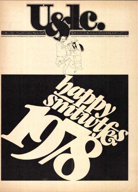
UPPER AND LOWER CASE, THE INTERNATIONAL JOURNAL OF TYPOGRAPHICS<br />
<strong>Qt</strong>.! <strong>ft</strong> 41V ■.:Wv, Zz 12345678908A-11 Ss(' ?(<br />
PUBLISHED BY INTERNATIONAL TYPEFACE CORPORATION, VOLUME FOUR, NUMBER FOUR, DEC. 1977<br />
Fad
U&Ic VOLUME 4. NUMBER 4 1977<br />
HERB LUBALIN. EDITORIAL 6. DESIGN DIRECTOR<br />
AARON BURNS, EDITORIAL DIRECTOR<br />
EDWARD RONDTHALER, EDITORIAL DIRECTOR<br />
JACK ANSON FINKE, ASSOCIATE EDITOR<br />
ANDY DIDORA. TONY DISPIGNA. LOUISE FILI,<br />
LYDIA GERSHEY, KELLY KAO, ANNA McCUSKER, TED SZUMILAS,<br />
DOUG TURSHEN, ALAN WOOD, ART & PRODUCTION EDITORS<br />
JOHN PRENTKI, BUSINESS AND ADVERTISING MANAGER<br />
EDWARD GOTTSCHALL. EDITORIAL ADVERTISING COORDINATOR<br />
0 INTERNATIONAL TYPEFACE CORPORATION 1977<br />
PUBLISHED FOUR TIMES A YEAR<br />
IN MARCH,JUNE,SEPTEMBER AND DECEMBER<br />
BY INTERNATIONAL TYPEFACE CORPORATION<br />
216 EAST 45TH STREET. NEW YORK, N.Y. 10017<br />
A JOINTLY OWNED SUBSIDIARY OF<br />
PHOTO-LETTERING, INC. AND LUBALIN, BURNS & CO. INC.<br />
CONTROLLED CIRCULATION POSTAGE PAID AT NEW YORK,<br />
N.Y. AND AT FARMINGDALE. N.Y.<br />
PUBLISHED IN U.S.A.<br />
ITC OFFICERS:<br />
EDWARD RONDTHALER, CHAIRMAN<br />
AARON BURNS, PRESIDENT<br />
HERB LUBALIN EXECUTIVE VICE PRESIDENT<br />
JOHN PRENTKI, VICE PRESIDENT, GENERAL MANAGER<br />
BOB FARBER, SENIOR VICE PRESIDENT<br />
ED BENGUIAT, VICE PRESIDENT<br />
STEPHEN KOPEC, VICE PRESIDENT<br />
U.S. SUBSCRIPTION TO INDIVIDUAL $6.00: SINGLE COPIES $1.50<br />
ELSEWHERESUBSCRIPTION. SB.00: SINGLE COPIES $2.50<br />
Vision '77 covered much more than the new typesetting technologies and typographic refinements reported in the previous<br />
issue of U&<strong>lc</strong>. It was concerned with everything from information flow and systems to the -role of creative graphics in making<br />
communications work; with the experience of companies that have used various typesetting systems; with the viewpoints of<br />
educators, designers and typographic services concerning the new machines and materials; and with what the near future<br />
holds in store. This second half of U&<strong>lc</strong>'s Vision '77 report covers those subjects and includes a roundup of projections by the<br />
presidents and top management executives of some of the field's leading manufacturers and suppliers.<br />
In This Issue: Vision '77 (Part II)<br />
Ed Gottschall concludes his account of what took place at the<br />
ITC symposium in Rochester last spring—an overall view of<br />
(as is said) "the state of the art:' Page 2.<br />
Pro.Files: The Great Graphic Innovators<br />
Continuing our series of insights into the personalities and<br />
artistry of the industry giants, this time featuring Herbert Bayer<br />
and William Golden. Page 12.<br />
On The Couch<br />
Lou Myers takes off into the empyrean again, this time from the<br />
psychological vantage point of the divan. Page 18.<br />
Holiday Postcards<br />
Once again we're the benefactors of Carol Wald's fascinating<br />
hobby, as the pages of U&<strong>lc</strong> are graced with an assortment of<br />
cards from her wonderfully-diversified collection. Page 20.<br />
Something From Everybody<br />
Letters from far and wide continue to reach our offices<br />
accompanied, most o<strong>ft</strong>en, by ingenious illustration. Herein are<br />
some random samplings from the newest batch. Page 23.<br />
Happy New Year.<br />
Jan Sawka, one of Poland's outstanding designers/illustrators,<br />
combines both of these abilities with remarkable virtuosity in our<br />
1978 monthly calendar. Page 26.<br />
Ms. Jacqui Morgan.<br />
Our famous featured female is a triple-threat illustrator, recently<br />
absorbed in designing provocative graphics on clothing. Page 28.<br />
The Sensualist Approach.<br />
No, U&<strong>lc</strong> isn't going porno. The title refers to examples of outstanding<br />
calligraphy from a booklet recently put out as a private<br />
edition by the Society of Scribes. Page 30.<br />
Face To Face.<br />
From time to time in earlier issues, we've featured photographs<br />
of such natural phenomena as "Nature's Alphabet:' The present<br />
emphasis is on naturally created "faces:' Page 32.<br />
Arrivederci Aroma.<br />
Presenting word experts among our readers with an Italian Food<br />
Crossword Puzzle by Al McGinley and Martin Alter. Page 36.<br />
The ABC's Of Coloring.<br />
Get out your magic markers, as prolific French designer Jean<br />
Larcher comes up with still another variation in his never-ending<br />
approach to alphabets. Page 38.<br />
Letters To Giorgio.<br />
Most people save letters. Happily for us, however, Giorgio Soavi<br />
saved all the envelopes he received from his Parisian illustrator<br />
friend, Folon. Page 40.<br />
What's New From ITC.<br />
ITC Benguiat in Roman and Italic in three weights is the new<br />
typeface series, which licensed ITC subscribers are authorized to<br />
reproduce, manufacture, and offer for sale. Page 44.<br />
Something For Everybody<br />
Our regular feature of frothy minutiae and fribble inconsequentials<br />
makes way this issue for John A<strong>lc</strong>orn's charming version of<br />
the 12 days of Christmas. Page 48.<br />
PART2<br />
The Word<br />
Paul Doebler<br />
Publishing and Printing<br />
Management Consultant<br />
Thomas P. Mahoney Associates<br />
CDVV„\ICATIO\S<br />
IYPOGRAPI IICS<br />
The Word<br />
The Future<br />
Information flow and systems Page 2 The near future Page 56<br />
Generation, recording, processing,<br />
Output media<br />
Page 58<br />
storing, retrieving,<br />
`Off the drawing board" Page 59<br />
using OCR's and VDT's Page 8 Roundup and forecast Page 59<br />
Case Histories<br />
Creativity<br />
The University of Graphic design in Europe Page 61<br />
North Carolina Press Page 10<br />
U.S. News & World Report Page 50<br />
Faulkner, Dawkins & Sullivan Page 51<br />
It is time to lay a foundation for understanding some<br />
of the advanced ideas that will be talked about during<br />
the rest of Vision '77. That is the reason for the title<br />
Essential: The Creative Touch Page 62<br />
Projections<br />
Company presidents and top<br />
management executives<br />
viewpoints<br />
The Designer/Editor Page 53<br />
The Educator Page 54<br />
survey the next few years Page 63<br />
The Typographic Service Page 55<br />
"The Word." We will provide a consistent background<br />
or framework within which you can think about<br />
some of these advanced ideas. We will first focus on<br />
principles and concepts. One must understand concepts<br />
before one can talk about the nuts and bolts of<br />
where the machines fit and who does specific things<br />
with them. Vision '77 came about because of the conversion<br />
and collision of two very different technological<br />
areas: word processing and typesetting. Word<br />
processing has its origins in the office field. It is really<br />
a transcription process to increase the efficiency of<br />
getting information down on paper, getting it to<br />
someone so that he or she can comprehend it, Word<br />
processing has developed along these two themes.<br />
One of them is to improve the flow of correspondence<br />
and documents in .their preparation. This involves<br />
reorganization of the office staff.<br />
At the highest level, word processing concepts separate<br />
the creative handling of text from machine<br />
keyboard operations. Keyboarding is put into the<br />
hands of a group of professional machine operators.<br />
People either dictate copy, write it in longhand, or get<br />
it down on paper by some other means. Then the<br />
material goes to what is, in a sense, a transcription<br />
pool, where the machine operators transcribe it onto<br />
magnetic tape, cards or some other medium used to<br />
store it. Printed copies are then produced and sent<br />
back to the editor, who edits them. These are returned
to the processing center for transcription of the<br />
changes. This cycle of editing and changing continues<br />
until you get a final approved document. This<br />
is a text handling system. It has led to other reorganization<br />
of office duties. For example, if you take all of<br />
the transcription work out of the regular secretary's<br />
job and put it in a special unit, this enables the other<br />
people in the office to concentrate on other things,<br />
and they become a different kind of support for the<br />
executive personnel.<br />
The WP/typesetting connection<br />
Of these two themes in word processing—office reorganization<br />
and the streamlining of text handling—<br />
for our consideration here today it is the text handling<br />
system that's really important. That's the element<br />
with implications for connecting up with<br />
typesetting, with implications for very radical<br />
changes in the way people of the future will operate<br />
in transmitting and using information. The average<br />
state of the art technologically in word processing at<br />
this point is the automatic typewriter. We are seeing<br />
the introduction of newer equipment though. We are<br />
seeing video screens added to the automatic typewriter<br />
so that the material is no longer played back on<br />
the typewriter platen. but on a video screen for<br />
changing and editing. We're seeing sophistication<br />
in the programs put into these machines. These are<br />
no longer simple write-and-edit routines. Some<br />
machines are even able to draw diagrams on video<br />
screens and have these played out on the output typing<br />
element. We're seeing special capabilities for<br />
building and maintaining lists programmed into the<br />
machines. Word processing is moving towards explosive<br />
growth in the abilities of these machines to do<br />
• all kinds of special chores. -<br />
The office of the future<br />
The office of the future lies out beyond the horizon a<br />
little bit, but it seems to be getting closer. This is one<br />
of the eventual developments the word processing<br />
system will have to tie into, in a very big way The<br />
office of the future concept gets somewhat exotic.<br />
Visualize executives working at their desks with their<br />
own video screens. If they want to know something,<br />
they push a few buttons and it comes up on their<br />
screen. If they want to write something, they type it<br />
into the machine and the text appears on the screen,<br />
or they may dictate it and have it translated into the<br />
machine. They edit it on their own screen. Perhaps, if<br />
they are doing research, they can put some numbers<br />
up on the screen and manipulate those numbers.<br />
These are far-out concepts. They do not exist yet. But<br />
these are dreams of the people who want to create the<br />
office of the future.<br />
Where does 1W fit in?<br />
Just how cioes the present concept of word processing<br />
fit into this? Let's go back a little now and consider,<br />
just briefly, the typesetting tradition, which is the reason<br />
for this meeting today. Its origins were 500 years<br />
ago when we first got moveable type; it can go back<br />
even further than that if one counts hand lettering,<br />
the carving of blocks, and so forth. But moveable type<br />
is a good beginning point to work with. Over the<br />
years we've developed an elaborate composition department<br />
to approach it—heavy machinery, and industrial<br />
type operation with development of highly<br />
specialized skills. This work was done in manufacturing<br />
plants because of the capital investment. The<br />
lighter computer-type machinery of today is challenging<br />
this industrial plant approach to the creation<br />
of composed type. Its moving it out of the plant and<br />
into the office. The one thing that must go along with<br />
it though, as Aaron Burns pointed out, is the graphic<br />
tradition. 'Iipesetting has always had the feel of<br />
aesthetics associated with it. Word processing, however,<br />
is only now coming up against graphic considerations.<br />
So as these two meet, the word processing<br />
area will contribute modern technology and reorganization<br />
of people in the offices. The typesetting<br />
tradition will contribute graphics, and appreciation<br />
of aesthetics, and the use of typography for more efficient<br />
communication and greater economy in the<br />
communications process. At the same time, the typographic<br />
area, even though it grows out of an industrial<br />
plant tradition, has developed a great deal of<br />
sophistication in the office systems of its own—the<br />
kinds of things that you hear about in newspapers<br />
where the editorial staffs work on video terminals<br />
and with OCR copy. They produce the newspaper<br />
today almost without the composing room, and in<br />
the future it will virtually go that way entirely. The<br />
creative decision-makers—making their decisions<br />
and using these kinds of equipment in their offices—<br />
have developed a very sophisticated level of copy processing<br />
technology. This technology is fundamentally<br />
parallel to the concepts of word processing. It's going<br />
to be very interesting to see how these very sophisticated<br />
so-called "front end" systems, which have<br />
evolvedin newspapers and which are now moving<br />
into books and magazines and some commercial<br />
printing applications, merge with the word processing<br />
equipment, which is coming from a relatively<br />
simple base into more sophisticated types of products.<br />
I'd like to look at this a little more systematically in<br />
several areas.<br />
Information management<br />
First the larger picture. Word processing and typesetting<br />
do not exist in a vacuum today. They exist in<br />
something much larger which is coming to be<br />
known in the industry as information management.<br />
The problem in information management is that the<br />
cost of managing information in a large organization—almost<br />
any organization for that matter, but<br />
especially in large organizations like governments,<br />
big corporations, foundations and so forth—is astronomical<br />
and growing rapidly. Some people put<br />
the cost of managing information as high as 15%<br />
of the gross revenues of a large corporation, and<br />
perhaps even higher in certain industries.<br />
The scope of the problem<br />
The scope of the problem is enormous. It stretches all<br />
the way from information coming into the organization<br />
to information going out the other side to someone<br />
you want to influence. And in between there is a<br />
tremendous amount of information processing. For<br />
example, think about the kinds of departments in<br />
organizations that are concerned just with the handling<br />
of information, not with manufacturing or<br />
selling the product. There is the market research department;<br />
it brings information into the company,<br />
centralizes it, makes sense out of it. There's R&D. The<br />
accounting department in essence is an information<br />
department. On the output side there are the sales<br />
promotion, advertising and public relations departments.<br />
These departments are just a few of those that<br />
handle information and are crucial to the flow of<br />
knowledge within the company. Beneath these<br />
departments there is a whole galaxie of support departments—the<br />
word processing center and in-plant<br />
print shop, to name just two. There is also the mail<br />
room, which is in charge of distribution. There are<br />
the messengers who run around bringing things<br />
back and forth. There are the telephone switchboard,<br />
the computer data processing department, the rec<br />
ords storage and retrieval department, the forms<br />
management group, and the company library. If you<br />
add up the cost of these, and then add on the money<br />
that is spent going to meetings and buying information<br />
from the outside, you come up with some rather<br />
astronomical totals. And this whole information<br />
enterprise is almost totally unmanaged in organizations<br />
today.<br />
A new management discipline<br />
We mentioned the phrase "information management"<br />
before. What is beginning to emerge is a new<br />
management discipline, and its going to be called<br />
information management. You will have information<br />
managers in corporations. They will have responsibility<br />
for word processing and in-plant print<br />
shops, but they will have a lot of other responsibilities<br />
as well. Their responsibility will be to take this disarray<br />
of disjointed information techniques and operations<br />
and put them together into an operating, functioning<br />
information-managing system.<br />
Flow<br />
Let's explore some of the characteristics of information<br />
and how they relate to the problem of designing<br />
word processing and typesetting systems. We'll start<br />
with the concept of flow It's fundamental to everything.<br />
1. Information<strong>ft</strong>ow in a knowledge industry.<br />
Information does no one any good unless it moves. As<br />
the diagram shows, on the far le<strong>ft</strong> someone generates<br />
information. It is written and transcribed somewhere<br />
as thoughts are thought. If it is worth distributing to<br />
anyone, it moves to a publishing function. Publishing,<br />
as used here, is a generic term describing the<br />
whole process of writing, editing and designing, and<br />
includes the conversion process of setting up the.type,<br />
proofreading, correcting, perfecting, making the<br />
graphic page, reproducing copies and distributing<br />
them.<br />
Distribution<br />
Sometimes these copies go to libraries, or to other<br />
storage and retrieval facilities where movement is<br />
suspended until someone needs them; one of the<br />
problems with information is that you never really<br />
know when somebody is going to need something.<br />
However, most copies skip the storage facility and go<br />
directly to their end consumers, shown on the le<strong>ft</strong> of<br />
the diagram in the same area as the original information<br />
generators. In fact, this published information<br />
o<strong>ft</strong>en becomes the basis for generating new<br />
material—the information is reorganized and reformatted<br />
into a new information product. Information<br />
regenerates itself in new forms.<br />
2.Many media can be fed by one data base.<br />
Another way of viewing the problem which we have<br />
to manage is looking at the variety of media we have<br />
to deal with. Most of us think of type as something to<br />
put on paper. But look at this diagram, at all the different<br />
media we can deal in: the print media, photographic<br />
media, electronic media, and even face-toface<br />
communication. Each presents different kinds of<br />
problems in graphic presentation; but processed text<br />
ultimately set in type is a key element in all of these<br />
media.<br />
Content Characteristics and Types of Communication<br />
1..f.frolaoonai Character<br />
Graphic Character .<br />
' f f<br />
Mer Characteristics<br />
-fvf. of Communic.ston<br />
Type of Communication<br />
3. Media/communication task relationships<br />
determine the hardware, so<strong>ft</strong>ware and<br />
personnel needs.<br />
How media relate to content<br />
The media/content relationship determines the kihd<br />
of system that you must have in terms of hardware,<br />
so<strong>ft</strong>ware and how people are organized. On the le<strong>ft</strong><br />
(Figure 3) are a number of characteristics inherent<br />
in the various kinds of media, and on the right are<br />
the types of communications tasks that these characteristics<br />
are best suited to serving. Correspondence,<br />
for example, is used quite o<strong>ft</strong>en in dialog situations—<br />
you write someone and you want a reply. It's also<br />
used in the current awareness situation where you are<br />
informing someone of something. These are terms<br />
that have come out in the last twenty years from the<br />
information science field. Various types of reporting<br />
media obviously are well matched to currentawareness<br />
needs.<br />
On the other hand. there is the function of documentation,<br />
in which you are not necessarily reporting<br />
current information—you may include some current<br />
information, but you also use the backfiles. The purpose<br />
of this is for reference and search. Someone<br />
comes into a field cold wanting to know something<br />
about it, and has to go back into the files to build a<br />
background.<br />
Graphic character<br />
Another dimension of information with which Vision<br />
'77 is concerned is its graphic character. Most word<br />
THIS ARTICLE WAS SET IN ITC GARAMOND CONDENSED
processing systems have been concerned only with<br />
the utility characteristics of graphics. We develop<br />
adequate typography, for example, so that one can<br />
find wanted information easily. This is a very simple,<br />
utilitarian situation.<br />
But utilitarian considerations leave virtually untouched<br />
other aspects of graphic character. Relatively<br />
unexplored in terms of systems development are<br />
facilities for generation of impressional graphics.<br />
Impressions are what graphics can uniquely give to a<br />
message. Graphics can leave strong and lasting impressions<br />
on people..Much advertising, and the fine<br />
corporate pieces try, as much as anything else, to develop<br />
a prestige image, a character or an emotion.<br />
Word processing and typesetting systems of the<br />
future, if they are going to be optimally used in organizations,<br />
are going to have to provide that kind of<br />
capability.<br />
Timing, aging, authority<br />
Still other information characteristics also will determine<br />
the shapes of systems. One is timing of delivery—must<br />
you have it overnight? What about aging<br />
of the content? Unlike the Library of Congress, we do<br />
not want to retain in these systems everything that<br />
was ever done— only to save live information.<br />
Authority, the weight of the content, is important in<br />
many instances. A small document, such as a memo,<br />
may only need to be read and thrown away; thus it<br />
can be prepared quickly and proofread and edited<br />
only once. But when you produce the price list for the<br />
company, it has a weight of authority that is going to<br />
be crucial in many cases, and you take a lot of editorial<br />
care producing it. These widely different activities<br />
and work flow patterns shape the kinds of systems<br />
that you apply.<br />
Types of communication/media links<br />
Let's look at another concept, at how the specific<br />
media tie together in different kinds of communications.<br />
At the top (Diagram 4) is something called<br />
simple communications. That would be the simplest<br />
memo or letter, for example. From there you branch<br />
out into at least four major areas: entertainment<br />
uses, current awareness uses, reference and search<br />
uses and educational uses. Each box shows some of<br />
the media involved for each kind of communication.<br />
Internal publishing<br />
Types of Communication and Medo<br />
4. One system doesn'tfit every situation.<br />
This diagram (4) illustrates an important principle,<br />
namely that if you start at the basic word processing<br />
level (in the uppermost box) with simple documents,<br />
as you move out to the four other areas documents<br />
become more and more complex. This implies that<br />
we are not going to be able to use just one system for<br />
every kind of situation. As you move out from the<br />
simple communication where one person writes it<br />
and someone types it up, and you send it elsewhere,<br />
you encounter increasingly elaborate operations, in<br />
some cases whole departments of 30 or 40 people<br />
with professional editorial and production skills,<br />
departments that constitute miniature publishing<br />
houses just to produce aparticular kind of document.<br />
If you go into these elaborate departments, you find<br />
an organization of commercial publishing companies.<br />
The technical manual department of a large<br />
high-technology corporation will have many of the<br />
characteristics that you find in a book or magazine<br />
publishing house, or even possibly in certain newspaper<br />
operations. You will find that the new technological<br />
systems that apply will perhaps look more<br />
like the kinds of systems we find from the typesetting<br />
tradition than from the word processing tradition.<br />
This is very important—what I am implying here is<br />
that in the future there will not be one universal system<br />
in a large organization for word processing and<br />
typesetting. We will have many different kinds of<br />
systems for different uses.<br />
Basic work flow<br />
Basic Flow – Edit/Design Decisions<br />
5. Decisions are made at the front end of<br />
the process.<br />
Let's now turn to the editorial, word processing,<br />
typesetting work flow, which is the specific segment<br />
of the larger picture we are really here to talk about<br />
today. This (diagram 5) shows the fundamental<br />
kinds of activities we deal with in any processing/<br />
typesetting system.<br />
The top line—writing, editing, column or block formatting,<br />
and makeup—are decision-making functions.<br />
People such as editors, designers and authors<br />
make decisions on what is going to be placed on the<br />
page and how it's going to be placed there. Below are<br />
four boxes—entry, proofing, storage, typesetting—<br />
which are support functions. They may be crucial to<br />
the system, but are not decision-making functions.<br />
Organization information flow<br />
111111191111111<br />
Typc.s1<br />
InformatkIn Rows<br />
in an Organization<br />
J<br />
=OM<br />
6 Organization information flow.<br />
MINN<br />
This flow can exist in an organization in many,<br />
many places, and in different forms. For instance,<br />
assume the triangle in diagram 6 is an organization.<br />
As shown on the le<strong>ft</strong>, a variety of incoming information<br />
flows exist. Within the organization, a range of<br />
administrative procedures constitute or are supported<br />
by additional flows. And various forms of outgoing<br />
information (right) are issued by still other flows.<br />
Incoming information tends to present a make-orbuy<br />
decision. Can you buy the information as a package<br />
from an outside vendor such as a publisher, or do<br />
you produce it internally? If you produce it, somewhere<br />
along the line you probably will have a word<br />
processing/typesetting function to handle the job, as<br />
you will for internal and outgoing material.<br />
The basic electronic system<br />
7. Components and functions in a basic<br />
electronic system.<br />
Now let's look at electronic systems and how they fit<br />
into these flow patterns. This diagram can be used to<br />
represent almost any kind of electronic word processing/typesetting<br />
system. No matter what kind of<br />
equipment you are considering, you can fit most of<br />
the pieces into these boxes. Then you can analyze<br />
and compare systems offered on the market in these<br />
terms and come to grips with what specific variations<br />
you need in each area.<br />
We have a broad variety of options to choose from<br />
here. We have direct keyboarding, keyboarding to<br />
tape, and keyboarding for optical character scanning.<br />
You can also use VDT, or mag cards, punched<br />
cards. You can also input onto computer discs and<br />
read them into the system. You can take the material<br />
from another system on-line or you can get it in a<br />
package that was prerecorded on an off-line<br />
machine.<br />
Three common input devices are the tape perforating<br />
keyboard, the word processing typewriter which<br />
can interface with typesetting systems, and the optical<br />
character reader (OCR).<br />
Processing<br />
Somewhere in the system you've got computer power<br />
that enables you to manipulate the material and to<br />
store it in memory for a while. Once it is in the system<br />
you can edit the content, give it format, prepare<br />
it for output.<br />
You can have centralized processing by using a master<br />
computer at the center of the system, or you can<br />
have decentralized processing by splitting the computer<br />
power up into a number of units and packaging<br />
it with other machinery. I'm sure you know about<br />
the problems of writing programs, of so<strong>ft</strong>ware. One<br />
of the newer developments is the idea of firmware.<br />
Firmware is simply a program that was originally<br />
a so<strong>ft</strong>ware package which now has been packaged<br />
permanently in integrated circuit chips so that it<br />
remains in the machine as a permanent piece of<br />
programming.<br />
Memory<br />
There are a variety of memory forms, such as tapes,<br />
discs and cards. You can have some of these wired<br />
onto the systems. Others can be stored on shelves<br />
until needed. Memory can be all in one place or it<br />
can be scattered around the office. It can have sequential<br />
or random access; both types are important<br />
because in some kinds of work it is easier to go<br />
through from one end to the other, and in other<br />
kinds of work you need to pick out things at various<br />
points. Memory devices come in a wide range of<br />
sizes.<br />
Manipulating<br />
For manipulating and checking material as you are<br />
working on it, there are a number of editing devices,<br />
as well as devices for column formatting and page<br />
formatting. Devices include the automatic typewriter<br />
as used in word processing systems. OCR equipment<br />
sometimes has formatting capabilities. You can use<br />
card sort systems where you arrange the cards in a<br />
certain sequence before you put them into the<br />
machine. Without question, though, the major device<br />
which has captured the imagination of everyone is<br />
the video display terminal. In a sense, it's the universal<br />
window into the system; it is the key device<br />
that really makes today's truly interactive systems<br />
practical. Some terminals enable you to do a great<br />
deal of positioning of elements and sizing of type.<br />
This gets you into graphics and graphic manipulation<br />
in addition to text manipulation. The area<br />
makeup terminal, such as those now used for advertising<br />
makeup, is leading us very rapidly into the<br />
page makeup terminal in which entire pages can be<br />
assembled on a screen, in a form which you can approve<br />
before they are output to go to press. Full page<br />
makeup eliminates a great deal of the paste-up operation<br />
and subsequent proofreading and checking.<br />
Outputs<br />
There are two forms of output. Intermediate output is<br />
usually represented by the printout with which most<br />
people are familiar. It's an intermediate working<br />
document. The final output, of course, is the ultimate<br />
page that you want to distribute. There are many<br />
kinds of final outputs. If it's adequate, such as on a<br />
word processing machine, you can use a typewriter<br />
output. The most graphically sophisticated output, of<br />
course, is phototypesetting.<br />
COM is a special variation of typesetting output in the<br />
microforms field. It involves special CRT machines<br />
which set type in miniscule characters on microfilm.<br />
There are limitations on what they can set, usually<br />
one typeface, maybe two. They usually can't handle<br />
graphics and different sizes of type, for example. But<br />
for specialized applications, such as producing lists of<br />
data, they are quite efficient.<br />
The video display terminal can be an output machine<br />
if you think of it as a device on which the user calls<br />
up information on the screen, reads it and gets everything<br />
he needs to know without further permanent<br />
output. This kind of service is developing in the information<br />
industry, where companies subscribe to<br />
on-line services such as Lockhead and SDC. A subscribing<br />
company has an in-office terminal. Someone<br />
desiring certain information calls in through the<br />
terminal, over an on-line network, and is connected<br />
to any of a variety of data bases or collections of information<br />
in which he can search for what he wants.<br />
He pays for this service on a time usage basis.
I<br />
The phototypesetter<br />
Let's take a closer look at the phototypesetter of today<br />
and some of the radical implications of these powerful<br />
machines. A modem phototypesetter literally can<br />
set everything we want—in complete pages—fully .<br />
automatically. Thus, in essence, we have taken that<br />
industrial plant, the composing room, and condensed<br />
it into a box. But this does not solve all our<br />
problems. What do we do with the work flow that<br />
we've always had to live with? What does this technology<br />
do to that work flow? It allows us to change a<br />
great deal—and this is where we make the payoff in<br />
this system.<br />
Conventional Composition Department<br />
Keyboard Typeset Proofreads Correct Melee. Parsed<br />
Computer-Aided Composition Department<br />
Proofread tttoo.ed PrO0he<br />
I=1<br />
Computer-Based Composition Department<br />
12_e<br />
f "<br />
i .<br />
_I<br />
8. Corrections can be made and makeup done<br />
before setting the type.<br />
Here, in the top bar, is the conventional composition<br />
department work flow, one that is very traditional.<br />
You keyboard and set the type, proofread it, correct it,<br />
make it up into pages, proofread these and then correct<br />
them. The more times you go around and around<br />
to get corrections made, the more involved things<br />
get, but those are the fundamental operations that<br />
happen in a normal sequence.<br />
Computer-aided composition<br />
If you are going to use a cornputer to speed this conventional<br />
process, as represented in the middle bar,<br />
you spend more time at the beginning to think and<br />
plan. You mark up copy with instructions for<br />
keyboarding, then you keyboard it. If you use a video<br />
terminal in this system, once you have keyboarded<br />
and placed the copy into magnetic storage, you can<br />
bring the image back onto the screen of the terminal,<br />
and proofread and correct it right there. This is more<br />
efficient than correcting the type a<strong>ft</strong>er you have it set.<br />
Then once the text is correct, you can typeset it, make<br />
up pages, proofread the pages and correct them.<br />
There are a number of systems operating in this basic<br />
mode today.<br />
Editorial/composition interaction<br />
These applications of computer power have created<br />
some improvements, but they still involve only<br />
typesetting in a conventional composing room<br />
environment. The real challenge and the real<br />
economies from electronic systems come when we<br />
take this kind of process and lay it against the editorial<br />
process that takes place before composition.<br />
9.Interfacing the editorial and composition<br />
departments.<br />
This process has been standard almost since the beginning<br />
of time, as, shown in the top section of diagram<br />
9. You write the material, edit the copy, design<br />
and dummy the pages, send the material out for<br />
typesetting, get the finished material back. I don't<br />
know of any publisher who is willing to trust a<br />
typesetter completely, so someone in the editorial<br />
office sits down and proofreads it as well. And you<br />
check page proofs in the editorial office too. The<br />
typesetting takes place in the plant as shown by the<br />
second bar, which represents the kind of computerbased<br />
composition department indicated in the previous<br />
diagram. In many of the advanced operations<br />
today we are already living with this situation. But<br />
look what happens when we begin to think in terms<br />
of not having the composition department use the<br />
equipment, but having the decision makers use it?<br />
Remember our concern with work flow.<br />
text. So, if the copy editing is done on a video terminal,<br />
the proofreading that was done before becomes<br />
part of the copy editing function because once the<br />
copy editor is finished the system has the corrected<br />
material safely in its memory—no additional verification<br />
is needed. The copy editing function may be<br />
lengthened somewhat, in order to do a good job, but<br />
it is still a net saving over what you would need for a<br />
separate proofreading. The correction function becomes<br />
part of the copyediting as well, because the<br />
editor has already made the corrections in the stored<br />
copy. The markup at the beginning of the composing<br />
room process is really a translation of instructions<br />
from the publishing house; therefore,<br />
the person who decides the design specifications in<br />
the publishing house can simply insert these directly<br />
in the system via a keyboard or some other device,<br />
and collapses markup into the design and dummying<br />
process. Similarly, if these people input these instructions<br />
properly into the system, the system can then<br />
generate madeup pages and eliminate manual<br />
makeup and paste-up; these functions then collapse<br />
into the design and dummying function. The one<br />
thing le<strong>ft</strong> from the composing room to be done<br />
separately is the typesetting— the very end process.<br />
The human factor<br />
Some people will argue that you can't have the writers<br />
write material on terminals all the time. This is<br />
absolutely correct. From this. there have been some<br />
assumptions made that in certain fields, especially<br />
the book industry, this negates use of the new<br />
technology. Not so. Look at the last bar at the bottom.<br />
Assuming that you get a manuscript from someone<br />
who has not typed it into the system, then you must<br />
add the rekeyboarding function back in as a necessary<br />
cost. But you will still have a tremendous net saving<br />
from all of the other composing room functions<br />
that can be collapsed into the editorial process. This<br />
kind of approach is being proven out emphatically in<br />
the newspaper business. It is being developed in certain<br />
book and magazine situations and will become<br />
important in in-plant and word processing fields<br />
as well.<br />
Current directions<br />
Let's go back to the original electronic system, diagram<br />
7. The basic concept that we started with in the<br />
early '70s was a system in which all of the different<br />
devices were wired together. In this wired system, we<br />
transmitted the information back and forth, and the<br />
processing was done in a central computer.<br />
with some processing capabilities. Small mini computers,<br />
or certain amounts of computer circuitry, are<br />
built into the various peripheral devices to provide<br />
certain functions in these machines. So the computer<br />
has become distributed to the other devices. The<br />
memory is o<strong>ft</strong>en portable, taking such forms as<br />
floppy discs or tape cassettes. You link the devices by<br />
carrying the memory discs or cassettes back and forth<br />
between the machines. Consider a typical word processing<br />
arrangement with a typewriter. It may have a<br />
magnetic-tape storage device so that you can store<br />
and retrieve, play back and edit. Here you have original<br />
input capability on the keyboard, and some<br />
processing capability. You also have manipulation<br />
ability in that same keyboard by playing back and inserting<br />
your changes. And you have a form of output<br />
—a typed page. It can be considered intermediate<br />
output, or it may be final output such as the final letter,<br />
document or page to be transmitted. You can describe<br />
today's typical word processing systems with<br />
this approach.<br />
The stand-alone<br />
Another popular kind of machine is the stand-alone<br />
phototypesetter which has a video terminal and a<br />
keyboard. The keyboard is used for initial inputting.<br />
The video screen and the same keyboard provide<br />
manipulation capability, and final output is produced<br />
through the typesetter. Many such machines have<br />
now been expanded to take floppy disc memory<br />
capability as well, and they can be teamed with other<br />
video terminals from a number of machines.<br />
Editor's note<br />
So much for the theoretical diagramming of how information<br />
is organized and how it flows. Now let's<br />
consider how specific equipment and systems generate,<br />
record, process, store, retrieve and output information<br />
and match these technologies to purpose.<br />
These subjects were covered at Vision '77 by Donald<br />
Goldman and Ralph Squire.<br />
The Word:<br />
Copy Processing/<br />
Typesetting<br />
Computer based composition<br />
Stand-Alone System<br />
Here, as shown in the bottom box, we push the typesetting<br />
function back even farther. We go through the<br />
same markup-keyboarding-proofreading-correction<br />
sequence as we did before. But in this case we assume<br />
we have the electronic capability in the system to<br />
make up pages on a video screen or in some other<br />
manner. It doesn't have to be done on a screen; it can<br />
be done in a controlled program operation such as<br />
has been the case in the directory field for a number<br />
of years now The pages are made up by the computer<br />
reacting to instructions from an operator or from<br />
some kind of a program. Then the job is typeset.<br />
There can be two variations to this procedure. In one,<br />
you go most of the way without makeup and then you<br />
do a little paste-up a<strong>ft</strong>erwards; in the other, you have<br />
total automatic makeup in the machine and you get<br />
absolutely finished pages as output.<br />
10.Keyboarding becomes an editorial<br />
function; other operations, formerly<br />
executed in the composing room, are<br />
now done in the editorial department.<br />
In diagram 10 the basic editorial flow is shown in the<br />
middle bar. The composition flow is shown in the<br />
upper bar. If your writers work on video terminal<br />
keyboards instead of conventional typewriters, the<br />
way they are doing in a great many newspapers today,<br />
the composing room keyboarding is collapsed<br />
into the writing process—you don't have to rekeyboard<br />
in the composing room because the text is<br />
captured in machine-readable form from the instant<br />
it is written. Next, one of the things a copy editor does<br />
is clean up the copy; in a sense, he is proofreading as<br />
well as changing words and generally improving the<br />
=INN<br />
Poreeet<br />
11Ṭhere is a current trend to a system in which<br />
the components are not wired together.<br />
The current trend in equipment is providing us with a<br />
new configuration, portrayed in diagram 11. Many of<br />
the systems today are not wired together. What you<br />
really have is a number of peripheral devices, each •<br />
pe<br />
Donald H Goldman<br />
Independent Management and<br />
Technical Consultant to the Graphic Arts<br />
Phototypesetting, a thumbnail history<br />
In the early 1940s, phototypesetting was first<br />
developed as a method of producing higher quality
imaging for offset printing. It was later that we<br />
appreciated its flexibility, utility, and cost effectiveness.<br />
In the 1960s, we began making use of computer<br />
technology, a key to the recent growth of typesetting<br />
devices. Computers for phototypesetting have, since<br />
the 60s, become faster, smaller, and less expensive,<br />
making phototypesetting machines with increased<br />
capability more widely available.<br />
A word of caution. While we must learn to accept<br />
change, we should not jump on the new technology<br />
bandwagon without justification. Decisions on<br />
change should be made with sound justification,and<br />
not rationalization. Too many companies have installed<br />
computers for their PR value instead of for<br />
economic reasons. A good example is the companies<br />
that jumped into CRT typesetting several years ago<br />
just because it seemed the right thing to do. Many of<br />
them are no longer with us.<br />
Obsolescence<br />
Take advantage of the equipment you have now if it<br />
is still cost effective. If you had good sound justification<br />
for the equipment in the first place, it can remain<br />
cost effective for years. For example, at a company<br />
I visited in Pennsylvania several years ago I saw<br />
a computer over here. a phototypesetter over there,<br />
and various terminals—quite an array of equipment.<br />
But, standing at a bench in the corner someone was<br />
reading a tape. laying it down on what seemed to be<br />
a breadboard, razor cutting-in the corrections and<br />
sticking them together with Elmer's glue. "Hey," I<br />
said to my guide, "what's going on here?" "Look," he<br />
answered, "she can read those codes faster than you<br />
could read a manuscript. We've accumulated all these<br />
tapes. If we tried to convert them for our computer, it<br />
would take several years. This method is the most<br />
cost effective one for this job." This same company,<br />
by the way, still uses Photon 200's early phototypesetters<br />
for their math work because they continue to be<br />
the most cost effective for this work. Not to say that its<br />
methods won't change, but the firm still makes good<br />
use of equipment selected with good judgment.<br />
Making an equipment decision<br />
Before you change, think about such things as reducing<br />
your cost per unit output at a given quality standard<br />
with your present, as well as future, equipment.<br />
You want to be able to increase your speed, with,<br />
hopefully, no sacrifice of quality. You want to reduce<br />
the mechanical complexity if possible. There is no<br />
point in going into a technology that is going to<br />
make it harder to do things. You should be looking to<br />
do things in a simpler way, to reduce labor and costs.<br />
If you follow these fundamental rules, you will immediately<br />
identify your present weaknesses and those<br />
elements important in helping you make an effective<br />
selection.<br />
Physical support requirements<br />
lb reduce labor costs, whatever the equipment you<br />
choose, doesn't mean to lower wages. It does mean<br />
using production people more effectively, perhaps by<br />
cutting down the time it takes to perform some operations,<br />
such as corrections, or by making it easier to<br />
mark up and keyboard complicated text through<br />
format usage. In other areas, you may want to reduce<br />
corrections and pasteup time and the follow-up operations<br />
with an electronic makeup device. Or, by better<br />
pre-planning of the text, cut down on later errors<br />
and corrections. How o<strong>ft</strong>en we hastily set the type on<br />
a job, then we find we spend more time correcting<br />
errors than we would have if we had filtered out<br />
these errors at the outset of the job. A job should be<br />
thoroughly pre-planned before it is typeset.<br />
Interactivity<br />
You want to increase your ability to control and predict<br />
your output. This is the one value of many of the<br />
interactive systems. With video display terminals, for<br />
example, editors can review a composed galley of<br />
type for copyfitting. They can also check for correct<br />
hyphenation before the copy goes through a<br />
typesetter<br />
System flexibility<br />
Perhaps the computer/typesetter system can be used<br />
for operations beyond typesetting. If you have a large<br />
data base, can you make use of it? We talk about word<br />
processing. Can you use the word processing output<br />
as input for the typesetting operation? Or can you use<br />
a variety of typesetters with the same input machine?<br />
Keyboards<br />
As the industry has progressed, a whole array of<br />
keyboards have been designed. There are paper tape<br />
devices with counting (justifying)_ keyboards. lbday,<br />
more electronics are being utilized. Some keyboards<br />
have one-line display screens. Others look just like<br />
typewriters hooked up to electronic systems with<br />
video display terminals. And some keyboards, of<br />
course, are connected directly into the phototypesetter.<br />
Some of these, too, have a VDT for corrections<br />
and show you what you are setting before the typesetting<br />
process.<br />
Training operators<br />
Training should not be overlooked as you move into<br />
new technologies. An appealing thing about<br />
typewriter-like keyboards is their familiar key layout<br />
—familiar to anyone who has taken an elementary<br />
course in typing. There isn't that much more to<br />
learn, at least about the basic keys. You have OCR and<br />
OBR (Optical Character Recognition and Optical Bar<br />
Code Recognition) typewriters as well as strike-on<br />
composition, such as the AM Varityper and the IBM<br />
Composer. There are blind keyboards without a hard<br />
copy print. lb help operators spot and correct errors,<br />
some blind keyboards have LED (Light Emitting Diode)<br />
displays. LEDs are also a part of all direct input<br />
typesetters. They show 32 or 64 of the last characters<br />
set and allow an operator to find and correct errors<br />
before sending the line into production.<br />
VDT input units<br />
When I first saw the VDTs (Video Display Terminals) I<br />
thought, here you are typing along, you see this information<br />
on the screen, it's going to distract you. You<br />
won't get any production out of something like this.<br />
But I must admit that not only can you get good<br />
production out of it, but you can also use the VDT<br />
creatively. You are able to type something and change<br />
it around without fully retyping. Using a VDT to do<br />
creative writing is pure luxury The ability to make<br />
changes easily and interactively is the premise, not<br />
just with the VDT, but with any kind of input revision<br />
typewriter that allows you to type information,<br />
change it, store it, then bring it out and edit it before<br />
finally committing it. Hence, the appeal of "word<br />
processing",for offices, typesetters, et al.<br />
The justifying keyboard<br />
Keyboards that have the unit width values of the different<br />
characters you are keyboarding tell you when<br />
you are near the end of the line. The operator can<br />
then make a decision, put in a hyphen as needed,<br />
and continue on. This method has been found to give<br />
the best quality in terms of line endings as long as the<br />
operator understands hyphenation, but it has been a<br />
handicap in terms of speed. Studies have shown that<br />
25 per cent is gained in production, especially on<br />
short line lengths, if operators do not have to make<br />
end-of-line decisions.<br />
This paved the way for so-called idiot keyboards.<br />
These keyboards are nonjustifying. The operator pays<br />
attention to the text, puts in the codes, and does not<br />
have to worry about line endings. Since keyboarding<br />
is a major cost factor, the time saved with such idiot<br />
keyboards is an important consideration. The output<br />
tape then goes to a typesetter where the hypenation<br />
routines can be put in electronically.<br />
If speed is not the problem, but accuracy is, justifying<br />
keyboards will fit in well, although they are more expensive<br />
than nonjustifying keyboards.<br />
VDTs<br />
VDTs are used, of course, in the visual text editing.<br />
They enable you to review the keyed text, correct or<br />
alter it and check that the changes have been made<br />
before setting the type or storing it away for later use.<br />
With a page display or visual area composition and<br />
makeup systems, this interactive page makeup permits<br />
you to see the end result immediately, o<strong>ft</strong>en with<br />
a representation of the type in proportion and in the<br />
proper place on the page.<br />
Many of the input or editing units operate in a batch<br />
mode, interactively. Some modes, though called interactive,<br />
actually are quasi-interactive. The computer<br />
computations involved are fairly rapid, though.<br />
You can record on such media as paper tape, magnetic<br />
tape, discs—either hard or floppy, or output<br />
directly into the typesetter.<br />
Input media<br />
The one that is probably the most popular and most<br />
likely to remain so for a while is paper tape. The<br />
material is not very expensive, and the hardware is<br />
relatively inexpensive, too. This is a positive medium.<br />
If you type a code you see that you have punched a<br />
hole in the tape. Proficient operators develop the ability<br />
to read tapes. You can get paper tape almost anywhere.<br />
It is portable; you can•carry it anywhere. It<br />
does have a few disadvantages. It is relatively slow<br />
and bulky... and have you ever had a paper tape<br />
knot, or, on a long job, while running it through your<br />
typesetter, had someone step on it?<br />
Hollerith cards<br />
These are data processing cards with the copy typed<br />
on them. The cards are then sequentially photographed.<br />
This is a form of cold type or strike-on composition<br />
especially suited to directories. If you want to<br />
make a change or add a new section, you just change<br />
or add some cards.<br />
Magnetic media<br />
All cassettes may look alike, but the internal coding<br />
formats are o<strong>ft</strong>en not compatible. The cassettes, ,<br />
however, are popular and relatively low cost. Their<br />
drives are not very expensive, and they are readily<br />
available. You can store and recall material on a cassette.<br />
You can use it a number of times—but you may<br />
get a surprise when the tape stretches. Though<br />
fragile, with proper care and use cassettes can be a<br />
very cost effective medium that can also be interfaced<br />
directly to many phototypesetting machines.<br />
The mag card is another way to store material. Some<br />
manufacturers are talking about adding mag card<br />
readers to their phototypesetting devices.<br />
Reels<br />
The granddaddy of all magnetic storage units is the<br />
tape reel. It enables information to be taken from a<br />
computer and outputted on a typesetter at relatively<br />
high speed. You can keep a lot of information on a<br />
reel at a very low storage cost, and the process is quite<br />
fast. Phototypesetting machines and the cathode ray<br />
typesetter (CRT) devices that utilize tape reels run<br />
much more rapidly, and are far more reliable, than<br />
machines using paper tape. The problem is cost. You<br />
start at $5,000 for such a reel drive. But if you have a<br />
computer, and want to use your data base—and have<br />
the programmers to do the so<strong>ft</strong>ware that makes the<br />
data composition useable—this can be a most effec .-<br />
tive way to communicate with your typesetter.<br />
Magnetic discs<br />
There are hard discs and flexible discs, or floppies, as<br />
they are known today. There are even mini-floppies<br />
and flippies, on which you can record on both sides.<br />
Disc hardware is relatively low-cost. A hard disc,whid<br />
is the most expensive, runs $10,000-$15,000 for<br />
hardware. Floppy disc hardware is less than $5,000<br />
and the discettes cost less than $10.00. Hard disc<br />
packs enable you to store up to five million characters,<br />
sometimes more, while floppies range from 250<br />
to 500,000 characters per discette. Like cassette formats,<br />
the disc formats may differ in different devices.<br />
Computer (Core) memory<br />
This is the form of electronic storage into which you<br />
put information, which is retained (usually temporarily)<br />
until you enter new information. Besides<br />
core memory, there are ROMs, PROMs, and RAMs<br />
(Read Only Memories, Programmable Read Only<br />
Memories, and Random Access Memories), all of<br />
which are forms of semiconductor memory. The<br />
drawback with RAM, though, is that when you turn<br />
the power off the memory disappears, so you need a<br />
paper tape, cassette or disc device to restore the computer<br />
program.<br />
Dedicated keyboards<br />
These are keyboards, such as those on the direct input<br />
machines, designed exclusively for typesetting. If the<br />
keyboard hasn't been designed to run the typesetter<br />
in your system, you have to be careful that you use the<br />
right coding information and language for the<br />
typesetter.<br />
Programmable keyboards<br />
Many keyboards are programmable, being able to<br />
execute a string of commands when only a few keys<br />
are struck. This ability to compress multiple instructions<br />
and have them exploded and inserted into the<br />
text with a minimum of keyed instructions is known<br />
as formatting.<br />
OCR<br />
It is much cheaper to buy a $900 typewriter than a<br />
$5,000 terminal with paper tape and all the special<br />
keys needed. This consideration has opened a new<br />
business, cottage industry keyboarding. In their<br />
homes, people type OCR copy on a per page basis.<br />
Editors can create their own OCR copy and send it to<br />
their vendors for conversion and typesetting. We have<br />
operator familiarity with a standard typewriter<br />
keyboard. The machine is portable from home to<br />
home, department to department. Cost of training
and labor is low, and effective use can be made of<br />
formats. The keyboarder is typing, not composing per<br />
se. Many of these devices enable you to type in a<br />
string of codes (format the text) that will command<br />
the typesetter later on. You write the codes into the<br />
manuscript. The typist keyboards them in along with<br />
the body copy.<br />
One negative aspect of OCR is the time it takes to get<br />
your typewriter adjusted. Accurate, clean copy is a<br />
must for the OCR reader. Because of this problem,<br />
one manufacturer has developed a machine that tests<br />
typewriters for accuracy. In one test, of 25 typewriters,<br />
only two didn't need adjustments. Since the problem<br />
can be remedied, it is a minor point. I make it only so<br />
that you know that your typewriters have to be put in<br />
good shape before attempting OCR use.<br />
The difference between. OCR and OBR is the bar code,<br />
a little code at the bottom of the characters of the alphabet.<br />
We have becoine familiar with bar codes because<br />
we see them in grocery stores today. The values<br />
principle . is the same.<br />
The,OCR/OBR scanner<br />
Here's how a scanner works. There is a light source.<br />
There is also a rapidly rotating drum, which focuses<br />
on the special characters on the bar code, or the<br />
characters themselves, then converts them into signals<br />
used to punch paper tape, or into other codes<br />
(possible magnetic) that are readable by the typesetter.<br />
One problem with' OCR is its slower speed, though<br />
some relatively high speed devices have been<br />
developed.<br />
The Visual Display Terminal<br />
The use of the VDT for input and editing has increased<br />
significantly over the past few years. It almost<br />
has become a necessity. Back in 1970-1 an inexpensive<br />
VDT unit cost $17-18,000 or more. Today. you can<br />
get one for $3,000 or less. The \DT is a fast keyboard,<br />
but its great advantage is its interactivity for editing.<br />
The operator can see the input results and make<br />
changes immediately. The VDT has flexibility and<br />
can include a programmable keyboard much like the<br />
input devices discussed before, Many companies use a<br />
VDT for both input and editing. Some VDTs even have<br />
dedicated keyboards which, as well as being designed<br />
for typesetting, are connected directly to the typesetter.<br />
A first generation phototypesetter<br />
The Intertype Fotosetter was little more than a<br />
linecaster with a photographic unit in place of the<br />
slug-casting mechanism. Its mats look like linecasting<br />
mats with film negative characters. They are<br />
dropped in front of a light source and photographed.<br />
lbday's technology falls into three categories: Photo/<br />
optic, which some call second generation phototypesetting;<br />
electronic/mechanical, in which characters<br />
are photo-scanned instead of being photoprojected;<br />
and digital-scan, using cathode tube and<br />
laser technology.<br />
Matrices in the photo-mechanical devices or in the<br />
photo-scan devices require a light source, a negative<br />
photographic character matrix, a lensing system,<br />
and a mechanical character positioning capability.<br />
Speeds go from five to 150 eight-point, 11-pica lines<br />
per minute.<br />
The second generation<br />
With the exception of the Alphatype, the early second<br />
generation machines were very expensive. They<br />
needed a justifying keyboard because computers<br />
weren't around, and they were relatively slow By the<br />
mid-1960s, comparable, in fact better, models were<br />
about $50-60,000. They were all good quality'<br />
machines, but because they were somewhat slow<br />
they weren't always cost effective, and the keyboards<br />
to drive them were expensive and cumbersome.<br />
The price revolution<br />
In the 1967-68, Compugraphic introduced a<br />
machine, at first designed for the newspaper industry,<br />
for under $10,000, with some slave (computerdriven)<br />
versions for under $5,000. In 1970-71 came<br />
the Dymo Pacesetter. Photon (now Dymo) virtually<br />
wiped out its entire product line with one piece of<br />
equipment. A-M came into the photocomposition<br />
market with a Pacesetter-like machine, first the 725,<br />
later the 747, and then the 744. Their latest machine<br />
is the 748. And Mergenthaler came out with the VIP.<br />
The average price of these machines dropped to<br />
under $20,000. It became more economically feasible<br />
for many of us to get into the typesetting business.<br />
While there was more to it than just going out and<br />
buying a machine, it was a start in the right direction.<br />
In a similar manner, $40,000-$200,000 computers<br />
have given way to computers that cost from<br />
$1,500 to $10,000 and are as powerful as some of their<br />
expensive ancestors.<br />
The third generation<br />
Photo-scan typesetters use a light source, a font grid<br />
and a scanning CRT—that is , a high-resolution television<br />
tube, which electronically, or electro mechanically<br />
positions the scanned character on the<br />
typeset page. Speeds are up to 600 newspaper lines<br />
per minute.<br />
With these systems the font character is scanned and<br />
reproduced on the CRT face, then lined up and imaged<br />
onto the photographic material. You can do<br />
neat tricks with the electronic positioning of characters.<br />
You want a condensed typeface? An expanded<br />
version? You want it bold? You want to italicize it? You<br />
want to slant the character? Back slant? Fore slant?<br />
You can do all of these electronic tricks. Just instruct<br />
the machine (through codes) and the standard<br />
Roman face can be manipulated, distorted, expanded,<br />
condensed, made bold, or whatever you<br />
desire.<br />
The cost of the CRT is coming down..Most CRT<br />
typesetting devices a few years ago were in the<br />
$100-$125,000 range. About two years ago we started<br />
seeing machines in the $75,000 range. Then Compugraphic<br />
took another leadership role with this<br />
kind of device and came up with a machine that<br />
ranged from $23,000 to $44,000. In 1977-78 you are<br />
going to see other CRT units that will be even more<br />
cost effective, more versatile, and will produce even<br />
better quality work.<br />
The fourth generation<br />
The digital-scan machines give you still more flexibility.<br />
With these machines, characters. instead of<br />
being in photographic form, are stored away in digitized<br />
(reduced to computer code) form. You can store<br />
hundreds of fonts, electronically produce them by<br />
drawing the character on the face of the CRT tube,<br />
and from that point project them onto the image carrier<br />
(film). With these units you can do all the electronic<br />
tricks you could do with photo-scan devices:<br />
And, because you omit the photographing of the font<br />
matrix, you have astronomical speeds.. .from 2000 to<br />
3000 newspaper lines a minute.<br />
You should be aware of how the characters are drawn<br />
on the CRT. The density of the scan lines will affect<br />
the quality of the type. There is a stepping effect along<br />
the edge of the characters. This is a characteristic of<br />
the machines generating images from digitized<br />
fonts. You are not photographing the font, but creating<br />
it. You are defining how long and how wide the<br />
scan lines should be to form a character. Many CRT<br />
typesetters will have more than one mode. One<br />
higher speed will give you fewer scans per inch (used<br />
for proofing), and a quality mode, with more scans<br />
per inch, which will improve reproduction quality,<br />
but lower the operating speed.<br />
Digitizing graphics<br />
As you digitize the input you could also use a scanner<br />
to merge in graphics of various forms. These include<br />
type, line graphics, hal<strong>ft</strong>ones, or special effect<br />
screens, You can merge these with the type, manipulate<br />
their size and reproduce them on the CRT face.<br />
You literally set pictures as well as type. You can simulate<br />
hal<strong>ft</strong>ones. This is one of the principles being<br />
used in ink jet printing, where digitized data can be<br />
produced through a hard copy output device that<br />
works on the scan-line principle.<br />
Another digital scan device is the laser typesetter. The<br />
laser has only one moving part, the moving mirror,<br />
which receives a high intensity light beam and<br />
transmits it directly onto the photosensitive material.<br />
The ultimate advantage of a laser will come when it<br />
exposes the image directly onto a printing plate. The<br />
light source used by conventional phototypesetters or<br />
CRTs is not intense enough for most plate materials.<br />
Page makeup<br />
We used to talk about page makeup as the manual<br />
pasteup of paper and film. We are all familiar with<br />
the technique—rubber cement or wax, and scissors.<br />
Today we can use the computer to assist in this process.<br />
First you define your pages (we are talking •<br />
about standardized page layouts) through keyboard<br />
commands which call up various format instructions.<br />
Then, when you enter your data into the system,<br />
it will he formatted into these preselected type<br />
blocks. By assembling the text blocks into pages, we<br />
have performed electronically the same function as is<br />
done manually. The obvious disadvantage is that you<br />
can't see your results until the typesetting is done.<br />
Also, corrections or adjustments must be done<br />
manually.<br />
Typographic previews<br />
On some interactive VDTs you can see the line endings<br />
before you go to your typesetter. This is useful for<br />
accurate editing and corrections, but it does not always<br />
solve the problem of visual copy fitting or help<br />
in the positioning of copy blocks. The trend today,<br />
especially for ad work, is to have a VDT that will represent<br />
the type as it will look, before actually reproducing<br />
it on photographic material. These devices<br />
are coming down in price significantly. Some<br />
machines only a few years ago were in the $200,000<br />
range, but recently one was introduced at $30,000. So<br />
you can expect these units to become more cost effective<br />
for the commercial market in the near future.<br />
Full page display<br />
These units are an advancement on the interactive<br />
VDTs and display ad systems. With them, all the text<br />
on a newspaper, catalog, advertisement, etc., is displayed<br />
in position, and, with some machines, in the<br />
exact typeface to be used. There are units today that<br />
can also display the graphics in the desired position.<br />
These full-page systems are the ultimate objective,<br />
since they offer electronic pasteup capabilities along<br />
with the high-speed batch processing of text. This is<br />
important since the weakness of many of the present<br />
Display Ad units is that they do not always save time<br />
on the initial composition because much of their operation<br />
has to be done interactively.<br />
Proofreading<br />
There have been a number of attempts to proofread<br />
by machine. However, people still do this job best.<br />
The lone proofreader remains the most popular way<br />
of proofing and probably for many kinds of work, the<br />
most cost effective. The copy holder/reader team uses<br />
one person to read the copy while someone else<br />
checks for errors. This method is used for detailed<br />
financial:material, for example. Of course, the cost<br />
goes up when you use a copyholder/reader, but it is<br />
not proven that accuracy goes up, or that the proofing<br />
process is speeded up for all types of work.<br />
Some exotic proofreading techniques have been<br />
tried, such as the cassette tape recorder reader. But<br />
think about it, Why does that have to fail? All the<br />
dese, doses, and dems must be filtered out and understood.<br />
Punctuation isn't obvious, and it takes as long<br />
(or longer) to recite the text than it does to read it.<br />
Another machine approach to proofreading, used<br />
for numeric or highly technical work, is double<br />
keyboarding. this teams input with computer programs<br />
that attempt to match the lines of the two sets<br />
of input, and, if something doesn't match, print it on<br />
a terminal. The corrections are then made interactively<br />
or by patch insertion. This process is used a lot,<br />
for example, in telephone directory work and statistical<br />
typesetting. Another type of electronic proofreading<br />
is the AT&T spelling program. designed to catch<br />
commonly misspelled words.<br />
Proof media<br />
We have been discussing typeset output that not only<br />
shows us the editorial information, but also whether<br />
it has been set properly. This is o<strong>ft</strong>en the most expensive<br />
way to proofread, because you have to go<br />
through the typesetter to produce a proof, then repeat<br />
the cycle to correct and even recorrect it. A combination<br />
of computer printout and an interactive VDT (or<br />
page makeup system) has the most potential for<br />
combining the editorial proofing requirements with<br />
the typographic ones. You can proofread right on the<br />
terminal. However, this can tie up a relatively expensive<br />
device, diverting it frOm its primary purpose. Yet<br />
in many newspapers today editors are doing just that.<br />
This way. as they read the story, editorial adjustments<br />
can be made immediately. As VDTs become less expensive,<br />
perhaps we will be making more use of<br />
combined proofreading and correcting.methods.<br />
This has the potential of increasing productivity and<br />
accuracy.<br />
One last word<br />
I have covered perhaps too quickly all aspects of the<br />
typesetting scene. You probably are confused and frustrated.<br />
Hopefully, by the time you have digested all<br />
the Vision '77 reports in U&Ic, some of the confusing<br />
aspects will be sorted out. However, it still will not be<br />
enough. You will have to visit, touch, examine, review<br />
and interview just to determine what, if any,<br />
equipment or method you should use. It takes a great<br />
deal of homework. Good luck!
The Word: OCRs & VDTs<br />
Ralph I. Squire<br />
Special Projects Director<br />
Frank E. Gannett Newspaper<br />
Foundation, Inc.<br />
Wouldn't it be nice to talk to a device and output our<br />
copy directly from it for all the verbiage we go<br />
through? It really hasn't come to that yet, but we do<br />
have some effective pieces of equipment now and I'm<br />
going to provide you with more details on some of<br />
this equipment that is in widespread use, and on<br />
some of the things we think of as revolutionary,<br />
although they are essentially evolutionary.<br />
The two technologies we are going to focus on are 1.<br />
optical character recognition (OCR and OBR too),<br />
and 2. the VDT systems. These two technologies came<br />
into being in 1970, primarily in the newspaper field.<br />
Here, with a large daily product, the per page<br />
production cost was very high. Economies were<br />
crucial to survival. Keyboarding was recognized as a<br />
major cost factor and one objective was to eliminate<br />
double keyboarding (as reporter plus typesetter).<br />
OCR and VDT's, then, were designed for reporters as<br />
well as for skilled typesetting people and thus became<br />
typewriter oriented. It was decided to use the editorial<br />
environment so as to eliminate the later keyboard<br />
operation.<br />
OCR<br />
OCR was first introduced in 1970. It takes typewritten<br />
copy and translates it to machine language through<br />
a device commonly referred to as a scanner.<br />
Input<br />
In an editorial environment the primary input device<br />
in use today is the IBM Selectric typewriter. It is a<br />
precision typewriter and, with its interchangeable<br />
typing element, you can select a special element with<br />
characters the scanner can read. When you type for<br />
OCR you require a little better quality paper than<br />
scrap newsprint, which newspapers have used in the<br />
editorial environment. A 201b white bond would be<br />
sufficient. We use the one-time carbon ribbon and, of<br />
course, the special typing element that the scanner<br />
can read. You can use special ribbons, or a Tech III<br />
ribbon which is about a third of their cost and lasts<br />
five times longer. Most of the scanners today read<br />
Tech III copy quite effectively. I have also seen good<br />
results with a correctable film ribbon. This permits<br />
the keyboarder to eliminate errors and go to the<br />
scanner with corrected copy. Scanners are not as<br />
fussy as everyone seems to think.<br />
We use a standard forty-four key IBM typewriter with<br />
duplexing of the period and comma, so we can put<br />
down eighty-six different characters. From a<br />
typographic standpoint that is not enough. We need<br />
to be able to put in characters not common to the<br />
typewriter keyboard, as instructions. We do have one<br />
character that is different—a delta symbol in place of<br />
the underscore. The little triangle is used in some<br />
systems as the insertion code. It must precede and<br />
follow certain information. Our keyboard uses the<br />
IBM OCR Courier typeface. The slash mark (/) is on<br />
the right-hand lower row of the keyboard and is our<br />
precedence character. It allows us to input -<br />
instructions: by striking it before keying a command,<br />
we enable the scanner and the typesetter to<br />
distinguish commands from copy.<br />
Mnemonic coding<br />
If your manuscript requires pi characters and your<br />
typesetter has the ability to reproduce them, you can<br />
put them in the copy by using a slash mark and<br />
mnemonic coding. Journalists and authors have<br />
done this for years. They space over and put<br />
characters in with a pencil or indicate them with<br />
mnemonic coding on the side. Any character that the<br />
typesetter can reproduce for you can be put in by<br />
simple mnemonic coding. The coding can be<br />
designed by the author, not the production people.<br />
It should be symbols with which the journalist or<br />
author is familiar and uses, and not those peculiar<br />
to the word processing environment. Our special<br />
characters can be put in to specify typesetting<br />
functions, like bold face, italic, etc. "Headlines, /24,<br />
/HM" would give you a 24 pt Helvetica Medium<br />
headline. In a similar way you can specify a style<br />
(from the storage in the machine's memory) or<br />
column lengths or widths, a switch of typeface or<br />
size, etc. Very simple mnemonic coding can provide<br />
all the necessary coding in your copy.<br />
Typing for scanning<br />
We hear all kinds of concepts about how to type for<br />
the scanner. I believe that you don't need to have a<br />
printed form. You don't really have to do extraordinary<br />
things. An author or journalist should be<br />
able to type very much the same as he or she has in<br />
the past, except for some very basic fundamentals.<br />
One thing you don't do is strike over. And in newspaper<br />
journalism one of the bad habits journalists<br />
have is x-ing out typing errors in copy We try to avoid<br />
new work procedures that can disrupt the creative<br />
thought process. You can treat the scanner the same<br />
way you treat copy off the manual typewriter—space<br />
over, retype the word correctly and cross out typing<br />
errors by hand a<strong>ft</strong>erwards. It's a very effective process.<br />
FOrms for OCR Typing<br />
Some companies use preprinted forms for OCR typing.<br />
What we do, and strongly recommend, is to<br />
standardize the operation. For example: one inch<br />
margins, vertical line space based on the scanner's<br />
requirements (some are five lines per inch, some are<br />
six, etc.). We use a 10 space preset tab. You have to use<br />
the typewriter properly. You don't indent with a space<br />
bar—you use the tab for indenting.<br />
There are two ways of correcting a typing error. There<br />
is the red felt tip pen method, described later, and deletion<br />
symbol editing. In the latter, a number symbol<br />
is used in the scanner as a deletion instruction. If you<br />
type a character and put a number symbol a<strong>ft</strong>er it, it<br />
tells the scanner to ignore the character, and not re-<br />
produce it. 'Iwo-number symbols say, "don't reproduce<br />
the word preceding," three-number, "the line<br />
preceding."<br />
If you were to compare the IBM Courier OCR with a<br />
piece of copy typed on a standard IBM Courier face<br />
you probably would not know the difference. There is<br />
very little noticeable modification.<br />
The editing process<br />
A<strong>ft</strong>er you take the copy out of the typewriter you go<br />
through the editing process to be sure the copy is correct<br />
before going to the production cycle. Since the<br />
scanner we use is not too sensitive to red, a red felt<br />
pen is used to indicate where the errors are in a line,<br />
and any corrections are put above the line accordingly.<br />
A<strong>ft</strong>er that is done you go through with a black<br />
felt pen. The scanner recognizes-the black carbon<br />
ribbon image as the typewriter's and also recognizes<br />
the black carbon from the felt tip pen. You can go<br />
back and cross out where the changes are to be made<br />
or where you want copy deleted or inserted. One<br />
thing you must be aware of is training. Training is<br />
basic to all this technology. You must look at every<br />
character in the typewriter in terms of it having a picture<br />
frame around it. Every character sits within that<br />
frame. When you cross it out make sure you don't go<br />
outside that frame into the frame of the next character.<br />
To be sure, you can simply cross out a part of the<br />
character or the complete character. It isn't necessary<br />
to blacken out the entire area. Just a single black line<br />
will do the job effectively. A<strong>ft</strong>er that's done you put the<br />
copy back into the typewriter and type in your additions.<br />
In correcting the word. "family," for example,<br />
one would type... Delta, space, FAM, Delta, This<br />
causes the scanner to drop down 21/2 spaces below the<br />
line and look for the correction, so when you type in<br />
corrections between the lines you type them in as<br />
they appear in the copy line above. If there is more<br />
than one correction in a line, you copy them in sequence<br />
as required. Of course, there are other situations,<br />
but the point is that anyone who can type can<br />
produce copy for a scanner.<br />
OCR's limits<br />
But this system works better for typists than for authors,<br />
reporters, or editors. The basic problem that we<br />
have come to recognize in the publishing industry is<br />
that OCR is fine for the reproduction process, but is<br />
not a very effective tool for the original author, newspaper<br />
journalist, magazine writer, whatever. The reason<br />
is that we just don't think logically. We, in newspapers<br />
for example, commonly have a second<br />
thought on something. We write a paragraph and<br />
may insert it in the middle of the copy. It's not at all<br />
uncommon to write a paragraph at the bottom and<br />
then, when you get all through reading and editing,<br />
you say, "That would make a better lead than the one<br />
I wrote at the start. I want to move it up." There is no<br />
way you are going to be able to do that with a scanner<br />
without completely retyping the copy The industry<br />
has recognized this and today, for the newspaper<br />
industry, OCR has pretty much peaked out. The trend<br />
in newspapers today is not to consider the scanner<br />
unless you can justify it in other than editorial areas.<br />
The trend is to VDTs.<br />
(Editor's note: At this point Mr. Squire showed slides<br />
of different OCR scanners, explaining the chief<br />
characteristics of each. He indicated that scanners<br />
are cost effective in such non-editorial areas as word<br />
processing centers, handling of syndicated copy,<br />
classified ads, and capturing wire service copy)<br />
VDTs<br />
Video Display Terminals allow us to manipulate our<br />
copy on the face of a cathode ray tube (CRT).<br />
Some copy displays in single columns, some in double.<br />
The whole premise and concept of a VDT is this.<br />
There's a bright spot or a blinking bright spot or<br />
underline, which is called a cursor. "Cursor" is a<br />
computer oriented term. Some cursors are blinking<br />
bright spots, some are outlines, some are underlines.<br />
But the premise of the VDT is that anything under<br />
that cursor or to the right of it can be deleted or al<br />
tered. A set of cursor control keys permits you to move<br />
the cursor le<strong>ft</strong> or right, up or down, to any position on<br />
the screen, and thus tell the VDT where the change is<br />
to be made. You then add, delete or change copy as<br />
necessary. The cursor controls are in various formats<br />
on different keyboards.<br />
The cursor control block of keys might be called an<br />
editor's electronic pencil. In our Harris 1100, the<br />
home key would put the cursor in the le<strong>ft</strong>-hand position<br />
of the screen. Keys with arrows on them move<br />
the cursor to the right, up, down, and to the le<strong>ft</strong>. A<br />
control key can be depressed with a cursor directional<br />
key to move the cursor through the limits of that direction.<br />
We are also able to move the copy across the<br />
screen. It can be scrolled up or down to bring into<br />
view other parts of a story, or the next story. Special<br />
control keys bring you quickly to the bottom or to the<br />
start of the copy. Other keys can remove a character, a<br />
word, or a line. And there are keys which allow you to<br />
delete information you have defined on the screen<br />
with the cursor.<br />
Character deletion is usually instantaneous, but some<br />
systems provide for a redundancy in respect to the<br />
word, sentence, paragraph and block deletions so<br />
that you do not lose copy accidentally. For example, a<br />
word or a sentence removed, instead of leaving the<br />
screen at your first request, may be.underlined or may<br />
start blinking, saying, "Dummy, do you really want to<br />
get rid of me?" If you do, just strike the remove key a<br />
second time. If you don't, touch one of the cursor control<br />
keys and it will stop the function. In practice it's a<br />
device which you can get used to very quickly.<br />
Above the character remove key there is a key called<br />
the insert key. This enables you to go out of what we<br />
call the normal overstrike mode of operation. When<br />
you strike it and then strike a character that character<br />
converts to the new character and you go to the<br />
insert mode. At that point old copy moves out of the<br />
way and you insert the new copy. You would be surprised<br />
how little instruction and time is required to<br />
use these systems effectively.<br />
With paper and pencil editing we have the luxury of<br />
going back and reading what we have crossed out<br />
With a VDT, never delete until you have put in what<br />
you want. Don't write over what's there. Just put itin<br />
insert mode, type in what you want, then delete what<br />
you don't want. There is no way to get back deleted<br />
copy<br />
The first VDT was not called a VDT It was called a<br />
CRT proofing and editing terminal. It was first<br />
brought out on the market in 1970 by Harris Intertype.<br />
(Now called Harris Corporation.) The 1100, by<br />
the way, is still manufactured on request. It was first<br />
priced around $18,000 and was not intended for<br />
editorial use. It aimed to facilitate the reading and<br />
editing of paper tape. It also handled incoming wire<br />
service copy. How did you edit wire service copy? You
didn't edit it. You had to take it as it was and chop out<br />
certain paragraphs and edit it journalistically. The<br />
Harris 1100 was developed to take paper tape, read it,<br />
display the information on the screen, and allow you<br />
to effectively edit and delete as required, and then it<br />
would generate a new corrected paper for the production<br />
process. A lot of other manufacturers produce<br />
stand alone VDT units today.<br />
(Editor's note: Here Mr. Squire showed slides of and<br />
compared diagrams of VDTs and VDT systems introduced<br />
over the past seven years. Mr. Squire also reviewed<br />
portable VDTs currently used by on-location<br />
news reporters. They weigh only 26 lbs, fit under an<br />
airline seat, use cassettes that can transmit by phone<br />
lines to a central computer or be put on line to a paper<br />
tape punch. He also described the system approach<br />
"where we take more than one VDT and control it by a<br />
central CPU," and compared several major systems.<br />
He explained that "the systems approach does one<br />
different thing for you. Other than having a screen<br />
showing you the mode of operation, where we can do<br />
the normal writing or editing of a story, we also have<br />
directory modes." Directories are, literally, electronic<br />
files. Editors can call up on their screens and index<br />
what is in the file (memory) and call up, by keyboarding<br />
the correct file number, a story that is in<br />
the file.)<br />
Newspapers the point of entry<br />
Most of this equipment was designed for newspapers<br />
rather than for commercial applications. Later on,<br />
as has been true of so much word processing and<br />
typesetting equipment, we can expect very capable<br />
lower priced systems for the.commercial and office<br />
markets. A real problem with some of the equipment<br />
and systems is that they aren't human engineered.<br />
Screen reflection is one of the problems, keyboard<br />
layouts another. Too o<strong>ft</strong>en, in the printing/publishing<br />
industry, lack of acceptance by authors or journalists<br />
has been due to the system being designed unilaterally<br />
by production oriented people, rather than in<br />
cooperation with journalists or other word<br />
originators.<br />
How many journalists and authors are really very<br />
good typists? In the newspaper industry, I would say<br />
sixty to eighty percent of them are very bad typists<br />
and most of them are "seek and ye shall find" twofingered<br />
typists. They get by. They are very good authors,<br />
but they are not very good communicators<br />
through that keyboard. As a result, as they type they<br />
must alternately watch the keyboard, then the screen.<br />
If you had to do that, with bifocals, I'm sure you<br />
would be a little disgusted.<br />
Prices breaking<br />
New model VDTs are coming in already in the<br />
$30,000 price range. Essentially they give you a unified<br />
composing system, tied to a videosetter/computer<br />
program capability that enables you to formulate<br />
copy or a story on the screen, pass it through the circuitry<br />
of the videosetter and then call it back and get<br />
a copy on the screen, and even a hard copy printout<br />
to get advertiser's approval prior to committing it to<br />
type. The state of the art of the industry has mushroomed<br />
very rapidly at the same time as prices have<br />
come down.<br />
Cost justification<br />
It is very difficult for even fulltime expert systems consultants<br />
to keep track of all the changes taking place<br />
in their industry and to truly measure their significance.<br />
Nevertheless you must practice basic man-<br />
agement principles in making new equipment purchase<br />
decisions. So much is at stake. First you have to<br />
determine what you really need to do and what you<br />
can do now Chart out what you are doing, using a<br />
PERT chart or the CFR project type. Determine if you<br />
are doing it right with your present process before you<br />
consider putting in any new equipment or system. At<br />
this point, systems are cost justifiable in areas where<br />
they formerly were not, but you have to be able to<br />
pinpoint where your cost justifiable point is.<br />
Case Histories<br />
A different historical<br />
perspective<br />
John W. Seyboki<br />
President<br />
Seybold Publications, Inc.<br />
Editor's Note: A<strong>ft</strong>er Vision '77 examined<br />
many of the new word processing and<br />
typesetting technologies, it asked a panel<br />
headed up by John Seybold to present case<br />
studies ofhow several different kinds of installations<br />
had been put together and how<br />
they were performing. Mr. Seybold's<br />
panelists were Joyce Kachergis, Harold<br />
Chevalier, and Perrin Long. Before calling<br />
on them, Mr. Seybold offered his own<br />
comments on some of the points covered<br />
by previous speakers.<br />
I differ with previous Vision '77 panelists in my<br />
analysis of the history and thrust of the word processing/typesetting<br />
relationship. There has been an<br />
assumption that these two phenomena developed<br />
simultaneously. As I look back on their evolution, it<br />
seems to me that the word processing revolution<br />
doesn't explain the typesetting revolution at all. The<br />
typesetting changes occurred long before there was<br />
such a thing as word processing. It is true that the<br />
MTSC, when it came out in the early 1960's, gave<br />
impetus to the new phenomenon of word processing.<br />
But, until recently, word processing and typesetting<br />
pursued independent courses. It is only recently that<br />
people in each field have come to recognize the<br />
other's existence. What happened in the graphic arts<br />
industry, as I see it, was that the rush to offset printing<br />
made hot metal typesetting to some extent an<br />
anachronism. Out of this need, photocomposition<br />
began to be adopted in the 1940's and early 50's. But<br />
photocomposition presented some significant prob-<br />
- lems that could only be resolved when computers<br />
came into being. In the early 1960's computers began<br />
to be applied to some of the perplexing formats of<br />
photocomposition. In the 1970's we had the equally<br />
significant development of the minicomputer which<br />
again transformed the character of the industry and<br />
the way computers relate to photocomposition processors.<br />
Mini-oriented computer typesetters, as we<br />
know them today, are where the action now is in<br />
typesetting.<br />
Word processors and typesetters compared<br />
The present minicomputers have been applied to<br />
make much better typesetting systems than word<br />
processing systems. 'Today, word processors are fairly<br />
naive and ineffective tools. I think this is changing,<br />
but the word processing industry can learn a great<br />
deal from the photocomposition industry regarding<br />
the development of better tools. As consultants, we<br />
are o<strong>ft</strong>en intimately involved with selecting systems<br />
which require us to look at editorial functions, and<br />
we find in general that the solutions proposed by<br />
word processor manufacturers and by their equipment<br />
suppliers are comparatively expensive and<br />
relatively ineffective.<br />
Basically, we have an editorial revolution<br />
These changes in typesetting have been inaccurately<br />
described as a typesetting revolution. What we are<br />
really witnessing is an editorial revolution. This<br />
means that it just happened backwards, as many<br />
things do, so illogically, in our society. We started to<br />
automate the back end (output, typesetting and<br />
composition) and have been moving closer to the<br />
front end (input and editing) all along. This came<br />
about because the technologistmouldn't understand<br />
anything but the back end. The really exciting<br />
consideration is how far "up front" the process can<br />
take us.<br />
The typesetting function, interesting as it is with all<br />
of its aesthetics, is still merely an output phenomenon.<br />
What we are talking about here is much more<br />
significant, and this trend toward the automation of<br />
editorial functions is still proceeding. It concerns<br />
functions which are extremely difficult to define and,<br />
as with most things involving computers and most<br />
tasks involving society, the actual doing isn't as difficult<br />
as the defining of the task. Understanding the<br />
task is terribly difficult.<br />
Page makeup<br />
It's not hard to write a page makeup program. All we<br />
have to know, and nobody has really defined this, is<br />
to come to grips with what the page makeup is supposed<br />
to do. We need an understanding of what the<br />
functions are before we can really address the problem.We<br />
have to look at the way words are generated<br />
and follow the flow until they come out the other<br />
end, if indeed they ever need to come out. We find<br />
such a bewildering variety of explanations that it is<br />
hard for us to design the system, if indeed there is one<br />
ideal system.<br />
We find there are some people who write by scribbling<br />
on pads, others who write by dictating into<br />
equipment, with their feet on the desk. There are<br />
people who write by dictating to stenographers,<br />
where the logical place to enter material into the system<br />
is at the stenographic level. There are people<br />
who write on video tubes. There are people who do<br />
extracts or translations and who could easily record<br />
their work directly on tubes. There are people who<br />
produce information in remote locations, producing<br />
manuscripts that they hope some publisher will take.<br />
Their work comes in over the transom and may then<br />
be rekeyboarded. And there are people whose normal<br />
function is to be "captive writers" in a particular environment.<br />
Other people write at home at midnight.<br />
There are people who write a few words that need to<br />
be engraved in marble and others who write stuff<br />
that is meant to be thrown away without hardly even<br />
being read. The tremendous variety of what is written,<br />
how it is written, and what it is written for<br />
creates the problem we are all facing.<br />
The total picture<br />
It doesn't do as much good to look at only part of the<br />
task as it does to see if we can step back and examine<br />
the entire function. And this obviously involves a total<br />
restructuring of the way our industries have related to<br />
themselves in the past. This restructuring threatens<br />
jobs, it threatens institutions. We are trying to salvage<br />
some part by finding new roles to play. None of us<br />
really knows how it's going to go but we find it a very<br />
exciting time in which to be alive and, we hope, well.<br />
WP/typesetting differences<br />
What are some of the differences between word processing<br />
and typesetting? Word processing is deficient<br />
in the sense that it usually doesn't offer any kind of<br />
file management system. It's up to the individual<br />
operator to keep track of his tapes or his floppy discs,<br />
or to some supervisor to follow the status of jobs.<br />
What we find in modern typesetting systems, generally<br />
speaking, is a superb file management arrangement<br />
with directories, cues, cross-directories and so<br />
on—the ability to ascertain the status of jobs.<br />
Word processing systems, by and large, make insignificant<br />
contributions to the work flow Work flow<br />
does not proceed through the word processors as it<br />
does through a good typesetting system. In the latter<br />
case, the material which is input stays within the system<br />
until it is finally disposed of, if it is indeed ever<br />
finally disposed of, in typesetting output. (The input<br />
may simply change form and become part of a data<br />
base.)<br />
Queuing, filing and the multiprocess editing and<br />
composing stages are characteristic of the large<br />
typesetting systems today, the typesetting plus editorial<br />
front-end systems. And word processing people<br />
have not yet really begun to address these problems<br />
in the most constructive way. For the most part, they<br />
are offering not solutions, but panaceas.<br />
Formatting flexibility<br />
Formatting flexibility is generally much more extensive<br />
in typesetting than in word processing systems.<br />
There are some advantages to word processing, in<br />
little things like decimal alignment of tabular material,<br />
documentation aids, and adding totals of columns<br />
when you're inputting tabular statistics. But on<br />
the whole I think the word processing people have to<br />
look at what's happened in the graphic arts industry<br />
in order to design appropriate systems.<br />
Needed...a more embracing system<br />
There's another ballgame which has to do with the<br />
large computer configurations, and the typesetting<br />
industry has to address that problem too. We have to<br />
find some method of accommodation which embraces,<br />
strictly speaking, stenographic-type word<br />
processing functions, typesetting functions and file
10<br />
management and work flow functions, and large<br />
computer data-base applications.<br />
scholar for other scholars and university press books<br />
represent a full range of typographic problems:<br />
University press books are—by advertising standards<br />
— conservatively designed.<br />
What is needed, moreover, is a corporate overview of<br />
these problems, and this is not yet happening. People<br />
are making the wrong decisions. Decisions are being<br />
made by the wrong people.<br />
Inplant printers are o<strong>ft</strong>en judging the kind of equipment<br />
they should have only in relation to their own<br />
needs. Or, decisions are made in an agency by various<br />
divisions or departments about what kind of<br />
word processing equipment they should have. Each<br />
one to his own fancy. They're made by computer<br />
people about what kind of systems and equipment<br />
they should have, all with no overview of the interrelationship<br />
or possible interrelationships between<br />
functions. This can't continue because we're all in<br />
the information game and all of these problems and<br />
challenges have to do with the processing of information<br />
in all forms. Within a company there is<br />
redundancy of capability and equipment; there are<br />
overlapping abilities and yet much unused time on<br />
too many machines. This doesn't mean that we want<br />
one gigantic supersystem, but it does mean that there<br />
has to be some accommodation. Management needs<br />
to make the decision at a corporate level. At least, if<br />
they're going to go ahead and let people in different<br />
departments make their own judgments they should<br />
adopt the policy of: "Rent it. Don't buy it until we<br />
take stock of where we are and where we're going."<br />
In many instances one same system will do a better<br />
and cheaper job addressing both typesetting problems<br />
and the so-called word processing problems.<br />
But we also need to consider such other things as<br />
data bank problems. There are really exciting opportunities<br />
for storing information, using it effectively<br />
and getting at it when you want it.<br />
Three case studies<br />
The case studies that follow were selected because<br />
they represent interesting situations, interesting problems<br />
in quite different areas. Let's see what light their<br />
experiences can shed on some of your problems and<br />
on some of the thoughts offered above.<br />
University press hooks have a circuitous proof flow.<br />
They are written by a scholar, who is someplace else,<br />
and must be proofread by that scholar because he or<br />
she may be the only one who understands the book.<br />
Orazio Vecchi<br />
L' Am fiparnaso<br />
A New Edition of the Music with Historical and Analytical Essays<br />
1.The scholarly book.<br />
Transcribed, Translated, and Edited by<br />
Cecil Adkins<br />
No Lb P Cheat<br />
The scholarly book's purpose is to communicate new<br />
ideas in a professional field; or it can convey new<br />
knowledge or a new interpretation resulting from the<br />
scholar's research.<br />
Carolina Home,<br />
Gardener<br />
Chris Florance<br />
riu■sme<br />
They have a tradition of quality in design and production,<br />
exemplified by their high proportion of representation<br />
in national and regional book shows.<br />
The edition size, the number of books printed of an<br />
individual title, is usually small— 1,500 to 2,000<br />
copies, to meet the small market.<br />
- Who buys university press books? Scholars iothe<br />
particular field of study and libraries. Students and<br />
many scholars prefer to get this type of book from a<br />
library. So scholarly publishing has an obligation to<br />
use good materials that will last, paper that will not<br />
self-destruct.<br />
Education is costly; scholarly books are published at a<br />
financial loss but, hopefully, for a cultural gain. They<br />
are an important means of transmitting knowledge<br />
and research.<br />
An in-house start<br />
The low edition sizes cause the cost of composing a<br />
scholarly book to be a very high percentage of the<br />
total cost of manufacturing the book. Because of this,<br />
in 1971, at North Carolina we began our experiment<br />
with in-house composition by leasing an IBM<br />
stand-alone and composing three books with startling<br />
savings. This strike-on composition produced<br />
typelike characters, more legible than typewriting,<br />
but the 9-point unit spacing resulted in loose lines<br />
and'less legible type.<br />
A<strong>ft</strong>er a period of leasing time on an IBM MT/ST on<br />
campus, we purchased a Compuwriter II, a directentry<br />
phototypesetter. We composed 19 books on the<br />
Compuwriter, again at a great savings and with decent<br />
results. We were convinced by the savings, the<br />
flexibility, and the convenience that composing our<br />
own books was not only a way to survive but a way to<br />
survive and maintain,quality. On the basis of the savings<br />
we effected, we submitted a request for an<br />
equipment grant to the Kresge Foundation and were<br />
awarded $65,000 in 1974 to purchase equipment to<br />
experiment with in-house composition.<br />
4. The inside of a VI-P. Drum holding tape is<br />
on le<strong>ft</strong> lens system is at top center.<br />
At picture 4 you see the inside of the VIP with the<br />
drum holding the tape on the le<strong>ft</strong> and the lens system<br />
toward the top on the metal pipe. What will it do? Its<br />
intelligence is measured in k's, each k representing<br />
just over 1000 bytes or positions in the computer. This<br />
is a 16 k machine.<br />
This VIP has a small exception-word dictionary. An<br />
exception-word dictionary is a list of words, word<br />
roots or word segments stored in the computer core.<br />
It also has logic hyphenation. These machines<br />
hyphenate by first checking the exception-word dictionary;<br />
if the word being checked is not there, they<br />
use logic hyphenation. We can purchase more intelligence<br />
for the typesetter enabling it to perform more<br />
functions. What kind of type will it set? With care and<br />
the proper choice of typeface, the quality is legible<br />
and can be handsome.<br />
We have absolute control over the interword spacing.<br />
The parameters controlling the interword space can<br />
be established.<br />
Linking the two extremes, and so articulating a coherent intellectual<br />
response, was the radical? belief in the relevance of the<br />
fate of liberty in America to its situation in western Europe in<br />
general and Britain in particular. Thus a sustained interest in the<br />
Case History:<br />
A University Press<br />
2.A regional trade book.<br />
Another area of scholarly publishing is regional trade<br />
books.<br />
SKIALETiiElA<br />
A Shodowe cst Trut h,<br />
Certaine<br />
Satti re<br />
Direct-entry typesetting<br />
Direct-entry typesetting equipment has changed the<br />
world and indeed changed ours at North Carolina.<br />
A<strong>ft</strong>er receiving the Kresge Foundation grant we decided<br />
that simply purchasing more Compuwriters<br />
was not a good solution for our press. We wanted a<br />
more sophisticated type-generation system, more<br />
computer power, more efficient correction, better<br />
type quality, and more flexibility in mixing type<br />
fonts. We decided to purchase a more flexible configuration<br />
with the phototypesetter (which sets the type)<br />
as a separate item from the input source. (Input, of<br />
course, is whatever feeds or drives the typesetter.)<br />
United States was not only an end in itself but had an exterior<br />
purpose, and as radicals wrote about America, whether publicly<br />
or privately, they not only dispensed advice but pondered its<br />
significance for themselves. They implicitly sought through their<br />
advice to direct America toward developing a stereotype model<br />
community that would exemplify the requirements of their own<br />
ideologiml system.<br />
5. This is the spacing wefeel is most legible<br />
and that we normally use.<br />
minimum 8, avcrag<br />
Joyce Webster Kachergis<br />
University of North Carolina Press<br />
Production and Design Manager<br />
The University of North Carolina Press is a scholarly<br />
publisher. The university press book is written by the<br />
3. Conservative design is common in University<br />
Press books.<br />
What immediately occurs when the keyboard is separated<br />
from the phototypesetter is that many more<br />
functions are possible—functions like more sophisticated<br />
tabular composition formatting; and these<br />
functions can be either in the keyboard or in the<br />
typesetter. We purchased and still use a one-drum<br />
Comet I Mergenthaler VIP. One-drum means that it<br />
holds six type fonts. This is enough flexibility for<br />
bookwork, Our VIP sets type from 6 to 72 points on<br />
the line. It can float accents over or under any<br />
character. We have a pi font which is a type font with<br />
blank positions so that we can put our own characters<br />
on the font.<br />
Linking thetwo extremes, and so articulating a coherent<br />
intellectual response, was the radical? belief in the relevance<br />
of the tate of liberty in America to its situation in western.<br />
Furor, in general and Britain in particular. Thus a sustained<br />
interest in the United Stares was not only an end in itself but<br />
had an exterior purpose, and as radicals wrote about<br />
America, whether publicly or privately, they not only dispensed<br />
adsice but pondered its significance for themselves.<br />
they implicitly sought through their advice to direct America<br />
moord developing a stereotype mod?l community that would<br />
exemplify the requirements of their own ideological system.<br />
6. Very loose spacing reduces readability.<br />
Very loose space (6) results in an almost unreadable<br />
paragraph. When the type is enlarged, the space is<br />
exploded and we have to automatically kern.
11<br />
The New Republic<br />
The New Republic<br />
The New Republic 1<br />
The New Republic<br />
7. We would kern as shown in the third line.<br />
Kerning means taking space out between the letters<br />
to achieve a more pleasing and legible combination.<br />
The top line (7) is as the machine would set the letters<br />
if le<strong>ft</strong> to its own devices. We have taken space out<br />
in increasing amounts. The bottom line is too tight.<br />
We would use the one indicated.<br />
Typeface reproduction quality<br />
We have great flexibility in space, size, and speed, but<br />
with photocomposition some typefaces have suffered<br />
badly. Typefaces that were designed to be printed<br />
with metal and pressed into paper have thinner lines<br />
because they spread when printed letterpress. Notice<br />
sample--Roman character A-42 pc<br />
AAAAAA<br />
Renato Janson Palatino Sabon Times HeNefica<br />
Amen<br />
8. Some typefaces that were designed for letterpress<br />
need to be redrawn to reproduce<br />
well when photoset and printed by offset.<br />
the Janson 'A' (8). The great contrast between the<br />
thin and thick lines will result in a page that looks<br />
like a picket fence.<br />
There are some typefaces that work. We have found<br />
that Times Roman is satisfactory and that Bembo -<br />
can be beautiful, but requires care in typesetting; the<br />
shape of the letters requires careful interletter space.<br />
The 20th-century faces— Sabon, Palatino and Helvetica—are<br />
very satisfactory. The typefaces for photocomposition<br />
can be improved with more careful design<br />
on the part of the manufacturers.<br />
In short, those typefaces designed for letterpress—to<br />
be printed by pressing the type into the paper with a<br />
resulting spread—lose their character when simply<br />
copied for photocomposition. If they were adapted for<br />
photocomposition using the type form as it looks<br />
a<strong>ft</strong>er it was printed by letterpress we would have<br />
much better looking and more legible faces.<br />
Keyboards<br />
We have 3 AKI keyboards, paper-tape driven. This<br />
keyboard is a compromise between blind keyboards<br />
and large general computer systems. The so<strong>ft</strong>ware<br />
and computer contained in this keyboard are geared<br />
to all levels of "operator interactive" kind of be-<br />
havior. That means that they are not designed to<br />
simply have raw words fed in. They do not justify and<br />
hyphenate, or generate ligatures. They do not produce<br />
totally coded tape without the aid of human<br />
hands. They are programmed to greatly assist the<br />
compositor by computer ca<strong>lc</strong>ulation. This assistance<br />
provides enough information from the keyboard on<br />
how the type is going to look and fit, to allow the<br />
compositor to do extremely complex typesetting,<br />
some of which would be too laborious without the<br />
aid of computer ca<strong>lc</strong>ulation.<br />
What can this keyboard do? It will read paper tape or<br />
show you the type on a screen, allow you to-move it<br />
around, delete and add letters or words. It has a justification<br />
program with composition hyphenation. It<br />
has memory keys that the compositor can use any<br />
way she wishes. For example, the running head<br />
could be set once and every time the compositor<br />
strikes that particular memory key, the running head<br />
would automatically be set. It has a search function;<br />
you can tell it to search for a particular word and the<br />
cursor will move along rapidly until it finds that<br />
word.<br />
It can also, of course, be used to typeset a manuscript<br />
or as an editing terminal.<br />
Factors that we consider in evaluating methods of<br />
composition are speed and the cost per hour of different<br />
machines.<br />
We constantly re-evaluate and modify our methods to<br />
try to arrive at maximum utilization of machines<br />
and personnel. It is important to remember that<br />
machines by themselves are helpless...dormant.<br />
Knowing this, we made a major change in December<br />
of 1975.<br />
The goal of maximum utilization<br />
Instead of keyboarding our manuscripts on our expensive<br />
AKE terminals, we began to keyboard for<br />
scanners on an IBM Selectric typewriter. The advantage<br />
is that a relatively inexpensive machine with a<br />
typist is used to capture the keystrokes—leaving editing<br />
terminals and compositors free to perform their<br />
specialized functions.<br />
OCR scanning<br />
We use the scanner as follows: The type must be clean<br />
—that is, not filled in—so that the scanner can read<br />
it properly. Scanners read by placing a grid over each<br />
letter and, by logical deduction (part of the letter is in<br />
this square and part of the letter is in that square,<br />
therefore this must be an R) "read" the specially<br />
typed page at great speed. This method is called optical<br />
character recognition, or OCR.<br />
9. Copy being read into the scanner.<br />
Here (9) you see the copy being read into the scanner.<br />
We use red and black pens to mark the OCR copy.<br />
Red is not visible to the scanner, so the red margins,<br />
red type and red markings will not be scanned. Black<br />
is visible, and all copy or markings to be scanned are<br />
in black. The copy can be seen and checked through<br />
a window. The scanner stops when it comes to a<br />
blurred character that it cannot read. The operator of<br />
the scanner can make corrections by keyboarding<br />
them in, using the regular and editing keys.<br />
To use the scanner, we type the manuscript, send it to<br />
be scanned and to produce a paper tape. The scannable<br />
retyped typescript is proofread against the original<br />
manuscript and the tape is sent through the<br />
terminal where the corrections are made, the formatting<br />
accomplished and the line endings established.<br />
The corrected tape is run through the photocompositor<br />
for the first and only time. Proofs then go to the<br />
editor and author.<br />
Comparing proof flow methods<br />
We tried many variations before arriving at the basic<br />
routine described. At first we put all codes in during<br />
the initial typing and went directly from scanner to<br />
phototypesetter, bypassing the expensive editing<br />
terminal.<br />
This did not work well because:<br />
1.The typist is not a trained compositor and many<br />
situations arose which required specialized typesetting<br />
knowledge to resolve.<br />
2. Many kinds of copy demanded that a "counting"<br />
keyboard be used to foresee awkward breaks, etc.<br />
3.We had to rely totally on VIP computer hyphenation<br />
for line-ending decisions. That simply was<br />
not accurate enough to let us avoid massive rerunning<br />
of the galleys through both the editing terminals<br />
and the VIP/Processor.<br />
We then modified our methods dramatically. The<br />
typist simply retyped the manuscript, the only codes<br />
used were paragraph and italic codes. Our idea was<br />
to re-insert the editing terminal into the sequence,<br />
letting the typist type as quickly as possible, with no<br />
code instructions to worry about. Then, a<strong>ft</strong>er scanning,<br />
the compositor and VIP could be used to put in<br />
all typesetting codes efficiently before the phototypesetting<br />
step. This made sense functionally.<br />
We first tried having copy proofread before scanning.<br />
Corrections were written in and it was the responsibility<br />
of the scanner operator (at the printer's) to<br />
interpret and insert these codes. We quickly found (a)<br />
that we did not like relying on the printer for this<br />
function—it was not done well—and (b) since we<br />
were running all material through editing terminals<br />
anyway prior to type generation, we might as well<br />
make corrections ourselves during this step.<br />
We now have evolved a system that combines the<br />
best utilization of both methods. This involves analyzing<br />
the manuscript and making the following<br />
decisions, based on the needs of the particular<br />
manuscript.<br />
1.Typing for OCR with all codes in (simple ms.);<br />
2. Typing for OCR with part codes in (moderately<br />
simple ms.);<br />
3. Typing part for OCR and part keyboarded (difficult<br />
ms.)<br />
This has resulted in the greatest efficiency and cost<br />
saving.<br />
The scanner we use (Compuscan) is programmed by<br />
the scanner user. It is programmed by making up a<br />
header sheet. Each character with its corresponding<br />
code is typed on a scan sheet to be used as a header<br />
sheet and then read into the scanner's computer and<br />
stored in memory. The computer can also be programmed<br />
to recognize character combinations and<br />
output codes.<br />
We used the header sheet to produce characters<br />
which the VIP has on its fonts but are not on the IBM<br />
typewriter we use when we type for the scanner. This<br />
(10) is a code sheet from which the header sheet is<br />
made.<br />
sesteamil. • ....ill iv snl• ■ ...KW N..<br />
101.. %a 04.11 is rot :Mit.. Oirk .11<br />
0.10 • mon• .11 inli .9• Aiva•O<br />
.<strong>ft</strong>rit Precs.e. ==.4 krt.<br />
5 •••■••<br />
• • ...sus!. ...=<br />
1/1•41 (now 10. .• •• 141 is.s. it.)<br />
= 010ii<br />
• • o. ow.<br />
• • .! (&/./.• 9alt /Ai—Ad<br />
• • A,. .100,<br />
ts.• ..r.s ileri<br />
ii••• ■01,10 • ifi<br />
• •••=0•Aiit 1 .1 Owe.,<br />
=I • *1.1<br />
•••=•<br />
It = ■070.<br />
/1 • wail 1alt<br />
t• • ••■■• tied<br />
k ••■• ort.<br />
slseill No. Wit 10.
12<br />
CHRONOLOGY<br />
In 1939, one young German artist and ment you can work there directing Con- stands for. Of course, I agree with him,<br />
two young New Yorkers, comparing phi- tainer Corporation's design department:" that the Bauhaus cannot be repeated<br />
losophies, found certain kinships. At except in a context adjusted to changed<br />
the last aufwiedersehen, bewildered by<br />
"You've done an environmental<br />
times. From the Bauhaus, people came<br />
what, even then, commercial graphics<br />
scu 1pure t inAspen. i Did that derive<br />
to practice in America... Breuer, Gropius,<br />
had wrought, the visitor bewailed,<br />
from the American ut hidinns and<br />
Albers...and have made their mark:<br />
"Why is it difficult to be simple?"<br />
their earth sculpture?"<br />
By the 1970's, that young man, born in "No. I was planning a treatment for the<br />
"Do you still want to redesign the<br />
the baroque of Austria, his leitmotiv a<br />
alphabet, dispense with capitals?<br />
environment of the Aspen Institute for<br />
In print, you double-spacefor<br />
for simplicity within the total con- Humanistic Studies. I envisioned somecept,<br />
had taken his probings to a third thing sculptural; the surface of the earth<br />
clarity, a<strong>ft</strong>er the period."<br />
dimension. Herbert Bayer, seminal de- could be molded. It would not cost much — "That's only the first step. Why write with<br />
signer, has spanned the world with typo- it was a question of money in Aspen, two alphabets when we can do it with one?<br />
graphics, tapestries and architecturals, getting things done on a shoestring. The alphabet needs complete revision<br />
and has felt the earth move with his sculp- "This idea derived in part from previous and reorganization — a more phonetic<br />
tured landscaping.<br />
studies of geology and the configurations alphabet. We have to add more symbols,<br />
Exquisitely tailored in green tweed, the of the earth in connection with my work do away with writing one sound with<br />
urbane Bayer was in NewYork recently, on the World Geographic Atlas. I also had two or three symbols. We could use one<br />
interviewed en route to Jerusalem. He done a series of paintings on this subject. symbol for the sound "eh: . presently<br />
first came to NewYork from the Bauhaus, I suddenly conceived the mountains as written with two letters in the English<br />
the art school founded in 1919 in Weimar, living organisms which move on a time language. For the same sound you even<br />
Germany, to eliminate barriers between scale and at a speed different from that need three letters "sch" in the German<br />
artist and architect, cra<strong>ft</strong>s and industry. of the human being:<br />
language.There are endings which always<br />
stay the same, like "ung:' or "ing:' or the<br />
"Why was Germany ready for an "In your relation as conceptual<br />
word "and:' It would simplify enormously<br />
advanced aesthetic concept?" designer to the client, how do you if we had symbols for them. It would not<br />
"Because of the economic and moral break- mirk t°Yether constructively?" detract from the richness of the language.<br />
down of the nation a<strong>ft</strong>er defeat in the "I have long believed in collaboration and "The problem of reeducation towards<br />
First World War, people's minds were ready teamwork and look back on some success- the use of simplified phonetic writing is<br />
for new and promising orientations. ful experiences. perhaps less complicated and difficult<br />
"The totality of art was more understood "In relation to cooperation with clients than switching from right-hand driving<br />
in Germany than it was in other coun- I am cautious not to talk about art during to le<strong>ft</strong>, or to the metric system.<br />
tries. While painting might have been presentations but concentrate on the<br />
"Do you have plans? Would<br />
more individually developed as a fine art purpose of a project, on techniques, on<br />
you like<br />
to do something in a different way?"<br />
elsewhere, it didn't look outside itself to 'explaining meaning and content. I use<br />
related areas. In Germany painting had the word 'art' as little as possible:' The so<strong>ft</strong>ly accented voice replies posideveloped<br />
a relation with architecture —<br />
tively "Oh, yes, I always change and am<br />
with the total area of design. At the<br />
"You deal with the concept, first? o<strong>ft</strong>en tempted to try again something new.<br />
Bauhaus, Gropius called on the cra<strong>ft</strong>s "Yes. By explaining the nature of the solu- But it is more a question of deepening<br />
and the artists to unite, to form again tion, I have few difficulties getting ideas and expanding on a once discovered path.<br />
the role they played in the Middle Ages accepted which are new and unusual. I "I might concentrate more on free<br />
where they worked together as a unit have been envied for having such marvel- speculative work—painting, sculpture,<br />
towards building beautiful cathedrals. ous clients, but I believe my clients are writing, ideas for the environment.<br />
"This was a romantic idea which soon not basically different from anyone else's. "Now I spend much time on commischanged<br />
orientation towards the present, "But I considered myself lucky twice to sions, which involves traveling, conetowards<br />
industry, to the idea of using the have become friends with the top echelon spondence, meetings. The businessman<br />
machine as a tool...the machine can be in industry. Walter Paepcke and I were has done his work when he is finished<br />
worthy of the artist. friends, and he gave me assignments with meetings, while the creative artist<br />
"A second point was a plan to break such as were necessary, and then he let only then can begin his work.<br />
down the separations between fine and me do them without interference. "A<strong>ft</strong>er my stay in Jerusalem, I go to<br />
applied arts. We looked upon the two as "This is the case even to a larger extent Linz, Austria. I have designed a fountain<br />
an entity. We believed the cra<strong>ft</strong>s —ele- with R 0. Anderson. He has the gi<strong>ft</strong> of there. I have to look a<strong>ft</strong>er that. And I have<br />
ments that make art—can be taught, but choosing somebody in whose work he to go to Munich and to Nuremberg to see<br />
not art itself. You cannot make someone believes and then giving him responsi- tapestries being woven. I've just come<br />
talented. An artist becomes a good artist bilities but letting him alone in his own from Philadelphia where I am working on<br />
when he has the basis of a good artisan field. I am able to deal with the top execu- an outdoor mural and on a small park.<br />
...herein lies a certain modesty. We did tives, a different situation from trying to Before I le<strong>ft</strong>, a new project came up: new<br />
not see the artist on a pedestal...we were convince a complex corporation from the headquarters for a large corporation in<br />
concerned with the place of the artist lower departmental level up. I realize that Denver requiring special design concepts,<br />
in his society. We're still coping with this enlightened industrial leaders such as acquisition of an art collection, etc:'<br />
problem today:' R 0. Anderson are not easy to find. Native-born to mountains in Europe,<br />
Political Germany an ocean away, Bayer "There is a curious reciprocity between Bayer has always been fascinated by<br />
began his career in the United States the sensitive sophisticate whose eyes yet mountain climbing..."It's an accomplishdesigning<br />
an exhibition of the Bauhaus are on the pragmatic path to simplicity ment, a challenge. You do something that<br />
for the Museum of Modern Art. His and the pragmatic men who are firmly is difficult, and you use the whole man to<br />
hegira for simplicity then led him to focused on the bottom line:' do it. You have to stay on top. There's<br />
Walter Paepcke of the Container Corpo-<br />
marvelous beauty involved. It's different,<br />
ration of America. For years, friendship Paul Randieels that establishing a climbing rock, or ice, or a path. It's an<br />
Bauhaus in America was not a suebound<br />
these men who each believed in<br />
experience in texture, climbing rock. You<br />
a unity of the arts in an industrialized c'ess —that you can't transplant a climb different mountains because they<br />
society. In America at that date, an adver- culture. How do youfeel about that?" have different rock....Above all, is the feeltisement<br />
was literature. "I started to "I don't know what he means by success ing of accomplishment:'<br />
work for the Container Corporation... or not success. Certainly there is enor- „youve<br />
the simplicity we<br />
ads with copy limited to 15 words. The mous influence in systems of teaching. It<br />
spoke of long ago?"<br />
first works I did here were simple, visual. also has influenced architecture, and all<br />
"In 1945, I went to Aspen. That was made areas of design throughout the world, "No. I'm still looking... :'<br />
possible because Paepcke said, 'If you even Rand. If I remember rightly, he was GERTRUDE SNYDER<br />
come to Aspen to help me with its develop- very impressed by what the Bauhaus<br />
THIS ARTICLE WAS SET IN ITC BOOKMAN AND ITC AVANT GARDE GOTHIC CONDENSED<br />
The chronology that follows is as up-to-date as we<br />
can make it.<br />
1900: born in Haag, Austria, near Salzburg<br />
1919: completed military service, and became apprentice<br />
to an Austrian architect; le<strong>ft</strong> for Darmstadt,<br />
Germany to work on packaging and interior<br />
design.<br />
1921: enrolled as a student at the Bauhaus in Weimar,<br />
Germany; studied mural painting with Kandinsky;<br />
began experiments with typography<br />
1923: designed the 1st Bauhaus book with sans-serif •<br />
type, designed multi-digit money for the Thuringian<br />
government; was responsible for the innovative<br />
design for a stained glass workshop trademark.<br />
1924: travelled through Italy and Sicily, sketching and<br />
painting; made experimental designs for a streetcar<br />
structure and newsstand using prefabricated<br />
units.<br />
1925: placed in charge of a Bauhaus workshop in<br />
typography, where he taught for 3 years; le<strong>ft</strong> the<br />
Bauhaus to work in Berlin as a designer; designed<br />
"Universar a Grotesk type face.<br />
1926: designed the extraordinary poster for the<br />
Kandinsky exhibit.<br />
1930: collaborated with Gropius, Bauer and Moholy-<br />
Nagy in the design of the Deutscher Werkbund<br />
exhibit in Paris.<br />
1931: was art editor of Vague; collaborated on design<br />
of "Building VVorkers'Union" exhibit in Berlin.<br />
1933: designed the geometrically constructed sans-serif<br />
typeface, "Bayer-type':<br />
1938: came to the US.; began a new career in advertising;<br />
became consultant Art Director for J. Walter<br />
Thompson, was Art Director of Dorland International;<br />
began his association with the Container<br />
Corporation of America.<br />
1946: became design consultant for the Aspen<br />
development.<br />
Most recently Herbert Bayer has been the design<br />
consultant for the Atlantic Richfield Oil Company<br />
and is resident of Santa Barbara, California.<br />
SELECTIVE BIBLIOGRAPHY<br />
Baum, Peter, "Herbert Bayer —Ein Universeller<br />
Gestalte(' Beispiele aus dem Gesamtwerk 1919-<br />
1974, Neue Galerie der Stadt Linz, WOLFGANG-<br />
GURLITT-MUSEUM 1976<br />
Bach, Otto Karl, introduction, "Herbert Bayer, A<br />
Total Concept' THE DENVER ART MUSEUM 1937<br />
Bayer, Herbert,'"Hertert Bayer—Painter, Designer,<br />
Architect' REINHOLD NewYork 1967 (German<br />
edition, Otto Maier Verlag, Ravensburg 1967)<br />
Bayer, Herbert, "Typography and Design;' in<br />
CONCEPTS OF THE BAUHAUS; THE BUSCH-<br />
REISINGER MUSEUM COLLECTION, Cambridge,<br />
Massachusetts 1971<br />
Black, Carl, Jr, introduction, "Two Visions of Space<br />
—Herbert Bayer and lngeborg Ten Hoe<strong>ft</strong>' THE<br />
HUDSON RIVER MUSEUM, Yonkers, New York 1969<br />
Bois, Yves-Alain, "Herbert Bayer, Procurseur de l'Art<br />
tcoiogique,' L'ART VIVANT, 19, Pads 1971<br />
Dourer, Alexander, "The Way Beyond Art: The Work<br />
of Herbert Bayer' WITTENBORN & SCHULZ New<br />
York 1947<br />
Goeritz, Mathias, and Ftampolini, Ida Rodriguez,<br />
"Advertencia Sobre y Para Herbert Bayer'<br />
ARQUITECTURA/MEXICO 107, Mexico City 1972<br />
Grote, Ludwig, foreword, "Herbert Bayer,'<br />
MARLBOROUGH NEW LONDON GALLERY London<br />
1968<br />
Mtiller-Brockmann, Joseph, "Herbert Bayer: The<br />
Bauhaus Tradition;' PRINT New York January-<br />
February 1969<br />
Neumann, Eckhard, "Bauhaus and Bauhaus<br />
People' \AN NOSTRAND & REINHOLD New York<br />
1970<br />
Neumann, Eckhard, "Herbert Bayer's Photographic<br />
Experiments'' TYPOGRAPHICA 11, London June<br />
1965<br />
"Personality in Print Herbert Bayer' introduction by<br />
Egbert Jacobson, PRINT New York July-August<br />
1955<br />
Prampolini, Ida Rodriguez, introduction, "Herbert<br />
Bayer' MARLBOROUGH GALERIE Zurich 1974<br />
Rampolini, Ida Rodriguez,"Herbert Bayer, Un<br />
Concepto Tatar INSTMJTO DE INVESTIGACIONES<br />
ESTETICAS, University of Mexico, Mexico City 1975<br />
Roh, Franz, "Die Zwischenposition von Herbert<br />
Bayer," DIE KUNST, Munich, May 1956<br />
Raters, Eberhard, "Painters of the Bauhaus':<br />
FREDERICK A. PRAEGER NewYork 1969<br />
Staber, Margit, introduction, "Herbert Bayer<br />
Dbilder aquarelle foto': NEUE GALERIE AM<br />
LANDE$MUSEUMJOANNEUM Graz 1974<br />
Van der Merck, Jan, "Exercise in Polarities: The<br />
Paintings and Sculpture of Herbert Bayer,"<br />
MARLBOROUGH GALLERY New York 1971<br />
\Mngler, Hans M., "\brwort: and Hahn, Peter<br />
"8nfiihrung' in Herbert Bayer, Das Druckgrafische<br />
VOA bis 1971, BAUHAUS ARCHIV Berlin 1974
Pro..File:<br />
DRAWING BY DIAN FRIEDMAN
Bill Golden was a complex man. Bill<br />
Golden, one of the handsome men, was a<br />
complex entity who dealt from a base of<br />
simplicity. Bill Golden was a complexity<br />
whose simplicity rested on an ability to—<br />
in Lou Dorfsman's words: "cut through<br />
the fat" in a problem. Bill Golden was a<br />
demanding man, yet "...all of us would<br />
have jumped off the roof for him. If he<br />
worked late, we all hung around, working<br />
late. What is that — Loyalty? Fear?<br />
Charisma? When he worked on his own<br />
projects, you couldn't get to see him until<br />
8 o'clock at night, when he finished. He<br />
closed his door, and the whole department<br />
hung around, waiting for approvals.<br />
I think that was a great quality He could<br />
turn off everybody and do his own work:'<br />
When there was no need for talk, Bill<br />
Golden didn't talk When asked to<br />
describe his first interview with Golden,<br />
when CBS was a radio network, Lou<br />
Dorfsman, now senior vice-president of<br />
the Columbia Broadcasting System, said,<br />
It wasn't much of an interview. I had gone<br />
to CBS for a job right a<strong>ft</strong>er I got out of the<br />
army. I le<strong>ft</strong> a portfolio with Harry O'Brien,<br />
who was sitting in for Golden, who was<br />
being released from the army. O'Brien<br />
felt Golden should do the hiring. Golden<br />
wasn't a big interviewer, wasn't a loquacious<br />
person. He said, 'You want to work<br />
here?' and I said, 'Sure: and he said,<br />
`Come on up on Monday.<br />
Ask colleagues, staff, friends, men in<br />
the stat room, and there will be many<br />
answers, consistently conflicting — harsh<br />
gentle; shy, articulate; simple, decisive;<br />
and, in unison, uncompromising. There's<br />
the classic story of a group of staffers at<br />
lunch who raised the question: "Shall we<br />
order first or talk about Bill right away?"<br />
His professional basic training was at<br />
Conde Nast Publications, under the<br />
watchful eye of Dr. Agha, the Legendary.<br />
Over a<strong>ft</strong>er-dinner co ffee at her city<br />
apartment, Cipe Pineles Golden<br />
talks:<br />
"I first met Bill when I was working full<br />
time at Conde Nast. He was working full<br />
time at Hearst Publications. We met because<br />
in those days we gave time to<br />
interesting and needy avant-garde publications.<br />
We were both working at night<br />
on a magazine called Theatre Arts.<br />
"There was a job opening at Conde<br />
Nast, and Bill took it, working with Agha<br />
for a year. He said it was like working<br />
with a professor who gave you a great<br />
deal, with whom you studied intensely<br />
for a year eight hours a day.<br />
"Bill didn't regard our cra<strong>ft</strong> as an art.<br />
He astonished me with the energy he put<br />
into a simple job. He turned the most<br />
ordinary job into an experience by the<br />
attention and the earnestness he gave it<br />
and by having such an honest attitude. It<br />
was a most extraordinary interest in<br />
doing something. I used to marvel that he<br />
put so much enthusiasm into that<br />
small job.<br />
"He had a great interest in graphic<br />
design, in making type readable. It wasn't<br />
something he allowed to happen on its .<br />
own. I would watch him make type tracings<br />
until it read right. I kept looking in '<br />
on him now and then, saying, 'There<br />
must be an easier way' He would laugh.<br />
"I remember with what pleasure I<br />
looked forward to weekends when he<br />
brought home type proofs, illustrations,<br />
or photographs for a job. Within an hour,<br />
the room was one mess of papers and<br />
photostats, and he was immersed in<br />
the business of putting into book form<br />
the type, photographs, illustrations, and<br />
headlines.<br />
"Making it into a unit became an exciting<br />
thing for me to watch. He had cast<br />
the type, had it set. When it came back, he<br />
divided it into pages, snipping the galleys<br />
apart, putting them into consecutive<br />
pages, changing them around as much<br />
as he needed to:'<br />
So<strong>ft</strong>ly, "Bill was interested in every<br />
aspect of living fully. He didn't make small<br />
talk but he could talk very comfortably.<br />
He was a person who would have the most<br />
marvelous time at a good party. When I<br />
would feel a party coming on, sometimes<br />
he'd say 'Please don't make any parties<br />
next month: because he was going to be<br />
busy. My° weeks later, he'd ask 'That<br />
THIS ARTICLE WAS SET IN ITC BOOKMAN AND AVANT GARDE GOTHIC CONDENSED<br />
was for seeing. In one of Bill's ads, he had<br />
a plaster cast of an ear and of an eye. That<br />
was at the beginning of television. It was<br />
a simple, direct idea:'<br />
Bill Golden has written in My Eye...<br />
`Our 'service mark' was conceived primarily<br />
for on-the-air use. It made its first<br />
appearance as a still composite photo of<br />
the 'eye' and a cloud formation... Later,<br />
when I suggested we abandon it, and do<br />
something else, Frank Stanton reminded<br />
me of an old advertising axiom. Just<br />
when you're beginning to get bored with<br />
what you've done is probably the time it's<br />
beginning to be noticed by your audience:'<br />
A last question for Cipe...What<br />
things did Bill like to do other<br />
than work?<br />
'He was an avid reader. When we moved to<br />
the country, he spent a winter reading<br />
everything b t gardens, andh<br />
emerged from a winter's reading saying,<br />
'No two books agree on how to till the soil:"<br />
More on BiUfrom Lou Bailsman:<br />
party we're talking about...whom are you "To the 'real Bill Golden: quality was the<br />
inviting?' I'd give him the guest list, and concept. His thinking was simple and<br />
he'd say, 'I like the party, I don't like the brilliant; execution was beautifully simguests:<br />
He might not cross out anybody, ple. Once, I asked, 'Bill, how do you do an<br />
but he would add names to make it a party ad?' He said, 'What do you mean?' I said,<br />
he felt he'd have a marvelous time at:' 'Where does it begin?' He said, 'It begins<br />
He accepted women as professional when you...begin: I asked: 'Does someone<br />
equals,<br />
usually come to you with a thought-out<br />
premise for an advertising statement?'<br />
"I don't think we ever talked about it.<br />
He answered. 'Sometimes, but generally<br />
The largest piece of women's lib promo-<br />
I evolve the advertising premise and contion<br />
Bill did was to get me into the Art<br />
cept: Question: 'If you disagree with the<br />
Directors Club. I'd been turned down for<br />
idea offered by someone else, the client in<br />
years. The Club noticed Bill wasn't a<br />
this case, what do you do?' Answer: 'If I<br />
member, so they took him to lunch to<br />
disagree I make it my business to come<br />
bestow membership. He said, 'I've no<br />
up with one that answers the problem<br />
intention of joining because you're not a more clearly and makes more sense than<br />
professional club. My wife has been eli- the 'idea' delivered by the client. My solu-<br />
Bible for 10 years, as an art director in<br />
bons do not spring from aesthetic<br />
her own name: The next day I became a considerations but from a business or<br />
member of the ADClub. He felt very<br />
marketing position. The aesthetics will<br />
strongly about admitting women:'<br />
take care of itself:"<br />
You two pioneered thefour-day His philosophy was to deal with the<br />
work week. full spectrum of an advertising problem —<br />
the need, the strategy, the concept, and<br />
"That was Bill's pioneering. CBS offered certainly, the aesthetics.<br />
him a raise which he accepted, held for<br />
Invariably, the most effective advertis-<br />
24 hours, then gave back in exchange for ing came from Bill Golden conceived and<br />
an extra day off. I began to take an extra executed campaigns rather than those<br />
day a<strong>ft</strong>er Bill showed the way"<br />
that started with client ideas or desires.<br />
He managed wet on a corporate<br />
level?<br />
The measure of the man is the caliber<br />
of those on staff who "hung around": Lou<br />
Dorfsman, George Lois, Kurt Weihs, Mort<br />
'He was articulate and strong when there Rubinstein, Tom Courtos, Joe Schindlewas<br />
something to be said. He in no way man, h -v Miller...<br />
avoided having to say something un-<br />
A copywriter on staff, now president of<br />
pleasant. When the industry was another network, wrote: "He was the most<br />
attacked, he felt attacked. Bill felt strongly stimulating, the most exciting, the most<br />
[that criticism of radio or television was<br />
truly creative man I've met in this pro-<br />
[criticism of a thing with great influence fessional world:'<br />
on people's lives. It was a seductive medium,<br />
but Bill felt it had the same faults The obviousfunction of the designer<br />
as all aspects of life. It needed attention is to design. His principal talent is<br />
and battle to make it better. He felt the to make simple order out of many<br />
job of CBS promotion was to speak for all elements.<br />
the broadcast media:'<br />
William Golden, from a paper read at the<br />
Which brings us to the story of 9th International Conference, Aspen,<br />
the eye. How did he start thinking Colorado, 1959.<br />
.eye”?<br />
He died later that year, suddenly.<br />
`First there was radio, and the ear was<br />
important. Then came television, which<br />
GERTRUDE SNYDER<br />
CHRONOLOGY<br />
1911: Born in New York City, on the Lower East Side; was<br />
the youngest in a family of 12 children; attended<br />
the \bcational School for Boys, where he was<br />
taught photoengraving and the rudiments of<br />
commercial design.<br />
Worked in Los Angeles, in printing plants, and in<br />
the art department of the Los Angeles Examiner.<br />
Returned to New York; worked in the promotion<br />
department of the Journal-American; worked for<br />
Conde Nast Publications, on House & Garden.<br />
1937: Joined the Columbia Broadcasting System.<br />
1940: Appointed Art Director of CBS.<br />
1941: Married Cipe Pineles; took leave of absence from<br />
CBS to work for the Office of War Information,<br />
Washington, D.C.<br />
1943: Entered the United States Army as a private; served<br />
in Europe as Art Director of Army Training Manuals.<br />
1946: Discharged from Army with rank of Captain;<br />
resumed work at CBS.<br />
1951: Became Creative Director of Advertising and Soles<br />
Promotion for the CBS Television network.<br />
1958: Collection of his work exhibited at the White<br />
Museum of Art, Cornell University.<br />
1959: Posthumously chosen Art Director of the Year by<br />
the National Society of Art Directors.<br />
Golden was twice chosen as one of the "ten best"<br />
art directors by the National Society of Art<br />
Directors; he has received prime awards at various<br />
graphics exhibitions throughout the nation; he<br />
was a member of the Board of Directors of the<br />
American Institute of Graphic Arts; he inaugurated<br />
the "Fi<strong>ft</strong>y Advertisements of the Year" show.<br />
1971: Posthumously become one of the first members<br />
of the Art Directors Club Hall of Fame.<br />
DRAWING BY DIAN FRIEDMAN
15<br />
Pro. File:<br />
Bill Golden
16<br />
HERBERT BAYER<br />
B<br />
0....01.1.•.•<br />
411.0*.e...ONIM j<br />
CONTAINER CORPORATION OF AMERICA<br />
C<br />
Arifileliff ist<br />
It StOMIVI MVO ittfitO<strong>ft</strong>C YIht5 a MDOt*4it OONI.TIOM Of /AVON<br />
E<br />
■<br />
R<br />
A Ad for Container Corporation, 1939<br />
B Cover design for General Electric booklet,1942<br />
C Ad'for Container Corporation, 1939<br />
D Spread from General Electric booklet, 1942<br />
E Center spread magazine ad,1940<br />
F Poster,1942<br />
0 Page from World Geo-graphic Atlas,1953<br />
H Spread from H. Berthold type catalog,1933<br />
G<br />
H
17<br />
WILLIAM GOLDEN<br />
A Cover for folder with drawing by Ben Shahn<br />
B Cover of a program kit for Dupont Show of the Month, 1957<br />
C Brochure cover illustrated by Ben Shahn<br />
D Network ad by Ludwig Bemelmans<br />
E Trade ad, 1954<br />
F Symbolic use of trademark in trade ad<br />
G CBS network ad for summer programming, 1957<br />
H Brochure for CBS Radio illustrated by Jean Pages<br />
I Trade ad photographed by Arik Nepo, 1956<br />
J Double page spread ad photographed by William Noyes, 1950<br />
K Cover for 80-page book<br />
L Trade ad illustrated by Joseph Hirsch<br />
Harvest<br />
1.3a1.11. ll1VliL 11LLIC LISCU. 1 GIC1/11011C. I:1 CCU<br />
ground. £3 15s.—Wes. 0664.<br />
NYONE POSSESSING<br />
A about the case of Rees<br />
man convicted of murder<br />
Mathry at 611 River Street..<br />
ISTRESSED GENTLE ID A<br />
D CIATION appeals for widow o professi<br />
man oared 17 livino al rtno<br />
fmrt ',rod crt;no<br />
lip NI :<br />
"<br />
DU PONT SNOW OF TOE MONTH<br />
PRESENTS AI. CRONIN'S MYSTERY<br />
"BEYOND THIS PLACE"<br />
STARRING FARE.<br />
OSCAN COML....PEGGY ANN CARMILIE.<br />
HURD HATFIELD AND SPECIAL<br />
GUEST STAR LLLLLLL WINTERS.<br />
LIVE ON CRS TELEVISION •<br />
MOV.SS. 11137,8 ■30-11PM,C11.<br />
SIIONSO RED RV El. DU PONT<br />
DE NSNIOURIS A COMPANY<br />
B<br />
ny... I<br />
C<br />
I<br />
111111 IC<br />
'W.1<br />
_<br />
IFNI"<br />
....,.,„<br />
W WI<br />
D<br />
E<br />
ifforim m<br />
[JULIO<br />
Ilya)<br />
11;1 sip ' 11<br />
• 1'4<br />
ri<br />
Yr<br />
IA11 11 i rio.<br />
--1 1103PIIIIN4a,rnal<br />
/<br />
---- tin' "it 1r<br />
G<br />
GOA I<br />
is built-in<br />
Cliti "II iiNIti111\<br />
t .<br />
WAN T *<br />
K
19<br />
"I alt,<br />
the cause<br />
to"rif<br />
tppYIess"<br />
he<br />
1<br />
"89 risk<br />
"I am<br />
expioriym tak;nq I<br />
1yei 04.20.:1" exPeriNce<br />
111/ler q witiself<br />
°Ay- space" the here<br />
and ylour."<br />
1<br />
1<br />
"1 rid„<br />
1,14Self of<br />
adCfiCtiVe<br />
habits avid<br />
am able to<br />
wake w ►qsa<br />
without ab<br />
ctlarvv, cl ocic.”
20<br />
Some<br />
Good<br />
Old-Fashioned<br />
ovetings:<br />
Washington's Birthday—February 20th<br />
Mother's Day—May 14th<br />
Easter Sunday—March 26th
21<br />
Flag Day June 14th<br />
ISOSS<br />
I S ,<br />
I VI<br />
READY NI:<br />
P AY.<br />
ltrpr, rInt<br />
happy N w year<br />
,rewr4 j^0 .rro4 rr<strong>ft</strong><br />
urn trl 0"11 Mt<br />
WAG otoptnot Ivry 07 3111<br />
rirr<strong>ft</strong> 7n^o TD D.' cow<br />
Father's Day June 18th<br />
Labor Day—September 4th
22<br />
fmm<br />
ra o \<br />
U61 c and<br />
-4,<br />
Cb<br />
et<br />
v‘e...,<br />
' 0 Va4 11`11<br />
..,w,*.w.<br />
-- '-'4.•-- 1 . :-\-14 li mai<br />
t. ..... Lt6i. N.• , 04...<br />
—<br />
IT<br />
Head,' Public School Celebratbit<br />
Oct: 21 g7<br />
Columbus Day—October 9th<br />
Veteran's Day—November 11th<br />
A*<br />
L 1 Tr. eh tr'<br />
II "Ili II '4..0 I I 11.1 41,4<br />
(Cowlitz() a an hs.(litiitzg.<br />
.e"j AL LOWEE N<br />
ere s a maid for every man<br />
(4,6 ibiseivses7 )d i, r o nan rori?frje be iowe,er<br />
By him to find tbe 5 1;e :.<br />
Re<br />
Halloween—October 31st<br />
TI N Oci<br />
For Vice President<br />
Hon, James S. Sherman<br />
IF.<br />
C a<br />
e<strong>ft</strong> rt<br />
Thanksgiving Day—November 23rd<br />
Christmas Day—December 25th
Something from Everybody for U&<strong>lc</strong><br />
rip_ •4107NA ' ea / ivret. ______.....<br />
4-<strong>ft</strong>,, ,,,,<br />
1",;M.4<br />
•<br />
•<br />
404•. . ...lb • ••<br />
•.<br />
...<br />
***<br />
• I I *•••• **"<br />
I • a<br />
• .<br />
• ■<br />
v.<br />
A"),<br />
#<br />
•
24<br />
Introducing the Questpersand (pronounced "And?")<br />
i SEE Eif<br />
YGuR voikstl et\Rr<br />
mer fou ELIMINATE])<br />
351"›° k•IAMES FROM<br />
yOJR MA11•11461<br />
I ScizELYFioveur -mxr<br />
mot<br />
FRED Est DENZLER I<br />
WAS *Oar AMONG<br />
"riEmt<br />
DYS Eiwo?<br />
JOHN LANGDON 106 S.MARION AVE.WENONAH, N.J. 08090 (609)468•2777<br />
GEE-011-METIEILS<br />
Mosamifoes aside, our week a<strong>ft</strong>he<br />
lake was super!<br />
GUS CARLGREN<br />
WHEN WE ASKED FOR LETTERS, WE GOT 26 OF THEM FROM LOU CUNETTE
25<br />
HERE AT 146 STupio,<br />
iv51 EAT OP EVERY<br />
155ue of UeIc. WW1<br />
THE HEM- ifs I.ow-ciu-<br />
ISNY IT?<br />
So PoN'T MAKE US<br />
CAW OUR MTh-<br />
INewDe PAM AND<br />
MC ori Wok<br />
Mitit.uk16-<br />
114DYTYPE INC .<br />
221 N. Nail Rase<br />
MOM. IND.<br />
462.01<br />
II, raw<br />
-41%1 , 1<br />
i tilldor<br />
A DRUNKEN MAN<br />
WAS LYING IN THE ROAD<br />
WITH A BIEEDING NOSE,<br />
UPON WHICH FE HAD FALLEN,<br />
WHEN A PIG PASSEDTHAT WAY<br />
"YOU WALLOW FAIRLY WELL,<br />
SAID THE PIG,<br />
"BUT, MY FINE FELLOW<br />
YOU HAVE MUCH 10 LEARN<br />
ABOUT RCETING:'<br />
AMBROSE BIERCE<br />
TY"PIG'GRAPHIC BY<br />
PHIL MEANS<br />
1011111111111111111W<br />
117S11111101y,',<br />
We have been avid readers of &<strong>lc</strong>" for some<br />
time and feel that this publication i definate proof<br />
that "the best things in life are free '.<br />
There is but one proble which we call<br />
to your attention. As "U&I " is published<br />
on newsprint, the pages when saturated<br />
with drool tend to disintegrate. We are<br />
presently experimenting with plastic<br />
lamination in an attempt toy preserve past<br />
issues, but the expense is becoming rather<br />
prohibative. Any and all suggestions you<br />
may have to help us in averting this tragic<br />
loss would be greatly appr ciated.<br />
In closing we'd like to g on record as<br />
citing "U&<strong>lc</strong>" as the only c se in which we<br />
know of "a breath of fresh ai " being mailed<br />
from New York to Oregon.<br />
Once again our thanks.<br />
Steve Martin M 1 Patch<br />
Graphic Designer Ty ographer<br />
Mt. Hood Community ollege<br />
Gresham, Oregon 97 30
26<br />
byjan Sawka<br />
March<br />
0 0 * 0 0<br />
0 0. 0 O 0 0. 0-
27<br />
A67,,.., ....., ,<br />
'' ;'//7111111111111<br />
77....." 7"1"/ / (://:7<br />
)':',,,„, ,,,.......„..... ;;;;V";.'<br />
...............,„.„<br />
...............<br />
"...........""/"..&<br />
m ..<br />
Zj<br />
,,Iii, 0 1 \ ii.i ll‘111.111.1111111."."1:<br />
, 0, 1111.'- Ns<br />
\\\,<br />
woma. •11•• mom<br />
•••• •■• Mi••■• =we<br />
••■•• aommi/ mow •••■•••<br />
4tAt<br />
Im<br />
li Ir40 IfocA ni ,4) " ,<br />
I U, i'0 1<br />
/ 71tw-5rafliit et<br />
.... ,... „„ .... p•• In<br />
,y dap,:<br />
, • /// ,./././„*„<br />
ril<br />
(ACIIIr) / its, Ar, —<br />
:woty 74, //,_„.. yddrui ,ogi el 814\90"<br />
/ - - , 1,, t At Ai i t„,,,,A•gi<br />
' irp, 7447,7/7.161elllyff rim( ' , ' irifirm.pow<br />
. 1<br />
- .., (°3, 4110lt<br />
d WirAll 7,' (4 i<br />
1/1/1'1'li F1'714 1.71/ht1 ' tifi,, ,,, rf<br />
rforArewtr.writTryvT ,<br />
,,,,, „,,, , ilofr,.4,fliN'',1' ,' ,'il '0.■t‘t,, ,'‘‘',‘\\,\‘i MN\\\i'''' ,‘<br />
■<br />
.<br />
)1<br />
, i .6 ' it<br />
( .1' i<br />
t '• 4 t ' ' '` i<br />
-7.. r ,, 0 ,14-'01171.1,MFPnrrwilnivArmirtim ,• ■• ■•11PATI Tvorr,tre'""' t<br />
I ) n )D-)<br />
(5, n<br />
,„...,<br />
t<br />
A. \ -rtw' 4.<br />
7'•4?" -,t,' ri a<strong>ft</strong> i <strong>ft</strong><br />
.,p.„.z.,..„,.,,,r,,v,,,r<br />
dt 4 ' t CI f, # r '<br />
I. t ' i '<br />
June<br />
)<br />
S.1/ ;<br />
K.<br />
• ° Go' '<br />
o • • 0 . • . 0 • • •<br />
0 • " • . • 0 • • • •<br />
— _ liejiArti405176
28<br />
31600.1acqui Morgan<br />
In past issues of U&<strong>lc</strong>, our<br />
famous featured females<br />
have run the gamut from<br />
designer and illustrator to<br />
sculptress and calligrapher.<br />
This time around our<br />
Ms. lady is a lithe blonde triplethreat<br />
artist—a New York illustrator<br />
whose vibrant organic compositions<br />
have appeared in the national<br />
magazines, on clothes, and as<br />
a focal point of many ad campaigns.<br />
Jacqui Morgan says that<br />
excites her more than the opportunity<br />
to apply her special imagery<br />
to a new vehicle. This constant restless<br />
search has brought her from<br />
designing textiles to illustration<br />
(advertising, editorial, and book)<br />
to the design and manufacture of<br />
clothing using her own fashion<br />
graphics—projecting her artistic<br />
sensibilities into the denim scene to<br />
make an ordinary piece of clothing<br />
a wearable art. Says Jacqui: "It's<br />
very seductive, designing apparel.<br />
There is great pleasure and satisfaction<br />
in seeing your design walk<br />
down the street." The samples appearing<br />
on these pages provide<br />
only a small glimpse of the work of<br />
this multi-talented artist whose clients<br />
read like a virtual who's who<br />
list of corporations, ad agencies,<br />
and print publications. As she says,<br />
her work is sensual. The intense<br />
colors and curves rise and swirl in<br />
rhythmic patterns, perhaps echoing<br />
the artist's own early training as<br />
a dancer, and come together in a<br />
face, a hand, or a landscape that is<br />
disturbing and surreal. It's not easy<br />
to say which field she favors. But in<br />
her posters, advertisements, illustrations,<br />
and other prints there is<br />
an atmosphere reminiscent of the<br />
jeans she paints, the linen dresses<br />
ornamented like evening gowns,<br />
and the things of everyday use her<br />
touch transforms into toys.<br />
Whether working in two or three<br />
dimensions, whether for posters or<br />
album covers, whether on clothing<br />
or in the palm of a shovel, Jacqui<br />
Morgan's artistry has brought a<br />
new excitement to illustration and<br />
design by way of her unique application<br />
of the graphic arts.
,„4i<strong>ft</strong>(Weifir<br />
aPzin inaa<br />
tom_ s<br />
'Aiiattrixoru<br />
J*.e.hefelect.../'
30<br />
The Sensualist Approach<br />
The work on this double-spread is taken from a<br />
calligraphic engagement calendar put out as a<br />
private edition by members of the Society of<br />
Scribes. From the one hundred and sixty entries<br />
considered, fi<strong>ft</strong>y were printed. Several scribes'<br />
were represented by more than one example<br />
of their hand, with a few calligraphers included<br />
"sans jury" out of respect for their achievements<br />
and contribution to the profession. U&Ic, a<strong>ft</strong>er<br />
much deliberation, selected the designs on<br />
these pages as being the most outstanding. We<br />
think the range and technical excellence of the<br />
pieces is exceptional. There must be great satisfaction<br />
in being able to turn out work of this<br />
caliber, not the least of which is not having to<br />
close letters to friends with that much-abused<br />
phrase "Please forgive my handwriting, but.."<br />
Truly, as calligrapher Tim Girvin so beautifully<br />
has it, "the sensualist approach to the alphabet"<br />
,.■<br />
a/IA:4,w<br />
.4/ta<br />
4//y.ffarava,/<br />
a eat . ,', , /<br />
assaal,/<br />
a<br />
a<br />
a<br />
Z a<br />
.4, ac<br />
at /aAv., I/ 4<br />
Y<br />
a.4<br />
54'11 11 Yza4<br />
I<br />
frilaaa/<br />
ad l'a<br />
X yd,A.daaa<br />
a>47,,,,fa,y,17a<br />
S2-aef7 OY. U.<br />
rlITA k d GOYA a gil<br />
LINDA DANNHAUSER<br />
-frf"<br />
deefwe<br />
4114.4:Mg<br />
al,- Ma<br />
4,Aa' ade-840<br />
al, X,' aa<br />
agaNt ,,e;<br />
."'/41Aaf<br />
r<br />
a<br />
‘9,6. l4a<br />
dvaa aSaat.<br />
haae44,e<br />
tv<br />
Leanly ro mampiartiourld<br />
101 irearlif ante voursidiwtth,<br />
t1t run( toy(ay<br />
trter; tros —rar'<br />
trienment-'<br />
"Do Anytyr cantk.<br />
twistiny InGfi-om stet<br />
to Fir (4-ark ajam.<br />
atove y on one omen:fin mh<br />
an r'<br />
: ur tii-t)<br />
rtiomsjou imover mow<br />
fi<br />
mro Jour morrinmarworc<br />
TOO DETOfitni6<br />
Am tar<br />
-where toe spirit a<br />
ortfieLor0 115, tat<br />
tticreTh'i<br />
_is Lit<br />
A kter d a designee I area ti; afattern made within a pace.<br />
Its outlines nave the effect?Motinn.<br />
CLARK MILLS<br />
N<br />
It kilns and ends.<br />
giethings are true about the ektufe<br />
lettere that are true about ell denpu<br />
t have/a:tern and metien.<br />
Ztlta<br />
itkpmff au<br />
ain fully but lown5ly, each letter, each numeral, andyunctuaan<br />
mark, must be runm'syly ontrived ta gi'v maxiInirm legklity<br />
mihout entroachay on I nefghbors' fight to be seen.<br />
diedto this' delicate problem ?.<br />
forms that haw A ythmn wit/tout monotony,<br />
and are yleasing lookat.<br />
LF<br />
F HI<br />
j<br />
A ccused thouyhimaybeOntaty, I seal assert that 1.—K T<br />
the written word has a soul a certain butit-tn lemma flow -<br />
which underouryen self-transtnuted into a shape,<br />
Oita a certain exyarssdv outlin e.<br />
ALLEN O. WONG<br />
MARK L VAN STONE<br />
CWOD<br />
Fl<br />
BAN IC<br />
QLPHS<br />
VOCE'
31<br />
On The Making ofwriting fluid<br />
( i alee three ounces ofsmaff, heav,y, ihrivettri<br />
°abseil-Cs a ndyouvidtficm rough(y in a mortee<br />
andimfde.Soak in a af measure wine or'<br />
ruin water and-Rave it in the sunfor one or<br />
two days. 04ddtwo ouncese operas or'<br />
darkfnuitoman nitre and<strong>ft</strong>irwetfwith a<br />
,fig<br />
Ek,f,:_, eave it in the sun for onotherekey<br />
or two .olid an osincoof Clear and.Thini9<br />
gum Arabic ancatinveffist it-A-and:far<br />
another day and then adda<strong>ft</strong>w)iects<br />
Jim ogranatt rind: ,BoiC over avery Cow'<br />
&at anof<strong>ft</strong>rain into a gfass or feakvesstf.<br />
9 • Alberta cc to de Darnel to<br />
FranciscohleiG• Laurcnnus Bel lanc,•iupvctOscr Aro. elf dr /1...ysimo<br />
franciscus dcAlm zni • Thorns, Bald Moran*. Geoyeus de Isfs.14<br />
Pic., de Soreshuida • H ierornmusBal mous • Tohann 15a.pCLs,ca de Spada<br />
Guhrimus Basciers do Carn, Fraser Brains* • Gerard* dr Camels<br />
FracerFortunaro • Giovanni Gradt12136•Tdhannes Andstiesde Colonia<br />
taurensp.Spinco deGualnert•Dorrnus Cipriani* • Chrisso&ssaG-raius<br />
Honofnus •ThonuslAurch it* • Sernardock ChnscophoroCarnesocchS<br />
Tafiannes Caravassis • Jrihannesdrltro • Harsholornarus Parusa,<br />
,\ LICE<br />
JEANYEE WONG<br />
LA 'BRIEF VISIT TO Xlith CENTURY<br />
Italian 'Writiv 131/(aliens<br />
AOPEKI}<br />
di" Luinv thwerinno<br />
,<br />
you mn Gijfy r6f yali pp,r5qA ven ian wit h<br />
pi; :,fawanf Sentonlr i"1" IA trandigion .<br />
Ii""" 6'i i"""ck "," `"'f' f.'67,_<br />
III' ili any twai6ts ! LUAIN I re NOS A wnm<br />
7741131,,rriceff manuscript:az riStr<br />
400k 4qiimuncattolerafatikto<br />
v<br />
Alling 9411104CM<br />
.Z_, It115111fr N16011.S'<br />
4.6 7.,,, ...<br />
..... ...A<br />
"rwr<br />
i„,,c,...a;A:— Ai, „2,,,,, Ny•ool<br />
'./rer CAISKI Lef 17 ■141/INCAII11,4 , 1, ",,,,<br />
I.6(1,-...'BUTier tit,. F AL Sol'IVES.<br />
CO,=s4)<br />
,val1cv,564 12 •<br />
13on Amlihno LS fena.ort4wig..04 ,<br />
,. ,id G.1. e qe,.....r4 si.114,...e.<br />
61;,66y-io<br />
Geofrer "Coq<br />
CHAMP, F LE URY<br />
,,,,,,d,.,,,,,,<br />
1,7,::'::„;;;. ,<br />
hc ."..is' 4Kr<br />
,fi y.......-awsok,<br />
Siovanniarctonio ."-ea len<br />
4 I, _ f'<br />
'"'''''''<br />
..••• ■■ •<br />
z.<br />
In IfillI '•<br />
fr.<br />
,„.....,<br />
,•::;,•• 71•• ' .<br />
ZY,,, :T , n' , , '<br />
° . Y VI514 •<br />
.<br />
IAbmlt that Acncir.,c those of<br />
you g_ tasks which mequipte<br />
physical_ eFFogr that op the<br />
scgiBe, ip he tenures coggectly<br />
appeals most ro me; Asa, it<br />
appeal a-peg-haps without<br />
REASON, Fog By geabiNe the<br />
Ne scgipruges he wholesomeLy<br />
I NstRucts his OWN<br />
MINb ANb By COpyIN9 The<br />
pRecepts op the logb he<br />
spReAbs them FAR 5r wide.<br />
Nappy his besicNS, pgaasetoogthy<br />
his zeal, to pi:teach to meN<br />
with haNbaloNe, to uNI,^Se.<br />
roNcues with the pr4Cfe125, rO<br />
GIVE SALVACION sileNzLy to<br />
MORTALS, CT CO r19bC AcniNsr<br />
the illicit rem pratioNs of<br />
the bevil with peN ANb INk...<br />
ANb 50, thouch se,steb IN ONE<br />
spot, With the bissemiNnrioN<br />
of his wopk he cp2wels<br />
-chiwuch bippegeNt pRoviNces.<br />
the pewbucc oc his roil is pe)<br />
IN holy places; people bet.p,<br />
the messss By which they<br />
may tugN themselves away<br />
ptom Base besige,aNb segue<br />
the Logb with heomx<br />
`Pep leb. rhouch aBseNc, he<br />
LaBogs At his rAsk.. _with<br />
yiebiNG peN the heaveNLy<br />
wogbs age copieb.<br />
they besegve pgaise too Foy._<br />
515EM1N9 IN SOME WAy to<br />
imitate the ACtION Op the<br />
Logb, who, chouc,41 It WAS<br />
eapgesseb picutzazweLy,<br />
wRore his Law with the use<br />
°p ins ALL-powegpul. pNeyeg-..<br />
much inieet, is these CO Be<br />
sazb ABOUt such A bISCIN'<br />
9i I ISeb agt, But it IS eNou9h<br />
to meNtioN the Fact chat<br />
chose men, Age calleb scgiBes<br />
•liBgagil• who segve zealously<br />
the just scAles • Li Btu.•<br />
OF the lo,ab.<br />
C.N.ssukolzus sent&rop<br />
ci,L,cc<br />
.eab.<br />
FROM:<br />
AN INCRObUCCION<br />
'-01VINe l3rhutruaN gelatioN<br />
chapreg.,0,5X- SCFJ5es.<br />
Sr gememBeruN9 og<br />
c,"-"BFeer 5PeU-17<br />
LILI WRONKER TIM GIRVIN DENNIS LUND THIS ARTICLE WAS SET IN ITC ERAS
32<br />
Face to face. To find is a pleasure of the mind, and Pentagram<br />
Papers publishes examples of curious, entertaining,<br />
stimulating, provocative and, occasionally controversial<br />
"finds" that have come to Pentagram's attention. The collec-<br />
'. lion of accidentally created faces shown here was conceived,<br />
photographed, and assembled over a period of<br />
years by the Swiss designer Jean Edouard Robert and<br />
published in its entirety as Pentagram Paper 4 under the<br />
heading "Face To Face" Responses to the faces vary Individually<br />
seen, one looks for a "face" but, collectively, finding the<br />
face is no longer a problem; rather, the problem is in identifying<br />
the subject. U&<strong>lc</strong> editors, for instance, saw a "sophisticated<br />
lady smoking a cigaret" in the object to the right just<br />
below, a "toy soldier" in the camera case, and a "flying<br />
space visitor" in the corkscrew The game is limitless, with<br />
much depending on the intuitiveness of the, viewer and his<br />
imaginative flight of fancy. In his brief introduction to the<br />
Paper, distinguished .American photogrctpher Irwin Dermer<br />
sets out more complex, and even poetic, responses to this<br />
series of inanimate masks — more complex and poetic, certainly<br />
than could ever have been imagined when the collec -<br />
tion was just starting. But however you view the series, one<br />
of the nicest things cbout it is that you can make of the faces<br />
what you will on whatever level you like and still find amuse<br />
ment in them and a source of joy A<strong>ft</strong>er reading the Dermer<br />
introduction, see what kind of responses you have to "faces"<br />
Face to face how many "faces" lie hidden,<br />
waiting for the time when curious eyes will<br />
find them in their secret places.<br />
In the heart of a leaf or the bark of a tree. In<br />
a frozen pond or the turning sea. In the twist<br />
of a chair or the look of a key or the shrivelled<br />
skin of an elephant's knee.<br />
Some are seen in a twinkle of light while<br />
others live in the shades of night.<br />
For many, they change with the moods of<br />
the weather, ageing and gathering qualities<br />
suggestive of human characteristics which<br />
transform the object. It may then appear to<br />
be more than an inanimate object thereby<br />
raising the question of the physical or metaphysical<br />
state of an object at a particular time.<br />
So much depends on the awareness of the<br />
searcher; his intensity of feeling, the depth of<br />
his life experience together with his sense of<br />
fantasy. For the moments before finding a<br />
"face" also bring delight as well as the moment<br />
during and a<strong>ft</strong>er the experience.<br />
The appetite of fantasy is intense and must<br />
be fed its special food. But, the mind must<br />
first enjoy an attitude of freedom in order to<br />
support this appetite. Only then does the<br />
magic begin to work. Only then is it possible<br />
to begin to search with any hope of ultimate<br />
success.<br />
Once a group of "faces" has been found,<br />
it can be seen that a unique society has been<br />
discovered. A society existing in isolation<br />
until the moment they are seen together in<br />
relation to each other. But unlike other societies,<br />
there is no interaction between members.<br />
They serve silently until the time when<br />
they no longer function or simply become<br />
worn out.<br />
In this group I see "a sleeping boy" who is<br />
a wooden stool, "a soldier" who is a camera<br />
case, "a nurse's face" that is a door lock and<br />
a "juggler" who is a toilet brush.<br />
Together with the other members of the<br />
group, their expressions offer a constant<br />
source of playful joy.<br />
To find is a pleasure of mind and not to<br />
care for "where" For to seek and see for the<br />
pleasure of "me" is the sign of the man who<br />
is wholly free.<br />
Irwin Dermer
Pentagram Papers are available from<br />
Pentagram Design, 61 North Wharf Road,<br />
London W2, G.B. Five have already been<br />
published and two more are in the pipeline.<br />
If you would like to receive all seven,<br />
please write to Pentagram at the above<br />
address. The cost is only $20.00 which we<br />
think is the buy of the year.<br />
33
AuAN Cu IZI NE
37<br />
Zabaglione: fiendishly clever<br />
combination of egg yolk, sugar,<br />
and Marsala.<br />
Zepole: fried cake dough with<br />
powdered sugar; greasy and<br />
gorgeous.<br />
Zucchini: the squash that made<br />
Naples famous.<br />
Zuppa de cozze: mussel soup<br />
that bites back.<br />
Zuppa crema di polio: cream of<br />
chicken soup like Guido's mother<br />
used to make.<br />
Zuppa di funghi: Mushroom<br />
soup from darkest Milan.<br />
Zuppa inglese: Italian trifle that<br />
doesn't mess around.<br />
Zuppa di lentecchie: Lentil<br />
soup for the serious.<br />
Zuppa di patate: Potato soup<br />
unavailable in Dublin.<br />
Zuppa di pesce: Fish soup just<br />
for the halibut.<br />
Zuppa di piselli: pea soup that<br />
proves green is beautiful.<br />
Zuppa di pomodori: tomato<br />
soup just right for those cold<br />
days in Rome.<br />
Zuppa di spinaci: See insert.<br />
Zuppa! Zabaglione! Pizza! Pasta! Thousands of delicious<br />
calories from Italia, where garlic and olives await the tender<br />
touch of the press. What more could one ask? (A little<br />
less garlic, but pass the salami anyway.)<br />
But the best thing about Italian food is the ritual of eating it Sniffing,<br />
savoring, twirling the fork. (But only if you're eating spaghetti.<br />
Never twirl the fork with<br />
zuppa.) That's what makes an<br />
Italian meal special. It's like floating<br />
down the canals of Venice; it's not<br />
necessarily the quickest way to get<br />
somewhere, but that's hardly<br />
the point.<br />
So, with no further delay,<br />
partake of the ritual. Sniff<br />
the page. Savor the aroma.<br />
Dig into "Italian Cuizine."<br />
o. 2 in a series of Very Graphic Crossword Puzzles<br />
ACROZZA<br />
1. See 44 Acrozza.<br />
7. Italian leaner.<br />
8. Italian beachhead, WW II.<br />
11. "Of !sing."<br />
13. Forbidden.<br />
14. Atlantic Alliance.<br />
17. Music for Caruso.<br />
19. Hospital Staff.<br />
(abbr.)<br />
20. Sound made when<br />
successfully swatting a fly.<br />
21. Pertaining to.<br />
23. Close one's trousers.<br />
25. Greek Letter.<br />
27. Eat too much Pasta.<br />
30. " Take the<br />
32. Where the Wiz lives.<br />
33. The fork ran away with<br />
the<br />
35. Cheer for Manolete.<br />
36. Word for a sharp Ferrari.<br />
37. Nickname for singer<br />
Bennett.<br />
38. Attlee, Chamberlain, and<br />
Churchill. (abbr.)<br />
40. Frame the Den for paneling.<br />
42. Baked Italian Pasta.<br />
44. Ice Cream on top, with<br />
1 Acrozza.<br />
45. Straw hats made in<br />
Ecuador.<br />
48. " Sono Buoni."<br />
50. Miss Gardner.<br />
52. Fi<strong>ft</strong>h Avenue Italian<br />
bookstore.<br />
55. Platinum (chem. abbr.)<br />
56. Suffix expressing aptitude.<br />
58. Italian Soprano voice above<br />
Contralto.<br />
59. Multicolored mineral<br />
(Gemstone)<br />
60. "When do as..."<br />
62. Variety of Pewter.<br />
64. Yalie.<br />
65. de Campe.<br />
66. " Gimme That<br />
Time Religion."<br />
67. Heyerdahl cra<strong>ft</strong>.<br />
68. Fork prong.<br />
69. " Great Caruso" star and<br />
family.<br />
73. Before 5, in Rome.<br />
74. A mean (abbr.)<br />
75. " tu, Brute?"<br />
77. "Show ", in Variety.<br />
78. Where rich Mario lives.<br />
80. What Venice is doing.<br />
82. Goose eggs.<br />
83. One very wide shoe.<br />
84. Miss Rand.<br />
86. Married women's title.<br />
88. A<strong>ft</strong>er 2, in Rome.<br />
89. It pays for dinner in Milano.<br />
DOWNA<br />
1. Do. Re,<br />
2. A mouth opening, in<br />
anatomy.<br />
3. Food for Univac.<br />
4. She lives in a convent.<br />
5. The Cocktail hour, in Rome.<br />
6. Big, Italiano Burger.<br />
7. Green potage, in Rome.<br />
8. e Molise, Italian<br />
region.<br />
9. How a fella travels with his<br />
girla in Venezia.<br />
10. Where it's<br />
11. What medium is the<br />
message?(abbr.)<br />
12. Initials for a House of<br />
Worship recognized by law.<br />
15. Tricky ruse.<br />
16. Crumb.<br />
18. Chinese weight.<br />
22. College teacher, for short.<br />
24. Some like it with extra<br />
Cheese and Anchovies.<br />
25. Kind of extra Cheese for<br />
24 downa.<br />
26. Spumanti.<br />
28. Where the General Assembly<br />
meets, for short.<br />
29. Many rejections.<br />
31. It flies to and from Rome.<br />
34. Northern Italian river.<br />
38. Making "Sacramento tomato<br />
juice" sounds.<br />
39. Ray, (Devilfish).<br />
41. " Like a kitten<br />
43. " In a " (Confused).<br />
You like it," to Vito.<br />
47. Neon (chem abbr.)<br />
48. Abbreviated British<br />
stargazers.,<br />
49. Nickel (chem abbr.)<br />
51. Italian town with alotta<br />
water.<br />
53. Suffix for change.<br />
54. Variant for where animals<br />
are kept.<br />
57. Joyeux<br />
59. Fruit for Italian Martini.<br />
61. Map abbr.<br />
63. Pasta patties with meat.<br />
64. Including everything<br />
(Latin).<br />
66. Harriet's husband.<br />
67. Famous Broadway theater.<br />
70. " Li ' 1 "<br />
71. Antiballistic missiles.<br />
72. Droops.<br />
76. Eliot.<br />
79. Myrna<br />
81 " a Camera:'<br />
85. Building Designers' Org.<br />
87. Before 12, in Rome.<br />
By Al McGinley and Martin Alter ANSWERS ON PAGE 8<br />
TO '1 '5 SPECIAL2% TbS,<br />
ZVPPA Dt SPNAcl V -2. Pr. SPINACH PUkE.E.<br />
1/4Cup auTreg<br />
I PINTS CH ICkSts.1 STock<br />
GARLIC CLOve,CE.t) IL PINT CICAN't<br />
TAKE A SAUCEPAN & MC.6,1 THE BUTIEK, ADC GARLIC_<br />
F ► •f GENTL3 FOR Foie miNviES.STtR IN IVAE. FLOUR<br />
THEN 13LENO IN<br />
PUREE, -PIE STUCK<br />
C REAM. 'LTA coNSTANILY UNTIL 1140, SOUP COME:. 'T0 A<br />
SOIL a TI4Kxe.N.t. LinonEK P. 10 mtNo-rs. S.EQ 1 E7<br />
THIS ARTICLE WAS SET IN ITC QUORUM
38<br />
The ABC's of coloring. It's hard to believe that anyone can add substantively to the voluminous number of letterforms<br />
that fairly boggle our minds and dazzle our senses. But Jean Larcher has done it again. Just when we think that designs of<br />
the alphabet have been exhausted, up pops Larcher with still another fascinating variation — this one a spread from his<br />
forthcoming "Alphabet Coloring Book," which will be on the bookstands in March courtesy of Dover Publications. This<br />
prolific multi-talented designer from Paris — who has contributed so handsomely to the editorial excitement of earlier<br />
issues with his playful interpretations of both numerals and alphabets — has come up with a bright new concept: an<br />
"audience participation" alphabet, with the readers invited to go for their color markers to fill in the provocative lettering<br />
with their own choice of colors. We suggest that you keep these pages on hand as a reminder to yourselves and your<br />
typophile friends who might want to go whole hog and buy the book on publication date (on the pretext, naturally, that<br />
it's really "for the children"). Give it a whirl. We think that you, like us, will never cease to be amazed at Larcher's creative<br />
reach and technical wizardry—brilliantly enhanced, of course, by your own glorious color schemes.
40<br />
Letters to Gior<br />
ALICE: EDITIONS CHENE<br />
Through the centuries, a great<br />
body of knowledge has come<br />
down to us through the medium<br />
of letters. In this way, we have<br />
learned intimate details about<br />
famous people ("The Collected<br />
Letters of Bernard Shaw!' Franz<br />
Kafka's "Letters to Milena," et<br />
cetera). Not in our recollection,<br />
however, has there ever been a<br />
collection of "envelopes!' Not,<br />
that is, until Giorgio Soavi, Creative<br />
Director of Olivetti in<br />
Milan, decided to save and collect<br />
the uniquely designed mail<br />
he received from his Parisian<br />
illustrator friend, Folon.<br />
It is difficult to evaluate a<br />
language in terms of that language<br />
itself. Its readers and<br />
writers are normally unaware<br />
of both its advantages and disadvantages,<br />
which can properly<br />
be brought into focus only by<br />
comparison with another tongue.<br />
An._ since those acquainted<br />
with another tongue are a<br />
rather small minority, the majority<br />
of reac_er/writers go<br />
through life in a rind of blissfu_<br />
ignorance of what their<br />
tongue really represents in t he<br />
world of language.<br />
There is, however, one universal<br />
theme that cuts through<br />
the barrier of word differences,<br />
anc_ that is the image, the picture,<br />
the illustration. Whether<br />
put down by a Frenchman, a<br />
German, an Italian — anyone —<br />
the recognizability of an illus-
"41<br />
o<br />
II /v /1 / .5<br />
CfeE A ArON Norgi,<br />
Avt3 ve<br />
wrotx /0,z1 If<br />
PARIS, OCTOBER 6,1967<br />
FONTAINEBLEAU,<br />
OCTOBER 30, 1969
42<br />
:::t1TrigI4WW<br />
Ile avv ,......77—* —<br />
♦ ,1■•••,, I •<br />
n" -e<strong>ft</strong>. 4 41Pi '<br />
tration is available to us all.<br />
When Folon began writing to<br />
Soavi in the 60s — from Paris,<br />
Milan, rIblvo, New YorIc— he<br />
continued in earnest his de- .<br />
lightful idea of illustrating the<br />
envelopes. The woric was so<br />
lovely that Soavi :cept and<br />
treasured them— collecting<br />
and, eventually, having them<br />
put out as a color boo_,c_et by<br />
Alice Editions. It is a pleasure<br />
for us to feature on these pages<br />
several selections from it revealing<br />
c'olon's masterful illustrative<br />
wit.<br />
Although most of the envelopes<br />
were conceivec and drawn<br />
by Folon himsei, others were<br />
done on occasion in collaboration<br />
with such artists as Milton<br />
Glaser, Pierre Alechinsicy, and<br />
R. 0. Blechman. Various elements<br />
combined to inspire the<br />
illustrations, not the least of<br />
which was the design of the<br />
particular stamp used.<br />
Loo<strong>lc</strong>ing for a fresh approach<br />
to addressing envelopes?<br />
Felon's "Letters to Giorgio"<br />
may give you a lead —a lively<br />
realization of the reach of an<br />
inventive mind. J.A.F<br />
BITRCY, MARCH 17, 1972
43<br />
PAR AVION<br />
IR MAIL 0<br />
Air
44<br />
What's New from ITC?<br />
ITC Benguiat Book, Medium and Bold and<br />
ITC Benguiat Book Italic, Medium Italic and<br />
Bold Italic are new typefaces from ITC. Only<br />
licensed ITC Subscribers are authorized to<br />
reproduce, manufacture, and offer for sale<br />
these and other ITC typefaces shown in this<br />
issue. This license mark is your guarantee of<br />
authenticity.<br />
LICENSED<br />
These new typefaces will be available to the<br />
public on or a<strong>ft</strong>er January 16, depending<br />
on each manufacturer's release schedule.<br />
ITC BEINGuukir<br />
(BEN GAT)<br />
ITC Benguiat Book<br />
It takes no crystal ball to foresee that the<br />
future will give ITC Benguiat its firm stamp<br />
of approval as the right face at the right<br />
time in the right place, for here is a design<br />
overflowing with contemporary goodies,<br />
drawn with fervor by one whose artistry<br />
sees far down the line, and whose pen records<br />
in vibrant graphics clear to all.<br />
Benguiat's design confidence reflects<br />
in every letter his eagerness to set down<br />
the lively shapes with unfaltering boldness;<br />
his assurance that in so doing he is<br />
taking a firm step forward.These are the<br />
traits that give this new typeface such vitality<br />
and assure for it a worthy role in tomorrow's<br />
typography.<br />
By no means its least important attribute<br />
is that, along with other ITC typefaces,<br />
it is available under license to manufacturers<br />
of scores of different keyboards<br />
and manual typesetting machines, transfer<br />
sheets, etc.Worldwide.This worldwide<br />
coverage brings new ITC faces promptly<br />
into the visual mainstream, giving them<br />
advance standing in broad dissemination<br />
of the printed word. Benguiat is available<br />
in three weights, roman and italic, separately<br />
designed for text and display.<br />
ABCDEFGHIJKLMNOPQRSTUVVVXYZ<br />
abcdefg<strong>hij</strong>klmnopqrstuvwxyz<br />
1234567890°<br />
ITC Benguiat Medium<br />
It takes no crystal ball to foresee that the<br />
future will give ITC Benguiat its firm<br />
stamp of approval as the right face at the<br />
right time in the right place, for here is a<br />
design overflowing with contemporary<br />
goodies, drawn with fervor by one whose<br />
artistry sees far down the line, and whose<br />
pen records in vibrant graphics clear to<br />
all.<br />
Benguiat's design confidence reflects<br />
in every letter his eagerness to set<br />
down the lively shapes with unfaltering<br />
boldness; his assurance that in so doing<br />
he is taking a firm step forward.These are<br />
the traits that give this new typeface such<br />
vitality and assure for it a worthy role in<br />
tomorrow's typography.<br />
By no means its least important attribute<br />
is that, along with other ITC typefaces,<br />
it is available under license to<br />
manufacturers of scores of different keyboards<br />
and manual typesetting machines,<br />
transfer sheets, etc. Worldwide.<br />
This worldwide coverage brings new ITC<br />
faces promptly into the visual mainstream,<br />
giving them advance standing in<br />
broad dissemination of the printed word.<br />
Benguiat is available in three weights,<br />
roman and italic, separately designed for<br />
text and display.<br />
ABCDEFGHIJKLMNOPQRSTUVWXYZ<br />
abcdefg<strong>hij</strong>klmnopqrstuvwxyz<br />
1234567890
45<br />
ITC Benguiat Bold<br />
It takes no crystal ball to foresee that<br />
the future will give ITC Benguiat its<br />
firm stamp of approval as the right<br />
face at the right time in the right<br />
place, for here is a design overflowing<br />
with contemporary goodies, drawn<br />
with fervor by one whose artistry sees<br />
far down the line, and whose pen records<br />
in vibrant graphics clear to all.<br />
Benguiat's design confidence reflects<br />
in every letter his eagerness to<br />
set down the lively shapes with unfaltering<br />
boldness; his assurance that<br />
in so doing he is taking a firm step<br />
forward.These are the traits that give<br />
this new typeface such vitality and<br />
assure for it a worthy role in<br />
tomorrow's typography.<br />
By no means its least important<br />
attribute is that, along with other ITC<br />
typefaces, it is available under license<br />
to manufacturers of scores of different<br />
keyboards and manual typesetting<br />
machines, transfer sheets, etc.<br />
Worldwide.This worldwide coverage<br />
brings new ITC faces promptly into<br />
the visual mainstream, giving them<br />
advance standing in broad dissemination<br />
of the printed word. Benguiat<br />
is available in three weights, roman<br />
and italic, separately designed for<br />
text and display.<br />
ABCDEFGHIJKLMNOPQRSTUVWXYZ<br />
abcdefg<strong>hij</strong>klmnopqrstuvwxyz<br />
1234567890<br />
ITC Benguiat Book Italic<br />
It takes no crystal ball to foresee that the<br />
future will give ITC Benguiat its firm<br />
stamp of approval as the right face at the<br />
right time in the right place, for here is a<br />
design overflowing with contemporary<br />
goodies, drawn with fervor by one whose<br />
artistry sees far down the line, and whose<br />
pen records in vibrant graphics clear to<br />
all. Benguiat's design confidence re-<br />
flects in every letter his eagerness to set<br />
down the lively shapes with unfaltering<br />
boldness; his assurance that in so doing<br />
he is taking a firm step forward. These are<br />
the traits that give this new typeface such<br />
vitality and assure for it a worthy role in<br />
tomorrow's typography.<br />
By no means its least important attribute<br />
is that, along with other ITC typefaces,<br />
it is available under license to<br />
manufacturers of scores of different keyboards<br />
and manual typesetting machines,<br />
transfer sheets, etc. Worldwide.<br />
This worldwide coverage brings new ITC<br />
faces promptly into the visual mainstream,<br />
giving them advance standing in<br />
broad dissemination of the printed word.<br />
Benguiat is available in three weights,<br />
roman and italic, separately designed for<br />
text and display.<br />
ABCDEIGHIJKLMNOPQRSTUVWXYZ<br />
abcdefg<strong>hij</strong>klmnopqrstuvwxyz<br />
1234567890<br />
ITC Benguiat Medium Italic<br />
It takes no crystal ball to foresee that the<br />
future will give ITC Benguiat its firm<br />
stamp of approval as the right face at the<br />
right time in the right place, for here is a<br />
design overflowing with contemporary<br />
goodies, drawn with fervor by one<br />
whose artistry sees far down the line,<br />
and whose pen records in vibrant<br />
graphics clear to all.<br />
Benguiat's design confidence reflects<br />
in every letter his eagerness to set<br />
down the lively shapes with unfaltering<br />
boldness; his assurance that in so doing<br />
he is taking a firm step forward. These are<br />
the traits that give this new typeface<br />
such vitality and assure for it a worthy<br />
role in tomorrow's typography.<br />
By no means its least important attribute<br />
is that, along with other ITC typefaces,<br />
it is available under license to<br />
manufacturers of scores of different keyboards<br />
and manual typesetting machines,<br />
transfer sheets, etc. Worldwide.<br />
This worldwide coverage brings new<br />
ITC faces promptly into the visual mainstream,<br />
giving them advance standing in<br />
broad dissemination of the printed<br />
word. Benguiat is available in three<br />
weights, roman and italic, separately<br />
designed for text and display.<br />
ABCDEFGHIJKLMNOPQRSTUVWXYZ<br />
abcdefg<strong>hij</strong>klmnopqrstuvwxyz<br />
1234567890<br />
ITC Benguiat Bold Italic<br />
It takes no crystal ball to foresee that<br />
the future will give ITC Benguiat its<br />
firm stamp of approval as the right<br />
face at the right time in the right<br />
place, for here is a design overflowing<br />
with contemporary goodies,<br />
drawn with fervor by one whose<br />
artistry sees far down the line, and<br />
whose pen records in vibrant<br />
graphics clear to all.<br />
Benguiat's design confidence reflects<br />
in every letter his eagerness to<br />
set down the lively shapes with unfaltering<br />
boldness; his assurance that<br />
in so doing he is taking a firm step<br />
forward. These are the traits that give<br />
this new typeface such vitality and<br />
assure for it a worthy role in<br />
tomorrow's typography.<br />
By no means its least important<br />
attribute is that, along with other ITC<br />
typefaces, it is available under<br />
license to manufacturers of scores of<br />
different keyboards and manual<br />
typesetting machines, transfer<br />
sheets, etc. Worldwide. This worldwide<br />
coverage brings new ITC faces<br />
promptly into the visual mainstream,<br />
giving them advance standing in<br />
broad dissemination of the printed<br />
word. Benguiat is available in three<br />
weights, roman and italic, separately<br />
designed for text and display.<br />
ABCDEFGHIJKLPINOPQRSTUVWXYZ<br />
abcdefghqklmnopqrstuvwxyz<br />
1234567890
AABCDEFGHIJKLM/ANOPQRSTUVW<br />
XYZabcdefg<strong>hij</strong>klmnopqrstuvwxyzfil<br />
234567890801A51E1FAUKRAiAkS5<br />
lic,OCEI3caeOcePW?( -1tV02:-L)(:;,.0)<br />
ITC BENGUIAT MEDIUM<br />
AABCDEFGHIJKLMMNOPQRSTUV<br />
WXYZabcdefg<strong>hij</strong>klmnopqrstuvwxyz<br />
fil234567890861AVERAIAVFAVA<br />
SSTIcOCE13cce004 1.7("ke*ParffL)ie)<br />
ITC BENGUIAT BOLD<br />
AABCDEFGHIJKLMMNOPQRST<br />
UVWXYZabcdefg<strong>hij</strong>klmnopqrst<br />
uvwxyzfi1234567890801111C1F<br />
AlACIFIRAVSSTIOccEiicmocesSt
AABCDEFGHIJKL1vVvINOPQRSTUVW<br />
XYZabcdefg<strong>hij</strong>klmnopqrstuvwxyzfi<br />
12345678908e 4A43_/EATIHAUPAilil<br />
SSTIVOCUcxce0cf$V?(#%721:4,•,)<br />
ITC BENGUIAT MEDIUM ITALIC<br />
AABCDEFGHIJKLMAINOPQRSTUV<br />
WXYZabcdefg<strong>hij</strong>klmnopqrstuvwx<br />
yz12345678908e*A lifiFAL41/17/1i<br />
AISS7Tc0CEf3cx0ceg$0?(#%7-0:Lei<br />
ITC BENGUIAT BOLD ITALIC<br />
AABCDEFGHIJKLMAINOPQRST<br />
UVWXYZabcdefg<strong>hij</strong>klmnopqrst<br />
uvwxyzfil234567890&"1/BiElf<br />
21-11KANIAISS1TCOCE13cmficef$<br />
01?"4:1-1=)1::ffei
48<br />
DRAWING BY JOHN ALCORN<br />
l' 2<br />
On the<br />
6<br />
On the<br />
On the th day of Christmas, my true<br />
10<br />
On the t,e th day of Christmas, my true love gave to me, eighi<br />
■11<br />
On the th day of Christmas, my true love gave to me, nine ladies dancing<br />
1•■■•■■<br />
On<br />
th day of Christmas, my true love gave to me, ten lords a-leaping, nine ladies dancing<br />
milm■•■••1<br />
On the 1 th day of Christmas , my true love gave to me, eleven pipers piping, ten lords a-leaping, nine ladies danci N<br />
.1<br />
th day of Christmas, my true love gave to me, twelve drummers drumming,<br />
eleven pipers piping ten lords a-leaping, nine ladies dancint
49<br />
Something For Everybody From U&Ic<br />
On the<br />
2<br />
On the st day of Christmas, my true love gave to me, a partridge in a pear tree.<br />
■11....rm<br />
On the nd day ofChristmas, my true love gave to me, two turtle doves, and a partridge in a pear tree.<br />
rd day of Christmas, my true love gave to me, three French hens, two turtle doves, and a partridge in a pear tree.<br />
On the th day of Christmas, my true love gave to me, four calling birds, three French hens, two turtle doves, and a partridge in a pear tree.<br />
m•I•■■■•<br />
)n the th day of Christmas, my true love gave to me, five golden rings, four calling birds, three French hens, two turtle doves, and a partridge in a pear tree.<br />
m..■•■•=1.1<br />
?ic Christmas, my true love gave to me, six geese a-laying, five golden rings, four calling birds, three French hens, two turtle doves, and a partridge in a pear tree.<br />
eto me, seven swans a -swimming, six geese a-laying, five golden rings, four calling birds, three French hens, two turtle doves, and a partridge in a pear tree.<br />
c a-milking, seven swans a-swimming, six geese a-layingfive golden rings, four calling birds, three French hens, two turtle doves, and a partridge in a pear tree.<br />
aids a-milking, seven swans a-swimming, six geese a-laying,five golden rings, four calling birds, three French hens, two turtle doves, and a partridge in a pear tree.<br />
aids a-milking, seven swans a-swimming, six geese a-layingfive golden rings, four calling birds, three French hens, two turtle doves, and a partridge in a pear tree.<br />
aids a-milking, seven swans a-swimming, sixgeese a-laying,five golden rings, four calling birds, three French hens, two turtle doves, and a partridge in a pear tree.<br />
aids a-milking seven swans a-swimming, six geese a-laying,five golden rings, four calling birds, three French hens, two turtle doves, and a partridge in a pear tree.<br />
THIS ARTICLE WAS SET IN ITC GARAMOND CONDENSED ITALIC
50<br />
CONTINUED FROM PAGE 11<br />
would not have to retype and then proofread what we<br />
have retyped.<br />
We have given some thought to requesting scannable<br />
copy from authors: This has real disadvantages.<br />
Editors and copyeditors would find scannable copy<br />
difficult, even impossible, to work with. Also, if the<br />
author's typist does not type with care (because it is<br />
better to type some codes in) or if any letters fill in,<br />
the resulting tape is more troublesome and expensive<br />
to work with than one produced from our retyping.<br />
The need is to receive the manuscript from the author<br />
in a form that can be used by machines without retyping<br />
and proofing what we have retyped.<br />
Word processor input<br />
There is some hope with a system which uses word<br />
processors. These automatic typewriters, which can<br />
double as text editing systems, are proliferating as<br />
office equipment. There are, for example, 30 to 60<br />
IBM processors on the campus of The University of<br />
North Carolina at Chapel Hill. Some universities are<br />
developing word-processing centers which could<br />
help scholarly publishing because our authors are<br />
generally with universities. However, there are<br />
serious problems to overcome: how to effect code<br />
explosion and how to translate and interface the<br />
many different text storage methods now used by<br />
word processors.<br />
At North Carolina we look forward to changing our<br />
system (when the work load demands a change) to<br />
terminals that will allow us to store data more easily<br />
and to manipulate data more quickly, that will have<br />
a better storage medium than paper tape, that will be<br />
programmable, and that will have a program or<br />
programs that interface with word processors.<br />
The Eames movie "A Communications Primer" is<br />
pertinent to this discussion. Any system has to produce<br />
type that is legible—that is the whole point—to<br />
communicate with the least amount of noise. Type<br />
gives clues to the reader that allow the reader to perceive<br />
what he reads. The loss of a ligature with the resultant<br />
disturbing blots is noise that interferes with<br />
reading—perception, communication and retention.<br />
A huge variance in the thick and thin lines of a<br />
character results in the same noise interference in<br />
communications; it doesn't matter what else a system<br />
will do if it will not produce legible type.<br />
Machines and systems do not operate by themselves.<br />
We are saving money at Chapel Hill because we have<br />
developed 'cra<strong>ft</strong>smen with a sense of typography and<br />
a sense of the book and proofreading skills to operate<br />
our machines.<br />
The necessary factors are the right equipment for the<br />
job to be done, the trained people to operate the<br />
equipment, the patience to try, and the ability to<br />
hang loose and realize that the best answer is not a<br />
single answer but multiple answers. What works for<br />
one manuscript does not necessarily work for<br />
another.<br />
Where has this philosophy taken us?<br />
From July 1976 to June 1977 we have composed 29<br />
books and journals at a percentage savings over<br />
commercial typesetters of 43%...based on their<br />
estimates.<br />
Our costs include all composition costs: labor,<br />
supplies, depreciation and a percentage of overhead.<br />
It is not easy. It's not pie in the sky, but it is possible<br />
and well worth the effort. Type quality can be<br />
achieved with savings.<br />
two systems. It cannot perform hyphenation and justification,<br />
or other composition functions. The two<br />
U.S. News &<br />
main systems, 1 and 2, are driven by Digital Equipment<br />
Corporation 11/35s, each of which can support<br />
World Report, Inc.<br />
sixteen video display terminals. System 3 is driven by<br />
a DEC 11/04 that supports thirty-two VDTs. Mass<br />
storage devices are moving-head drives, each with<br />
twenty-nine megabytes available.<br />
Harold Fine Chevalier<br />
Book Production Manager<br />
U.S. News & World Report, Inc.<br />
My personal concerns as a former book compositor<br />
relate to the image quality and letterforms that CRT<br />
typesetting can offer. Image quality is not a problem.<br />
Letter design remains, however, a thorn. The digitizing<br />
of letterforms is equivalent to the translation of a<br />
designer's drawings to metal patterns prior to the<br />
mechanical cutting of punches. This crucial electronic<br />
stage is rarely overseen by the type designer.<br />
Most digitized fonts today are engineered copies with<br />
generally unsatisfactory results. Hermann Zapf is<br />
happy to be free, in this electronic age, from baseline<br />
restrictions. But did the several digitizers of<br />
Optima, under different names, consider asking<br />
Mr. Zapf to oversee the process? When basked him,<br />
he said that no one in the U.S. had done so!<br />
The front end<br />
At U.S News & World Report in Washington, the<br />
original Atex system supports three primary functions<br />
—file management, editing, and composition—from<br />
one CPU (a minicomputer). We have three systems.<br />
The first is in our Data Communications Departpartment,<br />
which controls composition, page makeup,<br />
and transmission to remote printing plants. A second<br />
system is in our newsdesk area, where editors can<br />
send stories, interactively, through hyphenation and<br />
justification to fit them to page layouts submitted by<br />
the art department. Stories then go into System 1 for<br />
page makeup, typesetting for probfs, and transmission.<br />
The Atex Edit One System.<br />
In January 1977 we installed a third system which<br />
Atex calls Edit One. Designed for writing and editing<br />
by news reporters, it uses a smaller CPU than the first<br />
Part of the Atex hardware is designed so that the CPUs<br />
are not required for refreshing the VDT screens, and<br />
similar functions. This removes a significant load<br />
from the CPUs, leaving them free for editing functions.<br />
The VDTs in the Atex systems have no memory<br />
built into them, but are assigned a part of main<br />
memory.<br />
111111111•11111111MBRENMEm10? ,.,___<br />
An editing terminal keyboard.<br />
Terminals for systems 1 and 2<br />
These terminals have a group of keys on the 2d row,<br />
called "save/gets, - that access private memories for<br />
storing temporary files of any length. They are used<br />
for formats, repetitive portions of text, commands,<br />
etc., significantly increasing the speed of editing and<br />
compoSition. The top row accesses pi characters. The<br />
mode keys are in the third row from the top and are<br />
particularly important in the overall design of the<br />
system (see below).<br />
easassaaw<br />
Rannanisiss<br />
ass<br />
111111 111\11<br />
The simplified keyboard for the Edit One is<br />
adequatefor reporters.<br />
The Edit One terminals (our System 3) have no pi<br />
keys and no save/get keys. They are used by the writers<br />
and editors for input and editing. When the writers<br />
and editors have completed a story, they send it to<br />
a supervisory editor, on the same system, for review.<br />
Then it is sent electronically to System 2 for copyfitting,<br />
and on to System 1 for page makeup. Should an<br />
editor or writer wish to see a story on paper, the file<br />
can be printed out on a TTY Model 40. The use of<br />
the Edit One system at US. News has significantly<br />
reduced the amount of paper flow, as well as the<br />
amount of original input keyboarding that was<br />
required of our compositors in the Data Communications<br />
Dept.<br />
Satellite transmission<br />
We transmit to our printers, via Western Union satellite,<br />
complete pages in "packed" digital format,<br />
which increases our transmission rate eight times<br />
over our previous rate by telephone circuits. We have<br />
started to transmit pages that include typeset<br />
hal<strong>ft</strong>ones, which require more speed, because digital<br />
hal<strong>ft</strong>ones require far more information per square<br />
inch than type areas.<br />
Printing is done at three locations.<br />
Three printing centers<br />
We print in three locations: Old Saybrook, Connecticut,<br />
and Chicago, with R.R. Donnelley, and Los<br />
Angeles, with Arcata. We have Videocomp 500 (electron<br />
beam) typesetters installed at each of these<br />
plants, identical to a fourth in our Washington, D.C.<br />
headquarters, because we are transmitting complete<br />
pages, including hal<strong>ft</strong>ones.<br />
The VideoComp's tube face.<br />
The typesetters<br />
The Videocomp 500, made by Information International,<br />
Inc., is ideal for typesetting hal<strong>ft</strong>ones because<br />
its recording medium (RC paper or positive film) is<br />
stationary while paginated files are being set. Hal<strong>ft</strong>one<br />
dots cannot be laid down with any accuracy if<br />
the recording medium is moving. When in line-byline<br />
(galley) mode, the electron beam writes over a<br />
30-point vertical area before the recording medium is<br />
moved in the increments called for by the leading<br />
commands. The maximum page area is a rectangle<br />
whose diagonal is 81 picas, in full-face mode, a<strong>ft</strong>er<br />
enlargement by a lens system of about twice the<br />
image size on the tube face. Type size, leading, and<br />
rules can be specified in increments of a tenth of a<br />
point, fixed spaces to a hundredth of an em.<br />
Font storage<br />
Width tables for all fonts are stored in the Atex<br />
system, English language versions of these may be<br />
called up on a VDT screen if we need to check set<br />
width or description of any character. We can also<br />
typeset our fonts so that all characters appear in a<br />
table showing side bearings. Digital stroking information<br />
is stored on a double disc monitored by a<br />
minicomputer, both within the typesetter.<br />
Image quality<br />
Information International describes resolution of<br />
characters with the term "granularity," which is a<br />
combination of vertical and horizontal electron<br />
beam movements, and beam diameter. The beam
51<br />
sweeps vertically from bottom to top. A<strong>ft</strong>er each vertical<br />
stroke, the beam moves horizontally (in stroke<br />
spacing increments) so that each succeeding stroke<br />
overlaps the preceding one by one-third its width.<br />
Type size ranges<br />
Information International has defined four size<br />
ranges with a separate font description for each<br />
range. In range one, the recommended point sizes<br />
are 4-8, in range two, 4-18, in range three, 16-32, and<br />
in range four, 16-72. By overlapping these sizes and<br />
ranges it is possible to achieve any desired level of<br />
image resolution. The beam diameter itself can be<br />
controlled by so<strong>ft</strong>ware to eight standard diameters.<br />
For example, at 72 point the normal diameter of the<br />
beam is one and one-half thousandths of an inch.<br />
However, it can be so small that it will not record on<br />
a photographic emulsion.<br />
Picture scanning<br />
U.S. News & World Report has the first commercial<br />
model of a hal<strong>ft</strong>one scanner in the world, developed<br />
and built by Information International, Inc. Our<br />
scarifier is integrated with the Atex system and the<br />
Videocomp 500, as shown in this diagram:<br />
A diagrammatic representation ofhow text and<br />
graphics enter the system, are combined, typeset<br />
and transmitted.<br />
The digitized hal<strong>ft</strong>one goes to disc storage, whence<br />
we combine it with the digital description of the type<br />
page.<br />
The photomultiplier tubes receive the scanning<br />
information from the electron beam in 256<br />
shades of gray and convert these varying electronic<br />
intensities into digital information<br />
which can be stored, edited, and output in any<br />
of a number ofhal<strong>ft</strong>one screen values.<br />
Here is the interior of the scanner, showing the<br />
photomultiplier tubes. The cathode ray tube is<br />
mounted vertically below. Mirrors send the electron<br />
beam from the CRT to scan a continuous-tone<br />
photograph (or line art), held in place on a copyboard<br />
by cropping bars that carry gray-scale wedges.<br />
The photomultipliers read the reflected beam as two<br />
hundred and fi<strong>ft</strong>y-six shades of gray which are converted<br />
to digital values. The output size can range<br />
from 1/2-inch square to 54 x 66 picas, with screen<br />
from 65 to 255 lines per inch.<br />
Checking picture quality<br />
To check a hal<strong>ft</strong>one a<strong>ft</strong>er it has been scanned and<br />
recorded on mag tape, the tape is hung on the 500<br />
which typesets the hal<strong>ft</strong>one on RC paper. Each RC<br />
print shows two gray scales: one, the values available<br />
from the 500's.dot font, previously specified by the<br />
scanner operator (dot fonts are available in any desired<br />
shape); and two, the values that the scanner<br />
read from the copy. To change the hal<strong>ft</strong>one, we can<br />
change some specifications at the 500 console and<br />
reset it, or rescan.<br />
Here is a typeset page complete with hal<strong>ft</strong>ones, type,<br />
and rules.<br />
This fullpage. . . type, hal<strong>ft</strong>ones, rules... was<br />
typeset. Thefull page is transmitted to the prin<br />
ters in Connecticut, Chicago and Los Angeles.<br />
File management<br />
Security on our system is maintained by a log-on<br />
procedure using individual passwords that cannot be<br />
seen when typed. Each person can get into the system<br />
only to a predetermined levet. There are, for example,<br />
only two people at U.S News who can access the<br />
so<strong>ft</strong>ware. There are public and private directories of<br />
different kinds. Each person using the system has a<br />
private directory, which Shows four different listings,<br />
from simple file names and dates opened, to a context<br />
list with storage required for each file.<br />
Our three systems can interchange files via an<br />
"interprocessor link" that is part of the Atex control<br />
so<strong>ft</strong>ware. Within systems, files may be merged,<br />
copied, renamed, deleted.<br />
Electronic editing<br />
The Atex system gives us a window into disc storage<br />
via "infinite scrolling," which allows us to look at<br />
any file from beginning to end and back. Beyond<br />
provision for insertion, deletion, and overstrike, we<br />
can search or make changes throughout a file with a<br />
single command. We can define characters, words,<br />
lines, or any block of text, which may be moved,<br />
copied, deleted, or stored via the save-get keys. We can<br />
run any block through partial H&J or supershi<strong>ft</strong> H&J.<br />
Composition<br />
Atex separates H&J from the output driver so that H&J<br />
can be used as o<strong>ft</strong>en as needed before page makeup or<br />
typesetting. A<strong>ft</strong>er H&J, if we want to know precisely<br />
how far from the top of the file or defined block a certain<br />
line is, we use the 2-key supershi<strong>ft</strong> H&J command<br />
to which the system responds by displaying in<br />
picas and points the precise distance of each baseline<br />
from the top; at the same time we are given the<br />
number of points required to fill a line set-wise, so<br />
that we can see exactly how loose or tight the interword<br />
spaces are for any defined number of lines.<br />
The system contains a dictionary, prepared by the<br />
editors of U.S. News, that now contains well over a<br />
hundred thousand words, with four levels of hyphenation.<br />
Any word (for example, a homonym) not<br />
cx<br />
A<br />
F<br />
T<br />
0<br />
N<br />
T<br />
S<br />
found in the dictionary will be broken by logic and<br />
will be flagged on the VDT and on line printer output<br />
We can set parameters for minimum and maximum<br />
interword spacing, and to allow hyphenation only<br />
for a specified number of consecutive lines. We can<br />
set copy unjustified at le<strong>ft</strong> or right, with or without<br />
hyphenation. We can have automatic letterspacing,<br />
ligatures, kerning, dropped intials, and le<strong>ft</strong> and right<br />
indents of various kinds. Commands for automatic<br />
functions are inserted at the head of a file with mode<br />
definitions, or they may be scattered in the text if only<br />
occasional use is desired.<br />
Mode definitions<br />
There are eight modes (0-7), each of which causes<br />
characters to appear in a different form on the VDT—<br />
regular weight, bold, underlined, reversed, etc. Each<br />
mode used must be defined with a font number, face<br />
size, set width, leading, measure, and, if desired, the<br />
oblique angle in degrees. One or more of these can be<br />
redefined at any point in the text if more than eight<br />
styles are required.<br />
A major system design decision by Atex was to use<br />
16-bit words to define each character, at the expense<br />
of almost doubling storage requirements, so that the<br />
_ mode definition will follow each character through<br />
every operation in the system. As expensive as the<br />
mode system is in terms of storage, we are convinced<br />
that it saves a very large amount of time because we<br />
do not need to insert command codes every time we<br />
change from roman to italic, etc. A mode change is<br />
effected by striking one key.<br />
Tabular matter can be set and composed.<br />
Tabular matter<br />
Here is an example of a table from our system. We<br />
may specify up to forty columns across the measure.<br />
Column widths may be specified in five different ways.<br />
Within columns, type may be justified, centered, or<br />
flush le<strong>ft</strong> or right. The 500 allows us to draw vertical<br />
and horizontal rules (straight and curved) with weight<br />
and length in increments of one-tenth of a point.<br />
Pagination<br />
Page makeup requires a special set of commands for<br />
each page. These use vertical and horizontal starting<br />
points specified in points, picas, or inches, anywhere<br />
within a given page rectangle; another set contains<br />
the names of files from which text is to be taken, with<br />
the number of lines desired. The system returns the<br />
page to the VDT screen automatically, but columns or<br />
blocks of text do not appear in position within the<br />
page rectangle.<br />
The near future<br />
We are now working toward these short-term goals:<br />
• Perfecting hal<strong>ft</strong>one generation on the Videocomp.<br />
• Large-screen page display; all elements in position.<br />
•Automatic page makeup for single-column text,<br />
using only one set of commands per chapter, or for<br />
other large blocks of text.<br />
An In-Office Operation:<br />
Omnitext Terminals<br />
+A Pacesetter<br />
Editor's note:<br />
The system described here by Perrin Long,<br />
Jr. shows how a relatively small publishing<br />
operation can use some of the new technologies<br />
and methods to reduce costs while improving<br />
and stepping up output. Here Mr.<br />
Long outlines why and how Faulkner, Dawkins<br />
& Sullivan converted to a wp/typesetting<br />
installation, some of the problems they<br />
encountered and how they overcame them,<br />
and what the conversion has meant to the<br />
company's operations and customer service<br />
programs and what it is costing and what it<br />
is saving.<br />
by Perrin Long, Jr.<br />
Associate Director of Research<br />
Faulkner, Dawkins & Sullivan<br />
Before reviewing the Faulkner, Dawkins and Sullivan<br />
wp/typesetting installation one should know a little<br />
about the company's size and operation. Faulkner,<br />
Dawkins and Sullivan is a member of the New York<br />
Stock Exchange. Its revenues are about twenty-five<br />
million dollars and it had three hundred sixteen<br />
employees at the end of 1976. Faulkner, Dawkins and<br />
Sullivan does institutional research. The firm has<br />
twenty analysts, who cover about forty-five different<br />
industries.<br />
Producing reports before 1976<br />
I would like to walk you through, step by step, to what<br />
happened in January 1976 which made us change<br />
our method of producing research reports. The first<br />
quarter of 1976 was probably the peak period for brokers<br />
in the United States. The market was going<br />
through the roof, and everyone was making money<br />
and things looked good. It is at a time like this that<br />
most farsighted brokerage firms take a look at their<br />
costs and say to themselves, "These good days can't<br />
last forever. What are we going to do about it?" Early<br />
in January of 1976, the senior partner of Faulkner,<br />
Dawkins & Sullivan, Dwight Faulkner, called me in<br />
and said that he had had a complaint from one of<br />
our clients that it was taking too long from the time<br />
the analyst started writing a report until the report<br />
was in the client's hand.<br />
The challenge<br />
He asked me to cut that time by at least fi<strong>ft</strong>y per cent<br />
or more. The setup at that time was an IBM MT/ST<br />
system, which we had begun using in late 1967-68.<br />
By January 1976 we had three fulltime operators and<br />
a wide configuration of MT/ST typewriters, composers<br />
and so forth. Our annual rental for MT/ST<br />
equipment was running $25,000, our three fulltime<br />
operators another $36,000.<br />
We formed a three-person team to study how to decrease<br />
the turnaround time and, secondly, cut costs.<br />
There was one other stipulation. At that time we had<br />
eighteen fulltime analysts. At the moment we have<br />
twenty. Our past and present policy at Faulkner,<br />
Dawkins is to assign a secretary to each two analysts.
52<br />
We were not to consider a typing pool. Whatever<br />
system we came up with we had to maintain nine<br />
secretaries.<br />
The search<br />
In January 1976 we started looking at various systems.<br />
We looked at what Vydec had to offer. We took a<br />
look at AstroComp. We went back to IBM to see if they<br />
had anything new coming out. We went to Hewlett-<br />
Packard and we spoke to Xerox, at great length. We<br />
talked to a great number of people, one of which was<br />
Omnitext, in Arm Arbor, Michigan. Practically all of<br />
the systems, particularly AstroComp and to a degree,<br />
Vydec, had what we needed, but we settled on Omnitext<br />
for three reasons. First, they had the capability<br />
we might need in the future—looking down the mad<br />
—depending upon how large our research department<br />
might become. Secondly, they were from Ann<br />
Arbor, Michigan, and I was a graduate of the University<br />
of Michigan, so anybody out of Ann Arbor had to<br />
be all right. But the most important thing was that<br />
we liked the people from Omnitext better than the<br />
other people we had seen. So we ordered an Omnitext<br />
system.<br />
Costs compared<br />
Let's consider the cost questions again. At the beginning<br />
of the year we had $25,000 in rentals and<br />
$36,000 for operators' salaries. To purchase the<br />
Omnitext system, we spent $96,000. We are depreciating<br />
that over five years, so we will say depreciation<br />
is $21,000 a year. Instead of three operators, we now<br />
have two at $12,000 per year each. Our total gross expenses<br />
therefore are $45,000, down from $61,000<br />
when we started. So we are down $16,000, which<br />
doesn't sound like a great deal. But to a small firm,<br />
it's meaningful—that's a reduction in our direct costs<br />
of twenty-four per cent.<br />
We made some mistakes<br />
Let me just point out a few things that we did that in<br />
hindsight I don't think we would have done. In all of<br />
the installations that we visited, AstroComp, Vydec,<br />
Wang, and so on, we took along the three MT/ST<br />
operators that we already had. I think this was a bad<br />
mistake.<br />
Secondly, we went into detail with all of the companies,<br />
including Omnitext, giving them reports,<br />
showing them exactly. what we put out. There was a<br />
great amount of text material and a great deal of<br />
statistical material that we had to store and be able to<br />
update. Unfortunately, some of the vendors did not<br />
pay much attention to the research reports that we<br />
had done in the past. They looked at them and came<br />
back and said, "Oh, this is a snap. We can do this on<br />
our system. There's no problem."<br />
Well, in hindsight, in talking with others in the Wall<br />
Street area who picked up some of these systems, it<br />
was probably the fault of the individual salesmen<br />
that they really didn't take a hard look at what we<br />
were doing and try to come up with ways in which<br />
we could do it better.<br />
As an interesting sidelight, when we were looking at<br />
Wang equipment, we were with a Wang salesman<br />
and a Compugraphic salesman. At that particular installation,<br />
up at Argus Research in New York, the<br />
Compugraphic salesman was only interested in selling<br />
a typesetter. He never said a word about having a<br />
complete system if anybody was interested. He and<br />
the Wang salesman were working hand in hand.<br />
We placed the order with Omnitext, and gave them a<br />
bunch of our past reports to take a hard look at, so<br />
that they could do the necessary programming to<br />
come up with formats we could use. We did have our<br />
initial headaches but I am very happy that we went<br />
with Omnitext and very happy that we got our feet<br />
wet in word processing, particularly where it involved<br />
CRT terminals, computers and optical scanning.<br />
This is the wave of the future. The way some of<br />
us have been preparing various types of publications<br />
is on the way out.<br />
Rent it first<br />
As John Seybold mentioned earlier, if anyone is interested<br />
in putting in a system, maybe they ought to<br />
rent it, because systems are changing so rapidly. On<br />
the other hand, if you can depreciate it fast enough<br />
you are not going to get stuck with it anyway.<br />
If you are looking at systems now, don't procrastinate<br />
forever simply because everything is changing<br />
rapidly. You may think, we like what Compugraphic,<br />
or someone else, puts out, but let's wait a little bit,<br />
let's see what's new next month. You're not going to<br />
get anywhere doing that because there are going to<br />
be new things coming in rapid fashion.<br />
Faulkner, Dawkins & Sullivan prepares<br />
reports<br />
The pitfalls we have encountered have not been the<br />
fault of Omnitext, but the fault of Faulkner, Dawkins<br />
& Sullivan. For example, I did not ride our secretaries<br />
hard enough. There are two ways we receive material<br />
1. The original copy may be longhand reports<br />
from analysts or a typewritten manuscript<br />
based on dictated information.<br />
that will be printed. (Fig. 1) Either the analyst writes<br />
it longhand or it is dictated. Since one of our<br />
requirements is to keep the one-secretary-to-twoanalysts<br />
relationship, we cannot go into a typing<br />
pool. I disagree with this approach but there is nothing<br />
I can do about it. Everything you see on this page<br />
(Fig. 2) is set via the Omnitext system. The heading<br />
of the report is preprinted and we supply all the<br />
typeface copy for the balance of the report. We do not<br />
do our own in-house printing. Our printing bill runs<br />
to about $250,000 a year, which is a lot of money for<br />
a small firm. We are turning out 175 to 200 reports a<br />
year. They vary in length from four to 114 pages.<br />
2.A typical report. Headings are preprinted.<br />
The report body is produced on the Omnitext<br />
system and the Dymo Mark IVPhototypesetter.<br />
There is no systematic work flow. Analysts are odd<br />
individuals to begin with. Sometimes they are very<br />
prolific and at other times they sit on their duffs for a<br />
couple of months trying to work up an idea about<br />
what to do. Our problem is to work from handwritten<br />
notes and dictated text, and with nine secretaries.<br />
Prior to installing Omnitext we would type up a<br />
rough dra<strong>ft</strong> of a report, edit it and return it to the<br />
analyst who would review it and then send it into<br />
MT/ST to type all over again.<br />
3.IBM Selectric ll's with OCR 'golf balls"<br />
keyboard the copy.<br />
OCR typing and scanning<br />
We replaced all theUecutive typewriters with the<br />
IBM Selectric II's (Fig. 3). We use a golf ball, OCR<br />
173. We type everything on plain white paper, double<br />
spaced, and we type it only once. We type the text and<br />
the statistical material separately. We give the secretaries<br />
only three or four simple codes to type. For<br />
instance, we ask them to say whether they want a<br />
heading of a column flush le<strong>ft</strong>, right or centered. We<br />
ask them to put in simple coding for indents and to<br />
indicate when they have come to the end of a paragraph.<br />
A<strong>ft</strong>er a report is typed, the original copy is fed into an<br />
ECRM Scanner (Fig. 4). The material is scanned into<br />
a "black box," the computer. We could scan directly<br />
onto our CRT screen, but the way the system was set<br />
up for us we scan the material into our memory subsystem.<br />
This happens to be a Data General Nova<br />
1200. We can add to it in the future if we need more<br />
capacity.<br />
4.ECRM scanners read the typed copy and<br />
output it as punched paper tape which, when<br />
edited, will feed and drive the typesetter.<br />
Once a report is completed; one of our operators will<br />
ask the analyst which table he or she wants to save.<br />
We save those tables and erase all the text and everything<br />
else from memory. This gives us more storage<br />
capacity for the future.<br />
Filing<br />
We use a very simple file system. We started off with<br />
job number 201 and now we are up to job 486. We<br />
just write them down and keep them in a book.<br />
Editing<br />
A<strong>ft</strong>er we have the material in the memory we can<br />
bring it onto one of our two CRT screens for editing.<br />
We have a fulltime editor. She takes the typed copy<br />
and edits it using a red felt-tipped pen. A<strong>ft</strong>er editing<br />
she checks back with the analyst to make sure the<br />
editorial changes are satisfactory. Then our two<br />
operators take the original text with the edited<br />
changes and make the changes right on the screen<br />
5. One of the editing terminals.<br />
(Fig. 5). We do not use the screens in a true sense for<br />
editing but rather for merging in the corrections. As<br />
in other systems, however, we can move columns<br />
around. We can delete and we can add. We can take<br />
whole blocks of paragraphs and move them here or<br />
there. We can go into a job file and pull out a table<br />
and put it in a report. We can put in the necessary<br />
coding for line lengths, etc.-<br />
We use the same line lengths for all reports, 37<br />
picas. The operator enters the necessary coding for<br />
line length, paragraphing, tabular matter, etc. across<br />
the top of the screen and; using a cursor, can make<br />
the various changes. Once the changes are made a<br />
new file is created and the material is stored in the<br />
memory.<br />
Typesetting<br />
A<strong>ft</strong>er final editing we are ready to set type. We use a<br />
Dymo N (Fig. 6), and feed in paper tape which has<br />
been produced by our system or we go directly on-line<br />
to the phototypesetter from our memory. We use both<br />
paper tape and on-line inputs.
53<br />
6 The Dymo Mark IV Phototypesetter can be<br />
driven by the paper tape or be on-line to one<br />
of the editing terminals.<br />
We have no complaints with the Dymo. It is an<br />
eight-inch machine and takes eight-inch-wide paper<br />
which is readily available and inexpensive.<br />
Savings largely due to one-time<br />
keyboarding<br />
Although our system is nothing fancy, we find that it<br />
increases our speed in getting out reports by seventyfive<br />
per cent. Half of this saving comes from eliminating<br />
a second retyping as we did on the MT/ST.<br />
It is important that we get out reports quickly. Our<br />
clients need hard copy reports to make decisions.<br />
There are other aspects to this equipment that we are<br />
looking into. For instance, we have offices in Florida<br />
and we could, with a hook-up, take copy right off the<br />
memory system and transfer it to Florida where they<br />
could output it and have it instantly on hand.<br />
Viewpoints:<br />
Viewpoints:<br />
The Designer/Editor<br />
John Peter<br />
President<br />
John Peter Associates, Inc.<br />
Things I learned<br />
I'm a consultant. Like each of you, I will view the<br />
conference from where I am. I am a magazine man,<br />
although I have done newspaper tabloids. I worked<br />
as an art director at McCall's and have served my<br />
time as president of the New York Art Directors Club.<br />
I worked as a writer and editor at Life and Look.<br />
I don't think writing and designing are very different<br />
things. They both communicate and they both have<br />
to work together in print media. I work with my<br />
clients on the entire editorial product.<br />
My viewpoint is what I hear described in this conference<br />
as the front end. Like any editor, I try to look at<br />
communications from the reader's end.<br />
The Charles Eaines' classic film on communication<br />
that opened Vision '77 reminded us all that we are<br />
not in the sharp type, so<strong>ft</strong> typewriter or floppy disc<br />
business, but the information and communications<br />
business. If, as the film points out, the message isn't<br />
received it isn't communications—no matter what<br />
else it may be.<br />
The real reason I came to Vision '77 was to learn.<br />
I learned a lot.<br />
I learned right off, from Ed Gottschall's orientation,<br />
two things: one, the increasing integration of the<br />
sequential steps of print manufacture; and two, the<br />
shi<strong>ft</strong> of operations and decision making throughout<br />
the production line towards the front end.<br />
Typographic<br />
Typesetting Market A<br />
Services<br />
Today<br />
Book,<br />
Magazine &<br />
Newspaper<br />
In Office<br />
Plants with<br />
Printing &<br />
Typographic<br />
Publishing<br />
Departments<br />
Centers<br />
1981<br />
I learned that the shape of the future is a triangle,<br />
that the graphic arts and publishing markets with<br />
which many of us are familiar are the small part and<br />
that the growth is at the base, the huge office market.<br />
I learned about word processing and its potential.<br />
I also learned about jet printing, web belt printing<br />
and laser beam platemaking.<br />
I learned, from Aaron Burns, a new wordtypographist.<br />
typographist<br />
I learned that she could turn a typewriter into a<br />
typesetter.<br />
I was reminded of some things you can do with cold<br />
type that you can't do with hot type. I also saw the<br />
readability benefits of redrawing the classics—in this<br />
case Garamond with larger x heights.<br />
I learned about programmed typography and programmed<br />
layouts.<br />
We had a bit of history to remind us of where we<br />
came from—the better to cope with where we are<br />
going.<br />
From Paul Doebler we learned about the relationship<br />
of word processing and typography. Ralph Squire<br />
gave us an equipment review and showed us a bewildering<br />
array of hardware. From Don Goldman we<br />
learned, among other things, the state of letterforms.<br />
A tour through the MT printing plant showed me the<br />
role an educational institution can play in a technological<br />
society. It can do things industry can't do...<br />
like train people.<br />
For me, the evening with Colin Forbes and his 25<br />
contemporary European designers was really something<br />
special. Forbes holds that there is a distinct<br />
European design and it derives from four sources—<br />
art, Bauhaus, cra<strong>ft</strong>, and American design. He showed<br />
us the pretzel alphabet of one ex-American, Klein,<br />
the research of Herbert Spencer and the wonderful<br />
envelopes designed by Folon for his patron at Olivetti.<br />
In contrast to earlier presentations that were technologically<br />
strong, we ended the evening with style<br />
and imagination.<br />
Klaus Schmidt , reminded us that we must recognize<br />
certain limitations -and disadvantages of printing...<br />
1) Printing usually limits the information consumption<br />
to one person at a time. 2) Stored material is<br />
space consuming. 3) Access to material is frequently<br />
faster in other media. Picture and sound address several<br />
senses and impress themselves more intensely<br />
upon human minds. Klaus also acknowledged print's<br />
advantages.<br />
He reminded us of Diirer's beautiful letter constructed<br />
with rule and compass, and showed us the 1962<br />
French printing office type constructed within a<br />
framework of 2,304 squares.<br />
He quoted from that grand English typographer,<br />
Stanley Morison, "Tradition, therefore, is another<br />
word for unanimity about fundamentals which has<br />
been brought into being by the trials, errors and<br />
corrections of many centuries."<br />
Matthew Carter, from England, showed us the type<br />
selection of Gutenberg. He disabused me of everything<br />
I had learned about how letterforms were<br />
shaped by the tools and the materials at the designer's<br />
disposal.<br />
He showed me that the Hollywood impresario Louis<br />
B. Mayer had a lot of style.<br />
He showed us how script letters can be joined in<br />
photocomposition and why slanted letters are not<br />
italic—the lens plays distortion tricks. He showed us<br />
how the right computer program can provide us with<br />
an abundance of weights that will add refinement to<br />
tomorrow's typography. And, finally, he showed me<br />
the beauty of letterforms in other languages.<br />
Patricia Seybold Breuer made me feel good as an<br />
artist when she showed us input equipment designed<br />
for a man or woman whose skill is with a pencil,<br />
rather than a typewriter.<br />
She showed examples of breakthrough # 1—page<br />
makeup that moves the design out of the pastepot.<br />
From Victor Spindler we learned about breakthrough<br />
#2— automated basic formats.<br />
From John Seybold we learned that the word processing<br />
revolution doesn't explain the typographic<br />
revolution. Until recently they have pursued different<br />
courses. We learned that the real revolution is an<br />
editorial revolution.<br />
We learned that defining the content—the input<br />
problem—is the problem, not equipment.<br />
Three case histories by Joyce Kachergis, Harold<br />
Chevalier and Perrin Long showed us the real world.<br />
Now a few observations<br />
I don't really know how much or how soon word<br />
processing will overlap traditional typography but<br />
let's not underestimate these office workers. I have<br />
seen among them more skill and caring than I have<br />
seen in some unionized composing rooms. Let's not<br />
underestimate the motivation of that half of the<br />
human race, composed entirely of women, out to<br />
prove that they are as good as the other half.<br />
I don't worry about the technology<br />
I'm like Bob Benchley and the bison. Benchley used<br />
to worry about the bison and how they were disappearing,<br />
until he found out, a<strong>ft</strong>er a few years of worry,<br />
that the bison were multiplying so fast the government<br />
would give one to anyone who promised it a<br />
good home.<br />
However, I work with a lot of management people<br />
and items like this, in this week's Media Industry<br />
Newsletter, catch their eye: "Out in Chicago the<br />
Tribune is in the middle of converting to cold type -<br />
composition. Now they're suddenly realizing that<br />
power bills for the computerized equipment are almost<br />
as much as they pay to run their entire press<br />
operation."<br />
Our friend from Wall Street, Perrin Long, had a point.<br />
It will take more than the ability of a company to<br />
create magic black boxes for it to survive... it will<br />
take service.<br />
At Harvard, Professor Levitt pointed out—IBM is in<br />
the service, not manufacturing, industry.<br />
We also have to recognize that progress does not<br />
advance on a universal front. For example, researching<br />
an article for the next issue of Folio, I learned<br />
that at Time, Inc., while Time Magazine is working<br />
directly on video terminals, Fortune is still in<br />
hot metal.<br />
With all the high speed new electronic equipment, we<br />
have to remember that the early typewriter key positions,<br />
which for mechanical reasons were deliberately<br />
designed to be slow, remain the same.<br />
We need new tools to maintain not only style but<br />
simple readability. Man has a love-hate relationship<br />
with change. We read what we are used to reading...<br />
yes. We can change letterforms only so much ...yes.<br />
But we have only to recall Matthew Carter's beautiful<br />
Arabic scripts to realize that man has learned to communicate<br />
with an incredible number of letterforms.<br />
And, as a matter of fact, we read a great variety of letterforms<br />
in English, from impossible handwritten<br />
messages to severe sans serifs.<br />
We will learn to accept tight setting and ligatures.<br />
And, while we may find it new or odd our children<br />
will not.<br />
Man does change<br />
Speaking from the editorial side.. Yes, some writers<br />
at Time can't type. They file copy in longhand. Some<br />
use typewriters. Some writers input directly into the<br />
machine.<br />
The production man told us he's not sure he wouldn't<br />
rather have them compose everything on paper and<br />
toss all the first dra<strong>ft</strong>s into the wastebasket, rather<br />
than store it all in his computer.<br />
But, journalists—and I speak as one—will change,<br />
and you'll be surprised to find how soon the new will<br />
become standard practice.
54<br />
To the question from the floor expressing concern for<br />
the future of typography design and the artists...<br />
I don't know if you noticed how poor the Boston<br />
Globe looked, even though it was printed by computer<br />
methods. I don't know if you noticed how badly that<br />
programmed company format needed a more imaginative<br />
design. If you did you will know there is no<br />
need to worry.<br />
There is already a desperate need for talent, not just<br />
for layout and typography but for content to fit these<br />
formats—better photographs, better illustrations, better<br />
graphs, better graphics, etc.<br />
A visual managing editor<br />
The machine will free the artist from the back room<br />
and make him a full member of the editorial team—<br />
a visual managing editor.<br />
As to the question of cra<strong>ft</strong>smanship and art...in Paris<br />
I saw a magnificent exhibition of Tibetan monastic<br />
art at the Grand Palais. Later, on a brief vacation in<br />
Burgundy, I visited Cluny and other Cluniac monasteries.<br />
I was struck by how wonderfully these cra<strong>ft</strong>smen<br />
created... cra<strong>ft</strong>smanship, yes, and o<strong>ft</strong>en art,<br />
which is simple cra<strong>ft</strong> raised to a superior level...and<br />
how working in a monastic discipline, Buddhist and<br />
Catholic, they shaped and triumphed over their<br />
materials.<br />
Our discipline is communication.<br />
Our material is ideas.<br />
We have an unprecedented set of new tools.<br />
True cra<strong>ft</strong>smen and great artists always work with<br />
the materials of their epoch.<br />
I firmly believe that some will ride the computer<br />
to glory.<br />
Viewpoints:<br />
The Educator<br />
Alexander S. Lawson<br />
Melbert B. Cary,Jr., Professor of Graphic Arts,<br />
Emeritus<br />
Rochester Institute of Technology<br />
It will be obvious to many of you that anyone who<br />
has spent the past thirty years between captive college<br />
students and a blackboard should already have<br />
formed an opinion of what he was about, and I can<br />
assure you that this is so. I also know that the viewpoint<br />
of any teacher upon any methodology of learning<br />
is invariably subject to censorious scrutiny by his<br />
fellow practitioners.<br />
An historic approach, more concerned with where we<br />
have been than where we are going, is closer to my<br />
heart.<br />
Indenture, but no schools<br />
While printing itself has a five hundred year history,<br />
the formal education of printers is still well within its<br />
initial century. The training of printers, however, is<br />
another matter. Traditionally this has been accomplished<br />
by periods of indenture, of various lengths,<br />
during which an individual was introduced to a cra<strong>ft</strong><br />
by professionals who all too frequently resorted to duplicity<br />
and subterfuge in the instruction they imparted.<br />
While there were beneficial aspects in the ordinary<br />
apprenticeship, the system had many imperfections<br />
which were detrimental to enlightened progress. But<br />
the binding of employee to employer was just about<br />
the only way to learn the cra<strong>ft</strong> and thus the system<br />
was perpetuated.<br />
In an article in the 1934 edition of the Gutenberg<br />
Jahrbuch, John Clyde Oswald, a former editor of The<br />
American Printer, stated that "at the turn of the century,<br />
nowhere in America was there a school in<br />
which one might learn to be a printer."<br />
If this remark is accurate, as I believe it to be, then<br />
printing education is scarcely out of its incunabular<br />
period. By the time preliminary steps were undertaken<br />
to introduce printing to schools at every level, vast<br />
changes were taking place within the industry. The<br />
practice of typography became automated with the<br />
development of the linecasting and monotype<br />
machines which, between 1900 and 1910, were reluctantly<br />
being accepted as a replacement for orthodox<br />
hand composition. In this respect composition was<br />
the last of the major printing procedures to become<br />
industrialized.<br />
Matching cra<strong>ft</strong> principles to<br />
technological demands<br />
For about the following thirty years the use of typesetting<br />
machines became stabilized, with relatively little<br />
technological innovation which could upset printing<br />
industry leaders or those educators who established<br />
the training centers to service the new technology. It<br />
was during this time, you remember, that the William<br />
Morris revival with its re-emphasis on cra<strong>ft</strong><br />
ideas had nearly run it course, and, under the direction<br />
of a number of most astute typographers, there<br />
had emerged a rational matching of cra<strong>ft</strong> principles<br />
to technological demands.<br />
Such renowned designers as Bruce Rogers, T.M. Cleland<br />
and William Dwiggins proved without question<br />
that the typesetting machine could be used to produce<br />
printing of the highest quality, while maintaining a<br />
satisfactory rate of production. But it may also be<br />
noted that the Morrisonian convictions remained<br />
popular, although out of the main stream. Indeed<br />
they are again surfacing in a way which is no doubt<br />
disturbing to many observers who are presently<br />
promoting a new typography, which they believe<br />
should demonstrate the expansive capabilities of<br />
current technological advances.<br />
It must now be asked, "Where was printing education<br />
in this period, and what were its contributions?"<br />
The pleas for the establishment of school programs,<br />
by the illustrious Theodore Low De Vinne, the United<br />
Typothetae of America, and others, resulted in the introduction<br />
of a printing course at North End Union in<br />
Boston under the guidance of the Boston Typothetae,<br />
a program which was moved to the Wentworth Institute<br />
in 1916. By 1912 vocational education in printing<br />
had spread to several large cities, including the<br />
Winona Technical Institute in Indianapolis. In 1927,<br />
the program at Winona was incorporated into the<br />
Carnegie Institute of Technology.<br />
By 1931 such activity had resulted in the adoption of<br />
printing courses by many secondary schools. George<br />
Hebb, chairman of UTA's Education Committee, reviewed<br />
the number of schools then offering printing<br />
courses in all parts of the United States. He included<br />
some twenty-seven colleges and universities which<br />
"offer printing courses in engineering and management,<br />
in fine arts, journalism and teacher training."<br />
The UTA also initiated a publishing program of up to<br />
sixty technical manuals designed to strengthen the<br />
teaching of printing courses in the vocational schools<br />
by the introduction of national standards of practice.<br />
Three educational levels<br />
During the years between the world wars, printing<br />
education thus established itself at three levels: (1)<br />
the strictly vocational, which was the responsibility<br />
of vocational or "manual arts" high schools; (2) the<br />
promotion of printing in the secondary schools as an<br />
"industrial art"; *and, (3) printing courses leading to<br />
diplomas or certificates, offered by several colleges,<br />
with one major course at Carnegie Institute of<br />
Technology leading to a Bachelor of Science degree.<br />
At the college and university level the industry also<br />
sponsored numerous specialized courses which<br />
touched on typography, design, and publishing. Most<br />
of these were evening or extension courses and were<br />
rarely taken as part of formal education programs.<br />
Possibly the most widely known of these professional<br />
programs, because of the scholarly attributes of its<br />
teacher, was offered by Harvard's Graduate School of<br />
Business Administration in the period of 1911-1914.<br />
The instructor was the Boston printer Daniel Berkeley<br />
Updike, and from this course there emerged in 1922<br />
the distinguished Printing 7yp es, Their History,<br />
Forms, and Use, published by Harvard University<br />
Press. Updikes's course quite possibly represents the<br />
high point in printing education at the college level<br />
in the United States, although its purpose was merely<br />
to inform businessmen of the cultural aspects of<br />
typography. Certainly nobody has improved upon it,<br />
an indication of the opportunities still open to enhance<br />
the teaching of typography, even in the 1970's.<br />
The major direction in printing education had been<br />
toward vocational guidance, with very little attention<br />
being paid to the development of cultural concepts.<br />
Throughout the period, however, arguments were occasionally<br />
heard which deplored the emphasis upon<br />
technology.<br />
In 1933, for example, Professor Lehmann-Haupt of<br />
Columbia University wrote: "A program of instruction<br />
can be taught that would have as its result i.<br />
good practical training in all the mechanics of printing...but<br />
it is exactly beyond this line that the real<br />
values are to be found. Beyond this line lie the<br />
character of work, its physiognomy, its style, in fact,<br />
the spirit which gives life to the technical accomplishment.<br />
This spirit relies upon the mechanics in<br />
order to manifest itself...a mutual relationship that<br />
is essential to both."<br />
Lehmann-Haupt urged that teachers and students<br />
alike develop awareness of technology in the graphic<br />
arts by informing themselves about past developments<br />
and the forces behind them.<br />
Cra<strong>ft</strong> a suspect term<br />
Among practical printers the term "fine printing"<br />
seems always to have inspired polemics. Conse-<br />
quently there has been broad opposition to courses<br />
being offered, at any level, which propose to acquaint<br />
students with cra<strong>ft</strong> traditions as opposed to the promotion<br />
of new and rewarding techniques. Cra<strong>ft</strong>, incidentally,<br />
appears to be a term now rather suspect<br />
and subject to contempt by our more pragmatic<br />
brethren who continue to disparage attempts to encourage<br />
esthetic values along with technological<br />
principles.<br />
Possibly the course which prompted the most intense<br />
animosity was that offered by the Laboratory Press at<br />
Carnegie Tech. This was an elective course planned<br />
and taught by Porter Garnett, beginning in 1923. As a<br />
course in fine printing, it proposed, as Garnett wrote<br />
later, "to deal with the traditional, scholarly, and<br />
philosophical aspects of the cra<strong>ft</strong>, in its relation to the<br />
civilization of the future as well as of the past, and it<br />
was hoped to create in the mind of the students an<br />
attitude of sympathy towards the refinements of<br />
printing, which might bring about, in time, a general<br />
raising of standards."<br />
From the very beginning, this estimable project was<br />
harassed by the hard-headed businessmen printers,<br />
who were disinclined to lend their support to an institution<br />
which strayed so far from the standard<br />
commercial practices of the era.<br />
Porter Garnett never allowed his critics to divert him<br />
from his principles, but in the long run he did become<br />
discouraged by the unremitting criticism. A<strong>ft</strong>er<br />
a dozen years he felt that conditions at Carnegie were<br />
no longer congenial to his purpose and resigned his<br />
position.<br />
The role of the art school<br />
Up to this time I have not mentioned the role of the<br />
art school in the education of the printer or in the<br />
teaching of typography. This, of course, is a subject<br />
fraught with difficulties far beyond my comprehension,<br />
and is even more controversial than that of<br />
printing education, during the past half century.<br />
While my own experience has been with a school of<br />
printing, and is thus oriented toward a more traditional<br />
approach to typography, I have followed with<br />
interest many of the discussions, both in print and in<br />
seminars, which have endeavored to present the<br />
problems rationally.<br />
I suppose it is a generality to note that with few exceptions<br />
the schools of design in the United States,<br />
particularly at the undergraduate level, have been unsympathetic<br />
to the technology of the printer. Such an<br />
attitude has affected the ability of commercial art<br />
students to cope with the difficulties created by their<br />
limited knowledge of printing processes, primarily<br />
the photomechanical. There appears also to be an<br />
inadequacy in their appreciation and knowledge of<br />
that principal tool of the communicator, printing<br />
type.<br />
As Noel Martin once remarked about art school programs,<br />
there was a definite need for the designer to<br />
re-appraise historical typography and to avoid<br />
cliches and obvious trends. He also felt that no better<br />
method has been found than that of setting printing<br />
type in the composing stick, and that far too few art<br />
schools provided such materials an their curricula.<br />
Many other observers have come to similar conclusions<br />
concerning the lack of realism on the part of<br />
such institutions in the development of designers to<br />
meet the potentialities of techniques and materials<br />
presently available to the printing industry.
A time of sad decline<br />
At every hand, the need is obvious. The traditional<br />
training of printers is in a state of sad decline. The<br />
broad disciplines supplied by fairly long periods of<br />
apprenticeship will no longer bring to the printing<br />
plant that solid backlog of skilled cra<strong>ft</strong>smanship expected<br />
from the journeyman printer. It so happens ,<br />
that typesetting is the first segment of the industry to<br />
be so affected. This gap in the preparation of career<br />
practitioners can only be filled by the schools, at<br />
_every level from elementary through college.<br />
Industry's help is essential<br />
It will be immediately understood that such a program<br />
is not going to come from the academic world<br />
alone. Understandably, the educators tend to turn to<br />
the businessmen for the capital to mount specific<br />
programs. While frequently such aid is supplied—<br />
although seldom in sufficient amounts to satisfy the<br />
financial needs of the schools—the businessmen<br />
themselves are far too o<strong>ft</strong>en quiescent in demanding<br />
an adequate return for their investment.<br />
What now?<br />
It goes without saying that we cannot begin to measure<br />
the effect of the transformations that are presently<br />
taking place in typesetting. Whether or not<br />
they will be shattering depends upon the circumstances<br />
of who we are, what we are doing, and the<br />
direction in which we are headed.<br />
It is increasingly evident that typographic designers<br />
must begin to assume some measure of primacy over<br />
the techniques now being used for the dissemination<br />
of the printed word.<br />
It is no longer sufficient to say that the designer is<br />
above and beyond the technical demands of his profession.<br />
While it will still be necessary to rely upon<br />
training in taste and an insistence upon the study of<br />
traditional postulates, future emphasis must be on the<br />
mastery of technological principles—far, far too important<br />
to be le<strong>ft</strong> to technicians.<br />
Although there has been a spontaneous growth of the<br />
private press movement in recent years, this represents<br />
a turning away of many of us from the implacable<br />
mechanization of the cra<strong>ft</strong> of printing. While<br />
sufficing to meet certain individual needs, such a<br />
trend is most definitely not the response which is<br />
needed to meet the problems of the future head-on.<br />
Too much shoddiness<br />
Many of us-, looking with dismay upon the shoddiness<br />
of so much printing presently being produced, look<br />
back with some nostalgia to William Morris rising in<br />
righteous wrath and almost single-handedly reviving<br />
interest in the practice of the cra<strong>ft</strong>s, from furniture<br />
design to typography. Appalled by the decline of<br />
standards, Morris determined to do something about<br />
it, and by the strength of his own personality and<br />
ability he did bring about a kind of resurrection.<br />
As we know, the Morris example was followed by<br />
young men of the era, the best of whom adopted his<br />
principles, although establishing their own directions.<br />
An ironical paradox<br />
In our time, as was the case in Morris's, the decline in<br />
aesthetic standards occurs at a time when printing<br />
techniques are making possible the highest quality of<br />
production ever.<br />
Without doubt, Morris with all his impatience made<br />
one very solid contribution, basing his revolt against<br />
technology upon one very solid virtue—the human<br />
traits upon which cra<strong>ft</strong>smanship is founded and<br />
which remain.very much alive today. Those of us<br />
who would attempt to foster the more dehumanizing<br />
issues of contemporary technology might do well to<br />
keep this in mind.<br />
Needed: design & engineering compatibility<br />
I really can't begin here to suggest specific programs<br />
by which we can begin to make the gigantic strides<br />
so very necessary in bringing a sense of aesthetic '<br />
awareness to what seems to be an implacable technology<br />
of communication—a technology which appears<br />
increasingly impervious to such an awareness.<br />
The typographer simply must make the effort to become<br />
thoroughly familiar with the new procedures<br />
and to be sympathetic to the demands of the engineers.<br />
It is the great challenge of arranging such a<br />
compatibility that is the fundamental responsibility<br />
of the school's, at all levels.<br />
I tend to be quite optimistic about the present 18 to 25<br />
year old generation and its ability to overcome what<br />
can be the complete debasement of typographical<br />
standards brought about by thoughtless dependence<br />
upon devices which are just faster and more complicated<br />
than those which preceded them. Should we<br />
decline to face up to these issues, we may very well<br />
discover that we will not have another opportunity.<br />
Viewpoints: The<br />
Typographic Service<br />
James D. McLean<br />
President<br />
Cooper & Beatty, Limited, Toronto<br />
How does the typographic service view all this innovation?<br />
How is it changing the type shop of today and<br />
of the future?<br />
So that you understand my point of view, it is important<br />
that you know who and what C & B is. We are<br />
typographers and have shops in two cities, Toronto<br />
and Montreal. In each city we employ over 300<br />
people in three separate type shops and serve the<br />
studio, agency, publisher, printer, direct and business<br />
market. We have a wide range of equipment, metal<br />
and photo-typography—including Alphatype, VIP's,<br />
Linofilm, Fototronic, computer setup with OCR and<br />
-VDT's, even the Atex system and a Videocomp 500 accepting<br />
OCR and mag tape input. We span the whole<br />
spectrum of typography and equipment technology<br />
reviewed at Vision '77. I believe that C & B is representative<br />
of the type supplier of today.<br />
The reason we have three type shops per city is because<br />
no one piece of equipment can service all the<br />
typographic markets. Therefore, each shop has its<br />
own typesetting equipment configuration, each different<br />
and each serving different markets.<br />
For example, the Videocomp Atex system is for TV listings,<br />
price lists, parts cataloguesior General Motors,<br />
yellow pages for Bell Canada and rate manuals for<br />
insurance companies. On the other hand, ad work<br />
and brochures, etc. which require kerning, tight fit,<br />
good looks and a wide range of typefaces are done in<br />
another operation set up to deliver just that.<br />
C & BS setup is an example of how type shops all over<br />
America have changed over the past five years because<br />
of the new technology and new client<br />
demands.<br />
What's next?<br />
Now let's consider this full service type house and<br />
how it plans to work with, set up for, and become a<br />
part of the new technological environment of '77<br />
and into the '80's.<br />
With all of Vision '77's emphasis on in-office operations,<br />
one may wonder if there is a role for the typographer<br />
and how he sits with all these new innovations.<br />
Well, the type shops are sitting just fine. There is<br />
a role to play and the majority of them are rising to<br />
the challenges of change.<br />
The typographic industry, within which there are<br />
thousands and thousands of shops doing roughly 700<br />
million dollars worth of typesetting throughout<br />
North America -annually, has gone through a big<br />
change in the last 10-15 years. The change is phototypography<br />
and, more currently, the many systems<br />
that accompany phototypography—the computer<br />
hardware and so<strong>ft</strong>ware system; the way input is generated<br />
and supplied.<br />
A full pre-press service<br />
bgraphers of yesterday set metal type only—niade<br />
it up and shipped repros or the type itself. Today, the<br />
typographer sets the type by keyboarding it himself or<br />
by taking OCR copy from the customer or from mag<br />
tapes, cards or diskettes, and supplies, if needed, film<br />
negatives ready for press plates. He is supplying in<br />
some instances the whole pre-press situation.<br />
So now the typographer is supplying more. In many<br />
cases, by accepting customer input, he now finds<br />
himself in a mutual working relationship with the<br />
client. The client provides input, the typographer output.<br />
Sure, some clients of ours have complete inhouse<br />
operations. And that's o.k., because they still<br />
buy other services from the typographer, just as you<br />
will.<br />
For example, we have a client who, believe it or not,<br />
has 42 employees involved in typesetting. He does an<br />
awful lot of work—he also has a lot of little problems<br />
and needs a lot of other services. And if the typographer<br />
of today is to stay around, he must provide all<br />
those other services, besides typesetting. We do, and<br />
we are growing.<br />
Collateral services<br />
Now let's look at all those services the typographer<br />
needs if he is to evolve along with new technology<br />
and new thinking by the customer.<br />
First of all, he has a large camera facility to<br />
make hal<strong>ft</strong>ones and negatives, and to take the<br />
work he gets that much further through the<br />
process, in some cases finishing what some<br />
customers only do a portion of.<br />
He o<strong>ft</strong>en masks it out and opaques it, readying<br />
it for prints.<br />
((((II('<br />
1$ it<br />
II s
'<br />
56<br />
He provides camera techniques such as line<br />
conversions of original photos, and special<br />
effects.<br />
He must have large computers to take the<br />
sophisticated information on mag tapesfrom<br />
a client and transform it to type made up in<br />
position with rules, thereby providing extension<br />
servicesfor the in-house operation. Shown<br />
here is a VideoComp.<br />
He must have equipment ready to accept OCR<br />
input should the client want to provide the<br />
front end of the typesetting process.<br />
He must have VDT terminals to search for and<br />
update information that requires changes.<br />
9111:ar<br />
11 14 if 14 13<br />
The type shop must provide services such as<br />
plateless color proofing for labels, packages,<br />
and covers of catalogues, as well as transfer<br />
sheets for art studios and creative groups. He<br />
must provide color dummies for ads, promotions,<br />
and packages, as well as informative<br />
slidesfor visual presentations.<br />
Overnight service<br />
A service must be able to do schedules and deliver—as<br />
we do for one account—up to 21 original 8ex 11"<br />
pages of typography, and corrections on another 61<br />
8ex 11" pages per 24-hour period, and to offer overnight<br />
service on large and small work.<br />
The typographer must provide the latest in type styles<br />
and as many variations of each style as possible. His<br />
library, established for many clients, must be truly<br />
extensive and up-to-date.<br />
And what about costs?<br />
The last is what every client speaks of first...price...<br />
how much is it going. to cost? Are typography costs<br />
today too high? No way—typography today is<br />
cheaper than it has ever been. You can buy, from a<br />
lot of type shops, a page of type for $60 or $40 or $20<br />
or even $3.20—depending on what you provide, or on<br />
what you and your typographer have determined is<br />
the right system for that particular job. The typographer<br />
must provide a price that can fit any budget<br />
and he is doing it.<br />
Integrate your typographic service with<br />
your internal capabilities<br />
Just as you investigate and inquire about new<br />
methods and equipment systems for your own use,<br />
you should inquire also about the new systems,<br />
methods and services of the type shop. With your new<br />
ideas and equipment, you can work hand in hand<br />
with the typographer and his services. Your typographer<br />
is rising to the new innovations provided by<br />
new equipment and by new ways of receiving your<br />
work, be it paper tape, mag tape, cassette, diskette, or<br />
OCR typed input. He is providing more services to fill<br />
your new needs and offers facilities to do a complete<br />
job or any part of the pm-press package with which<br />
you need help.<br />
The Near Future<br />
How It All Adds Up<br />
Frank Romano<br />
Independent Consultant and Publisher<br />
Graphic Arts Marketing Association<br />
The term "cold type" was used quite a bit at Vision<br />
'77. Don't ever use it again. There is no such thing as<br />
cold type. Cold type is what Gutenberg used on a<br />
winter's morning. Today we set type photographically.<br />
People write me nasty letters asking why<br />
photographic typesetting has degraded the quality of<br />
typesetting. I take those letters and I usually file them<br />
in the wastepaper basket, because those folks don't<br />
know what they are talking about. A tool is only as<br />
good as the workman—the quality that you get out of<br />
typesetting is only as good as the person who operates<br />
it. There are some typesetting devices that are not as<br />
good as others. There are some that are better. But<br />
you can use the so-called low-cost device or lowquality<br />
device and produce quality typography with<br />
it. Quality is the function of the operator, the designer<br />
and a lot of other things.<br />
Overnight typesetters<br />
People who tell you that you can turn a typist into a<br />
typesetter in an hour or a day are full of it. The only<br />
relationship between typesetting and typing is that<br />
you do both of them when you're sitting down.<br />
They're related, but so are ice picks and acupuncture.<br />
There are three different ways of setting type photographically:<br />
photolettering, phototypesetting and<br />
photocomposition. Photolettering refers primarily to<br />
the setting of headline type. The kinds of machines in<br />
this category include the Striprinter, the Filmotype,<br />
the Phototypositor, the Visutek, the Compugraphic<br />
7200, the Singer photo display, the old<br />
Photon Headmaster, and many other devices. They<br />
only have one requirement. SET LARGE TYPE. Period.<br />
Phototypesetting refers to those machines that primarily<br />
set textual material. They are analogous to the<br />
Linotype machine. They set mainly galley material,<br />
large volumes of text. They mix headlines. They mix<br />
some faces and they give you some italics, etc. But the<br />
output is usually a long strip that you paste up.<br />
Photocomposition refers to those machines that set<br />
both headlines and text material and, more importantly,<br />
position the type and/or graphics according<br />
to the operator's instructions, to create a finished<br />
page. We talk about typesetting as if it were the whole<br />
process, but typesetting is only one part of the proc-<br />
ess. The second part is makeup. You don't just set<br />
type. You set type and then make it up.<br />
Suppliers who- sell typesetting to the in-plant market<br />
fail to tell the buyers this. They tell them that they buy<br />
this little $10,000 typesetting machine and they sit<br />
down with Susie secretary and she's going to turn out<br />
all these reports that they were buying on the outside<br />
before and two magical hands will come down from<br />
the heavens and do all the paste-up for them. It<br />
doesn't work that way. One of the great problems in<br />
the industry today is that suppliers are saturating the<br />
in-plant market, and all markets, with low-cost devices.<br />
But, unfortunately, they aren't teaching people<br />
how to use those devices.<br />
Direct entry typesetting<br />
There are now three different ways of setting type.<br />
Photolettering, phototypesetting, and photocomposition.<br />
You can use those methods in three different systems<br />
approaches. The first systems approach is called<br />
direct input or direct entry. In direct input typesetting<br />
we have a keyboard, or input device, physically connected<br />
to the output device, which is the typesetting<br />
machine. The Linotype was a direct input machine.<br />
The typewriter is a direct input machine. In this<br />
category today we have the Alphatype, Alphacomp<br />
1 and 2, the Mergenthaler LinoComp 1 and 2, the<br />
Linoterm, the Berthold Diatronic and Diatext, the<br />
Varityper Division of Addressograph-Multigraph's<br />
CompSet series (the 500, 510, 520, 550, 560, 570,<br />
3500, 3510, 3520, 3550, 3560, 3570, 4500, 4510,<br />
4520, 4550, 4560, 4570), Compugraphic Corporation's<br />
Compuwriter Series, the 1-1 Junior, the 2-2<br />
Junior, the Compuwriter 44, 48, 4, the Edit-Writer<br />
7500 and the Execuwriter 1, 2 and 3, and the Itek<br />
"Quadritek 1200.<br />
And you tell me that you can make an intelligent decision?<br />
All these machines have one thing in common:<br />
they're cheap. They range from about $4,000 to<br />
about $12,000. The average price being somewhere<br />
around $10,000. They are not very productive devices.<br />
A direct input machine is only as effective as the person<br />
operating it. And only one person at a time can<br />
operate it. Did you ever see two people sitting at one<br />
direct input device? Four hands operating on the<br />
keyboard? Some keyboards need four hands. Most<br />
keyboards are designed by engineers with fi<strong>ft</strong>een fingers.<br />
And they design the keyboards by taking all the<br />
keys and throwing them in a bag and they pick out<br />
the ones they want and put them all around. Most of<br />
those engineers have been living in a bell tower and<br />
they haven't stopped hearing the bell.<br />
Direct input correction systems<br />
So there's a problem with direct input machines and<br />
the problem is that if you make a mistake, what do<br />
you do? If you make a mistake when you're typesetting,<br />
when you see it, you can catch it and correct it<br />
right then and there. That's great, but you know that<br />
most errors don't get caught until they are printed<br />
out. Well, if you happen to make a mistake and catch<br />
it somewhere before printing, the only way to correct<br />
it with a direct input device is to reset the offending<br />
character, word, line, paragraph, section, or page—<br />
and then do what? Paste it in.<br />
You spend $10,000 for a typesetting machine and you<br />
wind up pasting in corrections. So what do you do?<br />
Your friendly supplier comes back to you and says,<br />
For $4000 or $5000, we'll give you something called<br />
record and playback." O.K. What they're going to do<br />
is add onto your direct input device some method for<br />
either punching out a tape and then reading it in, or<br />
recording on a cassette or a floppy disc. Did they tell<br />
you all the different kinds of floppy discs by the way?<br />
You know there's paper tape, and magnetic tape,<br />
magnetic tape cassettes, and magnetic cartridges,<br />
and there's the big floppy, which only records on one<br />
'
57<br />
side. Then there's a double density floppy which records<br />
twice as much on one side. Then there's a<br />
flippy you can turn over to record on both sides. AM a<br />
double density flippy that records on both sides. And<br />
now they've got a new one called the mini-floppy.<br />
And that will probably have all the combinations. I<br />
predict that you'll be seeing every one of these different<br />
versions in direct input machines.<br />
Separating input from output<br />
But when you take a direct input machine and you<br />
add record and playback onto it, you are now in the<br />
next category, which I call "tape." And here I physically<br />
separate the input and output devices. And I<br />
have to have some recorded medium between the two<br />
—a communicating medium. Paper tape is the most<br />
common. In fact it's the only standard we have in<br />
this industry. It's call 'ITS for Teletypesetters six<br />
channel tape. We need more standards. Someone<br />
should tell the manufacturers to sit down together<br />
and do something unique like putting the quad-le<strong>ft</strong><br />
key for every machine in the same place. That would<br />
be nice. We need a little technological togetherness.<br />
But paper tape, though widely used, is not effective in<br />
most cases, so some people are starting to work with<br />
magnetic tape cassettes and floppy discs, and all<br />
kinds of other things. It really makes no difference<br />
how you communicate between the two devices if<br />
paper tape makes you happy, and most of us who<br />
grew up with paper tape like it for several reasons.<br />
One, we can see it.<br />
When I first saw a magnetic medium, I asked,<br />
`Where do they punch the holes?" Because I can't see<br />
that something is on there. I don't know if it was recorded.<br />
With paper tape I can see. I guess it's a carry<br />
over from hot metal, right? You could see those galley<br />
racks with all the metal in them. You had this feeling<br />
of accomplishment, that you had done something.<br />
When we got to phototypesetting, we had a lot of<br />
paper tape hanging up. Now we get to magnetic<br />
media and we have one floppy disc with 300,000<br />
characters on it. You don't feel that you did anything.<br />
They ought to make the floppies about one foot<br />
square, you know, a cube; when you carry it around,<br />
it should weigh 20 pounds so you feel that you did<br />
something. There's no sense of accomplishment any<br />
more in the typesetting process.<br />
Correction with VDTs<br />
So with tape you can communicate between input<br />
and output machines any way you require. But again<br />
we have the same problem. What if you make a mistake?<br />
People make mistakes. That's why there are<br />
erasers on pencils. And rubber mats around spittoons.<br />
And splash guards on urinals. So the typesetting<br />
industry, in its infinite wisdom, happened to notice<br />
that the people in the computer industry had a little<br />
device that looked like a TV set. And instead of watching<br />
Charlie's Angels, they used to watch these characters.<br />
We call that a video editing terminal. In most<br />
of the cases it operates as a stand-alone device,<br />
meaning that you feed your input into it and see the<br />
information and then you produce a new recorded<br />
medium. You can have a little flow chart that says:<br />
input it; run it and look at it again; edit it and rerun<br />
it. No problem. This is really the way you want to go.<br />
Because if you buy one direct input machine at<br />
$10,000, and you need a second one, that's another<br />
$10,000. But if I were to buy atape operated machine,<br />
I might make an investment of $20,000, but my input<br />
devices might only be $5000 each. So I can add input<br />
devices more inexpensively here than I can add complete<br />
typesetters where I'm repeating the whole<br />
package.<br />
Needed—more modularity<br />
Why then is one getting into direct input? For only<br />
one reason: it's the cheapest way to start. Unfortu-<br />
nately, the suppliers don't don't make it easy for you<br />
to upgrade to the next level. What we really need is<br />
more modularity.<br />
H&J<br />
So, it is more economical to expand with an inputtape-output<br />
operation. Tape operation gives us something<br />
very important— machine intelligence.<br />
Machines will never be as smart as people (although<br />
I know some people who'll never be as smart as<br />
machines). The machine is programmed to do a job.<br />
That job is most o<strong>ft</strong>en hyphenation and justification.<br />
Most typesetting machines do a really bad job of<br />
hyphenation and justification. The classic case is Dr.<br />
Jones who was a therapist, and it was hyphenated<br />
"the-rapist." Most of the suppliers are working very<br />
hard to improve their hyphenation programs. They<br />
are improving the rules of logic that define relationships<br />
between characters. One can establish a set of<br />
rules to hyphenate always a<strong>ft</strong>er an "x" or before a<br />
"j," or between double consonants so long as there's<br />
not an "ing" at the end. But the rules can be effective<br />
in only about half the cases. In the other half they're<br />
wrong. They're going to make a mistake. So we<br />
supplement the logic programs with an exception<br />
word dictionary, a large list of words that don't follow<br />
the rules.<br />
And there are all sorts of little tricks for storing dictionaries<br />
as roots or stems and then putting prefixes<br />
and suffixes on them. All the manufacturers have<br />
worked on this.<br />
The single most important power in typesetting today<br />
is this intelligence, because without it you cannot<br />
interface to word processors, computers or other devices.<br />
In direct input in most cases the person operating<br />
the machine is making the decisions— ending<br />
the lines, determining the hyphenation point, making<br />
every decision. A direct input operator by definition<br />
carries this burden. You can never make money<br />
with a system like that. You must be able to put the<br />
burden on the machine. You must still have good<br />
people, you still review what you do, but you cannot<br />
be effective in today's marketplace without intelligence<br />
in the machines. The direct input devices lack<br />
extensive hyphenation programs. Some do have very<br />
minor kinds of programs but most avoid the whole<br />
problem of automatic hyphenation.<br />
Some good programs<br />
The tape machines had to get into hyphenation<br />
and some of them are doing a pretty good job. The<br />
Mergenthaler V-I-P, with the exception dictionary<br />
does a very good job, for example. The Compugraphic<br />
Unisetter, without a dictionary, does a lousy<br />
job. You can see this when you operate a machine.<br />
Needed—more editing power. But why?<br />
At this stage it seems people need more editing power.<br />
I always wondered why, and one day in our plant I<br />
figured it out. I was listening to the keyboard operator<br />
and she said "shit." All keyboard operators say that,<br />
by the way. I hope nobody's offended. When you go to<br />
keyboard school they teach you how to say it several<br />
different ways. Sometimes they typeset it because<br />
their fingers are going so fast. The editor thinks it's<br />
some kind of comment on his work. So a<strong>ft</strong>er I heard<br />
her say that word, she said, "They'll catch it in editing."<br />
In other words, "I don't have to be good any<br />
more because there's somebody else over there who's<br />
going to make all these corrections for me." Well, we<br />
put a stop to that. But the problem became one of a<br />
lot of people needing a lot of editing devices. And in<br />
most cases they needed more editing devices than<br />
they needed input devices.<br />
Clustering<br />
So we clustered the editing devices. We connected a<br />
number of them to a central computer. We call this<br />
clustering and it means that we can share some of<br />
the intelligence. We can eliminate some of the<br />
hardware. In a cluster system, one can reduce the<br />
cost per element and one can cluster anything—<br />
keyboards, editing terminals, whatever. The problem<br />
with cluster systems is that when information is put<br />
into them it has to go somewhere. The computer by<br />
the way, is only about the size of your thumb. The<br />
reason they put it in a big box is so that you feel better<br />
about spending $20,000 to $100,000 for it. Whervall<br />
this information goes into the computer, the computer<br />
can't keep it. It has to be put someplace, so now<br />
we create a storage method.<br />
Storage<br />
A storage method can be more or less anything you<br />
want it to be. It could be a disc. It could be a small<br />
disc, which we call a floppy disc, or the big ones,<br />
which we call the rigid discs. Isn't this tremendous<br />
terminology? The rigid disc spins around at high<br />
speed and the reading head floats on a cushion of air<br />
about a micron in length. And sometimes it loses that<br />
cushion of air and falls onto the disc. We call that a<br />
head crash (I would be remiss if I didn't tell you<br />
that). So you can have all these different kinds of recorded<br />
media and storage devices, and have the system<br />
clustered together. But when you've done this<br />
you haven't gained intelligence, you've just added<br />
editing power. You've also lowered the cost per unit.<br />
Now you may ask, "Why don't I make the computer<br />
the central part of my system since it is so important.<br />
I bought a computer for my typesetter and it does certain<br />
things, so if I had a bigger computer, it could do<br />
more things."<br />
Composition<br />
Let's see—you added storage and editing terminals to<br />
your input and output. We call this the computer system.<br />
The computer system enables you to edit the<br />
copy and makeup the type and/or graphics in areas<br />
or pages. And that is the third method for setting<br />
type. Three different methods: direct input, tape<br />
orientation (tape linking input to output) and photocomposition<br />
or the computer system. You can see<br />
how they phase from one to the other and if you're<br />
smart, you can buy the devices properly so you can<br />
use them over and over again, but most of the suppliers<br />
have not made that job easy.<br />
Why buy a computer system?<br />
One reason is to get a bigger computer. You can do<br />
more with it. Mergenthaler has shown us that they<br />
have been able to do a heck of a lot with the computer<br />
inside the V-I-P, for example. The V-I-P has all<br />
those automated aesthetics such as automatic kerning,<br />
hung punctuation, minus letterspacing and alternative<br />
justification. Kerning has not only an<br />
aesthetic; but a pragmatic value. Kerning aids readability.<br />
With automatic kerning I can"a.y to the<br />
typesetting machine, "Whenever you see a capital<br />
W and a lower case o, take out the space between<br />
them." I can therefore create more readable copy,<br />
more legible copy, copy that can be absorbed and<br />
communicated faster, because I can eliminate those<br />
unsightly gaps. We read word units. The eye focuses<br />
every few characters. It's called a saccadic jump and<br />
it tells us that the closer the characters are together<br />
the easier they are to read as groups. Of course you<br />
can go too far. We used to start with minus one unit.<br />
Remember that tight typesetting? They took out one<br />
unit of space. That was called minus one. That was<br />
nice. Minus two wasn't too had. Now they're up to<br />
minus 75. The characters all sit on top of one another.<br />
Programmed ligatures<br />
But I can also say to the machine, "Every time you see<br />
an ff, automatically give me the ff ligature." And I<br />
can say to the computer, "Whenever you see a th,<br />
which is a very common combination in the English<br />
language, automatically output this new ligature for<br />
th." Or whatever it might be. For teaching reading to<br />
children, the potential is fantastic. Script alphabets.<br />
There's a magazine called Highlights for Children<br />
which many of you may have seen if you have<br />
school-aged children, and they have a whole repertoire<br />
of connecting scripts that they've worked on.<br />
I can do the same thing automatically through the<br />
computer. Now the computer does all this stuff; it<br />
doesn't care who operates it. It doesn't know the<br />
person, it doesn't care what typesetting machine it<br />
drives. The computer is totally neutral. It will always<br />
make the same mistake. Human beings are unique.<br />
They will make a different mistake as they go along.<br />
The systems approach<br />
So you can put your intelligence in the stand-alone or<br />
you can put your intelligence in the computer system.<br />
When you do that, typesetting now becomes what? It<br />
becomes peripheral to a computer system. No longer<br />
are we now talking about typesetting. We are talking<br />
about an entire systems approach. A big thing in systems<br />
today is the editing terminal. The TV set. Some<br />
of the new systems have hundreds of these VDT terminals<br />
on line. Some of them are pretty bad. Harold<br />
Chevalier discussed the Atex system. The terminal on<br />
the Atex system is not very good. Those Atex people<br />
created a hundred thousand dollar, a million dollar<br />
system and they put all these keys on the stupid thing<br />
and the editors of this industry go out and buy it. It's a<br />
dastardly thing. It's terrible. The whole function of<br />
an editing terminal is interaction with the operator.<br />
It's not a TV set. You're watching some program; you<br />
are interacting with the information. And therefore<br />
you must have the ability to do this from the<br />
keyboard, and the keyboard must be kept simple.<br />
CAM ability<br />
Now some editing terminals can display the copy as<br />
it will be typeset. That's very important. We will call<br />
that CAM, Computer Assisted Makeup. I believe when<br />
CAM is more common we will have brought the<br />
typesetting process full circle. Because it began as a<br />
visual process, a mental process, but a manual one. I<br />
had to handle the metal. I had to feel it and touch it.<br />
And space it. And I could see what I was doing. At first<br />
we were character oriented. Then we became line<br />
oriented. And now, with new technology, we are<br />
going to become page oriented. And the only way to<br />
do this is to see the copy as it will be seen and to be<br />
able to interact with it intelligently.<br />
Inputting copy and commands with 44 keys<br />
There are 44 keys on a typewriter and with them you<br />
have two jobs to do in typesetting. You have to input<br />
all the characters to be typeset and you have to input<br />
the commands, functions or instructions that tell the<br />
system how to set those characters. Everything is all<br />
well and good when you're setting the regular alphabet<br />
characters. But you've only got 86 possible<br />
characters (using the shi<strong>ft</strong>) on a typewriter because<br />
two are duplicated: the period and the comma. So<br />
what happens when you need a dagger? What do you<br />
do? Well, the manufacturers give you a litttle card.<br />
And on it, if you look very carefully, you'll see that the<br />
supershi<strong>ft</strong> position of the Q is the dagger. So when<br />
you need a special character, you look through this<br />
card, find it, and go through the keying sequence.<br />
Code conversions and mnemonics<br />
Optical character recognition taught us about code<br />
conversions. OCR required something that no other<br />
device had—the ability to use the typewriter as the<br />
input device. OCR had all the limitations of the<br />
typewriter and all its potentials. With OCR we could<br />
set up what we call code conversions. I could say to<br />
the scanner that reads the-OCR sheet. "Whenever you<br />
see a certain code sequence, output these codes to operate<br />
my typesetting machine."
We created a language called mnemonics—memory<br />
oriented. And we said to the system, "Whenever you<br />
see a DA, •hat's a dagger; we want you to put an asterisk<br />
in from of it because that will make it stand out<br />
from all the other DAs in the English language. And if<br />
I need a bullet, it's BU. So I'll give you a little rule<br />
now. If there's only one word I give you, it's only the<br />
first two letters. If there are two words, you take the<br />
first letter of both words. What's a double dagger in<br />
mnemonics? DD. Very good. What's a box? BO. Let's<br />
get to the command side. I have an asterisk followed<br />
by an IL. That's an indent le<strong>ft</strong>. What's an indent<br />
right? IR. What's a ragged right? RR."<br />
Multi-source input<br />
An important point is that when there is intelligence<br />
in a system, input can come from any source. It really<br />
makes no difference so long as the input is in a language<br />
that the typesetting machine or system understands,<br />
or is recorded on a medium that the system<br />
understands.<br />
Word processing<br />
Word processing is the big buzz word right now. I<br />
think someone once got up in the middle of the night<br />
to go the the bathroom and said, "Ah! Word processing!"<br />
There is no such thing. They've been giving you<br />
a line. There is no such thing as wordprocessing. It<br />
has been made up. It refers only to a machine. The<br />
machine is the IBM MT/ST, the Magnetic Tape Selectric<br />
Typewriter. In 1964, IBM took that machine from<br />
Germany, where it was developed for only one purpose—to<br />
store paragraphs on the magnetic cartridge<br />
so that the operator, when given a form letter, could<br />
write it using paragraphs numbers 25, 32, 41, for<br />
example, could personalize it to some degree. When<br />
it came to the United States, people weren't interested<br />
in that. They didn't have to use form letters. They<br />
wanted to have very personal kinds of correspondence.<br />
So IBM called this machine a word processor,<br />
saying that it did what data processing systems did,<br />
what computers did, and that therefore the operator<br />
not only could type with it, but also could store, retrieve,<br />
edit, and correct the material without fluids or<br />
correction stuff. This turned a lot of people on. Someone<br />
thinks, "This is a fantastic idea. All I have to do<br />
now when I'm typing is record it. Then, when the<br />
boss wants to change his mind, and the boss always<br />
changes his mind, I can play it back and correct it,<br />
and I don't have to retype everything over and over<br />
again." That is all that word processing is. It is no<br />
more. But there are people out there who took this<br />
machine and made it into a movement, into a<br />
philosophy. They said that word processing is dictation<br />
equipment. That's word input. And copying<br />
machines, that's word output. God knows what the<br />
water cooler is. Word liquification? So word processing<br />
began as a machine and became a philosophy.<br />
Forget the philosophy. It's meaningless. The important<br />
thing is that people are putting text editing<br />
typewriters into business offices. And there are approximately<br />
180,000 of them right now in North<br />
America, and there are projections by 1985 of over a<br />
million. And you've got about 50 companies supplying<br />
devices, including IBM, who has 89% of the_market.<br />
And there are companies like Xerox, Burroughs<br />
(with the Redactron division), and 3M's word<br />
processing division. NCR is going to get into word<br />
processing. But what are these suppliers into? They<br />
are into a device that is primarily a typewriter connected<br />
to some form of recorded media that lets<br />
you input, edit and correct. Zero.<br />
WP–a potential input to a typesetting system<br />
Now here's the important point. Every one of these<br />
devices is a potential input device for a typesetting<br />
system. You've already done the input. In typesetting,<br />
everything we have always done has been re-input.<br />
Re-keyboarding. We took the information from the<br />
originator, we brought it back, and we retyped it. We<br />
made new errors. We had to find and correct these<br />
errors. With word processing, there are some advantages,<br />
but there is a very serious disadvantage. The<br />
person sitting down at the typewriter doesn't know<br />
anything about typesetting and never will know anything<br />
about typesetting. He or she will only know<br />
about typewriting. All the typist can do is give you the<br />
characters. Now you must take the characters and<br />
somehow put in the commands to establish the format<br />
that you want.<br />
Needed—Specialists<br />
We will need specialists, people who understand and<br />
can apply typographic principles. We can have a lot<br />
of what they call grunts out there—people who lust<br />
type. But we must have somewhere in the system a<br />
knowledgeable person to set typography. Supposedly a<br />
typographer has highly specialized knowledge but<br />
the problem is that nobody's teaching these people<br />
anything. There's no school for them. There's no<br />
place to go. There's no book to buy. And even Vision<br />
'77 doesn't help because it's only three days—three<br />
years, maybe. It's a very serious problem. And before<br />
we can apply all this stuff in the business office, we're<br />
going to have to teach someone, not everyone,someone<br />
what typography is all about.<br />
The office of the future<br />
Let's consider the office of the future. It will have a<br />
copying machine that takes your originals, copies<br />
them, collates them, staples and stacks them. The<br />
only thing it doesn't do is read them and throw them<br />
away.<br />
IBM has a machine called the 66/40. It's an ink jet -<br />
printer. It spits ink at a piece of paper. Spppp. For<br />
$20,000 it'll spit ink at a piece of paper so it'll look<br />
like a typewriter did it. The important thing about<br />
that device is not so much how it does it, because I-<br />
think ink letters are for the birds, although there's<br />
another guy at Vision '77 who's going to tell you that<br />
they're pretty good. The important thing is that that<br />
magnetic card or device you take from your word<br />
processing system can plug into it. And you know<br />
what it does? On the magnetic card you tell it what<br />
size you want It has only two, pica and elite. You tell<br />
it what line you want, what spacing you want. For all<br />
intents and purposes you are directing a machine to<br />
set type. Only it's setting typewriter.<br />
IBM has another device called the 3800. It costa<br />
quarter of a million dollars. It prints at a speed of<br />
something like 4000 sheets a minute. It operates<br />
from a computer. And it takes a laser beam and activates<br />
a drum and then xerographically transfers the<br />
toner onto the paper. There's no reason why the<br />
mechanism with the laser could not be adapted to<br />
almost any xerographic copying machine.<br />
Let's take these devices and put them together and see<br />
what we have. In the office of the future the secretary<br />
will take a magnetic tape cassette, or other medium,<br />
saunter over to the copying machine and plug it in.<br />
It will set and makeup the type, make the copies, collate<br />
them, staple them, stack them, and probably<br />
pack them. That's the office of the future. And once<br />
they get that recorded medium, they don't have to set<br />
type with it, by the way. They could go to a microfilm<br />
system. They could transmit it over a telephone line<br />
to some other office.<br />
Typesetting saves space, saves money<br />
Last year, one of the fastest growing industries in the<br />
United States was the manufacturing of filing<br />
cabinets—places to put paper. There are companies<br />
that spend millions of dollars a year for filing. There<br />
are limestone caves in upstate New York where companies<br />
store their records. They have to be stored for<br />
seven years. Imagine the volume of information that<br />
is produced by any major Fortune 500 corporation.<br />
They can no longer cope with all this paper. That is<br />
why the market for typesetting is increasing in the<br />
business office.<br />
Because typesetting puts more information on a piece<br />
of paper, and cuts storage, distribution and paper<br />
costs by as much as 40 percent. That's all those office<br />
people want right now. They don't give a damn<br />
whether it is in Souvenir or Cooper Black. They don't<br />
know the difference.<br />
So there's the office of the future. We've got our<br />
typesetting machines and we're going to use digitized<br />
typography. That's the newest one: little dots created<br />
on a tube of some sort. There is a tremendous potential<br />
in digitized typesetting. Some devices today are in<br />
the $100,000 range and can do an excellent job but<br />
some are outputting garbage and at those prices<br />
that's inexcusable. As a class, they are very high speed<br />
and can modify typeface weight and slant as well as<br />
size, and can condense or expand, all from one master.<br />
Quality<br />
I cannot close without telling you what quality is but I<br />
don't know what quality is. I think there's only one<br />
guy that does and he lives in the Himalayas. I don't<br />
think the suppliers know either. And I don't think the<br />
buyers know anymore. Because what one man calls<br />
quality, another man does not. I find some machines<br />
which have a reputation for very low quality and I<br />
find typographers using them and I find people buying<br />
the stuff and they're very happy with it. And I find<br />
typographers setting on what are considered very<br />
high quality devices. I find typographers setting on<br />
all kinds of devices, including hot metal. The IBM<br />
Composer is the most ubiquitous typesetting device<br />
ever known. There are more of them out there than<br />
of any other typesetting machine ever made.<br />
What is quality? It could be the density of the image.<br />
It could be the clarity of the image. But, more importantly<br />
in my mind, quality has to do with the person<br />
who handles the type, who works with the type. It has<br />
to do with the spacing of the type; whether you have<br />
three hyphens in a row or four hyphens; whether you<br />
have widows or orphans; the way you've oriented it.<br />
We have a terrible time differentiating between type<br />
and design. And maybe that's the problem because<br />
typography includes many aspects of design. So all of<br />
these technologies, all of these machines are totally<br />
useless until someone, somewhere, somehow, sometime<br />
learns what typography is.<br />
Output Media<br />
John Stoy<br />
Specialist, Marketing Planning<br />
Eastman Kodak Company<br />
Let's assume that you or your photocomposition<br />
supplier has recently decided to install a new sophis-<br />
ticated whump-de-dump system with a computer of<br />
umpteen megabytes of storage, OCR, VDT or perhaps<br />
keyboard input, and a phototypesetter with the ability<br />
to set about 6.3 zillion characters per second. How do<br />
you process this output once you have purchased the<br />
equipment, or how does your supplier process it? And<br />
how do you work with your supplier if that supplier is<br />
the firm who is making equipment changes?<br />
These are the sorts of questions that many of our representatives<br />
in the field are asked, and unfortunately<br />
it's not too uncommon when they're asked by a customer<br />
who says, "By the way, next week I'm going to<br />
be getting this new system. How do I process the output?"<br />
I would suggest that that sort of decision takes a<br />
great deal more time and thought than looking for a<br />
processing system a<strong>ft</strong>er the decision on input, editing,<br />
and phototypesetting output equipment has been<br />
made.<br />
The basic decision that most of you will be making<br />
will be whether to set type on film or on paper.<br />
Paper is by far the most common medium in typesetting,<br />
primarily because of newspaper and in-plant<br />
printing applications. (Commercial typographers are<br />
much more likely to be film oriented.) One of the<br />
reasons why some people prefer to set type on paper is<br />
that it can be pasted up—not only by itself, but along<br />
with sized artwork on paper, paper from photolettering,<br />
and hal<strong>ft</strong>one screened paper prints. The whole<br />
pasteup can then be photographed on a one-piece<br />
negative, and a printing plate made from that<br />
negative.<br />
Another advantage of photographic papers over films<br />
is that proofing can be done on'a typical office copier.<br />
For firms who don't need many proofs this becomes<br />
a pretty easy way to proof.<br />
The third reason that people use paper rather than<br />
film is that there is a considerable difference in the<br />
material cost; a factor of about three-and-a-half or<br />
four to one, depending upon the particular configuration<br />
that your typesetter uses. It's important enough<br />
to take into consideration. I don't mean to say that<br />
film is more expensive to use than paper, because in<br />
many cases, depending on your production operation,<br />
it can be less expensive. But it is more expensive<br />
to purchase.<br />
Why film?<br />
Why is film used at all then? First of all, film is considered<br />
the highest quality output medium. If you<br />
want the sharpest character that you can produce,<br />
both on the typeset medium itself and on the negative<br />
that will be made from the medium, film will produce<br />
a slightly sharper image than will phototypesetting<br />
papers.Where the difference can really be seen is<br />
in the resulting negative. If you're exposing phototypesetting<br />
paper and processing it and then using it<br />
as part of a pasteup, you will normally make the<br />
negative from it on a process camera. Process<br />
cameras always have slight differences in terms of<br />
lighting, focus, and dust and dirt on the lenses or on<br />
the copy boards. A negative from a film positive<br />
would normally be made by contact, and you would<br />
eliminate most of these variables and drawbacks.<br />
Therefore, the film negative made from a film positive<br />
is generally sharper than the film negative made<br />
from a paper positive.<br />
Another reason for using film is for firms who don't<br />
have a process camera. You set type on film, contact<br />
to negative and you're ready to make a plate, whereas
510<br />
if you set on paper somebody else has to make the<br />
negative for platemaking.<br />
Another reason for using film is that, for some films,<br />
processing can be varied. A film positive is produced<br />
with conventional processing—that is, black characters<br />
on a clear background. But it's possible, with reversal<br />
processing equipment, to produce a film negative<br />
rather than a film positive. For many types of<br />
work, such as directories, where input is not only correct<br />
but paginated, it's very feasible to set type on<br />
film and produce a negative rather than a positive,<br />
in processing.<br />
Another reason for using film is that diazo proofs,<br />
rather than office-type proofs, can be made. For large<br />
quantities of multiple proofs, diazos are less expensive.<br />
If your client requires upwards of half a dozen<br />
proofs, and we see cases of fi<strong>ft</strong>y or sixty for some types<br />
of work, it's a lot less expensive to use diazo equipment<br />
than to use an office copier. Diazo proofs are<br />
also used when large proofs are needed. 'lino 81/2 x 11<br />
pages for magazine work are o<strong>ft</strong>en set side by side.<br />
You want to proof the two of them together. Many office<br />
type copiers can't handle that size proof.<br />
Film bypasses production steps<br />
As the sophistication in the industry has increased<br />
and the ability to place elements on pages has increased,<br />
as we've become able to set in various sizes<br />
and faces of type, to set run arounds and do vertical<br />
column justification, and to actually lay out and put<br />
together the preliminary page work on editing terminals<br />
or correction devices—as these abilities have<br />
increased, we have seen more people become interested<br />
in film because it can bypass steps. Furthermore,<br />
most of the typesetting equipment now on the<br />
market can set either right- or wrong-reading. With<br />
wrong-reading films you can go directly to a positive<br />
working plate, bypassing the negative step entirely.<br />
That can be quite useful in book and single color<br />
magazine work.<br />
Conventionally processed papers<br />
There are two kinds of papers on the market and the<br />
differences between them relate to the processing.<br />
These are called stabilization papers and conventionally<br />
processed papers.<br />
A conventionally processed paper is one in which the<br />
paper is developed, fixed, washed and dried. Because<br />
of this complete processing, conventionally processed<br />
papers are able to be stored for long periods of time.<br />
Processing equipment can cost from several thousand<br />
dollars up to perhaps $25,000 depending on its speed,<br />
flexibility and size.<br />
Stabilization paper and processing<br />
Stabilization paper uses a completely different<br />
processing concept. It is completely different in its<br />
manufacturing and in the way that it is processed.<br />
The primary difference is that stabilization paper has<br />
the developer right in the paper: it is contained in the<br />
paper's emulsion, rather than being supplied with<br />
the chemicals. Processing becomes extremely simple.<br />
All that's required is a small tabletop processor that<br />
doesn't use water and plugs into a 110 volt outlet.<br />
Generally its cost is $800 or less. It uses two chemicals.<br />
One is an activator that reacts with the developer<br />
in the paper. Where an image has been exposed<br />
by the phototypesetter the image is produced<br />
on the paper. The second chemical is a stabilizer.<br />
This neutralizes the developer and coats the paper to<br />
keep it from further development a<strong>ft</strong>er it comes out of<br />
the processor. This is necessary because the silver on<br />
the paper remains on it a<strong>ft</strong>er processing. Without the<br />
stabilizer, the paper would continue to develop once<br />
it is out in the light.<br />
Processing is extremely simple but there are some<br />
disadvantages in this system. The paper is not considered<br />
permanent— the stabilizer stabilizes the<br />
image but does not make it permanent. The length of<br />
time that the image will remain varies according to a<br />
number of things. One is the physical condition of<br />
the processor, particularly the last two rollers in the<br />
processor. Another is the relative humidity at the time<br />
of processing and a<strong>ft</strong>erwards. Others are storage conditions,<br />
and how dry the paper was before it was<br />
waxed and used. The typical life of stabilization<br />
paper would perhaps be a few weeks or a few<br />
months, but it's guaranteed for only a few days. If you<br />
have output requiring longer life than just a few days,<br />
you should consider means of processing other than<br />
stabilization.<br />
Permanizing<br />
If you have only a few jobs requiring long life and<br />
storage, and most of your paper only needs a few<br />
days' life, it is possible to fix, wash and dry the<br />
stabilization paper, and then it becomes permanent<br />
Stabilization paper comes out of the processor<br />
slightly damp and air-dries in three to four, or five<br />
minutes under most conditions. However, it is possible<br />
to purchase an optional drier which is used on the<br />
back of the processor.<br />
Film processing for phototypesetting, even positive<br />
film processing, is a little bit more complex than<br />
processing of stabilization paper and of conventionally<br />
processed paper.<br />
Developers, processors<br />
Developers are designed specifically for phototypesetting<br />
films and papers. If you are using stabilization<br />
paper, you need a stabilization processor. But if you,<br />
or your supplier, are not using stabilization paper, you<br />
have two choices. One is to purchase a processor<br />
which would be basically dedicated to phototypesetting<br />
work, or perhaps to phototypesetting and camera<br />
and contact work. If the processor that you or<br />
your supplier wants to purchase is to be dedicated to<br />
phototypesetting work only, it can be relatively inexpensive...down<br />
in the several thousand dollar range.<br />
The throughput time on such a processor is generally<br />
fairly slow. Most of the phototypesetting-only processors<br />
are from about 8 to 13 inches wide.<br />
If the processor is also going to be used for camera<br />
and contact work, the price becomes a little higher.<br />
Most of these processors are a minimum of about 20<br />
inches in width, in order to process 20x24 film, and<br />
start at about $9,000. Generally they work on a batch<br />
system where you process so many square feet,<br />
perhaps a thousand square feet, through a given volume<br />
of developer and fixer. And when that's done you<br />
simply dump the chemicals, start over and process<br />
another 1000 square feet through more chemicals,<br />
and then dump them again. These processors can<br />
also handle camera line work, contact and duplicating<br />
work and contact prints on papers. But if they're<br />
going to be used to process phototypesetting paper, it<br />
generally is not recommended that hal<strong>ft</strong>ones are<br />
processed through the same 'processor at the same<br />
time.<br />
For firms who don't have a need for phototypesetting<br />
paper but do have a need for phototypesetting film<br />
and camera and contact work, where the accent<br />
really is on the lith films, it is possible to buy a conventional<br />
lith processor and process phototypesetting<br />
film along with camera and contact line and<br />
hal<strong>ft</strong>one work and duplicating work.<br />
Digitized art<br />
As the industry has grown more sophisticated in<br />
terms of its input and editing, we've heard new terms<br />
discussed, such as logotype scanning where artwork<br />
that has been created and pasted up can be scanned<br />
and digitized for phototypesetting. We've also seen<br />
preliminary efforts toward, and now the beginning<br />
of a system which scans black and white continuous<br />
tone prints, digitizes—that is, computerizes—those<br />
prints, and outputs them in hal<strong>ft</strong>one form on phototypesetting<br />
film. As this sort of thing becomes more<br />
feasible, it pays to look more and more at how this<br />
work will be processed, because there area tremendous<br />
number of short cuts you can take.<br />
"Off the<br />
Drawing Board"<br />
Lasers and KC film<br />
Sam Blum<br />
Publisher/Editor<br />
lypeWorld<br />
A lot has happened this last decade. The first practical<br />
application in the graphic arts of a VDT was in 1968.<br />
The first practical application of an OCR device was<br />
in 1970 or 1971. The first practical application of the<br />
laser beam in the graphic arts was in 1972. Lasers.<br />
LightAmplification byStimulated Emission ofRadiation.<br />
There are a variety of them. They're used quite a<br />
bit in making color separations. in scanning, and in<br />
OCR devices, platemaking and, to some degree, in<br />
printing. Their largest use, however, is in alignment<br />
of sewers. There's been a problem with lasers because<br />
the output energy doesn't really match a recording<br />
medium. However much power they put on the laser,<br />
there isn't a matching paper or film or emulsion to<br />
go with it. But there's one that's just coming off the<br />
drawing board. It was demonstrated publicly at'<br />
DRUPA in June and is called KC film. It's a non-silver<br />
kind of imaging process. I think they call it electrophotographic.<br />
It has a vastly superior resolution:<br />
10,000 lines per millimeter. it's ten times the speed of<br />
lith film. To understand it we have to learn a whole<br />
bunch of new words. A micron is very small. It's a<br />
millionth of a meter. (A meter equals 39.37 inches.)<br />
Now we have to learn what an Angstrom is. It's a lot<br />
smaller—one ten-thousandth of a micron. We have to<br />
learn words like anisotropic, morphology,<br />
stoichiometry.<br />
Being a non-silver process, KC film doesn't require<br />
chemicals. Being so fast in terms of emulsion speed it<br />
will allow you to use a helium-neon source of power<br />
that's low-cost, like the laser, for under $100. That's<br />
one of the things that are coming off the drawing<br />
board.<br />
KC film also has the potential of being used like a<br />
selenium drum. You set your type on this film and<br />
then transfer the image from the film to a piece of<br />
paper, film, whatever. You just print as many copies as<br />
you want. It's like an intelligent copier and the only<br />
consumable is toner.<br />
Digitizing photographs<br />
Another new product is something that fits into all of<br />
this. It's called a photograph reader. Two engineers in<br />
California have developed a device which will read a<br />
photograph, digitize it, store it, let you look at the<br />
picture on a screen, enlarge it, reduce it, enhance it.<br />
If you push a button and it's connected to a typesetter,<br />
such as an APS 4 with a font on it made up of bunch<br />
of variable size dots, it will let you produce fully made<br />
up pages, with your hal<strong>ft</strong>ones in position. It's sort of a<br />
missing link in our production chain and it's priced<br />
surprisingly low They're listing it now for on-line<br />
operation at under $30,000. Very interesting.<br />
The engineers are not going to let us relax. Several<br />
important new families of typesetters were marketed<br />
in 1977. They're coming at us from another direction,<br />
too. Up in New Hampshire Roy Sanders has developed<br />
a new line printer, also digital. It will have<br />
an impact in that it will raise the quality level of line<br />
printer output up to the graphic arts level. It's just in<br />
the infancy stage now, but like the laser and the KC<br />
paper and the ink jet printer and all the new typesetters,<br />
graphics digitizers, electronic platemakers and<br />
automated makeup systems reviewed at Vision '77, it<br />
presages an unending stream of interrelated graphic<br />
arts developments in the 1980's.<br />
The next decade offers a real challenge to the inoffice,<br />
commercial, or even newspaper plant manager<br />
to keep up with it all.<br />
Roundup and Forecast<br />
William C. Lamparter<br />
Vice President and General Manager<br />
Mead Corporation<br />
Digital Systems Division
Vision '77 opened with reference to Gutenberg—hand<br />
set type—hot metal and cold type. During the twoand-one-half<br />
day conference, the value and aesthetics<br />
of type design were discussed; the flow of information<br />
from author to composition was traced; and<br />
a wide variety of equipment was reviewed. But the<br />
focus of attention was on electronic composition and<br />
its future developments, both within and outside<br />
of the conventional composition and printing<br />
industries.<br />
During the conference, I made it a point to circulate<br />
and talk with as many people as possible. The conference<br />
attendees represented a wide spectrum of<br />
interest and were brimming over with a composite of<br />
present-day problems and future hopes. Both the old<br />
and the ultranew were represented.<br />
I found people who set hot metal type. Comment was<br />
made in one of the sessions that Fortune magazine,<br />
for example, is still being set in hot metal. Undoubtedly,<br />
hot metal is still around and will be for many<br />
years. Yet, we certainly do see hot metal declining as<br />
print manufacturing goes electronic.<br />
And it is going electronic not only in the composition<br />
area but in many, many places across the graphic<br />
arts spectrum including platemaking, copying press<br />
controls and even in the printing process itself.<br />
All that was touched on in the opening presentation<br />
(See "Perspectives" by Edward Gottschall, U&<strong>lc</strong> Vol. 4,<br />
No. 3). But as print has gone electronic, certainly<br />
the lead has been in the composition area.<br />
Word Processing<br />
I don't think we were ten or fi<strong>ft</strong>een minutes into Vision<br />
'77 when the word "composition" seemed to disappear<br />
from the scene and the phrase "word processing"<br />
took over. What is "word processing"? Frank<br />
Romano clarified it for me this morning when he<br />
said that there really is no such thing.<br />
If you are reading this because you have an interest in<br />
word processing, you certainly ought to reflect and<br />
ponder... "What is it? What is my definition of word<br />
processing? What do I believe it to be? What do I expect<br />
from it if I'm going to put it in place in my company?<br />
Why? What are my objectives? How? What am I<br />
going to do with it?': Word processing is a vision of<br />
the future—but that vision is a bit cloudy.<br />
Vision '77 started out by putting things in a basic<br />
schematic form so that you could look at the varieties<br />
of typesetting machines and systems and see where<br />
they fit into the big scheme of things. (See Paul<br />
Doebler's report in this issue of U&Ic.) At Vision '77<br />
there seemed to be an unending procession of<br />
pictures of equipment. I didn't know there were so<br />
many keyboards—we saw keyboards and then more<br />
keyboards and then even more keyboards. There were<br />
also all sorts of equipment including the word processors<br />
and interfaces—linking the word processor to<br />
the graphic arts output device or typesetter. We looked<br />
at a variety of input devices and at page make-up<br />
terminals including the so<strong>ft</strong> typesetter. We reviewed<br />
machines from the simple to a variety of complicated<br />
equipment. We've considered full pages being made<br />
up on tubes, and advanced equipment such as the<br />
APS-22. With a parade of varied equipment one does<br />
reflect and wonder about the cost effectiveness of<br />
some of these machines.<br />
A systems approach<br />
We had discussions on programmed design and<br />
comments made on the need to develop standards.<br />
Technical innovations and product innovations were<br />
explored. In many ways, without really fully understanding<br />
it or knowing it, we've been talking about a<br />
systems approach to automation in our particular<br />
fields and areas of interest.<br />
Cost effectiveness<br />
One of the things that seemed to me to be lacking in<br />
many of the discussions was a concern for dollars.<br />
What is the cost effectiveness of all this equipment?<br />
And how much of it is technology for technology's<br />
sake alone? How much of it is installed to be cute?<br />
What concern are you really giving to the cost effectiveness<br />
of the equipment?<br />
Concern for cost effectiveness seems to have been a<br />
missing or understated element at Vision '77. But if<br />
you are considering putting some of this equipment<br />
into place, I'd suggest that you be very sure about the<br />
cost effectiveness of the installation that you're proposing.<br />
Supplier backup<br />
And be concerned about supplier stability. How successful<br />
is that supplier that you're dealing with?<br />
What's his dollar situation? Will he be around a<strong>ft</strong>er<br />
you put that system in place and become heavily dependent<br />
upon him and his service operation? We recall<br />
Perrin Long who discussed a certain amount of<br />
service that his equipment needs. He attacks it himself<br />
with his own screwdriver.<br />
The outlook in 1971<br />
Looking back to 1970 and '71 we see that just a few<br />
years ago the users of the new electronic composition<br />
systems were having difficulty. There were a lot of interesting<br />
questions being asked about whether or not<br />
computerized composition in its variety of forms, real<br />
and proposed at that point in time, would in fact ever<br />
make it in the marketplace. The printer and publisher<br />
were unprepared to accept the ramifications of<br />
computerized typesetting. There were all kinds of<br />
troubles. Technology seemed to be ahead of the industry's<br />
ability to use it and properly market the end<br />
products. So<strong>ft</strong>ware was visioned as a huge problem.<br />
In many ways the so<strong>ft</strong>ware problem has been solved<br />
now, but those of you who deal with so<strong>ft</strong>ware know<br />
that it is not yet problem-free. Progress was being<br />
made in the early 70's despite those that thought electronic<br />
composition would not make it. Many things<br />
have happened, and progress is still being made...<br />
but today it is clear that electronic composition has<br />
made it.<br />
Predictions<br />
ComPrint (a 1971 printing industry conference) predicted<br />
that phototypesetting, abetted by so<strong>ft</strong>ware, was<br />
to become the dominant composition method by<br />
1980. Another key prediction was that systems automation<br />
of the electronic printing process overall was<br />
going to spread forward from composition systems to<br />
the rest of the printing production process. The computerized<br />
composition output would eventually lead<br />
to the control of image creation on press. In the early<br />
70's there were several technologies that were viewed<br />
as the likely technologies to fulfill that prediction.<br />
Ink jet printing was one of the technologies being developed.<br />
Since then major progress has been made in<br />
ink jet imaging as a process.<br />
Ink jet typesetters<br />
Today ink jet printing is perhaps turning into the fi<strong>ft</strong>h<br />
generation of typesetting equipment. Basically, there<br />
are two forms of ink jet printing. One approach is<br />
done with a single jet. This method can be quickly<br />
understood if you will think of it as printing with a<br />
hose—squirting out ink, and in effect, making a<br />
character by causing the stream of ink to paint the<br />
character.<br />
Secondly, there's the multiple jet approach. It's a binary<br />
approach. You turn many jets on and off as a<br />
web of paper is moved underneath the jets. Just visualize<br />
thousands of tiny jets, all squirting ink towards<br />
a piece of paper, being turned on and off under computer<br />
control and you can see how an image can be<br />
created.<br />
In 1971 some predictions were made about ink jet<br />
imaging. A detailed prediction backed up the<br />
generalization that ink jet would find its way into the<br />
marketplace as a specialty device in the 1975-80 time<br />
frame, and be a printing press in 1980-1990. In 1971,<br />
no one said that it was a typesetter but it did have<br />
some of the elements of being a typesetter. Actually,<br />
as we look at what is going on with ink jet, progress<br />
is somewhat ahead of the detailed schedules that<br />
were predicted for it in terms of its growth. Like<br />
many imaging processes, growth in this area is a<br />
long term kind of proposition. In 1971 when these<br />
statements were originally made, there were very few<br />
people working in the area of ink jet. Today many<br />
major companies are conducting extensive work in<br />
this area. There are several varieties of ink jet imaging<br />
being worked on in laboratories around the<br />
world. If you count patents, technical papers and the<br />
like, you can easily identify 30 substantial companies<br />
that are doing work in this area. In the United States,<br />
patents are issuing at the rate of more than 100 a<br />
year.<br />
Some ink jet equipment can be mounted on standard<br />
business forms or commercial web. The ink jet linkage<br />
to the press includes a tape drive, a mini-computer,<br />
system controls and the ink jet imaging bar<br />
and associated electronics. The ink jet imaging apparatus<br />
is on the top of the press. Multiple array ink<br />
jet imaging bars are available in widths of five, eight<br />
and ten inches—about the width of a typesetter.<br />
This is a piece of typesetting equipment even though<br />
it is a special unit mounted directly on a press. If you<br />
think of it as a press it's a strange phenomenon because<br />
it comes with 30 plus fonts. It's the first time<br />
I've ever seen a printing press that comes equipped<br />
with fonts. Some of those fonts emulate line printer<br />
fonts. Some look like standard typesetting fonts.<br />
There's also Handscript and all simulations of handwriting<br />
and various forms of script. The press/typesetter<br />
operates at 600 feet a minute. It really is setting<br />
type, because each and every image that it creates<br />
can be different from every preceding image. This is<br />
nothing more than another output device for all that<br />
front end composition stuff that Vision '77 has been<br />
reviewing.<br />
What can it produce?<br />
This typesetter/press is still very much in its embryonic<br />
form, but consider some of the products that<br />
are being produced on it already. It started out doing<br />
relatively simple label work. From one-up labels it<br />
went to two-up labeling and then went to labeling<br />
directly on the product. It also does jumbo labels that<br />
might be pasted down on the front of a mail order<br />
catalog. It has text and embedded in that text is a<br />
personal message. It's addressed to an individual. It<br />
highlights his hometown. It uses his name. It gives<br />
him a specific telephone number to call. Now, this is<br />
one of the things ink jet imaging does as it sets type,<br />
in that it takes from the computer a fixed file and<br />
a variable file, mixes these two on the fly, inserts<br />
the variable data in the appropriate places, creates a<br />
personalized message. And does it all at an output<br />
rate of 600 feet per minute.<br />
It can also produce label-badges on pressure sensitive<br />
paper. The badge is torn off and pasted on your pocket<br />
as you enter a trade show and it becomes your badge<br />
of admittance. This is another personalized product,<br />
in this case using all variable data.<br />
Ink jet printing does magazine and newspaper addressing<br />
of all sorts, some of it quite specialized, as<br />
well as advertising reply or bingo cards. I'm sure<br />
you're familiar with their use in the trade publications.<br />
They have the number of the ad or items about<br />
which you want more information sent to you. The<br />
publisher in these cases has found out that by not requiring<br />
you to write your own name and address on<br />
the bingo card, more people use it. He gets more requests<br />
for his ads. He loves it. And his advertisers love<br />
it. This kind of labeling is also produced at the rate<br />
of 600 feet a minute.<br />
Magazine cover-wraps still used by some of the<br />
high-class magazines. Instead of just pasting a label<br />
on the wrap, all the information can be printed by<br />
ink jet. This enables you to put all sorts of personalized<br />
messages on the outside of that wrapper.<br />
Newspapers can be addressed by putting your name<br />
and address so it gets the product delivered but ink jet<br />
printing can also print such messages as, "Hey Sam<br />
—yesterday was your wife's birthday. Did you forget?"<br />
Or the circulation manager can say, "Your subription<br />
expires next week. Please fill out the form and<br />
renew" There are a variety of personalized messages<br />
that can be communicated in this fashion. As for<br />
sampling letters and subscription renewals, they too<br />
can be personalized. And the fact that it is personalized<br />
gets more people to respond and so we move<br />
the merchandise. So there are many ways ink jet<br />
is being used in direct mail as well as in labeling.<br />
Examples include dunning letters and personalized<br />
promotions. A Newsweek Magazine promotion totaling<br />
approximately 50,000,000 copies was produced<br />
by ink jet. Its hook, too, was personalization.<br />
If you could see the type as it was set, you would see,<br />
for example, that the names Mr. Anthony and Ms.<br />
Commiskey, had different counts, and therefore different<br />
line lengths and that to accommodate this, .<br />
each ink jet moves the characters around.<br />
A typesetting mode<br />
We're functioning in a sense, in a typesetting mode<br />
as we do that because in setting these individual, personalized<br />
pieces of literature, we do function much<br />
'like a typesetter and move words, paragraphs and<br />
copy blocks around in accord with the program that<br />
had been established for that particular piece of<br />
work.<br />
Bar codes<br />
Variable bar codes can also be ink jet printed so it can<br />
be read by a hand-held OCR bar reader, part of taking<br />
inventory in supermarkets, for example. Every shelf<br />
label that goes on the supermarket shelf has a different<br />
bar code to identify the particular merchandise;<br />
therefore they have variable bar codes. Bar codes are
also used for warehouse picking tickets where merchandise<br />
is being assembled.<br />
A ticket is put on the piece of merchandise when it is<br />
picked from the storage bin. The merchandise is then<br />
thrown in a conveyor and the conveyor runs along in<br />
the plant. A bar reader reads the bar code at the bottom,<br />
which is different from any other bar code, because<br />
it identifies that customer and that merchandise.<br />
The reading of that variable bar code says dump<br />
the merchandise off in bin #37 where a particular<br />
order is being assembled. Bar codes can also be used<br />
to track coupons by zip code.<br />
In printing forms on a conventional forms press we<br />
may want to change a portion of the heading. An ink<br />
jet printer can be mounted on the forms press to personalize<br />
or customize parts of the copy, as by name,<br />
phone number or address, for example. Ink jet is able<br />
to add low cost variable information to a standard<br />
form.<br />
Generating the whole form<br />
We can also generate the entire form by ink jet when<br />
that makes more sense. A form can be generated by<br />
taking data and having it encoded on punched cards<br />
and running it through a computer program. That's<br />
really a nonsense step because the real way to go is to<br />
create the form on a CRT and to pick the information<br />
off digitally and use the digital information to drive<br />
the ink jet printer directly. That's coming down the<br />
pike in the future.<br />
Book production<br />
Ink jet is getting its feet wet in book production.<br />
Today books in scroll form are being produced and<br />
being used in special readers by the handicapped.<br />
The books are mounted on the reader and an<br />
operator controls the rate of scrolling with special<br />
devices. Without picking up a book, the operator can<br />
read it. Copy, today, is set in large type, fully hyphenated<br />
and justified.<br />
For a look into the future, consider these possibilities.<br />
On a belt press used to print books, for the belts we<br />
substitute an ink jet imaging head. That begins to<br />
take the shape of an ink jet book press of the future. A<br />
personalized ink jet ad can be run on the inside of a<br />
newspaper. It's a gimmick. But it's a gimmick that<br />
has powerful advertising possibilities. The point is<br />
that the type is set in a completely variable mode so<br />
that each and every ad in each and every copy of the<br />
newspaper could be different from the other.<br />
Ink jet has the capability not only of setting type but<br />
of generating graphics. Ink jet is a non-contact process,<br />
and so has the versatility of being able to print on<br />
a wide variety of surfaces. What we are really considering<br />
is a digital press. By definition, a digital press<br />
really includes a typesetter. It's the output end of the<br />
composition process. It incorporates a computer. It<br />
eliminates the typesetting device as a separate unit as<br />
you and I would know it. It incorporates the front<br />
end, and it eliminates cameras, film and plates.<br />
Today ink jet typesetting is an embryonic, but growing<br />
kind of technology. It has moved into commercial<br />
applications. It is responsible for creating change.<br />
And that's what Vision '77 is all about.<br />
Vision '77 has presented a snapshot view of change<br />
today. The conference presentors have tried to look<br />
into the future and alert you to changes about to<br />
come. Conference attendees and the readers of the<br />
meeting summaries need to think—study—plan and<br />
act to manage change.<br />
Graphic Design<br />
in Europe<br />
Colin Forbes<br />
Partner<br />
Pentagram Design, London<br />
Americans see Europe as a single entity. Well, of<br />
course, it really isn't like that. Europe is a collection<br />
of different countries. Americans have been working<br />
towards a political and cultural identity for the<br />
United States for 201 years. As a united Europe, we<br />
haven't had the same amount of time. For example,<br />
when England, the United Kingdom, was having a<br />
referendum in order to join the European Common<br />
Market, those who were opposed had a story that<br />
showed the disadvantages, the nightmare of Europe<br />
with the worst characteristics of each country. They<br />
said, "The Germans will be police. The Italians will<br />
run the army. The Swedes will be the comedians. The<br />
Irish will be the professors. The Spanish will run the<br />
railways. The Dutch will be the beauty queens. The<br />
Belgians will be town planners. And the British will<br />
be the cooks."<br />
A cultural common denominator<br />
Nevertheless, when I'm in the United States, I feel<br />
European. I feel that I have common cultural links<br />
with Germans and Swedes and the French. That is<br />
not anti-American; it is different from American. In<br />
some way we Europeans communicate with each<br />
other culturally and I can see a definite cultural difference<br />
between Europeans and Americans. So<br />
there's my first point—there is a separate European<br />
culture.<br />
The urban role<br />
My second point is that graphic design seems to<br />
thrive in a major urban community, and of course,<br />
an industrial complex. That is obvious to me in the<br />
United States While there are a lot of things that<br />
happen elsewhere, the real action seems to be in New<br />
York City. The same is true of London.<br />
I have another little anecdote, about a Belgian brewery.<br />
Stella Artois. The president decided he wanted a<br />
corporate indentity program—some 10,000 bars and<br />
cafes identified for the product that he sold. He asked<br />
around. He read Graphis Magazine and this, that and<br />
the other and he ended up with 12 European consultants.<br />
He wrote to all of them. He was a very polite<br />
man. He wrote to them in a way that they thought<br />
that they were the only people that were being asked<br />
for the jobs. He didn't realize that it was like advertis-<br />
ing for an endowment policy. And so, as you might<br />
guess, the next day everybody got on airplanes and<br />
they all arrived in Brussels with their slides and<br />
portfolios. Ideally, he wanted a Belgian for chauvinistic<br />
reasons and the problem really wasn't international.<br />
Secondly, he wanted a Frenchman because, as<br />
you know, Belgium is primarily a French speaking<br />
country. But he ended up with a short list of three and<br />
they all came from London and paradoxically the<br />
winner was a Swede who ran the London office of<br />
Unimark of Chicago at the time. I think that illustrates<br />
the point that London has become the largest<br />
single graphic design center in Europe. Now there's<br />
one exception to that. Armin Hofmann says that<br />
cuckoo clocks and watches used to be the biggest export<br />
of Switzerland, but now it's graphic designers.<br />
Four major influences<br />
There are, in my view, four major influences which<br />
affect European graphic design.<br />
1. The artist who did posters<br />
For example, Toulouse Lautrec, Seurat who were followed<br />
by poster artists McKnight-Kaufer, Leupin,<br />
Cassandre.<br />
2.The Dutch-German influence<br />
NI+<br />
KATALOG<br />
DER<br />
MUSTER<br />
ri■<br />
This comes primarily from the Bauhaus. They were<br />
architecturally or design based. They were not artists<br />
as much as they were architects or designers going<br />
into graphic design. This group includes Kurt<br />
Schwitters and Jan Tschichold and also Moholy Nagy<br />
and Herbert Bayer who came with others to the<br />
United States and, to bring you more up to date,<br />
Muller Brockman and Karl Gerstner who also work<br />
in this tradition.<br />
3. The classic cra<strong>ft</strong>sman's influence<br />
m ES<br />
THE TIMES<br />
, :menlment borro.ing<br />
all, .iitoin<br />
itiedgvt fore,asi.<br />
The classic cra<strong>ft</strong>sman's influence is present in the<br />
typographic scene. You know that the Times typeface<br />
was designed by Stanley Morison and of course there<br />
is Eric Gill. In Switzerland Adrian Frutiger and in<br />
London Matthew Carter have developed this tradition.<br />
An American confirmation of this is that Paul<br />
Rand said to me once, when he came to London<br />
there were two things he liked to do; to go to the city<br />
(downtown) because he couldn't believe all those<br />
men in bowler hats and Marlborough suits and to<br />
walk around the streets because he felt there was a<br />
better sense of lettering in London than in any other<br />
city in the world.<br />
The American influence in Europe<br />
Particularly in London there has been a strong<br />
American influence, due to the presence in London<br />
from the late '50's on of such American designers as<br />
Robert Brownjohn, Bob Gill, Tony Palladino and<br />
others. Another American whose work influenced<br />
British graphic design is Lou Klein who has stayed in<br />
England. Some of you may not know Bob Brownjohn<br />
but he was a partner in Brownjohn, Chermayeff and<br />
Geismar. He was probably most famous for the work<br />
he did in England, for example, the James Bond film<br />
titles: 'Doctor No' and 'Goldfinger'<br />
A new design generation<br />
The design scene in Europe has changed since the<br />
previous generation. Probably the two greatest poster<br />
designers from 1928-1938 were Cassandre and<br />
Leupin. There's a story that's told about Cassandre<br />
and Leupin that Leupin, a<strong>ft</strong>er the war, when neither<br />
of them was as successful as he had been, and the star<br />
of the poster designers was waning, Leupin said to
7.— e4teterke_,<br />
Cassandre, "How much do you charge for a poster<br />
now?" and Cassandre said, "Oh 5000 francs," or<br />
whatever it was. Leupin replied, "Well, that's strange.<br />
So do I." Then Leupin said, "And how many have you<br />
sold recently?" And Cassandre replied "None."<br />
Leupin then said, "That's strange, neither have I."<br />
It's different now that the designers in Europe are<br />
more organized. And there are a number of us that<br />
run quite big offices that are fairly efficient, and we<br />
have large industrial clients. But you can't do that<br />
without costs, and it's a pity that many of the big personalities<br />
and the big individual names who were<br />
larger than life have disappeared.<br />
EDITOR'S NOTE:<br />
At this point Colin Forbes showed slides of the work<br />
of people he knows, all of them his friends and<br />
people he admires. If this was not a totally representative<br />
selection of today's European graphic design, it<br />
was a collection of much of the best.<br />
He showed representative examples of the work of the<br />
following:<br />
From England—Derek Birdsall, John Gorham, Alan<br />
Fletcher, Colin Forbes, FHK Henrion, David Hillman,<br />
Lou Klein, Mervyn Kurlansky, John McConnell, David<br />
Pelham, Arnold Schwartzman, Herbert Spencer, and<br />
Brian Tattersfield; from France—Michel Folon and<br />
Jean Widmer; from Italy—Franco Grignani; from<br />
West Germany-0d Aicher, Frieder Grindler and<br />
Anton Stankowski; from the Netherlands—Pieter<br />
Brattinga, Wim Crouwel and Willem Sandberg; from<br />
Poland—W. Swierzy and H.Tomaszewski; from<br />
Sweden—E +U Hiestand, Armin Hofmann, Hans<br />
Rudolf-Lutz, Georg Staehelin and Wolfgang Weingart.<br />
Essential:<br />
The Creative Touch<br />
of them, can be negated by off-line as well as on-line<br />
noise and static. Our technologies, incredible as they<br />
are, are but a means to an end.<br />
To complement the technology-oriented presentations,<br />
Vision '77 presented an evening of visual joy<br />
and stimuli as a reminder that the most static-free<br />
message and the most appropriate system for conveying<br />
it are not enough. Essential is the creative touch<br />
that adds distinction, flavor, memorability, understanding,<br />
strength and o<strong>ft</strong>en joy or poignancy to<br />
messages that might otherwise be merely precise and<br />
dull.<br />
The films shown were selected by Herb Lubalin and<br />
Lou Dorfsman. Herb Lubalin's tongue-in-cheek introduction<br />
preceded the films. He "didn't see very<br />
much graphics" in the films... A certain amount of<br />
creativity. And no experimentation at all. Actually,<br />
the term experimental comes about when you do a<br />
film for somebody and he doesn't buy it. All the films<br />
you'll see tonight were bought. Therefore, no experimentation.<br />
This evening was advertised as an<br />
evening of 'visual joy and stimuli' I don't know.<br />
Might stimulate some people. I was stimulated by<br />
King Kong. Maybe somebody will be stimulated. I<br />
•don't know. As far as visual joy, well, good luck. It<br />
says, a<strong>ft</strong>er stimuli, 'in short films' There are a<br />
number of short films but there also happens to be a<br />
271/2-minute opus by Saul Bass. So they're not all<br />
short. But, as it says here, they are by far the country's<br />
most innovative and expert creative producers. Including<br />
such people as Saul Bass, with whose<br />
filmwork I think we're all familiar; Robert Abel, with<br />
whom I'm sure none of you are familiar although<br />
you've seen his work all over television; R.O.<br />
- Blechman, who resents being called Bob, but that's<br />
his name, and who has the most delicious and understated<br />
humor in the graphic arts. What you will<br />
see are three one-minute TV spots that he did. Then,<br />
of course, there's Charles Eames. I think everybody<br />
knows Charles Eames....a renaissance man. He is the<br />
only living genius in our business. Everything that he<br />
does turns into a piece of art sooner or later. And we<br />
also have some fantastic films by Charles Braverman<br />
and Jim Sant'Andrea."<br />
SEASONS •<br />
GREETINGS<br />
FROM CBS*<br />
AN .<br />
AMERICAN<br />
TIME CAPSULE<br />
santsetosar4fdaration.s.....$tebet °f` son<br />
7 a " tElete I I ;4-.71<br />
.411.<br />
Herb Lubalin<br />
President, LSC&P Design Group, Inc.;<br />
Executive Vice President,<br />
Lubalin, Burns & Co., Inc. and<br />
International Typeface Corporation<br />
and Editor and Designer of1I&<strong>lc</strong><br />
Editor's note: Vision '77 was dedicated to the proposition<br />
that to make the new technologies convey our<br />
messages most effectively, we must fully understand<br />
their capabilities, not their engineering; not how<br />
they work so much as what they can do for us and<br />
how we can maximize their value to us.<br />
The Eames film, "A Communications Primer," reminded<br />
us that machines and systems, the very best<br />
.;ṙ ,,,,<br />
, .1.1<br />
•tz<br />
Spetal BattiaLr...;.":340<br />
EXERCISF cg,'"Z, g`i<br />
.1 P Z::-310<br />
CANCER ,- 2<br />
SANTAVDREA
Projections by<br />
industry Leaders<br />
Where we are heading. ..<br />
Editor's note: U&<strong>lc</strong> asked the presidents and<br />
other top executives of the leading manufacturers<br />
of word processing and typesetting machines,<br />
supplies, and materials for a summary of the<br />
way the near future looks to them. Their collective<br />
comments, read in context with U&<strong>lc</strong>'s<br />
report on Vision'77, shed further light on where<br />
we are heading.<br />
Donald Hase<br />
President<br />
Alphatype Corporation<br />
In our opinion the future development of typesetting<br />
systems will follow closely the needs of the word<br />
processing market. Word processors are being aggressively<br />
marketed throughout the world and will soon<br />
be found in the small office environment as well as<br />
the large corporate office. These relatively low cost<br />
systems, designed to manipulate and store text, will<br />
make it easy for a company to justify economically<br />
the conversion of stored text to a professional typeset<br />
product. .<br />
We expect the interest in and use of quality typesetting<br />
to increase as companies develop an awareness<br />
of their ability to produce typesetting as an automatic<br />
by-product of their word processing system. This ability<br />
will have a positive effect on their printing, production,<br />
collating and mailing costs, as well as on<br />
their corporate image. In turn, we expect this will<br />
have a positive effect on the typesetting industry, both phasis on the text setting sector, at the same time<br />
equipment manufacturers and services alike. continuing our R&D work in the lower job composi-<br />
AlphaComp, our direct-input phototypesetter, is al- tion field.<br />
ready being driven on line by the Xerox 800 Word<br />
Processor. AlphaComp models will be developed for<br />
use with other word processing systems. In the not<br />
too distant future we expect to see phototypesetting<br />
Machines as common in the office as copiers are today<br />
Michael Limburg<br />
Sales Director<br />
H. Berthold AG<br />
With reference to new products we may say that<br />
Berthold of North America is taking special action to<br />
introduce to the US market "diatext", a low cost<br />
phototypesetter with an automatic hyphenation program<br />
for 11 languages included therein. A<strong>ft</strong>er almost<br />
a thousand installations all over Europe since October<br />
1976, this machine has already proved to be<br />
one of the most successful products within the phototypesetting<br />
field. Diatext is the basic component of<br />
a text setting system developed by H. Berthold AG.<br />
To complete the diatext system there is a new proofreading<br />
unit, "diamat," first shown at DRUPA '77. Diamat<br />
is operated in combination with either traditional<br />
tape punch and reader or the new magnetic<br />
tape cassette recorder "mcr 2," a twin drive model.<br />
The second novelty the Berthold company intends to<br />
introduce to the US market shortly is "diasetter," an<br />
additional peripheral component to the known diatronic<br />
system. Diasetter stands for a fast input<br />
keyboard for straight text setting, with correction<br />
work also being done by the diamat proofing unit via<br />
either punched or magnetic tape.<br />
Finally, the Berthold company's start of a complete<br />
series of new products is "ads 3000"—abbreviated<br />
from Akzidenz-Dialogue-System which was first presented<br />
to the US public in Chicago in October 1977,<br />
during Graph Expo '77. Ads 3000 represents Berthold's<br />
total concept for composing origination for at<br />
least five years to come. The machine is capable of<br />
being extended in hardware as well as in so<strong>ft</strong>ware.<br />
`Ads 1000" is a compact modular system consisting of<br />
input keyboard, visual display screen, single or twin<br />
magnetic cassette recorder for input/output Storage<br />
and an extension module positioned on the side to<br />
house up to three floppy disc options, the computer<br />
incorporating two microprocessors with a total<br />
capacity of 90 kilobytes.<br />
Berthold will offer a considerably extended assortment<br />
of international typefaces, including the latest<br />
creations, with continuous updating of this assortment,<br />
including Berthold's own creations and the<br />
entire ITC program.<br />
For the years ahead, Berthold will put particular em-<br />
George White<br />
Vice President<br />
CAMEX, Inc.<br />
The next five years will see the development of terminals<br />
for interactive composition and makeup of<br />
type, line art, and photographs into complete pages<br />
on a display screen. As a visual page image is being<br />
put together on the screen, a digital page image will<br />
simultaneously be assembled in a computer.<br />
As soon as complete page images can be produced in<br />
this way, there will be a strong impetus to bring the<br />
whole process of page creation into the publisher's office<br />
where it has always logically belonged.<br />
Page images in computer form produced by the publisher<br />
will be made available to readers through a<br />
wide variety of distribution channels, either by the<br />
publisher directly, or through intermediaries.<br />
Printed copies will be made either from computerproduced<br />
plates or by direct image via ink jet presses.<br />
Electrostatic printers will be used for single or small<br />
numbers of copies. Page images will be recorded by<br />
computer on microforms. Live TV transmission, or<br />
recording on videodisc for selective playback on TV,<br />
will also be available.<br />
Partial automation of the page production processes<br />
has not radically altered traditional relationships<br />
between publishers, printers and their distribution<br />
channels. Complete automation will change these<br />
relationships completely and forever.<br />
Seldan A. Lazarow<br />
Vice President, Marketing<br />
Dymo Graphic Systems, Inc.<br />
Dymo Graphic Systems is a single source supplier<br />
of typographic systems for the graphic arts market—<br />
including input devices, editing terminals, computer<br />
processors and phototypesetting output devices, and<br />
the first fourth generation phototypesetter, the Dymo<br />
Laser Composer. It is our belief that the past concentration<br />
on new and unique hardware will give way to<br />
an emphasis on developing modular systems of a<br />
wide variety of possible configurations. These will, in<br />
fact, accommodate the real needs of the varying users,<br />
rather than a percentage of their peripheral needs.<br />
Word processing and typography are somewhat<br />
synonymous with input and output. Dymo Graphic<br />
Systems has been proud of its contributions to date in<br />
both these areas, individually as well as in combination<br />
with each other.<br />
The output area encompasses more than the phototypesetter—it<br />
includes the ability to set type with the<br />
composition techniques available. Dymo has a<br />
dynamic library of typefaces and has taken a progressive<br />
position in augmenting this library. We have a<br />
high level of expertise in the creation of new typography.<br />
All of these factors provide Dymo with a<br />
proven single source supplier capability.<br />
Tying the input to the output with a central processor<br />
and data management system, while maintaining<br />
the requirements of setting type consistently yet with<br />
a wide variety of typography, will steadily improve.<br />
These parameters will blend with industry requirements<br />
for typesetting even more easily than in the<br />
past, coupled with a better understanding of typography...<br />
creatively, qualitatively, and quantitatively.<br />
Dymo is in a particularly good position to offer such<br />
performance characteristics in that it has been involved<br />
synergistically with all these areas for years.<br />
We would expect word processing and typography<br />
R&D to meld together in the near future and that<br />
Dymo will be a significant contributor to satisfying<br />
these industry needs.<br />
Paul A. Barbee<br />
Assistant Vice President<br />
and General Manager<br />
Graphics Markets Division<br />
Eastman Kodak Company<br />
It's worth mentioning at the beginning of this<br />
monograph of phototypesetting-related concerns at<br />
Kodak that it wasn't until the late 1950s that I first<br />
saw a phototypesetting unit in operation.<br />
•<br />
A good friend of mine was in the dealer catalog publishing<br />
business in New York and, for health reasons,<br />
decided to move to Sedona, Ariz., hundreds of miles<br />
from civilization and to what many of his friends<br />
figured to be an early and tragic retirement.<br />
And to complicate matters he invested heavily in a<br />
Photon 200 series phototypesetting unit. Well it
wasn't long before he was not only a glowing picture<br />
of health but was again a business success. Perhaps<br />
phototypesetting deserves the credit.<br />
That was nearly two decades ago. Eddie Phillips of<br />
Phillips Catalogs was a pioneer in prairie dog country<br />
with a machine that was first contemplated in 1944<br />
by Rene A. Higonnet, a French engineer who worked<br />
for International Telephone and Telegraph (ITT),<br />
and who then joined Lithomat Corporation, which<br />
became Photon.<br />
Even though this is nearly the third decade since<br />
phototypesetting equipment was first marketed in<br />
1949, the industry is perhaps still in its infancy. There<br />
are still many advances to be made and many problems<br />
to be solved.<br />
The advanced technologies in phototypesetting today<br />
dictate that each advance result in a greater degree of<br />
specialization as to the segment of the market to<br />
which it can be applied.<br />
The whole marketplace is a finely divided spectrum<br />
of businesses with different requirements. In the<br />
upper strata there are those who will be attracted to<br />
new and sophisticated methods offering the ultimate<br />
in full pagination speed for a tight deadline. And at<br />
the other end of the scale are those who want the<br />
convenience of text preparation in finished form at<br />
the point of origination and are less concerned with<br />
writing speed. All applications have their specific requirements,<br />
beyond speed, for image quality, processing<br />
access time, permanence, reproducibility and so on.<br />
Eastman Kodak Company's position in the phototypesetting<br />
field is not only to stay abreast of the most<br />
sophisticated and complicated equipment introductions,<br />
but to look for the right combinations of materials<br />
and processes to satisfy needs all across the spectrum.<br />
Our efforts are directed toward providing the<br />
right answer for consistently satisfactory results for<br />
every user.<br />
Stuart H. Charter<br />
Product Marketing Manager, Graphic Arts<br />
IMLAC Corporation<br />
IMLAC Corporation was founded in September 1968<br />
with a primary function of designing, manufacturing,<br />
installing and servicing computer-based<br />
graphics display systems. Since 1971, IMLAC has<br />
served both the commercial and in-plant graphic<br />
arts markets with the COMPOSER line of interactive<br />
composition systems. These products are configured<br />
with a variety of data storage and peripheral devices<br />
such as rigid and floppy disc drives, nine-track<br />
magnetic tape units, impact and nonimpact printers,<br />
optical scanners, and word processing and typesetting<br />
interfaces.<br />
The company, in an attempt to reach the broadest<br />
market, plans to retain its current posture as a<br />
supplier of general purpose rather than dedicated systems.<br />
This approach insures our customer base the<br />
following advantages:<br />
(1) Relative independence from state-of-the-art<br />
changes in typesetting or copy preparation<br />
equipment;<br />
(2) Capability in handling a wide spectrum of jobs<br />
from complete tabular material, as in financials,<br />
to book pagination; and<br />
(3) High degree of interaction and feedback between<br />
system and user.<br />
Within the next five to ten year period, IMLAC expects<br />
the volume of commercial printing to exceed 30 billion<br />
dollars. Coupled with the enormous increase in<br />
in-plant printing, IMLAC expects that this work volume<br />
will precipitate a restructuring of present printing<br />
facilities into larger, more diversified establishments.<br />
Consequently, the company plans to enhance<br />
its present COMPOSER systems in the following areas:<br />
(1) Expanded terminal configurations;<br />
(2) Additional word processing interfaces to current<br />
in-house text capability and to computerized<br />
composition; and<br />
(3) Improved so<strong>ft</strong>ware to handle real-time processing,<br />
augment current pagination features and<br />
further simplify the handling of complex tabular<br />
and multicolumn material.<br />
John E. Preschlack<br />
President<br />
Itek Graphic Products<br />
Itek recently introduced the latest concept in a direct<br />
entry phototypesetter—the Quadritek 1200 system.<br />
Our scientists incorporated the latest technologies in<br />
such diverse fields as ultrarnicrophotolithography,<br />
electro-optics and computer sciences to provide a<br />
low-cost typesetter, innovative in design and extremely<br />
versatile in use.<br />
This type of product development, I believe, is indicative<br />
of the direction that research and development<br />
for companies4ike Itek must take during the next five<br />
years to serve our customers. We must extend the<br />
availability of advanced technology at reasonable cost<br />
to all areas of the graphic arts markets. This is especially<br />
true for the in-plant and small commercial<br />
printers as well as for the art and design and typographic<br />
studios—that is, for the majority of users of<br />
graphic arts equipment and suppliers whose businesses<br />
are labor intensive. It is these customers who have<br />
not benefited from the array of labor-saving products<br />
which have been introduced for the large, more capital<br />
intensive graphic arts firms.<br />
We must continue to identify better the needs of the<br />
smaller reproduction and graphic firms so that we<br />
can develop advanced technological products which<br />
will offer the greatest value to the user at the lowest<br />
possible cost. Itek began in the photocomposition<br />
area. Additional systems will be developed that will<br />
interface with each other and with word processing<br />
equipment.<br />
Over the next five years, we should begin to see the<br />
development of less costly, user-oriented systems for<br />
projection and laser platemaking, for electron beam<br />
and scanning type systems, in video disc memories,<br />
in optical communications—all technologies which<br />
have the potential to revolutionize the phototypesetting<br />
and word processing fields as we know them<br />
today. I expect that Itek will make a significant contribution<br />
to this revolution.<br />
D.G. Gerlich<br />
Director, Product Planning<br />
and Technical Sales Support<br />
Information International<br />
Information International is a leader in computerized<br />
image processing. Our expertise includes the<br />
ability to digitize gray-scale and line art illustrations<br />
and to manipulate the illustration data along with<br />
text data and produce complete pages, including<br />
hal<strong>ft</strong>ones, on a variety of output media (microfilm,<br />
microfiche, true-size paper and true-size film). Information<br />
International equipment can produce<br />
combined illustration and text pages at a quality level<br />
required by commercial typographers and printers.<br />
At present we have a Model 3600 Scanner and a<br />
VideoComp 500 typesetter installed at U.S News &<br />
World Report in Washington, D.C., which are used<br />
to make the master copy of the weekly magazine.<br />
A<strong>ft</strong>er editorial sign-off, the pages, which are then in<br />
digital form, are transmitted to three locations—<br />
Connecticut, Chicago and Los Angeles—in a matter<br />
of several minutes per page over a 9600-band Western<br />
Union Satellite system. At these distant locations,<br />
Information International's computerized typesetters<br />
recreate the original pages, including hal<strong>ft</strong>one<br />
illustrations, which are then ready for the printing<br />
process.<br />
This is not a facsimile system which merely scans<br />
and plays back an image with some resultant loss of<br />
quality and of the requirement for broad band<br />
transmission facilities. In the Information International<br />
system, the text is prepared on conventional<br />
computerized text editing systems. The illustrations<br />
are scanned and stored as gray-level data for each<br />
hal<strong>ft</strong>one dot position in a binary format. When the<br />
page is typeset, a single character code is converted to<br />
the true graphic arts character representation and the<br />
illustration data is converted to hal<strong>ft</strong>one dots in a binary<br />
format over the desired density range. Therefore,<br />
each location generates an original page of the<br />
highest quality. Since the text is not scanned, it requires,<br />
in comparison to facsimile, only a fraction of<br />
the data for storage and transmission. The text and<br />
the illustrations may be transmitted independently,<br />
then stored and merged during the output typesetting<br />
operation.<br />
The advantages of this system are threefold: elimination<br />
of manual illustration screening and manual<br />
page makeup at each site; elimination of cumbersome<br />
shipment of page elements; and greater centralized<br />
editorial control with the freedom of last<br />
minute changes.<br />
Other unique Information International products include:<br />
• The 2000 Page Layout System, which displays text,<br />
hal<strong>ft</strong>one illustrations and line art which has been<br />
digitized on the 3600 Scanner and provides a complete<br />
interactive capability of sizing and positioning<br />
page elements prior to typesetting on the<br />
VideoComp 570.<br />
• The FR 80 and COMP 80 microfilm recorders<br />
which are used for detailed engineering drawings<br />
and technical documentation. These products are<br />
also capable of recording continuous tone color<br />
film.<br />
• The GRAFIX I multi-font/multi-format OCR system.<br />
This also reads unconstrained mixed alphanumeric<br />
handprint.<br />
These state-of-the-art products provide a total automated<br />
means of producing graphic arts quality pages<br />
without the conventional manual art preparation or<br />
the manual page makeup operation.<br />
Information International's R&D will continue to<br />
interface these systems into front-end procedures<br />
such as text editing and color illustration separation,<br />
and into pre-press operations such as automatic<br />
platemaking.<br />
Janice A. Vaghini<br />
Marketing Communications Representative<br />
Raytheon Company<br />
Raytheon Graphic Systems offered its first product,<br />
RAYCOMP-100, to the graphic communication industries<br />
in June of 1974. The first RAYCOMP-100 full<br />
page display ad composition system was delivered to<br />
Norfolk, Virginia in March of 1975. Since that time,<br />
Raytheon has sold one hundred and five RAYCOMP<br />
terminals to daily and weekly newspapers all over<br />
the United States and Canada.
65<br />
Most recently, Raytheon Graphic Systems responded<br />
to the needs of the small and medium sized newspapers,<br />
and at the ANPA show in Anaheim, California,<br />
introduced a new ad composition system,<br />
the RAYCOMP II. This system is a low-cost,<br />
simplified, easy to operate version of the<br />
RAYCOMP-100. Both systems allow electronic<br />
makeup of display advertisements on a 200 square<br />
inch TV Screen. RAYCOMP equipment can display<br />
255 different fonts in their actual set widths in sizes<br />
ranging from 5- to 96-point. Also, RAYCOMP can<br />
output page positioned copy for any selected page<br />
width up to 100 picas. It can drive today's most<br />
sophisticated typesetters. As the capabilities of<br />
phototypesetters are increased, the RAYCOMP<br />
equipment will be ready to meet any and all<br />
demands.<br />
These two products which address ad makeup are<br />
just the beginning for Raytheon Graphic Systems.<br />
New products, now under development, stress text<br />
entry, scheduling and production control. A Raytheon<br />
Ad Data Entry System being developed has<br />
been sold to The Washington Post. The Ad Data<br />
Entry System will facilitate and improve the method<br />
of controlling, scheduling and entering raw ad copy<br />
to be composed on the RAYCOMP.<br />
At the ANPA show, Raytheon also presented the<br />
RAYCOMP News Page Layout and Makeup System<br />
(RAYCOMP-NEWS), a major step towards the newspapers'<br />
goal of total pagination. It allows the layout<br />
editor to lay out a newspage by assigning story allocations<br />
and sizes to fit the available newshole. Once<br />
the stories are released by the copy editors, the actual<br />
page is automatically made up and can be<br />
displayed on the screen. The output will be page<br />
positioned when it comes-from the phototypesetter.<br />
These products indicate Raytheon's ability to meet<br />
the needs of the graphic arts industries. They are designed<br />
not only to solve the problems of today, but<br />
also as a first step in solving tomorrow's problems.<br />
Raytheon Graphic Systems will continue as a technological<br />
leader in the development of electronic<br />
composition systems.<br />
Evelyn Berezin<br />
President<br />
Redactron Corporation<br />
In twenty years the typewritten document will be a<br />
thing of the past...printing with its inherent economy<br />
will be substituted... distributed communications<br />
and information processing networks will conserve<br />
energy and create new work and work-place<br />
structures.<br />
The office of the future will feature:<br />
(1) the complete amalgamation of in-plant printing<br />
and word processing;<br />
(2) the development of a distributed information<br />
(not words or data or pictures or voice, but all together)<br />
processing environment, which in turn<br />
will foster smaller, decentralized and nonhierarchical<br />
work structures;<br />
(3) the proliferation of mixed media systems capable<br />
of interleaved number, word, picture and voice information;<br />
and<br />
(4) the growing use of compressed communications<br />
languages.<br />
Video display editing typewriters have already eliminated<br />
the need for typewritten copy during the dra<strong>ft</strong><br />
stages of document preparation. Phototypesetters<br />
now accept word processing cassettes as input media,<br />
and as phototypesetters drop in price and size they<br />
will do for typesetting and printing what the Brownie<br />
camera did for photography. What this means for the<br />
office is that the first hard copy version of a document<br />
will be the final one, and in printed form. With word<br />
processing typewriters feeding information directly<br />
into phototypesetters and printers, the distinction between<br />
the in-plant print shop and the word processing<br />
center will blur, and the two functions will be<br />
amalgamated, not in a central location but in a distributed<br />
network of keyboards, printers, number, picture<br />
and symbol handling equipment: Printing is intrinsically<br />
less expensive than typewriting, because it<br />
compresses more information in the same space.<br />
As paper, time, postage and energy costs escalate<br />
while concurrent developments in the computer,<br />
copier, facsimile and voice communication technologies<br />
come together and become less costly, they<br />
will impact the office more strongly. The tremendous<br />
drop in the cost of computation and memory functions<br />
for data processing has shi<strong>ft</strong>ed the focus from<br />
the large central computers to a distributed environment<br />
of small computers. The output from small<br />
computers will be used locally and not transmitted to<br />
a central processing department. And of considerable<br />
importance, small computer capability will extend<br />
beyond strictly data applications to include text and<br />
other kinds of information processing.<br />
As communications costs begin to drop due to the<br />
widespread deployment of satellites, home roo<strong>ft</strong>op<br />
antennae and fiber optic cables, the full-scale realization<br />
of a true information processing network will<br />
occur. The office of the future will have many work<br />
stations equipped for text, number and picture communication.<br />
Information will be disseminated electronically<br />
and "reconstituted" at the receiving end.<br />
Such a decentralized work environment will not suit<br />
today's hierarchical work structures, and these will<br />
change to take advantage of the available technology.<br />
Persons in smaller, decentralized environments<br />
tend to work more productively because information<br />
does not have to be filtered through some central<br />
office or structure before it reaches its ultimate audience.<br />
They can also have more autonomy in<br />
decision-making, if the information needed to make<br />
decisions is available to them.<br />
By 1980, according to some research groups, fully<br />
half of all office text will be prepared using editing<br />
typewriters, creating magnetic media in great volume.<br />
Communicating typewriters have already<br />
begun to disseminate some of this information electronically<br />
to computers, teletype terminals and other<br />
communicating typewriters.<br />
John Latham<br />
Group Typographical Manager<br />
Monotype International<br />
This last year has been an exciting and fruitful one<br />
for Monotype International. It has seen the introduction<br />
of three new high-speed phototypesetting<br />
systems, the Monotype 1000, 2000 and 3000 with<br />
Lasercomp. The last has been hailed as the first<br />
truly fourth-generation phototypesetter. By using the<br />
parallel concentrated beam of a laser, the sharpness<br />
of character definition is vastly improved in comparison<br />
with that of CRT Also, the Lasercomp typefaces<br />
are digitized and stored for quick access on<br />
floppy discs, ensuring a constant high quality without<br />
wear and tear. lb complement these advanced<br />
phototypesetting systems, Monotype has provided a .<br />
number of keyboards, ranging from the ultra-simple<br />
TC perforator to the sophisticated programmable/<br />
edit machine. ACE (Ancillary Composing Equipment)<br />
has been further developed as a cluster which can<br />
provide editing facilities for up to four operators<br />
using a single, shared, central processor.<br />
All these developments have shaped, and will<br />
further shape, the Group's attitude to type design.<br />
There is intense activity and the basis of all that is<br />
being done is " from the printing machine back<br />
through production toile drawing board," for unless<br />
the type designer really understands what happens<br />
to his type on the way to the printed page, his<br />
time will be completely wasted.<br />
So the future means the ongoing development of<br />
these new systems, and the providing of workable<br />
type designs to meet the new technology—and here<br />
Monotype's long experience of good type design and<br />
realization, coupled with a deep understanding of<br />
the new methods, will add considerably to the already<br />
high reputation Monotype has for typographical<br />
excellence.<br />
Louis Morroud<br />
j Bobst et Fils S.A.<br />
Excerpt ofa Speech During DRUPA 1977<br />
As far as the new line of Bobst phototypesetting is<br />
concerned. I have to emphasize that these are only<br />
the first fruits of our collaboration and others are already<br />
ripening on the branch.<br />
And then—and this will be an answer to those who<br />
might perhaps reproach us for not reaching out far<br />
enough for something new—I'd like to say that a research<br />
policy. like every policy, is the art of what's<br />
possible and that it must take account of certain economic<br />
and social realities of which every potential<br />
client is prisoner.<br />
We have therefore deliberately tried to satisfy the present<br />
needs of three categories of printers in offering<br />
them models which guarantee a maximum reliability<br />
with high graphic quality. We could easily have<br />
made more sophisticated machines, which run faster,<br />
but this would have cut down the quality of the<br />
image. and the price increase involved would have<br />
considerably reduced the number of potential buyers.<br />
But rest assured we are not stopping here. Other<br />
things are coming forth from niy collaboration with<br />
BOBST GRAPHIC, but I can't give details just yet.<br />
Paul E. Huber<br />
President<br />
Metgenthaler Lino0,pe Company<br />
Economic pressures and the information explosion<br />
have pointed up the need for all businesses to lower<br />
the cost and improve the appearance of their printed<br />
-communications. The advantages of the typesetter<br />
over the typewriter have become apparent in an environment<br />
of rising labor costs, higher prices for paper<br />
and postage, and increasing competition for the<br />
reader's attention.<br />
For these reasons, we see an extraordinary growth in<br />
the number of firms and individuals who will become<br />
involved in typesetting—many for the first<br />
time. They will stimulate sales of what we call "Unified<br />
Small Typesetting Systems," such as our recently<br />
introduced Linotronic and Linoterm.<br />
These new systems are more "approachable" than<br />
conventio al equipment, both in terms of price/performance<br />
eration.<br />
and so<strong>ft</strong>y<br />
operator.<br />
hie. They<br />
and adapt<br />
grammin<br />
diskettes<br />
within rea<br />
are availa<br />
new types<br />
nd in the important area of simplified op-,<br />
ey feature one or more microprocessors<br />
re designed to assist and inform the<br />
hese new systems are versatile and flexian<br />
he customized to special applications<br />
to changing needs through repro-<br />
. Composition aids and formats stored on<br />
ill put good design and refined typography<br />
h of every user. Low-cost off-line terminals<br />
le that can multiply the productivity of these<br />
ters at a fraction of the initial investment.<br />
Reduced costs in producing photocomposition<br />
typefaces allow us to equip these small systems with<br />
an expanding array of options—greater numbers of<br />
type families, more faces within each family, availability<br />
of customized designs, design aids to the less<br />
skilled operator. Easy access to expanded typographic<br />
service should further encourage the growth of these<br />
small systems.<br />
The growing market for typesetters Was stimulated intense<br />
competition among equipment manufacturers.<br />
Products will continue to he introduced that will offer<br />
more capability at lower cost. This, in turn, will attract<br />
more users into the market. This pattern of increasing<br />
demand matched by constantly improving,<br />
lower-cost products presents an exciting future to both<br />
the new typographer-and the responsible manufacturer.
66<br />
AKRON, OHIO The Akron Typesetting Co.<br />
ATLANTA, GEORGIA Action Graphics, Inc.<br />
BENTON HARBOR, MICHIGAN<br />
Type House, Inc.<br />
BLOOMFIELD, CONNECTICUT<br />
BOSTON, MASSACHUSETTS<br />
New England Typographic<br />
Service, Inc.<br />
Berkeley Typographers, Inc.<br />
Composing Room<br />
of New England<br />
CEDAR RAPIDS, IOWA<br />
Type 2 Inc.<br />
CHICAGO, ILLINOIS<br />
J. M. Bundscho, Inc.<br />
Frederic Ryder Company<br />
Total Typography, Inc.<br />
CINCINNATI, OHIO Typo-Set, Inc.<br />
CLEVELAND, OHIO<br />
Bohme & Blinkmann, Inc.<br />
COLUMBUS, OHIO Yaeger Typesetting Co., Inc.<br />
DALLAS, TEXAS<br />
Jaggars-Chiles-Stovall, Inc.<br />
Southwestern Typographics, Inc.<br />
DAYTON, OHIO<br />
DETROIT, MICHIGAN<br />
GRAND RAPIDS, MICHIGAN<br />
Cra<strong>ft</strong>sman Type Incorporated<br />
Willens + Michigan Corp.<br />
Central Trade Plant of Grand Rapids<br />
HOUSTON, TEXAS The Type House, Inc.<br />
INDIANAPOLIS, INDIANA Typoservice Corporation<br />
KANSAS CITY, MISSOURI<br />
Lettergraphics/Kansas City, Inc.<br />
If clarity, integrity<br />
and persuasion<br />
are the essence of<br />
printed salesmanship,<br />
typography is the<br />
ultimate concern.<br />
LOS ANGELES, CALIFORNIA<br />
MEMPHIS, TENNESSEE<br />
Andresen Typographics<br />
Typographic Service Co., Inc.<br />
Graphic Arts, Inc.<br />
MIAMI, FLORIDA Wrightson Typesetting, Inc.<br />
MINNEAPOLIS, MINNESOTA<br />
Dahl & Curry, Inc.<br />
Duragraph, Inc.<br />
NEWARK, NEW JERSEY Arrow Typographers<br />
NEW YORK, NEW YORK<br />
Advertising Agencies/Headliners<br />
Artintype-Metro, Inc.<br />
Franklin Typographers, Inc.<br />
Royal Composing Room, inc.<br />
Tri-Arts Press, Inc.<br />
TypoGraphics Communications, Inc.<br />
Volk & Huxley, Inc.<br />
ORANGE, CALIFORNIA DeLine-O-Type, Inc.<br />
PHILADELPHIA, PENNSYLVANIA<br />
Walter T. Armstrong, Inc.<br />
Typographic Service, Inc.<br />
PHOENIX, ARIZONA Morneau Typographers, Inc.<br />
PITTSBURGH, PENNSYLVANIA<br />
Davis & Warde, Inc.<br />
Headliners of Pittsburgh, Inc.<br />
PORTLAND, OREGON Paul 0. Giesey/Adcra<strong>ft</strong>ers, Inc.<br />
ROCHESTER, NEW YORK Rochester Mono/Headliners<br />
ST. LOUIS, MISSOURI<br />
Master Typographers, Inc.<br />
SYRACUSE, NEW YORK Dix Typesetting Co., Inc.<br />
Advertising<br />
TYWg raphers<br />
Association of America<br />
TAMPA, FLORIDA Century Typographers<br />
MONTREAL, CANADA McLean Brothers, Ltd.<br />
TORONTO, CANADA Cooper & Beatty, Ltd.<br />
WINNIPEG, CANADA B/W Type Service, Ltd.<br />
BRISBANE, QLD., AUSTRALIA Savage & Co., Pty., Ltd.<br />
SOLNA, SWEDEN Typografen AB<br />
HEADQUARTERS<br />
Advertising Typographers<br />
Association of America, Inc.<br />
461 Eighth Avenue<br />
New York, N.Y. 10001<br />
Walter A. Dew, Jr.<br />
Executive Secretary<br />
Typography and the ATA are one.
67<br />
ITC Kabel Book<br />
ITC Kabel Medium<br />
ITC Kabel Demi<br />
ITC Kabel Bold<br />
ITC Kabel Ultra<br />
ITC Bauhaus Light<br />
ITC Bauhaus Medium<br />
ITC Bauhaus Demi<br />
ITC Bauhaus Bold<br />
ITC Korinna Kursiv Regular<br />
ITC Korinna Kursiv Bold<br />
ITC Korinna Kursiv Extra Bold<br />
ITC Korinna Kursiv Heavy<br />
We are really excited about a new series of ITC typefaces available from Compugraphic in January,<br />
1978. We'd like to share our excitement with a preview of these three new families: ITC Kabel, with<br />
its larger x-height, adds distinction to text and display settings; ITC Bauhaus, a strong geometric design<br />
which makes it unique among the sans-serif faces; and ITC Korinna Kursiv, the long awaited italic mate<br />
to the roman design of ITC Korinna. Looking ahead, the future forecasts selections from a collection of<br />
such designs as: ITC Avant Garde Gothic Oblique, ITC Zapf Book, ITC Benguiat, ITC Quorum and<br />
Italia. There you have it ... sampling of Compugraphic's on-going commitment to contemporary needs<br />
in typography. More reasons to make our type library your type library!<br />
compugraphic<br />
eg Compugraphic Corporation, 80 Industrial Way, Wilmington, Massachusetts 01887, (617) 944 -6555
Introducing the<br />
Comp/Set Profitsettet<br />
It's easier and more economical to<br />
get into quality phototypesetting<br />
than ever before.<br />
From our wide range of proven phototypesetting<br />
systems, we now recommend the ideal profit-making<br />
combination for printers and typesetters.<br />
The Comp/Set Profitsetter System.<br />
At the core of this optimum system is the Comp/Set 4510<br />
direct-entry phototypesetter. It sets type at 50 lines per<br />
minute, with 16 styles and 70 sizes on-line from 51/2 to<br />
74 point. And it includes an impressive array<br />
of Comp/Set features. Big CRT<br />
screen. Simple, typewriterlike<br />
keyboarding. Hundreds<br />
of available typefaces. Highquality<br />
output. And many others.<br />
The Profitsetter System includes<br />
our floppy diskette record/playback unit,<br />
which captures keystrokes and provides<br />
extensive editing capability.<br />
Rounding out this profit-making package, we<br />
recommend our Video Display Input units. The unique<br />
50-lines-per-minute speed of our direct-entry phototypesetter<br />
will support five or more of these off-line units,<br />
which can be added as your workload increases. Because<br />
they're virtually identical in design to the Comp/Set on-line<br />
keyboard, your operators will perform equally well on both.<br />
So whether you're upgrading your present system, or<br />
making your first move into phototypesetting, the<br />
Profitsetter System will help you build new profits for your<br />
business. We even help out with a full range of directlease,<br />
lease-purchase, and rental plans.<br />
Call your local AM Sales office to see the Profitsetter<br />
System in action. If you like, we'll bring our demo van to<br />
your door. Or write to VariTyper Division,<br />
11 Mount Pleasant Avenue,<br />
East Hanover, New Jersey 07936.<br />
The Right Choice<br />
in Phototypesetting.<br />
All the type in this ad was composed<br />
on the Comp/Set phototypesetter.
In the next few weeks, you'll be seeing a new<br />
logo on the envelopes you get from RyderTypes.<br />
We could say that the reason we changed our<br />
corporate identity was to appear more aggressive,<br />
more dynamic, more sophisticated, or maybe even<br />
more contemporary than we already are.<br />
But the real reason we changed our corporate<br />
identification is the same reason you bought a<br />
new winter coat, rearranged the furniture in your<br />
living room, or considered a new hairstyle.<br />
We thought it was time for a change.<br />
Frederic Ryder Company, 500 N Dearborn,<br />
Chicago, Ill. Telephone 312-467-7117
NEWSLETTER<br />
71<br />
SKILLS FOR HIRE*<br />
STUDENTS HONORED<br />
BY AMERICAN ARTIST<br />
COVER CONTEST<br />
PITTSBURGH—Two Visual<br />
Communication majors at the Art Institute<br />
of Pittsburgh are semi-finalists in the annual<br />
American Artist magazine cover design<br />
competition. John Auge and Karen<br />
Rinehart will have their artwork featured in<br />
the April '78 issue of the magazine. The<br />
competition, open to art students all over<br />
the nation, awards honors each year based<br />
on originality and professional quality. 200<br />
designs were submitted in this year's<br />
contest. John Winberg, Director of<br />
Education at AIP, encourages students to<br />
enter major competitions as part of their<br />
preparation for the working world.<br />
COLORADO TOASTS<br />
NOTED ILLUSTRATOR,<br />
OPENS NEW BUILDING<br />
DENVER—The Colorado Institute of Art<br />
moved into a striking new building, and in<br />
honor of the grand opening in November,<br />
nationally-known illustrator Bart Forbes<br />
(above) was the special guest. It was the<br />
happy combination of a great talent visiting<br />
a vital and growing school. Enthusiasm ran<br />
high among the students as Forbes gave<br />
informal workshops and held informative<br />
question-and-answer sessions. The Denver<br />
school, with 356 students from 39 states<br />
and several foreign countries, is unique in<br />
the western U.S. It is one of the important<br />
resources for training career-minded artists,<br />
designers and photographers.<br />
Markham<br />
Park Zoo<br />
A mythological beast is the logotype<br />
for the Markham Park Zoo in Fort<br />
Lauderdale, Florida. It is a design detail<br />
from a poster created at the Art Institute of<br />
Fort Lauderdale by three talented<br />
Adyertising Design instructors: Walter<br />
Delaney, Jon Craine and Peter Myers.<br />
•<br />
ATLANTA INSTITUTE<br />
EXPANDS TRAINING<br />
IN TYPOGRAPHY<br />
ATLANTA—With the recent addition to its<br />
staff of Sharon Johnson, a young graphic<br />
design instructor from Minneapolis (above<br />
right), the Art Institute of Atlanta places<br />
increased emphasis on professional-level<br />
training in typography. The school's Visual<br />
Communication students are given a<br />
thorough ground work in type history,<br />
classical and modern letter forms and<br />
specification methods. They are assigned a<br />
broad range of original typographical<br />
design projects.<br />
PAUL RAND, LEFT, AWAITS HIS TURN AS MILT GLASER ADDRESSES WASHINGTON CONFERENCE<br />
DESIGN FORUM IN D.C. DRAWS CAPACITY CROWD<br />
WASHINGTON—Milt Glaser, Paul Rand<br />
and The New York Times Art Director,<br />
Lou Silverstein, provided outsiders'<br />
viewpoints about Government Design at a<br />
Washington conference in November. The<br />
four-hour forum, sponsored by The Design<br />
Schools, was attended by 150 designers<br />
and art directors from the D.C. area.<br />
The voluble audience spoke freely—at<br />
times heatedly—about the opportunities<br />
and limitations of their work. In particular,<br />
they emphasized the Government's<br />
production limitations and inept<br />
administration that o<strong>ft</strong>en restrict the quality<br />
of their design efforts. They were vocal in<br />
criticizing Senator Cannon (Nevada) and<br />
his recent measure that prohibits the use of<br />
coated paper in Government printed<br />
matter as a step toward "conserving<br />
energy." The meeting called upon Glaser,<br />
Rand and other eminent non-Government<br />
designers for support in dealing with these<br />
obstacles.<br />
Other members of the panel included<br />
Howard Paine, National Geographic; Bob<br />
Schulman, NASA; Bob Mu<strong>lc</strong>ahy, the<br />
National Zoological Park, Smithsonian<br />
Institution and Dave Hausmann, the<br />
National Endowment for the Arts. The<br />
program, held at the American Institute of<br />
Architects, was presented through the<br />
cooperation of the Federal Design Council,<br />
the Art Directors Club of Metropolitan<br />
Washington and the AIGA, Washington.<br />
Design<br />
Schools<br />
ART INSTITUTE OF ATLANTA<br />
ART INSTITUTE OF FORT LAUDERDALE<br />
ART INSTITUTE OF PITTSBURGH<br />
THE COLORADO INSTITUTE OFART<br />
A series of programs and seminars featuring noted designers, artists and<br />
filmmakers will be given this year in a number of key cities. Sponsored by<br />
The Design Schools and local art directors clubs, the programs will be<br />
announced by mail in various local areas. Watch for your invitation.<br />
The Design Schools graduates have had 24 months of intensive, specialized preparation in a<br />
variety of skills, including: advertising design, typography, photography, illustration, drawing,<br />
perspective, lettering, airbrush, package design, multi-media, photo laboratory, animation,<br />
mechanicals, pre-separation and many others. They are prepared to work productively for you.<br />
I<br />
I<br />
I<br />
I<br />
I<br />
I<br />
I<br />
I<br />
I<br />
I<br />
I<br />
Edward A. Hamilton, Design Director<br />
The Design Schools<br />
Time & Life Building, Suite 777<br />
1271 Avenue of the Americas<br />
New York, N.Y. 10020<br />
I would like to know more about The Design Schools graduates. ❑<br />
I don't have immediate need, but please keep me advised. ❑<br />
Include me on your invitation list for seminars and programs. ❑<br />
Name .<br />
Company:<br />
Address: City :<br />
Skills of special interest to me:<br />
Position:<br />
Phone. ( )<br />
State:<br />
Zip:
73<br />
hese two people have<br />
o T ne thing in common.<br />
They're both typesetters.<br />
They both set beautiful type. The big difference<br />
between them is that he has years of professional<br />
experience behind him, and yet she — a<strong>ft</strong>er only a<br />
couple hours instruction — can match him word<br />
for word with the AlphaComp.<br />
It's here. No two ways about it. Like it or not,<br />
the new technology in typography is with us and<br />
the industry is undergoing a complete change-over<br />
in typesetting services. And, as usual, the Alphatype<br />
Corporation is in the forefront of any change.<br />
The AlphaComp is a $10,000 direct-input<br />
phototypesetting system that produces the highest<br />
typographic quality by automating all the components<br />
of professional typography.<br />
With this amazing machine, your typist can<br />
produce cleaner, sharper, more distortion-free<br />
originals for reproduction than can be produced<br />
on any system. With it, you'll be able to turn out<br />
such materials as house manuals and visual aids,<br />
company reports and publications, catalogs, ads,<br />
fliers — you name it. All right on the premises in<br />
any type style you could possibly want; all in less<br />
time for less cost and with the same quality results<br />
you expect from a seasoned pro.<br />
And that's just half of it.<br />
AlphaComp has features you'd expect to find<br />
on costly heavyweight equipment. Like ten memory<br />
banks, automatic indent, and an information<br />
storage and retrieval system for those repetitive<br />
jobs. This sensational development — the dualdrive<br />
floppy disk — stores, recalls and edits 250,000<br />
characters (about 50,000 words) on a single $7.50<br />
disk. And if that isn't enough, plug an AlphaComp<br />
into a Xerox word processor and let your w/p staff<br />
do the typing. One more instance where the Alphatype<br />
Corporation updates its equipment. Write on!<br />
The new technology is here. Why not get in<br />
on the ground floor and send in the coupon for a<br />
personal live demonstration. At your office or ours.<br />
Because if we want your business (and we do), we<br />
want you to try this incredible machine for yourself.<br />
You only have to plug it in to start setting perfectly<br />
beautiful type.<br />
Remember, if you have an AlphaComp, you<br />
have a typesetter.<br />
.. 4,......<br />
rm. ....<br />
/<br />
..r ,<br />
.. .4 "<br />
_<br />
<strong>ft</strong><br />
airsr .0 ••■ .<br />
.. '''' •<br />
7500 McCormick Blvd.<br />
Skokie. Illinois 60076<br />
(312) 675-7210<br />
I=1 I want to see for myself<br />
❑<br />
❑<br />
Call me<br />
Send more material<br />
NAME<br />
COMPANY<br />
ADDRESS<br />
P<br />
CITY STATE ZIP<br />
PHONE<br />
Please Print
74<br />
AcNe<br />
etrase<br />
ta.ce<br />
Aachen MEDIUM<br />
Helvetica var<br />
F.T.C. Gaston Antique SEMI BOLD<br />
INULAR<br />
AntiqueBoutRIB LT.C.GaslonuaLA3<br />
Antique= I.T.C. Caslon...3<br />
City Light • I.T.C. Caslon BOLD<br />
City Medium<br />
•<br />
Plantin.<br />
City,Bold<br />
Dom Casual<br />
Dynamo MEDIUM<br />
Rockwell BOLD<br />
l81tYROM AN BOLD<br />
Un1Va<br />
223<br />
apollo<br />
41Tephin<br />
Artistils<br />
Chesterfield Thz, INITIALs<br />
Flyer Bold Ranliad<br />
9larrin8ton ;Ț halia<br />
Korinna„.<br />
-148QUE11I<br />
New Letraset Typefaces 1978<br />
Name<br />
The New Letraset<br />
Typefaces 1978" Brochure<br />
illustrates these typefaces in full font as well<br />
as details of other new Letraset products.<br />
Return the coupon and we'll<br />
send you a copy.<br />
Company<br />
Address<br />
Letraset<br />
City<br />
Letraset USA Inc.<br />
State Zip 40 Eisenhower Drive<br />
Paramus, New Jersey 07652<br />
L_ J Tel. 201 845-6100
75<br />
Now...<br />
a phototypesetting<br />
processor with<br />
a built-in<br />
repro camera<br />
sYstem•<br />
Copy set on your phototypesetter<br />
using RC (resin-coated)<br />
paper gives you the clearest,<br />
sharpest, most permanent image.<br />
Now, process the RC material<br />
speedily and automatically in<br />
normal room light with the<br />
processor that is part of the<br />
Pos One® 8000 System.<br />
With the flick of a switch,<br />
convert instantly from RC<br />
•processor to the famous<br />
Pos One system and<br />
you can now have<br />
complete in-house<br />
It's an automatic processor<br />
for resin-coated (RC)<br />
phototypesetting materials.<br />
It's a complete daylight<br />
operating repro camera<br />
system. All for the price<br />
of an RC 1*ocessor alone.<br />
reproduction capability. Make<br />
extra proofs of your typesetting—<br />
enlarged, reduced or same-sizeon<br />
paper or film; produce type<br />
modifications and reproportioning,<br />
positive or reverse stats, screened<br />
veloxes, special effects screens,<br />
VGC Color Cells slide enlargements,<br />
positive or negative transparencies,<br />
posterizations, etc., etc.<br />
—and do them all for pennies<br />
apiece. (One model even makes<br />
offset plates!) Positive to positive<br />
single-step automated process<br />
requires no negative, darkroom or<br />
plumbing. Simple to operate.<br />
Anyone including the person<br />
who sets your type can run it!<br />
Before you commit $4000<br />
or more to an RC processor alone,<br />
you owe it to yourself to investigate<br />
the full capabilities of the Pos One<br />
Photocomp 8000! If you already<br />
own an RC processor as part of<br />
your photocomposition system,<br />
the Pos One 8000 provides a<br />
perfect back-up RC processor in<br />
addition to full camera capability.<br />
Want to know more?<br />
CALL TOLL FREE 800.327-1813.<br />
In Florida call (305) 722-3000. In Canada call (514) 739-3325.<br />
LOW COST LEASING PLANS AVAILABLE.<br />
NSP<br />
VISUAL GRAPHICS CORPORATION<br />
We've taken photographic reproduction out of the dark.<br />
VGC Park, 5701 N.W. 94th Avenue Tamarac, Florida 33321<br />
❑ Yes. I'm interested in the new Pos One<br />
Photocomp 8000. Have a representative call.<br />
❑ Just more information, please.<br />
Name<br />
Title<br />
Company<br />
Address<br />
City, State & Zip<br />
Phone u&Lc 12/77<br />
1..
76<br />
halliard:<br />
The return<br />
of<br />
Robert Granjon<br />
Mike Parker, Director of Typographic<br />
Development, has wanted to see the Granjon<br />
faces in contemporary type libraries since<br />
he first saw them in the four-hundred year old<br />
Plantin-Moretus Museum in Antwerp.<br />
Matthew Carter has captured the 'dynamic<br />
style' ofRobert Granjon and redrawn it for<br />
the twentieth century. An innovator himself,<br />
Carter has used the computer to add weights<br />
which, in the italic, only became possible<br />
with photocomposition.<br />
This text was set on the Mergenthaler V-I-P<br />
phototypesetter in Galliard and Gaillard<br />
italic with the Mergenthaler ATP 54, using<br />
Track r.<br />
The lost romans of Robert Granjon are a typographic enigma. The most vital designs of the sixteenth<br />
century, they are immediately recognizable by their elan, their verve and their dynamic style. Strangely,<br />
they have never received the recognition they deserved. Nor have they been produced in a modern<br />
version.*<br />
Not only are the romans extraordinarily beautiful, they are remarkably attuned to today's taste. They<br />
have the large 'x' height and close fit Granjon innovated—trends in type design that have regained<br />
popularity. Granjon's music, Greek, Syriac, Arabic, Italic and Civilite (handwriting) type, all introduced<br />
new forms in design. His type flowers—a first—have never been equalled. No one before or<br />
since has captured as many pen-written forms in typeface design.<br />
While Garamond, a contemporary of Granjon, was the archetype of the classical designer, seeking<br />
purity and silence in the perfection of impersonal form, Granjon was a baroque enthusiast. He traveled<br />
throughout Europe, cutting faces for anyone who wanted them. The Antwerp printer, Plantin,<br />
carefully worded his contracts to keep Granjon in one place long enough to complete each project! His<br />
personality shows in the pet names he gave his faces: Nonpareille, Immortelle, Jolie, Granjonne,<br />
Giubilate and Galliarde. Names as surprisingly playful then, as today's Harry Fat and Harry Thin.<br />
Granjon's masterful creative ability made his italics the standard throughout Europe for three centuries,<br />
the form used for the Gaillard italic was less common, as he used this chancery form rarely.<br />
*The typeface Plantin, was based on a face of Granjon's. It was unfortunately made from an over-inked proof of worn type and<br />
has a wrong font eighteenth-century `a'. The typeface called Granjon is derived from the late Texte Roman of Claude Garamond.<br />
It was called Granjon a<strong>ft</strong>er its italic, which was a form of Granjon's Courante.<br />
M'A\1 13CDEFGHIJKLMNOPQRSTUVWXYZ&<br />
.<br />
abcdefg<strong>hij</strong>klmnopqrstuvwxyzfifid<strong>ft</strong>a,e.)n_r/I23<br />
456789o.,-:;"! ? *$-000<br />
BAB CDEFGHIJKLMNOP QR STUVWXYZ<br />
&abcdefg<strong>hij</strong>klmnopqrstuvwxyzfiflagta.,eAL<br />
n.,vt,123456789o.,-:; c1?*$0..E/0<br />
ickBCDEFGHIJKLMNOPQRSTUVWX<br />
l<br />
YZ&abcdefg<strong>hij</strong>klmnopqrstuvwxyzfifla<br />
sla.,e,n,vt.,123456789o.,-;; 5! Pf$0.E/0<br />
uu . IA.BCDEFGHIJKLMNOPQRSTUVW<br />
XYZ&abcdefg<strong>hij</strong>klmnopqrstuvwxyz<br />
fiflacsia..,witqueb][2,34567890. 5 m : 6 '!?*$
77<br />
The lost romans of Robert Granjon are a typographic enigma. The most vital designs of the sixteenth century,<br />
they are immediately recognizable by their elan, their verve and their dynamic style. Strangely, they have never<br />
received the recognition they deserved. Nor have they been produced in a modern version. *<br />
Not only are the romans extraordinarily beautiful, they are remarkably attuned to today's taste. They have the<br />
large `x' height and close fit Granjon innovated—trends in type design that have regained popularity.<br />
Granjon's music, Greek, Syriac, Arabic, Italic and Civilite (handwriting) type, all introduced new forms in<br />
design. His type flowers—a first—have never been equalled. The influence of the pen is clearly felt in his designs.<br />
No one before or since has captured as many pen-written forms in typeface design.<br />
While Garamond, a contemporary of Granjon, was the archetype of the classical designer, seeking purity and<br />
silence in the perfection of impersonal form, Granjon was a baroque enthusiast. He traveled throughout<br />
Europe, cutting faces for anyone who wanted them. T he Antwerp printer, Plantin, carefully worded his<br />
contracts to keep Granjon in one place long enough to complete each project! His personality shows in the pet<br />
names he gave his faces: Nonpareille,Immortelle,Jolie, Granjonne, Giubilate and Galliarde. Names<br />
as surprisingly playful then, as today's Harry Fat and Harry Thin.<br />
Granjon's masterful creative ability made his italics the standard throughout Europe for three centuries; the<br />
form used for the Galliard italic was less common, as he used this chancery form rarely.<br />
Mergenthaler, Linotype, Stempel, Haas<br />
ITA [ IC<br />
ABCDEFGHIJKLMNOPQRSTUVWXYZevb<br />
cdefg <strong>hij</strong> klmn op qrstuvwxyzfifletsWeA,n_)bc -vt<br />
1234567890 ., - :;`)!?$-CO<br />
BTABCDEFGHIJKLMNOPQRSTUVWXYZ<br />
ab cdefg<strong>hij</strong>klmnopqrstuvwxyzfifletsWeA,<br />
rvt__)c-v,1234s6789o.,-:;"!?k.CON<br />
CB CDEFGHIJKLMNOPQRSTUVWXY<br />
BLtA<br />
Z&abcdefg<strong>hij</strong>klmnopqrstuvwxyzfifletit*<br />
eArbbcvKj234567890.,-:;"!?$C.COLI<br />
ULTRA ITAL C<br />
ABCDEFGHIJKLMNOPQRSTUVW<br />
XYZ erabcdefg<strong>hij</strong>klmnopqrstuvwx eyz<br />
fifletitiPe.,k,x,bcvK,I234567890•,-:;1 ► ?
78<br />
Mergenthaler, Linotype, Stempel, Haas<br />
By popular demand In response<br />
to many requests, Mergenthaler Linotype Company is pleased<br />
to announce that the popular typeface,<br />
*Folio,<br />
Licensed from Bauersche Giesserei, Frankfurt<br />
is now available for the V-I-P phototypesetter.<br />
The first weight of Folio was designed by<br />
Dr. Konrad F Bauer and Walter Baum<br />
for the Bauersche Giesserei of Frankfurt,<br />
Germany in 1956. Several weights followed,<br />
and the publicity that greeted the new<br />
designs firmly established Folio as a favorite.<br />
Folio Light, Folio Light Italic, Folio Medium,<br />
Folio Bold, Folio Extra Bold<br />
new to the<br />
Mergenthaler, Linotype, Stempel, Haas<br />
library.<br />
Mergenthaler Linotype Company Mergenthaler Drive<br />
Plainview, New York 11803
80<br />
Two of the finest annuals available<br />
will be included in the price of a<br />
subscription to Communication Arts.<br />
• •<br />
•<br />
•<br />
•<br />
•<br />
•<br />
Communication Arts • P.O. Box 10300 • Palo Alto, California 94303 • •<br />
I would like to order:<br />
❑ CA-77 Annual ... $14<br />
•<br />
•<br />
• ❑ The 1977 ART Annual ... $9<br />
•<br />
• ❑ Subscription to Communication Arts ... $26<br />
•<br />
• (Canada $28, all other countries $32)<br />
•<br />
•<br />
•<br />
•<br />
• Name •<br />
•<br />
•<br />
•<br />
• Address<br />
•<br />
• •<br />
•<br />
•<br />
•<br />
• City State Zip<br />
• •<br />
•<br />
Postage will be prepaid, second class mail, but copies of the 1977<br />
Annuals cannot be shipped until payment is received. Allow up to<br />
three weeks for delivery in the U.S., longer on foreign orders.<br />
The subscription price shown is in effect December 1, 1977.<br />
Orders received a<strong>ft</strong>er any future price increase will be billed<br />
for the amount of the increase.<br />
If you would like to receive entry forms for either of the annual<br />
competitions, send us your name and address. Each year the<br />
ART Annual—illustration and photography—closes April 1.<br />
The CA Annual—design and advertising—closes July 1.<br />
•<br />
Many readers have told us that these annuals are worth more<br />
than the price of a subscription. I'm always happy to hear that,<br />
and I know they are a strong selling point. That's why this ad<br />
has the headline it does.<br />
But, the annuals are only a part of what you get. Four other big<br />
issues (single copy price $4 each) give you articles and features<br />
with the finest coverage of the current creative activity in design<br />
and advertising. Each has an average of 90 pages of editorial<br />
content, plus some ads. They are printed on one of the best 80-1b.<br />
coated papers available and special reproduction techniques are<br />
employed to maintain the fidelity in the work shown. Our policy<br />
is that everything that is in color will be shown in color. Last year,<br />
CA had over 1600 color illustrations.<br />
My name is Dick Coyne. I'm the editor and publisher of CA and<br />
I have a lot in common with you and most of the readers of our<br />
magazine. I graduated from art school. I was an agency art director<br />
and a corporate art director and the founder of a major West<br />
Coast design studio. CA was started in that studio nineteen years<br />
ago. But don't let that type us as a West Coast magazine. I am just<br />
as familiar and concerned with what's happening in New York,<br />
Boston, Chicago, Atlanta, Cleveland or other cities as I am with<br />
San Francisco or Los Angeles. We also have a very large<br />
Canadian and foreign circulation.<br />
I am backed by a great staff and a network of contributing editors<br />
around the country, and the world, who are all knowledgeable<br />
pros in the business. Allen Hurlburt, for example, the former art<br />
director of Look, was one of the most honored people in the<br />
business, including the NSAD Art Director of the Year when that<br />
organization was still functioning. Allen is living in London at<br />
this time and covering that part of the world for CA.<br />
Between us we try to plan interesting issues with diversity and<br />
balance. We feature outstanding designers, design firms, art<br />
directors, agencies, illustrators, photographers, and sometimes we<br />
will take a broader overview of a specific area of the business.<br />
Our content stays close to professional interests because that is<br />
our audience. We assume that our reader has a working knowledge<br />
of the business and present the material accordingly. Our format<br />
is geared to a flexible layout to best display the work, not to fit<br />
the work into a rigid format.<br />
There is a reason why CA can deliver more editorial content, more<br />
color and the finest reproduction—size and growth. We are bigger,<br />
over twice the paid circulation of the next largest U.S. design<br />
magazine and one-and-a-half times the circulation of the leading<br />
European magazine. And we are the only design publication<br />
showing any real growth. As our revenues have steadily increased,<br />
we have plowed a major portion of that money back into the<br />
product. It has paid off handsomely. Our paid circulation has<br />
doubled in the last six years—from 16,400 to over thirty-three<br />
thousand. Much of this is due to a remarkable 83% renewal rate.<br />
If you aren't already a CA reader, I hope you will join us.<br />
A year's subscription is $26.<br />
If you subscribe now, the 1978 ART Annual (Jul/Aug) and the<br />
CA-78 Annual (Nov/Dec) will be included in your subscription.<br />
If you'd like to purchase the CA-77 Annual or the 1977 ART<br />
Annual, copies are still available.<br />
The CA-77 Annual was juried from 15,000 entries and presents the<br />
best in design and advertising. Eight nations are represented.<br />
262 pages, 829 illustrations, 664 in color. Indexed. $14.<br />
The 1977 ART Annual was juried from 4,000 entries and presents<br />
an outstanding selection of illustration and photography. Eleven<br />
nations are represented. 166 pages, 290 illustrations, 257 in<br />
color. Indexed with addresses of the artists. $9.
,<br />
ITC Benguiat Book<br />
nclienguiat Book Italic<br />
ITC Benguiat Medium<br />
ITC Benguiat Medium Italic<br />
ITC Benguiat Bold<br />
ITC Benguiat Bold Italic<br />
We are proud to announce ITC Benguiat as another sampling of Compugraphic's<br />
on-going commitment to contemporafy needs in typography. This refreshing new<br />
typeface gives an informal and modern feeling to any typeset page. Available from<br />
Compugraphic in January 1978, this family will be offered in six versions: ITC Benguiat<br />
Book, Book Italic, Medium, Medium Italic, Bold and Bold Italic. These three weights<br />
with matching italics are sure to make ITC Benguiat one of the most versatile designs<br />
in typography today. The vitality and individuality reflected by this face brings the same<br />
distinction to your text and display settings as Ed Benguiat's previous typographic<br />
success, ITC Tiffany.<br />
ITC Benguiat...six more reasons to make our type libraryyour type library!<br />
eg<br />
corn pugraphic<br />
Compugraphic Corporation, 80 Industrial Way, Wilmington, Massachusetts 01887, (617) 944 -6555
82<br />
Introducing CPS 300<br />
Dymo's newest text management and<br />
composition system designed to "fit"<br />
the special operational requirements of:<br />
magazine and book publishers, daily<br />
and weekly newspapers, financial and<br />
statistical printers and ad-type and trade<br />
typographers.<br />
That may sound like a bold and<br />
farfetched statement, but think about it<br />
for a moment.<br />
Composition and typography, as we<br />
know it today, is much more than just<br />
the arrangement and appearance of<br />
type. Better defined and more important,<br />
it has become a means of recording,<br />
storing, retrieving and handling<br />
information.<br />
Whether this information is defined as<br />
commercial" or "newspaper", both<br />
share similar production procedures.<br />
Certainly layouts and formats will differ,<br />
but common tasks still exist: input,<br />
manipulation of copy and output.<br />
CPS 300 is a cost effective, labor<br />
reducing composition system that will<br />
assure you of faster, more efficient<br />
production cycles, greater accuracies<br />
and less proofing. It is modular in<br />
design, so that it can be custom fitted —<br />
at any time — to your ever changing<br />
needs . . . at Dymo, it has to be right<br />
for you! Write or call toll free, (1-800-225-<br />
0945, except Mass.) for brochure or<br />
demonstration appointment.<br />
°At)<br />
Dymo Graphic Systems, 355 Middlesex Ave., Wilmington, MA. 01887; Tel. (617) 933-7000
ki<br />
yok):<br />
C()<br />
ing<br />
C on develop<br />
\ittle ti-rne<br />
you-rlayoukideas ando rryucll.tinAe speciiying type<br />
-re spending too ko<br />
andl-landlin rroclianical detab, vqe canllelp.<br />
its yoo!Te designIng national ads, type t`aat.<br />
your<br />
Vice lists , catalogs, •rnanuals,laisoels, ov enA any daer<br />
u ce tat<br />
kind oi printed znateal, vsle crept,<br />
conAplelnents y 00 actin visual positIon concept., and ass prodilln<br />
-ccedfle,111Ca\ negatives VsIkb• 'ready \las tlle ior Inst. printing colnpete l and-up-to-date<br />
11,e cou nt ry.lt y u1:
Gestype<br />
r<br />
Ge•type<br />
Ge•type<br />
Ge.type<br />
osz<br />
All right class. What's the<br />
ampersand for? Sitting there in the<br />
middle of the page with its<br />
legs crossed, looking old-fashioned.<br />
What's it got to do with Geotype?<br />
You there, with the T-square<br />
behind your ear, speak up. It means<br />
— and more — you say.<br />
And more what?<br />
And more characters per sheet. 22%<br />
more than the other guys.<br />
Good, what else?<br />
And more easy to use. Guidelines<br />
printed right on the sheet.<br />
Guaranteed shelf-life. Won't crack<br />
or break up because of a more<br />
stable carrier sheet. Won't knock<br />
off, has a low-tak adhesive<br />
you have to lean into. Good stuff.<br />
What else.<br />
It's more heat-resistant too.<br />
Independent tests prove that<br />
Geolype's results are best. Can be<br />
used for ozalid or white-print<br />
reproduction systems. Coated papers<br />
. don't have to be sprayed<br />
Doesn't need fixing.<br />
What more do you need?<br />
It costs less than our major<br />
•competitior. Available in '169 faces,<br />
black and white. And the white is '<br />
whiter. True! whiter and more opaque.<br />
And there's still more.<br />
More products.<br />
Geocolor custom color transfer<br />
sheets. Geotone self-adhesive<br />
cut-out shading film. Geosign<br />
self-adhesive vinyl lettering. Geoex<br />
dry transfer shading and texture<br />
sheets. Geotape charting tapes. And<br />
more to come? More faces<br />
expected soon.<br />
Maybe we should have called it<br />
Geolype plus.<br />
For more information about Geotype and the complete<br />
line of Geographics products send your business card or<br />
this coupon to:<br />
ogrwhics<br />
2339 South 2300 West<br />
Salt Lake City, Utah 84119<br />
(801) 972-3907<br />
what more<br />
would you<br />
expect from<br />
a typesetting<br />
system<br />
❑ Type in position. (Headings, text, rules, runarounds.)<br />
EI 72 pica measure. (Compose all sizes to 72 pica<br />
measure, even 6 point.)<br />
❑ Ruling-in position. (Horizontal and vertical...<br />
continuous light source, not broken rule<br />
elements.)<br />
❑ Foreign language composition. (Our type<br />
masters include accented characters at no<br />
extra cost.)<br />
❑ 300 tabulation positions. (Use one or any<br />
number up to 300.)<br />
• Reverse leading. (Up to 72 picas at any time.)<br />
-1, Size and style flexibility. (15 sizes in 8 faces -<br />
15,120 freely mixable characters at your<br />
fingertips.)<br />
❑ Character kerning. (Compare this ad to others<br />
...need we say more?)<br />
❑ Character quality. (No other system can better<br />
our quality.)<br />
❑ Modular build up. (Add to your basic system<br />
as you grow...you will grow with Berthold<br />
equipment.)<br />
Berthold also provides first class training<br />
and a<strong>ft</strong>er sales service to ensure your continued<br />
profitability<br />
If you would like any further information on<br />
the benefits of the complete Berthold photocomposing<br />
system check the boxes and return<br />
this ad to us. We'll do the rest.<br />
if you need more tell us<br />
HEAD OFFICE.<br />
P.O. Box 430<br />
VVillet St.<br />
Bloomfield<br />
New Jersey 07003<br />
Tel: (201) 429-8800<br />
Name<br />
Title<br />
Firm<br />
Street<br />
City<br />
TORONTO<br />
157 Bentworth Ave<br />
Toronto<br />
Ontario M6A 1P6<br />
Tel: (416) 789-5219<br />
berthold<br />
CHICAGO<br />
4415 West Harrison St.<br />
Hillside<br />
Illinois 60162<br />
Tel: (312) 449-5827<br />
LOS ANGELES<br />
11222 La Cienega Blvd.<br />
Inglewood<br />
California 90304<br />
Tel: (213) 645-7112<br />
State<br />
Zip<br />
L -A
85<br />
1111Y001<br />
lnr<br />
( I ypiigrap ►ic<br />
rormal •<br />
Direct-entry typesetters —<br />
no longer direct, but...<br />
It seems like only'yesterday, and in fact it was only the<br />
past few years, that most of us learned about the truly<br />
remarkable typesetters that were so low in cost that<br />
offices could afford them and so easy to operate that<br />
typists could run them, yet very versatile and typographically<br />
capable. We called them direct entry because<br />
input and output were in the same unit, like the onceupon-a-time<br />
Linotype.<br />
Today's news is even more exciting and it is<br />
wonderfully detailed and interpreted in The Seybold<br />
Report, Vol. 7, No. 3. It's must reading if you are in the<br />
market for one of these machines or just want to be<br />
really up on your typographic toes.<br />
We'll summarize some of the Report's major<br />
findings here, but for more data and a 14-page chart<br />
comparing the newest machines and models, feature<br />
for feature, write to The Seybold Report, Box 644,<br />
Media, Pennsylvania, 19063, for information on how<br />
to get a copy. Here are just some of the things happening<br />
in the direct-entry field.<br />
• Input is being separated from output so that<br />
many so-called direct-entry machines no longer handle<br />
input and output in one unit.<br />
• The new machines feature editing, correcting<br />
and updating capabilities. They are fast becoming word<br />
processors that output typography instead of typewritten<br />
copy.<br />
• More and more units directly interface to word<br />
processors. WP output becomes typesetter input.<br />
• Speeds have been upped from 16-17 newspaper<br />
lines to 50 lines per minute, significant for machines that<br />
can play back.<br />
• On some machines one operator can simultaneously<br />
typeset one job while editing another.<br />
• Since these machines can now run faster than an<br />
operator can keyboard them, many now offer auxiliary<br />
input and/or editing stations to feed the more productive<br />
typesetting unit. With multiple, separate input,<br />
the system is no longer a true direct-entry system.<br />
• All this sounds as though they are becoming no<br />
different than the more expensive commercial and<br />
newspaper units. Not so. These machines, while stepping<br />
up their speed, editing, storage, and in some<br />
cases make-up capabilities, only partially close the gap<br />
between their capabilities and those of the higher<br />
priced machines.<br />
• On the other hand, the new generation of directentry<br />
machines, despite their tremendous advances,<br />
are still low-cost units. The values added far exceed<br />
the added cost and make them better buys than before<br />
for the office and other low-cost markets.<br />
1+1=4<br />
One setting,<br />
combined,<br />
with one<br />
new camera<br />
technique,<br />
produced<br />
the four<br />
specimens<br />
shown here.<br />
Add up to an<br />
idea or two?<br />
How can we change thee?<br />
Let us count the ways. We can expand<br />
your many charms, or even slenderize<br />
them; lean you alluringly forward or<br />
slant you beckoningly back. We'll<br />
shape you into luscious curves, or perhaps<br />
implant that intriguing shadow<br />
you've always yearned for Just put<br />
yourself in our hands—we'll show you<br />
a world you never knew and will never<br />
want to forget.<br />
M_J_Baurrivvell;Typogpraphy<br />
461 EIGHTH AVENUE. NEW YORK, N.Y 10001 - (212)868-0515<br />
How can we change thee?<br />
Let us count the ways. We can expand<br />
your many charms, or even slenderize<br />
them; lean you alluringly forward or<br />
slant you beckoningly back. We'll<br />
shape you into luscious curves, or perhaps<br />
implant that intriguing shadow<br />
you've always yearned for. Just put<br />
yourself in our hands—we'll show you<br />
a world you never knew and will never<br />
want to forget.<br />
M.J.Bauniwell,Typocsaphy<br />
461EIGHTHAVENUE, NEWYORK, N Y 10001 • (2121868-0515<br />
How can we change thee?<br />
Let us count the ways. We can expand<br />
your many charms, or even slenderize<br />
them; lean you alluringly forward or<br />
slant you beckoningly back. We'll<br />
shape you into luscious curves, or perhaps<br />
implant that intriguing shadow<br />
you've always yearned for. Just put<br />
yourself in our hands—we'll show you<br />
a world you never knew and will never<br />
want to forget.<br />
M.J.Baurnwell,Typography<br />
461 EIGHTH AVENUE, NEW YORK. N.Y. 10001 • (2121868-0515<br />
How ca7 He chweje Mee?<br />
Let us count the ways. 14' can expand<br />
your many charms, or even slenderize<br />
them, - lean you alluringly forward or<br />
slant you beckoningly back. Well<br />
shape you into luscious cu/vea ortxrhaps<br />
implant that intriguing shadow<br />
you've always yearned for Just put<br />
yourself in our hands—well showyou<br />
a world you never knewand will never<br />
want to forget.<br />
A4,113aunwejpography<br />
461EIGHIHAVENUE NEW YORK, N Y 10001 • (212)568-0515<br />
An editorial feature prepared for U&Ic by Edward M. Gottschall<br />
MJ B4U1VIWEIL<br />
46181H/1/E\ E<br />
NE\A/YCRK NY COD<br />
(2'2)868-0515
86<br />
INSTAN•STATS<br />
DIAL<br />
THE<br />
SIZE<br />
(Automatic Focus<br />
40%-255%)<br />
LOAD<br />
(Sizes up to<br />
18" x 24")<br />
op •<br />
Not if they're Normatype transfer letters. Even<br />
under magnification they have clean, precise<br />
edges, reproduce perfectly in contact printing,<br />
microfilm, or diazo. No chipping, flaking or<br />
peeling, either. Normatype letters are made of a<br />
tough, flexible material designed to last for<br />
years in storage or when transferred. You get<br />
more letters per sheet. Carrier sheets won't<br />
buckle. Transfer is easy. Over 200 type and letter<br />
styles and symbols, from 6 pt. to 214 pt. See<br />
your art supply dealer or write for complete<br />
196-page catalog to Keuffel & Esser Company,<br />
20 Whippany Road, Morristown, N.J. 07960.<br />
normatype®TRANSFER<br />
LETRS. TE<br />
SWITCH TO<br />
EXPOSE<br />
(Automatic Exposure)<br />
PROCESS<br />
(Only One<br />
Solution for<br />
All Prints)<br />
18111111<br />
IIIII1111h11nlInnW InaIIIIIsII u111111111111<br />
7.4<br />
REPRODUCTION QUALITY:<br />
METAL OFFSET PLATES POSITIVE STATS<br />
PAPER OFFSET PLATES REVERSE STATS<br />
SCREENED PRINTS FILM POSITIVES<br />
NO DARKROOM<br />
NO PLUMBING<br />
NO SPECIAL WIRING<br />
duostat con,<br />
114 BEACH ST.,<br />
ROCKAWAY, N.J. 07866<br />
201-625-4400<br />
EITIMItE=EM<br />
WE'VE MOVED ACROSS TOWN<br />
AND BROUGHT OUR. PACKARD ALONG<br />
Tintype Graphic Arts has mowed into a larger building<br />
— just in time to announce the newest old face from the<br />
Tintype ArchNes — Packard.<br />
Packard is attributed to Oz Cooper, a<strong>ft</strong>er whose lettering<br />
it was fashioned in 1913. Tintype Graphic Arts has made<br />
Packard a-Qailable on the V-I-P in standard text sizes.<br />
Send to our new address for a sample of Packard, and the<br />
other old faces in the Tintype Archi.)es.<br />
TINTYPE GRAPHIC ARTS<br />
BEEI3EE STREET, SAN LUIS OBISPO, CALIFORNIA 934ox<br />
TELEPHONE (805) 544 -9789<br />
Please send me samples from the Tintype ArchNes:<br />
Name<br />
Firm<br />
Address<br />
City<br />
State<br />
Zip<br />
11111 11111 11111111 111111111111111111 1111111111111111 III 111 1 1111 1111111 1 111111111111111111011111111 1111
87<br />
F RMATT &<br />
CUT-OUT ACETATE GRAPHIC ART AIDS<br />
F RMALINE.<br />
CHARTING & GRAPHIC ART TAPES<br />
Avant Garde Gothic X-Light<br />
Avant Garde Gothic Medium<br />
Avant Garde Gothic Bold<br />
LFEATURING3<br />
Bolt Bold<br />
Busorama Bold<br />
Chivalry<br />
Lubalin Graph X-Light<br />
Lubalin Graph Medium<br />
Lubalin Graph Bold<br />
Machine Bold<br />
Orchestra Bold<br />
Pioneer<br />
Publicity Gothic<br />
Rostrum<br />
Serif Gothic Regular<br />
Serif Gothic X-Bold<br />
Serif Gothic Heavy<br />
Souvenir Light<br />
Souvenir Medium<br />
Souvenir Demi<br />
Souvenir Bold<br />
Tiffany Medium<br />
Tiffany Heavy<br />
PLUS 272 O1HER STYLES<br />
.0<br />
HURO€R5 CRIVAMMIS<br />
,410<br />
A designer's dream! More than 100 different and exciting<br />
variations of basic design elements such as rectangles,<br />
ovals, squares, circles, splashes and banners—just a few<br />
of which are illustrated in this presentation.<br />
pm"<br />
Aptid.<br />
011-1,4<br />
401*-<br />
Avowal<br />
pw -<br />
I<br />
ill)).<br />
NEW<br />
SHdDING<br />
MEDIUMS<br />
FORMALINE, those wonderful, easy-to-use<br />
graphic art and visual presentation tapes.<br />
See your FORMATT & FORMALINE Dealer or write to:<br />
ek6.4 GRAPHIC PRODUCTS CORPORATION p1111<br />
3601 Edison Place<br />
Rolling Meadows, IL 60008<br />
SOMEONE AT KING KNOWS WHAT IT SAYS<br />
There are over 1000 languages and dialects<br />
in which we set type for corporate<br />
communications and advertising material.<br />
* King Typographic Service<br />
305 East 46th Street, New York, New York 10017, (212) 754-9595<br />
The Foreign Language Division of TGC<br />
To: Graphic Products Corporation<br />
3601 Edison Place, Rolling Meadows, IL 60008<br />
•<br />
Please rush me free FORMATT & FORMALINE Catalog No. 6<br />
My Name<br />
• Company<br />
•<br />
Street<br />
City State Zip<br />
•
FLAKE<br />
I don't care what paper company you work W65.<br />
for. Our wedding invitations get printed<br />
on Classic Crest or tell your mother<br />
what we've<br />
been up to.<br />
„..f.'?;?.?:(0077 ..4111■<br />
That's something that doesn't happen with<br />
Normatype transfer letters. They're made of a<br />
tough, flexible material designed to last for years<br />
in storage or when transferred. Normatype<br />
letters have clean, precise edges for perfect<br />
reproduction. Adhesive doesn't bleed out or pick<br />
up dirt. Letters remain solidly in place even in<br />
intense heat of frequent diazo copying. Over 200<br />
type and letter styles and symbols, from 6 pt. to<br />
214 pt. See your art supply dealer or write for<br />
196-page catalog to Keuffel & Esser Company,<br />
20 Whippany Road, Morristown, N.J. 07960.<br />
ns.,-0 ,HriomatypeR-<br />
TRANSFE<br />
LETT ERS. R<br />
Neenah Paper<br />
Classic Crest, Cover and other fine papers<br />
Neenah Paper<br />
A Division of Kimberly-Clark<br />
Neenah. Wisconsin 54956<br />
If we transferred our Velvet Touch lettering onto the<br />
back of the world's largest turtle to demonstrate its<br />
versatility and durability, we estimate that it would take<br />
approximately 16,000 72 pt. capital letters and more time<br />
than we'd care to take.<br />
However, we know you can use Chartpak Velvet Touch<br />
for more important projects than turtle lettering,<br />
because it's manufactured for professionals who have<br />
graphic problems to solve and demand the highest<br />
quality materials. Velvet Touch is offered in 250 of the<br />
most popular styles from International Typeface,<br />
Visual Graphics and Photolettering. 21 of these styles<br />
are new 1978 additions to the Chartpak line. 16 new<br />
symbol sheets have also been added, including ITC<br />
symbols. Our patented process combines a vinyl ink that<br />
won't crack with a Mylar ® carrier sheet that won't distort.<br />
By the way, the largest turtle ever recorded was a Pacific<br />
leatherback caught off Monterey, California in 1961. It was<br />
an impressive 1,908 lbs. Try Chartpak Velvet Touch<br />
lettering on your next graphic problem. At $2.50 a sheet it's<br />
not only impressive, but you can afford to cover a lot of<br />
turtles.<br />
cha - rtpak<br />
A TIMES MIRROR COMPANY<br />
ONE RIVER ROAD<br />
LEEDS, MASSACHUSETTS 01053<br />
Chartpak Products/Helping the Professional Create
89<br />
A complete line of<br />
pressure sensitive materials for<br />
the graphic and display artist<br />
PRESS-SURE LETTERING—$1.00 per sheet.<br />
Large 10 x 15" sheet of dry transfer<br />
lettering (the same size you pay $4.85 for)<br />
is sold by us for only $1.00.<br />
PRESS-SURE TONES—$1.00 per sheet.<br />
A 10 x 14" acetate sheet coated with'a heat<br />
resistant adhesive—available in a complete<br />
selection of 150 different tones and patterns.<br />
BOURGES COLOR SHEETS at 30% savings.<br />
The complete selection of famous Bourges<br />
pressure sensitive color sheets that are coordinated<br />
to standard printers inks.<br />
PRESS-SURE LINE TAPES at 40% savings.<br />
Precision slit charting and border tapes.<br />
Available in opaque and transparent<br />
colors, and in transparent printed borders.<br />
AD MARKERS at 30% savings.<br />
The only felt tip marker available in 200 beautiful<br />
vivid and pastel colors. The only brand<br />
with the interchangeable point system.<br />
SAVE MONEY<br />
Every product either produced or distributed by<br />
Pressure Graphics is sold at money saving prices.<br />
Our greatest value is our dry transfer lettering, at<br />
$1.00 per sheet.<br />
FAST, DOORSTEP DELIVERY<br />
All orders are shipped via U.P.S. the same day they<br />
are received. Orders to the West Coast and New York<br />
metropolitan area are shipped via air.<br />
ORDER BY PHONE ... TOLL FREE<br />
Join the thousands of satisfied customers who now<br />
buy as easily from us as from their local art supply<br />
dealer, by the use of our toll free number.<br />
ALWAYS FRESH INVENTORY<br />
All lettering is shipped from fresh stock as there is a<br />
rapid turnover of our products. All lettering and other<br />
products are satisfaction guaranteed.<br />
PRESSURE GRAPHICS, Inc. 1725 Armitage Court, Addison, IL 60101 • 800/323 1787 1312i60 19oo<br />
Lettering and Tone sheets available in Canada at $2.00 per sheet. From:<br />
PRESSURE LETTERING CANADA 3701 Grande Allee/St. Hubert P.Q.J4T 2V4 Phone: 514/676.7643<br />
Write or Call for your<br />
Pressure Graphics<br />
Catalog and Free<br />
Lettering Samples.<br />
MINIMUM ORDER: $15.00, please!<br />
CALL<br />
TOLL FREE<br />
800/323-1787<br />
In Illinois Call Collect<br />
312/620.6900<br />
If your company spends $2 million a year on type<br />
paying New York's out-of-sight type prices, we can give<br />
you every bit as good a product and service that's<br />
every bit as speedy for around $1 million. Or just about<br />
half the price. And we can also save you carloads of<br />
money on type bills whether your company spends<br />
considerably less. Or considerably more. Honest. We<br />
can do it. And we do do it.<br />
We're Birmy in Miami and we have first class, New<br />
York trained typographers. And one of the largest phototype<br />
libraries in America. We have telecopiers for<br />
practically instant communication. And we're only a few<br />
jet hours by air from anywhere in the country. We<br />
have everything you can find at any type house in New<br />
York except the prices.<br />
So come on. Try Birmy. Save a million dollars here.<br />
Save a million dollars there. Before you know it, it adds<br />
up. Birmy in Miami. (305) 633-5241/635-0482.<br />
2244 Northwest 21st Terrace, Miami, Florida 33142.<br />
Amillion dollars here.<br />
A million dollars there.<br />
Before you know it,<br />
it adds up.
90<br />
The complete library<br />
Mergenthaler<br />
Linotype<br />
Stempel<br />
Haas<br />
as typeset on the V-I-P<br />
a Wi 28.<br />
Agri<br />
444:e 6'11✓ (;.-<br />
3,drie4 :43/1564"911. 0'<br />
rOp<br />
67890 ( M 'tt<br />
12<br />
Nine type specimen books<br />
1 General Typefaces<br />
2 Text Typefaces<br />
3 Display Typefaces<br />
4 ITC Typefaces<br />
5 News and Classified Typefaces<br />
6 Special Typefaces<br />
7 Non-roman Typefaces<br />
8 54 unit Text Typefaces<br />
9 54 unit Display Typefaces<br />
ABCabcdefg<strong>hij</strong>klmno<br />
ABCabcdefg<strong>hij</strong>kl<br />
ABCabcdefg<strong>hij</strong><br />
ABCabcdefg<br />
ABCabcdef<br />
ABCabcd<br />
ABCabc<br />
ABCDEFGHIJ<br />
KLMNOPQRSTU<br />
VWXYZ<br />
abcdefg<strong>hij</strong>klmno<br />
pqrstuvwxyz<br />
1234567890<br />
These books show a total of nine hundred typefaces.<br />
Each typeface book sheet shows up to four weights of a family,<br />
at 18 pt (the complete alphabet), and a paragraph of text, set at 10 pt.<br />
Each display typeface book sheet shows one weight of a family,<br />
at 36 pt (the complete alphabet), and seven lines of display text in<br />
seven sizes up to 72 pt.<br />
The sheets are in four languages and carry pica/didot, and millimeter<br />
sizes, for international use.<br />
Publication of this series is to be completed by the end of 1978. Each<br />
edition will be mailed to you as each one is published.<br />
The complete<br />
Mergenthaler, Linotype, Stempel, Haas library<br />
in 9 bound books. Purchase this series now today!<br />
The entire series . . . $50.00<br />
To subscribe to these books, please fill in this coupon:<br />
Name:<br />
Company .<br />
Company Address:<br />
Telephone:<br />
Signature:<br />
Date:<br />
❑ Enclosed please find my check for (<br />
at $50.00 each.<br />
return to:<br />
Mergenthaler Linotype Company<br />
Mergenthaler Drive<br />
Plainview, New York 11803<br />
❑ Enclosed please find my check for (<br />
at DM 125 each.<br />
return to:<br />
D. Stempel AG<br />
6000 Frankfurt am Main 70<br />
Postfach 701160<br />
West Germany<br />
) sets of books<br />
) sets of books
91<br />
THE<br />
UPAND COMING<br />
HEADLINE<br />
AND TEXTSETTER<br />
IN SWEDEN.<br />
FOTOTEXT<br />
origin.alatelje ❑ fotosats<br />
Forsta Langgatan 8, G6teborg.<br />
Tel. 031/42 14 17 • 42 14 18<br />
The American Institute of Graphic Arts is<br />
well known for the exhibitions which it<br />
sponsors each year<br />
ful tool for institutions who desire good<br />
design but must operate on a low<br />
budget.<br />
Regular AIGA activities include: competitions<br />
resulting in six major exhibitions<br />
and related (recorded) seminars and<br />
slide archives, small exhibitions of influential<br />
work by individual artists and<br />
designers, numerous book clinics, career<br />
clinics for students, spring and fall plant<br />
tours, traveling exhibitions, and the<br />
publication of a catalog for each major<br />
exhibit and a variety of reference<br />
materials.<br />
What is not commonly known is that<br />
AIGA has been expanding its activities<br />
through grants. Three interesting and farreaching<br />
assignments are presently<br />
being developed:<br />
A Graphics Standards Manual for<br />
Non-Profit Institutions. This project,<br />
sponsored by the National Endowment<br />
for the Arts, will culminate in a most use-<br />
Symbol/Signs. This continuation of the<br />
massive study for the Department of<br />
Transportation deals with the standardization<br />
of informational symbols and signage<br />
in America—from expressways to air<br />
terminals.<br />
Cost/Efficiency Benefits from a<br />
Design System. This research project<br />
being developed for NEA will demonstrate<br />
the efficiency of design systems<br />
which are properly conceived and managed.<br />
The results can be as beneficial to<br />
a corporation as to a federal agency<br />
You can avail yourself of the benefits of<br />
the AIGA with considerable savings in<br />
time and money through membership in<br />
the organization. Members enjoy<br />
reduced fees and access to all AIGA facilities<br />
and programs. Send in the coupon<br />
below to join or receive more information.<br />
"YOUR<br />
border designs ore terrific,<br />
Keep it up, we love them!"<br />
(Thank you Ms. R. F. of Champaign, Illinois.)<br />
Now there are five super BORDER HOARDER<br />
volumes containing a torol of 150 ready-to-use<br />
borders . . just clip and poste . . blow-up or reduce.<br />
Normally each volume costs $15 . . . however, if you<br />
order the entire collection, you can save $5 per<br />
book. That's just $50 (or about 33et per border) for o<br />
classic art library that you will use year a<strong>ft</strong>er year.<br />
Design No. 135 Volume 3<br />
(if nor 100% satisfied, return books within<br />
30 days for full refund)<br />
Design No 176<br />
Volume 5<br />
Make all checks payable to:<br />
The American Institute of Graphic Arts<br />
1059 Third Avenue<br />
New York, NY 10021<br />
Name<br />
Company<br />
Address<br />
City State Zip<br />
❑ Professional Sponsors (includes non-profit organizations): $100<br />
❑ Resident New York City and Suburban: $75<br />
❑ Non-resident, U.S. and Foreign: $40<br />
❑ Please send further membership information<br />
NAME<br />
FIRM<br />
ADDRESS<br />
❑ Enclosed is our payment of $50 for all five BORDER HOARDER Volumes. I<br />
Enclosed is our payment of $15 for Volume 1. Plose send your literature <<br />
on the other volumes.<br />
Add 504 per volume for postage. Outside USA add $2.50.<br />
Orders from Michigan odd 4% soles tax.<br />
\<br />
\CITY STATE ZIP<br />
N RICHARD SCHLATTER DESIGN ,<br />
,› 265 CAPITAL AVE., N.E. •‹. Design Na 170<br />
1 BATTLE CREEK, MI 49017<br />
URIC 1277 i Volume 4<br />
/<br />
/
BirthdayBook<br />
Valentine Mixed A: 12 Hearts with Env. $5. B:12 Squares with Env. $5. (No Substitutions) 1/2 Doz. any Number $3.<br />
7 Back: "Rejoice in Our Love"<br />
iow0hWow0h Wow0hWow's<br />
iwOhWow0h Wow OhWow0h<br />
dObWow0hW3w0h OhWow0hWow<br />
;nVvbwOhWow0hWow0hWow0hWow0h<br />
twOhWow0hWowOnWow0hWow0h<br />
K)hWow0hWowOh‘Alow0hWow0h,Wor ,<br />
Vow0hWow0hWow0hWow0h<br />
\wOhWow0hWow0hWow0h<br />
`1Wow0hWow0hWow0h<br />
wOhWow OhWow0hWow<br />
‘1Wow0hWow0hWow<br />
\or0hWow0hWow<br />
OhWow0h<br />
OhWow0h<br />
reeTirnesAndRepeatAttetMeJustOickYourHeeisThreeT•m<br />
,rresAndRepeatA<strong>ft</strong>erMeJustaickYourHeelsIbmeT ■mesAn<br />
ntifiepealAtterMeJusiCiickYourHeelsThreeTimesAndFie<br />
RepeatAlterMeJustackYourtieelsThfeeT ■mesAndRepeat<br />
tAf terMeJustackYourlieefsThreaT ■rnesAndfszepeatA<strong>ft</strong>er<br />
eJustChckYourHeetsTnreeTimssAndRepeatAtterMe<br />
lickYourHeelsThreeTimesAndRepeatAllerMejustC<br />
ur keelsThreeT1 mesAndRepeat A flerMeJusta<strong>lc</strong><br />
hreeTimesAndFiepeatAtterMeJostackYou<br />
esAndRepeatA<strong>ft</strong>eriteJusICfickYourRe -<br />
6 Back: Kisd Kiss! Bang Bang!<br />
0,<br />
C<br />
17 Turn: "With Anyone Else But Me" 18 Back:"Zing Went the Strings ...<br />
• MIN<br />
NZ ng<br />
6LI IZ N<br />
19<br />
20 Inside:"Who Loves You" 21 "Be Careful—It's My Heart"<br />
From A Friend<br />
(110<br />
23 On the Back:"Me"<br />
You<br />
24 Inside:"For Old Time's Sake"<br />
Valentine<br />
Be Mine<br />
T. Shurtz: long sleeve (LS) $15., short sleeve (SS) $10.<br />
BirthdayBook's DesignGraphics<br />
translated into T. Shurtz. Specify<br />
(SS or LS) on order form.<br />
25 Scarlet Shirt with Electric Turquoise<br />
—A Definite Statement. SS&LS<br />
The following Sizes are available:<br />
X Small: Women 4-8; Men 14-141/2<br />
Small: Women 10-12; Men 15-15 1/2<br />
26 Kelly on Golden Yellow SS<br />
Kelly on Gold LS<br />
Medium: Women 14-16; Men 16-161/2<br />
Large: Women 18 Up; Men 17 Up<br />
27 28<br />
White Calligraphy on Royal PurpleSS PinkwithRedSS Strawberry on Tan LS<br />
all<br />
things<br />
possible<br />
viAlf ear.<br />
vte:
•<br />
93<br />
29 WriteNow!: New Mix of 12 Turnovers (5x5) Mixed Colors . .$5. 30 WordPlay: New Mix of 12 Turnovers (5x5) Mixed Colors . . .$5. 31 Tissues: 2 for $3. (13x19)<br />
I<br />
,<br />
i<br />
,,49,...R.9-....„, Now<br />
Rght No ,,Right Noviqg 11 Now hi<br />
RightNowiRgniNoveg gni N<br />
Rghligow Rigni Now.Rpg hi<br />
•<br />
g g i gill<br />
FlogigNowghl Row • Fight<br />
RV Now gighl<br />
gight<br />
Right Nowg 0<br />
Noo.ggight<br />
Right Now , Rght nr No....Right<br />
Fight Now.R, ghtNoodgigint<br />
Rghl Now' 'Fight•low.Right<br />
Right NOw w'Right Nov,R ■ght<br />
Rgill Now g Nowg gill ilt<br />
R<br />
No....13,11 NoveRghl<br />
ght Nowgight IMOvi.Rghl<br />
Fig Tight Novog gill Novi.Rigt,<br />
Aggatliciiigliggillaiiillgiabiliigmaliagi-<br />
1.DtsaHearts<br />
Lotsa Flowers<br />
LOtSaLOVe<br />
LOt Sa La Ug tiS<br />
g i<br />
deoNer.vdollo<br />
fr .,<br />
Nkt.<br />
N.,i<br />
•<br />
• ,<br />
_..,..<br />
rEb°6/Pertect<br />
- ...7.c.4:!,,:',,' ',,,-.%.,,..i-r<br />
..,:, I<br />
''4'-'<br />
• 4, . ti‘"C"'<br />
iiFF ri.<br />
.. t\t7:. I<br />
,.■ ,...<br />
PO' -<br />
74747474P<br />
. .01341)b o OiZI)<br />
Of Of )t,o0f)buAgi4;<br />
• • • • . •<br />
or, ..orr?„7, : • .. • :<br />
51 Dear You<br />
I)<br />
III<br />
11 11 )11.. . 411. 1110".<br />
,..%1 ,.... ri'll./AIZI<br />
.<br />
— .. ,.<br />
bitulov,ibitukiliagr,N,<br />
Fgbinitubiti.Voltglivt,io<br />
x,<br />
kitwialiaubii,o,ixiloKulo • . .<br />
WitisialiultitamAg,,ii<br />
glagalitaiggiiinburollaiti<br />
robitS•VeR.120•11,1oltuio ■tu<br />
Initut•IxiloViuto<strong>ft</strong>ilobutlikuarliaMi<br />
ialbubiiturolii.i•Vouloiturosicuro<br />
igibubstgloVaulgculo,u1nYcgio<br />
Toitubistololguiciltoln,,inigu<br />
ga,i,ioNtoiolgAtolioubVagiortai<br />
bit,ioibukituietubituigitu<br />
1,1•AgStaigoN,Totvig,,i,b•Fg<br />
a<br />
ii,<br />
Ioveyou<br />
WO:A \**<br />
tiv<br />
BirthdayBook WritingPapers: 30 Sheets 20# Grey Bond in Rust and Charcoal with Matched Envelopes . . .$6.00<br />
32<br />
\-•<br />
sc,e'<br />
—tp-*#<br />
33 34<br />
Gotcha<br />
If I had clouds of ink<br />
great fields of paper<br />
I'd rain giant poems,<br />
hard to miss, but<br />
things being as they are,<br />
this'll do.<br />
InShor<br />
At last<br />
Really<br />
BirthdayBook NotePads: 100 Vellum Sheets Gi<strong>ft</strong> Boxed ...$5.00 Rust, Black & Greys on Creme #43 25 Boxed Envelopes...$2.50 MailOrderForm:<br />
Note-25 Envelopes: Code #43 on OrderForm! Fold note in half, insert and mail.<br />
37 (3 1/4 x 8") 38 39 40<br />
MNItastChr kY 11111lol , ThrepT<br />
It1,1Clicksr . rod •ThreeTmles,<br />
II( kYoUrEieci Thwel ■ rneqAndR<br />
'otirHeelaTh , ,w •hme,AndRepe,<br />
•ei,Three , me,AndRopeatA<strong>ft</strong>e<br />
IropTinlesAndRopeatAlterMeJt<br />
111,AndReppatAtterMeJustac<br />
ndRopeatA<strong>ft</strong>erMeJusICiickYo<br />
eat A<strong>ft</strong>erMeJustaickYourHeel<br />
tierM*J11,101( kYourHeoi,Thre<br />
41 42<br />
BirthdayBook c/o U&LC (1<br />
216 East 45th Street<br />
New York 10017<br />
Please enter my Order<br />
as circled below:<br />
Note: On items 38-41<br />
please write size in box below!<br />
1 2 3 4 5 6<br />
O<br />
G)<br />
7 8 9 10 11 12<br />
13 14 15 16 17 18<br />
19 20 21 22 23 24<br />
25SS 25LS 26SS<br />
26LS 27SS 28SS<br />
BirthdayBook NoteCards $4.00<br />
44 Bits & pieces of the songs & movies of our<br />
time in bright mixed colors on smooth white.<br />
Each a different 3x4 1/2 Foldover"ThoughtNote."<br />
The Thoughts: All Things are Possible—Pass<br />
the Word, Lions and Tigers and Bears. Oh My!,<br />
Another Season,—Another Reason, Rice<br />
Pudding in Egypt,—You never know if it's<br />
Raisins or Flies, Free Again—Back to being Me<br />
Again, Old Friends sit on the park bench like<br />
Bookends, I won't Dance—Don't ask me,<br />
Forget your Troubles—come on Get Happy, I<br />
want to Be Happy but I won't Be Happy 'til I<br />
make You Happy too!, and more!<br />
Black & White Notes ... $4.00<br />
45 20 "Snazzy" little Foldover Notes in Black,<br />
White and Greys on White Vellum.3x4 1/2<br />
Design Thoughts with the Special BirthdayBook<br />
Twist. Very Personal! Acetate Gi<strong>ft</strong> Boxed with<br />
Envelopes. The List: call it a dream, ps: I love<br />
you, absent minded me, get lost with me,<br />
jungle drums, and for my next trick, forget the<br />
donut, send money, this is your hypnotist,<br />
guess what, me again, to make a long story<br />
short, lightslaction!cameral, knock on wood,<br />
just click your heels three times and repeat<br />
a<strong>ft</strong>er me, heavy duty, hoo malimali (string em'<br />
along), forever blowing bubbles, and more!<br />
Greetings... $5.00<br />
46 A new 3 1/2x51/2 BirthdayBook mix in mixed<br />
colors. 12 different everyday-greetings for<br />
birthdays, anniversaries, valentines and "keep<br />
in touch" notes All turnovers. The expressions:<br />
All Things are Possible; BeWell; Message for<br />
the Month; Another Season, Another Reason;<br />
This is Your Hypnotist—Go to the Phone and<br />
Call Me; You're on My List; Happy Birthdaze-<br />
Sparkle Plenty; Your Day—Have a Happy One;<br />
High Hopes; Hello Gorgeous; L'amour<br />
Toujours L'amour; Hiya! Great to Have<br />
around for those special occasions that<br />
always seem to come up!<br />
28LS 29 30 31 32<br />
33 34 35 36 37 38<br />
39 40 41 42 43 44<br />
45 46<br />
Name<br />
Address<br />
City<br />
State<br />
Zip<br />
January<br />
February<br />
March<br />
April<br />
May<br />
June<br />
July<br />
August<br />
September<br />
October<br />
November<br />
December<br />
Winning is Better<br />
On Your Toes<br />
Throw Caution to the Wind<br />
Get Ready! Get Set!<br />
Go! Go!Go!<br />
Clasp Hands<br />
Sing and Shout<br />
Lots of Loving<br />
Take Deep Breaths<br />
ClearYour Head<br />
Soul Search<br />
Gold,Frank incense & Myrrh<br />
Please Print!<br />
(Please enclose your Check<br />
including Postage and<br />
applicable Sales Taxes.)<br />
Make Check Payable to: U&LC<br />
Check Must Accompany Order!<br />
NeW York Residents add 8% Tax.<br />
Add $1. to Total for Postage.<br />
Allow 3 Weeks for Delivery.<br />
All Shipments sent UPS.
94<br />
There are eight new titles<br />
in the U&Ic Book Shop:<br />
#184-Creative Selling<br />
Through Trade Shows; #185-<br />
Legal Guide for the Visual<br />
Artist; #186-Animal Kingdom;<br />
#187-The Art of<br />
Advertising; #188-Brush-<br />
Strokes & Free Style Alphabets;<br />
#189-Florid Victorian<br />
Ornament; #190-Historic<br />
Alphabets & Initials; #191-<br />
Borders & Frames.To order<br />
any of these books, complete<br />
the order coupon or a copy of it and forward it<br />
with your payment to the U&<strong>lc</strong> Book Shop.<br />
ART MECUMS ANNUAL<br />
56th Edition. Featuring<br />
to. Fire-time Winners<br />
# 103 — Production for<br />
the Graphic Designer<br />
by James Craig<br />
Written by a designer<br />
for the designer. Covers<br />
typesetting, printing,<br />
paper, inks, binding/<br />
folding/imposition, and<br />
preparation of mechanicals.-A<br />
basic fact book.<br />
Glossary of 1100 entries.<br />
Paper section lists papers<br />
by generic names, describes<br />
their characteristics<br />
and uses. Type<br />
specimens. An excellent<br />
table of comparative<br />
typesetting systems.<br />
Bibliography, index.<br />
208 pages. 8% x 11.<br />
Over 400 illustrations.<br />
$18.50.<br />
#132 — Designing With<br />
Type<br />
by James Craig<br />
# 156, 157, 158—Encyclopedia of Source Illustrations<br />
Ed. Johann Georg Heck<br />
A faithful facsimile reissue,<br />
in two volumes, of<br />
The Iconographic Encyclopedia<br />
of Science, Literature<br />
and Art published in<br />
Philadelphia in 1851 —presenting<br />
in astonishingly<br />
detailed steel engravings<br />
the scope of man's knowledge<br />
up to that time in<br />
every important field.<br />
Complementing the<br />
11,282 steel engravings<br />
reproduced are clear de-<br />
# 150—The Picture<br />
Reference File Volume 1—<br />
A Compendium<br />
I UM<br />
ithek),THE<br />
PI CTU<br />
REFERENCE'<br />
F LE<br />
scriptions of each plate,<br />
and an almost incredibly<br />
complex index for locating<br />
any subject—or any<br />
individual picture under<br />
that subject—immediately.<br />
Pictures are of reproducible<br />
quality.<br />
300 pages. 12 x 9%.<br />
Each volume, $27.50.<br />
Boxed set, $55.00.<br />
Vol. 1, # 156; Vol. 2, # 157;<br />
boxed set, # 158.<br />
A how-to especially<br />
helpful to offices and<br />
personnel with duplicating<br />
and reproduction<br />
centers. Explains functions<br />
and mechanics of<br />
paste-up at three levels<br />
of complexity: office duplication,<br />
professional<br />
and art production. In<br />
cludes basic data on<br />
tools, materials, methods,<br />
and what the artist<br />
needs to know about<br />
typography and printing<br />
processes and such<br />
special areas as assembly,<br />
markup, retouching<br />
and lettering.<br />
132 pages. 200 illustrations.<br />
8 x 9% . $12.95.<br />
#177 The 56th Annual of Advertising, Editorial &<br />
Television Art & Design. The complete visual record<br />
of the most important competition in the communication<br />
arts industry. A record of the year's best<br />
and an exceptional idea source. Produced by the<br />
Art Directors Club of New York. Over 700 entries<br />
in virtually all media, including print, TV, and film ...<br />
ads, editorial pages, film titles, logos, promos,<br />
booklets, brochures, sales kits, annual reports,<br />
house organs, packaging, albums, calendars,<br />
letterheads, posters, books and jackets, corporate<br />
identity programs, illustration and photography.<br />
Over 500 pages, 8% x 11. 16 color pages. $25.00.<br />
# 153 — Film & TV<br />
Graphics 2<br />
Ed. Walter Herde9<br />
# 149—Art in Society<br />
by Ken Baynes, preface<br />
by Milton Glaser<br />
Aimed at the design<br />
educator and the student<br />
working with type, this<br />
is at once a book and a<br />
working tool. It is basic,<br />
clear and contemporary<br />
in viewpoint and content.<br />
As a book on this subject<br />
should be, it is heavily<br />
visual, with over 180 typographic<br />
illustrations. It is<br />
not simply a schoolbook<br />
but of much value to anyone<br />
in the graphic arts<br />
who wants a clear concise<br />
understanding of<br />
typefaces, typesetting<br />
systems and procedures.<br />
It has a good selection of<br />
display type showings<br />
and in-depth coverage of<br />
five basic text type families.<br />
Design projects at<br />
end of each chapter.<br />
176 pgs. 9 x12. Semiconcealed<br />
Wire-0 Binding.<br />
Glossary. Index. Bibliography.<br />
$12.95.<br />
#183— How to Establish a<br />
Cold Typesetting<br />
Department & Train<br />
Operating Personnel<br />
by Marvin Jacobs<br />
The first in a 25-<br />
volume series. A master<br />
swipe file of reproducible<br />
art all in the public<br />
domain. Vol. 1 has 2,200<br />
pictures culled from<br />
131 sources including<br />
private collections.<br />
Good size illustrations,<br />
clearly printed on 80 lb.<br />
glossy coated paper. All<br />
pictures captioned with<br />
identification and<br />
source. Extensively<br />
indexed.<br />
400 pages. 9 1/2 x 12%.<br />
Smythe-sewn, $39.50;<br />
Looseleaf, 11 x 12%.<br />
$60.00.<br />
# 154 —Graphis Packaging 3<br />
Ed. Walter Herdeg<br />
Foreword by Karl Fink<br />
Shows and comments<br />
on the best of the latest<br />
packaging graphics.<br />
Covers food, beverages,<br />
textiles/clothing/accessories,<br />
household,<br />
sports/tobacco products,<br />
stationery, cosmetics,<br />
pharmaceuticals, promotional<br />
and industrial<br />
packaging.<br />
250 pages, 9% x 12.<br />
801 illustrations, 154<br />
in color. $39.50.<br />
#178— Photographis '77<br />
Ed. Walter Herdeg<br />
The international<br />
annual of advertising and<br />
editorial photography.<br />
Covers 30 countries and<br />
a wide range of print<br />
media and TV. It is a<br />
definitive, comprehensive,<br />
stimulating, and<br />
beautifully reproduced<br />
record and idea source.<br />
Many full-color reproductions.<br />
Indexes for photographs,<br />
art directors and<br />
designers, agencies, publishers,<br />
and advertisers.<br />
228 pages. 9 x 12. 727<br />
illustrations. $37.50.<br />
#172 —Illustrators 18<br />
Ed. by Robert Hallock<br />
A thorough, international<br />
examination of all essential<br />
aspects of film and TV<br />
graphic design, including<br />
entertainment films, TV<br />
films, sponsored films,<br />
commercials, titles, captions,<br />
experiments, new<br />
techniques. A unique professional<br />
and artistic guide<br />
in the field of animation.<br />
22 pages, 9% x 9%. 1,264<br />
illustrations, 160 in color.<br />
$28.00.<br />
A definitive statement<br />
on how art and society<br />
inter-relate. Considers<br />
commercial, high and<br />
folk art in relation to<br />
work, worship, sex, and<br />
war. Spans many centuries<br />
and cultures.<br />
Assumes art resides in<br />
the kitchen as well as<br />
the museum. An exciting<br />
thesis, beautifully presented.<br />
288 pages. 10 x<br />
530 illustrations, 44 in<br />
full color. $35.00.<br />
A managementoriented<br />
guide to planning<br />
and operating a cold<br />
typesetting department<br />
or shop. Reviews objectives,<br />
work area, equipment,<br />
tools, supplies,<br />
selection and training<br />
of personnel.<br />
280 pages. 8 ,/, x 11.<br />
$34.50.<br />
The award winners and<br />
the almost 500 juried<br />
selections of the Society<br />
of Illustrators Annual<br />
National Exhibition. A visual<br />
guide to top talent,<br />
source of ideas, a graphic<br />
record of the best contemporary<br />
styles and<br />
techniques. Index includes<br />
artists' addresses.<br />
320 pages, 8% x 11 3/,,<br />
with 80 pages in color.<br />
$24.50.
#168, #169 —The Picture<br />
Reference File, Volume 2-<br />
Humor, Wit & Fantasy<br />
VOLUME I • HUMOR, WIT, f FANTASY<br />
P<br />
Via .'<br />
A fabulous collection of<br />
over 2000 especially<br />
attractive pictures in the<br />
public domain. Culled from<br />
130 sources including<br />
private collections the<br />
world over. Collated into<br />
70 categories for easy<br />
reference. Large size,<br />
clean pictures, almost all<br />
can be reproduced in line<br />
and will take enlargement<br />
or reduction. Pictures run<br />
gamut from whimsy to<br />
the grotesque.<br />
432 pages, 9'/2 x 1212.<br />
Hard cover, #168 $29.50.<br />
Looseleaf, #169 11 x 1210,<br />
$45.00.<br />
A handbook telling how to<br />
use trade shows to boost<br />
sales volume. Covers suiting<br />
the exhibit to the show,<br />
setting sales objectives,<br />
increasing staff incentive, •<br />
manning exhibits, booking<br />
orders, and creating exhibits<br />
that will attract attention and<br />
display the product effectively.<br />
224 pages. 5Y2x8X. $10.00.<br />
#180— Fundamentals of<br />
Modern Composition<br />
by John W. Seybold<br />
#171—Graphis Posters<br />
'77 Ed. by Walter Herdeg<br />
77<br />
The world's best adver<br />
tising, cultural, social,<br />
and decorative posters.<br />
A beautifully designed<br />
and printed record and<br />
idea source.<br />
220 pages, 912 x 12. 759<br />
illustrations (108 in color).<br />
$35.00.<br />
#179— Layout<br />
by Allen Hurlburt<br />
LAY<br />
OUT<br />
Presents the keys to<br />
successful graphic design<br />
by tracing the history of<br />
20th-century design,<br />
analyzing basic principles,<br />
explaining content of the<br />
printed page and the<br />
psychology of graphic<br />
communications. Deals<br />
with major art movements,<br />
ways of dividing<br />
space on the page, from<br />
the Golden Mean of<br />
Greece to Le Corbusier's<br />
modular system and the<br />
Swiss grid system.<br />
Relates content to<br />
photography, illustration,<br />
typography, and all to the<br />
communication's purpose<br />
and to achieving the<br />
desired response. A<br />
thoughtful and articulate<br />
analysis of applied<br />
graphics by a master<br />
practitioner.<br />
160 pages. 81/2 x 101/2.<br />
200 illustrations. Bibliography.<br />
Index. $17.95. -<br />
#182— Handbook of<br />
Operating Costs and<br />
Specifications for Phototypesetting<br />
Equipment<br />
by Thomas Hughes<br />
#185— Legal Guide for the<br />
Visual Artist<br />
by Tad Crawford<br />
1<br />
Gm e for<br />
theVisual<br />
Artist<br />
AiLmelbrok krt parotorr<br />
s,xdprors Atustraturs,<br />
mrirrrkers photograptrers<br />
rod art other rrrsualartrgs<br />
Tad Crawford<br />
A handbook for designers,<br />
illustrators, photographers<br />
and other artists. Covers tax<br />
problems including deducting<br />
cost of working space and<br />
materials as well as the new<br />
copyright law, rights of the<br />
artist, sales problems, reproduction<br />
rights, leases, estate<br />
planning, donations to<br />
museums, contracts, artists<br />
groups, etc.<br />
288 pages. 6Yex9Y.,. $9.95.<br />
#186 —The Picture Reference<br />
File—The Animal Kingdom<br />
THE<br />
AN1<br />
•;.<br />
KIN ;,<br />
v.<br />
HMI<br />
A fabulous collection of<br />
more than 2,000 pictures<br />
covering quadrupeds, crustaceans,<br />
birds, fish, worms,<br />
butterflies and reptiles.<br />
Pictures in alphabetic order.<br />
Good size pictures, clearly<br />
printed to take enlargement<br />
or reduction. Indexed. Hardbound.<br />
400 pages. 9Y,x12%, $44.50.<br />
#191—The Picture Reference<br />
File—Borders & Frames<br />
Over 500 truly unique and<br />
widely varied styles.They are<br />
clearly printed, reproducible<br />
and copyright-free. Indexed.<br />
Hardbound.<br />
400 pages. 9Y2x12Y2. $29.50.<br />
This may well be the most<br />
beautiful book on advertising<br />
you ever saw but don't let<br />
that fool you. It's not for your<br />
coffee table. It's not only too<br />
heavy, but too informative,<br />
too stimulating, too downright<br />
provocative and useful<br />
to be out of your reach. Here<br />
are exquisitely reproduced<br />
large-size color reproductions<br />
of some of the most success -<br />
ful advertisements and campaigns<br />
of recent times.<br />
Accompanying each are<br />
succinct Lois-comments<br />
stating the message problem<br />
and the reason-why of the<br />
solution. All together, a fabulous<br />
mixture of graphic<br />
beauty, revealed strategies,<br />
and a post-graduate course<br />
on how to use mass communications<br />
effectively.<br />
This book focuses on advertising<br />
but its revelation of<br />
strategies and tactics extend<br />
its value to all people involved<br />
in mass communications—in<br />
promotion, editing and writing,<br />
print or television, pointof-sale,<br />
or whatever. This is a<br />
showcase of graphics and<br />
words harnessed and<br />
focused to achieve specific<br />
results. As Dick Schaap said,<br />
"To read George Lois on<br />
advertising is to read Caesar<br />
on warfare, Da Vinci on art,<br />
Ted Williams on hitting, and<br />
Clifford Irving on fraud!'<br />
330 pages. 12x12. $45.00.<br />
#167 — A Book of Ornamental<br />
Alphabets Compiled by<br />
the Main Street Press<br />
Large, clean, reproducible<br />
reproductions of<br />
ornamental alphabets,<br />
initial letters, illuminated<br />
initials, monograms and<br />
ciphers, panels, friezes,<br />
capitals, borders, corners<br />
and centerpieces, frets,<br />
tiles, guilloches, bosses,<br />
ribbons and scrolls, trefoils<br />
and spanduls, and<br />
other ornaments.<br />
128 pages. 8%2 x 11.<br />
$3.95.<br />
#175, #176 —Art and<br />
Reproduction<br />
by Raymond A. Ballinger<br />
A readable introduction<br />
to the worlds of printing,<br />
platemaking, typesetting,<br />
and related products and<br />
services. Good for young<br />
artists, students, and<br />
office persons now involved<br />
in graphics and<br />
reproduction. Illustrated.<br />
Lucid, Concise. Indexed.<br />
112 pages, 7, x 10%.<br />
Cloth, #175, $12.95.<br />
Paper, #176, $7.95.<br />
#181—A Book of Art<br />
Nouveau Alphabets and<br />
Ornamental Designs<br />
Art Nouveau in the<br />
Still available:<br />
#102— Milton Glaser Graphic Design. $37.50.<br />
95<br />
#104 —Trademarks and Symbols, Vol. 1. Alphabetical Designs,<br />
$9.95.<br />
#105 — Trademarks and Symbols, Vol. 2. Symbolical Designs.<br />
$9.95.<br />
#106— Packaging. $8.95.<br />
#107— Publication Design, by Allen Hurlburt. Paper. $8.95.<br />
#129 — Hal<strong>ft</strong>one Reproduction Guide. $29.95.<br />
#133—Cameraready, by Kenneth Caird. $ 30.00.<br />
#141 —Understanding Phototypesetting, by Michael L. Kleper.<br />
$24.50.<br />
#142— Berthold Fototypes El. $39.95.<br />
#148 —The 55th Art Directors Annual. $25.00.<br />
#155 —Primer of Typeface Identification, by Lawson, Provan,<br />
Romano. $10.00.<br />
#162-200 Years of American Graphic Arts, by Clarence P.<br />
Hornung and Fridolf Johnson. $25.00.<br />
To order any of<br />
these books, complete<br />
the coupon below or a<br />
copy of it and forward it<br />
with your check to the<br />
address below<br />
1890's was a'resurgence<br />
of a decorative, romantic,<br />
baroque style glorifying<br />
the ornamental value of<br />
the curved line. There is<br />
renewed interest in Art<br />
Nouveau today, and this<br />
book illustrates 72 alphabets<br />
created by Chicago<br />
sign painter Frank H.<br />
Atkinson in the early<br />
1900's, as well as<br />
assorted "panels and<br />
ends': advertisements,<br />
and initials. All are in the<br />
public domain and reproducible<br />
from this book.<br />
112 pages. 11 x 8%.<br />
$4.50.<br />
#188— Brushstrokes and Free-<br />
Style Alphabets<br />
by Dan X. Solo<br />
A collection of 100 sets of<br />
numbers and special symbols<br />
selected and arranged by<br />
Mr. Solo. The alphabets o<strong>ft</strong>en<br />
include an appropriate vignette<br />
or decorative flourish.<br />
Fonts take on a diversity of<br />
form—upright, lightface,<br />
Japanesque, slanting, bold,<br />
delicate, thick, Hinduesque<br />
and many more. An idea<br />
source for lettering for<br />
posters, menus, signs, packaging,<br />
logos and any project<br />
that calls for free-style<br />
alphabets.<br />
100 pages. 8%0(11 Paper-<br />
uality<br />
bound. $3.00 in U.S.A. $3.50<br />
in Canada.<br />
#189— Florid Victorian<br />
Ornament<br />
by Karl Kleinsch<br />
Over 700 metal-engraved<br />
designs on 102 plates:<br />
borders, frames, corners,<br />
leaves, scrollwork, strapwork,<br />
rosettes, escutcheons<br />
and cartouches in various<br />
sizes and styles. Clean lines<br />
and shadings on opaque<br />
(minimal show-through)<br />
paper. Illustrations are copyright-free.<br />
Reproduction<br />
rights accompany purchase<br />
of book.<br />
102 plates. vii + 102 pages.<br />
8%x11%. Paperbound. $3.50<br />
in U.S.A. $4.00 in . Canada.<br />
#190—Historic Alphabets and<br />
Initials<br />
Ed. Carol Belanger Gra<strong>ft</strong>on<br />
A collection of over 2,000<br />
decorative letters, many<br />
grouped in complete alphabets.<br />
Spans ten centuries,<br />
from medieval illuminated<br />
manuscripts to the modern<br />
era. A wealth of copyrightfree<br />
material and ideas.<br />
Illustrations are clean and<br />
reproducible.<br />
176 pages. 8%x11%. Paperbound.<br />
$4.00 in U.S.A. $4.75<br />
in Canada.<br />
John W Seybold<br />
Author John Seybold is<br />
one of the most knowledgeable<br />
and articulate<br />
experts in this field. He<br />
has written this book for<br />
a broad audience of<br />
writers, editors, publishers,<br />
typesetters and<br />
printers, those planning<br />
to install or expand their<br />
installation of typesetters<br />
in offices or typographic<br />
services, and for<br />
all purchasers of composition.<br />
Subject matter runs<br />
the gamut of word<br />
processing/typesetting<br />
technologies and systems<br />
and covers alternative<br />
methods of input,<br />
storing and retrieving,<br />
makeup, and output with<br />
economic, technological,<br />
typographic and personnel<br />
considerations.<br />
A masterful coverage in<br />
one volume. Illustrated<br />
and indexed.<br />
402 pages. 8% x 10%.<br />
So<strong>ft</strong>cover. $20.00. This<br />
book available to United<br />
States residents only.<br />
Which keyboard, terminal,<br />
typesetter, OCR,<br />
or computer system is<br />
best for you? To help you<br />
find the answers, this<br />
book analyzes the operating<br />
costs, including<br />
labor, tax, depreciation,<br />
factory and other costs<br />
involved in purchase and<br />
use. Budgets hourly<br />
costs for one- and twoshi<strong>ft</strong><br />
operations. Outlines<br />
systems studied and<br />
includes equipmentbuying<br />
decision checklist.<br />
Illustrates and gives<br />
specifications data for<br />
all machines analyzed-<br />
231 models from 71<br />
manufacturers. Does not<br />
include most of the<br />
recent low-cost directentry<br />
typesetters or<br />
other machines introduced<br />
in 1976-77.<br />
280 pages. 8 x 11.<br />
$34.50.<br />
r&<strong>lc</strong> Book Shop<br />
I<br />
216 East 45th Street<br />
New York, N.Y. 10017<br />
Please enter my order for the books whose numbers are circled below:<br />
102<br />
148<br />
167<br />
181<br />
NAME<br />
ADDRESS<br />
L.<br />
103<br />
149<br />
168<br />
182<br />
104<br />
150<br />
169<br />
183<br />
105<br />
153<br />
171<br />
184<br />
Please Print<br />
106<br />
154<br />
172<br />
185<br />
107 129 132 133 141 142<br />
155 156 157 158 159 162<br />
175 176 177 178 179 180<br />
186 187 188 189 190 191<br />
Enclosed is my check for $<br />
All orders will be shipped postpaid. No COD's.<br />
New York residents add sales tax. Shipments out of the United States, add 5%, payable in<br />
U.S. funds. Books are not on display at U&Ic's offices.<br />
STATE<br />
ZIP<br />
THIS ARTICLE WAS SET IN ITC NEWTEXT BOOK
96<br />
ITC Type Specimen Booklets and U&LC Back Copies for Sale<br />
Bookman<br />
e<br />
eras<br />
Italia<br />
1(.11<br />
RATA<br />
ITC QUORUM<br />
Ca7,<br />
New "The ITC Typeface<br />
Collection"<br />
115 ITC Typefaces<br />
124 pages plus<br />
cover, 6x12 $2.00<br />
per copy<br />
Free One free copy of<br />
"The ITC Typeface<br />
Collection" with<br />
each orderfor a<br />
full set of 20<br />
ITC Specimen<br />
Booklets.<br />
rim..I•N•••••Imm......I...H.B.u...........I........I.....NNI N•E<br />
I<br />
I<br />
I<br />
I<br />
I<br />
I<br />
I<br />
I<br />
I<br />
I<br />
I<br />
I<br />
I<br />
I<br />
I<br />
I<br />
I<br />
<strong>Qt</strong>Y<br />
ITC BOOKLETS:<br />
American Typewriter<br />
ITC Avant Garde Gothic with Oblique<br />
ITC Avant Garde Gothic Condensed<br />
ITC Bauhaus<br />
— ITC Benguiat<br />
_ ITC Bookman<br />
_ ITC Eras<br />
Friz Quadrata<br />
_ ITC Garamond & Condensed<br />
Italia<br />
ITC Kobel<br />
ITC Korinna with Kursiv<br />
. ITC Lubolin Graph<br />
_ITC Newtext<br />
ITC Quorum<br />
_ITC Serif Gothic<br />
_ITC Souvenir<br />
_ITC Tiffany<br />
fiC Zapf Book<br />
_ITC Zapf Internationall .<br />
_The ITC Typeface Collection<br />
U&<strong>lc</strong> BACK COPIES:"<br />
_U&Ic, Vol. 2, No. 1<br />
_U&ic, Vol. 2, No. 2<br />
Unit Price- Total<br />
75c<br />
75<br />
75c<br />
75c<br />
75c<br />
75c<br />
75c<br />
75c<br />
75c<br />
75c<br />
75c<br />
75c<br />
75c<br />
75c<br />
75c<br />
75c<br />
75c<br />
75c<br />
c<br />
75c<br />
$2.00<br />
These handsomely designed, colorful ITC specimen<br />
booklets and back copies of U&Ic are available for<br />
your personal use and collection. To obtain them,<br />
just complete this order form and mail it to us. All<br />
orders must be accompanied by a remittance. No<br />
CODs, or purchase orders without remittances, can<br />
be handled. Please make checks payable, in U.S.<br />
funds, to ITC.<br />
International Typeface Corporation<br />
216 East 45th Street, New York, N.Y. 10017<br />
_U8/1c, Vol. 2, No. 4<br />
$1.50<br />
State Zip Code I<br />
I _U&Ic, Vol. 3, No. 2<br />
$1.50<br />
umc, I<br />
Vol. 3,1%. 4<br />
$1.50<br />
I<br />
U&Ic, Vol. 4, No. 1 $1.50— Country<br />
Il<br />
I — U&Ic, Vol.4, No. 2<br />
$1.50<br />
_ U&Ic, Vol. 4, No. 3*"<br />
I<br />
$1.50 _<br />
I<br />
Total order<br />
I<br />
.<br />
I Add postage for booklets only .50<br />
N.Y. residents add state sales tax_<br />
I<br />
I<br />
Remittance enclosed_ ❑ I am ordering a full set of ITC Specimen Booklets. I<br />
Please send me one free copy of<br />
'Outside U.S. $2.50 per copy.<br />
I<br />
"Outside U.S. $4.00 per copy.<br />
"The ITC Typeface Collection."<br />
i<br />
beemmiimommemmummilonmssommlimiummemosmossuimmimmummoid<br />
Name<br />
5Title<br />
$1.50<br />
$1.50<br />
$1.50<br />
Company<br />
Street Address<br />
City<br />
I<br />
I<br />
I<br />
I<br />
I<br />
I<br />
I<br />
I<br />
I<br />
7<br />
I<br />
I<br />
I<br />
I<br />
I<br />
-<br />
MOVING?<br />
CHANGE OF<br />
ADDRESS:<br />
SEND THIS LABEL<br />
(OR COPY OF IT)<br />
WITH YOUR<br />
CORRECTIONS<br />
TO: U&LC<br />
216 EAST<br />
45 STREET<br />
NEW YORK<br />
N.Y. 10017