specimen - MA Typeface Design
specimen - MA Typeface Design
specimen - MA Typeface Design

You also want an ePaper? Increase the reach of your titles
YUMPU automatically turns print PDFs into web optimized ePapers that Google loves.
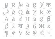
Melville is one of the results from<br />
a year of study on the <strong>MA</strong> <strong>Typeface</strong><br />
<strong>Design</strong> course at the University<br />
of Reading, UK. The typeface<br />
consists of three styles: Melville<br />
Regular – including Кириллица<br />
(Cyrillic) – Italic and Cursive.<br />
Melville is a contemporary book<br />
face, designed especially for<br />
poetry and literature. The type is<br />
intended for high-quality and fine<br />
book printing, and is at its best<br />
when surrounded by generous<br />
enough margins and sufficient<br />
leading. Melville is a delicate and<br />
refined typeface with a glimpse of<br />
quirkiness. Its pure and modest<br />
beauty, combined with two<br />
italic variants make it a versatile<br />
family. Although intended for<br />
setting poetry, the typefamily<br />
is able to handle complex book<br />
tasks as well, including literature,<br />
novels, multi-lingual editions<br />
and plays. Equipped with a full set<br />
of small capitals for the Regular<br />
and Italic, four sets of figures<br />
for each weight and a complete<br />
set of mathematical symbols<br />
(including inferior and superior<br />
numerals), Melville is suitable for<br />
all typographic work that calls<br />
for subtlety, refinement and high<br />
quality.
Melville is designed with a diagonal<br />
axis, inspired by oldstyle models.<br />
Although its overall proportions are<br />
conventional, consequent and repeated<br />
design features give the typeface a<br />
contemporary flavour and a personal<br />
expression. Melville is moderately<br />
condensed to avoid line breaking in<br />
the middle of a sentence or a poetic<br />
stanza. Long ascenders and<br />
descenders give the face a relatively<br />
small x-height. Its stems flare toward<br />
the top, before flowing into top serifs.<br />
This is best noticed in the ascenders,<br />
but stems with a serif at the x-height<br />
show this in a subtle way as well.<br />
The tapering of strokes is consistent<br />
throughout the typeface and is one<br />
its main characteristics. In letters<br />
like n, m and h, this gives an interesting<br />
stroke connection. The baseline<br />
serifs were interpreted from fluid<br />
movements of the pen, influenced<br />
by calligraphically inspired typefaces<br />
like Trinité by Bram De Does which<br />
results in refined, cupped, asymmetrical<br />
serifs that are bracketed on the<br />
left side and flare towards the right.<br />
Large counterforms increase legibility<br />
in smaller sizes. The interiors of the<br />
eu aа<br />
go ЗЛ<br />
nq ни<br />
ka RЯ<br />
counters show curves broken along<br />
the diagonal stress, giving Melville’s<br />
letterforms a fairly high contrast.<br />
These corners inside the counters<br />
were softened during the design process<br />
to give the cyrillic characters a<br />
slightly less ‘harsh’ look. Despite the<br />
obvious differences between the two<br />
scripts, like the higher stroke contrast<br />
in и, љ, д and with distinct stroke<br />
endings, the cyrillic letters were designed<br />
to match their latin opposites,<br />
in colour and in overall feel. The general<br />
design features of the latin were<br />
thus applied onto the cyrillic as much<br />
as possible. However, similar forms<br />
in latin and cyrillic have alternate<br />
outrokes or details, to distinguish the<br />
two scripts. The leaf-shaped terminals<br />
in the cyrillic are correspondant with<br />
the ones from the latin, but in certain<br />
letters (like Ж, У, л, к) they are bigger,<br />
because they carry more weight.
The Melville typeface contains a<br />
double set of italics; Melville Italic and<br />
Melville Cursive. The cursive is a true<br />
italic, with a gentle slope of 7°. Its<br />
main goal is to emphasize words,<br />
expressions or paragraphs within a<br />
text set in the regular, from which<br />
it differentiates itself by its rhythm,<br />
rather than its inclination. When<br />
compared to the roman, this cursive<br />
is a new design. The stem width<br />
is smaller and the glyphs are more<br />
condensed, which makes the colour<br />
of the italic not much lighter. Melville<br />
Cursive doesn’t show the flourishing<br />
italic forms that one might expect for<br />
a book typeface because emphasis is<br />
achieved by a difference in texture.<br />
The cursive appears crisp and sturdy<br />
yet elegant, showing a fast movement.<br />
Italic letterforms like f, g, k and y were<br />
drawn to increase the characterization<br />
of the cursive compared with<br />
the regular. A set of swash capitals is<br />
available in Melville Cursive for titles,<br />
initials on other formal uses. These<br />
are accesible through the OpenType<br />
menu. Melville Italic is an upright<br />
italic. It has the very slight slope angle<br />
of 2°, just enough to set it apart from<br />
mx<br />
kj<br />
yy<br />
aa<br />
the regular. It was conceived as an<br />
alternative for Melville Regular, to<br />
work side by side with the regular<br />
in different textblocks and for contexts<br />
where the emphasis of Melville<br />
Cursive is too strong. The design of<br />
Melville Italic features characteristics<br />
from both the regular and the cursive.<br />
It has an italic-like a, c, e, v, w<br />
and y but a regular f and g. Serifs at<br />
x-height level have italic instrokes and<br />
outstrokes. The uppercase and small<br />
capitals are slightly slanted capitals,<br />
whereas the cursive capitals are more<br />
italicised. Italic and cursive figures<br />
are based on the regular ones, but<br />
their outrokes correspond with the<br />
lowercase letters. Although Melville<br />
already suits many different contexts,<br />
there are more weights to be added.<br />
Melville Bold is currently in progess,<br />
as is a cursive for the Cyrillic. Furthermore,<br />
the family will to be extended<br />
to include a ‘Book’ weight. Cyrillic<br />
counterparts to Melville Book, Melville<br />
Bold and Melville’s Upright Italic will<br />
follow as well.<br />
111<br />
ff f<br />
g g<br />
к
p<br />
В красоте музыкальности<br />
Как в недвижной зеркальности<br />
Я нашел очертания снов,<br />
До меня не рассказанных,<br />
Тосковавших и связанных,<br />
Как растенья под глыбою.<br />
Я им дал наслаждение,<br />
Красоту их рождения,<br />
Я разрушил звенящие льды,<br />
И, как гимны неслышные,<br />
Дышут лотосы пышные<br />
Над пространством.<br />
И в немой музыкальности,<br />
В этой новой зеркальности,<br />
Создаёт их живой хоровод,<br />
Новый мир, недосказанный,<br />
Но с рассказанным связанный,<br />
В глубине отражающих вод.<br />
28<br />
Chords<br />
In the beauty of the melody,<br />
as on still, mirror-like surface,<br />
I discovered the outlines of dreams<br />
untold by anyone before me,<br />
pinning and confined like plants under<br />
blocks of ice.<br />
I gave them the power to delight,<br />
I gave them beauty to their birth, I<br />
shattered the ringing blocks of ice;<br />
and, like soundless hymns, luxuriant<br />
lotuses breathe above the expanse of the<br />
mirror-like water.<br />
And in the soundless melody, on this<br />
new mirror-like surface, their live<br />
round dance generates a new world,<br />
not yet full revealed but linked to the<br />
known world in the depth of reflecting<br />
waters.<br />
A ROSE OR TWO<br />
PART I<br />
as they fell<br />
AMOROSO<br />
Rosamond, my Rosamond<br />
Of roses is the rose;<br />
Her bloom belongs to summer,<br />
Nor less in winter glows,<br />
When, mossed in furs all cosey,<br />
We speed it o'er the snows<br />
By ice-bound streams enchanted,<br />
While red Arcturus, he<br />
A huntsman ever ruddy,<br />
Sees a ruddier star by me.<br />
O Rosamond, Rose Rosamond,<br />
Is yonder Dian's reign?<br />
Look, the icicles despond<br />
Chill drooping from the fane!<br />
But Rosamond, Rose Rosamond,<br />
In us, a plighted pair,<br />
First makes with flame a bond, —<br />
One purity they share.<br />
To feel your cheek like ice,<br />
While snug the furs inclose —<br />
This is spousal love's device<br />
This is Arctic Paradise,<br />
And wooing in the snows!<br />
Rosamond, my Rosamond,<br />
Rose Rosamond, Moss-Rose!<br />
295
ishmael What do you mean by that, Captain Peleg?<br />
peleg I mean, he must show his papers.<br />
bildad Yes,he must show that he’s converted.<br />
[turning to Queequeg] Son of darkness, art thou at present in<br />
communion with any Christian church?<br />
ishmael Why? He’s a member of the first Congregational Church.<br />
bildad [crying] First Congregational Church, what! That worships in Deacon<br />
Deuteronomy Coleman’s meeting-house? How long hath he been a<br />
member? Not very long, I rather guess, young man.<br />
peleg No,and he hasn’t been baptized right either, or it would have<br />
washed some of that devil’s blue off his face.<br />
bildad Do tell, is this Philistine a regular member of Deacon Deuteronomy’s<br />
meeting? I never saw him going there, and I pass it every Lord’s day.<br />
ishmael I don’t know anything about Deacon Deuteronomy or his meeting.<br />
All I know is, that Queequeg here is a born member of the First<br />
Congregational Church. He is a deacon himself, Queequeg is.<br />
bildad Young man, thou art skylarking with me — explain thyself, thou<br />
young Hittite. What church dost thee mean? Answer me.<br />
ishmael I mean, sir, the same ancient Catholic Church to which you and I,<br />
and Captain Peleg there, and Queequeg here, and all of us, and<br />
every mother’s son and soul of us belong; the great and everlasting<br />
First Congregation of this whole worshipping world; we all belong<br />
to that; only some of us cherish some queer crotchets no ways<br />
touching the grand belief; in that we all join hands.<br />
274<br />
peleg [yelling] Splice, thou mean’st splice hands. Young man, you’d<br />
better ship for a missionary, instead of a fore-mast hand; I never<br />
heard a better sermon. Deacon Deuteronomy — why Father<br />
Mapple himself couldn’t beat it, and he’s reckoned something.<br />
Come aboard, come aboard; never mind about the papers. I say,<br />
tell Quohog there — what’s that you call him? Tell Quohog to<br />
The Spring of the Arva Wai 165<br />
chapter xx<br />
A<br />
lmost every country has its medicinal springs<br />
famed for their healing virtues. The Cheltenham<br />
of Typee is embosomed in the deepest<br />
solitude, and but seldom receives a visitor. It is situated<br />
remote from any dwelling, a little way up the<br />
mountain, near the head of the valley; and you approach<br />
it by a pathway shaded by the most beautiful<br />
foliage, and adorned with a thousand fragrant plants.<br />
The mineral waters of Arva Wai1 ooze forth from the<br />
crevices of a rock, and gliding down its mossy side,<br />
fall at last, in many clustering drops, into a natural<br />
basin of stone fringed round with grass and dewylooking<br />
little violet-coloured flowers, as fresh and<br />
beautiful as the perpetual moisture they enjoy can<br />
make them. The water is held in high estimation by<br />
the islanders, some of whom consider it an agreeable<br />
as well as a medicinal beverage; they bring it from<br />
the mountain in their calabashes, and store it away<br />
beneath heaps of leaves in some shady nook near the<br />
house. Old Marheyo had a great love for the waters of<br />
the spring. Every now and then he lugged off to the<br />
mountain a great round demijohn of a calabash, and,<br />
panting with his exertions, brought it back filled with<br />
his darling fluid.<br />
1 I presume this might be translated into ‘Strong Waters’. Arva is<br />
the name bestowed upon a root the properties of which are both<br />
inebriating and medicinal. ‘Wai’ is the Marquesan word for water.
BOOK<br />
REVIEWS<br />
Typee: A Peep at Polynesian<br />
Life (1846)<br />
A novel that defies 19th<br />
century conventions and<br />
which foreshadows many<br />
of the themes that would<br />
appear in subsequent works<br />
such as Moby Dick. It is a<br />
clarion call against racism<br />
and colonialism, as well as<br />
an inchoate search for an<br />
alternative to the inhuman<br />
economic system that had<br />
ruined his once patrician<br />
family as well as many<br />
other Americans of all<br />
races.<br />
Omoo: A Narrative of the<br />
South Seas (1847)<br />
It would be difficult to<br />
imagine a man better fitted<br />
to describe the impressions<br />
such a life and scenes are<br />
calculated to call forth,<br />
than the author of Omoo.<br />
Every variety of character,<br />
and scene, and incident, he<br />
studies and describes with<br />
equal gusto.<br />
Mardi: And a Voyage Thither<br />
(1849)<br />
We proceed to notice this<br />
extraordinary production<br />
with feelings anything but<br />
gentle towards its gifted but<br />
excentric author. The truth<br />
is, that we have been deceived,<br />
inveigled, entrapped<br />
into reading a work where<br />
we had been led to expect<br />
only a book.<br />
104<br />
july<br />
Literature<br />
Make the choice for<br />
your summer reading<br />
with our edits of the<br />
best nautical novels.<br />
MELVILLE'S<br />
THOUgHTS<br />
iTUNES<br />
TOP 3<br />
1 Selected Stories<br />
(Unabridged) by Walter<br />
Covell and John Chatty<br />
2 Moby Dick (Dramatized)<br />
by Full Cast<br />
3 Benito Cereno (Abridged)<br />
by Santiago Munevar<br />
“To produce a mighty book, you<br />
must choose a mighty theme.<br />
No great and enduring volume<br />
can ever be written on the flea,<br />
though many there be that have<br />
tried it.”-> Herman Melville on literature.<br />
Billy<br />
Budd<br />
by Herman<br />
Melville<br />
billy budd is young, and<br />
innocent, quiet but kind.<br />
He is well liked except for<br />
those few that are jealous of<br />
him, and his ability to boost<br />
morale through his quiet<br />
gentleness. Billy is human<br />
however, and Melville<br />
reminds the readers of this<br />
by inserting a few character<br />
flaws in Billy. He stutters<br />
when overwhelmed, or<br />
becomes completely tongue<br />
tied.<br />
->Billy Budd, H. Melville, £12,99<br />
MOBY- DICK<br />
Carrie:<br />
How about I read you a little bit of<br />
or<br />
my favourite poetry?<br />
Aleksandr:<br />
THE Please. WHALE<br />
Carrie [Reads from Vogue]:<br />
“Cocktails at Tiffany's calls for<br />
classic charm. Oscar de la Renta<br />
sleeveless by silk full skirted dress with<br />
black patent leather bow belt.” Now<br />
Wat zijn walvissen Herman mooi<br />
that is Melville<br />
pure poetry.<br />
een vin, een hijgende opening Author of<br />
de boog van een groot Typee, lichaam Omoo, Redburn, Hards & White-jacket<br />
het andere leven dat we nooit<br />
raken kunnen<br />
D. Hillenius<br />
New York<br />
Harper Brothers, Publishers<br />
London: Richard Bentley<br />
1851
Littérature américaine | xix e siècle<br />
68<br />
explanatory notes 649<br />
501:2 Thames Tunnels of Whales: In London, the 1,300-foot-tunnel beneath<br />
the Thame was opened in 1834. In Chapter 108, Ahab employs the same<br />
figure as a comparison to the desired girh of the chest of his imagined<br />
“complete man.”<br />
505:18–20 his ivory limb … all but pierced his groin: This later accident explains<br />
why Ahab kept to his cabin before and after the departure of the<br />
Pequod, and it supplies a deeper motive for revenge; for he is not only<br />
“dismasted” but appearantly unmanned as well.<br />
510:15 multum in parvo: Much in little.<br />
511:8 you old Smut: “Smut!” or “brother smut,” a slang expression meaning<br />
“ditto” or “same to you”. The comic sense is that the carpenter, who<br />
like Ahab is given to soliloquizing, is upbraiding himself. The pairing of<br />
Ahab and the carpenter is deliberate and revealing. Both have a “subtle<br />
something” within them, and Ahab seems to recognize this, since he<br />
asks the carpenter whether he does not feel “some entire, living, thinking<br />
thing” standing where he now stands. The difference, of course, is<br />
that the carpenter’s doubled self, as opposed to Ahab’s, is benign and<br />
attributeable to mere dotage.<br />
515:7–8 taking altitudes on it: Double reference: using a quadrant and<br />
arrogantly indulging in elevated moods.<br />
516:20 up Burtons and break out: Hoist the casks out of stowage.<br />
530:11 Mother Carey’s chicken: According to Eric Partridge, a slang nautical<br />
expression for snow; here the sparks rain down on Ahab like snowflakes.<br />
But also, more conventionally, a slang expression for petrels, to which<br />
Ahab alludes when he speaks of the sparks as birds of omen.<br />
532:35 “Ego non baptizo te in nomine patris, sed in nomine diaboli!”: “I baptize<br />
thee not in the name of the Father, but in the name of the Devil.” Melville<br />
remarked in a letter to Hawthorne (June 29, 1851) that this is the secret<br />
“motto” of his book.<br />
535:8–26 “Oh, grassy glades!… we must there to learn it.”: The editors of the<br />
Northwestern-Newberry text, quite properly, have added the quotation<br />
marks for this paragraph. Neither the American or the English editions<br />
of Moby-Dick printed these quotation marks, but the context makes<br />
clear that the paragraph is spoken by Ahab, not Ishmael, as some critics
Melville includes an extended character<br />
set for both Latin and Cyrillic alphabets.<br />
The diacritics were designed to blend<br />
well with the design of Melville, giving<br />
the accents of lowercase, small capitals<br />
and capitals a different angle.<br />
Supported languages are Afrikaans,<br />
Danish, Dutch, Faroese, Finnish, german,<br />
Icelandic, Irish, Italian, Norwegian,<br />
Portuguese, Spanish, Swedish,<br />
Basque, Breton, Catalan, Croatian,<br />
Czech, Esperanto, Estonian, French,<br />
Frisian, Hungarian, Latin, Latvian,<br />
Lithuanian, Maltese, Polish, Provençal,<br />
Rhaeto-Romanic, Romanian,<br />
Romany, Sami, Slovak, Slovenian,<br />
Turkish, Welsh as well as Belarusian,<br />
Bulgarian, Serbian, Russian and<br />
Ukrainian.
OpenType features<br />
Ligatures ff fi ffi fl ffl fj ffj fb ffb fh ffh fk ffk Th<br />
liga ff fi ffi fl ffl fj ffj fb ffb fh ffh fk ffk Th<br />
Small Caps Ishmael & Queequeg @ the PEQUOD!<br />
smcp ishmael & queequeg @ the pequod!<br />
Case-sensitive {[(«HER-<strong>MA</strong>N•MEL–VILLE»)]}<br />
punctuation + {[(«HER-<strong>MA</strong>N•MEL–VILLE»)]}<br />
Capital spacing MOBY DICK; OR THE WHALE<br />
case + cpsp MOBY DICK; OR THE WHALE<br />
Oldstyle + Lining |1|2|3|4|5|6|7|8|9|0| |1|2|3|4|5|6|7|8|9|0|<br />
pnum + onum<br />
Proportional + tabular |1|2|3|4|5|6|7|8|9|0| |1|2|3|4|5|6|7|8|9|0|<br />
pnum + lnum<br />
Fractions 2 3 hour 1 10 l 57 365 year<br />
frac 2/3 hour 1/10 l 57/365 year<br />
Subscript + Superscript 62=36 Herman Melville1 FePO4 H2O<br />
subs + sups 62=36 Herman Melville1 FePO4 H2O<br />
Contextual alternate Qy Qp Qf [j<br />
calt y p f [<br />
Swash characters AABDEFGHIJKKMNPQRTVWY<br />
swsh <br />
Localised forms Ijssalon Ijsbeer roşii<br />
locl IJssalon IJsbeer roșii<br />
Stylistic sets --> -> ->
Characterset Melville Regular<br />
lowercase<br />
abcdefghijklmnopqrstuvwxyz<br />
àáâãäāăåąæǽćĉčċçďđðèéêěëēĕėęĝğġģĥħ<br />
ìíîĩïīĭįıĵķĺľļłńňñņŋ òóôõöōŏőøǿœŕŗřśŝšşșß<br />
ťţŧþùúûũüūŭůűųẁẃŵẅỳýŷÿźžżij<br />
capitals<br />
ABCDEFgHIJKLMNOPQRSTUVWxYz<br />
àáâãäāăåąæǽćĉčċçďđðèéêěëēĕ ęĝğġģĥħ<br />
ìíîĩïīĭįIĵķĺľļłńňñņ ŋòóôõöōŏőøǿœŕŗřśŝšşșSS<br />
ťţŧþùúûũüūŭůűųẁẃŵẅỳýŷÿźžżIJ<br />
small capitals<br />
abcdefghijklmnopqrstuvwxyz<br />
àáâãäāăåąæǽćĉčċçďđðèéêěëēĕėęĝğġģĥħ<br />
ìíîĩïīĭįıĵķĺľļłńňñņŋòóôõöōŏőøǿœŕŗřśŝšşșss<br />
ťţŧþùúûũüūŭůűųẁẃŵẅỳýŷÿźžż<br />
cyrillic lowercase<br />
абвгдежзийклмнопрстуфхцчшщьъыэюя<br />
ѓґђєѕѐёіїјѝќљњћўџ<br />
cyrillic capitals<br />
АБВГДЕЖЗИЙКЛМНОПРСТУФХЦЧШЩЪЫЬЭЮЯ<br />
ЃҐЂЄЅЀЁІЇЈЍЌЉЊЋЎЏ<br />
Latin diacritics<br />
`´ˆˇ̕˜¨¯˘˚˝˙̒¸˛ ¸˛ <br />
Cyrillic diacritics<br />
¨`́ <br />
Figures<br />
1234567890 ¤€$¢£ƒ¥ | 1234567890 <br />
Punctuation<br />
.,:;…--!?!?¡¿¡¿ ‘’“”‚„‘‘”‹›«»\/|¦_– —••··<br />
()[]{}&&*†‡§^~@@<br />
Ligatures<br />
ff fi ffi fl ffl fj ffj fk ffk fh ffh fb ffb<br />
Symbols<br />
+−±×÷=≠≈≤≥¬∆Ωµπ°∞∂∫∑∏◊√¼½¾%‰<br />
0123456789/0123456789 0123456789 0123456789 ℮ℓ©®#№<br />
Special characters<br />
->-->
Characterset Melville Italic<br />
Lowercase<br />
abcdefghijklmnopqrstuvwxyz<br />
àáâãäāăåąæǽćĉčċçďđðèéêěëēĕėęĝğġģĥħìíîĩïīĭįıĵķĺľļłńňñņŋ<br />
òóôõöōŏőøǿœŕŗřśŝšşșßťţŧþùúûũüūŭůűųẁẃŵẅỳýŷÿźžżij<br />
Capitals<br />
ABCDEFgHIjkLMNOPQRSTUvWxyz<br />
àáâãäāăåąæǽćĉčċçďđðèéêěëēĕėęĝğġģĥħ<br />
ìíîĩïīĭįIĵķĺľļłńňñņ ŋòóôõöōŏőøǿœŕŗřśŝšşșSS<br />
ťţŧþùúûũüūŭůűųẁẃŵẅỳýŷÿźžżij<br />
Small capitals<br />
abcdefghijklmnopqrstuvwxyz<br />
àáâãäāăåąæǽćĉčċçďđðèéêěëēĕėęĝğġģĥħìíîĩïīĭįıĵķĺľļłńňñņŋò<br />
óôõöōŏőøǿœŕŗřśŝšşșssťţŧþùúûũüūŭůűųẁẃŵẅỳýŷÿźžż<br />
Figures and monetary symbols<br />
1234567890 ¤€$¢£ƒ¥ | 1234567890 <br />
Punctuation<br />
.,:;…--!?!? ¡¿ ‘’“”‚„‘‘”‹›«»\/|¦_–—•·()[]{}&&†‡§^~@<br />
Ligatures<br />
ff fi ffi fl ffl fk ffk fh ffh fb ffb<br />
Symbols<br />
+−±×÷=≠≈≤≥¬∆Ωµπ°∞∂∫∑∏◊√¼½¾%‰<br />
012345678 ⁄0123456789 ©®#№<br />
Special characters<br />
->-->-->
Credits<br />
p 8 p,<br />
poem by Konstantin Bal’mont<br />
p 9 A Rose Or Two,<br />
poem by Herman Melville<br />
p 10 Text based on excerpt of Moby Dick,<br />
novel by Herman Melville<br />
p 11 Excerpt from Typee,<br />
novel by Herman Melville<br />
p 12 Texts from www.wikipedia.org &<br />
www.hermanmelville.org<br />
p 13 O wat zijn walvissen mooi,<br />
poem by D. Hillenius<br />
p 14 Texts from www.wikipedia.org<br />
p 15 Excerpt from Moby Dick,<br />
novel by Herman Melville<br />
p 18-20 Texts from wikipedia
Colophon<br />
The Melville typeface and this booklet were<br />
designed by Joke gossé and submitted in partial<br />
fulfilment of the requirements for the Master of<br />
Arts in <strong>Typeface</strong> <strong>Design</strong> at the Department of<br />
Typography and graphic Communication,<br />
University of Reading, 2008. I would like to thank<br />
my fellow students for being good friends, particularly the<br />
ones with whom I shared all these hours of work. Thanks<br />
to the visiting lecturers and staff from Reading, especially<br />
gerry Leonidas for making me push the boundaries,<br />
gerard Unger for sharing his optimism and knowledge,<br />
Jo De Baerdemaker for the kindly offered help. I also<br />
thank everyone else who helped me achieve; my parents<br />
and sister who supported me in every possible way, my<br />
love Roeland with his never-ending encouragement,<br />
my enthusiastic friends from Belgium and everyone who<br />
helped me, by reviewing my work. For more information,<br />
please contact me at joke.gosse@gmail.com