GE - Billy Blue Communication Design
GE - Billy Blue Communication Design
GE - Billy Blue Communication Design

Create successful ePaper yourself
Turn your PDF publications into a flip-book with our unique Google optimized e-Paper software.
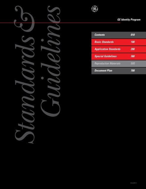
Standards&<br />
Guidelines<br />
e<br />
<strong>GE</strong> Identity Program<br />
Contents 010<br />
Basic Standards 100<br />
Application Standards 200<br />
Special Guidelines 300<br />
Reproduction Materials 500<br />
Document Plan 700<br />
Revised 2001.11
100, Basic Standards<br />
110, Program Overview<br />
120, Trademark Practices & Protections<br />
121, Primary Trademarks & Service Marks<br />
122, Secondary Trademarks & Service Marks<br />
123, Trade Names, Trademarks,<br />
& the <strong>GE</strong> Identity Program<br />
130, Graphic System<br />
131, Graphic Signatures<br />
132, Color<br />
133, Typography<br />
134, Dynamic Monogram<br />
500, Reproduction Materials<br />
Contained in this volume:<br />
540, Signature Monogram<br />
Grid Drawings<br />
200, Application Standards<br />
Products & Packages<br />
210, Products<br />
220, Packaging<br />
230, Shipping Cases & Cartons<br />
240, Marketing <strong>Communication</strong>s<br />
241, Advertising<br />
242, Recruitment Advertising<br />
243, Promotional Brochures<br />
244, Product Literature<br />
245, Promotional Materials<br />
247, Exhibits<br />
248, Presentations<br />
250, Employee <strong>Communication</strong>s<br />
251, Newsletters<br />
252, Employee Identification<br />
242, Recruitment Advertising<br />
(See document 242<br />
in Marketing <strong>Communication</strong>s)<br />
Stationery for<br />
261, North American Businesses<br />
262, Corporate Staff<br />
264, Businesses outside North America<br />
Formatting Stationery<br />
263, in North America<br />
265, outside North America<br />
Other Applications<br />
270, Forms & Checks<br />
280, Facility Signs<br />
285, Facility Signs Engineering Drawings<br />
290, Vehicles<br />
<strong>GE</strong> Identity Program<br />
Standards & Guidelines<br />
Contents<br />
300, Special Guidelines<br />
301, Component Names<br />
315, Summary Standards & Guidelines<br />
New Businesses<br />
For <strong>GE</strong> employees:<br />
341, New Businesses Name & Trademark Practices<br />
For prospective acquisitions:<br />
342, Acquisitions Name & Trademark Practices<br />
For prospective joint venture partners:<br />
343, Joint Ventures Name & Trademark Practices<br />
Licensees & Other Users<br />
350, Licensees Trademark Practices<br />
360, Dealers & Distributors<br />
Trademark & Graphic System Practices<br />
370, OEMs<br />
<strong>GE</strong> Identity Program 010, Contents<br />
(Revised 2001.11)<br />
<strong>GE</strong> Identity Website: www.ge.com/identity<br />
010.01<br />
Other Special Guidelines<br />
381, Adobe ® Acrobat ® & <strong>GE</strong> Identity Program Documents<br />
382, <strong>GE</strong> Logo Font<br />
382.Sup, <strong>GE</strong> Logo Font Supplement<br />
390, Frequently Asked Questions<br />
391, FAQ: Basic Standards<br />
392, FAQ: Advertising & Branding<br />
Available from the <strong>GE</strong> Identity Website, for Macintosh ® computers or Windows ® operating systems:<br />
<strong>GE</strong> Logo Font<br />
a custom font containing, instead of the alphabet, all versions of the signature Monogram, Dynamic Monogram,<br />
and linear Dynamic Monogram<br />
Program Fonts<br />
Authentic program typefaces: Univers ® , Univers Condensed, and ITC New Baskerville <br />
Adobe and Acrobat are either registered trademarks or trademarks of Adobe Systems<br />
Incorporated in the United States and/or other countries. Macintosh is a trademark of<br />
Apple Computer, Inc., registered in the U.S. and other countries. Windows is a registered<br />
trademark of Microsoft Corporation in the United States and/or other countries.<br />
Univers is a registered trademark of Heidelberger Druckmaschinen AG.<br />
ITC New Baskerville is a trademark of International Typeface Corporation.
Basic<br />
Standards<br />
e<br />
<strong>GE</strong> Identity Program<br />
Program Overview 110<br />
Trademark Practices & Protections 120<br />
Primary Trademarks & Service Marks 121<br />
Secondary Trademarks & Service Marks 122<br />
Trade Names, Trademarks, 123<br />
& the <strong>GE</strong> Identity Program<br />
Graphic System 130<br />
Graphic Signatures 131<br />
Color 132<br />
Typography 133<br />
Dynamic Monogram 134<br />
100<br />
Revised<br />
2001.11
Program<br />
Overview<br />
g<br />
<strong>GE</strong> Identity Program<br />
Letter from Robert C. Wright 110. 01<br />
Why was the <strong>GE</strong> Identity Program created? 110.02<br />
What is the <strong>GE</strong> Identity Program? 110.03<br />
Who is included in the <strong>GE</strong> Identity Program? 110.04<br />
Glossary 110.10<br />
110<br />
Revised<br />
2002.08
To: <strong>GE</strong> Identity Program participants<br />
Letter from Robert C. Wright 110.01<br />
In the ever-demanding global business climate of the twenty-first century,<br />
it is critical that we continue to protect and enhance <strong>GE</strong>’s unique competitive<br />
advantage—our name and reputation.<br />
As we are transformed into a leaner, smarter, faster, more global, more<br />
customer-focused company, real competitive advantage can be gained and<br />
leveraged in the proper and disciplined use of the Company’s trademarks.<br />
Although competitors can market similar products and services around<br />
the world, none can offer these under the mark of the Monogram, an enduring<br />
symbol of innovation, reliability, dynamism, trust, and value to our customers.<br />
Consistent with our customer focus and outside-in approach, the identity<br />
guidelines ensure the promotion of “one company, one vision, and one brand.”<br />
These guidelines help you realize the tremendous advantage our name and<br />
identity can bring to your customers, your business, and our Company.<br />
Everyone has responsibilities that build equity in the <strong>GE</strong> name, slogan,<br />
and promise. We must protect <strong>GE</strong>’s property, use the brand correctly and<br />
consistently, and use the same brand promise to further <strong>GE</strong>’s success.<br />
Please read these guidelines carefully, implement them fully, and reap the<br />
advantages of this powerful competitive tool.<br />
Sincerely,<br />
Robert C. Wright<br />
Vice Chairman & Executive Officer<br />
<strong>GE</strong> Identity Program 110, Program Overview<br />
(Revised 2002.08)<br />
<strong>GE</strong> Identity Website: www.ge.com/identity
Why was the<br />
<strong>GE</strong> Identity Program<br />
created?<br />
Why?110.02<br />
The Company’s identity—our name, trademarks, and graphic presentation—<br />
is one of our most valuable assets. As the most visible representation of our Company,<br />
the <strong>GE</strong> identity is an important tool we can use to shape the perceptions of our<br />
customers, investors, and employees. Therefore, it is critical that we leverage this asset<br />
for competitive advantage today and protect it for the future.<br />
It is for these two purposes—leverage and protection of a valued asset—<br />
that the <strong>GE</strong> Identity Program exists.<br />
This program is the product of an exhaustive reexamination of the Company’s image<br />
and identity and related practices. This analysis began with extensive interviews in 1986<br />
among customers and employees throughout the world and concluded with three key<br />
objectives:<br />
Analysis<br />
• The name “<strong>GE</strong>” and the Monogram are universally recognized.<br />
• The breadth of the Company’s diversity has increased in recent years<br />
as a result of growth and acquisitions.<br />
• <strong>GE</strong> is primarily associated with appliances; the Company’s diversity<br />
is not generally understood.<br />
• The name “General Electric” is inaccurate as the Company’s businesses<br />
are no longer predominantly “electrical.”<br />
• <strong>GE</strong> has one of the best reputations among major corporations;<br />
the Company’s goodwill is high.<br />
• The basic strength of the Company’s image is its reputation for reliability<br />
and quality.<br />
• The Company is not perceived to be as innovative and dynamic as, in fact, it is.<br />
• <strong>GE</strong>’s use and application of design and graphics has not been systematized,<br />
leading to<br />
-a fragmented and outdated presentation of the Company’s identity<br />
- wide variation in quality<br />
• The <strong>GE</strong> identity is a highly valuable asset, benefiting its businesses and affiliates.<br />
<strong>GE</strong> Identity Program 110, Program Overview <strong>GE</strong> Identity Website: www.ge.com/identity<br />
Program Objectives<br />
• Broaden awareness<br />
of <strong>GE</strong>’s diversity<br />
so that people have a<br />
more accurate perception<br />
of the Company.<br />
• Maintain <strong>GE</strong>’s image<br />
of reliability and<br />
improve perception<br />
of its innovation and<br />
dynamism.<br />
• Unify <strong>GE</strong>’s identity<br />
through a consistent and<br />
high-quality application<br />
of contemporary program<br />
standards throughout<br />
the Company.
What is the <strong>GE</strong> Identity Program? 110.03<br />
What?<br />
To accomplish our objectives, the three-part <strong>GE</strong> Identity Program provides<br />
naming standards, graphic standards, and application guidelines.<br />
Naming standards Graphic standards Application standards,<br />
address the first objec- help to achieve the the final part of the<br />
tive of the program: other two objectives program, detail<br />
to broaden awareness of the program:<br />
correct use of the<br />
of <strong>GE</strong>’s diversity.<br />
to improve perception naming and graphic<br />
The guiding principle of the Company and standards in all media.<br />
is simplification of unify the presentation The fundamental<br />
our names so that of our identity. People principle guiding<br />
they are accurate and recognize our relia- day-to-day application<br />
easily understood. bility, but they have of the identity is the<br />
failed to credit us for consistent and correct<br />
our dynamic and implementation of<br />
innovative response the program standards<br />
to a changing business as the context for<br />
environment.<br />
creativity.<br />
These are the key<br />
elements:<br />
• The name of the<br />
Company is “<strong>GE</strong>.”<br />
We use the name<br />
“General Electric<br />
Company” only when<br />
legally required.<br />
• Components use “<strong>GE</strong>”<br />
with an accurate, short,<br />
and easily understood<br />
description of their<br />
business: for example,<br />
“<strong>GE</strong> Appliances” and<br />
“<strong>GE</strong> Plastics.”<br />
• Affiliates may use “<strong>GE</strong>”<br />
and/or their own<br />
names. The acquisitions<br />
naming process<br />
helps determine<br />
the most appropriate<br />
names.<br />
The graphics capture the paradox of our image—<br />
reliability combined with dynamism.<br />
Reliability is conveyed<br />
through<br />
• continuing use of the<br />
Monogram, a 100+<br />
year-old symbol that<br />
is familiar and trusted<br />
• standardizing the<br />
color of the Monogram<br />
to Platinum Grey,<br />
creating a classic<br />
and distinguished<br />
presentation<br />
• using a serif typeface,<br />
ITC New Baskerville ,<br />
suggesting traditional<br />
qualities<br />
<strong>GE</strong> Identity Program 110, Program Overview <strong>GE</strong> Identity Website: www.ge.com/identity<br />
Dynamism and innovation<br />
are conveyed<br />
through<br />
• using a signature that<br />
provides a contemporary<br />
environment for the<br />
Monogram;<br />
the signature features<br />
- the Laser Line, suggesting<br />
the precision<br />
of high technology<br />
- a sans serif typeface,<br />
Univers ® , in an italic<br />
version, suggesting<br />
energetic forward<br />
movement<br />
- an asymmetrical layout,<br />
conveying movement<br />
with its visual tension<br />
• selectively using a portion<br />
of the Monogram<br />
on a large scale—the<br />
Dynamic Monogram<br />
—suggesting that<br />
the Company is<br />
too dynamic to be<br />
contained
Who?<br />
Who is included<br />
in the <strong>GE</strong> Identity Program?<br />
Whether the <strong>GE</strong> Identity Program applies to you and the communications you handle depends on the answer<br />
to a single question:<br />
Do you use the name “<strong>GE</strong>” or the Monogram to identify or promote<br />
your product, service, component, subcomponent, division, department, operation,<br />
internal function, program, or project?<br />
Yes.<br />
If you use the name “<strong>GE</strong>” or the Monogram to identify<br />
or promote your product, service, organizational part,<br />
or internal activity, then the <strong>GE</strong> Identity Program<br />
standards and guidelines apply to all your communications,<br />
from letterheads and business cards<br />
to advertising, promotional materials, and signs.<br />
The <strong>GE</strong> Identity Program provides standards and<br />
guidelines controlling the use of the name “<strong>GE</strong>”<br />
and the Monogram in all media.<br />
Everyone with responsibility for creating,<br />
purchasing, or managing communications for the<br />
Company and its operating units and affiliates—<br />
both <strong>GE</strong> employees and their authorized<br />
suppliers—should carefully review and apply<br />
the principles and standards contained in the<br />
<strong>GE</strong> Identity Program documents.<br />
Note: Special guidelines are available for<br />
• acquisitions and joint ventures<br />
• dealers, distributors, sales representatives, and<br />
repair shops<br />
• external licensees<br />
• original equipment manufacturers (OEMs)<br />
See document 300, Special Guidelines.<br />
<strong>GE</strong> Identity Program 110, Program Overview <strong>GE</strong> Identity Website: www.ge.com/identity<br />
110.04<br />
No.<br />
If you make no reference to <strong>GE</strong>—that is, you do not<br />
use the name “<strong>GE</strong>” or the Monogram to identify or<br />
promote your product, service, organizational part,<br />
or internal activity—then the <strong>GE</strong> Identity Program<br />
standards and guidelines do not apply to your<br />
communications.<br />
Your only obligations in support of the<br />
<strong>GE</strong> Identity Program are these:<br />
• In copy (such as in the body of letters) and<br />
conversation (such as in sales presentations),<br />
use the correct communicative names for <strong>GE</strong><br />
components and affiliates. (For a current list of<br />
component communicative names, see document<br />
301, Component Names, page 05.)<br />
• In designing communications, avoid using<br />
<strong>GE</strong> Identity Program elements such as<br />
- the graphic signature structure, including<br />
· the Laser Line<br />
· signature typography<br />
- the corporate colors:<br />
· Platinum Grey<br />
· Laser Red<br />
- program typography, including the series<br />
· Univers ® and Univers Condensed<br />
· ITC New Baskerville <br />
Note: In all media, all users of the Company’s<br />
trademarks and service marks are subject to the<br />
use and protection guidelines in these documents:<br />
• 121, Primary Trademarks & Service Marks<br />
• 122, Secondary Trademarks & Service Marks<br />
• 123, Trade Names, Trademarks, & the <strong>GE</strong> Identity<br />
Program<br />
continued
Who is included<br />
in the <strong>GE</strong> Identity Program?<br />
continued<br />
<strong>GE</strong> Identity Program 110, Program Overview <strong>GE</strong> Identity Website: www.ge.com/identity<br />
110.05<br />
Examples of components, acquisitions, and communications<br />
that are not subject to the standards<br />
and guidelines of the <strong>GE</strong> Identity Program include<br />
• RCA brand promotional media such as<br />
advertising, brochures, product literature, and<br />
packaging (without any <strong>GE</strong> identification)<br />
Note: Permanent media such as stationery, business<br />
forms, signs, vehicles, and shipping cartons<br />
used by the <strong>GE</strong> components that market the RCA<br />
brand are subject to the standards and guidelines<br />
of the <strong>GE</strong> Identity Program.<br />
• permanent and promotional media used by<br />
- NBC<br />
- Hotpoint (without any reference to <strong>GE</strong>)<br />
- acquisitions using level 4 and 5 names as<br />
determined by the acquisitions naming process<br />
(See document 341, New Businesses Name &<br />
Trademark Practices.)
affiliate<br />
an independent legal entity, separate and distinct<br />
from the Company, in which the Company or<br />
one of its components or affiliates holds a direct<br />
or indirect ownership interest<br />
acquisitions naming process<br />
the method by which names are developed for<br />
acquired affiliates, using the five-level naming<br />
scheme and the naming decision tree<br />
(See document 341, New Businesses Name &<br />
Trademark Practices, pages 21 to 27.)<br />
application<br />
an item of promotional or permanent media<br />
background<br />
the area surrounding an image; specifically,<br />
the area surrounding the Monogram<br />
baseline<br />
the alignment point of letterforms along their<br />
bottom edges<br />
bleed<br />
to reproduce so the image continues off the format<br />
brand mark<br />
synonym for word mark or design mark<br />
capital height<br />
the vertical dimension of an uppercase letter<br />
measured from its top to its base perpendicular<br />
to the baseline<br />
capital letter<br />
a large or uppercase letter as distinct from<br />
a lowercase letter in the alphabet<br />
Glossary 110.10<br />
communicative name<br />
the informal name of the Company or one of its<br />
organizational elements, used in conversation,<br />
copy, and graphic signatures. It does not contain<br />
legal terms such as “Inc.” or “Ltd.” or organizational<br />
terms such as “Division” or “Group.”<br />
(For example, the communicative name of the<br />
General Electric Company is “<strong>GE</strong>.”)<br />
component<br />
a wholly owned organizational element of the<br />
Company that operates without a separate board<br />
of directors<br />
condensed<br />
having the characteristic of type compressed<br />
in width (For example, this sentence is typeset in<br />
a condensed typeface.)<br />
corporate color<br />
Platinum Grey or Laser Red<br />
(See document 132, Color, page 02.)<br />
corporate mark (primary <strong>GE</strong> trademark)<br />
a word mark or design mark used to designate the<br />
<strong>GE</strong> brand of products or services, including the<br />
• Monogram<br />
• block letters “<strong>GE</strong>”<br />
• <strong>GE</strong> slogan, “We bring good things to life.”<br />
(See document 121, Primary Trademarks & Service<br />
Marks, page 02.)<br />
design mark<br />
a symbol, logotype, or other visual device<br />
adopted and used by the Company to designate<br />
its products or services and differentiate them<br />
from any others. A design mark is usually<br />
protected by registration in the U.S. Patent &<br />
Trademark Office (for example, the Monogram,<br />
the NBC Peacock, the RCA logotype).<br />
(See document 121, Primary Trademarks & Service<br />
Marks, page 01.)<br />
Dynamic Monogram<br />
one of the authorized drawings of only a portion<br />
of the Monogram, used as graphic support in<br />
program applications<br />
(See document 134, Dynamic Monogram.)<br />
<strong>GE</strong> Identity Program 110, Program Overview <strong>GE</strong> Identity Website: www.ge.com/identity<br />
continued
field (which includes<br />
outline circle)<br />
g<br />
field<br />
the area within the Monogram, excluding<br />
the letters/curlicues and including the outline circle<br />
of the positive Monogram<br />
(See document 131, Graphic Signatures, page 30.)<br />
five-level naming scheme<br />
a tool used in the acquisitions naming process that<br />
includes five types of names, each communicating<br />
a specific degree of association between the<br />
Company and an acquired affiliate<br />
(See document 341, New Businesses Name &<br />
Trademark Practices, pages 22 and 23.)<br />
flush left<br />
aligned at a common left margin<br />
(See visually flush left.)<br />
format<br />
an area in which elements of identification,<br />
such as graphic signatures and other graphic and<br />
typographic elements, are placed<br />
four-color process<br />
a method of reproducing full color by separating<br />
the desired colors into screen values of the<br />
primary ink colors—cyan, magenta, and yellow—<br />
and black, and printing them in combination<br />
<strong>GE</strong> brand<br />
the thoughts, feelings, associations, and expectations<br />
created by the<br />
• Company’s or its licensees’ products or services<br />
• Monogram<br />
• <strong>GE</strong> slogan “We bring good things to life.”<br />
Glossary, continued 110.11<br />
generic name<br />
a name consisting of common words not<br />
protected by trademark registration<br />
graphic signature<br />
the fundamental visual expression of identity,<br />
consisting of three elements, the<br />
• signature Monogram<br />
• signature typography<br />
• Laser Line<br />
configured in one of the acceptable arrangements<br />
(See document 131, Graphic Signatures.)<br />
graphic support<br />
a visual element used in a layout to enhance<br />
the verbal message conveyed in a graphic signature<br />
or other typography such as a title or headline<br />
(for example, a photograph, an illustration,<br />
a thematic graphic, or the Dynamic Monogram)<br />
grid<br />
an underlying structure used to organize<br />
elements in a layout<br />
italic<br />
having the characteristic of type with main<br />
strokes slanting to the right (For example,<br />
this sentence is typeset in an italic typeface.)<br />
joint marks<br />
the Monogram combined with an affiliate mark,<br />
used to identify a joint venture<br />
(See document 341, New Businesses Name &<br />
Trademark Practices, pages 32 to 35.)<br />
joint venture<br />
an independent legal entity, separate and distinct<br />
from the Company, that <strong>GE</strong> and one or more<br />
business partners start<br />
(See document 341, New Businesses Name &<br />
Trademark Practices, pages 30 to 39.)<br />
<strong>GE</strong> Identity Program 110, Program Overview <strong>GE</strong> Identity Website: www.ge.com/identity<br />
continued
gletters /curlicues<br />
Laser Line<br />
the fine horizontal line used as an element of<br />
graphic signatures<br />
(See document 131, Graphic Signatures, page 36.)<br />
Laser Red<br />
the corporate color often used in the Laser Line,<br />
the standard for which is specified in document<br />
132, Color, page 02<br />
layout<br />
the arrangement of graphic and typographic<br />
elements within a format<br />
legal name<br />
the formal name under which the Company<br />
or one of its organizational elements operates<br />
as a lawfully registered business, generally used<br />
in media only when required by law, such as in<br />
the address block on letterheads and in contracts,<br />
proposals, and agreements. A legal name often<br />
contains legal terms such as “Company,” “Inc.,”<br />
or “Ltd.” A legal name is not used in a graphic<br />
signature. (For example, the legal name of <strong>GE</strong><br />
is “General Electric Company.”)<br />
letters/curlicues<br />
the script lettering of “<strong>GE</strong>” plus the scrolls<br />
that form a circle around the lettering in the<br />
Monogram (used as an abbreviated reference)<br />
(See document 131, Graphic Signatures, page 30.)<br />
letterspacing<br />
the space between letters in a word<br />
line spacing<br />
the space between lines of typography<br />
linear Dynamic Monogram<br />
one of the authorized drawings of the Dynamic<br />
Monogram in which the field is composed of fine<br />
horizontal lines<br />
(See document 134, Dynamic Monogram, pages<br />
06 and 07.)<br />
lowercase letter<br />
a small letter as distinct from a capital letter<br />
in the alphabet<br />
Glossary, continued 110.12<br />
margin<br />
the area in a format usually kept clear of running text<br />
mark<br />
synonym for word mark or design mark<br />
(See document 121, Primary Trademarks & Service<br />
Marks, page 01.)<br />
match color<br />
a color reproduced using a specially mixed ink<br />
instead of four-color process<br />
media<br />
forms of communication<br />
Monogram<br />
the authorized drawing of the trademark design,<br />
containing the initials “<strong>GE</strong>” in script lettering<br />
enclosed in curlicues forming a circle, that<br />
appears in <strong>GE</strong> Identity Program documents<br />
(See document 131, Graphic Signatures, page 30.)<br />
naming decision tree<br />
a tool used in the acquisitions naming process<br />
consisting of a succession of questions, the<br />
answers to which assist in selecting from the<br />
five-level naming scheme<br />
(See document 341, New Businesses Name &<br />
Trademark Practices, pages 24 and 25.)<br />
outline circle<br />
the outside line surrounding the letters/curlicues<br />
in the positive form of the Monogram<br />
(See document 131, Graphic Signatures, page 30.)<br />
goutline circle<br />
<strong>GE</strong> Identity Program 110, Program Overview <strong>GE</strong> Identity Website: www.ge.com/identity<br />
continued
g<br />
positive Monogram<br />
e<br />
reverse Monogram<br />
permanent media<br />
forms of communication that do not convey<br />
changing promotional messages and are therefore<br />
designed once and reproduced without<br />
significant change (for example, stationery,<br />
business forms, signs, vehicles, product identification,<br />
shipping cartons)<br />
pica<br />
the basic typographic unit of measure used<br />
in <strong>GE</strong> Identity Program documents, equal to<br />
l ⁄6 inch<br />
Platinum Grey<br />
the corporate color often used in the Monogram<br />
and signature typography, the standard for which<br />
is specified in document 132, Color, page 02<br />
point<br />
the smallest typographic unit of measure used<br />
in <strong>GE</strong> Identity Program documents, equal to<br />
l ⁄12 pica<br />
positive<br />
being dark in value against a light background<br />
primary mark<br />
a design mark or word mark used to designate<br />
a broad range of the Company’s products or<br />
services<br />
(See document 121, Primary Trademarks &<br />
Service Marks.)<br />
program application<br />
an item of promotional or permanent media<br />
prepared according to the <strong>GE</strong> Identity Program<br />
standards and guidelines<br />
program typography<br />
the typeface series Univers ® and ITC New<br />
Baskerville (including their standard specification<br />
as defined in document 133, Typography)<br />
used in all program applications<br />
promotional media<br />
forms of communication that are frequently<br />
redesigned to convey changing messages<br />
(for example, advertising, print, sales promotion,<br />
packaging)<br />
Glossary, continued 110.13<br />
® symbol (registered trademark symbol)<br />
the letter R within a circle (®) used to indicate<br />
that a trademark or service mark is registered in the<br />
U.S. Patent & Trademark Office<br />
(See document 120, Trademark Practices &<br />
Protections.)<br />
ragged right<br />
typeset so two or more lines of typography are<br />
not aligned at the right margin<br />
reverse<br />
being light in value against a dark background<br />
roman<br />
having the characteristic of type with main<br />
strokes perpendicular to the baseline<br />
(For example, both this word and this word are<br />
typeset in a roman typeface.)<br />
sans serif<br />
having no serifs (For example, this sentence is<br />
typeset in a sans serif typeface.)<br />
screen<br />
a device used in printing to decrease color<br />
intensity by reproducing fine dots of the color,<br />
specified as a percentage of the selected color<br />
(For example, a 30 percent screen of black<br />
simulates a medium grey.)<br />
secondary word mark<br />
a word mark used to designate single (or a narrow<br />
range of) products or services (for example,<br />
Carry Cool, Spacemaker) that is normally displayed<br />
with a primary design mark such as the Monogram<br />
(See document 122, Secondary Trademarks &<br />
Service Marks.)<br />
serif<br />
having a fine line finishing off the main strokes<br />
of a letter (For example, this sentence is typeset<br />
in a serif typeface.)(See sans serif.)<br />
service mark<br />
a word mark or design mark used to designate a service<br />
(See document 121, Primary Trademarks & Service<br />
Marks, page 01.)<br />
<strong>GE</strong> Identity Program 110, Program Overview <strong>GE</strong> Identity Website: www.ge.com/identity<br />
continued<br />
Univers is a registered trademark of Heidelberger Druckmaschinen AG.<br />
ITC New Baskerville is a trademark of International Typeface Corporation.
signature content<br />
the message contained in the typography in<br />
a graphic signature<br />
(See document 131, Graphic Signatures, pages<br />
06 to 09.)<br />
signature Monogram<br />
the Monogram used in a graphic signature<br />
(See document 131, Graphic Signatures, page 30.)<br />
signature typography<br />
the typesetting used in a graphic signature<br />
(See document 131, Graphic Signatures, pages<br />
31 to 35.)<br />
stroke<br />
an element of a typographic form, usually drawn<br />
in one movement (For example, the letter “M”<br />
consists of four strokes.)<br />
symbol (trademark symbol)<br />
the capital letters used to indicate that<br />
a name or design is claimed as a trademark<br />
(See document 120, Trademark Practices &<br />
Protections.)<br />
thematic graphic<br />
a form of graphic support used in promotional media<br />
(See document 243, Promotional Brochures, page 11.)<br />
trademark<br />
a word mark or design mark used to designate<br />
a product or a line of products<br />
(See document 121, Primary Trademarks & Service<br />
Marks, page 01.)<br />
trade name<br />
a word or phrase used in a trade to designate a<br />
business or firm rather than products or services<br />
(See document 121, Primary Trademarks & Service<br />
Marks, page 01.)<br />
Glossary, continued 110.14<br />
uppercase letter<br />
a large or capital letter as distinct from a lowercase<br />
letter in the alphabet<br />
value (of a color)<br />
the relative darkness or lightness of a color<br />
visually flush left<br />
aligned at a common left margin so that forms<br />
that do not have straight, vertical left sides are<br />
placed slightly into the margin to give the<br />
appearance of alignment at the correct point<br />
(See flush left.)<br />
weight<br />
the boldness of a typographic element such as<br />
a letter or a line, measured according to the<br />
thickness of its main strokes<br />
word mark<br />
a word or phrase adopted and used by the<br />
Company to designate its products or services<br />
and to differentiate them from any others.<br />
A word mark is usually protected by registration<br />
in the U.S. Patent & Trademark Office<br />
(for example, <strong>GE</strong>, Hotpoint, RCA, Spacemaker,<br />
Signa, or “We bring good things to life.”).<br />
(See document 121, Primary Trademarks & Service<br />
Marks, page 01.)<br />
word spacing<br />
the space between words<br />
<strong>GE</strong> Identity Program 110, Program Overview <strong>GE</strong> Identity Website: www.ge.com/identity
Trademark<br />
Practices & Protections<br />
Gg<br />
<strong>GE</strong> Identity Program<br />
Primary Trademarks & Service Marks 121<br />
Secondary Trademarks & Service Marks 122<br />
Trade Names, Trademarks, 123<br />
& the <strong>GE</strong> Identity Program<br />
120<br />
Revised<br />
2001.11
Primary<br />
Trademarks &<br />
Service Marks<br />
g<br />
<strong>GE</strong> Identity Program<br />
These guidelines apply to all users of <strong>GE</strong>’s primary<br />
trademarks and service marks.<br />
It is essential to safeguard all <strong>GE</strong> marks. In the<br />
United States, in addition to official registration,<br />
trademarks are protected by continual correct use.<br />
Therefore, it is imperative that we use the marks<br />
correctly ourselves and make sure that the resellers<br />
and licensees authorized to use them also understand<br />
and practice proper use.<br />
121<br />
Revised<br />
2001.11
Definitions<br />
trademark or service mark<br />
a word, design, or any combination of these<br />
used to identify and distinguish the products or<br />
services of one company from those of another<br />
Trademarks and service marks, which are often<br />
referred to as marks, may be<br />
• word marks, consisting of letters, words, or phrases<br />
• design marks, consisting of symbols, logotypes, or<br />
other distinctive visual devices<br />
“<strong>GE</strong>” in block letters is a word mark, and the Monogram<br />
and the RCA logotype are design marks.<br />
Marks may also function as either<br />
• primary marks identifying a broad range of the<br />
Company’s products or services<br />
• secondary marks identifying a single product or<br />
service or a narrow range of products or services<br />
Thus, the word mark “<strong>GE</strong>” in block letters and<br />
the design mark of the Monogram are primary<br />
<strong>GE</strong> trademarks because they identify many unrelated<br />
products and services that have the same<br />
corporate origin. The word marks “Spacemaker”<br />
and “Carry Cool” are secondary marks that are<br />
specific to only certain product lines, not to the<br />
products or services of the Company generally.<br />
trade name<br />
a word or phrase used in the trade to designate a<br />
business or firm rather than products or services<br />
Note: The Company’s legal name, “General<br />
Electric Company,” serves as a trade name. Also,<br />
the words “General Electric” and “<strong>GE</strong>” serve as<br />
trade names when they refer to the Company<br />
but serve as word marks when they refer to the<br />
<strong>GE</strong> brand of products and services.<br />
Primary Trademarks & Service Marks<br />
Contents<br />
<strong>GE</strong> Identity Program 121, Primary Trademarks & Service Marks<br />
(Revised 2001.11)<br />
<strong>GE</strong> Identity Website: www.ge.com/identity<br />
121.01<br />
Primary <strong>GE</strong> Trademarks 121.02<br />
Using Primary Trademarks 121.03<br />
Trade Names & Trademarks<br />
Used by Affiliates 121.05<br />
outside the U.S.A. 121.06<br />
Used by Outsiders 121.09<br />
“General Electric” in a Graphic Signature 121.12
<strong>GE</strong>’s three primary<br />
trademarks include the<br />
• Monogram<br />
• block letters “<strong>GE</strong>”<br />
• <strong>GE</strong> slogan “We bring<br />
good things to life.”<br />
Each is covered by<br />
trademark and service<br />
mark registrations in<br />
the United States and<br />
most other countries.<br />
Use of the primary<br />
<strong>GE</strong> trademarks is<br />
generally limited to<br />
• <strong>GE</strong> components<br />
• affiliates licensed<br />
to use the marks<br />
• resellers of <strong>GE</strong><br />
products or services<br />
g <strong>GE</strong><br />
Plastics<br />
Monogram<br />
When the Monogram<br />
is used as an element<br />
of a graphic signature<br />
(the fundamental visual<br />
device used to identify<br />
the Company and its<br />
components, subcomponents,<br />
and licensed affiliates<br />
and the <strong>GE</strong> brand<br />
of products and services<br />
in all media), it is a<br />
registered design mark,<br />
is referred to as the<br />
“signature Monogram,”<br />
and is subject to the<br />
controls and standards<br />
detailed in documents<br />
• 131, Graphic Signatures<br />
• 132, Color<br />
x<br />
When the Monogram is<br />
used as optional graphic<br />
support, an authorized<br />
portion of the Monogram<br />
is used, usually<br />
large, bled off the<br />
format, and in a subtle<br />
color. When used<br />
in this capacity, it is<br />
referred to as the<br />
“Dynamic Monogram”<br />
and is subject to the<br />
controls and standards<br />
detailed in document<br />
134, Dynamic Monogram.<br />
Note: To protect <strong>GE</strong>’s<br />
trademark rights,<br />
a graphic signature<br />
containing the full<br />
Monogram must always<br />
be used with the<br />
Dynamic Monogram.<br />
<strong>GE</strong> components have full use of the primary <strong>GE</strong><br />
trademarks, subject to the controls and standards<br />
contained in this document and documents<br />
• 131, Graphic Signatures<br />
• 132, Color<br />
• 134, Dynamic Monogram<br />
• 200, Application Standards<br />
Primary <strong>GE</strong> Trademarks<br />
<strong>GE</strong><br />
<strong>GE</strong><br />
Block Letters<br />
The initials “<strong>GE</strong>” are<br />
a registered word mark.<br />
In headlines and text,<br />
the initials are typeset<br />
in the same style,<br />
weight, size, and color<br />
as the surrounding text.<br />
<strong>GE</strong> Identity Program 121, Primary Trademarks & Service Marks <strong>GE</strong> Identity Website: www.ge.com/identity<br />
121.02<br />
We bring good<br />
things to life.<br />
We bring good<br />
things to life.<br />
<strong>GE</strong> Slogan<br />
The <strong>GE</strong> slogan is a<br />
registered word mark.<br />
When displayed in<br />
or outside a graphic<br />
signature, the <strong>GE</strong> slogan<br />
is typeset using<br />
program typography.<br />
General guidelines for licensed affiliates appear<br />
on page 05. For detailed guidelines and examples<br />
of correct use, see document 341, New Businesses<br />
Name & Trademark Practices.<br />
Resellers have limited use of the primary<br />
<strong>GE</strong> trademarks, as authorized in writing, since<br />
unqualified use could easily cause confusion<br />
over responsibility for products and services.<br />
Guidelines for resellers begin on page 09. For<br />
detailed guidelines and examples of correct use,<br />
see document 360, Dealers & Distributors Trademark<br />
& Graphic System Practices.
<strong>Design</strong> Marks<br />
In all applications,<br />
use design marks<br />
according to these<br />
guidelines:<br />
Use design marks prominently. Take advantage<br />
of their selling power by<br />
• reproducing them in strong contrast to the<br />
background:<br />
g g<br />
We bring<br />
We bring<br />
quis nostrud exe amcorper suscipit est<br />
lobortis ut aliquip ex ea commod ibem<br />
Autem vel eum iriure dolor in drerit in<br />
vulputate velit esse mol estie consequat,<br />
vel illum dolore eu feugiat nulla facilisis<br />
at vero er os et accumsan et iusto odio<br />
dig nissim qui blandit praesent lupta.<br />
quis nostrud exe amcorper suscipit quis<br />
lobortis ut aliquip ex ea commod or du<br />
Autem vel eum iriure dolor in drerit in<br />
vulputate velit esse mol estie consequat<br />
g<br />
We bring good things to life.<br />
Always use authorized reproduction materials<br />
of Company design marks.<br />
• placing them away from all other words and<br />
designs:<br />
To reproduce the Monogram, use the materials<br />
available from the <strong>GE</strong> Identity Website:<br />
• In computer artwork, use <strong>GE</strong> Logo Font, a custom<br />
font that contains, instead of the alphabet, all<br />
authorized versions of the Monogram, including<br />
the Dynamic Monogram.(For more information on<br />
using this font, see document 382, <strong>GE</strong> Logo Font.)<br />
• For large-scale applications, see document<br />
540, Signature Monogram Grid Drawings.<br />
quis nostrud exe amcorper suscipit est lobortis ut<br />
aliquip ex ea commod ibem. Autem vel eum iriure<br />
dolor in drerit in vulputate velit esse mol estie consequat,<br />
vel illum dolore eu feugiat nulla facilisis at<br />
vero er os et accumsan et iusto odio dig nissim qui<br />
blandit praesent lupta. quis nostrud exe amcorper<br />
suscipit quis lobortis ut aliquip ex ea commod or<br />
du. Autem vel eum iriure dolor in drerit in vulputate<br />
velit esse mol estie consequat, vel illum dolore<br />
eu feugiat nulla facilisis at vero er os et accumsan et<br />
iusto odio dig nissim qui blandit praesent lupta<br />
quis nostrud exe amcorper suscipit est<br />
lobortis ut aliquip ex ea commod ibem.<br />
Autem vel eum iriure dolor in drerit in g We bring good things to life.<br />
vulputate velit esse mol estie consequat,<br />
vel illum dolore eu feugiat nulla facilisis at<br />
vero er os et accumsan et iusto odio dig nissim qui<br />
blandit prae.Autem vel eum iriure dolor in drerit<br />
(Note: The Dynamic Monogram, as discussed on<br />
page 02, functions as graphic support to a full<br />
Monogram used in a graphic signature. As such,<br />
it is normally reproduced in a subtle color of low<br />
contrast to the background, and typography may<br />
overprint it.)<br />
Using Primary Trademarks<br />
<strong>GE</strong> Identity Program 121, Primary Trademarks & Service Marks <strong>GE</strong> Identity Website: www.ge.com/identity<br />
121.03<br />
Use marks on even and unpatterned or subdued<br />
backgrounds. Do not display marks on patterned<br />
or distracting backgrounds because such use<br />
diminishes their strength and legibility:<br />
g g<br />
We bring<br />
We bring<br />
Keep design marks free from other design elements.<br />
Encircling design marks with words, graphic designs,<br />
shading, or outlines alters the design and consequently<br />
jeopardizes the impact as well as the exclusive<br />
rights gained from years of consistent display:<br />
g Gg<br />
We bring<br />
We bring<br />
Do not use a design mark in running text:<br />
for example,<br />
Use:<br />
<strong>GE</strong> ranges are good<br />
investments.<br />
Do not use a design mark either<br />
• to form a border,<br />
background pattern,<br />
or object:<br />
eeeeeeeeeeeeeee<br />
e eeeeeeeeeeeeee<br />
e eeeeeeeeeeeeee<br />
GgGg<br />
e eeeeeeeeeeeeee<br />
Gg<br />
e eeeeeeeeeeeeee<br />
e eeeeeeeeeeeeee Happy<br />
e eeeeeeeeeeeeee<br />
e eeeeeeeeeeeeee<br />
e eeeeeeeeeeeeee Holly<br />
e eeeeeeeeeeeeee<br />
e eeeeeeeeeeeeee Days<br />
e eeeeeeeeeeeeee<br />
e eeeeeeeeeeeeee<br />
e eeeeeeeeeeeeee<br />
eeeeeeeeeeeeeee<br />
Do not use:<br />
g ranges are good<br />
investments.<br />
•asanovelty punctuation<br />
device in headlines or<br />
text:<br />
Big<br />
Sale!Gg<br />
continued
Word Marks<br />
In copy, use word<br />
marks according to<br />
these guidelines:<br />
Typeset a word mark in the same style, weight,<br />
size, and color as surrounding copy: for example,<br />
Use:<br />
<strong>GE</strong> ranges<br />
Hotpoint ranges<br />
Do not use:<br />
<strong>GE</strong> ranges<br />
<strong>GE</strong> ranges<br />
<strong>GE</strong> ranges<br />
Hotpoint ranges<br />
Hotpoint ranges<br />
Hotpoint ranges<br />
Distinguish primary word marks. Word marks<br />
should be visually differentiated from other<br />
words in printed material every time they appear.<br />
Although there are a number of ways to accomplish<br />
this, the recommended method is to<br />
• capitalize only the first letter of each word in the mark<br />
and use lowercase letters for the balance of the word mark<br />
(unless the word mark is composed of initials,<br />
such as “<strong>GE</strong>” or “RCA”)<br />
• use all lowercase letters for the generic name that<br />
follows the word mark<br />
For example,<br />
Use:<br />
<strong>GE</strong> ranges<br />
Hotpoint ranges<br />
Do not use:<br />
<strong>GE</strong> Ranges<br />
HOTPOINT ranges<br />
Using Primary Trademarks,<br />
continued<br />
<strong>GE</strong> Identity Program 121, Primary Trademarks & Service Marks <strong>GE</strong> Identity Website: www.ge.com/identity<br />
121.04<br />
Do not use a word mark as a noun. Instead, use<br />
a generic name for the product or service immediately<br />
following the word mark: for example,<br />
Use:<br />
Any <strong>GE</strong> range is a<br />
good investment.<br />
• to form a border,<br />
background pattern,<br />
or object:<br />
<strong>GE</strong> <strong>GE</strong> <strong>GE</strong> <strong>GE</strong> <strong>GE</strong> <strong>GE</strong> <strong>GE</strong> <strong>GE</strong> <strong>GE</strong> <strong>GE</strong><br />
<strong>GE</strong> <strong>GE</strong> <strong>GE</strong> <strong>GE</strong> <strong>GE</strong> <strong>GE</strong> <strong>GE</strong> <strong>GE</strong> <strong>GE</strong> <strong>GE</strong> <strong>GE</strong><br />
<strong>GE</strong> <strong>GE</strong> <strong>GE</strong> <strong>GE</strong> <strong>GE</strong> <strong>GE</strong> <strong>GE</strong> <strong>GE</strong> <strong>GE</strong> <strong>GE</strong><br />
<strong>GE</strong><br />
<strong>GE</strong> <strong>GE</strong> <strong>GE</strong> <strong>GE</strong> <strong>GE</strong> <strong>GE</strong> <strong>GE</strong> <strong>GE</strong> <strong>GE</strong> <strong>GE</strong><br />
<strong>GE</strong> <strong>GE</strong> <strong>GE</strong> <strong>GE</strong> <strong>GE</strong> <strong>GE</strong> <strong>GE</strong> <strong>GE</strong> <strong>GE</strong> <strong>GE</strong><br />
<strong>GE</strong> <strong>GE</strong> <strong>GE</strong> Happy<br />
<strong>GE</strong> <strong>GE</strong> <strong>GE</strong> <strong>GE</strong> <strong>GE</strong> <strong>GE</strong> <strong>GE</strong><br />
<strong>GE</strong> <strong>GE</strong> <strong>GE</strong> <strong>GE</strong> <strong>GE</strong> <strong>GE</strong> <strong>GE</strong> <strong>GE</strong> <strong>GE</strong> <strong>GE</strong><br />
<strong>GE</strong> <strong>GE</strong> <strong>GE</strong> <strong>GE</strong> Holly <strong>GE</strong> <strong>GE</strong> <strong>GE</strong> <strong>GE</strong> <strong>GE</strong> <strong>GE</strong><br />
<strong>GE</strong> <strong>GE</strong> <strong>GE</strong> <strong>GE</strong> <strong>GE</strong> <strong>GE</strong> <strong>GE</strong> <strong>GE</strong> <strong>GE</strong> <strong>GE</strong><br />
<strong>GE</strong> <strong>GE</strong> <strong>GE</strong> <strong>GE</strong> Days <strong>GE</strong> <strong>GE</strong> <strong>GE</strong> <strong>GE</strong> <strong>GE</strong> <strong>GE</strong><br />
<strong>GE</strong> <strong>GE</strong> <strong>GE</strong> <strong>GE</strong> <strong>GE</strong> <strong>GE</strong> <strong>GE</strong> <strong>GE</strong> <strong>GE</strong> <strong>GE</strong><br />
<strong>GE</strong> <strong>GE</strong> <strong>GE</strong> <strong>GE</strong> <strong>GE</strong> <strong>GE</strong> <strong>GE</strong> <strong>GE</strong> <strong>GE</strong> <strong>GE</strong><br />
<strong>GE</strong> <strong>GE</strong> <strong>GE</strong> <strong>GE</strong> <strong>GE</strong> <strong>GE</strong> <strong>GE</strong> <strong>GE</strong> <strong>GE</strong> <strong>GE</strong><br />
Do not use:<br />
Any <strong>GE</strong> is a good<br />
investment.<br />
Follow this guideline at least the first time the<br />
name is used to refer to the <strong>GE</strong> brand of products<br />
or services and as often thereafter as is practical.<br />
Do not make a word mark plural or possessive:<br />
for example,<br />
Use:<br />
<strong>GE</strong> ranges are good<br />
investments…<br />
This <strong>GE</strong> range’s<br />
features include…<br />
Do not use:<br />
<strong>GE</strong>s are good investments…<br />
This <strong>GE</strong>’s features<br />
include…<br />
(Note: When a name is used to refer to a<br />
company or its organizational parts rather than<br />
its products or services, it is a trade name and may<br />
be used in the possessive form. For example,<br />
“<strong>GE</strong>’s strategy” is an acceptable use of the trade<br />
name “<strong>GE</strong>” in the possessive form.)<br />
Do not use a word mark as an adjective to modify<br />
any word other than a generic name for one of<br />
the Company’s products or services.<br />
Do not use a word mark either<br />
•asanovelty punctuation<br />
device in headlines or<br />
text:<br />
Big<br />
Sale!<strong>GE</strong>
These guidelines<br />
apply to affiliates,<br />
both inside and outside<br />
the U.S.A., that<br />
are licensed to use<br />
<strong>GE</strong> marks. Use these<br />
guidelines in addition<br />
to those for selecting,<br />
using, and protecting<br />
marks in documents<br />
• 121, Primary Trademarks<br />
& Service Marks<br />
• 122, Secondary Trademarks<br />
& Service Marks<br />
<strong>GE</strong> Trade Name & Trademarks<br />
An acquired affiliate may be licensed to use<br />
• the trade name “<strong>GE</strong>” (or, rarely, the name<br />
“General Electric”) in its trade name<br />
•the Monogram alone in a graphic signature<br />
A joint venture may be licensed to use<br />
• the trade name “<strong>GE</strong>” (or rarely, the name<br />
“General Electric”) with the name(s) of the joint<br />
venture partner(s) in the joint venture trade name<br />
• the Monogram with the mark(s) of the joint<br />
venture partner(s) as joint marks in a graphic<br />
signature<br />
All affiliates may use the phrase “Affiliated with<br />
General Electric Company.”<br />
Business, legal, and environmental factors<br />
determine whether an affiliate may be licensed<br />
to use any of the preceding categories of trademarks<br />
and service marks.<br />
The <strong>GE</strong> business responsible for the affiliate<br />
requesting a license should consult these<br />
documents for information on eligibility requirements,<br />
risk analysis, and approval authority:<br />
• 123,Trade Names,Trademarks, & the <strong>GE</strong> Identity<br />
Program<br />
• 341, New Businesses Name & Trademark Practices<br />
Stationery & Business Forms<br />
Affiliates may use the mark licensed to them provided<br />
that the name of the affiliate is also shown.<br />
Joint marks used by joint ventures must always be<br />
separate from the address and other information.<br />
Trade Names & Trademarks<br />
Used by Affiliates<br />
<strong>GE</strong> Secondary Trademarks<br />
<strong>GE</strong> Identity Program 121, Primary Trademarks & Service Marks <strong>GE</strong> Identity Website: www.ge.com/identity<br />
121.05<br />
All affiliates must obtain the right to use any<br />
<strong>GE</strong> secondary trademark from the U.S. business<br />
responsible for the trademark.<br />
Use of a secondary trademark with a primary<br />
<strong>GE</strong> trademark outside the U.S.A. follows the same<br />
guidelines that apply inside the U.S.A.<br />
See also document 122, Secondary Trademarks<br />
& Service Marks.<br />
Affiliate Company Trademarks<br />
Affiliate companies may adopt their own primary<br />
and secondary trademarks and, consequently,<br />
are responsible for their use and protection.<br />
Use and protection rules should be detailed<br />
in writing and communicated to the Corporate<br />
Trademark Counsel.<br />
Affiliate companies should follow the principles<br />
covering the adoption and use of secondary<br />
trademarks, including, when the mark is used<br />
with a primary <strong>GE</strong> trademark,<br />
•adopting only a secondary word mark with<br />
definite marketing value<br />
• using the <strong>GE</strong> graphic system to display the<br />
word mark<br />
See also documents<br />
• 122, Secondary Trademarks & Service Marks<br />
• 123,Trade Names,Trademarks, & the <strong>GE</strong> Identity<br />
Program<br />
• 130, Graphic System<br />
Records<br />
Corporate Trademark Counsel keeps central<br />
records of all worldwide registrations of the<br />
Company’s and its affiliates’ trademarks. To<br />
maintain this register, affiliates should inform<br />
Corporate Trademark Counsel of all newly<br />
adopted or discontinued marks.
<strong>GE</strong> products, both those manufactured in the<br />
U.S.A. and those manufactured outside the U.S.A.<br />
by licensed affiliates, are sold in markets throughout<br />
the world under primary and secondary<br />
marks registered worldwide in the name of<br />
General Electric Company.<br />
<strong>GE</strong> trademarks may be used in all countries outside<br />
the U.S.A., subject to local restrictions, by<br />
• <strong>GE</strong> components<br />
• <strong>GE</strong> affiliates licensed to use the marks<br />
(Use by affiliates is generally the same as use by<br />
<strong>GE</strong> components, except as detailed on page 05.)<br />
Normally, primary and secondary <strong>GE</strong> trademarks<br />
should not be translated into other languages.<br />
Similarly, the trade names“<strong>GE</strong>,” “General Electric,”<br />
and “General Electric Company” should remain<br />
in English whenever possible.<br />
Note: As an exception to this rule, the <strong>GE</strong> slogan<br />
is translated. To ensure consistent and correct<br />
translation of “We bring good things to life.”,<br />
<strong>GE</strong> Corporate Marketing <strong>Communication</strong>s<br />
maintains a list of translations that have been<br />
approved by local communicators and national<br />
executives for proper back translation to English,<br />
available from the <strong>GE</strong> internal website.<br />
Before using any new translation of the <strong>GE</strong> slogan,<br />
send it and its back translation to <strong>GE</strong> Corporate<br />
Marketing <strong>Communication</strong>s for approval.<br />
Trade Names & Trademarks<br />
outside the U.S.A.<br />
Standard Trademark Protection Notice<br />
Since trademark laws vary from country<br />
to country, use one of the following forms<br />
of notice, particularly in printed matter,<br />
in all countries outside the U.S.A.:<br />
• Form 1<br />
Follow a <strong>GE</strong> trademark with an asterisk<br />
referring to one of these statements in the<br />
official language of the country:<br />
*Trademark Proprietor General Electric Company<br />
*Trademark of General Electric Company<br />
Licensees may use this statement:<br />
*General Electric Company trademarks are used<br />
under license by [Licensee’s Name, Address].<br />
• Form 2<br />
Use this statement without an asterisk:<br />
<strong>GE</strong> Identity Program 121, Primary Trademarks & Service Marks <strong>GE</strong> Identity Website: www.ge.com/identity<br />
g<br />
and We bring good things to life.<br />
Trademarks of General Electric Company<br />
121.06<br />
Licensees may use this statement:<br />
g and We bring good things to life. are trademarks<br />
of General Electric Company and are used under<br />
license by [Licensee’s Name, Address].
For examples of resellers’<br />
use of <strong>GE</strong> trademarks and<br />
trade names, see document<br />
360, Dealers & Distributors<br />
Trademark & Graphic System<br />
Practices.<br />
Independent Resellers<br />
<strong>GE</strong>’s franchised distributors, dealers, and other<br />
resellers are an extremely important part of the<br />
Company’s marketing effort. They advertise<br />
and show <strong>GE</strong> products, explain <strong>GE</strong> services, take<br />
orders, make deliveries, and receive payments.<br />
Even though they play an essential role in sales<br />
through secondary channels, they are not part<br />
of the Company.<br />
Resellers must be authorized to use <strong>GE</strong> trademarks<br />
to promote sales of <strong>GE</strong> products. The selling<br />
power of <strong>GE</strong> marks contributes to their business<br />
success and consequently to the Company’s.<br />
To realize these benefits and to protect proprietary<br />
rights, resellers must understand what constitutes<br />
proper use. It is the responsibility of each <strong>GE</strong><br />
business to educate its resellers on correct trademark<br />
use and monitor and control resellers.<br />
Do not grant privileges of trademark use casually.<br />
Privileges customarily are granted in writing,<br />
usually as a provision of a dealer or sales contract<br />
that has had legal review.<br />
Trade Names & Trademarks<br />
Used by Outsiders<br />
Reseller Trademark Use<br />
<strong>GE</strong> Identity Program 121, Primary Trademarks & Service Marks <strong>GE</strong> Identity Website: www.ge.com/identity<br />
121.09<br />
• Resellers may use <strong>GE</strong> trademarks only in direct<br />
association with names, photographs, or illustrations<br />
of the <strong>GE</strong> products handled, the services<br />
rendered, or the products themselves.<br />
• The Company’s primary and secondary trademarks<br />
and the names “<strong>GE</strong>” and “General Electric”<br />
may not be incorporated into a reseller’s name.<br />
• <strong>GE</strong> trademarks may not be used in any way that<br />
might mislead or confuse the public as to the<br />
independent relationship of the reseller to <strong>GE</strong>.<br />
To help clarify this relationship, the legend<br />
“Authorized Dealer” or “Distributor” must be<br />
displayed with the trademark and applicable<br />
product names.<br />
•All <strong>GE</strong> identification must be less prominent<br />
than the name of the reseller.<br />
Reseller Stationery<br />
Resellers may use <strong>GE</strong> trademarks on their<br />
stationery and business forms. The written agreement<br />
or sales contract should outline specific use.<br />
On letterheads, envelopes, and invoices,<br />
resellers may either<br />
• use a graphic signature to display either<br />
-the Monogram, alone or combined with a<br />
secondary word mark, and the generic names<br />
of the <strong>GE</strong> products sold or services rendered<br />
- the Monogram and the “Authorized Dealer”<br />
(or “Distributor” or “Service”) legend with<br />
the generic names of the <strong>GE</strong> products sold or<br />
services rendered<br />
• use the dealer triptych system to display the<br />
Monogram, the “Authorized Dealer” (or “Distributor”<br />
or “Service”) legend and the generic names<br />
of the <strong>GE</strong> products sold or services rendered<br />
Regardless of the form used, the <strong>GE</strong> trademark<br />
must always be less prominent than the reseller<br />
or agent identification.<br />
continued
Customers<br />
Industrial and commercial customers frequently<br />
ask to use <strong>GE</strong> trademarks on products and in<br />
their advertising and sales promotion materials.<br />
Although the success of a customer’s business is<br />
of interest to <strong>GE</strong>, unqualified use of the trademarks<br />
could easily cause confusion over responsibility<br />
for products and services and threaten<br />
exclusive trademark ownership rights.<br />
Therefore, as a general rule, customers should<br />
not be granted use of <strong>GE</strong> trademarks. However,<br />
in the interest of maintaining satisfactory customer<br />
relations and promoting <strong>GE</strong> products,<br />
authorization is granted for these<br />
limited uses:<br />
Original Equipment Manufacturer (OEM)<br />
Customers & Their Dealers<br />
On request, a manufacturer whose products use<br />
<strong>GE</strong> components, products, materials, or subassemblies<br />
may be authorized to attach a permanent<br />
information plate to the products naming<br />
the <strong>GE</strong> products or materials included. When<br />
the plate clarifies information such as warranty<br />
coverage or service channels, it can benefit <strong>GE</strong>.<br />
When the OEM prepares the plate, the plate<br />
should include only the initials “<strong>GE</strong>,” not<br />
the Monogram: for example,<br />
Equipped with<br />
<strong>GE</strong> Fractional-HP<br />
Motor<br />
All plates prepared by OEMs must be approved<br />
by the responsible <strong>GE</strong> business.<br />
OEM customers may not be authorized to use<br />
<strong>GE</strong> trademarks on product packaging or in their<br />
advertising and promotion. On customers’<br />
packages, references to the products supplied<br />
by <strong>GE</strong> should be confined to nonprominent use<br />
of the name “<strong>GE</strong>” in a factual statement, such as<br />
“Equipped with <strong>GE</strong> motor.”<br />
Trade Names & Trademarks<br />
Used by Outsiders, continued<br />
When a <strong>GE</strong> business supplies plates, tags, or labels<br />
to a customer OEM, these Company-prepared<br />
attachments should follow these guidelines:<br />
<strong>GE</strong> Identity Program 121, Primary Trademarks & Service Marks <strong>GE</strong> Identity Website: www.ge.com/identity<br />
121.10<br />
•Make sure that the “equipped with” statement<br />
and graphic signature are less prominent than<br />
the OEM name or trademark on the complete<br />
product.<br />
• Subordinate the graphic signature to the<br />
“equipped with” statement: for example,<br />
Equipped<br />
with<br />
g Motor<br />
• Supply the OEM with the same number of attachments<br />
as products. When the <strong>GE</strong> product is a<br />
material sold in bulk, establish suitable standards<br />
for determining the number of attachments to<br />
be supplied.<br />
• Make sure that the tags and labels are removable<br />
and obviously impermanent.<br />
• OEM customers may not use <strong>GE</strong> trademarks on<br />
product packaging. On customers’ packages,<br />
reference to the products supplied by <strong>GE</strong> should<br />
be a factual statement, such as “Equipped with<br />
<strong>GE</strong> Motor.”<br />
The <strong>GE</strong> business selling the component product<br />
and supplying the plates, tags, or labels<br />
• must detail limitations on use of the marks in<br />
writing to avoid any confusion; the agreement<br />
must state that the OEM or its distributors or<br />
dealers will not use <strong>GE</strong> trademarks in advertising<br />
or promotion<br />
• is responsible for taking action if its customers or<br />
customers’ resellers abuse privileges of use or if<br />
misrepresentation occurs<br />
continued
Suppliers<br />
Suppliers of materials, equipment, and services<br />
often ask to use <strong>GE</strong> trademarks to advertise and<br />
promote the sale of their products or services.<br />
Suppliers may not be granted permission to use<br />
the <strong>GE</strong> trademarks in any application.<br />
When reference to the Company is appropriate,<br />
suppliers may be authorized to include the<br />
Company trade name, “<strong>GE</strong>” (or “General Electric”),<br />
without emphasis in a properly worded statement<br />
or listing. For authorization to use such a<br />
reference, contact:<br />
Manager – <strong>GE</strong> Identity<br />
<strong>GE</strong> Corporate Marketing <strong>Communication</strong>s<br />
Fairfield, Connecticut<br />
Trade Names & Trademarks<br />
Used by Outsiders, continued<br />
<strong>GE</strong> Identity Program 121, Primary Trademarks & Service Marks <strong>GE</strong> Identity Website: www.ge.com/identity<br />
121.11<br />
Builders, Developers, & General Contractors<br />
Builders who sell homes and buildings equipped<br />
with <strong>GE</strong> products may be authorized to display<br />
the Monogram, with names or illustrations of the<br />
<strong>GE</strong> products installed, on site signs and in their<br />
advertising. In the sales or supplemental agreement,<br />
<strong>GE</strong> businesses should define trademark<br />
use according to the following guidelines:<br />
• The Monogram may be used only in direct<br />
association with the names or illustrations of the<br />
<strong>GE</strong> products installed.<br />
• The <strong>GE</strong> trademark and generic name of the<br />
product must be separate from and subordinate<br />
to the name of the building project and developer.<br />
•The Monogram may be used with inclusive<br />
generic names such as “Kitchen” or “All-Electric<br />
Home” only if all installed appliances are <strong>GE</strong><br />
brand products.<br />
To ensure correct use and high-quality display<br />
of the Monogram, <strong>GE</strong> businesses should supply<br />
builder customers with official reproduction<br />
materials, available from the <strong>GE</strong> Identity Website:<br />
• for computer artwork, <strong>GE</strong> Logo Font, a custom<br />
font that contains, instead of the alphabet,<br />
all authorized versions of Monogram<br />
(For more information on using this font,<br />
see document 382, <strong>GE</strong> Logo Font.)<br />
• for large-scale applications, document 540,<br />
Signature Monogram Grid Drawings<br />
Commercial Institutions<br />
Restaurants, hotels, and stores using <strong>GE</strong> products<br />
often would like to advertise the convenience,<br />
comfort, or value that <strong>GE</strong> products add to the<br />
services they offer.<br />
To avoid confusing the public regarding ownership<br />
of the store or responsibility for the services,<br />
commercial users may not use <strong>GE</strong> trademarks<br />
in their advertising or sales promotions. Instead,<br />
commercial users should be encouraged<br />
to include “<strong>GE</strong>” in a factual statement referring<br />
to the <strong>GE</strong> product or service used.
g<br />
g<br />
General Electric<br />
g<br />
General Electric<br />
General Electric<br />
“General Electric”<br />
in a Graphic Signature<br />
<strong>GE</strong> Identity Program 121, Primary Trademarks & Service Marks <strong>GE</strong> Identity Website: www.ge.com/identity<br />
121.12<br />
The name “General Electric” may be displayed in<br />
a graphic signature where there is a compelling<br />
reason to use the name “General Electric” rather<br />
than “<strong>GE</strong>.” Such use should be adopted only after<br />
obtaining authorization, as noted here.<br />
As a general rule, use of “General Electric” in a<br />
graphic signature is strongly discouraged because<br />
it contradicts fundamental goals of the <strong>GE</strong> Identity<br />
Program. One program objective is to build awareness<br />
of the Company and its diversity in all markets<br />
where its products or services are sold by using its<br />
well-known communicative name, “<strong>GE</strong>,” combined<br />
with a generic description of those products or services.<br />
As noted in document 301, Component Names,<br />
the name “General Electric” is misleading; the word<br />
“General” does not convey the focused strategy of<br />
the Company, nor does the word “Electric” convey<br />
the growing nonelectrical businesses within the<br />
Company. As well as being a familiar name, “<strong>GE</strong>”<br />
is more encompassing and thus more accurate.<br />
Therefore, even in markets where the long trade<br />
name is better known today, “<strong>GE</strong>” is preferred<br />
so that in the future, this short and accurate name<br />
will be the single name by which the Company<br />
is best known around the world.<br />
Note: Before first use, obtain authorization to use<br />
“General Electric” in a graphic signature from:<br />
Manager – <strong>GE</strong> Identity<br />
<strong>GE</strong> Corporate Marketing <strong>Communication</strong>s<br />
Fairfield, Connecticut<br />
For signature construction drawings and general<br />
guidelines, see document 131, Graphic Signatures.<br />
For guidelines on the use of graphic signatures in<br />
specific media, see document 200, Application Standards.
Secondary<br />
Trademarks &<br />
Service Marks<br />
g<br />
<strong>GE</strong> Identity Program<br />
These guidelines apply to all developers<br />
and users of <strong>GE</strong>’s secondary trademarks and<br />
service marks.<br />
122<br />
Revised<br />
2001.11
Definitions<br />
trademark or service mark<br />
a word, design, or any combination of these<br />
used to identify and distinguish the products or<br />
services of one company from those of another<br />
Trademarks and service marks, which are often<br />
referred to as marks, may be<br />
• word marks, consisting of letters, words, or phrases<br />
• design marks, consisting of symbols, logotypes, or<br />
other distinctive visual devices<br />
“<strong>GE</strong>” in block letters is a word mark, and the Monogram<br />
and the RCA logotype are design marks.<br />
Marks may also function as either<br />
• primary marks identifying a broad range of the<br />
Company’s products or services<br />
• secondary marks identifying a single product or<br />
service or a narrow range of products or services<br />
Thus, the word mark “<strong>GE</strong>” in block letters and<br />
the design mark of the Monogram are primary<br />
<strong>GE</strong> trademarks because they identify many unrelated<br />
products and services that have the same<br />
corporate origin. The word marks “Spacemaker”<br />
and “Carry Cool” are secondary marks that are<br />
specific to only certain product lines, not to the<br />
products or services of the Company generally.<br />
Secondary Trademarks & Service Marks<br />
Contents<br />
<strong>GE</strong> Identity Program 122, Secondary Trademarks & Service Marks<br />
(Revised 2001.11)<br />
<strong>GE</strong> Identity Website: www.ge.com/identity<br />
122.01<br />
Secondary Marks 122.02<br />
& the <strong>GE</strong> Identity Program<br />
How Trademarks Come into Being 122.03<br />
Selecting Secondary Word Marks 122.04<br />
Using Secondary Word Marks 122.06<br />
Protecting Secondary Marks 122.07
g 2nd’ryMarq<br />
g 2nd’ryMarq<br />
2nd’ry<br />
marq<br />
g<br />
We bring good<br />
things to life.<br />
Se≥onda≠>MarΩ<br />
Se≥onda≠>MarΩ g<br />
Secondary Marks<br />
& the <strong>GE</strong> Identity Program<br />
122.02<br />
Most of the Company’s products and services<br />
are identified using at least the<br />
•primary <strong>GE</strong> trademarks<br />
• <strong>GE</strong> graphic system<br />
For such products and services,<br />
• adoption of secondary word marks is permitted,<br />
but only after thorough marketing and legal<br />
reviews and approval of the President and Chief<br />
Executive Officer of the responsible <strong>GE</strong> business,<br />
as described in document 123,Trade Names,<br />
Trademarks, & the <strong>GE</strong> Identity Program<br />
Note: Secondary word marks may be displayed<br />
inside or outside a graphic signature, as shown<br />
at the left. In the third example, the signature<br />
is used to endorse the secondary word mark,<br />
which may be typeset outside the signature<br />
in any appropriate combination of program<br />
typefaces and appear in any appropriate color.<br />
For more information, see document 131,<br />
Graphic Signatures, page 37.<br />
• adoption of new secondary design marks is prohibited<br />
because such marks compete with the Monogram,<br />
compromising its strength and primacy<br />
Note: The term word mark is used throughout<br />
this document as a constant reminder that,<br />
to the extent that secondary marks are used<br />
with the primary <strong>GE</strong> trademarks, they may be<br />
word marks but not design marks.<br />
Some of the Company’s products and services<br />
are not identified with the primary <strong>GE</strong> trademarks<br />
and <strong>GE</strong> graphic system; instead, they are<br />
marketed without reference to <strong>GE</strong>, using only<br />
a secondary trademark.<br />
For such products and services,<br />
• adoption of new secondary word marks or design<br />
marks is permitted, but only after thorough<br />
marketing and legal reviews and approval<br />
of the President and Chief Executive Officer<br />
of the responsible <strong>GE</strong> business, as described<br />
in document 123,Trade Names, Trademarks,<br />
& the <strong>GE</strong> Identity Program<br />
• the secondary mark may not be displayed with<br />
the primary <strong>GE</strong> trademarks or <strong>GE</strong> graphic system<br />
<strong>GE</strong> Identity Program 121, Primary Trademarks & Service Marks <strong>GE</strong> Identity Website: www.ge.com/identity
How Trademarks Come into Being<br />
<strong>GE</strong> Identity Program 122, Secondary Trademarks & Service Marks <strong>GE</strong> Identity Website: www.ge.com/identity<br />
122.03<br />
In the United States, rights to a secondary word<br />
mark are acquired simply by using the word in a<br />
proper trademark manner. The more the word<br />
mark is used and the better it becomes recognized<br />
by the public as distinguishing the products of one<br />
company from those of another, the more valuable<br />
it is and the more defensible it becomes.<br />
Although registration of trademarks and service<br />
marks in the U.S. Patent & Trademark Office<br />
is highly desirable, it is continual correct use that<br />
establishes and protects validity. Therefore, it is<br />
imperative that all users of secondary <strong>GE</strong> trademarks,<br />
including resellers and licensees authorized to use<br />
them, understand and practice proper use.
Select secondary<br />
word marks<br />
according to these<br />
guidelines:<br />
Assess the advantages you expect to achieve.<br />
New secondary word marks that offer sufficient<br />
advantage to merit adoption also merit a longrange<br />
plan for their establishment.<br />
Begin with a trademark strategy.<br />
Deciding at the outset what is ultimately desired<br />
will make it possible to develop an effective and<br />
consistent strategy.<br />
Normally, both the marketing plan and legal considerations<br />
influence selection of one of these<br />
trademark strategies:<br />
• Coin only the word mark. This, the most common<br />
approach, assumes that existing language<br />
will describe the product generically.<br />
An example is Lexan polycarbonate resin.<br />
• Coin both the word mark and a new generic<br />
name. In this approach, one new term is introduced<br />
as a <strong>GE</strong> secondary word mark, and at<br />
the same time a second term is introduced as<br />
a generic name because the Company has<br />
invented something so new that no existing term<br />
can describe it.<br />
Guard against infringing on the rights of others.<br />
A prerequisite to the adoption or use of a<br />
new word mark by <strong>GE</strong> is that it not infringe<br />
on the trademark rights established by others.<br />
Bear in mind that more than a half million<br />
trademarks are registered in the U.S. Patent<br />
& Trademark Office.<br />
As soon as possible after selecting a proposed<br />
word mark, request from Patent Counsel an<br />
infringement search. This will include careful<br />
investigation to identify any previous use of a<br />
proposed trademark or any uses sufficiently similar<br />
to cause infringement or confusion. Failure<br />
to initiate an adequate search can result in<br />
expensive litigation and embarrassment to the<br />
Company. Also, it can waste the money invested<br />
in an abortive attempt to establish the word mark.<br />
Selecting Secondary Word Marks<br />
Select distinctive names.<br />
<strong>GE</strong> Identity Program 122, Secondary Trademarks & Service Marks <strong>GE</strong> Identity Website: www.ge.com/identity<br />
122.04<br />
Secondary word marks can be classified according<br />
to their content as<br />
• arbitrary names<br />
• suggestive names<br />
• descriptive names<br />
Of these, the most distinctive are those that were<br />
originally arbitrary and meaningless. The classic<br />
example of a highly distinctive mark is Kodak,<br />
but <strong>GE</strong> also has done well with such marks as<br />
Lexan polycarbonate and Lucalox lamps. These<br />
are coined fanciful terms that had no meaning<br />
whatsoever until they were invented and used<br />
with generic names for the products.<br />
From a legal viewpoint, distinctiveness is important.<br />
The more original and unique a name,<br />
the less the chance of infringing on the rights of<br />
others and the better the chance of establishing<br />
the name as a proprietary word mark.<br />
Nevertheless, when using a highly distinctive<br />
word mark, make certain that a suitable generic<br />
name exists to ensure that the mark itself does<br />
not become the generic name for the product.<br />
Highly distinctive word marks, such as “Aspirin”<br />
and “Escalator,” have been lost when the marks<br />
became the accepted generic names for the<br />
products.<br />
From a marketing viewpoint as well, highly distinctive<br />
names offer great advantage over time.<br />
On the other hand, such a choice requires heavy<br />
investment for a long period to build recognition—an<br />
investment that normally would be<br />
reserved for significant new developments.<br />
continued
Select a suggestive, rather than a descriptive,<br />
name if an arbitrary name cannot be used.<br />
Generally, names that describe the function,<br />
qualities, or characteristics of a product tend to<br />
be difficult to protect.<br />
There is a significant distinction between<br />
descriptive names (difficult to protect) and<br />
suggestive names (somewhat easier to protect).<br />
The word mark “Bathmate,” for example, is<br />
suggestive. It does not describe radios, but rather<br />
suggests that the product to which the trademark<br />
applies may be used in connection with bathing.<br />
Thus, it is a protectable mark for radios specially<br />
designed for use in the shower, and it has been<br />
registered.<br />
On the other hand,<br />
• “Copperweld” for wire<br />
• “Full-Dimensional Sound” for records<br />
• “Fluid Lead” for pencils and ballpoint pens<br />
were all held nonregisterable as trademarks;<br />
they were deemed commonly descriptive.<br />
(Note: Intentionally misspelling a name or<br />
embellishing it with graphics usually does not<br />
make a descriptive word mark more defensible.)<br />
Among word marks in valid use today, there are<br />
outstanding exceptions to this rule. Some fairly<br />
descriptive terms have been used so extensively<br />
and exclusively over time that proprietary rights<br />
have accrued. For example, at their inception<br />
it might have been argued that the word marks<br />
“Hi-Break” and “Potscrubber” were overly descriptive,<br />
but they are clearly proprietary to <strong>GE</strong> today.<br />
From a marketing viewpoint, the immediate benefits<br />
to be derived from using a descriptive name<br />
may justify taking the risk of ultimately losing<br />
exclusive rights to its use.<br />
Select word marks that translate well in all<br />
languages where the marks will be used.<br />
This is an important consideration because some<br />
word marks occasionally present problems outside<br />
the United States. A classic example of the<br />
language barrier for word marks comes from<br />
Salada Foods. Salada tea did not sell well when<br />
it was introduced in Spain; in Spanish, salada<br />
means salty.<br />
Selecting Secondary Word Marks,<br />
continued<br />
<strong>GE</strong> Identity Program 122, Secondary Trademarks & Service Marks <strong>GE</strong> Identity Website: www.ge.com/identity<br />
122.05<br />
Avoid using surnames and geographic names.<br />
Such names are poor choices for trademarks<br />
because they are difficult to protect.<br />
As a general rule, anyone has the right to use his<br />
or her own name, making protection extremely<br />
difficult. Although it is possible to list cases<br />
where surnames have become distinctive (Ford,<br />
Singer, Piper), the guideline holds. Beyond the<br />
claims of others, there is risk that the individual<br />
whose name is used might choose a new association.<br />
Geographical names are difficult to establish as<br />
trademarks, although proprietary rights may<br />
accrue over time (Catalina, Corning, Cadillac).<br />
Marks with a geographical flavor (London Fog,<br />
Americana) are easier but still difficult to establish.<br />
Use model names or numbers with caution.<br />
If used solely for the designation of grade or<br />
style, model names or numbers are not legally<br />
protected against corresponding use by others.<br />
Occasionally, extensive use over time does cause<br />
model names and numbers to become distinctive<br />
of particular products (Pabst <strong>Blue</strong> Ribbon Beer<br />
or Gold Medal Flour). Numbers, if treated<br />
as trademarks from the outset, may become<br />
important marks (Chanel No. 5 or Philipps 66).<br />
Do not emphasize the letters of an existing word<br />
mark in another word mark (or any other word).<br />
For example, do not emphasize the letters<br />
“<strong>GE</strong>” in another word mark (or any other word),<br />
as in “<strong>GE</strong>nius,” because such an emphasis puts<br />
the Company’s exclusive rights to “<strong>GE</strong>” at risk.<br />
Remember: The best trademarks tend to be<br />
• easy to remember<br />
• easy to spell<br />
• easy to pronounce<br />
• easy to reproduce in print or broadcast media<br />
• attractive in sound and appearance<br />
Legal and marketing criteria will sometimes<br />
conflict. Thus, it is necessary to evaluate and<br />
weigh these guidelines for selecting trademarks<br />
against desired objectives and within the latitude<br />
permitted by document 123, Trade Names,<br />
Trademarks, & the <strong>GE</strong> Identity Program.
In copy, use secondary<br />
word marks<br />
according to the<br />
following guidelines.<br />
Although there may<br />
be some room for<br />
deviating from the<br />
guidelines here, you<br />
should normally<br />
follow them carefully<br />
and literally.<br />
Use a secondary word mark as an adjective<br />
together with a generic name for the product or<br />
service. For example,<br />
Use:<br />
Lexan polycarbonate resin provides benefits…<br />
Do not use:<br />
Lexan provides benefits…<br />
Follow this guideline at least the first time the<br />
word mark appears in copy and as often thereafter<br />
as practical.<br />
If a word mark is used without a generic name,<br />
the mark itself may become generic, and exclusive<br />
rights to it will be lost. Terms such as escalator,<br />
kerosene, and aspirin—once valuable trademarks<br />
—have lost their proprietary value because they<br />
have become generic through misuse.<br />
Do not use a secondary word mark as a noun,<br />
alone without a generic name for the product<br />
or service. Think of a word mark as a proper<br />
adjective, not as a noun or verb, and do not use<br />
word marks in the possessive or plural form<br />
or as descriptive adjectives modifying other than<br />
the generic name for a product or service.<br />
In some cases, the combination of a word mark<br />
and a generic name will be awkward or stilted.<br />
Use your judgment, recognizing that word marks<br />
are only marketing tools intended to help,<br />
not hinder, communication. For example, if it<br />
is helpful to use the word mark alone in a short<br />
headline, then follow this use with a proper use<br />
early in the body copy. Occasional commonsense<br />
deviations from proper usage may not be<br />
detrimental, provided that the preponderance<br />
of uses is correct.<br />
Using Secondary Word Marks<br />
<strong>GE</strong> Identity Program 122, Secondary Trademarks & Service Marks <strong>GE</strong> Identity Website: www.ge.com/identity<br />
122.06<br />
Distinguish secondary word marks. Word marks<br />
should be visually differentiated from other<br />
words in printed material every time they appear.<br />
Although there are a number of ways to accomplish<br />
this, the recommended method is to<br />
• capitalize only the first letter of each word in the mark<br />
and use lowercase letters for the balance of the word mark<br />
(unless the word mark is composed of initials)<br />
• use all lowercase letters for the generic name that<br />
follows the secondary word mark. For example,<br />
Use:<br />
Spacemaker microwave oven<br />
Do not use:<br />
Spacemaker Microwave Oven<br />
SPACEMAKER microwave oven<br />
Typeset the word mark in the same style, weight,<br />
size, and color as surrounding copy. (To<br />
distinguish the mark, follow the preceding rule.)<br />
Give proper trademark notice. Since trademark<br />
laws vary from country to country, use one of the<br />
following notices, particularly in printed matter,<br />
in all countries outside the U.S.A.:<br />
• Form 1<br />
Follow a <strong>GE</strong> trademark with an asterisk<br />
referring to one of these statements in the<br />
official language of the country:<br />
*Trademark Proprietor General Electric Company<br />
*Trademark of General Electric Company<br />
Licensees may use this statement:<br />
*General Electric Company trademarks are used<br />
under license by [Licensee’s Name, Address].<br />
• Form 2<br />
Use this statement, listing only the trademarks<br />
used, without an asterisk:<br />
g , We bring good things to life., and Spacemaker<br />
Trademarks of General Electric Company<br />
Licensees may use this statement, listing only the<br />
trademarks used:<br />
g, We bring good things to life., and Spacemaker are<br />
trademarks of General Electric Company and are<br />
used under license by [Licensee’s Name, Address].
Take these steps<br />
to protect secondary<br />
marks:<br />
Involve your business Intellectual Property<br />
Counsel in the planning and strategy development<br />
stages before a new word mark is ever<br />
employed. Give your counsel the continuing<br />
opportunity to review proposed printed materials,<br />
advertising, labels, packages, and nameplates<br />
to ensure correct trademark use.<br />
Make consistent use of secondary word marks.<br />
Decide how the name will be used and be consistent.<br />
Because the following actions tend to<br />
diminish the value of a word mark, avoid<br />
• compounding a word mark with another term<br />
• abbreviating a word mark<br />
• coining a variation on an established word mark<br />
Register secondary word marks for these reasons:<br />
•Others will be made aware of your proprietary<br />
interest in the mark and your intent to protect<br />
against its use by others.<br />
• The Trademark Office in each country is the<br />
most obvious place (though not the only one)<br />
for others to search for conflicts. Thus, registration<br />
protects against innocent adoption of your<br />
marks by others.<br />
• It is less expensive to register a word mark than<br />
to take legal actions to force discontinuation of<br />
infringing use.<br />
• Registration is normally deemed constructive<br />
notice of ownership and thus simplifies the legal<br />
work of proving a case.<br />
• In most countries, trademark rights are created<br />
by registration, not use; the first one to register<br />
a mark has superior rights. Therefore, multiple<br />
registrations may be needed to secure rights in<br />
all countries of interest. Consult your business<br />
Intellectual Property Counsel regarding foreign<br />
trademark law requirements.<br />
Protecting Secondary Marks<br />
<strong>GE</strong> Identity Program 122, Secondary Trademarks & Service Marks <strong>GE</strong> Identity Website: www.ge.com/identity<br />
122.07<br />
Watch for instances of misuse by others, not only<br />
of secondary word marks, but of all <strong>GE</strong> trademarks<br />
and service marks. Notify your business Intellectual<br />
Property Counsel whenever such a misuse is<br />
identified.<br />
Vigilance will permit you to dissuade others from<br />
continued misuse and prevent the expense and<br />
trouble of legal actions later.<br />
Exercise care in granting rights of use to others.<br />
If someone other than a dealer requests permission<br />
to use a secondary word mark, consider the<br />
request carefully. A trademark is a Company<br />
asset and should be so viewed. Make certain that<br />
• the nature and extent of the intended use is<br />
understood<br />
• the limitations on use are clearly stated<br />
• <strong>GE</strong> ownership of the trademark will be shown<br />
In any case, always ask your business Intellectual<br />
Property Counsel to review the request.
Trade Names,<br />
Trademarks,<br />
&the<strong>GE</strong> Identity Program<br />
g<br />
<strong>GE</strong> Identity Program<br />
Our name is widely accepted as one of our most<br />
valuable assets. Along with the Monogram and<br />
<strong>GE</strong> graphic system, it comprises our identity<br />
—the visual representation of our Company and<br />
our licensed affiliates.<br />
The Monogram is also our primary trademark.<br />
The Company and its trademark licensees use<br />
the primary <strong>GE</strong> trademarks and <strong>GE</strong> graphic<br />
system to identify the <strong>GE</strong> brand of products and<br />
services throughout the world.<br />
Exceptional recognition has been developed for<br />
• the legal name, “General Electric Company”<br />
• the <strong>GE</strong> communicative trade names:<br />
- “<strong>GE</strong>”<br />
- “General Electric”<br />
- the Monogram<br />
• the primary <strong>GE</strong> trademarks: the<br />
- Monogram<br />
- block letter initials “<strong>GE</strong>”<br />
- <strong>GE</strong> slogan “We bring good things to life.”<br />
Consistent and clear use of these and our other<br />
identity elements give the Company and the<br />
<strong>GE</strong> brand important advantages by ensuring that<br />
• the Company’s image reflects our competitive<br />
strengths<br />
• the <strong>GE</strong> brand continues to reflect the attributes<br />
for which it has become well known<br />
Therefore, proper use of the <strong>GE</strong> communicative<br />
trade names, trademarks, and graphic system<br />
must be an integral strategic part of our approach<br />
—and that of all our licensees—to all markets.<br />
Note: This procedure<br />
pertains only to primary<br />
<strong>GE</strong> trademarks and names.<br />
It does not present detailed<br />
guidelines for<br />
• <strong>GE</strong>’s secondary trademarks,<br />
such as Lexan<br />
• <strong>GE</strong>’s primary trademarks<br />
specific to a <strong>GE</strong> business,<br />
such as Hotpoint<br />
• the names or trademarks<br />
used for primary identification<br />
by affiliates, such as NBC<br />
All <strong>GE</strong> business components<br />
and affiliates using <strong>GE</strong>’s<br />
secondary trademarks and<br />
primary trademarks specific<br />
to a <strong>GE</strong> business must provide<br />
policies and procedures that<br />
will ensure the protection of<br />
those valuable assets. Information<br />
on all applications,<br />
registrations, and licenses<br />
covering these trademarks<br />
must be provided in a timely<br />
manner to Corporate Trademark<br />
Counsel for inclusion<br />
in the centralized database.<br />
123<br />
Revised<br />
2001.11
Trade Names, Trademarks,<br />
& the <strong>GE</strong> Identity Program<br />
Contents<br />
<strong>GE</strong> Identity Program 123, Trade Names, Trademarks, & the <strong>GE</strong> Identity Program<br />
(Revised 2001.11)<br />
<strong>GE</strong> Identity Website: www.ge.com/identity<br />
123.01<br />
Definitions 123.02<br />
General Procedure I. Requirements 123.03<br />
A. General 123.03<br />
B. Ownership and use 123.03<br />
C. Quality 123.03<br />
D. Licensing of affiliates and third parties 123.03<br />
E. Protection and enforcement 123.04<br />
F. Use by independent resellers, customers<br />
suppliers, and other unrelated entities<br />
123.04<br />
G. Secondary trademarks 123.04<br />
II. Employee responsibilities 123.04<br />
III. Responsibilities of leaders 123.05<br />
A. General 123.05<br />
B. Ownership and use 123.05<br />
C. Quality 123.05<br />
D. Licensing 123.06<br />
E. Enforcement of rights 123.07<br />
F. Employee organization names 123.07<br />
G. Use by independent resellers, customers,<br />
suppliers, and other unrelated entities<br />
123.07<br />
H. Secondary trademarks 123.08<br />
I. Sourced products 123.08<br />
J. Administration 123.08<br />
K. Counseling 123.09<br />
IV. Related policies and procedures 123.09<br />
V. Resources 123.09<br />
Appendices Appendix A: 123.10<br />
<strong>GE</strong> Business Components<br />
Guidelines for Identifying New Products<br />
& Services with the Primary <strong>GE</strong> Trademarks<br />
& <strong>GE</strong> Graphic System<br />
continued
Appendices,<br />
continued<br />
Appendix B:<br />
Created or Acquired Affiliates Licensing Procedure<br />
I. General 123.11<br />
II. Trade Name<br />
A. Use of “<strong>GE</strong>” or ”General Electric”<br />
in the trade name and use of the<br />
Monogram and <strong>GE</strong> graphic system<br />
in the graphic identifier of a<br />
1. Created affiliate 123.11<br />
2. Acquired affiliate 123.12<br />
B. Use of a phrase indicating affiliation 123.12<br />
III. Trademarks<br />
A. General<br />
B. Authorization guidelines<br />
123.13<br />
1. Existing created affiliates 123.13<br />
2. Existing acquired affiliates 123.13<br />
3. New created or acquired affiliates 123.13<br />
IV. Summary of requirements 123.14<br />
for created or acquired affiliates (chart)<br />
Trade Names, Trademarks,<br />
& the <strong>GE</strong> Identity Program<br />
Contents, continued<br />
Appendix C:<br />
Joint Ventures Licensing Procedure<br />
<strong>GE</strong> Identity Program 123, Trade Names, Trademarks, & the <strong>GE</strong> Identity Program <strong>GE</strong> Identity Website: www.ge.com/identity<br />
123.01a<br />
I. General 123.15<br />
II. Trade Name<br />
A. Use of “<strong>GE</strong>” of ”General Electric” 123.15<br />
in a joint venture trade name<br />
B. Use of the Monogram and 123.16<br />
<strong>GE</strong> graphic system in a joint venture<br />
graphic identifier<br />
C. Use of a phrase indicating affiliation 123.16<br />
III. Identification alternatives for<br />
joint venture products or services<br />
A. Joint marks 123.17<br />
B. The Monogram alone 123.17<br />
IV. Trademarks<br />
A. General 123.18<br />
B. Authorization guidelines<br />
1. Existing joint ventures 123.18<br />
3. New joint ventures 123.18<br />
V. Summary of requirements 123.19<br />
for joint ventures (chart)<br />
Appendix D:<br />
Third Parties Licensing Procedure<br />
I. General<br />
II. Third-party license review factors<br />
123.20<br />
A. Revenue 123.20<br />
B. Health and safety risks 123.20<br />
C. Reputations 123.20<br />
D. Relationships 123.21<br />
E. Conflicts 123.21<br />
F. Brand fit 123.21<br />
G. Economic benefits 123.21<br />
H. Quality plans 123.21
affiliate<br />
an independent legal entity that is separate and<br />
distinct from <strong>GE</strong>, in which <strong>GE</strong> holds a direct or<br />
indirect ownership interest, including<br />
• acquired affiliate, an existing business in which<br />
<strong>GE</strong> acquires an ownership interest<br />
• created affiliate, a business that <strong>GE</strong> alone starts<br />
• joint venture, a business that <strong>GE</strong> and one or more<br />
business partners start<br />
component (business component)<br />
an organizational element of the Company that<br />
operates without a separate board of directors<br />
<strong>GE</strong> graphic system<br />
the elements of the <strong>GE</strong> Identity Program, including<br />
• the graphic signature<br />
• color, including the corporate colors Platinum<br />
Grey and Laser Red<br />
• typography, including the program fonts Univers<br />
and ITC New Baskerville<br />
• the Dynamic Monogram<br />
and their use according to <strong>GE</strong> Identity Program<br />
Standards & Guidelines, in particular documents<br />
130, Graphic System<br />
200, Applications<br />
primary <strong>GE</strong> trademarks<br />
the Company’s marks that identify a broad range<br />
of <strong>GE</strong> brand products and services, including the<br />
• Monogram<br />
• block letters “<strong>GE</strong>”<br />
• <strong>GE</strong> slogan “We bring good things to life.”<br />
Trade Names, Trademarks,<br />
& the <strong>GE</strong> Identity Program<br />
Definitions<br />
slogan<br />
throughout this procedure, the trademark<br />
“We bring good things to life.”<br />
123.02<br />
third-party licensee<br />
an entity in which <strong>GE</strong> holds no ownership<br />
interest that is licensed to use the primary<br />
<strong>GE</strong> trademarks and <strong>GE</strong> graphic system to identify<br />
the <strong>GE</strong> brand of products or services<br />
trade name<br />
a word or phrase used in a trade to designate a<br />
business or firm rather than products or services<br />
trademark or service mark<br />
a word, design, or any combination of these used<br />
to identify and distinguish a brand of products<br />
or services from any other<br />
Trademarks and service marks, which are often<br />
referred to as marks, may be<br />
• word marks, consisting of letters, words, or<br />
phrases<br />
• design marks, consisting of symbols, logotypes, or<br />
other distinctive visual devices<br />
“<strong>GE</strong>” in block letters is a word mark, and the<br />
Monogram and the NBC Peacock are design marks.<br />
Marks may also function as either<br />
• primary marks identifying a broad range of<br />
products or services<br />
• secondary marks identifying a single product or<br />
service or a narrow range of products or services<br />
Thus, the word mark “<strong>GE</strong>” in block letters and<br />
the design mark of the Monogram are primary<br />
<strong>GE</strong> trademarks because they identify many<br />
unrelated products and services marketed under<br />
the <strong>GE</strong> brand. The word marks “Lexan”<br />
and “Watt-Miser” are secondary marks that are<br />
specific to only certain product lines.<br />
<strong>GE</strong> Identity Program 123, Trade Names, Trademarks, & the <strong>GE</strong> Identity Program <strong>GE</strong> Identity Website: www.ge.com/identity
I. Requirements<br />
A. General<br />
All <strong>GE</strong> business components and affiliates in<br />
which <strong>GE</strong> has a controlling (normally, greater<br />
than 50 percent) ownership must comply with<br />
this procedure.<br />
B. Ownership and use<br />
1. Ensure that<br />
• <strong>GE</strong> remains the sole owner of the<br />
- communicative trade names, trademarks,<br />
Internet domain names,<br />
and all registrations thereof, that<br />
incorporate the <strong>GE</strong> communicative<br />
trade names or primary or secondary<br />
<strong>GE</strong> trademarks<br />
- trademarks developed or used by<br />
affiliates that are similar to or include<br />
primary or secondary <strong>GE</strong> trademarks<br />
• trademarks developed by affiliates and<br />
third-party licensees for use on their<br />
products and services that are not similar<br />
to or do not include any <strong>GE</strong> trademarks<br />
are owned and administered by those<br />
affiliates and third-party licensees<br />
2. Before permitting a <strong>GE</strong> business component<br />
to use the primary <strong>GE</strong> trademarks and<br />
<strong>GE</strong> graphic system to identify new products<br />
and services in categories not approved for<br />
marketing under the <strong>GE</strong> brand, obtain the<br />
approvals required in Appendix A.<br />
3. Before permitting a <strong>GE</strong> affiliate to use the<br />
<strong>GE</strong> communicative trade names, primary<br />
<strong>GE</strong> trademarks, and <strong>GE</strong> graphic system,<br />
prepare and obtain the required approvals<br />
for a written license as set forth in Appendix<br />
B or C.<br />
4. Be consistent in using the <strong>GE</strong> communicative<br />
trade names, primary <strong>GE</strong> trademarks,<br />
and <strong>GE</strong> graphic system throughout the world.<br />
C. Quality<br />
Adhere to <strong>GE</strong> quality standards in marketing<br />
any product or service under the <strong>GE</strong> brand,<br />
regardless of whether such product or service<br />
is manufactured or provided by <strong>GE</strong>, an affiliate,<br />
a third-party licensee, or any other company.<br />
General Procedure<br />
D. Licensing of affiliates and third parties<br />
<strong>GE</strong> Identity Program 123, Trade Names, Trademarks, & the <strong>GE</strong> Identity Program <strong>GE</strong> Identity Website: www.ge.com/identity<br />
123.03<br />
1. Foster a common <strong>GE</strong> identity around the<br />
world by licensing<br />
• certain affiliates to use<br />
- “<strong>GE</strong>” or “General Electric” in their<br />
communicative trade names when<br />
<strong>GE</strong> has control over the quality of<br />
the affiliates’ products and services<br />
- the primary <strong>GE</strong> trademarks and<br />
<strong>GE</strong> graphic system to identify the<br />
<strong>GE</strong> brand of products and services<br />
when <strong>GE</strong> has control over the quality<br />
of these products and services<br />
- the <strong>GE</strong> communicative trade names,<br />
primary <strong>GE</strong> trademarks, and <strong>GE</strong><br />
graphic system in all communications<br />
• in exceptional circumstances, certain<br />
third-party licensees to use the primary<br />
<strong>GE</strong> trademarks and <strong>GE</strong> graphic system<br />
only to identify the <strong>GE</strong> brand of products<br />
and services and in related marketing<br />
materials when <strong>GE</strong> has control over the<br />
quality of these products and services<br />
2. License use of the <strong>GE</strong> communicative<br />
trade names, primary <strong>GE</strong> trademarks, and<br />
<strong>GE</strong> graphic system only in accordance<br />
with this management procedure.<br />
For the detailed licensing requirements<br />
and procedures for <strong>GE</strong>’s<br />
• created or acquired affiliates, see Appendix B<br />
• joint ventures, see Appendix C<br />
• third-party licensees, see Appendix D<br />
3. When using the <strong>GE</strong> communicative trade<br />
name, primary and secondary <strong>GE</strong> trademarks,<br />
and related naming and graphic systems,<br />
all licensees must follow all provisions of<br />
this procedure and the procedures and<br />
practices prescribed in <strong>GE</strong> Identity Program<br />
Standards & Guidelines, unless specific<br />
exceptions, authorized in accordance with<br />
this procedure, have been negotiated<br />
between <strong>GE</strong> and a licensee.<br />
continued
I. Requirements,<br />
continued<br />
II. Employee<br />
responsibilities<br />
E. Protection and enforcement<br />
Take all steps necessary to establish and<br />
safeguard rights in the <strong>GE</strong> communicative<br />
trade names, primary <strong>GE</strong> trademarks, and<br />
<strong>GE</strong> graphic system.<br />
F. Use by independent resellers, customers, suppliers,<br />
and other unrelated entities<br />
Control the limited use of the <strong>GE</strong> communicative<br />
trade names, primary and secondary<br />
<strong>GE</strong> trademarks, and <strong>GE</strong> graphic system by<br />
• retailers, dealers, and distributors<br />
• agents, brokers, and sales representatives<br />
• customers<br />
• OEMs<br />
• builders, developers, and contractors<br />
• suppliers<br />
• employee organizations<br />
by following the procedures and practices<br />
prescribed in <strong>GE</strong> Identity Program document<br />
121, Primary Trademarks & Service Marks.<br />
A. Follow the trade name and trademark<br />
practices and procedures prescribed by your<br />
business, <strong>GE</strong> Identity Program Standards &<br />
Guidelines, and this procedure.<br />
General Procedure, continued<br />
G. Secondary trademarks<br />
<strong>GE</strong> Identity Program 123, Trade Names, Trademarks, & the <strong>GE</strong> Identity Program <strong>GE</strong> Identity Website: www.ge.com/identity<br />
123.04<br />
1. A secondary trademark is any word mark or<br />
design mark other than the primary<br />
<strong>GE</strong> trademarks used to distinguish a <strong>GE</strong><br />
product, service, or line of products or<br />
services from others.<br />
2. When a secondary trademark is used<br />
a. with a primary <strong>GE</strong> trademark, use only<br />
a word mark, not a design mark, and<br />
display it using the <strong>GE</strong> graphic system<br />
as prescribed in <strong>GE</strong> Identity Program<br />
Standards & Guidelines (Note: Adoption<br />
of secondary design marks for use with<br />
the primary <strong>GE</strong> trademarks is prohibited.)<br />
b. without reference to <strong>GE</strong>, use either<br />
a word mark or a design mark and never<br />
use the primary <strong>GE</strong> trademarks or the<br />
<strong>GE</strong> graphic system or any of its elements<br />
to display the secondary mark<br />
3. Protect secondary trademarks as Company<br />
assets, and select and use secondary trademarks<br />
as prescribed in <strong>GE</strong> Identity Program<br />
document 122, Secondary Trademarks &<br />
Service Marks.<br />
B. For questions about this management<br />
procedure, contact your manager or business<br />
Intellectual Property Counsel.<br />
continued
III. Responsibilities<br />
of leaders<br />
A. General<br />
1. Ensure that<br />
• employees follow the practices and<br />
procedures prescribed in this management<br />
procedure and <strong>GE</strong> Identity Program<br />
Standards & Guidelines<br />
• these documents are readily available<br />
to employees as needed<br />
2. Establish and maintain a program in your<br />
business to ensure compliance with and<br />
prevent and detect violations of this management<br />
procedure. The program should<br />
• set standards and procedures and<br />
implement monitoring and auditing<br />
systems, including review of all marketing<br />
materials, to detect and prevent violations<br />
of and ensure compliance with this<br />
management procedure and <strong>GE</strong> Identity<br />
Program Standards & Guidelines<br />
• implement training programs enabling<br />
employees to understand and comply<br />
with the requirements of this procedure<br />
3. Obtain approval of the Chairman or his<br />
delegate for any<br />
• practices that deviate from those<br />
prescribed in <strong>GE</strong> Identity Program Standards<br />
& Guidelines<br />
• legal action to protect the Company’s<br />
rights in the primary <strong>GE</strong> trademarks and<br />
names<br />
General Procedure, continued<br />
B. Ownership and use<br />
<strong>GE</strong> Identity Program 123, Trade Names, Trademarks, & the <strong>GE</strong> Identity Program <strong>GE</strong> Identity Website: www.ge.com/identity<br />
123.05<br />
1. Ensure that all registrations of primary<br />
<strong>GE</strong> trademarks, communicative trade<br />
names, and domain names that include the<br />
<strong>GE</strong> communicative trade names or primary<br />
or secondary <strong>GE</strong> trademarks are<br />
• owned by General Electric Company<br />
• procured by, through, or at the direction<br />
of Corporate Trademark Counsel<br />
2. Ensure that all registrations of secondary<br />
trademarks are owned by the appropriate<br />
<strong>GE</strong> business.<br />
3. Ensure that your business component<br />
identifies new products with the primary<br />
<strong>GE</strong> trademarks and <strong>GE</strong> graphic system only<br />
after obtaining the approvals required in<br />
Appendix A.<br />
4. Throughout the world, be consistent<br />
in using the<br />
• <strong>GE</strong> communicative trade names and<br />
<strong>GE</strong> graphic system when identifying<br />
- <strong>GE</strong> business components<br />
- the affiliates in which the Company<br />
has a controlling interest<br />
• primary <strong>GE</strong> trademarks and <strong>GE</strong> graphic<br />
system to identify the <strong>GE</strong> brand of<br />
products and services<br />
5. Comply with this procedure as well as the<br />
procedures and practices prescribed by<br />
<strong>GE</strong> Identity Program Standards & Guidelines.<br />
C. Quality<br />
Ensure that <strong>GE</strong> quality standards are met<br />
in manufacturing and marketing any product<br />
under the <strong>GE</strong> brand.<br />
continued
III. Responsibilities<br />
of leaders,<br />
continued<br />
D. Licensing<br />
1. All licenses<br />
a. Before submitting a license proposal for<br />
corporate approval,<br />
• review the business and legal factors<br />
pertaining to any proposed license<br />
• from the responsible <strong>GE</strong> business,<br />
obtain the approval of both the<br />
- General Counsel<br />
- President and Chief Executive<br />
Officer<br />
b. Obtain the approval of Corporate Trademark<br />
Counsel for all license agreements<br />
that pertain to the <strong>GE</strong> communicative<br />
trade names or primary <strong>GE</strong> trademarks.<br />
c. Coordinate with tax counsel and your<br />
business Intellectual Property Counsel<br />
to maximize the value of licenses.<br />
d. Follow the detailed procedures in and<br />
obtain any additional approvals required<br />
by this procedure and Appendix B,C, or D.<br />
e. Ensure that all licensees adhere to quality<br />
standards in marketing products and<br />
services under the primary <strong>GE</strong> trademarks.<br />
The <strong>GE</strong> manager responsible for the<br />
oversight of the license has authority and<br />
responsibility for<br />
• approving the design and quality of<br />
products or services of the licensee<br />
• ensuring fulfillment of the terms of<br />
the license<br />
2. Affiliates<br />
a. Ensure that<br />
• all eligible affiliates using the <strong>GE</strong><br />
communicative trade names or<br />
primary <strong>GE</strong> trademarks are licensed<br />
to do so in writing in accordance with<br />
this management procedure<br />
• Corporate Trademark Counsel is<br />
advised of these licenses and any<br />
changes or amendments to them<br />
b. Obtain approval of the Chairman or his<br />
delegate for any use of<br />
• “<strong>GE</strong>” or “General Electric” in the<br />
name of any affiliate<br />
General Procedure, continued 123.06<br />
• the Monogram in the graphic identifier<br />
of any affiliate<br />
• the primary <strong>GE</strong> trademarks and<br />
<strong>GE</strong> graphic system to identify the <strong>GE</strong><br />
brand of new products or services of<br />
- existing affiliates:<br />
· in categories already approved for<br />
marketing under the <strong>GE</strong> brand,<br />
only when <strong>GE</strong>’s ownership in the<br />
affiliate is less than 34 percent<br />
· in categories not approved for<br />
marketing under the <strong>GE</strong> brand, all<br />
products and services, regardless<br />
of <strong>GE</strong>’s level of ownership<br />
- new affiliates: all products or<br />
services, regardless of <strong>GE</strong>’s level of<br />
ownership<br />
3. Third Parties<br />
a. In exceptional circumstances, third<br />
parties may be licensed to use the primary<br />
<strong>GE</strong> trademarks and <strong>GE</strong> graphic system<br />
to identify the <strong>GE</strong> brand of products and<br />
services and in related marketing<br />
materials after a review of the factors<br />
in Appendix D.<br />
b. Before negotiating with any third party<br />
to license the primary <strong>GE</strong> trademarks and<br />
<strong>GE</strong> graphic system, obtain approval of<br />
• <strong>GE</strong> Licensing<br />
• Corporate Trademark Counsel<br />
• the Chairman or his delegate<br />
c. Before offering an exclusive license<br />
of the primary <strong>GE</strong> trademarks to any<br />
third party, obtain the approval of Chief<br />
Intellectual Property Counsel.<br />
4. Divestitures<br />
a. A party acquiring a <strong>GE</strong> business may be<br />
licensed to use <strong>GE</strong> trademarks and the<br />
<strong>GE</strong> graphic system for a limited period to<br />
facilitate the orderly transfer of business.<br />
b. Before licensing a party acquiring<br />
a <strong>GE</strong> business, obtain approval of the<br />
Chairman or his delegate.<br />
<strong>GE</strong> Identity Program 123, Trade Names, Trademarks, & the <strong>GE</strong> Identity Program <strong>GE</strong> Identity Website: www.ge.com/identity<br />
continued
III. Responsibilities<br />
of leaders,<br />
continued<br />
E. Enforcement of rights<br />
1. With the assistance of Corporate Trademark<br />
Counsel, develop and implement<br />
procedures to detect infringement or<br />
unauthorized use of the <strong>GE</strong> communicative<br />
trade names, primary and secondary <strong>GE</strong><br />
trademarks, and <strong>GE</strong> graphic system, and<br />
promptly refer infringement or unauthorized<br />
use to Corporate Trademark Counsel.<br />
2. Refer all matters relating to any actual or<br />
prospective litigation or contested proceedings<br />
involving the <strong>GE</strong> communicative trade<br />
names or primary or secondary <strong>GE</strong> trademarks<br />
to Corporate Trademark Counsel.<br />
a. Before initiating litigation, Corporate<br />
Trademark Counsel will obtain approval<br />
of the Chairman or his delegate, who is<br />
responsible for the Company’s overall<br />
interest in its legal name, the <strong>GE</strong><br />
communicative trade names, primary<br />
<strong>GE</strong> trademarks, and <strong>GE</strong> graphic system.<br />
b. Corporate Trademark Counsel<br />
• has sole authority to initiate and<br />
conduct any activity, including litigation<br />
approved by the Chairman or his<br />
delegate, pertaining to enforcement<br />
of the Company’s rights in the<br />
<strong>GE</strong> communicative trade names and<br />
primary <strong>GE</strong> trademarks<br />
• is responsible for the conduct of contested<br />
proceedings regarding the legal<br />
protection of <strong>GE</strong> communicative trade<br />
names and primary <strong>GE</strong> trademarks<br />
• will consult appropriate business and<br />
area counsel on matters concerning<br />
their product lines or their geographic<br />
areas of responsibility<br />
General Procedure, continued 123.07<br />
F. Employee organization names<br />
Before using “<strong>GE</strong>” or “General Electric” in<br />
the name of an employee organization, obtain<br />
• preliminary approval from the General<br />
Counsel of the <strong>GE</strong> business responsible<br />
for the organization<br />
• final approval from both<br />
- Corporate Trademark Counsel<br />
- Manager – Corporate Marketing<br />
<strong>Communication</strong>s<br />
G. Use by independent resellers, customers, suppliers,<br />
and other unrelated entities<br />
Police, monitor, and control use of <strong>GE</strong> trademarks<br />
by independent resellers, customers,<br />
suppliers, and other unrelated entities.<br />
Presidents and Chief Executive Officers of<br />
<strong>GE</strong> businesses have responsibility for policing<br />
and, where appropriate, authorizing use<br />
of the Company’s primary and secondary<br />
trademarks by resellers such as dealers and<br />
distributors in conformance with the practices<br />
prescribed in <strong>GE</strong> Identity Program Standards<br />
& Guidelines: in particular, documents<br />
• 121, Primary Trademarks & Service Marks<br />
• 360, Dealers & Distributors Trademark & Graphic<br />
System Practices<br />
This responsibility may be delegated within<br />
businesses.<br />
<strong>GE</strong> Identity Program 123, Trade Names, Trademarks, & the <strong>GE</strong> Identity Program <strong>GE</strong> Identity Website: www.ge.com/identity<br />
continued
III. Responsibilities<br />
of leaders,<br />
continued<br />
H. Secondary trademarks<br />
1. Select, use, and protect secondary trademarks<br />
according to the guidelines in <strong>GE</strong><br />
Identity Program document 122, Secondary<br />
Trademarks & Service Marks.<br />
a. For a product or service marketed using<br />
both a secondary trademark and the<br />
primary <strong>GE</strong> trademarks, the secondary<br />
mark must<br />
• beonly a word mark, not a design mark<br />
• always be displayed with the primary<br />
<strong>GE</strong> trademarks and <strong>GE</strong> graphic system<br />
in all applications, as prescribed in <strong>GE</strong><br />
Identity Program Standards & Guidelines<br />
b. For a product or service marketed using<br />
only a secondary trademark without the<br />
primary <strong>GE</strong> trademarks, the secondary<br />
mark may<br />
• be either a word mark or design mark<br />
• never be displayed with the primary<br />
<strong>GE</strong> trademarks or <strong>GE</strong> graphic system<br />
in any application<br />
2. Before using a secondary trademark,<br />
• conduct a thorough marketing review<br />
to establish that use of the secondary<br />
trademark will result in significant<br />
advantage to <strong>GE</strong><br />
• consult the business Intellectual Property<br />
Counsel, who will obtain trademark<br />
searches and opinions to confirm that<br />
adoption of the mark is reasonable<br />
• obtain approval of the President<br />
and Chief Executive Officer of the<br />
responsible <strong>GE</strong> business<br />
• establish procedures to ensure that<br />
- for a product or service marketed with both<br />
a secondary and the primary <strong>GE</strong> trademarks,<br />
the secondary word mark is always<br />
displayed with the primary <strong>GE</strong> trademarks<br />
using the <strong>GE</strong> graphic system in<br />
all applications, as prescribed in <strong>GE</strong><br />
Identity Program Standards & Guidelines<br />
- for a product or service marketed with only<br />
a secondary trademark, no displays of the<br />
secondary mark contain the primary<br />
<strong>GE</strong> trademarks or <strong>GE</strong> graphic system<br />
General Procedure, continued 123.08<br />
3. Safeguard and protect Company rights<br />
in secondary trademark assets by<br />
• registering trademarks<br />
• maintaining records necessary to track<br />
the assets and establish use of the marks<br />
• establishing procedures to detect<br />
infringement of Company trademark<br />
rights and to enforce such rights against<br />
infringers<br />
4. For the procedure to register Internet<br />
domain names that include secondary<br />
trademarks, consult with Corporate<br />
Trademark Counsel.<br />
5. Before licensing, enforcing rights in, or<br />
disposing of <strong>GE</strong> secondary trademarks,<br />
obtain approval of the President and Chief<br />
Executive Officer of the responsible<br />
<strong>GE</strong> business, who may grant such approval<br />
following legal review within the business.<br />
This approval may not be delegated.<br />
I. Sourced products<br />
Before using <strong>GE</strong> trademarks as primary identification<br />
on any product to be sourced, obtain<br />
approval of the President and Chief Executive<br />
Officer with business scope for the product.<br />
J. Administration<br />
1. The Chairman or his delegate has<br />
responsibility and authority for<br />
• determining the form and use of the<br />
primary <strong>GE</strong> trademarks<br />
• monitoring the use of primary and<br />
secondary <strong>GE</strong> trademarks and<br />
<strong>GE</strong> communicative trade names<br />
<strong>GE</strong> Identity Program 123, Trade Names, Trademarks, & the <strong>GE</strong> Identity Program <strong>GE</strong> Identity Website: www.ge.com/identity<br />
continued
III. Responsibilities<br />
of leaders,<br />
continued<br />
IV. Related policies<br />
and procedures<br />
V. Resources<br />
2. Manager – Corporate Marketing <strong>Communication</strong>s<br />
will survey use and report deviations<br />
from prescribed <strong>GE</strong> Identity Program<br />
practices to the businesses concerned<br />
so that corrective action can be taken.<br />
Deviations from practices prescribed in<br />
<strong>GE</strong> Identity Program Standards & Guidelines<br />
that appear desirable for business reasons<br />
require<br />
• preliminary approval from both<br />
- Corporate Trademark Counsel<br />
- Manager – Corporate Marketing<br />
<strong>Communication</strong>s<br />
• final approval from the Chairman or his<br />
delegate<br />
3. Corporate Trademark Counsel has<br />
responsibility and authority for<br />
• registering the legal name, <strong>GE</strong> communicative<br />
trade names, and primary<br />
<strong>GE</strong> trademarks in all countries<br />
• maintaining central records of all<br />
trademarks and communicative trade<br />
names of the Company<br />
4. The general counsel or general manager<br />
of a Company component or affiliate has<br />
responsibility for reporting to Corporate<br />
A. Quality – Policy 20.1<br />
B. Intellectual Property Rights<br />
<strong>GE</strong> Identity Program Standards & Guidelines<br />
This set of documents is a highly detailed guide<br />
to the <strong>GE</strong> Identity Program, which is designed to<br />
create a clear and consistent identity for <strong>GE</strong> that<br />
reflects Company-wide strengths. The documents<br />
describe naming standards for the proper use of<br />
General Procedure, continued 123.09<br />
Trademark Counsel for inclusion in the<br />
Company trademark database all trademarks<br />
used or registered by the component<br />
or affiliate.<br />
K. Counseling<br />
1. The Chairman or his delegate will provide<br />
counsel on the application of this procedure,<br />
as well as on the use of the legal name,<br />
<strong>GE</strong> communicative trade names, and primary<br />
<strong>GE</strong> trademarks.<br />
2. Corporate Trademark Counsel will<br />
• advise on legal aspects of trademark<br />
adoption, registration, protection, and<br />
licensing<br />
• provide legal review of all licensing<br />
agreements pertaining to the <strong>GE</strong><br />
communicative trade names and primary<br />
<strong>GE</strong> trademarks<br />
3. The President of <strong>GE</strong> Licensing and the<br />
Manager – Corporate Marketing <strong>Communication</strong>s<br />
will advise on commercial and<br />
marketing issues pertaining to third-party<br />
licensing.<br />
4. For more information on applying this<br />
procedure, see “V. Resources,” below.<br />
“<strong>GE</strong>” and other Company names. They include<br />
graphic standards for the Monogram, graphic<br />
signatures, colors, typography, and formats as<br />
well as guidelines for applying the standards in<br />
all media. The documents also detail procedures<br />
for developing names and identifiers for created<br />
and acquired affiliates and joint ventures. The<br />
documents are available from the <strong>GE</strong> Identity<br />
Website: www.ge.com/identity<br />
<strong>GE</strong> Identity Program 123, Trade Names, Trademarks, & the <strong>GE</strong> Identity Program <strong>GE</strong> Identity Website: www.ge.com/identity
Appendix A:<br />
<strong>GE</strong> Business Components<br />
Guidelines for Identifying New Products<br />
& Services with the Primary <strong>GE</strong> Trademarks<br />
& <strong>GE</strong> Graphic System<br />
123.10<br />
To identify new products and services with the<br />
primary <strong>GE</strong> trademarks and <strong>GE</strong> graphic system, <strong>GE</strong><br />
business components must follow these guidelines:<br />
A. In product categories already approved for marketing<br />
under the <strong>GE</strong> brand when the new products or services<br />
are introduced (for example, a new refrigerator or<br />
CT scanner), no approval is required to use the<br />
primary <strong>GE</strong> trademarks and <strong>GE</strong> graphic system.<br />
B. In product categories not approved for marketing under<br />
the <strong>GE</strong> brand when the new products or services are<br />
introduced (for example, clothing), before using<br />
the primary <strong>GE</strong> trademarks and <strong>GE</strong> graphic<br />
system, obtain<br />
• preliminary approval from both<br />
- Corporate Trademark Counsel<br />
- Manager – Corporate Marketing<br />
<strong>Communication</strong>s<br />
• final approval from the Chairman or his<br />
delegate<br />
<strong>GE</strong> Identity Program 123, Trade Names, Trademarks, & the <strong>GE</strong> Identity Program <strong>GE</strong> Identity Website: www.ge.com/identity
I. General<br />
A. All created or acquired affiliates must be<br />
licensed in writing before using the <strong>GE</strong><br />
communicative trade names, primary <strong>GE</strong><br />
trademarks, and <strong>GE</strong> graphic system to identify<br />
themselves or the <strong>GE</strong> brand of products and<br />
services. The trademark license must be<br />
• approved by Corporate Trademark Counsel<br />
• based on model agreements (available from<br />
Corporate Trademark Counsel), which<br />
- state that <strong>GE</strong> has control over the quality<br />
of the products or services authorized<br />
to use the primary <strong>GE</strong> trademarks and<br />
<strong>GE</strong> graphic system<br />
- stipulate payment of compensation<br />
II. Trade name A. Use of “<strong>GE</strong>” or “General Electric” in the trade<br />
name and use of the Monogram and <strong>GE</strong> graphic<br />
system in the graphic identifier of a created or<br />
acquired affiliate<br />
Appendix B:<br />
Created or Acquired Affiliates<br />
Licensing Procedure<br />
123.11<br />
B. Before any such trade name or trademark<br />
license is granted to an affiliate, certain business<br />
factors must be reviewed in accordance with<br />
<strong>GE</strong> Identity Program document 341,<br />
New Businesses Name & Trademark Practices.<br />
1. Created affiliate<br />
a. To identify itself, a created affiliate is<br />
normally licensed to use both<br />
• the name “<strong>GE</strong>” (or, in rare circumstances,<br />
the name “General Electric”)<br />
with a generic name for the affiliate’s<br />
primary competence or product or<br />
service<br />
• the Monogram alone in a graphic<br />
signature<br />
For example:<br />
g <strong>GE</strong><br />
Reinsurance<br />
____________________<br />
<strong>GE</strong> Identity Program 123, Trade Names, Trademarks, & the <strong>GE</strong> Identity Program <strong>GE</strong> Identity Website: www.ge.com/identity<br />
continued
II. Trade name,<br />
continued<br />
Affiliates Identification<br />
Level 1<br />
Level 2<br />
Level 3<br />
Level 4<br />
2. Acquired affiliate<br />
g <strong>GE</strong><br />
a. To identify itself, an acquired affiliate in<br />
which <strong>GE</strong> has a controlling (greater than<br />
50 percent) interest may be licensed to use<br />
• the name “<strong>GE</strong>” (or, rarely, “General<br />
Electric”) in its trade name with<br />
- a generic name for the affiliate’s<br />
primary competence or product or<br />
service (see the name in the example<br />
of identification level 1 below)<br />
- the existing trade name of the affiliate<br />
(see the name in the example<br />
of identification level 2 below)<br />
- both the names listed above<br />
• the Monogram alone in a graphic<br />
signature (see the examples of identification<br />
levels 1 to 3 below) with<br />
- any of the names listed above<br />
- the existing trade name of the affiliate<br />
without the name “<strong>GE</strong>” or<br />
“General Electric” (see the example<br />
of identification level 3 below)<br />
Reinsurance<br />
___________________<br />
g <strong>GE</strong><br />
Employers Reinsurance<br />
___________________<br />
g Employers<br />
Reinsurance<br />
____________________<br />
Employers Reinsurance<br />
<strong>GE</strong> Capital Services<br />
Appendix B:<br />
Created or Acquired Affiliates<br />
Licensing Procedure, continued<br />
123.12<br />
b. To identify itself, an acquired affiliate in<br />
which <strong>GE</strong> has a significant equity interest<br />
(normally, at least 34 percent of the voting<br />
shares) may be licensed to use the trade<br />
name of the component or affiliate that has<br />
acquired the affiliate with the affiliate’s<br />
existing graphic identifier (see the example<br />
of identification level 4 below)<br />
c. Preliminary approval of<br />
• the President and Chief Executive<br />
Officer of the cognizant <strong>GE</strong> business<br />
• Corporate Trademark Counsel<br />
• Manager – Corporate Marketing<br />
<strong>Communication</strong>s<br />
and final approval of the Chairman or<br />
his delegate are required. Approval will<br />
ordinarily be granted only when <strong>GE</strong> has<br />
at least the minimum ownership in the<br />
business specified above. It may be granted<br />
in rare circumstances where <strong>GE</strong> has a lesser<br />
interest but nevertheless has a right<br />
to compel a subsequent change in the<br />
name and identifier of the business.<br />
B. Use of a phrase indicating affiliation<br />
Authorization to use a phrase indicating<br />
affiliation with <strong>GE</strong> or one of its components or<br />
affiliates, such as “An Affiliate of…” or “Affiliated<br />
with…,” requires the same level of approval as<br />
the grant of a trademark license to the business.<br />
<strong>GE</strong> Identity Program 123, Trade Names, Trademarks, & the <strong>GE</strong> Identity Program <strong>GE</strong> Identity Website: www.ge.com/identity<br />
continued
III. Trademarks:<br />
Created or acquired<br />
affiliates’ use of<br />
the primary <strong>GE</strong> trademarks<br />
and <strong>GE</strong> graphic<br />
system to identify<br />
the <strong>GE</strong> brand of new<br />
products and services<br />
A. General<br />
1. The level of approval required to use the<br />
primary <strong>GE</strong> trademarks and <strong>GE</strong> graphic<br />
system on new products or services depends<br />
on three factors:<br />
• the level of <strong>GE</strong> ownership in the affiliate<br />
• whether the affiliate exists or is new<br />
• whether the product category of the<br />
new products or services has already<br />
been approved for marketing under the<br />
<strong>GE</strong> brand<br />
2. Authorization is rarely granted when <strong>GE</strong><br />
does not have at least a 34 percent ownership<br />
interest in the affiliate.<br />
3. Moreover,<br />
• all existing created or acquired affiliates<br />
must obtain approval of the Chairman or<br />
his delegate for new product categories<br />
• all new created or acquired affiliates<br />
must obtain approval of the Chairman or<br />
his delegate for all products or services<br />
B. Authorization guidelines<br />
Authorization for a created or acquired<br />
affiliate to use the primary <strong>GE</strong> trademarks and<br />
<strong>GE</strong> graphic system to identify new products<br />
or services follows these guidelines:<br />
1. Existing created affiliates<br />
a. In product categories already approved<br />
for marketing under the <strong>GE</strong> brand when<br />
the new products or services are introduced<br />
(for example, a new refrigerator<br />
or CT scanner), use the primary <strong>GE</strong><br />
trademarks and <strong>GE</strong> graphic system; no<br />
approval is required.<br />
b. In product categories not approved for<br />
marketing under the <strong>GE</strong> brand when the<br />
new products or services are introduced<br />
(for example, clothing), before using the<br />
primary <strong>GE</strong> trademarks and <strong>GE</strong> graphic<br />
system, obtain<br />
• preliminary approval from both<br />
- Corporate Trademark Counsel<br />
- Manager – Corporate Marketing<br />
<strong>Communication</strong>s<br />
• final approval from the Chairman or<br />
his delegate<br />
Appendix B:<br />
Created or Acquired Affiliates<br />
Licensing Procedure, continued<br />
2. Existing acquired affiliates<br />
123.13<br />
a. In product categories already approved<br />
for marketing under the <strong>GE</strong> brand when<br />
the new products or services are introduced<br />
(for example, a new CT scanner),<br />
use depends on the level of <strong>GE</strong>’s ownership<br />
in the affiliate. If <strong>GE</strong>’s ownership is<br />
• 34 percent or greater, use the primary<br />
<strong>GE</strong> trademarks and <strong>GE</strong> graphic system;<br />
no approval is required<br />
• less than 34 percent, before using the<br />
primary <strong>GE</strong> trademarks and graphic<br />
system, obtain<br />
- preliminary approval from both<br />
· Corporate Trademark Counsel<br />
· Manager – Corporate Marketing<br />
<strong>Communication</strong>s<br />
- final approval from the Chairman<br />
or his delegate*<br />
b. In product categories not approved for<br />
marketing under the <strong>GE</strong> brand when the<br />
new products or services are introduced<br />
(for example, clothing), before using the<br />
primary <strong>GE</strong> trademarks and <strong>GE</strong> graphic<br />
system, obtain<br />
• preliminary approval from both<br />
- Corporate Trademark Counsel<br />
- Manager – Corporate Marketing<br />
<strong>Communication</strong>s<br />
• final approval from the Chairman or<br />
his delegate*<br />
3. New created or acquired affiliates<br />
For all products and services, before using<br />
the primary <strong>GE</strong> trademarks and <strong>GE</strong> graphic<br />
system, obtain<br />
• preliminary approval from both<br />
- Corporate Trademark Counsel<br />
- Manager – Corporate Marketing<br />
<strong>Communication</strong>s<br />
• final approval from the Chairman or his<br />
delegate*<br />
<strong>GE</strong> Identity Program 123, Trade Names, Trademarks, & the <strong>GE</strong> Identity Program <strong>GE</strong> Identity Website: www.ge.com/identity<br />
continued<br />
*When <strong>GE</strong>’s ownership is less than 34 percent,<br />
approval is rarely granted.
IV. Summary of<br />
requirements for<br />
created or acquired<br />
affiliates<br />
Note: The examples are<br />
hypothetical.<br />
No recommendation is implied<br />
regarding the name and identifier<br />
for any specific affiliate.<br />
Example name & identifier<br />
g <strong>GE</strong> Reinsurance<br />
____________<br />
Appendix B:<br />
Created or Acquired Affiliates<br />
Licensing Procedure, continued<br />
A. Use of “<strong>GE</strong>” in the name and the Monogram and <strong>GE</strong> graphic system in the identifier<br />
of a created or acquired affiliate<br />
Level<br />
1<br />
2<br />
3<br />
g <strong>GE</strong> Employers Reinsurance<br />
____________<br />
g Employers Reinsurance<br />
____________<br />
4 Employers Reinsurance<br />
<strong>GE</strong> Capital Services<br />
Ownership Approval required<br />
<strong>GE</strong> Identity Program 123, Trade Names, Trademarks, & the <strong>GE</strong> Identity Program <strong>GE</strong> Identity Website: www.ge.com/identity<br />
> 50%<br />
> 50%<br />
> 50%<br />
≥ 34%<br />
The names and identifiers of all created or<br />
acquired affiliates require<br />
• preliminary approval from<br />
- the President and CEO of the<br />
cognizant <strong>GE</strong> business<br />
- Corporate Trademark Counsel<br />
- Manager – Corporate Marketing<br />
<strong>Communication</strong>s<br />
• final approval from the Chairman or<br />
his delegate<br />
Note: Normally, whenever the minimum<br />
ownership levels specified at the left are<br />
met, approval is granted. In rare circumstances,<br />
approval may be granted with less<br />
than the minimum ownership if <strong>GE</strong> has<br />
a right to compel a subsequent change in<br />
the name and identifier.<br />
B.Use of the primary <strong>GE</strong> trademarks and <strong>GE</strong> graphic system to identify the <strong>GE</strong> brand<br />
of new products or services<br />
1. Existing created or acquired affiliates<br />
Categories<br />
Already<br />
approved<br />
(such as<br />
appliances)<br />
Not<br />
approved<br />
(such as<br />
clothing)<br />
Example name & identifier Ownership Approval required<br />
g Refrigerator<br />
____________<br />
We bring good things to life. }<br />
≥ 34%<br />
< 34%<br />
None<br />
Preliminary approval:<br />
• Corporate Trademark Counsel<br />
• Manager – Corporate Marketing<br />
<strong>Communication</strong>s<br />
Final approval: Chairman or his delegate<br />
Note: When <strong>GE</strong>’s ownership is less than<br />
34 percent, approval is rarely granted.<br />
g Raincoat<br />
____________<br />
We bring good things to life.<br />
2. New created or acquired affiliates<br />
Categories<br />
All levels Preliminary approval:<br />
• Corporate Trademark Counsel<br />
• Manager – Corporate Marketing<br />
<strong>Communication</strong>s<br />
Final approval: Chairman or his delegate<br />
Note: When <strong>GE</strong>’s ownership is less than<br />
34 percent, approval is rarely granted.<br />
Example name & identifier Ownership Approval required<br />
All Either example<br />
All levels Preliminary approval:<br />
shown above<br />
• Corporate Trademark Counsel<br />
• Manager – Corporate Marketing<br />
<strong>Communication</strong>s<br />
Final approval: Chairman or his delegate<br />
Note: When <strong>GE</strong>’s ownership is less than<br />
34 percent, approval is rarely granted.<br />
123.14
I. General<br />
II.Trade name<br />
A. All joint ventures must be licensed in writing<br />
before using the <strong>GE</strong> communicative trade<br />
names, primary <strong>GE</strong> trademarks, and <strong>GE</strong><br />
graphic system to identify themselves or the<br />
<strong>GE</strong> brand of products and services. The trademark<br />
license must be<br />
• approved by Corporate Trademark Counsel<br />
• based on model agreements (available from<br />
Corporate Trademark Counsel), which<br />
- state that <strong>GE</strong> has control over the quality<br />
of the products or services authorized<br />
to use the primary <strong>GE</strong> trademarks and<br />
<strong>GE</strong> graphic system<br />
- stipulate payment of compensation<br />
A. Use of “<strong>GE</strong>” or “General Electric”<br />
in a joint venture trade name<br />
1. To identify itself, a joint venture in which<br />
<strong>GE</strong> has a controlling (greater than 50 percent)<br />
interest may be licensed to use the<br />
name “<strong>GE</strong>” (or, in rare circumstances,<br />
“General Electric”) in its trade name with<br />
either<br />
• the trade name(s) of the joint venture<br />
partner(s): for example, “<strong>GE</strong> Fanuc”<br />
[Note: Normally, a joint venture may not<br />
use the name “<strong>GE</strong>” without the name(s)<br />
of the other partner(s).]<br />
• the trade name(s) of the joint venture<br />
partner(s) plus a generic name for<br />
the joint venture’s primary competence<br />
or product or service: for example,<br />
“<strong>GE</strong> Fanuc Automation”<br />
Appendix C:<br />
Joint Ventures Licensing Procedure<br />
<strong>GE</strong> Identity Program 123, Trade Names, Trademarks, & the <strong>GE</strong> Identity Program <strong>GE</strong> Identity Website: www.ge.com/identity<br />
123.15<br />
B. Before any such trade name or trademark<br />
license is granted to a joint venture, certain<br />
market considerations must be reviewed<br />
in accordance with <strong>GE</strong> Identity Program<br />
document 341, New Businesses Name &<br />
Trademark Practices.<br />
2. Preliminary approval of both<br />
• Corporate Trademark Counsel<br />
• Manager – Corporate Marketing<br />
<strong>Communication</strong>s<br />
and final approval of the Chairman or<br />
his delegate are required. Approval will<br />
ordinarily be granted only when <strong>GE</strong> has a<br />
controlling interest in the business. It may<br />
be granted in rare circumstances where<br />
<strong>GE</strong> has a lesser interest but nevertheless has<br />
a right to compel a subsequent change in<br />
the name of the business.<br />
continued
II.Trade name,<br />
continued<br />
B. Use of the Monogram and <strong>GE</strong> graphic system<br />
in a joint venture graphic identifier<br />
1. To identify itself, a joint venture in which<br />
<strong>GE</strong> has a minimum level of ownership may<br />
be licensed to use the Monogram with the<br />
corporate mark(s) of the joint venture<br />
partner(s) in joint marks in a graphic signature.<br />
A joint venture in which <strong>GE</strong> has a<br />
• controlling (greater than 50 percent) interest<br />
may be licensed to use the Monogram<br />
in joint marks in a graphic signature with<br />
the name “<strong>GE</strong>” combined with the<br />
name(s) of the joint venture partner(s)<br />
in the joint venture name: for example,<br />
e FANUC<br />
<strong>GE</strong> Fanuc Automation<br />
____________________<br />
• significant equity interest (normally, at least<br />
34 percent of the voting shares) may be<br />
licensed to use the Monogram in joint<br />
marks in a graphic signature, but the<br />
name “<strong>GE</strong>” or “General Electric” may not<br />
be used in the joint venture name:<br />
for example,<br />
e FANUC<br />
FactoBots Automation<br />
_____________________<br />
Appendix C:<br />
Joint Ventures Licensing Procedure,<br />
continued<br />
2. Preliminary approval of both<br />
• Corporate Trademark Counsel<br />
• Manager – Corporate Marketing<br />
<strong>Communication</strong>s<br />
and final approval of the Chairman or<br />
his delegate are required.<br />
123.16<br />
C. Use of a phrase indicating affiliation<br />
Authorization for a joint venture to use a<br />
phrase such as “A Joint Venture of <strong>GE</strong> and…”<br />
requires the same level of approval as the<br />
grant of a trademark license to the business.<br />
<strong>GE</strong> Identity Program 123, Trade Names, Trademarks, & the <strong>GE</strong> Identity Program <strong>GE</strong> Identity Website: www.ge.com/identity<br />
continued
III. Identification<br />
alternatives<br />
for joint venture<br />
products<br />
or services<br />
To identify products and services, a joint venture<br />
licensed to use the Monogram with the corporate<br />
mark(s) of the joint venture partner(s) in joint<br />
marks in a graphic signature to identify itself<br />
also may be licensed to use the Monogram either<br />
• in joint marks<br />
• alone<br />
Appendix C:<br />
Joint Ventures Licensing Procedure,<br />
continued<br />
<strong>GE</strong> Identity Program 123, Trade Names, Trademarks, & the <strong>GE</strong> Identity Program <strong>GE</strong> Identity Website: www.ge.com/identity<br />
123.17<br />
A. Joint marks are used, normally in a graphic<br />
signature along with the <strong>GE</strong> graphic system,<br />
to identify a brand of products and services<br />
sold by a joint venture: for example, FactoBots<br />
Automation could be licensed to use the<br />
Monogram with the Fanuc mark in joint<br />
marks, using the <strong>GE</strong> graphic system as shown<br />
in the graphic signature example on page 16,<br />
to market factory automation products and<br />
services.<br />
Note: Use of the Monogram in joint marks<br />
to identify products and services is subject<br />
to the same approval requirements and<br />
guidelines as described in “IV. Trademarks”<br />
on page 18, with one exception: the slogan<br />
“We bring good things to life.” may not be<br />
used with products or services marketed<br />
under joint marks.<br />
B. The Monogram alone is used, normally in a<br />
graphic signature along with the <strong>GE</strong> graphic<br />
system, to identify the <strong>GE</strong> brand of products<br />
and services: for example, FactoBots Automation<br />
could be licensed to market factory<br />
automation products and services under the<br />
<strong>GE</strong> brand, using the<br />
• Monogram alone<br />
• slogan “We bring good things to life.”<br />
• <strong>GE</strong> graphic system<br />
Use of the Monogram alone with the slogan<br />
and <strong>GE</strong> graphic system to identify the <strong>GE</strong><br />
brand of products and services is subject to<br />
the approval requirements and guidelines<br />
described in “IV. Trademarks” on page 18.<br />
continued
IV. Trademarks:<br />
Joint ventures’ use<br />
of the Monogram<br />
alone, slogan, and<br />
<strong>GE</strong> graphic system<br />
to identify the <strong>GE</strong><br />
brand of new products<br />
and services<br />
A. General<br />
1. The level of approval required to use the<br />
Monogram alone, slogan, and <strong>GE</strong> graphic<br />
system on new products or services depends<br />
on three factors:<br />
• the level of <strong>GE</strong> ownership in the joint<br />
venture<br />
• whether the joint venture exists or is new<br />
• whether the product category of the<br />
new products or services has already<br />
been approved for marketing under the<br />
<strong>GE</strong> brand<br />
2. Authorization is rarely granted when <strong>GE</strong><br />
does not have at least a 34 percent ownership<br />
interest in the joint venture.<br />
3. Moreover,<br />
• all existing joint ventures must obtain<br />
approval of the Chairman or his delegate<br />
for new product categories<br />
• all new joint ventures must obtain<br />
approval of the Chairman or his delegate<br />
for all products or services<br />
B. Authorization guidelines<br />
Authorization for a joint venture to use the<br />
Monogram alone, slogan, and <strong>GE</strong> graphic<br />
system to identify new products or services<br />
follows these guidelines:<br />
1. Existing joint ventures<br />
a. In product categories already approved<br />
for marketing under the <strong>GE</strong> brand when<br />
the new products or services are introduced<br />
(for example, a new refrigerator<br />
or CT scanner), use depends on the level<br />
of <strong>GE</strong>’s ownership in the joint venture.<br />
If <strong>GE</strong>’s ownership is<br />
• 34 percent or greater, use the Monogram<br />
alone, slogan, and <strong>GE</strong> graphic system;<br />
no approval is required<br />
• less than 34 percent, before using the<br />
Monogram alone, slogan, and <strong>GE</strong><br />
graphic system, obtain<br />
- preliminary approval from both<br />
· Corporate Trademark Counsel<br />
· Manager – Corporate Marketing<br />
<strong>Communication</strong>s<br />
- final approval from the Chairman<br />
or his delegate*<br />
Appendix C:<br />
Joint Ventures Licensing Procedure,<br />
continued<br />
<strong>GE</strong> Identity Program 123, Trade Names, Trademarks, & the <strong>GE</strong> Identity Program <strong>GE</strong> Identity Website: www.ge.com/identity<br />
123.18<br />
b. In product categories not approved for<br />
the joint venture to market under the <strong>GE</strong><br />
brand when the new products or services<br />
are introduced (for example, clothing),<br />
before using the Monogram alone,<br />
slogan, and <strong>GE</strong> graphic system, obtain<br />
• preliminary approval from both<br />
- Corporate Trademark Counsel<br />
- Manager – Corporate Marketing<br />
<strong>Communication</strong>s<br />
• final approval from the Chairman<br />
or his delegate*<br />
2. New joint ventures<br />
For all products and services, before<br />
using the Monogram alone, slogan, and<br />
<strong>GE</strong> graphic system, obtain<br />
• preliminary approval from both<br />
- Corporate Trademark Counsel<br />
- Manager – Corporate Marketing<br />
<strong>Communication</strong>s<br />
• final approval from the Chairman or<br />
his delegate*<br />
continued<br />
*When <strong>GE</strong>’s ownership is less than 34 percent,<br />
approval is rarely granted.
V. Summary of<br />
requirements<br />
for joint ventures<br />
Note: The examples are<br />
hypothetical.<br />
No recommendation is implied<br />
regarding the name and identifier<br />
for any specific joint venture.<br />
Example name & identifier<br />
Appendix C:<br />
Joint Ventures Licensing Procedure,<br />
continued<br />
A.Use of “<strong>GE</strong>” in the name and the Monogram and <strong>GE</strong> graphic system in the identifier<br />
of a joint venture<br />
Option<br />
1<br />
2<br />
FactoBots Automation<br />
_________________<br />
Ownership Approval required<br />
<strong>GE</strong> Identity Program 123, Trade Names, Trademarks, & the <strong>GE</strong> Identity Program <strong>GE</strong> Identity Website: www.ge.com/identity<br />
> 50%<br />
≥ 34%<br />
The names and identifiers of all joint<br />
ventures require<br />
• preliminary approval from<br />
- the President and CEO of the<br />
cognizant <strong>GE</strong> business<br />
- Corporate Trademark Counsel<br />
- Manager – Corporate Marketing<br />
<strong>Communication</strong>s<br />
• final approval from the Chairman or<br />
his delegate<br />
Note: Normally, whenever the minimum<br />
ownership levels specified at the left are<br />
met, approval is granted. In rare circumstances,<br />
approval may be granted with less<br />
than the minimum ownership if <strong>GE</strong> has a<br />
right to compel a subsequent change in the<br />
name and identifier.<br />
B.Use of the Monogram alone, slogan “We bring good things to life.”, and <strong>GE</strong> graphic system<br />
to identify the <strong>GE</strong> brand of new products or services<br />
1. Existing joint ventures<br />
Categories<br />
Already<br />
approved<br />
(such as<br />
appliances)<br />
Not<br />
approved<br />
(such as<br />
clothing)<br />
2. New joint ventures<br />
Categories<br />
e<br />
<strong>GE</strong> Fanuc Automation<br />
________________<br />
FANUC<br />
e FANUC<br />
Example name & identifier Ownership Approval required<br />
g Refrigerator<br />
_____________<br />
We bring good things to life. }<br />
≥ 34%<br />
< 34%<br />
None<br />
Preliminary approval:<br />
• Corporate Trademark Counsel<br />
• Manager – Corporate Marketing<br />
<strong>Communication</strong>s<br />
Final approval: Chairman or his delegate<br />
Note: When <strong>GE</strong>’s ownership is less than<br />
34 percent, approval is rarely granted.<br />
g Raincoat<br />
____________<br />
All levels Preliminary approval:<br />
• Corporate Trademark Counsel<br />
• Manager – Corporate Marketing<br />
<strong>Communication</strong>s<br />
We bring good things to life.<br />
Final approval: Chairman or his delegate<br />
Note: When <strong>GE</strong>’s ownership is less than<br />
34 percent, approval is rarely granted.<br />
Example name & identifier Ownership Approval required<br />
All Either example<br />
All levels Preliminary approval:<br />
shown above<br />
• Corporate Trademark Counsel<br />
• Manager – Corporate Marketing<br />
<strong>Communication</strong>s<br />
Final approval: Chairman or his delegate<br />
Note: When <strong>GE</strong>’s ownership is less than<br />
34 percent, approval is rarely granted.<br />
123.19
Appendix D:<br />
Third Parties Licensing Procedure<br />
I. General A. Any third party must be licensed in writing B. Before any such trademark license is granted<br />
before using the Monogram and <strong>GE</strong> graphic to a third party, obtain<br />
system to identify the <strong>GE</strong> brand of products<br />
• preliminary approval from both<br />
and services. The trademark license must be<br />
- Corporate Trademark Counsel<br />
based on model agreements available from<br />
- President of <strong>GE</strong> Licensing<br />
Corporate Trademark Counsel, which<br />
• final approval from the Chairman or<br />
• state that <strong>GE</strong> has control over the quality<br />
his delegate<br />
of the products or services authorized<br />
to use the primary <strong>GE</strong> trademarks and<br />
<strong>GE</strong> graphic system<br />
• stipulate payment of compensation<br />
Approval will be granted only when a compelling<br />
case is made for licensing the third<br />
party and after a thorough evaluation of the<br />
third-party license review factors, which follow.<br />
II. Third-party license<br />
review factors<br />
A. Revenue<br />
Is significant annual royalty income to <strong>GE</strong> projected<br />
from the proposed license agreement?<br />
Is the royalty rate commensurate with the<br />
stature of the <strong>GE</strong> brand? Guidelines on revenue<br />
and royalty thresholds are available from<br />
<strong>GE</strong> Licensing and Corporate Trademark<br />
Counsel.<br />
B. Health and safety risks of the prospective licensee’s<br />
• product or service<br />
Is the product or service inherently risky?<br />
What are the consequences of product misuse<br />
or failure? Are environmental, regulatory,<br />
or compliance issues associated with<br />
the use of the proposed product or service?<br />
• manufacturing process<br />
Is the manufacturing process inherently<br />
risky? What are the consequences of misuse<br />
or failure of the manufacturing process?<br />
Are child labor, environmental, regulatory,<br />
or compliance issues associated with the<br />
proposed licensee’s manufacturing process?<br />
<strong>GE</strong> Identity Program 123, Trade Names, Trademarks, & the <strong>GE</strong> Identity Program <strong>GE</strong> Identity Website: www.ge.com/identity<br />
123.20<br />
In exceptional circumstances, certain third<br />
parties may be licensed to use the primary<br />
<strong>GE</strong> trademarks and <strong>GE</strong> graphic system only to<br />
identify the <strong>GE</strong> brand of products and services,<br />
according to these guidelines.<br />
C. Reputation of the<br />
• proposed licensee<br />
Is the size and reputation of the proposed<br />
licensee significant in its industry category<br />
as shown by specific market research? in<br />
the general business community? Is the<br />
proposed licensee well known for its highquality<br />
products and services, customer<br />
service, and innovation as shown by specific<br />
market research?<br />
• proposed licensee’s industry category<br />
Would association of the <strong>GE</strong> brand with the<br />
industry product or service category have a<br />
positive, neutral, or negative effect on the<br />
<strong>GE</strong> brand?<br />
continued
II. Third-party license<br />
review factors,<br />
continued<br />
D. Relationship between <strong>GE</strong> (including<br />
its business components and affiliates) and<br />
• the proposed licensee<br />
Currently, are the proposed licensee and<br />
<strong>GE</strong> engaged in a significant business relationship?<br />
If so, what is the extent and<br />
quality of that relationship?<br />
• <strong>GE</strong>’s existing or prospective customers, business<br />
partners, or other licensees<br />
How would the relationship between <strong>GE</strong><br />
and the proposed licensee affect existing or<br />
prospective relationships with the customers,<br />
business partners, or licensees of your<br />
specific business? of all other <strong>GE</strong> businesses?<br />
E. Conflicts<br />
Does the proposed license conflict with any<br />
other existing or proposed <strong>GE</strong> trademark<br />
license? Will the proposed license conflict<br />
with the product line extension or business<br />
scope expansion of other <strong>GE</strong> businesses?<br />
F. For products or services never marketed under<br />
the <strong>GE</strong> brand, the suitability (fit) of the <strong>GE</strong> brand<br />
to the proposed products or services<br />
Are the attributes of the <strong>GE</strong> brand—its core<br />
promise, set of appealing values, and unique<br />
personality as defined in <strong>GE</strong> Identity Program<br />
document 150, The <strong>GE</strong> Brand —appropriate<br />
for the proposed products or services as<br />
clearly shown by market research?<br />
G.For products or services currently manufactured<br />
or sourced by <strong>GE</strong> and marketed under the<br />
<strong>GE</strong> brand, the significant economic benefits of<br />
a licensing model<br />
What are the significant economic benefits<br />
of changing from a manufacturing or sourcing<br />
model to a licensing model? What is the<br />
probability that those benefits will be realized?<br />
Appendix D:<br />
Third Parties Licensing Procedure,<br />
continued<br />
123.21<br />
H. Quality plan for<br />
• the product or service, replacement parts,<br />
and repair and customer services<br />
To ensure high quality in the proposed<br />
product or service, replacement parts, and<br />
repair and customer services, what controls<br />
will be implemented? What resources and<br />
expertise are required? What are the form<br />
and frequency of the quality inspections?<br />
What is the cost of the quality plan?<br />
• the marketing strategy and campaign and<br />
associated marketing materials<br />
To ensure high quality in the marketing<br />
materials used to promote the proposed<br />
product or service, what controls will be<br />
implemented? What resources and expertise<br />
are required? What training is required?<br />
What are the form and frequency of the<br />
quality inspections? What is the cost of the<br />
quality plan?<br />
<strong>GE</strong> Identity Program 123, Trade Names, Trademarks, & the <strong>GE</strong> Identity Program <strong>GE</strong> Identity Website: www.ge.com/identity
Graphic<br />
System<br />
Gg<br />
<strong>GE</strong> Identity Program<br />
Graphic Signatures 131<br />
Color 132<br />
Typography 133<br />
Dynamic Monogram 134<br />
130<br />
Revised<br />
2001.11
Graphic<br />
Signatures<br />
g<br />
<strong>GE</strong> Identity Program<br />
Graphic signatures are the fundamental visual<br />
devices used in all media to identify<br />
•the Company and its<br />
- components, subcomponents, divisions,<br />
departments, and operations<br />
-internal functions, programs, and projects<br />
•affiliates licensed to use the <strong>GE</strong> identity<br />
• the <strong>GE</strong> brand of products and services<br />
Other design marks such as logotypes, symbols,<br />
and icons may not be used to identify the<br />
Company, its organizational parts, or the<br />
<strong>GE</strong> brand of products and services.<br />
When used consistently and correctly,<br />
graphic signatures help achieve the goals of the<br />
<strong>GE</strong> Identity Program by<br />
• unifying, strengthening, and updating all <strong>GE</strong> communications<br />
by providing to each a single common<br />
identification featuring a well-recognized and<br />
respected trademark<br />
• establishing, maintaining, enhancing, and protecting<br />
valuable trademark rights<br />
131<br />
Revised<br />
2001.11
Graphic Signatures<br />
Contents<br />
<strong>GE</strong> Identity Program 131, Graphic Signatures<br />
(Revised 2001.11)<br />
<strong>GE</strong> Identity Website: www.ge.com/identity<br />
131.01<br />
General Guidelines 131.02<br />
Signature Elements 131.05<br />
Signature Content 131.06<br />
in Permanent Media 131.07<br />
in Promotional Media 131.08<br />
in Advertising 131.09<br />
Signature Arrangements 131.10<br />
Primary Signature Construction<br />
Drawings 131.11<br />
Guidelines 131.12<br />
Compact Signature Construction<br />
Drawings 131.13<br />
Guidelines 131.14<br />
Vertical Signature Construction<br />
Drawings 131.15<br />
Guidelines 131.16<br />
Special Signature Construction<br />
Drawings 131.17<br />
Guidelines 131.18<br />
Signature Monogram 131.30<br />
Use & Reproduction Controls 131.30a<br />
Signature Typography<br />
Univers ® 68 & 48 131.31<br />
ITC New Baskerville Italic 131.31a<br />
Using<br />
• Univers 68 & 48 in Signature Typography 131.32<br />
• ITC New Baskerville in Product Signatures 131.32a<br />
Sizes 131.33<br />
Using <strong>GE</strong> Logo Font 131.33a<br />
Specifications 131.34<br />
Laser Line 131.36<br />
Using Signatures as Endorsements 131.37<br />
Signature Animation 131.39<br />
Univers is a registered trademark of Heidelberger Druckmaschinen AG.<br />
ITC New Baskerville is a trademark of International Typeface Corporation.
Graphic Signature<br />
General Guidelines<br />
Graphic<br />
WE’VE JUST TOPPED<br />
THE TOP COOKTOP.<br />
The leading modular downdraft<br />
cooktop has been around for years.<br />
So it wasn’t too hard to think of<br />
ways to improve on it.<br />
To start with, we replaced the<br />
older model’s electro-mechanical<br />
control system with the first one<br />
that’s totally electronic. (For more<br />
accurate cooking temperatures.)<br />
And instead of a fixed-speed<br />
fan, we installed a variable-speed<br />
exhaust. (A big advantage.<br />
Particularly when it comes to<br />
reducing kitchen noise.)<br />
We also made our fan more<br />
powerful, so builders can use longer<br />
ducts; 34 feet instead of 26 feet. (It<br />
gives more choice of where to put<br />
the cooktop.)<br />
Our new <strong>GE</strong> model comes with<br />
a grill, and has optional Calrod ®<br />
units, solid disks, an induction<br />
cooking surface and a griddle.<br />
But although these modules<br />
may sound conventional, the way<br />
some of them are made isn’t.<br />
The griddle, for instance, is the<br />
only one with the heating element<br />
contained inside the cooking unit,<br />
instead of being a separate item<br />
below it.<br />
All in all, we believe we’ve<br />
designed the best cooktop in the<br />
business.<br />
Even if it isn’t the best-seller.<br />
Yet.<br />
g<br />
We bring good things to life.<br />
<strong>GE</strong> Identity Program 131, Graphic Signatures <strong>GE</strong> Identity Website: www.ge.com/identity<br />
131.02<br />
To make the best use of the <strong>GE</strong> Identity Program,<br />
think of a graphic signature as a fundamental and<br />
integral part of a layout. It is not an independent<br />
or self-contained element that can be slapdashed<br />
onto a layout.<br />
Signatures<br />
g<br />
When using graphic signatures, follow these<br />
general guidelines:<br />
• Use an underlying grid to<br />
- structure the placement of all layout elements<br />
- vertically align signature elements with other<br />
layout elements<br />
- horizontally stretch the signature across the<br />
format<br />
continued<br />
<strong>GE</strong> Identity Program<br />
Graphic signatures are the fundamental visual<br />
devices used in all media to identify<br />
• the Company and its<br />
- components, subcomponents, divisions,<br />
departments, and operations<br />
- internal functions, programs, and projects<br />
• affiliates licensed to use the <strong>GE</strong> identity<br />
• the <strong>GE</strong> brand of products and services<br />
Other design marks such as logotypes, symbols,<br />
and icons may not be used to identify the<br />
Company, its organizational parts, or the <strong>GE</strong><br />
brand of products and services.*<br />
When used consistently and correctly,<br />
graphic signatures help to achieve the goals<br />
of the <strong>GE</strong> Identity Program by<br />
• unifying, strengthening, and updating all <strong>GE</strong> communications<br />
by providing to each a single common<br />
identification featuring a well-recognized and<br />
respected trademark<br />
• establishing, maintaining, enhancing, and protecting<br />
valuable trademark rights
e<br />
CAA<br />
<strong>GE</strong> Aircraft Engines<br />
Center for Advanced<br />
Airmanship<br />
•Create an asymmetrical balance in the layout:<br />
-Avoid symmetrical layouts.<br />
- Place the signature so that neither it,<br />
in its entirety, nor the signature Monogram<br />
is centered in the layout.<br />
Graphic Signature<br />
General Guidelines, continued<br />
<strong>GE</strong> Identity Program 131, Graphic Signatures <strong>GE</strong> Identity Website: www.ge.com/identity<br />
131.03<br />
This is the law<br />
that gave leasing a whole<br />
new lease on life.<br />
for the English<br />
translation,<br />
call <strong>GE</strong> Capital at<br />
800 243 - 2222<br />
If you’re in business, you already<br />
know that the Tax Reform Act of 1986<br />
has changed the way you’ll conduct<br />
your business from now on.<br />
You may also know that equipment<br />
leasing is one important area<br />
where the rules (and the tax implications)<br />
have changed.<br />
What you may not know is<br />
that Tax Reform has left many past<br />
benefits of equipment leasing intact<br />
as well as adding important new ones.<br />
Happily, there’s an alternative to<br />
wading through all 1,434 closelyspaced<br />
pages of the official Tax<br />
Reform Act documents to learn what’s<br />
new (and what’s old, but still OK) in<br />
leasing.<br />
That alternative is <strong>GE</strong> Capital.<br />
We’ve been more involved in the<br />
ins and outs of equipment leasing over<br />
the past two decades than any other<br />
lender. So translating Washingtonese<br />
into plain English on a subject this<br />
close to our hearts comes easy to us.<br />
And the fruits of our labor are<br />
yours for the asking: a few short and<br />
simple booklets that explain the ins<br />
and outs, advantages and disadvantages,<br />
of equipment leasing in 1987<br />
and beyond.<br />
Required reading for CFOs,<br />
principal accountants and company<br />
treasurers is our leasing primer:<br />
“Leasing and Tax Reform—A Guide<br />
Through the Maze.” It explains in a<br />
handful of paragraphs how you can<br />
start to determine whether leasing is<br />
right for your company, right now.<br />
Your second semester reading list<br />
is our second brochure—“The New<br />
Corporate Alternative Minimum Tax.”<br />
And if you’re ready for a postgraduate<br />
cram course, we can recommend “The<br />
Transitional Rules: Why Equipment<br />
Leasing Now Makes Even More Sense.”<br />
(Half an hour with this one and you’ll<br />
be tossing out phrases like “Special<br />
Aircraft Rule” and Modified Accelerated<br />
Cost Recovery System” with a<br />
smug smile.) Any or all of our thankfully<br />
brief booklets are yours for the<br />
asking.<br />
Of course, our slim library won’t<br />
answer all your questions about how<br />
leasing may apply in your particular<br />
case. Only a fully-qualified leasing<br />
expert can do that. Fortunately, you<br />
can find as many of those as you need,<br />
right where you found the free<br />
booklets...and for the same price.<br />
Is equipment leasing still alive<br />
and well after Tax Reform? Yes,<br />
indeed—and the sooner you contact<br />
<strong>GE</strong> Capital, the sooner you’ll know<br />
how leasing can help improve your<br />
company’s tax picture.<br />
So mail in the coupon below, and<br />
we’ll mail out the booklet(s). Better<br />
still, dial our tool-free leasing hotline.<br />
And listen to some plain English.<br />
<strong>GE</strong> Capital<br />
Marketing Programs<br />
260 Long Ridge Road/X9<br />
Stamford, CT 06902<br />
Please send my free copy of these booklets:<br />
__A Guide Through the Maze<br />
__The AMT Brochure<br />
__The Transitional Rules<br />
NAME____________________________________<br />
TITLE____________________________________<br />
COMPANY________________________________<br />
CITY_____________________________________<br />
STATE_____________________ZIP____________<br />
PHONE___________________________________<br />
We do things differently<br />
because we<br />
see things differently.<br />
g<br />
<strong>GE</strong> Capital<br />
We bring good things to life.<br />
For example, on a brochure cover, stretch the<br />
signature across the top of a five-column grid.<br />
· Align the signature Monogram at the left margin.<br />
· Align the signature typography flush left in<br />
a grid column to the right of the Monogram.<br />
· Bleed the Laser Line left off the format.<br />
Or in an advertisement, stretch the signature<br />
across the bottom of a three-column grid.<br />
· Align the entire signature in the right column.<br />
· Extend the Laser Line left to align at the left<br />
margin (or bleed left off the format, if possible).<br />
continued
Grow<br />
your kitchen with<br />
Gg Spacemaker<br />
under-cabinet<br />
small appliances.<br />
• Use graphic signatures in all media. With few<br />
exceptions, graphic signatures are required in all<br />
applications—from advertising, brochures,<br />
product literature, point-of-sale displays, direct<br />
mail, and novelties to stationery, facility signs,<br />
and vehicles. For guidelines on using graphic<br />
signatures in specific media, see document 200,<br />
Applications Standards.<br />
Gg<br />
Idling<br />
with<br />
others?<br />
Get the<br />
“Go!”<br />
with <strong>GE</strong>.<br />
Lorem ipsum olor sit armet, consectetur<br />
Adipsi tempor inciduntat<br />
labore et dolore. Lorem ipsum<br />
olor sit armet, consectetur Adipsi<br />
tempor inciduntat Lorem ipsum<br />
olor sit armet, consectetur Adipsi<br />
tempor inciduntat labore et<br />
dolore. Lorem ipsum olor sit<br />
armet, consectetur Adipsi tempor<br />
inciduntat labore et dolore.<br />
g<br />
We bring good things to life.<br />
• Do not use graphic signatures in headlines or text.<br />
When the names, words, or phrases used in a<br />
graphic signature are required in a headline or<br />
text, typeset them in the same style, weight, size,<br />
and color as the surrounding copy.<br />
Graphic Signature<br />
General Guidelines, continued<br />
<strong>GE</strong> Identity Program 131, Graphic Signatures <strong>GE</strong> Identity Website: www.ge.com/identity<br />
131.04<br />
• In all media, construct graphic signatures<br />
according to the drawings and guidelines on<br />
pages 11 to 18.<br />
• Keep graphic signatures separate and distinct<br />
from other elements used in the same format.<br />
The recommended clear space separating and<br />
surrounding the signature elements (shown on<br />
pages 11, 13, 15, and 17) always may be larger.<br />
• Reproduce graphic signatures in correct colors<br />
as explained in document 132, Color.<br />
eeeeeeeeeeee<br />
eeeeeeeeeeee<br />
eeeeeeeeeeee<br />
GgGg<br />
eeeeeeeeeeee Gg<br />
eeeeeeeeeeee Happy<br />
eeeeeeeeeeee<br />
eeeeeeeeeeee<br />
eeeeeeeeeeee Holly<br />
eeeeeeeeeeee<br />
eeeeeeeeeeee Days<br />
eeeeeeeeeeee<br />
eeeeeeeeeeee<br />
eeeeeeeeeeee<br />
eeeeeeeeeeee<br />
eeeeeeeeeeee<br />
• Do not use signatures (or the Monogram alone)<br />
in illustrations or photographs unless the use<br />
merely<br />
- records an actual program application (such as a<br />
photograph of a Company product, brochure,<br />
sign, or vehicle)<br />
- demonstrates a proposed program application (such as<br />
an illustration of a new Company product or sign)<br />
• Do not use the Monogram (or a graphic signature)<br />
to make a border, background pattern, or object<br />
or for any decorative purpose.
g<br />
Signature Elements<br />
<strong>GE</strong> Identity Program 131, Graphic Signatures <strong>GE</strong> Identity Website: www.ge.com/identity<br />
131.05<br />
Graphic signatures consist of three elements,<br />
shown in the example below:<br />
• the signature Monogram<br />
(described on page 30)<br />
• signature typography<br />
(described on pages 31 to 35)<br />
• the Laser Line<br />
(described on page 36)<br />
<strong>GE</strong> Plastics
g<br />
g<br />
g<br />
<strong>GE</strong> Plastics<br />
Spacemaker<br />
We bring good things to life.<br />
Signature Content<br />
<strong>GE</strong> Identity Program 131, Graphic Signatures <strong>GE</strong> Identity Website: www.ge.com/identity<br />
131.06<br />
The message contained in the signature typography<br />
is referred to as the signature content.<br />
In the <strong>GE</strong> Identity Program, the signature content<br />
varies. Depending on the kind of media used and<br />
the requirements of a specific application, signatures<br />
may be created to convey specific messages.<br />
In advertising, for example, each industrial<br />
component uses a signature containing its specific<br />
communicative name (along with the <strong>GE</strong> slogan,<br />
“We bring good things to life.”). When consistently<br />
implemented throughout the Company’s<br />
communications, such signatures help define the<br />
Company’s rich diversity, thereby furthering one<br />
of the goals of the <strong>GE</strong> Identity Program.<br />
The following pages present examples of<br />
typical graphic signatures recommended for use<br />
in specific media.
g<br />
g<br />
g<br />
g<br />
g<br />
g<br />
g<br />
<strong>GE</strong> Plastics<br />
<strong>GE</strong> Mexico<br />
<strong>GE</strong> Plastics France<br />
<strong>GE</strong> Fanuc<br />
Life of Virginia<br />
Purchase Order<br />
<strong>GE</strong> Plastics Purchase Order<br />
Signature Content in Permanent Media<br />
<strong>GE</strong> Identity Program 131, Graphic Signatures <strong>GE</strong> Identity Website: www.ge.com/identity<br />
131.07<br />
In permanent media such as stationery, signs,<br />
and vehicles, use a graphic signature containing<br />
the communicative name of the component or<br />
affiliate in one of these forms:<br />
• the name “<strong>GE</strong>” + a generic description of the<br />
component’s or affiliate’s primary competence<br />
• <strong>GE</strong> + a geographic name<br />
• a combination of the two names described above<br />
• <strong>GE</strong> + a proper name<br />
• a proper name only<br />
In permanent media such as business forms,<br />
use a graphic signature containing either<br />
• the name of the item<br />
• a communicative name as described above<br />
+ the name of the item
g<br />
g<br />
g<br />
g<br />
g<br />
g<br />
g<br />
<strong>GE</strong> Transportation Systems<br />
We bring good things to life.<br />
<strong>GE</strong> Appliances<br />
We bring good things to life.<br />
Spacemaker<br />
Microwave Oven<br />
Spacemaker<br />
Microwave Oven<br />
<strong>GE</strong> Annual Report<br />
Signature Content in Promotional Media<br />
<strong>GE</strong> Identity Program 131, Graphic Signatures <strong>GE</strong> Identity Website: www.ge.com/identity<br />
131.08<br />
In promotional media other than advertising, such<br />
as packaging, brochures, and point-of-sale displays,<br />
use a signature containing one of the following:<br />
• any component or affiliate communicative name<br />
• the <strong>GE</strong> slogan<br />
• any component or affiliate communicative name<br />
+ the <strong>GE</strong> slogan<br />
• a secondary word mark<br />
• a generic product or service name<br />
• a secondary word mark<br />
+ a generic product or service name<br />
• a title
g<br />
g<br />
g<br />
g<br />
<strong>GE</strong> Aircraft Engines<br />
We bring good things to life.<br />
We bring good things to life.<br />
We bring good things to life.<br />
<strong>GE</strong> Rewards<br />
We bring good things to life.<br />
Signature Content in Advertising<br />
In advertising, the content of the graphic<br />
signature is limited to the following:<br />
In business-to-business advertising,<br />
use a graphic signature containing<br />
• the communicative name of the component<br />
or affiliate + the <strong>GE</strong> slogan<br />
• the <strong>GE</strong> slogan<br />
<strong>GE</strong> Identity Program 131, Graphic Signatures <strong>GE</strong> Identity Website: www.ge.com/identity<br />
131.09<br />
In corporate, consumer, and consumer trade<br />
advertising, use a graphic signature containing<br />
• the <strong>GE</strong> slogan<br />
• the name of the product or service<br />
+ the <strong>GE</strong> slogan
g<br />
g<br />
g<br />
<strong>GE</strong> Typography<br />
<strong>GE</strong> Typography<br />
<strong>GE</strong> Typography<br />
Signature Arrangements<br />
<strong>GE</strong> Identity Program 131, Graphic Signatures <strong>GE</strong> Identity Website: www.ge.com/identity<br />
131.10<br />
Three basic signature arrangements are used<br />
throughout <strong>GE</strong> Identity Program applications:<br />
• the primary signature, described on pages 11 and 12<br />
• the compact signature, described on pages 13 and 14<br />
• the vertical signature, described on pages 15 and 16<br />
Each possesses visual characteristics that support<br />
the communication goals of the program:<br />
•Preeminence of the Monogram<br />
In each arrangement, the Monogram is elevated<br />
above and usually to the left of other elements to<br />
a position of highest importance, suggesting that<br />
the Company’s primary commitment is to the<br />
values that the Monogram has come to represent<br />
during its nearly one hundred years of use:<br />
high quality and solid reliability.<br />
• Asymmetry<br />
In contrast to the static balance of the symmetrical<br />
arrangements used in the General Electric<br />
Signature,* these signatures arrange the elements<br />
in a visually active, asymmetrical balance,<br />
communicating a sense of the energetic activity<br />
that typifies the Company today.<br />
• Spaciousness<br />
In addition, the generous amounts of space<br />
separating and surrounding the signature elements<br />
communicate a sense of openness, suggesting<br />
the commitment management has made to making<br />
the Company easily accessible to its existing and<br />
potential customers.<br />
A unique feature of all signature arrangements<br />
is that the spaces between the signature elements,<br />
as shown in the construction drawings, are defined<br />
as recommended minimum spaces. In constructing<br />
a signature, these spaces may be increased. This<br />
feature permits and encourages the alignment of signature<br />
elements with other elements required in a specific format,<br />
thereby joining all elements in a unified whole. Equally<br />
important, this feature enhances the communication<br />
of the attributes of openness and accessibility.<br />
In short, wide formats where the Monogram must<br />
be displayed as large as possible, either of two<br />
special signatures may be used . For construction<br />
drawings and guidelines, see pages 17 and 18.<br />
*The General Electric Signature consists of the name “General<br />
Electric” typeset in all capital sans serif letters with the Monogram<br />
positioned between or centered above the words.
1 ⁄2 D<br />
D<br />
D<br />
D<br />
1 ⁄2 D<br />
D<br />
D<br />
D<br />
1 ⁄2 D<br />
1 ⁄2 D<br />
D<br />
g<br />
align if left bleed<br />
is not possible<br />
D<br />
1 1 ⁄2 D<br />
<strong>GE</strong> Typography<br />
align<br />
minimum clear space area<br />
<strong>GE</strong> Identity Program 131, Graphic Signatures <strong>GE</strong> Identity Website: www.ge.com/identity<br />
1 ⁄2 D<br />
CH<br />
CH<br />
Primary Signature<br />
Construction Drawings<br />
g <strong>GE</strong> Typography CH<br />
align if left bleed<br />
is not possible<br />
1 1 ⁄2 D<br />
align<br />
131.11<br />
Because of its spaciousness and ability to be easily<br />
related to other layout elements, the primary signature<br />
is generally preferred in all media.<br />
However, if space is restricted or the application<br />
format is narrow, the compact signature (page 13)<br />
or the vertical signature (page 15) may be used.<br />
For guidelines on constructing the primary<br />
signature, see page 12.<br />
Note: Do not reproduce the clear space rectangles<br />
shown in the drawings. The rectangles merely<br />
indicate the boundaries of the recommended<br />
minimum clear space area or the minimum size<br />
format required to display this signature.<br />
1 ⁄2 D<br />
minimum clear space area<br />
3 ⁄4 CH<br />
Throughout this document:<br />
D =<br />
diameter<br />
of signature Monogram<br />
CH =<br />
capital height<br />
of signature typography<br />
When CH = 1 ⁄4 or 1 ⁄3 D,<br />
use the dimensions given<br />
at the upper left.<br />
When CH = 1 ⁄2 or 3 ⁄4 D,<br />
use the dimensions given<br />
at the lower left.<br />
The only difference between the<br />
drawings is that the two larger<br />
sizes of typography may be<br />
placed closer to the Laser Line.
To construct the<br />
primary signature<br />
(shown on page 11),<br />
follow these detailed<br />
guidelines:<br />
Monogram<br />
Correct reproduction of the Monogram requires<br />
the letters/curlicues to be lighter than the field.<br />
To ensure correct reproduction, use the correct<br />
positive or reverse Monogram in <strong>GE</strong> Logo Font<br />
—a custom font that contains, instead of the<br />
alphabet, all versions of the signature and<br />
Dynamic Monograms. It is available from the<br />
<strong>GE</strong> Identity Website.<br />
(For information on using this font, see document<br />
382, <strong>GE</strong> Logo Font.)<br />
Note: Always use the entire signature Monogram;<br />
do not use any version of the Dynamic Monogram<br />
as a substitute.<br />
Laser Line<br />
• Use a Laser Line at least as heavy (thick) as<br />
1<br />
⁄2 point but, generally, no heavier than 3 percent<br />
of the diameter of the signature Monogram.<br />
For more information, see page 36.<br />
• Place the Laser Line below the signature Monogram<br />
at a distance at least as large as the diameter<br />
of the signature Monogram.<br />
• Bleed the Laser Line left off the format. When<br />
this is not possible, begin the Laser Line either<br />
-at the left margin<br />
- flush with the left edge of the signature Monogram<br />
• End the Laser Line as follows:<br />
- If the name “<strong>GE</strong>” appears at the beginning of the<br />
typography, end it at a point of vertical alignment<br />
with the lower-right corner of the “E” in “<strong>GE</strong>.”<br />
- If the name “<strong>GE</strong>” does not appear at the beginning<br />
of the typography, end it either<br />
· if the first word is short, at the end of the first word<br />
· if the first word has a strong vertical such as a<br />
character ascender or descender or a syllable break,<br />
to align with the strong vertical or syllable break<br />
· in all other cases, at a point to the right of the<br />
beginning of the signature typography equal to<br />
approximately 1 1 ⁄2 the capital height.<br />
• Do not bleed the Laser Line right off a format.<br />
•Cut the end of the Laser Line square; the end<br />
does not match the angle of the italic typography.<br />
*In computer typesetting, other names may be used, such as<br />
• for Univers 68, Univers (67) Condensed Bold Oblique<br />
• for Univers 48, Univers (47) Condensed Light Oblique<br />
Primary Signature<br />
Construction Guidelines<br />
Signature Typography<br />
<strong>GE</strong> Identity Program 131, Graphic Signatures <strong>GE</strong> Identity Website: www.ge.com/identity<br />
131.12<br />
• Use Univers 68* and, if needed, Univers 48*<br />
in the signature typography according to the<br />
guidelines on pages 31 to 35.<br />
Note: As an option, ITC New Baskerville Italic<br />
may be used in product signatures, as explained<br />
on page 31a.<br />
• Size the signature typography to equal 1 ⁄4, 1 ⁄2, 1 ⁄3,<br />
or 3 ⁄4 the diameter of the signature Monogram,<br />
as demonstrated on page 33.<br />
• Place the signature typography<br />
-to the right of the signature Monogram at a<br />
distance at least 1 1 ⁄2 times the diameter of the<br />
signature Monogram; this distance may be larger<br />
- above the Laser Line a minimum distance:<br />
· If the capital height of the typography is equal to<br />
1 ⁄4 or 1 ⁄3 the diameter of the signature Monogram,<br />
the minimum distance is equal to the capital<br />
height of the typography.<br />
· If the capital height of the typography is equal to<br />
1 ⁄2 or 3 ⁄4 of the diameter of the signature Monogram,<br />
the minimum distance is equal to 3 ⁄4 the capital<br />
height. (Note: When using the largest size<br />
of typography [CH = 3 ⁄4 D], adjust the position<br />
of the signature Monogram so its base aligns<br />
horizontally with the top of the capital letters<br />
in the typography.)<br />
Recommended Minimum Clear Space<br />
An area within and surrounding the primary<br />
signature must be kept clear of any other<br />
typography; graphic elements such as photographs,<br />
illustrations, thematic graphics, and<br />
conflicting patterns; and the trim edge of<br />
a printed piece.<br />
• Above and on both sides of the primary signature,<br />
the recommended minimum clear space equals<br />
1 ⁄2 the diameter of the signature Monogram.<br />
• Below the primary signature, the recommended<br />
minimum clear space equals the diameter of the<br />
signature Monogram.<br />
• Within the rectangle so described, all the area is<br />
clear space. The clear space may be larger.
1 ⁄2 D<br />
D<br />
D<br />
1 ⁄2 D<br />
D<br />
D<br />
1 ⁄2 D<br />
1 ⁄2 D<br />
D<br />
g <strong>GE</strong><br />
1 ⁄4<br />
D<br />
align if left bleed<br />
is not possible<br />
D<br />
1 ⁄4<br />
D<br />
Typography<br />
align<br />
1 ⁄2 D<br />
minimum clear space area<br />
Compact Signature<br />
Construction Drawings<br />
<strong>GE</strong> Identity Program 131, Graphic Signatures <strong>GE</strong> Identity Website: www.ge.com/identity<br />
CH<br />
CH<br />
g <strong>GE</strong> Typography CH<br />
align if left bleed<br />
is not possible<br />
align<br />
1 ⁄2 D<br />
minimum clear space area<br />
131.13<br />
Generally, the primary signature, shown on page 11,<br />
is preferred in all media.<br />
Where space is restricted, the compact signature,<br />
shown at the left, may be used. If the application<br />
format is narrow or a vertical emphasis is desired,<br />
the vertical signature, shown on page 15, may be used.<br />
For guidelines on constructing the compact<br />
signature, see page 14.<br />
Note: Do not reproduce the clear space rectangles<br />
shown in the drawings. The rectangles merely<br />
indicate the boundaries of the recommended<br />
minimum clear space area or the minimum size<br />
format required to display this signature.<br />
3 ⁄4 CH<br />
Throughout this document:<br />
D =<br />
diameter<br />
of signature Monogram<br />
CH =<br />
capital height<br />
of signature typography<br />
When CH = 1 ⁄4 or 1 ⁄3 D,<br />
use the dimensions given<br />
at the upper left.<br />
When CH = 1 ⁄2 or 3 ⁄4 D,<br />
use the dimensions given<br />
at the lower left.<br />
The only difference between the<br />
drawings is that the two larger<br />
sizes of typography may be<br />
placed closer to the Laser Line.
To construct the<br />
compact signature<br />
(shown on page 13),<br />
follow these detailed<br />
guidelines:<br />
Monogram<br />
Correct reproduction of the Monogram requires<br />
the letters/curlicues to be lighter than the field.<br />
To ensure correct reproduction, use the correct<br />
positive or reverse Monogram in <strong>GE</strong> Logo Font<br />
—a custom font that contains, instead of the<br />
alphabet, all versions of the signature and<br />
Dynamic Monograms. It is available from the<br />
<strong>GE</strong> Identity Website.<br />
(For information on using this font, see document<br />
382, <strong>GE</strong> Logo Font.)<br />
Note: Always use the entire signature Monogram;<br />
do not use any version of the Dynamic Monogram<br />
as a substitute.<br />
Signature Typography<br />
• Use Univers 68* and, if needed, Univers 48*<br />
in the signature typography according to the<br />
guidelines on pages 31 to 35.<br />
Note: As an option, ITC New Baskerville Italic<br />
may be used in product signatures, as explained<br />
on page 31a.<br />
• Size the signature typography to equal 1 ⁄4, 1 ⁄3, 1 ⁄2,<br />
or 3 ⁄4 the diameter of the signature Monogram,<br />
as demonstrated on page 33.<br />
• Place the signature typography<br />
- to the right of the signature Monogram at a<br />
distance at least as large as 1 ⁄4 the diameter of the<br />
signature Monogram; this distance may be larger<br />
(Note: If space is severely restricted, the typography<br />
may be positioned to begin at a point vertically<br />
aligned with the right edge of the signature<br />
Monogram.)<br />
- below the signature Monogram so that the base<br />
of the Monogram aligns horizontally with the top<br />
of the capital letters<br />
Laser Line<br />
• Use a Laser Line at least as heavy (thick) as<br />
1<br />
⁄2 point but, generally, no heavier than 3 percent<br />
of the diameter of the signature Monogram.<br />
For more information, see page 36.<br />
*In computer typesetting, other names may be used, such as<br />
• for Univers 68, Univers (67) Condensed Bold Oblique<br />
• for Univers 48, Univers (47) Condensed Light Oblique<br />
Compact Signature<br />
Construction Guidelines<br />
<strong>GE</strong> Identity Program 131, Graphic Signatures <strong>GE</strong> Identity Website: www.ge.com/identity<br />
131.14<br />
• Place the Laser Line below the signature<br />
typography a minimum distance:<br />
- If the capital height of the typography is equal to<br />
1 ⁄4 or 1 ⁄3 the diameter of the signature Monogram,<br />
the minimum distance is equal to the capital<br />
height of the typography.<br />
- If the capital height of the typography is equal to<br />
1 ⁄2 or 3 ⁄4 the diameter of the signature Monogram,<br />
the minimum distance is equal to 3 ⁄4 the capital<br />
height.<br />
• Bleed the Laser Line left off the format. When<br />
this is not possible, begin the Laser Line either<br />
-at the left margin<br />
-flush with the left edge of the signature Monogram<br />
• End the Laser Line as follows:<br />
-If the name “<strong>GE</strong>” appears at the beginning of the<br />
typography, end it at a point of vertical alignment<br />
with the lower-right corner of the “E” in “<strong>GE</strong>.”<br />
- If the name “<strong>GE</strong>” does not appear at the beginning<br />
of the typography, end it either<br />
· if the first word is short, at the end of the first word<br />
· if the first word has a strong vertical such as a<br />
character ascender or descender or a syllable break,<br />
to align with the strong vertical or syllable break<br />
· in all other cases, at a point to the right of the<br />
beginning of the signature typography equal to<br />
approximately 1 1 ⁄2 the capital height.<br />
• Do not bleed the Laser Line right off a format.<br />
•Cut the end of the Laser Line square; the end<br />
does not match the angle of the italic typography.<br />
Recommended Minimum Clear Space<br />
An area within and surrounding the compact<br />
signature must be kept clear of any other<br />
typography; graphic elements such as photographs,<br />
illustrations, thematic graphics, and<br />
conflicting patterns; and the trim edge of<br />
a printed piece.<br />
• Above and on both sides of the compact signature,<br />
the recommended minimum clear space equals<br />
1 ⁄2 the diameter of the signature Monogram.<br />
• Below the compact signature, the recommended<br />
minimum clear space equals the diameter of the<br />
signature Monogram.<br />
• Within the rectangle so described, all the area is clear<br />
space. The clear space may be larger.
1 ⁄2 D<br />
D<br />
1 ⁄2 D<br />
D<br />
1 ⁄2 D<br />
D<br />
1 ⁄2 D<br />
D<br />
1 ⁄2 D<br />
1 ⁄2 D<br />
D<br />
g<br />
<strong>GE</strong> Typography<br />
minimum clear space area<br />
align if left bleed<br />
is not possible<br />
D<br />
1 ⁄2 D<br />
align<br />
CH<br />
CH<br />
g<br />
<strong>GE</strong> Typography CH<br />
align if left bleed<br />
is not possible<br />
minimum clear space area<br />
Vertical Signature<br />
Construction Drawings<br />
<strong>GE</strong> Identity Program 131, Graphic Signatures <strong>GE</strong> Identity Website: www.ge.com/identity<br />
1 ⁄2 D<br />
align<br />
3 ⁄4 CH<br />
131.15<br />
Generally, the primary signature, shown on page 11,<br />
is preferred in all media.<br />
Where the application format is narrow or a<br />
vertical emphasis is desired, the vertical signature,<br />
shown at the left, may be used. If space is restricted,<br />
the compact signature, shown on page 13, may be used.<br />
For guidelines on constructing the vertical<br />
signature, see page 16.<br />
Note: Do not reproduce the clear space rectangles<br />
shown in the drawings. The rectangles merely<br />
indicate the boundaries of the recommended<br />
minimum clear space area or the minimum size<br />
format required to display this signature.<br />
Throughout this document:<br />
D =<br />
diameter<br />
of signature Monogram<br />
CH =<br />
capital height<br />
of signature typography<br />
When CH = 1 ⁄4 or 1 ⁄3 D,<br />
use the dimensions given<br />
at the upper left.<br />
When CH = 1 ⁄2 or 3 ⁄4 D,<br />
use the dimensions given<br />
at the lower left.<br />
The only difference between the<br />
drawings is that the two larger<br />
sizes of typography may be<br />
placed closer to the Laser Line.
To construct the<br />
vertical signature<br />
(shown on page 15),<br />
follow these detailed<br />
guidelines:<br />
Monogram<br />
Correct reproduction of the Monogram requires<br />
the letters/curlicues to be lighter than the field.<br />
To ensure correct reproduction, use the correct<br />
positive or reverse Monogram in <strong>GE</strong> Logo Font<br />
—a custom font that contains, instead of the<br />
alphabet, all versions of the signature and<br />
Dynamic Monograms. It is available from the<br />
<strong>GE</strong> Identity Website.<br />
(For information on using this font, see document<br />
382, <strong>GE</strong> Logo Font.)<br />
Note: Always use the entire signature Monogram;<br />
do not use any version of the Dynamic Monogram<br />
as a substitute.<br />
Signature Typography<br />
• Use Univers 68* and, if needed, Univers 48*<br />
in the signature typography according to the<br />
guidelines on pages 31 to 35.<br />
Note: As an option, ITC New Baskerville Italic<br />
may be used in product signatures, as explained<br />
on page 31a.<br />
• Size the signature typography to equal 1 ⁄4, 1 ⁄3, 1 ⁄2,<br />
or 3 ⁄4 the diameter of the signature Monogram,<br />
as demonstrated on page 33.<br />
• Place the signature typography below the signature<br />
Monogram, visually aligned flush left, at a<br />
distance at least as large as 1 ⁄2 the diameter of<br />
the signature Monogram. This distance may be<br />
larger.<br />
*In computer typesetting, other names may be used, such as<br />
• for Univers 68, Univers (67) Condensed Bold Oblique<br />
• for Univers 48, Univers (47) Condensed Light Oblique<br />
Vertical Signature<br />
Construction Guidelines<br />
Laser Line<br />
<strong>GE</strong> Identity Program 131, Graphic Signatures <strong>GE</strong> Identity Website: www.ge.com/identity<br />
131.16<br />
• Use a Laser Line at least as heavy (thick) as<br />
1 ⁄2 point but, generally, no heavier than 3 percent<br />
of the diameter of the signature Monogram.<br />
For more information, see page 36.<br />
• Place the Laser Line below the signature<br />
typography a minimum distance:<br />
- If the capital height of the typography is equal to<br />
1 ⁄4 or 1 ⁄3 the diameter of the signature Monogram,<br />
the minimum distance is equal to the capital<br />
height of the typography.<br />
- If the capital height of the typography is equal to<br />
1 ⁄2 or 3 ⁄4 the diameter of the signature Monogram,<br />
the minimum distance is equal to 3 ⁄4 the capital<br />
height.<br />
• Bleed the Laser Line left off the format. When<br />
this is not possible, begin the Laser Line either<br />
-at the left margin<br />
-flush with the left edge of the signature Monogram<br />
• End the Laser Line at the end of the signature<br />
typography.<br />
• Do not bleed the Laser Line right off a format.<br />
•Cut the end of the Laser Line square; the end<br />
does not match the angle of the italic typography.<br />
Recommended Minimum Clear Space<br />
An area within and surrounding the vertical<br />
signature must be kept clear of any other<br />
typography; graphic elements such as photographs,<br />
illustrations, thematic graphics, and<br />
conflicting patterns; and the trim edge of<br />
a printed piece.<br />
• Above and on both sides of the vertical signature,<br />
the recommended minimum clear space equals<br />
1 ⁄2 the diameter of the signature Monogram.<br />
• Below the vertical signature, the recommended<br />
minimum clear space equals the diameter of the<br />
signature Monogram.<br />
• Within the rectangle so described, all the area is clear<br />
space. The clear space may be larger.
1 ⁄4 D<br />
D<br />
1<br />
⁄4 D<br />
1<br />
⁄4 D<br />
1 ⁄4 D<br />
D<br />
1<br />
⁄4 D<br />
1<br />
⁄4 D<br />
1 ⁄4 D<br />
D<br />
1 ⁄4 D<br />
1 ⁄4 D<br />
1 ⁄4 D<br />
1 ⁄4 D<br />
1 ⁄4<br />
D<br />
D<br />
1 ⁄4<br />
D<br />
g Typography<br />
Special Signature A<br />
1 ⁄4<br />
D<br />
Special Signature<br />
Construction Drawings<br />
<strong>GE</strong> Identity Program 131, Graphic Signatures <strong>GE</strong> Identity Website: www.ge.com/identity<br />
1 ⁄4<br />
D<br />
center<br />
on<br />
center<br />
131.17<br />
Generally, the basic signatures, including the<br />
•primary signature (pages 11 and 12)<br />
• compact signature (pages 13 and 14)<br />
• vertical signature (pages 15 and 16)<br />
are preferred in all media.<br />
Where the application format is short and wide<br />
or tall and narrow and the Monogram needs to be<br />
displayed as large as possible, the special signatures<br />
may be used.<br />
For guidelines on using and constructing special<br />
signature A and B, see page 18.<br />
Note: Do not reproduce the clear space rectangles<br />
shown in the drawings. The rectangles merely<br />
indicate the boundaries of the recommended<br />
minimum clear space area or the minimum size<br />
format required to display these signatures.<br />
g <strong>GE</strong> Typography<br />
Special Signature B<br />
1 ⁄4<br />
D<br />
gTypography<br />
Special Signature C<br />
1 ⁄4<br />
D<br />
Note: Special signature C<br />
is the same as the vertical<br />
signature on pages 15 and 16<br />
except each of the minimum<br />
clear spaces separating and<br />
surrounding the signature<br />
elements is equal to only<br />
one-quarter the diameter of the<br />
signature Monogram.<br />
For signature construction<br />
drawings and guidelines, see<br />
pages 15 and 16 and substitute<br />
the smaller values shown<br />
in the drawing at the left.<br />
1 ⁄2 D<br />
align<br />
Throughout this document:<br />
D =<br />
diameter<br />
of signature Monogram<br />
CH =<br />
capital height<br />
of signature typography
Use the special<br />
signatures only in<br />
short, wide formats<br />
where the Monogram<br />
must be as large as<br />
possible: for example,<br />
in certain exhibits,<br />
facility signs, products,<br />
promotional novelties,<br />
and website mastheads.<br />
Do not use these<br />
signatures in print<br />
advertising, promotional<br />
brochures, or<br />
product literature.<br />
*In computer typesetting, other names may be used, such as<br />
• for Univers 68, Univers (67) Condensed Bold Oblique<br />
• for Univers 48, Univers (47) Condensed Light Oblique<br />
**Use the correct positive or reverse signature Monogram<br />
in <strong>GE</strong> Logo Font, available from the <strong>GE</strong> Identity Website.<br />
(For more information, see document 382, <strong>GE</strong> Logo Font.)<br />
Note: Always use the entire signature Monogram; do not use<br />
any version of the Dynamic Monogram as a substitute.<br />
Special Signature A (shown on page 17)<br />
• Use Univers 68* and, if needed, Univers 48*<br />
in the signature typography according to the<br />
guidelines on pages 31 to 35. Note: As an option,<br />
ITC New Baskerville Italic may be used in<br />
product signatures, as explained on page 31a.<br />
• Size the signature typography so that the capital<br />
height equals 1 ⁄4, 1 ⁄3, 1 ⁄2, or 3 ⁄4 the diameter of<br />
the signature Monogram ( 1 ⁄2 diameter is shown),<br />
as explained on page 33.<br />
•Horizontally center the signature typography<br />
to the right of the signature Monogram** at a<br />
minimum distance equal to 1 ⁄4 the diameter of<br />
the Monogram. (Note: When the typography is<br />
placed at this minimum distance, it is not necessary<br />
to use the name “<strong>GE</strong>” in the typography.)<br />
Between the end of the signature typography and<br />
the right edge of the format, maintain a minimum<br />
distance equal to 1 ⁄4 the diameter of the Monogram.<br />
• Use a Laser Line at least as heavy (thick) as<br />
1 ⁄2 point but, generally, no heavier than 3 percent<br />
of the diameter of the signature Monogram.<br />
For more information, see page 36.<br />
• Place the Laser Line below the signature<br />
Monogram a minimum distance equal to<br />
1 ⁄4 the diameter of the Monogram.<br />
• Bleed the Laser Line left off the format. When<br />
this is not possible, begin the Laser Line flush<br />
with the left edge of the signature Monogram.<br />
• End the Laser Line flush right with the end of<br />
the signature typography.<br />
• Do not bleed the Laser Line right off a format.<br />
•Cut the end of the Laser Line square; the end<br />
does not match the angle of the italic typography.<br />
• The dimensions shown in the drawings are<br />
recommended minimums. They may be larger.<br />
Special Signature<br />
Construction Guidelines<br />
Special Signature B (shown on page 17)<br />
<strong>GE</strong> Identity Program 131, Graphic Signatures <strong>GE</strong> Identity Website: www.ge.com/identity<br />
131.18<br />
• Use Univers 68* and, if needed, Univers 48*<br />
in the signature typography according to the<br />
guidelines on pages 31 to 35. Note: As an option,<br />
ITC New Baskerville Italic may be used in<br />
product signatures, as explained on page 31a.<br />
• Size the signature typography so that the capital<br />
height equals 1 ⁄4, 1 ⁄3, 1 ⁄2, or 3 ⁄4 the diameter of<br />
the signature Monogram ( 3 ⁄4 diameter is shown),<br />
as explained on page 33.<br />
• Place the signature typography to the right of the<br />
signature Monogram** at a minimum distance<br />
equal to 1 ⁄4 the diameter of the Monogram.<br />
(Note: When the typography is placed at this<br />
minimum distance, it is not necessary to use the<br />
name “<strong>GE</strong>” in the typography.) Between the end<br />
of the signature typography and the right edge of<br />
the format, maintain a minimum distance equal<br />
to 1 ⁄2 the diameter of the Monogram.<br />
•Align the baseline of the signature typography<br />
with the base of the signature Monogram.<br />
• Use a Laser Line at least as heavy (thick) as<br />
1 ⁄2 point but, generally, no heavier than 3 percent<br />
of the diameter of the signature Monogram.<br />
For more information, see page 36.<br />
• Place the Laser Line below the signature<br />
Monogram and the baseline of the signature<br />
typography a minimum distance equal to 1 ⁄4 the<br />
diameter of the Monogram.<br />
• Bleed the Laser Line left off the format. When<br />
this is not possible, begin the Laser Line flush<br />
with the left edge of the signature Monogram.<br />
• End the Laser Line at a point of vertical alignment<br />
with the lower-right corner of the “E” in<br />
“<strong>GE</strong>.” If “<strong>GE</strong>” is not used in the signature typography,<br />
end the Laser Line according to the guidelines<br />
for the primary signature on page 12.<br />
As an option, the Laser Line may be extended<br />
to the end of the typography.<br />
• Do not bleed the Laser Line right off a format.<br />
•Cut the end of the Laser Line square; the end<br />
does not match the angle of the italic typography.<br />
• The dimensions shown in the drawings are<br />
recommended minimums. They may be larger.
gWhen<br />
used in a<br />
graphic signature,<br />
the Monogram<br />
is referred to as the<br />
signature Monogram.<br />
g<br />
positive Monogram<br />
against light background<br />
e<br />
reverse Monogram<br />
against dark background<br />
Reproduction<br />
Correct reproduction<br />
of the Monogram<br />
requires the letters/<br />
curlicues to be<br />
lighter than the field.<br />
To ensure correct<br />
reproduction against<br />
light and dark backgrounds,<br />
use the<br />
correct positive or<br />
reverse Monogram<br />
in <strong>GE</strong> Logo Font—<br />
a custom font that<br />
contains, instead of<br />
the alphabet, all versions<br />
of the signature<br />
gfield outline circle<br />
letters / curlicues<br />
and Dynamic Monograms.<br />
It is available<br />
from the <strong>GE</strong> Identity<br />
Website.<br />
For information on<br />
sizing the Monogram<br />
in graphic signatures<br />
using <strong>GE</strong> Logo Font,<br />
see page 33a.<br />
For more information<br />
on using this<br />
font, see document<br />
382, <strong>GE</strong> Logo Font.<br />
Signature Monogram<br />
<strong>GE</strong> Identity Program 131, Graphic Signatures <strong>GE</strong> Identity Website: www.ge.com/identity<br />
131.30<br />
The Monogram is one of the Company’s most<br />
valuable assets. Through one hundred years<br />
of careful use, it has come to signify quality and<br />
reliability in <strong>GE</strong> products and services, as well as<br />
in the Company itself.<br />
It is critically important that the attributes the<br />
Monogram has acquired be preserved and<br />
strengthened through continued correct use in<br />
the <strong>GE</strong> Identity Program. Therefore, carefully<br />
follow the guidelines in this document when<br />
constructing and using graphic signatures.<br />
Authorized Drawing<br />
The Monogram was refined and simplified in<br />
1987. The authorized drawing, shown at the left,<br />
may not be altered or modified in any way.<br />
Parts of the Monogram<br />
• The field is the area shown in grey in the Monogram<br />
at the left. It includes the outline circle<br />
enclosing the Monogram. (Note: The outline<br />
circle is an integral part of the positive Monogram.<br />
Do not delete the outline circle when the<br />
Monogram is reproduced in positive form.)<br />
• The letters/curlicues are the script lettering of<br />
“<strong>GE</strong>” plus the scrolls that form a circle around<br />
the lettering, both shown in white in the drawing.<br />
• The background is the area surrounding the<br />
Monogram. For example, the white area around<br />
the Monogram at the left is the background.<br />
Note: The parts<br />
of the Monogram<br />
have been carefully<br />
proportioned so that<br />
a single drawing<br />
can be reproduced<br />
at all sizes, including<br />
very small sizes.<br />
To maintain the<br />
distinctive character<br />
of the Monogram,<br />
• when using high-quality<br />
reproduction such as<br />
offset lithography,<br />
use 20-point <strong>GE</strong> Logo<br />
Font ( 3 ⁄16 inch or<br />
5mm in diameter)<br />
or larger<br />
• when using other forms<br />
of reproduction, use<br />
a size large enough<br />
to maintain clarity<br />
in each part of the<br />
Monogram<br />
For large-scale<br />
applications, see<br />
document 540,<br />
Signature Monogram<br />
Grid Drawings.<br />
For information<br />
on the Dynamic<br />
Monogram,<br />
see document 134,<br />
Dynamic Monogram.
Gg<br />
Gg<br />
Gg<br />
Idling with<br />
others?<br />
Get the “Go!”<br />
with <strong>GE</strong>.<br />
Lorem ipsum olor sit armet, consectetur Adipsi tempor inciduntat<br />
labore et dolore. Lorem ipsum olor sit armet, consectetur<br />
Adipsi tempor inciduntat Lorem ipsum olor sit armet, consectetur<br />
Adipsi tempor inciduntat labore et dolore. Lorem ipsum olor<br />
sit armet, consectetur Adipsi tempor inciduntat labore et dolore<br />
Lorem ipsum olor sit armet, consectetur Adipsi tempor inciduntat<br />
labore et dolore. Lorem ipsum olor sit armet, consectetur<br />
Adipsi tempor inciduntat Lorem ipsum olor sit armet, consectetur<br />
Adipsi tempor inciduntat labore et dolore. Lorem ipsum olor<br />
sit armet, consectetur Adipsi tempor inciduntat<br />
g<br />
We bring good things to life.<br />
Gg<br />
Gg➠ ➠ Grow<br />
eeeeeeeeeeeeeee<br />
eeeeeeeeeeeeeee<br />
eeeeeeeeeeeeeee<br />
GgGg<br />
eeeeeeeeeeeeeee<br />
Gg<br />
eeeeeeeeeeeeeee<br />
eeeeeeeeeeeeeee Happy Big<br />
eeeeeeeeeeeeeee<br />
eeeeeeeeeeeeeee<br />
eeeeeeeeeeeeeee Holly<br />
eeeeeeeeeeeeeee<br />
eeeeeeeeeeeeeee Days<br />
eeeeeeeeeeeeeee<br />
eeeeeeeeeeeeeee<br />
eeeeeeeeeeeeeee<br />
eeeeeeeeeeeeeee<br />
your kitchen fast with<br />
Gg Spacemaker<br />
under-cabinet<br />
small appliances<br />
Sale!Gg<br />
g g<br />
e<br />
g g g g gg<br />
Signature Monogram<br />
Use & Reproduction Controls<br />
In all media, the use<br />
and reproduction of<br />
the Monogram is subject<br />
to these controls:<br />
<strong>GE</strong> Identity Program 131, Graphic Signatures <strong>GE</strong> Identity Website: www.ge.com/identity<br />
131.30a<br />
• Do not animate the<br />
Monogram. Do not<br />
make it rotate, roll,<br />
bounce, perform a<br />
pax de deux, move<br />
forward or backward,<br />
or in any other way<br />
appear to move.<br />
• Do not embellish the<br />
Monogram with<br />
- drop shadows, glows,<br />
or lighting effects<br />
- patterns or textures<br />
- three-dimensionality<br />
- perspective distortion<br />
- other elements<br />
- drawing or painting<br />
filters<br />
- any computer- or<br />
otherwise-generated<br />
special effect<br />
• Do not use the<br />
Monogram<br />
- in a word, phrase,<br />
or sentence<br />
- as another object<br />
- in a background<br />
pattern or border or<br />
for any decorative use<br />
- as a novelty punctuation<br />
device<br />
• Do not reproduce the<br />
Monogram<br />
-against a background<br />
with distracting<br />
patterns, textures, or<br />
photographic details<br />
- in simulated 3D<br />
-with the letters/<br />
curlicues darker than<br />
the field<br />
For information on<br />
animating signatures,<br />
see page 38.
ABCDEFGHIJKLMNOPQRSTUVWXYZ<br />
abcdefghijklmnopqrstuvwxyz<br />
0123456789.,;’[]=+&<br />
Univers 68,the typeface used most frequently in<br />
graphic signatures, is a condensed bold italic style.<br />
Because of its relatively thick stroke, words set in<br />
this face are emphasized.<br />
Note: In computer typesetting, this typeface may bear<br />
the name Univers (67) Condensed Bold Oblique.<br />
ABCDEFGHIJKLMNOPQRSTUVWXYZ<br />
abcdefghijklmnopqrstuvwxyz<br />
0123456789.,;’[]=+&<br />
Univers 48 is a condensed light italic style that<br />
complements Univers 68 by providing a rich<br />
contrast in weight. Because of its relatively thin<br />
stroke, words set in this face are deemphasized.<br />
Note: In computer typesetting, this typeface may bear<br />
the name Univers (47) Condensed Light Oblique.<br />
Signature Typography:<br />
Univers ® 68 & 48<br />
Univers 68<br />
Univers48<br />
<strong>GE</strong> Identity Program 131, Graphic Signatures <strong>GE</strong> Identity Website: www.ge.com/identity<br />
131.31<br />
The primary typography used in graphic signatures<br />
is Univers 68 and, if needed, Univers 48.<br />
These faces have been selected for two reasons:<br />
• Their visual characteristics communicate<br />
qualities that represent the Company and its<br />
management style:<br />
- The optically refined and well-balanced drawing<br />
of the Univers letterforms communicates a sense<br />
of quality, modernity, and sophistication.<br />
- The sans serif condensed style communicates a sense<br />
of leanness and efficiency.<br />
- The italic style communicates a sense of forward<br />
motion, suggesting agility, dynamism, and futureoriented<br />
activity.<br />
• They are generally available throughout the<br />
world on a variety of typesetting systems.<br />
Note: For <strong>GE</strong> employees’ and their suppliers’<br />
use in computer artwork, the authentic Univers<br />
series, including Univers Condensed, is available<br />
from the <strong>GE</strong> Identity Website.<br />
Univers [67] Condensed Bold Oblique<br />
Univers [47] Condensed Light Oblique<br />
Univers is a registered trademark of Heidelberger Druckmaschinen AG.
ITC New Baskerville Italic<br />
ABCDEFGHIJKLMNOPQRS<br />
TUVWXYZ<br />
abcdefghijklmnopqrstuvwxyz<br />
0123456789.,;’[]=+&<br />
Signature Typography:<br />
ITC New Baskerville Italic<br />
ITC New<br />
Baskerville<br />
Italic<br />
131.31a<br />
As an option, in product signatures (those that<br />
identify a product or service, such as Profile<br />
appliances), ITC New Baskerville Italic may be<br />
used for the product name.This face has been<br />
selected for two reasons:<br />
• Its visual characteristics communicate qualities<br />
that represent the Company and its management<br />
style:<br />
- The optically refined and well-balanced drawing<br />
of the Baskerville letterforms communicates a<br />
sense of quality and refinement, of excellence<br />
and sophistication.<br />
- The serif style communicates a sense of classicism,<br />
implying a respect for the heritage and<br />
traditional values that built the Company.<br />
- The italic style communicates a sense of forward<br />
motion, suggesting agility and dynamism.<br />
• It is generally available throughout the world on<br />
a variety of typesetting systems.<br />
Note: For <strong>GE</strong> employees’ and their suppliers’<br />
use in computer artwork, the authentic ITC New<br />
Baskerville series, including the italic version,<br />
is available from the <strong>GE</strong> Identity Website.<br />
ITC New Baskerville is a trademark of International Typeface Corporation.<br />
<strong>GE</strong> Identity Program 131, Graphic Signatures <strong>GE</strong> Identity Website: www.ge.com/identity
g<br />
g<br />
g<br />
g<br />
g<br />
<strong>GE</strong> Plastics France<br />
<strong>GE</strong> Appliances<br />
We bring good things to life.<br />
Spacesaver<br />
Microwave Oven<br />
600-Watt<br />
Microwave Oven<br />
CardioIntelligence<br />
Using Univers 68 & 48<br />
in Signature Typography<br />
<strong>GE</strong> Identity Program 131, Graphic Signatures <strong>GE</strong> Identity Website: www.ge.com/identity<br />
131.32<br />
Generally, Univers 68* is used for all typography<br />
in graphic signatures except when the signature<br />
content requires differentiation for emphasis or<br />
to enhance legibility. For example,<br />
• when a communicative name consists of both a<br />
competence description and a geographic name,<br />
the geographic name may be typeset in Univers 48*<br />
and the balance of the name in Univers 68.<br />
• when the typography consists of both a communicative<br />
name and another message (such as the <strong>GE</strong> slogan or a<br />
title), the other message may be typeset in Univers<br />
48 and the communicative name in Univers 68.<br />
• when the typography consists of both a secondary trademark<br />
name and a generic name for the product or service,<br />
the generic name may be typeset in Univers 48.<br />
As an option in product signatures,<br />
• when the typography consists of only a generic name,<br />
Univers 48 may be used alone<br />
• in secondary word marks, Univers 68 and 48 may be<br />
combined<br />
Note: As an option, ITC New Baskerville Italic may<br />
be used in product signatures, as demonstrated on<br />
the next page.<br />
*In computer typesetting, other names may be used, such as<br />
• for Univers 68, Univers (67) Condensed Bold Oblique<br />
• for Univers 48, Univers (47) Condensed Light Oblique
g<br />
g<br />
g<br />
g<br />
Profile<br />
We bring good things to life.<br />
Profile<br />
Spring Catalog 2001<br />
SoftWhite<br />
All-Purpose Light Bulbs<br />
We bring good<br />
things to life.<br />
Using ITC New Baskerville Italic<br />
in Product Signatures<br />
<strong>GE</strong> Identity Program 131, Graphic Signatures <strong>GE</strong> Identity Website: www.ge.com/identity<br />
131.32a<br />
As an option, ITC New Baskerville Italic may be<br />
used in signatures pertaining to products.<br />
For example,<br />
• when the product signature consists of both a product<br />
name and the <strong>GE</strong> slogan, the product name may be<br />
typeset in ITC New Baskerville Italic and the<br />
slogan in the same font (not shown) or Univers<br />
68 or 48*<br />
• when the product signature consists of both a product<br />
name and a brochure title, the product name<br />
may be typeset in ITC New Baskerville Italic<br />
and the title in the same font (not shown)<br />
or Univers 68 or 48<br />
• when the product signature consists of only a generic<br />
name for the product or service, the featured portion<br />
of the name may be typeset in ITC New Baskerville<br />
Italic and the balance of the name in the<br />
same font (not shown) or Univers 68 or 48<br />
• when the <strong>GE</strong> slogan is used in materials promoting<br />
a product identified using ITC New Baskerville Italic,<br />
the slogan may be typeset in the same font<br />
*In computer typesetting, other names may be used, such as<br />
• for Univers 68, Univers (67) Condensed Bold Oblique<br />
• for Univers 48, Univers (47) Condensed Light Oblique
g<br />
g<br />
g<br />
g<br />
<strong>GE</strong> Typography<br />
<strong>GE</strong> Typography<br />
<strong>GE</strong> Typography<br />
<strong>GE</strong> Typography<br />
Signature Typography Sizes<br />
<strong>GE</strong> Identity Program 131, Graphic Signatures <strong>GE</strong> Identity Website: www.ge.com/identity<br />
131.33<br />
The size of typography used in a graphic signature<br />
—both Univers 68 and 48* and ITC New Baskerville<br />
Italic—is based on the diameter of the signature<br />
Monogram. Any of four proportional sizes may be<br />
used, as shown below, depending on the relative<br />
emphasis required between the two elements in<br />
a particular application.<br />
CH = 1 ⁄4 D<br />
CH = 1 ⁄3 D<br />
CH = 1 ⁄2 D<br />
CH = 3 ⁄4 D<br />
Throughout this document:<br />
D =<br />
diameter<br />
of signature Monogram<br />
CH =<br />
capital height<br />
of signature typography<br />
*In computer typesetting, other names may be used, such as<br />
• for Univers 68, Univers (67) Condensed Bold Oblique<br />
• for Univers 48, Univers (47) Condensed Light Oblique
g<br />
g<br />
g<br />
g<br />
g Signature Typography<br />
As shown in the example above, when specified at<br />
the same point size, the diameter of the signature<br />
Monogram in <strong>GE</strong> Logo Font equals the height of<br />
Univers 68 and 48* capital letters.<br />
<strong>GE</strong> Typography<br />
<strong>GE</strong> Typography<br />
<strong>GE</strong> Typography<br />
<strong>GE</strong> Typography<br />
Signature Typography:<br />
Using <strong>GE</strong> Logo Font<br />
<strong>GE</strong> Identity Program 131, Graphic Signatures <strong>GE</strong> Identity Website: www.ge.com/identity<br />
131.33a<br />
This built-in 1:1 size relationship makes it easy<br />
to specify the correct point sizes for the signature<br />
Monogram and typography without measuring the<br />
diameter or the capital height. Provided that the<br />
correct proportional point sizes are specified for<br />
these elements, their actual sizes will be correct.<br />
Thus, for example, as shown in the examples at the<br />
left, when the signature Monogram is typeset using<br />
40-point <strong>GE</strong> Logo Font, any of the following pointsize<br />
specifications for the typography produce the<br />
correct proportional capital heights:<br />
CH = 1 ⁄4 D<br />
Monogram: 40-point <strong>GE</strong> Logo Font<br />
Typography: 10-point Univers 68<br />
CH = 1 ⁄3 D<br />
Monogram: 40-point <strong>GE</strong> Logo Font<br />
Typography: 13.33-point Univers 68<br />
CH = 1 ⁄2 D<br />
Monogram: 40-point <strong>GE</strong> Logo Font<br />
Typography: 20-point Univers 68<br />
CH = 3 ⁄4 D<br />
Monogram: 40-point <strong>GE</strong> Logo Font<br />
Typography: 30-point Univers 68<br />
For more information on using this font, see<br />
document 382, <strong>GE</strong> Logo Font.<br />
*In computer typesetting, other names may be used, such as<br />
• for Univers 68, Univers (67) Condensed Bold Oblique<br />
• for Univers 48, Univers (47) Condensed Light Oblique
Too Tight<br />
Correct<br />
Too Open<br />
Correct specification of letterspacing, word<br />
spacing, and line spacing depends in part on the<br />
selected typesetting equipment. Because so many<br />
different typesetting systems are available, each<br />
continuously revised and improved, it is not<br />
possible to standardize one specification that will<br />
yield uniform results from all sources.<br />
This is an example of Univers 68* set too tight.<br />
This is an example of Univers 68*<br />
set too tight.<br />
This is an example of Univers 48* set too tight.<br />
This is an example of Univers 48*<br />
set too tight.<br />
This is an example of Univers 68 set correctly.<br />
This is an example of Univers 68<br />
set correctly.<br />
This is an example of Univers 48 set correctly.<br />
This is an example of Univers 48<br />
set correctly.<br />
This is an example of Univers 68 set too open.<br />
This is an example of Univers 68<br />
set too open.<br />
This is an example of Univers 48 set too open.<br />
This is an example of Univers 48<br />
set too open.<br />
Signature Typography Specifications<br />
<strong>GE</strong> Identity Program 131, Graphic Signatures <strong>GE</strong> Identity Website: www.ge.com/identity<br />
131.34<br />
Therefore, the examples on this page establish<br />
the visual standard for correct spacing between<br />
letters, words, and lines of type, regardless of the<br />
source. When ordering typography for graphic<br />
signatures, ask the supplier to visually match the<br />
correct examples on this page.<br />
Note: Correct spacing is neither too tight nor<br />
too open, as shown in the examples. This visual<br />
standard applies to typography used in graphic<br />
signatures of all sizes in all media. To maintain<br />
this visual standard while optimizing legibility,<br />
additional spacing may be required when<br />
• the method of reproduction is coarse,<br />
as in flexography<br />
• the viewing distance is great or varied,<br />
as is the case with signs<br />
• the viewing conditions are unusual,<br />
as is the case with moving vehicles<br />
This is an example of ITC New Baskerville Italic<br />
set too tight.<br />
This is an example of ITC New Baskerville Italic<br />
set too tight.<br />
This is an example of ITC New Baskerville Italic<br />
set correctly.<br />
This is an example of ITC New Baskerville<br />
Italic set correctly.<br />
This is an example of ITC New Baskerville Italic<br />
set too open.<br />
This is an example of ITC New<br />
Baskerville Italic set too open.<br />
continued<br />
*In computer typesetting, other names may be used, such as<br />
• for Univers 68, Univers (67) Condensed Bold Oblique<br />
• for Univers 48, Univers (47) Condensed Light Oblique
<strong>GE</strong> Plastics<br />
<strong>GE</strong> PLASTICS<br />
We bring good things to life.<br />
We Bring Good Things to Life.<br />
The Intelligent Choice<br />
The intelligent choice<br />
THE INTELLI<strong>GE</strong>NT CHOICE<br />
the intelligent choice<br />
<strong>GE</strong> Plastics<br />
United Kingdom<br />
<strong>GE</strong> Plastics<br />
United Kingdom<br />
<strong>GE</strong> Plastics<br />
We bring good things to life.<br />
<strong>GE</strong> Plastics<br />
We bring good things to life.<br />
<strong>GE</strong> Plastics <strong>GE</strong> Plastics<br />
We bring good things to life. We bring good things to life.<br />
Profile<br />
We bring good things to life.<br />
<strong>GE</strong> Plastics<br />
United Kingdom<br />
Signature Typography Specifications,<br />
continued<br />
<strong>GE</strong> Identity Program 131, Graphic Signatures <strong>GE</strong> Identity Website: www.ge.com/identity<br />
131.35<br />
Specify typography used in graphic signatures<br />
as follows:<br />
•Use initial capital letters followed by lowercase<br />
letters for component and affiliate communicative<br />
names, secondary word marks, generic<br />
product or service names, and titles.<br />
Do not use all capital letters or all lowercase letters<br />
in signature typography.<br />
•Capitalize only the “W” and use lowercase letters<br />
for the balance of the <strong>GE</strong> slogan.<br />
(Note: Because this slogan is a sentence, it ends<br />
with a period.)<br />
•Use initial capital letters followed by lowercase<br />
letters, or capitalize the first word only, as desired,<br />
for other messages such as brochure titles.<br />
Generally, all capital letters or all lowercase letters<br />
should be avoided in signature typography.<br />
• Use flush left, ragged right for two or more lines<br />
of typography.<br />
Do not use flush right or justified settings in graphic<br />
signatures.<br />
• Generally, use a single size for all typography<br />
in a graphic signature. But when the signature<br />
content consists of two parts (as when a signature<br />
contains both a communicative name or a<br />
secondary trademark and the <strong>GE</strong> slogan), to<br />
avoid undue emphasis, the longer part may be<br />
reduced so its capital height equals 3 ⁄4, 1 ⁄2, or 1 ⁄3<br />
the capital height of the shorter part, provided<br />
the reduced part remains clearly legible at the<br />
viewing distance typical for the application.
The Laser Line,<br />
a fine horizontal line,<br />
is an integral part of<br />
graphic signatures.<br />
g<br />
g<br />
The Laser Line communicates specific attributes<br />
consistent with the goals of the <strong>GE</strong> Identity<br />
Program; for example,<br />
• the fineness of the Laser Line communicates a<br />
sense of quality, and its precision suggests high<br />
technology<br />
• when correctly arranged with the other signature<br />
elements and bleeding left off a format, the Laser Line<br />
imparts a sense of motion, suggesting energetic<br />
activity<br />
The Laser Line also functions as the stabilizing<br />
structural element unifying the signature Monogram<br />
and signature typography in a dynamic<br />
asymmetrical balance.<br />
Because it draws attention to the signature and<br />
underscores the typography, the Laser Line lends<br />
emphasis to signature content in all applications.<br />
Note: The Laser Line may not be omitted.<br />
Weight of Laser Line<br />
The weight, or thickness, of the Laser Line is<br />
determined by<br />
• the diameter of the signature Monogram used with it<br />
• limitations in reproduction quality<br />
• viewing distance and conditions<br />
• the color of the background and the Laser Line<br />
• presence of other fine lines in the application<br />
<strong>GE</strong> Typography<br />
<strong>GE</strong> Typography<br />
Laser Line<br />
<strong>GE</strong> Identity Program 131, Graphic Signatures <strong>GE</strong> Identity Website: www.ge.com/identity<br />
131.36<br />
The Laser Line should be<br />
•fine (thin)—but it should never appear frail<br />
or weak; it must always be of sufficient thickness<br />
to reproduce well and be clear and strong<br />
at the viewing distance and under the viewing<br />
conditions of the application<br />
• distinctly different from other fine lines in the<br />
application<br />
Follow these general guidelines to ensure<br />
proper specification of the Laser Line weight:<br />
• The minimum thickness of the Laser Line is<br />
1<br />
⁄2 point, as demonstrated in the top example<br />
at the left.<br />
• The maximum thickness is normally 3 percent<br />
of the diameter of the signature Monogram<br />
(using <strong>GE</strong> Logo Font, 2.5 percent of the<br />
point-size specification of the Monogram), as<br />
demonstrated in the bottom example at the left.<br />
Nevertheless, the Laser Line may be thicker if<br />
- the required method of reproduction is coarse<br />
(as in flexography)<br />
- the viewing distance is great or varied<br />
(as is the case with signs)<br />
- the viewing conditions are unusual<br />
(as is the case with moving vehicles)<br />
• The color of the background and the Laser Line<br />
effects its strength. For example, in print media,<br />
- against a black background,<br />
· a 1 ⁄2-point white Laser Line remains strong<br />
· a red Laser Line must be significantly thicker<br />
than a white one; a red line at least 1 1 ⁄2 to<br />
2 points thick is recommended<br />
- against a Platinum Grey background, a red Laser<br />
Line appears to vibrate and needs to be thicker<br />
than a white or black Laser Line; a red line at<br />
least 2 points thick is recommended<br />
- against a white background, a 1 ⁄2-point black Laser<br />
Line can appear grey and frail; a black line at<br />
least 1 to 1 1 ⁄2 points thick is recommended<br />
• Keep the Laser Line well differentiated from<br />
other fine lines in an application: for example,<br />
- if Laser Red is available, use it in only the Laser<br />
Line; do not use red in any other fine lines<br />
- if black or grey is used in both the Laser Line and<br />
other fine lines, keep the Laser Line distinctly<br />
thicker than the other fine lines—generally,<br />
at least twice their weight
g 2nd’ryMarq<br />
g 2nd’ryMarq<br />
2nd’ry<br />
marq<br />
2nd’ry<br />
marq<br />
2nd’ry<br />
marq<br />
g<br />
We bring good<br />
things to life.<br />
g<br />
<strong>GE</strong> Global<br />
Consumer Finance<br />
g<br />
We bring good<br />
things to life.<br />
Using Signatures as Endorsements 131.37<br />
To impart a sense of distinction, individuality,<br />
and personality, a secondary word mark may be<br />
displayed in a graphic signature, subject to these<br />
restrictions:<br />
• The typestyle may be only<br />
- Univers 68 or 48* or a combination<br />
- ITC New Baskerville Italic<br />
(as shown on pages 32 and 32a and in the top<br />
two examples at the left).<br />
• The capital height of the typography may be only<br />
1 ⁄4, 1 ⁄3, 1 ⁄2, or 3 ⁄4 the diameter of the signature<br />
Monogram (as described on page 33).<br />
• The color of the typography may be only the same<br />
color as the signature Monogram: black,<br />
Platinum Grey, or white. (For more information,<br />
see document 132, Color.)<br />
When these restrictions are too limiting, for<br />
greater variety, any typography—including a<br />
secondary word mark—may be displayed outside<br />
the signature, using any appropriate<br />
• program font or combination of program fonts,<br />
including any in these series:<br />
-Univers (including Condensed and Extended)<br />
- ITC New Baskerville (including small capitals<br />
and oldstyle figures)<br />
• size; there are no restrictions on type size<br />
• color; there are no restrictions on type color<br />
To combine the <strong>GE</strong> identity elements with such<br />
typography, a graphic signature may be used as<br />
an endorsement, as shown in the third and fourth<br />
examples at the left, according to these guidelines:<br />
• Use any signature arrangement. (For signature<br />
construction guidelines, see pages 11 to 18.)<br />
• Extend the Laser Line left at least to the beginning<br />
of the endorsed typography, preferably<br />
to bleed left off the format<br />
• Place the Laser Line in front, behind, or below<br />
the endorsed typography, as desired.<br />
• Use any appropriate signature content such as<br />
- the <strong>GE</strong> slogan “We bring good things to life.”<br />
- a business name<br />
• Do not use design elements. Symbols, icons, or<br />
other visual elements may not be used.<br />
• For a greater sense of distinction, personality,<br />
or individuality, use graphic support (not shown):<br />
any appropriate photograph, illustration, or<br />
thematic graphic.<br />
*In computer typesetting, other names may be used, such as<br />
• for Univers 68, Univers (67) Condensed Bold Oblique<br />
• for Univers 48, Univers (47) Condensed Light Oblique<br />
<strong>GE</strong> Identity Program 131, Graphic Signatures <strong>GE</strong> Identity Website: www.ge.com/identity
e Signature Signature<br />
Typography Typography<br />
e Signature<br />
Typography<br />
e Signature<br />
Typography<br />
e Signature<br />
Typography<br />
e Signature<br />
Typography<br />
e Signature<br />
Typography<br />
e Signature<br />
Typography<br />
e<br />
e<br />
Signature<br />
Typography<br />
e<br />
Signature<br />
Typography<br />
eSignature<br />
Typography<br />
e Signature<br />
Typography<br />
e Signature<br />
Typography<br />
e Signature<br />
Typography<br />
Typ<br />
Typ<br />
Typo<br />
Signa<br />
Typog<br />
e Signature<br />
Typography<br />
e Signature<br />
Typography<br />
e Signature<br />
Typography<br />
Signature Animation<br />
131.38<br />
In applications where movement of the<br />
signature is desirable, such as presentations and<br />
videos, to animate the signature elements,<br />
follow these guidelines:<br />
• Do not animate the signature Monogram. As<br />
shown on page 30a, the Monogram may not<br />
appear to move; it must always appear stationery.<br />
• Animate the signature typography and Laser<br />
Line, either separately or as a unit, as desired.<br />
• As an option, the signature Monogram may<br />
appear to materialize, provided such an effect is<br />
both<br />
- brief: as a general rule, the fully materialized<br />
Monogram must be displayed on screen longer<br />
than the time spent for it to form<br />
- unobtrusive: avoid coarse pixilation of the Monogram,<br />
a flash, or any technique that draws attention<br />
to itself instead of the Monogram<br />
The typical introductory slides at the left,<br />
showing the signature elements against a dark<br />
background, provide examples of correct<br />
signature animation:<br />
• Example 1 (far left):<br />
- The Laser Line and signature typography move<br />
into the slide from the left and right sides.<br />
- As the Laser Line and typography reach their<br />
destinations, the letters/curlicues of the signature<br />
Monogram first appear dark and quickly<br />
become white.<br />
• Example 2 (middle):<br />
The same as example 1, except the Laser Line<br />
and signature typography move into the slide<br />
from opposing sides and cross.<br />
• Example 3 (near left):<br />
-Asaunit, the Laser Line and signature typography<br />
appear to recede from a point extremely close to<br />
the viewer.<br />
-As in example 1, the letters/curlicues of the signature<br />
Monogram first appear dark and quickly<br />
become white as the Laser Line and typography<br />
reach their destinations.<br />
For other examples, see the sign-off signatures<br />
used in televised advertising in document<br />
241, Advertising, page 60.<br />
<strong>GE</strong> Identity Program 131, Graphic Signatures <strong>GE</strong> Identity Website: www.ge.com/identity
Color<br />
These guidelines apply<br />
to the use of color in<br />
all <strong>GE</strong> Identity Program<br />
applications.<br />
g<br />
<strong>GE</strong> Identity Program<br />
When using color in program applications,<br />
remember:<br />
• Of all visual elements, color is the most relative.<br />
It changes—or appears to change—in relation<br />
to factors such as<br />
- reproduction materials and methods<br />
On a computer screen, color is reproduced by<br />
mixing three colors of light. In four-color process<br />
printing, color is reproduced by printing in succession<br />
varying amounts of four pigmented inks.<br />
In match-color printing, ink is custom mixed to<br />
precisely match a sample. As a result of the different<br />
materials and methods used to reproduce<br />
color, the “same” color appears different when<br />
reproduced by different methods.<br />
Not all colors can be reproduced in all methods,<br />
and some colors are unique to some methods.<br />
For example, metallic and fluorescent colors can<br />
neither be displayed on a video monitor nor<br />
printed using four-color process. Such colors<br />
must be custom mixed using special pigments and<br />
reproduced using traditional techniques such as<br />
letterpress, offset lithography, and screen printing.<br />
-viewing conditions such as illumination and distance<br />
Viewing a color indoors under tungsten bulbs<br />
versus outdoors under the sun (or the moon)<br />
changes color perception. In addition, when<br />
viewed from afar, a color appears different than<br />
when viewed at close range.<br />
- adjacent color<br />
Perception of a color changes in relation to the<br />
color that surrounds it.<br />
- size of area bearing the color<br />
Perception of a large area of color is often different<br />
from perception of a small area of the same<br />
color, especially depending on the adjacent color.<br />
• Color selection is sometimes limited to standard<br />
colors provided in the dominant specification<br />
system available locally, which varies around the<br />
world. Furthermore, such color specification<br />
systems are continuously being changed; new<br />
colors are added as others are discontinued.<br />
• The significance of colors—the meanings or<br />
associations attached to them—can vary from<br />
one culture to another.<br />
132<br />
Revised<br />
2001.11
Color<br />
Contents<br />
<strong>GE</strong> Identity Program 132, Color<br />
(Revised 2001.11)<br />
<strong>GE</strong> Identity Website: www.ge.com/identity<br />
132.01<br />
Corporate Colors 132.02<br />
Using Color: Summary Guidelines 132.10<br />
Using Corporate Colors against<br />
White Backgrounds 132.11<br />
Black Backgrounds 132.12<br />
Platinum Grey Backgrounds 132.13<br />
Laser Red Backgrounds 132.14<br />
Using Other Colors 132.20
Laser Red*<br />
Platinum Grey*<br />
*When match color is used,<br />
in lieu of Platinum Grey<br />
and Laser Red, you may use<br />
• PANTONE ®† 423 (for<br />
stationery, PANTONE 424)<br />
and PANTONE Red 032, the<br />
standards for which are shown<br />
in the current edition of the<br />
PANTONE Color Formula<br />
Guide 1000<br />
• Toyo Printing Inks CF 8644<br />
and CF 8098, the standards<br />
for which are shown in the<br />
current editions of the Toyo<br />
Ink Color Finder<br />
When four-color process is used,<br />
you may use<br />
• for Platinum Grey,<br />
40 to 50 percent black<br />
(minimum 133-line screen)<br />
• for Laser Red,<br />
solid magenta/yellow<br />
When a standard line color is used,<br />
for Laser Red you may use<br />
the Association of Advertising<br />
Agencies of America color<br />
standard, AAAA/ABP Second<br />
Color Red.<br />
The alternative specifications<br />
provided here are not equivalent<br />
to the corporate colors<br />
nor equivalent to each other.<br />
They are merely acceptable<br />
alternative specifications<br />
when the corporate colors<br />
are not available.<br />
The colors shown and<br />
specified in this document<br />
are not intended to match the<br />
PANTONE Color Standards<br />
or the Toyo Printing Inks<br />
Colors. PANTONE Colors are<br />
not equivalent to Toyo Colors.<br />
† PANTONE ® is a registered<br />
trademark of Pantone, Inc.<br />
Corporate Colors<br />
The <strong>GE</strong> Identity Program features two corporate<br />
colors:<br />
• Platinum Grey<br />
• Laser Red<br />
Each communicates specific attributes that<br />
represent the Company and further the communication<br />
goals of the program.<br />
Platinum Grey<br />
The color used most often in the signature<br />
Monogram and signature typography, Platinum<br />
Grey is a neutral hue of medium value. Against<br />
white backgrounds, it appears dignified and<br />
reserved, signifying high quality and suggesting<br />
the essential and traditional character of the<br />
Company.<br />
Laser Red<br />
In contrast to the classic quality of Platinum<br />
Grey, Laser Red, the corporate color most often<br />
used in the Laser Line, is a bright, intense hue<br />
of strong value, salient in any environment. It<br />
suggests the spirit of innovation and the liveliness<br />
of entrepreneurial enterprise, the qualities<br />
<strong>GE</strong> is pursuing throughout its organization with<br />
renewed emphasis.<br />
Together, these corporate colors help express<br />
the fundamental identity of <strong>GE</strong>. They represent<br />
the Company’s commitment to the values of high<br />
quality and reliability, developed over generations<br />
of responsible product manufacturing and service,<br />
and its reliance on the creative energies throughout<br />
its organization to continually improve and<br />
revitalize its product and service offerings.<br />
When using the corporate colors, follow the<br />
guidelines beginning on page 10.<br />
<strong>GE</strong> Identity Program 132, Color <strong>GE</strong> Identity Website: www.ge.com/identity<br />
132.02
g e e e e<br />
g Gg Gg Gg Gg<br />
e g e e e<br />
e g g g g<br />
Rule One:<br />
Reproduce the Monogram<br />
so the letters/<br />
curlicues are lighter<br />
than the field.<br />
The letters/curlicues<br />
are never darker than<br />
the field.<br />
To ensure correct<br />
reproduction, use<br />
the correct positive<br />
or reverse Monogram<br />
in <strong>GE</strong> Logo Font,<br />
a custom font that<br />
contains, instead of<br />
the alphabet, all versions<br />
of the signature<br />
and Dynamic Monograms.<br />
It is available<br />
to all <strong>GE</strong> employees<br />
and their suppliers<br />
from the <strong>GE</strong> Identity<br />
Website. For more<br />
information on this<br />
font, see document<br />
382, <strong>GE</strong> Logo Font.<br />
Using Corporate Colors<br />
The corporate colors help to establish a consistent<br />
appearance among communications that<br />
pertain to the Company, its facilities, and its<br />
property. These colors are used in permanent<br />
media such as stationery, facility signs, and<br />
vehicles. Any time they are used, the corporate<br />
colors strengthen the <strong>GE</strong> identity.<br />
•Use the corporate colors in graphic signatures<br />
against white, off-white, or very light grey backgrounds.<br />
(See page 11.)<br />
• As an alternative, use the corporate colors in the<br />
background and reverse the graphic signature in<br />
white or overprint it in black. (See pages 12 to 14.)<br />
When using Platinum Grey:<br />
• In graphic signatures, use Platinum Grey in any signature<br />
element. In the Monogram, use Platinum<br />
Grey only in the field (including the outline<br />
circle) and use only white in the letters/curlicues.<br />
• In other layout elements, use Platinum Grey as desired.<br />
When using Laser Red:<br />
• In graphic signatures, use Laser Red in the Laser<br />
Line only. Do not use Laser Red in other signature<br />
elements.<br />
• In other layout elements, to preserve its uniqueness<br />
in the Laser Line, do not use Laser Red in other<br />
fine lines. Instead, use Laser Red in other welldifferentiated<br />
elements such as heavy lines, bars,<br />
bands, and backgrounds, if desired.<br />
Using Color:<br />
Summary Guidelines<br />
<strong>GE</strong> Identity Program 132, Color <strong>GE</strong> Identity Website: www.ge.com/identity<br />
132.10<br />
Using Other Colors<br />
Other colors may be used in promotional<br />
applications such as packaging, brochures,<br />
product literature, point-of-sale displays, novelties,<br />
and exhibits. Such colors help differentiate<br />
<strong>GE</strong> brand promotional materials from each<br />
other and from those of competitors.<br />
• Use other colors in the background.<br />
Use the selected color in a bar, band, or<br />
full-bleed background and<br />
- against dark backgrounds, use the reverse Monogram<br />
with white in all the signature elements<br />
(and the background color in the field)<br />
- against bright backgrounds, either<br />
· use the reverse Monogram with white in all the<br />
signature elements (as for dark backgrounds)<br />
· use the positive Monogram with black in all the<br />
signature elements (and either the background<br />
color or white in the letters/curlicues)<br />
whichever maintains the stronger contrast<br />
(See pages 20 and 21.)<br />
•When selecting other colors, use any appropriate<br />
color from any color specification system.<br />
Other Guidelines<br />
• When reversing any element of a graphic signature<br />
from a background color, the color of the<br />
paper stock appearing in the signature elements<br />
should be white, off-white, or very light grey.<br />
(Note: In applications such as shipping cases and<br />
cartons, where the paper stock is kraft colored,<br />
signature elements may be reversed from a<br />
colored bar, band, or background, provided the<br />
selected color is strong enough to contrast with<br />
the kraft color and maintain high legibility.)<br />
• When using colored paper stock, use the positive<br />
Monogram and overprint the entire graphic signature<br />
in black. If the paper stock is a very light<br />
color or a very light grey, the entire signature<br />
may be overprinted in Platinum Grey, if desired.<br />
•When using color in the Dynamic Monogram,<br />
follow the guidelines in document 134, Dynamic<br />
Monogram, page 02.
g<br />
g<br />
g<br />
g<br />
We bring good things to life.<br />
We bring good things to life.<br />
We bring good things to life.<br />
We bring good things to life.<br />
Using Corporate Colors<br />
against White Backgrounds<br />
<strong>GE</strong> Identity Program 132, Color <strong>GE</strong> Identity Website: www.ge.com/identity<br />
132.11<br />
Against white, off-white, and very light grey<br />
backgrounds, use the positive signature Monogram,<br />
and in all signature elements, use either<br />
• solid black<br />
• Platinum Grey<br />
Note: If Platinum Grey is created using a<br />
minimum 133-line 40 to 50 percent screen of<br />
black, the Laser Line may appear broken or<br />
ragged. To avoid this problem, use solid black<br />
in the Laser Line.<br />
As an option, use only Laser Red in only the<br />
Laser Line.<br />
Preferred use of the corporate colors:<br />
Platinum Grey in the signature Monogram and<br />
typography and Laser Red in the Laser Line, as<br />
shown in the example at the left, is the preferred<br />
use of the corporate colors against white,<br />
off-white, or very light grey backgrounds.<br />
Together, the corporate colors help express the<br />
fundamental identity of <strong>GE</strong>.<br />
continued
g<br />
g<br />
g<br />
We bring good things to life.<br />
We bring good things to life.<br />
We bring good things to life.<br />
Using Corporate Colors<br />
against White Backgrounds,<br />
continued<br />
<strong>GE</strong> Identity Program 132, Color <strong>GE</strong> Identity Website: www.ge.com/identity<br />
132.11a<br />
Do not use any other color in graphic signatures.<br />
Against a white background, signature elements<br />
must be the colors described on the preceding<br />
page. Use other colors in the background<br />
—in a bar, band, or full-bleed background—<br />
and reverse the signature in white or overprint<br />
in black. (See pages 20 and 21.)<br />
Do not use Laser Red in the signature Monogram<br />
or typography.<br />
Laser Red may be used only in the Laser Line or<br />
background.<br />
Do not use any other color in the Laser Line.<br />
The Laser Line may be only the same color as<br />
the other signature elements or, as an option,<br />
Laser Red, as shown on the preceding page.<br />
No other color may be used in the Laser Line.
e<br />
e<br />
e<br />
e<br />
Gg<br />
We bring good things to life.<br />
We bring good things to life.<br />
We bring good things to life.<br />
We bring good things to life.<br />
We bring good things to life.<br />
Using Corporate Colors<br />
against Black Backgrounds<br />
<strong>GE</strong> Identity Program 132, Color <strong>GE</strong> Identity Website: www.ge.com/identity<br />
132.12<br />
Against black backgrounds, use the reverse<br />
signature Monogram, and in all the signature<br />
elements use either<br />
• white<br />
• Platinum Grey<br />
As an option, use only Laser Red in only the<br />
Laser Line.<br />
As an option, use<br />
•the positive signature Monogram with<br />
-Platinum Grey in the field<br />
- white in the letters/curlicues<br />
•white signature typography<br />
•a white (or, not shown, Laser Red) Laser Line<br />
continued
e<br />
Gg<br />
e<br />
We bring good things to life.<br />
We bring good things to life.<br />
We bring good things to life.<br />
Using Corporate Colors<br />
against Black Backgrounds,<br />
continued<br />
<strong>GE</strong> Identity Program 132, Color <strong>GE</strong> Identity Website: www.ge.com/identity<br />
132.12a<br />
Do not use any other color in graphic signatures.<br />
Against a black background, both the signature<br />
Monogram and typography may be only white or<br />
Platinum Grey, and the Laser Line may be only<br />
the same color as the signature typography or<br />
Laser Red, as shown on the preceding page.<br />
Do not use Laser Red in the signature Monogram<br />
or typography.<br />
Laser Red may be used only in the Laser Line or<br />
background.<br />
Do not use any other color in the Laser Line.<br />
The Laser Line may be only the same color as<br />
the signature typography or, as an option, Laser<br />
Red, as shown on the preceding page. No other<br />
color may be used in the Laser Line.
e<br />
g<br />
e<br />
g<br />
Gg<br />
We bring good things to life.<br />
We bring good things to life.<br />
We bring good things to life.<br />
We bring good things to life.<br />
We bring good things to life.<br />
Using Corporate Colors<br />
against Platinum Grey Backgrounds<br />
<strong>GE</strong> Identity Program 132, Color <strong>GE</strong> Identity Website: www.ge.com/identity<br />
132.13<br />
Against Platinum Grey backgrounds, use either<br />
• the reverse signature Monogram with white in<br />
all the signature elements (and the background<br />
color, Platinum Grey, in the field)<br />
•the positive signature Monogram with black in<br />
all the signature elements (and the background<br />
color, Platinum Grey, in the letters/curlicues)<br />
As an option, use only Laser Red in only the<br />
Laser Line.<br />
Note: Against Platinum Grey, a Laser Red Laser<br />
Line will appear to vibrate.<br />
As an option, use<br />
•the positive signature Monogram with<br />
- black in the field<br />
- white in the letters/curlicues<br />
•black signature typography<br />
•a black (or, not shown, Laser Red) Laser Line<br />
continued
e<br />
Gg We<br />
e<br />
We bring good things to life.<br />
bring good things to life.<br />
We bring good things to life.<br />
Using Corporate Colors<br />
against Platinum Grey Backgrounds,<br />
continued<br />
<strong>GE</strong> Identity Program 132, Color <strong>GE</strong> Identity Website: www.ge.com/identity<br />
132.13a<br />
Do not use any other color in graphic signatures.<br />
Against a Platinum Grey background, both the<br />
Monogram and signature typography may be<br />
only white or black, and the Laser Line may be<br />
only the same color as the signature typography<br />
or Laser Red, as shown on the preceding page.<br />
Do not use Laser Red in the signature Monogram<br />
or typography.<br />
Laser Red may be used only in the Laser Line or<br />
background.<br />
Do not use any other color in the Laser Line.<br />
The Laser Line may be only the same color as<br />
the signature typography or, as an option, Laser<br />
Red, as shown on the preceding page. No other<br />
color may be used in the Laser Line.
e<br />
g<br />
Gg<br />
We bring good things to life.<br />
We bring good things to life.<br />
We bring good things to life.<br />
Using Corporate Colors<br />
against Laser Red Backgrounds<br />
Against Laser Red backgrounds, use either<br />
<strong>GE</strong> Identity Program 132, Color <strong>GE</strong> Identity Website: www.ge.com/identity<br />
132.14<br />
• the reverse signature Monogram with white in<br />
all the signature elements (and the background<br />
color, Laser Red, in the field)<br />
•the positive signature Monogram with black in<br />
all the signature elements (and the background<br />
color, Laser Red, in the letters/curlicues)<br />
As an option, use<br />
•the positive signature Monogram with<br />
- black in the field<br />
- white in the letters/curlicues<br />
•black signature typography<br />
•a black Laser Line<br />
continued
e<br />
Gg<br />
e<br />
We bring good things to life.<br />
We bring good things to life.<br />
We bring good things to life.<br />
Using Corporate Colors<br />
against Laser Red Backgrounds,<br />
continued<br />
<strong>GE</strong> Identity Program 132, Color <strong>GE</strong> Identity Website: www.ge.com/identity<br />
132.14a<br />
Do not use any other color in graphic signatures.<br />
Against a Laser Red background, all the signature<br />
elements may be only white or black, as<br />
shown on the preceding page.<br />
Do not use Platinum Grey against a Laser Red<br />
background. It appears weak in comparison to<br />
the bright background and is difficult to read.<br />
Do not use any other color in the Laser Line.<br />
Against a Laser Red background, the Laser Line<br />
may be only the same color as the signature<br />
typography. No other color may be used in the<br />
Laser Line.
e<br />
g<br />
Gg<br />
e<br />
g<br />
We bring good things to life.<br />
We bring good things to life.<br />
We bring good things to life.<br />
We bring good things to life.<br />
We bring good things to life.<br />
Using Other Colors<br />
<strong>GE</strong> Identity Program 132, Color <strong>GE</strong> Identity Website: www.ge.com/identity<br />
132.20<br />
In promotional media, use any appropriate color<br />
in bars, bands, or full-bleed backgrounds, and do<br />
either of the following, whichever maintains<br />
strong contrast and high legibility:<br />
• Use the reverse signature Monogram with white<br />
in all the signature elements (and the background<br />
color in the field).<br />
•Use the positive signature Monogram with black<br />
in all the signature elements (and the background<br />
color in the letters/curlicues).<br />
As an option, use<br />
•the positive signature Monogram with<br />
- black in the field<br />
- white in the letters/curlicues<br />
•black signature typography<br />
•a black (or, not shown, Laser Red) Laser Line<br />
As an option, use Laser Red in the Laser Line<br />
where the background color provides sufficient<br />
contrast.<br />
continued
e<br />
Gg<br />
e<br />
We bring good things to life.<br />
We bring good things to life.<br />
We bring good things to life.<br />
Using Other Colors, continued<br />
<strong>GE</strong> Identity Program 132, Color <strong>GE</strong> Identity Website: www.ge.com/identity<br />
132.21<br />
Do not use other colors in graphic signatures.<br />
Against a colored background, both the<br />
Monogram and signature typography may be<br />
only white or black, and the Laser Line may be<br />
only the same color as the signature typography<br />
or Laser Red, as shown on the preceding page.<br />
Do not use Laser Red in the signature Monogram<br />
or typography.<br />
Laser Red may be used only in the Laser Line or<br />
background.<br />
Do not use any other color in the Laser Line.<br />
Against a colored background, the Laser Line<br />
may be only the same color as the signature<br />
typography or Laser Red. No other color may be<br />
used in the Laser Line.
Typography<br />
g<br />
<strong>GE</strong> Identity Program<br />
Program typography includes two typeface series:<br />
• Univers ®<br />
• ITC New Baskerville <br />
These typeface series are used exclusively<br />
throughout the <strong>GE</strong> Identity Program. Each series<br />
is generally available throughout the world,*<br />
and each possesses visual characteristics that<br />
represent the Company and further the goals<br />
of the identity program.<br />
By using these typefaces exclusively in all<br />
program applications, a distinctive and unique<br />
visual quality can be established across all<br />
Company communications. This precise visual<br />
character helps to<br />
• unify and strengthen <strong>GE</strong> communications<br />
• differentiate the Company from its competitors<br />
Carefully follow the guidelines contained here<br />
and in document 200, Application Standards,<br />
to ensure the maximum benefit from the use of<br />
program typography in all media.<br />
For information on signature typography, see<br />
document 131, Graphic Signatures, pages 31 to 35.<br />
* For <strong>GE</strong> employees’ and their suppliers’ use in<br />
computer artwork, the authentic Univers and<br />
ITC New Baskerville series are available from the<br />
<strong>GE</strong> Identity Website.<br />
133<br />
Revised<br />
2001.11
Typography<br />
Contents<br />
<strong>GE</strong> Identity Program 133, Typography<br />
(Revised 2001.11)<br />
<strong>GE</strong> Identity Website: www.ge.com/identity<br />
133.01<br />
The Univers ® Series 133.02<br />
The ITC New Baskerville Series 133.04<br />
Univers is a registered trademark of Heidelberger Druckmaschinen AG.<br />
ITC New Baskerville is a trademark of International Typeface Corporation.
The Univers series of typefaces has been<br />
selected for use throughout the <strong>GE</strong> Identity<br />
Program because it possesses visual characteristics<br />
that represent the Company and further the<br />
goals of the identity program:<br />
• The optically refined and well-balanced drawing<br />
of the Univers letterforms communicates a sense<br />
of quality and sophistication.<br />
• The sans serif style communicates a sense of<br />
modernity, high technology, and efficiency.<br />
Univers 68<br />
ABCDEFGHIJKLMNOPQRSTUVWXYZ<br />
abcdefghijklmnopqrstuvwxyz<br />
0123456789.,;’[]=+&<br />
Univers 48<br />
ABCDEFGHIJKLMNOPQRSTUVWXYZ<br />
abcdefghijklmnopqrstuvwxyz<br />
0123456789.,;’[]=+&<br />
The Univers ® Series 133.02<br />
Univers 68 and 48, the bold and light condensed<br />
italic styles, possess additional visual characteristics<br />
valuable to the identity program:<br />
• The condensed style communicates a sense of leanness.<br />
• The italic style communicates a sense of forward<br />
motion, suggesting agility, dynamism, and futureoriented<br />
activity.<br />
Univers 68 and 48 are used extensively throughout<br />
the <strong>GE</strong> Identity Program.<br />
• In all media, Univers 68 and 48 are the primary<br />
typefaces used in graphic signatures.<br />
For guidelines on the use and specification of<br />
signature typography, see document 131, Graphic<br />
Signatures, pages 31 to 35.<br />
• In permanent media such as stationery, signs,<br />
vehicles, product identification, and shipping<br />
cases and cartons, Univers 68 and 48 are used<br />
extensively.<br />
• In promotional media such as advertising,<br />
brochures, product literature, and promotional<br />
materials such as direct mail and point-of-sale<br />
displays, Univers 68 and 48 are preferred for<br />
typographic accents such as captions, subheads,<br />
and folios.<br />
Sources of Univers 68 and 48<br />
Although Univers 68 and 48 are generally available<br />
throughout the world on a variety of typesetting<br />
systems, for <strong>GE</strong> employees’ and their suppliers’<br />
use in computer artwork, the authentic Univers<br />
series, including Univers Condensed, is available<br />
from the <strong>GE</strong> Identity Website.<br />
Note: In computer typesetting, Univers 68 and<br />
48 may may be known by other names, such as<br />
• Univers 68: Univers (67) Condensed Bold Oblique<br />
• Univers 48: Univers (47) Condensed Light Oblique<br />
<strong>GE</strong> Identity Program 133, Typography <strong>GE</strong> Identity Website: www.ge.com/identity<br />
continued
Traditional Name Computer Font Name<br />
Univers 39<br />
Univers 45<br />
Univers 46<br />
Univers 47<br />
Univers 48<br />
Univers 49<br />
Univers 55<br />
Univers 56<br />
Univers 57<br />
Univers 58<br />
Univers 59<br />
Univers 65<br />
Univers 66<br />
Univers 67<br />
Univers 68<br />
Univers 75<br />
Univers 76<br />
Univers 85<br />
Univers 86<br />
Other styles in the Univers series may be<br />
selected as needed in program applications;<br />
for example:<br />
• Univers 67 and 47, the bold and light condensed<br />
roman styles, are used for large areas of text such<br />
as the instructions on shipping cases and cartons,<br />
the copy in product identification labels, and the<br />
copy in accented feature columns in periodicals.<br />
Univers 67 and 47 are also used for the callouts<br />
in business forms.<br />
• Univers 65 and 45, the bold and light roman<br />
styles, may be used in applications where the<br />
condensed or italic styles fail to meet local ordinances<br />
for specific applications, such as vehicle<br />
gross weight markings.<br />
• Any of the Univers series may be used in<br />
promotional media for typographic accents such<br />
as captions, subheads, and folios.<br />
Univers Condensed Thin Ultra*<br />
Univers Light<br />
Univers Light Oblique<br />
Univers Condensed Light<br />
Univers Condensed Light Oblique<br />
Univers Condensed Light Ultra*<br />
Univers Regular<br />
Univers Oblique<br />
Univers Condensed Regular<br />
Univers Condensed Oblique<br />
Univers Condensed Ultra*<br />
Univers Bold<br />
Univers Bold Oblique<br />
Univers Condensed Bold<br />
Univers Condensed Bold Oblique<br />
Univers Black<br />
Univers Black Oblique<br />
Univers Extra Black<br />
Univers Extra Black Oblique<br />
*Not included in the<br />
Company's font package.<br />
The Univers ® Series, continued 133.03<br />
Univers Specifications<br />
In program applications, specify Univers<br />
typography using<br />
• capital and lowercase letters<br />
• flush left, ragged right for two or more lines<br />
of typography<br />
• a minimum of 1 point of line spacing in text settings<br />
• normal letterspacing and word spacing<br />
Note: Correct spacing is neither too tight nor<br />
too open. This visual standard applies to Univers<br />
typography used in all media. To maintain<br />
this visual standard while optimizing legibility,<br />
additional spacing may be required when<br />
• the method of reproduction is coarse,<br />
as in flexography<br />
• the viewing distance is great or varied,<br />
as is the case with signs<br />
• the viewing conditions are unusual,<br />
as is the case with moving vehicles<br />
Sources of the Univers Series<br />
Although the Univers series is generally available<br />
throughout the world on a variety of typesetting<br />
systems, for <strong>GE</strong> employees’ and their suppliers’<br />
use in computer artwork, the authentic Univers<br />
series is available from the <strong>GE</strong> Identity Website.<br />
<strong>GE</strong> Identity Program 133, Typography <strong>GE</strong> Identity Website: www.ge.com/identity
The ITC New Baskerville series of typefaces has<br />
been selected as a complement to Univers<br />
because it possesses visual characteristics that<br />
represent the Company and further the goals of<br />
the <strong>GE</strong> Identity Program:<br />
• The optically refined and well-balanced drawing of the<br />
Baskerville letterforms communicates a sense of<br />
quality and refinement, of excellence and sophistication.<br />
• The serif style communicates a sense of classicism,<br />
implying a respect for the heritage and traditional<br />
values that built the Company.<br />
These visual attributes complement the Univers<br />
series by providing a context of rich typographic<br />
contrast.<br />
Therefore, the ITC New Baskerville series is<br />
used extensively in highly visible promotional<br />
media applications. For example, in advertising,<br />
brochures, and promotional materials, ITC New<br />
Baskerville is used in<br />
• all headlines<br />
• all text<br />
ITC New Baskerville<br />
ABCDEFGHIJKLMNOPQRSTUVWXYZ<br />
abcdefghijklmnopqrstuvwxyz<br />
0123456789.,;’[]=+&<br />
ITC New Baskerville Italic<br />
ABCDEFGHIJKLMNOPQRSTUVWXYZ<br />
abcdefghijklmnopqrstuvwxyz<br />
0123456789.,;’[]=+&<br />
ITC New Baskerville Bold<br />
ABCDEFGHIJKLMNOPQRSTUVWXYZ<br />
abcdefghijklmnopqrstuvwxyz<br />
0123456789.,;’[]=+&<br />
ITC New Baskerville Bold Italic<br />
ABCDEFGHIJKLMNOPQRSTUVWXYZ<br />
abcdefghijklmnopqrstuvwxyz<br />
0123456789.,;’[]=+&<br />
The ITC New Baskerville Series 133.04<br />
As an option, ITC New Baskerville Italic may<br />
be used in product signatures.<br />
In the complete series, four weights, each in<br />
both roman and italic styles, are available<br />
(but only two weights, the regular and bold,<br />
are shown at the left below). Selection is made<br />
according to the requirements of the specific<br />
application. For example,<br />
• for high legibility in large areas of text, use the<br />
roman styles<br />
• for emphasis, use the bolder weights<br />
• for a sense of dignity and stability, use the<br />
roman styles<br />
• for a sense of motion or activity, use the italic styles<br />
ITC New Baskerville Specifications<br />
In program applications, specify ITC New<br />
Baskerville typography using<br />
for text settings:<br />
• capital and lowercase letters<br />
•flush left, ragged right<br />
•a minimum of 1 point of line spacing<br />
• normal letterspacing and word spacing<br />
for headlines:<br />
• capital and lowercase letters<br />
•flush left, ragged right or centered<br />
• tight letterspacing and word spacing<br />
Sources of the ITC New Baskerville Series<br />
Although the ITC New Baskerville series is generally<br />
available throughout the world on a variety<br />
of typesetting systems, for <strong>GE</strong> employees’ and<br />
their suppliers’ use in computer artwork, the<br />
authentic ITC New Baskerville series is available<br />
from the <strong>GE</strong> Identity Website.<br />
<strong>GE</strong> Identity Program 133, Typography <strong>GE</strong> Identity Website: www.ge.com/identity
Dynamic<br />
Monogram<br />
g<br />
<strong>GE</strong> Identity Program<br />
A unique feature of the <strong>GE</strong> Identity Program is<br />
that the Monogram serves two distinct functions:<br />
• As an integral component of graphic signatures,<br />
the full Monogram functions as the Company’s<br />
primary trademark. It communicates specific<br />
attributes about the Company—in particular,<br />
quality and reliability—for which the Monogram<br />
is well known around the world. Generally,<br />
when the Monogram functions as the primary<br />
corporate trademark, it is used as an element in<br />
graphic signatures and is referred to as the<br />
signature Monogram. (For more information on<br />
the signature Monogram, see document 131,<br />
Graphic Signatures, page 30.)<br />
• As an optional graphic support device,<br />
a portion of the Monogram may be used in program<br />
applications, if desired. When the Monogram<br />
functions as graphic support, one of the authorized<br />
drawings shown on the following pages<br />
must be used. Because each drawing features<br />
only a portion of the Monogram and is<br />
reproduced large and bleeding off a format, it<br />
is referred to as the Dynamic Monogram, suggesting<br />
that <strong>GE</strong> is too dynamic to be contained.<br />
Note: For <strong>GE</strong> employees and their suppliers, all<br />
versions of the Dynamic Monogram are provided<br />
in the computer font <strong>GE</strong> Logo Font, available<br />
from the <strong>GE</strong> Identity Website.<br />
When a portion of<br />
the Monogram is used<br />
as graphic support,<br />
it is referred to as the<br />
Dynamic Monogram.<br />
134<br />
Revised<br />
2001.11
Dynamic Monogram<br />
Contents<br />
<strong>GE</strong> Identity Program 134, Dynamic Monogram<br />
(Revised 2001.11)<br />
<strong>GE</strong> Identity Website: www.ge.com/identity<br />
134.01<br />
Guidelines 134.02<br />
Dynamic Monogram<br />
Three-Quarter Version<br />
• Right-Bleeding 134.03<br />
• Left-Bleeding 134.04<br />
One-Quarter Version 134.05<br />
Horizontal Version<br />
• Right-Bleeding 134.06<br />
• Left-Bleeding 134.07<br />
Linear Dynamic Monogram<br />
Circle Versions 134.08<br />
Bar Versions 134.09<br />
Reproduction Alternatives 134.10
Use of the Dynamic<br />
Monogram is restricted to<br />
• all <strong>GE</strong> components<br />
• only affiliates licensed<br />
to use the Monogram<br />
Unless expressly licensed<br />
to do so, dealers, resellers,<br />
and other outsiders<br />
may not use the Dynamic<br />
Monogram in any<br />
materials.<br />
Use the Dynamic Monogram in any application<br />
in any media. Its use is optional; it is not required<br />
in any program application, nor is it restricted to<br />
certain media.<br />
Use either the Dynamic Monogram or other<br />
graphic support elements in an application. The<br />
Dynamic Monogram functions like a photograph,<br />
illustration, or thematic graphic or other graphic<br />
support in a specific layout. It provides visual<br />
interest to a graphic signature and other typographic<br />
messages. Therefore, when it is used in<br />
a layout, do not combine it with photographs,<br />
illustrations, thematic graphics, or other graphic<br />
support as its strength and clarity would be<br />
diminished.<br />
Use the Dynamic Monogram large in a format.<br />
If reproduced small in relation to a format, the<br />
Dynamic Monogram loses its sense of dynamism.<br />
Bleed the Dynamic Monogram. Three versions<br />
of the Dynamic Monogram bleed off the bottom<br />
and left or right edges of a format; two versions<br />
bleed left or right, top, and bottom. <strong>GE</strong> Logo<br />
Font, available from the <strong>GE</strong> Identity Website,<br />
provides extra area for this bleed. Do not add<br />
borders around the Dynamic Monogram and do<br />
not reproduce it so it stops short of the edges of<br />
the format.<br />
Reproduce the Dynamic Monogram in a subtle<br />
color of low contrast to the background color.<br />
Generally, the graphic signature should be visually<br />
stronger than the Dynamic Monogram.<br />
Typography may overprint the Dynamic Monogram.<br />
When reproduced in a subtle color of low<br />
contrast to the background color, the Dynamic<br />
Monogram can be overprinted with typography<br />
without losing legibility.<br />
Note: Some marketing communications may<br />
require a stronger presentation of the Dynamic<br />
Monogram. When it is reproduced in strong<br />
contrast to the background, typography may not<br />
overprint it.<br />
Dynamic Monogram Guidelines 134.02<br />
Do not use the Dynamic Monogram as a substitute<br />
for a graphic signature or the signature Monogram.<br />
Because it is used as a supporting graphic element<br />
in a layout, the Dynamic Monogram is always<br />
used with other program elements such as<br />
a graphic signature, program typography, and<br />
color—and never in place of them. Do not use<br />
the Dynamic Monogram to replace a graphic<br />
signature or to replace the signature Monogram<br />
in any program application.<br />
Do not create other versions of the Dynamic<br />
Monogram. Do not bleed the Dynamic<br />
Monogram off formats at points other than<br />
those indicated in <strong>GE</strong> Logo Font.<br />
Note: Reproduce the<br />
Monogram so the<br />
letters/curlicues are<br />
lighter than the field,<br />
as shown in the top<br />
example at the right.<br />
The letters/curlicues<br />
are never darker than<br />
the field.<br />
To ensure correct<br />
reproduction, use<br />
the correct positive<br />
or reverse Dynamic<br />
Monogram, available<br />
in <strong>GE</strong> Logo Font—<br />
a custom font that<br />
contains, instead of<br />
the alphabet, all versions<br />
of the signature<br />
and Dynamic Monograms.<br />
It is available<br />
from the <strong>GE</strong> Identity<br />
Website.<br />
(For more information,<br />
see document<br />
382, <strong>GE</strong> Logo Font.)<br />
Do not use the<br />
Monograms shown<br />
in this document in<br />
reproduction art.<br />
<strong>GE</strong> Identity Program 134, Dynamic Monogram <strong>GE</strong> Identity Website: www.ge.com/identity<br />
x<br />
b
When using this version,<br />
follow the guidelines<br />
on page 02.<br />
The three-quarter right-bleeding version of the<br />
Dynamic Monogram features most of the script<br />
lettering and nearly three-quarters of the Monogram<br />
field. When this version bleeds off a format<br />
correctly, only the bottoms of both letters and the<br />
right edge of the “E” are trimmed.<br />
Three-Quarter Right-Bleeding<br />
Dynamic Monogram<br />
<strong>GE</strong> Identity Program 134, Dynamic Monogramx<strong>GE</strong> Identity Website: www.ge.com/identity<br />
134.03<br />
Because of its relative completeness, the threequarter<br />
version of the Dynamic Monogram is<br />
generally preferred in program applications.<br />
It is especially useful in vertical formats.
When using this version,<br />
follow the guidelines<br />
on page 02.<br />
The three-quarter left-bleeding version of the<br />
Dynamic Monogram features most of the script<br />
lettering and nearly three-quarters of the Monogram<br />
field, like its right-bleeding counterpart, shown<br />
on page 03. When this version bleeds off a format<br />
correctly, only the bottoms of both letters are<br />
trimmed.<br />
Three-Quarter Left-Bleeding<br />
Dynamic Monogram<br />
d<br />
<strong>GE</strong> Identity Program 134, Dynamic Monogram <strong>GE</strong> Identity Website: www.ge.com/identity<br />
134.04<br />
Because of its relative completeness, the threequarter<br />
version of the Dynamic Monogram is<br />
generally preferred in program applications.<br />
It is especially useful in vertical formats.
When using this version,<br />
follow the guidelines<br />
on page 02.<br />
The one-quarter version of the Dynamic Monogram<br />
features only the upper portion of the letter “G”<br />
and nearly one-quarter of the Monogram field.<br />
When this version bleeds off a format correctly,<br />
no part of the script “E” can be seen, but the<br />
curlicue on the left is shown in full.<br />
One-Quarter Dynamic Monogram 134.05<br />
Because the one-quarter version reveals only a<br />
small portion of the Monogram, it appears to be<br />
very close to the viewer. Therefore, in program<br />
applications where the accompanying graphic signature<br />
is large, the one-quarter version establishes<br />
a stronger contrast of scale than does the threequarter<br />
version. Also, it may be used to introduce<br />
variety in a series of applications.<br />
<strong>GE</strong> Identity Program 134, Dynamic Monogramc<strong>GE</strong> Identity Website: www.ge.com/identity
When using this version,<br />
follow the guidelines<br />
on page 02.<br />
Horizontal Right-Bleeding<br />
Dynamic Monogram<br />
<strong>GE</strong> Identity Program 134, Dynamic Monogram <strong>GE</strong> Identity Website: www.ge.com/identity<br />
134.06<br />
Created expressly for mastheads at the original<br />
<strong>GE</strong>.com, the horizontal right-bleeding version of the<br />
Dynamic Monogram may be used in any program<br />
application with a horizontal format. When this<br />
version bleeds correctly off a format, both the tops<br />
and bottoms of the letters are trimmed, and no<br />
part of the “E” appears in the lower-right corner.<br />
a
Horizontal Left-Bleeding<br />
Dynamic Monogram<br />
When using this version,<br />
Created expressly for use on tractor trailer vehicles,<br />
follow the guidelines<br />
the horizontal left-bleeding version of the Dynamic<br />
on page 02.<br />
Monogram may be used in any other program<br />
application that has a horizontal format. When this<br />
version bleeds correctly off a format, both the top<br />
and bottom edges of the letters are trimmed, and<br />
the left edge of the “G” appears in full.<br />
v<br />
<strong>GE</strong> Identity Program 134, Dynamic Monogram <strong>GE</strong> Identity Website: www.ge.com/identity<br />
134.07
When using any of<br />
the circle versions of<br />
the Linear Dynamic<br />
Monogram, follow the<br />
guidelines on page 02.<br />
The circle versions of the linear Dynamic Monogram<br />
are identical to the three-quarter, one-quarter, and<br />
horizontal versions of the standard Dynamic Monogram,<br />
shown on pages 03 to 07, except the fields of<br />
the Monograms are created by fine horizontal lines.<br />
Linear Dynamic Monogram,<br />
Circle Versions<br />
134.08<br />
These fine lines reduce the visual strength of the<br />
color used in them, allowing a dark color to appear<br />
lighter. For example, the black used in the example<br />
below appears grey.<br />
j<br />
When displayed on computer<br />
monitors, the example on<br />
this page appears incorrect.<br />
Except when greatly enlarged,<br />
the lines appear unequal in<br />
thickness and grouped in bands.<br />
It is for this reason that<br />
linear Dynamic Monograms<br />
should never be used for<br />
display on computer or video<br />
monitors. They are intended for<br />
use only in print applications.<br />
Bb<br />
<strong>GE</strong> Identity Program 134, Dynamic Monogram <strong>GE</strong> Identity Website: www.ge.com/identity
When using any of<br />
the bar versions of<br />
the Linear Dynamic<br />
Monogram, follow the<br />
guidelines on page 02.<br />
The bar versions of the linear Dynamic Monogram<br />
are similar to the circle versions (an example is<br />
shown on page 08) except the fine horizontal lines in<br />
the fields extend to the left or right of the Monogram,<br />
creating the appearance that the Monogram is<br />
reversed from a bar.<br />
Linear Dynamic Monogram,<br />
Bar Versions<br />
When displayed on computer<br />
monitors, the example on<br />
this page appears incorrect.<br />
Except when greatly enlarged,<br />
the lines appear unequal in<br />
thickness and grouped in bands.<br />
It is for this reason that<br />
uujb<br />
linear Dynamic Monograms<br />
should never be used for<br />
display on computer or video<br />
monitors. They are intended for<br />
use only in print applications.<br />
<strong>GE</strong> Identity Program 134, Dynamic Monogram <strong>GE</strong> Identity Website: www.ge.com/identity<br />
134.09<br />
As in the circle versions, these fine lines reduce the<br />
visual strength of the color used in them, allowing<br />
a dark color to appear lighter.<br />
The bar versions are useful when a highly structured<br />
appearance or horizontal emphasis is desired.<br />
The bar may stop at the margin or another point<br />
on the layout grid or bleed off the format, as shown<br />
in the example below.
Dynamic Monogram<br />
Reproduction Alternatives<br />
Generally, the Dynamic Monogram is reproduced<br />
in a subtle color of low contrast to the<br />
background, and the accompanying graphic<br />
signature is visually stronger than the Dynamic<br />
Monogram. When so reproduced, the Dynamic<br />
Monogram may be overprinted with typography.<br />
Some marketing communications may require<br />
a stronger presentation of the Dynamic<br />
Monogram. When it is reproduced in strong<br />
contrast to the background, the Dynamic Monogram<br />
may not be overprinted with typography.<br />
Note: Correct reproduction of the Monogram<br />
requires the letters/curlicues to be lighter than<br />
the field. The letters/curlicues are never darker<br />
than the field. To ensure correct reproduction,<br />
use the correct positive or reverse Monogram<br />
in <strong>GE</strong> Logo Font—a custom font that contains,<br />
instead of the alphabet, all versions of the<br />
signature and Dynamic Monograms. It is<br />
available from the <strong>GE</strong> Identity Website. (For<br />
information on using this font, see document<br />
382, <strong>GE</strong> Logo Font.)<br />
Examples of correct reproduction are shown on<br />
the following pages.<br />
<strong>GE</strong> Identity Program 134, Dynamic Monogram <strong>GE</strong> Identity Website: www.ge.com/identity<br />
continued<br />
134.10
Gg<br />
e<br />
<strong>GE</strong> Typography<br />
Dynamic Monogram<br />
Reproduction Alternatives, continued<br />
<strong>GE</strong> Identity Program 134, Dynamic Monogram <strong>GE</strong> Identity Website: www.ge.com/identity<br />
g<br />
n e<br />
<strong>GE</strong> Typography<br />
<strong>GE</strong> Typography<br />
134.11<br />
c<br />
<strong>GE</strong> Typography<br />
n ccontinued
e<br />
e<br />
<strong>GE</strong> Typography<br />
b<br />
<strong>GE</strong> Typography<br />
Dynamic Monogram<br />
Reproduction Alternatives, continued<br />
<strong>GE</strong> Identity Program 134, Dynamic Monogram <strong>GE</strong> Identity Website: www.ge.com/identity<br />
e<br />
e<br />
<strong>GE</strong> Typography<br />
134. 134.12<br />
x<br />
<strong>GE</strong> Typography<br />
b xcontinued
e<br />
g<br />
<strong>GE</strong> Typography<br />
Dynamic Monogram<br />
Reproduction Alternatives, continued<br />
<strong>GE</strong> Identity Program 134, Dynamic Monogram <strong>GE</strong> Identity Website: www.ge.com/identity<br />
e<br />
b e<br />
<strong>GE</strong> Typography<br />
<strong>GE</strong> Typography<br />
134.13<br />
x<br />
<strong>GE</strong> Typography<br />
bxcontinued
When displayed on computer<br />
monitors, the example on<br />
this page appears incorrect.<br />
Except when greatly enlarged,<br />
the lines appear unequal in<br />
thickness and grouped in bands.<br />
It is for this reason that<br />
linear Dynamic Monograms<br />
should never be used for<br />
display on computer or video<br />
monitors. They are intended for<br />
use only in print applications.<br />
Gg<br />
g<br />
<strong>GE</strong> Typography<br />
<strong>GE</strong> Typography<br />
Dynamic Monogram<br />
Reproduction Alternatives, continued<br />
jNnujb<br />
<strong>GE</strong> Identity Program 134, Dynamic Monogram <strong>GE</strong> Identity Website: www.ge.com/identity<br />
134.14<br />
jBbujn<br />
g<br />
g<br />
<strong>GE</strong> Typography<br />
<strong>GE</strong> Typography
Application<br />
Standards<br />
Gg<br />
<strong>GE</strong> Identity Program<br />
Products & Packages<br />
Products 210<br />
Packaging 220<br />
Shipping Cases & Cartons 230<br />
Marketing <strong>Communication</strong>s 240<br />
Advertising 241<br />
Recruitment Advertising 242<br />
Promotional Brochures 243<br />
Product Literature 244<br />
Promotional Materials 245<br />
Exhibits 247<br />
Presentations 248<br />
Employee <strong>Communication</strong>s 250<br />
Newsletters 251<br />
Employee Identification 252<br />
Recruitment Advertising<br />
(See document 242 in Marketing <strong>Communication</strong>s)<br />
Stationery for<br />
North American Businesses 261<br />
Corporate Staff 262<br />
Businesses outside North America 264<br />
Formatting Stationery<br />
in North America 263<br />
outside North America 265<br />
Other Applications<br />
Forms & Checks 270<br />
Facility Signs 280<br />
Facility Signs Engineering Drawings 285<br />
Vehicles 290<br />
200<br />
Revised<br />
2001.11
Products<br />
g<br />
<strong>GE</strong> Identity Program<br />
The product identification standards apply<br />
to all products marketed under the <strong>GE</strong> brand,<br />
including those that use both the name “<strong>GE</strong>”<br />
and a secondary brand name.<br />
These standards provide a plan for displaying<br />
graphic signatures or the Monogram alone<br />
consistently and prominently on products<br />
marketed under the <strong>GE</strong> brand. They also help<br />
• streamline and modernize the appearance<br />
of product identification<br />
• communicate specific attributes of refinement,<br />
sophistication, high technology, dynamism, and<br />
innovation<br />
• unify the identification of the <strong>GE</strong> brand of<br />
products made for or by all components,<br />
licensed affiliates, and third-party licensees<br />
so that each draws from and contributes to the<br />
strength of the <strong>GE</strong> brand<br />
•provide flexibility to accommodate the space<br />
limitations and reproduction methods required<br />
to identify different products<br />
210<br />
Revised<br />
2001.11
Products<br />
Contents<br />
<strong>GE</strong> Identity Program 210, Products<br />
(Revised 2001.11)<br />
<strong>GE</strong> Identity Website: www.ge.com/identity<br />
210.01<br />
Guidelines 210.02<br />
Examples 210.10<br />
Products outside the U.S.A. 210.90<br />
OEM Products 210.91
Follow these general<br />
guidelines to develop<br />
and identify the<br />
<strong>GE</strong> brand of products:<br />
<strong>Design</strong> products to feature graphic signatures.<br />
Consider the requirements of <strong>GE</strong> brand identification<br />
at the start of the product design process.<br />
Identification elements should appear to be<br />
integral to the product, complementary to its<br />
shape and function, and the result of foresight<br />
and planning. Attempts to squeeze a signature<br />
into the space left after a product has been<br />
designed to meet only engineering, ergonomic,<br />
and/or manufacturing requirements often results<br />
in a poor quality presentation of the <strong>GE</strong> brand,<br />
which is unacceptable.<br />
Place the identification elements on a product<br />
in an asymmetrical layout. In a product identification<br />
format, avoid centering a graphic signature,<br />
the Monogram, or a secondary word mark used<br />
alone.<br />
Note: As an exception to this general rule, on<br />
small products with necessarily symmetrical shapes,<br />
the best location for the product identification<br />
may be the center. For example, the best location<br />
for lamp identification may be in the middle of the<br />
bulb end. Similarly, on small appliances with<br />
symmetrical shapes, the best location for the<br />
identification may be centered above or below<br />
the central controls.<br />
Use a graphic signature in all product identification<br />
where a secondary name—a word mark or<br />
a generic name—is used to identify the product.<br />
• Use all three elements of a graphic signature:<br />
-the signature Monogram<br />
- signature typography<br />
- the Laser Line<br />
Product Guidelines 210.02<br />
•Use any of the signature arrangements:<br />
- Primary signature. Because the primary signature<br />
is preferred in all program applications,<br />
its use in product identification helps relate<br />
products to other media such as advertising,<br />
sales promotion materials, and product literature.<br />
Nevertheless, when the space available<br />
for identification is limited, the other graphic<br />
signatures may be used.<br />
- Compact signature. The compact signature is<br />
identical to the primary signature except that<br />
the signature elements may be placed closer<br />
together.<br />
-Vertical signature. This signature may be used<br />
when the application format is narrow or when<br />
a vertical emphasis is desired. The signature<br />
typography is aligned flush left with the signature<br />
Monogram; do not center the signature<br />
Monogram above the signature typography.<br />
- Special signatures. When the space available<br />
for product identification is so restricted that<br />
none of the basic graphic signatures can be used,<br />
one of the special signatures may be used. These<br />
signatures are useful when the identification<br />
must appear in a short, wide band.<br />
For more information, see document 131,<br />
Graphic Signatures.<br />
• In graphic signatures, use the following product<br />
identification elements:<br />
- the communicative name of a component or<br />
licensed affiliate, if appropriate<br />
-a secondary word mark and/or model number<br />
and/or generic product name<br />
-a generic product name<br />
- product features or salient specifications<br />
•Outside a graphic signature, use a<br />
- secondary word mark<br />
- model number<br />
- generic name<br />
- combination of these identification elements<br />
• Do not use the communicative name of<br />
a <strong>GE</strong> business outside a graphic signature.<br />
<strong>GE</strong> Identity Program 210, Products <strong>GE</strong> Identity Website: www.ge.com/identity<br />
continued
e<br />
g 2nd’ryMarq<br />
g 2nd’ryMarq<br />
2nd’ry<br />
marq<br />
g<br />
We bring good<br />
things to life.<br />
Use the Monogram alone when there is no room<br />
for signature typography or the typography<br />
cannot be reproduced at high quality.<br />
Note: The minimum identification on all <strong>GE</strong> brand<br />
products is the Monogram, which has been used to<br />
identify entry-level products—those with the<br />
fewest features or enhancements.<br />
Generally, the minimum diameter of the<br />
Monogram is 50-point <strong>GE</strong> Logo Font ( 1 ⁄2 inch<br />
or 12.5mm diameter). The minimum clear space<br />
surrounding the Monogram used alone is equal<br />
to 1 ⁄4 the diameter of the Monogram, as shown in<br />
the example at the top left.<br />
Do not use secondary design marks such as<br />
logotypes, symbols, or icons. Instead, use a<br />
secondary word mark either<br />
• in the signature,<br />
- typeset in<br />
· Univers 68 or 48* or a combination<br />
· ITC New Baskerville Italic<br />
- sized so the capital height is 1 ⁄4, 1 ⁄3, 1 ⁄2, or 3 ⁄4<br />
the diameter of the signature Monogram<br />
(as described in document 131, Graphic Signatures,<br />
page 33)<br />
- colored the same as the signature Monogram:<br />
black, Platinum Grey, or white. (For more<br />
information, see document 132, Color.)<br />
• outside the signature, using any appropriate<br />
- program font or combination of program fonts,<br />
including any in these series:<br />
· Univers (including Condensed and Extended)<br />
· ITC New Baskerville (including small capitals<br />
and oldstyle figures)<br />
- size; there are no restrictions on type size<br />
- color; there are no restrictions on type color<br />
Note: When used outside a graphic signature,<br />
a secondary word mark may be endorsed by<br />
a signature, as shown in the example at the lower<br />
left. For more information on using graphic<br />
signatures as endorsements, see document 131,<br />
Graphic Signatures, page 37.<br />
Product Guidelines,<br />
continued<br />
<strong>GE</strong> Identity Program 210, Products <strong>GE</strong> Identity Website: www.ge.com/identity<br />
210.03<br />
For all typography appearing on a product, including<br />
instructions and control markings, use any typeface<br />
in the Univers or ITC New Baskerville series,<br />
preferably typeset in initial capital and lowercase<br />
letters. (Note: Although an all-capital setting is<br />
acceptable, generally such a setting is the visual<br />
equivalent of a shout or bellow, which tone should<br />
normally be avoided. For more information, see<br />
document 133, Typography.)<br />
Reproduce the Monogram so the<br />
g<br />
letters/curlicues are lighter than the<br />
field, as shown in the top example<br />
at the right. The letters/curlicues are<br />
never darker than the field. To ensure<br />
correct reproduction, use the correct<br />
e<br />
positive or reverse signature Monogram<br />
in <strong>GE</strong> Logo Font—a custom font<br />
that contains, instead of the alphabet,<br />
all versions of the signature and Dynamic Monograms.<br />
It is available from the <strong>GE</strong> Identity Website.<br />
(For information on using this font, see document<br />
382, <strong>GE</strong> Logo Font.)<br />
At small sizes or when reproduction is coarse,<br />
the area where the curlicues join the circle may<br />
fill in slightly.<br />
Use color according to the guidelines in document<br />
132, Color. Metallic colors such as silver or gold may<br />
be used in product identification elements.<br />
Reproduction Materials<br />
For computer artwork, the following reproduction<br />
materials are available from the <strong>GE</strong> Identity<br />
Website to all <strong>GE</strong> employees and their suppliers:<br />
• <strong>GE</strong> Logo Font, containing all versions of the<br />
signature and Dynamic Monograms<br />
• authentic versions of the program typefaces:<br />
- Univers and Univers Condensed<br />
- ITC New Baskerville<br />
*In computer typesetting, other names may be used, such as<br />
• for Univers 68, Univers (67) Condensed Bold Oblique<br />
• for Univers 48, Univers (47) Condensed Light Oblique
Identification Elements:<br />
Primary signature<br />
containing a secondary<br />
word mark<br />
reproduced in Platinum Grey<br />
and Laser Red against<br />
a light neutral background<br />
When the space available for product identification<br />
is sufficient, the primary signature is used. In this<br />
example, the signature Monogram and signature<br />
typography are positioned at the far right on the<br />
product identification panel, and the Laser Line is<br />
bled left off the format. The asymmetrical layout<br />
and extension of the Laser Line suggest the qualities<br />
of dynamism and innovation.<br />
For more information on the primary signature, see<br />
document 131, Graphic Signatures, pages 11 and 12.<br />
*In computer typesetting, other names may be used, such as<br />
• for Univers 68, Univers (67) Condensed Bold Oblique<br />
• for Univers 48, Univers (47) Condensed Light Oblique<br />
Product Examples 210.10<br />
L/U Angio<br />
<strong>GE</strong> Identity Program 210, Products <strong>GE</strong> Identity Website: www.ge.com/identity<br />
g<br />
The signature typography contains the secondary<br />
word mark, “L/U Angio,” typeset in Univers 48,*<br />
the lighter of the two weights of Univers used in<br />
signatures. An exception to the standard use of<br />
Univers 68* for most typography in graphic signatures,<br />
this lighter weight is specified because it<br />
communicates a sense of high technology and<br />
exacting precision, qualities with which it is desirable<br />
for the product to be associated.<br />
For more information on signature typography, see<br />
document 131, Graphic Signatures, pages 31 to 35.<br />
The signature is reproduced in the corporate<br />
colors, Platinum Grey and Laser Red. Whenever<br />
possible, the corporate colors are used in product<br />
identification elements.<br />
For more information on color in signature<br />
elements, see document 132, Color.<br />
Note: The Laser Line may be reproduced only in<br />
the same color as the signature typography or<br />
Laser Red.
Identification Elements:<br />
Primary signature<br />
containing the component’s<br />
communicative name<br />
reproduced in white and<br />
Laser Red against a dark neutral<br />
background<br />
When the space available for product identification<br />
is sufficient, the primary signature is used.<br />
In this example, the signature typography contains<br />
the communicative name of the component,<br />
“<strong>GE</strong> Medical Systems.” This name is useful as product<br />
identification because it serves a dual function:<br />
It identifies the source of the product while<br />
suggesting that the product is part of a group of<br />
interrelated products.<br />
For more information on the primary signature, see<br />
document 131, Graphic Signatures, pages 11 and 12.<br />
Product Examples 210.11<br />
<strong>GE</strong> Medical Systems<br />
<strong>GE</strong> Identity Program 210, Products <strong>GE</strong> Identity Website: www.ge.com/identity<br />
e<br />
Note: When the communicative name of a component<br />
or affiliate is used in product identification,<br />
it must appear in a primary, compact, or vertical<br />
signature. A communicative name may not be used<br />
outside a graphic signature nor in a special<br />
signature.<br />
The signature is positioned in an asymmetrical<br />
layout on the product. By extending the Laser Line<br />
to bleed left off the format and positioning the<br />
other signature elements to the right, the qualities<br />
of dynamism and innovation are emphasized.
Identification Elements:<br />
Compact signature<br />
containing the component’s<br />
communicative name<br />
reproduced in white against<br />
a dark neutral background,<br />
and a secondary word mark<br />
outside the signature<br />
reproduced in blue against<br />
a light neutral background<br />
e<br />
<strong>GE</strong> Medical Systems<br />
On large products, identification elements may<br />
appear separately. In this example, the compact<br />
signature containing the component’s communicative<br />
name, “<strong>GE</strong> Medical Systems,” is used as the<br />
main identification on the operator panel. The<br />
secondary word mark, “Mammoview,” typeset in<br />
Univers 48,* is featured in a large size outside the<br />
signature on the front panel of the product.<br />
Only secondary word marks and model numbers<br />
may be used outside a graphic signature.<br />
Communicative names of components or licensed<br />
affiliates must appear in the graphic signature.<br />
Product Examples 210.12<br />
Mammoview<br />
When identification elements appear outside a<br />
signature, they are typeset in any appropriate<br />
Univers font, combination of Univers fonts, ITC<br />
New Baskerville font, or combination of ITC New<br />
Baskerville fonts, normally in initial capital and<br />
lowercase letters.<br />
For more information on program typography,<br />
see document 133, Typography.<br />
Although the corporate colors are preferred for all<br />
identification elements, secondary word marks and<br />
model numbers used outside graphic signatures<br />
may appear in any appropriate color.<br />
For more information on color, see document<br />
132, Color.<br />
*In computer typesetting, other names may be used, such as<br />
• for Univers 68, Univers (67) Condensed Bold Oblique<br />
• for Univers 48, Univers (47) Condensed Light Oblique<br />
<strong>GE</strong> Identity Program 210, Products <strong>GE</strong> Identity Website: www.ge.com/identity
Identification Elements:<br />
Vertical signature containing<br />
a secondary word mark<br />
reproduced in white against<br />
a dark neutral background<br />
e<br />
Spacemaker II<br />
Product Examples 210.13<br />
The vertical signature is used when the application<br />
format is narrow or when vertical emphasis is<br />
desired. In this example, the space available for<br />
product identification is sufficient to accommodate<br />
either the primary or the compact signature. However,<br />
the vertical signature is used because the vertical<br />
emphasis provides visual contrast to the horizontality<br />
of the product itself.<br />
For more information on the vertical signature, see<br />
document 131, Graphic Signatures, pages 15 and 16.<br />
<strong>GE</strong> Identity Program 210, Products <strong>GE</strong> Identity Website: www.ge.com/identity
Identification Elements:<br />
Special signature B<br />
containing a secondary<br />
word mark<br />
reproduced in white against<br />
a dark neutral background<br />
Starcam<br />
e<br />
When a product consists of component units, each<br />
unit may be identified.<br />
When appropriate, the content of the signatures<br />
used on component units may vary. In this<br />
example, the product consists of two units. On the<br />
operator unit, shown on this page, the signature<br />
contains a secondary word mark. On the patient<br />
unit, shown on page 15, the signature contains the<br />
communicative name of the <strong>GE</strong> business responsible<br />
for the product.<br />
Product Examples 210.14<br />
Because the space available for product identification<br />
is limited, a special signature is used. The<br />
signature is positioned at the far left in the format<br />
to avoid a centered layout.<br />
For more information on special signatures, see<br />
document 131, Graphic Signatures, pages 17 and 18.<br />
<strong>GE</strong> Identity Program 210, Products <strong>GE</strong> Identity Website: www.ge.com/identity
Identification Elements:<br />
Compact signature<br />
containing the component’s<br />
communicative name<br />
reproduced in white against<br />
a blue band,<br />
and the model number<br />
outside the signature<br />
reproduced in blue against<br />
a light neutral background<br />
<strong>GE</strong> Medical Systems<br />
400 ac<br />
Product Examples 210.15<br />
The communicative name, “<strong>GE</strong> Medical Systems,”<br />
is useful here because it suggests that the product<br />
is part of a group of interrelated medical products.<br />
Note: Not all component or licensed affiliate<br />
communicative names are appropriate for use as<br />
identification on products.<br />
<strong>GE</strong> Identity Program 210, Products <strong>GE</strong> Identity Website: www.ge.com/identity<br />
e
Identification Elements:<br />
Special signature A<br />
containing the generic<br />
product name, product<br />
description, or benefit<br />
reproduced in white against<br />
a dark neutral background<br />
e<br />
Heavy-Duty Extra Large Capacity<br />
Wash / Spin<br />
Speed<br />
One of the special signatures is used when the<br />
identification appears in a narrow band. The entire<br />
signature is positioned at the far left in the format<br />
to avoid a centered layout.<br />
For more information on special signatures, see<br />
document 131, Graphic Signatures, pages 17 and 18.<br />
Product Examples 210.16<br />
Normal<br />
Normal<br />
Normal<br />
Gentle<br />
Gentle<br />
Gentle<br />
Variable Wash<br />
Any graphic signature may contain a generic name,<br />
product feature, or salient specification, as shown<br />
in the example.<br />
Selection from the Univers series of typefaces<br />
is recommended for all nonproduct identification<br />
typography appearing on <strong>GE</strong> products, as shown<br />
in this example of a control panel.<br />
For more information on program typography,<br />
see document 133, Typography.<br />
<strong>GE</strong> Identity Program 210, Products <strong>GE</strong> Identity Website: www.ge.com/identity<br />
Large<br />
Medium
Identification Elements:<br />
Monogram only<br />
reproduced in silver against<br />
a dark neutral background<br />
e<br />
To identify entry-level products (those considered<br />
basic, with the fewest features or enhancements)<br />
or where there is no room for a graphic signature,<br />
the Monogram may be used alone, as shown in this<br />
example of identification on a refrigerator door<br />
handle.<br />
Product Examples 210.17<br />
The Monogram used alone or in a graphic<br />
signature must always be reproduced so that the<br />
letters/curlicues are lighter than the field.<br />
For more information on color in signature<br />
elements, see document 132, Color.<br />
<strong>GE</strong> Identity Program 210, Products <strong>GE</strong> Identity Website: www.ge.com/identity
Identification Elements:<br />
Compact signature<br />
containing the component’s<br />
communicative name<br />
reproduced in Platinum Grey and<br />
Laser Red against a light neutral<br />
background,<br />
and the model number<br />
outside the signature<br />
reproduced in white against<br />
a blue band.<br />
g<br />
Identification elements may appear in bars or<br />
bands of any appropriate color, if desired. In this<br />
example, a compact signature is reproduced in the<br />
corporate colors, Platinum Grey and Laser Red,<br />
against a light neutral background. Beneath the<br />
signature, the model number is reproduced in<br />
white against a colored band.<br />
<strong>GE</strong> Medical Systems<br />
RFX2<br />
Product Examples 210.18<br />
For more information on the compact signature, see<br />
document 131, Graphic Signatures, pages 13 and 14.<br />
For more information on color in signature<br />
elements, see document 132, Color.<br />
<strong>GE</strong> Identity Program 210, Products <strong>GE</strong> Identity Website: www.ge.com/identity
e<br />
Product Examples 210.19<br />
Diesel-Electric Locomotive<br />
Model Weight Serial Number<br />
C39-8 390-390 45398<br />
HP Date of MFR Maint. Inst.<br />
3900 1993/April <strong>GE</strong>K-80002<br />
<strong>GE</strong> Transportation Systems Erie, PA. Made in U.S.A<br />
General Electric Company<br />
When preparing a name plate or product rating<br />
label, in addition to the guidelines on pages<br />
02 and 03, follow these guidelines whenever<br />
possible:<br />
• Use a graphic signature at the top of the format.<br />
• Align information on the label with signature<br />
elements.<br />
• For the label information, use Univers 68* and,<br />
if needed, Univers 48.*<br />
*In computer typesetting, other names may be used, such as<br />
• for Univers 68, Univers (67) Condensed Bold Oblique<br />
• for Univers 48, Univers (47) Condensed Light Oblique<br />
<strong>GE</strong> Identity Program 210, Products <strong>GE</strong> Identity Website: www.ge.com/identity
Identification Elements:<br />
Compact signature<br />
containing the generic name<br />
of the product, reproduced<br />
in Platinum Grey against a light<br />
neutral background<br />
On Auto<br />
g Digital Coff emaker<br />
Off H M Prog<br />
Product Examples 210.20<br />
<strong>GE</strong> Identity Program 210, Products <strong>GE</strong> Identity Website: www.ge.com/identity<br />
PM<br />
Removable Reservoir<br />
– 12 –<br />
– 10 –<br />
– 8 –<br />
– 6 –<br />
– 2 –<br />
When a product is identified using only its generic<br />
name, that name may appear in a graphic signature,<br />
typeset in the light weight of signature typography,<br />
Univers 48*.<br />
*In computer typesetting, other names may be used, such as<br />
• for Univers 68, Univers (67) Condensed Bold Oblique<br />
• for Univers 48, Univers (47) Condensed Light Oblique
Although the guidelines that apply to the<br />
identification of domestic products also apply<br />
to products for sale outside the U.S.A.,<br />
there are some distinctions:<br />
• Whenever possible, use a graphic signature or<br />
the Monogram alone on the most visible side<br />
or surface of the product to be exported by U.S.<br />
components and overseas affiliates licensed to<br />
use the primary <strong>GE</strong> trademarks. An asterisk and<br />
trademark protection statement are not needed.<br />
• The Monogram alone may be used to supplement<br />
a graphic signature or as the primary<br />
identification if used with the affiliate mark<br />
(joint marks). An asterisk and trademark<br />
protection statement are not needed.<br />
• Indicate the country of origin (the country<br />
where the product was manufactured) on all<br />
exported products. If there is a specific reason<br />
to omit the country of origin, consult your<br />
legal counsel, because an indication of origin<br />
is a legal requirement in many countries.<br />
In exceptional situations, <strong>GE</strong> components may<br />
use “General Electric Company” or “General<br />
Electric” instead of a trademark to identify their<br />
products. Affiliates are not authorized to use the<br />
Company name instead of a trademark.<br />
Products outside the U.S.A. 210.90<br />
Rating, Instruction, and Information Plates<br />
outside the U.S.A.<br />
Even though rating, instruction, and information<br />
plates are attached to products identified<br />
elsewhere with the primary <strong>GE</strong> trademarks, a<br />
graphic signature with the Monogram or joint<br />
marks (or the Monogram or joint marks alone)<br />
must be placed at the top of the plate followed<br />
by an asterisk and one of the Form 1 standard<br />
trademark protection notation statements, as<br />
shown in document 121, Primary Trademarks &<br />
Service Marks, page 06.<br />
If the function, design, or size of a product<br />
precludes the use of a rating plate, place the<br />
asterisk and trademark protection notice on the<br />
product packaging. This is the only instance<br />
where the statement is not required directly on<br />
the product.<br />
<strong>GE</strong> Identity Program 210, Products <strong>GE</strong> Identity Website: www.ge.com/identity
Original Equipment Manufacturer (OEM)<br />
Customers & Their Dealers<br />
On request, a manufacturer whose products use<br />
<strong>GE</strong> components, products, materials, or subassemblies<br />
may be authorized to attach a permanent<br />
information plate to the products, naming<br />
the <strong>GE</strong> products or materials included. When<br />
the plate clarifies information such as warranty<br />
coverage or service channels, it can benefit <strong>GE</strong>.<br />
When the OEM prepares the plate, the plate<br />
should include only the initials “<strong>GE</strong>,” not<br />
the Monogram: for example,<br />
Equipped with<br />
<strong>GE</strong> Fractional-HP<br />
Motor<br />
All plates prepared by OEMs must be approved<br />
by the responsible <strong>GE</strong> business.<br />
OEM customers may not be authorized to use<br />
<strong>GE</strong> trademarks on product packaging or in their<br />
advertising and promotion. On customers’<br />
packages, references to the products supplied<br />
by <strong>GE</strong> should be confined to nonprominent use<br />
of the name “<strong>GE</strong>” in a factual statement, such as<br />
“Equipped with <strong>GE</strong> motor.”<br />
OEM Products 210.91<br />
When a <strong>GE</strong> business supplies plates, tags, or labels<br />
to a customer OEM, these Company-prepared<br />
attachments should follow these guidelines:<br />
•Make sure that the “equipped with” statement<br />
and graphic signature are less prominent than<br />
the OEM name or trademark on the complete<br />
product.<br />
• Subordinate the graphic signature to the<br />
“equipped with” statement: for example,<br />
Equipped<br />
with<br />
g Motor<br />
• Supply the OEM with the same number of attachments<br />
as products. When the <strong>GE</strong> product is a<br />
material sold in bulk, establish suitable standards<br />
for determining the number of attachments to<br />
be supplied.<br />
• Make sure that the tags and labels are removable<br />
and obviously impermanent.<br />
• OEM customers may not use <strong>GE</strong> trademarks on<br />
product packaging. On customers’ packages,<br />
reference to the products supplied by <strong>GE</strong> should<br />
be a factual statement, such as “Equipped with<br />
<strong>GE</strong> Motor.”<br />
The <strong>GE</strong> business selling the component product<br />
and supplying the plates, tags, or labels<br />
• must detail limitations on use of the marks in<br />
writing to avoid any confusion; the agreement<br />
must state that the OEM or its distributors or<br />
dealers will not use <strong>GE</strong> trademarks in advertising<br />
or promotion<br />
• is responsible for taking action if its customers or<br />
customers’ resellers abuse privileges of use or if<br />
misrepresentation occurs<br />
<strong>GE</strong> Identity Program 210, Products <strong>GE</strong> Identity Website: www.ge.com/identity
Packaging<br />
g<br />
<strong>GE</strong> Identity Program<br />
The packaging standards apply to all point-ofsale<br />
packaging for the <strong>GE</strong> brand of products,<br />
including those marketed under both the name<br />
“<strong>GE</strong>” and a secondary brand name.<br />
For guidelines on packaging used to transport<br />
products, see document 230, Shipping Cases &<br />
Cartons.<br />
These standards provide a plan for featuring<br />
graphic signatures prominently and consistently<br />
in all point-of-sale packaging. They also help to<br />
• simplify and clarify package information by standardizing<br />
its presentation<br />
•provide flexibility to accommodate varying<br />
amounts and kinds of information<br />
• rationalize and organize information by ranking<br />
it according to relative importance and presenting<br />
each rank consistently<br />
• modernize and streamline packages by<br />
- using<br />
· a grid<br />
· rules and bars<br />
· a minimum number of type styles and sizes<br />
- eliminating<br />
· unnecessary promotional devices<br />
· secondary product design marks<br />
• unify all packaging applications so that each<br />
draws from and contributes to the strength of<br />
the <strong>GE</strong> identity<br />
•reduce cost through the use of common design<br />
standards<br />
220<br />
Revised<br />
2001.11
Packaging<br />
Contents<br />
<strong>GE</strong> Identity Program 220, Packaging<br />
(Revised 2001.11)<br />
<strong>GE</strong> Identity Website: www.ge.com/identity<br />
220.01<br />
Guidelines 220.02<br />
Information Matrix 220.06<br />
Examples 220.10<br />
Packaging outside the U.S.A. 220.90<br />
OEM Packaging 220.91
g<br />
Signature Typography<br />
Featured<br />
Typography<br />
Because the nature, quantity, and relative importance<br />
of information appearing on packages<br />
varies, the first step in designing a package is to<br />
identify and prioritize the required information.<br />
• Identify all information required on the package,<br />
including any of the following:<br />
- communicative name<br />
- secondary word mark<br />
- generic product name<br />
- product number<br />
- product size, style, or color<br />
- quantity and/or weight of contents<br />
- product features<br />
- product use instructions<br />
- handling instructions<br />
- product warranty<br />
- bar code<br />
- promotional slogans<br />
- identification block with, for example, the<br />
· communicative name (such as “<strong>GE</strong> Lighting”)<br />
· legal name (such as “General Electric Company”)<br />
· address<br />
- place of manufacture, if required<br />
• Prioritize information according to individual<br />
package requirements, using only two categories:<br />
- critical information that requires emphasis and<br />
high visibility<br />
- all other information<br />
g<br />
Signature Typography<br />
Featured<br />
Typography<br />
Supporting Typography<br />
Packaging Guidelines<br />
<strong>GE</strong> Identity Program 220, Packaging <strong>GE</strong> Identity Website: www.ge.com/identity<br />
220.02<br />
Place the critical information in either or both<br />
- the graphic signature<br />
- the featured position below the graphic signature<br />
•Place only one of the following in the<br />
signature typography:<br />
- communicative name<br />
- secondary word mark<br />
- generic product name<br />
- secondary word mark + generic product name<br />
- the slogan, “We bring good things to life.”<br />
•Use any of the following as featured typography:<br />
- secondary word mark<br />
- generic product name<br />
- product number<br />
- product size, style, or color<br />
- any combination of the above<br />
- the slogan, “We bring good things to life.”<br />
• Further emphasize signature typography and<br />
featured typography by using either or both<br />
- large type<br />
- bold type (Univers 68*)<br />
Place all other information in a supporting<br />
position, separated from signature and featured<br />
typography.<br />
• Use any of the following as supporting typography:<br />
- product number<br />
- product size, style, or color<br />
- any promotional slogan<br />
- quantity and/or weight of contents<br />
- product use instructions<br />
- handling instructions<br />
- product warranty<br />
- bar code<br />
- identification block<br />
• Further deemphasize supporting typography<br />
by using either or both<br />
- small type<br />
- light type (Univers 48*)<br />
continued<br />
*In computer typesetting, other names may be used, such as<br />
• for Univers 68, Univers (67) Condensed Bold Oblique<br />
• for Univers 48, Univers (47) Condensed Light Oblique
e<br />
Supporting Typography<br />
Signature Typography<br />
Featured<br />
Typography<br />
Supporting Typography<br />
Use a compact signature at the top of each<br />
printed panel.<br />
•Size the capital height (CH) of the signature<br />
typography to equal 1 ⁄4, 1 ⁄3, 1 ⁄2, or 3 ⁄4 the diameter<br />
(D) of the signature Monogram.<br />
For more information on the compact<br />
signature, see document 131, Graphic Signatures,<br />
pages 13 and 14.<br />
For guidelines on the use and specification of<br />
signature typography, see document 131, Graphic<br />
Signatures, pages 31 to 35.<br />
• Other graphic signatures may be used:<br />
- primary signature<br />
- vertical signature<br />
- special signatures (only if required)<br />
Use Univers 68 and 48* for most typography.<br />
• Use Univers 68 for signature typography, except<br />
- when a graphic signature contains both a secondary<br />
word mark and generic product name, use Univers 48<br />
for the generic product name<br />
- as an option, a generic product name or<br />
secondary word mark may be typeset in ITC New<br />
Baskerville Italic or Univers 48<br />
• Use Univers 68 and Univers 48 for featured<br />
typography and supporting typography.<br />
• Use Univers 47 for warranties and instructions.<br />
• Use the ITC New Baskerville series only when<br />
high-quality reproduction is used.<br />
•Limit the number of type sizes on a package and<br />
select ones that are distinctly different from each<br />
other. Generally, use no more than three sizes.<br />
For more information on the use and specification<br />
of the Univers series, see document 133,<br />
Typography, pages 02 and 03.<br />
Packaging Guidelines, continued<br />
<strong>GE</strong> Identity Program 220, Packaging <strong>GE</strong> Identity Website: www.ge.com/identity<br />
220.03<br />
Use a layout with a clear left margin determined<br />
by the position of the signature typography.<br />
• Position signature typography to the right of the<br />
signature Monogram, separated by a space equal<br />
to at least 1 ⁄4 the diameter of the signature Monogram.<br />
When space is extremely limited, signature<br />
typography may align with the right edge of the<br />
signature Monogram.<br />
• Align all featured typography, supporting typography,<br />
rules, and bars flush left with the signature<br />
typography. Note: If necessary, illustrations,<br />
bar codes, and bands of color may appear in the<br />
left margin.<br />
• Use a generous left margin to prevent typography<br />
from appearing to be horizontally centered<br />
in the panel.<br />
Use rules outside the graphic signature to<br />
structure and emphasize featured and supporting<br />
typography.<br />
• Use rules either as<br />
- dividers between information<br />
- underlines to emphasize information<br />
• For all the rules on the package, use a weight<br />
(thickness) that is either<br />
- the same as the Laser Line in the graphic signature<br />
- distinctly heavier (thicker) than the Laser Line<br />
• Use the space between the signature typography<br />
and the Laser Line as the amount of space<br />
between featured or supporting typography and<br />
rules that function as underlines.<br />
Use bars to structure, differentiate, and emphasize<br />
featured and supporting typography.<br />
• Size bars to be significantly heavier, or thicker,<br />
than rules with a height at least half the diameter<br />
of the Monogram.<br />
• Begin bars flush at the left margin and bleed at<br />
the right edge and either the top or bottom edge<br />
of a panel. Generally, when using a bar at the top<br />
of a panel, keep the bottom of the bar above the<br />
top of the signature Monogram.<br />
continued<br />
*In computer typesetting, other names may be used, such as<br />
• for Univers 68, Univers (67) Condensed Bold Oblique<br />
• for Univers 48, Univers (47) Condensed Light Oblique
e<br />
Supporting Typography<br />
Signature Typography<br />
Featured<br />
Typography<br />
xSupporting Typography<br />
Use bands to contain and emphasize the graphic<br />
signature and supporting typography, if desired.<br />
•Connect bands around all panels and bleed at<br />
the top edge of each panel.<br />
•Use color in bands when color coding is required.<br />
Use the Dynamic Monogram for graphic support,<br />
if desired.<br />
• Use the three-quarter version of the Dynamic<br />
Monogram, bleeding at the right and bottom<br />
edges of a panel. Do not wrap the remainder<br />
of the Dynamic Monogram around package edges.<br />
•Extend the Dynamic Monogram into the left<br />
margin, if desired, but not beyond the right edge<br />
of the signature Monogram.<br />
• Reproduce the Dynamic Monogram in a subtle<br />
color of low contrast to the background. When<br />
the number of colors is limited, use one of the<br />
linear versions of the Dynamic Monogram in<br />
<strong>GE</strong> Logo Font to achieve this subtle effect.<br />
Featured and supporting typography and rules<br />
may overlap the Dynamic Monogram if the information<br />
remains legible. Note: Do not overlap the<br />
Dynamic Monogram with a heavy (thick) bar.<br />
For more information on the three-quarter<br />
Dynamic Monogram, see document 134, Dynamic<br />
Monogram, page 03. <strong>GE</strong> Logo Font is available<br />
from the <strong>GE</strong> Identity Website.<br />
e<br />
Signature Typography<br />
Featured<br />
Typography<br />
Supporting Typography<br />
e<br />
Signature Typography<br />
Featured<br />
Typography<br />
x<br />
Supporting Typography<br />
Packaging Guidelines, continued<br />
<strong>GE</strong> Identity Program 220, Packaging <strong>GE</strong> Identity Website: www.ge.com/identity<br />
220.04<br />
Use product illustrations or photographs for<br />
graphic support in place of the Dynamic Monogram,<br />
if desired. Do not combine the Dynamic<br />
Monogram with an illustration or photograph<br />
on the same package panel.<br />
Use color correctly.<br />
• In graphic signatures, use the corporate colors or<br />
black whenever possible.<br />
• In the circular version of the linear Dynamic Monogram,<br />
use black or Platinum Grey.<br />
• In the bar version of the linear Dynamic Monogram,<br />
use the corporate colors or any appropriate<br />
color. Caution: When Laser Red is used on white<br />
or grey backgrounds, the result may appear pink.<br />
• In other elements, including featured and supporting<br />
typography, rules, bars, bands, and backgrounds,<br />
repeat colors used in the graphic signature<br />
or use any appropriate color.<br />
For guidelines on color, see document 132, Color.<br />
Unify all sides of a package by consistently<br />
repeating elements.<br />
• Use a graphic signature on each printed panel,<br />
always selecting the signature arrangement that<br />
best fits the display area on each panel. Because<br />
all the signature arrangements complement one<br />
another, different arrangements may be used on<br />
different panels of a single package.<br />
Note: Never force a signature arrangement into a<br />
display area. For example, if the area available<br />
to display the signature on a particular panel<br />
is predominately horizontal, do not crowd a<br />
vertical signature into it. Instead, use a signature<br />
arrangement that is also predominately horizontal,<br />
such as a compact or special signature.<br />
• Use the same size of signature typography,<br />
aligned horizontally, in each graphic signature,<br />
if possible. Narrow side panels may require<br />
smaller signature typography or different signature<br />
arrangements than front and back panels.<br />
• Repeat featured typography and supporting<br />
typography as necessary and, if possible, use the<br />
same size and placement on each panel.<br />
- Use rules, bars, and bands of consistent thicknesses.<br />
- Use the fewest number of type sizes required to<br />
differentiate the information.<br />
continued
Packaging Guidelines, continued<br />
<strong>GE</strong> Identity Program 220, Packaging <strong>GE</strong> Identity Website: www.ge.com/identity<br />
220.05<br />
Reproduction Materials<br />
For computer artwork, the following reproduction<br />
materials are available from the <strong>GE</strong> Identity<br />
Website to all <strong>GE</strong> employees and their suppliers:<br />
• <strong>GE</strong> Logo Font, containing all versions of the<br />
signature and Dynamic Monograms<br />
• authentic versions of the program typefaces:<br />
- Univers and Univers Condensed<br />
- ITC New Baskerville
e<br />
Signature Typography<br />
Featured<br />
Typography<br />
The content of signature<br />
typography and featured<br />
typography may vary, depending<br />
on the requirements of<br />
each package.<br />
The examples shown in the<br />
information matrix demonstrate<br />
a typical range of possibilities<br />
for the content of<br />
these information categories.<br />
Featured<br />
Typography<br />
generic<br />
product name<br />
secondary<br />
word mark<br />
+ generic<br />
product name<br />
product<br />
number,<br />
size, or color<br />
<strong>GE</strong> slogan<br />
Signature<br />
Typography<br />
e e<br />
e e<br />
<strong>GE</strong> Identity Program 220, Packaging <strong>GE</strong> Identity Website: www.ge.com/identity<br />
e<br />
e<br />
Packaging Information Matrix<br />
communicative name <strong>GE</strong> slogan<br />
<strong>GE</strong> Appliances<br />
Portable Room<br />
Air Conditioner<br />
<strong>GE</strong> Appliances<br />
Carry-Cool<br />
Portable Room<br />
Air Conditioner<br />
<strong>GE</strong> Appliances<br />
Carry-Cool<br />
Portable Room Air<br />
Conditioner #NTP05LS<br />
<strong>GE</strong> Appliances<br />
We bring good<br />
things to life.<br />
e<br />
220.06<br />
We bring good things to life.<br />
Portable Room<br />
Air Conditioner<br />
We bring good things to life.<br />
Carry-Cool<br />
Portable Room<br />
Air Conditioner<br />
We bring good things to life.<br />
Carry-Cool<br />
20 inch Portable<br />
Room Air Conditioner<br />
continued
Featured<br />
Typography<br />
generic<br />
product name<br />
product<br />
number,<br />
size, or color<br />
<strong>GE</strong> slogan<br />
Signature<br />
Typography<br />
secondary word mark generic product name<br />
e<br />
Carry-Cool<br />
Portable Room<br />
Air Conditioner<br />
e e<br />
Carry-Cool<br />
e e<br />
Packaging Information Matrix,<br />
continued<br />
White<br />
Portable Room<br />
Air Conditioner Model NTP05LS<br />
Carry-Cool<br />
We bring good<br />
things to life.<br />
Portable Room<br />
Air Conditioner<br />
Portable Room<br />
Air Conditioner<br />
We bring good<br />
things to life.<br />
<strong>GE</strong> Identity Program 220, Packaging <strong>GE</strong> Identity Website: www.ge.com/identity<br />
e<br />
e<br />
Carry-Cool Portable<br />
Room Air Conditioner<br />
220.07<br />
secondary word mark<br />
+ generic product name<br />
20”White NTP05LS<br />
Carry-Cool Portable<br />
Room Air Conditioner<br />
We bring good<br />
things to life.
This example demonstrates the use of a generic<br />
product name in the graphic signature and the use<br />
of bars to structure, differentiate, and emphasize<br />
information.<br />
The generic product name may be used in the<br />
graphic signature when it is the most important<br />
information on a package.<br />
Gg<br />
Packaging Examples<br />
Bars may contain supporting typography<br />
to differentiate this typography from signature<br />
typography and featured typography.<br />
Supporting typography may be structured with<br />
flush left and flush right placement within bars and<br />
further differentiated with the use of color.<br />
<strong>GE</strong> Identity Program 220, Packaging <strong>GE</strong> Identity Website: www.ge.com/identity<br />
220.10<br />
Caution: Store in a cool, dry place. Avoid direct sunlight. 3-8710<br />
Ribbon Cartridge<br />
Black Replacement Ribbon for 3-8100 Printer<br />
e TR-1<br />
We bring good things to life.<br />
Open<br />
Here<br />
Made in Japan
e<br />
e<br />
e<br />
The Home Pro Line<br />
Silicone II Sealant<br />
280 Clear<br />
Household Glue & Seal<br />
48 only 2.8 fl. oz. tubes Gross weight 14.3 lbs.<br />
ADVANCED TECHNOLOGY 50-YEAR SEALANT<br />
The Home Pro Line<br />
Silicone II Sealant<br />
283 Black<br />
Glue, Seal & Gasket<br />
48 only 2.8 fl. oz. tubes Gross weight 14.3 lbs.<br />
ADVANCED TECHNOLOGY 50-YEAR SEALANT<br />
The Home Pro Line<br />
Silicone II Sealant<br />
281 White<br />
Bathroom Tub & Tile Sealant<br />
48 only 2.8 fl. oz. tubes Gross weight 14.3 lbs.<br />
ADVANCED TECHNOLOGY 50-YEAR SEALANT<br />
Bands may be used to color<br />
code packaging for a line<br />
of products. The corporate<br />
colors, Platinum Grey and<br />
Laser Red, or any appropriate<br />
color may be used.<br />
The Home Pro Line<br />
Silicone ll Sealant<br />
285 Grey Metallic<br />
Packaging Examples<br />
Bands contain and emphasize the graphic signature<br />
and may be used to color code a line of products.<br />
Promotional slogans may be differentiated from<br />
other supporting typography by placing them in<br />
bars at the top and bottom of a package panel, set<br />
in all capital letters and letterspaced, if desired.<br />
To unify all sides of a package, all elements should<br />
be repeated in the same size whenever possible. In<br />
the example below, the featured typography fits<br />
on the side panel in a smaller size than on the<br />
front panel, but all other elements are repeated in<br />
the same size.<br />
To unify all packages within a product line,<br />
all similar elements should be repeated in the<br />
same size, and both Platinum Grey and the second<br />
color should be used consistently.<br />
The Home Pro Line<br />
Silicone ll Sealant<br />
285 Grey Metallic<br />
Metal Seal<br />
<strong>GE</strong> Identity Program 220, Packaging <strong>GE</strong> Identity Website: www.ge.com/identity<br />
e<br />
Metal Seal<br />
48 only 2.8 fl. oz. tubes Gross weight 14.3 lbs.<br />
A D V A N C E D T E C H N O L O G Y 50 YEAR SEALANT<br />
e<br />
48 only 2.8 fl. oz. tubes Gross weight 14.3 lbs.<br />
<strong>GE</strong> Silicones General Electric Company Waterford NY 12188<br />
220.11
g<br />
<strong>GE</strong> Plastics<br />
NorylThermoplastic<br />
Resin<br />
g <strong>GE</strong> Plastics<br />
Noryl<br />
Thermoplastic Resin<br />
x<br />
Noryl resin is produced in Selkirk, New York, USA;<br />
Bergen Op Soom, Holland; Melbourne, Australia; Moka, Japan<br />
and distributed worldwide. Net weight 50 lb. (22.68 kg.)<br />
Packaging Examples<br />
The three-quarter version of the Dynamic Monogram<br />
may be used for graphic support, reproduced<br />
in a subtle color of low contrast to the background.<br />
Featured typography may be placed vertically on<br />
narrow side panels to maintain a large size and<br />
high visibility. To unify all sides of a package, rules<br />
are aligned and appear in the same color.<br />
Featured typography and supporting typography<br />
may overprint the Dynamic Monogram if the information<br />
remains legible and the Dynamic Monogram<br />
is not obscured. In this example, only the<br />
supporting typography overprints to avoid obscuring<br />
the Dynamic Monogram.<br />
g Noryl Thermoplastic Resin<br />
To enhance legibility, long<br />
product use instructions are<br />
placed in a layout with a<br />
clear left margin whenever<br />
possible.<br />
Material Drying Guidelines Drying is recommended if optimum<br />
appearance and freedom from moisture is of major importance. If<br />
appearance is not a requirement, many parts can be easily molded<br />
without pre-drying the resin, since only minor changes in physical<br />
properties are encountered with molding undried Noryl resins.<br />
• When using air circulating ovens, Noryl resins should be dried in<br />
shallow trays 1” to 11/ 2” deep. Also, excellent results can be<br />
obtained with hopper dryers. Hoppers should be large enough to<br />
insure minimum of two hours residence time for the resin.<br />
• Experience has shown that 99% of all surface moisture is removed<br />
after the first 2 hours of pre-drying, using these procedures. No<br />
further decrease in the moisture level is observed after 4 hours.<br />
Caution Over drying of Noryl resins can result in loss of physical<br />
properties and create appearance defects. Drying times should not<br />
exceed 6 hours. For specific times and temperatures, consult Noryl<br />
resin Processing guide CDX-80, your field technical service representative,<br />
or the <strong>GE</strong> Plastics Sales Service Center at 800 437-5278.<br />
PGB Quality Policy At <strong>GE</strong> Plastics, each of us will provide our<br />
customers and co-workers with products and services that conform<br />
to mutually agreed upon requirements. We will establish a process<br />
for continual improvement with a goal of doing it right the first time.<br />
Caution! Irritant-Molding Fumes Fumes evolved during thermal<br />
processing of resin may irritate the eyes, skin, or respiratory tract.<br />
Use local exhaust ventilation above processing equipment. Avoid<br />
inhalation or skin or eye contact with processing fumes. Wash<br />
thoroughly if exposed to processing fumes.<br />
FOR INDUSTRIAL USE ONLY<br />
See Material Safety Data Publications (MSDP) for information.<br />
<strong>GE</strong> Plastics General Electric Company Selkirk, New York<br />
<strong>GE</strong> Identity Program 220, Packaging <strong>GE</strong> Identity Website: www.ge.com/identity<br />
220.12
e Keep<br />
Do not drop<br />
Carry-Cool<br />
Portable<br />
Room Air<br />
Conditioner<br />
We bring<br />
good things<br />
to life.<br />
dry This end up<br />
<strong>GE</strong> Appliances General Electric Company<br />
Model<br />
NTPO5LS<br />
e<br />
Packaging Examples<br />
When desired, product illustrations may be used<br />
for graphic support. Illustrations may enter the<br />
left margin of a package panel and, if needed, may<br />
overlap or be overlapped by typography, rules,<br />
bands, and bars.<br />
1 and 5 year Limited Warranty<br />
1 year on entire unit, 5 years on compressor. Carry-in service and parts included<br />
Carry-Cool<br />
Portable Room Air<br />
Conditioner<br />
• 5,000 BTU capacity<br />
• High Efficiency: 7.5 EER<br />
• Adjustable 10-position Thermostat<br />
• 2 cooling and 2 fan-only speeds<br />
• Uses standard 115 volt household current<br />
• Easy window installation<br />
• Lightweight: less than 5.5 pounds<br />
<strong>GE</strong> Identity Program 220, Packaging <strong>GE</strong> Identity Website: www.ge.com/identity<br />
Model<br />
NTPO5LS<br />
220.13
e MPI<br />
g MPI<br />
TM<br />
Hand Held<br />
2-Way Radio<br />
Dependable<br />
<strong>Communication</strong>s<br />
for people<br />
on the move<br />
• Construction<br />
• Shopping Malls<br />
• Hotels<br />
• Department stores<br />
• Security Guards<br />
• Warehouses<br />
• Agriculture<br />
• Airports<br />
• Contractors<br />
TM<br />
Hand Held<br />
2-Way Radio<br />
e MPI TM<br />
Hand Held<br />
2-Way Radio<br />
Packaging Examples<br />
Product photography may also be used for graphic<br />
support. Photographs may enter the left margin<br />
and may be overlapped by typography, but they<br />
should not be combined on a package panel with<br />
the Dynamic Monogram.<br />
<strong>GE</strong> Identity Program 220, Packaging <strong>GE</strong> Identity Website: www.ge.com/identity<br />
220.14
The examples on this page<br />
cannot be shown large enough<br />
for the fine horizontal lines<br />
of the linear Dynamic Monogram<br />
to be distinct.<br />
On computer monitors and<br />
in laser prints, the lines appear<br />
as a solid color.<br />
e<br />
Replacement<br />
Components<br />
e<br />
Replacement<br />
Components<br />
e Replacement<br />
Components<br />
Distributor and Special Products<br />
Deptford, NJ 08096-2088<br />
Packaging Examples<br />
e Replacement<br />
Components<br />
e Replacement<br />
Components<br />
x<br />
<strong>GE</strong> Identity Program 220, Packaging <strong>GE</strong> Identity Website: www.ge.com/identity<br />
e Replacement<br />
Components<br />
220.15<br />
The circular version of the linear Dynamic Monogram<br />
may be used for graphic support when the<br />
number of colors printed on a package is limited.<br />
This version is recommended for use on square<br />
and vertically oriented package panels.<br />
Distributor and Special Products<br />
Deptford, NJ 08096-2088
e<br />
Rangr Mobile Radio<br />
Rangr Mobile Radio<br />
e<br />
<strong>GE</strong> Mobile <strong>Communication</strong>s<br />
To create lighter<br />
letters/curlicues on a darkcolored<br />
package, the bar<br />
version of the linear<br />
Dynamic Monogram may be<br />
reproduced in the same dark<br />
background color (in this<br />
example, black) against a<br />
Laser Red bar.<br />
The examples on this page<br />
cannot be shown large enough<br />
for the fine horizontal lines<br />
of the linear Dynamic Monogram<br />
to be distinct.<br />
On computer monitors and<br />
in laser prints, the lines appear<br />
as a solid color.<br />
Packaging Examples<br />
When desired, the bar version of the linear<br />
Dynamic Monogram may be used for graphic support.<br />
Recommended for square and horizontally<br />
oriented packages, it should bleed at the right and<br />
bottom edges of a package panel and be cropped<br />
at the left to align with signature typography.<br />
b<br />
When Laser Red is used in<br />
the linear versions of the<br />
Dynamic Monogram against<br />
white or grey backgrounds,<br />
the color may appear pink.<br />
<strong>GE</strong> Identity Program 220, Packaging <strong>GE</strong> Identity Website: www.ge.com/identity<br />
e<br />
Rangr Mobile Radio<br />
b<br />
g<br />
g<br />
Rangr Mobile Radio<br />
b<br />
Rangr Mobile Radio<br />
220.16
V e r s a t i l e T o a s t i n g<br />
e<br />
Toaster<br />
Oven/<br />
Broiler<br />
Extra-Large<br />
Extra-Large<br />
Ca Capacity Ca Capacity<br />
Nonstick Nonstick Nonstick Nonstick Interior Interior Interior Interior<br />
Versatile Versatile tile tile Ra Rack Ra Rack ck ck with with with with<br />
Three Three hree hree Positions Positions Positions Positions<br />
Toast, Toast, Bake, Bake, Bake, Bake, Br Broil Br Broil<br />
and and and and Top Top op op Br Brown Br Brown wn wn<br />
Remo Removable Remo Removable able able Cr Crumb Cr Crumb umb umb TT<br />
ray ray<br />
1066 1066 06632 06632<br />
e We bring good<br />
e Extra-Large<br />
Capacity<br />
Toaster Oven/Broiler<br />
things to life.<br />
Packaging Examples<br />
V e r s a t i l e T o a s t i n g<br />
e<br />
Toaster<br />
Oven/<br />
Broiler<br />
Extra Extra-La Extra Extra-La Large Large rge rge<br />
Ca Capacit Ca Capacit city city<br />
Nonstick Nonstick Interior Interior<br />
Versatile Versatile Rack Rack with with<br />
Three Three Positions Positions<br />
Toast, Toast, Bake, Bake, Broil Broil<br />
and and Top Top Brown Brown<br />
Removable Removable Crumb Crumb Tray Tray<br />
106632 106632<br />
With all the choices on the market,<br />
it’s hard to be sure that you’re getting<br />
the best value for your money.<br />
But when it comes to small appliances,<br />
we can eliminate the guesswork.<br />
e Extra-Large Capacity<br />
220.17<br />
ITC New Baskerville may be used in product<br />
signatures. To complement this use, the same<br />
font may be used for the <strong>GE</strong> slogan, “We bring<br />
good things to life.”, and the featured typography,<br />
if desired.<br />
Bars or bands may contain supporting typography<br />
to emphasize and differentiate it from the signature<br />
and featured typography.<br />
<strong>GE</strong> Identity Program 220, Packaging <strong>GE</strong> Identity Website: www.ge.com/identity<br />
Toaster Oven/Broiler<br />
For over a century , the <strong>GE</strong> brand has<br />
offered consumers innovative appliances<br />
built to uncompromising standards.<br />
Now, Wal-Mart brings you the same high<br />
quality and dependability that have<br />
made the <strong>GE</strong> brand a household name.<br />
The choice has never been simpler.
Packaging outside the U.S.A.<br />
Packages containing products made or sold by<br />
affiliates or other trademark licensees outside the<br />
U.S.A. or made by U.S. components for export sales<br />
should display the standard trademark protection<br />
notice Form 2.<br />
If the packaging material or the available space<br />
makes using Form 2 difficult, one appearance<br />
of the trademark may be qualified with Form 1.<br />
These standard trademark protection notices<br />
are shown in document 121, Primary Trademarks<br />
& Service Marks, page 06.<br />
<strong>GE</strong> Identity Program 220, Packaging <strong>GE</strong> Identity Website: www.ge.com/identity<br />
220.90
OEM Packaging<br />
Original Equipment Manufacturer (OEM)<br />
Customers & Their Dealers<br />
<strong>GE</strong> Identity Program 220, Packaging <strong>GE</strong> Identity Website: www.ge.com/identity<br />
220.91<br />
OEM customers may not be authorized to use the<br />
primary <strong>GE</strong> trademarks on product packaging.<br />
References on customers’ packages to the products<br />
supplied by <strong>GE</strong> should be confined to nonprominent<br />
use of the name “<strong>GE</strong>” in a factual statement,<br />
such as “Equipped with <strong>GE</strong> motor.”
Shipping<br />
Cases&Cartons<br />
g<br />
<strong>GE</strong> Identity Program<br />
The shipping cases and cartons standards apply<br />
to all packaging used to transport the <strong>GE</strong> brand<br />
of products, including those marketed under<br />
both the name “<strong>GE</strong>” and a secondary brand name.<br />
For guidelines on point-of-sale packaging, see<br />
document 220, Packaging.<br />
These standards provide a plan for featuring<br />
graphic signatures prominently and consistently in<br />
all shipping cases and cartons. They also help to<br />
• simplify and clarify information on shipping cases<br />
and cartons by standardizing its presentation<br />
•provide flexibility to accommodate varying<br />
amounts and kinds of information<br />
• rationalize and organize information by ranking<br />
it according to relative importance and presenting<br />
each rank consistently<br />
•modernize and streamline shipping cases and<br />
cartons by<br />
- using<br />
· a grid<br />
· rules and bars<br />
· a minimum number of type styles and sizes<br />
- eliminating<br />
· unnecessary promotional devices<br />
· secondary product design marks<br />
• unify shipping cases and cartons so that each<br />
draws from and contributes to the strength of<br />
the <strong>GE</strong> identity<br />
•reduce cost through the use of common design<br />
standards<br />
230<br />
Revised<br />
2001.11
Shipping Cases & Cartons<br />
Contents<br />
<strong>GE</strong> Identity Program 230, Shipping Cases & Cartons<br />
(Revised 2001.11)<br />
<strong>GE</strong> Identity Website: www.ge.com/identity<br />
230.01<br />
Guidelines 230.02<br />
Information Matrix 230.06<br />
Examples 230.10<br />
Shipping Cases & Cartons 230.90<br />
outside the U.S.A.<br />
OEM Shipping Cases & Cartons 230.91
g<br />
Signature Typography<br />
Featured<br />
Typography<br />
Because the nature, quantity, and relative importance<br />
of information appearing on shipping<br />
cases and cartons varies, the first step in designing<br />
such a package is to identify and prioritize<br />
the required information.<br />
• Identify all information required on the package,<br />
including any of the following:<br />
- communicative name<br />
- secondary word mark<br />
- generic product name<br />
- product number<br />
- product size, style, or color<br />
- quantity and/or weight of contents<br />
- product features<br />
- product use instructions<br />
- handling instructions<br />
- product warranty<br />
- bar code<br />
- promotional slogans<br />
- identification block with, for example, the<br />
· communicative name (such as “<strong>GE</strong> Lighting”)<br />
· legal name (such as “General Electric Company”)<br />
· address<br />
- place of manufacture, if required<br />
• Prioritize information according to individual<br />
case or carton requirements, using only two<br />
categories:<br />
- critical information that requires emphasis and<br />
high visibility<br />
- all other information<br />
g<br />
Signature Typography<br />
Featured<br />
Typography<br />
Supporting Typography<br />
Shipping Cases & Cartons<br />
Guidelines<br />
<strong>GE</strong> Identity Program 230, Shipping Cases & Cartons <strong>GE</strong> Identity Website: www.ge.com/identity<br />
230.02<br />
Place the critical information in either or both<br />
- the graphic signature<br />
- the featured position below the graphic signature<br />
•Place only one of the following in the<br />
signature typography:<br />
- communicative name<br />
- secondary word mark<br />
- generic product name<br />
- secondary word mark + generic product name<br />
- the slogan, “We bring good things to life.”<br />
•Use any of the following as featured typography:<br />
- secondary word mark<br />
- generic product name<br />
- product number<br />
- product size, style, or color<br />
- any combination of the above<br />
- the slogan, “We bring good things to life.”<br />
• Further emphasize signature typography and<br />
featured typography by using either or both<br />
- large type<br />
- bold type (Univers 68*)<br />
Place all other information in a supporting<br />
position, separated from signature and featured<br />
typography.<br />
• Use any of the following as supporting typography:<br />
- product number<br />
- product size, style, or color<br />
- any promotional slogan<br />
- quantity and/or weight of contents<br />
- product use instructions<br />
- handling instructions<br />
- product warranty<br />
- bar code<br />
- identification block<br />
• Further deemphasize supporting typography<br />
by using either or both<br />
- small type<br />
- light type (Univers 48*)<br />
continued<br />
*In computer typesetting, other names may be used, such as<br />
• for Univers 68, Univers (67) Condensed Bold Oblique<br />
• for Univers 48, Univers (47) Condensed Light Oblique
e<br />
Supporting Typography<br />
Signature Typography<br />
Featured<br />
Typography<br />
Supporting Typography<br />
Use a compact signature at the top of each<br />
printed panel.<br />
•Size the capital height (CH) of the signature<br />
typography to equal 1 ⁄4, 1 ⁄3, 1 ⁄2, or 3 ⁄4 the diameter<br />
(D) of the signature Monogram.<br />
For more information on the compact<br />
signature, see document 131, Graphic Signatures,<br />
pages 13 and 14.<br />
For guidelines on the use and specification of<br />
signature typography, see document 131, Graphic<br />
Signatures, pages 31 to 35.<br />
• Other graphic signatures may be used:<br />
- primary signature<br />
- vertical signature<br />
- special signatures (only if required)<br />
Use Univers 68 and 48* for most typography.<br />
• Use Univers 68 for signature typography, except<br />
- when a graphic signature contains both a secondary<br />
word mark and generic product name, use Univers 48<br />
for the generic product name<br />
- as an option, a generic product name or<br />
secondary word mark may be typeset in ITC New<br />
Baskerville Italic or Univers 48<br />
• Use Univers 68 and Univers 48 for featured<br />
typography and supporting typography.<br />
• Use Univers 47 for warranties and instructions.<br />
•Avoid the ITC New Baskerville series unless<br />
high-quality reproduction is used.<br />
•Limit the number of type sizes on a case or carton<br />
and select ones that are distinctly different<br />
from each other. Generally, use no more than<br />
three sizes.<br />
For more information on the use and specification<br />
of the Univers series, see document 133,<br />
Typography, pages 02 and 03.<br />
Shipping Cases & Cartons<br />
Guidelines, continued<br />
<strong>GE</strong> Identity Program 230, Shipping Cases & Cartons <strong>GE</strong> Identity Website: www.ge.com/identity<br />
230.03<br />
Use a layout with a clear left margin determined<br />
by the position of the signature typography.<br />
• Position signature typography to the right of the<br />
signature Monogram, separated by a space equal<br />
to at least 1 ⁄4 the diameter of the signature Monogram.<br />
When space is extremely limited, signature<br />
typography may align with the right edge of the<br />
signature Monogram.<br />
• Align all featured typography, supporting typography,<br />
rules, and bars flush left with the signature<br />
typography. Note: If necessary, illustrations,<br />
bar codes, and bands of color may appear in the<br />
left margin.<br />
• Use a generous left margin to prevent typography<br />
from appearing to be horizontally centered<br />
in the panel.<br />
Use rules outside the graphic signature to<br />
structure and emphasize featured and supporting<br />
typography.<br />
• Use rules either as<br />
- dividers between information<br />
- underlines to emphasize information<br />
• For all rules on the case or carton, use a weight<br />
(thickness) that is either<br />
- the same as the Laser Line in the graphic signature<br />
- distinctly heavier (thicker) than the Laser Line<br />
• Use the space between the signature typography<br />
and the Laser Line as the amount of space<br />
between featured or supporting typography and<br />
rules that function as underlines.<br />
Use bars to structure, differentiate, and emphasize<br />
featured and supporting typography.<br />
• Size bars to be significantly heavier, or thicker,<br />
than rules—at least half the diameter of the<br />
Monogram in depth.<br />
• Begin bars flush at the left margin and bleed at<br />
the right edge and either the top or bottom edge<br />
of a panel. Generally, when a bar is used at the<br />
top of a panel, keep the bottom of the bar above<br />
the top of the signature Monogram.<br />
continued<br />
*In computer typesetting, other names may be used, such as<br />
• for Univers 68, Univers (67) Condensed Bold Oblique<br />
• for Univers 48, Univers (47) Condensed Light Oblique
e<br />
Supporting Typography<br />
Signature Typography<br />
Featured<br />
Typography<br />
xSupporting Typography<br />
Use bands to contain and emphasize the graphic<br />
signature and supporting typography, if desired.<br />
•Connect bands around all panels and bleed at<br />
the top edge of each panel.<br />
•Use color in bands when color coding is required.<br />
Use the linear version of the Dynamic Monogram<br />
for graphic support, if desired, as shown on<br />
pages 11 to 13.<br />
• Use either<br />
- the circular version, which may extend into the<br />
left margin but not beyond the right edge of the<br />
signature Monogram<br />
- the bar version, which is aligned with the beginning<br />
of the signature typography<br />
•Bleed either version at the right and bottom<br />
edges of a panel. Do not wrap the remainder<br />
of the Dynamic Monogram around panel edges.<br />
• Featured and supporting typography and rules<br />
may overlap the Dynamic Monogram if the information<br />
remains legible. To help maintain the<br />
legibility of overlapping typography, use a second<br />
color in the Dynamic Monogram. Note: Do not<br />
overlap the Dynamic Monogram with a heavy<br />
(thick) bar.<br />
The linear Dynamic Monograms are provided<br />
in <strong>GE</strong> Logo Font, available from the <strong>GE</strong> Identity<br />
Website.<br />
e<br />
Signature Typography<br />
Featured<br />
Typography<br />
Supporting Typography<br />
e<br />
Signature Typography<br />
Featured<br />
Typography<br />
x<br />
Supporting Typography<br />
Shipping Cases & Cartons<br />
Guidelines, continued<br />
<strong>GE</strong> Identity Program 230, Shipping Cases & Cartons <strong>GE</strong> Identity Website: www.ge.com/identity<br />
230.04<br />
Use product illustrations for graphic support in<br />
place of the Dynamic Monogram, if desired.<br />
Do not combine the Dynamic Monogram with<br />
an illustration on the same panel.<br />
Use color correctly.<br />
• In graphic signatures, use the corporate colors or<br />
black whenever possible. Note: Do not use<br />
Platinum Grey on kraft-colored stock because it<br />
provides insufficient contrast.<br />
• In either version of the linear Dynamic Monogram, use<br />
black or a dark color against kraft-colored stock.<br />
• In other elements, including featured and<br />
supporting typography, rules, bars, bands, and<br />
backgrounds, repeat colors used in the graphic<br />
signature or use any appropriate color that<br />
provides sufficient contrast to the background.<br />
For guidelines on color, see document 132, Color.<br />
Unify all sides of a shipping case or carton<br />
by consistently repeating elements.<br />
• Use a graphic signature on each printed panel<br />
with the same size of signature Monogram and<br />
the same thickness of Laser Line. Horizontally<br />
align the signatures.<br />
• Use the same size of signature typography,<br />
aligned horizontally, in each graphic signature<br />
whenever possible. Narrow side panels may<br />
require smaller signature typography than front<br />
and back panels.<br />
• Repeat featured typography and supporting<br />
typography as necessary and, if possible, use the<br />
same size and placement on each panel.<br />
- Use rules, bars, and bands of consistent thicknesses.<br />
- Use the fewest number of type sizes required to differentiate<br />
the information.<br />
Reproduction Materials<br />
For computer artwork, the following reproduction<br />
materials are available from the <strong>GE</strong> Identity<br />
Website to all <strong>GE</strong> employees and their suppliers:<br />
• <strong>GE</strong> Logo Font, containing all versions of the<br />
signature and Dynamic Monograms<br />
• authentic versions of the program typefaces:<br />
- Univers and Univers Condensed<br />
- ITC New Baskerville
e<br />
Signature Typography<br />
Featured<br />
Typography<br />
The content of signature<br />
typography and featured<br />
typography may vary, depending<br />
on the requirements of<br />
each shipping case or carton.<br />
The examples shown in the<br />
information matrix demonstrate<br />
a typical range of possibilities<br />
for the content of<br />
these information categories.<br />
Featured<br />
Typography<br />
generic<br />
product name<br />
secondary<br />
word mark<br />
+ generic<br />
product name<br />
product<br />
number,<br />
size, or color<br />
<strong>GE</strong> slogan<br />
Signature<br />
Typography<br />
e e<br />
<strong>GE</strong> Identity Program 230, Shipping Cases & Cartons <strong>GE</strong> Identity Website: www.ge.com/identity<br />
e<br />
e<br />
e<br />
Shipping Cases & Cartons<br />
Information Matrix<br />
communicative name <strong>GE</strong> slogan<br />
<strong>GE</strong> Silicones<br />
Silicone<br />
Sealant<br />
<strong>GE</strong> Silicones<br />
Gesil N<br />
Silicone Sealant<br />
<strong>GE</strong> Silicones<br />
Gesil N<br />
2600 Silicone Sealant<br />
<strong>GE</strong> Silicones<br />
We bring good<br />
things to life.<br />
e<br />
e<br />
230.06<br />
We bring good things to life.<br />
Silicone<br />
Sealant<br />
We bring good things to life.<br />
Gesil N<br />
Silicone Sealant<br />
We bring good things to life.<br />
Gesil N<br />
Silicone Sealant<br />
10.3 fl. oz. cartridges<br />
continued
Featured<br />
Typography<br />
generic<br />
product name<br />
product<br />
number,<br />
size, or color<br />
<strong>GE</strong> slogan<br />
Signature<br />
Typography<br />
secondary word mark generic product name<br />
e<br />
e<br />
Gesil N<br />
Silicone<br />
Sealant<br />
Gesil N<br />
e e e<br />
<strong>GE</strong> Identity Program 230, Shipping Cases & Cartons <strong>GE</strong> Identity Website: www.ge.com/identity<br />
e<br />
White<br />
Silicone Sealant 2600<br />
Gesil N<br />
We bring good<br />
things to life.<br />
Shipping Cases & Cartons<br />
Information Matrix, continued<br />
Silicone<br />
Sealant<br />
Silicone<br />
Sealant<br />
We bring good<br />
things to life.<br />
e<br />
Gesil N<br />
Silicone Sealant<br />
230.07<br />
secondary word mark<br />
+ generic product name<br />
2600 White<br />
Gesil N<br />
Silicone Sealant<br />
We bring good<br />
things to life.
g <strong>GE</strong> Silicones<br />
Gesil N<br />
2600 Silicone Sealant<br />
24 cartridges, 10.3 fl. oz. (304 ml.)<br />
Gross shipping weight 21.5 lbs.<br />
IMPROVED FORMU LA<br />
A new sealant in standard colors for sealing requirements<br />
g <strong>GE</strong> Silicones<br />
Gesil N<br />
2600 Silicone Sealant<br />
24 cartridges, 10.3 fl. oz. (304 ml.)<br />
Gross shipping weight 21.5 lbs.<br />
IMPROVED FORMU LA<br />
A new sealant in standard colors for sealing requirements<br />
e <strong>GE</strong> Silicones<br />
Gesil N<br />
2600 Silicone Sealant<br />
24 cartridges, 10.3 fl. oz. (304 ml.)<br />
Gross shipping weight 21.5 lbs.<br />
IMPROVED FORMULA<br />
A new sealant in standard colors for sealing requirements<br />
g <strong>GE</strong> Silicones<br />
Gesil N<br />
2600 Silicone Sealant<br />
24 cartridges, 10.3 fl. oz. (304 ml.)<br />
Gross shipping weight 21.5 lbs.<br />
Bar Code Area<br />
g <strong>GE</strong> Silicones<br />
Gesil N<br />
2600 Silicone Sealant<br />
24 cartridges, 10.3 fl. oz. (304 ml.)<br />
Gross shipping weight 21.5 lbs.<br />
Bar Code Area<br />
e <strong>GE</strong> Silicones<br />
Gesil N<br />
2600 Silicone Sealant<br />
24 cartridges, 10.3 fl. oz. (304 ml.)<br />
Gross shipping weight 21.5 lbs.<br />
Bar Code Area<br />
e Gesil<br />
Shipping Cases & Cartons<br />
Examples<br />
These examples demonstrate the use of rules, bars,<br />
and bands to structure, differentiate, and emphasize<br />
information.<br />
Rules may be used as underlines to emphasize<br />
featured typography and as dividers to structure<br />
supporting typography.<br />
Bars may be added to help emphasize supporting<br />
typography and differentiate it from featured<br />
typography.<br />
Bands contain and emphasize the graphic signature.<br />
When color coding is required on a one-color<br />
package, the graphic signature is reversed out of<br />
the band, allowing the kraft carton color to show<br />
through.<br />
Featured typography may be emphasized with large<br />
and/or bold (Univers 68*) type.<br />
Promotional slogans may be differentiated from<br />
other supporting typography by being reversed out<br />
of a bar, set in all capital letters, or letterspaced.<br />
N 2600 Silicone Sealant<br />
Equipment<br />
Sectetuer adipiscing elit, sed dia nonummy<br />
nibh euismod incid uut laoreet<br />
dolore magna aliqua m erat<br />
Preparation<br />
Volutpat ut wisi enim ad. Veniam, quis<br />
nostrud exerci tatio ullamcorper suscipit<br />
lobortis nisl ut aliquip ex ea commod.<br />
Autem vel eum iriure dolor in he drerit<br />
in vulputate velit esse mol estie consequat,<br />
vel illum dolore eu<br />
Feugiat nulla facilisis at vero er os et<br />
accumsan et iusto odio dig nissim qui<br />
blandit praesent lupta tum zzril delenit<br />
augue duis dolo re te feugait<br />
Nulla facilisi. Lorem ipsum dolor sit<br />
amet cosectetuer.<br />
Application<br />
Sectetuer adipiscing elit, sed dia nonummy<br />
nibh euismod incid uut laoreet<br />
Dolore magna aliqua m erat volutpat. Ut<br />
wisi enim ad veniam, quis nostrud<br />
exerci tatio ullamcorper suscipit lobortis<br />
Nisl ut aliquip ex ea commod.<br />
Clean Up<br />
Sectetuer adipiscing elit, sed dia nonummy<br />
nibh euismod incid uut laoreet<br />
dolore magna aliqua m erat volutpat. Ut<br />
wisi enim ad veniam, quis nostrud<br />
exerci tatio ullamcorper suscipit lobortis<br />
nisl ut aliquip ex ea commod.<br />
Autem vel eum iriure dolor in he drerit<br />
in vulputate velit esse mol estie conse<br />
To enhance legibility, long<br />
product use instructions are<br />
<strong>GE</strong> Identity Program 230, Shipping Cases & Cartons <strong>GE</strong> Identity Website: www.ge.com/identity<br />
Storage and Shelf Life<br />
Sectetuer adipiscing elit, sed dia nonummy<br />
nibh euismod incid uut laoreet<br />
dolore magna aliqua m erat volutpat. Ut<br />
wisi enim ad veniam, quis nostrud<br />
Limitations<br />
Exerci tatio ullamcorper suscipit lobortis<br />
nisl ut aliquip ex ea commod.<br />
Autem vel eum iriure dolor in he drerit<br />
in vulputate velit esse mol estie consequat,<br />
vel illum dolore eu feugiat nulla<br />
Estimating Sealant and Primer Requirements<br />
Sectetuer adipiscing elit, sed dia nonummy nibh euismod incid uut laoreet dolore<br />
magna aliqua m erat volutpat. Ut wisi enim ad veniam, quis nostrud delenit augue duis<br />
dolo re te feugait nulla facilisi. Lorem ipsum dolor sit amet cosectetuer.<br />
Width<br />
Depth 12 13 58 14 34 1<br />
exerci tatio ullamcorper<br />
suscipit lo bo rt is nis ut<br />
aliqu ea co mm od ut em<br />
vel eum iri ur e do lo r<br />
in he drerit in vulputate velit esse mol estie<br />
conseq ua ve il um do lo<br />
re eu fe ug ia tn ul la<br />
facilisis at ve ro er os et ac<br />
Cumsan et iusto odio dig nissim qui blandit praesent lupta.quat, vel illum dolore eu feugiat<br />
nulla facilisis at vero er os et accumsan et iusto odio dig nissim qui blandit<br />
230.10<br />
placed in a layout with a<br />
clear left margin whenever<br />
possible.<br />
*In computer typesetting, other names may be used, such as<br />
• for Univers 68, Univers (67) Condensed Bold Oblique<br />
• for Univers 48, Univers (47) Condensed Light Oblique
g Refrigerator<br />
The examples on this page<br />
cannot be shown large enough<br />
for the fine horizontal lines<br />
of the linear Dynamic Monogram<br />
to be distinct.<br />
On computer monitors and<br />
in laser prints, the lines appear<br />
as a solid color.<br />
Do Not Drop This End Up Do Not Hand Truck This Side<br />
We bring good<br />
things to life.<br />
<strong>GE</strong> Appliances General Electric Company<br />
g Refrigerator<br />
x<br />
Shipping Cases & Cartons<br />
Examples<br />
Either of two versions of the linear Dynamic Monogram<br />
may be used for graphic support: the circular<br />
version, shown on this page, or the bar version,<br />
shown on page 12.<br />
The circular version is recommended for square<br />
and vertically oriented shipping cases and cartons.<br />
The circular version bleeds at the right and bottom<br />
edges of a panel and may enter the left margin, but<br />
it may not extend beyond the right edge of the<br />
signature Monogram.<br />
Do Not Drop This End Up Do Not Hand Truck This Side<br />
g Refrigerator<br />
We bring good<br />
things to life.<br />
<strong>GE</strong> Appliances General Electric Company<br />
g Refrigerator<br />
<strong>GE</strong> Identity Program 230, Shipping Cases & Cartons <strong>GE</strong> Identity Website: www.ge.com/identity<br />
230.11<br />
x
e<br />
Permanent Split Capacitor g<br />
Energy Saver<br />
1/2 HP<br />
1050 RPM, 3 Speed, 1/2" x 4" shaft<br />
115v, 60/50 HZ, 9.0 Amps<br />
Open Air-Over, SLV BRG-CCW ROT<br />
Overload Protection<br />
5KSP39MG6126T<br />
3292<br />
This End Up<br />
This End Up<br />
Motor<br />
Energy<br />
Saver<br />
b<br />
This End Up<br />
e Motor<br />
Shipping Cases & Cartons<br />
Examples<br />
The bar version of the linear Dynamic Monogram<br />
aligns with signature typography.<br />
Featured typography and supporting typography<br />
may overlap the Dynamic Monogram if the information<br />
remains legible and the Monogram is not<br />
obscured. To help maintain legibility of typography<br />
that overlaps the Dynamic Monogram, a second<br />
color is recommended.<br />
e<br />
This End Up<br />
Shaded Pole Resil Ring Mount<br />
Motor<br />
1/4 HP<br />
<strong>GE</strong> Identity Program 230, Shipping Cases & Cartons <strong>GE</strong> Identity Website: www.ge.com/identity<br />
1050 RPM, 3 Speed, 1/2" x 4" shaft<br />
115v, 60/50 HZ, 9.0 Amps<br />
Open Air-Over, SLV BRG-CCW ROT<br />
Overload Protection<br />
5KSP39MG6126T<br />
3971<br />
The examples on this page<br />
cannot be shown large enough<br />
for the fine horizontal lines<br />
of the linear Dynamic Monogram<br />
to be distinct.<br />
On computer monitors and<br />
in laser prints, the lines appear<br />
as a solid color.<br />
230.12
g Silicone<br />
Auto<br />
Product<br />
12 Tubes<br />
packed in blister cards<br />
2.8 fl. oz. each<br />
<strong>GE</strong>C 560<br />
Silicone hi-temp gasket<br />
<strong>GE</strong>C 54W<br />
Silicone windshield &<br />
glass seal<br />
<strong>GE</strong> Silicones General Electric Company<br />
Waterford, New York 12188<br />
g Silicone<br />
Auto<br />
Productg Silicone<br />
Auto<br />
Product<br />
12 Tubes<br />
packed in blister cards<br />
2.8 fl. oz. each<br />
<strong>GE</strong>C 560<br />
Silicone hi-temp gasket<br />
<strong>GE</strong>C 54W<br />
Silicone windshield &<br />
glass seal<br />
<strong>GE</strong> Silicones General Electric Company<br />
Waterford, New York 12188<br />
Shipping Cases & Cartons<br />
Examples<br />
A contents checklist on the side panel of a shipping<br />
case or carton may be separated and differentiated<br />
from other typography by rules or bars.<br />
An open circle, which is visually compatible with<br />
the Monogram, may be used as the check mark<br />
area. Usually, all typography aligns flush left, and the<br />
open circles are positioned within the left margin.<br />
g Silicone<br />
Auto<br />
Product<br />
<strong>GE</strong> Identity Program 230, Shipping Cases & Cartons <strong>GE</strong> Identity Website: www.ge.com/identity<br />
230.13<br />
x
Shipping Cases & Cartons<br />
outside the U.S.A.<br />
<strong>GE</strong> Identity Program 230, Shipping Cases & Cartons <strong>GE</strong> Identity Website: www.ge.com/identity<br />
230.90<br />
Shipping cases and cartons containing products<br />
made or sold by affiliates or other trademark<br />
licensees outside the U.S.A. or made by U.S. components<br />
for export sales should display the standard<br />
trademark protection notice Form 2.<br />
If the packaging material or the space available<br />
makes using Form 2 difficult, one appearance of<br />
the trademark may be qualified with Form 1.<br />
These standard trademark protection notices<br />
are shown in document 121, Primary Trademarks<br />
& Service marks, page 06.
OEM Shipping Cases & Cartons<br />
Original Equipment Manufacturer (OEM)<br />
Customers & Their Dealers<br />
OEM customers may not be authorized to use the<br />
primary <strong>GE</strong> trademarks on shipping cases and<br />
cartons. References on customers’ packages to<br />
the products supplied by <strong>GE</strong> should be confined<br />
to nonprominent use of the name “<strong>GE</strong>” in a factual<br />
statement, such as “Equipped with <strong>GE</strong> motor.”<br />
<strong>GE</strong> Identity Program 230, Shipping Cases & Cartons <strong>GE</strong> Identity Website: www.ge.com/identity<br />
230.91
Marketing<br />
<strong>Communication</strong>s<br />
Gg<br />
<strong>GE</strong> Identity Program<br />
Advertising 241<br />
Recruitment Advertising 242<br />
Promotional Brochures 243<br />
Product Literature 244<br />
Promotional Materials 245<br />
Exhibits 247<br />
Presentations 248<br />
240<br />
Revised<br />
2001.11
Advertising<br />
g<br />
<strong>GE</strong> Identity Program<br />
These standards apply to the advertising of<br />
•the Company and its<br />
- components<br />
-subcomponents<br />
- licensed affiliates<br />
• the <strong>GE</strong> brand of products and services<br />
The advertising standards provide a plan for<br />
featuring graphic signatures prominently and<br />
consistently in all advertising media. In addition,<br />
they help to<br />
• unify the advertising of all <strong>GE</strong> components and<br />
licensed affiliates so that each draws from and<br />
contributes to the strength of the <strong>GE</strong> identity<br />
• streamline and modernize the look of advertising<br />
by standardizing signature use and eliminating<br />
unnecessary or outdated graphic support elements<br />
•create synergy in advertising through consistent<br />
use of typography<br />
• communicate specific attributes of high technology,<br />
dynamism, innovation, and professionalism<br />
•provide flexibility to accommodate different<br />
kinds of information and communication needs<br />
The results of research that tested the <strong>GE</strong><br />
Identity Program advertising standards in typical<br />
consumer advertisements suggest that the<br />
objectives for which the standards were created<br />
have been achieved. Specifically, in comparison to<br />
consumers who viewed advertisements prepared<br />
without the standards, consumers who viewed<br />
print advertisements created according to the<br />
advertising standards had the following<br />
responses:<br />
• They more often noted the Monogram with<br />
the theme line, “We bring good things to life.”<br />
• They had a more positive impression of the<br />
Company, considering <strong>GE</strong> to be<br />
- professional<br />
-a high-technology company<br />
- innovative and forward thinking<br />
- known for research and development<br />
-a source of safe products and services<br />
• They felt the advertisements had greater<br />
aesthetic appeal and were more attractive,<br />
colorful, and eye-catching.<br />
241<br />
Revised<br />
2001.11
Advertising<br />
Contents<br />
<strong>GE</strong> Identity Program 241, Advertising<br />
(Revised 2001.11)<br />
<strong>GE</strong> Identity Website: www.ge.com/identity<br />
241.01<br />
Print Advertising<br />
Guidelines 241.02<br />
World Wide Web Site References 241.05<br />
Examples 241.10<br />
Outdoor Advertising 241.50<br />
Broadcast Advertising 241.60<br />
Yellow Pages Advertising<br />
Guidelines 241.70<br />
Examples 241.71<br />
White Pages Listings 241.80<br />
Advertising outside the U.S.A. 241.90
The advertising standards<br />
consist of three<br />
basic guidelines:<br />
1. Use a graphic signature in all advertising<br />
according to the following standards:<br />
• Use any of the basic signature arrangements:<br />
- Primary signature. Because the primary signature<br />
is preferred in all program applications, its<br />
use in advertising helps relate this medium to<br />
others such as sales promotion materials, product<br />
literature, and packaging. However, where<br />
space is limited, the other graphic signatures<br />
may be used. For primary signature construction<br />
drawings and guidelines, see document 131,<br />
Graphic Signatures, pages 11 and 12.<br />
- Compact signature. The compact signature is<br />
identical to the primary signature except that the<br />
signature elements may be positioned closer to<br />
each other. For compact signature construction<br />
drawings and guidelines, see document 131,<br />
Graphic Signatures, pages 13 and 14.<br />
-Vertical signature. This signature may be used<br />
when the advertising format is narrow or when<br />
vertical emphasis is desired. The signature typography<br />
is aligned flush left with the signature<br />
Monogram; do not center the signature Monogram<br />
above the signature typography.<br />
For vertical signature construction drawings<br />
and guidelines, see document 131, Graphic<br />
Signatures, pages 15 and 16.<br />
Print Advertising Guidelines<br />
<strong>GE</strong> Identity Program 241, Advertising <strong>GE</strong> Identity Website: www.ge.com/identity<br />
241. 241.02<br />
• Use all three elements of the graphic signature—<br />
the signature Monogram, signature typography,<br />
and Laser Line. Do not omit any element.<br />
• Bleed the Laser Line left off the advertising format.<br />
When this is not possible, begin the Laser Line<br />
- at the left margin<br />
-flush left with the left column of copy<br />
- flush with the left edge of the signature Monogram<br />
• Keep the clear space within and surrounding the<br />
signature free from typography, photographs,<br />
illustrations, conflicting patterns, or the trim edge of<br />
the advertisement. In particular, do not allow text<br />
to appear directly to the right of the signature<br />
Monogram. For more information on the recommended<br />
minimum clear space around each<br />
signature, see document 131, Graphic Signatures.<br />
• Reproduce graphic signatures in correct colors,<br />
according to the guidelines in document 132,<br />
Color.<br />
continued
g<br />
g<br />
g<br />
g<br />
<strong>GE</strong> Aircraft Engines<br />
We bring good things to life.<br />
We bring good things to life.<br />
We bring good things to life.<br />
<strong>GE</strong> Rewards<br />
We bring good things to life.<br />
Print Advertising Guidelines,<br />
continued<br />
<strong>GE</strong> Identity Program 241, Advertising <strong>GE</strong> Identity Website: www.ge.com/identity<br />
241.03<br />
• Limit the content of the graphic signature<br />
(the message contained in the signature typography)<br />
to the following:<br />
In commercial and industrial advertising, use<br />
- the communicative name of the component<br />
or affiliate + the <strong>GE</strong> slogan<br />
- the <strong>GE</strong> slogan<br />
In corporate, consumer, and consumer trade<br />
advertising, use<br />
- the <strong>GE</strong> slogan<br />
- the name of the product or service<br />
+ the <strong>GE</strong> slogan<br />
continued
2. Use the structure of the advertisement to place<br />
the graphic signature in an asymmetrical layout.<br />
Asymmetry is a fundamental layout concept used<br />
in all <strong>GE</strong> Identity Program applications.<br />
• Place only the signature at the top or bottom<br />
of the format.<br />
• Align the signature Monogram and signature<br />
typography with strong verticals in the advertisement,<br />
such as grid columns, copy blocks, or<br />
elements within a photograph or illustration.<br />
• Balance the size and position of the signature with<br />
other layout elements in the advertising format.<br />
• Do not center the entire signature or the<br />
Monogram in the advertising format.<br />
• For emphasis, outdent the signature typography<br />
to extend right beyond an alignment point with<br />
a strong vertical, if desired.<br />
• When space is sufficient, separate the signature<br />
Monogram from the signature typography with<br />
ample clear space, as desired.<br />
Print Advertising Guidelines,<br />
continued<br />
<strong>GE</strong> Identity Program 241, Advertising <strong>GE</strong> Identity Website: www.ge.com/identity<br />
241.04<br />
3. Use ITC New Baskerville in all headlines and text.<br />
• In headlines, use centered or flush left, ragged<br />
right settings, as desired.<br />
• In text, use flush left, ragged right settings.<br />
For more information on the ITC New Baskerville<br />
series, see document 133, Typography, page 04.<br />
Reproduction Materials<br />
For computer artwork, the following reproduction<br />
materials are available from the <strong>GE</strong> Identity<br />
Website to all <strong>GE</strong> employees and their suppliers:<br />
• <strong>GE</strong> Logo Font, containing all versions of the<br />
signature and Dynamic Monograms<br />
• authentic versions of the program typefaces:<br />
- Univers and Univers Condensed<br />
- ITC New Baskerville
man at 203 326-4199<br />
r choice in investment managers.<br />
1-800-<strong>GE</strong>-RENTS and ask for a Customer<br />
Service Representative. If we cannot make<br />
it right, your rental will be free.<br />
When you need a solution to a test<br />
equipment problem, let us spell it out for<br />
you. Call 1-800-<strong>GE</strong>-RENTS.<br />
g<br />
<strong>GE</strong> Capital<br />
Test Equipment Management Services<br />
We bring good things to life.<br />
www.ge.com<br />
equities, fixed income, private placements<br />
and real estate. We can also<br />
share best practices and provide valuable<br />
business insight based on firsthand<br />
experience – which translates<br />
into solid service and support that<br />
you, your management and your<br />
employees can depend on.<br />
g<br />
<strong>GE</strong> Investments<br />
We bring good things to life.<br />
www.ge.com<br />
Print Advertising<br />
World Wide Web Site References<br />
largest warehousing and distribution network and<br />
<strong>GE</strong> Answer Center ® . Installing a full complement of<br />
quality appliances from <strong>GE</strong> in your kitchens can help<br />
give you the competitive edge you need.<br />
g<br />
www.monogram.com<br />
For more information on Monogram appliances,<br />
contact Jack Dever at 201 585-6040.<br />
<strong>GE</strong> Identity Program 241, Advertising <strong>GE</strong> Identity Website: www.ge.com/identity<br />
241.05<br />
When using a reference to the Company’s World<br />
Wide Web sites (a universal resource locator, or<br />
URL) in print advertising, follow these guidelines:<br />
• Use an address pertinent to the target audience.<br />
- The <strong>GE</strong> home page address, www.ge.com, is recommended<br />
for all components, subcomponents,<br />
and licensed affiliates, but a more specific or<br />
different address may be used: for example,<br />
· an aircraft engines advertisement might use<br />
www.ge.com/aircraftengines<br />
· a Monogram appliances advertisement might use<br />
www.monogram.com<br />
• When using a reference in text, typeset the<br />
address in the same size and style as the<br />
surrounding text.<br />
• When using a reference with the graphic<br />
signature signoff,<br />
- typeset the address in Univers 68 or 48,* equal in<br />
size to the signature typography (if two sizes are<br />
used, the smaller of the two sizes is acceptable);<br />
for emphasis, use Univers 68<br />
- place the address below the Laser Line, aligned<br />
with either the<br />
· left edge of the signature Monogram<br />
· beginning of the signature typography<br />
as shown in the examples at the left and below<br />
We bring good things to life.<br />
*In computer typesetting, other names may be used, such as<br />
• for Univers 68, Univers (67) Condensed Bold Oblique<br />
• for Univers 48, Univers (47) Condensed Light Oblique
Why we take<br />
Print Advertising Examples<br />
technology<br />
so<br />
seriously<br />
At <strong>GE</strong>, we’re perfectionists about<br />
diagnostic imaging equipment. And<br />
there are some very important reasons<br />
why.<br />
Your patients.<br />
Our MR, CT, x-ray, ultrasound and<br />
nuclear systems meet your highest<br />
standards. The image quality and<br />
clinical flexibility you need for<br />
confident diagnoses—day after day,<br />
patient after patient.<br />
<strong>GE</strong> systems keep pace with clinical<br />
advances. We work closely with<br />
hundreds of clinical investigators and<br />
meet regularly with physicians on six<br />
advisory boards to translate your needs<br />
into improved hardware and software.<br />
Graphic signatures are<br />
aligned with strong<br />
verticals to relate the<br />
signature to the structure<br />
of the advertisement.<br />
In this example,<br />
the signature Monogram<br />
is aligned flush<br />
left with the copy column,<br />
and the signature<br />
typography is aligned<br />
flush right with the<br />
same column.<br />
Out of this<br />
synergism has come<br />
such breakthroughs<br />
as xenon blood flow<br />
mapping in CT. And<br />
pulsed progressive<br />
fluoro imaging which<br />
can reduce radiation<br />
dosage by 15-20% for pediatric<br />
procedures and angioplasty.<br />
For 92 years the medical community<br />
has depended on <strong>GE</strong> imaging systems.<br />
But that’s not surprising, considering<br />
who’s depending on you.<br />
<strong>GE</strong> Identity Program 241, Advertising <strong>GE</strong> Identity Website: www.ge.com/identity<br />
g<br />
<strong>GE</strong> Medical Systems<br />
We bring good things to life.<br />
241.10<br />
To give the signature<br />
greater prominence,<br />
more than the recommended<br />
minimum<br />
clear space for the<br />
compact signature is<br />
maintained between<br />
and surrounding the<br />
signature elements.<br />
For information on the<br />
recommended minimum<br />
clear space in graphic<br />
signatures, see document<br />
131, Graphic Signatures,<br />
pages 11 to 18.
To align the graphic<br />
signature with a strong<br />
vertical in this example,<br />
the signature Monogram<br />
is aligned flush<br />
left with the right copy<br />
column and the<br />
integrated illustration.<br />
This consumer<br />
advertisement uses a<br />
compact signature<br />
containing the slogan<br />
required in consumer<br />
advertising, “We bring<br />
good things to life.”<br />
Print Advertising Examples<br />
Get your money’s worth.<br />
Or your money back.<br />
What could be better than getting one<br />
of the best appliances money can buy?<br />
And if something should happen to go<br />
wrong, what could be better than getting<br />
your money back?<br />
That’s why we’re offering Satisfaction<br />
Guaranteed in addition to our warranties.<br />
Satisfaction Guaranteed lets you live<br />
with our major appliances*for ninety days.<br />
And if you’re not absolutely satisfied, we’ll<br />
replace them. Or refund your money.<br />
We’re also the only major appliance<br />
maker with this guarantee. We also offer<br />
factory-trained service professionals and<br />
the Quick Fix ® System for do-it-yourselfers.<br />
And our 24-hour <strong>GE</strong> Answer Center ® service.<br />
(You could call us at 800 626-2000<br />
about Satisfaction Guaranteed right now.)<br />
SATISFACTION<br />
GUARANTEED<br />
e<br />
<strong>GE</strong> Appliances<br />
90-DAY REFUND OR<br />
EXCHAN<strong>GE</strong> OPTION<br />
DIRECT FROM <strong>GE</strong> ON MAJOR APPLIANCES<br />
Of course, you may never need to use<br />
our Satisfaction Guarantee.<br />
But isn’t it satisfying to know it’s there<br />
if you need it?<br />
*Applies to new refrigerators, freezers, dishwashers, compactors, washers, dryers,<br />
microwave ovens, and cooking products purchased from an authorized <strong>GE</strong> retail dealer.<br />
eWe<br />
bring good things to life.<br />
<strong>GE</strong> Identity Program 241, Advertising <strong>GE</strong> Identity Website: www.ge.com/identity<br />
241. 241.11
e<br />
<strong>GE</strong> Medical Systems<br />
We bring good things to life.<br />
Print Advertising Examples<br />
To align the graphic<br />
signature with a strong<br />
vertical element in this<br />
advertisement, the<br />
signature Monogram is<br />
positioned flush left<br />
with a strong vertical<br />
element in the photograph.<br />
As shown in this<br />
example, the graphic<br />
signature may be isolated<br />
at the top of the<br />
format away from other<br />
copy as an endorsement<br />
to an editorialstyle<br />
advertisement.<br />
<strong>GE</strong> Identity Program 241, Advertising <strong>GE</strong> Identity Website: www.ge.com/identity<br />
241. 241.12<br />
Introducing CT Pace<br />
Ready<br />
when you are<br />
T<br />
he new CT Pace system from<br />
<strong>GE</strong> meets the productivity<br />
demands of today’s fast-paced<br />
radiology departments.<br />
CT Pace is the first CT system<br />
capable of simultaneous scanning,<br />
reconstruction, image display,<br />
and analysis.<br />
Accelerated productivity<br />
With the revolutionary Parallex <br />
computer architecture, reconstruction<br />
proceeds uninterrupted as you<br />
perform up to eight scans per minute—twelve<br />
in a dynamic mode.<br />
Innovative parallel processing<br />
delivers unprecedented system<br />
response—as soon as you give a<br />
command, CT Pace is ready to<br />
perform. The result—freedom to<br />
work at your own pace.<br />
2 sec, 10 mm abdominal scan demonstrates<br />
the gallbladder and cystic duct, the spleen<br />
and associated vasculature and the superior<br />
pole of the right kidney.<br />
Exceptional images<br />
With its new Paraview data<br />
acquisition system, CT Pace produces<br />
the clear, detailed images<br />
you expect from <strong>GE</strong>. Utilizing 825<br />
detectors, 1080 views and a 512 2<br />
reconstruction matrix results<br />
in excellent images, routinely<br />
acquired in two to three seconds.<br />
Secure Investment<br />
In today’s competitive environment,<br />
true economy goes beyond<br />
an affordable price State-of-theart<br />
engineering makes CT Pace<br />
extremely reliable. Compact size,<br />
light weight, and low power requirements<br />
keep site preparation<br />
costs and installation time to a<br />
minimum. And CT Pace is backed<br />
by our highly trained service and<br />
support team.<br />
Hydraulic table lowers smoothly to just 38 cm<br />
from the floor.<br />
Find out more about the new<br />
pacesetter in computed tomography.<br />
Call <strong>GE</strong> Medical Systems.<br />
800 624-5692<br />
An effective method<br />
for incorporating a<br />
graphic signature into<br />
an advertisement is to<br />
place it in an even, unpatterned<br />
or subdued<br />
area of a photograph<br />
or illustration. As shown<br />
in this example, this<br />
method lends a dramatic<br />
emphasis to the<br />
signature.
Graphic signatures<br />
should be sized and<br />
positioned to balance<br />
other layout elements.<br />
In this example, a compact<br />
signature, reversed<br />
in white, balances the<br />
copy and photograph<br />
of the airplane, also in<br />
white.<br />
Graphic signatures<br />
should be reproduced<br />
on even, unpatterned<br />
or subdued backgrounds.<br />
In cases where<br />
the graphic signature<br />
must appear against a<br />
patterned background,<br />
the background<br />
should be subdued to<br />
minimize distracting<br />
detail, as shown in this<br />
example.<br />
When a promotional<br />
slogan such as<br />
“Promises Count.” is<br />
desirable, it may be<br />
used as the last line of<br />
running text, typeset in<br />
ITC New Baskerville.<br />
Nothing else<br />
quite like it.<br />
Kenya Airways was the third<br />
airline to put the new <strong>GE</strong> CF6-80C2<br />
engine into service aboard new<br />
widebody aircraft.<br />
Since then, the engine has<br />
earned a reputation for meeting or<br />
beating its every promise and, in<br />
effect, setting a new record for<br />
reliability.<br />
During its first year of operation<br />
at Kenya airways, the -80C2<br />
experienced not a single enginecaused<br />
flight cancellation. And<br />
despite utilization of over 12 hours<br />
a day, and hot, tropical temperatures,<br />
the engine has maintained<br />
an on-time departure record at an<br />
extraordinary 99.9%.<br />
No wonder some 30 airlines<br />
have selected the CF6-80C2 as the<br />
preferred engine for their new<br />
widebody aircraft. So far.<br />
Promises Count.<br />
Wild animals still roam free on the African plains<br />
not far from Nairobi, where Kenya Airways makes<br />
its headquarters.<br />
Print Advertising Examples<br />
e <strong>GE</strong><br />
<strong>GE</strong> Identity Program 241, Advertising <strong>GE</strong> Identity Website: www.ge.com/identity<br />
241.13<br />
Aircraft Engines<br />
We bring good things to life.
T 7 0 0<br />
6500 HOURS.<br />
In the most demanding conditions, the T700 has<br />
proven itself again and again. This T700 combustor<br />
is ready for more action after already having logged<br />
6,500 hours without repairs in tough North Sea<br />
duty. Such operating experience is 5-10 times<br />
longer than previous combustor designs. <strong>GE</strong> ’s<br />
advanced technology —setting new standards of<br />
excellence.<br />
e<br />
<strong>GE</strong> Aircraft Engines<br />
We bring good things to life.<br />
Print Advertising Examples<br />
Graphic signatures<br />
may be positioned at<br />
the top or bottom of<br />
an advertisement.<br />
In the same advertisements<br />
on page 15, the<br />
graphic signatures are<br />
placed at the top of the<br />
format.<br />
Generally, the elements<br />
of a graphic signature<br />
are aligned with<br />
strong verticals in an<br />
advertisement.<br />
<strong>GE</strong> Identity Program 241, Advertising <strong>GE</strong> Identity Website: www.ge.com/identity<br />
241.14<br />
F 1 1 0<br />
e<br />
PROVEN<br />
POWER<br />
The performance and future of<br />
the F404 knows no bounds. In fact,<br />
the world standards for fighter/<br />
attack engine reliability maintainability<br />
and operability are being set<br />
by F404s. Proven in the F-18s of<br />
four nations at 16,000 pounds of<br />
afterburning power...and in 18,000<br />
pound thrust and non-afterburning<br />
derivatives developed for advanced<br />
fighter/attack aircraft. And a more<br />
advanced 20,000 pound core engine<br />
has already been tested for<br />
advanced F404 missions into the<br />
21st century. F404s...setting new<br />
standards of excellence, now and<br />
far into the future.<br />
<strong>GE</strong> Aircraft Engines<br />
We bring good things to life.<br />
In these examples, the<br />
signature Monogram<br />
and signature typography<br />
are aligned with<br />
the copy blocks.<br />
Note: The signature<br />
Monogram should not<br />
be centered in a format.<br />
As shown in the example<br />
at the left, the entire<br />
graphic signature may<br />
be centered to align<br />
with a single centered<br />
copy block.
e<br />
Print Advertising Examples<br />
F 1 1 0<br />
Graphic signatures<br />
may be positioned at<br />
the top or bottom of<br />
an advertisement.<br />
In the same advertisements<br />
on page 14, the<br />
graphic signatures are<br />
placed at the bottom of<br />
the format.<br />
Whenever possible,<br />
the Laser Line bleeds<br />
left off the format.<br />
To accentuate the signature,<br />
the Laser Line<br />
may bleed across the<br />
gutter and off the left<br />
page of a spread.<br />
<strong>GE</strong> Identity Program 241, Advertising <strong>GE</strong> Identity Website: www.ge.com/identity<br />
PROVEN<br />
POWER<br />
241.15<br />
<strong>GE</strong> Aircraft Engines<br />
We bring good things to life.<br />
The performance and future of the F404<br />
knows no bounds. In fact, the world standards<br />
for fighter/attack engine reliability<br />
maintainability and operability are being set<br />
by F404s. Proven in the F-18s of four nations<br />
at16,000 pounds of afterburning power<br />
...and in 18,000 pound thrust and non-afterburning<br />
derivatives developed for advanced<br />
fighter/attack aircraft. And a more advanced<br />
20,000 pound core engine has already been<br />
tested for advanced F404 missions into the<br />
21st century. F404s...setting new standards<br />
of excellence, now and far into the future.<br />
e<br />
<strong>GE</strong> Aircraft Engines<br />
We bring good things to life.<br />
6500 HOURS.<br />
In the most demanding conditions, the T700 has<br />
proven itself again and again. This T700 combustor<br />
is ready for more action after already having logged<br />
6,500 hours without repairs in tough North Sea<br />
duty. Such operating experience is 5-10 times<br />
longer than previous combustor designs. <strong>GE</strong> ’s<br />
advanced technology —setting new standards of<br />
excellence.<br />
T 7 0 0
When the advertising<br />
format is narrow or<br />
when a vertical<br />
emphasis is desired,<br />
the vertical signature<br />
arrangement may be<br />
used. In this example,<br />
the signature Monogram<br />
and signature<br />
typography are aligned<br />
flush left with the<br />
paragraph indent in<br />
the far right column of<br />
copy, creating a strong<br />
asymmetrical sign-off to<br />
emphasize the signature.<br />
Whenever possible, the<br />
Laser Line is bled left<br />
off the format.<br />
Print Advertising Examples<br />
WE’VE JUST TOPPED<br />
THE TOP COOKTOP.<br />
The leading modular downdraft<br />
cooktop has been around for years.<br />
So it wasn’t too hard to think of<br />
ways to improve on it.<br />
To start with, we replaced the<br />
older model’s electro-mechanical<br />
control system with the first one<br />
that’s totally electronic. (For more<br />
accurate cooking temperatures.)<br />
And instead of a fixed-speed<br />
fan, we installed a variable-speed<br />
exhaust. (A big advantage.<br />
Particularly when it comes to<br />
reducing kitchen noise.)<br />
We also made our fan more<br />
powerful, so builders can use longer<br />
ducts; 34 feet instead of 26 feet. (It<br />
gives more choice of where to put<br />
the cooktop.)<br />
Our new <strong>GE</strong> model comes with<br />
a grill, and has optional Calrod ®<br />
units, solid disks, an induction<br />
cooking surface and a griddle.<br />
But although these modules<br />
may sound conventional, the way<br />
some of them are made isn’t.<br />
The griddle, for instance, is the<br />
only one with the heating element<br />
contained inside the cooking unit,<br />
instead of being a separate item<br />
below it.<br />
All in all, we believe we’ve<br />
designed the best cooktop in the<br />
business.<br />
Even if it isn’t the best-seller.<br />
Yet.<br />
g<br />
<strong>GE</strong> Identity Program 241, Advertising <strong>GE</strong> Identity Website: www.ge.com/identity<br />
We bring good things to life.<br />
241.16
Graphic support elements<br />
such as photographs<br />
or illustrations<br />
may overlap the<br />
portion of the Laser<br />
Line extending to the<br />
left of the signature<br />
Monogram.<br />
Print Advertising Examples<br />
Generation to Generation<br />
Recyclable engineering materials today<br />
promise an even greater legacy than immediate<br />
reductions of costs and waste.<br />
Generation and regeneration from packaging<br />
to automotive to construction. The energy<br />
isn’t lost. Our promise for the future. Advanced<br />
technology plastics offering long-term productivity<br />
and potential<br />
Recyclable. Reusable. Responsible.<br />
For an informative outlook on recycling engineering<br />
plastics, call 800 845-0600.<br />
e<br />
In this example, the<br />
photographic elements<br />
appear to cross the<br />
Laser Line, creating a<br />
dramatic interrelationship<br />
between the<br />
graphic signature and<br />
the graphic support<br />
element.<br />
Note: Avoid obliterating<br />
the Laser Line.<br />
The Laser Line must<br />
always be visible as an<br />
element of the graphic<br />
signature.<br />
<strong>GE</strong> Identity Program 241, Advertising <strong>GE</strong> Identity Website: www.ge.com/identity<br />
<strong>GE</strong> Plastics<br />
We bring good things to life.<br />
241.17<br />
For emphasis, the<br />
signature typography<br />
may be outdented or<br />
used in a large size.<br />
In this example, the<br />
typography extends<br />
beyond the alignment<br />
point of the right edge<br />
of the copy block, and<br />
the signature typography<br />
is sized to equal<br />
one-half the diameter<br />
of the signature Monogram.<br />
Because of its<br />
size and position, the<br />
signature typography is<br />
a dominant element in<br />
this advertisement.
For headlines and text,<br />
any typeface in the<br />
ITC New Baskerville<br />
series may be used.<br />
Because this series<br />
contains four weights<br />
of type, each available<br />
in both roman and<br />
italic versions, advertisements<br />
can feature rich<br />
typographic contrast.<br />
In this example,<br />
ITC New Baskerville<br />
Semibold is used in the<br />
headline, and ITC New<br />
Baskerville italic is used<br />
in the text.<br />
Print Advertising Examples<br />
When it comes to your institution’s financial health,<br />
it makes sense to go to a specialist. <strong>GE</strong> Medical<br />
Systems Financing.<br />
We understand the business of healthcare. The<br />
Fiscal<br />
fitness<br />
difficult balance between quality of care and reality<br />
of costs. What it takes to<br />
maintain, and improve,<br />
profitability in an increasingly<br />
competitive field. The unique<br />
combination of economic<br />
pressures and medical<br />
considerations that influence<br />
your financial decisions.<br />
What does this understanding mean for your<br />
institution?<br />
Financing instruments precisely designed d for your<br />
operation. Payment plans that help you preserve<br />
working capital and stabilize cash flow. Alternative<br />
sources of capital to support your continued growth.<br />
And financial experts familiar with the complexities<br />
and opportunities in today’s healthcare market.<br />
So, if you’re interested in improving the financial<br />
fitness of your institution, talk with <strong>GE</strong> Medical<br />
Systems Financing. We can help make good<br />
medicine good business. 800 624-5692.<br />
g <strong>GE</strong><br />
Medical Systems<br />
We bring good things to life.<br />
<strong>GE</strong> Identity Program 241, Advertising <strong>GE</strong> Identity Website: www.ge.com/identity<br />
241.18
Introducing a line of built-in<br />
appliances designed for people who dislike<br />
unnecessary irritation.<br />
Print Advertising Examples<br />
Anyone who has ever had a<br />
wall torn down, or new<br />
plumbing installed, will have an<br />
idea of some of the headaches<br />
involved in building a custom<br />
kitchen.<br />
But one source of annoyance<br />
often comes as a complete<br />
surprise.<br />
And that’s the remarkably<br />
complex business of buying builtin<br />
appliances.<br />
Unfortunately, the<br />
refrigerator that most people<br />
If the Laser Line bleeding<br />
left off the format<br />
would interfere with<br />
important elements of<br />
a photograph or illustration,<br />
the Laser Line<br />
may abut the photograph<br />
or illustration, as<br />
shown in this example.<br />
<strong>GE</strong> Identity Program 241, Advertising <strong>GE</strong> Identity Website: www.ge.com/identity<br />
241.19<br />
seem to want comes from one<br />
company. The dishwasher from<br />
another. The oven from a<br />
different firm. And the cooktop<br />
from yet another.<br />
Which could mean you’d have<br />
to go to four different places to<br />
buy them, and even worse, deal<br />
with four different companies<br />
when you needed service.<br />
Now <strong>GE</strong> is introducing a<br />
simple alternative.<br />
Monogram.<br />
A line of built-in appliances<br />
with some significant advantages<br />
over the others.<br />
There’s a refrigerator, for<br />
instance, that offers more useable<br />
space than similar built-ins.<br />
A downdraft induction<br />
cooktop that’s more accurate and<br />
easier to keep clean than any<br />
other downdraft model.<br />
An electronic dishwasher that<br />
can blend in with the kitchen<br />
cabinetry better than any other.<br />
A double oven with European<br />
looks and American capacity.<br />
And more.<br />
But technological advances<br />
like these are not the sole reason<br />
why you should consider<br />
installing this new line.<br />
Its major virtue is that it is a<br />
line. Which means that you only<br />
have to deal with one company to<br />
see it, buy it, and have it serviced.<br />
And it’s a company that goes<br />
just a little further when it comes<br />
to service.<br />
Who else offers anything that<br />
can give you as much helpful<br />
information as The <strong>GE</strong> Answer<br />
Center ® service? (Just call 800<br />
626-2000, any hour of the day or<br />
night.)<br />
Who else backs their products<br />
with a nationwide network of<br />
factory-trained service<br />
professionals?<br />
No one else.<br />
Only <strong>GE</strong>.<br />
g<br />
Monogram.<br />
We bring good things to life.<br />
ITC New Baskerville is<br />
used in all advertising<br />
headlines and text.<br />
Because the headline is<br />
long in this example, it<br />
is typeset in capital and<br />
lowercase letters to<br />
maintain high legibility.
In short headlines,<br />
ITC New Baskerville<br />
may be typeset in all<br />
capital letters for<br />
emphasis, if desired.<br />
Whenever possible,<br />
the Laser Line bleeds<br />
left off the format.<br />
However, when this is<br />
not feasible, the Laser<br />
Line may begin flush<br />
with the left copy<br />
column, as shown in<br />
this example.<br />
Print Advertising Examples<br />
<strong>GE</strong> Identity Program 241, Advertising <strong>GE</strong> Identity Website: www.ge.com/identity<br />
241.20<br />
At <strong>GE</strong>, we have created what is<br />
unquestionably the world’s largest<br />
top-mount refrigerator.<br />
Our new 24.7 cubic foot model.<br />
It offers homebuyers more of<br />
the one thing they never seem able<br />
to get enough of.<br />
Space.<br />
And not just raw space, but<br />
space so cleverly used, ti makes this<br />
refrigerator seem even larger than<br />
its already gigantic size.<br />
For instance, it has door shelves<br />
so deep they can swallow milk<br />
containers by the gallon.<br />
And the main refrigerator<br />
section has our unique Quick<br />
Serve “I AM THE<br />
GREATEST.”<br />
Trays which slide under the<br />
shelves, so they open up even more<br />
useable space.<br />
This remarkable refrigerator<br />
also comes with something else no<br />
one else offers. Crushed ice<br />
through the door.<br />
It also has our new, more<br />
compact and energy-efficient<br />
rotary compressor.<br />
Which is one reason why our<br />
new refrigerator isn’t any wider<br />
than our 22.5 cubic foot model.<br />
Put it all together, and you have<br />
what we think is not only the<br />
world’s biggest top-mount.<br />
But the best.<br />
g<br />
We bring good things to life.
Against light grey<br />
backgrounds, the corporate<br />
colors, Platinum<br />
Grey and Laser Red,<br />
should be used in<br />
graphic signatures.<br />
Print Advertising Examples<br />
When four-color<br />
process is used:<br />
Platinum Grey may be<br />
reproduced as 40 to 50<br />
percent black, using a<br />
minimum screen of 133<br />
lines. If this or a finer<br />
screen is not available,<br />
the signature Monogram<br />
and signature<br />
typography are reproduced<br />
in solid black, as<br />
shown in this example.<br />
Laser Red may be<br />
reproduced as solid<br />
magenta/yellow.<br />
<strong>GE</strong> Identity Program 241, Advertising <strong>GE</strong> Identity Website: www.ge.com/identity<br />
241.21<br />
When performance counts.<br />
F-16s, powered by <strong>GE</strong> F110 engines, are doing everything<br />
expected of them. And then some.<br />
At the 86th TFW at Ramstein AB, mission readiness is<br />
currently running at 92% – well ahead of the 85% goal.<br />
Operational performance is<br />
extraordinary too. Immediate<br />
responsiveness throughout the<br />
flight envelope. Turn advantage<br />
up to 1.5g. No hot-day take-off<br />
limitations whatever.<br />
One pilot put it best: “[The<br />
F110] allows the pilot to fly the aircraft where he wants, when he<br />
wants, throughout the entire flight envelope, without worrying<br />
about the engine. You can go from idle to full AB at will.”<br />
g <strong>GE</strong><br />
Aircraft Engines<br />
We bring good things to life.<br />
For information on<br />
color in graphic signatures,<br />
see document<br />
132, Color.
Against colored backgrounds,<br />
graphic<br />
signatures are reversed<br />
in white, as shown in<br />
this example, or overprinted<br />
in black. When<br />
the background color<br />
provides sufficient contrast,<br />
the Laser Line<br />
may be reproduced in<br />
Laser Red.<br />
For more information<br />
on the use of color in<br />
graphic signatures, see<br />
document 132, Color.<br />
Print Advertising Examples<br />
<strong>GE</strong> Identity Program 241, Advertising <strong>GE</strong> Identity Website: www.ge.com/identity<br />
241.22<br />
On the way.<br />
The Super Tomcat, powered by <strong>GE</strong> F110<br />
engines is on schedule and on the way.<br />
On September 29, 1986, the engine flew<br />
for the first time aboard an F-14A Plus, and<br />
did everything it was supposed to. Same thing<br />
is true in more than 100 test flights since.<br />
When delivered to<br />
the fleet in late 1987, the<br />
F-14A Plus will give the<br />
Navy the fighter engine<br />
it’s been looking for. One<br />
plus is no throttle restrictions<br />
whatever. Another<br />
plus is enough extra<br />
thrust to perform shipboard catapult launches<br />
without afterburners.<br />
But one thing is the biggest plus of all: the<br />
F110 is now a reality for the Navy, and represents<br />
a giant step towards the fighter of the future,<br />
the F-14D Super Tomcat.<br />
e <strong>GE</strong><br />
Aircraft Engines<br />
We bring good things to life.
The minimum 133-line<br />
screen required to<br />
reproduce Platinum<br />
Grey as 40 to 50 percent<br />
black is not available<br />
in this example of an<br />
advertisement reproduced<br />
using four-color<br />
process. Therefore, the<br />
signature Monogram<br />
and signature typography<br />
are reproduced in<br />
solid black.<br />
To reproduce Laser<br />
Red in the Laser Line,<br />
solid magenta/yellow<br />
is used.<br />
For more information<br />
on the use of color in<br />
graphic signatures, see<br />
document 132, Color.<br />
<strong>GE</strong> ULTRASOUND CASE STUDY<br />
T<br />
Assessment of complications<br />
in early pregnancy<br />
ransvaginal ultrasound<br />
represents an important<br />
advancement in assessing<br />
complications in early pregnancy,<br />
offering several advantages over<br />
conventional transabdominal<br />
scanning.<br />
A 5 MHz <strong>GE</strong> Transvaginal sector<br />
transducer is applied directly to<br />
the uterus through the vaginal<br />
fornix. The need for a full bladder<br />
is eliminated, as is the diagnostic<br />
uncertainty created by an<br />
inadequately filled bladder. The<br />
distortion caused by overfilling, as<br />
with the transabdominal<br />
ultrasound technique, is also<br />
eliminated. Transvaginal image<br />
quality is not affected by maternal<br />
obesity or a retroflexed uterus.<br />
Transvaginal ultrasound also permits<br />
the use of higher frequency<br />
transducer elements for improved<br />
axial resolution and optimal<br />
lateral resolution, as seen in the<br />
following case study.<br />
Fig. 1–Transvaginal scan of quadruplets<br />
shows three gestational sacs, one of which<br />
is out of the imaging plane. Amniotic<br />
membrane between identical twins is<br />
seen. Image demonstrates the thicker and<br />
more echogenic chorion separating the<br />
identical twins.<br />
Case study<br />
Print Advertising Examples<br />
A 25-year-old patient with vaginal<br />
bleeding was referred to confirm<br />
fetal viability nine weeks following<br />
in vitro fertilization and embryo<br />
transfer. A transabdominal scan<br />
demonstrated three gestational sacs<br />
within the uterine cavity, one sac<br />
containing two embryos and the<br />
other sacs containing one embryo<br />
each. No separating membrane<br />
could be defined between the embryos<br />
in the single sac, and cardiac<br />
activity could not be observed in<br />
one of the fraternal embryos.<br />
A transvaginal scan was then performed<br />
using the <strong>GE</strong> 5 MHz Trans-<br />
<strong>GE</strong> Identity Program 241, Advertising <strong>GE</strong> Identity Website: www.ge.com/identity<br />
241.23<br />
vaginal probe and the RT 3600<br />
system. The scan demonstrated<br />
cardiac activity in all four embryos,<br />
and identified a membrane in the<br />
single sac, (Fig. 1) indicating<br />
diamniotic monochorionic twins.<br />
Conclusion<br />
Unequivocal sonographic diagnosis<br />
in early pregnancy requires<br />
clear visualization of very small<br />
structures. The resolution afforded<br />
by transvaginal scanning permitted<br />
the visualization of a nine week<br />
multiple gestation, with precise<br />
identification of detail. The ability<br />
to demonstrate cardiac activity<br />
also permitted the physician to<br />
eliminate the likelihood of spontaneous<br />
abortion at an earlier<br />
gestational stage.<br />
The certainty afforded by visualization<br />
of a live embryo in the<br />
endomentrial cavity clarifies diagnostic<br />
considerations, assures the<br />
patient, and eliminates the need<br />
for follow-up scans.<br />
Acknowledgement: Don A.Cubberley, M.D., Dept. of<br />
Radiology, Univ. of Utah, Salt Lake City, UT.<br />
The <strong>GE</strong> ultrasound<br />
advantage<br />
<strong>GE</strong> ultrasound provides superior<br />
image quality, resolution, and<br />
acoustic access necessary for a<br />
variety of procedures. A wide<br />
choice of fully electronic phased<br />
array probes are lightweight and<br />
easy to use.<br />
To receive a detailed discussion of<br />
the case presented here, call <strong>GE</strong> at<br />
800 624-5692 and request<br />
Ultrasound Clinical Symposium<br />
No. 7388.<br />
g <strong>GE</strong><br />
Medical Systems<br />
We bring good things to life.
Laser Red and the minimum<br />
133-line screen<br />
required to reproduce<br />
Platinum Grey as 40<br />
percent black are not<br />
available in this example<br />
of a full-page newspaper<br />
advertisement,<br />
so all elements of the<br />
graphic signature are<br />
reproduced in solid<br />
black.<br />
For more information<br />
on the use of color in<br />
graphic signatures, see<br />
document 132, Color.<br />
Print Advertising Examples<br />
<strong>GE</strong> Identity Program 241, Advertising <strong>GE</strong> Identity Website: www.ge.com/identity<br />
241.24<br />
This is the law<br />
that gave leasing a whole<br />
new lease on life.<br />
for the English<br />
translation,<br />
call <strong>GE</strong> Capital at<br />
800 243 - 2222<br />
If you’re in business, you already<br />
know that the Tax Reform Act of 1986<br />
has changed the way you’ll conduct<br />
your business from now on.<br />
You may also know that equipment<br />
leasing is one important area<br />
where the rules (and the tax implications)<br />
have changed.<br />
What you may not know is<br />
that Tax Reform has left many past<br />
benefits of equipment leasing intact<br />
as well as adding important new ones.<br />
Happily, there’s an alternative to<br />
wading through all 1,434 closelyspaced<br />
pages of the official Tax<br />
Reform Act documents to learn what’s<br />
new (and what’s old, but still OK) in<br />
leasing.<br />
That alternative is <strong>GE</strong> Capital.<br />
We’ve been more involved in the<br />
ins and outs of equipment leasing over<br />
the past two decades than any other<br />
lender. So translating Washingtonese<br />
into plain English on a subject this<br />
close to our hearts comes easy to us.<br />
And the fruits of our labor are<br />
yours for the asking: a few short and<br />
simple booklets that explain the ins<br />
and outs, advantages and disadvantages,<br />
of equipment leasing in 1987<br />
and beyond.<br />
Required reading for CFOs,<br />
principal accountants and company<br />
treasurers is our leasing primer:<br />
“Leasing and Tax Reform—A Guide<br />
Through the Maze.” It explains in a<br />
handful of paragraphs how you can<br />
start to determine whether leasing is<br />
right for your company, right now.<br />
Your second semester reading list<br />
is our second brochure—“The New<br />
Corporate Alternative Minimum Tax.”<br />
And if you’re ready for a postgraduate<br />
cram course, we can recommend “The<br />
Transitional Rules: Why Equipment<br />
Leasing Now Makes Even More Sense.”<br />
(Half an hour with this one and you’ll<br />
be tossing out phrases like “Special<br />
Aircraft Rule” and “Modified Accelerated<br />
Cost Recovery System” with a<br />
smug smile.) Any or all of our thankfully<br />
brief booklets are yours for the<br />
asking.<br />
Of course, our slim library won’t<br />
answer all your questions about how<br />
leasing may apply in your particular<br />
case. Only a fully-qualified leasing<br />
expert can do that. Fortunately, you<br />
can find as many of those as you need,<br />
right where you found the free<br />
booklets...and for the same price.<br />
Is equipment leasing still alive<br />
and well after Tax Reform? Yes,<br />
indeed—and the sooner you contact<br />
<strong>GE</strong> Capital, the sooner you’ll know<br />
how leasing can help improve your<br />
company’s tax picture.<br />
So mail in the coupon below, and<br />
we’ll mail out the booklet(s). Better<br />
still, dial our tool-free leasing hotline.<br />
And listen to some plain English.<br />
<strong>GE</strong> Capital<br />
Marketing Programs<br />
260 Long Ridge Road/X9<br />
Stamford, CT 06902<br />
Please send my free copy of these booklets:<br />
__A Guide Through the Maze<br />
__The AMT Brochure<br />
__The Transitional Rules<br />
NAME____________________________________<br />
TITLE____________________________________<br />
COMPANY________________________________<br />
CITY_____________________________________<br />
STATE_____________________ZIP____________<br />
PHONE___________________________________<br />
We do things differently<br />
because we<br />
see things differently.<br />
g<br />
<strong>GE</strong> Capital<br />
We bring good things to life.
Outdoor advertisement<br />
A ding-free car?<br />
A<br />
ding-free<br />
car?<br />
At <strong>GE</strong><br />
we have a 190 lb.<br />
PhD and a car door.<br />
The hefty PhD can put the<br />
door on the floor and jump on it<br />
so hard he makes a 5-inch dent.<br />
Then he can jump off again<br />
and the dent will pop back,<br />
leaving the door and the paint<br />
unmarked.<br />
The secret? The door is<br />
made from a new and remarkable<br />
plastic, covered with an equally<br />
new and remarkable flexible<br />
paint.<br />
It could be the answer to the<br />
tiny dings and dents of everyday<br />
parking that can rapidly age a car.<br />
And its driver.<br />
Print advertisement<br />
Could an<br />
affordable, massproduced,<br />
ding-proof car like this<br />
be put on the road soon?<br />
Ask the people in <strong>GE</strong> Plastics<br />
and the answer will be a very<br />
definite “yes”.<br />
But our ability to help car<br />
makers find new answers to old<br />
problems is far from confined to<br />
plastics.<br />
At <strong>GE</strong>, we have some 34,000<br />
exceptionally talented engineers<br />
and scientists. Some of whom<br />
lead the world in such areas as<br />
lighting, sensors and controls,<br />
electric motors, factory automation,<br />
and, of course, plastics.<br />
(Which might explain why,<br />
year after year, <strong>GE</strong> is awarded<br />
more U.S. patents than any other<br />
company in the world.)<br />
There is a group in<br />
<strong>GE</strong> Lighting, for instance, who<br />
have a bright idea that could<br />
mean the end of the road for<br />
conventional headlights.<br />
Plus others, in <strong>GE</strong> Fanuc<br />
Automation, who have built<br />
assembly lines that can predict<br />
problems. So you can fix them<br />
before they happen.<br />
And there are people in<br />
<strong>GE</strong> Motors, who are working on<br />
something that could liberate<br />
designers even further. A way to<br />
move the air conditioner to a<br />
different part of the car.<br />
If you’re a car maker, or<br />
supplier, and you’re interested<br />
in exploring any of these areas, or<br />
in having us become part of a<br />
team to develop advanced ideas<br />
of your own, just call <strong>GE</strong> Automotive,<br />
at (313) 965-7775.<br />
And put our minds to work.<br />
Pick our brains.<br />
g<br />
<strong>GE</strong> Automotive<br />
We bring good things to life.<br />
Outdoor Advertising<br />
<strong>GE</strong> Automotive<br />
We bring good things to life.<br />
<strong>GE</strong> Identity Program 241, Advertising <strong>GE</strong> Identity Website: www.ge.com/identity<br />
g<br />
241.50<br />
The print advertising<br />
guidelines (pages 02<br />
to 05) apply to outdoor<br />
advertising.<br />
Whenever possible,<br />
outdoor advertising<br />
should relate to the<br />
print or broadcast<br />
advertising used in<br />
the locality by using<br />
the same or similar<br />
headlines and images.<br />
In the example of<br />
a billboard in Detroit<br />
shown at the left, the<br />
image and headline<br />
were being used in<br />
a print advertisement<br />
appearing in automotive<br />
trade magazines.<br />
continued
e <strong>GE</strong> Aircraft Engines<br />
We bring good things to life.<br />
Outdoor Advertising, continued 241.51<br />
Gg<br />
x<br />
<strong>GE</strong> Aircraft Engines<br />
We bring good things to life.<br />
<strong>GE</strong> Identity Program 241, Advertising <strong>GE</strong> Identity Website: www.ge.com/identity<br />
If no print or broadcast<br />
advertisements are<br />
used in the locality, a<br />
graphic signature may<br />
be used by itself in<br />
outdoor advertising, as<br />
shown in the example<br />
at the left. The signature<br />
may contain any of<br />
the kinds of messages<br />
discussed on page 03.<br />
The graphic signature<br />
may be combined with<br />
graphic support such as<br />
the Dynamic Monogram,<br />
shown at the left.<br />
continued
e<br />
e <strong>GE</strong><br />
<strong>GE</strong> Aircraft Engines<br />
We bring good things to life.<br />
Aircraft Engines: We bring good things to life.<br />
Outdoor Advertising, continued 241.52<br />
<strong>GE</strong> Identity Program 241, Advertising <strong>GE</strong> Identity Website: www.ge.com/identity<br />
In place of the Dynamic<br />
Monogram, a simple<br />
photograph, shown at<br />
the left, or illustration<br />
may be used as graphic<br />
support, combined with<br />
the graphic signature to<br />
create an appealing outdoor<br />
advertisement.<br />
Outdoor advertising<br />
can resemble the close<br />
of broadcast advertising<br />
by bleeding an appropriate<br />
photograph at<br />
the upper-right corner<br />
of the billboard, with<br />
the graphic signature<br />
placed to the left of and<br />
below the photograph.
e<br />
e<br />
e<br />
e<br />
We bring good things to life.<br />
e<br />
e<br />
e<br />
e We bring good things to life.<br />
e<br />
e<br />
e<br />
We bring good things to life.<br />
Broadcast Advertising<br />
These guidelines apply to all broadcast advertising<br />
pertaining to<br />
•the Company and its<br />
- components<br />
-subcomponents<br />
- licensed affiliates<br />
• the <strong>GE</strong> brand of products and services<br />
Television Advertising<br />
•Use one of the standard sign-offs shown at the<br />
right at the end of each televised advertisement.<br />
• Use the name “<strong>GE</strong>” to refer to the Company and<br />
its components, subcomponents, and licensed<br />
affiliates (if appropriate) and the <strong>GE</strong> brand of<br />
products and services.<br />
• Do not use the name “General Electric” or<br />
“General Electric Company.”<br />
To obtain elements of the standard commercial<br />
close, contact:<br />
Manager – <strong>GE</strong> Identity<br />
<strong>GE</strong> Corporate Marketing <strong>Communication</strong>s<br />
Fairfield, Connecticut<br />
Radio Advertising<br />
• Use the name “<strong>GE</strong>” to refer to the Company and<br />
its components, subcomponents, and licensed<br />
affiliates (if appropriate) and the <strong>GE</strong> brand of<br />
products and services.<br />
• Do not use the name “General Electric” or<br />
“General Electric Company.”<br />
<strong>GE</strong> Identity Program 241, Advertising <strong>GE</strong> Identity Website: www.ge.com/identity<br />
241.60
These guidelines<br />
apply to Yellow Pages<br />
advertising of<br />
•the Company and its<br />
- components<br />
-subcomponents<br />
- licensed affiliates<br />
• the <strong>GE</strong> brand of<br />
products and services<br />
Note: The Dynamic<br />
Monogram may be<br />
used by only <strong>GE</strong> components<br />
and licensed<br />
affiliates—not non-<br />
Company service<br />
operations, even if<br />
they are authorized<br />
to use the Monogram<br />
alone or in a graphic<br />
signature.<br />
• Use special signature B shown in the examples on<br />
page 71. (For signature construction drawings<br />
and guidelines, see document 131, Graphic Signatures,<br />
pages 17 and 18.) This signature arrangement<br />
permits the signature Monogram to be<br />
placed closer to the Laser Line than is possible in<br />
the other graphic signatures. Note: Avoid using<br />
the special signatures in general commercial,<br />
industrial, consumer, or consumer trade advertising.<br />
- Use the communicative name of the component<br />
or affiliate (such as “<strong>GE</strong> Computer Service” or<br />
“<strong>GE</strong> Consumer Service”), typeset in Univers 68*<br />
initial capital and lowercase letters, in the<br />
signature. For more information on signature<br />
typography, see document 131, Graphic Signatures,<br />
pages 31 to 35.<br />
• Place the signature at the top of the format.<br />
- Place the signature Monogram in the upper-left<br />
corner. Maintain clear space equal to one-quarter<br />
the diameter of the signature Monogram above<br />
and to the left of the Monogram.<br />
- Place the signature typography in the right portion<br />
of the format, with its baseline horizontally<br />
aligned with the base of the signature Monogram.<br />
- Bleed the Laser Line left off the format (to abut<br />
the enclosing rectangular outline, where such<br />
outlines are required). End the Laser Line at a<br />
point of vertical alignment with the end of the<br />
“E” in “<strong>GE</strong>.”<br />
• Use the three-quarter version of the Dynamic<br />
Monogram in the lower-right corner. This element<br />
draws attention to the advertisement and<br />
can help relate Yellow Pages advertising to other<br />
media, such as the identification on service vans.<br />
-Bleed the Dynamic Monogram off the bottom<br />
and right edges of the format (to abut the<br />
enclosing rectangular outline, when such outlines<br />
are required).<br />
-Print the Dynamic Monogram in solid black—<br />
an exception to the standards for reproducing<br />
the Dynamic Monogram.<br />
-Do not allow any typography or graphic elements<br />
to overprint the Dynamic Monogram.<br />
For more information, see document 134,<br />
Dynamic Monogram.<br />
Yellow Pages Advertising<br />
Guidelines<br />
<strong>GE</strong> Identity Program 241, Advertising <strong>GE</strong> Identity Website: www.ge.com/identity<br />
241.70<br />
• Use ITC New Baskerville in copy appearing<br />
outside the signature.<br />
- Set copy in columns, flush left, ragged right.<br />
- Use no more than three sizes and two weights<br />
of ITC New Baskerville whenever possible.<br />
- For moderate emphasis of copy, use a heavy weight<br />
of typography or bullets.<br />
- For strong emphasis of copy, reverse typography<br />
from a solid black bar.<br />
For information on the ITC New Baskerville series,<br />
see document 133, Typography, pages 04 and 05.<br />
•Align copy columns with signature elements.<br />
- When space is sufficient, keep the left margin<br />
beneath the signature Monogram clear. This<br />
clear margin helps to accentuate the signature<br />
Monogram. When this is not possible, align the<br />
left copy column with the left edge of the<br />
signature Monogram.<br />
- Align a second copy column with the signature<br />
typography.<br />
-Align other graphic elements, such as the<br />
images of credit cards, with the copy columns or<br />
signature elements.<br />
•If applicable, position the slogan, “We bring good<br />
things to life.”—typeset in Univers 68*—at the<br />
bottom of the format, aligned with a copy column.<br />
*In computer typesetting, other names may be used, such as<br />
• for Univers 68, Univers (67) Condensed Bold Oblique<br />
• for Univers 48, Univers (47) Condensed Light Oblique
g<br />
Yellow Pages Advertising<br />
Examples<br />
<strong>GE</strong> Consumer Service<br />
Also Servicing:<br />
• Fast Convenient Service<br />
• RCA<br />
• Reasonable Prices Too!<br />
• Hotpoint<br />
• Senior Citizen Discount<br />
• JC Penny<br />
• Local Technicians in Your Area<br />
For Service For Parts<br />
Chicago<br />
Chicago<br />
582-1300 477-5610<br />
gx<br />
Suburbs<br />
4305 Lincoln Avenue<br />
636-2020<br />
Suburbs<br />
<strong>GE</strong> Services 636-2020<br />
4120 SW Highway 4120 SW Highway<br />
Hometown<br />
Hometown<br />
VISA<br />
MasterCard<br />
We bring good things to life.<br />
g <strong>GE</strong> Consumer Service<br />
<strong>GE</strong> Consumer<br />
Service<br />
For Service: Also Servicing:<br />
778-5361 RCA, Hotpoint,<br />
For Parts:<br />
JC Penny<br />
x<br />
779-3265 Senior Citizen Discounts<br />
<strong>GE</strong> Services<br />
VISA MasterCard<br />
7600 Boeing Dr.<br />
We bring good things to life.<br />
For Service<br />
Chicago<br />
582-1300<br />
Suburbs<br />
636-2020<br />
<strong>GE</strong> Service<br />
4120 SW Highway<br />
Hometown<br />
For Parts<br />
Also Servicing:<br />
RCA, Hotpoint, JC Penny<br />
• Fast Convenient Service<br />
• Reasonable Prices Too!<br />
• Senior Citizen Discount<br />
• Local Technicians<br />
in Your Area<br />
<strong>GE</strong> Identity Program 241, Advertising<br />
Chicago<br />
477-5610<br />
4035 Lincoln Ave.<br />
x<br />
Suburbs<br />
636-2020<br />
4120 SW Highway<br />
Hometown<br />
We bring good things to life.<br />
<strong>GE</strong> Identity Website: www.ge.com/identity<br />
241. 241.71
These guidelines<br />
apply to White Pages<br />
listings of the<br />
Company and its<br />
- components<br />
-subcomponents<br />
- licensed affiliates<br />
Telephone directory<br />
White Pages listings<br />
help customers<br />
locate and contact<br />
<strong>GE</strong>. If the listings are<br />
easy to find, they<br />
leave customers with<br />
a favorable impression<br />
of the Company<br />
because they can<br />
reach <strong>GE</strong> quickly<br />
without wasting time<br />
on referral calls.<br />
<strong>GE</strong> COMPANY<br />
<strong>GE</strong> Appliances<br />
32 Hanover.....................834-9283<br />
<strong>GE</strong> Plastics<br />
40 Chestnut Ave............289-2283<br />
<strong>GE</strong>NERAL ELECTRIC COMPANY<br />
PRODUCT INFORMATION<br />
<strong>GE</strong> Answer Center<br />
Toll Free................800-626-2000<br />
CONSUMER PRODUCT SERVICE<br />
Service.........................452-3511<br />
Parts 4421 Bishop Ln...452-3521<br />
Or Call Toll Free....800-626-2002<br />
For Other <strong>GE</strong> Numbers<br />
See <strong>GE</strong> Company<br />
<strong>GE</strong> COMPANY<br />
OTHER OPERATIONS<br />
<strong>GE</strong> Industry Sales & Services<br />
839 Broad St.............627-8384<br />
<strong>GE</strong> Lighting Systems<br />
Sales Office<br />
490 Cove Dr...............298-1849<br />
Customer Service<br />
Toll Free...........1 800 368-3277<br />
<strong>GE</strong> Plastics<br />
Sales Office<br />
40 Chestnut Ave........289-2283<br />
Sales Service Center<br />
Toll Free..............1800 437-5278<br />
<strong>GE</strong> COMPANY<br />
PRODUCT INFORMATION<br />
<strong>GE</strong> Answer Center<br />
Toll Free................800 626-2000<br />
CONSUMER PRODUCT SERVICE<br />
Service.........................452-3511<br />
Parts 4421 Bishop Ln...452-3521<br />
Or Call Toll Free....800 626-2002<br />
MANUFACTURING PLANT<br />
<strong>GE</strong> Superabrasives<br />
425 Broadway...........642-9311<br />
Employment.................284-9311<br />
Production Office.........642-9388<br />
Medical Office.............642-9815<br />
<strong>GE</strong> CAPITAL<br />
Administrative Offices<br />
260 Long Ridge Rd....357-4000<br />
OTHER OPERATIONS<br />
<strong>GE</strong> Aircraft Engines<br />
1 Prestige Dr..............238-6800<br />
White Pages Listings<br />
<strong>GE</strong> Company and Components<br />
<strong>GE</strong> Identity Program 241, Advertising <strong>GE</strong> Identity Website: www.ge.com/identity<br />
241.80<br />
List “<strong>GE</strong> COMPANY” first, and below it, in alphabetical<br />
order, list the communicative names of components<br />
(usually consisting of “<strong>GE</strong>” plus a generic<br />
description of the component’s broadest competence<br />
or major product line). Note: Not all publishers<br />
permit such listings.<br />
Cross-reference <strong>GE</strong>. Because some callers seek<br />
listings under the legal name, list product information<br />
and consumer product service numbers under<br />
“<strong>GE</strong>NERAL ELECTRIC COMPANY” with a cross-<br />
reference to the <strong>GE</strong> Company listings, if required.<br />
Note: Do not list any component, subcomponent,<br />
or affiliate numbers under this heading.<br />
List all <strong>GE</strong> businesses under one bold heading,<br />
“<strong>GE</strong> COMPANY,” to help callers quickly locate the<br />
Company. These listings should follow any for<br />
product information (such as “<strong>GE</strong> Answer Center”)<br />
and consumer product service. Do not use bold<br />
headings for each office listing because such bold<br />
headings would compete with the “<strong>GE</strong> COMPANY”<br />
heading, making it difficult to read the listing.<br />
Because of the high volume of calls to product<br />
information, consumer product service, and manufacturing<br />
plant (where applicable) numbers,<br />
list these numbers before the alphabetical listing of<br />
components’ numbers.<br />
Affiliates<br />
List “<strong>GE</strong> Capital” under the “<strong>GE</strong> COMPANY” bold<br />
heading and above the “OTHER OPERATIONS”<br />
subheading. List all other affiliates alphabetically<br />
with <strong>GE</strong> components under “OTHER OPERATIONS.”<br />
Note: List only <strong>GE</strong> components and affiliates under<br />
the name “<strong>GE</strong>” in White Pages. Independent<br />
resellers and dealers may not be listed under<br />
“General Electric Company,” “General Electric,”<br />
or “<strong>GE</strong> Company.” Entries such as “<strong>GE</strong> Repair Shop”<br />
or “General Electric Washing Machine Parts”<br />
should be brought to the attention of the business<br />
Intellectual Property Counsel for appropriate action.<br />
continued
1.<br />
2.<br />
3.<br />
4.<br />
5.<br />
6.<br />
<strong>GE</strong> COMPANY<br />
PRODUCT INFORMATION<br />
<strong>GE</strong> Answer Center<br />
Toll Free................800 626-2000<br />
CONSUMER PRODUCT SERVICE<br />
Service.........................452-3511<br />
Parts 4421 Bishop Ln...452-3521<br />
Or Call Toll Free....800 626-2002<br />
MANUFACTURING PLANT<br />
<strong>GE</strong> Superabrasives<br />
425 Broadway...........642-9311<br />
Employment.................284-9118<br />
Production Office.........642-9388<br />
Medical Office.............642-9815<br />
<strong>GE</strong> CAPITAL<br />
Administrative Offices<br />
260 Long Ridge Rd....357-4000<br />
Customer Service<br />
260 Long Ridge Rd....357-4508<br />
OTHER OPERATIONS<br />
<strong>GE</strong> Aircraft Engines<br />
1 Prestige Dr..............238-6800<br />
<strong>GE</strong> Computer Service<br />
Connecticut Service Center<br />
1 Prestige Rd.............238-6857<br />
Data <strong>Communication</strong> Service<br />
1 Prestige Dr..............238-6889<br />
Quick Rental Instruments<br />
1 Prestige Dr..............238-6890<br />
<strong>GE</strong> Ericsson Mobile <strong>Communication</strong>s<br />
425 Broadway Sq......824-3201<br />
<strong>GE</strong> Lighting<br />
1 Prestige Dr..............238-6836<br />
White Pages Listings, continued<br />
Multiple-Listing Format<br />
<strong>GE</strong> Identity Program 241, Advertising <strong>GE</strong> Identity Website: www.ge.com/identity<br />
241.81<br />
The example at the left illustrates a correctly<br />
organized listing for multiple <strong>GE</strong> components<br />
and affiliates.<br />
1.“<strong>GE</strong> COMPANY” is the initial bold heading,<br />
followed by<br />
2.“PRODUCT INFORMATION” listings,<br />
followed by<br />
3.“CONSUMER PRODUCT SERVICE” and parts<br />
listings, followed by<br />
4.“MANUFACTURING PLANT” listings,<br />
followed by<br />
5.“<strong>GE</strong> CAPITAL” listings, followed by<br />
6.“OTHER OPERATIONS,” listings for all local<br />
<strong>GE</strong> components and affiliates
Advertising outside the U.S.A.<br />
<strong>GE</strong> Identity Program 241, Advertising <strong>GE</strong> Identity Website: www.ge.com/identity<br />
241.90<br />
Although the print advertising standards (pages<br />
02 to 05) apply throughout the world, there are<br />
additional rules to follow outside the U.S.A.:<br />
•A created or acquired business licensed to use<br />
a primary <strong>GE</strong> trademark by itself should use it,<br />
normally in a graphic signature, for the sign-off<br />
in an advertisement.<br />
•A joint venture licensed to use the Monogram<br />
together with the mark(s) of the other joint<br />
venture partner(s) (joint marks) should use these<br />
marks, normally in a graphic signature, for the<br />
sign-off.<br />
• The primary <strong>GE</strong> trademarks should be qualified<br />
with a standard trademark protection notice,<br />
preferably Form 2, as shown in document<br />
121, Primary Trademarks & Service Marks, page 06.<br />
When the Company name or business name is<br />
already featured, use Form 1, also shown in<br />
document 121 on page 06.
Recruitment<br />
Advertising<br />
g<br />
<strong>GE</strong> Identity Program<br />
These guidelines apply to the display advertising<br />
of employment opportunities with<br />
• the Company and its<br />
- components and subcomponents<br />
-divisions, departments, and operations<br />
•affiliates licensed to use the <strong>GE</strong> identity<br />
Successful recruitment advertisements do more<br />
than list job openings. In a swarm of competing<br />
advertisements of widely varying quality,<br />
successful advertisements attract and hold a<br />
desirable candidate’s attention. Their look and<br />
tone reflect the advertised company’s culture<br />
and philosophy, providing an introduction to the<br />
company for the prospective employee. According<br />
to the Newspaper Advertising Bureau and<br />
other experts, that perception strongly influences<br />
a candidate’s decision to pursue a career with a<br />
company.<br />
Thus, each <strong>GE</strong> recruitment advertisement must<br />
• stand out from competitive clutter<br />
•appeal to the high-quality people the Company<br />
seeks to hire<br />
This document contains guidelines for<br />
• layout<br />
• typefaces<br />
• the signature identifying the component<br />
or affiliate<br />
as well as suggestions for advertising copy<br />
to help bring greater clarity, consistency,<br />
and creativity to <strong>GE</strong> recruitment advertisements,<br />
making them<br />
•highly visible and appealing to the people that<br />
the Company seeks to hire<br />
• faster, easier, and more economical to produce<br />
242<br />
Revised<br />
2001.11
Recruitment Advertising<br />
Contents<br />
242.01<br />
Introduction 242.02<br />
Layout Guidelines 242.03<br />
Optional Elements:<br />
• Bars & Bands 242.07<br />
• Employment Agency Logos 242.08<br />
• Dynamic Monogram 242.09<br />
Copy Guidelines 242.10<br />
Advertising outside the U.S.A. 242.90<br />
<strong>GE</strong> Identity Program 242, Recruitment Advertising <strong>GE</strong> Identity Website: www.ge.com/identity<br />
(Revised 2001.11)
Engineers<br />
<strong>GE</strong> is looking for<br />
imaginative<br />
lighting engineers<br />
Key word<br />
Key word<br />
Key word<br />
Lorem ipsum dolor sit amet, consectetur adip<br />
scing elit, sed diam nonumy eiusmod tempor.<br />
Qua non vesige conatad dopoei lie opus ido nostrud<br />
erat vemi diam amor plusestos non qu aliquam<br />
vlupate entieritis coleitus und der ach mal<br />
merchan sheem Ila tats.<br />
Orpor suscipit laboris nisi ut aliquip ex ecom<br />
modo consequat. Duis autem vel eum irure do in<br />
reprehenderit in voluptate velit esse mois taie<br />
son consequat, vel illum dolore eu fugiatie nulla<br />
pariatur vero eos et accusam. Et harumd dereud<br />
facilis est er expedit distint. Nam liber a temor<br />
cum soluta nobis optio comque nihil quod a<br />
impedit anim id.<br />
Justo odio dignissim qui blandit praesent lup<br />
atum delenit aigue duos dolor et moestais ptur<br />
sint occaecat cupidat non.<br />
g <strong>GE</strong><br />
An Equal Opportunity Employer<br />
Lighting<br />
Systems<br />
Recruitment Advertising<br />
Introduction<br />
242.02<br />
Clear space—an area without text or imagery—<br />
is a key element in <strong>GE</strong> recruitment advertising,<br />
helping create distinctive, attractive,<br />
and professional-looking advertisements.<br />
It’s a classic case of “less is more”: Ample clear<br />
space provides an open, relaxed, and inviting<br />
appearance that makes <strong>GE</strong> advertisements<br />
pop out from the surrounding clutter.<br />
Despite this fact, some people think clear space<br />
is wasted space. Their advertisements quickly<br />
become so packed with type that even when<br />
someone notices them in the clutter, they appear<br />
difficult to read. People tend to associate clutter<br />
in advertisements with relatively unsophisticated<br />
employers—which is not the impression <strong>GE</strong><br />
wishes to make.<br />
A key layout principle in all <strong>GE</strong> communications<br />
is the strong vertical and horizontal alignment<br />
of elements.<br />
Such alignments establish a sense of order,<br />
structure, and discipline in <strong>GE</strong> recruitment<br />
advertisements, suggesting the Company’s<br />
professionalism while making the advertisements<br />
easy to read and understand.<br />
Reproduction Materials<br />
For computer artwork, the following reproduction<br />
materials are available from the <strong>GE</strong> Identity<br />
Website to all <strong>GE</strong> employees and their suppliers:<br />
• <strong>GE</strong> Logo Font, containing all versions of the<br />
signature and Dynamic Monograms<br />
• authentic versions of the program typefaces:<br />
- Univers and Univers Condensed<br />
- ITC New Baskerville<br />
<strong>GE</strong> Identity Program 242, Recruitment Advertising <strong>GE</strong> Identity Website: www.ge.com/identity
1/3 2/3<br />
Engineers<br />
<strong>GE</strong> is looking for<br />
imaginative<br />
lighting engineers<br />
Key word<br />
Key word<br />
Key word<br />
Lorem ipsum dolor sit amet, consectetur adip<br />
scing elit, sed diam nonumy eiusmod tempor.<br />
Qua non vesige conatad dopoei lie opus ido nostrud<br />
erat vemi diam amor plusestos non qu aliquam<br />
vlupate entieritis coleitus und der ach mal<br />
merchan sheem Ila tats.<br />
Orpor suscipit laboris nisi ut aliquip ex ecom<br />
modo consequat. Duis autem vel eum irure do in<br />
reprehenderit in voluptate velit esse mois taie<br />
son consequat, vel illum dolore eu fugiatie nulla<br />
pariatur vero eos et accusam. Et harumd dereud<br />
facilis est er expedit distint. Nam liber a temor<br />
cum soluta nobis optio comque nihil quod a<br />
impedit anim id.<br />
Justo odio dignissim qui blandit praesent lup<br />
atum delenit aigue duos dolor et moestais ptur<br />
sint occaecat cupidat non.<br />
g <strong>GE</strong><br />
An Equal Opportunity Employer<br />
Lighting<br />
Systems<br />
Recruitment Advertising<br />
Layout Guidelines<br />
Use a vertical rectangle whenever possible.<br />
Because many newspapers have reduced the<br />
column width for classified advertisements,<br />
• use three-column (highly recommended)<br />
or two-column advertisements<br />
• avoid one-column advertisements<br />
Note: A two-column advertisement 3 7 ⁄16 inches<br />
in height makes a stronger visual impact than<br />
a one-column advertisement 7 inches in height,<br />
usually at no additional space cost.<br />
Use generous clear space throughout the<br />
advertisement to attract attention and make the<br />
advertisement easy to read and understand:<br />
• Make the width of the<br />
- key word area approximately one-quarter to<br />
one-third the width of the advertisement<br />
-body copy area approximately three-quarters to<br />
two-thirds the width of the advertisement<br />
For horizontal advertisements, divide the width<br />
into four or five sections and devote one section<br />
to the key word area, as shown below.<br />
• Keep key words and phrases short.<br />
• Typeset body copy flush left and place it to<br />
create a pillar of clear space along the left side<br />
of each advertisement. This asymmetry is an<br />
integral part of the distinctive <strong>GE</strong> visual style.<br />
Lorem ipsum dolor sit amet, consectetur adip<br />
scing elit, sed diam nonumy eiusmod tempor.<br />
Qua non vesige conatad dopoei lie opus ido nostrud<br />
erat vemi diam amor plusestos non qu aliquam<br />
vlupate entieritis coleitus und der ach mal<br />
merchan sheem Ila tats.<br />
Orpor suscipit laboris nisi ut aliquip ex ecom<br />
modo consequat. Duis autem vel eum irure do<br />
in reprehenderit in voluptate velit esse mois taie<br />
son consequat, vel illum dolore eu fugiatie nulla<br />
pariatur vero eos et accusam. Et harumd dereud<br />
facilis est er expedit distint. Nam liber a temor<br />
cum soluta nobis optio comque nihil quod a<br />
impedit anim id.<br />
Justo odio dignissim qui blandit praesent lup<br />
atum delenit aigue duos dolor et moestais ptur<br />
sint occaecat cupidat non.<br />
<strong>GE</strong> Identity Program 242, Recruitment Advertising <strong>GE</strong> Identity Website: www.ge.com/identity<br />
Key word<br />
Key word<br />
Key word<br />
Engineers<br />
<strong>GE</strong> is looking for<br />
bright lighting engineers<br />
g<br />
An Equal Opportunity Employer<br />
continued<br />
242.03<br />
Lorem ipsum dolor sit amet, consectetur adip<br />
scing elit, sed diam nonumy eiusmod tempor.<br />
Qua non vesige conatad dopoei lie opus ido nostrud<br />
erat vemi diam amor plusestos non qu aliquam<br />
vlupate entieritis coleitus und der ach mal<br />
merchan sheem Ila tats.<br />
Orpor suscipit laboris nisi ut aliquip ex ecom<br />
modo consequat. Duis autem vel eum irure do<br />
in reprehenderit in voluptate velit esse mois taie<br />
son consequat, vel illum dolore eu fugiatie nulla<br />
pariatur vero eos et accusam. Et harumd dereud<br />
facilis est er expedit distint. Nam liber a temor<br />
cum soluta nobis optio comque nihil quod a<br />
impedit anim id.<br />
Justo odio dignissim qui blandit praesent lup<br />
atum delenit aigue duos dolor et moestais ptur<br />
sint occaecat cupidat non.<br />
<strong>GE</strong> Lighting Systems
Engineers<br />
<strong>GE</strong> is looking for<br />
brilliant<br />
lighting engineers<br />
Key word<br />
Key word<br />
Key word<br />
Lorem ipsum dolor sit amet, consectetur adip<br />
scing elit, sed diam nonumy eiusmod tempor.<br />
Qua non vesige conatad dopoei lie opus ido nostrud<br />
erat vemi diam amor plusestos non qu aliquam<br />
vlupate entieritis coleitus und der ach mal<br />
merchan sheem Ila tats.<br />
Orpor suscipit laboris nisi ut aliquip ex ecom<br />
modo consequat. Duis autem vel eum irure do in<br />
reprehenderit in voluptate velit esse mois taie<br />
son consequat, vel illum dolore eu fugiatie nulla<br />
pariatur vero eos et accusam. Et harumd dereud<br />
facilis est er expedit distint. Nam liber a temor<br />
cum soluta nobis optio comque nihil quod a<br />
impedit anim id.<br />
Justo odio dignissim qui blandit praesent lup<br />
atum delenit aigue duos dolor et moestais ptur<br />
sint occaecat cupidat non.<br />
g <strong>GE</strong><br />
An Equal Opportunity Employer<br />
Lighting<br />
Systems<br />
Recruitment Advertising<br />
Layout Guidelines, continued<br />
Many newspapers alphabetize advertisements<br />
by a positioning key, the first word of the copy.<br />
When using a positioning key,<br />
• typeset it in ITC New Baskerville in the same<br />
point size as the body copy<br />
• place it at the left margin, above the headline<br />
Typeset the headline in ITC New Baskerville<br />
Bold, either roman or italic.<br />
Typeset key words in ITC New Baskerville Bold,<br />
either roman or italic, in the same point size as<br />
the body copy. Inviting subheads can be used to<br />
highlight subject matter and help emphasize the<br />
interests of special disciplines.<br />
Typeset body copy in ITC New Baskerville Roman,<br />
flush left, ragged right. To maintain high<br />
legibility, do not use italic type in body copy.<br />
An illustration, photograph, or diagram<br />
may be used in the body copy area, if desired:<br />
•Place it within the width of the body copy area;<br />
do not let it extend into the key word area.<br />
• If an accompanying caption is used, typeset it in<br />
ITC New Baskerville Italic.<br />
Use a single 1 ⁄2 - point outline for all recruitment<br />
advertisements, regardless of size.<br />
<strong>GE</strong> Identity Program 242, Recruitment Advertising <strong>GE</strong> Identity Website: www.ge.com/identity<br />
continued<br />
242.04
Engineers<br />
<strong>GE</strong> is looking for<br />
bright<br />
lighting engineers<br />
Key word<br />
Key word<br />
Key word<br />
Lorem ipsum dolor sit amet, consectetur adip<br />
scing elit, sed diam nonumy eiusmod tempor.<br />
Qua non vesige conatad dopoei lie opus ido nostrud<br />
erat vemi diam amor plusestos non qu aliquam<br />
vlupate entieritis coleitus und der ach mal<br />
merchan sheem Ila tats.<br />
Orpor suscipit laboris nisi ut aliquip ex ecom<br />
modo consequat. Duis autem vel eum irure do in<br />
reprehenderit in voluptate velit esse mois taie<br />
son consequat, vel illum dolore eu fugiatie nulla<br />
pariatur vero eos et accusam. Et harumd dereud<br />
facilis est er expedit distint. Nam liber a temor<br />
cum soluta nobis optio comque nihil quod a<br />
impedit anim id.<br />
Justo odio dignissim qui blandit praesent lup<br />
atum delenit aigue duos dolor et moestais ptur<br />
sint occaecat cupidat non.<br />
g <strong>GE</strong><br />
An Equal Opportunity Employer<br />
Lighting<br />
Systems<br />
E L<br />
The vertical alignment point<br />
at the ends of all the rules<br />
and the end of the “E” in“<strong>GE</strong>”<br />
can move left or right as<br />
required to accommodate<br />
a longer or shorter business<br />
name in the signature.<br />
Recruitment Advertising<br />
Layout Guidelines, continued<br />
242.05<br />
To organize copy elements, use horizontal rules,<br />
a minimum of 2 points in thickness,<br />
•beginning at the left edge of the advertisement<br />
• ending flush right approximately halfway across<br />
the width of the body copy<br />
Note: All rules, including the Laser Line in the<br />
graphic signature, should be the same length,<br />
ending at the same point of vertical alignment.<br />
If a second color is available, all rules may print<br />
in Laser Red, but in that case, all rules except the<br />
Laser Line should be at least 6-point bars to keep<br />
them well differentiated from the fine Laser Line,<br />
as shown in the example below.<br />
continued<br />
Engineers<br />
<strong>GE</strong> is looking for<br />
perspicacious<br />
lighting engineers<br />
Lorem ipsum dolor sit amet, consectetur adip<br />
scing elit, sed diam nonumy eiusmod tempor.<br />
Qua non vesige conatad dopoei lie opus ido<br />
nostrud erat vemi diam amor plusestos non qu<br />
aliquam vlupate entieritis coleitus und der ach<br />
mal merchan sheem Ila tats.<br />
Orpor suscipit laboris nisi ut aliquip ex ecom<br />
modo consequat. Duis autem vel eum irure do<br />
in reprehenderit in voluptate velit esse mois<br />
taie son consequat, vel illum dolore eu fugiatie<br />
nulla pariatur vero eos et accusam. Et harumd<br />
dereud facilis est er expedit distint. Nam liber<br />
a temor cum soluta nobis optio comque nihil<br />
quod a impedit anim id.<br />
Justo odio dignissim qui blandit praesent lup<br />
atum delenit aigue duos dolor et moestais ptur<br />
sint occaecat cupidat non.<br />
<strong>GE</strong> Identity Program 242, Recruitment Advertising <strong>GE</strong> Identity Website: www.ge.com/identity<br />
Key word<br />
Key word<br />
Key word<br />
g <strong>GE</strong><br />
An Equal Opportunity Employer<br />
Lighting<br />
Systems
Engineers<br />
<strong>GE</strong> is looking for<br />
imaginative<br />
lighting engineers<br />
Key word<br />
Key word<br />
Key word<br />
Lorem ipsum dolor sit amet, consectetur adip<br />
scing elit, sed diam nonumy eiusmod tempor.<br />
Qua non vesige conatad dopoei lie opus ido nostrud<br />
erat vemi diam amor plusestos non qu aliquam<br />
vlupate entieritis coleitus und der ach mal<br />
merchan sheem Ila tats.<br />
Orpor suscipit laboris nisi ut aliquip ex ecom<br />
modo consequat. Duis autem vel eum irure do in<br />
reprehenderit in voluptate velit esse mois taie<br />
son consequat, vel illum dolore eu fugiatie nulla<br />
pariatur vero eos et accusam. Et harumd dereud<br />
facilis est er expedit distint. Nam liber a temor<br />
cum soluta nobis optio comque nihil quod a<br />
impedit anim id.<br />
Justo odio dignissim qui blandit praesent lup<br />
atum delenit aigue duos dolor et moestais ptur<br />
sint occaecat cupidat non.<br />
g <strong>GE</strong><br />
An Equal Opportunity Employer<br />
Lighting<br />
Systems<br />
Typeset “An Equal Opportunity Employer”<br />
in Univers 68 or 48* and place it below the<br />
Laser Line. Note: This phrase is required on all<br />
<strong>GE</strong> recruitment advertisements.<br />
Recruitment Advertising<br />
Layout Guidelines, continued<br />
Graphic Signature Sign-Off<br />
242.06<br />
Visually align the left edge of the signature<br />
Monogram with the left side of the body copy.<br />
Typeset the communicative name of the business<br />
in Univers 68* in one or two lines, as required.<br />
Place the Laser Line—a 1 ⁄2 - point rule beginning<br />
at the outline of the left edge of the advertisement<br />
—below the communicative name of the business<br />
at a distance equal to the capital height of the<br />
communicative name.<br />
*In computer typesetting, other names may be used, such as<br />
• for Univers 68, Univers (67) Condensed Bold Oblique<br />
• for Univers 48, Univers (47) Condensed Light Oblique<br />
<strong>GE</strong> Identity Program 242, Recruitment Advertising <strong>GE</strong> Identity Website: www.ge.com/identity<br />
Use the primary signature in<br />
recruitment advertising. Where<br />
space is severely restricted, use the<br />
compact or vertical signature.<br />
Use all three elements of the<br />
graphic signature<br />
(the signature Monogram, signature<br />
typography, and Laser Line).<br />
Do not delete any signature<br />
element in recruitment advertising.<br />
Keep the space within and<br />
surrounding the signature clear<br />
of typography, illustrations,<br />
conflicting patterns, or the trim<br />
edge of the advertisement.<br />
Note: In particular, do not allow text<br />
to appear directly to the right of the<br />
signature Monogram.<br />
For signature construction drawings<br />
and more information on the<br />
minimum clear space required for<br />
each signature, see document 131,<br />
Graphic Signatures, pages 11 to 16.
A Director of Quality.<br />
Leeds Financial Services<br />
General Electric, the $60bn global corporation, is a business<br />
phenomenon. We set impossible goals, and then we achieve<br />
them. We empower our people and break down barriers to<br />
release and harness the human potential of the business. All our<br />
companies are characterised by swift growth, tight market focus,<br />
and a genuine commitment to excellence in customer service.<br />
<strong>GE</strong> Capital Global Consumer Finance provides value-adding<br />
financial services directly to customers and through partnerships<br />
with blue-chip clients. Quality is a guiding principle of the business:<br />
we aim to make everything we do ACE – Above Customer<br />
Expectation.<br />
We need a charismatic manager who can drive a series of quality<br />
initiatives forward, including Six Sigma, the internationallyrecognized<br />
quality measure. Your aim will be to<br />
• deliver higher-quality products at lower cost,<br />
• accelerate and improve response to customers<br />
• instil quality awareness throughout the company.<br />
g<br />
General Electric, the $60bn global corporation,<br />
is a business phenomenon. We set ourselves<br />
impossible goals, and then we achieve them.<br />
We empower our people and break down barriers<br />
to release and harness the human potential of<br />
the business. All our companies are characterised<br />
by swift growth, tight market focus, and a genuine<br />
commitment to excellence in customer service.<br />
<strong>GE</strong> Capital Global Consumer Finance provides<br />
value-adding financial services directly to customers<br />
and through partnerships with blue-chip clients.<br />
Quality is a guiding principle of the business:<br />
we aim to make everything we do ACE – Above<br />
Customer Expectation.<br />
We need a charismatic manager who can drive<br />
a series of quality initiatives forward,<br />
including Six Sigma, the internationally-recognized<br />
quality measure. Your aim will be to<br />
• deliver higher-quality products at lower cost,<br />
• accelerate and improve response to customers<br />
• instil quality awareness throughout the company.<br />
The ideal candidate has substantial experience<br />
in leading major programmes of change and<br />
the self-confidence, passion, and communication<br />
skills to inspire others to work together to achieve<br />
tangible and significant business results.<br />
<strong>GE</strong> Capital Global Consumer Finance – UK<br />
<strong>GE</strong> is an equal opportunity employer.<br />
Leeds Financial Services<br />
A Director of Quality.<br />
Strong analytical skills are essential as you must<br />
be able to synthesise complex information and<br />
prepare concise yet compelling presentations.<br />
A background in consulting or quantitative<br />
disciplines would also prove useful.<br />
The salary reflects the importance of this role<br />
to our continuing success, and will be supported<br />
by a comprehensive benefits package, including<br />
relocation expenses where appropriate. Success<br />
in this role will open up exciting further career<br />
development prospects at home and overseas.<br />
High achievers are regularly moved around the<br />
global business to build and broaden expertise.<br />
If you relish the challenge of this exciting new role,<br />
please write with full cv to<br />
Maureen O’Connor, Regional Director,<br />
Bernard Hodes, Television House, Mount Street<br />
Manchester M2 5WS.<br />
Please quote reference: St/11/DCP<br />
<strong>GE</strong> is an equal opportunity employer.<br />
g<br />
The ideal candidate has substantial experience in leading major<br />
programmes of change and the self-confidence, passion, and<br />
communication skills to inspire others to work together to<br />
achieve tangible and significant business results.<br />
Strong analytical skills are essential as you must be able to<br />
synthesise complex information and prepare concise yet<br />
compelling presentations. A background in consulting or<br />
quantitative disciplines would also prove useful.<br />
The salary reflects the importance of this role to our continuing<br />
success, and will be supported by a comprehensive benefits<br />
package, including relocation expenses where appropriate.<br />
Success in this role will open exciting further career development<br />
prospects at home and overseas. High achievers are moved<br />
around the global business to build and broaden expertise.<br />
If you relish the challenge of this exciting new role, please write<br />
with full cv to Maureen O’Connor, Regional Director,<br />
Bernard Hodes, Television House, Mount Street<br />
Manchester M2 5WS. Please quote reference: St/11/DCP<br />
<strong>GE</strong> Capital<br />
Global Consumer Finance – UK<br />
Recruitment Advertising<br />
Optional Elements: Bars & Bands<br />
242.07<br />
If the copy does not lend itself to the use of key<br />
words or phrases and the horizontal rule lines<br />
shown in the layout guidelines on pages 03 to 06,<br />
bars or bands in black or color may be used to<br />
• structure a recruitment advertisement<br />
• emphasize information, such as the industry<br />
category and employment locale<br />
as shown in the examples at the left.<br />
Although these examples are based on<br />
advertisements appearing in United Kingdom<br />
newspapers, these guidelines apply to the use<br />
of bars or bands in <strong>GE</strong> recruitment advertising<br />
throughout the world.<br />
When using bars or bands, maintain<br />
• ample clear space by<br />
- using a wide left margin<br />
- keeping the area surrounding the graphic<br />
signature clear<br />
• strong vertical and horizontal alignments among<br />
the layout elements<br />
as shown in the examples at the left and<br />
discussed on page 02.<br />
When using color<br />
• in the bars or bands, the corporate color Laser Red<br />
would provide a strong accent, but any<br />
appropriate color may be used<br />
• in the Laser Line, only black, Platinum Grey,<br />
white, or Laser Red may be used.<br />
No other color may be used in the Laser Line.<br />
<strong>GE</strong> Identity Program 242, Recruitment Advertising <strong>GE</strong> Identity Website: www.ge.com/identity
Sales Support Professionals<br />
Experts in the business<br />
of communication.<br />
Morley Job-share & full-time<br />
<strong>GE</strong> Capital Global Consumer Finance provides a wide range of<br />
financial services, from retail credit card services for householdname<br />
retailers to direct loans and insurance products for individual<br />
customers. We set ourselves unrealistically ambitious goals—and<br />
then we exceed them. We deliver unprecedented standards of customer<br />
service. And we encourage our people to contribute directly<br />
to the growth and direction of the business. This could be where<br />
you come in.<br />
We’re currently looking for people to tackle a challenging and varied<br />
sales support role here in Morley. You will be talking to customers<br />
on the telephone, producing promotional literature, and<br />
helping to create persuasive presentations. Everything you do will<br />
be driven by a determination to improve our service to customers.<br />
And that includes taking advantage of the superb training and<br />
career development opportunities.<br />
g<br />
<strong>GE</strong> Capital<br />
Global Consumer Finance – UK<br />
Flexible and self-assured, you must have an excellent telephone<br />
manner and a flair for written communication. A working<br />
knowledge of PC packages is essential, including Excel, Word,<br />
and PowerPoint.<br />
You may work full-time or on a two-and-a-half day job-share,<br />
Monday to Wednesday or Wednesday to Friday. Full-time salary will<br />
be around £10,500 with superb benefits including profit-sharing,<br />
incentive schemes, pension, and a subsidised restaurant. The Morley<br />
site offers free car parking and easy access by public transport.<br />
To find out more, call Julie Ridsdale or Tracy Spink<br />
on 01532 441464 quoting reference: MA/01,<br />
or call in at Ecco Employment, 17 Merrion Way, Leeds LS2 8BT.<br />
<strong>GE</strong> is an equal opportunity employer.<br />
Secretaries with<br />
unusual interests.<br />
Let’s talk business<br />
Consider this: According to Business Week, the<br />
global <strong>GE</strong> corporation is now the world’s second<br />
most profitable company, and we continue to<br />
grow at a phenomenal rate. In 1981, two of our<br />
twelve businesses were considered global players.<br />
Today, they all are. Among those world-class businesses,<br />
<strong>GE</strong> Capital is one of the largest and most<br />
successful diversified financial services companies<br />
in the world.<br />
Perhaps you’re wondering what all this business<br />
stuff has to do with a secretarial job. Perhaps<br />
you’re more interested in how long you get for<br />
lunch. If so, we fear you’re not really <strong>GE</strong> material.<br />
In most companies, 5% of the people do 95% of<br />
g<br />
<strong>GE</strong> Capital<br />
Global Consumer Finance – UK<br />
the thinking. In <strong>GE</strong> Companies, we look for good<br />
ideas and positive contributions from everyone.<br />
By harnessing the creativity and enthusiasm of<br />
the entire team, we routinely exceed even our<br />
own ambitious business goals. And that makes <strong>GE</strong><br />
Capital a very exciting place to work.<br />
It’s not just a question of having tip-top secretarial<br />
skills. The real question is, do you have the<br />
drive and potential to develop beyond an orthodox<br />
secretarial role with a very unorthodox company?<br />
To find out more, call Julie Ridsdale or<br />
Tracy Spink on 01532 441464 quoting reference:<br />
MA/01, or call in at Ecco Employment,<br />
17 Merrion Way, Leeds LS2 8BT.<br />
<strong>GE</strong> is an equal opportunity employer.<br />
ECCO<br />
EMPLOYMENT<br />
ECCO<br />
EMPLOYMENT<br />
Recruitment Advertising<br />
Optional Elements:<br />
Employment Agency Logos<br />
242.08<br />
As an option, the identity of the employment<br />
agency that places the advertisement (a symbol<br />
or logotype) may be used in an advertisement,<br />
provided that it is<br />
• placed in the lower-right corner of the advertisement<br />
• kept separate from all other elements in the<br />
advertisement<br />
as shown in the examples at the left.<br />
Although these examples are based on<br />
advertisements appearing in United Kingdom<br />
newspapers, these guidelines apply to the use<br />
of employment agency identities in <strong>GE</strong><br />
recruitment advertising throughout the world.<br />
Note: The Dynamic Monogram may not be used<br />
with the identity of an employment agency.<br />
<strong>GE</strong> Identity Program 242, Recruitment Advertising <strong>GE</strong> Identity Website: www.ge.com/identity
A Director of Quality.<br />
Leeds Financial Services<br />
General Electric, the $60bn global corporation, is a business<br />
phenomenon. We set impossible goals, and then we achieve<br />
them. We empower our people and break down barriers to<br />
release and harness the human potential of the business. All our<br />
companies are characterised by swift growth, tight market focus,<br />
and<br />
a genuine commitment to excellence in customer service.<br />
<strong>GE</strong> Capital Global Consumer Finance provides value-adding<br />
financial services directly to customers and through partnerships<br />
with blue-chip clients. Quality is a guiding principle of the business:<br />
we aim to make everything we do ACE – Above Customer<br />
Expectation.<br />
We need a charismatic manager who can drive a series of quality<br />
initiatives forward, including Six Sigma, the internationallyrecognized<br />
quality measure. Your aim will be to<br />
• deliver higher-quality products at lower cost,<br />
• accelerate and improve response to customers<br />
• instil quality awareness throughout the company.<br />
g<br />
Strong analytical skills are essential as you must be able to<br />
synthesise complex information and prepare concise yet<br />
compelling presentations. A background in consulting or<br />
xquantitative disciplines would also prove useful.<br />
<strong>GE</strong> Capital Global Consumer Finance – UK<br />
<strong>GE</strong> is an equal opportunity employer.<br />
Leeds Financial Services<br />
A Director of Quality.<br />
General Electric, the $60bn global corporation,<br />
is a business phenomenon. We set ourselves<br />
impossible goals, and then we achieve them.<br />
We empower our people and break down barriers<br />
to release and harness the human potential of<br />
the business. All our companies are characterised<br />
by swift growth, tight market focus, and a genuine<br />
commitment to excellence in customer service.<br />
<strong>GE</strong> Capital Global Consumer Finance provides<br />
value-adding financial services directly to customers<br />
and through partnerships with blue-chip clients.<br />
Quality is a guiding principle of the business:<br />
we aim to make everything we do ACE – Above<br />
Customer Expectation.<br />
We need a charismatic manager who can drive<br />
a series of quality initiatives forward,<br />
including Six Sigma, the internationally-recognized<br />
quality measure. Your aim will be to<br />
• deliver higher-quality products at lower cost,<br />
• accelerate and improve response to customers<br />
• instil quality awareness throughout the company.<br />
The ideal candidate has substantial experience<br />
in leading major programmes of change and<br />
the self-confidence, passion, and communication<br />
skills to inspire others to work together to achieve<br />
tangible and significant business results.<br />
The ideal candidate has substantial experience in leading major<br />
programmes of change and the self-confidence, passion, and<br />
communication skills to inspire others to work together to<br />
achieve tangible and significant business results.<br />
The salary reflects the importance of this role to our continuing<br />
success, and will be supported by a comprehensive benefits<br />
package, including relocation expenses where appropriate.<br />
Success in this role will open exciting further career development<br />
prospects at home and overseas. High achievers are moved<br />
around the global business to build and broaden expertise.<br />
If you relish the challenge of this exciting new role, please write<br />
with full cv to Maureen O’Connor, Regional Director,<br />
Bernard Hodes, Television House, Mount Street<br />
Manchester M2 5WS. Please quote reference: St/11/DCP<br />
Strong analytical skills are essential as you must<br />
be able to synthesise complex information and<br />
prepare concise yet compelling presentations.<br />
A background in consulting or quantitative<br />
disciplines would also prove useful.<br />
The salary reflects the importance of this role<br />
to our continuing success, and will be supported<br />
by a comprehensive benefits package, including<br />
relocation expenses where appropriate. Success<br />
in this role will open up exciting further career<br />
development prospects at home and overseas.<br />
High achievers are regularly moved around the<br />
global business to build and broaden expertise.<br />
If you relish the challenge of this exciting new role,<br />
please write with full cv to<br />
Maureen O’Connor, Regional Director,<br />
xBernard Hodes, Television House, Mount Street<br />
Manchester M2 5WS.<br />
Please quote reference: St/11/DCP<br />
<strong>GE</strong> is an equal opportunity employer.<br />
g<br />
<strong>GE</strong> Capital<br />
Global Consumer Finance – UK<br />
Recruitment Advertising<br />
Optional Elements:<br />
Dynamic Monogram<br />
242.09<br />
As an option, the Dynamic Monogram may be<br />
used in recruitment advertising according to the<br />
guidelines in <strong>GE</strong> Identity Program document<br />
134, Dynamic Monogram, as shown in the examples<br />
at the left.<br />
Although these examples are based on<br />
advertisements appearing in United Kingdom<br />
newspapers, these guidelines apply to the use<br />
of the Dynamic Monogram in <strong>GE</strong> recruitment<br />
advertising throughout the world.<br />
• Reproduce the Dynamic Monogram<br />
- large<br />
- bleeding off the format (touching the boundary line<br />
of the advertisement)<br />
- in a subtle color of low contrast to the background:<br />
for example, a light tint of black such as 10%<br />
(Remember: The letters/curlicues are always<br />
lighter than the field. For correct reproduction,<br />
use the positive version of the Dynamic Monogram<br />
and use color in the field, letting the white<br />
of the page show in the letters/curlicues.)<br />
•Use only the authorized drawings of the<br />
Dynamic Monogram, including the<br />
- three-quarter version (shown in the examples)<br />
- one-quarter version<br />
Note: The left- and right-bleeding horizontal<br />
versions of the Dynamic Monogram—which<br />
bleed at the top, bottom, and either left or right<br />
of the format—also may be used, provided the<br />
proportional relationship between the vertical<br />
and horizontal dimensions of the format is at<br />
least 1 : 3.<br />
• Do not create new croppings of the Monogram.<br />
If you feel you need a new crop, first contact the<br />
Manager of <strong>GE</strong> Identity, <strong>GE</strong> Corporate Marketing<br />
<strong>Communication</strong>s, Fairfield, Connecticut.<br />
• When properly reproduced as described above,<br />
typography may overprint the Dynamic Monogram.<br />
<strong>GE</strong> Identity Program 242, Recruitment Advertising <strong>GE</strong> Identity Website: www.ge.com/identity
Although no two <strong>GE</strong> recruitment advertisements<br />
are entirely alike, all must be easy to read and<br />
understand. At the same time, each must<br />
enhance the <strong>GE</strong> image because the best applicants<br />
are not looking for just a job and salary—they<br />
are looking for a company.<br />
The headline should use an active verb and<br />
identify the type of candidate the Company is<br />
seeking using a phrase that is both descriptive<br />
and appealing. For example, start with the action<br />
words “<strong>GE</strong> is looking for….” Looking for what?<br />
Engineers? No: imaginative engineers. Readers<br />
should recognize themselves as soon as possible<br />
in the headline and copy.<br />
The opening paragraph is a good place to convey<br />
general information. It serves as an umbrella<br />
for the specific employment offerings appearing<br />
in subsequent paragraphs.<br />
Recruitment Advertising<br />
Copy Guidelines<br />
242.10<br />
Key words and phrases can help summarize vital<br />
points, pique interest, and stimulate response.<br />
These key words and phrases can also feature<br />
the disciplines (for example: Electronics, Chemical,<br />
or Plastics) and draw specialists to their areas<br />
of expertise.<br />
The copy should cover the major selling points<br />
of the position for the target candidate.<br />
These may vary from one field to another.<br />
In general, all recruitment advertisements<br />
should indicate clearly that the Company offers<br />
• opportunity to grow, learn, contribute, and<br />
increase one’s knowledge, value, and earning<br />
capacity<br />
• recognition, understanding that it is Company<br />
policy to notice, single out, and reward talent<br />
and achievement<br />
• responsibility for those who can initiate,<br />
accomplish, make decisions, and lead<br />
• challenge to take on bigger and more demanding<br />
assignments in accordance with demonstrated<br />
performance<br />
Keep copy clear, brief, and to the point. Such<br />
copy not only encourages readership, it also<br />
helps reinforce the point that <strong>GE</strong> places high<br />
value on speed, simplicity, and self-confidence.<br />
Emphasize facts—hard, cold ones. Each is worth<br />
a hundred vague, general promises.<br />
Keep the tone warm and personal. Speak in terms<br />
that are friendly, personal, and encouraging.<br />
Even in the most complex technologies, good<br />
copy can project the enthusiasm and excitement<br />
available in the position advertised.<br />
<strong>GE</strong> Identity Program 242, Recruitment Advertising <strong>GE</strong> Identity Website: www.ge.com/identity
Advertising outside the U.S.A.<br />
<strong>GE</strong> Identity Program 242, Recruitment Advertising <strong>GE</strong> Identity Website: www.ge.com/identity<br />
242.90<br />
Although the recruitment advertising standards<br />
(pages 02 to 07) apply throughout the world,<br />
there are additional rules to follow outside the<br />
U.S.A.:<br />
•A created or acquired business licensed to use<br />
a primary <strong>GE</strong> trademark by itself should use it,<br />
normally in a graphic signature, as the sign-off<br />
in an advertisement.<br />
•A joint venture licensed to use the Monogram<br />
together with the mark(s) of the other joint<br />
venture partner(s) (joint marks) should use these<br />
marks, normally in a graphic signature, as the<br />
sign-off.<br />
• The primary <strong>GE</strong> trademarks should be qualified<br />
with a standard trademark protection notice,<br />
preferably Form 2, as shown in document 121,<br />
Primary Trademarks & Service Marks, page 06.<br />
When the Company name or business name is<br />
already featured, use Form 1, also shown in<br />
document 121, page 06.
Promotional<br />
Brochures<br />
g<br />
<strong>GE</strong> Identity Program<br />
These standards apply to all promotional<br />
brochures pertaining to<br />
• the Company and its<br />
- components<br />
-subcomponents<br />
- licensed affiliates<br />
• the <strong>GE</strong> brand of products and services<br />
These standards provide a plan for featuring<br />
graphic signatures consistently and prominently<br />
in all print applications. In addition, they help to<br />
• simplify and clarify information by standardizing<br />
its presentation<br />
• rationalize and organize information by ranking<br />
it according to priority<br />
• streamline and modernize print applications<br />
by instituting the use of grids and eliminating<br />
unnecessary or outdated graphic support elements<br />
• unify the print applications of all <strong>GE</strong> components<br />
and licensed affiliates so that each draws from<br />
and contributes to the strength of the <strong>GE</strong> identity<br />
•create synergy in print communications through<br />
the consistent use of typography<br />
• communicate specific attributes of high technology,<br />
dynamism, and innovation<br />
•provide flexibility to accommodate different<br />
kinds of information and communication needs<br />
•reduce cost through the use of common design<br />
standards<br />
243<br />
Revised<br />
2001.11
Promotional Brochures<br />
Contents<br />
<strong>GE</strong> Identity Program 243, Promotional Brochures<br />
(Revised 2001.11)<br />
<strong>GE</strong> Identity Website: www.ge.com/identity<br />
243.01<br />
Guidelines 243.02<br />
Creative Matrix 243.04<br />
Examples 243.20
Use a grid.<br />
A grid is an underlying<br />
structure used to<br />
organize graphic and<br />
typographic elements<br />
in a layout. By vertically<br />
and horizontally<br />
aligning these elements<br />
at common<br />
points on the grid, an<br />
orderly appearance,<br />
which communicates<br />
a sense of planning,<br />
discipline, and professionalism,<br />
is created.<br />
• Use a single grid for<br />
the covers and inside<br />
spreads of a brochure<br />
or a series of related<br />
brochures.<br />
• Use a grid tailored to<br />
your needs. Any kind<br />
of grid—three column,<br />
four column,<br />
five column, six column,<br />
seven column,<br />
and so on—may be<br />
used in print applications;<br />
no particular<br />
grid is recommended.<br />
g g<br />
Use a graphic signature<br />
• always on the front<br />
cover or outside panel<br />
at the top or bottom<br />
• as an option on the<br />
back cover or panel,<br />
with an address block<br />
if desired<br />
For guidelines on<br />
the construction of<br />
graphic signatures,<br />
see document 131,<br />
Graphic Signatures,<br />
pages 10 to 16.<br />
Promotional Brochures Guidelines<br />
Use a basic layout<br />
established by the<br />
selected grid and the<br />
placement of the<br />
graphic signature on<br />
the grid, as shown in<br />
the examples.<br />
• Use an asymmetrical<br />
layout with generous<br />
clear space. One<br />
method of creating<br />
this appearance is to<br />
emphasize the signature<br />
Monogram by<br />
keeping the left column<br />
of the grid clear.<br />
• Align other layout<br />
elements on the grid.<br />
<strong>GE</strong> Identity Program 243, Promotional Brochures <strong>GE</strong> Identity Website: www.ge.com/identity<br />
243.02<br />
<strong>GE</strong> Typography <strong>GE</strong> Typography <strong>GE</strong> Typography<br />
Typical Title Set in<br />
ITC New Baskerville<br />
g<br />
Big & Bold<br />
Title Set in ITC New Baskerville Bold<br />
Small Subtitle Set<br />
in ITC New Baskerville Italic<br />
Prioritize information.<br />
• Emphasize information<br />
of primary importance.<br />
Either<br />
- use it in the typography<br />
of the graphic<br />
signature<br />
-place it outside the<br />
signature and<br />
· use a large size and/<br />
or heavy weight of<br />
program typography<br />
· accent it with color<br />
• Deemphasize information<br />
of secondary<br />
importance:<br />
- Place it outside the<br />
signature.<br />
- Use a small size and<br />
/or light weight of<br />
program typography.<br />
- Subdue it with color.<br />
continued
Use color correctly.<br />
• In a graphic signature, use the corporate colors<br />
whenever possible.<br />
• In other elements such as backgrounds and headlines,<br />
use any appropriate color.<br />
For guidelines on color, see document 132, Color.<br />
Use program typography.<br />
• In a graphic signature, use only Univers 68* and,<br />
if needed, Univers 48.* (As an option in product<br />
signatures, ITC New Baskerville Italic or a combination<br />
of Univers 68 and 48 may be used.)<br />
For guidelines on the use and specification of<br />
signature typography, see document 131, Graphic<br />
Signatures, pages 31 to 35.<br />
• Outside a graphic signature,<br />
- (preferred) use ITC New Baskerville in all<br />
headlines and text, and use the Univers series for<br />
typographic accents such as captions and folios<br />
- (alternative) use Univers in all headlines and text,<br />
and use ITC New Baskerville for typographic<br />
accents such as captions and folios<br />
• Limit the number of type sizes and weights. Generally,<br />
use no more than three sizes and two weights in<br />
any one application.<br />
For guidelines on the use and specification of program<br />
typography, see document 133, Typography.<br />
Promotional Brochures Guidelines,<br />
continued<br />
<strong>GE</strong> Identity Program 243, Promotional Brochures <strong>GE</strong> Identity Website: www.ge.com/identity<br />
243.03<br />
Do not use<br />
• organizational design marks such as logotypes,<br />
symbols, or icons for components, divisions,<br />
departments, or operations<br />
• secondary product or service design marks<br />
such as logotypes, symbols, or icons for products<br />
or services<br />
• decorative borders, shapes, or patterns<br />
• graphic signatures for page titles, subtitles, folios,<br />
or any decorative purpose<br />
Instead, use graphic support elements such as<br />
• photographs<br />
• illustrations<br />
• thematic graphics<br />
• the Dynamic Monogram (See document<br />
134, Dynamic Monogram.)<br />
Reproduction Materials<br />
For computer artwork, the following reproduction<br />
materials are available from the <strong>GE</strong> Identity<br />
Website to all <strong>GE</strong> employees and their suppliers:<br />
• <strong>GE</strong> Logo Font, containing all versions of the<br />
signature and Dynamic Monograms<br />
• authentic versions of the program typefaces:<br />
- Univers and Univers Condensed<br />
- ITC New Baskerville<br />
*In computer typesetting, other names may be used, such as<br />
• for Univers 68, Univers (67) Condensed Bold Oblique<br />
• for Univers 48, Univers (47) Condensed Light Oblique
The first step in developing a promotional<br />
brochure cover is to select<br />
• graphic signature content<br />
• layout elements<br />
To facilitate selection, typical cover alternatives<br />
are diagrammed and demonstrated in the<br />
promotional brochure creative matrix shown<br />
on pages 05 and 06. A single typical brochure is<br />
shown in 21 variations. Each variation combines<br />
one option of graphic complexity with one level<br />
of signature content, as described below.<br />
Graphic Complexity<br />
Each horizontal row contains the same seven<br />
options of graphic complexity:<br />
• On the far left (1), the simplest layout (using only<br />
program typography) is shown.<br />
• On the far right (7), the most complex layout<br />
(using program typography combined with<br />
a thematic graphic and a photograph or an<br />
illustration) is shown.<br />
• In the middle (2 to 6), the other options, increasing<br />
in graphic complexity from left to right, are shown.<br />
Signature Content<br />
Each vertical row contains the same three levels<br />
of signature content:<br />
• At the top (A), the brochure title appears in the<br />
signature typography with no information below<br />
the signature.<br />
• In the middle (B), the brochure title appears in the<br />
signature typography with a subtitle below the<br />
signature.<br />
• At the bottom (C), the component or affiliate<br />
communicative name appears in the signature<br />
typography with the brochure title (and subtitle,<br />
if needed) below the signature.<br />
Each example in the matrix demonstrates one<br />
option of graphic complexity combined with one<br />
level of signature content. Together the examples<br />
define typical combinations of graphic signatures<br />
with other graphic and typographic elements.<br />
Select the combination that best accommodates<br />
your needs and develop your brochures according<br />
to the guidelines on pages 02 and 03.<br />
Signature<br />
Content<br />
><br />
Graphic Complexity ><br />
Promotional Brochures<br />
Creative Matrix<br />
A 1 2 3 4 5 6 7<br />
B 1 2 3 4 5 6 7<br />
C 1 2 3 4 5 6 7<br />
Signature Content<br />
g Brochure Title<br />
____________<br />
g Brochure Title<br />
____________<br />
Subtitle<br />
g<br />
<strong>GE</strong> Communicative Name<br />
___________<br />
Brochure Title<br />
Subtitle<br />
<strong>GE</strong> Identity Program 243, Promotional Brochures <strong>GE</strong> Identity Website: www.ge.com/identity<br />
Graphic Complexity<br />
1 Typography only<br />
2 Typography<br />
+ Dynamic Monogram<br />
3 Typography<br />
+ one photograph<br />
4 Typography<br />
+ multiple photographs<br />
5 Typography<br />
+ full-bleed photograph<br />
6 Typography<br />
+ thematic graphic<br />
7 Typography<br />
+ thematic graphic<br />
+ one photograph<br />
243.04<br />
continued
For an explanation of the<br />
promotional brochures<br />
creative matrix, see page 04.<br />
Examples from the creative<br />
matrix are shown and<br />
discussed on pages 07 to 12.<br />
Promotional Brochures<br />
Creative Matrix, continued<br />
c<strong>GE</strong><br />
Center for<br />
Advanced Airmanship<br />
<strong>GE</strong> Identity Program 243, Promotional Brochures <strong>GE</strong> Identity Website: www.ge.com/identity<br />
243.05<br />
g g g<br />
<strong>GE</strong> Center for<br />
<strong>GE</strong> Center for<br />
<strong>GE</strong> Center for<br />
Advanced Airmanship<br />
Advanced Airmanship<br />
Advanced Airmanship<br />
A 1 2<br />
B 1<br />
C 1<br />
e<br />
e<br />
CAA<br />
<strong>GE</strong> Center for<br />
Advanced Airmanship<br />
CAA<br />
<strong>GE</strong> Aircraft Engines<br />
Center for Advanced<br />
Airmanship<br />
2<br />
2<br />
e<br />
CAA<br />
c<br />
e<br />
<strong>GE</strong> Aircraft Engines<br />
CAA<br />
Center for Advanced<br />
Airmanship<br />
n<br />
3<br />
3<br />
3<br />
e<br />
e<br />
CAA<br />
<strong>GE</strong> Center for<br />
Advanced Airmanship<br />
CAA<br />
<strong>GE</strong> Aircraft Engines<br />
Center for Advanced<br />
Airmanship<br />
continued
A 4<br />
B 4<br />
g<br />
e<br />
e<br />
CAA<br />
<strong>GE</strong> Center for<br />
Advanced Airmanship<br />
<strong>GE</strong> Center for<br />
Advanced Airmanship<br />
CAA<br />
<strong>GE</strong> Aircraft Engines<br />
Center for Advanced<br />
Airmanship<br />
Promotional Brochures<br />
Creative Matrix, continued<br />
<strong>GE</strong> Identity Program 243, Promotional Brochures <strong>GE</strong> Identity Website: www.ge.com/identity<br />
243.06<br />
e g g<br />
<strong>GE</strong> Center for<br />
<strong>GE</strong> Center for<br />
<strong>GE</strong> Center for<br />
Advanced Airmanship<br />
Advanced Airmanship<br />
Advanced Airmanship<br />
5 6 7<br />
5<br />
e<br />
e<br />
CAA<br />
Center for Advanced<br />
Airmanship<br />
<strong>GE</strong> Center for<br />
Advanced Airmanship<br />
CAA<br />
<strong>GE</strong> Aircraft Engines<br />
e e<br />
<strong>GE</strong> Center for<br />
<strong>GE</strong> Center for<br />
Advanced Airmanship<br />
Advanced Airmanship<br />
e<br />
CAA<br />
Center for Advanced<br />
Airmanship<br />
CAA<br />
<strong>GE</strong> Aircraft Engines<br />
C 4 5 6 7<br />
6<br />
The background colors are<br />
used in the matrix only to<br />
categorize the three options<br />
of signature content.<br />
No recommendation is implied<br />
regarding the use of these<br />
colors in print applications.<br />
7<br />
e<br />
CAA<br />
CAA<br />
Center for Advanced<br />
Airmanship<br />
<strong>GE</strong> Aircraft Engines<br />
The thematic graphic<br />
is representative.<br />
No recommendation is implied<br />
regarding the use of this<br />
thematic graphic in applications.<br />
continued
The content of a graphic<br />
signature is the message<br />
contained in the<br />
signature typography.<br />
Placing a message<br />
in a graphic signature<br />
emphasizes the message.<br />
Each level of<br />
signature content is<br />
demonstrated in the<br />
examples at the right.<br />
All examples demonstrate<br />
the simplest level<br />
of graphic complexity.<br />
The typefaces used in<br />
signature typography<br />
are Univers 68* and,<br />
if needed, Univers 48.*<br />
As an option, ITC New<br />
Baskerville may be used<br />
in product signatures.<br />
For more information<br />
on the use and specification<br />
of signature<br />
typography, see document<br />
131, Graphic Signatures,<br />
pages 31 to 35.<br />
Messages placed outside<br />
a graphic signature may<br />
be emphasized by using<br />
a large size and/or<br />
heavy weight of program<br />
typography and by<br />
accenting with color.<br />
The typefaces used outside<br />
a graphic signature<br />
are selected from the<br />
ITC New Baskerville<br />
series. For more information<br />
on the use and<br />
specification of program<br />
typography, see document<br />
133, Typography.<br />
e<br />
CAA<br />
<strong>GE</strong> Aircraft Engines<br />
<strong>GE</strong> Identity Program 243, Promotional Brochures <strong>GE</strong> Identity Website: www.ge.com/identity<br />
g<br />
C1<br />
Component or affiliate<br />
communicative name<br />
in signature, brochure title<br />
and subtitle below<br />
A1<br />
Brochure title in signature,<br />
no information below<br />
Center for Advanced<br />
Airmanship<br />
Promotional Brochures<br />
Creative Matrix, continued<br />
<strong>GE</strong> Center for<br />
Advanced Airmanship<br />
e<br />
B1<br />
Brochure title in signature,<br />
subtitle below<br />
243.07<br />
<strong>GE</strong> Center for<br />
Advanced Airmanship<br />
CAA<br />
*In computer typesetting, other names may be used, such as<br />
• for Univers 68, Univers (67) Condensed Bold Oblique<br />
• for Univers 48, Univers (47) Condensed Light Oblique<br />
continued
The examples on<br />
pages 08 to 11 demonstrate<br />
the second level<br />
of signature content<br />
(brochure title in signature,<br />
subtitle below)<br />
combined with each<br />
option of graphic<br />
complexity.<br />
When the Dynamic<br />
Monogram is used,<br />
follow the guidelines<br />
in document 134,<br />
Dynamic Monogram.<br />
Note: Use of the Dynamic<br />
Monogram is restricted to<br />
<strong>GE</strong> components and only<br />
certain affiliates licensed<br />
to use the <strong>GE</strong> name and/or<br />
Monogram.<br />
e<br />
B1<br />
Signature Content:<br />
Brochure title in signature,<br />
subtitle below<br />
Graphic Complexity:<br />
Typography only<br />
<strong>GE</strong> Center for<br />
Advanced Airmanship<br />
CAA<br />
e<br />
Promotional Brochures<br />
Creative Matrix, continued<br />
cB2<br />
Signature Content:<br />
Brochure title in signature,<br />
subtitle below<br />
Graphic Complexity:<br />
Typography<br />
+ Dynamic Monogram<br />
CAA<br />
<strong>GE</strong> Identity Program 243, Promotional Brochures <strong>GE</strong> Identity Website: www.ge.com/identity<br />
243.08<br />
<strong>GE</strong> Center for<br />
Advanced Airmanship<br />
continued
When a single photograph<br />
or illustration is<br />
used, it may be sized<br />
and placed as desired<br />
on the selected grid.<br />
Although the signature<br />
Monogram can be<br />
emphasized by keeping<br />
the left margin clear of<br />
other graphic or typographic<br />
elements,<br />
photographs or illustrations<br />
may bleed left off<br />
the format.<br />
e<br />
B3<br />
Signature Content:<br />
Brochure title in signature,<br />
subtitle below<br />
Graphic Complexity:<br />
Typography<br />
+ one photograph or illustration<br />
Promotional Brochures<br />
Creative Matrix, continued<br />
<strong>GE</strong> Identity Program 243, Promotional Brochures <strong>GE</strong> Identity Website: www.ge.com/identity<br />
243.09<br />
<strong>GE</strong> Center for<br />
Advanced Airmanship<br />
CAA<br />
continued
When multiple photographs<br />
or illustrations<br />
are used, they may be<br />
sized and placed as<br />
desired on the selected<br />
grid. Visual interest is<br />
created by using these<br />
elements in different<br />
sizes and shapes.<br />
Although the signature<br />
Monogram can be<br />
emphasized by keeping<br />
the left margin clear of<br />
other graphic or typographic<br />
elements, photographs<br />
or illustrations<br />
may bleed left off the<br />
format.<br />
When a single photograph<br />
or illustration is<br />
used, it may bleed off<br />
all sides of the format.<br />
The area in the graphic<br />
signature should be<br />
even and unpatterned<br />
or subdued to maintain<br />
high legibility of the<br />
signature.<br />
e<br />
B4<br />
Signature Content:<br />
Brochure title in signature,<br />
subtitle below<br />
Graphic Complexity:<br />
Typography<br />
+ multiple photographs<br />
or illustrations<br />
<strong>GE</strong> Center for<br />
Advanced Airmanship<br />
CAA<br />
Promotional Brochures<br />
Creative Matrix, continued<br />
B5<br />
Signature Content:<br />
Brochure title in signature,<br />
subtitle below<br />
Graphic Complexity:<br />
Typography<br />
+ full-bleed photograph<br />
or illustration<br />
<strong>GE</strong> Identity Program 243, Promotional Brochures <strong>GE</strong> Identity Website: www.ge.com/identity<br />
e<br />
243.10<br />
<strong>GE</strong> Center for<br />
Advanced Airmanship<br />
CAA<br />
continued
A thematic graphic is<br />
an image used to suggest<br />
an idea relevant to the<br />
Company or its organizational<br />
elements,<br />
products, or services.<br />
It is used in place of<br />
logotypes, symbols, or<br />
other graphic devices<br />
that have served similar<br />
purposes in the past.<br />
Such logotypes or symbols<br />
create separate<br />
identities that compete<br />
with the <strong>GE</strong> identity and<br />
diminish its strength,<br />
contradicting a principal<br />
program goal to unify<br />
all Company communications.<br />
Thus, they are<br />
not used in <strong>GE</strong> Identity<br />
Program applications.<br />
Instead, when it is<br />
desirable to suggest<br />
a specific idea with<br />
an image, a thematic<br />
graphic is used.<br />
A thematic graphic is<br />
used as graphic support<br />
like the Dynamic Monogram—large,<br />
bled off<br />
the format, and reproduced<br />
in a subtle color<br />
of low contrast to the<br />
background. It is never<br />
given such prominence<br />
as to be misconstrued<br />
as a symbol for the<br />
e<br />
B6<br />
Signature Content:<br />
Brochure title in signature,<br />
subtitle below<br />
Graphic Complexity:<br />
Typography<br />
+ thematic graphic<br />
Company or its organizational<br />
parts, products,<br />
or services. It may be<br />
used in combination<br />
with a photograph or<br />
illustration placed on<br />
the grid, as desired.<br />
Note: When a thematic<br />
graphic is used, a full<br />
graphic signature must<br />
also be used in the same<br />
format.<br />
<strong>GE</strong> Center for<br />
Advanced Airmanship<br />
CAA<br />
Promotional Brochures<br />
Creative Matrix, continued<br />
B7<br />
Signature Content:<br />
Brochure title in signature,<br />
subtitle below<br />
Graphic Complexity:<br />
Typography<br />
+ thematic graphic<br />
+ one photograph or illustration<br />
<strong>GE</strong> Identity Program 243, Promotional Brochures <strong>GE</strong> Identity Website: www.ge.com/identity<br />
e<br />
CAA<br />
243.11<br />
<strong>GE</strong> Center for<br />
Advanced Airmanship<br />
The thematic graphic used<br />
in the examples is an image<br />
of a hawk derived from the<br />
logotype previously used by<br />
the Center for Advanced<br />
Airmanship. It is used for<br />
demonstration purposes only.<br />
No recommendation is implied<br />
regarding the use of this<br />
thematic graphic in specific<br />
applications.<br />
continued
This example demonstrates<br />
the third level<br />
of signature content<br />
combined with the<br />
third option of graphic<br />
complexity. The communicative<br />
name of the<br />
organization is used in<br />
the graphic signature.<br />
Below it, the brochure<br />
title and subtitle are used<br />
with one photograph.<br />
When a single photograph<br />
or illustration is<br />
used, it may bleed off<br />
the top of the format.<br />
The area in the graphic<br />
signature should be<br />
even and unpatterned<br />
or subdued to maintain<br />
high legibility of the<br />
signature.<br />
e<br />
C3<br />
Signature Content:<br />
Communicative name<br />
in signature,<br />
brochure title and subtitle<br />
below<br />
Graphic Complexity:<br />
Typography<br />
+ one photograph or illustration<br />
Promotional Brochures<br />
Creative Matrix, continued<br />
CAA<br />
<strong>GE</strong> Identity Program 243, Promotional Brochures <strong>GE</strong> Identity Website: www.ge.com/identity<br />
Center for Advanced<br />
Airmanship<br />
243.12<br />
<strong>GE</strong> Center for<br />
Advanced Airmanship
The examples on pages<br />
20 to 25 demonstrate<br />
the wide range of layouts<br />
that can be created by<br />
using the program<br />
guidelines in specific<br />
promotional brochure<br />
covers.<br />
e<br />
<strong>GE</strong> Aircraft Engines<br />
Conditioned<br />
to Win<br />
Training Systems Technology<br />
e<br />
Signature Content:<br />
Communicative name<br />
in signature,<br />
title and subtitle below<br />
Graphic Complexity:<br />
Typography only<br />
Promotional Brochures Examples<br />
<strong>GE</strong> Identity Program 243, Promotional Brochures <strong>GE</strong> Identity Website: www.ge.com/identity<br />
243.20<br />
<strong>GE</strong> Center for<br />
Advanced Airmanship<br />
Conditioned<br />
toWin<br />
Training Systems<br />
Technology from <strong>GE</strong>
e <strong>GE</strong><br />
Signa<br />
The MR Reference Point<br />
Signature Content:<br />
Communicative name<br />
in signature,<br />
title and subtitle below<br />
Graphic Complexity:<br />
Typography<br />
+ full-bleed photograph<br />
or illustration<br />
Medical Systems<br />
e<br />
Signature Content:<br />
Product name in signature,<br />
title below<br />
Promotional Brochures Examples<br />
Signa<br />
<strong>GE</strong> Identity Program 243, Promotional Brochures <strong>GE</strong> Identity Website: www.ge.com/identity<br />
243.21<br />
The MR<br />
Reference Point<br />
Graphic Complexity:<br />
Typography<br />
+ full-bleed photograph<br />
or illustration
Gg<br />
Signature Content:<br />
Communicative name<br />
in signature, title below<br />
Graphic Complexity:<br />
Typography<br />
+ thematic graphic only<br />
Promotional Brochures Examples 243.22<br />
<strong>GE</strong> Motors<br />
Turning UpThePower<br />
<strong>GE</strong> Identity Program 243, Promotional Brochures <strong>GE</strong> Identity Website: www.ge.com/identity
e<br />
Signature Content:<br />
Communicative name<br />
in signature,<br />
brochure title below<br />
Graphic Complexity:<br />
Typography<br />
+ multiple photographs<br />
or illustrations<br />
“Let us not forget<br />
that anyone who<br />
will visit us, anyone<br />
who will call us on<br />
the telephone,<br />
anyone who will<br />
seek our aid, offers<br />
to us the privilege<br />
of creating<br />
goodwill for the<br />
General Electric<br />
Company. Let us<br />
not throw away this<br />
privilege. Let us<br />
not rebuff the<br />
person who gives us<br />
this opportunity.”<br />
Owen D. Young<br />
Chairman of the Board<br />
1922-1939<br />
Promotional Brochures Examples<br />
<strong>GE</strong> Identity Program 243, Promotional Brochures <strong>GE</strong> Identity Website: www.ge.com/identity<br />
<strong>GE</strong> Utility &<br />
Industrial Services<br />
243.23<br />
Quality Customer Service
When developing the<br />
inside of promotional<br />
brochures, follow<br />
these guidelines:<br />
• Use the brochure<br />
cover grid for the<br />
inside layouts.<br />
Using the same grid<br />
throughout a single<br />
brochure helps to<br />
unify the cover and<br />
inside pages.<br />
•Do not use graphic<br />
signatures for<br />
page titles, subtitles,<br />
folios, or any<br />
decorative purpose.<br />
Graphic signatures<br />
may be used in promotional<br />
brochures<br />
only on the front and<br />
back covers.<br />
The Course Structure<br />
Initial Training<br />
Lorem ipsum dolor sit amet, con<br />
sectetuer adipiscing elit, sed dia nonummy<br />
nibh euismod incid uut laoreet<br />
dolore magna aliqua m erat volutpat ut<br />
wisi enim ad. Veniam, quis nostrud<br />
exerci tatio ullamcorper suscipit lobortis<br />
nisl ut aliquip ex ea commod. Autem<br />
vel eum iriure dolor in he drerit in.<br />
Continuation Training<br />
Vulputate velit esse mol estie consequat,<br />
vel illum dolore eu feugiat nulla<br />
facilisis at vero er os et accumsan et<br />
iusto odio<br />
Advanced Weapons Program<br />
Dig nissim qui blandit praesent lupta<br />
tum zzril delenit augue duis dolo re te<br />
feugait nulla facilisi. Lorem ipsum<br />
dolore magna aliqua m erat volutpat ut<br />
dolor sit amet cosectetuer. Er os et<br />
accumsan et iusto odio dig nissim.<br />
Adipiscing elit, sed dia nonummy nibh<br />
euismod incid uut laoreet dolore<br />
magna aliqua m erat volutpat ut wisi<br />
incid uut laoreet dolore magna aliqua<br />
enim ad. Veniam, quis nostrud exerci<br />
tatio ullamcorper suscipit lobortis nisl<br />
ut aliquip ex ea commod. euismod<br />
incid uut laoreet dolore magna aliqua<br />
m erat volutpat ut wisi.<br />
At the Center for Advanced<br />
Airmanship, student pilots will<br />
practice in an F-5 Mission<br />
Simulator equipped with a<br />
wide- angle dome display system<br />
and a COMPU-SCENE III Computer<br />
Generated Image System.<br />
At the Center for Advanced<br />
Airmanship, student pilots will<br />
practice in an F-5 Mission<br />
Simulator equipped with a<br />
wide- angle dome display system<br />
and a COMPU-SCENE III Computer<br />
Generated Image System.<br />
Simulated Overflight of<br />
Conventional Gunnery Range.<br />
Promotional Brochures Examples<br />
Simulated Overflight of<br />
Conventional Gunnery Range.<br />
The Training Environment<br />
The Training Environment<br />
Visual System<br />
Ipsum dolor sit amet, con sectetuer<br />
adipiscing elit, sed dia nonummy nibh<br />
euismod incid uut laoreet dolore<br />
magna aliqua m erat volutpat ut wisi<br />
enim ad. Veniam, quis nostrud exerci<br />
tatio ullamcorper suscipit lobortis nisl<br />
ut aliquip ex ea commod. Autem vel<br />
eum iriure dolor in he drerit in vulpulaoreet<br />
dolore magna aliqua m erat<br />
volutpat ut wisi enim ad. Veniam, quis<br />
tate velit esse mol estie consequat, vel<br />
illum dolore eu feugiat nulla facilisis at<br />
vero er os et accumsan et iusto odio<br />
amet cosectetuerdelenit augue duis.<br />
Cockpit<br />
Nissim qui blandit praesent lupta tum<br />
zzril delenit augue duis dolo re te feugait<br />
nulla facilisi. Lorem ipsum dolor sit<br />
tatio ullamcorper suscipit lobortis nisl<br />
amet cosectetuerdelenit augue duis<br />
dolo re te. Delenit augue duis dolo re<br />
te feugait nulla facilisi.<br />
Simulated Area<br />
Con sectetuer adipiscing elit, sed dia<br />
nonummy nibh euismod incid uut<br />
laoreet dolore magna aliqua m erat<br />
volutpat ut wisi enim ad. Veniam, quis<br />
nostrud exerci tatio ullamcorper suscipit<br />
lobortis nisl ut aliquip ex ea commod.<br />
Autem vel eum iriure dolor in he<br />
enim ad. Veniam, quis nostrud exerci<br />
tatio ullamcorper suscipit lobortis nisl<br />
drerit in vulputate velit esse mol estie<br />
consequat, vel illum dolore eu feugiat<br />
nulla facilisis at vero. Er os et accumsan<br />
et iusto odio dig nissim qui blandit duis<br />
dolo re te feugait.<br />
<strong>GE</strong> Identity Program 243, Promotional Brochures <strong>GE</strong> Identity Website: www.ge.com/identity<br />
243.24<br />
Visual System<br />
Ipsum dolor sit amet, con sectetuer<br />
adipiscing elit, sed dia nonummy nibh<br />
euismod incid uut laoreet dolore<br />
magna aliqua m erat volutpat ut wisi<br />
enim ad. Veniam, quis nostrud exerci<br />
tatio ullamcorper suscipit lobortis nisl<br />
ut aliquip ex ea commod. Autem vel<br />
eum iriure dolor in he drerit in vulpulaoreet<br />
dolore magna aliqua m erat<br />
volutpat ut wisi enim ad. Veniam, quis<br />
tate velit esse mol estie consequat, vel<br />
illum dolore eu feugiat nulla facilisis at<br />
vero er os et accumsan et iusto odio<br />
amet cosectetuerdelenit augue duis.<br />
Cockpit<br />
Nissim qui blandit praesent lupta tum<br />
zzril delenit augue duis dolo re te feugait<br />
nulla facilisi. Lorem ipsum dolor sit<br />
tatio ullamcorper suscipit lobortis nisl<br />
amet cosectetuerdelenit augue duis<br />
dolo re te. Delenit augue duis dolo re<br />
te feugait nulla facilisi.<br />
Simulated Area<br />
Con sectetuer adipiscing elit, sed dia<br />
nonummy nibh euismod incid uut<br />
laoreet dolore magna aliqua m erat<br />
volutpat ut wisi enim ad. Veniam, quis<br />
nostrud exerci tatio ullamcorper suscipit<br />
lobortis nisl ut aliquip ex ea commod.<br />
Autem vel eum iriure dolor in he<br />
enim ad. Veniam, quis nostrud exerci<br />
tatio ullamcorper suscipit lobortis nisl<br />
drerit in vulputate velit esse mol estie<br />
consequat, vel illum dolore eu feugiat<br />
nulla facilisis at vero. Er os et accumsan<br />
et iusto odio dig nissim qui blandit duis<br />
dolo re te feugait.<br />
The five-column grid is<br />
shown for demonstration<br />
purposes only.<br />
No recommendation is implied<br />
regarding the use of this grid in<br />
program applications.
On the back of promotional<br />
brochures,<br />
a graphic signature<br />
may be combined<br />
with the address<br />
block. As shown in<br />
the example,<br />
• the address block is<br />
typeset in Univers 48*<br />
and positioned below<br />
the Laser Line<br />
• the Laser Line bleeds<br />
left off the format<br />
whenever possible<br />
• the entire unit is<br />
positioned on the grid<br />
in an asymmetrical<br />
layout; avoid centering<br />
the signature Monogram<br />
or the graphic<br />
signature in the format<br />
General Electric Company<br />
Milwaukee, Wisconsin 53501<br />
www.gemedicalsystems.com<br />
Copenhagen, Frankfurt, London,<br />
Madrid, Seoul, Toronto<br />
*In computer typesetting, other names may be used, such as<br />
• for Univers 68, Univers (67) Condensed Bold Oblique<br />
• for Univers 48, Univers (47) Condensed Light Oblique<br />
Promotional Brochures Examples<br />
<strong>GE</strong> Identity Program 243, Promotional Brochures <strong>GE</strong> Identity Website: www.ge.com/identity<br />
e<br />
General Electric Company<br />
Milwaukee, Wisconsin 53501<br />
www.gemedicalsystems.com<br />
Copenhagen, Frankfurt, London,<br />
Madrid, Seoul, Toronto<br />
<strong>GE</strong> Medical Systems<br />
243.25<br />
Another example of<br />
the back of a brochure<br />
using this signature<br />
and address block<br />
appears in document<br />
244, Product Literature,<br />
page 23.
Literature<br />
Product<br />
g<br />
<strong>GE</strong> Identity Program<br />
These standards apply to all product literature<br />
pertaining to the <strong>GE</strong> brand of products and services.<br />
These standards provide a plan for featuring<br />
graphic signatures consistently and prominently<br />
in all print applications. In addition, they help to<br />
•simplify and clarify information by standardizing<br />
its presentation<br />
• rationalize and organize information by ranking<br />
it according to priority<br />
• streamline and modernize print applications by<br />
instituting the use of grids and eliminating<br />
unnecessary or outdated graphic support elements<br />
• unify the print applications of all <strong>GE</strong> components<br />
and licensed affiliates so that each draws from<br />
and contributes to the strength of the <strong>GE</strong> identity<br />
•create synergy in print communications through<br />
the consistent use of typography<br />
• communicate specific attributes of high technology,<br />
dynamism, and innovation<br />
•provide flexibility to accommodate different<br />
kinds of information and communication needs<br />
•reduce cost through the use of common design<br />
standards<br />
244<br />
Revised<br />
2001.11
Product Literature<br />
Contents<br />
<strong>GE</strong> Identity Program 244, Product Literature<br />
(Revised 2001.11)<br />
<strong>GE</strong> Identity Website: www.ge.com/identity<br />
244.01<br />
Guidelines 244.02<br />
Creative Matrix 244.04<br />
Examples 244.20<br />
Specification Sheets 244.50<br />
Use & Care Guides 244.60
These guidelines<br />
apply to all product<br />
literature, including<br />
specification sheets<br />
and Use & Care<br />
Guides, pertaining<br />
to the <strong>GE</strong> brand of<br />
products and services.<br />
Use a grid.<br />
A grid is an underlying<br />
structure used to<br />
organize graphic and<br />
typographic elements<br />
in a layout. By vertically<br />
and horizontally<br />
aligning these elements<br />
at common<br />
points on the grid, an<br />
orderly appearance,<br />
which communicates<br />
a sense of planning,<br />
discipline, and professionalism,<br />
is created.<br />
• Use a single grid for<br />
the covers and inside<br />
spreads of a brochure<br />
or a series of related<br />
brochures.<br />
• Use a grid tailored to<br />
your needs. Any kind<br />
of grid—three column,<br />
four column,<br />
five column, six column,<br />
seven column,<br />
and so on—may be<br />
used in print applications;<br />
no particular<br />
grid is recommended.<br />
Product Literature Guidelines<br />
<strong>GE</strong> Identity Program 244, Product Literature <strong>GE</strong> Identity Website: www.ge.com/identity<br />
g<br />
<strong>GE</strong> Appliances<br />
Use a graphic signature<br />
• always on the front<br />
cover or outside panel<br />
at the top or bottom<br />
• as an option on the<br />
back cover or panel,<br />
with an address block,<br />
if desired<br />
For guidelines on the<br />
construction of graphic<br />
signatures, see document<br />
131, Graphic Signatures,<br />
pages 10 to 16.<br />
g<br />
Use a basic layout<br />
established by the<br />
selected grid and the<br />
placement of the<br />
graphic signature on<br />
the grid, as shown in<br />
the examples.<br />
• Use an asymmetrical<br />
layout with generous<br />
clear space. One<br />
method of creating<br />
this appearance is to<br />
emphasize the signature<br />
Monogram by<br />
keeping the left column<br />
of the grid clear.<br />
• Align other layout<br />
elements on the grid.<br />
g<br />
<strong>GE</strong> Appliances<br />
Refrigerators<br />
Refrigerators<br />
The Intelligent Choice<br />
We bring good things to life.<br />
Model Number<br />
<strong>GE</strong> Appliances<br />
g<br />
244.02<br />
<strong>GE</strong> Appliances<br />
Refrigerators<br />
Prioritize information.<br />
• Emphasize information<br />
of primary importance.<br />
Either<br />
- use it in the typography<br />
of the graphic<br />
signature<br />
-place it outside the<br />
signature and<br />
· use a large size and/<br />
or heavy weight of<br />
program typography<br />
· accent it with color<br />
• Deemphasize information<br />
of secondary<br />
importance:<br />
- Place it outside the<br />
signature.<br />
- Use a small size and/<br />
or light weight of program<br />
typography.<br />
- Subdue it with color.<br />
Use horizontal lines,<br />
bars, and bands<br />
to emphasize, differentiate,<br />
or structure<br />
information.<br />
continued
Use color correctly.<br />
• In a graphic signature, use the corporate colors<br />
whenever possible.<br />
• In other elements such as backgrounds, headlines,<br />
color-coded bars, and bands, use any appropriate<br />
color.<br />
For guidelines on color, see document 132, Color.<br />
Use program typography.<br />
• In a graphic signature, use only Univers 68* and,<br />
if needed, Univers 48.* (As an option in product<br />
signatures, ITC New Baskerville Italic or a combination<br />
of Univers 68 and 48 may be used.)<br />
For guidelines on the use and specification of<br />
signature typography, see document 131, Graphic<br />
Signatures, pages 31 to 35.<br />
• Outside a graphic signature,<br />
- (preferred) use ITC New Baskerville in all<br />
headlines and text, and use the Univers series for<br />
typographic accents such as captions and folios<br />
- (alternative) use Univers in all headlines and text,<br />
and use ITC New Baskerville for typographic<br />
accents such as captions and folios<br />
• Limit the number of type sizes and weights. Generally,<br />
use no more than three sizes and two weights in<br />
any one application.<br />
For guidelines on the use and specification of<br />
program typography, see document 133, Typography.<br />
Product Literature Guidelines,<br />
continued<br />
<strong>GE</strong> Identity Program 244, Product Literature <strong>GE</strong> Identity Website: www.ge.com/identity<br />
244.03<br />
Do not use<br />
• organizational design marks such as logotypes,<br />
symbols, or icons for components, divisions,<br />
departments, or operations<br />
• secondary product or service design marks<br />
such as logotypes, symbols, or icons for products<br />
or services<br />
• decorative borders, shapes, or patterns<br />
• graphic signatures for page titles, subtitles, folios,<br />
or any decorative purpose<br />
Instead, use graphic support elements such as<br />
• photographs<br />
• illustrations<br />
• thematic graphics<br />
Reproduction Materials<br />
For computer artwork, the following reproduction<br />
materials are available from the <strong>GE</strong> Identity<br />
Website to all <strong>GE</strong> employees and their suppliers:<br />
• <strong>GE</strong> Logo Font, containing all versions of the<br />
signature and Dynamic Monograms<br />
• authentic versions of the program typefaces:<br />
- Univers and Univers Condensed<br />
- ITC New Baskerville<br />
*In computer typesetting, other names may be used, such as<br />
• for Univers 68, Univers (67) Condensed Bold Oblique<br />
• for Univers 48, Univers (47) Condensed Light Oblique
The first step in developing a product literature<br />
cover is to select<br />
• graphic signature content<br />
• layout elements<br />
To facilitate selection, typical cover alternatives<br />
are diagrammed and demonstrated in the product<br />
literature creative matrix shown on page 05.<br />
Three typical brochures are used to demonstrate<br />
the wide variety of layout and signature alternatives.<br />
Each brochure combines one option of<br />
graphic complexity with one level of signature<br />
content, as described below.<br />
Graphic Complexity<br />
Each horizontal row contains the same three<br />
options of graphic complexity:<br />
• On the left (1), a layout using program typography<br />
and one photograph or illustration is shown.<br />
• In the middle (2), a layout using program typography<br />
and multiple photographs or illustrations<br />
is shown.<br />
• On the right (3), a layout using program typography<br />
and a full-bleed photograph is shown.<br />
Signature Content<br />
Each vertical row contains the same four levels<br />
of signature content:<br />
• At the top (A), the component or affiliate<br />
communicative name appears.<br />
• Second from the top (B), the name “<strong>GE</strong>” plus a<br />
generic name for the product or service appears.<br />
• Third from the top (C), a secondary word mark<br />
or (not shown) a secondary word mark plus a<br />
generic name for the product or service appears.<br />
• At the bottom (D), a promotional slogan appears.<br />
Each example in the matrix demonstrates one<br />
option of graphic complexity combined with one<br />
level of signature content. Together the examples<br />
define typical combinations of graphic signatures<br />
with other graphic and typographic elements.<br />
Select the combination that best accommodates<br />
your needs and develop your product literature<br />
according to the guidelines on pages 02 and 03.<br />
Signature<br />
Content<br />
Product Literature<br />
Creative Matrix<br />
<strong>GE</strong> Identity Program 244, Product Literature <strong>GE</strong> Identity Website: www.ge.com/identity<br />
><br />
Graphic Complexity ><br />
A 1 2 3<br />
B 1 2 3<br />
C 1 2 3<br />
D 1 2 3<br />
Signature Content<br />
g<br />
<strong>GE</strong> Communicative Name<br />
___________<br />
g<br />
<strong>GE</strong> + Generic Name<br />
___________<br />
g<br />
Secondary Word Mark<br />
___________<br />
g <strong>GE</strong> Slogan<br />
___________<br />
244.04<br />
Graphic Complexity<br />
1 Typography<br />
+ one photograph<br />
2 Typography<br />
+ multiple photographs<br />
3 Typography<br />
+ full-bleed photograph<br />
continued
For an explanation of the<br />
product literature creative<br />
matrix, see page 04.<br />
Examples from the creative<br />
matrix are shown and<br />
discussed on pages 06 to 09.<br />
continued<br />
e<br />
<strong>GE</strong> Appliances<br />
A 1 2<br />
B 1<br />
C 1<br />
D 1<br />
e<br />
e<br />
e<br />
Refrigerators<br />
Refrigerators You Decorate to Your Personal Taste.<br />
Product Literature<br />
Creative Matrix, continued<br />
We bring good things to life. We bring good things to life. We bring good things to life.<br />
We bring good things to life.<br />
We bring good things to life.<br />
We bring good things to life.<br />
Models TFX-24E TFX-24R<br />
TFX-24F TFX-24S<br />
Models TFX-24E TFX-24R<br />
TFX-24F TFX-24S<br />
<strong>GE</strong> Refrigerators<br />
The Intelligent Choice!<br />
Refrigerators You Decorate to Your Personal Taste.<br />
Models TFX-24E TFX-24R<br />
TFX-24F TFX-24S<br />
Spacemaker<br />
Refrigerators<br />
The Intelligent Choice!<br />
Refrigerators You Decorate to Your Personal Taste.<br />
<strong>GE</strong> Refrigerators<br />
Models TFX-24E TFX-24R<br />
TFX-24F TFX-24S<br />
The Intelligent Choice!<br />
Refrigerators You Decorate to Your Personal Taste.<br />
<strong>GE</strong> Identity Program 244, Product Literature <strong>GE</strong> Identity Website: www.ge.com/identity<br />
2<br />
2<br />
e<br />
e<br />
e<br />
e<br />
<strong>GE</strong> Appliances<br />
Potscrubber<br />
Electronic Built-In Dishwashers<br />
With Durable PermaTuf Interior<br />
Models: GSD2800D GSD2600D<br />
Models: GSD2800D GSD2600D<br />
<strong>GE</strong> Dishwashers<br />
Potscrubber<br />
Electronic Built-In Dishwashers<br />
With Durable PermaTuf Interior<br />
We bring good things to life. We bring good things to life.<br />
Models: GSD2800D GSD2600D<br />
Potscrubber<br />
Dishwashers<br />
Electronic Built-In Dishwashers<br />
With Durable Permatuf Interior<br />
We bring good things to life. We bring good things to life.<br />
Potscrubber<br />
Dishwasher<br />
Models: GSD2800D GSD2600D<br />
The Intelligent Choice!<br />
2 3<br />
We bring good things to life. We bring good things to life.<br />
3<br />
3<br />
3<br />
e<br />
e<br />
e<br />
e<br />
Spacemaker II<br />
Microwave Oven<br />
The Intelligent Choice!<br />
Spacemaker II<br />
Microwave Oven<br />
The Intelligent Choice!<br />
244.05<br />
Models: JEM31E<br />
<strong>GE</strong> Appliances<br />
Models: JEM31E<br />
<strong>GE</strong> Microwave Ovens<br />
Models: JEM31E<br />
Spacemaker II<br />
Microwave Ovens<br />
The Intelligent Choice!<br />
<strong>GE</strong> Spacemaker II<br />
Microwave Oven<br />
Models: JEM31E<br />
The Intelligent Choice!
The content of a<br />
graphic signature is the<br />
message contained in<br />
the signature typography.<br />
Placing a message<br />
within a graphic<br />
signature emphasizes<br />
the message. The first<br />
level of signature<br />
content (the communicative<br />
name of the<br />
component or affiliate)<br />
is demonstrated in this<br />
example.<br />
The typefaces used in<br />
signature typography<br />
are Univers 68* and, if<br />
needed, Univers 48.*<br />
As an option, ITC New<br />
Baskerville Italic may<br />
be used in product<br />
signatures. For more<br />
information on the use<br />
and specification of<br />
signature typography,<br />
see document 131,<br />
Graphic Signatures, pages<br />
31 to 35.<br />
Messages placed outside<br />
a graphic signature<br />
may be emphasized by<br />
using a large size<br />
and/or heavy weight of<br />
program typography<br />
and by accenting them<br />
with color.<br />
The typefaces used outside<br />
a graphic signature<br />
are selected from the<br />
ITC New Baskerville<br />
series for headlines and<br />
text and from the<br />
Univers series for accents<br />
such as captions and<br />
folios. For more information<br />
on the use and<br />
specification of program<br />
typography, see document<br />
133, Typography.<br />
*In computer typesetting, other names may be used, such as<br />
• for Univers 68, Univers (67) Condensed Bold Oblique<br />
• for Univers 48, Univers (47) Condensed Light Oblique<br />
e<br />
A1<br />
Signature Content:<br />
Communicative name<br />
in signature,<br />
generic name and<br />
tag line below<br />
Graphic Complexity:<br />
Typography<br />
+ one photograph or illustration<br />
Product Literature<br />
Creative Matrix, continued<br />
Refrigerators<br />
We bring good things to life.<br />
<strong>GE</strong> Identity Program 244, Product Literature <strong>GE</strong> Identity Website: www.ge.com/identity<br />
<strong>GE</strong> Appliances<br />
244.06<br />
Models: TFX-24E TFX-24R TBX-23 Series<br />
TFX-24F TFX-24S TBX-20 Series<br />
TBX-18 Series<br />
Refrigerators You Decorate to Your Personal Taste.<br />
continued
When it is necessary<br />
to emphasize, differentiate,<br />
or structure<br />
information, use<br />
horizontal lines, bars,<br />
and bands. In these<br />
examples, bars are<br />
used<br />
• at the top of the format,<br />
to contain the product<br />
line model numbers<br />
in a consistent<br />
and useful position<br />
• at the bottom of the<br />
format, to contain<br />
the <strong>GE</strong> slogan in a<br />
consistent position<br />
(This slogan is typeset<br />
in Univers 68.*)<br />
e<br />
A3<br />
Signature Content:<br />
Communicative name<br />
in signature,<br />
word mark and slogan<br />
below<br />
Graphic Complexity:<br />
Typography<br />
+ full-bleed photograph<br />
or illustration<br />
Color can be used<br />
to differentiate<br />
similar brochures.<br />
In these examples,<br />
color coding is used<br />
in the bar containing<br />
the model numbers.<br />
For guidelines on<br />
the use of color, see<br />
document 132, Color.<br />
<strong>GE</strong> Appliances<br />
Spacemaker II<br />
Microwave Oven<br />
The Intelligent Choice!<br />
We bring good things to life.<br />
Model: JEM31E<br />
e<br />
A2<br />
Signature Content:<br />
Communicative name<br />
in signature,<br />
word mark and product<br />
information below<br />
Graphic Complexity:<br />
Typography<br />
+ multiple photographs<br />
or illustrations<br />
Product Literature<br />
Creative Matrix, continued<br />
<strong>GE</strong> Identity Program 244, Product Literature <strong>GE</strong> Identity Website: www.ge.com/identity<br />
<strong>GE</strong> Appliances<br />
244.07<br />
Models: GSD2800D GSD2600D<br />
Potscrubber<br />
Electronic Built-In Dishwashers<br />
With Durable PermaTuf Interior<br />
We bring good things to life.<br />
*In computer typesetting, other names may be used, such as<br />
• for Univers 68, Univers (67) Condensed Bold Oblique<br />
• for Univers 48, Univers (47) Condensed Light Oblique<br />
continued
Information can be<br />
emphasized by using it<br />
in the signature typography.<br />
In the example<br />
below, the name “<strong>GE</strong>”<br />
plus a generic name<br />
for a product or service<br />
is used in the graphic<br />
signature (the second<br />
level of signature content).<br />
On the right,<br />
the graphic signature<br />
contains a promotional<br />
slogan (the fourth level<br />
of signature content).<br />
Both examples demonstrate<br />
the same level of<br />
graphic complexity.<br />
e<br />
B1<br />
Signature Content:<br />
<strong>GE</strong> + generic name<br />
in signature,<br />
slogan and tag line below<br />
Graphic Complexity:<br />
Typography<br />
+ one photograph or illustration<br />
Models: TFX-24E TFX-24R TBX-23 Series<br />
TFX-24F TFX-24S TBX-20 Series<br />
TBX-18 Series<br />
<strong>GE</strong> Refrigerators<br />
The Intelligent Choice!<br />
Refrigerators You Decorate to Your Personal Taste.<br />
We bring good things to life.<br />
Product Literature<br />
Creative Matrix, continued<br />
D1<br />
Signature Content:<br />
Slogan in signature,<br />
generic name and tag line<br />
below<br />
Graphic Complexity:<br />
Typography<br />
+ full-bleed photograph<br />
or illustration<br />
<strong>GE</strong> Identity Program 244, Product Literature <strong>GE</strong> Identity Website: www.ge.com/identity<br />
e<br />
<strong>GE</strong> Refrigerators<br />
We bring good things to life.<br />
244.08<br />
Models: TFX-24E TFX-24R TBX-23 Series<br />
TFX-24F TFX-24S TBX-20 Series<br />
TBX-18 Series<br />
The Intelligent Choice!<br />
Refrigerators You Decorate to Your Personal Taste.<br />
continued
When multiple photographs<br />
or illustrations<br />
are used, they may be<br />
sized and placed as<br />
desired on the selected<br />
grid. Visual interest is<br />
created by using these<br />
elements in different<br />
sizes and shapes.<br />
Although the signature<br />
Monogram can be<br />
emphasized by keeping<br />
the left margin clear of<br />
other graphic or typographic<br />
elements, photographs<br />
or illustrations<br />
may bleed left off the<br />
format.<br />
When a single photograph<br />
or illustration is<br />
used, it may bleed off<br />
all sides of the format.<br />
The area in the graphic<br />
signature should be<br />
even and unpatterned<br />
or subdued to maintain<br />
high legibility of the<br />
signature.<br />
e<br />
C2<br />
Signature Content:<br />
Word mark + generic name<br />
in signature,<br />
product information below<br />
Graphic Complexity:<br />
Typography<br />
+ multiple photographs<br />
or illustrations<br />
Model: GSD2800D GSD2600D<br />
Potscrubber<br />
Dishwashers<br />
Electronic Built-In Dishwasher<br />
With Durable PermaTuf Interior<br />
We bring good things to life.<br />
Product Literature<br />
Creative Matrix, continued<br />
C3<br />
Signature Content:<br />
Word mark + generic name<br />
in signature,<br />
slogan below<br />
Graphic Complexity:<br />
Typography<br />
+ full-bleed photograph<br />
or illustration<br />
<strong>GE</strong> Identity Program 244, Product Literature <strong>GE</strong> Identity Website: www.ge.com/identity<br />
e<br />
We bring good things to life.<br />
Model: JEM31E<br />
Spacemaker II<br />
Microwave Ovens<br />
244.09<br />
The Intelligent Choice!
Product literature<br />
covers can appear<br />
less promotional by<br />
• deemphasizing<br />
all typographic<br />
information<br />
•using a small size and/<br />
or a light weight of<br />
program typography<br />
• subduing the typography<br />
with color<br />
e<br />
Signature Content:<br />
Communicative name<br />
in signature,<br />
product features below<br />
Graphic Complexity:<br />
Typography<br />
+ full-bleed photograph<br />
or illustration<br />
Product Literature Examples<br />
Model: TM-91<br />
<strong>GE</strong> Identity Program 244, Product Literature <strong>GE</strong> Identity Website: www.ge.com/identity<br />
244.20<br />
<strong>GE</strong> Power Delivery<br />
Featuring:<br />
• Programmable Calendar<br />
• Time and Date Displays<br />
• Disk Sensing Optics<br />
• Test Mode<br />
• Liquid Crystal Display
When developing the<br />
inside of product<br />
literature, follow these<br />
guidelines:<br />
Use the cover grid<br />
for the inside layouts.<br />
Using the same grid<br />
throughout a single<br />
brochure helps to<br />
unify the cover and<br />
the inside pages.<br />
Do not use graphic signatures<br />
for page titles,<br />
subtitles, folios, or any<br />
decorative purpose.<br />
Graphic signatures<br />
may be used in product<br />
literature only on the<br />
front and back covers.<br />
ook to <strong>GE</strong>...<br />
Exclusively from <strong>GE</strong><br />
Programmed washing<br />
Lorem ipsum dolor sit amet, con<br />
Con sectetuer adipiscing elit, sed dia<br />
sectetuer adipiscing elit, sed dia non- nonummy nibh euismod incid uut<br />
ummy nibh euismod incid uut laoreet laoreet dolore magna aliqua m erat<br />
dolore magna aliqua m erat volutpat ut volutpat ut wisi enim ad. Veniam, quis<br />
wisi enim ad. Veniam, quis nostrud nostrud exerci tatio ullamcorper sus-<br />
exerci tatio ullamcorper suscipit loborcipit lobortis nisl ut aliquip ex ea comtis<br />
nisl ut aliquip ex ea commod. Autem mod. Autem vel eum iriure dolor in he<br />
vel eum iriure dolor in he drerit in drerit in vulputate velit esse mol estie<br />
vulputate velit esse mol estie consequat, consequat, vel illum dolore eu feugiat<br />
vel illum dolore eu feugiat nulla facilisis<br />
at vero er os et accumsan et iusto odio<br />
nulla facilisis at vero<br />
Er os et accumsan et iusto odio dig nis-<br />
dig nissim qui blandit praesent lupta sim qui blandit praesent lupta tum zzril<br />
tum zzril delenit augue duis dolo re te<br />
feugait nulla facilisi. Lorem ipsum<br />
dolor sit amet cosectetuer.<br />
delenit augue duis dolo re te feugait.<br />
Look to <strong>GE</strong>...<br />
Exclusively from <strong>GE</strong><br />
Lorem ipsum dolor sit amet, con<br />
sectetuer adipiscing elit, sed dia nonummy<br />
nibh euismod incid uut laoreet<br />
dolore magna aliqua m erat volutpat ut<br />
wisi enim ad. Veniam, quis nostrud<br />
exerci tatio ullamcorper suscipit lobortis<br />
nisl ut aliquip ex ea commod. Autem<br />
vel eum iriure dolor in he drerit in<br />
vulputate velit esse mol estie consequat,<br />
vel illum dolore eu feugiat nulla facilisis<br />
at vero er os et accumsan et iusto odio<br />
dig nissim qui blandit praesent lupta<br />
tum zzril delenit augue duis dolo re te<br />
feugait nulla facilisi. Lorem ipsum<br />
dolor sit amet cosectetuer.<br />
Programmed washing<br />
Con sectetuer adipiscing elit, sed dia<br />
nonummy nibh euismod incid uut<br />
laoreet dolore magna aliqua m erat<br />
volutpat ut wisi enim ad. Veniam, quis<br />
nostrud exerci tatio ullamcorper suscipit<br />
lobortis nisl ut aliquip ex ea commod.<br />
Autem vel eum iriure dolor in he<br />
drerit in vulputate velit esse mol estie<br />
consequat, vel illum dolore eu feugiat<br />
nulla facilisis at vero<br />
Er os et accumsan et iusto odio dig nissim<br />
qui blandit praesent lupta tum zzril<br />
delenit augue duis dolo re te feugait.<br />
Product Literature Examples<br />
Model WWA8600G<br />
<strong>GE</strong> Identity Program 244, Product Literature <strong>GE</strong> Identity Website: www.ge.com/identity<br />
Model WWA8600G<br />
244.21<br />
...for Dependable Performance<br />
Fabric softener dispenser<br />
Adipiscing elit, sed dia nonummy nibh<br />
euismod incid uut laoreet dolore<br />
magna aliqua m erat volutpat ut wisi<br />
enim ad. Veniam, quis nostrud exerci<br />
tatio ullamcorper suscipit lobortis nisl<br />
ut aliquip ex ea commod.<br />
Model WWA8500G<br />
Model WWA8350G<br />
We bring good things to life.<br />
Model WWA8320G<br />
Model WWA8310G<br />
From delicates to hard-to-clean...and<br />
everything in-between<br />
Ipsum dolor sit amet, con sectetuer<br />
adipiscing elit, sed dia nonummy nibh<br />
euismod incid uut laoreet dolore<br />
magna aliqua m erat volutpat ut wisi<br />
enim ad. Veniam, quis nostrud exerci<br />
tatio ullamcorper suscipit lobortis nisl<br />
ut aliquip ex ea commod. Autem vel<br />
eum iriure dolor in he drerit in vulputate<br />
velit esse mol estie consequat, vel<br />
illum dolore eu feugiat nulla facilisis at<br />
vero er os et accumsan et iusto odio.<br />
Nissim qui blandit praesent lupta tum<br />
zzril delenit augue duis dolo re te feugait<br />
nulla facilisi. Lorem ipsum dolor sit<br />
amet cosectetuerdelenit augue duis<br />
dolo re te.<br />
The five-column grid is<br />
shown for demonstration<br />
purposes only.<br />
No recommendation is implied<br />
regarding the use of this grid<br />
in program applications.
Product literature of<br />
different shapes and<br />
sizes can be interrelated<br />
by following the guidelines<br />
for product literature<br />
on pages 02 and 03.<br />
In this example, a grid<br />
suited to the narrow<br />
format is used, and all<br />
elements are proportionally<br />
reduced to<br />
maintain the same scale<br />
relationships established<br />
in the examples<br />
on the previous pages.<br />
Product Literature Examples<br />
e Spacemaker II<br />
Microwave Ovens<br />
<strong>GE</strong> Identity Program 244, Product Literature <strong>GE</strong> Identity Website: www.ge.com/identity<br />
Model: JEM31E<br />
244.22<br />
The Intelligent Choice!<br />
We bring good things to life.
On the back of<br />
product brochures,<br />
a graphic signature<br />
may be combined<br />
with the address<br />
block. As shown in<br />
the example,<br />
• the address block<br />
is typeset in Univers<br />
48* and positioned<br />
below the Laser Line<br />
• the Laser Line bleeds<br />
left off the format<br />
whenever possible<br />
• the entire unit is<br />
positioned on the grid<br />
in an asymmetrical<br />
layout; avoid centering<br />
the signature<br />
Monogram or the<br />
graphic signature in<br />
the format<br />
Another example of<br />
the back of a brochure<br />
using this signature<br />
and address block<br />
appears in document<br />
243, Promotional Brochures,<br />
page 25.<br />
*In computer typesetting, other names may be used, such as<br />
• for Univers 68, Univers (67) Condensed Bold Oblique<br />
• for Univers 48, Univers (47) Condensed Light Oblique<br />
Product Literature Examples<br />
e<br />
General Electric Company<br />
Milwaukee, Wisconsin 53501<br />
www.gemedicalsystems.com<br />
Copenhagen, Frankfurt, London<br />
Madrid, Seoul, Toronto<br />
<strong>GE</strong> Identity Program 244, Product Literature <strong>GE</strong> Identity Website: www.ge.com/identity<br />
244.23<br />
<strong>GE</strong> Medical Systems<br />
General Electric Company<br />
Milwaukee, Wisconsin 53501<br />
www.gemedicalsystems.com<br />
Copenhagen, Frankfurt, London,<br />
Madrid, Seoul, Toronto
Specification sheets are<br />
developed according<br />
to the guidelines for<br />
product literature on<br />
pages 02 and 03.<br />
In this example, the<br />
cover layout is identical<br />
to the cover used in the<br />
accompanying fullcolor<br />
product brochure;<br />
to differentiate the<br />
specification sheet, it<br />
is reproduced in black<br />
and white.<br />
e<br />
Specification Sheets<br />
Refrigerators<br />
We bring good things to life.<br />
Models: TFX-24E TFX-24R TBX-23 Series<br />
TFX-24F TFX-24S TBX-20 Series<br />
TBX-18 Series<br />
<strong>GE</strong> Appliances<br />
Refrigerators You Decorate to Your Personal Taste.<br />
<strong>GE</strong> Identity Program 244, Product Literature <strong>GE</strong> Identity Website: www.ge.com/identity<br />
244.50<br />
continued
When a large number<br />
of specifications are<br />
presented on a small<br />
number of pages, the<br />
specifications can begin<br />
on the cover or front<br />
panel. In this case, the<br />
graphic signature, containing<br />
the name of the<br />
product or service, can<br />
be featured in a header<br />
band, preferably bled<br />
off the top, right, and<br />
left edges of the format.<br />
Included in this band is<br />
a bar featuring the title<br />
“Fact Sheet,” typeset in<br />
Univers 68.* Either the<br />
header band or the title<br />
bar may be color coded.<br />
e<br />
Figure1. Director Group<br />
Mk 81 consists of Director<br />
Mk 82 (with Antenna Assembly<br />
AS-3444/SPG-62), left, and<br />
Control Mk 200, right.<br />
Specification Sheets, continued<br />
Lorem ipsum dolor sit amet, con sectetuer adipiscing<br />
elit, sed dia nonummy nibh euismod incid uut laoreet<br />
dolore magna aliqua m erat volutpat ut wisi enim ad.<br />
Veniam, quis nostrud exerci tatio ullamcorper suscipit<br />
lobortis nisl ut aliquip ex ea commod.<br />
Autem vel eum iriure dolor in he drerit in vulputate velit<br />
esse mol estie consequat, vel illum dolore eu feugiat<br />
nulla facilisis at vero er os et accumsan et iusto odio dig<br />
nissim qui blandit praesent lupta tum zzril delenit augue<br />
duis dolo re te feugait nulla facilisi. Lorem ipsum dolor<br />
sit amet cosectetuer. Veniam, quis nostrud exerci tatio<br />
ullamcorper suscipit lobortis nisl ut aliquip ex ea commod.<br />
Autem vel eum iriure dolor in he drerit in vulputate<br />
velit esse mol estie consequat.<br />
Vel illum dolore eu feugiat nulla facilisis at vero er os et<br />
accumsan et iusto odio dig nissim qui blandit praesent<br />
lupta tum zzril delenit augue duis dolo re te feugait<br />
nulla facilisi. Lorem ipsum dolor sit amet cosectetuer.<br />
Lorem ipsum dolor sit amet, con sectetuer adipiscing<br />
elit, sed dia nonummy nibh euismod incid uut laoreet<br />
dolore magna aliqua m erat volutpat ut wisi enim ad.<br />
Fact Sheet<br />
<strong>GE</strong> Identity Program 244, Product Literature <strong>GE</strong> Identity Website: www.ge.com/identity<br />
244.51<br />
<strong>GE</strong> Director Mk 82/Control Mk 200<br />
Nibh euismod incid uut laoreet dolore magna aliqua m<br />
erat volutpat ut wisi enim ad. Veniam, quis nostrud<br />
exerci tatio ullamcorper suscipit lobortis nisl ut aliquip<br />
ex ea commod. Autem vel eum iriure dolor in he drerit<br />
in vulputate velit esse mol estie consequat, vel illum<br />
dolore eu feugiat nulla facilisis at vero.<br />
Er os et accumsan et iusto odio dig nissim qui blandit<br />
praesent lupta tum zzril delenit augue duis dolo re te<br />
feugait nulla facilisi. Lorem ipsum dolor sit amet.<br />
Cosectetuer. Veniam, quis nostrud exerci tatio ullamcorper<br />
suscipit lobortis nisl ut aliquip ex ea commod.<br />
Autem vel eum iriure dolor in he drerit in vulputate.<br />
Advantages<br />
• 63% estie consequat, vel illum dolore eu feugiat nulla<br />
facilisis at vero er os et accumsan et iusto odio dig nissim<br />
qui blandit praesent lupta tum zzril delenit augue duis.<br />
• dolo re te feugait nulla facilisi. Veniam, quis nostrud<br />
exerci tatio ullamcorper suscipit ommod. Autem vel<br />
eum iriure dolor cosectetuer.Lorem ipsum dolor sit<br />
amet, con sectetuer adipiscing.<br />
continued<br />
*In computer typesetting, other names may be used, such as<br />
• for Univers 68, Univers (67) Condensed Bold Oblique<br />
• for Univers 48, Univers (47) Condensed Light Oblique
The typefaces used outside<br />
a graphic signature<br />
are selected from the<br />
ITC New Baskerville<br />
series for headlines and<br />
text and from the<br />
Univers series for<br />
accents such as captions<br />
and folios. For more<br />
information on the<br />
use and specification<br />
of program typography,<br />
see document 133,<br />
Typography.<br />
Tabular matter may<br />
be typeset in either<br />
ITC New Baskerville<br />
or Univers.<br />
g<br />
Table I. Summary Comparison<br />
<strong>GE</strong> Aircraft Engines<br />
General Electric Company<br />
1 Neumann Way, Cincinnati, OH 45214<br />
Mk 73 Mod 4 Mk 82/Mk 200<br />
Mount weight 7600 lb (3447 kg) 2800 lb (1270 kg)<br />
Antenna aperture 7.5 ft (2.3 m) 7.5 ft (2.3 m)<br />
Control weight 2100 lb (953 kg) 1600 lb (729 kg)<br />
Peak power 63 kVA pf 0.86 37 kVA pf 0.74<br />
Average power ~30 kVA, 60 Hz + 400 Hz 24.5 kVA pf 0.38, 6 Hz + 400 Hz<br />
ORTS No Yes<br />
Gyros A.c. (heated)* D.c. (heater-less)<br />
Brakes Hydraulic Electric<br />
Horizon search rate 57º/s 72º/s<br />
Reliability (calculated) 950 hr MTBF,* 2 hr MTTR 2,000 hr MRBF, 2 hr MTTR<br />
Gyro block Long lines to electronics* Includes electronics<br />
Data readouts ±1 min ±1 min<br />
Slipring 259 rings* 145 rings<br />
Acceleration 2 rad/s 2 in limited wind 2.5 rad/s 2 in max. wind<br />
Tracking torque Not adequate for max. wind and ice Adequate for max. wind and ice<br />
Secant & limit function Potentiometers Electronic<br />
Rate Accuracy 0.5 mrad/s or 1% of local rate value<br />
Maintenance skill level FTM1 FTM3<br />
Field adjustments Servo and gyro* None<br />
*AEGIS-developed improvements have been incorporated into the Mk 73 Mod 2 and Mk 73 Mod 5 designs.<br />
Specification Sheets, continued<br />
<strong>GE</strong> Identity Program 244, Product Literature <strong>GE</strong> Identity Website: www.ge.com/identity<br />
MCB-2 2/85-500<br />
Printed in USA<br />
e<br />
General Electric Company<br />
Louisville, KY 40225<br />
<strong>GE</strong> Washers<br />
<strong>GE</strong> Appliances<br />
244.52<br />
On the back of every General Electric washer you’ll find the green dot of quality. It is applied only<br />
after critical washer components and circuits are thoroughly checked for quality and performance. Its<br />
your assurance that your new General Electric Home Laundry appliance has passed every test for<br />
Quality Operation.<br />
1. Simple convenient controls.<br />
2. Rear self-leveling legs.<br />
3. Durable porcelain-enamel finish top, tub, lid and<br />
basket.<br />
4. Rugged <strong>GE</strong> transmission. Has all metal gears. No<br />
plastic or stamped gears.<br />
5. Perforated wash basket—A special programmed<br />
hole pattern helps provide effective removal of soils<br />
and detergent scum.<br />
6. Heavy duty <strong>GE</strong> motor. Never needs lubrication.<br />
7. Turbo-type pump. Wide (1/2”) impeller clearance<br />
eliminates the need for pump guards. Runs at full<br />
speed, regardless of wash cycle or speed selection.<br />
8. Balance load control. “No springs” cable suspension<br />
system allows unbalanced loads to be<br />
washed and rinsed without machine stopping. No<br />
off balance switches or buzzers.<br />
Drawing does not reflect new Spotscrubber System<br />
on models WWA8600G and WWA8500G.<br />
Automatic Washer Feature<br />
Selection<br />
FEATURES: WWA8600G WWA8500G WWA8350G WWA8320G WWA8310G WWA8300G WWA7070G WWA7050G WWA5800G<br />
Mini-Basket tub • • • • •<br />
Potscrubber • •<br />
Bleach Dispenser • • • • •<br />
Fabric Softener Dispenser • • • •<br />
Capacity Extra Large Extra Large Extra Large Extra Large Extra Large Extra Large Large Large Large<br />
Wash/Spin Speeds 4 Programmed 3 3 2 2 1 3 2 1<br />
Wash/Rinse Temp. Comb. 4 4 4 4 3 3 3 3 3<br />
Mini-Quick cycle • • • •<br />
Reg. Cycle w/Extra Rinse • •<br />
Knits Cycle • • • • • • •<br />
Permanent Press Cycle• • • • • • • • • •<br />
Extra Rinse Cycle •<br />
Filter-Flo® system • • • • • • • • •<br />
Water Level Options Variable Variable Variable 4 3 4 Variable 3 4<br />
Activated Soak Cycle • • • • • • • • •<br />
Approx. Ship. Wt. (lbs.) 238 238 234 231 225 220 228 224 222<br />
Dimensions (HxWxD) in inches 43 1 ⁄2 x27x25 43 1 ⁄2 x27x25 43 1 ⁄2 x27x25 43 1 ⁄2 x27x25 43 1 ⁄2 x27x25 43 1 ⁄2 x27x25 43 1 ⁄2 x27x25 43 1 ⁄2 x27x25 43 1 ⁄2 x27x25<br />
Colors Available WH, AD, DS, SL WH, AD, DS, SL WH, HA, DS, WH, AD, DS WH, AD WH, AD, DS WH, AD, DS, WH, AD, DS WH, AD<br />
SL, AD SL, HA<br />
Before purchasing these<br />
appliances, read important<br />
energy cost efficiency information<br />
available from your retailer.<br />
Customer Information<br />
Installation must conform with all governing<br />
codes and ordinance requirements. See complete<br />
instructions packed with washer.<br />
Electric Requirements<br />
115V, 600Hz. An individual, properly grounded,<br />
15-amp, branch circuit is required.<br />
UL<br />
Good Housekeeping
Use & Care Guides<br />
are developed according<br />
to the guidelines<br />
for product literature<br />
on pages 02 and 03.<br />
To standardize the<br />
titling of these<br />
brochures, follow<br />
these guidelines:<br />
• The phrase “Use &<br />
Care Guide” is<br />
reversed from a bar<br />
at the bottom of the<br />
cover or front panel.<br />
• The model number<br />
is reversed from a bar<br />
at the top of the<br />
cover or front panel.<br />
• The graphic signature<br />
contains the<br />
name of the product.<br />
g<br />
The price category<br />
of the products<br />
determines how the<br />
guides are reproduced.<br />
• For low-end or mediumrange<br />
products, use<br />
black and white only.<br />
• For high-end products,<br />
use two colors.<br />
• For premium products,<br />
use four-color process.<br />
Model: LBI-31598B<br />
CF 2000 CarFone<br />
Cellular Mobile-Telephone<br />
Record Serial Number:<br />
According to some state laws, and in the event service should be required, you mary need both Model and<br />
Serial Numbers. Please record the Serial Number (located on the bottom of the unit) in the space below.<br />
Serial Number __________________________________________<br />
Read Instructions Before Using. Retain This Guide for Future References.<br />
Use & Care Guide<br />
e<br />
Use & Care Guides<br />
Model: LBI-31598B<br />
Use & Care Guide<br />
<strong>GE</strong> Identity Program 244, Product Literature <strong>GE</strong> Identity Website: www.ge.com/identity<br />
244.60<br />
CF 2000 CarFone<br />
Cellular Mobile-Telephone<br />
Record Serial Number:<br />
According to some state laws, and in the event service should be required, you mary need both Model and<br />
Serial Numbers. Please record the Serial Number (located on the bottom of the unit) in the space below.<br />
Serial Number __________________________________________<br />
Read Instructions Before Using. Retain This Guide for Future References.
Promotional<br />
Materials<br />
g<br />
<strong>GE</strong> Identity Program<br />
These guidelines apply to all promotional materials,<br />
including<br />
• point-of-sale materials<br />
• special promotions at the point of sale<br />
• direct mail<br />
• novelties and T-shirts<br />
used by the Company and its<br />
• components<br />
• subcomponents<br />
• licensed affiliates<br />
to promote<br />
• themselves<br />
• their internal projects and programs<br />
• the <strong>GE</strong> brand of products and services<br />
In addition to providing a plan for featuring<br />
the elements of the <strong>GE</strong> Identity Program in<br />
promotional materials, these standards have<br />
been created to<br />
• simplify and clarify information by standardizing<br />
its presentation<br />
• streamline and modernize the appearance of<br />
promotional materials by eliminating unnecessary<br />
or outdated graphic elements<br />
• communicate specific attributes of high technology,<br />
dynamism, innovation, and professionalism<br />
• unify the promotional materials of all <strong>GE</strong><br />
components and licensed affiliates so that each<br />
draws from and contributes to the strength of<br />
the <strong>GE</strong> identity<br />
•provide flexibility to accommodate different<br />
kinds of information and communication needs<br />
•reduce cost through the use of common design<br />
standards<br />
245<br />
Revised<br />
2001.11
Promotional Materials<br />
Contents<br />
<strong>GE</strong> Identity Program 245, Promotional Materials<br />
(Revised 2001.11)<br />
<strong>GE</strong> Identity Website: www.ge.com/identity<br />
245.01<br />
Signature Guidelines 245.02<br />
Point-of-Sale Materials 245.10<br />
Special Promotions at the Point of Sale 245.30<br />
Direct Mail<br />
Guidelines 245.40<br />
Examples 245.41<br />
Novelties 245.50<br />
T-Shirts 245.60
In all promotional<br />
materials, use a<br />
graphic signature<br />
whenever possible.<br />
Follow these general<br />
guidelines:<br />
g <strong>GE</strong> Typography<br />
g <strong>GE</strong> Typography<br />
g<br />
<strong>GE</strong> Typography<br />
g<br />
<strong>GE</strong> Typography<br />
• Use all three elements of a graphic signature:<br />
- the signature Monogram<br />
- signature typography<br />
- the Laser Line<br />
In very small formats without room for signature<br />
typography, the Monogram may be used alone.<br />
• Construct graphic signatures according to the<br />
guidelines in document 131, Graphic Signatures.<br />
•Whenever possible, bleed the Laser Line left off<br />
the promotional format. When this is not possible,<br />
begin the Laser Line at the left margin or<br />
flush with the left edge of the Monogram.<br />
• Keep the clear space within and surrounding the<br />
signature free from typography, photographs,<br />
illustrations, thematic graphics, conflicting<br />
patterns, or the edge of the item. For more information<br />
on the recommended minimum clear<br />
space required for each signature, see document<br />
131, Graphic Signatures, pages 10 to 18.<br />
Promotional Materials<br />
Signature Guidelines<br />
<strong>GE</strong> Identity Program 245, Promotional Materials <strong>GE</strong> Identity Website: www.ge.com/identity<br />
245.02<br />
• Reproduce graphic signatures in correct colors,<br />
according to the guidelines in document 132, Color.<br />
• Use these signatures in promotional materials:<br />
- Primary signature. Because the primary signature<br />
is preferred in all program applications, its use in<br />
promotional materials helps to relate this media<br />
to others such as advertising, product literature,<br />
and packaging. When space is limited, the other<br />
graphic signatures may be used. For more<br />
information, see document 131, Graphic Signatures,<br />
pages 11 and 12.<br />
- Compact signature. The compact signature is<br />
identical to the primary signature except that the<br />
signature elements may be positioned closer to<br />
each other. For more information, see document<br />
131, Graphic Signatures, pages 13 and 14.<br />
-Vertical signature. This signature may be used<br />
when the promotional format is narrow or when<br />
vertical emphasis is desired. The signature<br />
typography is aligned flush left with the signature<br />
Monogram; do not center the signature<br />
Monogram above the signature typography.<br />
For more information, see document 131,<br />
Graphic Signatures, pages 15 and 16.<br />
- Special signatures. These signatures may be used<br />
where space is limited or where legibility from<br />
a great distance is required. In these signatures,<br />
the typography is horizontally aligned with either<br />
the center (signature A) or the base (signature B)<br />
of the signature Monogram. For more information,<br />
see document 131, Graphic Signatures, pages<br />
17 and 18.<br />
Reproduction Materials<br />
For computer artwork, the following reproduction<br />
materials are available from the <strong>GE</strong> Identity<br />
Website to all <strong>GE</strong> employees and their suppliers:<br />
• <strong>GE</strong> Logo Font, containing all versions of the<br />
signature and Dynamic Monograms<br />
• authentic versions of the program typefaces:<br />
- Univers and Univers Condensed<br />
- ITC New Baskerville
Poster<br />
e<br />
e Appliances<br />
Sale!<br />
Product brochure<br />
Appliances<br />
Refrigerators<br />
Refrigerators You Decorate to Your Personal Taste.<br />
We bring good things to life.<br />
Models TFX-24E TFX-24R<br />
TFX-24F TFX-24S<br />
Big Savings on Selected<br />
<strong>GE</strong> Major Appliances<br />
e Appliances<br />
Was<br />
Now Only<br />
SAVE<br />
Hang tag<br />
Sale!<br />
$<br />
$<br />
$<br />
Point-of-Sale Materials 245.10<br />
When preparing point-of-sale materials,<br />
follow these guidelines:<br />
•Relate the layout and color of point-of-sale<br />
materials closely to that used in accompanying<br />
promotional brochures and product literature,<br />
as shown in the examples.<br />
For guidelines on print materials, see documents<br />
- 243, Promotional Brochures<br />
- 244, Product Literature<br />
All examples on this page show the graphic<br />
signature at the top of the format. When it is<br />
appropriate or necessary, the signature may<br />
appear at the bottom.<br />
• Position copy, such as product features, and<br />
graphic support elements, such as photographs<br />
or illustrations, outside the graphic signature.<br />
•For the slogan “We bring good things to life.”,<br />
whether it appears within or outside a graphic<br />
signature,<br />
- if Univers 68 or 48* is used in the signature, use<br />
Univers 68 or 48 for the slogan<br />
- if ITC New Baskerville is used in the signature, use<br />
ITC New Baskerville for the slogan<br />
• For all other typography outside a graphic<br />
signature, use either the Univers or ITC New<br />
Baskerville series. For more information, see<br />
document 133, Typography.<br />
•Use colors according to the guidelines in<br />
document 132,Color.<br />
• Use rules, bars, and bands to structure,<br />
differentiate, and emphasize information.<br />
• For graphic support, use<br />
- photographs<br />
- illustrations<br />
- thematic graphics<br />
- the Dynamic Monogram (For more information,<br />
see document 134, Dynamic Monogram.)<br />
<strong>GE</strong> Identity Program 245, Promotional Materials <strong>GE</strong> Identity Website: www.ge.com/identity<br />
continued<br />
*In computer typesetting, other names may be used, such as<br />
• for Univers 68, Univers (67) Condensed Bold Oblique<br />
• for Univers 48, Univers (47) Condensed Light Oblique
Counter card<br />
Display header band<br />
e<br />
e<br />
We bring good things to life.<br />
Promotional label<br />
More than<br />
a product<br />
Space Center 27<br />
Electronic Controls • Refreshments Center • Quick Serve<br />
e Soft White<br />
• Written Warranty<br />
Protection<br />
• Prompt Reliable Service<br />
• The <strong>GE</strong> Answer Center<br />
Service<br />
• Convenient Credit<br />
• Do-It-Yourself Help<br />
Point-of-Sale Materials, continued 245.11<br />
•When the space in a point-of sale format is<br />
severely limited or when legibility is required at a<br />
great distance, one of the special signatures may<br />
be used as shown in the examples. For more<br />
information, see document 131, Graphic Signatures,<br />
pages 17 and 18.<br />
Soft<br />
Pleasing<br />
Light<br />
<strong>GE</strong> Identity Program 245, Promotional Materials <strong>GE</strong> Identity Website: www.ge.com/identity
These guidelines cover<br />
a wide range of promotions<br />
such as contests<br />
and sweepstakes, including<br />
materials such as<br />
• posters<br />
• banners<br />
• product pre-packs<br />
•aisle displays<br />
•special panels on<br />
packages<br />
• “shelf-talkers”<br />
• mobiles<br />
Special promotions are often used to prompt<br />
immediate action from consumers. As a result,<br />
they need to convey more information and have<br />
more impact than a typical product sign, sales<br />
display, printed piece, or other promotion.<br />
These guidelines help achieve the objectives<br />
of special promotions while protecting and<br />
enhancing the <strong>GE</strong> identity through clear,<br />
consistent communications developed according<br />
to <strong>GE</strong> Identity Program standards.<br />
Special promotions present unique challenges to<br />
the designer. For example, when non-<strong>GE</strong> products<br />
are used in an illustration, it is necessary to<br />
make clear that <strong>GE</strong> is sponsoring the promotion.<br />
Such challenges can be successfully addressed by<br />
following the basic standards of the <strong>GE</strong> Identity<br />
Program and using simple, uncluttered layouts.<br />
Get a calendar for the Peanuts ®<br />
Gang’s 40th Birthday.<br />
g<br />
We bring good things to life.<br />
Although there is no typical<br />
example of a <strong>GE</strong> special<br />
promotion at the point of sale,<br />
this example demonstrates<br />
how many common challenges<br />
encountered in the<br />
medium may be handled.<br />
<strong>GE</strong> keeps<br />
you reading<br />
in the proper<br />
light.<br />
<strong>GE</strong><br />
Reader Light<br />
Snoopy<br />
Calendar<br />
Offer<br />
Lorem ipsum olor sit<br />
armet lorem ipsum<br />
olor sit ipsum olor<br />
sit armet lorem ipsum<br />
olor sit armet. (See back for details)<br />
Special Promotions at the Point of Sale 245.30<br />
Common <strong>Design</strong> Problems in Special Promotions<br />
at the Point of Sale & Possible Solutions<br />
• Odd shapes and sizes<br />
Use the signature best suited to the format.<br />
For short, wide formats, use a compact signature<br />
or one of the special signatures. For tall narrow<br />
formats, use the vertical signature. For more<br />
information, see document 131, Graphic Signatures.<br />
• Multiple graphic support elements such as<br />
- illustrations<br />
- product photographs<br />
- three-dimensional materials (such as coupon<br />
pads and dummy packages)<br />
- type blocks (such as body copy, calls-to-action,<br />
addresses, rules, and disclaimers)<br />
- Select one dominant visual element and position it<br />
and other elements in an asymmetrical layout<br />
(as in all other <strong>GE</strong> Identity Program applications).<br />
- Align the signature with strong verticals such as copy<br />
blocks or elements in a photograph or illustration.<br />
- Balance the size and placement of the signature with<br />
other layout elements. Overall, the layout should be<br />
simple, clean, and orderly. It should be easy to<br />
follow, communicating its message at a glance.<br />
• Photographs and illustrations of non-<strong>GE</strong> products<br />
and packaging (used, for example, as prizes or<br />
premiums)<br />
Use the graphic signature and other <strong>GE</strong> Identity<br />
Program standards to make it clear that <strong>GE</strong> is<br />
sponsoring the promotion.<br />
• Colored backgrounds<br />
- Against white or very light grey backgrounds, use the<br />
corporate colors, Platinum Grey and Laser Red,<br />
in the graphic signature. In four-color process,<br />
for Platinum Grey, use a 40 percent screen tint<br />
of black (minimum 133 lines); for Laser Red,<br />
use solid magenta/yellow.<br />
- Against other colors, signatures should be reversed<br />
in white or overprinted in black. If the background<br />
color provides sufficient contrast, use Laser Red<br />
in the Laser Line. For more information, see<br />
document 132, Color.<br />
<strong>GE</strong> Identity Program 245, Promotional Materials <strong>GE</strong> Identity Website: www.ge.com/identity
When preparing direct<br />
mail materials, follow<br />
these guidelines.<br />
Direct Mail Guidelines 245.40<br />
Among promotional media, none employs so<br />
many diverse formats as direct mail. To capture<br />
the attention of target audiences and elicit the<br />
proper response, <strong>GE</strong> marketing communicators<br />
have mailed everything from postcards and flyers<br />
to unwrapped hockey sticks.<br />
Several characteristics differentiate direct mail<br />
from other promotional media. Some direct mail<br />
concepts rely on intrigue to lead a reader into<br />
and through a piece. Some use borrowed interest.<br />
Others are effective because of their dramatic<br />
contrast to typical mail.<br />
One primary need is to delay identifying <strong>GE</strong><br />
as the source of the direct mailer. To satisfy this<br />
need in the context of the <strong>GE</strong> Identity Program,<br />
follow these simple guidelines:<br />
• Until <strong>GE</strong> is identified as the source of the product<br />
or service offering, the standards of the <strong>GE</strong> Identity<br />
Program do not apply.<br />
• When <strong>GE</strong> is revealed as the source of the product or<br />
service offering (on the page or double-page spread<br />
where the name “<strong>GE</strong>” is first used), all standards of<br />
the <strong>GE</strong> Identity Program apply. At that point,<br />
- use a graphic signature to display the name of<br />
the product, service, component, or affiliate, for<br />
example (For more information, see document<br />
131, Graphic Signatures.)<br />
- use color according to the guidelines in document<br />
132, Color<br />
- use program typography:<br />
· Preferred: Use ITC New Baskerville in all<br />
headlines and text, and use the Univers series for<br />
typographic accents such as captions and folios.<br />
· Alternative: Use Univers in all headlines and<br />
text, and use ITC New Baskerville for typographic<br />
accents such as captions and folios.<br />
For more information, see document 133,<br />
Typography.<br />
The examples on the following pages illustrate<br />
the varying degrees of this need to delay identifying<br />
<strong>GE</strong> and how, in each case, it is met within the<br />
scope of the <strong>GE</strong> Identity Program.<br />
<strong>GE</strong> Identity Program 245, Promotional Materials <strong>GE</strong> Identity Website: www.ge.com/identity
e <strong>GE</strong><br />
<strong>GE</strong> Capital<br />
Fleet<br />
Services<br />
Cellular<br />
Telephone<br />
Program<br />
Capital<br />
Fleet Services<br />
Where Added Value<br />
Is Only The Beginning.<br />
This direct mail brochure uses a prominent display<br />
of the graphic signature to immediately establish<br />
the <strong>GE</strong> identity.<br />
Direct Mail Examples 245.41<br />
This direct mailer from <strong>GE</strong> Medical Systems<br />
deliberately avoids component identification<br />
and uses an image of a telephone cord to lead<br />
readers inside.<br />
We’re<br />
not<br />
just<br />
handing<br />
you<br />
a<br />
line.<br />
<strong>GE</strong> Identity Program 245, Promotional Materials <strong>GE</strong> Identity Website: www.ge.com/identity
In these direct mail<br />
brochures, <strong>GE</strong> American<br />
<strong>Communication</strong>s<br />
features satellites. Each<br />
mailer uses a historical<br />
analogy to set up the<br />
sales message that is<br />
delivered inside the<br />
piece on a pullout insert<br />
bearing the graphic<br />
signature.<br />
Because <strong>GE</strong> is not identified<br />
as the source<br />
of the service until the<br />
inside, no element of<br />
the <strong>GE</strong> identity is used<br />
on the covers.<br />
Direct Mail Examples 245.42<br />
<strong>GE</strong> Identity Program 245, Promotional Materials <strong>GE</strong> Identity Website: www.ge.com/identity
When developing<br />
novelties to promote<br />
the Company and<br />
its components and<br />
licensed affiliates,<br />
internal projects or<br />
programs, and the<br />
<strong>GE</strong> brand of products<br />
or services, follow<br />
these guidelines:<br />
• Use a graphic signature<br />
whenever possible.<br />
For signature<br />
construction guidelines<br />
and drawings,<br />
see document 131,<br />
Graphic Signatures.<br />
Where there is no<br />
room or need for<br />
signature typography,<br />
the Monogram may<br />
be used alone.<br />
• Place the most important<br />
information,<br />
such as the communicative<br />
name of the<br />
component or affiliate,<br />
in the signature<br />
typography.<br />
• In the signature<br />
typography, use<br />
Univers 68* and, if<br />
needed, Univers 48.*<br />
As an option in<br />
product signatures,<br />
you may use ITC<br />
New Baskerville Italic.<br />
For more information,<br />
see document 131,<br />
Graphic Signatures,<br />
pages 31 to 35.<br />
• Outside the graphic<br />
signature, use<br />
ITC New Baskerville<br />
or Univers for all<br />
typography. For more<br />
information, see document<br />
133, Typography.<br />
• Reproduce graphic<br />
signatures in correct<br />
colors, according to<br />
document 132, Color.<br />
Novelties 245.50<br />
*In computer typesetting, other names may be used, such as<br />
• for Univers 68, Univers (67) Condensed Bold Oblique<br />
• for Univers 48, Univers (47) Condensed Light Oblique<br />
<strong>GE</strong> Identity Program 245, Promotional Materials <strong>GE</strong> Identity Website: www.ge.com/identity
When designing<br />
T-shirts for promotional<br />
or commemorative<br />
events, follow<br />
these guidelines:<br />
• Use a graphic signature containing one of the<br />
following:<br />
- the communicative name of the component or affiliate<br />
- a promotional message such as a slogan<br />
- a combination of a communicative name and<br />
a promotional message<br />
- a generic name for a product or service<br />
- a secondary word mark<br />
- a secondary word mark plus a generic name for<br />
a product or service<br />
For more information on graphic signatures,<br />
see document 131, Graphic Signatures.<br />
mg <strong>GE</strong> Fairfield<br />
We bring good things to life.<br />
T-Shirts 245.60<br />
• Place the graphic signature at the top of the<br />
T-shirt with any additional graphic or typographic<br />
elements placed below the signature. On the<br />
back, a graphic signature containing the same or<br />
a different message may be used, if desired.<br />
• Reproduce the graphic signature in correct colors.<br />
For more information on the use of color in<br />
graphic signatures, see document 132, Color.<br />
• Use Univers or ITC New Baskerville for any<br />
typographic information appearing outside the<br />
signature. This typography may overprint the<br />
graphic support elements discussed on page 61.<br />
<strong>GE</strong> Identity Program 245, Promotional Materials <strong>GE</strong> Identity Website: www.ge.com/identity<br />
continued
• Do not use<br />
- group, division, department, program, or other<br />
organizational logotypes, symbols, or icons<br />
- other logotypes, symbols, or icons<br />
Instead, use graphic support elements.<br />
g <strong>GE</strong> Silicones<br />
b<br />
Open House and Family Day<br />
October 12, 2004<br />
T-Shirts, continued 245.61<br />
• For graphic support, use either<br />
- the Dynamic Monogram<br />
Use the Dynamic Monogram alone; do not combine<br />
it with other elements of graphic support<br />
such as photographs or illustrations. Generally,<br />
reproduce the Dynamic Monogram in a color of<br />
low contrast to the background. For more information,<br />
see document 134, Dynamic Monogram.<br />
For the Dynamic Monogram, use <strong>GE</strong> Logo Font,<br />
available from the <strong>GE</strong> Identity Website.<br />
- a relevant thematic graphic<br />
This graphic may be a photograph or illustration,<br />
normally reproduced in colors of low contrast<br />
to the background, as shown on page 62.<br />
<strong>GE</strong> Identity Program 245, Promotional Materials <strong>GE</strong> Identity Website: www.ge.com/identity<br />
continued
e <strong>GE</strong> Aircraft Engines<br />
Conditioned<br />
to Win.<br />
T-Shirts, continued 245.62<br />
• For a color other than white or black or the<br />
corporate colors, Platinum Grey or Laser Red,<br />
in the background (or dyed in the T-shirt fabric),<br />
use any appropriate color. For more information<br />
on color, see document 132, Color.<br />
<strong>GE</strong> Identity Program 245, Promotional Materials <strong>GE</strong> Identity Website: www.ge.com/identity
Exhibits<br />
g<br />
<strong>GE</strong> Identity Program<br />
The <strong>GE</strong> exhibit program is used by the Company<br />
and its<br />
• components<br />
• subcomponents<br />
• licensed affiliates<br />
for all tradeshow exhibits.<br />
In addition to providing a plan for featuring<br />
the <strong>GE</strong> identity in exhibits, the exhibit program<br />
has been created to<br />
• standardize the best practices developed across<br />
the Company<br />
• communicate specific attributes of global<br />
leadership, innovation, and high technology<br />
• provide flexibility to accommodate different<br />
kinds of information and communication needs<br />
• simplify and clarify information by standardizing<br />
its presentation<br />
• unify the exhibits of all <strong>GE</strong> components and<br />
licensed affiliates so that each draws from and<br />
contributes to the strength of the <strong>GE</strong> identity<br />
• establish and maintain sound trademark practices<br />
• reduce cost through the use of<br />
-common design standards and exhibit elements<br />
-a single-source supplier<br />
247<br />
Revised<br />
2001.11
01<br />
02<br />
03<br />
Exhibits<br />
Contents<br />
<strong>GE</strong> Identity Program 247, Exhibits<br />
(Revised 2001.11)<br />
<strong>GE</strong> Identity Website: www.ge.com/identity<br />
247.00.01<br />
Section 01: Overview<br />
Introduction 247.01.01<br />
Typical Exhibits 247.01.02<br />
Exhibit Supplier Contacts 247.01.07<br />
Section 02: Project Scheduling<br />
Introduction 247.02.01<br />
Outline 247.02.02<br />
Project Schedule Example 247.02.04<br />
Section 03: Typical Exhibit Graphics<br />
Introduction 247.03.01<br />
Exhibit Colors & Materials 247.03.02<br />
Graphic Hierarchy 247.03.04<br />
Standard Graphic Signature Overlays 247.03.06<br />
Sizes of Graphic Overlays 247.03.07<br />
Background Formats 247.03.08<br />
Graphics Above 8' 247.03.10
History<br />
The <strong>GE</strong> exhibit program was developed by a<br />
team with worldwide experience in planning,<br />
designing, and mounting tradeshow exhibits.<br />
Composed of specialists from throughout the<br />
Company and lead by an exhibit consultant,<br />
the team identified activities common to<br />
<strong>GE</strong> businesses that, if standardized, could help<br />
reduce costs while enhancing quality.<br />
01<br />
Using surveys, needs analysis, and in-field studies,<br />
the <strong>GE</strong> exhibit team made observations that<br />
resulted in the program objective.<br />
Section 01: Overview<br />
Introduction<br />
<strong>GE</strong> Identity Program 247, Exhibits <strong>GE</strong> Identity Website: www.ge.com/identity<br />
247.01.01<br />
Observations<br />
• The <strong>GE</strong> name and Monogram are universally<br />
recognized.<br />
• At most North American exhibitions, <strong>GE</strong> is<br />
recognized as a leader, and goodwill is high.<br />
•Outside North America, where <strong>GE</strong> is less known,<br />
the <strong>GE</strong> name and identity need reinforcement.<br />
•Duplicate and redundant exhibit activities<br />
among the <strong>GE</strong> businesses result in unnecessarily<br />
high costs Company-wide.<br />
• Separate exhibit programs maintained by<br />
each <strong>GE</strong> business result in fragmentation of the<br />
<strong>GE</strong> image.<br />
Objective<br />
Create a global exhibit program that is<br />
• composed of<br />
- an exhibit planning process<br />
- a set of basic, high-quality, interchangeable,<br />
and reusable exhibit elements<br />
• managed by one global supplier to<br />
- ensure high quality and continuity of the<br />
<strong>GE</strong> identity around the world<br />
- reduce operational costs<br />
Features<br />
To accomplish the stated objective, the exhibit<br />
program provides<br />
• a detailed planning process, outlined on pages<br />
02.02 and 02.03 and shown on pages 02.04 to<br />
02.07. This step-by-step process covers all activities<br />
required for most tradeshows.<br />
• a single-source supplier to ensure quality and<br />
control cost (see page 01.07)<br />
• this guide to provide an introduction and<br />
overview of the program<br />
• a variety of physical elements, sized to meet the<br />
requirements of most tradeshows, as shown in<br />
the examples of typical exhibits on pages 01.02<br />
to 01.06
01<br />
Section 01: Overview<br />
Typical Exhibits<br />
<strong>GE</strong> Identity Program 247, Exhibits <strong>GE</strong> Identity Website: www.ge.com/identity<br />
247.01.02<br />
Standing portable<br />
exhibits are easy to ship<br />
and set up.<br />
continued
01<br />
Section 01: Overview<br />
Typical Exhibits, continued<br />
<strong>GE</strong> Identity Program 247, Exhibits <strong>GE</strong> Identity Website: www.ge.com/identity<br />
247.01.03<br />
Modular exhibits,<br />
with walls, cabinets,<br />
display surfaces, and<br />
overhead post-and-beam<br />
structures, isolate and<br />
highlight areas while<br />
controlling light and<br />
sightlines, as shown<br />
in the examples above<br />
and on the following<br />
pages.<br />
continued
01<br />
Section 01: Overview<br />
Typical Exhibits, continued<br />
<strong>GE</strong> Identity Program 247, Exhibits <strong>GE</strong> Identity Website: www.ge.com/identity<br />
247.01.04<br />
Engineered for ease of<br />
use and manufactured<br />
with high-quality<br />
materials, the modular<br />
elements permit a<br />
variety of exhibit<br />
configurations to suit<br />
a wide range of budgets.<br />
continued
01<br />
Section 01: Overview<br />
Typical Exhibits, continued<br />
<strong>GE</strong> Identity Program 247, Exhibits <strong>GE</strong> Identity Website: www.ge.com/identity<br />
247.01.05<br />
Even small exhibits<br />
can be exciting and<br />
dramatic, communicating<br />
a sense of the<br />
Company’s innovation<br />
and dynamism.<br />
continued
01<br />
Section 01: Overview<br />
Typical Exhibits, continued<br />
<strong>GE</strong> Identity Program 247, Exhibits <strong>GE</strong> Identity Website: www.ge.com/identity<br />
247.01.06<br />
Storage, audiovisual,<br />
lighting, and special<br />
product presentation<br />
units are available<br />
to adapt the modular<br />
exhibits to the particular<br />
requirements<br />
of each exhibitor.
For assistance executing<br />
a <strong>GE</strong> exhibit,<br />
visit Expotechnik’s website,<br />
www.expotechnik.com,<br />
or call 800 989-8277.<br />
01<br />
Section 01: Overview<br />
Exhibit Supplier Contacts<br />
<strong>GE</strong> Identity Program 247, Exhibits <strong>GE</strong> Identity Website: www.ge.com/identity<br />
247.01.07<br />
Expotechnik has been designated through <strong>GE</strong>’s<br />
formal bid process as the single-source supplier<br />
for all <strong>GE</strong> exhibits.<br />
With headquarters in Atlanta, Georgia, and<br />
Frankfurt, Germany, Expotechnik manages the<br />
<strong>GE</strong> exhibit program throughout the world.<br />
Expotechnik Offices<br />
Atlanta<br />
1300 Northbrook Pkwy., Suite 150<br />
Suwanee, GA 30024<br />
800 989-8277, 770 277-1120<br />
Fax: 770 277-1920<br />
Germany<br />
Aarstraße 176, Taunusstein 1<br />
65232 Germany<br />
49-6128-2690, Fax: 49-6128-21546<br />
Note: <strong>GE</strong> Corporate Marketing <strong>Communication</strong>s<br />
oversees the <strong>GE</strong> exhibit program.<br />
To provide feedback on the designated exhibit<br />
supplier, contact:<br />
Manager – <strong>GE</strong> Identity<br />
<strong>GE</strong> Corporate Marketing <strong>Communication</strong>s<br />
3135 Easton Turnpike<br />
Fairfield, CT 06431
02<br />
<strong>GE</strong>’s most frequent<br />
exhibitors participated<br />
in a process-mapping<br />
session to produce the<br />
ideas contained in this<br />
section. Use these ideas<br />
as a process framework,<br />
modifying them as<br />
necessary to suit the<br />
exhibit needs of your<br />
business.<br />
Section 02: Project Scheduling<br />
Introduction<br />
<strong>GE</strong> Identity Program 247, Exhibits <strong>GE</strong> Identity Website: www.ge.com/identity<br />
247.02.01<br />
Establishing a schedule at the start of an exhibit<br />
project—and adhering to its deadlines—is one<br />
of the best ways to control exhibit costs.<br />
The steps required to plan, design, and mount<br />
a large tradeshow exhibit are detailed in the<br />
Project Scheduling Outline on pages 02.02 to<br />
02.03. Collectively, the steps comprise a comprehensive<br />
project schedule, accounting for all the<br />
details required to develop an exhibit within a<br />
specific budget and deadline.<br />
The development of small exhibits follows the<br />
same general set of steps, but some steps may be<br />
combined or omitted, as needed.<br />
Note: Expotechnik can coordinate all project<br />
scheduling tasks. For more information,<br />
visit Expotechnik’s website, www.expotechnik.com,<br />
or call 800 989-8277.
The project scheduling<br />
outline at the right<br />
and on page 02.03<br />
contains all the steps<br />
required to produce<br />
an exhibit for a large<br />
tradeshow. For smaller<br />
exhibits, some steps<br />
may be combined or<br />
omitted, as required.<br />
02<br />
I. Budget Review<br />
A. Establish annual tradeshow budget<br />
B. Review floor space needs and choices and<br />
reserve<br />
C. Review facilities needs for accommodations,<br />
events, off-site demos, and other activities<br />
D. Review special needs for off-site events and<br />
promotions<br />
E. Set budget for each tradeshow<br />
II. Annual Exhibit Plan<br />
A. Define objectives and identify tradeshows<br />
B. Review message and develop message matrix<br />
C. Make staff assignments for each tradeshow<br />
III. Internal <strong>Communication</strong>s Plan<br />
A. Define strategy to implement tradeshow<br />
plans<br />
B. Plan periodic updates of goals, tasks,<br />
deadlines, and logistics by all involved,<br />
including suppliers<br />
IV. Pre-Tradeshow Launch Meetings<br />
A. Review chosen space and its relationship<br />
to competitors on tradeshow floor<br />
B. State objectives and purpose of tradeshow<br />
(for example, to generate leads, to enhance<br />
image)<br />
C. Define measurement—who, what, how to<br />
implement<br />
D. Analyze competitors<br />
E. Prepare pre-tradeshow plan—state objectives,<br />
themes, product emphasis<br />
F. Debrief from last year’s tradeshow, including<br />
review of exhibit surveys<br />
G. Identify booth team members, captains, and<br />
assistants and outline responsibilities<br />
H. Develop communications plan, including<br />
related MarComm activities<br />
I. Develop initial plan for tradeshow literature,<br />
give-aways, and promotions<br />
J. Plan tradeshow-related customer events<br />
K. Define advertising opportunities<br />
L. Book accommodations and area restaurants<br />
Section 02: Project Scheduling<br />
Outline<br />
<strong>GE</strong> Identity Program 247, Exhibits <strong>GE</strong> Identity Website: www.ge.com/identity<br />
247.02.02<br />
V. Project Planning with Exhibit Supplier<br />
A. Create and communicate detailed project<br />
plan, including timing and accountability<br />
B. Meet with exhibit supplier to review<br />
strategies, scope, special needs, and so on<br />
VI. Booth <strong>Design</strong>: Phase A<br />
A. Develop booth concept<br />
B. <strong>GE</strong> reviews concept with exhibit supplier<br />
for design layout options<br />
C. Exhibit supplier prepares cost estimate<br />
D. <strong>GE</strong> evaluates design against objectives and<br />
provides comments<br />
VII. Lead Planning<br />
A. Determine lead capture mechanism<br />
B. Formalize lead follow-up—who and how<br />
VIII. Booth <strong>Design</strong>: Phase B<br />
A. Develop design based on <strong>GE</strong>’s comments<br />
in Phase A<br />
B. Detail custom elements, if required<br />
C. Define scope of graphics<br />
D. Review overall costs<br />
E. <strong>GE</strong> evaluates design against objectives and<br />
provides comments<br />
IX. Booth <strong>Design</strong>: Phase C / Graphics: Phase A<br />
A. Develop design based on <strong>GE</strong>’s comments<br />
in Phase B<br />
B. Prepare final layout with product and demo<br />
placement, count of exhibit elements, and<br />
costs and present boards and scale drawings<br />
C. Review any custom elements<br />
D. Prepare preliminary layouts for all graphics<br />
X. Parts and Content Gathering<br />
A. Gather content internally for final graphics<br />
production<br />
B. Gather products internally from <strong>GE</strong> or<br />
OEMs<br />
C. Arrange delivery to exhibit supplier for<br />
mounting<br />
continued
02<br />
XI. Live Show and Presenters<br />
A. Develop themes and write scripts<br />
B. Revise and approve scripts<br />
C. Audition and select actors<br />
D. Develop stage production and select props<br />
E. Conduct rehearsals<br />
XII. Graphics: Phase B<br />
A. Develop detailed comprehensives of graphics<br />
B. Change and update graphics based on <strong>GE</strong>’s<br />
review<br />
C. Approve final graphics<br />
XIII. Public Relations and Pre-Tradeshow Publicity<br />
A. Define scope<br />
B. Identify target audience<br />
C. Review tasks and logistics for pre-tradeshow<br />
publicity, press kits, photography, invitations,<br />
and conferences<br />
D. <strong>Design</strong>, print, assemble, and distribute<br />
packages, as required<br />
XIV. Tradeshow Services<br />
A. Define scope<br />
B. Review logistics and define responsibilities<br />
C. Obtain bids for installation/dismantle,<br />
shipping, and other miscellaneous services,<br />
as needed<br />
D. Contract services<br />
XV. Exhibit Survey Preparation<br />
A. Define goals for tradeshow survey from<br />
exhibit surveys<br />
B. Prepare information for independent<br />
performance survey of exhibit supplier and<br />
outside services<br />
C. Contract services with independent survey<br />
firm<br />
Section 02: Project Scheduling<br />
Outline, continued<br />
247.02.03<br />
XVI. Final Team Strategy Meeting<br />
Attended by internal <strong>GE</strong> team and exhibit supplier<br />
design and project managers<br />
A. Review and confirm all logistical details—<br />
responsibilities for tradeshow services, labor,<br />
transportation, drayage, phone numbers,<br />
accommodations, dates, audiovisual,<br />
electricity, and so on<br />
B. Provide booth staff schedules and training<br />
(outside host/hostesses, presenters, and so on)<br />
C. Select booth duty team<br />
D. Distribute and discuss final schedules<br />
XVII. Staff Training<br />
A. Schedule time and place to train all staff<br />
at tradeshow and prepare training packets<br />
B. Review training at end of first day<br />
C. Review responsibilities<br />
D. Conduct dress rehearsals<br />
XVIII. Tradeshow<br />
A. Debrief daily<br />
B. Conduct special programs and events, if any<br />
C. Gather and manage leads<br />
XIX. Dismantle and Ship<br />
A. Exhibit supplier ships to storage or next<br />
tradeshow<br />
B. Confirm return of any materials to <strong>GE</strong><br />
XX. Post-Tradeshow Lead Management<br />
A. Organize and distribute leads<br />
B. Enter leads into database<br />
C. Prepare lead reports<br />
XXI. Post-Tradeshow Review<br />
A. Review objectives met or missed and discuss<br />
reasons<br />
B. Review performance surveys for exhibit<br />
supplier<br />
C. Write post-tradeshow report based on<br />
- objectives and results<br />
- competition<br />
- action items for next tradeshow<br />
<strong>GE</strong> Identity Program 247, Exhibits <strong>GE</strong> Identity Website: www.ge.com/identity
1. Budget Review<br />
2. Establish annual tradeshow budget<br />
3. Review floor space needs and choices and reserve<br />
4. Review facilities needs for accommodations, events,<br />
off-site demos, and other activities<br />
5. Review special needs for off-site events and promotions<br />
6. Set budget for each tradeshow<br />
7. Annual Exhibit Plan<br />
8. Define objectives and identify tradeshows<br />
9. Review message and develop message matrix<br />
10. Make staff assignments for each tradeshow<br />
11. Internal <strong>Communication</strong>s Plan<br />
12. Define strategy to implement tradeshow plans<br />
13. Plan periodic updates of goals, tasks, deadlines,<br />
and logistics by all involved, including suppliers<br />
14. Pre-Tradeshow Launch Meetings<br />
15. Review chosen space and its relationship<br />
to competitors on tradeshow floor<br />
16. State objectives and purpose of tradeshow<br />
(for example, to generate leads, to enhance image)<br />
17. Define measurement—who, what, how to implement<br />
18. Analyze competitors<br />
19. Prepare pre-tradeshow plan—state objectives,themes,<br />
product emphasis<br />
20. Debrief from last year’s tradeshow, including review<br />
of exhibit surveys<br />
21. Identify booth team members, captains, and assistants<br />
and outline responsibilities<br />
22. Develop communications plan, including related<br />
MarComm activities<br />
23. Develop initial plan for tradeshow literature, give-aways,<br />
and promotions<br />
24. Plan tradeshow-related customer events<br />
25. Define advertising opportunities<br />
26. Book accommodations and area restaurants<br />
The typical project schedule<br />
shown above and on pages<br />
02.05 to 02.07 is based on the<br />
Project Scheduling Outline<br />
on pages 02.02 and 02.03.<br />
02<br />
Section 02: Project Scheduling<br />
Project Schedule Example<br />
<strong>GE</strong> Identity Program 247, Exhibits <strong>GE</strong> Identity Website: www.ge.com/identity<br />
247.02.04<br />
First Year Second Year<br />
Jan Feb Mar Apr May Jun Jul Aug Sep Oct Nov Dec Jan Feb Mar Apr May<br />
continued
27. Project Planning with Exhibit Supplier<br />
28. Create and communicate detailed project plan,<br />
including timing and accountability<br />
29. Meet with exhibit supplier to review strategies, scope,<br />
special needs, and so on<br />
30. Booth <strong>Design</strong>: Phase A<br />
31. Develop booth concept<br />
32. <strong>GE</strong> reviews concept with exhibit supplier<br />
for design layout options<br />
33. Exhibit supplier prepares cost estimate<br />
34. <strong>GE</strong> evaluates design against objectives and provides comments<br />
35. Lead Planning<br />
36. Determine lead capture mechanism<br />
37. Formalize lead follow-up—who and how<br />
38. Booth <strong>Design</strong>: Phase B<br />
39. Develop design based on <strong>GE</strong>’s comments in Phase A<br />
40. Detail custom elements, if required<br />
41. Define scope of graphics<br />
42. Review overall costs<br />
43. <strong>GE</strong> evaluates design against objectives and provides comments<br />
44. Booth <strong>Design</strong>: Phase C / Graphics: Phase A<br />
45. Develop design based on <strong>GE</strong>’s comments in Phase B<br />
46. Prepare final layout with product and demo placement,<br />
count of exhibit elements, and costs<br />
and present boards and scale drawings<br />
47. Review any custom elements<br />
48. Prepare preliminary layouts for all graphics<br />
49. Parts and Content Gathering<br />
50. Gather content internally for final graphics<br />
production<br />
51. Gather products internally from <strong>GE</strong> or OEMs<br />
52. Arrange delivery to exhibit supplier for mounting<br />
02<br />
Section 02: Project Scheduling<br />
Project Schedule Example, continued<br />
<strong>GE</strong> Identity Program 247, Exhibits <strong>GE</strong> Identity Website: www.ge.com/identity<br />
247.02.05<br />
First Year Second Year<br />
Jan Feb Mar Apr May Jun Jul Aug Sep Oct Nov Dec Jan Feb Mar Apr May<br />
continued
53. Live Show and Presenters<br />
54. Develop themes and write scripts<br />
55. Revise and approve scripts<br />
56. Audition and select actors<br />
57. Develop stage production and select props<br />
58. Conduct rehearsals<br />
59. Graphics: Phase B<br />
60. Develop detailed comprehensives of graphics<br />
61. Change and update graphics based on <strong>GE</strong>’s review<br />
62. Approve final graphics<br />
63. Public Relations and Pre-Tradeshow Publicity<br />
64. Define scope<br />
65. Identify target audience<br />
66. Review tasks and logistics for pre-tradeshow publicity,<br />
press kits, photography, invitations, and conferences<br />
67. <strong>Design</strong>, print, assemble, and distribute packages, as required<br />
68. Tradeshow Services<br />
69. Define scope<br />
70. Review logistics and define responsibilities<br />
71. Obtain bids for installation/dismantle, shipping, and other<br />
miscellaneous services, as needed<br />
72. Contract services<br />
73. Exhibit Survey Preparation<br />
74. Define goals for tradeshow survey from exhibit surveys<br />
75. Prepare information for independent performance survey<br />
of exhibit supplier and outside services<br />
76. Contract services with independent survey firm<br />
02<br />
Section 02: Project Scheduling<br />
Project Schedule Example, continued<br />
<strong>GE</strong> Identity Program 247, Exhibits <strong>GE</strong> Identity Website: www.ge.com/identity<br />
247.02.06<br />
First Year Second Year<br />
Jan Feb Mar Apr May Jun Jul Aug Sep Oct Nov Dec Jan Feb Mar Apr May<br />
continued
77. Final Team Strategy Meeting<br />
Attended by internal <strong>GE</strong> team and exhibit supplier design<br />
and project managers<br />
78. Review and confirm all logistical details—responsibilities<br />
for tradeshow services, labor, transportation, drayage, phone<br />
numbers, accommodations, dates, audiovisual, electricity,<br />
and so on<br />
79. Provide booth staff schedules and training<br />
(outside host/hostesses, presenters, and so on)<br />
80. Select booth duty team<br />
81. Distribute and discuss final schedules<br />
82. Staff Training<br />
83. Schedule time and place to train all staff at tradeshow<br />
and prepare training packets<br />
84. Review training at end of first day<br />
85. Review responsibilities<br />
86. Conduct dress rehearsals<br />
87. Tradeshow<br />
88. Debrief daily<br />
89. Conduct special programs and events, if any<br />
90. Gather and manage leads<br />
91. Dismantle and Ship<br />
92. Exhibit supplier ships to storage or next tradeshow<br />
93. Confirm return of any materials to <strong>GE</strong><br />
94. Post-Tradeshow Lead Management<br />
95. Organize and distribute leads<br />
96. Enter leads into database<br />
97. Prepare lead reports<br />
98. Post-Tradeshow Review<br />
99. Review objectives met or missed and discuss reasons<br />
100. Review performance surveys for exhibit supplier<br />
101. Write post-tradeshow report based on<br />
102. - objectives and results<br />
103. - competition<br />
104. - action items for next tradeshow<br />
02<br />
Section 02: Project Scheduling<br />
Project Schedule Example, continued<br />
<strong>GE</strong> Identity Program 247, Exhibits <strong>GE</strong> Identity Website: www.ge.com/identity<br />
247.02.07<br />
First Year Second Year<br />
Jan Feb Mar Apr May Jun Jul Aug Sep Oct Nov Dec Jan Feb Mar Apr May
The <strong>GE</strong> exhibit program is built on the foundation<br />
of the <strong>GE</strong> Identity Program. Thus, the layout<br />
of exhibit panels incorporates the same identity<br />
elements and follows the same principles used in<br />
all program applications, including<br />
• the graphic signature with its three elements:<br />
-the signature Monogram<br />
- signature typography<br />
(Univers 68* and, if needed, Univers 48*)<br />
- the Laser Line<br />
• the corporate colors: Platinum Grey, Laser Red,<br />
black, and white<br />
• other appropriate colors<br />
• program typography including<br />
- ITC New Baskerville<br />
- Univers and Univers Condensed<br />
• graphic support including<br />
- photographs<br />
- illustrations<br />
- thematic graphics<br />
- the Dynamic Monogram<br />
• the principle of asymmetry<br />
03<br />
For more information on <strong>GE</strong> identity elements<br />
and principles, see document 100, Basic Standards.<br />
Section 03: Typical Exhibit Graphics<br />
Introduction<br />
<strong>GE</strong> Identity Program 247, Exhibits <strong>GE</strong> Identity Website: www.ge.com/identity<br />
247.03.01<br />
Typical exhibit graphics, using the <strong>GE</strong> identity<br />
elements and principles, are shown on the<br />
following pages.<br />
Note: Expotechnik can provide complete<br />
exhibit design services. For more information,<br />
visit Expotechnik’s website, www.expotechnik.com,<br />
or call 800 989-8277.<br />
*In computer typesetting, other names may be used, such as<br />
• for Univers 68, Univers (67) Condensed Bold Oblique<br />
• for Univers 48, Univers (47) Condensed Light Oblique
Wall panel<br />
White<br />
Carpet<br />
Solid grey<br />
03<br />
Standard <strong>GE</strong> exhibits<br />
•are built from white or light grey wall panels with<br />
an aluminum framework<br />
• use solid medium-grey carpet<br />
Light grey<br />
Section 03: Typical Exhibit Graphics<br />
Exhibit Colors & Materials<br />
Headers are available in a variety of standard<br />
and custom colors, as shown on page 03.03.<br />
<strong>GE</strong> Identity Program 247, Exhibits <strong>GE</strong> Identity Website: www.ge.com/identity<br />
247.03.02<br />
Optional fabric ceiling panels and lightwalls are<br />
translucent white.<br />
continued<br />
Note: Reproduction<br />
distorts color. For<br />
samples of the colors<br />
and materials used in<br />
production, visit<br />
Expotechnik’s website,<br />
www.expotechnik.com,<br />
or call 800 989-8277.
Standard header background colors<br />
g<br />
Light Grey White<br />
e<br />
Black<br />
Typical custom header background colors<br />
e<br />
Platinum Grey<br />
g<br />
Yellow<br />
Gg<br />
The standard colors for headers (located in<br />
zone 3, as described on pages 03.04 and 03.05)<br />
include white, light grey, black, and Laser Red.<br />
<strong>GE</strong> Lighting<br />
Laser Red<br />
<strong>Blue</strong><br />
Orange<br />
Light Green Dark <strong>Blue</strong><br />
03<br />
At an additional charge, headers can be provided<br />
in any appropriate custom color. Suggested<br />
alternatives to the standard header colors are<br />
shown in the examples below.<br />
<strong>GE</strong> Lighting<br />
<strong>GE</strong> Lighting<br />
<strong>GE</strong> Lighting<br />
<strong>GE</strong> Lighting<br />
g<br />
e<br />
e<br />
Gg<br />
e<br />
Section 03: Typical Exhibit Graphics<br />
Exhibit Colors & Materials, continued<br />
<strong>GE</strong> Identity Program 247, Exhibits <strong>GE</strong> Identity Website: www.ge.com/identity<br />
247.03.03<br />
Colored headers may be used<br />
•with or without graphic signatures or copy<br />
• as an accent to feature or emphasize a specific<br />
area or product<br />
Work with the exhibit supplier designers to<br />
design your exhibit to include color accent<br />
header panels.<br />
<strong>GE</strong> Lighting<br />
<strong>GE</strong> Lighting<br />
<strong>GE</strong> Lighting<br />
<strong>GE</strong> Lighting<br />
<strong>GE</strong> Lighting<br />
Note: Reproduction<br />
distorts color. For<br />
samples of the colors<br />
and materials used in<br />
production, visit<br />
Expotechnik’s website,<br />
www.expotechnik.com,<br />
or call 800 989-8277.
Zone 1:<br />
Brand Identity<br />
Zone 2:<br />
Product Area<br />
& Wayfinding<br />
Zone 3:<br />
Product Identification<br />
Zone 4:<br />
Details, Features,<br />
& Benefits<br />
Zone 5:<br />
Image bleed only;<br />
no content<br />
g<br />
g<br />
a<br />
<strong>GE</strong> Lighting Systems<br />
Product<br />
Identification<br />
Detail, Features & Benefits<br />
- Bulleted details<br />
- Bulleted details<br />
- Bulleted details<br />
Wayfinder Zone<br />
Section 03: Typical Exhibit Graphics 03 Graphic Hierarchy<br />
a<br />
<strong>GE</strong> Appliances<br />
The layout of <strong>GE</strong> exhibit panels is based on<br />
the special requirements of three-dimensional<br />
displays that are<br />
• viewed from a distance<br />
• placed in a visually competitive environment<br />
In view of these requirements, the information<br />
in all <strong>GE</strong> exhibits—from tabletop displays to<br />
top-of-the-line configurations commanding<br />
Product<br />
Identification<br />
Detail, Features & Benefits<br />
- Bulleted details<br />
- Bulleted details<br />
- Bulleted details<br />
<strong>GE</strong> Identity Program 247, Exhibits <strong>GE</strong> Identity Website: www.ge.com/identity<br />
247.03.04<br />
thousands of square feet of exhibit space—<br />
is prioritized and organized into horizontal<br />
zones, each designated to contain a specific kind<br />
of communication. This hierarchy allocates each<br />
message to a zone according to its importance<br />
and sizes it within a range appropriate to the<br />
average viewing distance. The result is a logical<br />
organization of exhibit messages, from the most<br />
general to the most detailed, that maintains<br />
optimum legibility for each.<br />
continued
03<br />
Zone 1: Brand Identity<br />
• Zone 1 is the area in which the entire exhibit is<br />
identified. Thus, it features the <strong>GE</strong> identity—the<br />
graphic signature and the Dynamic Monogram—<br />
and no other text or imagery may be used here.<br />
• The <strong>GE</strong> identity is viewed from a distance of 30<br />
to 100 feet and is displayed between 12 and 20<br />
feet above ground level.<br />
• For good legibility, the capital letter height is<br />
- at the 16- to 20-foot height, 12 to 36 inches<br />
- at the 12- and 16-foot height, 8 to 10 inches<br />
Zone 2: Product Area & Wayfinding<br />
• This zone includes messages to<br />
- identify a group of products<br />
- distinguish between different areas of the exhibit<br />
- help visitors find their way<br />
•Typically, graphics are viewed from a distance<br />
of 20 feet, so the capital letter height is between<br />
5 and 10 inches.<br />
Section 03: Typical Exhibit Graphics<br />
Graphic Hierarchy, continued<br />
247.03.05<br />
Zone 3: Product Identification<br />
• In exhibits over 8 feet in height, zone 3 displays<br />
product names.<br />
• In exhibits with heights of 8 feet or less, this zone<br />
displays the component or affiliate name.<br />
• The exhibit supplier provides each <strong>GE</strong> business<br />
with standard graphic signature overlays in 1m,<br />
2m, or 3m lengths that<br />
- are white, light grey, black, or red with black<br />
or white type (depending on overlay color)<br />
- display a Laser Red Laser Line<br />
- use a capital letter height of 3 to 5 inches<br />
•Color header or color graphic signature overlays<br />
are custom items, available at an additional<br />
charge.<br />
Zone 4: Details, Features, & Benefits<br />
• Zone 4 displays the most specific and detailed<br />
content in the exhibit: for example, product<br />
benefits and features, including text, photographs,<br />
illustrations, and mounted products. It is viewed<br />
at eye level in an area between 43 to 82 inches<br />
above ground level.<br />
• Note: All graphics in zone 4 are custom.<br />
•Photographs and illustrations may extend across<br />
two or more wall panels and down into zone 5.<br />
•Capital letter heights can range from 1 ⁄2 inch in<br />
text to 1 to 3 inches in titles.<br />
• For typical graphic treatments on four backgrounds,<br />
see pages 03.08 and 03.09.<br />
Zone 5: Image Bleed Only; No Content<br />
Because this zone is below eye level and can<br />
easily be obscured by visitors, it functions only<br />
as an adjunct to zone 4. Only images extending<br />
from zone 4 should appear here; no text or<br />
significant content should appear here.<br />
<strong>GE</strong> Identity Program 247, Exhibits <strong>GE</strong> Identity Website: www.ge.com/identity
g<br />
1m white graphic signature overlay<br />
g<br />
2m white graphic signature overlay<br />
g<br />
3m white graphic signature overlay<br />
g<br />
1m light grey graphic signature overlay<br />
g<br />
2m light grey graphic signature overlay<br />
g<br />
<strong>GE</strong> Motors<br />
<strong>GE</strong> Superabrasives<br />
<strong>GE</strong> Capital<br />
3m light grey graphic signature overlay<br />
We bring good things to life.<br />
<strong>GE</strong> Power Systems<br />
<strong>GE</strong> Electrical Distribution & Control<br />
03<br />
Section 03: Typical Exhibit Graphics<br />
Standard Graphic Signature Overlays<br />
<strong>GE</strong> Identity Program 247, Exhibits <strong>GE</strong> Identity Website: www.ge.com/identity<br />
247.03.06<br />
A standard graphic signature overlay, typically<br />
located in zone 3 (see pages 03.04 and 03.05),<br />
displays a component or licensed affiliate name:<br />
for example, <strong>GE</strong> Motors.<br />
The standard graphic signature overlay,<br />
provided as a rentable element, is available<br />
• in 3 lengths:<br />
-1 meter (39 inches)<br />
-2 meters (78 inches)<br />
-3 meters (117 inches)<br />
• in four background colors: white, light grey,<br />
black, or red<br />
•with black or white signature typography and<br />
Monogram (depending on the background<br />
color) and a Laser Red Laser Line<br />
For custom background colors, see page 03.03.<br />
Graphic signature overlays can also display the<br />
names of products or services, exhibit themes,<br />
and slogans such as “We bring good things to life.”<br />
Such overlays are custom, available at an additional<br />
charge.<br />
For assistance in creating custom overlays,<br />
visit Expotechnik’s website, www.expotechnik.com,<br />
or call 800 989-8277.
g <strong>GE</strong> Medical Systems<br />
39"x 39" 39"x 78"<br />
g <strong>GE</strong> Medical Systems<br />
g <strong>GE</strong> Medical Systems g <strong>GE</strong> Medical Systems<br />
78"x 39" 117"x 39"<br />
g <strong>GE</strong> Medical Systems<br />
117"x 78" 117"x 92"<br />
03<br />
Gg <strong>GE</strong> Medical Systems<br />
Section 03: Typical Exhibit Graphics<br />
Sizes of Graphic Overlays<br />
<strong>GE</strong> Identity Program 247, Exhibits <strong>GE</strong> Identity Website: www.ge.com/identity<br />
247.03.07<br />
The custom overlays used in zone 4, which detail<br />
the features and benefits of products and services,<br />
can be created in a variety of sizes. The typical<br />
sizes shown on this page conform to the<br />
dimensions of either the wall panel or the<br />
individual wall panel.<br />
The light grey areas in the examples on this page<br />
show where a graphic could be placed,<br />
and the size of each area is indicated below<br />
each example.<br />
Graphic overlays can be attached to wall panels by<br />
•a graphic rail<br />
• an adhesive system such as hook-and-loop
g<br />
Heading on 2 lines:<br />
ITC New Baskerville Italic<br />
Subheading: Univers Condensed Bold<br />
Text text text text text text<br />
text text text text text text<br />
text text text text text text<br />
text text text text text text<br />
text text text text text text<br />
text text text text<br />
Text text text text text text<br />
text text text text text text<br />
text text text text text text<br />
text text<br />
White background<br />
g<br />
Text text text text text text<br />
text text text text text text<br />
text text text text text text<br />
text text text text text text<br />
text text text text text text<br />
text text text text Text text<br />
text text text text text text<br />
text text<br />
<strong>GE</strong> Plastics<br />
Heading on 2 lines:<br />
ITC New Baskerville Italic<br />
Text text text text text text<br />
text text text text text text<br />
text text text text text text<br />
Text text text text text text<br />
text text text text Text text<br />
text text text text<br />
<strong>GE</strong> Supply<br />
Heading on 2 lines:<br />
ITC New Baskerville Italic<br />
Caption: Univers<br />
Condensed Bold<br />
Text text text text text<br />
text text text text text<br />
text text text text text<br />
text text text text text<br />
text text text text text<br />
text text text<br />
Text text text text text<br />
text text text text text<br />
text text text<br />
Heading on 2 lines:<br />
ITC New Baskerville Italic<br />
Subheading: Univers Condensed Bold<br />
Text text text text text text Text text text text text text<br />
text text text text text text text text text text text text<br />
x<br />
text text text text text text text text text text text text<br />
text text text text text text text text text text text text<br />
text text text text text text text text text text text text<br />
text text text text<br />
text text text text Text text<br />
text text text text text text<br />
Text text text text text text text text<br />
text text text text text text<br />
text text text text text text<br />
text text<br />
Dynamic Monogram background<br />
03<br />
Section 03: Typical Exhibit Graphics<br />
Background Formats<br />
247.03.08<br />
Graphic overlays used on wall panels can feature<br />
a variety of backgrounds, as shown here and on<br />
page 03.09: for example,<br />
• white<br />
• the Dynamic Monogram<br />
• duotone<br />
• full bleed<br />
For assistance in creating custom graphics,<br />
visit Expotechnik’s website, www.expotechnik.com,<br />
or call 800 989-8277.<br />
Note: The Dynamic Monogram may not be used<br />
alone; it must always be accompanied by a<br />
graphic signature with the full signature Monogram,<br />
as shown in the example on this page.<br />
<strong>GE</strong> Identity Program 247, Exhibits <strong>GE</strong> Identity Website: www.ge.com/identity<br />
continued
g<br />
Heading on 2 lines:<br />
ITC New Baskerville Italic<br />
Subheading: Univers Condensed Bold<br />
Text text text text text text<br />
text text text text text text<br />
text text text text text text<br />
text text text text text text<br />
text text text text text text<br />
text text text text<br />
Text text text text text text<br />
text text text text text text<br />
text text text text text text<br />
text text<br />
Duotone background<br />
e<br />
Text text text text text text<br />
text text text text text text<br />
text text text text text text<br />
text text text text text text<br />
text text text text text text<br />
text text text text Text text<br />
text text text text text text<br />
text text<br />
Full-bleed background<br />
<strong>GE</strong> Medical Systems<br />
Heading on 2 lines:<br />
ITC New Baskerville Italic<br />
Text text text text text text<br />
text text text text text text<br />
text text text text text text<br />
Text text text text text text<br />
text text text text Text text<br />
text text text text<br />
<strong>GE</strong> Aircraft Engines<br />
Heading on 2 lines:<br />
ITC New Baskerville Italic<br />
Caption: Univers<br />
Condensed Bold<br />
Text text text text text<br />
text text text text text<br />
text text text text text<br />
text text text text text<br />
text text text text text<br />
text text text<br />
Text text text text text<br />
text text text text text<br />
text text text<br />
Caption: Univers Condensed Bold<br />
Text text text text text text text text<br />
text text text text text text text text<br />
text text text text text text text text<br />
text text text text text text text text<br />
text text text text text<br />
03<br />
Section 03: Typical Exhibit Graphics<br />
Background Formats, continued<br />
<strong>GE</strong> Identity Program 247, Exhibits <strong>GE</strong> Identity Website: www.ge.com/identity<br />
247.03.09<br />
All colors in a photograph or illustration can be<br />
reduced to two, creating a duotone. Typically,<br />
a duotone is used in the background of a graphic<br />
overlay, as shown in the example at the left,<br />
providing contrast to a full-color photograph or<br />
illustration that highlights product benefits.<br />
A full-bleed background is sized to completely cover<br />
the surface of contiguous wall panels, as shown in<br />
the example at the lower left. This background can<br />
be used alone or with other graphics placed on top.
g <strong>GE</strong> Plastics<br />
x<br />
g <strong>GE</strong> Plastics<br />
Section 03: Typical Exhibit Graphics<br />
Graphics Above 8’<br />
x<br />
<strong>GE</strong> Identity Program 247, Exhibits <strong>GE</strong> Identity Website: www.ge.com/identity<br />
14' 7"<br />
03<br />
247.03.10<br />
In exhibits over 8' in height, the <strong>GE</strong> identity and<br />
component or affiliate names, product or service<br />
names, and wayfinder information can be<br />
displayed in a large format in zones 1 and 2.<br />
(For a discussion of the zones in the graphic<br />
hierarchy, see pages 03.04 and 03.05.)<br />
Above 8', information can be displayed<br />
• on wall panels over 8'<br />
• in banner graphics<br />
• in lightwall graphics<br />
Typical examples of custom graphic signature<br />
overlays on wall panels over 8' in height are<br />
shown on this page. Examples of custom banner<br />
graphics and lightwall graphics appear on pages<br />
03.11 and 03.12.<br />
For assistance in creating custom graphics,<br />
visit Expotechnik’s website, www.expotechnik.com,<br />
or call 800 989-8277.<br />
continued<br />
e <strong>GE</strong> Plastics<br />
10' 12'
5m (195")<br />
a<br />
g <strong>GE</strong> Aircraft Engines<br />
3m a(117")<br />
g <strong>GE</strong> Aircraft Engines<br />
03<br />
1.3m<br />
(52")<br />
Section 03: Typical Exhibit Graphics<br />
Graphics Above 8’, continued<br />
2m (78")<br />
g<br />
x<br />
<strong>GE</strong> Aircraft Engines<br />
<strong>GE</strong> Identity Program 247, Exhibits <strong>GE</strong> Identity Website: www.ge.com/identity<br />
247.03.11<br />
Custom banner graphics hang from exhibit posts<br />
and beams and can be fabricated to fit each of the<br />
standard beam lengths. Since they can be seen<br />
from a great distance—across a tradeshow floor—<br />
banners are a good place to display the <strong>GE</strong> identity.<br />
For optimum legibility, the capital letter heights<br />
used in banners should be those recommended for<br />
use in graphic hierarchy zone 1 or 2, described on<br />
pages 03.04 and 03.05.<br />
Note: The Dynamic Monogram may not be used<br />
alone; it must always be accompanied by a graphic<br />
signature with the full signature Monogram, as<br />
shown in the examples on this page.<br />
1.3m<br />
(52")<br />
continued
a<br />
g <strong>GE</strong> Appliances<br />
a<br />
g <strong>GE</strong> Appliances<br />
ag<br />
<strong>GE</strong> Appliances<br />
03<br />
Section 03: Typical Exhibit Graphics<br />
Graphics Above 8’, continued<br />
v<br />
<strong>GE</strong> Identity Program 247, Exhibits <strong>GE</strong> Identity Website: www.ge.com/identity<br />
22' 6"<br />
22' 6"<br />
247.03.12<br />
Lightwalls are large, internally illuminated, curved<br />
structures with translucent white surfaces. Their<br />
size, brightness, and uniqueness help draw attention<br />
to any exhibit that uses them. In addition, their<br />
curved surfaces provide a pleasing contrast to the<br />
right-angle structure of the modular exhibit elements.<br />
To dramatically identify an exhibit, <strong>GE</strong> identity<br />
elements (the graphic signature and Dynamic<br />
Monogram) can be applied to lightwalls. For high<br />
legibility, the capital letter heights used on a lightwall<br />
should be those recommended for use in<br />
graphic hierarchy zone 1 or 2, described on pages<br />
03.04 and 03.05.<br />
Note: The Dynamic Monogram may not be used<br />
alone; it must always be accompanied by a graphic<br />
signature with the full signature Monogram, as<br />
shown in the examples on this page.<br />
g<br />
<strong>GE</strong> Appliances<br />
22' 6"
Presentations<br />
g<br />
<strong>GE</strong> Identity Program<br />
These standards apply to the<br />
• printed reports and proposals<br />
• overhead transparencies<br />
• slides<br />
used inside or outside the Company<br />
prepared by<br />
• the Company or its<br />
- components<br />
-subcomponents<br />
•affiliates licensed to use the <strong>GE</strong> identity<br />
These guidelines are basic. They are intended<br />
to help anyone using a personal computer<br />
to prepare presentation materials for <strong>GE</strong>, in<br />
particular those with little or no experience or<br />
training in design, layout, or communication.<br />
These standards provide a plan for using the<br />
elements of the <strong>GE</strong> Identity Program correctly in<br />
presentation materials. In addition, they help to<br />
• simplify and clarify information by standardizing<br />
its presentation in three basic forms: print,<br />
overhead transparencies, and slides<br />
• streamline and modernize presentation materials<br />
by eliminating unnecessary, decorative, or<br />
distracting graphic elements, textures, patterns,<br />
backgrounds, and borders<br />
• unify the presentation materials of all <strong>GE</strong><br />
components and licensed affiliates so that each<br />
draws from and contributes to the strength of a<br />
common <strong>GE</strong> identity<br />
•provide flexibility to accommodate different<br />
kinds of information and communication needs<br />
across a variety of presentation formats<br />
•reduce cost and speed production through the<br />
use of common design standards<br />
248<br />
Revised<br />
2001.11
01<br />
02<br />
03<br />
04<br />
Presentations<br />
Contents<br />
248.00.01<br />
Section 01: Introduction 248.01.01<br />
General Guidelines 248.01.02<br />
Recommended Typefaces & Sizes 248.01.03<br />
Section 02: Cover Pages & Titles<br />
General Guidelines 248.02.01<br />
Cover Pages 248.02.02<br />
Overhead Title Transparencies 248.02.03<br />
Title Slides 248.02.04<br />
Using the Monogram with Other Logos<br />
• on Cover Pages 248.02.05<br />
• in Overhead Title Transparencies 248.02.06<br />
• in Title Slides 248.02.07<br />
Section 03: Headlines, Text, & Tables<br />
Text Style<br />
• General Guidelines 248.03.01<br />
• for Print Presentations 248.03.02<br />
• for Overhead Transparencies 248.03.03<br />
• for Slides 248.03.04<br />
Two- & Three-Column Grids<br />
• General Guidelines 248.03.05<br />
• for Print Presentations 248.03.06<br />
• for Overhead Transparencies 248.03.07<br />
• for Slides 248.03.08<br />
Table Style<br />
• General Guidelines 248.03.09<br />
• for Print Presentations 248.03.10<br />
• for Overhead Transparencies 248.03.11<br />
• for Slides 248.03.12<br />
Build Style<br />
• for Overhead Transparencies 248.03.13<br />
• for Slides 248.03.14<br />
Photograph & Chart Positions<br />
• in Overhead Transparencies 248.03.15<br />
• in Slides 248.03.16<br />
Section 04: Charts & Graphs<br />
Introduction 248.04.01<br />
Flow Charts 248.04.02<br />
Pie Charts<br />
• Single 248.04.03<br />
• Multiple 248.04.04<br />
Bar Charts<br />
• Single 248.04.05<br />
• Multiple 248.04.06<br />
Chart Labels 248.04.08<br />
<strong>GE</strong> Identity Program 248, Presentations<br />
(Revised 2001.11)<br />
<strong>GE</strong> Identity Website: www.ge.com/identity
Producing a presentation layout<br />
is a matter of displaying information<br />
• as simply as possible<br />
• with utmost clarity<br />
01<br />
Section 01: Introduction 248.01.01<br />
In an issue of Adweek magazine, Betsy Sharkey<br />
wrote that desktop publishing on a personal<br />
computer “conjures visions of graphics-laden<br />
reports and in-house newsletters that have the<br />
colorful panache of USA Today.”<br />
The reality, however, is often quite different.<br />
To fit as much information as possible on one page,<br />
type is reduced or squeezed almost beyond<br />
legibility. Boxes, borders, centered blocks, and<br />
shadows abound. Headlines typeset in all capital<br />
letters defy comprehension. Charts incorporating<br />
the full gamut of crosshatch patterns do more to<br />
aggravate astigmatism than clarify information.<br />
“In the age of [the personal computer], everybody<br />
is a designer—sort of,” said Mark Dolliver in the<br />
same issue of Adweek. “People with no training in<br />
graphic design are choosing headline typefaces<br />
and page layouts for their reports, proposals, and<br />
manuals.” The result? Eyesores and confusion.<br />
When typewriters prevailed, reports and<br />
presentations were limited to words, numbers,<br />
and horizontal lines. The myriad choices of computer-generated<br />
graphics were simply unavailable.<br />
Today the push of a button produces a flashy<br />
design. It’s easy to forget that “less decoration,<br />
more information” still holds true.<br />
Whether you use a computer or traditional means,<br />
producing a presentation layout is not a matter<br />
of letting your imagination run wild or slavishly<br />
following rules; it is a matter of displaying information<br />
as simply as possible with utmost clarity.<br />
The following sections show typical pages,<br />
overhead transparencies, and slides from <strong>GE</strong><br />
presentations. These materials provide examples of<br />
the best practices for displaying information clearly<br />
and simply. (Note: Details in these materials have<br />
been changed to protect proprietary information.)<br />
<strong>GE</strong> Identity Program 248, Presentations <strong>GE</strong> Identity Website: www.ge.com/identity
again<br />
again<br />
01<br />
Which form is best: printed presentations,<br />
overhead transparencies, or slides?<br />
Overhead presentations and slides work best as<br />
simplified versions of printed presentations. Thus,<br />
• put details in a printed presentation<br />
•project only highlights<br />
Projections crowded with details are difficult<br />
to read, so keep overhead transparencies simple<br />
and slides even simpler.<br />
Typefaces<br />
The typefaces used in <strong>GE</strong> presentations are<br />
• ITC New Baskerville<br />
• Univers and Univers Condensed<br />
For printed text, serif type is more legible than<br />
sans serif type. The example at the left shows that<br />
the additional detail of serifs aids in recognition;<br />
whereas the sans serif letters in the top line are<br />
unreadable, you can tell that the serif letters in<br />
the bottom line spell again.<br />
Nevertheless, for type projected in overhead<br />
transparencies and slides, a sans serif typeface is<br />
preferred. When projected even slightly out of<br />
focus (an unfortunate but common occurrence),<br />
the thin strokes of serif type tend to disappear,<br />
making the letters difficult to read, as shown in<br />
the example at the left.<br />
• Use the serif typeface ITC New Baskerville<br />
for long print presentations and reports.<br />
•Use the sans serif Univers family of type<br />
for overhead transparencies and slides.<br />
Note: When using the same presentation for<br />
both print and overhead transparencies,<br />
reproduce the overhead transparencies in print.<br />
Type Weights<br />
• For most text, use the regular or normal weight<br />
of type.<br />
• For emphasis, use bold or italic. Make certain<br />
that a change in emphasis clarifies rather than<br />
clutters the text.<br />
*In computer typesetting, other names may be used, such as<br />
• for Univers 68, Univers (67) Condensed Bold Oblique<br />
• for Univers 48, Univers (47) Condensed Light Oblique<br />
Section 01: Introduction<br />
General Guidelines<br />
248.01.02<br />
Main Headlines<br />
•Typeset main headlines in Univers 68.*<br />
• Place them at the top of the presentation format,<br />
directly above the horizontal line, always in<br />
exactly the same size and position throughout<br />
the presentation.<br />
Capital Letters<br />
•Avoid presenting any text, including headlines,<br />
in all capital letters since such text is not as easy<br />
to read as that using a combination of uppercase<br />
and lowercase letters.<br />
•Follow either of these standards for the capitalization<br />
used in headlines, titles, and callouts:<br />
- Capitalize only the first letter of the first word,<br />
as if the text were an ordinary sentence.<br />
- Capitalize the first letter of the first word and all<br />
other words, except use all lowercase letters for<br />
· articles (a, an, the)<br />
· conjunctions (such as and, but, or)<br />
· prepositions (such as at, for, of, to)<br />
Text<br />
• Begin body copy at the same point on each<br />
transparency or page, leaving at least one line<br />
space between the horizontal line and the first<br />
line of copy.<br />
• Set copy flush left, ragged right. Do not center<br />
or justify copy.<br />
Lines & Boxes<br />
Avoid boxes and vertical rules. (See the<br />
examples of tables on pages 03.10 to 03.12.)<br />
Consistency<br />
• Throughout a presentation, use a single type size<br />
and style for each kind of typographic element<br />
—for example, all headlines should use the<br />
same style, all body text should use the same<br />
style, and so on.<br />
• Do not make short text larger and long text<br />
smaller to fit an area and do not change type size<br />
from one page or transparency to the next.<br />
Monogram<br />
•Use the Monogram only in the graphic signature<br />
on the cover page, title transparency, or title slide.<br />
• Do not use the Monogram (or a full graphic<br />
signature)<br />
- in headlines or text<br />
- as a novelty punctuation device<br />
- for any decorative purpose whatsoever<br />
<strong>GE</strong> Identity Program 248, Presentations <strong>GE</strong> Identity Website: www.ge.com/identity
01<br />
Section 01: Introduction<br />
Recommended Typefaces & Sizes<br />
Detailed printed Simplified overhead Greatly simplified<br />
reports and presentations transparencies slide presentations*<br />
<strong>GE</strong> Identity Program 248, Presentations <strong>GE</strong> Identity Website: www.ge.com/identity<br />
248.01.03<br />
Headlines 18- to 20-point Univers 68 20- to 24-point Univers 68 22- to 24-point Univers 68<br />
Text 12- or 14-point 18- to 24-point Univers 55, 20- to 24-point Univers 55,<br />
ITC New Baskerville 65, 48, or 68, or ITC New 65, 48, or 68<br />
Baskerville<br />
Subheads Univers 68, Same size as text, bold Same size as text, bold<br />
same size as text or highlighted by color<br />
Charts & Tables 10- or 12-point 14- or 16-point Univers 55 12- to 16-point Univers 55<br />
ITC New Baskerville<br />
or Univers 55<br />
Maximum number 28 20 10<br />
of lines of text<br />
(under the horizontal line at the top<br />
of the presentation format)<br />
To minimize confusion, keep sizes for headlines, text, subheads, and graphs<br />
consistent throughout the entire presentation.<br />
*Based on a slide layout format<br />
of 4 5 ⁄8” x 7”<br />
Note: In computer typesetting, alternative names for<br />
the faces in the Univers series may be used: for example,<br />
• for Univers 45, Univers (45) Light<br />
• for Univers 46, Univers (45) Light Oblique<br />
• for Univers 47, Univers (47) Condensed Light<br />
• for Univers 48, Univers (47) Condensed Light Oblique<br />
• for Univers 55, Univers (55) Plain<br />
• for Univers 56, Univers (55) Oblique<br />
• for Univers 65, Univers (65) Bold<br />
• for Univers 66, Univers (65) Bold Oblique<br />
• for Univers 67, Univers (67) Condensed Bold<br />
• for Univers 68, Univers (67) Condensed Bold Oblique<br />
• for Univers 75, Univers (75) Black<br />
• for Univers 76, Univers (75) Black Oblique<br />
• for Univers 85, Univers (85) Extra Black<br />
• for Univers 86, Univers (85) Extra Black Oblique
Sequence and Emphasis of Information<br />
Follow this sequence when laying out the cover<br />
page or title transparency, as shown in the<br />
examples on pages 02.02 to 02.04:<br />
02<br />
• In the graphic signature:<br />
Communicative name of the <strong>GE</strong> business<br />
originating the report or presentation, always in<br />
Univers 68 and, if needed, Univers 48*<br />
• First:<br />
Title of material, in bold<br />
• Second:<br />
Source of material, in the same size as the title<br />
but in regular weight<br />
• Third:<br />
Date of material, in the same style as the source<br />
of the material<br />
• At the bottom:<br />
“Confidential” (if applicable), in the same style<br />
as the title<br />
Section 02: Cover Pages & Titles<br />
General Guidelines<br />
<strong>GE</strong> Identity Program 248, Presentations <strong>GE</strong> Identity Website: www.ge.com/identity<br />
248.02.01<br />
Laser Line<br />
Whenever possible, bleed the Laser Line<br />
(the horizontal line in the graphic signature) left<br />
off the presentation format, as shown in the<br />
examples of slides on page 02.04.<br />
If your printer cannot bleed the Laser Line off<br />
the format (as is the case with most laser printers,<br />
which cannot print up to the edge of the<br />
paper), begin the Laser Line at the left margin,<br />
aligning it with the left edge of the Monogram,<br />
as shown in the examples on pages 02.02 and<br />
02.03.<br />
In most cases, extend the Laser Line right<br />
to align with the end of the “E” in “<strong>GE</strong>”<br />
in the communicative name of the <strong>GE</strong> business<br />
used in the signature typography.<br />
Select a weight (thickness) for the Laser Line<br />
to ensure its visibility:<br />
• The minimum weight is 1 ⁄2 point.<br />
• The maximum weight is 6 percent of the<br />
diameter of the signature Monogram.<br />
• Any weight between the minimum and maximum<br />
is acceptable, but it is preferable to keep<br />
the line as fine (thin) as possible.<br />
Typefaces<br />
For the communicative name of the <strong>GE</strong> business<br />
in the graphic signature, use only Univers 68 and,<br />
if needed, Univers 48.*<br />
For the other information on the cover page<br />
or title transparency, use the same typefaces used<br />
in the balance of the presentation.<br />
Graphic Support<br />
If desired, use any one of the following as<br />
graphic support on the cover page or title<br />
transparency, as shown in the example on page<br />
02.04:<br />
• photograph<br />
• illustration<br />
• thematic graphic<br />
• Dynamic Monogram<br />
For more information on the Dynamic Monogram,<br />
see document 134, Dynamic Monogram.<br />
*In computer typesetting, other names may be used, such as<br />
• for Univers 68, Univers (67) Condensed Bold Oblique<br />
• for Univers 48, Univers (47) Condensed Light Oblique
Examples are reductions<br />
of 11 x 8 1 ⁄2 - inch formats.<br />
g <strong>GE</strong><br />
Strategic Account Management<br />
Program Review<br />
02<br />
Strategic Account Management Staff<br />
June 2004<br />
Monogram: 80-point <strong>GE</strong> Logo Font, signature typography: 20-point Univers 68, text: 36-point ITC New Baskerville<br />
g<br />
Steam Turbine Parts & Service Study<br />
Final Summary Report<br />
Field work and initial tabulation<br />
by Smith Research Associates<br />
Boston, MA<br />
Analysis and final report<br />
by <strong>GE</strong> Market Development & Consulting<br />
Bridgeport, CT<br />
June 2004<br />
Confidential<br />
Monogram: 80-point <strong>GE</strong> Logo Font, signature typography and text: 20-point Univers 68 and 48<br />
Corporate Marketing<br />
<strong>Communication</strong>s<br />
<strong>GE</strong> Power Generation<br />
Section 02: Cover Pages & Titles<br />
Cover Pages<br />
248.02.02<br />
Graphic Signature<br />
• Use a graphic signature on only<br />
the cover page of a printed presentation.<br />
Do not display the signature<br />
(or the Monogram alone) on the<br />
inside pages.<br />
• In the signature typography, always<br />
use Univers 68 and, if needed,<br />
Univers 48,* sized to equal 1 ⁄4, 1 ⁄3,<br />
or 1 ⁄2 the point size of the Monogram,<br />
typeset on a computer using<br />
<strong>GE</strong> Logo Font. In the examples at<br />
the left, the signature typography<br />
(20 points) equals 1 ⁄4 the point size<br />
of the Monogram (80 points).<br />
• Use the Monogram only in a<br />
graphic signature. Do not use the<br />
Monogram in headlines or text.<br />
For more information on<br />
typesetting the Monogram on<br />
a computer, see document 382,<br />
<strong>GE</strong> Logo Font.<br />
For more information on graphic<br />
signatures, see document 131,<br />
Graphic Signatures.<br />
Balance of Information<br />
Use either<br />
• ITC New Baskerville<br />
• Univers 68 and 48*<br />
<strong>GE</strong> Identity Program 248, Presentations <strong>GE</strong> Identity Website: www.ge.com/identity<br />
For recommended type sizes, see<br />
page 01.03.<br />
Note: Using cover pages preprinted<br />
with the Laser Line in Laser Red<br />
and the signature Monogram and<br />
typography in Platinum Grey is<br />
a convenient way to add color and<br />
consistency to printed reports,<br />
proposals, and presentations.<br />
These sheets can be customized<br />
with appropriate title information<br />
using a laser printer.<br />
*For names used in computer typesetting,<br />
see the footnote on page 01.03.
Examples are reductions<br />
of 11 x 8 1 ⁄2 - inch formats.<br />
g <strong>GE</strong><br />
02<br />
Strategic Account Management<br />
Program Review<br />
June 2004<br />
Monogram: 80-point <strong>GE</strong> Logo Font, signature typography: 20-point Univers 68, text: 36-point Univers 75<br />
g<br />
Steam Turbine Parts & Service<br />
Smith Research Associates<br />
<strong>GE</strong> Market Development & Consulting<br />
June 2004<br />
Confidential<br />
Corporate Marketing<br />
<strong>Communication</strong>s<br />
<strong>GE</strong> Power Generation<br />
Monogram: 80-point <strong>GE</strong> Logo Font, signature typography: 20-point Univers 68, text: 24-point Univers 68 and 48<br />
Section 02: Cover Pages & Titles<br />
Overhead Title Transparencies<br />
<strong>GE</strong> Identity Program 248, Presentations <strong>GE</strong> Identity Website: www.ge.com/identity<br />
248.02.03<br />
Graphic Signature<br />
• Use a graphic signature on only<br />
the title transparency of an<br />
overhead presentation. Do not<br />
display the signature (or the<br />
Monogram alone) on the following<br />
transparencies.<br />
• In the signature typography, always<br />
use Univers 68 and, if needed,<br />
Univers 48,* sized to equal 1 ⁄4, 1 ⁄3,<br />
or 1 ⁄2 the point size of the Monogram,<br />
typeset on a computer using<br />
<strong>GE</strong> Logo Font. In the examples at<br />
the left, the signature typography<br />
(20 points) equals 1 ⁄4 the point size<br />
of the Monogram (80 points).<br />
• Use the Monogram only in a<br />
graphic signature. Do not use the<br />
Monogram in headlines or text.<br />
For more information on<br />
typesetting the Monogram on<br />
a computer, see document 382,<br />
<strong>GE</strong> Logo Font.<br />
For more information on graphic<br />
signatures, see document 131,<br />
Graphic Signatures.<br />
Balance of Information<br />
Use Univers or Univers Condensed.<br />
For recommended type sizes, see<br />
page 01.03.<br />
Note: Using title transparencies<br />
preprinted with the Laser Line<br />
in Laser Red and the signature<br />
Monogram and typography in<br />
Platinum Grey is a convenient way<br />
to add color and consistency to<br />
overhead presentations. These<br />
transparencies can be customized<br />
with appropriate title information<br />
using a laser printer.<br />
*For names used in computer typesetting,<br />
see the footnote on page 01.03.
Examples are reductions of a 4 5 ⁄8 x 7 - inch format<br />
for 35 mm slides.<br />
e <strong>GE</strong> Corporate Marketing<br />
<strong>Communication</strong>s<br />
02<br />
Strategic Account Management<br />
Program Review<br />
Monogram: 66-point <strong>GE</strong> Logo Font, signature typography: 22-point Univers 68, text: 22-point Univers 68 and 48<br />
e <strong>GE</strong> Power Generation<br />
Monogram: 66-point <strong>GE</strong> Logo Font, signature typography: 22-point Univers 68, text: 22-point Univers 65 and 55<br />
Note: The letterspacing<br />
of light type against a dark<br />
background is slightly more<br />
open than that normally<br />
used in print.<br />
Steam Turbine<br />
Parts & Service<br />
Confidential<br />
Section 02: Cover Pages & Titles<br />
Title Slides<br />
<strong>GE</strong> Identity Program 248, Presentations <strong>GE</strong> Identity Website: www.ge.com/identity<br />
248.02.04<br />
Graphic Signature<br />
• Use a graphic signature in only<br />
the title slide of a slide presentation.<br />
Do not display the signature<br />
(or the Monogram alone) on the<br />
following slides.<br />
• In the signature typography, always<br />
use Univers 68 and, if needed,<br />
Univers 48,* sized to equal 1 ⁄4, 1 ⁄3,<br />
or 1 ⁄2 the point size of the Monogram,<br />
typeset on a computer using<br />
<strong>GE</strong> Logo Font. In the examples at<br />
the left, the signature typography<br />
(22 points) equals 1 ⁄3 the point size<br />
of the Monogram (66 points).<br />
• Use the Monogram only in a<br />
graphic signature. Do not use the<br />
Monogram in headlines or text.<br />
For more information on<br />
typesetting the Monogram on<br />
a computer, see document 382,<br />
<strong>GE</strong> Logo Font.<br />
For more information on graphic<br />
signatures, see document 131,<br />
Graphic Signatures.<br />
Balance of Information<br />
Use Univers or Univers Condensed.<br />
For recommended type sizes, see<br />
page 01.03.<br />
Color<br />
The recommended background<br />
color for <strong>GE</strong> slide presentations is<br />
opaque black with white typography<br />
and Laser Red in the Laser<br />
Line. If another background<br />
is required, use any appropriate<br />
dark color.<br />
*For names used in computer typesetting,<br />
see the footnote on page 01.03.
Examples are reductions<br />
of 11 x 8 1 ⁄2 - inch formats.<br />
g<br />
02<br />
Proposal to<br />
Virginia Power, Inc.<br />
June 2004<br />
VIRGINIA POWER<br />
Monogram: 80-point <strong>GE</strong> Logo Font, signature typography: 20-point Univers 68, text: 36-point ITC New Baskerville<br />
g<br />
<strong>GE</strong> Power Generation<br />
Proposal to<br />
Virginia Power, Inc.<br />
June 2004<br />
<strong>GE</strong> Power Generation<br />
Section 02: Cover Pages & Titles<br />
Using the Monogram with Other Logos<br />
on Cover Pages<br />
<strong>GE</strong> Identity Program 248, Presentations <strong>GE</strong> Identity Website: www.ge.com/identity<br />
248.02.05<br />
When using the logo of another<br />
company on a cover page, follow<br />
these guidelines, as shown in the<br />
example at the upper left:<br />
• Keep the other logo outside the<br />
graphic signature, well separated<br />
from the Monogram. Do not place<br />
the other logo next to the Monogram<br />
(for example, do not place<br />
it to the right of the Monogram,<br />
as shown in the incorrect example<br />
at the lower left). Because such<br />
a placement suggests a strong<br />
alliance with <strong>GE</strong>, it is reserved for<br />
the identification of only those<br />
joint ventures that are licensed<br />
to use joint marks.<br />
(For more information on joint<br />
marks, see document 341,<br />
New Businesses Name & Trademark<br />
Practices, pages 30 to 35.)<br />
• Avoid using the other logo in the<br />
title; instead, use the name of the<br />
company in the title, set in the<br />
same typeface and size as the<br />
balance of the title.<br />
•Place the logo at the bottom of the<br />
cover sheet, separated from but<br />
aligned with the other elements.
Examples are reductions<br />
of 11 x 8 1 ⁄2 - inch formats.<br />
g<br />
Proposal to<br />
Virginia Power, Inc.<br />
June 2004<br />
02<br />
Monogram: 80-point <strong>GE</strong> Logo Font, signature typography: 20-point Univers 68, text: 36-point Univers 75<br />
g<br />
VIRGINIA POWER<br />
Proposal to<br />
Virginia Power, Inc.<br />
June 2004<br />
<strong>GE</strong> Power Generation<br />
<strong>GE</strong> Power Generation<br />
Section 02: Cover Pages & Titles<br />
Using the Monogram with Other Logos<br />
in Overhead Title Transparencies<br />
<strong>GE</strong> Identity Program 248, Presentations <strong>GE</strong> Identity Website: www.ge.com/identity<br />
248.02.06<br />
When using the logo of another<br />
company in a title transparency,<br />
follow these guidelines, as shown<br />
in the example at the upper left:<br />
• Keep the other logo outside the<br />
graphic signature, well separated<br />
from the Monogram. Do not place<br />
the other logo next to the Monogram<br />
(for example, do not place<br />
it to the right of the Monogram,<br />
as shown in the incorrect example<br />
at the lower left). Because such<br />
a placement suggests a strong<br />
alliance with <strong>GE</strong>, it is reserved for<br />
the identification of only those<br />
joint ventures that are licensed<br />
to use joint marks.<br />
(For more information on joint<br />
marks, see document 341,<br />
New Businesses Name & Trademark<br />
Practices, pages 30 to 35.)<br />
• Avoid using the other logo in the<br />
title; instead, use the name of<br />
the company in the title, set in<br />
the same typeface and size as the<br />
balance of the title.<br />
•Place the logo at the bottom of<br />
the overhead transparency,<br />
separated from but aligned with<br />
the other elements.
Examples are reductions of a 4 5 ⁄8 x 7 - inch format<br />
for 35 mm slides.<br />
e <strong>GE</strong> Power Generation<br />
Monogram: 66-point <strong>GE</strong> Logo Font, signature typography and text: 22-point Univers 68<br />
e<br />
Proposal to<br />
Virginia Power, Inc.<br />
VIRGINIA POWER<br />
<strong>GE</strong> Power Generation<br />
Proposal to<br />
Virginia Power, Inc.<br />
Graphic signature: 34-point Univers 68, text: 34-point Univers 65 and 55<br />
Note: The letterspacing<br />
of light type against a dark<br />
background is slightly more<br />
open than that normally<br />
used in print.<br />
02<br />
Section 02: Cover Pages & Titles<br />
Using the Monogram with Other Logos<br />
in Title Slides<br />
<strong>GE</strong> Identity Program 248, Presentations <strong>GE</strong> Identity Website: www.ge.com/identity<br />
248.02.07<br />
When using the logo of another<br />
company in a title slide, follow<br />
these guidelines, as shown in the<br />
example at the upper left:<br />
• Keep the other logo outside the<br />
graphic signature, well separated<br />
from the Monogram. Do not place<br />
the other logo next to the Monogram<br />
(for example, do not place<br />
it to the right of the Monogram,<br />
as shown in the incorrect example<br />
at the lower left). Because such<br />
a placement suggests a strong<br />
alliance with <strong>GE</strong>, it is reserved for<br />
the identification of only those<br />
joint ventures that are licensed<br />
to use joint marks.<br />
(For more information on joint<br />
marks, see document 341,<br />
New Businesses Name & Trademark<br />
Practices, pages 30 to 35.)<br />
• Avoid using the other logo in the<br />
title; instead, use the name of the<br />
company in the title, set in the<br />
same typeface and size as the<br />
balance of the title.<br />
•Place the logo at the bottom of the<br />
title slide, separated from but<br />
aligned with the other elements.
The same basic style for text is used in all<br />
print, overhead, and slide presentations:<br />
• Use a fine (thin) horizontal line at the top of<br />
the presentation format. Place the headline<br />
above the line and the body text below it.<br />
• Set type flush left, ragged right.<br />
•Use at least one point of additional space<br />
between lines of type.<br />
• Do not indent paragraphs; instead, skip at<br />
least one-half line space between paragraphs.<br />
03<br />
Section 03: Headlines, Text, & Tables<br />
Text Style General Guidelines<br />
Headline & Top Horizontal Line<br />
Typeface: Univers 68.*<br />
For recommended type sizes, see page 01.03.<br />
<strong>GE</strong> Identity Program 248, Presentations <strong>GE</strong> Identity Website: www.ge.com/identity<br />
248.03.01<br />
Keep the headline and top horizontal line the<br />
same size and in the same position on all pages<br />
or transparencies, whether the text and headlines<br />
are long or short.<br />
Because most laser printers cannot print up to<br />
the edge of the paper, in the examples of print<br />
presentations and overhead transparencies on<br />
pages 03.02 and 03.03, the top horizontal line<br />
is shown beginning at the left margin, aligned<br />
with the left edge of the headline and text.<br />
Nevertheless, if the line can bleed left off the<br />
format, it should, as shown in the examples of<br />
slides on page 03.04.<br />
Body Text<br />
Typefaces<br />
• Body copy: ITC New Baskerville<br />
• Subheads and highlights: Univers 68*<br />
For recommended type sizes, see page 01.03.<br />
Begin the body text at least one line space below<br />
the horizontal line used at the top of all<br />
presentation formats. Keep this beginning point<br />
the same on all pages or transparencies, whether<br />
the body text is long or short.<br />
When listing items,<br />
• for first-level indents, use solid bullets<br />
• for second-level indents, use short dashes<br />
*For names used in computer typesetting, see the footnote<br />
on page 01.03.
Examples are reductions<br />
of 11 x 8 1 ⁄2 - inch formats.<br />
Customer Focus Magazine<br />
Subheads: Univers 68, text: 14-point ITC New Baskerville<br />
03<br />
Marketing<br />
• EDI and <strong>GE</strong> Plastics<br />
– Upwards of 60 customers are tied into <strong>GE</strong>P’s EDI system – a look at how and why it works.<br />
• EDI and <strong>GE</strong> Lighting<br />
– The customers are demanding it and <strong>GE</strong> Lighting is delivering – a look at their EDI system.<br />
• Pumping new life into an old market<br />
– <strong>GE</strong> Plastics and <strong>GE</strong> Motors link up to solve a common problem and create sales for both.<br />
Service<br />
• <strong>GE</strong> “Action Center” in action<br />
– <strong>GE</strong> Mortgage Insurance is providing unsurpassed service to customers.<br />
• AIM for Excellence year-end winner<br />
– ED&C earns $25,000 grand prize.<br />
• <strong>GE</strong> Aircraft Engines’ Quality Ambassadors<br />
– <strong>GE</strong>AE employees visit the customers to spread the quality and service message back home<br />
Selling<br />
• Laptops in Louisville<br />
– <strong>GE</strong> Appliances is increasing field sales productivity through the use of portable computers.<br />
• <strong>GE</strong>IS “is it” for Coke<br />
– An on-site project manager is the secret formula in <strong>GE</strong> Information Service’s success<br />
with Coca-Cola in Atlanta.<br />
Section 03: Headlines, Text, & Tables<br />
Text Style for Print Presentations<br />
<strong>GE</strong> Identity Program 248, Presentations <strong>GE</strong> Identity Website: www.ge.com/identity<br />
25<br />
248.03.02<br />
Body Copy<br />
Use ITC New Baskerville, sized by<br />
this method:<br />
• Determine the size required for<br />
the page with the most text.<br />
• Use that size for all body text in the<br />
presentation.<br />
Note: To maintain easy readability,<br />
do not use a size smaller than 10<br />
points or larger than 16 points for<br />
body text. The recommended size<br />
is 12 to 14 points.<br />
Subheads & Highlights<br />
• For first-level subheads and highlights,<br />
use Univers 68* in the same size<br />
as the body text. Do not box or<br />
underline highlights.<br />
• For second-level subheads, use ITC<br />
New Baskerville Italic.<br />
Page Numbers & Footnotes<br />
Use ITC New Baskerville, 2 points<br />
smaller than the body text.<br />
*For names used in computer typesetting,<br />
see the footnote on page 01.03.
Examples are reductions<br />
of 11 x 8 1 ⁄2 - inch formats.<br />
Customer Focus Magazine<br />
03<br />
Marketing<br />
• EDI and <strong>GE</strong> Plastics<br />
– A look at how and why <strong>GE</strong>P’s EDI system works<br />
• EDI and <strong>GE</strong> Lighting<br />
– The customers demand EDI: <strong>GE</strong> Lighting delivers<br />
•Pumping new life into an old market<br />
– <strong>GE</strong> Plastics and <strong>GE</strong> Motors link up and create<br />
sales for both<br />
Service<br />
• <strong>GE</strong> “Action Center” in action<br />
– <strong>GE</strong> Mortgage Insurance is providing unsurpassed<br />
service to customers<br />
• AIM for excellence year-end winner<br />
– ED&C earns $25,000 grand prize<br />
Subheads: Univers 65, text: 24-point Univers 55<br />
Customer Focus Magazine<br />
Marketing<br />
• EDI and <strong>GE</strong> Plastics<br />
– A look at how and why <strong>GE</strong>P’s EDI system works<br />
• EDI and <strong>GE</strong> Lighting<br />
– The customers demand EDI: <strong>GE</strong> Lighting delivers<br />
• Pumping new life into an old market<br />
– <strong>GE</strong> Plastics and <strong>GE</strong> Motors link up and create sales for both<br />
Service<br />
• <strong>GE</strong> “Action Center” in action<br />
– <strong>GE</strong> Mortgage Insurance is providing unsurpassed service to customers<br />
• AIM for excellence year-end winner<br />
– ED&C earns $25,000 grand prize<br />
Subheads: Univers 68, text: 20-point Univers 48<br />
Section 03: Headlines, Text, & Tables<br />
Text Style for Overhead Transparencies<br />
248.03.03<br />
Overhead projections are difficult<br />
to read when they contain too<br />
much copy. To enhance legibility,<br />
• make overhead transparencies<br />
summaries of the corresponding<br />
print presentation<br />
•use the largest type size that space<br />
permits<br />
Compared to preparing a print<br />
presentation, when preparing overhead<br />
transparencies,<br />
• shorten copy to express the gist of<br />
an idea, omitting detail (When the<br />
presentation is made, the commentator<br />
can elaborate on the idea and<br />
cite details.)<br />
•break long material into several<br />
overhead transparencies, as shown<br />
in the examples at the left<br />
Body Copy<br />
Use Univers 55, 56, 47, or 48* for<br />
the body text. Determine the size<br />
and style required and use the<br />
same size and style in all body text<br />
in the presentation.<br />
Subheads & Highlights<br />
To differentiate subheads and<br />
highlights from the body text, use<br />
the bold or black version of the<br />
typeface selected for the body text<br />
(Univers 75, 76, 67, or 68*) in the<br />
same size as the body text.<br />
Recommended combinations<br />
of typefaces* for body copy and<br />
subheads:<br />
Text Subhead<br />
Univers 55 Univers 75, 76, 68<br />
Univers 56 Univers 76<br />
Univers 48 Univers 68<br />
<strong>GE</strong> Identity Program 248, Presentations <strong>GE</strong> Identity Website: www.ge.com/identity<br />
Do not box, underline, or otherwise<br />
embellish highlights.<br />
*For names used in computer typesetting,<br />
see the footnote on page 01.03.
Examples are reductions of a 4 5 ⁄8 x 7 - inch format<br />
for 35 mm slides.<br />
Customer Focus Magazine<br />
Subheads and text: 22-point Univers 68 and 48<br />
03<br />
Marketing<br />
• EDI and <strong>GE</strong> Plastics<br />
– How and why <strong>GE</strong>P’s system works<br />
• EDI and <strong>GE</strong> Lighting<br />
– Customers are demanding it<br />
• Pumping new life into an old market<br />
– <strong>GE</strong> Plastics/<strong>GE</strong> Motors link up and benefit<br />
Customer Focus Magazine<br />
Marketing<br />
• EDI and <strong>GE</strong> Plastics<br />
– How and why <strong>GE</strong>P’s system works<br />
• EDI and <strong>GE</strong> Lighting<br />
– Customers are demanding it<br />
• Pumping new life into an old market<br />
– <strong>GE</strong> Plastics/<strong>GE</strong> Motors link up, benefit<br />
Subheads: Univers 75, text: 22-point Univers 55<br />
Note: The letterspacing<br />
of light type against a dark<br />
background is slightly more<br />
open than that normally<br />
used in print.<br />
Section 03: Headlines, Text, & Tables<br />
Text Style for Slides<br />
248.03.04<br />
Slides are difficult to read when<br />
they contain too much copy.<br />
To enhance legibility, make slides<br />
very brief summaries of the<br />
corresponding print presentation.<br />
Compared to preparing a print<br />
presentation, when preparing<br />
slides,<br />
• shorten copy using only key words<br />
and phrases (When the presentation<br />
is made, the commentator can<br />
define and expand on the idea and<br />
cite details.)<br />
•break long material into several<br />
slides, as shown in the examples at<br />
the left<br />
Body Copy<br />
Use Univers 55, 56, 47, or 48* for<br />
the body text. Determine the size<br />
and style required and use the<br />
same size and style in all body text<br />
in the presentation.<br />
Subheads & Highlights<br />
To differentiate subheads and<br />
highlights from the body text, use<br />
either (but not both)<br />
• the bold or black version of the<br />
typeface selected for the body text<br />
(Univers 75, 76, 67, or 68*) in the<br />
same size as the body text<br />
• color<br />
Recommended combinations<br />
of typefaces* for body copy and<br />
subheads when color is not used<br />
for differentiation:<br />
Text Subhead<br />
Univers 55 Univers 75, 76, 68<br />
Univers 56 Univers 76<br />
Univers 48 Univers 68<br />
<strong>GE</strong> Identity Program 248, Presentations <strong>GE</strong> Identity Website: www.ge.com/identity<br />
Do not box or underline highlights.<br />
*For names used in computer typesetting,<br />
see the footnote on page 01.03.
Examples are reductions<br />
of 11 x 8 1 ⁄2 - inch formats.<br />
Headline<br />
One-column format<br />
Headline<br />
Two-column format<br />
Headline<br />
Three-column format<br />
03<br />
Section 03: Headlines, Text, & Tables<br />
Two- & Three-Column Grids<br />
General Guidelines<br />
248.03.05<br />
As shown in the examples on the preceding<br />
pages, the standard size and position of the<br />
• headline<br />
• top horizontal line<br />
• left margin<br />
establish consistency and help unify all the pages<br />
or transparencies of a presentation.<br />
To accommodate different kinds of information,<br />
introduce variety, and avoid monotony within<br />
a presentation, it can be useful to mix one-, two-,<br />
and three-column grids like those shown in the<br />
examples at the left.<br />
<strong>GE</strong> Identity Program 248, Presentations <strong>GE</strong> Identity Website: www.ge.com/identity
Examples are reductions<br />
of 11 x 8 1 ⁄2 - inch formats.<br />
Customer Focus Magazine<br />
Marketing<br />
•EDI and <strong>GE</strong> Plastics<br />
– Upwards of 60 customers tied into <strong>GE</strong>P’s<br />
EDI system—a look at how and why it works.<br />
•EDI and <strong>GE</strong> Lighting<br />
– The customers are demanding it and<br />
<strong>GE</strong> Lighting is delivering—a look at their<br />
EDI system.<br />
•Pumping new life into an old market<br />
– <strong>GE</strong> Plastics and <strong>GE</strong> Motors link up to solve<br />
a common problem and create sales for both.<br />
Perspectives<br />
•EDI equals productivity<br />
– Selling customers on EDI.<br />
•Selling in the future:<br />
– How Appliances is doing it now.<br />
– <strong>GE</strong> Appliances looks at its business’<br />
new selling technology.<br />
Subheads: Univers 68, text: ITC New Baskerville<br />
Customer Focus Magazine<br />
Marketing<br />
•EDI and <strong>GE</strong> Plastics<br />
– Upwards of 60 customers tied<br />
into <strong>GE</strong>P’s EDI system—a look<br />
at how and why it works.<br />
•EDI and <strong>GE</strong> Lighting<br />
– The customers are<br />
demanding it and <strong>GE</strong> Lighting<br />
is delivering—a look at their<br />
EDI system.<br />
•Pumping new life into an<br />
old market<br />
– <strong>GE</strong> Plastics and <strong>GE</strong> Motors<br />
link up to solve a common<br />
problem and create sales<br />
for both.<br />
Subheads: Univers 68, text: ITC New Baskerville<br />
Perspectives<br />
•EDI equals productivity<br />
– Selling customers on EDI.<br />
•Selling in the future:<br />
– How Appliances does it now.<br />
– <strong>GE</strong> Appliances looks at its<br />
business’ new selling technology.<br />
Service<br />
•<strong>GE</strong> “Action Center” in action<br />
– <strong>GE</strong> Mortgage Insurance is<br />
providing unsurpassed service<br />
to customers.<br />
•AIM for Excellence year-end<br />
winner<br />
– ED&C earns $25,000<br />
grand prize.<br />
•<strong>GE</strong> Aircraft Engines’ Quality<br />
Ambassadors<br />
– <strong>GE</strong>AE employees visit<br />
the customers to spread the<br />
quality and service message<br />
back home.<br />
03<br />
Service<br />
•<strong>GE</strong> “Action Center” in action<br />
– <strong>GE</strong> Mortgage Insurance is<br />
providing unsurpassed service to customers.<br />
•AIM for Excellence year-end winner<br />
– ED&C earns $25,000 grand prize.<br />
•<strong>GE</strong> Aircraft Engines’ Quality Ambassadors<br />
– <strong>GE</strong>AE employees visit the customers<br />
to spread the quality and service message<br />
back home.<br />
Selling<br />
•Laptops in Louisville<br />
– <strong>GE</strong> Appliances is increasing field sales through<br />
the use of portable computers.<br />
•<strong>GE</strong>IS “is it” for Coke<br />
– An on-site project manager is the secret<br />
formula in <strong>GE</strong> Information Service’s success<br />
with Coca-Cola in Atlanta.<br />
Selling<br />
•Laptops in Louisville<br />
– <strong>GE</strong> Appliances is increasing<br />
field sales productivity<br />
through the use of portable<br />
computers.<br />
•<strong>GE</strong>IS “is it” for Coke<br />
– An on-site project manager<br />
is the secret formula<br />
in <strong>GE</strong> Information Service’s<br />
success with Coca-Cola<br />
in Atlanta.<br />
Section 03: Headlines, Text, & Tables<br />
Two- & Three-Column Grids<br />
for Print Presentations<br />
<strong>GE</strong> Identity Program 248, Presentations <strong>GE</strong> Identity Website: www.ge.com/identity<br />
248.03.06<br />
To display a list of short items in a<br />
print presentation, use two or three<br />
narrow columns. They will allow<br />
more copy to fit on a page.<br />
A two- or three-column grid is also<br />
useful for long paragraphs of copy,<br />
since it is easier to read a tall,<br />
narrow block of short lines than<br />
a short, wide block of long lines.<br />
Whenever possible, use the same<br />
typeface and size in two- and threecolumn<br />
grids as are used in onecolumn<br />
grids in the presentation.<br />
If necessary to accommodate more<br />
information, the typeface and size<br />
may be different from the standard<br />
body text used in the presentation<br />
(for example, smaller or condensed),<br />
but in that case, use this same typeface<br />
and size in all other two- or<br />
three-column displays throughout<br />
the presentation.
Examples are reductions<br />
of 11 x 8 1 ⁄2 - inch formats.<br />
Customer Focus Magazine<br />
Marketing<br />
• EDI and <strong>GE</strong> Plastics<br />
• EDI and <strong>GE</strong> Lighting<br />
• Pumping new life into<br />
an old market<br />
Perspectives<br />
• EDI equals productivity<br />
• Selling in the future:<br />
How <strong>GE</strong> Appliances is<br />
doing it now<br />
Subheads and text: 24-point Univers 68<br />
Customer Focus Magazine<br />
Marketing<br />
•EDI and <strong>GE</strong> Plastics<br />
•EDI and <strong>GE</strong> Lighting<br />
•Pumping new life into<br />
an old market<br />
Perspectives<br />
•EDI equals productivity<br />
•Selling in the future:<br />
How <strong>GE</strong> Appliances is<br />
doing it now<br />
Subheads: Univers 68, text: 24-point Univers 48<br />
Service<br />
03<br />
• <strong>GE</strong> “Action Center” in action<br />
• AIM for excellence<br />
year-end winner<br />
• <strong>GE</strong> Aircraft Engines’<br />
Quality Ambassadors<br />
Selling<br />
• Laptops in Louisville<br />
• <strong>GE</strong>IS’ on-site project manager<br />
“is it” for Coke<br />
• EDI as a selling tool<br />
Service<br />
•<strong>GE</strong> “Action Center” in action<br />
•AIM for excellence<br />
year-end winner<br />
•<strong>GE</strong> Aircraft Engines’<br />
Quality Ambassadors<br />
Selling<br />
•Laptops in Louisville<br />
•<strong>GE</strong>IS’ on-site project manager<br />
“is it” for Coke<br />
•EDI as a selling tool<br />
Section 03: Headlines, Text, & Tables<br />
Two- & Three-Column Grids<br />
for Overhead Transparencies<br />
<strong>GE</strong> Identity Program 248, Presentations <strong>GE</strong> Identity Website: www.ge.com/identity<br />
248.03.07<br />
To display a list of short items in<br />
an overhead transparency, use two<br />
or three narrow columns. They<br />
will allow more copy to fit on an<br />
overhead transparency and remain<br />
legible when projected.<br />
A two- or three-column grid is also<br />
useful when combining text with<br />
charts or photographs (see page<br />
03.15).<br />
Whenever possible, use the same<br />
Univers typeface and size in twoand<br />
three-column grids as are<br />
used in one-column grids in the<br />
presentation. If necessary to<br />
accommodate more information,<br />
the typeface and size may be<br />
different from the standard body<br />
text used in the presentation (for<br />
example, smaller or condensed),<br />
but in that case, use this same<br />
typeface and size in all other<br />
two- or three-column displays<br />
throughout the presentation.
Examples are reductions of a 4 5 ⁄8 x 7 - inch format<br />
for 35 mm slides.<br />
Customer Focus Magazine<br />
Marketing<br />
• EDI and<br />
<strong>GE</strong> Plastics<br />
• EDI and<br />
<strong>GE</strong> Lighting<br />
• Pumping new life<br />
into an old market<br />
Subheads and text: 22-point Univers 68<br />
Customer Focus Magazine<br />
Marketing<br />
• EDI and<br />
<strong>GE</strong> Plastics<br />
• EDI and<br />
<strong>GE</strong> Lighting<br />
• Pumping<br />
new life into<br />
an old market<br />
Subheads: Univers 75, text: 22-point Univers 55<br />
Note: The letterspacing<br />
of light type against a dark<br />
background is slightly more<br />
open than that normally<br />
used in print.<br />
03<br />
Perspectives<br />
• EDI equals<br />
productivity<br />
• Selling in the future:<br />
How <strong>GE</strong> Appliances<br />
is doing it now<br />
Perspectives<br />
• EDI equals<br />
productivity<br />
• Selling in the<br />
future: How<br />
<strong>GE</strong> Appliances<br />
is doing it now<br />
Section 03: Headlines, Text, & Tables<br />
Two- & Three-Column Grids<br />
for Slides<br />
<strong>GE</strong> Identity Program 248, Presentations <strong>GE</strong> Identity Website: www.ge.com/identity<br />
248.03.08<br />
To display a list of short items in<br />
a slide, use two or three narrow<br />
columns. They will allow more<br />
copy to fit on a slide and remain<br />
legible when projected.<br />
A two- or three-column grid is also<br />
useful when combining text with<br />
charts or photographs (see page<br />
03.16).<br />
Whenever possible, use the same<br />
Univers typeface and size in twoand<br />
three-column grids as are<br />
used in one-column grids in the<br />
presentation. If necessary to<br />
accommodate more information,<br />
the typeface and size may be<br />
different from the standard body<br />
text used in the presentation (for<br />
example, smaller or condensed),<br />
but in that case, use this same<br />
typeface and size in all other<br />
two- or three-column displays<br />
throughout the presentation.
03<br />
Section 03: Headlines, Text, & Tables<br />
Table Style General Guidelines<br />
In all presentation tables,<br />
248.03.09<br />
• use<br />
- the same typeface and size<br />
(Note: The typeface and size used in tables may<br />
differ from that used in the body text, as<br />
described on pages 03.10 to 03.12, but it should<br />
be the same in all the tables.)<br />
-the same text style used for body copy<br />
(flush left with no paragraph indents and at least<br />
one-half line space between paragraphs)<br />
- fine (thin) horizontal lines to aid the eye in reading<br />
across vertical columns<br />
- heavy (thick) horizontal bars or bands to structure<br />
and emphasize information<br />
• avoid<br />
- vertical lines<br />
- boxes<br />
-special background colors<br />
<strong>GE</strong> Identity Program 248, Presentations <strong>GE</strong> Identity Website: www.ge.com/identity
Examples are reductions<br />
of 11 x 8 1 ⁄2 - inch formats.<br />
Major Marketing Areas<br />
Marketing<br />
area<br />
Northeast<br />
Upper<br />
Midwest<br />
Southeast<br />
Pacific<br />
Northwest<br />
Major grades<br />
produced<br />
• Fine<br />
• Specialties<br />
• Fine<br />
• Bulk<br />
•Coarse<br />
• Fine<br />
•Coarse<br />
Characteristics<br />
of installed<br />
equipment base<br />
•Many old narrow<br />
machines with old<br />
drive systems<br />
• Strong presence<br />
•Many old narrow<br />
machines with old<br />
drive systems<br />
•Many large modern<br />
machines<br />
•Mixture of old<br />
narrow machines<br />
and large modern<br />
machines<br />
Text: 11-point ITC New Baskerville, highlights: Univers 68<br />
Subheads: Univers 68, text: 12-point ITC New Baskerville<br />
Assessment<br />
of opportunity for revamps<br />
Fair<br />
•While there are many<br />
machines with old drive<br />
systems in this area, many<br />
will be shut down and<br />
shipped overseas rather than<br />
revamped<br />
Excellent<br />
• This area has ranked consistently<br />
the highest in terms<br />
of machine revamp dollars<br />
spent per ton produced<br />
Excellent<br />
• The bulk market is booming,<br />
and customers are pursuing<br />
machine speed-ups and have<br />
the funds for revamps<br />
Good<br />
• The machine base is fairly<br />
small but relatively concentrated<br />
geographically<br />
More X-company users than <strong>GE</strong> users are dissatisfied<br />
with their OEM as a parts supplier<br />
Satisfaction with current parts suppliers<br />
by users who solo-source from OEM only<br />
03<br />
Strategy implications<br />
• Using ABC for prospecting,<br />
concentrate on smaller,<br />
maintenance-driven revamps<br />
and offer flexible financing<br />
terms to cash-strapped<br />
customers<br />
• Shore up skill resources<br />
• ABC team has the area well<br />
covered and is vigorously<br />
pursuing all opportunities<br />
• Field skill resources are<br />
presently adequate<br />
• Leverage exposure and<br />
experience from jobs run<br />
out of the Atlanta zone to<br />
land further projects in the<br />
surrounding area<br />
• Build up skill resources<br />
outside the Atlanta zone<br />
• Leverage exposure and<br />
experience from jobs to land<br />
further turnkey projects<br />
• Do some prospecting with<br />
uncovered customers to<br />
identify new opportunities<br />
Parts Supplier Extremely Very Somewhat Not too Not at all<br />
satisfied satisfied satisfied satisfied satisfied<br />
Part 1 <strong>GE</strong> only 2% 25% 64% 7% 2%<br />
X only – 33% 53% 11% 2%<br />
Part 2 <strong>GE</strong> only 2% 29% 59% 9% 2%<br />
X only – 29% 54% 15% 2%<br />
Part 3 <strong>GE</strong> only 2% 34% 55% 8% 2%<br />
X only – 33% 49% 14% 5%<br />
Part 4 <strong>GE</strong> only 3% 26% 66% 6% –<br />
X only – 34% 53% 13% –<br />
Part 5 <strong>GE</strong> only 2% 30% 56% 9% 4%<br />
X only – 36% 48% 14% 2%<br />
Section 03: Headlines, Text, & Tables<br />
Table Style<br />
for Print Presentations<br />
<strong>GE</strong> Identity Program 248, Presentations <strong>GE</strong> Identity Website: www.ge.com/identity<br />
248.03.10<br />
For tables in print presentations,<br />
use either<br />
•Univers or Univers Condensed<br />
• ITC New Baskerville<br />
sized by this method:<br />
• Determine the size required for<br />
the table with the most text.<br />
• Use that size for all tables in the<br />
presentation.<br />
Note: To maintain easy readability,<br />
do not use a size smaller than<br />
9 points or larger than 14 points<br />
for the text in tables in print<br />
presentations. The recommended<br />
size is 10 to 12 points.
Examples are reductions<br />
of 11 x 8 1 ⁄2 - inch formats.<br />
Major Marketing Areas<br />
Marketing area Northeast Upper Midwest<br />
Major grades • Fine • Fine<br />
produced • Specialties • Bulk<br />
Characteristics • Many old narrow • Many old narrow<br />
of installed machines with old machines with old<br />
equipment base drive systems drive systems<br />
• Strong presence<br />
Subheads: Univers 48, text: 16-point Univers 68<br />
Subheads and text: 16-point Univers 68<br />
03<br />
Assessment of Fair Excellent<br />
opportunity • While there are many • This area has ranked<br />
for revamps machines with old drive consistency the highest<br />
systems in this area, in terms of machine<br />
many will be shut down revamp dollars spent<br />
and shipped overseas per ton produced<br />
rather than revamped<br />
Strategy • Using ABC for prospecting, • ABC team has the area<br />
implications concentrate on smaller, well covered and is<br />
maintenance-driven vigorously pursuing all<br />
revamps and offer flexible opportunities<br />
financing terms to • Field skill resources are<br />
cash-strapped customers presently adequate<br />
More X-company users than <strong>GE</strong> users are dissatisfied<br />
with their OEM as a parts supplier<br />
Satisfaction with current parts suppliers<br />
by users who solo-source from OEM only<br />
Parts Supplier Extremely or Somewhat Not too or not<br />
very satisfied satisfied at all satisfied<br />
Part 1 <strong>GE</strong> only 27% 64% 9%<br />
X only 33% 53% 13%<br />
Part 2 <strong>GE</strong> only 31% 59% 11%<br />
X only 29% 54% 17%<br />
Part 3 <strong>GE</strong> only 36% 55% 10%<br />
X only 33% 49% 19%<br />
Part 4 <strong>GE</strong> only 29% 66% 6%<br />
X only 34% 53% 13%<br />
Part 5 <strong>GE</strong> only 32% 56% 13%<br />
X only 36% 48% 16%<br />
Section 03: Headlines, Text, & Tables<br />
Table Style<br />
for Overhead Transparencies<br />
<strong>GE</strong> Identity Program 248, Presentations <strong>GE</strong> Identity Website: www.ge.com/identity<br />
248.03.11<br />
For tables in overhead presentations,<br />
use Univers or Univers Condensed<br />
in the largest practical size. Use the<br />
same typeface and size for all tables<br />
in the presentation.<br />
Overhead presentations work best<br />
when they are simple summaries of<br />
the information in a corresponding<br />
print presentation. To achieve this<br />
simplicity while accommodating<br />
the information required in a print<br />
presentation table, you may need to<br />
• restructure or reorient the table<br />
• edit the copy<br />
• use more than one transparency<br />
(See “Build Style for Overhead<br />
Transparencies,” page 03.13.)<br />
The example at the upper left<br />
breaks the print version of the<br />
table (shown on page 03.10) into<br />
two overhead transparencies (only<br />
the first is shown here) and<br />
changes the orientation of the<br />
table from horizontal to vertical.<br />
The example at the lower left simplifies<br />
the print table by combining<br />
some of the satisfaction categories.<br />
Note: These examples are not<br />
required approaches. They merely<br />
demonstrate two of the possibilities<br />
for presenting summaries of<br />
complex information.
Examples are reductions of a 4 5 ⁄8 x 7 - inch format<br />
for 35 mm slides.<br />
Subheads and text: 22-point Univers 68<br />
Northeast marketing areas<br />
Major grades<br />
Installed<br />
equipment<br />
base<br />
Opportunity<br />
for revamps<br />
Headline: 22-point Univers 68, text: 13 point Univers 55<br />
Note: The letterspacing<br />
of light type against a dark<br />
background is slightly more<br />
open than that normally<br />
used in print.<br />
03<br />
• Fine, specialties<br />
• Old narrow<br />
machines<br />
• Old drive systems<br />
• Strong presence<br />
Fair<br />
More X-company users are dissatisfied<br />
Satisfaction with current parts suppliers<br />
by users who sole-source from OEM only<br />
Extremely Not too or<br />
or very Somewhat not at all<br />
Parts Supplier satisfied satisfied satisfied<br />
Part 1 <strong>GE</strong> only 27% 64% 9%<br />
X only 33% 53% 13%<br />
Part 2 <strong>GE</strong> only 31% 59% 11%<br />
X only 29% 54% 17%<br />
Part 3 <strong>GE</strong> only 36% 55% 10%<br />
X only 33% 49% 19%<br />
Section 03: Headlines, Text, & Tables<br />
Table Style for Slides<br />
<strong>GE</strong> Identity Program 248, Presentations <strong>GE</strong> Identity Website: www.ge.com/identity<br />
248.03.12<br />
For tables in slide presentations,<br />
use Univers or Univers Condensed<br />
in the largest practical size. Use the<br />
same typeface and size for all tables<br />
in the presentation.<br />
Slide presentations work best when<br />
they are greatly simplified summaries<br />
of the information in a corresponding<br />
print presentation. To achieve<br />
this simplicity while accommodating<br />
the information required in a<br />
print presentation table, you may<br />
need to<br />
• restructure or reorient the table<br />
• edit the copy<br />
• use more than one slide (See<br />
“Build Style for Slides,” page 03.14.)<br />
The example at the upper left<br />
breaks the print version of the<br />
table (shown on page 03.10) into<br />
several slides (only the first is<br />
shown here) and briefly summarizes<br />
the information.<br />
The example at the lower left<br />
simplifies and divides the print<br />
table into several segments<br />
and combines the satisfaction<br />
categories.<br />
Note: These examples are not<br />
required approaches. They merely<br />
demonstrate two of the possibilities<br />
for presenting very brief summaries<br />
of complex information.
Examples are reductions<br />
of 11 x 8 1 ⁄2 - inch formats.<br />
Customer Focus Magazine<br />
Marketing<br />
• EDI and <strong>GE</strong> Plastics<br />
– Upwards of 60 customers are tied into <strong>GE</strong>P’s EDI system—<br />
a look at how and why it works.<br />
• EDI and <strong>GE</strong> Lighting<br />
– The customers are demanding it and <strong>GE</strong> Lighting is delivering—<br />
a look at Lighting’s EDI system.<br />
• Pumping new life into an old market<br />
– <strong>GE</strong> Plastics and <strong>GE</strong> Motors link up to solve a common problem<br />
and create sales for both.<br />
Perspectives<br />
• EDI equals productivity<br />
– Selling EDI.<br />
• Selling in the future: How <strong>GE</strong> Appliances is doing it now<br />
– <strong>GE</strong> Appliances looks at new selling technology.<br />
First overhead in build, text: 20-point Univers 68<br />
Customer Focus Magazine<br />
Marketing<br />
• EDI and <strong>GE</strong> Plastics<br />
• EDI and <strong>GE</strong> Lighting<br />
• Pumping new life into an old market<br />
Perspective<br />
• EDI equals productivity<br />
• Selling in the future: How <strong>GE</strong> Appliances is doing it now<br />
Second overhead in build, text: 20-point Univers 68 and 48<br />
03<br />
Service<br />
• <strong>GE</strong> “Action Center” in action<br />
– <strong>GE</strong> Mortgage Insurance is providing unsurpassed service to customers.<br />
• AIM for Excellence year-end winner<br />
– ED&C earns $25,000 grand prize.<br />
• <strong>GE</strong> Aircraft Engines’ Quality Ambassador<br />
– <strong>GE</strong>AE employees visit the customers to spread the quality<br />
and service message back home.<br />
Section 03: Headlines, Text, & Tables<br />
Build Style<br />
for Overhead Transparencies<br />
<strong>GE</strong> Identity Program 248, Presentations <strong>GE</strong> Identity Website: www.ge.com/identity<br />
248.03.13<br />
An effective method for maintaining<br />
continuity in an overhead<br />
presentation is to introduce a new<br />
point while reminding an audience<br />
of previous points using a build<br />
presentation style—highlighting<br />
the newly presented points while<br />
subduing and summarizing the<br />
previous points.<br />
To create a build series, in the<br />
second and subsequent transparencies,<br />
subdue the previous points by<br />
both<br />
• summarizing them<br />
• using either<br />
-a lighter weight of type<br />
-grey in the type<br />
Using information from the print<br />
presentation shown on page 03.02,<br />
•the example at the upper left is the<br />
first transparency in a build series<br />
•the example at the lower left is the<br />
second transparency in the build<br />
series; it adds a third point to the<br />
previous points, which have been<br />
subdued by both<br />
-summarizing the copy<br />
- using light type
Examples are reductions of a 4 5 ⁄8 x 7 - inch format<br />
for 35 mm slides.<br />
Customer Focus Magazine<br />
03<br />
Marketing<br />
• EDI and <strong>GE</strong> Plastics<br />
• EDI and <strong>GE</strong> Lighting<br />
• Pumping new life into an old market<br />
Perspectives<br />
• EDI equals productivity<br />
• Selling in the future:<br />
How <strong>GE</strong> Appliances is doing it now<br />
First slide in build, text: 22-point Univers 68<br />
Customer Focus Magazine<br />
Marketing<br />
Perspectives<br />
Service<br />
• <strong>GE</strong> “Action Center” in action<br />
• AIM for excellence year-end winner<br />
• <strong>GE</strong> Aircraft Engines’<br />
Quality Ambassadors<br />
Second slide in build, text: 22-point Univers 68<br />
Note: The letterspacing<br />
of light type against a dark<br />
background is slightly more<br />
open than that normally<br />
used in print.<br />
Section 03: Headlines, Text, & Tables<br />
Build Style for Slides<br />
<strong>GE</strong> Identity Program 248, Presentations <strong>GE</strong> Identity Website: www.ge.com/identity<br />
248.03.14<br />
An effective method for maintaining<br />
continuity in a slide presentation<br />
is to introduce a new point<br />
while reminding an audience<br />
of previous points using a build<br />
presentation style—highlighting<br />
the newly presented points by<br />
subduing the previous points.<br />
To create a build series, in the<br />
second and subsequent slides<br />
subdue the previous points by both<br />
• summarizing them<br />
• using either<br />
-a lighter weight of type<br />
-grey in the type<br />
Using information from the print<br />
presentation shown on page 03.02,<br />
•the example at the upper left is the<br />
first slide in a build series<br />
•the example at the lower left is the<br />
second slide in the build series;<br />
it adds a third point to the previous<br />
points, which have been subdued<br />
by both<br />
-summarizing the copy<br />
- using grey type<br />
The same effect could be achieved<br />
by using two weights of type in the<br />
same color, as shown in the example<br />
on page 03.13.
Examples are reductions<br />
of 11 x 8 1 ⁄2 - inch formats.<br />
Customer A<br />
Third installation for customer in two years<br />
Customer A<br />
Second installation Third installation<br />
Customer A<br />
Purpose:<br />
• Improve productivity<br />
• Streamline<br />
and modernize<br />
• Communicate<br />
specific attributes<br />
• Unify network<br />
03<br />
Section 03: Headlines, Text, & Tables<br />
Photograph & Chart Positions<br />
in Overhead Transparencies<br />
<strong>GE</strong> Identity Program 248, Presentations <strong>GE</strong> Identity Website: www.ge.com/identity<br />
248.03.15<br />
To better integrate photographs<br />
and charts into overhead presentations,<br />
incorporate the text using<br />
the same two- and three-column<br />
grids used for text transparencies.<br />
Using the grids shown on page<br />
03.05, the examples at the<br />
left show various positions for<br />
photographs or charts:<br />
• The example at the upper left shows<br />
a single photograph used with a<br />
headline and an optional subhead.<br />
The photograph aligns flush right<br />
with the end of the horizontal line<br />
and extends as far left as required.<br />
• The example in the middle shows<br />
two photographs and subheads.<br />
The photographs are sized to fit the<br />
two-column grid and are aligned at<br />
the top under the horizontal rule.<br />
If required, the photographs may<br />
vary in height.<br />
• The example at the lower left shows<br />
a photograph combined with text<br />
on the same two-column grid used<br />
for overhead text transparencies.
Examples are reductions of a 4 5 ⁄8 x 7 - inch format<br />
for 35 mm slides.<br />
Customer A<br />
Third installation for customer in two years<br />
Customer A<br />
Second installation Third installation<br />
Customer A<br />
Purpose:<br />
• Improve<br />
productivity<br />
• Streamline<br />
and modernize<br />
• Communicate<br />
specific attributes<br />
• Unify network<br />
03<br />
Section 03: Headlines, Text, & Tables<br />
Photograph & Chart Positions<br />
in Slides<br />
Note: The letterspacing<br />
of light type against a dark<br />
background is slightly more<br />
open than that normally<br />
used in print.<br />
<strong>GE</strong> Identity Program 248, Presentations <strong>GE</strong> Identity Website: www.ge.com/identity<br />
248.03.16<br />
Although a photograph sometimes<br />
fills a slide, to better integrate<br />
photographs and charts with the<br />
balance of the presentation, they<br />
may appear with text, using the<br />
same two- and three-column grids<br />
used for text slides.<br />
Using the grids shown on page<br />
03.05, the examples at the left<br />
show various positions for photographs<br />
or charts:<br />
• The example at the upper left shows<br />
a single photograph used with a<br />
headline and an optional subhead.<br />
The photograph aligns flush right<br />
with the end of the horizontal rule<br />
and extends as far left as required.<br />
• The example in the middle shows<br />
two photographs and subheads.<br />
The photographs are sized to fit the<br />
two-column grid and are aligned at<br />
the top under the horizontal rule.<br />
If required, the photographs may<br />
vary in height.<br />
• The example at the lower left<br />
shows a photograph combined with<br />
text on the same two-column grid<br />
used for text slides.
Edward Tufte’s book,<br />
The Visual Display of<br />
Quantitative Information<br />
(Graphics Press, Cheshire,<br />
Connecticut, 1983) includes<br />
the table shown at the right.<br />
It highlights the differences<br />
between graphics that are<br />
friendly and easily understood<br />
and those that are unfriendly<br />
and obscure.<br />
04<br />
If prepared correctly, charts and graphs can<br />
communicate ideas and relationships more<br />
effectively than a simple table. A chart can give<br />
coherence to large quantities of numbers,<br />
and it can facilitate comparisons among various<br />
types of data. A graph can provide a wealth of<br />
information at a glance.<br />
Nevertheless, there are dangers in using such<br />
visual aids. Edward Tufte, a Yale professor,<br />
consults with TV networks, corporations, and the<br />
U.S. government on the display of statistics.<br />
Writing in the American Institute of Graphic Arts’<br />
Journal of Graphic <strong>Design</strong>, he discusses the tendency<br />
to overuse graphics when preparing charts:<br />
The excuse for decoration is often,“The data is boring,<br />
and we need to make it come alive.” Well, if the numbers<br />
are boring, then you’ve got the wrong numbers.<br />
Decoration won’t save the day. Note the hidden assumption<br />
here that the audience for graphics is probably<br />
somewhat thick-headed, requiring a visual trick to<br />
induce them to look at some numbers. We should reject<br />
the quality-corrupting doctrines that numbers are boring<br />
and that graphics are for those with short attention<br />
spans. These doctrines blame the victims (the data and<br />
the audience) rather than the perpetrators. Finally,<br />
garish but data-starved graphics reduce the credibility<br />
of presentations, for most audiences will have a natural<br />
suspicion of hyped graphics. Who would trust a chart<br />
that looks like a video game?<br />
Friendly Unfriendly<br />
Section 04: Charts & Graphs<br />
Introduction<br />
Type is set in upper- and lowercase letters. Type is set in all capital letters.<br />
Words are spelled out. Abbreviations abound, requiring the viewer to sort through<br />
Mysterious and elaborate encoding is avoided. text to decode abbreviations.<br />
Words run from left to right, the usual direction Words run vertically, particularly along the Y-axis.<br />
for reading occidental languages. Words run in several different directions.<br />
Little messages help explain data. Graphic is cryptic, requiring repeated references<br />
to scattered text.<br />
Elaborately encoded shadings, crosshatching, and colors Obscure coding requires going back and forth between<br />
are avoided; instead, labels are placed on the graphic itself: legend and graphic.<br />
no legend is required.<br />
Graphic attracts viewer and provokes curiosity. Graphic is repellent, filled with “chart junk.”<br />
<strong>GE</strong> Identity Program 248, Presentations <strong>GE</strong> Identity Website: www.ge.com/identity<br />
248.04.01<br />
When preparing a presentation chart, consider<br />
the following:<br />
• Is a chart the best way to communicate the information?<br />
Often, a table is easier to understand.<br />
• Is the kind of chart selected the best for the<br />
situation? There are many alternatives to rows<br />
of bars and wedges of pie.<br />
• Is a key or legend required or can the material<br />
be labeled directly?<br />
• Is the page cluttered? To simplify the presentation,<br />
can the information be combined into<br />
fewer charts or can some of the data be carried<br />
over to another page? Can the explanatory type<br />
and labels be better organized?<br />
On the following pages of this section,<br />
• at the top are some typical <strong>GE</strong> charts prepared<br />
before these guidelines were developed<br />
• at the bottom are the same charts redesigned<br />
to simplify the information and make it easier<br />
to read<br />
Note: The guidelines in Section 04 apply to all<br />
presentation materials, regardless of form.
Examples are reductions<br />
of 11 x 8 1 ⁄2 - inch formats.<br />
FITTING ABC EFFORT INTO <strong>GE</strong> . . .<br />
Step<br />
one<br />
• Represent Total<br />
<strong>GE</strong> Capabilities<br />
• Higher/Earlier<br />
Access<br />
• Customer-Needs-<br />
Driven Input<br />
• Sales, Marketing,<br />
& Alliances<br />
• Company-to-<br />
Company Access<br />
DO MORE<br />
TO<strong>GE</strong>THER<br />
Original print presentation<br />
Step<br />
two<br />
<strong>GE</strong><br />
Corporate<br />
Culture<br />
• Liberate/<br />
Autonomy<br />
• Globalize<br />
• #1 or #2<br />
• Delayer<br />
• Faster<br />
• Stable<br />
Growth<br />
Redesign with Univers 68 and 55<br />
Step<br />
three<br />
• Expose Total <strong>GE</strong><br />
Capabilities<br />
• Higher/Earlier<br />
Access<br />
• Customer-Needs-<br />
Driven Input<br />
• Sales, Marketing,<br />
& Alliances<br />
• Company-to-<br />
Company Access<br />
BUSINESS<br />
MUST DRIVE<br />
ACTIVITY<br />
<strong>GE</strong><br />
Business<br />
Focus<br />
• Current Results<br />
• Cost/<br />
Productivity<br />
• Share Gain<br />
• Grow/Globalize<br />
• Minimize Risk<br />
Little Room<br />
for Outside<br />
Influences<br />
on Priorities<br />
04<br />
Resulting Focus<br />
Businesses<br />
Supporting<br />
• Sales-Driven Activity<br />
– Coordinated Sales Calls<br />
– Higher Access to Customer<br />
• Shared Insights<br />
– About <strong>GE</strong><br />
– About <strong>GE</strong> Customers<br />
UNLESS ABC PROGRAM CAN GAIN BUSINESS DOMINANCE,<br />
IT SHOULD BE TRANSITIONED TO XYZ-LIKE ACTIVITY<br />
Unless ABC program can gain business dominance,<br />
it should be transitioned to XYZ-like activity.<br />
Fitting ABC effort into <strong>GE</strong> . . .<br />
Step 1<br />
•Represent<br />
total <strong>GE</strong><br />
capabilities<br />
•Higher/earlier<br />
access<br />
• Customer-<br />
needs-driven<br />
input<br />
•Sales,<br />
marketing,<br />
& alliances<br />
• Company-tocompany<br />
access<br />
Do more together<br />
Step 2<br />
<strong>GE</strong> corporate<br />
culture<br />
•Liberate/<br />
autonomy<br />
•Globalize<br />
• #1 or #2<br />
• Delayer<br />
•Faster<br />
•Stable growth<br />
Step 3<br />
• Expose total<br />
<strong>GE</strong> capabilities<br />
•Higher/earlier<br />
access<br />
• Customer-<br />
needs-driven<br />
input<br />
•Sales,<br />
marketing,<br />
& alliances<br />
• Company-tocompany<br />
access<br />
Businesses<br />
must drive<br />
activity<br />
Step<br />
four<br />
Businesses Reluctant<br />
to Support<br />
• Alliance/ Teaming Focus<br />
” Do More Together”<br />
• Technology Sharing<br />
Section 04: Charts & Graphs<br />
Flow Charts<br />
<strong>GE</strong> Identity Program 248, Presentations <strong>GE</strong> Identity Website: www.ge.com/identity<br />
Step 4<br />
<strong>GE</strong> business<br />
focus<br />
• Current results<br />
• Cost/<br />
productivity<br />
• Share gain<br />
•Grow/<br />
globalize<br />
•Minimize risk<br />
Little room for<br />
outside influences<br />
on priorities<br />
Resulting<br />
focus<br />
Businesses<br />
supporting<br />
•Sales-driven<br />
activity<br />
–Coordinated<br />
sales calls<br />
–Higher access<br />
to customer<br />
• Shared insights<br />
–About <strong>GE</strong><br />
–About <strong>GE</strong><br />
customers<br />
Businesses<br />
reluctant to<br />
support<br />
•Alliance/<br />
teaming focus<br />
”Do more<br />
together”<br />
•Technology<br />
sharing<br />
248.04.02<br />
The original flow chart at the left<br />
is a hodgepodge of elements<br />
(collectively known as chart junk),<br />
that should be avoided in all<br />
presentation materials, including<br />
• borders<br />
• words consisting of all-capital letters<br />
• coarse screens (linear and<br />
dot patterns)<br />
• shadows<br />
• oddly shaped boxes<br />
• grossly deformed arrows<br />
Ridding the page of chart junk<br />
unclutters it. Using only the<br />
necessary design elements,<br />
• simple boxes<br />
• arrows<br />
helps present the information<br />
much more clearly.<br />
Making the most important verbal<br />
element into a headline at the top<br />
of the page simplifies the layout<br />
and clarifies the point of the chart.<br />
The type is much easier to read<br />
when set in upper- and lowercase<br />
letters instead of the all-capital<br />
letters used in the chart above.
Examples are reductions<br />
of 11 x 8 1 ⁄2 - inch formats.<br />
Original overhead transparency<br />
Redesign with Univers 68 and 55<br />
04<br />
Customers Use Third-Party And In-House Services Because Of Cost<br />
Advantages<br />
Type of service arrangement<br />
R&F/Rad<br />
(N=1554)<br />
All three<br />
3.6%<br />
Third<br />
Party<br />
16.3%<br />
Source: All customers screened to participate in study: identified service supplier(s)<br />
for each equipment modality<br />
In-house<br />
2.3%<br />
OEM &<br />
In-house<br />
.5%<br />
OEM &<br />
Third-Party<br />
60.2%<br />
OEM<br />
17.0%<br />
Customers use third-party and in-house services<br />
because of cost advantages.<br />
Type of service arrangement<br />
R&F/Rad (N = 1554)<br />
Thirdparty<br />
16.3%<br />
In-house<br />
2.3%<br />
All three<br />
3.6%<br />
OEM &<br />
in-house<br />
.5%<br />
OEM<br />
17.0%<br />
Source: All customers screened to participate in study: identified service supplier(s) for each equipment modality<br />
OEM &<br />
third-party<br />
60.2%<br />
Section 04: Charts & Graphs<br />
Single Pie Charts<br />
<strong>GE</strong> Identity Program 248, Presentations <strong>GE</strong> Identity Website: www.ge.com/identity<br />
248.04.03<br />
In the original pie chart at the left,<br />
• the screens are so visually active,<br />
they are distracting, interfering<br />
with the quick understanding of<br />
the chart<br />
• the type in the labels is so small,<br />
it is barely legible<br />
Since a comparison of two or more<br />
charts is not required here, an<br />
all-black pie chart is easy to understand<br />
and free of visual distraction,<br />
as shown in the example at the left.<br />
In the original pie chart above,<br />
the white boxes within the wedges,<br />
which are used to contain three<br />
of the labels, hinder the size comparison<br />
of the wedges. Reversing<br />
the label information in white from<br />
an all-black pie could eliminate this<br />
problem, but some of the wedges<br />
are too small to accommodate the<br />
required type. Setting the label<br />
type in a size large enough to be<br />
easily read and neatly organizing<br />
the labels around the chart, as<br />
shown in the example, solves the<br />
problem.
Examples are reductions<br />
of 11 x 8 1 ⁄2 - inch formats.<br />
Original overhead transparency<br />
Redesign with Univers 65, 68 and 55<br />
04<br />
UTILITIES’ USE OF OUTSIDE MAINTENANCE SUPPLIERS IS GREATEST FOR<br />
TECHNICAL ASSISTANCE. MOST JOB MANA<strong>GE</strong>MENT AND CRAFT LABOR<br />
SERVICES ARE PERFORMED WITH IN-HOUSE STAFF.<br />
59%<br />
Technical Assistance<br />
3%<br />
Median: 75%<br />
Mean: 63%<br />
37%<br />
Utility Use of Outside Maintenance Suppliers<br />
(% Respondents Subcontracting Various Amounts)<br />
29%<br />
Job Management<br />
19%<br />
Median: 0%<br />
Mean: 24%<br />
Contract Out No Work<br />
Contract Out 1-50%<br />
Contract Out 51-100%<br />
Craft Labor<br />
Median: 10%<br />
Mean: 30%<br />
Utilities’ use of outside maintenance suppliers is greatest for technical assistance.<br />
Most job management and craft labor services are performed with in-house staff.<br />
Utility use of outside maintenance suppliers<br />
(% respondents subcontracting various amounts)<br />
Technical assistance<br />
Median: 75%<br />
Mean: 63%<br />
59%<br />
3%<br />
Contract out no work<br />
Contract out 1-50%<br />
Contract out 51-100%<br />
37%<br />
Job management<br />
Median: 0%<br />
Mean: 24%<br />
19%<br />
29%<br />
52%<br />
52%<br />
Section 04: Charts & Graphs<br />
Multiple Pie Charts<br />
<strong>GE</strong> Identity Program 248, Presentations <strong>GE</strong> Identity Website: www.ge.com/identity<br />
27%<br />
35%<br />
Craft labor<br />
Median: 10%<br />
Mean: 30%<br />
27%<br />
35%<br />
38%<br />
38%<br />
248.04.04<br />
As shown in the original overhead<br />
transparency at the left, the<br />
following elements impair legibility<br />
and impede understanding of<br />
the chart:<br />
• all-capital letters in the headline<br />
• distracting screens<br />
•white box labels for each wedge<br />
Compared to the example above,<br />
the example at the left shows that<br />
•the headline, set in upper- and<br />
lowercase letters, is much easier to<br />
read than the all-capital headline<br />
• the fine screens of black, used to<br />
make the shades of grey in the pie<br />
wedges, eliminate the visual distraction<br />
of coarse screen patterns<br />
• by combining some of the type<br />
elements into blocks above the<br />
pie charts, the layout has been<br />
simplified
Examples are reductions<br />
of 11 x 8 1 ⁄2 - inch formats.<br />
Customers Are The Most Happy With Division F<br />
Original overhead transparency<br />
Redesign with Univers 68 and 55<br />
Division Performance<br />
(Percentage Of Customers Who Rate Division’s Service Cost as Good)<br />
Division A<br />
Division B<br />
Division C<br />
Division D<br />
Division E<br />
Division F<br />
Customers are the happiest with Division F<br />
Division performance by modality<br />
(Percentage of customers who rate division’s service cost as good)<br />
Division A<br />
Division B<br />
Division C<br />
Division D<br />
Division E<br />
Division F<br />
04<br />
Section 04: Charts & Graphs<br />
Single Bar Charts<br />
<strong>GE</strong> Identity Program 248, Presentations <strong>GE</strong> Identity Website: www.ge.com/identity<br />
50.4<br />
49.8<br />
50.1<br />
51.1<br />
52.0<br />
50.4<br />
49.8<br />
50.1<br />
62.4<br />
51.1<br />
52.0<br />
62.4<br />
248.04.05<br />
As shown in the original overhead<br />
transparency at the left,<br />
• a different pattern in each bar<br />
unnecessarily emphasizes certain<br />
bars, complicating the chart and<br />
confusing its meaning<br />
• small type is difficult to read<br />
Compared to the chart above,<br />
the example at the left shows that<br />
• the same color in all the bars<br />
makes it easier to compare lengths<br />
and avoids undue emphasis on<br />
particular bars<br />
• marks at 10 percent increments in<br />
all the bars facilitate comparison<br />
• large type is easier to read
Examples are reductions<br />
of 11 x 8 1 ⁄2 - inch formats.<br />
%<br />
of<br />
Respondents<br />
100%<br />
Original print presentation<br />
57%<br />
12%<br />
45.5%<br />
Company A<br />
(N=177)<br />
1 Source: Customer survey question IV-03<br />
Redesign with Univers 68 and 55<br />
Contact by Third-Party Service Suppliers Last Year<br />
(% of Respondents)<br />
52.5%<br />
19.7%<br />
44.9%<br />
Company B<br />
(N=242)<br />
39.5%<br />
11.7%<br />
47.1%<br />
42.5% 35.4% 41.2%<br />
Company C<br />
(N=86)<br />
38.8%<br />
10.5%<br />
50%<br />
Company D<br />
(N=98)<br />
36.8%<br />
5.7%<br />
Company E<br />
(N=193)<br />
04<br />
Section 04: Charts & Graphs<br />
Multiple Bar Charts<br />
<strong>GE</strong> Identity Program 248, Presentations <strong>GE</strong> Identity Website: www.ge.com/identity<br />
56.3%<br />
29%<br />
50%<br />
39.5% 38% 45.2%<br />
Contact by third-party service suppliers last year<br />
(% of respondents)<br />
Contacted by<br />
one supplier<br />
Contacted by<br />
two or three<br />
suppliers<br />
Contacted by<br />
four or more<br />
suppliers<br />
57%<br />
12%<br />
Company A<br />
(N=177)<br />
Source: Customer survey question<br />
45.5%<br />
52.5%<br />
19.7%<br />
44.9%<br />
Company B<br />
(N=242)<br />
39.5%<br />
11.7%<br />
47.1%<br />
Company C<br />
(N=86)<br />
38.8%<br />
10.5%<br />
50%<br />
Key<br />
Company D<br />
(N=98)<br />
Company F<br />
(N=214)<br />
4.8%<br />
Contacted by one service supplier<br />
Contacted by two or three suppliers<br />
Contacted by four or more<br />
36.8%<br />
5.7%<br />
56.3%<br />
Company E<br />
(N=193)<br />
29%<br />
4.8%<br />
50%<br />
42.5% 35.4% 41.2% 39.5% 38% 45.2%<br />
1<br />
Company F<br />
(N=214)<br />
248.04.06<br />
The multiple bar chart in the<br />
original print presentation at the<br />
left uses the following unnecessary<br />
elements:<br />
• distracting screens<br />
• legend<br />
• white box labels for bar parts<br />
Compared to the chart above, the<br />
example at the left shows that<br />
• colors can differentiate the bar<br />
parts without the visual distraction<br />
of coarse screens<br />
• bar part labels, displayed in a large<br />
size to the left of the first bar and<br />
colored the same as each bar part,<br />
eliminate the legend and are easier<br />
to read<br />
• bar part percentages, displayed in<br />
a large size to the right of each bar,<br />
are easier to read<br />
• the vertical line indicating 100<br />
percent can be eliminated since no<br />
scale is required<br />
continued
Examples are reductions<br />
of 11 x 8 1 ⁄2 - inch formats.<br />
Original print presentation<br />
Redesign with Univers 68 and 55<br />
04<br />
<strong>GE</strong> Service Contracts and Insurance Policies Are Slightly More Prevalent<br />
in Larger Dealerships and in the East<br />
On Service Contract<br />
Purchased as Needed<br />
Under Warranty<br />
On an Insurance Policy<br />
Type of Service Arrangement by Dealer Size<br />
(% of units)<br />
6.0<br />
5.1<br />
7.6<br />
7.8<br />
Source: Customer survey of <strong>GE</strong> service users categorizing their current service arrangements<br />
21.0<br />
18.9<br />
18.2<br />
12.7<br />
17.6<br />
20<br />
26.4<br />
38.4<br />
37.4<br />
47.4<br />
51.1<br />
39.1<br />
Dealer (n=159)<br />
Under 200 bays (n=471)<br />
200-499 bays (n=329)<br />
Over 499 bays (n=90)<br />
<strong>GE</strong> service contracts are more prevalent in larger dealerships.<br />
Type of service arrangement by facility size<br />
(% of units)<br />
On service<br />
contract<br />
Purchased<br />
as needed<br />
Under<br />
warranty<br />
On an<br />
insurance<br />
policy<br />
6.0<br />
5.1<br />
7.6<br />
7.8<br />
21.0<br />
18.9<br />
18.2<br />
12.7<br />
17.6<br />
20<br />
26.4<br />
Source: Customer survey of <strong>GE</strong> service users categorizing their current service arrangements<br />
39.1<br />
38.4<br />
37.4<br />
47.4<br />
51.1<br />
Dealer (n=159)<br />
Under 200 bays (n=471)<br />
200-499 bays (n=329)<br />
Over 499 bays (n=90)<br />
Section 04: Charts & Graphs<br />
Multiple Bar Charts, continued<br />
<strong>GE</strong> Identity Program 248, Presentations <strong>GE</strong> Identity Website: www.ge.com/identity<br />
248.04.07<br />
As shown in the original print<br />
presentation at the left,<br />
• the four charts are confused as one<br />
when they are<br />
- placed close together<br />
- joined by the vertical baseline<br />
• the coarse patterns distract the eye,<br />
fragment the charts, and<br />
contribute to the misperception<br />
that only one chart is displayed<br />
• the small type is difficult to read<br />
and will not project well<br />
Compared to the chart above,<br />
the example at the left shows that<br />
• the four charts are made to appear<br />
separate and distinct by<br />
- separating each with a space equal<br />
to the bar height<br />
- repeating an even progression of tones<br />
(from black through medium grey,<br />
light grey, and white) in the four<br />
bars of each chart<br />
- omitting the vertical baseline<br />
• the fine screens of black, used to<br />
make the shades of grey in the<br />
bars, eliminate the visual distraction<br />
of coarse screen patterns<br />
•the large type is easier to read and<br />
will project well
Examples are reductions<br />
of 11 x 8 1 ⁄2 - inch formats.<br />
U.S. PURCHASES 2000 - 2007<br />
Original print presentation<br />
Redesign with Univers 68 and 55<br />
DOLLARS SPENT ($MM)<br />
20<br />
15<br />
10<br />
5<br />
0<br />
Dollars<br />
spent<br />
($MM)<br />
‘00 ‘01 ‘02 ‘03 ‘04 ‘05 ‘06 ‘07<br />
DOLLARS SPENT ($MM) 8.6 9.8 10.6 10.2 12.3 11.3 15.5 15.7<br />
NUMBER OF UNITS (M) 3.0 2.9 2.7 2.6 2.6 2.2 2.8 3.0<br />
U.S. Purchases 2000 - 2007<br />
20<br />
15<br />
10<br />
5<br />
U.S. PURCHASES<br />
2000 - 2007<br />
04<br />
Section 04: Charts & Graphs<br />
Chart Labels<br />
<strong>GE</strong> Identity Program 248, Presentations <strong>GE</strong> Identity Website: www.ge.com/identity<br />
3,000<br />
2.500<br />
2,000<br />
1,500<br />
1,000<br />
500<br />
0<br />
Number<br />
of units<br />
0<br />
‘00 ‘01 ‘02 ‘03 ‘04 ‘05 ‘05 ‘07<br />
Dollars spent ($MM) 8.6 9.8 10.6 10.2 12.3 11.3 15.5 15.7<br />
Number of units 3.0 2.9 2.7 2.6 2.6 2.2 2.8 3.0<br />
NUMBER OF UNITS (M)<br />
3,000<br />
2.500<br />
2,000<br />
1,500<br />
1,000<br />
500<br />
0<br />
248.04.08<br />
Although clear to its creator,<br />
a chart may still confuse others.<br />
After examining the example at<br />
the left, these questions remain:<br />
• What do the bars and plot line<br />
represent? One must represent<br />
the number of dollars and the<br />
other must represent the number<br />
of units, but which is which?<br />
• Why are the headline and subhead<br />
identical? Is this a careless error?<br />
Are there other such errors in this<br />
presentation? Are any of the<br />
figures incorrect?<br />
• Why is the type so difficult to read?<br />
What does that itsy-bitsy type<br />
along the bottom say? Does this<br />
chart actually reveal something<br />
the presenter wishes to hide?<br />
As shown in the example at the<br />
left, the confusion in the chart<br />
above is clarified by<br />
• using plot lines for both scales<br />
• labeling each plot line<br />
•eliminating redundancy between<br />
the headline and subhead by omitting<br />
the latter<br />
• enlarging the entire chart so the<br />
type is easy to read<br />
• placing close together the annual<br />
data displayed below the chart and<br />
the dates displayed at the bottom<br />
of the chart
Employee<br />
<strong>Communication</strong>s<br />
Gg<br />
Newsletters 251<br />
Employee Identification 252<br />
Recruitment Advertising<br />
(See document 242 in Marketing <strong>Communication</strong>s)<br />
<strong>GE</strong> Identity Program<br />
250<br />
Revised<br />
2001.11
Newsletters<br />
g<br />
These standards apply to the internal and<br />
external newsletters used by the Company and its<br />
• components<br />
•subcomponents<br />
• licensed affiliates<br />
These standards provide a plan for featuring<br />
the elements of the <strong>GE</strong> identity program<br />
consistently and prominently in newsletter<br />
mastheads. In addition, they help to<br />
• simplify and clarify information by standardizing<br />
its presentation<br />
• streamline and modernize newsletters by<br />
instituting the use of grids and eliminating<br />
unnecessary or outdated graphic support elements<br />
• unify the newsletters of all <strong>GE</strong> components and<br />
licensed affiliates so that each draws from and<br />
contributes to the strength of the <strong>GE</strong> identity<br />
•create synergy in newsletters through the<br />
consistent use of typography<br />
• communicate specific attributes of high<br />
technology, dynamism, and innovation<br />
<strong>GE</strong> Identity Program<br />
•provide flexibility to accommodate different<br />
kinds of information and communication needs<br />
•reduce cost through the use of common design<br />
standards<br />
251<br />
Revised<br />
2001.11
Newsletters<br />
Contents<br />
<strong>GE</strong> Identity Program 251, Newsletters<br />
(Revised 2001.11)<br />
<strong>GE</strong> Identity Website: www.ge.com/identity<br />
251.01<br />
Grids 251.02<br />
Mastheads 251.04<br />
Page Layouts 251.06<br />
Headlines & Subheads 251.07<br />
Text 251.08<br />
Back Pages 251.09
HQ to link with live videoconference during<br />
Professional Secretaries Week<br />
On Wednesday, April 27, <strong>GE</strong> Bridgeport<br />
and Fairfield will link with the<br />
First Secretaries Briefing – a videoconference<br />
for secretaries to be broadcast<br />
live by satellite to some 20,000<br />
viewer/participants across the country.<br />
The videoconference has been<br />
designed to coincide with Professional<br />
Secretaries Week, April 25 - 29, by the<br />
organization that started the annual<br />
recognition in 1952, and it will be part<br />
of special activities conducted here<br />
during the week by Headquarters and<br />
Bridgeport Employees Relations.<br />
Headquarters secretaries are being<br />
invited to view the videoconference in<br />
the auditorium from 2:45 p.m. to<br />
approximately 5 p.m. on April 27. A<br />
special wine-and-cheese reception will<br />
follow in the auditorium lounge, during<br />
which time door prizes will be<br />
awarded.<br />
The format for the secretaries briefing<br />
will be a panel discussion of a<br />
number of key issues facing secretaries<br />
in today’s workplace. Through the use<br />
of toll-free telephone tie-ins with the<br />
3-column grid<br />
An asymmetrical layout with generous clear space<br />
helps make <strong>GE</strong> newsletters inviting and easy to read.<br />
Because of their odd number of columns, both<br />
the three- and five-column grids help establish<br />
asymmetry.<br />
videoconference, viewers will be able<br />
to interact directly with panelists by<br />
calling in their questions and comments.<br />
Among the panelists for the<br />
briefing will be Francis R. Barr, past<br />
president of Professional Secretaries<br />
International (PSI); Amy D. Wohl, editor,<br />
publisher and president of Wohl<br />
Associates and one of the best-known<br />
consultants in the field of office<br />
automation; Betsy Lazarv, New York<br />
chapter president of PSI and secretary<br />
who has parlayed her skills and experience<br />
into an exciting career as a consultant,<br />
trainer and writer; and Jane<br />
Carter, a popular consultant, author<br />
and speaker whose lively style and<br />
highly regarded skills have helped her<br />
bring thousands of people to greater<br />
levels of competency in organizations<br />
throughout the country.<br />
“Employee Relations’ original plan<br />
was to have a committee of secretaries<br />
decide what event they’d like,” says<br />
Connie Arrington, manager-Salaried<br />
Relations. “However, before the committee<br />
had been organized, the oppor-<br />
Step forward for the March of Dimes<br />
On Wednesday, Health & Fitness Center<br />
staff will be manning a special signup<br />
booth in the cafeteria for the<br />
March of Dimes’ WalkAmerica at<br />
Bridgeport’s Seaside Park on Sunday,<br />
April 24. Again this year, Headquarters<br />
and Bridgeport will be organizing a<br />
group of walkers – to include employees,<br />
their family members and friends<br />
– to represent <strong>GE</strong> in the annual<br />
walkathon to raise money for the<br />
March of Dimes’ fight against birth<br />
defects.<br />
As in past years, walkers will solicit<br />
donations and pledges from friends,<br />
relatives and co-workers who sponsor<br />
them for the walkathon. Donations of<br />
$15 or more, made by a <strong>GE</strong> employee<br />
or retiree, will be eligible for giftmatching<br />
through the Company’s<br />
“More Gifts… More Givers” program.<br />
Each <strong>GE</strong> walker will receive a $5 “first<br />
pledge” from the Elfun Society, a team<br />
T-shirt and free transportation, if<br />
needed, to and from the Headquarters<br />
Jane Carter<br />
HQnews / April 11, 2004 3<br />
tunity for <strong>GE</strong> to host the videoconference<br />
became known to us. On short<br />
notice, we surveyed a group of 15 secretaries,<br />
representing various HQ components,<br />
and the idea of the videoconference<br />
was adopted.”<br />
“There are no prerequisites for walkers,<br />
other than a willingness to have a<br />
good time for a good cause,” reports<br />
H&FC Manager John Scanlon, who’ll<br />
be at the sign-up booth on Wednesday.<br />
“Walkers can complete as much of<br />
the 20 km course as they choose, at<br />
whatever pace they want, so anyone can<br />
participate.<br />
“And those who can’t be walkers<br />
will make excellent sponsors,” Scanlon<br />
adds.<br />
Forms for registering both walkers<br />
and sponsors will be available at the<br />
sign-up table, as will the “More<br />
Gifts…More Givers” forms which must<br />
accompany donations eligible for giftmatching.<br />
HQ to link with live videoconference during<br />
Professional Secretaries Week<br />
On Wednesday, April 27, <strong>GE</strong> Bridgeport<br />
and Fairfield will link with the<br />
First Secretaries Briefing – a videoconference<br />
for secretaries to be broadcast<br />
live by satellite to some 20,000<br />
viewer/participants across the country.<br />
The videoconference has been<br />
designed to coincide with Professional<br />
Secretaries Week, April 25 - 29, by the<br />
organization that started the annual<br />
recognition in 1952, and it will be part<br />
of special activities conducted here<br />
during the week by Headquarters and<br />
Bridgeport Employees Relations.<br />
Headquarters secretaries are being<br />
invited to view the videoconference in<br />
the auditorium from 2:45 p.m. to<br />
approximately 5 p.m. on April 27. A<br />
special wine-and-cheese reception will<br />
follow in the auditorium lounge, during<br />
which time door prizes will be<br />
awarded.<br />
The format for the secretaries briefing<br />
will be a panel discussion of a<br />
number of key issues facing secretaries<br />
in today’s workplace. Through the use<br />
of toll-free telephone tie-ins with the<br />
On Wednesday, Health & Fitness Center<br />
staff will be manning a special signup<br />
booth in the cafeteria for the<br />
March of Dimes’ WalkAmerica at<br />
Bridgeport’s Seaside Park on Sunday,<br />
April 24. Again this year, Headquarters<br />
and Bridgeport will be organizing a<br />
group of walkers to represent <strong>GE</strong> in the<br />
annual walkathon to raise money for<br />
the March of Dimes’ fight against<br />
birth defects.<br />
As in past years, walkers will solicit<br />
donations and pledges from friends,<br />
relatives and co-workers who sponsor<br />
them for the walkathon. Donations of<br />
$15 or more, made by a <strong>GE</strong> employee<br />
or retiree, will be eligible for giftmatching<br />
through the Company’s<br />
“More Gifts… More Givers” program.<br />
Each <strong>GE</strong> walker will receive a $5<br />
“first pledge” from the Elfun Society, a<br />
3- and 6-column grid<br />
Jane Carter Francis R. Barr<br />
videoconference, viewers will be able<br />
to interact directly with panelists by<br />
calling in their questions and comments.<br />
Among the panelists for the<br />
briefing will be Francis R. Barr, past<br />
president of Professional Secretaries<br />
International (PSI); Amy D. Wohl, editor,<br />
publisher and president of Wohl<br />
Associates and one of the best-known<br />
consultants in the field of office<br />
automation; Betsy Lazarv, New York<br />
chapter president of PSI and secretary<br />
who has parlayed her skills and experience<br />
into an exciting career as a consultant,<br />
trainer and writer; and Jane<br />
Step forward for the March of Dimes<br />
team T-shirt and free transportation, if<br />
needed, to and from the Headquarters<br />
“There are no prerequisites for<br />
walkers, other than a willingness to<br />
have a good time for a good cause,”<br />
reports H&FC Manager John Scanlon,<br />
who’ll be at the sign-up booth on<br />
Wednesday.<br />
“Walkers can<br />
complete as<br />
much of the 20<br />
km course as they<br />
choose, at whatever<br />
pace they<br />
want, so anyone<br />
can participate.<br />
“And those<br />
who can’t be<br />
walkers will make<br />
excellent sponsors,”<br />
Scanlon<br />
Newsletter Grids, continued 251.03<br />
As shown in the example of a five-column grid,<br />
below, generous clear space can be created by<br />
restricting the left column to a small amount<br />
of featured information: for example, circulation<br />
restrictions, issue data, captions, issue highlights,<br />
subheads, and photographs or illustrations.<br />
HQnews / April 11, 2004 3<br />
Carter, a popular consultant, author<br />
and speaker whose lively style and<br />
highly regarded skills have helped her<br />
bring thousands of people to greater<br />
levels of competency in organizations<br />
throughout the country.<br />
“Employee Relations’ original plan<br />
was to have a committee of secretaries<br />
decide what event they’d like,” says<br />
Connie Arrington, manager-Salaried<br />
Relations. “However, before the committee<br />
had been organized, the opportunity<br />
for <strong>GE</strong> to host the videoconference<br />
became known to us. On short<br />
notice, we surveyed a group of 15 secretaries,<br />
representing various HQ components,<br />
and the idea of the videoconference<br />
was adopted.”<br />
adds with characteristic enthusiasm.<br />
Forms for registering both walkers<br />
and sponsors will be available at the<br />
sign-up table, as will the “More<br />
Gifts…More Givers” forms which must<br />
accompany donations eligible for giftmatching.<br />
5-column grid<br />
<strong>GE</strong> Identity Program 251, Newsletters <strong>GE</strong> Identity Website: www.ge.com/identity<br />
Jane Carter<br />
Francis R. Barr<br />
HQ to link with live videoconference during<br />
Professional Secretaries Week<br />
HQnews / April 11, 2004 3<br />
On Wednesday, April 27, <strong>GE</strong> Bridgeport and lisher and president of Wohl Associates and<br />
Fairfield will link with the First Secretaries one of the best-known consultants in the field<br />
Briefing – a videoconference for secretaries to of office automation; Betsy Lazarv, New York<br />
be broadcast live by satellite to some 20,000 chapter president of PSI and secretary who has<br />
viewer/participants across the country. The parlayed her skills and experience into an<br />
videoconference has been designed to coin- exciting career as a consultant, trainer and<br />
cide with Professional Secretaries Week, April writer; and Jane Carter, a popular consultant,<br />
25 - 29, by the organization that started the author and speaker whose lively style and<br />
annual recognition in 1952, and it will be part highly regarded skills have helped her bring<br />
of special activities conducted here during the thousands of people to greater levels of compe-<br />
week by Headquarters and Bridgeport<br />
tency in organizations throughout the country.<br />
Employees Relations.<br />
“Employee Relations’ original plan was to<br />
Headquarters secretaries are being invited have a committee of secretaries decide what<br />
to view the videoconference in the auditorium event they’d like,” says Connie Arrington, man-<br />
from 2:45 p.m. to approximately 5 p.m. on ager-Salaried Relations. “However, before the<br />
April 27. A special wine-and-cheese reception committee had been organized, the opportu-<br />
will follow in the auditorium lounge, during nity for <strong>GE</strong> to host the videoconference became<br />
which time door prizes will be awarded. known to us. On short notice, we surveyed a<br />
The format for the secretaries briefing will group of 15 secretaries, representing various<br />
be a panel discussion of a number of key HQ components, and the idea of the videocon-<br />
issues facing secretaries in today’s workplace.<br />
Through the use of toll-free telephone tie-ins<br />
with the videoconference, viewers will be able<br />
to interact directly with panelists by calling in<br />
their questions and comments. Among the<br />
panelists for the briefing will be Francis R.<br />
Barr, past president of Professional Secretaries<br />
International (PSI); Amy D. Wohl, editor, pubference<br />
was adopted.”<br />
Step forward for the March of Dimes<br />
On Wednesday, Health & Fitness Center staff gift-matching through the Company’s “More<br />
will be manning a special sign-up booth in the Gifts… More Givers” program.<br />
cafeteria for the March of Dimes’ WalkAmerica Each <strong>GE</strong> walker will receive a $5 “first<br />
at Bridgeport’s Seaside Park on Sunday, April pledge” from the Elfun Society, a team T-shirt<br />
24. Again this year, Headquarters and Bridge- and free transportation, if needed, to and from<br />
port will be organizing a group of walkers to the Headquarters<br />
represent <strong>GE</strong> in the annual walkathon to raise “There are no prerequisites for walkers,<br />
money for the March other than a willingness to have a good time<br />
of Dimes’ fight for a good cause,” reports H&FC Manager John<br />
against birth defects. Scanlon, who’ll be at the sign-up booth on<br />
As in past years, Wednesday. “Walkers can complete as much of<br />
walkers will solicit the 20 km course as they choose, at whatever<br />
donations and pace they want, so anyone can participate.<br />
pledges from friends, “And those who can’t be walkers will make<br />
relatives and co-work- excellent sponsors,” Scanlon adds.<br />
ers who sponsor them Forms for registering both walkers and<br />
for the walkathon. sponsors will be available at the sign-up table,<br />
Donations of $15 or as will the “More Gifts…More Givers” forms<br />
more, made by a <strong>GE</strong> which must accompany donations eligible for<br />
employee or retiree,<br />
will be eligible for<br />
gift-matching.
*For computer artwork,<br />
the following reproduction<br />
materials are available from<br />
the <strong>GE</strong> Identity Website to <strong>GE</strong><br />
employees and their suppliers:<br />
• <strong>GE</strong> Logo Font, containing<br />
all versions of the signature<br />
and Dynamic Monograms<br />
• authentic versions of the<br />
program typefaces:<br />
- Univers and Univers<br />
Condensed<br />
- ITC New Baskerville<br />
**In computer typesetting,<br />
other names may be used,<br />
such as<br />
• for Univers 68, Univers (67)<br />
Condensed Bold Oblique<br />
• for Univers 48, Univers (47)<br />
Condensed Light Oblique<br />
As the name of the newsletter, the masthead is<br />
the dominant element on the first page. It provides<br />
a consistent visual identity from issue to issue.<br />
The first step in creating a <strong>GE</strong> newsletter masthead<br />
is to place the signature Monogram in the upperleft<br />
corner of the page. There is no required size,<br />
but a minimum of 60-point <strong>GE</strong> Logo Font*<br />
(3 3 ⁄4 picas in diameter) is recommended. It should<br />
be aligned at the left and top margins of the grid.<br />
Next, typeset the newsletter name in Univers 68**<br />
and, if needed, Univers 48,** and place it to the<br />
right of the signature Monogram. The newsletter<br />
name is usually set in capital and lowercase letters.<br />
g<br />
<strong>GE</strong> Medical Systems News<br />
Volume 18, Number 20<br />
May 27, 2004<br />
In this issue:<br />
Four <strong>GE</strong> children win scholarships<br />
Basic computer class offered<br />
Task force members needed<br />
Examples are shown at a reduced size.<br />
Fitness Center groundbreaking<br />
John Trani, senior vice president,<br />
recently announced that<br />
the ground breaking will take<br />
place for a <strong>GE</strong> Medical Systems fitness<br />
center in June. It will be<br />
located between the Waukesha<br />
headquarters and MR facilities.<br />
The Fitness Center will be open<br />
to all area employees and will<br />
include an indoor jogging/walking<br />
track, state-of-the-art exercise<br />
equipment, an area for group<br />
exercise, and men’s and<br />
Newsletter Mastheads 251.04<br />
Other information, such as the communicative<br />
name of a component, may appear in the masthead<br />
and should be typeset in Univers 68.<br />
Note: Do not use the Dynamic Monogram, other<br />
logotypes or symbols (except the signature Monogram),<br />
or other images in the masthead. No other<br />
symbol should fight the Monogram for attention.<br />
Use a fine line to underscore the signature Monogram<br />
and newsletter name. Whenever possible,<br />
bleed the line left off the page. If this is not<br />
possible, begin the line flush with the left edge<br />
of the Monogram. In either case, extend the line<br />
to the end of the masthead name.<br />
All masthead elements should align on the grid.<br />
<strong>GE</strong> Identity Program 251, Newsletters <strong>GE</strong> Identity Website: www.ge.com/identity<br />
continued<br />
Fitness Systems, a leader in corporate<br />
health and fitness programs,<br />
will manage the center. They have<br />
worked with several <strong>GE</strong> locations<br />
on their centers including Aircraft<br />
Engines in Evendale, Ohio,<br />
<strong>GE</strong>CC in Stamford, Connecticut<br />
and the <strong>GE</strong> Corporate fitness<br />
center in Fairfield, Connecticut.<br />
They will have a staff of fitness<br />
professionals on hand at all times<br />
to assist <strong>GE</strong> Medical Systems<br />
employees.<br />
The Fitness Center staff will<br />
create a personalized exercise<br />
“prescription” for employees and<br />
provide group exercise programs<br />
and will handle day-to-day activities<br />
involved in running the center.<br />
They will always be there to<br />
answer any employee questions<br />
on the center or on personalized<br />
exercise programs.<br />
Employees who are interested<br />
in joining the center,<br />
must fill out a form on
Keep the masthead clear<br />
of any symbol except the<br />
signature Monogram.<br />
To add a sense of individually, use color in the<br />
masthead. Use any appropriate color in a band that<br />
bleeds off the left, top, and right edges of the cover.<br />
The signature Monogram, masthead name, line,<br />
and any other typographic elements in the masthead<br />
should be reversed in white or overprinted in<br />
black, whichever provides stronger contrast to the<br />
selected color. If a second color is available, the<br />
e MECMicron<br />
<strong>GE</strong> Micro Electronics<br />
Center<br />
1st Quarter 2003<br />
Volume 3, Number 1<br />
<strong>GE</strong> wins VHSIC Pioneer Award<br />
The VHSIC Pioneer<br />
Award was given by<br />
the U.S. government<br />
to companies<br />
that for more than<br />
a decade have<br />
pursued Very High<br />
Speed IC research,<br />
and whose early<br />
contributions gave<br />
momentum and<br />
direction to the<br />
government’s<br />
VHSIC effort. <strong>GE</strong><br />
was one of the ten<br />
Newsletter Mastheads, continued 251.05<br />
line may be reproduced in Laser Red. Note: No<br />
other color may be used in the line.<br />
Newsletters printed on colored stock should not<br />
use a color in the masthead. Instead, use black in<br />
the masthead elements or reverse them from a<br />
black band, bled off the top, left, and right edges.<br />
companies recognized<br />
as a VHSIC<br />
Pioneer.<br />
“<strong>GE</strong> and it’s<br />
employees have<br />
made significant<br />
contributions to<br />
these achievements<br />
and to (VHSIC)<br />
e HQnews<br />
program’s success,”<br />
said Ronald Kerber,<br />
Deputy Under Secretary<br />
of Defense<br />
for Research and<br />
Technology.<br />
The VHSIC Pioneer<br />
Award was<br />
given by the U.S.<br />
government to<br />
companies that for<br />
more than a<br />
decade have pursued<br />
Very High<br />
Speed IC research,<br />
and whose early<br />
contributions gave<br />
momentum and<br />
direction to the<br />
government’s<br />
VHSIC effort.<br />
2002: <strong>GE</strong>’s best year for inventory control<br />
MEC interviews DefenseScience Editor<br />
Companywide, <strong>GE</strong> ended 2002 with 153 days of Efforts expanding<br />
inventory – capping a year in which inventory fell Looking ahead in 2003, Al Butler, manager of<br />
-in-Chief on future of everybody’s future<br />
in each quarter, compared with 2001.<br />
The year-end figure was 11 days below yearend<br />
2001 and repre-<br />
“Function such<br />
as purchasing and<br />
inventory are<br />
critical to success.”<br />
sented another “best<br />
ever” performance<br />
for the company.<br />
As of December 31,<br />
2001, <strong>GE</strong> inventory<br />
totaled $8.3 billion –<br />
down more than<br />
$1.1 billion during<br />
the year.<br />
For the year, 78% of the Company operation<br />
Al Butler<br />
components increased their turnover. This<br />
improvement represents a $960 million inventory<br />
avoidance for the fourth quarter.<br />
Examples are shown at a reduced size.<br />
Fairfield, Connecticut / Volume 98-12 / April 11, 2003<br />
Logistics Systems, Corporate Engineering and<br />
Manufacturing in Bridgeport, says the Corporate<br />
Inventory Counsel will continue to emphasizes<br />
manufacturing cycle reduction, but will<br />
expand its scope to include total business cycle<br />
reduction.<br />
Butler notes that business-level inventory<br />
council members will be working to improve<br />
their effectiveness by seeking more multifunctional<br />
involvement in inventory improvement.<br />
Functions such as purchasing, engineering and<br />
marketing are critical to overall inventory success,<br />
Butler points out.<br />
The corporate Inventory Council was organized<br />
in 2001 to lead the Company through its<br />
analysis of then-current inventory practices.<br />
<strong>GE</strong> Identity Program 251, Newsletters <strong>GE</strong> Identity Website: www.ge.com/identity
2 HQnews / April 11, 2003<br />
Confessions of a non-smoking, 35-year old<br />
by Bill Stoddard<br />
Bill Stoddard is program<br />
manager – Contributes for the<br />
<strong>GE</strong> Foundation, Inc.<br />
He has other tips on how to<br />
quit smoking. If interested,<br />
call him at x3220.<br />
Only a smoker – present or former – knows that<br />
knowing, persistent craving that makes you want<br />
another cigarette soon after you’ve put one out.<br />
We call cigarette smoking a habit, but it’s much<br />
more than that. It’s a serious addition.<br />
Smokers that don’t face that reality continue<br />
to be powerless over cigarettes. I know what that’s<br />
like. For 35 years I consumed an average of two<br />
2002 Black achievers named by <strong>GE</strong><br />
Howard Fuller and<br />
Cheryl Parham<br />
were recent quests<br />
at Headquarters<br />
for a luncheon<br />
given in honor of<br />
their awards as<br />
Black Achievers.<br />
Howard Fuller and Cheryl Parham have been<br />
named by <strong>GE</strong> as its honorees in the 28th Annual<br />
Black Achievers in Industry award program.<br />
Sponsored by the Harlem Branch YMCA, the<br />
Black Achievers program recognizes the outstanding<br />
achievement of minority persons in<br />
packs a day. I started in the days of Humphrey<br />
Bogart, when smoking was the in thing.<br />
It was socially acceptable.<br />
Then came the Surgeon General’s report. I<br />
read it with interest, but continued to smoke.<br />
Twenty years ago, my wife, who was also a<br />
heavy cigarette smoker, developed lung cancer.<br />
Her doctor said it was the “oat cell” variety, a type<br />
of lung cancer common among cigarette smokers.<br />
Despite treatment, within a year and a half,<br />
the cancer had won and my wife died.<br />
Still I smoked. But I was beginning to have<br />
second thoughts about my “habit.”<br />
Three years ago, I enrolled in a smoking cessation<br />
clinic and failed. A few months later, I<br />
enrolled in a second clinic and failed again. Last<br />
year, I enrolled in a third clinic, hoping this time<br />
would be different.<br />
I set a date that was to be my last day with cigarettes<br />
– March 1, 2002. I carefully planned my<br />
cigarette supply so that it would run out on that<br />
day. By 11 a.m., only one cigarette.<br />
supervisory, managerial or professional positions<br />
in business or industry.<br />
Fuller is manager – Financial Operations for<br />
<strong>GE</strong> Plastics in Burkeville, Alabama. He joined the<br />
Company in 1979, completed the Financial Management<br />
Program in 1982, and advanced through<br />
numerous positions in Finance at Aircraft Engine<br />
and Plastics before assuming his present responsibilities<br />
in 1995.<br />
Parham is counsel for <strong>GE</strong> Trading Company in<br />
New York City. Her first position with <strong>GE</strong> was in<br />
1980, as manager of International Trade Law and<br />
Policy Analysis. Since joining the Trading Company<br />
in 1992, she has represented <strong>GE</strong> on traderelated<br />
committees of the National Foreign<br />
Trade Counsel, the Electronics Industry Association<br />
and the U.S. Chamber of Commerce.<br />
Examples are shown at a reduced size.<br />
Newsletter Page Layouts 251.06<br />
Once the grid has been selected and the masthead<br />
designed, you can begin to lay out the newsletter.<br />
Determine how many articles, photographs, and<br />
illustrations are to be included. Then estimate the<br />
placement of the articles and their artwork on the<br />
grid by considering their relative importance and<br />
visual interest.<br />
Employee’s kids keep hitting new heights<br />
First there was Lola Smith’s son, Chris.<br />
Since HQ News chronicled his high school basketball<br />
career in December, the 6'2" Kolbe-Cathedral<br />
H.S. senior (and soon to be Uconn Hushie)<br />
has gone on to be named Bridgeport Post’s Player<br />
of the Year, and Connecticut and New England<br />
Player of the Year by Scholastic Coach magazine.<br />
He’s been included among Nike’s “Top 50,” USA<br />
Today’s “Super 25” and Coca-Cola’s “First<br />
Team–All America.” He’s also been picked to<br />
play in McDonald’s Capital Classic All America<br />
game on April 9.<br />
Four <strong>GE</strong> products named America’s best<br />
<strong>GE</strong> dishwashers, jet engines, locomotives and<br />
magnetic resonance imaging scanners are four of<br />
the “100 Products That America Makes Best”<br />
according to a recent survey published in the<br />
March 28th issue of Fortune magazine. The<br />
diverse list includes categories ranging from<br />
advanced technology to industrial equipment<br />
and consumer goods. Some of the items include<br />
textiles, electronics, tractors, prescription drugs,<br />
computers and ice cream.<br />
Selection criteria required products to be the<br />
most innovative and technologically advanced.<br />
They also had to be the most durable and demonstrate<br />
the highest quality for the lowest cost.<br />
Only one company, Hewlett-Packard, was cited<br />
<strong>GE</strong> Identity Program 251, Newsletters <strong>GE</strong> Identity Website: www.ge.com/identity<br />
HQnews / April 11, 2003 3<br />
Now we’re hearing news about an up-and-coming<br />
track star.<br />
Mark Harris – son of Monogram Editor Steve<br />
Harris – has been hitting new heights in pole<br />
vaulting and other track-and-field events on the<br />
local, regional and national levels.<br />
A 5'11" junior at Staples High School in Westport,<br />
Mark has this season vaulted to a first-place<br />
finish in the Connecticut Track Athletics Congress<br />
championships (competing against college<br />
vaulters); sixth place in Eastern States Indoor<br />
Championship; and a win in the Fairfield County<br />
Indoor Track Championship. He is currently<br />
ranked eighth among the top vaulters on the East<br />
Coast by Eastern Track magazine.<br />
Earlier this month, in the Connecticut Interscholastic<br />
Athletics Congress (CIAC) State Open<br />
Indoor Track Meet, Mark’s vault of 14' 2 1/2"<br />
broke the Staples’ record, came within 1/4" of<br />
the State Open record, and helped peg the CIAC<br />
title for his school.<br />
On March 12, Mark entered his biggest competition<br />
yet – The National Invitational High<br />
School Track and Field Championship, involving<br />
the best athletes from across the country. In<br />
addition to the pole vault, Mark entered the pentathlon,<br />
a contest involving five different track -<br />
and-field events and won by the contestant gaining<br />
the highest total scores. Mark finished fifth.<br />
more often than <strong>GE</strong>; however, the six HP products<br />
are all electronic-related. By contrast, <strong>GE</strong>’s<br />
four products represent greater technological<br />
diversity. Other companies receiving multiple<br />
mentions include AT&T and 3M, each named<br />
three times. IBM, Motorola and Whirlpool were<br />
each named twice.<br />
Other locally based manufacturers named in<br />
the listings are Black & Decker of Shelton, Connecticut,<br />
for its Dustbuster Plus hand-held cordless<br />
vacuum cleaners, and Moore Special Tool of<br />
Bridgeport, for its micro-precision machine and<br />
measuring tools.
Typeset headlines in ITC<br />
New Baskerville. The size<br />
should be big enough to attract<br />
attention but no so large as to<br />
compete with the masthead.<br />
Headlines help determine the appearance of a<br />
newsletter. They must be large enough to be read<br />
easily but not so large that they are overpowering.<br />
For all <strong>GE</strong> newsletters, use ITC New Baskerville in<br />
upper- and lowercase for headlines and text.<br />
Subheads, usually in a bolder typeface than the<br />
body copy, can guide readers through long blocks<br />
of text or direct them to relevant information.<br />
e CADMATnews<br />
April 2004/Issue 72<br />
Computer-Aided <strong>Design</strong>, Manufacture, Assembly and Test<br />
Department of Defense builds paperless<br />
digital information system<br />
Introduction<br />
The Department of Defense (DoD) is<br />
expanding its use of digital information<br />
in the areas of acquisition and logistics.<br />
The umbrella program for this effort,<br />
the Computer-Aided Acquisition and<br />
Logistic Support (CALS) program, has<br />
gained widespread acceptance through-<br />
The publication for<br />
<strong>GE</strong> personnel<br />
out the industry. Much of the future of<br />
in the the UK digital & Eire information age depends on<br />
this widespread acceptance, now noted<br />
as having spread widely throughout the<br />
October 2004<br />
industry. The umbrella program is only<br />
one of the factors, previously unidentified<br />
that has lead to industry-wide<br />
“Because of the Defense Department’s<br />
buying power, CALS is probably the most<br />
significant automation program for the<br />
remainder of this decade.”<br />
What is CALS? The Overview<br />
of CALS Report to the Committee on<br />
“Probably the most significant<br />
automation program for the remainder<br />
of this decade.”<br />
gUSA Interface<br />
In this issue:<br />
The Men of Bray<br />
“In Business” meets the APC men<br />
who made up their minds and<br />
bought their company.<br />
And in Personal View, Trevor<br />
Perry tests the <strong>GE</strong> Medical pulse<br />
and offers a progress report.<br />
Page 2<br />
Irish connections<br />
Two factories, 800 people and<br />
several offices make Ireland an<br />
important base for <strong>GE</strong>. A special<br />
Genius finds a new home<br />
UK factory automation specialist,<br />
<strong>GE</strong> Fanuc has completed<br />
one of the most<br />
important projects yet in its<br />
short history – setting up its<br />
new headquarters in Milton<br />
Keynes.<br />
The move comes less than<br />
two years after <strong>GE</strong> and the<br />
Japanese company Fanuc<br />
merged their worldwide<br />
automation business in a<br />
Examples are shown at a reduced size.<br />
the Digital Information age, now widely<br />
credited throughout the industry as<br />
having widespread acceptance of itself<br />
industrywide among its many members<br />
Newsletter Headlines & Subheads 251.07<br />
Use subheads when an important new topic is<br />
introduced, but use them sparingly. Too many<br />
subheads compete with each other and create a<br />
cluttered newsletter.<br />
Subheads, captions, page numbers, and similar<br />
typographic elements may be set in ITC New<br />
Baskerville or Univers. Do not use more than three<br />
type sizes and two styles in any one publication.<br />
serving London, the Midlands<br />
and other parts of the country.<br />
The opening, at the beginning<br />
of September, was<br />
attended by Hisao Endo,<br />
President of the parent company,<br />
<strong>GE</strong> Fanuc Automation<br />
Europe SA, and Heinz Otto,<br />
Executive Vice-President, as<br />
well as customers.<br />
Mr. Avrell told them the<br />
new facilities would not only<br />
<strong>GE</strong> Identity Program 251, Newsletters <strong>GE</strong> Identity Website: www.ge.com/identity<br />
the Executive Summary to the 2003<br />
Appropriations of the United States<br />
House of Representatives states:<br />
The DOD CALS Program is a strategy<br />
designed to institute within the Department<br />
and its industrial support structure a totally<br />
integrated “system of systems” that can create,<br />
transmit, and use technical information in<br />
digital form to design, manufacture, and support<br />
Defense weapon systems and equipment.<br />
This concept applies rapidly advancing<br />
communications and computer technology to<br />
the acquisition and support of major weapon<br />
systems developed for the express purpose of<br />
deterring all acts of aggression against the<br />
state, the sole purpose of which is to defend
Justifying narrow columns<br />
of text causes irregular<br />
word spacing.<br />
Line spacing (leading)<br />
should be adjusted so lines<br />
are neither so close nor so<br />
far apart that legibility is<br />
compromised. At the least,<br />
the space between lines should<br />
appear larger than the space<br />
between words. Normally,<br />
a minimum of 1 point of leading<br />
is required for good legibility.<br />
Text may be justified or unjustified.<br />
Justified text, in which all lines are the same length,<br />
is achieved by hyphenating words and varying word<br />
spacing. Justified text provides a rigidly formal<br />
appearance. Narrow columns of text should not be<br />
justified because the required wide variation in<br />
word spacing interferes with legibility.<br />
Unjustified text, characterized by irregular line<br />
endings at the right margin, creates an inviting,<br />
informal, and easy-to-read publication. Words are<br />
separated by equal amounts of space, and fewer<br />
words are hyphenated.<br />
Unjustified (flush left) Justified<br />
The goal of typography is for the eye<br />
to flow easily across and down lines<br />
of type. Avoid gaps and irregular<br />
word spacing caused by justifying<br />
short lines, or lines so long that the<br />
eye loses its place when it returns to<br />
the beginning of the next line.<br />
The goal of<br />
typography is for<br />
the eye to flow<br />
easily across and<br />
down lines of<br />
type. Avoid gaps<br />
and irregular<br />
word spacing by<br />
Newsletter Text 251.08<br />
Line spacing (also known as leading), the measurement<br />
between the baselines of type, may be<br />
adjusted to refine the appearance of a publication.<br />
Proper leading ensures, at the minimum, that the<br />
bottoms of the letters in one line do not touch the<br />
tops of the letters in the next line. Leading should<br />
be consistent throughout a newsletter.<br />
Avoid pages containing nothing but text. Use elements<br />
such as subheads, illustrations, photographs,<br />
clear space, or highlighted quotations to make a<br />
layout inviting. Charts, tables, and maps add visual<br />
interest and help readers understand the content.<br />
The goal of typography is for the eye<br />
to flow easily across and down lines<br />
of type. Avoid gaps and irregular<br />
word spacing caused by justifying<br />
short lines, or lines so long that the<br />
eye loses its place when it returns to<br />
the beginning of the next line.<br />
The goal of<br />
typography is for<br />
the eye to flow<br />
easily across and<br />
down lines of<br />
type. Avoid gaps<br />
and irregular<br />
word spacing by<br />
Too little leading Too much leading<br />
The goal of typography is for the eye<br />
to flow easily across and down lines<br />
of type. Avoid gaps and irregular<br />
word spacing caused by justifying<br />
short lines, or lines so long that the<br />
eye loses its place when it returns to<br />
the beginning of the next line.<br />
The goal of typography is for the eye<br />
to flow easily across and down lines<br />
of type. Avoid gaps and irregular<br />
word spacing caused by justifying<br />
short lines, or lines so long that the<br />
eye loses its place when it returns to<br />
the beginning of the next line.<br />
<strong>GE</strong> Identity Program 251, Newsletters <strong>GE</strong> Identity Website: www.ge.com/identity
HQnews / April 11, 2003<br />
Visiting Chinese<br />
students learn more<br />
about American<br />
Finance at <strong>GE</strong> capital<br />
Briefs<br />
Attention: Parking<br />
Garage Speeders<br />
Several employees<br />
have recently reported<br />
“close calls” in the<br />
parking garages when<br />
they, as pedestrians,<br />
have been nearly run<br />
down by cars traveling<br />
too fast. All employees<br />
are urged to slow<br />
down and be alert to<br />
pedestrians. Your live<br />
could depend on it!<br />
Drive carefully, please.<br />
Examples are shown at a reduced size.<br />
International goodwill<br />
Recently, three law students from the People’s<br />
Republic of China, who are studying in the<br />
United States, visited <strong>GE</strong> Capital headquarters to<br />
learn more about American finance.<br />
The students, Dong Jing, Li Li, and Deng Jing,<br />
discovered great differences in the two systems, as<br />
Training in self exams<br />
still offered through<br />
Medical Center<br />
Female employees are<br />
reminded that the<br />
Medical Center is continuing<br />
its program of<br />
providing training in<br />
the MammaCare technique<br />
of breast self<br />
examinations. The<br />
technique, developed<br />
by Mammatech Corporation,<br />
enables women<br />
to perform competent<br />
Employees can learn<br />
proper techniques<br />
using lifelike prostheses,<br />
training aids and<br />
take-home kits. A 45minute<br />
VHS training<br />
cassette is also available<br />
for use in the<br />
Medical Center and<br />
for home viewing<br />
through a lending<br />
arrangement with the<br />
Center.<br />
Newsletter Back Pages 251.09<br />
The design of the back page is as important as<br />
that of the first page. The back cover can become<br />
the cover when the newsletter is lying on a desk.<br />
Thus, it is important to carry important stories on<br />
the back page and make the layout as inviting as<br />
possible.<br />
one would expect, since the government controls<br />
business in China. But they all agreed that their<br />
country was changing every day and becoming<br />
more Westernized and open to new ideas, especially<br />
the private ownership of business.<br />
The students were particularly fascinated with<br />
the notion of credit in this country, since consumers<br />
cannot buy on credit in China. They also<br />
admired the flexibility and autonomy of American<br />
business.<br />
But while the two countries are miles apart<br />
geographically, culturally and politically, there<br />
are some things that are universal – and <strong>GE</strong> is<br />
one of them. All three students, who spoke<br />
excellent English and French, agreed that the<br />
Company was well known in China.<br />
Employee Store<br />
Specials<br />
Spring audio rebates:<br />
Get $2 to $5 in cash<br />
rebates on selected <strong>GE</strong><br />
audio products.<br />
Rebates end June 22.<br />
Held over: Winter Savers<br />
By popular demand,<br />
the special savings on<br />
all <strong>GE</strong> brand lighting<br />
that was offered over<br />
the winter has been<br />
extended. Clearance<br />
<strong>GE</strong> Identity Program 251, Newsletters <strong>GE</strong> Identity Website: www.ge.com/identity<br />
HQ News<br />
is published monthly<br />
for employees of<br />
<strong>GE</strong> Corporate Headquarters<br />
Fairfield, Connecticut<br />
by Corporate Staff<br />
Employee Relations<br />
Editor<br />
Bonnie J. Lescinsky<br />
<strong>Design</strong><br />
Thomas McVety
Employee<br />
Identification<br />
g<br />
<strong>GE</strong> Identity Program<br />
These standards apply to employee identification<br />
used by the Company and its<br />
• components<br />
•subcomponents<br />
• licensed affiliates<br />
Contents<br />
Name Tags 252.01<br />
Security Badges 252.02<br />
Uniform Patches 252.03<br />
252<br />
Revised<br />
2001.11
g Virginia<br />
Wilson<br />
<strong>GE</strong> Transportation Systems<br />
Erie, PA<br />
g Roger<br />
Zimmerman<br />
<strong>GE</strong> Silicones<br />
Waterford, NY<br />
*In computer typesetting, other names may be used, such as<br />
• for Univers 68, Univers (67) Condensed Bold Oblique<br />
• for Univers 48, Univers (47) Condensed Light Oblique<br />
Name Tags 252.01<br />
When designing name tags, follow these general<br />
guidelines:<br />
• Use a graphic signature to contain the individual’s<br />
name. The individual’s first name should<br />
appear large in Univers 68*; the last name may<br />
be differentiated by using<br />
-a smaller capital height or<br />
- lighter type (Univers 48*)<br />
Horizontally align the baseline of the first name<br />
with the base of the Monogram. Capital and lowercase<br />
letters for both names are recommended.<br />
Note: Bleed the Laser Line left off the name tag<br />
format. When this is not possible, begin the<br />
Laser Line flush left with the left edge of the<br />
signature Monogram. To accommodate names<br />
of different lengths, end the Laser Line 1 ⁄4 inch<br />
from the right margin on all name tags.<br />
For more information on graphic signatures,<br />
see document 131, Graphic Signatures.<br />
• Reproduce the graphic signature in correct colors.<br />
For more information on the use of color in<br />
graphic signatures and backgrounds, see<br />
document 132, Color.<br />
• Use Univers 68 and, if needed, Univers 48 for<br />
other information appearing on the name tag<br />
such as<br />
- the communicative name of the component or<br />
affiliate (typeset in Univers 68)<br />
- the office location (if used with a communicative<br />
name, typeset in Univers 48 for differentiation)<br />
Place this information below the Laser Line.<br />
The capital height of this information should be<br />
no larger than the capital height of the individual’s<br />
last name; it may be smaller, if desired.<br />
Reproduction Materials<br />
For computer artwork, the following reproduction<br />
materials are available from the <strong>GE</strong> Identity<br />
Website to all <strong>GE</strong> employees and their suppliers:<br />
• <strong>GE</strong> Logo Font, containing all versions of the<br />
signature and Dynamic Monograms<br />
• authentic versions of the program typefaces:<br />
- Univers and Univers Condensed<br />
- ITC New Baskerville<br />
<strong>GE</strong> Identity Program 252, Employee Identification <strong>GE</strong> Identity Website: www.ge.com/identity
When designing<br />
security badges,<br />
follow these<br />
general guidelines:<br />
e <strong>GE</strong><br />
Robert W. Holmes<br />
57488<br />
• Use a graphic signature containing the communicative<br />
name of the component, affiliate, or<br />
location. When space is severely limited, one of<br />
the special signatures, as shown below right, may<br />
be used. For more information on the special<br />
signatures, see document 131, Graphic Signatures.<br />
• Reproduce the graphic signature in correct colors.<br />
For more information on the use of color in<br />
graphic signatures and backgrounds, see<br />
document 132, Color.<br />
•Use a sans serif letter style for all typeset or<br />
typewritten information appearing outside the<br />
graphic signature on both the front and back of<br />
the badge, whenever possible. For more information<br />
on sans serif typefaces, see document 133,<br />
Typography.<br />
<strong>GE</strong> Aircraft Engines<br />
Evendale<br />
g<br />
American<br />
<strong>Communication</strong>s<br />
Security Badges 252.02<br />
• When selecting equipment to produce security<br />
badges, evaluate the equipment for its capability<br />
to reproduce graphic signatures with accuracy<br />
and high quality. Some of these examples are<br />
produced on equipment that can reproduce<br />
security information on both the front and<br />
reverse sides of the badge, leaving the front side<br />
uncluttered in appearance. This clean, uncluttered<br />
appearance is desirable in security badges.<br />
• Do not use<br />
- group, division, department, program, project,<br />
or other organizational logotypes or symbols<br />
- graphic elements such as decorative patterns,<br />
borders, or illustrations<br />
Reproduction Materials<br />
For computer artwork, the following reproduction<br />
materials are available from the <strong>GE</strong> Identity<br />
Website to all <strong>GE</strong> employees and their suppliers:<br />
• <strong>GE</strong> Logo Font, containing all versions of the<br />
signature and Dynamic Monograms<br />
• authentic versions of the program typefaces:<br />
- Univers and Univers Condensed<br />
- ITC New Baskerville<br />
g<br />
<strong>GE</strong> Identity Program 252, Employee Identification <strong>GE</strong> Identity Website: www.ge.com/identity<br />
<strong>GE</strong> Fairfield<br />
Signature<br />
Richard A. Eason 1689<br />
Name
g<br />
<strong>GE</strong> Consumer<br />
Service<br />
Uniform Patches 252.03<br />
When designing uniform patches, follow these<br />
general guidelines:<br />
• Use a graphic signature containing the communicative<br />
name of the component, affiliate, product,<br />
or service. For more information on graphic<br />
signatures, see document 131, Graphic Signatures.<br />
Note: When the uniform patch is very small, one<br />
of the special signatures may be used. In this<br />
application, the special signature may contain a<br />
communicative name, as shown at the left.<br />
• Reproduce the graphic signature in correct colors.<br />
For more information on the use of color in<br />
graphic signatures and backgrounds, see<br />
document 132, Color.<br />
• Do not use<br />
- group, division, department, program, project,<br />
or other organizational logotypes or symbols<br />
- secondary design marks or graphic elements<br />
such as decorative patterns or borders.<br />
• Primary word marks or design marks (other than<br />
the signature Monogram) may be used, if desired.<br />
They should be<br />
- placed below the Laser Line<br />
- preferably reproduced in a color different from<br />
the signature typography<br />
• Any additional copy should be placed below the<br />
Laser Line and set in Univers 68 or 48*.<br />
Reproduction Materials<br />
For computer artwork, the following reproduction<br />
materials are available from the <strong>GE</strong> Identity<br />
Website to all <strong>GE</strong> employees and their suppliers:<br />
• <strong>GE</strong> Logo Font, containing all versions of the<br />
signature and Dynamic Monograms<br />
• authentic versions of the program typefaces:<br />
- Univers and Univers Condensed<br />
- ITC New Baskerville<br />
*In computer typesetting, other names may be used, such as<br />
• for Univers 68, Univers (67) Condensed Bold Oblique<br />
• for Univers 48, Univers (47) Condensed Light Oblique<br />
<strong>GE</strong> Identity Program 252, Employee Identification <strong>GE</strong> Identity Website: www.ge.com/identity
Stationery<br />
for North American<br />
Businesses<br />
g<br />
<strong>GE</strong> Identity Program<br />
These stationery standards apply to all components<br />
and licensed affiliates in North America.<br />
In a company the size of <strong>GE</strong>, correspondence<br />
creates an enormous daily flow of communication<br />
specifically and personally directed to each<br />
of the Company’s audiences—prospective and<br />
existing customers, consumers, investors, and<br />
employees, to name a few. It is a highly visible<br />
medium, at once official and personal.<br />
The stationery standards provide consistent<br />
layouts, color treatments, and reproduction<br />
methods to help interrelate the Company’s<br />
organizational elements, each contributing to<br />
and drawing from the strength of the Company.<br />
When reproducing any item, even in subsequent<br />
print runs, the smallest details are important.<br />
Check that correct graphic signatures and<br />
typography are reproduced in sizes and colors<br />
matching the examples and specifications shown<br />
in this document. Take special care to ensure<br />
that these frequently reproduced items reflect<br />
<strong>GE</strong>’s commitment to high standards of quality.<br />
These standards provide a plan for featuring<br />
elements of the <strong>GE</strong> Identity Program in all<br />
stationery. In addition, they help<br />
• simplify and clarify information by standardizing<br />
its presentation<br />
• streamline and modernize the appearance of<br />
stationery by using new typography, layouts, and<br />
custom watermarked letterhead paper<br />
• communicate specific attributes of refinement,<br />
sophistication, high technology, dynamism, and<br />
innovation<br />
• unify the stationery of all <strong>GE</strong> components and<br />
licensed affiliates so that each draws from and<br />
contributes to the strength of the <strong>GE</strong> identity<br />
261<br />
Revised<br />
2001.11
Stationery for<br />
North American Businesses<br />
Contents<br />
<strong>GE</strong> Identity Program 261, Stationery for North American Businesses<br />
(Revised 2001.11)<br />
<strong>GE</strong> Identity Website: www.ge.com/identity<br />
261.01<br />
General Guidelines 261.10<br />
Copy Elements 261.11<br />
Typesetting Specifications 261.20<br />
Layout & Specifications:<br />
Standard Letterhead 261.31<br />
• with Brand Marks, a Slogan, or Certification 261.34<br />
• with Employee’s Name 261.36<br />
Standard Second Sheet 261.37<br />
Monarch Letterhead 261.38<br />
News Release Letterhead 261.40<br />
News Bulletin Letterhead 261.41<br />
Standard Envelope 261.51<br />
• with Brand Marks or Certification 261.53<br />
• with Employee’s Name 261.54<br />
Monarch Envelope 261.55<br />
Internal Envelope 261.56<br />
News Release Envelope 261.57<br />
Window Envelope 261.58<br />
Airmail Envelope 261.59<br />
Large Mailing Envelope 261.60<br />
Business Cards 261.71<br />
Mailing Label 261.81<br />
Note Pad<br />
Alternative 1 261.82<br />
Alternative 2 261.83
g<br />
Robert W. Holmes<br />
Vice President<br />
<strong>GE</strong> Plastics<br />
Plastics Technology Division<br />
General Electric Company<br />
P.O. Box 4321, 1234 W. Longestname Ave., Pittsfield, MA 02101-4321<br />
413 838-5453, DC: 299-5453, Fax: 413 838-5455, DC Fax: 299-5455<br />
Robert.Holmes@plastics.ge.com, www.ge.com/plastics<br />
General Guidelines<br />
for Stationery for North American Businesses<br />
Space-Saving Conventions<br />
<strong>GE</strong> Identity Program 261, Stationery for North American Businesses <strong>GE</strong> Identity Website: www.ge.com/identity<br />
261.10<br />
To fit the information required on a business card,<br />
three conventions are used in that item and, for<br />
consistency, in all <strong>GE</strong> stationery:<br />
The delivery address, including the city, state or<br />
province, and postal code, appears on one line<br />
whenever possible.<br />
Abbreviations are used in the address block.<br />
Labels are used only to differentiate similar contact<br />
numbers. Thus, for example, the first contact<br />
number, the direct-line telephone number, is not<br />
labeled. To differentiate the second number from<br />
the first, the abbreviation “DC:” for Dial Comm or<br />
“Fax:” for facsimile is used. No labels are used with<br />
the e-mail and website addresses because their<br />
unique forms clearly identify them.<br />
Standard & Executive Stationery<br />
For several stationery items, specifications are provided<br />
for both a standard and an executive version.<br />
In each, the content and layout are identical. The<br />
differences between the two versions are only the<br />
• paper stock<br />
• reproduction method<br />
Each <strong>GE</strong> business decides which of its employees<br />
should use the executive version of stationery items.<br />
Personalized Stationery<br />
Letterheads and envelopes imprinted with an<br />
employee’s name and job title are personalized<br />
stationery. Personalization is available in both<br />
standard and executive stationery.<br />
Each <strong>GE</strong> business decides which of its employees<br />
should use personalized stationery.<br />
Stationery Supplier<br />
Periodically, <strong>GE</strong> Corporate Sourcing requests bids<br />
from suppliers to provide North American<br />
components and licensed affiliates with stationery<br />
at reduced costs using online order fulfillment.<br />
Information on currently authorized suppliers is<br />
available at the <strong>GE</strong> Identity Website.
A. Address block<br />
g<br />
1. Employee’s name ————————— Robert W. Holmes<br />
2. Job title ———————————— Vice President<br />
g<br />
<strong>GE</strong> Plastics<br />
3. Subcomponent name (optional) ———— Plastics Technology Division<br />
4. Business legal name (required) ———— General Electric Company Robert W. Holmes<br />
5. Delivery address ————————— P.O. Box 4321, 1234 W. Longestname Vice Ave., President Pittsfield, MA 02101-4321<br />
6. Contact numbers ————————— 413 838-5453, DC: 299-5453, Fax: 413 838-5455, DC Fax: 299-5455<br />
7. E-mail and (optional) website addresses — Robert.Holmes@plastics.ge.com, www.ge.com/plastics<br />
Plastics Technology Division<br />
General Electric Company<br />
Number of lines in address block:<br />
One Plastics Ave., Pittsfield, MA 02101<br />
Preferred: 7, as shown at right<br />
Maximum: 8<br />
413 838-5453, DC: 299-5453, Fax: 413 838-5455<br />
Robert.Holmes@plastics.ge.com<br />
A. Address Block<br />
For typesetting<br />
specifications,<br />
see page 20 and the<br />
following pages:<br />
1.& 2. Employee’s name<br />
and job title, page 21<br />
3.& 4. Subcomponent<br />
name and business<br />
legal name, page 21<br />
5. Delivery address,<br />
page 21<br />
6. Contact numbers,<br />
page 22<br />
7. E-mail and website<br />
addresses, page 22<br />
1. Employee’s name. Use any combination of<br />
initials, nicknames, and full names, followed by<br />
academic degrees, as desired.<br />
2. Job title. Use the title associated with the<br />
employee’s job function. Although long titles can<br />
occupy two lines when required, if two lines are<br />
required for the delivery address and/or contact<br />
numbers (see below), a two-line job title can be<br />
shortened to occupy one line.<br />
3. Subcomponent name (optional), such as a<br />
division or department. Use only if required to<br />
avoid confusion or ensure timely deliveries.<br />
4. Business legal name (required), the full formal<br />
name under which the <strong>GE</strong> business operates as a<br />
lawfully registered entity. It often contains a legal<br />
term such as “Inc.” or “Ltd.” The legal name for<br />
• <strong>GE</strong> components is “General Electric Company”<br />
• <strong>GE</strong>’s licensed affiliates is often the affiliate’s communicative<br />
name plus a legal term<br />
Note: For the legal name of your business,<br />
contact your business legal counsel.<br />
5. Delivery address. Whenever possible, the<br />
delivery address appears on one line and includes<br />
the post office box number (only if required),<br />
street address, suite number (only if required), city,<br />
state or province, and postal code. To facilitate<br />
this one-line setting, use abbreviations such as<br />
“Ave.” for Avenue, “St.” for Street, “N.” for North,<br />
“NW” for Northwest, and so on; and approved<br />
postal abbreviations for state and province names.<br />
Copy Elements<br />
for Stationery for North American Businesses<br />
B. Business communicative name (See next page.)<br />
<strong>GE</strong> Plastics<br />
<strong>GE</strong> Identity Program 261, Stationery for North American Businesses <strong>GE</strong> Identity Website: www.ge.com/identity<br />
261.11<br />
C. Certification<br />
(optional)<br />
(See next page.)<br />
6. Contact numbers. To save space,<br />
• use only the contact numbers required to conduct business.<br />
Generally, such numbers include only the directline<br />
telephone, Dial Comm, and facsimile numbers,<br />
which can usually be typeset on one line.<br />
• use labels only to differentiate similar contact numbers.<br />
The first contact number, the direct-line telephone<br />
number, is not labeled. To differentiate<br />
the following telephone numbers from the first,<br />
use the abbreviations “DC:” for Dial Comm,<br />
“Fax:” for facsimile, and “DC Fax:” for Dial<br />
Comm facsimile. Label other required numbers<br />
“Pager:”, “Cell” for a cellular or mobile telephone<br />
number, “Home:”, and so on.<br />
Note: The number-star access code (for example,<br />
6*) required to place a Dial Comm call varies<br />
according to the country where the call is placed<br />
—not the location of the Dial Comm number.<br />
Since the number-star access code is unrelated to<br />
the Dial Comm number, it is not used in stationery.<br />
7. E-mail and (optional) website addresses.<br />
To emphasize it, use the employee’s e-mail address<br />
as the first entry of the last line in the address<br />
block whenever possible. If desired, follow the<br />
e-mail address with the pertinent website address.<br />
Note: The unique forms of the e-mail and website<br />
addresses clearly identify them to anyone who<br />
can use them, making a label redundant; do not<br />
use the word “E-mail,” “Internet,” or other labels<br />
with these addresses.<br />
continued
A. Address block —————————<br />
(See previous page.)<br />
B. Business<br />
Communicative Name<br />
For typesetting<br />
specifications,<br />
see pages 20 and 23.<br />
C. Certification<br />
(Optional)<br />
For typesetting<br />
specifications,<br />
see pages 20 and 23.<br />
g<br />
Robert W. Holmes<br />
Vice President<br />
Plastics Technology Division g<br />
<strong>GE</strong> Plastics<br />
General Electric Company Robert W. Holmes<br />
One Plastics Ave., Pittsfield, MA 02101 Vice President<br />
413 838-5453, DC: 299-5453, Fax: 413 838-5455<br />
Robert.Holmes@plastics.ge.com Plastics Technology Certified Division ISO 9001<br />
General Electric Company<br />
One Plastics Ave., Pittsfield, MA 02101<br />
413 838-5453, DC: 299-5453, Fax: 413 838-5455<br />
Robert.Holmes@plastics.ge.com<br />
The business communicative name is the name<br />
used informally in conversation to refer to a<br />
particular business. Unlike a typical legal name,<br />
a communicative name does not contain any<br />
legal terms such as “Inc.,” or “Ltd.”<br />
The communicative name used by a<br />
• <strong>GE</strong> component normally consists of the name “<strong>GE</strong>”<br />
plus a generic name for the business’s primary<br />
capability or product or service category, as in<br />
“<strong>GE</strong> Appliances.” It may also contain a geographic<br />
descriptor, as in “<strong>GE</strong> Plastics France.”<br />
(For more information, see document 301,<br />
Component Names.)<br />
As an option, a certification statement or logo may<br />
be used in stationery, subject to these controls:<br />
•Use no more than two (preferably one) certification<br />
statements and/or logos.<br />
•Use only Platinum Grey; no other color may be<br />
used in a certification statement or logo.<br />
Copy Elements<br />
for Stationery for North American Businesses,<br />
continued<br />
B. Business communicative name<br />
<strong>GE</strong> Plastics<br />
<strong>GE</strong> Identity Program 261, Stationery for North American Businesses <strong>GE</strong> Identity Website: www.ge.com/identity<br />
261.12<br />
C. Certification<br />
(optional)<br />
• <strong>GE</strong> licensed affiliate is any of the following names:<br />
- the name “<strong>GE</strong>” plus a generic name describing<br />
the business’s primary capability or product<br />
or service category, as in the hypothetical<br />
“<strong>GE</strong> Reinsurance”<br />
- the name “<strong>GE</strong>” plus a proper name, as in the<br />
hypothetical “<strong>GE</strong> Employers’ Reinsurance”<br />
-a proper name without the name “<strong>GE</strong>,” as in the<br />
hypothetical “Employers’ Reinsurance”<br />
(For more information, see document 341,<br />
New Businesses Name & Trademark Practices.)<br />
Note: For the communicative name of your<br />
business, contact your business legal counsel.<br />
Do not use the name of a subcomponent, such as<br />
a division or department, above the Laser Line.<br />
Instead, use such a name, if desired, in the<br />
address block as described on the preceding page.<br />
• Remember that on business cards, any certification<br />
will reduce the space available to display the<br />
address block. For example, whereas four contact<br />
numbers can appear on one line in a standard<br />
business card, as shown in the first example on<br />
the preceding page, when a certification statement<br />
or logo is used, the maximum number is<br />
three, as shown in both examples above.
General<br />
Specifications<br />
Too tight Correct<br />
<strong>GE</strong> Plastics<br />
Robert W. Holmes<br />
Vice President<br />
Plastics Technology Division<br />
General Electric Company<br />
One Plastics Ave., Pittsfield MA 02101<br />
413 838-5453, DC: 299-5453, Fax: 413 838-5455<br />
Robert.Holmes@plastics.ge.com, www.ge.com<br />
<strong>GE</strong> Plastics<br />
Robert W. Holmes<br />
Vice President<br />
Correct specification of typesetting depends<br />
in part on the selected typesetting equipment.<br />
Because there are many different typesetting<br />
systems, each continuously revised and improved<br />
and each with slightly different actual sizes produced<br />
at a specified point size, it is not possible<br />
to standardize one specification that will yield<br />
uniform results from all typesetting equipment.<br />
Therefore, the examples on this page establish<br />
the visual standard for correct typesetting.<br />
Note: The typefaces used in <strong>GE</strong> stationery,<br />
Univers 48 and 68,* are available as computer<br />
fonts to <strong>GE</strong> employees and their suppliers<br />
from the <strong>GE</strong> Identity Website.<br />
*In computer typesetting, other names may be used, such as<br />
• for Univers 68, Univers (67) Condensed Bold Oblique<br />
• for Univers 48, Univers (47) Condensed Light Oblique<br />
Plastics Technology Division<br />
General Electric Company<br />
One Plastics Ave., Pittsfield, MA 02101<br />
413 838-5453, DC: 299-5453, Fax: 413 838-5455<br />
Robert.Holmes@plastics.ge.com, www.ge.com<br />
Typesetting Specifications<br />
for Stationery for North American Businesses<br />
Too open<br />
<strong>GE</strong> Plastics<br />
Robert W. Holmes<br />
Vice President<br />
<strong>GE</strong> Identity Program 261, Stationery for North American Businesses <strong>GE</strong> Identity Website: www.ge.com/identity<br />
261.20<br />
Plastics Technology Division<br />
General Electric Company<br />
One Plastics Ave., Pittsfield, MA 02101<br />
413 838-5453, DC: 299-5453, Fax: 413 8<br />
Robert.Holmes@plastics.ge.com, www.<br />
The correct examples on this page and in the<br />
layout drawings on pages 31 to 83 were<br />
typeset on an Apple Macintosh computer using<br />
• QuarkXPress page layout program<br />
• the Company’s Univers Condensed font package<br />
• U.S. typographic measurement system<br />
(72 points = 6 picas = 1 inch), according to the<br />
following specifications:<br />
Univers 48*:<br />
8/9 point<br />
Normal letterspacing (with no letterspacing<br />
added or removed)<br />
Capital and lowercase letters<br />
Flush left, ragged right<br />
Maximum line length of 2 7 ⁄8 (73mm), 2 1 ⁄4<br />
inches (57mm), or less, as noted below or in the<br />
drawings<br />
+ 1-point line space above telephone numbers<br />
Univers 68*:<br />
8/9 and 11/12 point<br />
Normal letterspacing (with no letterspacing<br />
added or removed)<br />
Capital and lowercase letters<br />
Flush left, ragged right<br />
Maximum line length of 2 1 ⁄4 inches (57mm)<br />
or less, as noted in the drawings<br />
Laser Line: 1 ⁄2 -point rule<br />
continued
Employee’s Name<br />
& Job Title<br />
Subcomponent Name<br />
(Optional) &<br />
Business Legal Name<br />
(Required)<br />
Robert W. Holmes<br />
Vice President<br />
The employee’s name is typeset in 8/9-point<br />
Univers 68 and the title in 8/9-point Univers 48,<br />
both to match the correct example on page 20.<br />
Provided the length of the typeset title does not<br />
exceed 2 1 ⁄4 inches (57mm), it appears on one<br />
line; otherwise, two lines are used.<br />
Plastics Technology Division<br />
The subcomponent name (if used) is typeset<br />
in 8/9-point Univers 48 to match the correct<br />
example on page 20.<br />
Delivery Address One Plastics Ave., Pittsfield, MA 02101<br />
The delivery address is typeset in 8/9-point Univers<br />
48 to match the correct example on page 20.<br />
Note: The complete address, including the post<br />
office box number (only if required), street address,<br />
suite number (only if required), city, state or province,<br />
and postal code is placed on a single line, provided<br />
the length of the typeset line does not exceed<br />
• on business cards<br />
- without certification, 2 7 ⁄8 inches (73mm)<br />
- with certification, approximately 2 inches (51mm) or<br />
less, depending on the width of the certification<br />
• on letterheads and envelopes, 2 1 ⁄4 inches (57mm)<br />
To facilitate this one-line setting, do the following:<br />
• Use abbreviations. Use “Blvd.” for Boulevard and<br />
“N.” for North, for example; use approved postal<br />
abbreviations for all state and province names;<br />
do not abbreviate country names.<br />
• Use commas to correctly punctuate the address.<br />
Typesetting Specifications<br />
for Stationery for North American Businesses,<br />
continued<br />
Syndi Beth Doctors<br />
Manager – Marketing <strong>Communication</strong>s<br />
P.O. Box 417, Commerce Court N.<br />
Toronto, Ont M5L 1J2 Canada<br />
<strong>GE</strong> Identity Program 261, Stationery for North American Businesses <strong>GE</strong> Identity Website: www.ge.com/identity<br />
261.21<br />
When a job title consists of a functional description<br />
(such as “Manager”) and the name of an<br />
organizational element, an en dash (–) with a<br />
word space on either side is used to separate the<br />
parts of the title.<br />
General Electric Company<br />
The business legal name (required) is typeset<br />
in 8/9-point Univers 48 to match the correct<br />
example on page 20.<br />
A longer address is placed on two lines.<br />
One line contains the post office box number<br />
(only if required), street address, and suite<br />
number (only if required). The other line contains<br />
the city, state, approved state or province<br />
postal code, and country, if required.<br />
continued
Contact<br />
Numbers<br />
E-mail Address Robert.Holmes@plastics.ge.com<br />
Website Address<br />
(Optional)<br />
Contact numbers<br />
• appear on one line, provided the length of the<br />
typeset line does not exceed<br />
- on business cards<br />
· without certification, 2 7 ⁄8 inches (73mm)<br />
· with certification, approximately 2 inches<br />
(51mm) or less, depending on the width of the<br />
certification<br />
- on letterheads, 2 1 ⁄4 inches (57mm)<br />
• are typeset in 8/10-point Univers 48 to match<br />
the correct example on page 20. A comma<br />
and a word space separate consecutive contact<br />
numbers on one line.<br />
413 838-5453<br />
In the U.S.A., the telephone area code is typeset<br />
without parentheses, a word space separates the<br />
area code from the prefix, and a hyphen separates<br />
the prefix from the last four digits.<br />
47-1-741-9911<br />
In other countries, the telephone number is<br />
typeset according to local conventions.<br />
The employee’s e-mail address is typeset in<br />
8/9-point Univers 48 to match the correct<br />
example on page 20. Capital and lowercase letters<br />
are used for the employee’s name, but only<br />
lowercase letters are used for the balance of the<br />
address. Word spaces are not used. Since the<br />
unique form of an e-mail address clearly identifies<br />
it to anyone who can use it, no label precedes<br />
the e-mail address.<br />
Robert.Holmes@plastics.ge.com, www.ge.com/plastics<br />
The pertinent website address, if used, is typeset in<br />
8/9-point Univers 48 to match the correct example<br />
on page 20. All lowercase letters with no word<br />
spaces are used for the website address. Since the<br />
unique form of a website address clearly identifies it<br />
to anyone who can use it, no label precedes the address.<br />
Typesetting Specifications<br />
for Stationery for North American Businesses,<br />
continued<br />
DC: 234-2464<br />
<strong>GE</strong> Identity Program 261, Stationery for North American Businesses <strong>GE</strong> Identity Website: www.ge.com/identity<br />
261.22<br />
The Dial Comm number is preceded by only<br />
“DC:” and a word space, and a hyphen separates<br />
the prefix from the last four digits.<br />
Fax: 44-81-846-9844, DC Fax: 123-9844<br />
The facsimile number is preceded by “Fax:”<br />
and a word space, and it is typeset like the<br />
telephone number. If a Dial Comm facsimile<br />
number is required, it is preceded by “DC Fax:”.<br />
Pager: 413 838-2123<br />
Other required contact numbers are preceded<br />
by “Pager:”, “Cell:”, or “Home:”, as appropriate,<br />
and a word space, and they are typeset like the<br />
telephone number.<br />
One Plastics Ave., Pittsfield, MA 02101<br />
413 838-5453, DC: 299-5453, Fax: 413 838-5455<br />
The first line of contact numbers is placed flush<br />
left below the delivery address, separated by an<br />
additional 1 point of line space, as shown above.<br />
On letterheads, the e-mail address is placed flush<br />
left below the last line of communication<br />
numbers, with no additional line spacing.<br />
On business cards, the e-mail address may be<br />
placed either<br />
• if there is enough space, on it own line, below the<br />
last line of communication numbers<br />
• if space is limited, as the last entry in the last line<br />
of communication numbers (Note: In this case,<br />
a comma and a word space separate the previous<br />
entry from the e-mail address.)<br />
The website address is placed on the same line as<br />
the e-mail address, separated from it by a comma<br />
and a word space. As an option on letterheads,<br />
it may be placed on its own line and separated by<br />
a one-half line space.<br />
continued
Business<br />
Communicative<br />
Name<br />
Certification<br />
(Optional)<br />
The business communicative name is typeset<br />
in 11/12-point Univers 68 to match the correct<br />
example on page 20. If the name contains two parts,<br />
such as a generic name and a geographic descriptor<br />
(for example, “<strong>GE</strong> Plastics France”), the geographic<br />
descriptor may be typeset in 11/12-point Univers<br />
48, if desired, with the balance of the name typeset<br />
in 11/12 Univers 68.<br />
A short communicative name appears on one line,<br />
provided it does not exceed a maximum length of<br />
•1 5 ⁄8 inches (41.5mm) on letterheads and envelopes<br />
• 7 ⁄8 inch (22mm) on business cards<br />
Typesetting Specifications<br />
for Stationery for North American Businesses,<br />
continued<br />
<strong>GE</strong> Plastics <strong>GE</strong> Marine<br />
& Industrial Engines<br />
A short one- or two-line communicative name<br />
(one that does not exceed the maximum line<br />
lengths given above) is positioned above the Laser<br />
Line as shown in the example above. The end of<br />
the bottom stroke of the “E” in “<strong>GE</strong>” vertically aligns<br />
with the end of the Laser Line. If “<strong>GE</strong>” is not part of<br />
the name, the name begins 1 pica to the left of the<br />
end of the Laser Line.<br />
A certification statement, if used, is typeset<br />
to match the correct examples on page 20 using<br />
• on business cards, 8/9-point Univers 48<br />
• on letterheads, 8/9-point Univers 68<br />
<strong>GE</strong> Identity Program 261, Stationery for North American Businesses <strong>GE</strong> Identity Website: www.ge.com/identity<br />
261.23<br />
A longer communicative name is typeset on two<br />
lines, aligned flush left.<br />
If a long name does not read easily on two lines,<br />
it appears on one line. For example, “<strong>GE</strong> Saudi”<br />
on one line and “Arabia” on a second line is<br />
difficult to read.<br />
<strong>GE</strong> Plastics <strong>GE</strong> Marine<br />
& Industrial Engines<br />
A longer one- or two-line communicative name<br />
is positioned above the Laser Line so the right<br />
margin (the distance between the end of the name<br />
and the edge of the format) is no smaller than<br />
3 1<br />
⁄8 inch (9.5mm) on letterheads and ⁄4 inch<br />
(6mm) on business cards.<br />
Note: On business cards, the Laser Line remains a<br />
standard length; it may not be shortened. As shown<br />
in the example of part of a business card above,<br />
longer names cannot be placed above the standard<br />
preprinted Laser Line so that the bottom stroke of<br />
the “E” in “<strong>GE</strong>” vertically aligns with the end of the<br />
Laser Line. Instead, longer names are placed at a<br />
minimum distance from the edge of the card.<br />
A certification statement or logo is placed<br />
as shown in the following drawings:<br />
• business cards, page 71<br />
• personalized letterheads, page 35<br />
1 ⁄4"
<strong>GE</strong> Identity Program 261, Stationery for North American Businesses <strong>GE</strong> Identity Website: www.ge.com/identity<br />
1<br />
3 ⁄16<br />
1 1 ⁄4<br />
Unless noted by “p” for pica,<br />
dimensions are given in inches.<br />
Size 8 1 ⁄2" x 11"<br />
g<br />
Monogram<br />
44-point <strong>GE</strong> Logo Font,<br />
available from the<br />
<strong>GE</strong> Identity Website<br />
Typography<br />
See pages 20 to 23 for<br />
guidelines.<br />
Communicative name:<br />
11/12 point Univers 68<br />
and,if needed,Univers 48<br />
Laser Line: 1 ⁄2-point rule,<br />
40 1 ⁄2 picas with bleed<br />
Address block:<br />
8/9 point Univers 48<br />
Color<br />
For specifications<br />
on Platinum Grey and<br />
Laser Red, see<br />
document 132, Color.<br />
Monogram:<br />
Platinum Grey<br />
Laser Line: Laser Red<br />
All typography:<br />
Platinum Grey<br />
2 1 ⁄4<br />
Plastics Technology Division<br />
General Electric Company<br />
One Plastics Ave., Pittsfield, MA 02101<br />
413 838 5400<br />
Paper Stock<br />
Standard: <strong>GE</strong> standard<br />
stationery stock with<br />
custom <strong>GE</strong> watermark<br />
Executive: <strong>GE</strong> executive<br />
stationery stock with<br />
custom <strong>GE</strong> watermark<br />
Standard Letterhead<br />
for North American Businesses<br />
<strong>GE</strong> Plastics<br />
1 7 ⁄8<br />
Reproduction<br />
Standard:<br />
Offset lithography<br />
Executive: Engraving<br />
continued<br />
1 ⁄4<br />
1 p<br />
261.31<br />
Standard Letterhead<br />
for North American Businesses<br />
261.31
<strong>GE</strong> Identity Program 261, Stationery for North American Businesses <strong>GE</strong> Identity Website: www.ge.com/identity<br />
Unless noted by “p” for pica,<br />
dimensions are given in inches.<br />
g<br />
g<br />
The <strong>GE</strong> Intersil letterhead<br />
is shown for demonstration<br />
purposes only.<br />
Intersil, Inc.<br />
10600 Ridgeview Ct., Cupertino, CA 95014<br />
408 424-5526<br />
General Electric Canada, Inc.<br />
2300 Meadowvale Blvd.<br />
Mississauga, Ont. L5N 5P9 Canada<br />
416 858-5100<br />
Standard Letterhead<br />
for North American Businesses,<br />
continued<br />
<strong>GE</strong> Intersil<br />
<strong>GE</strong> Canada<br />
minimum margin<br />
3 ⁄8<br />
continued<br />
261.32<br />
Standard Letterhead<br />
for North American Businesses,<br />
continued<br />
261.32
<strong>GE</strong> Identity Program 261, Stationery for North American Businesses <strong>GE</strong> Identity Website: www.ge.com/identity<br />
Unless noted by “p” for pica,<br />
dimensions are given in inches.<br />
g<br />
g<br />
The Life Insurance Company of Virginia<br />
6610 West Broad St., Richmond, VA 23230<br />
804 281-6300, Fax: 804 281-6900<br />
General Electric Company<br />
P.O. Box 156301, One Neumann Way<br />
Cincinnati, OH 45215-6301<br />
513 330-5400<br />
Standard Letterhead<br />
for North American Businesses,<br />
continued<br />
Life of Virginia<br />
minimum margin<br />
<strong>GE</strong> Marine<br />
& Industrial Engines<br />
3 ⁄8<br />
261.33<br />
Standard Letterhead<br />
for North American Businesses,<br />
continued<br />
261.33
<strong>GE</strong> Identity Program 261, Stationery for North American Businesses <strong>GE</strong> Identity Website: www.ge.com/identity<br />
1<br />
3 ⁄16<br />
1 ⁄2<br />
1 1 ⁄4<br />
1 1 ⁄4<br />
Size 8 1 ⁄2" x 11"<br />
g<br />
Monogram<br />
44-point <strong>GE</strong> Logo Font,<br />
available from the<br />
<strong>GE</strong> Identity Website<br />
Brand Marks<br />
Monogram:<br />
1 ⁄4" diameter or<br />
25-point <strong>GE</strong> Logo Font<br />
Logotypes:<br />
3 ⁄32" capital height<br />
g<br />
center<br />
horizontally<br />
Typography<br />
See pages 20 to 23 for<br />
guidelines.<br />
Communicative name:<br />
11/12 point Univers 68<br />
and,if needed,Univers 48<br />
Laser Line: 1 ⁄2-point rule,<br />
40 1 ⁄2 picas with bleed<br />
Address block:<br />
8/9 point Univers 48<br />
Slogan or Certification<br />
(in place of brand marks):<br />
8-point Univers 68<br />
xStandard Letterhead with<br />
Brand Marks, a Slogan, or Certification<br />
for North American Businesses<br />
Color<br />
For specifications<br />
on Platinum Grey and<br />
Laser Red, see<br />
document 132, Color.<br />
Monogram:<br />
Platinum Grey<br />
Laser Line: Laser Red<br />
All typography:<br />
Platinum Grey<br />
Brand marks:<br />
• Monogram:<br />
Platinum Grey<br />
• Logotypes: Use existing<br />
brand mark color.<br />
2 1 ⁄4<br />
General Electric Company<br />
Appliance Park, Louisville, KY 40225<br />
502 452-4000<br />
custom <strong>GE</strong> watermark<br />
Paper Stock<br />
Standard: <strong>GE</strong> standard<br />
stationery stock with<br />
custom <strong>GE</strong> watermark<br />
Executive: <strong>GE</strong> executive<br />
stationery stock with<br />
custom <strong>GE</strong> watermark<br />
Reproduction<br />
Standard:<br />
<strong>GE</strong> Appliances<br />
1 7 ⁄8<br />
Offset lithography<br />
Executive: Engraving<br />
Unless noted by “p” for pica,<br />
dimensions are given in inches.<br />
continued<br />
1 ⁄4<br />
1 p<br />
261.34<br />
Standard Letterhead with<br />
Brand Marks, a Slogan, or Certification<br />
for North American Businesses<br />
261.34
<strong>GE</strong> Identity Program 261, Stationery for North American Businesses <strong>GE</strong> Identity Website: www.ge.com/identity<br />
5 ⁄16<br />
5 ⁄16<br />
1 1 ⁄4<br />
We bring good things to life.<br />
Certified ISO 9001<br />
Note: In all personalized<br />
stationery, the preferred<br />
form of certification is a<br />
statement, as shown above.<br />
Instead, a certification<br />
logo may be used<br />
according to these<br />
guidelines:<br />
Standard Letterhead with<br />
Brand Marks, a Slogan, or Certification<br />
for North American Businesses, continued<br />
custom <strong>GE</strong> watermarkx261.35<br />
xDimensions are given in inches.<br />
• Size and place the<br />
logo like a brand<br />
mark (shown on the<br />
preceding page).<br />
• Use no more than two<br />
logos.<br />
• Reproduce the logo in<br />
Platinum Grey only.<br />
See page 71 for examples<br />
of certification on<br />
business cards.<br />
Standard Letterhead with<br />
Brand Marks, a Slogan, or Certification<br />
for North American Businesses, continued<br />
261.35
<strong>GE</strong> Identity Program 261, Stationery for North American Businesses <strong>GE</strong> Identity Website: www.ge.com/identity<br />
1<br />
3 ⁄16<br />
1 1 ⁄4<br />
Unless noted by “p” for pica,<br />
dimensions are given in inches.<br />
Size 8 1 ⁄2" x 11"<br />
g<br />
Robert W. Holmes<br />
Vice President<br />
Monogram<br />
44-point <strong>GE</strong> Logo Font,<br />
available from the<br />
<strong>GE</strong> Identity Website<br />
Typography<br />
See pages 20 to 23 for<br />
guidelines.<br />
Communicative name:<br />
11/12 point Univers 68<br />
and,if needed,Univers 48<br />
Laser Line: 1 ⁄2-point rule,<br />
40 1 ⁄2 picas with bleed<br />
Address block:<br />
8/9 point Univers 48<br />
Employee’s name:<br />
8/9 point Univers 68<br />
Employee’s title (optional):<br />
8/9 point Univers 48<br />
Color<br />
For specifications<br />
on Platinum Grey and<br />
Laser Red, see<br />
document 132, Color.<br />
Monogram:<br />
Platinum Grey<br />
Laser Line: Laser Red<br />
All typography:<br />
Platinum Grey<br />
2 1 ⁄4<br />
Plastics Technology Division<br />
General Electric Company<br />
One Plastics Ave., Pittsfield, MA 02101<br />
413 838-5453, Fax: 413 838-5455<br />
Robert.Holmes@plastics.ge.com<br />
Paper Stock<br />
Standard: <strong>GE</strong> standard<br />
stationery stock with<br />
custom <strong>GE</strong> watermark<br />
Executive: <strong>GE</strong> executive<br />
stationery stock with<br />
custom <strong>GE</strong> watermark<br />
Standard Letterhead<br />
with Employee’s Name<br />
for North American Businesses<br />
<strong>GE</strong> Plastics<br />
1 7 ⁄8<br />
Reproduction<br />
Standard:<br />
Offset lithography<br />
Executive: Engraving<br />
1 ⁄4<br />
1 p<br />
261.36<br />
Standard Letterhead<br />
with Employee’s Name<br />
for North American Businesses<br />
261.36
<strong>GE</strong> Identity Program 261, Stationery for North American Businesses <strong>GE</strong> Identity Website: www.ge.com/identity<br />
1<br />
Dimensions are given in inches.<br />
Size 8 1 ⁄2" X 11"<br />
Typography<br />
Laser Line: 1 ⁄2-point rule,<br />
40 1 ⁄2 picas with bleed<br />
Color<br />
For specifications<br />
on Laser Red, see<br />
document 132, Color.<br />
Laser Line: Laser Red<br />
Paper Stock<br />
Standard: <strong>GE</strong> standard<br />
stationery stock with<br />
custom <strong>GE</strong> watermark<br />
Executive: <strong>GE</strong> executive<br />
stationery stock with<br />
custom <strong>GE</strong> watermark<br />
Reproduction<br />
Standard:<br />
Offset lithography<br />
Executive: Engraving<br />
Standard Second Sheet<br />
for North American Businesses<br />
7 ⁄8<br />
261.37<br />
Standard Second Sheet<br />
for North American Businesses<br />
261.37
<strong>GE</strong> Identity Program 261, Stationery for North American Businesses <strong>GE</strong> Identity Website: www.ge.com/identity<br />
1<br />
3 ⁄16<br />
1 1 ⁄4<br />
Unless noted by “p” for pica,<br />
dimensions are given in inches.<br />
g<br />
Size 7 1 ⁄4" x 10 l ⁄2"<br />
Robert W. Holmes<br />
Vice President<br />
Monogram<br />
44-point <strong>GE</strong> Logo Font,<br />
available from the<br />
<strong>GE</strong> Identity Website<br />
Typography<br />
See pages 20 to 23 for<br />
guidelines.<br />
Communicative name:<br />
11/12 point Univers 68<br />
and,if needed,Univers 48<br />
Laser Line: 1 ⁄2-point rule,<br />
34 1 ⁄2 picas with bleed<br />
Employee’s name:<br />
8/9 point Univers 68<br />
Employee’s title (optional):<br />
8/9 point Univers 48<br />
Address block:<br />
8/9 point Univers 48<br />
Plastics Technology Division<br />
General Electric Company<br />
One Plastics Ave., Pittsfield, MA 02101<br />
413 838-5453, Fax: 413 838-5455<br />
Robert.Holmes@plastics.ge.com<br />
Color<br />
For specifications<br />
on Platinum Grey and<br />
Laser Red, see<br />
document 132, Color.<br />
Monogram:<br />
Platinum Grey<br />
Laser Line: Laser Red<br />
All typography:<br />
Platinum Grey<br />
2<br />
<strong>GE</strong> Plastics<br />
Paper Stock<br />
Standard: <strong>GE</strong> standard<br />
monarch stationery<br />
stock with custom <strong>GE</strong><br />
watermark<br />
Executive: <strong>GE</strong> executive<br />
monarch stationery<br />
stock with custom <strong>GE</strong><br />
watermark<br />
1 5 ⁄8<br />
Monarch Letterhead<br />
for North American Businesses<br />
1 ⁄4<br />
1 p<br />
Reproduction<br />
Standard:<br />
Offset lithography<br />
Executive: Engraving<br />
261.38<br />
Monarch Letterhead<br />
for North American Businesses<br />
261.38
<strong>GE</strong> Identity Program 261, Stationery for North American Businesses <strong>GE</strong> Identity Website: www.ge.com/identity<br />
1<br />
3 ⁄16<br />
1 1 ⁄4<br />
Unless noted by “p” for pica,<br />
dimensions are given in inches.<br />
Size 8 l ⁄2" x 11"<br />
g<br />
Monogram<br />
44-point <strong>GE</strong> Logo Font,<br />
available from the<br />
<strong>GE</strong> Identity Website<br />
Typography<br />
See pages 20 to 23 for<br />
guidelines.<br />
“NEWS RELEASE”:<br />
12-point Univers 48, all<br />
caps, open letterspacing,<br />
positioned with baseline<br />
of type 8 points above<br />
edge of bar<br />
Communicative name:<br />
11/12 point Univers 68<br />
and, if needed, Univers<br />
48, vertically centered<br />
between bar and Laser<br />
Line<br />
Laser Line: 1 ⁄2-point rule,<br />
40 1 ⁄2 picas with bleed<br />
Address block:<br />
8/9 point Univers 48<br />
2 1 ⁄4<br />
NEWS RELEASE<br />
General Electric Company<br />
Nela Park, Cleveland, OH 44112<br />
Color<br />
For specifications<br />
on Platinum Grey and<br />
Laser Red, see<br />
document 132, Color.<br />
Monogram:<br />
Platinum Grey<br />
Laser Line: Laser Red<br />
Communicative name<br />
and address:<br />
Platinum Grey<br />
“NEWS RELEASE”:<br />
Reverses from bar<br />
Bar: Laser Red<br />
4 1 ⁄8<br />
News Release Letterhead<br />
for North American Businesses<br />
<strong>GE</strong> Lighting<br />
1 7 ⁄8<br />
Paper Stock<br />
<strong>GE</strong> standard stationery<br />
stock with custom <strong>GE</strong><br />
watermark.<br />
Reproduction<br />
Offset lithography<br />
1 ⁄2<br />
1 p<br />
261.40<br />
News Release Letterhead<br />
for North American Businesses<br />
261.40
<strong>GE</strong> Identity Program 261, Stationery for North American Businesses <strong>GE</strong> Identity Website: www.ge.com/identity<br />
1<br />
3 ⁄16<br />
5 ⁄16<br />
1 1 ⁄4<br />
Unless noted by “p” for pica,<br />
dimensions are given in inches.<br />
g<br />
For use by <strong>GE</strong> Personnel<br />
Size 8 1 ⁄2" x 11"<br />
Monogram<br />
44-point <strong>GE</strong> Logo Font,<br />
available from the<br />
<strong>GE</strong> Identity Website<br />
Typography<br />
See pages 20 to 23 for<br />
guidelines.<br />
Bulletin title:<br />
12- to 16-point Univers 68<br />
and,if needed,Univers 48<br />
Communicative name:<br />
11/12 point Univers 68<br />
and, if needed, Univers<br />
48, vertically centered<br />
between bar and Laser<br />
Line<br />
Laser Line: 1 ⁄2-point rule,<br />
40 1 ⁄2 picas with bleed<br />
Address block:<br />
8/9 point Univers 48<br />
2 1 ⁄4<br />
Phoenix Marketing Information<br />
Large Motor and Generator Department<br />
General Electric Company<br />
Schenectady, NY 12345<br />
Phoenix Motors & Generators<br />
We bring good things to life.<br />
Color<br />
For specifications<br />
on Platinum Grey and<br />
Laser Red, see<br />
document 132, Color.<br />
Monogram:<br />
Platinum Grey<br />
Laser Line: Laser Red<br />
or Platinum Grey<br />
All typography:<br />
Platinum Grey<br />
Bar: Use any appropriate<br />
color.<br />
4 1 ⁄8<br />
News Bulletin Letterhead<br />
for North American Businesses<br />
<strong>GE</strong> Motors<br />
1 7 ⁄8<br />
Reproduction<br />
Offset lithography<br />
1 ⁄2<br />
1 p<br />
261.41<br />
News Bulletin Letterhead<br />
for North American Businesses<br />
261.41
<strong>GE</strong> Identity Program 261, Stationery for North American Businesses <strong>GE</strong> Identity Website: www.ge.com/identity<br />
1<br />
3 ⁄16<br />
1 ⁄4<br />
1 p<br />
3 ⁄8<br />
g<br />
2 5 ⁄8<br />
Plastics Technology Division<br />
General Electric Company<br />
One Plastics Ave., Pittsfield, MA 02101<br />
Unless noted by “p” for pica,<br />
dimensions are given in inches.<br />
Size 4 1 ⁄8" x 9 1 ⁄2"<br />
Monogram<br />
44-point <strong>GE</strong> Logo Font,<br />
available from the<br />
<strong>GE</strong> Identity Website<br />
<strong>GE</strong> Plastics<br />
Typography<br />
See pages 20 to 23 for<br />
guidelines.<br />
Communicative name:<br />
11/12 point Univers 68<br />
and,if needed,Univers 48<br />
Laser Line: 1 ⁄2-point rule,<br />
16 1 ⁄2 picas with bleed<br />
Address block:<br />
8/9 point Univers 48<br />
Color<br />
For specifications<br />
on Platinum Grey and<br />
Laser Red, see<br />
document 132, Color.<br />
Monogram:<br />
Platinum Grey<br />
Laser Line: Laser Red<br />
All typography:<br />
Platinum Grey<br />
Paper Stock<br />
Standard: <strong>GE</strong> standard<br />
envelope stock with<br />
side seam<br />
Executive: <strong>GE</strong> executive<br />
envelope stock with<br />
side seam<br />
Standard Envelope<br />
for North American Businesses<br />
Reproduction<br />
Standard:<br />
Offset lithography<br />
Executive: Engraving<br />
continued<br />
261.51<br />
Standard Envelope<br />
for North American Businesses<br />
261.51
<strong>GE</strong> Identity Program 261, Stationery for North American Businesses <strong>GE</strong> Identity Website: www.ge.com/identity<br />
g<br />
Intersil Inc.<br />
10600 Ridgeview Ct., Cupertino, CA 95014<br />
g<br />
The Life Insurance Company of Virginia<br />
6610 West Broad St., Richmond, VA 23230<br />
<strong>GE</strong> Intersil<br />
Life of Virginia<br />
Standard Envelope<br />
for North American Businesses, continued<br />
The <strong>GE</strong> Intersil envelope<br />
is shown for demonstration<br />
purposes only.<br />
261.52<br />
Standard Envelope<br />
for North American Businesses, continued<br />
261.52
<strong>GE</strong> Identity Program 261, Stationery for North American Businesses <strong>GE</strong> Identity Website: www.ge.com/identity<br />
1<br />
1<br />
3 ⁄16<br />
1 ⁄4<br />
1 p<br />
3 ⁄8<br />
g<br />
General Electric Company<br />
Appliance Park, Louisville, KY 40225<br />
align<br />
g<br />
2 5 ⁄8<br />
Size 4 1 ⁄8" x 9 1 ⁄2"<br />
Monogram<br />
44-point <strong>GE</strong> Logo Font,<br />
available from the<br />
<strong>GE</strong> Identity Website<br />
Brand Marks<br />
Monogram:<br />
1 ⁄4" diameter or<br />
25-point <strong>GE</strong> Logo Font<br />
Logotypes:<br />
3 ⁄32" capital height<br />
center<br />
horizontally<br />
<strong>GE</strong> Appliances<br />
Typography<br />
See pages 20 to 23 for<br />
guidelines.<br />
Communicative name:<br />
11/12 point Univers 68<br />
and,if needed,Univers 48<br />
Laser Line: 1 ⁄2-point rule,<br />
16 1 ⁄2 picas with bleed<br />
Address block:<br />
8/9 point Univers 48<br />
Certification<br />
(in place of brand marks):<br />
8/9 point Univers 68,<br />
flush left below address<br />
block so baseline is<br />
1" below Laser Line<br />
Note: The preferred<br />
form of certification is<br />
a statement. Instead,<br />
a certification logo may<br />
be used. See page 35<br />
for guidelines.<br />
Unless noted by “p” for pica,<br />
dimensions are given in inches.<br />
Color<br />
For specifications<br />
on Platinum Grey and<br />
Laser Red, see<br />
document 132, Color.<br />
Monogram:<br />
Platinum Grey<br />
Laser Line: Laser Red<br />
All typography:<br />
Platinum Grey<br />
Brand mark:<br />
• Monogram:<br />
Platinum Grey<br />
• Logotypes: Use existing<br />
brand mark color.<br />
Standard Envelope<br />
with Brand Marks or Certification<br />
for North American Businesses<br />
Display of brand marks<br />
is not recommended.<br />
Paper Stock<br />
Standard: <strong>GE</strong> standard<br />
envelope stock with<br />
side seam<br />
Executive: <strong>GE</strong> executive<br />
envelope stock with<br />
side seam<br />
Reproduction<br />
Standard:<br />
Offset lithography<br />
Executive: Engraving<br />
261.53<br />
Standard Envelope<br />
with Brand Marks or Certification<br />
for North American Businesses<br />
261.53
<strong>GE</strong> Identity Program 261, Stationery for North American Businesses <strong>GE</strong> Identity Website: www.ge.com/identity<br />
1<br />
3 ⁄16<br />
1 ⁄4<br />
1 p<br />
3 ⁄8<br />
g<br />
Robert W. Holmes<br />
Vice President<br />
2 5 ⁄8<br />
Plastics Technology Division<br />
General Electric Company<br />
One Plastics Ave., Pittsfield, MA 02101<br />
Unless noted by “p” for pica,<br />
dimensions are given in inches.<br />
Size 4 1 ⁄8" x 9 1 ⁄2"<br />
Monogram<br />
44-point <strong>GE</strong> Logo Font,<br />
available from the<br />
<strong>GE</strong> Identity Website<br />
<strong>GE</strong> Plastics<br />
Typography<br />
See pages 20 to 23 for<br />
guidelines.<br />
Communicative name:<br />
11/12 point Univers 68<br />
and,if needed,Univers 48<br />
Laser Line: 1 ⁄2-point rule,<br />
16 1 ⁄2 picas with bleed<br />
Employee’s name:<br />
8/9 point Univers 68<br />
Employee’s title (optional):<br />
8/9 point Univers 48<br />
Address block:<br />
8/9 point Univers 48,<br />
one line space (9 points)<br />
below name or title<br />
Color<br />
For specifications<br />
on Platinum Grey and<br />
Laser Red, see<br />
document 132, Color.<br />
Monogram:<br />
Platinum Grey<br />
Laser Line: Laser Red<br />
All typography:<br />
Platinum Grey<br />
Standard Envelope<br />
with Employee’s Name<br />
for North American Businesses<br />
Paper Stock<br />
Standard: <strong>GE</strong> standard<br />
envelope stock with<br />
side seam<br />
Executive: <strong>GE</strong> executive<br />
envelope stock with<br />
side seam<br />
Reproduction<br />
Standard:<br />
Offset lithography<br />
Executive: Engraving<br />
261.54<br />
Standard Envelope<br />
with Employee’s Name<br />
for North American Businesses<br />
261.54
<strong>GE</strong> Identity Program 261, Stationery for North American Businesses <strong>GE</strong> Identity Website: www.ge.com/identity<br />
3 ⁄16<br />
3 ⁄8<br />
7 ⁄8 g<br />
1 ⁄4<br />
1 p<br />
Robert W. Holmes<br />
Vice President<br />
2 5 ⁄8<br />
Plastics Technology Division<br />
General Electric Company<br />
One Plastics Ave., Pittsfield, MA 02101<br />
Unless noted by “p” for pica,<br />
dimensions are given in inches.<br />
Size 3 7 ⁄8"x 7 l ⁄2"<br />
Monogram<br />
44-point <strong>GE</strong> Logo Font,<br />
available from the<br />
<strong>GE</strong> Identity Website<br />
Typography<br />
See pages 20 to 23 for<br />
guidelines.<br />
<strong>GE</strong> Plastics<br />
Communicative name:<br />
11/12 point Univers 68<br />
and,if needed,Univers 48<br />
Laser Line: 1 ⁄2-point rule,<br />
16 1 ⁄2 picas with bleed<br />
Employee’s name:<br />
8/9 point Univers 68<br />
Employee’s title (optional):<br />
8/9 point Univers 48<br />
Address block:<br />
8/9 point Univers 48,<br />
one line space (9 points)<br />
below name or title<br />
Color<br />
For specifications<br />
on Platinum Grey and<br />
Laser Red, see<br />
document 132, Color.<br />
Monogram:<br />
Platinum Grey<br />
Laser Line: Laser Red<br />
All typography:<br />
Platinum Grey<br />
Paper Stock<br />
Standard: <strong>GE</strong> standard<br />
monarch stationery<br />
stock with custom <strong>GE</strong><br />
watermark<br />
Executive: <strong>GE</strong> executive<br />
monarch stationery<br />
stock with custom <strong>GE</strong><br />
watermark<br />
Monarch Envelope<br />
for North American Businesses<br />
Reproduction<br />
Standard:<br />
Offset lithography<br />
Executive: Engraving<br />
261.55<br />
Monarch Envelope<br />
for North American Businesses<br />
261.55
<strong>GE</strong> Identity Program 261, Stationery for North American Businesses <strong>GE</strong> Identity Website: www.ge.com/identity<br />
3 ⁄4<br />
1 ⁄4<br />
3 ⁄8<br />
3 ⁄4<br />
1 p<br />
1 ⁄2<br />
6 pt<br />
1 ⁄2<br />
5 ⁄8<br />
g<br />
To/Department<br />
4 3 ⁄4<br />
Remove all contents.<br />
Use for mailing to <strong>GE</strong> addresses only<br />
• within local plant<br />
• between locations served by <strong>GE</strong> Mail Trucks<br />
Unless noted by “p” for pica<br />
or “pt” for point, dimensions<br />
are given in inches.<br />
Remove all contents. Reuse envelope.<br />
Note: This drawing is shown<br />
at a reduced size.<br />
<strong>GE</strong> Internal Mail<br />
To/Department<br />
Reuse envelope until all spaces are full.<br />
<strong>GE</strong> reuse envelope RD-602. Use RD-602-3 for larger mail<br />
(12”x 15 3/4”). Return surplus envelopes to local stationery room.<br />
When all spaces are used and the envelope is still useable,<br />
you may affix address label L-15 for additional mailing.<br />
5 ⁄8<br />
Size 9 1 ⁄2" x 12 1 ⁄2"<br />
Monogram<br />
44-point <strong>GE</strong> Logo Font,<br />
available from the<br />
<strong>GE</strong> Identity Website<br />
Internal Envelope<br />
for North American Businesses<br />
Typography<br />
See pages 20 to 23 for<br />
guidelines.<br />
“<strong>GE</strong> Internal Mail”and<br />
type on flap:<br />
20-point Univers 68<br />
“To/Department”and<br />
text below“Remove…” and<br />
“Reuse…”:<br />
12/14 point Univers 48<br />
“Remove…”and“Reuse…”:<br />
14/16 point Univers 68<br />
Heavy rule: 4 1 ⁄2 points<br />
Laser Line and all other<br />
rules: 1 1 ⁄2 -point rule<br />
Color<br />
All elements: Black<br />
Paper Stock<br />
Medium-grey standard<br />
interoffice mail stringand-button<br />
envelope<br />
Reproduction<br />
Offset lithography<br />
261.56<br />
Internal Envelope<br />
for North American Businesses<br />
261.56
<strong>GE</strong> Identity Program 261, Stationery for North American Businesses <strong>GE</strong> Identity Website: www.ge.com/identity<br />
1<br />
3 ⁄8<br />
3 ⁄16<br />
1 ⁄4<br />
1 p<br />
3 ⁄8<br />
g<br />
2 5 ⁄8<br />
General Electric Company<br />
Nela Park, Cleveland, OH 44112<br />
Unless noted by “p” for pica,<br />
dimensions are given in inches.<br />
Size 4 1 ⁄8" x 9 1 ⁄2"<br />
Monogram<br />
44-point <strong>GE</strong> Logo Font,<br />
available from the<br />
<strong>GE</strong> Identity Website<br />
Typography<br />
See pages 20 to 23 for<br />
guidelines.<br />
NEWS RELEASE<br />
<strong>GE</strong> Lighting<br />
align<br />
“NEWS RELEASE”:<br />
9-point Univers 48,<br />
all caps, open letterspacing,<br />
positioned with<br />
baseline of type 8 points<br />
above edge of bar<br />
Communicative name:<br />
11/12 point Univers 68<br />
and,if needed,Univers 48<br />
Laser Line: 1 ⁄2-point rule,<br />
16 1 ⁄2 picas with bleed<br />
Address block:<br />
8/9 point Univers 48<br />
Length of bar: 4<br />
Color<br />
For specifications<br />
on Platinum Grey and<br />
Laser Red, see<br />
document 132, Color.<br />
Monogram:<br />
Platinum Grey<br />
Laser Line: Laser Red<br />
Communicative name<br />
and address:<br />
Platinum Grey<br />
“NEWS RELEASE”:<br />
Reverses from bar<br />
Bar: Laser Red<br />
Paper Stock<br />
<strong>GE</strong> standard envelope<br />
stock with square flap<br />
Reproduction<br />
Offset lithography<br />
News Release Envelope<br />
for North American Businesses<br />
261.57<br />
News Release Envelope<br />
for North American Businesses<br />
261.57
<strong>GE</strong> Identity Program 261, Stationery for North American Businesses <strong>GE</strong> Identity Website: www.ge.com/identity<br />
1<br />
3 ⁄16<br />
1 ⁄4<br />
1 p<br />
3 ⁄8<br />
g<br />
2 5 ⁄8<br />
Plastics Technology Division<br />
General Electric Company<br />
One Plastics Ave., Pittsfield, MA 02101<br />
Unless noted by “p” for pica,<br />
dimensions are given in inches.<br />
Size 4 1 ⁄8" x 9 1 ⁄2"<br />
Monogram<br />
44-point <strong>GE</strong> Logo Font,<br />
available from the<br />
<strong>GE</strong> Identity Website<br />
<strong>GE</strong> Plastics<br />
Typography<br />
See pages 20 to 23 for<br />
guidelines.<br />
Communicative name:<br />
11/12 point Univers 68<br />
and,if needed,Univers 48<br />
Laser Line: 1 ⁄2-point rule,<br />
16 1 ⁄2 picas with bleed<br />
Address block:<br />
8/9 point Univers 48<br />
Color<br />
For specifications<br />
on Platinum Grey and<br />
Laser Red, see<br />
document 132, Color.<br />
Monogram:<br />
Platinum Grey<br />
Laser Line: Laser Red<br />
All typography:<br />
Platinum Grey<br />
Reproduction<br />
Offset lithography<br />
Window Envelope<br />
for North American Businesses<br />
261.58<br />
Window Envelope<br />
for North American Businesses<br />
261.58
<strong>GE</strong> Identity Program 261, Stationery for North American Businesses <strong>GE</strong> Identity Website: www.ge.com/identity<br />
1<br />
3 ⁄16<br />
1 ⁄4<br />
1 p<br />
1 ⁄8<br />
5 ⁄16<br />
3 ⁄8<br />
g<br />
2 5 ⁄8<br />
Plastics Technology Division<br />
General Electric Company<br />
One Plastics Ave., Pittsfield, MA 02101<br />
Unless noted by “p” for pica or “pt” for<br />
point, dimensions are given in inches.<br />
Size 4 1 ⁄8" x 9 1 ⁄2"<br />
Monogram<br />
44-point <strong>GE</strong> Logo Font,<br />
available from the<br />
<strong>GE</strong> Identity Website<br />
align<br />
<strong>GE</strong> Plastics<br />
Via Air Mail Correo Aereo Par Avion<br />
Typography<br />
See pages 20 to 23 for<br />
guidelines.<br />
Communicative name:<br />
11/12 point Univers 68<br />
and,ifneeded,Univers 48<br />
Laser Line: 1 ⁄2-point rule,<br />
16 1 ⁄2 picas with bleed<br />
Address block:<br />
8/9 point Univers 48<br />
“Via Air Mail…”:<br />
11-point Univers 68 with<br />
1 pica between phrases<br />
Stripes:<br />
27 points wide,<br />
placed 27 points apart<br />
at a 45-degree angle<br />
Color<br />
For specifications<br />
on Platinum Grey and<br />
Laser Red, see<br />
document 132, Color.<br />
Monogram:<br />
Platinum Grey<br />
Laser Line: Laser Red<br />
All typography and stripes:<br />
Platinum Grey<br />
Airmail Envelope<br />
for North American Businesses<br />
Reproduction<br />
Offset lithography<br />
27 pt<br />
27 pt<br />
align<br />
261.59<br />
Airmail Envelope<br />
for North American Businesses<br />
261.59
<strong>GE</strong> Identity Program 261, Stationery for North American Businesses <strong>GE</strong> Identity Website: www.ge.com/identity<br />
1 1 ⁄8<br />
3 ⁄8<br />
1 ⁄8<br />
1 p<br />
3 ⁄8<br />
g<br />
Size 9" x 12"<br />
2 5 ⁄8<br />
Plastics Technology Division<br />
General Electric Company<br />
One Plastics Ave., Pittsfield, MA 02101<br />
Unless noted by “p” for pica,<br />
dimensions are given in inches.<br />
Monogram<br />
44-point <strong>GE</strong> Logo Font,<br />
available from the<br />
<strong>GE</strong> Identity Website<br />
<strong>GE</strong> Plastics<br />
Typography<br />
See pages 20 to 23 for<br />
guidelines.<br />
Communicative name:<br />
11/12 point Univers 68<br />
and,if needed,Univers 48<br />
Laser Line: 1 ⁄2-point rule,<br />
16 1 ⁄2 picas with bleed<br />
Address block:<br />
8/9 point Univers 48<br />
Color<br />
All elements: Black<br />
Paper Stock<br />
Medium-grey standard<br />
mailing envelope<br />
Reproduction<br />
Offset lithography<br />
Large Mailing Envelope<br />
for North American Businesses<br />
261.60<br />
Large Mailing Envelope<br />
for North American Businesses<br />
261.60
<strong>GE</strong> Identity Program 261, Stationery for North American Businesses <strong>GE</strong> Identity Website: www.ge.com/identity<br />
3 ⁄4<br />
1 ⁄8<br />
1 ⁄8<br />
1 p<br />
3 ⁄16<br />
3 ⁄8<br />
g<br />
Robert W. Holmes<br />
Vice President<br />
2 5 ⁄8<br />
Plastics Technology Division<br />
General Electric Company<br />
One Plastics Ave., Pittsfield, MA 02101<br />
413 838-5453, DC: 299-5453, Fax: 413 838-5455<br />
Robert.Holmes@plastics.ge.com<br />
g<br />
Robert W. Holmes<br />
Vice President<br />
Plastics Technology Division<br />
General Electric Company<br />
One Plastics Ave., Pittsfield, MA 02101<br />
413 838-5453, DC: 299-5453, Fax: 413 838-5455<br />
Robert.Holmes@plastics.ge.com<br />
Unless noted by “p” for pica,<br />
dimensions are given in inches.<br />
<strong>GE</strong> Plastics<br />
Certified ISO 9001<br />
minimum margin<br />
<strong>GE</strong> Plastics<br />
1 ⁄4<br />
align<br />
align<br />
Size 2" x 3 1 ⁄2"<br />
Monogram<br />
44-point <strong>GE</strong> Logo Font,<br />
available from the<br />
<strong>GE</strong> Identity Website<br />
Typography<br />
See pages 20 to 23 for<br />
guidelines.<br />
Communicative name:<br />
11/12 point Univers 68<br />
and,if needed,Univers 48<br />
Laser Line: 1 ⁄2-point rule,<br />
16 1 ⁄2 picas with bleed*<br />
Employee’s name:<br />
8/9 point Univers 68<br />
Employee’s title:<br />
8/9 point Univers 48<br />
Address block:<br />
8/9 point Univers 48<br />
Certification (optional):<br />
8/9 point Univers 48<br />
Notes:<br />
• The preferred form<br />
of certification is a statement,<br />
as shown in the<br />
example at the top left.<br />
Instead, a certification<br />
logo may be used as<br />
shown in the example<br />
at the bottom left.<br />
Business Cards<br />
for North American Businesses<br />
•A certification statement<br />
or logo reduces the<br />
space available for the<br />
address block.<br />
• See page 35 for guidelines<br />
on using certification<br />
logos.<br />
Color<br />
For specifications<br />
on Platinum Grey and<br />
Laser Red, see<br />
document 132, Color.<br />
Monogram:<br />
Platinum Grey<br />
Laser Line: Laser Red<br />
All typography and certification<br />
logos (if used):<br />
Platinum Grey<br />
Reproduction<br />
Standard:<br />
Offset lithography<br />
Executive: Engraving<br />
continued<br />
261.71<br />
*To lower the cost of reproducing<br />
the standard business<br />
card, some suppliers preprint<br />
the Laser Line at 16 1 ⁄2 picas<br />
in length on large quantities<br />
of business card blanks, and<br />
their standard business card<br />
reproduction cost includes<br />
only the additional one-color<br />
(Platinum Grey) imprint of<br />
the other elements listed at<br />
the left. To preserve these cost<br />
savings, do not shorten the<br />
Laser Line. Note: No colors<br />
other than those specified at<br />
the left may be used.<br />
At an additional cost, business<br />
cards may be custom-printed<br />
with information in Platinum<br />
Grey on the back. Note:<br />
Other colors may not be used.<br />
Business Cards<br />
for North American Businesses<br />
261.71
<strong>GE</strong> Identity Program 261, Stationery for North American Businesses <strong>GE</strong> Identity Website: www.ge.com/identity<br />
g<br />
Gerold E. Vanderspek<br />
Manager – Corporate Health, Safety & Environment<br />
Dimensions are given in inches.<br />
<strong>GE</strong> Plastics<br />
General Electric Canada, Inc.<br />
2300 Meadowvale Blvd.<br />
Mississauga, Ont. L5N 5P9 Canada<br />
416 858-5100, DC: 299-5100, Fax: 416 858-5105, DC Fax: 299-5105<br />
Gerold.Vanderspek@canada.ge.com<br />
g<br />
Maebelle Z. Jefferson<br />
Vice President<br />
Intersil, Inc.<br />
10600 Ridgeview Ct., Cupertino, CA 95014<br />
408 424-5526, Fax: 408 242-5533<br />
Maebelle.Jefferson@intersil.ge.com<br />
<strong>GE</strong> Intersil<br />
g<br />
Joel A. Burton<br />
Vice President<br />
Business Cards<br />
for North American Businesses, continued<br />
minimum margin<br />
General Electric Company<br />
P.O. Box 156301, One Neumann Way<br />
Cincinnati, OH 45215-6301<br />
513 330-5400, DC: 299-5400, Fax: 513 330-5454, DC Fax: 299-5454<br />
Joel.Burton@ae.ge.com, www.ge.com/aircraftengines<br />
g<br />
Thomas R. Pinkato<br />
Second Vice President – <strong>Communication</strong>s<br />
The Life Insurance Company of Virginia<br />
6610 West Broad St., Richmond, VA 23230<br />
804 281-6309, Fax: 804 281-6909<br />
tpinkato@lifeofva.com<br />
<strong>GE</strong> Marine<br />
& Industrial Engines<br />
Life of Virginia<br />
The <strong>GE</strong> Intersil business card<br />
is shown for demonstration<br />
purposes only.<br />
1 ⁄4<br />
261.72<br />
Business Cards<br />
for North American Businesses, continued<br />
261.72
<strong>GE</strong> Identity Program 261, Stationery for North American Businesses <strong>GE</strong> Identity Website: www.ge.com/identity<br />
3 ⁄4<br />
7 ⁄16<br />
1 ⁄8<br />
1 ⁄8<br />
1 p<br />
1 p<br />
5 ⁄16<br />
1 ⁄2<br />
g<br />
Plastics Technology Division<br />
One Plastics Ave., Pittsfield, MA 02101<br />
2<br />
Contains Merchandise<br />
Return Postage Guaranteed<br />
Unless noted by “p” for pica,<br />
dimensions are given in inches.<br />
<strong>GE</strong> Plastics<br />
R.R. or EXP. CO. If undeliverable,<br />
notify us of our requisition number. FC-23-B<br />
1 ⁄2<br />
Mailing Label<br />
for North American Businesses<br />
Size 5" x 3"<br />
Monogram<br />
44-point <strong>GE</strong> Logo Font,<br />
available from the<br />
<strong>GE</strong> Identity Website<br />
Typography<br />
See pages 20 to 23 for<br />
guidelines.<br />
Communicative name:<br />
11/12 point Univers 68<br />
and,if needed,Univers 48<br />
Laser Line: 1 ⁄2-point rule,<br />
16 1 ⁄2 picas with bleed<br />
Address block:<br />
8/9 point Univers 48,<br />
maximum line length<br />
2 1 ⁄8 inches<br />
“Contains Merchandise…”:<br />
8/9 point Univers 68<br />
“R.R. or EXP.CO…”:<br />
6/7 point Univers 68<br />
261.81<br />
Color<br />
For specifications<br />
on Platinum Grey and<br />
Laser Red, see<br />
document 132, Color.<br />
All elements:<br />
Platinum Grey<br />
Paper Stock<br />
Starliner Scenario,<br />
White Vellum,<br />
60 lb. label stock<br />
Reproduction<br />
Offset lithography<br />
Mailing Label<br />
for North American Businesses<br />
261.81
<strong>GE</strong> Identity Program 261, Stationery for North American Businesses <strong>GE</strong> Identity Website: www.ge.com/identity<br />
7 ⁄8<br />
3 ⁄16<br />
1 ⁄8<br />
1 p<br />
1 ⁄4<br />
g<br />
Robert W. Holmes<br />
Vice President<br />
2 1 ⁄4<br />
2<br />
413 838-5453<br />
DC: 234-5453<br />
Plastics Technology Division<br />
General Electric Company<br />
One Plastics Ave., Pittsfield, MA 02101<br />
<strong>GE</strong> Plastics<br />
Unless noted by “p” for pica,<br />
dimensions are given in inches.<br />
1<br />
1 ⁄8<br />
Note Pad, Alternative 1<br />
for North American Businesses<br />
Size 5" x 7”<br />
Monogram<br />
44-point <strong>GE</strong> Logo Font,<br />
available from the<br />
<strong>GE</strong> Identity Website<br />
Typography<br />
See pages 20 to 23 for<br />
guidelines.<br />
Communicative name:<br />
11/12 point Univers 68<br />
and,if needed,Univers 48<br />
(Note: For a layout with<br />
a long name, see page<br />
83.)<br />
Laser Line: 1 ⁄2-point rule,<br />
24 1 ⁄2 picas with bleed<br />
Employee’s name:<br />
8/9 point Univers 68<br />
Employee’s title (optional):<br />
8/9 point Univers 48<br />
Address block:<br />
8/9 point Univers 48<br />
261.82<br />
Color<br />
All elements: Black<br />
Reproduction<br />
Offset lithography<br />
Note Pad, Alternative 1<br />
for North American Businesses<br />
261.82
<strong>GE</strong> Identity Program 261, Stationery for North American Businesses <strong>GE</strong> Identity Website: www.ge.com/identity<br />
7 ⁄8<br />
3 ⁄16<br />
1 ⁄8<br />
1 p<br />
1 ⁄4<br />
g<br />
Robert W. Holmes<br />
Vice President<br />
Unless noted by “p” for pica,<br />
dimensions are given in inches.<br />
<strong>GE</strong> Marine<br />
& Industrial Engines<br />
align<br />
minimum margin<br />
1 ⁄4<br />
Note Pad, Alternative 2<br />
for North American Businesses<br />
Size 5" x 7"<br />
Monogram<br />
44-point <strong>GE</strong> Logo Font,<br />
available from the<br />
<strong>GE</strong> Identity Website<br />
Typography<br />
See pages 20 to 23 for<br />
guidelines.<br />
Communicative name:<br />
11/12 point Univers 68<br />
and,if needed,Univers 48<br />
(Note: For a layout with<br />
a short name, see page<br />
82.)<br />
Laser Line: 1 ⁄2-point rule,<br />
24 1 ⁄2 picas with bleed<br />
Employee’s name:<br />
8/9 point Univers 68<br />
Employee’s title (optional):<br />
8/9 point Univers 48<br />
261.83<br />
Color<br />
All elements: Black<br />
Reproduction<br />
Offset lithography<br />
Note Pad, Alternative 2<br />
for North American Businesses<br />
261.83
Stationery<br />
for Corporate Staff<br />
g<br />
<strong>GE</strong> Identity Program<br />
These stationery standards apply to all corporate<br />
staff functions.<br />
In a company the size of <strong>GE</strong>, correspondence<br />
creates an enormous daily flow of communication<br />
specifically and personally directed to each<br />
of the Company’s audiences—prospective and<br />
existing customers, consumers, investors, and<br />
employees, to name a few. It is a highly visible<br />
medium, at once official and personal.<br />
The stationery standards provide consistent<br />
layouts, color treatments, and reproduction<br />
methods to help interrelate the Company’s<br />
organizational elements, each contributing to<br />
and drawing from the strength of the Company.<br />
When reproducing any item, even in subsequent<br />
print runs, the smallest details are important.<br />
Check that correct graphic signatures and<br />
typography are reproduced in sizes and colors<br />
matching the examples and specifications shown<br />
in this document. Take special care to ensure<br />
that these frequently reproduced items reflect<br />
<strong>GE</strong>’s commitment to high standards of quality.<br />
These standards provide a plan for featuring<br />
elements of the <strong>GE</strong> Identity Program in all<br />
stationery. In addition, they help<br />
• simplify and clarify information by standardizing<br />
its presentation<br />
• streamline and modernize the appearance of<br />
stationery by using new typography, layouts, and<br />
custom watermarked letterhead paper<br />
• communicate specific attributes of refinement,<br />
sophistication, high technology, dynamism, and<br />
innovation<br />
• unify the stationery of all <strong>GE</strong> components and<br />
licensed affiliates so that each draws from and<br />
contributes to the strength of the <strong>GE</strong> identity<br />
262<br />
Revised<br />
2001.11
Stationery for Corporate Staff<br />
Contents<br />
<strong>GE</strong> Identity Program 262, Stationery for Corporate Staff<br />
(Revised 2001.11)<br />
<strong>GE</strong> Identity Website: www.ge.com/identity<br />
262.01<br />
General Guidelines 262.10<br />
Copy Elements 262.11<br />
Typesetting Specifications 262.20<br />
Layout & Specifications:<br />
Letterhead 262.31<br />
Letterhead with Employee’s Name 262.36<br />
Second Sheet 262.37<br />
Monarch Letterhead 262.38<br />
Envelope 262.51<br />
Envelope with Employee’s Name 262.54<br />
Monarch Envelope 262.55<br />
Internal Envelope 262.56<br />
Business Card 262.71
g<br />
Stuart L. Barber<br />
Staff Executive and Chief Economist<br />
Economic Research and Forecasting<br />
General Electric Company<br />
3135 Easton Turnpike, Fairfield, CT 06431<br />
203 373-2562, DC: 229-2562, Fax: 203 373-2567<br />
Stuart.Barber@corporate.ge.com<br />
General Guidelines<br />
for Stationery for Corporate Staff<br />
Space-Saving Conventions<br />
<strong>GE</strong> Identity Program 262, Stationery for Corporate Staff <strong>GE</strong> Identity Website: www.ge.com/identity<br />
262.10<br />
To fit the information required on a business card,<br />
three conventions are used in that item and, for<br />
consistency, in all <strong>GE</strong> stationery:<br />
The delivery address, including the city, state, and<br />
postal code, appears on one line whenever possible.<br />
Abbreviations are used in the address block.<br />
Labels are used only to differentiate similar contact<br />
numbers. Thus, for example, the first contact<br />
number, the direct-line telephone number, is not<br />
labeled. To differentiate the second number from<br />
the first, the abbreviation “DC:” for Dial Comm or<br />
“Fax:” for facsimile is used. No labels are used with<br />
the e-mail address because its unique form clearly<br />
identifies it to anyone who can use it.<br />
Standard & Executive Stationery<br />
For several stationery items, specifications are provided<br />
for both a standard and an executive version.<br />
In each, the content and layout are identical. The<br />
differences between the two versions are only the<br />
• paper stock<br />
• reproduction method<br />
Personalized Stationery<br />
Letterheads and envelopes imprinted with an<br />
employee’s name and job title are personalized<br />
stationery. Personalization is available in both<br />
standard and executive stationery.<br />
Stationery Supplier<br />
Periodically, <strong>GE</strong> Corporate Sourcing requests bids<br />
from suppliers to provide corporate staff and <strong>GE</strong><br />
businesses with stationery at reduced costs using<br />
online order fulfillment. Information on currently<br />
authorized suppliers is available at the <strong>GE</strong> Identity<br />
Website.
Address block<br />
1. Employee’s name ————————— Stuart L. Barber<br />
2. Job title ———————————— Staff Executive and Chief Economist<br />
3. Corporate function name —————————————— Economic Research and Forecasting<br />
4. Legal name (required) ——————————————— General Electric Company<br />
5. Delivery address ————————————————— 3135 Easton Turnpike, Fairfield, CT 06431<br />
6. Contact numbers ————————————————— 203 373-2562, DC: 229-2562, Fax: 203 373-2567<br />
7. E-mail address —————————————————— Stuart.Barber@corporate.ge.com<br />
Number of lines in address block:<br />
Preferred: 7, as shown at right<br />
Maximum: 8<br />
Address Block<br />
For typesetting<br />
specifications,<br />
see page 20 and the<br />
following pages:<br />
1.& 2. Employee’s name<br />
and job title, page 21<br />
3.& 4. Corporate<br />
function name and<br />
legal name, page 21<br />
5. Delivery address,<br />
page 21<br />
6. Contact numbers,<br />
page 22<br />
7. E-mail address,<br />
page 22<br />
g<br />
1. Employee’s name. Use any combination of<br />
initials, nicknames, and full names, followed by<br />
academic degrees, as desired.<br />
2. Job title. Use the title associated with the<br />
employee’s job function. Although long titles can<br />
occupy two lines when required, if two lines are<br />
required for the delivery address and/or contact<br />
numbers (see below), a two-line job title can be<br />
shortened to occupy one line.<br />
3. Corporate function name. Use the name<br />
commonly used for the corporate staff function.<br />
4. Legal name (required), the full formal name<br />
under which <strong>GE</strong> operates as a lawfully registered<br />
entity,“General Electric Company.”<br />
5. Delivery address. Whenever possible, the<br />
delivery address appears on one line and includes<br />
the post office box number (only if required),<br />
street address, suite number (only if required), city,<br />
state, and postal code. To facilitate this one-line<br />
setting, use abbreviations such as “Ave.” for<br />
Avenue, “St.” for Street, “N.” for North, “NW” for<br />
Northwest, and so on; and approved postal<br />
abbreviations for state names.<br />
Copy Elements<br />
for Stationery for Corporate Staff<br />
<strong>GE</strong> Identity Program 262, Stationery for Corporate Staff <strong>GE</strong> Identity Website: www.ge.com/identity<br />
262.11<br />
Note: Whereas all component<br />
and licensed affiliate<br />
stationery items feature<br />
a communicative name,<br />
stationery for corporate staff<br />
does not. No name is used<br />
above the Laser Line in the<br />
graphic signature at the top<br />
of a stationery item. Instead, the<br />
name of the corporate function<br />
appears in the address block.<br />
6. Contact numbers. To save space,<br />
• use only the contact numbers required to conduct business.<br />
Generally, such numbers include only the directline<br />
telephone, Dial Comm, and facsimile numbers,<br />
which can usually be typeset on one line.<br />
• use labels only to differentiate similar contact numbers.<br />
The first contact number, the direct-line telephone<br />
number, is not labeled. To differentiate<br />
the following telephone numbers from the first,<br />
use the abbreviations “DC:” for Dial Comm,<br />
“Fax:” for facsimile, and “DC Fax:” for Dial<br />
Comm facsimile. Label other required numbers<br />
“Pager:”, “Cell” for a cellular or mobile telephone<br />
number, “Home:”, and so on.<br />
Note: The number-star access code (for example,<br />
6*) required to place a Dial Comm call varies<br />
according to the country where the call is placed<br />
—not the location of the Dial Comm number.<br />
Since the number-star access code is unrelated to<br />
the Dial Comm number, it is not used in stationery.<br />
7. E-mail address. To emphasize it, use the<br />
employee’s e-mail address as the first entry of the<br />
last line in the address block whenever possible.<br />
Note: The unique form of the e-mail address<br />
clearly identifies it to anyone who can use it,<br />
making a label redundant; do not use the word<br />
“E-mail,” “Internet,” or other labels with this<br />
address.
General<br />
Specifications<br />
Too tight<br />
Andrew J. Harman<br />
Manager<br />
Corporate Marketing <strong>Communication</strong>s<br />
General Electric Company<br />
3135 Easton Turnpike, Fairfield, CT 06431<br />
203 373-3056, DC: 229-3056, Fax: 203 373-2992<br />
Andrew.Harman@corporate.ge.com<br />
Correct specification of typesetting depends in<br />
part on the selected typesetting equipment.<br />
Because there are many different typesetting<br />
systems, each continuously revised and improved<br />
and each with slightly different actual sizes produced<br />
at a specified point size, it is not possible<br />
to standardize one specification that will yield<br />
uniform results from all typesetting equipment.<br />
Therefore, the examples on this page establish<br />
the visual standard for correct typesetting.<br />
Note: The typefaces used in <strong>GE</strong> stationery,<br />
Univers 48 and 68,* are available as computer<br />
fonts to <strong>GE</strong> employees and their suppliers from<br />
the <strong>GE</strong> Identity Website.<br />
*In computer typesetting, other names may be used, such as<br />
• for Univers 68, Univers (67) Condensed Bold Oblique<br />
• for Univers 48, Univers (47) Condensed Light Oblique<br />
Typesetting Specifications<br />
for Stationery for Corporate Staff<br />
Correct Too open<br />
Andrew J. Harman<br />
Manager<br />
Corporate Marketing <strong>Communication</strong>s<br />
General Electric Company<br />
3135 Easton Turnpike, Fairfield, CT 06431<br />
203 373-3056, DC: 229-3056, Fax: 203 373-2992<br />
Andrew.Harman@corporate.ge.com<br />
Andrew J. Harman<br />
Manager<br />
<strong>GE</strong> Identity Program 262, Stationery for Corporate Staff <strong>GE</strong> Identity Website: www.ge.com/identity<br />
262.20<br />
Corporate Marketing <strong>Communication</strong>s<br />
General Electric Company,<br />
3135 Easton Turnpike, Fairfield, CT 06431<br />
203 373-3056, DC: 22903056, Fax: 203 37<br />
Andrew.Harman@corporate.ge.com<br />
The correct examples on this page and in the<br />
layout drawings on pages 31 to 71 were<br />
typeset on an Apple Macintosh computer using<br />
• QuarkXPress page layout program<br />
• the Company’s Univers Condensed font package<br />
• U.S. typographic measurement system<br />
(72 points = 6 picas = 1 inch), according to the<br />
following specifications:<br />
Univers 48*:<br />
8/9 point<br />
Normal letterspacing (with no letterspacing<br />
added or removed)<br />
Capital and lowercase letters<br />
Flush left, ragged right<br />
Maximum line length of 2 inches (51mm), 2 1 ⁄4<br />
inches (57mm), or less, as noted in the drawings<br />
+ 1-point line space above telephone numbers<br />
Univers 68*:<br />
8/9 and 11/12 point<br />
Normal letterspacing (with no letterspacing<br />
added or removed)<br />
Capital and lowercase letters<br />
Flush left, ragged right<br />
Maximum line length of 2 1 ⁄4 inches (57mm)<br />
or less, as noted in the drawings<br />
Laser Line: 1 ⁄2 -point rule<br />
continued
Employee’s Name<br />
& Title<br />
Corporate Function,<br />
Legal Name,<br />
& Delivery Address<br />
Contact<br />
Numbers<br />
Andrew J. Harman<br />
Manager<br />
The employee’s name is typeset in 8/9 Univers<br />
68 and the title in 8/9 Univers 48, both to match<br />
the correct example on page 20. Provided<br />
the length of the typeset title does not exceed<br />
2 1 ⁄4 inches (57mm), it appears on one line;<br />
otherwise, two lines are used.<br />
Corporate Marketing <strong>Communication</strong>s<br />
General Electric Company<br />
3135 Easton Turnpike, Fairfield, CT 06431<br />
The name of the corporate function, legal name,<br />
and delivery address are typeset in 8/9 Univers<br />
48 to match the correct example on page 20.<br />
Note: The complete delivery address, including<br />
the post office box number (only if required),<br />
street address, suite number (only if required), city,<br />
state, and postal code is placed on a single line,<br />
provided it does not exceed<br />
• on business cards, 2 inches (51mm)<br />
• on letterheads and envelopes, 2 1 ⁄4 inches (57mm)<br />
Contact numbers<br />
• appear on one line, provided the length of the<br />
typeset line does not exceed<br />
- on business cards, 2 inches (51mm)<br />
- on letterheads, 2 1 ⁄4 inches (57mm)<br />
•are typeset in 8/10-point Univers 48 to match<br />
the correct example on page 20. A comma<br />
and a word space separate consecutive contact<br />
numbers on one line.<br />
203 373-3056<br />
• The telephone number area code is typeset without<br />
parentheses, a word space separates the area<br />
code from the prefix, and a hyphen separates the<br />
prefix from the last four digits.<br />
DC: 229-3056<br />
• The Dial Comm number is preceded by “DC:”<br />
and a word space, and a hyphen separates the<br />
prefix from the last four digits.<br />
Typesetting Specifications<br />
for Stationery for Corporate Staff,<br />
continued<br />
Syndi Beth Doctors<br />
Manager – Corporate Public Relations<br />
<strong>GE</strong> Identity Program 262, Stationery for Corporate Staff <strong>GE</strong> Identity Website: www.ge.com/identity<br />
262.21<br />
When a title consists of a functional description<br />
(such as “Manager”) and the name of an organizational<br />
element, an en dash (–) with a word<br />
space on either side is used to separate the parts<br />
of the title.<br />
To facilitate this one-line setting, do the following:<br />
• Use abbreviations. Use “Blvd.” for Boulevard and<br />
“N.” for North, for example; use approved postal<br />
abbreviations for all state names.<br />
• Use commas to correctly punctuate the address.<br />
A longer address would be placed on two lines.<br />
One line would contain the post office box number<br />
(only if required), street address, and suite<br />
number (only if required). The other line would<br />
contain the city, state, and postal code.<br />
Fax: 203 373-2992<br />
• The facsimile number is preceded by “Fax:”<br />
and a word space, and it is typeset like the<br />
telephone number.<br />
Pager: 203 838-2123<br />
• Other communication numbers are preceded by<br />
“Pager:”, “Cell:”, or “Home:”, as appropriate, and<br />
a word space, and they are typeset like the<br />
telephone number.<br />
3135 Easton Turnpike, Fairfield, CT 06431<br />
203 373-3056, DC: 229-3056, Fax: 203 373-2992<br />
The first line of contact numbers is positioned<br />
flush left below the address block, separated by<br />
an additional 1 point of line space, as shown<br />
above.<br />
continued
E-mail Address Andrew.Harman@corporate.ge.com<br />
The employee’s e-mail address is typeset in<br />
8/9 Univers 48 to match the correct example on<br />
page 20. Capital and lowercase letters are used<br />
for the employee’s name, but only lowercase<br />
letters are used for the balance of the address<br />
Word spaces are not used.<br />
Typesetting Specifications<br />
for Stationery for Corporate Staff,<br />
continued<br />
<strong>GE</strong> Identity Program 262, Stationery for Corporate Staff <strong>GE</strong> Identity Website: www.ge.com/identity<br />
262.22<br />
On letterheads, the e-mail address is placed flush<br />
left below the last line of communication<br />
numbers, with no additional line spacing.<br />
On business cards, the e-mail address may be<br />
placed either<br />
• if there is enough space, below the last line of<br />
communication numbers<br />
• if space is limited, as the last entry in the last line<br />
of communication numbers (Note: In this case,<br />
a comma and a word space separate the previous<br />
entry from the e-mail address.)
<strong>GE</strong> Identity Program 262, Stationery for Corporate Staff <strong>GE</strong> Identity Website: www.ge.com/identity<br />
1<br />
3 ⁄16<br />
1 1 ⁄4<br />
Unless noted by “p” for pica,<br />
dimensions are given in inches.<br />
Size 8 1 ⁄2" x 11"<br />
g<br />
Monogram<br />
44-point <strong>GE</strong> Logo Font,<br />
available from the<br />
<strong>GE</strong> Identity Website<br />
Typography<br />
See pages 20 to 22 for<br />
guidelines.<br />
Laser Line: 1 ⁄2 -point rule,<br />
40 1 ⁄2 picas with bleed<br />
Address block:<br />
8/9 point Univers 48<br />
Note: Letterheads used<br />
by affiliates attached to<br />
corporate staff components<br />
(for example, <strong>GE</strong><br />
Property Management<br />
or <strong>GE</strong> Ceramics) carry<br />
the communicative<br />
name above the Laser<br />
Line, similar to North<br />
American components.<br />
See document 261,<br />
Stationery for North American<br />
Businesses, page 31.<br />
Color<br />
For specifications<br />
on Platinum Grey and<br />
Laser Red, see<br />
document 132, Color.<br />
Monogram:<br />
Platinum Grey<br />
Laser Line: Laser Red<br />
All typography:<br />
Platinum Grey<br />
2 1 ⁄4<br />
Economic Research & Forecasting<br />
General Electric Company<br />
3135 Easton Turnpike, Fairfield, CT 06431<br />
203 373-2500<br />
Paper Stock<br />
Standard: <strong>GE</strong> standard<br />
stationery stock with<br />
custom <strong>GE</strong> watermark<br />
Executive: <strong>GE</strong> executive<br />
stationery stock with<br />
custom <strong>GE</strong> watermark<br />
Letterhead<br />
for Corporate Staff<br />
1 7 ⁄8<br />
Reproduction<br />
Standard:<br />
Offset lithography<br />
Executive: Engraving<br />
1 p<br />
262.31<br />
Letterhead<br />
for Corporate Staff<br />
262.31
<strong>GE</strong> Identity Program 262, Stationery for Corporate Staff <strong>GE</strong> Identity Website: www.ge.com/identity<br />
1<br />
3 ⁄16<br />
1 1 ⁄4<br />
Unless noted by “p” for pica,<br />
dimensions are given in inches.<br />
Size 8 1 ⁄2" x 11"<br />
g<br />
Andrew J. Harman<br />
Manager<br />
Monogram<br />
44-point <strong>GE</strong> Logo Font,<br />
available from the<br />
<strong>GE</strong> Identity Website<br />
Typography<br />
See pages 20 to 22 for<br />
guidelines.<br />
Laser Line: 1 ⁄2 -point rule,<br />
40 1 ⁄2 picas with bleed<br />
Address block:<br />
8/9 point Univers 48<br />
Employee’s name:<br />
8/9 point Univers 68<br />
Employee’s title (optional):<br />
8/9 point Univers 48<br />
Color<br />
For specifications<br />
on Platinum Grey and<br />
Laser Red, see<br />
document 132, Color.<br />
2 1 ⁄4<br />
Corporate Marketing <strong>Communication</strong>s<br />
General Electric Company<br />
3135 Easton Turnpike, Fairfield, CT 06431<br />
203 373-3056, DC: 229-3056, Fax: 203 373-2992<br />
Andrew.Harman@corporate.ge.com<br />
Paper Stock<br />
Standard: <strong>GE</strong> standard<br />
stationery stock with<br />
custom <strong>GE</strong> watermark<br />
Executive: <strong>GE</strong> executive<br />
stationery stock with<br />
custom <strong>GE</strong> watermark<br />
Letterhead with Employee’s Name<br />
for Corporate Staff<br />
1 7 ⁄8<br />
Reproduction<br />
Standard:<br />
Offset lithography<br />
Executive: Engraving<br />
1 p<br />
262.36<br />
Letterhead with Employee’s Name<br />
for Corporate Staff<br />
262.36
<strong>GE</strong> Identity Program 262, Stationery for Corporate Staff <strong>GE</strong> Identity Website: www.ge.com/identity<br />
1<br />
Dimensions are given in inches.<br />
Size 8 1 ⁄2" X 11"<br />
Typography<br />
Laser Line: 1 ⁄2 -point rule,<br />
40 1 ⁄2 picas with bleed<br />
Color<br />
For specifications<br />
on Laser Red, see<br />
document 132, Color.<br />
Laser Line: Laser Red<br />
Paper Stock<br />
Standard: <strong>GE</strong> standard<br />
stationery stock with<br />
custom <strong>GE</strong> watermark<br />
Executive: <strong>GE</strong> executive<br />
stationery stock with<br />
custom <strong>GE</strong> watermark<br />
Reproduction<br />
Standard:<br />
Offset lithography<br />
Executive: Engraving<br />
Second Sheet<br />
for Corporate Staff<br />
1 7 ⁄8<br />
262.37<br />
Second Sheet<br />
for Corporate Staff<br />
262.37
<strong>GE</strong> Identity Program 262, Stationery for Corporate Staff <strong>GE</strong> Identity Website: www.ge.com/identity<br />
1<br />
3 ⁄16<br />
1 1 ⁄4<br />
Unless noted by “p” for pica,<br />
dimensions are given in inches.<br />
g<br />
Size 7 1 ⁄4" x 10 l ⁄2"<br />
Monogram<br />
44-point <strong>GE</strong> Logo Font,<br />
available from the<br />
<strong>GE</strong> Identity Website<br />
Typography<br />
See pages 20 to 22 for<br />
guidelines.<br />
Laser Line: 1 ⁄2 -point rule,<br />
34 1 ⁄2 picas with bleed<br />
Employee’s name:<br />
8/9 point Univers 68<br />
Employee’s title (optional):<br />
8/9 point Univers 48<br />
Position<br />
The longest line of<br />
typography in the name<br />
and title block aligns<br />
flush right with the end<br />
of the Laser Line.<br />
Color<br />
For specifications<br />
on Platinum Grey and<br />
Laser Red, see<br />
document 132, Color.<br />
Monogram:<br />
Platinum Grey<br />
Laser Line: Laser Red<br />
All typography:<br />
Platinum Grey<br />
align<br />
Marcus S. Jones<br />
Vice President<br />
Paper Stock<br />
Standard: <strong>GE</strong> standard<br />
monarch stationery<br />
stock with custom <strong>GE</strong><br />
watermark<br />
Executive: <strong>GE</strong> executive<br />
monarch stationery<br />
stock with custom <strong>GE</strong><br />
watermark<br />
1 5 ⁄8<br />
Monarch Letterhead<br />
for Corporate Staff<br />
1 p<br />
Reproduction<br />
Standard:<br />
Offset lithography<br />
Executive: Engraving<br />
262.38<br />
Monarch Letterhead<br />
for Corporate Staff<br />
262.38
<strong>GE</strong> Identity Program 262, Stationery for Corporate Staff <strong>GE</strong> Identity Website: www.ge.com/identity<br />
1<br />
3 ⁄16<br />
1 p<br />
3 ⁄8<br />
g<br />
2 5 ⁄8<br />
General Electric Company<br />
3135 Easton Turnpike, Fairfield, CT 06431<br />
Unless noted by “p” for pica,<br />
dimensions are given in inches.<br />
Size 4 1 ⁄8" x 9 1 ⁄2"<br />
Monogram<br />
44-point <strong>GE</strong> Logo Font,<br />
available from the<br />
<strong>GE</strong> Identity Website<br />
Typography<br />
See pages 20 to 22 for<br />
guidelines.<br />
Laser Line: 1 ⁄2 -point rule,<br />
16 1 ⁄2 picas with bleed<br />
Address block:<br />
8/9 point Univers 48<br />
Color<br />
For specifications<br />
on Platinum Grey and<br />
Laser Red, see<br />
document 132, Color.<br />
Monogram:<br />
Platinum Grey<br />
Laser Line: Laser Red<br />
All typography:<br />
Platinum Grey<br />
Paper Stock<br />
Standard: <strong>GE</strong> standard<br />
envelope stock with<br />
side seam<br />
Executive: <strong>GE</strong> executive<br />
envelope stock with<br />
side seam<br />
Envelope<br />
for Corporate Staff<br />
Reproduction<br />
Standard:<br />
Offset lithography<br />
Executive: Engraving<br />
262.51<br />
Envelope<br />
for Corporate Staff<br />
262.51
<strong>GE</strong> Identity Program 262, Stationery for Corporate Staff <strong>GE</strong> Identity Website: www.ge.com/identity<br />
1<br />
3 ⁄16<br />
1 p<br />
3 ⁄8<br />
g<br />
Andrew J. Harman<br />
Manager<br />
2 5 ⁄8<br />
Corporate Marketing <strong>Communication</strong>s<br />
General Electric Company<br />
3135 Easton Turnpike, Fairfield, CT 06431<br />
Unless noted by “p” for pica,<br />
dimensions are given in inches.<br />
Size 4 1 ⁄8" x 9 1 ⁄2"<br />
Monogram<br />
44-point <strong>GE</strong> Logo Font,<br />
available from the<br />
<strong>GE</strong> Identity Website<br />
Typography<br />
See pages 20 to 22 for<br />
guidelines.<br />
Laser Line: 1 ⁄2 -point rule,<br />
16 1 ⁄2 picas with bleed<br />
Employee’s name:<br />
8/9 point Univers 68<br />
Employee’s title (optional):<br />
8/9 point Univers 48<br />
Address block:<br />
8/9 point Univers 48,<br />
one line space (9 points)<br />
below name or title<br />
Color<br />
For specifications<br />
on Platinum Grey and<br />
Laser Red, see<br />
document 132, Color.<br />
Monogram:<br />
Platinum Grey<br />
Laser Line: Laser Red<br />
All typography:<br />
Platinum Grey<br />
Paper Stock<br />
Standard: <strong>GE</strong> standard<br />
envelope stock with<br />
side seam<br />
Executive: <strong>GE</strong> executive<br />
envelope stock with<br />
side seam<br />
Envelope with Employee’s Name<br />
for Corporate Staff<br />
Reproduction<br />
Standard:<br />
Offset lithography<br />
Executive: Engraving<br />
262.54<br />
Envelope with Employee’s Name<br />
for Corporate Staff<br />
262.54
<strong>GE</strong> Identity Program 262, Stationery for Corporate Staff <strong>GE</strong> Identity Website: www.ge.com/identity<br />
3 ⁄16<br />
3 ⁄8<br />
7 ⁄8 g<br />
1 p<br />
Marcus S. Jones<br />
Vice President<br />
2 5 ⁄8<br />
Corporate Marketing <strong>Communication</strong>s<br />
General Electric Company<br />
3135 Easton Turnpike, Fairfield, CT 06431<br />
Unless noted by “p” for pica,<br />
dimensions are given in inches.<br />
Size 4 1 ⁄8"x 9 l ⁄2"<br />
Monogram<br />
44-point <strong>GE</strong> Logo Font,<br />
available from the<br />
<strong>GE</strong> Identity Website<br />
Typography<br />
See pages 20 to 22 for<br />
guidelines.<br />
Laser Line: 1 ⁄2 -point rule,<br />
16 1 ⁄2 picas with bleed<br />
Employee’s name:<br />
8/9 point Univers 68<br />
Employee’s title (optional):<br />
8/9 point Univers 48<br />
Address block:<br />
8/9 point Univers 48<br />
Color<br />
For specifications<br />
on Platinum Grey and<br />
Laser Red, see<br />
document 132, Color.<br />
Monogram:<br />
Platinum Grey<br />
Laser Line: Laser Red<br />
All typography:<br />
Platinum Grey<br />
Paper Stock<br />
Standard: <strong>GE</strong> standard<br />
monarch stationery<br />
stock with custom <strong>GE</strong><br />
watermark<br />
Executive: <strong>GE</strong> executive<br />
monarch stationery<br />
stock with custom <strong>GE</strong><br />
watermark<br />
Monarch Envelope<br />
for Corporate Staff<br />
Reproduction<br />
Standard:<br />
Offset lithography<br />
Executive: Engraving<br />
262.55<br />
Monarch Envelope<br />
for Corporate Staff<br />
262.55
<strong>GE</strong> Identity Program 262, Stationery for Corporate Staff <strong>GE</strong> Identity Website: www.ge.com/identity<br />
3 ⁄4<br />
1 ⁄4<br />
3 ⁄8<br />
3 ⁄4<br />
1 p<br />
1 ⁄2<br />
6 pt<br />
1 ⁄2<br />
5 ⁄8<br />
g<br />
To/Department<br />
4 3 ⁄4<br />
Remove all contents.<br />
Use for mailing to <strong>GE</strong> addresses only<br />
• within local plant<br />
• between locations served by <strong>GE</strong> Mail Trucks<br />
Unless noted by “p” for pica<br />
or “pt” for point, dimensions<br />
are given in inches.<br />
Remove all contents. Reuse envelope.<br />
Note: This drawing is shown<br />
at a reduced size.<br />
<strong>GE</strong> Internal Mail<br />
To/Department<br />
Reuse envelope until all spaces are full.<br />
<strong>GE</strong> reuse envelope RD-602. Use RD-602-3 for larger mail<br />
(12”x 15 3/4”). Return surplus envelopes to local stationery room.<br />
When all spaces are used and the envelope is still useable,<br />
you may affix address label L-15 for additional mailing.<br />
5 ⁄8<br />
Size 9 1 ⁄2" x 12 1 ⁄2"<br />
Monogram<br />
44-point <strong>GE</strong> Logo Font,<br />
available from the<br />
<strong>GE</strong> Identity Website<br />
Internal Envelope<br />
for Corporate Staff<br />
Typography<br />
See pages 20 to 22 for<br />
guidelines.<br />
“<strong>GE</strong> Internal Mail”and<br />
type on flap:<br />
20-point Univers 68<br />
“To/Department”and<br />
text below“Remove…” and<br />
“Reuse…”:<br />
12/14 point Univers 48<br />
“Remove…”and“Reuse…”:<br />
14/16 point Univers 68<br />
Heavy rule: 4 1 ⁄2 points<br />
Laser Line and all other<br />
rules: 1 1 ⁄2 -point rule<br />
Color<br />
All elements: Black<br />
Paper Stock<br />
Medium-grey standard<br />
interoffice mail stringand-button<br />
envelope<br />
Reproduction<br />
Offset lithography<br />
262.56<br />
Internal Envelope<br />
for Corporate Staff<br />
262.56
<strong>GE</strong> Identity Program 262, Stationery for Corporate Staff <strong>GE</strong> Identity Website: www.ge.com/identity<br />
3 ⁄4<br />
1 ⁄8<br />
1 p<br />
3 ⁄16<br />
3 ⁄8<br />
g<br />
Stuart L. Barber<br />
Staff Executive and Chief Economist<br />
1 1 ⁄4<br />
Unless noted by “p” for pica,<br />
dimensions are given in inches.<br />
3<br />
Economic Research and Forecasting<br />
General Electric Company<br />
3135 Easton Turnpike, Fairfield, CT 06431<br />
203 373-2562, DC: 229-2562, Fax: 203 373-2567<br />
Stuart.Barber@corporate.ge.com<br />
Size 2" x 3 1 ⁄2"<br />
Monogram<br />
44-point <strong>GE</strong> Logo Font,<br />
available from the<br />
<strong>GE</strong> Identity Website<br />
Typography<br />
See pages 20 to 22 for<br />
guidelines.<br />
Laser Line: 1 ⁄2 -point rule,<br />
16 1 ⁄2 picas with bleed<br />
Employee’s name:<br />
8/9 point Univers 68<br />
Employee’s title:<br />
8/9 point Univers 48<br />
Address block:<br />
8/9 point Univers 48<br />
Business Card<br />
for Corporate Staff<br />
Color<br />
For specifications<br />
on Platinum Grey and<br />
Laser Red, see<br />
document 132, Color.<br />
Monogram:<br />
Platinum Grey<br />
Laser Line: Laser Red<br />
All typography:<br />
Platinum Grey<br />
Reproduction<br />
Standard:<br />
Offset lithography<br />
Executive: Engraving<br />
262.71<br />
Business Card<br />
for Corporate Staff<br />
262.71
Formatting<br />
Stationery<br />
in North America<br />
g<br />
<strong>GE</strong> Identity Program<br />
These guidelines apply to formatting letterheads,<br />
envelopes, mailing labels, and other stationery<br />
items used in North America, including stationery<br />
used by corporate staff.<br />
For guidelines on formatting stationery used<br />
outside North America, see document 265,<br />
Formatting Stationery outside North America.<br />
263<br />
Revised<br />
2001.11
Formatting Stationery<br />
in North America<br />
Contents<br />
<strong>GE</strong> Identity Program 263, Formatting Stationery in North America<br />
(Revised 2001.11)<br />
<strong>GE</strong> Identity Website: www.ge.com/identity<br />
263.01<br />
Standard Letterhead Format 263.02<br />
Standard Second Sheet Format 263.03<br />
Monarch Letterhead Format 263.04<br />
Envelope Formats 263.07<br />
News Release Letterhead 263.10<br />
& Envelope Formats<br />
Mailing Label Format 263.11
one-third fold line<br />
The salutation and body<br />
of the letter always begin<br />
below the top third of the<br />
folded letterhead.<br />
For short letters, leave more<br />
than three line spaces<br />
between the address and<br />
salutation.<br />
On personalized letterheads,<br />
the sender’s name and title<br />
may be omitted, if desired.<br />
g <strong>GE</strong><br />
Month Day, Year<br />
Addressee’s Name<br />
Addressee’s Title<br />
Business Name<br />
Street Address<br />
City, State Zip Code<br />
Nation (if applicable)<br />
Salutation:<br />
Standard Letterhead Format<br />
in North America<br />
This letter demonstrates the approved block-left typing format, which complements<br />
all North American <strong>GE</strong> letterheads.<br />
Each line of typing, including the first line of each paragraph, aligns with the left side<br />
of the Monogram. The right margin is a minimum of one inch, and there is one line<br />
space between each paragraph.<br />
The date and address are typed in the top third of the folded letterhead, with the<br />
salutation below the fold. To create this arrangement, type the date three to eight<br />
lines below the red line (depending on the number of lines in the typed address)<br />
and leave one line space between the date and the address. Leave at least three line<br />
spaces between the address and the salutation and leave one line space between the<br />
salutation and the first line of the letter.<br />
At the end of the letter, leave one line space above the complimentary close and four<br />
line spaces between the complimentary close and the sender’s name. Leave two line<br />
spaces below the sender’s name or title and single-space any additional information.<br />
Complimentary close,<br />
Sender’s Name<br />
Sender’s Title<br />
SI/ti<br />
enclosure<br />
cc:<br />
First Name<br />
Second Name<br />
Plastics Technology Division<br />
General Electric Company<br />
One Plastics Ave., Pittsfield, MA 02101<br />
413 838-5400<br />
<strong>GE</strong> Identity Program 263, Formatting Stationery in North America <strong>GE</strong> Identity Website: www.ge.com/identity<br />
Plastics<br />
263.02
Addressee’s Name<br />
Month Day, Year<br />
Page Number<br />
Standard Second Sheet Format<br />
in North America<br />
The second sheet is typed with the same format and margins as the first sheet.<br />
The three-line reference block is typed immediately below the red line and is<br />
followed by at least three line spaces, so that the continuation of the letter begins no<br />
higher than the date on the first page.<br />
At the end of the letter, leave one line space above the complimentary close and four<br />
line spaces between the complimentary close and the sender’s name. Leave two line<br />
spaces below the sender’s name or title and single-space any additional information.<br />
Complimentary close,<br />
Sender’s Name<br />
Sender’s Title<br />
SI/ti<br />
enclosure<br />
cc:<br />
First Name<br />
Second Name<br />
<strong>GE</strong> Identity Program 263, Formatting Stationery in North America <strong>GE</strong> Identity Website: www.ge.com/identity<br />
263.03
one-third fold line<br />
The salutation and body<br />
of the letter always begin<br />
below the top third of the<br />
folded letterhead.<br />
For short letters, leave more<br />
than two line spaces<br />
between the address and<br />
salutation.<br />
On monarch letterheads, the<br />
sender’s name and title may<br />
be omitted, if desired.<br />
g <strong>GE</strong><br />
Robert W. Holmes<br />
Vice President<br />
Month Day, Year<br />
Addressee’s Name<br />
Addressee’s Title<br />
Business Name<br />
Street Address<br />
City, State Zip Code<br />
Nation (if applicable)<br />
Salutation:<br />
This letter demonstrates the approved block-left typing format, which<br />
complements all <strong>GE</strong> monarch letterheads.<br />
Each line of typing, including the first line of each paragraph, aligns<br />
with the left side of the Monogram. The right margin is a minimum of<br />
one inch, and there is one line space between each paragraph.<br />
The date and address are typed in the top third of the folded letterhead,<br />
with the salutation below the fold. To create this arrangement, type the<br />
date three to seven lines below the red line (depending on the number<br />
of lines in the typed address) and leave one line space between the date<br />
and the address. Leave at least two line spaces between the address and<br />
the salutation and leave one line space between the salutation and the<br />
first line of the letter.<br />
At the end of the letter, leave one line space above the complimentary<br />
close and four line spaces between the complimentary close and the<br />
sender’s name. Leave two line spaces below the sender’s name or title<br />
and single-space any additional information.<br />
Complimentary close,<br />
Sender’s Name<br />
Sender’s Title<br />
SI/ti<br />
Monarch Letterhead Format<br />
in North America<br />
Plastics Technology Division<br />
General Electric Company<br />
One Plastics Ave., Pittsfield, MA 02101<br />
413 838-5453, Fax: 413 383-5455<br />
Robert.Holmes@plastics.ge.com<br />
Plastics<br />
<strong>GE</strong> Identity Program 263, Formatting Stationery in North America <strong>GE</strong> Identity Website: www.ge.com/identity<br />
263.04
Standard Envelope<br />
The address is typed to align<br />
with the end of the communicative<br />
name (for example,<br />
“<strong>GE</strong> Plastics”) and begin<br />
halfway below the top edge<br />
of the envelope.<br />
center line<br />
Monarch Envelope<br />
The address is typed to align<br />
with the end of the communicative<br />
name (for example,<br />
“<strong>GE</strong> Plastics”) and begin<br />
halfway below the top of the<br />
envelope.<br />
center line<br />
g <strong>GE</strong><br />
Plastics Technology Division<br />
General Electric Company<br />
One Plastics Ave., Pittsfield, MA 02101<br />
g <strong>GE</strong><br />
Robert W. Holmes<br />
Vice President<br />
Plastics Technology Division<br />
General Electric Company<br />
One Plastics Ave., Pittsfield, MA 02101<br />
Plastics<br />
Plastics<br />
Addressee’s Name<br />
Addressee’s Title<br />
Business Name<br />
Street Address<br />
City, State Zip Code<br />
Nation (if applicable)<br />
Addressee’s Name<br />
Addressee’s Title<br />
Business Name<br />
Street Address<br />
City, State Zip Code<br />
Nation (if applicable)<br />
Envelope Formats<br />
in North America<br />
<strong>GE</strong> Identity Program 263, Formatting Stationery in North America <strong>GE</strong> Identity Website: www.ge.com/identity<br />
continued<br />
263.07
Standard Corporate Envelope<br />
The address is typed 3 1 ⁄4<br />
inches from the left edge<br />
and begins halfway below<br />
the top edge of the envelope.<br />
center line<br />
Corporate Monarch Envelope<br />
The address is typed 3 1 ⁄4<br />
inches from the left edge<br />
and begins halfway below<br />
the top edge of the envelope.<br />
center line<br />
g<br />
General Electric Company<br />
3135 Easton Turnpike, Fairfield, CT 06431<br />
g<br />
Roger V. Zimmerman<br />
Vice President<br />
Corporate Marketing <strong>Communication</strong>s<br />
General Electric Company<br />
3135 Easton Turnpike, Fairfield, CT 06431<br />
Addressee’s Name<br />
Addressee’s Title<br />
Business Name<br />
Street Address<br />
City, State Zip Code<br />
Nation (if applicable)<br />
Addressee’s Name<br />
Addressee’s Title<br />
Business Name<br />
Street Address<br />
City, State Zip Code<br />
Nation (if applicable)<br />
Envelope Formats<br />
in North America, continued<br />
<strong>GE</strong> Identity Program 263, Formatting Stationery in North America <strong>GE</strong> Identity Website: www.ge.com/identity<br />
continued<br />
263.08
Airmail Envelope<br />
The address is typed to align<br />
with the end of the communicative<br />
name (for example,<br />
“<strong>GE</strong> Plastics”) and begin<br />
halfway below the top edge<br />
of the envelope.<br />
center line<br />
Large Mailing Envelope<br />
The address is typed to align<br />
with the end of the communicative<br />
name (for example,<br />
“<strong>GE</strong> Plastics”) and begin<br />
halfway below the top edge<br />
of the envelope.<br />
center line<br />
g <strong>GE</strong><br />
Plastics Technology Division<br />
General Electric Company<br />
One Plastics Ave., Pittsfield, MA 02101<br />
g <strong>GE</strong><br />
Plastics Technology Division<br />
General Electric Company<br />
One Plastics Ave., Pittsfield, MA 02101<br />
Plastics<br />
Addressee’s Name<br />
Addressee’s Title<br />
Business Name<br />
Street Address<br />
City, State Zip Code<br />
Nation (if applicable)<br />
Via Air Mail Correo Aereo Par Avion<br />
Plastics<br />
Addressee’s Name<br />
Addressee’s Title<br />
Business Name<br />
Street Address<br />
City, State Zip Code<br />
Nation (if applicable)<br />
Envelope Formats<br />
in North America, continued<br />
<strong>GE</strong> Identity Program 263, Formatting Stationery in North America <strong>GE</strong> Identity Website: www.ge.com/identity<br />
263.09
g <strong>GE</strong><br />
NEWS RELEASE<br />
General Electric Company<br />
Nela Park, Cleveland, OH 44112<br />
News Release<br />
Letterhead & Envelope Formats<br />
in North America<br />
Lighting<br />
THE HEADLINE IS TYPED IN ALL CAPITAL LETTERS AND, IF NECESSARY,<br />
CONTINUES TO A SECOND DOUBLE-SPACED LINE.<br />
City, State (Month Day, Year) This typewritten letter demonstrates the approved<br />
typing format, which complements the <strong>GE</strong> News Release letterhead.<br />
Type the release conditions (for example, “FOR IMMEDIATE RELEASE”)<br />
in all capital letters, five lines below the red line and aligned with the left side of the<br />
printed address block. Type the contact’s name and phone number immediately<br />
below in capital and lowercase letters in single-spaced lines. Leave three line spaces<br />
between the contact’s phone number and the headline of the news release.<br />
The headline and body of the news release align with the left side of the Monogram,<br />
and the right margin is a minimum of one inch. Both the headline and body<br />
of the release are double-spaced. The headline is typed in all capital letters with an<br />
extra line space below it.<br />
The first paragraph is not indented, but all other paragraphs begin on a fivecharacter<br />
indent. The text is typed in capital and lowercase letters and begins with<br />
the location and date pertinent to the news release. The date is typed in parentheses,<br />
preceded and followed by two blank spaces, and is followed by the first sentence.<br />
center line<br />
g <strong>GE</strong><br />
General Electric Company<br />
Nela Park, Cleveland, OH 44112<br />
RELEASE CONDITIONS<br />
Contact: Contact’s Name<br />
Telephone: Contact’s Telephone Number<br />
NEWS RELEASE<br />
Lighting<br />
Addressee’s Name<br />
Addressee’s Title<br />
Business Name<br />
Street Address<br />
City, State Zip Code<br />
Nation (if applicable)<br />
<strong>GE</strong> Identity Program 263, Formatting Stationery in North America <strong>GE</strong> Identity Website: www.ge.com/identity<br />
263.10<br />
News Release Envelope<br />
The address is typed to align<br />
with the end of the red bar<br />
and begin halfway below<br />
the top edge of the envelope.
The address is typed to<br />
align with the left edge of<br />
the grey bars.<br />
If the addressee’s name is<br />
long, the reference number<br />
(optional) may be moved to<br />
the right.<br />
The mailing label is placed<br />
on unprinted large mailing<br />
envelopes with the upperleft<br />
corner of the label at the<br />
center of the envelope.<br />
center line<br />
g <strong>GE</strong><br />
Plastics Technology Division<br />
One Plastics Ave., Pittsfield, MA 02101<br />
Addressee’s Name R591603<br />
Addressee’s Title<br />
Business Name<br />
Street Address<br />
City, State Zip Code<br />
Nation (if applicable)<br />
Contains Merchandise<br />
Return Postage Guaranteed<br />
Plastics<br />
R.R. or EXP. CO.-If undeliverable, notify us<br />
of our requisition number. FC-23-B<br />
Mailing Label Format<br />
in North America<br />
center line<br />
Addressee’s Name R591603<br />
Addressee’s Title<br />
Business Name<br />
Street Address<br />
City, State Zip Code<br />
Nation (if applicable)<br />
<strong>GE</strong> Identity Program 263, Formatting Stationery in North America <strong>GE</strong> Identity Website: www.ge.com/identity<br />
g <strong>GE</strong><br />
Plastics Technology Division<br />
One Plastics Ave., Pittsfield, MA 02101<br />
Contains Merchandise<br />
Return Postage Guaranteed<br />
Plastics<br />
R.R. or EXP. CO.-If undeliverable, notify us<br />
of our requisition number. FC-23-B<br />
263.11
Stationery<br />
for Businesses<br />
outside North America<br />
g<br />
<strong>GE</strong> Identity Program<br />
These stationery standards apply to all<br />
<strong>GE</strong> components and licensed affiliates outside<br />
North America.<br />
In a company the size of <strong>GE</strong>, correspondence<br />
creates an enormous daily flow of communication<br />
specifically and personally directed to each<br />
of the Company’s audiences—prospective and<br />
existing customers, consumers, investors, and<br />
employees, to name a few. It is a highly visible<br />
medium, at once official and personal.<br />
The stationery standards provide consistent<br />
layouts, color treatments, and reproduction<br />
methods to help interrelate the Company’s<br />
organizational elements, each contributing to<br />
and drawing from the strength of the Company.<br />
When reproducing any item, even in subsequent<br />
print runs, the smallest details are important.<br />
Check that correct graphic signatures and<br />
typography are reproduced in sizes and colors<br />
matching the examples and specifications shown<br />
in this document. Take special care to ensure<br />
that these frequently reproduced items reflect<br />
<strong>GE</strong>’s commitment to high standards of quality.<br />
These standards provide a plan for featuring<br />
elements of the <strong>GE</strong> Identity Program in all<br />
stationery. In addition, they help<br />
• simplify and clarify information by standardizing<br />
its presentation<br />
• streamline and modernize the appearance of<br />
stationery by using new typography, layouts, and<br />
custom watermarked letterhead paper<br />
• communicate specific attributes of refinement,<br />
sophistication, high technology, dynamism, and<br />
innovation<br />
• unify the stationery of all <strong>GE</strong> components and<br />
licensed affiliates so that each draws from and<br />
contributes to the strength of the <strong>GE</strong> identity<br />
264<br />
Revised<br />
2001.11
Stationery for<br />
Businesses outside North America<br />
Contents<br />
<strong>GE</strong> Identity Program 264, Stationery for Businesses outside North America<br />
(Revised 2001.11)<br />
<strong>GE</strong> Identity Website: www.ge.com/identity<br />
264.01<br />
General Guidelines 264.10<br />
Copy Elements 264.11<br />
Typesetting Specifications 264.20<br />
Layout Guidelines for Additional Copy 264.24<br />
Layout & Specifications:<br />
Standard Letterhead 264.31<br />
• with Employee’s Name 264.36<br />
Standard Second Sheet 264.37<br />
Internal Letterhead 264.39<br />
Standard Envelope 264.51<br />
• with Employee’s Name 264.54<br />
Business Cards 264.71
g<br />
Richard A. Eason<br />
Research Director<br />
<strong>GE</strong> Plastics<br />
France<br />
Plastics Technology Division<br />
General Electric Plastics S.A.R.L.<br />
Z.I. de Guenault C.E. 1203, 91021 Evry-Cedex, France<br />
33-6-007-9285, DC: 992-9285, Fax: 33-6-007-3345, DC Fax: 992-3345<br />
Richard.Eason@gepfrance.ge.com, www.geplastics.com/france<br />
General Guidelines<br />
for Stationery for Businesses<br />
outside North America<br />
Space-Saving Conventions<br />
<strong>GE</strong> Identity Program 264, Stationery for Businesses outside North America <strong>GE</strong> Identity Website: www.ge.com/identity<br />
264.10<br />
To fit the information required on a business card,<br />
three conventions are used in that item and, for<br />
consistency, in all <strong>GE</strong> stationery:<br />
The delivery address, including the city, state or<br />
province, and postal code, appears on one line<br />
whenever possible.<br />
Abbreviations are used in the address block.<br />
Labels are used only to differentiate similar contact<br />
numbers. Thus, for example, the first contact<br />
number, the direct-line telephone number, is not<br />
labeled. To differentiate the second number from<br />
the first, the abbreviation “DC:” for Dial Comm or<br />
“Fax:” for facsimile is used. No labels are used with<br />
the e-mail and website addresses because their<br />
unique forms clearly identify them.<br />
Standard & Executive Stationery<br />
For several stationery items, specifications are provided<br />
for both a standard and an executive version.<br />
In each, the content and layout are identical. The<br />
differences between the two versions are only the<br />
• paper stock<br />
• reproduction method<br />
Each <strong>GE</strong> business decides which of its employees<br />
should use the executive version of stationery items.<br />
Personalized Stationery<br />
Letterheads and envelopes imprinted with an<br />
employee’s name and job title are personalized<br />
stationery. Personalization is available in both<br />
standard and executive stationery.<br />
Each <strong>GE</strong> business decides which of its employees<br />
should use personalized stationery.<br />
Stationery Supplier<br />
Periodically, <strong>GE</strong> Corporate Sourcing requests<br />
bids from suppliers to provide North American<br />
businesses with stationery at reduced costs using<br />
online order fulfillment. Information on currently<br />
authorized suppliers is available at the <strong>GE</strong> Identity<br />
Website. Note: Outside North America, the authorized<br />
suppliers may not be able to provide stationery.<br />
In that case, stationery may be obtained from any<br />
qualified local vendor.
A. Address block<br />
g<br />
1. Employee’s name ————————— Richard A. Eason<br />
2. Job title ———————————— Research Director<br />
g<br />
<strong>GE</strong> Plastics<br />
France<br />
Copy Elements<br />
for Stationery for Businesses<br />
outside North America<br />
3. Subcomponent name (optional) ———— Plastics Technology Division<br />
4. Business legal name (required) ————— General Electric Plastics S.A.R.L. Robert W. Holmes<br />
5. Delivery address ————————— Z.I. de Guenault C.E. 1203, 91021 Evry-Cedex, Vice President France<br />
6. Contact numbers ————————— 33-6-007-9285, DC: 992-9285, Fax: 33-6-007-3345, DC Fax: 992-3345<br />
7. E-mail and (optional) website addresses — Richard.Eason@gepfrance.ge.com, www.geplastics.com/france<br />
Plastics Technology Division<br />
General Electric Plastics S.A.R.L.<br />
Number of lines in address block:<br />
Z.I. de Guenault C.E. 1203, 91021 Evry-Cedex, France<br />
Preferred: 7, as shown at right<br />
Maximum: 8<br />
33-6-007-9285, DC: 992-9285, Fax: 33-6-007-3345<br />
Richard.Eason@gepfrance.ge.com<br />
A. Address Block<br />
For typesetting<br />
specifications,<br />
see page 20 and the<br />
following pages:<br />
1.& 2. Employee’s name<br />
and job title, page 21<br />
3.& 4. Subcomponent<br />
name and business<br />
legal name, page 21<br />
5. Delivery address,<br />
page 21<br />
6. Contact numbers,<br />
page 22<br />
7. E-mail and website<br />
addresses, page 22<br />
1. Employee’s name. Use any combination of<br />
initials, nicknames, and full names, followed by<br />
academic degrees, as desired.<br />
2. Job title. Use the title associated with the<br />
employee’s job function. Although long titles can<br />
occupy two lines when required, if two lines are<br />
required for the delivery address and/or contact<br />
numbers (see below), a two-line job title can be<br />
shortened to occupy one line.<br />
3. Subcomponent name (optional), such as a<br />
division or department. Use only if required to<br />
avoid confusion or ensure timely deliveries.<br />
4. Business legal name (required), the full formal<br />
name under which the <strong>GE</strong> business operates as a<br />
lawfully registered entity. It often contains a legal<br />
term such as “Inc.” or “Ltd.” The legal name for<br />
• <strong>GE</strong> components is “General Electric Company”<br />
• <strong>GE</strong>’s licensed affiliates is often the affiliate’s communicative<br />
name plus a legal term<br />
Note: For the legal name of your business,<br />
contact your business legal counsel.<br />
5. Delivery address. Whenever possible, the<br />
delivery address appears on one line and includes<br />
the post office box number (only if required),<br />
street address, suite number (only if required), city,<br />
state or province, and postal code. To facilitate<br />
this one-line setting, use abbreviations such as<br />
“Ave.” for Avenue, “St.” for Street, “N.” for North,<br />
“NW” for Northwest, and so on; and approved<br />
postal abbreviations for state and province names.<br />
B. Business communicative name (See next page.)<br />
<strong>GE</strong> Plastics<br />
France<br />
<strong>GE</strong> Identity Program 264, Stationery for Businesses outside North America <strong>GE</strong> Identity Website: www.ge.com/identity<br />
264.11<br />
C. Certification<br />
(optional)<br />
(See next page.)<br />
6. Contact numbers. To save space,<br />
• use only the contact numbers required to conduct business.<br />
Generally, such numbers include only the directline<br />
telephone, Dial Comm, and facsimile numbers,<br />
which can usually be typeset on one line.<br />
• use labels only to differentiate similar contact numbers.<br />
The first contact number, the direct-line telephone<br />
number, is not labeled. To differentiate<br />
the following telephone numbers from the first,<br />
use the abbreviations “DC:” for Dial Comm,<br />
“Fax:” for facsimile, and “DC Fax:” for Dial<br />
Comm facsimile. Label other required numbers<br />
“Pager:”, “Cell” for a cellular or mobile telephone<br />
number, “Home:”, and so on.<br />
Note: The number-star access code (for example,<br />
6*) required to place a Dial Comm call varies<br />
according to the country where the call is placed<br />
—not the location of the Dial Comm number.<br />
Since the number-star access code is unrelated to<br />
the Dial Comm number, it is not used in stationery.<br />
7. E-mail and (optional) website addresses.<br />
To emphasize it, use the employee’s e-mail address<br />
as the first entry of the last line in the address<br />
block whenever possible. If desired, follow the<br />
e-mail address with the pertinent website address.<br />
Note: The unique forms of the e-mail and website<br />
addresses clearly identify them to anyone who<br />
can use them, making a label redundant; do not<br />
use the word “E-mail,” “Internet,” or other labels<br />
with these addresses.<br />
continued
A. Address block —————————<br />
(See previous page.)<br />
B. Business<br />
Communicative Name<br />
For typesetting<br />
specifications,<br />
see pages 20 and 23.<br />
C. Certification<br />
(Optional)<br />
For typesetting<br />
specifications,<br />
see pages 20 and 23.<br />
The business communicative name is the name<br />
used informally in conversation to refer to a<br />
particular business. Unlike a typical legal name,<br />
a communicative name does not contain any<br />
legal terms such as “Inc.,” or “Ltd.”<br />
The communicative name used by a<br />
• <strong>GE</strong> component normally consists of the name “<strong>GE</strong>”<br />
plus a generic name for the business’s primary<br />
capability or product or service category, as in<br />
“<strong>GE</strong> Appliances.” It may also contain a geographic<br />
descriptor, as in “<strong>GE</strong> Plastics France.”<br />
(For more information, see document 301,<br />
Component Names.)<br />
As an option, a certification statement or logo may<br />
be used in stationery, subject to these controls:<br />
•Use no more than two (preferably one) certification<br />
statements and/or logos.<br />
•Use only Platinum Grey; no other color may be<br />
used in a certification statement or logo.<br />
Copy Elements<br />
for Stationery for Businesses<br />
outside North America, continued<br />
B. Business communicative name<br />
g<br />
<strong>GE</strong> Plastics<br />
France<br />
g<br />
Richard A. Eason<br />
Research Director<br />
Plastics Technology Division<br />
General Electric Plastics S.A.R.L. Robert W. Holmes<br />
Z.I. de Guenault C.E. 1203, 91021 Evry-Cedex, Vice President France<br />
33-6-007-9285, DC: 992-9285, Fax: 33-6-007-3345, DC Fax: 992-3345<br />
Richard.Eason@gepfrance.ge.com, www.geplastics.com/france<br />
Plastics Technology Division<br />
General Electric Plastics S.A.R.L.<br />
Z.I. de Guenault C.E. 1203, 91021 Evry-Cedex, France<br />
33-6-007-9285, DC: 992-9285, Fax: 33-6-007-3345<br />
Richard.Eason@gepfrance.ge.com<br />
<strong>GE</strong> Plastics<br />
France<br />
<strong>GE</strong> Identity Program 264, Stationery for Businesses outside North America <strong>GE</strong> Identity Website: www.ge.com/identity<br />
264.12<br />
• <strong>GE</strong> licensed affiliate is any of the following names:<br />
- the name “<strong>GE</strong>” plus a generic name describing<br />
the business’s primary capability or product<br />
or service category, as in the hypothetical<br />
“<strong>GE</strong> Reinsurance”<br />
- the name “<strong>GE</strong>” plus a proper name, as in the<br />
hypothetical “<strong>GE</strong> Employers’ Reinsurance”<br />
-a proper name without the name “<strong>GE</strong>,” as in the<br />
hypothetical “Employers’ Reinsurance”<br />
(For more information, see document 341,<br />
New Businesses Name & Trademark Practices.)<br />
Note: For the communicative name of your<br />
business, contact your business legal counsel.<br />
C. Certification<br />
(optional)<br />
Do not use the name of a subcomponent, such as<br />
a division or department, above the Laser Line.<br />
Instead, use such a name, if desired, in the<br />
address block as described on the preceding page.<br />
• Remember that on business cards, any certification<br />
will reduce the space available to display the<br />
address block. For example, whereas four<br />
contact numbers can appear on one line in a<br />
standard business card, as shown in the upper<br />
example above, when a certification statement<br />
or logo is used, the maximum number is three,<br />
as shown in the lower example above.
General<br />
Specifications<br />
Typesetting Specifications<br />
for Stationery for Businesses<br />
outside North America<br />
Too tight Correct<br />
Too open<br />
<strong>GE</strong> Plastics United Kingdom<br />
Robert W. Holmes<br />
Vice President<br />
Plastics Technology Division<br />
<strong>GE</strong> Plastics Limited<br />
Birchwood Park<br />
Risley, Warrington WA3 6DA, England<br />
44-92-581-1522, DC: 992-1522, Fax: 44-92-581-<br />
Robert.Holmes@plastics.ge.com<br />
<strong>GE</strong> Plastics United Kingdom<br />
Robert W. Holmes<br />
Vice President<br />
Correct specification of typesetting depends<br />
in part on the selected typesetting equipment.<br />
Because there are many different typesetting<br />
systems, each continuously revised and improved<br />
and each with slightly different actual sizes produced<br />
at a specified point size, it is not possible<br />
to standardize one specification that will yield<br />
uniform results from all typesetting equipment.<br />
Therefore, the examples on this page establish<br />
the visual standard for correct typesetting.<br />
Note: The typefaces used in <strong>GE</strong> stationery,<br />
Univers 48 and 68,* are available as computer<br />
fonts to <strong>GE</strong> employees and their suppliers from<br />
the <strong>GE</strong> Identity Website.<br />
*In computer typesetting, other names may be used, such as<br />
• for Univers 68, Univers (67) Condensed Bold Oblique<br />
• for Univers 48, Univers (47) Condensed Light Oblique<br />
Plastics Technology Division<br />
<strong>GE</strong> Plastics Limited<br />
Birchwood Park<br />
Risley, Warrington WA3 6DA, England<br />
44-92-581-1522, DC: 992-1522, Fax: 44-92-581-<br />
Robert.Holmes@plastics.ge.com<br />
<strong>GE</strong> Identity Program 264, Stationery for Businesses outside North America <strong>GE</strong> Identity Website: www.ge.com/identity<br />
264.20<br />
<strong>GE</strong> Plastics United Kingdom<br />
Robert W. Holmes<br />
Vice President<br />
Plastics Technology Division<br />
<strong>GE</strong> Plastics Limited<br />
Birchwood Park<br />
Risley, Warrington WA3 6DA, England<br />
44-92-581-1522, DC: 992-1522, Fax: 44-9<br />
Robert.Holmes@plastics.ge.com<br />
The correct examples on this page and in the<br />
layout drawings on pages 31 to 71 were typeset<br />
on an Apple Macintosh computer using<br />
• QuarkXPress page layout program<br />
• the Company’s Univers Condensed font package<br />
• U.S. typographic measurement system<br />
(72 points = 6 picas = 1 inch), according to the<br />
following specifications:<br />
Univers 48:*<br />
8/9 point<br />
Normal letterspacing (with no letterspacing<br />
added or removed)<br />
Capital and lowercase letters<br />
Flush left, ragged right<br />
Maximum line length of 73mm, 57mm, or less,<br />
as noted in the drawings<br />
+ 1-point line space above telephone numbers<br />
Univers 68:*<br />
8/9 and 11/12 point<br />
Normal letterspacing (with no letterspacing<br />
added or removed)<br />
Capital and lowercase letters<br />
Flush left, ragged right<br />
Maximum line length, 57mm or less, as noted<br />
in the drawings<br />
Laser Line: 1 ⁄2 -point rule<br />
continued
Employee’s Name<br />
& Job Title<br />
Subcomponent Name<br />
(Optional) &<br />
Business Legal Name<br />
(Required)<br />
Delivery Address<br />
Robert W. Holmes<br />
Vice President<br />
The employee’s name is typeset in 8/9 Univers<br />
68 and the title in 8/9 Univers 48, both to match<br />
the correct example on page 20. Provided the<br />
length of the title does not exceed 57mm, it<br />
appears on one line; otherwise, two lines are used.<br />
Plastics Technology Division<br />
The subcomponent name (if used) is typeset<br />
in 8/9-point Univers 48 to match the correct<br />
example on page 20.<br />
Typesetting Specifications<br />
for Stationery for Businesses<br />
outside North America, continued<br />
Syndi Beth Doctors<br />
Manager – Marketing <strong>Communication</strong>s<br />
General Electric Company<br />
<strong>GE</strong> Identity Program 264, Stationery for Businesses outside North America <strong>GE</strong> Identity Website: www.ge.com/identity<br />
264.21<br />
When a job title consists of a functional description<br />
(such as “Manager”) and the name of an<br />
organizational element, a small dash (–) with a<br />
word space on either side is used to separate the<br />
parts of the title.<br />
The business legal name (required) is typeset<br />
in 8/9-point Univers 48 to match the correct<br />
example on page 20.<br />
14 Glenshiel Rd., London SE9 1AQ, England West Cravensheath, Birchwood Park<br />
Risley, Warrington WA3 6DA, England<br />
The delivery address is typeset in 8/9-point Univers<br />
48 to match the correct example on page 20.<br />
Note: The complete address, including the post<br />
office box number (only if required), street address,<br />
suite number (only if required), city, area (state or<br />
province, if required), postal code, and country is<br />
placed on a single line, provided the length of the<br />
typeset line does not exceed<br />
• on business cards<br />
- without certification, 73mm<br />
- with certification, approximately 51mm or less,<br />
depending on the width of the certification<br />
• on letterheads and envelopes, 57mm<br />
To facilitate this one-line setting, do the following:<br />
• Use abbreviations. Use “Blvd.” for Boulevard and<br />
“N.” for North, for example; use approved postal<br />
abbreviations for all state and province names;<br />
do not abbreviate country names.<br />
• Use commas to correctly punctuate the address.<br />
A longer address is placed on two lines.<br />
One line contains the post office box number<br />
(only if required), street address, and suite<br />
number (only if required). The other line<br />
contains the city, area (such as state or province,<br />
if required), postal code, and country.<br />
continued
Contact<br />
Numbers<br />
Website Address<br />
(Optional)<br />
Contact numbers<br />
• appear on one line, provided the length of the<br />
typeset line does not exceed<br />
- on business cards<br />
· without certification, 73mm<br />
· with certification, approximately 51mm or less,<br />
depending on the width of the certification<br />
- on letterheads, 57mm<br />
• are typeset in 8/10-point Univers 48 to match<br />
the correct example on page 20. A comma<br />
and a word space separate consecutive contact<br />
numbers on one line.<br />
44-92-581-1522<br />
• The telephone number is typeset according to<br />
local conventions.<br />
DC: 234-2464<br />
• The Dial Comm number is preceded by “DC:”<br />
and a word space, and a hyphen separates the<br />
prefix from the last four digits.<br />
E-mail address Robert.Holmes@plastics.ge.com<br />
The employee’s e-mail address is typeset in<br />
8/9 Univers 48 to match the correct example on<br />
page 20. Capital and lowercase letters are used<br />
for the employee’s name, but only lowercase<br />
letters are used for the balance of the address<br />
Word spaces are not used. Since the unique form<br />
of an e-mail address clearly identifies it to anyone<br />
who can use it, no label precedes the e-mail address.<br />
Robert.Holmes@plastics.ge.com, www.geplastics.com/france<br />
The pertinent website address, if used, is typeset in<br />
8/9-point Univers 48 to match the correct example<br />
on page 20. All lowercase letters with no word<br />
spaces are used for the website address. Since the<br />
unique form of a website address clearly identifies it<br />
to anyone who can use it, no label precedes the address.<br />
Typesetting Specifications<br />
for Stationery for Businesses<br />
outside North America, continued<br />
Fax: 44-81-846-9844<br />
<strong>GE</strong> Identity Program 264, Stationery for Businesses outside North America <strong>GE</strong> Identity Website: www.ge.com/identity<br />
264.22<br />
• The facsimile number is preceded by “Fax:”<br />
and a word space, and it is typeset according to<br />
local conventions. If a Dial Comm facsimile<br />
number is required, it is preceded by “DC Fax:”.<br />
Pager: 44-81-882-2224<br />
• Other communication numbers are preceded by<br />
“Pager:”, “Cell:”, or “Home:”, as appropriate, and<br />
a word space, and they are typeset according to<br />
local conventions.<br />
Risley, Warrington WA3 6DA, England<br />
44-92-581-1522, DC: 992-1522, Fax: 44-92-581-1555<br />
The first line of telephone and communication<br />
numbers is positioned flush left below the<br />
address block, separated by an additional 1 point<br />
of line space, as shown above.<br />
On letterheads, the e-mail address is placed flush<br />
left below the last line of communication<br />
numbers, with no additional line spacing.<br />
On business cards, the e-mail address may be<br />
placed either<br />
• if there is enough space, below the last line of<br />
communication numbers<br />
• if space is limited, as the last entry in the last line<br />
of communication numbers (Note: In this case,<br />
a comma and a word space separate the previous<br />
entry from the e-mail address.)<br />
The website address is placed on the same line as<br />
the e-mail address, separated from it by a comma<br />
and a word space. As an option on letterheads,<br />
it may be placed on its own line and separated by<br />
a one-half line space.<br />
continued
Business<br />
Communicative<br />
Name<br />
Certification<br />
(Optional)<br />
Typesetting Specifications<br />
for Stationery for Businesses<br />
outside North America, continued<br />
<strong>GE</strong> Plastics France <strong>GE</strong> Marine<br />
& Industrial Engines<br />
The communicative name is typeset in 11/12<br />
Univers 68 to match the correct example on page 20.<br />
If the name contains both a geographic descriptor<br />
and a generic name, such as “<strong>GE</strong> Plastics France,”<br />
the geographic descriptor is typeset in 11/12<br />
Univers 48, and the balance of the name is typeset<br />
in 11/12 Univers 68.<br />
A short communicative name appears on one line,<br />
provided it does not exceed a maximum length of<br />
• 41.5mm on letterheads and envelopes<br />
• 22mm on business cards<br />
<strong>GE</strong> Plastics France<br />
A short one- or two-line communicative name<br />
(one that does not exceed the maximum line<br />
lengths given above) is positioned above the Laser<br />
Line as shown in the example above. The end of<br />
the bottom stroke of the “E” in “<strong>GE</strong>” vertically aligns<br />
with the end of the Laser Line. If “<strong>GE</strong>” is not part of<br />
the name, the name begins 1 pica to the left of the<br />
end of the Laser Line.<br />
A certification statement, if used, is typeset<br />
to match the correct examples on page 20<br />
• on business cards, 8/9-point Univers 48<br />
• on letterheads, 8/9-point Univers 68<br />
<strong>GE</strong> Identity Program 264, Stationery for Businesses outside North America <strong>GE</strong> Identity Website: www.ge.com/identity<br />
264.23<br />
A longer communicative name is typeset on two<br />
lines, aligned flush left.<br />
If a long name does not read easily on two lines,<br />
it appears on one line. For example, “<strong>GE</strong> Saudi”<br />
on one line and “Arabia” on a second line is<br />
difficult to read.<br />
<strong>GE</strong> Marine<br />
& Industrial Engines<br />
A longer one- or two-line communicative name<br />
is positioned above the Laser Line so the right<br />
margin (the distance between the end of the name<br />
and the edge of the format) is no smaller than<br />
9.5mm on letterheads and 6mm on business cards.<br />
Note: On business cards, the Laser Line may not be<br />
shortened; it remains a standard length. As shown<br />
in the example of part of a business card above,<br />
longer names cannot be placed above the standard<br />
preprinted Laser Line so that the bottom stroke of<br />
the “E” in “<strong>GE</strong>” vertically aligns with the end of the<br />
Laser Line. Instead, longer names are placed at a<br />
minimum distance from the edge of the card.<br />
A certification statement or logo is placed on<br />
business cards as shown in the drawing on page 71.<br />
6
All dimensions<br />
are given<br />
in millimeters.<br />
g<br />
xalign with<br />
address block at top<br />
of letterhead<br />
custom<br />
<strong>GE</strong> watermark<br />
<strong>GE</strong> Plastics Limited<br />
Birchwood Park<br />
Risley, Warrington WA3 6DA, England<br />
44-92-581-1522<br />
Affiliated with<br />
General Electric Company<br />
<strong>GE</strong> Plastics<br />
United Kingdom<br />
Registered office<br />
114-118 Southampton Row<br />
London WC18 5AB<br />
Registered in England No 1387606<br />
A subsidiary of International<br />
General Electric (USA) Limited<br />
align with<br />
communicative name<br />
at top of letterhead<br />
Layout Guidelines for Additional Copy<br />
in Stationery for Businesses<br />
outside North America<br />
Additional Copy<br />
Additional copy (such as bank references or<br />
disclaimers required on some letterheads) is typeset<br />
in 8/9 Univers 48*to match the correct example<br />
on page 20; the maximum line length is 40mm.<br />
A small amount of additional copy is typeset in a<br />
single block aligned flush left with the communicative<br />
name and positioned so the baseline of the last<br />
line of information is 13mm from the bottom edge<br />
of the format, as shown in the example at the left.<br />
A large amount of additional copy appears in two<br />
blocks. One is aligned flush left with the address<br />
block, and the other is aligned flush left with the<br />
communicative name. Both are positioned at the<br />
bottom of the letterhead. The copy block with the<br />
greater number of lines is positioned so the baseline<br />
of the last line of copy is 13mm from the bottom<br />
edge of the format. The shorter block is positioned<br />
so the top line horizontally aligns with the top line<br />
in the longer block, as shown in the example.<br />
In countries where certain information is required<br />
to appear in a specific area on the letterhead (such<br />
as in the left margin), the copy is typeset in a small<br />
point size of Univers 48* and, if needed for emphasis,<br />
Univers 68,* and placed as required.<br />
<strong>GE</strong> Identity Program 264, Stationery for Businesses outside North America <strong>GE</strong> Identity Website: www.ge.com/identity<br />
align<br />
13<br />
gUSA<br />
264.24<br />
Note: Although “USA” is<br />
no longer required in any<br />
stationery item, it may be<br />
used, if desired.<br />
Typeset it in 5-point Univers 47<br />
(without periods) and center it<br />
below the signature Monogram.<br />
The example above is shown<br />
at the size used in stationery.<br />
*In computer typesetting, other names may be used, such as<br />
• for Univers 68, Univers (67) Condensed Bold Oblique<br />
• for Univers 48, Univers (47) Condensed Light Oblique
<strong>GE</strong> Identity Program 264, Stationery for Businesses outside North America <strong>GE</strong> Identity Website: www.ge.com/identity<br />
25<br />
4.5<br />
30<br />
All dimensions are given<br />
in millimeters.<br />
g<br />
Size 210mm x 297mm<br />
Monogram<br />
44-point <strong>GE</strong> Logo Font,<br />
available from the<br />
<strong>GE</strong> Identity Website<br />
Typography<br />
See pages 20 to 23 for<br />
guidelines.<br />
Communicative name:<br />
11/12 point Univers 68<br />
and,if needed,Univers 48<br />
Laser Line: 1 ⁄2-point rule,<br />
166mm with bleed<br />
Address block:<br />
8/9 point Univers 48<br />
Note: See page 24<br />
for specifications on<br />
additional copy.<br />
Color<br />
For specifications<br />
on Platinum Grey and<br />
Laser Red, see<br />
document 132, Color.<br />
Monogram:<br />
Platinum Grey<br />
Laser Line: Laser Red<br />
All typography:<br />
Platinum Grey<br />
57<br />
Saudi American General Electric Company Ltd.<br />
Eastern Corporation Building, 4th Floor<br />
Dhabab Street, P.O. Box 10211, Riyadh, Saudi Arabia<br />
966-1-406-7622, Fax: 966-1-404-1561, 966-1-406-8672<br />
Paper Stock<br />
Standard: <strong>GE</strong> standard<br />
stationery stock with<br />
custom <strong>GE</strong> watermark<br />
Executive: <strong>GE</strong> executive<br />
stationery stock with<br />
custom <strong>GE</strong> watermark<br />
Standard Letterhead<br />
for Businesses outside North America<br />
<strong>GE</strong> Saudi Arabia<br />
47<br />
Reproduction<br />
Standard:<br />
Offset lithography<br />
Executive: Engraving<br />
continued<br />
6<br />
4.25<br />
264.31<br />
Standard Letterhead<br />
for Businesses outside North America<br />
264.31
<strong>GE</strong> Identity Program 264, Stationery for Businesses outside North America <strong>GE</strong> Identity Website: www.ge.com/identity<br />
All dimensions are given<br />
in millimeters.<br />
g<br />
g<br />
General Electric Plastics S.A.R.L.<br />
Z.I. de Guenault C.E. 1203, 91021 Evry-Cedex, France<br />
33-6-007-9285<br />
New Zealand General Electric Company, Ltd.<br />
109-117 Featherstone, Wellington, New Zealand<br />
64-4-857-437<br />
Standard Letterhead<br />
for Businesses outside North America,<br />
continued<br />
<strong>GE</strong> Plastics France<br />
<strong>GE</strong> New Zealand<br />
minimum margin 9.5<br />
264.32<br />
Standard Letterhead<br />
for Businesses outside North America,<br />
continued<br />
264.32
<strong>GE</strong> Identity Program 264, Stationery for Businesses outside North America <strong>GE</strong> Identity Website: www.ge.com/identity<br />
25<br />
4.5<br />
30<br />
All dimensions are given<br />
in millimeters.<br />
g<br />
4.25 Richard A. Eason<br />
Managing Director<br />
Size 210mm x 297mm<br />
Monogram<br />
44-point <strong>GE</strong> Logo Font,<br />
available from the<br />
<strong>GE</strong> Identity Website<br />
Typography<br />
See pages 20 to 23 for<br />
guidelines.<br />
Communicative name:<br />
11/12 point Univers 68<br />
and,if needed,Univers 48<br />
Laser Line: 1 ⁄2-point rule,<br />
166mm with bleed<br />
Address block:<br />
8/9 point Univers 48<br />
Employee’s name:<br />
8/9 point Univers 68<br />
Employee’s title (optional):<br />
8/9 point Univers 48<br />
Color<br />
For specifications<br />
on Platinum Grey and<br />
Laser Red, see<br />
document 132, Color.<br />
Monogram:<br />
Platinum Grey<br />
Laser Line: Laser Red<br />
All typography:<br />
Platinum Grey<br />
57<br />
General Electric Plastics S.A.R.L.<br />
Z. I. de Guenault C. E. 1203, 91021 Evry-Cedex, France<br />
33-6-007-9285<br />
Paper Stock<br />
Standard: <strong>GE</strong> standard<br />
stationery stock with<br />
custom <strong>GE</strong> watermark<br />
Executive: <strong>GE</strong> executive<br />
stationery stock with<br />
custom <strong>GE</strong> watermark<br />
Standard Letterhead<br />
with Employee’s Name<br />
for Businesses outside North America<br />
47<br />
<strong>GE</strong> Plastics France<br />
Reproduction<br />
Standard:<br />
Offset lithography<br />
Executive: Engraving<br />
6<br />
4.25<br />
264.36<br />
Standard Letterhead<br />
with Employee’s Name<br />
for Businesses outside North America<br />
264.36
<strong>GE</strong> Identity Program 264, Stationery for Businesses outside North America <strong>GE</strong> Identity Website: www.ge.com/identity<br />
25<br />
All dimensions are given<br />
in millimeters.<br />
Size 210mm x 297mm<br />
Typography<br />
Laser Line: 1 ⁄2-point rule,<br />
166mm with bleed<br />
Color<br />
For specifications<br />
on Laser Red, see<br />
document 132, Color.<br />
Laser Line: Laser Red<br />
Paper Stock<br />
Standard: <strong>GE</strong> standard<br />
stationery stock with<br />
custom <strong>GE</strong> watermark<br />
Executive: <strong>GE</strong> executive<br />
stationery stock with<br />
custom <strong>GE</strong> watermark<br />
Reproduction<br />
Standard:<br />
Offset lithography<br />
Executive: Engraving<br />
Standard Second Sheet<br />
for Businesses outside North America<br />
47<br />
264.37<br />
Standard Second Sheet<br />
for Businesses outside North America<br />
264.37
<strong>GE</strong> Identity Program 264, Stationery for Businesses outside North America <strong>GE</strong> Identity Website: www.ge.com/identity<br />
25<br />
4.5<br />
6<br />
4.25<br />
10<br />
g<br />
Saudi American General Electric Company Ltd.<br />
Eastern Corporation Building, 4th Floor<br />
Dhabab Street, P.O. Box 10211, Riyadh, Saudi Arabia<br />
All dimensions are given<br />
in millimeters.<br />
64<br />
Size 110mm x 220mm<br />
Monogram<br />
44-point <strong>GE</strong> Logo Font,<br />
available from the<br />
<strong>GE</strong> Identity Website<br />
<strong>GE</strong> Saudi Arabia<br />
Typography<br />
See pages 20 to 23 for<br />
guidelines.<br />
Communicative name:<br />
11/12 point Univers 68<br />
and,if needed,Univers 48<br />
Laser Line: 1 ⁄2-point rule,<br />
67mm with bleed<br />
Geographic descriptor:<br />
11/12 point Univers 48<br />
Address block:<br />
8/9 point Univers 48<br />
Color<br />
For specifications<br />
on Platinum Grey and<br />
Laser Red, see<br />
document 132, Color.<br />
Monogram:<br />
Platinum Grey<br />
Laser Line: Laser Red<br />
All typography:<br />
Platinum Grey<br />
Paper Stock<br />
Standard: <strong>GE</strong> standard<br />
envelope stock with<br />
side seam<br />
Executive: <strong>GE</strong> executive<br />
envelope stock with<br />
side seam<br />
Standard Envelope<br />
for Businesses outside North America<br />
Reproduction<br />
Standard:<br />
Offset lithography<br />
Executive: Engraving<br />
264.51<br />
Standard Envelope<br />
for Businesses outside North America<br />
264.51
<strong>GE</strong> Identity Program 264, Stationery for Businesses outside North America <strong>GE</strong> Identity Website: www.ge.com/identity<br />
25<br />
4.5<br />
6<br />
4.25<br />
10<br />
g<br />
Richard A. Eason<br />
Managing Director<br />
General Electric Plastics S.A.R.L.<br />
Z.I. de Guenault C.E. 1203 91021 Evry-Cedex, France<br />
All dimensions are given<br />
in millimeters.<br />
64<br />
Size 110mm x 220mm<br />
Monogram<br />
44-point <strong>GE</strong> Logo Font,<br />
available from the<br />
<strong>GE</strong> Identity Website<br />
<strong>GE</strong> Plastics France<br />
Typography<br />
See pages 20 to 23 for<br />
guidelines.<br />
Communicative name:<br />
11/12 point Univers 68<br />
and,if needed,Univers 48<br />
Laser Line: 1 ⁄2-point rule,<br />
67mm with bleed<br />
Employee’s name:<br />
8/9 point Univers 68<br />
Employee’s title (optional):<br />
8/9 point Univers 48<br />
Address block:<br />
8/9 point Univers 48,<br />
one line space (9 points)<br />
below name or title<br />
Color<br />
For specifications<br />
on Platinum Grey and<br />
Laser Red, see<br />
document 132, Color.<br />
Monogram:<br />
Platinum Grey<br />
Laser Line: Laser Red<br />
All typography:<br />
Platinum Grey<br />
Paper Stock<br />
Standard: <strong>GE</strong> standard<br />
envelope stock with<br />
side seam<br />
Executive: <strong>GE</strong> executive<br />
envelope stock with<br />
side seam<br />
Standard Envelope<br />
with Employee’s Name<br />
for Businesses outside North America<br />
Reproduction<br />
Standard:<br />
Offset lithography<br />
Executive: Engraving<br />
264.54<br />
Standard Envelope<br />
with Employee’s Name<br />
for Businesses outside North America<br />
264.54
<strong>GE</strong> Identity Program 264, Stationery for Businesses outside North America <strong>GE</strong> Identity Website: www.ge.com/identity<br />
18.5<br />
3.5<br />
3<br />
4.25<br />
4.5<br />
10<br />
g<br />
Richard A. Eason<br />
Research Director<br />
67<br />
<strong>GE</strong> Plastics<br />
France<br />
Plastics Technology Division<br />
General Electric Plastics S.A.R.L.<br />
Z.I. de Guenault C.E. 1203, 91021 Evry-Cedex, France<br />
33-6-007-9285, DC: 992-9285, Fax: 33-6-007-3345, DC Fax: 992-3345<br />
Richard.Eason@gepfrance.ge.com, www.geplastics.com/france<br />
g<br />
Donald B. Hoyt<br />
Manager – Employee Relations<br />
Saudi American General Electric Company Ltd.<br />
Eastern Corporation Building, 4th Floor<br />
Dhabab Street, P.O. Box 10211, Riyadh, Saudi Arabia<br />
966-1-406-7622, Fax: 966-1-404-1561, 966-1-406-8672<br />
Donald.Hoyt@corporate.ge.com<br />
All dimensions are given<br />
in millimeters.<br />
minimum margin<br />
<strong>GE</strong> Saudi Arabia<br />
6<br />
align<br />
Size 51mm x 89mm<br />
Monogram<br />
44-point <strong>GE</strong> Logo Font,<br />
available from the<br />
<strong>GE</strong> Identity Website<br />
Typography<br />
See pages 20 to 23 for<br />
guidelines.<br />
Communicative name:<br />
11/12 point Univers 68<br />
and,if needed,Univers 48<br />
Laser Line: 1 ⁄2-point rule,<br />
70mm with bleed<br />
Employee’s name:<br />
8/9 point Univers 68<br />
Employee’s title:<br />
8/9 point Univers 48<br />
Address block:<br />
8/9 point Univers 48<br />
Business Cards<br />
for Businesses outside North America<br />
Color<br />
For specifications<br />
on Platinum Grey and<br />
Laser Red, see<br />
document 132, Color.<br />
Monogram:<br />
Platinum Grey<br />
Laser Line: Laser Red<br />
All typography and certification<br />
logos (if used):<br />
Platinum Grey<br />
Reproduction<br />
Standard:<br />
Offset lithography<br />
Executive: Engraving<br />
264.71<br />
Business Cards<br />
for Businesses outside North America<br />
264.71
Formatting<br />
Stationery<br />
outside North America<br />
g<br />
<strong>GE</strong> Identity Program<br />
These guidelines apply to formatting letterheads<br />
and envelopes used outside North America.<br />
For guidelines on formatting stationery used<br />
in North America, including items used by corporate<br />
staff, see document 263, Formatting Stationery<br />
in North America.<br />
265<br />
Revised<br />
2001.11
Formatting Stationery<br />
outside North America<br />
Contents<br />
<strong>GE</strong> Identity Program 265, Formatting Stationery outside North America<br />
(Revised 2001.11)<br />
<strong>GE</strong> Identity Website: www.ge.com/identity<br />
265.01<br />
Standard Letterhead Format 265.02<br />
Standard Second Sheet Format 265.03<br />
Standard Envelope Format 265.07
one-third fold line<br />
The salutation and body<br />
of the letter always begin<br />
below the top third of the<br />
folded letterhead.<br />
For short letters, leave more<br />
than three line spaces<br />
between the address and<br />
salutation.<br />
On personalized letterheads,<br />
the sender’s name and title<br />
may be omitted, if desired.<br />
g <strong>GE</strong><br />
Day Month Year<br />
Addressee’s Name<br />
Addressee’s Title<br />
Business Title<br />
Street Address<br />
City, State (if applicable) Postal Code<br />
Nation (if applicable)<br />
Salutation:<br />
Standard Letterhead Format<br />
outside North America<br />
This letter demonstrates the approved block-left typing format, which complements<br />
all <strong>GE</strong> letterheads outside North America.<br />
Each line of typing, including the first line of each paragraph, aligns with the left<br />
side of the Monogram. The right margin is a minimum of 25 millimeters, and<br />
there is one line space between each paragraph.<br />
The date and address are typed in the top third of the folded letterhead, with the<br />
salutation below the fold. To create this arrangement, type the date three to nine<br />
lines below the red line (depending on the number of lines in the typed address)<br />
and leave one line space between the date and the address. Leave at least three<br />
line spaces between the address and salutation and leave one line space between<br />
the salutation and the first line of the letter.<br />
At the end of the letter, leave one line space above the complimentary close and<br />
four line spaces between the complimentary close and the sender’s name. Leave<br />
two line spaces below the sender’s name or title and single-space any additional<br />
information.<br />
Complimentary close,<br />
Sender’s Name<br />
Sender’s Title<br />
SI/ti<br />
enclosure<br />
cc:<br />
First Name<br />
Second Name<br />
Saudi American General Electric Company Ltd.<br />
Eastern Corporation Building, 4th Floor<br />
Dhabab Street, P.O. Box 10211, Riyadh, Saudi Arabia<br />
966-1-406-7622, Fax: 966-1-404-1561, 966-1-406-8672<br />
Saudi Arabia<br />
<strong>GE</strong> Identity Program 265, Formatting Stationery outside North America <strong>GE</strong> Identity Website: www.ge.com/identity<br />
265.02
Addressee’s Name<br />
Day Month Year<br />
Page Number<br />
Standard Second Sheet Format<br />
outside North America<br />
The second sheet is typed with the same format and margins as the first sheet.<br />
The three-line reference block is typed immediately below the red line and is followed<br />
by at least three line spaces, so that the continuation of the letter begins no<br />
higher than the date on the first page.<br />
At the end of the letter, leave one line space above the complimentary close and<br />
four line spaces between the complimentary close and the sender’s name. Leave<br />
two line spaces below the sender’s name or title and single-space any additional<br />
information.<br />
Complimentary close,<br />
Sender’s Name<br />
Sender’s Title<br />
SI/ti<br />
enclosure<br />
cc:<br />
First Name<br />
Second Name<br />
<strong>GE</strong> Identity Program 265, Formatting Stationery outside North America <strong>GE</strong> Identity Website: www.ge.com/identity<br />
265.03
center line<br />
The address is typed to align<br />
with the end of the communicative<br />
name (for example,<br />
“<strong>GE</strong> Saudi Arabia”) and begin<br />
halfway below the top edge<br />
of the envelope.<br />
g <strong>GE</strong><br />
Saudi American General Electric Company Ltd.<br />
Eastern Corporation Building, 4th Floor<br />
Dhabab Street, P.O. Box 10211, Riyadh, Saudi Arabia<br />
Saudi Arabia<br />
Standard Envelope Format<br />
outside North America<br />
Addressee’s Name<br />
Addressee’s Title<br />
Business Title<br />
Street Address<br />
City, State (if applicable) Postal Code<br />
Nation (if applicable)<br />
<strong>GE</strong> Identity Program 265, Formatting Stationery outside North America <strong>GE</strong> Identity Website: www.ge.com/identity<br />
265.07
Forms&<br />
Checks<br />
g<br />
<strong>GE</strong> Identity Program<br />
These standards apply to all business forms and<br />
checks used by the Company and its<br />
• components<br />
•subcomponents<br />
• licensed affiliates<br />
These standards provide a plan for featuring<br />
graphic signatures consistently and prominently<br />
in business forms and checks. In addition, they<br />
help<br />
• simplify, clarify, and organize information by<br />
standardizing its presentation<br />
• streamline and modernize forms and checks<br />
through the use of grids and standard layout<br />
principles<br />
• unify the forms and checks of all <strong>GE</strong> components<br />
and licensed affiliates so that each draws from<br />
and contributes to the strength of the <strong>GE</strong> identity<br />
• provide flexibility to accommodate different<br />
kinds of information<br />
• reduce preparation cost through the use of<br />
common design standards<br />
• reduce waste and reproduction cost by avoiding<br />
redundancy<br />
270<br />
Revised<br />
2001.11
Forms & Checks<br />
Contents<br />
<strong>GE</strong> Identity Program 270, Forms & Checks<br />
(Revised 2001.11)<br />
<strong>GE</strong> Identity Website: www.ge.com/identity<br />
270.01<br />
Forms<br />
Forms Requirements 270.02<br />
The Graphic Signature & Form Title 270.05<br />
Structuring Information in a Form 270.06<br />
General Information Area Specifications 270.10<br />
Consolidating Forms 270.12<br />
Selecting a Form Format 270.13<br />
Short Forms 270.14<br />
Forms with Extensive Instructions 270.15<br />
External Forms 270.16<br />
Checks<br />
Guidelines 270.17<br />
Examples 270.19
Understanding the<br />
requirements of<br />
good forms language<br />
and design helps you<br />
create new forms<br />
and evaluate current<br />
forms.<br />
Assessing the Need<br />
Before beginning the form design or writing<br />
process, ask yourself: “Exactly what information<br />
do I need?” You will save time for yourself and<br />
your employees, customers, and business partners<br />
by not asking for information that is not needed<br />
or cannot be put to good use.<br />
Once you have defined your information needs,<br />
ask yourself the following questions:<br />
• Can an existing form<br />
- supply part or all of the information I need?<br />
- be altered to provide the additional information<br />
I need?<br />
• Do my information needs justify the cost and<br />
time burdens that a form will place on my organization<br />
and my audience?<br />
Once you decide that a form is necessary<br />
to meet your information needs, think about<br />
your prospective audience:<br />
•Will the members of your audience understand<br />
why you are soliciting information?<br />
•Will they have the information?<br />
• Do they face obstacles in responding to your<br />
form (for example, time and space limitations)?<br />
Giving careful consideration to your audience<br />
and your information needs at the outset can<br />
make writing and designing your form simpler<br />
and more effective.<br />
Forms Requirements 270.02<br />
The Language of Business Forms<br />
A business form performs two basic tasks: It<br />
• communicates your message to a given audience<br />
• permits that audience to respond<br />
Thus, a business form must “talk” and “listen”<br />
at the same time. To help people hear your message<br />
and respond correctly, here are suggestions<br />
to create better forms “conversations”:<br />
Talking:<br />
• The title of your form should state its specific<br />
function. For example, “Quotation for Products<br />
and Services” tells the customer exactly what to<br />
expect; “Contractor Proposal Form” leaves room<br />
for guessing the form’s objective.<br />
• Do not request the same information more than<br />
once. Your audience may be confused and<br />
decide to provide different answers to the same<br />
question.<br />
• Make sure all the information on the form is<br />
necessary; unnecessary information wastes time<br />
and can confuse the audience.<br />
• Determine whether your form has more than<br />
one function. If your form serves several<br />
functions (for example, collecting several types<br />
of information for different purposes), make<br />
sure that they are readily distinguishable.<br />
• Logically group your statements and questions.<br />
A statement or question may be clear when it<br />
stands alone but confusing when placed among<br />
dissimilar items.<br />
• Present information in a logical sequence. If you<br />
jump inexplicably from one subject to another,<br />
you may lose your audience.<br />
• Use abbreviations only when you know they will be<br />
understood. If abbreviations require explanation,<br />
they do not save time.<br />
<strong>GE</strong> Identity Program 270, Forms & Checks <strong>GE</strong> Identity Website: www.ge.com/identity<br />
continued
• Speak in a language your audience understands.<br />
Seldom will your audience be composed solely<br />
of accountants, lawyers, or engineers. As the<br />
following example* from a health benefits plan<br />
shows, specialized subject matter does not<br />
require specialized language:<br />
Original: The benefits of the plan which covers the<br />
person on whose expenses claim is based as a dependent<br />
of a person whose date of birth, excluding year of birth,<br />
occurs earlier in a calendar year, shall be determined<br />
before the benefits of a plan which covers such a person<br />
as a dependent of a person whose date of birth,<br />
excluding year of birth, occurs late in a calendar year.<br />
Simplified: When a husband and wife both have<br />
coverage, we use their birthdays to determine who<br />
pays for their dependents’ coverage. If the husband’s<br />
birthday falls earlier in the year, his plan will pay.<br />
If the wife’s birthday falls earlier, then her plan pays.<br />
For example, if the wife was born in March, and the<br />
husband was born in July, the wife’s plan would pay.<br />
• If legal or technical terminology cannot be<br />
avoided in a form used by a general audience,<br />
put such information at the bottom or on the<br />
back of the form and alert users to its whereabouts.<br />
This promotes a better forms conversation<br />
and can improve forms design.<br />
Listening<br />
To be a good forms conversationalist, a form<br />
must “listen” with consideration. Thus:<br />
• Give your audience enough space to respond.<br />
If you provide too little room for your readers’<br />
responses, they may decide that you do not need<br />
the information and not respond fully.<br />
Forms Requirements, continued 270.03<br />
• Use checklists to speed up the pace of the conversation<br />
whenever possible.<br />
• Use clear, simple words and sentences and be<br />
specific. For example, “In what city and state did<br />
the accident occur?” makes it clear to your<br />
audience that only the city and state concern<br />
you; “Where did the accident occur?” may<br />
compel some respondents to draw road maps.<br />
• If separate sections of your form are intended for<br />
different audiences or if some respondents are not<br />
required to fill out the form completely, clarify who<br />
should fill out which sections:<br />
-Identify and separate such sections by using<br />
a horizontal bar bearing a label such as<br />
“For use by [specified users] only” and, if<br />
necessary, use a screen tint to differentiate one<br />
section from another.<br />
-Write clear instructions and, if necessary, highlight<br />
them in red to help users avoid irrelevant<br />
sections.<br />
(See pages 13, 15, and 16.)<br />
• If some questions are optional, identify them:<br />
-Group them in a section headed with a<br />
horizontal bar bearing the label “Optional<br />
questions” and, if necessary, differentiate the<br />
entire section by using a screen tint.<br />
- For further clarification, use instructions to<br />
explain which questions are optional.<br />
- For a small number of optional questions,<br />
precede each question with “(Optional).”<br />
• If your form has multiple copies, to differentiate<br />
copies, use labels that are easy to understand.<br />
• If your audience must use code numbers, provide<br />
a legend for the code numbers on the back<br />
of the form.<br />
• Test the form before it is reproduced.<br />
Ask potential users to examine a proof or a<br />
tight sketch of the proposed form to determine<br />
whether they can understand exactly what<br />
information is requested. Rewrite and reorganize<br />
the form in response to their needs.<br />
<strong>GE</strong> Identity Program 270, Forms & Checks <strong>GE</strong> Identity Website: www.ge.com/identity<br />
continued<br />
*From Kenneth Morris, “Corporate Language: Creating a Verbal<br />
Identity,” <strong>Design</strong> Management Journal (winter 1991): p. 37.
Predesign Planning<br />
Before tackling the details of designing a form,<br />
consider the following issues:<br />
• Redundancy<br />
- Can you use an existing form?<br />
- If a new form is required, can you consolidate<br />
any existing forms with the new form to create<br />
one that serves the needs of others, reduces<br />
waste, and avoids redundancy?<br />
(See page 12.)<br />
•Processing<br />
- How will the form be<br />
· filled out (by hand, typewriter, or computer)?<br />
· processed (faxed, photocopied, or mailed)?<br />
· stored (punched at the left or top margin for a<br />
loose-leaf binder or clasp file folder, microfilmed,<br />
reentered as computer data)?<br />
- What minimum margins are required on all sides<br />
of the form to avoid loss of information when<br />
using office machines to process the form<br />
throughout its life-cycle?<br />
(See page 16.)<br />
Forms Requirements, continued 270.04<br />
• Distribution<br />
Can the number of multiple copies be reduced<br />
to simplify distribution?<br />
• Format and size<br />
-Which format—vertical or horizontal—is best<br />
suited to collect, store, distribute, and retrieve<br />
the required information?<br />
- Is a particular format or size required for manual<br />
or machine processing?<br />
- Is an exceptional form size or a multi-page form<br />
required?<br />
(See pages 13 and 14.)<br />
• Information priorities<br />
Can your requests for information be categorized<br />
as essential, important, less important, and<br />
optional or dispensable? This classification will<br />
help the designer develop an appropriate layout.<br />
• Emphasis and differentiation<br />
-What information needs to be placed under a<br />
heading, reversed from a bar, or otherwise<br />
emphasized or subdued?<br />
-Will some parts of the form require no response<br />
or be intended for internal use only?<br />
(See page 16.)<br />
• Response space<br />
How much room will respondents need to supply<br />
the desired information?<br />
• Review<br />
Before printing, who should review the form<br />
design to ascertain its clarity, correctness, and<br />
completeness: users, processors, forms manager,<br />
legal counsel, others?<br />
Reproduction Materials<br />
For computer artwork, the following reproduction<br />
materials are available from the <strong>GE</strong> Identity<br />
Website to all <strong>GE</strong> employees and their suppliers:<br />
• <strong>GE</strong> Logo Font, containing all versions of the<br />
signature and Dynamic Monograms<br />
• approved versions of the program typefaces:<br />
- Univers and Univers Condensed<br />
- ITC New Baskerville<br />
<strong>GE</strong> Identity Program 270, Forms & Checks <strong>GE</strong> Identity Website: www.ge.com/identity
The word “form” generally<br />
should not be used in a form<br />
title. Nevertheless, here it is<br />
required to differentiate a<br />
particular version of a form.<br />
The graphic signature* plays a key role in<br />
forms conversations. It introduces the form title<br />
and thus identifies the topic of the conversation.<br />
g<br />
Seller<br />
g<br />
Employee name<br />
Employee no.<br />
Foreman approval<br />
g<br />
Purchase Order<br />
<strong>GE</strong> Industrial & Power Systems<br />
General Electric Company<br />
<strong>GE</strong> Apparatus Service Department<br />
Time Sheet & Expense Statement<br />
General Electric Company<br />
1285 Boston Ave., Bridgeport, CT 06602<br />
Unit Social security no.<br />
Straight Bill of Lading<br />
Short Form<br />
General Electric Company<br />
Received, subject to the classifications and tariffs in effect on the date of the issue of the Bill<br />
of Lading. The property described below, in apparent good order, except as noted (contents and<br />
condition of contents of packages unknown), marked, consigned, and destined as indicated<br />
below, which said carrier (the word “carrier” being understood throughout this contract as<br />
meaning any person or corporation in possession of the property under the contract) agrees to<br />
carry to its usual place of delivery at said destination, if on its route; otherwise to deliver to<br />
another carrier on the route to said destination. It is mutually agreed, as to each carrier of all<br />
The Graphic Signature & Form Title 270.05<br />
The information just below the Laser Line tells<br />
the audience who is requesting information.<br />
The examples below show the top portion of<br />
typical forms with the graphic signature used to<br />
display a variety of one- and two-line form titles.<br />
Purchase order no.<br />
Amendment no.<br />
*The elements of the graphic signature include the Monogram,<br />
signature typography, and Laser Line. For more information,<br />
see document 131, Graphics Signatures.<br />
<strong>GE</strong> Identity Program 270, Forms & Checks <strong>GE</strong> Identity Website: www.ge.com/identity<br />
Date<br />
Notice<br />
1. Acknowledgment copy attached to be filled out and returned to invoice address or as<br />
indicated in purchase order.<br />
2. Issue in triplicate separate invoices for each purchase order or partial shipment. Reference<br />
P.O. no. and control/part no. Original paid freight bill must be submitted when billing for<br />
prepaid freight.<br />
3. Mark all shipping memoranda, packages, invoices, correspondence, transportation bills,<br />
etc., with our purchase order number and applicable line item.<br />
Service center<br />
Customer name<br />
Customer address<br />
Original – not negotiable<br />
Date<br />
Shipment ID no.<br />
Job no.<br />
183801<br />
1. In Official, Southern, Western and Illinois freight Classifications in effect on the date hereof,<br />
if this is a rail or rail-water shipment, or<br />
2. In the applicable motor carrier classification or tariff if this is a motor carrier shipment.<br />
Shipper hereby certifies that he is familiar with all the terms and conditions of the said bill of<br />
lading, including those on the back thereof, set forth in the classification of tariff which governs<br />
the transportation of this shipment and the said terms and conditions are hereby agreed to by
Vertical format<br />
8 1 ⁄2 "x 11"<br />
8 1 ⁄2<br />
10<br />
4 1 ⁄2<br />
General<br />
information<br />
area<br />
6<br />
General<br />
information<br />
area<br />
1 1 ⁄2<br />
8pt<br />
1 1 ⁄2<br />
8pt<br />
g<br />
To standardize the placement of text while<br />
providing a method for emphasizing selected<br />
information, the design of all forms is based<br />
on a single layout. As shown in the examples<br />
below, this basic layout divides the form into<br />
three sections, one each for<br />
• the graphic signature<br />
• priority information<br />
• general information<br />
Expense Account Statement<br />
<strong>GE</strong> Motors, Appliance Control Product Department<br />
General Electric Company<br />
1285 Boston Ave., Bridgeport, CT 06602<br />
g Requisition<br />
Office Supply & Promotional Products<br />
General Electric Company<br />
Structuring Information in a Form 270.06<br />
Graphic Signature Area<br />
Separate the graphic signature area (shown in a<br />
red tint in the examples below) from the general<br />
information area with a 2-point horizontal rule<br />
running from the left to the right margin. Place<br />
the rule 8 1 ⁄2 picas (for a one-line title) or 10 picas<br />
(for a two-line title) from the top edge of the form.<br />
Note: For detailed guidelines on setting up the<br />
graphic signature, see pages 08 and 09.<br />
Graphic signature area Priority information area<br />
2 2 26 maximum<br />
1 ⁄2 3 12<br />
2<br />
Title: 1 line<br />
Title: 2 lines<br />
Measurements are given in picas and points (pt).<br />
Margin dimensions are the minimum recommended.<br />
<strong>Blue</strong> horizontal rules indicate the 12-point grid.<br />
Examples are shown at a reduced size.<br />
<strong>GE</strong> Identity Program 270, Forms & Checks <strong>GE</strong> Identity Website: www.ge.com/identity<br />
continued<br />
2<br />
2<br />
2<br />
Units<br />
of 1<br />
pica<br />
2<br />
2<br />
2<br />
Units<br />
of 1<br />
pica
Horizontal format<br />
11" x 8 1 ⁄2 "<br />
8 1 ⁄2<br />
10<br />
4 1 ⁄2<br />
General<br />
information<br />
area<br />
6<br />
General<br />
information<br />
area<br />
1 1 ⁄2<br />
8pt<br />
1 1 ⁄2<br />
8pt<br />
g<br />
g<br />
Priority Information Area<br />
Use the priority information area (indicated in<br />
light blue) for only<br />
• information that needs to be found quickly<br />
(for example, a serial number)<br />
• critical instructions (for example, “Internal<br />
use only”)<br />
This information may be structured using<br />
1 ⁄2 -point rules, 12 picas long and 2 picas apart.<br />
<strong>GE</strong> Lighting Purchase Order<br />
General Electric Company<br />
<strong>GE</strong> Employee Benefits Plans<br />
Beneficiary <strong>Design</strong>ations<br />
General Electric Company<br />
Structuring Information in a Form,<br />
continued<br />
270.07<br />
General Information Area<br />
A 1- pica horizontal grid helps to structure the<br />
information in this area. One pica of vertical space<br />
can accommodate a line of information generated<br />
by hand, typewriter, and most computers.<br />
Horizontal rules, bars, or screens must fall on the<br />
lines of this grid. For detailed specifications, see<br />
pages 10 and 11.<br />
Graphic signature area Priority information area<br />
2 2 1 ⁄2 3<br />
Title: 1 line<br />
Title: 2 lines<br />
Measurements are given in picas and points (pt).<br />
Margin dimensions are the minimum recommended.<br />
<strong>Blue</strong> horizontal rules indicate the 12-point grid.<br />
Examples are shown at a reduced size.<br />
26 maximum 12<br />
2<br />
<strong>GE</strong> Identity Program 270, Forms & Checks <strong>GE</strong> Identity Website: www.ge.com/identity<br />
continued<br />
2<br />
2<br />
2<br />
Units<br />
of 1<br />
pica<br />
2<br />
2<br />
2<br />
Units<br />
of 1<br />
pica
Example 1<br />
g<br />
Example 2<br />
Example 3<br />
Example 4a<br />
Example 4b<br />
Purchase Order<br />
General Electric Company<br />
123 Name Rd., City, ST 00000<br />
g Requisition<br />
Office Supply Products<br />
g<br />
g<br />
g<br />
General Electric Company<br />
Purchase Order<br />
<strong>GE</strong> Lighting<br />
General Electric Company<br />
123 Name Rd., City, ST 00000<br />
<strong>GE</strong> Lighting Purchase Order<br />
General Electric Company<br />
123 Name Rd., City, ST 00000<br />
<strong>GE</strong> Lighting<br />
Purchase Order<br />
General Electric Company<br />
123 Name Rd., City, ST 00000<br />
Examples are shown at a reduced size.<br />
Structuring Information in a Form,<br />
continued<br />
270.08<br />
Form Title<br />
To prominently identify the form and distinguish<br />
it from others, feature the form title in the<br />
graphic signature (Example 1):<br />
•Typeset the title in 20-point Univers 68*, using<br />
initial capital and lowercase letters<br />
• Place the title 3 picas to the right of the Monogram<br />
and align the title with the letters in the<br />
Monogram.<br />
Short titles are preferred, and the maximum title<br />
length is 26 picas.<br />
For long form titles, Univers 48* may be used in<br />
the second part to help make the title easy to<br />
read (Example 2).<br />
Either one or two lines may be used. If two lines<br />
are used,<br />
• set the title solid (20/20 points)<br />
• align the first line of the title with the letters in<br />
the Monogram.<br />
Legal Name<br />
Since the legal name of the company is required<br />
on all forms, use it in the address block, typeset<br />
in 8/8-point Univers 48,* placed just beneath the<br />
Laser Line (Example 1). If no address is needed,<br />
the legal name appears by itself (Example 2).<br />
Communicative Name<br />
When the communicative name of the component<br />
or affiliate is required, place it<br />
• (Preferred) above the legal name in the address block,<br />
typeset in 8/8-point Univers 48* (Example 3).<br />
This method of displaying the communicative<br />
name is preferred because it emphasizes the<br />
form title.<br />
• (Alternative) in the graphic signature, typeset in<br />
20/20-point Univers 68,* preceding the form<br />
title, which is typeset in 20/20-point Univers 48;<br />
use one or two lines as required (Examples 4a<br />
and 4b). This method is used when the communicative<br />
name must be prominently displayed<br />
with the form title. Note: When a communicative<br />
name is used in the graphic signature, the form<br />
title must be typeset in Univers 48; Univers 68<br />
may be used for only the communicative name.<br />
<strong>GE</strong> Identity Program 270, Forms & Checks <strong>GE</strong> Identity Website: www.ge.com/identity<br />
continued<br />
*In computer typesetting, other names may be used, such as<br />
• for Univers 68, Univers (67) Condensed Bold Oblique<br />
• for Univers 48, Univers (47) Condensed Light Oblique
Example 5<br />
g<br />
Example 6<br />
g<br />
Beneficiary <strong>Design</strong>ations<br />
<strong>GE</strong> Employee Benefits Plans<br />
General Electric Company<br />
123 Name Rd., City, ST 00000<br />
<strong>GE</strong> Employee Benefits Plans<br />
Beneficiary <strong>Design</strong>ations<br />
General Electric Company<br />
123 Name Rd., City, ST 00000<br />
Examples are shown at a reduced size.<br />
Structuring Information in a Form,<br />
continued<br />
270.09<br />
Program & Plan Names<br />
The name of a program or plan is treated like a<br />
communicative name. Place it<br />
• (Preferred) above the legal name in the address block,<br />
typeset in 8/8-point Univers 48* (Example 5).<br />
This method of displaying the program or plan<br />
name is preferred because it emphasizes the<br />
form title.<br />
• (Alternative) in the graphic signature, typeset in<br />
20/20-point Univers 68*, preceding the form<br />
title, which is typeset in 20/20-point Univers 48*;<br />
use one or two lines as required (Example 6).<br />
This method is used when the program or plan<br />
name must be prominently displayed with the<br />
form title. Note: When a program or plan name<br />
is used in the graphic signature, the form title<br />
must be typeset in Univers 48*; Univers 68* may<br />
be used for only the program or plan name.<br />
Signature Monogram<br />
Typeset the signature Monogram in 40 -point<br />
<strong>GE</strong> Logo Font (approximately 2 1 ⁄2 picas in<br />
diameter) and place it at the left and top<br />
margins, a minimum of 2 picas from the left and<br />
l 1 ⁄2 picas from the top trim edges of the form.<br />
Laser Line<br />
Use a 1 ⁄2 - point rule that extends from the left<br />
edge of the Monogram to the end of the signature<br />
typography or the length of the longest line<br />
in the address block, whichever is longer.<br />
*In computer typesetting, other names may be used, such as<br />
• for Univers 68, Univers (67) Condensed Bold Oblique<br />
• for Univers 48, Univers (47) Condensed Light Oblique<br />
<strong>GE</strong> Identity Program 270, Forms & Checks <strong>GE</strong> Identity Website: www.ge.com/identity
To differentiate and<br />
emphasize items in<br />
the general information<br />
area, use the<br />
following specifications<br />
for typography<br />
and graphic devices.<br />
These specifications<br />
are shown in the<br />
examples on the<br />
following pages.<br />
Typography and text placement<br />
Use only Univers Condensed in forms.<br />
• For general information, use 8/8-point Univers 47.<br />
• For emphasis, use 8/8-point Univers 67.<br />
Place the baseline of type 8 points below a<br />
horizontal rule and 3 points to the right of a<br />
vertical rule.<br />
Set blocks of copy flush left, ragged right.<br />
For full sentences, use standard capitalization.<br />
For incomplete sentences and labels, use an<br />
initial capital letter in the first word only.<br />
Reversed type: Use 8/8-point Univers 67. Place<br />
the baseline 8 points below the top edge of the<br />
bar and 3 points to the right of its left edge.<br />
Form number: Use 6-point Univers 47. Place the<br />
baseline 1 pica above the bottom trim edge of<br />
the form, aligned at the left margin of the form.<br />
Distribution instructions: Use 8-point Univers 68*<br />
to identify distribution copies. Place the baseline<br />
1 pica from the bottom trim edge of the form.<br />
Rule weights<br />
•To structure information, use 1 ⁄2 - point horizontal<br />
and vertical rules.<br />
• For emphasis, use 2 - point horizontal and vertical<br />
rules.<br />
Vertical spacing<br />
Horizontal rules must fall on the lines of the<br />
l-pica grid (see pages 06 and 07). One pica<br />
of vertical space can accommodate a line of<br />
information generated by hand, typewriter, or<br />
computer. Note: Because a prompt is usually used<br />
to request information (for example, “Address”<br />
or “Priced by”), 2 picas of space are required to<br />
accommodate a single-line response. Each<br />
additional pica of space gives the respondent an<br />
extra line.<br />
Horizontal bars<br />
Use horizontal bars for additional emphasis or<br />
to structure information. A horizontal bar<br />
extending the width of a form can be used to<br />
separate the graphic signature area from the<br />
general information area (see the example on<br />
page 05). To fit the horizontal grid, bar widths<br />
must be multiples of 1 pica. Reverse type from bars.<br />
Forms General Information Area<br />
Specifications<br />
<strong>GE</strong> Identity Program 270, Forms & Checks <strong>GE</strong> Identity Website: www.ge.com/identity<br />
270.10<br />
Vertical rules<br />
Use vertical rules to divide information or<br />
columns. Do not use vertical rules along the<br />
right or left margins. Connect the bottom of<br />
each vertical rule to a horizontal rule. Do not<br />
connect the top of a vertical rule to a horizontal<br />
rule. Instead, align the top of each vertical rule<br />
with the top of the adjacent capital letter.<br />
Dashed l ⁄2 -point vertical rules can provide<br />
additional differentiation; for example,<br />
a separate cents column can be created within a<br />
larger price column (see the example on page 16).<br />
Open circles<br />
Use open circles instead of boxes for checklists.<br />
Circles should have a l ⁄2 - point rule weight with<br />
a 9-point diameter. Place the circle 3 points from<br />
the following copy and center it opposite the<br />
height of the initial capital letter.<br />
Screens<br />
A 10 percent black screen can be used to<br />
differentiate a particular area within a form<br />
(see the examples on pages 11 and 13).<br />
Colors<br />
• For the primary color on all forms, use black.<br />
• To highlight important information or instructions,<br />
use Laser Red.<br />
If Laser Red is used, the Laser Line in the<br />
graphic signature should also be reproduced in<br />
Laser Red.<br />
Notes:<br />
• The Laser Line is the only element of the<br />
graphic signature that may be reproduced in red.<br />
Do not use red in the signature Monogram or<br />
form title.<br />
•To maintain the distinction of the Laser Line, do<br />
not use Laser Red in other fine lines.<br />
continued<br />
*In computer typesetting, other names may be used, such as<br />
• for Univers 68, Univers (67) Condensed Bold Oblique<br />
• for Univers 48, Univers (47) Condensed Light Oblique
For general information,<br />
use 8/8 -point Univers 47.<br />
To divide or emphasize<br />
information,<br />
use a 2-point rule.<br />
For strong emphasis,<br />
reverse type<br />
from a horizontal bar.<br />
Use 8-point Univers 67.<br />
Size thicknesses of bars in<br />
1-pica increments.<br />
For emphasis,<br />
use 8/8 -point Univers 67.<br />
To structure information,<br />
use a 1 ⁄2 - point rule.<br />
Stand each vertical rule<br />
on a horizontal rule or bar.<br />
The top of each vertical rule<br />
should not connect to any<br />
other element.<br />
To differentiate line items,<br />
use a 10 percent black screen.<br />
When possible, keep<br />
column widths equal.<br />
For the form number,<br />
use 6 -point Univers 47.<br />
g<br />
Report no.<br />
Return authorized to<br />
Charge<br />
Transportation to<br />
Reason for return of material<br />
Shipped after cancellation<br />
Accommodation to customer<br />
To be reshipped on requisition no.<br />
Return Shipment<br />
<strong>GE</strong> Motors, Appliance Control Product Department<br />
General Electric Company<br />
1285 Boston Ave., Bridgeport, CT 06602<br />
Customer no.<br />
Defective material<br />
Duplicate shipment<br />
Forms General Information Area<br />
Specifications, continued<br />
R/A label no.<br />
Date material received<br />
<strong>GE</strong> Identity Program 270, Forms & Checks <strong>GE</strong> Identity Website: www.ge.com/identity<br />
Credit no.<br />
Credit to (if other than return authorized to)<br />
Restock to<br />
Incorrect material (factory)<br />
Incorrect material (warehouse)<br />
Priced by<br />
Credit date<br />
Disposition Quantity Description Price/M Amount Factory cost Restocking<br />
cost<br />
Signature<br />
Form no.<br />
Examples are shown at a reduced size.<br />
For distribution instructions,<br />
use 8 -point Univers 68.<br />
Date<br />
Original<br />
270.11<br />
83801
Consolidating forms by adapting an existing form<br />
to serve the needs of many can result in substantial<br />
savings in forms development and reduce waste.<br />
Using a form jointly with other departments or<br />
<strong>GE</strong> components can eliminate forms development<br />
costs and result in far lower printing costs.<br />
The Laser Line remains black.<br />
(The red number is a serial imprint.)<br />
A 2-point rule separates<br />
the graphic signature area<br />
and creates a distinct<br />
general information area.<br />
For checklists, use open circles<br />
with a 9 -point diameter<br />
and a 1 ⁄2 - point rule weight.<br />
On a form filled out by<br />
typewriter, some areas<br />
may not require horizontal rules.<br />
A vertical rule<br />
is connected to a horizontal rule<br />
at the bottom only.<br />
Consolidating Forms 270.12<br />
For example, although produced independently,<br />
each of the many Request for Exempt Personnel forms<br />
requested the same information. By standardizing<br />
the information and using only the Company’s<br />
legal name, the consolidated form was made nonproprietary<br />
and can be printed in quantity for use<br />
by a number of <strong>GE</strong> components.<br />
<strong>GE</strong> Identity Program 270, Forms & Checks <strong>GE</strong> Identity Website: www.ge.com/identity<br />
g<br />
Position title<br />
Reports to<br />
Location<br />
Form no.<br />
Examples are shown at a reduced size.<br />
Request for Exempt Personnel<br />
General Electric Company<br />
Replacement position New position Part-time Temporary<br />
If replacement position, name of person to be replaced<br />
Position responsibilities<br />
Minimum qualifications<br />
Desirable qualifications<br />
For further information contact<br />
Approvals<br />
Requested by<br />
Level<br />
Title<br />
Hours<br />
The serial number<br />
is imprinted in Laser Red.<br />
Date<br />
Request no.<br />
Division/department<br />
Starting date<br />
Candidates outside the division will be considered for this position?<br />
Yes No<br />
Reason for replacement<br />
Department/division<br />
Subsection<br />
Date<br />
Human resource<br />
Date<br />
Section Date<br />
Job code Charge no. Organization code Timekeeper code<br />
Date<br />
162911<br />
Date
The standard format sizes include<br />
•8 1 ⁄2"x 11" (vertical)<br />
• 11"x 8 1 ⁄2" (horizontal)<br />
For information on short forms, see page 14.<br />
g<br />
Ship to<br />
Attention<br />
<strong>GE</strong> Electrical Distribution & Control<br />
Sales Incentive Order<br />
General Electric Company<br />
How to order: Use this order form. A new order form will be included in your incentive item shipment.<br />
Use complete street address, including zip code, under shipping instructions. All items are shipped UPS<br />
and cannot be shipped to a P.O. box number. To make sure that your order is processed quickly, please<br />
note the following:<br />
• Fill out this form completely and legibly. (For items 22, 37, and 38, specify S, M, L, XL.)<br />
• For imprint items, attach camera-ready artwork of your logo and/or your company name as you would<br />
like it to appear. If required, specify desired color. Price includes single-color imprinting. For multi-color<br />
logo printing, contact John A. Bailey Associates, Inc., 203 289-9541.<br />
• Check the appropriate box if you want to take advantage of <strong>GE</strong>’s Cooperative Promotional Allowance.<br />
CPA funds can be used for up to 50% of the total order value.<br />
• There is a normal handling charge of $2.50. Rush shipments will be additional.<br />
•A company check for the grand total amount must accompany this order. Make check payable to<br />
John A. Bailey Associates, Inc.<br />
•Mail the completed order form and your company check to your ED&CS regional office for processing.<br />
Refer to the inside cover of the catalog for address.<br />
Delivery schedule: 1 to 2 weeks for in-stock items without distributor imprint.<br />
4 to 5 weeks for items with distributor imprint.<br />
Distributor name<br />
Address<br />
City<br />
<strong>GE</strong> sales engineer<br />
Requester name<br />
Requester signature<br />
ED&CS regional authorization Date<br />
Form no.<br />
Paper stock of any color<br />
may be used in multipart forms.<br />
State<br />
Examples are shown at a reduced size.<br />
Date items needed<br />
Item name<br />
Include size, if applicable<br />
Selecting a Form Format 270.13<br />
In the example below, the horizontal format<br />
makes it easier to structure instructions and<br />
provides more space for filling out the form.<br />
<strong>GE</strong> Identity Program 270, Forms & Checks <strong>GE</strong> Identity Website: www.ge.com/identity<br />
Zip code<br />
Telephone no.<br />
Fax. no.<br />
Item no.<br />
Shipping instructions – for internal use only<br />
Shipment date Packer code<br />
Shipped by<br />
Common carrier<br />
1st class<br />
UPS<br />
UPS-BL<br />
Number of pieces<br />
Air<br />
Other<br />
Weight<br />
Prepaid To be billed<br />
To highlight an area,<br />
use a 10 percent black screen.<br />
Quantity<br />
Date<br />
For legible copies, use a typewriter or print<br />
with a ballpoint pen.<br />
Unit cost Total cost<br />
Total cost<br />
Deduct CPA fund<br />
Handling charge<br />
Net total<br />
Sales tax<br />
where applicable<br />
Grand total<br />
John A. Bailey Associates, Inc.<br />
Packing slip<br />
<strong>GE</strong><br />
Distributor's office copy<br />
( )<br />
$ 2.50<br />
Place multiform labels<br />
in the same area on each copy.
If the amount of information to communicate or<br />
collect is minimal, a small form should be used.<br />
While ample white space is generally desirable,<br />
spreading information out to fill a page is not.<br />
A small format size also saves on paper costs.<br />
The typing dot<br />
(8-point Univers 47) helps users<br />
position the address to fit<br />
a window envelope.<br />
A narrow column width<br />
enhances legibility.<br />
Short Forms 270.14<br />
The standard short form sizes include<br />
•8 1 ⁄2"x 7" (folds in half to fit inside a standard<br />
#10 business envelope)<br />
•8 1 ⁄2"x 6 1 ⁄2"<br />
•8 1 ⁄2"x 5 1 ⁄2"<br />
Note: The width is always 8 1 ⁄2".<br />
When a form is returned in a window envelope,<br />
a typing dot should be provided to facilitate the<br />
correct positioning of the mailing address. Use<br />
an 8 -point Univers 47 period and position it so<br />
that the first letter of the addressee’s name will<br />
appear in the upper-left corner of the window.<br />
<strong>GE</strong> Identity Program 270, Forms & Checks <strong>GE</strong> Identity Website: www.ge.com/identity<br />
g<br />
To<br />
Acknowledgment of Services Order<br />
<strong>GE</strong> Industrial & Power Systems<br />
General Electric Company<br />
We thank you for your order. <strong>GE</strong> Industrial & Power Systems (<strong>GE</strong>) agrees to furnish services as<br />
described in your quotation referred below.<br />
attached hereto, and subject to the terms and conditions contained therein.<br />
Customer order no.<br />
Order date<br />
Quotation no.<br />
Sale of any services covered by the order identified above is conditioned upon the terms and<br />
conditions contained in the quotation referred above. Any additional or different terms and<br />
conditions proposed by the Customer are expressly objected to and will not be binding upon<br />
Acknowledged by<br />
<strong>GE</strong> unless specifically assented to in writing by <strong>GE</strong>’s authorized representative. Any order for,<br />
or any statement of intent to purchase hereunder, or any direction to perform work and <strong>GE</strong>’s<br />
performance of work, shall constitute assent to <strong>GE</strong>’s terms and conditions.<br />
Title<br />
Address<br />
City<br />
Form no.<br />
Examples are shown at a reduced size.<br />
Payment terms<br />
.<br />
This 8 1 ⁄2"x 7" form can be<br />
folded in half lengthwise<br />
to fit in a #10 business envelope.<br />
Quotation no.<br />
Date<br />
State Zip code<br />
Customer copy
To collect a small amount of information,<br />
sometimes it is necessary to communicate<br />
a great deal of instructions. This is often true<br />
of forms that ask users to make choices having<br />
legal or financial consequences.<br />
For emphasis, reverse short<br />
instructions from a 2-pica bar.<br />
Vertical type is difficult to read<br />
and generally should be avoided.<br />
Nevertheless, here it provides<br />
more space for responses.<br />
3-pica spaces accommodate<br />
two lines of typewritten text.<br />
Vertical rules at the margin<br />
generally are unnecessary and<br />
should be avoided. Nevertheless,<br />
here they create boxes for the<br />
user's responses.<br />
Examples are shown at a reduced size.<br />
Forms with Extensive Instructions 270.15<br />
To make such forms easy to use,<br />
• provide sufficient space for responses<br />
• separate instructions from response spaces<br />
• format instructions in a narrow column to make<br />
them easy to read<br />
<strong>GE</strong> Identity Program 270, Forms & Checks <strong>GE</strong> Identity Website: www.ge.com/identity<br />
g<br />
<strong>GE</strong> Employee Benefits Plans<br />
Beneficiary <strong>Design</strong>ations<br />
General Electric Company<br />
Return to Name<br />
Write your initials in the appropriate<br />
boxes for each beneficiary listed<br />
All <strong>GE</strong> Benefits<br />
If you initial this block, do not<br />
initial other blocks.<br />
<strong>GE</strong> Pension Plan<br />
<strong>GE</strong> Savings & Security Program<br />
Accumulated Securities<br />
<strong>GE</strong> Savings & Security Program<br />
Insurance<br />
<strong>GE</strong> Life Insurance Benefits<br />
<strong>GE</strong> Personal Accident<br />
Insurance Plan<br />
A Plus Life Insurance<br />
Department<br />
Home telephone no.<br />
I hereby revoke any and all previous designations of primary beneficiary(ies)<br />
and contingent beneficiary(ies) applicable to the plan(s)<br />
I have indicated below. In accordance with the provisions of those<br />
<strong>GE</strong> Employee Benefit Plans I have initiated, I hereby designate below<br />
beneficiary(ies) under said plan(s) in the event of my death.<br />
If more than one beneficiary is named as contingent beneficiary,<br />
amounts payable under the plan(s) shall be paid in equal shares<br />
to the designated beneficiaries who survive me, unless otherwise<br />
provided. If no beneficiary survives me, payment will be made in<br />
accordance with the terms of the applicable plan.<br />
Print or type name of beneficiary<br />
(first, middle, last)<br />
Consent of spouse: (to be completed only if spouse is not designated a 100% primary<br />
beneficiary under <strong>GE</strong> Savings & Security Program for accumulated securities<br />
or insurance.) I hereby consent to the making of the foregoing election by my spouse.<br />
I understand that, by execution of this consent , I am surrendering my right under the Plan to<br />
receive the full amount or insurance proceeds in my spouse’s account in the event of my<br />
spouse’s death and that I will receive in that event only such amount, if any, as I may be<br />
entitled to by reason of being named a designated beneficiary.<br />
Effective date and signature: Any payment made in good faith to the legal representative<br />
of my estate shall be in full discharge of the liability under the Plan(s) indicated above. All<br />
decisions upon questions of fact which are made in good faith in determining any unnamed<br />
persons which are based on proof by affidavit or other written evidence shall be conclusive.<br />
I reserve the right to change the primary beneficiary or beneficiaries and/or contingent beneficiary<br />
or beneficiaries without their consent. This beneficiary designation revokes and supersedes<br />
any prior beneficiary designation under the Plan(s) indicated or any predecessor plans.<br />
Form no.<br />
For payroll use only<br />
This form must be typewritten<br />
or printed with a ballpoint pen.<br />
Social security no.<br />
Pay no.<br />
Work telephone no.<br />
Salary Hourly Married Single<br />
(P) for primary<br />
or (C) for<br />
contingent<br />
beneficiary<br />
Spouse signature<br />
Notice with respect to <strong>GE</strong> Pension Plan: If under the terms of<br />
the <strong>GE</strong> Pension Plan a Pre-retirement Spouse Benefit becomes<br />
payable upon your death to your then surviving spouse, that Benefit<br />
will be paid in lieu of the payments that would otherwise become<br />
payable to your beneficiaries designated on this form unless a valid<br />
waiver of the Pre-retirement Spouse Benefit has been submitted and<br />
consented to by your spouse.<br />
Address of beneficiary Relationship Date of<br />
birth<br />
Witness (plan representative or notary public)<br />
Employee signature (please sign in ink)<br />
Date<br />
Date<br />
Date
Forms used by <strong>GE</strong>’s business partners, customers,<br />
and other external audiences must be functional<br />
and present information in a logical order.<br />
Sections filled out by <strong>GE</strong> personnel must be<br />
clearly delineated from sections requiring<br />
external attention or response.<br />
The form below uses several graphic devices<br />
to separate and highlight information:<br />
The Laser Line is printed<br />
in Laser Red because this<br />
second color is used in the text.<br />
For differentiation,<br />
use a 10 percent black screen.<br />
To highlight important mailing<br />
and billing information,<br />
use the second color, Laser Red.<br />
For emphasis,<br />
reverse type from a bar.<br />
To help structure a price<br />
column, use dashed 1 ⁄2 - point<br />
vertical rules.<br />
For three-hole punch,<br />
use a 5-pica margin.<br />
Examples are shown at a reduced size.<br />
External Forms 270.16<br />
• A 10 percent black screen isolates a set of<br />
responses to be completed internally.<br />
• Laser Red highlights important mailing and<br />
billing instructions for suppliers.<br />
• Type reversed out of a horizontal bar draws<br />
attention to important shipping instructions.<br />
• The left margin, increased to 5 picas,<br />
accommodates three-hole punching or other<br />
binding methods.<br />
<strong>GE</strong> Identity Program 270, Forms & Checks <strong>GE</strong> Identity Website: www.ge.com/identity<br />
g<br />
Seller .<br />
Ship to .<br />
Confirming order to<br />
Ship via<br />
Purchase Order<br />
General Electric Company<br />
Date<br />
Bill to (<strong>GE</strong> internal account no.)<br />
This order expressly limits acceptance to the terms stated on the face and back of<br />
this form and on any purchase order supplement attached hereto. Any additional or<br />
different terms, whether or not materially different, set forth in any communication<br />
from the seller are objected to and are hereby rejected.<br />
Change to customer<br />
Orders received customer<br />
Tax Off.tak.<br />
Instructions<br />
1. Mail invoices in triplicate to:<br />
Authorized signature<br />
General Electric Company<br />
Buyer<br />
Purchase order no.<br />
Date<br />
Change no.<br />
Ship to customer<br />
ADSD user customer<br />
Sales district<br />
Ren.<br />
Page<br />
<strong>GE</strong> contract <strong>GE</strong> project<br />
Spec. hdlg. Terms Dest.<br />
Form no. Accounting copy<br />
Lge. ord. Coll. dist.<br />
2. Our purchase order number must appear on all documents.<br />
3. Do not show prices on any document forwarded to consignee.<br />
4. Prepaid charges must be substantiated. Include as a separate item on your invoice.<br />
Taxable Nontaxable Resale R&D Other<br />
Tax exemption certificate no., if applicable<br />
Payment terms<br />
Net cash 30 days<br />
Shipping terms<br />
Prepay & charge<br />
Transportation responsibility (FOB, CIF, FAS, etc.)<br />
FOB point of shipment unless indicated otherwise<br />
Title passage<br />
Mark packages, packaging lists and all documents with the following three items Provide full details below<br />
Required delivery<br />
Customer order no. Date of order<br />
Inspection Prints Test reports Instruction books<br />
Item Quantity U/M Description<br />
Catalog no. Price Per
To differentiate and<br />
emphasize items in<br />
checks, use the following<br />
specifications<br />
for typography and<br />
graphic devices.<br />
These specifications<br />
are shown in the<br />
examples on the<br />
following pages.<br />
General<br />
In all checks, the following elements should be<br />
consistent:<br />
•the size of the signature Monogram<br />
• the size and specifications for all typography<br />
•the weights (thicknesses) of rules<br />
• the position of typography in relation to rules<br />
The following elements may vary:<br />
• the amount of space between horizontal rules<br />
•the number and position of vertical rules and the<br />
corresponding columns of information<br />
• the information that is emphasized with bold<br />
type (Univers 67), bold rules (1 l ⁄2- point), or bars<br />
Use a measurement system based on the method<br />
by which the check will be filled out:<br />
• For checks filled out by typewriters or computers,<br />
use multiples of 1 unit of vertical typewriter<br />
spacing ( 1 ⁄6 inch).<br />
• For checks filled out only by hand, use multiples of<br />
l ⁄4 or l ⁄3 inch.<br />
Note: Computer printout positions are not easy<br />
to change. When redesigning a computer check,<br />
take into account established printout positions.<br />
Guidelines for Checks 270.17<br />
Graphic Signature & Address Block<br />
As shown in the example above, in the upper-left<br />
corner of each check,<br />
• place a 44- point signature Monogram, typeset in<br />
<strong>GE</strong> Logo Font, maintaining the following<br />
minimum margins:<br />
- above the signature Monogram, 1 ⁄4 the diameter of<br />
the Monogram<br />
- at the left side, 1 ⁄8 inch<br />
• place a l ⁄2 - point Laser Line below the signature<br />
Monogram:<br />
- Leave a space equal to l ⁄4 the diameter of the<br />
Monogram between the Laser Line and the<br />
Monogram.<br />
- If desired, bleed the Laser Line left.<br />
- Extend the Laser Line at least to the end of<br />
and preferably beyond the longest line in the<br />
address block.<br />
Set the address block in 8/8-point Univers 48,*<br />
flush left with the signature Monogram. Place the<br />
baseline of the first line of the address block 8<br />
points below the Laser Line.<br />
Notes<br />
• If a communicative name is used, see the specifications<br />
for business forms on page 08.<br />
• Envelopes with windows for return addresses may<br />
require that the graphic signature be reduced to<br />
fit. (Do not reduce the signature Monogram to<br />
less than a 3 ⁄16 - inch diameter.)<br />
<strong>GE</strong> Identity Program 270, Forms & Checks <strong>GE</strong> Identity Website: www.ge.com/identity<br />
1 ⁄4 D<br />
D<br />
1 ⁄4 D<br />
8 pt<br />
1 ⁄8"<br />
min.<br />
minimum length = the longest<br />
line in the address block<br />
gAddress<br />
block<br />
continued<br />
*In computer typesetting, other names may be used, such as<br />
• for Univers 68, Univers (67) Condensed Bold Oblique<br />
• for Univers 48, Univers (47) Condensed Light Oblique
Rule Weights<br />
• To structure information, use l ⁄2 - point horizontal<br />
and vertical rules<br />
• For emphasis, use heavier 1 1 ⁄2 - point rules.<br />
Horizontal & Vertical Spacing<br />
•Space horizontal rules according to the appropriate<br />
measurement system, described in the<br />
general specifications on the previous page.<br />
• Use vertical rules to divide columns of<br />
information:<br />
- Size the column width to accommodate the<br />
requested information. (Note: Using this<br />
method, if column widths are similar in size,<br />
make them the same.)<br />
- Do not use vertical rules at the far left or right<br />
edges of a check.<br />
-Connect the bottom of each vertical rule to a<br />
horizontal rule. Do not connect the tops<br />
of vertical rules to horizontal rules; instead, align<br />
the top of each vertical rule with the top of the<br />
capital letter in the first line of the typography.<br />
Use l ⁄6 -inch horizontal bars for additional structure<br />
and emphasis. Reverse any typography from<br />
these bars, placing it 3 points from the left edge<br />
of the bar.<br />
Typography & Text Placement<br />
Use only Univers Condensed in checks.<br />
• For general information, use 8/8-point Univers 47.<br />
• For emphasis, use 8/8-point Univers 67.<br />
• To deemphasize information, use 6/6-point<br />
Univers 47.<br />
• For the monetary symbol (for example, $ or £), use<br />
16-point Univers 67, placed flush left 3 points<br />
above the horizontal rule for the check amount.<br />
Place the baseline of check typography 8 points<br />
below or 3 points above a horizontal rule.<br />
Place check typography 3 points to the right of a<br />
vertical rule and end the top of the vertical rule<br />
at the top of the capital letter.<br />
Whenever possible, align typography with other<br />
typography and layout elements.<br />
Guidelines for Checks,<br />
continued<br />
Margins<br />
<strong>GE</strong> Identity Program 270, Forms & Checks <strong>GE</strong> Identity Website: www.ge.com/identity<br />
270.18<br />
When possible, maintain the following minimum<br />
margins:<br />
• above the signature Monogram, 1 ⁄4 the diameter of<br />
the Monogram<br />
• at the sides and bottom of the check, 1 ⁄8 inch<br />
Security Pattern<br />
To ensure confidentiality, use an envelope<br />
security pattern consisting of a field of repeated<br />
dots. Reproduce the pattern in positive<br />
or negative form on the inside or outside<br />
of envelopes used for checks.<br />
Dynamic Monogram<br />
Use the Dynamic Monogram in the background<br />
of checks according to the standards and guidelines<br />
in document 134, Dynamic Monogram.<br />
Colors<br />
• For the primary color on all checks, use black.<br />
• To highlight important information (such as the<br />
imprinted serial number), use Laser Red.<br />
• To differentiate or emphasize areas, use a 10 percent<br />
black screen.<br />
• In the Dynamic Monogram, use any appropriate<br />
color (Note: Normally, the letters/curlicues are<br />
reproduced lighter than the field. When opposing<br />
tone progressions are used, it is permissible<br />
for a small part of the top portion of the curlicues<br />
to be darker than the field, as shown in the<br />
examples on pages 19 and 20.)<br />
• For the paper stock, use white.<br />
Notes:<br />
• The Laser Line is the only element of the<br />
graphic signature that may be reproduced in red.<br />
Do not use red in the signature Monogram or<br />
any signature typography.<br />
•To maintain distinction in the Laser Line, do not<br />
use Laser Red in other fine lines.
Typeset the address block<br />
in 8/8-point Univers 48<br />
and place it flush left<br />
with the signature Monogram.<br />
The three-quarter Dynamic<br />
Monogram is used on this check,<br />
sized and placed so that when<br />
the voucher portion of the check<br />
is torn off along the perforation,<br />
the horizontal Dynamic Monogram<br />
—with the correct crop along<br />
the top edge—remains on the<br />
face of the check.<br />
Date due MO<br />
gCorporate Financial Services<br />
General Electric Company<br />
1 River Road, Schenectady, NY 12345<br />
Voucher no. Vendor<br />
reference<br />
Certified<br />
correct<br />
Approved for<br />
payment<br />
g<br />
Corporate Financial Services<br />
General Electric Company<br />
1 River Road, Schenectady, NY 12345<br />
Pay<br />
To the order of:<br />
To Manufacturers Hanover Trust Company<br />
New York, New York<br />
Examples are shown at a reduced size.<br />
Invoice amount Discount <strong>GE</strong> distribution<br />
amount Account<br />
Detach Before Depositing Check<br />
Examples of Checks 270.19<br />
1 2 3 4 5 6 7 8 9 10 11 12 13 14 15 16 17 18 19 20 21 22 23 24 25 26 27 28 29 30 31<br />
In correspondence<br />
write and refer to<br />
<strong>GE</strong> description<br />
This check is in full payment of the account on voucher which<br />
accompanied it and the payee accepts it as such by endorsement<br />
<strong>GE</strong> Identity Program 270, Forms & Checks <strong>GE</strong> Identity Website: www.ge.com/identity<br />
Date<br />
SPECIMEN 145506<br />
F91-<br />
$<br />
145506<br />
Disbursement account<br />
1-30<br />
210<br />
For the monetary symbol,<br />
use 16-point Univers 67.
The Laser Line may bleed left,<br />
but begin and end all other<br />
horizontal rules at the margins.<br />
The envelope security pattern<br />
may be used on the inside<br />
or outside of the envelope.<br />
When using the pattern on<br />
the outside, keep the area behind<br />
the graphic signature clear.<br />
Voucher no. Invoice no. Invoice date Invoice amount Discount Net amount<br />
gCorporate Financial Services<br />
General Electric Company<br />
Building 23 EW, 1285 Boston Avenue<br />
Bridgeport, CT 06602<br />
e<br />
Corporate Financial Services<br />
Building 23 EW, 1285 Boston Avenue, Bridgeport, CT 06602<br />
Remittance Total<br />
Check no.<br />
2047350<br />
Examples of Checks 270.20<br />
• • • • • • • • • • • • • • • • • • • • • • • • • • • • • • • • • • • • • • • • • • • • • • • • • • • • • • • • • • • • • • • • • • • • • • • • • • • • • • • • • • • • • • •<br />
• • • • • • • • • • • • • • • • • • • • • • • • • • • • • • • • • • • • • • • • • • • • • • • • • • • • • • • • • • • • • • • • • • • • • • • • • • • • • • • • • • • • • • •<br />
• • • • • • • • • • • • • • • • • • • • • • • • • • • • • • • • • • • • • • • • • • • • • • • • • • • • • • • • • • • • • • • • • • • • • • • • • • • • • • • • • • • • • • •<br />
• • • • • • • • • • • • • • • • • • • • • • • • • • • • • • • • • • • • • • • • • • • • • • • • • • • • • • • • • • • • • • • • • • • • • • • • • • • • • • • • • • • • • • •<br />
• • • • • • • • • • • • • • • • • • • • • • • • • • • • • • • • • • • • • • • • • • • • • • • • • • • • • • • • • • • • • • • • • • • • • • • • • • • • • • • • • • • • • • •<br />
• • • • • • • • • • • • • • • • • • • • • • • • • • • • • • • • • • • • • • • • • • • • • • • • • • • • • • • • • • • • • • • • • • • • • • • • • • • • • • • • • • • • • • •<br />
• • • • • • • • • • • • • • • • • • • • • • • • • • • • • • • • • • • • • • • • • • • • • • • • • • • • • • • • • • • • • • • • • • • • • • • • • • • • • • • • • • • • • • •<br />
• • • • • • • • • • • • • • • • • • • • • • • • • • • • • • • • • • • • • • • • • • • • • • • • • • • • • • • • • • • • • • • • • • • • • • • • • • • • • • • • • • • • • • •<br />
• • • • • • • • • • • • • • • • • • • • • • • • • • • • • • • • • • • • • • • • • • • • • • • • • • • • • • • • • • • • • • • • • • • • • • • • • • • • • • • • • • • • • • •<br />
• • • • • • • • • • • • • • • • • • • • • • • • • • • • • • • • • • • • • • • • • • • • • • • • • • • • • • • • • • • • • • • • • • • • • • • • • • • • • • • • • • • • • • •<br />
• • • • • • • • • • • • • • • • • • • • • • • • • • • • • • • • • •Addressee’s • • • • • • • • • • • •Name • • • • • • • • • • • • • • • • • • • • • • • • • • • • • • • • • • • • • • • • •<br />
• • • • • • • • • • • • • • • • • • • • • • • • • • • • • • • • • • • • • • • • • • • • • • • • • • • • • • • • • • • • • • • • • • • • • • • • • • • • • • • • • • • • • • •<br />
• • • • • • • • • • • • • • • • • • • • • • • • • • • • • • • • • •Business • • • • • • • • •Name • • • • • • • • • • • • • • • • • • • • • • • • • • • • • • • • • • • • • • • • • • • •<br />
• • • • • • • • • • • • • • • • • • • • • • • • • • • • • • • • • • • • • • • • • • • • • • • • • • • • • • • • • • • • • • • • • • • • • • • • • • • • • • • • • • • • • • •<br />
Street Address<br />
• • • • • • • • • • • • • • • • • • • • • • • • • • • • • • • • • • • • • • • • • • • • • • • • • • • • • • • • • • • • • • • • • • • • • • • • • • • • • • • • • • • • • • •<br />
• • • • • • • • • • • • • • • • • • • • • • • • • • • • • • • • • • • • • • • • • • • • • • • • • • • • • • • • • • • • • • • • • • • • • • • • • • • • • • • • • • • • • • •<br />
• • • • • • • • • • • • • • • • • • • • • • • • • • • • • • • • • • • • • • • • • • • • • • • • • • • • • • • • • • • • • • • • • • • • • • • • • • • • • • • • • • • • • • •<br />
• • • • • • • • • • • • • • • • • • • • • • • • • • • • • • • • • • • • • • • • • • • • • • • • • • • • • • • • • • • • • • • • • • • • • • • • • • • • • • • • • • • • • • •<br />
• • • • • • • • • • • • • • • • • • • • • • • • • • • • • • • • • • • • • • • • • • • • • • • • • • • • • • • • • • • • • • • • • • • • • • • • • • • • • • • • • • • • • • •<br />
• • • • • • • • • • • • • • • • • • • • • • • • • • • • • • • • • • • • • • • • • • • • • • • • • • • • • • • • • • • • • • • • • • • • • • • • • • • • • • • • • • • • • • •<br />
• • • • • • • • • • • • • • • • • • • • • • • • • • • • • • • • • • • • • • • • • • • • • • • • • • • • • • • • • • • • • • • • • • • • • • • • • • • • • • • • • • • • • • •<br />
• • • • • • • • • • • • • • • • • • • • • • • • • • • • • • • • • • • • • • • • • • • • • • • • • • • • • • • • • • • • • • • • • • • • • • • • • • • • • • • • • • • • • • •<br />
• • • • • • • • • • • • • • • • • • • • • • • • • • • • • • • • • • • • • • • • • • • • • • • • • • • • • • • • • • • • • • • • • • • • • • • • • • • • • • • • • • • • • • •<br />
• • • • • • • • • • • • • • • • • • • • • • • • • • • • • • • • • • • • • • • • • • • • • • • • • • • • • • • • • • • • • • • • • • • • • • • • • • • • • • • • • • • • • • •<br />
Outside<br />
For emphasis, use 1 ⁄6 -inch,<br />
1 ⁄4 -inch, or 1 ⁄3 -inch horizontal<br />
bars and reverse Univers 67<br />
City ST Zip Code<br />
Addressee’s Name<br />
Business Name<br />
Street Address<br />
City ST Zip Code<br />
<strong>GE</strong> Identity Program 270, Forms & Checks <strong>GE</strong> Identity Website: www.ge.com/identity<br />
g<br />
Corporate Financial Services<br />
General Electric Company<br />
1285 Boston Avenue Bridgeport, CT 06602<br />
Pay<br />
To the order of<br />
Manufacturers Hanover Bank, Wilmington, DE<br />
To open, fold and carefully tear along perforations 1, 2, and 3<br />
Inside To differentiate areas of the<br />
For the background pattern<br />
form attached to the check,<br />
on horizontal checks,<br />
use a 10 percent screen of black<br />
use the horizontal Dynamic<br />
or the second color.<br />
Monogram.<br />
Examples are shown at a reduced size.<br />
This check is in full payment of the account on voucher which<br />
accompanied it and the payee accepts it as such by endorsement.<br />
Date<br />
For all information,<br />
use Univers 47 and 67.<br />
$<br />
Disbursement account<br />
2<br />
3<br />
562-09<br />
62-26<br />
311<br />
2047350<br />
1
Facility<br />
Signs<br />
g<br />
<strong>GE</strong> Identity Program<br />
The <strong>GE</strong> facility sign standards apply to facilities<br />
owned or operated by the Company and its<br />
• components<br />
• subcomponents<br />
• licensed affiliates<br />
The <strong>GE</strong> facility sign standards have been<br />
designed to fulfill two basic requirements:<br />
• Legibility. This functional requirement is<br />
achieved by<br />
- providing a sufficient number of actual sizes of the<br />
signature Monogram and signature typography—<br />
in specific relative sizes—to ensure that both elements<br />
remain legible at typical viewing distances<br />
under typical viewing conditions<br />
- simplifying and clarifying information by standardizing<br />
its presentation and eliminating unnecessary<br />
or redundant signs<br />
• <strong>Communication</strong> of the qualities of dynamism<br />
and innovation. This communication requirement<br />
is achieved by<br />
- featuring the <strong>GE</strong> identity elements, which have been<br />
created to communicate specific attributes of<br />
high technology, dynamism, and innovation<br />
- streamlining and modernizing the appearance of<br />
facility signs by using innovative sign structures<br />
such as the triangular pylon and the dynamic base<br />
In addition, the sign standards have been<br />
created to<br />
• demonstrate <strong>GE</strong> products such as Lexan<br />
polycarbonate and <strong>GE</strong> lighting<br />
• unify the signs used by all <strong>GE</strong> components and<br />
licensed affiliates at all facilities so that each<br />
draws from and contributes to the strength of<br />
the <strong>GE</strong> identity.<br />
Note: The <strong>GE</strong> sign standards are a self-contained<br />
system requiring a uniform and complete<br />
change-over of all identification signs at any<br />
particular site. This system is not compatible with<br />
signs installed before the <strong>GE</strong> Identity Program<br />
was introduced in 1987. When installing new signs,<br />
remove all identification signs installed before 1987.<br />
280<br />
Revised<br />
2001.11
Facility Signs<br />
Contents<br />
<strong>GE</strong> Identity Program 280, Facility Signs<br />
(Revised 2001.11)<br />
<strong>GE</strong> Identity Website: www.ge.com/identity<br />
280.01<br />
General Guidelines 280.02<br />
Primary Signs:<br />
Pylon Sign 280.03<br />
Monument Sign 280.05<br />
Pole Sign 280.07<br />
Ground Sign 280.09<br />
Supporting Signs:<br />
Wall Sign<br />
• Cantilever Mount 280.11<br />
• Flush Mount 280.13<br />
Individual Sign Elements 280.15<br />
Roof Sign 280.17<br />
Decals on Glass Doors 280.19<br />
Directional Signs 280.21<br />
How to Order Facility Signs 280.50
The guidelines summarized<br />
here help<br />
familiarize you with<br />
the graphic elements<br />
used in signs.<br />
For detailed fabrication,<br />
installation, and<br />
maintenance specifications<br />
and drawings<br />
for most sign models,<br />
see document 285,<br />
Facility Signs Engineering<br />
Drawings.<br />
To obtain <strong>GE</strong> signs,<br />
see “How to Order<br />
Facility Signs,”page 50.<br />
Graphic Signatures<br />
With few exceptions, a graphic signature is used<br />
on all facility signs. Depending on the size and<br />
shape of the sign format and the length of the<br />
name used in the signature, any of the approved<br />
signature arrangements may be used, as shown<br />
in the examples of typical signs on pages 03 to<br />
20. These include the<br />
• primary signature<br />
• compact signature<br />
• vertical signature<br />
• special signatures<br />
For more information on these signatures,<br />
see document 131, Graphic Signatures.<br />
Note: On directional signs, a graphic signature<br />
is not used, but the signature Monogram and<br />
Laser Line are used, as shown on page 21.<br />
Monogram Alone<br />
At facilities where several components or affiliates<br />
are located, or in retrofitting certain existing<br />
signs, the Monogram alone may be used as a<br />
facility sign.<br />
Signature Typography<br />
• Sizes. To make the signature typography legible<br />
at a great distance, it is usually sized so the capital<br />
height equals 1 ⁄2 or 3 ⁄4 the diameter of the<br />
signature Monogram.<br />
• Style. Univers 68* is used for all signature<br />
typography. Note: Univers 48* is not used in<br />
<strong>GE</strong> signs because it does not remain legible at a<br />
great distance.<br />
• Content. The content of the graphic signature<br />
used in a facility sign is limited to either or both<br />
- the communicative name of the component or<br />
affiliate<br />
-the geographic location<br />
Note: No other messages may be used in the<br />
graphic signature in a facility sign.<br />
Facility Signs General Guidelines 280.02<br />
Other Typography<br />
• In facility signs, other messages, such as the<br />
names of other components or subcomponents<br />
or the location of the facility, may appear below<br />
the Laser Line only if their appearance on the<br />
sign is required for visitors. These names appear<br />
in Univers 68,* are aligned flush left with<br />
signature typography, and are usually sized<br />
to be smaller than the height of the signature<br />
typography.<br />
• In directional signs, Univers 65 is used for the<br />
names of all destination points in a facility.<br />
Color<br />
Color varies by sign type, as shown in the examples<br />
on pages 03 to 21. To ensure legibility of the<br />
graphic signature under adverse viewing conditions,<br />
black is used in the signature Monogram<br />
and typography. As usual, in the graphic signature<br />
Laser Red is used only in the Laser Line.<br />
Dynamic Monogram<br />
Either the one- or three-quarter version of the<br />
Dynamic Monogram may be used in most facility<br />
signs, as shown in the examples of typical signs<br />
on pages 03 to 20.<br />
Note: The Dynamic Monogram is not used<br />
on directional signs or on signs lighted only<br />
internally.<br />
Lighting<br />
Depending on the type of sign, internal, external,<br />
or both types of lighting may be used. Lighting<br />
options are described for each typical sign on<br />
pages 03 to 21.<br />
Reproduction Materials<br />
For computer artwork, the following reproduction<br />
materials are available from the <strong>GE</strong> Identity<br />
Website to all <strong>GE</strong> employees and their suppliers:<br />
• <strong>GE</strong> Logo Font, containing all versions of the<br />
signature and Dynamic Monograms<br />
• authentic versions of the program typefaces:<br />
- Univers and Univers Condensed<br />
- ITC New Baskerville<br />
*In computer typesetting, other names may be used, such as<br />
• for Univers 68, Univers (67) Condensed Bold Oblique<br />
• for Univers 48, Univers (47) Condensed Light Oblique<br />
<strong>GE</strong> Identity Program 280, Facility Signs <strong>GE</strong> Identity Website: www.ge.com/identity
The pylon sign is a three-faced monolith rising<br />
from a dynamic base. It is available in two<br />
standard heights: 12 and 20 feet. Because of its<br />
strong verticality, unique triangular structure,<br />
and dynamic base, this sign is a striking accent to<br />
any facility.<br />
The pylon sign is preferred as the primary sign<br />
at locations where<br />
•there is sufficient space for its installation, such<br />
as a lawn area<br />
•the sign is normally viewed from more than one<br />
direction<br />
Dynamic Base<br />
The chief function of the dynamic base is æsthetic.<br />
When viewed from different angles, the base<br />
appears to be a portion of a large solid block,<br />
buried below but breaking through the earth’s<br />
surface at a surprising angle. To emphasize this<br />
dramatic quality, the base may be finished in<br />
Laser Red, as shown in the drawing at the right.<br />
The base also may be finished in dark grey.<br />
continued<br />
Pylon Sign 280.03<br />
Gg<br />
<strong>GE</strong> Aircraft<br />
Engines<br />
g<br />
<strong>GE</strong> Identity Program 280, Facility Signs <strong>GE</strong> Identity Website: www.ge.com/identity
Graphic Signature<br />
To maximize the capital height of the signature<br />
typography, only the vertical signature arrangement<br />
is used on pylon signs. Examples of typical<br />
signatures are shown in the drawings at the right.<br />
Note: The Monogram may not be used alone on<br />
this sign.<br />
Typography<br />
For information on signature typography and<br />
other typography, see the general guidelines<br />
on page 02.<br />
Color<br />
To ensure legibility of the graphic signature<br />
under adverse viewing conditions, black is used<br />
in the signature Monogram and typography.<br />
As usual, in the graphic signature Laser Red<br />
is used only in the Laser Line.<br />
Dynamic Monogram<br />
The three-quarter version of the Dynamic Monogram<br />
is used on pylon signs. It is reproduced<br />
slightly darker than the background grey.<br />
Note: On all faces of the pylon sign, the tops of<br />
the Dynamic Monograms are horizontally aligned<br />
parallel to the ground line. Because the top surface<br />
of the dynamic base slopes, the Monograms<br />
are not trimmed as usual:<br />
• On the two front face panels of the pylon, the bottoms<br />
of the Monograms are trimmed at an angle.<br />
• On the back face of the sign, the Monogram is<br />
trimmed higher than usual.<br />
To facilitate this trim, the signature Monogram<br />
is used instead of the Dynamic Monogram.<br />
Lighting<br />
The pylon sign must be lighted with a combination<br />
of internal and external illumination<br />
to make the unique shape, dynamic base, and<br />
message visible at night:<br />
• The signature Monogram and Laser Line are<br />
internally illuminated.<br />
• Signature typography and other typography<br />
(if used), the Dynamic Monogram, and the<br />
dynamic base are externally illuminated.<br />
For more information, see document 285, Facility<br />
Signs Engineering Drawings, pages 03.01 to 03.36.<br />
x<br />
Pylon Sign, continued 280.04<br />
g g g<br />
<strong>GE</strong> Motors<br />
x<br />
<strong>GE</strong><br />
Silicones<br />
x<br />
x<br />
<strong>GE</strong> Identity Program 280, Facility Signs <strong>GE</strong> Identity Website: www.ge.com/identity<br />
<strong>GE</strong><br />
Medical<br />
Systems<br />
g g g<br />
<strong>GE</strong><br />
Industry<br />
Sales &<br />
Services<br />
Plan View<br />
<strong>GE</strong><br />
Electrical<br />
Distribution<br />
and<br />
Control<br />
x<br />
<strong>GE</strong> Aircraft<br />
Engines<br />
<strong>GE</strong> Marine<br />
& Industrial Engines<br />
x<br />
Note: Drawings are not to scale.
The monument is a single-faced sign rising<br />
from a dynamic base. It is available in two<br />
standard heights: 6'6" and 9'8". Because of its<br />
simple horizontality, this sign is more traditional<br />
in appearance than the pylon sign, but with the<br />
dynamic base, the sign is a striking accent to<br />
<strong>GE</strong> facilities.<br />
As a single-faced sign, the monument sign<br />
is installed parallel to a two-way street or<br />
perpendicular to a one-way street.<br />
The monument sign is preferred as the primary<br />
sign at locations where<br />
•there is sufficient space for its installation, such<br />
as a lawn area<br />
(Note: At locations where insufficient space<br />
prevents use of the dynamic base, the ground<br />
sign, page 09, may be used.)<br />
•a single-sided sign is legible from typical<br />
viewpoints<br />
Dynamic Base<br />
The chief function of the dynamic base is æsthetic.<br />
When viewed from different angles, the base<br />
appears to be a portion of a large rectangular<br />
solid block, buried below but breaking through<br />
the earth’s surface at a surprising angle. To<br />
emphasize this dramatic quality, the base may be<br />
finished in Laser Red or, as shown in the drawing,<br />
in dark grey.<br />
continued<br />
Gg<br />
Monument Sign 280.05<br />
<strong>GE</strong> Aircraft<br />
Engines<br />
c<br />
<strong>GE</strong> Identity Program 280, Facility Signs <strong>GE</strong> Identity Website: www.ge.com/identity
Graphic Signatures<br />
To take advantage of the horizontal sign format<br />
and to keep typography as large as possible, the<br />
compact signature arrangement is preferred on<br />
the monument sign. When two or more lines are<br />
required for the signature typography, the top<br />
line is positioned to the right of the signature<br />
Monogram. Examples of typical signatures are<br />
shown in the drawings at the right.<br />
Note: The Monogram may not be used alone<br />
on this sign.<br />
Typography<br />
For information on signature typography and<br />
other typography, see the general guidelines<br />
on page 02.<br />
Color<br />
To ensure legibility of the graphic signature<br />
under adverse viewing conditions, black is used<br />
in the signature Monogram and typography.<br />
As usual, in the graphic signature Laser Red<br />
is used only in the Laser Line.<br />
Dynamic Monogram<br />
Because the signature Monogram is large in the<br />
format, the one-quarter version of the Dynamic<br />
Monogram is used on monument signs. It is reproduced<br />
slightly darker than the background grey.<br />
Lighting<br />
The monument sign must be lighted with a<br />
combination of internal and external illumination<br />
to make the unique shape, dynamic base,<br />
and message visible at night:<br />
• The signature Monogram and Laser Line are<br />
internally illuminated.<br />
• Signature typography and other typography<br />
(if used), the Dynamic Monogram, and<br />
the dynamic base are externally illuminated.<br />
For more information, see document 285, Facility<br />
Signs Engineering Drawings, pages 05.01 to 05.35.<br />
Monument Sign, continued 280.06<br />
<strong>GE</strong> Capital<br />
c<br />
g <strong>GE</strong> Appliance<br />
c<br />
Controls<br />
Note: Drawings are not to scale.<br />
Plan View<br />
<strong>GE</strong> Information<br />
Services<br />
c<br />
Switzerland<br />
<strong>GE</strong> Identity Program 280, Facility Signs <strong>GE</strong> Identity Website: www.ge.com/identity<br />
g<br />
g
The pole sign is a double-faced sign available in<br />
two standard sizes, 7'x 7' and 11'6"x 11'6", which<br />
can be mounted at heights up to 30 and 40 feet,<br />
respectively. Because of its height and the size of<br />
the signature typography, this sign is recommended<br />
where visibility at a great distance or from a highway<br />
is required.<br />
Note: Because of the sign size and height, and to<br />
withstand strong wind loads, the face of the pole<br />
sign is a light-weight flexible material—not Lexan<br />
polycarbonate.<br />
continued<br />
Pole Sign 280.07<br />
g<br />
<strong>GE</strong> Aircraft<br />
Engines<br />
<strong>GE</strong> Identity Program 280, Facility Signs <strong>GE</strong> Identity Website: www.ge.com/identity
Graphic Signature<br />
To maximize the height of the signature typography,<br />
only the vertical signature arrangement is used on<br />
pole signs. Examples of typical signatures are shown<br />
in the drawings at the right.<br />
Monogram Alone<br />
At facilities where several components or affiliates<br />
are located, or at sites where the sign is visible from<br />
such a distance that the signature typography<br />
would be illegible even at its maximum size, the<br />
Monogram alone may be used on the pole sign.<br />
Typography<br />
For information on signature typography, see the<br />
general guidelines on page 02.<br />
Note: On pole signs, typography is not used outside<br />
the graphic signature.<br />
Color<br />
To ensure legibility of the graphic signature under<br />
adverse viewing conditions, black is used in the<br />
signature Monogram and typography. As usual, in<br />
the graphic signature Laser Red is used only in the<br />
Laser Line.<br />
Dynamic Monogram<br />
The Dynamic Monogram is not used on pole signs.<br />
Lighting<br />
The entire sign face is internally illuminated (with<br />
the face of the sign white). Poles may be externally<br />
illuminated, if desired.<br />
For more information, see document 285, Facility<br />
Signs Engineering Drawings, pages 07.01 to 07.31.<br />
Pole Sign, continued 280.08<br />
g g<br />
<strong>GE</strong> Canada<br />
g g<br />
<strong>GE</strong><br />
Transportation<br />
Systems<br />
Note: Drawings are not to scale.<br />
<strong>GE</strong> Identity Program 280, Facility Signs <strong>GE</strong> Identity Website: www.ge.com/identity<br />
<strong>GE</strong><br />
Appliances<br />
<strong>GE</strong><br />
International<br />
Sales<br />
& Services
The ground sign is identical to the monument sign,<br />
except it is double-faced and does not use<br />
the dynamic base. It is available in three standard<br />
heights, 6'0", 7'3", and 10'6", and is installed<br />
perpendicular to the road.<br />
Note: The ground sign may be fabricated as a<br />
single-faced sign.<br />
The monument sign, on page 05, is preferred over<br />
the ground sign as the primary sign wherever site<br />
conditions permit installation of the dynamic base.<br />
When installation of the dynamic base is not<br />
possible, the ground sign may be used.<br />
The ground sign may also be used to identify<br />
a portion of a facility, such as a building.<br />
continued<br />
Gg<br />
Ground Sign 280.09<br />
<strong>GE</strong> Aircraft<br />
c<br />
Engines<br />
<strong>GE</strong> Identity Program 280, Facility Signs <strong>GE</strong> Identity Website: www.ge.com/identity
Graphic Signatures<br />
To take advantage of the horizontal sign format<br />
and to keep typography as large as possible, the<br />
compact signature arrangement is preferred for<br />
the ground sign. When two or more lines are<br />
required for the signature typography, the top<br />
line is positioned to the right of the signature<br />
Monogram. Examples of typical signatures are<br />
shown in the drawings at the right.<br />
Note: The Monogram may not be used alone<br />
on this sign.<br />
Typography<br />
For information on signature typography and<br />
other typography, see the general guidelines<br />
on page 02.<br />
Color<br />
To ensure legibility of the graphic signature<br />
under adverse viewing conditions, black is used<br />
in the signature Monogram and typography.<br />
As usual, in the graphic signature Laser Red<br />
is used only in the Laser Line.<br />
Dynamic Monogram<br />
As an option, the one-quarter version of the Dynamic<br />
Monogram may be used on the ground sign.<br />
Lighting<br />
The ground sign may be lighted with a combination<br />
of internal and external illumination:<br />
• The signature Monogram and Laser Line may be<br />
internally illuminated.<br />
• The signature typography and other typography<br />
(if used) and the Dynamic Monogram (if used)<br />
may be externally illuminated<br />
This sign may also be<br />
• only externally illuminated<br />
• nonilluminated<br />
For more information, see document 285, Facility<br />
Signs Engineering Drawings, pages 09.01 to 09.52.<br />
Ground Sign, continued 280.10<br />
<strong>GE</strong> Appliances<br />
c<br />
<strong>GE</strong><br />
Electromaterials<br />
<strong>GE</strong><br />
Transportation<br />
c<br />
Systems<br />
<strong>GE</strong> Medical<br />
Systems<br />
X-Ray Center<br />
Note: Drawings are not to scale.<br />
<strong>GE</strong> Identity Program 280, Facility Signs <strong>GE</strong> Identity Website: www.ge.com/identity<br />
g<br />
g<br />
g<br />
g
The cantilever-mounted wall sign is double-faced<br />
and is available in two standard sizes: 4'0"x 4'0"<br />
and 6'0"x 6'0".<br />
Generally, this sign is used as a supporting sign<br />
along with a primary sign. Nevertheless, the<br />
cantilever-mounted wall sign may be used as the<br />
primary sign at locations where<br />
• space is insufficient to install a pylon, monument,<br />
pole, or ground sign<br />
•such a mount (perpendicular to the mounting<br />
surface) enhances visibility of the sign<br />
When the sign is used as the primary sign, it<br />
should be illuminated. When used as a supporting<br />
sign, it may be nonilluminated.<br />
continued<br />
Wall Sign, Cantilever Mount 280.11<br />
g<br />
<strong>GE</strong> Aircraft<br />
Engines<br />
<strong>GE</strong> Identity Program 280, Facility Signs <strong>GE</strong> Identity Website: www.ge.com/identity
Graphic Signatures<br />
To take advantage of the square sign format,<br />
only the vertical signature arrangement is used<br />
in this wall sign. Examples of typical signatures<br />
are shown in the drawings at the right.<br />
Note: The Monogram may not be used alone<br />
on this sign.<br />
Typography<br />
For information on signature typography and<br />
other typography, see the general guidelines<br />
on page 02.<br />
Color<br />
To ensure legibility of the graphic signature<br />
under adverse viewing conditions, black is used<br />
in the signature Monogram and typography.<br />
As usual, in the graphic signature Laser Red<br />
is used only in the Laser Line.<br />
Dynamic Monogram<br />
The Dynamic Monogram is not used on<br />
cantilever-mounted wall signs.<br />
Lighting<br />
The entire sign face may be either<br />
•internally illuminated<br />
(with the face of the sign white)<br />
• nonilluminated<br />
(with the face of the sign very light grey)<br />
For more information, see document 285, Facility<br />
Signs Engineering Drawings, pages 11.01 to 11.26.<br />
Wall Sign, Cantilever Mount,<br />
continued<br />
g g<br />
<strong>GE</strong> Supply<br />
g g<br />
<strong>GE</strong><br />
Transportation<br />
Systems<br />
<strong>GE</strong><br />
Industry Sales<br />
and<br />
Services<br />
<strong>GE</strong> Identity Program 280, Facility Signs <strong>GE</strong> Identity Website: www.ge.com/identity<br />
g<br />
<strong>GE</strong> Power<br />
Delivery<br />
Capacitors<br />
<strong>GE</strong><br />
Information<br />
Services<br />
Switzerland<br />
Note: Drawings<br />
are not to scale.<br />
280.12
The flush-mounted wall sign is single-faced<br />
and is available in two standard sizes: 3'0"x 7'6"<br />
and 5'1"x 12'9".<br />
Generally, this sign is used as a supporting sign<br />
along with a primary sign. Nevertheless, the<br />
flush-mounted wall sign may be used as the<br />
primary sign at locations where<br />
• space is insufficient to install a pylon, monument,<br />
pole, or ground sign<br />
• such a mount (parallel to the mounting surface)<br />
enhances visibility of the sign<br />
When the sign is used as the primary sign, it<br />
should be illuminated. When used as a supporting<br />
sign, it may be nonilluminated.<br />
continued Gg<br />
Wall Sign, Flush Mount 280.13<br />
<strong>GE</strong> Aircraft<br />
c<br />
Engines<br />
<strong>GE</strong> Identity Program 280, Facility Signs <strong>GE</strong> Identity Website: www.ge.com/identity
Graphic Signatures<br />
To take advantage of the horizontal sign format<br />
and to keep typography as large as possible, the<br />
compact signature arrangement is preferred on<br />
the wall sign. When two or more lines are<br />
required for the signature typography, the top<br />
line is positioned to the right of the signature<br />
Monogram. Examples of typical signatures are<br />
shown in the drawings at the right.<br />
Note: The Monogram may not be used alone<br />
on this sign.<br />
Typography<br />
For information on signature typography and<br />
other typography, see the general guidelines<br />
on page 02.<br />
Color<br />
To ensure legibility of the graphic signature<br />
under adverse viewing conditions, black is used<br />
in the signature Monogram and typography.<br />
As usual, in the graphic signature Laser Red<br />
is used only in the Laser Line.<br />
Dynamic Monogram<br />
The one-quarter version of the Dynamic Monogram<br />
may be used on nonilluminated wall signs.<br />
The Dynamic Monogram is not used on signs<br />
illuminated entirely internally.<br />
Lighting<br />
The entire sign face may be either<br />
• internally illuminated<br />
(with the face of the sign white)<br />
• nonilluminated<br />
(with the face of the sign very light grey)<br />
For more information, see document 285, Facility<br />
Signs Engineering Drawings, pages 13.01 to 13.26.<br />
Wall Sign, Flush Mount,<br />
continued<br />
<strong>GE</strong> Plastics<br />
c<br />
<strong>GE</strong> Capital<br />
Services<br />
Note: Drawings are not to scale.<br />
<strong>GE</strong><br />
Information<br />
c<br />
Services<br />
<strong>GE</strong> Identity Program 280, Facility Signs <strong>GE</strong> Identity Website: www.ge.com/identity<br />
g<br />
g<br />
g<br />
280.14
A graphic signature may be fabricated as individual<br />
elements and applied to any structurally sound<br />
surface, such as a building wall. The individual<br />
elements may be of plastic-faced metal container<br />
or metal channel construction. The metal channel<br />
construction may be especially applicable for small<br />
sizes and interior signs, such as signs for lobbies.<br />
Generally, this sign is used as a supporting sign<br />
along with a primary sign. Nevertheless, individual<br />
elements may be used as the primary sign at locations<br />
where a pylon, monument, pole, or ground<br />
sign cannot be installed.<br />
continued<br />
e<br />
Individual Sign Elements 280.15<br />
<strong>GE</strong> <strong>GE</strong> Aircraft Aircraft<br />
Engines Engines<br />
<strong>GE</strong> Identity Program 280, Facility Signs <strong>GE</strong> Identity Website: www.ge.com/identity
Graphic Signatures<br />
Depending on the space available for the sign<br />
and the letter size required to maintain legibility<br />
at the average viewing distance, any of the graphic<br />
signature arrangements described in the general<br />
guidelines on page 02 may be used. Examples of<br />
typical signatures are shown at the right.<br />
Monogram Alone<br />
At facilities where several components or affiliates<br />
are located, at sites where the sign is visible from<br />
such a distance that the signature typography<br />
would be illegible even at its maximum size,<br />
or when the sign is used as a supporting sign,<br />
the Monogram may be used alone.<br />
Typography<br />
For information on signature typography and other<br />
typography, see the general guidelines on page 02.<br />
Color<br />
To ensure legibility of the graphic signature, white<br />
is used in the letters/curlicues of the signature<br />
Monogram and on the face of all typography for all<br />
plastic-faced elements. Metal elements may also be<br />
aluminum or steel-colored (not brass or bronze).<br />
Dark grey or black is used on all returns. The Laser<br />
Line appears in Laser Red, with red neon used<br />
whenever the sign is illuminated. The Monogram<br />
for plastic-faced elements has a black field to<br />
contrast with the white letters. The Monogram for<br />
metal elements uses the building façade as the field,<br />
as shown in the drawing.<br />
Dynamic Monogram<br />
The Dynamic Monogram should not be fabricated<br />
as an individual element (or elements). As an<br />
option, any version of the Dynamic Monogram may<br />
be painted on a structurally sound surface, such as<br />
a building wall, and reproduced according to the<br />
guidelines in document 134, Dynamic Monogram.<br />
Lighting<br />
All elements may be internally illuminated or<br />
nonilluminated.<br />
For more information, see document 285, Facility<br />
Signs Engineering Drawings, pages 15.01 to 15.35.<br />
Individual Sign Elements, continued 280.16<br />
<strong>GE</strong> Identity Program 280, Facility Signs <strong>GE</strong> Identity Website: www.ge.com/identity<br />
g<br />
g<br />
<strong>GE</strong> Schenectady<br />
<strong>GE</strong> Superabrasives<br />
x<br />
Note: Drawings are not to scale.
The roof sign is a custom-built sign, specially<br />
designed for use on top of a specific building.<br />
Generally, this sign is used as a supporting sign<br />
along with a primary sign. Nevertheless, the roof<br />
sign may be used as a primary sign at locations<br />
where a pylon, monument, pole, or ground sign<br />
cannot be installed.<br />
When the sign is used as the primary sign, it should<br />
be illuminated. When used as a supporting sign, it<br />
may be nonilluminated.<br />
continued<br />
Roof Sign 280.17<br />
g<br />
<strong>GE</strong> Aircraft<br />
Engines<br />
<strong>GE</strong> Identity Program 280, Facility Signs <strong>GE</strong> Identity Website: www.ge.com/identity
Graphic Signatures<br />
Depending on the space available for the sign<br />
and the letter size required to maintain legibility<br />
at the average viewing distance, any of the<br />
graphic signature arrangements described in the<br />
general guidelines on page 02 may be used.<br />
Monogram Alone<br />
At facilities where several components or<br />
affiliates are located, or at sites where the sign<br />
is visible from such a distance that the signature<br />
typography would be illegible even at its maximum<br />
size, the Monogram may be used alone.<br />
Typography<br />
For information on signature typography and<br />
other typography, see the general guidelines<br />
on page 02.<br />
Color<br />
To ensure legibility of the graphic signature<br />
under adverse viewing conditions, black is used<br />
in the signature Monogram and typography.<br />
As usual, in the graphic signature Laser Red is<br />
used only in the Laser Line.<br />
Dynamic Monogram<br />
The Dynamic Monogram is not used on roof<br />
signs.<br />
Lighting<br />
The entire sign face may be<br />
•internally illuminated<br />
(with the face of the sign white)<br />
• externally illuminated or nonilluminated<br />
(with the face of the sign very light grey)<br />
Note: Because the roof sign is custom-designed,<br />
engineering drawings for it are not available.<br />
Roof Sign, continued 280.18<br />
<strong>GE</strong> Lighting<br />
<strong>GE</strong> Nuclear<br />
Energy<br />
<strong>GE</strong><br />
Transportation<br />
Systems<br />
Note: Drawings are not to scale.<br />
<strong>GE</strong> Identity Program 280, Facility Signs <strong>GE</strong> Identity Website: www.ge.com/identity<br />
g<br />
g<br />
g
Decals of graphic signatures, the Monogram alone,<br />
other typography, and the Dynamic Monogram may<br />
be used on the outside surface of glass doors.<br />
Generally, decals are used as supporting signs<br />
along with a primary sign. Nevertheless, decals may<br />
be used as the primary facility identification sign at<br />
locations where a pylon, monument, pole, ground,<br />
or wall sign cannot be installed.<br />
continued<br />
Decals on Glass Doors 280.19<br />
<strong>GE</strong> Aircraft Engines<br />
b<br />
<strong>GE</strong> Identity Program 280, Facility Signs <strong>GE</strong> Identity Website: www.ge.com/identity<br />
e
Graphic Signatures<br />
Depending on the space available for the decal,<br />
any of the basic graphic signature arrangements<br />
(the primary, compact, and vertical signatures)<br />
may be used. Note: The special signatures may not<br />
be used on glass doors.<br />
For more information on the basic signatures,<br />
see document 131, Graphic Signatures, page 10.<br />
Monogram Alone<br />
At facilities where several components or<br />
affiliates are located, the Monogram may be used<br />
alone on glass doors in place of a graphic<br />
signature. Note: Avoid using the Monogram<br />
alone or in multiples as a decorative or safety<br />
device on glass doors or walls.<br />
Typography<br />
For information on signature typography and<br />
other typography, see the general guidelines<br />
on page 02.<br />
Color<br />
To ensure legibility of the graphic signature<br />
under adverse viewing conditions and on glass<br />
doors of any tint, decals should be prepared in<br />
the following colors:<br />
• signature Monogram, either<br />
- letters/curlicues, white; field, no color (clear)<br />
Note: In artwork, use a reverse Monogram.<br />
- letters/ curlicues, white; field, Platinum Grey<br />
Note: In artwork, use a positive Monogram.<br />
• signature typography: white<br />
• Laser Line: Laser Red or white<br />
• other typography (if used): white<br />
• Dynamic Monogram: letters/curlicues, translucent<br />
(clear but with an etched-glass or sand-blasted<br />
texture or milky white color); field, no color<br />
(clear) Note: In artwork, use a reverse Dynamic<br />
Monogram.<br />
Dynamic Monogram<br />
The three-quarter version of the Dynamic Monogram<br />
is preferred on glass doors.<br />
Note: To order decals, contact<br />
HA-LO, Creative Concepts in Marketing<br />
1501 HALO Drive<br />
Troy, MI 48084<br />
800 521-0639<br />
Decals on Glass Doors, continued 280.20<br />
<strong>GE</strong> Identity Program 280, Facility Signs <strong>GE</strong> Identity Website: www.ge.com/identity<br />
e<br />
e<br />
e<br />
<strong>GE</strong> Motors<br />
<strong>GE</strong> Computer<br />
Service<br />
<strong>GE</strong><br />
Information<br />
Services<br />
e e<br />
<strong>GE</strong><br />
Industry<br />
Sales and<br />
Services<br />
Note: Drawings are not to scale.<br />
e<br />
e<br />
e<br />
<strong>GE</strong> Motors<br />
b b<br />
b<br />
<strong>GE</strong> Computer<br />
Service<br />
b<br />
<strong>GE</strong><br />
Information<br />
Services<br />
b b<br />
b<br />
<strong>GE</strong><br />
Industry<br />
Sales and<br />
Services<br />
b
The standard directional sign provides<br />
•a visual complement to each of the primary and<br />
supporting <strong>GE</strong> facility signs<br />
• enough space to accommodate a typical amount<br />
of directional information<br />
Depending on the amount of information<br />
required, three sizes may be used: 2'8"x 4'0",<br />
4'0"x 6'0", and 6'0"x 9'0".<br />
A directional sign should be placed at any point<br />
along a traffic route leading around or through<br />
a <strong>GE</strong> facility where a decision to proceed in<br />
a different direction is required. Generally,<br />
the sign should be placed at or just preceding<br />
the decision point, and it should be installed<br />
perpendicular to the flow of traffic.<br />
Note: This sign may also be used without arrows<br />
to identify a portion of a facility, such as a building,<br />
entrance, area, or parking lot.<br />
Graphic Signature<br />
Because a directional sign is used in addition<br />
to one or more primary signs and because of the<br />
limited space on the sign, a graphic signature is<br />
not used. Nevertheless, the signature Monogram<br />
and the Laser Line are used, as shown in the<br />
drawing.<br />
Typography<br />
Univers 65 is used for all typography on the<br />
directional sign.<br />
Color<br />
To ensure legibility under adverse viewing conditions,<br />
black is used in the signature Monogram<br />
and all typography. As usual, Laser Red is used<br />
only in the Laser Line.<br />
Dynamic Monogram<br />
The Dynamic Monogram is not used on the<br />
directional sign.<br />
Lighting<br />
Generally, directional signs are not illuminated;<br />
the letters, Monogram, and Laser Line are made<br />
of reflective vinyl. If site conditions require<br />
illumination, the sign may be externally lighted.<br />
For more information, see document 285, Facility<br />
Signs Engineering Drawings, pages 21.01 to 21.23.<br />
Gg<br />
Directional Signs 280.21<br />
Employee Parking<br />
Visitors Parking<br />
Receiving<br />
Shipping<br />
<strong>GE</strong> Identity Program 280, Facility Signs <strong>GE</strong> Identity Website: www.ge.com/identity
Follow this<br />
procedure to order<br />
facility signs:<br />
Step 1: Complete a <strong>GE</strong> facility sign survey.*<br />
Conducted by an authorized consultant familiar<br />
with the <strong>GE</strong> sign standards, the sign survey<br />
provides you with an objective evaluation of your<br />
sign needs and gives you the opportunity<br />
to eliminate unnecessary or redundant signs.<br />
In addition, to maintain good visibility, the<br />
survey advises on the optimum size, location,<br />
and facing of all identification signs. It can also<br />
help you determine whether any existing sign<br />
structures can be retrofitted with new sign faces.<br />
The <strong>GE</strong> facility sign survey is available for any<br />
<strong>GE</strong> facility or location in the continental United<br />
States for a fixed fee (inclusive of time, travel,<br />
and out-of-pocket expenses) and includes<br />
•meeting with appropriate personnel on site to<br />
review the <strong>GE</strong> sign system and its adaptation to<br />
the location/facility<br />
• photographs of current signs and traffic<br />
approaches, with two sets of photographs submitted<br />
with the sign survey recommendation<br />
•preliminary review of all local codes regarding<br />
sign height, size, and setback requirements;<br />
all recommendations based on these restrictions<br />
•a recommendation for primary and secondary<br />
identity signs, with the survey photographs and<br />
a preliminary site plan showing sign locations<br />
• cost estimate for the sign conversion with a list<br />
of approved sign manufacturers who can bid<br />
on the project<br />
•follow-up with the sign manufacturer to confirm<br />
the understanding of the design package and<br />
specifications (following the contract award,<br />
which is the sole responsibility of the <strong>GE</strong> component<br />
or affiliate)<br />
How to Order Facility Signs 280.50<br />
Concurrently with the <strong>GE</strong> facility sign survey,<br />
you may want the sign consultant to survey for<br />
directional and safety signs. For an additional<br />
fee, the following services are available:<br />
• sign survey for directional and safety signs<br />
• detailed site plan for all primary, secondary, and<br />
directional signs<br />
• message layout for directional signs<br />
• bid package specifications for all signs<br />
• sign permit applications<br />
• shop drawing review<br />
•inspection of manufacturing and installation<br />
To arrange for a sign survey, contact<br />
Sign Management Consultants<br />
Three Lakeview Place, 25 Century Blvd., Ste. 410<br />
Nashville, TN 37214<br />
615 885-1661<br />
Step 2: Select signs.<br />
Based on survey recommendations, choose the<br />
signs to be manufactured and installed.<br />
Step 3: Bid the sign manufacture and installation.<br />
Select from the a list of sign fabricators provided<br />
as part of the sign survey or choose your own<br />
fabricator. Any sign fabricator may be selected to<br />
manufacture <strong>GE</strong> facility signs.<br />
Step 4: Award the sign contract.<br />
Generally, the selected manufacturer assumes<br />
responsibility for<br />
• removing all old signs<br />
•manufacturing new signs or elements to retrofit<br />
existing signs<br />
• installing all new signs<br />
• subcontracting any specialty services (such as site<br />
wiring, provided by an electrician) as required<br />
Note: To order decals, see page 20.<br />
<strong>GE</strong> Identity Program 280, Facility Signs <strong>GE</strong> Identity Website: www.ge.com/identity<br />
* • All <strong>GE</strong> facility sign surveys<br />
will be completed within<br />
45 days of receipt of order.<br />
• Purchase orders should<br />
accompany written confirmation<br />
of sign survey orders.<br />
• Invoices will be submitted<br />
on completion of surveys<br />
and are payable in full<br />
immediately on receipt.
Vehicles<br />
g<br />
These standards apply generally to new and<br />
retrofitted vehicles that are owned or leased by<br />
the Company or its components, subcomponents,<br />
and licensed affiliates and that travel on<br />
public thoroughfares. Guidelines for vehicles<br />
used only on Company property and other special<br />
applications appear on pages 08 to 14.<br />
The Company’s fleet of vehicles serve as moving<br />
billboards, informing a wide audience of the<br />
Company’s diverse products and services.<br />
Although the size and make-up of this audience<br />
is difficult to measure precisely, it has been<br />
estimated that a typical for-hire tractor-trailer<br />
traveling on a mix of urban and rural roadways<br />
generates 7,900,000 visual impressions per year.<br />
For a typical local delivery van, using estimates<br />
of time-in-operation impressions plus those generated<br />
while the vehicle is stopped, the number<br />
of visual impressions generated per year is more<br />
than 16,250,000.*<br />
The vehicle identification standards therefore<br />
have been created to<br />
• streamline and modernize the appearance of<br />
vehicles by eliminating unnecessary and outdated<br />
identification elements<br />
• standardize the use of <strong>GE</strong> Identity Program elements<br />
• consistently identify and unify the fleet<br />
<strong>GE</strong> Identity Program<br />
• optimize safety through the use of materials<br />
that help make the vehicles conspicuous under<br />
adverse viewing conditions<br />
• control costs through the use of common<br />
materials and design elements<br />
*American Trucking Association,<br />
Department of Economics: The<br />
Visual Impact of Trucks in Traffic.<br />
290<br />
Revised<br />
2001.11
Vehicles<br />
Contents<br />
<strong>GE</strong> Identity Program 290, Vehicles<br />
(Revised 2001.11)<br />
<strong>GE</strong> Identity Website: www.ge.com/identity<br />
290.01<br />
General Guidelines 290.02<br />
Typical Examples:<br />
Tractor-Trailers 290.04<br />
Service Vans 290.06<br />
Service Pickup Trucks 290.08<br />
In-Plant Vehicles 290.09<br />
Industrial Haulage 290.10<br />
Heavy Construction Equipment 290.11<br />
Tarpaulins 290.12<br />
Straight-Box Trucks 290.13
Use white as the base<br />
color of the vehicle.<br />
White is one of the<br />
most visible colors<br />
under typical viewing<br />
conditions and therefore<br />
contributes to the<br />
safety of the vehicle.<br />
Use a graphic signature on the side and/or rear<br />
of the vehicle.<br />
• The primary signature is preferred, but where<br />
space available for identification is limited, the<br />
compact or vertical signature may be used.<br />
• Use all three elements of the graphic signature—<br />
the signature Monogram, signature typography,<br />
and Laser Line—on Company vehicles, as shown<br />
in the examples on the following pages.<br />
• Construct graphic signatures and specify<br />
signature elements according to the guidelines<br />
in document 131, Graphic Signatures.<br />
• In the signature typography, use one of the<br />
following:<br />
- the communicative name of the component or<br />
affiliate, such as “<strong>GE</strong> Consumer Service”<br />
- the basic competence of a business, such as<br />
“<strong>GE</strong> Utility & Industrial Service”<br />
- a promotional slogan, such as “We bring good<br />
things to life.”<br />
- a combination of the communicative name and<br />
a promotional slogan<br />
A promotional slogan may appear below the<br />
signature typography, aligned flush left with that<br />
typography, in Univers 68* or 48.*<br />
• Whenever possible, bleed the Laser Line left<br />
off the identification format. When this is not<br />
possible, begin the Laser Line flush left with the<br />
left edge of the signature Monogram.<br />
• Depending on the length of the Laser Line and<br />
the overall appearance of the graphic signature<br />
in the identification format on vehicles, end the<br />
Laser Line either<br />
- at a point vertically aligned with the end of the bottom<br />
of the letter “E” in “<strong>GE</strong>” (or, if “<strong>GE</strong>” is not used in<br />
the signature typography, at a point to the right<br />
of the beginning of the signature typography<br />
equal to 1 1 ⁄2 times the capital height)<br />
- at a point of vertical alignment with the end of the<br />
signature typography<br />
Note: The end of the Laser Line is cut square.<br />
The end does not match the angle of the italic<br />
signature typography.<br />
Vehicles<br />
General Guidelines<br />
<strong>GE</strong> Identity Program 290, Vehicles <strong>GE</strong> Identity Website: www.ge.com/identity<br />
290.02<br />
Use Univers 68* and, if needed, Univers 48* for<br />
typography appearing outside the graphic signature<br />
on the vehicle whenever possible. When this<br />
is not possible, select other typefaces from the<br />
Univers series, unless local regulations mandate<br />
use of a different typeface. For more information,<br />
see document 133, Typography, page 02.<br />
Use the corporate colors in signature elements<br />
except as noted:<br />
• Use Platinum Grey or <strong>GE</strong> Reflective Grey**<br />
in the signature Monogram.<br />
• Use Laser Red in the Laser Line. This color may<br />
be reflective, if desired.<br />
• Use black in the signature typography.<br />
continued<br />
*In computer typesetting, other names may be used, such as<br />
• for Univers 68, Univers (67) Condensed Bold Oblique<br />
• for Univers 48, Univers (47) Condensed Light Oblique<br />
**Scotchlite brand reflective sheeting 590-10, produced by 3M<br />
Company, is custom screen-printed to create <strong>GE</strong> Reflective Grey.
Use black or an appropriate color in primary<br />
trademarks and typography appearing outside a<br />
graphic signature.<br />
Do not use<br />
• component, subcomponent, division, or department<br />
logotypes or symbols<br />
• graphic elements, photographs, or illustrations<br />
as graphic support.<br />
Instead, use the Dynamic Monogram.<br />
• Use the Dynamic Monogram only on the sides<br />
of trailers and service vans. Do not wrap the<br />
Dynamic Monogram around adjacent sides or<br />
the top of a vehicle; do not use it on the front or<br />
rear of a vehicle.<br />
• Use of the Dynamic Monogram on other vehicles<br />
is optional but desirable wherever there is sufficient<br />
room to reproduce it very large.<br />
For more information, see document 134,<br />
Dynamic Monogram.<br />
• Use <strong>GE</strong> Reflective Grey* in the Dynamic Monogram.<br />
The reflective grey material is used in the<br />
field (including the outline circle) of the positive<br />
Dynamic Monogram; the white base color of the<br />
vehicle is used in the letters/curlicues.<br />
Use computer-assisted cutting equipment,<br />
photo-etched dies, or photomechanical screen<br />
printing to produce decals of vehicle identification<br />
elements. Whenever possible, avoid handpainted<br />
applications.<br />
Reproduction Materials<br />
For computer artwork, the following reproduction<br />
materials are available from the <strong>GE</strong> Identity<br />
Website to all <strong>GE</strong> employees and their suppliers:<br />
• <strong>GE</strong> Logo Font, containing all versions of the<br />
signature and Dynamic Monograms<br />
• approved versions of the program typefaces:<br />
- Univers and Univers Condensed<br />
- ITC New Baskerville<br />
Vehicles<br />
General Guidelines, continued<br />
<strong>GE</strong> Identity Program 290, Vehicles <strong>GE</strong> Identity Website: www.ge.com/identity<br />
290.03<br />
The examples on the following pages demonstrate<br />
the correct size, color, and position of<br />
identification elements on typical vehicles.<br />
For specific applications, the identification<br />
elements should be sized and positioned to<br />
achieve an appearance similar to the examples.<br />
To accommodate variations in body contours,<br />
some modification of the size or position of<br />
elements may be required.<br />
*Scotchlite brand reflective sheeting 590-10, produced by 3M<br />
Company, is custom screen-printed to create <strong>GE</strong> Reflective Grey.
Note: See the general<br />
guidelines on pages<br />
02 to 03.<br />
Monogram<br />
Use a full graphic signature on the rear of the<br />
trailer. Use the signature Monogram on both cab<br />
doors and on the wind spoiler.<br />
Do not use the signature Monogram on the sides<br />
of the trailer.<br />
Position the horizontal Dynamic Monogram to<br />
bleed off the top, bottom, and left edges of both<br />
sides of the trailer.<br />
Typography<br />
Communicative name:<br />
Use Univers 68* and, if needed, Univers 48* for<br />
signature typography.<br />
Secondary typography:<br />
Use Univers 68* and, if needed, Univers 48* for<br />
additional information required on the vehicle,<br />
unless local regulations mandate use of a different<br />
typeface.<br />
Laser Line:<br />
Bleed the Laser Line left off the side of the trailer<br />
whenever possible. Bleed the Laser Line off both<br />
sides of the wind spoiler.<br />
Tractor-Trailers 290.04<br />
Color<br />
Cabs and trailers: white<br />
Signature Monogram: Platinum Grey<br />
or <strong>GE</strong> Reflective Grey**<br />
Dynamic Monogram: <strong>GE</strong> Reflective Grey**<br />
Laser Line: Laser Red (may be reflective)<br />
Typography: black<br />
Reproduction<br />
Use computer-assisted cutting equipment, photoetched<br />
dies, or photomechanical screen printing<br />
to produce decals of vehicle identification elements.<br />
Avoid hand-painted applications.<br />
v<br />
<strong>GE</strong> Motors<br />
g<br />
continued<br />
*In computer typesetting, other names may be used, such as<br />
• for Univers 68, Univers (67) Condensed Bold Oblique<br />
• for Univers 48, Univers (47) Condensed Light Oblique<br />
**Scotchlite brand reflective sheeting 590-10, produced by 3M<br />
Company, is custom screen-printed to create <strong>GE</strong> Reflective Grey.<br />
<strong>GE</strong> Identity Program 290, Vehicles <strong>GE</strong> Identity Website: www.ge.com/identity
g<br />
v<br />
<strong>GE</strong> Motors<br />
Tractor-Trailers, continued 290.05<br />
<strong>GE</strong> Motors<br />
g g<br />
<strong>GE</strong> Identity Program 290, Vehicles <strong>GE</strong> Identity Website: www.ge.com/identity
Note: See the general<br />
guidelines on pages<br />
02 to 03.<br />
g<strong>GE</strong> Consumer Service<br />
g<br />
<strong>GE</strong> Consumer<br />
Service<br />
Also Servicing<br />
Monogram<br />
Use the signature Monogram and a full graphic<br />
signature on the rear door only. Do not use the<br />
signature Monogram on the sides of the van.<br />
Two special versions of the Dynamic Monogram<br />
are used on the van:<br />
• On the driver’s side, the Dynamic Monogram<br />
bleeds off the right end of the side panel.<br />
• On the passenger’s side, it bleeds off the left end.<br />
g<br />
<strong>GE</strong> Consumer Service<br />
Also Servicing<br />
Also Servicing<br />
Service Vans 290.06<br />
Typography<br />
Communicative name:<br />
Use Univers 68* and, if needed, Univers 48.*<br />
Secondary Typography:<br />
Use Univers 68* and, if needed, Univers 48* for<br />
additional information required on the vehicle,<br />
unless local regulations mandate use of a<br />
different typeface.<br />
Laser Line:<br />
• On the driver’s side, bleed the Laser Line left<br />
off the left edge of the driver’s door.<br />
• On the passenger’s side, bleed the Laser Line left<br />
to the end of the side panel; do not wrap the<br />
Laser Line onto the rear panel.<br />
• On the rear of the van, bleed the Laser Line left<br />
and right off both doors.<br />
Color<br />
Van body: white<br />
Signature Monogram: Platinum Grey<br />
or <strong>GE</strong> Reflective Grey**<br />
Dynamic Monogram: <strong>GE</strong> Reflective Grey**<br />
Laser Line: Laser Red (may be reflective)<br />
Typography: black<br />
Primary design marks (other than the Monogram):<br />
black or appropriate color<br />
Reproduction<br />
Use computer-assisted cutting equipment,<br />
photo-etched dies, or photomechanical screen<br />
printing to produce decals of vehicle identification<br />
elements. Avoid hand-painted applications.<br />
<strong>GE</strong> Identity Program 290, Vehicles <strong>GE</strong> Identity Website: www.ge.com/identity<br />
continued<br />
*In computer typesetting, other names may be used, such as<br />
• for Univers 68, Univers (67) Condensed Bold Oblique<br />
• for Univers 48, Univers (47) Condensed Light Oblique<br />
**Scotchlite brand reflective sheeting 590-10, produced by 3M<br />
Company, is custom screen-printed to create <strong>GE</strong> Reflective Grey.
g<strong>GE</strong> Computer Service<br />
g<br />
<strong>GE</strong> Computer Service<br />
g g<br />
<strong>GE</strong> Computer<br />
Service <strong>GE</strong> Utility & Industrial Service<br />
Servicing<br />
Motors Transformers<br />
Turbines Condensers<br />
Coils Magnets<br />
Service Vans, continued 290.07<br />
Generators<br />
Switchgear & Controls<br />
Off Hwy Vehicles<br />
<strong>GE</strong> Identity Program 290, Vehicles <strong>GE</strong> Identity Website: www.ge.com/identity<br />
Albany, New York<br />
000-0000<br />
Albany, New York<br />
000-0000<br />
g<strong>GE</strong> Computer Service<br />
g<br />
<strong>GE</strong> Utility & Industrial Service<br />
Albany, New York<br />
000-0000
g<br />
<strong>GE</strong> Utility & Industrial Service<br />
Albany, New York<br />
000-0000<br />
g<br />
<strong>GE</strong> Utility & Industrial Service<br />
Albany, New York<br />
000-0000<br />
g<br />
<strong>GE</strong> Utility & Industrial Service<br />
Albany, New York<br />
000-0000<br />
Note: See the general<br />
guidelines on pages<br />
02 to 03.<br />
Service Pickup Trucks 290.08<br />
Service pickup trucks and panel trucks with windows<br />
carry full graphic signatures on the doors<br />
only but, because of limited space, do not include<br />
the Dynamic Monogram.<br />
Monogram<br />
Use the signature Monogram in the graphic<br />
signatures on both doors.<br />
Typography<br />
Communicative name:<br />
Use Univers 68* and, if needed, Univers 48.*<br />
Secondary typography:<br />
Use Univers 68* and, if needed, Univers 48* for<br />
additional information required on the vehicle,<br />
unless local regulations mandate use of a different<br />
typeface.<br />
Laser Line:<br />
The Laser Line bleeds off the left edge of each door.<br />
Color<br />
Truck body: white<br />
Signature Monogram: Platinum Grey or<br />
<strong>GE</strong> Reflective Grey**<br />
Laser Line: Laser Red (may be reflective)<br />
Typography: black<br />
Reproduction<br />
Use computer-assisted cutting equipment, photoetched<br />
dies, or photomechanical screen printing<br />
to produce decals of vehicle identification elements.<br />
Avoid hand-painted applications.<br />
*In computer typesetting, other names may be used, such as<br />
• for Univers 68, Univers (67) Condensed Bold Oblique<br />
• for Univers 48, Univers (47) Condensed Light Oblique<br />
**Scotchlite brand reflective sheeting 590-10, produced by 3M<br />
Company, is custom screen-printed to create <strong>GE</strong> Reflective Grey.<br />
<strong>GE</strong> Identity Program 290, Vehicles <strong>GE</strong> Identity Website: www.ge.com/identity
e<br />
g<br />
e<br />
In-Plant Vehicles 290.09<br />
Because the base color of in-plant vehicles varies<br />
for reasons of safety and maintenance, graphic<br />
signatures are not used on these vehicles.<br />
Instead, the signature Monogram is used alone.<br />
Color<br />
Dark-colored vehicles:<br />
Use white in the letters/curlicues of the reverse<br />
signature Monogram, with the color of the vehicle<br />
appearing in the field.<br />
Light-colored vehicles:<br />
Use black in the field and outline circle of the<br />
positive signature Monogram, with the color of the<br />
vehicle appearing in the letters/curlicues.<br />
Reproduction<br />
Use computer-assisted cutting equipment, photoetched<br />
dies, or photomechanical screen printing<br />
to produce decals of vehicle identification elements.<br />
Avoid hand-painted applications.<br />
<strong>GE</strong> Identity Program 290, Vehicles <strong>GE</strong> Identity Website: www.ge.com/identity
g<br />
e<br />
g<br />
Industrial Haulage 290.10<br />
Because the base color of industrial haulage vehicles<br />
varies for reasons of safety and maintenance, and<br />
because the space available for identification is<br />
often limited, graphic signatures are not used on<br />
these vehicles.<br />
Instead, the signature Monogram is used alone.<br />
Color<br />
Dark-colored vehicles:<br />
Use white in the letters/curlicues of the reverse<br />
signature Monogram, with the color of the vehicle<br />
appearing in the field.<br />
Light-colored vehicles:<br />
Use black in the field and outline circle of the<br />
positive signature Monogram, with the color of the<br />
vehicle appearing in the letters/curlicues.<br />
Reproduction<br />
Use computer-assisted cutting equipment, photoetched<br />
dies, or photomechanical screen printing<br />
to produce decals of vehicle identification elements.<br />
Avoid hand-painted applications.<br />
<strong>GE</strong> Identity Program 290, Vehicles <strong>GE</strong> Identity Website: www.ge.com/identity
g<br />
e<br />
Heavy Construction Equipment 290.11<br />
Because the base color of heavy construction<br />
equipment varies for reasons of safety and maintenance,<br />
and because the space available for identification<br />
is often limited, graphic signatures are not<br />
used on these vehicles.<br />
Instead, the signature Monogram is used alone.<br />
Color<br />
Dark-colored vehicles:<br />
Use white in the letters/curlicues of the reverse<br />
signature Monogram, with the color of the vehicle<br />
appearing in the field.<br />
Light-colored vehicles:<br />
Use black in the field and outline circle of the<br />
positive signature Monogram, with the color of the<br />
vehicle appearing in the letters/curlicues.<br />
Reproduction<br />
Use computer-assisted cutting equipment, photoetched<br />
dies, or photomechanical screen printing<br />
to produce decals of vehicle identification elements.<br />
Avoid hand-painted applications.<br />
<strong>GE</strong> Identity Program 290, Vehicles <strong>GE</strong> Identity Website: www.ge.com/identity
If a tarpaulin is<br />
designed to fit a<br />
particular product,<br />
and if its surface is<br />
smooth and flat for<br />
identification that is<br />
easily seen, follow<br />
the guidelines at the<br />
right. If a tarpaulin<br />
does not provide a<br />
suitable smooth, flat<br />
surface for identification,<br />
or if it is used<br />
on products of different<br />
sizes and shapes<br />
(making visibility of<br />
the identification<br />
difficult to ensure),<br />
do not use identification<br />
elements on<br />
such a tarpaulin.<br />
Instead, use a single<br />
flat color for the tarpaulin:<br />
for example,<br />
Platinum Grey or<br />
Laser Red.<br />
Use a graphic signature containing one of the<br />
following:<br />
• the communicative name of the component or<br />
affiliate, as shown in the example<br />
• a generic name for the product<br />
• a secondary word mark + a generic name for the<br />
product (optional)<br />
For more information, see document 131,<br />
Graphic Signatures.<br />
Typography<br />
Signature typography:<br />
Use Univers 68 and, if needed, Univers 48.<br />
For more information, see document 131,<br />
Graphic Signatures, pages 31 to 35.<br />
Secondary typography:<br />
Use Univers 68 and, if needed, Univers 48 for<br />
additional information required on the tarpaulin.<br />
Laser Line:<br />
Begin the Laser Line flush left with the left edge<br />
of the signature Monogram; do not bleed the<br />
Laser Line left off the tarpaulin. End the Laser<br />
Line, depending on which signature is used,<br />
according to the guidelines in document 131,<br />
Graphic Signatures, pages 10 to 18.<br />
e<br />
<strong>GE</strong> Aircraft Engines<br />
Commercial Engines<br />
Cincinnati, Ohio 45215<br />
Tarpaulins 290.12<br />
Color<br />
Tarpaulin material: Platinum Grey<br />
Graphic signature: white<br />
Note: Use white in the letters/curlicues of the<br />
reverse signature Monogram, with the color of<br />
the tarpaulin appearing in the field.<br />
If desired, reproduce the Laser Line in Laser Red.<br />
Reproduction<br />
Use photomechanical screen printing to<br />
reproduce identification elements on tarpaulins.<br />
Avoid hand-painted applications.<br />
<strong>GE</strong> Aircraft Engines<br />
Commercial Engines<br />
Cincinnati, Ohio 45215<br />
<strong>GE</strong> Identity Program 290, Vehicles <strong>GE</strong> Identity Website: www.ge.com/identity<br />
e
Note: See the general<br />
guidelines on pages<br />
02 to 03.<br />
g<strong>GE</strong> Supply<br />
Shelton, Connecticut<br />
Monogram<br />
Use the signature Monogram and a full graphic<br />
signature on the rear door only. Do not use the<br />
signature Monogram on the sides of the truck.<br />
Two special versions of the Dynamic Monogram<br />
are used on the truck:<br />
• On the drivers’ side, the Dynamic Monogram<br />
bleeds off the right end of the box.<br />
• On the passenger’s side, it bleeds off the left end.<br />
Shelton, Connecticut<br />
g<br />
<strong>GE</strong> Supply<br />
Straight-Box Trucks 290.13<br />
Typography<br />
Communicative name:<br />
Use Univers 68* and, if needed, Univers 48.*<br />
Note: For long names, use a small type size and/or<br />
stack the type.<br />
Secondary Typography:<br />
Use Univers 68* and, if needed, Univers 48* for<br />
additional information required on the vehicle,<br />
unless local regulations mandate use of a<br />
different typeface.<br />
Laser Line<br />
• On the driver’s side, bleed the Laser Line left,<br />
across the Dynamic Monogram as shown.<br />
• On the passenger’s side, bleed the Laser Line right,<br />
across the Dynamic Monogram as shown.<br />
• On the rear of the truck, bleed the Laser Line left.<br />
Color<br />
Body: white<br />
Signature Monogram: Platinum Grey<br />
Dynamic Monogram: Reflective Grey<br />
Laser Line: Laser Red (may be reflective)<br />
Typography: black<br />
Reproduction<br />
Use computer-assisted cutting equipment,<br />
photo-etched dies, or photomechanical screen<br />
printing to produce decals of vehicle identification<br />
elements. Avoid hand-painted applications.<br />
<strong>GE</strong> Identity Program 290, Vehicles <strong>GE</strong> Identity Website: www.ge.com/identity<br />
g<br />
<strong>GE</strong> Supply<br />
continued<br />
*In computer typesetting, other names may be used, such as<br />
• for Univers 68, Univers (67) Condensed Bold Oblique<br />
• for Univers 48, Univers (47) Condensed Light Oblique
g<br />
Shelton, Connecticut<br />
<strong>GE</strong> Supply<br />
Shelton, Connecticut<br />
Straight-Box Trucks, continued 290.14<br />
g<br />
<strong>GE</strong> Supply g<br />
<strong>GE</strong> Supply<br />
<strong>GE</strong> Identity Program 290, Vehicles <strong>GE</strong> Identity Website: www.ge.com/identity
Special<br />
Guidelines<br />
g<br />
<strong>GE</strong> Identity Program<br />
Component Names 301<br />
Summary Standards & Guidelines 315<br />
New Businesses<br />
For <strong>GE</strong> personnel:<br />
New Businesses Name 341<br />
& Trademark Practices<br />
For prospective acquisitions:<br />
Acquisitions Name & Trademark Practices 342<br />
For prospective joint venture partners:<br />
Joint Ventures Name & Trademark Practices 343<br />
Licensees & Other Users<br />
Licensees Trademark Practices 350<br />
Dealers & Distributors 360<br />
Trademark & Graphic System Practices<br />
OEMs 370<br />
Other Special Guidelines<br />
Adobe ® Acrobat ® 381<br />
& <strong>GE</strong> Identity Program Documents<br />
<strong>GE</strong> Logo Font 382<br />
<strong>GE</strong> Logo Font Supplement 382.Sup<br />
Frequently Asked Questions 390<br />
FAQ: Basic Standards 391<br />
FAQ: Advertising & Branding 392<br />
300<br />
Revised<br />
2001.11
Component<br />
Names<br />
g<br />
<strong>GE</strong> Identity Program<br />
These guidelines apply to the names of all<br />
<strong>GE</strong> components and subcomponents.<br />
For guidelines on naming acquisitions and<br />
joint ventures, see document 341, New Businesses<br />
Name & Trademark Practices.<br />
The purpose of the component naming<br />
standards is to<br />
• leverage the unity of the Company through a<br />
consistent and simple naming system that will<br />
-increase the impact and visibility of <strong>GE</strong><br />
- increase awareness of the depth and breadth,<br />
or diversity, of <strong>GE</strong><br />
• provide each <strong>GE</strong> business with a strong individual<br />
identity that will<br />
- clarify the understanding of each business<br />
- leverage the strength of <strong>GE</strong> for each business<br />
The naming standards pertain to communicative<br />
names—the informal names used in conversation<br />
or copy and in graphic signatures. Graphic<br />
signatures are the visual expression of identity<br />
for most <strong>GE</strong> components and affiliates. They are<br />
used in media such as letterheads and business<br />
cards, advertising, brochures, product literature,<br />
packaging, and all the other communications<br />
directed to consumers, customers, employees,<br />
investors, and others.<br />
Note: Usually, the naming process results in a<br />
single communicative name used by all organizational<br />
elements within a component. In cases<br />
where a single name would misrepresent a subcomponent,<br />
additional names are recommended.<br />
In most cases, the legal name—the formal name<br />
used in the address block on letterheads and in<br />
contracts, proposals, and agreements where<br />
required by law—does not change. For example,<br />
the communicative name of the Company is<br />
“<strong>GE</strong>,” but its legal name remains “General Electric<br />
Company.”<br />
301<br />
Revised<br />
2001.11
Component Names<br />
Contents<br />
<strong>GE</strong> Identity Program 301, Component Names<br />
(Revised 2001.11)<br />
<strong>GE</strong> Identity Website: www.ge.com/identity<br />
301.01<br />
Component Naming Standards 301.02<br />
Developing Component Names 301.03<br />
Using Communicative Names 301.04<br />
Communicative Names of <strong>GE</strong> Businesses 301.05
As the Company simplifies its organization and<br />
concentrates its resources in key businesses<br />
to operate with more agility and effectiveness,<br />
it is important that the names used to refer<br />
to the Company and its components succinctly<br />
and accurately communicate the simpler, less<br />
bureaucratic, and more focused nature of <strong>GE</strong>.<br />
Component Naming Standards 301.02<br />
The Communicative Name “<strong>GE</strong>”<br />
For purposes of communicating about the<br />
Company succinctly and accurately, we use the<br />
name “<strong>GE</strong>” instead of “General Electric” because<br />
• The word “General” does not convey the<br />
focused strategy of the Company, nor does the<br />
word “Electric” convey the growing nonelectrical<br />
businesses within <strong>GE</strong>.<br />
• The name “<strong>GE</strong>” is more encompassing.<br />
• Use and awareness of the name “<strong>GE</strong>” is high.<br />
When asked to name worldwide companies in<br />
recent research, two-thirds of respondents who<br />
mentioned the Company used the name “<strong>GE</strong>.”<br />
Component Communicative Names<br />
Similarly, the communicative names of components<br />
should be simple, clear, and accurate<br />
and free from any word or term that suggests<br />
a complex organizational structure.<br />
Procedure<br />
When making name changes, deletions,<br />
or additions, notify:<br />
Manager – <strong>GE</strong> Identity<br />
<strong>GE</strong> Corporate Marketing <strong>Communication</strong>s<br />
Fairfield, Connecticut<br />
<strong>GE</strong> Identity Program 301, Component Names <strong>GE</strong> Identity Website: www.ge.com/identity
<strong>GE</strong> + Generic Words<br />
Use the name “<strong>GE</strong>” at the beginning of the component<br />
name. The trade name, “General Electric,” is<br />
not used in a communicative name. Using “<strong>GE</strong>” to<br />
begin the component name links the business to the<br />
strength of <strong>GE</strong> and the public’s high awareness of<br />
the Company and clearly defines the diversity of <strong>GE</strong>.<br />
Use generic words—common words not protected<br />
by trademark registration—that succinctly and<br />
accurately describe the primary competence or<br />
major business of the component. These words<br />
should be clear and comprehensible to a person<br />
unfamiliar with the Company. For example, if the<br />
name “<strong>GE</strong> Aircraft Engines” were mentioned at a<br />
social event, a stranger would understand the<br />
nature of the component business.<br />
<strong>GE</strong> Major Appliances<br />
<strong>GE</strong> Appliances Business Group<br />
Developing Component Names<br />
<strong>GE</strong> Identity Program 301, Component Names <strong>GE</strong> Identity Website: www.ge.com/identity<br />
301.03<br />
Simplify. Use only the number of communicative<br />
names for a component and its organizational<br />
elements that are required for clarity. Whenever<br />
possible, use a single name that describes the<br />
entire component’s broadest capability, including<br />
the primary products and services offered by each<br />
subcomponent.<br />
If the primary product or service offered by a subcomponent<br />
cannot be accurately described by the<br />
name that best describes the component’s major<br />
business, create a different communicative name<br />
for that organizational element. For example,<br />
“<strong>GE</strong> Aircraft Engines” is the most succinct and<br />
accurate description of that component’s major<br />
business, so the subcomponent whose products are<br />
not installed in flying machines uses the communicative<br />
name “<strong>GE</strong> Marine & Industrial Engines.”<br />
Note: Subcomponents that use the communicative<br />
name of the component to which they belong also<br />
use a graphic signature bearing that same communicative<br />
name. This graphic signature is the<br />
fundamental visual device used to identify the subcomponent<br />
in all media. If desired, the specific<br />
name of such a subcomponent (as distinct from<br />
the name of the component used in the graphic<br />
signature) may be used in the address block in<br />
stationery, business cards, and promotional media.<br />
Also, the name of a division or department may be<br />
used as part of an individual’s title on business<br />
cards or in personalized stationery when required.<br />
Omit words defining the Company’s organizational<br />
structure. Words such as “Group,” “Division,” and<br />
“Department” imply a tedious bureaucracy of little<br />
interest to existing and prospective customers.<br />
Note: For information on naming acquisitions and<br />
joint ventures, see document 341, New Businesses<br />
Name & Trademark Practices.
The Communicative Name “<strong>GE</strong>”<br />
In copy such as headlines or text used in promotional<br />
media or news releases, use the name “<strong>GE</strong>”<br />
to refer to the Company or its primary brand of<br />
products or services.<br />
(Note: The legal name, “General Electric Company,”<br />
is used only in the address block on letterheads<br />
and in contracts, proposals, and agreements<br />
where required by law.)<br />
When “<strong>GE</strong>” is used to refer to the Company’s primary<br />
brand of products and services, the name is a word<br />
mark, protected by federal trademark and service<br />
mark registration. To safeguard this valuable protection,<br />
use the word mark correctly, according to<br />
the guidelines in document 121, Primary Trademarks<br />
& Service Marks.<br />
When “<strong>GE</strong>” is used to refer to the Company itself rather<br />
than its primary brand, the name is a trade name and<br />
may be used as a noun and in the possessive form.<br />
For example, “<strong>GE</strong>’s strategy was…” is an acceptable<br />
use of the trade name.<br />
In conversation such as speeches, sales presentations,<br />
informal negotiations, and answering Company<br />
telephones, use the name “<strong>GE</strong>” to refer to the<br />
Company or its primary brand. Follow the guidelines<br />
for copy, above.<br />
Using Communicative Names<br />
Component Communicative Names<br />
<strong>GE</strong> Identity Program 301, Component Names <strong>GE</strong> Identity Website: www.ge.com/identity<br />
301.04<br />
Note: To ensure consistent and correct use, a current list<br />
of approved communicative names appears on page 05.<br />
In copy such as headlines or text used in promotional<br />
media or news releases, use communicative<br />
names to refer to components.<br />
In conversation such as speeches, sales presentations,<br />
informal negotiations, and answering Company<br />
telephones, use communicative names to refer to<br />
components. Follow the guidelines for copy, above.<br />
In permanent and promotional media, use a<br />
graphic signature containing a component communicative<br />
name as described in documents 131,<br />
Graphic Signatures, and 200, Application Standards.
One of the goals of the <strong>GE</strong> Identity Program is<br />
to present <strong>GE</strong> to all audiences in a more accurate,<br />
contemporary, and consistent manner. The list<br />
of communicative names for <strong>GE</strong> businesses at the<br />
right shows one way in which this is being achieved.<br />
The names are accurate, contemporary, and<br />
consistent:<br />
• For each key business, “<strong>GE</strong>” is combined with<br />
a simple, easily understood term describing the<br />
major competence of the business.<br />
Note: A secondary name is used only if the<br />
primary name does not adequately describe a<br />
specific business. For example,<br />
-a subcomponent of <strong>GE</strong> Aircraft Engines uses<br />
the name “<strong>GE</strong> Marine & Industrial Engines”<br />
for greater clarity<br />
-a unit of <strong>GE</strong> Plastics uses the name “<strong>GE</strong> Silicones”<br />
to best describe its competency<br />
• The Company communicative name, “<strong>GE</strong>,”<br />
does not include the misleading connotation<br />
“Electric,” which pertains to only a few of the<br />
Company’s key businesses. Also, no organizational<br />
names (such as division or group) are used.<br />
• The names of key businesses and a limited<br />
number of subcomponents are used in permanent<br />
media to broaden awareness of <strong>GE</strong>’s<br />
diversity. Research has shown that people generally<br />
have not known what <strong>GE</strong> does and have been<br />
unaware that the Company participates in many<br />
industries. Instead, people have tended to associate<br />
<strong>GE</strong> primarily with appliances and lighting.<br />
• These names are combined with the Monogram<br />
in a contemporary environment—the graphic<br />
signature—with the Monogram in the classic<br />
Platinum Grey, underlined by the red Laser Line.<br />
This presentation gives each business the values<br />
of quality and reliability for which the Monogram<br />
is widely recognized, while adding an element<br />
of excitement.<br />
• The Monogram and the communicative names<br />
are applied in all media in a consistent manner<br />
by all <strong>GE</strong> businesses. This ensures maximum<br />
recognition and helps protect the <strong>GE</strong> brand as<br />
a powerful marketing tool.<br />
Communicative Names<br />
of <strong>GE</strong> Businesses<br />
Key Businesses<br />
<strong>GE</strong> Aircraft Engines<br />
<strong>GE</strong> Appliances<br />
<strong>GE</strong> Capital Services<br />
<strong>GE</strong> Global eXchange<br />
<strong>GE</strong> Lighting<br />
<strong>GE</strong> Medical Systems<br />
<strong>GE</strong> Industrial Systems<br />
<strong>GE</strong> Plastics<br />
<strong>GE</strong> Power Systems<br />
<strong>GE</strong> Specialty Materials<br />
<strong>GE</strong> Supply<br />
<strong>GE</strong> Transportation Systems<br />
<strong>GE</strong> Identity Program 301, Component Names <strong>GE</strong> Identity Website: www.ge.com/identity<br />
NBC<br />
301.05
Summary<br />
Standards &Guidelines<br />
g<br />
<strong>GE</strong> Identity Program<br />
Purpose<br />
How we identify ourselves—our name,<br />
trademark, and related graphics—is the most<br />
visible representation of our Company.<br />
Making our identity more accurate, contemporary,<br />
and consistent can help move perceptions<br />
of <strong>GE</strong> toward reality.<br />
Objectives<br />
• To make our identity accurate, we want<br />
to broaden awareness of our diversity.<br />
• To make our identity contemporary, we want<br />
to communicate our innovation and dynamism<br />
along with our long-recognized reliability.<br />
• To make our identity consistent, we want<br />
to unify the identity we use throughout the Company.<br />
Program<br />
The <strong>GE</strong> Identity Program includes<br />
• graphic standards, featuring the Monogram used<br />
in the context of a graphic signature<br />
• naming standards for the communicative names<br />
used by <strong>GE</strong> businesses<br />
• application standards for the use of the names and<br />
graphic elements in specific applications<br />
315<br />
Revised<br />
2001.11
Summary Standards & Guidelines<br />
Contents<br />
<strong>GE</strong> Identity Program 315, Summary Standards & Guidelines<br />
(Revised 2001.11)<br />
<strong>GE</strong> Identity Website: www.ge.com/identity<br />
315.01<br />
Graphic Signatures 315.02<br />
Signature Content 315.04<br />
Signature Construction 315.05<br />
Typography 315.10<br />
Color 315.20<br />
Dynamic Monogram 315.30<br />
Asymmetry 315.40<br />
Tying It Together: 315.50<br />
Using Graphic Signatures in Layouts<br />
Reproduction Materials 315.60
g<br />
Summary of Graphic Signatures<br />
<strong>GE</strong> Identity Program 315, Summary Standards & Guidelines <strong>GE</strong> Identity Website: www.ge.com/identity<br />
315.02<br />
Graphic signatures are the fundamental visual<br />
devices used in all media to identify<br />
•the Company and its<br />
- components, subcomponents, divisions,<br />
departments, and operations<br />
-internal functions, programs, and projects<br />
•affiliates licensed to use the <strong>GE</strong> identity<br />
• the <strong>GE</strong> brand of products and services<br />
A graphic signature consists of the three<br />
elements shown in the example below:<br />
• the signature Monogram, our 100-year-old symbol<br />
of reliability<br />
• signature typography, either<br />
- for most signatures, the condensed italic sans serif<br />
typefaces Univers 68 and, if needed, Univers 48<br />
- as an option for product signatures, the italic<br />
serif typeface ITC New Baskerville Italic<br />
• the Laser Line, a fine horizontal line that suggests<br />
precision and high technology<br />
<strong>GE</strong> Plastics<br />
continued
g<br />
g<br />
g<br />
<strong>GE</strong> Typography<br />
g<br />
g<br />
<strong>GE</strong> Typography<br />
<strong>GE</strong> Typography<br />
Typography<br />
<strong>GE</strong> Typography<br />
Summary of Graphic Signatures,<br />
continued<br />
<strong>GE</strong> Identity Program 315, Summary Standards & Guidelines <strong>GE</strong> Identity Website: www.ge.com/identity<br />
315.03<br />
To satisfy varying needs, three basic signature<br />
arrangements may be used, as shown at the left:<br />
• the primary signature, preferred in all media<br />
• the compact signature, in which the signature<br />
elements are grouped close together, used where<br />
space restrictions are tight<br />
• the vertical signature, used in narrow formats or<br />
where a vertical emphasis is desired<br />
For a summary of the construction of the three<br />
basic signatures, see page 05.<br />
Note: As specified in document 200, Application<br />
Standards, in selected applications where space<br />
restrictions are very tight, two other arrangements<br />
may be used: special signature A or B.<br />
Where there is no need or room for signature<br />
typography, the Monogram may be used alone.<br />
For more information, see document 131,<br />
Graphic Signatures.<br />
Graphic signature arrangements<br />
include those shown<br />
at the left:<br />
• the primary signature<br />
• the compact signature<br />
• the vertical signature<br />
• special signature A<br />
• special signature B
g <strong>GE</strong><br />
g Spacemaker<br />
g We<br />
g<br />
Medical Systems<br />
Microwave Oven<br />
bring good things to life.<br />
Profile<br />
We bring good things to life.<br />
Typical signature content is shown<br />
in the examples above, including<br />
• a component communicative name<br />
• a product name<br />
(secondary word mark + generic description)<br />
• the <strong>GE</strong> slogan<br />
• a product name<br />
(secondary word mark + the <strong>GE</strong> slogan)<br />
Summary of Signature Content 315.04<br />
The content of a graphic signature is the<br />
message contained in the signature typography,<br />
and the message may vary. For example:<br />
• In permanent media such as stationery, signs,<br />
and vehicles, the graphic signature contains<br />
the communicative name of a business—the<br />
informal name used in copy and conversation.<br />
The Company’s communicative name, “<strong>GE</strong>,”<br />
no longer includes the misleading name<br />
“Electric,” which now relates to only a few of our<br />
businesses. (Note: Our legal name, “General<br />
Electric Company,” is still used for legal purposes.)<br />
For the communicative name of each of our<br />
major businesses, “<strong>GE</strong>” is combined with a<br />
simple, easily understood term describing that<br />
business’s primary competence, and organizational<br />
terms are eliminated. For example:<br />
<strong>GE</strong> Appliances<br />
<strong>GE</strong> Capital Services<br />
<strong>GE</strong> Plastics<br />
<strong>GE</strong> Transportation Systems<br />
For more information on component names,<br />
see document 301, Component Names.<br />
For information on naming acquisitions, see<br />
document 341, New Businesses Name & Trademark<br />
Practices, pages 20 to 27.<br />
• In promotional media such as packaging,<br />
the signature may contain the name of the product.<br />
•In advertising, the signature must contain the<br />
<strong>GE</strong> slogan “We bring good things to life.” The<br />
slogan may be used in the signoff signature,<br />
- in any advertising, by itself<br />
- in business-to-business advertising, with the<br />
component or affiliate name<br />
- in consumer or consumer trade advertising, with the<br />
name of the product or service<br />
For more information on optional graphic<br />
signature content, see document 131, Graphic<br />
Signatures, pages 06 to 09. Also see the guidelines<br />
for specific applications in document 200,<br />
Application Standards.<br />
<strong>GE</strong> Identity Program 315, Summary Standards & Guidelines <strong>GE</strong> Identity Website: www.ge.com/identity
The recommended<br />
minimum spaces separating<br />
and surrounding<br />
the signature elements<br />
are shown in the drawings<br />
below; these spaces<br />
may be larger.<br />
Primary Signature<br />
1 ⁄2 D<br />
D<br />
D<br />
D<br />
Compact Signature<br />
1 ⁄2 D<br />
D<br />
D<br />
g<br />
Vertical Signature<br />
1 ⁄2 D<br />
D<br />
1 ⁄2 D g<br />
D<br />
1 ⁄2 D<br />
1 ⁄2 D<br />
1 ⁄2 D<br />
D<br />
align if left bleed<br />
is not possible<br />
D<br />
g <strong>GE</strong><br />
1 ⁄4<br />
D<br />
align if left bleed<br />
is not possible<br />
D<br />
g<br />
1 1 ⁄2 D<br />
If the capital height of the signature typography<br />
• equals 1 ⁄4 or 1 ⁄3 the diameter of the Monogram,<br />
refer to the drawings at the left below<br />
• equals 1 ⁄2 or 3 ⁄4 the diameter of the Monogram,<br />
refer to the drawings at the right below<br />
Note: The only difference is that the larger sizes<br />
of typography may be closer to the Laser Line.<br />
<strong>GE</strong> Typography<br />
align<br />
Typography<br />
align<br />
<strong>GE</strong> Typography<br />
minimum clear space area<br />
align if left bleed<br />
is not possible<br />
minimum clear space area<br />
1 ⁄2 D<br />
align<br />
CH<br />
CH<br />
1 ⁄2 D<br />
minimum clear space area<br />
1 ⁄2 D<br />
CH<br />
CH<br />
CH<br />
CH<br />
1 ⁄2 D<br />
D<br />
D<br />
D<br />
1 ⁄2 D<br />
D<br />
D<br />
1 ⁄2 D<br />
D<br />
1 ⁄2 D<br />
D<br />
Summary of Signature Construction<br />
<strong>GE</strong> Identity Program 315, Summary Standards & Guidelines <strong>GE</strong> Identity Website: www.ge.com/identity<br />
1 ⁄2 D<br />
1 ⁄2 D<br />
1 ⁄2 D<br />
D<br />
1 1 ⁄2 D<br />
315.05<br />
The Laser Line* bleeds left off the format.<br />
If it cannot bleed, it should either extend left to<br />
the margin or align left with the Monogram.<br />
On the right, the Laser Line ends<br />
• in the primary signature, at the end of the “E” in “<strong>GE</strong>”<br />
• in the compact signature, at the end of the “E” in “<strong>GE</strong>”<br />
• in the vertical signature, at the end of the typography<br />
g <strong>GE</strong> Typography CH<br />
align if left bleed<br />
is not possible<br />
D<br />
1 ⁄4<br />
D<br />
align<br />
1 ⁄2 D<br />
minimum clear space area<br />
g <strong>GE</strong> Typography CH<br />
align if left bleed<br />
is not possible<br />
D<br />
align<br />
1 ⁄2 D<br />
minimum clear space area<br />
<strong>GE</strong> Typography CH<br />
align if left bleed<br />
is not possible<br />
minimum clear space area<br />
1 ⁄2 D<br />
align<br />
3 ⁄4 CH<br />
3 ⁄4 CH<br />
3 ⁄4 CH<br />
D =<br />
diameter<br />
of signature Monogram<br />
CH =<br />
capital height<br />
of signature typography<br />
*The minimum weight<br />
(thickness) of the Laser Line is<br />
1 ⁄2 point; the maximum weight<br />
is 6 percent of the diameter of<br />
the signature Monogram.
Univers 68<br />
ABCDEFGHIJKLMNOPQRSTUVWXYZ<br />
abcdefghijklmnopqrstuvwxyz<br />
0123456789.,;’[]=+&<br />
Univers 48<br />
ABCDEFGHIJKLMNOPQRSTUVWXYZ<br />
abcdefghijklmnopqrstuvwxyz<br />
0123456789.,;’[]=+&<br />
ITC New Baskerville<br />
ABCDEFGHIJKLMNOPQRSTUVWXYZ<br />
abcdefghijklmnopqrstuvwxyz<br />
0123456789.,;’[]=+&<br />
ITC New Baskerville Italic<br />
ABCDEFGHIJKLMNOPQRSTUVWXYZ<br />
abcdefghijklmnopqrstuvwxyz<br />
0123456789.,;’[]=+&<br />
ITC New Baskerville Bold<br />
ABCDEFGHIJKLMNOPQRSTUVWXYZ<br />
abcdefghijklmnopqrstuvwxyz<br />
0123456789.,;’[]=+&<br />
ITC New Baskerville Bold Italic<br />
ABCDEFGHIJKLMNOPQRSTUVWXYZ<br />
abcdefghijklmnopqrstuvwxyz<br />
0123456789.,;’[]=+&<br />
Summary of Typography<br />
<strong>GE</strong> Identity Program 315, Summary Standards & Guidelines <strong>GE</strong> Identity Website: www.ge.com/identity<br />
315.10<br />
Two series of typefaces—Univers and ITC New<br />
Baskerville—are used exclusively in program<br />
applications according to the following guidelines:<br />
• In signature typography, Univers 68 is used for<br />
most typography unless a message consists of<br />
two parts, when Univers 48 may be used for<br />
differentiation. As an option in product signatures,<br />
ITC New Baskerville Italic or a combination<br />
of Univers 68 and 48 may be used.<br />
• In permanent media such as stationery, signs, and<br />
vehicles, Univers 68 and 48 are also used outside<br />
the graphic signature.<br />
• In all print and broadcast advertising and in other<br />
print applications such as brochures, product literature,<br />
and periodicals, ITC New Baskerville is used for<br />
all headlines and text. Univers may be used for<br />
typographic accents such as page numbers and<br />
captions.<br />
For more information on signature typography, see<br />
document 131, Graphic Signatures, pages 31 to 35.<br />
For more information on program typography,<br />
see document 133, Typography.<br />
Note: In computer typesetting, other names may<br />
be used for Univers 68 and 48, such as<br />
• Univers 68: Univers (67) Condensed Bold Oblique<br />
• Univers 48: Univers (47) Condensed Light Oblique
Laser Red*<br />
Platinum Grey*<br />
*When match color is used,<br />
in lieu of Platinum Grey<br />
and Laser Red, you may use<br />
• PANTONE ®† 423 (for<br />
stationery, PANTONE 424)<br />
and PANTONE Red 032, the<br />
standards for which are shown<br />
in the current edition of the<br />
PANTONE Color Formula<br />
Guide 1000<br />
• Toyo Printing Inks CF 8644<br />
and CF 8098, the standards for<br />
which are shown in the current<br />
editions of the Toyo Ink<br />
Color Finder<br />
When four-color process is used,<br />
you may use<br />
• for Platinum Grey,<br />
40 to 50 percent black<br />
(minimum 133-line screen)<br />
• for Laser Red,<br />
solid magenta/yellow<br />
When a standard line color is used,<br />
for Laser Red you may use<br />
the Association of Advertising<br />
Agencies of America color<br />
standard, AAAA/ABP Second<br />
Color Red.<br />
Summary of Color<br />
Corporate colors<br />
The alternative specifications<br />
provided here are not equivalent<br />
to the corporate colors<br />
nor equivalent to each other.<br />
They are merely acceptable<br />
alternative specifications when<br />
the corporate colors are not<br />
available.<br />
The colors shown and<br />
specified in this document are<br />
not intended to match the<br />
PANTONE Color Standards<br />
or the Toyo Printing Inks<br />
Colors. PANTONE Colors are<br />
not equivalent to Toyo Colors.<br />
† PANTONE ® is a registered<br />
trademark of Pantone, Inc.<br />
<strong>GE</strong> Identity Program 315, Summary Standards & Guidelines <strong>GE</strong> Identity Website: www.ge.com/identity<br />
315.20<br />
Two corporate colors are used extensively in<br />
graphic signatures and program applications.<br />
• Platinum Grey,* the color used most often in the<br />
signature Monogram and signature typography,<br />
appears dignified and reserved, signifying high<br />
quality and suggesting the traditional character<br />
of the Company.<br />
• Laser Red,* the color used in the Laser Line, is a<br />
bright, strong color, suggesting the liveliness of<br />
entrepreneurial enterprise. These colors are<br />
preferred in graphic signatures displayed against<br />
white or very pale grey backgrounds.<br />
Other Colors<br />
When other colors are needed in backgrounds<br />
or as color accents, any appropriate color<br />
may be used.<br />
continued
g e e e e<br />
g Gg Gg Gg Gg<br />
e g e e e<br />
e g g g g<br />
Rule One:<br />
Reproduce the Monogram<br />
so the letters/<br />
curlicues are lighter<br />
than the field.<br />
The letters/curlicues<br />
are never darker than<br />
the field.<br />
To ensure correct<br />
reproduction, use<br />
the correct positive<br />
or reverse Monogram<br />
in <strong>GE</strong> Logo Font,<br />
a custom font that<br />
contains, instead of<br />
the alphabet, all versions<br />
of the signature<br />
and Dynamic Monograms.<br />
It is available<br />
to all <strong>GE</strong> employees<br />
and their suppliers<br />
from the <strong>GE</strong> Identity<br />
Website. For more<br />
information on this<br />
font, see document<br />
382, <strong>GE</strong> Logo Font.<br />
For more information,<br />
see document<br />
132, Color.<br />
Using Corporate Colors<br />
The corporate colors help to establish a consistent<br />
appearance among communications that<br />
pertain to the Company, its facilities, and its<br />
property. These colors are used in permanent<br />
media such as stationery, facility signs, and<br />
vehicles. Any time they are used, the corporate<br />
colors strengthen the <strong>GE</strong> identity.<br />
•Use the corporate colors in graphic signatures<br />
against white, off-white, or very light grey backgrounds.<br />
(See page 11.)<br />
• As an alternative, use the corporate colors in the<br />
background and reverse the graphic signature in<br />
white or overprint it in black. (See pages 12 to 14.)<br />
When using Platinum Grey:<br />
• In graphic signatures, use Platinum Grey in any signature<br />
element. In the Monogram, use Platinum<br />
Grey only in the field (including the outline<br />
circle) and use only white in the letters/curlicues.<br />
• In other layout elements, use Platinum Grey as desired.<br />
When using Laser Red:<br />
• In graphic signatures, use Laser Red in the Laser<br />
Line only. Do not use Laser Red in other signature<br />
elements.<br />
• In other layout elements, to preserve its uniqueness<br />
in the Laser Line, do not use Laser Red in other<br />
fine lines. Instead, use Laser Red in other welldifferentiated<br />
elements such as heavy lines, bars,<br />
bands, and backgrounds, if desired.<br />
Summary of Color, continued 315.21<br />
Using Other Colors<br />
Other colors may be used in promotional<br />
applications such as packaging, brochures,<br />
product literature, point-of-sale displays, novelties,<br />
and exhibits. Such colors help differentiate<br />
<strong>GE</strong> brand promotional materials from each<br />
other and from those of competitors.<br />
• Use other colors in the background.<br />
Use the selected color in a bar, band, or<br />
full-bleed background and<br />
- against dark backgrounds, use the reverse Monogram<br />
with white in all the signature elements<br />
(and the background color in the field)<br />
- against bright backgrounds, either<br />
· use the reverse Monogram with white in all the<br />
signature elements (as for dark backgrounds)<br />
· use the positive Monogram with black in all the<br />
signature elements (and either the background<br />
color or white in the letters/curlicues)<br />
whichever maintains the stronger contrast<br />
•When selecting other colors, use any appropriate<br />
color from any color specification system.<br />
Other Guidelines<br />
• When reversing any element of a graphic signature<br />
from a background color, the color of the<br />
paper stock appearing in the signature elements<br />
should be white, off-white, or very light grey.<br />
(Note: In applications such as shipping cases and<br />
cartons, where the paper stock is kraft colored,<br />
signature elements may be reversed from a<br />
colored bar, band, or background, provided the<br />
selected color is strong enough to contrast with<br />
the kraft color and maintain high legibility.)<br />
• When using colored paper stock, use the positive<br />
Monogram and overprint the entire graphic signature<br />
in black. If the paper stock is a very light<br />
color or a very light grey, the entire signature<br />
may be overprinted in Platinum Grey, if desired.<br />
•When using color in the Dynamic Monogram,<br />
follow the guidelines in document 134, Dynamic<br />
Monogram, page 02.<br />
<strong>GE</strong> Identity Program 315, Summary Standards & Guidelines <strong>GE</strong> Identity Website: www.ge.com/identity
c<br />
d<br />
x<br />
v a<br />
Summary of the Dynamic Monogram<br />
As graphic support in place of a photograph,<br />
illustration, or thematic graphic, a portion of<br />
the Monogram may be used—but only one of the<br />
authorized drawings shown at the left:<br />
• the one-quarter version, bleeding only right<br />
• the three-quarter version, bleeding left or right<br />
• the horizontal version, bleeding left or right<br />
<strong>GE</strong> Identity Program 315, Summary Standards & Guidelines <strong>GE</strong> Identity Website: www.ge.com/identity<br />
continued<br />
315.30
g<br />
a<br />
We bring good things to life.<br />
e <strong>GE</strong> Capital Services<br />
Go to <strong>GE</strong> Businesses page.<br />
<strong>GE</strong> Capital Services: Our business is helping yours.<br />
<strong>GE</strong> Capital Services business is helping other businesses succeed. We provide the services that<br />
give businesses an advantage—more productivity, more efficiency—in whatever they do.<br />
<strong>GE</strong> Capital’s financing activities span the world through an aggregation of highly focused niche<br />
businesses. Our products and services—such as financing, leasing , and loan servicing—give our<br />
customers greater financial and operating flexibility, which they can translate into competitive<br />
advantage.<br />
• Products & Services for<br />
• Families & Individuals<br />
• Dollar Sense Quarterly<br />
• Business & Industry<br />
• Business Directory<br />
• Typical Document<br />
• Excerpt from <strong>GE</strong> Annual Report 2003<br />
• Excerpt from <strong>GE</strong> Annual Report 2004<br />
<strong>GE</strong> Plastics<br />
Noryl<br />
Thermoplastic Resin<br />
g <strong>GE</strong> Plastics<br />
Noryl<br />
Thermoplastic Resin<br />
x<br />
Noryl resin is produced in Selkirk, New York, USA;<br />
Bergen Op Soom, Holland; Melbourne, Australia; Moka, Japan<br />
and distributed worldwide. Net weight 50 lb. (22.68 kg.)<br />
v Gg<br />
The Benefits of<br />
Family Member and<br />
Custodial Accounts<br />
How to open<br />
a Family Member or<br />
Custodial Account<br />
$25 Sign-Up Bonus<br />
<strong>GE</strong> Interest Plus<br />
pays you more!<br />
For current<br />
<strong>GE</strong> Interest Plus rates<br />
call 1-800-433-4480<br />
Compound yields as of 4/25/05.<br />
Bank and Money Market rates per<br />
The Wall Street Journal.<br />
Family Member Accounts<br />
“Can my parents open a <strong>GE</strong><br />
Interest Plus account?” is one<br />
of the most frequently asked<br />
questions of our customer service<br />
agents. The answer is<br />
“yes.”<br />
Any member of your family<br />
can open a <strong>GE</strong> Interest Plus<br />
account. In fact, over 9,000<br />
family accounts have already<br />
been opened to take advantage<br />
of our higher interest<br />
rates, no up-front sales fees or<br />
commissions, easy access to<br />
funds, and free check writing.<br />
On the back of this newsletter<br />
is an Application for those<br />
wishing to open an Individual,<br />
Joint, Custodial, or Trust<br />
account. Simply complete, sign<br />
and mail it, along with a check<br />
for your initial investment, in<br />
the postage paid envelope.<br />
Open a <strong>GE</strong> Interest Plus family<br />
member or custodial account<br />
by December 31, 2005, and we’ll<br />
credit the new account with a<br />
$25 sign-up bonus!<br />
<strong>GE</strong> Interest Plus<br />
<strong>GE</strong> Interest Plus<br />
Staying in Touch<br />
June 2005<br />
Money Market Mutual Funds 5.66%<br />
Three Month Bank CDs 4.34%<br />
Bank Money Market Funds 3.51%<br />
Custodial Accounts<br />
Opening a custodial account<br />
for a child, grandchild or<br />
other minor is a great way to<br />
introduce young people to the<br />
joys of saving. Custodial<br />
accounts can also be an excellent<br />
way to save on taxes.<br />
Under the Uniform Gift to<br />
Minors Act, the first $600 of a<br />
minor's unearned income<br />
(interest and dividends) is tax<br />
exempt. The age limit of a<br />
minor is 18 or 21 depending<br />
on the state—please consult<br />
with a tax advisor.<br />
Or if you’d like to receive a<br />
complete <strong>GE</strong> Interest Plus<br />
sign-up package which also<br />
includes a Q&A booklet and<br />
prospectus, or would like us to<br />
send one to someone else,<br />
please call us at 1 800 433-4480<br />
from 8:30 am to 7:00 pm EST.<br />
It’s our way of saying thanks<br />
and welcome!<br />
(Please note: one bonus per<br />
social security number).<br />
Accounts over $50,000 6.49%<br />
Accounts up to $50,000 6.22%<br />
Accounts up to $15,000 5.96%<br />
g<br />
<strong>GE</strong> Consumer Service<br />
Also Servicing<br />
Summary of the Dynamic Monogram,<br />
continued<br />
<strong>GE</strong> Identity Program 315, Summary Standards & Guidelines g<br />
<strong>GE</strong> Identity Website: www.ge.com/identity<br />
315.31<br />
The Dynamic Monogram is reproduced<br />
• large<br />
•bleeding off the format<br />
•in a subtle color of low contrast to the background<br />
When correctly reproduced as described above<br />
and shown in the examples on this page, the<br />
Dynamic Monogram suggests that the Company<br />
is too dynamic to be contained.<br />
For more information, see document 134,<br />
Dynamic Monogram.<br />
Gg<br />
<strong>GE</strong> Aircraft<br />
Engines
e<br />
PROVEN<br />
POWER<br />
<strong>GE</strong> Aircraft Engines<br />
We bring good things to life.<br />
The performance and future of the F404<br />
knows no bounds. In fact, the world standards<br />
for fighter/attack engine reliability maintainability<br />
and operability are being set by<br />
F404s. Proven in the F-18s of four nations at<br />
16,000 pounds of afterburning power…and<br />
in 18,000 pound thrust and non-afterburning<br />
derivatives developed for advanced fighter/<br />
attack aircraft. And a more advanced 20,000<br />
pound core engine has already been tested<br />
for advanced F404 missions into the 21st<br />
century. F404s...setting new standards of<br />
excellence, now and far into the future.<br />
F 1 1 0<br />
Summary of Asymmetry<br />
<strong>GE</strong> Identity Program 315, Summary Standards & Guidelines <strong>GE</strong> Identity Website: www.ge.com/identity<br />
e<br />
315.40<br />
To further the communication of dynamism,<br />
design elements within a given format are<br />
arranged asymmetrically. Even in graphic signatures,<br />
the elements are not centered in relation to<br />
each other. Likewise, in a given format, all design<br />
elements—headlines, text blocks, and graphic<br />
support such as photographs, illustrations, thematic<br />
graphics, or the Dynamic Monogram—should be<br />
arranged to create an asymmetrical balance.<br />
For more examples of this design principle, see<br />
document 200, Application Standards.<br />
Model: TM-91<br />
e<br />
<strong>GE</strong> Power Delivery<br />
Featuring:<br />
• Programmable Calendar<br />
• Time and Date Displays<br />
• Disk Sensing Optics<br />
• Test Mode<br />
• Liquid Crystal Display<br />
<strong>GE</strong> Center for<br />
Advanced Airmanship<br />
CAA
WE’VE JUST TOPPED<br />
THE TOP COOKTOP.<br />
The leading modular downdraft<br />
cooktop has been around for years.<br />
So it wasn’t too hard to think of<br />
ways to improve on it.<br />
To start with, we replaced the<br />
older model’s electro-mechanical<br />
control system with the first one<br />
that’s totally electronic. (For more<br />
accurate cooking temperatures.)<br />
And instead of a fixed-speed<br />
fan, we installed a variable-speed<br />
exhaust. (A big advantage.<br />
Particularly when it comes to<br />
reducing kitchen noise.)<br />
We also made our fan more<br />
powerful, so builders can use longer<br />
ducts; 34 feet instead of 26 feet. (It<br />
gives more choice of where to put<br />
the cooktop.)<br />
Our new <strong>GE</strong> model comes with<br />
a grill, and has optional Calrod ®<br />
units, solid disks, an induction<br />
cooking surface and a griddle.<br />
But although these modules<br />
may sound conventional, the way<br />
some of them are made isn’t.<br />
The griddle, for instance, is the<br />
only one with the heating element<br />
contained inside the cooking unit,<br />
instead of being a separate item<br />
below it.<br />
All in all, we believe we’ve<br />
designed the best cooktop in the<br />
business.<br />
Even if it isn’t the best-seller.<br />
Yet.<br />
g<br />
We bring good things to life.<br />
Tying It Together:<br />
Using Graphic Signatures in Layouts<br />
To make the best use of the <strong>GE</strong> Identity Program,<br />
think of a graphic signature as a fundamental and<br />
integral part of a layout. It is not an independent<br />
or self-contained element that can be slapdashed<br />
onto a layout.<br />
Graphic<br />
Signatures<br />
When using graphic signatures, follow these<br />
general guidelines:<br />
<strong>GE</strong> Identity Program 315, Summary Standards & Guidelines <strong>GE</strong> Identity Website: www.ge.com/identity<br />
g<br />
315.50<br />
• Use an underlying grid to<br />
- structure the placement of all layout elements<br />
- vertically align signature elements with other<br />
layout elements<br />
- horizontally stretch the signature across the<br />
format<br />
continued<br />
<strong>GE</strong> Identity Program<br />
Graphic signatures are the fundamental visual<br />
devices used in all media to identify<br />
• the Company and its<br />
- components, subcomponents, divisions,<br />
departments, and operations<br />
- internal functions, programs, and projects<br />
• affiliates licensed to use the <strong>GE</strong> identity<br />
• the <strong>GE</strong> brand of products and services<br />
Other design marks such as logotypes, symbols,<br />
and icons may not be used to identify the<br />
Company, its organizational parts, or the <strong>GE</strong><br />
brand of products and services.*<br />
When used consistently and correctly,<br />
graphic signatures help to achieve the goals<br />
of the <strong>GE</strong> Identity Program by<br />
• unifying, strengthening, and updating all <strong>GE</strong> communications<br />
by providing to each a single common<br />
identification featuring a well-recognized and<br />
respected trademark<br />
• establishing, maintaining, enhancing, and protecting<br />
valuable trademark rights
e<br />
CAA<br />
<strong>GE</strong> Aircraft Engines<br />
Center for Advanced<br />
Airmanship<br />
•Create an asymmetrical balance in the layout:<br />
-Avoid symmetrical layouts.<br />
- Place the signature so that neither it,<br />
in its entirety, nor the signature Monogram<br />
is centered in the layout.<br />
Tying It Together:<br />
Using Graphic Signatures in Layouts,<br />
continued<br />
<strong>GE</strong> Identity Program 315, Summary Standards & Guidelines <strong>GE</strong> Identity Website: www.ge.com/identity<br />
315.51<br />
This is the law<br />
that gave leasing a whole<br />
new lease on life.<br />
for the English<br />
translation,<br />
call <strong>GE</strong> Capital at<br />
800 243 - 2222<br />
If you’re in business, you already<br />
know that the Tax Reform Act of 1986<br />
has changed the way you’ll conduct<br />
your business from now on.<br />
You may also know that equipment<br />
leasing is one important area<br />
where the rules (and the tax implications)<br />
have changed.<br />
What you may not know is<br />
that Tax Reform has left many past<br />
benefits of equipment leasing intact<br />
as well as adding important new ones.<br />
Happily, there’s an alternative to<br />
wading through all 1,434 closelyspaced<br />
pages of the official Tax<br />
Reform Act documents to learn what’s<br />
new (and what’s old, but still OK) in<br />
leasing.<br />
That alternative is <strong>GE</strong> Capital.<br />
We’ve been more involved in the<br />
ins and outs of equipment leasing over<br />
the past two decades than any other<br />
lender. So translating Washingtonese<br />
into plain English on a subject this<br />
close to our hearts comes easy to us.<br />
And the fruits of our labor are<br />
yours for the asking: a few short and<br />
simple booklets that explain the ins<br />
and outs, advantages and disadvantages,<br />
of equipment leasing in 1987<br />
and beyond.<br />
Required reading for CFOs,<br />
principal accountants and company<br />
treasurers is our leasing primer:<br />
“Leasing and Tax Reform—A Guide<br />
Through the Maze.” It explains in a<br />
handful of paragraphs how you can<br />
start to determine whether leasing is<br />
right for your company, right now.<br />
Your second semester reading list<br />
is our second brochure—“The New<br />
Corporate Alternative Minimum Tax.”<br />
And if you’re ready for a postgraduate<br />
cram course, we can recommend “The<br />
Transitional Rules: Why Equipment<br />
Leasing Now Makes Even More Sense.”<br />
(Half an hour with this one and you’ll<br />
be tossing out phrases like “Special<br />
Aircraft Rule” and Modified Accelerated<br />
Cost Recovery System” with a<br />
smug smile.) Any or all of our thankfully<br />
brief booklets are yours for the<br />
asking.<br />
Of course, our slim library won’t<br />
answer all your questions about how<br />
leasing may apply in your particular<br />
case. Only a fully-qualified leasing<br />
expert can do that. Fortunately, you<br />
can find as many of those as you need,<br />
right where you found the free<br />
booklets...and for the same price.<br />
Is equipment leasing still alive<br />
and well after Tax Reform? Yes,<br />
indeed—and the sooner you contact<br />
<strong>GE</strong> Capital, the sooner you’ll know<br />
how leasing can help improve your<br />
company’s tax picture.<br />
So mail in the coupon below, and<br />
we’ll mail out the booklet(s). Better<br />
still, dial our tool-free leasing hotline.<br />
And listen to some plain English.<br />
<strong>GE</strong> Capital<br />
Marketing Programs<br />
260 Long Ridge Road/X9<br />
Stamford, CT 06902<br />
Please send my free copy of these booklets:<br />
__A Guide Through the Maze<br />
__The AMT Brochure<br />
__The Transitional Rules<br />
NAME____________________________________<br />
TITLE____________________________________<br />
COMPANY________________________________<br />
CITY_____________________________________<br />
STATE_____________________ZIP____________<br />
PHONE___________________________________<br />
We do things differently<br />
because we<br />
see things differently.<br />
g<br />
<strong>GE</strong> Capital<br />
We bring good things to life.<br />
For example, on a brochure cover, stretch the<br />
signature across the top of a five-column grid.<br />
· Align the signature Monogram at the left margin.<br />
· Align the signature typography flush left in a<br />
grid column to the right of the Monogram.<br />
· Bleed the Laser Line left off the format.<br />
In an advertisement, stretch the signature across<br />
the bottom of a three-column grid.<br />
· Align the entire signature in the right column.<br />
· Extend the Laser Line left to align at the left<br />
margin (or bleed left off the format, if possible).<br />
continued
Grow<br />
your kitchen with<br />
Gg Spacemaker<br />
under-cabinet<br />
small appliances.<br />
• Use graphic signatures in all media. With few<br />
exceptions, graphic signatures are required in<br />
all applications—from advertising, brochures,<br />
product literature, point-of-sale displays, direct<br />
mail, and novelties to stationery, facility signs,<br />
and vehicles. For guidelines on using graphic<br />
signatures in specific media, see document 200,<br />
Applications Standards.<br />
• In all media, construct graphic signatures<br />
according to the drawings and guidelines<br />
presented in this document on page 05 and in<br />
greater detail in document 131,Graphic Signatures,<br />
pages 11 to 18.<br />
Gg<br />
Idling<br />
with<br />
others?<br />
Get the<br />
“Go!”<br />
with <strong>GE</strong>.<br />
Lorem ipsum olor sit armet, consectetur<br />
Adipsi tempor inciduntat<br />
labore et dolore. Lorem ipsum<br />
olor sit armet, consectetur Adipsi<br />
tempor inciduntat Lorem ipsum<br />
olor sit armet, consectetur Adipsi<br />
tempor inciduntat labore et<br />
dolore. Lorem ipsum olor sit<br />
armet, consectetur Adipsi tempor<br />
inciduntat labore et dolore.<br />
g<br />
We bring good things to life.<br />
• Do not use graphic signatures in headlines or text.<br />
When the names, words, or phrases used in a<br />
graphic signature are required in a headline or<br />
text, typeset them in the same style and size as<br />
the surrounding copy.<br />
Tying It Together:<br />
Using Graphic Signatures in Layouts,<br />
continued<br />
<strong>GE</strong> Identity Program 315, Summary Standards & Guidelines <strong>GE</strong> Identity Website: www.ge.com/identity<br />
315.52<br />
• Keep graphic signatures separate and distinct<br />
from other elements used in the same format.<br />
The minimum clear space separating and<br />
surrounding the signature elements (shown in<br />
this document on page 05 and in greater detail<br />
in document 131, Graphic Signatures, pages 11, 13,<br />
15, and 17) always may be larger but never smaller.<br />
• Reproduce graphic signatures in correct colors<br />
as explained in this document on page 20 and in<br />
greater detail in document 132, Color.<br />
eeeeeeeeeeee<br />
eeeeeeeeeeee<br />
eeeeeeeeeeee<br />
GgGg<br />
eeeeeeeeeeee Gg<br />
eeeeeeeeeeee Happy<br />
eeeeeeeeeeee<br />
eeeeeeeeeeee<br />
eeeeeeeeeeee Holly<br />
eeeeeeeeeeee<br />
eeeeeeeeeeee Days<br />
eeeeeeeeeeee<br />
eeeeeeeeeeee<br />
eeeeeeeeeeee<br />
eeeeeeeeeeee<br />
eeeeeeeeeeee<br />
• Do not use signatures (or the Monogram alone)<br />
in illustrations or photographs unless the use<br />
merely<br />
- records an actual program application (such as a<br />
photograph of a Company product, brochure,<br />
sign, or vehicle)<br />
- demonstrates a proposed program application (such as<br />
an illustration of a new Company product or sign)<br />
• Do not use the Monogram (or a graphic signature)<br />
to make a border, background pattern, or object<br />
or for any decorative purpose.
The following reproduction materials are<br />
available from the <strong>GE</strong> Identity Website to all<br />
<strong>GE</strong> employees and their suppliers:<br />
Reproduction Materials<br />
<strong>GE</strong> Identity Program 315, Summary Standards & Guidelines <strong>GE</strong> Identity Website: www.ge.com/identity<br />
315.60<br />
• for computer artwork, fonts for Macintosh ®<br />
computers and Windows ® operating systems,<br />
including<br />
- <strong>GE</strong> Logo Font, including all versions of the<br />
· signature Monogram<br />
· Dynamic Monogram<br />
· linear Dynamic Monogram<br />
(For information on using this computer font,<br />
see document 382, <strong>GE</strong> Logo Font.)<br />
- <strong>GE</strong> Identity Program typefaces, including<br />
· Univers ® and Univers Condensed<br />
· ITC New Baskerville <br />
(For more information on program typography,<br />
see document 133, Typography.)<br />
• for manual enlargement, grid drawings (document<br />
540, Signature Monogram Grid Drawings),<br />
laser-printed drawings for use in large-scale<br />
hand-painted applications (such as water towers,<br />
storage tanks, and billboards), including the<br />
signature Monogram in both<br />
- positive<br />
- reverse<br />
Macintosh is a trademark of Apple Computer, Inc., registered in the U.S. and other countries.<br />
Windows is a registered trademark of Microsoft Corporation in the United States and/or<br />
other countries. Univers is a registered trademark of Heidelberger Druckmaschinen AG.<br />
ITC New Baskerville is a trademark of International Typeface Corporation.
New Businesses<br />
Name&Trademark Practices<br />
g<br />
<strong>GE</strong> Identity Program<br />
These guidelines apply to the names and<br />
graphic identifiers used by <strong>GE</strong>’s created or<br />
acquired businesses and joint ventures.<br />
For the purposes of this document,<br />
• acreated business* is a business that <strong>GE</strong> alone starts<br />
• an acquisition* is an existing business in which<br />
<strong>GE</strong> acquires an ownership interest<br />
• a joint venture* is a business that <strong>GE</strong> and one or<br />
more business partners start<br />
New businesses licensed to use the <strong>GE</strong> trademarks<br />
are entrusted with a valuable property.<br />
They share with <strong>GE</strong> an opportunity and<br />
responsibility to enhance the value of this<br />
property—to preserve and strengthen the<br />
unique attributes of the <strong>GE</strong> trademarks.<br />
The key to protecting and enhancing the value<br />
of the <strong>GE</strong> trademarks lies in their correct and<br />
consistent use by everyone in all applications.<br />
We benefit from others’ correct use, and they<br />
in turn benefit from ours. Working together to<br />
uphold a common set of standards, all users of<br />
the <strong>GE</strong> trademarks help to preserve and enhance<br />
their value.<br />
For <strong>GE</strong> employees, this document provides<br />
an introduction to the correct use of the <strong>GE</strong><br />
trademarks and outlines what is expected of<br />
new businesses.<br />
For prospective acquisitions and joint ventures,<br />
separate documents excerpted from this guide<br />
explaining <strong>GE</strong> requirements are available, as<br />
described inside. Detailed guidelines controlling<br />
the <strong>GE</strong> graphic system in all applications<br />
appear in the comprehensive set of documents,<br />
<strong>GE</strong> Identity Program Standards & Guidelines,<br />
available from the <strong>GE</strong> Identity Website.<br />
*New businesses are structured as affiliates—independent legal<br />
entities that are separate and distinct from the Company. Thus,<br />
instead of the informal terms used in this document, <strong>GE</strong>’s legal<br />
community uses these legal terms:<br />
• for created business, created affiliate<br />
• for acquisition, acquired affiliate<br />
• for joint venture, joint venture affiliate<br />
341<br />
Revised<br />
2001.11
New Businesses<br />
Name & Trademark Practices<br />
Contents<br />
<strong>GE</strong> Identity Program 341, New Businesses Name & Trademark Practices<br />
(Revised 2001.11)<br />
<strong>GE</strong> Identity Website: www.ge.com/identity<br />
341.01<br />
Introduction 341.02<br />
“Winning Combinations” 341.03<br />
<strong>GE</strong> Identity Overview 341.10<br />
<strong>GE</strong> Graphic System 341.11<br />
Summary of Graphic Identifiers 341.15<br />
Used by New Businesses<br />
Created Businesses 341.17<br />
Acquisitions 341.20<br />
Naming Process Overview 341.21<br />
Five-Level Naming Scheme 341.22<br />
Naming Decision Tree 341.24<br />
Naming Process outside the U.S.A. 341.27<br />
Joint Ventures 341.30<br />
Names & Graphic Identifiers 341.31<br />
Joint Marks 341.32<br />
Use of <strong>GE</strong> Trademarks 341.36<br />
in Marketing Applications
Joint Ventures<br />
Name &Trademark Practices<br />
g<br />
The purpose of this guide is to help you before<br />
you negotiate a licensing or other trademark<br />
agreement—and whenever possible, before you<br />
negotiate the initial business alliance—to determine<br />
the most appropriate and preferred<br />
• name<br />
• graphic identifier<br />
for any contemplated new business, including<br />
• a created business<br />
• an acquisition<br />
• a joint venture<br />
<strong>GE</strong> Identity Program<br />
These standards apply to joint ventures licensed<br />
to use the <strong>GE</strong> name and/or trademarks.<br />
For the purpose of this document, a joint venture<br />
is an independent legal entity, separate and<br />
distinct from <strong>GE</strong>, that <strong>GE</strong> and one or more business<br />
partners starts.<br />
As a licensee of the <strong>GE</strong> trademarks, you are<br />
entrusted with a valuable property. You share with<br />
<strong>GE</strong> and its other licensees an opportunity and<br />
responsibility to enhance the value of this property<br />
—to preserve and strengthen the unique attributes<br />
of the <strong>GE</strong> trademarks.<br />
The key to protecting and enhancing the value of<br />
the <strong>GE</strong> trademarks lies in their correct and consistent<br />
use by everyone in all applications. You benefit<br />
from others’ correct use, and they in turn benefit<br />
from yours. Working together to uphold a common<br />
set of standards, you and all other users of the<br />
<strong>GE</strong> trademarks help to preserve and enhance their<br />
value.<br />
This document provides an introduction to the<br />
correct use of the <strong>GE</strong> trademarks and outlines what<br />
is expected of all joint ventures licensed to use the<br />
<strong>GE</strong> name and/or marks. Detailed guidelines<br />
controlling the <strong>GE</strong> graphic system in all applications<br />
appear in the comprehensive set of documents,<br />
<strong>GE</strong> Identity Program Standards & Guidelines, available<br />
from the <strong>GE</strong> Identity Website.<br />
In addition, these guidelines provide a general<br />
indication of how the <strong>GE</strong> name and trademarks<br />
must be used in new businesses’ applications<br />
such as stationery, signs, vehicles, product<br />
promotion, and advertising.<br />
Acquisitions<br />
Name &Trademark Practices<br />
g<br />
These standards apply to acquisitions licensed<br />
to use the <strong>GE</strong> name and/or trademarks. For the<br />
purpose of this document, an acquisition is an<br />
existing business in which <strong>GE</strong> acquires a direct or<br />
indirect interest, which remains an independent<br />
legal entity, separate and distinct from <strong>GE</strong>.<br />
As a licensee of the <strong>GE</strong> trademarks, you are<br />
entrusted with a valuable property. You share with<br />
responsibility to enhance the value of this property<br />
—to preserve and strengthen the unique attributes<br />
of the <strong>GE</strong> trademarks.<br />
The key to protecting and enhancing the value of<br />
the <strong>GE</strong> trademarks lies in their correct and consistent<br />
use by everyone in all applications. You benefit<br />
from others’ correct use and they in turn benefit<br />
from yours. Working together to uphold a common<br />
set of standards, you and all other users of the<br />
value.<br />
This document provides an introduction to correct<br />
use of the <strong>GE</strong> trademarks and outlines what is<br />
expected of all acquisitions licensed to use the <strong>GE</strong><br />
name and/or marks. Detailed guidelines controlling<br />
the <strong>GE</strong> graphic system in all applications<br />
appear in the <strong>GE</strong> Identity Program Standards & Guidelines.<br />
This comprehensive set of documents is available<br />
from the <strong>GE</strong> Identity Website.<br />
<strong>GE</strong> and its other licensees an opportunity and<br />
<strong>GE</strong> trademarks help to preserve and enhance their<br />
Introduction 341.02<br />
The growing number of business alliances with<br />
different marketing strategies requires a variety<br />
of graphic identifiers that relate the names and<br />
trademarks of business partners to those of <strong>GE</strong>.<br />
Each of these names and identifiers must<br />
• optimize the visibility of the <strong>GE</strong> name and/or trademarks<br />
in view of specific market conditions<br />
For example, in many cases it is desirable for<br />
the <strong>GE</strong> name and trademarks to predominate,<br />
but under some circumstances, they are not used<br />
at all—optimum visibility is invisibility.<br />
• meet the requirements of sound trademark practice<br />
Trademarks and service marks are protected in<br />
the United States by continued and proper use,<br />
as well as official registration. (Registration of a<br />
mark in the U.S. Patent & Trademark Office<br />
establishes certain procedural rights in the mark<br />
and, in the case of a dispute, makes it easier to<br />
defend exclusive rights.) It is imperative that we<br />
use the marks correctly ourselves and make sure<br />
that licensees and others authorized to use them<br />
also understand and practice proper use.<br />
By following the guidelines contained here,<br />
you not only help achieve optimum visibility<br />
for the <strong>GE</strong> name and trademarks, you also help<br />
ensure correct and consistent trademark use by<br />
new businesses, which in turn helps protect the<br />
marks and enhances their value.<br />
You can help prospective business partners<br />
understand <strong>GE</strong>’s requirements by<br />
•discussing the preferred identification for a<br />
proposed alliance early in negotiations with the<br />
other company<br />
To avoid misunderstanding, before negotiating<br />
the details of the alliance,<br />
- determine the best name and identifier, using this guide<br />
- obtain legal and management approvals as defined<br />
in document 123, Trade Names, Trademarks, &<br />
the <strong>GE</strong> Identity Program<br />
•providing your prospective partners with the<br />
excerpts from this document prepared especially<br />
for them<br />
Separate documents, one for each business<br />
alliance as shown at the left, are available from<br />
the <strong>GE</strong> Identity Website.<br />
<strong>GE</strong> Identity Program 341, New Businesses Name & Trademark Practices <strong>GE</strong> Identity Website: www.ge.com/identity<br />
<strong>GE</strong> Identity Program
e FANUC<br />
g<br />
g<br />
e<br />
g<br />
BG Automotive Motors<br />
<strong>GE</strong> Fanuc Automation<br />
<strong>GE</strong> Medical Systems<br />
<strong>GE</strong>-Fuji Electric<br />
<strong>GE</strong> Capital<br />
Fleet Services<br />
Winning Combinations 341.03<br />
For new business alliances,<br />
the right name and identity can provide<br />
an important competitive edge.<br />
Edited excerpts from an article originally published<br />
in <strong>GE</strong> <strong>Design</strong> Matters 2 (spring 1989).<br />
We live in an age of alliances. In an era of rapid<br />
change and uncertainty, relationships in which two<br />
parties agree to “share to gain” help meet the need<br />
for growth while minimizing risk.<br />
This is especially true at <strong>GE</strong>, where a global growth<br />
strategy has led to a growing number of acquisitions<br />
and joint ventures.<br />
These alliances offer several benefits. They enable<br />
penetration into a new market, permit expansion<br />
within a current market, add new technology to<br />
strengthen the Company’s position in a current<br />
offering or to extend a product line, or offer some<br />
combination of these benefits.<br />
One factor that can play a significant role in the<br />
achievement of these strategies is the alliance’s use<br />
of the <strong>GE</strong> name and Monogram. By using these<br />
elements appropriately, the new venture can take<br />
maximum advantage of <strong>GE</strong>’s image of quality and<br />
reliability and gain immediate recognition and<br />
high awareness in the marketplace, substantially<br />
sharpening the organization’s competitive edge.<br />
Because they are an integral part of a new organization’s<br />
business and marketing strategy, decisions<br />
on <strong>GE</strong> name and trademark use should be made<br />
early in the organization’s development.<br />
<strong>GE</strong> has developed practical directions for naming<br />
new businesses. In all cases, the goal is to enable<br />
use of the <strong>GE</strong> identity in ways that contribute to the<br />
organization’s marketing strategy, while preserving<br />
the value of the <strong>GE</strong> trademarks.<br />
<strong>GE</strong> Identity Program 341, New Businesses Name & Trademark Practices <strong>GE</strong> Identity Website: www.ge.com/identity<br />
continued
e FANUC<br />
A good example of the benefits of alliances is<br />
<strong>GE</strong> Fanuc Automation. When <strong>GE</strong> decided to enter<br />
the programmed logic control (PLC) market, it<br />
faced fierce and entrenched competition. What<br />
the Company needed was a solid product that could<br />
be manufactured economically and efficiently<br />
and that had a strong presence in a marketplace<br />
outside the U.S.A.<br />
<strong>GE</strong> Fanuc Automation<br />
Winning Combinations, continued 341.04<br />
Japan’s Fanuc had the right product and was a vital<br />
player in the Asian marketplace, but it needed a<br />
presence in the United States and an Americantrained<br />
sales force.<br />
So the two companies formed a joint venture called<br />
<strong>GE</strong> Fanuc Automation. “It’s a classic example of our<br />
‘share to gain’ approach,” says Bob Magielnicki,<br />
then of <strong>GE</strong> Fanuc in Charlottesville. “We shared<br />
our sales force and a piece of the U.S. market, and<br />
we gained technological know-how and the products<br />
we needed to extend our product line.<br />
“We considered the name and identification very<br />
early in the negotiations,” Magielnicki says. “The<br />
equity in both names is powerful. It was extremely<br />
important that we preserve both partners’<br />
identities, while establishing a new identity for<br />
the business partnership we were building.”<br />
To do this, the companies developed a joint mark<br />
that combines the <strong>GE</strong> Monogram with the Fanuc<br />
logo in a graphic signature. The Fanuc logo (block<br />
letters inside a rectangle) is positioned alongside<br />
the Monogram inside a square with the name<br />
“<strong>GE</strong> Fanuc Automation” in the signature typography.<br />
The Laser Line is underneath, and Fanuc’s corporate<br />
colors are maintained on promotional items.<br />
“One of the advantages of a joint venture is that<br />
each partner draws from the other’s strong points<br />
—‘share to gain,’” says Magielnicki. “Our logo is<br />
the physical embodiment of this union of the two<br />
companies.”<br />
<strong>GE</strong> Identity Program 341, New Businesses Name & Trademark Practices <strong>GE</strong> Identity Website: www.ge.com/identity<br />
continued
g<br />
g<br />
g<br />
BG Automotive Motors<br />
Another area of corporate growth is medical<br />
systems, which received a solid shot in the arm<br />
when <strong>GE</strong> acquired CGR from Thompson of France.<br />
During the period of integrating CGR, a transitional<br />
signature was adopted. “CGR is a key player in<br />
medical systems in Europe and is among the leading<br />
manufacturers of mammographic and X-ray<br />
equipment worldwide,” says Bob Filip, then<br />
Manager – Marketing and Sales <strong>Communication</strong>s,<br />
<strong>GE</strong> Medical Systems. “Its reputation was so strong,<br />
we had to preserve its visual identity until our<br />
market became familiar with <strong>GE</strong>.”<br />
General Electric<br />
<strong>GE</strong> Medical Systems<br />
Winning Combinations, continued 341.05<br />
The transitional signature incorporated the typography<br />
and color of the CGR logo and used CGR<br />
Orange instead of Laser Red in the Laser Line.<br />
It also used “General Electric CGR,” not “<strong>GE</strong> CGR.”<br />
“The name ‘<strong>GE</strong>’ wasn’t widely recognized in<br />
Europe,” Filip explains, “and ‘General Electric’ was<br />
better known. So you play to your strengths. The<br />
combination of ‘General Electric’ and the existing<br />
CGR logo was a good starting point for our new<br />
operations.”<br />
After a few years, the signature was changed to<br />
conform to the <strong>GE</strong> Identity Program standards.<br />
Today the company is known as <strong>GE</strong> Medical Systems,<br />
that name is used in the graphic signature, and the<br />
Laser Line is Laser Red.<br />
Another of <strong>GE</strong>’s joint ventures is with Germany’s<br />
Robert Bosch GmbH, a leader in automotive<br />
technology.<br />
Although <strong>GE</strong> is a respected and successful company<br />
worldwide, it was not as well known as a motor<br />
supplier in the automotive industry as was Bosch.<br />
Gary Martin, then of <strong>GE</strong> Motors in Fort Wayne,<br />
Indiana, who headed the new venture, explains,<br />
“We wanted to call ourselves <strong>GE</strong>–Bosch, but some<br />
felt that name would dilute the Bosch trademark<br />
by implying that the two companies had merged.”<br />
The resulting compromise uses “B” for Bosch and<br />
“G” for General Electric, and the joint venture is<br />
called BG Automotive Motors.<br />
“The important thing,” Martin says, “is the identifier.<br />
The name is in the middle, with the Monogram on<br />
the left and the Bosch logo on the right. As long as<br />
the Monogram is used prominently,” Martin notes,<br />
“we won’t lose recognition. Our identifier gives us<br />
that instantly. Consequently, the identifier helps us<br />
penetrate a market in which we’re not perceived as<br />
the leader; it gives us entree into important European<br />
markets; and it preserves our partner’s identity,<br />
which they value fully as much as we do ours.”<br />
<strong>GE</strong> Identity Program 341, New Businesses Name & Trademark Practices <strong>GE</strong> Identity Website: www.ge.com/identity<br />
continued
e<br />
g <strong>GE</strong><br />
Similar benefits accrued when <strong>GE</strong> and Fuji joined<br />
forces to market low-voltage circuit breakers in the<br />
Middle East and Southeast Asia.<br />
“<strong>GE</strong> has good presence in the Middle East, and Fuji<br />
is strong in Southeast Asia,” says John Riddle, then<br />
of <strong>GE</strong>-Fuji. “Neither is dominant in its marketplace,<br />
so the alliance made a lot of sense for both parties.”<br />
“Furthermore, this venture allows us to source<br />
where necessary to ride with the ups and downs<br />
of various currencies.”<br />
To designate the alliance, the venture uses a<br />
joint mark combining the Monogram in a square<br />
and the Fuji Electric logo in a rectangle in a graphic<br />
signature. The signature typography contains the<br />
name “<strong>GE</strong>-Fuji Electric.” This approach capitalizes<br />
on the recognition of both companies in their<br />
respective markets.<br />
<strong>GE</strong>-Fuji Electric<br />
Capital<br />
Fleet Services<br />
Winning Combinations, continued 341.06<br />
The value of the <strong>GE</strong> brand is also important<br />
to acquisitions. “<strong>GE</strong> Capital Fleet Services” is the<br />
communicative name for one of <strong>GE</strong> Capital’s<br />
wholly owned subsidiaries.<br />
The company is composed of three fleet-leasing<br />
firms—Kerr Fleet Leasing, D&K Financial<br />
Corporation, and Gelco Corporation—acquired<br />
by <strong>GE</strong> over the past few years.<br />
Fleet Services’ then-President Jim Rogers notes,<br />
“Our communicative name is a powerful asset. It<br />
gives us instant recognition and shows we have the<br />
financial strength of <strong>GE</strong> behind us.”<br />
For <strong>GE</strong> Capital Fleet Services, as for <strong>GE</strong>’s other<br />
new alliances, the use of the <strong>GE</strong> identity strengthens<br />
its marketing position and improves its competitive<br />
edge.<br />
That puts the value of the brand where it ought to be<br />
—on the bottom line.<br />
<strong>GE</strong> Identity Program 341, New Businesses Name & Trademark Practices <strong>GE</strong> Identity Website: www.ge.com/identity
g<br />
<strong>GE</strong><br />
We bring good<br />
things to life.<br />
The primary <strong>GE</strong> trademarks include the<br />
• Monogram<br />
• block letters “<strong>GE</strong>”<br />
• <strong>GE</strong> slogan “We bring good things to life.”<br />
as shown at the left.<br />
Note: Correct trademark practice requires that<br />
new businesses use the <strong>GE</strong> graphic system as<br />
specified in<br />
•the appropriate excerpt of this internal document:<br />
- 342, Acquisitions Name & Trademark Practices<br />
- 343, Joint Ventures Name & Trademark Practices<br />
• <strong>GE</strong> Identity Program Standards & Guidelines<br />
These documents are available from the<br />
<strong>GE</strong> Identity Website.<br />
General Electric Company uses these forms as<br />
• trademarks to identify its products and services<br />
(for example, in marketing applications such as<br />
packaging and advertising)<br />
• a trade name to identify itself as a distinct business<br />
entity (for example, on letterheads) and to<br />
identify its facilities (on signs) and other property<br />
(vehicles). Also, <strong>GE</strong> commonly uses the trademarks<br />
as a trade name in product and advertising<br />
copy, as in the sentence, “For over 100 years,<br />
<strong>GE</strong> has served the electric power industry.”<br />
<strong>GE</strong> Identity Overview 341.10<br />
In 1987, <strong>GE</strong> introduced an identity program<br />
built around the primary <strong>GE</strong> trademarks.<br />
The program includes a number of features:<br />
New names help to communicate the Company’s<br />
integrated diversity clearly and concisely.<br />
A graphic system featuring new signatures,<br />
typography, and colors (see page 11) helps to<br />
communicate <strong>GE</strong>’s attributes of dynamism and<br />
innovation while preserving reliability and quality.<br />
Reliability and quality are conveyed by<br />
• continuing use of the Monogram, a 100-year-old<br />
symbol that is familiar and trusted<br />
•standardizing the color of the Monogram to<br />
Platinum Grey, creating a classic and distinguished<br />
presentation<br />
•using a serif typeface, ITC New Baskerville,<br />
suggesting traditional qualities<br />
Dynamism and innovation are conveyed by<br />
•using a signature that provides a contemporary<br />
environment for the Monogram; the graphic<br />
signature features<br />
- the Laser Line, suggesting high technology<br />
- the italic typeface Univers, suggesting forward<br />
movement<br />
- an asymmetrical layout, conveying movement with<br />
its visual tension<br />
• selectively using a portion of the Monogram on<br />
a large scale—the Dynamic Monogram—suggesting<br />
that the brand is too dynamic to be contained<br />
Application standards controlling the use of the<br />
graphic system in all media help to simplify,<br />
modernize, and unify all communications.<br />
<strong>GE</strong> Identity Program documents containing basic<br />
standards and application guidelines assist in the<br />
implementation of the program and help protect<br />
the value of the <strong>GE</strong> identity.<br />
<strong>GE</strong> Identity Program 341, New Businesses Name & Trademark Practices <strong>GE</strong> Identity Website: www.ge.com/identity
Monogram Laser Line Signature Typography<br />
g<br />
g<br />
g<br />
Univers 68*<br />
Univers 48*<br />
Platinum Grey Laser Red<br />
<strong>GE</strong> Fanuc Automation<br />
Microwave Oven<br />
Spacemaker<br />
ITC New Baskerville<br />
ITC New Baskerville Italic<br />
ITC New Baskerville Bold<br />
ITC New Baskerville Bold Italic<br />
*In computer typesetting, other names may be used, such as<br />
• for Univers 68, Univers (67) Condensed Bold Oblique<br />
• for Univers 48, Univers (47) Condensed Light Oblique<br />
<strong>GE</strong> Graphic System 341.11<br />
The graphic signature is the fundamental visual<br />
device used in the <strong>GE</strong> graphic system. It consists of<br />
• the Monogram trademark<br />
• signature typography (Univers 68* and, if needed,<br />
Univers 48*; as an option for product signatures,<br />
ITC New Baskerville Italic)<br />
• the Laser Line<br />
The message in the signature typography may<br />
vary, depending on the application. Shown at the<br />
left are typical signatures containing a<br />
• communicative name<br />
• generic product description<br />
• secondary word mark<br />
For flexibility, in addition to the primary signature<br />
(shown), two other basic arrangements of<br />
the signature elements are available: the compact<br />
and the vertical signatures (not shown).<br />
Program typography, the typefaces and their<br />
standard specification in applications, includes<br />
• ITC New Baskerville series for headlines and text<br />
• Univers series for typographic accents such as<br />
captions and page numbers<br />
Program colors include<br />
• for all the signature elements, one of the following<br />
colors: Platinum Grey, black, or white<br />
• as an option for only the Laser Line, only Laser Red;<br />
no other color may be used<br />
(Note: Other colors are used in the background,<br />
and the signature elements are reversed in white<br />
or overprinted in black.)<br />
Asymmetry is a fundamental layout principle in<br />
all applications; a graphic signature is aligned<br />
with other elements to create an asymmetrical<br />
balance, as shown in document 200, Application<br />
Standards.<br />
Note: Only the following<br />
new businesses use the<br />
<strong>GE</strong> graphic system:<br />
<strong>GE</strong> Identity Program 341, New Businesses Name & Trademark Practices <strong>GE</strong> Identity Website: www.ge.com/identity<br />
• created businesses<br />
• acquisitions using level<br />
1, 2, or 3 names and graphic<br />
identifiers<br />
• joint ventures using<br />
option 1 or 2 names and<br />
graphic identifiers, shown on<br />
page 31, and those that use<br />
the optional signatures (with<br />
only a signature Monogram)<br />
in marketing applications<br />
(see pages 36 to 39)
This and the next<br />
page show the range<br />
of graphic identifiers<br />
(using the <strong>GE</strong> name<br />
and/or Monogram<br />
alone or with another<br />
company’s name<br />
and/or mark) used to<br />
identify each kind of<br />
business relationship.<br />
Graphic Identifier<br />
g<br />
g<br />
g<br />
g<br />
Employers Reinsurance<br />
<strong>GE</strong> Capital Services<br />
Employers Reinsurance<br />
Note: Some examples are<br />
hypothetical.<br />
No recommendation is implied<br />
regarding the identification<br />
of a specific business.<br />
<strong>GE</strong> Capital Services<br />
<strong>GE</strong> Reinsurance<br />
<strong>GE</strong> Employers Reinsurance<br />
Employers Reinsurance<br />
Summary of Graphic Identifiers<br />
Used by New Businesses<br />
Business Relationship<br />
Created Business<br />
an independent legal entity, separate and distinct<br />
from <strong>GE</strong>, that <strong>GE</strong> alone starts and in which <strong>GE</strong><br />
maintains a direct or indirect ownership interest<br />
See page 17.<br />
Acquisition<br />
an existing business in which <strong>GE</strong> acquires a direct<br />
or indirect interest, which remains an independent<br />
legal entity, separate and distinct from <strong>GE</strong><br />
See pages 20 to 27.<br />
<strong>GE</strong> Identity Program 341, New Businesses Name & Trademark Practices <strong>GE</strong> Identity Website: www.ge.com/identity<br />
341.15<br />
continued
Graphic Identifier<br />
e FANUC<br />
e FANUC<br />
Note: Some examples are<br />
hypothetical.<br />
No recommendation is implied<br />
regarding the identification<br />
of a specific business.<br />
<strong>GE</strong> Fanuc Automation<br />
FactoBots Automation<br />
Summary of Graphic Identifiers<br />
Used by New Businesses,<br />
continued<br />
Business Relationship<br />
<strong>GE</strong> Identity Program 341, New Businesses Name & Trademark Practices <strong>GE</strong> Identity Website: www.ge.com/identity<br />
341.16<br />
Joint Venture<br />
an independent legal entity, separate and distinct<br />
from <strong>GE</strong>, that <strong>GE</strong> and one or more business<br />
partners starts, in which <strong>GE</strong> holds a direct or<br />
indirect ownership interest<br />
See pages 30 to 39.
g<br />
<strong>GE</strong> Capital Services<br />
Created Businesses 341.17<br />
Normally, a business created by <strong>GE</strong> is named and<br />
identified like a <strong>GE</strong> business component.<br />
Thus, a created business<br />
• uses a communicative name consisting of the<br />
name “<strong>GE</strong>” combined with a succinct, clear,<br />
and accurate generic description of the primary<br />
product or service provided by the business<br />
• uses a graphic signature (containing the Monogram,<br />
signature typography, and the Laser Line) as its<br />
identifier<br />
• fully participates in the <strong>GE</strong> Identity Program,<br />
following all program standards and guidelines<br />
For more information on<br />
• the procedure and approvals required for<br />
licensing use of the primary <strong>GE</strong> trademarks and<br />
trade names to a created business, see document<br />
123, Trade Names, Trademarks, & the <strong>GE</strong> Identity<br />
Program, “Appendix B: Created or Acquired<br />
Affiliates Licensing Procedure”<br />
• developing and using business component names,<br />
see document 301, Component Names<br />
• constructing and using graphic signatures,<br />
see document 131, Graphic Signatures<br />
• developing program applications, see document<br />
200, Application Standards<br />
<strong>GE</strong> Identity Program 341, New Businesses Name & Trademark Practices <strong>GE</strong> Identity Website: www.ge.com/identity
Acquisitions<br />
Name &Trademark Practices<br />
g<br />
<strong>GE</strong> Identity Program<br />
These standards apply to acquisitions licensed<br />
to use the <strong>GE</strong> name and/or trademarks. For the<br />
purpose of this document, an acquisition is an<br />
existing business in which <strong>GE</strong> acquires a direct or<br />
indirect interest, which remains an independent<br />
legal entity, separate and distinct from <strong>GE</strong>.<br />
As a licensee of the <strong>GE</strong> trademarks, you are<br />
entrusted with a valuable property. You share with<br />
<strong>GE</strong> and its other licensees an opportunity and<br />
responsibility to enhance the value of this property<br />
—to preserve and strengthen the unique attributes<br />
of the <strong>GE</strong> trademarks.<br />
The key to protecting and enhancing the value of<br />
the <strong>GE</strong> trademarks lies in their correct and consistent<br />
use by everyone in all applications. You benefit<br />
from others’ correct use and they in turn benefit<br />
from yours. Working together to uphold a common<br />
set of standards, you and all other users of the<br />
<strong>GE</strong> trademarks help to preserve and enhance their<br />
value.<br />
This document provides an introduction to correct<br />
use of the <strong>GE</strong> trademarks and outlines what is<br />
expected of all acquisitions licensed to use the <strong>GE</strong><br />
name and/or marks. Detailed guidelines controlling<br />
the <strong>GE</strong> graphic system in all applications<br />
appear in the <strong>GE</strong> Identity Program Standards & Guidelines.<br />
This comprehensive set of documents is available<br />
from the <strong>GE</strong> Identity Website.<br />
Document 342, Acquisitions<br />
Name & Trademark<br />
Practices, contains excerpts<br />
from document 341.<br />
To help your prospective<br />
partners understand <strong>GE</strong>’s<br />
expectations, give them<br />
document 342 early in<br />
your negotiations.<br />
It can be downloaded from<br />
the <strong>GE</strong> Identity Website.<br />
Acquisitions 341.20<br />
These guidelines apply to acquisitions licensed<br />
to use the <strong>GE</strong> name and/or trademarks.<br />
You can help prospective acquisitions understand<br />
<strong>GE</strong>’s requirements by<br />
•discussing the preferred identification for a<br />
proposed alliance early in negotiations with the<br />
other company<br />
To avoid misunderstanding, before negotiating<br />
the details of the alliance<br />
- determine the best name and identifier, using this guide<br />
- obtain legal and management approvals as defined<br />
in document 123, Trade Names, Trademarks,<br />
& the <strong>GE</strong> Identity Program, “Appendix B: Licensing<br />
Procedure for Created or Acquired Affiliates”<br />
•providing your prospective partners with the<br />
excerpts from this document prepared especially<br />
for them: document 342, Acquisitions Name<br />
& Trademark Practices, shown at the left and<br />
available from the <strong>GE</strong> Identity Website<br />
<strong>GE</strong> Identity Program 341, New Businesses Name & Trademark Practices <strong>GE</strong> Identity Website: www.ge.com/identity
In a separate document:<br />
Trade Names,<br />
Trademarks,<br />
&the<strong>GE</strong> Identity Program<br />
g<br />
<strong>GE</strong> Identity Program<br />
Our name is widely accepted as one of our most<br />
valuable assets. Along with the Monogram and<br />
<strong>GE</strong> graphic system, it comprises our identity<br />
—the visual representation of our Company and<br />
our licensed affiliates.<br />
The Monogram is also our primary trademark.<br />
The Company and its trademark licensees use<br />
the primary <strong>GE</strong> trademarks and <strong>GE</strong> graphic<br />
system to identify the <strong>GE</strong> brand of products and<br />
services throughout the world.<br />
Exceptional recognition has been developed for<br />
• the legal name, “General Electric Company”<br />
• the <strong>GE</strong> communicative trade names:<br />
- “<strong>GE</strong>”<br />
- “General Electric”<br />
- the Monogram<br />
• the primary <strong>GE</strong> trademarks: the<br />
- Monogram<br />
- block letter initials “<strong>GE</strong>”<br />
- <strong>GE</strong> slogan “We bring good things to life.”<br />
Consistent and clear use of these and our other<br />
identity elements give the Company and the<br />
<strong>GE</strong> brand important advantages by ensuring that<br />
•the Company’s image reflects our competitive<br />
strengths<br />
•the <strong>GE</strong> brand continues to reflect the attributes<br />
for which it has become well known<br />
Therefore, proper use of the <strong>GE</strong> communicative<br />
trade names, trademarks, and graphic system<br />
must be an integral strategic part of our approach<br />
—and that of all our licensees—to all markets.<br />
Note: This procedure<br />
All <strong>GE</strong> business components<br />
pertains only to primary and affiliates using <strong>GE</strong>’s<br />
<strong>GE</strong> trademarks and names. secondary trademarks and<br />
It does not present detailed primary trademarks specific<br />
guidelines for<br />
to a <strong>GE</strong> business must provide<br />
• <strong>GE</strong>’s secondary trademarks,<br />
policies and procedures that<br />
such as Lexan<br />
will ensure the protection of<br />
those valuable assets. Infor-<br />
• <strong>GE</strong>’s primary trademarks<br />
mation on all applications,<br />
specific to a <strong>GE</strong> business,<br />
registrations, and licenses<br />
such as Hotpoint<br />
covering these trademarks<br />
• the names or trademarks must be provided in a timely<br />
used for primary identifica- manner to Corporate Tradetion<br />
by affiliates, such as NBC mark Counsel for inclusion<br />
in the centralized database.<br />
Revised<br />
123<br />
2001.06<br />
• Document 123,<br />
Trade Names,<br />
Trademarks, & the<br />
<strong>GE</strong> Identity Program.<br />
Before permitting an<br />
acquisition to adopt<br />
any name or graphic<br />
identifier, you must<br />
ensure that<br />
- <strong>GE</strong>’s minimum<br />
ownership requirements<br />
are met<br />
- all required approvals<br />
are obtained<br />
-a written trademark<br />
license is approved<br />
by Corporate Trademark<br />
Counsel<br />
as set forth in document<br />
123.<br />
Thus, before proceeding,<br />
obtain this<br />
document from the<br />
<strong>GE</strong> Identity Website<br />
and familiarize yourself<br />
with it, in particular<br />
“Appendix B: Created<br />
or Acquired Affiliates<br />
Licensing Procedure.”<br />
Acquisitions<br />
Naming Process Overview<br />
On the following pages of this document:<br />
<strong>GE</strong> Identity Program 341, New Businesses Name & Trademark Practices <strong>GE</strong> Identity Website: www.ge.com/identity<br />
A primary purpose<br />
of the <strong>GE</strong> Identity<br />
Program—and thus<br />
the acquisitions<br />
naming process—<br />
is to link the name<br />
“<strong>GE</strong>” with words that<br />
describe the Company’s<br />
competencies<br />
or capabilities,<br />
particularly those<br />
that enhance the<br />
perception of <strong>GE</strong><br />
as innovative and<br />
dynamic. Generally,<br />
then, the acquisitions<br />
naming process<br />
encourages linking<br />
<strong>GE</strong> with its acquisitions,<br />
but it also<br />
considers the external<br />
variables that influence<br />
the degree to<br />
which a particular<br />
acquisition should be<br />
associated with <strong>GE</strong>.<br />
The acquisitions<br />
naming decision tree,<br />
shown on this and<br />
the next page, is a<br />
tool to help determine<br />
the most appropriate<br />
communicative name<br />
and identifier for<br />
<strong>GE</strong> acquisitions.<br />
To best answer some<br />
of the questions in<br />
the decision tree,<br />
current market<br />
research is recommended.<br />
(Several<br />
decisions for the<br />
examples at the right<br />
were based on thencurrent<br />
research.)<br />
The acquisitions naming process is built on a<br />
five-level naming scheme. As described on this<br />
and the next page, it provides a complete range<br />
of communicative name options, each with<br />
distinct communication opportunities, limitations,<br />
and implications for both <strong>GE</strong> and the acquisition.<br />
At each level, a precise degree of association<br />
between <strong>GE</strong> and the acquisition is established<br />
in the acquisition’s communicative name.<br />
It is this association, and hence the visibility of<br />
<strong>GE</strong> through acquisition communicative names,<br />
that this naming process determines.<br />
Naming Level 1:<br />
<strong>GE</strong> + Generic Name<br />
This is the highest level of identification, having<br />
the strongest association with <strong>GE</strong>. The acquisition<br />
is known by the name “<strong>GE</strong>” combined with a<br />
succinct, clear, and accurate generic description<br />
of the primary product or service provided by<br />
the acquisition. This form of naming is identical<br />
to that used by almost all <strong>GE</strong> components.<br />
At this level of naming, an acquisition<br />
• uses a graphic signature (containing the Monogram,<br />
signature typography, and the Laser Line) as its<br />
identifier<br />
• fully participates in the <strong>GE</strong> Identity Program,<br />
following all program standards and guidelines<br />
Naming Level 2:<br />
<strong>GE</strong> + Proper Name or Communicative Name<br />
When it is beneficial to highlight the acquisition’s<br />
name and a lesser degree of association with <strong>GE</strong><br />
is desirable, this second level of naming is appropriate.<br />
Here the name “<strong>GE</strong>” is combined with the<br />
existing communicative name of the acquisition.<br />
Step 1: Management Control<br />
Does <strong>GE</strong> have control of the acquisition as<br />
defined in document 123, Trade Names, Trade -<br />
marks, & the <strong>GE</strong> Identity Program ? Does <strong>GE</strong> have<br />
the right to change the acquisition’s name?<br />
If the answer to any question is no, level 5 is<br />
the selected identification. If the answer is yes,<br />
continue to the next decision point.<br />
Examples<br />
Coronet Industries: yes, <strong>GE</strong> controls (RCA acquisition)<br />
Employers Reinsurance: yes<br />
NBC: yes<br />
Step 2: Commitment<br />
Is <strong>GE</strong> committed to the acquisition as a business<br />
in the future? Is there a strategy for the acquisition<br />
that is growth or maintenance oriented?<br />
If there is no commitment, then level 5 is<br />
selected. If a commitment exits, continue to the<br />
next decision point.<br />
Examples<br />
Coronet Industries: no commitment (carpet<br />
company is not a fit)<br />
Employers Reinsurance: yes<br />
NBC: yes<br />
Step 3: Image Value of Industry<br />
Is the image of the industry in which the acquisition<br />
competes generally perceived to be dynamic<br />
and innovative? <strong>GE</strong> wants to associate itself most<br />
prominently with acquisitions that are in these<br />
types of industries.<br />
Examples<br />
Employers Reinsurance: low image value of<br />
financial services<br />
NBC: high image value of entertainment<br />
Step 4: Performance Expectations<br />
How well is <strong>GE</strong> expected to perform in the<br />
industry of the acquisition? That is, what are the<br />
general expectations for the industry category<br />
held by business decision makers and consumers<br />
—not the expectations regarding a specific <strong>GE</strong><br />
business or those held by its customers?<br />
Note: The acquisitions It is not in the companion<br />
naming decision tree is document for prospective<br />
proprietary and is intended acquisitions, 342, Acquisitions<br />
for <strong>GE</strong> only.<br />
Name & Trademark Practices.<br />
Acquisitions<br />
Five-Level Naming Scheme<br />
At this level of naming, an acquisition<br />
Naming Level 5:<br />
• uses a graphic signature (containing the Monogram, <strong>GE</strong> Invisible<br />
signature typography, and the Laser Line) as its In cases where there is no benefit in associating<br />
identifier<br />
<strong>GE</strong> with an acquisition, the name “<strong>GE</strong>” is not part<br />
• fully participates in the <strong>GE</strong> Identity Program,<br />
of the acquisition’s name. Thus, neither a verbal<br />
following all program standards and guidelines nor a visual connection is made between <strong>GE</strong> and<br />
the acquisition.<br />
Note: Before permitting an acquisition to adopt<br />
any name or identifier using the primary <strong>GE</strong><br />
trademarks, obtain the required approvals and<br />
prepare a written trademark license as set forth<br />
in document 123, Trade Names, Trademarks,<br />
& the <strong>GE</strong> Identity Program, “Appendix B: Created<br />
or Acquired Affiliates Licensing Procedure.”<br />
<strong>GE</strong> Identity Program 341, Name & Trademark Practices for New Businesses <strong>GE</strong> Identity Website: www.ge.com/identity<br />
Acquisitions<br />
Naming Decision Tree<br />
<strong>GE</strong> Identity Program 341, Name & Trademark Practices for New Businesses <strong>GE</strong> Identity Website: www.ge.com/identity<br />
341.24<br />
Then-current research showed that<br />
• <strong>GE</strong> enjoyed high performance expectations in the<br />
following industries:<br />
- electrical (lighting, appliances)<br />
-high technology (factory automation, jet<br />
engines)<br />
-computer-related service<br />
-consumer electronics (video, audio)<br />
• <strong>GE</strong> had lower performance expectations in<br />
-financial services<br />
-entertainment (radio/TV, broadcasting, motion<br />
pictures, publishing)<br />
Examples<br />
Employers Reinsurance: poor expectations of <strong>GE</strong><br />
NBC: poor expectations<br />
Step 5: Equity of Existing Identity<br />
Is the equity of the acquisition’s existing name<br />
and logo strong or weak? The answer to this<br />
question can be derived from research or management<br />
judgment on how well known and valuable<br />
the existing identity is in the marketplace.<br />
Is awareness of the name and logo high? Is the<br />
name associated with a leadership position<br />
because of product and service quality? What is<br />
the professional reputation of employees? What<br />
is the R&D stature?<br />
Examples<br />
Employers Reinsurance: strong equity<br />
NBC: strong equity<br />
341.22<br />
Naming Level 3:<br />
Monogram Endorsement<br />
Where only a strong visual association is desirable,<br />
the acquisition’s existing communicative name<br />
may be used in a graphic signature featuring the<br />
Monogram.<br />
Like acquisitions using names at higher levels,<br />
an acquisition using a level 3 name<br />
• uses a graphic signature (containing the Monogram,<br />
signature typography, and the Laser Line)<br />
as its identifier<br />
• fully participates in the <strong>GE</strong> Identity Program,<br />
following all program standards and guidelines<br />
Naming Level 4:<br />
<strong>GE</strong> Verbal Endorsement<br />
Where only a verbal association is desirable,<br />
the acquisition’s existing identifier carries a<br />
reference to <strong>GE</strong> in a tag line. This tag line<br />
consists of at least the communicative name<br />
of the <strong>GE</strong> business having primary responsibility<br />
for the acquisition.<br />
Acquisitions using only a verbal endorsement<br />
in their existing identifiers do not fully<br />
participate in the <strong>GE</strong> Identity Program. Their<br />
only obligations are to<br />
• incorporate the correct tag line (typeset in Univers<br />
68 according to the guidelines in <strong>GE</strong> Identity<br />
Program document 133, Typography, pages 02<br />
and 03) into their existing identifier and to use<br />
that identifier with the tag line in all media<br />
• use the communicative names of the Company and<br />
its components correctly in copy and conversation<br />
(according to the guidelines in <strong>GE</strong> Identity<br />
Program document 301, Component Names)<br />
Acquisitions at this level retain their own<br />
separate identities and do not participate in<br />
the <strong>GE</strong> Identity Program.<br />
continued<br />
Step 6: Impact on <strong>GE</strong><br />
What is the impact on <strong>GE</strong> when the acquisition<br />
is associated with the parent company? Is the<br />
impact positive or neutral? Does the acquisition<br />
help <strong>GE</strong> in the marketplace, or is the acquisition’s<br />
association of little consequence? If the<br />
impact is positive or neutral, then follow the positive/<br />
neutral branch. If the acquisition might have an<br />
adverse impact on <strong>GE</strong> for any variety of commercial,<br />
public relations, or political reasons, then<br />
follow the negative branch.<br />
Examples<br />
Employers Reinsurance: positive or neutral impact<br />
NBC: may have negative impact on <strong>GE</strong> and NBC,<br />
particularly in the area of news reporting<br />
continued<br />
341.21<br />
To help determine the best name and identifier<br />
for an acquisition in the United States, the<br />
<strong>GE</strong> Identity Program provides <strong>GE</strong> employees<br />
with these tools:<br />
Naming Level 1:<br />
<strong>GE</strong> + Generic Name<br />
<strong>GE</strong> ownership must be<br />
greater than 50%.<br />
Naming Level 2:<br />
<strong>GE</strong> + Proper Name or<br />
Communicative Name<br />
<strong>GE</strong> ownership must be<br />
greater than 50%.<br />
Naming Level 3:<br />
Monogram Endorsement<br />
<strong>GE</strong> ownership must be<br />
greater than 50%.<br />
Naming Level 4:<br />
<strong>GE</strong> Verbal Endorsement<br />
<strong>GE</strong> ownership must be<br />
at least 34%.<br />
Naming Level 5:<br />
<strong>GE</strong> Invisible<br />
<strong>GE</strong> ownership may be<br />
any percentage.<br />
g<br />
g<br />
g<br />
Employers Reinsurance<br />
<strong>GE</strong> Capital Services<br />
Employers Reinsurance<br />
Acquisitions<br />
Five-Level Naming Scheme,<br />
continued<br />
Summary of Requirements<br />
An acquisition with a name at level 1,2, or 3<br />
An acquisition with a name at level 4 or 5<br />
• retains its original identifier<br />
<strong>GE</strong> Identity Program 341, Name & Trademark Practices for New Businesses <strong>GE</strong> Identity Website: www.ge.com/identity<br />
Business Issues<br />
1. Management Control 2.Commitment<br />
Yes<br />
No<br />
Yes<br />
No<br />
341.23<br />
• uses a graphic signature containing the<br />
communicative name of the acquisition<br />
<strong>GE</strong> Reinsurance<br />
• creates signatures and develops applications<br />
according to the guidelines in the <strong>GE</strong> Identity<br />
Program Standards & Guidelines<br />
• uses the acquisition’s legal name to legally<br />
identify the acquisition<br />
Note: A graphic signature does not take the place<br />
of an acquisition’s legal name. To the extent<br />
<strong>GE</strong> Employers Reinsurance required to clearly identify an acquisition as<br />
a separate legal entity, an acquisition’s legal name<br />
also should be used in applications: for example,<br />
in an address block.<br />
Employers Reinsurance<br />
• does not develop applications according to the<br />
guidelines in the <strong>GE</strong> Identity Program Standards<br />
& Guidelines<br />
Note: The examples are<br />
hypothetical.<br />
No recommendation is implied<br />
regarding the name and identifier<br />
for any specific acquisition.<br />
Acquisitions<br />
Naming Decision Tree,<br />
continued<br />
Industry Issues Name & Logo Issues Solution<br />
3. Image Value<br />
of Industry<br />
Dynamic<br />
Not Dynamic<br />
4.Performance<br />
Expectations<br />
Good / Average<br />
5.Equity of<br />
6. Impact on <strong>GE</strong><br />
Existing Identity<br />
Positive / Neutral 2<br />
Negative<br />
Positive / Neutral 1<br />
Negative<br />
Key<br />
1 <strong>GE</strong> + Generic Name<br />
2 <strong>GE</strong> + Proper Name<br />
3 Monogram Endorsement<br />
4 <strong>GE</strong> Verbal Endorsement<br />
5 <strong>GE</strong> Invisible<br />
Positive / Neutral 3 4<br />
Negative<br />
Positive / Neutral 2<br />
Negative<br />
Positive / Neutral 3 4<br />
Negative<br />
Positive / Neutral 2<br />
Negative<br />
Positive / Neutral 3 4<br />
Negative<br />
Positive / Neutral 2<br />
Negative<br />
<strong>GE</strong> Identity Program 341, Name & Trademark Practices for New Businesses <strong>GE</strong> Identity Website: www.ge.com/identity<br />
Poor<br />
Good / Average<br />
Poor<br />
Strong<br />
Weak<br />
Strong<br />
Weak<br />
Strong<br />
Weak<br />
Strong<br />
Weak<br />
5<br />
5<br />
5<br />
5<br />
5<br />
5<br />
5<br />
5<br />
5<br />
5<br />
341.25<br />
• “Acquisitions<br />
Five-Level Naming<br />
Scheme,” pages 22<br />
and 23, explaining<br />
the five options for<br />
naming and identifying<br />
an acquisition<br />
• “Acquisitions<br />
Naming Decision<br />
Tree,” pages 24<br />
and 25, a succession<br />
of questions, the<br />
answers to which<br />
help narrow the<br />
range of name and<br />
identifier options for<br />
a specific acquisition<br />
For guidelines on naming and identifying<br />
acquisitions outside the United States,<br />
see page 27.
A primary purpose<br />
of the <strong>GE</strong> Identity<br />
Program—and thus<br />
the acquisitions<br />
naming process—<br />
is to link the name<br />
“<strong>GE</strong>” with words that<br />
describe the Company’s<br />
competencies<br />
or capabilities,<br />
particularly those<br />
that enhance the<br />
perception of <strong>GE</strong><br />
as innovative and<br />
dynamic. Generally,<br />
then, the acquisitions<br />
naming process<br />
encourages linking<br />
<strong>GE</strong> with its acquisitions,<br />
but it also<br />
considers the external<br />
variables that influence<br />
the degree to<br />
which a particular<br />
acquisition should be<br />
associated with <strong>GE</strong>.<br />
Note: Before permitting an acquisition to adopt<br />
any name or identifier using the primary <strong>GE</strong><br />
trademarks, obtain the required approvals and<br />
prepare a written trademark license as set forth<br />
in document 123, Trade Names, Trademarks,<br />
& the <strong>GE</strong> Identity Program, “Appendix B: Created<br />
or Acquired Affiliates Licensing Procedure.”<br />
The acquisitions naming process is built on a<br />
five-level naming scheme. As described on this<br />
and the next page, it provides a complete range<br />
of communicative name options, each with<br />
distinct communication opportunities, limitations,<br />
and implications for both <strong>GE</strong> and the acquisition.<br />
At each level, a precise degree of association<br />
between <strong>GE</strong> and the acquisition is established<br />
in the acquisition’s communicative name.<br />
It is this association, and hence the visibility of<br />
<strong>GE</strong> through acquisition communicative names,<br />
that this naming process determines.<br />
Naming Level 1:<br />
<strong>GE</strong> + Generic Name<br />
This is the highest level of identification, having<br />
the strongest association with <strong>GE</strong>. The acquisition<br />
is known by the name “<strong>GE</strong>” combined with a<br />
succinct, clear, and accurate generic description<br />
of the primary product or service provided by<br />
the acquisition. This form of naming is identical<br />
to that used by almost all <strong>GE</strong> components.<br />
At this level of naming, an acquisition<br />
• uses a graphic signature (containing the Monogram,<br />
signature typography, and the Laser Line) as its<br />
identifier<br />
• fully participates in the <strong>GE</strong> Identity Program,<br />
following all program standards and guidelines<br />
Naming Level 2:<br />
<strong>GE</strong> + Proper Name or Communicative Name<br />
When it is beneficial to highlight the acquisition’s<br />
name and a lesser degree of association with <strong>GE</strong><br />
is desirable, this second level of naming is appropriate.<br />
Here the name “<strong>GE</strong>” is combined with the<br />
existing communicative name of the acquisition.<br />
At this level of naming, an acquisition<br />
• uses a graphic signature (containing the Monogram,<br />
signature typography, and the Laser Line) as its<br />
identifier<br />
• fully participates in the <strong>GE</strong> Identity Program,<br />
following all program standards and guidelines<br />
Acquisitions<br />
Five-Level Naming Scheme<br />
<strong>GE</strong> Identity Program 341, New Businesses Name & Trademark Practices <strong>GE</strong> Identity Website: www.ge.com/identity<br />
341.22<br />
Naming Level 3:<br />
Monogram Endorsement<br />
Where only a strong visual association is desirable,<br />
the acquisition’s existing communicative name<br />
may be used in a graphic signature featuring the<br />
Monogram.<br />
Like acquisitions using names at higher levels,<br />
an acquisition using a level 3 name<br />
• uses a graphic signature (containing the Monogram,<br />
signature typography, and the Laser Line)<br />
as its identifier<br />
• fully participates in the <strong>GE</strong> Identity Program,<br />
following all program standards and guidelines<br />
Naming Level 4:<br />
<strong>GE</strong> Verbal Endorsement<br />
Where only a verbal association is desirable,<br />
the acquisition’s existing identifier carries a<br />
reference to <strong>GE</strong> in a tag line. This tag line<br />
consists of at least the communicative name<br />
of the <strong>GE</strong> business having primary responsibility<br />
for the acquisition.<br />
Acquisitions using only a verbal endorsement<br />
in their existing identifiers do not fully<br />
participate in the <strong>GE</strong> Identity Program. Their<br />
only obligations are to<br />
• incorporate the correct tag line (typeset in Univers<br />
68 according to the guidelines in <strong>GE</strong> Identity<br />
Program document 133, Typography, pages 02<br />
and 03) into their existing identifier and to use<br />
that identifier with the tag line in all media<br />
• use the communicative names of the Company and<br />
its components correctly in copy and conversation<br />
(according to the guidelines in <strong>GE</strong> Identity<br />
Program document 301, Component Names)<br />
Naming Level 5:<br />
<strong>GE</strong> Invisible<br />
In cases where there is no benefit in associating<br />
<strong>GE</strong> with an acquisition, the name “<strong>GE</strong>” is not part<br />
of the acquisition’s name. Thus, neither a verbal<br />
nor a visual connection is made between <strong>GE</strong> and<br />
the acquisition.<br />
Acquisitions at this level retain their own<br />
separate identities and do not participate in<br />
the <strong>GE</strong> Identity Program.<br />
continued
Naming Level 1:<br />
<strong>GE</strong> + Generic Name<br />
<strong>GE</strong> ownership must be<br />
greater than 50%.<br />
Naming Level 2:<br />
<strong>GE</strong> + Proper Name or<br />
Communicative Name<br />
<strong>GE</strong> ownership must be<br />
greater than 50%.<br />
Naming Level 3:<br />
Monogram Endorsement<br />
<strong>GE</strong> ownership must be<br />
greater than 50%.<br />
Naming Level 4:<br />
<strong>GE</strong> Verbal Endorsement<br />
<strong>GE</strong> ownership must be<br />
at least 34%.<br />
Naming Level 5:<br />
<strong>GE</strong> Invisible<br />
<strong>GE</strong> ownership may be<br />
any percentage.<br />
g<br />
g<br />
g<br />
Employers Reinsurance<br />
<strong>GE</strong> Capital Services<br />
Employers Reinsurance<br />
<strong>GE</strong> Reinsurance<br />
<strong>GE</strong> Employers Reinsurance<br />
Employers Reinsurance<br />
Acquisitions<br />
Five-Level Naming Scheme,<br />
continued<br />
Summary of Requirements<br />
An acquisition with a name at level 1,2, or 3<br />
• uses a graphic signature containing the<br />
communicative name of the acquisition<br />
<strong>GE</strong> Identity Program 341, New Businesses Name & Trademark Practices <strong>GE</strong> Identity Website: www.ge.com/identity<br />
341.23<br />
• creates signatures and develops applications<br />
according to the guidelines in the <strong>GE</strong> Identity<br />
Program Standards & Guidelines<br />
• uses the acquisition’s legal name to legally<br />
identify the acquisition<br />
Note: A graphic signature does not take the place<br />
of an acquisition’s legal name. To the extent<br />
required to clearly identify an acquisition as<br />
a separate legal entity, an acquisition’s legal name<br />
also should be used in applications: for example,<br />
in an address block.<br />
An acquisition with a name at level 4 or 5<br />
• retains its original identifier<br />
• does not develop applications according to the<br />
guidelines in the <strong>GE</strong> Identity Program Standards<br />
& Guidelines<br />
Note: The examples are<br />
hypothetical.<br />
No recommendation is implied<br />
regarding the name and identifier<br />
for any specific acquisition.
The acquisitions<br />
naming decision tree,<br />
shown on this and<br />
the next page, is a<br />
tool to help determine<br />
the most appropriate<br />
communicative name<br />
and identifier for<br />
<strong>GE</strong> acquisitions.<br />
To best answer some<br />
of the questions in<br />
the decision tree,<br />
current market<br />
research is recommended.<br />
(Several<br />
decisions for the<br />
examples at the right<br />
were based on thencurrent<br />
research.)<br />
Note: The acquisitions<br />
naming decision tree is<br />
proprietary and is intended<br />
for <strong>GE</strong> only.<br />
Step 1: Management Control<br />
Does <strong>GE</strong> have control of the acquisition as<br />
defined in document 123, Trade Names, Trademarks,<br />
& the <strong>GE</strong> Identity Program? Does <strong>GE</strong> have<br />
the right to change the acquisition’s name?<br />
If the answer to any question is no, level 5 is<br />
the selected identification. If the answer is yes,<br />
continue to the next decision point.<br />
Examples<br />
Coronet Industries: yes, <strong>GE</strong> controls (RCA acquisition)<br />
Employers Reinsurance: yes<br />
NBC: yes<br />
Step 2: Commitment<br />
Is <strong>GE</strong> committed to the acquisition as a business<br />
in the future? Is there a strategy for the acquisition<br />
that is growth or maintenance oriented?<br />
If there is no commitment, then level 5 is<br />
selected. If a commitment exits, continue to the<br />
next decision point.<br />
Examples<br />
Coronet Industries: no commitment (carpet<br />
company is not a fit)<br />
Employers Reinsurance: yes<br />
NBC: yes<br />
Step 3: Image Value of Industry<br />
Is the image of the industry in which the acquisition<br />
competes generally perceived to be dynamic<br />
and innovative? <strong>GE</strong> wants to associate itself most<br />
prominently with acquisitions that are in these<br />
types of industries.<br />
Examples<br />
Employers Reinsurance: low image value of<br />
financial services<br />
NBC: high image value of entertainment<br />
Step 4: Performance Expectations<br />
How well is <strong>GE</strong> expected to perform in the<br />
industry of the acquisition? That is, what are the<br />
general expectations for the industry category<br />
held by business decision makers and consumers<br />
—not the expectations regarding a specific <strong>GE</strong><br />
business or those held by its customers?<br />
It is not in the companion<br />
document for prospective<br />
acquisitions, 342, Acquisitions<br />
Name & Trademark Practices.<br />
Acquisitions<br />
Naming Decision Tree<br />
<strong>GE</strong> Identity Program 341, New Businesses Name & Trademark Practices <strong>GE</strong> Identity Website: www.ge.com/identity<br />
341.24<br />
Then-current research showed that<br />
• <strong>GE</strong> enjoyed high performance expectations in the<br />
following industries:<br />
- electrical (lighting, appliances)<br />
-high technology (factory automation, jet<br />
engines)<br />
- computer-related service<br />
- consumer electronics (video, audio)<br />
• <strong>GE</strong> had lower performance expectations in<br />
- financial services<br />
- entertainment (radio/TV, broadcasting, motion<br />
pictures, publishing)<br />
Examples<br />
Employers Reinsurance: poor expectations of <strong>GE</strong><br />
NBC: poor expectations<br />
Step 5: Equity of Existing Identity<br />
Is the equity of the acquisition’s existing name<br />
and logo strong or weak? The answer to this<br />
question can be derived from research or management<br />
judgment on how well known and valuable<br />
the existing identity is in the marketplace.<br />
Is awareness of the name and logo high? Is the<br />
name associated with a leadership position<br />
because of product and service quality? What is<br />
the professional reputation of employees? What<br />
is the R&D stature?<br />
Examples<br />
Employers Reinsurance: strong equity<br />
NBC: strong equity<br />
Step 6: Impact on <strong>GE</strong><br />
What is the impact on <strong>GE</strong> when the acquisition<br />
is associated with the parent company? Is the<br />
impact positive or neutral? Does the acquisition<br />
help <strong>GE</strong> in the marketplace, or is the acquisition’s<br />
association of little consequence? If the impact is<br />
positive or neutral, then follow the positive/<br />
neutral branch. If the acquisition might have an<br />
adverse impact on <strong>GE</strong> for any variety of commercial,<br />
public relations, or political reasons, then<br />
follow the negative branch.<br />
Examples<br />
Employers Reinsurance: positive or neutral impact<br />
NBC: may have negative impact on <strong>GE</strong> and NBC,<br />
particularly in the area of news reporting<br />
continued
Business Issues<br />
1. Management Control<br />
Yes<br />
No<br />
2.Commitment<br />
Yes<br />
No<br />
Acquisitions<br />
Naming Decision Tree,<br />
continued<br />
Industry Issues Name & Logo Issues Solution<br />
3. Image Value<br />
of Industry<br />
Dynamic<br />
Not Dynamic<br />
4.Performance<br />
Expectations<br />
Good / Average<br />
5.Equity of<br />
Existing Identity<br />
6. Impact on <strong>GE</strong><br />
Positive / Neutral<br />
Negative<br />
Positive / Neutral<br />
Negative<br />
Positive / Neutral<br />
Negative<br />
Positive / Neutral<br />
Negative<br />
Positive / Neutral<br />
Negative<br />
Positive / Neutral<br />
Negative<br />
Positive / Neutral<br />
Negative<br />
Positive / Neutral<br />
Negative<br />
<strong>GE</strong> Identity Program 341, New Businesses Name & Trademark Practices <strong>GE</strong> Identity Website: www.ge.com/identity<br />
Poor<br />
Good / Average<br />
Poor<br />
Strong<br />
Weak<br />
Strong<br />
Weak<br />
Strong<br />
Weak<br />
Strong<br />
Weak<br />
Key<br />
1 <strong>GE</strong> + Generic Name<br />
2<br />
<strong>GE</strong> + Proper Name<br />
3 Monogram Endorsement<br />
4 <strong>GE</strong> Verbal Endorsement<br />
5 <strong>GE</strong> Invisible<br />
2<br />
5<br />
1<br />
5<br />
3 4<br />
5<br />
2<br />
5<br />
3 4<br />
5<br />
2<br />
5<br />
3 4<br />
5<br />
2<br />
5<br />
5<br />
5<br />
341.25
Note: Before permitting an acquisition to adopt<br />
any name or identifier using the primary <strong>GE</strong><br />
trademarks, obtain the required approvals and<br />
prepare a written trademark license as set forth<br />
in document 123, Trade Names, Trademarks,<br />
& the <strong>GE</strong> Identity Program, “Appendix B: Created<br />
or Acquired Affiliates Licensing Procedure.”<br />
Use the highest level of <strong>GE</strong> visibility that makes<br />
sense for both <strong>GE</strong> and the acquisition. Consider<br />
any potential adverse effects on the <strong>GE</strong> image<br />
that could result, for example, from <strong>GE</strong>’s association<br />
with a particular kind of business or industry<br />
or with a country having major political problems.<br />
Use the country name. To the extent legally<br />
permitted, the country name should be included<br />
in the communicative names of acquisitions at<br />
naming levels 1 and 2. It is important for the<br />
Company to be associated with both the name<br />
of the country in which the acquisition operates<br />
and the generic name of the acquisition’s business<br />
(or the proper name of the acquisition).<br />
For example,<br />
• if an operation represents the total Company or a number<br />
of <strong>GE</strong> businesses, use “<strong>GE</strong>” plus a country name<br />
• if a government-supplier relationship or a political<br />
situation indicates a need for close ties to the country,<br />
use “<strong>GE</strong>” plus a country name<br />
• if an acquisition represents one <strong>GE</strong> business, use<br />
either<br />
-“<strong>GE</strong>” plus the communicative name of the<br />
acquisition<br />
-“<strong>GE</strong>” plus the communicative name of the<br />
acquisition plus the country name<br />
Acquisitions<br />
Naming Process outside the U.S.A.<br />
<strong>GE</strong> Identity Program 341, New Businesses Name & Trademark Practices <strong>GE</strong> Identity Website: www.ge.com/identity<br />
341.27<br />
Eliminate organizational terms such as “GmbH,”<br />
Ltd.,” and “S.A.R.I.” in the communicative name.<br />
Unless required by local national laws, these<br />
terms appear only in the legal name, which is<br />
used only when required by law.<br />
Consult with your assigned counsel. When<br />
naming <strong>GE</strong> acquisitions outside the U.S.A.,<br />
continue to be guided by your assigned counsel,<br />
who will take into account<br />
• current Company policies and procedures<br />
•applicable national laws
Joint Ventures<br />
Name &Trademark Practices<br />
g<br />
<strong>GE</strong> Identity Program<br />
These standards apply to joint ventures licensed<br />
to use the <strong>GE</strong> name and/or trademarks. For the<br />
purpose of this document, a joint venture is an<br />
independent business entity jointly owned by <strong>GE</strong> or<br />
one or more partners who cooperate in managing it.<br />
As a licensee of the <strong>GE</strong> trademarks, you are<br />
entrusted with a valuable property. You share with<br />
<strong>GE</strong> and its other licensees an opportunity and<br />
responsibility to enhance the value of this property—to<br />
preserve and strengthen the unique attributes<br />
of the <strong>GE</strong> trademarks.<br />
The key to protecting and enhancing the value of<br />
the <strong>GE</strong> trademarks lies in their correct and consistent<br />
use by everyone in all applications. You benefit<br />
from others’ correct use and they in turn benefit<br />
from ours. Working together to uphold a common<br />
set of standards, you and all other users of the <strong>GE</strong><br />
trademarks help to preserve and enhance their value.<br />
This document provides an introduction to correct<br />
use of the <strong>GE</strong> trademarks and outlines what is<br />
expected of all joint ventures licensed to use the<br />
<strong>GE</strong> name and/or marks. Detailed guidelines controlling<br />
the <strong>GE</strong> graphic system in all applications<br />
appear in the <strong>GE</strong> Identity Program Standards & Guidelines.<br />
This comprehensive set of documents is available<br />
from the <strong>GE</strong> Identity Website.<br />
Document 343, Joint Ventures<br />
Name & Trademark<br />
Practices, contains excerpts<br />
from document 341.<br />
To help your prospective<br />
partners understand <strong>GE</strong>’s<br />
expectations, give them<br />
document 343 early in<br />
your negotiations.<br />
It can be downloaded from<br />
the <strong>GE</strong> Identity Website.<br />
Joint Ventures 341.30<br />
These guidelines apply to joint ventures licensed<br />
to use the <strong>GE</strong> name and/or trademarks.<br />
You can help prospective joint venture partners<br />
understand <strong>GE</strong>’s requirements by<br />
•discussing the preferred identification for a<br />
proposed joint venture early in negotiations with<br />
the other company<br />
To avoid misunderstandings, before negotiating<br />
the details of the alliance<br />
- determine the best name and identifier, using this guide<br />
- obtain legal and management approvals as defined<br />
in document 123, Trade Names, Trademarks,<br />
& the <strong>GE</strong> Identity Program, “Appendix C: Joint<br />
Ventures Licensing Procedure.”<br />
•providing your prospective partners with the<br />
excerpt from this document prepared especially<br />
for them: document 343, Joint Ventures Name &<br />
Trademark Practices, shown at the left and available<br />
from the <strong>GE</strong> Identity Website<br />
<strong>GE</strong> Identity Program 341, New Businesses Name & Trademark Practices <strong>GE</strong> Identity Website: www.ge.com/identity
Market Considerations<br />
& <strong>GE</strong> Ownership Levels<br />
Option 1<br />
For use when <strong>GE</strong> and<br />
the other company are<br />
essentially equal in the<br />
marketplace and/or<br />
management control.<br />
(When the other company<br />
is dominant,<br />
the sequence of marks<br />
and names may be<br />
reversed.)<br />
To use the name “<strong>GE</strong>”<br />
in the name of the joint<br />
venture, <strong>GE</strong>’s ownership<br />
must be greater than<br />
50%.<br />
Option 2<br />
For use as described<br />
for option 1, above,<br />
but when either<br />
• the joint venture name<br />
(with neither the <strong>GE</strong><br />
name nor the other<br />
company’s name in it)<br />
should have dominance,<br />
at least in some markets<br />
• the minimum ownership<br />
level required to use the<br />
<strong>GE</strong> name is not met<br />
To use the Monogram<br />
in joint marks but not<br />
the name “<strong>GE</strong>” in the<br />
joint venture name,<br />
<strong>GE</strong>’s ownership must be<br />
at least 34%.<br />
Provided that <strong>GE</strong>’s minimum level of ownership<br />
is met, as indicated in the column at the left<br />
below, the Monogram may be used in joint marks<br />
in a graphic signature either with or without<br />
“<strong>GE</strong>” in the joint venture name.<br />
Name & Graphic Identifier<br />
e FANUC<br />
e FANUC<br />
<strong>GE</strong> Fanuc Automation<br />
FactoBots Automation<br />
Joint Ventures<br />
Names & Graphic Identifiers<br />
General Guidelines<br />
<strong>GE</strong> Identity Program 341, New Businesses Name & Trademark Practices <strong>GE</strong> Identity Website: www.ge.com/identity<br />
341.31<br />
Note: Before permitting a joint venture to adopt<br />
any name or identifier using the primary <strong>GE</strong><br />
trademarks, obtain the approvals and prepare<br />
a trademark license as set forth in document<br />
123, Trade Names, Trademarks & the <strong>GE</strong> Identity<br />
Program, “Appendix C: Joint Ventures Licensing<br />
Procedure.”<br />
• Use a graphic signature containing<br />
- joint marks in place of the signature Monogram<br />
- the communicative name of the joint venture<br />
Note: To create joint marks, you must follow the<br />
guidelines on pages 32 to 35.<br />
• Develop applications according to the guidelines<br />
in document 200, Application Standards.<br />
• As an option, only the primary <strong>GE</strong> trademarks<br />
and <strong>GE</strong> graphic system may be used in product<br />
branding and marketing applications. See pages<br />
36 to 39.<br />
• Use a graphic signature containing<br />
- joint marks in place of the signature Monogram<br />
- the communicative name of the joint venture<br />
(without the name “<strong>GE</strong>” in it)<br />
Note: To create joint marks, you must follow the<br />
guidelines on pages 32 to 35.<br />
• Develop applications according to the guidelines<br />
in document 200, Application Standards.<br />
• As an option, only the primary <strong>GE</strong> trademarks<br />
and <strong>GE</strong> graphic system may be used in product<br />
branding and marketing applications. See pages<br />
36 to 39.
Joint Ventures<br />
Joint Marks<br />
<strong>GE</strong> Identity Program 341, New Businesses Name & Trademark Practices <strong>GE</strong> Identity Website: www.ge.com/identity<br />
341.32<br />
When <strong>GE</strong> and its joint venture partner(s) are<br />
essentially equal in the marketplace and/or<br />
management control, the recommended name<br />
and identifier are either option 1 or 2 shown on<br />
page 31. The identifier is a graphic signature<br />
containing<br />
• joint marks in place of the signature Monogram<br />
• the communicative name of the joint venture<br />
The guidelines on pages 33 to 35 demonstrate<br />
how to develop an acceptable design and layout<br />
using the Monogram with another mark.<br />
This action does not create a new trademark out<br />
of two marks, but rather uses two existing marks<br />
together by enclosing the marks in separate but<br />
similar shapes and displaying those shapes side<br />
by side as joint marks.<br />
Joint Marks <strong>Design</strong> Approval<br />
The joint venture trademark license specifies the<br />
corporate marks that may be used and the conditions<br />
that apply to that use. If the prospective<br />
license allows the Monogram to be used with<br />
another mark, the design and layout of the joint<br />
marks must be approved by both<br />
• Manager – <strong>GE</strong> Corporate Marketing<br />
<strong>Communication</strong>s<br />
• <strong>GE</strong> Corporate Trademark Counsel<br />
Note: In addition to the approval of the design<br />
and layout of the joint marks, before permitting<br />
a joint venture to adopt any name or identifier<br />
using the primary <strong>GE</strong> trademarks, you must<br />
obtain the approvals and prepare a written<br />
trademark license as set forth in document<br />
123, Trade Names, Trademarks, & the <strong>GE</strong> Identity<br />
Program, “Appendix C: Joint Ventures Licensing<br />
Procedure.”<br />
continued
1 ⁄4 D<br />
D<br />
1 ⁄4 D<br />
1 ⁄4<br />
D<br />
e<br />
Mark<br />
1 ⁄4<br />
D<br />
1 : 1 (height : length)<br />
Long Mark<br />
1 : 2 (height : length)<br />
The Longest Mark<br />
1 : 3 (height : length)<br />
Joint Ventures<br />
Joint Marks, continued<br />
When developing a layout using the Monogram with<br />
another mark, carefully follow these guidelines:<br />
Note: To protect the Company’s trademark rights,<br />
the two marks combined as joint marks may never be<br />
connected or intertwined, and the Monogram may<br />
never be redrawn or altered in any way.<br />
• Use the signature Monogram with another design<br />
or word mark, not with a legal name. Do not use<br />
the Dynamic Monogram.<br />
• Enclose the Monogram within a square having<br />
a solid background.<br />
-Maintain a minimum distance equal to 1 ⁄4 the<br />
diameter of the Monogram between the edge<br />
of the Monogram and the edges of the square.<br />
- Use the reverse signature Monogram in <strong>GE</strong> Logo<br />
Font—a custom font that contains, instead<br />
of the alphabet, all versions of the signature<br />
and Dynamic Monograms. It is available to all<br />
<strong>GE</strong> employees and their suppliers from the<br />
<strong>GE</strong> Identity Website.<br />
(For information on using this computer font,<br />
see document 382, <strong>GE</strong> Logo Font.)<br />
- Do not use the positive Monogram and<br />
do not use the Monogram without the square.<br />
• Enclose the other mark within a separate square<br />
or horizontal rectangle having the same solid<br />
background. Depending on the relationship<br />
between the height and width of the other mark,<br />
the length of the enclosing rectangle may vary.<br />
When the other mark is enclosed within a<br />
square, the height of the mark may be equal to<br />
but no larger than the diameter of the Monogram.<br />
Within a rectangle, the height of the other<br />
mark should be sized to visually balance the<br />
Monogram. Note: In artwork, use a reverse<br />
reproduction proof of the other mark.<br />
Do not use the mark without the enclosing shape.<br />
<strong>GE</strong> Identity Program 341, New Businesses Name & Trademark Practices <strong>GE</strong> Identity Website: www.ge.com/identity<br />
continued<br />
341.33
e<br />
Preferred<br />
Long Mark<br />
Alternative<br />
e<br />
e<br />
Preferred<br />
e<br />
Alternative 1<br />
e<br />
Alternative 2<br />
Long Mark<br />
e<br />
Long Mark<br />
Long Mark<br />
Long Mark<br />
Long Mark<br />
Joint Ventures<br />
Joint Marks, continued<br />
<strong>GE</strong> Identity Program 341, New Businesses Name & Trademark Practices <strong>GE</strong> Identity Website: www.ge.com/identity<br />
341.34<br />
• Position the Monogram/square to the left<br />
of the other mark/rectangle. The height of the<br />
enclosing shapes must be equal.<br />
As an alternative, the Monogram/square may<br />
be placed to the right of the mark/rectangle.<br />
Note: No other configuration is acceptable;<br />
do not position the Monogram/square above<br />
or below the other mark/rectangle.<br />
• Leave space between the enclosing shapes.<br />
The minimum space between the two shapes<br />
equals the thickness of the narrowest portion of<br />
the curlicues in the Monogram; this space may<br />
be larger. Do not join the two shapes together;<br />
do not connect or intertwine the Monogram with<br />
the other mark.<br />
• Use one of the following color treatments:<br />
- Preferred: Use Platinum Grey in the background<br />
of both enclosing shapes; reverse the Monogram<br />
and the other mark in white, off-white, or very<br />
light grey.<br />
- Alternative 1: Use Platinum Grey in the background<br />
of the square enclosing the Monogram;<br />
reverse the Monogram in white, off-white, or very<br />
light grey. Use another color (such as the partner’s<br />
standard color) in the background of the<br />
rectangle enclosing the other mark; reverse the<br />
other mark in white, off-white, or very light grey.<br />
- Alternative 2: Use any appropriate color in the<br />
background of both enclosing shapes; reverse<br />
the letters/curlicues of the Monogram and the<br />
other mark in white, off-white, or very light grey.<br />
continued
Once the<br />
• design and layout of the joint marks have been<br />
approved (as described on page 32)<br />
• joint venture name and identifier have been<br />
approved and the required written trademark<br />
license has been approved (as described<br />
in document 123, Trade Names, Trademarks,<br />
& the <strong>GE</strong> Identity Program, “Appendix C: Joint<br />
Ventures Licensing Procedure”)<br />
use the joint marks in place of the signature<br />
Monogram in a graphic signature in any program<br />
application.<br />
Note: A joint venture graphic identifier does not<br />
take the place of a joint venture legal name.<br />
To the extent required to clearly identify a joint<br />
venture as a separate legal entity, the joint venture<br />
legal name also must be used in applications: for<br />
example, in an address block.<br />
Joint Ventures<br />
Joint Marks, continued<br />
<strong>GE</strong> Identity Program 341, New Businesses Name & Trademark Practices <strong>GE</strong> Identity Website: www.ge.com/identity<br />
341.35<br />
For guidelines on the construction of graphic<br />
signatures and specification of signature typography,<br />
see document 131, Graphic Signatures, pages<br />
10 to 18, bearing in mind these points:<br />
•Your graphic signature is composed of three<br />
elements—joint marks, signature typography,<br />
and the Laser Line. Do not omit any element.<br />
• When substituting joint marks for the signature<br />
Monogram in graphic signatures, construct the<br />
signatures according to the drawings in document<br />
131, Graphic Signatures, pages 10 to 18, except<br />
- for the value of D, use the height dimension<br />
of the enclosing shapes (not the diameter of the<br />
Monogram used in the joint marks nor the height<br />
of the other mark)<br />
- for dimensions given between the edge of the signature<br />
Monogram and any other element (such as the Laser<br />
Line or the edge of a format), measure from the<br />
edges of the enclosing shapes of the joint marks<br />
• The Laser Line may be reproduced only in Laser<br />
Red, Platinum Grey, white, or black. Do not use<br />
any other color in the Laser Line.<br />
For guidelines on specific program applications,<br />
see document 200, Application Standards.
As an option in marketing applications<br />
(such as product identification, promotion, and<br />
advertising), a graphic signature featuring only<br />
the signature Monogram may be used (instead<br />
of a graphic signature with joint marks, shown<br />
on page 31). Note: The joint venture identifier<br />
must still be used in company applications such<br />
as stationery, signs, and vehicles.<br />
When a joint venture chooses this option, it is<br />
imperative that it understands the distinction<br />
between the proper use of the primary <strong>GE</strong> trademarks<br />
and <strong>GE</strong> graphic system in these marketing<br />
applications and the misuse of these marks as trade<br />
names in the same applications or in the joint venture<br />
company applications, as explained at the right.<br />
The distinction between proper use of the marks<br />
as trademarks and improper use as trade names<br />
is subtle and requires vigilant policing by the<br />
Company. To protect <strong>GE</strong> interests, all joint<br />
ventures must agree to periodic review of their<br />
applications to ascertain correct and consistent<br />
use of the <strong>GE</strong> trademarks. Their agreement in this<br />
matter is not negotiable under any circumstance.<br />
As noted on page 10,<br />
•the primary <strong>GE</strong> trademarks include the<br />
- Monogram<br />
- block letters “<strong>GE</strong>”<br />
- <strong>GE</strong> slogan “We bring good things to life.”<br />
• General Electric Company uses these forms as<br />
- trademarks to identify its products and services<br />
(for example, in marketing applications such as<br />
packaging and advertising)<br />
- a trade name to identify itself as a distinct business<br />
entity (for example, on letterheads) and to<br />
identify its facilities (on signs) and other property<br />
(vehicles). Also, <strong>GE</strong> commonly uses the trademarks<br />
as a trade name in product and advertising<br />
copy, as in the sentence, “For over 100 years,<br />
<strong>GE</strong> has served the electric power industry.”<br />
Joint Ventures<br />
Use of <strong>GE</strong> Trademarks<br />
in Marketing Applications<br />
<strong>GE</strong> Identity Program 341, New Businesses Name & Trademark Practices <strong>GE</strong> Identity Website: www.ge.com/identity<br />
341.36<br />
If a joint venture chooses to use the primary <strong>GE</strong> trademarks<br />
and <strong>GE</strong> graphic system instead of its joint venture<br />
identifier to identify the <strong>GE</strong> band of products or services,<br />
its license must restrict the use of <strong>GE</strong> trademarks to identify<br />
only specified products and/or services. In this case,<br />
a joint venture may not use the primary <strong>GE</strong> trademarks,<br />
any similar marks or terms, or the <strong>GE</strong> graphic system as a<br />
trade name to identify the joint venture, its facilities, or<br />
its property.<br />
The joint venture may never use the primary <strong>GE</strong> trademarks<br />
as trade names because such use misrepresents the<br />
joint venture as General Electric Company and is likely to<br />
confuse the public.<br />
Specifically, the joint venture<br />
• may never use predominantly the primary <strong>GE</strong> trademarks<br />
or <strong>GE</strong> graphic system (except in the joint venture identifier)<br />
on a business document such as the joint venture letterhead;<br />
instead, the joint venture must use predominantly<br />
the joint venture identifier<br />
• may never include in joint venture product or advertising<br />
copy such statements as “Call <strong>GE</strong> at 1-800-555-7878 for<br />
product information”; instead, the joint venture must use<br />
its own communicative name: for example, “Call <strong>GE</strong>-Fanuc<br />
Automation at 1-800-555-8787 for product information”<br />
• may use the primary <strong>GE</strong> trademarks and <strong>GE</strong> graphic<br />
system on joint venture business documents when the<br />
use is clearly a trademark use, identifying the <strong>GE</strong> brand<br />
of products or services, and the predominant identifier<br />
on the document clearly identifies the joint venture as<br />
a party distinct from General Electric Company<br />
Examples of how the primary <strong>GE</strong> trademarks and<br />
<strong>GE</strong> graphic system may be used in joint venture business<br />
documents appear on the following pages.<br />
Note: Misuse of the primary <strong>GE</strong> trademarks as trade names or<br />
failure to comply with <strong>GE</strong>’s use requirements by a joint venture<br />
can result in termination of the joint venture’s license.<br />
continued
Company<br />
applications<br />
Company<br />
applications<br />
with incidental<br />
marketing value<br />
Marketing<br />
applications<br />
Stationery<br />
For these applications:<br />
• recruitment advertising<br />
• employee communications<br />
• supplier communications<br />
• checks<br />
• business forms not specific to<br />
licensed products<br />
• stationery<br />
• facility signs<br />
• vehicles<br />
• dealer communications<br />
• business forms specific to<br />
licensed products<br />
• product identification<br />
• packaging<br />
• product literature<br />
• sales promotion<br />
• advertising<br />
Top<br />
Bottom<br />
Joint Ventures<br />
Use of <strong>GE</strong> Trademarks<br />
in Marketing Applications,<br />
continued<br />
use this identity:<br />
Licensee’s Identity<br />
g Product name(s)<br />
Licensee’s Name<br />
Licensee’s Address<br />
Licensee’s Phone<br />
<strong>GE</strong> Identity Program 341, New Businesses Name & Trademark Practices <strong>GE</strong> Identity Website: www.ge.com/identity<br />
XYZ<br />
BRAND<br />
OTHER<br />
BRAND<br />
341.37<br />
<strong>GE</strong>-approved joint venture identifier<br />
Note: Except in the joint venture identifier,<br />
do not use <strong>GE</strong> trademarks or the <strong>GE</strong> graphic<br />
system.<br />
dominant:<br />
<strong>GE</strong>-approved joint venture identifier<br />
subordinate:<br />
<strong>GE</strong> graphic system with <strong>GE</strong> trademarks<br />
and appropriate product name(s)<br />
dominant:<br />
<strong>GE</strong> graphic system with <strong>GE</strong> trademarks<br />
subordinate:<br />
statement identifying <strong>GE</strong> trademarks,<br />
trademark owner, and licensee<br />
continued
Vehicles<br />
Facility Signs<br />
Packages<br />
e Spacemaker<br />
Microwave<br />
Oven<br />
Joint Ventures<br />
Use of <strong>GE</strong> Trademarks<br />
in Marketing Applications,<br />
continued<br />
Licensee’s<br />
Identity<br />
XYZ<br />
BRAND<br />
<strong>GE</strong> Identity Program 341, New Businesses Name & Trademark Practices <strong>GE</strong> Identity Website: www.ge.com/identity<br />
OTHER<br />
BRAND<br />
Licensee’s Identity<br />
g Product<br />
g Product name(s)<br />
name(s)<br />
XYZ<br />
BRAND<br />
OTHER<br />
BRAND<br />
341.38<br />
g and Spacemaker are trademarks of General Electric Company<br />
and are used under license by Licensee’s Name, Address<br />
continued
Product Literature<br />
Advertising<br />
g Spacemaker<br />
Owner’s xManual<br />
re te feugait nulla facilisi. L<br />
ipsum dolor sit amet cosectet<br />
g and Spacemaker are trademarks of General Electric Company<br />
and are used under license by Licensee’s Name<br />
Front Back<br />
Introducing<br />
Joint Ventures<br />
Use of <strong>GE</strong> Trademarks<br />
in Marketing Applications,<br />
continued<br />
Spacemaker<br />
microwave ovens<br />
Lorem ipsum dolor sit amet, con<br />
sectetuer adipiscing elit, sed dia<br />
nonummy nibh euismod incid<br />
uut laoreet dolore magna aliqua<br />
m erat volutpat ut wisi enim ad.<br />
Veniam, quis nostrud exerci tatio<br />
ullamcorper suscipit lobortis nisl<br />
ut aliquip ex ea commod.<br />
Autem vel eum iriure dolor in he<br />
drerit in vulputate velit esse mol<br />
estie consequat, vel illum dolore<br />
eu feugiat nulla facilisis at vero er<br />
os et accumsan et iusto odio dig<br />
nissim qui blandit praesent lupta<br />
tum zzril delenit augue duis dolo<br />
re te feugait nulla facilisi. Lorem<br />
ipsum dolor sit amet cosectetuer.<br />
g is a trademark of General Electric Company<br />
and is used under license by Licensee’s Name<br />
Lorem ipsum dolor sit amet, con<br />
sectetuer adipiscing elit, sed dia<br />
nonummy nibh euismod incid<br />
uut laoreet dolore magna aliqua<br />
m erat volutpat. Ut wisi enim ad<br />
veniam, quis nostrud exerci tatio<br />
ullamcorper suscipit lobortis nisl<br />
ut aliquip ex ea commod.<br />
Autem vel eum iriure dolor in he<br />
drerit in vulputate velit esse mol<br />
estie consequat, vel illum dolore<br />
eu feugiat nulla facilisis at vero er<br />
os et accumsan et iusto odio dig<br />
nissim qui blandit praesent lupta<br />
tum zzril delenit augue duis dolo<br />
re te feugait nulla facilisi. Lorem<br />
ipsum dolor sit amet cosectetuer.<br />
Lorem ipsum dolor sit amet, con<br />
sectetuer adipiscing elit, sed dia<br />
nonummy nibh euismod incid<br />
uut laoreet dolore magna aliqua<br />
m erat volutpat. Ut wisi enim ad<br />
veniam, quis nostrud exerci tatio<br />
ullamcorper suscipit lobortis nisl<br />
ut aliquip ex ea commod.<br />
Autem vel eum iriure dolor in he<br />
drerit in vulputate velit esse mol<br />
estie consequat, vel illum dolore<br />
eu feugiat nulla facilisis at vero er<br />
os et accumsan et iusto odio dig<br />
nissim qui blandit praesent lupta.<br />
Licensee’s Identity<br />
Licensee’s Street Address<br />
Licensee’s City, State, Zip<br />
Licensee’s Phone Number<br />
g and Spacemaker are trademarks<br />
of General Electric Company<br />
and are used under license by<br />
Licensee’s Name<br />
<strong>GE</strong> Identity Program 341, New Businesses Name & Trademark Practices <strong>GE</strong> Identity Website: www.ge.com/identity<br />
g<br />
Spacemaker<br />
341.39<br />
Licensee’s Identity<br />
Licensee’s Street Address<br />
Licensee’s City, State, Zip<br />
Licensee’s Phone Number<br />
g and Spacemaker are trademarks<br />
of General Electric Company<br />
and are used under license by<br />
Licensee’s Name<br />
Licensee’s Name introduces<br />
another <strong>GE</strong> brand kitchen<br />
appliance, the Spacemaker <br />
microwave oven—the best in<br />
the world. It’s so good that<br />
Licensee’s Name guarantees<br />
your satisfaction. Veniam, quis<br />
notrud exerci tatio ullamcorper<br />
suscipit lobortis ut aliquip ex<br />
it in vulputate velit e<br />
am, quis nostrud exe<br />
amcorper suscipit lobortis<br />
ut aliquip ex ea commod.<br />
Autem vel eum iriure dolor in he<br />
drerit in vulputate velit esse mol<br />
estie consequat, vel illum dolore<br />
eu feugiat nulla facilisis at vero er<br />
os et accumsan et iusto odio dig<br />
nissim qui blandit praesent lupta.<br />
For more information, contact<br />
Licensee’s Name.
Acquisitions<br />
Name&Trademark Practices<br />
g<br />
<strong>GE</strong> Identity Program<br />
These standards apply to acquisitions licensed<br />
to use the <strong>GE</strong> name and/or trademarks. For the<br />
purpose of this document, an acquisition is an<br />
existing business in which <strong>GE</strong> acquires a direct or<br />
indirect interest, which remains an independent<br />
legal entity, separate and distinct from <strong>GE</strong>.<br />
As a licensee of the <strong>GE</strong> trademarks, you are<br />
entrusted with a valuable property. You share with<br />
<strong>GE</strong> and its other licensees an opportunity and<br />
responsibility to enhance the value of this property<br />
—to preserve and strengthen the unique attributes<br />
of the <strong>GE</strong> trademarks.<br />
The key to protecting and enhancing the value of<br />
the <strong>GE</strong> trademarks lies in their correct and consistent<br />
use by everyone in all applications. You benefit<br />
from others’ correct use, and they in turn benefit<br />
from yours. Working together to uphold a common<br />
set of standards, you and all other users of the <strong>GE</strong><br />
trademarks help to preserve and enhance their<br />
value.<br />
This document provides an introduction to correct<br />
use of the <strong>GE</strong> trademarks and outlines what is<br />
expected of all acquisitions licensed to use the <strong>GE</strong><br />
name and/or marks. Detailed guidelines controlling<br />
the <strong>GE</strong> graphic system in all applications<br />
appear in the <strong>GE</strong> Identity Program Standards & Guidelines.<br />
This comprehensive set of documents is available<br />
from the <strong>GE</strong> Identity Website.<br />
342<br />
Revised<br />
2001.11
Acquisitions<br />
Name & Trademark Practices<br />
Contents<br />
<strong>GE</strong> Identity Program 342, Acquisitions Name & Trademark Practices<br />
(Revised 2001.11)<br />
<strong>GE</strong> Identity Website: www.ge.com/identity<br />
342.01<br />
Introduction 342.02<br />
<strong>GE</strong> Identity Overview 342.10<br />
<strong>GE</strong> Graphic System 342.11<br />
Acquisitions<br />
Five-Level Naming Scheme 342.22<br />
Naming Process outside the U.S.A. 342.27
The purpose of this guide is to demonstrate<br />
alternative<br />
• names<br />
• graphic identifiers<br />
for any company that <strong>GE</strong> is considering<br />
acquiring.<br />
Introduction 342.02<br />
To ensure clear and consistent association of<br />
<strong>GE</strong> with its licensees, the names and identifiers<br />
used by licensed acquisitions must<br />
• optimize the visibility of the <strong>GE</strong> name and/or<br />
trademarks in view of prevailing business, industry,<br />
identity, and marketing issues<br />
For example, in many cases it is desirable for<br />
the <strong>GE</strong> name and trademarks to predominate,<br />
but under some circumstances, they are not used<br />
at all—optimum visibility is invisibility.<br />
• meet the requirements of sound trademark practice<br />
Trademarks and service marks are protected in<br />
the United States by continued and proper use,<br />
as well as official registration. (Registration of a<br />
mark in the U.S. Patent & Trademark Office<br />
establishes certain procedural rights in the mark<br />
and, in the case of a dispute, makes it easier to<br />
defend exclusive rights.) It is imperative that<br />
you, as an authorized licensee of the <strong>GE</strong> marks,<br />
understand and practice proper use.<br />
By following the guidelines contained here,<br />
you not only help achieve optimum visibility<br />
for the <strong>GE</strong> name and trademarks, you also help<br />
ensure correct and consistent trademark use,<br />
which in turn helps protect the marks and<br />
enhances their value.<br />
<strong>GE</strong> Identity Program 342, Acquisitions Name & Trademark Practices <strong>GE</strong> Identity Website: www.ge.com/identity
g<br />
<strong>GE</strong><br />
We bring good<br />
things to life.<br />
The primary <strong>GE</strong> trademarks include the<br />
• Monogram<br />
• block letters “<strong>GE</strong>”<br />
• <strong>GE</strong> slogan “We bring good things to life.”<br />
as shown at the left.<br />
Note: Correct trademark practice requires that<br />
licensed acquisitions use the <strong>GE</strong> graphic system<br />
as specified in<br />
• this guide<br />
• <strong>GE</strong> Identity Program Standards & Guidelines,<br />
available from the <strong>GE</strong> Identity Website<br />
General Electric Company uses these forms as<br />
• trademarks to identify its products and services<br />
(for example, in marketing applications such as<br />
packaging and advertising)<br />
• a trade name to identify itself as a distinct business<br />
entity (for example, on letterheads) and to<br />
identify its facilities (on signs) and other property<br />
(vehicles). Also, <strong>GE</strong> commonly uses the trademarks<br />
as a trade name in product and advertising<br />
copy, as in the sentence, “For over 100 years,<br />
<strong>GE</strong> has served the electric power industry.”<br />
<strong>GE</strong> Identity Overview 342.10<br />
In 1987, <strong>GE</strong> introduced an identity program<br />
built around the primary <strong>GE</strong> trademarks.<br />
The program includes a number of features:<br />
New names help to communicate the Company’s<br />
integrated diversity clearly and concisely.<br />
A graphic system featuring new signatures,<br />
typography, and colors (see page 11) helps to<br />
communicate <strong>GE</strong>’s attributes of dynamism and<br />
innovation while preserving reliability and quality.<br />
Reliability and quality are conveyed by<br />
• continuing use of the Monogram, a 100-year-old<br />
symbol that is familiar and trusted<br />
•standardizing the color of the Monogram to<br />
Platinum Grey, creating a classic and distinguished<br />
presentation<br />
•using a serif typeface, ITC New Baskerville,<br />
suggesting traditional qualities<br />
Dynamism and innovation are conveyed by<br />
•using a signature that provides a contemporary<br />
environment for the Monogram; the graphic<br />
signature features<br />
- the Laser Line, suggesting high technology<br />
- the italic typeface Univers, suggesting forward<br />
movement<br />
- an asymmetrical layout, conveying movement with<br />
its visual tension<br />
• selectively using a portion of the Monogram on<br />
a large scale—the Dynamic Monogram—suggesting<br />
that the brand is too dynamic to be contained<br />
Application standards controlling the use of the<br />
graphic system in all media help to simplify,<br />
modernize, and unify all communications.<br />
<strong>GE</strong> Identity Program documents containing basic<br />
standards and application guidelines assist in the<br />
implementation of the program and help protect<br />
the value of the <strong>GE</strong> identity.<br />
<strong>GE</strong> Identity Program 342, Acquisitions Name & Trademark Practices <strong>GE</strong> Identity Website: www.ge.com/identity
Monogram Laser Line Signature Typography<br />
g<br />
g<br />
g<br />
Univers 68*<br />
Univers 48*<br />
Platinum Grey Laser Red<br />
<strong>GE</strong> Fanuc Automation<br />
Microwave Oven<br />
Spacemaker<br />
ITC New Baskerville<br />
ITC New Baskerville Italic<br />
ITC New Baskerville Bold<br />
ITC New Baskerville Bold Italic<br />
*In computer typesetting, other names may be used, such as<br />
• for Univers 68, Univers (67) Condensed Bold Oblique<br />
• for Univers 48, Univers (47) Condensed Light Oblique<br />
<strong>GE</strong> Graphic System 342.11<br />
The graphic signature is the fundamental visual<br />
device used in the <strong>GE</strong> graphic system. It consists of<br />
• the Monogram trademark<br />
• signature typography (Univers 68* and, if needed,<br />
Univers 48*; as an option for product signatures,<br />
ITC New Baskerville Italic)<br />
• the Laser Line<br />
The message in the signature typography may<br />
vary, depending on the application. Shown at the<br />
left are typical signatures containing a<br />
• communicative name<br />
• generic product description<br />
• secondary word mark<br />
For flexibility, in addition to the primary signature<br />
(shown), two other basic arrangements of<br />
the signature elements are available: the compact<br />
and the vertical signatures (not shown).<br />
Program typography, the typefaces and their<br />
standard specification in applications, includes<br />
• ITC New Baskerville series for headlines and text<br />
• Univers series for typographic accents such as<br />
captions and page numbers<br />
Program colors include<br />
• for all the signature elements, one of the following<br />
colors: Platinum Grey, black, or white<br />
• as an option for only the Laser Line, only Laser Red;<br />
no other color may be used<br />
(Note: Other colors are used in the background,<br />
and the signature elements are reversed in white<br />
or overprinted in black.)<br />
Asymmetry is a fundamental layout principle in<br />
all applications; a graphic signature is aligned<br />
with other elements to create an asymmetrical<br />
balance, as shown in document 200, Application<br />
Standards.<br />
Note: Only acquisitions that<br />
use names and graphic<br />
identifiers at level 1, 2, or 3<br />
of the five-level naming<br />
scheme, described on the<br />
following pages, use the<br />
<strong>GE</strong> graphic system.<br />
<strong>GE</strong> Identity Program 342, Acquisitions Name & Trademark Practices <strong>GE</strong> Identity Website: www.ge.com/identity<br />
Acquisitions that use names<br />
and identifiers at level 4 or 5 do<br />
not use the <strong>GE</strong> graphic system.
A primary purpose<br />
of the <strong>GE</strong> Identity<br />
Program—and thus<br />
the acquisitions<br />
naming process—<br />
is to link the name<br />
“<strong>GE</strong>” with words that<br />
describe the Company’s<br />
competencies<br />
or capabilities,<br />
particularly those<br />
that enhance the<br />
perception of <strong>GE</strong><br />
as innovative and<br />
dynamic. Generally,<br />
then, the acquisitions<br />
naming process<br />
encourages linking<br />
<strong>GE</strong> with its acquisitions,<br />
but it also<br />
considers the external<br />
variables that influence<br />
the degree to<br />
which a particular<br />
acquisition should be<br />
associated with <strong>GE</strong>.<br />
Note: Before an acquisition may adopt any name<br />
or identifier using the primary <strong>GE</strong> trademarks,<br />
it must be licensed in writing to do so as set forth<br />
in document 123, Trade Names, Trademarks,<br />
& the <strong>GE</strong> Identity Program, “Appendix B: Created<br />
or Acquired Affiliates Licensing Procedure.”<br />
The acquisitions naming process is built on a<br />
five-level naming scheme. As described on this<br />
and the next page, it provides a complete range<br />
of communicative name options, each with<br />
distinct communication opportunities, limitations,<br />
and implications for both <strong>GE</strong> and the acquisition.<br />
At each level, a precise degree of association<br />
between <strong>GE</strong> and the acquisition is established<br />
in the acquisition’s communicative name.<br />
It is this association, and hence the visibility of<br />
<strong>GE</strong> through acquisition communicative names,<br />
that this naming process determines.<br />
Naming Level 1:<br />
<strong>GE</strong> + Generic Name<br />
This is the highest level of identification, having<br />
the strongest association with <strong>GE</strong>. The acquisition<br />
is known by the name “<strong>GE</strong>” combined with a<br />
succinct, clear, and accurate generic description<br />
of the primary product or service provided by<br />
the acquisition. This form of naming is identical<br />
to that used by almost all <strong>GE</strong> components.<br />
At this level of naming, an acquisition<br />
• uses a graphic signature (containing the Monogram,<br />
signature typography, and the Laser Line) as its<br />
identifier<br />
• fully participates in the <strong>GE</strong> Identity Program,<br />
following all program standards and guidelines<br />
Naming Level 2:<br />
<strong>GE</strong> + Proper Name or Communicative Name<br />
When it is beneficial to highlight the acquisition’s<br />
name and a lesser degree of association with <strong>GE</strong><br />
is desirable, this second level of naming is appropriate.<br />
Here the name “<strong>GE</strong>” is combined with the<br />
existing communicative name of the acquisition.<br />
At this level of naming, an acquisition<br />
• uses a graphic signature (containing the Monogram,<br />
signature typography, and the Laser Line) as its<br />
identifier<br />
• fully participates in the <strong>GE</strong> Identity Program,<br />
following all program standards and guidelines<br />
Acquisitions<br />
Five-Level Naming Scheme<br />
<strong>GE</strong> Identity Program 342, Acquisitions Name & Trademark Practices <strong>GE</strong> Identity Website: www.ge.com/identity<br />
342.22<br />
Naming Level 3:<br />
Monogram Endorsement<br />
Where only a strong visual association is desirable,<br />
the acquisition’s existing communicative name<br />
may be used in a graphic signature featuring the<br />
Monogram.<br />
Like acquisitions using names at higher levels,<br />
an acquisition using a level 3 name<br />
• uses a graphic signature (containing the Monogram,<br />
signature typography, and the Laser Line)<br />
as its identifier<br />
• fully participates in the <strong>GE</strong> Identity Program,<br />
following all program standards and guidelines<br />
Naming Level 4:<br />
<strong>GE</strong> Verbal Endorsement<br />
Where only a verbal association is desirable,<br />
the acquisition’s existing identifier carries a<br />
reference to <strong>GE</strong> in a tag line. This tag line<br />
consists of at least the communicative name<br />
of the <strong>GE</strong> business having primary responsibility<br />
for the acquisition.<br />
Acquisitions using only a verbal endorsement<br />
in their existing identifiers do not fully<br />
participate in the <strong>GE</strong> Identity Program. Their<br />
only obligations are to<br />
• incorporate the correct tag line (typeset in Univers<br />
68 according to the guidelines in <strong>GE</strong> Identity<br />
Program document 133, Typography, pages 02<br />
and 03) into their existing identifier and to use<br />
that identifier with the tag line in all media<br />
• use the communicative names of the Company and<br />
its components correctly in copy and conversation<br />
(according to the guidelines in <strong>GE</strong> Identity<br />
Program document 301, Component Names)<br />
Naming Level 5:<br />
<strong>GE</strong> Invisible<br />
In cases where there is no benefit in associating<br />
<strong>GE</strong> with an acquisition, the name “<strong>GE</strong>” is not part<br />
of the acquisition’s name. Thus, neither a verbal<br />
nor a visual connection is made between <strong>GE</strong> and<br />
the acquisition.<br />
Acquisitions at this level retain their own<br />
separate identities and do not participate in<br />
the <strong>GE</strong> Identity Program.<br />
continued
Naming Level 1:<br />
<strong>GE</strong> + Generic Name<br />
<strong>GE</strong> ownership must be<br />
greater than 50%.<br />
Naming Level 2:<br />
<strong>GE</strong> + Proper Name or<br />
Communicative Name<br />
<strong>GE</strong> ownership must be<br />
greater than 50%.<br />
Naming Level 3:<br />
Monogram Endorsement<br />
<strong>GE</strong> ownership must be<br />
greater than 50%.<br />
Naming Level 4:<br />
<strong>GE</strong> Verbal Endorsement<br />
<strong>GE</strong> ownership must be<br />
at least 34%.<br />
Naming Level 5:<br />
<strong>GE</strong> Invisible<br />
<strong>GE</strong> ownership may be<br />
any percentage.<br />
g<br />
g<br />
g<br />
Employers Reinsurance<br />
<strong>GE</strong> Capital Services<br />
Employers Reinsurance<br />
<strong>GE</strong> Reinsurance<br />
<strong>GE</strong> Employers Reinsurance<br />
Employers Reinsurance<br />
Acquisitions<br />
Five-Level Naming Scheme,<br />
continued<br />
Summary of Requirements<br />
An acquisition with a name at level 1,2, or 3<br />
• uses a graphic signature containing the<br />
communicative name of the acquisition<br />
<strong>GE</strong> Identity Program 342, Acquisitions Name & Trademark Practices <strong>GE</strong> Identity Website: www.ge.com/identity<br />
342.23<br />
• creates signatures and develop applications<br />
according to the guidelines in the <strong>GE</strong> Identity<br />
Program Standards & Guidelines<br />
• uses the acquisition’s legal name to legally<br />
identify the acquisition<br />
Note: A graphic signature does not take the place<br />
of an acquisition’s legal name. To the extent<br />
required to clearly identify an acquisition as<br />
a separate legal entity, an acquisition’s legal name<br />
also should be used in applications: for example,<br />
in an address block.<br />
An acquisition with a name at level 4 or 5<br />
• retains its original identifier<br />
• does not develop applications according to the<br />
guidelines in the <strong>GE</strong> Identity Program Standards<br />
& Guidelines<br />
Note: The examples are<br />
hypothetical.<br />
No recommendation is implied<br />
regarding the name and identifier<br />
for any specific acquisition.
Note: Before an acquisition may adopt any name<br />
or identifier using the primary <strong>GE</strong> trademarks,<br />
it must be licensed in writing to do so as set forth<br />
in document 123, Trade Names, Trademarks,<br />
& the <strong>GE</strong> Identity Program, “Appendix B: Created<br />
or Acquired Affiliates Licensing Procedure.”<br />
Use the highest level of <strong>GE</strong> visibility that makes<br />
sense for both <strong>GE</strong> and the acquisition. Consider<br />
any potential adverse effects on the <strong>GE</strong> image<br />
that could result, for example, from <strong>GE</strong>’s association<br />
with a particular kind of business or industry<br />
or with a country having major political problems.<br />
Use the country name. To the extent legally<br />
permitted, the country name should be included<br />
in the communicative names of acquisitions at<br />
naming levels 1 and 2. It is important for the<br />
Company to be associated with both the name<br />
of the country in which the acquisition operates<br />
and the generic name of the acquisition’s business<br />
(or the proper name of the acquisition).<br />
For example,<br />
• if an operation represents the total Company or a number<br />
of <strong>GE</strong> businesses, use “<strong>GE</strong>” plus a country name<br />
• if a government-supplier relationship or a political<br />
situation indicates a need for close ties to the country,<br />
use “<strong>GE</strong>” plus a country name<br />
• if an acquisition represents one <strong>GE</strong> business, use<br />
either<br />
-“<strong>GE</strong>” plus the communicative name of the<br />
acquisition<br />
-“<strong>GE</strong>” plus the communicative name of the<br />
acquisition plus the country name<br />
Acquisitions<br />
Naming Process outside the U.S.A.<br />
<strong>GE</strong> Identity Program 342, Acquisitions Name & Trademark Practices <strong>GE</strong> Identity Website: www.ge.com/identity<br />
342.27<br />
Eliminate organizational terms such as “GmbH,”<br />
Ltd.,” and “S.A.R.I.” in the communicative name.<br />
Unless required by local national laws, these<br />
terms appear only in the legal name, which is<br />
used only when required by law.<br />
Consult with your assigned counsel. When<br />
naming <strong>GE</strong> acquisitions outside the U.S.A.,<br />
continue to be guided by your assigned counsel,<br />
who will take into account<br />
• current Company policies and procedures<br />
•applicable national laws
JointVentures<br />
Name&Trademark Practices<br />
g<br />
<strong>GE</strong> Identity Program<br />
These standards apply to joint ventures licensed<br />
to use the <strong>GE</strong> name and/or trademarks.<br />
For the purpose of this document, a joint venture<br />
is an independent legal entity, separate and<br />
distinct from <strong>GE</strong>, that <strong>GE</strong> and one or more business<br />
partners start.<br />
As a licensee of the <strong>GE</strong> trademarks, you are<br />
entrusted with a valuable property. You share with<br />
<strong>GE</strong> and its other licensees an opportunity and<br />
responsibility to enhance the value of this property<br />
—to preserve and strengthen the unique attributes<br />
of the <strong>GE</strong> trademarks.<br />
The key to protecting and enhancing the value of<br />
the <strong>GE</strong> trademarks lies in their correct and consistent<br />
use by everyone in all applications. You benefit<br />
from others’ correct use, and they in turn benefit<br />
from yours. Working together to uphold a common<br />
set of standards, you and all other users of the <strong>GE</strong><br />
trademarks help to preserve and enhance their value.<br />
This document provides an introduction to the<br />
correct use of the <strong>GE</strong> trademarks and outlines what<br />
is expected of all joint ventures licensed to use the<br />
<strong>GE</strong> name and/or marks. Detailed guidelines<br />
controlling the <strong>GE</strong> graphic system in all applications<br />
appear in the comprehensive set of documents,<br />
<strong>GE</strong> Identity Program Standards & Guidelines, available<br />
from the <strong>GE</strong> Identity Website.<br />
343<br />
Revised<br />
2001.11
Joint Ventures<br />
Name & Trademark Practices<br />
Contents<br />
<strong>GE</strong> Identity Program 343, Joint Ventures Name & Trademark Practices<br />
(Revised 2001.11)<br />
<strong>GE</strong> Identity Website: www.ge.com/identity<br />
343.01<br />
Introduction 343.02<br />
<strong>GE</strong> Identity Overview 343.10<br />
<strong>GE</strong> Graphic System 343.11<br />
Joint Ventures<br />
Names & Graphic Identifiers 343.31<br />
Joint Marks 343.32<br />
Use of <strong>GE</strong> Trademarks 343.36<br />
in Marketing Applications
The purpose of this guide is to<br />
• demonstrate alternative<br />
- names<br />
- graphic identifiers<br />
for a joint venture with <strong>GE</strong><br />
• define which is most appropriate for a specific<br />
joint venture’s marketing conditions and <strong>GE</strong>’s<br />
ownership requirements<br />
In addition, these guidelines provide a general<br />
indication of how the <strong>GE</strong> name and trademarks<br />
must be used in joint venture applications such<br />
as stationery, signs, vehicles, product promotion,<br />
and advertising.<br />
Introduction 343.02<br />
To ensure clear and consistent association of<br />
<strong>GE</strong> with its licensees, the names and identifiers<br />
used by licensed joint ventures must<br />
• optimize the visibility of the <strong>GE</strong> name and/or trademarks<br />
in view of specific market conditions and <strong>GE</strong>’s<br />
ownership requirements<br />
• meet the requirements of sound trademark practice<br />
Trademarks and service marks are protected in<br />
the United States by continued and proper use,<br />
as well as official registration. (Registration of a<br />
mark in the U.S. Patent & Trademark Office<br />
establishes certain procedural rights in the mark<br />
and, in the case of a dispute, makes it easier to<br />
defend exclusive rights.) It is imperative that<br />
you, as an authorized licensee of the <strong>GE</strong> marks,<br />
understand and practice proper use.<br />
By following the guidelines contained here,<br />
you not only help achieve optimum visibility<br />
for the <strong>GE</strong> name and trademarks, you also help<br />
ensure correct and consistent trademark use by<br />
licensees, which in turn helps protect the marks<br />
and enhances their value.<br />
<strong>GE</strong> Identity Program 343, Joint Ventures Name & Trademark Practices <strong>GE</strong> Identity Website: www.ge.com/identity
g<br />
<strong>GE</strong><br />
We bring good<br />
things to life.<br />
Note: Correct trademark practice requires<br />
that licensed joint ventures use the<br />
<strong>GE</strong> graphic system as specified in<br />
• this guide<br />
• <strong>GE</strong> Identity Program Standards & Guidelines,<br />
available from the <strong>GE</strong> Identity Website<br />
The primary <strong>GE</strong> trademarks include the<br />
• Monogram<br />
• block letters “<strong>GE</strong>”<br />
• <strong>GE</strong> slogan “We bring good things to life.”<br />
as shown at the left.<br />
General Electric Company uses these forms as<br />
• trademarks to identify its products and services<br />
(for example, in marketing applications such as<br />
packaging and advertising)<br />
• a trade name to identify itself as a distinct business<br />
entity (for example, on letterheads) and to<br />
identify its facilities (on signs) and other property<br />
(vehicles). Also, <strong>GE</strong> commonly uses the trademarks<br />
as a trade name in product and advertising<br />
copy, as in the sentence, “For over 100 years,<br />
<strong>GE</strong> has served the electric power industry.”<br />
<strong>GE</strong> Identity Overview 343.10<br />
In 1987, <strong>GE</strong> introduced an identity program<br />
built around the primary <strong>GE</strong> trademarks.<br />
The program includes a number of features:<br />
New names help to communicate the Company’s<br />
integrated diversity clearly and concisely.<br />
A graphic system featuring new signatures,<br />
typography, and colors (see page 11) helps to<br />
communicate <strong>GE</strong>’s attributes of dynamism and<br />
innovation while preserving reliability and quality.<br />
Reliability and quality are conveyed by<br />
• continuing use of the Monogram, a 100-year-old<br />
symbol that is familiar and trusted<br />
•standardizing the color of the Monogram to<br />
Platinum Grey, creating a classic and distinguished<br />
presentation<br />
•using a serif typeface, ITC New Baskerville,<br />
suggesting traditional qualities<br />
Dynamism and innovation are conveyed by<br />
•using a signature that provides a contemporary<br />
environment for the Monogram; the graphic<br />
signature features<br />
- the Laser Line, suggesting high technology<br />
- the italic typeface Univers, suggesting forward<br />
movement<br />
- an asymmetrical layout, conveying movement with<br />
its visual tension<br />
• selectively using a portion of the Monogram on<br />
a large scale—the Dynamic Monogram—suggesting<br />
that the brand is too dynamic to be contained<br />
Application standards controlling the use of the<br />
graphic system in all media help to simplify,<br />
modernize, and unify all communications.<br />
<strong>GE</strong> Identity Program documents containing basic<br />
standards and application guidelines assist in the<br />
implementation of the program and help protect<br />
the value of the <strong>GE</strong> identity.<br />
<strong>GE</strong> Identity Program 343, Joint Ventures Name & Trademark Practices <strong>GE</strong> Identity Website: www.ge.com/identity
Monogram Laser Line Signature Typography<br />
g<br />
g<br />
g<br />
Univers 68*<br />
Univers 48*<br />
Platinum Grey Laser Red<br />
<strong>GE</strong> Fanuc Automation<br />
Microwave Oven<br />
Spacemaker<br />
ITC New Baskerville<br />
ITC New Baskerville Italic<br />
ITC New Baskerville Bold<br />
ITC New Baskerville Bold Italic<br />
*In computer typesetting, other names may be used, such as<br />
• for Univers 68, Univers (67) Condensed Bold Oblique<br />
• for Univers 48, Univers (47) Condensed Light Oblique<br />
<strong>GE</strong> Graphic System 343.11<br />
The graphic signature is the fundamental visual<br />
device used in the <strong>GE</strong> graphic system. It consists of<br />
• the Monogram trademark<br />
• signature typography (Univers 68* and, if needed,<br />
Univers 48*; as an option for product signatures,<br />
ITC New Baskerville Italic)<br />
• the Laser Line<br />
The message in the signature typography may<br />
vary, depending on the application. Shown at the<br />
left are typical signatures containing a<br />
• communicative name<br />
• generic product description<br />
• secondary word mark<br />
For flexibility, in addition to the primary signature<br />
(shown), two other basic arrangements of<br />
the signature elements are available: the compact<br />
and the vertical signatures (not shown).<br />
Program typography, the typefaces and their<br />
standard specification in applications, includes<br />
• ITC New Baskerville series for headlines and text<br />
• Univers series for typographic accents such as<br />
captions and page numbers<br />
Program colors include<br />
• for all the signature elements, one of the following<br />
colors: Platinum Grey, black, or white<br />
• as an option for only the Laser Line, only Laser Red;<br />
no other color may be used<br />
(Note: Other colors are used in the background,<br />
and the signature elements are reversed in white<br />
or overprinted in black.)<br />
Asymmetry is a fundamental layout principle in<br />
all applications; a graphic signature is aligned<br />
with other elements to create an asymmetrical<br />
balance, as shown in document 200, Application<br />
Standards.<br />
Note: The <strong>GE</strong> graphic<br />
system is used only<br />
by joint ventures that<br />
• use joint marks in graphic<br />
signatures, shown on the<br />
following page<br />
• use the optional marketing<br />
signatures (with only<br />
a signature Monogram)<br />
in marketing applications<br />
(see pages 36 to 39)<br />
<strong>GE</strong> Identity Program 343, Joint Ventures Name & Trademark Practices <strong>GE</strong> Identity Website: www.ge.com/identity<br />
Joint Ventures that do not<br />
use either joint marks in<br />
graphic signatures or the<br />
optional marketing signatures<br />
do not use the <strong>GE</strong> graphic<br />
system.
Market Considerations<br />
& <strong>GE</strong> Ownership Levels<br />
Option 1<br />
For use when <strong>GE</strong> and<br />
the other company are<br />
essentially equal in the<br />
marketplace and/or<br />
management control.<br />
(When the other company<br />
is dominant,<br />
the sequence of marks<br />
and names may be<br />
reversed.)<br />
To use the name “<strong>GE</strong>”<br />
in the name of the joint<br />
venture, <strong>GE</strong>’s ownership<br />
must be greater than<br />
50%.<br />
Option 2<br />
For use as described<br />
for option 1, above,<br />
but when either<br />
• the joint venture name<br />
(with neither the <strong>GE</strong><br />
name nor the other<br />
company’s name in it)<br />
should have dominance,<br />
at least in some markets<br />
• the minimum ownership<br />
level required to use the<br />
<strong>GE</strong> name is not met<br />
To use the Monogram<br />
in joint marks but not<br />
the name “<strong>GE</strong>” in the<br />
joint venture name,<br />
<strong>GE</strong>’s ownership must be<br />
at least 34%.<br />
Provided <strong>GE</strong>’s minimum level of ownership is<br />
met, as indicated in the column at the left below,<br />
the Monogram may be used in joint marks in a<br />
graphic signature either with or without “<strong>GE</strong>”<br />
in the joint venture name.<br />
Name & Graphic Identifier<br />
e FANUC<br />
e FANUC<br />
<strong>GE</strong> Fanuc Automation<br />
FactoBots Automation<br />
Joint Ventures<br />
Names & Graphic Identifiers<br />
General Guidelines<br />
<strong>GE</strong> Identity Program 343, Joint Ventures Name & Trademark Practices <strong>GE</strong> Identity Website: www.ge.com/identity<br />
343.31<br />
Note: Before a joint venture may adopt any name<br />
or identifier using the primary <strong>GE</strong> trademarks,<br />
it must be licensed in writing to do so as set forth<br />
in document 123, Trade Names, Trademarks<br />
& the <strong>GE</strong> Identity Program, “Appendix C: Joint<br />
Ventures Licensing Procedure.”<br />
• Use a graphic signature containing<br />
- joint marks in place of the signature Monogram<br />
- the communicative name of the joint venture<br />
Note: To create joint marks, you must follow the<br />
guidelines on pages 32 to 35.<br />
• Develop applications according to the guidelines<br />
in document 200, Application Standards.<br />
• As an option, only the primary <strong>GE</strong> trademarks<br />
and <strong>GE</strong> graphic system may be used in product<br />
branding and marketing applications. See pages<br />
36 to 39.<br />
• Use a graphic signature containing<br />
- joint marks in place of the signature Monogram<br />
- the communicative name of the joint venture<br />
(without the name “<strong>GE</strong>” in it)<br />
Note: To create joint marks, you must follow the<br />
guidelines on pages 32 to 35.<br />
• Develop applications according to the guidelines<br />
in document 200, Application Standards.<br />
• As an option, only the primary <strong>GE</strong> trademarks<br />
and <strong>GE</strong> graphic system may be used in product<br />
branding and marketing applications. See pages<br />
36 to 39.
Joint Ventures<br />
Joint Marks<br />
<strong>GE</strong> Identity Program 343, Joint Ventures Name & Trademark Practices <strong>GE</strong> Identity Website: www.ge.com/identity<br />
343.32<br />
When <strong>GE</strong> and its joint venture partner(s) are<br />
essentially equal in the marketplace and/or<br />
management control, the recommended name<br />
and identifier are those shown at Option 2 on<br />
page 31. The identifier is a graphic signature<br />
containing<br />
• joint marks in place of the signature Monogram<br />
• the communicative name of the joint venture<br />
The guidelines on pages 33 to 35 demonstrate<br />
how to develop an acceptable design and layout<br />
using the Monogram with another mark.<br />
This action does not create a new trademark out<br />
of two marks, but rather uses two existing marks<br />
together by enclosing the marks in separate but<br />
similar shapes and displaying those shapes side<br />
by side as joint marks.<br />
Joint Marks <strong>Design</strong> Approval<br />
The joint venture trademark license specifies the<br />
corporate marks that may be used and the conditions<br />
that apply to that use. If the prospective<br />
license allows the Monogram to be used with<br />
another mark, the design and layout<br />
of the joint marks must be approved by both<br />
• Manager – <strong>GE</strong> Corporate Marketing<br />
<strong>Communication</strong>s<br />
• <strong>GE</strong> Corporate Trademark Counsel<br />
Note: In addition to the approval of the design<br />
and layout of the joint marks, before a joint<br />
venture may adopt any name or identifier using<br />
the primary <strong>GE</strong> trademarks, it must be licensed<br />
in writing to do so as set forth in document<br />
123, Trade Names, Trademarks, & the <strong>GE</strong> Identity<br />
Program, “Appendix C: Joint Ventures Licensing<br />
Procedure.”<br />
continued
1 ⁄4 D<br />
D<br />
1 ⁄4 D<br />
1 ⁄4<br />
D<br />
e<br />
Mark<br />
1 ⁄4<br />
D<br />
1 : 1 (height : length)<br />
Long Mark<br />
1 : 2 (height : length)<br />
The Longest Mark<br />
1 : 3 (height : length)<br />
Joint Ventures<br />
Joint Marks, continued<br />
When developing a layout using the Monogram with<br />
another mark, carefully follow these guidelines:<br />
Note: To protect the Company’s trademark rights,<br />
the two marks combined as joint marks may never be<br />
connected or intertwined, and the Monogram may<br />
never be redrawn or altered in any way.<br />
• Use the signature Monogram with another design<br />
or word mark, not with a legal name. Do not use<br />
the Dynamic Monogram.<br />
• Enclose the Monogram within a square having<br />
a solid background.<br />
-Maintain a minimum distance equal to 1 ⁄4 the<br />
diameter of the Monogram between the edge<br />
of the Monogram and the edges of the square.<br />
- Use the reverse signature Monogram in <strong>GE</strong> Logo<br />
Font—a custom font that contains, instead<br />
of the alphabet, all versions of the signature<br />
and Dynamic Monograms. It is available to all<br />
<strong>GE</strong> employees and their suppliers from the<br />
<strong>GE</strong> Identity Website.<br />
(For information on using this computer font,<br />
see document 382, <strong>GE</strong> Logo Font.)<br />
- Do not use the positive Monogram and<br />
do not use the Monogram without the square.<br />
• Enclose the other mark within a separate square<br />
or horizontal rectangle having the same solid<br />
background. Depending on the relationship<br />
between the height and width of the other mark,<br />
the length of the enclosing rectangle may vary.<br />
When the other mark is enclosed within a<br />
square, the height of the mark may be equal to<br />
but no larger than the diameter of the Monogram.<br />
Within a rectangle, the height of the other<br />
mark should be sized to visually balance the<br />
Monogram. Note: In artwork, use a reverse<br />
reproduction proof of the other mark.<br />
Do not use the mark without the enclosing shape.<br />
<strong>GE</strong> Identity Program 343, Joint Ventures Name & Trademark Practices <strong>GE</strong> Identity Website: www.ge.com/identity<br />
continued<br />
343.33
e<br />
Preferred<br />
Long Mark<br />
Alternative<br />
e<br />
e<br />
Preferred<br />
e<br />
Alternative 1<br />
e<br />
Alternative 2<br />
Long Mark<br />
e<br />
Long Mark<br />
Long Mark<br />
Long Mark<br />
Long Mark<br />
Joint Ventures<br />
Joint Marks, continued<br />
<strong>GE</strong> Identity Program 343, Joint Ventures Name & Trademark Practices <strong>GE</strong> Identity Website: www.ge.com/identity<br />
343.34<br />
• Position the Monogram/square to the left<br />
of the other mark/rectangle. The height of the<br />
enclosing shapes must be equal.<br />
As an alternative, the Monogram/square may<br />
be placed to the right of the mark/rectangle.<br />
Note: No other configuration is acceptable;<br />
do not position the Monogram/square above<br />
or below the other mark/rectangle.<br />
• Leave space between the enclosing shapes.<br />
The minimum space between the two shapes<br />
equals the thickness of the narrowest portion of<br />
the curlicues in the Monogram; this space may<br />
be larger. Do not join the two shapes together;<br />
do not connect or intertwine the Monogram with<br />
the other mark.<br />
• Use one of the following color treatments:<br />
- Preferred: Use Platinum Grey in the background<br />
of both enclosing shapes; reverse the Monogram<br />
and the other mark in white, off-white, or very<br />
light grey.<br />
- Alternative 1: Use Platinum Grey in the background<br />
of the square enclosing the Monogram;<br />
reverse the Monogram in white, off-white, or very<br />
light grey. Use another color (such as the partner’s<br />
standard color) in the background of the<br />
rectangle enclosing the other mark; reverse the<br />
other mark in white, off-white, or very light grey.<br />
- Alternative 2: Use any appropriate color in the<br />
background of both enclosing shapes; reverse<br />
the letters/curlicues of the Monogram and the<br />
other mark in white, off-white, or very light grey.<br />
continued
Once the<br />
• design and layout of the joint marks have been<br />
approved (as described on page 32)<br />
• joint venture name and identifier have been<br />
approved and the required written trademark<br />
license has been approved (as described<br />
in document 123, Trade Names, Trademarks,<br />
& the <strong>GE</strong> Identity Program)<br />
use the joint marks in place of the signature<br />
Monogram in a graphic signature in any program<br />
application.<br />
Note: A joint venture graphic identifier does not<br />
take the place of a joint venture legal name.<br />
To the extent required to clearly identify a joint<br />
venture as a separate legal entity, the joint venture<br />
legal name also must be used in applications: for<br />
example, in an address block.<br />
Joint Ventures<br />
Joint Marks, continued<br />
<strong>GE</strong> Identity Program 343, Joint Ventures Name & Trademark Practices <strong>GE</strong> Identity Website: www.ge.com/identity<br />
343.35<br />
For guidelines on the construction of graphic<br />
signatures and specification of signature typography,<br />
see document 131, Graphic Signatures, pages<br />
10 to 18, bearing in mind these points:<br />
•Your graphic signature is composed of three<br />
elements—joint marks, signature typography,<br />
and the Laser Line. Do not omit any element.<br />
• When substituting joint marks for the signature<br />
Monogram in graphic signatures, construct the<br />
signatures according to the drawings in document<br />
131, Graphic Signatures, pages 10 to 18, except<br />
- for the value of D, use the height dimension<br />
of the enclosing shapes (not the diameter of the<br />
Monogram used in the joint marks nor the height<br />
of the other mark)<br />
- for dimensions given between the edge of the signature<br />
Monogram and any other element (such as the Laser<br />
Line or the edge of a format), measure from the<br />
edges of the enclosing shapes of the joint marks<br />
• The Laser Line may be reproduced only in Laser<br />
Red, Platinum Grey, black, or white. Do not use<br />
any other color in the Laser Line.<br />
For guidelines on specific program applications,<br />
see document 200, Application Standards.
As an option in marketing applications<br />
(such as product identification, promotion, and<br />
advertising), a graphic signature featuring only<br />
the signature Monogram may be used (instead<br />
of a graphic signature with joint marks, shown<br />
on page 31). Note: The joint venture identifier<br />
must still be used in company applications such<br />
as stationery, signs, and vehicles.<br />
When you choose this option, it is imperative<br />
that you understand the distinction between the<br />
proper use of the primary <strong>GE</strong> trademarks and <strong>GE</strong><br />
graphic system in these marketing applications<br />
and the misuse of these marks as trade names in the<br />
same applications or in the joint venture company<br />
applications, as explained at the right.<br />
The distinction between proper use of the marks<br />
as trademarks and improper use as trade names<br />
is subtle and requires vigilant policing by the<br />
Company. To protect <strong>GE</strong> interests, you must<br />
agree to periodic review of your applications<br />
to ascertain correct and consistent use of the<br />
<strong>GE</strong> trademarks. Your agreement in this matter is not<br />
negotiable under any circumstance.<br />
As noted on page 10,<br />
•the primary <strong>GE</strong> trademarks include the<br />
- Monogram<br />
- block letters “<strong>GE</strong>”<br />
- <strong>GE</strong> slogan “We bring good things to life.”<br />
• General Electric Company uses these forms as<br />
- trademarks to identify its products and services<br />
(for example, in marketing applications such as<br />
packaging and advertising)<br />
- a trade name to identify itself as a distinct business<br />
entity (for example, on letterheads) and to<br />
identify its facilities (on signs) and other property<br />
(vehicles). Also, <strong>GE</strong> commonly uses the trademarks<br />
as a trade name in product and advertising<br />
copy, as in the sentence, “For over 100 years,<br />
<strong>GE</strong> has served the electric power industry.”<br />
Joint Ventures<br />
Use of <strong>GE</strong> Trademarks<br />
in Marketing Applications<br />
<strong>GE</strong> Identity Program 343, Joint Ventures Name & Trademark Practices <strong>GE</strong> Identity Website: www.ge.com/identity<br />
343.36<br />
If you choose to use the primary <strong>GE</strong> trademarks and<br />
<strong>GE</strong> graphic system instead of your joint venture identifier<br />
to identify the <strong>GE</strong> brand of products or services, your<br />
license restricts the use of <strong>GE</strong> trademarks to identify only<br />
specified products and/or services. In this case, you may<br />
not use the <strong>GE</strong> trademarks, any similar marks or terms, or<br />
the <strong>GE</strong> graphic system as trade names to identify the joint<br />
venture, its facilities, or its property.<br />
You may never use the primary <strong>GE</strong> trademarks as trade<br />
names because such use misrepresents the joint venture<br />
as General Electric Company and is likely to confuse the<br />
public.<br />
Specifically, you<br />
• may never use predominantly the primary <strong>GE</strong> trademarks<br />
or <strong>GE</strong> graphic system (except in the joint venture identifier)<br />
on a business document such as the joint venture letterhead;<br />
instead, you must use predominantly the joint venture<br />
identifier<br />
• may never include in joint venture product or advertising<br />
copy such statements as “Call <strong>GE</strong> at 1-800-555-7878 for<br />
information”; instead, you must use the joint venture’s<br />
own communicative name: for example, “Call <strong>GE</strong>-Fanuc<br />
Automation at 1-800-555-8787 for information”<br />
• may use the primary <strong>GE</strong> trademarks and <strong>GE</strong> graphic<br />
system on joint venture business documents when the<br />
use is clearly a trademark use, identifying the <strong>GE</strong> brand<br />
of products or services, and the predominant identifier<br />
on the document clearly identifies the joint venture as<br />
a party distinct from General Electric Company<br />
Examples of how the primary <strong>GE</strong> trademarks and<br />
<strong>GE</strong> graphic system may be used in joint venture business<br />
documents appear on the following pages.<br />
Note: Your misuse of the primary <strong>GE</strong> trademarks as trade<br />
names or failure to comply with <strong>GE</strong>’s use requirements can<br />
result in termination of your license.<br />
continued
Company<br />
applications<br />
Company<br />
applications<br />
with incidental<br />
marketing value<br />
Marketing<br />
applications<br />
Stationery<br />
For these applications:<br />
• recruitment advertising<br />
• employee communications<br />
• supplier communications<br />
• checks<br />
• business forms not specific to<br />
licensed products<br />
• stationery<br />
• facility signs<br />
• vehicles<br />
• dealer communications<br />
• business forms specific to<br />
licensed products<br />
• product identification<br />
• packaging<br />
• product literature<br />
• sales promotion<br />
• advertising<br />
Top<br />
Bottom<br />
Joint Ventures<br />
Use of <strong>GE</strong> Trademarks<br />
in Marketing Applications,<br />
continued<br />
use this identity:<br />
Licensee’s Identity<br />
gProduct name(s)<br />
Licensee’s Name<br />
Licensee’s Address<br />
Licensee’s Phone<br />
<strong>GE</strong> Identity Program 343, Joint Ventures Name & Trademark Practices <strong>GE</strong> Identity Website: www.ge.com/identity<br />
XYZ<br />
BRAND<br />
OTHER<br />
BRAND<br />
343.37<br />
<strong>GE</strong>-approved joint venture identifier<br />
Note: Except in the joint venture identifier,<br />
do not use <strong>GE</strong> trademarks.<br />
dominant:<br />
<strong>GE</strong>-approved joint venture identifier<br />
subordinate:<br />
<strong>GE</strong> trademarks with appropriate<br />
product name(s)<br />
dominant:<br />
<strong>GE</strong> graphic system<br />
subordinate:<br />
statement identifying <strong>GE</strong> trademarks,<br />
trademark owner, and licensee<br />
continued
Vehicles<br />
Facility Signs<br />
Packages<br />
e Spacemaker<br />
Microwave<br />
Oven<br />
Joint Ventures<br />
Use of <strong>GE</strong> Trademarks<br />
in Marketing Applications,<br />
continued<br />
Licensee’s<br />
Identity<br />
g Product name(s)<br />
XYZ<br />
BRAND<br />
<strong>GE</strong> Identity Program 343, Joint Ventures Name & Trademark Practices <strong>GE</strong> Identity Website: www.ge.com/identity<br />
OTHER<br />
BRAND<br />
Licensee’s Identity<br />
g<br />
Product name(s)<br />
XYZ<br />
BRAND<br />
OTHER<br />
BRAND<br />
343.38<br />
g and Spacemaker are trademarks of General Electric Company<br />
and are used under license by Licensee’s Name, Address<br />
continued
Product Literature<br />
Advertising<br />
g Spacemaker<br />
Owner’s xManual<br />
re te feugait nulla facilisi. L<br />
ipsum dolor sit amet cosectet<br />
g and Spacemaker are trademarks of General Electric Company<br />
and are used under license by Licensee’s Name<br />
Front Back<br />
Introducing<br />
Joint Ventures<br />
Use of <strong>GE</strong> Trademarks<br />
in Marketing Applications,<br />
continued<br />
Spacemaker<br />
microwave ovens<br />
Lorem ipsum dolor sit amet, con<br />
sectetuer adipiscing elit, sed dia<br />
nonummy nibh euismod incid<br />
uut laoreet dolore magna aliqua<br />
m erat volutpat ut wisi enim ad.<br />
Veniam, quis nostrud exerci tatio<br />
ullamcorper suscipit lobortis nisl<br />
ut aliquip ex ea commod.<br />
Autem vel eum iriure dolor in he<br />
drerit in vulputate velit esse mol<br />
estie consequat, vel illum dolore<br />
eu feugiat nulla facilisis at vero er<br />
os et accumsan et iusto odio dig<br />
nissim qui blandit praesent lupta<br />
tum zzril delenit augue duis dolo<br />
re te feugait nulla facilisi. Lorem<br />
ipsum dolor sit amet cosectetuer.<br />
g is a trademark of General Electric Company<br />
and is used under license by Licensee’s Name<br />
Lorem ipsum dolor sit amet, con<br />
sectetuer adipiscing elit, sed dia<br />
nonummy nibh euismod incid<br />
uut laoreet dolore magna aliqua<br />
m erat volutpat. Ut wisi enim ad<br />
veniam, quis nostrud exerci tatio<br />
ullamcorper suscipit lobortis nisl<br />
ut aliquip ex ea commod.<br />
Autem vel eum iriure dolor in he<br />
drerit in vulputate velit esse mol<br />
estie consequat, vel illum dolore<br />
eu feugiat nulla facilisis at vero er<br />
os et accumsan et iusto odio dig<br />
nissim qui blandit praesent lupta<br />
tum zzril delenit augue duis dolo<br />
re te feugait nulla facilisi. Lorem<br />
ipsum dolor sit amet cosectetuer.<br />
Lorem ipsum dolor sit amet, con<br />
sectetuer adipiscing elit, sed dia<br />
nonummy nibh euismod incid<br />
uut laoreet dolore magna aliqua<br />
m erat volutpat. Ut wisi enim ad<br />
veniam, quis nostrud exerci tatio<br />
ullamcorper suscipit lobortis nisl<br />
ut aliquip ex ea commod.<br />
Autem vel eum iriure dolor in he<br />
drerit in vulputate velit esse mol<br />
estie consequat, vel illum dolore<br />
eu feugiat nulla facilisis at vero er<br />
os et accumsan et iusto odio dig<br />
nissim qui blandit praesent lupta.<br />
g Spacemaker<br />
Licensee’s Identity<br />
Licensee’s Street Address<br />
Licensee’s City, State, Zip<br />
Licensee’s Phone Number<br />
g and Spacemaker are trademarks<br />
of General Electric Company<br />
and are used under license by<br />
Licensee’s Name<br />
<strong>GE</strong> Identity Program 343, Joint Ventures Name & Trademark Practices <strong>GE</strong> Identity Website: www.ge.com/identity<br />
343.39<br />
Licensee’s Identity<br />
Licensee’s Street Address<br />
Licensee’s City, State, Zip<br />
Licensee’s Phone Number<br />
g and Spacemaker are trademarks<br />
of General Electric Company<br />
and are used under license by<br />
Licensee’s Name<br />
Licensee’s Name introduces<br />
another <strong>GE</strong> brand kitchen<br />
appliance, the Spacemaker <br />
microwave oven—the best in<br />
the world. It’s so good that<br />
Licensee’s Name guarantees<br />
your satisfaction. Veniam, quis<br />
notrud exerci tatio ullamcorper<br />
suscipit lobortis ut aliquip ex<br />
it in vulputate velit e<br />
am, quis nostrud exe<br />
amcorper suscipit lobortis<br />
ut aliquip ex ea commod.<br />
Autem vel eum iriure dolor in he<br />
drerit in vulputate velit esse mol<br />
estie consequat, vel illum dolore<br />
eu feugiat nulla facilisis at vero er<br />
os et accumsan et iusto odio dig<br />
nissim qui blandit praesent lupta.<br />
For more information, contact<br />
Licensee’s Name.
Licensees<br />
Trademark Practices<br />
g<br />
<strong>GE</strong> Identity Program<br />
These standards apply generally to all licensed<br />
users of the <strong>GE</strong> trademarks.<br />
As a licensee of the <strong>GE</strong> trademarks, you are an<br />
investor in a valuable property. You share with<br />
<strong>GE</strong> and its other licensees an opportunity and<br />
responsibility to protect and enhance the value<br />
of this property—to preserve and strengthen the<br />
unique attributes of the <strong>GE</strong> trademarks.<br />
The key to protecting and enhancing the value of<br />
the <strong>GE</strong> trademarks lies in their correct and consistent<br />
use by everyone in all applications. You benefit<br />
from others’ correct use, and they in turn benefit<br />
from yours. Working together to uphold a common<br />
set of standards, you and all other users of the <strong>GE</strong><br />
trademarks help to preserve and enhance their value.<br />
This document provides an introduction to the<br />
correct use of the <strong>GE</strong> trademarks and outlines what<br />
is expected of all licensees.<br />
350<br />
Revised<br />
2001.11
Licensees Trademark Practices<br />
Contents<br />
<strong>GE</strong> Identity Program 350, Licensees Trademark Practices<br />
(Revised 2001.11)<br />
<strong>GE</strong> Identity Website: www.ge.com/identity<br />
350.01<br />
<strong>GE</strong> Trademarks & Trade Names 350.02<br />
<strong>GE</strong> Identity Overview 350.10<br />
<strong>GE</strong> Graphic System 350.11<br />
Five Basic Rules 350.20<br />
Examples of Typical Applications 350.22<br />
Reproduction Guidelines & Materials 350.60
g<br />
<strong>GE</strong><br />
We bring good<br />
things to life.<br />
*Your license requires you<br />
to comply with trademark<br />
standards provided by <strong>GE</strong>.<br />
This guide contains general<br />
standards that are consistent<br />
with your license.<br />
The primary <strong>GE</strong> trademarks include the<br />
• Monogram<br />
• block letters “<strong>GE</strong>”<br />
• <strong>GE</strong> slogan “We bring good things to life.”<br />
as shown at the left.<br />
General Electric Company uses these forms as<br />
• trademarks to identify its products and services<br />
(for example, in marketing applications such as<br />
packaging and advertising)<br />
• a trade name to identify itself as a distinct business<br />
entity (for example, on letterheads) and to<br />
identify its facilities (on signs) and other property<br />
(vehicles). Also, <strong>GE</strong> commonly uses the trademarks<br />
as a trade name in product and advertising<br />
copy, as in the sentence, “For over 100 years,<br />
<strong>GE</strong> has served the electric power industry.”<br />
The purpose of this guide is to distinguish<br />
between<br />
•proper trademark use<br />
• improper trade name use<br />
of the primary <strong>GE</strong> trademarks by licensees.*<br />
This guide may be revised<br />
to reflect changes adopted by<br />
<strong>GE</strong> to control its own use of<br />
the <strong>GE</strong> trademarks to identify<br />
products and/or services.<br />
If this guide or its revisions<br />
are inconsistent with the clear<br />
language of your agreement<br />
or specific guidelines entered<br />
into pursuant to your agreement,<br />
such agreement or<br />
specific guidelines will control.<br />
<strong>GE</strong> Trademarks & Trade Names 350.02<br />
Your license restricts your use of the primary <strong>GE</strong><br />
trademarks to identify only your licensed products<br />
and/or services. You are not licensed to use the<br />
primary <strong>GE</strong> trademarks or any similar marks or<br />
terms as trade names to identify your company,<br />
your facilities, or your property.<br />
You may never use the primary <strong>GE</strong> trademarks<br />
as trade names because such use misrepresents<br />
the licensee as General Electric Company and<br />
is likely to confuse the public:<br />
•You may never use the primary <strong>GE</strong> trademarks<br />
as the predominant identifier on a business<br />
document such as your company letterhead.<br />
•You may never include in your product<br />
promotion or advertising copy statements such<br />
as “Call <strong>GE</strong> at 1-800-355-7878 for information<br />
on its products.”<br />
• You may use the primary <strong>GE</strong> trademarks<br />
on business documents when both<br />
- the use is clearly a trademark use<br />
-the predominant identifier on the document<br />
clearly identifies the licensee as a party distinct<br />
from General Electric Company<br />
This guide provides examples of how the primary<br />
<strong>GE</strong> trademarks may be used in licensee business<br />
documents.<br />
Note: A licensee’s misuse of the primary <strong>GE</strong> trademarks<br />
as trade names or failure to comply with <strong>GE</strong>’s<br />
requirements can result in termination of its license.<br />
<strong>GE</strong> Identity Program 350, Licensees Trademark Practices <strong>GE</strong> Identity Website: www.ge.com/identity
In 1987, <strong>GE</strong> introduced an identity program<br />
built around the primary <strong>GE</strong> trademarks.<br />
The program includes a number of features:<br />
New names help to communicate the Company’s<br />
integrated diversity clearly and concisely.<br />
A graphic system featuring new signatures,<br />
typography, and colors (see page 11) helps to<br />
communicate <strong>GE</strong>’s attributes of dynamism and<br />
innovation while preserving reliability and quality.<br />
<strong>GE</strong> Identity Overview 350.10<br />
Reliability and quality are conveyed by<br />
• continuing use of the Monogram, a 100-year-old<br />
symbol that is familiar and trusted<br />
•standardizing the color of the Monogram to<br />
Platinum Grey, creating a classic and distinguished<br />
presentation<br />
•using a serif typeface, ITC New Baskerville,<br />
suggesting traditional qualities<br />
Dynamism and innovation are conveyed by<br />
•using a signature that provides a contemporary<br />
environment for the Monogram; the graphic<br />
signature features<br />
- the Laser Line, suggesting high technology<br />
- the italic typeface Univers, suggesting forward<br />
movement<br />
- an asymmetrical layout, conveying movement with<br />
its visual tension<br />
• selectively using a portion of the Monogram on<br />
a large scale—the Dynamic Monogram—suggesting<br />
that the brand is too dynamic to be contained<br />
Application standards controlling the use of the<br />
graphic system in all media help to simplify,<br />
modernize, and unify all communications.<br />
<strong>GE</strong> Identity Program documents containing basic<br />
standards and application guidelines assist in the<br />
implementation of the program and help protect<br />
the value of the <strong>GE</strong> identity.<br />
<strong>GE</strong> Identity Program 350, Licensees Trademark Practices <strong>GE</strong> Identity Website: www.ge.com/identity
Monogram Laser Line Signature Typography<br />
g<br />
g<br />
Microwave Oven<br />
Spacemaker<br />
g Spacemaker<br />
Microwave Oven<br />
Univers 68*<br />
Univers 48*<br />
Platinum Grey Laser Red<br />
ITC New Baskerville<br />
ITC New Baskerville Italic<br />
ITC New Baskerville Bold<br />
ITC New Baskerville Bold Italic<br />
<strong>GE</strong> Graphic System 350.11<br />
The graphic signature is the fundamental visual<br />
device used in the <strong>GE</strong> graphic system. It consists of<br />
• the Monogram trademark<br />
• signature typography (Univers 68* and, if needed,<br />
Univers 48*; as an option for product signatures,<br />
ITC New Baskerville)<br />
• the Laser Line<br />
The message in the signature typography<br />
may vary, depending on the application. Shown<br />
at the left are typical signatures containing a<br />
• generic product description<br />
• secondary word mark<br />
• secondary word mark + a generic product description<br />
For flexibility, in addition to the primary signature<br />
(shown), two other basic arrangements of<br />
the signature elements are available: the compact<br />
and the vertical signatures (not shown).<br />
Program typography, the typefaces and their<br />
standard specification in applications, includes<br />
• ITC New Baskerville series for headlines and text<br />
• Univers series for typographic accents such as<br />
captions and page numbers<br />
Program colors include<br />
• for all the signature elements, one of the following<br />
colors: Platinum Grey, black, or white<br />
• as an option for only the Laser Line, only Laser Red;<br />
no other color may be used<br />
(Note: Other colors are used in the background,<br />
and the signature elements are reversed in white<br />
or overprinted in black.)<br />
Asymmetry is a fundamental layout principle in<br />
all applications; a graphic signature is aligned<br />
with other elements to create an asymmetrical<br />
balance, as shown in document 200, Application<br />
Standards.<br />
Note: Correct trademark practice requires that<br />
licensees use the <strong>GE</strong> graphic system in all marketing<br />
applications such as packaging and advertising.<br />
See page 20 for the basic rules.<br />
*In computer typesetting, other names may be used, such as<br />
• for Univers 68, Univers (67) Condensed Bold Oblique<br />
• for Univers 48, Univers (47) Condensed Light Oblique<br />
<strong>GE</strong> Identity Program 350, Licensees Trademark Practices <strong>GE</strong> Identity Website: www.ge.com/identity
1. Do not use the <strong>GE</strong> graphic system in company (or corporate identity) applications.<br />
Company (or corporate identity) applications<br />
include your company letterhead, business cards,<br />
forms and checks, facility signs, and vehicles.<br />
These applications are used to identify your<br />
company—not General Electric Company—as the<br />
originating source of your products and services.<br />
Since <strong>GE</strong> uses the <strong>GE</strong> graphic system in all<br />
company or corporate applications, it would be<br />
confusing if licensees were also to use the system<br />
in their corporate applications.<br />
2. Use the <strong>GE</strong> graphic system in marketing applications.<br />
Marketing applications include product identification,<br />
advertising, product literature, tradeshow<br />
exhibits, point-of-sale displays, packaging, and<br />
shipping cases and cartons.<br />
Since these applications identify those of your<br />
products or services that are sold under the <strong>GE</strong><br />
trademarks according to your licensing agreement,<br />
they should prominently feature the <strong>GE</strong><br />
graphic system—not your own company identity.<br />
3. Use the tools the Company provides to implement the <strong>GE</strong> graphic system.<br />
In all licensee applications, you are expected<br />
to uphold the standards controlling use of the<br />
<strong>GE</strong> trademarks.<br />
4. Participate in an annual applications review.<br />
To help ensure that licensees are upholding the<br />
standards governing use and nonuse of the <strong>GE</strong><br />
trademarks and graphic system, <strong>GE</strong> conducts an<br />
annual review of all licensees’ applications that<br />
incorporate the <strong>GE</strong> trademarks.<br />
At <strong>GE</strong>’s request, you submit examples of<br />
applications for <strong>GE</strong> review and make known any<br />
problems ensuing from the standards.<br />
Five Basic Rules<br />
for Licensees<br />
5. Change your use of the <strong>GE</strong> trademarks or graphic system if and when <strong>GE</strong> changes them.<br />
If <strong>GE</strong> changes any element or use principle of<br />
the <strong>GE</strong> trademarks or graphic system, you must<br />
incorporate the changes as your applications are<br />
<strong>GE</strong> Identity Program 350, Licensees Trademark Practices <strong>GE</strong> Identity Website: www.ge.com/identity<br />
350.20<br />
To avoid misleading the public, your company<br />
applications must prominently feature your own<br />
company identity, not the <strong>GE</strong> graphic system.<br />
If it is desirable to include the <strong>GE</strong> trademarks in<br />
these applications, use the Monogram with<br />
product or service names in a graphic signature<br />
in a clearly subordinate position, preserving<br />
clear and strong emphasis on your own company<br />
identity.<br />
In most of these applications, the name and<br />
address of your company are used: for example,<br />
in an address block.<br />
However, in certain applications where identification<br />
of your company as the originating source<br />
of the products or services helps to avoid<br />
confusion with <strong>GE</strong>—for example, in tradeshow<br />
exhibits—your own company identity must be<br />
prominently featured and take precedence over<br />
the <strong>GE</strong> trademarks.<br />
Those standards specify the correct construction,<br />
reproduction, and use of the <strong>GE</strong> graphic system<br />
in all applications for licensees.<br />
To facilitate dialogue, you host a workshop at<br />
which <strong>GE</strong>’s findings and recommendations are<br />
presented to those with hands-on responsibility<br />
for using the <strong>GE</strong> trademarks.<br />
Note: Violations of standards must be corrected<br />
within the period specified by your license<br />
agreement.<br />
reprinted, retooled, and so on, unless such<br />
changes are inconsistent with the specifications<br />
of your license.<br />
continued
Company<br />
applications<br />
Company<br />
applications<br />
with incidental<br />
marketing value<br />
Marketing<br />
applications<br />
For these applications:<br />
• recruitment advertising<br />
• employee communications<br />
• supplier communications<br />
• checks<br />
• business forms not specific to<br />
licensed products<br />
• stationery<br />
• facility signs<br />
• vehicles<br />
• dealer communications<br />
• business forms specific to<br />
licensed products<br />
• product identification<br />
• packaging<br />
• product literature<br />
• sales promotion<br />
• advertising<br />
Five Basic Rules<br />
for Licensees, continued<br />
use this identity:<br />
licensee’s own company identity<br />
Do not use <strong>GE</strong> trademarks or the<br />
<strong>GE</strong> graphic system.<br />
dominant:<br />
licensee’s own company identity<br />
<strong>GE</strong> Identity Program 350, Licensees Trademark Practices <strong>GE</strong> Identity Website: www.ge.com/identity<br />
350.21<br />
subordinate:<br />
<strong>GE</strong> graphic system with <strong>GE</strong> trademarks<br />
and appropriate product name(s) or<br />
illustration(s)<br />
dominant:<br />
<strong>GE</strong> graphic system with <strong>GE</strong> trademarks<br />
subordinate:<br />
statement identifying <strong>GE</strong> trademarks,<br />
trademark owner, and licensee<br />
Typical examples showing<br />
correct use of the primary<br />
<strong>GE</strong> trademarks and <strong>GE</strong><br />
graphic system in licensee<br />
materials appear on the<br />
following pages.
Stationery<br />
Business forms<br />
specific to licensed<br />
products or services<br />
Top<br />
Bottom<br />
Top<br />
Bottom<br />
Invoice<br />
Ship to<br />
Examples of Typical Applications 350.22<br />
Licensee’s Identity<br />
g Product name(s)<br />
Licensee’s Name<br />
Licensee’s Address<br />
Licensee’s Phone<br />
Products licensed to use the <strong>GE</strong> trademarks<br />
should be shown or listed on stationery, forms,<br />
signs, and vehicles. List the products with the<br />
Monogram in a graphic signature if the names<br />
or illustrations do not appear elsewhere on the<br />
specific application.<br />
<strong>GE</strong> Identity Program 350, Licensees Trademark Practices <strong>GE</strong> Identity Website: www.ge.com/identity<br />
XYZ<br />
BRAND<br />
OTHER<br />
BRAND<br />
Licensee’s Identity<br />
g Product name(s)<br />
Licensee’s Name<br />
Licensee’s Address<br />
Licensee’s Phone<br />
XYZ<br />
BRAND<br />
OTHER<br />
BRAND<br />
continued
Vehicles<br />
Facility Signs<br />
Examples of Typical Applications,<br />
continued<br />
Licensee’s<br />
Identity<br />
g Product name(s)<br />
Licensee’s Identity<br />
g<br />
Product name(s)<br />
XYZ<br />
BRAND<br />
XYZ<br />
BRAND<br />
OTHER<br />
BRAND<br />
<strong>GE</strong> Identity Program 350, Licensees Trademark Practices <strong>GE</strong> Identity Website: www.ge.com/identity<br />
OTHER<br />
BRAND<br />
350.23<br />
continued
Products<br />
Packages<br />
Gg<br />
Spacemaker<br />
Gg<br />
Spacemaker<br />
e Spacemaker<br />
Microwave<br />
Oven<br />
Examples of Typical Applications,<br />
continued<br />
Rating Plate<br />
Consectetur Adipis Cingun<br />
Consectetur Adipis Cingun<br />
Consectetur Adipis Cingun<br />
Consectetur Adipis Cingun<br />
Consectetur Adipis Cingun<br />
Licensee's Name<br />
Licensee's Address<br />
Rating Plate<br />
Licensee’s Name<br />
Licensee’s Address<br />
<strong>GE</strong> Identity Program 350, Licensees Trademark Practices <strong>GE</strong> Identity Website: www.ge.com/identity<br />
350.24<br />
g and Spacemaker are trademarks of General Electric Company<br />
and are used under license by Licensee’s Name, Address<br />
continued
Product Literature<br />
Point-of-Sale Materials<br />
g Spacemaker<br />
Gg Spacemaker<br />
Owner’s xManual<br />
Front Back<br />
Big<br />
Sale<br />
g and Spacemaker are trademarks of General Electric Company<br />
and are used under license by Licensee’s Name<br />
Examples of Typical Applications,<br />
continued<br />
Licensee’s Identity<br />
Licensee’s Street Address<br />
Licensee’s City, State, Zip<br />
Licensee’s Phone Number<br />
g and Spacemaker are trademarks<br />
of General Electric Company<br />
and are used under license by<br />
Licensee’s Name<br />
<strong>GE</strong> Identity Program 350, Licensees Trademark Practices <strong>GE</strong> Identity Website: www.ge.com/identity<br />
350.25<br />
Licensee’s Identity<br />
Licensee’s Street Address<br />
Licensee’s City, State, Zip<br />
Licensee’s Phone Number<br />
g and Spacemaker are trademarks<br />
of General Electric Company<br />
and are used under license by<br />
Licensee’s Name<br />
Gg and Spacemaker are trademarks of General Electric Company<br />
and are used under license by Licensee’s Name<br />
continued
Advertising<br />
Exhibits<br />
re te feugait nulla facilisi. L<br />
ipsum dolor sit amet cosectet<br />
g and Spacemaker are trademarks of General Electric Company<br />
and are used under license by Licensee’s Name<br />
Licensee’s Identity<br />
g Spacemaker<br />
Lorem ipsum dolor sit amet, con sectetuer<br />
adipiscing elit, sed dia nonummy nibh<br />
euismod incid uut laoreet dolore magna<br />
aliqua m erat volutpat ut wisi enim ad.<br />
Veniam, quis nostrud exerci tatio ullamcorper<br />
suscipit lobortis nisl ut aliquip ex<br />
ea commod. Autem vel eum iriure dolor<br />
in he drerit in vulputate velit esse mol<br />
estie consequat, vel illum dolore eu feugiat<br />
nulla facilisis at vero er os et accumsan<br />
et iusto odio dig nissim qui blandit<br />
praesent lupta tum zzril delenit augue<br />
duis dolo re te feugait nulla facilisi. Lorem<br />
ipsum dolor sit amet cosectetuer.<br />
Lorem ipsum dolor sit amet, con sectetuer<br />
adipiscing elit, sed dia nonummy nibh<br />
euismod incid uut laoreet dolore magna<br />
aliqua m erat volutpat ut wisi enim ad.<br />
Veniam, quis nostrud exerci tatio ullamcorper<br />
suscipit lobortis nisl ut aliquip ex<br />
ea commod. Autem vel eum iriure dolor<br />
in he drerit in vulputate velit esse mol<br />
estie consequat, vel illum dolore eu feu<br />
Introducing<br />
Spacemaker<br />
microwave ovens<br />
Lorem ipsum dolor sit amet, con<br />
sectetuer adipiscing elit, sed dia<br />
nonummy nibh euismod incid<br />
uut laoreet dolore magna aliqua<br />
m erat volutpat ut wisi enim ad.<br />
Veniam, quis nostrud exerci tatio<br />
ullamcorper suscipit lobortis nisl<br />
ut aliquip ex ea commod.<br />
Autem vel eum iriure dolor in he<br />
drerit in vulputate velit esse mol<br />
estie consequat, vel illum dolore<br />
eu feugiat nulla facilisis at vero er<br />
os et accumsan et iusto odio dig<br />
nissim qui blandit praesent lupta<br />
tum zzril delenit augue duis dolo<br />
re te feugait nulla facilisi. Lorem<br />
ipsum dolor sit amet cosectetuer.<br />
g is a trademark of General Electric Company<br />
and is used under license by Licensee’s Name<br />
Lorem ipsum dolor sit amet<br />
con sectetuer adipiscing elit,<br />
sed dia nonummy nibh eui<br />
mod incid uut laoreet dolore<br />
magna aliqua m erat volutpat<br />
ut wisi enim ad. Veniam, quis<br />
nostrud exerci tatio ulla cop<br />
er suscipit lobortis nisl ut ali<br />
uip ex ea commod. Autem vel<br />
eum iriure dolor in he drerit<br />
in vulputate velit esse mol es<br />
tie consequat, vel illum dol<br />
ore eu feugiat nulla facilisis at<br />
vero er os et accu msan et ius<br />
to odio dig nissim qui blandit<br />
praesent lupta tu zzril delenit<br />
augue duis dolo re te feugait<br />
nulla facilisi. Lorem ipsum do<br />
lor sit amet cosectetuer.<br />
Lorem ipsum dolor sit amet,<br />
con sectetuer adipiscing elit,<br />
sed dia nonummy nibh euismod<br />
incid uut laoreet dolore<br />
magna aliqua m erat volutpat<br />
ut wisi enim ad. Veniam, quis<br />
nostrud exerci tatio ullamco<br />
per suscipit lobortis nisl ut ali<br />
uip ex ea commod. Autem vel<br />
eum iriure dolor in he drerit<br />
in vulputate velit esse mol es<br />
tie consequat, vel illum dol<br />
ore eu feugiat nulla facilisis a.<br />
Examples of Typical Applications,<br />
continued<br />
<strong>GE</strong> Identity Program 350, Licensees Trademark Practices <strong>GE</strong> Identity Website: www.ge.com/identity<br />
XYZBrand<br />
Lorem ipsum dolor sit amet, con<br />
sectetuer adipiscing elit, sed dia<br />
nonummy nibh euismod incid<br />
uut laoreet dolore magna aliqua<br />
m erat volutpat. Ut wisi enim ad<br />
veniam, quis nostrud exerci tatio<br />
ullamcorper suscipit lobortis nisl<br />
ut aliquip ex ea commod.<br />
Autem vel eum iriure dolor in he<br />
drerit in vulputate velit esse mol<br />
estie consequat, vel illum dolore<br />
eu feugiat nulla facilisis at vero er<br />
os et accumsan et iusto odio dig<br />
nissim qui blandit praesent lupta<br />
tum zzril delenit augue duis dolo<br />
re te feugait nulla facilisi. Lorem<br />
ipsum dolor sit amet cosectetuer.<br />
Lorem ipsum dolor sit amet, con<br />
sectetuer adipiscing elit, sed dia<br />
nonummy nibh euismod incid<br />
uut laoreet dolore magna aliqua<br />
m erat volutpat. Ut wisi enim ad<br />
veniam, quis nostrud exerci tatio<br />
ullamcorper suscipit lobortis nisl<br />
ut aliquip ex ea commod.<br />
Autem vel eum iriure dolor in he<br />
drerit in vulputate velit esse mol<br />
estie consequat, vel illum dolore<br />
eu feugiat nulla facilisis at vero er<br />
os et accumsan et iusto odio dig<br />
nissim qui blandit praesent lupta.<br />
g Spacemaker<br />
L’s Brand<br />
Lorem ipsum dolor sit am<br />
et con sectetuer adipiscing<br />
elit, sed dia nonummy ni<br />
bh eui mod incid uut laor<br />
eet dolore magna aliquam<br />
erat volutpat ut wisi enim<br />
ad. Veniam, quis nostrud<br />
exerci tatio ulla cop er su<br />
cipit lobortis nisl ut ali uip<br />
ex ea commod. Autem vel<br />
eum iriure dolor in he dre<br />
rit in vulputate velit esse<br />
moles tie consequat, vel ill<br />
um dol ore eu feugiat ulla<br />
facilisis at vero er os et ac<br />
cu msan et ius to odio dig<br />
nissim qui blandit prasent<br />
lupta tu zzril delenit aug<br />
ue duis dolo re te feugait<br />
nulla facilisi. Lorem ipsum<br />
do lor sit amet Locomeum<br />
OTHER<br />
BRAND<br />
Lorem ipsum dolor sit am et con sectetuer<br />
adipiscing elit, sed dia nonummy ni bh eui mod<br />
incid uut laor eet dolore magna aliquam<br />
volutpat ut wisi enim ad. Veniam, quis nostrud<br />
exerci tatio ulla cop er su cipit lobortis nisl<br />
ut ali uip ex ea commod. Autem vel eum iriure<br />
dolor in he dre rit in vulputate velit esse<br />
moles tie consequat, vel ill um dol ore eu<br />
feugiat ulla facilisis at vero er os et ac cu msan et<br />
ius to odio dig nissim qui blandit prasent<br />
lupta tu zzril delenit aug ue duis dol.<br />
Lorem ipsum dolor sit am et con sectetuer<br />
adipiscing elit, sed dia nonummy ni bh eui mod<br />
incid uut laor eet dolore magna aliquam<br />
volutpat ut wisi enim ad. Veniam, quis nostrud<br />
exerci tatio ulla cop er su cipit lobortis nisl<br />
ut ali uip ex ea commod. Autem vel eum iriure<br />
dolor in he dre rit in vulputate velit esse<br />
moles tie consequat, vel ill um dol ore eu.<br />
350.26<br />
Licensee’s Name introduces<br />
another <strong>GE</strong> brand kitchen<br />
appliance, the Spacemaker <br />
microwave oven—the best in<br />
the world. It’s so good that<br />
Licensee’s Name guarantees<br />
your satisfaction. Veniam, quis<br />
notrud exerci tatio ullamcorper<br />
suscipit lobortis ut aliquip ex<br />
it in vulputate velit e<br />
am, quis nostrud exe<br />
amcorper suscipit lobortis<br />
ut aliquip ex ea commod.<br />
Autem vel eum iriure dolor in he<br />
drerit in vulputate velit esse mol<br />
estie consequat, vel illum dolore<br />
eu feugiat nulla facilisis at vero er<br />
os et accumsan et iusto odio dig<br />
nissim qui blandit praesent lupta.<br />
For more information, contact<br />
Licensee’s Name.
g e<br />
Correct reproduction<br />
of the positive Monogram<br />
The Monogram is an original hand-lettered design<br />
which may never be redrawn or altered in any way.<br />
For correct and consistent display of this trademark,<br />
always use official reproduction materials.<br />
Never reproduce the signature Monogram<br />
from second-generation photostats or other<br />
unauthorized copies.<br />
Correct reproduction<br />
of the reverse Monogram<br />
e g<br />
Incorrect reproduction<br />
of the reverse Monogram<br />
Incorrect reproduction<br />
of the positive Monogram<br />
Always reproduce the<br />
Monogram so the letters/<br />
curlicues are lighter than<br />
the field, as shown in the<br />
correct examples above.<br />
The Letters/curlicues are<br />
never darker than the field.<br />
Reproduction Guidelines & Materials 350.60<br />
The following reproduction materials are<br />
available from the <strong>GE</strong> Identity Website to all<br />
licensees of the <strong>GE</strong> trademarks and their<br />
suppliers:<br />
• for computer artwork, fonts for Macintosh ®<br />
computers and Windows ® operating systems,<br />
including<br />
- <strong>GE</strong> Logo Font, including all versions of the<br />
· signature Monogram<br />
· Dynamic Monogram<br />
· linear Dynamic Monogram<br />
(For information on using this computer font,<br />
see document 382, <strong>GE</strong> Logo Font.)<br />
- <strong>GE</strong> Identity Program typefaces, including<br />
· Univers ® and Univers Condensed<br />
· ITC New Baskerville <br />
(For more information on program typography,<br />
see document 133, Typography.)<br />
• for manual enlargement, grid drawings (document<br />
540, Signature Monogram Grid Drawings),<br />
for use in large-scale hand-painted applications<br />
(such as water towers, storage tanks, and<br />
billboards), including the signature Monogram<br />
in both<br />
- positive<br />
- reverse<br />
Macintosh is a trademark of Apple Computer, Inc., registered in the U.S. and other countries.<br />
Windows is a registered trademark of Microsoft Corporation in the United States and/or<br />
other countries. Univers is a registered trademark of Heidelberger Druckmaschinen AG.<br />
ITC New Baskerville is a trademark of International Typeface Corporation.<br />
<strong>GE</strong> Identity Program 350, Licensees Trademark Practices <strong>GE</strong> Identity Website: www.ge.com/identity
Dealers&<br />
Distributors<br />
Trademark &Graphic System Practices<br />
g<br />
<strong>GE</strong> Identity Program<br />
These guidelines apply to all sales and service<br />
businesses authorized to use the <strong>GE</strong> identity,<br />
including<br />
• dealers<br />
• distributors<br />
• sales representatives<br />
•repair shops<br />
The <strong>GE</strong> identity—the Company’s name and<br />
trademarks and their graphic presentation—<br />
is of enormous commercial value to the<br />
Company and all businesses selling or servicing<br />
<strong>GE</strong> products. The Monogram is one of the bestknown<br />
and most highly regarded trademarks<br />
in the world. People everywhere know that it<br />
symbolizes high-quality products and services<br />
from a company with a reputation for dependability<br />
and integrity.<br />
As a user of the <strong>GE</strong> trademarks, you enjoy the<br />
benefits of this valuable property, leveraging this<br />
asset for competitive advantage every day, and<br />
you share with <strong>GE</strong> an opportunity and responsibility<br />
to enhance the value of this property—<br />
to protect and strengthen the unique attributes<br />
of the <strong>GE</strong> trademarks for the future.<br />
The key to protecting and enhancing the value<br />
of the <strong>GE</strong> trademarks lies in their correct and<br />
consistent use by everyone in all applications.<br />
You benefit from others’ correct use, and they<br />
in turn benefit from yours. Working together<br />
to uphold a common set of standards, we can<br />
help ensure that we each get maximum impact<br />
from these valuable assets.<br />
This document provides guidelines for correct<br />
use of the <strong>GE</strong> trademarks and graphic system<br />
and outlines what is expected of distribution and<br />
service businesses representing <strong>GE</strong>.<br />
360<br />
Revised<br />
2001.11
Dealers & Distributors<br />
Trademark & Graphic System Practices<br />
Contents<br />
<strong>GE</strong> Identity Program 360, Dealers & Distributors Trademark & Graphic System Practices<br />
(Revised 2001.11)<br />
<strong>GE</strong> Identity Website: www.ge.com/identity<br />
360.01<br />
Introduction 360.02<br />
<strong>GE</strong> Trademarks & Trade Names 360.10<br />
<strong>GE</strong> Identity Overview 360.11<br />
<strong>GE</strong> Graphic System 360.12<br />
Five Basic Rules 360.15<br />
Use of <strong>GE</strong> Trademarks & Name 360.20<br />
outside the U.S.A.<br />
Applications:<br />
Advertising 360.30<br />
Promotional Materials 360.35<br />
Print & Product Literature 360.36<br />
Signs 360.38<br />
Vehicles 360.40<br />
Stationery 360.45<br />
Business Forms 360.50<br />
Reproduction Guidelines & Materials 360.60
Introduction 360.02<br />
As a <strong>GE</strong> dealer, distributor, sales representative, or<br />
repair shop, you are an essential and highly visible<br />
part of <strong>GE</strong>’s business effort. Although you are not<br />
part of the Company, you advertise, show, and sell<br />
our products, explain and provide our services, and<br />
represent <strong>GE</strong> to our customers.<br />
It is imperative that you, as an authorized sales<br />
and service partner with <strong>GE</strong>, understand and<br />
practice proper use of the <strong>GE</strong> trademarks because<br />
in addition to official registration, in the United<br />
States, trademarks are protected by continued and<br />
proper use.<br />
These guidelines indicate how the <strong>GE</strong> trademarks<br />
and the related graphic system may be used in your<br />
marketing applications, such as advertising and<br />
sales promotion, and the limitations on their use in<br />
your company applications, such as stationery and<br />
business forms.<br />
Note: You must be authorized to use the <strong>GE</strong> trademarks<br />
to promote the sale of <strong>GE</strong> products. Such<br />
privileges of trademark use are usually granted in<br />
writing as a provision of a sales or service contract<br />
that you have with a <strong>GE</strong> business.<br />
<strong>GE</strong> Identity Program 360, Dealers & Distributors Trademark & Graphic System Practices <strong>GE</strong> Identity Website: www.ge.com/identity
g<br />
<strong>GE</strong><br />
We bring good<br />
things to life.<br />
The primary <strong>GE</strong> trademarks include the<br />
• Monogram<br />
• block letters “<strong>GE</strong>”<br />
• <strong>GE</strong> slogan “We bring good things to life.”<br />
as shown at the left.<br />
General Electric Company uses these forms as<br />
• trademarks to identify its products and services<br />
(for example, in marketing applications such as<br />
packaging and advertising)<br />
• a trade name to identify itself as a distinct business<br />
entity (for example, on letterheads) and to<br />
identify its facilities (on signs) and other property<br />
(vehicles). Also, <strong>GE</strong> commonly uses the trademarks<br />
as a trade name in product and advertising<br />
copy, as in the sentence, “For over 100 years,<br />
<strong>GE</strong> has served the electric power industry.”<br />
<strong>GE</strong> Trademarks & Trade Names 360.10<br />
This document<br />
• distinguishes between proper trademark use<br />
and improper trade name use of the primary<br />
<strong>GE</strong> trademarks<br />
• demonstrates the proper use of the <strong>GE</strong> trademarks<br />
in distribution and service businesses applications<br />
You are restricted to using the primary <strong>GE</strong><br />
trademarks to identify only <strong>GE</strong> products and/or<br />
services. You are not allowed to use the primary<br />
<strong>GE</strong> trademarks or any similar marks or terms<br />
as trade names to identify your company, your<br />
facilities, or your property.<br />
To benefit from the enormous selling power<br />
of the marks while at the same time protecting<br />
them, you must use the <strong>GE</strong> trademarks<br />
consistently and correctly according to this guide.<br />
You may never use the primary <strong>GE</strong> trademarks<br />
as trade names because such use misrepresents<br />
your company as General Electric Company<br />
and is likely to confuse the public:<br />
•You may never use the primary <strong>GE</strong> trademarks<br />
as the predominant identifier on a business<br />
document such as your company letterhead.<br />
•You may never include in your product promotion<br />
or advertising copy statements such as<br />
“Call <strong>GE</strong> at 1-800-555-7878 for information on<br />
its products.”<br />
•You may use the primary <strong>GE</strong> trademarks on some<br />
business documents when both<br />
- the use is clearly a trademark use<br />
-the predominant identifier on the document<br />
clearly identifies your company as a party distinct<br />
from General Electric Company.<br />
This guide provides examples of how the primary<br />
<strong>GE</strong> trademarks may be used in a subordinate way<br />
on some business documents.<br />
<strong>GE</strong> Identity Program 360, Dealers & Distributors Trademark & Graphic System Practices <strong>GE</strong> Identity Website: www.ge.com/identity
In 1987, <strong>GE</strong> introduced an identity program<br />
built around the primary <strong>GE</strong> trademarks.<br />
The program includes a number of features:<br />
New names help to communicate the Company’s<br />
integrated diversity clearly and concisely.<br />
A graphic system featuring new signatures,<br />
typography, and colors (see page 12) helps to<br />
communicate <strong>GE</strong>’s attributes of dynamism and<br />
innovation while preserving reliability and quality.<br />
<strong>GE</strong> Identity Overview 360.11<br />
Reliability and quality are conveyed by<br />
• continuing use of the Monogram, a 100-year-old<br />
symbol that is familiar and trusted<br />
•standardizing the color of the Monogram to<br />
Platinum Grey, creating a classic and distinguished<br />
presentation<br />
•using a serif typeface, ITC New Baskerville,<br />
suggesting traditional qualities<br />
Dynamism and innovation are conveyed by<br />
•using a signature that provides a contemporary<br />
environment for the Monogram; the graphic<br />
signature features<br />
- the Laser Line, suggesting high technology<br />
- the italic typeface Univers, suggesting forward<br />
movement<br />
- an asymmetrical layout, conveying movement with<br />
its visual tension<br />
• selectively using a portion of the Monogram on<br />
a large scale—the Dynamic Monogram—suggesting<br />
that the brand is too dynamic to be contained<br />
Application standards controlling the use of the<br />
graphic system in all media help to simplify,<br />
modernize, and unify all communications.<br />
<strong>GE</strong> Identity Program documents containing basic<br />
standards and application guidelines assist in the<br />
implementation of the program and help protect<br />
the value of the <strong>GE</strong> identity.<br />
Note: Correct trademark practice requires that<br />
distribution and service businesses handling<br />
<strong>GE</strong> products use the <strong>GE</strong> graphic system as specified<br />
in this guide in all marketing applications, such as<br />
advertising and sales promotion.<br />
<strong>GE</strong> Identity Program 360, Dealers & Distributors Trademark & Graphic System Practices <strong>GE</strong> Identity Website: www.ge.com/identity
g Lampa<br />
g<br />
g<br />
<strong>GE</strong> Medical Systems<br />
g<br />
g<br />
g<br />
Switchgear<br />
Control<br />
<strong>GE</strong> Plastics<br />
<strong>GE</strong> Graphic System 360.12<br />
Graphic Signatures<br />
The graphic signature is the fundamental visual<br />
device used to identify <strong>GE</strong> products and services.<br />
It consists of<br />
• the signature Monogram, a refined drawing of our<br />
highly regarded, 100-year old symbol<br />
• signature typography, containing a message<br />
• the Laser Line, a fine horizontal line suggesting<br />
precision and high technology<br />
To satisfy varying needs, the elements of a<br />
graphic signature may be arranged in three basic<br />
configurations:<br />
• primary signature, preferred in all media<br />
• compact signature, a condensed version used<br />
where space limitations prohibit use of the<br />
primary signature<br />
• vertical signature, used in narrow formats or<br />
where a vertical emphasis is desired<br />
In certain applications, other signature arrangements<br />
may be used:<br />
• One of two special signatures may be used where<br />
the Monogram needs to appear as large as<br />
possible in extremely short, wide formats.<br />
• The Monogram alone may be used where there<br />
is no room for signature typography.<br />
Show at the left are the<br />
• primary signature<br />
• compact signature<br />
• vertical signature<br />
• special signature A<br />
• special signature B<br />
and the Monogram alone<br />
<strong>GE</strong> Identity Program 360, Dealers & Distributors Trademark & Graphic System Practices <strong>GE</strong> Identity Website: www.ge.com/identity<br />
continued
1 ⁄2 D<br />
D<br />
D<br />
D<br />
1 ⁄2 D<br />
D<br />
g <strong>GE</strong><br />
Primary Signature<br />
Construction Drawing<br />
align if left bleed<br />
is not possible<br />
1 1 ⁄2 D<br />
D =<br />
diameter<br />
of signature Monogram<br />
CH =<br />
capital height<br />
of signature typography<br />
Note:<br />
All dimensions are given at their<br />
minimum specification.<br />
Typography CH<br />
align<br />
minimum clear space area<br />
<strong>GE</strong> Graphic System, continued 360.13<br />
Signature Construction<br />
The elements of a graphic signature are separated<br />
by minimum spaces based on the diameter (D)<br />
of the signature Monogram and the capital<br />
height (CH) of the signature typography,<br />
as shown in the construction drawing of the<br />
primary signature at the left.<br />
The capital height (CH) of the typography used<br />
in graphic signatures is based on the diameter of<br />
the signature Monogram. It may equal 1 ⁄4, 1 ⁄3, 1 ⁄2,<br />
or 3 ⁄4 the diameter (D) of the signature Monogram.<br />
In the example, the capital height/Monogram<br />
ratio is 1 ⁄4.<br />
The Laser Line is positioned below the Monogram<br />
and signature typography and, whenever<br />
possible, bleeds left off the format. When this is<br />
not possible, the Laser Line should align with<br />
the left margin of the format or the left edge of<br />
the Monogram.<br />
In the primary and compact signatures and in<br />
special signature B, the Laser Line ends as follows:<br />
•If the name “<strong>GE</strong>” appears at the beginning of the<br />
signature typography, it ends at a point of vertical<br />
alignment with the lower-right corner of the “E”<br />
in “<strong>GE</strong>.”<br />
• If the name “<strong>GE</strong>” does not appear at the beginning<br />
of the typography, it ends<br />
· if the first word is short, at the end of the first word<br />
· if the first word has a strong vertical such a character<br />
ascender or descender or a syllable break, to align with<br />
the strong vertical or syllable break<br />
· in all other cases, at a point to the right of the<br />
beginning of the signature typography equal to<br />
approximately 1 1 ⁄2 the capital height.<br />
In the vertical signature, special signature A,<br />
and as an option in special signature B, the Laser<br />
Line always extends to the end of the signature<br />
typography.<br />
The Laser Line never bleeds right, and it is<br />
always cut square (not angled to match the angle<br />
of the italic typography).<br />
The Laser Line should be as thin as possible,<br />
provided it is clear, strong, and can be easily<br />
reproduced. The minimum thickness of the<br />
Laser Line is 1 ⁄2 point.<br />
<strong>GE</strong> Identity Program 360, Dealers & Distributors Trademark & Graphic System Practices <strong>GE</strong> Identity Website: www.ge.com/identity<br />
1 ⁄2 D<br />
CH<br />
continued
g Authorized<br />
g<br />
g<br />
Platinum Grey Laser Red<br />
Univers 68*<br />
Univers 48*<br />
Distributor<br />
Motor Controls & Parts<br />
Microwave Oven<br />
Spacemaker Microwave Oven<br />
ITC New Baskerville<br />
ITC New Baskerville Italic<br />
ITC New Baskerville Bold<br />
ITC New Baskerville Bold Italic<br />
<strong>GE</strong> Graphic System, continued 360.14<br />
Signature Content<br />
A key feature of graphic signatures is that their<br />
messages may vary, depending on the application<br />
in which they are used. For example, in signs<br />
the graphic signature may contain the<br />
“Authorized Dealer” legend, and in product<br />
literature, a secondary word mark may be used.<br />
Signature Typography<br />
Univers 68* and, if needed, Univers 48,* are<br />
used in most graphic signatures. If the message in<br />
a graphic signature consists of two parts, Univers<br />
48 may be used for differentiation, as shown.<br />
As an option for product signatures, ITC New<br />
Baskerville Italic may be used.<br />
Generally, graphic signatures are typeset in a<br />
single size, as discussed on page 13, but in a<br />
two-part signature, the longer part may be<br />
reduced so its capital height equals 3 ⁄4, 1 ⁄2, or 1 ⁄3<br />
the capital height of the shorter part, provided<br />
the reduced part remains clearly legible at the<br />
viewing distance typical for the application.<br />
Signature typography is set in capital and lowercase<br />
letters, and multiple lines are aligned flush left.<br />
Colors<br />
Two <strong>GE</strong> colors may be used in graphic signatures,<br />
as shown in the examples at the left:<br />
• Platinum Grey, in the signature Monogram and<br />
signature typography<br />
• Laser Red, in the Laser Line<br />
Signatures also may be reproduced entirely in<br />
Platinum Grey, black, or white with the option to<br />
use only Laser Red in only the Laser Line. Any<br />
appropriate color may be used in the background,<br />
with the signature reproduced in white or black.<br />
Program Typography<br />
In permanent media such as stationery, signs,<br />
and vehicles, Univers is used for all typography.<br />
In promotional applications such as advertising,<br />
brochures, product literature, and sales promotion<br />
materials, ITC New Baskerville is used for<br />
headings and text. Univers may be used as<br />
a typographic accent: for example, in page<br />
numbers and captions.<br />
*In computer typesetting, other names may be used, such as<br />
• for Univers 68, Univers (67) Condensed Bold Oblique<br />
• for Univers 48, Univers (47) Condensed Light Oblique<br />
<strong>GE</strong> Identity Program 360, Dealers & Distributors Trademark & Graphic System Practices <strong>GE</strong> Identity Website: www.ge.com/identity
Five Basic Rules<br />
for Dealers & Distributors<br />
1. Do not use the <strong>GE</strong> graphic system in company (or corporate identity) applications.<br />
Company (or corporate identity) applications<br />
include your company letterhead, business cards,<br />
forms and checks, facility signs, and vehicles.<br />
These applications are used to identify your<br />
company—not General Electric Company<br />
—as the supplier of <strong>GE</strong> products and services.<br />
Since <strong>GE</strong> uses the <strong>GE</strong> graphic system in all company<br />
or corporate applications, it would be confusing<br />
if sales and service businesses were also to use the<br />
system in their corporate applications.<br />
2. Use the <strong>GE</strong> graphic system in marketing applications.<br />
Marketing applications include product advertising<br />
and literature, tradeshow exhibits, and point-of-sale<br />
displays.<br />
Since these applications identify products or<br />
services sold under the <strong>GE</strong> trademarks according<br />
to your sales or service agreement, they should<br />
prominently feature the <strong>GE</strong> graphic system<br />
—not your own company identity.<br />
3. Thus, in general, for the following applications: use this identity:<br />
Company<br />
applications<br />
Company<br />
applications<br />
with incidental<br />
marketing value<br />
Marketing<br />
applications<br />
• recruitment advertising<br />
• employee<br />
communications<br />
• checks<br />
• business forms not<br />
specific to licensed<br />
products<br />
• stationery<br />
• primary facility signs<br />
• vehicles<br />
• business forms specific<br />
to licensed products<br />
• product literature<br />
• sales promotion<br />
• advertising<br />
<strong>GE</strong> Identity Program 360, Dealers & Distributors Trademark & Graphic System Practices <strong>GE</strong> Identity Website: www.ge.com/identity<br />
360.15<br />
To avoid misleading the public, your company<br />
applications must prominently feature your own<br />
company identity, not the <strong>GE</strong> graphic system.<br />
If it is desirable to include the <strong>GE</strong> trademarks<br />
in your company applications, use a graphic<br />
signature with product or service names in a clearly<br />
subordinate position, preserving clear and strong<br />
emphasis on your own company identity.<br />
In marketing applications, the name and address<br />
of your company must also be used: for example,<br />
in an address block.<br />
However, in certain applications where identification<br />
of your company as the supplier of the products<br />
or services helps to avoid confusion with <strong>GE</strong><br />
—for example, in tradeshow exhibits—your own<br />
company identity must be prominently featured<br />
and take precedence over the <strong>GE</strong> trademarks.<br />
your own company identity<br />
Do not use <strong>GE</strong> trademarks or the <strong>GE</strong> graphic system.<br />
dominant: your own company identity<br />
subordinate: graphic signature with generic<br />
product or service names or illustrations<br />
dominant: <strong>GE</strong> graphic system<br />
subordinate: your name and address<br />
continued
4. In all applications, follow these general guidelines:<br />
• Use the communicative name “<strong>GE</strong>” to refer<br />
to the Company. <strong>GE</strong>’s communicative name<br />
no longer includes the misleading connotation<br />
“Electric,” which now relates to only a few <strong>GE</strong><br />
businesses.<br />
Note: “General Electric Company” is still used<br />
for legal purposes, and outside North America<br />
where “<strong>GE</strong>” is not commonly recognized,<br />
“General Electric” may be used.<br />
• Do not use the <strong>GE</strong> trademarks in any way that<br />
might mislead or confuse the public as to the<br />
independent relationship between your distribution<br />
or service business and <strong>GE</strong>. To help clarify<br />
this relationship, you must prominently display<br />
the “Authorized” legend with “Dealer,” “Distributor,”<br />
“Sales Representative,” or “Repair Shop”<br />
and applicable product illustrations or names.<br />
• Do not incorporate the <strong>GE</strong> trademarks into<br />
the name of a distribution or service business<br />
outside the Company.<br />
• Prominently display your business name<br />
(and/or identity) in media. Except in marketing<br />
applications (as listed under rule 3 on page 15),<br />
all <strong>GE</strong> identification must be less prominent than<br />
the name and/or identity of a distribution or<br />
service business outside the Company.<br />
• When displaying the name or illustration of a<br />
<strong>GE</strong> product, place the Monogram immediately<br />
next to it (for illustrations, superimposed over it).<br />
The Monogram should never be overlapped by<br />
another graphic element.<br />
• If a <strong>GE</strong> product is not named or illustrated,<br />
do not use <strong>GE</strong> trademarks. Every use of the<br />
Monogram must be in direct association with<br />
the names or illustrations of the <strong>GE</strong> products or<br />
services handled or with the products themselves.<br />
Five Basic Rules<br />
for Dealers & Distributors,<br />
continued<br />
<strong>GE</strong> Identity Program 360, Dealers & Distributors Trademark & Graphic System Practices <strong>GE</strong> Identity Website: www.ge.com/identity<br />
360.16<br />
• Use only the following words in a graphic<br />
signature:<br />
- “Authorized” legends including “Distributor,”<br />
“Dealer,” “Sales Representative,” or “Repair Shop”<br />
- generic names of <strong>GE</strong> products you sell or service<br />
-authorized <strong>GE</strong> secondary word marks<br />
Do not use the name “<strong>GE</strong>” or any other words or<br />
phrases in graphic signatures.<br />
• Do not use any background treatment or other<br />
graphic device superimposed or infringing on<br />
the Monogram so as to embellish it or detract<br />
from its singular purpose: to identify the <strong>GE</strong> brand.<br />
• Use the authorized <strong>GE</strong> colors in graphic<br />
signatures as described on page 14.<br />
• Use only Univers 68* and, if needed, Univers 48*<br />
and, as an option in product signatures, ITC New<br />
Baskerville in graphic signatures as described on<br />
page 14. Do not use any other typeface.<br />
• Use ITC New Baskerville in copy in marketing<br />
applications as described on page 14.<br />
• Organizations sponsored by distribution or<br />
service businesses outside the Company or those<br />
formed or operated by the employees of a dealer<br />
or other sales or service company may not use<br />
the Monogram for promotional or identification<br />
purposes.<br />
Examples of typical applications demonstrating<br />
correct use of the <strong>GE</strong> trademarks, <strong>GE</strong> graphic system,<br />
and distribution and services businesses names and<br />
identities appear on pages 30 to 50.<br />
continued<br />
*In computer typesetting, other names may be used, such as<br />
• for Univers 68, Univers (67) Condensed Bold Oblique<br />
• for Univers 48, Univers (47) Condensed Light Oblique
Five Basic Rules<br />
for Dealers & Distributors,<br />
continued<br />
5. When using <strong>GE</strong> secondary word marks in advertising and promotion, follow these guidelines:<br />
• In the first or most prominent use of a secondary<br />
trademark in each application, follow the trademark<br />
with an asterisk referring to one of these<br />
statements in the official language of the country:<br />
*Trademark Proprietor General Electric Company<br />
*Trademark of General Electric Company<br />
<strong>GE</strong> Identity Program 360, Dealers & Distributors Trademark & Graphic System Practices <strong>GE</strong> Identity Website: www.ge.com/identity<br />
360.17<br />
• Use the <strong>GE</strong> trademarks and secondary word<br />
marks only as adjectives, never as nouns, and<br />
never in the possessive or plural forms. Use the<br />
generic name of the product or article to which<br />
the trademark applies in all media each time the<br />
trademark is used to make it clear that the<br />
trademark designates the origin of that product<br />
and not the name of the product.
In addition to the<br />
guidelines appearing<br />
on other pages of<br />
this document, when<br />
using the <strong>GE</strong> trademarks<br />
and name<br />
outside the U.S.A.,<br />
follow these special<br />
guidelines:<br />
• <strong>GE</strong> trademarks may be used in all countries<br />
outside the U.S.A., subject to local restrictions,<br />
by distribution and service businesses outside<br />
<strong>GE</strong> under agreements with <strong>GE</strong> businesses.<br />
• <strong>GE</strong> marks should not be translated into foreign<br />
languages. Similarly, in text the trade names<br />
“<strong>GE</strong>,” “General Electric,” and “General Electric<br />
Company” should remain in English whenever<br />
possible.<br />
Note: Although exclusive use of the communicative<br />
name “<strong>GE</strong>” is preferred, outside North<br />
America where the abbreviation is not commonly<br />
recognized, “General Electric” may be used.<br />
In text, use the name “General Electric” when<br />
the Company is first mentioned, but use “<strong>GE</strong>”<br />
in subsequent references. In a graphic signature,<br />
use the name as shown in the first example below.<br />
Never translate or change the Monogram.<br />
The Monogram may not be redrawn or altered<br />
in any way.<br />
g General Electric<br />
*<br />
g<br />
<strong>GE</strong> Motors<br />
Use of <strong>GE</strong> Trademarks & Name<br />
outside the U.S.A.<br />
Standard Trademark Protection Notice<br />
Since trademark laws vary from country<br />
to country, use one of the following forms<br />
of notice, particularly in printed matter,<br />
in all countries outside the U.S.A.:<br />
• Form 1<br />
Follow a <strong>GE</strong> trademark with an asterisk<br />
referring to one of these statements in the<br />
official language of the country:<br />
*Trademark Proprietor General Electric Company<br />
*Trademark of General Electric Company<br />
• Form 2<br />
Use this statement without an asterisk:<br />
<strong>GE</strong> Identity Program 360, Dealers & Distributors Trademark & Graphic System Practices <strong>GE</strong> Identity Website: www.ge.com/identity<br />
g<br />
and We bring good things to life.<br />
Trademarks of General Electric Company<br />
360.20
Prova en lada av any<br />
ER energi-soarande lampor<br />
från <strong>GE</strong> ¡30 dagar.<br />
• Ntxl et lrxelsn vnek<br />
radnixl rety nonst<br />
• Vlexin mewscan en<br />
lettniggs collsar<br />
• Whensw clatt uni<br />
nextiu ylinl klsgn<br />
• Ystrgglin sa<br />
alina sye quens!<br />
Gg<br />
nez 30<br />
nez 20<br />
AB Ingeniörfirman Lars Borg<br />
N. Agatan 2, 102 42 Stockholm<br />
Advertising 360.30<br />
Advertising is one of the most visible and effective<br />
applications used to maintain high <strong>GE</strong> brand<br />
awareness in the marketplace. Upholding common<br />
standards gives all <strong>GE</strong> brand advertising a collective<br />
strength that adds impact to each individual<br />
advertisement.<br />
To optimize the impact of advertising prepared by<br />
sales and service businesses outside <strong>GE</strong>, you should<br />
relate it to all other <strong>GE</strong> advertising by following the<br />
advertising guidelines presented on pages 30 to 33.<br />
The advertisements shown on pages 30 and 31 are<br />
based on a flexible and effective format suitable<br />
for many of your requirements. Incorporated into<br />
the format are spaces for headlines and body copy,<br />
product illustrations, and your business identification.<br />
Univers and ITC New Baskerville typefaces (see<br />
page 14) are used in advertising as a means of maintaining<br />
a consistent appearance in all promotions<br />
of <strong>GE</strong> products and services.<br />
In addition to the points mentioned here, you<br />
should also follow the general guidelines for trademark<br />
use and application of graphic signatures (see<br />
pages 12 to 14). (Note: Advertisements provided by <strong>GE</strong><br />
will include open space for dealer or distributor identity.<br />
Dealer or distributor identity should be visually balanced<br />
with the <strong>GE</strong> graphic signature but should not appear<br />
in the space immediately surrounding the <strong>GE</strong> graphic<br />
signature. See the sample specification sheet on page 37.)<br />
Print Advertising Guidelines<br />
• For the basic layout of a large multiproduct<br />
advertisement, as shown on page 31, use a grid of<br />
equal-size rectangles. For the basic layout of a small<br />
single-product advertisement, as shown on this<br />
page, use a single rectangle.<br />
- Place a single product illustration and its descriptive copy<br />
within each rectangle.<br />
- For large products and those usually grouped together,<br />
use two to four rectangles.<br />
<strong>GE</strong> Identity Program 360, Dealers & Distributors Trademark & Graphic System Practices <strong>GE</strong> Identity Website: www.ge.com/identity<br />
continued
• Display the signature Monogram next to each<br />
<strong>GE</strong> product illustrated or named for sure and fast<br />
identification of <strong>GE</strong> merchandise.<br />
In advertisements that include only <strong>GE</strong> products,<br />
a graphic signature may be used in place of a<br />
headline, as shown in the example at the right.<br />
Note: The Monogram alone or a graphic signature may<br />
not be used as a word within a headline.<br />
• To emphasize and differentiate subheads, product<br />
names, and graphic signatures, reverse them from<br />
solid bars or bands.<br />
-Use a solid black bar at the top of each product illustration<br />
rectangle and reverse the product name or a special<br />
signature containing the name (see page 12) in<br />
white, as shown in the example at the right.<br />
- Use a solid black or gray bar at the bottom of each<br />
product illustration rectangle and reverse in white any<br />
additional information.<br />
• To emphasize headlines and sign-offs, highlight<br />
them with large type, use color, or reverse them<br />
from solid bars or bands.<br />
- In a large advertisement, use solid bars above and<br />
below the headline or graphic signature and reverse<br />
subheads in white.<br />
- Use a solid band at the bottom of the advertisement<br />
and reverse the sign-off information in white.<br />
• Use the italic versions of Univers for<br />
- headlines and subheads<br />
- product names and statements appearing in bars<br />
and bands<br />
Note: Avoid the roman versions of Univers.<br />
• Use the roman versions of ITC New Baskerville<br />
for all descriptive copy.<br />
• Use flush left, ragged right settings for all<br />
typography.<br />
• Avoid the use of illustrations other than product<br />
illustrations.<br />
• Avoid secondary logos or design marks.<br />
Advertising, continued 360.31<br />
Special Limited Time Offer on <strong>GE</strong> Appliances<br />
g<br />
Weekend Sale!<br />
Prices Good through Sunday Night<br />
Save All Weekend on Selected <strong>GE</strong> Appliances<br />
e 4-Cycle Washer e 6-Cycle Dryer e<br />
Model WWA8600G<br />
Extra large capacity.<br />
SPOTSCRUBBER cycle for<br />
small loads of tough stains and<br />
Mini-Wash system.<br />
5 Programmed Selections<br />
Model JGBP26<strong>GE</strong>J<br />
Lift-off black glass oven window<br />
door. Waist-high broiler Porcelain<br />
enameled cooktop. Automatic<br />
pilotless ignition.<br />
Self-Cleaning Oven<br />
Extra Large Capacity Self-Cleaning Oven<br />
Model JE1465H<br />
1.4 cu. ft. oven cavity. Electronic<br />
digital display with clock. Automatic<br />
cooking control with Auto<br />
Reheat. Shelf. Temp Cook/Hold.<br />
Electronic Controls<br />
ABC Appliance<br />
Authorized Dealer Open every Friday until 8:30pm<br />
<strong>GE</strong> Identity Program 360, Dealers & Distributors Trademark & Graphic System Practices <strong>GE</strong> Identity Website: www.ge.com/identity<br />
g<br />
e 30” Gas Range e<br />
g<br />
Model DDE9200G<br />
Electric Sensor Control Dryer.<br />
Automatic permanent press and<br />
knits cycle. 4 drying selections.<br />
Up-front lint filter.<br />
Microwave Oven<br />
g<br />
30” Electric Range<br />
Model JB550GJ<br />
Deluxe black crystal control<br />
panel. Electric digital clock,<br />
minute timer and oven timer.<br />
Black glass oven door.<br />
e<br />
g<br />
We bring good things to life.<br />
MORE THAN<br />
A PRODUCT<br />
<strong>GE</strong> Answer Center ® 800.626.2000<br />
Convenient Credit<br />
Written Warranty Protection<br />
Do-It-Yourself Help<br />
Prompt, Reliable Service<br />
continued
Television and Radio Advertising Guidelines<br />
• You may use a graphic signature to contain the<br />
“Authorized” legend in the sales or service<br />
business identification at the end of television<br />
commercials, as shown in the example below.<br />
• Use the name “<strong>GE</strong>” and not “General Electric”<br />
in all verbal references to the Company and its<br />
components, subcomponents, and licensed affiliates<br />
(if appropriate). (For exceptions to this rule<br />
in advertising outside the U.S.A., see page 20.)<br />
e<br />
Fred’s<br />
Home Appliances<br />
3500 Bayshore Avenue<br />
555-1234<br />
Authorized Dealer<br />
Advertising, continued<br />
Telephone Directory Advertising Guidelines<br />
ACME APPLIANCE CENTER<br />
110 Elm St 555-4567<br />
SANCHEZ<br />
Distribuidor Autorizado<br />
General Electric Company<br />
[names of products you handle]<br />
47 Calle Ocho 555-6889<br />
<strong>GE</strong> Identity Program 360, Dealers & Distributors Trademark & Graphic System Practices <strong>GE</strong> Identity Website: www.ge.com/identity<br />
360.32<br />
• Although you may use <strong>GE</strong> trademarks in telephone<br />
directory advertising, you may not incorporate<br />
them into your business name.<br />
For example, in a White Pages listing in the<br />
telephone directory, you may not be listed as<br />
“<strong>GE</strong> Appliance Dealer.”<br />
In the White Pages of the telephone directory,<br />
place your listing under your own business name.<br />
Do not list it under “<strong>GE</strong>” or “General Electric.”<br />
A correct listing displays only the correct<br />
business name, as shown below:<br />
• Your name may be followed with your “Authorized”<br />
legend, the name of the Company, and<br />
the names of the <strong>GE</strong> products or product lines<br />
you handle, as shown below:<br />
continued
Yellow Pages Advertising Guidelines<br />
When using <strong>GE</strong> trademarks in Yellow Pages<br />
advertising, follow these basic guidelines:<br />
• Use a <strong>GE</strong> heading or finding line to identify the<br />
product lines or services you handle.<br />
Display Advertisements:<br />
• Make the size of your business name larger than<br />
the <strong>GE</strong> trademarks.<br />
• Do not use the Dynamic Monogram. The Dynamic<br />
Monogram may not be used by your business<br />
in advertising or any application except signs,<br />
as described on page 38.<br />
• Use authorization statements such as “Factory<br />
Trained Technician” or “Authorized Service”<br />
only if you have a written agreement with <strong>GE</strong><br />
to provide in-warranty service.<br />
• You may use a graphic signature to contain the<br />
“Authorized” legend along with the names of the<br />
products you handle, as shown in the following<br />
example of a display advertisement.<br />
g<br />
Sanchez<br />
47 Calle Ocho<br />
555-6889<br />
Distributor Autorizado<br />
Lampa<br />
Advertising, continued 360.33<br />
In-column Listing:<br />
Note: Trademark and trade name listing<br />
programs may be available through the <strong>GE</strong><br />
business you represent.<br />
• When a <strong>GE</strong> program is available, your listings must<br />
be placed with the <strong>GE</strong> business component’s<br />
agency. Contact your sales representative for<br />
further information. Do not go through local<br />
Yellow Pages sales.<br />
• If a <strong>GE</strong> program is not available, advise local Yellow<br />
Pages sales of <strong>GE</strong>’s guidelines for Yellow Pages<br />
advertising.<br />
Sample in-column listing formats are shown<br />
below.<br />
<strong>GE</strong> REFRI<strong>GE</strong>RATORS FOOD FREEZERS<br />
AUTHORIZED DEALER<br />
Acme Appliance Center<br />
110 Elm St 555-4567<br />
<strong>GE</strong> REFRI<strong>GE</strong>RATORS FOOD FREEZERS<br />
Select from a full line<br />
g<br />
of refrigerators and<br />
freezers, featuring the<br />
exciting Space Center<br />
refrigerator backed by<br />
<strong>GE</strong> Consumer Service.<br />
“WHERE TO CALL”<br />
AUTHORIZED DEALER<br />
Acme Appliance Center<br />
110 Elm St 555-4567<br />
<strong>GE</strong> Identity Program 360, Dealers & Distributors Trademark & Graphic System Practices <strong>GE</strong> Identity Website: www.ge.com/identity
Gg Lampa<br />
Prova!<br />
e Authorized<br />
Distributor<br />
Motors<br />
Brad’s<br />
10101 Wilshire Boulevard<br />
555-5432<br />
Proa en lada av nya ER<br />
energi-soarande lampor<br />
fran <strong>GE</strong>. 30 dagar!<br />
Franco’s<br />
g Authorized<br />
Distributor<br />
Circuit Protective<br />
Devices<br />
Swit’s<br />
Promotional Materials 360.35<br />
You may use displays to promote <strong>GE</strong> products and<br />
highlight product features at the point of purchase.<br />
The examples on this page demonstrate the proper<br />
use of graphic signatures, program typography, and<br />
colors as they relate to typical point-of-purchase<br />
materials.<br />
As a general rule, relate the layout and color of<br />
point-of-purchase materials to the theme of the<br />
promotion or environmental graphics, taking care<br />
to adhere to the guidelines presented on previous<br />
pages.<br />
e Dishwashers<br />
$ 30 00<br />
Rebate<br />
When You Purchase at Retail<br />
Model GSD 110L, GSD1000L or GSD940L<br />
June 23 - August 5, 2002<br />
Fred’s<br />
Home Appliances<br />
<strong>GE</strong> Identity Program 360, Dealers & Distributors Trademark & Graphic System Practices <strong>GE</strong> Identity Website: www.ge.com/identity
Gg<br />
You may use <strong>GE</strong> identification in print and<br />
product literature according to these general<br />
guidelines and those presented on previous pages:<br />
• In each case, make it clear to the public that<br />
a local store, not the Company, is promoting<br />
<strong>GE</strong> products.<br />
• Use the “Authorized Dealer” or other<br />
appropriate legend.<br />
Distribuidor Autorizado<br />
Armando Reverol<br />
Artefactos Electricos<br />
32 Calle Ocho, Madrid<br />
Tele: 419171<br />
Print & Product Literature 360.36<br />
• If <strong>GE</strong> products are not named or illustrated in<br />
the print materials, the <strong>GE</strong> trademarks and the<br />
“Authorized Dealer,” or “Distributor” legends<br />
may not be displayed, even if you handle <strong>GE</strong><br />
products.<br />
• Display the signature Monogram next to each<br />
<strong>GE</strong> product illustrated or named for sure and fast<br />
identification of <strong>GE</strong> merchandise.<br />
• Use the <strong>GE</strong> graphic system described on pages 12<br />
to 14 and follow the five rules on pages 15 to 17.<br />
• In the reproduction materials, promotional<br />
brochures, and mailers given to you by <strong>GE</strong>,<br />
adequate space is provided for your identification.<br />
<strong>GE</strong> Identity Program 360, Dealers & Distributors Trademark & Graphic System Practices <strong>GE</strong> Identity Website: www.ge.com/identity<br />
continued
e<br />
7 8<br />
* #<br />
0<br />
Authorized Dealer<br />
CV 2000 ® CarFone<br />
Cellular Mobile-Telephone<br />
4 5<br />
9<br />
1 2<br />
6<br />
AutoMatt<br />
Matt Saxon’s personal selection...<br />
the best of everything for your car.<br />
210 Fifth Avenue, 555-AUTO<br />
3<br />
Print & Product Literature, continued 360.37<br />
20.7 Cu. Ft. Top-Mount No-Frost Refrigerator<br />
Optional Automatic<br />
Icemaker<br />
Freezer Features<br />
• 6.31 cu. ft. freezer with two Ice ‘N Easy trays,<br />
ice storage bin.<br />
• One full-width, two-position compartment<br />
shelf .<br />
•Equipped for optional automatic icemaker.<br />
• Two door shelves.<br />
Fresh Food Features<br />
• Three adjustable glass cabinet shelves: two<br />
split and one full-width.<br />
• Sealed meat pan.<br />
•Two vegetable/fruit pans.<br />
• Removable utility bin.<br />
• Two dairy compartments<br />
• Two door shelves.<br />
<strong>GE</strong> Identity Program 360, Dealers & Distributors Trademark & Graphic System Practices <strong>GE</strong> Identity Website: www.ge.com/identity<br />
A<br />
C<br />
B<br />
g<br />
D<br />
General Features<br />
• Durable Permalon II cabinet and door liner<br />
resist stains, chipping and cracking.<br />
• Foam insulation in cabinet and doors.<br />
• Energy Saver Switch helps cut operating cost.<br />
• Magnetic door gaskets: fungus-resistant.<br />
• Textured steel doors.<br />
• No coils on back: fits flush at rear.<br />
• Reversible doors.<br />
• Rolls out on adjustable rollers.<br />
• Protective door stops.<br />
• Available in Almond and White.<br />
• Color matched door handles.<br />
Dimensions TBX21KM<br />
Height (in.) (A) 661 ⁄4*<br />
Width (in.) (B)** 311 ⁄4<br />
Depth (in.) (including handles) (C) 311 ⁄2<br />
Depth (in.) (less handles) 2911 ⁄16<br />
Depth (in.) (with door open 90°) (D) 597 Dimensions and Specifications<br />
⁄8<br />
Approx. Shipping Weight (lbs.) 240<br />
Specifications TBX21KM<br />
Total Refrigerated Volume (cu. ft.) 20.7<br />
Fresh Food Compartment (cu. ft.) 14.35<br />
Freezer Compartment (cu. ft.) 6.31<br />
Total Shelf Area (sq. ft.)<br />
* Height does not include hinge.<br />
26.6<br />
** If Top Mount No-Frost is used against a wall, on hinge side allow 1” clearance.<br />
Allow 2” on each side and 1” at top for air circulation and ease of installation. Electrical rating 115 volts.<br />
AC 60 Amps. 100 Volts. AC 50 Amps. Three-prong grounding plug.<br />
Warranty Information<br />
Full One Year Warranty (parts and labor at<br />
no additional charge) applies to the entire<br />
refrigerator.<br />
Full Five Year Warranty on any part of the<br />
sealed refrigerator system (includes compressor,<br />
condenser, evaporator and all connecting tubing).<br />
See written warranty for details.<br />
<strong>GE</strong> Appliances<br />
Before purchasing any<br />
appliances read important<br />
energy cost and efficiency<br />
information available from<br />
your retailer.<br />
Pierce Electronics<br />
Now...Slash your<br />
light bill up to 70%<br />
<strong>GE</strong> has a policy of continuous<br />
improvement of its<br />
products and reserves<br />
the right to change materials<br />
and specifications<br />
without notice.<br />
Weyburn’s<br />
Home Appliances<br />
g Authorized Distributor<br />
WattMiser ® Bulbs<br />
(without giving up light)
You may use <strong>GE</strong> identification on facility signs.<br />
Specific use is outlined in your written<br />
agreement or sales contract and follows these<br />
general guidelines:<br />
• Regardless of the form used, keep the <strong>GE</strong><br />
trademark less prominent than your business<br />
identification.<br />
• When displaying the Monogram, adhere to the<br />
color standards on page 14.<br />
• Display the Monogram with the full “Authorized”<br />
legend plus the names of the products or<br />
services handled, as shown in the example below.<br />
Simpson’s<br />
Winding Co.<br />
g<br />
Authorized Distributor<br />
Motors<br />
Motor Controls & Parts<br />
Transformers<br />
Circuit Protective Devices<br />
Signs 360.38<br />
The Dynamic Monogram may be used in signs,<br />
but only in those signs specified by <strong>GE</strong> in a<br />
specific sign program. Note: You may not incorporate<br />
the Dynamic Monogram into any other<br />
signs or into any other applications. For more<br />
information, contact the business you represent.<br />
Casa Antonio<br />
<strong>GE</strong> Identity Program 360, Dealers & Distributors Trademark & Graphic System Practices <strong>GE</strong> Identity Website: www.ge.com/identity<br />
e<br />
Distribuidor<br />
Autorizado<br />
Lampa<br />
continued
e<br />
Mobile<br />
<strong>Communication</strong>s<br />
Authorized Collins Dealer<br />
The triptych system is a flexible and distinctive<br />
way to maximize identification. Its simplicity<br />
lends itself to a variety of applications and reproduction<br />
techniques. For example, the triptych<br />
system may be used in applications such as<br />
stationery, business forms, displays, and vehicles,<br />
as well as signs.<br />
Co. g<br />
Signs, continued 360.39<br />
Each panel of the triptych carries specific<br />
information:<br />
• The first panel features the Monogram alone.<br />
• In the middle panel, either the generic name of the<br />
product or service offering or the “Authorized”<br />
legend, typeset in capital and lowercase Univers<br />
68,* may be used.<br />
• The third panel features your name (preferably<br />
typeset in capital and lowercase Univers 68*),<br />
other <strong>GE</strong> primary trademarks, or any of the<br />
information that may appear in the middle panel,<br />
described above.<br />
Two color treatments may be used in the<br />
triptych:<br />
• In the reverse version, shown at the left, the letters/<br />
curlicues of the Monogram and all typography in<br />
each panel are reproduced in white against a<br />
Platinum Grey or black background.<br />
• In the positive version, shown below, the outline<br />
circle and the field of the Monogram and all<br />
typography in each panel are reproduced in Platinum<br />
Grey or black against a white background.<br />
• In either version, other primary <strong>GE</strong> trademarks,<br />
such as Hotpoint and RCA, may be reproduced<br />
in black, white, or the color usually associated<br />
with the mark—whichever color maintains<br />
strong contrast with the selected background.<br />
Mobile<br />
<strong>Communication</strong>s<br />
Authorized<br />
Dealer<br />
Collins<br />
Co.<br />
*In computer typesetting, other names may be used, such as<br />
• for Univers 68, Univers (67) Condensed Bold Oblique<br />
• for Univers 48, Univers (47) Condensed Light Oblique<br />
<strong>GE</strong> Identity Program 360, Dealers & Distributors Trademark & Graphic System Practices <strong>GE</strong> Identity Website: www.ge.com/identity
g<br />
Distribuidor<br />
Autorizado<br />
Lampa<br />
When properly identified, your vehicles build<br />
awareness not only for your business but for <strong>GE</strong><br />
as well.<br />
To avoid confusion, you must communicate your<br />
independent relationship with <strong>GE</strong> by<br />
g<br />
Mavilla<br />
Av. Municipal<br />
Caracas<br />
e<br />
Authorized<br />
Dealer<br />
Authorized Service<br />
Motors<br />
Red’s<br />
Motor Service<br />
Don’s<br />
Home Appliances<br />
Vehicles 360.40<br />
• keeping the trademark identification of the<br />
<strong>GE</strong> products that you handle subordinate to the<br />
name of your business<br />
• displaying the Monogram with the full “Authorized<br />
Dealer” or “Distributor” or “Service”<br />
legend that includes the names of the products<br />
sold or services rendered<br />
The triptych system, described on page 39, may<br />
be used on trucks with the Monogram, product<br />
or service names, and “Authorized” legend.<br />
If you repeat the triptych on the back of your<br />
vehicle, you may repeat your business name in<br />
the third panel.<br />
<strong>GE</strong> Identity Program 360, Dealers & Distributors Trademark & Graphic System Practices <strong>GE</strong> Identity Website: www.ge.com/identity
Weyburn’s<br />
Home Appliances<br />
Barnsdork<br />
Factory Robots<br />
Paolo’s<br />
Plastics<br />
Products<br />
3500 Bayshore<br />
Anytown, 01234<br />
(222) 555-1234<br />
3500 Bayshore<br />
Anytown, 01234<br />
(222) 555-1234 g<br />
General Supply Ltd.<br />
Typical letterheads, top portion,<br />
shown at reduced size<br />
John W. Martin<br />
Managing Director<br />
P.O. Box 200<br />
NW 378 New Zealand<br />
Phone (03) 456 7890<br />
Facsimile (03) 234 5678<br />
Telex A8 23456<br />
Typical business cards<br />
shown at actual size<br />
3500 Bayshore<br />
Anytown, 01234<br />
(222) 555-1234 g<br />
P.O. Box 200<br />
NW 378 New Zealand<br />
Phone (03) 456 7890<br />
Facsimile (03) 234 5678<br />
Telex A8 23456<br />
Stationery 360.45<br />
You may use <strong>GE</strong> identification on your stationery,<br />
including letterheads, envelopes, and business<br />
cards, provided your own business identification<br />
is predominant.<br />
Specific use is outlined in your written<br />
agreement or sales contract and follows these<br />
general guidelines:<br />
<strong>GE</strong> Identity Program 360, Dealers & Distributors Trademark & Graphic System Practices <strong>GE</strong> Identity Website: www.ge.com/identity<br />
g<br />
Air Conditioners<br />
Refrigerators<br />
Microwave Ovens<br />
Authorized Distributor<br />
Automation Systems<br />
g<br />
Authorized<br />
Distributor<br />
Authorized Distributor<br />
Appliance Controls<br />
General Supply Ltd.<br />
g<br />
Authorized Distributor<br />
Appliance Controls<br />
Freddy’s<br />
Energy<br />
Products<br />
Authorized Distributor<br />
of Freddy’s Furnaces<br />
Plastics<br />
Structured<br />
Products<br />
Freddy’s<br />
Energy<br />
Products<br />
Authorized Distributor<br />
of Freddy’s Furnaces<br />
William B. Smith<br />
Sales Representative<br />
3500 Bayshore<br />
Anytown, 01234<br />
(222) 555-1234<br />
Fax: (222) 123-4567<br />
Adhere to the guidelines<br />
for application<br />
of graphic signatures.<br />
(See pages 12 to 14.)<br />
Reproduce the Monogram<br />
and signature<br />
typography in Platinum<br />
Grey or black<br />
in all applications.<br />
Meyer<br />
Medical Supply<br />
g Sales<br />
Representative<br />
On stationery, either<br />
•display a graphic<br />
signature with either<br />
- the names of the <strong>GE</strong><br />
products sold<br />
- the full “Authorized<br />
Dealer,” “Distributor,”<br />
or “Service” legend<br />
and the names of the<br />
<strong>GE</strong> products sold or<br />
services rendered<br />
• use the triptych system<br />
to include the<br />
Monogram, “Authorized<br />
Dealer” legend,<br />
and names of the<br />
<strong>GE</strong> products sold<br />
(see page 39)<br />
Note: Regardless of<br />
the form used, the <strong>GE</strong><br />
trademark must always<br />
be less prominent<br />
than your business<br />
identification.<br />
Medical<br />
Systems
Transway<br />
TranspoSupplies<br />
3500 Bayshore<br />
Anytown, 01234<br />
(222) 555-1234<br />
Barnsdork<br />
Factory Robots<br />
3500 Bayshore<br />
Anytown, 01234<br />
(222) 555-1234<br />
Paolo’s<br />
Plastics<br />
Products<br />
3500 Bayshore<br />
Anytown, 01234<br />
(222) 555-1234<br />
Typical business forms<br />
related to <strong>GE</strong> products, top portion,<br />
shown at reduced size<br />
You may use <strong>GE</strong> identification on your business<br />
forms—but only on those forms specifically<br />
related to <strong>GE</strong> products.<br />
Invoice<br />
Invoice<br />
Invoice g Authorized<br />
g<br />
Transportation Parts<br />
g Authorized Distributor<br />
Automation Systems<br />
Business Forms 360.50<br />
On forms such as invoices or statements, either<br />
•display a graphic signature with<br />
- the names of the products sold<br />
- the full “Authorized Dealer,” “Distributor,” or<br />
“Service” legend that includes the names of the<br />
products sold or services rendered<br />
• use the triptych system to include the Monogram,<br />
“Authorized Dealer” legend, and name of the<br />
product sold (see page 39)<br />
Note: Regardless of the form used, the <strong>GE</strong> trademark<br />
must always be less prominent than your business<br />
identification.<br />
<strong>GE</strong> Identity Program 360, Dealers & Distributors Trademark & Graphic System Practices <strong>GE</strong> Identity Website: www.ge.com/identity<br />
Distributor<br />
Plastics<br />
Structured<br />
Products
g e<br />
Correct reproduction Correct reproduction<br />
of the positive Monogram of the reverse Monogram<br />
e g<br />
Incorrect reproduction<br />
of the reverse Monogram<br />
The Monogram is an original hand-lettered design<br />
which may never be redrawn or altered in any way.<br />
For correct and consistent display of this trademark,<br />
always use official reproduction materials.<br />
Never reproduce the signature Monogram<br />
from second-generation photostats or other<br />
unauthorized copies.<br />
Incorrect reproduction<br />
of the positive Monogram<br />
Always reproduce the<br />
Monogram so the letters/<br />
curlicues are lighter than<br />
the field, as shown in the<br />
correct examples above.<br />
The Letters/curlicues are<br />
never darker than the field.<br />
Reproduction Guidelines & Materials 360.60<br />
The following reproduction materials are<br />
available from the <strong>GE</strong> Identity Website to all sales<br />
and service businesses authorized to use the <strong>GE</strong><br />
trademarks and their suppliers:<br />
• for computer artwork, fonts for Macintosh ®<br />
computers and Windows ® operating systems,<br />
including<br />
- <strong>GE</strong> Logo Font, including all versions of the<br />
· signature Monogram<br />
· Dynamic Monogram<br />
· linear Dynamic Monogram<br />
(For information on using this computer font,<br />
see document 382, <strong>GE</strong> Logo Font.)<br />
- <strong>GE</strong> Identity Program typefaces, including<br />
· Univers ® and Univers Condensed<br />
· ITC New Baskerville <br />
(For more information on program typography,<br />
see document 133, Typography.)<br />
• for manual enlargement, grid drawings (document<br />
540, Signature Monogram Grid Drawings),<br />
laser-printed drawings for use in large-scale<br />
hand-painted applications (such as water towers,<br />
storage tanks, and billboards), including the<br />
signature Monogram in both<br />
- positive<br />
- reverse<br />
Macintosh is a trademark of Apple Computer, Inc., registered in the U.S. and other countries.<br />
Windows is a registered trademark of Microsoft Corporation in the United States and/or<br />
other countries. Univers is a registered trademark of Heidelberger Druckmaschinen AG.<br />
ITC New Baskerville is a trademark of International Typeface Corporation.<br />
<strong>GE</strong> Identity Program 360, Dealers & Distributors Trademark & Graphic System Practices <strong>GE</strong> Identity Website: www.ge.com/identity
OEMs<br />
g<br />
<strong>GE</strong> Identity Program<br />
These special guidelines apply to original<br />
equipment manufacturers (OEMs)<br />
who use <strong>GE</strong> components, products, materials,<br />
or subassemblies in their products.<br />
The guidelines are excerpted from the following<br />
<strong>GE</strong> Identity Program documents:<br />
• 210, Products<br />
• 220, Packaging<br />
• 230, Shipping Cases & Cartons<br />
Contents<br />
OEM Products 210.91<br />
OEM Packaging 220.91<br />
OEM Shipping Cases & Cartons 230.91<br />
370<br />
Revised<br />
2001.11
Original Equipment Manufacturer (OEM)<br />
Customers & Their Dealers<br />
On request, a manufacturer whose products use<br />
<strong>GE</strong> components, products, materials, or subassemblies<br />
may be authorized to attach a permanent<br />
information plate to the products naming<br />
the <strong>GE</strong> products or materials included. When<br />
the plate clarifies information such as warranty<br />
coverage or service channels, it can benefit <strong>GE</strong>.<br />
When the OEM prepares the plate, the plate<br />
should include only the initials “<strong>GE</strong>,” not<br />
the Monogram: for example,<br />
Equipped with<br />
<strong>GE</strong> Fractional-HP<br />
Motor<br />
All plates prepared by OEMs must be approved<br />
by the responsible <strong>GE</strong> business.<br />
OEM customers may not be authorized to use<br />
<strong>GE</strong> trademarks on product packaging or in their<br />
advertising and promotion. On customers’<br />
packages, references to the products supplied<br />
by <strong>GE</strong> should be confined to nonprominent use<br />
of the name “<strong>GE</strong>” in a factual statement, such as<br />
“Equipped with <strong>GE</strong> motor.”<br />
OEM Products 210.91<br />
When a <strong>GE</strong> business supplies plates, tags, or labels<br />
to a customer OEM, these Company-prepared<br />
attachments should follow these guidelines:<br />
•Make sure that the “equipped with” statement<br />
and graphic signature are less prominent than<br />
the OEM name or trademark on the complete<br />
product.<br />
• Subordinate the graphic signature to the<br />
“equipped with” statement: for example,<br />
Equipped<br />
with<br />
g Motor<br />
• Supply the OEM with the same number of attachments<br />
as products. When the <strong>GE</strong> product is a<br />
material sold in bulk, establish suitable standards<br />
for determining the number of attachments to<br />
be supplied.<br />
• Make sure that the tags and labels are removable<br />
and obviously impermanent.<br />
• OEM customers may not use <strong>GE</strong> trademarks on<br />
product packaging. On customers’ packages,<br />
reference to the products supplied by <strong>GE</strong> should<br />
be a factual statement, such as “Equipped with<br />
<strong>GE</strong> Motor.”<br />
The <strong>GE</strong> business selling the component product<br />
and supplying the plates, tags, or labels<br />
• must detail limitations on use of the marks in<br />
writing to avoid any confusion; the agreement<br />
must state that the OEM or its distributors or<br />
dealers will not use <strong>GE</strong> trademarks in advertising<br />
or promotion<br />
• is responsible for taking action if its customers or<br />
customers’ resellers abuse privileges of use or if<br />
misrepresentation occurs<br />
<strong>GE</strong> Identity Program 210, Products <strong>GE</strong> Identity Website: www.ge.com/identity
OEM Packaging<br />
Original Equipment Manufacturer (OEM)<br />
Customers & Their Dealers<br />
<strong>GE</strong> Identity Program 220, Packaging <strong>GE</strong> Identity Website: www.ge.com/identity<br />
220.91<br />
OEM customers may not be authorized to use the<br />
primary <strong>GE</strong> trademarks on product packaging.<br />
References on customers’ packages to the products<br />
supplied by <strong>GE</strong> should be confined to nonprominent<br />
use of the name “<strong>GE</strong>” in a factual statement,<br />
such as “Equipped with <strong>GE</strong> motor.”
OEM Shipping Cases & Cartons<br />
Original Equipment Manufacturer (OEM)<br />
Customers & Their Dealers<br />
OEM customers may not be authorized to use the<br />
primary <strong>GE</strong> trademarks on shipping cases and<br />
cartons. References on customers’ packages to<br />
the products supplied by <strong>GE</strong> should be confined<br />
to nonprominent use of the name “<strong>GE</strong>” in a factual<br />
statement, such as “Equipped with <strong>GE</strong> motor.”<br />
<strong>GE</strong> Identity Program 230, Shipping Cases & Cartons <strong>GE</strong> Identity Website: www.ge.com/identity<br />
230.91
Adobe®Acrobat®<br />
&<strong>GE</strong> Identity Program Documents<br />
g<br />
These guidelines help you use any <strong>GE</strong> Identity<br />
Program document in the Adobe ® Acrobat ® Reader <br />
program on your computer.<br />
Contents<br />
<strong>GE</strong> Identity Program<br />
Getting Started 381.01<br />
Standard Navigational Tools 381.02<br />
Custom Links 381.04<br />
Document Plan 381.05<br />
381<br />
Revised<br />
2001.11
Using the Adobe ®<br />
Acrobat ® family of programs,<br />
a file prepared<br />
in any program on any<br />
computer with any<br />
typeface and graphics<br />
can be compressed and<br />
converted into the<br />
Adobe portable document<br />
format (PDF), which can<br />
be viewed on a different<br />
computer with only<br />
Acrobat ® Reader <br />
installed. The program,<br />
typefaces, and graphics<br />
used to create the<br />
original file need not<br />
be installed on the<br />
viewing computer.<br />
The electronic files of<br />
all <strong>GE</strong> Identity Program<br />
documents have been<br />
compressed and<br />
converted to PDF files<br />
to make them widely<br />
accessible.<br />
To view any <strong>GE</strong> Identity<br />
Program document on<br />
your computer, all you<br />
need is Adobe Acrobat<br />
Reader.<br />
Getting Started<br />
Using Adobe Acrobat Reader<br />
1. Install Adobe ® Acrobat ® Reader .<br />
<strong>GE</strong> Identity Program 381, Adobe Acrobat & <strong>GE</strong> Identity Program Documents <strong>GE</strong> Identity Website: www.ge.com/identity<br />
381.01<br />
To open a <strong>GE</strong> Identity Program document on<br />
your computer, first install the Adobe Acrobat<br />
Reader program. It is available at no cost from<br />
Adobe Systems’ website: www.adobe.com.<br />
Acrobat’s standard navigational tools help you<br />
move easily within and between Acrobat documents<br />
and other resources to find quickly the<br />
information you seek. These tools include<br />
• bookmarks<br />
• thumbnails<br />
• other toolbar buttons<br />
• scroll bars<br />
• keyboard shortcuts<br />
To familiarize yourself with Acrobat’s standard<br />
navigational tools, open the Acrobat Reader<br />
Guide in the Help menu.<br />
2.Open the document.<br />
To open a <strong>GE</strong> Identity Program document<br />
once Adobe Acrobat Reader has been installed,<br />
double-click the document icon.<br />
This document includes a brief description<br />
of some of the tools you will use most often<br />
in viewing <strong>GE</strong> Identity Program documents.<br />
For guidelines on using<br />
• bookmarks and thumbnails, see pages 02 and 03<br />
• custom links, see page 04<br />
• the Document Plan on the <strong>GE</strong> Identity Program<br />
Standards & Guidelines CD, see page 05<br />
Adobe, Acrobat, and Reader are either registered trademarks or trademarks of Adobe<br />
Systems Incorporated in the United States and/or other countries. Macintosh is a trademark<br />
of Apple Computer, Inc., registered in the U.S. and other countries.
ookmark<br />
navigation pane<br />
scroll bar<br />
dards&<br />
uidelines<br />
window splitter<br />
toolbar<br />
Standard Navigational Tools<br />
in <strong>GE</strong> Identity Program Documents<br />
Bookmarks<br />
<strong>GE</strong> Identity Program 381, Adobe Acrobat & <strong>GE</strong> Identity Program Documents <strong>GE</strong> Identity Website: www.ge.com/identity<br />
e<br />
Contents<br />
document area<br />
dards&<br />
uidelines<br />
Basic Standards<br />
Application Stan<br />
Special Guidelin<br />
Reproduction Mate<br />
Document Plan<br />
381.02<br />
Most <strong>GE</strong> Identity Program documents open with<br />
a contents listing—known in Acrobat as bookmarks<br />
—displayed in the navigation pane and the<br />
document cover displayed in the document area,<br />
as shown in the example at the left.<br />
To show or hide the navigation pane, either<br />
click the navigation pane button on the toolbar<br />
or click one of the tabs at the left of the navigation pane.<br />
To show or hide bookmarks, click the Bookmarks tab<br />
in the navigation pane, as shown in the example at<br />
the left.<br />
To go to a bookmarked page, click its bookmark.<br />
At the left of a bookmark, a box with a plus sign<br />
(on Macintosh ® computers, a right-pointing triangle)<br />
indicates that the bookmark contains nested<br />
bookmarks.<br />
To show nested bookmarks, click the box at the left<br />
of the bookmark so it displays a minus sign, as<br />
shown in the example at the left. On Macintosh<br />
computers, click the triangle so it points down.<br />
To hide nested bookmarks, click the box so it displays<br />
a plus sign. On Macintosh computers, click the<br />
triangle so it points to the right.<br />
To show bookmarks that extend below the navigation<br />
pane, use the scroll bar at the right of the pane.<br />
To increase the width of the navigation pane, drag<br />
the window splitter (located below the lower-left<br />
corner of the document area) to the right,<br />
as shown in the example at the left.<br />
continued
Standard<br />
Guidel<br />
thumbnail<br />
navigation pane<br />
scroll bar<br />
dards&<br />
uidelines<br />
window splitter<br />
toolbar<br />
Standard<br />
Guidel<br />
Adobe Acrobat<br />
& <strong>GE</strong> Identity Program Documents<br />
Thumbnails<br />
<strong>GE</strong> Identity Program 381, Adobe Acrobat & <strong>GE</strong> Identity Program Documents <strong>GE</strong> Identity Website: www.ge.com/identity<br />
e<br />
Contents<br />
document area<br />
Basic Standards<br />
Application Stan<br />
Special Guidelin<br />
Reproduction Mate<br />
Document Plan<br />
381.03<br />
Most <strong>GE</strong> Identity Program documents contain<br />
small pictures of the document pages—known<br />
in Acrobat as thumbnails—which can be displayed<br />
in the navigation pane instead of bookmarks,<br />
as shown in the example at the left.<br />
To show or hide the navigation pane, either<br />
click the navigation pane button on the toolbar<br />
or click one of the tabs at the left of the navigation pane.<br />
To show or hide thumbnails, click the Thumbnails tab<br />
in the navigation pane.<br />
To show thumbnails that extend below the navigation<br />
pane, use the scroll bar to the right of the<br />
navigation pane.<br />
To go to a specific page*, click its thumbnail.<br />
To increase the width of the navigation pane, drag<br />
the window splitter (located below the lower-left<br />
corner of the document area) to the right,<br />
as shown in the example at the left.<br />
*In Acrobat Reader 3.01 and earlier versions, the Acrobat page<br />
number shown below the thumbnail does not correspond to the<br />
<strong>GE</strong> Identity Program document page number in the upper-right<br />
corner of each document page. In Acrobat Reader 4.0 and later<br />
versions, the Acrobat and document page numbers are the same.
term<br />
definition<br />
Contents<br />
Topic A<br />
Topic B<br />
Topic C<br />
Topic D<br />
Topic E<br />
To go to the first page of a topic,<br />
click the topic in a table of contents.<br />
Glossary<br />
textextext<br />
textextex<br />
textextexte<br />
term in text<br />
textex<br />
etexte<br />
textextext.<br />
Topic B<br />
Topic D 9<br />
textextext<br />
textextextex<br />
extextextex<br />
xtextextext<br />
extextextex<br />
textextexte<br />
textextextex<br />
extextextex<br />
textextexte<br />
textextexte<br />
xtextextexte<br />
textextexte.<br />
To go to the Glossary<br />
for the definition of a <strong>GE</strong> Identity Program term,<br />
click the term.<br />
Notes:<br />
• Only the first occurrence of a term on each page is linked.<br />
• When changes in the glossary prevent a link from displaying the<br />
desired term and its definition, scroll to find them.<br />
• In some documents, terms are linked to definitions in the<br />
document instead of the glossary.<br />
Topic A 3<br />
textextext<br />
textextex<br />
seeTopic A,<br />
pages 3 to 5<br />
extext<br />
xtexte<br />
textextext.<br />
To go to the first page of a cross-reference,<br />
click the reference.<br />
Contents<br />
To return to a table of contents,<br />
click in the upper-right corner of the page<br />
near the page number.<br />
Custom Links<br />
in <strong>GE</strong> Identity Program Documents<br />
Topic D 9<br />
textextext<br />
extextextex<br />
textextextex<br />
xtextextext<br />
extextextex<br />
textextexte<br />
textextextex<br />
extextextex<br />
textextextex<br />
textextexte<br />
xtextextex<br />
textextetext.<br />
Topic G 5<br />
Note: Similarly, in a group of documents such as the <strong>GE</strong> Identity<br />
Program Standards & Guidelines, the upper-right corner of each<br />
document cover is linked to the next higher level in the hierarchical<br />
organization of documents. By clicking in this area, you can<br />
move quickly up through higher levels of contents listings.<br />
<strong>GE</strong> Identity Program 381, Adobe Acrobat & <strong>GE</strong> Identity Program Documents <strong>GE</strong> Identity Website: www.ge.com/identity<br />
381.04<br />
Additional custom<br />
navigational tools<br />
—links—are built into<br />
<strong>GE</strong> Identity Program<br />
documents, as shown in<br />
the examples at the left.<br />
As an Acrobat tool like<br />
the hand tool is scrolled<br />
over a page, it changes<br />
to a pointer hand when<br />
a link is found.<br />
To go to the linked destination,<br />
click the link.<br />
Note: Links between<br />
documents are accessible<br />
only if the linked<br />
document is available.
last page scroll bar<br />
dards&.<br />
uidelines.<br />
g<br />
g<br />
e<br />
e<br />
Standards&<br />
Guidelines<br />
e<br />
<strong>GE</strong> Identity Program<br />
Contents Introduction 010<br />
Basic Standards 100<br />
Application Standards 200<br />
Special Guidelines 300<br />
Reproduction Document Plan Materials 500 353<br />
Document Plan 700<br />
e<br />
<strong>GE</strong> Identity Program<br />
Contents 010<br />
Basic Standards 100<br />
Application Standards 200<br />
Special Guidelines 300<br />
Reproduction Materials 500<br />
Reproduction Materi<br />
Document Plan 700<br />
Document Plan<br />
Basic<br />
Standards......<br />
e<br />
<strong>GE</strong> Identity Program<br />
Program<br />
Overview<br />
g<br />
<strong>GE</strong> Identity Program<br />
Trademark<br />
Practices & Protections<br />
Gg<br />
<strong>GE</strong> Identity Program<br />
Primary<br />
Trademarks &<br />
Service Marks<br />
Secondary<br />
Trademarks &<br />
Service Marks<br />
Trade Names,<br />
Trademarks,<br />
&the <strong>GE</strong> Identity Program<br />
g<br />
<strong>GE</strong> Identity Program<br />
g<br />
<strong>GE</strong> Identity Program<br />
g<br />
<strong>GE</strong> Identity Program<br />
Graphic<br />
System<br />
Graphic<br />
Document Plan 381.05<br />
In the computer version of the <strong>GE</strong> Identity<br />
Program Standards & Guidelines, a visual plan<br />
of all document covers is provided on the last<br />
page, shown below. In the plan, each document<br />
cover is linked to the actual document.<br />
To go to the Document Plan from the cover<br />
of the Standards & Guidelines, click the<br />
Document Plan button, as shown in the<br />
example at the left.<br />
To go to the Document Plan from any page in the<br />
Standards & Guidelines, either<br />
• click the last page button on the toolbar<br />
• use the scroll bar to the right of the document area<br />
To go to any document shown in the Document Plan,<br />
click the document.<br />
<strong>GE</strong> Identity Program<br />
Standards & Guidelines Document Plan<br />
<strong>GE</strong> Identity Program 381, Adobe Acrobat & <strong>GE</strong> Identity Program Documents <strong>GE</strong> Identity Website: www.ge.com/identity<br />
Gg<br />
<strong>GE</strong> Identity Program<br />
Signatures<br />
Color<br />
Typography<br />
Dynamic<br />
Monogram<br />
Dynamic<br />
Monogram<br />
g<br />
<strong>GE</strong> Identity Program<br />
g<br />
<strong>GE</strong> Identity Program<br />
g<br />
<strong>GE</strong> Identity Program<br />
g<br />
<strong>GE</strong> Identity Program<br />
Application<br />
Standards<br />
g <strong>GE</strong> Identity<br />
Gg<br />
<strong>GE</strong> Identity Program<br />
Products<br />
Packaging<br />
Shipping<br />
Cases &Cartons<br />
g<br />
<strong>GE</strong> Identity Program<br />
g<br />
<strong>GE</strong> Identity Program<br />
g<br />
<strong>GE</strong> Identity Program<br />
Marketing<br />
<strong>Communication</strong>s<br />
Gg<br />
<strong>GE</strong> Identity Program<br />
Advertising<br />
Recruitment<br />
Advertising<br />
Promotional<br />
Brochures<br />
Product<br />
Literature<br />
Promotional<br />
Materials<br />
Exhibits<br />
Presentations<br />
g<br />
<strong>GE</strong> Identity Program<br />
g<br />
<strong>GE</strong> Identity Program<br />
g<br />
<strong>GE</strong> Identity Program<br />
g<br />
<strong>GE</strong> Identity Program<br />
g<br />
<strong>GE</strong> Identity Program<br />
g<br />
<strong>GE</strong> Identity Program<br />
g<br />
<strong>GE</strong> Identity Program<br />
Employee<br />
<strong>Communication</strong>s<br />
Gg<br />
<strong>GE</strong> Identity Program<br />
Newsletters<br />
Employee<br />
Identification<br />
g<br />
<strong>GE</strong> Identity Program<br />
g<br />
<strong>GE</strong> Identity Program<br />
Stationery<br />
for North American<br />
Businesses<br />
Stationery<br />
for Corporate Staff<br />
Stationery<br />
for Businesses<br />
outside North America<br />
g<br />
<strong>GE</strong> Identity Program<br />
g<br />
<strong>GE</strong> Identity Program<br />
g<br />
<strong>GE</strong> Identity Program<br />
Formatting<br />
Stationery<br />
in North America<br />
Formatting<br />
Stationery<br />
outside North America<br />
g<br />
<strong>GE</strong> Identity Program<br />
g<br />
<strong>GE</strong> Identity Program<br />
Forms&<br />
Checks..<br />
Facility<br />
Signs<br />
Vehicles<br />
g<br />
<strong>GE</strong> Identity Program<br />
g<br />
<strong>GE</strong> Identity Program<br />
g<br />
<strong>GE</strong> Identity Program<br />
Special<br />
Guidelines<br />
g<br />
<strong>GE</strong> Identity Program<br />
Component<br />
Names<br />
g<br />
<strong>GE</strong> Identity Program<br />
Summary<br />
Standards&Guidelines<br />
Facility Signs<br />
Engineering Drawings<br />
g<br />
<strong>GE</strong> Identity Program<br />
Name &<br />
Trademark Practices<br />
for New Businesses<br />
Acquisitions<br />
Name & Trademark Practices<br />
Joint Ventures<br />
Name & Trademark Practices<br />
g<br />
<strong>GE</strong> Identity Program<br />
g<br />
<strong>GE</strong> Identity Program<br />
g<br />
<strong>GE</strong> Identity Program<br />
g<br />
<strong>GE</strong> Identity Program<br />
Licensees<br />
Trademark Practices<br />
Dealers &<br />
Distributors<br />
OEMs<br />
<strong>GE</strong> Logo Font Adobe Acrobat<br />
& <strong>GE</strong> Identity Program Documents<br />
Trademark &Graphic System Practices<br />
g<br />
<strong>GE</strong> Identity Program<br />
g<br />
<strong>GE</strong> Identity Program<br />
g<br />
<strong>GE</strong> Identity Program<br />
g<br />
<strong>GE</strong> Identity Program<br />
g<br />
<strong>GE</strong> Identity Program<br />
<strong>GE</strong> Logo Font<br />
Supplement<br />
FAQ<br />
Frequently Asked<br />
Questions<br />
Gg<br />
<strong>GE</strong> Identity Program<br />
g<br />
<strong>GE</strong> Identity Program<br />
FAQ:<br />
Basic Standards<br />
g<br />
<strong>GE</strong> Identity Program<br />
FAQ:<br />
Advertising<br />
&Branding<br />
g<br />
<strong>GE</strong> Identity Program<br />
Reproduction<br />
Materials<br />
700<br />
g<br />
<strong>GE</strong> Identity Program<br />
Signature Monogram<br />
Grid Drawings<br />
g<br />
<strong>GE</strong> Identity Program<br />
Revised<br />
2001.11
<strong>GE</strong> LogoFont<br />
g<br />
<strong>GE</strong> Identity Program<br />
<strong>GE</strong> Logo Font is a computer font that contains—<br />
instead of the alphabet—all versions of the<br />
• signature Monogram<br />
(the full Monogram used in graphic signatures)<br />
• Dynamic Monogram<br />
(the partial Monograms, each used as optional<br />
graphic support)<br />
Once <strong>GE</strong> Logo Font is installed on a computer,<br />
any version of the Monogram can be created<br />
by simply typing a key or series of keys in any<br />
computer program that provides font menus.<br />
<strong>GE</strong> Logo Font for Macintosh and Windows computer<br />
platforms is available to all <strong>GE</strong> employees<br />
and their suppliers from the <strong>GE</strong> Identity Website.<br />
These guidelines help you use <strong>GE</strong> Logo Font<br />
on a computer to create the signature and<br />
Dynamic Monograms.<br />
For technical assistance installing <strong>GE</strong> Logo Font,<br />
contact your local computer technical support.<br />
Related guidelines are available from the<br />
<strong>GE</strong> Identity Website:<br />
To construct a graphic signature, see document<br />
• 131, Graphic Signatures<br />
To use color in the signature Monogram<br />
or any version of the Dynamic Monogram,<br />
see documents<br />
• 132, Color<br />
• 134, Dynamic Monogram<br />
To use the Dynamic Monogram in any program<br />
application, see document<br />
• 134, Dynamic Monogram<br />
382<br />
Revised<br />
2001.11
<strong>GE</strong> Logo Font<br />
Contents<br />
382.01<br />
Introduction & General Guidelines 382.02<br />
PostScript ® or TrueType ® Font? 382.03a<br />
Signature Monogram<br />
in Word Processing Programs 382.04<br />
in Drawing, Painting, & Page Layout Programs 382.05<br />
Dynamic Monogram<br />
in Comprehensives or Mock-Ups 382.07<br />
in Artwork 382.08<br />
Linear Dynamic Monogram 382.09<br />
Sizing the Signature Monogram 382.10<br />
Adobe, ATM, Illustrator, PageMaker, PostScript, and Type Manager are either registered<br />
trademarks or trademarks of Adobe Systems Incorporated in the United States and/or other<br />
countries. Macintosh and TrueType are trademarks of Apple Computer, Inc., registered in<br />
the U.S. and other countries. QuarkXPress is a trademark of Quark, Inc., registered in the<br />
U.S. and other countries. Windows is a registered trademark of Microsoft Corporation in the<br />
United States and/or other countries.<br />
<strong>GE</strong> Identity Program 382, <strong>GE</strong> Logo Font<br />
(Revised 2001.11)<br />
<strong>GE</strong> Identity Website: www.ge.com/identity
We bring<br />
1. Place the typing<br />
cursor at the point<br />
where the Monogram<br />
will begin.<br />
2. Follow the steps in<br />
either 2A or 2B at the<br />
right, depending on<br />
whether you wish to convert<br />
the typed characters<br />
to <strong>GE</strong> Logo Font before<br />
or after they are typed.<br />
<strong>GE</strong> Logo Font is a computer font that contains<br />
—instead of the alphabet—all versions of the<br />
• signature Monogram<br />
• Dynamic Monogram<br />
Once <strong>GE</strong> Logo Font is installed on your computer,<br />
you can create the Monogram by simply selecting<br />
<strong>GE</strong> Logo Font and typing a key or series of keys<br />
in any program that provides font menus.<br />
Note: <strong>GE</strong> Logo Font is installed following the<br />
same procedure used for any other font on<br />
your computer; this guide does not contain<br />
installation instructions.<br />
We bring<br />
2A.<br />
Select<br />
- <strong>GE</strong> Logo Font from<br />
the font menu<br />
- the Monogram point<br />
size*<br />
Type the key or series<br />
of keys required to produce<br />
the desired Monogram<br />
(in this case, “g”).<br />
This produces the<br />
desired Monogram (with<br />
the typing cursor at the<br />
right of the Monogram).<br />
Introduction & General Guidelines 382.02<br />
The same general procedure is used to create<br />
all versions of the<br />
• signature Monogram<br />
(the full Monogram used in graphic signatures)<br />
• Dynamic Monogram<br />
(the partial Monograms, each used as optional<br />
graphic support):<br />
•Type the keys required to produce the desired<br />
Monogram.<br />
• Convert the typed characters to <strong>GE</strong> Logo Font either<br />
before or after typing them.<br />
This general procedure is illustrated below.<br />
g We bring<br />
g We bring We bring<br />
GGg<br />
We bring<br />
<strong>GE</strong> Identity Program 382, <strong>GE</strong> Logo Font <strong>GE</strong> Identity Website: www.ge.com/identity<br />
g<br />
continued<br />
2B.<br />
Type the key or series<br />
of keys required to<br />
produce the desired<br />
Monogram (in this case,<br />
“g”) in any font and<br />
point size.*<br />
Select (highlight) the<br />
letter or series of letters.<br />
With the letter or series<br />
of letters selected, select<br />
<strong>GE</strong> Logo Font from the<br />
font menu. This converts<br />
the selection to the<br />
desired Monogram (with<br />
the typing cursor at the<br />
right of the Monogram).<br />
* The point size of the signature<br />
Monogram is normally two,<br />
three, or four times the point<br />
size of the signature typography.<br />
For more information, see<br />
pages 10 to 12.
field (which includes<br />
the outline circle)<br />
To correctly size the signature Monogram for<br />
a graphic signature, use a point size for the<br />
signature Monogram that is two, three, or four<br />
times the point size of the signature typography.<br />
Conversely, use a point size for the signature<br />
typography that is one-half, one-third, or one-quarter<br />
the point size used for the signature Monogram.<br />
For more information on sizing the signature<br />
Monogram, see pages 10 to 12.<br />
To construct graphic signatures, see document<br />
131, Graphic Signatures, pages 11 to 18.<br />
All versions of the Dynamic Monogram are<br />
provided in two forms: for use in either<br />
• comprehensives (mock-ups), correctly trimmed<br />
• artwork, with additional area for bleed and trim<br />
marks showing the correct crop<br />
For guidelines on using the correct version, see<br />
pages 07 and 08.<br />
For reproduction alternatives and use guidelines,<br />
see document 134, Dynamic Monogram.<br />
Ensure correct color reproduction of the<br />
signature and Dynamic Monograms by using the<br />
correct positive or reverse version.<br />
Remember: The letters/curlicues are always<br />
lighter than the field. Typically, the Monogram<br />
field is black or Platinum Grey (40% to 50%<br />
black), and the letters/curlicues are white.<br />
For guidelines on using the correct positive<br />
or reverse version of the signature Monogram,<br />
see pages 04 and 05.<br />
gx<br />
letters/curlicues<br />
background<br />
Introduction & General Guidelines,<br />
continued<br />
Cautions<br />
<strong>GE</strong> Identity Program 382, <strong>GE</strong> Logo Font <strong>GE</strong> Identity Website: www.ge.com/identity<br />
382.03<br />
• Use a plain or normal style attribute for all<br />
characters in <strong>GE</strong> Logo Font. Italic, bold, outline,<br />
condensed, or any other style attributes will<br />
distort <strong>GE</strong> Logo Font.<br />
• Use flush left, flush right, or centered settings.<br />
To avoid unpredictable results, do not use<br />
justified settings for <strong>GE</strong> Logo Font.<br />
• Use the value for “white” that is standard in the<br />
computer program you are using. Sometimes this<br />
value is “paper” or “0% black” instead of the<br />
“white” used in this guide.<br />
• For best results when using <strong>GE</strong> Logo Font in<br />
- Adobe Illustrator ® , uncheck Auto kerning in the<br />
Character window displayed from the pull-down<br />
Type menu:<br />
Type > Character… > Auto kerning<br />
(or set the kerning value to zero in the character<br />
palette)<br />
- Adobe PageMaker ® , check “No track” in the<br />
pop-up Track menu displayed from the pulldown<br />
Type menu:<br />
Type > Track > No track<br />
- QuarkXPress ® , check “Standard em space” in the<br />
Typographic Preferences window displayed from<br />
the pop-up Preferences menu on the pull-down<br />
Edit menu:<br />
Edit > Preferences > Typographic… ><br />
Standard em space<br />
• Computer screens and video monitors do not<br />
display the linear patterns and trim marks well.<br />
- Never use the linear versions of the Dynamic<br />
Monogram in files intended for display on<br />
computer screens or video monitors.<br />
- Ignore the poor screen display of the trim marks;<br />
the screen display is unrelated to the output.<br />
• Type the correct characters.<br />
-The following characters are not used in<br />
<strong>GE</strong> Logo Font:<br />
· the numerals 1 and 0<br />
· the letter l<br />
-A capital letter indicates that the Shift key must<br />
be used with the character key.
PostScript ® or TrueType ® Font?<br />
<strong>GE</strong> Logo Font is available in two font forms:<br />
PostScript and TrueType. Both forms are<br />
available for either Macintosh ® computers or<br />
Windows ® operating systems.<br />
What is the difference between the two forms?<br />
• In a PostScript font, any kind of curve, regardless<br />
of complexity, can be rendered. By contrast, in a<br />
TrueType font, curves must be broken down into<br />
parts of mathematical forms such as circles and<br />
ellipses. As a result of this breakdown in a True-<br />
Type font, complex curves tend to flatten and<br />
become spatulate, losing their correct, full<br />
roundness. Bumps appear, and the thickness<br />
of strokes is distorted. The examples below show<br />
the difference between the correct PostScript<br />
rendering (in red) and the degraded TrueType<br />
rending (in blue).<br />
too wide<br />
too narrow<br />
full, round flat, squashed<br />
PostScript TrueType<br />
PostScript ® or TrueType ® Font? 382.03a<br />
• Another difference is that PostScript fonts<br />
require the font utility Adobe ® Type Manager ® .<br />
The minimal version required, ATM ® Light, is<br />
available at no cost from Adobe Systems’ website:<br />
www.adobe.com.<br />
Which should be used?<br />
• In artwork, the PostScript font is required.<br />
Because of its ability to render the complex<br />
curves of the Monogram correctly with no<br />
distortion, the PostScript version of <strong>GE</strong> Logo<br />
Font is used in computer artwork prepared for<br />
high-quality reproduction, including artwork for<br />
marketing materials such as brochures, product<br />
literature, point-of sale, direct mail, and websites.<br />
• In word-processing and presentation programs used<br />
on <strong>GE</strong>’s office computers, the TrueType font is<br />
acceptable. Although the degradation in the<br />
quality of the Monogram in the TrueType version<br />
of <strong>GE</strong> Logo Font is regrettable under any<br />
circumstance, this font forms may be used when<br />
quality is not of paramount importance.<br />
<strong>GE</strong> Identity Program 382, <strong>GE</strong> Logo Font <strong>GE</strong> Identity Website: www.ge.com/identity<br />
flat<br />
bump<br />
bump<br />
PostScript TrueType<br />
flat<br />
bump<br />
flat
`<br />
shift<br />
1 2<br />
q<br />
a<br />
When the Monogram<br />
is correctly reproduced<br />
using a word processing<br />
program, the field is<br />
black or Platinum Grey,<br />
and the color of the<br />
paper appears in the<br />
letters/curlicues.<br />
Note: The letters/curlicues<br />
are never darker than<br />
the field.*<br />
To create the correct<br />
color in each part of the<br />
Monogram, carefully<br />
follow the steps shown<br />
at the right.<br />
Note: The point size<br />
of the signature Monogram<br />
is normally two,<br />
three, or four times<br />
the point size of the<br />
signature typography.<br />
For more information<br />
on sizing the signature<br />
Monogram and typography,<br />
see pages 10 to 12.<br />
Signature Monogram<br />
in Word Processing Programs<br />
3 4 5 6 7 8 9 0 – =<br />
w e r t y u i o p [ ] \<br />
s d f g h j k l ; ‘<br />
z x c v b n m , . /<br />
g We bring<br />
To produce a black<br />
Monogram:<br />
1. Type “g” in <strong>GE</strong> Logo<br />
Font to use the positive<br />
signature Monogram.<br />
2. Make the Monogram<br />
black. This produces<br />
a Monogram with black<br />
in the field and the<br />
color of the paper<br />
in the letters/curlicues.<br />
3. In the laser printer,<br />
use any appropriate<br />
color paper such as<br />
white, off-white, light<br />
grey, or light or bright<br />
colors.<br />
*For additional guidelines on color in the Monogram<br />
and graphic signatures, see document 132, Color.<br />
positive<br />
signature<br />
Monogram<br />
g<br />
g We bring<br />
To produce a Platinum<br />
Grey Monogram:<br />
1. Type “g” in <strong>GE</strong> Logo<br />
Font to use the positive<br />
signature Monogram.<br />
2. Make the Monogram<br />
(and signature typography)<br />
40% black<br />
(and make the Laser<br />
Line solid black).<br />
Note: For best output,<br />
use a printer with high<br />
resolution such as 600<br />
dots per inch (dpi).<br />
Avoid using a 300-dpi<br />
printer.<br />
3. In the laser printer,<br />
use white, off-white,<br />
or very light grey paper.<br />
To avoid errors<br />
in reproduction:<br />
Never type “e” in<br />
<strong>GE</strong> Logo Font to produce<br />
the reverse signature<br />
Monogram. In word<br />
processing programs,<br />
this key produces a<br />
Monogram with a value<br />
in the letters/curlicues<br />
that is darker than the<br />
field, which is incorrect.<br />
<strong>GE</strong> Identity Program 382, <strong>GE</strong> Logo Font <strong>GE</strong> Identity Website: www.ge.com/identity<br />
shift<br />
To avoid errors<br />
in color:<br />
382.04<br />
e g<br />
We bring We bring<br />
Never use any color but<br />
black or Platinum Grey<br />
in the signature Monogram,<br />
typography, and<br />
Laser Line (as described<br />
in the second example<br />
at the left).<br />
Correct reproduction<br />
of a graphic signature<br />
requires all elements<br />
to be black or Platinum<br />
Grey against a light<br />
background; as an<br />
option, only Laser Red<br />
may be used in only the<br />
Laser Line.*
`<br />
shift<br />
1 2<br />
q<br />
a<br />
When the Monogram<br />
is correctly reproduced<br />
in a drawing, painting,<br />
or page layout program,<br />
the letters/curlicues are<br />
lighter than the field.<br />
Note: The letters/curlicues<br />
are never darker than<br />
the field.*<br />
To create the correct<br />
color in each part of the<br />
Monogram, carefully<br />
follow the steps shown<br />
at the right and on the<br />
next page.<br />
Note: The point size<br />
of the signature Monogram<br />
is normally two,<br />
three, or four times<br />
the point size of the<br />
signature typography.<br />
For more information<br />
on sizing the signature<br />
Monogram and typography,<br />
see pages 10 to 12.<br />
reverse<br />
signature<br />
Monogram<br />
e<br />
Signature Monogram in Drawing,<br />
Painting, & Page Layout Programs<br />
3 4 5 6 7 8 9 0 – =<br />
w e r t y u i o p [ ] \<br />
s d f g h j k l ; ‘<br />
z x c v b n m , . /<br />
g We bring<br />
To produce a black<br />
Monogram:<br />
1. Type “g” in <strong>GE</strong> Logo<br />
Font to use the positive<br />
signature Monogram.<br />
2. Make the Monogram<br />
black. This produces<br />
a Monogram with black<br />
in the field and the<br />
color of the paper<br />
in the letters/curlicues.<br />
3. In the laser printer,<br />
use any appropriate<br />
color paper such as<br />
white, off-white, light<br />
grey (shown above), or<br />
light or bright colors.<br />
*For additional guidelines on color in the Monogram<br />
and graphic signatures, see document 132, Color.<br />
positive<br />
signature<br />
Monogram<br />
g<br />
g e<br />
We bring We bring<br />
To produce a Platinum<br />
Grey Monogram:<br />
1. Type “g” in <strong>GE</strong> Logo<br />
font to use the positive<br />
signature Monogram.<br />
2. Make the Monogram<br />
(and signature typography)<br />
40% black<br />
(and make the Laser<br />
Line solid black).<br />
Note: For best output,<br />
use a printer with high<br />
resolution such as 600<br />
dots per inch (dpi).<br />
Avoid using a 300-dpi<br />
printer.<br />
3. In the laser printer,<br />
use white (shown above),<br />
off-white, or very light<br />
grey paper.<br />
To reverse or “drop out”<br />
a Monogram:<br />
1. Create a medium to<br />
dark background color<br />
(such as black, above).<br />
2. Type “e” in <strong>GE</strong> Logo<br />
Font to use the reverse<br />
signature Monogram.<br />
3. Make the Monogram<br />
(and signature typography<br />
and Laser Line)<br />
white.<br />
4. In the laser printer,<br />
use white (shown above),<br />
off-white, or light grey<br />
paper.<br />
<strong>GE</strong> Identity Program 382, <strong>GE</strong> Logo Font <strong>GE</strong> Identity Website: www.ge.com/identity<br />
shift<br />
g<br />
To avoid errors in<br />
in color:<br />
382.05<br />
We bring<br />
Never use any color but<br />
black, Platinum Grey,<br />
or white in the signature<br />
Monogram, typography,<br />
and Laser Line<br />
(as described in the<br />
examples at the left).<br />
Correct reproduction<br />
of a graphic signature<br />
requires all elements<br />
to be black or Platinum<br />
Grey against a light<br />
background or white<br />
against a dark background;<br />
as an option,<br />
only Laser Red may be<br />
used in only the Laser<br />
Line.*<br />
continued
`<br />
shift<br />
1 2<br />
q<br />
a<br />
Gg We bring<br />
To produce a Monogram<br />
with a black field and<br />
white letters/curlicues on<br />
a colored background:<br />
1. Create a light to<br />
dark background color<br />
such as the medium<br />
grey shown above.<br />
2. To create the<br />
Monogram, follow the<br />
steps in either 2A or 2B<br />
at the right.<br />
3. In the laser printer,<br />
use white paper.<br />
reverse<br />
signature<br />
Monogram<br />
e<br />
Signature Monogram in Drawing,<br />
Painting, & Page Layout Programs,<br />
continued<br />
3 4 5 6 7 8 9 0 – =<br />
w e r t y u i o p [ ] \<br />
s d f g h j k l ; ‘<br />
z x c v b n m , . /<br />
G<br />
We bring<br />
We bring<br />
GGg<br />
We bring<br />
positive<br />
signature<br />
Monogram<br />
g<br />
colorable<br />
letters/<br />
curlicues<br />
G<br />
2A.<br />
Place the typing cursor<br />
at the point where the<br />
Monogram will begin.<br />
Select<br />
- <strong>GE</strong> Logo Font<br />
- the Monogram point size*<br />
- the color white<br />
Type “Shift - G”. This<br />
produces a solid white<br />
circle (with the typing<br />
cursor remaining at the<br />
left of the circle).<br />
Select the color black,<br />
and type “g”. This<br />
produces a black Monogram<br />
on top of the<br />
white circle (with the<br />
typing cursor at the<br />
right of the Monogram).<br />
Gg We bring<br />
Gg We bring<br />
GGg<br />
We bring<br />
<strong>GE</strong> Identity Program 382, <strong>GE</strong> Logo Font <strong>GE</strong> Identity Website: www.ge.com/identity<br />
shift<br />
382.06<br />
2B.<br />
Place the typing cursor<br />
at the point where the<br />
Monogram will begin<br />
and type “Shift - G” and<br />
“g” in any font and<br />
point size.* This produces<br />
the letters G and g.<br />
Make the capital G<br />
white and the lowercase<br />
g black. Then select<br />
(highlight) both letters.<br />
With the letters still<br />
selected (highlighted),<br />
select <strong>GE</strong> Logo Font<br />
from the font menu.<br />
This converts the letters<br />
into a Monogram with<br />
a black field and white<br />
letters/curlicues (with<br />
the typing cursor at the<br />
right of the Monogram).<br />
*The point size of the signature Monogram is normally two, three, or four times the point size<br />
of the signature typography. For more information, see pages 10 to 12.
A DDD<br />
shift<br />
q<br />
a<br />
XxC V<br />
colorable letters/curlicues<br />
The Dynamic Monogram<br />
is reproduced<br />
• large<br />
• bleeding off the<br />
format (so that it<br />
appears to continue<br />
beyond the edge of<br />
the format)<br />
• in a subtle color<br />
of low contrast<br />
to the background<br />
•with the letters/<br />
curlicues lighter than<br />
the field<br />
Note: The letters/curlicues<br />
are never darker than<br />
the field.*<br />
*For examples of reproduction<br />
alternatives and additional<br />
guidelines, see document<br />
134, Dynamic Monogram.<br />
asdf<br />
Dynamic Monogram<br />
in Comprehensives or Mock-Ups<br />
w e r t y u i o p [ ] \<br />
s d f g h j k l ; ‘<br />
z x c v b n m , . /<br />
xcvbnm<br />
positive Dynamic Monograms reverse Dynamic Monograms<br />
To produce correct Dynamic Monograms in<br />
comprehensives (or mock-ups) using a computer<br />
and an imaging device such as a laser printer,<br />
use the Dynamic Monograms available on the<br />
character keys a, s, d, f, x, c, v, b, n, and m in the<br />
lower half of the keyboard, as shown above.<br />
Note: Do not use these Monograms in artwork that<br />
will be reproduced by traditional methods such as<br />
offset lithography. For that purpose, use the other<br />
Dynamic Monograms with extra area for bleed and<br />
trim marks, as described on page 08.<br />
When you want the background color to appear<br />
in the letters/curlicues, use the positive Dynamic<br />
Monograms. Type “a”, “d”, “x”, “c”, or “v” and<br />
color the Monogram darker than the background.<br />
<strong>GE</strong> Identity Program 382, <strong>GE</strong> Logo Font <strong>GE</strong> Identity Website: www.ge.com/identity<br />
shift<br />
382.07<br />
When you want the background color to appear<br />
in the field, use the reverse Dynamic Monograms.<br />
Type “s”, “f”, “b”, “n”, or “m” and color the<br />
Monogram lighter than the background.<br />
When you want both the color in the letters/<br />
curlicues and the color in the field to be different<br />
from the background, use both a colorable<br />
letters/curlicues key and the corresponding<br />
positive Dynamic Monogram key:<br />
• For the right-bleeding three-quarter version,<br />
type “Shift - X” and “x”.<br />
•For the left-bleeding three-quarter version,<br />
type “Shift - D” and “d”.<br />
• For the one-quarter version, type “Shift - C” and “c”.<br />
• For the right-bleeding horizontal version,<br />
type “Shift - A” and “a”.<br />
•For the left-bleeding horizontal version,<br />
type “Shift - V” and “v”.<br />
Note: You must enter the color value and point size<br />
and type the keystrokes in the same sequence that is<br />
used to create the signature Monogram.<br />
Follow the instructions for this procedure on page 06,<br />
substituting the keystrokes given above.<br />
For more information, see document 382.Sup,<br />
<strong>GE</strong> Logo Font Supplement (filename:LOGO_SUP.pdf ),<br />
available from the <strong>GE</strong> Identity Website.
For artwork only. Use these only when you are preparing artwork for traditional printing<br />
(such as offset lithography) where the bleed area will be trimmed off the printed piece.<br />
qw234567 op<br />
`<br />
shift<br />
e<br />
1 2<br />
q<br />
a<br />
Artwork indicating bleed<br />
and trim marks<br />
3 4 5 6 7 8 9 0 – =<br />
w e r t y u i o p [ ] \<br />
s d f g h j k l ; ‘<br />
z x c v b n m , . /<br />
<strong>GE</strong> Typography<br />
5e<br />
<strong>GE</strong> Typography<br />
b<br />
Final printed and<br />
trimmed item<br />
Dynamic Monogram in Artwork 382.08<br />
<strong>GE</strong> Identity Program 382, <strong>GE</strong> Logo Font <strong>GE</strong> Identity Website: www.ge.com/identity<br />
shift<br />
When correctly reproduced, a Dynamic Monogram<br />
appears to continue beyond the edge of the format<br />
on which it is displayed.<br />
To produce this effect in traditional printing<br />
(such as offset lithography), the Monogram is<br />
printed on paper larger than the trim size, and<br />
it extends beyond the trim edge. The excess,<br />
known as the bleed area, is trimmed off in the<br />
final steps of the printing process.<br />
In artwork prepared for reproduction by traditional<br />
printing methods, use the Dynamic Monograms<br />
available on the numeral keys 2, 3, 4, 5, 6,<br />
and 7 and the character keys q, w, o, and p in the<br />
upper half of the keyboard. They contain both<br />
• trim marks to indicate the correct crop<br />
• the extra area that will be cut off when the<br />
printed piece is trimmed to the finished size<br />
Note: Do not use these Monograms in documents<br />
that will be output on laser printers.<br />
Use them only to prepare artwork for reproduction<br />
by traditional methods such as offset lithography.<br />
For more information, see document 382.Sup,<br />
<strong>GE</strong> Logo Font Supplement (filename:LOGO_SUP.pdf ),<br />
available from the <strong>GE</strong> Identity Website.
g <strong>GE</strong> Brochure Title: Subtitle in Light<br />
ujb<br />
Linear Dynamic Monogram 382.09<br />
Detailed guidelines for creating the linear versions<br />
of the Dynamic Monogram are contained<br />
in document 382.Sup, <strong>GE</strong> Logo Font Supplement<br />
(filename: LOGO_SUP.pdf ), available from the<br />
<strong>GE</strong> Identity Website.<br />
Caution: Although the guidelines in document<br />
382.Sup, <strong>GE</strong> Logo Font Supplement, make the<br />
process of creating the linear Dynamic Monograms<br />
appear easy, the ability to follow the<br />
directions and display, print, and reproduce<br />
acceptable results requires extensive knowledge<br />
of and experience in<br />
• the limitations of and interactions among<br />
computer memory, computer programs, and<br />
display and output devices<br />
• basic design principles<br />
• the requirements of the <strong>GE</strong> Identity Program<br />
Therefore, use of the linear Dynamic Monograms<br />
is recommended only to professional graphic<br />
designers preparing artwork on high-end<br />
computers for traditional reproduction methods<br />
such as offset lithography.<br />
Use by office personnel in documents prepared on<br />
standard office computers for display on computer<br />
screens and/or output on laser printers is strongly<br />
discouraged.<br />
<strong>GE</strong> Identity Program 382, <strong>GE</strong> Logo Font <strong>GE</strong> Identity Website: www.ge.com/identity
g Signature<br />
g Signature<br />
g Signature<br />
g Signature<br />
When correctly sized in a graphic signature, the<br />
diameter of the Monogram is two, three, or four<br />
times larger than the capital height of the signature<br />
typography in most program applications.<br />
In applications such as tradeshow exhibits, where<br />
the signature typography must appear very large<br />
in relation to the Monogram, the signature<br />
Monogram may be sized just one-third larger than<br />
the typography.<br />
Expressed as a diameter : capital height ratio,<br />
these four proportional relationships are:<br />
4 : 1 where the diameter of the Monogram is quadruple<br />
the capital height of the signature typography,<br />
and the capital height of the typography is one-quarter<br />
the diameter of the signature Monogram<br />
3 : 1 where the diameter of the Monogram is triple<br />
the capital height of the signature typography,<br />
and the capital height of the typography is one-third<br />
the diameter of the signature Monogram<br />
2 : 1 where the diameter of the Monogram is double<br />
the capital height of the signature typography,<br />
and the capital height of the typography is one-half<br />
the diameter of the signature Monogram<br />
4 : 3 where the diameter of the Monogram is one-third larger<br />
than the capital height of the signature typography,<br />
and the capital height of the typography is three-quarters<br />
the diameter of the signature Monogram<br />
diameter<br />
& capital height<br />
Reminder:<br />
When used to specify a size<br />
in any given font, a point<br />
measurement states the<br />
distance between<br />
• the top of the ascender<br />
(such as the top of the “h”)<br />
• the bottom of the descender<br />
(such as the bottom of the “q”)<br />
Gg hq<br />
Sizing the Signature Monogram 382.10<br />
g Signature Typography<br />
To make it easy to achieve these correct<br />
proportional relationships, the diameter of the<br />
signature Monogram in <strong>GE</strong> Logo Font equals the<br />
height of the Univers 68 and 48* capital letters<br />
in signature typography when both the Monogram<br />
and the typography are specified at the same<br />
point size. As shown in the example above,<br />
the diameter equals the capital height when<br />
• the signature Monogram is specified as 18-point<br />
<strong>GE</strong> Logo Font<br />
• the signature typography is specified as 18-point<br />
Univers 68*<br />
Because of this built-in 1 : 1 size relationship,<br />
it is easy to specify the correct point size for<br />
both the signature Monogram and typography,<br />
as shown in the examples on pages 11 and 12.<br />
*In computer typesetting, other names may be used, such as<br />
• for Univers 68, Univers (67) Condensed Bold Oblique<br />
• for Univers 48, Univers (47) Condensed Light Oblique<br />
The point-size measurement<br />
of a font does not state<br />
• the diameter of the Monogram<br />
in <strong>GE</strong> Logo Font<br />
• the height of the capital<br />
letters in any font<br />
The actual height of the<br />
capital letters and the actual<br />
diameter of the Monogram<br />
always measure less than<br />
the point-size specification.<br />
font<br />
point size<br />
<strong>GE</strong> Identity Program 382, <strong>GE</strong> Logo Font <strong>GE</strong> Identity Website: www.ge.com/identity<br />
continued<br />
In most applications, the actual<br />
capital height and diameter<br />
measurements are unimportant.<br />
What is important in all<br />
applications is the proportional<br />
relationship between the capital<br />
height and diameter sizes.<br />
Establishing the correct proportional<br />
relationship between the<br />
two point sizes by following the<br />
guidelines here ensures that the<br />
actual sizes also will be correct.
g Signature<br />
Typography<br />
g Signature Typography<br />
g Signature Typography<br />
Sizing the Signature Monogram,<br />
continued<br />
g Signature Typography<br />
<strong>GE</strong> Identity Program 382, <strong>GE</strong> Logo Font <strong>GE</strong> Identity Website: www.ge.com/identity<br />
382.11<br />
If you have determined the desired point size<br />
of the signature Monogram, then specify the<br />
signature typography at<br />
• one-quarter<br />
• one-third<br />
• one-half<br />
• three-quarters<br />
the point size of the signature Monogram.<br />
For example, as shown at the left, when the<br />
Monogram is specified in <strong>GE</strong> Logo Font at<br />
• 48 point<br />
the signature typography may be specified in<br />
Univers 68 (and, if needed, Univers 48)* at<br />
• 12 point (one-quarter the Monogram point size)<br />
• 16 point (one-third the Monogram point size)<br />
• 24 point (one-half the Monogram point size)<br />
• 36 point (three-quarters the Monogram point size)<br />
continued<br />
*In computer typesetting, other names may be used, such as<br />
• for Univers 68, Univers (67) Condensed Bold Oblique<br />
• for Univers 48, Univers (47) Condensed Light Oblique
g<br />
g<br />
g<br />
g<br />
Signature Typography<br />
Signature Typography<br />
Signature Typography<br />
Signature Typography<br />
Sizing the Signature Monogram,<br />
continued<br />
382.12<br />
If you have determined the desired point size<br />
of the signature typography, then specify the<br />
signature Monogram at<br />
• quadruple<br />
• triple<br />
• double<br />
• one-third larger than<br />
the point size of the signature typography.<br />
For example, as shown at the left, when the<br />
signature typography is specified in Univers 68<br />
(and, if needed, Univers 48)* at<br />
• 18 point<br />
the signature Monogram may be specified in<br />
<strong>GE</strong> Logo Font at<br />
• 72 point (quadruple the typography point size)<br />
• 54 point (triple the typography point size)<br />
• 36 point (double the typography point size)<br />
• 24 point (one-third larger than the typography<br />
point size)<br />
*In computer typesetting, other names may be used, such as<br />
• for Univers 68, Univers (67) Condensed Bold Oblique<br />
• for Univers 48, Univers (47) Condensed Light Oblique<br />
<strong>GE</strong> Identity Program 382, <strong>GE</strong> Logo Font <strong>GE</strong> Identity Website: www.ge.com/identity
FAQ<br />
FrequentlyAsked<br />
Questions<br />
g<br />
<strong>GE</strong> Identity Program<br />
Basic Standards 391<br />
Advertising & Branding 392<br />
390<br />
Revised<br />
2001.11
FAQ<br />
:<br />
g<br />
Basic Standards<br />
Frequently Asked Questions<br />
about the Basic Standards of the <strong>GE</strong> Identity Program<br />
May I use a color in the signature typography or must I always use<br />
Platinum Grey and Laser Red?<br />
<strong>GE</strong> Identity Program<br />
The entire graphic signature (the signature Monogram, signature typography,<br />
and Laser Line) may be reproduced in black, white, or Platinum Grey. In any<br />
of these cases, the Laser Line also may be reproduced in Laser Red, if available.<br />
No other color may be used in any of the signature elements. Instead, you may<br />
use color in the background and reverse the signature in white or overprint it in black,<br />
whichever maintains stronger contrast with the background color. In these<br />
cases, the Laser Line also may be reproduced in Laser Red, if available, provided<br />
sufficient contrast is maintained to preserve the strength of the Laser Line.<br />
Note: The fundamental look and feel of the Company and its businesses<br />
is established by using either<br />
• against a white background, Platinum Grey in the positive signature Monogram<br />
and typography and Laser Red in the Laser Line<br />
• against a black background, white in the reverse signature Monogram and<br />
typography and Laser Red in the Laser Line<br />
May I use the Dynamic Monogram alone?<br />
No; it must always be used with a full graphic signature.<br />
The Dynamic Monogram is not a trademark; it is used as an optional element<br />
of graphic support, in place of—not with—other graphic support such as a<br />
photograph, illustration, or thematic graphic. Such an element provides visual<br />
interest, individuality, and differentiation in support of a graphic signature<br />
displaying the Company’s primary trademark, the signature Monogram.<br />
continued<br />
391<br />
Revised<br />
2001.11
FAQ: Basic Standards, continued 391.02<br />
May I place the signature typography over photographs or graphics?<br />
Yes, provided the photographs, illustrations, or thematic graphics in the area<br />
around the signature typography are relatively even (without areas of high<br />
contrast) and unpatterned (free of sharp details), to preserve high legibility.<br />
May I use a color outside the <strong>GE</strong> color palettes?<br />
Yes. The <strong>GE</strong> color palettes had provided a range of bright, dark, and grey and<br />
metallic colors appropriate for use in promotional applications, but these<br />
palettes are no longer supported. Today, any appropriate color may be used<br />
in backgrounds, rule lines, bars, and bands in promotional applications.<br />
Color is the most relative of all visual elements: different cultural groups and<br />
nationalities attach different meanings to the same colors, the dominant color<br />
specification system varies between countries, and new colors are added<br />
to each color specification system regularly.<br />
The final criteria for selecting color is its appropriateness to your promotional<br />
message and its target audience.<br />
What may I put below the Laser Line?<br />
In promotional applications, there are few limitations on the information that<br />
may be placed either in the graphic signature (above the Laser Line) or outside<br />
the signature (generally, below the Laser Line).<br />
For example, on a brochure cover, you can emphasize information (such as<br />
your business name) by placing it in the graphic signature. Outside a graphic<br />
signature, you can emphasize information (such as the brochure title) by increasing<br />
its size and accenting it with color. Conversely, you can place the brochure<br />
title in the graphic signature for emphasis and de-emphasize a secondary title<br />
outside the signature by reducing its size and subduing it with color.<br />
<strong>GE</strong> Identity Program 391, FAQ: Basic Standards <strong>GE</strong> Identity Website: www.ge.com/identity<br />
continued
FAQ: Basic Standards, continued 391.03<br />
When should I use “General Electric Company” versus “<strong>GE</strong> Company”?<br />
Use the legal name of the Company, “General Electric Company,” only when<br />
legally required; for example, use it in legal documents such as letterheads,<br />
where it appears in the address block. Do not use the full legal name of the<br />
Company in a graphic signature.<br />
Use the communicative name of the Company, “<strong>GE</strong>,” to refer to the Company<br />
in copy and conversation.<br />
Since there is no entity called “<strong>GE</strong> Company,” avoid using this name (except in<br />
White Pages listings, where it is the preferred heading; for more information,<br />
see document 241, Advertising, pages 80 and 81).<br />
When a graphic signature refers to the Company, use the <strong>GE</strong> slogan,<br />
“We bring good things to life.” to add meaning to the signature Monogram.<br />
(Avoid using the communicative name of the Company alone in a graphic<br />
signature; “<strong>GE</strong>” by itself in a graphic signature appears to be insignificant and<br />
redundant because the communicative name alone adds no meaning to the<br />
signature Monogram.)<br />
Is the Laser Line always used in the graphic signature?<br />
Yes. The Laser Line is an integral part of a graphic signature. In all media,<br />
including promotional media such as advertising, brochures, and product<br />
literature and promotional materials such as novelties, T-shirts, and direct mail,<br />
a full graphic signature is required.<br />
May I place signature typography over a horizontal Dynamic Monogram?<br />
When any version of the Dynamic Monogram is reproduced large, bleeding<br />
off the format, and in a subtle color of low contrast to the background, any<br />
typography, including signature typography, may be reproduced over the<br />
Dynamic Monogram.<br />
If the Dynamic Monogram is reproduced in strong contrast to the background,<br />
typography should not be reproduced over it because the typography would be<br />
difficult to read and the layout would appear cluttered.<br />
<strong>GE</strong> Identity Program 391, FAQ: Basic Standards <strong>GE</strong> Identity Website: www.ge.com/identity
FAQ<br />
:<br />
Frequently Asked Questions<br />
about <strong>GE</strong> Advertising & Branding<br />
g<br />
<strong>GE</strong> Identity Program<br />
Advertising & Branding<br />
My business goes to market under our own brand, not the <strong>GE</strong> brand. May I use<br />
the Monogram, Dynamic Monogram, or any other elements of the <strong>GE</strong> graphic<br />
system in my business presentation to customers to leverage <strong>GE</strong>’s equity?<br />
No. If you go to market under your own brand, your business is either a level<br />
4 or 5 acquisition, as determined by the acquisitions naming process.<br />
At level 5, the identifier of an acquisition communicates no association<br />
whatsoever with <strong>GE</strong>. The acquisition continues to use the same identifier<br />
as when <strong>GE</strong> acquired the business.<br />
At level 4, the identifier of an acquisition establishes a minimal association with<br />
<strong>GE</strong>. The acquisition continues to use the same identifier as when <strong>GE</strong> acquired<br />
the business and adds a verbal reference to the <strong>GE</strong> business having responsibility<br />
for the acquisition. For example, the phrase “A <strong>GE</strong> Capital Company” is displayed<br />
beneath the identifier of a <strong>GE</strong> Capital level 4 acquisition. For level 4 acquisitions,<br />
such a verbal phrase—called an endorsement—is the only reference to <strong>GE</strong><br />
permitted in display.<br />
For both level 4 and 5 acquisitions, the elements of the <strong>GE</strong> graphic system may<br />
not be used. Thus, in business presentations by level 4 or 5 acquisitions, the<br />
Monogram, Laser Line, graphic signature, corporate colors, program typography,<br />
and Dynamic Monogram may not be used. In the text of the presentation, the<br />
relationship with <strong>GE</strong> may be discussed, but the look and feel of the presentation<br />
graphics must be distinctly different from a <strong>GE</strong> presentation.<br />
For more information, see document 341, New Businesses Name & Trademark<br />
Practices.<br />
continued<br />
392<br />
Revised<br />
2001.11
FAQ: Advertising & Branding,<br />
continued<br />
Must I use “We bring good things to life.” as my slogan?<br />
<strong>GE</strong> Identity Program 392, FAQ: Advertising & Branding <strong>GE</strong> Identity Website: www.ge.com/identity<br />
392.02<br />
Yes. All <strong>GE</strong> businesses use WBGTTL as their slogan and incorporate it into the<br />
graphic signature used as the sign-off in their advertisements.<br />
<strong>GE</strong> has invested over $1 billion in the slogan since 1979, and the equity in our<br />
slogan is enormous. U.S. surveys show that more people are aware of WBGTTL<br />
than any of the slogans of our competitor and peer companies, and half of the<br />
people who are aware of the slogan associate it with <strong>GE</strong>. These awareness and<br />
association ratings are extraordinarily high. Each business should leverage the<br />
power of <strong>GE</strong>’s positioning slogan for its own advantage.<br />
But WBGTTL is consumer oriented, and my business is industry or service<br />
oriented. May I use another slogan?<br />
A secondary slogan or theme line may be integrated into your communication<br />
program—but not as a substitute for WBGTTL.<br />
A good example was the <strong>GE</strong> Information Services advertising campaign that<br />
promoted “Productivity Solutions.” This theme line appeared in print advertisements<br />
as part of the body copy—not in the graphic signature sign-off, where<br />
WBGTTL was displayed.<br />
New slogans are costly. <strong>GE</strong> research indicates that investments up to<br />
$400 million are required to reach the range of 40 to 50 percent awareness.<br />
Such costs are borne by the business creating the new slogan. But all <strong>GE</strong><br />
businesses suffer the cost of a conflict between a new slogan and the message<br />
<strong>GE</strong> has been sending consistently for over 20 years.<br />
May I translate “We bring good things to life.” into my local language?<br />
Yes. To ensure use of correct translations, <strong>GE</strong> Corporate Marketing <strong>Communication</strong>s<br />
maintains a list of WBGTTL translations reviewed by local communicators<br />
and national executives for proper back translation to English. These approved<br />
translations are available from the <strong>GE</strong> internal website and <strong>GE</strong> Corporate<br />
Marketing <strong>Communication</strong>s.<br />
If you develop a new translation, please send it and its back translation to<br />
<strong>GE</strong> Corporate Marketing <strong>Communication</strong>s for review and inclusion in the list<br />
of approved WBGTTL translations.<br />
continued
FAQ: Advertising & Branding,<br />
continued<br />
May I translate “<strong>GE</strong>” and my business name into my local language?<br />
<strong>GE</strong> Identity Program 392, FAQ: Advertising & Branding <strong>GE</strong> Identity Website: www.ge.com/identity<br />
392.03<br />
No. The Company goes to market worldwide as “<strong>GE</strong>,” communicated in English<br />
only. Since some local trademark laws do not protect and do not permit translation<br />
of a company name, we use the same English name around the world.<br />
Similarly, we use the same English names for our businesses everywhere:<br />
for example, <strong>GE</strong> Plastics, <strong>GE</strong> Medical Systems, and <strong>GE</strong> Transportation Systems.<br />
“General Electric Company” is better known in my country than “<strong>GE</strong>.”<br />
May we go to market as “General Electric Company”?<br />
No. The Company goes to market worldwide as “<strong>GE</strong>,” and each of the Company’s<br />
components and licensed affiliates identifies itself with its communicative<br />
name—in most cases, the name “<strong>GE</strong>” plus a generic description of the business’s<br />
primary competence or product line—in copy, conversation, and a graphic<br />
signature. (Note: Where required, the legal name, “General Electric Company,”<br />
is used: for example, in an address block on letterheads.)<br />
In 1987, this practice was standardized in the <strong>GE</strong> Identity Program, and<br />
it was reaffirmed by a consensus of the European CEC business leaders in 1995.<br />
As communications reach around the world to customers who increasingly<br />
operate globally, we have resolved to present a single, consistent identity<br />
to these constituents.The combined power of all <strong>GE</strong> businesses going to market<br />
and communicating as “<strong>GE</strong>”will help drive high brand awareness in markets<br />
where it may be low today.<br />
Nevertheless, “General Electric” (not “General Electric Company”) may be<br />
displayed in a graphic signature to identify and promote the <strong>GE</strong> brand of<br />
products or services where there is a compelling reason to use the name<br />
“General Electric” rather than “<strong>GE</strong>”: for example, <strong>GE</strong> Lighting markets light<br />
bulbs in Europe using a graphic signature with the name “General Electric”<br />
on packages and in advertisements. Note: Before first use, obtain authorization to use<br />
“General Electric” in a signature from the Manager – <strong>GE</strong> Identity, <strong>GE</strong> Corporate Marketing<br />
<strong>Communication</strong>s.
Reproduction<br />
Materials<br />
e<br />
Contained in this volume:<br />
Signature Monogram Grid Drawings 540<br />
For manual enlargement, including<br />
• Positive<br />
• Reverse<br />
Available from the <strong>GE</strong> Identity Website,<br />
for Macintosh ® computers<br />
and Windows ® operating systems:<br />
<strong>GE</strong> Logo Font<br />
A custom font containing, instead<br />
of the alphabet, all versions of the<br />
• signature Monogram<br />
• Dynamic Monogram<br />
• linear Dynamic Monogram<br />
Program Fonts<br />
Authentic program typefaces:<br />
• Univers ® and Univers Condensed<br />
• ITC New Baskerville <br />
<strong>GE</strong> Identity Program<br />
500<br />
Revised<br />
2001.11
Signature Monogram<br />
Grid Drawings<br />
g<br />
<strong>GE</strong> Identity Program<br />
When the Monogram is reproduced so large<br />
that photomechanical or computer methods of<br />
enlargement would be impractical, manual<br />
enlargement of the Monogram should be based on<br />
the grid drawings in this document. For example,<br />
if the Monogram were painted on the side<br />
of a water tower, the enlarged drawing would be<br />
based on one of the grid drawings found here.<br />
Two grids are provided. In one, the diameter of<br />
the Monogram is divided into sixteen equal<br />
parts. In the other, the diameter of the Monogram<br />
is divided into ten equal parts. For enlargements<br />
using<br />
• feet and inches, the grid drawing based on sixteen<br />
equal parts is recommended<br />
• meters and centimeters, the grid drawing based on<br />
ten equal parts is recommended<br />
Two versions of both grid drawings are provided:<br />
positive and reverse. Remember that the<br />
letters/curlicues are always reproduced lighter<br />
than the field. Thus,<br />
• against a white, light, or brightly colored background,<br />
use the positive drawing to make the field<br />
Platinum Grey or black and the letters/curlicues<br />
white<br />
• against a black, dark, Platinum Grey, or brightly<br />
colored background, use the reverse drawing to make<br />
the letters/curlicues white and the field the same<br />
color as the background<br />
For more information on color in the Monogram,<br />
see document 132, Color, available from the<br />
<strong>GE</strong> Identity Website.<br />
Contents<br />
Positive Signature Monogram<br />
• 16-Unit Grid 540.01<br />
• 10-Unit Grid 540.02<br />
Reverse Signature Monogram<br />
• 16-Unit Grid 540.03<br />
• 10-Unit Grid 540.04<br />
540<br />
Revised<br />
2001.11
16<br />
15<br />
14<br />
13<br />
12<br />
11<br />
10<br />
9<br />
8<br />
7<br />
6<br />
5<br />
4<br />
3<br />
2<br />
1<br />
Positive Signature Monogram,<br />
16-Unit Grid<br />
540.01<br />
g1<br />
2 3 4 5 6 7 8 9 10 11 12 13 14 15 16<br />
Note: The letters/curlicues are always lighter<br />
than the field. Use this positive signature<br />
Monogram against a white, light, or brightly<br />
colored background and make<br />
• the letters/curlicues white<br />
• the field Platinum Grey or black<br />
g g Gg<br />
Gg g g<br />
<strong>GE</strong> Identity Program 540, Signature Monogram Grid Drawings <strong>GE</strong> Identity Website: www.ge.com/identity
10<br />
9<br />
8<br />
7<br />
6<br />
5<br />
4<br />
3<br />
2<br />
1<br />
Positive Signature Monogram,<br />
10-Unit Grid<br />
540.02<br />
g1<br />
2 3 4 5 6 7 8 9 10<br />
Note: The letters/curlicues are always lighter<br />
than the field. Use this positive signature<br />
Monogram against a white, light, or brightly<br />
colored background and make<br />
• the letters/curlicues white<br />
• the field Platinum Grey or black<br />
g g Gg<br />
Gg g g<br />
<strong>GE</strong> Identity Program 540, Signature Monogram Grid Drawings <strong>GE</strong> Identity Website: www.ge.com/identity
16<br />
15<br />
14<br />
13<br />
12<br />
11<br />
10<br />
9<br />
8<br />
7<br />
6<br />
5<br />
4<br />
3<br />
2<br />
1<br />
Reverse Signature Monogram,<br />
16-Unit Grid<br />
540.03<br />
e1<br />
2 3 4 5 6 7 8 9 10 11 12 13 14 15 16<br />
e<br />
Note: The letters/curlicues are always lighter<br />
than the field. Use this reverse signature<br />
Monogram against a black, Platinum Grey, dark,<br />
or brightly colored background and make<br />
• the letters/curlicues white<br />
• the field the same as the background color<br />
e e e e<br />
e<br />
<strong>GE</strong> Identity Program 540, Signature Monogram Grid Drawings <strong>GE</strong> Identity Website: www.ge.com/identity
10<br />
9<br />
8<br />
7<br />
6<br />
5<br />
4<br />
3<br />
2<br />
1<br />
Reverse Signature Monogram,<br />
10-Unit Grid<br />
540.04<br />
e1<br />
2 3 4 5 6 7 8 9 10<br />
e<br />
Note: The letters/curlicues are always lighter<br />
than the field. Use this reverse signature<br />
Monogram against a black, Platinum Grey, dark,<br />
or brightly colored background and make<br />
• the letters/curlicues white<br />
• the field the same as the background color<br />
e e e e<br />
e<br />
<strong>GE</strong> Identity Program 540, Signature Monogram Grid Drawings <strong>GE</strong> Identity Website: www.ge.com/identity
Standards&<br />
Guidelines<br />
e<br />
<strong>GE</strong> Identity Program<br />
Contents Introduction 010<br />
Basic Standards 100<br />
Application Standards 200<br />
Special Guidelines 300<br />
Reproduction Document Plan Materials 500 353<br />
Document Plan 700<br />
Basic<br />
Standards......<br />
e<br />
Program<br />
Overview<br />
<strong>GE</strong> Identity Program<br />
g<br />
<strong>GE</strong> Identity Program<br />
Trademark<br />
Practices & Protections<br />
Gg<br />
<strong>GE</strong> Identity Program<br />
Primary<br />
Trademarks &<br />
Service Marks<br />
Secondary<br />
Trademarks &<br />
Service Marks<br />
Trade Names,<br />
Trademarks,<br />
&the <strong>GE</strong> Identity Program<br />
g<br />
<strong>GE</strong> Identity Program<br />
g<br />
<strong>GE</strong> Identity Program<br />
g<br />
<strong>GE</strong> Identity Program<br />
Graphic<br />
System<br />
Gg<br />
<strong>GE</strong> Identity Program<br />
Graphic<br />
Signatures<br />
Color<br />
Typography<br />
Dynamic<br />
Monogram<br />
g<br />
<strong>GE</strong> Identity Program<br />
g<br />
<strong>GE</strong> Identity Program<br />
g<br />
<strong>GE</strong> Identity Program<br />
g<br />
<strong>GE</strong> Identity Program<br />
Application<br />
Standards<br />
Gg<br />
Products<br />
Packaging<br />
Shipping<br />
Cases &Cartons<br />
<strong>GE</strong> Identity Program<br />
g<br />
<strong>GE</strong> Identity Program<br />
g<br />
<strong>GE</strong> Identity Program<br />
g<br />
<strong>GE</strong> Identity Program<br />
Marketing<br />
<strong>Communication</strong>s<br />
Gg<br />
<strong>GE</strong> Identity Program<br />
Advertising<br />
Recruitment<br />
Advertising<br />
Promotional<br />
Brochures<br />
Product<br />
Literature<br />
Promotional<br />
Materials<br />
Exhibits<br />
Presentations<br />
g<br />
<strong>GE</strong> Identity Program<br />
g<br />
<strong>GE</strong> Identity Program<br />
g<br />
<strong>GE</strong> Identity Program<br />
g<br />
<strong>GE</strong> Identity Program<br />
g<br />
<strong>GE</strong> Identity Program<br />
g<br />
<strong>GE</strong> Identity Program<br />
g<br />
<strong>GE</strong> Identity Program<br />
Employee<br />
<strong>Communication</strong>s<br />
Gg<br />
<strong>GE</strong> Identity Program<br />
Newsletters<br />
Employee<br />
Identification<br />
g<br />
<strong>GE</strong> Identity Program<br />
g<br />
<strong>GE</strong> Identity Program<br />
Stationery<br />
for North American<br />
Businesses<br />
Stationery<br />
for Corporate Staff<br />
Stationery<br />
for Businesses<br />
outside North America<br />
g<br />
<strong>GE</strong> Identity Program<br />
g<br />
<strong>GE</strong> Identity Program<br />
g<br />
<strong>GE</strong> Identity Program<br />
Formatting<br />
Stationery<br />
in North America<br />
Formatting<br />
Stationery<br />
outside North America<br />
g<br />
<strong>GE</strong> Identity Program<br />
g<br />
<strong>GE</strong> Identity Program<br />
Forms&<br />
Checks..<br />
Facility<br />
Signs<br />
Vehicles<br />
g<br />
<strong>GE</strong> Identity Program<br />
g<br />
<strong>GE</strong> Identity Program<br />
g<br />
<strong>GE</strong> Identity Program<br />
Special<br />
Guidelines<br />
g<br />
Component<br />
Names<br />
<strong>GE</strong> Identity Program<br />
g<br />
<strong>GE</strong> Identity Program<br />
<strong>GE</strong> Identity Program<br />
Standards & Guidelines Document Plan<br />
Summary<br />
Standards&Guidelines<br />
Facility Signs<br />
Engineering Drawings<br />
g<br />
<strong>GE</strong> Identity Program<br />
New Businesses<br />
Name & Trademark Practices<br />
Acquisitions<br />
Name & Trademark Practices<br />
Joint Ventures<br />
Name & Trademark Practices<br />
g<br />
g<br />
<strong>GE</strong> Identity Program<br />
g<br />
<strong>GE</strong> Identity Program<br />
g<br />
<strong>GE</strong> Identity Program<br />
<strong>GE</strong> Identity Program<br />
Licensees<br />
Trademark Practices<br />
Dealers &<br />
Distributors<br />
OEMs<br />
<strong>GE</strong> Logo Font Adobe Acrobat<br />
& <strong>GE</strong> Identity Program Documents<br />
Trademark &Graphic System Practices<br />
g<br />
<strong>GE</strong> Identity Program<br />
g<br />
<strong>GE</strong> Identity Program<br />
g<br />
<strong>GE</strong> Identity Program<br />
g<br />
<strong>GE</strong> Identity Program<br />
g<br />
<strong>GE</strong> Identity Program<br />
<strong>GE</strong> Logo Font<br />
Supplement<br />
FAQ<br />
Frequently Asked<br />
Questions<br />
Gg<br />
<strong>GE</strong> Identity Program<br />
g<br />
<strong>GE</strong> Identity Program<br />
FAQ:<br />
Basic Standards<br />
g<br />
<strong>GE</strong> Identity Program<br />
FAQ:<br />
Advertising<br />
& Branding<br />
g<br />
<strong>GE</strong> Identity Program<br />
Reproduction<br />
Materials<br />
g<br />
Signature Monogram<br />
Grid Drawings<br />
700<br />
<strong>GE</strong> Identity Program<br />
g<br />
<strong>GE</strong> Identity Program<br />
Revised<br />
2001.11
Application<br />
Standards<br />
Gg<br />
<strong>GE</strong> Identity Program<br />
Products & Packages<br />
Products 210<br />
Packaging 220<br />
Shipping Cases & Cartons 230<br />
Marketing <strong>Communication</strong>s 240<br />
Advertising 241<br />
Recruitment Advertising 242<br />
Promotional Brochures 243<br />
Product Literature 244<br />
Promotional Materials 245<br />
Exhibits 247<br />
Presentations 248<br />
Employee <strong>Communication</strong>s 250<br />
Newsletters 251<br />
Employee Identification 252<br />
Recruitment Advertising<br />
(See document 242 in Marketing <strong>Communication</strong>s)<br />
Stationery for<br />
North American Businesses 261<br />
Corporate Staff 262<br />
Businesses outside North America 264<br />
Formatting Stationery<br />
in North America 263<br />
outside North America 265<br />
Other Applications<br />
Forms & Checks 270<br />
Facility Signs 280<br />
Facility Signs Engineering Drawings 285<br />
Vehicles 290<br />
200<br />
Revised<br />
2001.11
Products<br />
g<br />
<strong>GE</strong> Identity Program<br />
The product identification standards apply<br />
to all products marketed under the <strong>GE</strong> brand,<br />
including those that use both the name “<strong>GE</strong>”<br />
and a secondary brand name.<br />
These standards provide a plan for displaying<br />
graphic signatures or the Monogram alone<br />
consistently and prominently on products<br />
marketed under the <strong>GE</strong> brand. They also help<br />
• streamline and modernize the appearance<br />
of product identification<br />
• communicate specific attributes of refinement,<br />
sophistication, high technology, dynamism, and<br />
innovation<br />
• unify the identification of the <strong>GE</strong> brand of<br />
products made for or by all components,<br />
licensed affiliates, and third-party licensees<br />
so that each draws from and contributes to the<br />
strength of the <strong>GE</strong> brand<br />
•provide flexibility to accommodate the space<br />
limitations and reproduction methods required<br />
to identify different products<br />
210<br />
Revised<br />
2001.11
Products<br />
Contents<br />
<strong>GE</strong> Identity Program 210, Products<br />
(Revised 2001.11)<br />
<strong>GE</strong> Identity Website: www.ge.com/identity<br />
210.01<br />
Guidelines 210.02<br />
Examples 210.10<br />
Products outside the U.S.A. 210.90<br />
OEM Products 210.91
Follow these general<br />
guidelines to develop<br />
and identify the<br />
<strong>GE</strong> brand of products:<br />
<strong>Design</strong> products to feature graphic signatures.<br />
Consider the requirements of <strong>GE</strong> brand identification<br />
at the start of the product design process.<br />
Identification elements should appear to be<br />
integral to the product, complementary to its<br />
shape and function, and the result of foresight<br />
and planning. Attempts to squeeze a signature<br />
into the space left after a product has been<br />
designed to meet only engineering, ergonomic,<br />
and/or manufacturing requirements often results<br />
in a poor quality presentation of the <strong>GE</strong> brand,<br />
which is unacceptable.<br />
Place the identification elements on a product<br />
in an asymmetrical layout. In a product identification<br />
format, avoid centering a graphic signature,<br />
the Monogram, or a secondary word mark used<br />
alone.<br />
Note: As an exception to this general rule, on<br />
small products with necessarily symmetrical shapes,<br />
the best location for the product identification<br />
may be the center. For example, the best location<br />
for lamp identification may be in the middle of the<br />
bulb end. Similarly, on small appliances with<br />
symmetrical shapes, the best location for the<br />
identification may be centered above or below<br />
the central controls.<br />
Use a graphic signature in all product identification<br />
where a secondary name—a word mark or<br />
a generic name—is used to identify the product.<br />
• Use all three elements of a graphic signature:<br />
-the signature Monogram<br />
- signature typography<br />
- the Laser Line<br />
Product Guidelines 210.02<br />
•Use any of the signature arrangements:<br />
- Primary signature. Because the primary signature<br />
is preferred in all program applications,<br />
its use in product identification helps relate<br />
products to other media such as advertising,<br />
sales promotion materials, and product literature.<br />
Nevertheless, when the space available<br />
for identification is limited, the other graphic<br />
signatures may be used.<br />
- Compact signature. The compact signature is<br />
identical to the primary signature except that<br />
the signature elements may be placed closer<br />
together.<br />
-Vertical signature. This signature may be used<br />
when the application format is narrow or when<br />
a vertical emphasis is desired. The signature<br />
typography is aligned flush left with the signature<br />
Monogram; do not center the signature<br />
Monogram above the signature typography.<br />
- Special signatures. When the space available<br />
for product identification is so restricted that<br />
none of the basic graphic signatures can be used,<br />
one of the special signatures may be used. These<br />
signatures are useful when the identification<br />
must appear in a short, wide band.<br />
For more information, see document 131,<br />
Graphic Signatures.<br />
• In graphic signatures, use the following product<br />
identification elements:<br />
- the communicative name of a component or<br />
licensed affiliate, if appropriate<br />
-a secondary word mark and/or model number<br />
and/or generic product name<br />
-a generic product name<br />
- product features or salient specifications<br />
•Outside a graphic signature, use a<br />
- secondary word mark<br />
- model number<br />
- generic name<br />
- combination of these identification elements<br />
• Do not use the communicative name of<br />
a <strong>GE</strong> business outside a graphic signature.<br />
<strong>GE</strong> Identity Program 210, Products <strong>GE</strong> Identity Website: www.ge.com/identity<br />
continued
e<br />
g 2nd’ryMarq<br />
g 2nd’ryMarq<br />
2nd’ry<br />
marq<br />
g<br />
We bring good<br />
things to life.<br />
Use the Monogram alone when there is no room<br />
for signature typography or the typography<br />
cannot be reproduced at high quality.<br />
Note: The minimum identification on all <strong>GE</strong> brand<br />
products is the Monogram, which has been used to<br />
identify entry-level products—those with the<br />
fewest features or enhancements.<br />
Generally, the minimum diameter of the<br />
Monogram is 50-point <strong>GE</strong> Logo Font ( 1 ⁄2 inch<br />
or 12.5mm diameter). The minimum clear space<br />
surrounding the Monogram used alone is equal<br />
to 1 ⁄4 the diameter of the Monogram, as shown in<br />
the example at the top left.<br />
Do not use secondary design marks such as<br />
logotypes, symbols, or icons. Instead, use a<br />
secondary word mark either<br />
• in the signature,<br />
- typeset in<br />
· Univers 68 or 48* or a combination<br />
· ITC New Baskerville Italic<br />
- sized so the capital height is 1 ⁄4, 1 ⁄3, 1 ⁄2, or 3 ⁄4<br />
the diameter of the signature Monogram<br />
(as described in document 131, Graphic Signatures,<br />
page 33)<br />
- colored the same as the signature Monogram:<br />
black, Platinum Grey, or white. (For more<br />
information, see document 132, Color.)<br />
• outside the signature, using any appropriate<br />
- program font or combination of program fonts,<br />
including any in these series:<br />
· Univers (including Condensed and Extended)<br />
· ITC New Baskerville (including small capitals<br />
and oldstyle figures)<br />
- size; there are no restrictions on type size<br />
- color; there are no restrictions on type color<br />
Note: When used outside a graphic signature,<br />
a secondary word mark may be endorsed by<br />
a signature, as shown in the example at the lower<br />
left. For more information on using graphic<br />
signatures as endorsements, see document 131,<br />
Graphic Signatures, page 37.<br />
Product Guidelines,<br />
continued<br />
<strong>GE</strong> Identity Program 210, Products <strong>GE</strong> Identity Website: www.ge.com/identity<br />
210.03<br />
For all typography appearing on a product, including<br />
instructions and control markings, use any typeface<br />
in the Univers or ITC New Baskerville series,<br />
preferably typeset in initial capital and lowercase<br />
letters. (Note: Although an all-capital setting is<br />
acceptable, generally such a setting is the visual<br />
equivalent of a shout or bellow, which tone should<br />
normally be avoided. For more information, see<br />
document 133, Typography.)<br />
Reproduce the Monogram so the<br />
g<br />
letters/curlicues are lighter than the<br />
field, as shown in the top example<br />
at the right. The letters/curlicues are<br />
never darker than the field. To ensure<br />
correct reproduction, use the correct<br />
e<br />
positive or reverse signature Monogram<br />
in <strong>GE</strong> Logo Font—a custom font<br />
that contains, instead of the alphabet,<br />
all versions of the signature and Dynamic Monograms.<br />
It is available from the <strong>GE</strong> Identity Website.<br />
(For information on using this font, see document<br />
382, <strong>GE</strong> Logo Font.)<br />
At small sizes or when reproduction is coarse,<br />
the area where the curlicues join the circle may<br />
fill in slightly.<br />
Use color according to the guidelines in document<br />
132, Color. Metallic colors such as silver or gold may<br />
be used in product identification elements.<br />
Reproduction Materials<br />
For computer artwork, the following reproduction<br />
materials are available from the <strong>GE</strong> Identity<br />
Website to all <strong>GE</strong> employees and their suppliers:<br />
• <strong>GE</strong> Logo Font, containing all versions of the<br />
signature and Dynamic Monograms<br />
• authentic versions of the program typefaces:<br />
- Univers and Univers Condensed<br />
- ITC New Baskerville<br />
*In computer typesetting, other names may be used, such as<br />
• for Univers 68, Univers (67) Condensed Bold Oblique<br />
• for Univers 48, Univers (47) Condensed Light Oblique
Identification Elements:<br />
Primary signature<br />
containing a secondary<br />
word mark<br />
reproduced in Platinum Grey<br />
and Laser Red against<br />
a light neutral background<br />
When the space available for product identification<br />
is sufficient, the primary signature is used. In this<br />
example, the signature Monogram and signature<br />
typography are positioned at the far right on the<br />
product identification panel, and the Laser Line is<br />
bled left off the format. The asymmetrical layout<br />
and extension of the Laser Line suggest the qualities<br />
of dynamism and innovation.<br />
For more information on the primary signature, see<br />
document 131, Graphic Signatures, pages 11 and 12.<br />
*In computer typesetting, other names may be used, such as<br />
• for Univers 68, Univers (67) Condensed Bold Oblique<br />
• for Univers 48, Univers (47) Condensed Light Oblique<br />
Product Examples 210.10<br />
L/U Angio<br />
<strong>GE</strong> Identity Program 210, Products <strong>GE</strong> Identity Website: www.ge.com/identity<br />
g<br />
The signature typography contains the secondary<br />
word mark, “L/U Angio,” typeset in Univers 48,*<br />
the lighter of the two weights of Univers used in<br />
signatures. An exception to the standard use of<br />
Univers 68* for most typography in graphic signatures,<br />
this lighter weight is specified because it<br />
communicates a sense of high technology and<br />
exacting precision, qualities with which it is desirable<br />
for the product to be associated.<br />
For more information on signature typography, see<br />
document 131, Graphic Signatures, pages 31 to 35.<br />
The signature is reproduced in the corporate<br />
colors, Platinum Grey and Laser Red. Whenever<br />
possible, the corporate colors are used in product<br />
identification elements.<br />
For more information on color in signature<br />
elements, see document 132, Color.<br />
Note: The Laser Line may be reproduced only in<br />
the same color as the signature typography or<br />
Laser Red.
Identification Elements:<br />
Primary signature<br />
containing the component’s<br />
communicative name<br />
reproduced in white and<br />
Laser Red against a dark neutral<br />
background<br />
When the space available for product identification<br />
is sufficient, the primary signature is used.<br />
In this example, the signature typography contains<br />
the communicative name of the component,<br />
“<strong>GE</strong> Medical Systems.” This name is useful as product<br />
identification because it serves a dual function:<br />
It identifies the source of the product while<br />
suggesting that the product is part of a group of<br />
interrelated products.<br />
For more information on the primary signature, see<br />
document 131, Graphic Signatures, pages 11 and 12.<br />
Product Examples 210.11<br />
<strong>GE</strong> Medical Systems<br />
<strong>GE</strong> Identity Program 210, Products <strong>GE</strong> Identity Website: www.ge.com/identity<br />
e<br />
Note: When the communicative name of a component<br />
or affiliate is used in product identification,<br />
it must appear in a primary, compact, or vertical<br />
signature. A communicative name may not be used<br />
outside a graphic signature nor in a special<br />
signature.<br />
The signature is positioned in an asymmetrical<br />
layout on the product. By extending the Laser Line<br />
to bleed left off the format and positioning the<br />
other signature elements to the right, the qualities<br />
of dynamism and innovation are emphasized.
Identification Elements:<br />
Compact signature<br />
containing the component’s<br />
communicative name<br />
reproduced in white against<br />
a dark neutral background,<br />
and a secondary word mark<br />
outside the signature<br />
reproduced in blue against<br />
a light neutral background<br />
e<br />
<strong>GE</strong> Medical Systems<br />
On large products, identification elements may<br />
appear separately. In this example, the compact<br />
signature containing the component’s communicative<br />
name, “<strong>GE</strong> Medical Systems,” is used as the<br />
main identification on the operator panel. The<br />
secondary word mark, “Mammoview,” typeset in<br />
Univers 48,* is featured in a large size outside the<br />
signature on the front panel of the product.<br />
Only secondary word marks and model numbers<br />
may be used outside a graphic signature.<br />
Communicative names of components or licensed<br />
affiliates must appear in the graphic signature.<br />
Product Examples 210.12<br />
Mammoview<br />
When identification elements appear outside a<br />
signature, they are typeset in any appropriate<br />
Univers font, combination of Univers fonts, ITC<br />
New Baskerville font, or combination of ITC New<br />
Baskerville fonts, normally in initial capital and<br />
lowercase letters.<br />
For more information on program typography,<br />
see document 133, Typography.<br />
Although the corporate colors are preferred for all<br />
identification elements, secondary word marks and<br />
model numbers used outside graphic signatures<br />
may appear in any appropriate color.<br />
For more information on color, see document<br />
132, Color.<br />
*In computer typesetting, other names may be used, such as<br />
• for Univers 68, Univers (67) Condensed Bold Oblique<br />
• for Univers 48, Univers (47) Condensed Light Oblique<br />
<strong>GE</strong> Identity Program 210, Products <strong>GE</strong> Identity Website: www.ge.com/identity
Identification Elements:<br />
Vertical signature containing<br />
a secondary word mark<br />
reproduced in white against<br />
a dark neutral background<br />
e<br />
Spacemaker II<br />
Product Examples 210.13<br />
The vertical signature is used when the application<br />
format is narrow or when vertical emphasis is<br />
desired. In this example, the space available for<br />
product identification is sufficient to accommodate<br />
either the primary or the compact signature. However,<br />
the vertical signature is used because the vertical<br />
emphasis provides visual contrast to the horizontality<br />
of the product itself.<br />
For more information on the vertical signature, see<br />
document 131, Graphic Signatures, pages 15 and 16.<br />
<strong>GE</strong> Identity Program 210, Products <strong>GE</strong> Identity Website: www.ge.com/identity
Identification Elements:<br />
Special signature B<br />
containing a secondary<br />
word mark<br />
reproduced in white against<br />
a dark neutral background<br />
Starcam<br />
e<br />
When a product consists of component units, each<br />
unit may be identified.<br />
When appropriate, the content of the signatures<br />
used on component units may vary. In this<br />
example, the product consists of two units. On the<br />
operator unit, shown on this page, the signature<br />
contains a secondary word mark. On the patient<br />
unit, shown on page 15, the signature contains the<br />
communicative name of the <strong>GE</strong> business responsible<br />
for the product.<br />
Product Examples 210.14<br />
Because the space available for product identification<br />
is limited, a special signature is used. The<br />
signature is positioned at the far left in the format<br />
to avoid a centered layout.<br />
For more information on special signatures, see<br />
document 131, Graphic Signatures, pages 17 and 18.<br />
<strong>GE</strong> Identity Program 210, Products <strong>GE</strong> Identity Website: www.ge.com/identity
Identification Elements:<br />
Compact signature<br />
containing the component’s<br />
communicative name<br />
reproduced in white against<br />
a blue band,<br />
and the model number<br />
outside the signature<br />
reproduced in blue against<br />
a light neutral background<br />
<strong>GE</strong> Medical Systems<br />
400 ac<br />
Product Examples 210.15<br />
The communicative name, “<strong>GE</strong> Medical Systems,”<br />
is useful here because it suggests that the product<br />
is part of a group of interrelated medical products.<br />
Note: Not all component or licensed affiliate<br />
communicative names are appropriate for use as<br />
identification on products.<br />
<strong>GE</strong> Identity Program 210, Products <strong>GE</strong> Identity Website: www.ge.com/identity<br />
e
Identification Elements:<br />
Special signature A<br />
containing the generic<br />
product name, product<br />
description, or benefit<br />
reproduced in white against<br />
a dark neutral background<br />
e<br />
Heavy-Duty Extra Large Capacity<br />
Wash / Spin<br />
Speed<br />
One of the special signatures is used when the<br />
identification appears in a narrow band. The entire<br />
signature is positioned at the far left in the format<br />
to avoid a centered layout.<br />
For more information on special signatures, see<br />
document 131, Graphic Signatures, pages 17 and 18.<br />
Product Examples 210.16<br />
Normal<br />
Normal<br />
Normal<br />
Gentle<br />
Gentle<br />
Gentle<br />
Variable Wash<br />
Any graphic signature may contain a generic name,<br />
product feature, or salient specification, as shown<br />
in the example.<br />
Selection from the Univers series of typefaces<br />
is recommended for all nonproduct identification<br />
typography appearing on <strong>GE</strong> products, as shown<br />
in this example of a control panel.<br />
For more information on program typography,<br />
see document 133, Typography.<br />
<strong>GE</strong> Identity Program 210, Products <strong>GE</strong> Identity Website: www.ge.com/identity<br />
Large<br />
Medium
Identification Elements:<br />
Monogram only<br />
reproduced in silver against<br />
a dark neutral background<br />
e<br />
To identify entry-level products (those considered<br />
basic, with the fewest features or enhancements)<br />
or where there is no room for a graphic signature,<br />
the Monogram may be used alone, as shown in this<br />
example of identification on a refrigerator door<br />
handle.<br />
Product Examples 210.17<br />
The Monogram used alone or in a graphic<br />
signature must always be reproduced so that the<br />
letters/curlicues are lighter than the field.<br />
For more information on color in signature<br />
elements, see document 132, Color.<br />
<strong>GE</strong> Identity Program 210, Products <strong>GE</strong> Identity Website: www.ge.com/identity
Identification Elements:<br />
Compact signature<br />
containing the component’s<br />
communicative name<br />
reproduced in Platinum Grey and<br />
Laser Red against a light neutral<br />
background,<br />
and the model number<br />
outside the signature<br />
reproduced in white against<br />
a blue band.<br />
g<br />
Identification elements may appear in bars or<br />
bands of any appropriate color, if desired. In this<br />
example, a compact signature is reproduced in the<br />
corporate colors, Platinum Grey and Laser Red,<br />
against a light neutral background. Beneath the<br />
signature, the model number is reproduced in<br />
white against a colored band.<br />
<strong>GE</strong> Medical Systems<br />
RFX2<br />
Product Examples 210.18<br />
For more information on the compact signature, see<br />
document 131, Graphic Signatures, pages 13 and 14.<br />
For more information on color in signature<br />
elements, see document 132, Color.<br />
<strong>GE</strong> Identity Program 210, Products <strong>GE</strong> Identity Website: www.ge.com/identity
e<br />
Product Examples 210.19<br />
Diesel-Electric Locomotive<br />
Model Weight Serial Number<br />
C39-8 390-390 45398<br />
HP Date of MFR Maint. Inst.<br />
3900 1993/April <strong>GE</strong>K-80002<br />
<strong>GE</strong> Transportation Systems Erie, PA. Made in U.S.A<br />
General Electric Company<br />
When preparing a name plate or product rating<br />
label, in addition to the guidelines on pages<br />
02 and 03, follow these guidelines whenever<br />
possible:<br />
• Use a graphic signature at the top of the format.<br />
• Align information on the label with signature<br />
elements.<br />
• For the label information, use Univers 68* and,<br />
if needed, Univers 48.*<br />
*In computer typesetting, other names may be used, such as<br />
• for Univers 68, Univers (67) Condensed Bold Oblique<br />
• for Univers 48, Univers (47) Condensed Light Oblique<br />
<strong>GE</strong> Identity Program 210, Products <strong>GE</strong> Identity Website: www.ge.com/identity
Identification Elements:<br />
Compact signature<br />
containing the generic name<br />
of the product, reproduced<br />
in Platinum Grey against a light<br />
neutral background<br />
On Auto<br />
g Digital Coff emaker<br />
Off H M Prog<br />
Product Examples 210.20<br />
<strong>GE</strong> Identity Program 210, Products <strong>GE</strong> Identity Website: www.ge.com/identity<br />
PM<br />
Removable Reservoir<br />
– 12 –<br />
– 10 –<br />
– 8 –<br />
– 6 –<br />
– 2 –<br />
When a product is identified using only its generic<br />
name, that name may appear in a graphic signature,<br />
typeset in the light weight of signature typography,<br />
Univers 48*.<br />
*In computer typesetting, other names may be used, such as<br />
• for Univers 68, Univers (67) Condensed Bold Oblique<br />
• for Univers 48, Univers (47) Condensed Light Oblique
Although the guidelines that apply to the<br />
identification of domestic products also apply<br />
to products for sale outside the U.S.A.,<br />
there are some distinctions:<br />
• Whenever possible, use a graphic signature or<br />
the Monogram alone on the most visible side<br />
or surface of the product to be exported by U.S.<br />
components and overseas affiliates licensed to<br />
use the primary <strong>GE</strong> trademarks. An asterisk and<br />
trademark protection statement are not needed.<br />
• The Monogram alone may be used to supplement<br />
a graphic signature or as the primary<br />
identification if used with the affiliate mark<br />
(joint marks). An asterisk and trademark<br />
protection statement are not needed.<br />
• Indicate the country of origin (the country<br />
where the product was manufactured) on all<br />
exported products. If there is a specific reason<br />
to omit the country of origin, consult your<br />
legal counsel, because an indication of origin<br />
is a legal requirement in many countries.<br />
In exceptional situations, <strong>GE</strong> components may<br />
use “General Electric Company” or “General<br />
Electric” instead of a trademark to identify their<br />
products. Affiliates are not authorized to use the<br />
Company name instead of a trademark.<br />
Products outside the U.S.A. 210.90<br />
Rating, Instruction, and Information Plates<br />
outside the U.S.A.<br />
Even though rating, instruction, and information<br />
plates are attached to products identified<br />
elsewhere with the primary <strong>GE</strong> trademarks, a<br />
graphic signature with the Monogram or joint<br />
marks (or the Monogram or joint marks alone)<br />
must be placed at the top of the plate followed<br />
by an asterisk and one of the Form 1 standard<br />
trademark protection notation statements, as<br />
shown in document 121, Primary Trademarks &<br />
Service Marks, page 06.<br />
If the function, design, or size of a product<br />
precludes the use of a rating plate, place the<br />
asterisk and trademark protection notice on the<br />
product packaging. This is the only instance<br />
where the statement is not required directly on<br />
the product.<br />
<strong>GE</strong> Identity Program 210, Products <strong>GE</strong> Identity Website: www.ge.com/identity
Original Equipment Manufacturer (OEM)<br />
Customers & Their Dealers<br />
On request, a manufacturer whose products use<br />
<strong>GE</strong> components, products, materials, or subassemblies<br />
may be authorized to attach a permanent<br />
information plate to the products, naming<br />
the <strong>GE</strong> products or materials included. When<br />
the plate clarifies information such as warranty<br />
coverage or service channels, it can benefit <strong>GE</strong>.<br />
When the OEM prepares the plate, the plate<br />
should include only the initials “<strong>GE</strong>,” not<br />
the Monogram: for example,<br />
Equipped with<br />
<strong>GE</strong> Fractional-HP<br />
Motor<br />
All plates prepared by OEMs must be approved<br />
by the responsible <strong>GE</strong> business.<br />
OEM customers may not be authorized to use<br />
<strong>GE</strong> trademarks on product packaging or in their<br />
advertising and promotion. On customers’<br />
packages, references to the products supplied<br />
by <strong>GE</strong> should be confined to nonprominent use<br />
of the name “<strong>GE</strong>” in a factual statement, such as<br />
“Equipped with <strong>GE</strong> motor.”<br />
OEM Products 210.91<br />
When a <strong>GE</strong> business supplies plates, tags, or labels<br />
to a customer OEM, these Company-prepared<br />
attachments should follow these guidelines:<br />
•Make sure that the “equipped with” statement<br />
and graphic signature are less prominent than<br />
the OEM name or trademark on the complete<br />
product.<br />
• Subordinate the graphic signature to the<br />
“equipped with” statement: for example,<br />
Equipped<br />
with<br />
g Motor<br />
• Supply the OEM with the same number of attachments<br />
as products. When the <strong>GE</strong> product is a<br />
material sold in bulk, establish suitable standards<br />
for determining the number of attachments to<br />
be supplied.<br />
• Make sure that the tags and labels are removable<br />
and obviously impermanent.<br />
• OEM customers may not use <strong>GE</strong> trademarks on<br />
product packaging. On customers’ packages,<br />
reference to the products supplied by <strong>GE</strong> should<br />
be a factual statement, such as “Equipped with<br />
<strong>GE</strong> Motor.”<br />
The <strong>GE</strong> business selling the component product<br />
and supplying the plates, tags, or labels<br />
• must detail limitations on use of the marks in<br />
writing to avoid any confusion; the agreement<br />
must state that the OEM or its distributors or<br />
dealers will not use <strong>GE</strong> trademarks in advertising<br />
or promotion<br />
• is responsible for taking action if its customers or<br />
customers’ resellers abuse privileges of use or if<br />
misrepresentation occurs<br />
<strong>GE</strong> Identity Program 210, Products <strong>GE</strong> Identity Website: www.ge.com/identity
Packaging<br />
g<br />
<strong>GE</strong> Identity Program<br />
The packaging standards apply to all point-ofsale<br />
packaging for the <strong>GE</strong> brand of products,<br />
including those marketed under both the name<br />
“<strong>GE</strong>” and a secondary brand name.<br />
For guidelines on packaging used to transport<br />
products, see document 230, Shipping Cases &<br />
Cartons.<br />
These standards provide a plan for featuring<br />
graphic signatures prominently and consistently<br />
in all point-of-sale packaging. They also help to<br />
• simplify and clarify package information by standardizing<br />
its presentation<br />
•provide flexibility to accommodate varying<br />
amounts and kinds of information<br />
• rationalize and organize information by ranking<br />
it according to relative importance and presenting<br />
each rank consistently<br />
• modernize and streamline packages by<br />
- using<br />
· a grid<br />
· rules and bars<br />
· a minimum number of type styles and sizes<br />
- eliminating<br />
· unnecessary promotional devices<br />
· secondary product design marks<br />
• unify all packaging applications so that each<br />
draws from and contributes to the strength of<br />
the <strong>GE</strong> identity<br />
•reduce cost through the use of common design<br />
standards<br />
220<br />
Revised<br />
2001.11
Packaging<br />
Contents<br />
<strong>GE</strong> Identity Program 220, Packaging<br />
(Revised 2001.11)<br />
<strong>GE</strong> Identity Website: www.ge.com/identity<br />
220.01<br />
Guidelines 220.02<br />
Information Matrix 220.06<br />
Examples 220.10<br />
Packaging outside the U.S.A. 220.90<br />
OEM Packaging 220.91
g<br />
Signature Typography<br />
Featured<br />
Typography<br />
Because the nature, quantity, and relative importance<br />
of information appearing on packages<br />
varies, the first step in designing a package is to<br />
identify and prioritize the required information.<br />
• Identify all information required on the package,<br />
including any of the following:<br />
- communicative name<br />
- secondary word mark<br />
- generic product name<br />
- product number<br />
- product size, style, or color<br />
- quantity and/or weight of contents<br />
- product features<br />
- product use instructions<br />
- handling instructions<br />
- product warranty<br />
- bar code<br />
- promotional slogans<br />
- identification block with, for example, the<br />
· communicative name (such as “<strong>GE</strong> Lighting”)<br />
· legal name (such as “General Electric Company”)<br />
· address<br />
- place of manufacture, if required<br />
• Prioritize information according to individual<br />
package requirements, using only two categories:<br />
- critical information that requires emphasis and<br />
high visibility<br />
- all other information<br />
g<br />
Signature Typography<br />
Featured<br />
Typography<br />
Supporting Typography<br />
Packaging Guidelines<br />
<strong>GE</strong> Identity Program 220, Packaging <strong>GE</strong> Identity Website: www.ge.com/identity<br />
220.02<br />
Place the critical information in either or both<br />
- the graphic signature<br />
- the featured position below the graphic signature<br />
•Place only one of the following in the<br />
signature typography:<br />
- communicative name<br />
- secondary word mark<br />
- generic product name<br />
- secondary word mark + generic product name<br />
- the slogan, “We bring good things to life.”<br />
•Use any of the following as featured typography:<br />
- secondary word mark<br />
- generic product name<br />
- product number<br />
- product size, style, or color<br />
- any combination of the above<br />
- the slogan, “We bring good things to life.”<br />
• Further emphasize signature typography and<br />
featured typography by using either or both<br />
- large type<br />
- bold type (Univers 68*)<br />
Place all other information in a supporting<br />
position, separated from signature and featured<br />
typography.<br />
• Use any of the following as supporting typography:<br />
- product number<br />
- product size, style, or color<br />
- any promotional slogan<br />
- quantity and/or weight of contents<br />
- product use instructions<br />
- handling instructions<br />
- product warranty<br />
- bar code<br />
- identification block<br />
• Further deemphasize supporting typography<br />
by using either or both<br />
- small type<br />
- light type (Univers 48*)<br />
continued<br />
*In computer typesetting, other names may be used, such as<br />
• for Univers 68, Univers (67) Condensed Bold Oblique<br />
• for Univers 48, Univers (47) Condensed Light Oblique
e<br />
Supporting Typography<br />
Signature Typography<br />
Featured<br />
Typography<br />
Supporting Typography<br />
Use a compact signature at the top of each<br />
printed panel.<br />
•Size the capital height (CH) of the signature<br />
typography to equal 1 ⁄4, 1 ⁄3, 1 ⁄2, or 3 ⁄4 the diameter<br />
(D) of the signature Monogram.<br />
For more information on the compact<br />
signature, see document 131, Graphic Signatures,<br />
pages 13 and 14.<br />
For guidelines on the use and specification of<br />
signature typography, see document 131, Graphic<br />
Signatures, pages 31 to 35.<br />
• Other graphic signatures may be used:<br />
- primary signature<br />
- vertical signature<br />
- special signatures (only if required)<br />
Use Univers 68 and 48* for most typography.<br />
• Use Univers 68 for signature typography, except<br />
- when a graphic signature contains both a secondary<br />
word mark and generic product name, use Univers 48<br />
for the generic product name<br />
- as an option, a generic product name or<br />
secondary word mark may be typeset in ITC New<br />
Baskerville Italic or Univers 48<br />
• Use Univers 68 and Univers 48 for featured<br />
typography and supporting typography.<br />
• Use Univers 47 for warranties and instructions.<br />
• Use the ITC New Baskerville series only when<br />
high-quality reproduction is used.<br />
•Limit the number of type sizes on a package and<br />
select ones that are distinctly different from each<br />
other. Generally, use no more than three sizes.<br />
For more information on the use and specification<br />
of the Univers series, see document 133,<br />
Typography, pages 02 and 03.<br />
Packaging Guidelines, continued<br />
<strong>GE</strong> Identity Program 220, Packaging <strong>GE</strong> Identity Website: www.ge.com/identity<br />
220.03<br />
Use a layout with a clear left margin determined<br />
by the position of the signature typography.<br />
• Position signature typography to the right of the<br />
signature Monogram, separated by a space equal<br />
to at least 1 ⁄4 the diameter of the signature Monogram.<br />
When space is extremely limited, signature<br />
typography may align with the right edge of the<br />
signature Monogram.<br />
• Align all featured typography, supporting typography,<br />
rules, and bars flush left with the signature<br />
typography. Note: If necessary, illustrations,<br />
bar codes, and bands of color may appear in the<br />
left margin.<br />
• Use a generous left margin to prevent typography<br />
from appearing to be horizontally centered<br />
in the panel.<br />
Use rules outside the graphic signature to<br />
structure and emphasize featured and supporting<br />
typography.<br />
• Use rules either as<br />
- dividers between information<br />
- underlines to emphasize information<br />
• For all the rules on the package, use a weight<br />
(thickness) that is either<br />
- the same as the Laser Line in the graphic signature<br />
- distinctly heavier (thicker) than the Laser Line<br />
• Use the space between the signature typography<br />
and the Laser Line as the amount of space<br />
between featured or supporting typography and<br />
rules that function as underlines.<br />
Use bars to structure, differentiate, and emphasize<br />
featured and supporting typography.<br />
• Size bars to be significantly heavier, or thicker,<br />
than rules with a height at least half the diameter<br />
of the Monogram.<br />
• Begin bars flush at the left margin and bleed at<br />
the right edge and either the top or bottom edge<br />
of a panel. Generally, when using a bar at the top<br />
of a panel, keep the bottom of the bar above the<br />
top of the signature Monogram.<br />
continued<br />
*In computer typesetting, other names may be used, such as<br />
• for Univers 68, Univers (67) Condensed Bold Oblique<br />
• for Univers 48, Univers (47) Condensed Light Oblique
e<br />
Supporting Typography<br />
Signature Typography<br />
Featured<br />
Typography<br />
xSupporting Typography<br />
Use bands to contain and emphasize the graphic<br />
signature and supporting typography, if desired.<br />
•Connect bands around all panels and bleed at<br />
the top edge of each panel.<br />
•Use color in bands when color coding is required.<br />
Use the Dynamic Monogram for graphic support,<br />
if desired.<br />
• Use the three-quarter version of the Dynamic<br />
Monogram, bleeding at the right and bottom<br />
edges of a panel. Do not wrap the remainder<br />
of the Dynamic Monogram around package edges.<br />
•Extend the Dynamic Monogram into the left<br />
margin, if desired, but not beyond the right edge<br />
of the signature Monogram.<br />
• Reproduce the Dynamic Monogram in a subtle<br />
color of low contrast to the background. When<br />
the number of colors is limited, use one of the<br />
linear versions of the Dynamic Monogram in<br />
<strong>GE</strong> Logo Font to achieve this subtle effect.<br />
Featured and supporting typography and rules<br />
may overlap the Dynamic Monogram if the information<br />
remains legible. Note: Do not overlap the<br />
Dynamic Monogram with a heavy (thick) bar.<br />
For more information on the three-quarter<br />
Dynamic Monogram, see document 134, Dynamic<br />
Monogram, page 03. <strong>GE</strong> Logo Font is available<br />
from the <strong>GE</strong> Identity Website.<br />
e<br />
Signature Typography<br />
Featured<br />
Typography<br />
Supporting Typography<br />
e<br />
Signature Typography<br />
Featured<br />
Typography<br />
x<br />
Supporting Typography<br />
Packaging Guidelines, continued<br />
<strong>GE</strong> Identity Program 220, Packaging <strong>GE</strong> Identity Website: www.ge.com/identity<br />
220.04<br />
Use product illustrations or photographs for<br />
graphic support in place of the Dynamic Monogram,<br />
if desired. Do not combine the Dynamic<br />
Monogram with an illustration or photograph<br />
on the same package panel.<br />
Use color correctly.<br />
• In graphic signatures, use the corporate colors or<br />
black whenever possible.<br />
• In the circular version of the linear Dynamic Monogram,<br />
use black or Platinum Grey.<br />
• In the bar version of the linear Dynamic Monogram,<br />
use the corporate colors or any appropriate<br />
color. Caution: When Laser Red is used on white<br />
or grey backgrounds, the result may appear pink.<br />
• In other elements, including featured and supporting<br />
typography, rules, bars, bands, and backgrounds,<br />
repeat colors used in the graphic signature<br />
or use any appropriate color.<br />
For guidelines on color, see document 132, Color.<br />
Unify all sides of a package by consistently<br />
repeating elements.<br />
• Use a graphic signature on each printed panel,<br />
always selecting the signature arrangement that<br />
best fits the display area on each panel. Because<br />
all the signature arrangements complement one<br />
another, different arrangements may be used on<br />
different panels of a single package.<br />
Note: Never force a signature arrangement into a<br />
display area. For example, if the area available<br />
to display the signature on a particular panel<br />
is predominately horizontal, do not crowd a<br />
vertical signature into it. Instead, use a signature<br />
arrangement that is also predominately horizontal,<br />
such as a compact or special signature.<br />
• Use the same size of signature typography,<br />
aligned horizontally, in each graphic signature,<br />
if possible. Narrow side panels may require<br />
smaller signature typography or different signature<br />
arrangements than front and back panels.<br />
• Repeat featured typography and supporting<br />
typography as necessary and, if possible, use the<br />
same size and placement on each panel.<br />
- Use rules, bars, and bands of consistent thicknesses.<br />
- Use the fewest number of type sizes required to<br />
differentiate the information.<br />
continued
Packaging Guidelines, continued<br />
<strong>GE</strong> Identity Program 220, Packaging <strong>GE</strong> Identity Website: www.ge.com/identity<br />
220.05<br />
Reproduction Materials<br />
For computer artwork, the following reproduction<br />
materials are available from the <strong>GE</strong> Identity<br />
Website to all <strong>GE</strong> employees and their suppliers:<br />
• <strong>GE</strong> Logo Font, containing all versions of the<br />
signature and Dynamic Monograms<br />
• authentic versions of the program typefaces:<br />
- Univers and Univers Condensed<br />
- ITC New Baskerville
e<br />
Signature Typography<br />
Featured<br />
Typography<br />
The content of signature<br />
typography and featured<br />
typography may vary, depending<br />
on the requirements of<br />
each package.<br />
The examples shown in the<br />
information matrix demonstrate<br />
a typical range of possibilities<br />
for the content of<br />
these information categories.<br />
Featured<br />
Typography<br />
generic<br />
product name<br />
secondary<br />
word mark<br />
+ generic<br />
product name<br />
product<br />
number,<br />
size, or color<br />
<strong>GE</strong> slogan<br />
Signature<br />
Typography<br />
e e<br />
e e<br />
<strong>GE</strong> Identity Program 220, Packaging <strong>GE</strong> Identity Website: www.ge.com/identity<br />
e<br />
e<br />
Packaging Information Matrix<br />
communicative name <strong>GE</strong> slogan<br />
<strong>GE</strong> Appliances<br />
Portable Room<br />
Air Conditioner<br />
<strong>GE</strong> Appliances<br />
Carry-Cool<br />
Portable Room<br />
Air Conditioner<br />
<strong>GE</strong> Appliances<br />
Carry-Cool<br />
Portable Room Air<br />
Conditioner #NTP05LS<br />
<strong>GE</strong> Appliances<br />
We bring good<br />
things to life.<br />
e<br />
220.06<br />
We bring good things to life.<br />
Portable Room<br />
Air Conditioner<br />
We bring good things to life.<br />
Carry-Cool<br />
Portable Room<br />
Air Conditioner<br />
We bring good things to life.<br />
Carry-Cool<br />
20 inch Portable<br />
Room Air Conditioner<br />
continued
Featured<br />
Typography<br />
generic<br />
product name<br />
product<br />
number,<br />
size, or color<br />
<strong>GE</strong> slogan<br />
Signature<br />
Typography<br />
secondary word mark generic product name<br />
e<br />
Carry-Cool<br />
Portable Room<br />
Air Conditioner<br />
e e<br />
Carry-Cool<br />
e e<br />
Packaging Information Matrix,<br />
continued<br />
White<br />
Portable Room<br />
Air Conditioner Model NTP05LS<br />
Carry-Cool<br />
We bring good<br />
things to life.<br />
Portable Room<br />
Air Conditioner<br />
Portable Room<br />
Air Conditioner<br />
We bring good<br />
things to life.<br />
<strong>GE</strong> Identity Program 220, Packaging <strong>GE</strong> Identity Website: www.ge.com/identity<br />
e<br />
e<br />
Carry-Cool Portable<br />
Room Air Conditioner<br />
220.07<br />
secondary word mark<br />
+ generic product name<br />
20”White NTP05LS<br />
Carry-Cool Portable<br />
Room Air Conditioner<br />
We bring good<br />
things to life.
This example demonstrates the use of a generic<br />
product name in the graphic signature and the use<br />
of bars to structure, differentiate, and emphasize<br />
information.<br />
The generic product name may be used in the<br />
graphic signature when it is the most important<br />
information on a package.<br />
Gg<br />
Packaging Examples<br />
Bars may contain supporting typography<br />
to differentiate this typography from signature<br />
typography and featured typography.<br />
Supporting typography may be structured with<br />
flush left and flush right placement within bars and<br />
further differentiated with the use of color.<br />
<strong>GE</strong> Identity Program 220, Packaging <strong>GE</strong> Identity Website: www.ge.com/identity<br />
220.10<br />
Caution: Store in a cool, dry place. Avoid direct sunlight. 3-8710<br />
Ribbon Cartridge<br />
Black Replacement Ribbon for 3-8100 Printer<br />
e TR-1<br />
We bring good things to life.<br />
Open<br />
Here<br />
Made in Japan
e<br />
e<br />
e<br />
The Home Pro Line<br />
Silicone II Sealant<br />
280 Clear<br />
Household Glue & Seal<br />
48 only 2.8 fl. oz. tubes Gross weight 14.3 lbs.<br />
ADVANCED TECHNOLOGY 50-YEAR SEALANT<br />
The Home Pro Line<br />
Silicone II Sealant<br />
283 Black<br />
Glue, Seal & Gasket<br />
48 only 2.8 fl. oz. tubes Gross weight 14.3 lbs.<br />
ADVANCED TECHNOLOGY 50-YEAR SEALANT<br />
The Home Pro Line<br />
Silicone II Sealant<br />
281 White<br />
Bathroom Tub & Tile Sealant<br />
48 only 2.8 fl. oz. tubes Gross weight 14.3 lbs.<br />
ADVANCED TECHNOLOGY 50-YEAR SEALANT<br />
Bands may be used to color<br />
code packaging for a line<br />
of products. The corporate<br />
colors, Platinum Grey and<br />
Laser Red, or any appropriate<br />
color may be used.<br />
The Home Pro Line<br />
Silicone ll Sealant<br />
285 Grey Metallic<br />
Packaging Examples<br />
Bands contain and emphasize the graphic signature<br />
and may be used to color code a line of products.<br />
Promotional slogans may be differentiated from<br />
other supporting typography by placing them in<br />
bars at the top and bottom of a package panel, set<br />
in all capital letters and letterspaced, if desired.<br />
To unify all sides of a package, all elements should<br />
be repeated in the same size whenever possible. In<br />
the example below, the featured typography fits<br />
on the side panel in a smaller size than on the<br />
front panel, but all other elements are repeated in<br />
the same size.<br />
To unify all packages within a product line,<br />
all similar elements should be repeated in the<br />
same size, and both Platinum Grey and the second<br />
color should be used consistently.<br />
The Home Pro Line<br />
Silicone ll Sealant<br />
285 Grey Metallic<br />
Metal Seal<br />
<strong>GE</strong> Identity Program 220, Packaging <strong>GE</strong> Identity Website: www.ge.com/identity<br />
e<br />
Metal Seal<br />
48 only 2.8 fl. oz. tubes Gross weight 14.3 lbs.<br />
A D V A N C E D T E C H N O L O G Y 50 YEAR SEALANT<br />
e<br />
48 only 2.8 fl. oz. tubes Gross weight 14.3 lbs.<br />
<strong>GE</strong> Silicones General Electric Company Waterford NY 12188<br />
220.11
g<br />
<strong>GE</strong> Plastics<br />
NorylThermoplastic<br />
Resin<br />
g <strong>GE</strong> Plastics<br />
Noryl<br />
Thermoplastic Resin<br />
x<br />
Noryl resin is produced in Selkirk, New York, USA;<br />
Bergen Op Soom, Holland; Melbourne, Australia; Moka, Japan<br />
and distributed worldwide. Net weight 50 lb. (22.68 kg.)<br />
Packaging Examples<br />
The three-quarter version of the Dynamic Monogram<br />
may be used for graphic support, reproduced<br />
in a subtle color of low contrast to the background.<br />
Featured typography may be placed vertically on<br />
narrow side panels to maintain a large size and<br />
high visibility. To unify all sides of a package, rules<br />
are aligned and appear in the same color.<br />
Featured typography and supporting typography<br />
may overprint the Dynamic Monogram if the information<br />
remains legible and the Dynamic Monogram<br />
is not obscured. In this example, only the<br />
supporting typography overprints to avoid obscuring<br />
the Dynamic Monogram.<br />
g Noryl Thermoplastic Resin<br />
To enhance legibility, long<br />
product use instructions are<br />
placed in a layout with a<br />
clear left margin whenever<br />
possible.<br />
Material Drying Guidelines Drying is recommended if optimum<br />
appearance and freedom from moisture is of major importance. If<br />
appearance is not a requirement, many parts can be easily molded<br />
without pre-drying the resin, since only minor changes in physical<br />
properties are encountered with molding undried Noryl resins.<br />
• When using air circulating ovens, Noryl resins should be dried in<br />
shallow trays 1” to 11/ 2” deep. Also, excellent results can be<br />
obtained with hopper dryers. Hoppers should be large enough to<br />
insure minimum of two hours residence time for the resin.<br />
• Experience has shown that 99% of all surface moisture is removed<br />
after the first 2 hours of pre-drying, using these procedures. No<br />
further decrease in the moisture level is observed after 4 hours.<br />
Caution Over drying of Noryl resins can result in loss of physical<br />
properties and create appearance defects. Drying times should not<br />
exceed 6 hours. For specific times and temperatures, consult Noryl<br />
resin Processing guide CDX-80, your field technical service representative,<br />
or the <strong>GE</strong> Plastics Sales Service Center at 800 437-5278.<br />
PGB Quality Policy At <strong>GE</strong> Plastics, each of us will provide our<br />
customers and co-workers with products and services that conform<br />
to mutually agreed upon requirements. We will establish a process<br />
for continual improvement with a goal of doing it right the first time.<br />
Caution! Irritant-Molding Fumes Fumes evolved during thermal<br />
processing of resin may irritate the eyes, skin, or respiratory tract.<br />
Use local exhaust ventilation above processing equipment. Avoid<br />
inhalation or skin or eye contact with processing fumes. Wash<br />
thoroughly if exposed to processing fumes.<br />
FOR INDUSTRIAL USE ONLY<br />
See Material Safety Data Publications (MSDP) for information.<br />
<strong>GE</strong> Plastics General Electric Company Selkirk, New York<br />
<strong>GE</strong> Identity Program 220, Packaging <strong>GE</strong> Identity Website: www.ge.com/identity<br />
220.12
e Keep<br />
Do not drop<br />
Carry-Cool<br />
Portable<br />
Room Air<br />
Conditioner<br />
We bring<br />
good things<br />
to life.<br />
dry This end up<br />
<strong>GE</strong> Appliances General Electric Company<br />
Model<br />
NTPO5LS<br />
e<br />
Packaging Examples<br />
When desired, product illustrations may be used<br />
for graphic support. Illustrations may enter the<br />
left margin of a package panel and, if needed, may<br />
overlap or be overlapped by typography, rules,<br />
bands, and bars.<br />
1 and 5 year Limited Warranty<br />
1 year on entire unit, 5 years on compressor. Carry-in service and parts included<br />
Carry-Cool<br />
Portable Room Air<br />
Conditioner<br />
• 5,000 BTU capacity<br />
• High Efficiency: 7.5 EER<br />
• Adjustable 10-position Thermostat<br />
• 2 cooling and 2 fan-only speeds<br />
• Uses standard 115 volt household current<br />
• Easy window installation<br />
• Lightweight: less than 5.5 pounds<br />
<strong>GE</strong> Identity Program 220, Packaging <strong>GE</strong> Identity Website: www.ge.com/identity<br />
Model<br />
NTPO5LS<br />
220.13
e MPI<br />
g MPI<br />
TM<br />
Hand Held<br />
2-Way Radio<br />
Dependable<br />
<strong>Communication</strong>s<br />
for people<br />
on the move<br />
• Construction<br />
• Shopping Malls<br />
• Hotels<br />
• Department stores<br />
• Security Guards<br />
• Warehouses<br />
• Agriculture<br />
• Airports<br />
• Contractors<br />
TM<br />
Hand Held<br />
2-Way Radio<br />
e MPI TM<br />
Hand Held<br />
2-Way Radio<br />
Packaging Examples<br />
Product photography may also be used for graphic<br />
support. Photographs may enter the left margin<br />
and may be overlapped by typography, but they<br />
should not be combined on a package panel with<br />
the Dynamic Monogram.<br />
<strong>GE</strong> Identity Program 220, Packaging <strong>GE</strong> Identity Website: www.ge.com/identity<br />
220.14
The examples on this page<br />
cannot be shown large enough<br />
for the fine horizontal lines<br />
of the linear Dynamic Monogram<br />
to be distinct.<br />
On computer monitors and<br />
in laser prints, the lines appear<br />
as a solid color.<br />
e<br />
Replacement<br />
Components<br />
e<br />
Replacement<br />
Components<br />
e Replacement<br />
Components<br />
Distributor and Special Products<br />
Deptford, NJ 08096-2088<br />
Packaging Examples<br />
e Replacement<br />
Components<br />
e Replacement<br />
Components<br />
x<br />
<strong>GE</strong> Identity Program 220, Packaging <strong>GE</strong> Identity Website: www.ge.com/identity<br />
e Replacement<br />
Components<br />
220.15<br />
The circular version of the linear Dynamic Monogram<br />
may be used for graphic support when the<br />
number of colors printed on a package is limited.<br />
This version is recommended for use on square<br />
and vertically oriented package panels.<br />
Distributor and Special Products<br />
Deptford, NJ 08096-2088
e<br />
Rangr Mobile Radio<br />
Rangr Mobile Radio<br />
e<br />
<strong>GE</strong> Mobile <strong>Communication</strong>s<br />
To create lighter<br />
letters/curlicues on a darkcolored<br />
package, the bar<br />
version of the linear<br />
Dynamic Monogram may be<br />
reproduced in the same dark<br />
background color (in this<br />
example, black) against a<br />
Laser Red bar.<br />
The examples on this page<br />
cannot be shown large enough<br />
for the fine horizontal lines<br />
of the linear Dynamic Monogram<br />
to be distinct.<br />
On computer monitors and<br />
in laser prints, the lines appear<br />
as a solid color.<br />
Packaging Examples<br />
When desired, the bar version of the linear<br />
Dynamic Monogram may be used for graphic support.<br />
Recommended for square and horizontally<br />
oriented packages, it should bleed at the right and<br />
bottom edges of a package panel and be cropped<br />
at the left to align with signature typography.<br />
b<br />
When Laser Red is used in<br />
the linear versions of the<br />
Dynamic Monogram against<br />
white or grey backgrounds,<br />
the color may appear pink.<br />
<strong>GE</strong> Identity Program 220, Packaging <strong>GE</strong> Identity Website: www.ge.com/identity<br />
e<br />
Rangr Mobile Radio<br />
b<br />
g<br />
g<br />
Rangr Mobile Radio<br />
b<br />
Rangr Mobile Radio<br />
220.16
V e r s a t i l e T o a s t i n g<br />
e<br />
Toaster<br />
Oven/<br />
Broiler<br />
Extra-Large<br />
Extra-Large<br />
Ca Capacity Ca Capacity<br />
Nonstick Nonstick Nonstick Nonstick Interior Interior Interior Interior<br />
Versatile Versatile tile tile Ra Rack Ra Rack ck ck with with with with<br />
Three Three hree hree Positions Positions Positions Positions<br />
Toast, Toast, Bake, Bake, Bake, Bake, Br Broil Br Broil<br />
and and and and Top Top op op Br Brown Br Brown wn wn<br />
Remo Removable Remo Removable able able Cr Crumb Cr Crumb umb umb TT<br />
ray ray<br />
1066 1066 06632 06632<br />
e We bring good<br />
e Extra-Large<br />
Capacity<br />
Toaster Oven/Broiler<br />
things to life.<br />
Packaging Examples<br />
V e r s a t i l e T o a s t i n g<br />
e<br />
Toaster<br />
Oven/<br />
Broiler<br />
Extra Extra-La Extra Extra-La Large Large rge rge<br />
Ca Capacit Ca Capacit city city<br />
Nonstick Nonstick Interior Interior<br />
Versatile Versatile Rack Rack with with<br />
Three Three Positions Positions<br />
Toast, Toast, Bake, Bake, Broil Broil<br />
and and Top Top Brown Brown<br />
Removable Removable Crumb Crumb Tray Tray<br />
106632 106632<br />
With all the choices on the market,<br />
it’s hard to be sure that you’re getting<br />
the best value for your money.<br />
But when it comes to small appliances,<br />
we can eliminate the guesswork.<br />
e Extra-Large Capacity<br />
220.17<br />
ITC New Baskerville may be used in product<br />
signatures. To complement this use, the same<br />
font may be used for the <strong>GE</strong> slogan, “We bring<br />
good things to life.”, and the featured typography,<br />
if desired.<br />
Bars or bands may contain supporting typography<br />
to emphasize and differentiate it from the signature<br />
and featured typography.<br />
<strong>GE</strong> Identity Program 220, Packaging <strong>GE</strong> Identity Website: www.ge.com/identity<br />
Toaster Oven/Broiler<br />
For over a century , the <strong>GE</strong> brand has<br />
offered consumers innovative appliances<br />
built to uncompromising standards.<br />
Now, Wal-Mart brings you the same high<br />
quality and dependability that have<br />
made the <strong>GE</strong> brand a household name.<br />
The choice has never been simpler.
Packaging outside the U.S.A.<br />
Packages containing products made or sold by<br />
affiliates or other trademark licensees outside the<br />
U.S.A. or made by U.S. components for export sales<br />
should display the standard trademark protection<br />
notice Form 2.<br />
If the packaging material or the available space<br />
makes using Form 2 difficult, one appearance<br />
of the trademark may be qualified with Form 1.<br />
These standard trademark protection notices<br />
are shown in document 121, Primary Trademarks<br />
& Service Marks, page 06.<br />
<strong>GE</strong> Identity Program 220, Packaging <strong>GE</strong> Identity Website: www.ge.com/identity<br />
220.90
OEM Packaging<br />
Original Equipment Manufacturer (OEM)<br />
Customers & Their Dealers<br />
<strong>GE</strong> Identity Program 220, Packaging <strong>GE</strong> Identity Website: www.ge.com/identity<br />
220.91<br />
OEM customers may not be authorized to use the<br />
primary <strong>GE</strong> trademarks on product packaging.<br />
References on customers’ packages to the products<br />
supplied by <strong>GE</strong> should be confined to nonprominent<br />
use of the name “<strong>GE</strong>” in a factual statement,<br />
such as “Equipped with <strong>GE</strong> motor.”
Shipping<br />
Cases&Cartons<br />
g<br />
<strong>GE</strong> Identity Program<br />
The shipping cases and cartons standards apply<br />
to all packaging used to transport the <strong>GE</strong> brand<br />
of products, including those marketed under<br />
both the name “<strong>GE</strong>” and a secondary brand name.<br />
For guidelines on point-of-sale packaging, see<br />
document 220, Packaging.<br />
These standards provide a plan for featuring<br />
graphic signatures prominently and consistently in<br />
all shipping cases and cartons. They also help to<br />
• simplify and clarify information on shipping cases<br />
and cartons by standardizing its presentation<br />
•provide flexibility to accommodate varying<br />
amounts and kinds of information<br />
• rationalize and organize information by ranking<br />
it according to relative importance and presenting<br />
each rank consistently<br />
•modernize and streamline shipping cases and<br />
cartons by<br />
- using<br />
· a grid<br />
· rules and bars<br />
· a minimum number of type styles and sizes<br />
- eliminating<br />
· unnecessary promotional devices<br />
· secondary product design marks<br />
• unify shipping cases and cartons so that each<br />
draws from and contributes to the strength of<br />
the <strong>GE</strong> identity<br />
•reduce cost through the use of common design<br />
standards<br />
230<br />
Revised<br />
2001.11
Shipping Cases & Cartons<br />
Contents<br />
<strong>GE</strong> Identity Program 230, Shipping Cases & Cartons<br />
(Revised 2001.11)<br />
<strong>GE</strong> Identity Website: www.ge.com/identity<br />
230.01<br />
Guidelines 230.02<br />
Information Matrix 230.06<br />
Examples 230.10<br />
Shipping Cases & Cartons 230.90<br />
outside the U.S.A.<br />
OEM Shipping Cases & Cartons 230.91
g<br />
Signature Typography<br />
Featured<br />
Typography<br />
Because the nature, quantity, and relative importance<br />
of information appearing on shipping<br />
cases and cartons varies, the first step in designing<br />
such a package is to identify and prioritize<br />
the required information.<br />
• Identify all information required on the package,<br />
including any of the following:<br />
- communicative name<br />
- secondary word mark<br />
- generic product name<br />
- product number<br />
- product size, style, or color<br />
- quantity and/or weight of contents<br />
- product features<br />
- product use instructions<br />
- handling instructions<br />
- product warranty<br />
- bar code<br />
- promotional slogans<br />
- identification block with, for example, the<br />
· communicative name (such as “<strong>GE</strong> Lighting”)<br />
· legal name (such as “General Electric Company”)<br />
· address<br />
- place of manufacture, if required<br />
• Prioritize information according to individual<br />
case or carton requirements, using only two<br />
categories:<br />
- critical information that requires emphasis and<br />
high visibility<br />
- all other information<br />
g<br />
Signature Typography<br />
Featured<br />
Typography<br />
Supporting Typography<br />
Shipping Cases & Cartons<br />
Guidelines<br />
<strong>GE</strong> Identity Program 230, Shipping Cases & Cartons <strong>GE</strong> Identity Website: www.ge.com/identity<br />
230.02<br />
Place the critical information in either or both<br />
- the graphic signature<br />
- the featured position below the graphic signature<br />
•Place only one of the following in the<br />
signature typography:<br />
- communicative name<br />
- secondary word mark<br />
- generic product name<br />
- secondary word mark + generic product name<br />
- the slogan, “We bring good things to life.”<br />
•Use any of the following as featured typography:<br />
- secondary word mark<br />
- generic product name<br />
- product number<br />
- product size, style, or color<br />
- any combination of the above<br />
- the slogan, “We bring good things to life.”<br />
• Further emphasize signature typography and<br />
featured typography by using either or both<br />
- large type<br />
- bold type (Univers 68*)<br />
Place all other information in a supporting<br />
position, separated from signature and featured<br />
typography.<br />
• Use any of the following as supporting typography:<br />
- product number<br />
- product size, style, or color<br />
- any promotional slogan<br />
- quantity and/or weight of contents<br />
- product use instructions<br />
- handling instructions<br />
- product warranty<br />
- bar code<br />
- identification block<br />
• Further deemphasize supporting typography<br />
by using either or both<br />
- small type<br />
- light type (Univers 48*)<br />
continued<br />
*In computer typesetting, other names may be used, such as<br />
• for Univers 68, Univers (67) Condensed Bold Oblique<br />
• for Univers 48, Univers (47) Condensed Light Oblique
e<br />
Supporting Typography<br />
Signature Typography<br />
Featured<br />
Typography<br />
Supporting Typography<br />
Use a compact signature at the top of each<br />
printed panel.<br />
•Size the capital height (CH) of the signature<br />
typography to equal 1 ⁄4, 1 ⁄3, 1 ⁄2, or 3 ⁄4 the diameter<br />
(D) of the signature Monogram.<br />
For more information on the compact<br />
signature, see document 131, Graphic Signatures,<br />
pages 13 and 14.<br />
For guidelines on the use and specification of<br />
signature typography, see document 131, Graphic<br />
Signatures, pages 31 to 35.<br />
• Other graphic signatures may be used:<br />
- primary signature<br />
- vertical signature<br />
- special signatures (only if required)<br />
Use Univers 68 and 48* for most typography.<br />
• Use Univers 68 for signature typography, except<br />
- when a graphic signature contains both a secondary<br />
word mark and generic product name, use Univers 48<br />
for the generic product name<br />
- as an option, a generic product name or<br />
secondary word mark may be typeset in ITC New<br />
Baskerville Italic or Univers 48<br />
• Use Univers 68 and Univers 48 for featured<br />
typography and supporting typography.<br />
• Use Univers 47 for warranties and instructions.<br />
•Avoid the ITC New Baskerville series unless<br />
high-quality reproduction is used.<br />
•Limit the number of type sizes on a case or carton<br />
and select ones that are distinctly different<br />
from each other. Generally, use no more than<br />
three sizes.<br />
For more information on the use and specification<br />
of the Univers series, see document 133,<br />
Typography, pages 02 and 03.<br />
Shipping Cases & Cartons<br />
Guidelines, continued<br />
<strong>GE</strong> Identity Program 230, Shipping Cases & Cartons <strong>GE</strong> Identity Website: www.ge.com/identity<br />
230.03<br />
Use a layout with a clear left margin determined<br />
by the position of the signature typography.<br />
• Position signature typography to the right of the<br />
signature Monogram, separated by a space equal<br />
to at least 1 ⁄4 the diameter of the signature Monogram.<br />
When space is extremely limited, signature<br />
typography may align with the right edge of the<br />
signature Monogram.<br />
• Align all featured typography, supporting typography,<br />
rules, and bars flush left with the signature<br />
typography. Note: If necessary, illustrations,<br />
bar codes, and bands of color may appear in the<br />
left margin.<br />
• Use a generous left margin to prevent typography<br />
from appearing to be horizontally centered<br />
in the panel.<br />
Use rules outside the graphic signature to<br />
structure and emphasize featured and supporting<br />
typography.<br />
• Use rules either as<br />
- dividers between information<br />
- underlines to emphasize information<br />
• For all rules on the case or carton, use a weight<br />
(thickness) that is either<br />
- the same as the Laser Line in the graphic signature<br />
- distinctly heavier (thicker) than the Laser Line<br />
• Use the space between the signature typography<br />
and the Laser Line as the amount of space<br />
between featured or supporting typography and<br />
rules that function as underlines.<br />
Use bars to structure, differentiate, and emphasize<br />
featured and supporting typography.<br />
• Size bars to be significantly heavier, or thicker,<br />
than rules—at least half the diameter of the<br />
Monogram in depth.<br />
• Begin bars flush at the left margin and bleed at<br />
the right edge and either the top or bottom edge<br />
of a panel. Generally, when a bar is used at the<br />
top of a panel, keep the bottom of the bar above<br />
the top of the signature Monogram.<br />
continued<br />
*In computer typesetting, other names may be used, such as<br />
• for Univers 68, Univers (67) Condensed Bold Oblique<br />
• for Univers 48, Univers (47) Condensed Light Oblique
e<br />
Supporting Typography<br />
Signature Typography<br />
Featured<br />
Typography<br />
xSupporting Typography<br />
Use bands to contain and emphasize the graphic<br />
signature and supporting typography, if desired.<br />
•Connect bands around all panels and bleed at<br />
the top edge of each panel.<br />
•Use color in bands when color coding is required.<br />
Use the linear version of the Dynamic Monogram<br />
for graphic support, if desired, as shown on<br />
pages 11 to 13.<br />
• Use either<br />
- the circular version, which may extend into the<br />
left margin but not beyond the right edge of the<br />
signature Monogram<br />
- the bar version, which is aligned with the beginning<br />
of the signature typography<br />
•Bleed either version at the right and bottom<br />
edges of a panel. Do not wrap the remainder<br />
of the Dynamic Monogram around panel edges.<br />
• Featured and supporting typography and rules<br />
may overlap the Dynamic Monogram if the information<br />
remains legible. To help maintain the<br />
legibility of overlapping typography, use a second<br />
color in the Dynamic Monogram. Note: Do not<br />
overlap the Dynamic Monogram with a heavy<br />
(thick) bar.<br />
The linear Dynamic Monograms are provided<br />
in <strong>GE</strong> Logo Font, available from the <strong>GE</strong> Identity<br />
Website.<br />
e<br />
Signature Typography<br />
Featured<br />
Typography<br />
Supporting Typography<br />
e<br />
Signature Typography<br />
Featured<br />
Typography<br />
x<br />
Supporting Typography<br />
Shipping Cases & Cartons<br />
Guidelines, continued<br />
<strong>GE</strong> Identity Program 230, Shipping Cases & Cartons <strong>GE</strong> Identity Website: www.ge.com/identity<br />
230.04<br />
Use product illustrations for graphic support in<br />
place of the Dynamic Monogram, if desired.<br />
Do not combine the Dynamic Monogram with<br />
an illustration on the same panel.<br />
Use color correctly.<br />
• In graphic signatures, use the corporate colors or<br />
black whenever possible. Note: Do not use<br />
Platinum Grey on kraft-colored stock because it<br />
provides insufficient contrast.<br />
• In either version of the linear Dynamic Monogram, use<br />
black or a dark color against kraft-colored stock.<br />
• In other elements, including featured and<br />
supporting typography, rules, bars, bands, and<br />
backgrounds, repeat colors used in the graphic<br />
signature or use any appropriate color that<br />
provides sufficient contrast to the background.<br />
For guidelines on color, see document 132, Color.<br />
Unify all sides of a shipping case or carton<br />
by consistently repeating elements.<br />
• Use a graphic signature on each printed panel<br />
with the same size of signature Monogram and<br />
the same thickness of Laser Line. Horizontally<br />
align the signatures.<br />
• Use the same size of signature typography,<br />
aligned horizontally, in each graphic signature<br />
whenever possible. Narrow side panels may<br />
require smaller signature typography than front<br />
and back panels.<br />
• Repeat featured typography and supporting<br />
typography as necessary and, if possible, use the<br />
same size and placement on each panel.<br />
- Use rules, bars, and bands of consistent thicknesses.<br />
- Use the fewest number of type sizes required to differentiate<br />
the information.<br />
Reproduction Materials<br />
For computer artwork, the following reproduction<br />
materials are available from the <strong>GE</strong> Identity<br />
Website to all <strong>GE</strong> employees and their suppliers:<br />
• <strong>GE</strong> Logo Font, containing all versions of the<br />
signature and Dynamic Monograms<br />
• authentic versions of the program typefaces:<br />
- Univers and Univers Condensed<br />
- ITC New Baskerville
e<br />
Signature Typography<br />
Featured<br />
Typography<br />
The content of signature<br />
typography and featured<br />
typography may vary, depending<br />
on the requirements of<br />
each shipping case or carton.<br />
The examples shown in the<br />
information matrix demonstrate<br />
a typical range of possibilities<br />
for the content of<br />
these information categories.<br />
Featured<br />
Typography<br />
generic<br />
product name<br />
secondary<br />
word mark<br />
+ generic<br />
product name<br />
product<br />
number,<br />
size, or color<br />
<strong>GE</strong> slogan<br />
Signature<br />
Typography<br />
e e<br />
<strong>GE</strong> Identity Program 230, Shipping Cases & Cartons <strong>GE</strong> Identity Website: www.ge.com/identity<br />
e<br />
e<br />
e<br />
Shipping Cases & Cartons<br />
Information Matrix<br />
communicative name <strong>GE</strong> slogan<br />
<strong>GE</strong> Silicones<br />
Silicone<br />
Sealant<br />
<strong>GE</strong> Silicones<br />
Gesil N<br />
Silicone Sealant<br />
<strong>GE</strong> Silicones<br />
Gesil N<br />
2600 Silicone Sealant<br />
<strong>GE</strong> Silicones<br />
We bring good<br />
things to life.<br />
e<br />
e<br />
230.06<br />
We bring good things to life.<br />
Silicone<br />
Sealant<br />
We bring good things to life.<br />
Gesil N<br />
Silicone Sealant<br />
We bring good things to life.<br />
Gesil N<br />
Silicone Sealant<br />
10.3 fl. oz. cartridges<br />
continued
Featured<br />
Typography<br />
generic<br />
product name<br />
product<br />
number,<br />
size, or color<br />
<strong>GE</strong> slogan<br />
Signature<br />
Typography<br />
secondary word mark generic product name<br />
e<br />
e<br />
Gesil N<br />
Silicone<br />
Sealant<br />
Gesil N<br />
e e e<br />
<strong>GE</strong> Identity Program 230, Shipping Cases & Cartons <strong>GE</strong> Identity Website: www.ge.com/identity<br />
e<br />
White<br />
Silicone Sealant 2600<br />
Gesil N<br />
We bring good<br />
things to life.<br />
Shipping Cases & Cartons<br />
Information Matrix, continued<br />
Silicone<br />
Sealant<br />
Silicone<br />
Sealant<br />
We bring good<br />
things to life.<br />
e<br />
Gesil N<br />
Silicone Sealant<br />
230.07<br />
secondary word mark<br />
+ generic product name<br />
2600 White<br />
Gesil N<br />
Silicone Sealant<br />
We bring good<br />
things to life.
g <strong>GE</strong> Silicones<br />
Gesil N<br />
2600 Silicone Sealant<br />
24 cartridges, 10.3 fl. oz. (304 ml.)<br />
Gross shipping weight 21.5 lbs.<br />
IMPROVED FORMU LA<br />
A new sealant in standard colors for sealing requirements<br />
g <strong>GE</strong> Silicones<br />
Gesil N<br />
2600 Silicone Sealant<br />
24 cartridges, 10.3 fl. oz. (304 ml.)<br />
Gross shipping weight 21.5 lbs.<br />
IMPROVED FORMU LA<br />
A new sealant in standard colors for sealing requirements<br />
e <strong>GE</strong> Silicones<br />
Gesil N<br />
2600 Silicone Sealant<br />
24 cartridges, 10.3 fl. oz. (304 ml.)<br />
Gross shipping weight 21.5 lbs.<br />
IMPROVED FORMULA<br />
A new sealant in standard colors for sealing requirements<br />
g <strong>GE</strong> Silicones<br />
Gesil N<br />
2600 Silicone Sealant<br />
24 cartridges, 10.3 fl. oz. (304 ml.)<br />
Gross shipping weight 21.5 lbs.<br />
Bar Code Area<br />
g <strong>GE</strong> Silicones<br />
Gesil N<br />
2600 Silicone Sealant<br />
24 cartridges, 10.3 fl. oz. (304 ml.)<br />
Gross shipping weight 21.5 lbs.<br />
Bar Code Area<br />
e <strong>GE</strong> Silicones<br />
Gesil N<br />
2600 Silicone Sealant<br />
24 cartridges, 10.3 fl. oz. (304 ml.)<br />
Gross shipping weight 21.5 lbs.<br />
Bar Code Area<br />
e Gesil<br />
Shipping Cases & Cartons<br />
Examples<br />
These examples demonstrate the use of rules, bars,<br />
and bands to structure, differentiate, and emphasize<br />
information.<br />
Rules may be used as underlines to emphasize<br />
featured typography and as dividers to structure<br />
supporting typography.<br />
Bars may be added to help emphasize supporting<br />
typography and differentiate it from featured<br />
typography.<br />
Bands contain and emphasize the graphic signature.<br />
When color coding is required on a one-color<br />
package, the graphic signature is reversed out of<br />
the band, allowing the kraft carton color to show<br />
through.<br />
Featured typography may be emphasized with large<br />
and/or bold (Univers 68*) type.<br />
Promotional slogans may be differentiated from<br />
other supporting typography by being reversed out<br />
of a bar, set in all capital letters, or letterspaced.<br />
N 2600 Silicone Sealant<br />
Equipment<br />
Sectetuer adipiscing elit, sed dia nonummy<br />
nibh euismod incid uut laoreet<br />
dolore magna aliqua m erat<br />
Preparation<br />
Volutpat ut wisi enim ad. Veniam, quis<br />
nostrud exerci tatio ullamcorper suscipit<br />
lobortis nisl ut aliquip ex ea commod.<br />
Autem vel eum iriure dolor in he drerit<br />
in vulputate velit esse mol estie consequat,<br />
vel illum dolore eu<br />
Feugiat nulla facilisis at vero er os et<br />
accumsan et iusto odio dig nissim qui<br />
blandit praesent lupta tum zzril delenit<br />
augue duis dolo re te feugait<br />
Nulla facilisi. Lorem ipsum dolor sit<br />
amet cosectetuer.<br />
Application<br />
Sectetuer adipiscing elit, sed dia nonummy<br />
nibh euismod incid uut laoreet<br />
Dolore magna aliqua m erat volutpat. Ut<br />
wisi enim ad veniam, quis nostrud<br />
exerci tatio ullamcorper suscipit lobortis<br />
Nisl ut aliquip ex ea commod.<br />
Clean Up<br />
Sectetuer adipiscing elit, sed dia nonummy<br />
nibh euismod incid uut laoreet<br />
dolore magna aliqua m erat volutpat. Ut<br />
wisi enim ad veniam, quis nostrud<br />
exerci tatio ullamcorper suscipit lobortis<br />
nisl ut aliquip ex ea commod.<br />
Autem vel eum iriure dolor in he drerit<br />
in vulputate velit esse mol estie conse<br />
To enhance legibility, long<br />
product use instructions are<br />
<strong>GE</strong> Identity Program 230, Shipping Cases & Cartons <strong>GE</strong> Identity Website: www.ge.com/identity<br />
Storage and Shelf Life<br />
Sectetuer adipiscing elit, sed dia nonummy<br />
nibh euismod incid uut laoreet<br />
dolore magna aliqua m erat volutpat. Ut<br />
wisi enim ad veniam, quis nostrud<br />
Limitations<br />
Exerci tatio ullamcorper suscipit lobortis<br />
nisl ut aliquip ex ea commod.<br />
Autem vel eum iriure dolor in he drerit<br />
in vulputate velit esse mol estie consequat,<br />
vel illum dolore eu feugiat nulla<br />
Estimating Sealant and Primer Requirements<br />
Sectetuer adipiscing elit, sed dia nonummy nibh euismod incid uut laoreet dolore<br />
magna aliqua m erat volutpat. Ut wisi enim ad veniam, quis nostrud delenit augue duis<br />
dolo re te feugait nulla facilisi. Lorem ipsum dolor sit amet cosectetuer.<br />
Width<br />
Depth 12 13 58 14 34 1<br />
exerci tatio ullamcorper<br />
suscipit lo bo rt is nis ut<br />
aliqu ea co mm od ut em<br />
vel eum iri ur e do lo r<br />
in he drerit in vulputate velit esse mol estie<br />
conseq ua ve il um do lo<br />
re eu fe ug ia tn ul la<br />
facilisis at ve ro er os et ac<br />
Cumsan et iusto odio dig nissim qui blandit praesent lupta.quat, vel illum dolore eu feugiat<br />
nulla facilisis at vero er os et accumsan et iusto odio dig nissim qui blandit<br />
230.10<br />
placed in a layout with a<br />
clear left margin whenever<br />
possible.<br />
*In computer typesetting, other names may be used, such as<br />
• for Univers 68, Univers (67) Condensed Bold Oblique<br />
• for Univers 48, Univers (47) Condensed Light Oblique
g Refrigerator<br />
The examples on this page<br />
cannot be shown large enough<br />
for the fine horizontal lines<br />
of the linear Dynamic Monogram<br />
to be distinct.<br />
On computer monitors and<br />
in laser prints, the lines appear<br />
as a solid color.<br />
Do Not Drop This End Up Do Not Hand Truck This Side<br />
We bring good<br />
things to life.<br />
<strong>GE</strong> Appliances General Electric Company<br />
g Refrigerator<br />
x<br />
Shipping Cases & Cartons<br />
Examples<br />
Either of two versions of the linear Dynamic Monogram<br />
may be used for graphic support: the circular<br />
version, shown on this page, or the bar version,<br />
shown on page 12.<br />
The circular version is recommended for square<br />
and vertically oriented shipping cases and cartons.<br />
The circular version bleeds at the right and bottom<br />
edges of a panel and may enter the left margin, but<br />
it may not extend beyond the right edge of the<br />
signature Monogram.<br />
Do Not Drop This End Up Do Not Hand Truck This Side<br />
g Refrigerator<br />
We bring good<br />
things to life.<br />
<strong>GE</strong> Appliances General Electric Company<br />
g Refrigerator<br />
<strong>GE</strong> Identity Program 230, Shipping Cases & Cartons <strong>GE</strong> Identity Website: www.ge.com/identity<br />
230.11<br />
x
e<br />
Permanent Split Capacitor g<br />
Energy Saver<br />
1/2 HP<br />
1050 RPM, 3 Speed, 1/2" x 4" shaft<br />
115v, 60/50 HZ, 9.0 Amps<br />
Open Air-Over, SLV BRG-CCW ROT<br />
Overload Protection<br />
5KSP39MG6126T<br />
3292<br />
This End Up<br />
This End Up<br />
Motor<br />
Energy<br />
Saver<br />
b<br />
This End Up<br />
e Motor<br />
Shipping Cases & Cartons<br />
Examples<br />
The bar version of the linear Dynamic Monogram<br />
aligns with signature typography.<br />
Featured typography and supporting typography<br />
may overlap the Dynamic Monogram if the information<br />
remains legible and the Monogram is not<br />
obscured. To help maintain legibility of typography<br />
that overlaps the Dynamic Monogram, a second<br />
color is recommended.<br />
e<br />
This End Up<br />
Shaded Pole Resil Ring Mount<br />
Motor<br />
1/4 HP<br />
<strong>GE</strong> Identity Program 230, Shipping Cases & Cartons <strong>GE</strong> Identity Website: www.ge.com/identity<br />
1050 RPM, 3 Speed, 1/2" x 4" shaft<br />
115v, 60/50 HZ, 9.0 Amps<br />
Open Air-Over, SLV BRG-CCW ROT<br />
Overload Protection<br />
5KSP39MG6126T<br />
3971<br />
The examples on this page<br />
cannot be shown large enough<br />
for the fine horizontal lines<br />
of the linear Dynamic Monogram<br />
to be distinct.<br />
On computer monitors and<br />
in laser prints, the lines appear<br />
as a solid color.<br />
230.12
g Silicone<br />
Auto<br />
Product<br />
12 Tubes<br />
packed in blister cards<br />
2.8 fl. oz. each<br />
<strong>GE</strong>C 560<br />
Silicone hi-temp gasket<br />
<strong>GE</strong>C 54W<br />
Silicone windshield &<br />
glass seal<br />
<strong>GE</strong> Silicones General Electric Company<br />
Waterford, New York 12188<br />
g Silicone<br />
Auto<br />
Productg Silicone<br />
Auto<br />
Product<br />
12 Tubes<br />
packed in blister cards<br />
2.8 fl. oz. each<br />
<strong>GE</strong>C 560<br />
Silicone hi-temp gasket<br />
<strong>GE</strong>C 54W<br />
Silicone windshield &<br />
glass seal<br />
<strong>GE</strong> Silicones General Electric Company<br />
Waterford, New York 12188<br />
Shipping Cases & Cartons<br />
Examples<br />
A contents checklist on the side panel of a shipping<br />
case or carton may be separated and differentiated<br />
from other typography by rules or bars.<br />
An open circle, which is visually compatible with<br />
the Monogram, may be used as the check mark<br />
area. Usually, all typography aligns flush left, and the<br />
open circles are positioned within the left margin.<br />
g Silicone<br />
Auto<br />
Product<br />
<strong>GE</strong> Identity Program 230, Shipping Cases & Cartons <strong>GE</strong> Identity Website: www.ge.com/identity<br />
230.13<br />
x
Shipping Cases & Cartons<br />
outside the U.S.A.<br />
<strong>GE</strong> Identity Program 230, Shipping Cases & Cartons <strong>GE</strong> Identity Website: www.ge.com/identity<br />
230.90<br />
Shipping cases and cartons containing products<br />
made or sold by affiliates or other trademark<br />
licensees outside the U.S.A. or made by U.S. components<br />
for export sales should display the standard<br />
trademark protection notice Form 2.<br />
If the packaging material or the space available<br />
makes using Form 2 difficult, one appearance of<br />
the trademark may be qualified with Form 1.<br />
These standard trademark protection notices<br />
are shown in document 121, Primary Trademarks<br />
& Service marks, page 06.
OEM Shipping Cases & Cartons<br />
Original Equipment Manufacturer (OEM)<br />
Customers & Their Dealers<br />
OEM customers may not be authorized to use the<br />
primary <strong>GE</strong> trademarks on shipping cases and<br />
cartons. References on customers’ packages to<br />
the products supplied by <strong>GE</strong> should be confined<br />
to nonprominent use of the name “<strong>GE</strong>” in a factual<br />
statement, such as “Equipped with <strong>GE</strong> motor.”<br />
<strong>GE</strong> Identity Program 230, Shipping Cases & Cartons <strong>GE</strong> Identity Website: www.ge.com/identity<br />
230.91
Marketing<br />
<strong>Communication</strong>s<br />
Gg<br />
<strong>GE</strong> Identity Program<br />
Advertising 241<br />
Recruitment Advertising 242<br />
Promotional Brochures 243<br />
Product Literature 244<br />
Promotional Materials 245<br />
Exhibits 247<br />
Presentations 248<br />
240<br />
Revised<br />
2001.11
Advertising<br />
g<br />
<strong>GE</strong> Identity Program<br />
These standards apply to the advertising of<br />
•the Company and its<br />
- components<br />
-subcomponents<br />
- licensed affiliates<br />
• the <strong>GE</strong> brand of products and services<br />
The advertising standards provide a plan for<br />
featuring graphic signatures prominently and<br />
consistently in all advertising media. In addition,<br />
they help to<br />
• unify the advertising of all <strong>GE</strong> components and<br />
licensed affiliates so that each draws from and<br />
contributes to the strength of the <strong>GE</strong> identity<br />
• streamline and modernize the look of advertising<br />
by standardizing signature use and eliminating<br />
unnecessary or outdated graphic support elements<br />
•create synergy in advertising through consistent<br />
use of typography<br />
• communicate specific attributes of high technology,<br />
dynamism, innovation, and professionalism<br />
•provide flexibility to accommodate different<br />
kinds of information and communication needs<br />
The results of research that tested the <strong>GE</strong><br />
Identity Program advertising standards in typical<br />
consumer advertisements suggest that the<br />
objectives for which the standards were created<br />
have been achieved. Specifically, in comparison to<br />
consumers who viewed advertisements prepared<br />
without the standards, consumers who viewed<br />
print advertisements created according to the<br />
advertising standards had the following<br />
responses:<br />
• They more often noted the Monogram with<br />
the theme line, “We bring good things to life.”<br />
• They had a more positive impression of the<br />
Company, considering <strong>GE</strong> to be<br />
- professional<br />
-a high-technology company<br />
- innovative and forward thinking<br />
- known for research and development<br />
-a source of safe products and services<br />
• They felt the advertisements had greater<br />
aesthetic appeal and were more attractive,<br />
colorful, and eye-catching.<br />
241<br />
Revised<br />
2001.11
Advertising<br />
Contents<br />
<strong>GE</strong> Identity Program 241, Advertising<br />
(Revised 2001.11)<br />
<strong>GE</strong> Identity Website: www.ge.com/identity<br />
241.01<br />
Print Advertising<br />
Guidelines 241.02<br />
World Wide Web Site References 241.05<br />
Examples 241.10<br />
Outdoor Advertising 241.50<br />
Broadcast Advertising 241.60<br />
Yellow Pages Advertising<br />
Guidelines 241.70<br />
Examples 241.71<br />
White Pages Listings 241.80<br />
Advertising outside the U.S.A. 241.90
The advertising standards<br />
consist of three<br />
basic guidelines:<br />
1. Use a graphic signature in all advertising<br />
according to the following standards:<br />
• Use any of the basic signature arrangements:<br />
- Primary signature. Because the primary signature<br />
is preferred in all program applications, its<br />
use in advertising helps relate this medium to<br />
others such as sales promotion materials, product<br />
literature, and packaging. However, where<br />
space is limited, the other graphic signatures<br />
may be used. For primary signature construction<br />
drawings and guidelines, see document 131,<br />
Graphic Signatures, pages 11 and 12.<br />
- Compact signature. The compact signature is<br />
identical to the primary signature except that the<br />
signature elements may be positioned closer to<br />
each other. For compact signature construction<br />
drawings and guidelines, see document 131,<br />
Graphic Signatures, pages 13 and 14.<br />
-Vertical signature. This signature may be used<br />
when the advertising format is narrow or when<br />
vertical emphasis is desired. The signature typography<br />
is aligned flush left with the signature<br />
Monogram; do not center the signature Monogram<br />
above the signature typography.<br />
For vertical signature construction drawings<br />
and guidelines, see document 131, Graphic<br />
Signatures, pages 15 and 16.<br />
Print Advertising Guidelines<br />
<strong>GE</strong> Identity Program 241, Advertising <strong>GE</strong> Identity Website: www.ge.com/identity<br />
241. 241.02<br />
• Use all three elements of the graphic signature—<br />
the signature Monogram, signature typography,<br />
and Laser Line. Do not omit any element.<br />
• Bleed the Laser Line left off the advertising format.<br />
When this is not possible, begin the Laser Line<br />
- at the left margin<br />
-flush left with the left column of copy<br />
- flush with the left edge of the signature Monogram<br />
• Keep the clear space within and surrounding the<br />
signature free from typography, photographs,<br />
illustrations, conflicting patterns, or the trim edge of<br />
the advertisement. In particular, do not allow text<br />
to appear directly to the right of the signature<br />
Monogram. For more information on the recommended<br />
minimum clear space around each<br />
signature, see document 131, Graphic Signatures.<br />
• Reproduce graphic signatures in correct colors,<br />
according to the guidelines in document 132,<br />
Color.<br />
continued
g<br />
g<br />
g<br />
g<br />
<strong>GE</strong> Aircraft Engines<br />
We bring good things to life.<br />
We bring good things to life.<br />
We bring good things to life.<br />
<strong>GE</strong> Rewards<br />
We bring good things to life.<br />
Print Advertising Guidelines,<br />
continued<br />
<strong>GE</strong> Identity Program 241, Advertising <strong>GE</strong> Identity Website: www.ge.com/identity<br />
241.03<br />
• Limit the content of the graphic signature<br />
(the message contained in the signature typography)<br />
to the following:<br />
In commercial and industrial advertising, use<br />
- the communicative name of the component<br />
or affiliate + the <strong>GE</strong> slogan<br />
- the <strong>GE</strong> slogan<br />
In corporate, consumer, and consumer trade<br />
advertising, use<br />
- the <strong>GE</strong> slogan<br />
- the name of the product or service<br />
+ the <strong>GE</strong> slogan<br />
continued
2. Use the structure of the advertisement to place<br />
the graphic signature in an asymmetrical layout.<br />
Asymmetry is a fundamental layout concept used<br />
in all <strong>GE</strong> Identity Program applications.<br />
• Place only the signature at the top or bottom<br />
of the format.<br />
• Align the signature Monogram and signature<br />
typography with strong verticals in the advertisement,<br />
such as grid columns, copy blocks, or<br />
elements within a photograph or illustration.<br />
• Balance the size and position of the signature with<br />
other layout elements in the advertising format.<br />
• Do not center the entire signature or the<br />
Monogram in the advertising format.<br />
• For emphasis, outdent the signature typography<br />
to extend right beyond an alignment point with<br />
a strong vertical, if desired.<br />
• When space is sufficient, separate the signature<br />
Monogram from the signature typography with<br />
ample clear space, as desired.<br />
Print Advertising Guidelines,<br />
continued<br />
<strong>GE</strong> Identity Program 241, Advertising <strong>GE</strong> Identity Website: www.ge.com/identity<br />
241.04<br />
3. Use ITC New Baskerville in all headlines and text.<br />
• In headlines, use centered or flush left, ragged<br />
right settings, as desired.<br />
• In text, use flush left, ragged right settings.<br />
For more information on the ITC New Baskerville<br />
series, see document 133, Typography, page 04.<br />
Reproduction Materials<br />
For computer artwork, the following reproduction<br />
materials are available from the <strong>GE</strong> Identity<br />
Website to all <strong>GE</strong> employees and their suppliers:<br />
• <strong>GE</strong> Logo Font, containing all versions of the<br />
signature and Dynamic Monograms<br />
• authentic versions of the program typefaces:<br />
- Univers and Univers Condensed<br />
- ITC New Baskerville
man at 203 326-4199<br />
r choice in investment managers.<br />
1-800-<strong>GE</strong>-RENTS and ask for a Customer<br />
Service Representative. If we cannot make<br />
it right, your rental will be free.<br />
When you need a solution to a test<br />
equipment problem, let us spell it out for<br />
you. Call 1-800-<strong>GE</strong>-RENTS.<br />
g<br />
<strong>GE</strong> Capital<br />
Test Equipment Management Services<br />
We bring good things to life.<br />
www.ge.com<br />
equities, fixed income, private placements<br />
and real estate. We can also<br />
share best practices and provide valuable<br />
business insight based on firsthand<br />
experience – which translates<br />
into solid service and support that<br />
you, your management and your<br />
employees can depend on.<br />
g<br />
<strong>GE</strong> Investments<br />
We bring good things to life.<br />
www.ge.com<br />
Print Advertising<br />
World Wide Web Site References<br />
largest warehousing and distribution network and<br />
<strong>GE</strong> Answer Center ® . Installing a full complement of<br />
quality appliances from <strong>GE</strong> in your kitchens can help<br />
give you the competitive edge you need.<br />
g<br />
www.monogram.com<br />
For more information on Monogram appliances,<br />
contact Jack Dever at 201 585-6040.<br />
<strong>GE</strong> Identity Program 241, Advertising <strong>GE</strong> Identity Website: www.ge.com/identity<br />
241.05<br />
When using a reference to the Company’s World<br />
Wide Web sites (a universal resource locator, or<br />
URL) in print advertising, follow these guidelines:<br />
• Use an address pertinent to the target audience.<br />
- The <strong>GE</strong> home page address, www.ge.com, is recommended<br />
for all components, subcomponents,<br />
and licensed affiliates, but a more specific or<br />
different address may be used: for example,<br />
· an aircraft engines advertisement might use<br />
www.ge.com/aircraftengines<br />
· a Monogram appliances advertisement might use<br />
www.monogram.com<br />
• When using a reference in text, typeset the<br />
address in the same size and style as the<br />
surrounding text.<br />
• When using a reference with the graphic<br />
signature signoff,<br />
- typeset the address in Univers 68 or 48,* equal in<br />
size to the signature typography (if two sizes are<br />
used, the smaller of the two sizes is acceptable);<br />
for emphasis, use Univers 68<br />
- place the address below the Laser Line, aligned<br />
with either the<br />
· left edge of the signature Monogram<br />
· beginning of the signature typography<br />
as shown in the examples at the left and below<br />
We bring good things to life.<br />
*In computer typesetting, other names may be used, such as<br />
• for Univers 68, Univers (67) Condensed Bold Oblique<br />
• for Univers 48, Univers (47) Condensed Light Oblique
Why we take<br />
Print Advertising Examples<br />
technology<br />
so<br />
seriously<br />
At <strong>GE</strong>, we’re perfectionists about<br />
diagnostic imaging equipment. And<br />
there are some very important reasons<br />
why.<br />
Your patients.<br />
Our MR, CT, x-ray, ultrasound and<br />
nuclear systems meet your highest<br />
standards. The image quality and<br />
clinical flexibility you need for<br />
confident diagnoses—day after day,<br />
patient after patient.<br />
<strong>GE</strong> systems keep pace with clinical<br />
advances. We work closely with<br />
hundreds of clinical investigators and<br />
meet regularly with physicians on six<br />
advisory boards to translate your needs<br />
into improved hardware and software.<br />
Graphic signatures are<br />
aligned with strong<br />
verticals to relate the<br />
signature to the structure<br />
of the advertisement.<br />
In this example,<br />
the signature Monogram<br />
is aligned flush<br />
left with the copy column,<br />
and the signature<br />
typography is aligned<br />
flush right with the<br />
same column.<br />
Out of this<br />
synergism has come<br />
such breakthroughs<br />
as xenon blood flow<br />
mapping in CT. And<br />
pulsed progressive<br />
fluoro imaging which<br />
can reduce radiation<br />
dosage by 15-20% for pediatric<br />
procedures and angioplasty.<br />
For 92 years the medical community<br />
has depended on <strong>GE</strong> imaging systems.<br />
But that’s not surprising, considering<br />
who’s depending on you.<br />
<strong>GE</strong> Identity Program 241, Advertising <strong>GE</strong> Identity Website: www.ge.com/identity<br />
g<br />
<strong>GE</strong> Medical Systems<br />
We bring good things to life.<br />
241.10<br />
To give the signature<br />
greater prominence,<br />
more than the recommended<br />
minimum<br />
clear space for the<br />
compact signature is<br />
maintained between<br />
and surrounding the<br />
signature elements.<br />
For information on the<br />
recommended minimum<br />
clear space in graphic<br />
signatures, see document<br />
131, Graphic Signatures,<br />
pages 11 to 18.
To align the graphic<br />
signature with a strong<br />
vertical in this example,<br />
the signature Monogram<br />
is aligned flush<br />
left with the right copy<br />
column and the<br />
integrated illustration.<br />
This consumer<br />
advertisement uses a<br />
compact signature<br />
containing the slogan<br />
required in consumer<br />
advertising, “We bring<br />
good things to life.”<br />
Print Advertising Examples<br />
Get your money’s worth.<br />
Or your money back.<br />
What could be better than getting one<br />
of the best appliances money can buy?<br />
And if something should happen to go<br />
wrong, what could be better than getting<br />
your money back?<br />
That’s why we’re offering Satisfaction<br />
Guaranteed in addition to our warranties.<br />
Satisfaction Guaranteed lets you live<br />
with our major appliances*for ninety days.<br />
And if you’re not absolutely satisfied, we’ll<br />
replace them. Or refund your money.<br />
We’re also the only major appliance<br />
maker with this guarantee. We also offer<br />
factory-trained service professionals and<br />
the Quick Fix ® System for do-it-yourselfers.<br />
And our 24-hour <strong>GE</strong> Answer Center ® service.<br />
(You could call us at 800 626-2000<br />
about Satisfaction Guaranteed right now.)<br />
SATISFACTION<br />
GUARANTEED<br />
e<br />
<strong>GE</strong> Appliances<br />
90-DAY REFUND OR<br />
EXCHAN<strong>GE</strong> OPTION<br />
DIRECT FROM <strong>GE</strong> ON MAJOR APPLIANCES<br />
Of course, you may never need to use<br />
our Satisfaction Guarantee.<br />
But isn’t it satisfying to know it’s there<br />
if you need it?<br />
*Applies to new refrigerators, freezers, dishwashers, compactors, washers, dryers,<br />
microwave ovens, and cooking products purchased from an authorized <strong>GE</strong> retail dealer.<br />
eWe<br />
bring good things to life.<br />
<strong>GE</strong> Identity Program 241, Advertising <strong>GE</strong> Identity Website: www.ge.com/identity<br />
241. 241.11
e<br />
<strong>GE</strong> Medical Systems<br />
We bring good things to life.<br />
Print Advertising Examples<br />
To align the graphic<br />
signature with a strong<br />
vertical element in this<br />
advertisement, the<br />
signature Monogram is<br />
positioned flush left<br />
with a strong vertical<br />
element in the photograph.<br />
As shown in this<br />
example, the graphic<br />
signature may be isolated<br />
at the top of the<br />
format away from other<br />
copy as an endorsement<br />
to an editorialstyle<br />
advertisement.<br />
<strong>GE</strong> Identity Program 241, Advertising <strong>GE</strong> Identity Website: www.ge.com/identity<br />
241. 241.12<br />
Introducing CT Pace<br />
Ready<br />
when you are<br />
T<br />
he new CT Pace system from<br />
<strong>GE</strong> meets the productivity<br />
demands of today’s fast-paced<br />
radiology departments.<br />
CT Pace is the first CT system<br />
capable of simultaneous scanning,<br />
reconstruction, image display,<br />
and analysis.<br />
Accelerated productivity<br />
With the revolutionary Parallex <br />
computer architecture, reconstruction<br />
proceeds uninterrupted as you<br />
perform up to eight scans per minute—twelve<br />
in a dynamic mode.<br />
Innovative parallel processing<br />
delivers unprecedented system<br />
response—as soon as you give a<br />
command, CT Pace is ready to<br />
perform. The result—freedom to<br />
work at your own pace.<br />
2 sec, 10 mm abdominal scan demonstrates<br />
the gallbladder and cystic duct, the spleen<br />
and associated vasculature and the superior<br />
pole of the right kidney.<br />
Exceptional images<br />
With its new Paraview data<br />
acquisition system, CT Pace produces<br />
the clear, detailed images<br />
you expect from <strong>GE</strong>. Utilizing 825<br />
detectors, 1080 views and a 512 2<br />
reconstruction matrix results<br />
in excellent images, routinely<br />
acquired in two to three seconds.<br />
Secure Investment<br />
In today’s competitive environment,<br />
true economy goes beyond<br />
an affordable price State-of-theart<br />
engineering makes CT Pace<br />
extremely reliable. Compact size,<br />
light weight, and low power requirements<br />
keep site preparation<br />
costs and installation time to a<br />
minimum. And CT Pace is backed<br />
by our highly trained service and<br />
support team.<br />
Hydraulic table lowers smoothly to just 38 cm<br />
from the floor.<br />
Find out more about the new<br />
pacesetter in computed tomography.<br />
Call <strong>GE</strong> Medical Systems.<br />
800 624-5692<br />
An effective method<br />
for incorporating a<br />
graphic signature into<br />
an advertisement is to<br />
place it in an even, unpatterned<br />
or subdued<br />
area of a photograph<br />
or illustration. As shown<br />
in this example, this<br />
method lends a dramatic<br />
emphasis to the<br />
signature.
Graphic signatures<br />
should be sized and<br />
positioned to balance<br />
other layout elements.<br />
In this example, a compact<br />
signature, reversed<br />
in white, balances the<br />
copy and photograph<br />
of the airplane, also in<br />
white.<br />
Graphic signatures<br />
should be reproduced<br />
on even, unpatterned<br />
or subdued backgrounds.<br />
In cases where<br />
the graphic signature<br />
must appear against a<br />
patterned background,<br />
the background<br />
should be subdued to<br />
minimize distracting<br />
detail, as shown in this<br />
example.<br />
When a promotional<br />
slogan such as<br />
“Promises Count.” is<br />
desirable, it may be<br />
used as the last line of<br />
running text, typeset in<br />
ITC New Baskerville.<br />
Nothing else<br />
quite like it.<br />
Kenya Airways was the third<br />
airline to put the new <strong>GE</strong> CF6-80C2<br />
engine into service aboard new<br />
widebody aircraft.<br />
Since then, the engine has<br />
earned a reputation for meeting or<br />
beating its every promise and, in<br />
effect, setting a new record for<br />
reliability.<br />
During its first year of operation<br />
at Kenya airways, the -80C2<br />
experienced not a single enginecaused<br />
flight cancellation. And<br />
despite utilization of over 12 hours<br />
a day, and hot, tropical temperatures,<br />
the engine has maintained<br />
an on-time departure record at an<br />
extraordinary 99.9%.<br />
No wonder some 30 airlines<br />
have selected the CF6-80C2 as the<br />
preferred engine for their new<br />
widebody aircraft. So far.<br />
Promises Count.<br />
Wild animals still roam free on the African plains<br />
not far from Nairobi, where Kenya Airways makes<br />
its headquarters.<br />
Print Advertising Examples<br />
e <strong>GE</strong><br />
<strong>GE</strong> Identity Program 241, Advertising <strong>GE</strong> Identity Website: www.ge.com/identity<br />
241.13<br />
Aircraft Engines<br />
We bring good things to life.
T 7 0 0<br />
6500 HOURS.<br />
In the most demanding conditions, the T700 has<br />
proven itself again and again. This T700 combustor<br />
is ready for more action after already having logged<br />
6,500 hours without repairs in tough North Sea<br />
duty. Such operating experience is 5-10 times<br />
longer than previous combustor designs. <strong>GE</strong> ’s<br />
advanced technology —setting new standards of<br />
excellence.<br />
e<br />
<strong>GE</strong> Aircraft Engines<br />
We bring good things to life.<br />
Print Advertising Examples<br />
Graphic signatures<br />
may be positioned at<br />
the top or bottom of<br />
an advertisement.<br />
In the same advertisements<br />
on page 15, the<br />
graphic signatures are<br />
placed at the top of the<br />
format.<br />
Generally, the elements<br />
of a graphic signature<br />
are aligned with<br />
strong verticals in an<br />
advertisement.<br />
<strong>GE</strong> Identity Program 241, Advertising <strong>GE</strong> Identity Website: www.ge.com/identity<br />
241.14<br />
F 1 1 0<br />
e<br />
PROVEN<br />
POWER<br />
The performance and future of<br />
the F404 knows no bounds. In fact,<br />
the world standards for fighter/<br />
attack engine reliability maintainability<br />
and operability are being set<br />
by F404s. Proven in the F-18s of<br />
four nations at 16,000 pounds of<br />
afterburning power...and in 18,000<br />
pound thrust and non-afterburning<br />
derivatives developed for advanced<br />
fighter/attack aircraft. And a more<br />
advanced 20,000 pound core engine<br />
has already been tested for<br />
advanced F404 missions into the<br />
21st century. F404s...setting new<br />
standards of excellence, now and<br />
far into the future.<br />
<strong>GE</strong> Aircraft Engines<br />
We bring good things to life.<br />
In these examples, the<br />
signature Monogram<br />
and signature typography<br />
are aligned with<br />
the copy blocks.<br />
Note: The signature<br />
Monogram should not<br />
be centered in a format.<br />
As shown in the example<br />
at the left, the entire<br />
graphic signature may<br />
be centered to align<br />
with a single centered<br />
copy block.
e<br />
Print Advertising Examples<br />
F 1 1 0<br />
Graphic signatures<br />
may be positioned at<br />
the top or bottom of<br />
an advertisement.<br />
In the same advertisements<br />
on page 14, the<br />
graphic signatures are<br />
placed at the bottom of<br />
the format.<br />
Whenever possible,<br />
the Laser Line bleeds<br />
left off the format.<br />
To accentuate the signature,<br />
the Laser Line<br />
may bleed across the<br />
gutter and off the left<br />
page of a spread.<br />
<strong>GE</strong> Identity Program 241, Advertising <strong>GE</strong> Identity Website: www.ge.com/identity<br />
PROVEN<br />
POWER<br />
241.15<br />
<strong>GE</strong> Aircraft Engines<br />
We bring good things to life.<br />
The performance and future of the F404<br />
knows no bounds. In fact, the world standards<br />
for fighter/attack engine reliability<br />
maintainability and operability are being set<br />
by F404s. Proven in the F-18s of four nations<br />
at16,000 pounds of afterburning power<br />
...and in 18,000 pound thrust and non-afterburning<br />
derivatives developed for advanced<br />
fighter/attack aircraft. And a more advanced<br />
20,000 pound core engine has already been<br />
tested for advanced F404 missions into the<br />
21st century. F404s...setting new standards<br />
of excellence, now and far into the future.<br />
e<br />
<strong>GE</strong> Aircraft Engines<br />
We bring good things to life.<br />
6500 HOURS.<br />
In the most demanding conditions, the T700 has<br />
proven itself again and again. This T700 combustor<br />
is ready for more action after already having logged<br />
6,500 hours without repairs in tough North Sea<br />
duty. Such operating experience is 5-10 times<br />
longer than previous combustor designs. <strong>GE</strong> ’s<br />
advanced technology —setting new standards of<br />
excellence.<br />
T 7 0 0
When the advertising<br />
format is narrow or<br />
when a vertical<br />
emphasis is desired,<br />
the vertical signature<br />
arrangement may be<br />
used. In this example,<br />
the signature Monogram<br />
and signature<br />
typography are aligned<br />
flush left with the<br />
paragraph indent in<br />
the far right column of<br />
copy, creating a strong<br />
asymmetrical sign-off to<br />
emphasize the signature.<br />
Whenever possible, the<br />
Laser Line is bled left<br />
off the format.<br />
Print Advertising Examples<br />
WE’VE JUST TOPPED<br />
THE TOP COOKTOP.<br />
The leading modular downdraft<br />
cooktop has been around for years.<br />
So it wasn’t too hard to think of<br />
ways to improve on it.<br />
To start with, we replaced the<br />
older model’s electro-mechanical<br />
control system with the first one<br />
that’s totally electronic. (For more<br />
accurate cooking temperatures.)<br />
And instead of a fixed-speed<br />
fan, we installed a variable-speed<br />
exhaust. (A big advantage.<br />
Particularly when it comes to<br />
reducing kitchen noise.)<br />
We also made our fan more<br />
powerful, so builders can use longer<br />
ducts; 34 feet instead of 26 feet. (It<br />
gives more choice of where to put<br />
the cooktop.)<br />
Our new <strong>GE</strong> model comes with<br />
a grill, and has optional Calrod ®<br />
units, solid disks, an induction<br />
cooking surface and a griddle.<br />
But although these modules<br />
may sound conventional, the way<br />
some of them are made isn’t.<br />
The griddle, for instance, is the<br />
only one with the heating element<br />
contained inside the cooking unit,<br />
instead of being a separate item<br />
below it.<br />
All in all, we believe we’ve<br />
designed the best cooktop in the<br />
business.<br />
Even if it isn’t the best-seller.<br />
Yet.<br />
g<br />
<strong>GE</strong> Identity Program 241, Advertising <strong>GE</strong> Identity Website: www.ge.com/identity<br />
We bring good things to life.<br />
241.16
Graphic support elements<br />
such as photographs<br />
or illustrations<br />
may overlap the<br />
portion of the Laser<br />
Line extending to the<br />
left of the signature<br />
Monogram.<br />
Print Advertising Examples<br />
Generation to Generation<br />
Recyclable engineering materials today<br />
promise an even greater legacy than immediate<br />
reductions of costs and waste.<br />
Generation and regeneration from packaging<br />
to automotive to construction. The energy<br />
isn’t lost. Our promise for the future. Advanced<br />
technology plastics offering long-term productivity<br />
and potential<br />
Recyclable. Reusable. Responsible.<br />
For an informative outlook on recycling engineering<br />
plastics, call 800 845-0600.<br />
e<br />
In this example, the<br />
photographic elements<br />
appear to cross the<br />
Laser Line, creating a<br />
dramatic interrelationship<br />
between the<br />
graphic signature and<br />
the graphic support<br />
element.<br />
Note: Avoid obliterating<br />
the Laser Line.<br />
The Laser Line must<br />
always be visible as an<br />
element of the graphic<br />
signature.<br />
<strong>GE</strong> Identity Program 241, Advertising <strong>GE</strong> Identity Website: www.ge.com/identity<br />
<strong>GE</strong> Plastics<br />
We bring good things to life.<br />
241.17<br />
For emphasis, the<br />
signature typography<br />
may be outdented or<br />
used in a large size.<br />
In this example, the<br />
typography extends<br />
beyond the alignment<br />
point of the right edge<br />
of the copy block, and<br />
the signature typography<br />
is sized to equal<br />
one-half the diameter<br />
of the signature Monogram.<br />
Because of its<br />
size and position, the<br />
signature typography is<br />
a dominant element in<br />
this advertisement.
For headlines and text,<br />
any typeface in the<br />
ITC New Baskerville<br />
series may be used.<br />
Because this series<br />
contains four weights<br />
of type, each available<br />
in both roman and<br />
italic versions, advertisements<br />
can feature rich<br />
typographic contrast.<br />
In this example,<br />
ITC New Baskerville<br />
Semibold is used in the<br />
headline, and ITC New<br />
Baskerville italic is used<br />
in the text.<br />
Print Advertising Examples<br />
When it comes to your institution’s financial health,<br />
it makes sense to go to a specialist. <strong>GE</strong> Medical<br />
Systems Financing.<br />
We understand the business of healthcare. The<br />
Fiscal<br />
fitness<br />
difficult balance between quality of care and reality<br />
of costs. What it takes to<br />
maintain, and improve,<br />
profitability in an increasingly<br />
competitive field. The unique<br />
combination of economic<br />
pressures and medical<br />
considerations that influence<br />
your financial decisions.<br />
What does this understanding mean for your<br />
institution?<br />
Financing instruments precisely designed d for your<br />
operation. Payment plans that help you preserve<br />
working capital and stabilize cash flow. Alternative<br />
sources of capital to support your continued growth.<br />
And financial experts familiar with the complexities<br />
and opportunities in today’s healthcare market.<br />
So, if you’re interested in improving the financial<br />
fitness of your institution, talk with <strong>GE</strong> Medical<br />
Systems Financing. We can help make good<br />
medicine good business. 800 624-5692.<br />
g <strong>GE</strong><br />
Medical Systems<br />
We bring good things to life.<br />
<strong>GE</strong> Identity Program 241, Advertising <strong>GE</strong> Identity Website: www.ge.com/identity<br />
241.18
Introducing a line of built-in<br />
appliances designed for people who dislike<br />
unnecessary irritation.<br />
Print Advertising Examples<br />
Anyone who has ever had a<br />
wall torn down, or new<br />
plumbing installed, will have an<br />
idea of some of the headaches<br />
involved in building a custom<br />
kitchen.<br />
But one source of annoyance<br />
often comes as a complete<br />
surprise.<br />
And that’s the remarkably<br />
complex business of buying builtin<br />
appliances.<br />
Unfortunately, the<br />
refrigerator that most people<br />
If the Laser Line bleeding<br />
left off the format<br />
would interfere with<br />
important elements of<br />
a photograph or illustration,<br />
the Laser Line<br />
may abut the photograph<br />
or illustration, as<br />
shown in this example.<br />
<strong>GE</strong> Identity Program 241, Advertising <strong>GE</strong> Identity Website: www.ge.com/identity<br />
241.19<br />
seem to want comes from one<br />
company. The dishwasher from<br />
another. The oven from a<br />
different firm. And the cooktop<br />
from yet another.<br />
Which could mean you’d have<br />
to go to four different places to<br />
buy them, and even worse, deal<br />
with four different companies<br />
when you needed service.<br />
Now <strong>GE</strong> is introducing a<br />
simple alternative.<br />
Monogram.<br />
A line of built-in appliances<br />
with some significant advantages<br />
over the others.<br />
There’s a refrigerator, for<br />
instance, that offers more useable<br />
space than similar built-ins.<br />
A downdraft induction<br />
cooktop that’s more accurate and<br />
easier to keep clean than any<br />
other downdraft model.<br />
An electronic dishwasher that<br />
can blend in with the kitchen<br />
cabinetry better than any other.<br />
A double oven with European<br />
looks and American capacity.<br />
And more.<br />
But technological advances<br />
like these are not the sole reason<br />
why you should consider<br />
installing this new line.<br />
Its major virtue is that it is a<br />
line. Which means that you only<br />
have to deal with one company to<br />
see it, buy it, and have it serviced.<br />
And it’s a company that goes<br />
just a little further when it comes<br />
to service.<br />
Who else offers anything that<br />
can give you as much helpful<br />
information as The <strong>GE</strong> Answer<br />
Center ® service? (Just call 800<br />
626-2000, any hour of the day or<br />
night.)<br />
Who else backs their products<br />
with a nationwide network of<br />
factory-trained service<br />
professionals?<br />
No one else.<br />
Only <strong>GE</strong>.<br />
g<br />
Monogram.<br />
We bring good things to life.<br />
ITC New Baskerville is<br />
used in all advertising<br />
headlines and text.<br />
Because the headline is<br />
long in this example, it<br />
is typeset in capital and<br />
lowercase letters to<br />
maintain high legibility.
In short headlines,<br />
ITC New Baskerville<br />
may be typeset in all<br />
capital letters for<br />
emphasis, if desired.<br />
Whenever possible,<br />
the Laser Line bleeds<br />
left off the format.<br />
However, when this is<br />
not feasible, the Laser<br />
Line may begin flush<br />
with the left copy<br />
column, as shown in<br />
this example.<br />
Print Advertising Examples<br />
<strong>GE</strong> Identity Program 241, Advertising <strong>GE</strong> Identity Website: www.ge.com/identity<br />
241.20<br />
At <strong>GE</strong>, we have created what is<br />
unquestionably the world’s largest<br />
top-mount refrigerator.<br />
Our new 24.7 cubic foot model.<br />
It offers homebuyers more of<br />
the one thing they never seem able<br />
to get enough of.<br />
Space.<br />
And not just raw space, but<br />
space so cleverly used, ti makes this<br />
refrigerator seem even larger than<br />
its already gigantic size.<br />
For instance, it has door shelves<br />
so deep they can swallow milk<br />
containers by the gallon.<br />
And the main refrigerator<br />
section has our unique Quick<br />
Serve “I AM THE<br />
GREATEST.”<br />
Trays which slide under the<br />
shelves, so they open up even more<br />
useable space.<br />
This remarkable refrigerator<br />
also comes with something else no<br />
one else offers. Crushed ice<br />
through the door.<br />
It also has our new, more<br />
compact and energy-efficient<br />
rotary compressor.<br />
Which is one reason why our<br />
new refrigerator isn’t any wider<br />
than our 22.5 cubic foot model.<br />
Put it all together, and you have<br />
what we think is not only the<br />
world’s biggest top-mount.<br />
But the best.<br />
g<br />
We bring good things to life.
Against light grey<br />
backgrounds, the corporate<br />
colors, Platinum<br />
Grey and Laser Red,<br />
should be used in<br />
graphic signatures.<br />
Print Advertising Examples<br />
When four-color<br />
process is used:<br />
Platinum Grey may be<br />
reproduced as 40 to 50<br />
percent black, using a<br />
minimum screen of 133<br />
lines. If this or a finer<br />
screen is not available,<br />
the signature Monogram<br />
and signature<br />
typography are reproduced<br />
in solid black, as<br />
shown in this example.<br />
Laser Red may be<br />
reproduced as solid<br />
magenta/yellow.<br />
<strong>GE</strong> Identity Program 241, Advertising <strong>GE</strong> Identity Website: www.ge.com/identity<br />
241.21<br />
When performance counts.<br />
F-16s, powered by <strong>GE</strong> F110 engines, are doing everything<br />
expected of them. And then some.<br />
At the 86th TFW at Ramstein AB, mission readiness is<br />
currently running at 92% – well ahead of the 85% goal.<br />
Operational performance is<br />
extraordinary too. Immediate<br />
responsiveness throughout the<br />
flight envelope. Turn advantage<br />
up to 1.5g. No hot-day take-off<br />
limitations whatever.<br />
One pilot put it best: “[The<br />
F110] allows the pilot to fly the aircraft where he wants, when he<br />
wants, throughout the entire flight envelope, without worrying<br />
about the engine. You can go from idle to full AB at will.”<br />
g <strong>GE</strong><br />
Aircraft Engines<br />
We bring good things to life.<br />
For information on<br />
color in graphic signatures,<br />
see document<br />
132, Color.
Against colored backgrounds,<br />
graphic<br />
signatures are reversed<br />
in white, as shown in<br />
this example, or overprinted<br />
in black. When<br />
the background color<br />
provides sufficient contrast,<br />
the Laser Line<br />
may be reproduced in<br />
Laser Red.<br />
For more information<br />
on the use of color in<br />
graphic signatures, see<br />
document 132, Color.<br />
Print Advertising Examples<br />
<strong>GE</strong> Identity Program 241, Advertising <strong>GE</strong> Identity Website: www.ge.com/identity<br />
241.22<br />
On the way.<br />
The Super Tomcat, powered by <strong>GE</strong> F110<br />
engines is on schedule and on the way.<br />
On September 29, 1986, the engine flew<br />
for the first time aboard an F-14A Plus, and<br />
did everything it was supposed to. Same thing<br />
is true in more than 100 test flights since.<br />
When delivered to<br />
the fleet in late 1987, the<br />
F-14A Plus will give the<br />
Navy the fighter engine<br />
it’s been looking for. One<br />
plus is no throttle restrictions<br />
whatever. Another<br />
plus is enough extra<br />
thrust to perform shipboard catapult launches<br />
without afterburners.<br />
But one thing is the biggest plus of all: the<br />
F110 is now a reality for the Navy, and represents<br />
a giant step towards the fighter of the future,<br />
the F-14D Super Tomcat.<br />
e <strong>GE</strong><br />
Aircraft Engines<br />
We bring good things to life.
The minimum 133-line<br />
screen required to<br />
reproduce Platinum<br />
Grey as 40 to 50 percent<br />
black is not available<br />
in this example of an<br />
advertisement reproduced<br />
using four-color<br />
process. Therefore, the<br />
signature Monogram<br />
and signature typography<br />
are reproduced in<br />
solid black.<br />
To reproduce Laser<br />
Red in the Laser Line,<br />
solid magenta/yellow<br />
is used.<br />
For more information<br />
on the use of color in<br />
graphic signatures, see<br />
document 132, Color.<br />
<strong>GE</strong> ULTRASOUND CASE STUDY<br />
T<br />
Assessment of complications<br />
in early pregnancy<br />
ransvaginal ultrasound<br />
represents an important<br />
advancement in assessing<br />
complications in early pregnancy,<br />
offering several advantages over<br />
conventional transabdominal<br />
scanning.<br />
A 5 MHz <strong>GE</strong> Transvaginal sector<br />
transducer is applied directly to<br />
the uterus through the vaginal<br />
fornix. The need for a full bladder<br />
is eliminated, as is the diagnostic<br />
uncertainty created by an<br />
inadequately filled bladder. The<br />
distortion caused by overfilling, as<br />
with the transabdominal<br />
ultrasound technique, is also<br />
eliminated. Transvaginal image<br />
quality is not affected by maternal<br />
obesity or a retroflexed uterus.<br />
Transvaginal ultrasound also permits<br />
the use of higher frequency<br />
transducer elements for improved<br />
axial resolution and optimal<br />
lateral resolution, as seen in the<br />
following case study.<br />
Fig. 1–Transvaginal scan of quadruplets<br />
shows three gestational sacs, one of which<br />
is out of the imaging plane. Amniotic<br />
membrane between identical twins is<br />
seen. Image demonstrates the thicker and<br />
more echogenic chorion separating the<br />
identical twins.<br />
Case study<br />
Print Advertising Examples<br />
A 25-year-old patient with vaginal<br />
bleeding was referred to confirm<br />
fetal viability nine weeks following<br />
in vitro fertilization and embryo<br />
transfer. A transabdominal scan<br />
demonstrated three gestational sacs<br />
within the uterine cavity, one sac<br />
containing two embryos and the<br />
other sacs containing one embryo<br />
each. No separating membrane<br />
could be defined between the embryos<br />
in the single sac, and cardiac<br />
activity could not be observed in<br />
one of the fraternal embryos.<br />
A transvaginal scan was then performed<br />
using the <strong>GE</strong> 5 MHz Trans-<br />
<strong>GE</strong> Identity Program 241, Advertising <strong>GE</strong> Identity Website: www.ge.com/identity<br />
241.23<br />
vaginal probe and the RT 3600<br />
system. The scan demonstrated<br />
cardiac activity in all four embryos,<br />
and identified a membrane in the<br />
single sac, (Fig. 1) indicating<br />
diamniotic monochorionic twins.<br />
Conclusion<br />
Unequivocal sonographic diagnosis<br />
in early pregnancy requires<br />
clear visualization of very small<br />
structures. The resolution afforded<br />
by transvaginal scanning permitted<br />
the visualization of a nine week<br />
multiple gestation, with precise<br />
identification of detail. The ability<br />
to demonstrate cardiac activity<br />
also permitted the physician to<br />
eliminate the likelihood of spontaneous<br />
abortion at an earlier<br />
gestational stage.<br />
The certainty afforded by visualization<br />
of a live embryo in the<br />
endomentrial cavity clarifies diagnostic<br />
considerations, assures the<br />
patient, and eliminates the need<br />
for follow-up scans.<br />
Acknowledgement: Don A.Cubberley, M.D., Dept. of<br />
Radiology, Univ. of Utah, Salt Lake City, UT.<br />
The <strong>GE</strong> ultrasound<br />
advantage<br />
<strong>GE</strong> ultrasound provides superior<br />
image quality, resolution, and<br />
acoustic access necessary for a<br />
variety of procedures. A wide<br />
choice of fully electronic phased<br />
array probes are lightweight and<br />
easy to use.<br />
To receive a detailed discussion of<br />
the case presented here, call <strong>GE</strong> at<br />
800 624-5692 and request<br />
Ultrasound Clinical Symposium<br />
No. 7388.<br />
g <strong>GE</strong><br />
Medical Systems<br />
We bring good things to life.
Laser Red and the minimum<br />
133-line screen<br />
required to reproduce<br />
Platinum Grey as 40<br />
percent black are not<br />
available in this example<br />
of a full-page newspaper<br />
advertisement,<br />
so all elements of the<br />
graphic signature are<br />
reproduced in solid<br />
black.<br />
For more information<br />
on the use of color in<br />
graphic signatures, see<br />
document 132, Color.<br />
Print Advertising Examples<br />
<strong>GE</strong> Identity Program 241, Advertising <strong>GE</strong> Identity Website: www.ge.com/identity<br />
241.24<br />
This is the law<br />
that gave leasing a whole<br />
new lease on life.<br />
for the English<br />
translation,<br />
call <strong>GE</strong> Capital at<br />
800 243 - 2222<br />
If you’re in business, you already<br />
know that the Tax Reform Act of 1986<br />
has changed the way you’ll conduct<br />
your business from now on.<br />
You may also know that equipment<br />
leasing is one important area<br />
where the rules (and the tax implications)<br />
have changed.<br />
What you may not know is<br />
that Tax Reform has left many past<br />
benefits of equipment leasing intact<br />
as well as adding important new ones.<br />
Happily, there’s an alternative to<br />
wading through all 1,434 closelyspaced<br />
pages of the official Tax<br />
Reform Act documents to learn what’s<br />
new (and what’s old, but still OK) in<br />
leasing.<br />
That alternative is <strong>GE</strong> Capital.<br />
We’ve been more involved in the<br />
ins and outs of equipment leasing over<br />
the past two decades than any other<br />
lender. So translating Washingtonese<br />
into plain English on a subject this<br />
close to our hearts comes easy to us.<br />
And the fruits of our labor are<br />
yours for the asking: a few short and<br />
simple booklets that explain the ins<br />
and outs, advantages and disadvantages,<br />
of equipment leasing in 1987<br />
and beyond.<br />
Required reading for CFOs,<br />
principal accountants and company<br />
treasurers is our leasing primer:<br />
“Leasing and Tax Reform—A Guide<br />
Through the Maze.” It explains in a<br />
handful of paragraphs how you can<br />
start to determine whether leasing is<br />
right for your company, right now.<br />
Your second semester reading list<br />
is our second brochure—“The New<br />
Corporate Alternative Minimum Tax.”<br />
And if you’re ready for a postgraduate<br />
cram course, we can recommend “The<br />
Transitional Rules: Why Equipment<br />
Leasing Now Makes Even More Sense.”<br />
(Half an hour with this one and you’ll<br />
be tossing out phrases like “Special<br />
Aircraft Rule” and “Modified Accelerated<br />
Cost Recovery System” with a<br />
smug smile.) Any or all of our thankfully<br />
brief booklets are yours for the<br />
asking.<br />
Of course, our slim library won’t<br />
answer all your questions about how<br />
leasing may apply in your particular<br />
case. Only a fully-qualified leasing<br />
expert can do that. Fortunately, you<br />
can find as many of those as you need,<br />
right where you found the free<br />
booklets...and for the same price.<br />
Is equipment leasing still alive<br />
and well after Tax Reform? Yes,<br />
indeed—and the sooner you contact<br />
<strong>GE</strong> Capital, the sooner you’ll know<br />
how leasing can help improve your<br />
company’s tax picture.<br />
So mail in the coupon below, and<br />
we’ll mail out the booklet(s). Better<br />
still, dial our tool-free leasing hotline.<br />
And listen to some plain English.<br />
<strong>GE</strong> Capital<br />
Marketing Programs<br />
260 Long Ridge Road/X9<br />
Stamford, CT 06902<br />
Please send my free copy of these booklets:<br />
__A Guide Through the Maze<br />
__The AMT Brochure<br />
__The Transitional Rules<br />
NAME____________________________________<br />
TITLE____________________________________<br />
COMPANY________________________________<br />
CITY_____________________________________<br />
STATE_____________________ZIP____________<br />
PHONE___________________________________<br />
We do things differently<br />
because we<br />
see things differently.<br />
g<br />
<strong>GE</strong> Capital<br />
We bring good things to life.
Outdoor advertisement<br />
A ding-free car?<br />
A<br />
ding-free<br />
car?<br />
At <strong>GE</strong><br />
we have a 190 lb.<br />
PhD and a car door.<br />
The hefty PhD can put the<br />
door on the floor and jump on it<br />
so hard he makes a 5-inch dent.<br />
Then he can jump off again<br />
and the dent will pop back,<br />
leaving the door and the paint<br />
unmarked.<br />
The secret? The door is<br />
made from a new and remarkable<br />
plastic, covered with an equally<br />
new and remarkable flexible<br />
paint.<br />
It could be the answer to the<br />
tiny dings and dents of everyday<br />
parking that can rapidly age a car.<br />
And its driver.<br />
Print advertisement<br />
Could an<br />
affordable, massproduced,<br />
ding-proof car like this<br />
be put on the road soon?<br />
Ask the people in <strong>GE</strong> Plastics<br />
and the answer will be a very<br />
definite “yes”.<br />
But our ability to help car<br />
makers find new answers to old<br />
problems is far from confined to<br />
plastics.<br />
At <strong>GE</strong>, we have some 34,000<br />
exceptionally talented engineers<br />
and scientists. Some of whom<br />
lead the world in such areas as<br />
lighting, sensors and controls,<br />
electric motors, factory automation,<br />
and, of course, plastics.<br />
(Which might explain why,<br />
year after year, <strong>GE</strong> is awarded<br />
more U.S. patents than any other<br />
company in the world.)<br />
There is a group in<br />
<strong>GE</strong> Lighting, for instance, who<br />
have a bright idea that could<br />
mean the end of the road for<br />
conventional headlights.<br />
Plus others, in <strong>GE</strong> Fanuc<br />
Automation, who have built<br />
assembly lines that can predict<br />
problems. So you can fix them<br />
before they happen.<br />
And there are people in<br />
<strong>GE</strong> Motors, who are working on<br />
something that could liberate<br />
designers even further. A way to<br />
move the air conditioner to a<br />
different part of the car.<br />
If you’re a car maker, or<br />
supplier, and you’re interested<br />
in exploring any of these areas, or<br />
in having us become part of a<br />
team to develop advanced ideas<br />
of your own, just call <strong>GE</strong> Automotive,<br />
at (313) 965-7775.<br />
And put our minds to work.<br />
Pick our brains.<br />
g<br />
<strong>GE</strong> Automotive<br />
We bring good things to life.<br />
Outdoor Advertising<br />
<strong>GE</strong> Automotive<br />
We bring good things to life.<br />
<strong>GE</strong> Identity Program 241, Advertising <strong>GE</strong> Identity Website: www.ge.com/identity<br />
g<br />
241.50<br />
The print advertising<br />
guidelines (pages 02<br />
to 05) apply to outdoor<br />
advertising.<br />
Whenever possible,<br />
outdoor advertising<br />
should relate to the<br />
print or broadcast<br />
advertising used in<br />
the locality by using<br />
the same or similar<br />
headlines and images.<br />
In the example of<br />
a billboard in Detroit<br />
shown at the left, the<br />
image and headline<br />
were being used in<br />
a print advertisement<br />
appearing in automotive<br />
trade magazines.<br />
continued
e <strong>GE</strong> Aircraft Engines<br />
We bring good things to life.<br />
Outdoor Advertising, continued 241.51<br />
Gg<br />
x<br />
<strong>GE</strong> Aircraft Engines<br />
We bring good things to life.<br />
<strong>GE</strong> Identity Program 241, Advertising <strong>GE</strong> Identity Website: www.ge.com/identity<br />
If no print or broadcast<br />
advertisements are<br />
used in the locality, a<br />
graphic signature may<br />
be used by itself in<br />
outdoor advertising, as<br />
shown in the example<br />
at the left. The signature<br />
may contain any of<br />
the kinds of messages<br />
discussed on page 03.<br />
The graphic signature<br />
may be combined with<br />
graphic support such as<br />
the Dynamic Monogram,<br />
shown at the left.<br />
continued
e<br />
e <strong>GE</strong><br />
<strong>GE</strong> Aircraft Engines<br />
We bring good things to life.<br />
Aircraft Engines: We bring good things to life.<br />
Outdoor Advertising, continued 241.52<br />
<strong>GE</strong> Identity Program 241, Advertising <strong>GE</strong> Identity Website: www.ge.com/identity<br />
In place of the Dynamic<br />
Monogram, a simple<br />
photograph, shown at<br />
the left, or illustration<br />
may be used as graphic<br />
support, combined with<br />
the graphic signature to<br />
create an appealing outdoor<br />
advertisement.<br />
Outdoor advertising<br />
can resemble the close<br />
of broadcast advertising<br />
by bleeding an appropriate<br />
photograph at<br />
the upper-right corner<br />
of the billboard, with<br />
the graphic signature<br />
placed to the left of and<br />
below the photograph.
e<br />
e<br />
e<br />
e<br />
We bring good things to life.<br />
e<br />
e<br />
e<br />
e We bring good things to life.<br />
e<br />
e<br />
e<br />
We bring good things to life.<br />
Broadcast Advertising<br />
These guidelines apply to all broadcast advertising<br />
pertaining to<br />
•the Company and its<br />
- components<br />
-subcomponents<br />
- licensed affiliates<br />
• the <strong>GE</strong> brand of products and services<br />
Television Advertising<br />
•Use one of the standard sign-offs shown at the<br />
right at the end of each televised advertisement.<br />
• Use the name “<strong>GE</strong>” to refer to the Company and<br />
its components, subcomponents, and licensed<br />
affiliates (if appropriate) and the <strong>GE</strong> brand of<br />
products and services.<br />
• Do not use the name “General Electric” or<br />
“General Electric Company.”<br />
To obtain elements of the standard commercial<br />
close, contact:<br />
Manager – <strong>GE</strong> Identity<br />
<strong>GE</strong> Corporate Marketing <strong>Communication</strong>s<br />
Fairfield, Connecticut<br />
Radio Advertising<br />
• Use the name “<strong>GE</strong>” to refer to the Company and<br />
its components, subcomponents, and licensed<br />
affiliates (if appropriate) and the <strong>GE</strong> brand of<br />
products and services.<br />
• Do not use the name “General Electric” or<br />
“General Electric Company.”<br />
<strong>GE</strong> Identity Program 241, Advertising <strong>GE</strong> Identity Website: www.ge.com/identity<br />
241.60
These guidelines<br />
apply to Yellow Pages<br />
advertising of<br />
•the Company and its<br />
- components<br />
-subcomponents<br />
- licensed affiliates<br />
• the <strong>GE</strong> brand of<br />
products and services<br />
Note: The Dynamic<br />
Monogram may be<br />
used by only <strong>GE</strong> components<br />
and licensed<br />
affiliates—not non-<br />
Company service<br />
operations, even if<br />
they are authorized<br />
to use the Monogram<br />
alone or in a graphic<br />
signature.<br />
• Use special signature B shown in the examples on<br />
page 71. (For signature construction drawings<br />
and guidelines, see document 131, Graphic Signatures,<br />
pages 17 and 18.) This signature arrangement<br />
permits the signature Monogram to be<br />
placed closer to the Laser Line than is possible in<br />
the other graphic signatures. Note: Avoid using<br />
the special signatures in general commercial,<br />
industrial, consumer, or consumer trade advertising.<br />
- Use the communicative name of the component<br />
or affiliate (such as “<strong>GE</strong> Computer Service” or<br />
“<strong>GE</strong> Consumer Service”), typeset in Univers 68*<br />
initial capital and lowercase letters, in the<br />
signature. For more information on signature<br />
typography, see document 131, Graphic Signatures,<br />
pages 31 to 35.<br />
• Place the signature at the top of the format.<br />
- Place the signature Monogram in the upper-left<br />
corner. Maintain clear space equal to one-quarter<br />
the diameter of the signature Monogram above<br />
and to the left of the Monogram.<br />
- Place the signature typography in the right portion<br />
of the format, with its baseline horizontally<br />
aligned with the base of the signature Monogram.<br />
- Bleed the Laser Line left off the format (to abut<br />
the enclosing rectangular outline, where such<br />
outlines are required). End the Laser Line at a<br />
point of vertical alignment with the end of the<br />
“E” in “<strong>GE</strong>.”<br />
• Use the three-quarter version of the Dynamic<br />
Monogram in the lower-right corner. This element<br />
draws attention to the advertisement and<br />
can help relate Yellow Pages advertising to other<br />
media, such as the identification on service vans.<br />
-Bleed the Dynamic Monogram off the bottom<br />
and right edges of the format (to abut the<br />
enclosing rectangular outline, when such outlines<br />
are required).<br />
-Print the Dynamic Monogram in solid black—<br />
an exception to the standards for reproducing<br />
the Dynamic Monogram.<br />
-Do not allow any typography or graphic elements<br />
to overprint the Dynamic Monogram.<br />
For more information, see document 134,<br />
Dynamic Monogram.<br />
Yellow Pages Advertising<br />
Guidelines<br />
<strong>GE</strong> Identity Program 241, Advertising <strong>GE</strong> Identity Website: www.ge.com/identity<br />
241.70<br />
• Use ITC New Baskerville in copy appearing<br />
outside the signature.<br />
- Set copy in columns, flush left, ragged right.<br />
- Use no more than three sizes and two weights<br />
of ITC New Baskerville whenever possible.<br />
- For moderate emphasis of copy, use a heavy weight<br />
of typography or bullets.<br />
- For strong emphasis of copy, reverse typography<br />
from a solid black bar.<br />
For information on the ITC New Baskerville series,<br />
see document 133, Typography, pages 04 and 05.<br />
•Align copy columns with signature elements.<br />
- When space is sufficient, keep the left margin<br />
beneath the signature Monogram clear. This<br />
clear margin helps to accentuate the signature<br />
Monogram. When this is not possible, align the<br />
left copy column with the left edge of the<br />
signature Monogram.<br />
- Align a second copy column with the signature<br />
typography.<br />
-Align other graphic elements, such as the<br />
images of credit cards, with the copy columns or<br />
signature elements.<br />
•If applicable, position the slogan, “We bring good<br />
things to life.”—typeset in Univers 68*—at the<br />
bottom of the format, aligned with a copy column.<br />
*In computer typesetting, other names may be used, such as<br />
• for Univers 68, Univers (67) Condensed Bold Oblique<br />
• for Univers 48, Univers (47) Condensed Light Oblique
g<br />
Yellow Pages Advertising<br />
Examples<br />
<strong>GE</strong> Consumer Service<br />
Also Servicing:<br />
• Fast Convenient Service<br />
• RCA<br />
• Reasonable Prices Too!<br />
• Hotpoint<br />
• Senior Citizen Discount<br />
• JC Penny<br />
• Local Technicians in Your Area<br />
For Service For Parts<br />
Chicago<br />
Chicago<br />
582-1300 477-5610<br />
gx<br />
Suburbs<br />
4305 Lincoln Avenue<br />
636-2020<br />
Suburbs<br />
<strong>GE</strong> Services 636-2020<br />
4120 SW Highway 4120 SW Highway<br />
Hometown<br />
Hometown<br />
VISA<br />
MasterCard<br />
We bring good things to life.<br />
g <strong>GE</strong> Consumer Service<br />
<strong>GE</strong> Consumer<br />
Service<br />
For Service: Also Servicing:<br />
778-5361 RCA, Hotpoint,<br />
For Parts:<br />
JC Penny<br />
x<br />
779-3265 Senior Citizen Discounts<br />
<strong>GE</strong> Services<br />
VISA MasterCard<br />
7600 Boeing Dr.<br />
We bring good things to life.<br />
For Service<br />
Chicago<br />
582-1300<br />
Suburbs<br />
636-2020<br />
<strong>GE</strong> Service<br />
4120 SW Highway<br />
Hometown<br />
For Parts<br />
Also Servicing:<br />
RCA, Hotpoint, JC Penny<br />
• Fast Convenient Service<br />
• Reasonable Prices Too!<br />
• Senior Citizen Discount<br />
• Local Technicians<br />
in Your Area<br />
<strong>GE</strong> Identity Program 241, Advertising<br />
Chicago<br />
477-5610<br />
4035 Lincoln Ave.<br />
x<br />
Suburbs<br />
636-2020<br />
4120 SW Highway<br />
Hometown<br />
We bring good things to life.<br />
<strong>GE</strong> Identity Website: www.ge.com/identity<br />
241. 241.71
These guidelines<br />
apply to White Pages<br />
listings of the<br />
Company and its<br />
- components<br />
-subcomponents<br />
- licensed affiliates<br />
Telephone directory<br />
White Pages listings<br />
help customers<br />
locate and contact<br />
<strong>GE</strong>. If the listings are<br />
easy to find, they<br />
leave customers with<br />
a favorable impression<br />
of the Company<br />
because they can<br />
reach <strong>GE</strong> quickly<br />
without wasting time<br />
on referral calls.<br />
<strong>GE</strong> COMPANY<br />
<strong>GE</strong> Appliances<br />
32 Hanover.....................834-9283<br />
<strong>GE</strong> Plastics<br />
40 Chestnut Ave............289-2283<br />
<strong>GE</strong>NERAL ELECTRIC COMPANY<br />
PRODUCT INFORMATION<br />
<strong>GE</strong> Answer Center<br />
Toll Free................800-626-2000<br />
CONSUMER PRODUCT SERVICE<br />
Service.........................452-3511<br />
Parts 4421 Bishop Ln...452-3521<br />
Or Call Toll Free....800-626-2002<br />
For Other <strong>GE</strong> Numbers<br />
See <strong>GE</strong> Company<br />
<strong>GE</strong> COMPANY<br />
OTHER OPERATIONS<br />
<strong>GE</strong> Industry Sales & Services<br />
839 Broad St.............627-8384<br />
<strong>GE</strong> Lighting Systems<br />
Sales Office<br />
490 Cove Dr...............298-1849<br />
Customer Service<br />
Toll Free...........1 800 368-3277<br />
<strong>GE</strong> Plastics<br />
Sales Office<br />
40 Chestnut Ave........289-2283<br />
Sales Service Center<br />
Toll Free..............1800 437-5278<br />
<strong>GE</strong> COMPANY<br />
PRODUCT INFORMATION<br />
<strong>GE</strong> Answer Center<br />
Toll Free................800 626-2000<br />
CONSUMER PRODUCT SERVICE<br />
Service.........................452-3511<br />
Parts 4421 Bishop Ln...452-3521<br />
Or Call Toll Free....800 626-2002<br />
MANUFACTURING PLANT<br />
<strong>GE</strong> Superabrasives<br />
425 Broadway...........642-9311<br />
Employment.................284-9311<br />
Production Office.........642-9388<br />
Medical Office.............642-9815<br />
<strong>GE</strong> CAPITAL<br />
Administrative Offices<br />
260 Long Ridge Rd....357-4000<br />
OTHER OPERATIONS<br />
<strong>GE</strong> Aircraft Engines<br />
1 Prestige Dr..............238-6800<br />
White Pages Listings<br />
<strong>GE</strong> Company and Components<br />
<strong>GE</strong> Identity Program 241, Advertising <strong>GE</strong> Identity Website: www.ge.com/identity<br />
241.80<br />
List “<strong>GE</strong> COMPANY” first, and below it, in alphabetical<br />
order, list the communicative names of components<br />
(usually consisting of “<strong>GE</strong>” plus a generic<br />
description of the component’s broadest competence<br />
or major product line). Note: Not all publishers<br />
permit such listings.<br />
Cross-reference <strong>GE</strong>. Because some callers seek<br />
listings under the legal name, list product information<br />
and consumer product service numbers under<br />
“<strong>GE</strong>NERAL ELECTRIC COMPANY” with a cross-<br />
reference to the <strong>GE</strong> Company listings, if required.<br />
Note: Do not list any component, subcomponent,<br />
or affiliate numbers under this heading.<br />
List all <strong>GE</strong> businesses under one bold heading,<br />
“<strong>GE</strong> COMPANY,” to help callers quickly locate the<br />
Company. These listings should follow any for<br />
product information (such as “<strong>GE</strong> Answer Center”)<br />
and consumer product service. Do not use bold<br />
headings for each office listing because such bold<br />
headings would compete with the “<strong>GE</strong> COMPANY”<br />
heading, making it difficult to read the listing.<br />
Because of the high volume of calls to product<br />
information, consumer product service, and manufacturing<br />
plant (where applicable) numbers,<br />
list these numbers before the alphabetical listing of<br />
components’ numbers.<br />
Affiliates<br />
List “<strong>GE</strong> Capital” under the “<strong>GE</strong> COMPANY” bold<br />
heading and above the “OTHER OPERATIONS”<br />
subheading. List all other affiliates alphabetically<br />
with <strong>GE</strong> components under “OTHER OPERATIONS.”<br />
Note: List only <strong>GE</strong> components and affiliates under<br />
the name “<strong>GE</strong>” in White Pages. Independent<br />
resellers and dealers may not be listed under<br />
“General Electric Company,” “General Electric,”<br />
or “<strong>GE</strong> Company.” Entries such as “<strong>GE</strong> Repair Shop”<br />
or “General Electric Washing Machine Parts”<br />
should be brought to the attention of the business<br />
Intellectual Property Counsel for appropriate action.<br />
continued
1.<br />
2.<br />
3.<br />
4.<br />
5.<br />
6.<br />
<strong>GE</strong> COMPANY<br />
PRODUCT INFORMATION<br />
<strong>GE</strong> Answer Center<br />
Toll Free................800 626-2000<br />
CONSUMER PRODUCT SERVICE<br />
Service.........................452-3511<br />
Parts 4421 Bishop Ln...452-3521<br />
Or Call Toll Free....800 626-2002<br />
MANUFACTURING PLANT<br />
<strong>GE</strong> Superabrasives<br />
425 Broadway...........642-9311<br />
Employment.................284-9118<br />
Production Office.........642-9388<br />
Medical Office.............642-9815<br />
<strong>GE</strong> CAPITAL<br />
Administrative Offices<br />
260 Long Ridge Rd....357-4000<br />
Customer Service<br />
260 Long Ridge Rd....357-4508<br />
OTHER OPERATIONS<br />
<strong>GE</strong> Aircraft Engines<br />
1 Prestige Dr..............238-6800<br />
<strong>GE</strong> Computer Service<br />
Connecticut Service Center<br />
1 Prestige Rd.............238-6857<br />
Data <strong>Communication</strong> Service<br />
1 Prestige Dr..............238-6889<br />
Quick Rental Instruments<br />
1 Prestige Dr..............238-6890<br />
<strong>GE</strong> Ericsson Mobile <strong>Communication</strong>s<br />
425 Broadway Sq......824-3201<br />
<strong>GE</strong> Lighting<br />
1 Prestige Dr..............238-6836<br />
White Pages Listings, continued<br />
Multiple-Listing Format<br />
<strong>GE</strong> Identity Program 241, Advertising <strong>GE</strong> Identity Website: www.ge.com/identity<br />
241.81<br />
The example at the left illustrates a correctly<br />
organized listing for multiple <strong>GE</strong> components<br />
and affiliates.<br />
1.“<strong>GE</strong> COMPANY” is the initial bold heading,<br />
followed by<br />
2.“PRODUCT INFORMATION” listings,<br />
followed by<br />
3.“CONSUMER PRODUCT SERVICE” and parts<br />
listings, followed by<br />
4.“MANUFACTURING PLANT” listings,<br />
followed by<br />
5.“<strong>GE</strong> CAPITAL” listings, followed by<br />
6.“OTHER OPERATIONS,” listings for all local<br />
<strong>GE</strong> components and affiliates
Advertising outside the U.S.A.<br />
<strong>GE</strong> Identity Program 241, Advertising <strong>GE</strong> Identity Website: www.ge.com/identity<br />
241.90<br />
Although the print advertising standards (pages<br />
02 to 05) apply throughout the world, there are<br />
additional rules to follow outside the U.S.A.:<br />
•A created or acquired business licensed to use<br />
a primary <strong>GE</strong> trademark by itself should use it,<br />
normally in a graphic signature, for the sign-off<br />
in an advertisement.<br />
•A joint venture licensed to use the Monogram<br />
together with the mark(s) of the other joint<br />
venture partner(s) (joint marks) should use these<br />
marks, normally in a graphic signature, for the<br />
sign-off.<br />
• The primary <strong>GE</strong> trademarks should be qualified<br />
with a standard trademark protection notice,<br />
preferably Form 2, as shown in document<br />
121, Primary Trademarks & Service Marks, page 06.<br />
When the Company name or business name is<br />
already featured, use Form 1, also shown in<br />
document 121 on page 06.
Recruitment<br />
Advertising<br />
g<br />
<strong>GE</strong> Identity Program<br />
These guidelines apply to the display advertising<br />
of employment opportunities with<br />
• the Company and its<br />
- components and subcomponents<br />
-divisions, departments, and operations<br />
•affiliates licensed to use the <strong>GE</strong> identity<br />
Successful recruitment advertisements do more<br />
than list job openings. In a swarm of competing<br />
advertisements of widely varying quality,<br />
successful advertisements attract and hold a<br />
desirable candidate’s attention. Their look and<br />
tone reflect the advertised company’s culture<br />
and philosophy, providing an introduction to the<br />
company for the prospective employee. According<br />
to the Newspaper Advertising Bureau and<br />
other experts, that perception strongly influences<br />
a candidate’s decision to pursue a career with a<br />
company.<br />
Thus, each <strong>GE</strong> recruitment advertisement must<br />
• stand out from competitive clutter<br />
•appeal to the high-quality people the Company<br />
seeks to hire<br />
This document contains guidelines for<br />
• layout<br />
• typefaces<br />
• the signature identifying the component<br />
or affiliate<br />
as well as suggestions for advertising copy<br />
to help bring greater clarity, consistency,<br />
and creativity to <strong>GE</strong> recruitment advertisements,<br />
making them<br />
•highly visible and appealing to the people that<br />
the Company seeks to hire<br />
• faster, easier, and more economical to produce<br />
242<br />
Revised<br />
2001.11
Recruitment Advertising<br />
Contents<br />
242.01<br />
Introduction 242.02<br />
Layout Guidelines 242.03<br />
Optional Elements:<br />
• Bars & Bands 242.07<br />
• Employment Agency Logos 242.08<br />
• Dynamic Monogram 242.09<br />
Copy Guidelines 242.10<br />
Advertising outside the U.S.A. 242.90<br />
<strong>GE</strong> Identity Program 242, Recruitment Advertising <strong>GE</strong> Identity Website: www.ge.com/identity<br />
(Revised 2001.11)
Engineers<br />
<strong>GE</strong> is looking for<br />
imaginative<br />
lighting engineers<br />
Key word<br />
Key word<br />
Key word<br />
Lorem ipsum dolor sit amet, consectetur adip<br />
scing elit, sed diam nonumy eiusmod tempor.<br />
Qua non vesige conatad dopoei lie opus ido nostrud<br />
erat vemi diam amor plusestos non qu aliquam<br />
vlupate entieritis coleitus und der ach mal<br />
merchan sheem Ila tats.<br />
Orpor suscipit laboris nisi ut aliquip ex ecom<br />
modo consequat. Duis autem vel eum irure do in<br />
reprehenderit in voluptate velit esse mois taie<br />
son consequat, vel illum dolore eu fugiatie nulla<br />
pariatur vero eos et accusam. Et harumd dereud<br />
facilis est er expedit distint. Nam liber a temor<br />
cum soluta nobis optio comque nihil quod a<br />
impedit anim id.<br />
Justo odio dignissim qui blandit praesent lup<br />
atum delenit aigue duos dolor et moestais ptur<br />
sint occaecat cupidat non.<br />
g <strong>GE</strong><br />
An Equal Opportunity Employer<br />
Lighting<br />
Systems<br />
Recruitment Advertising<br />
Introduction<br />
242.02<br />
Clear space—an area without text or imagery—<br />
is a key element in <strong>GE</strong> recruitment advertising,<br />
helping create distinctive, attractive,<br />
and professional-looking advertisements.<br />
It’s a classic case of “less is more”: Ample clear<br />
space provides an open, relaxed, and inviting<br />
appearance that makes <strong>GE</strong> advertisements<br />
pop out from the surrounding clutter.<br />
Despite this fact, some people think clear space<br />
is wasted space. Their advertisements quickly<br />
become so packed with type that even when<br />
someone notices them in the clutter, they appear<br />
difficult to read. People tend to associate clutter<br />
in advertisements with relatively unsophisticated<br />
employers—which is not the impression <strong>GE</strong><br />
wishes to make.<br />
A key layout principle in all <strong>GE</strong> communications<br />
is the strong vertical and horizontal alignment<br />
of elements.<br />
Such alignments establish a sense of order,<br />
structure, and discipline in <strong>GE</strong> recruitment<br />
advertisements, suggesting the Company’s<br />
professionalism while making the advertisements<br />
easy to read and understand.<br />
Reproduction Materials<br />
For computer artwork, the following reproduction<br />
materials are available from the <strong>GE</strong> Identity<br />
Website to all <strong>GE</strong> employees and their suppliers:<br />
• <strong>GE</strong> Logo Font, containing all versions of the<br />
signature and Dynamic Monograms<br />
• authentic versions of the program typefaces:<br />
- Univers and Univers Condensed<br />
- ITC New Baskerville<br />
<strong>GE</strong> Identity Program 242, Recruitment Advertising <strong>GE</strong> Identity Website: www.ge.com/identity
1/3 2/3<br />
Engineers<br />
<strong>GE</strong> is looking for<br />
imaginative<br />
lighting engineers<br />
Key word<br />
Key word<br />
Key word<br />
Lorem ipsum dolor sit amet, consectetur adip<br />
scing elit, sed diam nonumy eiusmod tempor.<br />
Qua non vesige conatad dopoei lie opus ido nostrud<br />
erat vemi diam amor plusestos non qu aliquam<br />
vlupate entieritis coleitus und der ach mal<br />
merchan sheem Ila tats.<br />
Orpor suscipit laboris nisi ut aliquip ex ecom<br />
modo consequat. Duis autem vel eum irure do in<br />
reprehenderit in voluptate velit esse mois taie<br />
son consequat, vel illum dolore eu fugiatie nulla<br />
pariatur vero eos et accusam. Et harumd dereud<br />
facilis est er expedit distint. Nam liber a temor<br />
cum soluta nobis optio comque nihil quod a<br />
impedit anim id.<br />
Justo odio dignissim qui blandit praesent lup<br />
atum delenit aigue duos dolor et moestais ptur<br />
sint occaecat cupidat non.<br />
g <strong>GE</strong><br />
An Equal Opportunity Employer<br />
Lighting<br />
Systems<br />
Recruitment Advertising<br />
Layout Guidelines<br />
Use a vertical rectangle whenever possible.<br />
Because many newspapers have reduced the<br />
column width for classified advertisements,<br />
• use three-column (highly recommended)<br />
or two-column advertisements<br />
• avoid one-column advertisements<br />
Note: A two-column advertisement 3 7 ⁄16 inches<br />
in height makes a stronger visual impact than<br />
a one-column advertisement 7 inches in height,<br />
usually at no additional space cost.<br />
Use generous clear space throughout the<br />
advertisement to attract attention and make the<br />
advertisement easy to read and understand:<br />
• Make the width of the<br />
- key word area approximately one-quarter to<br />
one-third the width of the advertisement<br />
-body copy area approximately three-quarters to<br />
two-thirds the width of the advertisement<br />
For horizontal advertisements, divide the width<br />
into four or five sections and devote one section<br />
to the key word area, as shown below.<br />
• Keep key words and phrases short.<br />
• Typeset body copy flush left and place it to<br />
create a pillar of clear space along the left side<br />
of each advertisement. This asymmetry is an<br />
integral part of the distinctive <strong>GE</strong> visual style.<br />
Lorem ipsum dolor sit amet, consectetur adip<br />
scing elit, sed diam nonumy eiusmod tempor.<br />
Qua non vesige conatad dopoei lie opus ido nostrud<br />
erat vemi diam amor plusestos non qu aliquam<br />
vlupate entieritis coleitus und der ach mal<br />
merchan sheem Ila tats.<br />
Orpor suscipit laboris nisi ut aliquip ex ecom<br />
modo consequat. Duis autem vel eum irure do<br />
in reprehenderit in voluptate velit esse mois taie<br />
son consequat, vel illum dolore eu fugiatie nulla<br />
pariatur vero eos et accusam. Et harumd dereud<br />
facilis est er expedit distint. Nam liber a temor<br />
cum soluta nobis optio comque nihil quod a<br />
impedit anim id.<br />
Justo odio dignissim qui blandit praesent lup<br />
atum delenit aigue duos dolor et moestais ptur<br />
sint occaecat cupidat non.<br />
<strong>GE</strong> Identity Program 242, Recruitment Advertising <strong>GE</strong> Identity Website: www.ge.com/identity<br />
Key word<br />
Key word<br />
Key word<br />
Engineers<br />
<strong>GE</strong> is looking for<br />
bright lighting engineers<br />
g<br />
An Equal Opportunity Employer<br />
continued<br />
242.03<br />
Lorem ipsum dolor sit amet, consectetur adip<br />
scing elit, sed diam nonumy eiusmod tempor.<br />
Qua non vesige conatad dopoei lie opus ido nostrud<br />
erat vemi diam amor plusestos non qu aliquam<br />
vlupate entieritis coleitus und der ach mal<br />
merchan sheem Ila tats.<br />
Orpor suscipit laboris nisi ut aliquip ex ecom<br />
modo consequat. Duis autem vel eum irure do<br />
in reprehenderit in voluptate velit esse mois taie<br />
son consequat, vel illum dolore eu fugiatie nulla<br />
pariatur vero eos et accusam. Et harumd dereud<br />
facilis est er expedit distint. Nam liber a temor<br />
cum soluta nobis optio comque nihil quod a<br />
impedit anim id.<br />
Justo odio dignissim qui blandit praesent lup<br />
atum delenit aigue duos dolor et moestais ptur<br />
sint occaecat cupidat non.<br />
<strong>GE</strong> Lighting Systems
Engineers<br />
<strong>GE</strong> is looking for<br />
brilliant<br />
lighting engineers<br />
Key word<br />
Key word<br />
Key word<br />
Lorem ipsum dolor sit amet, consectetur adip<br />
scing elit, sed diam nonumy eiusmod tempor.<br />
Qua non vesige conatad dopoei lie opus ido nostrud<br />
erat vemi diam amor plusestos non qu aliquam<br />
vlupate entieritis coleitus und der ach mal<br />
merchan sheem Ila tats.<br />
Orpor suscipit laboris nisi ut aliquip ex ecom<br />
modo consequat. Duis autem vel eum irure do in<br />
reprehenderit in voluptate velit esse mois taie<br />
son consequat, vel illum dolore eu fugiatie nulla<br />
pariatur vero eos et accusam. Et harumd dereud<br />
facilis est er expedit distint. Nam liber a temor<br />
cum soluta nobis optio comque nihil quod a<br />
impedit anim id.<br />
Justo odio dignissim qui blandit praesent lup<br />
atum delenit aigue duos dolor et moestais ptur<br />
sint occaecat cupidat non.<br />
g <strong>GE</strong><br />
An Equal Opportunity Employer<br />
Lighting<br />
Systems<br />
Recruitment Advertising<br />
Layout Guidelines, continued<br />
Many newspapers alphabetize advertisements<br />
by a positioning key, the first word of the copy.<br />
When using a positioning key,<br />
• typeset it in ITC New Baskerville in the same<br />
point size as the body copy<br />
• place it at the left margin, above the headline<br />
Typeset the headline in ITC New Baskerville<br />
Bold, either roman or italic.<br />
Typeset key words in ITC New Baskerville Bold,<br />
either roman or italic, in the same point size as<br />
the body copy. Inviting subheads can be used to<br />
highlight subject matter and help emphasize the<br />
interests of special disciplines.<br />
Typeset body copy in ITC New Baskerville Roman,<br />
flush left, ragged right. To maintain high<br />
legibility, do not use italic type in body copy.<br />
An illustration, photograph, or diagram<br />
may be used in the body copy area, if desired:<br />
•Place it within the width of the body copy area;<br />
do not let it extend into the key word area.<br />
• If an accompanying caption is used, typeset it in<br />
ITC New Baskerville Italic.<br />
Use a single 1 ⁄2 - point outline for all recruitment<br />
advertisements, regardless of size.<br />
<strong>GE</strong> Identity Program 242, Recruitment Advertising <strong>GE</strong> Identity Website: www.ge.com/identity<br />
continued<br />
242.04
Engineers<br />
<strong>GE</strong> is looking for<br />
bright<br />
lighting engineers<br />
Key word<br />
Key word<br />
Key word<br />
Lorem ipsum dolor sit amet, consectetur adip<br />
scing elit, sed diam nonumy eiusmod tempor.<br />
Qua non vesige conatad dopoei lie opus ido nostrud<br />
erat vemi diam amor plusestos non qu aliquam<br />
vlupate entieritis coleitus und der ach mal<br />
merchan sheem Ila tats.<br />
Orpor suscipit laboris nisi ut aliquip ex ecom<br />
modo consequat. Duis autem vel eum irure do in<br />
reprehenderit in voluptate velit esse mois taie<br />
son consequat, vel illum dolore eu fugiatie nulla<br />
pariatur vero eos et accusam. Et harumd dereud<br />
facilis est er expedit distint. Nam liber a temor<br />
cum soluta nobis optio comque nihil quod a<br />
impedit anim id.<br />
Justo odio dignissim qui blandit praesent lup<br />
atum delenit aigue duos dolor et moestais ptur<br />
sint occaecat cupidat non.<br />
g <strong>GE</strong><br />
An Equal Opportunity Employer<br />
Lighting<br />
Systems<br />
E L<br />
The vertical alignment point<br />
at the ends of all the rules<br />
and the end of the “E” in“<strong>GE</strong>”<br />
can move left or right as<br />
required to accommodate<br />
a longer or shorter business<br />
name in the signature.<br />
Recruitment Advertising<br />
Layout Guidelines, continued<br />
242.05<br />
To organize copy elements, use horizontal rules,<br />
a minimum of 2 points in thickness,<br />
•beginning at the left edge of the advertisement<br />
• ending flush right approximately halfway across<br />
the width of the body copy<br />
Note: All rules, including the Laser Line in the<br />
graphic signature, should be the same length,<br />
ending at the same point of vertical alignment.<br />
If a second color is available, all rules may print<br />
in Laser Red, but in that case, all rules except the<br />
Laser Line should be at least 6-point bars to keep<br />
them well differentiated from the fine Laser Line,<br />
as shown in the example below.<br />
continued<br />
Engineers<br />
<strong>GE</strong> is looking for<br />
perspicacious<br />
lighting engineers<br />
Lorem ipsum dolor sit amet, consectetur adip<br />
scing elit, sed diam nonumy eiusmod tempor.<br />
Qua non vesige conatad dopoei lie opus ido<br />
nostrud erat vemi diam amor plusestos non qu<br />
aliquam vlupate entieritis coleitus und der ach<br />
mal merchan sheem Ila tats.<br />
Orpor suscipit laboris nisi ut aliquip ex ecom<br />
modo consequat. Duis autem vel eum irure do<br />
in reprehenderit in voluptate velit esse mois<br />
taie son consequat, vel illum dolore eu fugiatie<br />
nulla pariatur vero eos et accusam. Et harumd<br />
dereud facilis est er expedit distint. Nam liber<br />
a temor cum soluta nobis optio comque nihil<br />
quod a impedit anim id.<br />
Justo odio dignissim qui blandit praesent lup<br />
atum delenit aigue duos dolor et moestais ptur<br />
sint occaecat cupidat non.<br />
<strong>GE</strong> Identity Program 242, Recruitment Advertising <strong>GE</strong> Identity Website: www.ge.com/identity<br />
Key word<br />
Key word<br />
Key word<br />
g <strong>GE</strong><br />
An Equal Opportunity Employer<br />
Lighting<br />
Systems
Engineers<br />
<strong>GE</strong> is looking for<br />
imaginative<br />
lighting engineers<br />
Key word<br />
Key word<br />
Key word<br />
Lorem ipsum dolor sit amet, consectetur adip<br />
scing elit, sed diam nonumy eiusmod tempor.<br />
Qua non vesige conatad dopoei lie opus ido nostrud<br />
erat vemi diam amor plusestos non qu aliquam<br />
vlupate entieritis coleitus und der ach mal<br />
merchan sheem Ila tats.<br />
Orpor suscipit laboris nisi ut aliquip ex ecom<br />
modo consequat. Duis autem vel eum irure do in<br />
reprehenderit in voluptate velit esse mois taie<br />
son consequat, vel illum dolore eu fugiatie nulla<br />
pariatur vero eos et accusam. Et harumd dereud<br />
facilis est er expedit distint. Nam liber a temor<br />
cum soluta nobis optio comque nihil quod a<br />
impedit anim id.<br />
Justo odio dignissim qui blandit praesent lup<br />
atum delenit aigue duos dolor et moestais ptur<br />
sint occaecat cupidat non.<br />
g <strong>GE</strong><br />
An Equal Opportunity Employer<br />
Lighting<br />
Systems<br />
Typeset “An Equal Opportunity Employer”<br />
in Univers 68 or 48* and place it below the<br />
Laser Line. Note: This phrase is required on all<br />
<strong>GE</strong> recruitment advertisements.<br />
Recruitment Advertising<br />
Layout Guidelines, continued<br />
Graphic Signature Sign-Off<br />
242.06<br />
Visually align the left edge of the signature<br />
Monogram with the left side of the body copy.<br />
Typeset the communicative name of the business<br />
in Univers 68* in one or two lines, as required.<br />
Place the Laser Line—a 1 ⁄2 - point rule beginning<br />
at the outline of the left edge of the advertisement<br />
—below the communicative name of the business<br />
at a distance equal to the capital height of the<br />
communicative name.<br />
*In computer typesetting, other names may be used, such as<br />
• for Univers 68, Univers (67) Condensed Bold Oblique<br />
• for Univers 48, Univers (47) Condensed Light Oblique<br />
<strong>GE</strong> Identity Program 242, Recruitment Advertising <strong>GE</strong> Identity Website: www.ge.com/identity<br />
Use the primary signature in<br />
recruitment advertising. Where<br />
space is severely restricted, use the<br />
compact or vertical signature.<br />
Use all three elements of the<br />
graphic signature<br />
(the signature Monogram, signature<br />
typography, and Laser Line).<br />
Do not delete any signature<br />
element in recruitment advertising.<br />
Keep the space within and<br />
surrounding the signature clear<br />
of typography, illustrations,<br />
conflicting patterns, or the trim<br />
edge of the advertisement.<br />
Note: In particular, do not allow text<br />
to appear directly to the right of the<br />
signature Monogram.<br />
For signature construction drawings<br />
and more information on the<br />
minimum clear space required for<br />
each signature, see document 131,<br />
Graphic Signatures, pages 11 to 16.
A Director of Quality.<br />
Leeds Financial Services<br />
General Electric, the $60bn global corporation, is a business<br />
phenomenon. We set impossible goals, and then we achieve<br />
them. We empower our people and break down barriers to<br />
release and harness the human potential of the business. All our<br />
companies are characterised by swift growth, tight market focus,<br />
and a genuine commitment to excellence in customer service.<br />
<strong>GE</strong> Capital Global Consumer Finance provides value-adding<br />
financial services directly to customers and through partnerships<br />
with blue-chip clients. Quality is a guiding principle of the business:<br />
we aim to make everything we do ACE – Above Customer<br />
Expectation.<br />
We need a charismatic manager who can drive a series of quality<br />
initiatives forward, including Six Sigma, the internationallyrecognized<br />
quality measure. Your aim will be to<br />
• deliver higher-quality products at lower cost,<br />
• accelerate and improve response to customers<br />
• instil quality awareness throughout the company.<br />
g<br />
General Electric, the $60bn global corporation,<br />
is a business phenomenon. We set ourselves<br />
impossible goals, and then we achieve them.<br />
We empower our people and break down barriers<br />
to release and harness the human potential of<br />
the business. All our companies are characterised<br />
by swift growth, tight market focus, and a genuine<br />
commitment to excellence in customer service.<br />
<strong>GE</strong> Capital Global Consumer Finance provides<br />
value-adding financial services directly to customers<br />
and through partnerships with blue-chip clients.<br />
Quality is a guiding principle of the business:<br />
we aim to make everything we do ACE – Above<br />
Customer Expectation.<br />
We need a charismatic manager who can drive<br />
a series of quality initiatives forward,<br />
including Six Sigma, the internationally-recognized<br />
quality measure. Your aim will be to<br />
• deliver higher-quality products at lower cost,<br />
• accelerate and improve response to customers<br />
• instil quality awareness throughout the company.<br />
The ideal candidate has substantial experience<br />
in leading major programmes of change and<br />
the self-confidence, passion, and communication<br />
skills to inspire others to work together to achieve<br />
tangible and significant business results.<br />
<strong>GE</strong> Capital Global Consumer Finance – UK<br />
<strong>GE</strong> is an equal opportunity employer.<br />
Leeds Financial Services<br />
A Director of Quality.<br />
Strong analytical skills are essential as you must<br />
be able to synthesise complex information and<br />
prepare concise yet compelling presentations.<br />
A background in consulting or quantitative<br />
disciplines would also prove useful.<br />
The salary reflects the importance of this role<br />
to our continuing success, and will be supported<br />
by a comprehensive benefits package, including<br />
relocation expenses where appropriate. Success<br />
in this role will open up exciting further career<br />
development prospects at home and overseas.<br />
High achievers are regularly moved around the<br />
global business to build and broaden expertise.<br />
If you relish the challenge of this exciting new role,<br />
please write with full cv to<br />
Maureen O’Connor, Regional Director,<br />
Bernard Hodes, Television House, Mount Street<br />
Manchester M2 5WS.<br />
Please quote reference: St/11/DCP<br />
<strong>GE</strong> is an equal opportunity employer.<br />
g<br />
The ideal candidate has substantial experience in leading major<br />
programmes of change and the self-confidence, passion, and<br />
communication skills to inspire others to work together to<br />
achieve tangible and significant business results.<br />
Strong analytical skills are essential as you must be able to<br />
synthesise complex information and prepare concise yet<br />
compelling presentations. A background in consulting or<br />
quantitative disciplines would also prove useful.<br />
The salary reflects the importance of this role to our continuing<br />
success, and will be supported by a comprehensive benefits<br />
package, including relocation expenses where appropriate.<br />
Success in this role will open exciting further career development<br />
prospects at home and overseas. High achievers are moved<br />
around the global business to build and broaden expertise.<br />
If you relish the challenge of this exciting new role, please write<br />
with full cv to Maureen O’Connor, Regional Director,<br />
Bernard Hodes, Television House, Mount Street<br />
Manchester M2 5WS. Please quote reference: St/11/DCP<br />
<strong>GE</strong> Capital<br />
Global Consumer Finance – UK<br />
Recruitment Advertising<br />
Optional Elements: Bars & Bands<br />
242.07<br />
If the copy does not lend itself to the use of key<br />
words or phrases and the horizontal rule lines<br />
shown in the layout guidelines on pages 03 to 06,<br />
bars or bands in black or color may be used to<br />
• structure a recruitment advertisement<br />
• emphasize information, such as the industry<br />
category and employment locale<br />
as shown in the examples at the left.<br />
Although these examples are based on<br />
advertisements appearing in United Kingdom<br />
newspapers, these guidelines apply to the use<br />
of bars or bands in <strong>GE</strong> recruitment advertising<br />
throughout the world.<br />
When using bars or bands, maintain<br />
• ample clear space by<br />
- using a wide left margin<br />
- keeping the area surrounding the graphic<br />
signature clear<br />
• strong vertical and horizontal alignments among<br />
the layout elements<br />
as shown in the examples at the left and<br />
discussed on page 02.<br />
When using color<br />
• in the bars or bands, the corporate color Laser Red<br />
would provide a strong accent, but any<br />
appropriate color may be used<br />
• in the Laser Line, only black, Platinum Grey,<br />
white, or Laser Red may be used.<br />
No other color may be used in the Laser Line.<br />
<strong>GE</strong> Identity Program 242, Recruitment Advertising <strong>GE</strong> Identity Website: www.ge.com/identity
Sales Support Professionals<br />
Experts in the business<br />
of communication.<br />
Morley Job-share & full-time<br />
<strong>GE</strong> Capital Global Consumer Finance provides a wide range of<br />
financial services, from retail credit card services for householdname<br />
retailers to direct loans and insurance products for individual<br />
customers. We set ourselves unrealistically ambitious goals—and<br />
then we exceed them. We deliver unprecedented standards of customer<br />
service. And we encourage our people to contribute directly<br />
to the growth and direction of the business. This could be where<br />
you come in.<br />
We’re currently looking for people to tackle a challenging and varied<br />
sales support role here in Morley. You will be talking to customers<br />
on the telephone, producing promotional literature, and<br />
helping to create persuasive presentations. Everything you do will<br />
be driven by a determination to improve our service to customers.<br />
And that includes taking advantage of the superb training and<br />
career development opportunities.<br />
g<br />
<strong>GE</strong> Capital<br />
Global Consumer Finance – UK<br />
Flexible and self-assured, you must have an excellent telephone<br />
manner and a flair for written communication. A working<br />
knowledge of PC packages is essential, including Excel, Word,<br />
and PowerPoint.<br />
You may work full-time or on a two-and-a-half day job-share,<br />
Monday to Wednesday or Wednesday to Friday. Full-time salary will<br />
be around £10,500 with superb benefits including profit-sharing,<br />
incentive schemes, pension, and a subsidised restaurant. The Morley<br />
site offers free car parking and easy access by public transport.<br />
To find out more, call Julie Ridsdale or Tracy Spink<br />
on 01532 441464 quoting reference: MA/01,<br />
or call in at Ecco Employment, 17 Merrion Way, Leeds LS2 8BT.<br />
<strong>GE</strong> is an equal opportunity employer.<br />
Secretaries with<br />
unusual interests.<br />
Let’s talk business<br />
Consider this: According to Business Week, the<br />
global <strong>GE</strong> corporation is now the world’s second<br />
most profitable company, and we continue to<br />
grow at a phenomenal rate. In 1981, two of our<br />
twelve businesses were considered global players.<br />
Today, they all are. Among those world-class businesses,<br />
<strong>GE</strong> Capital is one of the largest and most<br />
successful diversified financial services companies<br />
in the world.<br />
Perhaps you’re wondering what all this business<br />
stuff has to do with a secretarial job. Perhaps<br />
you’re more interested in how long you get for<br />
lunch. If so, we fear you’re not really <strong>GE</strong> material.<br />
In most companies, 5% of the people do 95% of<br />
g<br />
<strong>GE</strong> Capital<br />
Global Consumer Finance – UK<br />
the thinking. In <strong>GE</strong> Companies, we look for good<br />
ideas and positive contributions from everyone.<br />
By harnessing the creativity and enthusiasm of<br />
the entire team, we routinely exceed even our<br />
own ambitious business goals. And that makes <strong>GE</strong><br />
Capital a very exciting place to work.<br />
It’s not just a question of having tip-top secretarial<br />
skills. The real question is, do you have the<br />
drive and potential to develop beyond an orthodox<br />
secretarial role with a very unorthodox company?<br />
To find out more, call Julie Ridsdale or<br />
Tracy Spink on 01532 441464 quoting reference:<br />
MA/01, or call in at Ecco Employment,<br />
17 Merrion Way, Leeds LS2 8BT.<br />
<strong>GE</strong> is an equal opportunity employer.<br />
ECCO<br />
EMPLOYMENT<br />
ECCO<br />
EMPLOYMENT<br />
Recruitment Advertising<br />
Optional Elements:<br />
Employment Agency Logos<br />
242.08<br />
As an option, the identity of the employment<br />
agency that places the advertisement (a symbol<br />
or logotype) may be used in an advertisement,<br />
provided that it is<br />
• placed in the lower-right corner of the advertisement<br />
• kept separate from all other elements in the<br />
advertisement<br />
as shown in the examples at the left.<br />
Although these examples are based on<br />
advertisements appearing in United Kingdom<br />
newspapers, these guidelines apply to the use<br />
of employment agency identities in <strong>GE</strong><br />
recruitment advertising throughout the world.<br />
Note: The Dynamic Monogram may not be used<br />
with the identity of an employment agency.<br />
<strong>GE</strong> Identity Program 242, Recruitment Advertising <strong>GE</strong> Identity Website: www.ge.com/identity
A Director of Quality.<br />
Leeds Financial Services<br />
General Electric, the $60bn global corporation, is a business<br />
phenomenon. We set impossible goals, and then we achieve<br />
them. We empower our people and break down barriers to<br />
release and harness the human potential of the business. All our<br />
companies are characterised by swift growth, tight market focus,<br />
and<br />
a genuine commitment to excellence in customer service.<br />
<strong>GE</strong> Capital Global Consumer Finance provides value-adding<br />
financial services directly to customers and through partnerships<br />
with blue-chip clients. Quality is a guiding principle of the business:<br />
we aim to make everything we do ACE – Above Customer<br />
Expectation.<br />
We need a charismatic manager who can drive a series of quality<br />
initiatives forward, including Six Sigma, the internationallyrecognized<br />
quality measure. Your aim will be to<br />
• deliver higher-quality products at lower cost,<br />
• accelerate and improve response to customers<br />
• instil quality awareness throughout the company.<br />
g<br />
Strong analytical skills are essential as you must be able to<br />
synthesise complex information and prepare concise yet<br />
compelling presentations. A background in consulting or<br />
xquantitative disciplines would also prove useful.<br />
<strong>GE</strong> Capital Global Consumer Finance – UK<br />
<strong>GE</strong> is an equal opportunity employer.<br />
Leeds Financial Services<br />
A Director of Quality.<br />
General Electric, the $60bn global corporation,<br />
is a business phenomenon. We set ourselves<br />
impossible goals, and then we achieve them.<br />
We empower our people and break down barriers<br />
to release and harness the human potential of<br />
the business. All our companies are characterised<br />
by swift growth, tight market focus, and a genuine<br />
commitment to excellence in customer service.<br />
<strong>GE</strong> Capital Global Consumer Finance provides<br />
value-adding financial services directly to customers<br />
and through partnerships with blue-chip clients.<br />
Quality is a guiding principle of the business:<br />
we aim to make everything we do ACE – Above<br />
Customer Expectation.<br />
We need a charismatic manager who can drive<br />
a series of quality initiatives forward,<br />
including Six Sigma, the internationally-recognized<br />
quality measure. Your aim will be to<br />
• deliver higher-quality products at lower cost,<br />
• accelerate and improve response to customers<br />
• instil quality awareness throughout the company.<br />
The ideal candidate has substantial experience<br />
in leading major programmes of change and<br />
the self-confidence, passion, and communication<br />
skills to inspire others to work together to achieve<br />
tangible and significant business results.<br />
The ideal candidate has substantial experience in leading major<br />
programmes of change and the self-confidence, passion, and<br />
communication skills to inspire others to work together to<br />
achieve tangible and significant business results.<br />
The salary reflects the importance of this role to our continuing<br />
success, and will be supported by a comprehensive benefits<br />
package, including relocation expenses where appropriate.<br />
Success in this role will open exciting further career development<br />
prospects at home and overseas. High achievers are moved<br />
around the global business to build and broaden expertise.<br />
If you relish the challenge of this exciting new role, please write<br />
with full cv to Maureen O’Connor, Regional Director,<br />
Bernard Hodes, Television House, Mount Street<br />
Manchester M2 5WS. Please quote reference: St/11/DCP<br />
Strong analytical skills are essential as you must<br />
be able to synthesise complex information and<br />
prepare concise yet compelling presentations.<br />
A background in consulting or quantitative<br />
disciplines would also prove useful.<br />
The salary reflects the importance of this role<br />
to our continuing success, and will be supported<br />
by a comprehensive benefits package, including<br />
relocation expenses where appropriate. Success<br />
in this role will open up exciting further career<br />
development prospects at home and overseas.<br />
High achievers are regularly moved around the<br />
global business to build and broaden expertise.<br />
If you relish the challenge of this exciting new role,<br />
please write with full cv to<br />
Maureen O’Connor, Regional Director,<br />
xBernard Hodes, Television House, Mount Street<br />
Manchester M2 5WS.<br />
Please quote reference: St/11/DCP<br />
<strong>GE</strong> is an equal opportunity employer.<br />
g<br />
<strong>GE</strong> Capital<br />
Global Consumer Finance – UK<br />
Recruitment Advertising<br />
Optional Elements:<br />
Dynamic Monogram<br />
242.09<br />
As an option, the Dynamic Monogram may be<br />
used in recruitment advertising according to the<br />
guidelines in <strong>GE</strong> Identity Program document<br />
134, Dynamic Monogram, as shown in the examples<br />
at the left.<br />
Although these examples are based on<br />
advertisements appearing in United Kingdom<br />
newspapers, these guidelines apply to the use<br />
of the Dynamic Monogram in <strong>GE</strong> recruitment<br />
advertising throughout the world.<br />
• Reproduce the Dynamic Monogram<br />
- large<br />
- bleeding off the format (touching the boundary line<br />
of the advertisement)<br />
- in a subtle color of low contrast to the background:<br />
for example, a light tint of black such as 10%<br />
(Remember: The letters/curlicues are always<br />
lighter than the field. For correct reproduction,<br />
use the positive version of the Dynamic Monogram<br />
and use color in the field, letting the white<br />
of the page show in the letters/curlicues.)<br />
•Use only the authorized drawings of the<br />
Dynamic Monogram, including the<br />
- three-quarter version (shown in the examples)<br />
- one-quarter version<br />
Note: The left- and right-bleeding horizontal<br />
versions of the Dynamic Monogram—which<br />
bleed at the top, bottom, and either left or right<br />
of the format—also may be used, provided the<br />
proportional relationship between the vertical<br />
and horizontal dimensions of the format is at<br />
least 1 : 3.<br />
• Do not create new croppings of the Monogram.<br />
If you feel you need a new crop, first contact the<br />
Manager of <strong>GE</strong> Identity, <strong>GE</strong> Corporate Marketing<br />
<strong>Communication</strong>s, Fairfield, Connecticut.<br />
• When properly reproduced as described above,<br />
typography may overprint the Dynamic Monogram.<br />
<strong>GE</strong> Identity Program 242, Recruitment Advertising <strong>GE</strong> Identity Website: www.ge.com/identity
Although no two <strong>GE</strong> recruitment advertisements<br />
are entirely alike, all must be easy to read and<br />
understand. At the same time, each must<br />
enhance the <strong>GE</strong> image because the best applicants<br />
are not looking for just a job and salary—they<br />
are looking for a company.<br />
The headline should use an active verb and<br />
identify the type of candidate the Company is<br />
seeking using a phrase that is both descriptive<br />
and appealing. For example, start with the action<br />
words “<strong>GE</strong> is looking for….” Looking for what?<br />
Engineers? No: imaginative engineers. Readers<br />
should recognize themselves as soon as possible<br />
in the headline and copy.<br />
The opening paragraph is a good place to convey<br />
general information. It serves as an umbrella<br />
for the specific employment offerings appearing<br />
in subsequent paragraphs.<br />
Recruitment Advertising<br />
Copy Guidelines<br />
242.10<br />
Key words and phrases can help summarize vital<br />
points, pique interest, and stimulate response.<br />
These key words and phrases can also feature<br />
the disciplines (for example: Electronics, Chemical,<br />
or Plastics) and draw specialists to their areas<br />
of expertise.<br />
The copy should cover the major selling points<br />
of the position for the target candidate.<br />
These may vary from one field to another.<br />
In general, all recruitment advertisements<br />
should indicate clearly that the Company offers<br />
• opportunity to grow, learn, contribute, and<br />
increase one’s knowledge, value, and earning<br />
capacity<br />
• recognition, understanding that it is Company<br />
policy to notice, single out, and reward talent<br />
and achievement<br />
• responsibility for those who can initiate,<br />
accomplish, make decisions, and lead<br />
• challenge to take on bigger and more demanding<br />
assignments in accordance with demonstrated<br />
performance<br />
Keep copy clear, brief, and to the point. Such<br />
copy not only encourages readership, it also<br />
helps reinforce the point that <strong>GE</strong> places high<br />
value on speed, simplicity, and self-confidence.<br />
Emphasize facts—hard, cold ones. Each is worth<br />
a hundred vague, general promises.<br />
Keep the tone warm and personal. Speak in terms<br />
that are friendly, personal, and encouraging.<br />
Even in the most complex technologies, good<br />
copy can project the enthusiasm and excitement<br />
available in the position advertised.<br />
<strong>GE</strong> Identity Program 242, Recruitment Advertising <strong>GE</strong> Identity Website: www.ge.com/identity
Advertising outside the U.S.A.<br />
<strong>GE</strong> Identity Program 242, Recruitment Advertising <strong>GE</strong> Identity Website: www.ge.com/identity<br />
242.90<br />
Although the recruitment advertising standards<br />
(pages 02 to 07) apply throughout the world,<br />
there are additional rules to follow outside the<br />
U.S.A.:<br />
•A created or acquired business licensed to use<br />
a primary <strong>GE</strong> trademark by itself should use it,<br />
normally in a graphic signature, as the sign-off<br />
in an advertisement.<br />
•A joint venture licensed to use the Monogram<br />
together with the mark(s) of the other joint<br />
venture partner(s) (joint marks) should use these<br />
marks, normally in a graphic signature, as the<br />
sign-off.<br />
• The primary <strong>GE</strong> trademarks should be qualified<br />
with a standard trademark protection notice,<br />
preferably Form 2, as shown in document 121,<br />
Primary Trademarks & Service Marks, page 06.<br />
When the Company name or business name is<br />
already featured, use Form 1, also shown in<br />
document 121, page 06.
Promotional<br />
Brochures<br />
g<br />
<strong>GE</strong> Identity Program<br />
These standards apply to all promotional<br />
brochures pertaining to<br />
• the Company and its<br />
- components<br />
-subcomponents<br />
- licensed affiliates<br />
• the <strong>GE</strong> brand of products and services<br />
These standards provide a plan for featuring<br />
graphic signatures consistently and prominently<br />
in all print applications. In addition, they help to<br />
• simplify and clarify information by standardizing<br />
its presentation<br />
• rationalize and organize information by ranking<br />
it according to priority<br />
• streamline and modernize print applications<br />
by instituting the use of grids and eliminating<br />
unnecessary or outdated graphic support elements<br />
• unify the print applications of all <strong>GE</strong> components<br />
and licensed affiliates so that each draws from<br />
and contributes to the strength of the <strong>GE</strong> identity<br />
•create synergy in print communications through<br />
the consistent use of typography<br />
• communicate specific attributes of high technology,<br />
dynamism, and innovation<br />
•provide flexibility to accommodate different<br />
kinds of information and communication needs<br />
•reduce cost through the use of common design<br />
standards<br />
243<br />
Revised<br />
2001.11
Promotional Brochures<br />
Contents<br />
<strong>GE</strong> Identity Program 243, Promotional Brochures<br />
(Revised 2001.11)<br />
<strong>GE</strong> Identity Website: www.ge.com/identity<br />
243.01<br />
Guidelines 243.02<br />
Creative Matrix 243.04<br />
Examples 243.20
Use a grid.<br />
A grid is an underlying<br />
structure used to<br />
organize graphic and<br />
typographic elements<br />
in a layout. By vertically<br />
and horizontally<br />
aligning these elements<br />
at common<br />
points on the grid, an<br />
orderly appearance,<br />
which communicates<br />
a sense of planning,<br />
discipline, and professionalism,<br />
is created.<br />
• Use a single grid for<br />
the covers and inside<br />
spreads of a brochure<br />
or a series of related<br />
brochures.<br />
• Use a grid tailored to<br />
your needs. Any kind<br />
of grid—three column,<br />
four column,<br />
five column, six column,<br />
seven column,<br />
and so on—may be<br />
used in print applications;<br />
no particular<br />
grid is recommended.<br />
g g<br />
Use a graphic signature<br />
• always on the front<br />
cover or outside panel<br />
at the top or bottom<br />
• as an option on the<br />
back cover or panel,<br />
with an address block<br />
if desired<br />
For guidelines on<br />
the construction of<br />
graphic signatures,<br />
see document 131,<br />
Graphic Signatures,<br />
pages 10 to 16.<br />
Promotional Brochures Guidelines<br />
Use a basic layout<br />
established by the<br />
selected grid and the<br />
placement of the<br />
graphic signature on<br />
the grid, as shown in<br />
the examples.<br />
• Use an asymmetrical<br />
layout with generous<br />
clear space. One<br />
method of creating<br />
this appearance is to<br />
emphasize the signature<br />
Monogram by<br />
keeping the left column<br />
of the grid clear.<br />
• Align other layout<br />
elements on the grid.<br />
<strong>GE</strong> Identity Program 243, Promotional Brochures <strong>GE</strong> Identity Website: www.ge.com/identity<br />
243.02<br />
<strong>GE</strong> Typography <strong>GE</strong> Typography <strong>GE</strong> Typography<br />
Typical Title Set in<br />
ITC New Baskerville<br />
g<br />
Big & Bold<br />
Title Set in ITC New Baskerville Bold<br />
Small Subtitle Set<br />
in ITC New Baskerville Italic<br />
Prioritize information.<br />
• Emphasize information<br />
of primary importance.<br />
Either<br />
- use it in the typography<br />
of the graphic<br />
signature<br />
-place it outside the<br />
signature and<br />
· use a large size and/<br />
or heavy weight of<br />
program typography<br />
· accent it with color<br />
• Deemphasize information<br />
of secondary<br />
importance:<br />
- Place it outside the<br />
signature.<br />
- Use a small size and<br />
/or light weight of<br />
program typography.<br />
- Subdue it with color.<br />
continued
Use color correctly.<br />
• In a graphic signature, use the corporate colors<br />
whenever possible.<br />
• In other elements such as backgrounds and headlines,<br />
use any appropriate color.<br />
For guidelines on color, see document 132, Color.<br />
Use program typography.<br />
• In a graphic signature, use only Univers 68* and,<br />
if needed, Univers 48.* (As an option in product<br />
signatures, ITC New Baskerville Italic or a combination<br />
of Univers 68 and 48 may be used.)<br />
For guidelines on the use and specification of<br />
signature typography, see document 131, Graphic<br />
Signatures, pages 31 to 35.<br />
• Outside a graphic signature,<br />
- (preferred) use ITC New Baskerville in all<br />
headlines and text, and use the Univers series for<br />
typographic accents such as captions and folios<br />
- (alternative) use Univers in all headlines and text,<br />
and use ITC New Baskerville for typographic<br />
accents such as captions and folios<br />
• Limit the number of type sizes and weights. Generally,<br />
use no more than three sizes and two weights in<br />
any one application.<br />
For guidelines on the use and specification of program<br />
typography, see document 133, Typography.<br />
Promotional Brochures Guidelines,<br />
continued<br />
<strong>GE</strong> Identity Program 243, Promotional Brochures <strong>GE</strong> Identity Website: www.ge.com/identity<br />
243.03<br />
Do not use<br />
• organizational design marks such as logotypes,<br />
symbols, or icons for components, divisions,<br />
departments, or operations<br />
• secondary product or service design marks<br />
such as logotypes, symbols, or icons for products<br />
or services<br />
• decorative borders, shapes, or patterns<br />
• graphic signatures for page titles, subtitles, folios,<br />
or any decorative purpose<br />
Instead, use graphic support elements such as<br />
• photographs<br />
• illustrations<br />
• thematic graphics<br />
• the Dynamic Monogram (See document<br />
134, Dynamic Monogram.)<br />
Reproduction Materials<br />
For computer artwork, the following reproduction<br />
materials are available from the <strong>GE</strong> Identity<br />
Website to all <strong>GE</strong> employees and their suppliers:<br />
• <strong>GE</strong> Logo Font, containing all versions of the<br />
signature and Dynamic Monograms<br />
• authentic versions of the program typefaces:<br />
- Univers and Univers Condensed<br />
- ITC New Baskerville<br />
*In computer typesetting, other names may be used, such as<br />
• for Univers 68, Univers (67) Condensed Bold Oblique<br />
• for Univers 48, Univers (47) Condensed Light Oblique
The first step in developing a promotional<br />
brochure cover is to select<br />
• graphic signature content<br />
• layout elements<br />
To facilitate selection, typical cover alternatives<br />
are diagrammed and demonstrated in the<br />
promotional brochure creative matrix shown<br />
on pages 05 and 06. A single typical brochure is<br />
shown in 21 variations. Each variation combines<br />
one option of graphic complexity with one level<br />
of signature content, as described below.<br />
Graphic Complexity<br />
Each horizontal row contains the same seven<br />
options of graphic complexity:<br />
• On the far left (1), the simplest layout (using only<br />
program typography) is shown.<br />
• On the far right (7), the most complex layout<br />
(using program typography combined with<br />
a thematic graphic and a photograph or an<br />
illustration) is shown.<br />
• In the middle (2 to 6), the other options, increasing<br />
in graphic complexity from left to right, are shown.<br />
Signature Content<br />
Each vertical row contains the same three levels<br />
of signature content:<br />
• At the top (A), the brochure title appears in the<br />
signature typography with no information below<br />
the signature.<br />
• In the middle (B), the brochure title appears in the<br />
signature typography with a subtitle below the<br />
signature.<br />
• At the bottom (C), the component or affiliate<br />
communicative name appears in the signature<br />
typography with the brochure title (and subtitle,<br />
if needed) below the signature.<br />
Each example in the matrix demonstrates one<br />
option of graphic complexity combined with one<br />
level of signature content. Together the examples<br />
define typical combinations of graphic signatures<br />
with other graphic and typographic elements.<br />
Select the combination that best accommodates<br />
your needs and develop your brochures according<br />
to the guidelines on pages 02 and 03.<br />
Signature<br />
Content<br />
><br />
Graphic Complexity ><br />
Promotional Brochures<br />
Creative Matrix<br />
A 1 2 3 4 5 6 7<br />
B 1 2 3 4 5 6 7<br />
C 1 2 3 4 5 6 7<br />
Signature Content<br />
g Brochure Title<br />
____________<br />
g Brochure Title<br />
____________<br />
Subtitle<br />
g<br />
<strong>GE</strong> Communicative Name<br />
___________<br />
Brochure Title<br />
Subtitle<br />
<strong>GE</strong> Identity Program 243, Promotional Brochures <strong>GE</strong> Identity Website: www.ge.com/identity<br />
Graphic Complexity<br />
1 Typography only<br />
2 Typography<br />
+ Dynamic Monogram<br />
3 Typography<br />
+ one photograph<br />
4 Typography<br />
+ multiple photographs<br />
5 Typography<br />
+ full-bleed photograph<br />
6 Typography<br />
+ thematic graphic<br />
7 Typography<br />
+ thematic graphic<br />
+ one photograph<br />
243.04<br />
continued
For an explanation of the<br />
promotional brochures<br />
creative matrix, see page 04.<br />
Examples from the creative<br />
matrix are shown and<br />
discussed on pages 07 to 12.<br />
Promotional Brochures<br />
Creative Matrix, continued<br />
c<strong>GE</strong><br />
Center for<br />
Advanced Airmanship<br />
<strong>GE</strong> Identity Program 243, Promotional Brochures <strong>GE</strong> Identity Website: www.ge.com/identity<br />
243.05<br />
g g g<br />
<strong>GE</strong> Center for<br />
<strong>GE</strong> Center for<br />
<strong>GE</strong> Center for<br />
Advanced Airmanship<br />
Advanced Airmanship<br />
Advanced Airmanship<br />
A 1 2<br />
B 1<br />
C 1<br />
e<br />
e<br />
CAA<br />
<strong>GE</strong> Center for<br />
Advanced Airmanship<br />
CAA<br />
<strong>GE</strong> Aircraft Engines<br />
Center for Advanced<br />
Airmanship<br />
2<br />
2<br />
e<br />
CAA<br />
c<br />
e<br />
<strong>GE</strong> Aircraft Engines<br />
CAA<br />
Center for Advanced<br />
Airmanship<br />
n<br />
3<br />
3<br />
3<br />
e<br />
e<br />
CAA<br />
<strong>GE</strong> Center for<br />
Advanced Airmanship<br />
CAA<br />
<strong>GE</strong> Aircraft Engines<br />
Center for Advanced<br />
Airmanship<br />
continued
A 4<br />
B 4<br />
g<br />
e<br />
e<br />
CAA<br />
<strong>GE</strong> Center for<br />
Advanced Airmanship<br />
<strong>GE</strong> Center for<br />
Advanced Airmanship<br />
CAA<br />
<strong>GE</strong> Aircraft Engines<br />
Center for Advanced<br />
Airmanship<br />
Promotional Brochures<br />
Creative Matrix, continued<br />
<strong>GE</strong> Identity Program 243, Promotional Brochures <strong>GE</strong> Identity Website: www.ge.com/identity<br />
243.06<br />
e g g<br />
<strong>GE</strong> Center for<br />
<strong>GE</strong> Center for<br />
<strong>GE</strong> Center for<br />
Advanced Airmanship<br />
Advanced Airmanship<br />
Advanced Airmanship<br />
5 6 7<br />
5<br />
e<br />
e<br />
CAA<br />
Center for Advanced<br />
Airmanship<br />
<strong>GE</strong> Center for<br />
Advanced Airmanship<br />
CAA<br />
<strong>GE</strong> Aircraft Engines<br />
e e<br />
<strong>GE</strong> Center for<br />
<strong>GE</strong> Center for<br />
Advanced Airmanship<br />
Advanced Airmanship<br />
e<br />
CAA<br />
Center for Advanced<br />
Airmanship<br />
CAA<br />
<strong>GE</strong> Aircraft Engines<br />
C 4 5 6 7<br />
6<br />
The background colors are<br />
used in the matrix only to<br />
categorize the three options<br />
of signature content.<br />
No recommendation is implied<br />
regarding the use of these<br />
colors in print applications.<br />
7<br />
e<br />
CAA<br />
CAA<br />
Center for Advanced<br />
Airmanship<br />
<strong>GE</strong> Aircraft Engines<br />
The thematic graphic<br />
is representative.<br />
No recommendation is implied<br />
regarding the use of this<br />
thematic graphic in applications.<br />
continued
The content of a graphic<br />
signature is the message<br />
contained in the<br />
signature typography.<br />
Placing a message<br />
in a graphic signature<br />
emphasizes the message.<br />
Each level of<br />
signature content is<br />
demonstrated in the<br />
examples at the right.<br />
All examples demonstrate<br />
the simplest level<br />
of graphic complexity.<br />
The typefaces used in<br />
signature typography<br />
are Univers 68* and,<br />
if needed, Univers 48.*<br />
As an option, ITC New<br />
Baskerville may be used<br />
in product signatures.<br />
For more information<br />
on the use and specification<br />
of signature<br />
typography, see document<br />
131, Graphic Signatures,<br />
pages 31 to 35.<br />
Messages placed outside<br />
a graphic signature may<br />
be emphasized by using<br />
a large size and/or<br />
heavy weight of program<br />
typography and by<br />
accenting with color.<br />
The typefaces used outside<br />
a graphic signature<br />
are selected from the<br />
ITC New Baskerville<br />
series. For more information<br />
on the use and<br />
specification of program<br />
typography, see document<br />
133, Typography.<br />
e<br />
CAA<br />
<strong>GE</strong> Aircraft Engines<br />
<strong>GE</strong> Identity Program 243, Promotional Brochures <strong>GE</strong> Identity Website: www.ge.com/identity<br />
g<br />
C1<br />
Component or affiliate<br />
communicative name<br />
in signature, brochure title<br />
and subtitle below<br />
A1<br />
Brochure title in signature,<br />
no information below<br />
Center for Advanced<br />
Airmanship<br />
Promotional Brochures<br />
Creative Matrix, continued<br />
<strong>GE</strong> Center for<br />
Advanced Airmanship<br />
e<br />
B1<br />
Brochure title in signature,<br />
subtitle below<br />
243.07<br />
<strong>GE</strong> Center for<br />
Advanced Airmanship<br />
CAA<br />
*In computer typesetting, other names may be used, such as<br />
• for Univers 68, Univers (67) Condensed Bold Oblique<br />
• for Univers 48, Univers (47) Condensed Light Oblique<br />
continued
The examples on<br />
pages 08 to 11 demonstrate<br />
the second level<br />
of signature content<br />
(brochure title in signature,<br />
subtitle below)<br />
combined with each<br />
option of graphic<br />
complexity.<br />
When the Dynamic<br />
Monogram is used,<br />
follow the guidelines<br />
in document 134,<br />
Dynamic Monogram.<br />
Note: Use of the Dynamic<br />
Monogram is restricted to<br />
<strong>GE</strong> components and only<br />
certain affiliates licensed<br />
to use the <strong>GE</strong> name and/or<br />
Monogram.<br />
e<br />
B1<br />
Signature Content:<br />
Brochure title in signature,<br />
subtitle below<br />
Graphic Complexity:<br />
Typography only<br />
<strong>GE</strong> Center for<br />
Advanced Airmanship<br />
CAA<br />
e<br />
Promotional Brochures<br />
Creative Matrix, continued<br />
cB2<br />
Signature Content:<br />
Brochure title in signature,<br />
subtitle below<br />
Graphic Complexity:<br />
Typography<br />
+ Dynamic Monogram<br />
CAA<br />
<strong>GE</strong> Identity Program 243, Promotional Brochures <strong>GE</strong> Identity Website: www.ge.com/identity<br />
243.08<br />
<strong>GE</strong> Center for<br />
Advanced Airmanship<br />
continued
When a single photograph<br />
or illustration is<br />
used, it may be sized<br />
and placed as desired<br />
on the selected grid.<br />
Although the signature<br />
Monogram can be<br />
emphasized by keeping<br />
the left margin clear of<br />
other graphic or typographic<br />
elements,<br />
photographs or illustrations<br />
may bleed left off<br />
the format.<br />
e<br />
B3<br />
Signature Content:<br />
Brochure title in signature,<br />
subtitle below<br />
Graphic Complexity:<br />
Typography<br />
+ one photograph or illustration<br />
Promotional Brochures<br />
Creative Matrix, continued<br />
<strong>GE</strong> Identity Program 243, Promotional Brochures <strong>GE</strong> Identity Website: www.ge.com/identity<br />
243.09<br />
<strong>GE</strong> Center for<br />
Advanced Airmanship<br />
CAA<br />
continued
When multiple photographs<br />
or illustrations<br />
are used, they may be<br />
sized and placed as<br />
desired on the selected<br />
grid. Visual interest is<br />
created by using these<br />
elements in different<br />
sizes and shapes.<br />
Although the signature<br />
Monogram can be<br />
emphasized by keeping<br />
the left margin clear of<br />
other graphic or typographic<br />
elements, photographs<br />
or illustrations<br />
may bleed left off the<br />
format.<br />
When a single photograph<br />
or illustration is<br />
used, it may bleed off<br />
all sides of the format.<br />
The area in the graphic<br />
signature should be<br />
even and unpatterned<br />
or subdued to maintain<br />
high legibility of the<br />
signature.<br />
e<br />
B4<br />
Signature Content:<br />
Brochure title in signature,<br />
subtitle below<br />
Graphic Complexity:<br />
Typography<br />
+ multiple photographs<br />
or illustrations<br />
<strong>GE</strong> Center for<br />
Advanced Airmanship<br />
CAA<br />
Promotional Brochures<br />
Creative Matrix, continued<br />
B5<br />
Signature Content:<br />
Brochure title in signature,<br />
subtitle below<br />
Graphic Complexity:<br />
Typography<br />
+ full-bleed photograph<br />
or illustration<br />
<strong>GE</strong> Identity Program 243, Promotional Brochures <strong>GE</strong> Identity Website: www.ge.com/identity<br />
e<br />
243.10<br />
<strong>GE</strong> Center for<br />
Advanced Airmanship<br />
CAA<br />
continued
A thematic graphic is<br />
an image used to suggest<br />
an idea relevant to the<br />
Company or its organizational<br />
elements,<br />
products, or services.<br />
It is used in place of<br />
logotypes, symbols, or<br />
other graphic devices<br />
that have served similar<br />
purposes in the past.<br />
Such logotypes or symbols<br />
create separate<br />
identities that compete<br />
with the <strong>GE</strong> identity and<br />
diminish its strength,<br />
contradicting a principal<br />
program goal to unify<br />
all Company communications.<br />
Thus, they are<br />
not used in <strong>GE</strong> Identity<br />
Program applications.<br />
Instead, when it is<br />
desirable to suggest<br />
a specific idea with<br />
an image, a thematic<br />
graphic is used.<br />
A thematic graphic is<br />
used as graphic support<br />
like the Dynamic Monogram—large,<br />
bled off<br />
the format, and reproduced<br />
in a subtle color<br />
of low contrast to the<br />
background. It is never<br />
given such prominence<br />
as to be misconstrued<br />
as a symbol for the<br />
e<br />
B6<br />
Signature Content:<br />
Brochure title in signature,<br />
subtitle below<br />
Graphic Complexity:<br />
Typography<br />
+ thematic graphic<br />
Company or its organizational<br />
parts, products,<br />
or services. It may be<br />
used in combination<br />
with a photograph or<br />
illustration placed on<br />
the grid, as desired.<br />
Note: When a thematic<br />
graphic is used, a full<br />
graphic signature must<br />
also be used in the same<br />
format.<br />
<strong>GE</strong> Center for<br />
Advanced Airmanship<br />
CAA<br />
Promotional Brochures<br />
Creative Matrix, continued<br />
B7<br />
Signature Content:<br />
Brochure title in signature,<br />
subtitle below<br />
Graphic Complexity:<br />
Typography<br />
+ thematic graphic<br />
+ one photograph or illustration<br />
<strong>GE</strong> Identity Program 243, Promotional Brochures <strong>GE</strong> Identity Website: www.ge.com/identity<br />
e<br />
CAA<br />
243.11<br />
<strong>GE</strong> Center for<br />
Advanced Airmanship<br />
The thematic graphic used<br />
in the examples is an image<br />
of a hawk derived from the<br />
logotype previously used by<br />
the Center for Advanced<br />
Airmanship. It is used for<br />
demonstration purposes only.<br />
No recommendation is implied<br />
regarding the use of this<br />
thematic graphic in specific<br />
applications.<br />
continued
This example demonstrates<br />
the third level<br />
of signature content<br />
combined with the<br />
third option of graphic<br />
complexity. The communicative<br />
name of the<br />
organization is used in<br />
the graphic signature.<br />
Below it, the brochure<br />
title and subtitle are used<br />
with one photograph.<br />
When a single photograph<br />
or illustration is<br />
used, it may bleed off<br />
the top of the format.<br />
The area in the graphic<br />
signature should be<br />
even and unpatterned<br />
or subdued to maintain<br />
high legibility of the<br />
signature.<br />
e<br />
C3<br />
Signature Content:<br />
Communicative name<br />
in signature,<br />
brochure title and subtitle<br />
below<br />
Graphic Complexity:<br />
Typography<br />
+ one photograph or illustration<br />
Promotional Brochures<br />
Creative Matrix, continued<br />
CAA<br />
<strong>GE</strong> Identity Program 243, Promotional Brochures <strong>GE</strong> Identity Website: www.ge.com/identity<br />
Center for Advanced<br />
Airmanship<br />
243.12<br />
<strong>GE</strong> Center for<br />
Advanced Airmanship
The examples on pages<br />
20 to 25 demonstrate<br />
the wide range of layouts<br />
that can be created by<br />
using the program<br />
guidelines in specific<br />
promotional brochure<br />
covers.<br />
e<br />
<strong>GE</strong> Aircraft Engines<br />
Conditioned<br />
to Win<br />
Training Systems Technology<br />
e<br />
Signature Content:<br />
Communicative name<br />
in signature,<br />
title and subtitle below<br />
Graphic Complexity:<br />
Typography only<br />
Promotional Brochures Examples<br />
<strong>GE</strong> Identity Program 243, Promotional Brochures <strong>GE</strong> Identity Website: www.ge.com/identity<br />
243.20<br />
<strong>GE</strong> Center for<br />
Advanced Airmanship<br />
Conditioned<br />
toWin<br />
Training Systems<br />
Technology from <strong>GE</strong>
e <strong>GE</strong><br />
Signa<br />
The MR Reference Point<br />
Signature Content:<br />
Communicative name<br />
in signature,<br />
title and subtitle below<br />
Graphic Complexity:<br />
Typography<br />
+ full-bleed photograph<br />
or illustration<br />
Medical Systems<br />
e<br />
Signature Content:<br />
Product name in signature,<br />
title below<br />
Promotional Brochures Examples<br />
Signa<br />
<strong>GE</strong> Identity Program 243, Promotional Brochures <strong>GE</strong> Identity Website: www.ge.com/identity<br />
243.21<br />
The MR<br />
Reference Point<br />
Graphic Complexity:<br />
Typography<br />
+ full-bleed photograph<br />
or illustration
Gg<br />
Signature Content:<br />
Communicative name<br />
in signature, title below<br />
Graphic Complexity:<br />
Typography<br />
+ thematic graphic only<br />
Promotional Brochures Examples 243.22<br />
<strong>GE</strong> Motors<br />
Turning UpThePower<br />
<strong>GE</strong> Identity Program 243, Promotional Brochures <strong>GE</strong> Identity Website: www.ge.com/identity
e<br />
Signature Content:<br />
Communicative name<br />
in signature,<br />
brochure title below<br />
Graphic Complexity:<br />
Typography<br />
+ multiple photographs<br />
or illustrations<br />
“Let us not forget<br />
that anyone who<br />
will visit us, anyone<br />
who will call us on<br />
the telephone,<br />
anyone who will<br />
seek our aid, offers<br />
to us the privilege<br />
of creating<br />
goodwill for the<br />
General Electric<br />
Company. Let us<br />
not throw away this<br />
privilege. Let us<br />
not rebuff the<br />
person who gives us<br />
this opportunity.”<br />
Owen D. Young<br />
Chairman of the Board<br />
1922-1939<br />
Promotional Brochures Examples<br />
<strong>GE</strong> Identity Program 243, Promotional Brochures <strong>GE</strong> Identity Website: www.ge.com/identity<br />
<strong>GE</strong> Utility &<br />
Industrial Services<br />
243.23<br />
Quality Customer Service
When developing the<br />
inside of promotional<br />
brochures, follow<br />
these guidelines:<br />
• Use the brochure<br />
cover grid for the<br />
inside layouts.<br />
Using the same grid<br />
throughout a single<br />
brochure helps to<br />
unify the cover and<br />
inside pages.<br />
•Do not use graphic<br />
signatures for<br />
page titles, subtitles,<br />
folios, or any<br />
decorative purpose.<br />
Graphic signatures<br />
may be used in promotional<br />
brochures<br />
only on the front and<br />
back covers.<br />
The Course Structure<br />
Initial Training<br />
Lorem ipsum dolor sit amet, con<br />
sectetuer adipiscing elit, sed dia nonummy<br />
nibh euismod incid uut laoreet<br />
dolore magna aliqua m erat volutpat ut<br />
wisi enim ad. Veniam, quis nostrud<br />
exerci tatio ullamcorper suscipit lobortis<br />
nisl ut aliquip ex ea commod. Autem<br />
vel eum iriure dolor in he drerit in.<br />
Continuation Training<br />
Vulputate velit esse mol estie consequat,<br />
vel illum dolore eu feugiat nulla<br />
facilisis at vero er os et accumsan et<br />
iusto odio<br />
Advanced Weapons Program<br />
Dig nissim qui blandit praesent lupta<br />
tum zzril delenit augue duis dolo re te<br />
feugait nulla facilisi. Lorem ipsum<br />
dolore magna aliqua m erat volutpat ut<br />
dolor sit amet cosectetuer. Er os et<br />
accumsan et iusto odio dig nissim.<br />
The Course Structure<br />
Initial Training<br />
Lorem ipsum dolor sit amet, con<br />
sectetuer adipiscing elit, sed dia nonummy<br />
nibh euismod incid uut laoreet<br />
dolore magna aliqua m erat volutpat ut<br />
wisi enim ad. Veniam, quis nostrud<br />
exerci tatio ullamcorper suscipit lobortis<br />
nisl ut aliquip ex ea commod. Autem<br />
vel eum iriure dolor in he drerit in.<br />
Continuation Training<br />
Vulputate velit esse mol estie consequat,<br />
vel illum dolore eu feugiat nulla<br />
facilisis at vero er os et accumsan et<br />
iusto odio<br />
Advanced Weapons Program<br />
Dig nissim qui blandit praesent lupta<br />
tum zzril delenit augue duis dolo re te<br />
feugait nulla facilisi. Lorem ipsum<br />
dolore magna aliqua m erat volutpat ut<br />
dolor sit amet cosectetuer. Er os et<br />
accumsan et iusto odio dig nissim.<br />
Adipiscing elit, sed dia nonummy nibh<br />
euismod incid uut laoreet dolore<br />
magna aliqua m erat volutpat ut wisi<br />
incid uut laoreet dolore magna aliqua<br />
enim ad. Veniam, quis nostrud exerci<br />
tatio ullamcorper suscipit lobortis nisl<br />
ut aliquip ex ea commod. euismod<br />
incid uut laoreet dolore magna aliqua<br />
m erat volutpat ut wisi.<br />
Adipiscing elit, sed dia nonummy nibh<br />
euismod incid uut laoreet dolore<br />
magna aliqua m erat volutpat ut wisi<br />
incid uut laoreet dolore magna aliqua<br />
enim ad. Veniam, quis nostrud exerci<br />
tatio ullamcorper suscipit lobortis nisl<br />
ut aliquip ex ea commod. euismod<br />
incid uut laoreet dolore magna aliqua<br />
m erat volutpat ut wisi.<br />
At the Center for Advanced<br />
Airmanship, student pilots will<br />
practice in an F-5 Mission<br />
Simulator equipped with a<br />
wide- angle dome display system<br />
and a COMPU-SCENE III Computer<br />
Generated Image System.<br />
At the Center for Advanced<br />
Airmanship, student pilots will<br />
practice in an F-5 Mission<br />
Simulator equipped with a<br />
wide- angle dome display system<br />
and a COMPU-SCENE III Computer<br />
Generated Image System.<br />
Simulated Overflight of<br />
Conventional Gunnery Range.<br />
Promotional Brochures Examples<br />
Simulated Overflight of<br />
Conventional Gunnery Range.<br />
The Training Environment<br />
The Training Environment<br />
Visual System<br />
Ipsum dolor sit amet, con sectetuer<br />
adipiscing elit, sed dia nonummy nibh<br />
euismod incid uut laoreet dolore<br />
magna aliqua m erat volutpat ut wisi<br />
enim ad. Veniam, quis nostrud exerci<br />
tatio ullamcorper suscipit lobortis nisl<br />
ut aliquip ex ea commod. Autem vel<br />
eum iriure dolor in he drerit in vulpulaoreet<br />
dolore magna aliqua m erat<br />
volutpat ut wisi enim ad. Veniam, quis<br />
tate velit esse mol estie consequat, vel<br />
illum dolore eu feugiat nulla facilisis at<br />
vero er os et accumsan et iusto odio<br />
amet cosectetuerdelenit augue duis.<br />
Cockpit<br />
Nissim qui blandit praesent lupta tum<br />
zzril delenit augue duis dolo re te feugait<br />
nulla facilisi. Lorem ipsum dolor sit<br />
tatio ullamcorper suscipit lobortis nisl<br />
amet cosectetuerdelenit augue duis<br />
dolo re te. Delenit augue duis dolo re<br />
te feugait nulla facilisi.<br />
Simulated Area<br />
Con sectetuer adipiscing elit, sed dia<br />
nonummy nibh euismod incid uut<br />
laoreet dolore magna aliqua m erat<br />
volutpat ut wisi enim ad. Veniam, quis<br />
nostrud exerci tatio ullamcorper suscipit<br />
lobortis nisl ut aliquip ex ea commod.<br />
Autem vel eum iriure dolor in he<br />
enim ad. Veniam, quis nostrud exerci<br />
tatio ullamcorper suscipit lobortis nisl<br />
drerit in vulputate velit esse mol estie<br />
consequat, vel illum dolore eu feugiat<br />
nulla facilisis at vero. Er os et accumsan<br />
et iusto odio dig nissim qui blandit duis<br />
dolo re te feugait.<br />
<strong>GE</strong> Identity Program 243, Promotional Brochures <strong>GE</strong> Identity Website: www.ge.com/identity<br />
243.24<br />
Visual System<br />
Ipsum dolor sit amet, con sectetuer<br />
adipiscing elit, sed dia nonummy nibh<br />
euismod incid uut laoreet dolore<br />
magna aliqua m erat volutpat ut wisi<br />
enim ad. Veniam, quis nostrud exerci<br />
tatio ullamcorper suscipit lobortis nisl<br />
ut aliquip ex ea commod. Autem vel<br />
eum iriure dolor in he drerit in vulpulaoreet<br />
dolore magna aliqua m erat<br />
volutpat ut wisi enim ad. Veniam, quis<br />
tate velit esse mol estie consequat, vel<br />
illum dolore eu feugiat nulla facilisis at<br />
vero er os et accumsan et iusto odio<br />
amet cosectetuerdelenit augue duis.<br />
Cockpit<br />
Nissim qui blandit praesent lupta tum<br />
zzril delenit augue duis dolo re te feugait<br />
nulla facilisi. Lorem ipsum dolor sit<br />
tatio ullamcorper suscipit lobortis nisl<br />
amet cosectetuerdelenit augue duis<br />
dolo re te. Delenit augue duis dolo re<br />
te feugait nulla facilisi.<br />
Simulated Area<br />
Con sectetuer adipiscing elit, sed dia<br />
nonummy nibh euismod incid uut<br />
laoreet dolore magna aliqua m erat<br />
volutpat ut wisi enim ad. Veniam, quis<br />
nostrud exerci tatio ullamcorper suscipit<br />
lobortis nisl ut aliquip ex ea commod.<br />
Autem vel eum iriure dolor in he<br />
enim ad. Veniam, quis nostrud exerci<br />
tatio ullamcorper suscipit lobortis nisl<br />
drerit in vulputate velit esse mol estie<br />
consequat, vel illum dolore eu feugiat<br />
nulla facilisis at vero. Er os et accumsan<br />
et iusto odio dig nissim qui blandit duis<br />
dolo re te feugait.<br />
The five-column grid is<br />
shown for demonstration<br />
purposes only.<br />
No recommendation is implied<br />
regarding the use of this grid in<br />
program applications.
On the back of promotional<br />
brochures,<br />
a graphic signature<br />
may be combined<br />
with the address<br />
block. As shown in<br />
the example,<br />
• the address block is<br />
typeset in Univers 48*<br />
and positioned below<br />
the Laser Line<br />
• the Laser Line bleeds<br />
left off the format<br />
whenever possible<br />
• the entire unit is<br />
positioned on the grid<br />
in an asymmetrical<br />
layout; avoid centering<br />
the signature Monogram<br />
or the graphic<br />
signature in the format<br />
General Electric Company<br />
Milwaukee, Wisconsin 53501<br />
www.gemedicalsystems.com<br />
Copenhagen, Frankfurt, London,<br />
Madrid, Seoul, Toronto<br />
*In computer typesetting, other names may be used, such as<br />
• for Univers 68, Univers (67) Condensed Bold Oblique<br />
• for Univers 48, Univers (47) Condensed Light Oblique<br />
Promotional Brochures Examples<br />
<strong>GE</strong> Identity Program 243, Promotional Brochures <strong>GE</strong> Identity Website: www.ge.com/identity<br />
e<br />
General Electric Company<br />
Milwaukee, Wisconsin 53501<br />
www.gemedicalsystems.com<br />
Copenhagen, Frankfurt, London,<br />
Madrid, Seoul, Toronto<br />
<strong>GE</strong> Medical Systems<br />
243.25<br />
Another example of<br />
the back of a brochure<br />
using this signature<br />
and address block<br />
appears in document<br />
244, Product Literature,<br />
page 23.
Literature<br />
Product<br />
g<br />
<strong>GE</strong> Identity Program<br />
These standards apply to all product literature<br />
pertaining to the <strong>GE</strong> brand of products and services.<br />
These standards provide a plan for featuring<br />
graphic signatures consistently and prominently<br />
in all print applications. In addition, they help to<br />
•simplify and clarify information by standardizing<br />
its presentation<br />
• rationalize and organize information by ranking<br />
it according to priority<br />
• streamline and modernize print applications by<br />
instituting the use of grids and eliminating<br />
unnecessary or outdated graphic support elements<br />
• unify the print applications of all <strong>GE</strong> components<br />
and licensed affiliates so that each draws from<br />
and contributes to the strength of the <strong>GE</strong> identity<br />
•create synergy in print communications through<br />
the consistent use of typography<br />
• communicate specific attributes of high technology,<br />
dynamism, and innovation<br />
•provide flexibility to accommodate different<br />
kinds of information and communication needs<br />
•reduce cost through the use of common design<br />
standards<br />
244<br />
Revised<br />
2001.11
Product Literature<br />
Contents<br />
<strong>GE</strong> Identity Program 244, Product Literature<br />
(Revised 2001.11)<br />
<strong>GE</strong> Identity Website: www.ge.com/identity<br />
244.01<br />
Guidelines 244.02<br />
Creative Matrix 244.04<br />
Examples 244.20<br />
Specification Sheets 244.50<br />
Use & Care Guides 244.60
These guidelines<br />
apply to all product<br />
literature, including<br />
specification sheets<br />
and Use & Care<br />
Guides, pertaining<br />
to the <strong>GE</strong> brand of<br />
products and services.<br />
Use a grid.<br />
A grid is an underlying<br />
structure used to<br />
organize graphic and<br />
typographic elements<br />
in a layout. By vertically<br />
and horizontally<br />
aligning these elements<br />
at common<br />
points on the grid, an<br />
orderly appearance,<br />
which communicates<br />
a sense of planning,<br />
discipline, and professionalism,<br />
is created.<br />
• Use a single grid for<br />
the covers and inside<br />
spreads of a brochure<br />
or a series of related<br />
brochures.<br />
• Use a grid tailored to<br />
your needs. Any kind<br />
of grid—three column,<br />
four column,<br />
five column, six column,<br />
seven column,<br />
and so on—may be<br />
used in print applications;<br />
no particular<br />
grid is recommended.<br />
Product Literature Guidelines<br />
<strong>GE</strong> Identity Program 244, Product Literature <strong>GE</strong> Identity Website: www.ge.com/identity<br />
g<br />
<strong>GE</strong> Appliances<br />
Use a graphic signature<br />
• always on the front<br />
cover or outside panel<br />
at the top or bottom<br />
• as an option on the<br />
back cover or panel,<br />
with an address block,<br />
if desired<br />
For guidelines on the<br />
construction of graphic<br />
signatures, see document<br />
131, Graphic Signatures,<br />
pages 10 to 16.<br />
g<br />
Use a basic layout<br />
established by the<br />
selected grid and the<br />
placement of the<br />
graphic signature on<br />
the grid, as shown in<br />
the examples.<br />
• Use an asymmetrical<br />
layout with generous<br />
clear space. One<br />
method of creating<br />
this appearance is to<br />
emphasize the signature<br />
Monogram by<br />
keeping the left column<br />
of the grid clear.<br />
• Align other layout<br />
elements on the grid.<br />
g<br />
<strong>GE</strong> Appliances<br />
Refrigerators<br />
Refrigerators<br />
The Intelligent Choice<br />
We bring good things to life.<br />
Model Number<br />
<strong>GE</strong> Appliances<br />
g<br />
244.02<br />
<strong>GE</strong> Appliances<br />
Refrigerators<br />
Prioritize information.<br />
• Emphasize information<br />
of primary importance.<br />
Either<br />
- use it in the typography<br />
of the graphic<br />
signature<br />
-place it outside the<br />
signature and<br />
· use a large size and/<br />
or heavy weight of<br />
program typography<br />
· accent it with color<br />
• Deemphasize information<br />
of secondary<br />
importance:<br />
- Place it outside the<br />
signature.<br />
- Use a small size and/<br />
or light weight of program<br />
typography.<br />
- Subdue it with color.<br />
Use horizontal lines,<br />
bars, and bands<br />
to emphasize, differentiate,<br />
or structure<br />
information.<br />
continued
Use color correctly.<br />
• In a graphic signature, use the corporate colors<br />
whenever possible.<br />
• In other elements such as backgrounds, headlines,<br />
color-coded bars, and bands, use any appropriate<br />
color.<br />
For guidelines on color, see document 132, Color.<br />
Use program typography.<br />
• In a graphic signature, use only Univers 68* and,<br />
if needed, Univers 48.* (As an option in product<br />
signatures, ITC New Baskerville Italic or a combination<br />
of Univers 68 and 48 may be used.)<br />
For guidelines on the use and specification of<br />
signature typography, see document 131, Graphic<br />
Signatures, pages 31 to 35.<br />
• Outside a graphic signature,<br />
- (preferred) use ITC New Baskerville in all<br />
headlines and text, and use the Univers series for<br />
typographic accents such as captions and folios<br />
- (alternative) use Univers in all headlines and text,<br />
and use ITC New Baskerville for typographic<br />
accents such as captions and folios<br />
• Limit the number of type sizes and weights. Generally,<br />
use no more than three sizes and two weights in<br />
any one application.<br />
For guidelines on the use and specification of<br />
program typography, see document 133, Typography.<br />
Product Literature Guidelines,<br />
continued<br />
<strong>GE</strong> Identity Program 244, Product Literature <strong>GE</strong> Identity Website: www.ge.com/identity<br />
244.03<br />
Do not use<br />
• organizational design marks such as logotypes,<br />
symbols, or icons for components, divisions,<br />
departments, or operations<br />
• secondary product or service design marks<br />
such as logotypes, symbols, or icons for products<br />
or services<br />
• decorative borders, shapes, or patterns<br />
• graphic signatures for page titles, subtitles, folios,<br />
or any decorative purpose<br />
Instead, use graphic support elements such as<br />
• photographs<br />
• illustrations<br />
• thematic graphics<br />
Reproduction Materials<br />
For computer artwork, the following reproduction<br />
materials are available from the <strong>GE</strong> Identity<br />
Website to all <strong>GE</strong> employees and their suppliers:<br />
• <strong>GE</strong> Logo Font, containing all versions of the<br />
signature and Dynamic Monograms<br />
• authentic versions of the program typefaces:<br />
- Univers and Univers Condensed<br />
- ITC New Baskerville<br />
*In computer typesetting, other names may be used, such as<br />
• for Univers 68, Univers (67) Condensed Bold Oblique<br />
• for Univers 48, Univers (47) Condensed Light Oblique
The first step in developing a product literature<br />
cover is to select<br />
• graphic signature content<br />
• layout elements<br />
To facilitate selection, typical cover alternatives<br />
are diagrammed and demonstrated in the product<br />
literature creative matrix shown on page 05.<br />
Three typical brochures are used to demonstrate<br />
the wide variety of layout and signature alternatives.<br />
Each brochure combines one option of<br />
graphic complexity with one level of signature<br />
content, as described below.<br />
Graphic Complexity<br />
Each horizontal row contains the same three<br />
options of graphic complexity:<br />
• On the left (1), a layout using program typography<br />
and one photograph or illustration is shown.<br />
• In the middle (2), a layout using program typography<br />
and multiple photographs or illustrations<br />
is shown.<br />
• On the right (3), a layout using program typography<br />
and a full-bleed photograph is shown.<br />
Signature Content<br />
Each vertical row contains the same four levels<br />
of signature content:<br />
• At the top (A), the component or affiliate<br />
communicative name appears.<br />
• Second from the top (B), the name “<strong>GE</strong>” plus a<br />
generic name for the product or service appears.<br />
• Third from the top (C), a secondary word mark<br />
or (not shown) a secondary word mark plus a<br />
generic name for the product or service appears.<br />
• At the bottom (D), a promotional slogan appears.<br />
Each example in the matrix demonstrates one<br />
option of graphic complexity combined with one<br />
level of signature content. Together the examples<br />
define typical combinations of graphic signatures<br />
with other graphic and typographic elements.<br />
Select the combination that best accommodates<br />
your needs and develop your product literature<br />
according to the guidelines on pages 02 and 03.<br />
Signature<br />
Content<br />
Product Literature<br />
Creative Matrix<br />
<strong>GE</strong> Identity Program 244, Product Literature <strong>GE</strong> Identity Website: www.ge.com/identity<br />
><br />
Graphic Complexity ><br />
A 1 2 3<br />
B 1 2 3<br />
C 1 2 3<br />
D 1 2 3<br />
Signature Content<br />
g<br />
<strong>GE</strong> Communicative Name<br />
___________<br />
g<br />
<strong>GE</strong> + Generic Name<br />
___________<br />
g<br />
Secondary Word Mark<br />
___________<br />
g <strong>GE</strong> Slogan<br />
___________<br />
244.04<br />
Graphic Complexity<br />
1 Typography<br />
+ one photograph<br />
2 Typography<br />
+ multiple photographs<br />
3 Typography<br />
+ full-bleed photograph<br />
continued
For an explanation of the<br />
product literature creative<br />
matrix, see page 04.<br />
Examples from the creative<br />
matrix are shown and<br />
discussed on pages 06 to 09.<br />
continued<br />
e<br />
<strong>GE</strong> Appliances<br />
A 1 2<br />
B 1<br />
C 1<br />
D 1<br />
e<br />
e<br />
e<br />
Refrigerators<br />
Refrigerators You Decorate to Your Personal Taste.<br />
Product Literature<br />
Creative Matrix, continued<br />
We bring good things to life. We bring good things to life. We bring good things to life.<br />
We bring good things to life.<br />
We bring good things to life.<br />
We bring good things to life.<br />
Models TFX-24E TFX-24R<br />
TFX-24F TFX-24S<br />
Models TFX-24E TFX-24R<br />
TFX-24F TFX-24S<br />
<strong>GE</strong> Refrigerators<br />
The Intelligent Choice!<br />
Refrigerators You Decorate to Your Personal Taste.<br />
Models TFX-24E TFX-24R<br />
TFX-24F TFX-24S<br />
Spacemaker<br />
Refrigerators<br />
The Intelligent Choice!<br />
Refrigerators You Decorate to Your Personal Taste.<br />
<strong>GE</strong> Refrigerators<br />
Models TFX-24E TFX-24R<br />
TFX-24F TFX-24S<br />
The Intelligent Choice!<br />
Refrigerators You Decorate to Your Personal Taste.<br />
<strong>GE</strong> Identity Program 244, Product Literature <strong>GE</strong> Identity Website: www.ge.com/identity<br />
2<br />
2<br />
e<br />
e<br />
e<br />
e<br />
<strong>GE</strong> Appliances<br />
Potscrubber<br />
Electronic Built-In Dishwashers<br />
With Durable PermaTuf Interior<br />
Models: GSD2800D GSD2600D<br />
Models: GSD2800D GSD2600D<br />
<strong>GE</strong> Dishwashers<br />
Potscrubber<br />
Electronic Built-In Dishwashers<br />
With Durable PermaTuf Interior<br />
We bring good things to life. We bring good things to life.<br />
Models: GSD2800D GSD2600D<br />
Potscrubber<br />
Dishwashers<br />
Electronic Built-In Dishwashers<br />
With Durable Permatuf Interior<br />
We bring good things to life. We bring good things to life.<br />
Potscrubber<br />
Dishwasher<br />
Models: GSD2800D GSD2600D<br />
The Intelligent Choice!<br />
2 3<br />
We bring good things to life. We bring good things to life.<br />
3<br />
3<br />
3<br />
e<br />
e<br />
e<br />
e<br />
Spacemaker II<br />
Microwave Oven<br />
The Intelligent Choice!<br />
Spacemaker II<br />
Microwave Oven<br />
The Intelligent Choice!<br />
244.05<br />
Models: JEM31E<br />
<strong>GE</strong> Appliances<br />
Models: JEM31E<br />
<strong>GE</strong> Microwave Ovens<br />
Models: JEM31E<br />
Spacemaker II<br />
Microwave Ovens<br />
The Intelligent Choice!<br />
<strong>GE</strong> Spacemaker II<br />
Microwave Oven<br />
Models: JEM31E<br />
The Intelligent Choice!
The content of a<br />
graphic signature is the<br />
message contained in<br />
the signature typography.<br />
Placing a message<br />
within a graphic<br />
signature emphasizes<br />
the message. The first<br />
level of signature<br />
content (the communicative<br />
name of the<br />
component or affiliate)<br />
is demonstrated in this<br />
example.<br />
The typefaces used in<br />
signature typography<br />
are Univers 68* and, if<br />
needed, Univers 48.*<br />
As an option, ITC New<br />
Baskerville Italic may<br />
be used in product<br />
signatures. For more<br />
information on the use<br />
and specification of<br />
signature typography,<br />
see document 131,<br />
Graphic Signatures, pages<br />
31 to 35.<br />
Messages placed outside<br />
a graphic signature<br />
may be emphasized by<br />
using a large size<br />
and/or heavy weight of<br />
program typography<br />
and by accenting them<br />
with color.<br />
The typefaces used outside<br />
a graphic signature<br />
are selected from the<br />
ITC New Baskerville<br />
series for headlines and<br />
text and from the<br />
Univers series for accents<br />
such as captions and<br />
folios. For more information<br />
on the use and<br />
specification of program<br />
typography, see document<br />
133, Typography.<br />
*In computer typesetting, other names may be used, such as<br />
• for Univers 68, Univers (67) Condensed Bold Oblique<br />
• for Univers 48, Univers (47) Condensed Light Oblique<br />
e<br />
A1<br />
Signature Content:<br />
Communicative name<br />
in signature,<br />
generic name and<br />
tag line below<br />
Graphic Complexity:<br />
Typography<br />
+ one photograph or illustration<br />
Product Literature<br />
Creative Matrix, continued<br />
Refrigerators<br />
We bring good things to life.<br />
<strong>GE</strong> Identity Program 244, Product Literature <strong>GE</strong> Identity Website: www.ge.com/identity<br />
<strong>GE</strong> Appliances<br />
244.06<br />
Models: TFX-24E TFX-24R TBX-23 Series<br />
TFX-24F TFX-24S TBX-20 Series<br />
TBX-18 Series<br />
Refrigerators You Decorate to Your Personal Taste.<br />
continued
When it is necessary<br />
to emphasize, differentiate,<br />
or structure<br />
information, use<br />
horizontal lines, bars,<br />
and bands. In these<br />
examples, bars are<br />
used<br />
• at the top of the format,<br />
to contain the product<br />
line model numbers<br />
in a consistent<br />
and useful position<br />
• at the bottom of the<br />
format, to contain<br />
the <strong>GE</strong> slogan in a<br />
consistent position<br />
(This slogan is typeset<br />
in Univers 68.*)<br />
e<br />
A3<br />
Signature Content:<br />
Communicative name<br />
in signature,<br />
word mark and slogan<br />
below<br />
Graphic Complexity:<br />
Typography<br />
+ full-bleed photograph<br />
or illustration<br />
Color can be used<br />
to differentiate<br />
similar brochures.<br />
In these examples,<br />
color coding is used<br />
in the bar containing<br />
the model numbers.<br />
For guidelines on<br />
the use of color, see<br />
document 132, Color.<br />
<strong>GE</strong> Appliances<br />
Spacemaker II<br />
Microwave Oven<br />
The Intelligent Choice!<br />
We bring good things to life.<br />
Model: JEM31E<br />
e<br />
A2<br />
Signature Content:<br />
Communicative name<br />
in signature,<br />
word mark and product<br />
information below<br />
Graphic Complexity:<br />
Typography<br />
+ multiple photographs<br />
or illustrations<br />
Product Literature<br />
Creative Matrix, continued<br />
<strong>GE</strong> Identity Program 244, Product Literature <strong>GE</strong> Identity Website: www.ge.com/identity<br />
<strong>GE</strong> Appliances<br />
244.07<br />
Models: GSD2800D GSD2600D<br />
Potscrubber<br />
Electronic Built-In Dishwashers<br />
With Durable PermaTuf Interior<br />
We bring good things to life.<br />
*In computer typesetting, other names may be used, such as<br />
• for Univers 68, Univers (67) Condensed Bold Oblique<br />
• for Univers 48, Univers (47) Condensed Light Oblique<br />
continued
Information can be<br />
emphasized by using it<br />
in the signature typography.<br />
In the example<br />
below, the name “<strong>GE</strong>”<br />
plus a generic name<br />
for a product or service<br />
is used in the graphic<br />
signature (the second<br />
level of signature content).<br />
On the right,<br />
the graphic signature<br />
contains a promotional<br />
slogan (the fourth level<br />
of signature content).<br />
Both examples demonstrate<br />
the same level of<br />
graphic complexity.<br />
e<br />
B1<br />
Signature Content:<br />
<strong>GE</strong> + generic name<br />
in signature,<br />
slogan and tag line below<br />
Graphic Complexity:<br />
Typography<br />
+ one photograph or illustration<br />
Models: TFX-24E TFX-24R TBX-23 Series<br />
TFX-24F TFX-24S TBX-20 Series<br />
TBX-18 Series<br />
<strong>GE</strong> Refrigerators<br />
The Intelligent Choice!<br />
Refrigerators You Decorate to Your Personal Taste.<br />
We bring good things to life.<br />
Product Literature<br />
Creative Matrix, continued<br />
D1<br />
Signature Content:<br />
Slogan in signature,<br />
generic name and tag line<br />
below<br />
Graphic Complexity:<br />
Typography<br />
+ full-bleed photograph<br />
or illustration<br />
<strong>GE</strong> Identity Program 244, Product Literature <strong>GE</strong> Identity Website: www.ge.com/identity<br />
e<br />
<strong>GE</strong> Refrigerators<br />
We bring good things to life.<br />
244.08<br />
Models: TFX-24E TFX-24R TBX-23 Series<br />
TFX-24F TFX-24S TBX-20 Series<br />
TBX-18 Series<br />
The Intelligent Choice!<br />
Refrigerators You Decorate to Your Personal Taste.<br />
continued
When multiple photographs<br />
or illustrations<br />
are used, they may be<br />
sized and placed as<br />
desired on the selected<br />
grid. Visual interest is<br />
created by using these<br />
elements in different<br />
sizes and shapes.<br />
Although the signature<br />
Monogram can be<br />
emphasized by keeping<br />
the left margin clear of<br />
other graphic or typographic<br />
elements, photographs<br />
or illustrations<br />
may bleed left off the<br />
format.<br />
When a single photograph<br />
or illustration is<br />
used, it may bleed off<br />
all sides of the format.<br />
The area in the graphic<br />
signature should be<br />
even and unpatterned<br />
or subdued to maintain<br />
high legibility of the<br />
signature.<br />
e<br />
C2<br />
Signature Content:<br />
Word mark + generic name<br />
in signature,<br />
product information below<br />
Graphic Complexity:<br />
Typography<br />
+ multiple photographs<br />
or illustrations<br />
Model: GSD2800D GSD2600D<br />
Potscrubber<br />
Dishwashers<br />
Electronic Built-In Dishwasher<br />
With Durable PermaTuf Interior<br />
We bring good things to life.<br />
Product Literature<br />
Creative Matrix, continued<br />
C3<br />
Signature Content:<br />
Word mark + generic name<br />
in signature,<br />
slogan below<br />
Graphic Complexity:<br />
Typography<br />
+ full-bleed photograph<br />
or illustration<br />
<strong>GE</strong> Identity Program 244, Product Literature <strong>GE</strong> Identity Website: www.ge.com/identity<br />
e<br />
We bring good things to life.<br />
Model: JEM31E<br />
Spacemaker II<br />
Microwave Ovens<br />
244.09<br />
The Intelligent Choice!
Product literature<br />
covers can appear<br />
less promotional by<br />
• deemphasizing<br />
all typographic<br />
information<br />
•using a small size and/<br />
or a light weight of<br />
program typography<br />
• subduing the typography<br />
with color<br />
e<br />
Signature Content:<br />
Communicative name<br />
in signature,<br />
product features below<br />
Graphic Complexity:<br />
Typography<br />
+ full-bleed photograph<br />
or illustration<br />
Product Literature Examples<br />
Model: TM-91<br />
<strong>GE</strong> Identity Program 244, Product Literature <strong>GE</strong> Identity Website: www.ge.com/identity<br />
244.20<br />
<strong>GE</strong> Power Delivery<br />
Featuring:<br />
• Programmable Calendar<br />
• Time and Date Displays<br />
• Disk Sensing Optics<br />
• Test Mode<br />
• Liquid Crystal Display
When developing the<br />
inside of product<br />
literature, follow these<br />
guidelines:<br />
Use the cover grid<br />
for the inside layouts.<br />
Using the same grid<br />
throughout a single<br />
brochure helps to<br />
unify the cover and<br />
the inside pages.<br />
Do not use graphic signatures<br />
for page titles,<br />
subtitles, folios, or any<br />
decorative purpose.<br />
Graphic signatures<br />
may be used in product<br />
literature only on the<br />
front and back covers.<br />
ook to <strong>GE</strong>...<br />
Exclusively from <strong>GE</strong><br />
Programmed washing<br />
Lorem ipsum dolor sit amet, con<br />
Con sectetuer adipiscing elit, sed dia<br />
sectetuer adipiscing elit, sed dia non- nonummy nibh euismod incid uut<br />
ummy nibh euismod incid uut laoreet laoreet dolore magna aliqua m erat<br />
dolore magna aliqua m erat volutpat ut volutpat ut wisi enim ad. Veniam, quis<br />
wisi enim ad. Veniam, quis nostrud nostrud exerci tatio ullamcorper sus-<br />
exerci tatio ullamcorper suscipit loborcipit lobortis nisl ut aliquip ex ea comtis<br />
nisl ut aliquip ex ea commod. Autem mod. Autem vel eum iriure dolor in he<br />
vel eum iriure dolor in he drerit in drerit in vulputate velit esse mol estie<br />
vulputate velit esse mol estie consequat, consequat, vel illum dolore eu feugiat<br />
vel illum dolore eu feugiat nulla facilisis<br />
at vero er os et accumsan et iusto odio<br />
nulla facilisis at vero<br />
Er os et accumsan et iusto odio dig nis-<br />
dig nissim qui blandit praesent lupta sim qui blandit praesent lupta tum zzril<br />
tum zzril delenit augue duis dolo re te<br />
feugait nulla facilisi. Lorem ipsum<br />
dolor sit amet cosectetuer.<br />
delenit augue duis dolo re te feugait.<br />
Look to <strong>GE</strong>...<br />
Exclusively from <strong>GE</strong><br />
Lorem ipsum dolor sit amet, con<br />
sectetuer adipiscing elit, sed dia nonummy<br />
nibh euismod incid uut laoreet<br />
dolore magna aliqua m erat volutpat ut<br />
wisi enim ad. Veniam, quis nostrud<br />
exerci tatio ullamcorper suscipit lobortis<br />
nisl ut aliquip ex ea commod. Autem<br />
vel eum iriure dolor in he drerit in<br />
vulputate velit esse mol estie consequat,<br />
vel illum dolore eu feugiat nulla facilisis<br />
at vero er os et accumsan et iusto odio<br />
dig nissim qui blandit praesent lupta<br />
tum zzril delenit augue duis dolo re te<br />
feugait nulla facilisi. Lorem ipsum<br />
dolor sit amet cosectetuer.<br />
Programmed washing<br />
Con sectetuer adipiscing elit, sed dia<br />
nonummy nibh euismod incid uut<br />
laoreet dolore magna aliqua m erat<br />
volutpat ut wisi enim ad. Veniam, quis<br />
nostrud exerci tatio ullamcorper suscipit<br />
lobortis nisl ut aliquip ex ea commod.<br />
Autem vel eum iriure dolor in he<br />
drerit in vulputate velit esse mol estie<br />
consequat, vel illum dolore eu feugiat<br />
nulla facilisis at vero<br />
Er os et accumsan et iusto odio dig nissim<br />
qui blandit praesent lupta tum zzril<br />
delenit augue duis dolo re te feugait.<br />
Product Literature Examples<br />
Model WWA8600G<br />
<strong>GE</strong> Identity Program 244, Product Literature <strong>GE</strong> Identity Website: www.ge.com/identity<br />
Model WWA8600G<br />
244.21<br />
...for Dependable Performance<br />
Fabric softener dispenser<br />
Adipiscing elit, sed dia nonummy nibh<br />
euismod incid uut laoreet dolore<br />
magna aliqua m erat volutpat ut wisi<br />
enim ad. Veniam, quis nostrud exerci<br />
tatio ullamcorper suscipit lobortis nisl<br />
ut aliquip ex ea commod.<br />
Model WWA8500G<br />
Model WWA8350G<br />
We bring good things to life.<br />
...for Dependable Performance<br />
Fabric softener dispenser<br />
Adipiscing elit, sed dia nonummy nibh<br />
euismod incid uut laoreet dolore<br />
magna aliqua m erat volutpat ut wisi<br />
enim ad. Veniam, quis nostrud exerci<br />
tatio ullamcorper suscipit lobortis nisl<br />
ut aliquip ex ea commod.<br />
Model WWA8500G<br />
Model WWA8350G<br />
We bring good things to life.<br />
Model WWA8320G<br />
Model WWA8310G<br />
From delicates to hard-to-clean...and<br />
everything in-between<br />
Ipsum dolor sit amet, con sectetuer<br />
adipiscing elit, sed dia nonummy nibh<br />
euismod incid uut laoreet dolore<br />
magna aliqua m erat volutpat ut wisi<br />
enim ad. Veniam, quis nostrud exerci<br />
tatio ullamcorper suscipit lobortis nisl<br />
ut aliquip ex ea commod. Autem vel<br />
eum iriure dolor in he drerit in vulputate<br />
velit esse mol estie consequat, vel<br />
illum dolore eu feugiat nulla facilisis at<br />
vero er os et accumsan et iusto odio.<br />
Nissim qui blandit praesent lupta tum<br />
zzril delenit augue duis dolo re te feugait<br />
nulla facilisi. Lorem ipsum dolor sit<br />
amet cosectetuerdelenit augue duis<br />
dolo re te.<br />
Model WWA8320G<br />
Model WWA8310G<br />
From delicates to hard-to-clean...and<br />
everything in-between<br />
Ipsum dolor sit amet, con sectetuer<br />
adipiscing elit, sed dia nonummy nibh<br />
euismod incid uut laoreet dolore<br />
magna aliqua m erat volutpat ut wisi<br />
enim ad. Veniam, quis nostrud exerci<br />
tatio ullamcorper suscipit lobortis nisl<br />
ut aliquip ex ea commod. Autem vel<br />
eum iriure dolor in he drerit in vulputate<br />
velit esse mol estie consequat, vel<br />
illum dolore eu feugiat nulla facilisis at<br />
vero er os et accumsan et iusto odio.<br />
Nissim qui blandit praesent lupta tum<br />
zzril delenit augue duis dolo re te feugait<br />
nulla facilisi. Lorem ipsum dolor sit<br />
amet cosectetuerdelenit augue duis<br />
dolo re te.<br />
The five-column grid is<br />
shown for demonstration<br />
purposes only.<br />
No recommendation is implied<br />
regarding the use of this grid<br />
in program applications.
Product literature of<br />
different shapes and<br />
sizes can be interrelated<br />
by following the guidelines<br />
for product literature<br />
on pages 02 and 03.<br />
In this example, a grid<br />
suited to the narrow<br />
format is used, and all<br />
elements are proportionally<br />
reduced to<br />
maintain the same scale<br />
relationships established<br />
in the examples<br />
on the previous pages.<br />
Product Literature Examples<br />
e Spacemaker II<br />
Microwave Ovens<br />
<strong>GE</strong> Identity Program 244, Product Literature <strong>GE</strong> Identity Website: www.ge.com/identity<br />
Model: JEM31E<br />
244.22<br />
The Intelligent Choice!<br />
We bring good things to life.
On the back of<br />
product brochures,<br />
a graphic signature<br />
may be combined<br />
with the address<br />
block. As shown in<br />
the example,<br />
• the address block<br />
is typeset in Univers<br />
48* and positioned<br />
below the Laser Line<br />
• the Laser Line bleeds<br />
left off the format<br />
whenever possible<br />
• the entire unit is<br />
positioned on the grid<br />
in an asymmetrical<br />
layout; avoid centering<br />
the signature<br />
Monogram or the<br />
graphic signature in<br />
the format<br />
Another example of<br />
the back of a brochure<br />
using this signature<br />
and address block<br />
appears in document<br />
243, Promotional Brochures,<br />
page 25.<br />
*In computer typesetting, other names may be used, such as<br />
• for Univers 68, Univers (67) Condensed Bold Oblique<br />
• for Univers 48, Univers (47) Condensed Light Oblique<br />
Product Literature Examples<br />
e<br />
General Electric Company<br />
Milwaukee, Wisconsin 53501<br />
www.gemedicalsystems.com<br />
Copenhagen, Frankfurt, London<br />
Madrid, Seoul, Toronto<br />
<strong>GE</strong> Identity Program 244, Product Literature <strong>GE</strong> Identity Website: www.ge.com/identity<br />
244.23<br />
<strong>GE</strong> Medical Systems<br />
General Electric Company<br />
Milwaukee, Wisconsin 53501<br />
www.gemedicalsystems.com<br />
Copenhagen, Frankfurt, London,<br />
Madrid, Seoul, Toronto
Specification sheets are<br />
developed according<br />
to the guidelines for<br />
product literature on<br />
pages 02 and 03.<br />
In this example, the<br />
cover layout is identical<br />
to the cover used in the<br />
accompanying fullcolor<br />
product brochure;<br />
to differentiate the<br />
specification sheet, it<br />
is reproduced in black<br />
and white.<br />
e<br />
Specification Sheets<br />
Refrigerators<br />
We bring good things to life.<br />
Models: TFX-24E TFX-24R TBX-23 Series<br />
TFX-24F TFX-24S TBX-20 Series<br />
TBX-18 Series<br />
<strong>GE</strong> Appliances<br />
Refrigerators You Decorate to Your Personal Taste.<br />
<strong>GE</strong> Identity Program 244, Product Literature <strong>GE</strong> Identity Website: www.ge.com/identity<br />
244.50<br />
continued
When a large number<br />
of specifications are<br />
presented on a small<br />
number of pages, the<br />
specifications can begin<br />
on the cover or front<br />
panel. In this case, the<br />
graphic signature, containing<br />
the name of the<br />
product or service, can<br />
be featured in a header<br />
band, preferably bled<br />
off the top, right, and<br />
left edges of the format.<br />
Included in this band is<br />
a bar featuring the title<br />
“Fact Sheet,” typeset in<br />
Univers 68.* Either the<br />
header band or the title<br />
bar may be color coded.<br />
e<br />
Figure1. Director Group<br />
Mk 81 consists of Director<br />
Mk 82 (with Antenna Assembly<br />
AS-3444/SPG-62), left, and<br />
Control Mk 200, right.<br />
Specification Sheets, continued<br />
Lorem ipsum dolor sit amet, con sectetuer adipiscing<br />
elit, sed dia nonummy nibh euismod incid uut laoreet<br />
dolore magna aliqua m erat volutpat ut wisi enim ad.<br />
Veniam, quis nostrud exerci tatio ullamcorper suscipit<br />
lobortis nisl ut aliquip ex ea commod.<br />
Autem vel eum iriure dolor in he drerit in vulputate velit<br />
esse mol estie consequat, vel illum dolore eu feugiat<br />
nulla facilisis at vero er os et accumsan et iusto odio dig<br />
nissim qui blandit praesent lupta tum zzril delenit augue<br />
duis dolo re te feugait nulla facilisi. Lorem ipsum dolor<br />
sit amet cosectetuer. Veniam, quis nostrud exerci tatio<br />
ullamcorper suscipit lobortis nisl ut aliquip ex ea commod.<br />
Autem vel eum iriure dolor in he drerit in vulputate<br />
velit esse mol estie consequat.<br />
Vel illum dolore eu feugiat nulla facilisis at vero er os et<br />
accumsan et iusto odio dig nissim qui blandit praesent<br />
lupta tum zzril delenit augue duis dolo re te feugait<br />
nulla facilisi. Lorem ipsum dolor sit amet cosectetuer.<br />
Lorem ipsum dolor sit amet, con sectetuer adipiscing<br />
elit, sed dia nonummy nibh euismod incid uut laoreet<br />
dolore magna aliqua m erat volutpat ut wisi enim ad.<br />
Fact Sheet<br />
<strong>GE</strong> Identity Program 244, Product Literature <strong>GE</strong> Identity Website: www.ge.com/identity<br />
244.51<br />
<strong>GE</strong> Director Mk 82/Control Mk 200<br />
Nibh euismod incid uut laoreet dolore magna aliqua m<br />
erat volutpat ut wisi enim ad. Veniam, quis nostrud<br />
exerci tatio ullamcorper suscipit lobortis nisl ut aliquip<br />
ex ea commod. Autem vel eum iriure dolor in he drerit<br />
in vulputate velit esse mol estie consequat, vel illum<br />
dolore eu feugiat nulla facilisis at vero.<br />
Er os et accumsan et iusto odio dig nissim qui blandit<br />
praesent lupta tum zzril delenit augue duis dolo re te<br />
feugait nulla facilisi. Lorem ipsum dolor sit amet.<br />
Cosectetuer. Veniam, quis nostrud exerci tatio ullamcorper<br />
suscipit lobortis nisl ut aliquip ex ea commod.<br />
Autem vel eum iriure dolor in he drerit in vulputate.<br />
Advantages<br />
• 63% estie consequat, vel illum dolore eu feugiat nulla<br />
facilisis at vero er os et accumsan et iusto odio dig nissim<br />
qui blandit praesent lupta tum zzril delenit augue duis.<br />
• dolo re te feugait nulla facilisi. Veniam, quis nostrud<br />
exerci tatio ullamcorper suscipit ommod. Autem vel<br />
eum iriure dolor cosectetuer.Lorem ipsum dolor sit<br />
amet, con sectetuer adipiscing.<br />
continued<br />
*In computer typesetting, other names may be used, such as<br />
• for Univers 68, Univers (67) Condensed Bold Oblique<br />
• for Univers 48, Univers (47) Condensed Light Oblique
The typefaces used outside<br />
a graphic signature<br />
are selected from the<br />
ITC New Baskerville<br />
series for headlines and<br />
text and from the<br />
Univers series for<br />
accents such as captions<br />
and folios. For more<br />
information on the<br />
use and specification<br />
of program typography,<br />
see document 133,<br />
Typography.<br />
Tabular matter may<br />
be typeset in either<br />
ITC New Baskerville<br />
or Univers.<br />
g<br />
Table I. Summary Comparison<br />
<strong>GE</strong> Aircraft Engines<br />
General Electric Company<br />
1 Neumann Way, Cincinnati, OH 45214<br />
Mk 73 Mod 4 Mk 82/Mk 200<br />
Mount weight 7600 lb (3447 kg) 2800 lb (1270 kg)<br />
Antenna aperture 7.5 ft (2.3 m) 7.5 ft (2.3 m)<br />
Control weight 2100 lb (953 kg) 1600 lb (729 kg)<br />
Peak power 63 kVA pf 0.86 37 kVA pf 0.74<br />
Average power ~30 kVA, 60 Hz + 400 Hz 24.5 kVA pf 0.38, 6 Hz + 400 Hz<br />
ORTS No Yes<br />
Gyros A.c. (heated)* D.c. (heater-less)<br />
Brakes Hydraulic Electric<br />
Horizon search rate 57º/s 72º/s<br />
Reliability (calculated) 950 hr MTBF,* 2 hr MTTR 2,000 hr MRBF, 2 hr MTTR<br />
Gyro block Long lines to electronics* Includes electronics<br />
Data readouts ±1 min ±1 min<br />
Slipring 259 rings* 145 rings<br />
Acceleration 2 rad/s 2 in limited wind 2.5 rad/s 2 in max. wind<br />
Tracking torque Not adequate for max. wind and ice Adequate for max. wind and ice<br />
Secant & limit function Potentiometers Electronic<br />
Rate Accuracy 0.5 mrad/s or 1% of local rate value<br />
Maintenance skill level FTM1 FTM3<br />
Field adjustments Servo and gyro* None<br />
*AEGIS-developed improvements have been incorporated into the Mk 73 Mod 2 and Mk 73 Mod 5 designs.<br />
Specification Sheets, continued<br />
<strong>GE</strong> Identity Program 244, Product Literature <strong>GE</strong> Identity Website: www.ge.com/identity<br />
MCB-2 2/85-500<br />
Printed in USA<br />
e<br />
General Electric Company<br />
Louisville, KY 40225<br />
<strong>GE</strong> Washers<br />
<strong>GE</strong> Appliances<br />
244.52<br />
On the back of every General Electric washer you’ll find the green dot of quality. It is applied only<br />
after critical washer components and circuits are thoroughly checked for quality and performance. Its<br />
your assurance that your new General Electric Home Laundry appliance has passed every test for<br />
Quality Operation.<br />
1. Simple convenient controls.<br />
2. Rear self-leveling legs.<br />
3. Durable porcelain-enamel finish top, tub, lid and<br />
basket.<br />
4. Rugged <strong>GE</strong> transmission. Has all metal gears. No<br />
plastic or stamped gears.<br />
5. Perforated wash basket—A special programmed<br />
hole pattern helps provide effective removal of soils<br />
and detergent scum.<br />
6. Heavy duty <strong>GE</strong> motor. Never needs lubrication.<br />
7. Turbo-type pump. Wide (1/2”) impeller clearance<br />
eliminates the need for pump guards. Runs at full<br />
speed, regardless of wash cycle or speed selection.<br />
8. Balance load control. “No springs” cable suspension<br />
system allows unbalanced loads to be<br />
washed and rinsed without machine stopping. No<br />
off balance switches or buzzers.<br />
Drawing does not reflect new Spotscrubber System<br />
on models WWA8600G and WWA8500G.<br />
Automatic Washer Feature<br />
Selection<br />
FEATURES: WWA8600G WWA8500G WWA8350G WWA8320G WWA8310G WWA8300G WWA7070G WWA7050G WWA5800G<br />
Mini-Basket tub • • • • •<br />
Potscrubber • •<br />
Bleach Dispenser • • • • •<br />
Fabric Softener Dispenser • • • •<br />
Capacity Extra Large Extra Large Extra Large Extra Large Extra Large Extra Large Large Large Large<br />
Wash/Spin Speeds 4 Programmed 3 3 2 2 1 3 2 1<br />
Wash/Rinse Temp. Comb. 4 4 4 4 3 3 3 3 3<br />
Mini-Quick cycle • • • •<br />
Reg. Cycle w/Extra Rinse • •<br />
Knits Cycle • • • • • • •<br />
Permanent Press Cycle• • • • • • • • • •<br />
Extra Rinse Cycle •<br />
Filter-Flo® system • • • • • • • • •<br />
Water Level Options Variable Variable Variable 4 3 4 Variable 3 4<br />
Activated Soak Cycle • • • • • • • • •<br />
Approx. Ship. Wt. (lbs.) 238 238 234 231 225 220 228 224 222<br />
Dimensions (HxWxD) in inches 43 1 ⁄2 x27x25 43 1 ⁄2 x27x25 43 1 ⁄2 x27x25 43 1 ⁄2 x27x25 43 1 ⁄2 x27x25 43 1 ⁄2 x27x25 43 1 ⁄2 x27x25 43 1 ⁄2 x27x25 43 1 ⁄2 x27x25<br />
Colors Available WH, AD, DS, SL WH, AD, DS, SL WH, HA, DS, WH, AD, DS WH, AD WH, AD, DS WH, AD, DS, WH, AD, DS WH, AD<br />
SL, AD SL, HA<br />
Before purchasing these<br />
appliances, read important<br />
energy cost efficiency information<br />
available from your retailer.<br />
Customer Information<br />
Installation must conform with all governing<br />
codes and ordinance requirements. See complete<br />
instructions packed with washer.<br />
Electric Requirements<br />
115V, 600Hz. An individual, properly grounded,<br />
15-amp, branch circuit is required.<br />
UL<br />
Good Housekeeping
Use & Care Guides<br />
are developed according<br />
to the guidelines<br />
for product literature<br />
on pages 02 and 03.<br />
To standardize the<br />
titling of these<br />
brochures, follow<br />
these guidelines:<br />
• The phrase “Use &<br />
Care Guide” is<br />
reversed from a bar<br />
at the bottom of the<br />
cover or front panel.<br />
• The model number<br />
is reversed from a bar<br />
at the top of the<br />
cover or front panel.<br />
• The graphic signature<br />
contains the<br />
name of the product.<br />
g<br />
The price category<br />
of the products<br />
determines how the<br />
guides are reproduced.<br />
• For low-end or mediumrange<br />
products, use<br />
black and white only.<br />
• For high-end products,<br />
use two colors.<br />
• For premium products,<br />
use four-color process.<br />
Model: LBI-31598B<br />
CF 2000 CarFone<br />
Cellular Mobile-Telephone<br />
Record Serial Number:<br />
According to some state laws, and in the event service should be required, you mary need both Model and<br />
Serial Numbers. Please record the Serial Number (located on the bottom of the unit) in the space below.<br />
Serial Number __________________________________________<br />
Read Instructions Before Using. Retain This Guide for Future References.<br />
Use & Care Guide<br />
e<br />
Use & Care Guides<br />
Model: LBI-31598B<br />
Use & Care Guide<br />
<strong>GE</strong> Identity Program 244, Product Literature <strong>GE</strong> Identity Website: www.ge.com/identity<br />
244.60<br />
CF 2000 CarFone<br />
Cellular Mobile-Telephone<br />
Record Serial Number:<br />
According to some state laws, and in the event service should be required, you mary need both Model and<br />
Serial Numbers. Please record the Serial Number (located on the bottom of the unit) in the space below.<br />
Serial Number __________________________________________<br />
Read Instructions Before Using. Retain This Guide for Future References.
Promotional<br />
Materials<br />
g<br />
<strong>GE</strong> Identity Program<br />
These guidelines apply to all promotional materials,<br />
including<br />
• point-of-sale materials<br />
• special promotions at the point of sale<br />
• direct mail<br />
• novelties and T-shirts<br />
used by the Company and its<br />
• components<br />
• subcomponents<br />
• licensed affiliates<br />
to promote<br />
• themselves<br />
• their internal projects and programs<br />
• the <strong>GE</strong> brand of products and services<br />
In addition to providing a plan for featuring<br />
the elements of the <strong>GE</strong> Identity Program in<br />
promotional materials, these standards have<br />
been created to<br />
• simplify and clarify information by standardizing<br />
its presentation<br />
• streamline and modernize the appearance of<br />
promotional materials by eliminating unnecessary<br />
or outdated graphic elements<br />
• communicate specific attributes of high technology,<br />
dynamism, innovation, and professionalism<br />
• unify the promotional materials of all <strong>GE</strong><br />
components and licensed affiliates so that each<br />
draws from and contributes to the strength of<br />
the <strong>GE</strong> identity<br />
•provide flexibility to accommodate different<br />
kinds of information and communication needs<br />
•reduce cost through the use of common design<br />
standards<br />
245<br />
Revised<br />
2001.11
Promotional Materials<br />
Contents<br />
<strong>GE</strong> Identity Program 245, Promotional Materials<br />
(Revised 2001.11)<br />
<strong>GE</strong> Identity Website: www.ge.com/identity<br />
245.01<br />
Signature Guidelines 245.02<br />
Point-of-Sale Materials 245.10<br />
Special Promotions at the Point of Sale 245.30<br />
Direct Mail<br />
Guidelines 245.40<br />
Examples 245.41<br />
Novelties 245.50<br />
T-Shirts 245.60
In all promotional<br />
materials, use a<br />
graphic signature<br />
whenever possible.<br />
Follow these general<br />
guidelines:<br />
g <strong>GE</strong> Typography<br />
g <strong>GE</strong> Typography<br />
g<br />
<strong>GE</strong> Typography<br />
g<br />
<strong>GE</strong> Typography<br />
• Use all three elements of a graphic signature:<br />
- the signature Monogram<br />
- signature typography<br />
- the Laser Line<br />
In very small formats without room for signature<br />
typography, the Monogram may be used alone.<br />
• Construct graphic signatures according to the<br />
guidelines in document 131, Graphic Signatures.<br />
•Whenever possible, bleed the Laser Line left off<br />
the promotional format. When this is not possible,<br />
begin the Laser Line at the left margin or<br />
flush with the left edge of the Monogram.<br />
• Keep the clear space within and surrounding the<br />
signature free from typography, photographs,<br />
illustrations, thematic graphics, conflicting<br />
patterns, or the edge of the item. For more information<br />
on the recommended minimum clear<br />
space required for each signature, see document<br />
131, Graphic Signatures, pages 10 to 18.<br />
Promotional Materials<br />
Signature Guidelines<br />
<strong>GE</strong> Identity Program 245, Promotional Materials <strong>GE</strong> Identity Website: www.ge.com/identity<br />
245.02<br />
• Reproduce graphic signatures in correct colors,<br />
according to the guidelines in document 132, Color.<br />
• Use these signatures in promotional materials:<br />
- Primary signature. Because the primary signature<br />
is preferred in all program applications, its use in<br />
promotional materials helps to relate this media<br />
to others such as advertising, product literature,<br />
and packaging. When space is limited, the other<br />
graphic signatures may be used. For more<br />
information, see document 131, Graphic Signatures,<br />
pages 11 and 12.<br />
- Compact signature. The compact signature is<br />
identical to the primary signature except that the<br />
signature elements may be positioned closer to<br />
each other. For more information, see document<br />
131, Graphic Signatures, pages 13 and 14.<br />
-Vertical signature. This signature may be used<br />
when the promotional format is narrow or when<br />
vertical emphasis is desired. The signature<br />
typography is aligned flush left with the signature<br />
Monogram; do not center the signature<br />
Monogram above the signature typography.<br />
For more information, see document 131,<br />
Graphic Signatures, pages 15 and 16.<br />
- Special signatures. These signatures may be used<br />
where space is limited or where legibility from<br />
a great distance is required. In these signatures,<br />
the typography is horizontally aligned with either<br />
the center (signature A) or the base (signature B)<br />
of the signature Monogram. For more information,<br />
see document 131, Graphic Signatures, pages<br />
17 and 18.<br />
Reproduction Materials<br />
For computer artwork, the following reproduction<br />
materials are available from the <strong>GE</strong> Identity<br />
Website to all <strong>GE</strong> employees and their suppliers:<br />
• <strong>GE</strong> Logo Font, containing all versions of the<br />
signature and Dynamic Monograms<br />
• authentic versions of the program typefaces:<br />
- Univers and Univers Condensed<br />
- ITC New Baskerville
Poster<br />
e<br />
e Appliances<br />
Sale!<br />
Product brochure<br />
Appliances<br />
Refrigerators<br />
Refrigerators You Decorate to Your Personal Taste.<br />
We bring good things to life.<br />
Models TFX-24E TFX-24R<br />
TFX-24F TFX-24S<br />
Big Savings on Selected<br />
<strong>GE</strong> Major Appliances<br />
e Appliances<br />
Was<br />
Now Only<br />
SAVE<br />
Hang tag<br />
Sale!<br />
$<br />
$<br />
$<br />
Point-of-Sale Materials 245.10<br />
When preparing point-of-sale materials,<br />
follow these guidelines:<br />
•Relate the layout and color of point-of-sale<br />
materials closely to that used in accompanying<br />
promotional brochures and product literature,<br />
as shown in the examples.<br />
For guidelines on print materials, see documents<br />
- 243, Promotional Brochures<br />
- 244, Product Literature<br />
All examples on this page show the graphic<br />
signature at the top of the format. When it is<br />
appropriate or necessary, the signature may<br />
appear at the bottom.<br />
• Position copy, such as product features, and<br />
graphic support elements, such as photographs<br />
or illustrations, outside the graphic signature.<br />
•For the slogan “We bring good things to life.”,<br />
whether it appears within or outside a graphic<br />
signature,<br />
- if Univers 68 or 48* is used in the signature, use<br />
Univers 68 or 48 for the slogan<br />
- if ITC New Baskerville is used in the signature, use<br />
ITC New Baskerville for the slogan<br />
• For all other typography outside a graphic<br />
signature, use either the Univers or ITC New<br />
Baskerville series. For more information, see<br />
document 133, Typography.<br />
•Use colors according to the guidelines in<br />
document 132,Color.<br />
• Use rules, bars, and bands to structure,<br />
differentiate, and emphasize information.<br />
• For graphic support, use<br />
- photographs<br />
- illustrations<br />
- thematic graphics<br />
- the Dynamic Monogram (For more information,<br />
see document 134, Dynamic Monogram.)<br />
<strong>GE</strong> Identity Program 245, Promotional Materials <strong>GE</strong> Identity Website: www.ge.com/identity<br />
continued<br />
*In computer typesetting, other names may be used, such as<br />
• for Univers 68, Univers (67) Condensed Bold Oblique<br />
• for Univers 48, Univers (47) Condensed Light Oblique
Counter card<br />
Display header band<br />
e<br />
e<br />
We bring good things to life.<br />
Promotional label<br />
More than<br />
a product<br />
Space Center 27<br />
Electronic Controls • Refreshments Center • Quick Serve<br />
e Soft White<br />
• Written Warranty<br />
Protection<br />
• Prompt Reliable Service<br />
• The <strong>GE</strong> Answer Center<br />
Service<br />
• Convenient Credit<br />
• Do-It-Yourself Help<br />
Point-of-Sale Materials, continued 245.11<br />
•When the space in a point-of sale format is<br />
severely limited or when legibility is required at a<br />
great distance, one of the special signatures may<br />
be used as shown in the examples. For more<br />
information, see document 131, Graphic Signatures,<br />
pages 17 and 18.<br />
Soft<br />
Pleasing<br />
Light<br />
<strong>GE</strong> Identity Program 245, Promotional Materials <strong>GE</strong> Identity Website: www.ge.com/identity
These guidelines cover<br />
a wide range of promotions<br />
such as contests<br />
and sweepstakes, including<br />
materials such as<br />
• posters<br />
• banners<br />
• product pre-packs<br />
•aisle displays<br />
•special panels on<br />
packages<br />
• “shelf-talkers”<br />
• mobiles<br />
Special promotions are often used to prompt<br />
immediate action from consumers. As a result,<br />
they need to convey more information and have<br />
more impact than a typical product sign, sales<br />
display, printed piece, or other promotion.<br />
These guidelines help achieve the objectives<br />
of special promotions while protecting and<br />
enhancing the <strong>GE</strong> identity through clear,<br />
consistent communications developed according<br />
to <strong>GE</strong> Identity Program standards.<br />
Special promotions present unique challenges to<br />
the designer. For example, when non-<strong>GE</strong> products<br />
are used in an illustration, it is necessary to<br />
make clear that <strong>GE</strong> is sponsoring the promotion.<br />
Such challenges can be successfully addressed by<br />
following the basic standards of the <strong>GE</strong> Identity<br />
Program and using simple, uncluttered layouts.<br />
Get a calendar for the Peanuts ®<br />
Gang’s 40th Birthday.<br />
g<br />
We bring good things to life.<br />
Although there is no typical<br />
example of a <strong>GE</strong> special<br />
promotion at the point of sale,<br />
this example demonstrates<br />
how many common challenges<br />
encountered in the<br />
medium may be handled.<br />
<strong>GE</strong> keeps<br />
you reading<br />
in the proper<br />
light.<br />
<strong>GE</strong><br />
Reader Light<br />
Snoopy<br />
Calendar<br />
Offer<br />
Lorem ipsum olor sit<br />
armet lorem ipsum<br />
olor sit ipsum olor<br />
sit armet lorem ipsum<br />
olor sit armet. (See back for details)<br />
Special Promotions at the Point of Sale 245.30<br />
Common <strong>Design</strong> Problems in Special Promotions<br />
at the Point of Sale & Possible Solutions<br />
• Odd shapes and sizes<br />
Use the signature best suited to the format.<br />
For short, wide formats, use a compact signature<br />
or one of the special signatures. For tall narrow<br />
formats, use the vertical signature. For more<br />
information, see document 131, Graphic Signatures.<br />
• Multiple graphic support elements such as<br />
- illustrations<br />
- product photographs<br />
- three-dimensional materials (such as coupon<br />
pads and dummy packages)<br />
- type blocks (such as body copy, calls-to-action,<br />
addresses, rules, and disclaimers)<br />
- Select one dominant visual element and position it<br />
and other elements in an asymmetrical layout<br />
(as in all other <strong>GE</strong> Identity Program applications).<br />
- Align the signature with strong verticals such as copy<br />
blocks or elements in a photograph or illustration.<br />
- Balance the size and placement of the signature with<br />
other layout elements. Overall, the layout should be<br />
simple, clean, and orderly. It should be easy to<br />
follow, communicating its message at a glance.<br />
• Photographs and illustrations of non-<strong>GE</strong> products<br />
and packaging (used, for example, as prizes or<br />
premiums)<br />
Use the graphic signature and other <strong>GE</strong> Identity<br />
Program standards to make it clear that <strong>GE</strong> is<br />
sponsoring the promotion.<br />
• Colored backgrounds<br />
- Against white or very light grey backgrounds, use the<br />
corporate colors, Platinum Grey and Laser Red,<br />
in the graphic signature. In four-color process,<br />
for Platinum Grey, use a 40 percent screen tint<br />
of black (minimum 133 lines); for Laser Red,<br />
use solid magenta/yellow.<br />
- Against other colors, signatures should be reversed<br />
in white or overprinted in black. If the background<br />
color provides sufficient contrast, use Laser Red<br />
in the Laser Line. For more information, see<br />
document 132, Color.<br />
<strong>GE</strong> Identity Program 245, Promotional Materials <strong>GE</strong> Identity Website: www.ge.com/identity
When preparing direct<br />
mail materials, follow<br />
these guidelines.<br />
Direct Mail Guidelines 245.40<br />
Among promotional media, none employs so<br />
many diverse formats as direct mail. To capture<br />
the attention of target audiences and elicit the<br />
proper response, <strong>GE</strong> marketing communicators<br />
have mailed everything from postcards and flyers<br />
to unwrapped hockey sticks.<br />
Several characteristics differentiate direct mail<br />
from other promotional media. Some direct mail<br />
concepts rely on intrigue to lead a reader into<br />
and through a piece. Some use borrowed interest.<br />
Others are effective because of their dramatic<br />
contrast to typical mail.<br />
One primary need is to delay identifying <strong>GE</strong><br />
as the source of the direct mailer. To satisfy this<br />
need in the context of the <strong>GE</strong> Identity Program,<br />
follow these simple guidelines:<br />
• Until <strong>GE</strong> is identified as the source of the product<br />
or service offering, the standards of the <strong>GE</strong> Identity<br />
Program do not apply.<br />
• When <strong>GE</strong> is revealed as the source of the product or<br />
service offering (on the page or double-page spread<br />
where the name “<strong>GE</strong>” is first used), all standards of<br />
the <strong>GE</strong> Identity Program apply. At that point,<br />
- use a graphic signature to display the name of<br />
the product, service, component, or affiliate, for<br />
example (For more information, see document<br />
131, Graphic Signatures.)<br />
- use color according to the guidelines in document<br />
132, Color<br />
- use program typography:<br />
· Preferred: Use ITC New Baskerville in all<br />
headlines and text, and use the Univers series for<br />
typographic accents such as captions and folios.<br />
· Alternative: Use Univers in all headlines and<br />
text, and use ITC New Baskerville for typographic<br />
accents such as captions and folios.<br />
For more information, see document 133,<br />
Typography.<br />
The examples on the following pages illustrate<br />
the varying degrees of this need to delay identifying<br />
<strong>GE</strong> and how, in each case, it is met within the<br />
scope of the <strong>GE</strong> Identity Program.<br />
<strong>GE</strong> Identity Program 245, Promotional Materials <strong>GE</strong> Identity Website: www.ge.com/identity
e <strong>GE</strong><br />
<strong>GE</strong> Capital<br />
Fleet<br />
Services<br />
Cellular<br />
Telephone<br />
Program<br />
Capital<br />
Fleet Services<br />
Where Added Value<br />
Is Only The Beginning.<br />
This direct mail brochure uses a prominent display<br />
of the graphic signature to immediately establish<br />
the <strong>GE</strong> identity.<br />
Direct Mail Examples 245.41<br />
This direct mailer from <strong>GE</strong> Medical Systems<br />
deliberately avoids component identification<br />
and uses an image of a telephone cord to lead<br />
readers inside.<br />
We’re<br />
not<br />
just<br />
handing<br />
you<br />
a<br />
line.<br />
<strong>GE</strong> Identity Program 245, Promotional Materials <strong>GE</strong> Identity Website: www.ge.com/identity
In these direct mail<br />
brochures, <strong>GE</strong> American<br />
<strong>Communication</strong>s<br />
features satellites. Each<br />
mailer uses a historical<br />
analogy to set up the<br />
sales message that is<br />
delivered inside the<br />
piece on a pullout insert<br />
bearing the graphic<br />
signature.<br />
Because <strong>GE</strong> is not identified<br />
as the source<br />
of the service until the<br />
inside, no element of<br />
the <strong>GE</strong> identity is used<br />
on the covers.<br />
Direct Mail Examples 245.42<br />
<strong>GE</strong> Identity Program 245, Promotional Materials <strong>GE</strong> Identity Website: www.ge.com/identity
When developing<br />
novelties to promote<br />
the Company and<br />
its components and<br />
licensed affiliates,<br />
internal projects or<br />
programs, and the<br />
<strong>GE</strong> brand of products<br />
or services, follow<br />
these guidelines:<br />
• Use a graphic signature<br />
whenever possible.<br />
For signature<br />
construction guidelines<br />
and drawings,<br />
see document 131,<br />
Graphic Signatures.<br />
Where there is no<br />
room or need for<br />
signature typography,<br />
the Monogram may<br />
be used alone.<br />
• Place the most important<br />
information,<br />
such as the communicative<br />
name of the<br />
component or affiliate,<br />
in the signature<br />
typography.<br />
• In the signature<br />
typography, use<br />
Univers 68* and, if<br />
needed, Univers 48.*<br />
As an option in<br />
product signatures,<br />
you may use ITC<br />
New Baskerville Italic.<br />
For more information,<br />
see document 131,<br />
Graphic Signatures,<br />
pages 31 to 35.<br />
• Outside the graphic<br />
signature, use<br />
ITC New Baskerville<br />
or Univers for all<br />
typography. For more<br />
information, see document<br />
133, Typography.<br />
• Reproduce graphic<br />
signatures in correct<br />
colors, according to<br />
document 132, Color.<br />
Novelties 245.50<br />
*In computer typesetting, other names may be used, such as<br />
• for Univers 68, Univers (67) Condensed Bold Oblique<br />
• for Univers 48, Univers (47) Condensed Light Oblique<br />
<strong>GE</strong> Identity Program 245, Promotional Materials <strong>GE</strong> Identity Website: www.ge.com/identity
When designing<br />
T-shirts for promotional<br />
or commemorative<br />
events, follow<br />
these guidelines:<br />
• Use a graphic signature containing one of the<br />
following:<br />
- the communicative name of the component or affiliate<br />
- a promotional message such as a slogan<br />
- a combination of a communicative name and<br />
a promotional message<br />
- a generic name for a product or service<br />
- a secondary word mark<br />
- a secondary word mark plus a generic name for<br />
a product or service<br />
For more information on graphic signatures,<br />
see document 131, Graphic Signatures.<br />
mg <strong>GE</strong> Fairfield<br />
We bring good things to life.<br />
T-Shirts 245.60<br />
• Place the graphic signature at the top of the<br />
T-shirt with any additional graphic or typographic<br />
elements placed below the signature. On the<br />
back, a graphic signature containing the same or<br />
a different message may be used, if desired.<br />
• Reproduce the graphic signature in correct colors.<br />
For more information on the use of color in<br />
graphic signatures, see document 132, Color.<br />
• Use Univers or ITC New Baskerville for any<br />
typographic information appearing outside the<br />
signature. This typography may overprint the<br />
graphic support elements discussed on page 61.<br />
<strong>GE</strong> Identity Program 245, Promotional Materials <strong>GE</strong> Identity Website: www.ge.com/identity<br />
continued
• Do not use<br />
- group, division, department, program, or other<br />
organizational logotypes, symbols, or icons<br />
- other logotypes, symbols, or icons<br />
Instead, use graphic support elements.<br />
g <strong>GE</strong> Silicones<br />
b<br />
Open House and Family Day<br />
October 12, 2004<br />
T-Shirts, continued 245.61<br />
• For graphic support, use either<br />
- the Dynamic Monogram<br />
Use the Dynamic Monogram alone; do not combine<br />
it with other elements of graphic support<br />
such as photographs or illustrations. Generally,<br />
reproduce the Dynamic Monogram in a color of<br />
low contrast to the background. For more information,<br />
see document 134, Dynamic Monogram.<br />
For the Dynamic Monogram, use <strong>GE</strong> Logo Font,<br />
available from the <strong>GE</strong> Identity Website.<br />
- a relevant thematic graphic<br />
This graphic may be a photograph or illustration,<br />
normally reproduced in colors of low contrast<br />
to the background, as shown on page 62.<br />
<strong>GE</strong> Identity Program 245, Promotional Materials <strong>GE</strong> Identity Website: www.ge.com/identity<br />
continued
e <strong>GE</strong> Aircraft Engines<br />
Conditioned<br />
to Win.<br />
T-Shirts, continued 245.62<br />
• For a color other than white or black or the<br />
corporate colors, Platinum Grey or Laser Red,<br />
in the background (or dyed in the T-shirt fabric),<br />
use any appropriate color. For more information<br />
on color, see document 132, Color.<br />
<strong>GE</strong> Identity Program 245, Promotional Materials <strong>GE</strong> Identity Website: www.ge.com/identity
Exhibits<br />
g<br />
<strong>GE</strong> Identity Program<br />
The <strong>GE</strong> exhibit program is used by the Company<br />
and its<br />
• components<br />
• subcomponents<br />
• licensed affiliates<br />
for all tradeshow exhibits.<br />
In addition to providing a plan for featuring<br />
the <strong>GE</strong> identity in exhibits, the exhibit program<br />
has been created to<br />
• standardize the best practices developed across<br />
the Company<br />
• communicate specific attributes of global<br />
leadership, innovation, and high technology<br />
• provide flexibility to accommodate different<br />
kinds of information and communication needs<br />
• simplify and clarify information by standardizing<br />
its presentation<br />
• unify the exhibits of all <strong>GE</strong> components and<br />
licensed affiliates so that each draws from and<br />
contributes to the strength of the <strong>GE</strong> identity<br />
• establish and maintain sound trademark practices<br />
• reduce cost through the use of<br />
-common design standards and exhibit elements<br />
-a single-source supplier<br />
247<br />
Revised<br />
2001.11
01<br />
02<br />
03<br />
Exhibits<br />
Contents<br />
<strong>GE</strong> Identity Program 247, Exhibits<br />
(Revised 2001.11)<br />
<strong>GE</strong> Identity Website: www.ge.com/identity<br />
247.00.01<br />
Section 01: Overview<br />
Introduction 247.01.01<br />
Typical Exhibits 247.01.02<br />
Exhibit Supplier Contacts 247.01.07<br />
Section 02: Project Scheduling<br />
Introduction 247.02.01<br />
Outline 247.02.02<br />
Project Schedule Example 247.02.04<br />
Section 03: Typical Exhibit Graphics<br />
Introduction 247.03.01<br />
Exhibit Colors & Materials 247.03.02<br />
Graphic Hierarchy 247.03.04<br />
Standard Graphic Signature Overlays 247.03.06<br />
Sizes of Graphic Overlays 247.03.07<br />
Background Formats 247.03.08<br />
Graphics Above 8' 247.03.10
History<br />
The <strong>GE</strong> exhibit program was developed by a<br />
team with worldwide experience in planning,<br />
designing, and mounting tradeshow exhibits.<br />
Composed of specialists from throughout the<br />
Company and lead by an exhibit consultant,<br />
the team identified activities common to<br />
<strong>GE</strong> businesses that, if standardized, could help<br />
reduce costs while enhancing quality.<br />
01<br />
Using surveys, needs analysis, and in-field studies,<br />
the <strong>GE</strong> exhibit team made observations that<br />
resulted in the program objective.<br />
Section 01: Overview<br />
Introduction<br />
<strong>GE</strong> Identity Program 247, Exhibits <strong>GE</strong> Identity Website: www.ge.com/identity<br />
247.01.01<br />
Observations<br />
• The <strong>GE</strong> name and Monogram are universally<br />
recognized.<br />
• At most North American exhibitions, <strong>GE</strong> is<br />
recognized as a leader, and goodwill is high.<br />
•Outside North America, where <strong>GE</strong> is less known,<br />
the <strong>GE</strong> name and identity need reinforcement.<br />
•Duplicate and redundant exhibit activities<br />
among the <strong>GE</strong> businesses result in unnecessarily<br />
high costs Company-wide.<br />
• Separate exhibit programs maintained by<br />
each <strong>GE</strong> business result in fragmentation of the<br />
<strong>GE</strong> image.<br />
Objective<br />
Create a global exhibit program that is<br />
• composed of<br />
- an exhibit planning process<br />
- a set of basic, high-quality, interchangeable,<br />
and reusable exhibit elements<br />
• managed by one global supplier to<br />
- ensure high quality and continuity of the<br />
<strong>GE</strong> identity around the world<br />
- reduce operational costs<br />
Features<br />
To accomplish the stated objective, the exhibit<br />
program provides<br />
• a detailed planning process, outlined on pages<br />
02.02 and 02.03 and shown on pages 02.04 to<br />
02.07. This step-by-step process covers all activities<br />
required for most tradeshows.<br />
• a single-source supplier to ensure quality and<br />
control cost (see page 01.07)<br />
• this guide to provide an introduction and<br />
overview of the program<br />
• a variety of physical elements, sized to meet the<br />
requirements of most tradeshows, as shown in<br />
the examples of typical exhibits on pages 01.02<br />
to 01.06
01<br />
Section 01: Overview<br />
Typical Exhibits<br />
<strong>GE</strong> Identity Program 247, Exhibits <strong>GE</strong> Identity Website: www.ge.com/identity<br />
247.01.02<br />
Standing portable<br />
exhibits are easy to ship<br />
and set up.<br />
continued
01<br />
Section 01: Overview<br />
Typical Exhibits, continued<br />
<strong>GE</strong> Identity Program 247, Exhibits <strong>GE</strong> Identity Website: www.ge.com/identity<br />
247.01.03<br />
Modular exhibits,<br />
with walls, cabinets,<br />
display surfaces, and<br />
overhead post-and-beam<br />
structures, isolate and<br />
highlight areas while<br />
controlling light and<br />
sightlines, as shown<br />
in the examples above<br />
and on the following<br />
pages.<br />
continued
01<br />
Section 01: Overview<br />
Typical Exhibits, continued<br />
<strong>GE</strong> Identity Program 247, Exhibits <strong>GE</strong> Identity Website: www.ge.com/identity<br />
247.01.04<br />
Engineered for ease of<br />
use and manufactured<br />
with high-quality<br />
materials, the modular<br />
elements permit a<br />
variety of exhibit<br />
configurations to suit<br />
a wide range of budgets.<br />
continued
01<br />
Section 01: Overview<br />
Typical Exhibits, continued<br />
<strong>GE</strong> Identity Program 247, Exhibits <strong>GE</strong> Identity Website: www.ge.com/identity<br />
247.01.05<br />
Even small exhibits<br />
can be exciting and<br />
dramatic, communicating<br />
a sense of the<br />
Company’s innovation<br />
and dynamism.<br />
continued
01<br />
Section 01: Overview<br />
Typical Exhibits, continued<br />
<strong>GE</strong> Identity Program 247, Exhibits <strong>GE</strong> Identity Website: www.ge.com/identity<br />
247.01.06<br />
Storage, audiovisual,<br />
lighting, and special<br />
product presentation<br />
units are available<br />
to adapt the modular<br />
exhibits to the particular<br />
requirements<br />
of each exhibitor.
For assistance executing<br />
a <strong>GE</strong> exhibit,<br />
visit Expotechnik’s website,<br />
www.expotechnik.com,<br />
or call 800 989-8277.<br />
01<br />
Section 01: Overview<br />
Exhibit Supplier Contacts<br />
<strong>GE</strong> Identity Program 247, Exhibits <strong>GE</strong> Identity Website: www.ge.com/identity<br />
247.01.07<br />
Expotechnik has been designated through <strong>GE</strong>’s<br />
formal bid process as the single-source supplier<br />
for all <strong>GE</strong> exhibits.<br />
With headquarters in Atlanta, Georgia, and<br />
Frankfurt, Germany, Expotechnik manages the<br />
<strong>GE</strong> exhibit program throughout the world.<br />
Expotechnik Offices<br />
Atlanta<br />
1300 Northbrook Pkwy., Suite 150<br />
Suwanee, GA 30024<br />
800 989-8277, 770 277-1120<br />
Fax: 770 277-1920<br />
Germany<br />
Aarstraße 176, Taunusstein 1<br />
65232 Germany<br />
49-6128-2690, Fax: 49-6128-21546<br />
Note: <strong>GE</strong> Corporate Marketing <strong>Communication</strong>s<br />
oversees the <strong>GE</strong> exhibit program.<br />
To provide feedback on the designated exhibit<br />
supplier, contact:<br />
Manager – <strong>GE</strong> Identity<br />
<strong>GE</strong> Corporate Marketing <strong>Communication</strong>s<br />
3135 Easton Turnpike<br />
Fairfield, CT 06431
02<br />
<strong>GE</strong>’s most frequent<br />
exhibitors participated<br />
in a process-mapping<br />
session to produce the<br />
ideas contained in this<br />
section. Use these ideas<br />
as a process framework,<br />
modifying them as<br />
necessary to suit the<br />
exhibit needs of your<br />
business.<br />
Section 02: Project Scheduling<br />
Introduction<br />
<strong>GE</strong> Identity Program 247, Exhibits <strong>GE</strong> Identity Website: www.ge.com/identity<br />
247.02.01<br />
Establishing a schedule at the start of an exhibit<br />
project—and adhering to its deadlines—is one<br />
of the best ways to control exhibit costs.<br />
The steps required to plan, design, and mount<br />
a large tradeshow exhibit are detailed in the<br />
Project Scheduling Outline on pages 02.02 to<br />
02.03. Collectively, the steps comprise a comprehensive<br />
project schedule, accounting for all the<br />
details required to develop an exhibit within a<br />
specific budget and deadline.<br />
The development of small exhibits follows the<br />
same general set of steps, but some steps may be<br />
combined or omitted, as needed.<br />
Note: Expotechnik can coordinate all project<br />
scheduling tasks. For more information,<br />
visit Expotechnik’s website, www.expotechnik.com,<br />
or call 800 989-8277.
The project scheduling<br />
outline at the right<br />
and on page 02.03<br />
contains all the steps<br />
required to produce<br />
an exhibit for a large<br />
tradeshow. For smaller<br />
exhibits, some steps<br />
may be combined or<br />
omitted, as required.<br />
02<br />
I. Budget Review<br />
A. Establish annual tradeshow budget<br />
B. Review floor space needs and choices and<br />
reserve<br />
C. Review facilities needs for accommodations,<br />
events, off-site demos, and other activities<br />
D. Review special needs for off-site events and<br />
promotions<br />
E. Set budget for each tradeshow<br />
II. Annual Exhibit Plan<br />
A. Define objectives and identify tradeshows<br />
B. Review message and develop message matrix<br />
C. Make staff assignments for each tradeshow<br />
III. Internal <strong>Communication</strong>s Plan<br />
A. Define strategy to implement tradeshow<br />
plans<br />
B. Plan periodic updates of goals, tasks,<br />
deadlines, and logistics by all involved,<br />
including suppliers<br />
IV. Pre-Tradeshow Launch Meetings<br />
A. Review chosen space and its relationship<br />
to competitors on tradeshow floor<br />
B. State objectives and purpose of tradeshow<br />
(for example, to generate leads, to enhance<br />
image)<br />
C. Define measurement—who, what, how to<br />
implement<br />
D. Analyze competitors<br />
E. Prepare pre-tradeshow plan—state objectives,<br />
themes, product emphasis<br />
F. Debrief from last year’s tradeshow, including<br />
review of exhibit surveys<br />
G. Identify booth team members, captains, and<br />
assistants and outline responsibilities<br />
H. Develop communications plan, including<br />
related MarComm activities<br />
I. Develop initial plan for tradeshow literature,<br />
give-aways, and promotions<br />
J. Plan tradeshow-related customer events<br />
K. Define advertising opportunities<br />
L. Book accommodations and area restaurants<br />
Section 02: Project Scheduling<br />
Outline<br />
<strong>GE</strong> Identity Program 247, Exhibits <strong>GE</strong> Identity Website: www.ge.com/identity<br />
247.02.02<br />
V. Project Planning with Exhibit Supplier<br />
A. Create and communicate detailed project<br />
plan, including timing and accountability<br />
B. Meet with exhibit supplier to review<br />
strategies, scope, special needs, and so on<br />
VI. Booth <strong>Design</strong>: Phase A<br />
A. Develop booth concept<br />
B. <strong>GE</strong> reviews concept with exhibit supplier<br />
for design layout options<br />
C. Exhibit supplier prepares cost estimate<br />
D. <strong>GE</strong> evaluates design against objectives and<br />
provides comments<br />
VII. Lead Planning<br />
A. Determine lead capture mechanism<br />
B. Formalize lead follow-up—who and how<br />
VIII. Booth <strong>Design</strong>: Phase B<br />
A. Develop design based on <strong>GE</strong>’s comments<br />
in Phase A<br />
B. Detail custom elements, if required<br />
C. Define scope of graphics<br />
D. Review overall costs<br />
E. <strong>GE</strong> evaluates design against objectives and<br />
provides comments<br />
IX. Booth <strong>Design</strong>: Phase C / Graphics: Phase A<br />
A. Develop design based on <strong>GE</strong>’s comments<br />
in Phase B<br />
B. Prepare final layout with product and demo<br />
placement, count of exhibit elements, and<br />
costs and present boards and scale drawings<br />
C. Review any custom elements<br />
D. Prepare preliminary layouts for all graphics<br />
X. Parts and Content Gathering<br />
A. Gather content internally for final graphics<br />
production<br />
B. Gather products internally from <strong>GE</strong> or<br />
OEMs<br />
C. Arrange delivery to exhibit supplier for<br />
mounting<br />
continued
02<br />
XI. Live Show and Presenters<br />
A. Develop themes and write scripts<br />
B. Revise and approve scripts<br />
C. Audition and select actors<br />
D. Develop stage production and select props<br />
E. Conduct rehearsals<br />
XII. Graphics: Phase B<br />
A. Develop detailed comprehensives of graphics<br />
B. Change and update graphics based on <strong>GE</strong>’s<br />
review<br />
C. Approve final graphics<br />
XIII. Public Relations and Pre-Tradeshow Publicity<br />
A. Define scope<br />
B. Identify target audience<br />
C. Review tasks and logistics for pre-tradeshow<br />
publicity, press kits, photography, invitations,<br />
and conferences<br />
D. <strong>Design</strong>, print, assemble, and distribute<br />
packages, as required<br />
XIV. Tradeshow Services<br />
A. Define scope<br />
B. Review logistics and define responsibilities<br />
C. Obtain bids for installation/dismantle,<br />
shipping, and other miscellaneous services,<br />
as needed<br />
D. Contract services<br />
XV. Exhibit Survey Preparation<br />
A. Define goals for tradeshow survey from<br />
exhibit surveys<br />
B. Prepare information for independent<br />
performance survey of exhibit supplier and<br />
outside services<br />
C. Contract services with independent survey<br />
firm<br />
Section 02: Project Scheduling<br />
Outline, continued<br />
247.02.03<br />
XVI. Final Team Strategy Meeting<br />
Attended by internal <strong>GE</strong> team and exhibit supplier<br />
design and project managers<br />
A. Review and confirm all logistical details—<br />
responsibilities for tradeshow services, labor,<br />
transportation, drayage, phone numbers,<br />
accommodations, dates, audiovisual,<br />
electricity, and so on<br />
B. Provide booth staff schedules and training<br />
(outside host/hostesses, presenters, and so on)<br />
C. Select booth duty team<br />
D. Distribute and discuss final schedules<br />
XVII. Staff Training<br />
A. Schedule time and place to train all staff<br />
at tradeshow and prepare training packets<br />
B. Review training at end of first day<br />
C. Review responsibilities<br />
D. Conduct dress rehearsals<br />
XVIII. Tradeshow<br />
A. Debrief daily<br />
B. Conduct special programs and events, if any<br />
C. Gather and manage leads<br />
XIX. Dismantle and Ship<br />
A. Exhibit supplier ships to storage or next<br />
tradeshow<br />
B. Confirm return of any materials to <strong>GE</strong><br />
XX. Post-Tradeshow Lead Management<br />
A. Organize and distribute leads<br />
B. Enter leads into database<br />
C. Prepare lead reports<br />
XXI. Post-Tradeshow Review<br />
A. Review objectives met or missed and discuss<br />
reasons<br />
B. Review performance surveys for exhibit<br />
supplier<br />
C. Write post-tradeshow report based on<br />
- objectives and results<br />
- competition<br />
- action items for next tradeshow<br />
<strong>GE</strong> Identity Program 247, Exhibits <strong>GE</strong> Identity Website: www.ge.com/identity
1. Budget Review<br />
2. Establish annual tradeshow budget<br />
3. Review floor space needs and choices and reserve<br />
4. Review facilities needs for accommodations, events,<br />
off-site demos, and other activities<br />
5. Review special needs for off-site events and promotions<br />
6. Set budget for each tradeshow<br />
7. Annual Exhibit Plan<br />
8. Define objectives and identify tradeshows<br />
9. Review message and develop message matrix<br />
10. Make staff assignments for each tradeshow<br />
11. Internal <strong>Communication</strong>s Plan<br />
12. Define strategy to implement tradeshow plans<br />
13. Plan periodic updates of goals, tasks, deadlines,<br />
and logistics by all involved, including suppliers<br />
14. Pre-Tradeshow Launch Meetings<br />
15. Review chosen space and its relationship<br />
to competitors on tradeshow floor<br />
16. State objectives and purpose of tradeshow<br />
(for example, to generate leads, to enhance image)<br />
17. Define measurement—who, what, how to implement<br />
18. Analyze competitors<br />
19. Prepare pre-tradeshow plan—state objectives,themes,<br />
product emphasis<br />
20. Debrief from last year’s tradeshow, including review<br />
of exhibit surveys<br />
21. Identify booth team members, captains, and assistants<br />
and outline responsibilities<br />
22. Develop communications plan, including related<br />
MarComm activities<br />
23. Develop initial plan for tradeshow literature, give-aways,<br />
and promotions<br />
24. Plan tradeshow-related customer events<br />
25. Define advertising opportunities<br />
26. Book accommodations and area restaurants<br />
The typical project schedule<br />
shown above and on pages<br />
02.05 to 02.07 is based on the<br />
Project Scheduling Outline<br />
on pages 02.02 and 02.03.<br />
02<br />
Section 02: Project Scheduling<br />
Project Schedule Example<br />
<strong>GE</strong> Identity Program 247, Exhibits <strong>GE</strong> Identity Website: www.ge.com/identity<br />
247.02.04<br />
First Year Second Year<br />
Jan Feb Mar Apr May Jun Jul Aug Sep Oct Nov Dec Jan Feb Mar Apr May<br />
continued
27. Project Planning with Exhibit Supplier<br />
28. Create and communicate detailed project plan,<br />
including timing and accountability<br />
29. Meet with exhibit supplier to review strategies, scope,<br />
special needs, and so on<br />
30. Booth <strong>Design</strong>: Phase A<br />
31. Develop booth concept<br />
32. <strong>GE</strong> reviews concept with exhibit supplier<br />
for design layout options<br />
33. Exhibit supplier prepares cost estimate<br />
34. <strong>GE</strong> evaluates design against objectives and provides comments<br />
35. Lead Planning<br />
36. Determine lead capture mechanism<br />
37. Formalize lead follow-up—who and how<br />
38. Booth <strong>Design</strong>: Phase B<br />
39. Develop design based on <strong>GE</strong>’s comments in Phase A<br />
40. Detail custom elements, if required<br />
41. Define scope of graphics<br />
42. Review overall costs<br />
43. <strong>GE</strong> evaluates design against objectives and provides comments<br />
44. Booth <strong>Design</strong>: Phase C / Graphics: Phase A<br />
45. Develop design based on <strong>GE</strong>’s comments in Phase B<br />
46. Prepare final layout with product and demo placement,<br />
count of exhibit elements, and costs<br />
and present boards and scale drawings<br />
47. Review any custom elements<br />
48. Prepare preliminary layouts for all graphics<br />
49. Parts and Content Gathering<br />
50. Gather content internally for final graphics<br />
production<br />
51. Gather products internally from <strong>GE</strong> or OEMs<br />
52. Arrange delivery to exhibit supplier for mounting<br />
02<br />
Section 02: Project Scheduling<br />
Project Schedule Example, continued<br />
<strong>GE</strong> Identity Program 247, Exhibits <strong>GE</strong> Identity Website: www.ge.com/identity<br />
247.02.05<br />
First Year Second Year<br />
Jan Feb Mar Apr May Jun Jul Aug Sep Oct Nov Dec Jan Feb Mar Apr May<br />
continued
53. Live Show and Presenters<br />
54. Develop themes and write scripts<br />
55. Revise and approve scripts<br />
56. Audition and select actors<br />
57. Develop stage production and select props<br />
58. Conduct rehearsals<br />
59. Graphics: Phase B<br />
60. Develop detailed comprehensives of graphics<br />
61. Change and update graphics based on <strong>GE</strong>’s review<br />
62. Approve final graphics<br />
63. Public Relations and Pre-Tradeshow Publicity<br />
64. Define scope<br />
65. Identify target audience<br />
66. Review tasks and logistics for pre-tradeshow publicity,<br />
press kits, photography, invitations, and conferences<br />
67. <strong>Design</strong>, print, assemble, and distribute packages, as required<br />
68. Tradeshow Services<br />
69. Define scope<br />
70. Review logistics and define responsibilities<br />
71. Obtain bids for installation/dismantle, shipping, and other<br />
miscellaneous services, as needed<br />
72. Contract services<br />
73. Exhibit Survey Preparation<br />
74. Define goals for tradeshow survey from exhibit surveys<br />
75. Prepare information for independent performance survey<br />
of exhibit supplier and outside services<br />
76. Contract services with independent survey firm<br />
02<br />
Section 02: Project Scheduling<br />
Project Schedule Example, continued<br />
<strong>GE</strong> Identity Program 247, Exhibits <strong>GE</strong> Identity Website: www.ge.com/identity<br />
247.02.06<br />
First Year Second Year<br />
Jan Feb Mar Apr May Jun Jul Aug Sep Oct Nov Dec Jan Feb Mar Apr May<br />
continued
77. Final Team Strategy Meeting<br />
Attended by internal <strong>GE</strong> team and exhibit supplier design<br />
and project managers<br />
78. Review and confirm all logistical details—responsibilities<br />
for tradeshow services, labor, transportation, drayage, phone<br />
numbers, accommodations, dates, audiovisual, electricity,<br />
and so on<br />
79. Provide booth staff schedules and training<br />
(outside host/hostesses, presenters, and so on)<br />
80. Select booth duty team<br />
81. Distribute and discuss final schedules<br />
82. Staff Training<br />
83. Schedule time and place to train all staff at tradeshow<br />
and prepare training packets<br />
84. Review training at end of first day<br />
85. Review responsibilities<br />
86. Conduct dress rehearsals<br />
87. Tradeshow<br />
88. Debrief daily<br />
89. Conduct special programs and events, if any<br />
90. Gather and manage leads<br />
91. Dismantle and Ship<br />
92. Exhibit supplier ships to storage or next tradeshow<br />
93. Confirm return of any materials to <strong>GE</strong><br />
94. Post-Tradeshow Lead Management<br />
95. Organize and distribute leads<br />
96. Enter leads into database<br />
97. Prepare lead reports<br />
98. Post-Tradeshow Review<br />
99. Review objectives met or missed and discuss reasons<br />
100. Review performance surveys for exhibit supplier<br />
101. Write post-tradeshow report based on<br />
102. - objectives and results<br />
103. - competition<br />
104. - action items for next tradeshow<br />
02<br />
Section 02: Project Scheduling<br />
Project Schedule Example, continued<br />
<strong>GE</strong> Identity Program 247, Exhibits <strong>GE</strong> Identity Website: www.ge.com/identity<br />
247.02.07<br />
First Year Second Year<br />
Jan Feb Mar Apr May Jun Jul Aug Sep Oct Nov Dec Jan Feb Mar Apr May
The <strong>GE</strong> exhibit program is built on the foundation<br />
of the <strong>GE</strong> Identity Program. Thus, the layout<br />
of exhibit panels incorporates the same identity<br />
elements and follows the same principles used in<br />
all program applications, including<br />
• the graphic signature with its three elements:<br />
-the signature Monogram<br />
- signature typography<br />
(Univers 68* and, if needed, Univers 48*)<br />
- the Laser Line<br />
• the corporate colors: Platinum Grey, Laser Red,<br />
black, and white<br />
• other appropriate colors<br />
• program typography including<br />
- ITC New Baskerville<br />
- Univers and Univers Condensed<br />
• graphic support including<br />
- photographs<br />
- illustrations<br />
- thematic graphics<br />
- the Dynamic Monogram<br />
• the principle of asymmetry<br />
03<br />
For more information on <strong>GE</strong> identity elements<br />
and principles, see document 100, Basic Standards.<br />
Section 03: Typical Exhibit Graphics<br />
Introduction<br />
<strong>GE</strong> Identity Program 247, Exhibits <strong>GE</strong> Identity Website: www.ge.com/identity<br />
247.03.01<br />
Typical exhibit graphics, using the <strong>GE</strong> identity<br />
elements and principles, are shown on the<br />
following pages.<br />
Note: Expotechnik can provide complete<br />
exhibit design services. For more information,<br />
visit Expotechnik’s website, www.expotechnik.com,<br />
or call 800 989-8277.<br />
*In computer typesetting, other names may be used, such as<br />
• for Univers 68, Univers (67) Condensed Bold Oblique<br />
• for Univers 48, Univers (47) Condensed Light Oblique
Wall panel<br />
White<br />
Carpet<br />
Solid grey<br />
03<br />
Standard <strong>GE</strong> exhibits<br />
•are built from white or light grey wall panels with<br />
an aluminum framework<br />
• use solid medium-grey carpet<br />
Light grey<br />
Section 03: Typical Exhibit Graphics<br />
Exhibit Colors & Materials<br />
Headers are available in a variety of standard<br />
and custom colors, as shown on page 03.03.<br />
<strong>GE</strong> Identity Program 247, Exhibits <strong>GE</strong> Identity Website: www.ge.com/identity<br />
247.03.02<br />
Optional fabric ceiling panels and lightwalls are<br />
translucent white.<br />
continued<br />
Note: Reproduction<br />
distorts color. For<br />
samples of the colors<br />
and materials used in<br />
production, visit<br />
Expotechnik’s website,<br />
www.expotechnik.com,<br />
or call 800 989-8277.
Standard header background colors<br />
g<br />
Light Grey White<br />
e<br />
Black<br />
Typical custom header background colors<br />
e<br />
Platinum Grey<br />
g<br />
Yellow<br />
Gg<br />
The standard colors for headers (located in<br />
zone 3, as described on pages 03.04 and 03.05)<br />
include white, light grey, black, and Laser Red.<br />
<strong>GE</strong> Lighting<br />
Laser Red<br />
<strong>Blue</strong><br />
Orange<br />
Light Green Dark <strong>Blue</strong><br />
03<br />
At an additional charge, headers can be provided<br />
in any appropriate custom color. Suggested<br />
alternatives to the standard header colors are<br />
shown in the examples below.<br />
<strong>GE</strong> Lighting<br />
<strong>GE</strong> Lighting<br />
<strong>GE</strong> Lighting<br />
<strong>GE</strong> Lighting<br />
g<br />
e<br />
e<br />
Gg<br />
e<br />
Section 03: Typical Exhibit Graphics<br />
Exhibit Colors & Materials, continued<br />
<strong>GE</strong> Identity Program 247, Exhibits <strong>GE</strong> Identity Website: www.ge.com/identity<br />
247.03.03<br />
Colored headers may be used<br />
•with or without graphic signatures or copy<br />
• as an accent to feature or emphasize a specific<br />
area or product<br />
Work with the exhibit supplier designers to<br />
design your exhibit to include color accent<br />
header panels.<br />
<strong>GE</strong> Lighting<br />
<strong>GE</strong> Lighting<br />
<strong>GE</strong> Lighting<br />
<strong>GE</strong> Lighting<br />
<strong>GE</strong> Lighting<br />
Note: Reproduction<br />
distorts color. For<br />
samples of the colors<br />
and materials used in<br />
production, visit<br />
Expotechnik’s website,<br />
www.expotechnik.com,<br />
or call 800 989-8277.
Zone 1:<br />
Brand Identity<br />
Zone 2:<br />
Product Area<br />
& Wayfinding<br />
Zone 3:<br />
Product Identification<br />
Zone 4:<br />
Details, Features,<br />
& Benefits<br />
Zone 5:<br />
Image bleed only;<br />
no content<br />
g<br />
g<br />
a<br />
<strong>GE</strong> Lighting Systems<br />
Product<br />
Identification<br />
Detail, Features & Benefits<br />
- Bulleted details<br />
- Bulleted details<br />
- Bulleted details<br />
Wayfinder Zone<br />
Section 03: Typical Exhibit Graphics 03 Graphic Hierarchy<br />
a<br />
<strong>GE</strong> Appliances<br />
The layout of <strong>GE</strong> exhibit panels is based on<br />
the special requirements of three-dimensional<br />
displays that are<br />
• viewed from a distance<br />
• placed in a visually competitive environment<br />
In view of these requirements, the information<br />
in all <strong>GE</strong> exhibits—from tabletop displays to<br />
top-of-the-line configurations commanding<br />
Product<br />
Identification<br />
Detail, Features & Benefits<br />
- Bulleted details<br />
- Bulleted details<br />
- Bulleted details<br />
<strong>GE</strong> Identity Program 247, Exhibits <strong>GE</strong> Identity Website: www.ge.com/identity<br />
247.03.04<br />
thousands of square feet of exhibit space—<br />
is prioritized and organized into horizontal<br />
zones, each designated to contain a specific kind<br />
of communication. This hierarchy allocates each<br />
message to a zone according to its importance<br />
and sizes it within a range appropriate to the<br />
average viewing distance. The result is a logical<br />
organization of exhibit messages, from the most<br />
general to the most detailed, that maintains<br />
optimum legibility for each.<br />
continued
03<br />
Zone 1: Brand Identity<br />
• Zone 1 is the area in which the entire exhibit is<br />
identified. Thus, it features the <strong>GE</strong> identity—the<br />
graphic signature and the Dynamic Monogram—<br />
and no other text or imagery may be used here.<br />
• The <strong>GE</strong> identity is viewed from a distance of 30<br />
to 100 feet and is displayed between 12 and 20<br />
feet above ground level.<br />
• For good legibility, the capital letter height is<br />
- at the 16- to 20-foot height, 12 to 36 inches<br />
- at the 12- and 16-foot height, 8 to 10 inches<br />
Zone 2: Product Area & Wayfinding<br />
• This zone includes messages to<br />
- identify a group of products<br />
- distinguish between different areas of the exhibit<br />
- help visitors find their way<br />
•Typically, graphics are viewed from a distance<br />
of 20 feet, so the capital letter height is between<br />
5 and 10 inches.<br />
Section 03: Typical Exhibit Graphics<br />
Graphic Hierarchy, continued<br />
247.03.05<br />
Zone 3: Product Identification<br />
• In exhibits over 8 feet in height, zone 3 displays<br />
product names.<br />
• In exhibits with heights of 8 feet or less, this zone<br />
displays the component or affiliate name.<br />
• The exhibit supplier provides each <strong>GE</strong> business<br />
with standard graphic signature overlays in 1m,<br />
2m, or 3m lengths that<br />
- are white, light grey, black, or red with black<br />
or white type (depending on overlay color)<br />
- display a Laser Red Laser Line<br />
- use a capital letter height of 3 to 5 inches<br />
•Color header or color graphic signature overlays<br />
are custom items, available at an additional<br />
charge.<br />
Zone 4: Details, Features, & Benefits<br />
• Zone 4 displays the most specific and detailed<br />
content in the exhibit: for example, product<br />
benefits and features, including text, photographs,<br />
illustrations, and mounted products. It is viewed<br />
at eye level in an area between 43 to 82 inches<br />
above ground level.<br />
• Note: All graphics in zone 4 are custom.<br />
•Photographs and illustrations may extend across<br />
two or more wall panels and down into zone 5.<br />
•Capital letter heights can range from 1 ⁄2 inch in<br />
text to 1 to 3 inches in titles.<br />
• For typical graphic treatments on four backgrounds,<br />
see pages 03.08 and 03.09.<br />
Zone 5: Image Bleed Only; No Content<br />
Because this zone is below eye level and can<br />
easily be obscured by visitors, it functions only<br />
as an adjunct to zone 4. Only images extending<br />
from zone 4 should appear here; no text or<br />
significant content should appear here.<br />
<strong>GE</strong> Identity Program 247, Exhibits <strong>GE</strong> Identity Website: www.ge.com/identity
g<br />
1m white graphic signature overlay<br />
g<br />
2m white graphic signature overlay<br />
g<br />
3m white graphic signature overlay<br />
g<br />
1m light grey graphic signature overlay<br />
g<br />
2m light grey graphic signature overlay<br />
g<br />
<strong>GE</strong> Motors<br />
<strong>GE</strong> Superabrasives<br />
<strong>GE</strong> Capital<br />
3m light grey graphic signature overlay<br />
We bring good things to life.<br />
<strong>GE</strong> Power Systems<br />
<strong>GE</strong> Electrical Distribution & Control<br />
03<br />
Section 03: Typical Exhibit Graphics<br />
Standard Graphic Signature Overlays<br />
<strong>GE</strong> Identity Program 247, Exhibits <strong>GE</strong> Identity Website: www.ge.com/identity<br />
247.03.06<br />
A standard graphic signature overlay, typically<br />
located in zone 3 (see pages 03.04 and 03.05),<br />
displays a component or licensed affiliate name:<br />
for example, <strong>GE</strong> Motors.<br />
The standard graphic signature overlay,<br />
provided as a rentable element, is available<br />
• in 3 lengths:<br />
-1 meter (39 inches)<br />
-2 meters (78 inches)<br />
-3 meters (117 inches)<br />
• in four background colors: white, light grey,<br />
black, or red<br />
•with black or white signature typography and<br />
Monogram (depending on the background<br />
color) and a Laser Red Laser Line<br />
For custom background colors, see page 03.03.<br />
Graphic signature overlays can also display the<br />
names of products or services, exhibit themes,<br />
and slogans such as “We bring good things to life.”<br />
Such overlays are custom, available at an additional<br />
charge.<br />
For assistance in creating custom overlays,<br />
visit Expotechnik’s website, www.expotechnik.com,<br />
or call 800 989-8277.
g <strong>GE</strong> Medical Systems<br />
39"x 39" 39"x 78"<br />
g <strong>GE</strong> Medical Systems<br />
g <strong>GE</strong> Medical Systems g <strong>GE</strong> Medical Systems<br />
78"x 39" 117"x 39"<br />
g <strong>GE</strong> Medical Systems<br />
117"x 78" 117"x 92"<br />
03<br />
Gg <strong>GE</strong> Medical Systems<br />
Section 03: Typical Exhibit Graphics<br />
Sizes of Graphic Overlays<br />
<strong>GE</strong> Identity Program 247, Exhibits <strong>GE</strong> Identity Website: www.ge.com/identity<br />
247.03.07<br />
The custom overlays used in zone 4, which detail<br />
the features and benefits of products and services,<br />
can be created in a variety of sizes. The typical<br />
sizes shown on this page conform to the<br />
dimensions of either the wall panel or the<br />
individual wall panel.<br />
The light grey areas in the examples on this page<br />
show where a graphic could be placed,<br />
and the size of each area is indicated below<br />
each example.<br />
Graphic overlays can be attached to wall panels by<br />
•a graphic rail<br />
• an adhesive system such as hook-and-loop
g<br />
Heading on 2 lines:<br />
ITC New Baskerville Italic<br />
Subheading: Univers Condensed Bold<br />
Text text text text text text<br />
text text text text text text<br />
text text text text text text<br />
text text text text text text<br />
text text text text text text<br />
text text text text<br />
Text text text text text text<br />
text text text text text text<br />
text text text text text text<br />
text text<br />
White background<br />
g<br />
Text text text text text text<br />
text text text text text text<br />
text text text text text text<br />
text text text text text text<br />
text text text text text text<br />
text text text text Text text<br />
text text text text text text<br />
text text<br />
<strong>GE</strong> Plastics<br />
Heading on 2 lines:<br />
ITC New Baskerville Italic<br />
Text text text text text text<br />
text text text text text text<br />
text text text text text text<br />
Text text text text text text<br />
text text text text Text text<br />
text text text text<br />
<strong>GE</strong> Supply<br />
Heading on 2 lines:<br />
ITC New Baskerville Italic<br />
Caption: Univers<br />
Condensed Bold<br />
Text text text text text<br />
text text text text text<br />
text text text text text<br />
text text text text text<br />
text text text text text<br />
text text text<br />
Text text text text text<br />
text text text text text<br />
text text text<br />
Heading on 2 lines:<br />
ITC New Baskerville Italic<br />
Subheading: Univers Condensed Bold<br />
Text text text text text text Text text text text text text<br />
text text text text text text text text text text text text<br />
x<br />
text text text text text text text text text text text text<br />
text text text text text text text text text text text text<br />
text text text text text text text text text text text text<br />
text text text text<br />
text text text text Text text<br />
text text text text text text<br />
Text text text text text text text text<br />
text text text text text text<br />
text text text text text text<br />
text text<br />
Dynamic Monogram background<br />
03<br />
Section 03: Typical Exhibit Graphics<br />
Background Formats<br />
247.03.08<br />
Graphic overlays used on wall panels can feature<br />
a variety of backgrounds, as shown here and on<br />
page 03.09: for example,<br />
• white<br />
• the Dynamic Monogram<br />
• duotone<br />
• full bleed<br />
For assistance in creating custom graphics,<br />
visit Expotechnik’s website, www.expotechnik.com,<br />
or call 800 989-8277.<br />
Note: The Dynamic Monogram may not be used<br />
alone; it must always be accompanied by a<br />
graphic signature with the full signature Monogram,<br />
as shown in the example on this page.<br />
<strong>GE</strong> Identity Program 247, Exhibits <strong>GE</strong> Identity Website: www.ge.com/identity<br />
continued
g<br />
Heading on 2 lines:<br />
ITC New Baskerville Italic<br />
Subheading: Univers Condensed Bold<br />
Text text text text text text<br />
text text text text text text<br />
text text text text text text<br />
text text text text text text<br />
text text text text text text<br />
text text text text<br />
Text text text text text text<br />
text text text text text text<br />
text text text text text text<br />
text text<br />
Duotone background<br />
e<br />
Text text text text text text<br />
text text text text text text<br />
text text text text text text<br />
text text text text text text<br />
text text text text text text<br />
text text text text Text text<br />
text text text text text text<br />
text text<br />
Full-bleed background<br />
<strong>GE</strong> Medical Systems<br />
Heading on 2 lines:<br />
ITC New Baskerville Italic<br />
Text text text text text text<br />
text text text text text text<br />
text text text text text text<br />
Text text text text text text<br />
text text text text Text text<br />
text text text text<br />
<strong>GE</strong> Aircraft Engines<br />
Heading on 2 lines:<br />
ITC New Baskerville Italic<br />
Caption: Univers<br />
Condensed Bold<br />
Text text text text text<br />
text text text text text<br />
text text text text text<br />
text text text text text<br />
text text text text text<br />
text text text<br />
Text text text text text<br />
text text text text text<br />
text text text<br />
Caption: Univers Condensed Bold<br />
Text text text text text text text text<br />
text text text text text text text text<br />
text text text text text text text text<br />
text text text text text text text text<br />
text text text text text<br />
03<br />
Section 03: Typical Exhibit Graphics<br />
Background Formats, continued<br />
<strong>GE</strong> Identity Program 247, Exhibits <strong>GE</strong> Identity Website: www.ge.com/identity<br />
247.03.09<br />
All colors in a photograph or illustration can be<br />
reduced to two, creating a duotone. Typically,<br />
a duotone is used in the background of a graphic<br />
overlay, as shown in the example at the left,<br />
providing contrast to a full-color photograph or<br />
illustration that highlights product benefits.<br />
A full-bleed background is sized to completely cover<br />
the surface of contiguous wall panels, as shown in<br />
the example at the lower left. This background can<br />
be used alone or with other graphics placed on top.
g <strong>GE</strong> Plastics<br />
x<br />
g <strong>GE</strong> Plastics<br />
Section 03: Typical Exhibit Graphics<br />
Graphics Above 8’<br />
x<br />
<strong>GE</strong> Identity Program 247, Exhibits <strong>GE</strong> Identity Website: www.ge.com/identity<br />
14' 7"<br />
03<br />
247.03.10<br />
In exhibits over 8' in height, the <strong>GE</strong> identity and<br />
component or affiliate names, product or service<br />
names, and wayfinder information can be<br />
displayed in a large format in zones 1 and 2.<br />
(For a discussion of the zones in the graphic<br />
hierarchy, see pages 03.04 and 03.05.)<br />
Above 8', information can be displayed<br />
• on wall panels over 8'<br />
• in banner graphics<br />
• in lightwall graphics<br />
Typical examples of custom graphic signature<br />
overlays on wall panels over 8' in height are<br />
shown on this page. Examples of custom banner<br />
graphics and lightwall graphics appear on pages<br />
03.11 and 03.12.<br />
For assistance in creating custom graphics,<br />
visit Expotechnik’s website, www.expotechnik.com,<br />
or call 800 989-8277.<br />
continued<br />
e <strong>GE</strong> Plastics<br />
10' 12'
5m (195")<br />
a<br />
g <strong>GE</strong> Aircraft Engines<br />
3m a(117")<br />
g <strong>GE</strong> Aircraft Engines<br />
03<br />
1.3m<br />
(52")<br />
Section 03: Typical Exhibit Graphics<br />
Graphics Above 8’, continued<br />
2m (78")<br />
g<br />
x<br />
<strong>GE</strong> Aircraft Engines<br />
<strong>GE</strong> Identity Program 247, Exhibits <strong>GE</strong> Identity Website: www.ge.com/identity<br />
247.03.11<br />
Custom banner graphics hang from exhibit posts<br />
and beams and can be fabricated to fit each of the<br />
standard beam lengths. Since they can be seen<br />
from a great distance—across a tradeshow floor—<br />
banners are a good place to display the <strong>GE</strong> identity.<br />
For optimum legibility, the capital letter heights<br />
used in banners should be those recommended for<br />
use in graphic hierarchy zone 1 or 2, described on<br />
pages 03.04 and 03.05.<br />
Note: The Dynamic Monogram may not be used<br />
alone; it must always be accompanied by a graphic<br />
signature with the full signature Monogram, as<br />
shown in the examples on this page.<br />
1.3m<br />
(52")<br />
continued
a<br />
g <strong>GE</strong> Appliances<br />
a<br />
g <strong>GE</strong> Appliances<br />
ag<br />
<strong>GE</strong> Appliances<br />
03<br />
Section 03: Typical Exhibit Graphics<br />
Graphics Above 8’, continued<br />
v<br />
<strong>GE</strong> Identity Program 247, Exhibits <strong>GE</strong> Identity Website: www.ge.com/identity<br />
22' 6"<br />
22' 6"<br />
247.03.12<br />
Lightwalls are large, internally illuminated, curved<br />
structures with translucent white surfaces. Their<br />
size, brightness, and uniqueness help draw attention<br />
to any exhibit that uses them. In addition, their<br />
curved surfaces provide a pleasing contrast to the<br />
right-angle structure of the modular exhibit elements.<br />
To dramatically identify an exhibit, <strong>GE</strong> identity<br />
elements (the graphic signature and Dynamic<br />
Monogram) can be applied to lightwalls. For high<br />
legibility, the capital letter heights used on a lightwall<br />
should be those recommended for use in<br />
graphic hierarchy zone 1 or 2, described on pages<br />
03.04 and 03.05.<br />
Note: The Dynamic Monogram may not be used<br />
alone; it must always be accompanied by a graphic<br />
signature with the full signature Monogram, as<br />
shown in the examples on this page.<br />
g<br />
<strong>GE</strong> Appliances<br />
22' 6"
Presentations<br />
g<br />
<strong>GE</strong> Identity Program<br />
These standards apply to the<br />
• printed reports and proposals<br />
• overhead transparencies<br />
• slides<br />
used inside or outside the Company<br />
prepared by<br />
• the Company or its<br />
- components<br />
-subcomponents<br />
•affiliates licensed to use the <strong>GE</strong> identity<br />
These guidelines are basic. They are intended<br />
to help anyone using a personal computer<br />
to prepare presentation materials for <strong>GE</strong>, in<br />
particular those with little or no experience or<br />
training in design, layout, or communication.<br />
These standards provide a plan for using the<br />
elements of the <strong>GE</strong> Identity Program correctly in<br />
presentation materials. In addition, they help to<br />
• simplify and clarify information by standardizing<br />
its presentation in three basic forms: print,<br />
overhead transparencies, and slides<br />
• streamline and modernize presentation materials<br />
by eliminating unnecessary, decorative, or<br />
distracting graphic elements, textures, patterns,<br />
backgrounds, and borders<br />
• unify the presentation materials of all <strong>GE</strong><br />
components and licensed affiliates so that each<br />
draws from and contributes to the strength of a<br />
common <strong>GE</strong> identity<br />
•provide flexibility to accommodate different<br />
kinds of information and communication needs<br />
across a variety of presentation formats<br />
•reduce cost and speed production through the<br />
use of common design standards<br />
248<br />
Revised<br />
2001.11
01<br />
02<br />
03<br />
04<br />
Presentations<br />
Contents<br />
248.00.01<br />
Section 01: Introduction 248.01.01<br />
General Guidelines 248.01.02<br />
Recommended Typefaces & Sizes 248.01.03<br />
Section 02: Cover Pages & Titles<br />
General Guidelines 248.02.01<br />
Cover Pages 248.02.02<br />
Overhead Title Transparencies 248.02.03<br />
Title Slides 248.02.04<br />
Using the Monogram with Other Logos<br />
• on Cover Pages 248.02.05<br />
• in Overhead Title Transparencies 248.02.06<br />
• in Title Slides 248.02.07<br />
Section 03: Headlines, Text, & Tables<br />
Text Style<br />
• General Guidelines 248.03.01<br />
• for Print Presentations 248.03.02<br />
• for Overhead Transparencies 248.03.03<br />
• for Slides 248.03.04<br />
Two- & Three-Column Grids<br />
• General Guidelines 248.03.05<br />
• for Print Presentations 248.03.06<br />
• for Overhead Transparencies 248.03.07<br />
• for Slides 248.03.08<br />
Table Style<br />
• General Guidelines 248.03.09<br />
• for Print Presentations 248.03.10<br />
• for Overhead Transparencies 248.03.11<br />
• for Slides 248.03.12<br />
Build Style<br />
• for Overhead Transparencies 248.03.13<br />
• for Slides 248.03.14<br />
Photograph & Chart Positions<br />
• in Overhead Transparencies 248.03.15<br />
• in Slides 248.03.16<br />
Section 04: Charts & Graphs<br />
Introduction 248.04.01<br />
Flow Charts 248.04.02<br />
Pie Charts<br />
• Single 248.04.03<br />
• Multiple 248.04.04<br />
Bar Charts<br />
• Single 248.04.05<br />
• Multiple 248.04.06<br />
Chart Labels 248.04.08<br />
<strong>GE</strong> Identity Program 248, Presentations<br />
(Revised 2001.11)<br />
<strong>GE</strong> Identity Website: www.ge.com/identity
Producing a presentation layout<br />
is a matter of displaying information<br />
• as simply as possible<br />
• with utmost clarity<br />
01<br />
Section 01: Introduction 248.01.01<br />
In an issue of Adweek magazine, Betsy Sharkey<br />
wrote that desktop publishing on a personal<br />
computer “conjures visions of graphics-laden<br />
reports and in-house newsletters that have the<br />
colorful panache of USA Today.”<br />
The reality, however, is often quite different.<br />
To fit as much information as possible on one page,<br />
type is reduced or squeezed almost beyond<br />
legibility. Boxes, borders, centered blocks, and<br />
shadows abound. Headlines typeset in all capital<br />
letters defy comprehension. Charts incorporating<br />
the full gamut of crosshatch patterns do more to<br />
aggravate astigmatism than clarify information.<br />
“In the age of [the personal computer], everybody<br />
is a designer—sort of,” said Mark Dolliver in the<br />
same issue of Adweek. “People with no training in<br />
graphic design are choosing headline typefaces<br />
and page layouts for their reports, proposals, and<br />
manuals.” The result? Eyesores and confusion.<br />
When typewriters prevailed, reports and<br />
presentations were limited to words, numbers,<br />
and horizontal lines. The myriad choices of computer-generated<br />
graphics were simply unavailable.<br />
Today the push of a button produces a flashy<br />
design. It’s easy to forget that “less decoration,<br />
more information” still holds true.<br />
Whether you use a computer or traditional means,<br />
producing a presentation layout is not a matter<br />
of letting your imagination run wild or slavishly<br />
following rules; it is a matter of displaying information<br />
as simply as possible with utmost clarity.<br />
The following sections show typical pages,<br />
overhead transparencies, and slides from <strong>GE</strong><br />
presentations. These materials provide examples of<br />
the best practices for displaying information clearly<br />
and simply. (Note: Details in these materials have<br />
been changed to protect proprietary information.)<br />
<strong>GE</strong> Identity Program 248, Presentations <strong>GE</strong> Identity Website: www.ge.com/identity
again<br />
again<br />
01<br />
Which form is best: printed presentations,<br />
overhead transparencies, or slides?<br />
Overhead presentations and slides work best as<br />
simplified versions of printed presentations. Thus,<br />
• put details in a printed presentation<br />
•project only highlights<br />
Projections crowded with details are difficult<br />
to read, so keep overhead transparencies simple<br />
and slides even simpler.<br />
Typefaces<br />
The typefaces used in <strong>GE</strong> presentations are<br />
• ITC New Baskerville<br />
• Univers and Univers Condensed<br />
For printed text, serif type is more legible than<br />
sans serif type. The example at the left shows that<br />
the additional detail of serifs aids in recognition;<br />
whereas the sans serif letters in the top line are<br />
unreadable, you can tell that the serif letters in<br />
the bottom line spell again.<br />
Nevertheless, for type projected in overhead<br />
transparencies and slides, a sans serif typeface is<br />
preferred. When projected even slightly out of<br />
focus (an unfortunate but common occurrence),<br />
the thin strokes of serif type tend to disappear,<br />
making the letters difficult to read, as shown in<br />
the example at the left.<br />
• Use the serif typeface ITC New Baskerville<br />
for long print presentations and reports.<br />
•Use the sans serif Univers family of type<br />
for overhead transparencies and slides.<br />
Note: When using the same presentation for<br />
both print and overhead transparencies,<br />
reproduce the overhead transparencies in print.<br />
Type Weights<br />
• For most text, use the regular or normal weight<br />
of type.<br />
• For emphasis, use bold or italic. Make certain<br />
that a change in emphasis clarifies rather than<br />
clutters the text.<br />
*In computer typesetting, other names may be used, such as<br />
• for Univers 68, Univers (67) Condensed Bold Oblique<br />
• for Univers 48, Univers (47) Condensed Light Oblique<br />
Section 01: Introduction<br />
General Guidelines<br />
248.01.02<br />
Main Headlines<br />
•Typeset main headlines in Univers 68.*<br />
• Place them at the top of the presentation format,<br />
directly above the horizontal line, always in<br />
exactly the same size and position throughout<br />
the presentation.<br />
Capital Letters<br />
•Avoid presenting any text, including headlines,<br />
in all capital letters since such text is not as easy<br />
to read as that using a combination of uppercase<br />
and lowercase letters.<br />
•Follow either of these standards for the capitalization<br />
used in headlines, titles, and callouts:<br />
- Capitalize only the first letter of the first word,<br />
as if the text were an ordinary sentence.<br />
- Capitalize the first letter of the first word and all<br />
other words, except use all lowercase letters for<br />
· articles (a, an, the)<br />
· conjunctions (such as and, but, or)<br />
· prepositions (such as at, for, of, to)<br />
Text<br />
• Begin body copy at the same point on each<br />
transparency or page, leaving at least one line<br />
space between the horizontal line and the first<br />
line of copy.<br />
• Set copy flush left, ragged right. Do not center<br />
or justify copy.<br />
Lines & Boxes<br />
Avoid boxes and vertical rules. (See the<br />
examples of tables on pages 03.10 to 03.12.)<br />
Consistency<br />
• Throughout a presentation, use a single type size<br />
and style for each kind of typographic element<br />
—for example, all headlines should use the<br />
same style, all body text should use the same<br />
style, and so on.<br />
• Do not make short text larger and long text<br />
smaller to fit an area and do not change type size<br />
from one page or transparency to the next.<br />
Monogram<br />
•Use the Monogram only in the graphic signature<br />
on the cover page, title transparency, or title slide.<br />
• Do not use the Monogram (or a full graphic<br />
signature)<br />
- in headlines or text<br />
- as a novelty punctuation device<br />
- for any decorative purpose whatsoever<br />
<strong>GE</strong> Identity Program 248, Presentations <strong>GE</strong> Identity Website: www.ge.com/identity
01<br />
Section 01: Introduction<br />
Recommended Typefaces & Sizes<br />
Detailed printed Simplified overhead Greatly simplified<br />
reports and presentations transparencies slide presentations*<br />
<strong>GE</strong> Identity Program 248, Presentations <strong>GE</strong> Identity Website: www.ge.com/identity<br />
248.01.03<br />
Headlines 18- to 20-point Univers 68 20- to 24-point Univers 68 22- to 24-point Univers 68<br />
Text 12- or 14-point 18- to 24-point Univers 55, 20- to 24-point Univers 55,<br />
ITC New Baskerville 65, 48, or 68, or ITC New 65, 48, or 68<br />
Baskerville<br />
Subheads Univers 68, Same size as text, bold Same size as text, bold<br />
same size as text or highlighted by color<br />
Charts & Tables 10- or 12-point 14- or 16-point Univers 55 12- to 16-point Univers 55<br />
ITC New Baskerville<br />
or Univers 55<br />
Maximum number 28 20 10<br />
of lines of text<br />
(under the horizontal line at the top<br />
of the presentation format)<br />
To minimize confusion, keep sizes for headlines, text, subheads, and graphs<br />
consistent throughout the entire presentation.<br />
*Based on a slide layout format<br />
of 4 5 ⁄8” x 7”<br />
Note: In computer typesetting, alternative names for<br />
the faces in the Univers series may be used: for example,<br />
• for Univers 45, Univers (45) Light<br />
• for Univers 46, Univers (45) Light Oblique<br />
• for Univers 47, Univers (47) Condensed Light<br />
• for Univers 48, Univers (47) Condensed Light Oblique<br />
• for Univers 55, Univers (55) Plain<br />
• for Univers 56, Univers (55) Oblique<br />
• for Univers 65, Univers (65) Bold<br />
• for Univers 66, Univers (65) Bold Oblique<br />
• for Univers 67, Univers (67) Condensed Bold<br />
• for Univers 68, Univers (67) Condensed Bold Oblique<br />
• for Univers 75, Univers (75) Black<br />
• for Univers 76, Univers (75) Black Oblique<br />
• for Univers 85, Univers (85) Extra Black<br />
• for Univers 86, Univers (85) Extra Black Oblique
Sequence and Emphasis of Information<br />
Follow this sequence when laying out the cover<br />
page or title transparency, as shown in the<br />
examples on pages 02.02 to 02.04:<br />
02<br />
• In the graphic signature:<br />
Communicative name of the <strong>GE</strong> business<br />
originating the report or presentation, always in<br />
Univers 68 and, if needed, Univers 48*<br />
• First:<br />
Title of material, in bold<br />
• Second:<br />
Source of material, in the same size as the title<br />
but in regular weight<br />
• Third:<br />
Date of material, in the same style as the source<br />
of the material<br />
• At the bottom:<br />
“Confidential” (if applicable), in the same style<br />
as the title<br />
Section 02: Cover Pages & Titles<br />
General Guidelines<br />
<strong>GE</strong> Identity Program 248, Presentations <strong>GE</strong> Identity Website: www.ge.com/identity<br />
248.02.01<br />
Laser Line<br />
Whenever possible, bleed the Laser Line<br />
(the horizontal line in the graphic signature) left<br />
off the presentation format, as shown in the<br />
examples of slides on page 02.04.<br />
If your printer cannot bleed the Laser Line off<br />
the format (as is the case with most laser printers,<br />
which cannot print up to the edge of the<br />
paper), begin the Laser Line at the left margin,<br />
aligning it with the left edge of the Monogram,<br />
as shown in the examples on pages 02.02 and<br />
02.03.<br />
In most cases, extend the Laser Line right<br />
to align with the end of the “E” in “<strong>GE</strong>”<br />
in the communicative name of the <strong>GE</strong> business<br />
used in the signature typography.<br />
Select a weight (thickness) for the Laser Line<br />
to ensure its visibility:<br />
• The minimum weight is 1 ⁄2 point.<br />
• The maximum weight is 6 percent of the<br />
diameter of the signature Monogram.<br />
• Any weight between the minimum and maximum<br />
is acceptable, but it is preferable to keep<br />
the line as fine (thin) as possible.<br />
Typefaces<br />
For the communicative name of the <strong>GE</strong> business<br />
in the graphic signature, use only Univers 68 and,<br />
if needed, Univers 48.*<br />
For the other information on the cover page<br />
or title transparency, use the same typefaces used<br />
in the balance of the presentation.<br />
Graphic Support<br />
If desired, use any one of the following as<br />
graphic support on the cover page or title<br />
transparency, as shown in the example on page<br />
02.04:<br />
• photograph<br />
• illustration<br />
• thematic graphic<br />
• Dynamic Monogram<br />
For more information on the Dynamic Monogram,<br />
see document 134, Dynamic Monogram.<br />
*In computer typesetting, other names may be used, such as<br />
• for Univers 68, Univers (67) Condensed Bold Oblique<br />
• for Univers 48, Univers (47) Condensed Light Oblique
Examples are reductions<br />
of 11 x 8 1 ⁄2 - inch formats.<br />
g <strong>GE</strong><br />
Strategic Account Management<br />
Program Review<br />
02<br />
Strategic Account Management Staff<br />
June 2004<br />
Monogram: 80-point <strong>GE</strong> Logo Font, signature typography: 20-point Univers 68, text: 36-point ITC New Baskerville<br />
g<br />
Steam Turbine Parts & Service Study<br />
Final Summary Report<br />
Field work and initial tabulation<br />
by Smith Research Associates<br />
Boston, MA<br />
Analysis and final report<br />
by <strong>GE</strong> Market Development & Consulting<br />
Bridgeport, CT<br />
June 2004<br />
Confidential<br />
Monogram: 80-point <strong>GE</strong> Logo Font, signature typography and text: 20-point Univers 68 and 48<br />
Corporate Marketing<br />
<strong>Communication</strong>s<br />
<strong>GE</strong> Power Generation<br />
Section 02: Cover Pages & Titles<br />
Cover Pages<br />
248.02.02<br />
Graphic Signature<br />
• Use a graphic signature on only<br />
the cover page of a printed presentation.<br />
Do not display the signature<br />
(or the Monogram alone) on the<br />
inside pages.<br />
• In the signature typography, always<br />
use Univers 68 and, if needed,<br />
Univers 48,* sized to equal 1 ⁄4, 1 ⁄3,<br />
or 1 ⁄2 the point size of the Monogram,<br />
typeset on a computer using<br />
<strong>GE</strong> Logo Font. In the examples at<br />
the left, the signature typography<br />
(20 points) equals 1 ⁄4 the point size<br />
of the Monogram (80 points).<br />
• Use the Monogram only in a<br />
graphic signature. Do not use the<br />
Monogram in headlines or text.<br />
For more information on<br />
typesetting the Monogram on<br />
a computer, see document 382,<br />
<strong>GE</strong> Logo Font.<br />
For more information on graphic<br />
signatures, see document 131,<br />
Graphic Signatures.<br />
Balance of Information<br />
Use either<br />
• ITC New Baskerville<br />
• Univers 68 and 48*<br />
<strong>GE</strong> Identity Program 248, Presentations <strong>GE</strong> Identity Website: www.ge.com/identity<br />
For recommended type sizes, see<br />
page 01.03.<br />
Note: Using cover pages preprinted<br />
with the Laser Line in Laser Red<br />
and the signature Monogram and<br />
typography in Platinum Grey is<br />
a convenient way to add color and<br />
consistency to printed reports,<br />
proposals, and presentations.<br />
These sheets can be customized<br />
with appropriate title information<br />
using a laser printer.<br />
*For names used in computer typesetting,<br />
see the footnote on page 01.03.
Examples are reductions<br />
of 11 x 8 1 ⁄2 - inch formats.<br />
g <strong>GE</strong><br />
02<br />
Strategic Account Management<br />
Program Review<br />
June 2004<br />
Monogram: 80-point <strong>GE</strong> Logo Font, signature typography: 20-point Univers 68, text: 36-point Univers 75<br />
g<br />
Steam Turbine Parts & Service<br />
Smith Research Associates<br />
<strong>GE</strong> Market Development & Consulting<br />
June 2004<br />
Confidential<br />
Corporate Marketing<br />
<strong>Communication</strong>s<br />
<strong>GE</strong> Power Generation<br />
Monogram: 80-point <strong>GE</strong> Logo Font, signature typography: 20-point Univers 68, text: 24-point Univers 68 and 48<br />
Section 02: Cover Pages & Titles<br />
Overhead Title Transparencies<br />
<strong>GE</strong> Identity Program 248, Presentations <strong>GE</strong> Identity Website: www.ge.com/identity<br />
248.02.03<br />
Graphic Signature<br />
• Use a graphic signature on only<br />
the title transparency of an<br />
overhead presentation. Do not<br />
display the signature (or the<br />
Monogram alone) on the following<br />
transparencies.<br />
• In the signature typography, always<br />
use Univers 68 and, if needed,<br />
Univers 48,* sized to equal 1 ⁄4, 1 ⁄3,<br />
or 1 ⁄2 the point size of the Monogram,<br />
typeset on a computer using<br />
<strong>GE</strong> Logo Font. In the examples at<br />
the left, the signature typography<br />
(20 points) equals 1 ⁄4 the point size<br />
of the Monogram (80 points).<br />
• Use the Monogram only in a<br />
graphic signature. Do not use the<br />
Monogram in headlines or text.<br />
For more information on<br />
typesetting the Monogram on<br />
a computer, see document 382,<br />
<strong>GE</strong> Logo Font.<br />
For more information on graphic<br />
signatures, see document 131,<br />
Graphic Signatures.<br />
Balance of Information<br />
Use Univers or Univers Condensed.<br />
For recommended type sizes, see<br />
page 01.03.<br />
Note: Using title transparencies<br />
preprinted with the Laser Line<br />
in Laser Red and the signature<br />
Monogram and typography in<br />
Platinum Grey is a convenient way<br />
to add color and consistency to<br />
overhead presentations. These<br />
transparencies can be customized<br />
with appropriate title information<br />
using a laser printer.<br />
*For names used in computer typesetting,<br />
see the footnote on page 01.03.
Examples are reductions of a 4 5 ⁄8 x 7 - inch format<br />
for 35 mm slides.<br />
e <strong>GE</strong> Corporate Marketing<br />
<strong>Communication</strong>s<br />
02<br />
Strategic Account Management<br />
Program Review<br />
Monogram: 66-point <strong>GE</strong> Logo Font, signature typography: 22-point Univers 68, text: 22-point Univers 68 and 48<br />
e <strong>GE</strong> Power Generation<br />
Monogram: 66-point <strong>GE</strong> Logo Font, signature typography: 22-point Univers 68, text: 22-point Univers 65 and 55<br />
Note: The letterspacing<br />
of light type against a dark<br />
background is slightly more<br />
open than that normally<br />
used in print.<br />
Steam Turbine<br />
Parts & Service<br />
Confidential<br />
Section 02: Cover Pages & Titles<br />
Title Slides<br />
<strong>GE</strong> Identity Program 248, Presentations <strong>GE</strong> Identity Website: www.ge.com/identity<br />
248.02.04<br />
Graphic Signature<br />
• Use a graphic signature in only<br />
the title slide of a slide presentation.<br />
Do not display the signature<br />
(or the Monogram alone) on the<br />
following slides.<br />
• In the signature typography, always<br />
use Univers 68 and, if needed,<br />
Univers 48,* sized to equal 1 ⁄4, 1 ⁄3,<br />
or 1 ⁄2 the point size of the Monogram,<br />
typeset on a computer using<br />
<strong>GE</strong> Logo Font. In the examples at<br />
the left, the signature typography<br />
(22 points) equals 1 ⁄3 the point size<br />
of the Monogram (66 points).<br />
• Use the Monogram only in a<br />
graphic signature. Do not use the<br />
Monogram in headlines or text.<br />
For more information on<br />
typesetting the Monogram on<br />
a computer, see document 382,<br />
<strong>GE</strong> Logo Font.<br />
For more information on graphic<br />
signatures, see document 131,<br />
Graphic Signatures.<br />
Balance of Information<br />
Use Univers or Univers Condensed.<br />
For recommended type sizes, see<br />
page 01.03.<br />
Color<br />
The recommended background<br />
color for <strong>GE</strong> slide presentations is<br />
opaque black with white typography<br />
and Laser Red in the Laser<br />
Line. If another background<br />
is required, use any appropriate<br />
dark color.<br />
*For names used in computer typesetting,<br />
see the footnote on page 01.03.
Examples are reductions<br />
of 11 x 8 1 ⁄2 - inch formats.<br />
g<br />
02<br />
Proposal to<br />
Virginia Power, Inc.<br />
June 2004<br />
VIRGINIA POWER<br />
Monogram: 80-point <strong>GE</strong> Logo Font, signature typography: 20-point Univers 68, text: 36-point ITC New Baskerville<br />
g<br />
<strong>GE</strong> Power Generation<br />
Proposal to<br />
Virginia Power, Inc.<br />
June 2004<br />
<strong>GE</strong> Power Generation<br />
Section 02: Cover Pages & Titles<br />
Using the Monogram with Other Logos<br />
on Cover Pages<br />
<strong>GE</strong> Identity Program 248, Presentations <strong>GE</strong> Identity Website: www.ge.com/identity<br />
248.02.05<br />
When using the logo of another<br />
company on a cover page, follow<br />
these guidelines, as shown in the<br />
example at the upper left:<br />
• Keep the other logo outside the<br />
graphic signature, well separated<br />
from the Monogram. Do not place<br />
the other logo next to the Monogram<br />
(for example, do not place<br />
it to the right of the Monogram,<br />
as shown in the incorrect example<br />
at the lower left). Because such<br />
a placement suggests a strong<br />
alliance with <strong>GE</strong>, it is reserved for<br />
the identification of only those<br />
joint ventures that are licensed<br />
to use joint marks.<br />
(For more information on joint<br />
marks, see document 341,<br />
New Businesses Name & Trademark<br />
Practices, pages 30 to 35.)<br />
• Avoid using the other logo in the<br />
title; instead, use the name of the<br />
company in the title, set in the<br />
same typeface and size as the<br />
balance of the title.<br />
•Place the logo at the bottom of the<br />
cover sheet, separated from but<br />
aligned with the other elements.
Examples are reductions<br />
of 11 x 8 1 ⁄2 - inch formats.<br />
g<br />
Proposal to<br />
Virginia Power, Inc.<br />
June 2004<br />
02<br />
Monogram: 80-point <strong>GE</strong> Logo Font, signature typography: 20-point Univers 68, text: 36-point Univers 75<br />
g<br />
VIRGINIA POWER<br />
Proposal to<br />
Virginia Power, Inc.<br />
June 2004<br />
<strong>GE</strong> Power Generation<br />
<strong>GE</strong> Power Generation<br />
Section 02: Cover Pages & Titles<br />
Using the Monogram with Other Logos<br />
in Overhead Title Transparencies<br />
<strong>GE</strong> Identity Program 248, Presentations <strong>GE</strong> Identity Website: www.ge.com/identity<br />
248.02.06<br />
When using the logo of another<br />
company in a title transparency,<br />
follow these guidelines, as shown<br />
in the example at the upper left:<br />
• Keep the other logo outside the<br />
graphic signature, well separated<br />
from the Monogram. Do not place<br />
the other logo next to the Monogram<br />
(for example, do not place<br />
it to the right of the Monogram,<br />
as shown in the incorrect example<br />
at the lower left). Because such<br />
a placement suggests a strong<br />
alliance with <strong>GE</strong>, it is reserved for<br />
the identification of only those<br />
joint ventures that are licensed<br />
to use joint marks.<br />
(For more information on joint<br />
marks, see document 341,<br />
New Businesses Name & Trademark<br />
Practices, pages 30 to 35.)<br />
• Avoid using the other logo in the<br />
title; instead, use the name of<br />
the company in the title, set in<br />
the same typeface and size as the<br />
balance of the title.<br />
•Place the logo at the bottom of<br />
the overhead transparency,<br />
separated from but aligned with<br />
the other elements.
Examples are reductions of a 4 5 ⁄8 x 7 - inch format<br />
for 35 mm slides.<br />
e <strong>GE</strong> Power Generation<br />
Monogram: 66-point <strong>GE</strong> Logo Font, signature typography and text: 22-point Univers 68<br />
e<br />
Proposal to<br />
Virginia Power, Inc.<br />
VIRGINIA POWER<br />
<strong>GE</strong> Power Generation<br />
Proposal to<br />
Virginia Power, Inc.<br />
Graphic signature: 34-point Univers 68, text: 34-point Univers 65 and 55<br />
Note: The letterspacing<br />
of light type against a dark<br />
background is slightly more<br />
open than that normally<br />
used in print.<br />
02<br />
Section 02: Cover Pages & Titles<br />
Using the Monogram with Other Logos<br />
in Title Slides<br />
<strong>GE</strong> Identity Program 248, Presentations <strong>GE</strong> Identity Website: www.ge.com/identity<br />
248.02.07<br />
When using the logo of another<br />
company in a title slide, follow<br />
these guidelines, as shown in the<br />
example at the upper left:<br />
• Keep the other logo outside the<br />
graphic signature, well separated<br />
from the Monogram. Do not place<br />
the other logo next to the Monogram<br />
(for example, do not place<br />
it to the right of the Monogram,<br />
as shown in the incorrect example<br />
at the lower left). Because such<br />
a placement suggests a strong<br />
alliance with <strong>GE</strong>, it is reserved for<br />
the identification of only those<br />
joint ventures that are licensed<br />
to use joint marks.<br />
(For more information on joint<br />
marks, see document 341,<br />
New Businesses Name & Trademark<br />
Practices, pages 30 to 35.)<br />
• Avoid using the other logo in the<br />
title; instead, use the name of the<br />
company in the title, set in the<br />
same typeface and size as the<br />
balance of the title.<br />
•Place the logo at the bottom of the<br />
title slide, separated from but<br />
aligned with the other elements.
The same basic style for text is used in all<br />
print, overhead, and slide presentations:<br />
• Use a fine (thin) horizontal line at the top of<br />
the presentation format. Place the headline<br />
above the line and the body text below it.<br />
• Set type flush left, ragged right.<br />
•Use at least one point of additional space<br />
between lines of type.<br />
• Do not indent paragraphs; instead, skip at<br />
least one-half line space between paragraphs.<br />
03<br />
Section 03: Headlines, Text, & Tables<br />
Text Style General Guidelines<br />
Headline & Top Horizontal Line<br />
Typeface: Univers 68.*<br />
For recommended type sizes, see page 01.03.<br />
<strong>GE</strong> Identity Program 248, Presentations <strong>GE</strong> Identity Website: www.ge.com/identity<br />
248.03.01<br />
Keep the headline and top horizontal line the<br />
same size and in the same position on all pages<br />
or transparencies, whether the text and headlines<br />
are long or short.<br />
Because most laser printers cannot print up to<br />
the edge of the paper, in the examples of print<br />
presentations and overhead transparencies on<br />
pages 03.02 and 03.03, the top horizontal line<br />
is shown beginning at the left margin, aligned<br />
with the left edge of the headline and text.<br />
Nevertheless, if the line can bleed left off the<br />
format, it should, as shown in the examples of<br />
slides on page 03.04.<br />
Body Text<br />
Typefaces<br />
• Body copy: ITC New Baskerville<br />
• Subheads and highlights: Univers 68*<br />
For recommended type sizes, see page 01.03.<br />
Begin the body text at least one line space below<br />
the horizontal line used at the top of all<br />
presentation formats. Keep this beginning point<br />
the same on all pages or transparencies, whether<br />
the body text is long or short.<br />
When listing items,<br />
• for first-level indents, use solid bullets<br />
• for second-level indents, use short dashes<br />
*For names used in computer typesetting, see the footnote<br />
on page 01.03.
Examples are reductions<br />
of 11 x 8 1 ⁄2 - inch formats.<br />
Customer Focus Magazine<br />
Subheads: Univers 68, text: 14-point ITC New Baskerville<br />
03<br />
Marketing<br />
• EDI and <strong>GE</strong> Plastics<br />
– Upwards of 60 customers are tied into <strong>GE</strong>P’s EDI system – a look at how and why it works.<br />
• EDI and <strong>GE</strong> Lighting<br />
– The customers are demanding it and <strong>GE</strong> Lighting is delivering – a look at their EDI system.<br />
• Pumping new life into an old market<br />
– <strong>GE</strong> Plastics and <strong>GE</strong> Motors link up to solve a common problem and create sales for both.<br />
Service<br />
• <strong>GE</strong> “Action Center” in action<br />
– <strong>GE</strong> Mortgage Insurance is providing unsurpassed service to customers.<br />
• AIM for Excellence year-end winner<br />
– ED&C earns $25,000 grand prize.<br />
• <strong>GE</strong> Aircraft Engines’ Quality Ambassadors<br />
– <strong>GE</strong>AE employees visit the customers to spread the quality and service message back home<br />
Selling<br />
• Laptops in Louisville<br />
– <strong>GE</strong> Appliances is increasing field sales productivity through the use of portable computers.<br />
• <strong>GE</strong>IS “is it” for Coke<br />
– An on-site project manager is the secret formula in <strong>GE</strong> Information Service’s success<br />
with Coca-Cola in Atlanta.<br />
Section 03: Headlines, Text, & Tables<br />
Text Style for Print Presentations<br />
<strong>GE</strong> Identity Program 248, Presentations <strong>GE</strong> Identity Website: www.ge.com/identity<br />
25<br />
248.03.02<br />
Body Copy<br />
Use ITC New Baskerville, sized by<br />
this method:<br />
• Determine the size required for<br />
the page with the most text.<br />
• Use that size for all body text in the<br />
presentation.<br />
Note: To maintain easy readability,<br />
do not use a size smaller than 10<br />
points or larger than 16 points for<br />
body text. The recommended size<br />
is 12 to 14 points.<br />
Subheads & Highlights<br />
• For first-level subheads and highlights,<br />
use Univers 68* in the same size<br />
as the body text. Do not box or<br />
underline highlights.<br />
• For second-level subheads, use ITC<br />
New Baskerville Italic.<br />
Page Numbers & Footnotes<br />
Use ITC New Baskerville, 2 points<br />
smaller than the body text.<br />
*For names used in computer typesetting,<br />
see the footnote on page 01.03.
Examples are reductions<br />
of 11 x 8 1 ⁄2 - inch formats.<br />
Customer Focus Magazine<br />
03<br />
Marketing<br />
• EDI and <strong>GE</strong> Plastics<br />
– A look at how and why <strong>GE</strong>P’s EDI system works<br />
• EDI and <strong>GE</strong> Lighting<br />
– The customers demand EDI: <strong>GE</strong> Lighting delivers<br />
•Pumping new life into an old market<br />
– <strong>GE</strong> Plastics and <strong>GE</strong> Motors link up and create<br />
sales for both<br />
Service<br />
• <strong>GE</strong> “Action Center” in action<br />
– <strong>GE</strong> Mortgage Insurance is providing unsurpassed<br />
service to customers<br />
• AIM for excellence year-end winner<br />
– ED&C earns $25,000 grand prize<br />
Subheads: Univers 65, text: 24-point Univers 55<br />
Customer Focus Magazine<br />
Marketing<br />
• EDI and <strong>GE</strong> Plastics<br />
– A look at how and why <strong>GE</strong>P’s EDI system works<br />
• EDI and <strong>GE</strong> Lighting<br />
– The customers demand EDI: <strong>GE</strong> Lighting delivers<br />
• Pumping new life into an old market<br />
– <strong>GE</strong> Plastics and <strong>GE</strong> Motors link up and create sales for both<br />
Service<br />
• <strong>GE</strong> “Action Center” in action<br />
– <strong>GE</strong> Mortgage Insurance is providing unsurpassed service to customers<br />
• AIM for excellence year-end winner<br />
– ED&C earns $25,000 grand prize<br />
Subheads: Univers 68, text: 20-point Univers 48<br />
Section 03: Headlines, Text, & Tables<br />
Text Style for Overhead Transparencies<br />
248.03.03<br />
Overhead projections are difficult<br />
to read when they contain too<br />
much copy. To enhance legibility,<br />
• make overhead transparencies<br />
summaries of the corresponding<br />
print presentation<br />
•use the largest type size that space<br />
permits<br />
Compared to preparing a print<br />
presentation, when preparing overhead<br />
transparencies,<br />
• shorten copy to express the gist of<br />
an idea, omitting detail (When the<br />
presentation is made, the commentator<br />
can elaborate on the idea and<br />
cite details.)<br />
•break long material into several<br />
overhead transparencies, as shown<br />
in the examples at the left<br />
Body Copy<br />
Use Univers 55, 56, 47, or 48* for<br />
the body text. Determine the size<br />
and style required and use the<br />
same size and style in all body text<br />
in the presentation.<br />
Subheads & Highlights<br />
To differentiate subheads and<br />
highlights from the body text, use<br />
the bold or black version of the<br />
typeface selected for the body text<br />
(Univers 75, 76, 67, or 68*) in the<br />
same size as the body text.<br />
Recommended combinations<br />
of typefaces* for body copy and<br />
subheads:<br />
Text Subhead<br />
Univers 55 Univers 75, 76, 68<br />
Univers 56 Univers 76<br />
Univers 48 Univers 68<br />
<strong>GE</strong> Identity Program 248, Presentations <strong>GE</strong> Identity Website: www.ge.com/identity<br />
Do not box, underline, or otherwise<br />
embellish highlights.<br />
*For names used in computer typesetting,<br />
see the footnote on page 01.03.
Examples are reductions of a 4 5 ⁄8 x 7 - inch format<br />
for 35 mm slides.<br />
Customer Focus Magazine<br />
Subheads and text: 22-point Univers 68 and 48<br />
03<br />
Marketing<br />
• EDI and <strong>GE</strong> Plastics<br />
– How and why <strong>GE</strong>P’s system works<br />
• EDI and <strong>GE</strong> Lighting<br />
– Customers are demanding it<br />
• Pumping new life into an old market<br />
– <strong>GE</strong> Plastics/<strong>GE</strong> Motors link up and benefit<br />
Customer Focus Magazine<br />
Marketing<br />
• EDI and <strong>GE</strong> Plastics<br />
– How and why <strong>GE</strong>P’s system works<br />
• EDI and <strong>GE</strong> Lighting<br />
– Customers are demanding it<br />
• Pumping new life into an old market<br />
– <strong>GE</strong> Plastics/<strong>GE</strong> Motors link up, benefit<br />
Subheads: Univers 75, text: 22-point Univers 55<br />
Note: The letterspacing<br />
of light type against a dark<br />
background is slightly more<br />
open than that normally<br />
used in print.<br />
Section 03: Headlines, Text, & Tables<br />
Text Style for Slides<br />
248.03.04<br />
Slides are difficult to read when<br />
they contain too much copy.<br />
To enhance legibility, make slides<br />
very brief summaries of the<br />
corresponding print presentation.<br />
Compared to preparing a print<br />
presentation, when preparing<br />
slides,<br />
• shorten copy using only key words<br />
and phrases (When the presentation<br />
is made, the commentator can<br />
define and expand on the idea and<br />
cite details.)<br />
•break long material into several<br />
slides, as shown in the examples at<br />
the left<br />
Body Copy<br />
Use Univers 55, 56, 47, or 48* for<br />
the body text. Determine the size<br />
and style required and use the<br />
same size and style in all body text<br />
in the presentation.<br />
Subheads & Highlights<br />
To differentiate subheads and<br />
highlights from the body text, use<br />
either (but not both)<br />
• the bold or black version of the<br />
typeface selected for the body text<br />
(Univers 75, 76, 67, or 68*) in the<br />
same size as the body text<br />
• color<br />
Recommended combinations<br />
of typefaces* for body copy and<br />
subheads when color is not used<br />
for differentiation:<br />
Text Subhead<br />
Univers 55 Univers 75, 76, 68<br />
Univers 56 Univers 76<br />
Univers 48 Univers 68<br />
<strong>GE</strong> Identity Program 248, Presentations <strong>GE</strong> Identity Website: www.ge.com/identity<br />
Do not box or underline highlights.<br />
*For names used in computer typesetting,<br />
see the footnote on page 01.03.
Examples are reductions<br />
of 11 x 8 1 ⁄2 - inch formats.<br />
Headline<br />
One-column format<br />
Headline<br />
Two-column format<br />
Headline<br />
Three-column format<br />
03<br />
Section 03: Headlines, Text, & Tables<br />
Two- & Three-Column Grids<br />
General Guidelines<br />
248.03.05<br />
As shown in the examples on the preceding<br />
pages, the standard size and position of the<br />
• headline<br />
• top horizontal line<br />
• left margin<br />
establish consistency and help unify all the pages<br />
or transparencies of a presentation.<br />
To accommodate different kinds of information,<br />
introduce variety, and avoid monotony within<br />
a presentation, it can be useful to mix one-, two-,<br />
and three-column grids like those shown in the<br />
examples at the left.<br />
<strong>GE</strong> Identity Program 248, Presentations <strong>GE</strong> Identity Website: www.ge.com/identity
Examples are reductions<br />
of 11 x 8 1 ⁄2 - inch formats.<br />
Customer Focus Magazine<br />
Marketing<br />
•EDI and <strong>GE</strong> Plastics<br />
– Upwards of 60 customers tied into <strong>GE</strong>P’s<br />
EDI system—a look at how and why it works.<br />
•EDI and <strong>GE</strong> Lighting<br />
– The customers are demanding it and<br />
<strong>GE</strong> Lighting is delivering—a look at their<br />
EDI system.<br />
•Pumping new life into an old market<br />
– <strong>GE</strong> Plastics and <strong>GE</strong> Motors link up to solve<br />
a common problem and create sales for both.<br />
Perspectives<br />
•EDI equals productivity<br />
– Selling customers on EDI.<br />
•Selling in the future:<br />
– How Appliances is doing it now.<br />
– <strong>GE</strong> Appliances looks at its business’<br />
new selling technology.<br />
Subheads: Univers 68, text: ITC New Baskerville<br />
Customer Focus Magazine<br />
Marketing<br />
•EDI and <strong>GE</strong> Plastics<br />
– Upwards of 60 customers tied<br />
into <strong>GE</strong>P’s EDI system—a look<br />
at how and why it works.<br />
•EDI and <strong>GE</strong> Lighting<br />
– The customers are<br />
demanding it and <strong>GE</strong> Lighting<br />
is delivering—a look at their<br />
EDI system.<br />
•Pumping new life into an<br />
old market<br />
– <strong>GE</strong> Plastics and <strong>GE</strong> Motors<br />
link up to solve a common<br />
problem and create sales<br />
for both.<br />
Subheads: Univers 68, text: ITC New Baskerville<br />
Perspectives<br />
•EDI equals productivity<br />
– Selling customers on EDI.<br />
•Selling in the future:<br />
– How Appliances does it now.<br />
– <strong>GE</strong> Appliances looks at its<br />
business’ new selling technology.<br />
Service<br />
•<strong>GE</strong> “Action Center” in action<br />
– <strong>GE</strong> Mortgage Insurance is<br />
providing unsurpassed service<br />
to customers.<br />
•AIM for Excellence year-end<br />
winner<br />
– ED&C earns $25,000<br />
grand prize.<br />
•<strong>GE</strong> Aircraft Engines’ Quality<br />
Ambassadors<br />
– <strong>GE</strong>AE employees visit<br />
the customers to spread the<br />
quality and service message<br />
back home.<br />
03<br />
Service<br />
•<strong>GE</strong> “Action Center” in action<br />
– <strong>GE</strong> Mortgage Insurance is<br />
providing unsurpassed service to customers.<br />
•AIM for Excellence year-end winner<br />
– ED&C earns $25,000 grand prize.<br />
•<strong>GE</strong> Aircraft Engines’ Quality Ambassadors<br />
– <strong>GE</strong>AE employees visit the customers<br />
to spread the quality and service message<br />
back home.<br />
Selling<br />
•Laptops in Louisville<br />
– <strong>GE</strong> Appliances is increasing field sales through<br />
the use of portable computers.<br />
•<strong>GE</strong>IS “is it” for Coke<br />
– An on-site project manager is the secret<br />
formula in <strong>GE</strong> Information Service’s success<br />
with Coca-Cola in Atlanta.<br />
Selling<br />
•Laptops in Louisville<br />
– <strong>GE</strong> Appliances is increasing<br />
field sales productivity<br />
through the use of portable<br />
computers.<br />
•<strong>GE</strong>IS “is it” for Coke<br />
– An on-site project manager<br />
is the secret formula<br />
in <strong>GE</strong> Information Service’s<br />
success with Coca-Cola<br />
in Atlanta.<br />
Section 03: Headlines, Text, & Tables<br />
Two- & Three-Column Grids<br />
for Print Presentations<br />
<strong>GE</strong> Identity Program 248, Presentations <strong>GE</strong> Identity Website: www.ge.com/identity<br />
248.03.06<br />
To display a list of short items in a<br />
print presentation, use two or three<br />
narrow columns. They will allow<br />
more copy to fit on a page.<br />
A two- or three-column grid is also<br />
useful for long paragraphs of copy,<br />
since it is easier to read a tall,<br />
narrow block of short lines than<br />
a short, wide block of long lines.<br />
Whenever possible, use the same<br />
typeface and size in two- and threecolumn<br />
grids as are used in onecolumn<br />
grids in the presentation.<br />
If necessary to accommodate more<br />
information, the typeface and size<br />
may be different from the standard<br />
body text used in the presentation<br />
(for example, smaller or condensed),<br />
but in that case, use this same typeface<br />
and size in all other two- or<br />
three-column displays throughout<br />
the presentation.
Examples are reductions<br />
of 11 x 8 1 ⁄2 - inch formats.<br />
Customer Focus Magazine<br />
Marketing<br />
• EDI and <strong>GE</strong> Plastics<br />
• EDI and <strong>GE</strong> Lighting<br />
• Pumping new life into<br />
an old market<br />
Perspectives<br />
• EDI equals productivity<br />
• Selling in the future:<br />
How <strong>GE</strong> Appliances is<br />
doing it now<br />
Subheads and text: 24-point Univers 68<br />
Customer Focus Magazine<br />
Marketing<br />
•EDI and <strong>GE</strong> Plastics<br />
•EDI and <strong>GE</strong> Lighting<br />
•Pumping new life into<br />
an old market<br />
Perspectives<br />
•EDI equals productivity<br />
•Selling in the future:<br />
How <strong>GE</strong> Appliances is<br />
doing it now<br />
Subheads: Univers 68, text: 24-point Univers 48<br />
Service<br />
03<br />
• <strong>GE</strong> “Action Center” in action<br />
• AIM for excellence<br />
year-end winner<br />
• <strong>GE</strong> Aircraft Engines’<br />
Quality Ambassadors<br />
Selling<br />
• Laptops in Louisville<br />
• <strong>GE</strong>IS’ on-site project manager<br />
“is it” for Coke<br />
• EDI as a selling tool<br />
Service<br />
•<strong>GE</strong> “Action Center” in action<br />
•AIM for excellence<br />
year-end winner<br />
•<strong>GE</strong> Aircraft Engines’<br />
Quality Ambassadors<br />
Selling<br />
•Laptops in Louisville<br />
•<strong>GE</strong>IS’ on-site project manager<br />
“is it” for Coke<br />
•EDI as a selling tool<br />
Section 03: Headlines, Text, & Tables<br />
Two- & Three-Column Grids<br />
for Overhead Transparencies<br />
<strong>GE</strong> Identity Program 248, Presentations <strong>GE</strong> Identity Website: www.ge.com/identity<br />
248.03.07<br />
To display a list of short items in<br />
an overhead transparency, use two<br />
or three narrow columns. They<br />
will allow more copy to fit on an<br />
overhead transparency and remain<br />
legible when projected.<br />
A two- or three-column grid is also<br />
useful when combining text with<br />
charts or photographs (see page<br />
03.15).<br />
Whenever possible, use the same<br />
Univers typeface and size in twoand<br />
three-column grids as are<br />
used in one-column grids in the<br />
presentation. If necessary to<br />
accommodate more information,<br />
the typeface and size may be<br />
different from the standard body<br />
text used in the presentation (for<br />
example, smaller or condensed),<br />
but in that case, use this same<br />
typeface and size in all other<br />
two- or three-column displays<br />
throughout the presentation.
Examples are reductions of a 4 5 ⁄8 x 7 - inch format<br />
for 35 mm slides.<br />
Customer Focus Magazine<br />
Marketing<br />
• EDI and<br />
<strong>GE</strong> Plastics<br />
• EDI and<br />
<strong>GE</strong> Lighting<br />
• Pumping new life<br />
into an old market<br />
Subheads and text: 22-point Univers 68<br />
Customer Focus Magazine<br />
Marketing<br />
• EDI and<br />
<strong>GE</strong> Plastics<br />
• EDI and<br />
<strong>GE</strong> Lighting<br />
• Pumping<br />
new life into<br />
an old market<br />
Subheads: Univers 75, text: 22-point Univers 55<br />
Note: The letterspacing<br />
of light type against a dark<br />
background is slightly more<br />
open than that normally<br />
used in print.<br />
03<br />
Perspectives<br />
• EDI equals<br />
productivity<br />
• Selling in the future:<br />
How <strong>GE</strong> Appliances<br />
is doing it now<br />
Perspectives<br />
• EDI equals<br />
productivity<br />
• Selling in the<br />
future: How<br />
<strong>GE</strong> Appliances<br />
is doing it now<br />
Section 03: Headlines, Text, & Tables<br />
Two- & Three-Column Grids<br />
for Slides<br />
<strong>GE</strong> Identity Program 248, Presentations <strong>GE</strong> Identity Website: www.ge.com/identity<br />
248.03.08<br />
To display a list of short items in<br />
a slide, use two or three narrow<br />
columns. They will allow more<br />
copy to fit on a slide and remain<br />
legible when projected.<br />
A two- or three-column grid is also<br />
useful when combining text with<br />
charts or photographs (see page<br />
03.16).<br />
Whenever possible, use the same<br />
Univers typeface and size in twoand<br />
three-column grids as are<br />
used in one-column grids in the<br />
presentation. If necessary to<br />
accommodate more information,<br />
the typeface and size may be<br />
different from the standard body<br />
text used in the presentation (for<br />
example, smaller or condensed),<br />
but in that case, use this same<br />
typeface and size in all other<br />
two- or three-column displays<br />
throughout the presentation.
03<br />
Section 03: Headlines, Text, & Tables<br />
Table Style General Guidelines<br />
In all presentation tables,<br />
248.03.09<br />
• use<br />
- the same typeface and size<br />
(Note: The typeface and size used in tables may<br />
differ from that used in the body text, as<br />
described on pages 03.10 to 03.12, but it should<br />
be the same in all the tables.)<br />
-the same text style used for body copy<br />
(flush left with no paragraph indents and at least<br />
one-half line space between paragraphs)<br />
- fine (thin) horizontal lines to aid the eye in reading<br />
across vertical columns<br />
- heavy (thick) horizontal bars or bands to structure<br />
and emphasize information<br />
• avoid<br />
- vertical lines<br />
- boxes<br />
-special background colors<br />
<strong>GE</strong> Identity Program 248, Presentations <strong>GE</strong> Identity Website: www.ge.com/identity
Examples are reductions<br />
of 11 x 8 1 ⁄2 - inch formats.<br />
Major Marketing Areas<br />
Marketing<br />
area<br />
Northeast<br />
Upper<br />
Midwest<br />
Southeast<br />
Pacific<br />
Northwest<br />
Major grades<br />
produced<br />
• Fine<br />
• Specialties<br />
• Fine<br />
• Bulk<br />
•Coarse<br />
• Fine<br />
•Coarse<br />
Characteristics<br />
of installed<br />
equipment base<br />
•Many old narrow<br />
machines with old<br />
drive systems<br />
• Strong presence<br />
•Many old narrow<br />
machines with old<br />
drive systems<br />
•Many large modern<br />
machines<br />
•Mixture of old<br />
narrow machines<br />
and large modern<br />
machines<br />
Text: 11-point ITC New Baskerville, highlights: Univers 68<br />
Subheads: Univers 68, text: 12-point ITC New Baskerville<br />
Assessment<br />
of opportunity for revamps<br />
Fair<br />
•While there are many<br />
machines with old drive<br />
systems in this area, many<br />
will be shut down and<br />
shipped overseas rather than<br />
revamped<br />
Excellent<br />
• This area has ranked consistently<br />
the highest in terms<br />
of machine revamp dollars<br />
spent per ton produced<br />
Excellent<br />
• The bulk market is booming,<br />
and customers are pursuing<br />
machine speed-ups and have<br />
the funds for revamps<br />
Good<br />
• The machine base is fairly<br />
small but relatively concentrated<br />
geographically<br />
More X-company users than <strong>GE</strong> users are dissatisfied<br />
with their OEM as a parts supplier<br />
Satisfaction with current parts suppliers<br />
by users who solo-source from OEM only<br />
03<br />
Strategy implications<br />
• Using ABC for prospecting,<br />
concentrate on smaller,<br />
maintenance-driven revamps<br />
and offer flexible financing<br />
terms to cash-strapped<br />
customers<br />
• Shore up skill resources<br />
• ABC team has the area well<br />
covered and is vigorously<br />
pursuing all opportunities<br />
• Field skill resources are<br />
presently adequate<br />
• Leverage exposure and<br />
experience from jobs run<br />
out of the Atlanta zone to<br />
land further projects in the<br />
surrounding area<br />
• Build up skill resources<br />
outside the Atlanta zone<br />
• Leverage exposure and<br />
experience from jobs to land<br />
further turnkey projects<br />
• Do some prospecting with<br />
uncovered customers to<br />
identify new opportunities<br />
Parts Supplier Extremely Very Somewhat Not too Not at all<br />
satisfied satisfied satisfied satisfied satisfied<br />
Part 1 <strong>GE</strong> only 2% 25% 64% 7% 2%<br />
X only – 33% 53% 11% 2%<br />
Part 2 <strong>GE</strong> only 2% 29% 59% 9% 2%<br />
X only – 29% 54% 15% 2%<br />
Part 3 <strong>GE</strong> only 2% 34% 55% 8% 2%<br />
X only – 33% 49% 14% 5%<br />
Part 4 <strong>GE</strong> only 3% 26% 66% 6% –<br />
X only – 34% 53% 13% –<br />
Part 5 <strong>GE</strong> only 2% 30% 56% 9% 4%<br />
X only – 36% 48% 14% 2%<br />
Section 03: Headlines, Text, & Tables<br />
Table Style<br />
for Print Presentations<br />
<strong>GE</strong> Identity Program 248, Presentations <strong>GE</strong> Identity Website: www.ge.com/identity<br />
248.03.10<br />
For tables in print presentations,<br />
use either<br />
•Univers or Univers Condensed<br />
• ITC New Baskerville<br />
sized by this method:<br />
• Determine the size required for<br />
the table with the most text.<br />
• Use that size for all tables in the<br />
presentation.<br />
Note: To maintain easy readability,<br />
do not use a size smaller than<br />
9 points or larger than 14 points<br />
for the text in tables in print<br />
presentations. The recommended<br />
size is 10 to 12 points.
Examples are reductions<br />
of 11 x 8 1 ⁄2 - inch formats.<br />
Major Marketing Areas<br />
Marketing area Northeast Upper Midwest<br />
Major grades • Fine • Fine<br />
produced • Specialties • Bulk<br />
Characteristics • Many old narrow • Many old narrow<br />
of installed machines with old machines with old<br />
equipment base drive systems drive systems<br />
• Strong presence<br />
Subheads: Univers 48, text: 16-point Univers 68<br />
Subheads and text: 16-point Univers 68<br />
03<br />
Assessment of Fair Excellent<br />
opportunity • While there are many • This area has ranked<br />
for revamps machines with old drive consistency the highest<br />
systems in this area, in terms of machine<br />
many will be shut down revamp dollars spent<br />
and shipped overseas per ton produced<br />
rather than revamped<br />
Strategy • Using ABC for prospecting, • ABC team has the area<br />
implications concentrate on smaller, well covered and is<br />
maintenance-driven vigorously pursuing all<br />
revamps and offer flexible opportunities<br />
financing terms to • Field skill resources are<br />
cash-strapped customers presently adequate<br />
More X-company users than <strong>GE</strong> users are dissatisfied<br />
with their OEM as a parts supplier<br />
Satisfaction with current parts suppliers<br />
by users who solo-source from OEM only<br />
Parts Supplier Extremely or Somewhat Not too or not<br />
very satisfied satisfied at all satisfied<br />
Part 1 <strong>GE</strong> only 27% 64% 9%<br />
X only 33% 53% 13%<br />
Part 2 <strong>GE</strong> only 31% 59% 11%<br />
X only 29% 54% 17%<br />
Part 3 <strong>GE</strong> only 36% 55% 10%<br />
X only 33% 49% 19%<br />
Part 4 <strong>GE</strong> only 29% 66% 6%<br />
X only 34% 53% 13%<br />
Part 5 <strong>GE</strong> only 32% 56% 13%<br />
X only 36% 48% 16%<br />
Section 03: Headlines, Text, & Tables<br />
Table Style<br />
for Overhead Transparencies<br />
<strong>GE</strong> Identity Program 248, Presentations <strong>GE</strong> Identity Website: www.ge.com/identity<br />
248.03.11<br />
For tables in overhead presentations,<br />
use Univers or Univers Condensed<br />
in the largest practical size. Use the<br />
same typeface and size for all tables<br />
in the presentation.<br />
Overhead presentations work best<br />
when they are simple summaries of<br />
the information in a corresponding<br />
print presentation. To achieve this<br />
simplicity while accommodating<br />
the information required in a print<br />
presentation table, you may need to<br />
• restructure or reorient the table<br />
• edit the copy<br />
• use more than one transparency<br />
(See “Build Style for Overhead<br />
Transparencies,” page 03.13.)<br />
The example at the upper left<br />
breaks the print version of the<br />
table (shown on page 03.10) into<br />
two overhead transparencies (only<br />
the first is shown here) and<br />
changes the orientation of the<br />
table from horizontal to vertical.<br />
The example at the lower left simplifies<br />
the print table by combining<br />
some of the satisfaction categories.<br />
Note: These examples are not<br />
required approaches. They merely<br />
demonstrate two of the possibilities<br />
for presenting summaries of<br />
complex information.
Examples are reductions of a 4 5 ⁄8 x 7 - inch format<br />
for 35 mm slides.<br />
Subheads and text: 22-point Univers 68<br />
Northeast marketing areas<br />
Major grades<br />
Installed<br />
equipment<br />
base<br />
Opportunity<br />
for revamps<br />
Headline: 22-point Univers 68, text: 13 point Univers 55<br />
Note: The letterspacing<br />
of light type against a dark<br />
background is slightly more<br />
open than that normally<br />
used in print.<br />
03<br />
• Fine, specialties<br />
• Old narrow<br />
machines<br />
• Old drive systems<br />
• Strong presence<br />
Fair<br />
More X-company users are dissatisfied<br />
Satisfaction with current parts suppliers<br />
by users who sole-source from OEM only<br />
Extremely Not too or<br />
or very Somewhat not at all<br />
Parts Supplier satisfied satisfied satisfied<br />
Part 1 <strong>GE</strong> only 27% 64% 9%<br />
X only 33% 53% 13%<br />
Part 2 <strong>GE</strong> only 31% 59% 11%<br />
X only 29% 54% 17%<br />
Part 3 <strong>GE</strong> only 36% 55% 10%<br />
X only 33% 49% 19%<br />
Section 03: Headlines, Text, & Tables<br />
Table Style for Slides<br />
<strong>GE</strong> Identity Program 248, Presentations <strong>GE</strong> Identity Website: www.ge.com/identity<br />
248.03.12<br />
For tables in slide presentations,<br />
use Univers or Univers Condensed<br />
in the largest practical size. Use the<br />
same typeface and size for all tables<br />
in the presentation.<br />
Slide presentations work best when<br />
they are greatly simplified summaries<br />
of the information in a corresponding<br />
print presentation. To achieve<br />
this simplicity while accommodating<br />
the information required in a<br />
print presentation table, you may<br />
need to<br />
• restructure or reorient the table<br />
• edit the copy<br />
• use more than one slide (See<br />
“Build Style for Slides,” page 03.14.)<br />
The example at the upper left<br />
breaks the print version of the<br />
table (shown on page 03.10) into<br />
several slides (only the first is<br />
shown here) and briefly summarizes<br />
the information.<br />
The example at the lower left<br />
simplifies and divides the print<br />
table into several segments<br />
and combines the satisfaction<br />
categories.<br />
Note: These examples are not<br />
required approaches. They merely<br />
demonstrate two of the possibilities<br />
for presenting very brief summaries<br />
of complex information.
Examples are reductions<br />
of 11 x 8 1 ⁄2 - inch formats.<br />
Customer Focus Magazine<br />
Marketing<br />
• EDI and <strong>GE</strong> Plastics<br />
– Upwards of 60 customers are tied into <strong>GE</strong>P’s EDI system—<br />
a look at how and why it works.<br />
• EDI and <strong>GE</strong> Lighting<br />
– The customers are demanding it and <strong>GE</strong> Lighting is delivering—<br />
a look at Lighting’s EDI system.<br />
• Pumping new life into an old market<br />
– <strong>GE</strong> Plastics and <strong>GE</strong> Motors link up to solve a common problem<br />
and create sales for both.<br />
Perspectives<br />
• EDI equals productivity<br />
– Selling EDI.<br />
• Selling in the future: How <strong>GE</strong> Appliances is doing it now<br />
– <strong>GE</strong> Appliances looks at new selling technology.<br />
First overhead in build, text: 20-point Univers 68<br />
Customer Focus Magazine<br />
Marketing<br />
• EDI and <strong>GE</strong> Plastics<br />
• EDI and <strong>GE</strong> Lighting<br />
• Pumping new life into an old market<br />
Perspective<br />
• EDI equals productivity<br />
• Selling in the future: How <strong>GE</strong> Appliances is doing it now<br />
Second overhead in build, text: 20-point Univers 68 and 48<br />
03<br />
Service<br />
• <strong>GE</strong> “Action Center” in action<br />
– <strong>GE</strong> Mortgage Insurance is providing unsurpassed service to customers.<br />
• AIM for Excellence year-end winner<br />
– ED&C earns $25,000 grand prize.<br />
• <strong>GE</strong> Aircraft Engines’ Quality Ambassador<br />
– <strong>GE</strong>AE employees visit the customers to spread the quality<br />
and service message back home.<br />
Section 03: Headlines, Text, & Tables<br />
Build Style<br />
for Overhead Transparencies<br />
<strong>GE</strong> Identity Program 248, Presentations <strong>GE</strong> Identity Website: www.ge.com/identity<br />
248.03.13<br />
An effective method for maintaining<br />
continuity in an overhead<br />
presentation is to introduce a new<br />
point while reminding an audience<br />
of previous points using a build<br />
presentation style—highlighting<br />
the newly presented points while<br />
subduing and summarizing the<br />
previous points.<br />
To create a build series, in the<br />
second and subsequent transparencies,<br />
subdue the previous points by<br />
both<br />
• summarizing them<br />
• using either<br />
-a lighter weight of type<br />
-grey in the type<br />
Using information from the print<br />
presentation shown on page 03.02,<br />
•the example at the upper left is the<br />
first transparency in a build series<br />
•the example at the lower left is the<br />
second transparency in the build<br />
series; it adds a third point to the<br />
previous points, which have been<br />
subdued by both<br />
-summarizing the copy<br />
- using light type
Examples are reductions of a 4 5 ⁄8 x 7 - inch format<br />
for 35 mm slides.<br />
Customer Focus Magazine<br />
03<br />
Marketing<br />
• EDI and <strong>GE</strong> Plastics<br />
• EDI and <strong>GE</strong> Lighting<br />
• Pumping new life into an old market<br />
Perspectives<br />
• EDI equals productivity<br />
• Selling in the future:<br />
How <strong>GE</strong> Appliances is doing it now<br />
First slide in build, text: 22-point Univers 68<br />
Customer Focus Magazine<br />
Marketing<br />
Perspectives<br />
Service<br />
• <strong>GE</strong> “Action Center” in action<br />
• AIM for excellence year-end winner<br />
• <strong>GE</strong> Aircraft Engines’<br />
Quality Ambassadors<br />
Second slide in build, text: 22-point Univers 68<br />
Note: The letterspacing<br />
of light type against a dark<br />
background is slightly more<br />
open than that normally<br />
used in print.<br />
Section 03: Headlines, Text, & Tables<br />
Build Style for Slides<br />
<strong>GE</strong> Identity Program 248, Presentations <strong>GE</strong> Identity Website: www.ge.com/identity<br />
248.03.14<br />
An effective method for maintaining<br />
continuity in a slide presentation<br />
is to introduce a new point<br />
while reminding an audience<br />
of previous points using a build<br />
presentation style—highlighting<br />
the newly presented points by<br />
subduing the previous points.<br />
To create a build series, in the<br />
second and subsequent slides<br />
subdue the previous points by both<br />
• summarizing them<br />
• using either<br />
-a lighter weight of type<br />
-grey in the type<br />
Using information from the print<br />
presentation shown on page 03.02,<br />
•the example at the upper left is the<br />
first slide in a build series<br />
•the example at the lower left is the<br />
second slide in the build series;<br />
it adds a third point to the previous<br />
points, which have been subdued<br />
by both<br />
-summarizing the copy<br />
- using grey type<br />
The same effect could be achieved<br />
by using two weights of type in the<br />
same color, as shown in the example<br />
on page 03.13.
Examples are reductions<br />
of 11 x 8 1 ⁄2 - inch formats.<br />
Customer A<br />
Third installation for customer in two years<br />
Customer A<br />
Second installation Third installation<br />
Customer A<br />
Purpose:<br />
• Improve productivity<br />
• Streamline<br />
and modernize<br />
• Communicate<br />
specific attributes<br />
• Unify network<br />
03<br />
Section 03: Headlines, Text, & Tables<br />
Photograph & Chart Positions<br />
in Overhead Transparencies<br />
<strong>GE</strong> Identity Program 248, Presentations <strong>GE</strong> Identity Website: www.ge.com/identity<br />
248.03.15<br />
To better integrate photographs<br />
and charts into overhead presentations,<br />
incorporate the text using<br />
the same two- and three-column<br />
grids used for text transparencies.<br />
Using the grids shown on page<br />
03.05, the examples at the<br />
left show various positions for<br />
photographs or charts:<br />
• The example at the upper left shows<br />
a single photograph used with a<br />
headline and an optional subhead.<br />
The photograph aligns flush right<br />
with the end of the horizontal line<br />
and extends as far left as required.<br />
• The example in the middle shows<br />
two photographs and subheads.<br />
The photographs are sized to fit the<br />
two-column grid and are aligned at<br />
the top under the horizontal rule.<br />
If required, the photographs may<br />
vary in height.<br />
• The example at the lower left shows<br />
a photograph combined with text<br />
on the same two-column grid used<br />
for overhead text transparencies.
Examples are reductions of a 4 5 ⁄8 x 7 - inch format<br />
for 35 mm slides.<br />
Customer A<br />
Third installation for customer in two years<br />
Customer A<br />
Second installation Third installation<br />
Customer A<br />
Purpose:<br />
• Improve<br />
productivity<br />
• Streamline<br />
and modernize<br />
• Communicate<br />
specific attributes<br />
• Unify network<br />
03<br />
Section 03: Headlines, Text, & Tables<br />
Photograph & Chart Positions<br />
in Slides<br />
Note: The letterspacing<br />
of light type against a dark<br />
background is slightly more<br />
open than that normally<br />
used in print.<br />
<strong>GE</strong> Identity Program 248, Presentations <strong>GE</strong> Identity Website: www.ge.com/identity<br />
248.03.16<br />
Although a photograph sometimes<br />
fills a slide, to better integrate<br />
photographs and charts with the<br />
balance of the presentation, they<br />
may appear with text, using the<br />
same two- and three-column grids<br />
used for text slides.<br />
Using the grids shown on page<br />
03.05, the examples at the left<br />
show various positions for photographs<br />
or charts:<br />
• The example at the upper left shows<br />
a single photograph used with a<br />
headline and an optional subhead.<br />
The photograph aligns flush right<br />
with the end of the horizontal rule<br />
and extends as far left as required.<br />
• The example in the middle shows<br />
two photographs and subheads.<br />
The photographs are sized to fit the<br />
two-column grid and are aligned at<br />
the top under the horizontal rule.<br />
If required, the photographs may<br />
vary in height.<br />
• The example at the lower left<br />
shows a photograph combined with<br />
text on the same two-column grid<br />
used for text slides.
Edward Tufte’s book,<br />
The Visual Display of<br />
Quantitative Information<br />
(Graphics Press, Cheshire,<br />
Connecticut, 1983) includes<br />
the table shown at the right.<br />
It highlights the differences<br />
between graphics that are<br />
friendly and easily understood<br />
and those that are unfriendly<br />
and obscure.<br />
04<br />
If prepared correctly, charts and graphs can<br />
communicate ideas and relationships more<br />
effectively than a simple table. A chart can give<br />
coherence to large quantities of numbers,<br />
and it can facilitate comparisons among various<br />
types of data. A graph can provide a wealth of<br />
information at a glance.<br />
Nevertheless, there are dangers in using such<br />
visual aids. Edward Tufte, a Yale professor,<br />
consults with TV networks, corporations, and the<br />
U.S. government on the display of statistics.<br />
Writing in the American Institute of Graphic Arts’<br />
Journal of Graphic <strong>Design</strong>, he discusses the tendency<br />
to overuse graphics when preparing charts:<br />
The excuse for decoration is often,“The data is boring,<br />
and we need to make it come alive.” Well, if the numbers<br />
are boring, then you’ve got the wrong numbers.<br />
Decoration won’t save the day. Note the hidden assumption<br />
here that the audience for graphics is probably<br />
somewhat thick-headed, requiring a visual trick to<br />
induce them to look at some numbers. We should reject<br />
the quality-corrupting doctrines that numbers are boring<br />
and that graphics are for those with short attention<br />
spans. These doctrines blame the victims (the data and<br />
the audience) rather than the perpetrators. Finally,<br />
garish but data-starved graphics reduce the credibility<br />
of presentations, for most audiences will have a natural<br />
suspicion of hyped graphics. Who would trust a chart<br />
that looks like a video game?<br />
Friendly Unfriendly<br />
Section 04: Charts & Graphs<br />
Introduction<br />
Type is set in upper- and lowercase letters. Type is set in all capital letters.<br />
Words are spelled out. Abbreviations abound, requiring the viewer to sort through<br />
Mysterious and elaborate encoding is avoided. text to decode abbreviations.<br />
Words run from left to right, the usual direction Words run vertically, particularly along the Y-axis.<br />
for reading occidental languages. Words run in several different directions.<br />
Little messages help explain data. Graphic is cryptic, requiring repeated references<br />
to scattered text.<br />
Elaborately encoded shadings, crosshatching, and colors Obscure coding requires going back and forth between<br />
are avoided; instead, labels are placed on the graphic itself: legend and graphic.<br />
no legend is required.<br />
Graphic attracts viewer and provokes curiosity. Graphic is repellent, filled with “chart junk.”<br />
<strong>GE</strong> Identity Program 248, Presentations <strong>GE</strong> Identity Website: www.ge.com/identity<br />
248.04.01<br />
When preparing a presentation chart, consider<br />
the following:<br />
• Is a chart the best way to communicate the information?<br />
Often, a table is easier to understand.<br />
• Is the kind of chart selected the best for the<br />
situation? There are many alternatives to rows<br />
of bars and wedges of pie.<br />
• Is a key or legend required or can the material<br />
be labeled directly?<br />
• Is the page cluttered? To simplify the presentation,<br />
can the information be combined into<br />
fewer charts or can some of the data be carried<br />
over to another page? Can the explanatory type<br />
and labels be better organized?<br />
On the following pages of this section,<br />
• at the top are some typical <strong>GE</strong> charts prepared<br />
before these guidelines were developed<br />
• at the bottom are the same charts redesigned<br />
to simplify the information and make it easier<br />
to read<br />
Note: The guidelines in Section 04 apply to all<br />
presentation materials, regardless of form.
Examples are reductions<br />
of 11 x 8 1 ⁄2 - inch formats.<br />
FITTING ABC EFFORT INTO <strong>GE</strong> . . .<br />
Step<br />
one<br />
• Represent Total<br />
<strong>GE</strong> Capabilities<br />
• Higher/Earlier<br />
Access<br />
• Customer-Needs-<br />
Driven Input<br />
• Sales, Marketing,<br />
& Alliances<br />
• Company-to-<br />
Company Access<br />
DO MORE<br />
TO<strong>GE</strong>THER<br />
Original print presentation<br />
Step<br />
two<br />
<strong>GE</strong><br />
Corporate<br />
Culture<br />
• Liberate/<br />
Autonomy<br />
• Globalize<br />
• #1 or #2<br />
• Delayer<br />
• Faster<br />
• Stable<br />
Growth<br />
Redesign with Univers 68 and 55<br />
Step<br />
three<br />
• Expose Total <strong>GE</strong><br />
Capabilities<br />
• Higher/Earlier<br />
Access<br />
• Customer-Needs-<br />
Driven Input<br />
• Sales, Marketing,<br />
& Alliances<br />
• Company-to-<br />
Company Access<br />
BUSINESS<br />
MUST DRIVE<br />
ACTIVITY<br />
<strong>GE</strong><br />
Business<br />
Focus<br />
• Current Results<br />
• Cost/<br />
Productivity<br />
• Share Gain<br />
• Grow/Globalize<br />
• Minimize Risk<br />
Little Room<br />
for Outside<br />
Influences<br />
on Priorities<br />
04<br />
Resulting Focus<br />
Businesses<br />
Supporting<br />
• Sales-Driven Activity<br />
– Coordinated Sales Calls<br />
– Higher Access to Customer<br />
• Shared Insights<br />
– About <strong>GE</strong><br />
– About <strong>GE</strong> Customers<br />
UNLESS ABC PROGRAM CAN GAIN BUSINESS DOMINANCE,<br />
IT SHOULD BE TRANSITIONED TO XYZ-LIKE ACTIVITY<br />
Unless ABC program can gain business dominance,<br />
it should be transitioned to XYZ-like activity.<br />
Fitting ABC effort into <strong>GE</strong> . . .<br />
Step 1<br />
•Represent<br />
total <strong>GE</strong><br />
capabilities<br />
•Higher/earlier<br />
access<br />
• Customer-<br />
needs-driven<br />
input<br />
•Sales,<br />
marketing,<br />
& alliances<br />
• Company-tocompany<br />
access<br />
Do more together<br />
Step 2<br />
<strong>GE</strong> corporate<br />
culture<br />
•Liberate/<br />
autonomy<br />
•Globalize<br />
• #1 or #2<br />
• Delayer<br />
•Faster<br />
•Stable growth<br />
Step 3<br />
• Expose total<br />
<strong>GE</strong> capabilities<br />
•Higher/earlier<br />
access<br />
• Customer-<br />
needs-driven<br />
input<br />
•Sales,<br />
marketing,<br />
& alliances<br />
• Company-tocompany<br />
access<br />
Businesses<br />
must drive<br />
activity<br />
Step<br />
four<br />
Businesses Reluctant<br />
to Support<br />
• Alliance/ Teaming Focus<br />
” Do More Together”<br />
• Technology Sharing<br />
Section 04: Charts & Graphs<br />
Flow Charts<br />
<strong>GE</strong> Identity Program 248, Presentations <strong>GE</strong> Identity Website: www.ge.com/identity<br />
Step 4<br />
<strong>GE</strong> business<br />
focus<br />
• Current results<br />
• Cost/<br />
productivity<br />
• Share gain<br />
•Grow/<br />
globalize<br />
•Minimize risk<br />
Little room for<br />
outside influences<br />
on priorities<br />
Resulting<br />
focus<br />
Businesses<br />
supporting<br />
•Sales-driven<br />
activity<br />
–Coordinated<br />
sales calls<br />
–Higher access<br />
to customer<br />
• Shared insights<br />
–About <strong>GE</strong><br />
–About <strong>GE</strong><br />
customers<br />
Businesses<br />
reluctant to<br />
support<br />
•Alliance/<br />
teaming focus<br />
”Do more<br />
together”<br />
•Technology<br />
sharing<br />
248.04.02<br />
The original flow chart at the left<br />
is a hodgepodge of elements<br />
(collectively known as chart junk),<br />
that should be avoided in all<br />
presentation materials, including<br />
• borders<br />
• words consisting of all-capital letters<br />
• coarse screens (linear and<br />
dot patterns)<br />
• shadows<br />
• oddly shaped boxes<br />
• grossly deformed arrows<br />
Ridding the page of chart junk<br />
unclutters it. Using only the<br />
necessary design elements,<br />
• simple boxes<br />
• arrows<br />
helps present the information<br />
much more clearly.<br />
Making the most important verbal<br />
element into a headline at the top<br />
of the page simplifies the layout<br />
and clarifies the point of the chart.<br />
The type is much easier to read<br />
when set in upper- and lowercase<br />
letters instead of the all-capital<br />
letters used in the chart above.
Examples are reductions<br />
of 11 x 8 1 ⁄2 - inch formats.<br />
Original overhead transparency<br />
Redesign with Univers 68 and 55<br />
04<br />
Customers Use Third-Party And In-House Services Because Of Cost<br />
Advantages<br />
Type of service arrangement<br />
R&F/Rad<br />
(N=1554)<br />
All three<br />
3.6%<br />
Third<br />
Party<br />
16.3%<br />
Source: All customers screened to participate in study: identified service supplier(s)<br />
for each equipment modality<br />
In-house<br />
2.3%<br />
OEM &<br />
In-house<br />
.5%<br />
OEM &<br />
Third-Party<br />
60.2%<br />
OEM<br />
17.0%<br />
Customers use third-party and in-house services<br />
because of cost advantages.<br />
Type of service arrangement<br />
R&F/Rad (N = 1554)<br />
Thirdparty<br />
16.3%<br />
In-house<br />
2.3%<br />
All three<br />
3.6%<br />
OEM &<br />
in-house<br />
.5%<br />
OEM<br />
17.0%<br />
Source: All customers screened to participate in study: identified service supplier(s) for each equipment modality<br />
OEM &<br />
third-party<br />
60.2%<br />
Section 04: Charts & Graphs<br />
Single Pie Charts<br />
<strong>GE</strong> Identity Program 248, Presentations <strong>GE</strong> Identity Website: www.ge.com/identity<br />
248.04.03<br />
In the original pie chart at the left,<br />
• the screens are so visually active,<br />
they are distracting, interfering<br />
with the quick understanding of<br />
the chart<br />
• the type in the labels is so small,<br />
it is barely legible<br />
Since a comparison of two or more<br />
charts is not required here, an<br />
all-black pie chart is easy to understand<br />
and free of visual distraction,<br />
as shown in the example at the left.<br />
In the original pie chart above,<br />
the white boxes within the wedges,<br />
which are used to contain three<br />
of the labels, hinder the size comparison<br />
of the wedges. Reversing<br />
the label information in white from<br />
an all-black pie could eliminate this<br />
problem, but some of the wedges<br />
are too small to accommodate the<br />
required type. Setting the label<br />
type in a size large enough to be<br />
easily read and neatly organizing<br />
the labels around the chart, as<br />
shown in the example, solves the<br />
problem.
Examples are reductions<br />
of 11 x 8 1 ⁄2 - inch formats.<br />
Original overhead transparency<br />
Redesign with Univers 65, 68 and 55<br />
04<br />
UTILITIES’ USE OF OUTSIDE MAINTENANCE SUPPLIERS IS GREATEST FOR<br />
TECHNICAL ASSISTANCE. MOST JOB MANA<strong>GE</strong>MENT AND CRAFT LABOR<br />
SERVICES ARE PERFORMED WITH IN-HOUSE STAFF.<br />
59%<br />
Technical Assistance<br />
3%<br />
Median: 75%<br />
Mean: 63%<br />
37%<br />
Utility Use of Outside Maintenance Suppliers<br />
(% Respondents Subcontracting Various Amounts)<br />
29%<br />
Job Management<br />
19%<br />
Median: 0%<br />
Mean: 24%<br />
Contract Out No Work<br />
Contract Out 1-50%<br />
Contract Out 51-100%<br />
Craft Labor<br />
Median: 10%<br />
Mean: 30%<br />
Utilities’ use of outside maintenance suppliers is greatest for technical assistance.<br />
Most job management and craft labor services are performed with in-house staff.<br />
Utility use of outside maintenance suppliers<br />
(% respondents subcontracting various amounts)<br />
Technical assistance<br />
Median: 75%<br />
Mean: 63%<br />
59%<br />
3%<br />
Contract out no work<br />
Contract out 1-50%<br />
Contract out 51-100%<br />
37%<br />
Job management<br />
Median: 0%<br />
Mean: 24%<br />
19%<br />
29%<br />
52%<br />
52%<br />
Section 04: Charts & Graphs<br />
Multiple Pie Charts<br />
<strong>GE</strong> Identity Program 248, Presentations <strong>GE</strong> Identity Website: www.ge.com/identity<br />
27%<br />
35%<br />
Craft labor<br />
Median: 10%<br />
Mean: 30%<br />
27%<br />
35%<br />
38%<br />
38%<br />
248.04.04<br />
As shown in the original overhead<br />
transparency at the left, the<br />
following elements impair legibility<br />
and impede understanding of<br />
the chart:<br />
• all-capital letters in the headline<br />
• distracting screens<br />
•white box labels for each wedge<br />
Compared to the example above,<br />
the example at the left shows that<br />
•the headline, set in upper- and<br />
lowercase letters, is much easier to<br />
read than the all-capital headline<br />
• the fine screens of black, used to<br />
make the shades of grey in the pie<br />
wedges, eliminate the visual distraction<br />
of coarse screen patterns<br />
• by combining some of the type<br />
elements into blocks above the<br />
pie charts, the layout has been<br />
simplified
Examples are reductions<br />
of 11 x 8 1 ⁄2 - inch formats.<br />
Customers Are The Most Happy With Division F<br />
Original overhead transparency<br />
Redesign with Univers 68 and 55<br />
Division Performance<br />
(Percentage Of Customers Who Rate Division’s Service Cost as Good)<br />
Division A<br />
Division B<br />
Division C<br />
Division D<br />
Division E<br />
Division F<br />
Customers are the happiest with Division F<br />
Division performance by modality<br />
(Percentage of customers who rate division’s service cost as good)<br />
Division A<br />
Division B<br />
Division C<br />
Division D<br />
Division E<br />
Division F<br />
04<br />
Section 04: Charts & Graphs<br />
Single Bar Charts<br />
<strong>GE</strong> Identity Program 248, Presentations <strong>GE</strong> Identity Website: www.ge.com/identity<br />
50.4<br />
49.8<br />
50.1<br />
51.1<br />
52.0<br />
50.4<br />
49.8<br />
50.1<br />
62.4<br />
51.1<br />
52.0<br />
62.4<br />
248.04.05<br />
As shown in the original overhead<br />
transparency at the left,<br />
• a different pattern in each bar<br />
unnecessarily emphasizes certain<br />
bars, complicating the chart and<br />
confusing its meaning<br />
• small type is difficult to read<br />
Compared to the chart above,<br />
the example at the left shows that<br />
• the same color in all the bars<br />
makes it easier to compare lengths<br />
and avoids undue emphasis on<br />
particular bars<br />
• marks at 10 percent increments in<br />
all the bars facilitate comparison<br />
• large type is easier to read
Examples are reductions<br />
of 11 x 8 1 ⁄2 - inch formats.<br />
%<br />
of<br />
Respondents<br />
100%<br />
Original print presentation<br />
57%<br />
12%<br />
45.5%<br />
Company A<br />
(N=177)<br />
1 Source: Customer survey question IV-03<br />
Redesign with Univers 68 and 55<br />
Contact by Third-Party Service Suppliers Last Year<br />
(% of Respondents)<br />
52.5%<br />
19.7%<br />
44.9%<br />
Company B<br />
(N=242)<br />
39.5%<br />
11.7%<br />
47.1%<br />
42.5% 35.4% 41.2%<br />
Company C<br />
(N=86)<br />
38.8%<br />
10.5%<br />
50%<br />
Company D<br />
(N=98)<br />
36.8%<br />
5.7%<br />
Company E<br />
(N=193)<br />
04<br />
Section 04: Charts & Graphs<br />
Multiple Bar Charts<br />
<strong>GE</strong> Identity Program 248, Presentations <strong>GE</strong> Identity Website: www.ge.com/identity<br />
56.3%<br />
29%<br />
50%<br />
39.5% 38% 45.2%<br />
Contact by third-party service suppliers last year<br />
(% of respondents)<br />
Contacted by<br />
one supplier<br />
Contacted by<br />
two or three<br />
suppliers<br />
Contacted by<br />
four or more<br />
suppliers<br />
57%<br />
12%<br />
Company A<br />
(N=177)<br />
Source: Customer survey question<br />
45.5%<br />
52.5%<br />
19.7%<br />
44.9%<br />
Company B<br />
(N=242)<br />
39.5%<br />
11.7%<br />
47.1%<br />
Company C<br />
(N=86)<br />
38.8%<br />
10.5%<br />
50%<br />
Key<br />
Company D<br />
(N=98)<br />
Company F<br />
(N=214)<br />
4.8%<br />
Contacted by one service supplier<br />
Contacted by two or three suppliers<br />
Contacted by four or more<br />
36.8%<br />
5.7%<br />
56.3%<br />
Company E<br />
(N=193)<br />
29%<br />
4.8%<br />
50%<br />
42.5% 35.4% 41.2% 39.5% 38% 45.2%<br />
1<br />
Company F<br />
(N=214)<br />
248.04.06<br />
The multiple bar chart in the<br />
original print presentation at the<br />
left uses the following unnecessary<br />
elements:<br />
• distracting screens<br />
• legend<br />
• white box labels for bar parts<br />
Compared to the chart above, the<br />
example at the left shows that<br />
• colors can differentiate the bar<br />
parts without the visual distraction<br />
of coarse screens<br />
• bar part labels, displayed in a large<br />
size to the left of the first bar and<br />
colored the same as each bar part,<br />
eliminate the legend and are easier<br />
to read<br />
• bar part percentages, displayed in<br />
a large size to the right of each bar,<br />
are easier to read<br />
• the vertical line indicating 100<br />
percent can be eliminated since no<br />
scale is required<br />
continued
Examples are reductions<br />
of 11 x 8 1 ⁄2 - inch formats.<br />
Original print presentation<br />
Redesign with Univers 68 and 55<br />
04<br />
<strong>GE</strong> Service Contracts and Insurance Policies Are Slightly More Prevalent<br />
in Larger Dealerships and in the East<br />
On Service Contract<br />
Purchased as Needed<br />
Under Warranty<br />
On an Insurance Policy<br />
Type of Service Arrangement by Dealer Size<br />
(% of units)<br />
6.0<br />
5.1<br />
7.6<br />
7.8<br />
Source: Customer survey of <strong>GE</strong> service users categorizing their current service arrangements<br />
21.0<br />
18.9<br />
18.2<br />
12.7<br />
17.6<br />
20<br />
26.4<br />
38.4<br />
37.4<br />
47.4<br />
51.1<br />
39.1<br />
Dealer (n=159)<br />
Under 200 bays (n=471)<br />
200-499 bays (n=329)<br />
Over 499 bays (n=90)<br />
<strong>GE</strong> service contracts are more prevalent in larger dealerships.<br />
Type of service arrangement by facility size<br />
(% of units)<br />
On service<br />
contract<br />
Purchased<br />
as needed<br />
Under<br />
warranty<br />
On an<br />
insurance<br />
policy<br />
6.0<br />
5.1<br />
7.6<br />
7.8<br />
21.0<br />
18.9<br />
18.2<br />
12.7<br />
17.6<br />
20<br />
26.4<br />
Source: Customer survey of <strong>GE</strong> service users categorizing their current service arrangements<br />
39.1<br />
38.4<br />
37.4<br />
47.4<br />
51.1<br />
Dealer (n=159)<br />
Under 200 bays (n=471)<br />
200-499 bays (n=329)<br />
Over 499 bays (n=90)<br />
Section 04: Charts & Graphs<br />
Multiple Bar Charts, continued<br />
<strong>GE</strong> Identity Program 248, Presentations <strong>GE</strong> Identity Website: www.ge.com/identity<br />
248.04.07<br />
As shown in the original print<br />
presentation at the left,<br />
• the four charts are confused as one<br />
when they are<br />
- placed close together<br />
- joined by the vertical baseline<br />
• the coarse patterns distract the eye,<br />
fragment the charts, and<br />
contribute to the misperception<br />
that only one chart is displayed<br />
• the small type is difficult to read<br />
and will not project well<br />
Compared to the chart above,<br />
the example at the left shows that<br />
• the four charts are made to appear<br />
separate and distinct by<br />
- separating each with a space equal<br />
to the bar height<br />
- repeating an even progression of tones<br />
(from black through medium grey,<br />
light grey, and white) in the four<br />
bars of each chart<br />
- omitting the vertical baseline<br />
• the fine screens of black, used to<br />
make the shades of grey in the<br />
bars, eliminate the visual distraction<br />
of coarse screen patterns<br />
•the large type is easier to read and<br />
will project well
Examples are reductions<br />
of 11 x 8 1 ⁄2 - inch formats.<br />
U.S. PURCHASES 2000 - 2007<br />
Original print presentation<br />
Redesign with Univers 68 and 55<br />
DOLLARS SPENT ($MM)<br />
20<br />
15<br />
10<br />
5<br />
0<br />
Dollars<br />
spent<br />
($MM)<br />
‘00 ‘01 ‘02 ‘03 ‘04 ‘05 ‘06 ‘07<br />
DOLLARS SPENT ($MM) 8.6 9.8 10.6 10.2 12.3 11.3 15.5 15.7<br />
NUMBER OF UNITS (M) 3.0 2.9 2.7 2.6 2.6 2.2 2.8 3.0<br />
U.S. Purchases 2000 - 2007<br />
20<br />
15<br />
10<br />
5<br />
U.S. PURCHASES<br />
2000 - 2007<br />
04<br />
Section 04: Charts & Graphs<br />
Chart Labels<br />
<strong>GE</strong> Identity Program 248, Presentations <strong>GE</strong> Identity Website: www.ge.com/identity<br />
3,000<br />
2.500<br />
2,000<br />
1,500<br />
1,000<br />
500<br />
0<br />
Number<br />
of units<br />
0<br />
‘00 ‘01 ‘02 ‘03 ‘04 ‘05 ‘05 ‘07<br />
Dollars spent ($MM) 8.6 9.8 10.6 10.2 12.3 11.3 15.5 15.7<br />
Number of units 3.0 2.9 2.7 2.6 2.6 2.2 2.8 3.0<br />
NUMBER OF UNITS (M)<br />
3,000<br />
2.500<br />
2,000<br />
1,500<br />
1,000<br />
500<br />
0<br />
248.04.08<br />
Although clear to its creator,<br />
a chart may still confuse others.<br />
After examining the example at<br />
the left, these questions remain:<br />
• What do the bars and plot line<br />
represent? One must represent<br />
the number of dollars and the<br />
other must represent the number<br />
of units, but which is which?<br />
• Why are the headline and subhead<br />
identical? Is this a careless error?<br />
Are there other such errors in this<br />
presentation? Are any of the<br />
figures incorrect?<br />
• Why is the type so difficult to read?<br />
What does that itsy-bitsy type<br />
along the bottom say? Does this<br />
chart actually reveal something<br />
the presenter wishes to hide?<br />
As shown in the example at the<br />
left, the confusion in the chart<br />
above is clarified by<br />
• using plot lines for both scales<br />
• labeling each plot line<br />
•eliminating redundancy between<br />
the headline and subhead by omitting<br />
the latter<br />
• enlarging the entire chart so the<br />
type is easy to read<br />
• placing close together the annual<br />
data displayed below the chart and<br />
the dates displayed at the bottom<br />
of the chart
Employee<br />
<strong>Communication</strong>s<br />
Gg<br />
Newsletters 251<br />
Employee Identification 252<br />
Recruitment Advertising<br />
(See document 242 in Marketing <strong>Communication</strong>s)<br />
<strong>GE</strong> Identity Program<br />
250<br />
Revised<br />
2001.11
Newsletters<br />
g<br />
These standards apply to the internal and<br />
external newsletters used by the Company and its<br />
• components<br />
•subcomponents<br />
• licensed affiliates<br />
These standards provide a plan for featuring<br />
the elements of the <strong>GE</strong> identity program<br />
consistently and prominently in newsletter<br />
mastheads. In addition, they help to<br />
• simplify and clarify information by standardizing<br />
its presentation<br />
• streamline and modernize newsletters by<br />
instituting the use of grids and eliminating<br />
unnecessary or outdated graphic support elements<br />
• unify the newsletters of all <strong>GE</strong> components and<br />
licensed affiliates so that each draws from and<br />
contributes to the strength of the <strong>GE</strong> identity<br />
•create synergy in newsletters through the<br />
consistent use of typography<br />
• communicate specific attributes of high<br />
technology, dynamism, and innovation<br />
<strong>GE</strong> Identity Program<br />
•provide flexibility to accommodate different<br />
kinds of information and communication needs<br />
•reduce cost through the use of common design<br />
standards<br />
251<br />
Revised<br />
2001.11
Newsletters<br />
Contents<br />
<strong>GE</strong> Identity Program 251, Newsletters<br />
(Revised 2001.11)<br />
<strong>GE</strong> Identity Website: www.ge.com/identity<br />
251.01<br />
Grids 251.02<br />
Mastheads 251.04<br />
Page Layouts 251.06<br />
Headlines & Subheads 251.07<br />
Text 251.08<br />
Back Pages 251.09
HQ to link with live videoconference during<br />
Professional Secretaries Week<br />
On Wednesday, April 27, <strong>GE</strong> Bridgeport<br />
and Fairfield will link with the<br />
First Secretaries Briefing – a videoconference<br />
for secretaries to be broadcast<br />
live by satellite to some 20,000<br />
viewer/participants across the country.<br />
The videoconference has been<br />
designed to coincide with Professional<br />
Secretaries Week, April 25 - 29, by the<br />
organization that started the annual<br />
recognition in 1952, and it will be part<br />
of special activities conducted here<br />
during the week by Headquarters and<br />
Bridgeport Employees Relations.<br />
Headquarters secretaries are being<br />
invited to view the videoconference in<br />
the auditorium from 2:45 p.m. to<br />
approximately 5 p.m. on April 27. A<br />
special wine-and-cheese reception will<br />
follow in the auditorium lounge, during<br />
which time door prizes will be<br />
awarded.<br />
The format for the secretaries briefing<br />
will be a panel discussion of a<br />
number of key issues facing secretaries<br />
in today’s workplace. Through the use<br />
of toll-free telephone tie-ins with the<br />
3-column grid<br />
An asymmetrical layout with generous clear space<br />
helps make <strong>GE</strong> newsletters inviting and easy to read.<br />
Because of their odd number of columns, both<br />
the three- and five-column grids help establish<br />
asymmetry.<br />
videoconference, viewers will be able<br />
to interact directly with panelists by<br />
calling in their questions and comments.<br />
Among the panelists for the<br />
briefing will be Francis R. Barr, past<br />
president of Professional Secretaries<br />
International (PSI); Amy D. Wohl, editor,<br />
publisher and president of Wohl<br />
Associates and one of the best-known<br />
consultants in the field of office<br />
automation; Betsy Lazarv, New York<br />
chapter president of PSI and secretary<br />
who has parlayed her skills and experience<br />
into an exciting career as a consultant,<br />
trainer and writer; and Jane<br />
Carter, a popular consultant, author<br />
and speaker whose lively style and<br />
highly regarded skills have helped her<br />
bring thousands of people to greater<br />
levels of competency in organizations<br />
throughout the country.<br />
“Employee Relations’ original plan<br />
was to have a committee of secretaries<br />
decide what event they’d like,” says<br />
Connie Arrington, manager-Salaried<br />
Relations. “However, before the committee<br />
had been organized, the oppor-<br />
Step forward for the March of Dimes<br />
On Wednesday, Health & Fitness Center<br />
staff will be manning a special signup<br />
booth in the cafeteria for the<br />
March of Dimes’ WalkAmerica at<br />
Bridgeport’s Seaside Park on Sunday,<br />
April 24. Again this year, Headquarters<br />
and Bridgeport will be organizing a<br />
group of walkers – to include employees,<br />
their family members and friends<br />
– to represent <strong>GE</strong> in the annual<br />
walkathon to raise money for the<br />
March of Dimes’ fight against birth<br />
defects.<br />
As in past years, walkers will solicit<br />
donations and pledges from friends,<br />
relatives and co-workers who sponsor<br />
them for the walkathon. Donations of<br />
$15 or more, made by a <strong>GE</strong> employee<br />
or retiree, will be eligible for giftmatching<br />
through the Company’s<br />
“More Gifts… More Givers” program.<br />
Each <strong>GE</strong> walker will receive a $5 “first<br />
pledge” from the Elfun Society, a team<br />
T-shirt and free transportation, if<br />
needed, to and from the Headquarters<br />
Jane Carter<br />
HQnews / April 11, 2004 3<br />
tunity for <strong>GE</strong> to host the videoconference<br />
became known to us. On short<br />
notice, we surveyed a group of 15 secretaries,<br />
representing various HQ components,<br />
and the idea of the videoconference<br />
was adopted.”<br />
“There are no prerequisites for walkers,<br />
other than a willingness to have a<br />
good time for a good cause,” reports<br />
H&FC Manager John Scanlon, who’ll<br />
be at the sign-up booth on Wednesday.<br />
“Walkers can complete as much of<br />
the 20 km course as they choose, at<br />
whatever pace they want, so anyone can<br />
participate.<br />
“And those who can’t be walkers<br />
will make excellent sponsors,” Scanlon<br />
adds.<br />
Forms for registering both walkers<br />
and sponsors will be available at the<br />
sign-up table, as will the “More<br />
Gifts…More Givers” forms which must<br />
accompany donations eligible for giftmatching.<br />
HQ to link with live videoconference during<br />
Professional Secretaries Week<br />
On Wednesday, April 27, <strong>GE</strong> Bridgeport<br />
and Fairfield will link with the<br />
First Secretaries Briefing – a videoconference<br />
for secretaries to be broadcast<br />
live by satellite to some 20,000<br />
viewer/participants across the country.<br />
The videoconference has been<br />
designed to coincide with Professional<br />
Secretaries Week, April 25 - 29, by the<br />
organization that started the annual<br />
recognition in 1952, and it will be part<br />
of special activities conducted here<br />
during the week by Headquarters and<br />
Bridgeport Employees Relations.<br />
Headquarters secretaries are being<br />
invited to view the videoconference in<br />
the auditorium from 2:45 p.m. to<br />
approximately 5 p.m. on April 27. A<br />
special wine-and-cheese reception will<br />
follow in the auditorium lounge, during<br />
which time door prizes will be<br />
awarded.<br />
The format for the secretaries briefing<br />
will be a panel discussion of a<br />
number of key issues facing secretaries<br />
in today’s workplace. Through the use<br />
of toll-free telephone tie-ins with the<br />
On Wednesday, Health & Fitness Center<br />
staff will be manning a special signup<br />
booth in the cafeteria for the<br />
March of Dimes’ WalkAmerica at<br />
Bridgeport’s Seaside Park on Sunday,<br />
April 24. Again this year, Headquarters<br />
and Bridgeport will be organizing a<br />
group of walkers to represent <strong>GE</strong> in the<br />
annual walkathon to raise money for<br />
the March of Dimes’ fight against<br />
birth defects.<br />
As in past years, walkers will solicit<br />
donations and pledges from friends,<br />
relatives and co-workers who sponsor<br />
them for the walkathon. Donations of<br />
$15 or more, made by a <strong>GE</strong> employee<br />
or retiree, will be eligible for giftmatching<br />
through the Company’s<br />
“More Gifts… More Givers” program.<br />
Each <strong>GE</strong> walker will receive a $5<br />
“first pledge” from the Elfun Society, a<br />
3- and 6-column grid<br />
Jane Carter Francis R. Barr<br />
videoconference, viewers will be able<br />
to interact directly with panelists by<br />
calling in their questions and comments.<br />
Among the panelists for the<br />
briefing will be Francis R. Barr, past<br />
president of Professional Secretaries<br />
International (PSI); Amy D. Wohl, editor,<br />
publisher and president of Wohl<br />
Associates and one of the best-known<br />
consultants in the field of office<br />
automation; Betsy Lazarv, New York<br />
chapter president of PSI and secretary<br />
who has parlayed her skills and experience<br />
into an exciting career as a consultant,<br />
trainer and writer; and Jane<br />
Step forward for the March of Dimes<br />
team T-shirt and free transportation, if<br />
needed, to and from the Headquarters<br />
“There are no prerequisites for<br />
walkers, other than a willingness to<br />
have a good time for a good cause,”<br />
reports H&FC Manager John Scanlon,<br />
who’ll be at the sign-up booth on<br />
Wednesday.<br />
“Walkers can<br />
complete as<br />
much of the 20<br />
km course as they<br />
choose, at whatever<br />
pace they<br />
want, so anyone<br />
can participate.<br />
“And those<br />
who can’t be<br />
walkers will make<br />
excellent sponsors,”<br />
Scanlon<br />
Newsletter Grids, continued 251.03<br />
As shown in the example of a five-column grid,<br />
below, generous clear space can be created by<br />
restricting the left column to a small amount<br />
of featured information: for example, circulation<br />
restrictions, issue data, captions, issue highlights,<br />
subheads, and photographs or illustrations.<br />
HQnews / April 11, 2004 3<br />
Carter, a popular consultant, author<br />
and speaker whose lively style and<br />
highly regarded skills have helped her<br />
bring thousands of people to greater<br />
levels of competency in organizations<br />
throughout the country.<br />
“Employee Relations’ original plan<br />
was to have a committee of secretaries<br />
decide what event they’d like,” says<br />
Connie Arrington, manager-Salaried<br />
Relations. “However, before the committee<br />
had been organized, the opportunity<br />
for <strong>GE</strong> to host the videoconference<br />
became known to us. On short<br />
notice, we surveyed a group of 15 secretaries,<br />
representing various HQ components,<br />
and the idea of the videoconference<br />
was adopted.”<br />
adds with characteristic enthusiasm.<br />
Forms for registering both walkers<br />
and sponsors will be available at the<br />
sign-up table, as will the “More<br />
Gifts…More Givers” forms which must<br />
accompany donations eligible for giftmatching.<br />
5-column grid<br />
<strong>GE</strong> Identity Program 251, Newsletters <strong>GE</strong> Identity Website: www.ge.com/identity<br />
Jane Carter<br />
Francis R. Barr<br />
HQ to link with live videoconference during<br />
Professional Secretaries Week<br />
HQnews / April 11, 2004 3<br />
On Wednesday, April 27, <strong>GE</strong> Bridgeport and lisher and president of Wohl Associates and<br />
Fairfield will link with the First Secretaries one of the best-known consultants in the field<br />
Briefing – a videoconference for secretaries to of office automation; Betsy Lazarv, New York<br />
be broadcast live by satellite to some 20,000 chapter president of PSI and secretary who has<br />
viewer/participants across the country. The parlayed her skills and experience into an<br />
videoconference has been designed to coin- exciting career as a consultant, trainer and<br />
cide with Professional Secretaries Week, April writer; and Jane Carter, a popular consultant,<br />
25 - 29, by the organization that started the author and speaker whose lively style and<br />
annual recognition in 1952, and it will be part highly regarded skills have helped her bring<br />
of special activities conducted here during the thousands of people to greater levels of compe-<br />
week by Headquarters and Bridgeport<br />
tency in organizations throughout the country.<br />
Employees Relations.<br />
“Employee Relations’ original plan was to<br />
Headquarters secretaries are being invited have a committee of secretaries decide what<br />
to view the videoconference in the auditorium event they’d like,” says Connie Arrington, man-<br />
from 2:45 p.m. to approximately 5 p.m. on ager-Salaried Relations. “However, before the<br />
April 27. A special wine-and-cheese reception committee had been organized, the opportu-<br />
will follow in the auditorium lounge, during nity for <strong>GE</strong> to host the videoconference became<br />
which time door prizes will be awarded. known to us. On short notice, we surveyed a<br />
The format for the secretaries briefing will group of 15 secretaries, representing various<br />
be a panel discussion of a number of key HQ components, and the idea of the videocon-<br />
issues facing secretaries in today’s workplace.<br />
Through the use of toll-free telephone tie-ins<br />
with the videoconference, viewers will be able<br />
to interact directly with panelists by calling in<br />
their questions and comments. Among the<br />
panelists for the briefing will be Francis R.<br />
Barr, past president of Professional Secretaries<br />
International (PSI); Amy D. Wohl, editor, pubference<br />
was adopted.”<br />
Step forward for the March of Dimes<br />
On Wednesday, Health & Fitness Center staff gift-matching through the Company’s “More<br />
will be manning a special sign-up booth in the Gifts… More Givers” program.<br />
cafeteria for the March of Dimes’ WalkAmerica Each <strong>GE</strong> walker will receive a $5 “first<br />
at Bridgeport’s Seaside Park on Sunday, April pledge” from the Elfun Society, a team T-shirt<br />
24. Again this year, Headquarters and Bridge- and free transportation, if needed, to and from<br />
port will be organizing a group of walkers to the Headquarters<br />
represent <strong>GE</strong> in the annual walkathon to raise “There are no prerequisites for walkers,<br />
money for the March other than a willingness to have a good time<br />
of Dimes’ fight for a good cause,” reports H&FC Manager John<br />
against birth defects. Scanlon, who’ll be at the sign-up booth on<br />
As in past years, Wednesday. “Walkers can complete as much of<br />
walkers will solicit the 20 km course as they choose, at whatever<br />
donations and pace they want, so anyone can participate.<br />
pledges from friends, “And those who can’t be walkers will make<br />
relatives and co-work- excellent sponsors,” Scanlon adds.<br />
ers who sponsor them Forms for registering both walkers and<br />
for the walkathon. sponsors will be available at the sign-up table,<br />
Donations of $15 or as will the “More Gifts…More Givers” forms<br />
more, made by a <strong>GE</strong> which must accompany donations eligible for<br />
employee or retiree,<br />
will be eligible for<br />
gift-matching.
*For computer artwork,<br />
the following reproduction<br />
materials are available from<br />
the <strong>GE</strong> Identity Website to <strong>GE</strong><br />
employees and their suppliers:<br />
• <strong>GE</strong> Logo Font, containing<br />
all versions of the signature<br />
and Dynamic Monograms<br />
• authentic versions of the<br />
program typefaces:<br />
- Univers and Univers<br />
Condensed<br />
- ITC New Baskerville<br />
**In computer typesetting,<br />
other names may be used,<br />
such as<br />
• for Univers 68, Univers (67)<br />
Condensed Bold Oblique<br />
• for Univers 48, Univers (47)<br />
Condensed Light Oblique<br />
As the name of the newsletter, the masthead is<br />
the dominant element on the first page. It provides<br />
a consistent visual identity from issue to issue.<br />
The first step in creating a <strong>GE</strong> newsletter masthead<br />
is to place the signature Monogram in the upperleft<br />
corner of the page. There is no required size,<br />
but a minimum of 60-point <strong>GE</strong> Logo Font*<br />
(3 3 ⁄4 picas in diameter) is recommended. It should<br />
be aligned at the left and top margins of the grid.<br />
Next, typeset the newsletter name in Univers 68**<br />
and, if needed, Univers 48,** and place it to the<br />
right of the signature Monogram. The newsletter<br />
name is usually set in capital and lowercase letters.<br />
g<br />
<strong>GE</strong> Medical Systems News<br />
Volume 18, Number 20<br />
May 27, 2004<br />
In this issue:<br />
Four <strong>GE</strong> children win scholarships<br />
Basic computer class offered<br />
Task force members needed<br />
Examples are shown at a reduced size.<br />
Fitness Center groundbreaking<br />
John Trani, senior vice president,<br />
recently announced that<br />
the ground breaking will take<br />
place for a <strong>GE</strong> Medical Systems fitness<br />
center in June. It will be<br />
located between the Waukesha<br />
headquarters and MR facilities.<br />
The Fitness Center will be open<br />
to all area employees and will<br />
include an indoor jogging/walking<br />
track, state-of-the-art exercise<br />
equipment, an area for group<br />
exercise, and men’s and<br />
Newsletter Mastheads 251.04<br />
Other information, such as the communicative<br />
name of a component, may appear in the masthead<br />
and should be typeset in Univers 68.<br />
Note: Do not use the Dynamic Monogram, other<br />
logotypes or symbols (except the signature Monogram),<br />
or other images in the masthead. No other<br />
symbol should fight the Monogram for attention.<br />
Use a fine line to underscore the signature Monogram<br />
and newsletter name. Whenever possible,<br />
bleed the line left off the page. If this is not<br />
possible, begin the line flush with the left edge<br />
of the Monogram. In either case, extend the line<br />
to the end of the masthead name.<br />
All masthead elements should align on the grid.<br />
<strong>GE</strong> Identity Program 251, Newsletters <strong>GE</strong> Identity Website: www.ge.com/identity<br />
continued<br />
Fitness Systems, a leader in corporate<br />
health and fitness programs,<br />
will manage the center. They have<br />
worked with several <strong>GE</strong> locations<br />
on their centers including Aircraft<br />
Engines in Evendale, Ohio,<br />
<strong>GE</strong>CC in Stamford, Connecticut<br />
and the <strong>GE</strong> Corporate fitness<br />
center in Fairfield, Connecticut.<br />
They will have a staff of fitness<br />
professionals on hand at all times<br />
to assist <strong>GE</strong> Medical Systems<br />
employees.<br />
The Fitness Center staff will<br />
create a personalized exercise<br />
“prescription” for employees and<br />
provide group exercise programs<br />
and will handle day-to-day activities<br />
involved in running the center.<br />
They will always be there to<br />
answer any employee questions<br />
on the center or on personalized<br />
exercise programs.<br />
Employees who are interested<br />
in joining the center,<br />
must fill out a form on
Keep the masthead clear<br />
of any symbol except the<br />
signature Monogram.<br />
To add a sense of individually, use color in the<br />
masthead. Use any appropriate color in a band that<br />
bleeds off the left, top, and right edges of the cover.<br />
The signature Monogram, masthead name, line,<br />
and any other typographic elements in the masthead<br />
should be reversed in white or overprinted in<br />
black, whichever provides stronger contrast to the<br />
selected color. If a second color is available, the<br />
e MECMicron<br />
<strong>GE</strong> Micro Electronics<br />
Center<br />
1st Quarter 2003<br />
Volume 3, Number 1<br />
<strong>GE</strong> wins VHSIC Pioneer Award<br />
The VHSIC Pioneer<br />
Award was given by<br />
the U.S. government<br />
to companies<br />
that for more than<br />
a decade have<br />
pursued Very High<br />
Speed IC research,<br />
and whose early<br />
contributions gave<br />
momentum and<br />
direction to the<br />
government’s<br />
VHSIC effort. <strong>GE</strong><br />
was one of the ten<br />
Newsletter Mastheads, continued 251.05<br />
line may be reproduced in Laser Red. Note: No<br />
other color may be used in the line.<br />
Newsletters printed on colored stock should not<br />
use a color in the masthead. Instead, use black in<br />
the masthead elements or reverse them from a<br />
black band, bled off the top, left, and right edges.<br />
companies recognized<br />
as a VHSIC<br />
Pioneer.<br />
“<strong>GE</strong> and it’s<br />
employees have<br />
made significant<br />
contributions to<br />
these achievements<br />
and to (VHSIC)<br />
e HQnews<br />
program’s success,”<br />
said Ronald Kerber,<br />
Deputy Under Secretary<br />
of Defense<br />
for Research and<br />
Technology.<br />
The VHSIC Pioneer<br />
Award was<br />
given by the U.S.<br />
government to<br />
companies that for<br />
more than a<br />
decade have pursued<br />
Very High<br />
Speed IC research,<br />
and whose early<br />
contributions gave<br />
momentum and<br />
direction to the<br />
government’s<br />
VHSIC effort.<br />
2002: <strong>GE</strong>’s best year for inventory control<br />
MEC interviews DefenseScience Editor<br />
Companywide, <strong>GE</strong> ended 2002 with 153 days of Efforts expanding<br />
inventory – capping a year in which inventory fell Looking ahead in 2003, Al Butler, manager of<br />
-in-Chief on future of everybody’s future<br />
in each quarter, compared with 2001.<br />
The year-end figure was 11 days below yearend<br />
2001 and repre-<br />
“Function such<br />
as purchasing and<br />
inventory are<br />
critical to success.”<br />
sented another “best<br />
ever” performance<br />
for the company.<br />
As of December 31,<br />
2001, <strong>GE</strong> inventory<br />
totaled $8.3 billion –<br />
down more than<br />
$1.1 billion during<br />
the year.<br />
For the year, 78% of the Company operation<br />
Al Butler<br />
components increased their turnover. This<br />
improvement represents a $960 million inventory<br />
avoidance for the fourth quarter.<br />
Examples are shown at a reduced size.<br />
Fairfield, Connecticut / Volume 98-12 / April 11, 2003<br />
Logistics Systems, Corporate Engineering and<br />
Manufacturing in Bridgeport, says the Corporate<br />
Inventory Counsel will continue to emphasizes<br />
manufacturing cycle reduction, but will<br />
expand its scope to include total business cycle<br />
reduction.<br />
Butler notes that business-level inventory<br />
council members will be working to improve<br />
their effectiveness by seeking more multifunctional<br />
involvement in inventory improvement.<br />
Functions such as purchasing, engineering and<br />
marketing are critical to overall inventory success,<br />
Butler points out.<br />
The corporate Inventory Council was organized<br />
in 2001 to lead the Company through its<br />
analysis of then-current inventory practices.<br />
<strong>GE</strong> Identity Program 251, Newsletters <strong>GE</strong> Identity Website: www.ge.com/identity
2 HQnews / April 11, 2003<br />
Confessions of a non-smoking, 35-year old<br />
by Bill Stoddard<br />
Bill Stoddard is program<br />
manager – Contributes for the<br />
<strong>GE</strong> Foundation, Inc.<br />
He has other tips on how to<br />
quit smoking. If interested,<br />
call him at x3220.<br />
Only a smoker – present or former – knows that<br />
knowing, persistent craving that makes you want<br />
another cigarette soon after you’ve put one out.<br />
We call cigarette smoking a habit, but it’s much<br />
more than that. It’s a serious addition.<br />
Smokers that don’t face that reality continue<br />
to be powerless over cigarettes. I know what that’s<br />
like. For 35 years I consumed an average of two<br />
2002 Black achievers named by <strong>GE</strong><br />
Howard Fuller and<br />
Cheryl Parham<br />
were recent quests<br />
at Headquarters<br />
for a luncheon<br />
given in honor of<br />
their awards as<br />
Black Achievers.<br />
Howard Fuller and Cheryl Parham have been<br />
named by <strong>GE</strong> as its honorees in the 28th Annual<br />
Black Achievers in Industry award program.<br />
Sponsored by the Harlem Branch YMCA, the<br />
Black Achievers program recognizes the outstanding<br />
achievement of minority persons in<br />
packs a day. I started in the days of Humphrey<br />
Bogart, when smoking was the in thing.<br />
It was socially acceptable.<br />
Then came the Surgeon General’s report. I<br />
read it with interest, but continued to smoke.<br />
Twenty years ago, my wife, who was also a<br />
heavy cigarette smoker, developed lung cancer.<br />
Her doctor said it was the “oat cell” variety, a type<br />
of lung cancer common among cigarette smokers.<br />
Despite treatment, within a year and a half,<br />
the cancer had won and my wife died.<br />
Still I smoked. But I was beginning to have<br />
second thoughts about my “habit.”<br />
Three years ago, I enrolled in a smoking cessation<br />
clinic and failed. A few months later, I<br />
enrolled in a second clinic and failed again. Last<br />
year, I enrolled in a third clinic, hoping this time<br />
would be different.<br />
I set a date that was to be my last day with cigarettes<br />
– March 1, 2002. I carefully planned my<br />
cigarette supply so that it would run out on that<br />
day. By 11 a.m., only one cigarette.<br />
supervisory, managerial or professional positions<br />
in business or industry.<br />
Fuller is manager – Financial Operations for<br />
<strong>GE</strong> Plastics in Burkeville, Alabama. He joined the<br />
Company in 1979, completed the Financial Management<br />
Program in 1982, and advanced through<br />
numerous positions in Finance at Aircraft Engine<br />
and Plastics before assuming his present responsibilities<br />
in 1995.<br />
Parham is counsel for <strong>GE</strong> Trading Company in<br />
New York City. Her first position with <strong>GE</strong> was in<br />
1980, as manager of International Trade Law and<br />
Policy Analysis. Since joining the Trading Company<br />
in 1992, she has represented <strong>GE</strong> on traderelated<br />
committees of the National Foreign<br />
Trade Counsel, the Electronics Industry Association<br />
and the U.S. Chamber of Commerce.<br />
Examples are shown at a reduced size.<br />
Newsletter Page Layouts 251.06<br />
Once the grid has been selected and the masthead<br />
designed, you can begin to lay out the newsletter.<br />
Determine how many articles, photographs, and<br />
illustrations are to be included. Then estimate the<br />
placement of the articles and their artwork on the<br />
grid by considering their relative importance and<br />
visual interest.<br />
Employee’s kids keep hitting new heights<br />
First there was Lola Smith’s son, Chris.<br />
Since HQ News chronicled his high school basketball<br />
career in December, the 6'2" Kolbe-Cathedral<br />
H.S. senior (and soon to be Uconn Hushie)<br />
has gone on to be named Bridgeport Post’s Player<br />
of the Year, and Connecticut and New England<br />
Player of the Year by Scholastic Coach magazine.<br />
He’s been included among Nike’s “Top 50,” USA<br />
Today’s “Super 25” and Coca-Cola’s “First<br />
Team–All America.” He’s also been picked to<br />
play in McDonald’s Capital Classic All America<br />
game on April 9.<br />
Four <strong>GE</strong> products named America’s best<br />
<strong>GE</strong> dishwashers, jet engines, locomotives and<br />
magnetic resonance imaging scanners are four of<br />
the “100 Products That America Makes Best”<br />
according to a recent survey published in the<br />
March 28th issue of Fortune magazine. The<br />
diverse list includes categories ranging from<br />
advanced technology to industrial equipment<br />
and consumer goods. Some of the items include<br />
textiles, electronics, tractors, prescription drugs,<br />
computers and ice cream.<br />
Selection criteria required products to be the<br />
most innovative and technologically advanced.<br />
They also had to be the most durable and demonstrate<br />
the highest quality for the lowest cost.<br />
Only one company, Hewlett-Packard, was cited<br />
<strong>GE</strong> Identity Program 251, Newsletters <strong>GE</strong> Identity Website: www.ge.com/identity<br />
HQnews / April 11, 2003 3<br />
Now we’re hearing news about an up-and-coming<br />
track star.<br />
Mark Harris – son of Monogram Editor Steve<br />
Harris – has been hitting new heights in pole<br />
vaulting and other track-and-field events on the<br />
local, regional and national levels.<br />
A 5'11" junior at Staples High School in Westport,<br />
Mark has this season vaulted to a first-place<br />
finish in the Connecticut Track Athletics Congress<br />
championships (competing against college<br />
vaulters); sixth place in Eastern States Indoor<br />
Championship; and a win in the Fairfield County<br />
Indoor Track Championship. He is currently<br />
ranked eighth among the top vaulters on the East<br />
Coast by Eastern Track magazine.<br />
Earlier this month, in the Connecticut Interscholastic<br />
Athletics Congress (CIAC) State Open<br />
Indoor Track Meet, Mark’s vault of 14' 2 1/2"<br />
broke the Staples’ record, came within 1/4" of<br />
the State Open record, and helped peg the CIAC<br />
title for his school.<br />
On March 12, Mark entered his biggest competition<br />
yet – The National Invitational High<br />
School Track and Field Championship, involving<br />
the best athletes from across the country. In<br />
addition to the pole vault, Mark entered the pentathlon,<br />
a contest involving five different track -<br />
and-field events and won by the contestant gaining<br />
the highest total scores. Mark finished fifth.<br />
more often than <strong>GE</strong>; however, the six HP products<br />
are all electronic-related. By contrast, <strong>GE</strong>’s<br />
four products represent greater technological<br />
diversity. Other companies receiving multiple<br />
mentions include AT&T and 3M, each named<br />
three times. IBM, Motorola and Whirlpool were<br />
each named twice.<br />
Other locally based manufacturers named in<br />
the listings are Black & Decker of Shelton, Connecticut,<br />
for its Dustbuster Plus hand-held cordless<br />
vacuum cleaners, and Moore Special Tool of<br />
Bridgeport, for its micro-precision machine and<br />
measuring tools.
Typeset headlines in ITC<br />
New Baskerville. The size<br />
should be big enough to attract<br />
attention but no so large as to<br />
compete with the masthead.<br />
Headlines help determine the appearance of a<br />
newsletter. They must be large enough to be read<br />
easily but not so large that they are overpowering.<br />
For all <strong>GE</strong> newsletters, use ITC New Baskerville in<br />
upper- and lowercase for headlines and text.<br />
Subheads, usually in a bolder typeface than the<br />
body copy, can guide readers through long blocks<br />
of text or direct them to relevant information.<br />
e CADMATnews<br />
April 2004/Issue 72<br />
Computer-Aided <strong>Design</strong>, Manufacture, Assembly and Test<br />
Department of Defense builds paperless<br />
digital information system<br />
Introduction<br />
The Department of Defense (DoD) is<br />
expanding its use of digital information<br />
in the areas of acquisition and logistics.<br />
The umbrella program for this effort,<br />
the Computer-Aided Acquisition and<br />
Logistic Support (CALS) program, has<br />
gained widespread acceptance through-<br />
The publication for<br />
<strong>GE</strong> personnel<br />
out the industry. Much of the future of<br />
in the the UK digital & Eire information age depends on<br />
this widespread acceptance, now noted<br />
as having spread widely throughout the<br />
October 2004<br />
industry. The umbrella program is only<br />
one of the factors, previously unidentified<br />
that has lead to industry-wide<br />
“Because of the Defense Department’s<br />
buying power, CALS is probably the most<br />
significant automation program for the<br />
remainder of this decade.”<br />
What is CALS? The Overview<br />
of CALS Report to the Committee on<br />
“Probably the most significant<br />
automation program for the remainder<br />
of this decade.”<br />
gUSA Interface<br />
In this issue:<br />
The Men of Bray<br />
“In Business” meets the APC men<br />
who made up their minds and<br />
bought their company.<br />
And in Personal View, Trevor<br />
Perry tests the <strong>GE</strong> Medical pulse<br />
and offers a progress report.<br />
Page 2<br />
Irish connections<br />
Two factories, 800 people and<br />
several offices make Ireland an<br />
important base for <strong>GE</strong>. A special<br />
Genius finds a new home<br />
UK factory automation specialist,<br />
<strong>GE</strong> Fanuc has completed<br />
one of the most<br />
important projects yet in its<br />
short history – setting up its<br />
new headquarters in Milton<br />
Keynes.<br />
The move comes less than<br />
two years after <strong>GE</strong> and the<br />
Japanese company Fanuc<br />
merged their worldwide<br />
automation business in a<br />
Examples are shown at a reduced size.<br />
the Digital Information age, now widely<br />
credited throughout the industry as<br />
having widespread acceptance of itself<br />
industrywide among its many members<br />
Newsletter Headlines & Subheads 251.07<br />
Use subheads when an important new topic is<br />
introduced, but use them sparingly. Too many<br />
subheads compete with each other and create a<br />
cluttered newsletter.<br />
Subheads, captions, page numbers, and similar<br />
typographic elements may be set in ITC New<br />
Baskerville or Univers. Do not use more than three<br />
type sizes and two styles in any one publication.<br />
serving London, the Midlands<br />
and other parts of the country.<br />
The opening, at the beginning<br />
of September, was<br />
attended by Hisao Endo,<br />
President of the parent company,<br />
<strong>GE</strong> Fanuc Automation<br />
Europe SA, and Heinz Otto,<br />
Executive Vice-President, as<br />
well as customers.<br />
Mr. Avrell told them the<br />
new facilities would not only<br />
<strong>GE</strong> Identity Program 251, Newsletters <strong>GE</strong> Identity Website: www.ge.com/identity<br />
the Executive Summary to the 2003<br />
Appropriations of the United States<br />
House of Representatives states:<br />
The DOD CALS Program is a strategy<br />
designed to institute within the Department<br />
and its industrial support structure a totally<br />
integrated “system of systems” that can create,<br />
transmit, and use technical information in<br />
digital form to design, manufacture, and support<br />
Defense weapon systems and equipment.<br />
This concept applies rapidly advancing<br />
communications and computer technology to<br />
the acquisition and support of major weapon<br />
systems developed for the express purpose of<br />
deterring all acts of aggression against the<br />
state, the sole purpose of which is to defend
Justifying narrow columns<br />
of text causes irregular<br />
word spacing.<br />
Line spacing (leading)<br />
should be adjusted so lines<br />
are neither so close nor so<br />
far apart that legibility is<br />
compromised. At the least,<br />
the space between lines should<br />
appear larger than the space<br />
between words. Normally,<br />
a minimum of 1 point of leading<br />
is required for good legibility.<br />
Text may be justified or unjustified.<br />
Justified text, in which all lines are the same length,<br />
is achieved by hyphenating words and varying word<br />
spacing. Justified text provides a rigidly formal<br />
appearance. Narrow columns of text should not be<br />
justified because the required wide variation in<br />
word spacing interferes with legibility.<br />
Unjustified text, characterized by irregular line<br />
endings at the right margin, creates an inviting,<br />
informal, and easy-to-read publication. Words are<br />
separated by equal amounts of space, and fewer<br />
words are hyphenated.<br />
Unjustified (flush left) Justified<br />
The goal of typography is for the eye<br />
to flow easily across and down lines<br />
of type. Avoid gaps and irregular<br />
word spacing caused by justifying<br />
short lines, or lines so long that the<br />
eye loses its place when it returns to<br />
the beginning of the next line.<br />
The goal of<br />
typography is for<br />
the eye to flow<br />
easily across and<br />
down lines of<br />
type. Avoid gaps<br />
and irregular<br />
word spacing by<br />
Newsletter Text 251.08<br />
Line spacing (also known as leading), the measurement<br />
between the baselines of type, may be<br />
adjusted to refine the appearance of a publication.<br />
Proper leading ensures, at the minimum, that the<br />
bottoms of the letters in one line do not touch the<br />
tops of the letters in the next line. Leading should<br />
be consistent throughout a newsletter.<br />
Avoid pages containing nothing but text. Use elements<br />
such as subheads, illustrations, photographs,<br />
clear space, or highlighted quotations to make a<br />
layout inviting. Charts, tables, and maps add visual<br />
interest and help readers understand the content.<br />
The goal of typography is for the eye<br />
to flow easily across and down lines<br />
of type. Avoid gaps and irregular<br />
word spacing caused by justifying<br />
short lines, or lines so long that the<br />
eye loses its place when it returns to<br />
the beginning of the next line.<br />
The goal of<br />
typography is for<br />
the eye to flow<br />
easily across and<br />
down lines of<br />
type. Avoid gaps<br />
and irregular<br />
word spacing by<br />
Too little leading Too much leading<br />
The goal of typography is for the eye<br />
to flow easily across and down lines<br />
of type. Avoid gaps and irregular<br />
word spacing caused by justifying<br />
short lines, or lines so long that the<br />
eye loses its place when it returns to<br />
the beginning of the next line.<br />
The goal of typography is for the eye<br />
to flow easily across and down lines<br />
of type. Avoid gaps and irregular<br />
word spacing caused by justifying<br />
short lines, or lines so long that the<br />
eye loses its place when it returns to<br />
the beginning of the next line.<br />
<strong>GE</strong> Identity Program 251, Newsletters <strong>GE</strong> Identity Website: www.ge.com/identity
HQnews / April 11, 2003<br />
Visiting Chinese<br />
students learn more<br />
about American<br />
Finance at <strong>GE</strong> capital<br />
Briefs<br />
Attention: Parking<br />
Garage Speeders<br />
Several employees<br />
have recently reported<br />
“close calls” in the<br />
parking garages when<br />
they, as pedestrians,<br />
have been nearly run<br />
down by cars traveling<br />
too fast. All employees<br />
are urged to slow<br />
down and be alert to<br />
pedestrians. Your live<br />
could depend on it!<br />
Drive carefully, please.<br />
Examples are shown at a reduced size.<br />
International goodwill<br />
Recently, three law students from the People’s<br />
Republic of China, who are studying in the<br />
United States, visited <strong>GE</strong> Capital headquarters to<br />
learn more about American finance.<br />
The students, Dong Jing, Li Li, and Deng Jing,<br />
discovered great differences in the two systems, as<br />
Training in self exams<br />
still offered through<br />
Medical Center<br />
Female employees are<br />
reminded that the<br />
Medical Center is continuing<br />
its program of<br />
providing training in<br />
the MammaCare technique<br />
of breast self<br />
examinations. The<br />
technique, developed<br />
by Mammatech Corporation,<br />
enables women<br />
to perform competent<br />
Employees can learn<br />
proper techniques<br />
using lifelike prostheses,<br />
training aids and<br />
take-home kits. A 45minute<br />
VHS training<br />
cassette is also available<br />
for use in the<br />
Medical Center and<br />
for home viewing<br />
through a lending<br />
arrangement with the<br />
Center.<br />
Newsletter Back Pages 251.09<br />
The design of the back page is as important as<br />
that of the first page. The back cover can become<br />
the cover when the newsletter is lying on a desk.<br />
Thus, it is important to carry important stories on<br />
the back page and make the layout as inviting as<br />
possible.<br />
one would expect, since the government controls<br />
business in China. But they all agreed that their<br />
country was changing every day and becoming<br />
more Westernized and open to new ideas, especially<br />
the private ownership of business.<br />
The students were particularly fascinated with<br />
the notion of credit in this country, since consumers<br />
cannot buy on credit in China. They also<br />
admired the flexibility and autonomy of American<br />
business.<br />
But while the two countries are miles apart<br />
geographically, culturally and politically, there<br />
are some things that are universal – and <strong>GE</strong> is<br />
one of them. All three students, who spoke<br />
excellent English and French, agreed that the<br />
Company was well known in China.<br />
Employee Store<br />
Specials<br />
Spring audio rebates:<br />
Get $2 to $5 in cash<br />
rebates on selected <strong>GE</strong><br />
audio products.<br />
Rebates end June 22.<br />
Held over: Winter Savers<br />
By popular demand,<br />
the special savings on<br />
all <strong>GE</strong> brand lighting<br />
that was offered over<br />
the winter has been<br />
extended. Clearance<br />
<strong>GE</strong> Identity Program 251, Newsletters <strong>GE</strong> Identity Website: www.ge.com/identity<br />
HQ News<br />
is published monthly<br />
for employees of<br />
<strong>GE</strong> Corporate Headquarters<br />
Fairfield, Connecticut<br />
by Corporate Staff<br />
Employee Relations<br />
Editor<br />
Bonnie J. Lescinsky<br />
<strong>Design</strong><br />
Thomas McVety
Employee<br />
Identification<br />
g<br />
<strong>GE</strong> Identity Program<br />
These standards apply to employee identification<br />
used by the Company and its<br />
• components<br />
•subcomponents<br />
• licensed affiliates<br />
Contents<br />
Name Tags 252.01<br />
Security Badges 252.02<br />
Uniform Patches 252.03<br />
252<br />
Revised<br />
2001.11
g Virginia<br />
Wilson<br />
<strong>GE</strong> Transportation Systems<br />
Erie, PA<br />
g Roger<br />
Zimmerman<br />
<strong>GE</strong> Silicones<br />
Waterford, NY<br />
*In computer typesetting, other names may be used, such as<br />
• for Univers 68, Univers (67) Condensed Bold Oblique<br />
• for Univers 48, Univers (47) Condensed Light Oblique<br />
Name Tags 252.01<br />
When designing name tags, follow these general<br />
guidelines:<br />
• Use a graphic signature to contain the individual’s<br />
name. The individual’s first name should<br />
appear large in Univers 68*; the last name may<br />
be differentiated by using<br />
-a smaller capital height or<br />
- lighter type (Univers 48*)<br />
Horizontally align the baseline of the first name<br />
with the base of the Monogram. Capital and lowercase<br />
letters for both names are recommended.<br />
Note: Bleed the Laser Line left off the name tag<br />
format. When this is not possible, begin the<br />
Laser Line flush left with the left edge of the<br />
signature Monogram. To accommodate names<br />
of different lengths, end the Laser Line 1 ⁄4 inch<br />
from the right margin on all name tags.<br />
For more information on graphic signatures,<br />
see document 131, Graphic Signatures.<br />
• Reproduce the graphic signature in correct colors.<br />
For more information on the use of color in<br />
graphic signatures and backgrounds, see<br />
document 132, Color.<br />
• Use Univers 68 and, if needed, Univers 48 for<br />
other information appearing on the name tag<br />
such as<br />
- the communicative name of the component or<br />
affiliate (typeset in Univers 68)<br />
- the office location (if used with a communicative<br />
name, typeset in Univers 48 for differentiation)<br />
Place this information below the Laser Line.<br />
The capital height of this information should be<br />
no larger than the capital height of the individual’s<br />
last name; it may be smaller, if desired.<br />
Reproduction Materials<br />
For computer artwork, the following reproduction<br />
materials are available from the <strong>GE</strong> Identity<br />
Website to all <strong>GE</strong> employees and their suppliers:<br />
• <strong>GE</strong> Logo Font, containing all versions of the<br />
signature and Dynamic Monograms<br />
• authentic versions of the program typefaces:<br />
- Univers and Univers Condensed<br />
- ITC New Baskerville<br />
<strong>GE</strong> Identity Program 252, Employee Identification <strong>GE</strong> Identity Website: www.ge.com/identity
When designing<br />
security badges,<br />
follow these<br />
general guidelines:<br />
e <strong>GE</strong><br />
Robert W. Holmes<br />
57488<br />
• Use a graphic signature containing the communicative<br />
name of the component, affiliate, or<br />
location. When space is severely limited, one of<br />
the special signatures, as shown below right, may<br />
be used. For more information on the special<br />
signatures, see document 131, Graphic Signatures.<br />
• Reproduce the graphic signature in correct colors.<br />
For more information on the use of color in<br />
graphic signatures and backgrounds, see<br />
document 132, Color.<br />
•Use a sans serif letter style for all typeset or<br />
typewritten information appearing outside the<br />
graphic signature on both the front and back of<br />
the badge, whenever possible. For more information<br />
on sans serif typefaces, see document 133,<br />
Typography.<br />
<strong>GE</strong> Aircraft Engines<br />
Evendale<br />
g<br />
American<br />
<strong>Communication</strong>s<br />
Security Badges 252.02<br />
• When selecting equipment to produce security<br />
badges, evaluate the equipment for its capability<br />
to reproduce graphic signatures with accuracy<br />
and high quality. Some of these examples are<br />
produced on equipment that can reproduce<br />
security information on both the front and<br />
reverse sides of the badge, leaving the front side<br />
uncluttered in appearance. This clean, uncluttered<br />
appearance is desirable in security badges.<br />
• Do not use<br />
- group, division, department, program, project,<br />
or other organizational logotypes or symbols<br />
- graphic elements such as decorative patterns,<br />
borders, or illustrations<br />
Reproduction Materials<br />
For computer artwork, the following reproduction<br />
materials are available from the <strong>GE</strong> Identity<br />
Website to all <strong>GE</strong> employees and their suppliers:<br />
• <strong>GE</strong> Logo Font, containing all versions of the<br />
signature and Dynamic Monograms<br />
• authentic versions of the program typefaces:<br />
- Univers and Univers Condensed<br />
- ITC New Baskerville<br />
g<br />
<strong>GE</strong> Identity Program 252, Employee Identification <strong>GE</strong> Identity Website: www.ge.com/identity<br />
<strong>GE</strong> Fairfield<br />
Signature<br />
Richard A. Eason 1689<br />
Name
g<br />
<strong>GE</strong> Consumer<br />
Service<br />
Uniform Patches 252.03<br />
When designing uniform patches, follow these<br />
general guidelines:<br />
• Use a graphic signature containing the communicative<br />
name of the component, affiliate, product,<br />
or service. For more information on graphic<br />
signatures, see document 131, Graphic Signatures.<br />
Note: When the uniform patch is very small, one<br />
of the special signatures may be used. In this<br />
application, the special signature may contain a<br />
communicative name, as shown at the left.<br />
• Reproduce the graphic signature in correct colors.<br />
For more information on the use of color in<br />
graphic signatures and backgrounds, see<br />
document 132, Color.<br />
• Do not use<br />
- group, division, department, program, project,<br />
or other organizational logotypes or symbols<br />
- secondary design marks or graphic elements<br />
such as decorative patterns or borders.<br />
• Primary word marks or design marks (other than<br />
the signature Monogram) may be used, if desired.<br />
They should be<br />
- placed below the Laser Line<br />
- preferably reproduced in a color different from<br />
the signature typography<br />
• Any additional copy should be placed below the<br />
Laser Line and set in Univers 68 or 48*.<br />
Reproduction Materials<br />
For computer artwork, the following reproduction<br />
materials are available from the <strong>GE</strong> Identity<br />
Website to all <strong>GE</strong> employees and their suppliers:<br />
• <strong>GE</strong> Logo Font, containing all versions of the<br />
signature and Dynamic Monograms<br />
• authentic versions of the program typefaces:<br />
- Univers and Univers Condensed<br />
- ITC New Baskerville<br />
*In computer typesetting, other names may be used, such as<br />
• for Univers 68, Univers (67) Condensed Bold Oblique<br />
• for Univers 48, Univers (47) Condensed Light Oblique<br />
<strong>GE</strong> Identity Program 252, Employee Identification <strong>GE</strong> Identity Website: www.ge.com/identity
Stationery<br />
for North American<br />
Businesses<br />
g<br />
<strong>GE</strong> Identity Program<br />
These stationery standards apply to all components<br />
and licensed affiliates in North America.<br />
In a company the size of <strong>GE</strong>, correspondence<br />
creates an enormous daily flow of communication<br />
specifically and personally directed to each<br />
of the Company’s audiences—prospective and<br />
existing customers, consumers, investors, and<br />
employees, to name a few. It is a highly visible<br />
medium, at once official and personal.<br />
The stationery standards provide consistent<br />
layouts, color treatments, and reproduction<br />
methods to help interrelate the Company’s<br />
organizational elements, each contributing to<br />
and drawing from the strength of the Company.<br />
When reproducing any item, even in subsequent<br />
print runs, the smallest details are important.<br />
Check that correct graphic signatures and<br />
typography are reproduced in sizes and colors<br />
matching the examples and specifications shown<br />
in this document. Take special care to ensure<br />
that these frequently reproduced items reflect<br />
<strong>GE</strong>’s commitment to high standards of quality.<br />
These standards provide a plan for featuring<br />
elements of the <strong>GE</strong> Identity Program in all<br />
stationery. In addition, they help<br />
• simplify and clarify information by standardizing<br />
its presentation<br />
• streamline and modernize the appearance of<br />
stationery by using new typography, layouts, and<br />
custom watermarked letterhead paper<br />
• communicate specific attributes of refinement,<br />
sophistication, high technology, dynamism, and<br />
innovation<br />
• unify the stationery of all <strong>GE</strong> components and<br />
licensed affiliates so that each draws from and<br />
contributes to the strength of the <strong>GE</strong> identity<br />
261<br />
Revised<br />
2001.11
Stationery for<br />
North American Businesses<br />
Contents<br />
<strong>GE</strong> Identity Program 261, Stationery for North American Businesses<br />
(Revised 2001.11)<br />
<strong>GE</strong> Identity Website: www.ge.com/identity<br />
261.01<br />
General Guidelines 261.10<br />
Copy Elements 261.11<br />
Typesetting Specifications 261.20<br />
Layout & Specifications:<br />
Standard Letterhead 261.31<br />
• with Brand Marks, a Slogan, or Certification 261.34<br />
• with Employee’s Name 261.36<br />
Standard Second Sheet 261.37<br />
Monarch Letterhead 261.38<br />
News Release Letterhead 261.40<br />
News Bulletin Letterhead 261.41<br />
Standard Envelope 261.51<br />
• with Brand Marks or Certification 261.53<br />
• with Employee’s Name 261.54<br />
Monarch Envelope 261.55<br />
Internal Envelope 261.56<br />
News Release Envelope 261.57<br />
Window Envelope 261.58<br />
Airmail Envelope 261.59<br />
Large Mailing Envelope 261.60<br />
Business Cards 261.71<br />
Mailing Label 261.81<br />
Note Pad<br />
Alternative 1 261.82<br />
Alternative 2 261.83
g<br />
Robert W. Holmes<br />
Vice President<br />
<strong>GE</strong> Plastics<br />
Plastics Technology Division<br />
General Electric Company<br />
P.O. Box 4321, 1234 W. Longestname Ave., Pittsfield, MA 02101-4321<br />
413 838-5453, DC: 299-5453, Fax: 413 838-5455, DC Fax: 299-5455<br />
Robert.Holmes@plastics.ge.com, www.ge.com/plastics<br />
General Guidelines<br />
for Stationery for North American Businesses<br />
Space-Saving Conventions<br />
<strong>GE</strong> Identity Program 261, Stationery for North American Businesses <strong>GE</strong> Identity Website: www.ge.com/identity<br />
261.10<br />
To fit the information required on a business card,<br />
three conventions are used in that item and, for<br />
consistency, in all <strong>GE</strong> stationery:<br />
The delivery address, including the city, state or<br />
province, and postal code, appears on one line<br />
whenever possible.<br />
Abbreviations are used in the address block.<br />
Labels are used only to differentiate similar contact<br />
numbers. Thus, for example, the first contact<br />
number, the direct-line telephone number, is not<br />
labeled. To differentiate the second number from<br />
the first, the abbreviation “DC:” for Dial Comm or<br />
“Fax:” for facsimile is used. No labels are used with<br />
the e-mail and website addresses because their<br />
unique forms clearly identify them.<br />
Standard & Executive Stationery<br />
For several stationery items, specifications are provided<br />
for both a standard and an executive version.<br />
In each, the content and layout are identical. The<br />
differences between the two versions are only the<br />
• paper stock<br />
• reproduction method<br />
Each <strong>GE</strong> business decides which of its employees<br />
should use the executive version of stationery items.<br />
Personalized Stationery<br />
Letterheads and envelopes imprinted with an<br />
employee’s name and job title are personalized<br />
stationery. Personalization is available in both<br />
standard and executive stationery.<br />
Each <strong>GE</strong> business decides which of its employees<br />
should use personalized stationery.<br />
Stationery Supplier<br />
Periodically, <strong>GE</strong> Corporate Sourcing requests bids<br />
from suppliers to provide North American<br />
components and licensed affiliates with stationery<br />
at reduced costs using online order fulfillment.<br />
Information on currently authorized suppliers is<br />
available at the <strong>GE</strong> Identity Website.
A. Address block<br />
g<br />
1. Employee’s name ————————— Robert W. Holmes<br />
2. Job title ———————————— Vice President<br />
g<br />
<strong>GE</strong> Plastics<br />
3. Subcomponent name (optional) ———— Plastics Technology Division<br />
4. Business legal name (required) ———— General Electric Company Robert W. Holmes<br />
5. Delivery address ————————— P.O. Box 4321, 1234 W. Longestname Vice Ave., President Pittsfield, MA 02101-4321<br />
6. Contact numbers ————————— 413 838-5453, DC: 299-5453, Fax: 413 838-5455, DC Fax: 299-5455<br />
7. E-mail and (optional) website addresses — Robert.Holmes@plastics.ge.com, www.ge.com/plastics<br />
Plastics Technology Division<br />
General Electric Company<br />
Number of lines in address block:<br />
One Plastics Ave., Pittsfield, MA 02101<br />
Preferred: 7, as shown at right<br />
Maximum: 8<br />
413 838-5453, DC: 299-5453, Fax: 413 838-5455<br />
Robert.Holmes@plastics.ge.com<br />
A. Address Block<br />
For typesetting<br />
specifications,<br />
see page 20 and the<br />
following pages:<br />
1.& 2. Employee’s name<br />
and job title, page 21<br />
3.& 4. Subcomponent<br />
name and business<br />
legal name, page 21<br />
5. Delivery address,<br />
page 21<br />
6. Contact numbers,<br />
page 22<br />
7. E-mail and website<br />
addresses, page 22<br />
1. Employee’s name. Use any combination of<br />
initials, nicknames, and full names, followed by<br />
academic degrees, as desired.<br />
2. Job title. Use the title associated with the<br />
employee’s job function. Although long titles can<br />
occupy two lines when required, if two lines are<br />
required for the delivery address and/or contact<br />
numbers (see below), a two-line job title can be<br />
shortened to occupy one line.<br />
3. Subcomponent name (optional), such as a<br />
division or department. Use only if required to<br />
avoid confusion or ensure timely deliveries.<br />
4. Business legal name (required), the full formal<br />
name under which the <strong>GE</strong> business operates as a<br />
lawfully registered entity. It often contains a legal<br />
term such as “Inc.” or “Ltd.” The legal name for<br />
• <strong>GE</strong> components is “General Electric Company”<br />
• <strong>GE</strong>’s licensed affiliates is often the affiliate’s communicative<br />
name plus a legal term<br />
Note: For the legal name of your business,<br />
contact your business legal counsel.<br />
5. Delivery address. Whenever possible, the<br />
delivery address appears on one line and includes<br />
the post office box number (only if required),<br />
street address, suite number (only if required), city,<br />
state or province, and postal code. To facilitate<br />
this one-line setting, use abbreviations such as<br />
“Ave.” for Avenue, “St.” for Street, “N.” for North,<br />
“NW” for Northwest, and so on; and approved<br />
postal abbreviations for state and province names.<br />
Copy Elements<br />
for Stationery for North American Businesses<br />
B. Business communicative name (See next page.)<br />
<strong>GE</strong> Plastics<br />
<strong>GE</strong> Identity Program 261, Stationery for North American Businesses <strong>GE</strong> Identity Website: www.ge.com/identity<br />
261.11<br />
C. Certification<br />
(optional)<br />
(See next page.)<br />
6. Contact numbers. To save space,<br />
• use only the contact numbers required to conduct business.<br />
Generally, such numbers include only the directline<br />
telephone, Dial Comm, and facsimile numbers,<br />
which can usually be typeset on one line.<br />
• use labels only to differentiate similar contact numbers.<br />
The first contact number, the direct-line telephone<br />
number, is not labeled. To differentiate<br />
the following telephone numbers from the first,<br />
use the abbreviations “DC:” for Dial Comm,<br />
“Fax:” for facsimile, and “DC Fax:” for Dial<br />
Comm facsimile. Label other required numbers<br />
“Pager:”, “Cell” for a cellular or mobile telephone<br />
number, “Home:”, and so on.<br />
Note: The number-star access code (for example,<br />
6*) required to place a Dial Comm call varies<br />
according to the country where the call is placed<br />
—not the location of the Dial Comm number.<br />
Since the number-star access code is unrelated to<br />
the Dial Comm number, it is not used in stationery.<br />
7. E-mail and (optional) website addresses.<br />
To emphasize it, use the employee’s e-mail address<br />
as the first entry of the last line in the address<br />
block whenever possible. If desired, follow the<br />
e-mail address with the pertinent website address.<br />
Note: The unique forms of the e-mail and website<br />
addresses clearly identify them to anyone who<br />
can use them, making a label redundant; do not<br />
use the word “E-mail,” “Internet,” or other labels<br />
with these addresses.<br />
continued
A. Address block —————————<br />
(See previous page.)<br />
B. Business<br />
Communicative Name<br />
For typesetting<br />
specifications,<br />
see pages 20 and 23.<br />
C. Certification<br />
(Optional)<br />
For typesetting<br />
specifications,<br />
see pages 20 and 23.<br />
g<br />
Robert W. Holmes<br />
Vice President<br />
Plastics Technology Division g<br />
<strong>GE</strong> Plastics<br />
General Electric Company Robert W. Holmes<br />
One Plastics Ave., Pittsfield, MA 02101 Vice President<br />
413 838-5453, DC: 299-5453, Fax: 413 838-5455<br />
Robert.Holmes@plastics.ge.com Plastics Technology Certified Division ISO 9001<br />
General Electric Company<br />
One Plastics Ave., Pittsfield, MA 02101<br />
413 838-5453, DC: 299-5453, Fax: 413 838-5455<br />
Robert.Holmes@plastics.ge.com<br />
The business communicative name is the name<br />
used informally in conversation to refer to a<br />
particular business. Unlike a typical legal name,<br />
a communicative name does not contain any<br />
legal terms such as “Inc.,” or “Ltd.”<br />
The communicative name used by a<br />
• <strong>GE</strong> component normally consists of the name “<strong>GE</strong>”<br />
plus a generic name for the business’s primary<br />
capability or product or service category, as in<br />
“<strong>GE</strong> Appliances.” It may also contain a geographic<br />
descriptor, as in “<strong>GE</strong> Plastics France.”<br />
(For more information, see document 301,<br />
Component Names.)<br />
As an option, a certification statement or logo may<br />
be used in stationery, subject to these controls:<br />
•Use no more than two (preferably one) certification<br />
statements and/or logos.<br />
•Use only Platinum Grey; no other color may be<br />
used in a certification statement or logo.<br />
Copy Elements<br />
for Stationery for North American Businesses,<br />
continued<br />
B. Business communicative name<br />
<strong>GE</strong> Plastics<br />
<strong>GE</strong> Identity Program 261, Stationery for North American Businesses <strong>GE</strong> Identity Website: www.ge.com/identity<br />
261.12<br />
C. Certification<br />
(optional)<br />
• <strong>GE</strong> licensed affiliate is any of the following names:<br />
- the name “<strong>GE</strong>” plus a generic name describing<br />
the business’s primary capability or product<br />
or service category, as in the hypothetical<br />
“<strong>GE</strong> Reinsurance”<br />
- the name “<strong>GE</strong>” plus a proper name, as in the<br />
hypothetical “<strong>GE</strong> Employers’ Reinsurance”<br />
-a proper name without the name “<strong>GE</strong>,” as in the<br />
hypothetical “Employers’ Reinsurance”<br />
(For more information, see document 341,<br />
New Businesses Name & Trademark Practices.)<br />
Note: For the communicative name of your<br />
business, contact your business legal counsel.<br />
Do not use the name of a subcomponent, such as<br />
a division or department, above the Laser Line.<br />
Instead, use such a name, if desired, in the<br />
address block as described on the preceding page.<br />
• Remember that on business cards, any certification<br />
will reduce the space available to display the<br />
address block. For example, whereas four contact<br />
numbers can appear on one line in a standard<br />
business card, as shown in the first example on<br />
the preceding page, when a certification statement<br />
or logo is used, the maximum number is<br />
three, as shown in both examples above.
General<br />
Specifications<br />
Too tight Correct<br />
<strong>GE</strong> Plastics<br />
Robert W. Holmes<br />
Vice President<br />
Plastics Technology Division<br />
General Electric Company<br />
One Plastics Ave., Pittsfield MA 02101<br />
413 838-5453, DC: 299-5453, Fax: 413 838-5455<br />
Robert.Holmes@plastics.ge.com, www.ge.com<br />
<strong>GE</strong> Plastics<br />
Robert W. Holmes<br />
Vice President<br />
Correct specification of typesetting depends<br />
in part on the selected typesetting equipment.<br />
Because there are many different typesetting<br />
systems, each continuously revised and improved<br />
and each with slightly different actual sizes produced<br />
at a specified point size, it is not possible<br />
to standardize one specification that will yield<br />
uniform results from all typesetting equipment.<br />
Therefore, the examples on this page establish<br />
the visual standard for correct typesetting.<br />
Note: The typefaces used in <strong>GE</strong> stationery,<br />
Univers 48 and 68,* are available as computer<br />
fonts to <strong>GE</strong> employees and their suppliers<br />
from the <strong>GE</strong> Identity Website.<br />
*In computer typesetting, other names may be used, such as<br />
• for Univers 68, Univers (67) Condensed Bold Oblique<br />
• for Univers 48, Univers (47) Condensed Light Oblique<br />
Plastics Technology Division<br />
General Electric Company<br />
One Plastics Ave., Pittsfield, MA 02101<br />
413 838-5453, DC: 299-5453, Fax: 413 838-5455<br />
Robert.Holmes@plastics.ge.com, www.ge.com<br />
Typesetting Specifications<br />
for Stationery for North American Businesses<br />
Too open<br />
<strong>GE</strong> Plastics<br />
Robert W. Holmes<br />
Vice President<br />
<strong>GE</strong> Identity Program 261, Stationery for North American Businesses <strong>GE</strong> Identity Website: www.ge.com/identity<br />
261.20<br />
Plastics Technology Division<br />
General Electric Company<br />
One Plastics Ave., Pittsfield, MA 02101<br />
413 838-5453, DC: 299-5453, Fax: 413 8<br />
Robert.Holmes@plastics.ge.com, www.<br />
The correct examples on this page and in the<br />
layout drawings on pages 31 to 83 were<br />
typeset on an Apple Macintosh computer using<br />
• QuarkXPress page layout program<br />
• the Company’s Univers Condensed font package<br />
• U.S. typographic measurement system<br />
(72 points = 6 picas = 1 inch), according to the<br />
following specifications:<br />
Univers 48*:<br />
8/9 point<br />
Normal letterspacing (with no letterspacing<br />
added or removed)<br />
Capital and lowercase letters<br />
Flush left, ragged right<br />
Maximum line length of 2 7 ⁄8 (73mm), 2 1 ⁄4<br />
inches (57mm), or less, as noted below or in the<br />
drawings<br />
+ 1-point line space above telephone numbers<br />
Univers 68*:<br />
8/9 and 11/12 point<br />
Normal letterspacing (with no letterspacing<br />
added or removed)<br />
Capital and lowercase letters<br />
Flush left, ragged right<br />
Maximum line length of 2 1 ⁄4 inches (57mm)<br />
or less, as noted in the drawings<br />
Laser Line: 1 ⁄2 -point rule<br />
continued
Employee’s Name<br />
& Job Title<br />
Subcomponent Name<br />
(Optional) &<br />
Business Legal Name<br />
(Required)<br />
Robert W. Holmes<br />
Vice President<br />
The employee’s name is typeset in 8/9-point<br />
Univers 68 and the title in 8/9-point Univers 48,<br />
both to match the correct example on page 20.<br />
Provided the length of the typeset title does not<br />
exceed 2 1 ⁄4 inches (57mm), it appears on one<br />
line; otherwise, two lines are used.<br />
Plastics Technology Division<br />
The subcomponent name (if used) is typeset<br />
in 8/9-point Univers 48 to match the correct<br />
example on page 20.<br />
Delivery Address One Plastics Ave., Pittsfield, MA 02101<br />
The delivery address is typeset in 8/9-point Univers<br />
48 to match the correct example on page 20.<br />
Note: The complete address, including the post<br />
office box number (only if required), street address,<br />
suite number (only if required), city, state or province,<br />
and postal code is placed on a single line, provided<br />
the length of the typeset line does not exceed<br />
• on business cards<br />
- without certification, 2 7 ⁄8 inches (73mm)<br />
- with certification, approximately 2 inches (51mm) or<br />
less, depending on the width of the certification<br />
• on letterheads and envelopes, 2 1 ⁄4 inches (57mm)<br />
To facilitate this one-line setting, do the following:<br />
• Use abbreviations. Use “Blvd.” for Boulevard and<br />
“N.” for North, for example; use approved postal<br />
abbreviations for all state and province names;<br />
do not abbreviate country names.<br />
• Use commas to correctly punctuate the address.<br />
Typesetting Specifications<br />
for Stationery for North American Businesses,<br />
continued<br />
Syndi Beth Doctors<br />
Manager – Marketing <strong>Communication</strong>s<br />
P.O. Box 417, Commerce Court N.<br />
Toronto, Ont M5L 1J2 Canada<br />
<strong>GE</strong> Identity Program 261, Stationery for North American Businesses <strong>GE</strong> Identity Website: www.ge.com/identity<br />
261.21<br />
When a job title consists of a functional description<br />
(such as “Manager”) and the name of an<br />
organizational element, an en dash (–) with a<br />
word space on either side is used to separate the<br />
parts of the title.<br />
General Electric Company<br />
The business legal name (required) is typeset<br />
in 8/9-point Univers 48 to match the correct<br />
example on page 20.<br />
A longer address is placed on two lines.<br />
One line contains the post office box number<br />
(only if required), street address, and suite<br />
number (only if required). The other line contains<br />
the city, state, approved state or province<br />
postal code, and country, if required.<br />
continued
Contact<br />
Numbers<br />
E-mail Address Robert.Holmes@plastics.ge.com<br />
Website Address<br />
(Optional)<br />
Contact numbers<br />
• appear on one line, provided the length of the<br />
typeset line does not exceed<br />
- on business cards<br />
· without certification, 2 7 ⁄8 inches (73mm)<br />
· with certification, approximately 2 inches<br />
(51mm) or less, depending on the width of the<br />
certification<br />
- on letterheads, 2 1 ⁄4 inches (57mm)<br />
• are typeset in 8/10-point Univers 48 to match<br />
the correct example on page 20. A comma<br />
and a word space separate consecutive contact<br />
numbers on one line.<br />
413 838-5453<br />
In the U.S.A., the telephone area code is typeset<br />
without parentheses, a word space separates the<br />
area code from the prefix, and a hyphen separates<br />
the prefix from the last four digits.<br />
47-1-741-9911<br />
In other countries, the telephone number is<br />
typeset according to local conventions.<br />
The employee’s e-mail address is typeset in<br />
8/9-point Univers 48 to match the correct<br />
example on page 20. Capital and lowercase letters<br />
are used for the employee’s name, but only<br />
lowercase letters are used for the balance of the<br />
address. Word spaces are not used. Since the<br />
unique form of an e-mail address clearly identifies<br />
it to anyone who can use it, no label precedes<br />
the e-mail address.<br />
Robert.Holmes@plastics.ge.com, www.ge.com/plastics<br />
The pertinent website address, if used, is typeset in<br />
8/9-point Univers 48 to match the correct example<br />
on page 20. All lowercase letters with no word<br />
spaces are used for the website address. Since the<br />
unique form of a website address clearly identifies it<br />
to anyone who can use it, no label precedes the address.<br />
Typesetting Specifications<br />
for Stationery for North American Businesses,<br />
continued<br />
DC: 234-2464<br />
<strong>GE</strong> Identity Program 261, Stationery for North American Businesses <strong>GE</strong> Identity Website: www.ge.com/identity<br />
261.22<br />
The Dial Comm number is preceded by only<br />
“DC:” and a word space, and a hyphen separates<br />
the prefix from the last four digits.<br />
Fax: 44-81-846-9844, DC Fax: 123-9844<br />
The facsimile number is preceded by “Fax:”<br />
and a word space, and it is typeset like the<br />
telephone number. If a Dial Comm facsimile<br />
number is required, it is preceded by “DC Fax:”.<br />
Pager: 413 838-2123<br />
Other required contact numbers are preceded<br />
by “Pager:”, “Cell:”, or “Home:”, as appropriate,<br />
and a word space, and they are typeset like the<br />
telephone number.<br />
One Plastics Ave., Pittsfield, MA 02101<br />
413 838-5453, DC: 299-5453, Fax: 413 838-5455<br />
The first line of contact numbers is placed flush<br />
left below the delivery address, separated by an<br />
additional 1 point of line space, as shown above.<br />
On letterheads, the e-mail address is placed flush<br />
left below the last line of communication<br />
numbers, with no additional line spacing.<br />
On business cards, the e-mail address may be<br />
placed either<br />
• if there is enough space, on it own line, below the<br />
last line of communication numbers<br />
• if space is limited, as the last entry in the last line<br />
of communication numbers (Note: In this case,<br />
a comma and a word space separate the previous<br />
entry from the e-mail address.)<br />
The website address is placed on the same line as<br />
the e-mail address, separated from it by a comma<br />
and a word space. As an option on letterheads,<br />
it may be placed on its own line and separated by<br />
a one-half line space.<br />
continued
Business<br />
Communicative<br />
Name<br />
Certification<br />
(Optional)<br />
The business communicative name is typeset<br />
in 11/12-point Univers 68 to match the correct<br />
example on page 20. If the name contains two parts,<br />
such as a generic name and a geographic descriptor<br />
(for example, “<strong>GE</strong> Plastics France”), the geographic<br />
descriptor may be typeset in 11/12-point Univers<br />
48, if desired, with the balance of the name typeset<br />
in 11/12 Univers 68.<br />
A short communicative name appears on one line,<br />
provided it does not exceed a maximum length of<br />
•1 5 ⁄8 inches (41.5mm) on letterheads and envelopes<br />
• 7 ⁄8 inch (22mm) on business cards<br />
Typesetting Specifications<br />
for Stationery for North American Businesses,<br />
continued<br />
<strong>GE</strong> Plastics <strong>GE</strong> Marine<br />
& Industrial Engines<br />
A short one- or two-line communicative name<br />
(one that does not exceed the maximum line<br />
lengths given above) is positioned above the Laser<br />
Line as shown in the example above. The end of<br />
the bottom stroke of the “E” in “<strong>GE</strong>” vertically aligns<br />
with the end of the Laser Line. If “<strong>GE</strong>” is not part of<br />
the name, the name begins 1 pica to the left of the<br />
end of the Laser Line.<br />
A certification statement, if used, is typeset<br />
to match the correct examples on page 20 using<br />
• on business cards, 8/9-point Univers 48<br />
• on letterheads, 8/9-point Univers 68<br />
<strong>GE</strong> Identity Program 261, Stationery for North American Businesses <strong>GE</strong> Identity Website: www.ge.com/identity<br />
261.23<br />
A longer communicative name is typeset on two<br />
lines, aligned flush left.<br />
If a long name does not read easily on two lines,<br />
it appears on one line. For example, “<strong>GE</strong> Saudi”<br />
on one line and “Arabia” on a second line is<br />
difficult to read.<br />
<strong>GE</strong> Plastics <strong>GE</strong> Marine<br />
& Industrial Engines<br />
A longer one- or two-line communicative name<br />
is positioned above the Laser Line so the right<br />
margin (the distance between the end of the name<br />
and the edge of the format) is no smaller than<br />
3 1<br />
⁄8 inch (9.5mm) on letterheads and ⁄4 inch<br />
(6mm) on business cards.<br />
Note: On business cards, the Laser Line remains a<br />
standard length; it may not be shortened. As shown<br />
in the example of part of a business card above,<br />
longer names cannot be placed above the standard<br />
preprinted Laser Line so that the bottom stroke of<br />
the “E” in “<strong>GE</strong>” vertically aligns with the end of the<br />
Laser Line. Instead, longer names are placed at a<br />
minimum distance from the edge of the card.<br />
A certification statement or logo is placed<br />
as shown in the following drawings:<br />
• business cards, page 71<br />
• personalized letterheads, page 35<br />
1 ⁄4"
<strong>GE</strong> Identity Program 261, Stationery for North American Businesses <strong>GE</strong> Identity Website: www.ge.com/identity<br />
1<br />
3 ⁄16<br />
1 1 ⁄4<br />
Unless noted by “p” for pica,<br />
dimensions are given in inches.<br />
Size 8 1 ⁄2" x 11"<br />
g<br />
Monogram<br />
44-point <strong>GE</strong> Logo Font,<br />
available from the<br />
<strong>GE</strong> Identity Website<br />
Typography<br />
See pages 20 to 23 for<br />
guidelines.<br />
Communicative name:<br />
11/12 point Univers 68<br />
and,if needed,Univers 48<br />
Laser Line: 1 ⁄2-point rule,<br />
40 1 ⁄2 picas with bleed<br />
Address block:<br />
8/9 point Univers 48<br />
Color<br />
For specifications<br />
on Platinum Grey and<br />
Laser Red, see<br />
document 132, Color.<br />
Monogram:<br />
Platinum Grey<br />
Laser Line: Laser Red<br />
All typography:<br />
Platinum Grey<br />
2 1 ⁄4<br />
Plastics Technology Division<br />
General Electric Company<br />
One Plastics Ave., Pittsfield, MA 02101<br />
413 838 5400<br />
Paper Stock<br />
Standard: <strong>GE</strong> standard<br />
stationery stock with<br />
custom <strong>GE</strong> watermark<br />
Executive: <strong>GE</strong> executive<br />
stationery stock with<br />
custom <strong>GE</strong> watermark<br />
Standard Letterhead<br />
for North American Businesses<br />
<strong>GE</strong> Plastics<br />
1 7 ⁄8<br />
Reproduction<br />
Standard:<br />
Offset lithography<br />
Executive: Engraving<br />
continued<br />
1 ⁄4<br />
1 p<br />
261.31<br />
Standard Letterhead<br />
for North American Businesses<br />
261.31
<strong>GE</strong> Identity Program 261, Stationery for North American Businesses <strong>GE</strong> Identity Website: www.ge.com/identity<br />
Unless noted by “p” for pica,<br />
dimensions are given in inches.<br />
g<br />
g<br />
The <strong>GE</strong> Intersil letterhead<br />
is shown for demonstration<br />
purposes only.<br />
Intersil, Inc.<br />
10600 Ridgeview Ct., Cupertino, CA 95014<br />
408 424-5526<br />
General Electric Canada, Inc.<br />
2300 Meadowvale Blvd.<br />
Mississauga, Ont. L5N 5P9 Canada<br />
416 858-5100<br />
Standard Letterhead<br />
for North American Businesses,<br />
continued<br />
<strong>GE</strong> Intersil<br />
<strong>GE</strong> Canada<br />
minimum margin<br />
3 ⁄8<br />
continued<br />
261.32<br />
Standard Letterhead<br />
for North American Businesses,<br />
continued<br />
261.32
<strong>GE</strong> Identity Program 261, Stationery for North American Businesses <strong>GE</strong> Identity Website: www.ge.com/identity<br />
Unless noted by “p” for pica,<br />
dimensions are given in inches.<br />
g<br />
g<br />
The Life Insurance Company of Virginia<br />
6610 West Broad St., Richmond, VA 23230<br />
804 281-6300, Fax: 804 281-6900<br />
General Electric Company<br />
P.O. Box 156301, One Neumann Way<br />
Cincinnati, OH 45215-6301<br />
513 330-5400<br />
Standard Letterhead<br />
for North American Businesses,<br />
continued<br />
Life of Virginia<br />
minimum margin<br />
<strong>GE</strong> Marine<br />
& Industrial Engines<br />
3 ⁄8<br />
261.33<br />
Standard Letterhead<br />
for North American Businesses,<br />
continued<br />
261.33
<strong>GE</strong> Identity Program 261, Stationery for North American Businesses <strong>GE</strong> Identity Website: www.ge.com/identity<br />
1<br />
3 ⁄16<br />
1 ⁄2<br />
1 1 ⁄4<br />
1 1 ⁄4<br />
Size 8 1 ⁄2" x 11"<br />
g<br />
Monogram<br />
44-point <strong>GE</strong> Logo Font,<br />
available from the<br />
<strong>GE</strong> Identity Website<br />
Brand Marks<br />
Monogram:<br />
1 ⁄4" diameter or<br />
25-point <strong>GE</strong> Logo Font<br />
Logotypes:<br />
3 ⁄32" capital height<br />
g<br />
center<br />
horizontally<br />
Typography<br />
See pages 20 to 23 for<br />
guidelines.<br />
Communicative name:<br />
11/12 point Univers 68<br />
and,if needed,Univers 48<br />
Laser Line: 1 ⁄2-point rule,<br />
40 1 ⁄2 picas with bleed<br />
Address block:<br />
8/9 point Univers 48<br />
Slogan or Certification<br />
(in place of brand marks):<br />
8-point Univers 68<br />
xStandard Letterhead with<br />
Brand Marks, a Slogan, or Certification<br />
for North American Businesses<br />
Color<br />
For specifications<br />
on Platinum Grey and<br />
Laser Red, see<br />
document 132, Color.<br />
Monogram:<br />
Platinum Grey<br />
Laser Line: Laser Red<br />
All typography:<br />
Platinum Grey<br />
Brand marks:<br />
• Monogram:<br />
Platinum Grey<br />
• Logotypes: Use existing<br />
brand mark color.<br />
2 1 ⁄4<br />
General Electric Company<br />
Appliance Park, Louisville, KY 40225<br />
502 452-4000<br />
custom <strong>GE</strong> watermark<br />
Paper Stock<br />
Standard: <strong>GE</strong> standard<br />
stationery stock with<br />
custom <strong>GE</strong> watermark<br />
Executive: <strong>GE</strong> executive<br />
stationery stock with<br />
custom <strong>GE</strong> watermark<br />
Reproduction<br />
Standard:<br />
<strong>GE</strong> Appliances<br />
1 7 ⁄8<br />
Offset lithography<br />
Executive: Engraving<br />
Unless noted by “p” for pica,<br />
dimensions are given in inches.<br />
continued<br />
1 ⁄4<br />
1 p<br />
261.34<br />
Standard Letterhead with<br />
Brand Marks, a Slogan, or Certification<br />
for North American Businesses<br />
261.34
<strong>GE</strong> Identity Program 261, Stationery for North American Businesses <strong>GE</strong> Identity Website: www.ge.com/identity<br />
5 ⁄16<br />
5 ⁄16<br />
1 1 ⁄4<br />
We bring good things to life.<br />
Certified ISO 9001<br />
Note: In all personalized<br />
stationery, the preferred<br />
form of certification is a<br />
statement, as shown above.<br />
Instead, a certification<br />
logo may be used<br />
according to these<br />
guidelines:<br />
Standard Letterhead with<br />
Brand Marks, a Slogan, or Certification<br />
for North American Businesses, continued<br />
custom <strong>GE</strong> watermarkx261.35<br />
xDimensions are given in inches.<br />
• Size and place the<br />
logo like a brand<br />
mark (shown on the<br />
preceding page).<br />
• Use no more than two<br />
logos.<br />
• Reproduce the logo in<br />
Platinum Grey only.<br />
See page 71 for examples<br />
of certification on<br />
business cards.<br />
Standard Letterhead with<br />
Brand Marks, a Slogan, or Certification<br />
for North American Businesses, continued<br />
261.35
<strong>GE</strong> Identity Program 261, Stationery for North American Businesses <strong>GE</strong> Identity Website: www.ge.com/identity<br />
1<br />
3 ⁄16<br />
1 1 ⁄4<br />
Unless noted by “p” for pica,<br />
dimensions are given in inches.<br />
Size 8 1 ⁄2" x 11"<br />
g<br />
Robert W. Holmes<br />
Vice President<br />
Monogram<br />
44-point <strong>GE</strong> Logo Font,<br />
available from the<br />
<strong>GE</strong> Identity Website<br />
Typography<br />
See pages 20 to 23 for<br />
guidelines.<br />
Communicative name:<br />
11/12 point Univers 68<br />
and,if needed,Univers 48<br />
Laser Line: 1 ⁄2-point rule,<br />
40 1 ⁄2 picas with bleed<br />
Address block:<br />
8/9 point Univers 48<br />
Employee’s name:<br />
8/9 point Univers 68<br />
Employee’s title (optional):<br />
8/9 point Univers 48<br />
Color<br />
For specifications<br />
on Platinum Grey and<br />
Laser Red, see<br />
document 132, Color.<br />
Monogram:<br />
Platinum Grey<br />
Laser Line: Laser Red<br />
All typography:<br />
Platinum Grey<br />
2 1 ⁄4<br />
Plastics Technology Division<br />
General Electric Company<br />
One Plastics Ave., Pittsfield, MA 02101<br />
413 838-5453, Fax: 413 838-5455<br />
Robert.Holmes@plastics.ge.com<br />
Paper Stock<br />
Standard: <strong>GE</strong> standard<br />
stationery stock with<br />
custom <strong>GE</strong> watermark<br />
Executive: <strong>GE</strong> executive<br />
stationery stock with<br />
custom <strong>GE</strong> watermark<br />
Standard Letterhead<br />
with Employee’s Name<br />
for North American Businesses<br />
<strong>GE</strong> Plastics<br />
1 7 ⁄8<br />
Reproduction<br />
Standard:<br />
Offset lithography<br />
Executive: Engraving<br />
1 ⁄4<br />
1 p<br />
261.36<br />
Standard Letterhead<br />
with Employee’s Name<br />
for North American Businesses<br />
261.36
<strong>GE</strong> Identity Program 261, Stationery for North American Businesses <strong>GE</strong> Identity Website: www.ge.com/identity<br />
1<br />
Dimensions are given in inches.<br />
Size 8 1 ⁄2" X 11"<br />
Typography<br />
Laser Line: 1 ⁄2-point rule,<br />
40 1 ⁄2 picas with bleed<br />
Color<br />
For specifications<br />
on Laser Red, see<br />
document 132, Color.<br />
Laser Line: Laser Red<br />
Paper Stock<br />
Standard: <strong>GE</strong> standard<br />
stationery stock with<br />
custom <strong>GE</strong> watermark<br />
Executive: <strong>GE</strong> executive<br />
stationery stock with<br />
custom <strong>GE</strong> watermark<br />
Reproduction<br />
Standard:<br />
Offset lithography<br />
Executive: Engraving<br />
Standard Second Sheet<br />
for North American Businesses<br />
7 ⁄8<br />
261.37<br />
Standard Second Sheet<br />
for North American Businesses<br />
261.37
<strong>GE</strong> Identity Program 261, Stationery for North American Businesses <strong>GE</strong> Identity Website: www.ge.com/identity<br />
1<br />
3 ⁄16<br />
1 1 ⁄4<br />
Unless noted by “p” for pica,<br />
dimensions are given in inches.<br />
g<br />
Size 7 1 ⁄4" x 10 l ⁄2"<br />
Robert W. Holmes<br />
Vice President<br />
Monogram<br />
44-point <strong>GE</strong> Logo Font,<br />
available from the<br />
<strong>GE</strong> Identity Website<br />
Typography<br />
See pages 20 to 23 for<br />
guidelines.<br />
Communicative name:<br />
11/12 point Univers 68<br />
and,if needed,Univers 48<br />
Laser Line: 1 ⁄2-point rule,<br />
34 1 ⁄2 picas with bleed<br />
Employee’s name:<br />
8/9 point Univers 68<br />
Employee’s title (optional):<br />
8/9 point Univers 48<br />
Address block:<br />
8/9 point Univers 48<br />
Plastics Technology Division<br />
General Electric Company<br />
One Plastics Ave., Pittsfield, MA 02101<br />
413 838-5453, Fax: 413 838-5455<br />
Robert.Holmes@plastics.ge.com<br />
Color<br />
For specifications<br />
on Platinum Grey and<br />
Laser Red, see<br />
document 132, Color.<br />
Monogram:<br />
Platinum Grey<br />
Laser Line: Laser Red<br />
All typography:<br />
Platinum Grey<br />
2<br />
<strong>GE</strong> Plastics<br />
Paper Stock<br />
Standard: <strong>GE</strong> standard<br />
monarch stationery<br />
stock with custom <strong>GE</strong><br />
watermark<br />
Executive: <strong>GE</strong> executive<br />
monarch stationery<br />
stock with custom <strong>GE</strong><br />
watermark<br />
1 5 ⁄8<br />
Monarch Letterhead<br />
for North American Businesses<br />
1 ⁄4<br />
1 p<br />
Reproduction<br />
Standard:<br />
Offset lithography<br />
Executive: Engraving<br />
261.38<br />
Monarch Letterhead<br />
for North American Businesses<br />
261.38
<strong>GE</strong> Identity Program 261, Stationery for North American Businesses <strong>GE</strong> Identity Website: www.ge.com/identity<br />
1<br />
3 ⁄16<br />
1 1 ⁄4<br />
Unless noted by “p” for pica,<br />
dimensions are given in inches.<br />
Size 8 l ⁄2" x 11"<br />
g<br />
Monogram<br />
44-point <strong>GE</strong> Logo Font,<br />
available from the<br />
<strong>GE</strong> Identity Website<br />
Typography<br />
See pages 20 to 23 for<br />
guidelines.<br />
“NEWS RELEASE”:<br />
12-point Univers 48, all<br />
caps, open letterspacing,<br />
positioned with baseline<br />
of type 8 points above<br />
edge of bar<br />
Communicative name:<br />
11/12 point Univers 68<br />
and, if needed, Univers<br />
48, vertically centered<br />
between bar and Laser<br />
Line<br />
Laser Line: 1 ⁄2-point rule,<br />
40 1 ⁄2 picas with bleed<br />
Address block:<br />
8/9 point Univers 48<br />
2 1 ⁄4<br />
NEWS RELEASE<br />
General Electric Company<br />
Nela Park, Cleveland, OH 44112<br />
Color<br />
For specifications<br />
on Platinum Grey and<br />
Laser Red, see<br />
document 132, Color.<br />
Monogram:<br />
Platinum Grey<br />
Laser Line: Laser Red<br />
Communicative name<br />
and address:<br />
Platinum Grey<br />
“NEWS RELEASE”:<br />
Reverses from bar<br />
Bar: Laser Red<br />
4 1 ⁄8<br />
News Release Letterhead<br />
for North American Businesses<br />
<strong>GE</strong> Lighting<br />
1 7 ⁄8<br />
Paper Stock<br />
<strong>GE</strong> standard stationery<br />
stock with custom <strong>GE</strong><br />
watermark.<br />
Reproduction<br />
Offset lithography<br />
1 ⁄2<br />
1 p<br />
261.40<br />
News Release Letterhead<br />
for North American Businesses<br />
261.40
<strong>GE</strong> Identity Program 261, Stationery for North American Businesses <strong>GE</strong> Identity Website: www.ge.com/identity<br />
1<br />
3 ⁄16<br />
5 ⁄16<br />
1 1 ⁄4<br />
Unless noted by “p” for pica,<br />
dimensions are given in inches.<br />
g<br />
For use by <strong>GE</strong> Personnel<br />
Size 8 1 ⁄2" x 11"<br />
Monogram<br />
44-point <strong>GE</strong> Logo Font,<br />
available from the<br />
<strong>GE</strong> Identity Website<br />
Typography<br />
See pages 20 to 23 for<br />
guidelines.<br />
Bulletin title:<br />
12- to 16-point Univers 68<br />
and,if needed,Univers 48<br />
Communicative name:<br />
11/12 point Univers 68<br />
and, if needed, Univers<br />
48, vertically centered<br />
between bar and Laser<br />
Line<br />
Laser Line: 1 ⁄2-point rule,<br />
40 1 ⁄2 picas with bleed<br />
Address block:<br />
8/9 point Univers 48<br />
2 1 ⁄4<br />
Phoenix Marketing Information<br />
Large Motor and Generator Department<br />
General Electric Company<br />
Schenectady, NY 12345<br />
Phoenix Motors & Generators<br />
We bring good things to life.<br />
Color<br />
For specifications<br />
on Platinum Grey and<br />
Laser Red, see<br />
document 132, Color.<br />
Monogram:<br />
Platinum Grey<br />
Laser Line: Laser Red<br />
or Platinum Grey<br />
All typography:<br />
Platinum Grey<br />
Bar: Use any appropriate<br />
color.<br />
4 1 ⁄8<br />
News Bulletin Letterhead<br />
for North American Businesses<br />
<strong>GE</strong> Motors<br />
1 7 ⁄8<br />
Reproduction<br />
Offset lithography<br />
1 ⁄2<br />
1 p<br />
261.41<br />
News Bulletin Letterhead<br />
for North American Businesses<br />
261.41
<strong>GE</strong> Identity Program 261, Stationery for North American Businesses <strong>GE</strong> Identity Website: www.ge.com/identity<br />
1<br />
3 ⁄16<br />
1 ⁄4<br />
1 p<br />
3 ⁄8<br />
g<br />
2 5 ⁄8<br />
Plastics Technology Division<br />
General Electric Company<br />
One Plastics Ave., Pittsfield, MA 02101<br />
Unless noted by “p” for pica,<br />
dimensions are given in inches.<br />
Size 4 1 ⁄8" x 9 1 ⁄2"<br />
Monogram<br />
44-point <strong>GE</strong> Logo Font,<br />
available from the<br />
<strong>GE</strong> Identity Website<br />
<strong>GE</strong> Plastics<br />
Typography<br />
See pages 20 to 23 for<br />
guidelines.<br />
Communicative name:<br />
11/12 point Univers 68<br />
and,if needed,Univers 48<br />
Laser Line: 1 ⁄2-point rule,<br />
16 1 ⁄2 picas with bleed<br />
Address block:<br />
8/9 point Univers 48<br />
Color<br />
For specifications<br />
on Platinum Grey and<br />
Laser Red, see<br />
document 132, Color.<br />
Monogram:<br />
Platinum Grey<br />
Laser Line: Laser Red<br />
All typography:<br />
Platinum Grey<br />
Paper Stock<br />
Standard: <strong>GE</strong> standard<br />
envelope stock with<br />
side seam<br />
Executive: <strong>GE</strong> executive<br />
envelope stock with<br />
side seam<br />
Standard Envelope<br />
for North American Businesses<br />
Reproduction<br />
Standard:<br />
Offset lithography<br />
Executive: Engraving<br />
continued<br />
261.51<br />
Standard Envelope<br />
for North American Businesses<br />
261.51
<strong>GE</strong> Identity Program 261, Stationery for North American Businesses <strong>GE</strong> Identity Website: www.ge.com/identity<br />
g<br />
Intersil Inc.<br />
10600 Ridgeview Ct., Cupertino, CA 95014<br />
g<br />
The Life Insurance Company of Virginia<br />
6610 West Broad St., Richmond, VA 23230<br />
<strong>GE</strong> Intersil<br />
Life of Virginia<br />
Standard Envelope<br />
for North American Businesses, continued<br />
The <strong>GE</strong> Intersil envelope<br />
is shown for demonstration<br />
purposes only.<br />
261.52<br />
Standard Envelope<br />
for North American Businesses, continued<br />
261.52
<strong>GE</strong> Identity Program 261, Stationery for North American Businesses <strong>GE</strong> Identity Website: www.ge.com/identity<br />
1<br />
1<br />
3 ⁄16<br />
1 ⁄4<br />
1 p<br />
3 ⁄8<br />
g<br />
General Electric Company<br />
Appliance Park, Louisville, KY 40225<br />
align<br />
g<br />
2 5 ⁄8<br />
Size 4 1 ⁄8" x 9 1 ⁄2"<br />
Monogram<br />
44-point <strong>GE</strong> Logo Font,<br />
available from the<br />
<strong>GE</strong> Identity Website<br />
Brand Marks<br />
Monogram:<br />
1 ⁄4" diameter or<br />
25-point <strong>GE</strong> Logo Font<br />
Logotypes:<br />
3 ⁄32" capital height<br />
center<br />
horizontally<br />
<strong>GE</strong> Appliances<br />
Typography<br />
See pages 20 to 23 for<br />
guidelines.<br />
Communicative name:<br />
11/12 point Univers 68<br />
and,if needed,Univers 48<br />
Laser Line: 1 ⁄2-point rule,<br />
16 1 ⁄2 picas with bleed<br />
Address block:<br />
8/9 point Univers 48<br />
Certification<br />
(in place of brand marks):<br />
8/9 point Univers 68,<br />
flush left below address<br />
block so baseline is<br />
1" below Laser Line<br />
Note: The preferred<br />
form of certification is<br />
a statement. Instead,<br />
a certification logo may<br />
be used. See page 35<br />
for guidelines.<br />
Unless noted by “p” for pica,<br />
dimensions are given in inches.<br />
Color<br />
For specifications<br />
on Platinum Grey and<br />
Laser Red, see<br />
document 132, Color.<br />
Monogram:<br />
Platinum Grey<br />
Laser Line: Laser Red<br />
All typography:<br />
Platinum Grey<br />
Brand mark:<br />
• Monogram:<br />
Platinum Grey<br />
• Logotypes: Use existing<br />
brand mark color.<br />
Standard Envelope<br />
with Brand Marks or Certification<br />
for North American Businesses<br />
Display of brand marks<br />
is not recommended.<br />
Paper Stock<br />
Standard: <strong>GE</strong> standard<br />
envelope stock with<br />
side seam<br />
Executive: <strong>GE</strong> executive<br />
envelope stock with<br />
side seam<br />
Reproduction<br />
Standard:<br />
Offset lithography<br />
Executive: Engraving<br />
261.53<br />
Standard Envelope<br />
with Brand Marks or Certification<br />
for North American Businesses<br />
261.53
<strong>GE</strong> Identity Program 261, Stationery for North American Businesses <strong>GE</strong> Identity Website: www.ge.com/identity<br />
1<br />
3 ⁄16<br />
1 ⁄4<br />
1 p<br />
3 ⁄8<br />
g<br />
Robert W. Holmes<br />
Vice President<br />
2 5 ⁄8<br />
Plastics Technology Division<br />
General Electric Company<br />
One Plastics Ave., Pittsfield, MA 02101<br />
Unless noted by “p” for pica,<br />
dimensions are given in inches.<br />
Size 4 1 ⁄8" x 9 1 ⁄2"<br />
Monogram<br />
44-point <strong>GE</strong> Logo Font,<br />
available from the<br />
<strong>GE</strong> Identity Website<br />
<strong>GE</strong> Plastics<br />
Typography<br />
See pages 20 to 23 for<br />
guidelines.<br />
Communicative name:<br />
11/12 point Univers 68<br />
and,if needed,Univers 48<br />
Laser Line: 1 ⁄2-point rule,<br />
16 1 ⁄2 picas with bleed<br />
Employee’s name:<br />
8/9 point Univers 68<br />
Employee’s title (optional):<br />
8/9 point Univers 48<br />
Address block:<br />
8/9 point Univers 48,<br />
one line space (9 points)<br />
below name or title<br />
Color<br />
For specifications<br />
on Platinum Grey and<br />
Laser Red, see<br />
document 132, Color.<br />
Monogram:<br />
Platinum Grey<br />
Laser Line: Laser Red<br />
All typography:<br />
Platinum Grey<br />
Standard Envelope<br />
with Employee’s Name<br />
for North American Businesses<br />
Paper Stock<br />
Standard: <strong>GE</strong> standard<br />
envelope stock with<br />
side seam<br />
Executive: <strong>GE</strong> executive<br />
envelope stock with<br />
side seam<br />
Reproduction<br />
Standard:<br />
Offset lithography<br />
Executive: Engraving<br />
261.54<br />
Standard Envelope<br />
with Employee’s Name<br />
for North American Businesses<br />
261.54
<strong>GE</strong> Identity Program 261, Stationery for North American Businesses <strong>GE</strong> Identity Website: www.ge.com/identity<br />
3 ⁄16<br />
3 ⁄8<br />
7 ⁄8 g<br />
1 ⁄4<br />
1 p<br />
Robert W. Holmes<br />
Vice President<br />
2 5 ⁄8<br />
Plastics Technology Division<br />
General Electric Company<br />
One Plastics Ave., Pittsfield, MA 02101<br />
Unless noted by “p” for pica,<br />
dimensions are given in inches.<br />
Size 3 7 ⁄8"x 7 l ⁄2"<br />
Monogram<br />
44-point <strong>GE</strong> Logo Font,<br />
available from the<br />
<strong>GE</strong> Identity Website<br />
Typography<br />
See pages 20 to 23 for<br />
guidelines.<br />
<strong>GE</strong> Plastics<br />
Communicative name:<br />
11/12 point Univers 68<br />
and,if needed,Univers 48<br />
Laser Line: 1 ⁄2-point rule,<br />
16 1 ⁄2 picas with bleed<br />
Employee’s name:<br />
8/9 point Univers 68<br />
Employee’s title (optional):<br />
8/9 point Univers 48<br />
Address block:<br />
8/9 point Univers 48,<br />
one line space (9 points)<br />
below name or title<br />
Color<br />
For specifications<br />
on Platinum Grey and<br />
Laser Red, see<br />
document 132, Color.<br />
Monogram:<br />
Platinum Grey<br />
Laser Line: Laser Red<br />
All typography:<br />
Platinum Grey<br />
Paper Stock<br />
Standard: <strong>GE</strong> standard<br />
monarch stationery<br />
stock with custom <strong>GE</strong><br />
watermark<br />
Executive: <strong>GE</strong> executive<br />
monarch stationery<br />
stock with custom <strong>GE</strong><br />
watermark<br />
Monarch Envelope<br />
for North American Businesses<br />
Reproduction<br />
Standard:<br />
Offset lithography<br />
Executive: Engraving<br />
261.55<br />
Monarch Envelope<br />
for North American Businesses<br />
261.55
<strong>GE</strong> Identity Program 261, Stationery for North American Businesses <strong>GE</strong> Identity Website: www.ge.com/identity<br />
3 ⁄4<br />
1 ⁄4<br />
3 ⁄8<br />
3 ⁄4<br />
1 p<br />
1 ⁄2<br />
6 pt<br />
1 ⁄2<br />
5 ⁄8<br />
g<br />
To/Department<br />
4 3 ⁄4<br />
Remove all contents.<br />
Use for mailing to <strong>GE</strong> addresses only<br />
• within local plant<br />
• between locations served by <strong>GE</strong> Mail Trucks<br />
Unless noted by “p” for pica<br />
or “pt” for point, dimensions<br />
are given in inches.<br />
Remove all contents. Reuse envelope.<br />
Note: This drawing is shown<br />
at a reduced size.<br />
<strong>GE</strong> Internal Mail<br />
To/Department<br />
Reuse envelope until all spaces are full.<br />
<strong>GE</strong> reuse envelope RD-602. Use RD-602-3 for larger mail<br />
(12”x 15 3/4”). Return surplus envelopes to local stationery room.<br />
When all spaces are used and the envelope is still useable,<br />
you may affix address label L-15 for additional mailing.<br />
5 ⁄8<br />
Size 9 1 ⁄2" x 12 1 ⁄2"<br />
Monogram<br />
44-point <strong>GE</strong> Logo Font,<br />
available from the<br />
<strong>GE</strong> Identity Website<br />
Internal Envelope<br />
for North American Businesses<br />
Typography<br />
See pages 20 to 23 for<br />
guidelines.<br />
“<strong>GE</strong> Internal Mail”and<br />
type on flap:<br />
20-point Univers 68<br />
“To/Department”and<br />
text below“Remove…” and<br />
“Reuse…”:<br />
12/14 point Univers 48<br />
“Remove…”and“Reuse…”:<br />
14/16 point Univers 68<br />
Heavy rule: 4 1 ⁄2 points<br />
Laser Line and all other<br />
rules: 1 1 ⁄2 -point rule<br />
Color<br />
All elements: Black<br />
Paper Stock<br />
Medium-grey standard<br />
interoffice mail stringand-button<br />
envelope<br />
Reproduction<br />
Offset lithography<br />
261.56<br />
Internal Envelope<br />
for North American Businesses<br />
261.56
<strong>GE</strong> Identity Program 261, Stationery for North American Businesses <strong>GE</strong> Identity Website: www.ge.com/identity<br />
1<br />
3 ⁄8<br />
3 ⁄16<br />
1 ⁄4<br />
1 p<br />
3 ⁄8<br />
g<br />
2 5 ⁄8<br />
General Electric Company<br />
Nela Park, Cleveland, OH 44112<br />
Unless noted by “p” for pica,<br />
dimensions are given in inches.<br />
Size 4 1 ⁄8" x 9 1 ⁄2"<br />
Monogram<br />
44-point <strong>GE</strong> Logo Font,<br />
available from the<br />
<strong>GE</strong> Identity Website<br />
Typography<br />
See pages 20 to 23 for<br />
guidelines.<br />
NEWS RELEASE<br />
<strong>GE</strong> Lighting<br />
align<br />
“NEWS RELEASE”:<br />
9-point Univers 48,<br />
all caps, open letterspacing,<br />
positioned with<br />
baseline of type 8 points<br />
above edge of bar<br />
Communicative name:<br />
11/12 point Univers 68<br />
and,if needed,Univers 48<br />
Laser Line: 1 ⁄2-point rule,<br />
16 1 ⁄2 picas with bleed<br />
Address block:<br />
8/9 point Univers 48<br />
Length of bar: 4<br />
Color<br />
For specifications<br />
on Platinum Grey and<br />
Laser Red, see<br />
document 132, Color.<br />
Monogram:<br />
Platinum Grey<br />
Laser Line: Laser Red<br />
Communicative name<br />
and address:<br />
Platinum Grey<br />
“NEWS RELEASE”:<br />
Reverses from bar<br />
Bar: Laser Red<br />
Paper Stock<br />
<strong>GE</strong> standard envelope<br />
stock with square flap<br />
Reproduction<br />
Offset lithography<br />
News Release Envelope<br />
for North American Businesses<br />
261.57<br />
News Release Envelope<br />
for North American Businesses<br />
261.57
<strong>GE</strong> Identity Program 261, Stationery for North American Businesses <strong>GE</strong> Identity Website: www.ge.com/identity<br />
1<br />
3 ⁄16<br />
1 ⁄4<br />
1 p<br />
3 ⁄8<br />
g<br />
2 5 ⁄8<br />
Plastics Technology Division<br />
General Electric Company<br />
One Plastics Ave., Pittsfield, MA 02101<br />
Unless noted by “p” for pica,<br />
dimensions are given in inches.<br />
Size 4 1 ⁄8" x 9 1 ⁄2"<br />
Monogram<br />
44-point <strong>GE</strong> Logo Font,<br />
available from the<br />
<strong>GE</strong> Identity Website<br />
<strong>GE</strong> Plastics<br />
Typography<br />
See pages 20 to 23 for<br />
guidelines.<br />
Communicative name:<br />
11/12 point Univers 68<br />
and,if needed,Univers 48<br />
Laser Line: 1 ⁄2-point rule,<br />
16 1 ⁄2 picas with bleed<br />
Address block:<br />
8/9 point Univers 48<br />
Color<br />
For specifications<br />
on Platinum Grey and<br />
Laser Red, see<br />
document 132, Color.<br />
Monogram:<br />
Platinum Grey<br />
Laser Line: Laser Red<br />
All typography:<br />
Platinum Grey<br />
Reproduction<br />
Offset lithography<br />
Window Envelope<br />
for North American Businesses<br />
261.58<br />
Window Envelope<br />
for North American Businesses<br />
261.58
<strong>GE</strong> Identity Program 261, Stationery for North American Businesses <strong>GE</strong> Identity Website: www.ge.com/identity<br />
1<br />
3 ⁄16<br />
1 ⁄4<br />
1 p<br />
1 ⁄8<br />
5 ⁄16<br />
3 ⁄8<br />
g<br />
2 5 ⁄8<br />
Plastics Technology Division<br />
General Electric Company<br />
One Plastics Ave., Pittsfield, MA 02101<br />
Unless noted by “p” for pica or “pt” for<br />
point, dimensions are given in inches.<br />
Size 4 1 ⁄8" x 9 1 ⁄2"<br />
Monogram<br />
44-point <strong>GE</strong> Logo Font,<br />
available from the<br />
<strong>GE</strong> Identity Website<br />
align<br />
<strong>GE</strong> Plastics<br />
Via Air Mail Correo Aereo Par Avion<br />
Typography<br />
See pages 20 to 23 for<br />
guidelines.<br />
Communicative name:<br />
11/12 point Univers 68<br />
and,ifneeded,Univers 48<br />
Laser Line: 1 ⁄2-point rule,<br />
16 1 ⁄2 picas with bleed<br />
Address block:<br />
8/9 point Univers 48<br />
“Via Air Mail…”:<br />
11-point Univers 68 with<br />
1 pica between phrases<br />
Stripes:<br />
27 points wide,<br />
placed 27 points apart<br />
at a 45-degree angle<br />
Color<br />
For specifications<br />
on Platinum Grey and<br />
Laser Red, see<br />
document 132, Color.<br />
Monogram:<br />
Platinum Grey<br />
Laser Line: Laser Red<br />
All typography and stripes:<br />
Platinum Grey<br />
Airmail Envelope<br />
for North American Businesses<br />
Reproduction<br />
Offset lithography<br />
27 pt<br />
27 pt<br />
align<br />
261.59<br />
Airmail Envelope<br />
for North American Businesses<br />
261.59
<strong>GE</strong> Identity Program 261, Stationery for North American Businesses <strong>GE</strong> Identity Website: www.ge.com/identity<br />
1 1 ⁄8<br />
3 ⁄8<br />
1 ⁄8<br />
1 p<br />
3 ⁄8<br />
g<br />
Size 9" x 12"<br />
2 5 ⁄8<br />
Plastics Technology Division<br />
General Electric Company<br />
One Plastics Ave., Pittsfield, MA 02101<br />
Unless noted by “p” for pica,<br />
dimensions are given in inches.<br />
Monogram<br />
44-point <strong>GE</strong> Logo Font,<br />
available from the<br />
<strong>GE</strong> Identity Website<br />
<strong>GE</strong> Plastics<br />
Typography<br />
See pages 20 to 23 for<br />
guidelines.<br />
Communicative name:<br />
11/12 point Univers 68<br />
and,if needed,Univers 48<br />
Laser Line: 1 ⁄2-point rule,<br />
16 1 ⁄2 picas with bleed<br />
Address block:<br />
8/9 point Univers 48<br />
Color<br />
All elements: Black<br />
Paper Stock<br />
Medium-grey standard<br />
mailing envelope<br />
Reproduction<br />
Offset lithography<br />
Large Mailing Envelope<br />
for North American Businesses<br />
261.60<br />
Large Mailing Envelope<br />
for North American Businesses<br />
261.60
<strong>GE</strong> Identity Program 261, Stationery for North American Businesses <strong>GE</strong> Identity Website: www.ge.com/identity<br />
3 ⁄4<br />
1 ⁄8<br />
1 ⁄8<br />
1 p<br />
3 ⁄16<br />
3 ⁄8<br />
g<br />
Robert W. Holmes<br />
Vice President<br />
2 5 ⁄8<br />
Plastics Technology Division<br />
General Electric Company<br />
One Plastics Ave., Pittsfield, MA 02101<br />
413 838-5453, DC: 299-5453, Fax: 413 838-5455<br />
Robert.Holmes@plastics.ge.com<br />
g<br />
Robert W. Holmes<br />
Vice President<br />
Plastics Technology Division<br />
General Electric Company<br />
One Plastics Ave., Pittsfield, MA 02101<br />
413 838-5453, DC: 299-5453, Fax: 413 838-5455<br />
Robert.Holmes@plastics.ge.com<br />
Unless noted by “p” for pica,<br />
dimensions are given in inches.<br />
<strong>GE</strong> Plastics<br />
Certified ISO 9001<br />
minimum margin<br />
<strong>GE</strong> Plastics<br />
1 ⁄4<br />
align<br />
align<br />
Size 2" x 3 1 ⁄2"<br />
Monogram<br />
44-point <strong>GE</strong> Logo Font,<br />
available from the<br />
<strong>GE</strong> Identity Website<br />
Typography<br />
See pages 20 to 23 for<br />
guidelines.<br />
Communicative name:<br />
11/12 point Univers 68<br />
and,if needed,Univers 48<br />
Laser Line: 1 ⁄2-point rule,<br />
16 1 ⁄2 picas with bleed*<br />
Employee’s name:<br />
8/9 point Univers 68<br />
Employee’s title:<br />
8/9 point Univers 48<br />
Address block:<br />
8/9 point Univers 48<br />
Certification (optional):<br />
8/9 point Univers 48<br />
Notes:<br />
• The preferred form<br />
of certification is a statement,<br />
as shown in the<br />
example at the top left.<br />
Instead, a certification<br />
logo may be used as<br />
shown in the example<br />
at the bottom left.<br />
Business Cards<br />
for North American Businesses<br />
•A certification statement<br />
or logo reduces the<br />
space available for the<br />
address block.<br />
• See page 35 for guidelines<br />
on using certification<br />
logos.<br />
Color<br />
For specifications<br />
on Platinum Grey and<br />
Laser Red, see<br />
document 132, Color.<br />
Monogram:<br />
Platinum Grey<br />
Laser Line: Laser Red<br />
All typography and certification<br />
logos (if used):<br />
Platinum Grey<br />
Reproduction<br />
Standard:<br />
Offset lithography<br />
Executive: Engraving<br />
continued<br />
261.71<br />
*To lower the cost of reproducing<br />
the standard business<br />
card, some suppliers preprint<br />
the Laser Line at 16 1 ⁄2 picas<br />
in length on large quantities<br />
of business card blanks, and<br />
their standard business card<br />
reproduction cost includes<br />
only the additional one-color<br />
(Platinum Grey) imprint of<br />
the other elements listed at<br />
the left. To preserve these cost<br />
savings, do not shorten the<br />
Laser Line. Note: No colors<br />
other than those specified at<br />
the left may be used.<br />
At an additional cost, business<br />
cards may be custom-printed<br />
with information in Platinum<br />
Grey on the back. Note:<br />
Other colors may not be used.<br />
Business Cards<br />
for North American Businesses<br />
261.71
<strong>GE</strong> Identity Program 261, Stationery for North American Businesses <strong>GE</strong> Identity Website: www.ge.com/identity<br />
g<br />
Gerold E. Vanderspek<br />
Manager – Corporate Health, Safety & Environment<br />
Dimensions are given in inches.<br />
<strong>GE</strong> Plastics<br />
General Electric Canada, Inc.<br />
2300 Meadowvale Blvd.<br />
Mississauga, Ont. L5N 5P9 Canada<br />
416 858-5100, DC: 299-5100, Fax: 416 858-5105, DC Fax: 299-5105<br />
Gerold.Vanderspek@canada.ge.com<br />
g<br />
Maebelle Z. Jefferson<br />
Vice President<br />
Intersil, Inc.<br />
10600 Ridgeview Ct., Cupertino, CA 95014<br />
408 424-5526, Fax: 408 242-5533<br />
Maebelle.Jefferson@intersil.ge.com<br />
<strong>GE</strong> Intersil<br />
g<br />
Joel A. Burton<br />
Vice President<br />
Business Cards<br />
for North American Businesses, continued<br />
minimum margin<br />
General Electric Company<br />
P.O. Box 156301, One Neumann Way<br />
Cincinnati, OH 45215-6301<br />
513 330-5400, DC: 299-5400, Fax: 513 330-5454, DC Fax: 299-5454<br />
Joel.Burton@ae.ge.com, www.ge.com/aircraftengines<br />
g<br />
Thomas R. Pinkato<br />
Second Vice President – <strong>Communication</strong>s<br />
The Life Insurance Company of Virginia<br />
6610 West Broad St., Richmond, VA 23230<br />
804 281-6309, Fax: 804 281-6909<br />
tpinkato@lifeofva.com<br />
<strong>GE</strong> Marine<br />
& Industrial Engines<br />
Life of Virginia<br />
The <strong>GE</strong> Intersil business card<br />
is shown for demonstration<br />
purposes only.<br />
1 ⁄4<br />
261.72<br />
Business Cards<br />
for North American Businesses, continued<br />
261.72
<strong>GE</strong> Identity Program 261, Stationery for North American Businesses <strong>GE</strong> Identity Website: www.ge.com/identity<br />
3 ⁄4<br />
7 ⁄16<br />
1 ⁄8<br />
1 ⁄8<br />
1 p<br />
1 p<br />
5 ⁄16<br />
1 ⁄2<br />
g<br />
Plastics Technology Division<br />
One Plastics Ave., Pittsfield, MA 02101<br />
2<br />
Contains Merchandise<br />
Return Postage Guaranteed<br />
Unless noted by “p” for pica,<br />
dimensions are given in inches.<br />
<strong>GE</strong> Plastics<br />
R.R. or EXP. CO. If undeliverable,<br />
notify us of our requisition number. FC-23-B<br />
1 ⁄2<br />
Mailing Label<br />
for North American Businesses<br />
Size 5" x 3"<br />
Monogram<br />
44-point <strong>GE</strong> Logo Font,<br />
available from the<br />
<strong>GE</strong> Identity Website<br />
Typography<br />
See pages 20 to 23 for<br />
guidelines.<br />
Communicative name:<br />
11/12 point Univers 68<br />
and,if needed,Univers 48<br />
Laser Line: 1 ⁄2-point rule,<br />
16 1 ⁄2 picas with bleed<br />
Address block:<br />
8/9 point Univers 48,<br />
maximum line length<br />
2 1 ⁄8 inches<br />
“Contains Merchandise…”:<br />
8/9 point Univers 68<br />
“R.R. or EXP.CO…”:<br />
6/7 point Univers 68<br />
261.81<br />
Color<br />
For specifications<br />
on Platinum Grey and<br />
Laser Red, see<br />
document 132, Color.<br />
All elements:<br />
Platinum Grey<br />
Paper Stock<br />
Starliner Scenario,<br />
White Vellum,<br />
60 lb. label stock<br />
Reproduction<br />
Offset lithography<br />
Mailing Label<br />
for North American Businesses<br />
261.81
<strong>GE</strong> Identity Program 261, Stationery for North American Businesses <strong>GE</strong> Identity Website: www.ge.com/identity<br />
7 ⁄8<br />
3 ⁄16<br />
1 ⁄8<br />
1 p<br />
1 ⁄4<br />
g<br />
Robert W. Holmes<br />
Vice President<br />
2 1 ⁄4<br />
2<br />
413 838-5453<br />
DC: 234-5453<br />
Plastics Technology Division<br />
General Electric Company<br />
One Plastics Ave., Pittsfield, MA 02101<br />
<strong>GE</strong> Plastics<br />
Unless noted by “p” for pica,<br />
dimensions are given in inches.<br />
1<br />
1 ⁄8<br />
Note Pad, Alternative 1<br />
for North American Businesses<br />
Size 5" x 7”<br />
Monogram<br />
44-point <strong>GE</strong> Logo Font,<br />
available from the<br />
<strong>GE</strong> Identity Website<br />
Typography<br />
See pages 20 to 23 for<br />
guidelines.<br />
Communicative name:<br />
11/12 point Univers 68<br />
and,if needed,Univers 48<br />
(Note: For a layout with<br />
a long name, see page<br />
83.)<br />
Laser Line: 1 ⁄2-point rule,<br />
24 1 ⁄2 picas with bleed<br />
Employee’s name:<br />
8/9 point Univers 68<br />
Employee’s title (optional):<br />
8/9 point Univers 48<br />
Address block:<br />
8/9 point Univers 48<br />
261.82<br />
Color<br />
All elements: Black<br />
Reproduction<br />
Offset lithography<br />
Note Pad, Alternative 1<br />
for North American Businesses<br />
261.82
<strong>GE</strong> Identity Program 261, Stationery for North American Businesses <strong>GE</strong> Identity Website: www.ge.com/identity<br />
7 ⁄8<br />
3 ⁄16<br />
1 ⁄8<br />
1 p<br />
1 ⁄4<br />
g<br />
Robert W. Holmes<br />
Vice President<br />
Unless noted by “p” for pica,<br />
dimensions are given in inches.<br />
<strong>GE</strong> Marine<br />
& Industrial Engines<br />
align<br />
minimum margin<br />
1 ⁄4<br />
Note Pad, Alternative 2<br />
for North American Businesses<br />
Size 5" x 7"<br />
Monogram<br />
44-point <strong>GE</strong> Logo Font,<br />
available from the<br />
<strong>GE</strong> Identity Website<br />
Typography<br />
See pages 20 to 23 for<br />
guidelines.<br />
Communicative name:<br />
11/12 point Univers 68<br />
and,if needed,Univers 48<br />
(Note: For a layout with<br />
a short name, see page<br />
82.)<br />
Laser Line: 1 ⁄2-point rule,<br />
24 1 ⁄2 picas with bleed<br />
Employee’s name:<br />
8/9 point Univers 68<br />
Employee’s title (optional):<br />
8/9 point Univers 48<br />
261.83<br />
Color<br />
All elements: Black<br />
Reproduction<br />
Offset lithography<br />
Note Pad, Alternative 2<br />
for North American Businesses<br />
261.83
Stationery<br />
for Corporate Staff<br />
g<br />
<strong>GE</strong> Identity Program<br />
These stationery standards apply to all corporate<br />
staff functions.<br />
In a company the size of <strong>GE</strong>, correspondence<br />
creates an enormous daily flow of communication<br />
specifically and personally directed to each<br />
of the Company’s audiences—prospective and<br />
existing customers, consumers, investors, and<br />
employees, to name a few. It is a highly visible<br />
medium, at once official and personal.<br />
The stationery standards provide consistent<br />
layouts, color treatments, and reproduction<br />
methods to help interrelate the Company’s<br />
organizational elements, each contributing to<br />
and drawing from the strength of the Company.<br />
When reproducing any item, even in subsequent<br />
print runs, the smallest details are important.<br />
Check that correct graphic signatures and<br />
typography are reproduced in sizes and colors<br />
matching the examples and specifications shown<br />
in this document. Take special care to ensure<br />
that these frequently reproduced items reflect<br />
<strong>GE</strong>’s commitment to high standards of quality.<br />
These standards provide a plan for featuring<br />
elements of the <strong>GE</strong> Identity Program in all<br />
stationery. In addition, they help<br />
• simplify and clarify information by standardizing<br />
its presentation<br />
• streamline and modernize the appearance of<br />
stationery by using new typography, layouts, and<br />
custom watermarked letterhead paper<br />
• communicate specific attributes of refinement,<br />
sophistication, high technology, dynamism, and<br />
innovation<br />
• unify the stationery of all <strong>GE</strong> components and<br />
licensed affiliates so that each draws from and<br />
contributes to the strength of the <strong>GE</strong> identity<br />
262<br />
Revised<br />
2001.11
Stationery for Corporate Staff<br />
Contents<br />
<strong>GE</strong> Identity Program 262, Stationery for Corporate Staff<br />
(Revised 2001.11)<br />
<strong>GE</strong> Identity Website: www.ge.com/identity<br />
262.01<br />
General Guidelines 262.10<br />
Copy Elements 262.11<br />
Typesetting Specifications 262.20<br />
Layout & Specifications:<br />
Letterhead 262.31<br />
Letterhead with Employee’s Name 262.36<br />
Second Sheet 262.37<br />
Monarch Letterhead 262.38<br />
Envelope 262.51<br />
Envelope with Employee’s Name 262.54<br />
Monarch Envelope 262.55<br />
Internal Envelope 262.56<br />
Business Card 262.71
g<br />
Stuart L. Barber<br />
Staff Executive and Chief Economist<br />
Economic Research and Forecasting<br />
General Electric Company<br />
3135 Easton Turnpike, Fairfield, CT 06431<br />
203 373-2562, DC: 229-2562, Fax: 203 373-2567<br />
Stuart.Barber@corporate.ge.com<br />
General Guidelines<br />
for Stationery for Corporate Staff<br />
Space-Saving Conventions<br />
<strong>GE</strong> Identity Program 262, Stationery for Corporate Staff <strong>GE</strong> Identity Website: www.ge.com/identity<br />
262.10<br />
To fit the information required on a business card,<br />
three conventions are used in that item and, for<br />
consistency, in all <strong>GE</strong> stationery:<br />
The delivery address, including the city, state, and<br />
postal code, appears on one line whenever possible.<br />
Abbreviations are used in the address block.<br />
Labels are used only to differentiate similar contact<br />
numbers. Thus, for example, the first contact<br />
number, the direct-line telephone number, is not<br />
labeled. To differentiate the second number from<br />
the first, the abbreviation “DC:” for Dial Comm or<br />
“Fax:” for facsimile is used. No labels are used with<br />
the e-mail address because its unique form clearly<br />
identifies it to anyone who can use it.<br />
Standard & Executive Stationery<br />
For several stationery items, specifications are provided<br />
for both a standard and an executive version.<br />
In each, the content and layout are identical. The<br />
differences between the two versions are only the<br />
• paper stock<br />
• reproduction method<br />
Personalized Stationery<br />
Letterheads and envelopes imprinted with an<br />
employee’s name and job title are personalized<br />
stationery. Personalization is available in both<br />
standard and executive stationery.<br />
Stationery Supplier<br />
Periodically, <strong>GE</strong> Corporate Sourcing requests bids<br />
from suppliers to provide corporate staff and <strong>GE</strong><br />
businesses with stationery at reduced costs using<br />
online order fulfillment. Information on currently<br />
authorized suppliers is available at the <strong>GE</strong> Identity<br />
Website.
Address block<br />
1. Employee’s name ————————— Stuart L. Barber<br />
2. Job title ———————————— Staff Executive and Chief Economist<br />
3. Corporate function name —————————————— Economic Research and Forecasting<br />
4. Legal name (required) ——————————————— General Electric Company<br />
5. Delivery address ————————————————— 3135 Easton Turnpike, Fairfield, CT 06431<br />
6. Contact numbers ————————————————— 203 373-2562, DC: 229-2562, Fax: 203 373-2567<br />
7. E-mail address —————————————————— Stuart.Barber@corporate.ge.com<br />
Number of lines in address block:<br />
Preferred: 7, as shown at right<br />
Maximum: 8<br />
Address Block<br />
For typesetting<br />
specifications,<br />
see page 20 and the<br />
following pages:<br />
1.& 2. Employee’s name<br />
and job title, page 21<br />
3.& 4. Corporate<br />
function name and<br />
legal name, page 21<br />
5. Delivery address,<br />
page 21<br />
6. Contact numbers,<br />
page 22<br />
7. E-mail address,<br />
page 22<br />
g<br />
1. Employee’s name. Use any combination of<br />
initials, nicknames, and full names, followed by<br />
academic degrees, as desired.<br />
2. Job title. Use the title associated with the<br />
employee’s job function. Although long titles can<br />
occupy two lines when required, if two lines are<br />
required for the delivery address and/or contact<br />
numbers (see below), a two-line job title can be<br />
shortened to occupy one line.<br />
3. Corporate function name. Use the name<br />
commonly used for the corporate staff function.<br />
4. Legal name (required), the full formal name<br />
under which <strong>GE</strong> operates as a lawfully registered<br />
entity,“General Electric Company.”<br />
5. Delivery address. Whenever possible, the<br />
delivery address appears on one line and includes<br />
the post office box number (only if required),<br />
street address, suite number (only if required), city,<br />
state, and postal code. To facilitate this one-line<br />
setting, use abbreviations such as “Ave.” for<br />
Avenue, “St.” for Street, “N.” for North, “NW” for<br />
Northwest, and so on; and approved postal<br />
abbreviations for state names.<br />
Copy Elements<br />
for Stationery for Corporate Staff<br />
<strong>GE</strong> Identity Program 262, Stationery for Corporate Staff <strong>GE</strong> Identity Website: www.ge.com/identity<br />
262.11<br />
Note: Whereas all component<br />
and licensed affiliate<br />
stationery items feature<br />
a communicative name,<br />
stationery for corporate staff<br />
does not. No name is used<br />
above the Laser Line in the<br />
graphic signature at the top<br />
of a stationery item. Instead, the<br />
name of the corporate function<br />
appears in the address block.<br />
6. Contact numbers. To save space,<br />
• use only the contact numbers required to conduct business.<br />
Generally, such numbers include only the directline<br />
telephone, Dial Comm, and facsimile numbers,<br />
which can usually be typeset on one line.<br />
• use labels only to differentiate similar contact numbers.<br />
The first contact number, the direct-line telephone<br />
number, is not labeled. To differentiate<br />
the following telephone numbers from the first,<br />
use the abbreviations “DC:” for Dial Comm,<br />
“Fax:” for facsimile, and “DC Fax:” for Dial<br />
Comm facsimile. Label other required numbers<br />
“Pager:”, “Cell” for a cellular or mobile telephone<br />
number, “Home:”, and so on.<br />
Note: The number-star access code (for example,<br />
6*) required to place a Dial Comm call varies<br />
according to the country where the call is placed<br />
—not the location of the Dial Comm number.<br />
Since the number-star access code is unrelated to<br />
the Dial Comm number, it is not used in stationery.<br />
7. E-mail address. To emphasize it, use the<br />
employee’s e-mail address as the first entry of the<br />
last line in the address block whenever possible.<br />
Note: The unique form of the e-mail address<br />
clearly identifies it to anyone who can use it,<br />
making a label redundant; do not use the word<br />
“E-mail,” “Internet,” or other labels with this<br />
address.
General<br />
Specifications<br />
Too tight<br />
Andrew J. Harman<br />
Manager<br />
Corporate Marketing <strong>Communication</strong>s<br />
General Electric Company<br />
3135 Easton Turnpike, Fairfield, CT 06431<br />
203 373-3056, DC: 229-3056, Fax: 203 373-2992<br />
Andrew.Harman@corporate.ge.com<br />
Correct specification of typesetting depends in<br />
part on the selected typesetting equipment.<br />
Because there are many different typesetting<br />
systems, each continuously revised and improved<br />
and each with slightly different actual sizes produced<br />
at a specified point size, it is not possible<br />
to standardize one specification that will yield<br />
uniform results from all typesetting equipment.<br />
Therefore, the examples on this page establish<br />
the visual standard for correct typesetting.<br />
Note: The typefaces used in <strong>GE</strong> stationery,<br />
Univers 48 and 68,* are available as computer<br />
fonts to <strong>GE</strong> employees and their suppliers from<br />
the <strong>GE</strong> Identity Website.<br />
*In computer typesetting, other names may be used, such as<br />
• for Univers 68, Univers (67) Condensed Bold Oblique<br />
• for Univers 48, Univers (47) Condensed Light Oblique<br />
Typesetting Specifications<br />
for Stationery for Corporate Staff<br />
Correct Too open<br />
Andrew J. Harman<br />
Manager<br />
Corporate Marketing <strong>Communication</strong>s<br />
General Electric Company<br />
3135 Easton Turnpike, Fairfield, CT 06431<br />
203 373-3056, DC: 229-3056, Fax: 203 373-2992<br />
Andrew.Harman@corporate.ge.com<br />
Andrew J. Harman<br />
Manager<br />
<strong>GE</strong> Identity Program 262, Stationery for Corporate Staff <strong>GE</strong> Identity Website: www.ge.com/identity<br />
262.20<br />
Corporate Marketing <strong>Communication</strong>s<br />
General Electric Company,<br />
3135 Easton Turnpike, Fairfield, CT 06431<br />
203 373-3056, DC: 22903056, Fax: 203 37<br />
Andrew.Harman@corporate.ge.com<br />
The correct examples on this page and in the<br />
layout drawings on pages 31 to 71 were<br />
typeset on an Apple Macintosh computer using<br />
• QuarkXPress page layout program<br />
• the Company’s Univers Condensed font package<br />
• U.S. typographic measurement system<br />
(72 points = 6 picas = 1 inch), according to the<br />
following specifications:<br />
Univers 48*:<br />
8/9 point<br />
Normal letterspacing (with no letterspacing<br />
added or removed)<br />
Capital and lowercase letters<br />
Flush left, ragged right<br />
Maximum line length of 2 inches (51mm), 2 1 ⁄4<br />
inches (57mm), or less, as noted in the drawings<br />
+ 1-point line space above telephone numbers<br />
Univers 68*:<br />
8/9 and 11/12 point<br />
Normal letterspacing (with no letterspacing<br />
added or removed)<br />
Capital and lowercase letters<br />
Flush left, ragged right<br />
Maximum line length of 2 1 ⁄4 inches (57mm)<br />
or less, as noted in the drawings<br />
Laser Line: 1 ⁄2 -point rule<br />
continued
Employee’s Name<br />
& Title<br />
Corporate Function,<br />
Legal Name,<br />
& Delivery Address<br />
Contact<br />
Numbers<br />
Andrew J. Harman<br />
Manager<br />
The employee’s name is typeset in 8/9 Univers<br />
68 and the title in 8/9 Univers 48, both to match<br />
the correct example on page 20. Provided<br />
the length of the typeset title does not exceed<br />
2 1 ⁄4 inches (57mm), it appears on one line;<br />
otherwise, two lines are used.<br />
Corporate Marketing <strong>Communication</strong>s<br />
General Electric Company<br />
3135 Easton Turnpike, Fairfield, CT 06431<br />
The name of the corporate function, legal name,<br />
and delivery address are typeset in 8/9 Univers<br />
48 to match the correct example on page 20.<br />
Note: The complete delivery address, including<br />
the post office box number (only if required),<br />
street address, suite number (only if required), city,<br />
state, and postal code is placed on a single line,<br />
provided it does not exceed<br />
• on business cards, 2 inches (51mm)<br />
• on letterheads and envelopes, 2 1 ⁄4 inches (57mm)<br />
Contact numbers<br />
• appear on one line, provided the length of the<br />
typeset line does not exceed<br />
- on business cards, 2 inches (51mm)<br />
- on letterheads, 2 1 ⁄4 inches (57mm)<br />
•are typeset in 8/10-point Univers 48 to match<br />
the correct example on page 20. A comma<br />
and a word space separate consecutive contact<br />
numbers on one line.<br />
203 373-3056<br />
• The telephone number area code is typeset without<br />
parentheses, a word space separates the area<br />
code from the prefix, and a hyphen separates the<br />
prefix from the last four digits.<br />
DC: 229-3056<br />
• The Dial Comm number is preceded by “DC:”<br />
and a word space, and a hyphen separates the<br />
prefix from the last four digits.<br />
Typesetting Specifications<br />
for Stationery for Corporate Staff,<br />
continued<br />
Syndi Beth Doctors<br />
Manager – Corporate Public Relations<br />
<strong>GE</strong> Identity Program 262, Stationery for Corporate Staff <strong>GE</strong> Identity Website: www.ge.com/identity<br />
262.21<br />
When a title consists of a functional description<br />
(such as “Manager”) and the name of an organizational<br />
element, an en dash (–) with a word<br />
space on either side is used to separate the parts<br />
of the title.<br />
To facilitate this one-line setting, do the following:<br />
• Use abbreviations. Use “Blvd.” for Boulevard and<br />
“N.” for North, for example; use approved postal<br />
abbreviations for all state names.<br />
• Use commas to correctly punctuate the address.<br />
A longer address would be placed on two lines.<br />
One line would contain the post office box number<br />
(only if required), street address, and suite<br />
number (only if required). The other line would<br />
contain the city, state, and postal code.<br />
Fax: 203 373-2992<br />
• The facsimile number is preceded by “Fax:”<br />
and a word space, and it is typeset like the<br />
telephone number.<br />
Pager: 203 838-2123<br />
• Other communication numbers are preceded by<br />
“Pager:”, “Cell:”, or “Home:”, as appropriate, and<br />
a word space, and they are typeset like the<br />
telephone number.<br />
3135 Easton Turnpike, Fairfield, CT 06431<br />
203 373-3056, DC: 229-3056, Fax: 203 373-2992<br />
The first line of contact numbers is positioned<br />
flush left below the address block, separated by<br />
an additional 1 point of line space, as shown<br />
above.<br />
continued
E-mail Address Andrew.Harman@corporate.ge.com<br />
The employee’s e-mail address is typeset in<br />
8/9 Univers 48 to match the correct example on<br />
page 20. Capital and lowercase letters are used<br />
for the employee’s name, but only lowercase<br />
letters are used for the balance of the address<br />
Word spaces are not used.<br />
Typesetting Specifications<br />
for Stationery for Corporate Staff,<br />
continued<br />
<strong>GE</strong> Identity Program 262, Stationery for Corporate Staff <strong>GE</strong> Identity Website: www.ge.com/identity<br />
262.22<br />
On letterheads, the e-mail address is placed flush<br />
left below the last line of communication<br />
numbers, with no additional line spacing.<br />
On business cards, the e-mail address may be<br />
placed either<br />
• if there is enough space, below the last line of<br />
communication numbers<br />
• if space is limited, as the last entry in the last line<br />
of communication numbers (Note: In this case,<br />
a comma and a word space separate the previous<br />
entry from the e-mail address.)
<strong>GE</strong> Identity Program 262, Stationery for Corporate Staff <strong>GE</strong> Identity Website: www.ge.com/identity<br />
1<br />
3 ⁄16<br />
1 1 ⁄4<br />
Unless noted by “p” for pica,<br />
dimensions are given in inches.<br />
Size 8 1 ⁄2" x 11"<br />
g<br />
Monogram<br />
44-point <strong>GE</strong> Logo Font,<br />
available from the<br />
<strong>GE</strong> Identity Website<br />
Typography<br />
See pages 20 to 22 for<br />
guidelines.<br />
Laser Line: 1 ⁄2 -point rule,<br />
40 1 ⁄2 picas with bleed<br />
Address block:<br />
8/9 point Univers 48<br />
Note: Letterheads used<br />
by affiliates attached to<br />
corporate staff components<br />
(for example, <strong>GE</strong><br />
Property Management<br />
or <strong>GE</strong> Ceramics) carry<br />
the communicative<br />
name above the Laser<br />
Line, similar to North<br />
American components.<br />
See document 261,<br />
Stationery for North American<br />
Businesses, page 31.<br />
Color<br />
For specifications<br />
on Platinum Grey and<br />
Laser Red, see<br />
document 132, Color.<br />
Monogram:<br />
Platinum Grey<br />
Laser Line: Laser Red<br />
All typography:<br />
Platinum Grey<br />
2 1 ⁄4<br />
Economic Research & Forecasting<br />
General Electric Company<br />
3135 Easton Turnpike, Fairfield, CT 06431<br />
203 373-2500<br />
Paper Stock<br />
Standard: <strong>GE</strong> standard<br />
stationery stock with<br />
custom <strong>GE</strong> watermark<br />
Executive: <strong>GE</strong> executive<br />
stationery stock with<br />
custom <strong>GE</strong> watermark<br />
Letterhead<br />
for Corporate Staff<br />
1 7 ⁄8<br />
Reproduction<br />
Standard:<br />
Offset lithography<br />
Executive: Engraving<br />
1 p<br />
262.31<br />
Letterhead<br />
for Corporate Staff<br />
262.31
<strong>GE</strong> Identity Program 262, Stationery for Corporate Staff <strong>GE</strong> Identity Website: www.ge.com/identity<br />
1<br />
3 ⁄16<br />
1 1 ⁄4<br />
Unless noted by “p” for pica,<br />
dimensions are given in inches.<br />
Size 8 1 ⁄2" x 11"<br />
g<br />
Andrew J. Harman<br />
Manager<br />
Monogram<br />
44-point <strong>GE</strong> Logo Font,<br />
available from the<br />
<strong>GE</strong> Identity Website<br />
Typography<br />
See pages 20 to 22 for<br />
guidelines.<br />
Laser Line: 1 ⁄2 -point rule,<br />
40 1 ⁄2 picas with bleed<br />
Address block:<br />
8/9 point Univers 48<br />
Employee’s name:<br />
8/9 point Univers 68<br />
Employee’s title (optional):<br />
8/9 point Univers 48<br />
Color<br />
For specifications<br />
on Platinum Grey and<br />
Laser Red, see<br />
document 132, Color.<br />
2 1 ⁄4<br />
Corporate Marketing <strong>Communication</strong>s<br />
General Electric Company<br />
3135 Easton Turnpike, Fairfield, CT 06431<br />
203 373-3056, DC: 229-3056, Fax: 203 373-2992<br />
Andrew.Harman@corporate.ge.com<br />
Paper Stock<br />
Standard: <strong>GE</strong> standard<br />
stationery stock with<br />
custom <strong>GE</strong> watermark<br />
Executive: <strong>GE</strong> executive<br />
stationery stock with<br />
custom <strong>GE</strong> watermark<br />
Letterhead with Employee’s Name<br />
for Corporate Staff<br />
1 7 ⁄8<br />
Reproduction<br />
Standard:<br />
Offset lithography<br />
Executive: Engraving<br />
1 p<br />
262.36<br />
Letterhead with Employee’s Name<br />
for Corporate Staff<br />
262.36
<strong>GE</strong> Identity Program 262, Stationery for Corporate Staff <strong>GE</strong> Identity Website: www.ge.com/identity<br />
1<br />
Dimensions are given in inches.<br />
Size 8 1 ⁄2" X 11"<br />
Typography<br />
Laser Line: 1 ⁄2 -point rule,<br />
40 1 ⁄2 picas with bleed<br />
Color<br />
For specifications<br />
on Laser Red, see<br />
document 132, Color.<br />
Laser Line: Laser Red<br />
Paper Stock<br />
Standard: <strong>GE</strong> standard<br />
stationery stock with<br />
custom <strong>GE</strong> watermark<br />
Executive: <strong>GE</strong> executive<br />
stationery stock with<br />
custom <strong>GE</strong> watermark<br />
Reproduction<br />
Standard:<br />
Offset lithography<br />
Executive: Engraving<br />
Second Sheet<br />
for Corporate Staff<br />
1 7 ⁄8<br />
262.37<br />
Second Sheet<br />
for Corporate Staff<br />
262.37
<strong>GE</strong> Identity Program 262, Stationery for Corporate Staff <strong>GE</strong> Identity Website: www.ge.com/identity<br />
1<br />
3 ⁄16<br />
1 1 ⁄4<br />
Unless noted by “p” for pica,<br />
dimensions are given in inches.<br />
g<br />
Size 7 1 ⁄4" x 10 l ⁄2"<br />
Monogram<br />
44-point <strong>GE</strong> Logo Font,<br />
available from the<br />
<strong>GE</strong> Identity Website<br />
Typography<br />
See pages 20 to 22 for<br />
guidelines.<br />
Laser Line: 1 ⁄2 -point rule,<br />
34 1 ⁄2 picas with bleed<br />
Employee’s name:<br />
8/9 point Univers 68<br />
Employee’s title (optional):<br />
8/9 point Univers 48<br />
Position<br />
The longest line of<br />
typography in the name<br />
and title block aligns<br />
flush right with the end<br />
of the Laser Line.<br />
Color<br />
For specifications<br />
on Platinum Grey and<br />
Laser Red, see<br />
document 132, Color.<br />
Monogram:<br />
Platinum Grey<br />
Laser Line: Laser Red<br />
All typography:<br />
Platinum Grey<br />
align<br />
Marcus S. Jones<br />
Vice President<br />
Paper Stock<br />
Standard: <strong>GE</strong> standard<br />
monarch stationery<br />
stock with custom <strong>GE</strong><br />
watermark<br />
Executive: <strong>GE</strong> executive<br />
monarch stationery<br />
stock with custom <strong>GE</strong><br />
watermark<br />
1 5 ⁄8<br />
Monarch Letterhead<br />
for Corporate Staff<br />
1 p<br />
Reproduction<br />
Standard:<br />
Offset lithography<br />
Executive: Engraving<br />
262.38<br />
Monarch Letterhead<br />
for Corporate Staff<br />
262.38
<strong>GE</strong> Identity Program 262, Stationery for Corporate Staff <strong>GE</strong> Identity Website: www.ge.com/identity<br />
1<br />
3 ⁄16<br />
1 p<br />
3 ⁄8<br />
g<br />
2 5 ⁄8<br />
General Electric Company<br />
3135 Easton Turnpike, Fairfield, CT 06431<br />
Unless noted by “p” for pica,<br />
dimensions are given in inches.<br />
Size 4 1 ⁄8" x 9 1 ⁄2"<br />
Monogram<br />
44-point <strong>GE</strong> Logo Font,<br />
available from the<br />
<strong>GE</strong> Identity Website<br />
Typography<br />
See pages 20 to 22 for<br />
guidelines.<br />
Laser Line: 1 ⁄2 -point rule,<br />
16 1 ⁄2 picas with bleed<br />
Address block:<br />
8/9 point Univers 48<br />
Color<br />
For specifications<br />
on Platinum Grey and<br />
Laser Red, see<br />
document 132, Color.<br />
Monogram:<br />
Platinum Grey<br />
Laser Line: Laser Red<br />
All typography:<br />
Platinum Grey<br />
Paper Stock<br />
Standard: <strong>GE</strong> standard<br />
envelope stock with<br />
side seam<br />
Executive: <strong>GE</strong> executive<br />
envelope stock with<br />
side seam<br />
Envelope<br />
for Corporate Staff<br />
Reproduction<br />
Standard:<br />
Offset lithography<br />
Executive: Engraving<br />
262.51<br />
Envelope<br />
for Corporate Staff<br />
262.51
<strong>GE</strong> Identity Program 262, Stationery for Corporate Staff <strong>GE</strong> Identity Website: www.ge.com/identity<br />
1<br />
3 ⁄16<br />
1 p<br />
3 ⁄8<br />
g<br />
Andrew J. Harman<br />
Manager<br />
2 5 ⁄8<br />
Corporate Marketing <strong>Communication</strong>s<br />
General Electric Company<br />
3135 Easton Turnpike, Fairfield, CT 06431<br />
Unless noted by “p” for pica,<br />
dimensions are given in inches.<br />
Size 4 1 ⁄8" x 9 1 ⁄2"<br />
Monogram<br />
44-point <strong>GE</strong> Logo Font,<br />
available from the<br />
<strong>GE</strong> Identity Website<br />
Typography<br />
See pages 20 to 22 for<br />
guidelines.<br />
Laser Line: 1 ⁄2 -point rule,<br />
16 1 ⁄2 picas with bleed<br />
Employee’s name:<br />
8/9 point Univers 68<br />
Employee’s title (optional):<br />
8/9 point Univers 48<br />
Address block:<br />
8/9 point Univers 48,<br />
one line space (9 points)<br />
below name or title<br />
Color<br />
For specifications<br />
on Platinum Grey and<br />
Laser Red, see<br />
document 132, Color.<br />
Monogram:<br />
Platinum Grey<br />
Laser Line: Laser Red<br />
All typography:<br />
Platinum Grey<br />
Paper Stock<br />
Standard: <strong>GE</strong> standard<br />
envelope stock with<br />
side seam<br />
Executive: <strong>GE</strong> executive<br />
envelope stock with<br />
side seam<br />
Envelope with Employee’s Name<br />
for Corporate Staff<br />
Reproduction<br />
Standard:<br />
Offset lithography<br />
Executive: Engraving<br />
262.54<br />
Envelope with Employee’s Name<br />
for Corporate Staff<br />
262.54
<strong>GE</strong> Identity Program 262, Stationery for Corporate Staff <strong>GE</strong> Identity Website: www.ge.com/identity<br />
3 ⁄16<br />
3 ⁄8<br />
7 ⁄8 g<br />
1 p<br />
Marcus S. Jones<br />
Vice President<br />
2 5 ⁄8<br />
Corporate Marketing <strong>Communication</strong>s<br />
General Electric Company<br />
3135 Easton Turnpike, Fairfield, CT 06431<br />
Unless noted by “p” for pica,<br />
dimensions are given in inches.<br />
Size 4 1 ⁄8"x 9 l ⁄2"<br />
Monogram<br />
44-point <strong>GE</strong> Logo Font,<br />
available from the<br />
<strong>GE</strong> Identity Website<br />
Typography<br />
See pages 20 to 22 for<br />
guidelines.<br />
Laser Line: 1 ⁄2 -point rule,<br />
16 1 ⁄2 picas with bleed<br />
Employee’s name:<br />
8/9 point Univers 68<br />
Employee’s title (optional):<br />
8/9 point Univers 48<br />
Address block:<br />
8/9 point Univers 48<br />
Color<br />
For specifications<br />
on Platinum Grey and<br />
Laser Red, see<br />
document 132, Color.<br />
Monogram:<br />
Platinum Grey<br />
Laser Line: Laser Red<br />
All typography:<br />
Platinum Grey<br />
Paper Stock<br />
Standard: <strong>GE</strong> standard<br />
monarch stationery<br />
stock with custom <strong>GE</strong><br />
watermark<br />
Executive: <strong>GE</strong> executive<br />
monarch stationery<br />
stock with custom <strong>GE</strong><br />
watermark<br />
Monarch Envelope<br />
for Corporate Staff<br />
Reproduction<br />
Standard:<br />
Offset lithography<br />
Executive: Engraving<br />
262.55<br />
Monarch Envelope<br />
for Corporate Staff<br />
262.55
<strong>GE</strong> Identity Program 262, Stationery for Corporate Staff <strong>GE</strong> Identity Website: www.ge.com/identity<br />
3 ⁄4<br />
1 ⁄4<br />
3 ⁄8<br />
3 ⁄4<br />
1 p<br />
1 ⁄2<br />
6 pt<br />
1 ⁄2<br />
5 ⁄8<br />
g<br />
To/Department<br />
4 3 ⁄4<br />
Remove all contents.<br />
Use for mailing to <strong>GE</strong> addresses only<br />
• within local plant<br />
• between locations served by <strong>GE</strong> Mail Trucks<br />
Unless noted by “p” for pica<br />
or “pt” for point, dimensions<br />
are given in inches.<br />
Remove all contents. Reuse envelope.<br />
Note: This drawing is shown<br />
at a reduced size.<br />
<strong>GE</strong> Internal Mail<br />
To/Department<br />
Reuse envelope until all spaces are full.<br />
<strong>GE</strong> reuse envelope RD-602. Use RD-602-3 for larger mail<br />
(12”x 15 3/4”). Return surplus envelopes to local stationery room.<br />
When all spaces are used and the envelope is still useable,<br />
you may affix address label L-15 for additional mailing.<br />
5 ⁄8<br />
Size 9 1 ⁄2" x 12 1 ⁄2"<br />
Monogram<br />
44-point <strong>GE</strong> Logo Font,<br />
available from the<br />
<strong>GE</strong> Identity Website<br />
Internal Envelope<br />
for Corporate Staff<br />
Typography<br />
See pages 20 to 22 for<br />
guidelines.<br />
“<strong>GE</strong> Internal Mail”and<br />
type on flap:<br />
20-point Univers 68<br />
“To/Department”and<br />
text below“Remove…” and<br />
“Reuse…”:<br />
12/14 point Univers 48<br />
“Remove…”and“Reuse…”:<br />
14/16 point Univers 68<br />
Heavy rule: 4 1 ⁄2 points<br />
Laser Line and all other<br />
rules: 1 1 ⁄2 -point rule<br />
Color<br />
All elements: Black<br />
Paper Stock<br />
Medium-grey standard<br />
interoffice mail stringand-button<br />
envelope<br />
Reproduction<br />
Offset lithography<br />
262.56<br />
Internal Envelope<br />
for Corporate Staff<br />
262.56
<strong>GE</strong> Identity Program 262, Stationery for Corporate Staff <strong>GE</strong> Identity Website: www.ge.com/identity<br />
3 ⁄4<br />
1 ⁄8<br />
1 p<br />
3 ⁄16<br />
3 ⁄8<br />
g<br />
Stuart L. Barber<br />
Staff Executive and Chief Economist<br />
1 1 ⁄4<br />
Unless noted by “p” for pica,<br />
dimensions are given in inches.<br />
3<br />
Economic Research and Forecasting<br />
General Electric Company<br />
3135 Easton Turnpike, Fairfield, CT 06431<br />
203 373-2562, DC: 229-2562, Fax: 203 373-2567<br />
Stuart.Barber@corporate.ge.com<br />
Size 2" x 3 1 ⁄2"<br />
Monogram<br />
44-point <strong>GE</strong> Logo Font,<br />
available from the<br />
<strong>GE</strong> Identity Website<br />
Typography<br />
See pages 20 to 22 for<br />
guidelines.<br />
Laser Line: 1 ⁄2 -point rule,<br />
16 1 ⁄2 picas with bleed<br />
Employee’s name:<br />
8/9 point Univers 68<br />
Employee’s title:<br />
8/9 point Univers 48<br />
Address block:<br />
8/9 point Univers 48<br />
Business Card<br />
for Corporate Staff<br />
Color<br />
For specifications<br />
on Platinum Grey and<br />
Laser Red, see<br />
document 132, Color.<br />
Monogram:<br />
Platinum Grey<br />
Laser Line: Laser Red<br />
All typography:<br />
Platinum Grey<br />
Reproduction<br />
Standard:<br />
Offset lithography<br />
Executive: Engraving<br />
262.71<br />
Business Card<br />
for Corporate Staff<br />
262.71
Formatting<br />
Stationery<br />
in North America<br />
g<br />
<strong>GE</strong> Identity Program<br />
These guidelines apply to formatting letterheads,<br />
envelopes, mailing labels, and other stationery<br />
items used in North America, including stationery<br />
used by corporate staff.<br />
For guidelines on formatting stationery used<br />
outside North America, see document 265,<br />
Formatting Stationery outside North America.<br />
263<br />
Revised<br />
2001.11
Formatting Stationery<br />
in North America<br />
Contents<br />
<strong>GE</strong> Identity Program 263, Formatting Stationery in North America<br />
(Revised 2001.11)<br />
<strong>GE</strong> Identity Website: www.ge.com/identity<br />
263.01<br />
Standard Letterhead Format 263.02<br />
Standard Second Sheet Format 263.03<br />
Monarch Letterhead Format 263.04<br />
Envelope Formats 263.07<br />
News Release Letterhead 263.10<br />
& Envelope Formats<br />
Mailing Label Format 263.11
one-third fold line<br />
The salutation and body<br />
of the letter always begin<br />
below the top third of the<br />
folded letterhead.<br />
For short letters, leave more<br />
than three line spaces<br />
between the address and<br />
salutation.<br />
On personalized letterheads,<br />
the sender’s name and title<br />
may be omitted, if desired.<br />
g <strong>GE</strong><br />
Month Day, Year<br />
Addressee’s Name<br />
Addressee’s Title<br />
Business Name<br />
Street Address<br />
City, State Zip Code<br />
Nation (if applicable)<br />
Salutation:<br />
Standard Letterhead Format<br />
in North America<br />
This letter demonstrates the approved block-left typing format, which complements<br />
all North American <strong>GE</strong> letterheads.<br />
Each line of typing, including the first line of each paragraph, aligns with the left side<br />
of the Monogram. The right margin is a minimum of one inch, and there is one line<br />
space between each paragraph.<br />
The date and address are typed in the top third of the folded letterhead, with the<br />
salutation below the fold. To create this arrangement, type the date three to eight<br />
lines below the red line (depending on the number of lines in the typed address)<br />
and leave one line space between the date and the address. Leave at least three line<br />
spaces between the address and the salutation and leave one line space between the<br />
salutation and the first line of the letter.<br />
At the end of the letter, leave one line space above the complimentary close and four<br />
line spaces between the complimentary close and the sender’s name. Leave two line<br />
spaces below the sender’s name or title and single-space any additional information.<br />
Complimentary close,<br />
Sender’s Name<br />
Sender’s Title<br />
SI/ti<br />
enclosure<br />
cc:<br />
First Name<br />
Second Name<br />
Plastics Technology Division<br />
General Electric Company<br />
One Plastics Ave., Pittsfield, MA 02101<br />
413 838-5400<br />
<strong>GE</strong> Identity Program 263, Formatting Stationery in North America <strong>GE</strong> Identity Website: www.ge.com/identity<br />
Plastics<br />
263.02
Addressee’s Name<br />
Month Day, Year<br />
Page Number<br />
Standard Second Sheet Format<br />
in North America<br />
The second sheet is typed with the same format and margins as the first sheet.<br />
The three-line reference block is typed immediately below the red line and is<br />
followed by at least three line spaces, so that the continuation of the letter begins no<br />
higher than the date on the first page.<br />
At the end of the letter, leave one line space above the complimentary close and four<br />
line spaces between the complimentary close and the sender’s name. Leave two line<br />
spaces below the sender’s name or title and single-space any additional information.<br />
Complimentary close,<br />
Sender’s Name<br />
Sender’s Title<br />
SI/ti<br />
enclosure<br />
cc:<br />
First Name<br />
Second Name<br />
<strong>GE</strong> Identity Program 263, Formatting Stationery in North America <strong>GE</strong> Identity Website: www.ge.com/identity<br />
263.03
one-third fold line<br />
The salutation and body<br />
of the letter always begin<br />
below the top third of the<br />
folded letterhead.<br />
For short letters, leave more<br />
than two line spaces<br />
between the address and<br />
salutation.<br />
On monarch letterheads, the<br />
sender’s name and title may<br />
be omitted, if desired.<br />
g <strong>GE</strong><br />
Robert W. Holmes<br />
Vice President<br />
Month Day, Year<br />
Addressee’s Name<br />
Addressee’s Title<br />
Business Name<br />
Street Address<br />
City, State Zip Code<br />
Nation (if applicable)<br />
Salutation:<br />
This letter demonstrates the approved block-left typing format, which<br />
complements all <strong>GE</strong> monarch letterheads.<br />
Each line of typing, including the first line of each paragraph, aligns<br />
with the left side of the Monogram. The right margin is a minimum of<br />
one inch, and there is one line space between each paragraph.<br />
The date and address are typed in the top third of the folded letterhead,<br />
with the salutation below the fold. To create this arrangement, type the<br />
date three to seven lines below the red line (depending on the number<br />
of lines in the typed address) and leave one line space between the date<br />
and the address. Leave at least two line spaces between the address and<br />
the salutation and leave one line space between the salutation and the<br />
first line of the letter.<br />
At the end of the letter, leave one line space above the complimentary<br />
close and four line spaces between the complimentary close and the<br />
sender’s name. Leave two line spaces below the sender’s name or title<br />
and single-space any additional information.<br />
Complimentary close,<br />
Sender’s Name<br />
Sender’s Title<br />
SI/ti<br />
Monarch Letterhead Format<br />
in North America<br />
Plastics Technology Division<br />
General Electric Company<br />
One Plastics Ave., Pittsfield, MA 02101<br />
413 838-5453, Fax: 413 383-5455<br />
Robert.Holmes@plastics.ge.com<br />
Plastics<br />
<strong>GE</strong> Identity Program 263, Formatting Stationery in North America <strong>GE</strong> Identity Website: www.ge.com/identity<br />
263.04
Standard Envelope<br />
The address is typed to align<br />
with the end of the communicative<br />
name (for example,<br />
“<strong>GE</strong> Plastics”) and begin<br />
halfway below the top edge<br />
of the envelope.<br />
center line<br />
Monarch Envelope<br />
The address is typed to align<br />
with the end of the communicative<br />
name (for example,<br />
“<strong>GE</strong> Plastics”) and begin<br />
halfway below the top of the<br />
envelope.<br />
center line<br />
g <strong>GE</strong><br />
Plastics Technology Division<br />
General Electric Company<br />
One Plastics Ave., Pittsfield, MA 02101<br />
g <strong>GE</strong><br />
Robert W. Holmes<br />
Vice President<br />
Plastics Technology Division<br />
General Electric Company<br />
One Plastics Ave., Pittsfield, MA 02101<br />
Plastics<br />
Plastics<br />
Addressee’s Name<br />
Addressee’s Title<br />
Business Name<br />
Street Address<br />
City, State Zip Code<br />
Nation (if applicable)<br />
Addressee’s Name<br />
Addressee’s Title<br />
Business Name<br />
Street Address<br />
City, State Zip Code<br />
Nation (if applicable)<br />
Envelope Formats<br />
in North America<br />
<strong>GE</strong> Identity Program 263, Formatting Stationery in North America <strong>GE</strong> Identity Website: www.ge.com/identity<br />
continued<br />
263.07
Standard Corporate Envelope<br />
The address is typed 3 1 ⁄4<br />
inches from the left edge<br />
and begins halfway below<br />
the top edge of the envelope.<br />
center line<br />
Corporate Monarch Envelope<br />
The address is typed 3 1 ⁄4<br />
inches from the left edge<br />
and begins halfway below<br />
the top edge of the envelope.<br />
center line<br />
g<br />
General Electric Company<br />
3135 Easton Turnpike, Fairfield, CT 06431<br />
g<br />
Roger V. Zimmerman<br />
Vice President<br />
Corporate Marketing <strong>Communication</strong>s<br />
General Electric Company<br />
3135 Easton Turnpike, Fairfield, CT 06431<br />
Addressee’s Name<br />
Addressee’s Title<br />
Business Name<br />
Street Address<br />
City, State Zip Code<br />
Nation (if applicable)<br />
Addressee’s Name<br />
Addressee’s Title<br />
Business Name<br />
Street Address<br />
City, State Zip Code<br />
Nation (if applicable)<br />
Envelope Formats<br />
in North America, continued<br />
<strong>GE</strong> Identity Program 263, Formatting Stationery in North America <strong>GE</strong> Identity Website: www.ge.com/identity<br />
continued<br />
263.08
Airmail Envelope<br />
The address is typed to align<br />
with the end of the communicative<br />
name (for example,<br />
“<strong>GE</strong> Plastics”) and begin<br />
halfway below the top edge<br />
of the envelope.<br />
center line<br />
Large Mailing Envelope<br />
The address is typed to align<br />
with the end of the communicative<br />
name (for example,<br />
“<strong>GE</strong> Plastics”) and begin<br />
halfway below the top edge<br />
of the envelope.<br />
center line<br />
g <strong>GE</strong><br />
Plastics Technology Division<br />
General Electric Company<br />
One Plastics Ave., Pittsfield, MA 02101<br />
g <strong>GE</strong><br />
Plastics Technology Division<br />
General Electric Company<br />
One Plastics Ave., Pittsfield, MA 02101<br />
Plastics<br />
Addressee’s Name<br />
Addressee’s Title<br />
Business Name<br />
Street Address<br />
City, State Zip Code<br />
Nation (if applicable)<br />
Via Air Mail Correo Aereo Par Avion<br />
Plastics<br />
Addressee’s Name<br />
Addressee’s Title<br />
Business Name<br />
Street Address<br />
City, State Zip Code<br />
Nation (if applicable)<br />
Envelope Formats<br />
in North America, continued<br />
<strong>GE</strong> Identity Program 263, Formatting Stationery in North America <strong>GE</strong> Identity Website: www.ge.com/identity<br />
263.09
g <strong>GE</strong><br />
NEWS RELEASE<br />
General Electric Company<br />
Nela Park, Cleveland, OH 44112<br />
News Release<br />
Letterhead & Envelope Formats<br />
in North America<br />
Lighting<br />
THE HEADLINE IS TYPED IN ALL CAPITAL LETTERS AND, IF NECESSARY,<br />
CONTINUES TO A SECOND DOUBLE-SPACED LINE.<br />
City, State (Month Day, Year) This typewritten letter demonstrates the approved<br />
typing format, which complements the <strong>GE</strong> News Release letterhead.<br />
Type the release conditions (for example, “FOR IMMEDIATE RELEASE”)<br />
in all capital letters, five lines below the red line and aligned with the left side of the<br />
printed address block. Type the contact’s name and phone number immediately<br />
below in capital and lowercase letters in single-spaced lines. Leave three line spaces<br />
between the contact’s phone number and the headline of the news release.<br />
The headline and body of the news release align with the left side of the Monogram,<br />
and the right margin is a minimum of one inch. Both the headline and body<br />
of the release are double-spaced. The headline is typed in all capital letters with an<br />
extra line space below it.<br />
The first paragraph is not indented, but all other paragraphs begin on a fivecharacter<br />
indent. The text is typed in capital and lowercase letters and begins with<br />
the location and date pertinent to the news release. The date is typed in parentheses,<br />
preceded and followed by two blank spaces, and is followed by the first sentence.<br />
center line<br />
g <strong>GE</strong><br />
General Electric Company<br />
Nela Park, Cleveland, OH 44112<br />
RELEASE CONDITIONS<br />
Contact: Contact’s Name<br />
Telephone: Contact’s Telephone Number<br />
NEWS RELEASE<br />
Lighting<br />
Addressee’s Name<br />
Addressee’s Title<br />
Business Name<br />
Street Address<br />
City, State Zip Code<br />
Nation (if applicable)<br />
<strong>GE</strong> Identity Program 263, Formatting Stationery in North America <strong>GE</strong> Identity Website: www.ge.com/identity<br />
263.10<br />
News Release Envelope<br />
The address is typed to align<br />
with the end of the red bar<br />
and begin halfway below<br />
the top edge of the envelope.
The address is typed to<br />
align with the left edge of<br />
the grey bars.<br />
If the addressee’s name is<br />
long, the reference number<br />
(optional) may be moved to<br />
the right.<br />
The mailing label is placed<br />
on unprinted large mailing<br />
envelopes with the upperleft<br />
corner of the label at the<br />
center of the envelope.<br />
center line<br />
g <strong>GE</strong><br />
Plastics Technology Division<br />
One Plastics Ave., Pittsfield, MA 02101<br />
Addressee’s Name R591603<br />
Addressee’s Title<br />
Business Name<br />
Street Address<br />
City, State Zip Code<br />
Nation (if applicable)<br />
Contains Merchandise<br />
Return Postage Guaranteed<br />
Plastics<br />
R.R. or EXP. CO.-If undeliverable, notify us<br />
of our requisition number. FC-23-B<br />
Mailing Label Format<br />
in North America<br />
center line<br />
Addressee’s Name R591603<br />
Addressee’s Title<br />
Business Name<br />
Street Address<br />
City, State Zip Code<br />
Nation (if applicable)<br />
<strong>GE</strong> Identity Program 263, Formatting Stationery in North America <strong>GE</strong> Identity Website: www.ge.com/identity<br />
g <strong>GE</strong><br />
Plastics Technology Division<br />
One Plastics Ave., Pittsfield, MA 02101<br />
Contains Merchandise<br />
Return Postage Guaranteed<br />
Plastics<br />
R.R. or EXP. CO.-If undeliverable, notify us<br />
of our requisition number. FC-23-B<br />
263.11
Stationery<br />
for Businesses<br />
outside North America<br />
g<br />
<strong>GE</strong> Identity Program<br />
These stationery standards apply to all<br />
<strong>GE</strong> components and licensed affiliates outside<br />
North America.<br />
In a company the size of <strong>GE</strong>, correspondence<br />
creates an enormous daily flow of communication<br />
specifically and personally directed to each<br />
of the Company’s audiences—prospective and<br />
existing customers, consumers, investors, and<br />
employees, to name a few. It is a highly visible<br />
medium, at once official and personal.<br />
The stationery standards provide consistent<br />
layouts, color treatments, and reproduction<br />
methods to help interrelate the Company’s<br />
organizational elements, each contributing to<br />
and drawing from the strength of the Company.<br />
When reproducing any item, even in subsequent<br />
print runs, the smallest details are important.<br />
Check that correct graphic signatures and<br />
typography are reproduced in sizes and colors<br />
matching the examples and specifications shown<br />
in this document. Take special care to ensure<br />
that these frequently reproduced items reflect<br />
<strong>GE</strong>’s commitment to high standards of quality.<br />
These standards provide a plan for featuring<br />
elements of the <strong>GE</strong> Identity Program in all<br />
stationery. In addition, they help<br />
• simplify and clarify information by standardizing<br />
its presentation<br />
• streamline and modernize the appearance of<br />
stationery by using new typography, layouts, and<br />
custom watermarked letterhead paper<br />
• communicate specific attributes of refinement,<br />
sophistication, high technology, dynamism, and<br />
innovation<br />
• unify the stationery of all <strong>GE</strong> components and<br />
licensed affiliates so that each draws from and<br />
contributes to the strength of the <strong>GE</strong> identity<br />
264<br />
Revised<br />
2001.11
Stationery for<br />
Businesses outside North America<br />
Contents<br />
<strong>GE</strong> Identity Program 264, Stationery for Businesses outside North America<br />
(Revised 2001.11)<br />
<strong>GE</strong> Identity Website: www.ge.com/identity<br />
264.01<br />
General Guidelines 264.10<br />
Copy Elements 264.11<br />
Typesetting Specifications 264.20<br />
Layout Guidelines for Additional Copy 264.24<br />
Layout & Specifications:<br />
Standard Letterhead 264.31<br />
• with Employee’s Name 264.36<br />
Standard Second Sheet 264.37<br />
Internal Letterhead 264.39<br />
Standard Envelope 264.51<br />
• with Employee’s Name 264.54<br />
Business Cards 264.71
g<br />
Richard A. Eason<br />
Research Director<br />
<strong>GE</strong> Plastics<br />
France<br />
Plastics Technology Division<br />
General Electric Plastics S.A.R.L.<br />
Z.I. de Guenault C.E. 1203, 91021 Evry-Cedex, France<br />
33-6-007-9285, DC: 992-9285, Fax: 33-6-007-3345, DC Fax: 992-3345<br />
Richard.Eason@gepfrance.ge.com, www.geplastics.com/france<br />
General Guidelines<br />
for Stationery for Businesses<br />
outside North America<br />
Space-Saving Conventions<br />
<strong>GE</strong> Identity Program 264, Stationery for Businesses outside North America <strong>GE</strong> Identity Website: www.ge.com/identity<br />
264.10<br />
To fit the information required on a business card,<br />
three conventions are used in that item and, for<br />
consistency, in all <strong>GE</strong> stationery:<br />
The delivery address, including the city, state or<br />
province, and postal code, appears on one line<br />
whenever possible.<br />
Abbreviations are used in the address block.<br />
Labels are used only to differentiate similar contact<br />
numbers. Thus, for example, the first contact<br />
number, the direct-line telephone number, is not<br />
labeled. To differentiate the second number from<br />
the first, the abbreviation “DC:” for Dial Comm or<br />
“Fax:” for facsimile is used. No labels are used with<br />
the e-mail and website addresses because their<br />
unique forms clearly identify them.<br />
Standard & Executive Stationery<br />
For several stationery items, specifications are provided<br />
for both a standard and an executive version.<br />
In each, the content and layout are identical. The<br />
differences between the two versions are only the<br />
• paper stock<br />
• reproduction method<br />
Each <strong>GE</strong> business decides which of its employees<br />
should use the executive version of stationery items.<br />
Personalized Stationery<br />
Letterheads and envelopes imprinted with an<br />
employee’s name and job title are personalized<br />
stationery. Personalization is available in both<br />
standard and executive stationery.<br />
Each <strong>GE</strong> business decides which of its employees<br />
should use personalized stationery.<br />
Stationery Supplier<br />
Periodically, <strong>GE</strong> Corporate Sourcing requests<br />
bids from suppliers to provide North American<br />
businesses with stationery at reduced costs using<br />
online order fulfillment. Information on currently<br />
authorized suppliers is available at the <strong>GE</strong> Identity<br />
Website. Note: Outside North America, the authorized<br />
suppliers may not be able to provide stationery.<br />
In that case, stationery may be obtained from any<br />
qualified local vendor.
A. Address block<br />
g<br />
1. Employee’s name ————————— Richard A. Eason<br />
2. Job title ———————————— Research Director<br />
g<br />
<strong>GE</strong> Plastics<br />
France<br />
Copy Elements<br />
for Stationery for Businesses<br />
outside North America<br />
3. Subcomponent name (optional) ———— Plastics Technology Division<br />
4. Business legal name (required) ————— General Electric Plastics S.A.R.L. Robert W. Holmes<br />
5. Delivery address ————————— Z.I. de Guenault C.E. 1203, 91021 Evry-Cedex, Vice President France<br />
6. Contact numbers ————————— 33-6-007-9285, DC: 992-9285, Fax: 33-6-007-3345, DC Fax: 992-3345<br />
7. E-mail and (optional) website addresses — Richard.Eason@gepfrance.ge.com, www.geplastics.com/france<br />
Plastics Technology Division<br />
General Electric Plastics S.A.R.L.<br />
Number of lines in address block:<br />
Z.I. de Guenault C.E. 1203, 91021 Evry-Cedex, France<br />
Preferred: 7, as shown at right<br />
Maximum: 8<br />
33-6-007-9285, DC: 992-9285, Fax: 33-6-007-3345<br />
Richard.Eason@gepfrance.ge.com<br />
A. Address Block<br />
For typesetting<br />
specifications,<br />
see page 20 and the<br />
following pages:<br />
1.& 2. Employee’s name<br />
and job title, page 21<br />
3.& 4. Subcomponent<br />
name and business<br />
legal name, page 21<br />
5. Delivery address,<br />
page 21<br />
6. Contact numbers,<br />
page 22<br />
7. E-mail and website<br />
addresses, page 22<br />
1. Employee’s name. Use any combination of<br />
initials, nicknames, and full names, followed by<br />
academic degrees, as desired.<br />
2. Job title. Use the title associated with the<br />
employee’s job function. Although long titles can<br />
occupy two lines when required, if two lines are<br />
required for the delivery address and/or contact<br />
numbers (see below), a two-line job title can be<br />
shortened to occupy one line.<br />
3. Subcomponent name (optional), such as a<br />
division or department. Use only if required to<br />
avoid confusion or ensure timely deliveries.<br />
4. Business legal name (required), the full formal<br />
name under which the <strong>GE</strong> business operates as a<br />
lawfully registered entity. It often contains a legal<br />
term such as “Inc.” or “Ltd.” The legal name for<br />
• <strong>GE</strong> components is “General Electric Company”<br />
• <strong>GE</strong>’s licensed affiliates is often the affiliate’s communicative<br />
name plus a legal term<br />
Note: For the legal name of your business,<br />
contact your business legal counsel.<br />
5. Delivery address. Whenever possible, the<br />
delivery address appears on one line and includes<br />
the post office box number (only if required),<br />
street address, suite number (only if required), city,<br />
state or province, and postal code. To facilitate<br />
this one-line setting, use abbreviations such as<br />
“Ave.” for Avenue, “St.” for Street, “N.” for North,<br />
“NW” for Northwest, and so on; and approved<br />
postal abbreviations for state and province names.<br />
B. Business communicative name (See next page.)<br />
<strong>GE</strong> Plastics<br />
France<br />
<strong>GE</strong> Identity Program 264, Stationery for Businesses outside North America <strong>GE</strong> Identity Website: www.ge.com/identity<br />
264.11<br />
C. Certification<br />
(optional)<br />
(See next page.)<br />
6. Contact numbers. To save space,<br />
• use only the contact numbers required to conduct business.<br />
Generally, such numbers include only the directline<br />
telephone, Dial Comm, and facsimile numbers,<br />
which can usually be typeset on one line.<br />
• use labels only to differentiate similar contact numbers.<br />
The first contact number, the direct-line telephone<br />
number, is not labeled. To differentiate<br />
the following telephone numbers from the first,<br />
use the abbreviations “DC:” for Dial Comm,<br />
“Fax:” for facsimile, and “DC Fax:” for Dial<br />
Comm facsimile. Label other required numbers<br />
“Pager:”, “Cell” for a cellular or mobile telephone<br />
number, “Home:”, and so on.<br />
Note: The number-star access code (for example,<br />
6*) required to place a Dial Comm call varies<br />
according to the country where the call is placed<br />
—not the location of the Dial Comm number.<br />
Since the number-star access code is unrelated to<br />
the Dial Comm number, it is not used in stationery.<br />
7. E-mail and (optional) website addresses.<br />
To emphasize it, use the employee’s e-mail address<br />
as the first entry of the last line in the address<br />
block whenever possible. If desired, follow the<br />
e-mail address with the pertinent website address.<br />
Note: The unique forms of the e-mail and website<br />
addresses clearly identify them to anyone who<br />
can use them, making a label redundant; do not<br />
use the word “E-mail,” “Internet,” or other labels<br />
with these addresses.<br />
continued
A. Address block —————————<br />
(See previous page.)<br />
B. Business<br />
Communicative Name<br />
For typesetting<br />
specifications,<br />
see pages 20 and 23.<br />
C. Certification<br />
(Optional)<br />
For typesetting<br />
specifications,<br />
see pages 20 and 23.<br />
The business communicative name is the name<br />
used informally in conversation to refer to a<br />
particular business. Unlike a typical legal name,<br />
a communicative name does not contain any<br />
legal terms such as “Inc.,” or “Ltd.”<br />
The communicative name used by a<br />
• <strong>GE</strong> component normally consists of the name “<strong>GE</strong>”<br />
plus a generic name for the business’s primary<br />
capability or product or service category, as in<br />
“<strong>GE</strong> Appliances.” It may also contain a geographic<br />
descriptor, as in “<strong>GE</strong> Plastics France.”<br />
(For more information, see document 301,<br />
Component Names.)<br />
As an option, a certification statement or logo may<br />
be used in stationery, subject to these controls:<br />
•Use no more than two (preferably one) certification<br />
statements and/or logos.<br />
•Use only Platinum Grey; no other color may be<br />
used in a certification statement or logo.<br />
Copy Elements<br />
for Stationery for Businesses<br />
outside North America, continued<br />
B. Business communicative name<br />
g<br />
<strong>GE</strong> Plastics<br />
France<br />
g<br />
Richard A. Eason<br />
Research Director<br />
Plastics Technology Division<br />
General Electric Plastics S.A.R.L. Robert W. Holmes<br />
Z.I. de Guenault C.E. 1203, 91021 Evry-Cedex, Vice President France<br />
33-6-007-9285, DC: 992-9285, Fax: 33-6-007-3345, DC Fax: 992-3345<br />
Richard.Eason@gepfrance.ge.com, www.geplastics.com/france<br />
Plastics Technology Division<br />
General Electric Plastics S.A.R.L.<br />
Z.I. de Guenault C.E. 1203, 91021 Evry-Cedex, France<br />
33-6-007-9285, DC: 992-9285, Fax: 33-6-007-3345<br />
Richard.Eason@gepfrance.ge.com<br />
<strong>GE</strong> Plastics<br />
France<br />
<strong>GE</strong> Identity Program 264, Stationery for Businesses outside North America <strong>GE</strong> Identity Website: www.ge.com/identity<br />
264.12<br />
• <strong>GE</strong> licensed affiliate is any of the following names:<br />
- the name “<strong>GE</strong>” plus a generic name describing<br />
the business’s primary capability or product<br />
or service category, as in the hypothetical<br />
“<strong>GE</strong> Reinsurance”<br />
- the name “<strong>GE</strong>” plus a proper name, as in the<br />
hypothetical “<strong>GE</strong> Employers’ Reinsurance”<br />
-a proper name without the name “<strong>GE</strong>,” as in the<br />
hypothetical “Employers’ Reinsurance”<br />
(For more information, see document 341,<br />
New Businesses Name & Trademark Practices.)<br />
Note: For the communicative name of your<br />
business, contact your business legal counsel.<br />
C. Certification<br />
(optional)<br />
Do not use the name of a subcomponent, such as<br />
a division or department, above the Laser Line.<br />
Instead, use such a name, if desired, in the<br />
address block as described on the preceding page.<br />
• Remember that on business cards, any certification<br />
will reduce the space available to display the<br />
address block. For example, whereas four<br />
contact numbers can appear on one line in a<br />
standard business card, as shown in the upper<br />
example above, when a certification statement<br />
or logo is used, the maximum number is three,<br />
as shown in the lower example above.
General<br />
Specifications<br />
Typesetting Specifications<br />
for Stationery for Businesses<br />
outside North America<br />
Too tight Correct<br />
Too open<br />
<strong>GE</strong> Plastics United Kingdom<br />
Robert W. Holmes<br />
Vice President<br />
Plastics Technology Division<br />
<strong>GE</strong> Plastics Limited<br />
Birchwood Park<br />
Risley, Warrington WA3 6DA, England<br />
44-92-581-1522, DC: 992-1522, Fax: 44-92-581-<br />
Robert.Holmes@plastics.ge.com<br />
<strong>GE</strong> Plastics United Kingdom<br />
Robert W. Holmes<br />
Vice President<br />
Correct specification of typesetting depends<br />
in part on the selected typesetting equipment.<br />
Because there are many different typesetting<br />
systems, each continuously revised and improved<br />
and each with slightly different actual sizes produced<br />
at a specified point size, it is not possible<br />
to standardize one specification that will yield<br />
uniform results from all typesetting equipment.<br />
Therefore, the examples on this page establish<br />
the visual standard for correct typesetting.<br />
Note: The typefaces used in <strong>GE</strong> stationery,<br />
Univers 48 and 68,* are available as computer<br />
fonts to <strong>GE</strong> employees and their suppliers from<br />
the <strong>GE</strong> Identity Website.<br />
*In computer typesetting, other names may be used, such as<br />
• for Univers 68, Univers (67) Condensed Bold Oblique<br />
• for Univers 48, Univers (47) Condensed Light Oblique<br />
Plastics Technology Division<br />
<strong>GE</strong> Plastics Limited<br />
Birchwood Park<br />
Risley, Warrington WA3 6DA, England<br />
44-92-581-1522, DC: 992-1522, Fax: 44-92-581-<br />
Robert.Holmes@plastics.ge.com<br />
<strong>GE</strong> Identity Program 264, Stationery for Businesses outside North America <strong>GE</strong> Identity Website: www.ge.com/identity<br />
264.20<br />
<strong>GE</strong> Plastics United Kingdom<br />
Robert W. Holmes<br />
Vice President<br />
Plastics Technology Division<br />
<strong>GE</strong> Plastics Limited<br />
Birchwood Park<br />
Risley, Warrington WA3 6DA, England<br />
44-92-581-1522, DC: 992-1522, Fax: 44-9<br />
Robert.Holmes@plastics.ge.com<br />
The correct examples on this page and in the<br />
layout drawings on pages 31 to 71 were typeset<br />
on an Apple Macintosh computer using<br />
• QuarkXPress page layout program<br />
• the Company’s Univers Condensed font package<br />
• U.S. typographic measurement system<br />
(72 points = 6 picas = 1 inch), according to the<br />
following specifications:<br />
Univers 48:*<br />
8/9 point<br />
Normal letterspacing (with no letterspacing<br />
added or removed)<br />
Capital and lowercase letters<br />
Flush left, ragged right<br />
Maximum line length of 73mm, 57mm, or less,<br />
as noted in the drawings<br />
+ 1-point line space above telephone numbers<br />
Univers 68:*<br />
8/9 and 11/12 point<br />
Normal letterspacing (with no letterspacing<br />
added or removed)<br />
Capital and lowercase letters<br />
Flush left, ragged right<br />
Maximum line length, 57mm or less, as noted<br />
in the drawings<br />
Laser Line: 1 ⁄2 -point rule<br />
continued
Employee’s Name<br />
& Job Title<br />
Subcomponent Name<br />
(Optional) &<br />
Business Legal Name<br />
(Required)<br />
Delivery Address<br />
Robert W. Holmes<br />
Vice President<br />
The employee’s name is typeset in 8/9 Univers<br />
68 and the title in 8/9 Univers 48, both to match<br />
the correct example on page 20. Provided the<br />
length of the title does not exceed 57mm, it<br />
appears on one line; otherwise, two lines are used.<br />
Plastics Technology Division<br />
The subcomponent name (if used) is typeset<br />
in 8/9-point Univers 48 to match the correct<br />
example on page 20.<br />
Typesetting Specifications<br />
for Stationery for Businesses<br />
outside North America, continued<br />
Syndi Beth Doctors<br />
Manager – Marketing <strong>Communication</strong>s<br />
General Electric Company<br />
<strong>GE</strong> Identity Program 264, Stationery for Businesses outside North America <strong>GE</strong> Identity Website: www.ge.com/identity<br />
264.21<br />
When a job title consists of a functional description<br />
(such as “Manager”) and the name of an<br />
organizational element, a small dash (–) with a<br />
word space on either side is used to separate the<br />
parts of the title.<br />
The business legal name (required) is typeset<br />
in 8/9-point Univers 48 to match the correct<br />
example on page 20.<br />
14 Glenshiel Rd., London SE9 1AQ, England West Cravensheath, Birchwood Park<br />
Risley, Warrington WA3 6DA, England<br />
The delivery address is typeset in 8/9-point Univers<br />
48 to match the correct example on page 20.<br />
Note: The complete address, including the post<br />
office box number (only if required), street address,<br />
suite number (only if required), city, area (state or<br />
province, if required), postal code, and country is<br />
placed on a single line, provided the length of the<br />
typeset line does not exceed<br />
• on business cards<br />
- without certification, 73mm<br />
- with certification, approximately 51mm or less,<br />
depending on the width of the certification<br />
• on letterheads and envelopes, 57mm<br />
To facilitate this one-line setting, do the following:<br />
• Use abbreviations. Use “Blvd.” for Boulevard and<br />
“N.” for North, for example; use approved postal<br />
abbreviations for all state and province names;<br />
do not abbreviate country names.<br />
• Use commas to correctly punctuate the address.<br />
A longer address is placed on two lines.<br />
One line contains the post office box number<br />
(only if required), street address, and suite<br />
number (only if required). The other line<br />
contains the city, area (such as state or province,<br />
if required), postal code, and country.<br />
continued
Contact<br />
Numbers<br />
Website Address<br />
(Optional)<br />
Contact numbers<br />
• appear on one line, provided the length of the<br />
typeset line does not exceed<br />
- on business cards<br />
· without certification, 73mm<br />
· with certification, approximately 51mm or less,<br />
depending on the width of the certification<br />
- on letterheads, 57mm<br />
• are typeset in 8/10-point Univers 48 to match<br />
the correct example on page 20. A comma<br />
and a word space separate consecutive contact<br />
numbers on one line.<br />
44-92-581-1522<br />
• The telephone number is typeset according to<br />
local conventions.<br />
DC: 234-2464<br />
• The Dial Comm number is preceded by “DC:”<br />
and a word space, and a hyphen separates the<br />
prefix from the last four digits.<br />
E-mail address Robert.Holmes@plastics.ge.com<br />
The employee’s e-mail address is typeset in<br />
8/9 Univers 48 to match the correct example on<br />
page 20. Capital and lowercase letters are used<br />
for the employee’s name, but only lowercase<br />
letters are used for the balance of the address<br />
Word spaces are not used. Since the unique form<br />
of an e-mail address clearly identifies it to anyone<br />
who can use it, no label precedes the e-mail address.<br />
Robert.Holmes@plastics.ge.com, www.geplastics.com/france<br />
The pertinent website address, if used, is typeset in<br />
8/9-point Univers 48 to match the correct example<br />
on page 20. All lowercase letters with no word<br />
spaces are used for the website address. Since the<br />
unique form of a website address clearly identifies it<br />
to anyone who can use it, no label precedes the address.<br />
Typesetting Specifications<br />
for Stationery for Businesses<br />
outside North America, continued<br />
Fax: 44-81-846-9844<br />
<strong>GE</strong> Identity Program 264, Stationery for Businesses outside North America <strong>GE</strong> Identity Website: www.ge.com/identity<br />
264.22<br />
• The facsimile number is preceded by “Fax:”<br />
and a word space, and it is typeset according to<br />
local conventions. If a Dial Comm facsimile<br />
number is required, it is preceded by “DC Fax:”.<br />
Pager: 44-81-882-2224<br />
• Other communication numbers are preceded by<br />
“Pager:”, “Cell:”, or “Home:”, as appropriate, and<br />
a word space, and they are typeset according to<br />
local conventions.<br />
Risley, Warrington WA3 6DA, England<br />
44-92-581-1522, DC: 992-1522, Fax: 44-92-581-1555<br />
The first line of telephone and communication<br />
numbers is positioned flush left below the<br />
address block, separated by an additional 1 point<br />
of line space, as shown above.<br />
On letterheads, the e-mail address is placed flush<br />
left below the last line of communication<br />
numbers, with no additional line spacing.<br />
On business cards, the e-mail address may be<br />
placed either<br />
• if there is enough space, below the last line of<br />
communication numbers<br />
• if space is limited, as the last entry in the last line<br />
of communication numbers (Note: In this case,<br />
a comma and a word space separate the previous<br />
entry from the e-mail address.)<br />
The website address is placed on the same line as<br />
the e-mail address, separated from it by a comma<br />
and a word space. As an option on letterheads,<br />
it may be placed on its own line and separated by<br />
a one-half line space.<br />
continued
Business<br />
Communicative<br />
Name<br />
Certification<br />
(Optional)<br />
Typesetting Specifications<br />
for Stationery for Businesses<br />
outside North America, continued<br />
<strong>GE</strong> Plastics France <strong>GE</strong> Marine<br />
& Industrial Engines<br />
The communicative name is typeset in 11/12<br />
Univers 68 to match the correct example on page 20.<br />
If the name contains both a geographic descriptor<br />
and a generic name, such as “<strong>GE</strong> Plastics France,”<br />
the geographic descriptor is typeset in 11/12<br />
Univers 48, and the balance of the name is typeset<br />
in 11/12 Univers 68.<br />
A short communicative name appears on one line,<br />
provided it does not exceed a maximum length of<br />
• 41.5mm on letterheads and envelopes<br />
• 22mm on business cards<br />
<strong>GE</strong> Plastics France<br />
A short one- or two-line communicative name<br />
(one that does not exceed the maximum line<br />
lengths given above) is positioned above the Laser<br />
Line as shown in the example above. The end of<br />
the bottom stroke of the “E” in “<strong>GE</strong>” vertically aligns<br />
with the end of the Laser Line. If “<strong>GE</strong>” is not part of<br />
the name, the name begins 1 pica to the left of the<br />
end of the Laser Line.<br />
A certification statement, if used, is typeset<br />
to match the correct examples on page 20<br />
• on business cards, 8/9-point Univers 48<br />
• on letterheads, 8/9-point Univers 68<br />
<strong>GE</strong> Identity Program 264, Stationery for Businesses outside North America <strong>GE</strong> Identity Website: www.ge.com/identity<br />
264.23<br />
A longer communicative name is typeset on two<br />
lines, aligned flush left.<br />
If a long name does not read easily on two lines,<br />
it appears on one line. For example, “<strong>GE</strong> Saudi”<br />
on one line and “Arabia” on a second line is<br />
difficult to read.<br />
<strong>GE</strong> Marine<br />
& Industrial Engines<br />
A longer one- or two-line communicative name<br />
is positioned above the Laser Line so the right<br />
margin (the distance between the end of the name<br />
and the edge of the format) is no smaller than<br />
9.5mm on letterheads and 6mm on business cards.<br />
Note: On business cards, the Laser Line may not be<br />
shortened; it remains a standard length. As shown<br />
in the example of part of a business card above,<br />
longer names cannot be placed above the standard<br />
preprinted Laser Line so that the bottom stroke of<br />
the “E” in “<strong>GE</strong>” vertically aligns with the end of the<br />
Laser Line. Instead, longer names are placed at a<br />
minimum distance from the edge of the card.<br />
A certification statement or logo is placed on<br />
business cards as shown in the drawing on page 71.<br />
6
All dimensions<br />
are given<br />
in millimeters.<br />
g<br />
xalign with<br />
address block at top<br />
of letterhead<br />
custom<br />
<strong>GE</strong> watermark<br />
<strong>GE</strong> Plastics Limited<br />
Birchwood Park<br />
Risley, Warrington WA3 6DA, England<br />
44-92-581-1522<br />
Affiliated with<br />
General Electric Company<br />
<strong>GE</strong> Plastics<br />
United Kingdom<br />
Registered office<br />
114-118 Southampton Row<br />
London WC18 5AB<br />
Registered in England No 1387606<br />
A subsidiary of International<br />
General Electric (USA) Limited<br />
align with<br />
communicative name<br />
at top of letterhead<br />
Layout Guidelines for Additional Copy<br />
in Stationery for Businesses<br />
outside North America<br />
Additional Copy<br />
Additional copy (such as bank references or<br />
disclaimers required on some letterheads) is typeset<br />
in 8/9 Univers 48*to match the correct example<br />
on page 20; the maximum line length is 40mm.<br />
A small amount of additional copy is typeset in a<br />
single block aligned flush left with the communicative<br />
name and positioned so the baseline of the last<br />
line of information is 13mm from the bottom edge<br />
of the format, as shown in the example at the left.<br />
A large amount of additional copy appears in two<br />
blocks. One is aligned flush left with the address<br />
block, and the other is aligned flush left with the<br />
communicative name. Both are positioned at the<br />
bottom of the letterhead. The copy block with the<br />
greater number of lines is positioned so the baseline<br />
of the last line of copy is 13mm from the bottom<br />
edge of the format. The shorter block is positioned<br />
so the top line horizontally aligns with the top line<br />
in the longer block, as shown in the example.<br />
In countries where certain information is required<br />
to appear in a specific area on the letterhead (such<br />
as in the left margin), the copy is typeset in a small<br />
point size of Univers 48* and, if needed for emphasis,<br />
Univers 68,* and placed as required.<br />
<strong>GE</strong> Identity Program 264, Stationery for Businesses outside North America <strong>GE</strong> Identity Website: www.ge.com/identity<br />
align<br />
13<br />
gUSA<br />
264.24<br />
Note: Although “USA” is<br />
no longer required in any<br />
stationery item, it may be<br />
used, if desired.<br />
Typeset it in 5-point Univers 47<br />
(without periods) and center it<br />
below the signature Monogram.<br />
The example above is shown<br />
at the size used in stationery.<br />
*In computer typesetting, other names may be used, such as<br />
• for Univers 68, Univers (67) Condensed Bold Oblique<br />
• for Univers 48, Univers (47) Condensed Light Oblique
<strong>GE</strong> Identity Program 264, Stationery for Businesses outside North America <strong>GE</strong> Identity Website: www.ge.com/identity<br />
25<br />
4.5<br />
30<br />
All dimensions are given<br />
in millimeters.<br />
g<br />
Size 210mm x 297mm<br />
Monogram<br />
44-point <strong>GE</strong> Logo Font,<br />
available from the<br />
<strong>GE</strong> Identity Website<br />
Typography<br />
See pages 20 to 23 for<br />
guidelines.<br />
Communicative name:<br />
11/12 point Univers 68<br />
and,if needed,Univers 48<br />
Laser Line: 1 ⁄2-point rule,<br />
166mm with bleed<br />
Address block:<br />
8/9 point Univers 48<br />
Note: See page 24<br />
for specifications on<br />
additional copy.<br />
Color<br />
For specifications<br />
on Platinum Grey and<br />
Laser Red, see<br />
document 132, Color.<br />
Monogram:<br />
Platinum Grey<br />
Laser Line: Laser Red<br />
All typography:<br />
Platinum Grey<br />
57<br />
Saudi American General Electric Company Ltd.<br />
Eastern Corporation Building, 4th Floor<br />
Dhabab Street, P.O. Box 10211, Riyadh, Saudi Arabia<br />
966-1-406-7622, Fax: 966-1-404-1561, 966-1-406-8672<br />
Paper Stock<br />
Standard: <strong>GE</strong> standard<br />
stationery stock with<br />
custom <strong>GE</strong> watermark<br />
Executive: <strong>GE</strong> executive<br />
stationery stock with<br />
custom <strong>GE</strong> watermark<br />
Standard Letterhead<br />
for Businesses outside North America<br />
<strong>GE</strong> Saudi Arabia<br />
47<br />
Reproduction<br />
Standard:<br />
Offset lithography<br />
Executive: Engraving<br />
continued<br />
6<br />
4.25<br />
264.31<br />
Standard Letterhead<br />
for Businesses outside North America<br />
264.31
<strong>GE</strong> Identity Program 264, Stationery for Businesses outside North America <strong>GE</strong> Identity Website: www.ge.com/identity<br />
All dimensions are given<br />
in millimeters.<br />
g<br />
g<br />
General Electric Plastics S.A.R.L.<br />
Z.I. de Guenault C.E. 1203, 91021 Evry-Cedex, France<br />
33-6-007-9285<br />
New Zealand General Electric Company, Ltd.<br />
109-117 Featherstone, Wellington, New Zealand<br />
64-4-857-437<br />
Standard Letterhead<br />
for Businesses outside North America,<br />
continued<br />
<strong>GE</strong> Plastics France<br />
<strong>GE</strong> New Zealand<br />
minimum margin 9.5<br />
264.32<br />
Standard Letterhead<br />
for Businesses outside North America,<br />
continued<br />
264.32
<strong>GE</strong> Identity Program 264, Stationery for Businesses outside North America <strong>GE</strong> Identity Website: www.ge.com/identity<br />
25<br />
4.5<br />
30<br />
All dimensions are given<br />
in millimeters.<br />
g<br />
4.25 Richard A. Eason<br />
Managing Director<br />
Size 210mm x 297mm<br />
Monogram<br />
44-point <strong>GE</strong> Logo Font,<br />
available from the<br />
<strong>GE</strong> Identity Website<br />
Typography<br />
See pages 20 to 23 for<br />
guidelines.<br />
Communicative name:<br />
11/12 point Univers 68<br />
and,if needed,Univers 48<br />
Laser Line: 1 ⁄2-point rule,<br />
166mm with bleed<br />
Address block:<br />
8/9 point Univers 48<br />
Employee’s name:<br />
8/9 point Univers 68<br />
Employee’s title (optional):<br />
8/9 point Univers 48<br />
Color<br />
For specifications<br />
on Platinum Grey and<br />
Laser Red, see<br />
document 132, Color.<br />
Monogram:<br />
Platinum Grey<br />
Laser Line: Laser Red<br />
All typography:<br />
Platinum Grey<br />
57<br />
General Electric Plastics S.A.R.L.<br />
Z. I. de Guenault C. E. 1203, 91021 Evry-Cedex, France<br />
33-6-007-9285<br />
Paper Stock<br />
Standard: <strong>GE</strong> standard<br />
stationery stock with<br />
custom <strong>GE</strong> watermark<br />
Executive: <strong>GE</strong> executive<br />
stationery stock with<br />
custom <strong>GE</strong> watermark<br />
Standard Letterhead<br />
with Employee’s Name<br />
for Businesses outside North America<br />
47<br />
<strong>GE</strong> Plastics France<br />
Reproduction<br />
Standard:<br />
Offset lithography<br />
Executive: Engraving<br />
6<br />
4.25<br />
264.36<br />
Standard Letterhead<br />
with Employee’s Name<br />
for Businesses outside North America<br />
264.36
<strong>GE</strong> Identity Program 264, Stationery for Businesses outside North America <strong>GE</strong> Identity Website: www.ge.com/identity<br />
25<br />
All dimensions are given<br />
in millimeters.<br />
Size 210mm x 297mm<br />
Typography<br />
Laser Line: 1 ⁄2-point rule,<br />
166mm with bleed<br />
Color<br />
For specifications<br />
on Laser Red, see<br />
document 132, Color.<br />
Laser Line: Laser Red<br />
Paper Stock<br />
Standard: <strong>GE</strong> standard<br />
stationery stock with<br />
custom <strong>GE</strong> watermark<br />
Executive: <strong>GE</strong> executive<br />
stationery stock with<br />
custom <strong>GE</strong> watermark<br />
Reproduction<br />
Standard:<br />
Offset lithography<br />
Executive: Engraving<br />
Standard Second Sheet<br />
for Businesses outside North America<br />
47<br />
264.37<br />
Standard Second Sheet<br />
for Businesses outside North America<br />
264.37
<strong>GE</strong> Identity Program 264, Stationery for Businesses outside North America <strong>GE</strong> Identity Website: www.ge.com/identity<br />
25<br />
4.5<br />
6<br />
4.25<br />
10<br />
g<br />
Saudi American General Electric Company Ltd.<br />
Eastern Corporation Building, 4th Floor<br />
Dhabab Street, P.O. Box 10211, Riyadh, Saudi Arabia<br />
All dimensions are given<br />
in millimeters.<br />
64<br />
Size 110mm x 220mm<br />
Monogram<br />
44-point <strong>GE</strong> Logo Font,<br />
available from the<br />
<strong>GE</strong> Identity Website<br />
<strong>GE</strong> Saudi Arabia<br />
Typography<br />
See pages 20 to 23 for<br />
guidelines.<br />
Communicative name:<br />
11/12 point Univers 68<br />
and,if needed,Univers 48<br />
Laser Line: 1 ⁄2-point rule,<br />
67mm with bleed<br />
Geographic descriptor:<br />
11/12 point Univers 48<br />
Address block:<br />
8/9 point Univers 48<br />
Color<br />
For specifications<br />
on Platinum Grey and<br />
Laser Red, see<br />
document 132, Color.<br />
Monogram:<br />
Platinum Grey<br />
Laser Line: Laser Red<br />
All typography:<br />
Platinum Grey<br />
Paper Stock<br />
Standard: <strong>GE</strong> standard<br />
envelope stock with<br />
side seam<br />
Executive: <strong>GE</strong> executive<br />
envelope stock with<br />
side seam<br />
Standard Envelope<br />
for Businesses outside North America<br />
Reproduction<br />
Standard:<br />
Offset lithography<br />
Executive: Engraving<br />
264.51<br />
Standard Envelope<br />
for Businesses outside North America<br />
264.51
<strong>GE</strong> Identity Program 264, Stationery for Businesses outside North America <strong>GE</strong> Identity Website: www.ge.com/identity<br />
25<br />
4.5<br />
6<br />
4.25<br />
10<br />
g<br />
Richard A. Eason<br />
Managing Director<br />
General Electric Plastics S.A.R.L.<br />
Z.I. de Guenault C.E. 1203 91021 Evry-Cedex, France<br />
All dimensions are given<br />
in millimeters.<br />
64<br />
Size 110mm x 220mm<br />
Monogram<br />
44-point <strong>GE</strong> Logo Font,<br />
available from the<br />
<strong>GE</strong> Identity Website<br />
<strong>GE</strong> Plastics France<br />
Typography<br />
See pages 20 to 23 for<br />
guidelines.<br />
Communicative name:<br />
11/12 point Univers 68<br />
and,if needed,Univers 48<br />
Laser Line: 1 ⁄2-point rule,<br />
67mm with bleed<br />
Employee’s name:<br />
8/9 point Univers 68<br />
Employee’s title (optional):<br />
8/9 point Univers 48<br />
Address block:<br />
8/9 point Univers 48,<br />
one line space (9 points)<br />
below name or title<br />
Color<br />
For specifications<br />
on Platinum Grey and<br />
Laser Red, see<br />
document 132, Color.<br />
Monogram:<br />
Platinum Grey<br />
Laser Line: Laser Red<br />
All typography:<br />
Platinum Grey<br />
Paper Stock<br />
Standard: <strong>GE</strong> standard<br />
envelope stock with<br />
side seam<br />
Executive: <strong>GE</strong> executive<br />
envelope stock with<br />
side seam<br />
Standard Envelope<br />
with Employee’s Name<br />
for Businesses outside North America<br />
Reproduction<br />
Standard:<br />
Offset lithography<br />
Executive: Engraving<br />
264.54<br />
Standard Envelope<br />
with Employee’s Name<br />
for Businesses outside North America<br />
264.54
<strong>GE</strong> Identity Program 264, Stationery for Businesses outside North America <strong>GE</strong> Identity Website: www.ge.com/identity<br />
18.5<br />
3.5<br />
3<br />
4.25<br />
4.5<br />
10<br />
g<br />
Richard A. Eason<br />
Research Director<br />
67<br />
<strong>GE</strong> Plastics<br />
France<br />
Plastics Technology Division<br />
General Electric Plastics S.A.R.L.<br />
Z.I. de Guenault C.E. 1203, 91021 Evry-Cedex, France<br />
33-6-007-9285, DC: 992-9285, Fax: 33-6-007-3345, DC Fax: 992-3345<br />
Richard.Eason@gepfrance.ge.com, www.geplastics.com/france<br />
g<br />
Donald B. Hoyt<br />
Manager – Employee Relations<br />
Saudi American General Electric Company Ltd.<br />
Eastern Corporation Building, 4th Floor<br />
Dhabab Street, P.O. Box 10211, Riyadh, Saudi Arabia<br />
966-1-406-7622, Fax: 966-1-404-1561, 966-1-406-8672<br />
Donald.Hoyt@corporate.ge.com<br />
All dimensions are given<br />
in millimeters.<br />
minimum margin<br />
<strong>GE</strong> Saudi Arabia<br />
6<br />
align<br />
Size 51mm x 89mm<br />
Monogram<br />
44-point <strong>GE</strong> Logo Font,<br />
available from the<br />
<strong>GE</strong> Identity Website<br />
Typography<br />
See pages 20 to 23 for<br />
guidelines.<br />
Communicative name:<br />
11/12 point Univers 68<br />
and,if needed,Univers 48<br />
Laser Line: 1 ⁄2-point rule,<br />
70mm with bleed<br />
Employee’s name:<br />
8/9 point Univers 68<br />
Employee’s title:<br />
8/9 point Univers 48<br />
Address block:<br />
8/9 point Univers 48<br />
Business Cards<br />
for Businesses outside North America<br />
Color<br />
For specifications<br />
on Platinum Grey and<br />
Laser Red, see<br />
document 132, Color.<br />
Monogram:<br />
Platinum Grey<br />
Laser Line: Laser Red<br />
All typography and certification<br />
logos (if used):<br />
Platinum Grey<br />
Reproduction<br />
Standard:<br />
Offset lithography<br />
Executive: Engraving<br />
264.71<br />
Business Cards<br />
for Businesses outside North America<br />
264.71
Formatting<br />
Stationery<br />
outside North America<br />
g<br />
<strong>GE</strong> Identity Program<br />
These guidelines apply to formatting letterheads<br />
and envelopes used outside North America.<br />
For guidelines on formatting stationery used<br />
in North America, including items used by corporate<br />
staff, see document 263, Formatting Stationery<br />
in North America.<br />
265<br />
Revised<br />
2001.11
Formatting Stationery<br />
outside North America<br />
Contents<br />
<strong>GE</strong> Identity Program 265, Formatting Stationery outside North America<br />
(Revised 2001.11)<br />
<strong>GE</strong> Identity Website: www.ge.com/identity<br />
265.01<br />
Standard Letterhead Format 265.02<br />
Standard Second Sheet Format 265.03<br />
Standard Envelope Format 265.07
one-third fold line<br />
The salutation and body<br />
of the letter always begin<br />
below the top third of the<br />
folded letterhead.<br />
For short letters, leave more<br />
than three line spaces<br />
between the address and<br />
salutation.<br />
On personalized letterheads,<br />
the sender’s name and title<br />
may be omitted, if desired.<br />
g <strong>GE</strong><br />
Day Month Year<br />
Addressee’s Name<br />
Addressee’s Title<br />
Business Title<br />
Street Address<br />
City, State (if applicable) Postal Code<br />
Nation (if applicable)<br />
Salutation:<br />
Standard Letterhead Format<br />
outside North America<br />
This letter demonstrates the approved block-left typing format, which complements<br />
all <strong>GE</strong> letterheads outside North America.<br />
Each line of typing, including the first line of each paragraph, aligns with the left<br />
side of the Monogram. The right margin is a minimum of 25 millimeters, and<br />
there is one line space between each paragraph.<br />
The date and address are typed in the top third of the folded letterhead, with the<br />
salutation below the fold. To create this arrangement, type the date three to nine<br />
lines below the red line (depending on the number of lines in the typed address)<br />
and leave one line space between the date and the address. Leave at least three<br />
line spaces between the address and salutation and leave one line space between<br />
the salutation and the first line of the letter.<br />
At the end of the letter, leave one line space above the complimentary close and<br />
four line spaces between the complimentary close and the sender’s name. Leave<br />
two line spaces below the sender’s name or title and single-space any additional<br />
information.<br />
Complimentary close,<br />
Sender’s Name<br />
Sender’s Title<br />
SI/ti<br />
enclosure<br />
cc:<br />
First Name<br />
Second Name<br />
Saudi American General Electric Company Ltd.<br />
Eastern Corporation Building, 4th Floor<br />
Dhabab Street, P.O. Box 10211, Riyadh, Saudi Arabia<br />
966-1-406-7622, Fax: 966-1-404-1561, 966-1-406-8672<br />
Saudi Arabia<br />
<strong>GE</strong> Identity Program 265, Formatting Stationery outside North America <strong>GE</strong> Identity Website: www.ge.com/identity<br />
265.02
Addressee’s Name<br />
Day Month Year<br />
Page Number<br />
Standard Second Sheet Format<br />
outside North America<br />
The second sheet is typed with the same format and margins as the first sheet.<br />
The three-line reference block is typed immediately below the red line and is followed<br />
by at least three line spaces, so that the continuation of the letter begins no<br />
higher than the date on the first page.<br />
At the end of the letter, leave one line space above the complimentary close and<br />
four line spaces between the complimentary close and the sender’s name. Leave<br />
two line spaces below the sender’s name or title and single-space any additional<br />
information.<br />
Complimentary close,<br />
Sender’s Name<br />
Sender’s Title<br />
SI/ti<br />
enclosure<br />
cc:<br />
First Name<br />
Second Name<br />
<strong>GE</strong> Identity Program 265, Formatting Stationery outside North America <strong>GE</strong> Identity Website: www.ge.com/identity<br />
265.03
center line<br />
The address is typed to align<br />
with the end of the communicative<br />
name (for example,<br />
“<strong>GE</strong> Saudi Arabia”) and begin<br />
halfway below the top edge<br />
of the envelope.<br />
g <strong>GE</strong><br />
Saudi American General Electric Company Ltd.<br />
Eastern Corporation Building, 4th Floor<br />
Dhabab Street, P.O. Box 10211, Riyadh, Saudi Arabia<br />
Saudi Arabia<br />
Standard Envelope Format<br />
outside North America<br />
Addressee’s Name<br />
Addressee’s Title<br />
Business Title<br />
Street Address<br />
City, State (if applicable) Postal Code<br />
Nation (if applicable)<br />
<strong>GE</strong> Identity Program 265, Formatting Stationery outside North America <strong>GE</strong> Identity Website: www.ge.com/identity<br />
265.07
Forms&<br />
Checks<br />
g<br />
<strong>GE</strong> Identity Program<br />
These standards apply to all business forms and<br />
checks used by the Company and its<br />
• components<br />
•subcomponents<br />
• licensed affiliates<br />
These standards provide a plan for featuring<br />
graphic signatures consistently and prominently<br />
in business forms and checks. In addition, they<br />
help<br />
• simplify, clarify, and organize information by<br />
standardizing its presentation<br />
• streamline and modernize forms and checks<br />
through the use of grids and standard layout<br />
principles<br />
• unify the forms and checks of all <strong>GE</strong> components<br />
and licensed affiliates so that each draws from<br />
and contributes to the strength of the <strong>GE</strong> identity<br />
• provide flexibility to accommodate different<br />
kinds of information<br />
• reduce preparation cost through the use of<br />
common design standards<br />
• reduce waste and reproduction cost by avoiding<br />
redundancy<br />
270<br />
Revised<br />
2001.11
Forms & Checks<br />
Contents<br />
<strong>GE</strong> Identity Program 270, Forms & Checks<br />
(Revised 2001.11)<br />
<strong>GE</strong> Identity Website: www.ge.com/identity<br />
270.01<br />
Forms<br />
Forms Requirements 270.02<br />
The Graphic Signature & Form Title 270.05<br />
Structuring Information in a Form 270.06<br />
General Information Area Specifications 270.10<br />
Consolidating Forms 270.12<br />
Selecting a Form Format 270.13<br />
Short Forms 270.14<br />
Forms with Extensive Instructions 270.15<br />
External Forms 270.16<br />
Checks<br />
Guidelines 270.17<br />
Examples 270.19
Understanding the<br />
requirements of<br />
good forms language<br />
and design helps you<br />
create new forms<br />
and evaluate current<br />
forms.<br />
Assessing the Need<br />
Before beginning the form design or writing<br />
process, ask yourself: “Exactly what information<br />
do I need?” You will save time for yourself and<br />
your employees, customers, and business partners<br />
by not asking for information that is not needed<br />
or cannot be put to good use.<br />
Once you have defined your information needs,<br />
ask yourself the following questions:<br />
• Can an existing form<br />
- supply part or all of the information I need?<br />
- be altered to provide the additional information<br />
I need?<br />
• Do my information needs justify the cost and<br />
time burdens that a form will place on my organization<br />
and my audience?<br />
Once you decide that a form is necessary<br />
to meet your information needs, think about<br />
your prospective audience:<br />
•Will the members of your audience understand<br />
why you are soliciting information?<br />
•Will they have the information?<br />
• Do they face obstacles in responding to your<br />
form (for example, time and space limitations)?<br />
Giving careful consideration to your audience<br />
and your information needs at the outset can<br />
make writing and designing your form simpler<br />
and more effective.<br />
Forms Requirements 270.02<br />
The Language of Business Forms<br />
A business form performs two basic tasks: It<br />
• communicates your message to a given audience<br />
• permits that audience to respond<br />
Thus, a business form must “talk” and “listen”<br />
at the same time. To help people hear your message<br />
and respond correctly, here are suggestions<br />
to create better forms “conversations”:<br />
Talking:<br />
• The title of your form should state its specific<br />
function. For example, “Quotation for Products<br />
and Services” tells the customer exactly what to<br />
expect; “Contractor Proposal Form” leaves room<br />
for guessing the form’s objective.<br />
• Do not request the same information more than<br />
once. Your audience may be confused and<br />
decide to provide different answers to the same<br />
question.<br />
• Make sure all the information on the form is<br />
necessary; unnecessary information wastes time<br />
and can confuse the audience.<br />
• Determine whether your form has more than<br />
one function. If your form serves several<br />
functions (for example, collecting several types<br />
of information for different purposes), make<br />
sure that they are readily distinguishable.<br />
• Logically group your statements and questions.<br />
A statement or question may be clear when it<br />
stands alone but confusing when placed among<br />
dissimilar items.<br />
• Present information in a logical sequence. If you<br />
jump inexplicably from one subject to another,<br />
you may lose your audience.<br />
• Use abbreviations only when you know they will be<br />
understood. If abbreviations require explanation,<br />
they do not save time.<br />
<strong>GE</strong> Identity Program 270, Forms & Checks <strong>GE</strong> Identity Website: www.ge.com/identity<br />
continued
• Speak in a language your audience understands.<br />
Seldom will your audience be composed solely<br />
of accountants, lawyers, or engineers. As the<br />
following example* from a health benefits plan<br />
shows, specialized subject matter does not<br />
require specialized language:<br />
Original: The benefits of the plan which covers the<br />
person on whose expenses claim is based as a dependent<br />
of a person whose date of birth, excluding year of birth,<br />
occurs earlier in a calendar year, shall be determined<br />
before the benefits of a plan which covers such a person<br />
as a dependent of a person whose date of birth,<br />
excluding year of birth, occurs late in a calendar year.<br />
Simplified: When a husband and wife both have<br />
coverage, we use their birthdays to determine who<br />
pays for their dependents’ coverage. If the husband’s<br />
birthday falls earlier in the year, his plan will pay.<br />
If the wife’s birthday falls earlier, then her plan pays.<br />
For example, if the wife was born in March, and the<br />
husband was born in July, the wife’s plan would pay.<br />
• If legal or technical terminology cannot be<br />
avoided in a form used by a general audience,<br />
put such information at the bottom or on the<br />
back of the form and alert users to its whereabouts.<br />
This promotes a better forms conversation<br />
and can improve forms design.<br />
Listening<br />
To be a good forms conversationalist, a form<br />
must “listen” with consideration. Thus:<br />
• Give your audience enough space to respond.<br />
If you provide too little room for your readers’<br />
responses, they may decide that you do not need<br />
the information and not respond fully.<br />
Forms Requirements, continued 270.03<br />
• Use checklists to speed up the pace of the conversation<br />
whenever possible.<br />
• Use clear, simple words and sentences and be<br />
specific. For example, “In what city and state did<br />
the accident occur?” makes it clear to your<br />
audience that only the city and state concern<br />
you; “Where did the accident occur?” may<br />
compel some respondents to draw road maps.<br />
• If separate sections of your form are intended for<br />
different audiences or if some respondents are not<br />
required to fill out the form completely, clarify who<br />
should fill out which sections:<br />
-Identify and separate such sections by using<br />
a horizontal bar bearing a label such as<br />
“For use by [specified users] only” and, if<br />
necessary, use a screen tint to differentiate one<br />
section from another.<br />
-Write clear instructions and, if necessary, highlight<br />
them in red to help users avoid irrelevant<br />
sections.<br />
(See pages 13, 15, and 16.)<br />
• If some questions are optional, identify them:<br />
-Group them in a section headed with a<br />
horizontal bar bearing the label “Optional<br />
questions” and, if necessary, differentiate the<br />
entire section by using a screen tint.<br />
- For further clarification, use instructions to<br />
explain which questions are optional.<br />
- For a small number of optional questions,<br />
precede each question with “(Optional).”<br />
• If your form has multiple copies, to differentiate<br />
copies, use labels that are easy to understand.<br />
• If your audience must use code numbers, provide<br />
a legend for the code numbers on the back<br />
of the form.<br />
• Test the form before it is reproduced.<br />
Ask potential users to examine a proof or a<br />
tight sketch of the proposed form to determine<br />
whether they can understand exactly what<br />
information is requested. Rewrite and reorganize<br />
the form in response to their needs.<br />
<strong>GE</strong> Identity Program 270, Forms & Checks <strong>GE</strong> Identity Website: www.ge.com/identity<br />
continued<br />
*From Kenneth Morris, “Corporate Language: Creating a Verbal<br />
Identity,” <strong>Design</strong> Management Journal (winter 1991): p. 37.
Predesign Planning<br />
Before tackling the details of designing a form,<br />
consider the following issues:<br />
• Redundancy<br />
- Can you use an existing form?<br />
- If a new form is required, can you consolidate<br />
any existing forms with the new form to create<br />
one that serves the needs of others, reduces<br />
waste, and avoids redundancy?<br />
(See page 12.)<br />
•Processing<br />
- How will the form be<br />
· filled out (by hand, typewriter, or computer)?<br />
· processed (faxed, photocopied, or mailed)?<br />
· stored (punched at the left or top margin for a<br />
loose-leaf binder or clasp file folder, microfilmed,<br />
reentered as computer data)?<br />
- What minimum margins are required on all sides<br />
of the form to avoid loss of information when<br />
using office machines to process the form<br />
throughout its life-cycle?<br />
(See page 16.)<br />
Forms Requirements, continued 270.04<br />
• Distribution<br />
Can the number of multiple copies be reduced<br />
to simplify distribution?<br />
• Format and size<br />
-Which format—vertical or horizontal—is best<br />
suited to collect, store, distribute, and retrieve<br />
the required information?<br />
- Is a particular format or size required for manual<br />
or machine processing?<br />
- Is an exceptional form size or a multi-page form<br />
required?<br />
(See pages 13 and 14.)<br />
• Information priorities<br />
Can your requests for information be categorized<br />
as essential, important, less important, and<br />
optional or dispensable? This classification will<br />
help the designer develop an appropriate layout.<br />
• Emphasis and differentiation<br />
-What information needs to be placed under a<br />
heading, reversed from a bar, or otherwise<br />
emphasized or subdued?<br />
-Will some parts of the form require no response<br />
or be intended for internal use only?<br />
(See page 16.)<br />
• Response space<br />
How much room will respondents need to supply<br />
the desired information?<br />
• Review<br />
Before printing, who should review the form<br />
design to ascertain its clarity, correctness, and<br />
completeness: users, processors, forms manager,<br />
legal counsel, others?<br />
Reproduction Materials<br />
For computer artwork, the following reproduction<br />
materials are available from the <strong>GE</strong> Identity<br />
Website to all <strong>GE</strong> employees and their suppliers:<br />
• <strong>GE</strong> Logo Font, containing all versions of the<br />
signature and Dynamic Monograms<br />
• approved versions of the program typefaces:<br />
- Univers and Univers Condensed<br />
- ITC New Baskerville<br />
<strong>GE</strong> Identity Program 270, Forms & Checks <strong>GE</strong> Identity Website: www.ge.com/identity
The word “form” generally<br />
should not be used in a form<br />
title. Nevertheless, here it is<br />
required to differentiate a<br />
particular version of a form.<br />
The graphic signature* plays a key role in<br />
forms conversations. It introduces the form title<br />
and thus identifies the topic of the conversation.<br />
g<br />
Seller<br />
g<br />
Employee name<br />
Employee no.<br />
Foreman approval<br />
g<br />
Purchase Order<br />
<strong>GE</strong> Industrial & Power Systems<br />
General Electric Company<br />
<strong>GE</strong> Apparatus Service Department<br />
Time Sheet & Expense Statement<br />
General Electric Company<br />
1285 Boston Ave., Bridgeport, CT 06602<br />
Unit Social security no.<br />
Straight Bill of Lading<br />
Short Form<br />
General Electric Company<br />
Received, subject to the classifications and tariffs in effect on the date of the issue of the Bill<br />
of Lading. The property described below, in apparent good order, except as noted (contents and<br />
condition of contents of packages unknown), marked, consigned, and destined as indicated<br />
below, which said carrier (the word “carrier” being understood throughout this contract as<br />
meaning any person or corporation in possession of the property under the contract) agrees to<br />
carry to its usual place of delivery at said destination, if on its route; otherwise to deliver to<br />
another carrier on the route to said destination. It is mutually agreed, as to each carrier of all<br />
The Graphic Signature & Form Title 270.05<br />
The information just below the Laser Line tells<br />
the audience who is requesting information.<br />
The examples below show the top portion of<br />
typical forms with the graphic signature used to<br />
display a variety of one- and two-line form titles.<br />
Purchase order no.<br />
Amendment no.<br />
*The elements of the graphic signature include the Monogram,<br />
signature typography, and Laser Line. For more information,<br />
see document 131, Graphics Signatures.<br />
<strong>GE</strong> Identity Program 270, Forms & Checks <strong>GE</strong> Identity Website: www.ge.com/identity<br />
Date<br />
Notice<br />
1. Acknowledgment copy attached to be filled out and returned to invoice address or as<br />
indicated in purchase order.<br />
2. Issue in triplicate separate invoices for each purchase order or partial shipment. Reference<br />
P.O. no. and control/part no. Original paid freight bill must be submitted when billing for<br />
prepaid freight.<br />
3. Mark all shipping memoranda, packages, invoices, correspondence, transportation bills,<br />
etc., with our purchase order number and applicable line item.<br />
Service center<br />
Customer name<br />
Customer address<br />
Original – not negotiable<br />
Date<br />
Shipment ID no.<br />
Job no.<br />
183801<br />
1. In Official, Southern, Western and Illinois freight Classifications in effect on the date hereof,<br />
if this is a rail or rail-water shipment, or<br />
2. In the applicable motor carrier classification or tariff if this is a motor carrier shipment.<br />
Shipper hereby certifies that he is familiar with all the terms and conditions of the said bill of<br />
lading, including those on the back thereof, set forth in the classification of tariff which governs<br />
the transportation of this shipment and the said terms and conditions are hereby agreed to by
Vertical format<br />
8 1 ⁄2 "x 11"<br />
8 1 ⁄2<br />
10<br />
4 1 ⁄2<br />
General<br />
information<br />
area<br />
6<br />
General<br />
information<br />
area<br />
1 1 ⁄2<br />
8pt<br />
1 1 ⁄2<br />
8pt<br />
g<br />
To standardize the placement of text while<br />
providing a method for emphasizing selected<br />
information, the design of all forms is based<br />
on a single layout. As shown in the examples<br />
below, this basic layout divides the form into<br />
three sections, one each for<br />
• the graphic signature<br />
• priority information<br />
• general information<br />
Expense Account Statement<br />
<strong>GE</strong> Motors, Appliance Control Product Department<br />
General Electric Company<br />
1285 Boston Ave., Bridgeport, CT 06602<br />
g Requisition<br />
Office Supply & Promotional Products<br />
General Electric Company<br />
Structuring Information in a Form 270.06<br />
Graphic Signature Area<br />
Separate the graphic signature area (shown in a<br />
red tint in the examples below) from the general<br />
information area with a 2-point horizontal rule<br />
running from the left to the right margin. Place<br />
the rule 8 1 ⁄2 picas (for a one-line title) or 10 picas<br />
(for a two-line title) from the top edge of the form.<br />
Note: For detailed guidelines on setting up the<br />
graphic signature, see pages 08 and 09.<br />
Graphic signature area Priority information area<br />
2 2 26 maximum<br />
1 ⁄2 3 12<br />
2<br />
Title: 1 line<br />
Title: 2 lines<br />
Measurements are given in picas and points (pt).<br />
Margin dimensions are the minimum recommended.<br />
<strong>Blue</strong> horizontal rules indicate the 12-point grid.<br />
Examples are shown at a reduced size.<br />
<strong>GE</strong> Identity Program 270, Forms & Checks <strong>GE</strong> Identity Website: www.ge.com/identity<br />
continued<br />
2<br />
2<br />
2<br />
Units<br />
of 1<br />
pica<br />
2<br />
2<br />
2<br />
Units<br />
of 1<br />
pica
Horizontal format<br />
11" x 8 1 ⁄2 "<br />
8 1 ⁄2<br />
10<br />
4 1 ⁄2<br />
General<br />
information<br />
area<br />
6<br />
General<br />
information<br />
area<br />
1 1 ⁄2<br />
8pt<br />
1 1 ⁄2<br />
8pt<br />
g<br />
g<br />
Priority Information Area<br />
Use the priority information area (indicated in<br />
light blue) for only<br />
• information that needs to be found quickly<br />
(for example, a serial number)<br />
• critical instructions (for example, “Internal<br />
use only”)<br />
This information may be structured using<br />
1 ⁄2 -point rules, 12 picas long and 2 picas apart.<br />
<strong>GE</strong> Lighting Purchase Order<br />
General Electric Company<br />
<strong>GE</strong> Employee Benefits Plans<br />
Beneficiary <strong>Design</strong>ations<br />
General Electric Company<br />
Structuring Information in a Form,<br />
continued<br />
270.07<br />
General Information Area<br />
A 1- pica horizontal grid helps to structure the<br />
information in this area. One pica of vertical space<br />
can accommodate a line of information generated<br />
by hand, typewriter, and most computers.<br />
Horizontal rules, bars, or screens must fall on the<br />
lines of this grid. For detailed specifications, see<br />
pages 10 and 11.<br />
Graphic signature area Priority information area<br />
2 2 1 ⁄2 3<br />
Title: 1 line<br />
Title: 2 lines<br />
Measurements are given in picas and points (pt).<br />
Margin dimensions are the minimum recommended.<br />
<strong>Blue</strong> horizontal rules indicate the 12-point grid.<br />
Examples are shown at a reduced size.<br />
26 maximum 12<br />
2<br />
<strong>GE</strong> Identity Program 270, Forms & Checks <strong>GE</strong> Identity Website: www.ge.com/identity<br />
continued<br />
2<br />
2<br />
2<br />
Units<br />
of 1<br />
pica<br />
2<br />
2<br />
2<br />
Units<br />
of 1<br />
pica
Example 1<br />
g<br />
Example 2<br />
Example 3<br />
Example 4a<br />
Example 4b<br />
Purchase Order<br />
General Electric Company<br />
123 Name Rd., City, ST 00000<br />
g Requisition<br />
Office Supply Products<br />
g<br />
g<br />
g<br />
General Electric Company<br />
Purchase Order<br />
<strong>GE</strong> Lighting<br />
General Electric Company<br />
123 Name Rd., City, ST 00000<br />
<strong>GE</strong> Lighting Purchase Order<br />
General Electric Company<br />
123 Name Rd., City, ST 00000<br />
<strong>GE</strong> Lighting<br />
Purchase Order<br />
General Electric Company<br />
123 Name Rd., City, ST 00000<br />
Examples are shown at a reduced size.<br />
Structuring Information in a Form,<br />
continued<br />
270.08<br />
Form Title<br />
To prominently identify the form and distinguish<br />
it from others, feature the form title in the<br />
graphic signature (Example 1):<br />
•Typeset the title in 20-point Univers 68*, using<br />
initial capital and lowercase letters<br />
• Place the title 3 picas to the right of the Monogram<br />
and align the title with the letters in the<br />
Monogram.<br />
Short titles are preferred, and the maximum title<br />
length is 26 picas.<br />
For long form titles, Univers 48* may be used in<br />
the second part to help make the title easy to<br />
read (Example 2).<br />
Either one or two lines may be used. If two lines<br />
are used,<br />
• set the title solid (20/20 points)<br />
• align the first line of the title with the letters in<br />
the Monogram.<br />
Legal Name<br />
Since the legal name of the company is required<br />
on all forms, use it in the address block, typeset<br />
in 8/8-point Univers 48,* placed just beneath the<br />
Laser Line (Example 1). If no address is needed,<br />
the legal name appears by itself (Example 2).<br />
Communicative Name<br />
When the communicative name of the component<br />
or affiliate is required, place it<br />
• (Preferred) above the legal name in the address block,<br />
typeset in 8/8-point Univers 48* (Example 3).<br />
This method of displaying the communicative<br />
name is preferred because it emphasizes the<br />
form title.<br />
• (Alternative) in the graphic signature, typeset in<br />
20/20-point Univers 68,* preceding the form<br />
title, which is typeset in 20/20-point Univers 48;<br />
use one or two lines as required (Examples 4a<br />
and 4b). This method is used when the communicative<br />
name must be prominently displayed<br />
with the form title. Note: When a communicative<br />
name is used in the graphic signature, the form<br />
title must be typeset in Univers 48; Univers 68<br />
may be used for only the communicative name.<br />
<strong>GE</strong> Identity Program 270, Forms & Checks <strong>GE</strong> Identity Website: www.ge.com/identity<br />
continued<br />
*In computer typesetting, other names may be used, such as<br />
• for Univers 68, Univers (67) Condensed Bold Oblique<br />
• for Univers 48, Univers (47) Condensed Light Oblique
Example 5<br />
g<br />
Example 6<br />
g<br />
Beneficiary <strong>Design</strong>ations<br />
<strong>GE</strong> Employee Benefits Plans<br />
General Electric Company<br />
123 Name Rd., City, ST 00000<br />
<strong>GE</strong> Employee Benefits Plans<br />
Beneficiary <strong>Design</strong>ations<br />
General Electric Company<br />
123 Name Rd., City, ST 00000<br />
Examples are shown at a reduced size.<br />
Structuring Information in a Form,<br />
continued<br />
270.09<br />
Program & Plan Names<br />
The name of a program or plan is treated like a<br />
communicative name. Place it<br />
• (Preferred) above the legal name in the address block,<br />
typeset in 8/8-point Univers 48* (Example 5).<br />
This method of displaying the program or plan<br />
name is preferred because it emphasizes the<br />
form title.<br />
• (Alternative) in the graphic signature, typeset in<br />
20/20-point Univers 68*, preceding the form<br />
title, which is typeset in 20/20-point Univers 48*;<br />
use one or two lines as required (Example 6).<br />
This method is used when the program or plan<br />
name must be prominently displayed with the<br />
form title. Note: When a program or plan name<br />
is used in the graphic signature, the form title<br />
must be typeset in Univers 48*; Univers 68* may<br />
be used for only the program or plan name.<br />
Signature Monogram<br />
Typeset the signature Monogram in 40 -point<br />
<strong>GE</strong> Logo Font (approximately 2 1 ⁄2 picas in<br />
diameter) and place it at the left and top<br />
margins, a minimum of 2 picas from the left and<br />
l 1 ⁄2 picas from the top trim edges of the form.<br />
Laser Line<br />
Use a 1 ⁄2 - point rule that extends from the left<br />
edge of the Monogram to the end of the signature<br />
typography or the length of the longest line<br />
in the address block, whichever is longer.<br />
*In computer typesetting, other names may be used, such as<br />
• for Univers 68, Univers (67) Condensed Bold Oblique<br />
• for Univers 48, Univers (47) Condensed Light Oblique<br />
<strong>GE</strong> Identity Program 270, Forms & Checks <strong>GE</strong> Identity Website: www.ge.com/identity
To differentiate and<br />
emphasize items in<br />
the general information<br />
area, use the<br />
following specifications<br />
for typography<br />
and graphic devices.<br />
These specifications<br />
are shown in the<br />
examples on the<br />
following pages.<br />
Typography and text placement<br />
Use only Univers Condensed in forms.<br />
• For general information, use 8/8-point Univers 47.<br />
• For emphasis, use 8/8-point Univers 67.<br />
Place the baseline of type 8 points below a<br />
horizontal rule and 3 points to the right of a<br />
vertical rule.<br />
Set blocks of copy flush left, ragged right.<br />
For full sentences, use standard capitalization.<br />
For incomplete sentences and labels, use an<br />
initial capital letter in the first word only.<br />
Reversed type: Use 8/8-point Univers 67. Place<br />
the baseline 8 points below the top edge of the<br />
bar and 3 points to the right of its left edge.<br />
Form number: Use 6-point Univers 47. Place the<br />
baseline 1 pica above the bottom trim edge of<br />
the form, aligned at the left margin of the form.<br />
Distribution instructions: Use 8-point Univers 68*<br />
to identify distribution copies. Place the baseline<br />
1 pica from the bottom trim edge of the form.<br />
Rule weights<br />
•To structure information, use 1 ⁄2 - point horizontal<br />
and vertical rules.<br />
• For emphasis, use 2 - point horizontal and vertical<br />
rules.<br />
Vertical spacing<br />
Horizontal rules must fall on the lines of the<br />
l-pica grid (see pages 06 and 07). One pica<br />
of vertical space can accommodate a line of<br />
information generated by hand, typewriter, or<br />
computer. Note: Because a prompt is usually used<br />
to request information (for example, “Address”<br />
or “Priced by”), 2 picas of space are required to<br />
accommodate a single-line response. Each<br />
additional pica of space gives the respondent an<br />
extra line.<br />
Horizontal bars<br />
Use horizontal bars for additional emphasis or<br />
to structure information. A horizontal bar<br />
extending the width of a form can be used to<br />
separate the graphic signature area from the<br />
general information area (see the example on<br />
page 05). To fit the horizontal grid, bar widths<br />
must be multiples of 1 pica. Reverse type from bars.<br />
Forms General Information Area<br />
Specifications<br />
<strong>GE</strong> Identity Program 270, Forms & Checks <strong>GE</strong> Identity Website: www.ge.com/identity<br />
270.10<br />
Vertical rules<br />
Use vertical rules to divide information or<br />
columns. Do not use vertical rules along the<br />
right or left margins. Connect the bottom of<br />
each vertical rule to a horizontal rule. Do not<br />
connect the top of a vertical rule to a horizontal<br />
rule. Instead, align the top of each vertical rule<br />
with the top of the adjacent capital letter.<br />
Dashed l ⁄2 -point vertical rules can provide<br />
additional differentiation; for example,<br />
a separate cents column can be created within a<br />
larger price column (see the example on page 16).<br />
Open circles<br />
Use open circles instead of boxes for checklists.<br />
Circles should have a l ⁄2 - point rule weight with<br />
a 9-point diameter. Place the circle 3 points from<br />
the following copy and center it opposite the<br />
height of the initial capital letter.<br />
Screens<br />
A 10 percent black screen can be used to<br />
differentiate a particular area within a form<br />
(see the examples on pages 11 and 13).<br />
Colors<br />
• For the primary color on all forms, use black.<br />
• To highlight important information or instructions,<br />
use Laser Red.<br />
If Laser Red is used, the Laser Line in the<br />
graphic signature should also be reproduced in<br />
Laser Red.<br />
Notes:<br />
• The Laser Line is the only element of the<br />
graphic signature that may be reproduced in red.<br />
Do not use red in the signature Monogram or<br />
form title.<br />
•To maintain the distinction of the Laser Line, do<br />
not use Laser Red in other fine lines.<br />
continued<br />
*In computer typesetting, other names may be used, such as<br />
• for Univers 68, Univers (67) Condensed Bold Oblique<br />
• for Univers 48, Univers (47) Condensed Light Oblique
For general information,<br />
use 8/8 -point Univers 47.<br />
To divide or emphasize<br />
information,<br />
use a 2-point rule.<br />
For strong emphasis,<br />
reverse type<br />
from a horizontal bar.<br />
Use 8-point Univers 67.<br />
Size thicknesses of bars in<br />
1-pica increments.<br />
For emphasis,<br />
use 8/8 -point Univers 67.<br />
To structure information,<br />
use a 1 ⁄2 - point rule.<br />
Stand each vertical rule<br />
on a horizontal rule or bar.<br />
The top of each vertical rule<br />
should not connect to any<br />
other element.<br />
To differentiate line items,<br />
use a 10 percent black screen.<br />
When possible, keep<br />
column widths equal.<br />
For the form number,<br />
use 6 -point Univers 47.<br />
g<br />
Report no.<br />
Return authorized to<br />
Charge<br />
Transportation to<br />
Reason for return of material<br />
Shipped after cancellation<br />
Accommodation to customer<br />
To be reshipped on requisition no.<br />
Return Shipment<br />
<strong>GE</strong> Motors, Appliance Control Product Department<br />
General Electric Company<br />
1285 Boston Ave., Bridgeport, CT 06602<br />
Customer no.<br />
Defective material<br />
Duplicate shipment<br />
Forms General Information Area<br />
Specifications, continued<br />
R/A label no.<br />
Date material received<br />
<strong>GE</strong> Identity Program 270, Forms & Checks <strong>GE</strong> Identity Website: www.ge.com/identity<br />
Credit no.<br />
Credit to (if other than return authorized to)<br />
Restock to<br />
Incorrect material (factory)<br />
Incorrect material (warehouse)<br />
Priced by<br />
Credit date<br />
Disposition Quantity Description Price/M Amount Factory cost Restocking<br />
cost<br />
Signature<br />
Form no.<br />
Examples are shown at a reduced size.<br />
For distribution instructions,<br />
use 8 -point Univers 68.<br />
Date<br />
Original<br />
270.11<br />
83801
Consolidating forms by adapting an existing form<br />
to serve the needs of many can result in substantial<br />
savings in forms development and reduce waste.<br />
Using a form jointly with other departments or<br />
<strong>GE</strong> components can eliminate forms development<br />
costs and result in far lower printing costs.<br />
The Laser Line remains black.<br />
(The red number is a serial imprint.)<br />
A 2-point rule separates<br />
the graphic signature area<br />
and creates a distinct<br />
general information area.<br />
For checklists, use open circles<br />
with a 9 -point diameter<br />
and a 1 ⁄2 - point rule weight.<br />
On a form filled out by<br />
typewriter, some areas<br />
may not require horizontal rules.<br />
A vertical rule<br />
is connected to a horizontal rule<br />
at the bottom only.<br />
Consolidating Forms 270.12<br />
For example, although produced independently,<br />
each of the many Request for Exempt Personnel forms<br />
requested the same information. By standardizing<br />
the information and using only the Company’s<br />
legal name, the consolidated form was made nonproprietary<br />
and can be printed in quantity for use<br />
by a number of <strong>GE</strong> components.<br />
<strong>GE</strong> Identity Program 270, Forms & Checks <strong>GE</strong> Identity Website: www.ge.com/identity<br />
g<br />
Position title<br />
Reports to<br />
Location<br />
Form no.<br />
Examples are shown at a reduced size.<br />
Request for Exempt Personnel<br />
General Electric Company<br />
Replacement position New position Part-time Temporary<br />
If replacement position, name of person to be replaced<br />
Position responsibilities<br />
Minimum qualifications<br />
Desirable qualifications<br />
For further information contact<br />
Approvals<br />
Requested by<br />
Level<br />
Title<br />
Hours<br />
The serial number<br />
is imprinted in Laser Red.<br />
Date<br />
Request no.<br />
Division/department<br />
Starting date<br />
Candidates outside the division will be considered for this position?<br />
Yes No<br />
Reason for replacement<br />
Department/division<br />
Subsection<br />
Date<br />
Human resource<br />
Date<br />
Section Date<br />
Job code Charge no. Organization code Timekeeper code<br />
Date<br />
162911<br />
Date
The standard format sizes include<br />
•8 1 ⁄2"x 11" (vertical)<br />
• 11"x 8 1 ⁄2" (horizontal)<br />
For information on short forms, see page 14.<br />
g<br />
Ship to<br />
Attention<br />
<strong>GE</strong> Electrical Distribution & Control<br />
Sales Incentive Order<br />
General Electric Company<br />
How to order: Use this order form. A new order form will be included in your incentive item shipment.<br />
Use complete street address, including zip code, under shipping instructions. All items are shipped UPS<br />
and cannot be shipped to a P.O. box number. To make sure that your order is processed quickly, please<br />
note the following:<br />
• Fill out this form completely and legibly. (For items 22, 37, and 38, specify S, M, L, XL.)<br />
• For imprint items, attach camera-ready artwork of your logo and/or your company name as you would<br />
like it to appear. If required, specify desired color. Price includes single-color imprinting. For multi-color<br />
logo printing, contact John A. Bailey Associates, Inc., 203 289-9541.<br />
• Check the appropriate box if you want to take advantage of <strong>GE</strong>’s Cooperative Promotional Allowance.<br />
CPA funds can be used for up to 50% of the total order value.<br />
• There is a normal handling charge of $2.50. Rush shipments will be additional.<br />
•A company check for the grand total amount must accompany this order. Make check payable to<br />
John A. Bailey Associates, Inc.<br />
•Mail the completed order form and your company check to your ED&CS regional office for processing.<br />
Refer to the inside cover of the catalog for address.<br />
Delivery schedule: 1 to 2 weeks for in-stock items without distributor imprint.<br />
4 to 5 weeks for items with distributor imprint.<br />
Distributor name<br />
Address<br />
City<br />
<strong>GE</strong> sales engineer<br />
Requester name<br />
Requester signature<br />
ED&CS regional authorization Date<br />
Form no.<br />
Paper stock of any color<br />
may be used in multipart forms.<br />
State<br />
Examples are shown at a reduced size.<br />
Date items needed<br />
Item name<br />
Include size, if applicable<br />
Selecting a Form Format 270.13<br />
In the example below, the horizontal format<br />
makes it easier to structure instructions and<br />
provides more space for filling out the form.<br />
<strong>GE</strong> Identity Program 270, Forms & Checks <strong>GE</strong> Identity Website: www.ge.com/identity<br />
Zip code<br />
Telephone no.<br />
Fax. no.<br />
Item no.<br />
Shipping instructions – for internal use only<br />
Shipment date Packer code<br />
Shipped by<br />
Common carrier<br />
1st class<br />
UPS<br />
UPS-BL<br />
Number of pieces<br />
Air<br />
Other<br />
Weight<br />
Prepaid To be billed<br />
To highlight an area,<br />
use a 10 percent black screen.<br />
Quantity<br />
Date<br />
For legible copies, use a typewriter or print<br />
with a ballpoint pen.<br />
Unit cost Total cost<br />
Total cost<br />
Deduct CPA fund<br />
Handling charge<br />
Net total<br />
Sales tax<br />
where applicable<br />
Grand total<br />
John A. Bailey Associates, Inc.<br />
Packing slip<br />
<strong>GE</strong><br />
Distributor's office copy<br />
( )<br />
$ 2.50<br />
Place multiform labels<br />
in the same area on each copy.
If the amount of information to communicate or<br />
collect is minimal, a small form should be used.<br />
While ample white space is generally desirable,<br />
spreading information out to fill a page is not.<br />
A small format size also saves on paper costs.<br />
The typing dot<br />
(8-point Univers 47) helps users<br />
position the address to fit<br />
a window envelope.<br />
A narrow column width<br />
enhances legibility.<br />
Short Forms 270.14<br />
The standard short form sizes include<br />
•8 1 ⁄2"x 7" (folds in half to fit inside a standard<br />
#10 business envelope)<br />
•8 1 ⁄2"x 6 1 ⁄2"<br />
•8 1 ⁄2"x 5 1 ⁄2"<br />
Note: The width is always 8 1 ⁄2".<br />
When a form is returned in a window envelope,<br />
a typing dot should be provided to facilitate the<br />
correct positioning of the mailing address. Use<br />
an 8 -point Univers 47 period and position it so<br />
that the first letter of the addressee’s name will<br />
appear in the upper-left corner of the window.<br />
<strong>GE</strong> Identity Program 270, Forms & Checks <strong>GE</strong> Identity Website: www.ge.com/identity<br />
g<br />
To<br />
Acknowledgment of Services Order<br />
<strong>GE</strong> Industrial & Power Systems<br />
General Electric Company<br />
We thank you for your order. <strong>GE</strong> Industrial & Power Systems (<strong>GE</strong>) agrees to furnish services as<br />
described in your quotation referred below.<br />
attached hereto, and subject to the terms and conditions contained therein.<br />
Customer order no.<br />
Order date<br />
Quotation no.<br />
Sale of any services covered by the order identified above is conditioned upon the terms and<br />
conditions contained in the quotation referred above. Any additional or different terms and<br />
conditions proposed by the Customer are expressly objected to and will not be binding upon<br />
Acknowledged by<br />
<strong>GE</strong> unless specifically assented to in writing by <strong>GE</strong>’s authorized representative. Any order for,<br />
or any statement of intent to purchase hereunder, or any direction to perform work and <strong>GE</strong>’s<br />
performance of work, shall constitute assent to <strong>GE</strong>’s terms and conditions.<br />
Title<br />
Address<br />
City<br />
Form no.<br />
Examples are shown at a reduced size.<br />
Payment terms<br />
.<br />
This 8 1 ⁄2"x 7" form can be<br />
folded in half lengthwise<br />
to fit in a #10 business envelope.<br />
Quotation no.<br />
Date<br />
State Zip code<br />
Customer copy
To collect a small amount of information,<br />
sometimes it is necessary to communicate<br />
a great deal of instructions. This is often true<br />
of forms that ask users to make choices having<br />
legal or financial consequences.<br />
For emphasis, reverse short<br />
instructions from a 2-pica bar.<br />
Vertical type is difficult to read<br />
and generally should be avoided.<br />
Nevertheless, here it provides<br />
more space for responses.<br />
3-pica spaces accommodate<br />
two lines of typewritten text.<br />
Vertical rules at the margin<br />
generally are unnecessary and<br />
should be avoided. Nevertheless,<br />
here they create boxes for the<br />
user's responses.<br />
Examples are shown at a reduced size.<br />
Forms with Extensive Instructions 270.15<br />
To make such forms easy to use,<br />
• provide sufficient space for responses<br />
• separate instructions from response spaces<br />
• format instructions in a narrow column to make<br />
them easy to read<br />
<strong>GE</strong> Identity Program 270, Forms & Checks <strong>GE</strong> Identity Website: www.ge.com/identity<br />
g<br />
<strong>GE</strong> Employee Benefits Plans<br />
Beneficiary <strong>Design</strong>ations<br />
General Electric Company<br />
Return to Name<br />
Write your initials in the appropriate<br />
boxes for each beneficiary listed<br />
All <strong>GE</strong> Benefits<br />
If you initial this block, do not<br />
initial other blocks.<br />
<strong>GE</strong> Pension Plan<br />
<strong>GE</strong> Savings & Security Program<br />
Accumulated Securities<br />
<strong>GE</strong> Savings & Security Program<br />
Insurance<br />
<strong>GE</strong> Life Insurance Benefits<br />
<strong>GE</strong> Personal Accident<br />
Insurance Plan<br />
A Plus Life Insurance<br />
Department<br />
Home telephone no.<br />
I hereby revoke any and all previous designations of primary beneficiary(ies)<br />
and contingent beneficiary(ies) applicable to the plan(s)<br />
I have indicated below. In accordance with the provisions of those<br />
<strong>GE</strong> Employee Benefit Plans I have initiated, I hereby designate below<br />
beneficiary(ies) under said plan(s) in the event of my death.<br />
If more than one beneficiary is named as contingent beneficiary,<br />
amounts payable under the plan(s) shall be paid in equal shares<br />
to the designated beneficiaries who survive me, unless otherwise<br />
provided. If no beneficiary survives me, payment will be made in<br />
accordance with the terms of the applicable plan.<br />
Print or type name of beneficiary<br />
(first, middle, last)<br />
Consent of spouse: (to be completed only if spouse is not designated a 100% primary<br />
beneficiary under <strong>GE</strong> Savings & Security Program for accumulated securities<br />
or insurance.) I hereby consent to the making of the foregoing election by my spouse.<br />
I understand that, by execution of this consent , I am surrendering my right under the Plan to<br />
receive the full amount or insurance proceeds in my spouse’s account in the event of my<br />
spouse’s death and that I will receive in that event only such amount, if any, as I may be<br />
entitled to by reason of being named a designated beneficiary.<br />
Effective date and signature: Any payment made in good faith to the legal representative<br />
of my estate shall be in full discharge of the liability under the Plan(s) indicated above. All<br />
decisions upon questions of fact which are made in good faith in determining any unnamed<br />
persons which are based on proof by affidavit or other written evidence shall be conclusive.<br />
I reserve the right to change the primary beneficiary or beneficiaries and/or contingent beneficiary<br />
or beneficiaries without their consent. This beneficiary designation revokes and supersedes<br />
any prior beneficiary designation under the Plan(s) indicated or any predecessor plans.<br />
Form no.<br />
For payroll use only<br />
This form must be typewritten<br />
or printed with a ballpoint pen.<br />
Social security no.<br />
Pay no.<br />
Work telephone no.<br />
Salary Hourly Married Single<br />
(P) for primary<br />
or (C) for<br />
contingent<br />
beneficiary<br />
Spouse signature<br />
Notice with respect to <strong>GE</strong> Pension Plan: If under the terms of<br />
the <strong>GE</strong> Pension Plan a Pre-retirement Spouse Benefit becomes<br />
payable upon your death to your then surviving spouse, that Benefit<br />
will be paid in lieu of the payments that would otherwise become<br />
payable to your beneficiaries designated on this form unless a valid<br />
waiver of the Pre-retirement Spouse Benefit has been submitted and<br />
consented to by your spouse.<br />
Address of beneficiary Relationship Date of<br />
birth<br />
Witness (plan representative or notary public)<br />
Employee signature (please sign in ink)<br />
Date<br />
Date<br />
Date
Forms used by <strong>GE</strong>’s business partners, customers,<br />
and other external audiences must be functional<br />
and present information in a logical order.<br />
Sections filled out by <strong>GE</strong> personnel must be<br />
clearly delineated from sections requiring<br />
external attention or response.<br />
The form below uses several graphic devices<br />
to separate and highlight information:<br />
The Laser Line is printed<br />
in Laser Red because this<br />
second color is used in the text.<br />
For differentiation,<br />
use a 10 percent black screen.<br />
To highlight important mailing<br />
and billing information,<br />
use the second color, Laser Red.<br />
For emphasis,<br />
reverse type from a bar.<br />
To help structure a price<br />
column, use dashed 1 ⁄2 - point<br />
vertical rules.<br />
For three-hole punch,<br />
use a 5-pica margin.<br />
Examples are shown at a reduced size.<br />
External Forms 270.16<br />
• A 10 percent black screen isolates a set of<br />
responses to be completed internally.<br />
• Laser Red highlights important mailing and<br />
billing instructions for suppliers.<br />
• Type reversed out of a horizontal bar draws<br />
attention to important shipping instructions.<br />
• The left margin, increased to 5 picas,<br />
accommodates three-hole punching or other<br />
binding methods.<br />
<strong>GE</strong> Identity Program 270, Forms & Checks <strong>GE</strong> Identity Website: www.ge.com/identity<br />
g<br />
Seller .<br />
Ship to .<br />
Confirming order to<br />
Ship via<br />
Purchase Order<br />
General Electric Company<br />
Date<br />
Bill to (<strong>GE</strong> internal account no.)<br />
This order expressly limits acceptance to the terms stated on the face and back of<br />
this form and on any purchase order supplement attached hereto. Any additional or<br />
different terms, whether or not materially different, set forth in any communication<br />
from the seller are objected to and are hereby rejected.<br />
Change to customer<br />
Orders received customer<br />
Tax Off.tak.<br />
Instructions<br />
1. Mail invoices in triplicate to:<br />
Authorized signature<br />
General Electric Company<br />
Buyer<br />
Purchase order no.<br />
Date<br />
Change no.<br />
Ship to customer<br />
ADSD user customer<br />
Sales district<br />
Ren.<br />
Page<br />
<strong>GE</strong> contract <strong>GE</strong> project<br />
Spec. hdlg. Terms Dest.<br />
Form no. Accounting copy<br />
Lge. ord. Coll. dist.<br />
2. Our purchase order number must appear on all documents.<br />
3. Do not show prices on any document forwarded to consignee.<br />
4. Prepaid charges must be substantiated. Include as a separate item on your invoice.<br />
Taxable Nontaxable Resale R&D Other<br />
Tax exemption certificate no., if applicable<br />
Payment terms<br />
Net cash 30 days<br />
Shipping terms<br />
Prepay & charge<br />
Transportation responsibility (FOB, CIF, FAS, etc.)<br />
FOB point of shipment unless indicated otherwise<br />
Title passage<br />
Mark packages, packaging lists and all documents with the following three items Provide full details below<br />
Required delivery<br />
Customer order no. Date of order<br />
Inspection Prints Test reports Instruction books<br />
Item Quantity U/M Description<br />
Catalog no. Price Per
To differentiate and<br />
emphasize items in<br />
checks, use the following<br />
specifications<br />
for typography and<br />
graphic devices.<br />
These specifications<br />
are shown in the<br />
examples on the<br />
following pages.<br />
General<br />
In all checks, the following elements should be<br />
consistent:<br />
•the size of the signature Monogram<br />
• the size and specifications for all typography<br />
•the weights (thicknesses) of rules<br />
• the position of typography in relation to rules<br />
The following elements may vary:<br />
• the amount of space between horizontal rules<br />
•the number and position of vertical rules and the<br />
corresponding columns of information<br />
• the information that is emphasized with bold<br />
type (Univers 67), bold rules (1 l ⁄2- point), or bars<br />
Use a measurement system based on the method<br />
by which the check will be filled out:<br />
• For checks filled out by typewriters or computers,<br />
use multiples of 1 unit of vertical typewriter<br />
spacing ( 1 ⁄6 inch).<br />
• For checks filled out only by hand, use multiples of<br />
l ⁄4 or l ⁄3 inch.<br />
Note: Computer printout positions are not easy<br />
to change. When redesigning a computer check,<br />
take into account established printout positions.<br />
Guidelines for Checks 270.17<br />
Graphic Signature & Address Block<br />
As shown in the example above, in the upper-left<br />
corner of each check,<br />
• place a 44- point signature Monogram, typeset in<br />
<strong>GE</strong> Logo Font, maintaining the following<br />
minimum margins:<br />
- above the signature Monogram, 1 ⁄4 the diameter of<br />
the Monogram<br />
- at the left side, 1 ⁄8 inch<br />
• place a l ⁄2 - point Laser Line below the signature<br />
Monogram:<br />
- Leave a space equal to l ⁄4 the diameter of the<br />
Monogram between the Laser Line and the<br />
Monogram.<br />
- If desired, bleed the Laser Line left.<br />
- Extend the Laser Line at least to the end of<br />
and preferably beyond the longest line in the<br />
address block.<br />
Set the address block in 8/8-point Univers 48,*<br />
flush left with the signature Monogram. Place the<br />
baseline of the first line of the address block 8<br />
points below the Laser Line.<br />
Notes<br />
• If a communicative name is used, see the specifications<br />
for business forms on page 08.<br />
• Envelopes with windows for return addresses may<br />
require that the graphic signature be reduced to<br />
fit. (Do not reduce the signature Monogram to<br />
less than a 3 ⁄16 - inch diameter.)<br />
<strong>GE</strong> Identity Program 270, Forms & Checks <strong>GE</strong> Identity Website: www.ge.com/identity<br />
1 ⁄4 D<br />
D<br />
1 ⁄4 D<br />
8 pt<br />
1 ⁄8"<br />
min.<br />
minimum length = the longest<br />
line in the address block<br />
gAddress<br />
block<br />
continued<br />
*In computer typesetting, other names may be used, such as<br />
• for Univers 68, Univers (67) Condensed Bold Oblique<br />
• for Univers 48, Univers (47) Condensed Light Oblique
Rule Weights<br />
• To structure information, use l ⁄2 - point horizontal<br />
and vertical rules<br />
• For emphasis, use heavier 1 1 ⁄2 - point rules.<br />
Horizontal & Vertical Spacing<br />
•Space horizontal rules according to the appropriate<br />
measurement system, described in the<br />
general specifications on the previous page.<br />
• Use vertical rules to divide columns of<br />
information:<br />
- Size the column width to accommodate the<br />
requested information. (Note: Using this<br />
method, if column widths are similar in size,<br />
make them the same.)<br />
- Do not use vertical rules at the far left or right<br />
edges of a check.<br />
-Connect the bottom of each vertical rule to a<br />
horizontal rule. Do not connect the tops<br />
of vertical rules to horizontal rules; instead, align<br />
the top of each vertical rule with the top of the<br />
capital letter in the first line of the typography.<br />
Use l ⁄6 -inch horizontal bars for additional structure<br />
and emphasis. Reverse any typography from<br />
these bars, placing it 3 points from the left edge<br />
of the bar.<br />
Typography & Text Placement<br />
Use only Univers Condensed in checks.<br />
• For general information, use 8/8-point Univers 47.<br />
• For emphasis, use 8/8-point Univers 67.<br />
• To deemphasize information, use 6/6-point<br />
Univers 47.<br />
• For the monetary symbol (for example, $ or £), use<br />
16-point Univers 67, placed flush left 3 points<br />
above the horizontal rule for the check amount.<br />
Place the baseline of check typography 8 points<br />
below or 3 points above a horizontal rule.<br />
Place check typography 3 points to the right of a<br />
vertical rule and end the top of the vertical rule<br />
at the top of the capital letter.<br />
Whenever possible, align typography with other<br />
typography and layout elements.<br />
Guidelines for Checks,<br />
continued<br />
Margins<br />
<strong>GE</strong> Identity Program 270, Forms & Checks <strong>GE</strong> Identity Website: www.ge.com/identity<br />
270.18<br />
When possible, maintain the following minimum<br />
margins:<br />
• above the signature Monogram, 1 ⁄4 the diameter of<br />
the Monogram<br />
• at the sides and bottom of the check, 1 ⁄8 inch<br />
Security Pattern<br />
To ensure confidentiality, use an envelope<br />
security pattern consisting of a field of repeated<br />
dots. Reproduce the pattern in positive<br />
or negative form on the inside or outside<br />
of envelopes used for checks.<br />
Dynamic Monogram<br />
Use the Dynamic Monogram in the background<br />
of checks according to the standards and guidelines<br />
in document 134, Dynamic Monogram.<br />
Colors<br />
• For the primary color on all checks, use black.<br />
• To highlight important information (such as the<br />
imprinted serial number), use Laser Red.<br />
• To differentiate or emphasize areas, use a 10 percent<br />
black screen.<br />
• In the Dynamic Monogram, use any appropriate<br />
color (Note: Normally, the letters/curlicues are<br />
reproduced lighter than the field. When opposing<br />
tone progressions are used, it is permissible<br />
for a small part of the top portion of the curlicues<br />
to be darker than the field, as shown in the<br />
examples on pages 19 and 20.)<br />
• For the paper stock, use white.<br />
Notes:<br />
• The Laser Line is the only element of the<br />
graphic signature that may be reproduced in red.<br />
Do not use red in the signature Monogram or<br />
any signature typography.<br />
•To maintain distinction in the Laser Line, do not<br />
use Laser Red in other fine lines.
Typeset the address block<br />
in 8/8-point Univers 48<br />
and place it flush left<br />
with the signature Monogram.<br />
The three-quarter Dynamic<br />
Monogram is used on this check,<br />
sized and placed so that when<br />
the voucher portion of the check<br />
is torn off along the perforation,<br />
the horizontal Dynamic Monogram<br />
—with the correct crop along<br />
the top edge—remains on the<br />
face of the check.<br />
Date due MO<br />
gCorporate Financial Services<br />
General Electric Company<br />
1 River Road, Schenectady, NY 12345<br />
Voucher no. Vendor<br />
reference<br />
Certified<br />
correct<br />
Approved for<br />
payment<br />
g<br />
Corporate Financial Services<br />
General Electric Company<br />
1 River Road, Schenectady, NY 12345<br />
Pay<br />
To the order of:<br />
To Manufacturers Hanover Trust Company<br />
New York, New York<br />
Examples are shown at a reduced size.<br />
Invoice amount Discount <strong>GE</strong> distribution<br />
amount Account<br />
Detach Before Depositing Check<br />
Examples of Checks 270.19<br />
1 2 3 4 5 6 7 8 9 10 11 12 13 14 15 16 17 18 19 20 21 22 23 24 25 26 27 28 29 30 31<br />
In correspondence<br />
write and refer to<br />
<strong>GE</strong> description<br />
This check is in full payment of the account on voucher which<br />
accompanied it and the payee accepts it as such by endorsement<br />
<strong>GE</strong> Identity Program 270, Forms & Checks <strong>GE</strong> Identity Website: www.ge.com/identity<br />
Date<br />
SPECIMEN 145506<br />
F91-<br />
$<br />
145506<br />
Disbursement account<br />
1-30<br />
210<br />
For the monetary symbol,<br />
use 16-point Univers 67.
The Laser Line may bleed left,<br />
but begin and end all other<br />
horizontal rules at the margins.<br />
The envelope security pattern<br />
may be used on the inside<br />
or outside of the envelope.<br />
When using the pattern on<br />
the outside, keep the area behind<br />
the graphic signature clear.<br />
Voucher no. Invoice no. Invoice date Invoice amount Discount Net amount<br />
gCorporate Financial Services<br />
General Electric Company<br />
Building 23 EW, 1285 Boston Avenue<br />
Bridgeport, CT 06602<br />
e<br />
Corporate Financial Services<br />
Building 23 EW, 1285 Boston Avenue, Bridgeport, CT 06602<br />
Remittance Total<br />
Check no.<br />
2047350<br />
Examples of Checks 270.20<br />
• • • • • • • • • • • • • • • • • • • • • • • • • • • • • • • • • • • • • • • • • • • • • • • • • • • • • • • • • • • • • • • • • • • • • • • • • • • • • • • • • • • • • • •<br />
• • • • • • • • • • • • • • • • • • • • • • • • • • • • • • • • • • • • • • • • • • • • • • • • • • • • • • • • • • • • • • • • • • • • • • • • • • • • • • • • • • • • • • •<br />
• • • • • • • • • • • • • • • • • • • • • • • • • • • • • • • • • • • • • • • • • • • • • • • • • • • • • • • • • • • • • • • • • • • • • • • • • • • • • • • • • • • • • • •<br />
• • • • • • • • • • • • • • • • • • • • • • • • • • • • • • • • • • • • • • • • • • • • • • • • • • • • • • • • • • • • • • • • • • • • • • • • • • • • • • • • • • • • • • •<br />
• • • • • • • • • • • • • • • • • • • • • • • • • • • • • • • • • • • • • • • • • • • • • • • • • • • • • • • • • • • • • • • • • • • • • • • • • • • • • • • • • • • • • • •<br />
• • • • • • • • • • • • • • • • • • • • • • • • • • • • • • • • • • • • • • • • • • • • • • • • • • • • • • • • • • • • • • • • • • • • • • • • • • • • • • • • • • • • • • •<br />
• • • • • • • • • • • • • • • • • • • • • • • • • • • • • • • • • • • • • • • • • • • • • • • • • • • • • • • • • • • • • • • • • • • • • • • • • • • • • • • • • • • • • • •<br />
• • • • • • • • • • • • • • • • • • • • • • • • • • • • • • • • • • • • • • • • • • • • • • • • • • • • • • • • • • • • • • • • • • • • • • • • • • • • • • • • • • • • • • •<br />
• • • • • • • • • • • • • • • • • • • • • • • • • • • • • • • • • • • • • • • • • • • • • • • • • • • • • • • • • • • • • • • • • • • • • • • • • • • • • • • • • • • • • • •<br />
• • • • • • • • • • • • • • • • • • • • • • • • • • • • • • • • • • • • • • • • • • • • • • • • • • • • • • • • • • • • • • • • • • • • • • • • • • • • • • • • • • • • • • •<br />
• • • • • • • • • • • • • • • • • • • • • • • • • • • • • • • • • •Addressee’s • • • • • • • • • • • •Name • • • • • • • • • • • • • • • • • • • • • • • • • • • • • • • • • • • • • • • • •<br />
• • • • • • • • • • • • • • • • • • • • • • • • • • • • • • • • • • • • • • • • • • • • • • • • • • • • • • • • • • • • • • • • • • • • • • • • • • • • • • • • • • • • • • •<br />
• • • • • • • • • • • • • • • • • • • • • • • • • • • • • • • • • •Business • • • • • • • • •Name • • • • • • • • • • • • • • • • • • • • • • • • • • • • • • • • • • • • • • • • • • • •<br />
• • • • • • • • • • • • • • • • • • • • • • • • • • • • • • • • • • • • • • • • • • • • • • • • • • • • • • • • • • • • • • • • • • • • • • • • • • • • • • • • • • • • • • •<br />
Street Address<br />
• • • • • • • • • • • • • • • • • • • • • • • • • • • • • • • • • • • • • • • • • • • • • • • • • • • • • • • • • • • • • • • • • • • • • • • • • • • • • • • • • • • • • • •<br />
• • • • • • • • • • • • • • • • • • • • • • • • • • • • • • • • • • • • • • • • • • • • • • • • • • • • • • • • • • • • • • • • • • • • • • • • • • • • • • • • • • • • • • •<br />
• • • • • • • • • • • • • • • • • • • • • • • • • • • • • • • • • • • • • • • • • • • • • • • • • • • • • • • • • • • • • • • • • • • • • • • • • • • • • • • • • • • • • • •<br />
• • • • • • • • • • • • • • • • • • • • • • • • • • • • • • • • • • • • • • • • • • • • • • • • • • • • • • • • • • • • • • • • • • • • • • • • • • • • • • • • • • • • • • •<br />
• • • • • • • • • • • • • • • • • • • • • • • • • • • • • • • • • • • • • • • • • • • • • • • • • • • • • • • • • • • • • • • • • • • • • • • • • • • • • • • • • • • • • • •<br />
• • • • • • • • • • • • • • • • • • • • • • • • • • • • • • • • • • • • • • • • • • • • • • • • • • • • • • • • • • • • • • • • • • • • • • • • • • • • • • • • • • • • • • •<br />
• • • • • • • • • • • • • • • • • • • • • • • • • • • • • • • • • • • • • • • • • • • • • • • • • • • • • • • • • • • • • • • • • • • • • • • • • • • • • • • • • • • • • • •<br />
• • • • • • • • • • • • • • • • • • • • • • • • • • • • • • • • • • • • • • • • • • • • • • • • • • • • • • • • • • • • • • • • • • • • • • • • • • • • • • • • • • • • • • •<br />
• • • • • • • • • • • • • • • • • • • • • • • • • • • • • • • • • • • • • • • • • • • • • • • • • • • • • • • • • • • • • • • • • • • • • • • • • • • • • • • • • • • • • • •<br />
• • • • • • • • • • • • • • • • • • • • • • • • • • • • • • • • • • • • • • • • • • • • • • • • • • • • • • • • • • • • • • • • • • • • • • • • • • • • • • • • • • • • • • •<br />
Outside<br />
For emphasis, use 1 ⁄6 -inch,<br />
1 ⁄4 -inch, or 1 ⁄3 -inch horizontal<br />
bars and reverse Univers 67<br />
City ST Zip Code<br />
Addressee’s Name<br />
Business Name<br />
Street Address<br />
City ST Zip Code<br />
<strong>GE</strong> Identity Program 270, Forms & Checks <strong>GE</strong> Identity Website: www.ge.com/identity<br />
g<br />
Corporate Financial Services<br />
General Electric Company<br />
1285 Boston Avenue Bridgeport, CT 06602<br />
Pay<br />
To the order of<br />
Manufacturers Hanover Bank, Wilmington, DE<br />
To open, fold and carefully tear along perforations 1, 2, and 3<br />
Inside To differentiate areas of the<br />
For the background pattern<br />
form attached to the check,<br />
on horizontal checks,<br />
use a 10 percent screen of black<br />
use the horizontal Dynamic<br />
or the second color.<br />
Monogram.<br />
Examples are shown at a reduced size.<br />
This check is in full payment of the account on voucher which<br />
accompanied it and the payee accepts it as such by endorsement.<br />
Date<br />
For all information,<br />
use Univers 47 and 67.<br />
$<br />
Disbursement account<br />
2<br />
3<br />
562-09<br />
62-26<br />
311<br />
2047350<br />
1
Facility<br />
Signs<br />
g<br />
<strong>GE</strong> Identity Program<br />
The <strong>GE</strong> facility sign standards apply to facilities<br />
owned or operated by the Company and its<br />
• components<br />
• subcomponents<br />
• licensed affiliates<br />
The <strong>GE</strong> facility sign standards have been<br />
designed to fulfill two basic requirements:<br />
• Legibility. This functional requirement is<br />
achieved by<br />
- providing a sufficient number of actual sizes of the<br />
signature Monogram and signature typography—<br />
in specific relative sizes—to ensure that both elements<br />
remain legible at typical viewing distances<br />
under typical viewing conditions<br />
- simplifying and clarifying information by standardizing<br />
its presentation and eliminating unnecessary<br />
or redundant signs<br />
• <strong>Communication</strong> of the qualities of dynamism<br />
and innovation. This communication requirement<br />
is achieved by<br />
- featuring the <strong>GE</strong> identity elements, which have been<br />
created to communicate specific attributes of<br />
high technology, dynamism, and innovation<br />
- streamlining and modernizing the appearance of<br />
facility signs by using innovative sign structures<br />
such as the triangular pylon and the dynamic base<br />
In addition, the sign standards have been<br />
created to<br />
• demonstrate <strong>GE</strong> products such as Lexan<br />
polycarbonate and <strong>GE</strong> lighting<br />
• unify the signs used by all <strong>GE</strong> components and<br />
licensed affiliates at all facilities so that each<br />
draws from and contributes to the strength of<br />
the <strong>GE</strong> identity.<br />
Note: The <strong>GE</strong> sign standards are a self-contained<br />
system requiring a uniform and complete<br />
change-over of all identification signs at any<br />
particular site. This system is not compatible with<br />
signs installed before the <strong>GE</strong> Identity Program<br />
was introduced in 1987. When installing new signs,<br />
remove all identification signs installed before 1987.<br />
280<br />
Revised<br />
2001.11
Facility Signs<br />
Contents<br />
<strong>GE</strong> Identity Program 280, Facility Signs<br />
(Revised 2001.11)<br />
<strong>GE</strong> Identity Website: www.ge.com/identity<br />
280.01<br />
General Guidelines 280.02<br />
Primary Signs:<br />
Pylon Sign 280.03<br />
Monument Sign 280.05<br />
Pole Sign 280.07<br />
Ground Sign 280.09<br />
Supporting Signs:<br />
Wall Sign<br />
• Cantilever Mount 280.11<br />
• Flush Mount 280.13<br />
Individual Sign Elements 280.15<br />
Roof Sign 280.17<br />
Decals on Glass Doors 280.19<br />
Directional Signs 280.21<br />
How to Order Facility Signs 280.50
The guidelines summarized<br />
here help<br />
familiarize you with<br />
the graphic elements<br />
used in signs.<br />
For detailed fabrication,<br />
installation, and<br />
maintenance specifications<br />
and drawings<br />
for most sign models,<br />
see document 285,<br />
Facility Signs Engineering<br />
Drawings.<br />
To obtain <strong>GE</strong> signs,<br />
see “How to Order<br />
Facility Signs,”page 50.<br />
Graphic Signatures<br />
With few exceptions, a graphic signature is used<br />
on all facility signs. Depending on the size and<br />
shape of the sign format and the length of the<br />
name used in the signature, any of the approved<br />
signature arrangements may be used, as shown<br />
in the examples of typical signs on pages 03 to<br />
20. These include the<br />
• primary signature<br />
• compact signature<br />
• vertical signature<br />
• special signatures<br />
For more information on these signatures,<br />
see document 131, Graphic Signatures.<br />
Note: On directional signs, a graphic signature<br />
is not used, but the signature Monogram and<br />
Laser Line are used, as shown on page 21.<br />
Monogram Alone<br />
At facilities where several components or affiliates<br />
are located, or in retrofitting certain existing<br />
signs, the Monogram alone may be used as a<br />
facility sign.<br />
Signature Typography<br />
• Sizes. To make the signature typography legible<br />
at a great distance, it is usually sized so the capital<br />
height equals 1 ⁄2 or 3 ⁄4 the diameter of the<br />
signature Monogram.<br />
• Style. Univers 68* is used for all signature<br />
typography. Note: Univers 48* is not used in<br />
<strong>GE</strong> signs because it does not remain legible at a<br />
great distance.<br />
• Content. The content of the graphic signature<br />
used in a facility sign is limited to either or both<br />
- the communicative name of the component or<br />
affiliate<br />
-the geographic location<br />
Note: No other messages may be used in the<br />
graphic signature in a facility sign.<br />
Facility Signs General Guidelines 280.02<br />
Other Typography<br />
• In facility signs, other messages, such as the<br />
names of other components or subcomponents<br />
or the location of the facility, may appear below<br />
the Laser Line only if their appearance on the<br />
sign is required for visitors. These names appear<br />
in Univers 68,* are aligned flush left with<br />
signature typography, and are usually sized<br />
to be smaller than the height of the signature<br />
typography.<br />
• In directional signs, Univers 65 is used for the<br />
names of all destination points in a facility.<br />
Color<br />
Color varies by sign type, as shown in the examples<br />
on pages 03 to 21. To ensure legibility of the<br />
graphic signature under adverse viewing conditions,<br />
black is used in the signature Monogram<br />
and typography. As usual, in the graphic signature<br />
Laser Red is used only in the Laser Line.<br />
Dynamic Monogram<br />
Either the one- or three-quarter version of the<br />
Dynamic Monogram may be used in most facility<br />
signs, as shown in the examples of typical signs<br />
on pages 03 to 20.<br />
Note: The Dynamic Monogram is not used<br />
on directional signs or on signs lighted only<br />
internally.<br />
Lighting<br />
Depending on the type of sign, internal, external,<br />
or both types of lighting may be used. Lighting<br />
options are described for each typical sign on<br />
pages 03 to 21.<br />
Reproduction Materials<br />
For computer artwork, the following reproduction<br />
materials are available from the <strong>GE</strong> Identity<br />
Website to all <strong>GE</strong> employees and their suppliers:<br />
• <strong>GE</strong> Logo Font, containing all versions of the<br />
signature and Dynamic Monograms<br />
• authentic versions of the program typefaces:<br />
- Univers and Univers Condensed<br />
- ITC New Baskerville<br />
*In computer typesetting, other names may be used, such as<br />
• for Univers 68, Univers (67) Condensed Bold Oblique<br />
• for Univers 48, Univers (47) Condensed Light Oblique<br />
<strong>GE</strong> Identity Program 280, Facility Signs <strong>GE</strong> Identity Website: www.ge.com/identity
The pylon sign is a three-faced monolith rising<br />
from a dynamic base. It is available in two<br />
standard heights: 12 and 20 feet. Because of its<br />
strong verticality, unique triangular structure,<br />
and dynamic base, this sign is a striking accent to<br />
any facility.<br />
The pylon sign is preferred as the primary sign<br />
at locations where<br />
•there is sufficient space for its installation, such<br />
as a lawn area<br />
•the sign is normally viewed from more than one<br />
direction<br />
Dynamic Base<br />
The chief function of the dynamic base is æsthetic.<br />
When viewed from different angles, the base<br />
appears to be a portion of a large solid block,<br />
buried below but breaking through the earth’s<br />
surface at a surprising angle. To emphasize this<br />
dramatic quality, the base may be finished in<br />
Laser Red, as shown in the drawing at the right.<br />
The base also may be finished in dark grey.<br />
continued<br />
Pylon Sign 280.03<br />
Gg<br />
<strong>GE</strong> Aircraft<br />
Engines<br />
g<br />
<strong>GE</strong> Identity Program 280, Facility Signs <strong>GE</strong> Identity Website: www.ge.com/identity
Graphic Signature<br />
To maximize the capital height of the signature<br />
typography, only the vertical signature arrangement<br />
is used on pylon signs. Examples of typical<br />
signatures are shown in the drawings at the right.<br />
Note: The Monogram may not be used alone on<br />
this sign.<br />
Typography<br />
For information on signature typography and<br />
other typography, see the general guidelines<br />
on page 02.<br />
Color<br />
To ensure legibility of the graphic signature<br />
under adverse viewing conditions, black is used<br />
in the signature Monogram and typography.<br />
As usual, in the graphic signature Laser Red<br />
is used only in the Laser Line.<br />
Dynamic Monogram<br />
The three-quarter version of the Dynamic Monogram<br />
is used on pylon signs. It is reproduced<br />
slightly darker than the background grey.<br />
Note: On all faces of the pylon sign, the tops of<br />
the Dynamic Monograms are horizontally aligned<br />
parallel to the ground line. Because the top surface<br />
of the dynamic base slopes, the Monograms<br />
are not trimmed as usual:<br />
• On the two front face panels of the pylon, the bottoms<br />
of the Monograms are trimmed at an angle.<br />
• On the back face of the sign, the Monogram is<br />
trimmed higher than usual.<br />
To facilitate this trim, the signature Monogram<br />
is used instead of the Dynamic Monogram.<br />
Lighting<br />
The pylon sign must be lighted with a combination<br />
of internal and external illumination<br />
to make the unique shape, dynamic base, and<br />
message visible at night:<br />
• The signature Monogram and Laser Line are<br />
internally illuminated.<br />
• Signature typography and other typography<br />
(if used), the Dynamic Monogram, and the<br />
dynamic base are externally illuminated.<br />
For more information, see document 285, Facility<br />
Signs Engineering Drawings, pages 03.01 to 03.36.<br />
x<br />
Pylon Sign, continued 280.04<br />
g g g<br />
<strong>GE</strong> Motors<br />
x<br />
<strong>GE</strong><br />
Silicones<br />
x<br />
x<br />
<strong>GE</strong> Identity Program 280, Facility Signs <strong>GE</strong> Identity Website: www.ge.com/identity<br />
<strong>GE</strong><br />
Medical<br />
Systems<br />
g g g<br />
<strong>GE</strong><br />
Industry<br />
Sales &<br />
Services<br />
Plan View<br />
<strong>GE</strong><br />
Electrical<br />
Distribution<br />
and<br />
Control<br />
x<br />
<strong>GE</strong> Aircraft<br />
Engines<br />
<strong>GE</strong> Marine<br />
& Industrial Engines<br />
x<br />
Note: Drawings are not to scale.
The monument is a single-faced sign rising<br />
from a dynamic base. It is available in two<br />
standard heights: 6'6" and 9'8". Because of its<br />
simple horizontality, this sign is more traditional<br />
in appearance than the pylon sign, but with the<br />
dynamic base, the sign is a striking accent to<br />
<strong>GE</strong> facilities.<br />
As a single-faced sign, the monument sign<br />
is installed parallel to a two-way street or<br />
perpendicular to a one-way street.<br />
The monument sign is preferred as the primary<br />
sign at locations where<br />
•there is sufficient space for its installation, such<br />
as a lawn area<br />
(Note: At locations where insufficient space<br />
prevents use of the dynamic base, the ground<br />
sign, page 09, may be used.)<br />
•a single-sided sign is legible from typical<br />
viewpoints<br />
Dynamic Base<br />
The chief function of the dynamic base is æsthetic.<br />
When viewed from different angles, the base<br />
appears to be a portion of a large rectangular<br />
solid block, buried below but breaking through<br />
the earth’s surface at a surprising angle. To<br />
emphasize this dramatic quality, the base may be<br />
finished in Laser Red or, as shown in the drawing,<br />
in dark grey.<br />
continued<br />
Gg<br />
Monument Sign 280.05<br />
<strong>GE</strong> Aircraft<br />
Engines<br />
c<br />
<strong>GE</strong> Identity Program 280, Facility Signs <strong>GE</strong> Identity Website: www.ge.com/identity
Graphic Signatures<br />
To take advantage of the horizontal sign format<br />
and to keep typography as large as possible, the<br />
compact signature arrangement is preferred on<br />
the monument sign. When two or more lines are<br />
required for the signature typography, the top<br />
line is positioned to the right of the signature<br />
Monogram. Examples of typical signatures are<br />
shown in the drawings at the right.<br />
Note: The Monogram may not be used alone<br />
on this sign.<br />
Typography<br />
For information on signature typography and<br />
other typography, see the general guidelines<br />
on page 02.<br />
Color<br />
To ensure legibility of the graphic signature<br />
under adverse viewing conditions, black is used<br />
in the signature Monogram and typography.<br />
As usual, in the graphic signature Laser Red<br />
is used only in the Laser Line.<br />
Dynamic Monogram<br />
Because the signature Monogram is large in the<br />
format, the one-quarter version of the Dynamic<br />
Monogram is used on monument signs. It is reproduced<br />
slightly darker than the background grey.<br />
Lighting<br />
The monument sign must be lighted with a<br />
combination of internal and external illumination<br />
to make the unique shape, dynamic base,<br />
and message visible at night:<br />
• The signature Monogram and Laser Line are<br />
internally illuminated.<br />
• Signature typography and other typography<br />
(if used), the Dynamic Monogram, and<br />
the dynamic base are externally illuminated.<br />
For more information, see document 285, Facility<br />
Signs Engineering Drawings, pages 05.01 to 05.35.<br />
Monument Sign, continued 280.06<br />
<strong>GE</strong> Capital<br />
c<br />
g <strong>GE</strong> Appliance<br />
c<br />
Controls<br />
Note: Drawings are not to scale.<br />
Plan View<br />
<strong>GE</strong> Information<br />
Services<br />
c<br />
Switzerland<br />
<strong>GE</strong> Identity Program 280, Facility Signs <strong>GE</strong> Identity Website: www.ge.com/identity<br />
g<br />
g
The pole sign is a double-faced sign available in<br />
two standard sizes, 7'x 7' and 11'6"x 11'6", which<br />
can be mounted at heights up to 30 and 40 feet,<br />
respectively. Because of its height and the size of<br />
the signature typography, this sign is recommended<br />
where visibility at a great distance or from a highway<br />
is required.<br />
Note: Because of the sign size and height, and to<br />
withstand strong wind loads, the face of the pole<br />
sign is a light-weight flexible material—not Lexan<br />
polycarbonate.<br />
continued<br />
Pole Sign 280.07<br />
g<br />
<strong>GE</strong> Aircraft<br />
Engines<br />
<strong>GE</strong> Identity Program 280, Facility Signs <strong>GE</strong> Identity Website: www.ge.com/identity
Graphic Signature<br />
To maximize the height of the signature typography,<br />
only the vertical signature arrangement is used on<br />
pole signs. Examples of typical signatures are shown<br />
in the drawings at the right.<br />
Monogram Alone<br />
At facilities where several components or affiliates<br />
are located, or at sites where the sign is visible from<br />
such a distance that the signature typography<br />
would be illegible even at its maximum size, the<br />
Monogram alone may be used on the pole sign.<br />
Typography<br />
For information on signature typography, see the<br />
general guidelines on page 02.<br />
Note: On pole signs, typography is not used outside<br />
the graphic signature.<br />
Color<br />
To ensure legibility of the graphic signature under<br />
adverse viewing conditions, black is used in the<br />
signature Monogram and typography. As usual, in<br />
the graphic signature Laser Red is used only in the<br />
Laser Line.<br />
Dynamic Monogram<br />
The Dynamic Monogram is not used on pole signs.<br />
Lighting<br />
The entire sign face is internally illuminated (with<br />
the face of the sign white). Poles may be externally<br />
illuminated, if desired.<br />
For more information, see document 285, Facility<br />
Signs Engineering Drawings, pages 07.01 to 07.31.<br />
Pole Sign, continued 280.08<br />
g g<br />
<strong>GE</strong> Canada<br />
g g<br />
<strong>GE</strong><br />
Transportation<br />
Systems<br />
Note: Drawings are not to scale.<br />
<strong>GE</strong> Identity Program 280, Facility Signs <strong>GE</strong> Identity Website: www.ge.com/identity<br />
<strong>GE</strong><br />
Appliances<br />
<strong>GE</strong><br />
International<br />
Sales<br />
& Services
The ground sign is identical to the monument sign,<br />
except it is double-faced and does not use<br />
the dynamic base. It is available in three standard<br />
heights, 6'0", 7'3", and 10'6", and is installed<br />
perpendicular to the road.<br />
Note: The ground sign may be fabricated as a<br />
single-faced sign.<br />
The monument sign, on page 05, is preferred over<br />
the ground sign as the primary sign wherever site<br />
conditions permit installation of the dynamic base.<br />
When installation of the dynamic base is not<br />
possible, the ground sign may be used.<br />
The ground sign may also be used to identify<br />
a portion of a facility, such as a building.<br />
continued<br />
Gg<br />
Ground Sign 280.09<br />
<strong>GE</strong> Aircraft<br />
c<br />
Engines<br />
<strong>GE</strong> Identity Program 280, Facility Signs <strong>GE</strong> Identity Website: www.ge.com/identity
Graphic Signatures<br />
To take advantage of the horizontal sign format<br />
and to keep typography as large as possible, the<br />
compact signature arrangement is preferred for<br />
the ground sign. When two or more lines are<br />
required for the signature typography, the top<br />
line is positioned to the right of the signature<br />
Monogram. Examples of typical signatures are<br />
shown in the drawings at the right.<br />
Note: The Monogram may not be used alone<br />
on this sign.<br />
Typography<br />
For information on signature typography and<br />
other typography, see the general guidelines<br />
on page 02.<br />
Color<br />
To ensure legibility of the graphic signature<br />
under adverse viewing conditions, black is used<br />
in the signature Monogram and typography.<br />
As usual, in the graphic signature Laser Red<br />
is used only in the Laser Line.<br />
Dynamic Monogram<br />
As an option, the one-quarter version of the Dynamic<br />
Monogram may be used on the ground sign.<br />
Lighting<br />
The ground sign may be lighted with a combination<br />
of internal and external illumination:<br />
• The signature Monogram and Laser Line may be<br />
internally illuminated.<br />
• The signature typography and other typography<br />
(if used) and the Dynamic Monogram (if used)<br />
may be externally illuminated<br />
This sign may also be<br />
• only externally illuminated<br />
• nonilluminated<br />
For more information, see document 285, Facility<br />
Signs Engineering Drawings, pages 09.01 to 09.52.<br />
Ground Sign, continued 280.10<br />
<strong>GE</strong> Appliances<br />
c<br />
<strong>GE</strong><br />
Electromaterials<br />
<strong>GE</strong><br />
Transportation<br />
c<br />
Systems<br />
<strong>GE</strong> Medical<br />
Systems<br />
X-Ray Center<br />
Note: Drawings are not to scale.<br />
<strong>GE</strong> Identity Program 280, Facility Signs <strong>GE</strong> Identity Website: www.ge.com/identity<br />
g<br />
g<br />
g<br />
g
The cantilever-mounted wall sign is double-faced<br />
and is available in two standard sizes: 4'0"x 4'0"<br />
and 6'0"x 6'0".<br />
Generally, this sign is used as a supporting sign<br />
along with a primary sign. Nevertheless, the<br />
cantilever-mounted wall sign may be used as the<br />
primary sign at locations where<br />
• space is insufficient to install a pylon, monument,<br />
pole, or ground sign<br />
•such a mount (perpendicular to the mounting<br />
surface) enhances visibility of the sign<br />
When the sign is used as the primary sign, it<br />
should be illuminated. When used as a supporting<br />
sign, it may be nonilluminated.<br />
continued<br />
Wall Sign, Cantilever Mount 280.11<br />
g<br />
<strong>GE</strong> Aircraft<br />
Engines<br />
<strong>GE</strong> Identity Program 280, Facility Signs <strong>GE</strong> Identity Website: www.ge.com/identity
Graphic Signatures<br />
To take advantage of the square sign format,<br />
only the vertical signature arrangement is used<br />
in this wall sign. Examples of typical signatures<br />
are shown in the drawings at the right.<br />
Note: The Monogram may not be used alone<br />
on this sign.<br />
Typography<br />
For information on signature typography and<br />
other typography, see the general guidelines<br />
on page 02.<br />
Color<br />
To ensure legibility of the graphic signature<br />
under adverse viewing conditions, black is used<br />
in the signature Monogram and typography.<br />
As usual, in the graphic signature Laser Red<br />
is used only in the Laser Line.<br />
Dynamic Monogram<br />
The Dynamic Monogram is not used on<br />
cantilever-mounted wall signs.<br />
Lighting<br />
The entire sign face may be either<br />
•internally illuminated<br />
(with the face of the sign white)<br />
• nonilluminated<br />
(with the face of the sign very light grey)<br />
For more information, see document 285, Facility<br />
Signs Engineering Drawings, pages 11.01 to 11.26.<br />
Wall Sign, Cantilever Mount,<br />
continued<br />
g g<br />
<strong>GE</strong> Supply<br />
g g<br />
<strong>GE</strong><br />
Transportation<br />
Systems<br />
<strong>GE</strong><br />
Industry Sales<br />
and<br />
Services<br />
<strong>GE</strong> Identity Program 280, Facility Signs <strong>GE</strong> Identity Website: www.ge.com/identity<br />
g<br />
<strong>GE</strong> Power<br />
Delivery<br />
Capacitors<br />
<strong>GE</strong><br />
Information<br />
Services<br />
Switzerland<br />
Note: Drawings<br />
are not to scale.<br />
280.12
The flush-mounted wall sign is single-faced<br />
and is available in two standard sizes: 3'0"x 7'6"<br />
and 5'1"x 12'9".<br />
Generally, this sign is used as a supporting sign<br />
along with a primary sign. Nevertheless, the<br />
flush-mounted wall sign may be used as the<br />
primary sign at locations where<br />
• space is insufficient to install a pylon, monument,<br />
pole, or ground sign<br />
• such a mount (parallel to the mounting surface)<br />
enhances visibility of the sign<br />
When the sign is used as the primary sign, it<br />
should be illuminated. When used as a supporting<br />
sign, it may be nonilluminated.<br />
continued Gg<br />
Wall Sign, Flush Mount 280.13<br />
<strong>GE</strong> Aircraft<br />
c<br />
Engines<br />
<strong>GE</strong> Identity Program 280, Facility Signs <strong>GE</strong> Identity Website: www.ge.com/identity
Graphic Signatures<br />
To take advantage of the horizontal sign format<br />
and to keep typography as large as possible, the<br />
compact signature arrangement is preferred on<br />
the wall sign. When two or more lines are<br />
required for the signature typography, the top<br />
line is positioned to the right of the signature<br />
Monogram. Examples of typical signatures are<br />
shown in the drawings at the right.<br />
Note: The Monogram may not be used alone<br />
on this sign.<br />
Typography<br />
For information on signature typography and<br />
other typography, see the general guidelines<br />
on page 02.<br />
Color<br />
To ensure legibility of the graphic signature<br />
under adverse viewing conditions, black is used<br />
in the signature Monogram and typography.<br />
As usual, in the graphic signature Laser Red<br />
is used only in the Laser Line.<br />
Dynamic Monogram<br />
The one-quarter version of the Dynamic Monogram<br />
may be used on nonilluminated wall signs.<br />
The Dynamic Monogram is not used on signs<br />
illuminated entirely internally.<br />
Lighting<br />
The entire sign face may be either<br />
• internally illuminated<br />
(with the face of the sign white)<br />
• nonilluminated<br />
(with the face of the sign very light grey)<br />
For more information, see document 285, Facility<br />
Signs Engineering Drawings, pages 13.01 to 13.26.<br />
Wall Sign, Flush Mount,<br />
continued<br />
<strong>GE</strong> Plastics<br />
c<br />
<strong>GE</strong> Capital<br />
Services<br />
Note: Drawings are not to scale.<br />
<strong>GE</strong><br />
Information<br />
c<br />
Services<br />
<strong>GE</strong> Identity Program 280, Facility Signs <strong>GE</strong> Identity Website: www.ge.com/identity<br />
g<br />
g<br />
g<br />
280.14
A graphic signature may be fabricated as individual<br />
elements and applied to any structurally sound<br />
surface, such as a building wall. The individual<br />
elements may be of plastic-faced metal container<br />
or metal channel construction. The metal channel<br />
construction may be especially applicable for small<br />
sizes and interior signs, such as signs for lobbies.<br />
Generally, this sign is used as a supporting sign<br />
along with a primary sign. Nevertheless, individual<br />
elements may be used as the primary sign at locations<br />
where a pylon, monument, pole, or ground<br />
sign cannot be installed.<br />
continued<br />
e<br />
Individual Sign Elements 280.15<br />
<strong>GE</strong> <strong>GE</strong> Aircraft Aircraft<br />
Engines Engines<br />
<strong>GE</strong> Identity Program 280, Facility Signs <strong>GE</strong> Identity Website: www.ge.com/identity
Graphic Signatures<br />
Depending on the space available for the sign<br />
and the letter size required to maintain legibility<br />
at the average viewing distance, any of the graphic<br />
signature arrangements described in the general<br />
guidelines on page 02 may be used. Examples of<br />
typical signatures are shown at the right.<br />
Monogram Alone<br />
At facilities where several components or affiliates<br />
are located, at sites where the sign is visible from<br />
such a distance that the signature typography<br />
would be illegible even at its maximum size,<br />
or when the sign is used as a supporting sign,<br />
the Monogram may be used alone.<br />
Typography<br />
For information on signature typography and other<br />
typography, see the general guidelines on page 02.<br />
Color<br />
To ensure legibility of the graphic signature, white<br />
is used in the letters/curlicues of the signature<br />
Monogram and on the face of all typography for all<br />
plastic-faced elements. Metal elements may also be<br />
aluminum or steel-colored (not brass or bronze).<br />
Dark grey or black is used on all returns. The Laser<br />
Line appears in Laser Red, with red neon used<br />
whenever the sign is illuminated. The Monogram<br />
for plastic-faced elements has a black field to<br />
contrast with the white letters. The Monogram for<br />
metal elements uses the building façade as the field,<br />
as shown in the drawing.<br />
Dynamic Monogram<br />
The Dynamic Monogram should not be fabricated<br />
as an individual element (or elements). As an<br />
option, any version of the Dynamic Monogram may<br />
be painted on a structurally sound surface, such as<br />
a building wall, and reproduced according to the<br />
guidelines in document 134, Dynamic Monogram.<br />
Lighting<br />
All elements may be internally illuminated or<br />
nonilluminated.<br />
For more information, see document 285, Facility<br />
Signs Engineering Drawings, pages 15.01 to 15.35.<br />
Individual Sign Elements, continued 280.16<br />
<strong>GE</strong> Identity Program 280, Facility Signs <strong>GE</strong> Identity Website: www.ge.com/identity<br />
g<br />
g<br />
<strong>GE</strong> Schenectady<br />
<strong>GE</strong> Superabrasives<br />
x<br />
Note: Drawings are not to scale.
The roof sign is a custom-built sign, specially<br />
designed for use on top of a specific building.<br />
Generally, this sign is used as a supporting sign<br />
along with a primary sign. Nevertheless, the roof<br />
sign may be used as a primary sign at locations<br />
where a pylon, monument, pole, or ground sign<br />
cannot be installed.<br />
When the sign is used as the primary sign, it should<br />
be illuminated. When used as a supporting sign, it<br />
may be nonilluminated.<br />
continued<br />
Roof Sign 280.17<br />
g<br />
<strong>GE</strong> Aircraft<br />
Engines<br />
<strong>GE</strong> Identity Program 280, Facility Signs <strong>GE</strong> Identity Website: www.ge.com/identity
Graphic Signatures<br />
Depending on the space available for the sign<br />
and the letter size required to maintain legibility<br />
at the average viewing distance, any of the<br />
graphic signature arrangements described in the<br />
general guidelines on page 02 may be used.<br />
Monogram Alone<br />
At facilities where several components or<br />
affiliates are located, or at sites where the sign<br />
is visible from such a distance that the signature<br />
typography would be illegible even at its maximum<br />
size, the Monogram may be used alone.<br />
Typography<br />
For information on signature typography and<br />
other typography, see the general guidelines<br />
on page 02.<br />
Color<br />
To ensure legibility of the graphic signature<br />
under adverse viewing conditions, black is used<br />
in the signature Monogram and typography.<br />
As usual, in the graphic signature Laser Red is<br />
used only in the Laser Line.<br />
Dynamic Monogram<br />
The Dynamic Monogram is not used on roof<br />
signs.<br />
Lighting<br />
The entire sign face may be<br />
•internally illuminated<br />
(with the face of the sign white)<br />
• externally illuminated or nonilluminated<br />
(with the face of the sign very light grey)<br />
Note: Because the roof sign is custom-designed,<br />
engineering drawings for it are not available.<br />
Roof Sign, continued 280.18<br />
<strong>GE</strong> Lighting<br />
<strong>GE</strong> Nuclear<br />
Energy<br />
<strong>GE</strong><br />
Transportation<br />
Systems<br />
Note: Drawings are not to scale.<br />
<strong>GE</strong> Identity Program 280, Facility Signs <strong>GE</strong> Identity Website: www.ge.com/identity<br />
g<br />
g<br />
g
Decals of graphic signatures, the Monogram alone,<br />
other typography, and the Dynamic Monogram may<br />
be used on the outside surface of glass doors.<br />
Generally, decals are used as supporting signs<br />
along with a primary sign. Nevertheless, decals may<br />
be used as the primary facility identification sign at<br />
locations where a pylon, monument, pole, ground,<br />
or wall sign cannot be installed.<br />
continued<br />
Decals on Glass Doors 280.19<br />
<strong>GE</strong> Aircraft Engines<br />
b<br />
<strong>GE</strong> Identity Program 280, Facility Signs <strong>GE</strong> Identity Website: www.ge.com/identity<br />
e
Graphic Signatures<br />
Depending on the space available for the decal,<br />
any of the basic graphic signature arrangements<br />
(the primary, compact, and vertical signatures)<br />
may be used. Note: The special signatures may not<br />
be used on glass doors.<br />
For more information on the basic signatures,<br />
see document 131, Graphic Signatures, page 10.<br />
Monogram Alone<br />
At facilities where several components or<br />
affiliates are located, the Monogram may be used<br />
alone on glass doors in place of a graphic<br />
signature. Note: Avoid using the Monogram<br />
alone or in multiples as a decorative or safety<br />
device on glass doors or walls.<br />
Typography<br />
For information on signature typography and<br />
other typography, see the general guidelines<br />
on page 02.<br />
Color<br />
To ensure legibility of the graphic signature<br />
under adverse viewing conditions and on glass<br />
doors of any tint, decals should be prepared in<br />
the following colors:<br />
• signature Monogram, either<br />
- letters/curlicues, white; field, no color (clear)<br />
Note: In artwork, use a reverse Monogram.<br />
- letters/ curlicues, white; field, Platinum Grey<br />
Note: In artwork, use a positive Monogram.<br />
• signature typography: white<br />
• Laser Line: Laser Red or white<br />
• other typography (if used): white<br />
• Dynamic Monogram: letters/curlicues, translucent<br />
(clear but with an etched-glass or sand-blasted<br />
texture or milky white color); field, no color<br />
(clear) Note: In artwork, use a reverse Dynamic<br />
Monogram.<br />
Dynamic Monogram<br />
The three-quarter version of the Dynamic Monogram<br />
is preferred on glass doors.<br />
Note: To order decals, contact<br />
HA-LO, Creative Concepts in Marketing<br />
1501 HALO Drive<br />
Troy, MI 48084<br />
800 521-0639<br />
Decals on Glass Doors, continued 280.20<br />
<strong>GE</strong> Identity Program 280, Facility Signs <strong>GE</strong> Identity Website: www.ge.com/identity<br />
e<br />
e<br />
e<br />
<strong>GE</strong> Motors<br />
<strong>GE</strong> Computer<br />
Service<br />
<strong>GE</strong><br />
Information<br />
Services<br />
e e<br />
<strong>GE</strong><br />
Industry<br />
Sales and<br />
Services<br />
Note: Drawings are not to scale.<br />
e<br />
e<br />
e<br />
<strong>GE</strong> Motors<br />
b b<br />
b<br />
<strong>GE</strong> Computer<br />
Service<br />
b<br />
<strong>GE</strong><br />
Information<br />
Services<br />
b b<br />
b<br />
<strong>GE</strong><br />
Industry<br />
Sales and<br />
Services<br />
b
The standard directional sign provides<br />
•a visual complement to each of the primary and<br />
supporting <strong>GE</strong> facility signs<br />
• enough space to accommodate a typical amount<br />
of directional information<br />
Depending on the amount of information<br />
required, three sizes may be used: 2'8"x 4'0",<br />
4'0"x 6'0", and 6'0"x 9'0".<br />
A directional sign should be placed at any point<br />
along a traffic route leading around or through<br />
a <strong>GE</strong> facility where a decision to proceed in<br />
a different direction is required. Generally,<br />
the sign should be placed at or just preceding<br />
the decision point, and it should be installed<br />
perpendicular to the flow of traffic.<br />
Note: This sign may also be used without arrows<br />
to identify a portion of a facility, such as a building,<br />
entrance, area, or parking lot.<br />
Graphic Signature<br />
Because a directional sign is used in addition<br />
to one or more primary signs and because of the<br />
limited space on the sign, a graphic signature is<br />
not used. Nevertheless, the signature Monogram<br />
and the Laser Line are used, as shown in the<br />
drawing.<br />
Typography<br />
Univers 65 is used for all typography on the<br />
directional sign.<br />
Color<br />
To ensure legibility under adverse viewing conditions,<br />
black is used in the signature Monogram<br />
and all typography. As usual, Laser Red is used<br />
only in the Laser Line.<br />
Dynamic Monogram<br />
The Dynamic Monogram is not used on the<br />
directional sign.<br />
Lighting<br />
Generally, directional signs are not illuminated;<br />
the letters, Monogram, and Laser Line are made<br />
of reflective vinyl. If site conditions require<br />
illumination, the sign may be externally lighted.<br />
For more information, see document 285, Facility<br />
Signs Engineering Drawings, pages 21.01 to 21.23.<br />
Gg<br />
Directional Signs 280.21<br />
Employee Parking<br />
Visitors Parking<br />
Receiving<br />
Shipping<br />
<strong>GE</strong> Identity Program 280, Facility Signs <strong>GE</strong> Identity Website: www.ge.com/identity
Follow this<br />
procedure to order<br />
facility signs:<br />
Step 1: Complete a <strong>GE</strong> facility sign survey.*<br />
Conducted by an authorized consultant familiar<br />
with the <strong>GE</strong> sign standards, the sign survey<br />
provides you with an objective evaluation of your<br />
sign needs and gives you the opportunity<br />
to eliminate unnecessary or redundant signs.<br />
In addition, to maintain good visibility, the<br />
survey advises on the optimum size, location,<br />
and facing of all identification signs. It can also<br />
help you determine whether any existing sign<br />
structures can be retrofitted with new sign faces.<br />
The <strong>GE</strong> facility sign survey is available for any<br />
<strong>GE</strong> facility or location in the continental United<br />
States for a fixed fee (inclusive of time, travel,<br />
and out-of-pocket expenses) and includes<br />
•meeting with appropriate personnel on site to<br />
review the <strong>GE</strong> sign system and its adaptation to<br />
the location/facility<br />
• photographs of current signs and traffic<br />
approaches, with two sets of photographs submitted<br />
with the sign survey recommendation<br />
•preliminary review of all local codes regarding<br />
sign height, size, and setback requirements;<br />
all recommendations based on these restrictions<br />
•a recommendation for primary and secondary<br />
identity signs, with the survey photographs and<br />
a preliminary site plan showing sign locations<br />
• cost estimate for the sign conversion with a list<br />
of approved sign manufacturers who can bid<br />
on the project<br />
•follow-up with the sign manufacturer to confirm<br />
the understanding of the design package and<br />
specifications (following the contract award,<br />
which is the sole responsibility of the <strong>GE</strong> component<br />
or affiliate)<br />
How to Order Facility Signs 280.50<br />
Concurrently with the <strong>GE</strong> facility sign survey,<br />
you may want the sign consultant to survey for<br />
directional and safety signs. For an additional<br />
fee, the following services are available:<br />
• sign survey for directional and safety signs<br />
• detailed site plan for all primary, secondary, and<br />
directional signs<br />
• message layout for directional signs<br />
• bid package specifications for all signs<br />
• sign permit applications<br />
• shop drawing review<br />
•inspection of manufacturing and installation<br />
To arrange for a sign survey, contact<br />
Sign Management Consultants<br />
Three Lakeview Place, 25 Century Blvd., Ste. 410<br />
Nashville, TN 37214<br />
615 885-1661<br />
Step 2: Select signs.<br />
Based on survey recommendations, choose the<br />
signs to be manufactured and installed.<br />
Step 3: Bid the sign manufacture and installation.<br />
Select from the a list of sign fabricators provided<br />
as part of the sign survey or choose your own<br />
fabricator. Any sign fabricator may be selected to<br />
manufacture <strong>GE</strong> facility signs.<br />
Step 4: Award the sign contract.<br />
Generally, the selected manufacturer assumes<br />
responsibility for<br />
• removing all old signs<br />
•manufacturing new signs or elements to retrofit<br />
existing signs<br />
• installing all new signs<br />
• subcontracting any specialty services (such as site<br />
wiring, provided by an electrician) as required<br />
Note: To order decals, see page 20.<br />
<strong>GE</strong> Identity Program 280, Facility Signs <strong>GE</strong> Identity Website: www.ge.com/identity<br />
* • All <strong>GE</strong> facility sign surveys<br />
will be completed within<br />
45 days of receipt of order.<br />
• Purchase orders should<br />
accompany written confirmation<br />
of sign survey orders.<br />
• Invoices will be submitted<br />
on completion of surveys<br />
and are payable in full<br />
immediately on receipt.
Vehicles<br />
g<br />
These standards apply generally to new and<br />
retrofitted vehicles that are owned or leased by<br />
the Company or its components, subcomponents,<br />
and licensed affiliates and that travel on<br />
public thoroughfares. Guidelines for vehicles<br />
used only on Company property and other special<br />
applications appear on pages 08 to 14.<br />
The Company’s fleet of vehicles serve as moving<br />
billboards, informing a wide audience of the<br />
Company’s diverse products and services.<br />
Although the size and make-up of this audience<br />
is difficult to measure precisely, it has been<br />
estimated that a typical for-hire tractor-trailer<br />
traveling on a mix of urban and rural roadways<br />
generates 7,900,000 visual impressions per year.<br />
For a typical local delivery van, using estimates<br />
of time-in-operation impressions plus those generated<br />
while the vehicle is stopped, the number<br />
of visual impressions generated per year is more<br />
than 16,250,000.*<br />
The vehicle identification standards therefore<br />
have been created to<br />
• streamline and modernize the appearance of<br />
vehicles by eliminating unnecessary and outdated<br />
identification elements<br />
• standardize the use of <strong>GE</strong> Identity Program elements<br />
• consistently identify and unify the fleet<br />
<strong>GE</strong> Identity Program<br />
• optimize safety through the use of materials<br />
that help make the vehicles conspicuous under<br />
adverse viewing conditions<br />
• control costs through the use of common<br />
materials and design elements<br />
*American Trucking Association,<br />
Department of Economics: The<br />
Visual Impact of Trucks in Traffic.<br />
290<br />
Revised<br />
2001.11
Vehicles<br />
Contents<br />
<strong>GE</strong> Identity Program 290, Vehicles<br />
(Revised 2001.11)<br />
<strong>GE</strong> Identity Website: www.ge.com/identity<br />
290.01<br />
General Guidelines 290.02<br />
Typical Examples:<br />
Tractor-Trailers 290.04<br />
Service Vans 290.06<br />
Service Pickup Trucks 290.08<br />
In-Plant Vehicles 290.09<br />
Industrial Haulage 290.10<br />
Heavy Construction Equipment 290.11<br />
Tarpaulins 290.12<br />
Straight-Box Trucks 290.13
Use white as the base<br />
color of the vehicle.<br />
White is one of the<br />
most visible colors<br />
under typical viewing<br />
conditions and therefore<br />
contributes to the<br />
safety of the vehicle.<br />
Use a graphic signature on the side and/or rear<br />
of the vehicle.<br />
• The primary signature is preferred, but where<br />
space available for identification is limited, the<br />
compact or vertical signature may be used.<br />
• Use all three elements of the graphic signature—<br />
the signature Monogram, signature typography,<br />
and Laser Line—on Company vehicles, as shown<br />
in the examples on the following pages.<br />
• Construct graphic signatures and specify<br />
signature elements according to the guidelines<br />
in document 131, Graphic Signatures.<br />
• In the signature typography, use one of the<br />
following:<br />
- the communicative name of the component or<br />
affiliate, such as “<strong>GE</strong> Consumer Service”<br />
- the basic competence of a business, such as<br />
“<strong>GE</strong> Utility & Industrial Service”<br />
- a promotional slogan, such as “We bring good<br />
things to life.”<br />
- a combination of the communicative name and<br />
a promotional slogan<br />
A promotional slogan may appear below the<br />
signature typography, aligned flush left with that<br />
typography, in Univers 68* or 48.*<br />
• Whenever possible, bleed the Laser Line left<br />
off the identification format. When this is not<br />
possible, begin the Laser Line flush left with the<br />
left edge of the signature Monogram.<br />
• Depending on the length of the Laser Line and<br />
the overall appearance of the graphic signature<br />
in the identification format on vehicles, end the<br />
Laser Line either<br />
- at a point vertically aligned with the end of the bottom<br />
of the letter “E” in “<strong>GE</strong>” (or, if “<strong>GE</strong>” is not used in<br />
the signature typography, at a point to the right<br />
of the beginning of the signature typography<br />
equal to 1 1 ⁄2 times the capital height)<br />
- at a point of vertical alignment with the end of the<br />
signature typography<br />
Note: The end of the Laser Line is cut square.<br />
The end does not match the angle of the italic<br />
signature typography.<br />
Vehicles<br />
General Guidelines<br />
<strong>GE</strong> Identity Program 290, Vehicles <strong>GE</strong> Identity Website: www.ge.com/identity<br />
290.02<br />
Use Univers 68* and, if needed, Univers 48* for<br />
typography appearing outside the graphic signature<br />
on the vehicle whenever possible. When this<br />
is not possible, select other typefaces from the<br />
Univers series, unless local regulations mandate<br />
use of a different typeface. For more information,<br />
see document 133, Typography, page 02.<br />
Use the corporate colors in signature elements<br />
except as noted:<br />
• Use Platinum Grey or <strong>GE</strong> Reflective Grey**<br />
in the signature Monogram.<br />
• Use Laser Red in the Laser Line. This color may<br />
be reflective, if desired.<br />
• Use black in the signature typography.<br />
continued<br />
*In computer typesetting, other names may be used, such as<br />
• for Univers 68, Univers (67) Condensed Bold Oblique<br />
• for Univers 48, Univers (47) Condensed Light Oblique<br />
**Scotchlite brand reflective sheeting 590-10, produced by 3M<br />
Company, is custom screen-printed to create <strong>GE</strong> Reflective Grey.
Use black or an appropriate color in primary<br />
trademarks and typography appearing outside a<br />
graphic signature.<br />
Do not use<br />
• component, subcomponent, division, or department<br />
logotypes or symbols<br />
• graphic elements, photographs, or illustrations<br />
as graphic support.<br />
Instead, use the Dynamic Monogram.<br />
• Use the Dynamic Monogram only on the sides<br />
of trailers and service vans. Do not wrap the<br />
Dynamic Monogram around adjacent sides or<br />
the top of a vehicle; do not use it on the front or<br />
rear of a vehicle.<br />
• Use of the Dynamic Monogram on other vehicles<br />
is optional but desirable wherever there is sufficient<br />
room to reproduce it very large.<br />
For more information, see document 134,<br />
Dynamic Monogram.<br />
• Use <strong>GE</strong> Reflective Grey* in the Dynamic Monogram.<br />
The reflective grey material is used in the<br />
field (including the outline circle) of the positive<br />
Dynamic Monogram; the white base color of the<br />
vehicle is used in the letters/curlicues.<br />
Use computer-assisted cutting equipment,<br />
photo-etched dies, or photomechanical screen<br />
printing to produce decals of vehicle identification<br />
elements. Whenever possible, avoid handpainted<br />
applications.<br />
Reproduction Materials<br />
For computer artwork, the following reproduction<br />
materials are available from the <strong>GE</strong> Identity<br />
Website to all <strong>GE</strong> employees and their suppliers:<br />
• <strong>GE</strong> Logo Font, containing all versions of the<br />
signature and Dynamic Monograms<br />
• approved versions of the program typefaces:<br />
- Univers and Univers Condensed<br />
- ITC New Baskerville<br />
Vehicles<br />
General Guidelines, continued<br />
<strong>GE</strong> Identity Program 290, Vehicles <strong>GE</strong> Identity Website: www.ge.com/identity<br />
290.03<br />
The examples on the following pages demonstrate<br />
the correct size, color, and position of<br />
identification elements on typical vehicles.<br />
For specific applications, the identification<br />
elements should be sized and positioned to<br />
achieve an appearance similar to the examples.<br />
To accommodate variations in body contours,<br />
some modification of the size or position of<br />
elements may be required.<br />
*Scotchlite brand reflective sheeting 590-10, produced by 3M<br />
Company, is custom screen-printed to create <strong>GE</strong> Reflective Grey.
Note: See the general<br />
guidelines on pages<br />
02 to 03.<br />
Monogram<br />
Use a full graphic signature on the rear of the<br />
trailer. Use the signature Monogram on both cab<br />
doors and on the wind spoiler.<br />
Do not use the signature Monogram on the sides<br />
of the trailer.<br />
Position the horizontal Dynamic Monogram to<br />
bleed off the top, bottom, and left edges of both<br />
sides of the trailer.<br />
Typography<br />
Communicative name:<br />
Use Univers 68* and, if needed, Univers 48* for<br />
signature typography.<br />
Secondary typography:<br />
Use Univers 68* and, if needed, Univers 48* for<br />
additional information required on the vehicle,<br />
unless local regulations mandate use of a different<br />
typeface.<br />
Laser Line:<br />
Bleed the Laser Line left off the side of the trailer<br />
whenever possible. Bleed the Laser Line off both<br />
sides of the wind spoiler.<br />
Tractor-Trailers 290.04<br />
Color<br />
Cabs and trailers: white<br />
Signature Monogram: Platinum Grey<br />
or <strong>GE</strong> Reflective Grey**<br />
Dynamic Monogram: <strong>GE</strong> Reflective Grey**<br />
Laser Line: Laser Red (may be reflective)<br />
Typography: black<br />
Reproduction<br />
Use computer-assisted cutting equipment, photoetched<br />
dies, or photomechanical screen printing<br />
to produce decals of vehicle identification elements.<br />
Avoid hand-painted applications.<br />
v<br />
<strong>GE</strong> Motors<br />
g<br />
continued<br />
*In computer typesetting, other names may be used, such as<br />
• for Univers 68, Univers (67) Condensed Bold Oblique<br />
• for Univers 48, Univers (47) Condensed Light Oblique<br />
**Scotchlite brand reflective sheeting 590-10, produced by 3M<br />
Company, is custom screen-printed to create <strong>GE</strong> Reflective Grey.<br />
<strong>GE</strong> Identity Program 290, Vehicles <strong>GE</strong> Identity Website: www.ge.com/identity
g<br />
v<br />
<strong>GE</strong> Motors<br />
Tractor-Trailers, continued 290.05<br />
<strong>GE</strong> Motors<br />
g g<br />
<strong>GE</strong> Identity Program 290, Vehicles <strong>GE</strong> Identity Website: www.ge.com/identity
Note: See the general<br />
guidelines on pages<br />
02 to 03.<br />
g<strong>GE</strong> Consumer Service<br />
g<br />
<strong>GE</strong> Consumer<br />
Service<br />
Also Servicing<br />
Monogram<br />
Use the signature Monogram and a full graphic<br />
signature on the rear door only. Do not use the<br />
signature Monogram on the sides of the van.<br />
Two special versions of the Dynamic Monogram<br />
are used on the van:<br />
• On the driver’s side, the Dynamic Monogram<br />
bleeds off the right end of the side panel.<br />
• On the passenger’s side, it bleeds off the left end.<br />
g<br />
<strong>GE</strong> Consumer Service<br />
Also Servicing<br />
Also Servicing<br />
Service Vans 290.06<br />
Typography<br />
Communicative name:<br />
Use Univers 68* and, if needed, Univers 48.*<br />
Secondary Typography:<br />
Use Univers 68* and, if needed, Univers 48* for<br />
additional information required on the vehicle,<br />
unless local regulations mandate use of a<br />
different typeface.<br />
Laser Line:<br />
• On the driver’s side, bleed the Laser Line left<br />
off the left edge of the driver’s door.<br />
• On the passenger’s side, bleed the Laser Line left<br />
to the end of the side panel; do not wrap the<br />
Laser Line onto the rear panel.<br />
• On the rear of the van, bleed the Laser Line left<br />
and right off both doors.<br />
Color<br />
Van body: white<br />
Signature Monogram: Platinum Grey<br />
or <strong>GE</strong> Reflective Grey**<br />
Dynamic Monogram: <strong>GE</strong> Reflective Grey**<br />
Laser Line: Laser Red (may be reflective)<br />
Typography: black<br />
Primary design marks (other than the Monogram):<br />
black or appropriate color<br />
Reproduction<br />
Use computer-assisted cutting equipment,<br />
photo-etched dies, or photomechanical screen<br />
printing to produce decals of vehicle identification<br />
elements. Avoid hand-painted applications.<br />
<strong>GE</strong> Identity Program 290, Vehicles <strong>GE</strong> Identity Website: www.ge.com/identity<br />
continued<br />
*In computer typesetting, other names may be used, such as<br />
• for Univers 68, Univers (67) Condensed Bold Oblique<br />
• for Univers 48, Univers (47) Condensed Light Oblique<br />
**Scotchlite brand reflective sheeting 590-10, produced by 3M<br />
Company, is custom screen-printed to create <strong>GE</strong> Reflective Grey.
g<strong>GE</strong> Computer Service<br />
g<br />
<strong>GE</strong> Computer Service<br />
g g<br />
<strong>GE</strong> Computer<br />
Service <strong>GE</strong> Utility & Industrial Service<br />
Servicing<br />
Motors Transformers<br />
Turbines Condensers<br />
Coils Magnets<br />
Service Vans, continued 290.07<br />
Generators<br />
Switchgear & Controls<br />
Off Hwy Vehicles<br />
<strong>GE</strong> Identity Program 290, Vehicles <strong>GE</strong> Identity Website: www.ge.com/identity<br />
Albany, New York<br />
000-0000<br />
Albany, New York<br />
000-0000<br />
g<strong>GE</strong> Computer Service<br />
g<br />
<strong>GE</strong> Utility & Industrial Service<br />
Albany, New York<br />
000-0000
g<br />
<strong>GE</strong> Utility & Industrial Service<br />
Albany, New York<br />
000-0000<br />
g<br />
<strong>GE</strong> Utility & Industrial Service<br />
Albany, New York<br />
000-0000<br />
g<br />
<strong>GE</strong> Utility & Industrial Service<br />
Albany, New York<br />
000-0000<br />
Note: See the general<br />
guidelines on pages<br />
02 to 03.<br />
Service Pickup Trucks 290.08<br />
Service pickup trucks and panel trucks with windows<br />
carry full graphic signatures on the doors<br />
only but, because of limited space, do not include<br />
the Dynamic Monogram.<br />
Monogram<br />
Use the signature Monogram in the graphic<br />
signatures on both doors.<br />
Typography<br />
Communicative name:<br />
Use Univers 68* and, if needed, Univers 48.*<br />
Secondary typography:<br />
Use Univers 68* and, if needed, Univers 48* for<br />
additional information required on the vehicle,<br />
unless local regulations mandate use of a different<br />
typeface.<br />
Laser Line:<br />
The Laser Line bleeds off the left edge of each door.<br />
Color<br />
Truck body: white<br />
Signature Monogram: Platinum Grey or<br />
<strong>GE</strong> Reflective Grey**<br />
Laser Line: Laser Red (may be reflective)<br />
Typography: black<br />
Reproduction<br />
Use computer-assisted cutting equipment, photoetched<br />
dies, or photomechanical screen printing<br />
to produce decals of vehicle identification elements.<br />
Avoid hand-painted applications.<br />
*In computer typesetting, other names may be used, such as<br />
• for Univers 68, Univers (67) Condensed Bold Oblique<br />
• for Univers 48, Univers (47) Condensed Light Oblique<br />
**Scotchlite brand reflective sheeting 590-10, produced by 3M<br />
Company, is custom screen-printed to create <strong>GE</strong> Reflective Grey.<br />
<strong>GE</strong> Identity Program 290, Vehicles <strong>GE</strong> Identity Website: www.ge.com/identity
e<br />
g<br />
e<br />
In-Plant Vehicles 290.09<br />
Because the base color of in-plant vehicles varies<br />
for reasons of safety and maintenance, graphic<br />
signatures are not used on these vehicles.<br />
Instead, the signature Monogram is used alone.<br />
Color<br />
Dark-colored vehicles:<br />
Use white in the letters/curlicues of the reverse<br />
signature Monogram, with the color of the vehicle<br />
appearing in the field.<br />
Light-colored vehicles:<br />
Use black in the field and outline circle of the<br />
positive signature Monogram, with the color of the<br />
vehicle appearing in the letters/curlicues.<br />
Reproduction<br />
Use computer-assisted cutting equipment, photoetched<br />
dies, or photomechanical screen printing<br />
to produce decals of vehicle identification elements.<br />
Avoid hand-painted applications.<br />
<strong>GE</strong> Identity Program 290, Vehicles <strong>GE</strong> Identity Website: www.ge.com/identity
g<br />
e<br />
g<br />
Industrial Haulage 290.10<br />
Because the base color of industrial haulage vehicles<br />
varies for reasons of safety and maintenance, and<br />
because the space available for identification is<br />
often limited, graphic signatures are not used on<br />
these vehicles.<br />
Instead, the signature Monogram is used alone.<br />
Color<br />
Dark-colored vehicles:<br />
Use white in the letters/curlicues of the reverse<br />
signature Monogram, with the color of the vehicle<br />
appearing in the field.<br />
Light-colored vehicles:<br />
Use black in the field and outline circle of the<br />
positive signature Monogram, with the color of the<br />
vehicle appearing in the letters/curlicues.<br />
Reproduction<br />
Use computer-assisted cutting equipment, photoetched<br />
dies, or photomechanical screen printing<br />
to produce decals of vehicle identification elements.<br />
Avoid hand-painted applications.<br />
<strong>GE</strong> Identity Program 290, Vehicles <strong>GE</strong> Identity Website: www.ge.com/identity
g<br />
e<br />
Heavy Construction Equipment 290.11<br />
Because the base color of heavy construction<br />
equipment varies for reasons of safety and maintenance,<br />
and because the space available for identification<br />
is often limited, graphic signatures are not<br />
used on these vehicles.<br />
Instead, the signature Monogram is used alone.<br />
Color<br />
Dark-colored vehicles:<br />
Use white in the letters/curlicues of the reverse<br />
signature Monogram, with the color of the vehicle<br />
appearing in the field.<br />
Light-colored vehicles:<br />
Use black in the field and outline circle of the<br />
positive signature Monogram, with the color of the<br />
vehicle appearing in the letters/curlicues.<br />
Reproduction<br />
Use computer-assisted cutting equipment, photoetched<br />
dies, or photomechanical screen printing<br />
to produce decals of vehicle identification elements.<br />
Avoid hand-painted applications.<br />
<strong>GE</strong> Identity Program 290, Vehicles <strong>GE</strong> Identity Website: www.ge.com/identity
If a tarpaulin is<br />
designed to fit a<br />
particular product,<br />
and if its surface is<br />
smooth and flat for<br />
identification that is<br />
easily seen, follow<br />
the guidelines at the<br />
right. If a tarpaulin<br />
does not provide a<br />
suitable smooth, flat<br />
surface for identification,<br />
or if it is used<br />
on products of different<br />
sizes and shapes<br />
(making visibility of<br />
the identification<br />
difficult to ensure),<br />
do not use identification<br />
elements on<br />
such a tarpaulin.<br />
Instead, use a single<br />
flat color for the tarpaulin:<br />
for example,<br />
Platinum Grey or<br />
Laser Red.<br />
Use a graphic signature containing one of the<br />
following:<br />
• the communicative name of the component or<br />
affiliate, as shown in the example<br />
• a generic name for the product<br />
• a secondary word mark + a generic name for the<br />
product (optional)<br />
For more information, see document 131,<br />
Graphic Signatures.<br />
Typography<br />
Signature typography:<br />
Use Univers 68 and, if needed, Univers 48.<br />
For more information, see document 131,<br />
Graphic Signatures, pages 31 to 35.<br />
Secondary typography:<br />
Use Univers 68 and, if needed, Univers 48 for<br />
additional information required on the tarpaulin.<br />
Laser Line:<br />
Begin the Laser Line flush left with the left edge<br />
of the signature Monogram; do not bleed the<br />
Laser Line left off the tarpaulin. End the Laser<br />
Line, depending on which signature is used,<br />
according to the guidelines in document 131,<br />
Graphic Signatures, pages 10 to 18.<br />
e<br />
<strong>GE</strong> Aircraft Engines<br />
Commercial Engines<br />
Cincinnati, Ohio 45215<br />
Tarpaulins 290.12<br />
Color<br />
Tarpaulin material: Platinum Grey<br />
Graphic signature: white<br />
Note: Use white in the letters/curlicues of the<br />
reverse signature Monogram, with the color of<br />
the tarpaulin appearing in the field.<br />
If desired, reproduce the Laser Line in Laser Red.<br />
Reproduction<br />
Use photomechanical screen printing to<br />
reproduce identification elements on tarpaulins.<br />
Avoid hand-painted applications.<br />
<strong>GE</strong> Aircraft Engines<br />
Commercial Engines<br />
Cincinnati, Ohio 45215<br />
<strong>GE</strong> Identity Program 290, Vehicles <strong>GE</strong> Identity Website: www.ge.com/identity<br />
e
Note: See the general<br />
guidelines on pages<br />
02 to 03.<br />
g<strong>GE</strong> Supply<br />
Shelton, Connecticut<br />
Monogram<br />
Use the signature Monogram and a full graphic<br />
signature on the rear door only. Do not use the<br />
signature Monogram on the sides of the truck.<br />
Two special versions of the Dynamic Monogram<br />
are used on the truck:<br />
• On the drivers’ side, the Dynamic Monogram<br />
bleeds off the right end of the box.<br />
• On the passenger’s side, it bleeds off the left end.<br />
Shelton, Connecticut<br />
g<br />
<strong>GE</strong> Supply<br />
Straight-Box Trucks 290.13<br />
Typography<br />
Communicative name:<br />
Use Univers 68* and, if needed, Univers 48.*<br />
Note: For long names, use a small type size and/or<br />
stack the type.<br />
Secondary Typography:<br />
Use Univers 68* and, if needed, Univers 48* for<br />
additional information required on the vehicle,<br />
unless local regulations mandate use of a<br />
different typeface.<br />
Laser Line<br />
• On the driver’s side, bleed the Laser Line left,<br />
across the Dynamic Monogram as shown.<br />
• On the passenger’s side, bleed the Laser Line right,<br />
across the Dynamic Monogram as shown.<br />
• On the rear of the truck, bleed the Laser Line left.<br />
Color<br />
Body: white<br />
Signature Monogram: Platinum Grey<br />
Dynamic Monogram: Reflective Grey<br />
Laser Line: Laser Red (may be reflective)<br />
Typography: black<br />
Reproduction<br />
Use computer-assisted cutting equipment,<br />
photo-etched dies, or photomechanical screen<br />
printing to produce decals of vehicle identification<br />
elements. Avoid hand-painted applications.<br />
<strong>GE</strong> Identity Program 290, Vehicles <strong>GE</strong> Identity Website: www.ge.com/identity<br />
g<br />
<strong>GE</strong> Supply<br />
continued<br />
*In computer typesetting, other names may be used, such as<br />
• for Univers 68, Univers (67) Condensed Bold Oblique<br />
• for Univers 48, Univers (47) Condensed Light Oblique
g<br />
Shelton, Connecticut<br />
<strong>GE</strong> Supply<br />
Shelton, Connecticut<br />
Straight-Box Trucks, continued 290.14<br />
g<br />
<strong>GE</strong> Supply g<br />
<strong>GE</strong> Supply<br />
<strong>GE</strong> Identity Program 290, Vehicles <strong>GE</strong> Identity Website: www.ge.com/identity
affiliate<br />
an independent legal entity, separate and distinct<br />
from the Company, in which the Company or<br />
one of its components or affiliates holds a direct<br />
or indirect ownership interest<br />
acquisitions naming process<br />
the method by which names are developed for<br />
acquired affiliates, using the five-level naming<br />
scheme and the naming decision tree<br />
(See document 341, New Businesses Name &<br />
Trademark Practices, pages 21 to 27.)<br />
application<br />
an item of promotional or permanent media<br />
background<br />
the area surrounding an image; specifically,<br />
the area surrounding the Monogram<br />
baseline<br />
the alignment point of letterforms along their<br />
bottom edges<br />
bleed<br />
to reproduce so the image continues off the format<br />
brand mark<br />
synonym for word mark or design mark<br />
capital height<br />
the vertical dimension of an uppercase letter<br />
measured from its top to its base perpendicular<br />
to the baseline<br />
capital letter<br />
a large or uppercase letter as distinct from<br />
a lowercase letter in the alphabet<br />
Glossary 110.10<br />
communicative name<br />
the informal name of the Company or one of its<br />
organizational elements, used in conversation,<br />
copy, and graphic signatures. It does not contain<br />
legal terms such as “Inc.” or “Ltd.” or organizational<br />
terms such as “Division” or “Group.”<br />
(For example, the communicative name of the<br />
General Electric Company is “<strong>GE</strong>.”)<br />
component<br />
a wholly owned organizational element of the<br />
Company that operates without a separate board<br />
of directors<br />
condensed<br />
having the characteristic of type compressed<br />
in width (For example, this sentence is typeset in<br />
a condensed typeface.)<br />
corporate color<br />
Platinum Grey or Laser Red<br />
(See document 132, Color, page 02.)<br />
corporate mark (primary <strong>GE</strong> trademark)<br />
a word mark or design mark used to designate the<br />
<strong>GE</strong> brand of products or services, including the<br />
• Monogram<br />
• block letters “<strong>GE</strong>”<br />
• <strong>GE</strong> slogan, “We bring good things to life.”<br />
(See document 121, Primary Trademarks & Service<br />
Marks, page 02.)<br />
design mark<br />
a symbol, logotype, or other visual device<br />
adopted and used by the Company to designate<br />
its products or services and differentiate them<br />
from any others. A design mark is usually<br />
protected by registration in the U.S. Patent &<br />
Trademark Office (for example, the Monogram,<br />
the NBC Peacock, the RCA logotype).<br />
(See document 121, Primary Trademarks & Service<br />
Marks, page 01.)<br />
Dynamic Monogram<br />
one of the authorized drawings of only a portion<br />
of the Monogram, used as graphic support in<br />
program applications<br />
(See document 134, Dynamic Monogram.)<br />
<strong>GE</strong> Identity Program 110, Program Overview <strong>GE</strong> Identity Website: www.ge.com/identity<br />
continued
field (which includes<br />
outline circle)<br />
g<br />
field<br />
the area within the Monogram, excluding<br />
the letters/curlicues and including the outline circle<br />
of the positive Monogram<br />
(See document 131, Graphic Signatures, page 30.)<br />
five-level naming scheme<br />
a tool used in the acquisitions naming process that<br />
includes five types of names, each communicating<br />
a specific degree of association between the<br />
Company and an acquired affiliate<br />
(See document 341, New Businesses Name &<br />
Trademark Practices, pages 22 and 23.)<br />
flush left<br />
aligned at a common left margin<br />
(See visually flush left.)<br />
format<br />
an area in which elements of identification,<br />
such as graphic signatures and other graphic and<br />
typographic elements, are placed<br />
four-color process<br />
a method of reproducing full color by separating<br />
the desired colors into screen values of the<br />
primary ink colors—cyan, magenta, and yellow—<br />
and black, and printing them in combination<br />
<strong>GE</strong> brand<br />
the thoughts, feelings, associations, and expectations<br />
created by the<br />
• Company’s or its licensees’ products or services<br />
• Monogram<br />
• <strong>GE</strong> slogan “We bring good things to life.”<br />
Glossary, continued 110.11<br />
generic name<br />
a name consisting of common words not<br />
protected by trademark registration<br />
graphic signature<br />
the fundamental visual expression of identity,<br />
consisting of three elements, the<br />
• signature Monogram<br />
• signature typography<br />
• Laser Line<br />
configured in one of the acceptable arrangements<br />
(See document 131, Graphic Signatures.)<br />
graphic support<br />
a visual element used in a layout to enhance<br />
the verbal message conveyed in a graphic signature<br />
or other typography such as a title or headline<br />
(for example, a photograph, an illustration,<br />
a thematic graphic, or the Dynamic Monogram)<br />
grid<br />
an underlying structure used to organize<br />
elements in a layout<br />
italic<br />
having the characteristic of type with main<br />
strokes slanting to the right (For example,<br />
this sentence is typeset in an italic typeface.)<br />
joint marks<br />
the Monogram combined with an affiliate mark,<br />
used to identify a joint venture<br />
(See document 341, New Businesses Name &<br />
Trademark Practices, pages 32 to 35.)<br />
joint venture<br />
an independent legal entity, separate and distinct<br />
from the Company, that <strong>GE</strong> and one or more<br />
business partners start<br />
(See document 341, New Businesses Name &<br />
Trademark Practices, pages 30 to 39.)<br />
<strong>GE</strong> Identity Program 110, Program Overview <strong>GE</strong> Identity Website: www.ge.com/identity<br />
continued
gletters /curlicues<br />
Laser Line<br />
the fine horizontal line used as an element of<br />
graphic signatures<br />
(See document 131, Graphic Signatures, page 36.)<br />
Laser Red<br />
the corporate color often used in the Laser Line,<br />
the standard for which is specified in document<br />
132, Color, page 02<br />
layout<br />
the arrangement of graphic and typographic<br />
elements within a format<br />
legal name<br />
the formal name under which the Company<br />
or one of its organizational elements operates<br />
as a lawfully registered business, generally used<br />
in media only when required by law, such as in<br />
the address block on letterheads and in contracts,<br />
proposals, and agreements. A legal name often<br />
contains legal terms such as “Company,” “Inc.,”<br />
or “Ltd.” A legal name is not used in a graphic<br />
signature. (For example, the legal name of <strong>GE</strong><br />
is “General Electric Company.”)<br />
letters/curlicues<br />
the script lettering of “<strong>GE</strong>” plus the scrolls<br />
that form a circle around the lettering in the<br />
Monogram (used as an abbreviated reference)<br />
(See document 131, Graphic Signatures, page 30.)<br />
letterspacing<br />
the space between letters in a word<br />
line spacing<br />
the space between lines of typography<br />
linear Dynamic Monogram<br />
one of the authorized drawings of the Dynamic<br />
Monogram in which the field is composed of fine<br />
horizontal lines<br />
(See document 134, Dynamic Monogram, pages<br />
06 and 07.)<br />
lowercase letter<br />
a small letter as distinct from a capital letter<br />
in the alphabet<br />
Glossary, continued 110.12<br />
margin<br />
the area in a format usually kept clear of running text<br />
mark<br />
synonym for word mark or design mark<br />
(See document 121, Primary Trademarks & Service<br />
Marks, page 01.)<br />
match color<br />
a color reproduced using a specially mixed ink<br />
instead of four-color process<br />
media<br />
forms of communication<br />
Monogram<br />
the authorized drawing of the trademark design,<br />
containing the initials “<strong>GE</strong>” in script lettering<br />
enclosed in curlicues forming a circle, that<br />
appears in <strong>GE</strong> Identity Program documents<br />
(See document 131, Graphic Signatures, page 30.)<br />
naming decision tree<br />
a tool used in the acquisitions naming process<br />
consisting of a succession of questions, the<br />
answers to which assist in selecting from the<br />
five-level naming scheme<br />
(See document 341, New Businesses Name &<br />
Trademark Practices, pages 24 and 25.)<br />
outline circle<br />
the outside line surrounding the letters/curlicues<br />
in the positive form of the Monogram<br />
(See document 131, Graphic Signatures, page 30.)<br />
goutline circle<br />
<strong>GE</strong> Identity Program 110, Program Overview <strong>GE</strong> Identity Website: www.ge.com/identity<br />
continued
g<br />
positive Monogram<br />
e<br />
reverse Monogram<br />
permanent media<br />
forms of communication that do not convey<br />
changing promotional messages and are therefore<br />
designed once and reproduced without<br />
significant change (for example, stationery,<br />
business forms, signs, vehicles, product identification,<br />
shipping cartons)<br />
pica<br />
the basic typographic unit of measure used<br />
in <strong>GE</strong> Identity Program documents, equal to<br />
l ⁄6 inch<br />
Platinum Grey<br />
the corporate color often used in the Monogram<br />
and signature typography, the standard for which<br />
is specified in document 132, Color, page 02<br />
point<br />
the smallest typographic unit of measure used<br />
in <strong>GE</strong> Identity Program documents, equal to<br />
l ⁄12 pica<br />
positive<br />
being dark in value against a light background<br />
primary mark<br />
a design mark or word mark used to designate<br />
a broad range of the Company’s products or<br />
services<br />
(See document 121, Primary Trademarks &<br />
Service Marks.)<br />
program application<br />
an item of promotional or permanent media<br />
prepared according to the <strong>GE</strong> Identity Program<br />
standards and guidelines<br />
program typography<br />
the typeface series Univers ® and ITC New<br />
Baskerville (including their standard specification<br />
as defined in document 133, Typography)<br />
used in all program applications<br />
promotional media<br />
forms of communication that are frequently<br />
redesigned to convey changing messages<br />
(for example, advertising, print, sales promotion,<br />
packaging)<br />
Glossary, continued 110.13<br />
® symbol (registered trademark symbol)<br />
the letter R within a circle (®) used to indicate<br />
that a trademark or service mark is registered in the<br />
U.S. Patent & Trademark Office<br />
(See document 120, Trademark Practices &<br />
Protections.)<br />
ragged right<br />
typeset so two or more lines of typography are<br />
not aligned at the right margin<br />
reverse<br />
being light in value against a dark background<br />
roman<br />
having the characteristic of type with main<br />
strokes perpendicular to the baseline<br />
(For example, both this word and this word are<br />
typeset in a roman typeface.)<br />
sans serif<br />
having no serifs (For example, this sentence is<br />
typeset in a sans serif typeface.)<br />
screen<br />
a device used in printing to decrease color<br />
intensity by reproducing fine dots of the color,<br />
specified as a percentage of the selected color<br />
(For example, a 30 percent screen of black<br />
simulates a medium grey.)<br />
secondary word mark<br />
a word mark used to designate single (or a narrow<br />
range of) products or services (for example,<br />
Carry Cool, Spacemaker) that is normally displayed<br />
with a primary design mark such as the Monogram<br />
(See document 122, Secondary Trademarks &<br />
Service Marks.)<br />
serif<br />
having a fine line finishing off the main strokes<br />
of a letter (For example, this sentence is typeset<br />
in a serif typeface.)(See sans serif.)<br />
service mark<br />
a word mark or design mark used to designate a service<br />
(See document 121, Primary Trademarks & Service<br />
Marks, page 01.)<br />
<strong>GE</strong> Identity Program 110, Program Overview <strong>GE</strong> Identity Website: www.ge.com/identity<br />
continued<br />
Univers is a registered trademark of Heidelberger Druckmaschinen AG.<br />
ITC New Baskerville is a trademark of International Typeface Corporation.
signature content<br />
the message contained in the typography in<br />
a graphic signature<br />
(See document 131, Graphic Signatures, pages<br />
06 to 09.)<br />
signature Monogram<br />
the Monogram used in a graphic signature<br />
(See document 131, Graphic Signatures, page 30.)<br />
signature typography<br />
the typesetting used in a graphic signature<br />
(See document 131, Graphic Signatures, pages<br />
31 to 35.)<br />
stroke<br />
an element of a typographic form, usually drawn<br />
in one movement (For example, the letter “M”<br />
consists of four strokes.)<br />
symbol (trademark symbol)<br />
the capital letters used to indicate that<br />
a name or design is claimed as a trademark<br />
(See document 120, Trademark Practices &<br />
Protections.)<br />
thematic graphic<br />
a form of graphic support used in promotional media<br />
(See document 243, Promotional Brochures, page 11.)<br />
trademark<br />
a word mark or design mark used to designate<br />
a product or a line of products<br />
(See document 121, Primary Trademarks & Service<br />
Marks, page 01.)<br />
trade name<br />
a word or phrase used in a trade to designate a<br />
business or firm rather than products or services<br />
(See document 121, Primary Trademarks & Service<br />
Marks, page 01.)<br />
Glossary, continued 110.14<br />
uppercase letter<br />
a large or capital letter as distinct from a lowercase<br />
letter in the alphabet<br />
value (of a color)<br />
the relative darkness or lightness of a color<br />
visually flush left<br />
aligned at a common left margin so that forms<br />
that do not have straight, vertical left sides are<br />
placed slightly into the margin to give the<br />
appearance of alignment at the correct point<br />
(See flush left.)<br />
weight<br />
the boldness of a typographic element such as<br />
a letter or a line, measured according to the<br />
thickness of its main strokes<br />
word mark<br />
a word or phrase adopted and used by the<br />
Company to designate its products or services<br />
and to differentiate them from any others.<br />
A word mark is usually protected by registration<br />
in the U.S. Patent & Trademark Office<br />
(for example, <strong>GE</strong>, Hotpoint, RCA, Spacemaker,<br />
Signa, or “We bring good things to life.”).<br />
(See document 121, Primary Trademarks & Service<br />
Marks, page 01.)<br />
word spacing<br />
the space between words<br />
<strong>GE</strong> Identity Program 110, Program Overview <strong>GE</strong> Identity Website: www.ge.com/identity