

Volume 8–4 (Low Res).pdf - U&lc
Volume 8–4 (Low Res).pdf - U&lc
Volume 8–4 (Low Res).pdf - U&lc

You also want an ePaper? Increase the reach of your titles
YUMPU automatically turns print PDFs into web optimized ePapers that Google loves.
AaBbCcDdEeFfGgHhIiJjKkLIMmNnOoPp<br />
UPPER AND LOWER CASE. THE INTERNATIONAL JOURNAL OF TYPOGRAPHICS<br />
Qq Rr SsTt UuVvWw>CONZz12345678908z/ECESS(£%!?( )[1<br />
PUBLISHED BY INTERNATIONALTYPEFACE CORPORATION, VOLUME EIGHT, NUMBER FOUR, DEC. 1981<br />
PAGE 37
VOLUME EIGHT, NUMBER FOUR, DECEMBER, 1981<br />
EDITOR: EDWARD GOTTSCHALL<br />
APT DIRECTOR: BOB FARBER<br />
EDITORIAL/DESIGN CONSULTANTS: LOUIS DORFSMAN, ALAN PECKOLICK<br />
EDITORIAL DIRECTORS: AARON BURNS. EDWARD RONOTHALER<br />
ASSOCIATE EDITOR: MARION MULLER<br />
CONTRIBUTING EDITORS: ALLAN HALEY. LORNA SHANKS<br />
RESEARCH DIRECTOR: RHODA SPARSER LUBALIN<br />
BUSINESS MANAGER: JOHN PRENTKI<br />
ADVERTISING/PRODUCTION MANAGER: HELENA WALLSCHLAG<br />
ASSISTANT TO THE EDITOR: JULIET TRAVISON<br />
ART/PRODUCTION: ILENE MEHL. ANDREA COSTA, SID TIMM, _WREN WAJDOWICZ<br />
SUBSCRIPTIONS, ELOISE COLEMAN<br />
INTERNATIONAL TYPEFACE CORPORATION 1981<br />
PUBLISHED FOUR TIMES A YEAR<br />
IN MARCH, JUNE, SEPTEMBER AND DECEMBER<br />
BY INTERNATIONAL TYPEFACE CORPORATION<br />
HAMMARSKJOLD PLAZA, NEW YORK. N.Y. 10017<br />
A JOINT, OWNED SUBSIDIARY OF<br />
LUBALIN, BURNS 6 CO.. INC. AND PHOTO.LETTERING, INC.<br />
CONTROLLED CIRCULATION POSTAGE PAID AT NEW YORK, N.V.<br />
AND AT FARMINGDALE. N.Y. USTS PURL 073930<br />
ISSN 036262. PUBLISHED IN U.S.A.<br />
ITC FOUNDERS:<br />
AARON BURNS, PRESIDENT<br />
EDWARD RONDTHALER. CHAIRMAN EMERITUS<br />
HERB LUBALIN. EXECUTIVE VICE PRESIDENT 1970-1981<br />
ITC OFFICERS 1981:<br />
GEORGE SOHN, CHAIRMAN<br />
AARON BURNS. PRESIDENT<br />
EDWARD GOTTSCHALL, VICE PRESIDENT, INFORMATION AND MARKETING SERVICES<br />
JOHN L. PETERSON, VICE PRESIDENT, SALES AND MARKETING<br />
JOHN PRENTKI, VICE PRESIDENT, FINANCE AND GENERAL MANAGER<br />
EDWARD BENGUIAT, VICE PRESIDENT<br />
BOB FARBER. SENIOR VICE PRESIDENT<br />
U.S. SINGLE COPIES 5I.50<br />
ELSEWHERE. SINGLE COPIES $2.50<br />
TO QUALIFY FOR FREE SUBSCRIPTION COMPLETE AND RETURN<br />
THE SUBSCRIPTION FORM IN THIS ISSUE TO ITC OR WRITE TO<br />
THE ITC EXECUTIVE OFFICE, 2 HANIMARSKJOLD PLAZA, NEW YORK, N.V. 10017<br />
In this Issue: Editorial<br />
Anew look"in business communication as the<br />
typewriter heads for retirement. Pages 2 and 3<br />
Thoughts<br />
Pithy words about books and reading by some<br />
visiting sages. Pages 2 and 3<br />
Playing Cards<br />
They're notjust for playing, but for scholarly<br />
analysis, fortunetelling, invitations, calling cards,<br />
legal tender, advertising, collecting... and more.<br />
Page 4<br />
Jovica Verjovie<br />
His 3-H approach to calligraphy calls for a synchronization<br />
of the head, the hand and the heart.<br />
Page 10<br />
Simplicissimus<br />
Steven Heller continues his survey of satiric<br />
journals of the past with his story of Simplicissimus,<br />
an acerbic, witty and influential German<br />
weekly. Page 14<br />
Puzzle<br />
Find some familiar faces in a crowd of characters.<br />
You can work this puzzle vertically, horizontally,<br />
diagonally and even backwards. Page 18<br />
The World of Vali Myers<br />
An eccentric body, with an eccentric body of<br />
work, leaves us wondering: Is this a case of life<br />
imitating art? Page 20<br />
Bramhall Strikes Again<br />
With rapier wit and facile pen, this caricaturist<br />
goes straight to the essence of his subjects in his<br />
1982 literary calendar Page 24<br />
What's New from ITC?<br />
ITC Galliarcr is a contemporary adaptation, by<br />
designer Matthew Carter, of a beautiful old 16th<br />
century typeface. It is full-bodied, authoritative,<br />
elegant and highly legible in all its weights and<br />
sizes: Roman, Bold, Black and Ultra, as well as<br />
the corresponding italics. Page 28<br />
Creative Alphabets<br />
Computer graphics may be the wave ofthe future,<br />
but that doesn't deter a dynamite designer from<br />
Connecticut. . . a class of irrepressible design<br />
students in Edinburgh. . . or a Californian committed<br />
to the continuity of the rubber stamp.<br />
Page 34<br />
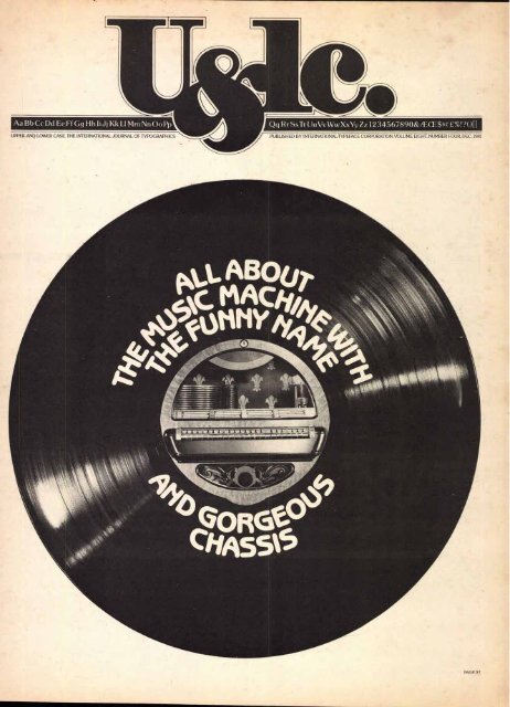
The Jukebox<br />
All about the music machine with the funny name<br />
and the gorgeous chassis. Cover and color<br />
feature section designed by our guest designer,<br />
Lou Dorfsman. Page 37<br />
Something from Everybody<br />
Our readers demonstrate eleven ways to<br />
express "desire." Page 45<br />
This issue of Ugric was mailed to 165,000 readers: 130,000<br />
in the United States and Canada, and 35,000 abroad. It will<br />
be read by approximately 500,000 people.<br />
Editorial<br />
A NEW WORLD OF TYPOGRAPHIC COMMUNICATIONS<br />
Thoughts<br />
We are on the verge of a new era in typeface usage.<br />
Correspondence, memos, documents, reports, material<br />
customarily set in typewriter faces will soon<br />
be set in such faces as Helvetica, Times, Futura,<br />
Goudy, ITC Souvenir, ITC Bookman, ITC Franklin<br />
Gothic, or ITC Century.<br />
WHY?<br />
Several ongoing trends are coming together They<br />
are: 1) the new capabilities of daisy wheel and matrix<br />
impact printers, laser electrographic, ink jet and<br />
other non-impact printers that five office automation<br />
equipment from the 100 year old limitations of<br />
typewriter designed typefaces; 2) an increasing<br />
awareness in the office of graphic arts typefaces;<br />
3) a need for improved cost and communication<br />
effectiveness.<br />
"WHERE THE<br />
PRESS IS FREE<br />
AND EVERY MAN<br />
ABLE TO READ,<br />
,kt iOLLEASAFE:<br />
TABLE OF CONTENTS AND EDITORIAL SET IN ITC BARCELONA'!" MASTHEAD SET IN ITC NEWTEXT' (REDUCED) ILLUSTRATIONS BY WALLY NEIBART ITC QUORU
WHERE TYPEFACES FIT IN<br />
Typefaces (as opposed to typewriter faces) often<br />
make possible the accommodation of almost twice<br />
as much copy in a given space. The resultant<br />
savings in paper, printing, plates, filing space and<br />
distribution costs can be considerable.<br />
COMMUNICATION EFFECTIVENESS<br />
Furthermore, in addition to saving money, typeaces<br />
attract readership, improve readability and<br />
offer alternate ways to add emphasis—with italics,<br />
changes in point sizes, use of bold faces, and choices<br />
of contrasting typefaces, etc. These typographic<br />
design options are in addition to the limited choices<br />
of only underscoring or capitalizing available on<br />
typewriters.<br />
OR CORPORATE DESIGN<br />
or companies with a carefully developed corporate<br />
"IF LANGUAGE<br />
IS INCORRECT,<br />
THEN WHAT IS<br />
SAID IS NOT<br />
MEANT.<br />
IF WHAT IS SAID<br />
IS NOT MEANT,<br />
THEN WHAT<br />
OUGHT TO DE<br />
DONE REMAINS<br />
UNDONE:<br />
design program in which typography plays a key<br />
role, the typefaces selected for the corporate type<br />
styles and advertising programs can also be used in<br />
correspondence, memoranda, internal documents<br />
and reports.<br />
TYPEFACES AND OFFICES<br />
Many major manufacturers of office printers are<br />
planning to introduce typefaces on their printers in<br />
the near future. One, Xerox Corporation, recently<br />
became an ITC Subscriber and is now licensed to<br />
offer ITC typefaces on some of its electronic printers.<br />
In Xerox's words, "The ITC agreement. . . marks a<br />
major commitment by Xerox to ensure typographic<br />
excellence for all our electronic printing products."<br />
THE OFFICE OF TODAY<br />
This is a mcijor breakthrough into the office automation<br />
market. Typographic arts quality, not typewriter<br />
quality, is what the future portends for the<br />
"AS GOAN)<br />
ALMONT<br />
KILL A MAN<br />
AS KILL A<br />
GOOD BOOK:<br />
"office of the future" which is already being called<br />
the "office of today." We are truly witnessing the<br />
dawn of a new era in communications... the office is<br />
entering the world of typographic communications.<br />
A TYPOGRAPHIC EVOLUTION<br />
While one cannot put a ruler on these trends and<br />
truly measure their effects, it would appear their<br />
first impact will be for manufacturers to introduce<br />
typefaces which will produce work that was not<br />
typeset before. At first, the limited range of type<br />
families, of typefaces within a family and of type<br />
sizes, and often the lower than graphic arts resolution<br />
of most of the new printers, is likely to slow the<br />
development of this typographic communication<br />
revolution. But as the level of output quality<br />
increases and costs of equipment decrease, typography,<br />
with all its communications advantages, will<br />
pervade the office as it now does in advertising,<br />
publishing and commercial printing.<br />
4*,<br />
3I1<br />
aril rn; Par \<br />
linie<br />
TIMM '\*<br />
(VI II \ \\\\\\<br />
"THERE IS DANGER<br />
IN READING BAD<br />
BOOKS, BUT<br />
ALSO GREATER<br />
DANGER IN NOT<br />
READING GOOD<br />
JOHN COURTNEY MURRAY<br />
ITC SERIF GOTHIC® ITC TIFFANY FRIZ QUADRATA<br />
3
4<br />
For most of us, a deck of cards is a deck<br />
of cards — a commonplace, unremarkable<br />
item. But when you stop to contemplate the<br />
idea of playing cards, it becomes something<br />
of a phenomenon of our civilization. Rich,<br />
poor... old, young ...wizard/yokel— everybody<br />
has some experience with cards in the<br />
course of a lifetime. Even a little 3-yr-old<br />
we know, when asked if she could count to<br />
ten, replied, "Of course!" and proceeded to<br />
praying cards they're not just for paying<br />
demonstrate: "One, two, three,four, ve, six,<br />
seven, eight, nine, ten, jack, queen, ng !"<br />
And that's just one instance of how thoroughly<br />
cards have permeated our culture.<br />
For most of us, also, playing "cards"<br />
translates into a game— Bridge, Canasta,<br />
Poker, Pinochle, Blackjack, Casino, Hearts,<br />
Rummy (in an infinite variety of versions),<br />
Solitaire, and so on. We've seen cards used<br />
for conjurin.g,fortuneteffing and parlor tricks.<br />
But for some people, the name of the<br />
game is collecting.<br />
The series of cards spread out on the next<br />
few pages are from the -collection of Mr.<br />
Leonard Schneir of New York City. His collection<br />
is devoted to American cards of the<br />
19th and 20th centuries. Other private collectors<br />
have their specialties But the histoiy,<br />
esthetics and cultural ramifications of<br />
playing cards have made them collectors'<br />
items for art museums, historical societies<br />
and major libraries throughout the world.<br />
There is much to learn about costumes,<br />
politics, social mores, religious attitudes<br />
and moral persuasions of an era by examining<br />
their playing cards, as scholars and<br />
collectors have been doing.<br />
It would be unforgivable to launch into a<br />
discourse on playing cards without digging<br />
back into their origin. But nailing down<br />
facts turns into an exercise in futility and<br />
frustration. All the reference material is<br />
replete with phrases like, "it could be,' "supposed,"<br />
"it is believed,' etc., etc. So in the<br />
same spirit, we offer this brief synopsis of<br />
historical data: Playing cards may have been<br />
invented in China, about 1120 A.D.,for<br />
the amusement of a reigning potentate and<br />
his concubines ... or thousands of years<br />
earlier in India.... or in Egypt... or among<br />
Arabic tribes.<br />
As for their introduction into Europe,
there is again a series of multiple choices.<br />
They may have been brought back by the<br />
Crusaders (inveterate gamblers) returning<br />
from the East... or by fortunetelling gypsies<br />
from India... by Moors crossing into Spain<br />
from Africa... or by all of the above. It is<br />
known for sure that cards were introduced<br />
to the New World by Spanish, sailors and<br />
soldiers in the course of their explorations<br />
and conquests.<br />
0<br />
1918—End of W.W.I<br />
0<br />
r<br />
It is also (mown for certain that by the<br />
14th century playing cards was such, a<br />
widespread activity throughout Europe,<br />
government and religious authorities were<br />
up in arms about it. Edicts and proclamations<br />
were issued condemning the practice.<br />
KE<br />
R<br />
1896—Transformation Deck, Hustling Joe<br />
1<br />
3<br />
0
6<br />
In France, at the close of the century,<br />
the provost of Paris decreed that working<br />
people could not play at tennis, bowls, dice,<br />
cards or nine-pins on working days. In<br />
Bologna, Italy, St. Bernardino delivered sermons<br />
labeling cards the invention of the devil.<br />
Nevertheless, the fun and games continued.<br />
By the 15th century, card-making<br />
was a well developed craft, employing<br />
painters, etchers, woodblock. cutters,<br />
engravers and printers throughout Europe.<br />
In17th century England, the traffic in playing<br />
cards was so heavy, a ban was placed<br />
on imports from the continent to protect<br />
home industry. It was a money-maker for<br />
the government, too, when Parliament<br />
levied a tax on each. pack. sold- a quaint<br />
custom. that persists to this day.<br />
. The changing designs and esthetics of<br />
playing cards through the centuries is end-<br />
fess cyfasciriating . The earliest Chinese packs<br />
were long and narrow, with markings like<br />
the money of the period. Early decks from<br />
India were round, with as many as ten suits,<br />
each one representing one of the incarnations<br />
of the Hindu god, Vishnu. In Europe,<br />
cards designed exclusively for the p leasure<br />
of royalty were sumptuous affairs - each<br />
card hand painted and often illuminated<br />
with gold or silver. But when they were
adapted for the mass market, designs were<br />
printed by the sheet, from woodffocks, and<br />
colors were applied with stencils.<br />
The imagery on cards related to the<br />
games people played. Early on, the games<br />
derived from chess and the cards had warinspired<br />
motifs. Later, they reflected the<br />
society of the medieval courts, with Kings,<br />
Queens, Vassals and Jesters.<br />
Although a variety of symbols have been<br />
GLN. P. G. T. iiKAUE :ARM<br />
1863—Confederate General Series<br />
used as suits — acorns, bells, cups, spears,<br />
etc. — the suits we use today derive directly<br />
from the 15th century French. "pips" as they<br />
are called: Coeurs (Hearts) symbolized the<br />
Church; Carreaux (Diamonds) represented<br />
the arrowheads of vassals; Trefles (Clubs)<br />
for the peasants of the domain, and Piques<br />
(Spades) stood for the Knight's lance.<br />
It was in the 17th century in France that<br />
the elaborate Tarot cards were first intro-
duced, with numbers, suits and a code of em-<br />
blems for fortuneteffing as well as gaming.<br />
Church and government protests notwithstanding,<br />
playing cards was big business.<br />
Observing the lure of "chance" and<br />
the delights implicit in the cards themselves,<br />
astute business people and clergymen<br />
turned the demon cards into socially<br />
acceptable devices. They devised teaching<br />
games with. cards. Spelling, geography,<br />
history, mythology, poetry, music, even<br />
morality lessons were printed on cards for<br />
study and contemp lation.<br />
Another curiosity (which ended in the<br />
19th century) was the proliferation of cards<br />
with blank. backs. The empty space was<br />
often put to use as a calling card, invitation,<br />
pass slip, credit note or memo pad. The<br />
most unusual use on record goes back. to the<br />
time of the French occupation of Canada.<br />
When the commanding general ran out of<br />
gold to pay his troops, he marked the backs<br />
of playing cards with, an assigned monetary<br />
value, and they were used as legal tender.<br />
For the most part, though, backs of cards<br />
have been heavily designed or imprinted<br />
with strong color to prevent them from being<br />
either accidentally or deliberately "marked."<br />
With the variety of peripheral uses for<br />
playing cards already established, it required<br />
no great stretch of the imagination to see<br />
their potential as an advertising medium.<br />
Mr. Schneir's collection includes a number<br />
of advertising cards, as well as other categories<br />
and themes. Some are memorabilia<br />
from Worlds Fairs and Expositions. Others<br />
celebrate heroes of history, sports and the<br />
entertainment world. There are patriotic<br />
decks with symbols of Americana and<br />
military heroes for picture cards. Perhaps<br />
his most unique acquisitions are his "transformation"<br />
cards in which the pips (suit
(<br />
CONSOLIDATED<br />
A<br />
4<br />
Elaborately Designed Ace<br />
br4 Rte;<br />
jy^yy -YORK<br />
OARD<br />
CINCINNATLUS.A.<br />
U 2819 tV<br />
C OM PA N Y.<br />
USNAYING CARD CO<br />
Shirley Temple (Face Card)<br />
1863—Confederate Generals<br />
l'itEs. J EPTER.4311<br />
markings) are integrated into a doodle or<br />
illustration. He even owns a number of<br />
transparent cards which must be held up<br />
to the light to see the image. For obvious<br />
reasons, they are not included here.<br />
Mr. Schneir is a serious and dedicated<br />
.co [rector of American playirui cards and<br />
gambling memorabilia. He is extremely<br />
well informed and he wishes it to be known<br />
that he we<strong>lc</strong>omes requests for estimates,<br />
appraisals and historic information. Also,<br />
readers interested in buying, selling or trading<br />
those items may write to him at 184<br />
Sixth Avenue, New York, NY. 10013.<br />
PAR 1‘.;<br />
NEW YORK. 1,0N10<br />
F. C.,e.o< 7,-.Y1.<br />
1897—Transformation Deck<br />
A complete and authoritative work<br />
A History of<br />
Playing Cards by Catherine Perry Hargrave<br />
is available in a durable paperback edition from<br />
Dover Publications, Inc.,<br />
180 Varick Street, New York, NY 10014.<br />
THIS ARTICLE WAS SET IN ITC ZAPF CHANCERY., ITC MACHINE BOLD..AND ITC FRANKLIN GOTHIC.<br />
9
10<br />
JOVICA VELJOVIC: CALLIGRAPHY FROM THE HEAD, THE HAND AND THE HEART<br />
From the series of postcards "Sentimentalnosti" — text by Dusan Radovic
ASINNIALVtTSTHEIDENIN:THEMI<br />
N D I STH f ITUXE NTEYNR.D STICK<br />
BY %V H. ICti AVE EVM. LINTENVER.ITIN<br />
TH I N:k.-1- rto D U CT,TH ETE CHN I C<br />
s ITES -TOOLS NI N'T<br />
FRILLS XNDNEETLIODO/NVO:LI:<br />
I NG -THOUGH NEEDE D V.tt :Vim%<br />
J'S S 1.180 :L3 I N NTETOTH Et IV■11<br />
NT MAXI IM.PINA;TECI-IN [SUE IS<br />
ON (JAMI E S.5 LIT- U LIYA,VIW<br />
LIG'HTIEN rIkES IONS 01 INCONSF<br />
IV TO IA. OUSE D ISM NN<br />
MI tk:vriONpoOlklYWXITTEN Li<br />
TT E :k.SS 1:1 LLFullycH tsELLtilxm<br />
xlvv:kA's La I NN AV E 11-NVA.I<br />
TTE IETTircs rot.-11,Uvc.tur<br />
NDIFICTINTH NUE xNs LissDN<br />
-XING INGTUI NN EfECTINTHE<br />
XI I, NTAII'MTE:t'N xrti Eli c :yr' cr-1<br />
With a name like Jovica Veljovie<br />
which ripples off the tongue like a<br />
phrase of poetry, how could you not<br />
have a predisposition for words?<br />
The very sight of such a name, with<br />
its rhythmic repetition of letter<br />
forms, might easily spark a love for<br />
lettering and calligraphy. Perhaps<br />
those are romantic notions.Veljovie<br />
himself is quite specific about the<br />
experiences that led him to choose<br />
lettering as his life's work.<br />
He was first seduced by an encounter<br />
with Hermann Zapf's book,<br />
About Alphabets. It was the first<br />
lettering book he had ever laid eyes<br />
on, and it unveiled for him the<br />
beauty of letter forms in calligraphy<br />
and typography. He was further encouraged<br />
by his professor, Stjepan<br />
Fileki, who taught a lettering course<br />
at the Academy of Applied Arts in<br />
Belgrade. As early as his second<br />
year in the Academy, Veljovie knew<br />
for sure that lettering and calligraphy<br />
would be his choice of major.<br />
This early decision was all the more<br />
singular because he was the only<br />
Father Catich, Pen & ink<br />
student in the entire school to<br />
choose that area of concentration.<br />
It created some problems regarding<br />
a curriculum, which turned out<br />
to be a blessing.<br />
Since there were no prescribed<br />
courses of study for such a major,<br />
Professor Fileki wisely encouraged<br />
him to develop his own program—<br />
to explore media and materials in<br />
whatever direction he felt drawn.<br />
Veljovie also gives credit to Professor<br />
Boiidar Dimerkovie, a drawing<br />
and painting teacher, who helped<br />
him understand how scale, space<br />
and other elements of painting<br />
apply to lettering and calligraphy<br />
as well.<br />
In the course of his independent<br />
study, Veljovie found that, in spite<br />
of the availability of fine steel pens<br />
and a multitude of up-to-the-minute<br />
writing tools, he preferred a wooden<br />
lettering implement above all. He<br />
liked the warmth of wood — the<br />
responsiveness — better than the<br />
rigid, cold, sharp metal tools. He<br />
found that though wood was resil-<br />
11
ient, it was firm enough to permit<br />
the finest hairsbreadth edge.He also<br />
discovered the joy of using color<br />
in his work, and how to dilute ink<br />
with quantities of water to create<br />
variations in tone.This variety of<br />
tone, texture and incidental transparencies<br />
give life to his letter forms<br />
and to an entire page.<br />
"Calligraphy for me;' writes Veljovie,"is<br />
a serious play of heart.The<br />
sharpness, softness or other quality<br />
of letters depends upon the meaning<br />
of the text and the mood I am in.<br />
Concentration and peace are essential<br />
to my work:'<br />
Though his work rings with<br />
authority, Jovica Veljovie is refreshingly<br />
humble; he hands out bouquets<br />
to all his mentors.Aside from<br />
his teachers at the Academy and<br />
Hermann Zapf, he is unabashedly<br />
devoted to Mr. Henri Friedlaender<br />
of Israel for the influence he has<br />
had on his career.Veljovie describes<br />
their relationship, and how it came<br />
to be: In December 1976, while<br />
still a student at the Academy, he<br />
created a hand-lettered greeting<br />
card and sent it to a few addresses<br />
on the A.TVP.I list. Mr.Friedlaender,<br />
one of the recipients, responded<br />
with a note of thanks, a few words<br />
of commendation and a few words<br />
of criticism.Veljovie, elated over the<br />
critique, has continued to correspond<br />
with Friedlaender and eagerly<br />
awaits his letters with their comments<br />
and suggestions, which he<br />
feels have tremendously influenced<br />
his work. "FY is<br />
the one most responsible that my<br />
head, hand and heart are in accordance<br />
(sic) when I hold my pen:'<br />
Although Veljovie is a fairly<br />
recent graduate of the Academy<br />
(1979), he already has a number of<br />
professional credits to his name. He<br />
participated and received a special<br />
award in the October Salon in Belgrade,<br />
1979. He was represented at<br />
the Victoria and Albert Museum in<br />
"A Survey of Western Calligraphy<br />
from the Roman Period to 1950:'<br />
And in the same year participated<br />
in "International Calligraphy lbday"<br />
at the ITC Center in New York. His<br />
work has also been published in a<br />
collection called Modern Scribes<br />
and Lettering Artists,published by<br />
Studio Vista, London.<br />
It isn't a long reach from calligraphy<br />
to type design.After his<br />
recent visit to the ITC Center and<br />
meetings with Aaron Burns and<br />
designers Benguiat, DiSpigna and<br />
Lubalin,Veljovie was noticeably<br />
impressed with the demands and<br />
problems of type design, as well as<br />
the esthetic latitude. We would not<br />
be at all surprised if, in the near<br />
future, we receive an alphabet designed<br />
by him. Off the top of our<br />
heads, we already have a name for<br />
it —Veljovie Ultra Fine.<br />
— Marion Muller
QUAISA<br />
INIQUE<br />
C 0 ItIPARATITAI<br />
EST! HI QUI<br />
TERENTILIS MINUS<br />
HARE T<br />
UT tiE Pk.'NL.<br />
AU QUID<br />
AIMANT<br />
DIVITI 0 RUMS<br />
Quotation from the work of Pubhus lerentius Afer Wooden stick& ink on handmade paper<br />
Quotation from Thomas Moore "Irish Melodies': Wooden stick & ink<br />
zo /wits<br />
loifvf4 4IL<br />
ailio vcisAt i.<br />
THIS ARTICLE WAS SET IN ITC ZAPF BOOK.<br />
13
14<br />
0<br />
n the surface, the late<br />
nineteenth century<br />
was a profitable time<br />
for the German monarchy.<br />
Bismarck unified<br />
the principalities<br />
under one banner, so,<br />
by the close of the<br />
century the wings of<br />
the Imperial eagle<br />
spanned the entire land, with its claws<br />
firmly implanted in resource producing<br />
colonies. Contentment and joy were felt<br />
throughout the court, with august princes,<br />
barons and dukes aglow in pomp—stylishly<br />
dressed in greatcoats with spiked, tassled<br />
and plumed helmets, strutting their stuff<br />
like cocks of the walk The Kaiser's power<br />
was rooted in the burgeoning technological<br />
apparatus which provided both monetary<br />
and military rewards; by an emerging<br />
bourgoisie loyal to the throne; and, by a<br />
pride of sons, which insured a continuous,<br />
healthy blood line. However;"Deutschland"<br />
was not entirely "uber alles:' Dissension<br />
was brewing within the haunts of the<br />
"avant-garde:" In Munich and Berlin cafes<br />
and ateliers the inhabitants were avidly<br />
watching the progress and discussing the<br />
merits of the European democracies.Artists<br />
with social and political affinities, fearing<br />
the speed with which capitalism and the<br />
industrial revolution were supplanting liberal<br />
ideals, nurtured the seeds of spiritual<br />
rebellion,a principle that later grew into<br />
violent conflict.<br />
Young painters, printmakers and writers,<br />
and cartoonists rebelling against the<br />
entrenched, conservative academicians,<br />
were the vanguard of the "counter-culture:'<br />
They realized the need for both artistic<br />
experimentation and political reform and<br />
were zealous in their dissent. However,<br />
their means for expression—small literary,<br />
satiric and graphic pamphlets, including<br />
manifestos for a new society—were amateurish.<br />
Although existing humor magazines,<br />
such as Fliegende Blatter and Kladderadatsch,<br />
afforded cartoonists popular outlets<br />
for a modicum of their frustrations, they<br />
were basically apolitical (even Bismarck,<br />
who was the most caricatured world leader<br />
of his day, was rarely ridiculed in the German<br />
press) and restricted by the artistic<br />
conventions. Sanctioned by the Kaiser, they<br />
were designed to provide diversion and<br />
entertainment rather than anti-establishment<br />
vitriol.These publications veered<br />
toward the status quo, merely giving comic<br />
side glances to those already self-carica-<br />
tured members of German society.At this<br />
time there existed a clear need for revolutionary<br />
rallying points. On April 4, 1896,<br />
an exciting, radical new journal, Simplicissimus,premiered<br />
to fill the satiric vacuum.<br />
No other German weekly was as win<br />
as acerbic or as ultimately influential as<br />
this newly born "Illustrierte Wochenschrift:<br />
No other collective of German cartoonists<br />
was as energetic or clever in its response<br />
to the corruption of the ruling class;<br />
or as virtuoso in combining new graphic<br />
styles and polemical content into the cartoon<br />
format. Der Simpl, as it was colloquially<br />
known, was the spiritual progeny of<br />
"La Caricature;' and became the progenitor<br />
of modern caricature and cartoon.<br />
Simplicissimus was orginally conceived<br />
as a literary magazine by its publisher,<br />
Albert Langen, whose formidable imprimatur<br />
was affixed to reissues of Dostoyevsky,<br />
and original works by Thomas<br />
Mann, Frank Wedekind, Felix 'fficholsky<br />
and others. After seeing copies of "Gil Blas"<br />
the famed Steinlen illustrated Parisian<br />
satiric journal, Langen was convinced that<br />
a similar tabloid employing the best<br />
graphic humorists and commentators in<br />
Germany could generate the kind of controversy<br />
and public opinion needed to light<br />
the fires of protest. Like its French model—<br />
which was named after a popular, fictional<br />
anti-hero—Der Simpl was named for<br />
Simplicus Simplissimus, (authored by<br />
Grimmelhausen in the seventeenth century),<br />
a wily court jester who traveled<br />
throughout Germany from castle to castle<br />
during the Thirty Years War. He savagely<br />
lampooned the very audiences for whom<br />
he performed, and at the same time attempted<br />
to teach them moral lessons by<br />
focusing on the futility of the interminable<br />
war. Langen hoped to maintain a similar<br />
persona, one that he viewed as devilish<br />
(in fact one of Simplicissimus' two graphic<br />
mascots was a bright-red devil). On the<br />
cover of the first issue, dedicated "To Our<br />
Enemies;' Josef Engl depicted Stupidity,<br />
Misanthropy, Pride and Hypocrisy, and inside<br />
other artists clearly defined the members<br />
of society under attack Der Simpl<br />
became a forum for anti-clerical, anti-<br />
Junker, anti-monarchist, and anti-decadence<br />
sentiments, while preferring proworker,<br />
pro-"volk,' (the peasant class seen<br />
as the backbone of the nation,displaced by<br />
industrialization) and pro-socialist passions.<br />
It was forcefully argumentative and<br />
acutely critical, and cast to the wind those<br />
warnings issued it from government functionaries.<br />
The journal was a departure<br />
from classical newspaper design—with its<br />
prolific use of flat color and its (later)<br />
rejection of German gothic fora modern<br />
sans-serif typeface.Its distinctive Jugendstil<br />
drawing approach was based on the French<br />
art nouveaq stylings; however, in the hands<br />
of Der Simpl's staffers this decorative manner<br />
was afforded firm bite—an effective<br />
tool for political expression through comic<br />
exaggeration. Early elements of expressionism<br />
were apparent in the distinctive<br />
woodcuts produced for the magazine—no<br />
doubt inspiring members of the various<br />
Secessionist movements, Die Brucke, and<br />
other expressionist schools. Der Simpl was<br />
definitely rooted in the tradition of German<br />
graphic art to the extent that its penchant<br />
for the physical grotesquery and<br />
classical symbolism was once practiced by<br />
Durer and other Northern printmakers<br />
centuries earlier.<br />
Simplicissimus hoped to appeal to both<br />
the intellectuals and the masses through<br />
pictures—seemingly a common denominator<br />
of communication for both groups.<br />
Inevitably, it was a middle-class journal,<br />
more apt to be found in bohemian flats<br />
and on the coffee tables of the bourgeoisie<br />
than in the houses of the revered "yolk"<br />
Although it became a thorn in the side of<br />
the monarchy (enough so that it was<br />
banned at times and often censored) Der<br />
Simpl never really achieved the revolutionary<br />
aims to which it aspired.<br />
Langen established an editorial board<br />
comprised of artists and writers, including<br />
his own authors (Mann, Tucholsky, Hermann<br />
Hesse, Rainer Maria Rilke and Ludwig<br />
Thoma). This group decided policy,<br />
themes and often contributed texts in the<br />
form of captions, titles or essays. The artists<br />
were obviously the mainstay of the operation<br />
and quickly developed distinct visual<br />
personalities and specialties of interest.<br />
Among the most notable, Rudolf Wilke<br />
was a master sketcher and produced delightful<br />
drawings highlighting the comic<br />
side of peasant life. He created the vagabond-philosopher<br />
who represented a simpler<br />
alter-ego to the scabrous persona of<br />
the magazine. Like Heinrich Zille (famed<br />
children's book illustrator, who also contributed<br />
drawings to Der Simpl), Wilke<br />
acutely targeted social types—with pen and<br />
brush he could hilariously pinpoint the<br />
affectations of the upper crust as well as<br />
the sincerity of the provincial naifs.Thomas<br />
Theodor Heine, who later became coeditor<br />
was the philosophical "captain" of<br />
the Simplicissimus team. He created the<br />
two trademarks—the devil and the angry<br />
bulldog with severed chain (representing<br />
the strife and resistance of the "people").<br />
Heine's drawings were stark and realistic.<br />
Content—usually harshly critical of a specific<br />
German foible—was of most importance,<br />
and so his drawings were often very<br />
stiff (in comparison to the others), taking<br />
a backseat to his passions. Bruno Paul was<br />
the most strident of the group. He successfully<br />
married an art nouveau line and a<br />
unique expressionist style in woodcuts<br />
that were at the same time visually appealing,<br />
conceptually provocative and powerfully<br />
biting. His presence on the magazine<br />
(before leaving to become a professor,<br />
architect and interior designer of renown)
Caricature of Isadora Duncan by Olaf Gulbransson<br />
Cover illustration for first issue of Simplicissimus by Josepf Engi<br />
21-.1 iroliSthE S TU 0%t:<br />
DER<br />
UACCH ,ADE vON EuRiP‘DSS<br />
lv\ ISA N I<br />
P I t<br />
GAC( PIUS UND<br />
ARJP,DNE<br />
r.,z NACt DE ri<br />
c,LE10-INAmic,Er4<br />
GE rrALDE<br />
VON TIZI AN<br />
aLRiC'<br />
SI p iCIS 1<br />
c.:3■N ,<br />
AN) C SS j4,<br />
,,w0(,„„c„,,, e/s<br />
By Steven Heller
16<br />
added immeasurably to the first ten<br />
years—the most significant and "heroic"<br />
period.Olaf Gulbransson, who remained<br />
with Der Simpl during the best and worst<br />
of times, was the single most influential<br />
modern caricaturist in Europe. His magnificent<br />
facial and anatomical distortions,<br />
employed in the service of politics, took to<br />
task the famous and infamous clerics, military<br />
leaders and politicians alike,as well as<br />
notable personalities in the arts. He mastered<br />
the economical line and was able to<br />
both flatter or render a subject defenseless<br />
with a simple pen stroke. He was<br />
certainly an influence on Al Hirshfeld,<br />
Edward Auerbach-Levy, and Alfred Freuh<br />
in the United States and countless other<br />
stylistic imitators in France, Spain, Italy<br />
and Scandinavia. With Eduard Thony, Der<br />
Simpl's most virtuoso realist, publisher<br />
Langen achieved his wish to have those<br />
being satirized read the paper. Although a<br />
versatile cartoonist, Thony primarily created<br />
drawings of the military,Junker and<br />
cadet classes.Although his graphic reportage<br />
of the Prusssian-type was often savage,<br />
he had the ability to infuse a quiet respect<br />
and affection for these people in his work,<br />
which appealed to many within that very<br />
class. In fact, they bought Der Simpl to see<br />
their "friends" (rather than themselves)<br />
being ridiculed. Karl Arnold was a later,yet<br />
significant, addition to Simplicissimus. He<br />
brought with him a deco styling. His drawings<br />
were harsh social critiques in the<br />
manner of George Grosz (while not as insightful),that<br />
focused on the cabarets, fashions<br />
and political trends—among them the<br />
struggle between the newly organized<br />
Nazis and the Communist parties of the<br />
twenties. Other artists who came and went<br />
represented diverse artistic and thematic<br />
approaches. Some well known practitioners<br />
such as Jules Pascin and Ernst Barlach,<br />
moved on to the finer arts.Others who had<br />
already or were about to achieve prominence<br />
in the graphic arts included Alfred<br />
Kubin, Heinrich Kley, Kathe Kollwitz (who<br />
maintained, albeit briefly, Der Simpl's humanist<br />
tradition),George Grosz,and Jeanne<br />
Mammen. Other cartoonists, ultimately of<br />
less consequence, continued a relationship<br />
with the magazine for decades, including<br />
Erich Schilling, Wilhelm Schulz,<br />
and Karl Rossing.<br />
Der Simpl had many reverent followers.<br />
Among them was Leo Tolstoi who described<br />
the heyday of the journal this way:<br />
"For the historian of the 22nd and 23rd<br />
centuries who describes the 19th century,<br />
Simplicissimus will be the most valuable<br />
source enabling him to become familiar<br />
not only with the state of our present-day<br />
society, but allow them to test the credibility<br />
of all other sources: For us, today, the magazine<br />
offers an invaluable critical look at<br />
most of the periods during which it published,<br />
especially its first decade: It triumphed<br />
for the first ten years with no<br />
equal; a time when the magazine's leaders<br />
were jailed and issues were banned.It stood<br />
steadfast in championing the yolk spirit—<br />
the weak against the mighty—whether in<br />
terms of human relations or relations with<br />
the state. Artistically, it opened the doors<br />
for the morel .dical twentieth century<br />
avant garde (including Dada and Expressionism).<br />
Unfortunately, by the end of 1903,<br />
three of its ardent supporters were gone;<br />
Wilke died—in only his early thirties, Paul<br />
took a professorship which could not be<br />
compromised by cartooning (although he<br />
did work under a pseudonym for a short<br />
time), and the publisher, Langen, also<br />
passed away. By 1909 champagne advertisements<br />
were being accepted and it was<br />
apparent that the magazine no longer<br />
expressed the rage of the downtrodden.<br />
As is true with all vigorous movements,<br />
the new becomes old and the fresh be-<br />
comes tired. Simplicissimus was not immune<br />
to this transition. During the six<br />
year period before World War I, Der Simpl<br />
became more a humor magazine (harping<br />
on trivialities of society) than an outlet for<br />
insightful satire. During the war, it became<br />
a propaganda machine for the government,<br />
with Thony using his drafting talents<br />
to romanticize the common soldief,<br />
and Heine creating scathing anti-Allied<br />
cartoons. With the end of the war came<br />
revolution and a democratic government<br />
was established in Weimar. This period encompassed<br />
major cultural changes in<br />
which the Bauhaus developed and the<br />
Malik Verlag (the socialist press run by<br />
Grosz and montagist John Heartfeld) enjoyed<br />
literary and political influence. How-
Simplicissimus Mascot by Thomas Theodor Heine<br />
ever, the dream of many Simplicissimus<br />
artists turned into a nightmare as the ravages<br />
of war, the hardships of an Alliesorchestrated<br />
peace, and the violent factionalism<br />
fostered by the right and left wings<br />
affected all segments of society. Der Simpl<br />
was in a position,once again,to employ the<br />
cartoon to make sense out of chaos—highlight<br />
the absurdity and the danger of these<br />
postwar conflicts.<br />
Der Simpl tried to maintain a critical<br />
presence, yet failed because it could not<br />
pinpoint the right targets in a meaningful<br />
way. During the early twenties the artists<br />
attacked the emerging fascism in Italy,<br />
comparing Mussolini to Hitler and his<br />
brown shirts. They attacked the church<br />
and its hunger for power amidst political<br />
turmoil. But as the Weimarian experiment<br />
was crumbling, Simplicissimus' artists and<br />
editors failed to do anything more than<br />
mirror the crisis; they simply preferred to<br />
focus their humor on more accessible<br />
social phenomena.<br />
When the Nazis came to power, Hitler<br />
and Goebbels realized the nostalgic attachment<br />
Germans had for the Simplicissimus<br />
name. The journal was maintained as an<br />
arm of the propaganda ministry and employed<br />
some of the better talents whose<br />
one-time radical—even socialist—pursuits<br />
were supplanted by a survivalist, or perhaps<br />
more charitably, a nationalist attitude.<br />
Unfortunately, Gulbransson remained,<br />
as did Thony. Heine, the only Jewish member<br />
of the group, was forced to flee, and<br />
later died, a broken man, in Norway. An offshoot<br />
of the magazine, entitled Simplicus,<br />
was founded by German exiles in Prague<br />
and published anti-Nazi drawings for a<br />
year. Throughout the war, Simplicissimus<br />
continued to publish on a weekly schedule<br />
and finally folded in 1944. During the<br />
early fifties it was revived for a short time,<br />
without any of its early vigor.<br />
Simplicissimus remains a monument<br />
in the history of satiric art—if only for its<br />
triumphant years. Like the other major<br />
journals of graphic commentary, Puck,<br />
Punch and L'Assiette au Beurre,discussed<br />
previously in this series, it is an important<br />
signpost in the history of a bygone age and<br />
an important piece of the cartoon legacy.<br />
17
18<br />
D RAILLAGZAPFCHANCERYKOOBFPAZ<br />
L UZAPFDINGBATSCAKEECAFRAELCS<br />
N TTSOUVMOLSUAVAKORINNANTGARB<br />
D O A M A I T A L I A N S H O T I Y T N R N A T L E<br />
AMIOBRI Z SSERIO ,= FARORYDCDAR<br />
L SUNOAECAFTAFSR QKRNESIINN<br />
S RGZLORTCMUROUQA TZSROHDOA<br />
TONATTAHNAMNEERSM t1CHUTNIS<br />
YMEPBISGSNOLECRABA TJVOOTE<br />
MABFOSOACHELTENHAMD f EWEGVAR<br />
INTBLERTIFFANYHEANDLINTNEANO<br />
E BLODEPIONEERASROECINEFIDRRM<br />
H HNOENLUBOLCNEACOEGERNRRREEA<br />
APAKILINESBOUGHANMZORIACP/STN<br />
IATANSRTSTLPITCWARINRENRGEND<br />
RRAKORONAESTIERSLCASEIKOENIE<br />
L GRBSAGRCORWSTYMIEHAIRLSTEFS<br />
INDCOUOROEDINSALMCONDEILNGPN<br />
N IASTOAMINESFMOLLKABELNFARAE<br />
E LUYABKHONDAFGATIEIJTYGOVIZD<br />
E AQAMORMUTAASUOCAABHPROGAZRN<br />
MBZRINASAAEZNERTHCASBUTSOZRO<br />
G UINORMURNBGROUCHISOITHVELNC<br />
E LROAPCASLONHEADLINERNIBNYLC<br />
H M F G B E N GU I A T G O T H I C C E N E C O B E V S<br />
CUPTIGHTMRETIRWEPYTNACIREMAL<br />
A WORD SEARCH BY<br />
JULIET TRAVISON<br />
ILLUSTRATIONS BY<br />
LIONEL KALISH<br />
How to play: The names of all the ITC typefaces<br />
appearing on the adjacent list and<br />
ITC's initials appear in this word search<br />
puzzle. Find and circle each typeface name.<br />
The names appear vertically horizontally,<br />
diagonally and even backwards. Don't<br />
cross letters out—they may be needed for<br />
another typeface name! Here is a sample<br />
to start you off. (Prefixes LSC, L&C in parentheses<br />
do not appear in the puzzle.)<br />
ANSWERS ON PAGE 79 .<br />
UN JEU DE MOTS, PAR<br />
JULIET TRAVISON<br />
ILLUSTRATIONS DE<br />
LIONEL KALISH<br />
Regle du jeu: ceipuzzle est compose de tous<br />
les noms de caracteres ITC qui figurent dans<br />
la liste ci-contre. ainsi que des initiales ITC.<br />
Its sont disposes verticalement horizontalement,<br />
diagonalement et meme inverse-<br />
ment. Ne barrez aucune lettre —vous pourriez<br />
en avoir besoin pour un autre nom de<br />
caractere! Voici un exemple, pour vous<br />
mettre sur la bonne vole. (Les prefixes LSC,<br />
L+C, qui sont entre parentheses. n'apparaissent<br />
pas dans le puzzle.)<br />
EIN WORTSUCHRATSEL VON<br />
JULIET TRAVISON<br />
ILLUSTRATION EN VON<br />
LIONEL KALISH<br />
So lOst man dieses Rase': Die Namen aller<br />
ITC-Schriften in der daneben abgedruckten<br />
Liste sowie auch die Initialen von ITC sind<br />
in dem Wortsuchratsel enthalten. Man rnuss<br />
sie finden and sodann die Schriftennamen<br />
umkreisen. Diese Namen kOrinen vertikal.<br />
horizontal, diagonal oder sogar rOckwarts<br />
auftauchen. Man darf keine Buchstaben<br />
ausstreichen, kbnnten sie loch fOr einen<br />
anderen Schriftnamen gebraucht werden.<br />
Das Beispiel zeigt, wie man die LOsung des<br />
Rasels beginnt. (Die Vorsilben LSC. L&C in<br />
Klammern treten im Ratsel nicht auf.)
ITC<br />
AKI LINES<br />
AMERICAN TYPEWRITER<br />
AVANT GARDE GOTHIC<br />
BAUHAUS<br />
BARCELONA<br />
BENGUIAT<br />
BENGUIAT GOTHIC<br />
BERNASE ROMAN<br />
BOLT BOLD<br />
(LSC) BOOK<br />
BOOKMAN<br />
BUSORAMA<br />
(LSC) CASLON<br />
CASLON HEADLINE<br />
CENTURY<br />
CHELTENHAM<br />
CLEARFACE<br />
DIDI<br />
ERAS<br />
FAT FACE<br />
FENICE<br />
FIRENZE<br />
FRANKLIN GOTHIC<br />
FRIZ QUADRATA<br />
GALLIARD<br />
GARAMOND WITH<br />
CONDENSED<br />
GORILLA<br />
GRIZZLY<br />
GROUCH<br />
HONDA<br />
ISBELL<br />
ITALIA<br />
ITC<br />
KABEL<br />
KORINNA<br />
(LSC) CONDENSED<br />
LUBALIN GRAPH<br />
MACHINE<br />
(LSC) MANHATTAN<br />
MILANO<br />
NEON<br />
NEWTEXT<br />
NOVARESE<br />
PIONEER<br />
QUORUM<br />
RONDA<br />
SERIF GOTHIC<br />
SOUVENIR<br />
(L&C) STYMIE HAIRLINE<br />
TIFFANY<br />
TOM'S ROMAN<br />
UPTIGHT<br />
ZAPF BOOK<br />
ZAPF CHANCERY<br />
ZAPF DINGBATS<br />
ZAPF INTERNATIONAL<br />
H<br />
FACES<br />
(41<br />
FACES<br />
FACES FACES<br />
ILLUSTRATIONS BY LIONEL KALISH<br />
4<br />
A ITC BERNASE ROMAN<br />
B ITC CENTURY ULTRA CONDENSED<br />
C ITC AMERICAN TYPEWRITER BOLD CONDENSED<br />
D ITC BENGUIAT BOLD CONDENSED<br />
E ITC AVANT GARDE GOTHIC BOLD CONDENSED<br />
F ITC FENICE BOLD<br />
ITC QUORUM BOLD<br />
H ITALIA BOLD<br />
ITC FRANKLIN GOTHIC MEDIUM<br />
THIS ARTICLE WAS SET IN ITC QUORUM® AND ITC BENGUIATO CONDENSED<br />
19
20<br />
bat are we to<br />
make of Vali Myers? People who have<br />
come upon her unexpectedly have<br />
screamed at the sight. Even those of<br />
us enured to funky, flaky, punk-rock<br />
freaks with pink-green hair and phosphorescent<br />
fingernails, have stopped<br />
dead in our tracks, confronted with<br />
this apparition. Her burnt-orange<br />
hair blazes like a flame about her<br />
head. Her kohl-blackened eyes are<br />
punctuated by little star tattoos on<br />
her cheekbones. And a spidery embroidery<br />
pattern is also tattooed<br />
about her lips and chin. She dresses<br />
in flowing capes, with amulets and<br />
pendants dripping like vestigial organs<br />
from her neck, ears and limbs.<br />
ali Myers first<br />
came to our attention through a book<br />
of her work, Vali Myers Drawings,<br />
1949-79, published by Open House<br />
of London, in 1980. Even a casual<br />
browse through the pages puts you<br />
on notice that a singular mentality<br />
is at work here.The Foreword,written<br />
by Ed van der Elsker, and the Introduction<br />
by George Plimpton—two<br />
men who know her well—bear that<br />
out.The details of her life are as surreal<br />
as her art.<br />
She was born in<br />
1930, in Australia, and raised there<br />
in quite a normal household with<br />
two sisters and a brother Her mother<br />
was a violinist; her father, a marine<br />
officer. She attended a bushschool<br />
in the outback where,we are told, she<br />
neglected her lessons, but filled her<br />
exercise book with doodles, drawings,<br />
and a profusion of private visions.<br />
She studied dance, and at 19 was<br />
actually the lead dancer with the<br />
Melbourne Modern Ballet Company.<br />
But her restless spirit propelled her<br />
to Paris in 1949, and it was there<br />
that her life was turned around.<br />
THE WORLD OF VALI MYERS
doe . %<br />
$i st%;<br />
It -<br />
el*<br />
lit -011 V<br />
* okk .<br />
4 4 4'1<br />
le,441■644<br />
4 .,<br />
, . , . . _r _ ,<br />
4<br />
. i<br />
104 4"<br />
1.*41;<br />
661<br />
In the first year<br />
of her Paris experience, she started<br />
to drawShe has not stopped drawing<br />
since. Hallelujah! Out of this bloody<br />
Australian Kangaroo ugly duckling<br />
grew a beautiful swan... wrote Ed<br />
van der Elsken, the Dutch photographer<br />
who was her dear friend, confidant<br />
and author of a book about<br />
her, Love on the Left Bank. He describes<br />
her as a "sweet, funny, crazy,<br />
poetic weirdo:' Being young, with a<br />
voracious appetite for life—and in<br />
the relaxed climate of the Bohemian<br />
society of St. Germain-des-Pres-<br />
Vali experienced everything it had to<br />
offer: heavy talk, heavy art, heavy<br />
love, heavy drugs. She hit bottom in<br />
an adventure with opium and in a<br />
confrontation with the French authorities<br />
who expelled her and invalidated<br />
her passport.The white knight<br />
who came to her rescue was Rudi<br />
Rappold, a handsome young Austrian<br />
architect, who helped her get<br />
her passport and her life in order.<br />
She gave up her Bohemian wanderings,<br />
married him and settled down<br />
in a small, spare cabin in an inaccessible<br />
valley near Positano in southern<br />
Italy. In this hideaway, she and<br />
Rudi live, along with another young<br />
man who wandered in one day from<br />
out of the mountains, plus a menagerie<br />
of goats, pigs, dogs, cats, birds,<br />
sheep, mice. Creatures great and<br />
small take refuge in her house and<br />
heart. When an animal friend dies,<br />
she may bury it temporarily, but eventually<br />
retrieves the bones, because<br />
she finds them beautiful and wants<br />
her"friends"close by. She has tattooed<br />
the names of her departed dogs<br />
on her feet to immortalize them.There<br />
21
22<br />
is no need to continue to recite the<br />
eccentric details of her life. Her drawings—a<br />
few of which we have reprinted<br />
here, speak volumes.<br />
W at are we to<br />
make of her art?It goes without saying<br />
that Vali Myers' work is not everyone's<br />
idea of high art. But there can<br />
be no question about its integrity.<br />
It is the work of an original, unfettered<br />
mind,with an indomitable spirit,<br />
indefatigable physical prowess<br />
and consummate skill. She works<br />
with a fine English pen nib set into<br />
a goosefeather.<br />
She uses Chinese<br />
ink,water color and gold leaf on fine<br />
hand made paper.And she pores over<br />
these drawings through all hours of<br />
the night, holed up in her tiny cabin<br />
like a nocturnal animal in its burrow.<br />
She draws with infinite care and patience,<br />
and has been known to spend<br />
hours on a half-inch section. She<br />
may stay with a single drawing for<br />
two years or more, so it is understandable<br />
why she is reluctant to part<br />
with her work.<br />
Her drawings are<br />
mostly about people—the people of<br />
myths, poems, legends and folklore;<br />
people she observes casually and<br />
people she admires deeply. On close<br />
inspection, it's clear enough,the drawings<br />
are really all about Vali Myers,<br />
the flaming red-haired, sensual, halfwoman,<br />
half-animal creature she's<br />
become. Her perseveration to replicate<br />
herself... her inexhaustible<br />
store of design motifs ...her energy<br />
...do not stop with the drawing. Each<br />
picture is accompanied by an explanatory<br />
legend in a calligraphy<br />
that matches her images in intensity<br />
and quirkiness.<br />
It's probably best<br />
to leave it to the psychologists and<br />
graphologists to explain the wellsprings<br />
of her visions. But one thing<br />
must be clear to everyone. Her work<br />
is a far cry from the detached, impersonal,untouched-by-human-handsor-the-human-condition<br />
look of<br />
much contemporary art. She reaches<br />
down deep into herself ...she is violently<br />
expressive...she is inseparable<br />
from her work. It remains for us<br />
to wonder whether she has created<br />
her art in her own image...or conjured<br />
up her image out of her art.<br />
M.M.<br />
"Vali Myers" was published by Open House. The book<br />
costs $40 in US currency, and is available from Open<br />
House, Box 3635, Charlottesville, VA 22903. All<br />
orders from outside the USA should go to: Open House,<br />
43 St. Ann's Crescent, London SW18 2NG. UK rate is<br />
£15.00 plus £1.50 for posting within the UK,plus £5.00<br />
for surface post overseas.
THE WORLD OF VALI MYERS<br />
400:014.0.111:10<br />
0.41,1'.<br />
"el'Inir.111.!<br />
THIS ARTICLE WAS SET IN ITC FENICE.
We have an unfortunate tendency to think of portraiture as<br />
high art-serious, sober and with a long respectable history-<br />
while caricature, which makes us smile a lot, is passed off<br />
as a lightweight art form. Not fair, friends. The art of<br />
caricature also has a long, respectable history. The word<br />
itself, adopted from the French,refers to the art of pictorial<br />
ridicule of any subject, and it derives from the Italian<br />
earicatura l which pertains to portraiture in particular.Its<br />
history goes back to the ancients. In an anecdote reported<br />
by Pliny, two Greek sculptors, by way of poking fun at a very<br />
ugly poet, Hipponax by name, exhibited his portrait for<br />
public ridicule. In retaliation, he wrote a satirical poem<br />
that was so devastating, the two sculptors hanged themselves<br />
in despair. (So said Pliny.)<br />
Well we do not expect that any of the characters depicted<br />
in William Bramhall's Literary Calendar for 1982 will take<br />
the rope to him or themselves. For one thing, most of them<br />
are dead. For another, he has already survived one literary<br />
calendar, a musical engagement calendar and has lived to<br />
carry on with this latest contribution.<br />
25
Lewis Carroll<br />
.<br />
^ii<br />
riraraWAIAPAIMININP4P iiii-c Ali1170116<br />
■iralAro .". ,PC ' .... ""<br />
... ■■.m1IIIM.IIIKINVINIAINIII■■■■■ ■r■.:;:_<br />
..'..'<br />
WIPAVAI.I-MWAVIII0.1.11...■■■■■■ ' -.1- ..."'<br />
%RI ■■■<br />
I I W/A1W101 ■■, :"<br />
■ ■■■ ■■ ■■■■ ■<br />
-..<br />
. ..<br />
....,„„. , , A Pi I.VANIWAYA VA/M.4<br />
A N.A...v.....w.iro ow<br />
ZrZrAL,- - .. , , - ■ . ■ . - .17-. -.1.r. .- ' = ..... .. ,..■ ■■-:;..7=r '''.... - ..... --- ■-<br />
- - - f Zr.." -- 11111<br />
- .111,-;4141%.1.4.' .'' .7. ...1.......maraw.AZZ:;;;Z<br />
■■ ■ ■■■ ■ .' ■—■■-ilr:a..:1".<br />
rAtwarmanin.m.rArrar. — —.., ''''''.....<br />
IIVAIWIVIVAIIPAIN11,11,==r /Ara,' 711/411%;;, ■=4.4247rararAPX,;41;Zrip.<br />
nanI/V■74111 ■ ■■■■ ■—<br />
Apur,104.4,.....w..............-Arirarzw.... .......<br />
...,<br />
irimar........<br />
......4.4mir, ...4rAinanr.w........<br />
rorAroAr.............,........<br />
■■■ ■ ""'"7ZX:ririiiinlarig,==.17.7.141/21,7zw<br />
.......................<br />
111WAVAIWAir<br />
.....mouriAr.■ ■ ■■ ■■ ■ ■■ ■ ■■■ ■<br />
ge<br />
7171:47:■2■70:Z1
Emily Bronte H. G. Wells Marcel Proust William Carlos Williams Nathaniel Hawthorne<br />
This is William Bramhall's third appearance in the pages<br />
of U&<strong>lc</strong>, but he hasn't worn out his we<strong>lc</strong>ome. His work is so<br />
eminently satisfying, we feel others in the graphic world<br />
should enjoy sharing it with us. For one thing caricature as<br />
Bramhall practices it, goes far beyond portrait painting. He<br />
doesn't just capture a likeness, he relays the essence of the<br />
character and his work. He also gets it down in a few<br />
persuasive, economical strokes, which is exactly what good<br />
caricature is all about.<br />
Considering his keen perceptions and nimble pen, it is<br />
even more amazing to know that Bramhall has no formal<br />
art background. For his art education, he shopped around,<br />
choosing teachers who suited his purpose. In the past he<br />
studied with Sigmund Abiles. Currently, he is taking a<br />
course with Dick Odin at California State University, Long<br />
Beach. Bramhall also admires (and we assume has been<br />
influenced by) Alan Cober, Brad Holland and Albrecht<br />
Diirer, to name a few.<br />
At the moment, Mr. Bramhall is involved in a new project,<br />
a book called Bad Examples, to be published by Potter. "It<br />
is the history of the American misfit; he explained, "and I<br />
am doing my own research, writing and illustration:' He<br />
emphasized the word "illustration" explaining that the<br />
work would be less like caricature and more like the etchings<br />
of Diirer. We have such peat respect for BramhaH's<br />
incisive wit and potentially wicked pen,we hope to see Bad<br />
Examples from the outside, looking in.<br />
MARION MULLER<br />
4f' .<br />
Thc)9;<br />
Mark Twain<br />
THIS ARTICLE WAS SET IN ITC CENTURY' AND ITC GORILLA.<br />
27
ABCDEFGHIJK<br />
LMNOPQRSTU<br />
VWXYZ&12345<br />
67890abcdefghijk<br />
lmnopqrstuvwxy<br />
zae.)n__;11..)rt_:$$(<br />
$YE%cLOyaffEg<br />
'00Yefefidft12345<br />
67890 0 ,E:v(;,.!) 27-C)<br />
#/t-t-§g« >>1234567890<br />
[aeilmorst]<br />
ABCDEFGHIJ<br />
KLMNOPQRS<br />
TUVWXYZ8d<br />
234567890abcd<br />
efghijklmnopqr<br />
stuvwxyzae.A.,<br />
wrt.A$0$4f.E%c<br />
LOMER10Vi<br />
fiagh2345678 9 0<br />
(s)s )cf:dv(: ; ? #/t<br />
t§@1234567890<br />
[aeilmorst]
ABCDEFGHI<br />
JKLMNOPQ<br />
RSTUVWXY<br />
Z&123456789<br />
Oabcdefghijkl<br />
mnopqrstuvw<br />
tASO"favocti<br />
OACEBO0ICE<br />
fiath2345678<br />
90MA10;59 6"2-<br />
#/#5@1234567<br />
890Feilmorsti<br />
ITC Galliard Black<br />
ABCDEFGH<br />
IJKLMNOP<br />
QRSTUVWX<br />
YZ&123456<br />
7890abcdefg<br />
hijklmnopqr<br />
stuvwxyza,<br />
eAunavt,$$(0<br />
$YEKLOIE<br />
CEE00visfiet<br />
gh234567890<br />
Itfc nu\<br />
ss‘c ,5.<br />
7890Feilmors1<br />
ITC Galliard Ultra
30<br />
ITC GALLIARD<br />
ABCDEFGHIJK<br />
LAINOPQRSTU<br />
VWXYZ&1234<br />
567890abcdefghijk<br />
qmnopqrstuvwxyz<br />
sTf%cLaHig<br />
Midfidspi234567<br />
89ospZ:/t,e,..?-`gLQ.#)<br />
py-§g
MATTHEW CARTER/DESIGNER<br />
ABCDEFGHI<br />
JKLMNOPQ<br />
RSTUVWXT<br />
Z6123456789<br />
Oabcdefghtjkl<br />
mnopqrstuvw<br />
xyzebe,kn.,bry<br />
Kposof.c%c.L,<br />
azEtEflOs'a7e:fl<br />
etfistp23 456789<br />
#/t1g
32<br />
ITC GALLIARa<br />
ROMAN<br />
Excellence in typography is the result of nothing more than<br />
an attitude. Its appeal comes from the understanding used i<br />
n its planning; the designer must care. In contemporary adv<br />
ertising the perfect integration of design elements often de<br />
mands unorthodox typography. It may require the use of co<br />
mpact spacing, minus leading, unusual sizes and weights; w<br />
hatever is needed to improve appearance and impact. Statin<br />
g specific principles or guides on the subject of typography<br />
6 POINT<br />
Excellence in typography is the result of nothing m<br />
ore than an attitude. Its appeal comes from the under<br />
standing used in its planning; the designer must care<br />
In contemporary advertising the perfect integratio<br />
n of design elements often demands unorthodox ty<br />
pography. It may require the use of compact spacin<br />
g, minus leading, unusual sizes and weights; whatev<br />
er is needed to improve appearance and impact. Stat<br />
7 POINT<br />
Excellence in typography is the result of nothi<br />
ng more than an attitude. Its appeal comes fro<br />
m the understanding used in its planning; the<br />
designer must care. In contemporary advertisi<br />
ng the perfect integration ofdesign elements o<br />
ften demands unorthodox typography. It may<br />
require the use of compact spacing, minus lead<br />
ing, unusual sizes and weights; whatever is nee<br />
8 POINT<br />
Excellence in typography is the result of<br />
nothing more than an attitude. Its appeal<br />
comes from the understanding used in its<br />
planning; the designer must care. In cont<br />
emporary advertising the perfect integrat<br />
ion of design elements often demands un<br />
orthodox typography. It may require the<br />
use of compact spacing, minus leading, u<br />
9 POINT<br />
Excellence in typography is the result<br />
of nothing more than an attitude. Its a<br />
ppeal comes from the understanding<br />
used in its planning; the designer mus<br />
t care. In contemporary advertising th<br />
e perfect integration of design elemen<br />
ts often demands unorthodox typogra<br />
phy. It may require the use of compact<br />
10 POINT<br />
Excellence in typography is the res<br />
ult of nothing more than an attitu<br />
de. Its appeal comes from the and<br />
erstanding used in its planning; th<br />
e designer must care. In contempo<br />
rary advertising the perfect integra<br />
tion of design elements often dem<br />
ands unorthodox typography. It<br />
11 POINT<br />
Excellence in typography is the<br />
result of nothing more than an a<br />
ttitude. Its appeal comes from t<br />
he understanding used in its pla<br />
nning; the designer must care. I<br />
n contemporary advertising the<br />
perfect integration of design ele<br />
ments often demands unorthod<br />
12 POINT<br />
Excellence in typography is<br />
the result of nothing more<br />
than an attitude. Its appeal<br />
comes from the understand<br />
ing used in its planning; the<br />
designer must care. In conte<br />
mporary advertising the per<br />
fect integration of design el<br />
14 POINT<br />
BOLD<br />
Excellence in typography is the result of nothing more th<br />
an an attitude. Its appeal comes from the understanding u<br />
sed in its planning; the designer must care. In contempor<br />
ary advertising the perfect integration of design elements<br />
often demands unorthodox typography. It may require t<br />
he use of compact spacing, minus leading, unusual sizes a<br />
nd weights; whatever is needed to improve appearance an<br />
d impact. Stating specific principles or guides on the subje<br />
Excellence in typography is the result of nothing<br />
more than an attitude. Its appeal comes from the<br />
understanding used in its planning; the designer<br />
must care. In contemporary advertising the perfe<br />
ct integration of design elements often demands u<br />
northodox typography. It may require the use of<br />
compact spacing, minus leading, unusual sizes an<br />
d weights; whatever is needed to improve appeara<br />
Excellence in typography is the result of not<br />
hing more than an attitude. Its appeal comes<br />
from the understanding used in its planning;<br />
the designer must care. In contemporary adv<br />
ertising the perfect integration of design de<br />
ments often demands unorthodox typograp<br />
hy. It may require the use of compact spacing<br />
minus leading, unusual sizes and weights; w<br />
Excellence in typography is the result of<br />
nothing more than an attitude. Its appe<br />
al comes from the understanding used i<br />
n its planning; the designer must care. I<br />
n contemporary advertising the perfect<br />
integration of design elements often de<br />
mands unorthodox typography. It may<br />
require the use of compact spacing, min<br />
Excellence in typography is the resul<br />
t of nothing more than an attitude. I<br />
ts appeal comes from the understand<br />
ing used in its planning; the designer<br />
must care. In contemporary advertis<br />
ing the perfect integration of design<br />
elements often demands unorthodo<br />
x typography. It may require the use<br />
Excellence in typography is the r<br />
esult of nothing more than an att<br />
itude. Its appeal comes from the<br />
understanding used in its planni<br />
ng; the designer must care. In co<br />
ntemporary advertising the perfe<br />
ct integration of design elements<br />
often demands unorthodox typo<br />
Excellence in typography is th<br />
e result of nothing more than a<br />
n attitude. Its appeal comes fro<br />
m the understanding used in it<br />
s planning; the designer must c<br />
are. In contemporary advertisi<br />
ng the perfect integration of d<br />
esign elements often demands<br />
Excellence in typography i<br />
s the result of nothing mo<br />
re than an attitude. Its app<br />
eal comes from the unders<br />
tanding used in its planni<br />
ng; the designer must care<br />
In contemporary advertisi<br />
ng the perfect integration<br />
BLACK<br />
Excellence in typography is the result of nothing more<br />
than an attitude. Its appeal comes from the understand<br />
ing used in its planning; the designer must care. In con<br />
temporary advertising the perfect integration of desig<br />
n elements often demands unorthodox typography. It<br />
may require the use of compact spacing, minus leading<br />
unusual sizes and weights; whatever is needed to impr<br />
ove appearawe and impact. Stating specific principles<br />
Excellence in typography is the result of nothin<br />
g more than an attitude. Its appeal comes from<br />
the understanding used in its planning; the des<br />
igner must care. In contemporary advertising t<br />
he perfect integration of design elements often<br />
demands unorthodox typography. It may requ<br />
ire the use of compact spacing, minus leading<br />
unusual sizes and weights; whatever is needed t<br />
Excellence in typography is the result ofn<br />
othing more than an attitude. Its appeal c<br />
omes from the understanding used in its<br />
planning; the designer must care. In cont<br />
emporary advertising the perfect integrat<br />
ion of design elements often demands un<br />
orthodox typography. It may require the<br />
use of compact spacing, minus leading, u<br />
Excellence in typography is the resul<br />
t of nothing more than an attitude. I<br />
ts appeal comes from the understand<br />
ing used in its planning; the designe<br />
r must care. In contemporary adverti<br />
sing the perfect integration of design<br />
elements often demands unorthodo<br />
x typography. It may require the use<br />
Excellence in typography is the re<br />
suit of nothing more than an attit<br />
ude. Its appeal comes from the u<br />
nderstanding used in its plannin<br />
g; the designer must care. In cont<br />
emporary advertising the perfect<br />
integration of design elements of<br />
ten demands unorthodox typogr<br />
Excellence in typography is the<br />
result of nothing more than an<br />
attitude. Its appeal comes fro<br />
m the understanding used in it<br />
s planning; the designer must<br />
care. In contemporary advertis<br />
ing the perfect integration of d<br />
esign elements often demands<br />
Excellence in typography is<br />
the result of nothing more t<br />
han an attitude. Its appeal c<br />
omes from the understandi<br />
ng used in its planning; the<br />
designer must care. In conte<br />
mporary advertising the per<br />
fect integration of design el<br />
Excellence in typograph<br />
y is the result of nothing<br />
more than an attitude. I<br />
ts appeal comes from the<br />
understanding used in it<br />
s planning; the designer<br />
must care. In contempo<br />
rary advertising the perf<br />
ULTRA<br />
Excellence in typography is the result of nothing mo<br />
re than an attitude. Its appeal comes from the under<br />
standing used in its planning; the designer must care<br />
In contemporary advertising the perfect integratio<br />
n of design elements often demands unorthodox ty<br />
pography. It may require the use of compact spacing<br />
minus leading, unusual sizes and weights; whatever<br />
is needed to improve appearance and impact. Statin<br />
Excellence in typography is the result of moth<br />
ing more than an attitude. Its appeal comes f<br />
rom the understanding used in its planning;<br />
the designer must care. In contemporary adv<br />
ertising the perfect integration of design ele<br />
ments often demands unorthodox typograp<br />
hy. It may require the use of compact spacing<br />
minus leading, unusual sizes and weights; w<br />
Excellence in typography is the result o<br />
f nothing more than an attitude. Its ap<br />
peal comes from the understanding use<br />
d in its planning; the designer must car<br />
e. In contemporary advertising the per<br />
feet integration of design elements ofte<br />
n demands unorthodox typography. It<br />
may require the use of compact spacing<br />
Excellence in typography is the res<br />
ult of nothing more than an attitud<br />
e. Its appeal comes from the under<br />
standing used in its planning; the d<br />
esigner must care. In contemporar<br />
y advertising the perfect integratio<br />
n of design elements often demand<br />
s unorthodox typography. It may r<br />
Excellence in typography is the<br />
result of nothing more than an<br />
attitude. Its appeal comes from<br />
the understanding used in its pl<br />
anning; the designer must care<br />
In contemporary advertising th<br />
e perfect integration of design e<br />
lements often demands unorth<br />
Excellence in typography is t<br />
he result of nothing more tha<br />
n an attitude. Its appeal come<br />
s from the understanding use<br />
d in its planning; the designe<br />
r must care. In contemporar<br />
y advertising the perfect inte<br />
gration of design elements of<br />
Excellence in typography i<br />
s the result of nothing mor<br />
e than an attitude. Its appe<br />
at comes from the underst<br />
anding used in its plannin<br />
g; the designer must care<br />
In contemporary advertisi<br />
ng the perfect integration of<br />
Excellence in typograp<br />
hy is the result of nothi<br />
ng more than an attitu<br />
de. Its appeal comes fr<br />
om the understanding<br />
used in its planning; th<br />
e designer must care. I<br />
n contemporary advert
ITALIC BOLD ITALIC BLACK ITALIC ULTRA ITALIC<br />
Excellence in typography is the result ofnothing more than an atti<br />
tude. Its appeal comes from the understanding used in its plannin<br />
g; the designer must care. In contemporary advertising the perfect<br />
integration of design elements often demands unorthodox typogra<br />
ploy. It may require the use ofcompact spacing, minus leading, un<br />
usual sizes and weights; whatever 6 needed to improve appearanc<br />
e and impact. Stating specific principles orguides on the subject of<br />
typography is difficult because the principle applying to one job ma<br />
6 POINT<br />
Excellence in typography is the result ofnothing more tha<br />
n an attitude. Its appeal comes from the understanding<br />
used in its planning; the designer must care. In contemp<br />
orary advertising the perfect integration of design eleme<br />
nts often demands unorthodox typography. It may requi<br />
re the use ofcompact spacing, minus leading, unusual siz<br />
es and weights; whatever is needed to improve appearanc<br />
e and impact. Stating specific principles orguides on the<br />
7 POINT<br />
Excellence in typography it the result ofnothing mo<br />
re than an attitude. Its appeal comes from the code<br />
rstanding used in its planning; the designer must c<br />
are. In contemporary advertising the perfect integr<br />
ation ofdesign elements often demands unorthodox<br />
typography. It may require the use of compact spaci<br />
ng, minus leading, unusual sizes and weights; wha<br />
Sever is needed to improve appearance and impact<br />
8 POINT<br />
Excellence in typography is the result of nothi<br />
ng more than an attitude. Its appeal comes fr<br />
om the understanding used in its planning; t<br />
he designer must care. In contemporary adver<br />
tising thepetftct integration ofdesign elements<br />
often demands unorthodox typography. It m<br />
ay require the use of compact spacing, minus 1<br />
ending, unusual sizes and weights; whatever<br />
9 POINT<br />
Excellence in typography is the result of not<br />
hing more than an attitude. Its appeal co<br />
mes from the understanding used in its pl<br />
anning; the designer must care. In conte<br />
mporary advertising the perfect integratio<br />
n of design elements often demands unort<br />
hodox typography. It may require the use o<br />
f compact spacing, minus leading, unusu<br />
10 POINT<br />
Excellence in typography is the result o<br />
fnothing more than an attitude. Its a<br />
ppeal comes from the understanding u<br />
sed in its planning; the designer must<br />
care. In contemporary advertising the<br />
perfect integration of design elements<br />
often demands unorthodox typograph<br />
y. It may require the use of compact sp<br />
11 POINT<br />
Excellence in typography is the resul<br />
t of nothing more than an attitude.<br />
Its appeal comes from the understa<br />
nding used in its planning; the desi<br />
gner must care. In contemporary a<br />
dvertising the perfect integration of<br />
design elements often demands uno<br />
rthodox typography. It may require<br />
12 POINT<br />
Excellence in typography is the<br />
result of nothing more than a<br />
n attitude. Its appeal comes fr<br />
om the understanding used in<br />
its planning; the designer mus<br />
t care. In contemporary adver<br />
tiring the perfect integration o<br />
f deign elements often deman<br />
14 POINT<br />
Excellence in typography is the result of nothing more than an<br />
attitude. Its appeal comes from the understanding used in its<br />
planning; the designer must care. In contemporary advertisi<br />
ng the perfect integration of design elements often demands u<br />
northodox typography. It may require the use of compact spaci<br />
ng, minus leading, unusual sizes and weights; whatever is ne<br />
eded to improve appearance and impact. Stating specific prin<br />
ciples orguides on the subject of typography is difficult because<br />
Excellence in typography is the result of nothing more<br />
than an attitude. Its appeal comes from the understand<br />
ing used in its planning; the designer must care. In c<br />
ontemporary advertising the perfect integration of d<br />
esign elements often demands unorthodox typograph<br />
y. It may require the use of compact spacing, minus It<br />
ading, unusual sizes and weights; whatever is neede<br />
d to improve appearance and impact. Stating specific<br />
Excellence in typography is the result of nothing<br />
more than an attitude. Its appeal comes from th<br />
e understanding used in its planning; the desig<br />
ner must care. In contemporary advertising the<br />
perfect integration of design elements often dem<br />
ands unorthodox typography. It may require th<br />
e use of compact spacing, minus leading, unusu<br />
al sizes and weights; whatever is needed to impr<br />
Excellence in typography is the result of not<br />
hing more than an attitude. Its appeal co<br />
mes from the understanding used in its pl<br />
anning; the designer must care. In conte<br />
mporary advertising the perfect integratio<br />
n of design elements often demands unorth<br />
odox typography. It may require the use of<br />
compact spacing, minus leading, unusual<br />
Excellence in typography is the result of<br />
nothing more than an attitude. Its app<br />
cal comes from the understanding used<br />
in its planning; the designer must care<br />
In contemporary advertising the perfrc<br />
t integration of design elements often d<br />
emands unorthodox typography. It ma<br />
y require the use of compact spacing, mi<br />
Excellence in typography is the resul<br />
t of nothing more than an attitude<br />
Its appeal comes from the understa<br />
nding used in its planning; the desi<br />
gner must care. In contemporary a<br />
dvertising the perfect integration of<br />
design elements often demands uno<br />
rthodox typography. It may require<br />
Excellence in typography is the re<br />
suit of nothing more than an atti<br />
tude. Its appeal comes from the u<br />
nderstanding used in its planni<br />
ng; the designer must care. In co<br />
ntemporary advertising the perfe<br />
ct integration of design elements<br />
often demands unorthodox typog<br />
Excellence in typography is t<br />
he result of nothing more th<br />
an an attitude. Its appeal co<br />
mes from the understandin<br />
g used in its planning; the d<br />
esigner must care. In conte<br />
mporary advertising the per<br />
feet integration of design de<br />
Excellence in typography is the result ofnotbing more than<br />
an attitude. Its appeal comes from the understanding used<br />
in its planning; the designer must care. In contemporary<br />
advertising the perfect integration of design elements ofte<br />
n demands unorthodox typography. It may require the use<br />
of compact spacing, minus leading, unusual sizes and wei<br />
plots; whatever is needed to improve appearance andimpact<br />
Stating specific principles orguides on the subject oftypogr<br />
Excellence in typography is the result ofnothing m<br />
ore than an attitude. Its appeal comes from the un<br />
derstanding used in its planning; the designer mu<br />
st care. In contemporary advertising the perfect in<br />
tegration of design elements often demands unort<br />
bodox typography. It may require the use of compa<br />
ct spacing, minus leading, unusual sizes and weig<br />
hts; whatever is needed to improve appearance an<br />
Excellence in typography is the result ofnoth<br />
ing more than an attitude. Its appeal comes<br />
from the understanding used in its plannin<br />
g; the designer must care. In contemporary<br />
advertising the perfect integration ofdesign<br />
elements often dem ands unorthodox typogr<br />
apby. It may require the use of compact spaci<br />
ng, minus leading, unusual sizes and weigh<br />
Excellence in typography is the result of<br />
nothing more than an attitude. Its app<br />
cal comes from the understanding used<br />
in its planning; the designer must care<br />
In contemporary advertising the petfrc<br />
t integration of design elements often d<br />
emands unorthodox typography. It ma<br />
y require the use of compact spacing, mi<br />
Excellence in typography is the resu<br />
It of nothing more than an attitude<br />
Its appeal comes from the understa<br />
nding used in its planning; the desi<br />
gner must care. In contemporary a<br />
dvertising the perfect integration o<br />
f design elements often demands un<br />
orthodox typography. It may requi<br />
Excellence in typography is the re<br />
suit ofnothing more than an atti<br />
tude. Its appeal comes from the u<br />
nderstanding used in its plannin<br />
g; the designer must care. In con<br />
temporary advertising the perfec<br />
t integration of design elements o<br />
ften demands unorthodox typogr<br />
Excellence in typography is th<br />
e result ofnothing more than an<br />
attitude. Its appeal comes fro<br />
m the understanding used in i<br />
ts planning; the designer mus<br />
t care. In contemporary adver<br />
tising the perfect integration of<br />
design elements often demand<br />
Excellence in typography i<br />
s the result of nothing mor<br />
e than an attitude. Its app<br />
cal comes from the underst<br />
anding used in its planni<br />
ng; the designer must care<br />
In contemporary advertis<br />
ing the perfect integration<br />
Excellence in typography is the result ofnothing more t<br />
ban an attitude. Its appeal comes from the understand<br />
ing used in its planning; the designer must care. In conte<br />
mporary advertising the perfect integration ofdesign e<br />
lements often demands unorthodox typography. It may<br />
require the use ofcompact spacing, minus leading, tutu<br />
sual sizes and weights; whatever is needed to improve a<br />
ppearance and impact. Stating specific principles or g<br />
Excellence in typography is the result of notbin<br />
g more than an attitude. Its appeal comes from<br />
the understanding used in its planning; the des<br />
ignermust care. In contemporary advertising the<br />
perfect integration of design elements often de<br />
mands unorthodox typography. It may require<br />
the use of compact spacing, minus leading, unu<br />
sual sizes and weights; whatever is needed to im<br />
Excellence in typography is the result ofn<br />
otbing more than an attitude. Its appeal<br />
comes from the understanding used in its<br />
planning; the designer must care. In eont<br />
emporary advertising the perfect integra<br />
tion of design elements often dem ands un<br />
orthodox typography. It may require the<br />
use of compact spacing, minus leading, u<br />
Excellence in typography is the result<br />
ofnotbing more than an attitude. Its<br />
appeal comes from the understandin<br />
g used in its planning; the designer<br />
must care. In contemporary advertis<br />
ing the perfect integration of design e<br />
lements often demands unorthodox t<br />
ypography. It may require the useirfe<br />
Excellence in typography is the re<br />
suit of nothing more than an atti<br />
tude. Its appeal comes from the u<br />
nderstanding used in its plannin<br />
g; the designer must care. In coot<br />
emporary advertising the perfect<br />
integration of design elements oft<br />
en demands unorthodox typogra<br />
Excellence in typography is the<br />
result of nothing more than an<br />
attitude. Its appeal comes fro<br />
m the understanding used in it<br />
s planning; the designer must c<br />
are. In contemporary advertis<br />
ing the perfect integration ofd<br />
esign elements often demands u<br />
Excellence in typography is t<br />
he result of nothing more tb<br />
an an attitude. Its appeal co<br />
mes from the understanding<br />
used in its planning; the des<br />
igner must care. In contemp<br />
orary advertising the perfre<br />
t integration of design eleme<br />
Excellence in typograpb<br />
y is the result of nothing<br />
more than an attitude. I<br />
ts appeal comes from the<br />
understanding used in i<br />
ts planning; the design<br />
r must care. In contemp<br />
orary advertising the pe<br />
33
34<br />
1<br />
If each letter of this alphabet<br />
seems to stand alone,<br />
without the least inclination<br />
to integrate into a<br />
single theme, it is with good<br />
reason. Each character<br />
was created by a different<br />
design student. All were<br />
second-year students at<br />
the School of Design<br />
(Visual Communications<br />
Area) of the Edinburgh<br />
College of Art, Edinburgh,<br />
Scotland.<br />
The object of the project,<br />
according to instructor<br />
Stuart Barrie, was "to<br />
introduce students to drawing<br />
for offset lithography<br />
on paper plates" and also<br />
"to use the students' ability<br />
to draw and illustrate<br />
to balance their lack of<br />
knowledge of traditional<br />
letterforms."<br />
It is obvious that whatever<br />
they may have lacked<br />
in regard to traditional<br />
forms, they were not at all<br />
lacking in independence,<br />
daring and self-esteem,<br />
as these uninhibited and<br />
imaginative drawings<br />
demonstrate.<br />
ITNREIATED<br />
UNCIALS<br />
f
In her 27 years, diminutive<br />
Lynne Cherry ofMarlborough,<br />
Connecticut, lugs<br />
generated more creative<br />
energy and completed<br />
more projects, with ease<br />
and flair, than most of us<br />
do in a lifetime of trying<br />
hard.<br />
A graduate of the Tyler<br />
School ofArt in Philadelphia,<br />
her most beloved activity<br />
is illustrating. She<br />
has eight, going on nine,<br />
books to her credit. She<br />
has lost count of the number<br />
of illustrations she has<br />
produced for newspaper<br />
and magazine editorials<br />
and retail advertising<br />
pieces. She also designs<br />
calendars, notecards and<br />
letter stationery. And in<br />
her spare time, remodels<br />
old houses.<br />
As anyone can see<br />
from her alphabet, animals<br />
are a most beguiling subject<br />
for her. She not only<br />
obviously loves them, she<br />
invests them with human<br />
emotions anti capabilities.<br />
They read...they smile...<br />
they scowl... they embrace<br />
...they preen... they show<br />
off... they contemplate...<br />
they not only endear themselves<br />
to us, they help us<br />
like our own selves better.<br />
THIS ARTICLE WAS SET IN ITC TIFFANY<br />
35
36<br />
BEAS TS®<br />
It's not exactly a compliment<br />
to label someone a<br />
"rubber stamp" man. It<br />
implies a certain lack of<br />
originality, and relegates<br />
said person to the<br />
demeaning position of<br />
"yes man" to someone<br />
else's concepts.<br />
Well, nothing could<br />
be further from the truth<br />
when you're speaking<br />
of rubber-stamp-man<br />
Robert Bloomberg.<br />
Bloomberg, a Californian,<br />
has been endlessly<br />
fascinated by rubber<br />
stamps. On the hunch<br />
that he is not unique in<br />
his pleasure in these oldfashioned<br />
printing gadgets,<br />
he set up a business<br />
in rubber stamps with an<br />
impressive inventory of<br />
designs. It includes animals,<br />
sports figures, real<br />
and imaginary people,<br />
parts of the body, symbols<br />
of heaven and earth,<br />
travel themes, etc., etc.<br />
With a supply of Bloomberg<br />
stamps, anyone<br />
can be a do-it-yourself<br />
designer of invitations,<br />
stationery, greeting<br />
cards, wrapping paper<br />
and such.<br />
It was inevitable that,<br />
sooner or later, he would<br />
come up with an alphabet,<br />
and here it is-26 zany<br />
animalfigures he calls<br />
Atphabeasts.® They can<br />
be had individually, in a<br />
complete set of 26 stamps,<br />
or printed in poster form.<br />
Further information<br />
about Bloomberg and<br />
his All Night Media enterprise<br />
may be obtained<br />
from Box 22Z Forest<br />
Knolls, California 94933.<br />
THIS ARTICLE WAS SET IN ITC TIFFANY
ITC LU BALIN G RAPH" BOLD<br />
I TC LUBALIN GRAPH" DEMI<br />
a<br />
a<br />
z<br />
a<br />
O<br />
a<br />
a<br />
a<br />
ITC LU BALIN GRAPH' X- LIG HT<br />
3,<br />
38<br />
JUKEBOX: The Golden Age may<br />
be purchased from the publishers:<br />
Lancaster-Miller Publishers,<br />
3165 Adeline Street, Berkeley,<br />
CA 94703. The price of the book<br />
is $12.95 plus $1 for postage<br />
and handling for the first book<br />
and 500 for each additional<br />
book ordered.<br />
The jukebox was not just incidental<br />
to the Great Depression<br />
era, it was an integral part of it.<br />
Few young people had phonographs<br />
of their own.And if they<br />
did,they could barely afford to<br />
maintain large collections of recordings.<br />
As for radio, even in the<br />
mid-to-late '30s, not every household<br />
was equipped with a receiver.<br />
But if you had a nickel,or five<br />
friends with a penny apiece,you<br />
could "hang our at the local<br />
gathering spot and enjoy the<br />
benefit of other patrons' selections<br />
as well as your own.<br />
During Prohibition years,the<br />
speakeasy was a natural location<br />
for the jukebox,especially in the<br />
less deluxe establishments that<br />
could not afford an orchestra<br />
or band.<br />
After the repeal of Prohibition,<br />
jukeboxes were in even greater<br />
demand. Bars, saloons and beer<br />
halls—all legal gathering places<br />
now—multiplied.All such establishments<br />
knew the value of a<br />
good jukebox for livening up the<br />
atmosphere and bringing in<br />
business.
tv.;:zr*IT.t. I<br />
Like all other entertainment<br />
media of the period,<br />
the esthetics of the jukebox<br />
were designed to take us out<br />
of this world. Some of us<br />
noticed it only subliminally;<br />
some of us dismissed it as<br />
cornball. But the pyrotechnics<br />
of jukebox design strike<br />
us with delight today, as we<br />
understand its relationship<br />
to its time and place.<br />
The uninhibited quaking<br />
color, the streamlined, selfconfident,<br />
surging lines, the<br />
ebullient circles and swirls<br />
were all diversionary tactics<br />
to relieve the anguish of<br />
1 those imminent war years.<br />
If the customers were not<br />
consciously aware of the<br />
jukebox design, the proprietors<br />
of eating and drinking<br />
establishments were!<br />
A good jukebox meant good<br />
business. Not only did the<br />
machine have to operate<br />
flawlessly, it had to provide<br />
1<br />
the proper ambience to keep D1<br />
patrons eating and drinking<br />
as long as possible. r43DIN33
U<br />
F<br />
Even when radios became a<br />
staple item in every home, the<br />
jukebox provided what radio<br />
couldn't. Radio had to satisfy a<br />
broad common denominator of<br />
listeners. It could not cater to idiomatic<br />
musical tastes — rhythm<br />
and blues for the black population<br />
...hillbilly country music for<br />
the South ...cowboy songs for<br />
the West... sophisticated show<br />
tunes for the Eastern establishment.<br />
But jukeboxes could! The<br />
proprietor of a gathering spot<br />
could select records for his<br />
machine that reflected the<br />
tastes of his clientele.<br />
If jukeboxes satisfied the special-interest<br />
listeners, it had an<br />
even more salubrious effect on<br />
performers—especially blacks.<br />
The best of them appeared only<br />
in places like New York's Cotton<br />
Club in Harlem, and then they<br />
were seen and heard mostly by<br />
affluent whites. Generally, there<br />
was no opportunity for black<br />
performers to get broad public<br />
exposure. But with the jukebox,<br />
ethnic and regional music<br />
gained an audience. Big record<br />
sales followed, and scores of<br />
composers,vocalists, instrumentalists<br />
and band leaders<br />
were catapulted into the limelight.<br />
Without doubt, the jukebox<br />
enriched our musical tastes<br />
and heritage forever.
During World War II,<br />
jukebox manufacturers<br />
had to re-think their<br />
production strategy.<br />
New mechanisms were<br />
out of the question.<br />
Neither were plastics<br />
and metal available for<br />
such low priority items<br />
asjukeboxes. So instead<br />
of producing complete<br />
new units, they manufactured<br />
cabinets only,<br />
which could be fitted<br />
with mechanisms left<br />
over from the early '30s.<br />
Instead of brilliant<br />
plastics and decorative<br />
metal grilles, they resorted<br />
to glass and wood.<br />
Glass panels were decorated<br />
with painted patterns<br />
and frosted motifs.<br />
Mirrors and fluorescent<br />
tubes lit up the interiors.<br />
Lavish wood carving<br />
substituted for shiny<br />
metal embellishments.<br />
Everything available<br />
was poured into the<br />
design to maintain the<br />
festive ambience.
If the surface cosmetics of<br />
the jukebox were somewhat<br />
restrained during the war,<br />
the fervor for its contents was<br />
undiminished.Through all<br />
the grim years,we danced to<br />
a frenzied beat—Lindy, Shag,<br />
Jitterbug, Boogie-Woogiethe<br />
sounds from the jukebox<br />
drowned out the news reports<br />
of battles, bombings and<br />
casualties.<br />
But not in its heyday... and<br />
not even now, at this late date,<br />
has anyone nailed down<br />
how the"jukebox"got its<br />
name. Until the early '30s,the<br />
machine was called the<br />
automatic phonograph.<br />
Some music buffs have come<br />
up with the explanation<br />
that the word derives from an<br />
old southern word of African<br />
origin —jook—meaning to<br />
dance. Someone else suggests<br />
that it is a corruption of<br />
the word jute, and that the<br />
name alludes to the southern<br />
jute field area where automatic<br />
phonographs first<br />
made a big hit in the '20s. Still<br />
others contend that the word<br />
has sexual connotations,<br />
since the automatic phonograph<br />
was a fixture in every<br />
pleasure palace. Whatever<br />
the origin,the name jukebox<br />
endures, though the boxes<br />
themselves are an endangered<br />
species.<br />
11<br />
n<br />
z<br />
-I<br />
0<br />
><br />
A<br />
0<br />
m<br />
0<br />
I
When World War II finally<br />
ended...when the lights<br />
went on again all over the<br />
world, it was a very different<br />
world we saw New technology<br />
in die-casting metal and<br />
molding plastics wrought a<br />
revolution in industrial<br />
design and new fantasies<br />
in jukeboxes.<br />
There was no limit to the<br />
exuberance and visual delights<br />
packed into the new<br />
machines. This beauty "The<br />
Bubbler," had a built-in<br />
bubble effect rising from<br />
both sides of the base and<br />
converging at the top. The<br />
side columns contained<br />
rotating fluorescent tubes<br />
which bathed the box and<br />
its surroundings in swirls of<br />
red, yellow blue and green.<br />
Every jukebox was a sound<br />
and light show in itself.<br />
Wonder of wonders—<br />
though we have referred to<br />
the jukebox as extinct, a<br />
famous New York City store<br />
has given us the lie.<br />
Hammacher Schlemmer,<br />
specialists in exotic and<br />
serendipitous gift ideas,<br />
resurrected a number of<br />
these Wurlitzer "Bubblers"<br />
and offered them for sale in<br />
their 1981 Christmas catalog.<br />
The price, (in either 45<br />
or 78 RPM model) complete D<br />
with 24 Big-Band-Type<br />
records, a mere $7500. .u113EI5I i
44<br />
r)<br />
0<br />
z<br />
This was the last jukebox<br />
designed by the<br />
eminent Paul Fuller for<br />
Wurlitzer. It was his swan<br />
song—a last, fantastic effort<br />
which resulted in this<br />
box which was better to<br />
listen to and more fun to<br />
watch. There were technological<br />
innovations: a<br />
lightweight, plastic tone<br />
a rm,a ceramic cartridge<br />
and a preamplifier—the<br />
first ever in jukebox design.<br />
The reduced wearand-tear<br />
on the records<br />
and the new technology<br />
greatly improved the<br />
sound. And the wide<br />
open "bomber-nose" window—a<br />
carryover from<br />
warplane design—permitted<br />
an unobstructed<br />
view of the works. Ironically,<br />
because of the<br />
success of a previous<br />
model,this last word in<br />
jukebox design never<br />
received the distribution<br />
one would have imagined.<br />
Model 1100 joins<br />
the extended family of<br />
j u keboxes... extinct, yes,<br />
but not nearly forgotten.
Something from Everybody for U&<strong>lc</strong><br />
2,,:at „amp<br />
Search<br />
mai/box everyday<br />
looka.for Icor<br />
/adgdzine -<br />
rilag UST<br />
RACINE, VVISCONSIN 53402<br />
Bank<br />
.t.0h0_,4aALrAi (I kto.--jkaht&<br />
40 7 S9 18521: 05308 275 02??<br />
c<br />
„<br />
-deuti.- ad-441, -,b!,t4/14/6.4<br />
4a/ e kod<br />
7:-ty / tit<br />
(pa ,abed it<br />
comes overwhelmed<br />
sorele Joy,<br />
)"St caoi<br />
cor1fra Myself.<br />
eeneD /Paolo<br />
121 e chestnut<br />
and ,..44,tatart„,„,..:7 Blvd cuyeln.34ffsll_s,<br />
0010. 14223<br />
STUDENT AT WER‘ rry<br />
OF A IRom,<br />
277<br />
1 9 S I 79- 1 185<br />
759<br />
$ 1,opo,oco.<br />
DOLLARS<br />
DICK 6404 BALLENTINE<br />
DANIELS SHAWNEE-KS 66203<br />
Anonymous/USA<br />
is Arline and Marvin Oberman<br />
In U&<strong>lc</strong> Vol. 8, No.1 this example<br />
of typographic illustration was<br />
credited to Anonymous/USA. That<br />
was because the illustration was<br />
taken from a page of "Typography"<br />
by Aaron Bums, which was<br />
published in 1960. The credit was an<br />
error. For the record it should be<br />
noted that the lettering was done by<br />
the Obermans of Yonkers/USA.<br />
Anonymous/USA<br />
THIS ARTICLE WAS SET IN ITC SOUVENIRS<br />
45
46<br />
Something from Everybody for U&<strong>lc</strong><br />
PAT NVOKI RN<br />
to soft-working din<br />
rs gave microscopic<br />
ittle sharpness and less<br />
high-di-<br />
;ave good grain, great<br />
X-on-snow contrast.<br />
m really an ASA 400<br />
fled to tame the wild<br />
ulsion, the experience<br />
irm my long-standing<br />
monosized emulsion<br />
itigh-definition,<br />
in his ranch-style<br />
'harles River, in Shared<br />
Dick Delagi, hav-<br />
e not quite as sharp<br />
The second basic di<br />
these two soft-workit<br />
modern developm,i„<br />
mal image contrg,' --<br />
Metol alone, that<br />
accompanying develop(<br />
The most famous eJ<br />
formulation is Kodak<br />
sists of ICO grams of s<br />
7.5 grams of Metol i<br />
with nothing else. He<br />
agent and the prese<br />
tives of somewhat-lo<br />
ON<br />
0 PE! r,<br />
SEW) 'YOUR<br />
NEXT ISSUE OF<br />
To<br />
rm<br />
4K3 ALLYN STRESS, HKRON , 0111 0 Li.3 Li<br />
Dear Sol,<br />
This is a confession/<br />
I admit it/<br />
lam sleabh8 your mastz.Ine<br />
from the mai/ room<br />
It started so innocent/y,<br />
first I was reach/! over Froples"<br />
Shoulders,tliehr cods Asyrowi/78'<br />
coloieS of tiec<br />
Next I was 63 k/ny off<br />
other peopieS' desk and now<br />
out -the mail room-<br />
67-0? ME BEFORE 'rs To ifurE1<br />
5aue me from this sordid<br />
life, Makt me an honest M4/7<br />
once aeam, send me Yo ur<br />
next issuE<br />
Must 50 now theiris someone .<br />
df the door.<br />
HOI✓ESTZ-y,<br />
Nickhli .0-kXSO)V<br />
Ir<br />
U L<br />
CASE<br />
PitASE SEND To JEFF BEEDE<br />
129 ShRDySIDE OR. YOUOIS-rawN ,OHI 0,445 1 2<br />
.14i in a spot....<br />
j'in riot on your riailing<br />
Flew add naT,.<br />
*Year\ Jo es<br />
128 Voigt gall<br />
il-hep\s, Ohio ivoi<br />
I'll get straight to the point:<br />
I wanna be on your mailing list.<br />
1,NE'Re Horteizq -R3k<br />
-Ft-FNE 5E14,1D A "ft.1 HE O746<br />
OF 1191.-e. -<br />
1 cat SC014-4 ATQL-LJ 1:2CA4:5<br />
SocrI4 WI R, CT Orart
Philadelphia Grad<br />
Goes from Z to V<br />
PHILADELPHIA — When Denise Deery,<br />
Commercial Art graduate of the Art Institute<br />
of Philadelphia, began her search for employment,<br />
she started with the "Z" listings<br />
for local ad agencies. It didn't take her long<br />
to find work. One of the "V's"—VanSant Dugdale<br />
— hired her almost immediately. She's<br />
an art assistant for the agency, doing layout,<br />
design and mechanicals for clients such as<br />
Altair Airlines, Philadelphia National Bank,<br />
Slazenger sports equipment, and radio stations<br />
WIP and WMMR.<br />
"My Art Institute education was valuable<br />
because it was so practical," says Miss<br />
Deery, who did on-the-job training with a<br />
well-known Philadelphia agency while in<br />
school. When her training was completed,<br />
they offered her a full-time position, but she<br />
waited and is now happy with her choice of<br />
VanSant Dugdale. "There's real opportunity<br />
for growth here," she says.<br />
Logo design for<br />
a calling card<br />
graphically<br />
represents the<br />
initials of the artist,<br />
Kyle Paula, of the<br />
Art Institute of<br />
Fort Lauderdale.<br />
Noted Designers Judge Student Poster Competition<br />
ASPEN, Colo.—Four of the biggest names in<br />
the world of design — Saul Bass, Milton<br />
Glaser, Henry Wolf and Ivan Chermayeff.acted<br />
as judges for The Design Schools<br />
poster competition at this year's International<br />
Design Conference in Aspen. The conference<br />
is one of the most prestigious design<br />
events in the world, and this year's theme,<br />
"The Italian Idea," drew over 1,800 entries to<br />
the poster competition. From the 180 finalists,<br />
23 posters were selected for cash prizes<br />
and were featured in a special exhibit during<br />
the conference. They are now part of a traveling<br />
exhibit touring the nation. In addition to<br />
being an all-round learning experience, the<br />
contest demonstrated how students at the<br />
six autonomous Design Schools could work<br />
effectively toward a common goal.<br />
NEWSLETTER<br />
Skills for Hire*<br />
I I \ I \<br />
Prize Winners (left to right): First, Jan Rommel, Colorado Institute of Art; Second, Kevin Mitchell,<br />
Art Institute of Fort Lauderdale; Third, Jennifer Eitemiller, Colorado Institute of Art.<br />
Prestigious judges of The Design Schools Aspen poster contest (left to right): Saul Bass, Milton Glaser, Henry Wolf and Ivan Chermayeff<br />
Art Institute of Atlanta<br />
Art Institute of Fort Lauderdale<br />
Art Institute of Houston<br />
Art Institute of Philadelphia<br />
Art Institute of Pittsburgh<br />
Colorado Institute of Art<br />
The New Technology, Servant or Master?<br />
To the readers of U&/c: Is technology complicating your professional life? If so,<br />
you'll want to attend the big conference, "The Designer and the Technology<br />
Explosion," on May 12-14, 1982, at the Rochester Institute of Technology. Sponsored<br />
by The Design Schools and R.I.T., the program will shed light on everything<br />
from digitized typesetting to computer graphics techniques. The steering committee<br />
for the program consists of Ivan Chermayeff, Muriel Cooper, Lou Dorfsman,<br />
Colin Forbes, Tom Lunde, John Massey, Eileen Hedy Schultz, Robert S. Smith,<br />
Jim Ver Hague and Edward A. Hamilton. For advance information or reservations,<br />
mail in the coupon at right. Enrollment is limited to 350.<br />
Graduates of The Design Schools have had 24 months of intensive, specialized preparation<br />
in a variety of skills, including: advertising design, typography, photography, illustration,<br />
drawing, perspective, lettering, airbrush, package design, multimedia, animation, mechanicals,<br />
pre-separation and many others. They are prepared to work productively for you.<br />
Edward A. Hamilton, Design Director 18<br />
The Design Schools<br />
Pan Am Building, Suite 256, East Mezzanine<br />
200 Park Avenue, New York, N.Y. 10166<br />
❑ I would like to know more about The Design Schools graduates. Please send<br />
me your free booklet "Design Graduates at Work."<br />
❑ I don't have an opening at present, but please keep me advised.<br />
❑ I'd like to know more about "The Designer and the Technology Explosion."<br />
Name Position<br />
Company Phone ( )<br />
Address City State Zip<br />
Skills of special interest to me<br />
47
MA Varityper<br />
The Informationists.
Type is our<br />
middle name.<br />
When you design a job, your name is on the line. So<br />
you want the typestyle that's exactly right.<br />
That's why we've designed more than 600 typestyles<br />
for you to choose from. Including most ITC faces.<br />
And to keep up with the latest design trends, we're<br />
always adding new typestyles. For example, the sample<br />
here has been set in ITC Galliard Bold, one of the faces<br />
in the newest ITC family in our library.<br />
ITC Gaillard Bold<br />
abcdefghijklmnopqrstuvwxyz<br />
ABCDEFGHIJKLMNOPQRSTUVWXYZ<br />
1234567890 &$0.£%<br />
(:;,.!?./#*) [4 t1234567890]<br />
Then, to make sure that your type looks just right,<br />
we've built precise design control features like variable<br />
wordspacing, letterspacing and kerning into all of our<br />
phototypesetters.<br />
To make your work easier, you can use our new<br />
Image Previewer option. It shows your type on-screen<br />
in its actual size and position. So you can see how your<br />
layout will look even before the type is set.<br />
And because you often need a special typeface in a<br />
hurry, we offer Type Express service in the U.S. and<br />
Canada. Just call our hot line. We'll have a type disc on<br />
its way to you within eight business hours.<br />
Return the coupon today to AM Varityper, Dept. Q-1,<br />
11 Mount Pleasant Avenue, East Hanover, NJ 07936.<br />
Or call toll-free (800) 526-0709. In Alaska, Hawaii and<br />
New Jersey, call (201) 884-2662.<br />
In Canada: AM Varityper, 165 Milner Avenue,<br />
Scarborough, Ontario M1S 4G7 Canada. Or call us at<br />
(416) 298-2700. In Europe: Manager of Typography,<br />
AM Varityper Regional Headquarters, 64/66 Stuart St.,<br />
Luton, Bedfordshire LU1 2SW United Kingdom. In<br />
Europe, call 44-582-416837.<br />
Comp/Edit, AM and Varityper are registered trademarks and The Informationists,<br />
"type" and Type Express are trademarks of AM International, Inc.<br />
©1981 AM International, Inc.<br />
❑ Send me a copy of the<br />
"Type one-liner."<br />
❑ Send me information on your<br />
phototypesetting systems.<br />
Name<br />
Company<br />
Address<br />
0-1<br />
City/State Zip<br />
Phone (<br />
49
50<br />
Lou Dorfsman and Panaprint Web at work<br />
on the color section of this issue<br />
Lou Dorfsman you know. You should know<br />
Champion Panaprint® Web, the paper<br />
that the color section is printed on.<br />
See for yourself how Dorfsman and<br />
Panaprint® make beautiful music for<br />
your eyes about the jukebox.<br />
You and Panaprint® can make beautiful<br />
music together too. Just remember<br />
to specify it! Available in 50, 55, 60,<br />
70, and 80 lb. basis weights.<br />
a Champion<br />
0 Champ<br />
International Corporation<br />
Paper Division<br />
One Champion Plaza<br />
Stamford, Connecticut 06921<br />
Only the following Subscriber Companies are<br />
licensed to manufacture and sell ITC typefaces:<br />
AM International, Inc.<br />
Varityper Division<br />
11 Mt. Pleasant Avenue<br />
East Hanover. N.J. 07936<br />
(201) 887-8000<br />
Phototypesetters and Photolettering<br />
Systems<br />
Alphatype Corporation<br />
7711 N. Merrimac Avenue<br />
Niles. Illinois 60648<br />
(312) 965-8800<br />
AlphaSette and AlphaComp<br />
Phototypesetting Systems<br />
CRS Digital Phototypesetter<br />
Artype, Inc.<br />
3530 Work Drive<br />
P.O. Box 7151<br />
Fort Myers, Fla. 33901<br />
(813) 332-1174<br />
800-237-4474<br />
Dry Transfer Letters<br />
Cut Out Letters<br />
Autologic, Inc.<br />
1050 Rancho Conejo Blvd.<br />
Newbury Park. Calif. 91320<br />
(213) 889-7400<br />
APS-4/APS-5 CRT Phototypesetter<br />
Composition and<br />
Typesetting Systems<br />
Autologic SA<br />
1032 Bussigny Pies Lausanne<br />
Switzerland<br />
021/89.29.71<br />
Bobst Graphic Products and<br />
Phototypesetting Systems<br />
H. Berthold AG<br />
Thltowkanalstrasse 1-4<br />
D-1000 Berlin 46<br />
Germany<br />
(030) 7795-1<br />
Diatronic, ADS 3000, Diatext,<br />
Diatype. Staromatic,<br />
Staromat, Starograph<br />
Berthold of North America<br />
610 Winters Avenue<br />
Paramus, N.J. 07652<br />
(201) 262-8700<br />
Diatronic, ADS, Diatype,<br />
Staromat, Diasetter,<br />
Repromatic<br />
Dr. Boger Photosatz GmbH<br />
2 Wedel in Holstein<br />
Rissener Strasse 94<br />
Germany<br />
(04103) 6021-25<br />
Manufacturers of Copytronic<br />
Phototext Composing Machines,<br />
Film Fonts, and Copytype<br />
Photolettering Systems<br />
and Fonts<br />
Cello-Tak Mfg., Inc.<br />
35 Alabama Avenue<br />
Island Park. L.I., N.Y. 11558<br />
(516) 431-7733<br />
Dry Transfer Letters<br />
Chartpak<br />
One River Road<br />
Leeds, Mass. 01053<br />
(413) 584-5446<br />
Dry Transfer Letters<br />
Compugraphic Corporation<br />
80 Industrial Way<br />
Wilmington, Mass. 01887<br />
(617) 944-6555<br />
EditWriters, CompuWriters,<br />
lbxt Editing Systems,<br />
Accessories and Supplies<br />
Esselte Dymo N.V.<br />
P.O. Box 85<br />
Industrie Park-Noord 30<br />
B-2700 Sint-Niklaas<br />
Belgium<br />
031/76.69.80 (10 1.)<br />
Visual Systems Division<br />
Film Fonts International, Inc.<br />
330 Phillips Ave.<br />
South Hackensack, N.J. 07606<br />
(201) 440-9366<br />
Manufacturers of fonts for:<br />
Alphatype/Alphasette<br />
2" Display Film Fonts<br />
Harris Fototronic 1200. TXT,<br />
4000<br />
Filmotype<br />
7711 N. Merrimac Avenue<br />
Niles, Illinois 60648<br />
(312) 965-8800<br />
Film Fonts<br />
Fonts<br />
Hardy/Williams (Design) Ltd.<br />
73 Newman St.<br />
London WI England<br />
01-636-0474<br />
Font Manufacturer<br />
Fundicion Tipogrifica<br />
Neufville, S.A.<br />
Puigmarti, 22<br />
Barcelona-12<br />
Spain<br />
Poster Types<br />
Geographies, Inc.<br />
1100 Seymour Street<br />
Vancouver, B.C.<br />
Canada V6B 3N3<br />
(604) 685-8236<br />
Dry Transfer Letters<br />
Graphic Products COrporation<br />
3601 Edison Place<br />
Rolling Meadows, Ill. 60008<br />
(312) 392-1476<br />
Formatt cut-out acetate letters<br />
and graphic art aids<br />
Harris Corporation<br />
Harris Composition Systems<br />
Division<br />
P.O. Box 2080<br />
Melbourne, Florida 32901<br />
(305) 259-2900<br />
Fbtotronic 4000, Da 1200, 600<br />
CRT 7400, 7450<br />
Dr. -Ing Rudolf Hell GmbH<br />
Grenzstrasse 1-5<br />
D2300 Kiel 14<br />
Germany<br />
(0431) 2001-1<br />
Digiset Phototypesetting<br />
Equipments and Systems,<br />
Digiset-Fonts<br />
Information International<br />
5933 Slauson Avenue<br />
Culver City Calif. 90230<br />
(213) 390-8611<br />
Phototypesetting Systems<br />
International Graphic<br />
Marketing<br />
Rue des Bosquets 12<br />
Ch-1800 Vevey<br />
P.O. Box 33<br />
Switzerland<br />
Fbnt Manufacturer<br />
International type Fonts ApS<br />
c/o Cooper & Beatty. Limited<br />
401 Wellington Street West<br />
Toronto M5V 1E8<br />
(416) 364-7272<br />
Type Discs for Harris 600,<br />
1200, 4000, TXT Typesetters<br />
Itek Composition<br />
Systems Division<br />
34 Cellu Drive<br />
Nashua, N.H. 03060<br />
(603) 889-1400<br />
Phototypesetting Systems and<br />
Equipment, Film Strips,<br />
Standard and Segmented Discs.<br />
and Digitized Fonts<br />
Laboratoire Michot<br />
23, Route De Seurre<br />
21200 Beaune<br />
France<br />
80-22 23 73<br />
Manufacturer of fonts for<br />
Singer/GSI/Wang<br />
Typesetters 44 and 48<br />
Letraset International Ltd.<br />
St. Georges House<br />
195/203 Waterloo Road<br />
London SE1 84J<br />
England<br />
(01) 930-8161<br />
Dry "Thansfer Letters<br />
Letraset USA Inc.<br />
40 Eisenhower Drive<br />
Paramus, N.J. 07652<br />
(201) 845-6100<br />
Dry Transfer Letters<br />
Linographics<br />
770 N. Main Street<br />
Orange, California 92668<br />
(714) 639-0511<br />
Display Typesetters,<br />
2" Film Fonts.<br />
For further information, write or call:<br />
Mecanorma<br />
78610 LePerray-en-Yvelines<br />
Paris, France<br />
483.90.90<br />
Dry Transfer Letters<br />
Mergenthaler Linotype<br />
Company<br />
201 Old Country Road<br />
Melville, N.Y. 11747<br />
(516) 673-4197<br />
Linoterm, V-I-P Linotron, Omnitech<br />
CRTronic, Phototypesetting<br />
Equipment and Systems<br />
The Monotype Corporation Ltd.<br />
Salfords, RedhilL Surrey<br />
England<br />
Redhill 6 5959<br />
Visual Communications<br />
Equipment<br />
Officine Simoncini s.p.a.<br />
Casella Postale 776<br />
40100 Bologna<br />
Italy<br />
(051) 744246<br />
Hot Metal Composing Matrices<br />
and Phototypesetting Systems<br />
Optronics International, Inc.<br />
7 Stuart Road<br />
Chelmsford, Mass. 01824<br />
(617) 256-4511<br />
Phototypesetting Systems<br />
PhotoVision Of California, Inc.<br />
P.O. Box 552<br />
Culver City Calif. 90230<br />
(213) 870-4828<br />
Toll Free: 800-421-4106<br />
Spectra Setter 1200, Visual<br />
Display Setter, and 2" Film<br />
Fonts<br />
Pressure Graphics, Inc.<br />
1725 Armitage Court<br />
Addison, Illinois 60101<br />
(312) 620-6900<br />
Dry Transfer Letters<br />
Prestype, Inc.<br />
194 Veterans Blvd.<br />
Carlstadt, N.J. 07072<br />
(201) 933-6011<br />
Dry Transfer Letters<br />
Ryobi Limited<br />
762 Mesakt-Cho<br />
Fucilu-Shi<br />
Hiroshima-Ken 726<br />
Japan<br />
Thxt/Display Phototypesetters<br />
D. Stempel AG<br />
Hedderichstrasse 106-114<br />
Frankfurt am Main-70<br />
Germany<br />
(0611) 6068-1<br />
Type Division<br />
Tactype, Inc.<br />
12 West 26th Street<br />
New York, N.Y. 10001<br />
(212) 924-1800<br />
Dry Transfer Letters<br />
lbchnographics/Film Fonts<br />
P.O. Box 552<br />
Culver City Calif. 90230<br />
(213) 870-4828<br />
lbll Free: 800-421-4106<br />
Film Fonts, Studio Film Kits,<br />
and Alphabet Designers<br />
Visi-Graphics<br />
8119 Central Avenue<br />
Washington, D.C. 20027<br />
(301) 366-1144<br />
Dry Transfer Letters<br />
Visual Graphics Corporation<br />
5701 N.W. 94th Avenue<br />
Tamarac, Florida 33321<br />
(305) 722-3000<br />
Manufacturer of Photo lypositor<br />
and Original lypositor<br />
Film Fonts<br />
Xerox Corporation<br />
Digital Graphics Center<br />
701 South Aviation Blvd.<br />
El Segundo, Calif 90278<br />
Mail Stop-A3-39<br />
(213) 536-5926<br />
Electronic Printing Systems<br />
Zipatone, Inc.<br />
150 Fend Lane<br />
Hillside. Illinois 60162<br />
(312) 449-5500<br />
Dry Transfer Letters<br />
INTERNATIONAL TYPEFACE CORPORATION<br />
2 HAMMARSKJOLD PLAZA NEW YORK, NEW YORK 10017<br />
(212) 371-0699 TELEX: 125788<br />
ICT3<br />
UCENSED
"I found a way to beat<br />
the high cost of stats:'<br />
"We create on-air graphics for several TV networks. Time is of the essence in<br />
our business, and we've also got to keep a sharp eye on production costs.<br />
"Our Pos One® camera/processor helps us beat those tight deadlines and stay<br />
within budget, something that would be virtually impossible to do if we had to send out<br />
for stats and other reproductions.<br />
"The Pos One camera is a great creative tool. It's simple to<br />
use and delivers an amazing variety of reproductions in normal<br />
room light.<br />
"With this versatile machine on the premises we get<br />
all the stats, enlargements, reductions, positives, reverses,<br />
special effects, screened halftones and film transparencies<br />
we need— in a matter of minutes and at exceptionally<br />
low cost."<br />
Peter Diaferia<br />
Partner, The Studios of<br />
Diamond and Diaferia<br />
New York, N.Y.<br />
Call Us Toll Free<br />
800-327-1813<br />
IN FLORIDA (305) 722-3000<br />
IN CANADA (416) 533.2305<br />
NEW LOW- COST RENTAL PLAN AVAILABLE<br />
r<br />
\SP<br />
VISUAL GRAPHICS CORPORATION<br />
VGC Park, 5701 N. W. 94th Ave.<br />
Tamarac, FL 33321<br />
—Please send more information on the<br />
Pos One cameras.<br />
—Tell me about your low-cost rental plan.<br />
—Please arrange a demonstration.<br />
Name Title<br />
Company<br />
Address<br />
City State Zip<br />
Phone<br />
51
This headline is set in<br />
Mtge bold condensed for<br />
doub<strong>lc</strong>imge ad bil licrillold,<br />
announcing flaw<br />
scrics of Wares Cd1101<br />
»Berthold wAlusiv«.
Apart from the brochures<br />
and layout sheets, you'll also<br />
get a few self-adhesive labels<br />
to stick on your self-made<br />
filing boxes.<br />
There's no charge —<br />
just send us the coupon.<br />
Set on berthold ads 3000»<br />
in LoType light, 8 keg on 3.25 linefeed.<br />
Written and designed by<br />
Erik Spiekermann,<br />
MetaDesign 1981.<br />
The previous three ads on this subject<br />
were a bit on the plain side. We thought that<br />
amongst us designers we didn't have to spell<br />
everything out in detail.<br />
By now, however, all the insiders have sent in<br />
their coupons and we have to appeal to those<br />
of you who need something a bit more tangible<br />
before you're prepared to look at our new<br />
brochures called «Berthold Exclusiv».<br />
There are four of them so far, each one with<br />
16 specially designed pages, often in colour,<br />
displaying our exclusive typefaces<br />
Comenius, LoType, Poppl Pontifex<br />
and Seneca.<br />
As we can't possibly reproduce all 64 pages,<br />
we've instead decided to illustrate a way<br />
of solving the problem of storing these and<br />
other brochures.<br />
Name<br />
Address<br />
Clip coupon and send to: H. Berthold AG<br />
TeltowkanalstraBe 1-4 D-1000 Berlin 46 West Germany<br />
53
54<br />
"I miss ordering pizza from Uno's and type<br />
from Ryder:'<br />
Dave Kennedy worked in Chicago for 10 years. During that<br />
time, he won every award an art director would want to win.<br />
"It's been three years since I moved from Chicago, and I'm<br />
sfill not used to the pace.<br />
"' there isrit the same call for rush jobs here. But I guess that's<br />
why I moved out here in the first place.<br />
"I enjoyed the personal contact.<br />
"I remember' om Gray and Al Garzotto. They'd stop by and<br />
pick up jobs at the end of the day. If anything required<br />
an explanation,they'd be there to hear it and tell the<br />
night crew<br />
"Every art director has a style preference.' the<br />
salesman got to know your style and know how you<br />
wanted the job done.<br />
"Give my best to those guys.Tell them I really<br />
miss their faces":<br />
RyderTypes Inc., 500 North Dearborn Street<br />
Chicago, Illinois 60610. Telephone (312) 467-7117
O WE NEED NEW ALPHABETS AT ALL?<br />
Remember, 120 designs were the contribution to type<br />
design by Frederic W. Goudy alone. He said about the<br />
old fellows that they already had forestalled all of<br />
our best ideas. But what do we want to say now, we, who after Goudy,<br />
have to design new alphabets? If you look at the type specimen book of a print-<br />
er there are really plenty of alphabets for all kinds of jobs, an enormous choice. Things<br />
might well be left alone,were it not for all the new developments now taking place. For example, the new-<br />
est composing system using cathode-ray tubes or digital storage for the alphabet — and one day, before<br />
very long, we will use the laser beam for generating characters — bring with them some absolutely new<br />
NET<br />
QUADRITEK®<br />
SERIES!<br />
NEW<br />
EXCLUSIVE<br />
TYPE SERIES!<br />
abcdefghijklmnopqrstuvwxyzABCDEFGHIJKLMNOPQRSTUVUJXYZ<br />
1234567890 1@$%(&*()-»«;:",.?/ I=1 ---- I TM ✓ t ® # §© C(*)<br />
U]EINZ KURUALIN WK 55 Product Code Number 28500<br />
technical problems, many more than the past with its solid foundation on historical development in typographic<br />
styles. The work of type designers (or better let us start calling them the alphabet designers) will<br />
certainly not become easier. Not only will the scope for developing new alphabets be narrowed, but technical<br />
considerations will limit it still further. And if automatic reading machines have also to be taken<br />
into account, we will get additional problems. At the same time we are hoping to use a Latin alphabet<br />
that continues to satisfy our artistic sensibilities.<br />
HERMANN ZAPF<br />
From The Frederic W. Goudy Distinguished<br />
Lecture in Typography for 1969<br />
Itek<br />
Itek Composition Systems<br />
A Division of Itek Corporation<br />
34 Cellu Drive<br />
Nashua, New Hampshire 03063<br />
TM<br />
55
56<br />
CRESCEN'T CPSO.BOPPO<br />
cot.m) p.c.?
THE ALPHATYPE CRS TYPE MASTERS GUILD —<br />
a group truly concerned about providing you with the finest<br />
typographic quality.<br />
To back their commitment, they use the Alphatype CRS...<br />
the digital phototypesetter with resolution of 5,300 lines<br />
to the inch for razor-sharp characters. Unprecedented<br />
control over letterspacing and kerning in '/3 unit<br />
increments. And size for size type design for the<br />
highest quality in terms of letterform and maximum<br />
legibility. All of which gives them virtually unlimited<br />
flexibility to aesthetically solve any typographic challenge.<br />
You can select from their extensive type font<br />
library — with the newest faces being added daily.<br />
The CRS brings a new standard of quality to your<br />
advertisements, annual reports, books, forms<br />
and publications.<br />
The Type Masters Guild — able to handle all of<br />
your requirements with true typeartistry. Call a Type Master<br />
for your next job and see for yourself. You'll never again<br />
settle for less!<br />
THE ALPHATYPE CRS<br />
WE DON'T JUST SET TYPE. WE SET NEW STANDARDS.<br />
In the United States Hodges Typographers, Inc. New York<br />
Arizona<br />
Silver Springs (301) 585-3601<br />
Massachusetts<br />
Arizona Typographers, Inc.<br />
Phoenix (602) 263-1166 Graphics East, Inc.<br />
Morneau Typographers<br />
Phoenix (602) 258-5741<br />
Progress Litho Service<br />
Phoenix (602) 258-6001<br />
Arkansas<br />
Prestige Composition Inc.<br />
Little Rock (501) 375-5395<br />
California<br />
Aldus Type Studio Ltd.<br />
Los Angeles, (213) 933-7371<br />
A.T. Composition<br />
Berkeley (415)-548-3192<br />
D &J Typographers, Inc.<br />
Santa Clara (408) 727-0991<br />
Future Studio<br />
Los Angeles (213) 660-0620<br />
Headliners/ldenticolor<br />
San Francisco (415) 781-0463<br />
Koala-T Typesetting<br />
Lafayette (415) 283-5360<br />
Omnicomp<br />
San Francisco (415) 398-3377<br />
Rapid Typographers<br />
San Francisco (415) 982-6071<br />
Repro Typographers<br />
San Francisco (415) 362-3971<br />
Taurus Phototypography<br />
Los Angeles (213) 382-8244<br />
TypoGraphic Innovations<br />
Beverly Hills (213) 657-6030<br />
Colorado<br />
Photocomp Phototypographers<br />
Colorado Springs (303) 475-1122<br />
Connecticut<br />
Production Typographers Inc.<br />
(Pro Type)<br />
Greenwich (203) 531-4600<br />
Florida<br />
Typographical Service<br />
Ft. Lauderdale (305) 772-4710<br />
Georgia<br />
Action Graphics, Inc.<br />
Atlanta (404) 351-1753<br />
Phototype<br />
Atlanta (404) 873-1209<br />
Swift Tom & His Electric<br />
Type Shop Ltd.<br />
Atlanta (404) 874-1634<br />
The Typegroup<br />
Atlanta (404) 233-8973<br />
Illinois<br />
A-1 Composition Co., Inc.<br />
Chicago (312) 236-8733<br />
House of Typography<br />
Chicago (312) 263-1532<br />
Master Typographers, Inc.<br />
Chicago (312) 661-1733<br />
Publishers Typesetters Inc.<br />
Chicago (312) 283-3340<br />
RyderTypes, Inc.<br />
Chicago (312) 467-7117<br />
Shore Typographers, Inc.<br />
Chicago (312) 676-3600<br />
The Typographers<br />
Chicago (312) 644-7768<br />
Louisiana<br />
Forstall Typographers<br />
New Orleans (504) 524-0822<br />
Martin/Greater Film Graphics, Inc.<br />
New Orleans (504) 524-1741<br />
Maryland<br />
Marlowe Typography, Inc.<br />
Brentwood (301) 277-8311<br />
Worcester (617) 799-2743<br />
Michigan<br />
A-Type, Inc.<br />
Dearborn (313) 336-2466<br />
The Thos. P. Henry Co.<br />
Detroit (313) 875-1950<br />
Minnesota<br />
Graph-Tronics<br />
Minneapolis (612) 338-7171<br />
Great Faces, Inc.<br />
Minneapolis (612) 339-2933<br />
P & H Photo Composition<br />
Minneapolis (612) 374-3213<br />
Type Tronics, Inc.<br />
Minneapolis (612) 339-5563<br />
Missouri<br />
Lettergraphics/Kansas City, Inc.<br />
Kansas City (816) 471-2585<br />
Master Typographers, Inc.<br />
St. Louis (314) 645-2878<br />
National Typographers, Inc.<br />
St. Louis (314) 241-8297<br />
Type House, Inc.<br />
St. Louis (314) 644-1404<br />
Nevada<br />
Alpha Typographers<br />
Reno (702) 825-8677<br />
New Jersey<br />
Computype Co.<br />
Garfield (201) 546-9267<br />
Able Phototype Systems<br />
Yonkers (914) 476-3336<br />
M.J. Baumwell Typography, Inc.<br />
New York (212) 868-0515<br />
Boro Typographers, Inc.<br />
New York (212) 475-7850<br />
City Typographic Service, Inc.<br />
New York (212) 686-2760<br />
Composition Corporation<br />
Albany (518) 465-7575<br />
Cresset, Baxter & Spencer, Inc.<br />
New York (212) 766-9432<br />
Euramerica<br />
New York (212) 921-4390<br />
Farrington & Favia, Inc.<br />
New York (212) 431-9700<br />
Fototype Factory, Inc.<br />
New York (212) 889-7995<br />
Lincoln Typographers<br />
New York (212) 679-7933<br />
Line & Tone Associates, Inc.<br />
New York (212) 921-8333<br />
Marvin Kommel Productions, Inc.<br />
New York (212) 682-3498<br />
Primar Typographers, Inc.<br />
New York (212) 269-7916<br />
Real Type Systems, Inc.<br />
New York (212) 687-0870<br />
Thorner-Sidney Press, Inc.<br />
Buffalo (716) 856-4500<br />
Total Typographers Inc.<br />
Mamaroneck (914) 381-2659<br />
Tribeca Typographers, Inc.<br />
New York (212) 925-8080<br />
Type/Graphics<br />
Syracuse (315) 437-1101<br />
Word Management Corp./<br />
Typography Services<br />
Albany (518) 482-8650<br />
Ohio<br />
Advertype Inc.<br />
Cleveland (216) 241-2274<br />
Bohme & Blinkmann, Inc.<br />
Cleveland (216) 621-5388<br />
Typo-Set<br />
Cincinnati (513) 751-5116<br />
Oklahoma<br />
Alphasource, Inc.<br />
Oklahoma City (405) 521-0310<br />
ED-BE Incorporated<br />
Oklahoma City (405) 943-2391<br />
Pennsylvania<br />
Armstrong Inc.<br />
Philadelphia (215) 574-8600<br />
Estelle Bair<br />
Blue Bell (215) 542-7790<br />
Headliners of Pittsburgh<br />
Pittsburgh (412) 391-3778<br />
Leon Segal Typesetting<br />
Philadelphia (215) 236-5585<br />
Stallone Typography Service Inc.<br />
Philadelphia (215) 568-6310<br />
South Carolina<br />
D G & F Typography<br />
Columbia (803) 799-9140<br />
Texas<br />
Candlelight Type Print Corp.<br />
Austin (512) 476-0732<br />
Virginia<br />
Riddick Advertising Art<br />
Richmond (804) 270-1811<br />
Washington<br />
Western Typographers Inc.<br />
Seattle (206) 624-3642<br />
Wisconsin<br />
Peter A. Altenhofen Typographers<br />
Milwaukee (414) 352-3590<br />
Graphic Composition, Inc.<br />
Menasha (414) 739-3152<br />
Zahn-Klicka-Hill Typographers Inc.<br />
Milwaukee (414) 276-0136<br />
. . . Canada<br />
Alberta<br />
Duffoto Process Co. Ltd.<br />
Calgary (403) 263-7160<br />
Manitoba<br />
B/W Type Service Ltd.<br />
Winnipeg (204) 947-0538<br />
Ontario<br />
Adtype Toronto Ltd.<br />
Toronto (416) 968-6778<br />
Alpha Graphics Ltd.<br />
Tennesee Toronto (416) 961-5600<br />
Graphic Arts Associates, Inc. Calum Composition Ltd.<br />
Memphis (901) 345-8973 London (519) 686-9771<br />
House of Typography, Inc. Canadian Composition<br />
Memphis (901) 726-6961 Toronto (416) 863-0742<br />
Lettergraphics Memphis M & H Typography Ltd. (Tor.)<br />
Memphis (901) 458-4584 Toronto (416) 922-3194<br />
MonoLino Typesetting Co Ltd.<br />
Toronto (416) 537-2401<br />
Protype<br />
Toronto (416) 482-2599<br />
Techni-Process Ltd.<br />
Toronto (416) 363-2493<br />
Quebec<br />
Gravel Photograveur Inc.<br />
Quebec (418) 683-1501<br />
M & H Typography, Ltd. (Mont.)<br />
Montreal (514) 866-6736<br />
TypoGraphica 2000 Inc.<br />
Montreal (514) 933-3315<br />
. . . Europe<br />
Austria<br />
Grafostil GesmbH<br />
Wien 222-55-4628<br />
Belgium<br />
Graphiproduction<br />
Brussels 640-25-53<br />
Graphiservice SPRL<br />
Brussels 538-02-21<br />
Denmark<br />
Everts Alfabet<br />
Copenhagen 1-116320<br />
France<br />
Typogabor<br />
Paris 229-19-90<br />
Netherlands<br />
Ploeger Lettering BV<br />
Amsterdam 020-276451<br />
United Kingdom<br />
Apex Photosetting Ltd.<br />
London 01-837-9369<br />
Artwork Composition<br />
Birmingham 021-643-0946<br />
De Sa Graphics, Nunhead<br />
London 01-639-2828<br />
Headliners (UK) Ltd.<br />
London 01-580-7045<br />
Heavyweight Graphics<br />
London 01-388-5451<br />
Image Communications Ltd.<br />
London 01-580-7017<br />
Letterform Ltd.<br />
London 01-437-3912<br />
Libra Press<br />
London 01-928-7081<br />
Modern Text Typesetting<br />
Prittlewell<br />
Essex 0702-45195<br />
Progress Filmsetting Ltd.<br />
London 01-729-5000<br />
PRT Offset<br />
London 01-607-7535<br />
Sans Serif Ltd., Deritend<br />
Birmingham 021-773-8466<br />
Studio Press (Birmingham) Ltd.<br />
Birmingham 021-359-3151<br />
Swan Press<br />
London 01-278-7961<br />
The Setting Room<br />
Tunbridge Wells<br />
Kent 0892-39625<br />
. . . Orient<br />
Japan<br />
Typro Inc.<br />
Tokyo (03) 716-0131<br />
And more to come!<br />
U&Ic12/81 Alphatype Corporation—A member of the Berthold group-7711 N. Merrimac Ave. Niles, Illinois (312) 965-8800 Alphatype Corporation 1981<br />
57
New Sans<br />
Serifs &<br />
Decoratives lead the<br />
field!<br />
p<br />
CONDENSED °<br />
ITC Eras<br />
LI<br />
flishotit<br />
gra; kosn<br />
IMO<br />
Paramus NJ 07652<br />
letraset USA<br />
1881<br />
Dateline!<br />
Letraset<br />
Letraset is again first on the<br />
scene, with 29 new typefaces<br />
added to its line-up of Instant Lettering®<br />
and Letragraphica Sheets.<br />
You can uncover your own typo-<br />
graphic ideas by investigating<br />
these new additions. Many are<br />
exclusive Letraset designs, while<br />
others are available for<br />
the very first time<br />
COOIlan and<br />
Caxton Roman<br />
tomilies<br />
exposed!<br />
Coatop. Corinthian<br />
Caxton<br />
16rinthian<br />
ROMAN LIGHT ITALIC MEDIUM<br />
Caxton Corinthian<br />
BOLD<br />
ROMAN BOOK hian<br />
Cagon Corint<br />
EXTRA BOLD<br />
ROMAN BOLD<br />
New<br />
Scripts<br />
seen in<br />
the best<br />
places!<br />
rAtfT-arqz-<br />
SCRIPT<br />
Whet better<br />
way<br />
the New Letroset Reference to discover the<br />
new<br />
A spiral bound and has<br />
new<br />
a Manua/.<br />
This Letraset typefaces than with<br />
320<br />
also bound into the color index system for easy page referencing. manual is<br />
PANTONE* color back chart, cover showing 296 PANTONE colors, is<br />
The<br />
manual<br />
is priced at $2.95<br />
.<br />
*Pantone reproduction Inc.'s aterials.<br />
check-standard tradernark for<br />
co/or<br />
reproduction,<br />
colo r data<br />
and color<br />
owsgeog
tes. I N48,1)-t,<br />
-0-a\M slides ao-d1 do weed fo\)-:\-bao-ds.<br />
-ge,<br />
Q.<br />
.5,t3-0-valy,1 dese-vve tigad<br />
6 ----------<br />
`- -,, -0-<br />
-rO-al,c-e Plans<br />
50<br />
tB,g,e,<br />
r ao- appoilleo. "V d WO o dise\)-ss<br />
jobs tios.,, oave<br />
'co- t310e -placCOVO-g 04e.<br />
vo-pb-o-oe t-oe f<br />
601<br />
lea s<br />
CoToc ao-y<br />
MAVB SS<br />
Arrow Typographers Inc.<br />
2-14 Liberty Street, Newark, N.J. 07102<br />
Telephone (212) 571-0328 / (201) 622-0111
60<br />
WE LOVE A ERTISING<br />
AS MUCH ASYOU DO.<br />
Let us count the ways.<br />
Working far into the night for the<br />
9 o'clock meeting that the client forgets<br />
to show up for.<br />
Having the creative director<br />
reject a campaign because the I Ching<br />
sticks advised against it.<br />
Hearing that the account guy<br />
took a two-part storyboard to the client<br />
and sold it as a :20 and :10. (All stories<br />
are actually true.)<br />
That's advertising and we under-<br />
stand that. We are the Advertising<br />
Typographers Association. The<br />
ATA, for short.<br />
And not only are our members<br />
used to dealing with the "I've got to<br />
have it now and make sure it looks<br />
great" demands of the industry, but<br />
they don't even mind.<br />
Plus, all ATA members must<br />
pass an exceptionally tough set of<br />
standards that include typesetting<br />
technology, quality of work and<br />
business ethics.<br />
So the next time you have an<br />
incredibly tough type problem, call a<br />
local ATA member and let him have<br />
it. It will make you feel better.<br />
ADVERTISING<br />
TYPOGRAPHERS<br />
ASSOCIATION<br />
461 Eighth Avenue, New York, New York 10001.<br />
Walter A. Dew, Jr., Executive Secretary.<br />
ADVERTISING ATA MEMBERS: Atlanta, Georgia Action Graphics, Inc. Bloomfield, Connecticut New England Typographic Service, Inc. Boston, Massachusetts Berkeley Typographers, Inc.; Composing Room of<br />
SPOKEN HEKt, New England; Typographic House, Inc. Cedar Rapids, Iowa Type 2, Inc. Chicago, Illinois J. M. Bundscho, Inc.; RyderTypes, Inc.; Total Typography, Inc. Cincinnati, Ohio Typo-Set, Inc. Cleveland,<br />
Ohio Bohme & Blinkmann, Inc. Columbus, Ohio Dwight Yaeger Typographer Dallas, Texas Jaggars-Chiles-Stovall, Inc.; Southwestern Typographies, Inc.; Typography Plus, Inc. Dayton, Ohio Craftsman Type Incorporated<br />
Detroit, Michigan The Thos. P Henry Company; Willens+Michigan Corp. Grand Rapids, Michigan Central Trade Plant of Grand Rapids Houston, Texas Typografiks, Inc. Indianapolis, Indiana Typoservice Corporation Los<br />
Angeles, California Andresen Typographies; Typographic Service Co., Inc. Memphis,Tennessee Graphic Arts, Inc. Miami, Florida Wrightson Typesetting, Inc. Minneapolis, Minnesota Dahl & Curry, Inc.; Type House +Duragraph,<br />
Inc. Newark, New Jersey Arrow Typographers, Inc. New Orleans, Louisiana Martin/Greater Film Graphics, Inc. New York, New York Advertising Agencies/Headliners; Royal Composing Room, Inc.; Tri-Arts Press, Inc.;<br />
TypoGraphics Communications, Inc. Norwalk, Connecticut Norwalk Typographers, Inc. Philadelphia, Pennsylvania Armstrong, Inc.; Typographic Service, Inc. Phoenix, Arizona Momeau Typographers, Inc. Pittsburgh, Pennsylvania<br />
Davis & Warde, Inc.; Headliners of Pittsburgh, Inc. Portland, Oregon Paul 0. Giesey/Adcrafters, Inc. Rochester, New York Rochester Mono/Headliners San Diego, California Central Typesetting, Inc. San Francisco, California<br />
Headliners/Identicolor, Inc. Seattle, Washington The Type Gallery, Inc.; Thomas & Kennedy Typographers, Inc. St. Joseph, Michigan Type House, Inc. Kansas City, Missouri Westem Typesetting Company St. Louis, Missouri<br />
Master Typographers, Inc. Syracuse, New York Dix Typesetting Co., Inc. Tampa, Florida Century Typographers Montreal, Canada McLean Brothers, Ltd. Toronto, Canada Cooper & Beatty, Ltd. Winnipeg, Canada B/W Type<br />
Service, Ltd. Brisbane, Australia Savage & Co. Brussels, Belgium Graphiservice London, England Filmcomposition Gothenburg, Sweden Fototext/Typografen AB Stockholm, Sweden Typografen AB Frankfurt, West Germany<br />
Layoutsetzerei Typo-Gartner GmbH Munich, West Germany Systemsatz GmbH Stuttgart, West Germany Layout-Setzerei Stulle GmbH
TAKE ANY 5 FOR 50<br />
...and beat inflation with a brief trial subscription to the hard-working "Clip Books"<br />
Rising costs got you down? Get quick<br />
relief from inflation — as many others do —<br />
with the thrifty "Clip Books of Line Art!" Our<br />
ready-to-use art has been saving time and<br />
money for the giants of industry as well as<br />
one-man shops for 30 years.<br />
TO PROVE A POINT<br />
Now, to introduce you to top-art-at-rockbottom-prices,<br />
we offer a deal you cannot<br />
possibly refuse! Simply select any five of the<br />
48 "Clip Books" shown here for only a<br />
nickel, along with a limited five month trial<br />
subscription at a trifle over $3 a week.<br />
All in all, you'll get more than 500 original<br />
drawings for considerably less than you'd<br />
spend for a single custom illustration. You<br />
simply join with other subscribers in a moneysaving<br />
co-op!<br />
USED IN MANY WAYS<br />
Pick five bread-and- butter books - the<br />
categories you use most often. Yours to clip<br />
and paste without extra reproduction fees.<br />
You'll use the art effectively in company<br />
publications, newspapers, trade papers,<br />
booklets, bulletins, circulars, direct mail,<br />
dealer aids, TV, custom screen printing.<br />
You'll clip and paste an art proof just like<br />
an original illustration (which it is) for each is<br />
pure black-and-white line. Ready fora simple<br />
camera shot - no hard-to-handle halftones.<br />
Reduce, enlarge, use same size. Print hand-<br />
somely by offset, letterpress, silk screen,<br />
electrostatic.<br />
CONTEMPORARY ART STYLES<br />
The "Clip Books" are strong on handsome<br />
realistic illustrations - best in the field! And,<br />
the art reflects today's fashions, hair, etc.<br />
since it's drawn for each month's new books.<br />
Plus useful decorative humorous spots. All<br />
the current art styles - pen & ink, dry brush,<br />
litho crayon, etc.<br />
This introductory offer is so unusual<br />
that it is for new subscriptions only<br />
and is available only once every two<br />
years to any one purchaser. None of<br />
the 48 "Clip Books" shown here is<br />
offered separately.<br />
But please don't let the low price mislead<br />
you! The art is used in many ways by many of<br />
America's top firms - some for over 29 years.<br />
They'd willingly spend more, but there is no<br />
better ready-to-use art at any price.<br />
AMERICA'S TOP ART SERVICE<br />
Our 30 years of leadership in the field<br />
assure you of top creativity, taste and quality.<br />
Many art studios, ad agencies, creative<br />
printers, etc. use the art profitably on a<br />
custom basis for individual clients. (The art,<br />
however, may not be resyndicated.)<br />
The art is faithfully reproduced on "Kromekote"<br />
repro stock with the 5 x 8-inch pages<br />
printed one side only. Two 12-page books<br />
and two eight-page books monthly for five<br />
months. Plus a matching index folder on<br />
each, with all art reproduced in half size. For<br />
fast look-up or as a quick source of smaller<br />
art proofs.<br />
UNBELIEVABLY LOW IN COST<br />
The cost? Only $77.50 for five months —<br />
ten 12-page books, ten eight-page books,<br />
20 index folders. Plus your choice of any five<br />
bonus books for an additional five cents.<br />
Save even more! Enclose a check with order<br />
and deduct 5 percent - only $73.67, postpaid!<br />
Simply write the number of your fivebooks-for-five-cents<br />
in the coupon at lower<br />
right...and start saving time and money!<br />
OR ALL 48 FOR<br />
159.95<br />
No subscription, no bonus, no waiting!<br />
All 48 "Clip Books" shown plus 48<br />
miniature index folders immediately via<br />
UPS. 600 hard-working pages (5 x 8") on<br />
glossy "Kromekote" (one side). Nearly<br />
1,000 new different illustrations. Over<br />
$60,000 in art!<br />
ITT<br />
.18111111= =Nom mmi =mom<br />
1.1<br />
YES! WE'LL TAKE THESE 5 FOR 5C 1.1<br />
VOLK CLIP ART, BOX 72L<br />
PLEASANTVILLE, NEW JERSEY 08232 I<br />
Please rush the above five bonus books for only five<br />
cents. We will be free to clip and use the art without<br />
extra cost in connection with our limited five-month trial<br />
subscription to the newest "Clip Books of Line Art" at<br />
only $77.50. Send us each of the five forthcoming<br />
monthly issues with four books and four indexes in<br />
each. Invoice us for $77.55 which includes all shipping.<br />
1:1 We wish to save five percent — our check for $73.67<br />
in full payment is enclosed. (Outside USA: payment in<br />
U.S. funds, with order. In N.J. include 5% sales tax.<br />
None of the 48 books shown is offered separately).<br />
1:1 Skip the above but rush the complete set of all 48<br />
books shown along with their matching indexes. Charge<br />
to our established account (purchase order enclosed)<br />
and invoice us for $159.95 plus UPS charges. (We<br />
absorb shipping charges if you enclose check for<br />
$159.95 with order).<br />
Firm Name<br />
Authorized by<br />
Street Address Please for UPS<br />
I I I<br />
I (We've listed our five bonus books by number above) I<br />
Please Print Clearly<br />
61<br />
1<br />
1<br />
City, State, Zip Code<br />
11.====111111.MMINIIIM=11111110.111<br />
1<br />
I
62<br />
04 414 b<br />
(044 0#<br />
tozr4s colt"<br />
401) e st*<br />
tte.$64Q 0*° 41<br />
4) le hl) 0<br />
G'-e' 2i' sC<br />
A s<br />
-.14 0 44e<br />
'S..<br />
c\C) O.,sC\<br />
'b<br />
,c■'\<br />
e,<br />
e, .(`<br />
%1"<br />
)<br />
e, .4 e. ‹C".<br />
cc\ .90°) \ ,.5,ec<br />
'a 0 c\* ‘cc e<br />
-<br />
e, 'C<br />
&C 4. '` C cc\ &s<br />
-\ ,sAN ,e 4 \c\ '<br />
,„ .4, ,,, ‹,.). 4 ,:k -1. + 44<br />
po<br />
e o sO e, .((` e:-\ $ 0)() $ \ ..'N \ \
#eteig (*0"<br />
o et, 11.<br />
+0<br />
6'<br />
67<br />
o<br />
e,<br />
4y e<br />
N.eG e c‘b<br />
0 „, \e, 6")<br />
6e,<br />
s (.7 ;' '<br />
%kk 0 (\ (26 044 \ (P<br />
\‘' OSS 6\ A<br />
>
64<br />
0 Vt<br />
06 b )<br />
4 it2 kt* 4k<br />
b44` 441* 4<br />
vO<br />
W 44 e 44<br />
q> -.14 ...)<br />
1146 Se %'6 .'§ .<br />
ea<br />
014%**e‘:4SVe 411* ' 7:\„:; r . . ' ,§<br />
0> CC: 0<br />
.V‘z" ee'<br />
Osc'<br />
1145)<br />
f fp4:96::0<br />
‘412) :ii<br />
,\-4e- 4 e<br />
ZS` 0`)<br />
.1' &<br />
6' 64 ,c0 aka 6 44."'' \e<br />
6e5) (, .c. 6<br />
4- e 09 46<br />
$5 ' Gs \e><br />
sC\<br />
,0 soA<br />
'P \' -<br />
ZS'<br />
. .\("5‘<br />
se<br />
cot' e c,<br />
9<br />
e' A °<br />
,<br />
\,<br />
c<br />
ck ,<br />
,e.' 6.' - 4 ?).<br />
,0- 44 s (\e" of .&\ e 'a<br />
c, 0<br />
oc'z' 44 0 ,,e \ .' 64' ,bc% 6' ' 6)<br />
T .x e ..\, q,, NiC 41 S.' o .<br />
e 4 e,<br />
(.,° 7:, sO it+<br />
0 8> 0 .cq., , ,,-,- e ,<br />
AL Scv , 4,, Af' b , - e,<br />
' 463. oo' .4 c, ,‘,Q' c:'C''' 07"..g' 2:.9 ,.0.0 o,'' co' ''' ,\...1v 4” boo<br />
'..\ 04'' ..tis ics cco cv ..4.‘' I," co 4° .s,..5,<br />
c<br />
.64\<br />
'. +SS / \Cs<br />
-is\ .0.S\ \<br />
\ c , 0 04- `'s' )" cs`o re' 6c‘ e,4 / .4f<br />
6`) 4s 41 Os e.,Z5‘ \,Z>Cs 6 e<br />
..1 o0 No, e 0 .4'. ,es 4,0 %<br />
, 6 e, 5` §.<br />
G514 4,0 e. 017 0 b.g., \-c) "Se' z%c 0.* \ 4 c- e> / 46<br />
"4c.* ,gd ,o, ,;`,0 15, "0 Ow. c0 4 ,...4;c „orb' c4.<br />
4 cps / Ncs.'<br />
o 0 ■∎ K., 04<br />
,c 4,sc.' ■2'"e ca e / ,<br />
ce,yo<br />
e, 40+ 44‘b. t' :6 S '0 '0 NI. 0<br />
■cs. 4‘ ',(1 e,'S' 4,11, Z0 9, 0'0 ty<br />
e,0c, 0 .6 5. 4 ,41 \2> \ ?fr<br />
\'C'd%)- N.04 ev'C%. ,t;;Z 41-V \. K., ..05' 4, soe' c 44 0. %e' \'Z' c Ss°. N'<br />
4<br />
....r. 60 ed,„(Z, 4e, ,..,c,<br />
'1;Z e c” . 1:,9. 'cn 4e' %",-<br />
4' .Cs ..0 4,'0' sov 0' 0 0<br />
1.' cc' - e c) 0<br />
e.7.to p, e,c .<br />
0,g_ 1,0Y<br />
cbq<br />
cc:9 ,ve<br />
4, e<br />
SL-e'<br />
cc'<br />
d§s
sf 26\<br />
c,0.<br />
,1/4o<br />
tea<br />
0, 0 ,An 6' as<br />
'C`..<br />
c 1,9. a. ,, c„,<br />
\5)c 4e. \c,, c, 'tc41' `t 0 Qid,st2, 4. 0<br />
PJ tic<br />
ce 6<br />
,o * 0 ‘, ,6 40 4,, ,e'S 0<br />
l I o<br />
a'4 e> IP e 4<br />
0* .§ * '$-\ 0-b' 0 4+ 0 4, 0 ;*<br />
.0 ,S N0fD I' th<br />
'4 0 ■ 4, 0,<br />
8\ 0 e ,<br />
OV<br />
N, 1/49 ‘1, -<br />
<<br />
4.37<br />
S<br />
0 0 - 0 ■<br />
so A --,--<br />
40 d* .4 0 ,,4, la<br />
k.0 .,,* ce, N 0<br />
4 o (3, ,4 cce-' 1/4''' c o' 4, so 0,<br />
‘6C5> $%. 0' e ee...,„° ,%.41/4 041-<br />
4 . ,) . , c, c t . 4: b , a .0 , c 1 0 ;,,,,6 \. (3 '' 41*<br />
t,42' A° se 9 ,0,6' A A2' *"' z.,% - cs,a , -0<br />
a,c,<br />
,c-, --,<br />
(., ..,<br />
0 -41Q' ..„Q, ° at .0 ...,, ¢,'c' ,,,b° 0 e Ob* caV e Q,' ,. Ao<br />
ea- o co. ,1/49 .p...- Aa g° o 61/4. .s,t, xce.,<br />
c c.%<br />
...1,<br />
ea ct, 's e, o'°.` 'tc ocv 42,t' \s°' ''', tie<br />
.„.\ N i% 5, ..c,,% 29'<br />
C , '<br />
(P (c& r? c oo ,-N .„.0'<br />
.7 47, *\ 03> C,o, 9:- '0' 0 \ — 0<br />
0°0 4. 0' -\ '<br />
6e' 4 ,\e'<br />
so<br />
.§%<br />
...,(..,<br />
d' sc s,<br />
e:\ , d,<br />
es„..6'°'S .?<br />
....Np .s..e .,,,s4s.<br />
\ o (c(6 0` .<br />
'R‘C\ 4' c\' 4?<br />
„....\\c- ...e, ..,,,e ,ce<br />
(1)\‘-. ,\C\ e('‘' ,2,s'F'<br />
eN<br />
547) SQ. ...I<br />
4)<br />
e ,:s.e<br />
l>c 4 ,c.\9 soe'<br />
6- c. A stf,<br />
6X<br />
, \\;1/4 ?,, c „?> scos<br />
\c...<br />
,0 ,,O. Ice 4.4<br />
e,<br />
e...-- c..;T v os so. o 0 \ a<br />
ce re 0-4Q'<br />
,6?<br />
\<br />
,cc\e. \e,0 „,,,,,<br />
.4, ' ''..\ cc\ 6 .c`, 41/4 o1/4)' \1/4‘ ,, e,<br />
,o cP oA`se 40 LS 0 Ktz<br />
C9<br />
'b<br />
e e e<br />
0 $`' 0 &1/4 .V1<br />
A6 4, 0 ,4k<br />
ccscb,'<br />
0 sZk *.o<br />
A1 \ 0 . .,,, .,„.e<br />
t., xf,' - cs4, z§, ,.* ,c.9 z,,a, ;cc ,t , 6,-. cs<br />
,..4 0 4,° \'',- 6(1,v - ,c§' :7' '' ,4` . Cc ,,,c,CZ . 04,<br />
+`,s<br />
Ck% \\.Q,' „`,0 ,A<br />
^`,,7.* °t, 4 kaz' ,\. z) ■ '' ,,;, c> 4P ,d3 ,, (7.,' „,‘<br />
tss<br />
(Vb4<br />
Sw<br />
o<br />
o 04 4 0 4,fi'<br />
o<br />
O'C'<br />
,<br />
AO<br />
z,, .,,:,- \c3' ,o3> c' ,c)-- ...). ,03- .,:i; e sciz, 4) po<br />
als-' ...\e .,. - ct ..0.-\ c,cs ,3*<br />
Q.<br />
0;.T, 5 po<br />
e<br />
z<br />
0-<br />
\co,<br />
¢To 00<br />
&s c<br />
\o<br />
,Pc "9 S<br />
c. dao (p* op.<br />
\,<br />
i\<br />
9<br />
` a' ,c9
66<br />
,4). .,x,\:t<br />
4) ce (5> c;S- (;\<br />
-\64(' (53Q%e<br />
Ffkoc,e51'<br />
6e%<br />
,e()Q
4$'<br />
In Pallet<br />
lbw Money &Abu<br />
FROWSCR.13<br />
...ROWER INVESTMORO RWIRES., MC<br />
You don't have to imagine<br />
Every illustration, design, heading and<br />
special effect photo on this page is from<br />
recent issues of Clipper®.<br />
Clipper Creative Art Service® , to be exact,<br />
is art of exceptional quality created by dozens<br />
of America's top professionals.<br />
It is yours at a small fraction of the price<br />
you'd pay for the same art if it were created<br />
exclusively for you.<br />
But Clipper is much more than top-notch<br />
camera-ready art. Each issue contains dozens<br />
of idea-inspiring demonstrations and<br />
suggestions for using the art. Plus, Clipper<br />
never repeats itself. You get fresh material<br />
in a wide variety of styles and techniques —<br />
month in and month out. You'll have many<br />
more creative alternatives than with any other<br />
art service.<br />
12 issues a year,<br />
24 big pages in each<br />
Clipper arrives on your desk or drawing<br />
board about the 20th of each month. In it are<br />
24 big pages (121/2" x 19") containing scores<br />
of individual illustrations, design elements,<br />
borders, layout frames, decorative headings—<br />
and even a color separation.<br />
You'll also find suggested applications —<br />
finished layouts — with headlines and copy<br />
in position. Not that you'll use them as is.<br />
But they're great idea starters that you can<br />
adapt to your own needs with appropriate<br />
copy and logo changes.<br />
Your Clipper annual subscription includes: 12 issues<br />
of Clipper and "Clip Bits," 3 monthly pictorial indexes,<br />
a Cross Reference Index (of our 8,000-plus listing art<br />
library) and vinyl binders for both issues and indexes.<br />
Note: All art here is from recent issues of Clipper.<br />
World's largest<br />
commercial art library<br />
always at your service<br />
Suppose you can't find a particular<br />
illustration in the issues of Clipper you own.<br />
Simply call or write our Special Services<br />
Dept. and tell us which graphic or graphics —<br />
from your Clipper Cross Reference Index—<br />
you need. (There are more than 8,000 listings.)<br />
This exclusive subscriber service is yours,<br />
without charge, other than postage and<br />
handling.<br />
Seasonal art<br />
for instant solutions<br />
Clipper anticipates the seasons and<br />
national, as well as promotional holidays,<br />
well in advance — gives you ample time to<br />
prepare and present projects to customers,<br />
management or others.<br />
Three pictorial indexes (two 121/2" x 19" and<br />
one 81/2" x 11") come with each issue of<br />
Clipper. The larger indexes are 5-hole punched<br />
for easy filing in the issue binder included with<br />
your subscription. For fast desk-top reference,<br />
a 3-ring binder is also provided.<br />
O.K. I'd like a free trial issue of Clipper". So enter my<br />
■ order for a one-year, I2-issue subscription to the Clipper<br />
Creative Art Service® at $29.50 per month, (F.O.B.<br />
1.11 Peoria, IL, U.SA). Thereafter, continue to ship Clipper<br />
monthly subject to my written cancellation notice<br />
1111 30 days prior to publication (20th of each month).<br />
■<br />
MI<br />
III<br />
111<br />
III<br />
However, first send me the FREE TRIAL ISSUE, which<br />
I may review and use. If I decide that Clipper is not<br />
for me, I may cancel this order within 15 days, keep<br />
the FREE ISSUE and owe nothing. (Note: This offer<br />
applies in North America only.) Otherwise, I agree to<br />
complete payment as follows:<br />
❑ I prefer to SAVE 3% of the subscription<br />
II. price by prepaying. Please bill me now.<br />
1.1 ❑ Please bill me monthly as the year's issues<br />
■ are shipped. Terms are net 10 days.<br />
▪ SEND NO MONEY NOW.,<br />
MI NM I MI Milli 1 Ell in<br />
How do you know you'll<br />
like Clipper?<br />
Try a FREE TRIAL ISSUE and look us over.<br />
If you decide Clipper is not for you, cancel yout<br />
order within 15 days and owe us nothing. You<br />
need send no money now to receive your FREE<br />
ISSUE.<br />
Simply complete<br />
and mail the coupon<br />
below. This no-risk<br />
free trial is our way<br />
of inviting you to take<br />
a look at Clipper —<br />
just as thousands of<br />
very smart art<br />
directors do —<br />
every month.<br />
Dynamic Graphics, Inc.<br />
6707 North Sheridan Rd.,<br />
P.O. Box 1901<br />
Peoria, IL 61656-1901<br />
IIIMMIIIIIIMINIMEM111111110111<br />
MAIL THIS COUPON TODAY FOR<br />
■ FREE TRIAL. ISSUE<br />
■<br />
(please print or type)<br />
TITLE<br />
STATE<br />
BUSINESS PHONE (area code)<br />
(signature and title)<br />
U<strong>lc</strong> 1281 I<br />
Dynamic Graphics, Inc.<br />
6707 N. Sheridan Rd., P.O. Box 1901<br />
Peoria, IL 61656-1901<br />
67
68<br />
Hell, sir a<br />
ABCDEFGHIJKLMNOPQRSTUVWXYZ<br />
abcdefghijklmnopqrsBtuvwxyz-@#$%08 -etc<br />
ABCDEFGH1JKLMNOPQRSTUVWXYZ<br />
abcdefghijklmnopqrsf3tuvwxyzagioii[Y etc<br />
ABCDEFGHIJKLMNOPQRSTUVWXYZ<br />
abcdefghijklmnopqrsBtuvwxyz1234567890<br />
ABCDEFGH1JKLMNOPQRSTUVWXYZ<br />
abcdefghijklmnopqrsfltuvwxyz1234567890<br />
ABCDEFGHIJKLMNOPQRSTUVWXYZ<br />
abcdefghijklmnopqrstituvwxyz 1/8 1/4%1/2 5/83/4 7/8<br />
ABCDEFGHIJKLMNOPQRSTUVWXYZ<br />
abcdefghijklmnopqrsfituvwxyz9I§APIOU<br />
ABCDEFGHIJKLMNOPQRSTUVWXYZ<br />
abcdefghijklmnopqrsIituvwxyzi234567890<br />
ABCDEFGHIJKLMNOPQRSTUVWXYZ<br />
abcdefghijklmnopqrsfituvwxyz.„TTTme&<br />
ABCDEFGHIJKLMNOPQRSTUVWXYZ<br />
1234567890<br />
ABCDEFGHIJKLMNOPQRSTUVWXYZ<br />
1234567890<br />
EAAHNIKOE<br />
MPHIL/11411A<br />
ABCDEFGHIJKLMNOPQRSTUVWXYZ<br />
abcdefghUldinnopqralltuvwxyz<br />
12345678901/21/43/41/23i3/4 3i0<br />
=@#$%orC,W1130<br />
This advertisement was produced in one pass an an<br />
intermediary proving font which dots not include<br />
final drawing corrections or kerning program No.<br />
No, sir, Else.<br />
new typeface?<br />
So why do I need this Else?<br />
Because it already has<br />
every Latin character you will need,<br />
including small caps, in four weights.<br />
Because Greek and Cyrillic<br />
will soon be available,<br />
followed by maths and phonetics.<br />
Because it is easy to read<br />
and easy to print.<br />
Even shilling fractions<br />
can be printed in five point.<br />
So?<br />
It would become a dull world<br />
if every job was suddenly converted to Else.<br />
But some jobs which were headaches<br />
will now become easy.<br />
And for in-plant work it will be a boon,<br />
as it is so forgiving.<br />
If I want to try it can I get it now?<br />
It is at present available on Alphatype CRS<br />
and on machines from Autologic SA.<br />
Other manufacturers<br />
(not necessarily in alphabetical order!)<br />
are also planning to introduce it in due course.<br />
If you have difficulty getting a showing write to<br />
Norton Photosetting Limited<br />
P 0 Box 13, Princes Risborough, Bucks, England<br />
Is that all?<br />
But we hope it's enough to get you interested.
NOTHING<br />
BUT THE<br />
BEST! Advertising<br />
Typography 2<br />
presenting all 200 pieces TDC Judges<br />
selected for Typographic Excellence<br />
and for display in TDC-27-Annual<br />
Exhibit of the Type Directors Club<br />
Informational Promotional<br />
Editorial Social<br />
_4<br />
Chosen from several thousand pieces submitted<br />
for consideration of the judges,<br />
representing three continents and more<br />
than two dozen countries, these 200 final ,<br />
selections are presented in Typography 2,<br />
4:47<br />
one to a page with 32 shown in full color. Entries<br />
were judged without regard to classification; however, The Annual of The Type Directors Club<br />
to facilitate reference Typography 2 presents them in<br />
five categories—Advertising, Editorial, Promotional, il ii in ii<br />
Informational and Social. The outsize eight-by-eleven<br />
inch page permits reproduction which makes type<br />
and illustrative detail readily visible. Additionally, credits<br />
list not only those who contributed to the work but<br />
also identify principal type faces used and dimensions<br />
of the finished work. It is fully indexed.<br />
Published by Watson-Guptill Publications,<br />
well-known in the field of art and graphic publishing,<br />
Typography 2 is available internationally from leading<br />
book stores and many art supply dealers. Priced at<br />
$25 per copy, the Type Directors Club, in an effort to<br />
identify job categories most interested in this type<br />
publication, makes a special 10% discount offer.<br />
Type Directors Club<br />
12 East 41 Street<br />
New York City, USA 10017<br />
■ YES I want to take advantage of your special discount offer.<br />
Send me a copy of Typography 2 showing all selected entries<br />
■ in TDC-27 the TDC Annual Certification Exhibit. I enclose a<br />
$22.50 draft or money order in US funds, mail my postpaid<br />
216-page volume immediately using this label-<br />
"'<br />
SIGNED<br />
I consider my job classification to be:<br />
111<br />
YP P hy<br />
Name<br />
(This question must be answered)<br />
Use this special coupon to order your personal Company<br />
copy of Typography 2 and take advantage of a spe- El Complete Address<br />
cial postpaid price—$22.50 US dollars. Typography 1<br />
edition was sold out in less than three months.<br />
Don't take a chance of missing Typography 2. Order<br />
your copy today! ■ ■
70<br />
Believe it! Velvet Touch<br />
transfer lettering doesn't<br />
crack. Try this test.<br />
PROBLEM: You know how it is with a lot of transfer lettering. You have to handle<br />
your artwork with kid gloves for fear your letters will chip or crack. With the prices of<br />
everything what they are, including transfer lettering, that's no joke.<br />
SOLUTION: When you switch to Chartpak Velvet Touch Transfer Lettering your problems are<br />
solved. Velvet Touch is the only lettering manufactured with a tough vinyl ink that goes down fast<br />
and stays down; it will not crack.<br />
Try this test! (1) Transfer a number of letters onto an ordinary piece<br />
of pad or notebook paper; then burnish down well on a hard<br />
surface as you would usually do. (2) Roll and crinkle the paper<br />
into a ball in your hands. (3) Unfold and smooth out the<br />
paper and examine the lettering. We feel confident that it<br />
will be as perfect as it was when it came off the sheet.<br />
Ask for a Chartpak today and solve your graphic problems.<br />
chartpak<br />
A TIMES MIRROR COMPANY<br />
ONE RIVER ROAD<br />
LEEDS, MASSACHUSETTS 01053<br />
Refinem'ent: Enlightenment & excellent taste resulting<br />
from intellectual development; The ability to distingu<br />
ish, especially to recognize small differences or dra<br />
w fine distinctions. Refinement: Enlightenment & e<br />
xcellent taste resulting from intellectual developme<br />
nt; The ability to distinguish, especially to recogni<br />
ze small differences or draw fine distinctions. Re<br />
finement: Enlightenment & excellent taste result!<br />
ng from intellectual development; The ability to<br />
distinguish, especially to recognize small diffe<br />
rences or draw fine distinctions. Refinement:<br />
Enlightenment & excellent taste resulting fro<br />
in intellectual development; The ability to di<br />
stinguish, especially to recognize small diff<br />
erences or draw fine distinctions. Refinem<br />
cm Enlightenment & excellent taste result<br />
ing from intellectual development; The a<br />
bility to distinguish, especially to recogn<br />
ize small differences or draw fine distin<br />
ctions. Refinement: Enlightenment & e<br />
xcellent taste resulting from intellectu<br />
'al development; The ability to disting<br />
uish, especially to recognizesmall d<br />
ifferences or draw fine distinctions.<br />
Refinement: Enlightenment & exce<br />
!lent taste resulting from intellectu<br />
al development; The ability to<br />
distinguish, especially to rec<br />
ognize small differences o<br />
r draw fine distinct<br />
ions. R<br />
efine<br />
ment:<br />
Enlighten<br />
ment &<br />
excel!<br />
ent fast<br />
e resulting f<br />
tom intellect<br />
ual develop<br />
ment; The<br />
ability to di<br />
stinguish,<br />
especially<br />
to recogni<br />
ze small<br />
different<br />
es or dr<br />
aw fine<br />
distinct!<br />
ons. R<br />
efine<br />
ment:<br />
Enlig<br />
hte'nm<br />
ent & excelle<br />
nt taste resulting from<br />
intellectual development; The<br />
ability to distinguish, especially to<br />
recognize small differences or draw tine distinctions.<br />
GRINITE GRAPHICS<br />
19 Franklin Place, Rutherford, N.J. 07070<br />
201-438-7398 212-772-0364<br />
Fine Typography<br />
Put new life into your old drawing boards<br />
and tables and keep new ones looking<br />
better-than-new! Vyco provides a super<br />
smooth, resilient work surface with<br />
outstanding recovery characteristics.<br />
Actually enhances reproduction quality of<br />
drawings and tracings. Holes made by<br />
tacks and instruments self-seal and<br />
spring back to like-new smoothness.<br />
Special 5-ply all vinyl construction is<br />
permanently bonded for long service and<br />
extra wear resistance. Cleans easily<br />
with a damp cloth. Will not discolor,<br />
chip or peel.<br />
VINYL<br />
BOARD<br />
COVER<br />
Two useable surfaces for<br />
extra value One side soft green<br />
flips over to a bright white.<br />
Available in 10 yard rolls or<br />
pre-cut sheets in 7 sizes to 54".<br />
Would you like to put VYCO<br />
to the test? Send for a FREE<br />
SAMPLE and descriptive literature.<br />
ALVIN and COMPANY, INC.<br />
Importers, Manufacturers and Distributors<br />
CORPORATE HOOTRS<br />
P.O. BOX 188UL, Windsor, CT 06095<br />
ALVIN WEST<br />
P.O. Box 1975UL, San Leandro, CA 94577<br />
ALVIN SOUTHWEST<br />
P.O. Box 47140UL, Dallas, TX 75247
SHOW<br />
What we would put on when we found<br />
Mom's costumes in the attic and Dad's<br />
old lights out in the barn. It used to be<br />
easy to put on a slide show too. Just a<br />
projector and a tray or two of charts and<br />
graphs. Now it's all flash and Star Wars.<br />
SPINDLER SLIDES, INC. has the pros to<br />
make it easy for you again. We do it<br />
now, everyday for some of the toughest<br />
clients in town. Special effects to Multiscreen<br />
panoramas, to straight under<br />
camera shooting. We're waiting for you.<br />
Make your next show easier . . . call us.<br />
SPINDLER<br />
SLIDES, INC<br />
1 DeStgOer<br />
aphtc<br />
QUOIllGr 1M<br />
Mike<br />
AMSVI SOUPERDA<br />
"The best device for carrying things ever<br />
New West<br />
invented. —<br />
phi<br />
boo<br />
ks, magacameras,<br />
hard-working import carries<br />
tines, chess sets, tape recorders<br />
work tools, scripts, records, small dogs; features<br />
six nifty pockets, expandable sides,<br />
sturdy straps, wears like cold rolled steel, is<br />
generally plendiferous. Also, other Danish<br />
carriers make interesting dinner<br />
Soup companions. In squashy grey, cinnamon<br />
brown, smokey black, jade green, bright $48 blue plus<br />
f canvas. Practical gift. Brochure<br />
waterproof $2.50 shipping. Canada add $7.<br />
available .<br />
THE 04000MIE SOUP<br />
Dept N 946 Madison Ave New \i'ork10021<br />
1501 BROADWAY<br />
NEW YORK NY 10036<br />
730-12 55<br />
The one-volume<br />
print production<br />
library...<br />
Even Experienced<br />
Professionals Rely on it for<br />
instant answers.<br />
That's right. Graphics Master 2 is the one<br />
guide and workbook that even the most<br />
experienced professionals turn to for immediate<br />
answers and help in planning for<br />
print production.<br />
All the vital guidelines and technical specifications<br />
that are so hard to find when you<br />
need them most are here in one compact<br />
volume. All in an easy-to-find-and-use format<br />
that puts instant answers right at your<br />
fingertips. You'll save many precious minutes—even<br />
hours that are often wasted<br />
looking for the right answers.<br />
Graphics Master 2 is beautifully reproduced<br />
in six colors with indexed sections<br />
printed on coated bristol stock that is plastic<br />
coated for heavy usage. It is bound in a<br />
hard, turned-case cover combined with<br />
sturdy double Wire-0 mechanical binding<br />
that opens flat and handles easily.<br />
If you create, design, write, plan, estimate,<br />
produce, buy or sell printing or print advertising,<br />
this valuable working tool can make<br />
your work faster, easier and more professional.<br />
The Graphic Tools and<br />
Production Aids Alone<br />
are Worth its Price.<br />
Each Graphics Master 2 includes the following<br />
built-in graphic tools and aids:<br />
Copy-Fitting System. The typography<br />
section includes 18 pages of alphabet<br />
showings for 276 different machine set<br />
type faces. Over 1,250 hot metal and phototype<br />
face listings for 17 different systems<br />
are catalogued with character count<br />
Professional Books are Tax Deductible.<br />
III ■ .211111111. ■■■■■ 1111. ■■■■■■■■<br />
Mail order and make checks payable to:<br />
Dean Lem Associates, Inc. P.O. Box 25920, Los Angeles, CA. 90025<br />
Please send copies of Graphic Master 2 at $47.50 per copy.<br />
❑ Check or money order for $ is enclosed. Publisher pays all shipping and handling<br />
charges on orders within the U.S.A. Orders outside U.S.A. add $5.00 per book. All orders payable in<br />
U.S. funds. In California add 6% Sales Tax.<br />
❑ Charge to my ❑ Visa or ❑ Master Charge Account. Add $3.00 per book for shipping and handling.<br />
Orders outside U.S.A. add $5.00 per book.<br />
Acct. # Expiration date<br />
1:1 Purchase order enclosed. Add $3.00 per book for shipping and handling charges. Orders outside<br />
U.S.A. add $5.00 per book. All orders payable in U.S. funds.<br />
NOTE: Payment in full, credit card charge authorization or official company or institution purchase order<br />
must be received before any book can be shipped. No C.O.D.'s. In California add 6% Sales Tax.<br />
NAME<br />
CO. or ORG<br />
ADDRESS<br />
CITY<br />
key numbers for over 10,000 fonts. Simply<br />
turn the built-in scale to the indicated key<br />
number to find the average number of<br />
characters in any line length for any type<br />
face in any size up to 18 points. It's simple.<br />
It's easy. It works.<br />
There's also a 14 page Type Face Selector<br />
Guide with specimen showings for over<br />
800 display and text, photo and metal type<br />
faces.<br />
Line Gauge & Ruler. A 10" laminated<br />
plastic Line Gauge & Ruler for inches,<br />
picas and centimeters with a pica and inch<br />
centering rule. Scales for measuring type<br />
lines from agate to 17 point sizes. Rule fits<br />
into a convenient bound-in pocket.<br />
Process Color Selector Guide. Process<br />
blue (cyan), red (magenta), yellow and<br />
black color combinations and screen<br />
values for over 2,800 different colors.<br />
Printed in two 24 page sections on coated<br />
and uncoated paper stock, bound one<br />
above the other for easy comparison. Diecut<br />
masks permit you to isolate any color.<br />
Proportional Scale. A built - in proportional<br />
scale gives dimensions and percentages<br />
for reducing or enlarging copy<br />
and art<br />
Take advantage of the no-risk offer<br />
Graphics Master 2 is much more than a<br />
book. It has to be examined and used to<br />
appreciate its value. That's why we make<br />
you an unconditional guarantee. Order<br />
yours today. Examine and use it for 10<br />
days, and if you are not completely satisfied,<br />
simply return it for a full and prompt<br />
refund with no questions asked.<br />
TITLE<br />
STATE ZIP<br />
MIMI M N ME M III IN IN III M E MI NMI<br />
71
72<br />
Neenah Paper<br />
Neenah — a quality spread<br />
of textured and colored papers.<br />
Small Bed ■ Three<br />
large holes organize at<br />
least 24 items. ■ Five<br />
wide mouth slots hold<br />
triangles, templates,<br />
curves, etc.■ Clamps<br />
to any side of your drawing<br />
table or sits unclamped<br />
anywhere.<br />
■ Handcrafted solid<br />
wood (5x8x3% inches).<br />
■ Your satisfaction<br />
is guaranteed.<br />
ORDER SOON.<br />
Small Bed 528.00<br />
clamp included<br />
Name<br />
Company Name<br />
Address (No P.O. Boxes please)<br />
City<br />
■ Clear Oil Finish.<br />
State Zip<br />
Make Check payable to<br />
TOOLDECKS.<br />
❑ Send for free catalog.<br />
0<br />
Neenah Paper<br />
A Kimberly-Clark Company<br />
Neenah, Wisconsin 54956<br />
©1981 K.C.C.<br />
Mail to<br />
TOOLDECKS1911 West Wabansia AvenueChicago, Illinois 60622.312/384-4539 III<br />
1111111.11111111111111.1 Man. 1.111. MEM.<br />
I<br />
■<br />
Looking for a different sans-serif? Here are three which<br />
were especially digitized for our typesetting system.<br />
Three Sans<br />
Heldustry Fine typography is the result of nothing<br />
more than an attitude. Its appeal comes from the understanding<br />
used in its planning; the designer must care. In<br />
contemporary advertising the perfect integration of design<br />
elements often demands unorthodox typography. It may require<br />
using wrong fonts, cutting hyphens in half, using smaller<br />
than normal punctuation marks; in fact, doing anything<br />
that is needed to improve appearance and impact. Stating<br />
specific principles or guides on the subject of typography<br />
is a practice to be approached only with a goodly measure<br />
of restraint. There should be an ever-present awareness of<br />
the purpose to be served, the mood to be inspired, the<br />
message to be conveyed. No rule is useful if it inhibits or<br />
restricts the ultimate purpose of the design. Fine typography<br />
is the result of nothing more than an attitude. Its<br />
appeal comes from the understanding used in its planning<br />
Martin Gothic Fine typography is the result of nothing<br />
more than an attitude.,Its appeal comes from the understanding<br />
used in its planning; the designer must care. In contemporary<br />
advertising the perfect integration of design elements often demands<br />
unorthodox typography. It may require using wrong fonts,<br />
cutting hyphens in half, using smaller than normal punctuation<br />
marks; in fact, doing anything that is needed to improve appearance<br />
and impact. Stating specific principles or guides<br />
on the subject of typography is a practice to be approached<br />
only with a goodly measure of restraint. There should be an<br />
ever-present awareness of the purpose to be served, the<br />
mood to be inspired, the message to be conveyed. No rule<br />
is useful if it inhibits or restricts the ultimate purpose of<br />
design. Fine typography is the result of nothing more than<br />
an attitude. Its appeal comes from the understanding used<br />
in its planning; the designer must care. In contemporary<br />
Oliver Fine typography is the result of nothing<br />
more than an attitude. Its appeal comes from the<br />
understanding used in its planning; the designer must<br />
care. In contemporary advertising the perfect integration<br />
of design elements often demands unorthodox<br />
typography. It may require using wrong fonts, cutting<br />
hyphens in half, using smaller than normal punctuation<br />
marks; in fact, doing anything that is needed<br />
to improve appearance and impact. Stating specific<br />
principles or guides on the subject of typography<br />
is a practice to be approached only with a<br />
goodly measure of restraint. There should be an<br />
ever-present awareness of the purpose to be<br />
served, the mood to be inspired, the message to<br />
be conveyed. No rule is useful if it inhibits or restricts<br />
the ultimate purpose of the design. Fine<br />
mps<br />
MJ PAUMWELL NPOGRAPHYINc.<br />
461 81= A/_=:_\_--<br />
\EWYCn< COO<br />
(2'2)868-0515
duoprint® 1400<br />
THE WORLD'S MOST<br />
ADVANCED R.C.PAPER<br />
& FILM PROCESSOR.<br />
Develop—Fix—Wash—Dry any<br />
length up to 14" wide<br />
Variable Speed—Variable Temperature<br />
Self-contained—No Plumbing— 110 V.<br />
Compact—Rugged—Easy to Clean<br />
only<br />
$3895w<br />
Complete with<br />
Cabinet and<br />
Recirculation<br />
System.<br />
FOB Rockaway,<br />
New Jersey<br />
duostat<br />
corporation<br />
114 Beach Street<br />
Rockaway<br />
New Jersey 07866<br />
(201)-625-4400<br />
SALES AND SERVICE<br />
NATIONWIDE<br />
THIS ND WAS SET IN ADVERTISERS GOTHIC 8139 (DISPLAY) AND OLNE GRAPHIC HOOK 8740 (TEXT)<br />
. 1.RTHOUSE<br />
Many of our customers like Photo-Lettering, Inc.<br />
because they think of us as a specialized studio.<br />
We are known for our headline alphabets, reproportioning,<br />
perspectives, circoflairs, curves, step<br />
and repeats, shadow effects, italicizing, our color<br />
preview prints—"Spectrakromes"—etc., etc., etc.<br />
We can do almost anything that involves type and<br />
even some things that don't!<br />
However, you might be thinking, "That's right,<br />
Photo-Lettering is the place that does all that<br />
great fancy stuff" and yet do not know that we<br />
are also a great down-to-earth type house. As a<br />
matter of fact, with our collection of over 10,000<br />
display alphabets (the largest in the world) and<br />
many of them exclusive, we have the technical<br />
skill and know-how to convert headline faces to<br />
text faces for use with our text equipment.<br />
We presently have over 500 text faces and we<br />
are adding exclusive alphabets to that list each<br />
day. Think of Photo-Lettering as your all-service<br />
arts typographer as our present customers do!<br />
Remember, all means all—display and text too!<br />
/4re if<br />
**i<br />
AP' Mir.-<br />
/X/ /r/04)<br />
■ ■■<br />
216 EAST 45 STREET- NEW YORK CITY 10017.212-490-2345<br />
FOR ARTHOUSE SPECIALS WRITE TO: P. O. BOX 1413, BROOKLYN, NEW YORK 11202.<br />
P.O.BOX 329, M.I.T. BRANCH POST OFFICE, CAMBRIDGE, MASSACHUSETTS 02139.<br />
STAEDTLER<br />
marematic 700 57 pen set<br />
Contains 7 pens one<br />
each of 030 thru 100,<br />
plus one bottle of ink.<br />
List Price:959.00<br />
Now, $29.50 per set<br />
11\ =cam<br />
L / -<br />
MARSSUPERBOW 55 352<br />
Compass with pencil part for<br />
use with Mars Technical Pens 3<br />
spare parts.<br />
List Price:933.50<br />
Now, $20.10 per set<br />
INARS.SUPERSOW 55340<br />
Compass with inter-changeable<br />
pen & pencil parts,6"extension<br />
bar, 6"divider, 492"small bow and<br />
dropbow with inter.. parts, etc.<br />
List Price , 365.95<br />
Now, $39.57 per set<br />
OT Y. ITEM NUMBERS .S.8. te TOTAL VALUE<br />
$2.50<br />
$2.50<br />
Total item<br />
CLASSIFIED<br />
TRANSFER<br />
LETTERING<br />
SIZE :10 X15<br />
PRICE:$1.99<br />
PER SHEET<br />
WRITE FOR<br />
YOUR FREE<br />
CATALOGUE<br />
& SAMPLES<br />
ARTFONTS GRAPHICS PRINTED IN U S A<br />
$2.50<br />
$2.50<br />
SUBTOTAL<br />
N V RESIDENTS 81/4TAX<br />
NO C.0 I3<br />
TOTAL AMOUNT<br />
TO ORDER: XEROX COPY WILL BE ACCEPTED, PAY BY<br />
CERTIFIED CHECKS & MONEY ORDERS WILL SHIP PROMPT-<br />
LY. ALL ORDERS ARE SHIPPED VIA U.PS.,STREET ADDRESS<br />
IS REQUIRED. ADD $2.50 PER SET FOR S.& H:TIN U.S. CONT.<br />
CasteirTO Professional<br />
alien set 51164/4.<br />
Contains 4 complete pens.<br />
00.0.1.2.,one cone extractor,<br />
a bottle of ink, a hinged box.<br />
List Price. 36.00<br />
N ow, $19.00 per set<br />
rw■<br />
dam<br />
■aw■f<br />
■=wi■<br />
MR:w■w<br />
CasteirTG Professional<br />
7 pen set 51167/U.<br />
Contains ?complete pens:<br />
000.00.0.1,2,2.5,3. a bottle of<br />
i k, a cone extractor, a hinged<br />
box & instruction manual.<br />
L st Price:360.00<br />
Now, $30.00 per set<br />
eftwie■ a= I<br />
69111ii■ se,<br />
PLEASE MAKE CHECK PAYABLE TO:<br />
ARTHOUSE,P.O.BOX3001BROOKLYN,N.Y.11202<br />
VISA❑ M. CHARGED INTER B.NO.<br />
HIM 1 1 1 1 1 III DATE<br />
SIGNATURE (minimum card order $35.00) HOLDER'S NAME<br />
SHIP TO<br />
NAME<br />
STREET<br />
APT.<br />
CITY, STATE ZIP<br />
CasteleTO Professional<br />
9pen set 51169.<br />
Contains 9 complete pens.<br />
000.00.01,2,243,4,9 a bottle<br />
of ink,a cone extractor, hinged<br />
box & instruction manual.<br />
List Price: $75.00<br />
Now, $37.50 per set lip<br />
73
74<br />
Announcing<br />
toliNew & Innovative<br />
RMOST<br />
FORMOST Self-Adhesive Clip Art Books are an all new and<br />
exclusive production of original line art and recreation of<br />
invaluable drawings that will add an entire new dimension of<br />
creativity to your graphic art requirements. All FORMOST Clip Art<br />
is printed on a special dull coated paper to assure excellent<br />
reproduction quality. And, the innovative adhesive on FORMOST<br />
Clip Art is repositionable for easy handling. Each FORMOST Self-<br />
Adhesive Clip Art book contains a minimum of 130 original drawings<br />
in at least two sizes and average more than 275 illustrations<br />
per 32 page book. With 12 original titles to choose from, you are<br />
certain to find many valuable aids for your creative needs.<br />
Send for free copy of the Graphic Products Catalog<br />
illustrating the FORMOST library of clip art books.<br />
COMPANY<br />
STREET<br />
CITY STATE ZIP<br />
ATTENTION<br />
12 ORIGINAL TITLES TO CHOOSE FROM;<br />
Home & Family At Work School Days Special Times<br />
Leisure Time Travel Sports Seasons Holidays<br />
Borders & Panels Victorian Days Art Aid Potpourri<br />
New Catalog<br />
Features Clip<br />
Art Books<br />
The complete selection of<br />
FORMOST self-adhesive clip art<br />
books is featured in the all new<br />
Graphic Products Corporation<br />
Catalog No. 7. Also illustrated are<br />
many new sheets of FORMATT<br />
acetate art aids, new rolls of<br />
FORMALINE graphic art tapes, and<br />
BORDER BOARDS—an exclusive<br />
series of 32 pre-printed borders.<br />
Mail to: GRAPHIC PRODUCTS CORPORATION<br />
3601 Edison Place, Rolling Meadows, IL 60008<br />
7'I # to t I 71( /P A -C 6') <<br />
I- hi LL
Two Great Ways to Save!<br />
1. Stay on top of rising costs.<br />
2. Lean back relaxed with improved quality.<br />
DUOPRINT papers, films, chemistry<br />
are packaged for your cameras<br />
Join thousands of Satisfied DuoPrint users who enjoy<br />
our low prices and high quality.<br />
corporation<br />
114 Beach Street, Rockaway, New Jersey 07866 (201) 625-4400<br />
1. TITLE OF PUBLICATION A. PUBLICATION NO. 2. DATE OF FILING<br />
U&<strong>lc</strong> (Upper and lower case) ISSN 03826245<br />
9/25/81<br />
FULL NAME<br />
International Wypeface Corporation<br />
Stockholders:<br />
COMPLETE MAILING ADDRESS<br />
2 Hammarskjold Plaza, New York, NY 10017<br />
❑LJ<br />
PRECEDING 12 MONTHS ❑ PRECEDING 12 MONTHS statement.)<br />
10. EXTENT AND NATURE OF CIRCULATION<br />
A. TOTAL NO. COPIES (Net Press Run)<br />
AVERAGE NO. COPIES<br />
EACH ISSUE DURING<br />
PRECEDING<br />
12 MONTHS<br />
ACTUAL NO. COPIES<br />
OF SINGLE ISSUE<br />
PUBLISHED NEAREST<br />
TO FILING DATE<br />
150,000 167,570<br />
B. PAID CIRCULATION<br />
1. SALES THROUGH DEALERS AND CARRIERS,<br />
STREET VENDORS AND COUNTER SALES<br />
none<br />
none<br />
2. MAIL SUBSCRIPTION 1,200 1,200<br />
11. I certify that the statements made by<br />
me above are correct and complete<br />
PS Form<br />
June 1980 3526 (Page 1)<br />
®Trademark of ITEK Corp. ©Trademark of VGC Corp.<br />
U.S. POSTAL SERVICE<br />
STATEMENT OF OWNERSHIP, MANAGEMENT AND CIRCULATION<br />
(Required by 39 U.S. C. 3685)<br />
3. FREQUENCY OF ISSUE A. NO. OF ISSUES B. ANNUAL SUB-<br />
PUBLISHED ANNUALLY. SCRIPTION PRICE<br />
Quarterly 4 $6.00<br />
4. COMPLETE MAILING ADDRESS OF KNOWN OFFICE OF PUBLICATION<br />
(Street, City County State and ZIP Code) (Not printers)<br />
2 Hammarskjold Plaza, NewYork, NY 10017<br />
S. COMPLETE MAILING ADDRESS OF THE HEADQUARTERS OR GENERAL BUSINESS<br />
OFFICES OF THE PUBLISHERS (Not printers)<br />
same as above<br />
6. FULL NAMES AND COMPLETE MAILING ADDRESS OF PUBLISHER, EDITOR, AND<br />
MANAGING EDITOR (This item MUST NOT be blank)<br />
PUBLISHER (Name and Complete Mailing Address)<br />
International Zrpeface Corp., 2 Hammarskjold Plaza, New York, NY 10017<br />
EDITOR (Name and Complete Mailing Address)<br />
Edward Gottschall — International Typeface Corp., 2 Hammarskjold Plaza, New York, NY 10017<br />
MANAGING EDITOR (Name and Complete Mailing Address)<br />
Aaron Burns — International Typeface Corp., 2 Hammarslqold Plaza, New York, NY 10017<br />
7. OWNER (If owned by a corporation, Its name and address must be stated and also immediately thereunder the<br />
names and addresses of stockholders owning or holding 1 percent or more of total amount of stock. If not owned by<br />
a corporation, the names and addresses of the individual owners must be given. If owned by a partnership or other<br />
unincorporated firm, its name and address, as well as that of each individual must be given. If the publication is<br />
published by a nonprofit organization, its name and address must be stated.) (Item must be completed)<br />
Lubalin, Burns & Co., Inc. 50% 2 Hammarskjold Plaza, New York, NY 10017<br />
Electrographic Corp. 50% 20 North Wacker Dr., Chicago, IL 80606<br />
8. KNOWN BONDHOLDERS, MORTGAGEES, AND OTHER SECURITY HOLDERS OWNING OR HOLDING 1 PERCENT<br />
OR MORE OF TOTAL AMOUNT OF BONDS. MORTGAGES OR OTHER SECURITIES (If there are none, so state)<br />
FULL NAME COMPLETE MAILING ADDRESS<br />
None<br />
9. FOR COMPLETION BY NONPROFIT ORGANIZATIONS AUTHORIZED TO MAIL AT SPECIAL<br />
RATES (Section 411.3, DMM only) The purpose, function, and nonprofit status of this organization<br />
and the exempt status for Federal income tax purposes (Check one)<br />
Non-applicable<br />
(1) (2) (If changed, publisher must submit<br />
HAS NOT CHANGED DURING ri HAS CHANGED DURING explanation of change with this<br />
C.<br />
D.<br />
E.<br />
F.<br />
TOTAL PAID CIRCULATION (Sum of 10B1<br />
and 10B2) 1,200 1,200<br />
FREE DISTRIBUTION BY MAIL, CARRIER<br />
OR OTHER MEANS. SAMPLES COMPLI-<br />
MENTARY AND OTHER FREE COPIES<br />
145,000 180,500<br />
TOTAL DISTRIBUTION (Sum of C and D) 146,200 181,700<br />
COPIES NOT DISTRIBUTED<br />
1. OFFICE US. LEFT OVER, UNAC-<br />
COUNTED, SPOILED AFTER PRINTING<br />
3,800 5,870<br />
2. RETURN FROM NEWS AGENTS none none<br />
G. TOTAL (Sum of E, Fl and 2—should equal net<br />
press run shown in A) 150,000 187,570<br />
SIGNATURE AND TITLE OF EDITOR, PUBLISHER, BUSINESS<br />
MANAGER, OR OWNER.<br />
John Prentki, V.P.<br />
(See instruction on reverse)<br />
Rejected by a trade publication as "insulting to art directors," this<br />
literal interpretation of Marshall McLuhan's phrase, "Advertising is<br />
the cave art of the twentieth century," has been privately printed<br />
for aficionados. In sepia color, 18 x 21 inches, it was conceived by<br />
art director Bernie Zlotnick, photographed by his friend Carl Fischer.<br />
The Poster Company, 121 East 83 Street, New York 10028. $15 postpaid.<br />
peovoR AAF,<br />
121A5.. ?ROM<br />
ANONYMOUS<br />
CLIP ART!.<br />
Your Prayers are Answered!<br />
So you've seen enough homogenized art from other services but can't<br />
afford custom art. Your answer is in The 1982 CMS Clip Art Book,<br />
a collection of over 300 character clips—all in the unmistakable style<br />
of nationally syndicated cartoonist Phil Frank.<br />
Send us this coupon and we'll deliver<br />
more information on The 1982 Creative<br />
Media Clip Art Book by Phil Frank.<br />
Name<br />
A ddress 1<br />
1<br />
1 City State Zip<br />
Creative Media Services Box 5955 Berkeley, Ca. 94705 415-843-3408<br />
75
76<br />
Name Now<br />
Company Firme Firma<br />
Title Fonction Beruf<br />
Street Address Rue et n° Strasse<br />
City Mlle Postleitzahl und Ort<br />
Country Pays Land Code Postal Zip Code<br />
Quantity Unit Price Total<br />
Quantite Prix unitaire Total<br />
Anzahl Einzelpreis Gesamtpreis<br />
ITC BOOKLETS:<br />
.<br />
ITC American Typewriter' $1.00<br />
ITC Avant Garde Gothic' with Oblique 1.00<br />
ITC Avant Garde Gothic' Condensed 1.00<br />
ITC Barcelona' 1.00<br />
ITC Bauhaus' 1.00<br />
ITC Benguiat® 100<br />
ITC Benguiat® Condensed 100<br />
ITC Benguiat Gothic' 1.00<br />
ITC Bookman' 100<br />
ITC Century' with Condensed 100<br />
ITC Cheltenham' with Condensed 100<br />
ITC Clearface ® 100<br />
ITC Eras' 1.00<br />
ITC Fenice 100<br />
ITC Franklin Gothié® 100<br />
Friz Quadrata 100<br />
ITC Gaillard' 100<br />
ITC Garamond''" with Condensed 100<br />
ITC Isbell" 100<br />
_ Italia<br />
100<br />
ITC Kabel' 1.00<br />
ITC Korinne with Kursiv 100<br />
ITC Lubalin Graph' with Oblique 100<br />
ITC Newtext' 100<br />
ITC Novarese" 100<br />
ITC Quorum® 100<br />
ITC Serif Gothic ® 100<br />
ITC Souvenir® 100<br />
ITC Tiffany with Italic 100<br />
ITC Zapf Book' 100<br />
ITC Zapf Chancery' 100<br />
ITC Zapf Dingbats ® 100<br />
__ ITC Zapf International ® 100<br />
U&Ic BACK COPIES: Foreign U.S. Price<br />
U&Ic, Vol. 1, No. 2 $2.50 $1.50<br />
U&Ic, Vol. 1, No. 3 2.50 1.50<br />
__U&Ic, Vol. 2, No.1<br />
2.50 1.50<br />
_ _U&Ic, Vol. 2, No. 2 2.50 1.50<br />
U&Ic, Vol. 2, No. 3 2.50 1.50<br />
U&Ic, Vol. 3, No. 2 2.50 1.50<br />
_U&Ic, Vol. 3, No. 4<br />
2.50 1.50<br />
Wile, Vol. 4, No. 1 2.50 1.50<br />
U&Ic, Vol. 4, No. 2 2.50 1.50<br />
U&Ic, Vol. 4, No. 3 4.00 1.50<br />
U&Ic, Vol. 4, No.4 4.00 1.50<br />
U&Ic, Vol. 5, No.1 2.50 1.50<br />
U&Ic, Vol. 5, No. 2 2.50 1.50<br />
U&Ic, Vol. 5, No. 3 2.50 1.50<br />
U&Ic, Vol. 5, No. 4 2.50 1.50<br />
U&Ic, Vol. 6, No.1 2.50 1.50<br />
U&Ic, Vol. 6, No. 2 2.50 1.50<br />
U&Ic, Vol. 6, No. 3 2.50 1.50<br />
_U&Ic, Vol. 6, No. 4<br />
2.50 1.50<br />
U&Ic, Vol. 7, No. 1 2.50 1.50<br />
U&Ic, Vol. 7, No. 2 5.00 2.50<br />
U&Ic, Vol. 7, No. 3 2.50 1.50<br />
U&Ic, Vol. 7, No.4 2.50 1.50<br />
_ U&Ic, Vol. 8, No.1 2.50 1.50<br />
U&tc, Vol. 8, No. 3 2.50 1.50<br />
U&Ic, Vol. 8, No.4 2.50 1.50<br />
Total Order, in U.S. funds $<br />
Add postage for booklets $<br />
NY. <strong>Res</strong>idents add state sales tax $<br />
Remittance in U.S. funds enclosed $<br />
Montant de la commande $<br />
Affranchissement des brochures, en $ americains $<br />
Pa iement ci-joint (en $ americains), total $<br />
Gesamtprels (in U.S.-Wahrung) $<br />
Zuz(iglich Porto $<br />
Belgefiligte Zahlanweisung (In U.S.-Wiihrung) $<br />
.50<br />
.50<br />
.50<br />
Now You can order these<br />
ITC Type Specimen Booklets<br />
To obtain these handsomely designed, colorful ITC type specimen booklets,<br />
just complete this order form and mail it to us. All orders must be<br />
accompanied by a remittance.Please make checks payable, in U.S. funds,<br />
to ITC at:<br />
En vente Ces brochures-specimens<br />
ITC sont livrables de stock<br />
Pour obtenir ces jolies brochures-specimens ITC, it suffit de remplir ce bon<br />
de commande et de nous le retourner. Toute commande doit etre accompagnee<br />
d'un avis de paiement acquitte. Priere de payer en $ americains<br />
au nom de ITC:<br />
Nunmehr kennen Sie diese<br />
ITC-Schriftmusterhefte bestellen<br />
Wenn Sie diese attraktiv entworfenen, farbvollen ITC-Schriftmusterhefte<br />
erhalten mOchten,fullen Sie bitte den Bestellschein aus.Alle Bestellungen<br />
mtlissen vorbezahlt werden. Senden Sie Ihre Zahlanweisung (in U.S.-<br />
Wahrung und zahlbar an ITC) zusammen mit dem Bestellschein an:<br />
itc galliard<br />
Notice to typographers: for<br />
purchases of 50 or more ITC<br />
specimen booklets,contact<br />
Mr. John Prentki for special<br />
typographer's price.
THE ITC IYIDEFACE<br />
COLLECT CI IS DESIGNED<br />
TO MAKE SPECIFYING<br />
The ITC<br />
Collection<br />
includes all<br />
ITC typeface<br />
families<br />
issued<br />
through 1980<br />
TYPEFACES JIM 11<br />
ITC American Typewriter<br />
ITC Avant Garde Gothic<br />
ITC Bauhaus<br />
ITC Benguiat<br />
ITC Benguiat Gothic<br />
ITC Bookman<br />
ITC Bengulat ttook<br />
0.WWW agost ■no,<br />
MS MSMISSN MM.!, NISMS12.34,71M0<br />
ITC Century<br />
ITC Cheltenham<br />
ITC Clearface<br />
ITC Eras<br />
ITC Fenice<br />
ITC Franklin Gothic<br />
Friz Quadrata<br />
ITC Garamond<br />
Italia<br />
ITC Kabel<br />
ITC Korinna<br />
ITC Lubalin Graph<br />
ITC Newtext<br />
ITC Novarese<br />
^"..n<br />
Ilytivwelii mkt., mon. Min ..1“<br />
.,Ms ...PM coals, km, itte mdsrmods.,,,m, plam<br />
■sm In conegvnonran..evr.1111, Ove<br />
Inecgration 01 . 4WWW1,11.0. °Mr') litIVIand■ unothottod,<br />
mann., tt nu. roam. Ine a.. tot .atata. t hunt, ormss nada<br />
tadehtni#JonotannNuotla,<br />
Al0Chenottahlt.MNOnatitialaha.a712.34507.0<br />
L 14r.tn....W.1r is the nothing mote Wan<br />
an attnnde.1 apycal tomes noml ndroaanding then<br />
in as 01a 15 dna tirvayirr rms. Are In COOIernp0.,<br />
Ix rt.., the net, nnattanon des.do etermans oath<br />
anorthodto m.o.," It a. mason-Mr use ol t<br />
ain dtahhitklomorntrattmes,z<br />
711X.Orfl Mr10...2K,11)VPAYZ. 12.3-1507a90<br />
Elacettents in hpothaphy ttn . rest* of not !ino onto'<br />
than an attitude Its appeal t ones front to undet,t.nt<br />
ding osell in its Odeon,. the 4...gr., e.Into<br />
nterthanan Ma r° thing the pert..< t intrwation ot desi<br />
C1411-wrt, Otanatn),.....dfnaIth tatanteaphs<br />
ITC Quorum<br />
ITC Serif Gothic<br />
ITC Souvenir<br />
ITC -Many<br />
ITC Zapf Book<br />
ITC Zapf Chancery<br />
ITC Zapf International<br />
PLUS The ITC<br />
Display Typeface<br />
Collection<br />
AND The ITC<br />
ZapfDingbat<br />
Series<br />
abcdelgpilldInnopqrstunexyz ABCDEMMIJKLEINOEQESTUVWXYZ typography is the result ot nothing 0 to<br />
Excellent e in<br />
re than an attitude. Its appeal comes front the unde<br />
rstandIng used in its planning the deskPer thusltd<br />
re. In contemporary advertising the inrtect integrate<br />
abcdefghijklmnopgrstuvwxyz 5TUVWXYZ<br />
ABCDEFOHIJKLMtiOEQR<br />
Excellence in typography is the result of nothi<br />
ng more than an attitude. Its appeal comes II -<br />
the understanding used in its planning; th<br />
onl<br />
e designer must care. In contemporary advert<br />
abodefghijklmnopgrstuwacyz VWXYZ<br />
ABCDEFGHIJKLMNOPQRSTU<br />
in typography is the result of<br />
Excellence<br />
nothing more than an attitude. Its appeal<br />
comes from the understanding used in it<br />
s planning; the designer must care. In to<br />
abcdefgh Oki m nopqrstuvwxyz<br />
ABCDEttili 1.1KUINOPQRSTUVWXYZ<br />
Excellence in typography is the result<br />
of nothing more than an attitude. Its<br />
appeal comes from the understand i<br />
ng used in its planning: the designer<br />
abcdefghijklmnopgrstuvwxyz<br />
ABCDEFGVIIJKLMNOPQFiSTUV<br />
Excellence in typography is the<br />
result of nothing more than an<br />
attitude. Its appeal comes fro<br />
m the understanding used in it<br />
1. Text blocks plus alphabet showings for sizes 6,7,8,9,10,11,<br />
12,14,16,18,20 and 24 points.<br />
2. Alphabet lengths in points for each text point size shown.<br />
These relate to an easy-to-use copyfitting chart at the back<br />
of the book<br />
3. Alphabet display showings in sizes 30,36,48,60 and<br />
72 points plus 1" caps.<br />
4. Complete character showing of each ITC display font.<br />
5. Headline presentation in display size range.<br />
Basic facts about "The ITC Typeface Collection": 572 pages.<br />
121/2"x12 1/2'' Hardbound. Smyth sewn for easy opening.<br />
abcdefghtjklmnopqrst<br />
ABCDEFGHIJKLM NOP<br />
abcdefghijklmnopq<br />
ABCDEFOHIJKLMN<br />
abcdefghijklm<br />
ABCDEFONJK<br />
abcdefghik<br />
ABCDEFGH<br />
abcdehik<br />
ABCDEGI<br />
abcdei<br />
ABCDF<br />
abcdefghijklmnopqrstuvwxyz<br />
Al3C.DERMIJKLMTIOPQRSTUVWXYZ<br />
1234567890&$seg%<br />
AMA/131f-/11/KRAVV1511'<br />
(02Ettlaal.oefi<br />
.I2345tatahti)<br />
26<br />
good<br />
reasons<br />
to use<br />
Benguiat<br />
Book<br />
Please print/Bitte im Druckschrift/Ecrivez en caracteres d'imprimerie<br />
International 'Typeface Corporation<br />
2 HammarsIjold Plaza<br />
New York, New York 10017<br />
Please send me "The ITC lypeface Collection:<br />
Enclosed is my payment of $39.95! Ship my book postpaid.<br />
*New York State residents add applicable sales tax.<br />
For shipments outside the United States, please remit $41.45.<br />
(All orders must be accompanied by a remittance payable in<br />
U.S. funds. No C.O.D.s.)<br />
NAME/NAME/NOM<br />
STREET ADDRESS, STRASSE/RUE ET N°<br />
CITY/POSTLEIZAHL UND ORTNILLE<br />
STATE AND ZIP CODE/LAND/PAYS, CODE POSTAL<br />
_J<br />
77
78<br />
If you are not receiving your<br />
own copy of U&Ic and would<br />
like to receive it free, please<br />
complete this form and mail to:<br />
U&Ic Subscription Dept.<br />
2 Hammarskjold Plaza,<br />
New York, N.Y. '10017 U S A.<br />
❑ I want to receive U&Io.<br />
NOTE: U&Ic is published quarterly. Please allow<br />
four months before anticipating first copy.<br />
SURNAME<br />
TITLE<br />
COMPANY<br />
ADDRESS<br />
CITY<br />
STATE<br />
SIGNATURE<br />
DATE<br />
BUSINESS CLASSIFICATION<br />
(Check one only)<br />
GIVEN NAME<br />
ZIP CODE<br />
(a)<br />
Printer (Commercial, forms, etc.)<br />
(b) Typesetting, Composing<br />
(c) Advertising Agency, Art Studio, Design<br />
(d) Newspaper, Magazine<br />
(e) Book Publisher<br />
(f)<br />
Packaging<br />
(g) Internal Printing (not for resale)<br />
(h) Education<br />
(i)<br />
Libraries<br />
(l)<br />
Government<br />
(k) Corporation advertising, design, promotion<br />
(I)<br />
Student<br />
(m)<br />
Other<br />
MY PRIMARY JOB FUNCTION IS:<br />
(Check one only)<br />
(n) Artist Illustrator<br />
(o) Art Director, Creative Director<br />
(p) Pasteup Artist<br />
(q)<br />
Type Director<br />
(r) Graphic Designer<br />
(s) Advertising Manager, Sales Promotion<br />
Manager<br />
(t) Production Manager<br />
(u) Printing Buyer, Purchasing Agent<br />
(v) Principal, Officer<br />
(w)<br />
Other<br />
NUMBER OF PERSONS EMPLOYED<br />
IN YOUR ORGANIZATION<br />
(1) 1-9<br />
(2) 10-19<br />
(3)<br />
20-49<br />
(4) -50-99<br />
(5)<br />
100-249<br />
(6) 250 and over<br />
Si vous ne recevez pas U&Ic<br />
mais souhaitez le recevoir<br />
gratuitement, veuillez remplir<br />
ce formulaire et ('addresser a:<br />
U&Ic Subscription Dept.<br />
2 Hammarskjold Plaza<br />
New York, N.Y. 10017, 3 U S A .<br />
❑ J'aimerais recevoir U&Ic.<br />
N.B.: U&Ic est une publication trimestrielle.<br />
Considerez 4 mois avant de recevoir le<br />
premier numero.<br />
NOM<br />
FONCTION<br />
FIRME<br />
ADRESSE<br />
VILLE<br />
PAYS<br />
SIGNATURE<br />
DATE<br />
CLASSIFICATION PAR PROFESSIONS<br />
(Ne cocher qu'une seule fonction)<br />
(a)<br />
PRENOM<br />
CODE POSTAL<br />
Imprimerie (commerciale, formula ires, etc.)<br />
(b) Composition a facon<br />
(c) Agence de publicite,Joureau de creation,<br />
studio<br />
(d) Journal quotidien, periodique<br />
(e) Edition de livres<br />
(f)<br />
Emballage<br />
(g)<br />
Imprimerie integree (non commerciale)<br />
(h) Enseignement<br />
(i)<br />
Bibliotheque<br />
(j) Fonction publique<br />
(k)<br />
Departement de publicite d'une entreprise<br />
(I)<br />
Etudiant<br />
(m)<br />
Divers<br />
MON ACTIVITE PRINCIPALE EST :<br />
(Ne cocher qu'une seule fonction)<br />
(n) Dessinateur, illustrateur<br />
(o) Directeur artistique, directeur de la creation<br />
(p) Metteur au net<br />
(q) Type Director<br />
(r) Graphiste<br />
(s)<br />
Chef de publicite, directeur de la promotion<br />
(t) Chef de la production<br />
(u) Acheteur, vendeur d'espace<br />
(v) Chef de service, employe<br />
(w)<br />
Divers<br />
NOMBRE DE PERSONNES EMPLOYEES<br />
DANS VOTRE FIRME<br />
(1) 1-9<br />
(2) 10-19<br />
(3)<br />
20-49<br />
(4) 50-99<br />
(5)<br />
100-249<br />
(6) 250 et plus<br />
Wenn Sie nicht schon Ihr<br />
eigenes Exemplar von U&Ic<br />
erhalten und die Zeitschrift<br />
gem kostenlos beziehen<br />
mochten, Killen Sie bitte<br />
diesen Coupon aus und<br />
senden ihn an:<br />
U&Ic Subscription Dept.<br />
2 Hammarskjold Plaza<br />
New York, N.Y. 10017, U.S.A.<br />
❑ Ich mOchte U&Ic beziehen.<br />
ANMERKUNG: U&Ic wird vierteljahrlich veroffentlicht.<br />
Bitte erlauben Sie 4 Monate, ehe Sie die<br />
erste Nummer erhalten.<br />
ZUNAME VORNAME<br />
BERUF<br />
FIRMA<br />
STRASSE<br />
POSTLEITZAHL UND ORT<br />
LAND<br />
UNTERSCHRIFT<br />
DATUM<br />
FIRMENKLASSIFIZIERUNG<br />
(Bitte eine ankreuzen)<br />
(a)<br />
Druckerei (Akzidenzen, Formulare, usw.)<br />
(b) Schrittsetzerei<br />
(c)<br />
Werbeagentur, Grafikdesignatelier<br />
(d) Zeitungs- oder Zeitschriftenverlag<br />
(e) Buchverlag<br />
(f) Verpackungsdesignatelier oder<br />
Verpackungsdruckerei<br />
(g) Hausdruckerei<br />
(h)<br />
Lehrer (Schule, Fachschule, Universitat, usw.)<br />
(I)<br />
(j)<br />
Bibliothek<br />
Beharde<br />
,..<br />
(k) Werbeabtellung von Industrie- oder<br />
Handelsfirma<br />
(I)<br />
Student<br />
(m) Andere (bitte beschreiben)<br />
MEINE HAUPTBERUFSTATIGKEIT 1ST:<br />
(Biffe eine ankreuzen)<br />
(n) KOnstler, Illustrator<br />
(o) Art-Direktor, Kreativ-Direktor<br />
(p) Reinzeichner<br />
(q) Typograf<br />
(r) Grafikdesigner<br />
(s) Werbeleiter, Verkaufsforderungsleiter<br />
(t) Produktionsleiter __<br />
(u)<br />
Drucksacheneinka' ufer<br />
(v) Firmeninhaber, Direktor<br />
(w) Andere (bitte beschreiben)<br />
ZAHL DER BESCHAFTIGTEN MEINER<br />
FIRMA ODER BEHoRDE:<br />
(1)<br />
1-9<br />
(2) 10-19<br />
(3)<br />
20-49<br />
(4) 50-99<br />
(5)<br />
100-249<br />
(6) Uber 250
The ITC Center was established to introduce new and exciting<br />
typo/graphic arts experiences. It is now a growing resource for<br />
students and professionals.<br />
The following slide shows, based on ITC Center exhibitions, are cur-<br />
rently available for rental from ITC.Rentals are for a two week period.<br />
International Calligraphy lbday<br />
379 slides representing the work of more than 100 calligraphers from<br />
five continents. $50.00 rental plus $50.00 deposit.<br />
Lubalin in Paris<br />
350 slides of work from Herb Lubalin's design studio. $50.00 rental plus<br />
$50.00 deposit.<br />
Type and '1Whnology<br />
70 slides of the exhibition designed by Mergenthaler Linotype Company<br />
and the Cooper Union for the Advancement of Art and Architecture.<br />
$25.00 rental plus $25.00 deposit.<br />
Vision '80s<br />
45-minute slide lecture prepared by Edward M. Gottschall, Editor of U&<strong>lc</strong><br />
and author of the "Vision '80s" report. For slides and script $40.00 rental<br />
plus $40.00 deposit.<br />
For rentals outside the United States, please add $25.00 U.S. to the rental<br />
and $25.00 U.S. to the deposit fees.<br />
For further information and/or a copy of the rental agreement, contact<br />
Laurie Burns, Assistant Director, ITC Center, 2 Hammarskjold Plaza,<br />
NewYork, NY 10017, 212-371-0699.<br />
SOLUTION ID PUZZLE ON PAGE 18.<br />
IkAittAGZAPFCHANC.-E- RYIKOOBFPAZ<br />
L UZAPFDINGBATSCAKEECAFRAELCS<br />
N TT S OUVM OLSUAVAKORINNANTGARB<br />
D OA MAITA LIANSHTAOTIYTNRNATLE<br />
AMI O BRIZ SSERIOFXBFARORYDCDAR<br />
L SU N OAEC AFTAFSRPEWQKRNESIINN<br />
S RG<br />
ZLORT CMUROUQALTOTZSROHDOA<br />
TONATTAHNAMNEERSMOWNNCHUTNIS<br />
YMEPBISGSNOLECRABAMENTJVOOTE<br />
MABFOSOACHELTENHAMDCNEWEGVAR<br />
INTBLERTIFFANYHEANDLINTNEANO<br />
E B L O D E P I O N E E R A S R O E C I N E F I D R R M<br />
H HNOENLUBOLCNEACOEGERNRRREEA<br />
APAKILINESBOUGHANMZORIACASTN<br />
IATANSRTSTLPITCWARINRENRGEND<br />
RRAKORONAESTIERSLCASEIKOENIE<br />
L GRBSAGRCORWSTYMIEHAIRLSTEFS<br />
INDCOUOROEDINSALMCONDEILNGPN<br />
N IASTOAMINESFMOLLKABELNFARAE<br />
E LUYABKHONDAFGATIEIJTYGOVIZD<br />
EAQAMORMUTAASUOCAA 11/4 PROGAZRN<br />
MBZRINASAAEZNERTHCA UTSOZRO<br />
G UINORMURNBGROUCHIlkpO THVELNC<br />
E LROAPCASLONHEADLI -NERNIBNYLC<br />
H MFGBENGUIATGOTHICCENECOBEVS<br />
CUPTIGHTMRETIRWEPYTNACIREMAL<br />
Trang ■ 11 Cal<br />
.0, 7sw<br />
SEPARATIONS<br />
MAKE<br />
THE DIFFERENCE €<br />
AM<br />
we'll IP<br />
proofN a<br />
it !<br />
call Nr<br />
toll g%<br />
free m■ L<br />
1E8000°<br />
327-9786<br />
Yes...you are only a phone call away from greater savings,<br />
better quality, and faster service buying color separations<br />
than you have ever known before.<br />
We have created at 7:::(v...n one of the finest teams of<br />
color separation craftsmen ever assembled, cameramen,<br />
strippers, dot etchers, and pressmen that are all<br />
dedicated to producing high-quality color separations,<br />
true professionals producing 7::::G .Cr. separations.<br />
To augment their fine technical ability, we have the<br />
most advanced photographic systems and our in-house<br />
press proofing staff is second to none.<br />
offers you fast, reliable service nationwide<br />
with door to door service! But best of all, we offer this<br />
fine color separation service at a very reasonable cost...<br />
including press proofs with minor corrections. Call toll<br />
free -1 800 327-9786 and start saving today - we are only<br />
a phone call away!<br />
®<br />
P.O. Box 3633—S.W. 57th Terrace—West Hollywood, Fla. 33023<br />
79
80<br />
CALENDAR OF EVENTS<br />
eri #5 df(kifri°7 #3<br />
FEBRUARY 8-APRIL 1,1982<br />
Group Therapy by Lou Myers<br />
Lou Myers has to be seen to be believed. And<br />
even then it's difficult. Or perhaps it's better to<br />
hear him in his stream-of-consciousness talking<br />
as he expounds on his theories on life, from<br />
art to politics. During February and March, the<br />
last two decades of Lou Myers' satirical drawings<br />
will be on exhibition at the ITC Center.<br />
MOVING? CHANGE OF ADDRESS:<br />
SEND THIS LABEL (ORA COPY) WITH<br />
YOUR CORRECTIONS TO:<br />
U&LC SUBSCRIPTION DEPT.,<br />
2 HAMMARSIgOLD PLAZA<br />
NEW YORK, N.Y. 10017<br />
The ITC Center was established to introduce new<br />
and exciting typo/graphic arts experiences. It is now a<br />
growing resource for students and professionals.<br />
Each Tuesday from 11:00 a.m. to 12:00 noon he<br />
will be at the ITC Center in person and will give<br />
informal talks about his work— and anything<br />
else you would like to ask him. Not really<br />
Group Therapy—but a little like it.<br />
Schools and associations (and individuals!) are we<strong>lc</strong>ome to meet<br />
Lou Myers on 'Tuesdays, 11:00 a.m. to 12:00 noon. For reservations<br />
please call Laurie Burns at 212-371-0699.<br />
CLOSES JANUARY 22,1982<br />
Letters Alive: A Letraset Show<br />
Future Exhibitions<br />
TYPOGRAPHICA/USSR<br />
TYPOGRAPHY 3: THE 28TH ANNUAL TYPE DIRECTORS CLUB EXHIBITION<br />
THE ANNUAL BROADCAST DESIGNERS ASSOCIATION<br />
EXHIBITION OF VIDEO GRAPHICS<br />
THE CALENDARS OF OLAF LEU<br />
NIPPON TYPOGRAPHY KYOKAI<br />
Hours: 12 Noon-5 P.M. Admission: Free<br />
Open Days: Monday-Friday (Closed February 15, 1982)<br />
ITC Center<br />
2 Hammarskjold Plaza (866 Second Avenue—between 46th and<br />
47th Streets), 3rd Floor, NewYork, NewYork 10017<br />
For more information call (212) 371-0699.<br />
CONTROLLED CIRCULATION POSTAGE PAID AT FARMINGDALE, N.Y. 11735 AND NEW YORK, N.Y. 10017 USTS PUBL 073430


