Wenger Brand Standards Guide-Fall2011 v1_03.pdf - TRG Group
Wenger Brand Standards Guide-Fall2011 v1_03.pdf - TRG Group
Wenger Brand Standards Guide-Fall2011 v1_03.pdf - TRG Group

Create successful ePaper yourself
Turn your PDF publications into a flip-book with our unique Google optimized e-Paper software.
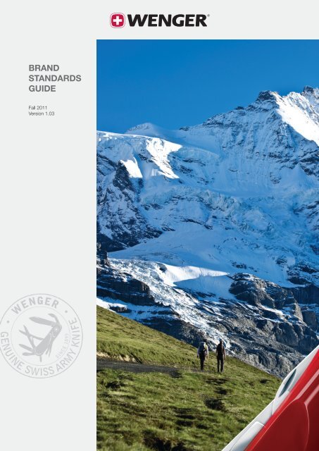
BRAND<br />
STANDARDS<br />
GUIDE<br />
Fall 2011<br />
Version 1.03
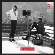
Introduction<br />
Peter Hug, CEO<br />
Our vision is to be<br />
the preferred<br />
active outdoor brand<br />
which delivers<br />
genuine Swiss Army<br />
knife solutions.<br />
It gives me great pleasure to announce the return of the<br />
<strong>Wenger</strong> brand to its true and rightful place: firmly engaged<br />
with, and serving, outdoor pursuits. We are making efforts<br />
across the board – introducing new product lines, sponsoring<br />
individuals and adventure events – but the effectiveness<br />
of those efforts will be greatly diminished if we do not<br />
present one unified face throughout all of our marketing<br />
materials. Which brings us to this guide.<br />
This guide puts every possible tool at our disposal into<br />
the hands of you, our partners, in order to properly<br />
communicate our brand’s new direction. Now we must<br />
rely on you to take these guidelines to heart, and promote<br />
<strong>Wenger</strong> products with one voice, around the world, to the<br />
mutual benefit of all. These days it’s entirely possible that<br />
a window-shopper in London will become a purchaser in<br />
Tokyo, yet need watch battery replacement in Los Angeles.<br />
To lose brand consistency is to become nothing more than<br />
a number of individual whispers lost in the din of global<br />
commerce – instead we must let our single voice ring<br />
from the mountaintops.<br />
Do not stray from these guidelines. We developed them<br />
to build brand equity and make processes more efficient.<br />
If you need clarification or assistance for any reason, see<br />
the contact information section.<br />
Peter Hug<br />
<strong>Wenger</strong> <strong>Group</strong><br />
Delémont Switzerland<br />
2
Table of contents<br />
<strong>Brand</strong> standards fall 2011<br />
Introduction . . . . . . . . . . . . . . . . . . . . . . . . . . . . . . . . . . . . 2<br />
General design principles . . . . . . . . . . . . . . . . . . . . . . . . . . 4<br />
Logo. . . . . . . . . . . . . . . . . . . . . . . . . . . . . . . . . . . . . . . . . . 5<br />
Corner knife graphic . . . . . . . . . . . . . . . . . . . . . . . . . . . . . 13<br />
Seal of authenticity . . . . . . . . . . . . . . . . . . . . . . . . . . . . . . 19<br />
Layout Recommendation . . . . . . . . . . . . . . . . . . . . . . . . . 23<br />
<strong>Wenger</strong> gray. . . . . . . . . . . . . . . . . . . . . . . . . . . . . . . . . . . 24<br />
Color palette. . . . . . . . . . . . . . . . . . . . . . . . . . . . . . . . . . . 25<br />
<strong>Brand</strong>-appropriate visual inspiration . . . . . . . . . . . . . . . . . 26<br />
Typography. . . . . . . . . . . . . . . . . . . . . . . . . . . . . . . . . . . . 28<br />
Photography. . . . . . . . . . . . . . . . . . . . . . . . . . . . . . . . . . . 32<br />
Respecting the environment . . . . . . . . . . . . . . . . . . . . . . . 36<br />
Contact information . . . . . . . . . . . . . . . . . . . . . . . . . . . . . 37<br />
List of files . . . . . . . . . . . . . . . . . . . . . . . . . . . . . . . . . . . . 38<br />
Legal information . . . . . . . . . . . . . . . . . . . . . . . . . . . . . . . 39<br />
Note: there is a separate, internal standards guide which<br />
addresses stationery layout and other non-public designs.<br />
See the contact information section.<br />
3
General design principles<br />
Five major elements<br />
5<br />
1<br />
<strong>Wenger</strong> is, and has always been, a brand dedicated to the<br />
pursuit of outdoor activities. This <strong>Standards</strong> <strong>Guide</strong> is part<br />
of an effort to more effectively communicate that to our<br />
customers – more importantly, to those people who should<br />
Si meliora dies, ut vina,<br />
poemata reddit.<br />
be our customers but don’t yet realize it. Our recently<br />
revised brand identity is made up of five components<br />
(indicated at left): (1) our logo, (2) well-defined active<br />
outdoor imagery, (3) the “corner knife” graphic (for sizing<br />
of the <strong>Wenger</strong> logo and the corner knife please refer to<br />
pages 18 and 19), (4) the “Genuine Swiss Army Knife”<br />
seal of authenticity and (5) the <strong>Wenger</strong> gray background.<br />
This is, generally speaking, their order of importance. Our<br />
logo identifies us and represents our Swiss origin. The<br />
active outdoor imagery instantly creates a connection<br />
with our desired audience, and the knife is one of the<br />
most recognized icons in the world. The seal represents<br />
our lineage and confirms our authenticity. In the rare event<br />
that space does not permit the use of all four elements,<br />
the seal need not be used. Finally, the <strong>Wenger</strong> gray is a<br />
neutral background to accentuate the white of the cross.<br />
.4<br />
.2<br />
3<br />
Where catalogs and other multiple-page documents such<br />
as brochures are concerned, the cover must adhere to<br />
the full, five-element standard. The logo and <strong>Wenger</strong> gray<br />
background should appear only on the cover and back<br />
cover. The interior pages may include as few as one other<br />
element (outdoor imagery, corner knife, and/or seal) per<br />
two-page spread.<br />
We believe that when each element is treated with respect<br />
and given the appropriate level of precedence, it will be<br />
possible to make a great variety of designs suitable for<br />
almost every application which are recognizable as<br />
belonging to one brand, and one brand only: <strong>Wenger</strong>.<br />
4
Logo<br />
<strong>Wenger</strong> cross and logotype<br />
At left you can see the preferred use of the <strong>Wenger</strong> cross<br />
and logotype (referred to together as the “logo”); this is the<br />
file named “<strong>Wenger</strong>_LB_cmyk_MED.eps”. It may be used<br />
in other ways as demonstrated on the following pages, but<br />
whenever possible this is the preferred usage (placed on<br />
the <strong>Wenger</strong> gray background) of the <strong>Wenger</strong> brand logo.<br />
Below it is “<strong>Wenger</strong>_DB_cmyk_MED.eps” placed on a<br />
solid dark background. It too may be used in other ways<br />
as shown on the following pages.<br />
We are providing the necessary files for almost every<br />
circumstance including product applications such as<br />
embossing, debossing, pad printing, etc. Should a need<br />
arise that we have not foreseen do not create your own<br />
logo or modify these files. Contact us (see “Contact<br />
information”) and <strong>Wenger</strong> Marketing will provide a new file<br />
to meet your needs. But under normal circumstances, we<br />
are sure that the logos provided here will be sufficient for<br />
your needs.<br />
5
Logo color versions<br />
Depending on the production method of the piece to which<br />
the logo is applied, there are different ways of defining the red<br />
field of the <strong>Wenger</strong> cross. You must know how the end<br />
product will be produced before choosing a logo file (your<br />
printer will be able to help you). For Powerpoint, Web, and<br />
other on-screen presentations, use one of the RGB files<br />
provided (note: do not enlarge the RGB file, as its quality will<br />
suffer). In printed pieces, use the PMS file whenever possible.<br />
If necessary, you may substitute the CMYK file. Only use the<br />
black and white (BW) file if the piece is printing without any<br />
color at all.<br />
Pantone ®<br />
PMS 200<br />
C=0<br />
M=100<br />
Y=65<br />
K=15<br />
R=190<br />
G=15<br />
B=52<br />
Different ways of specifying the red used in the <strong>Wenger</strong> cross<br />
Note: red is not to be used as a palette color.<br />
<strong>Wenger</strong>_LB_2c_MED.eps<br />
(shown on a <strong>Wenger</strong> gray background)<br />
<strong>Wenger</strong>_DB_2c_MED.eps (shown on a dark background)<br />
<strong>Wenger</strong>_LB_cmyk_MED.eps<br />
(shown on a <strong>Wenger</strong> gray background)<br />
<strong>Wenger</strong>_DB_cmyk_MED.eps (shown on a dark background)<br />
<strong>Wenger</strong>_LB_bw_MED.eps<br />
(shown on a <strong>Wenger</strong> gray background)<br />
<strong>Wenger</strong>_DB_bw_MED.eps (shown on a dark background)<br />
6
Logo file sizes<br />
With the exception of the RGB files, all logo files provided are<br />
vector art, and as such they can be enlarged or reduced<br />
without degrading in quality. However, we are providing three<br />
sizes because of the custom-designed registered ® mark<br />
which must accompany the logo. Please use the size which<br />
is closest to the size at which it will be reproduced. Please<br />
do not reduce the small (SM) or medium (MED) files to less<br />
than 50%, nor enlarge them to more than 200%. If it is<br />
necessary to use the logo at a size larger than the largest<br />
provided, it is acceptable to simply enlarge the large (LG) file<br />
as necessary. Note: RGB files are not vector. They may be<br />
reduced but must not be enlarged. If you need larger RGB<br />
files please contact us.<br />
20mm–40mm<br />
40mm–80mm<br />
<strong>Wenger</strong>_LB_2c_SM.eps<br />
(preferred for applications between 20mm–40mm)<br />
<strong>Wenger</strong>_LB_2c_MED.eps<br />
(preferred for applications between 40mm–80mm)<br />
80mm–1m<br />
<strong>Wenger</strong>_LB_2c_LG.eps<br />
(preferred for applications between 80mm–1m)<br />
7
Logo clear space<br />
Total width = logo width plus 2 times the logo height<br />
Logo height<br />
Logo height<br />
Total height = 3 times<br />
the logo height<br />
Logo height<br />
Clear space: do not allow any type or graphic within this area<br />
Available at Joe’s Outdoor Shack<br />
Available at Joe’s Outdoor Shack<br />
Unacceptable: dealer line placed too close to logo<br />
Acceptable: dealer line placed outside of the<br />
logo’s clear space<br />
8
Maintaining logo integrity<br />
Unacceptable: do not use the <strong>Wenger</strong> cross alone<br />
Unacceptable: do not use the <strong>Wenger</strong> name alone<br />
Unacceptable: do not change the proportion<br />
of the logo’s parts<br />
Unacceptable: do not move the cross from its position<br />
at the left side of the logotype<br />
Unacceptable: do not alter the colors of the logotype<br />
Unacceptable: do not place the logo in a box,<br />
regardless of the shape or color<br />
Unacceptable: do not use the Swiss flag<br />
Unacceptable: do not attempt to recreate <strong>Wenger</strong>’s cross<br />
9
Use of the logo on colored backgrounds<br />
When placing the logo on a colored background, first<br />
determine which version of the logo to use: the dark<br />
background (DB) or the light background (LB). If it isn’t<br />
immediately obvious, create and place a block of 50%<br />
black directly on top of the background in question. (In<br />
Microsoft applications, use the color called “Gray-50%”.<br />
You may also choose RGB 128/128/128 or HEX #808080.)<br />
If the background color is darker than the gray test block,<br />
use the dark background logo version. If the background<br />
color is lighter than the gray test block, use the light<br />
background logo version. If you cannot tell which one is<br />
darker, use the dark background version of the logo.<br />
Test Block:<br />
“Gray-50%”<br />
This color is darker than the test block:<br />
use “<strong>Wenger</strong>_DB_[color; size].eps”<br />
“<strong>Wenger</strong>_DB_2c_MED.eps”<br />
Test Block:<br />
“Gray-50%”<br />
This color is lighter than the test block:<br />
use “<strong>Wenger</strong>_LB_[color; size].eps”<br />
“<strong>Wenger</strong>_LB_2c_MED.eps”<br />
Test Block:<br />
“Gray-50%”<br />
This color is very similar to the test block:<br />
use “<strong>Wenger</strong>_DB_[color; size].eps”<br />
“<strong>Wenger</strong>_DB_2c_MED.eps”<br />
10
Use of the logo on colored backgrounds (cont.)<br />
Unacceptable: incorrect logo placed on a light background<br />
Unacceptable: incorrect logo placed on a dark background<br />
Unacceptable: incorrect logo placed on a neutral<br />
background<br />
Unacceptable: incorrect logo placed on a neutral<br />
background<br />
Unacceptable: do not place the logo on a split background<br />
Unacceptable: do not mix parts of each version of the logo<br />
11
Use of the logo with photography<br />
In most instances, the logo should not be placed on top of a<br />
photographic background. However, if it becomes necessary<br />
to place the logo on a photograph, be sure to place it on an<br />
area with as little variety as possible (it may be necessary to<br />
retouch the photograph to do this). When determining which<br />
logo version to use, you may follow the gray box rules<br />
(“Use of the logo on colored backgrounds”), but be sure to<br />
consider the entire background and not just one specific<br />
area. See the following color photograph examples below:<br />
Acceptable use<br />
Acceptable use<br />
Unacceptable: too much contrast<br />
Unacceptable: too much contrast<br />
Unacceptable: background is too light<br />
Unacceptable: background is too dark<br />
Unacceptable: background is too busy<br />
Unacceptable: background is too busy<br />
Note: placing the logo on any background other than<br />
<strong>Wenger</strong> gray quickly becomes a matter of personal<br />
judgement. If you do not feel comfortable making such a<br />
judgement, or if you feel than any of the previous examples<br />
are unclear, we strongly suggest that you simply use the<br />
logo on a <strong>Wenger</strong> gray background as shown at the<br />
opening of the “Logo” section.<br />
12
Corner knife graphic<br />
Our most recognizable product<br />
Corner knife:<br />
CornerKnife_cmyk.eps<br />
As shown on the cover of this <strong>Standards</strong> <strong>Guide</strong>, the<br />
corner knife graphic is a significant part of our new<br />
identity. It anchors our public persona with the most<br />
instantly recognizable product we make: the Swiss Army<br />
knife. As with all of the visual elements of our brand, it is<br />
very important to maintain consistency in the use of the<br />
corner knife graphic. It is not acceptable to simply place<br />
any knife anywhere within the piece; it must be one of the<br />
corner knife EPS files provided and it must be placed in<br />
the lower, right hand corner. Do not enlarge, alter the<br />
proportion, crop or color these files in any way. They may,<br />
however, be reduced.<br />
As illustrated at left, note the dotted line: this indicates the<br />
“trim” or edge of the printed graphic. Extra image (4mm<br />
at 100%) is provided on two sides because it is necessary<br />
for commercial printing purposes (it is not provided in the<br />
RGB version of the files because these should neither print<br />
nor trim).<br />
Note: although we are providing additional versions for<br />
other circumstances, use only the CMYK corner knife files<br />
for print advertising purposes.<br />
13
Proper size of the corner knife<br />
In order to create well-proportioned layouts, it is necessary<br />
that all brand elements are properly sized. With regard to the<br />
corner knife, please apply the following guidelines:<br />
For common document proportions – such as A4, US letter,<br />
square and other similar shapes – the length of the corner<br />
knife graphic (A) should be between 1/3 and 1/4 of the<br />
length of the short side of the document (B).<br />
For extremely vertical proportions the base of the corner<br />
knife graphic should be between 1/2 and up to the entire<br />
width of the document.<br />
For extremely horizontal proportions the base of the corner<br />
knife graphic should be between 1/2 and up to the entire<br />
height of the document.<br />
Common document proportions<br />
Extremely vertical proportions<br />
B<br />
1/3 1/4 1/2<br />
A<br />
B A<br />
Extremely horizontal proportions<br />
1<br />
1/2<br />
A<br />
long side<br />
short side<br />
B<br />
14
Proper size of the logo<br />
The size relationship between the <strong>Wenger</strong> logo and the<br />
corner knife graphic is extremely important. In order to<br />
achieve balance and harmony it is required that the width<br />
of the <strong>Wenger</strong> logo (C) must be between 100% and 125%<br />
the length of the corner knife (A).<br />
A+25%<br />
C<br />
A<br />
A<br />
Unacceptable: logo too small<br />
Unacceptable: logo too big<br />
15
Corner knife element usage<br />
Acceptable lightbox or poster graphic (this sample uses<br />
the traditional “L” but an inverted “L” is also acceptable)<br />
Acceptable catalog cover (this sample uses the<br />
inverted “L” but a traditional “L” is also acceptable)<br />
Unacceptable: must be placed in lower right corner<br />
Unacceptable: do not use any other knife<br />
16
Corner knife element usage (cont.)<br />
Unacceptable: must be placed at both edges of the page<br />
Unacceptable: do not use any other knife<br />
Unacceptable: must not be cropped further<br />
Unacceptable: do not use any other knife<br />
17
Seal of authenticity<br />
Swiss Army knife lineage<br />
Above: seal with 15% opacity<br />
Below: the seal in its three available languages,<br />
in the preferred “watermark” appearance<br />
with an opacity (or screen) of 15%<br />
The “<strong>Wenger</strong>: Genuine Swiss Army Knife – Since 1893”<br />
seal is an important component of our identity, because it<br />
identifies <strong>Wenger</strong> as an authentic brand amongst imposters.<br />
However, care must be taken so that the seal is subtle in the<br />
layout so that it does not overpower the <strong>Wenger</strong> logo. For<br />
this reason we require that it always be used with a “watermark”<br />
appearance, with an opacity (screen or ghosting) of<br />
between 10–20% (the white seal only may be used up to<br />
30% opacity), placed so as to provide low contrast with<br />
the background. The black seal should have a 15% opacity<br />
when placed on a white background but a 20% opacity<br />
when placed on the <strong>Wenger</strong> gray background. Additionally,<br />
it must have a diameter between 60% and 200% of the<br />
width of the entire logo. The seal must always be placed<br />
apart from the logo, and positioned on the edge of a page<br />
in such a way that part of it appears to be cut off (see the<br />
following pages). Under no circumstances is it to be<br />
used to replace the logo itself.<br />
When choosing whether to use the white or black version,<br />
apply the same rule as when using the logo on a colored<br />
background earlier in this manual. The white seal is to be<br />
used on dark backgrounds and the black on light backgrounds<br />
(always observing the low contrast requirement<br />
above).<br />
Note: if the black version is used on top of any background<br />
other than the <strong>Wenger</strong> gray or white, please take care that it<br />
“overprint” the background rather than “knock out”.<br />
18
Cropping and rotating the seal<br />
The seal may be rotated by plus or minus 20° and cropped<br />
on almost any side. Do not crop more than two sides and<br />
do not crop more than 1/5 of the seal’s diameter. Thus for<br />
a seal of 50mm, you may crop one side by up to 10mm, or<br />
two sides by 7mm and 3mm (or 5mm and 5mm, etc). We<br />
also prefer that the phrase “Genuine Swiss Army Knife” be<br />
readable; for this reason we suggest that this particular side<br />
be only partially cropped, if it must be cropped at all.<br />
In the following 50mm seal examples, the dotted red lines represent “trim” (the edge of the page) and<br />
the red area of the seal indicates what would be cropped off.<br />
6mm<br />
20° -20°<br />
10mm<br />
4mm<br />
Acceptable: 20° rotation, combined crop is 1/5 seal diameter<br />
Acceptable: -20° rotation, crop is 1/5 seal diameter<br />
6mm<br />
10mm<br />
12mm<br />
Unacceptable: rotation is greater than 20° and combined<br />
crop is greater than 1/5 seal diameter<br />
Unacceptable: crop is 1/5 seal diameter (acceptable) but<br />
the phrase “Genuine Swiss Army Knife” is not readable<br />
19
Seal placement on photos<br />
Acceptable: black seal at 20% opacity, placed on a<br />
low-contrast light photographic background<br />
Acceptable: white seal at 20% opacity, placed on a<br />
low-contrast dark photographic background<br />
Unacceptable: do not modify the seal by changing its color<br />
(or in any other way); the seal must be used in black or<br />
white, with an opacity of 20% or less<br />
Unacceptable: do not place the seal on a background<br />
which is too busy; we require the seal to be subtle,<br />
but not hidden<br />
20
Seal placement on <strong>Wenger</strong> gray background<br />
Acceptable: black seal at 20% opacity<br />
(this sample uses the traditional “L”)<br />
Acceptable: white seal at 20% opacity<br />
(this sample uses the inverted “L”)<br />
Unacceptable: the phrase “Genuine Swiss Army Knife”<br />
is not readable; the seal is too dark, seal should have<br />
an opacity of 20%<br />
Unacceptable: do not use the white seal on the<br />
<strong>Wenger</strong> gray, the black seal should be used<br />
with a 20% opacity.<br />
21
Layout recommendation<br />
A guide for common document proportions<br />
Common document proportion:<br />
.C<br />
D<br />
As a guide please follow the following steps which illustrate<br />
the proper sizing for each brand element within a layout:<br />
F<br />
1. Begin by calculating the length of the corner knife (A) which<br />
should be between 1/3 and 1/4 of the length of the short side<br />
of document (B). On the sample shown left, the corner knife<br />
(A) is 1/3 the length of the short side of document (B).<br />
H<br />
2. The width of the <strong>Wenger</strong> logo (C) must be between 100%<br />
and 125% of the length of the corner knife (A). On the sample<br />
shown left, the width of <strong>Wenger</strong> logo (C) is 120% the length<br />
of corner knife (A).<br />
G<br />
E<br />
3. To determine the size of the <strong>Wenger</strong> Gray “L” shape, it<br />
is recommended that the height of the horizontal part of field<br />
(D) be between 300% and 310% the height of the <strong>Wenger</strong><br />
logo (C). The width of the vertical part of field (E) should be<br />
between 175% and 200% the height of area (D). In the<br />
sample shown left, area (D) is 310% the height of the <strong>Wenger</strong><br />
logo (C). The width of area (E) is 175% the height of area (D).<br />
Please note that the inverted “L” (shown left) and a traditional<br />
“L” are both acceptable.<br />
B<br />
A<br />
4. When placing the seal (F) on the <strong>Wenger</strong> gray, utilize the<br />
black seal version with an opacity of 20% and position it on<br />
the edge of the page so that it appears cropped. Also keep in<br />
mind that the diameter of the seal (F) must be at least 60%<br />
the width of the <strong>Wenger</strong> logo (C). In the example shown left,<br />
the seal (F) is 75% the width of the <strong>Wenger</strong> logo (C). The seal<br />
is rotated -20°.<br />
H<br />
G<br />
Note: InDesign master layouts for catalogs, etc are<br />
available on request by contacting marketing@wenger.ch<br />
5. When placing a featured product (G) on layout, position the<br />
item so that a portion of it overlaps the key brand visual. For<br />
items that are more vertical such as watches and backpacks,<br />
we recommend that the height of the item be up to 30% of<br />
the document’s height for vertical layouts and up to 50% of<br />
the height for horizontal layouts. For items that are horizontal<br />
or square, such as footwear we recommend that it be sized<br />
up to 25% the height of the document for vertical layouts and<br />
up to 35% for horizontal layouts. These percentages can be<br />
increased on larger media such as billboards, posters and<br />
lightboxes.<br />
22
Alternative brand banner designs for extreme layouts<br />
In the rare event that space does not permit the use of all<br />
<strong>Wenger</strong> brand elements, the layout may include as few as<br />
one brand element - the <strong>Wenger</strong> logo. If the <strong>Wenger</strong> logo is<br />
placed alone on a vertical layout, the logo may be rotated -<br />
90° so that the cross is on top. A 90° rotation where the<br />
cross is on the bottom is not permitted. See the following<br />
samples for situations where not all brand elements should<br />
be utilized:<br />
Acceptable horizontal brand banner: the <strong>Wenger</strong> logo alone<br />
on the <strong>Wenger</strong> gray background is ideal for situations where clarity<br />
on the <strong>Wenger</strong> logo is paramount. (eg. website banners,<br />
display headers, etc.)<br />
Acceptable vertical brand banners<br />
Unacceptable: not enough space to fully represent the<br />
brand properly. <strong>Wenger</strong> logo and brand image appear<br />
overwhelmed by the corner knife.<br />
Unacceptable: <strong>Wenger</strong> logo is too large<br />
compared to the corner knife and seal.<br />
Unacceptable: diameters of seals are less<br />
than 60% of width of the logo. Vertical <strong>Wenger</strong><br />
logo should not be used with corner knife or<br />
seal. The brand image is incomplete.<br />
23
<strong>Wenger</strong> gray<br />
Our preferred background color<br />
Pantone Cool Gray 1<br />
C0,M0,Y0,K6<br />
R226,G225,B221<br />
The <strong>Wenger</strong> brand is an outdoor brand, and the outdoors<br />
is seldom pure white. For this reason, we have designated<br />
“<strong>Wenger</strong> gray” to be used as a background color. <strong>Wenger</strong><br />
gray is defined as Pantone Cool Gray 1 or its CMYK or RGB<br />
equivalents, shown at left (note that the CMYK conversion is<br />
based on the official Pantone standards and some software<br />
may convert it incorrectly. We highly advise utilizing the 6%<br />
black formula for any full color printed pieces being<br />
produced without spot colors). It has the added advantage<br />
of highlighting the white of the cross in the <strong>Wenger</strong> logo,<br />
and of making our outdoor photography appear more<br />
vibrant by comparison.<br />
24
Color palette<br />
Echoing the shades of nature<br />
Primary colors<br />
Pantone 7502<br />
C0,M8,Y35,K10<br />
R212,G191,B149<br />
Pantone 448<br />
C65,M58,Y100,K35<br />
R77,G68,B46<br />
Pantone 5405<br />
C78,M51,Y37,K13<br />
R68,G104,B125<br />
Pantone 430<br />
C5,M0,Y0,K45<br />
R130,G138,B143<br />
Secondary colors<br />
Pantone 553<br />
C59,M0,Y53,K80<br />
R33,G66,B50<br />
Our brand identity is primarily dominated by outdoor,<br />
color photography. In the event that color is necessary<br />
to distinguish similar objects from one another (trade fair<br />
stands, shop-in-shop materials, packaging labels or<br />
promotional items, for example), you should choose from<br />
among the 8 colors shown to the left. These colors are<br />
broken up into two categories: 4 primary colors and 4<br />
secondary colors. These colors are inspired by the natural<br />
environment, will compliment our outdoor photography and<br />
reinforce our brand’s position. Additionally, as demonstrated,<br />
they have the advantage of being independently identifiable<br />
in screens down to 20%.<br />
Colors are identified by the Pantone Matching System (PMS)<br />
number (an internationally-recognized color system), the<br />
process color mix (CMYK) suitable for general printing and<br />
their RGB equivalents for Web and other on-screen<br />
applications.<br />
Note: red is never to be used as a palette color.<br />
Pantone 7407<br />
C0,M22,Y85,K11<br />
R204,G156,B74<br />
Pantone 469<br />
C40,M73,Y89,K49<br />
R97,G54,B29<br />
Pantone 291<br />
C33,M3,Y0,K0<br />
R158,G206,B235<br />
25
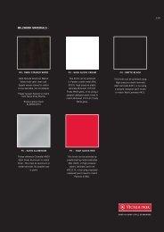
<strong>Brand</strong>-appropriate visual inspiration<br />
Beyond the printed surface<br />
Generally speaking, there are many materials which will<br />
represent the <strong>Wenger</strong> brand – primarily those used in our<br />
products. But when given the opportunity to represent the<br />
brand in a three dimensional environment, we must be sure<br />
that we do so appropriately. Care must be taken when<br />
choosing materials.<br />
The first requirement, obviously, is that the material represent<br />
the outdoors in a direct manner. Stone, wood, sand, moss –<br />
these are all good examples. The next requirement is that<br />
it appear to be as genuine as possible. If imitation materials<br />
must be used, ensure that they have a highly authentic<br />
appearance. If an ordinary person could see that they are<br />
not real, do not use them.<br />
If for any reason you use living materials, such as potted<br />
plants, please be sure that they are properly cared for and<br />
have a destination other than the rubbish heap when their<br />
purpose has been served. Last year’s trade fair plants can<br />
still brighten today’s offices.<br />
Files of these images are not provided, because they are<br />
not intended to be used as visuals, but only to enable you<br />
to better visualize the <strong>Wenger</strong> brand beyond its obvious<br />
associations.<br />
26
<strong>Brand</strong>-appropriate visual inspiration<br />
27
Typography<br />
Helvetica Neue Family (preferred)<br />
A B C D E F G H I J K L M N O P<br />
Q R S T U V W X Y Z<br />
a b c d e f g h i j k l m n o p q r s t u v<br />
w x y z & 1 2 3 4 5 6 7 8 9 0<br />
Helvetica Neue - 45 Light<br />
A B C D E F G H I J K L M N O P<br />
Q R S T U V W X Y Z<br />
a b c d e f g h i j k l m n o p q r s t u<br />
v w x y z & 1 2 3 4 5 6 7 8 9 0<br />
Helvetica Neue - 75 Bold<br />
Typography is an essential element of any brand identity. As<br />
such, worldwide consistency is essential and mandatory.<br />
<strong>Wenger</strong> is phasing out the Bell Gothic BT font family and<br />
replacing it with the Helvetica Neue family. It is not<br />
mandatory at this time to replace printed materials that<br />
currently use the Bell Gothic BT font. However, any new<br />
material should use the Helvetica Neue type family. Under<br />
no circumstances can the Helvetica Neue font and the Bell<br />
Gothic BT font be used together on the same piece. No<br />
type family other than Helvetica Neue or Bell Gothic BT may<br />
be used in any <strong>Wenger</strong> materials, whether printed,<br />
constructed (retail displays and similar) or digitally created<br />
for online materials and/or video.<br />
The preferred setting of headlines is in Helvetica Neue-75<br />
Bold, upper and lower case (all caps may be used in limited<br />
cases but only with prior approval). Leading should be set to<br />
120% of the point size. Body copy should be set in Helvetica<br />
Neue-45 Light between 9–11 points with leading between<br />
14–18 points. Do not set copy justified, and no tracking or<br />
letter-spacing should be used. Mouse type for disclaimers or<br />
warranty information may be set in 6 points, solid (6 point<br />
type on 6 point leading).<br />
Utilizing Helvetica Neue-75 Bold is an acceptable means of<br />
emphasis. Neue-46 Light Italic may be used for titles of<br />
works. For multi-lingual documents where space is limited,<br />
Helvetica Neue-57 Condensed may be used in headlines and<br />
Helvetica Neue-47 Light Condensed for body copy<br />
Helvetica Neue font is available from linotype.com.<br />
28
Typography<br />
Bell Gothic BT Family (acceptable)<br />
A B C D E F G H I J K L M N O P<br />
Q R S T U V W X Y Z<br />
a b c d e f g h i j k l m n o p q r s t u v<br />
w x y z & 1 2 3 4 5 6 7 8 9 0<br />
Bell Gothic BT<br />
A B C D E F G H I J K L M N O P<br />
Q R S T U V W X Y Z<br />
a b c d e f g h i j k l m n o p q r s t u v<br />
w x y z & 1 2 3 4 5 6 7 8 9 0<br />
Bell Gothic Bold BT<br />
A B C D E F G H I J K L M N O P<br />
Q R S T U V W X Y Z<br />
a b c d e f g h i j k l m n o p q r s t u v<br />
w x y z & 1 2 3 4 5 6 7 8 9 0<br />
This typeface was originally designed for telephone directories,<br />
and as a result features high legibility at smaller sizes. We<br />
have found this practicality to be particularly resonant with<br />
the Swiss nature of the <strong>Wenger</strong> brand.<br />
The preferred setting of headlines is in Bell Gothic Black BT,<br />
upper and lower case (all caps may be used in limited cases<br />
but only with prior approval). Leading should be set to 120%<br />
of the point size. Body copy should be set in Bell Gothic BT<br />
between 9–11 points with leading between 14–18 points. Do<br />
not set copy justified, and no tracking or letter-spacing should<br />
be used. Mouse type for disclaimers or warranty information<br />
may be set in 6 points, solid (6 point type on 6 point leading).<br />
Bell Gothic Bold BT should be used sparingly for elements<br />
which are set off from the main body of text. Do not mix the<br />
plain and bold weights within a paragraph (the black weight,<br />
however, may be used). There is no italic within the Bell Gothic<br />
BT family of typefaces – do not imitate italic by artificially<br />
slanting the typeface. Utilizing Bell Gothic Black BT is an<br />
acceptable means of emphasis.<br />
Bell Gothic BT is available exclusively from myFonts.com, the<br />
online store of type foundry Bitstream, Inc.<br />
Bell Gothic Black BT<br />
29
Typographic examples – headlines<br />
Sample headline: flush left, caps and<br />
lower case with no letterspacing.<br />
Acceptable: Helvetica Neue 75 Bold, 21 point on 25 point leading<br />
Sample headline: flush left, caps and<br />
lower case with no letterspacing.<br />
Unacceptable: never scale (stretch) type in <strong>Wenger</strong> materials; do not add letterspacing<br />
Sample headline: flush left, caps and<br />
lower case with no letterspacing.<br />
Unacceptable: never scale (stretch) type in <strong>Wenger</strong> materials; do not use leading other than 120% of the point size<br />
Sample headline: flush left, caps and<br />
lower case with no letterspacing.<br />
Unacceptable: never artificially bold (“Sample headline:”)<br />
30
Typographic examples – body copy<br />
Si meliora dies, ut vina, poemata reddit, scire velim, chartis<br />
pretium quotus arroget annus. scriptor abhinc annos centum<br />
qui decidit, inter perfectos veteresque referri debet an inter<br />
vilis atque novos? Excludat iurgia finis, est vetus atque<br />
probus, centum qui perficit annos. Quid, qui deperiit minor<br />
uno mense vel anno, inter quos referendus erit? Veteresne<br />
poetas, an quos et praesens et postera respuat aetas. Iste<br />
quidem veteres inter ponetur honeste, qui vel mense brevi<br />
Si meliora dies, ut vina, poemata reddit, scire<br />
velim, chartis pretium quotus arroget annus.<br />
scriptor abhinc annos centum qui decidit, inter<br />
perfectos veteresque referri debet an inter vilis<br />
atque novos? Excludat iurgia finis, est vetus<br />
atque probus, centum qui perficit annos. Quid,<br />
qui deperiit minor uno mense vel anno, inter quos<br />
referendus erit? Veteresne poetas, an quos et<br />
Acceptable: 9 point type on 14 point leading<br />
Unacceptable: do not add letterspacing to body copy<br />
Si meliora dies, ut vina, poemata reddit,<br />
scire velim, chartis pretium quotus<br />
arroget annus. scriptor abhinc annos<br />
centum qui decidit, inter perfectos veteresque<br />
referri debet an inter vilis<br />
atque novos? Excludat iurgia finis, est<br />
vetus atque probus, centum qui perficit<br />
annos. Quid, qui deperiit minor<br />
Si meliora dies, ut vina, poemata reddit, scire velim, chartis<br />
pretium quotus arroget annus. scriptor abhinc<br />
annos centum qui decidit, inter perfectos veteresque referri<br />
debet an inter vilis atque novos? Excludat iurgia finis, est<br />
vetus atque probus, centum qui perficit annos. Quid, qui deperiit<br />
minor uno mense vel anno, inter quos referendus erit?<br />
Veteresne poetas, an quos et praesens et postera respuat<br />
aetas. Iste quidem veteres inter ponetur honeste, qui vel<br />
Unacceptable: 14 point type on 14 point leading<br />
Unacceptable: do not justify body copy<br />
Si meliora dies, ut vina, poemata reddit, scire velim, chartis pretium quotus arroget<br />
annus. scriptor abhinc annos centum qui decidit, inter perfectos veteresque<br />
referri debet an inter vilis atque novos? Excludat iurgia finis, est vetus<br />
atque probus, centum qui perficit annos. Quid, qui deperiit minor uno mense<br />
vel anno, inter quos referendus erit? Veteresne poetas, an quos et praesens et<br />
postera respuat aetas. Iste quidem veteres inter ponetur honeste, qui vel<br />
mense brevi vel toto est iunior anno.” Utor permisso, caudaeque pilos ut<br />
equinae paulatim vello unum, demo etiam unum, dum cadat elusus ratione ru-<br />
Si meliora dies, ut vina, poemata reddit, scire<br />
velim, chartis pretium quotus arroget annus. scriptor<br />
abhinc annos centum qui decidit, inter perfectos<br />
veteresque referri debet an inter vilis atque<br />
novos? Excludat iurgia finis, est vetus atque<br />
probus, centum qui perficit annos. Quid, qui deperiit<br />
minor uno mense vel anno, inter quos referendus<br />
erit? Veteresne poetas, an quos et<br />
Unacceptable: 7 point type on 14 point leading<br />
Unacceptable: do not scale (stretch) body copy<br />
31
Photography<br />
One quality standard worldwide<br />
Note: the following instructions are for primary product<br />
photos. You may wish to take additional images which are<br />
more feature-specific. For such secondary photos, you may<br />
be more free with the product position, crop, etc. – although<br />
the requirements for attention to detail obviously still apply.<br />
Image photography<br />
We’re happy to announce that we have created a photo<br />
library of active outdoor imagery (such as the example at left)<br />
for use by all of our partners. These images are the result of<br />
our contracts with various professional photographers and<br />
have been assembled with great effort and attention.<br />
Collectively, they are a celebration of Mother Earth’s variety<br />
and beauty – each imparts a sense of wonder and<br />
acknowledges the scale of human existence (and activity)<br />
within the much larger natural world.<br />
Please note that the contents of the photo library (and all of<br />
the images presented throughout this standards manual) are<br />
copyrighted by, and the property of, <strong>Wenger</strong> SA and their<br />
contracted photographers. They may not be reproduced for<br />
any reason other than the exclusive promotion of <strong>Wenger</strong><br />
products as described throughout this guide. The license for<br />
images in <strong>Wenger</strong>’s initial photo library that were introduced in<br />
2009 will expire in March 2012. Under no circumstances can<br />
these photos be created or reproduced after March 2012.<br />
Following the industry standard, all <strong>Wenger</strong> environment<br />
images are supplied in RGB format. RGB files are provided<br />
because they are capable of carrying a wider range of color<br />
information than CMYK files. Additionally, RGB files can be<br />
compressed more than CMYK files which makes them easier<br />
to work with and transfer. However, please be aware that<br />
RGB files will not print properly unless they are converted to<br />
CMYK. Professional graphics vendors have their ownoptimized<br />
means of converting RGB files in order to get the<br />
best possible print quality on their equipment. If necessary,<br />
you can request a conversion directly from <strong>Wenger</strong> SA.<br />
Please allow 15 working days.<br />
Product photography<br />
The majority of our product photography will also be provided<br />
to you upon request. However, in the event that you should<br />
need to shoot products locally, please provide your photographer<br />
with the instructions on the following pages as they<br />
relate to specific product categories.<br />
32
Key brand visuals vs. product in use shots<br />
<strong>Wenger</strong>’s photo library contains both Key <strong>Brand</strong> Visuals and<br />
Product in Use Shots. Key <strong>Brand</strong> Visuals are to be utilized<br />
for main images in advertisements; catalog covers; category<br />
introductions, etc. Particular care should be taken when<br />
cropping key brand visuals. The focus of the image should<br />
include the environment and not just the individual in the<br />
photo.<br />
Product in use shots are available for situations where<br />
additional images are needed for inset shots in catalogs and<br />
websites.<br />
Note: Product in use shots are never to be used in place of<br />
a key brand visual.<br />
Acceptable: key brand visual was utilized on cover<br />
Acceptable: product in use shot placed as an<br />
inset shot on interior pages of a catalog<br />
Unacceptable: product in use shot should not be used<br />
in place of a key brand visual<br />
Unacceptable: key brand visual cropped too tightly,<br />
too much focus is on the activity and<br />
not enough on the environment<br />
33
Knives<br />
Blades and implements should be wiped clean of oil, dust<br />
and fingerprints. In images like the above left, each<br />
implement should have evenly faded gray reflections with<br />
no hard edges. Make as much effort as possible to separate<br />
each implement from the others evenly when fanning them<br />
out, taking great care to fully deploy the scissor and plier<br />
levers. Often, at least one implement in each knife should<br />
be opened fully. Closed knives, like the one on the right,<br />
are permitted only as demonstrations of alternate colors or<br />
finishes – they must always be accompanied by a knife of<br />
the same model with its implements fully displayed.<br />
Watches<br />
Here as well, all metal surfaces should be wiped clean of<br />
fingerprints and dust. Watches should be turned slightly to<br />
the left so that 4-5mm (at actual size) of the inside of the<br />
band or bracelet shows on the crown side of the case, as<br />
shown above. This is typically the width of the lug arms.<br />
Depending on the type of watch, you should set them to the<br />
following times and/or dates. For three-hand watches, such<br />
as the middle one above, time should be set to 10:09:19,<br />
unless there is a date window in the lower-right quadrant, in<br />
which case set it to 10:09:39. For chronographs or other<br />
watches with sub-dials, set the time to 11:05. The chrono<br />
seconds hand (often the longest, red hand) should be set to<br />
19 unless there is a date window in the lower-right quadrant,<br />
in which case set it to 39. If there is a fourth hand (such as<br />
an alarm hand), it should be set to whichever position (19 or<br />
39) is not already occupied according to the previous rules.<br />
Subdial hands should all point straight up. Dates should<br />
always read “7”. Day of the week should be “Wed” or the<br />
middle of the work week. Second time zone dials (such as<br />
the one shown above right) must show the same minutes<br />
as the main dial.<br />
34
Footwear<br />
Footwear has a few specific requirements. First, always<br />
photo-graph the outside of the shoe or boot, not the inside<br />
(e.g., the left side of a left foot and the right side of a right<br />
foot). Shoes and boots should be fully laced but not tied,<br />
with the remaining lace ends stowed inside the shoe (out of<br />
view). Take care not to expose any stuffing behind the<br />
tongue or through cut-outs.<br />
Backpacks and other outdoor gear<br />
Backpacks and other packs should be stuffed but not overstuffed<br />
– there is a fine line between the two. Effort should<br />
be taken to stow extraneous straps, cords or ties. The main<br />
(shoulder) straps should be propped so as to be visible from<br />
the side in a 3/4 view (as shown above left). When possible,<br />
all gear should be steamed (or left set up over a period of<br />
time) to reduce the appearance of wrinkles which result from<br />
storage (the wrinkles which appear from being filled – but<br />
not over-stuffed – are acceptable).<br />
35
Respecting the environment<br />
Ensuring outdoor pursuits for future generations<br />
<strong>Wenger</strong> is committed to protecting the environment. We<br />
strive to set an example of environmental responsibility<br />
for colleagues, our consumers, customers, vendors and<br />
business partners.<br />
With this in mind, we strongly suggest that you use<br />
recycled or recyclable materials, low VOC materials and<br />
sustainable or renewable resources. The Forest Stewardship<br />
Council, an independent, non-governmental, not for profit<br />
organization established to promote the responsible<br />
management of the world’s forests (based in Bonn,<br />
Germany), has certified paper suppliers and printers<br />
around the world and is an excellent resource. They can<br />
be found at fsc.org. If you must print something, please<br />
print it on FSC-certified paper.<br />
Fortunately, it is becoming easier and easier to source<br />
environmentally responsible materials. We believe that profit<br />
and environmental responsibility will increasingly work<br />
together as more industries find out that nature works for<br />
both sustainability and the bottom-line. Thank you for<br />
joining us in this effort.<br />
36
Contact information and approval guidelines<br />
Internal communication process<br />
Contact information:<br />
If you have any questions about this guide please contact<br />
your Sales Manager or <strong>Wenger</strong> SA Marketing at:<br />
marketing@wenger.ch<br />
or by phone + 41 32 421 3900<br />
Approval guidelines:<br />
All materials created on behalf of the <strong>Wenger</strong> brand and/or<br />
<strong>Wenger</strong> products must be approved by <strong>Wenger</strong> SA<br />
Marketing in Delémont. Please allow at least 10 working<br />
days for approval.<br />
IMPORTANT: Support from <strong>Wenger</strong> SA is contingent upon<br />
cooperation with the standards set forth in this <strong>Guide</strong>.<br />
37
List of files<br />
All available in PC and Mac format<br />
Note: “SM” = Small, “MED” = Medium, “LG” = Large<br />
Logos<br />
“LB” = Light background, “DB” = Dark Background<br />
Please see “Logo” section for details and proper usage.<br />
CMYK files:<br />
<strong>Wenger</strong>_LB_cmyk_SM.eps<br />
<strong>Wenger</strong>_LB_cmyk_MED.eps<br />
<strong>Wenger</strong>_LB_cmyk_LG.eps<br />
<strong>Wenger</strong>_DB_cmyk_SM.eps<br />
<strong>Wenger</strong>_DB_cmyk_MED.eps<br />
<strong>Wenger</strong>_DB_cmyk_LG.eps<br />
RGB files (Medium only):<br />
<strong>Wenger</strong>_LB_rgb.jpg<br />
<strong>Wenger</strong>_LB_rgb.png<br />
<strong>Wenger</strong>_DB_rgb.jpg<br />
<strong>Wenger</strong>_DB_rgb.png<br />
Black and white files:<br />
<strong>Wenger</strong>_LB_bw_SM.eps<br />
<strong>Wenger</strong>_LB_bw_MED.eps<br />
<strong>Wenger</strong>_LB_bw_LG.eps<br />
<strong>Wenger</strong>_DB_bw_SM.eps<br />
<strong>Wenger</strong>_DB_bw_MED.eps<br />
<strong>Wenger</strong>_DB_bw_LG.eps<br />
2-color files (PMS 200 + black):<br />
<strong>Wenger</strong>_LB_2c_SM.eps<br />
<strong>Wenger</strong>_LB_2c_MED.eps<br />
<strong>Wenger</strong>_LB_2c_LG.eps<br />
<strong>Wenger</strong>_DB_2c_SM.eps<br />
<strong>Wenger</strong>_DB_2c_MED.eps<br />
<strong>Wenger</strong>_DB_2c_LG.eps<br />
Product logos*:<br />
<strong>Wenger</strong>_Emboss.eps<br />
<strong>Wenger</strong>_Deboss.eps<br />
<strong>Wenger</strong>_1c.eps<br />
**<br />
Corner knife element<br />
Available in three orientations: preferred, tall and short.<br />
See “Corner Knife” section for details and proper usage.<br />
CMYK files:<br />
CornerKnife_cmyk.eps<br />
CornerKnife_cmyk_short.eps<br />
CornerKnife_cmyk_tall.eps<br />
RGB files (Do not include bleed):<br />
CornerKnife_rgb.jpg<br />
CornerKnife_rgb.png<br />
CornerKnife_rgb_short.jpg<br />
CornerKnife_rgb_short.png<br />
CornerKnife_rgb_tall.jpg<br />
CornerKnife_rgb_tall.png<br />
2-color files* (PMS 200 + black):<br />
CornerKnife_2c.eps<br />
CornerKnife_2c.psd<br />
CornerKnife_2c_short.eps<br />
CornerKnife_2c_short.psd<br />
CornerKnife_2c_tall.eps<br />
CornerKnife_2c_tall.psd<br />
5-color files** (PMS 200 + CMYK):<br />
CornerKnife_5c.eps<br />
CornerKnife_5c.psd<br />
CornerKnife_5c_short.eps<br />
CornerKnife_5c_short.psd<br />
CornerKnife_5c_tall.eps<br />
CornerKnife_5c_tall.psd<br />
Spot color .eps files are provided for those applications that<br />
do not support .psd<br />
* 1-color product logo files are provided for product<br />
applications such as embossing, debossing, pad printing, etc.<br />
Seal<br />
Available in Deutsch (“DE”), English (“EN”), Français (“FR”). Do not enlarge .tif files. See “Seal” section for proper usage.<br />
Seal-DE_1bit.tif<br />
Seal-DE_Black.eps<br />
Seal-DE_White.eps<br />
Seal-EN_1bit.tif<br />
Seal-EN_Black.eps<br />
Seal-EN_White.eps<br />
Seal-FR_1bit.tif<br />
Seal-FR_Black.eps<br />
Seal-FR_White.eps<br />
38
Legal information<br />
Ownership and permissions, agreements, etc.<br />
Trademarks<br />
<strong>Wenger</strong> SA is exclusive owner of the trademarks WENGER ® ,<br />
SWIBO ® , Grand Maître ® , Swissgear ® , <strong>Wenger</strong>. The Genuine<br />
Swiss Army Knife ® , <strong>Wenger</strong>. Maker of the Genuine Swiss<br />
Army Knife ® , Maker of the Genuine Swiss Army Knife ® , ® in<br />
Switzerland and in most countries worldwide. In addition,<br />
<strong>Wenger</strong> SA is exclusive proprietor of other trademarks used<br />
for certain of its models.<br />
Official <strong>Wenger</strong> partners are authorized to employ the above<br />
mentioned <strong>Wenger</strong> SA trademarks in its publicity and its<br />
promotion and marketing activities as an official partner. In<br />
all cases, the official partner shall employ the trademarks<br />
only in the manner and form as prescribed by <strong>Wenger</strong> SA.<br />
The official partner shall refrain from obtaining or trying to<br />
obtain any rights, either through registration or use, to any<br />
trademarks owned or used by <strong>Wenger</strong> SA. The official<br />
partner shall not attack or contest the ownership of <strong>Wenger</strong><br />
SA or the validity of the above-mentioned trademarks, even<br />
after termination of agreements.<br />
The official partner shall inform <strong>Wenger</strong> SA of any counterfeiting<br />
coming to its knowledge of the said trademarks in the<br />
territory and shall cooperate, if requested by <strong>Wenger</strong> SA, in<br />
their protection.<br />
The official partner's right to use the trademarks shall cease<br />
upon expiration of any agreements.<br />
The trademarks mentioned above, when used on business<br />
papers or sales documents and in advertising, must be<br />
accompanied by a ® ("R" for "registered trademark"). In all<br />
such papers, documents and advertising, the official partner<br />
shall make a footnote with the following text: "<strong>Wenger</strong> ® is<br />
a registered trademark of <strong>Wenger</strong> S.A."<br />
39