- Page 3: TENTH EDITION BIOSTATISTICS A Found
- Page 6 and 7: VP & EXECUTIVE PUBLISHER: ACQUISITI
- Page 9 and 10: PREFACE This 10th edition of Biosta
- Page 11 and 12: PREFACE ix SUPPLEMENTS Instructor
- Page 13: BRIEF CONTENTS 1 INTRODUCTION TO BI
- Page 16 and 17: xiv CONTENTS 6.3 The t Distribution
- Page 19 and 20: CHAPTER1 INTRODUCTION TO BIOSTATIST
- Page 21 and 22: 1.2 SOME BASIC CONCEPTS 3 Sources o
- Page 23 and 24: 1.3 MEASUREMENT AND MEASUREMENT SCA
- Page 25 and 26: 1.4 SAMPLING AND STATISTICAL INFERE
- Page 27 and 28: 1.4 SAMPLING AND STATISTICAL INFERE
- Page 29 and 30: 1.4 SAMPLING AND STATISTICAL INFERE
- Page 31 and 32: 1.5 THE SCIENTIFIC METHOD AND THE D
- Page 33 and 34: 1.6 COMPUTERS AND BIOSTATISTICAL AN
- Page 35 and 36: REVIEW QUESTIONS AND EXERCISES 17 a
- Page 37 and 38: CHAPTER2 DESCRIPTIVE STATISTICS CHA
- Page 39 and 40: 2.2 THE ORDERED ARRAY 21 TABLE 2.2.
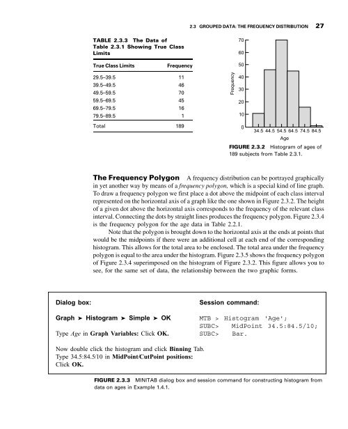
- Page 41 and 42: 2.3 GROUPED DATA: THE FREQUENCY DIS
- Page 43: 2.3 GROUPED DATA: THE FREQUENCY DIS
- Page 47 and 48: 2.3 GROUPED DATA: THE FREQUENCY DIS
- Page 49 and 50: EXERCISES 31 3 ¼ an abundance of s
- Page 51 and 52: EXERCISES 33 25.21 30.49 27.38 36.4
- Page 53 and 54: EXERCISES 35 2.3.7 In a study of ph
- Page 55 and 56: EXERCISES 37 0.6870 0.6900 0.6910 0
- Page 57 and 58: 2.4 DESCRIPTIVE STATISTICS: MEASURE
- Page 59 and 60: 2.4 DESCRIPTIVE STATISTICS: MEASURE
- Page 61 and 62: 2.5 DESCRIPTIVE STATISTICS: MEASURE
- Page 63 and 64: 2.5 DESCRIPTIVE STATISTICS: MEASURE
- Page 65 and 66: 2.5 DESCRIPTIVE STATISTICS: MEASURE
- Page 67 and 68: 2.5 DESCRIPTIVE STATISTICS: MEASURE
- Page 69 and 70: 2.5 DESCRIPTIVE STATISTICS: MEASURE
- Page 71 and 72: EXERCISES 53 2.5.1 Porcellini et al
- Page 73 and 74: SUMMARY OF FORMULAS FOR CHAPTER 2 5
- Page 75 and 76: REVIEW QUESTIONS AND EXERCISES 57 R
- Page 77 and 78: REVIEW QUESTIONS AND EXERCISES 59 1
- Page 79 and 80: REVIEW QUESTIONS AND EXERCISES 61 1
- Page 81 and 82: REFERENCES 63 DRINK TOUNCES TGRAMS
- Page 83 and 84: CHAPTER3 SOME BASIC PROBABILITY CON
- Page 85 and 86: 3.2 TWO VIEWS OF PROBABILITY: OBJEC
- Page 87 and 88: 3.4 CALCULATING THE PROBABILITY OF
- Page 89 and 90: 3.4 CALCULATING THE PROBABILITY OF
- Page 91 and 92: 3.4 CALCULATING THE PROBABILITY OF
- Page 93 and 94: 3.4 CALCULATING THE PROBABILITY OF
- Page 95 and 96:
EXERCISES 77 (d) If we pick a subje
- Page 97 and 98:
3.5 BAYES’ THEOREM, SCREENING TES
- Page 99 and 100:
3.5 BAYES’ THEOREM, SCREENING TES
- Page 101 and 102:
EXERCISES 83 EXERCISES 3.5.1 A medi
- Page 103 and 104:
REVIEW QUESTIONS AND EXERCISES 85 3
- Page 105 and 106:
REVIEW QUESTIONS AND EXERCISES 87 (
- Page 107 and 108:
REVIEW QUESTIONS AND EXERCISES 89 i
- Page 109 and 110:
REFERENCES 91 Applications Referenc
- Page 111 and 112:
4.2 PROBABILITY DISTRIBUTIONS OF DI
- Page 113 and 114:
4.2 PROBABILITY DISTRIBUTIONS OF DI
- Page 115 and 116:
4.2 PROBABILITY DISTRIBUTIONS OF DI
- Page 117 and 118:
4.3 THE BINOMIAL DISTRIBUTION 99 TA
- Page 119 and 120:
4.3 THE BINOMIAL DISTRIBUTION 101 E
- Page 121 and 122:
4.3 THE BINOMIAL DISTRIBUTION 103 f
- Page 123 and 124:
EXAMPLE 4.3.4 According to a June 2
- Page 125 and 126:
EXERCISES 107 Data: C1: 0 1 2 3 4 5
- Page 127 and 128:
4.4 THE POISSON DISTRIBUTION 109 pr
- Page 129 and 130:
4.4 THE POISSON DISTRIBUTION 111 or
- Page 131 and 132:
4.5 CONTINUOUS PROBABILITY DISTRIBU
- Page 133 and 134:
4.5 CONTINUOUS PROBABILITY DISTRIBU
- Page 135 and 136:
4.6 THE NORMAL DISTRIBUTION 117 .68
- Page 137 and 138:
4.6 THE NORMAL DISTRIBUTION 119 σ
- Page 139 and 140:
4.6 THE NORMAL DISTRIBUTION 121 _ 2
- Page 141 and 142:
4.7 NORMAL DISTRIBUTION APPLICATION
- Page 143 and 144:
TableD,wefindthattheareatotheleftof
- Page 145 and 146:
EXERCISES 127 Data: C1:-3-2-10123 D
- Page 147 and 148:
SUMMARY OF FORMULAS FOR CHAPTER 4 S
- Page 149 and 150:
REVIEW QUESTIONS AND EXERCISES 131
- Page 151 and 152:
REFERENCES 133 REFERENCES Methodolo
- Page 153 and 154:
5.2 SAMPLING DISTRIBUTIONS 135 voca
- Page 155 and 156:
5.3 DISTRIBUTION OF THE SAMPLE MEAN
- Page 157 and 158:
5.3 DISTRIBUTION OF THE SAMPLE MEAN
- Page 159 and 160:
5.3 DISTRIBUTION OF THE SAMPLE MEAN
- Page 161 and 162:
5.3 DISTRIBUTION OF THE SAMPLE MEAN
- Page 163 and 164:
5.4 DISTRIBUTION OF THE DIFFERENCE
- Page 165 and 166:
5.4 DISTRIBUTION OF THE DIFFERENCE
- Page 167 and 168:
EXERCISES 149 FIGURE 5.4.2 Sampling
- Page 169 and 170:
5.5 DISTRIBUTION OF THE SAMPLE PROP
- Page 171 and 172:
EXERCISES 153 51 percent had adequa
- Page 173 and 174:
5.6 DISTRIBUTION OF THE DIFFERENCE
- Page 175 and 176:
SUMMARY OF FORMULAS FOR CHAPTER 5 1
- Page 177 and 178:
REVIEW QUESTIONS AND EXERCISES 159
- Page 179 and 180:
CHAPTER6 ESTIMATION CHAPTER OVERVIE
- Page 181 and 182:
6.1 INTRODUCTION 163 We will find t
- Page 183 and 184:
6.2 CONFIDENCE INTERVAL FOR A POPUL
- Page 185 and 186:
6.2 CONFIDENCE INTERVAL FOR A POPUL
- Page 187 and 188:
6.2 CONFIDENCE INTERVAL FOR A POPUL
- Page 189 and 190:
6.3 THE t DISTRIBUTION 171 someone
- Page 191 and 192:
6.3 THE t DISTRIBUTION 173 Normal d
- Page 193 and 194:
EXERCISES 175 Yes Population normal
- Page 195 and 196:
6.4 CONFIDENCE INTERVAL FOR THE DIF
- Page 197 and 198:
6.4 CONFIDENCE INTERVAL FOR THE DIF
- Page 199 and 200:
6.4 CONFIDENCE INTERVAL FOR THE DIF
- Page 201 and 202:
EXERCISES 183 EXERCISES R Code: > t
- Page 203 and 204:
6.5 CONFIDENCE INTERVAL FOR A POPUL
- Page 205 and 206:
6.6 CONFIDENCE INTERVAL FOR THE DIF
- Page 207 and 208:
6.7 DETERMINATION OF SAMPLE SIZE FO
- Page 209 and 210:
6.8 DETERMINATION OF SAMPLE SIZE FO
- Page 211 and 212:
6.9 CONFIDENCE INTERVAL FOR THE VAR
- Page 213 and 214:
6.9 CONFIDENCE INTERVAL FOR THE VAR
- Page 215 and 216:
EXERCISES 197 x 2 1 ða=2Þ ¼ 14:4
- Page 217 and 218:
6.10 CONFIDENCE INTERVAL FOR THE RA
- Page 219 and 220:
6.10 CONFIDENCE INTERVAL FOR THE RA
- Page 221 and 222:
SUMMARY OF FORMULAS FOR CHAPTER 6 2
- Page 223 and 224:
REVIEW QUESTIONS AND EXERCISES 205
- Page 225 and 226:
REVIEW QUESTIONS AND EXERCISES 207
- Page 227 and 228:
REVIEW QUESTIONS AND EXERCISES 209
- Page 229 and 230:
REFERENCES 211 3. W. V. BEHRENS,
- Page 231 and 232:
REFERENCES 213 A-30. ELENI KOUSTA,
- Page 233 and 234:
7.1 INTRODUCTION 215 7.1 INTRODUCTI
- Page 235 and 236:
7.1 INTRODUCTION 217 question: Can
- Page 237 and 238:
7.1 INTRODUCTION 219 DEFINITION The
- Page 239 and 240:
7.1 INTRODUCTION 221 Evaluate data
- Page 241 and 242:
7.2 HYPOTHESIS TESTING: A SINGLE PO
- Page 243 and 244:
7.2 HYPOTHESIS TESTING: A SINGLE PO
- Page 245 and 246:
7.2 HYPOTHESIS TESTING: A SINGLE PO
- Page 247 and 248:
7.2 HYPOTHESIS TESTING: A SINGLE PO
- Page 249 and 250:
7.2 HYPOTHESIS TESTING: A SINGLE PO
- Page 251 and 252:
EXERCISES 233 Dialog box: Session c
- Page 253 and 254:
EXERCISES 235 7.2.10 Following a we
- Page 255 and 256:
7.3 HYPOTHESIS TESTING: THE DIFFERE
- Page 257 and 258:
EXAMPLE 7.3.2 The purpose of a stud
- Page 259 and 260:
7.3 HYPOTHESIS TESTING: THE DIFFERE
- Page 261 and 262:
7.3 HYPOTHESIS TESTING: THE DIFFERE
- Page 263 and 264:
EXERCISES 245 The SAS System The TT
- Page 265 and 266:
EXERCISES 247 Primary Hypertensive
- Page 267 and 268:
7.4 PAIRED COMPARISONS 249 7.3.10 R
- Page 269 and 270:
7.4 PAIRED COMPARISONS 251 where d
- Page 271 and 272:
7.4 PAIRED COMPARISONS 253 a = .05
- Page 273 and 274:
EXERCISES 255 7.4.1 Ellen Davis Jon
- Page 275 and 276:
7.5 HYPOTHESIS TESTING: A SINGLE PO
- Page 277 and 278:
7.5 HYPOTHESIS TESTING: A SINGLE PO
- Page 279 and 280:
7.6 HYPOTHESIS TESTING: THE DIFFERE
- Page 281 and 282:
EXERCISES 263 MINITAB Output Test a
- Page 283 and 284:
7.7 HYPOTHESIS TESTING: A SINGLE PO
- Page 285 and 286:
7.8 HYPOTHESIS TESTING: THE RATIO O
- Page 287 and 288:
7.8 HYPOTHESIS TESTING: THE RATIO O
- Page 289 and 290:
EXERCISES 271 EXERCISES In the foll
- Page 291 and 292:
7.9 THE TYPE II ERROR AND THE POWER
- Page 293 and 294:
7.9 THE TYPE II ERROR AND THE POWER
- Page 295 and 296:
7.10 DETERMINING SAMPLE SIZE TO CON
- Page 297 and 298:
EXERCISES 279 We set the right-hand
- Page 299 and 300:
SUMMARY OF FORMULAS FOR CHAPTER 7 2
- Page 301 and 302:
REVIEW QUESTIONS AND EXERCISES 283
- Page 303 and 304:
REVIEW QUESTIONS AND EXERCISES 285
- Page 305 and 306:
REVIEW QUESTIONS AND EXERCISES 287
- Page 307 and 308:
REVIEW QUESTIONS AND EXERCISES 289
- Page 309 and 310:
REVIEW QUESTIONS AND EXERCISES 291
- Page 311 and 312:
REVIEW QUESTIONS AND EXERCISES 293
- Page 313 and 314:
REVIEW QUESTIONS AND EXERCISES 295
- Page 315 and 316:
REVIEW QUESTIONS AND EXERCISES 297
- Page 317 and 318:
REVIEW QUESTIONS AND EXERCISES 299
- Page 319 and 320:
REFERENCES 301 A-17. JOHN S. MORLEY
- Page 321 and 322:
REFERENCES 303 A-56. LUIGI BENINI,
- Page 323 and 324:
8.1 INTRODUCTION 305 8.1 INTRODUCTI
- Page 325 and 326:
8.1 INTRODUCTION 307 who received d
- Page 327 and 328:
8.2 THE COMPLETELY RANDOMIZED DESIG
- Page 329 and 330:
8.2 THE COMPLETELY RANDOMIZED DESIG
- Page 331 and 332:
8.2 THE COMPLETELY RANDOMIZED DESIG
- Page 333 and 334:
8.2 THE COMPLETELY RANDOMIZED DESIG
- Page 335 and 336:
8.2 THE COMPLETELY RANDOMIZED DESIG
- Page 337 and 338:
8.2 THE COMPLETELY RANDOMIZED DESIG
- Page 339 and 340:
8.2 THE COMPLETELY RANDOMIZED DESIG
- Page 341 and 342:
8.2 THE COMPLETELY RANDOMIZED DESIG
- Page 343 and 344:
8.2 THE COMPLETELY RANDOMIZED DESIG
- Page 345 and 346:
Dependent Variable: Selenium Tukey
- Page 347 and 348:
EXERCISES 329 Elbow Angle (Degrees)
- Page 349 and 350:
EXERCISES 331 Age Groups (Years) Ag
- Page 351 and 352:
EXERCISES 333 Group 1 Group 2 Group
- Page 353 and 354:
Objective The objective in using th
- Page 355 and 356:
8.3 THE RANDOMIZED COMPLETE BLOCK D
- Page 357 and 358:
8.3 THE RANDOMIZED COMPLETE BLOCK D
- Page 359 and 360:
8.3 THE RANDOMIZED COMPLETE BLOCK D
- Page 361 and 362:
EXERCISES 343 The SAS System Analys
- Page 363 and 364:
EXERCISES 345 group were randomly a
- Page 365 and 366:
8.4 THE REPEATED MEASURES DESIGN 34
- Page 367 and 368:
8.4 THE REPEATED MEASURES DESIGN 34
- Page 369 and 370:
8.4 THE REPEATED MEASURES DESIGN 35
- Page 371 and 372:
8.4 THE REPEATED MEASURES DESIGN 35
- Page 373 and 374:
8.4 THE REPEATED MEASURES DESIGN 35
- Page 375 and 376:
EXERCISES 357 Is there sufficient e
- Page 377 and 378:
8.5 THE FACTORIAL EXPERIMENT 359 In
- Page 379 and 380:
8.5 THE FACTORIAL EXPERIMENT 361 In
- Page 381 and 382:
8.5 THE FACTORIAL EXPERIMENT 363 Be
- Page 383 and 384:
8.5 THE FACTORIAL EXPERIMENT 365 TA
- Page 385 and 386:
8.5 THE FACTORIAL EXPERIMENT 367 Ro
- Page 387 and 388:
EXERCISES 369 The SAS System Analys
- Page 389 and 390:
EXERCISES 371 Physical Psychiatric
- Page 391 and 392:
8.6 SUMMARY 373 Percent Change in C
- Page 393 and 394:
SUMMARY OF FORMULAS FOR CHAPTER 8 3
- Page 395 and 396:
REVIEW QUESTIONS AND EXERCISES 377
- Page 397 and 398:
REVIEW QUESTIONS AND EXERCISES 379
- Page 399 and 400:
REVIEW QUESTIONS AND EXERCISES 381
- Page 401 and 402:
REVIEW QUESTIONS AND EXERCISES 383
- Page 403 and 404:
REVIEW QUESTIONS AND EXERCISES 385
- Page 405 and 406:
REVIEW QUESTIONS AND EXERCISES 387
- Page 407 and 408:
REVIEW QUESTIONS AND EXERCISES 389
- Page 409 and 410:
REVIEW QUESTIONS AND EXERCISES 391
- Page 411 and 412:
REVIEW QUESTIONS AND EXERCISES 393
- Page 413 and 414:
REVIEW QUESTIONS AND EXERCISES 395
- Page 415 and 416:
REVIEW QUESTIONS AND EXERCISES 397
- Page 417 and 418:
REVIEW QUESTIONS AND EXERCISES 399
- Page 419 and 420:
REVIEW QUESTIONS AND EXERCISES 401
- Page 421 and 422:
REVIEW QUESTIONS AND EXERCISES 403
- Page 423 and 424:
REVIEW QUESTIONS AND EXERCISES 405
- Page 425 and 426:
REVIEW QUESTIONS AND EXERCISES 407
- Page 427 and 428:
REFERENCES 409 Applications Referen
- Page 429 and 430:
REFERENCES 411 Postmenopausal Women
- Page 431 and 432:
CHAPTER9 SIMPLE LINEAR REGRESSION A
- Page 433 and 434:
9.2 THE REGRESSION MODEL 415 some e
- Page 435 and 436:
9.3 THE SAMPLE REGRESSION EQUATION
- Page 437 and 438:
9.3 THE SAMPLE REGRESSION EQUATION
- Page 439 and 440:
9.3 THE SAMPLE REGRESSION EQUATION
- Page 441 and 442:
EXERCISES EXERCISES 423 The Least-S
- Page 443 and 444:
EXERCISES 425 CoaguChek Hospital Co
- Page 445 and 446:
9.4 EVALUATING THE REGRESSION EQUAT
- Page 447 and 448:
9.4 EVALUATING THE REGRESSION EQUAT
- Page 449 and 450:
9.4 EVALUATING THE REGRESSION EQUAT
- Page 451 and 452:
9.4 EVALUATING THE REGRESSION EQUAT
- Page 453 and 454:
9.4 EVALUATING THE REGRESSION EQUAT
- Page 455 and 456:
9.4 EVALUATING THE REGRESSION EQUAT
- Page 457 and 458:
9.4 EVALUATING THE REGRESSION EQUAT
- Page 459 and 460:
9.5 USING THE REGRESSION EQUATION I
- Page 461 and 462:
9.5 USING THE REGRESSION EQUATION 4
- Page 463 and 464:
9.6 THE CORRELATION MODEL 445 9.6 T
- Page 465 and 466:
9.7 THE CORRELATION COEFFICIENT 447
- Page 467 and 468:
9.7 THE CORRELATION COEFFICIENT 449
- Page 469 and 470:
9.7 THE CORRELATION COEFFICIENT 451
- Page 471 and 472:
9.7 THE CORRELATION COEFFICIENT 453
- Page 473 and 474:
EXERCISES 455 is employed. We first
- Page 475 and 476:
EXERCISES 457 9.7.3 In the study by
- Page 477 and 478:
9.8 SOME PRECAUTIONS 459 X Y X Y 5.
- Page 479 and 480:
9.9 SUMMARY 461 variance, which tes
- Page 481 and 482:
9.7.3 t statistic for correlation c
- Page 483 and 484:
REVIEW QUESTIONS AND EXERCISES 465
- Page 485 and 486:
REVIEW QUESTIONS AND EXERCISES 467
- Page 487 and 488:
REVIEW QUESTIONS AND EXERCISES 469
- Page 489 and 490:
REVIEW QUESTIONS AND EXERCISES 471
- Page 491 and 492:
REVIEW QUESTIONS AND EXERCISES 473
- Page 493 and 494:
REVIEW QUESTIONS AND EXERCISES 475
- Page 495 and 496:
REVIEW QUESTIONS AND EXERCISES 477
- Page 497 and 498:
REVIEW QUESTIONS AND EXERCISES 479
- Page 499 and 500:
REVIEW QUESTIONS AND EXERCISES 481
- Page 501 and 502:
REVIEW QUESTIONS AND EXERCISES 483
- Page 503 and 504:
REVIEW QUESTIONS AND EXERCISES 485
- Page 505 and 506:
REFERENCES 487 A-4. ROBERT B. PARKE
- Page 507 and 508:
CHAPTER10 MULTIPLE REGRESSION AND C
- Page 509 and 510:
Assumptions follows. 10.2 THE MULTI
- Page 511 and 512:
10.3 OBTAINING THE MULTIPLE REGRESS
- Page 513 and 514:
10.3 OBTAINING THE MULTIPLE REGRESS
- Page 515 and 516:
EXERCISES 497 EXERCISES Obtain the
- Page 517 and 518:
EXERCISES 499 10.3.3 In a study of
- Page 519 and 520:
10.4 EVALUATING THE MULTIPLE REGRES
- Page 521 and 522:
10.4 EVALUATING THE MULTIPLE REGRES
- Page 523 and 524:
10.4 EVALUATING THE MULTIPLE REGRES
- Page 525 and 526:
10.5 USING THE MULTIPLE REGRESSION
- Page 527 and 528:
EXERCISES 509 and has an education
- Page 529 and 530:
10.6 THE MULTIPLE CORRELATION MODEL
- Page 531 and 532:
This equation may be used for estim
- Page 533 and 534:
10.6 THE MULTIPLE CORRELATION MODEL
- Page 535 and 536:
10.6 THE MULTIPLE CORRELATION MODEL
- Page 537 and 538:
10.6 THE MULTIPLE CORRELATION MODEL
- Page 539 and 540:
EXERCISES 521 HIV DNA Blood (Y) HIV
- Page 541 and 542:
SUMMARY OF FORMULAS FOR CHAPTER 10
- Page 543 and 544:
10.6.7 t statistic for testing hypo
- Page 545 and 546:
REVIEW QUESTIONS AND EXERCISES 527
- Page 547 and 548:
REVIEW QUESTIONS AND EXERCISES 529
- Page 549 and 550:
REVIEW QUESTIONS AND EXERCISES 531
- Page 551 and 552:
REVIEW QUESTIONS AND EXERCISES 533
- Page 553 and 554:
REVIEW QUESTIONS AND EXERCISES 535
- Page 555 and 556:
REFERENCES 537 4. Refer to the data
- Page 557 and 558:
CHAPTER11 REGRESSION ANALYSIS: SOME
- Page 559 and 560:
11.1 INTRODUCTION 541 TABLE 11.1.1
- Page 561 and 562:
11.2 QUALITATIVE INDEPENDENT VARIAB
- Page 563 and 564:
11.2 QUALITATIVE INDEPENDENT VARIAB
- Page 565 and 566:
11.2 QUALITATIVE INDEPENDENT VARIAB
- Page 567 and 568:
11.2 QUALITATIVE INDEPENDENT VARIAB
- Page 569 and 570:
11.2 QUALITATIVE INDEPENDENT VARIAB
- Page 571 and 572:
11.2 QUALITATIVE INDEPENDENT VARIAB
- Page 573 and 574:
11.2 QUALITATIVE INDEPENDENT VARIAB
- Page 575 and 576:
EXERCISES 557 11.2.1 For subjects u
- Page 577 and 578:
EXERCISES 559 11.2.4 Refer to Exerc
- Page 579 and 580:
11.3 VARIABLE SELECTION PROCEDURES
- Page 581 and 582:
11.3 VARIABLE SELECTION PROCEDURES
- Page 583 and 584:
EXERCISES 565 CGAGE CGINCOME CGDUR
- Page 585 and 586:
EXERCISES 567 11.3.2 Machiel Naeije
- Page 587 and 588:
11.4 LOGISTIC REGRESSION 569 REACTI
- Page 589 and 590:
11.4 LOGISTIC REGRESSION 571 betwee
- Page 591 and 592:
11.4 LOGISTIC REGRESSION 573 The LO
- Page 593 and 594:
11.4 LOGISTIC REGRESSION 575 Standa
- Page 595 and 596:
11.4 LOGISTIC REGRESSION 577 Parame
- Page 597 and 598:
11.4 LOGISTIC REGRESSION 579 Model
- Page 599 and 600:
EXERCISES EXERCISES 581 Further Rea
- Page 601 and 602:
SUMMARY OF FORMULAS FOR CHAPTER 11
- Page 603 and 604:
REVIEW QUESTIONS AND EXERCISES 585
- Page 605 and 606:
REVIEW QUESTIONS AND EXERCISES 587
- Page 607 and 608:
REVIEW QUESTIONS AND EXERCISES 589
- Page 609 and 610:
REVIEW QUESTIONS AND EXERCISES 591
- Page 611 and 612:
REVIEW QUESTIONS AND EXERCISES 593
- Page 613 and 614:
REVIEW QUESTIONS AND EXERCISES 595
- Page 615 and 616:
REFERENCES 597 KNOW ¼ Knowledge. S
- Page 617 and 618:
REFERENCES 599 A-26. EITHNE MULLOYa
- Page 619 and 620:
12.1 INTRODUCTION 12.2 THE MATHEMAT
- Page 621 and 622:
12.2 THE MATHEMATICAL PROPERTIES OF
- Page 623 and 624:
12.3 TESTS OF GOODNESS-OF-FIT 605 W
- Page 625 and 626:
12.3 TESTS OF GOODNESS-OF-FIT 607 x
- Page 627 and 628:
12.3 TESTS OF GOODNESS-OF-FIT 609 9
- Page 629 and 630:
that the first expected frequency i
- Page 631 and 632:
12.3 TESTS OF GOODNESS-OF-FIT 613 T
- Page 633 and 634:
12.3 TESTS OF GOODNESS-OF-FIT 615 V
- Page 635 and 636:
EXERCISES 617 EXERCISES 12.3.1 The
- Page 637 and 638:
12.4 TESTS OF INDEPENDENCE 619 12.3
- Page 639 and 640:
Observed Versus Expected Frequencie
- Page 641 and 642:
12.4 TESTS OF INDEPENDENCE 623 Comp
- Page 643 and 644:
12.4 TESTS OF INDEPENDENCE 625 Note
- Page 645 and 646:
12.4 TESTS OF INDEPENDENCE 627 9. C
- Page 647 and 648:
EXERCISES 629 Performed Baseline Te
- Page 649 and 650:
12.5 TESTS OF HOMOGENEITY 631 TABLE
- Page 651 and 652:
12.5 TESTS OF HOMOGENEITY 633 8. St
- Page 653 and 654:
EXERCISES 635 12.5.2 Coughlin et al
- Page 655 and 656:
Hypotheses alternatives. 12.6 THE F
- Page 657 and 658:
12.6 THE FISHER EXACT TEST 639 TABL
- Page 659 and 660:
12.7 RELATIVE RISK, ODDS RATIO, AND
- Page 661 and 662:
12.7 RELATIVE RISK, ODDS RATIO, AND
- Page 663 and 664:
12.7 RELATIVE RISK, ODDS RATIO, AND
- Page 665 and 666:
12.7 RELATIVE RISK, ODDS RATIO, AND
- Page 667 and 668:
12.7 RELATIVE RISK, ODDS RATIO, AND
- Page 669 and 670:
12.7 RELATIVE RISK, ODDS RATIO, AND
- Page 671 and 672:
EXERCISES 653 Smoking_status * Obse
- Page 673 and 674:
12.8 SUMMARY 655 collected data on
- Page 675 and 676:
REVIEW QUESTIONS AND EXERCISES 657
- Page 677 and 678:
REVIEW QUESTIONS AND EXERCISES 659
- Page 679 and 680:
REVIEW QUESTIONS AND EXERCISES 661
- Page 681 and 682:
REVIEW QUESTIONS AND EXERCISES 663
- Page 683 and 684:
REVIEW QUESTIONS AND EXERCISES 665
- Page 685 and 686:
REFERENCES 667 12. R. LATSCHA, “T
- Page 687 and 688:
REFERENCES 669 A-35. CRAIG R. COHEN
- Page 689 and 690:
13.1 INTRODUCTION 671 2. be able to
- Page 691 and 692:
13.3 THE SIGN TEST 673 13.3 THE SIG
- Page 693 and 694:
13.3 THE SIGN TEST 675 TABLE 13.3.2
- Page 695 and 696:
13.3 THE SIGN TEST 677 EXAMPLE 13.3
- Page 697 and 698:
13.3 THE SIGN TEST 679 one sample i
- Page 699 and 700:
13.4 THE WILCOXON SIGNED-RANK TEST
- Page 701 and 702:
13.4 THE WILCOXON SIGNED-RANK TEST
- Page 703 and 704:
EXERCISES 685 Dialog box: Session c
- Page 705 and 706:
13.5 THE MEDIAN TEST 687 TABLE 13.5
- Page 707 and 708:
EXERCISES 689 Dialog box: Session c
- Page 709 and 710:
EXAMPLE 13.6.1 A researcher designe
- Page 711 and 712:
13.6 THE MANN-WHITNEY TEST 693 to t
- Page 713 and 714:
13.6 THE MANN-WHITNEY TEST 695 Dial
- Page 715 and 716:
EXERCISES 697 deficit in Sprague-Da
- Page 717 and 718:
Assumptions the following: 1. The s
- Page 719 and 720:
13.7 THE KOLMOGOROV-SMIRNOV GOODNES
- Page 721 and 722:
EXERCISES 703 1.0 .9 Cumulative rel
- Page 723 and 724:
13.8 THE KRUSKAL-WALLIS ONE-WAY ANA
- Page 725 and 726:
13.8 THE KRUSKAL-WALLIS ONE-WAY ANA
- Page 727 and 728:
EXERCISES 709 Data: C1: 12.22 28.44
- Page 729 and 730:
EXERCISES 711 Improvement (Control)
- Page 731 and 732:
13.9 THE FRIEDMAN TWO-WAY ANALYSIS
- Page 733 and 734:
13.9 THE FRIEDMAN TWO-WAY ANALYSIS
- Page 735 and 736:
EXERCISES 717 Subject Area Student
- Page 737 and 738:
13.10 THE SPEARMAN RANK CORRELATION
- Page 739 and 740:
13.10 THE SPEARMAN RANK CORRELATION
- Page 741 and 742:
13.10 THE SPEARMAN RANK CORRELATION
- Page 743 and 744:
EXERCISES 725 Rank by Rank by Area
- Page 745 and 746:
13.11 NONPARAMETRIC REGRESSION ANAL
- Page 747 and 748:
13.11 NONPARAMETRIC REGRESSION ANAL
- Page 749 and 750:
SUMMARY OF FORMULAS FOR CHAPTER 13
- Page 751 and 752:
REVIEW QUESTIONS AND EXERCISES 733
- Page 753 and 754:
REVIEW QUESTIONS AND EXERCISES 735
- Page 755 and 756:
REVIEW QUESTIONS AND EXERCISES 737
- Page 757 and 758:
REVIEW QUESTIONS AND EXERCISES 739
- Page 759 and 760:
REVIEW QUESTIONS AND EXERCISES 741
- Page 761 and 762:
REVIEW QUESTIONS AND EXERCISES 743
- Page 763 and 764:
REVIEW QUESTIONS AND EXERCISES 745
- Page 765 and 766:
REFERENCES 747 cardiac operations.
- Page 767 and 768:
REFERENCES 749 A-14. WENDY GANTT an
- Page 769 and 770:
14.2 TIME-TO-EVENT DATA AND CENSORI
- Page 771 and 772:
14.2 TIME-TO-EVENT DATA AND CENSORI
- Page 773 and 774:
14.2 TIME-TO-EVENT DATA AND CENSORI
- Page 775 and 776:
14.3 THE KAPLAN-MEIER PROCEDURE 757
- Page 777 and 778:
14.3 THE KAPLAN-MEIER PROCEDURE 759
- Page 779 and 780:
EXERCISES 761 1.0 .8 73% Low-grade
- Page 781 and 782:
14.4 COMPARING SURVIVAL CURVES 763
- Page 783 and 784:
14.4 COMPARING SURVIVAL CURVES 765
- Page 785 and 786:
EXERCISES 767 EXERCISES 14.4.1 If a
- Page 787 and 788:
14.5 COX REGRESSION: THE PROPORTION
- Page 789 and 790:
14.5 COX REGRESSION: THE PROPORTION
- Page 791 and 792:
SUMMARY OF FORMULAS FOR CHAPTER 14
- Page 793 and 794:
REVIEW QUESTIONS AND EXERCISES 775
- Page 795:
REFERENCES 777 REFERENCES Methodolo
- Page 798 and 799:
A-2 APPENDIX STATISTICAL TABLES
- Page 800 and 801:
A-4 APPENDIX STATISTICAL TABLES
- Page 802 and 803:
A-6 APPENDIX STATISTICAL TABLES
- Page 804 and 805:
A-8 APPENDIX STATISTICAL TABLES
- Page 806 and 807:
A-10 APPENDIX STATISTICAL TABLES
- Page 808 and 809:
A-12 APPENDIX STATISTICAL TABLES
- Page 810 and 811:
A-14 APPENDIX STATISTICAL TABLES
- Page 812 and 813:
A-16 APPENDIX STATISTICAL TABLES
- Page 814 and 815:
A-18 APPENDIX STATISTICAL TABLES
- Page 816 and 817:
A-20 APPENDIX STATISTICAL TABLES
- Page 818 and 819:
A-22 APPENDIX STATISTICAL TABLES
- Page 820 and 821:
A-24 APPENDIX STATISTICAL TABLES
- Page 822 and 823:
A-26 APPENDIX STATISTICAL TABLES
- Page 824 and 825:
A-28 APPENDIX STATISTICAL TABLES
- Page 826 and 827:
A-30 APPENDIX STATISTICAL TABLES
- Page 828 and 829:
A-32 APPENDIX STATISTICAL TABLES
- Page 830 and 831:
A-34 APPENDIX STATISTICAL TABLES
- Page 832 and 833:
A-36 APPENDIX STATISTICAL TABLES
- Page 834 and 835:
A-38 APPENDIX STATISTICAL TABLES
- Page 836 and 837:
A-40 APPENDIX STATISTICAL TABLES
- Page 838 and 839:
A-42 APPENDIX STATISTICAL TABLES
- Page 840 and 841:
A-44 APPENDIX STATISTICAL TABLES
- Page 842 and 843:
A-46 APPENDIX STATISTICAL TABLES
- Page 844 and 845:
A-48 APPENDIX STATISTICAL TABLES
- Page 846 and 847:
A-50 APPENDIX STATISTICAL TABLES
- Page 848 and 849:
A-52 APPENDIX STATISTICAL TABLES
- Page 850 and 851:
A-54 APPENDIX STATISTICAL TABLES
- Page 852 and 853:
A-56 APPENDIX STATISTICAL TABLES
- Page 854 and 855:
A-58 APPENDIX STATISTICAL TABLES
- Page 856 and 857:
A-60 APPENDIX STATISTICAL TABLES
- Page 858 and 859:
A-62 APPENDIX STATISTICAL TABLES
- Page 860 and 861:
A-64 APPENDIX STATISTICAL TABLES
- Page 862 and 863:
A-66 APPENDIX STATISTICAL TABLES
- Page 864 and 865:
A-68 APPENDIX STATISTICAL TABLES
- Page 866 and 867:
A-70 APPENDIX STATISTICAL TABLES
- Page 868 and 869:
A-72 APPENDIX STATISTICAL TABLES
- Page 870 and 871:
A-74 APPENDIX STATISTICAL TABLES
- Page 872 and 873:
A-76 APPENDIX STATISTICAL TABLES
- Page 874 and 875:
A-78 APPENDIX STATISTICAL TABLES
- Page 876 and 877:
A-80 APPENDIX STATISTICAL TABLES
- Page 878 and 879:
A-82 APPENDIX STATISTICAL TABLES
- Page 880 and 881:
A-84 APPENDIX STATISTICAL TABLES
- Page 882 and 883:
A-86 APPENDIX STATISTICAL TABLES
- Page 884 and 885:
A-88 APPENDIX STATISTICAL TABLES
- Page 886 and 887:
A-90 APPENDIX STATISTICAL TABLES
- Page 888 and 889:
A-92 APPENDIX STATISTICAL TABLES
- Page 890 and 891:
A-94 APPENDIX STATISTICAL TABLES
- Page 892 and 893:
A-96 APPENDIX STATISTICAL TABLES
- Page 894 and 895:
A-98 APPENDIX STATISTICAL TABLES
- Page 896 and 897:
A-100 APPENDIX STATISTICAL TABLES
- Page 898 and 899:
A-102 APPENDIX STATISTICAL TABLES
- Page 900 and 901:
A-104 APPENDIX STATISTICAL TABLES
- Page 903 and 904:
ANSWERS TO ODD-NUMBERED EXERCISES C
- Page 905 and 906:
ANSWERS TO ODD-NUMBERED EXERCISES A
- Page 907 and 908:
ANSWERS TO ODD-NUMBERED EXERCISES A
- Page 909 and 910:
ANSWERS TO ODD-NUMBERED EXERCISES A
- Page 911 and 912:
ANSWERS TO ODD-NUMBERED EXERCISES A
- Page 913 and 914:
ANSWERS TO ODD-NUMBERED EXERCISES A
- Page 915 and 916:
ANSWERS TO ODD-NUMBERED EXERCISES A
- Page 917 and 918:
ANSWERS TO ODD-NUMBERED EXERCISES A
- Page 919 and 920:
ANSWERS TO ODD-NUMBERED EXERCISES A
- Page 921 and 922:
ANSWERS TO ODD-NUMBERED EXERCISES A
- Page 923 and 924:
ANSWERS TO ODD-NUMBERED EXERCISES A
- Page 925 and 926:
ANSWERS TO ODD-NUMBERED EXERCISES A
- Page 927 and 928:
ANSWERS TO ODD-NUMBERED EXERCISES A
- Page 929 and 930:
ANSWERS TO ODD-NUMBERED EXERCISES A
- Page 931 and 932:
ANSWERS TO ODD-NUMBERED EXERCISES A
- Page 933 and 934:
ANSWERS TO ODD-NUMBERED EXERCISES A
- Page 935 and 936:
ANSWERS TO ODD-NUMBERED EXERCISES A
- Page 937 and 938:
ANSWERS TO ODD-NUMBERED EXERCISES A
- Page 939 and 940:
ANSWERS TO ODD-NUMBERED EXERCISES A
- Page 941 and 942:
ANSWERS TO ODD-NUMBERED EXERCISES A
- Page 943 and 944:
ANSWERS TO ODD-NUMBERED EXERCISES A
- Page 945 and 946:
ANSWERS TO ODD-NUMBERED EXERCISES A
- Page 947 and 948:
ANSWERS TO ODD-NUMBERED EXERCISES A
- Page 949:
ANSWERS TO ODD-NUMBERED EXERCISES A
- Page 952 and 953:
I-2 INDEX Confidence coefficient, 1
- Page 954 and 955:
I-4 INDEX Median test, 686-689 MINI
- Page 956 and 957:
I-6 INDEX SAS: and chi-square analy