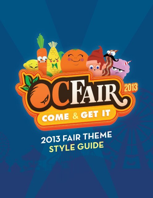
2013 FAIR THEME STYLE GUIDE - Orange County Fair
2013 FAIR THEME STYLE GUIDE - Orange County Fair
2013 FAIR THEME STYLE GUIDE - Orange County Fair

You also want an ePaper? Increase the reach of your titles
YUMPU automatically turns print PDFs into web optimized ePapers that Google loves.
<strong>2013</strong> <strong>FAIR</strong> <strong>THEME</strong><br />
<strong>STYLE</strong> <strong>GUIDE</strong>
LOGO DESIGN<br />
The <strong>2013</strong> OC <strong>Fair</strong> Logo has 2 main variations: one<br />
which emphasizes the OC <strong>Fair</strong> brand and the other<br />
which emphasizes the OC <strong>Fair</strong> theme. These two<br />
versions can be used interchangebly as needed,<br />
depending on what needs to be emphasized more (The<br />
<strong>Fair</strong> brand vs. the Theme.)<br />
Both versions feature alternates of their own, some<br />
including characters, some without. These are used<br />
depending on space provided. If the logo is to be<br />
used in a large format, use the alternates that have<br />
characters. It is not suggested to use the alternates<br />
featuring characters in small applications, due to the<br />
lack of legibility of the logo.<br />
MAIN LOGO<br />
Grayscale alternates of the logos work in the same<br />
fashion as their full-color counterparts. Take care in<br />
providing ample space around the logo so as not to<br />
create contrast issues.<br />
One-color variations feature either one character or<br />
none. This is to keep the logo simplified, as much of its<br />
original detail has been removed for visibility. Like fullcolor<br />
versions, use non-character versions for smaller<br />
applications to ensure legibility of the logo.<br />
<strong>THEME</strong>-CENTERED LOGO<br />
2
FULL COLOR + ALTERNATES<br />
COME GET IT<br />
WITHOUT CHARACTERS<br />
MAIN LOGO<br />
WITH SINGLE CHARACTER<br />
<strong>THEME</strong>-CENTERED LOGO<br />
<strong>THEME</strong>-CENTERED LOGO<br />
WITHOUT CHARACTERS<br />
3
GRAYSCALE + ALTERNATES<br />
WITHOUT CHARACTERS<br />
MAIN LOGO<br />
WITH SINGLE CHARACTER<br />
<strong>THEME</strong>-CENTERED LOGO<br />
<strong>THEME</strong>-CENTERED LOGO<br />
WITHOUT CHARACTERS<br />
4
1 COLOR LIGHT BACKGROUND<br />
WITHOUT CHARACTERS<br />
WITH SINGLE CHARACTER<br />
<strong>THEME</strong>-CENTERED LOGO<br />
WITHOUT CHARACTERS<br />
5
1 COLOR DARK BACKGROUND<br />
WITHOUT CHARACTERS<br />
WITH SINGLE CHARACTER<br />
<strong>THEME</strong>-CENTERED LOGO<br />
WITHOUT CHARACTERS<br />
6
USAGE<br />
USE LOGO AS DIRECTED<br />
COME GET IT<br />
USE PROVIDED ALTERNATES PROVIDED<br />
Bacon ipsum dolor sit am<br />
tip pork loin. Sirloin veniso<br />
leberkas ribeye strip stea<br />
belly jowl filet mignon me<br />
corned beef beef. Chuck kielbasa swine pork<br />
pork belly short loin capicola turkey pig tri-tip<br />
Pork belly boudin tail shoulder. Doner corned<br />
ground round sirloin turkey. Salami bresaola<br />
PROVIDE AMPLE SPACE AROUND LOGO<br />
Capicola meatball ball tip boudin brisket dru<br />
beef pastrami chuck ham hock frankfurter. Fi<br />
spare ribs, shankle boudin brisket chuck shor<br />
doner prosciutto chicken salami tail. Shank ta<br />
DO NOT ROTATE LOGO<br />
DO NOT SQUISH, STRECH OR SKEW LOGO<br />
DO NOT RECOLOR OR FADE OUT LOGO<br />
DO NOT PUT LOGO ON A HIGH-CONSTRACT<br />
OR COMPLEX BACKGROUND<br />
DO NOT PUT ANY HARD STROKES/<br />
OUTLINES AROUND THE LOGO<br />
(PLEASE REFER TO ALTERNATE LOGOS WITH PROVIDED GLOW<br />
Bacon ipsum dolor sit amet t-bone pig ball tip pork loin. Sirloin<br />
venison frankfurter leberkas ribeye strip steak swine pig pork<br />
belly jowl filet mignon meatball shankle corned beef beef.<br />
Chuck kielbasa swine pork chop, chicken pork belly short loin<br />
capicola turkey pig tri-tip shankle salami. Pork belly boudin<br />
tail shoulder. Doner corned beef beef ribs ground round sirloin<br />
turkey. Salami bresaola pig tenderloin.<br />
COME GET IT<br />
Capicola meatball ball tip boudin brisket drumstick, corned<br />
beef pastrami chuck ham hock frankfurter. Filet mignon sirloin<br />
spare ribs, shankle boudin brisket chuck short loin pig bacon<br />
doner prosciutto chicken DO NOT salami PLACE TEXT tail. OR Shank OTHER tail filet mignon<br />
ELEMENTS ON TOP OF THE LOGO<br />
pig biltong tongue. Pastrami shankle ground round, brisket<br />
7
COLORS<br />
• For dark backgrounds: general text should be White; slightly more importact information should be in Yellow; very<br />
important or call-to-action text should be in Gold. Headers should be in <strong>Orange</strong>.<br />
• For light backgrounds: general text should be in Brown; slightly more important text can be in Gold; very<br />
important or call-to-action text should be in <strong>Orange</strong>. Headers should be in Blue.<br />
BLUE<br />
C=98 M=75 Y=46 K=43<br />
R= 3 G=36 B=78<br />
WEB: #03244E<br />
ORANGE<br />
PANTONE 1655C<br />
C=0 M=73 Y=98 K=0<br />
R= 252 G=76 B=2<br />
WEB: #FC4C02<br />
GOLD<br />
C=0 M=32 Y=98 K=0<br />
R= 255 G=173 B=5<br />
WEB: #FFAD05<br />
YELLOW<br />
C=0 M=0 Y=63 K=0<br />
R= 255 G=255 B=94<br />
WEB: #FFFF5E<br />
BROWN<br />
C=18 M=38 Y=51 K=88<br />
R= 25 G=19 B=15<br />
WEB: #19130F<br />
TAN<br />
C=0 M=0 Y=15 K=5<br />
R= 243 G=239 B=212<br />
WEB: #F2F2CE<br />
8
FONTS<br />
Be sure to use ALT versions of Neutra Text. Non-alt versions have smallcapped numerics.<br />
NEUTRA TEXT - LIGHT ALT<br />
ABCDEGHIJKLMNOPQRSTUVWXYZ<br />
abcdeghijklmnopqrstuvwxyz<br />
0123456789<br />
NEUTRA TEXT - BOOK ALT<br />
ABCDEGHIJKLMNOPQRSTUVWXYZ<br />
abcdeghijklmnopqrstuvwxyz<br />
0123456789<br />
NEUTRA TEXT - BOLD ALT<br />
ABCDEGHIJKLMNOPQRSTUVWXYZ<br />
abcdeghijklmnopqrstuvwxyz<br />
0123456789<br />
NEUTRA TEXT - DEMI ALT<br />
ABCDEGHIJKLMNOPQRSTUVWXYZ<br />
abcdeghijklmnopqrstuvwxyz<br />
0123456789<br />
9
CHARACTERS & ARTWORK<br />
10
CHARACTERS (CONT.)<br />
11
ARTWORK<br />
LIGHT <strong>FAIR</strong>GROUNDS BG<br />
DARK <strong>FAIR</strong>GROUNDS BG<br />
12
EXAMPLE & COLOR RULES<br />
THINGS TO NOTE:<br />
• On dark backgrounds, a slight<br />
glow is placed around the<br />
logo. There are versions of this<br />
logo with the glow provided as<br />
alternates. Single color versions<br />
do not need this glow. Nonglow<br />
versions should be used<br />
on lighter backgrounds (also<br />
provided as alternates).<br />
• Only important information such<br />
as dates on a poster format<br />
should have skewed text. If<br />
possible but not neccessary.<br />
• Spotlights should only<br />
accompany a poster-style format<br />
like the example on the right.<br />
• For dark backgrounds: general<br />
text should be White, slightly<br />
more important information<br />
should be Yellow; very important<br />
or call-to-action text should<br />
be Gold. Headers should be<br />
<strong>Orange</strong>.<br />
&<br />
COME GET IT<br />
JULY 12 – AUGUST 11<br />
OPEN WEDNESDAY – SUNDAY<br />
OC<strong>FAIR</strong>.COM<br />
• For light backgrounds: general<br />
text should be Brown, slightly<br />
more important text can be<br />
Gold; very important or call-toaction<br />
text should be <strong>Orange</strong>.<br />
Headers should be Blue.<br />
13