Cornelia Thomsen - Erik Thomsen
Cornelia Thomsen - Erik Thomsen
Cornelia Thomsen - Erik Thomsen

Create successful ePaper yourself
Turn your PDF publications into a flip-book with our unique Google optimized e-Paper software.
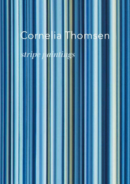
<strong>Cornelia</strong> <strong>Thomsen</strong><br />
stripe paintings<br />
1
<strong>Cornelia</strong> <strong>Thomsen</strong><br />
stripe paintings
<strong>Cornelia</strong> <strong>Thomsen</strong><br />
stripe paintings<br />
Table of Contents<br />
5<br />
8<br />
31<br />
Introduction<br />
Paintings<br />
Curriculum Vitae
Introduction<br />
<strong>Cornelia</strong> <strong>Thomsen</strong>:<br />
Stripe Paintings<br />
<strong>Cornelia</strong> <strong>Thomsen</strong> paints color curtains that become<br />
stripes—or stripes that become color curtains. Disregarding<br />
the stripes for a moment, the pattern of such framefilling<br />
curtains has the effect of accentuating the curtain’s<br />
flatness through the opacity of veiling, but also suggests<br />
an imagined window view on the world behind it. Both<br />
effects are rooted in the history of painting.<br />
Let’s start with the window. A window confronts its users,<br />
in terms of disposition, similar to the way a painting<br />
does—not only because both are physically mounted<br />
on a wall, but also because the window has become a<br />
familiar if risky metaphor, indeed a model, for introducing<br />
the illusion of spatial depth since the early Renaissance.<br />
The notion of a painting as a window is »risky«<br />
because accompanying the potential for a view through<br />
the window is the decision for enormous spatial depth.<br />
And introducing the illusion of spatial depth has been<br />
an achievement of central perspective painting since<br />
the early Renaissance.<br />
It is interesting and certainly no accident that, by contrast,<br />
the depiction of curtains in paintings became more<br />
a concern in the late Renaissance and in the Baroque<br />
periods. On the one hand a curtain, provided it is not<br />
fully open, obstructs the view into the distance. On the<br />
other hand, however, a curtain can also frame and effectively<br />
stage this view—and so a curtain primarily appears<br />
in works in which the illusionistic achievements of<br />
painting are not only meant to be savored but also to be<br />
made a theme of. This use of the curtain is what we admire<br />
about Raphael’s Sistine Madonna (1513–14), where<br />
the dark-green curtain on either side of the Madonna<br />
serves a mediatory function at the edges of the painting<br />
and denotes the »aesthetic boundary« (Ernst Michalski);<br />
that is, the demarcation between the image’s space (in<br />
this case the heavenly realm consisting of clouds and angels),<br />
and the real space of the viewer. And as Michalski<br />
noted, the Pope’s pointing gesture at the left side of the<br />
painting can at the very least be seen as transgressing<br />
this aesthetic boundary. However, while the playful approach<br />
to the curtain remains discrete and modest in<br />
Raphael’s painting, in Rembrandt’s Holy Family in Kassel<br />
(1646) it becomes a bravura performance, a full-blown<br />
feat. In Rembrandt’s work the curtain is painted in a<br />
trompe l’oeil manner of such virtuosity that it appears to<br />
have been hung in front of the painting—thereby playfully<br />
referencing the dubious praise in antiquity of painting’s<br />
ability to deceive the eye.<br />
While the paradigm of the curtain makes its exit in the<br />
beginning of the modern era (though René Magritte still<br />
used it as an ambiguous instrument pointing at the discourses<br />
on painting), stripes become an issue in painting<br />
not before the start of the modern era, indeed only<br />
with modernism. There had always been stripes in clothing<br />
and ornament, of course, but the flattened, characteristically<br />
repetitive juxtaposition of parallel, perfectly<br />
straight lines or bands, which we generally interpret as<br />
stripes, was never a guiding principle in Romantic German<br />
and Danish landscape painting (though in hindsight<br />
we think we can easily see it there). We are certainly<br />
familiar with the notion that every continuous horizontal<br />
line contains the suggestion of a distant landscape, the<br />
place where sky meets sea or plain. We are also familiar<br />
with the reversal of this: that some landscape paintings<br />
(and even some real landscapes) recede from their intended<br />
(or real) spatial depth into a picture plane and<br />
thus into a structure of horizontal stripes of color in a<br />
largely overarching staggered arrangement. One could<br />
even see stripes as one of the catalysts that helped pave<br />
the way from landscape portrayals to abstraction, from<br />
4 5
illusionistic depth to a picture plane given over entirely<br />
to the mere presence and self-presentation of color—<br />
even to the reification of the pure picture-object. This is<br />
why the stripes, bands, or even just the horizontal pictorial<br />
divisions found in Agnes Martin, Antonio Calderara,<br />
or Blinky Palermo are always inscribed with an almost<br />
melancholic tone; an art dedicated to landscape-like<br />
pure flatness formed a wistful harmony.<br />
However, there were also the stripes of Barnett Newman,<br />
in which the precision and peculiarity of an extremely<br />
elongated, thin color situation was turned against its<br />
own logic; for Newman’s »zips« rushed vertically through<br />
vast areas of monochrome color and were characterized<br />
by great expressiveness. There were also the stripes of<br />
Kenneth Noland, which did not rush through anything<br />
because they themselves were the image or constituted<br />
the image. However, they had not descended to the level<br />
of the literal, like those Frank Stella devised for his Black<br />
Paintings. On the contrary, Noland’s work resulted in a<br />
tradition that made use of the painterliness of stripes, a<br />
tradition that bears fruit to this day, even in Concrete Art.<br />
Stripes allow the artist to place color in arbitrary widths<br />
and lengths and to abstain from further decisions about<br />
form. The artist must only decide on the colors, width,<br />
and application of the stripes. He is relieved of all the<br />
demanding (and, of course, wonderful) possibilities and<br />
constraints of having to arrange the colors he has set<br />
down in a useful way, that is, to compose them. In truth,<br />
the painter of stripes often derives full satisfaction from<br />
his sequence—indeed it even provides incredible and<br />
infinite opportunities for modulation. This temptation<br />
is one that <strong>Cornelia</strong> <strong>Thomsen</strong> has also succumbed to.<br />
She, too, seeks adventure in painting unswervingly parallel<br />
stripes, an unburdened adventure that for all its immense<br />
constraints is accompanied by great freedoms.<br />
<strong>Thomsen</strong>’s stripes are of varying widths, ranging from a<br />
millimeter to two centimeters. The color of the individual<br />
stripe can be smoothly homogenous or it can follow a<br />
transverse course from dark by way of light to dark, giving<br />
it a seemingly outward, or in some instances, inward<br />
cylindrical curve. In this way the entire surface of successions<br />
of stacked stripes is counteracted everywhere in<br />
the details by projecting and receding, protuberant or<br />
hollowed tiers; a modulation that lends the maritimeinspired<br />
shades of blue to white a pulsating three-dimensional<br />
spatiality, or, more precisely, a flat, relief-like<br />
corporeal spatiality. The dancing fluctuation between<br />
convex and concave is much like that seen in the channels<br />
and rolls of a High Gothic compound pier.<br />
A flickering and streaming of colors and color sequences<br />
that overlap individual stripes, as encountered in<br />
some of Bridget Riley’s work, does not interest <strong>Thomsen</strong>.<br />
She emphasizes succession, a real legibility, an<br />
absolute there-and-then-ness of the individual color.<br />
By constantly varying the width of the stripes, the application<br />
of the paint, and whatever curvature there may<br />
be, she effectively prevents a formation of supersigns<br />
that would rake in the individual element, the individual<br />
point in the painting. This effect finds correspondence<br />
in <strong>Thomsen</strong>’s technique: she paints the stripes from top<br />
to bottom, one after another, horizontally—for technical<br />
reasons the canvas is tilted ninety degrees—by hand and<br />
without templates, using a metal bar that can be moved<br />
downward bit by bit.<br />
The result is a rapport of vertical stripes, one that both<br />
overwhelms the eye—overtaxing the ability to consolidate—and<br />
conducts it. In its vertical orientation it is<br />
anything but landscape-like; instead, it approaches the<br />
pattern of a curtain. Gerhard Richter himself executed a<br />
series of »curtain paintings« in the mid-1960s, a phase<br />
during which he was still often programmatically treading<br />
(and showing) the path from photographic realism<br />
to abstraction to pure painting. His curtains were done<br />
in gray and had far fewer swaying folds. Richter had specifically<br />
sought out the possibilities guaranteed by the<br />
tradition that a painted curtain can both conceal vast<br />
depth and evoke it nevertheless; on the one hand denying<br />
it completely, and on the other rendering the image<br />
of the dominating curtain through its meager, intrinsically<br />
flat, painted corporeal spatiality.<br />
<strong>Thomsen</strong> is not, by any means, seeking to continue such<br />
a paragone. The unsettling aspect in Richter’s paintings,<br />
for which one might claim Hegel’s dictum »behind all<br />
the curtains, no world,« is not her concern. Rather, she is<br />
interested in combining the meandering indefinite, the<br />
projecting and receding of color (and thus of lightness<br />
and darkness), following the pattern of the curtain. This<br />
means that what presents itself prima facie as a cheerful<br />
modulation in vertical stripes rendered in landscapelike<br />
shades of blue is guided by an almost symphonic<br />
fullness, a polyphony. <strong>Thomsen</strong>’s paintings don’t let us<br />
look deeper than what the rearward curving of a curtain<br />
fold, its amplitude, allows. Because of the rigid succession<br />
of fully continuous stripes, there is nothing that<br />
makes us want to raise these »curtains.« Instead everything<br />
encourages us to linger, to look at, and to experience<br />
the colors. Behind them is, as Hegel was aware, no<br />
world—indeed, the world is in them, without gravity, not<br />
even allegorically.<br />
Dr. Christian Janecke<br />
Professor of art history at University of Art and Design<br />
Offenbach/Main, Germany<br />
6 7
»Stripes Nr. 11«<br />
2011, Oil on canvas, 96" × 48" (244 × 122 cm)<br />
8
»Stripes Nr. 21«<br />
2011, Oil on canvas, 72" × 48" (183 × 122 cm)<br />
10
»Stripes Nr. 22«<br />
2011, Oil on canvas, 72" × 48" (183 × 122 cm)<br />
12
»Stripes Nr. 12«<br />
2011, Oil on canvas, 47 ¼" × 31 ½" (120 × 80 cm)<br />
14
»Stripes Nr. 13«<br />
2011, Oil on canvas, 47 ¼" × 31 ½" (120 × 80 cm)<br />
16
»Stripes Nr. 14«<br />
2011, Oil on canvas, 36" × 24" (91.5 × 61 cm)<br />
18
»Stripes Nr. 15«<br />
2011, Oil on canvas, 36" × 24" (91.5 × 61 cm)<br />
20
»Stripes Nr. 16«<br />
2011, Oil on canvas, 36" × 24" (91.5 × 61 cm)<br />
22
»Stripes Nr. 17«<br />
2011, Oil on canvas, 36" × 24" (91.5 × 61 cm)<br />
24
»Stripes Nr. 20«<br />
2011, Oil on canvas, 24" × 18" (61 × 45.5 cm)<br />
26
»Stripes Nr. 23«<br />
2011, Oil on canvas, 24" × 18" (61 × 45.5 cm)<br />
28
<strong>Cornelia</strong> <strong>Thomsen</strong><br />
Personal History<br />
Born 1970 in Rudolstadt, Thuringia, Germany<br />
Lives and works in New York City<br />
Painter at Meissen Porcelain Company (1986 – 94)<br />
Pohle-Stiehl Art School, Darmstadt, Germany (1997 – 2002)<br />
University of Art and Design Offenbach/Main, Germany (2002 – 2011), MFA 2011<br />
Solo Exhibitions<br />
<strong>Cornelia</strong> <strong>Thomsen</strong> »Stripe Paintings« <strong>Erik</strong> <strong>Thomsen</strong> LLC, New York, NY, 2011 (catalog)<br />
<strong>Cornelia</strong> <strong>Thomsen</strong> »Nature’s Reflections« Behnke & Doherty Gallery, Washington Depot, CT, 2010<br />
<strong>Cornelia</strong> <strong>Thomsen</strong> »Works on Paper« The International Art & Design Fair, New York, NY, 2005 (catalog)<br />
Group Exhibitions<br />
»Retrospective« Behnke & Doherty Gallery, Washington Depot, CT, 2011<br />
»Etchings and Prints« Manhattan Graphics Center, New York, NY, 2010<br />
»Fragile Diplomacy« The Bard Graduate Center of New York, NY, 2008<br />
»Art Attack« Frère Independent, Chelsea Hotel, New York, NY, 2007<br />
Broome Street Gallery, New York, NY, 2007<br />
»Immer die schönste Malerei« Galerie K9 aktuelle Kunst, Hannover, Germany, 2006<br />
»Kunsthalle Sandwiese« BKI Sandip Shah, Alsbach, Germany, 2004<br />
»Was isst ein Künstler« BKI Sandip Shah, Darmstadt, Germany, 2004<br />
www.corneliathomsen.com<br />
30 31
Front cover: <strong>Cornelia</strong> <strong>Thomsen</strong>, 1:1 detail from »Stripes Nr. 14«<br />
Back cover: <strong>Cornelia</strong> <strong>Thomsen</strong>, 1:1 detail from »Stripes Nr. 17«<br />
This catalogue is published on the occasion of the exhibition<br />
<strong>Cornelia</strong> <strong>Thomsen</strong>: Stripe Paintings at <strong>Erik</strong> <strong>Thomsen</strong> LLC, New York<br />
October 14 – November 23, 2011<br />
<strong>Cornelia</strong> <strong>Thomsen</strong><br />
stripe paintings<br />
© 2011 <strong>Erik</strong> <strong>Thomsen</strong> LLC, New York<br />
All rights reserved<br />
Photography: <strong>Erik</strong> <strong>Thomsen</strong><br />
Design and Production: Valentin Beinroth<br />
Printing: Henrich Druck + Medien GmbH, Frankfurt am Main<br />
Printed in Germany<br />
32