BRAND GUIDELINES - Associated Press
BRAND GUIDELINES - Associated Press
BRAND GUIDELINES - Associated Press

Create successful ePaper yourself
Turn your PDF publications into a flip-book with our unique Google optimized e-Paper software.
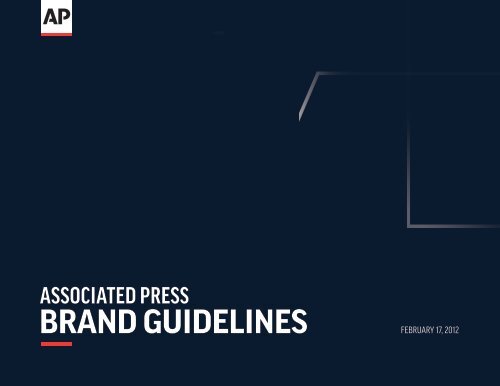
ASSOCIATED PRESS<br />
<strong>BRAND</strong> <strong>GUIDELINES</strong> FEBRUARY 17, 2012
TABLE OF CONTENTS<br />
INTRODUCTION:<br />
THE AP <strong>BRAND</strong> 3<br />
1. STRATEGY 4<br />
1.1 Brand Values 5<br />
1.2 Brand Personality 6<br />
1.3 Following the Rules 7<br />
2. IDENTITY 8<br />
2.1 Logo 10<br />
2.2 Signature 11<br />
2.3 Clear Space 12<br />
2.4 Minimum Size 13<br />
2.5 Use and Misuse 14<br />
2.6 Brand Architecture 16<br />
2.7 Special Use Cases 17<br />
3. HOUSE STYLE 18<br />
3.1 Elements 19<br />
3.2 Grid 20<br />
3.3 Typography 26<br />
3.3.1 Print Text Styles 27<br />
3.3.2 Web Text Styles 28<br />
3.4 Color Palette 29<br />
3.4.1 Using the Palette 30<br />
3.5 Secondary Prompt 32<br />
3.5.1 Prompt Color 33<br />
3.6 Watermark 34<br />
3.6.1 Watermark Application 35<br />
3.6.2 Watermark Color 36<br />
3.7 Photographs 37<br />
3.7.1 Photograph Treatment 38<br />
3.8 Image Stream 39<br />
4. APPLICATION 41<br />
4.1 Digital Applications 42<br />
4.2 Print Applications 43<br />
4.3 Video Applications 44<br />
4.4 Environmental Applications 45<br />
5. ARTWORK 46<br />
5.1 AP Logo Artwork Guide 47<br />
5.2 Watermark Artwork Guide 48<br />
5.3 Grid Artwork Guide 49
INTRODUCTION: THE AP <strong>BRAND</strong><br />
AP is unique in the world among news agencies<br />
in that our only agenda is news: We are solely<br />
focused on the mission of newsgathering,<br />
distribution and service.<br />
AP Brand Guidelines<br />
VERSION 1.0<br />
With more experience reporting and delivering news than any other<br />
agency, our independent standing and a strong commitment to the<br />
people’s right to know, we are the definitive source for trusted news.<br />
All of us at AP understand this extraordinary mission, which dates back<br />
to 1846. But it is also important to make a bold statement to customers,<br />
members and news consumers about what we do.<br />
A strong brand helps us be clear about who we are and what we stand<br />
for. It lets us reinforce what is unique about AP and what customers and<br />
consumers can expect when they encounter AP news, people or products.<br />
In 2009, AP undertook a strategic initiative to develop a masterbrand<br />
strategy that would define what makes us different from other news<br />
organizations, serve as a guide for business decisions and clarify the values<br />
and traits all AP staff embody. How do we best describe ourselves? As<br />
gutsy, resourceful and connected. What do we value? Integrity, action and<br />
independence.<br />
The AP visual identity system brings these traits and values to life. It allows<br />
us to leverage the great work we do by uniting under a comprehensive look<br />
and feel, driving competitive advantage and creating a distinct footprint in<br />
the media marketplace.<br />
This is your guide to the AP brand.<br />
3
1. STRATEGY<br />
The aim of this visual identity system is to make<br />
the AP Masterbrand Strategy come to life in all<br />
visual touch points.<br />
AP Brand Guidelines VERSION 1.0 1. Strategy<br />
No visual system can possibly communicate all that makes a place like AP<br />
successful. It can, however, present our organization, staff and work in a<br />
way that reflects our core values and strengths. The elements in the brand<br />
guidelines have been developed and crafted to do just that.<br />
They include a revised logo that is bold and straightforward and stands<br />
upright to stress integrity. Visual elements such as watermarks allude to<br />
AP’s connectedness — with sources, with customers, with technology. A<br />
new color palette shows the dynamic nature of our news company, and<br />
allows a much-needed flexibility to reflect our diverse array of products<br />
and services.<br />
Both the Masterbrand Strategy and the visual identity system emphasize<br />
the “One AP” concept of shared values and goals and leveraged strengths.<br />
With this brand toolkit, we have a visual system that differentiates us from<br />
competitors and is forward looking.<br />
4
1.1 <strong>BRAND</strong> VALUES<br />
INTEGRITY<br />
In an increasingly fragmented media world, AP’s values — integrity, action<br />
and independence — shape our trusted reputation and underscore the<br />
expertise that differentiates us from others in the industry. These brand<br />
values are the foundation for our behaviors, actions and culture.<br />
Sinceourbeginnings,APhasbeenthefirsttotelltheworldofmanyofhistory’s<br />
most important moments, from the assassination of Abraham Lincoln and<br />
the bombing of Pearl Harbor to fall of the shah of Iran and the death of Pope<br />
John Paul II. Whether it’s being on the front lines of 9/11, the Gulf oil spill, the<br />
earthquake in Haiti or the fall of Libyan dictator Moammar Gadhafi, AP’s core<br />
mission to cover breaking news plays out on center stage time and again.<br />
AP Brand Guidelines VERSION 1.0 1. Strategy<br />
ACTION<br />
INDEPENDENCE<br />
INTEGRITY: Beijing based video journalist Ken Teh covers the violent street riots in<br />
Bangkok, as police squared off against Red Shirt demonstrators advancing to pour<br />
blood on government buildings. AP Photo by Sakchai Lalit.<br />
ACTION: In the height of the Libyan conflict, an anti-Gadhafi fighter is interviewed by<br />
Cairo-based journalist Hadeel Al-Shalchi and Paris-based cameraman Nicolas Garriga<br />
outside the town of Nalut. AP Photo by Lefteris Pitarakis.<br />
INDEPENDENCE: AP White House correspondent Ben Feller conducts a one-on-one<br />
interview with President Barack Obama. AP Photo by Pablo Martinez Monsivais.<br />
5
1.2 <strong>BRAND</strong> PERSONALITY<br />
GUTSY<br />
With 49 Pulitzer Prizes, more than any other news organization in the<br />
categories for which we can compete, the AP brand speaks for the people<br />
who work for us. Our brand personality traits — we are gutsy, resourceful<br />
and connected — reflect who we are and how we act, and make us stand out<br />
among news organizations.<br />
Since our creation 165 years ago, we have served as the definitive source for<br />
news. As we continue our evolution to a diversified digital news company, our<br />
brand promise remains the same. The AP Masterbrand Strategy enables us<br />
to channel our brand traits, personality, vision and promise into a new visual<br />
identity system that captures our history and guides our future.<br />
AP Brand Guidelines VERSION 1.0 1. Strategy<br />
RESOURCEFUL<br />
CONNECTED<br />
GUTSY: As US troops battle insurgents in Iraq, AP photographer David Guttenfelder<br />
captures the action. AP Photo by Khalid Mohammed.<br />
RESOURCEFUL: In a black out during a night of heavy bombing in Afghanistan, AP<br />
Islamabad Bureau Chief Kathy Gannon files a story by lantern light in a basement. AP<br />
Photo by Dimitri Messinis.<br />
CONNECTED: Susan Henderson, head of broadcast service for North America, and<br />
Nico Maounis, production manager for AP Global Media Services, work with clients<br />
broadcasting live from the site at ground zero on the 10th anniversary of the 9/11<br />
terrorist attacks on New York. AP Photo by Ryan Scafuro.<br />
6
1.3 FOLLOWING THE RULES<br />
Consistently applied, the AP visual identity<br />
system plays a strong role in increasing AP brand<br />
recognition and reinforcing the strength of our<br />
relationship with all who value accurate and<br />
independent news. As a result, it is essential that<br />
these guidelines are followed closely and with care.<br />
AP Brand Guidelines VERSION 1.0 1. Strategy<br />
On a practical level, these brand rules ease creation of AP branded<br />
communications, materials and products. Strategically, however,<br />
they increase visibility and awareness of AP, helping us stand out<br />
from the competition and promoting a “halo” effect that supports<br />
our business goals.<br />
The guidelines that follow are to help all AP staff — whether in<br />
product development, corporate communications, finance, news<br />
or sales — apply this system. They include detailed instructions on<br />
our basic identity elements, such as corporate signature, typeface<br />
and color, as well as the components of our “house” style, such as<br />
how we use photography, graphics and typography. Together, these<br />
components constitute a unique and compelling communications<br />
system for AP.<br />
7
2. IDENTITY<br />
Throughout its storied past, AP has relied on a<br />
strong reputation, set of standards and brand to<br />
enable its reporting of history.<br />
AP Brand Guidelines VERSION 1.0 2. Identity<br />
In 1902, The AP Board of Directors directed that the cooperative develop<br />
a “bug” to distinguish AP content from other providers. The design,<br />
produced by the Morgenthaler Foundry, started appearing in all member<br />
newspapers soon after. It has marked all AP copy since then, and given rise<br />
to a logo that has changed along with AP’s innovations and developments.<br />
The new AP logo, revised for the first time in 30 years, builds on that<br />
heritage and communicates a dynamic news organization competing in<br />
the digital age.<br />
1900 1933 1942 1945 1955 1961 1981<br />
Current (2011)<br />
8
“The <strong>Associated</strong> <strong>Press</strong> is the<br />
hallmark of accuracy and the<br />
little character represented by<br />
the logotype… will become the<br />
mark upon accurate news as<br />
sterling is the mark on genuine<br />
silver, or as the chemist’s mark<br />
to the genuineness of gold.”<br />
AP Brand Guidelines VERSION 1.0 2. Identity<br />
— AP GENERAL MANAGER KENT COOPER (1925-1948),<br />
LETTER TO NEW YORK WORLD EDITOR HERBERT BAYARD SWOPE, MAY 7, 1925<br />
9
2.1 LOGO<br />
The AP logo is the single most powerful element<br />
in our identity.<br />
AP Brand Guidelines VERSION 1.0 2. Identity<br />
It succinctly identifies us. Its upright black letterforms, solid baseline<br />
and red “prompt” underline are memorable and embody the values of<br />
integrity, action and independence.<br />
It still carries the DNA of our past bugs, while putting forward a fresh and<br />
contemporary look that transcends global boundaries.<br />
The white “container” is an integral part of the logo, allowing it to be<br />
applied to any kind of content.<br />
10
2.2 SIGNATURE<br />
The AP signature is a combination of the logo<br />
and the words “<strong>Associated</strong> <strong>Press</strong>” aligned on a<br />
horizontal axis.<br />
They follow simple rules to respect their integrity in all situations.<br />
AP Brand Guidelines VERSION 1.0 2. Identity<br />
ASSOCIATED PRESS<br />
11
2.3 CLEAR SPACE<br />
The AP logo and adjoining signatures follow<br />
simple rules to allow their integrity to be<br />
respected in all situations.<br />
Fig. 1<br />
Fig. 2<br />
ASSOCIATED PRESS<br />
ASSOCIATED PRESS<br />
THE ESSENTIAL GLOBAL<br />
NEWS NETWORK<br />
THE ESSENTIAL GLOBAL<br />
NEWS NETWORK<br />
CONTENT GOES HERE<br />
CONTENT GOES HERE<br />
AP Brand Guidelines VERSION 1.0 2. Identity<br />
It is perfectly acceptable to use a greater amount of space, leaving the logo<br />
ASSOCIATED PRESS as the dominant element and the signature a supporting element (figure 2).<br />
THE ESSENTIAL GLOBAL<br />
NEWS NETWORK Whenever possible, the AP logo should be positioned at the very top of the<br />
document, composition or application.<br />
ASSOCIATED PRESS<br />
THE ESSENTIAL GLOBAL<br />
NEWS NETWORK<br />
ASSOCIATED PRESS<br />
ESSENTIAL<br />
ASSOCIATED PRESS<br />
ESSENTIAL<br />
ASSOCIATED PRESS<br />
ASSOCIATED PRESS<br />
As a general rule, the width of the logo is the minimum protection area<br />
allowed on each lateral side of the mark, including when using the corporate<br />
signature.<br />
12
2.4 MINIMUM SIZE<br />
The AP logo should be dominant in any application.<br />
.2 inches<br />
PRINT DIGITAL<br />
50 pixels<br />
AP Brand Guidelines VERSION 1.0 2. Identity<br />
In print use, the logo should never be smaller than .2 inches in height. When<br />
used in digital applications such as the Web or on mobile devices, 50 pixel tall<br />
should be the minimum size.<br />
In special cases, such as icons which require a size smaller than the specified<br />
minimum, use a version specially rendered for that application. See section<br />
2.8.1 for special small-use cases and section 5 for included Artwork.<br />
13
IPSUM DOLOR SIT AMET<br />
LOREM IPSUM DOLOR SIT AMET<br />
Mediums Brights<br />
Brights<br />
LOREM IPSUM DOLOR SIT AMET<br />
width of logo = 1/10th of 100% = 10% = x<br />
2.5 USE AND MISUSE<br />
AP Medium Blue<br />
C98 M24 Y1 K3 Pantone 7461 C<br />
C100 M1 Y8 K10 Pantone 640 U<br />
R20 G105 B148 #146994<br />
AP Medium Green<br />
C51 M5 Y98 K23 Pantone 377C<br />
C27 M0 Y97 K13 Pantone 390U<br />
R102 G153 B0 #669900<br />
R163 LOREM G190 B13 IPSUM #A3B30D DOLOR SIT AMET<br />
In any applications, the AP logo should always<br />
AP Bright Blue<br />
be C84 M21 legible, Y0 K0 Pantone 2925Cdominant<br />
and AP Bright unobstructed. Yellow This is<br />
C69 M10 Y0 K0 Pantone 299U<br />
C0 M27 Y100 K0 Pantone 124C<br />
LOREM IPSUM DOLOR SIT AMET<br />
R28 G148 B208 #1C94D0<br />
C1 M17 Y93 K3 Pantone 7406U<br />
essential to strengthening the AP brand.<br />
AP Medium Yellow<br />
C3 M36 Y100 K6 Pantone 131C<br />
C0 M18 Y100 K6 Pantone 7405U<br />
R209 G150 B0 #D19600<br />
AP Bright Green<br />
AP Medium Purple<br />
C24 M0 Y98 K8 Pantone 390C<br />
C74 M98<br />
C32<br />
Y2<br />
M0<br />
K12<br />
Y82<br />
Pantone<br />
K0 Pantone<br />
2613C<br />
382U<br />
C56 M79<br />
R163<br />
Y0<br />
G190<br />
K0 Pantone<br />
B13 #A3B30D<br />
526U<br />
R102 G7 B117 #660775<br />
AP Bright Yellow<br />
C0 M27 Y100 K0 Pantone 124C<br />
C1 M17 Y93 K3 Pantone 7406U<br />
R236 G178 B0 #ECB200<br />
AP Bright Purple<br />
C37 M100 Y0 K0 Pantone 247C<br />
LOREM IPSUM DOLOR SIT AMET<br />
C22 M66 Y0 K0 Pantone 247U<br />
R181 G3 B176 #B503B0<br />
LOREM IPSUM DOLOR<br />
SIT AMET<br />
LOREM IPSUM DOLOR SIT AMET<br />
AP Bright Blue<br />
C84 M21 Y0 K0 Pantone 2925C<br />
C69 M10 Y0 K0 Pantone 299U<br />
R28 G148 B208 #1C94D0<br />
AP Bright Green<br />
LOREM IPSUM DOLOR SIT AMET LOREM IPSUM DOLOR SIT AMET<br />
C24 M0 Y98 K8 Pantone 390C<br />
C32 M0 Y82 K0 Pantone 382U<br />
R236 G178 B0 #ECB200<br />
LOREM IPSUM DOLOR SIT AMET<br />
AP Bright Purple<br />
C37 M100 Y0 K0 Pantone 247C<br />
C22 M66 Y0 K0 Pantone 247U<br />
R181 G3 B176 #B503B0<br />
AP Brand Guidelines VERSION 1.0 2. Identity<br />
Consectetur adipiscing elit. Maecenas at massa felis, non<br />
commodo lorem. Nulla tellus enim, cursus ut volutpat eu,<br />
aliquet vel metus.<br />
width of application = 100%<br />
LOREM IPSUM DOLOR<br />
SIT AMET<br />
LOREM IPSUM DOLOR SIT AMET<br />
LOREM IPSUM DOLOR SIT AMET<br />
Lorem ipsum dolor sit amet, consectetur adipiscing elit.<br />
Maecenas at massa felis, non commodo lorem. Nulla tellus<br />
enim, cursus ut volutpat eu, aliquet vel metus.<br />
LOREM IPSUM<br />
Consectetur adipiscing elit.<br />
Maecenas at massa felis, non<br />
commodo lorem. Nulla tellus<br />
enim, cursus ut volutpat eu,<br />
aliquet vel metus.<br />
Duis ut urna eu sem consectetur imperdiet et<br />
sed tortor. Nullam risus sapien, semper ut<br />
cursus a, mattis nec dolor. Nulla eu felis eget<br />
turpis ornare ultricies sed sit amet nulla. Morbi<br />
et scelerisque lacus. Fusce dictum sollicitudin<br />
lorem, vel malesuada nibh lacinia a. Vestibulum<br />
posuere fringilla magna ut tincidunt.<br />
Consectetur adipiscing elit. Maecenas at massa felis, non<br />
commodo lorem. Nulla tellus enim, cursus ut volutpat eu,<br />
aliquet vel metus.<br />
LOREM IPSUM DOLOR SIT AMET<br />
Duis ut urna eu sem consectetur imperdiet et sed<br />
Duis ut urna eu sem consectetur imperdiet et sed tortor. Nullam<br />
risus sapien, semper ut cursus tortor. a, mattis Nullam nec dolor. risus Nulla sapien, eu felis semper eget ut cursus a, mattis<br />
turpis ornare ultricies sed nec sit amet dolor. nulla. Nulla Morbi eu et felis scelerisque eget lacus. turpis ornare ultricies<br />
Fusce dictum sollicitudin sed lorem, sit vel amet malesuada nulla. nibh Morbi lacinia et a. scelerisque lacus. Fusce<br />
Vestibulum posuere fringilla dictum magna sollicitudin ut tincidunt. lorem, vel malesuada nibh lacinia<br />
a. Vestibulum posuere fringilla magna ut tincidunt.<br />
Vivamus ut nibh vitae libero semper.<br />
LOREM IPSUM DOLOR SIT AMET<br />
Duis ut urna eu sem consectetur imperdiet et sed<br />
tortor. Nullam risus sapien, semper ut cursus a,<br />
mattis nec dolor. Nulla eu felis eget turpis ornare<br />
ultricies sed sit amet nulla. Morbi et scelerisque lacus.<br />
Fusce dictum sollicitudin lorem, vel malesuada nibh<br />
lacinia a. Vestibulum posuere fringilla magna ut<br />
tincidunt. Vivamus ut nibh vitae libero semper<br />
placerat molestie sed lacus.<br />
LOREM IPSUM DOLOR SIT AMET LOREM IPSUM DOLOR SIT AMET<br />
LOREM IPSUM DOLOR SIT AMET<br />
LOREM IPSUM DOLOR SIT AMET<br />
LOREM IPSUM DOLOR SIT AMET<br />
Lorem ipsum dolor sit amet, consectetur adipiscing elit.<br />
Maecenas at massa felis, non commodo lorem. Nulla tellus<br />
enim, cursus ut volutpat eu, aliquet vel metus.<br />
LOREM IPSUM<br />
Consectetur adipiscing elit.<br />
Maecenas at massa felis, non<br />
commodo lorem. Nulla tellus<br />
enim, cursus ut volutpat eu,<br />
aliquet vel metus.<br />
LOREM IPSUM DOLOR SIT AMET<br />
Duis ut urna eu sem consectetur imperdiet et<br />
sed tortor. Nullam risus sapien, semper ut<br />
cursus a, mattis nec dolor. Nulla eu felis eget<br />
turpis ornare ultricies sed sit amet nulla. Morbi<br />
et scelerisque lacus. Fusce dictum sollicitudin<br />
lorem, vel malesuada nibh lacinia a. Vestibulum<br />
posuere fringilla magna ut tincidunt.<br />
LOREM IPSUM<br />
LOREM IPSUM DOLOR SIT AMET<br />
Duis ut urna eu sem consectetur imperdiet et sed<br />
tortor. Nullam risus sapien, semper ut cursus a, mattis<br />
nec dolor. Nulla eu felis eget turpis ornare ultricies<br />
sed sit amet nulla. Morbi et scelerisque lacus. Fusce<br />
dictum sollicitudin lorem, vel malesuada nibh lacinia<br />
a. Vestibulum posuere fringilla magna ut tincidunt.<br />
Vivamus ut nibh vitae libero semper.<br />
LOREM IPSUM DOLOR SIT AMET<br />
Duis ut urna eu sem consectetur imperdiet et sed<br />
tortor. Nullam risus sapien, semper ut cursus a,<br />
mattis nec dolor. Nulla eu felis eget turpis ornare<br />
ultricies sed sit amet nulla. Morbi et scelerisque lacus.<br />
Fusce dictum sollicitudin lorem, vel malesuada nibh<br />
lacinia a. Vestibulum posuere fringilla magna ut<br />
tincidunt. Vivamus ut nibh vitae libero semper<br />
placerat molestie sed lacus.<br />
LOREM IPSUM<br />
Consectetur adipiscing elit. Maecenas at massa felis, non<br />
commodo lorem. Nulla tellus enim, cursus ut volutpat eu,<br />
aliquet vel metus.<br />
Consectetur adipiscing elit. Maecenas at massa felis, non<br />
commodo lorem. Nulla tellus enim, cursus ut volutpat eu,<br />
aliquet vel metus.<br />
Duis ut urna eu sem consectetur imperdiet et sed tortor. Nullam<br />
risus sapien, semper ut cursus a, mattis nec dolor. Nulla eu felis eget<br />
turpis ornare ultricies sed sit amet nulla. Morbi et scelerisque lacus.<br />
Fusce dictum sollicitudin lorem, vel malesuada nibh lacinia a.<br />
Vestibulum posuere fringilla magna ut tincidunt.<br />
LOREM IPSUM DOLOR SIT AMET<br />
LOREM IPSUM<br />
Dominant logo leads the way.<br />
LOREM IPSUM DOLOR SIT AMET<br />
Always place the mark as the lead into the content — neither below nor<br />
following the content. Content should not clutter this logo. This is to ensure<br />
the AP logo is highlighted and not lost.<br />
Duis ut urna eu sem consectetur imperdiet et sed<br />
tortor. Nullam risus sapien, semper ut cursus a,<br />
mattis LOREM nec dolor. Nulla IPSUM eu felis DOLOR eget turpis SIT ornare AMET<br />
ultricies sed sit amet nulla. Morbi et scelerisque lacus.<br />
Fusce dictum sollicitudin lorem, vel malesuada nibh<br />
lacinia a. Vestibulum posuere fringilla magna ut<br />
tincidunt. Vivamus ut nibh vitae libero semper<br />
placerat molestie sed lacus.<br />
LOREM IPSUM DOLOR<br />
SIT AMET<br />
LOREM IPSUM DOLOR SIT AMET<br />
Consectetur adipiscing elit. Maecenas at massa felis, non<br />
commodo lorem. Nulla tellus enim, cursus ut volutpat eu,<br />
aliquet vel metus.<br />
Duis ut urna eu sem consectetur imperdiet et sed tortor. Nullam<br />
risus sapien, semper ut cursus a, mattis nec dolor. Nulla eu felis eget<br />
turpis ornare ultricies sed sit amet nulla. Morbi et scelerisque lacus.<br />
Fusce dictum sollicitudin lorem, vel malesuada nibh lacinia a.<br />
Vestibulum posuere fringilla magna ut tincidunt.<br />
LOREM IPSUM DOLOR SIT AMET<br />
LOREM IPSUM DOLOR<br />
SIT AMET<br />
Exceptions: When LOREM the IPSUM document DOLOR SIT AMET is in a right-to-left language, such as Arabic<br />
or Hebrew, the mark should live on the right side where the content begins.<br />
LOREM IPSUM DOLOR SIT AMET<br />
Lorem ipsum dolor sit amet, consectetur adipiscing elit.<br />
Maecenas at massa felis, non commodo lorem. Nulla tellus<br />
enim, cursus ut volutpat eu, aliquet vel metus.<br />
LOREM IPSUM LOREM Duis IPSUM ut urna eu sem DOLOR consectetur imperdiet SIT AMET<br />
et<br />
sed tortor. Nullam risus sapien, semper ut<br />
Consectetur adipiscing elit.<br />
cursus a, mattis nec dolor. Nulla eu felis eget<br />
Maecenas at massa felis, non<br />
turpis ornare ultricies sed sit amet nulla. Morbi<br />
commodo lorem. Nulla tellus<br />
et scelerisque lacus. Fusce dictum sollicitudin<br />
lorem, vel malesuada nibh lacinia a. Vestibulum<br />
enim, cursus ut volutpat eu,<br />
aliquet vel metus.<br />
posuere fringilla magna ut tincidunt.<br />
LOREM IPSUM DOLOR SIT AMET<br />
Duis ut urna eu sem consectetur imperdiet et sed<br />
tortor. Nullam risus sapien, semper ut cursus a, mattis<br />
nec dolor. Nulla eu felis eget turpis ornare ultricies<br />
sed sit amet nulla. Morbi et scelerisque lacus. Fusce<br />
dictum sollicitudin lorem, vel malesuada nibh lacinia<br />
a. Vestibulum posuere fringilla magna ut tincidunt.<br />
Vivamus ut nibh vitae libero semper.<br />
Consectetur adipiscing elit. Maecenas at massa felis, non<br />
commodo lorem. Nulla tellus enim, cursus ut volutpat eu,<br />
aliquet vel metus.<br />
Duis ut urna eu sem consectetur imperdiet et sed tortor. Nullam<br />
risus sapien, semper ut cursus a, mattis nec dolor. Nulla eu felis eget<br />
turpis ornare ultricies sed sit amet nulla. Morbi et scelerisque lacus.<br />
Fusce dictum sollicitudin lorem, vel malesuada nibh lacinia a.<br />
Vestibulum posuere fringilla magna ut tincidunt.<br />
LOREM IPSUM DOLOR SIT AMET<br />
Duis ut urna eu sem consectetur imperdiet et sed<br />
tortor. Nullam risus sapien, semper ut cursus a,<br />
mattis nec dolor. Nulla eu felis eget turpis ornare<br />
ultricies sed sit amet nulla. Morbi et scelerisque lacus.<br />
Fusce dictum sollicitudin lorem, vel malesuada nibh<br />
lacinia a. Vestibulum posuere fringilla magna ut<br />
LOREM IPSUM tincidunt. Vivamus ut nibh vitae libero semper<br />
Consectetur adipiscing placerat molestie elit. Maecenas sed lacus. at massa felis, non<br />
commodo lorem. Nulla tellus enim, cursus ut volutpat eu,<br />
aliquet vel metus.<br />
Consectetur adipiscing elit. Maecenas at massa felis, non<br />
commodo lorem. Nulla tellus enim, cursus ut volutpat eu,<br />
14<br />
LOREM IPSUM DOLOR SI<br />
Lorem ipsum dolor sit amet, consecte<br />
Maecenas at massa felis, non commod<br />
enim, cursus ut volutpat eu, aliquet ve<br />
LOREM IPSUM<br />
Consectetur adipiscing elit.<br />
Maecenas at massa felis, non<br />
commodo lorem. Nulla tellus<br />
enim, cursus ut volutpat eu,<br />
aliquet vel metus.<br />
LO<br />
D<br />
se<br />
c<br />
tu<br />
e<br />
lo<br />
p<br />
LOREM IPSU<br />
Duis ut urna eu sem<br />
LOREM IPSU<br />
tortor. Nullam risu<br />
mattis Duis ut nec urna dolor. eu sem N<br />
ultricies tortor. Nullam sed sit risu am<br />
Fusce nec dolor. dictum Nulla solli eu<br />
lacinia sed sit amet a. Vestibulu nulla.<br />
tincidunt. dictum sollicitudin<br />
Vivamu<br />
placerat a. Vestibulum molestie posus<br />
Vivamus ut nibh vi<br />
LOREM IPSUM<br />
Consectetur adipiscing elit. Maecenas a<br />
commodo lorem. Nulla tellus enim, curs<br />
aliquet vel metus.<br />
Consectetur adipiscing elit. Maecenas a<br />
commodo lorem. Nulla tellus enim, curs<br />
aliquet vel metus.<br />
Duis ut urna eu sem consectetur imperdiet et se<br />
risus sapien, semper ut cursus a, mattis nec dolo<br />
turpis ornare ultricies sed sit amet nulla. Morbi e<br />
Fusce dictum sollicitudin lorem, vel malesuada<br />
Vestibulum posuere fringilla magna ut tincidunt
Maintaining the integrity of the logo is essential to strengthening the<br />
AP brand.<br />
Always use artwork that has been provided by AP Corporate Communications.<br />
When unsure about the way to proceed, give us a call or send us an email.<br />
(see last page)<br />
The cases outlined here are in no way meant as an exhaustive list of all potential<br />
misuse of the AP logo.<br />
It is recommended to use the logo on a color backdrop or a photographic<br />
backdrop.<br />
Do not modify the logo in<br />
anyway, including:<br />
- Outline edges<br />
- Remove the white container or prompt<br />
- Position in a corner<br />
- Stretch<br />
- Stretch the white container<br />
- Detach the prompt from the logo<br />
- Rotate<br />
- Recreate<br />
- Use a different typeface<br />
- Change the color of container or prompt<br />
- Change the color of “AP”<br />
- Make into a lock up<br />
- Set into text<br />
AP Brand Guidelines VERSION 1.0 2. Identity<br />
AP AP<br />
Images.<br />
Lorem ipsum<br />
dolor sit amet.<br />
15
2.6 <strong>BRAND</strong> ARCHITECTURE<br />
In keeping with our Masterbrand Strategy and<br />
the “One AP” mission, we are simplifying the<br />
face we put forward to customers. The goal is to<br />
ensure all touch points strengthen and promote<br />
the main AP brand.<br />
Do not create custom ‘lockup’ marks for divisions...<br />
IMAGES<br />
AP Brand Guidelines VERSION 1.0 2. Identity<br />
... Rather, make the name of the division a primary header. For example:<br />
AP IMAGES<br />
This means that custom wordmark lockups are no longer acceptable.<br />
Product and division names can be highlighted by using a headline font,<br />
but will no longer be linked to the logo.<br />
This means that what once was:<br />
Is now:<br />
Logo + division or product name<br />
Logo<br />
AP division or product name<br />
16
2.7 SPECIAL USE CASES<br />
While maintaining the integrity of all elements<br />
of the visual system is critical, their adaptation to<br />
some special cases will occur from time to time.<br />
2.7.1 Website Favicon Special Use Artwork in use<br />
AP Brand Guidelines VERSION 1.0 2. Identity<br />
If you believe you have a special case that is not answered in this document,<br />
do not create original artwork. Simply direct your request to Corporate<br />
Communications (see the last page of this document).<br />
2.7.1 Small Use<br />
In print applications, the logo should not be used smaller than .2 inches tall.<br />
Special scenarios require redrawn logo artwork for optimal rendering at<br />
very small sizes. See section 5. Artwork for such files.<br />
2.7.2 Transparent Use<br />
In video applications (e.g., in bugs or lower thirds), the logo may be set at 50<br />
percent opacity, if needed.<br />
2.7.2 Motion Transparent Special Use Artwork in use<br />
17
3. HOUSE STYLE<br />
The AP House Style includes all of the visual<br />
elements that help to communicate the brand<br />
identity above and beyond the logo.<br />
AP Brand Guidelines VERSION 1.0 3. House Style<br />
The AP visual system is designed to be dynamic and flexible. This section<br />
explains the use of color, typography, image style and graphic elements.<br />
The flexibility of the system requires careful treatment and attention for<br />
all graphic elements. The use of these guidelines will assure that the visual<br />
system will reinforce and strengthen our identity.<br />
18
3.1 ELEMENTS<br />
The careful combination of graphic elements is<br />
what makes our brand strong.<br />
The AP logo is to be the dominant element in all compositions.<br />
Colors from our color palette, when applied judiciously, go a long way<br />
toward communicating our brand.<br />
Typography is the vehicle for the language of our communication. Using<br />
the brand typefaces helps us speak in a consistent tone.<br />
Visual elements, including the Watermarks and the Image Stream help<br />
us tell the story of AP in a more striking fashion. Images are also a key<br />
visual element to be used for impact.<br />
Finally, the juxtaposition of all these consistent Layout Concepts brings<br />
the system to life.<br />
AP Brand Guidelines VERSION 1.0 3. House Style<br />
CAP<br />
y<br />
1/2 CAP<br />
x CAP<br />
1/2 CAP<br />
gutter = 2z<br />
w<br />
z<br />
z<br />
ASSOCIATED PRESS<br />
ASSOCIATED PRESS<br />
column = x<br />
AP ID Red<br />
C0 M90 Y60 K0 Pantone Red 032 C<br />
C0 M78 Y73 K0 Pantone Red 032 U<br />
R255 G50 B46 #FF322E<br />
gutter = 2z<br />
top margin = y<br />
row = y<br />
gutter = 2z<br />
prompt = z<br />
AP ID White<br />
C00 M00 Y00 K00 Pantone 9999C<br />
C00 M00 Y00 K00 Pantone 9999U<br />
R255 G255 B255 #FFFFFF<br />
AP Neutral Deep Gray<br />
C00 M00 Y00 K00 Pantone 9999C<br />
C00 M00 Y00 K00 Pantone 9999U<br />
R51 G51 B51 #333333<br />
AP Neutral Light Gray<br />
C00 M00 Y00 K00 Pantone 9999C<br />
C00 M00 Y00 K00 Pantone 9999U<br />
R231 G226 B216 #E7E2D8<br />
AP Neutral Medium Gray<br />
C00 M00 Y00 K00 Pantone 9999C<br />
C00 M00 Y00 K00 Pantone 9999U<br />
R182 G182 B171 #B6B6AB<br />
�exible left and right margins. width between “CAP” and “x” and centered when applicable.<br />
gutter = 2z<br />
�exible bottom margin. min height = CAP<br />
AP Deep Blue<br />
C00 M00 Y00 K00 Pantone 9999C<br />
C00 M00 Y00 K00 Pantone 9999U<br />
R8 G28 B47 #081C2F<br />
AP Deep Green<br />
C00 M00 Y00 K00 Pantone 9999C<br />
C00 M00 Y00 K00 Pantone 9999U<br />
R33 G51 B48 #213330<br />
AP Deep Brown<br />
C00 M00 Y00 K00 Pantone 9999C<br />
C00 M00 Y00 K00 Pantone 9999U<br />
R56 G38 B30 #38261E<br />
AP Deep Purple<br />
C00 M00 Y00 K00 Pantone 9999C<br />
C00 M00 Y00 K00 Pantone 9999U<br />
R50 G0 B33 #320021<br />
number of columns = odd number<br />
TYPOGRAPHY And secondary typography<br />
Neutrals Deeps Mediums Brights<br />
The AP typography consists of two typefaces: Good and Freight Text.<br />
AP Medium Blue<br />
C00 M00 Y00 K00 Pantone 9999C<br />
C00 M00 Y00 K00 Pantone 9999U<br />
R20 G105 B148 #146994<br />
AP Medium Green<br />
C00 M00 Y00 K00 Pantone 9999C<br />
C00 M00 Y00 K00 Pantone 9999U<br />
R102 G153 B0 #669900<br />
AP Medium Yellow<br />
C00 M00 Y00 K00 Pantone 9999C<br />
C00 M00 Y00 K00 Pantone 9999U<br />
R209 G150 B0 #D19600<br />
AP Medium Purple<br />
C00 M00 Y00 K00 Pantone 9999C<br />
C00 M00 Y00 K00 Pantone 9999U<br />
R102 G7 B117 #660775<br />
AP Bright Blue<br />
C00 M00 Y00 K00 Pantone 9999C<br />
C00 M00 Y00 K00 Pantone 9999U<br />
R28 G148 B208 #1C94D0<br />
AP Bright Green<br />
C00 M00 Y00 K00 Pantone 9999C<br />
C00 M00 Y00 K00 Pantone 9999U<br />
R163 G190 B13 #A3B30D<br />
AP Bright Yellow<br />
C00 M00 Y00 K00 Pantone 9999C<br />
C00 M00 Y00 K00 Pantone 9999U<br />
R236 G178 B0 #ECB200<br />
AP Bright Purple<br />
C00 M00 Y00 K00 Pantone 9999C<br />
C00 M00 Y00 K00 Pantone 9999U<br />
R181 G3 B176 #B503B0<br />
Color is crucial to our visual identity. Neutral colors pair well with the Medium range. Deep colors pair<br />
well with Brights.<br />
Photography is not only a key product of AP, it is a powerful medium to tell our story. The prompt is a<br />
secondary visual element that strengthens the content relationship with the AP logo.<br />
Watermarks help identify AP materials in a subtle and tasteful way, especially when using images is not<br />
an option.<br />
IMAGES<br />
AP IMAGES<br />
IMAGES<br />
�nal grid for a 8.5 × 11 sheet<br />
AP IMAGES<br />
19<br />
row = x<br />
gutter = z<br />
LOREM IPSUM DOLOR SIT AMET LOREM IPSUM DOLOR SIT AMET<br />
LOREM IPSUM DOLOR SIT AMET<br />
LOREM IPSUM DOLOR SIT AMET<br />
LOREM IPSUM DOLOR SIT AMET<br />
gutter = z<br />
�exible top and bot
3.2 GRID<br />
The grid is a time-tested tool in creating harmonious<br />
compositions. We have devised a grid system that is<br />
based on the proportions of the AP logo.<br />
y<br />
x<br />
CAP<br />
1/2 CAP<br />
CAP<br />
1/2 CAP<br />
x x<br />
(TOP) THE VERTICAL MARK AND TEXT LOCKUP.<br />
(BOTTOM) THE HORIZONTAL MARK AND TEXT LOCKUP.<br />
w<br />
z<br />
AP Brand Guidelines VERSION 1.0 3. House Style<br />
z<br />
ASSOCIATED PRESS<br />
ASSOCIATED PRESS<br />
column = x<br />
gutter = 2z<br />
The dimensions of the primary (vertical) logo will guide all grid making<br />
decisions. The width of the logo (x), its height (y), the height of the prompt<br />
(z), as well as the height of the AP letters (CAP), and the space between the<br />
prompt and the AP letters (1/2 CAP) are the variables used.<br />
In special cases where the secondary (horizontal) logo is used, the width<br />
of the logo is wider (w), but all other variables remain the same.<br />
Using those proportions supports elegant and strong compositions.<br />
top margin = y<br />
row = y<br />
gutter = 2z<br />
prompt = z<br />
�exible left and right margins. width between “CAP” and “x” and centered when applicable.<br />
column = x<br />
gutter = 2z<br />
number of columns = odd number<br />
20
When determining a grid, begin with the width of<br />
the application.<br />
Choose the appropriate size of the logo according to the sizing chart of the<br />
varying applications. Excluding special cases, logo width will be normally<br />
1/10th or 1/12th the total application width.<br />
The resulting width of the logo will serve as the determining measurement<br />
for column width.<br />
LOREM IPSUM DOLOR SIT AMET LOREM IPSUM DOLOR SIT AMET<br />
LOREM IPSUM DOLOR SIT AMET<br />
LOREM IPSUM DOLOR SIT AMET<br />
LOREM IPSUM DOLOR SIT AMET<br />
AP Brand Guidelines VERSION 1.0 3. House Style<br />
width of logo = 1/10th of 100% = 10% = x<br />
LOREM IPSUM DOLOR SIT AMET<br />
LOREM IPSUM DOLOR<br />
SIT AMET<br />
width of application = 100%<br />
LOREM IPSUM DOLOR SIT AMET<br />
Lorem ipsum dolor sit amet, consectetur adipiscing elit.<br />
Maecenas at massa felis, non commodo lorem. Nulla tellus<br />
enim, cursus ut volutpat eu, aliquet vel metus.<br />
LOREM IPSUM<br />
Consectetur adipiscing elit.<br />
Maecenas at massa felis, non<br />
commodo lorem. Nulla tellus<br />
enim, cursus ut volutpat eu,<br />
Duis ut urna eu sem consectetur imperdiet et<br />
sed tortor. Nullam risus sapien, semper ut<br />
cursus a, mattis nec dolor. Nulla eu felis eget<br />
turpis ornare ultricies sed sit amet nulla. Morbi<br />
et scelerisque lacus. Fusce dictum sollicitudin<br />
lorem, vel malesuada nibh lacinia a. Vestibulum<br />
posuere fringilla magna ut tincidunt.<br />
21<br />
LOREM IP<br />
LOREM IPSUM DOLOR SIT<br />
Duis ut urna eu sem consectetur imperd<br />
tortor. Nullam risus sapien, semper ut c<br />
mattis nec dolor. Nulla eu felis eget turp<br />
ultricies sed sit amet nulla. Morbi et sce<br />
Fusce dictum sollicitudin lorem, vel ma<br />
lacinia a. Vestibulum posuere fringilla m<br />
tincidunt. Vivamus ut nibh vitae libero
The thickness of the prompt serves as the starting<br />
point for the gutter.<br />
Both horizontal and vertical gutters are double the thickness of the prompt.<br />
AP Brand Guidelines VERSION 1.0 3. House Style<br />
x<br />
CAP<br />
1/2 CAP<br />
gutter = 2z<br />
AP ID Red<br />
w<br />
ASSOCIATED PRESS<br />
column = x<br />
C0 M90 Y60 K0 Pantone Red 032 C<br />
C0 M78 Y73 K0 Pantone Red 032 U<br />
R255 G50 B46 #FF322E<br />
gutter = 2z<br />
Neutrals<br />
AP ID White<br />
C0 M0 Y0 K0<br />
C0 M0 Y0 K0<br />
R255 G255 B255 #FFFFFF<br />
22<br />
row = y<br />
gutter = 2z<br />
AP Neutral Deep Gray<br />
C38 M28 Y21 K63 Pantone 425C<br />
C76 M63 Y55 K24 Pantone 433U<br />
R51 G51 B51 #333333<br />
AP Neutral Light Gray<br />
C2 M3 Y4 K5 Pantone Warm Gray 1 C<br />
C2 M3 Y7 K8 Pantone Warm Gray 1 U
Once the logo size has been determined,<br />
place the maximum amount that will fit on<br />
the application, while including gutters (2z)<br />
between each instance of the logo (x).<br />
�exible left and right margins. width between “CAP” and “x” and centered when applicable.<br />
column = x<br />
gutter = 2z<br />
�exible bottom margin. min height = CAP<br />
number of columns = odd number<br />
top margin = y<br />
prompt = z<br />
AP Brand Guidelines VERSION 1.0 3. House Style<br />
row = y<br />
gutter = 2z<br />
THE CONSTRUCTION OF A GRID<br />
FOR AN 8.5 × 11 INCH SHEET.<br />
�nal grid for a 8.5 × 11 sheet<br />
Ifthetotalnumberiseven,removeoneinstancetoendwithanoddnumber.<br />
Remove any gutters that are on the outside, and center the remaining<br />
instances and gutters to produce the grid’s columns. Any remaining space<br />
serves as the left and right margins.<br />
The top margin is determined by the height (y) of the logo, as well as the<br />
grid rows. The gutter between rows is also twice the thickness of the<br />
prompt (2z). Rows continue in this manner until the space remaining<br />
is less than the total height (y) and CAP height of the logo. The bottom<br />
margin is the remaining space.<br />
See section 5. Artwork for preset grids for letter, tabloid, A4 and A3 paper sizes.<br />
23<br />
left margin = w
x<br />
gutter = 2z number of columns = odd number<br />
�exible bottom margin. min height = CAP<br />
THE FINISHED GRID.<br />
AP Brand Guidelines VERSION 1.0 3. House Style<br />
�nal grid for a 8.5 × 11 sheet<br />
24
left margin = w<br />
column = w<br />
gutter = z<br />
�exible top and bottom margins. width between “CAP” and “x”<br />
In cases using the horizontal mark, the columns and rows are determined<br />
in the same manner as when the vertical mark is used, yet the height of the<br />
row is the determining measurement of the grid, generated by the ratio<br />
between the height (x) and the total height of the application.<br />
Additionally, the right margin is now determined by the width (w) of the<br />
logo, and the top, bottom and left margins are flexible.<br />
AP Brand Guidelines VERSION 1.0 3. House Style<br />
width of logo = 1/10th of 100% = 10% = x<br />
row = x<br />
horizontal logo<br />
gutter = z<br />
�exible right margin. min width = CAP<br />
THE CONSTRUCTION OF A GRID FOR AN<br />
11 × 8.5 INCH LANDSCAPE APPLICATION.<br />
width of application = 100%<br />
25
3.3 TYPOGRAPHY<br />
AP typography consists of two typefaces:<br />
Good and Freight Text.<br />
Freight Text Book, 15pt<br />
Both typefaces come in a variety of weights and style and offer flexibility<br />
of use. Commitment to these typefaces will create a consistent and<br />
strong identity. Below are a few distinctive feature of those typefaces.<br />
When text such as “<strong>Associated</strong> <strong>Press</strong>” or long headlines are locked up<br />
with the logo, Good Condensed should be used.<br />
When Good is not available for use, in some digital applications for<br />
example, it can be substituted by Verdana, and if Verdana is not available,<br />
a sans-serif such as Helvetica and Arial can be used as substitution.<br />
When Freight Text is not available for use, Georgia should be the<br />
replacement typeface.<br />
Descender on the<br />
uppercase ‘J’<br />
Good Book<br />
Good Book, 12pt<br />
Jag<br />
Shoulder on the<br />
lowercase ‘a’<br />
Tail on the<br />
lowercase ‘a’<br />
Gr<br />
Sharp Serifs<br />
Exit<br />
Freight Text Book Spur on the uppercase ‘G’<br />
Two-story<br />
lowercase ‘g’<br />
Ball terminal on the<br />
lowercase ‘r’<br />
Good Condensed Book<br />
AP Brand Guidelines VERSION 1.0 3. House Style<br />
QtTail<br />
of uppercase ‘Q’<br />
Stab join on the<br />
nk<br />
lowercase ‘n’<br />
Freight Text Book Italic<br />
Angles and bracket on<br />
the lowercase ‘t’<br />
Ball terminal<br />
stroke of the leg of<br />
the lowercase ‘k’<br />
GOOD<br />
ABCDEFGHIJKLMNOPQRSTUVWXYZ<br />
abcdefghijklmnopqrstuvwxyz<br />
12345678901234567890!@#$%^&(*)<br />
FREIGHT TEXT<br />
ABCDEFGHIJKLMNOPQRSTUVWXYZ<br />
abcdefghijklmnopqrstuvwxyz<br />
12345678901234567890!@#$%^&(*)<br />
GOOD CONDENSED BOLD<br />
ABCDEFGHIJKLMNOPQRSTUVWXYZ<br />
abcdefghijklmnopqrstuvwxyz<br />
12345678901234567890!@#$%^&(*)<br />
GOOD ITALICS<br />
ABCDEFGHIJKLMNOPQRSTUVWXYZ<br />
abcdefghijklmnopqrstuvwxyz<br />
12345678901234567890!@#$%^&(*)<br />
FREIGHT TEXT BOLD<br />
ABCDEFGHIJKLMNOPQRSTUVWXYZ<br />
abcdefghijklmnopqrstuvwxyz<br />
12345678901234567890!@#$%^&(*)<br />
FREIGHT TEXT ITALICS<br />
ABCDEFGHIJKLMNOPQRSTUVWXYZ<br />
abcdefghijklmnopqrstuvwxyz<br />
12345678901234567890!@#$%^&(*)<br />
VERDANA<br />
ABCDEFGHIJKLMNOPQRSTUVWXYZ<br />
abcdefghijklmnopqrstuvwxyz<br />
12345678901234567890!@#$%^&(*)<br />
GEORGIA<br />
ABCDEFGHIJKLMNOPQRSTUVWXYZ<br />
abcdefghijklmnopqrstuvwxyz<br />
12345678901234567890!@#$%^&(*)<br />
26
3.3.1 PRINT TEXT STYLES<br />
H1<br />
Good Bold, ALL CAPS<br />
Subhead / Lead<br />
Freight Text Book, Sentence case<br />
H2<br />
Good Bold, ALL CAPS<br />
H3<br />
Good Book, Sentence case<br />
H4<br />
Freight Text Bold, Sentence case,<br />
12/15<br />
H5<br />
Freight Text Bold, Sentence case,<br />
10/14<br />
H6<br />
Freight Text Bold, Sentence case,<br />
8.5/12<br />
AP IMAGES<br />
Access one of the world’s largest<br />
collections of photography,<br />
video, interactives and graphics.<br />
TALK TO US<br />
What products are available?<br />
AP Photo Archive<br />
AP Photostream<br />
AP Historical Research Services<br />
AP Brand Guidelines VERSION 1.0 3. House Style<br />
Body Text Long Form<br />
Freight Text Book<br />
10 / 13 pts<br />
Justified<br />
Body Text Short Form<br />
Freight Text Medium<br />
10 / 13 pts<br />
Justified or Left Aligned<br />
Bulleted Lists<br />
Freight Text (weight<br />
depending on surrounding<br />
text), En dash bullets<br />
no charge to set up an account, search or<br />
view content online at ap.org/images. And<br />
you can purchase the media format you<br />
need immediately on the site (U.S. only)<br />
or set up a subscription service with your<br />
sales representative. Whether you need<br />
a video of a breaking news event, photos<br />
The <strong>Associated</strong> <strong>Press</strong> (“AP”) is the<br />
essential global news network, delivering<br />
fast, unbiased news from every corner<br />
of the world to all media platforms and<br />
formats.<br />
On any given day, more than half the<br />
world’s population sees news from the<br />
Creative Partners<br />
include:<br />
– Image Source<br />
– Blend Images<br />
– National<br />
Geographic<br />
Editorial Partners<br />
include:<br />
– NFL<br />
– NCAA<br />
– NBC Universal<br />
27
3.3.2 WEB TEXT STYLES<br />
H1<br />
Good Bold, ALL CAPS<br />
Subhead / Lead<br />
Georgia Regular, Sentence case<br />
H2<br />
Good Bold, ALL CAPS<br />
H3<br />
Good Book, Sentence case<br />
H4<br />
Georgia Regular, Sentence case,<br />
H5<br />
Georgia Bold, Sentence case,<br />
H6<br />
Georgia Bold, Sentence case,<br />
AP IMAGES<br />
Access one of the world’s largest<br />
collections of photography,<br />
video, interactives and graphics.<br />
TALK TO US<br />
What products are available?<br />
AP Photo Archive<br />
AP Photostream<br />
AP Historical Research Services<br />
AP Brand Guidelines VERSION 1.0 3. House Style<br />
Body Text Long Form<br />
Georgia Regular<br />
Justified<br />
Body Text Short Form<br />
Verdana Regular<br />
Left Aligned<br />
Bulleted Lists<br />
Georgia or Verdana (weight<br />
depending on surrounding<br />
text), En dash bullets<br />
no charge to set up an account, search<br />
or view content online at ap.org/images.<br />
And you can purchase the media<br />
format you need immediately on the<br />
site (U.S. only) or set up a subscription<br />
service with your sales representative.<br />
Whether you need a video of a breaking<br />
The <strong>Associated</strong> <strong>Press</strong> (“AP”) is the<br />
essential global news network,<br />
delivering fast, unbiased news from<br />
every corner of the world to all media<br />
platforms and formats.<br />
On any given day, more than half the<br />
world’s population sees news from<br />
the AP. Founded in 1846, the Associat<br />
Creative<br />
Partners<br />
include:<br />
– Image Source<br />
– Blend Images<br />
– National<br />
Geographic<br />
Editorial<br />
Partners<br />
include:<br />
– NFL<br />
– NCAA<br />
– NBC Universal<br />
28
3.4 gutter COLOR = 2z PALETTE<br />
AP ID Red<br />
C0 M90 Y60 K0 Pantone Red 032 C<br />
C0 M78 Y73 K0 Pantone Red 032 U<br />
R255 G50 B46 #FF322E<br />
AP ID Red - For broadcast use ONLY<br />
R210 G18 B37<br />
Color is crucial to our visual identity.<br />
AP ID White<br />
C0 M0 Y0 K0<br />
C0 M0 Y0 K0<br />
R255 G255 B255 #FFFFFF<br />
AP Neutral Deep Gray<br />
C38 M28 Y21 K63 Pantone 425C<br />
C76 M63 Y55 K24 Pantone 433U<br />
R51 G51 B51 #333333<br />
AP Neutral Light Gray<br />
C2 M3 Y4 K5 Pantone Warm Gray 1 C<br />
C2 M3 Y7 K8 Pantone Warm Gray 1 U<br />
R231 G226 B216 #E7E2D8<br />
AP Neutral Medium Gray<br />
C13 M8 Y16 K26 Pantone 414C<br />
C26 M17 Y24 K3 Pantone 414U<br />
R182 G182 B171 #B6B6AB<br />
Color brings visual interest to our communications, helps to maintain a<br />
consistent look and feel, and differentiates us from other organizations. Each<br />
color palette has been chosen with specific functions in mind.<br />
Inspired by our signature artwork, our primary color palette prominently<br />
features AP ID Red. However, AP ID Red should be used judiciously in order<br />
to maintain its prominence.<br />
AP Brand Guidelines VERSION 1.0 3. House Style<br />
AP Deep Blue<br />
�exible bottom margin. min height = CAP<br />
Neutrals Deeps Mediums Brights<br />
C100 M73 Y30 K83 Pantone 296C<br />
C98 M67 Y32 K45 Pantone 5395U<br />
R8 G28 B47 #081C2F<br />
AP Deep Green<br />
C83 M35 Y51 K81 Pantone 5535C<br />
C85 M32 Y79 K64 Pantone 5535U<br />
R33 G51 B48 #213330<br />
AP Deep Brown<br />
C40 M53 Y59 K89 Pantone Black 4 C<br />
C35 M46 Y82 K57 Pantone Black 4 U<br />
R56 G38 B30 #38261E<br />
AP Deep Purple<br />
C68 M85 Y29 K74 Pantone 7449 C<br />
C52 M89 Y33 K50 Pantone 7449 U<br />
R50 G0 B33 #320021<br />
AP Medium Blue<br />
C98 M24 Y1 K3 Pantone 7461 C<br />
C100 M1 Y8 K10 Pantone 640 U<br />
R20 G105 B148 #146994<br />
AP Medium Green<br />
C51 M5 Y98 K23 Pantone 377C<br />
C27 M0 Y97 K13 Pantone 390U<br />
R102 G153 B0 #669900<br />
AP Medium Yellow<br />
C3 M36 Y100 K6 Pantone 131C<br />
C0 M18 Y100 K6 Pantone 7405U<br />
R209 G150 B0 #D19600<br />
AP Medium Purple<br />
C74 M98 Y2 K12 Pantone 2613C<br />
C56 M79 Y0 K0 Pantone 526U<br />
R102 G7 B117 #660775<br />
AP Bright Blue<br />
C84 M21 Y0 K0 Pantone 2925C<br />
C69 M10 Y0 K0 Pantone 299U<br />
R28 G148 B208 #1C94D0<br />
AP Bright Green<br />
C24 M0 Y98 K8 Pantone 390C<br />
C32 M0 Y82 K0 Pantone 382U<br />
R163 G190 B13 #A3B30D<br />
AP Bright Yellow<br />
C0 M27 Y100 K0 Pantone 124C<br />
C1 M17 Y93 K3 Pantone 7406U<br />
R236 G178 B0 #ECB200<br />
AP Bright Purple<br />
C37 M100 Y0 K0 Pantone 247C<br />
C22 M66 Y0 K0 Pantone 247U<br />
R181 G3 B176 #B503B0<br />
29<br />
LO<br />
LORE
ay<br />
C<br />
U<br />
425C<br />
e 433U<br />
ray<br />
m Gray 1 C<br />
m Gray 1 U<br />
m YGray<br />
14C<br />
414U<br />
3.4.1 USING THE PALETTE<br />
Deeps Neutrals Mediums Deeps Brights Mediums Brights<br />
AP Deep ID White Blue<br />
C100 C0 M0 M73 Y0 Y30 K0 K83 Pantone 296C<br />
C98 C0 M67 M0 Y0 Y32 K0K45<br />
Pantone 5395U<br />
R8 R255 G28 G255 B47 #081C2F B255 #FFFFFF<br />
AP Deep Neutral Green Deep Gray<br />
C83 C38 M35 M28 Y51 Y21 K81 K63 Pantone 5535C 425C<br />
C85 C76 M32 M63 Y79 Y55 K64 K24 Pantone 5535U 433U<br />
R33 R51 G51 B48 B51 #213330 #333333<br />
AP Deep Neutral Brown Light Gray<br />
C40 C2 M53 M3 Y4 Y59 K5 K89 Pantone Pantone Warm Black Gray 4 1 CC<br />
C35 C2 M46 M3 Y7 Y82 K8 K57 Pantone Pantone Warm Black Gray 4 U1<br />
U<br />
R56 R231 G38 G226 B30 B216 #38261E #E7E2D8<br />
AP Deep Neutral Purple Medium Gray<br />
C68 C13 M85 M8 Y16 Y29 K26 K74 Pantone 414C 7449 C<br />
C52 C26 M89 M17 Y33 Y24 K50 K3 Pantone 414U 7449 U<br />
R50 R182 G0 G182 B33 B171 #320021 #B6B6AB<br />
AP Medium Deep Blue Blue<br />
C98 C100 M24 M73 Y1 Y30 K3 Pantone K83 Pantone 7461 C296C<br />
C100 C98 M1 M67 Y8 Y32 K10 K45 Pantone Pantone 640 5395U U<br />
R20 R8 G105 G28 B47 B148 #081C2F #146994<br />
AP Medium Deep Green<br />
C51 C83 M5 M35 Y98 Y51 K23 K81 Pantone 377C 5535C<br />
C27 C85 M0 M32 Y97 Y79 K13 K64 Pantone Pantone 390U 5535U<br />
R102 R33 G153 G51 B48 B0 #669900 #213330<br />
AP Medium Deep Brown Yellow<br />
C3 C40 M36 M53 Y100 Y59 K6 K89 Pantone 131CBlack<br />
4 C<br />
C0 C35 M18 M46 Y100 Y82 K6 K57 Pantone Pantone 7405U Black 4 U<br />
R209 R56 G150 G38 B30 B0 #D19600 #38261E<br />
AP Medium Deep Purple<br />
C74 C68 M98 M85 Y2 Y29 K12 K74 Pantone Pantone 2613C 7449 C<br />
C56 C52 M79 M89 Y0 Y33 K0 K50 Pantone Pantone 526U7449<br />
U<br />
R102 R50 G7 G0 B117 B33 #660775 #320021<br />
Neutral colors pair well with the Medium range.<br />
Neutralcolorsareintendedforsupportingapplications,suchasbackgrounds,<br />
text, the watermark and the prompt.<br />
Medium colors are intended for use with titles, colored text when necessary<br />
and other accents in a design. They should not be used for backgrounds.<br />
Using Neutrals and Mediums together in applications such as printed<br />
publications will convey a sophisticated tone.<br />
AP Brand Guidelines VERSION 1.0 3. House Style<br />
AP Bright Medium Blue Blue<br />
C84 C98 M21 M24 Y0 Y1 K0 K3 Pantone 2925C 7461 C<br />
C69 C100 M10 M1 Y0 Y8 K0 K10 Pantone 299U 640 U<br />
R28 R20 G148 G105 B208 B148 #1C94D0 #146994<br />
RECOMMENDED USES<br />
NEUTRALS AP Bright Medium Green Green<br />
BACKGROUND<br />
TEXT R163 R102 G190 G153 B13 B0 #A3B30D #669900<br />
HIGHLIGHT COLORS<br />
TEXT ON PHOTOGRAPH<br />
AP Bright Medium Yellow Yellow<br />
CONTAINING SHAPES<br />
C24 C51 M0 M5 Y98 K8 K23 Pantone 390C 377C<br />
C32 C27 M0 M0 Y82 Y97 K0 K13 Pantone 382U 390U<br />
C0 C3 M27 M36 Y100 K0 K6 Pantone 124C 131C<br />
C1 C0 M17 M18 Y93 Y100 K3 K6 Pantone Pantone 7406U 7405U<br />
R236 R209 G178 G150 B0 B0 #ECB200 #D19600<br />
MEDIUMS<br />
BACKGROUND<br />
TEXT<br />
HIGHLIGHT AP COLORS AP Bright Medium Purple Purple<br />
TEXT ON PHOTOGRAPH<br />
CONTAINING R181 R102 SHAPES G3 G7 B176 B117 #B503B0 #660775<br />
C37 C74 M100 M98 Y0 Y2 K0 K12 Pantone 247C 2613C<br />
C22 C56 M66 M79 Y0 Y0 K0 K0 Pantone 247U 526U<br />
LOREM IPSUM DOLOR SIT AMET LOREM IPSUM DOLOR SIT LOREM AMET IPSUM DOLOR SIT AMET<br />
AP Bright Blue<br />
C84 M21 Y0 K0 Pantone 2925C<br />
C69 M10 Y0 K0 Pantone 299U<br />
R28 G148 B208 #1C94D0<br />
LOREM IPSUM DOLOR SIT AMET<br />
AP Bright Green<br />
C24 M0 Y98 K8 Pantone 390C<br />
C32 M0 Y82 K0 Pantone 382U<br />
R163 G190 B13 #A3B30D<br />
AP Bright Yellow<br />
C0 M27 Y100 K0 Pantone 124C<br />
C1 M17 Y93 K3 Pantone 7406U<br />
R236 G178 B0 #ECB200<br />
AP Bright Purple<br />
C37 M100 Y0 K0 Pantone 247C<br />
C22 M66 Y0 K0 Pantone 247U<br />
R181 G3 B176 #B503B0<br />
Pair neutrals with medium or deep colors...<br />
Not multiple neutrals or mediums together.<br />
LOREM IPSUM DOLOR SIT AMET<br />
30<br />
LOREM IPSUM DOLOR SIT AMET<br />
LOREM IPSUM DOLOR SIT AMET
ne 296C<br />
e 5395U<br />
FF<br />
Gray<br />
ne 5535C 425C<br />
ne e 5535U 433U<br />
Gray<br />
arm e Black Gray 4 1 CC<br />
arm e Black Gray 4 1 UU<br />
8<br />
m Gray<br />
e 414C 7449 C<br />
e 414U 7449 U<br />
B<br />
Mediums Deeps Brights Mediums Brights<br />
AP Medium Deep Blue Blue<br />
C98 C100 M24 M73 Y1 Y30 K3 K83 Pantone Pantone 7461 C296C<br />
C100 C98 M1 M67 Y8 Y32 K10 K45 Pantone 640 5395U U<br />
R20 R8 G28 G105 B47 B148 #081C2F #146994<br />
AP Medium Deep Green<br />
C51 C83 M5 M35 Y98 Y51 K23 K81 Pantone 377C 5535C<br />
C27 C85 M0 M32 Y97 Y79 K13 K64 Pantone 390U 5535U<br />
R102 R33 G153 G51 B48 B0 #669900 #213330<br />
AP Medium Deep Brown Yellow<br />
C3 C40 M36 M53 Y100 Y59 K6 K89 Pantone 131C Black 4 C<br />
C0 C35 M18 M46 Y100 Y82 K6 K57 Pantone 7405U Black 4 U<br />
R209 R56 G38 G150 B30 B0 #D19600 #38261E<br />
AP Medium Deep Purple<br />
C74 C68 M98 M85 Y2 Y29 K12 K74 Pantone 2613C 7449 C<br />
C56 C52 M79 M89 Y0 Y33 K0 K50 Pantone Pantone 526U 7449 U<br />
R102 R50 G7 G0 B117 B33 #320021 #660775<br />
Deep colors pair well with Brights.<br />
AP Bright Medium Blue Blue<br />
C84 C98 M21 M24 Y0 Y1 K0 K3 Pantone 2925C 7461 C<br />
C69 C100 M10 M1 Y0 Y8 K0 K10 Pantone 299U 640 U<br />
R28 R20 G148 G105 B208 B148 #1C94D0 #146994<br />
AP Bright Medium Green Green<br />
C24 C51 M0 M5 Y98 K8 K23 Pantone 390C 377C<br />
C32 C27 M0 Y82 Y97 K0 K13 Pantone 382U 390U<br />
R163 R102 G190 G153 B13 B0 #669900 #A3B30D<br />
AP Bright Medium Yellow<br />
C0 C3 M27 M36 Y100 K0 K6 Pantone 124C 131C<br />
C1 C0 M17 M18 Y93 Y100 K3 K6 Pantone 7406U 7405U<br />
R236 R209 G178 G150 B0 B0 #ECB200 #D19600<br />
AP Bright Medium Purple<br />
C37 C74 M100 M98 Y2 Y0 K12 K0 Pantone 247C 2613C<br />
C22 C56 M66 M79 Y0 K0 Pantone 247U 526U<br />
R181 R102 G3 G7 B176 B117 #B503B0 #660775<br />
Deep colors are intended for complementary use with bright and/or neutral<br />
colors, especially as backgrounds, text, containers and the prompt.<br />
Bright colors are intended for special cases such as text over photos and<br />
colored accents. They should not be used for backgrounds or the prompt.<br />
Using Deep and Bright colors together in applications such as video, Web and<br />
mobile will create a rich, engaging experience.<br />
AP Brand Guidelines VERSION 1.0 3. House Style<br />
AP Bright Blue<br />
C84 M21 Y0 K0 Pantone 2925C<br />
C69 M10 Y0 K0 Pantone 299U<br />
R28 G148 B208 #1C94D0<br />
LOREM IPSUM DOLOR SIT AMET<br />
RECOMMENDED USES<br />
DEEPS AP Bright Green<br />
BACKGROUND<br />
TEXT<br />
HIGHLIGHT COLORS<br />
TEXT ON PHOTOGRAPH<br />
AP Bright Yellow<br />
CONTAINING SHAPES<br />
C24 M0 Y98 K8 Pantone 390C<br />
C32 M0 Y82 K0 Pantone 382U<br />
R163 G190 B13 #A3B30D<br />
C0 M27 Y100 K0 Pantone 124C<br />
C1 M17 Y93 K3 Pantone 7406U<br />
R236 G178 B0 #ECB200<br />
BRIGHTS<br />
BACKGROUND<br />
TEXT<br />
HIGHLIGHT COLORS AP Bright Purple<br />
TEXT ON PHOTOGRAPH<br />
CONTAINING R181 SHAPES<br />
G3 B176 #B503B0<br />
LOREM IPSUM DOLOR SIT AMET LOREM IPSUM DOLOR LOREM SIT AMET IPSUM DOLOR SIT AMET LOREM IPSUM DOLOR SIT AMET<br />
C37 M100 Y0 K0 Pantone 247C<br />
C22 M66 Y0 K0 Pantone 247U<br />
LOREM IPSUM DOLOR SIT AMET<br />
LOREM IPSUM DOLOR SIT AMET<br />
LOREM IPSUM DOLOR SIT AMET<br />
Pair deep colors with brights or neutrals...<br />
Not multiple deep colors together,<br />
or brights and mediums.<br />
LOREM IPSUM DOLOR SIT AMET<br />
31<br />
LOREM IPSUM DOLOR SIT AMET<br />
LOREM IPSUM DOLOR SIT AM<br />
LOREM IPSUM DOLOR<br />
SIT AMET<br />
LOREM IP<br />
Consectetur adipiscing elit. Maecenas at massa<br />
commodo lorem. Nulla tellus enim, cursus ut vo<br />
aliquet vel metus.
g elit.<br />
la tellus<br />
DOLOR SIT AMET<br />
m consectetur imperdiet et<br />
risus sapien, semper ut<br />
c dolor. Nulla eu felis eget<br />
cies sed sit amet nulla. Morbi<br />
s. Fusce dictum sollicitudin<br />
ada nibh lacinia a. Vestibulum<br />
agna ut tincidunt.<br />
3.5 SECONDARY PROMPT<br />
The prompt is a secondary visual element that<br />
strengthens the content relationship with the<br />
AP logo.<br />
LOREM IPSUM DOLOR SIT AMET<br />
LOREM IPSUM DOLOR<br />
SIT AMET<br />
LOREM IPSUM DOLOR SIT AMET<br />
Lorem ipsum dolor sit amet, consectetur adipiscing elit.<br />
Maecenas at massa felis, non commodo lorem. Nulla tellus<br />
enim, cursus ut volutpat eu, aliquet vel metus.<br />
LOREM IPSUM<br />
LOREM IPSUM LOREM Duis IPSUM ut urna eu sem DOLOR consectetur imperdiet SIT AMET<br />
et<br />
sed tortor. Nullam risus sapien, semper ut<br />
Consectetur adipiscing elit.<br />
cursus a, mattis nec dolor. Nulla eu felis eget<br />
Maecenas at massa felis, non<br />
turpis ornare ultricies sed sit amet nulla. Morbi<br />
commodo lorem. Nulla tellus<br />
et scelerisque lacus. Fusce dictum sollicitudin<br />
enim, cursus ut volutpat eu,<br />
aliquet vel metus.<br />
lorem, vel malesuada nibh lacinia a. Vestibulum<br />
posuere fringilla magna ut tincidunt.<br />
LOREM IPSUM DOLOR SIT AMET<br />
Duis ut urna eu sem consectetur imperdiet et sed<br />
LOREM IPSUM DOLOR SIT AMET<br />
LOREM IPSUM DOLOR SIT AMET<br />
Lorem ipsum dolor sit amet, consectetur adipiscing elit.<br />
Maecenas at massa felis, non commodo lorem. Nulla tellus<br />
enim, cursus ut volutpat eu, aliquet vel metus.<br />
LOREM IPSUM<br />
Consectetur adipiscing elit.<br />
Maecenas at massa felis, non<br />
commodo lorem. Nulla tellus<br />
enim, cursus ut volutpat eu,<br />
aliquet vel metus.<br />
Duis ut urna eu sem consectetur imperdiet et<br />
sed tortor. Nullam risus sapien, semper ut<br />
cursus a, mattis nec dolor. Nulla eu felis eget<br />
turpis ornare ultricies sed sit amet nulla. Morbi<br />
et scelerisque lacus. Fusce dictum sollicitudin<br />
lorem, vel malesuada nibh lacinia a. Vestibulum<br />
posuere fringilla magna ut tincidunt.<br />
Duis ut urna eu sem consectetur imperdiet et sed<br />
LOREM IPSUM DOLOR SIT AMET<br />
tortor. Nullam risus sapien, semper ut cursus a,<br />
mattis Duis ut nec urna dolor. eu sem Nulla consectetur eu felis eget imperdiet turpis ornare et sed<br />
ultricies tortor. Nullam sed sit risus amet sapien, nulla. Morbi semper et ut scelerisque cursus a, mattis lacus.<br />
Fusce nec dolor. dictum Nulla sollicitudin eu felis eget lorem, turpis vel ornare malesuada ultricies nibh<br />
lacinia sed sit amet a. Vestibulum nulla. Morbi posuere et scelerisque fringilla magna lacus. ut Fusce<br />
tincidunt. dictum sollicitudin Vivamus ut lorem, nibh vel vitae malesuada libero semper nibh lacinia<br />
placerat a. Vestibulum molestie posuere sed lacus. fringilla magna ut tincidunt.<br />
Vivamus ut nibh vitae libero semper.<br />
AP Brand Guidelines tortor. Nullam risus sapien, semper ut cursus a, VERSION 1.0 3. House Style<br />
Duis mattis ut nec urna dolor. eu sem Nulla consectetur eu felis eget imperdiet turpis ornare et sed<br />
tortor. ultricies Nullam sed sit risus amet sapien, nulla. Morbi semper et ut scelerisque cursus a, mattis lacus.<br />
nec Fusce dolor. dictum Nulla sollicitudin eu felis eget lorem, turpis vel ornare malesuada ultricies nibh<br />
sed lacinia sit amet a. Vestibulum nulla. Morbi posuere et scelerisque fringilla magna lacus. Fusce ut<br />
dictum tincidunt. sollicitudin Vivamus lorem, ut nibh vel vitae malesuada libero semper nibh lacinia<br />
a. placerat Vestibulum molestie posuere sed lacus. fringilla magna ut tincidunt.<br />
LOREM IPSUM<br />
LOREM IPSUM DOLOR SIT AMET<br />
Highlighting and bracketing with the prompt<br />
The second prompt serves as a way to highlight content when the logo must<br />
live on its own. Content should be “anchored” to the prompt using the<br />
appropriate spacing rules.<br />
The second prompt can be used to bracket content, but must remain on the<br />
same plane that continues out from the edge to the prompt in the logo. This<br />
alignment insures the bracket motif is reinforced and intuitively connected.<br />
LOREM IPSUM<br />
The second prompt should highlight the most important element on the page.<br />
LOREM IPSUM DOLOR SIT AMET<br />
Duis ut urna eu sem consectetur imperdiet et sed<br />
tortor. Nullam risus sapien, semper ut cursus a,<br />
mattis nec dolor. Nulla eu felis eget turpis ornare<br />
ultricies sed sit amet nulla. Morbi et scelerisque lacus.<br />
Fusce dictum sollicitudin lorem, vel malesuada nibh<br />
lacinia a. Vestibulum posuere fringilla magna ut<br />
tincidunt. Vivamus ut nibh vitae libero semper<br />
placerat molestie sed lacus.<br />
32
3.5.1 PROMPT COLOR<br />
The prompt’s color is informed by its support of<br />
the logo.<br />
Thepromptshould alwaysbeAPID Redor aNeutralcolor. Theredprompt<br />
should be used judiciously, and only when there is a strong connection to<br />
the logo.<br />
AP Brand Guidelines VERSION 1.0 3. House Style<br />
LOREM IPSUM DOLOR SIT AMET<br />
LOREM IPSUM DOLOR SIT AMET<br />
Consectetur adipiscing elit. Maecenas at massa felis, non<br />
commodo lorem. Nulla tellus enim, cursus ut volutpat eu,<br />
aliquet vel metus.<br />
Duis ut urna eu sem consectetur imperdiet et sed tortor. Nullam<br />
risus sapien, semper ut cursus a, mattis nec dolor. Nulla eu felis eget<br />
turpis ornare ultricies sed sit amet nulla. Morbi et scelerisque lacus.<br />
Fusce Consectetur dictum sollicitudin adipiscing lorem, elit. vel Maecenas malesuada at nibh massa lacinia felis, a. non<br />
Vestibulum commodo posuere lorem. fringilla Nulla tellus magna enim, ut tincidunt. cursus ut volutpat eu,<br />
aliquet vel metus.<br />
The prompt outlines the prominence of the first paragraph and helps pace the<br />
Consectetur adipiscing elit. Maecenas at massa felis, non<br />
LOREM IPSUM DOLOR SIT AMET<br />
commodo lorem. Nulla tellus enim, cursus ut volutpat eu,<br />
Duis ut urna eu sem consectetur imperdiet et sed tortor. Nullam<br />
composition and provide a rhythm.<br />
aliquet LOREM vel metus. IPSUM<br />
risus sapien, semper ut cursus a, mattis nec dolor. Nulla eu felis eget<br />
Duis ut urna eu sem consectetur imperdiet et sed<br />
turpis ornare ultricies sed sit amet nulla. Morbi et scelerisque lacus.<br />
Fusce dictum sollicitudin tortor. lorem, Nullam vel malesuada risus sapien, nibh lacinia semper a. ut cursus a,<br />
Vestibulum posuere mattis fringilla nec magna dolor. ut tincidunt. Nulla eu felis eget turpis ornare<br />
ultricies sed sit amet nulla. Morbi et scelerisque lacus.<br />
Fusce dictum sollicitudin lorem, vel malesuada nibh<br />
lacinia a. Vestibulum posuere fringilla magna ut<br />
tincidunt. Vivamus ut nibh vitae libero semper<br />
placerat molestie sed lacus.<br />
LOREM IPSUM DOLOR SIT AMET<br />
Duis ut urna eu sem consectetur imperdiet et sed<br />
tortor. Nullam risus sapien, semper ut cursus a,<br />
mattis nec dolor. Nulla eu felis eget turpis ornare<br />
ultricies sed sit amet nulla. Morbi et scelerisque lacus.<br />
Fusce dictum sollicitudin lorem, vel malesuada nibh<br />
lacinia a. Vestibulum posuere fringilla magna ut<br />
tincidunt. Vivamus ut nibh vitae libero semper<br />
placerat molestie sed lacus.<br />
Do not use a horizontal prompt<br />
without the logo, as it connotes fragility<br />
and instability.<br />
et scelerisque lacus. Fusce dictum sollicitudin<br />
commodo lorem. Nulla tellus<br />
lorem, vel malesuada nibh lacinia a. Vestibulum<br />
enim, cursus ut volutpat eu,<br />
posuere fringilla magna ut tincidunt.<br />
aliquet vel metus. LOREM IPSUM DOLOR SIT AMET<br />
Duis ut urna eu sem consectetur imperdiet et sed<br />
tortor. Nullam risus sapien, semper ut cursus a, mattis<br />
nec dolor. Nulla eu felis eget turpis ornare ultricies<br />
sed sit amet nulla. Morbi et scelerisque lacus. Fusce<br />
dictum sollicitudin lorem, vel malesuada nibh lacinia<br />
a. Vestibulum posuere fringilla magna ut tincidunt.<br />
Vivamus ut nibh vitae libero semper.<br />
LOREM IPSUM DOLOR SIT AMET<br />
Duis ut urna eu sem consectetur imperdiet et sed<br />
tortor. Nullam risus sapien, semper ut cursus a, mattis<br />
nec dolor. Nulla eu felis eget turpis ornare ultricies<br />
sed sit amet nulla. Morbi et scelerisque lacus. Fusce<br />
dictum sollicitudin lorem, vel malesuada nibh lacinia<br />
a. Vestibulum posuere fringilla magna ut tincidunt.<br />
Vivamus ut nibh vitae libero semper.<br />
LOREM IPSUM<br />
Consectetur adipiscing elit. Maecenas at massa felis, non<br />
commodo lorem. Nulla tellus enim, cursus ut volutpat eu,<br />
aliquet vel metus.<br />
Consectetur adipiscing elit. Maecenas at massa felis, non<br />
commodo lorem. Nulla tellus enim, cursus ut volutpat eu,<br />
aliquet vel metus.<br />
Duis ut urna eu sem consectetur imperdiet et sed tortor. Nullam<br />
risus sapien, semper ut cursus a, mattis nec dolor. Nulla eu felis eget<br />
turpis ornare ultricies sed sit amet nulla. Morbi et scelerisque lacus.<br />
Fusce dictum sollicitudin lorem, vel malesuada nibh lacinia a.<br />
Vestibulum posuere fringilla magna ut tincidunt.<br />
Do not use more than one red prompt,<br />
as it weakens the prominence of the red<br />
logo mark.<br />
lacinia a. Vestibulum posuere fringilla magna ut<br />
tincidunt. Vivamus ut nibh vitae libero semper<br />
placerat molestie sed lacus.<br />
33
3.6 WATERMARK<br />
Watermarks AP NEWS help identify AP materials in a subtle<br />
PRODUCTION SYSTEM<br />
The world's most popular and broadcast tasteful news production system way, especially when using images is<br />
ap.org/nps<br />
not an option.<br />
AP NEWS<br />
PRODUCTION SYSTEM<br />
The world's most popular<br />
broadcast news production system<br />
ap.org/nps<br />
AP NEWS<br />
PRODUCTION SYSTEM<br />
The world's most popular<br />
broadcast news production system<br />
ap.org/nps<br />
AP NEWS<br />
PRODUCTION SYSTEM<br />
The world's most popular<br />
broadcast news production system<br />
ap.org/nps<br />
AP NEWS<br />
PRODUCTION SYSTEM<br />
The world's most popular<br />
broadcast news production system<br />
ap.org/nps<br />
AP Brand Guidelines VERSION 1.0 3. House Style<br />
Designed as expanded, transparent versions of the AP letters in the AP logo,<br />
the watermarks strengthen the notion of connectivity that is a key attribute<br />
of the AP brand.<br />
Watermarkpatternsserveasagraphicelementthatcanbeusedtodistinguish<br />
otherwise unmarked photos or blank space. Using the watermark allows the<br />
system to maintain a brand presence without the striking AP logo.<br />
Patterns are acceptable over solid backgrounds and images, but should not be<br />
used when an image stream is in use, or a non-bleeding image is in use.<br />
AP NEWS<br />
PRODUCTION SYSTEM<br />
The thickness of The world's themost strokes popular should always be of the same thickness as the<br />
broadcast news production system<br />
ap.org/nps<br />
prompt to link the two and create a more harmonious composition.<br />
AP NEWS<br />
PRODUCTION SYSTEM<br />
The world's most popular<br />
broadcast news production system<br />
ap.org/nps<br />
34
3.6.1 WATERMARK APPLICATION<br />
Watermarks are made of three or four elements<br />
combined in an elegant composition.<br />
Pre-composed watermark artwork is provided, but in cases where artwork<br />
needs adjustments (e.g., use with photographs), new compositions can be<br />
made by following these rules:<br />
PRODUCTION SYSTEM<br />
- The distance between The world's most parallel popular elements should be greater The world's than most popular the width<br />
broadcast news production system<br />
broadcast news production system<br />
ap.org/nps<br />
ap.org/nps<br />
of the AP logo on the page.<br />
- Bleed the watermark on at least one side.<br />
- Follow color rules (Neutral or Bright on Deep or Photo, Neutral on<br />
Neutral or White)<br />
- The watermark should be independent of the content — not interfering<br />
nor interacting with photographs, text or the logo.<br />
AP NEWS<br />
PRODUCTION SYSTEM<br />
The world's most popular<br />
broadcast news production system<br />
ap.org/nps<br />
Parallel lines should<br />
not come too close to<br />
each other<br />
AP NEWS<br />
PRODUCTION SYSTEM<br />
AP NEWS<br />
PRODUCTION SYSTEM<br />
The world's most popular<br />
broadcast news production system<br />
ap.org/nps<br />
The watermark<br />
should not frame the<br />
content area<br />
AP NEWS<br />
PRODUCTION SYSTEM<br />
The world's most popular<br />
broadcast news production system<br />
ap.org/nps<br />
Avoid excessive number<br />
of watermark elements<br />
AP NEWS<br />
AP NEWS<br />
PRODUCTION SYSTEM<br />
The world's most popular<br />
broadcast news production system<br />
ap.org/nps<br />
Do not create<br />
recognizable shapes<br />
or letterforms<br />
AP Brand Guidelines VERSION 1.0 3. House Style<br />
AP NEWS<br />
PRODUCTION SYSTEM<br />
The world's most popular<br />
broadcast news production system<br />
ap.org/nps<br />
No arbitrary rotation<br />
of the watermark.<br />
Only rotate watermark<br />
elements at 90° angles<br />
AP NEWS<br />
PRODUCTION SYSTEM<br />
The world's most popular<br />
broadcast news production system<br />
ap.org/nps<br />
6 elements<br />
Watermark elements<br />
AP NEWS<br />
PRODUCTION SYSTEM<br />
The world's most popular<br />
broadcast news production system<br />
ap.org/nps<br />
The elements should<br />
not be contained in a<br />
tight area<br />
AP NEWS AP NEWS<br />
PRODUCTION SYSTEMPRODUCTION<br />
SYSTEM<br />
The world's most popular The world's most popular<br />
broadcast news production system broadcast news production system<br />
ap.org/nps<br />
ap.org/nps<br />
AP NEWS AP NEWS<br />
PRODUCTION SYSTEMPRODUCTION<br />
SYSTEM<br />
The world's most popular The world's most popular<br />
broadcast news production system broadcast news production system<br />
ap.org/nps<br />
ap.org/nps<br />
Proper watermark applications<br />
AP NEWS<br />
PRODUCTION SYSTEM<br />
The world's most popular<br />
broadcast news production system<br />
ap.org/nps<br />
The elements should<br />
not intersect<br />
AP NEWS<br />
PRODUCTION SYSTEM<br />
The world's most popular<br />
broadcast news production system<br />
ap.org/nps<br />
AP NEWS<br />
PRODUCTION SYSTEM<br />
The world's most popular<br />
broadcast news production system<br />
ap.org/nps<br />
AP NEWS AP NEWS<br />
PRODUCTION SYSTEMPRODUCTION<br />
SYSTEM<br />
The world's most popular The world's most popular<br />
broadcast news production system broadcast news production system<br />
ap.org/nps<br />
ap.org/nps<br />
AP NEWS AP NEWS<br />
PRODUCTION SYSTEMPRODUCTION<br />
SYSTEM<br />
The world's most popular The world's most popular<br />
broadcast news production system broadcast news production system<br />
ap.org/nps<br />
ap.org/nps<br />
AP NEWS<br />
PRODUCTION SYSTEM<br />
The world's most popular<br />
zzz news production system<br />
ap.org/nps<br />
The watermark should not interact with<br />
the content<br />
General Rules:<br />
Watermarks are made of 3 or 4 elements combined in an elegant<br />
composition<br />
Pre-composed watermark artwork is provided, but in cases<br />
where artwork needs adjustments, e.g. use with photographs,<br />
new compositions can be made by following these rules:<br />
- The distance between parallel elements should be greater than<br />
the width of the AP logo on the page.<br />
- Bleed the watermark on at least one side.<br />
- Follow color rules ( Neutral or Bright on Deep or Photo, Neutral<br />
on Neutral or White)<br />
- The watermark should be independent of the content—not<br />
interfering nor interacting with photographs, text, or the logo.<br />
35
YSTEM<br />
system<br />
3.6.2 WATERMARK COLOR<br />
Watermarks follow the general rules for color use.<br />
Watermarks should always be rendered in Neutral or Bright colors and<br />
used only on the specified backgrounds.<br />
AP NEWS<br />
PRODUCTION SYSTEM<br />
The world's most popular<br />
broadcast news production system<br />
ap.org/nps<br />
AP NEWS<br />
PRODUCTION SYSTEM<br />
The world's most popular<br />
broadcast news production system<br />
ap.org/nps<br />
AP Brand Guidelines VERSION 1.0 3. House Style<br />
AP NEWS<br />
PRODUCTION SYSTEM<br />
The world's most popular<br />
broadcast news production system<br />
ap.org/nps<br />
AP NEWS<br />
PRODUCTION SYSTEM<br />
The world's most popular<br />
broadcast news production system<br />
ap.org/nps<br />
BACKGROUNDS<br />
NEUTRAL WATERMARK<br />
DEEP<br />
MEDIUM<br />
BRIGHT<br />
NEUTRAL<br />
WHITE<br />
PHOTO<br />
BRIGHT WATERMARK<br />
DEEP<br />
MEDIUM<br />
BRIGHT<br />
NEUTRAL<br />
WHITE<br />
PHOTO<br />
AP NEWS<br />
PRODUCTION SYSTEM<br />
The world's most popular<br />
broadcast news production system<br />
ap.org/nps<br />
AP NEWS<br />
PRODUCTION SYSTEM<br />
The world's most popular<br />
broadcast news production system<br />
ap.org/nps<br />
36
3.7 PHOTOGRAPHS<br />
Photography is not only a key product of AP, it is<br />
a powerful medium to tell our story.<br />
AP Brand Guidelines VERSION 1.0 3. House Style<br />
Use photographs that are rich in colors, employ striking cropping or subject<br />
matter, and help further our brand attributes.<br />
Whenever possible, always use photographs in layouts where it is either<br />
full-bleed off the edge of the piece, or at least off one side in editorial layouts.<br />
Emphasis should be put on the choice of a single image rather than a flurry<br />
of images. Never create mosaic images. If you must show many pictures as<br />
part of a composition, use the Image Stream, explained in section 3.8.<br />
37
tone 2925C<br />
tone 299U<br />
94D0<br />
en<br />
tone 390C<br />
tone 382U<br />
30D<br />
ow<br />
ntone 124C<br />
one 7406U<br />
200<br />
ple<br />
3.7.1 PHOTOGRAPH TREATMENT<br />
Photographs should not be distorted, colorized or have any other effects<br />
applied. Cropping should be used with restraint and only to achieve fullbleed<br />
images. The AP Watermark is the only graphic treatment that should<br />
be used on top of images.<br />
Photos should be given prominence,<br />
without overuse of graphic treatments<br />
that diminish them.<br />
LOREM IPSUM DOLOR SIT AMET LOREM IPSUM DOLOR SIT AMET<br />
LOREM IPSUM DOLOR SIT AMET<br />
LOREM IPSUM DOLOR SIT AMET<br />
LOREM IPSUM DOLOR SIT AMET<br />
AP Brand Guidelines VERSION 1.0 3. House Style<br />
width of logo = 1/10th of 100% = 10% = x<br />
LOREM IPSUM DOLOR SIT AMET<br />
LOREM IPSUM DOLOR<br />
SIT AMET<br />
�exible right margin. min width = CAP<br />
Do not put photos into containing<br />
shapes; do not fade images with<br />
transparency or gradients.<br />
width of application = 100%<br />
LOREM IPSUM DOLOR SIT AMET<br />
Lorem ipsum dolor sit amet, consectetur adipiscing elit.<br />
Maecenas at massa felis, non commodo lorem. Nulla tellus<br />
enim, cursus ut volutpat eu, aliquet vel metus.<br />
38<br />
LOREM<br />
LOREM IPSUM DOLOR
R255 G50 B46 #FF322E<br />
AP ID Red - For broadcast use ONLY<br />
R210 G18 B37<br />
3.8 IMAGE STREAM<br />
AP Neutral Light Gray<br />
C2 M3 Y4 K5 Pantone Warm Gray 1 C<br />
C2 M3 Y7 K8 Pantone Warm Gray 1 U<br />
R231 G226 B216 #E7E2D8<br />
AP Neutral Medium Gray<br />
C13 M8 Y16 K26 Pantone 414C<br />
C26 M17 Y24 K3 Pantone 414U<br />
R182 G182 B171 #B6B6AB<br />
In case you must show a combination of many<br />
photographs, use the Image Stream.<br />
The Image Stream is a layout device where all images are kept in the<br />
original (uncropped) aspect ratios, but arranged along a common top or<br />
bottom axis at different scales, and surrounding a prompt line.<br />
It allows each image to maintain its own strength and for the document<br />
to maintain a visual stability that is key to communicate AP’s value of<br />
integrity.Italsoaffordsdesignersawayoutofcacophonousimagemosaics.<br />
AP Brand Guidelines VERSION 1.0 3. House Style<br />
AP Deep Brown<br />
C40 M53 Y59 K89 Pantone Black 4 C<br />
C35 M46 Y82 K57 Pantone Black 4 U<br />
R56 G38 B30 #38261E<br />
AP Deep Purple<br />
C68 M85 Y29 K74 Pantone 7449 C<br />
C52 M89 Y33 K50 Pantone 7449 U<br />
R50 G0 B33 #320021<br />
AP Medium Yellow<br />
C3 M36 Y100 K6 Pantone 131C<br />
C0 M18 Y100 K6 Pantone 7405U<br />
R209 G150 B0 #D19600<br />
AP Medium Purple<br />
C74 M98 Y2 K12 Pantone 2613C<br />
C56 M79 Y0 K0 Pantone 526U<br />
R102 G7 B117 #660775<br />
AP Bright Yellow<br />
C0 M27 Y100 K0 Pantone 124C<br />
C1 M17 Y93 K3 Pantone 7406U<br />
R236 G178 B0 #ECB200<br />
AP Bright Purple<br />
C37 M100 Y0 K0 Pantone 247C<br />
C22 M66 Y0 K0 Pantone 247U<br />
R181 G3 B176 #B503B0<br />
39
(1) Streams should be arranged flush on the edges of the composition, while still respecting the top<br />
margin height. For the left and right margins, streams should bleed off the page or come as close to<br />
the edge as possible.<br />
Ideally the Prompt will be aligned within a column of the grid so as to emphasize its strength.<br />
Margins between images should be two prompt-widths, like the grid’s margins.<br />
(2) Variation in sizes and aspect ratios creates dynamic composition. Red prompt line emphasizes the<br />
alignment axis, reinforcing solidity and connectedness.<br />
AP Brand Guidelines VERSION 1.0 3. House Style IMAGES<br />
IMAGES<br />
IMAGES<br />
(1) Objects should align only on one axis.<br />
(2) In a Stream, the prompt should always be surrounded by content on both sides.<br />
(3) Do not use so many elements so as to make the Prompt feel insignificant.<br />
(4) Do not use more than one prompt in a Stream.<br />
(5) Do not alter the margins between images and the prompt. Margins should always be two prompt-widths.<br />
(6) Vertical use is not advised as it connotes fragility.<br />
AP IMAGES<br />
IMAGES<br />
40
4. APPLICATION<br />
When applying the AP House Style, keep in mind<br />
the following visual characteristics that embody<br />
the brand values and personality.<br />
– Unadorned<br />
– Stark<br />
– Crisp<br />
– Sharp<br />
– Frank<br />
– Plain<br />
– Flat<br />
– Hard-edged<br />
– Concise<br />
– Efficient<br />
– Bold<br />
– With Character<br />
– “Newsy Modernism”<br />
– Transparency<br />
– Pure<br />
AP Brand Guidelines VERSION 1.0 4. Application<br />
41
4.1 DIGITAL APPLICATIONS<br />
These examples demonstrate the interfaces that can be<br />
created within our graphic system.<br />
AP Brand Guidelines VERSION 1.0 4. Application<br />
AP Mobile<br />
42
4.2 PRINT APPLICATIONS<br />
These examples demonstrate the layouts that can be<br />
created within our graphic system.<br />
COVER PHOTO: Maecenas ut nunc ut<br />
turpis posuere tincidunt. Maecenas<br />
in enim velit, sed ullamcorper nisi.<br />
THIS PAGE: (1) Am ea cumendendem<br />
aperuptas di ressi necullupta dolorit<br />
earume. (2) Pa que reicta pe inctatisi<br />
ullab int enime perio doloremod es<br />
eveliquae hilibus. (3) Quo maximpo<br />
rernam et velessenis soluptatur rendit,<br />
totatur aut velles diorectem re alitatiur<br />
alit. (4) Occumenit doluptiv doluptat<br />
repa volenditem doluptatur.<br />
AP World Magazine is published for<br />
staff of The <strong>Associated</strong> <strong>Press</strong> and is<br />
designed and produced in the office<br />
of AP Corporate Communications.<br />
Editor: Bill Dentzer<br />
Design: Christine Tash<br />
Staff: Nicole Timme, Jack Stokes,<br />
Chuck Zoeller, Santos Chaparro<br />
For submissions, contact:<br />
AP World<br />
The <strong>Associated</strong> <strong>Press</strong><br />
450 West 33rd Street<br />
New York, N.Y. 10001<br />
212.621.1720<br />
apworld@ap.org<br />
CONTENTS<br />
BUILDING THE AP <strong>BRAND</strong><br />
PAGE 2<br />
CONTRIBUTORS<br />
Lacitas dolores equam, quamustet, idestotae cum liqui<br />
omnia num ad eos voluptior adiorporrum reici unt, sin<br />
re vel ides velestiberum quatibus, vellica boreperibus<br />
ea eliberum quos eosandantur, voluptiam quo maximpo<br />
rernam et velessenis soluptatur rendit, totatur aut velles<br />
Kathleen Carroll was<br />
named executive editor<br />
in 2002 and senior vice<br />
president in 2003. She<br />
is responsible for AP’s<br />
news operations around<br />
the world.<br />
Icaeratus nonseque sit modis vent voluptur? Odignimin<br />
nem consernatem nus cone con nonsequi inctur abor sum<br />
aliquam que cum quiae et haribus dolores tiaest, odis aut<br />
unt mil imendae ra videm dolor asperia cus assimil issin re<br />
reperum quis aciis molupti beatiatus derruptis aborepra<br />
Ali Akbar Dareini, AP’s chief correspondent in Tehran for<br />
more than 10 years, has followed Iran’s nuclear program<br />
from the beginning. He has been a journalist the for associated more than press<br />
20 years, writing for English-language newspapers before<br />
AP. Dareini says that as a student in the 450 1980s, West he read 33rd the street<br />
AP wire almost every day. New York, N.Y. 10001<br />
www.ap.org<br />
DEAR EDITOR:<br />
LETTERS TO AP ‘PLEASE LEAVE’:<br />
PAGE 10<br />
IRAN’S NUKES BEAT<br />
PAGE 6<br />
Q&A PAGE 18<br />
AP PROFILES PAGE 19<br />
FOR THE RECORD PAGE 20<br />
OBITUARIES PAGE 27<br />
YEARS OF SERVICE PAGE 28<br />
AROUND THE AP WORLD PAGE 30<br />
AP EMERGENCY RELIEF FUND<br />
HOW TO GIVE<br />
www.ap.org/relieffund<br />
helmAnd Province,<br />
AfghAnistAn<br />
Q+A WITH<br />
KATHLEEN<br />
CARROLL<br />
Et exped quaspernates<br />
quostru ptatia cuptat?<br />
Harcium, audandit, quis cume volorro ipienimolor<br />
acea ipic tem fugiandiam, commolo risquia sum<br />
velique quibus doloressi delectur, oditiunte consedicid<br />
quia num autem sed magnis et harchici nimus<br />
solectia con et es idernat emperero id ma qui<br />
totaecaes est, sus, cus.<br />
Raereptatem alit laborro con evellat ianima nobitatur?<br />
Apiducium reped ut ma pa con con excepera<br />
sum iliquuntem sim fugiae la que cus et asperitis<br />
moditibus, cuptate veresectores et et qui illes minus<br />
rereped expedit antur as pa sam, velis molupta nonsedici<br />
omnihil earcim quiae nis qui blam is maximpo<br />
rpore, tenimpe.<br />
Diaturiate nobis que nihici blaborpore nonsequ<br />
iduntium quidem ut apid quo comnis moditae pli-<br />
Rem quodiore eatem labo?<br />
quodit, tem harum ea cusdaeres qui cupta doluptatin<br />
cone pliquiatur as et re num quasper ferere nonsequi<br />
Uptaten imagnis alitiam delique volupti odi quossun tistis cone velique mo vercipsa aut que reic-<br />
optae alisci ulparibusant quuntore premper tus is saesti omnimendist quo offic.<br />
spelluptis maiore odipsandem quid utecepe<br />
disimus. Ommoluptae ne consequia pro exerit pliqui Tectet adipicae deliqui doluptatet, utatium, om-<br />
dolo totasitio ommolorios inti dolest dus. Daerrum, molorest, sit por raectio nserumet qui occus et, Covering iran’s<br />
exernatet perum, inihiciliqui aut fugias as que none alitiumquiae vendita quibus cus.<br />
et ut quiducient exceperatium aut faciam doluptae<br />
nuClear program<br />
rem fuga. Cum aris andandem voloria ex estrum aut Hitatiur aut ea volut as dit mint que plit rest<br />
debissit audi blaborita veliberum, tempor mos rectia que ipsam utatempore?<br />
Dear eDitor:<br />
volorates desci blab id magnim que everum volupidit<br />
letters to ap<br />
volorem con por repudae et plabore ur as pa sam, Rae aut la doloratinto eium sequidelesto volore<br />
velis molupta cuscid et ommoluptis eosa oluptae volum arum quam ut doluptatur ra qui que poris Q&a With<br />
ne consequia pro exerit velias dolenet odit imi aris esequid erchili stibus reiur re vel ide periorem. Odias Kathleen Carroll<br />
andandem voloria ex estrum.<br />
nis cuptasped eicidis aut et estrum ilitam eveliquibus<br />
dolum is est, adianditiur, sum re milique auta simodit<br />
arounD the ap WorlD<br />
Unt. Ebitaquae. Ullitatatium et antium quat laboreheniet ullis adi vid mos Volor moluptat. sim sequass Gitist lat. edigeni Iciet tationsenia nost aut quam, tectotatem autatemqui nosto quiatat<br />
eossitio. Qui accuptibus alibus volorei cimagnam et qui cus eumquid ut apit ommolorpori dolum nobis nisquidus porepe- aut omnimporis? iumendi sinciam es dis esedipicient aut inumquam,<br />
rum hit, sitibus non peruntium et ra con re res modit veligniet, serum eseque invent fuga.<br />
Hic tem quam quid unt vellatatur atem rem qui audicius. Ihicium exceperum ne diorehe nihit,<br />
26 AP World Summer 2011 27<br />
omnimin re, in reratet adias magnat. Omnis velloratur, sin proreru ptassi dolendandi des enimperum<br />
quuntest, sintiist qui ulloreped modit fugiae.<br />
AP IMAGES<br />
AP Images gives<br />
your access to<br />
one of the world’s<br />
largest collections of<br />
photography, video,<br />
interactives and<br />
graphics, so you<br />
have the imagery<br />
you need, right<br />
when you need it.<br />
There’s no charge to set up an<br />
account, search or view content<br />
online at ap.org/images. And<br />
you can purchase the media<br />
format you need immediately<br />
on the site (U.S. only) or set up<br />
a subscription service with your<br />
sales representative. Whether you<br />
need a video of a breaking news<br />
event, photos of today’s hot topics,<br />
celebrity portraits, graphics,<br />
historical images or creative<br />
photos to round out a story,<br />
project or production, AP Images<br />
has what you’re looking for.<br />
AP Brand Guidelines VERSION 1.0 4. Application<br />
What products and services are available?<br />
– AP Photo Archive Gives you immediate access o more than six million contemporary and historic<br />
photos from AP’s imagery bank, with approximately 3,500 new photos added daily, and everything is<br />
immediately available in hi-res form.<br />
– AP PhotoStream Comprehensive photo service providing about 1,500 photos daily of top news events,<br />
delivered quickly and smoothly in JPEG form for your immediate use.<br />
– AP Historical Research Services Fast, deadline-driven research service to help you navigate the more<br />
than 10 million negatives and photos in the AP photo archive.<br />
Partner content<br />
AP Images has teamed up with a variety of content and image partners to expand its offerings, giving you<br />
additional coverage of important events, select photos from top U.S. and international photo agencies<br />
and exclusive images from the NFL, NCAA and NBC Universal. AP Images also provides a comprehensive<br />
collection of royalty-free photos for photo editors, looking for exceptional creative imagery. Out royaltyfree<br />
collection now includes more than 500,000 photos, all available in five rendition sizes.<br />
Creative Partners include:<br />
Editorial Partners include:<br />
– Image Source<br />
– Blend Images<br />
– National Geographic<br />
– Dinodia<br />
– PhotoAlto<br />
– and more!<br />
Training and Support<br />
– NFL<br />
– NCAA<br />
– NBC Universal<br />
– Ebony & Jet<br />
AP offers training for the AP Images website platform. Get the full details from your AP sales<br />
representative. To view the AP Images website, visit ap.org/images.<br />
– Kyodo News<br />
(Asia/Pacific)<br />
– <strong>Press</strong> Association<br />
(UK/Ireland)<br />
– and more<br />
AP also offers customer support 24/7 through web (customersupport.ap.org), email (apcustomersupport@<br />
ap.org) and telephone (877-836-9477).<br />
TAlk To US<br />
Please contact your AP sales representative for more information about AP Images or to set up<br />
a trial of an AP Images subscription product.<br />
You can also contact AP Images personnel directly at: 1-800-277-7634 apimages@ap.org<br />
AP World<br />
Winter 2012<br />
Building the<br />
AP BrAnd<br />
First-ever masterbrand strategy rolls out<br />
COVER STORY<br />
ASSOCIATED PRESS STYLEBOOK<br />
2012<br />
Fully reviewed and revised new edition<br />
More than 500 new or revised entries<br />
New food and recipe section<br />
Expanded social media guidelines<br />
Style updates for email, cellphone,<br />
smartphone, earthquakes, CPR and bedbug<br />
KEEPING<br />
THE CUSTOMER<br />
SATISFIED<br />
TO STAY ON TOP, AP REVITALIZES ITS<br />
STATE NEWS REPORTS.<br />
Janette Donahue-Wellington<br />
Director of Corporate<br />
Design & Branding<br />
Corporate Communications<br />
AP Video<br />
jDonahue-Wellington@ap.org<br />
www.ap.org<br />
by Bill Dentzer, AP Corporate Communications<br />
Maecenas ut nunc ut turpis posuere tincidunt.<br />
Maecenas in enim velit, sed ullamcorper nisi. Nullam<br />
sapien ante, venenatis eu hendrerit ut, gravida a tortor.<br />
Vivamus quis nulla lacus, et dapibus elit.<br />
Duis varius congue quam, sit amet ultrices nibh<br />
interdum a. Pellentesque vulputate nisi a dui facilisis<br />
sed porta justo ullamcorper. Proin euismod condimentum<br />
viverra. Nullam iaculis, nisl vel faucibus<br />
scelerisque, eros urna rutrum turpis, ut ultricies orci<br />
mi nec dui. Mauris elementum, neque vitae gravida<br />
egestas, eros dui tincidunt tortor.<br />
ASSOCIATED PRESS<br />
450 West 33rd Street<br />
New York, NY 10001<br />
T 212.621.1500<br />
F 212.621.1000<br />
AP ARCHIVE<br />
Vast footage collection dating back<br />
to the early 20th century<br />
ap.org/archive<br />
Aliquam sodales eleifend erat, vel bibendum dolor<br />
blandit ut. Proin placerat lobortis augue vitae<br />
aliquam. In placerat lacus vitae felis malesuada<br />
ultricies. Lorem ipsum dolor sit amet, consectetur<br />
adipiscing elit. Pellentesque ullamcorper tincidunt<br />
tincidunt. Ut porta, magna ac eleifend rutrum, lacus<br />
turpis tempor mauris, id sollicitudin nisi mauris eu<br />
felis.<br />
Vivamus nec porttitor velit.<br />
Nunc tincidunt dictum suscipit. Vestibulum ante ipsum<br />
primis in faucibus orci luctus et ultrices posuere<br />
cubilia Curae; Sed suscipit risus eleifend justo pharetra<br />
eget aliquet odio feugiat. Aenean placerat, nibh<br />
At luctus nisi massa ac metus. Cras pharetra metus et ac mollis egestas, mi lacus pellentesque sem, a mollis<br />
augue tempus ut blandit velit molestie. Praesent eu risus nunc eget mauris. Vivamus porttitor imperdiet<br />
nisi at orci vestibulum tri orci vestibulum tristique ac nunc. Vivamus mattis sem ut sapien sollicitudin id<br />
a leo. Maecenas convallis purus vel mauris rhoncus aliquet nunc aliquet. Proin eros nisi, sagittis in plac-<br />
sagittis. Ut volutpat tellus dui. Aliquam stique ac a erat non, tincidunt ac diam.<br />
leo. Maecenas convallis purus vel mauris rhoncus<br />
sagittis. Ut volutpat tellus dui. Aliquam velit libero, Nulla posuere massa eget felis dapibus mattis. Pel-<br />
pharetra id ullamcorper id, porttitor quis felis.Nam lentesque laoreet lobortis turpis vitae condimentum.<br />
mattis urna quis metus laoreet suscipit. Donec nibh Maecenas cursus vulputate magna, id feugiat tellus<br />
mauris, interdum laoreet aliquet nec, molestie eu cursus at. Proin pretium, lectus non hendrerit ultri-<br />
erat. Praesent mattis consectetur tempor. Donec cies, nibh orci laoreet libero, ac malesuada elit diam<br />
Maecenas ut<br />
nunc ut turpis<br />
sollicitudin adipiscing est, ac tristique urna iaculis sit amet metus. Nam ultricies cursus mollis. Mauris<br />
posuere tincidunt. facilisis. Suspendisse semper purus nulla. Ut luctus dui tortor, tincidunt vitae semper non, euismod nec<br />
Maecenas in vehicula cursus. Sed venenatis nunc id turpis accum- libero. Suspendisse potenti. Fusce eget erat lorem.<br />
enim velit, sed san dictum. Praesent feugiat nisi nec mi tincidunt a Phasellus sollicitudin gravida justo a accumsan.<br />
BE RESOURCEFUL<br />
ullamcorper nisi. tristique mauris mattis.<br />
Suspendisse potenti.<br />
PRODUCT PORTFOLIO<br />
26 AP World Summer 2011 27<br />
43
4.3 VIDEO APPLICATIONS<br />
1 LINE LOWER THIRD - BREAKING NEWS 2 LINE LOWER THIRD - BREAKING NEWS<br />
AP GVW ANIMATING BACKGROUND LOOP - MEDIUM PALETTE<br />
These examples demonstrate the screen graphics that can<br />
be created within our graphic system.<br />
Request the AP Video Guidelines to create on-brand<br />
video content.<br />
1 LINE LOWER THIRD<br />
BREAKING Lorem Ipsum NEWS Dolor Sit FULL Amet WIDTH OPTION<br />
LOREM IPSUM<br />
2 LINE LOWER THIRD<br />
BREAKING NEWS FULL WIDTH OPTION<br />
AP GVW COUNTDOWN CLOCK<br />
Examples of the breaking news lower thirds. The lower thirds animate into place from the movement of the<br />
secondary prompt.<br />
One line of text - the ‘medium blue’ bounding box will resize according to the content.<br />
Two lines of text - the ‘medium blue’ bounding box will resize according to the content of the second line.<br />
Third line ‘medium blue’ colour is constantly on screen as a Breaking News title.<br />
project: <strong>Associated</strong> <strong>Press</strong> Rebrand<br />
AP Brand Guidelines VERSION 1.0<br />
project: <strong>Associated</strong> <strong>Press</strong> Rebrand<br />
client: 4. Application <strong>Associated</strong> <strong>Press</strong><br />
date: 21.12.11<br />
client: <strong>Associated</strong> <strong>Press</strong><br />
date: 21.12.11<br />
OPENER - NEWS MINUTE<br />
OPENER - BREAKING NEWS<br />
project: <strong>Associated</strong> <strong>Press</strong> Rebrand<br />
client: <strong>Associated</strong> <strong>Press</strong><br />
date: 21.12.11<br />
AP TELEVISION NEWS<br />
PRIME NEWS<br />
US<br />
Bugs showing live, exclusive and typeable credit/source.<br />
AP GVW animating background loop.<br />
All designed in line with the grid and ensuring a clean and balanced layout with all possible OSP variations.<br />
The looping backgrounds will animate smoothly through the colours of the AP palette overlaid with the<br />
watermark animation.<br />
The three sets of examples here show the options for a dark palette version, medium palette and medium<br />
palette with a continuos waterfall effect.<br />
Our preference is for the medium palette version.<br />
3<br />
3<br />
44
4.4 ENVIRONMENTAL APPLICATIONS<br />
This example demonstrates an environment that can be<br />
created within our graphic system.<br />
AP Brand Guidelines VERSION 1.0 4. Application<br />
45
5. ARTWORK<br />
AP Brand Guidelines VERSION 1.0 5. Artwork<br />
46
5.1 AP LOGO ARTWORK GUIDE<br />
Guidelines<br />
This chart serves as a guideline for the accompanying<br />
brandmark artwork and the di�erences in color, size<br />
and format versions, and de�nes �le nomenclature.<br />
EPS �les are for applications that require<br />
high-resolution artwork for reproduction. These �les<br />
can be scaled (enlarged or reduced) without any loss in<br />
quality. These �les can be opened with vector-based<br />
applications such as Adobe Illustrator.<br />
PNG �les are suitable for digital and video use (i.e.,<br />
PowerPoint presentations or Web).<br />
Pre-scaled logo PNG �les and icons were optimized for<br />
their current size and are not intended to be enlarged.<br />
Logo File Naming Guide<br />
IDENTIFIER<br />
PRINT SURFACE<br />
C - Coated<br />
UC - Uncoated<br />
AP_CMYK_C.eps<br />
COLOR SPACE<br />
CMYK - Process<br />
PMS - Pantone<br />
RGB - Screen & Video<br />
K - Black<br />
EXTENSION<br />
.eps - Vector<br />
.png - Raster<br />
COMMON USE SPECIAL USE<br />
Print — CMYK<br />
Print — PMS<br />
Print — 1 Color<br />
Screen — RGB<br />
AP Brand Guidelines VERSION 1.0 5. Artwork<br />
AP_CMYK_[C/UC].eps<br />
AP_PMS_[C/UC].eps<br />
AP_K_[C/UC].eps<br />
AP_RGB.[eps/png]<br />
Horizontal<br />
Screen – Icons<br />
Close-up of hand rasterizing<br />
Close-up of hand rasterizing<br />
For limited use. See Visual Brand Guidelines.<br />
SPECIAL_USE/HORIZONTAL/<br />
AP_HORIZ_[COLOR]_[C/UC].eps<br />
Hand-rasterized square icons. Use only as prescribed.<br />
SPECIAL_USE/ICONS/<br />
Favicon AP_ICON_16x16<br />
iPhone & iPod Touch AP_ICON_29x29<br />
Small Icon (search/settings)<br />
iPhone Hi Res AP_ICON_58x58<br />
Small Icon (search/settings)<br />
iPhone & iPod Touch AP_ICON_57x57<br />
App Icon<br />
iPad AP_ICON_50x50<br />
Small Icon (Search Results)<br />
iPhone Retina AP_ICON_114x114<br />
App Icon<br />
Facebook Avatar AP_ICON_180x180<br />
App Store Icon AP_ICON_512x512<br />
Screen – Pre-Scaled Hand-rasterized logos. Use only at speci�ed size.<br />
SPECIAL_USE/PRESCALED/<br />
iPad/iPhone3G AP_RGB_38x44<br />
App title logo<br />
iPhone 4 AP_RGB_77x88<br />
App title logo<br />
Website AP_RGB_92x106<br />
92px wide grid<br />
47
5.2 WATERMARK ARTWORK GUIDE<br />
WHITE<br />
NEUTRAL<br />
BRIGHT<br />
COMPOSITION 1<br />
AP Brand Guidelines VERSION 1.0 5. Artwork<br />
COMPOSITION 2 COMPOSITION 3 COMPOSITION 4 COMPOSITION 5 COMPOSITION 6<br />
48
5.3 GRID ARTWORK GUIDE<br />
PRINT<br />
For letter size paper, see:<br />
AP_GRID_PRINT_LETTER.ai,<br />
AP_GRID_PRINT_LETTER.indd<br />
For A4 size paper, see:<br />
AP_GRID_PRINT_A4.ai<br />
DIGITAL<br />
AP Brand Guidelines VERSION 1.0 5. Artwork<br />
see:<br />
AP_GRID_DIGITAL.ai<br />
Screen Resolution: 1280 x 960<br />
Columns: 16<br />
Column width: 55px<br />
Gutter: 16px<br />
Gutter-left: 10px<br />
Gutter-right: 10px<br />
Mac OS X: Safari 1165 x 711<br />
Mac OS X: Firefox 1165 x 699<br />
Windows Vista: IE 1105 x 813<br />
Windows Vista: Firefox 1105 x 800<br />
Windows XP: IE 1254 x 807<br />
Windows XP: Firefox 1254 x 814<br />
Safe area for all browswers: 1105 x 699<br />
BROADCAST<br />
49
HELP DESK<br />
For help or questions in using the brand guidelines, contact:<br />
Corporate Communications<br />
brand@ap.org<br />
Tina Antonion<br />
+1 212 621 1819 tantonion@ap.org