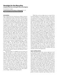
CSS Zen Garden PDF.
CSS Zen Garden PDF.
CSS Zen Garden PDF.

Create successful ePaper yourself
Turn your PDF publications into a flip-book with our unique Google optimized e-Paper software.
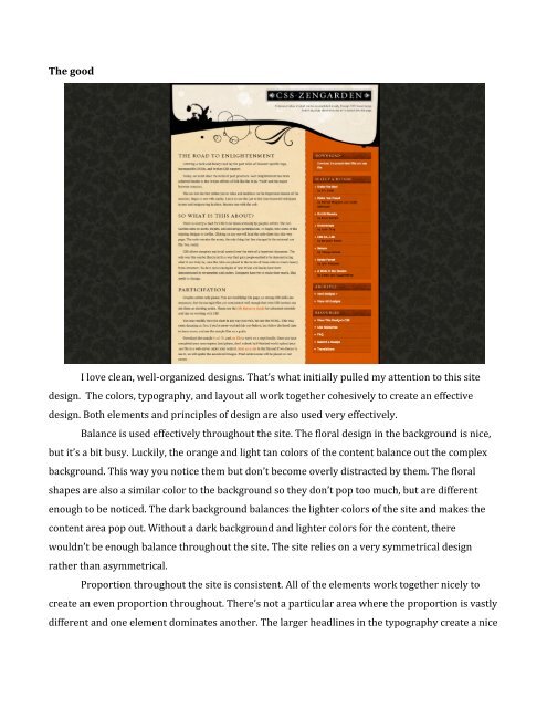
The good I love clean, well-‐organized designs. That’s what initially pulled my attention to this site design. The colors, typography, and layout all work together cohesively to create an effective design. Both elements and principles of design are also used very effectively. Balance is used effectively throughout the site. The floral design in the background is nice, but it’s a bit busy. Luckily, the orange and light tan colors of the content balance out the complex background. This way you notice them but don’t become overly distracted by them. The floral shapes are also a similar color to the background so they don’t pop too much, but are different enough to be noticed. The dark background balances the lighter colors of the site and makes the content area pop out. Without a dark background and lighter colors for the content, there wouldn’t be enough balance throughout the site. The site relies on a very symmetrical design rather than asymmetrical. Proportion throughout the site is consistent. All of the elements work together nicely to create an even proportion throughout. There’s not a particular area where the proportion is vastly different and one element dominates another. The larger headlines in the typography create a nice
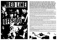
To start, the whole site is fairly unreadable. There’s not much of a balance with the grungy looking skull in the background. The random white cross at the top left also throws the balance off, in a bad way. My eyes keep being drawn to the bright cross, rather than the content. It doesn’t help that the text for the content is tiny. I think the overall typography of the site is a mess in general. The script font for the headlines fits the overall theme, but they have a grungy texture to them that makes them hard to read. The overall proportion, dominance, and unity of the page causes some confusion. I feel like all the elements are pointing me into different directions. I don’t know if I should be looking at the white cross, the giant red skull, the splatter marks everywhere, or the text itself. For a site that has content that needs to be read, this isn’t good. The elements in the design are way too dominant. The bright red skull and bright white cross dominate the black background. The text being black stands out from the red background of the skull, but it’s hard to focus in on because it’s so tiny. Because of this, the red skull continues to dominate the whole page. The site has interesting graphics, but I think they’re too loud. In this particular instance, I think the graphics aren’t appropriate, or should have been toned down. There’s no way I’m reading text on that page without getting a headache or a serious problem of being distracted by the rest of the site. My site
When I was initially designing my site, I wanted a really simple and clean look/feel. I didn’t want the site to be flashy and take the attention away from the content itself. I also wanted to use neutral colors to make the pictures pop. Overall, I’m happy with the balance of my site. I think having the thumbnails on the bottom in an orderly row creates a nice balance, like they are what’s holding the image up. I also think that there is some movement in the site created by the lines. For example, you have the line next to the navigation that goes vertical, following the vertical arrangement of the navigation. Then, you have a horizontal line created by the thumbnails toward the bottom. The navigation leads the eye downward toward the thumbnails, and the thumbnails guide you across the page. I wanted the images to be the “stars” of the page. I wanted the main images to have dominance over everything else. I tried to do this by making the navigation simple and to the side, while making the thumbnails small and toward the bottom. This way the images have a good chunk of page to be displayed. The proportion of the image is much larger than the other elements of the site, creating dominance and allowing the image to stand out on its own. Using simple typography also allows the viewer to not be too distracted. The solid blue background does enough to add a bit of flare but isn’t complicated so the viewer is distracted. Although I wanted a minimal design, I wonder if it’s almost too minimal and lacks creativity. I know that a photography portfolio’s main purpose should be to show off the photos. However, when I turn this into my full portfolio with other design work, I want to add a little more personality. I think the site works for a photography portfolio, but will come off lazy and lack luster if turned into a full portfolio.