SCILAB – PLOTS AND GRAPHS Simple plots Exercise 1
SCILAB â PLOTS AND GRAPHS Simple plots Exercise 1
SCILAB â PLOTS AND GRAPHS Simple plots Exercise 1
- No tags were found...

You also want an ePaper? Increase the reach of your titles
YUMPU automatically turns print PDFs into web optimized ePapers that Google loves.
Utility Software II lab 6 Jacek Wiślicki, jacenty@kis.p.lodz.pl<br />
source: http://wwwmaths.anu.edu.au/comptlsci/<br />
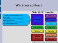
<strong>SCILAB</strong> <strong>–</strong> <strong>PLOTS</strong> <strong>AND</strong> <strong>GRAPHS</strong><br />
<strong>Simple</strong> <strong>plots</strong><br />
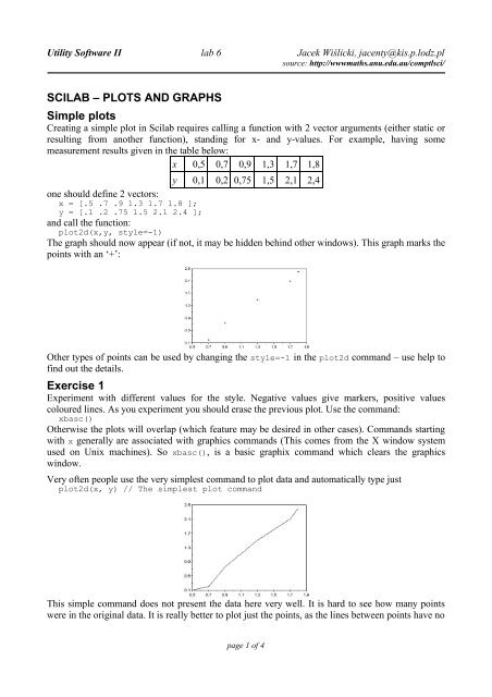
Creating a simple plot in Scilab requires calling a function with 2 vector arguments (either static or<br />
resulting from another function), standing for x- and y-values. For example, having some<br />
measurement results given in the table below:<br />
x 0,5 0,7 0,9 1,3 1,7 1,8<br />
y 0,1 0,2 0,75 1,5 2,1 2,4<br />
one should define 2 vectors:<br />
x = [.5 .7 .9 1.3 1.7 1.8 ];<br />
y = [.1 .2 .75 1.5 2.1 2.4 ];<br />
and call the function:<br />
plot2d(x,y, style=-1)<br />
The graph should now appear (if not, it may be hidden behind other windows). This graph marks the<br />
points with an ‘+’:<br />
Other types of points can be used by changing the style=-1 in the plot2d command <strong>–</strong> use help to<br />
find out the details.<br />
<strong>Exercise</strong> 1<br />
Experiment with different values for the style. Negative values give markers, positive values<br />
coloured lines. As you experiment you should erase the previous plot. Use the command:<br />
xbasc()<br />
Otherwise the <strong>plots</strong> will overlap (which feature may be desired in other cases). Commands starting<br />
with x generally are associated with graphics commands (This comes from the X window system<br />
used on Unix machines). So xbasc(), is a basic graphix command which clears the graphics<br />
window.<br />
Very often people use the very simplest command to plot data and automatically type just<br />
plot2d(x, y) // The simplest plot command<br />
This simple command does not present the data here very well. It is hard to see how many points<br />
were in the original data. It is really better to plot just the points, as the lines between points have no<br />
page 1 of 4
Utility Software II lab 6 Jacek Wiślicki, jacenty@kis.p.lodz.pl<br />
source: http://wwwmaths.anu.edu.au/comptlsci/<br />
significance; they just help us follow the set of measurements if there are several data sets on the<br />
one graph. If we insist on joining the points it is important to mark the individual points as well.<br />
<strong>Exercise</strong> 2<br />
1. Plot the above data with the points shown as circles.<br />
2. Plot the above data with the points joined by lines (use help plot2d).<br />
3. Find out how to add a title to the plot. (use the command apropos title)<br />
<strong>Exercise</strong> 3<br />
Change the above plot commands to show the data more clearly by plotting the data points as small<br />
circles joined by dotted lines. Use help plot2d to see the possible arguments.<br />
From the graph it is clear that the points almost lie on a straight line. Perhaps the points are off the<br />
line because of experimental errors. A course in statistics will show how to calculate a ‘line of best<br />
fit’ for the data. But even without statistics, the line between the points (.5, 0) and (2, 3) is a good<br />
candidate for ‘a line fitting the data’. Lets add this line to the plot and see how well it approximates<br />
the data. We do this by asking Scilab to plot the points (.5, 0) and (2, 2.7) joined by a line.<br />
x = [.5 .7 .9 1.3 1.7 1.8 ];<br />
y = [.1 .2 .75 1.5 2.1 2.4 ];<br />
plot2d(x,y,style=-1)<br />
x_vals = [.5 2]; // The X-coords of the endpoints.<br />
y_vals = [0 2.7]; // The Y-coordinates<br />
plot2d(x_vals,y_vals)<br />
legends([’Line of Best Fit’; ’Data’], [1, -1], 5)<br />
xtitle(’Data Analysis’)<br />
Note that x_vals contains the x<strong>–</strong>coordinates, y_vals contains the y<strong>–</strong>coordinates, and the two points<br />
are joined by a line because we don’t specify a style (default style is a line):<br />
The line of best fit can be found using the datafit function, which will not be described in the<br />
instruction:<br />
There are many opinions on what makes a good graph. From the scientific viewpoint a simple test is<br />
to see whether we can recover the original data easily from the graph. A graph is supposed to add<br />
something, not remove information. For example if our data runs from 1 to 1.5 it is a bad idea to use<br />
page 2 of 4
Utility Software II lab 6 Jacek Wiślicki, jacenty@kis.p.lodz.pl<br />
source: http://wwwmaths.anu.edu.au/comptlsci/<br />
an axis running from 0 to 10, as we will not be able to see the differences between the values. We<br />
give two more subtle recommendations.<br />
In the example in this section, it was easy to see the relationship between x and y from the simple<br />
plot of x against y. In more complicated situations, it may be necessary to use different scales to<br />
show the data more clearly. Consider the following model results:<br />
n 3 5 9 17 33 65<br />
s n 0,257 0,0646 0,0151 3,96×10 −3 9,78×10 −4 2,45×10 −4<br />
A plot of n against s n directly shows no obvious pattern. (Note the dots, ‘...’, in the next example<br />
mean the current line continues on the next line. Do not type these dots if you want to put the whole<br />
command on the one line.<br />
n = [ 3 5 9 17 33 65 ];<br />
s = [ 2.57e-1 6.46e-2 1.51e-2 ...<br />
3.96e-3 9.78e-4 2.45e-4 ];<br />
xbasc() // clear the previous plot<br />
plot2d( n, s, style=-1 ) // This is a poor plot!!<br />
In fact it is hard to read the values of sn back from the graph. However a plot of log(n) against<br />
log(s n ) is much clearer. To produce a plot on a log scale we can use either of the commands:<br />
xbasc();<br />
plot2d(log10(n), log10(s), style=-1)<br />
or<br />
xbasc();<br />
plot2d(n, s, style=-1, logflag = 'll') //see help for 'logflag' option<br />
<strong>Exercise</strong> 4 (10 points)<br />
1. Graph 1/1e x for x∈[−4 ,4] and =0.5 ,1.0 , 2.0 on the one plot.<br />
2. Use plot2d to draw a graph that shows that:<br />
sin x<br />
lim =0<br />
x∞ x<br />
Select a suitable range and a set of x values.<br />
Printing graphs<br />
When the graph has been correctly drawn we will usually want to print it. As many graphs come out<br />
page 3 of 4
Utility Software II lab 6 Jacek Wiślicki, jacenty@kis.p.lodz.pl<br />
source: http://wwwmaths.anu.edu.au/comptlsci/<br />
on the printer, it is a good idea to label the graph with your name. To do this use the xtitle<br />
command:<br />
xtitle('This is my plot') \\ Be sure to put quotes around the title.<br />
Bring the plot window to the front. The title should appear on the graph. If everything is fine, click<br />
on the ‘file’ menu → ‘print scilab’ item in the graph window. If everything is set up correctly, the<br />
graph will appear on the printer attached to your computer.<br />
After printing a graph, it is useful to take a pen and label the axes (if that was not done in Scilab),<br />
and perhaps explain the various points or curves in the space underneath. Alternatively before<br />
printing the graph, use the Scilab command xtitle with two optional arguments and the legend<br />
argument of the plot2d command for a more professional appearance. For instance<br />
xbasc()<br />
plot2d(x,[y y2 y3],leg='function y@function y2@function y3')<br />
xtitle('Plot of three functions', 'x label', 'y label')<br />
Another option is to use the graphics window file menu item, export, or the xbasimp command to<br />
print the current graph to a file so that it can be printed later. For example to produce a postscript<br />
file use the command:<br />
xbasimp(0,'mygraph.eps')<br />
This will write the current graph (associated with graphics window 0) to the file mygraph.eps. This<br />
file can be stored and printed out later.<br />
page 4 of 4