Info-graphic Process Book
Documentation of the process and ideation involving the creative process.
Documentation of the process and ideation involving the creative process.

Create successful ePaper yourself
Turn your PDF publications into a flip-book with our unique Google optimized e-Paper software.
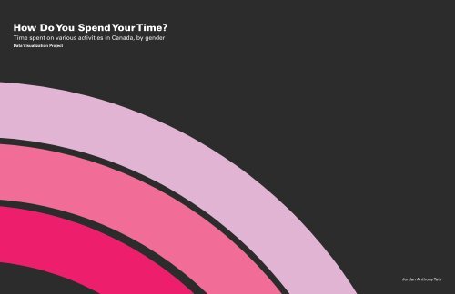
How Do You Spend Your Time?<br />
Time spent on various activities in Canada, by gender<br />
Data Visualization Project<br />
Jordan Anthony Tate
Project Description<br />
This project required me to collect statistical data, comprehend it and then interpret<br />
it into a visualization which was tailored to my specific user.<br />
• Select a data set to visualize.<br />
• Analyze the selected data set comprehensively.<br />
• Break down the data into smaller more organized data groups and criteria.<br />
(So the information can be structured effectively.)<br />
• Conceptualize the ways in which the organized data can be visualized.<br />
• Choose the most effective and appropriate visualization concept.<br />
• Further improve my design through critiques and inspirations.
Chosen Data Set<br />
The data set I chose is:<br />
Time spent on various activities in Canada, by gender.<br />
This data set compiles data regarding the time in hours (2 decimal places) of<br />
various activities done by Canadian citizens within a 7 day period. The information<br />
was collected from Computer Assisted Telephone Interviews (CATI). The<br />
respondents were aged 15 and over, living in the 10 provinces, and not residing<br />
in institutions.<br />
This survey aids in monitoring changes in time use to better understand how<br />
Canadians spend and manage their time and what contributes to their well-being<br />
and stress.<br />
The data collected provides information to all level of governments when making<br />
funding decisions, developing priorities and identifying areas of concern for legislation,<br />
new policies and programs. Researchers and other users use this information<br />
to inform the general Canadian population about the changing nature of<br />
time use in Canada.<br />
I broke down the data set into various main categories and subcategories. There<br />
are two main variables.<br />
• Gender<br />
• Time (In hours, 2 decimal places)<br />
• Activities<br />
Sex and activities were further sub categorized<br />
Sex<br />
• Male<br />
• Female<br />
Activities<br />
• Work<br />
• Paid work<br />
• House Hold work<br />
• Civic and Voluntary activities<br />
• Personal Activities<br />
• Night Sleep<br />
• Meals<br />
• Other Personal Activities<br />
• Free Time<br />
• Socializing<br />
• Passive Leisure<br />
• Active Leisure<br />
I then tabulated the data extracted from the source.<br />
This made it easier for me to manipulate the data
User<br />
Government<br />
The director of the ministry of health Raymond Tosh is trying to acquire<br />
information regarding the amount of time each sex spends doing<br />
sedentary activities. The director is doing this research to solve issues<br />
regarding the onset of obesity and weight related problems within the<br />
country. The director will use this information to propose a plan of action<br />
to a committee. The director is slightly dyslexic and has problems reading<br />
lengthy texts therefore he favors clear and easily understandable imagery<br />
and short descriptive text.<br />
Figure 1 Minister of Health user<br />
Public<br />
Todd is a recent immigrant in Vancouver. He’s 30 years old and lives by<br />
himself. He lives a fairly sedentary lifestyle as he is a desk clerk. He is<br />
out of shape and desires to become more fit. Todd has been told by his<br />
friends that he has to dedicate more time to doing various work related<br />
activities to help burn fat quicker. He is unaware of the average amount of<br />
time other citizens dedicate to certain work related task and would want<br />
to know so he can use this information to compare and work off of. Todd<br />
is not very fluent in English however and sometimes have difficulties reading.<br />
Goal<br />
The goal of this diagram is to effectively relay information of the number<br />
of hours different sexes partake in select activities. The user will be able to<br />
view and understand the information with ease and delight, even without<br />
substantial understanding of the English language.<br />
Figure 2 Immigrant user
Appearance<br />
The visualization will be appropriately color coded to show differentiation of genders.<br />
I think I will utilize bar graphs with carefully generalized dimensions. I might use<br />
different shades of the selected gendered colors to represent the different activities. I<br />
will also use small representative icons of activities and genders to help differentiate.<br />
(Isotype method). Little text will be used to minimize reading the visualization will be<br />
easily understood from first glance.<br />
Figure 4 Inspiration Bar Graph 2<br />
Figure 3 Inspiration Bar graph<br />
Figure 5 Inspiration Iconography
Sketches<br />
During the lecture involving graphs Kathleen mentioned that when dealing with<br />
time or duration bar graphs are the ideal representation. Using this knowledge I<br />
started conceptualizing ways to depict the data<br />
Figure 6 Rough Sketches 1 Figure 7 Rough Sketch 2
Sketches<br />
I settled on this design because it achieved a circular clock aesthetic while appropriately<br />
representing the information<br />
Figure 8 Chosen Rough Sketch
Iconography<br />
I needed to acquire appropriate and effective icons to represent the different categories.<br />
I began sketching common representative icons of the categories and sub categories of<br />
my data set.<br />
Figure 10 These are my initial chosen icons<br />
Figure 9 Icon Sketches
Ideation<br />
After focus groups and<br />
critiques I was advised<br />
to adjust my design.<br />
I was advised to;<br />
• Acquire more<br />
appropriate icons<br />
• Use Icons enclosed<br />
in circles<br />
• Omit “Data<br />
Visualization<br />
• Put my key at the<br />
bottom of the<br />
document<br />
• Flip the male<br />
category<br />
• Omit drop shadow<br />
Figure 11 First Ideation<br />
Figure 12 Second Ideation
Final Design<br />
I also changed<br />
• The way in which the icons and bars interacted<br />
(This was a suggestion from Cece )<br />
• I placed the legend for each category under each<br />
visualization (suggestion from Kareem)<br />
• I changed the title back to Univers 65 as a<br />
suggestion from Gui (It was not as condensed<br />
as Impact which made it more appropriate for a<br />
title)<br />
• Change all numeral to tabular figures<br />
• Removed the border around the hours<br />
• Chose more appropriate fonts for<br />
• House Hold Work<br />
• Paid Work<br />
• Other Personal activities<br />
• Socializing<br />
• Meals<br />
Figure 13 Final Design
Reflection<br />
Pros<br />
• It is easy to understand.<br />
• <strong>Info</strong>rmation is grouped appropriately and<br />
effectively.<br />
• Proper Iconography is used.<br />
• Color is effectively used as a function and<br />
aesthetic.<br />
• Dark background allows for increased<br />
contrast and focus of the content.<br />
Cons<br />
• Clock aesthetic is lacking and could have<br />
been applied more.<br />
• Visualization could be more aesthetically<br />
pleasing.