

Web_Designer_Issue_262_2017

You also want an ePaper? Increase the reach of your titles
YUMPU automatically turns print PDFs into web optimized ePapers that Google loves.
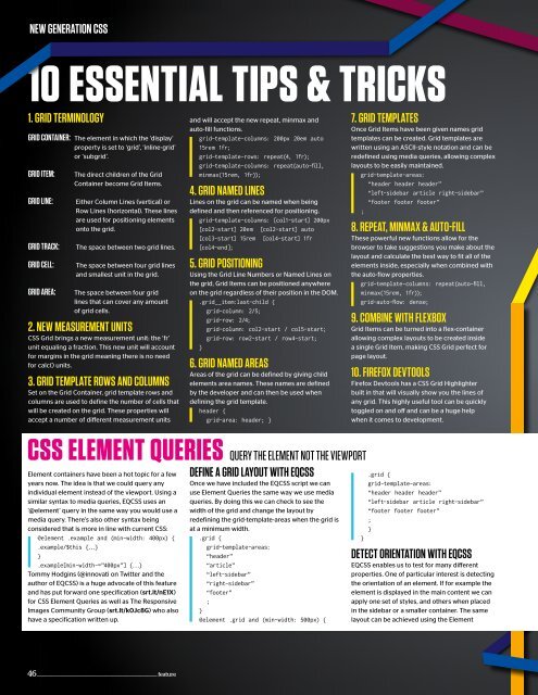
new generation CSS<br />
10 ESSENTIAL TIPS & TRICKS<br />
1. grid terminology<br />
grid Container: The element in which the ‘display’<br />
property is set to ‘grid’, ‘inline-grid’<br />
or ‘subgrid’.<br />
grid item:<br />
grid line:<br />
grid traCk:<br />
grid Cell:<br />
grid area:<br />
The direct children of the Grid<br />
Container become Grid Items.<br />
Either Column Lines (vertical) or<br />
Row Lines (horizontal). These lines<br />
are used for positioning elements<br />
onto the grid.<br />
The space between two grid lines.<br />
The space between four grid lines<br />
and smallest unit in the grid.<br />
The space between four grid<br />
lines that can cover any amount<br />
of grid cells.<br />
2. new meaSurement unitS<br />
CSS Grid brings a new measurement unit: the ‘fr’<br />
unit equaling a fraction. This new unit will account<br />
for margins in the grid meaning there is no need<br />
for calc() units.<br />
3. grid temPlate rowS and ColumnS<br />
Set on the Grid Container, grid template rows and<br />
columns are used to define the number of cells that<br />
will be created on the grid. These properties will<br />
accept a number of diferent measurement units<br />
CSS ELEMENT QUERIES<br />
Element containers have been a hot topic for a few<br />
years now. The idea is that we could query any<br />
individual element instead of the viewport. Using a<br />
similar syntax to media queries, EQCSS uses an<br />
‘@element’ query in the same way you would use a<br />
media query. There’s also other syntax being<br />
considered that is more in line with current CSS:<br />
@element .example and (min-width: 400px) {<br />
.example/$this {...}<br />
}<br />
.example[min-width~=”400px”] {...}<br />
Tommy Hodgins (@innovati on Twitter and the<br />
author of EQCSS) is a huge advocate of this feature<br />
and has put forward one specification (srt.lt/nE1X)<br />
for CSS Element Queries as well as The Responsive<br />
Images Community Group (srt.lt/k0Jc8G) who also<br />
have a specification written up.<br />
and will accept the new repeat, minmax and<br />
auto-fill functions.<br />
grid-template-columns: 200px 20em auto<br />
15rem 1fr;<br />
grid-template-rows: repeat(4, 1fr);<br />
grid-template-columns: repeat(auto-ill,<br />
minmax(15rem, 1fr));<br />
4. grid named lineS<br />
Lines on the grid can be named when being<br />
defined and then referenced for positioning.<br />
grid-template-columns: [col1-start] 200px<br />
[col2-start] 20em [col2-start] auto<br />
[col3-start] 15rem [col4-start] 1fr<br />
[col4-end];<br />
5. grid PoSitioning<br />
Using the Grid Line Numbers or Named Lines on<br />
the grid, Grid Items can be positioned anywhere<br />
on the grid regardless of their position in the DOM.<br />
.grid__item:last-child {<br />
grid-column: 2/5;<br />
grid-row: 2/4;<br />
grid-column: col2-start / col5-start;<br />
grid-row: row2-start / row4-start;<br />
}<br />
6. grid named areaS<br />
Areas of the grid can be defined by giving child<br />
elements area names. These names are defined<br />
by the developer and can then be used when<br />
defining the grid template.<br />
header {<br />
grid-area: header; }<br />
QUERY THE ELEMENT NOT THE VIEWPORT<br />
define a grid layout with eQCSS<br />
Once we have included the EQCSS script we can<br />
use Element Queries the same way we use media<br />
queries. By doing this we can check to see the<br />
width of the grid and change the layout by<br />
redefining the grid-template-areas when the grid is<br />
at a minimum width.<br />
.grid {<br />
}<br />
grid-template-areas:<br />
“header”<br />
“article”<br />
“left-sidebar”<br />
“right-sidebar”<br />
“footer”<br />
;<br />
}<br />
@element .grid and (min-width: 500px) {<br />
7. grid temPlateS<br />
Once Grid Items have been given names grid<br />
templates can be created. Grid templates are<br />
written using an ASCII-style notation and can be<br />
redefined using media queries, allowing complex<br />
layouts to be easily maintained.<br />
grid-template-areas:<br />
“header header header”<br />
“left-sidebar article right-sidebar”<br />
“footer footer footer”<br />
;<br />
8. rePeat, minmax & auto-fill<br />
These powerful new functions allow for the<br />
browser to take suggestions you make about the<br />
layout and calculate the best way to fit all of the<br />
elements inside, especially when combined with<br />
the auto-flow properties.<br />
grid-template-columns: repeat(auto-ill,<br />
minmax(15rem, 1fr));<br />
grid-auto-low: dense;<br />
9. ComBine with flexBox<br />
Grid Items can be turned into a flex-container<br />
allowing complex layouts to be created inside<br />
a single Grid Item, making CSS Grid perfect for<br />
page layout.<br />
10. firefox devtoolS<br />
Firefox Devtools has a CSS Grid Highlighter<br />
built in that will visually show you the lines of<br />
any grid. This highly useful tool can be quickly<br />
toggled on and of and can be a huge help<br />
when it comes to development.<br />
.grid {<br />
grid-template-areas:<br />
“header header header”<br />
“left-sidebar article right-sidebar”<br />
“footer footer footer”<br />
;<br />
}<br />
deteCt orientation with eQCSS<br />
EQCSS enables us to test for many diferent<br />
properties. One of particular interest is detecting<br />
the orientation of an element. If for example the<br />
element is displayed in the main content we can<br />
apply one set of styles, and others when placed<br />
in the sidebar or a smaller container. The same<br />
layout can be achieved using the Element<br />
46 ________________________________________________________________ feature


 Change language