

product design - aesthetic considerations: colour - LizzyHouse
product design - aesthetic considerations: colour - LizzyHouse
product design - aesthetic considerations: colour - LizzyHouse

You also want an ePaper? Increase the reach of your titles
YUMPU automatically turns print PDFs into web optimized ePapers that Google loves.
PRODUCT DESIGN - AESTHETIC CONSIDERATIONS:<br />
COLOUR<br />
Class Discussion<br />
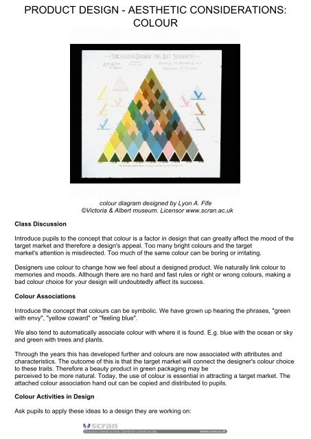
<strong>colour</strong> diagram <strong>design</strong>ed by Lyon A. Fife<br />
©Victoria & Albert museum. Licensor www.scran.ac.uk<br />
Introduce pupils to the concept that <strong>colour</strong> is a factor in <strong>design</strong> that can greatly affect the mood of the<br />
target market and therefore a <strong>design</strong>'s appeal. Too many bright <strong>colour</strong>s and the target<br />
market's attention is misdirected. Too much of the same <strong>colour</strong> can be boring or irritating.<br />
Designers use <strong>colour</strong> to change how we feel about a <strong>design</strong>ed <strong>product</strong>. We naturally link <strong>colour</strong> to<br />
memories and moods. Although there are no hard and fast rules or right or wrong <strong>colour</strong>s, making a<br />
bad <strong>colour</strong> choice for your <strong>design</strong> will undoubtedly affect its success.<br />
Colour Associations<br />
Introduce the concept that <strong>colour</strong>s can be symbolic. We have grown up hearing the phrases, "green<br />
with envy", "yellow coward" or "feeling blue".<br />
We also tend to automatically associate <strong>colour</strong> with where it is found. E.g. blue with the ocean or sky<br />
and green with trees and plants.<br />
Through the years this has developed further and <strong>colour</strong>s are now associated with attributes and<br />
characteristics. The outcome of this is that the target market will connect the <strong>design</strong>er's <strong>colour</strong> choice<br />
to these traits. Therefore a beauty <strong>product</strong> in green packaging may be<br />
perceived to be more natural. Today, the use of <strong>colour</strong> is essential in attracting a target market. The<br />
attached <strong>colour</strong> association hand out can be copied and distributed to pupils.<br />
Colour Activities in Design<br />
Ask pupils to apply these ideas to a <strong>design</strong> they are working on:
- Apply one <strong>colour</strong> to <strong>design</strong>, varying the intensity to make other <strong>colour</strong>s but still creating unity.<br />
- Choose two <strong>colour</strong>s which are related but not too similar.<br />
- Choose a <strong>colour</strong> scheme of two contrasting <strong>colour</strong>s e.g. a warm and cool <strong>colour</strong> mix.<br />
- Aim for a clean <strong>design</strong> by restricting your palette to three <strong>colour</strong>s.<br />
Artists have always successfully used <strong>colour</strong> to create emotion and mood in their work. Many of their<br />
methods can be applied in <strong>design</strong>. Browse Scran's Art & Design Pathfinder Packs to research <strong>colour</strong><br />
in art further. Think about how you might apply these ideas in your own work.<br />
Further Research<br />
Consider Everyday Brands<br />
As a class list some everyday brands - from soft drinks and confectionery to training shoes.<br />
Visualise these brands in a completely different <strong>colour</strong>. Consider the following:<br />
Does it have the same impact?<br />
Does it still have instant appeal?<br />
What makes the original <strong>colour</strong> choice successful?<br />
Is it purely familiarity?<br />
Is the new <strong>colour</strong> suited to the <strong>product</strong>'s function and/or target market?<br />
Do you still want to buy, use or wear this <strong>product</strong>?<br />
Characteristics Associated with Warm Colours<br />
Red - fire, danger, passion, lust, violence, blood and aggression.<br />
Possible uses: for conveying a warning, instruction or power.<br />
Pink - femininity, childhood, sweetness, cuteness, romance and calm.<br />
Possible uses: for conveying romance, calmness and a sense of caring.<br />
Orange - autumn, Hallowe'en celebrations, vibrancy and warmth.<br />
Possible uses: for conveying a sense of feel good.<br />
Yellow - sunshine, happiness and light as well as conflicting associations of cowardice, illness and<br />
caution.<br />
Possible uses: conveying brightness and energy.<br />
Characteristics Associated with Cool Colours<br />
Green - fertility, jealousy, poison, nature, money, spring and the inexperience of youth.<br />
Possible uses: creating a feeling of calm or a return to nature.<br />
Blue - the ocean, sky, freshness, peace, intelligence, trust and sadness.<br />
Possible uses: for formal <strong>product</strong>s or those requiring a sense of space or calm.<br />
Purple - spirituality, creativity and royalty.<br />
Possible uses: depending on tone, use for creating a sense of spirituality or exclusivity.<br />
Black - death, evil, elegance and sophistication.<br />
Possible uses: conveying classic or sleek <strong>design</strong>. Portraying a sombre mood.<br />
White - innocence, purity, the truth and cleanliness.<br />
Possible uses: conveying honesty, clean <strong>design</strong> and pure <strong>product</strong>s.<br />
Grey - a conservative outlook but also can represent sadness or humdrum.<br />
Possible uses: to suggest low-key, straightforwardness or plain.<br />
Brown - earthiness, homeliness and stability.<br />
Possible uses: conveying a sense of something being hand-crafted, home-made or natural.