

design3

You also want an ePaper? Increase the reach of your titles
YUMPU automatically turns print PDFs into web optimized ePapers that Google loves.
152<br />
The Principles of Beautiful Web Design<br />
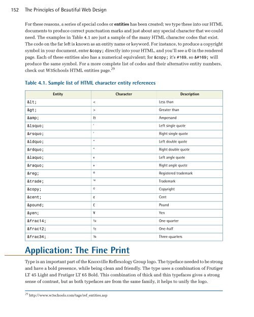
For these reasons, a series of special codes or entities has been created; we type these into our HTML<br />
documents to produce correct punctuation marks and just about any special character that we could<br />
need. The examples in Table 4.1 are just a sample of the many HTML character codes that exist.<br />
The code on the far left is known as an entity name or keyword. For instance, to produce a copyright<br />
symbol in your document, enter © directly into your HTML, and you’ll see a © in the rendered<br />
page. Each of these entities also has a numerical equivalent; for © it’s #169, so © will<br />
produce the same symbol. For a more complete list of codes and their alternative entity numbers,<br />
check out W3Schools HTML entities page. 29<br />
Table 4.1. Sample list of HTML character entity references<br />
Entity<br />
Character<br />
Description<br />
<<br />
><br />
&<br />
‘<br />
’<br />
“<br />
”<br />
«<br />
»<br />
®<br />
™<br />
©<br />
¢<br />
£<br />
¥<br />
¼<br />
½<br />
¾<br />
<<br />
><br />
&<br />
‘<br />
’<br />
“<br />
”<br />
«<br />
»<br />
®<br />
<br />
©<br />
¢<br />
£<br />
¥<br />
¼<br />
½<br />
¾<br />
Less than<br />
Greater than<br />
Ampersand<br />
Left single quote<br />
Right single quote<br />
Left double quote<br />
Right double quote<br />
Left angle quote<br />
Right angle quote<br />
Registered trademark<br />
Trademark<br />
Copyright<br />
Cent<br />
Pound<br />
Yen<br />
One-quarter<br />
One-half<br />
Three-quarters<br />
Application: The Fine Print<br />
Type is an important part of the Knoxville Reflexology Group logo. The typeface needed to be strong<br />
and have a bold presence, while being clean and friendly. The type uses a combination of Frutiger<br />
LT 45 Light and Frutiger LT 65 Bold. This combination of thick and thin typefaces gives a strong<br />
sense of contrast, but as both typefaces are from the same family, it helps to unify the logo.<br />
29 http://www.w3schools.com/tags/ref_entities.asp