

design3

You also want an ePaper? Increase the reach of your titles
YUMPU automatically turns print PDFs into web optimized ePapers that Google loves.
Layout and Composition<br />
47<br />
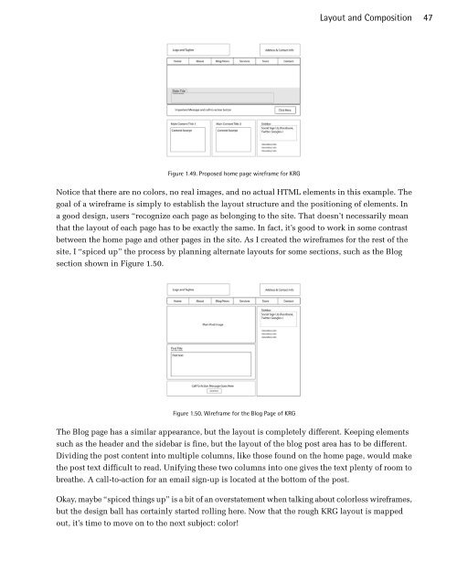
Figure 1.49. Proposed home page wireframe for KRG<br />
Notice that there are no colors, no real images, and no actual HTML elements in this example. The<br />
goal of a wireframe is simply to establish the layout structure and the positioning of elements. In<br />
a good design, users “recognize each page as belonging to the site. That doesn’t necessarily mean<br />
that the layout of each page has to be exactly the same. In fact, it’s good to work in some contrast<br />
between the home page and other pages in the site. As I created the wireframes for the rest of the<br />
site, I “spiced up” the process by planning alternate layouts for some sections, such as the Blog<br />
section shown in Figure 1.50.<br />
Figure 1.50. Wireframe for the Blog Page of KRG<br />
The Blog page has a similar appearance, but the layout is completely different. Keeping elements<br />
such as the header and the sidebar is fine, but the layout of the blog post area has to be different.<br />
Dividing the post content into multiple columns, like those found on the home page, would make<br />
the post text difficult to read. Unifying these two columns into one gives the text plenty of room to<br />
breathe. A call-to-action for an email sign-up is located at the bottom of the post.<br />
Okay, maybe “spiced things up” is a bit of an overstatement when talking about colorless wireframes,<br />
but the design ball has certainly started rolling here. Now that the rough KRG layout is mapped<br />
out, it’s time to move on to the next subject: color!