

Web_Designer_UK__May_2018

Create successful ePaper yourself
Turn your PDF publications into a flip-book with our unique Google optimized e-Paper software.
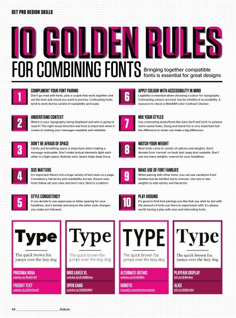
GET PRO DESIGN SKILLS<br />
FOR COMBINING FONTSBringing<br />
together compatible<br />
fonts is essential for great designs<br />
1<br />
COMPLIMENT YOUR FONT PAIRING<br />
Don’t go mad with fonts, pick a couple that work together and<br />
set the tone and mood you want to portray. Contrasting fonts<br />
tend to work but be careful of readability and scale.<br />
6<br />
APPLY COLOUR WITH ACCESSIBILITY IN MIND<br />
Legibility is essential when choosing a colour for typography.<br />
Contrasting colours are best, but be mindful of accessibility. A<br />
resource to check is <strong>Web</strong>AIM Color Contrast Checker.<br />
2<br />
UNDERSTAND CONTEXT<br />
Where is your typography being displayed and who is going to<br />
read it? The right visual direction and tone is important when it<br />
comes to making your messages readable and relatable.<br />
7<br />
MIX YOUR STYLES<br />
Use contrasting styles/fonts like Sans-Serif and Serif, to achieve<br />
more varied looks. Sizing and hierarchy is very important but<br />
the difference in styles can make a big difference.<br />
3<br />
DON’T BE AFRAID OF SPACE<br />
Clarity and breathing space is important when making a<br />
message noticeable. Don’t make textual elements fight each<br />
other in a tight space. Nobody wins. Space helps keep focus.<br />
8<br />
WATCH YOUR WEIGHT<br />
Most fonts come in variety of options and weights. Don’t<br />
deviate from ‘normal’ on body text, keep text readable. Don’t<br />
use too many weights, reserve for your headlines.<br />
4<br />
SIZE MATTERS<br />
It’s important there’s not a huge variety of text sizes on a page.<br />
Consistency, hierarchy and readability are key. Ensure your<br />
fonts follow set size rules and don’t vary. Stick to a pattern.<br />
9<br />
MAKE USE OF FONT FAMILIES<br />
When pairing with other fonts, you can use variations from<br />
families but be mindful not to overuse. Use one or two<br />
weights to add variety and hierarchy.<br />
5<br />
STYLE CONSISTENCY<br />
If you decide to use uppercase or letter spacing for your<br />
headlines, don’t deviate and ensure the other style changes<br />
you make are followed.<br />
10<br />
PLAY AROUND<br />
It’s good to find font pairings you like that you stick to, but with<br />
the amount of fonts out there to experiment with, it’s always<br />
worth having a play with new and interesting fonts.<br />
PROXIMA NOVA<br />
adobe.ly/1k4Zr4S<br />
MRS EAVES XL<br />
adobe.ly/2rdMDmz<br />
ALTERNATE GOTHIC<br />
adobe.ly/2rhkNGr<br />
PLAYFAIR DISPLAY<br />
bit.ly/2j4b4eL<br />
FREIGHT TEXT<br />
adobe.ly/2DhOexG<br />
OPEN SANS<br />
adobe.ly/2D86IMU<br />
ROBOTO<br />
typekit.com/fonts/roboto<br />
ALICE<br />
bit.ly/2DBlvR4<br />
44 _________________________________________________feature