

Web_Designer_UK__May_2018

Create successful ePaper yourself
Turn your PDF publications into a flip-book with our unique Google optimized e-Paper software.
GET PRO DESIGN SKILLS<br />
COLOUR &<br />
ACCESSIBILITY<br />
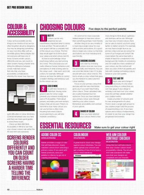
Colour and accessibility are key<br />
things to be mindful of, but are too<br />
often forgotten about by designers.<br />
You may be designing something<br />
on your nice shiny iMac with an<br />
incredibly glossy Retina display but<br />
not everyone will have one of<br />
those. Screens render colours<br />
differently and you can count on<br />
older screens having a harder time<br />
telling the difference between<br />
closely matched colours.<br />
Not only that, you have<br />
accessibility considerations<br />
whereby the viewer may have eye<br />
sight difficulties or colour blindness.<br />
Contrast will always save you here<br />
and there are many good guides<br />
to avoid these issues.<br />
Check out <strong>Web</strong> AIM (<strong>Web</strong><br />
Accessibility in Mind) to see how<br />
your chosen colours rate within the<br />
AA and AAA web standards.<br />
SCREENS RENDER<br />
COLOURS<br />
DIFFERENTLY AND<br />
YOU CAN COUNT<br />
ON OLDER<br />
SCREENS HAVING<br />
A HARDER TIME<br />
TELLING THE<br />
DIFFERENCE<br />
CHOOSING COLOURS<br />
1<br />
BEST FIT<br />
Colours can be very<br />
subjective but are<br />
nevertheless important when it comes<br />
to look and feel. The personality of<br />
your project still has a complete hold<br />
of the colours you choose. The first<br />
step would again be to think about<br />
your values and what colours best fit.<br />
It’s best to acknowledge colour<br />
psychology before you start picking<br />
any colour. This is because you can<br />
really influence human behaviour and<br />
perceptions of what is being seen by<br />
the colour used — take warm and cold<br />
colours, for example. Although<br />
obvious, we have the ability to control<br />
a reader’s feelings and behaviour just<br />
by the colours we use.<br />
2<br />
LESS IS MORE<br />
As with text, hierarchy is<br />
important. Having some<br />
ground rules for colour usage<br />
prevents your artwork looking like a<br />
pack of fruit pastilles. Think about<br />
primary, secondary and even tertiary<br />
colours that can be used. There’s no<br />
real limit to how many colours you<br />
can use but less is often more.<br />
Knowing how many colours<br />
you’re planning to use, will help<br />
maintain consistency.<br />
It’s common for more corporaterelated<br />
designs to have less colours<br />
than something perhaps more friendly.<br />
Another thing to be very mindful of<br />
is reserving a single colour for your<br />
call-to-actions and buttons. It’s a good<br />
idea to single out a colour so that links<br />
and buttons are more individual and<br />
user-friendly.<br />
ESSENTIAL RESOURCES<br />
ADOBE COLOR CC<br />
adobe.ly/2wLilqq<br />
Adobe provides a range of rules<br />
that will help discover closely<br />
matched colours from selecting a<br />
primary colour. If you work with<br />
Adobe products, save your<br />
palette to a library to get rid of<br />
copying and pasting.<br />
3<br />
CHOOSING COLOURS<br />
Let’s start by choosing<br />
colours since we now know<br />
the personality and hierarchy. You can<br />
useatoollikeAdobeColorCCtoplay<br />
around with your colour choices. This<br />
tool is simply a colour wheel that gives<br />
youthefreedomtoselectandfind<br />
colour palettes.<br />
Focus on your primary colour first<br />
and play with the rules that Adobe<br />
gives you if you want help finding<br />
other colours. These calculated rules<br />
are a useful headstart but not<br />
restrictive. Once you have selected<br />
your primary colour, work through<br />
selecting your other colours.<br />
Remember accessibility and contrast<br />
in your options.<br />
4<br />
SHADES OF COLOUR<br />
Once you have selected<br />
your colours, there’s a few<br />
COLBLINDOR<br />
bit.ly/1qSSJSu<br />
A great tool to check your design<br />
against colour blindness. You can<br />
safely upload your artwork and<br />
get a feeling of how it is to have a<br />
colour vision handicap.<br />
Five steps to the perfect palette<br />
more things to think about. Lightness<br />
and darkness will be one. Although<br />
you have your chosen colours, there<br />
are no rules to restrict you from using<br />
lighter or darker versions. For example,<br />
we may have a bright blue as our<br />
primary colour and we are using it for<br />
some of our foreground content. We<br />
could darken the same blue (with a<br />
shade of black) for a treatment in the<br />
background. Be mindful of consistency<br />
and not create too many variations of<br />
your colours, but this method will<br />
steer you clear of the fruit pastilles and<br />
help with creating contrasting colours<br />
basedonyourownpalette.<br />
5<br />
TEST AND TRY<br />
Apply, play and change if<br />
necessary. It’s only when<br />
using everything in context that you<br />
can truly gauge if your design is<br />
working. Look back over your values<br />
since this will help validate whether<br />
your creation works.<br />
Create a number of versions and<br />
try new arrangements of colour.<br />
There’s never a single right answer to<br />
any creative project and the process<br />
of experimenting is fun. If you have<br />
options and a history of experiments,<br />
it’s easier to see how your design has<br />
progressed and evolved.<br />
Make sure to get your colour right<br />
WEB AIM COLOUR<br />
CONTRAST CHECKER<br />
bit.ly/2ALPtTp<br />
Usingthistoolwillhelpensure<br />
that your chosen colours meet<br />
accessibility criteria. The AA and<br />
AAA web standards will make<br />
sure that your designs are<br />
compliant and user friendly.<br />
48 _________________________________________________feature
 Change language