

The Lantern Thredbo Apartments Style Guide
Branding for Holiday Rental Apartments in Thredbo Village.
Branding for Holiday Rental Apartments in Thredbo Village.

Create successful ePaper yourself
Turn your PDF publications into a flip-book with our unique Google optimized e-Paper software.
<strong>The</strong> <strong>Lantern</strong> <strong>Thredbo</strong> <strong>Apartments</strong><br />
<strong>The</strong> <strong>Lantern</strong> <strong>Apartments</strong> is a famous <strong>Thredbo</strong> Landmark. Choose<br />
from 35 apartments most with spectacular mountain views of <strong>Thredbo</strong><br />
Village and the mountains of the Kosciuszko National Park.<br />
<strong>Thredbo</strong> offers snow sports in winter and a choice of hiking, trout<br />
fishing, mountain bike riding and relaxing in the Australian Alps.<br />
Brand <strong>Guide</strong>lines<br />
Following these guidelines will ensure that the logo is used in<br />
a way that upholds aesthetic standards and keeps <strong>The</strong> <strong>Lantern</strong><br />
<strong>Thredbo</strong> <strong>Apartments</strong> brand looking professional and consistent.
QUALITY<br />
COMFORT<br />
HIGH COUNTRY<br />
HOME BASE<br />
FUNCTIONAL<br />
EXPLORE<br />
CARING<br />
Inspiration<br />
<strong>The</strong> <strong>Lantern</strong> <strong>Apartments</strong> provide a quality, comfortable and practical home base for<br />
guests who wish to spend their days exploring the high country and their nights with<br />
friends and family, resting their legs for the next activity. People come to <strong>Thredbo</strong> to<br />
experience the Village and the National Park, not to stay in an apartment.<br />
<strong>The</strong> <strong>Lantern</strong> <strong>Apartments</strong> simply provide functional accommodation with caring customer<br />
service, so the logo needed to be clean and simple. <strong>The</strong> tagline - Snow Bike Hike -<br />
is represented in the colour palette and by three clear symbols, which most guests can<br />
associate with an aspect of their <strong>Thredbo</strong> holiday.
Minimum Size<br />
<strong>The</strong> smallest the logo<br />
should be presented is 1<br />
inch high by 3 inches long
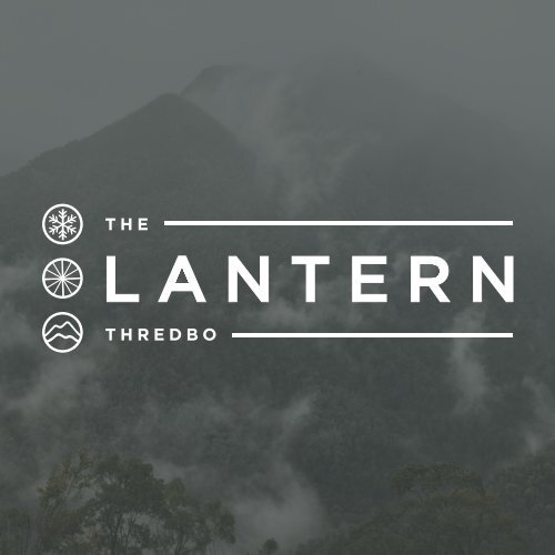
Primary Logo<br />
<strong>The</strong> <strong>Lantern</strong> <strong>Thredbo</strong> <strong>Apartments</strong> Primary<br />
Logo is a word mark with the tagline’s<br />
associated symbols. <strong>The</strong> clean, spacious<br />
san serif font is representitive of a modern<br />
accommodation service. By keeping<br />
the logo simple it shall remain relevent<br />
for years to come. <strong>The</strong> symbols provide a<br />
more flexible and playful element, which<br />
will become associated with <strong>The</strong> <strong>Lantern</strong><br />
brand in years to come.<br />
This is the main logo to be used across<br />
primary brand applications. As <strong>The</strong> <strong>Lantern</strong>’s<br />
trademark it is important that the<br />
logo always be applied with care and<br />
respect in every application according to<br />
these guidelines.
Vertical Logo<br />
Secondary Logos<br />
This logo can be<br />
used for purposes<br />
where a vertical<br />
display required.<br />
For example as a<br />
bookmark business<br />
card for guests.<br />
<strong>The</strong> <strong>Lantern</strong> <strong>Thredbo</strong> <strong>Apartments</strong> secondary<br />
logos can be used in replacement of the Primary<br />
logo in certain situations. <strong>The</strong> primary logo<br />
should never be used directly next to a secondary<br />
logo, as it will seem repetitive.<br />
<strong>The</strong> tagline can be used with or without the<br />
primary logo but should be used carefully as a<br />
graphic accent, to showcase the activities available.<br />
<strong>The</strong> symbols can also be used when the full<br />
primary logo is not necessary or in cases where<br />
the brand name is already displayed in plain<br />
text. For example, the symbols could be used<br />
on instagram as the username will be adjacent<br />
to the display image in plain text.<br />
Horizontal Logo<br />
<strong>The</strong>se horizontal<br />
secondary logos<br />
can be used when<br />
the <strong>Lantern</strong> Brand<br />
requires the use of<br />
‘<strong>Thredbo</strong> <strong>Apartments</strong>’<br />
when reaching out to<br />
a less familiar target<br />
market. <strong>The</strong> simplified<br />
version can be used to<br />
prevent repetitiveness.
Tagline<br />
This tagline works<br />
well when the primary<br />
logo is not<br />
required. It can also<br />
be used more subtly<br />
on merchandise to<br />
represent <strong>Thredbo</strong><br />
and <strong>The</strong> <strong>Lantern</strong>.<br />
Symbols<br />
<strong>The</strong>se symbols are<br />
signify the activities<br />
available and<br />
<strong>The</strong> <strong>Lantern</strong> brand.<br />
<strong>The</strong>y can be scaled<br />
down to a small<br />
size, or rearranged<br />
and re-sized to<br />
indicate a certain<br />
offer or seasonal
Icons<br />
<strong>The</strong>se icons represent what <strong>Thredbo</strong> Village and the <strong>Lantern</strong> has to offer.<br />
<strong>The</strong>y are useful for social media and signage around the buildings.
Colour Usage<br />
<strong>The</strong> colour usage for <strong>The</strong> <strong>Lantern</strong><br />
<strong>Thredbo</strong> <strong>Apartments</strong> is<br />
fairly minimal. <strong>The</strong> Logo is not<br />
to be displayed in other other<br />
colour than black, charcoal or<br />
white and snow grey. <strong>The</strong> logo<br />
must be displayed in white if<br />
placed over the brands colour<br />
palette, as displayed. It is not to<br />
be displayed in black or charcoal<br />
over a block colour.<br />
<strong>The</strong> symbols can be displayed<br />
using any of the four selected<br />
colours if they are being used<br />
as a stand alone element.
Clear Space<br />
To ensure legibility always keep<br />
a clear space around the logo.<br />
This space isolates the mark from<br />
any compteting graphic elements<br />
that lessen the impact of the<br />
mark. <strong>The</strong> minimum clear space is<br />
defined as the diameter the circle<br />
encasing the symbols. This space<br />
should be maintained as the logo<br />
is proportionately resized.<br />
Unacceptable Usage<br />
A. DON’T ROTATE LOGO<br />
F. DON’T ADD GRAPHICS<br />
To maintain the integrity of the<br />
brand do not rotate, skew or<br />
distort the logo in anyway. This<br />
includes adding any new elements<br />
to the design or adding<br />
any effects like dropsadows or<br />
colour. Here are some examples<br />
of how NOT to use the logo.<br />
B. DON’T SQUASH OR STRETCH<br />
C. DON’T ADD ELEMENTS<br />
WITHIN LOGO CLEARSPACE<br />
D. DON’T RESIZE ANY PART<br />
E. DON’T REARRANGE PARTS<br />
G. DON’T USE OFF BRAND<br />
COLOURS<br />
H. DON’T ADD DROPSHADOWS OR<br />
TEXT EFFECTS<br />
I. DON’T CONTAIN LOGO IN A BOX<br />
WHEN USING ON BLOCK COLOUR<br />
OR IMAGE.
Photo Background<br />
<strong>The</strong>re are many ways the logo<br />
can be used on photographic<br />
backgrounds , but each option<br />
should be exercised with<br />
care, by making sure the logo<br />
and type aren’t obstructed by<br />
the image.<br />
Tips<br />
Use Quality Relevent Images<br />
Use a colour overlay from<br />
the selected palette with the<br />
white logo<br />
Do not place the white or<br />
black logo on an image<br />
with predominately white or<br />
black tones without using<br />
an overlay.
Typography<br />
Typography is a powerful brand<br />
tool when used consistently. <strong>The</strong><br />
font family Gotham represents<br />
the clean and modern feel of the<br />
brand and should be used across<br />
all print & web applications.<br />
GOTHAM<br />
light<br />
book<br />
medium<br />
book<br />
ABCDEFGHIJKLMNOPQRSTUVWXYZ<br />
123456789<br />
ABCDEFGHIJKLMNOPQRSTUVWXYZ<br />
123456789<br />
ABCDEFGHIJKLMNOPQRSTUVWXYZ<br />
123456789<br />
ABCDEFGHIJKLMNOPQRSTUVWXYZ<br />
123456789
Colour Palette<br />
Colour is an integral part of <strong>The</strong> <strong>Lantern</strong>’s<br />
brand identity. Consistent use of the colour<br />
palette will not only reinforce the cohesiveness<br />
of the brand, but it also serves an underlying<br />
purpose of communicating a certain feeling to<br />
the target market.<br />
ALPINE GREEN<br />
CMYK: 42, 14, 49, 0<br />
RGB: 171, 187, 145<br />
hex: #abbb91<br />
CHARCOAL<br />
CMYK: 73, 65, 61, 62<br />
RGB: 51, 51, 51<br />
Hex: #333333<br />
<strong>The</strong> muted tones represent the environment<br />
and the activities on offer within it.<br />
Alpine Green signifies the surrounding bushland,<br />
hiking and exploring the National Park.<br />
Charcoal represents the bike tyre, the tread on<br />
your hiking boot or the base of your ski.<br />
Alpine Blue is the sky on a blue bird day.<br />
Snow Grey balances the Charcoal, something<br />
like the snow on a 4pm High Noon run.<br />
ALPINE BLUE<br />
CMYK: 80, 46, 21, 1<br />
RGB: 79, 119, 155<br />
Hex: #4f779b<br />
SNOW GREY<br />
CMYK: 15, 11, 8, 0<br />
RGB: 223, 223, 226<br />
Hex: #dfdfe2
Branding Mockups<br />
<strong>The</strong>se mockups are to showcase<br />
the potential of the new <strong>Lantern</strong><br />
brand within the workplace.<br />
<strong>The</strong>se are just simple examples<br />
and not representitive of<br />
actual stationary, uniforms or<br />
merchandise.
Uniforms
Office Staff
Cleaners
Environmentally Friendly Merchandise
www.lanternapartments.com.au<br />
@lanternapartmentsthredbo<br />
@lanternthredbo