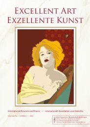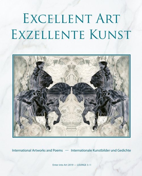
Excellent Art 2019 - Exzellente Kunst 2019
This art book presents 31 artists from 19 countries on different continents. Most of them are award winning artists and finalists, others adequate guest artists. We encourage readers to choose any of the artworks in this book and, using our instructions for meditative art observation, deeply and consciously connect with it to experience the unique form of art-induced relaxation emblematic of our “Enter into Art” concept. Based on the visible, specific side of paintings and sculptures, and mostly leaving out aspects related to the artists’ résumés, we invite art lovers to try out this stimulating method of connecting with the artworks themselves. To accompany this excellent selection of paintings, some first-class international haiku poems are presented alongside them. Both original versions and English translations of the poems are included – reading poetry in a foreign language allows us to perceive its characteristic color tones, increasing its intercultural effect. The art and poetry pages give „Enter into Art“ artists the opportunity to present their artwork in combination with their own poetry. The printed book is available in the book trade and in internet bookshops. Hardcover: ISBN 978-3-96103-724-7, Publisher: Re Di Roma-Verlag, Language: English, German, Size: 26 x 21 cm Das zweisprachige Kunstbuch stellt 31 Künstler aus 19 Ländern verschiedener Kontinente vor. Die meisten von ihnen sind preisgekrönte Künstler und Finalisten, andere adäquate Gastkünstler. Auf den Kunst- und Poesieseiten präsentieren die Künstler ihre Werke auch in Kombination mit eigenen Gedichten.
This art book presents 31 artists from 19 countries on different continents. Most of them are award winning artists and finalists, others adequate guest artists. We encourage readers to choose any of the artworks in this book and, using our instructions for meditative art observation, deeply and consciously connect with it to experience the unique form of art-induced relaxation emblematic of our “Enter into Art” concept. Based on the visible, specific side of paintings and sculptures, and mostly leaving out aspects related to the artists’ résumés, we invite art lovers to try out this stimulating method of connecting with the artworks themselves. To accompany this excellent selection of paintings, some first-class international haiku poems are presented alongside them. Both original versions and English translations of the poems are included – reading poetry in a foreign language allows us to perceive its characteristic color tones, increasing its intercultural effect. The art and poetry pages give „Enter into Art“ artists the opportunity to present their artwork in combination with their own poetry.
The printed book is available in the book trade and in internet bookshops. Hardcover: ISBN 978-3-96103-724-7, Publisher: Re Di Roma-Verlag, Language: English, German, Size: 26 x 21 cm
Das zweisprachige Kunstbuch stellt 31 Künstler aus 19 Ländern verschiedener Kontinente vor. Die meisten von ihnen sind preisgekrönte Künstler und Finalisten, andere adäquate Gastkünstler. Auf den Kunst- und Poesieseiten präsentieren die Künstler ihre Werke auch in Kombination mit eigenen Gedichten.

You also want an ePaper? Increase the reach of your titles
YUMPU automatically turns print PDFs into web optimized ePapers that Google loves.
International <strong>Art</strong>works and Poems —<br />
Internationale <strong>Kunst</strong>bilder und Gedichte<br />
Enter into <strong>Art</strong> <strong>2019</strong> — LOUNGE 3 / I<br />
1
<strong>Excellent</strong> <strong>Art</strong><br />
<strong>Exzellente</strong> <strong>Kunst</strong><br />
Relax and Rejoice with <strong>Art</strong> and Poetry from Nineteen Countries<br />
Entspannung und Genuss mit <strong>Kunst</strong> und Poesie aus neunzehn Ländern<br />
124 artworks<br />
29 poems<br />
124 <strong>Kunst</strong>bilder<br />
29 Gedichte<br />
Cover: Bie Flameng<br />
Back of the book / Cover-Rückseite:<br />
Alicja Snoch-Pawlowska, Maud du Jeu, Yvonne Welman, Patricia Pascazzi, Sophia Koopman<br />
Title page / Titelseite: Ivana Gagić Kičinbači<br />
2 3
Contents / Inhalt<br />
Ai-Wen Wu Kratz, USA<br />
page / Seite 4 - 5<br />
Gerhard Rasser, Austria / Österreich<br />
page / Seite 6 - 7<br />
Kazuko Misawa, Japan<br />
page / Seite 8 - 9<br />
David Whitfield, France / Frankreich<br />
page / Seite 10 - 11<br />
Gerhardt Gallagher, Ireland / Irland<br />
page / Seite 12 - 13<br />
Patricia Pascazzi, Argentina / Argentinien<br />
page / Seite 16 - 17<br />
Takanori Iwase, Japan<br />
page / Seite 18 - 19<br />
Yvonne Welman, The Netherlands / Niederlande<br />
page / Seite 20 - 21<br />
Merete Bartholdy, Denmark / Dänemark<br />
page / Seite 22 - 23<br />
Veryal Zimmerman, USA<br />
page / Seite 24 - 25<br />
Bie Flameng, Belgium / Belgien<br />
page / Seite 28 - 29<br />
Lisa Graham, USA<br />
page / Seite 30 - 31<br />
Maud du Jeu, France / Frankreich<br />
page / Seite 32 - 33<br />
Rowena Božič, Slovenia /Slowenien<br />
page / Seite 34 - 35<br />
Sophia Koopman, The Netherlands / Niederlande<br />
page / Seite 36 - 37<br />
Dear Readers,<br />
Based on our international art promotion project, the competition „Enter into <strong>Art</strong>“,<br />
held in Germany at regular intervals, this art book presents 31 artists from 19 countries<br />
on different continents. Most of them are award winning artists and finalists,<br />
others adequate guest artists.<br />
Based on the visible, specific side of paintings and sculptures, and mostly leaving<br />
out aspects related to the artists’ résumés, we invite art lovers to try out this stimulating<br />
method of connecting with the artworks themselves.<br />
We encourage readers to choose any of the artworks in this book and, using our<br />
instructions for meditative art observation, deeply and consciously connect with it<br />
to experience the unique form of art-induced relaxation emblematic of our “Enter<br />
into <strong>Art</strong>” concept.<br />
To accompany this excellent selection of paintings, some first-class international<br />
haiku poems are presented alongside them. Both original versions and English<br />
translations of the poems are included – reading poetry in a foreign language allows<br />
us to perceive its characteristic color tones, increasing its intercultural effect. Our<br />
art and poetry pages give „Enter into <strong>Art</strong>“ artists the opportunity to present their<br />
artwork in combination with their own poetry.<br />
We would like to thank all the artists and poets who participated in this international<br />
project for their excellent cooperation and wish them much success!<br />
Kurt Ries and Gabriele Walter<br />
(Editors)<br />
Foreword<br />
Instructions for <strong>Art</strong> Meditation<br />
Imagine you are visiting an exhibition featuring these art works and look at them<br />
very consciously. Close your eyes and observe or listen to your breath until you start<br />
feeling comfortably calm, then choose a painting:<br />
Liebe Leserinnen und Leser,<br />
basierend auf den internationalen „Enter into <strong>Art</strong>“-Wettbewerben für <strong>Kunst</strong>förderung,<br />
welche regelmäßig in Deutschland stattfinden, werden in dem vorliegenden<br />
<strong>Kunst</strong>- und Geschenkbuch 31 Künstlerinnen und Künstler aus 19 Ländern verschiedener<br />
Kontinente vorgestellt. Es handelt sich dabei vor allem um Preisträger und<br />
Finalisten sowie adäquate Gastkünstler.<br />
Orientierend an der Anschaulichkeit steht das Spezifische der Bilder und Skulpturen<br />
im Mittelpunkt der Interpretationen. Es sind dies Anregungen für den <strong>Kunst</strong>freund,<br />
sich mit den Werken selbst auseinanderzusetzen. Sie verzichten weitgehend<br />
auf Aspekte, welche dem Lebenslauf der Künstlerinnen und Künstler entnommen<br />
werden können. Nachdem sich der Leser ein Bild ausgesucht hat, kann er sich - gemäß<br />
dem „Enter into <strong>Art</strong>“-Konzept - mit der Anleitung für eine meditative <strong>Kunst</strong>betrachtung<br />
achtsam in ein <strong>Kunst</strong>werk vertiefen und entspannen.<br />
Passend zu der exzellenten Auswahl der Bilder sind auch die internationalen<br />
Haiku-Gedichte eine erlesene Melange. Die Gedichte werden in der Muttersprache<br />
der Dichterinnen und Dichter veröffentlicht, denn das Lesen fremdsprachiger Texte<br />
gleicht einem Farbklang und erhöht die interkulturelle Wirkung. Zudem bieten die<br />
speziellen <strong>Kunst</strong>- und Poesie-Seiten der „Enter into <strong>Art</strong>“-Buchreihen für Künstlerinnen<br />
und Künstler die Möglichkeit, ihre Werke im Zusammenspiel mit eigener Poesie<br />
zu präsentieren.<br />
Wir danken allen teilnehmenden Künstlern und Dichtern für die hervorragende<br />
Zusammenarbeit in dem weltweiten Gemeinschaftsprojekt und wünschen ihnen<br />
viel Erfolg!<br />
Kurt Ries und Gabriele Walter<br />
(Herausgeber)<br />
Vorwort<br />
Anleitung für eine <strong>Kunst</strong>meditation<br />
Stell dir vor, du würdest eine Ausstellung mit den <strong>Kunst</strong>werken besuchen und sie in<br />
achtsamer Weise betrachten. Schließe deine Augen und beobachte bzw. höre deinen<br />
Atem so lange, bis du angenehme Ruhe in dir spürst und suche dir danach ein<br />
Bild aus:<br />
Svetlana Vedernikov, Russia / Russland<br />
page / Seite 44 - 45<br />
Diana Kleiner, Argentina / Argentinien<br />
page / Seite 46 - 47<br />
Watana Kreetong, Thailand<br />
page / Seite 48 - 49<br />
Alicja Snoch-Pawlowska, Poland / Polen<br />
page / Seite 50 - 51<br />
Cinla Seker, Turkey / Türkei<br />
page / Seite 52 - 53<br />
Beverly Ashcraft-Johnson, USA<br />
page / Seite 54 - 55<br />
Ann Dunbar, France / Frankreich<br />
page / Seite 56 - 57<br />
R. Geoffrey Blackburn, USA<br />
page / Seite 60 - 61<br />
Miriam Cojocaru, Israel<br />
page / Seite 62 - 63<br />
Jerzy Pietruczuk, Poland / Polen<br />
page / Seite 64 - 65<br />
Mady Piesold, Germany / Deutschland<br />
page / Seite 66 - 67<br />
Mari Vedin Laaksonen, Sweden / Schweden<br />
page / Seite 68 - 69<br />
Haiku Poets / Haiku-Dichter<br />
Reinhard Harbaum, Germany<br />
page / Seite 14 - 15<br />
Youetta de Jager, The Netherlands<br />
page / Seite 42 - 43<br />
• What is this painting about? What special characteristics do you notice?<br />
<strong>Art</strong> and Poetry / <strong>Kunst</strong> und Poesie<br />
• Take time to analyze the colors and shapes in the painting!<br />
• Worum geht es in dem <strong>Kunst</strong>werk? Welche Besonderheiten weist es auf?<br />
Derwin Leiva, USA<br />
• What spontaneous associations does the painting evoke?<br />
• Nimm dir Zeit und analysiere die Farben und die Formen in dem Bild!<br />
Ana Galvão, Portugal<br />
page / Seite 38 - 39<br />
• What is the mysterious, unspeakable aspect of the painting that must<br />
• Welche Assoziationen weckt das Bild bei dir spontan?<br />
page / Seite 26 - 27<br />
have poured into it straight from the artist’s soul?<br />
• Worin liegt das Geheimnisvolle, Unaussprechliche, das wohl rein aus der<br />
Ivana Gagić Kičinbači, Croatia / Kroatien<br />
Seele quellende der Künstlerin oder des Künstlers?<br />
Gabriele Walter - Kurt Ries, Germany<br />
page / Seite 40 - 41<br />
page / Seite 58 - 59<br />
4 5
Ai-Wen Wu Kratz<br />
1<br />
Ai-Wen Wu Kratz<br />
USA<br />
Delightful Colors<br />
Using bright, cheerful colors, Ai-Wen Wu Kratz has developed an aesthetically<br />
ambitious painting style. With a healthy faith in the observer’s imagination, her<br />
energetic artistic gesture is suggestive of sunny gardens and flowering landscapes.<br />
The Hong Kong born artist’s abstract nature paintings reveal an affinity to<br />
Asian ornamental expression. Reality is transformed into lively rhythms and colorful<br />
melodies. Looking at us from these paintings are not faces but characters<br />
born from the artist’s poetic visual imagination and resembling the creatures<br />
walking archaic dream- and storyscapes. Collage-like fragments gather to form<br />
new compositions. Kratz’s characteristic style is marked by a playful, experimental<br />
approach to color and shape.<br />
Wonniges Leuchten der Farben<br />
In heiter gestimmten Farbtönen hat Ai-Wen Wu Kratz einen Malstil von hohem<br />
ästhetischen Anspruch entwickelt. Auf die Fantasie des Betrachters vertrauend,<br />
spielt sie mit schwungvoll ausgreifenden Gesten auf sonnige Gärten und blühende<br />
Landschaften an. In den Naturabstraktionen der aus Hong Kong stammenden<br />
Künstlerin wird die Nähe zum asiatischen Dekor offensichtlich. Realität<br />
wird in vitale Rhythmik und klangvolle Farbmelodie verwandelt. Was uns da<br />
anblickt, sind keine Gesichter, sondern Erdichtungen, wie sie im Märchenhaften,<br />
Archaischen oder auch in Träumen umgehen. Dabei werden collagenhafte<br />
Fragmente zu neuen Formgebilden verdichtet. Die Experimentierfreude mit<br />
Farbe und Form ist kennzeichnend für die Künstlerin.<br />
1<br />
4<br />
2 3<br />
1. I Found In Him My Star, My Sun, 2018, Acrylic on Canvas, 70 x 114 cm<br />
2. Improvisation, 2018, Acrylic on Canvas, 44 cm in diameter.<br />
3. Sing To The Carnival Moon, 2017, Acrylic on Canvas, 76 x 81 cm<br />
4. The Gift of Life, 2018, Acrylic on Canvas, 61 x 76 cm<br />
4 www.aiwenwukratzartstudio.com<br />
5
Gerhard R asser<br />
Trips to Nowhere<br />
Gerhard Rasser’s lyrical compositions are peaceful islands of contemplation<br />
among the hectic waves of our time. Hitting no limits, the eye is free to travel<br />
into the open space of his landscapes. The geometric motifs are kept horizontal,<br />
interrupted only by sparse vertical accents –a tree, or a lone person. The way<br />
the artist sticks to the bare essentials of the scenery creates a special pull. In the<br />
Nirvana of loneliness he presents, people play almost no part in his paintings.<br />
At the same time, however, it is people who benefit from his invitation to embark<br />
on a journey of peace and serenity to find places void of distraction.<br />
Gerhard Rasser<br />
Austria / Österreich<br />
Reisen ins Nirgendwo<br />
1. The Big Journey IV-I, Mixed Media, 14 x 14 cm<br />
2. The Big Journey IV-I, Mixed Media, 14 x 14 cm<br />
3. The Big Journey IV-I, Mixed Media, 14 x 14 cm<br />
4. The Big Journey IV-I, Mixed Media, 14 x 14 cm<br />
1<br />
Gerhard Rassers lyrische Bildkompositionen sind kontemplative Ruheinseln in<br />
einer ansonsten hektischen Zeit. Grenzenlos schweift der Blick in die Weite der<br />
Landschaft. Die stark geometrisch orientierten Motive sind betont horizontal<br />
ausgerichtet und werden nur durch sparsam eingesetzte vertikale Akzente unterbrochen<br />
– wie zum Beispiel ein Baum oder ein einsamer Mensch. Durch die<br />
Konzentration des Malers auf das unbedingt Wesentliche im Landschaftsbild<br />
entsteht ein besonderer Reiz. Obwohl Menschen scheinbar keinen Platz in seinen<br />
Bildern haben und sie ins Nirwana der Einsamkeit entführen, laden sie uns<br />
zu einer Reise voller Ruhe und Seelenfrieden ein. Sie führen an Orte, an denen<br />
es keine Störung gibt.<br />
4<br />
2<br />
3<br />
6 www.blickfang-gerhardrasser.com<br />
7
K azuko Misawa<br />
Kazuko Misawa<br />
Japan<br />
3<br />
1<br />
Floating Color Tones<br />
Kazuko Misawa’s medium for depicting the internal and the external world<br />
is color. The artist’s impasto application gives her colors a special intensity,<br />
allowing them to shine. Phosphorescent color chorales redefine nature. It is<br />
implication rather than clear statements that describe the rare moments the<br />
artist seeks to capture in order to imbue them with the individual soul and<br />
spirit. Monet’s Water Lily Pond has obviously inspired Misawa, and yet, she has<br />
completely made this theme her own. Purposefully guiding its momentum<br />
towards a minimalist lightness, her shapes dissolve in the floating magic of<br />
color tones melting into one another. Vibrating spots of color disperse under<br />
the influence of her spontaneous, relaxed brush stroke.<br />
Schwebende Farbklänge<br />
1. Nature, <strong>2019</strong>, Oil on Paper, 20 x 20 cm<br />
2. Nature, <strong>2019</strong>, Oil on Paper, 20 x 20 cm<br />
3. Nature, <strong>2019</strong>, Oil on Paper, 20 x 20 cm<br />
4. Nature, <strong>2019</strong>, Oil on Paper, 20 x 20 cm<br />
2<br />
Kazuko Misawas Medium für die Darstellung der inneren und äußeren Welt ist<br />
ausschließlich die Farbe. In ihrer pastos aufgetragenen Intensität leuchtet sie<br />
aus sich selbst heraus. Phosphoreszierende Farbchoräle werten die Natur um.<br />
Nur Andeutung und keine bekräftigende Formen bezeichnen einen seltenen<br />
Augenblick. Ihn gilt es zu erfassen, um eigenes Seelisch-Geistiges hinzuzufügen.<br />
Die Inspiration durch Monets Seerosenteich wird deutlich und dennoch<br />
handelt es sich um ein Werk, das der Künstlerin ganz eigen ist. Fortgeführt zu<br />
minimalistischer Leichtigkeit löst sich die Form im schwebenden Zauber ineinanderfließender<br />
Farbklänge auf. Vibrierende Farbtupfer zerstäuben sich im<br />
spontanen, lockeren Pinselduktus.<br />
4<br />
8 www.kmisawa.com<br />
9
d.w. Whitfield<br />
1. Untitled, <strong>2019</strong>, Acrylic, 100 x 100 cm<br />
2. Untitled, <strong>2019</strong>, Acrylic, 100 x 100 cm<br />
3. Untitled, <strong>2019</strong>, Acrylic, 100 x 100 cm<br />
4. Untitled, <strong>2019</strong>, Acrylic, 100 x 100 cm<br />
Psychological Depth<br />
David Whitfield’s dynamic paintings aim to expose the truth rather than succumbing<br />
to appearances. With surrealist abstraction and colors, the language<br />
of his shapes is full of allusions and encryptions. The artist finds his motifs in<br />
a mundane demimonde, and visualizes desolate primal forces. Psychological<br />
themes are presented from different angles. Their intensely expressive nature<br />
is color-driven. Whitfield’s figures seem to be cut from a finely woven, silk-like<br />
cloth underlined by subdued shades of gray. The shady figures appear densely<br />
crowded and often emit a sense of compulsive arousal. Their faces resemble demonic<br />
masks symbolizing subjective emotions and characters.<br />
d.w. Whitfield<br />
France / Frankreich<br />
Psychologische Tiefe<br />
1<br />
David Whitfields dynamische Bilder streben nach Wahrheit, nicht nach dem<br />
schönen Schein. Mit surrealistischer Verfremdung und Farbigkeit ist seine<br />
Formsprache anspielungsreich und verschlüsselt zugleich. Der Künstler findet<br />
seine Motive in der mondänen Halbwelt und macht desolate Urkräfte sichtbar.<br />
Aus verschiedenen Gesichtswinkeln werden psychologische Reizthemen<br />
dargestellt. Die Ausdruckssteigerung geht auch von der Farbe aus. Seine Figuren<br />
scheinen wie aus seidig feinem Stoff gewebt - mit vornehmen Grautönen<br />
unterlegt. Dicht gedrängte, lineare fragwürdige Gestalten strahlen zum Teil<br />
triebhafte Erregtheit aus. Ihre Gesichter gleichen dämonischen Masken, welche<br />
subjektive Empfindungen und Charaktere versinnbildlichen.<br />
4<br />
2 3<br />
10 davidwwhitfield.com<br />
11
Gerhardt Gallagher<br />
Seascapes Spawning Dreams<br />
gerhardt gallagher<br />
Ireland / Irland<br />
Gerhardt Gallagher‘s mature art has no room for artistic fads. His charismatic<br />
aquatints tell stories of peaceful landscapes and small, quaint villages. The surroundings<br />
of his home are the fundamental theme of his art. His style captures<br />
an expressionist representationalism. Reducing shapes to impersonal figurines,<br />
he challenges viewers to follow their own hiking routes and explore the lyrical<br />
atmosphere and the nature surrounding them. Inadvertently, one feels an urgency<br />
to be there and take in the austere light of the beautiful islands of Northern<br />
Europe, and the sparse, quiet clarity of their nature.<br />
Seestücke zum Träumen<br />
1<br />
Im reifen künstlerischen Schaffen Gerhardt Gallaghers haben Modeerscheinungen<br />
in der <strong>Kunst</strong> keine Bedeutung. Seine stimmungsvollen Aquatinta-<br />
Radierungen erzählen von friedvollen Landschaften und kleinen Dörfern mit<br />
urtümlichen Charme. Die Umgebung seines Lebensdomizils ist das Grundthema<br />
seiner <strong>Kunst</strong>. Dabei hält er an expressionistischer Gegenständlichkeit fest.<br />
Die formale Reduzierung zu unpersönlichen Figurinen fordert den Betrachter<br />
dazu auf, ihn auf seinen Wanderwegen zu folgen und in die lyrische Atmosphäre<br />
der ihm umgebenden Natur einzutauchen. Unweigerlich will man dort sein,<br />
um das herbe Licht der schönen Insel im Norden Europas und die karge, stille<br />
Klarheit ihrer Natur zu genießen.<br />
1. Barrow Valley, 2016, Aquatint Etching, 20 x 30 cm<br />
2. Upper Lake, 2018, Aquatint Etching, 17 x 23 cm<br />
3. Copper Coast, <strong>2019</strong>, Aquatint Etching, 28 x 23 cm<br />
4. Rocky Detour, 2017, Aquatint Etching, 18 x 22 cm<br />
2 3<br />
4<br />
12 www.gerhardtgallagher.com<br />
13
R einhard Harbaum<br />
Germany / Deutschland<br />
Reinhard Harbaum<br />
At Black Alder Swamp,<br />
Am Schwarzerlensumpf schwelt<br />
No name and no sound.<br />
Kein Name kein Laut<br />
the smoldering canola<br />
Der Raps – all die Kormorane<br />
The winter night grants the brown<br />
Winternacht gibt dem Waldkauz<br />
hides my cormorants.<br />
Die ich nicht sah.<br />
owl life without light.<br />
Gedeih ohne Licht.<br />
A Blue Tit<br />
Eine Blaumeise<br />
That hurried gust of<br />
Ein Geschenk der<br />
This small speck of blue<br />
Dieser Flecken Blau<br />
air the black bird fans towards<br />
Luftzug den die eilige<br />
draws its life force from a well<br />
Schöpft aus dem Brunnen dessen<br />
me – what a present!<br />
Amsel mir zufächelt.<br />
whose depth is unknown.<br />
Tiefe unbekannt.<br />
That blissful feeling<br />
Das Wohlgefühl ging<br />
As the moon rises<br />
Als der Mond aufging<br />
dies in the wind like the call<br />
Dahin wie ein Sperberruf<br />
a tremor runs through the air:<br />
Noch ein Zittern in der Luft<br />
of the sparrow hawk.<br />
Der im Winde stirbt<br />
It’s the pied wagtail.<br />
Von der Bachstelze.<br />
Three leaves left on the<br />
Drei Blätter blieben<br />
The yellow hammer<br />
Gewitterluft – der<br />
gingko. A common chaffinch<br />
Dem Ginkgo – und an einem<br />
sprinting through thunderstorm air.<br />
Sprint der Goldammer das ist<br />
attacks one of them.<br />
Schnäbelt der Buchfink.<br />
Moonlight in the water.<br />
Mondschein im Wasser.<br />
Crane piles upon crane<br />
Kranich auf Kranich<br />
Behind the haymaker<br />
Hinterm Heumacher<br />
as their leader succumbs to<br />
Dunkelsprache – das Leittier<br />
the crow struts across a table<br />
Stolziert die Krähe über<br />
a rain-induced blues.<br />
Hat den Regenblues.<br />
full of the finest food.<br />
Den gedeckten Tisch.<br />
14 15
Patricia Pascazzi<br />
Patricia Pascazzi<br />
1. Eterna, 2017, Monocopia Sobre Cartón/Chine Collé, 17,5 x 18 cm<br />
2. Ayer, 2017, Monocopia, Chine Collé, 17,5 x 18 cm<br />
3. Atemporal, 2017, Monocopia, 19 x 17,3 cm<br />
4. Aguila y Piedra, 2017, Gofrado, Collage, 17,5 x 17,5 cm<br />
Argentina / Argentinien<br />
1<br />
2<br />
Interpreting the Uninterpretable<br />
In Patricia Pascazzi’s graphic works, spontaneous impulses meet the rhythm and<br />
symbolic language of a painter. Her expressive artistic gesture is accompanied<br />
by the logic of structural composition. Her powerful structures create a framework<br />
both dynamic and stable, informed by random impulses and coincidental<br />
reflexes. While the artist transcends contemporary ideas of beauty, she discovers<br />
new ones with her unusual graphic techniques. The haptic impression created<br />
by the embossing makes her motifs appear like mysterious, archaic codes<br />
oscillating between the opposing forces of expressiveness and symbolism.<br />
Bedeutsam, obwohl undeutbar<br />
1<br />
In Patricia Pascazzis Grafiken mündet das Spontane in malerische Rhythmik bis<br />
hin zur zeichenhaften Bildsprache. Die expressive Gestik wird von bildnerischer<br />
Ordnung begleitet. Ihre kraftvollen Strukturen erzeugen ein dynamisches und<br />
zugleich stabiles Bildgerüst, das von willkürlichen Impulsen und zufälligen<br />
Reflexen gesteuert worden ist. Indem sich die Künstlerin über den zeitgenössischen<br />
Schönheitsbegriff hinwegsetzt, entdeckt sie Schönheiten durch ungewöhnliche<br />
grafische Mittel. Der haptische Eindruck der Prägedrucke verfremdet<br />
die Bildinhalte zu geheimnisvollen archaischen Chiffren. Sie wirken wie Bildzitate<br />
und bewegen sich im Spannungsfeld zwischen Expressivität und Symbolik.<br />
3<br />
4<br />
16 Patricia Pascazzi<br />
17
Takanori Iwase<br />
1. Rivercrow, 2018, Wood Engraving, 16 x 14 cm<br />
2. Flow I, <strong>2019</strong>, Wood Engraving, 9 x 9,5 cm<br />
3. From Now II, 2017, Wood Engraving,14 x 15,5 cm<br />
4. Dawn Song, <strong>2019</strong>, Wood Engraving, 18 x 18 cm<br />
Takanori Iwase<br />
Japan<br />
2<br />
Melodious Flow<br />
1<br />
Takanori Iwase is a masterful wood engraver who skips the futile question<br />
about shape and content point blank. Keeping his shapes clear and traditional,<br />
he imbues them with an artistic vibrato. With compositional perfection and a<br />
unique individual style, he creates variations on the river crow motif. His almost<br />
ornamental, immaterial lines conjure up the harmonious shapes found in calligraphy.<br />
Under a magnifying glass, they are chiseled out of hard wood one by<br />
one. The artist’s sensitivity to the natural shape and structure of the wood, and<br />
his love of his material are palpable. Mostly set along a diagonal axis, his compositions<br />
show the river’s melodious flow rather than the river itself.<br />
Klangvolles Fließen<br />
Die müßige Frage nach Form und Inhalt stellt sich dem Holzstichmeister Takanori<br />
Iwase nicht. Traditionell hält er an der Klarheit der Formen fest, verleiht<br />
ihnen aber ein malerisches Vibrato. Mit kompositorischer Vollkommenheit<br />
variiert er sein Flusskrähen-Thema auf sehr persönliche Weise. Aus den fast<br />
schon ornamental-ungegenständlichen Lineaturen spricht die kalligraphische<br />
Schönform heraus. Unter der Lupe werden die Lichter Linie für Linie aus dem<br />
harten Holz gestochen. Das Einfühlen des Künstlers in die gewachsene Form<br />
4<br />
und Struktur des Holzes und seine Liebe zu diesem edlen Material kann man<br />
regelrecht erspüren. Mit Vorliebe zur diagonalen Bildanordnung wird nicht der<br />
Fluss, sondern sein klangvolles Fließen dargestellt.<br />
3<br />
18 Takanori Iwase<br />
19
Yvonne Welman<br />
Figurative Narration<br />
Yvonne Welman uses photorealism to bring the unconscious to the surface. Her<br />
hyperreal motifs are painted in the precise style of the Old Masters. At the same<br />
time, they fuse surrealism with symbolism, while exploring individual imagescapes.<br />
Allegories, metamorphoses, and a number of other art historical quotes<br />
are used to help the artist deliver her message of social criticism, and provide<br />
polemic input for modern debates. Her style is accessible, facts are brought<br />
close to the viewer, while the unconscious serves as a driving force, and distant<br />
worlds merge into a poetic reality.<br />
Yvonne Welman<br />
The Netherlands / Niederlande<br />
1. Living Craft: Homage to R.l Ruysch, 2014, Painting, Digital Print, 10,5 x 14 cm<br />
2. Selfies, 2017, Painting, Digital Print, 14 x 14 cm<br />
3. Comment on Klimt, 2015, Digital Print, Painting, 14 x 14 cm<br />
4. Since Leucippos, 2016, Digital Print, Painting, 14 x 14 cm<br />
1<br />
Figurative Erzählweise<br />
In fotorealistischer Manier fördert Yvonne Welman das Unbewusste zutage.<br />
Ihre hyperrealen Darstellungen sind im präzisen Stil der alten Meister gemalt.<br />
Gleichermaßen stellen sie eine Fusion von Surrealismus und Symbolismus dar,<br />
wobei sehr persönliche Bilderwelten erkundet werden. Sie greift auf Allegorien<br />
und Metamorphosen und eine Vielzahl anderer Quellen aus der <strong>Kunst</strong>geschichte<br />
zurück. Dabei möchte die Künstlerin auch gesellschaftskritisch polemisieren<br />
und Stellung beziehen bzw. für etwas eintreten und überzeugen. Der Stil ihrer<br />
Bilder ist anschaulich, das Geschehene wird nahe an den Betrachter herangebracht,<br />
wobei das Unbewusste als treibende Kraft und entfernte Realitäten eine<br />
poetische Wirklichkeit erzeugen.<br />
4<br />
2<br />
3<br />
20 www.yvonne-welman.com<br />
21
Merete Bartholdy<br />
1. Red Legs, 2018, Linocut, 13 x 13 cm<br />
2. Head and Foot, <strong>2019</strong>, Acrylic and Cardboard, 20 x 29 cm<br />
3. All Dressed Up, 2018, Linocut, 13 x 13 cm<br />
4. Blinds, 2018, Linocut, 13 x 13 cm<br />
Merete Bartholdy<br />
Denmark / Dänemark<br />
3<br />
Visual Pull<br />
1<br />
Specializing in minimalist crane depictions, Merete Bartholdy moves back and<br />
forth between representational and abstract art. With humility vis-à-vis the<br />
large birds and a keen eye for detail, she invites viewers to take a closer look.<br />
With great sensitivity, she depicts the animals’ pride, dignity, and grace. The<br />
way she manages to breathe life and soul into the birds bears witness to the<br />
awe she feels in the presence of these noble creatures. Their silhouettes emanate<br />
peace and harmony. With her remarkable use of transparency, the artist<br />
presents shapes embedded in an atmosphere of radiant power and dance-like<br />
movement.<br />
Spannende Seherlebnisse<br />
Merete Bartholdy pendelt zwischen Abstraktion und Gegenständlichkeit. In minimalistischer<br />
Manier zeigt sie vor allem Kranichszenen. Mit stetem Respekt vor<br />
den großen Vögeln und einem gut entwickelten Blick für Details animiert sie<br />
zur näheren Betrachtung der Tiere. Voller Hingabe wird deren Stolz, ihre Würde<br />
und Anmut herausgearbeitet. Gleichsam verleiht sie ihnen eine Seele und ein<br />
Innenleben, aus dem die Hochachtung für die Schönheit dieser kaiserlichen<br />
Geschöpfe spricht. Ihre Silhouetten strahlen zudem Frieden und Harmonie aus.<br />
Dank vortrefflicher Transparenzeffekte lässt die Künstlerin Formen entstehen,<br />
eingebettet in ein Kolorit von leuchtender Kraft und tänzerischer Bewegtheit.<br />
4<br />
2<br />
22 www.meretebartholdy.dk<br />
23
Veryal Zimmerman<br />
Sensitive Impressions<br />
With a quiet melancholy and a purist sparseness of color, Veryal Zimmerman<br />
explores the borders of representational painting without crossing over into the<br />
realm of the abstract. A certain propensity for the eerie and the blurred verging<br />
on the complete dissolution of shapes makes some of his works remindful of<br />
William Turner’s art. With his own individual style and spiritual charm, the artist<br />
does not depict immediate impressions but subjective perception as an echo<br />
of actual experience. Hidden light exudes a mysterious, poetic mood outlining<br />
objects seemingly made of transparent breaths, and exuding an aura of the<br />
ephemeral. The main theme, however, is the moving shape.<br />
Sensitive Impressionen<br />
Veryal Zimmerman<br />
USA<br />
1. Full Moon II-M, <strong>2019</strong>, Pastel on Gesso Board, 17,78 x 12,7<br />
2. Looking East at Sunset, 2018, Oil on Canvas, 60,96 x 45,72 cm<br />
3. Nature’s Abstraction II, <strong>2019</strong>, Pastel, 20,32 x 13,97 cm<br />
4. The Rising I, 2018, Oil on Canvas, 121,92 x 60,96 cm<br />
1<br />
Mit leiser Melancholie und puristischer Kargheit der Palette erreicht Veryal Zimmerman<br />
die Grenzen zur Abstraktion, ohne diese zu überschreiten. Eine leichte<br />
Neigung zum Unheimlichen und romantisch Verschwebendem bis hin zur<br />
verwischenden Auflösung der Form lässt zuweilen an William Turner denken.<br />
Mit eigener Handschrift und spirituellem Charme stellt die Künstlerin nicht den<br />
unmittelbaren Eindruck dar, sondern ein subjektives Empfinden als Widerhall<br />
des Erlebens. Verborgenes Licht ruft eine geheimnisvolle poetische Stimmung<br />
hervor, welche Gebilde scheinbar gehauchter Transparenz und flüchtiger Augenblicklichkeit<br />
umreißt. Das Hauptthema ist dennoch die bewegte Form.<br />
3<br />
2 4<br />
24 www.veryalzimmerman.com<br />
25
ana galvão<br />
Portugal<br />
<strong>Art</strong> and poetry / <strong>Kunst</strong> und Poesie<br />
PRIMAVERA …<br />
OUTONO …<br />
Vieste de novo.<br />
Meu vôo solitário<br />
Calmo e imenso<br />
Terminou.<br />
Implacável,<br />
O deslumbramento,<br />
O desequilíbrio.<br />
Desço as escadas<br />
Vejo o mar.<br />
Estarás,<br />
Não estarás?<br />
Janelas de<br />
Par em par!<br />
Moon, 2015, Copper Etching, 10 x 8,5 cm<br />
Vôo, em círculos<br />
Breves, patéticos<br />
Loucos.<br />
INVERNO …<br />
Sun, 2016, Copper Etching, 10 x 7,5 cm<br />
VERÃO …<br />
Um dia acordo<br />
E vejo que esqueço,<br />
O solstício de Verão.<br />
Como explicar o esplendor<br />
Dos dias em que te tenho<br />
O fogo desmedido e ardente<br />
De tudo o que me cerca<br />
Caminho inevitável<br />
Loucura lúcida<br />
O vôo do sol é dócil,<br />
… a lembrança tem o seu preço …<br />
Nem tu mo recordas,<br />
Nem eu te peço …<br />
Subo, ébria de luz,<br />
A ladeira do vulcão.<br />
Só o Sol celebra o esplendor do<br />
Homem.<br />
X, 2016, Copper Etching, 13 x 15 cm<br />
Eclipse, 2015, Copper Etching, 10 x 10 cm<br />
Visual Enchantment<br />
Verzauberung des Gesehenen<br />
Ana Galvão’s poetic odes to the moon are marked by aesthetic romanticism. She is both artist and poet. Her pictorial moonshine sonatas convey the fantastic<br />
poetry of the night sky. The moon (and the sun) are the protagonists illuminating the interplay between graphic expression and painting that leads to the artist’s<br />
unique dramatic compositions. Her eccentric painting style employs different types of planes, figures, and circles and is driven by emotions that help visualize<br />
what usually remains hidden from the eye. This process allows her shapes to speak their own language. The artist’s finetuned sense of shape and color is highlighted<br />
by the sublime nature of the environment she inhabits. Her short poems are very personal poetic interpretations of the four seasons telling stories of the<br />
summer solstice, of love, and of the sea.<br />
Ana Galvão erweist sich mit ihren Kleinoden über den Mond als ästhetische Romantikerin. Sie ist Künstlerin und Dichterin zugleich. Ihre Bildsonaten des Mondes<br />
vermitteln die märchenhafte Poesie des Himmelsgestirns. Mond (und Sonne) sind Hauptmotive und Akteure im grafischen und malerischen Werk der Künstlerin<br />
und bilden in ihrem Zusammenspiel die Bilddramaturgie. Der eigenständige Malstil aus verschiedenartigen Flächen, Figuren und Kreissegmenten ist getragen von<br />
Emotionen, welche sichtbar machen, was dem Auge verborgen bleibt. In sensibler Weise hat die Form der Dinge ihre eigenständige Sprache. Das feinnervige Formund<br />
Farbgespür der Künstlerin wird beflügelt durch die anmutige Natur der Umgebung, in der sie lebt. Ihre Kurzgedichte poetisieren die vier Jahreszeiten aus ganz<br />
persönlicher Sicht. Sie erzählen von der Sonnenwende, von Liebe und dem Meer.<br />
26 Ana Galvão<br />
27
ie flameng<br />
bie flameng<br />
Belgium / Belgien<br />
Inspired by Van Eyck<br />
Bie Flameng’s partly digital drawings are figurative and ornamental at once. Her<br />
motifs appear majestic. She creates layers with a palpable presence and takes viewers<br />
into mysterious worlds. The symmetry of her images is remindful of stained<br />
glass. Playfully incorporating quotes from art history, and quietly melancholic, the<br />
artist succumbs to a very individual perspective. It is the fantastic combination of resounding<br />
shapes and motifs that makes her shapes so magical. With skill and confidence,<br />
she translates her emotions into images and takes viewers into an immaterial<br />
world both elegant and stylish. Spatial logic is neglected, colors are muted.<br />
1<br />
Inspiriert von Van Eyck<br />
Bie Flameng zeichnet in einer digitalen Mischtechnik figurativ und ornamental zugleich.<br />
Ihre Motive wirken majestätisch. Dabei modelliert sie effektvoll mit Überlagerungen<br />
und entführt in rätselhafte Welten. Die Symmetrie der Bilder erinnert an<br />
Glasmalerei, wobei die Bildsprache mit Zitaten aus der <strong>Kunst</strong>geschichte spielt und<br />
sich mit leiser Melancholie einer eigenwilligen Betrachtungsweise hingibt. Durch<br />
die fantastische Kombination von Formenklang und Sujet erhält die Magie der Formen<br />
ihr Dasein. Mit gekonnter Sicherheit setzt die Künstlerin ihre Empfindungen<br />
um und entführt den Betrachter mit stilvoller Eleganz ins Ungegenständliche. Dabei<br />
wird das Räumliche vernachlässigt, farbliche Verhaltenheit dominiert.<br />
2<br />
1. Self Portrait, 2014, Digital Graphic <strong>Art</strong> (Mixed Media), 13 x 9,5 cm<br />
2. Lamb, 2014, Digital Graphic <strong>Art</strong> (Mixed Media), 13 x 9,8 cm<br />
3. The Just Judges, 2014, Digital Graphic <strong>Art</strong> (Mixed Media), 13 x 9 cm<br />
4. Adam & Eve, 2014, Digital Graphic <strong>Art</strong> (Mixed Media), 13 x 10,4 cm<br />
3<br />
4<br />
28 www.bieflameng.be<br />
29
Lisa Graham<br />
Lisa Graham<br />
1. Vortices, Digital Print, flexible image size<br />
2. Invisible Forces #2, Digital Print, flexible image size<br />
3. Invisible Forces #3, Digital Print, flexible image size<br />
4. Invisible Forces #4, Digital Print, flexible image size<br />
USA<br />
1<br />
Vehement Circling<br />
Lisa Graham’s digital prints charm viewers with their unique style. Radical<br />
simplification and sparse color schemes unite in a floating music without any<br />
gimmickry. The geometric shapes and wave patterns give the impression of<br />
movement. This visual effect is created through curved lines remindful of Ernst<br />
Wilhelm Nay‘s Scheibenbilder (disc paintings). The circle serves as the most dominant<br />
shape. The dynamic and rigorous language of this shape speaks through<br />
the artist’s improvisational brushstroke and is frequently reduced to fragments.<br />
The rhythmic impression these paintings evoke oscillates atop the tonal function<br />
of their pastel-colored backgrounds.<br />
2<br />
Vehementes Kreisen<br />
Lisa Grahams Digitaldrucke überzeugen durch ganz eigene Prägung. Radikale<br />
Vereinfachung und sparsame Farbgebung ergänzen sich zu einer schwebenden<br />
Musik ohne jegliche Effekthascherei. Die geometrischen Formen und wellenförmigen<br />
Muster erwecken den Eindruck von Bewegung. Dieser optische Effekt<br />
wird mit Hilfe von geschwungenen Linien erzeugt, welche an die Scheibenbilder<br />
Ernst Wilhelm Nays erinnern. Vor allem dient der Kreis als dominante Form.<br />
Die dynamische und rigorose Formensprache wird durch improvisatorischen<br />
Schwung bei der Malaktion hervorgebracht und oft nur ausschnitthaft visualisiert.<br />
Die Rhythmik der Bildwirkung schwingt auf der klanglichen Funktionalität<br />
der pastellfarbenen Hintergründe.<br />
4<br />
3<br />
30 Lisa Graham<br />
31
Maud du Jeu<br />
Maud du Jeu<br />
France / Frankreich<br />
1<br />
2<br />
Appealing Body Language<br />
Maud du Jeu dedicates her art to the human body, emphasizing three-dimensionality<br />
even in her drawings. Her main objective is to give shape to its erotic appeal.<br />
Using subdued, clay-like colors, she stays close to her motif, while playing<br />
with the floating opulence of light. Coquettishly articulated, her amorous seated<br />
statues appeal directly to sensual pleasure. Soft, round lines are combined<br />
with slim bodies, as the gentle surface modeling of the bronze cast figures<br />
exerts a special pull. With her body-oriented expressive skill, the artist displays<br />
a well-rounded and very personal style.<br />
Ansprechende Körpersprache<br />
Maud du Jeu widmet sich in ihren <strong>Kunst</strong>werken dem menschlichen Körper,<br />
auch in ihren Zeichnungen entwickelt sie betont plastische Formen. Vornehmlich<br />
möchte sie dessen erotische Ausstrahlung zum Ausdruck bringen. Mit tonig<br />
verhaltenen Farben bleibt sie voll und ganz am Motiv und spielt mit der gleitenden<br />
Fülle des Lichts. Maniriert überfeinert sind ihre verliebten Sitzstatuen<br />
dem Sinngenuss zugewandt. Der Schlankheit des Körperwuchses begegnet die<br />
4<br />
weiche Rundung der Umrisse, wobei die sanfte Oberflächenmodellierung der<br />
1. Couple, <strong>2019</strong>, Ink and Wash Drawing, 116 x 83 cm<br />
Bronzegüsse den besonderen Reiz ausmacht. Mit ihren auf Körperwirkung bedachten<br />
2. Femme, 2018, ink and Wash Drawing, 90 x 90 cm<br />
Gestaltungskräften modelliert die Künstlerin einen durchgebildeten,<br />
3. Seule, 2015, Bronze, 20 x 13 x 13 cm<br />
sehr persönlichen Stil.<br />
4. Sérénité, 2013, Bronze, 29 x 30 x 30 cm<br />
3<br />
32 maud.dujeu.free.fr<br />
33
Rowena Božič<br />
Rowena Božič<br />
1. Landscape, 2016, Etching, Aquatint, Reservage, 20 x 15 cm<br />
2. Traces, 2010, Etching, Aquatint, 34 x 25 cm<br />
3. Gardens IV, 2013, Etching, Aquatint, 21 x 15 cm<br />
4. Sun, 2006, Dry point, 25 x 20 cm<br />
Slovenia / Slowenien<br />
3<br />
1<br />
Approaching the Distance<br />
With her abstract expressive prowess, Rowena Božič dedicates herself completely<br />
to the adventure of modern art. Free of real objects and exuding lyrical<br />
poetry and folkloristic cheerfulness, her work plays with the music of shapes<br />
and colors. Multiform and ornamental, painting becomes a hieroglyphic mode<br />
of graphic expression. The artist’s minimalist reduction of surface appearances<br />
manages to reveal the internal essence of her motifs. The tension between blue<br />
and yellow, for example, is pacified in a warm shade of green. A domed semicircle<br />
exudes peace and conjures up blades of grass in the field, while triangle<br />
shapes directed upwards are remindful of mountains and summits.<br />
Extrakte der Ferne<br />
Mit abstrahierter Gestaltungskraft gibt sich Rowena Božič voll und ganz dem<br />
Abenteuer moderner <strong>Kunst</strong> hin. Abgelöst von realen Dingen bis hin zu lyrischer<br />
Poesie und folkloristischer Heiterkeit spielt sie mit der Musik von Formen und<br />
Farben. Vielgestaltig und ornamental verwandelt sie Malerei zu hieroglyphischer<br />
Grafik. Durch die Reduktion des äußeren Erscheinungsbildes kommt das<br />
innere Wesen desto stärker zum Ausdruck. Zum Beispiel wird die Spannung zwischen<br />
Blau und Gelb durch ein warmtoniges Grün aufgehoben. Auch der gekuppelte<br />
Halbkreis vermag Ruhe auszustrahlen. Er suggeriert das leise Schwingen<br />
von Wiesenhalmen, während nach oben gerichtete Dreiecksformen Berge und<br />
Gipfel vermuten lassen.<br />
2 4<br />
34 Rowena Božič<br />
35
sophia koopman<br />
sophia koopman<br />
Magic of the Sea<br />
The Netherlands / Niederlande<br />
Inspired by the beauty of the sea and a fleeting moment lasting only seconds,<br />
photographer Sophia Koopman captures details that tend to escape the eye of<br />
less serious observers. Her closeup compositions are marked by clarity. Graphically<br />
intense contours are visually pleasing, based on the interplay of light and<br />
dark notes. The dramatic nature of the images comes to life in her black and<br />
white mode of interpretation. There are no distractions, the shiny texture of<br />
waves and spray, and their reflection become the source of abstraction. Unburdened<br />
by their context, the light situations lead to a focus on the essence, and<br />
to a strong visual capacity for the transition between water and land.<br />
1. Shoreline 2, 2015, Photo<br />
2. Shoreline 5, 2010, Photo<br />
3. Shoreline 4, 2011, Photo<br />
4. Shoreline 1, 2015, Photo<br />
1<br />
Magie des Meeres<br />
Beseelt von der Schönheit des Meeres und einem flüchtigen Moment, welcher<br />
nur Sekunden dauert, stehen im Fokus der Fotografin Sophia Koopman dem<br />
oberflächlichen Blick verborgene Details. Aus klar komponierten Bildausschnitten<br />
stechen lichtvolle Texturen und tonale Kontraste hervor. Grafisch intensive<br />
Konturen sprechen visuell an, beruhend auf dem Zusammenspiel heller<br />
und dunkler Töne. Die Dramatik der Bilder offenbart sich in der zweifarbigen<br />
Interpretation. Nichts lenkt ab, die glänzende Textur von Wellen und Gischt und<br />
deren Reflexion wurden zur Quelle für Abstraktion. Ohne die Last eines Kontextes<br />
führen die Lichtsituationen zur Konzentration auf das Wesentliche und<br />
zur intensiven Beobachtungsgabe am Übergang zwischen Wasser und Land.<br />
4<br />
4<br />
2<br />
3<br />
36 www.sophiakoopman.com<br />
37
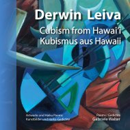
Derwin Leiva<br />
Optical Illusion<br />
Derwin Leiva<br />
USA<br />
1. Amor De Balcones, <strong>2019</strong>, Oil on Canvas, 91 x 76 cm<br />
2. 90 Miles, <strong>2019</strong>, Oil on Canvas, 91 x 76 cm<br />
3. La Pianista, <strong>2019</strong>, Oil on Canvas, 91 x 76 cm<br />
4. The Blue Guitar, 2018, Oil on Canvas, 152 x 122 cm<br />
1<br />
In spite of the great artistic freedom Derwin Leiva claims for himself, his surrealist<br />
compositions are marked by a classic sense of balance. A cubism-inspired<br />
approach to shapes perspires. Intensely curved lines and bent shapes charge<br />
Leiva’s work with energy, while its colors discharge cheerfulness. The Cuban<br />
artist’s original color concert occasionally seems to lose itself in a folkloristic excess<br />
of colors, but upon closer inspection, each color accent is deliberately and<br />
precisely applied, and positioned purposefully in his articulate, vivid image architecture.<br />
The perspective is lyrically distorted, and loses its balance as it breaks<br />
into dance, and the floor withdraws from under its feet. Angular shapes exude<br />
an erotic aura, intensified by red accents in the musical color composition.<br />
Optische Illusion<br />
Bei aller malerischer Freiheit zeugen Derwin Leivas surrealistische Bildkompositionen<br />
von klassischer Ausgewogenheit. Ein Hauch kubistischer Formgestaltung<br />
spielt hinein. Heftige Kurvierungen der Linien und Formverbiegungen<br />
steigern die Energie, wobei sich die Farben in Frohsinnigkeit entladen. Obwohl<br />
sich das originelle Farbkonzert des aus Kuba stammenden Künstlers zuweilen<br />
in folkloristische Buntheit verliert, ist jeder Farbakzent präzise gesetzt - kompositorisch<br />
geordnet und eingebaut in eine vitale Bildarchitektur von prägnantem<br />
Zuschnitt. Lyrisch verzerrt sich die Perspektive, ja sie gerät tänzerisch ins<br />
Schwanken, den Boden unter den Füßen verlierend. Zu eckigen Formen zugespitzte<br />
Erotik wird durch Rotakzente zur Farbmusik.<br />
1<br />
2<br />
3<br />
4<br />
38 www.derwinleiva.com<br />
39
Ivana Gagić Kičinbači<br />
Croatia / Kroatien<br />
1<br />
Ivana Gagić Kičinbači<br />
Inspiration and Construction<br />
2<br />
Ivana Gagić Kičinbači’s art reveals a special enthusiasm about technology. Her<br />
vocabulary consists of broad strips arranged in compositions remindful of East<br />
Asian calligraphy. Painting becomes writing and wants to be read. A circle may<br />
stand for the sun or the moon, but also for completion. The artist’s architectural,<br />
mathematical composition style is emphasized by the minimalist contrast of<br />
black and white, arranged in flat spaces neglecting the laws of perspective. The<br />
minor notes of sparse colors resound from the planar paintings, illuminated by<br />
a vermilion sun. Organic and anorganic components, emotion and calculation<br />
seem to mingle. This creates a special atmosphere in the illuminated space.<br />
Inspiration und Konstruktion<br />
3<br />
Einer <strong>Art</strong> Technik-Enthusiasmus zugeneigt, spricht Ivana Gagić Kičinbači mit<br />
dem Vokabular breiter Streifen und lässt den Betrachter an ostasiatische Kalligraphie<br />
denken. Das Bild wird hier zur Schrift, die man lesen lernen muss. Der<br />
Kreis mag für Sonne oder Mond, aber auch für Vollkommenheit stehen. Die<br />
architektonisch-mathematische Bildordnung wird durch die Beschränkung auf<br />
Schwarz und Weiß im aperspektivischem Raum betont. Im Flächencharakter der<br />
Bilder erklingen die wenigen Farben in Moll-Tönen, während ein Zinnoberrot die<br />
Sonne erglühen lässt. Organisches und Anorganisches, Gefühl und Berechnung<br />
scheinen sich zu mischen. Dabei wird eine besondere Atmosphäre im beleuchteten<br />
Raum erzeugt.<br />
1. Habitat, <strong>2019</strong>, Digital Print, 120 x 80 cm<br />
2. Direction, <strong>2019</strong>, Digital Print, 110 x 110 cm<br />
3. Note, <strong>2019</strong>, Digital Print, 110 x 110 cm<br />
4. Story from the Beginning, <strong>2019</strong>, Indian Ink on paper, 570 x 220 cm<br />
4<br />
40 www.ivanagagickicinbaci.com.hr<br />
41
Youetta de Jager<br />
The Netherlands / Niederlande<br />
Youetta de Jager<br />
Langzaam<br />
Slowly<br />
Building bridges<br />
Brücken bauen,<br />
kruipt avond aan<br />
the evening creeps<br />
crossing silent waters<br />
stille Wasser überqueren<br />
in zachter licht<br />
into softer light<br />
how life finds its way<br />
Das Leben bahnt sich Wege<br />
De danseres<br />
The dancer<br />
Cradled<br />
In hundert Armen<br />
zij tilt haar rokken op<br />
hikes up her skirt<br />
in hundred arms<br />
gewiegt bis hinauf<br />
tart de wind<br />
challenging the wind<br />
up the mountain<br />
zum Gipfel<br />
Zie mij meer<br />
Look at the truth<br />
Wishing<br />
Wunsch nach<br />
dan in jouw termen<br />
of my existence<br />
to remain safe<br />
Sicherheit<br />
bestaan<br />
beyond your terms<br />
under these clouds<br />
unter diesen Wolken<br />
Lief, geef mij schaduw<br />
My love, give me shade<br />
These displaced moments<br />
Verdrängte Momente<br />
en een bankje onder groen<br />
and a bench under the trees<br />
gather perspective in time<br />
gewinnen Perspektive<br />
ver voorbij de tijd<br />
that outlasts time<br />
life's vanishing points<br />
Fluchtpunkte des Lebens<br />
Dichter bij verte<br />
Close to the distance,<br />
The feathered dancer<br />
Gefiederte Tänzerin<br />
omarmt de kade wegen<br />
the quay embraces waterways<br />
carried by the winds of change<br />
getragen vom Wind des Wandels<br />
in stil ontmoeten<br />
in silent meetings<br />
seasons turning leaves<br />
Das Jahr blättert um<br />
Youetta de Jager writes poetry in Dutch and English. As requested, her Dutch haiku were translated into English, and her English poems into German.<br />
Youetta de Jager schreibt ihre Gedichte auf Niederländisch oder Englisch. Auf Wunsch der Dichterin wurden die niederländischen Haiku ins Englische und die<br />
englischen Gedichte ins Deutsche übersetzt.<br />
42 43
svetlana vedernikova<br />
svetlana vedernikova<br />
Russia / Russland<br />
3<br />
1<br />
Blossoming Motifs<br />
Svetlana Vedernikova’s paintings combine the visible, realistic world with an intensely<br />
subjective art. Following the young Monet’s philosophy: “I paint what I<br />
see and not what others like to see,” her colorful outdoor paintings contain more<br />
of the artist herself than of what she has painted. The paintings are expressions<br />
of spontaneous experience, colorful representations of journeys, full of longing.<br />
Her depiction of experienced beauty conveys the enchantment of the moment.<br />
Exotic cheerfulness is reflected in the sheen of Mediterranean colors that seem<br />
to blossom, or even explode in the hands of the St. Petersburg artist – into pure<br />
greens, reds, and yellows. Not the flower but its blossoming is her motif.<br />
Gemaltes Erblühen<br />
1. Sunset, 2003, Oil on Canvas, 90 x 100 cm<br />
2. In Egypt, 2008, Oil on Canvas, 80 x 90 cm<br />
3. In The Park, 1998, Guash, 60 x 55 cm<br />
4. When The Bridges are Open,2006, Oil on Canvas, 90 x 75 cm<br />
2<br />
Svetlana Vedernikova kombiniert in ihren Bildern die sichtbare realistische<br />
Welt mit subjektiver <strong>Kunst</strong>. Nach dem Motto des jungen Manets „Ich male, was<br />
ich sehe und nicht, was andere zu sehen belieben“, steckt in der farbenfrohen<br />
Freilichtmalerei mehr von der Künstlerin als von dem Gemalten. Die Bilder sind<br />
Ausdruck spontanen Erlebens, farbiger Abglanz sehnsuchtserfüllter Reisen.<br />
Die Wiedergabe des schönen Seins verrät eine Verzauberung des Augenblicks.<br />
Exotische Heiterkeit spiegelt sich im Glanz mediterraner Farben wieder, welche<br />
zu erblühen scheinen. Ja, sie können bei der St. Petersburger Künstlerin auch<br />
explodieren – in ungemischtem Grün, Rot und Gelb. Nicht die Blume, sondern<br />
das Blühen wird gemalt.<br />
4<br />
44 www.vedernikova.com<br />
45
Diana Kleiner<br />
Profound Conversation<br />
Diana Kleiner’s works of art are the kind that tends to be kept away from exhibition<br />
walls because they openly express social criticism. The artistic photographs<br />
in this series are not random snapshots but careful and deeply thoughtful<br />
compositions. There is more of a message to them than it initially appears. The<br />
first reaction they trigger is puzzlement, only then do they shake up viewers<br />
and make them think. Burning to inform and educate, the artist openly takes a<br />
stance against silence and indifference. The posed photographs resemble theater<br />
scenes marked by a minimalist dramatic style.<br />
diana kleiner<br />
Argentina / Argentinien<br />
Hintergründiger Dialog<br />
1<br />
Diana Kleiners <strong>Kunst</strong>werke gehören zu den Bildern, welche gerne von den<br />
Ausstellungswänden fern gehalten werden, weil sie ein gesellschaftskritisches<br />
Anliegen sichtbar machen. Die <strong>Kunst</strong>fotoserie wurde nicht am Wegesrand fotografiert,<br />
sondern tiefgründig und kompositorisch durchdacht. Hinter den Fotografien<br />
steckt mehr Aussage als sich zunächst vermuten lässt. Erst einmal rufen<br />
sie Verwunderung hervor, um beim zweiten Hinsehen aufzurütteln und zum<br />
Nachdenken anzuregen. Mit ausgeprägten aufklärerischen Gefühlen kämpft<br />
die Künstlerin gegen unerträgliches Totschweigen und Gleichgültigkeit an. Die<br />
gestellten Fotosituationen gleichen Theaterinszenierungen, welche eine minimalistische<br />
Aktionskunst verkörpern.<br />
1. Empress Of The Waters, Queen Of The Sea, Lady Of Life III, Digital Print, 10 x 10 cm<br />
2. Empress Of The Waters, Queen Of The Sea, Lady Of Life IV, Digital Print, 10 x 10 cm<br />
3. Empress Of The Waters, Queen Of The Sea, Lady Of Life VIII, Digital Print, 10 x 10 cm<br />
4. Empress Of The Waters, Queen Of The Sea, Lady Of Life I, Digital Print, 10 x 10 cm<br />
4<br />
2<br />
3<br />
46 www.dianakleiner.com<br />
47
Watana Kreetong<br />
Watana Kreetong<br />
Thailand<br />
1<br />
Fireworks of Color and Light<br />
The lightness of his brushstroke reveals Watana Kreetong as a water color virtuoso<br />
walking his own path. The shimmering light and color play in his landscape<br />
paintings is delicate. Oscillating shades of light give them their characteristic<br />
expression. They radiate cheerfulness and afford viewers a joyful, poetic experience.<br />
Thousands of color nuances increase the appeal of the landscapes depicted.<br />
Like travel photographs assembled in a photobook, they take viewers to<br />
beautiful places and make them float between dream and reality, as the artist’s<br />
impressionist brushstroke creates a magic fascination rather than a photographic<br />
reality. It is the emotional experience of the moment that is captured and<br />
expressed in these paintings.<br />
2<br />
Wirbel von Farbe und Licht<br />
Die Leichtigkeit des Strichs und Kolorits weist Watana Kreetong als virtuosen<br />
Aquarellisten aus, der seinen eigenen Weg beschreitet. Das flirrende Licht- und<br />
Farbenspiel in seiner Freilichtmalerei ist delikat. Die Töne der Lichtfülle geben<br />
den Landschaften ihren spezifischen Ausdruck. Sie strahlen Heiterkeit aus und<br />
beglücken mit dem Wohlgefühl der Poesie. Tausende Nuancen seiner Farbpalette<br />
steigern den Reiz seiner Landschaften. Gleich einem Reisebildband entführen<br />
sie zu schönen Orten, sodass man zwischen Traum und Wirklichkeit schwebt,<br />
denn der impressionistische Duktus gibt anstelle fotografischer Wirklichkeit magische<br />
Faszination wieder. Festgehalten wird die momentane Erscheinung – ein<br />
gefühlvoller Augenblick.<br />
4<br />
1. Doi Yapanae Village Maehongson Thailand, 2017, Watercolor on Paper, 15 x 20 cm<br />
2. Yapanae Village Maehongson Thailand, 2017, Watercolor on Paper, 15 x 20 cm<br />
3. Koshinzuka Station Tokyo Japan, 2017, Watercolor on Paper, 15 x 20 cm<br />
4. Pratat Jongkhum Temple Maehongson Thailand, 2017, Watercolor on Paper, 15 x 20 cm<br />
3<br />
48 Watana Kreetong<br />
49
Alicja Snoch-Pawlowska<br />
Alicja Snoch-Pawlowska<br />
Poland / Polen<br />
1. Into Red 3, 2018, Mixed, 14 x 14 cm<br />
2. Into Red 2, 2018, Mixed, 13,5 x 13,5 cm<br />
3. Conformation 2, 2018, Mixed, 8,5 x 14 cm<br />
4. Cathedral 3, 2018, Mixed, 14 x 11 cm<br />
3<br />
Fascination Perspective<br />
Alicja Snoch-Pawlowska masterfully creates a combination of graphic print and<br />
architectural history. She finds her motifs where architecture reaches for the<br />
soul of artistic expression. Elements of op-art meet kinetic-geometric grid patterns.<br />
Networks of lines overlap forming prism-like shapes that give an impression<br />
of movement and rhythm. Snoch-Pawlowska’s paintings are dominated by<br />
constructions and spatial overlaps. Hovering beyond the ordinary, they emit a<br />
powerful sacral glow, conveying the aura of a precious treasure. The reduced<br />
color choices are a crucial element of the artist’s style. Her paintings are marked<br />
by complete harmony of lines and rhythms.<br />
1<br />
Faszination der Perspektive<br />
Meisterhaft schafft Alicja Snoch-Pawlowska eine Verbindung von Druckgrafik<br />
und baulicher Historie. Sie findet ihre Motive dort, wo Architektur den<br />
Anspruch erhebt, künstlerisch beseelt zu sein. Ein wenig Op-<strong>Art</strong> spielt in die<br />
kinetisch-geometrischen Gitterwerke hinein. Liniennetze kreuzen sich und bilden<br />
prismenhafte Muster, welche den Eindruck von Bewegung und Rhythmus<br />
vermitteln. Die Bilder werden beherrscht von Konstruktionen und Raumüberlagerungen.<br />
Jenseits des Gewöhnlichen entwickeln sie eine sakrale Leuchtkraft<br />
und vermitteln dadurch den Eindruck eines wertvollen Schatzes. Dabei ist<br />
die reduzierte Farbwahl ein grundlegendes Stilelement. In den <strong>Kunst</strong>werken<br />
herrscht vollkommene Harmonie der Linien und Rhythmen.<br />
4<br />
2<br />
50 Alicja Snoch-Pawlowska<br />
51
Invitation to Associate<br />
Cinla Seker<br />
Cinla Seker<br />
Turkey / Türkei<br />
1<br />
Cinla Seker likes to make the gap the center of her work, drawing our attention<br />
to the way we perceive things. Her digital prints resemble windows with<br />
a view of a tiny plot. Pictures have borders, just like our perception. The artist<br />
uses photography to express her artistic ambition but refrains from presenting<br />
mere copies of reality. Assembling her work in diptychs and triptychs, she builds<br />
a bridge between reproduction and communication. Her way of leaving things<br />
out speaks for itself, while challenging viewers to fill the gaps with their own<br />
interpretations. She lets partial views of reality peep through skillfully arranged<br />
panels of white curtain. What is omitted is filled in by the viewer’s mind.<br />
Eigenen Assoziationen nachgehen<br />
2<br />
Cinla Seker bevorzugt den Ausschnitt und weist damit auf die Relativität unserer<br />
Sichtweise hin. Ihre digitalen Drucke gleichen Fenstern mit Blick auf einen<br />
kleinen Flecken Erde. Wie unsere Wahrnehmung überhaupt ist auch ein Bild<br />
in seiner Räumlichkeit beschränkt. Die Künstlerin nutzt die Fotografie, um<br />
ihren künstlerischen Anspruch auszudrücken, wobei sie kein reines Abbild der<br />
Realität zeigt. Durch Diptychen und Triptychen baut sie Brücken zwischen der<br />
Abbildung und der Aussage. Selbstredend fordert ihre „<strong>Kunst</strong> des Weglassens“<br />
gleichsam zur Interpretation auf. Ausschnitthaft zeigt sie markante Facetten<br />
einer Realität, die hinter der raffinierten Komposition der weißen Fläche sichtbar<br />
wird. Das was nicht gezeigt wird, wird gedanklich ergänzt.<br />
4<br />
3<br />
1. h, 2018, Digital Print, 10 x 14 cm<br />
2. d, 2018, Digital Print, 10 x 14 cm<br />
3. g, 2018, Digital Print, 10 x 14 cm<br />
4. e, 2018, Digital Print, 10 x 14 cm<br />
52 Cinla Seker<br />
53
Beverly Ashcraft-Johnson<br />
Multiple Layers<br />
Beverly Ashcraft-Johnson<br />
USA<br />
Beverly Ashcraft-Johnson draws viewers into a fantastic world of magic. Her<br />
paintings are dominated by constructivist overlaps embedding fragments of<br />
reality in a surreal manner. They are aesthetically pleasing and sensitive at once.<br />
Nobody knows where the narrative leads that lurks behind the often mysterious<br />
compositions and symbols. The artist creates something entirely new, using color<br />
as an emotional component. Her highly sensitive perception of color leads<br />
to subtly transparent light compositions and underpins her unique mysterious<br />
style. From a markedly surrealist perspective she seems to overcome time and<br />
space, and grasp the world through symbols and metamorphoses.<br />
Mehrdeutiger Bildeindruck<br />
Beverly Ashcraft-Johnson zieht den Betrachter in eine phantasievolle Zauberwelt<br />
hinein. Ihre Bilder werden beherrscht von konstruktiven Raumüberlagerungen,<br />
in die Fragmente der Wirklichkeit surreal eingebettet sind. Sie wirken<br />
ästhetisch und sensibel zugleich. Hinter den oft rätselhaften Kompositionen<br />
und Symbolen verbergen sich Erzählungen, von denen man nicht weiß, wohin<br />
sie führen. Die Künstlerin gestaltet etwas völlig Neues, wobei die Farbe ein<br />
emotionaler Bestandteil ist. Ihre Farbempfindlichkeit befähigt sie zu subtiltransparenten<br />
Lichtschilderungen und verstärkt die ihr eigene geheimnisvolle<br />
Handschrift. Aus betont surrealer Perspektive scheint sie Zeit und Raum zu überwinden<br />
und die Welt durch Symbole und Metamorphosen zu erfassen.<br />
1. Yes, Granny Speeds, 2018, Mezzotint, Digital, 9,3 x 14 cm<br />
2. Triplicity #2, 2018, Mezzotint, Digital, 14 x 14 cm<br />
3. Myths Which Parade, 2018, Mezzotint, Digital, 14 x 14 cm<br />
4. Take a Sip, 2018, Mezzotint, Digital, 14 x 14 cm<br />
1<br />
4<br />
2<br />
3<br />
54 Beverly Ashcraft-Johnson<br />
55
Ann Dunbar<br />
Ann Dunbar<br />
France / Frankreich<br />
1<br />
Paradise through the Eye of a Needle<br />
3<br />
Ann Dunbar’s mode of expression is marked by an unusual “painting style”.<br />
Based on her pictorial imagination, she creates her motifs using a sewing machine.<br />
This eccentric technique is typical for the artist and clearly sets her apart<br />
from her colleagues. It was the fine line of the thread that has helped her develop<br />
her unique style. The atmosphere of her light-flooded, colorful landscapes is<br />
real and fantastic at once. Leaves caressed by the wind, and delicate blossoms<br />
exert an irresistible pull on the viewer, whose eyes are invited to dwell on virginal<br />
expanses of natural beauty, where everything is in harmonious order. The<br />
combination of sewing and watercolor allows for remarkable effects remindful<br />
of Asian-style silk paintings.<br />
Paradies durchs Nadelöhr<br />
Ann Dunbars Darstellungskunst konzentriert sich auf eine ungewohnte „Malweise“.<br />
Geprägt von der Besinnung auf bildnerische Mittel erarbeitet sie ihre<br />
4<br />
Motive mit der Nähmaschine. Diese eigenwillige Maltechnik ist typisch für die<br />
Künstlerin, ihr Alleinstellungsmerkmal. Mit jenen feinen Konturen der Fäden<br />
fand sie zu ihrem unverkennbaren Stil. Das Flair ihrer lichtdurchfluteten, farbenfrohen<br />
Landschaften ist real und fantastisch zugleich. Vom Wind geliebkoste<br />
Blätter und die Blütenpracht ziehen den Betrachter in den Bann. Dabei wird<br />
1. Pine and Maple Moment, 2018, Embroidery, Acrylic, 19 x 14,5 cm<br />
der Blick in eine unversehrte paradiesische Natur von geordneter Harmonie<br />
2. Zen Japanese Garden, 2018, Embroidery, Watercolour, 19 x 14,2 cm<br />
gekrönt. Die Mischkunst aus Nähtechnik und Aquarell erlaubt erstaunliche Effekte,<br />
3. Giverny Nocturne, 2018, Embroidery, Watercolour, 19 x 17,5<br />
die an asiatische Seidenmalerei erinnern.<br />
4. Giverny Lakeview, 2018, Embroidery, Watercolour, 15 x 19 cm<br />
2<br />
56 www.ann-dunbar.com<br />
57
Kurt Ries / Gabriele Walter<br />
Germany / Deutschland<br />
Gabriele Walter / Kurt Ries<br />
<strong>Art</strong> and poetry<br />
Beyond Stillness<br />
Hinter der Stille<br />
<strong>Kunst</strong> und Poesie<br />
Pink camellia<br />
Geküsst von rosa<br />
kissing the silent tears of<br />
Kamelienblüten still des<br />
the perishing hail.<br />
Schneehagels Weinen.<br />
The tired light of<br />
Müde steigt aus den<br />
lanterns slowly rises in<br />
Noch alten Sträßchen das<br />
the ancient back street.<br />
Laternenlicht empor.<br />
Maria, 2015, Watercolor, 21 x 18,5 cm<br />
Goddess, 2016, Watercolor - Acrylic, 51 x 39 cm<br />
In shaded stillness<br />
Im stillen Schatten<br />
the stone bench shines like a throne<br />
Die Steinbank thront. Kostbar mit<br />
with poetic gems.<br />
Poesie beschenkt.<br />
Lost in the white<br />
Verloren ins Weiß<br />
alleys where they finally<br />
Der Gassen dort wo endlich<br />
fall silent. Alone.<br />
Sie einsam schweigen.<br />
Wistfully the rain<br />
Ins endlose Grau<br />
falls into an endless gray<br />
Wehmutsvoll der Regen fällt.<br />
Face III, 2016, Carborundum Print, 20 x 15 cm<br />
expanse void of words.<br />
Sprachlose Weite.<br />
Face II, 2016, Carborundum Print, 20 x 12 cm<br />
On these pages, the editors are introducing some of their own work.<br />
Im Rahmen des gemeinsamen <strong>Kunst</strong>- und Geschenkbuchprojektes stellen sich auf diesen beiden Seiten die Herausgeber vor.<br />
58 59
R. Geoffrey Blackburn<br />
R. Geoffrey Blackburn<br />
USA<br />
1. Castle Tower, 2012, Pigment Print, flexible image size<br />
2. Bryce Canyon, 2006, Pigment Print, flexible image size<br />
3. Red Dawn, 2009, Pigment Print, flexible image size<br />
4. Canyon Jewel, 2006, Pigment Print, flexible image size<br />
3<br />
Places of Peace and Grandeur<br />
R. Geoffrey Blackburn’s painter’s approach to his photographic subjects imbues<br />
them with inner life and soul. Presenting landscapes and natural objects in<br />
an almost supernatural light, the shapes and colors in his compositions seem<br />
to epitomize the very idea of beauty. It is his great attention to detail and his<br />
fine artistic feel for the characteristics of the Colorado region that have shaped<br />
the artist’s unique style, marked by no-nonsense naturalism. Illuminated by a<br />
fantastic glow, his works appear magical and realistic at once. Blackburn is dedicated<br />
to presenting the grace and dignity of the landscape in the best possible<br />
light. His sublime way of contrasting light and shade inspires viewers to dwell<br />
and meditate on each of his picture-perfect moments.<br />
1<br />
Grandiose Orte der Ruhe<br />
R. Geoffrey Blackburn behandelt sein Sujet in überaus malerischer Weise,<br />
wodurch er seinen Bildern eine Seele und ein Innenleben verleiht. Durch die<br />
Überhöhung der Schönheit von Landschaft und Natur faszinieren die Bildkompositionen<br />
mit vollkommener ästhetischer Farb- und Formensprache. Mit Liebe<br />
zum Detail und Gespür für den Reiz der Colorado-Region fand der Künstler<br />
zu seinem unverkennbaren Stil. Dieser ist von ungeschminktem Naturalismus<br />
geprägt. Erstrahlend von einem fantastischen Licht wirken seine <strong>Kunst</strong>werke<br />
magisch und realistisch zugleich. Voller Hingabe wird die Anmut und Würde<br />
einer Landschaft herausgearbeitet, deren kontrastreiches Spiel von Licht und<br />
Schatten zu meditativer Betrachtung inspiriert.<br />
1<br />
4<br />
2<br />
60 www.rgeoffreyblackburn.com<br />
61
Miriam Cojocaru<br />
1. Three Mushrooms, 2016, Etching, Sugar Lift, Aquatint, 18 x 18 cm<br />
2. Upside Down, 2016, Etching, Chine Colle, 18 x 18 cm<br />
3. Golden Bird, 2018, Etching, 18 x 18 cm<br />
4. Landscape, 2017, Etching, Collagraph, 18 x 18 cm<br />
Miriam Cojocaru<br />
Israel<br />
3<br />
Tempted to Travel<br />
1<br />
Miriam Cojocaru’s etchings inspire viewers to fall in love with the air of remote<br />
countries. Her nature paintings include poetically realistic and stylized depictions<br />
exuding an earth-colored aura. The objects in her paintings appear like<br />
abstract still lives. Leaving out everything that is not absolutely necessary, the<br />
artist creates an elementary type of art showing exactly what she sees and<br />
feels. Her harmonious color scheme conveys the magic of a landscape dominated<br />
by ochers and dessert sand, interspersed with green oases. The subdued colors<br />
and shapes are brought to the fore by her harmonious overall compositions.<br />
Her unique mix of painting techniques gives her etchings a delicate personality.<br />
Auf Reisen<br />
Miriam Cojocarus Radierungen regen zum Verlieben in den Duft ferner Länder<br />
an. Ihre Naturbilder umfassen poetisch realistische wie stilisierte Darstellungen<br />
von erdfarbener Ausstrahlung. Dabei erscheinen die Gegenstände wie abstrakte<br />
Stillleben. Ohne Überflüssiges präsentiert uns die Künstlerin eine elementare<br />
<strong>Kunst</strong>, das was sie sieht, was sie empfindet. Die Harmonie ihrer Farbpalette<br />
vermittelt den Zauber einer Landschaft, in welcher Ockertöne und Wüstensand<br />
überwiegen, durchbrochen von grünen Oasen. Die unaufgeregte Farb- und<br />
Formgebung wird durch die harmonischen Kompositionen verstärkt. Mit exotischen<br />
Mischtechniken verleiht sie ihrer Radierkunst einen delikaten Charakter.<br />
4<br />
2<br />
62 Miriam Cojocaru<br />
63
Jerzy Pietruczuk<br />
Avantgarde Affinity<br />
Jerzy Pietruczuk’s digital prints bear the mark of Neo-Dada. Emotionally charged,<br />
his pictures are carefully composed, making sparse but effective use of golden<br />
light and luster. Collage-like scraps become part of clear structures juxtaposing<br />
construction with improvisation in a way that does away with conventional<br />
ideas of image perception. Feeling at home in the darker color spectrum, the artist<br />
gives preference to earth colors and vague hues of ocher. Seemingly random<br />
and carefree concerning their own proportions, shapes and figures are placed<br />
beside each other. Touched by psychic automatism, representational elements<br />
join the flow, remaining only a small step away from abstraction.<br />
Jerzy Pietruczuk<br />
Poland / Polen<br />
Der Avantgarde zugewandt<br />
1<br />
Jerzy Pietruczuks Digitaldrucke tragen neo-dadaistische Züge. Emotional aufgeladen<br />
werden die Bilder durch die goldenen Licht- und Glanzeffekte, welche<br />
er kontrolliert einsetzt und durchkomponiert. Collagehafte Fetzen fügen sich<br />
in klare Bildordnungen, wobei der Konstruktion ein improvisatorisches Prinzip<br />
entgegengesetzt und die überlieferte Bildvorstellung zerstört wird. Dunkeltonig<br />
vorgetragen bevorzugt der Künstler Erdtöne bzw. unbestimmte Ockertöne.<br />
Scheinbar willkürlich und unbekümmert um ihre Proportionen werden Formen<br />
und Figuren nebeneinander gesetzt. Berührt von psychischen Automatismus<br />
fließt auch Gegenständliches ein, wobei es nur ein kleiner Schritt zur Abstraktion<br />
ist.<br />
4<br />
2<br />
1. Postscriptum 5, 2018, Digital Image, Digital Print, 14 x 14 cm<br />
2. Postscriptum 1, 2018, Digital Image, Digital Print, 14 x 14 cm<br />
3. Postscriptum 4, 2018, Digital Image, Digital Print, 14 x 14 cm<br />
4 Postscriptum 3, 2018, Digital Image, Digital Print, 14 x 14 cm<br />
3<br />
64 Jerzy Pietruczuk<br />
65
Mady Piesold<br />
Mady Piesold<br />
Germany / Deutschland<br />
3<br />
1<br />
Contrast over Color<br />
Mady Piesold has created a series of animal portraits that reveal intense study of<br />
her subjects. Using bold, clear lines, the animals are virtually produced from the<br />
black void forming their background. A minimalist dialog between white lines<br />
and black space reveals the characteristics of each creature with the keen eye<br />
of a caricaturist. As human, fairy-like figures enter the scene, the images evoke<br />
fairy tale associations. The sparse color scheme emphasizes the beauty of the<br />
creatures depicted, while the black background creates a nocturnal mood. The<br />
unconventional color reversal gives the motifs a noble and sublime aura, while,<br />
interestingly, the lack of other colors seems to add to their realism.<br />
Verzicht auf Farbigkeit<br />
1. Close, 2018, Linolcut, 10 x 10 cm<br />
2. Garden, <strong>2019</strong>, Oil and Cardboard, 15 x 29 cm<br />
3. Bird, 2018, Linolcut, 10,5 x 10,5 cm<br />
4. Swarm, 2018, Linolcut, 10 x 10 cm<br />
2<br />
Mady Piesold hat eine Motivserie verschiedener Tiere geschaffen, wobei sie diese<br />
Wesen genauer studiert hat. Die Tierfiguren sind mit klarer durchgezogener<br />
Linie modelliert – gewissermaßen aus dem Nichts der schwarzen Fläche heraus.<br />
Ein minimalistisches Wechselspiel zwischen Linie und Untergrund arbeitet kontrastreich<br />
die karikaturhaften Wesenszüge heraus. In Kombination mit menschlichen<br />
feenhaften Figuren tragen die Bilder märchenhafte Züge. Die farbige Sparsamkeit<br />
hebt die Schönheit der Tiere hervor, wobei der schwarze Hintergrund<br />
eine nächtliche Stimmung erzeugt. Zugleich verleiht das Umkehrverfahren der<br />
grafischen Werte den Motiven etwas Edles und Erhabenes. Der Verzicht auf bunte<br />
Farbigkeit führt dennoch zu einer naturgetreuen Darstellung.<br />
4<br />
66 madypiesold.de<br />
67
Mari Vedin Laaksonen<br />
Mari Vedin Laaksonen<br />
Sweden / Schweden<br />
1. From The Other Side, 2016, Oil on Canvas, 200 x 200 cm<br />
2. Fallen Sail One, 2016, Oil on Canvas, 150 x 200 cm<br />
3. Fallen Sail Two, 2016, Oil on Canvas, 150 x 200 cm<br />
4. Ruin, 2017, Oil on Canvas, 80 x 80 cm<br />
1<br />
Getting to the Bottom of the Moment<br />
Through Mari Vedin Laaksonen’s finetuned affinity to the rough, barren landscapes<br />
of the far north, the shape of the objects in her landscape etudes gains a<br />
great sense of independence. Her compositions are based on color planes and<br />
reveal the study of expressionist styles. The artist takes in the beauty of nature<br />
subjectively, with her senses. In her paintings, reality is what remains hidden<br />
from the eye. Her use of color as an expressive element, and her dramatic brush<br />
stroke allow her to get to the bottom of the moment. Her paintings seem to be<br />
born from an artistic state of trance. Shapes and colors are exaggerated, adding<br />
expressive depth to the experience.<br />
2<br />
Empfindung des Augenblicks<br />
Mit feinnervigem Farbgespür für die karge und raue Szenerie des hohen Nordens,<br />
gewinnt die Form der Dinge in Mari Vedin Laaksonens Landschaftsetüden<br />
eine grandiose Eigenständigkeit. Der auf Farbflächen beruhende Aufbau der Bilder<br />
offenbart die Auseinandersetzung mit Stilformen des Expressionismus. Die<br />
Künstlerin nimmt die Schönheit der Natur mit subjektiven Sinnen auf. In ihren<br />
Bildern ist Wirklichkeit, was man nicht sieht. Mit dem Kolorit als Gestaltwert<br />
und dramatischer Pinselführung dringt sie zum Kern der Dinge vor. Man hat den<br />
Eindruck, die <strong>Kunst</strong>werke seien in einem Trancezustand des Malens entstanden.<br />
Formen und Farben sind übersteigert, um dem Erlebnis vertieften Ausdruck geben<br />
zu können.<br />
4<br />
3<br />
68 www.marivedin.com<br />
69
EXCELLENT ART<br />
Relax and Rejoice with <strong>Art</strong> and Poetry from<br />
Nineteen Countries<br />
Book Series: Enter-into-<strong>Art</strong> – LOUNGE 3, volume 1<br />
Editors: Gabriele Walter and Kurt Ries<br />
Imprint:<br />
Photos and design by: Kurt Ries, Gabriele Walter<br />
Illustrations: Kurt Ries<br />
Written by: Gabriele Walter<br />
With a Foreword by: Gabriele Walter<br />
Translated into English by: Anna Sanner<br />
Copyright:<br />
Gabriele Walter, Kurt Ries<br />
Pützstücker Straße 45<br />
D-53639 Königswinter<br />
Tel. 0049 2244 872161<br />
www.meditaterra.de<br />
www.enterintoart.com<br />
www.enter-into-art.com<br />
EXZELLENTE KUNST<br />
Entspannung und Genuss mit <strong>Kunst</strong> und Poesie aus<br />
neunzehn Ländern<br />
Buchreihe: Enter into <strong>Art</strong> – LOUNGE 3, Band 1<br />
Herausgeber: Gabriele Walter und Kurt Ries<br />
Impressum:<br />
Fotografie und Buchgestaltung: Kurt Ries, Gabriele Walter<br />
Illustrationen: Kurt Ries<br />
Text und Vorwort: Gabriele Walter<br />
Übersetzung ins Englische: Anna Sanner<br />
Copyright:<br />
Gabriele Walter, Kurt Ries<br />
Pützstücker Straße 45<br />
D-53639 Königswinter<br />
Tel. 0049-2244-872161<br />
www.meditaterra.de<br />
www.enterintoart.com<br />
www.enter-into-art.com<br />
Übersetzung der Druck- und Maltechniken<br />
acrylic - Acrylmalerei<br />
dry point – Kaltnadel (Tiefdrucktechnik)<br />
etching - Radierung<br />
embroidery - Stickerei<br />
ink - Tusche<br />
linocut - Linolschnitt<br />
oil on canvas - Öl auf Leinwand<br />
painting - Malerei<br />
print - Druck<br />
sugar lift - Zuckeraussprengtechnik<br />
watercolor - Aquarell<br />
wood engraving - Holzstich<br />
Bibliographic information of the German National Library:<br />
The German National Library lists this publication in the German National Bibliography; detailed bibliographic data<br />
are available on the Internet – http://dnb.ddb.de<br />
All rights reserved. Any reprinting in full or in part, any distribution by film, broadcasting, or television, any publication<br />
on the internet, or through photomechanical reproduction, sound recording, or data processing systems of any<br />
kind requires the written consent of the publisher.<br />
© Königswinter, <strong>2019</strong><br />
Bibliographische Information der Deutschen Bibliothek:<br />
Die Deutsche Bibliothek verzeichnet diese Publikation in der Deutschen Nationalbibliographie, detaillierte bibliographische<br />
Daten sind im Internet über http://dnb.ddb.de abrufbar.<br />
Alle Rechte vorbehalten. Nachdruck, auch auszugsweise, sowie die Verbreitung durch Film, Funk, Fernsehen und Internet,<br />
durch fotomechanische Wiedergabe, Tonträger und Datenverarbeitungssysteme jeglicher <strong>Art</strong> nur mit schriftlicher<br />
Genehmigung der Herausgeber.<br />
70 71
Relax and Rejoice with <strong>Art</strong> and Poetry<br />
from Nineteen Countries<br />
Argentina, Austria, Belgium, Croatia, Denmark, France, Germany, Ireland,<br />
Israel, Japan, Poland, Portugal, Russia, Slovenia, Sweden, Thailand, The<br />
Netherlands, Turkey, United States<br />
Ai-Wen Wu Kratz: delightful colors; Alicja Snoch-Pawlowska: fascination perspective;<br />
Ana Galvão: visual enchantment; Ann Dunbar: paradise through<br />
the eye of a needle; Beverly Ashcraft-Johnson: multiple layers; Bie Flameng:<br />
inspired by Van Eyck; Cinla Seker: invitation to associate; David Whitfield:<br />
psychological depth; Derwin Leiva: optical illusion; Diana Kleiner: profound<br />
conversation; Gerhard Rasser: trips to nowhere; Gerhardt Gallagher: seascapes<br />
spawning dreams; Ivana Gagić Kičinbači: inspiration and construction; Jerzy<br />
Pietruczuk: avantgarde affinity; Kazuko Misawa: floating color tones; Kurt Ries:<br />
beyond stillness; Lisa Graham: vehement circling; Mady Piesold: contrast over<br />
color; Mari Vedin Laaksonen: getting to the bottom of the moment; Maud du<br />
Jeu: appealing body language; Merete Bartholdy: visual pull; Miriam Cojocaru:<br />
tempted to travel; Patricia Pascazzi: interpreting the uninterpretable; Rowena<br />
Božič: approaching the distance; R. Geoffrey Blackburn: places of peace and<br />
grandeur; Sophia Koopman: magic of the sea; Svetlana Vedernikova: blossoming<br />
motifs; Takanori Iwase: melodious flow; Veryal Zimmerman: sensitive<br />
impressions; Watana Kreetong: fireworks of color and light; Yvonne Welman:<br />
figurative narration<br />
Poems: Ana Galvão, Reinhard Harbaum, Youetta de Jager, Gabriele Walter<br />
Entspannung und Genuss mit <strong>Kunst</strong><br />
und Poesie aus neunzehn Ländern<br />
Argentinien, Belgien, Dänemark, Deutschland, Frankreich, Irland, Israel,<br />
Japan, Kroatien, Niederlande, Österreich, Polen, Portugal, Russland, Slowenien,<br />
Schweden, Thailand, Türkei, USA<br />
Ai-Wen Wu Kratz: Wonnige Farben; Alicja Snoch-Pawlowska: Faszination der<br />
Perspektive; Ana Galvão: Verzauberung des Gesehenen; Ann Dunbar: Paradies<br />
durchs Nadelöhr; Beverly Ashcraft-Johnson: Mehrdeutiger Bildeindruck;<br />
Bie Flameng: Inspiriert von Van Eyck; Cinla Seker: Eigenen Assoziationen<br />
nachgehen; David Whitfield: Psychologische Tiefe; Derwin Leiva: Optische Illusion;<br />
Diana Kleiner: Hintergründiger Dialog; Gerhard Rasser: Reisen ins Nirgendwo;<br />
Gerhardt Gallagher: Seestücke zum Träumen; Ivana Gagić Kičinbači:<br />
Inspiration und Konstruktion; Jerzy Pietruczuk: Der Avantgarde zugewandt;<br />
Kazuko Misawa: Schwebende Farbklänge; Kurt Ries: Hinter der Stille; Lisa<br />
Graham: Vehementes Kreisen; Mady Piesold: Verzicht auf Farbigkeit; Mari<br />
Vedin Laaksonen: Empfindung des Augenblicks; Maud du Jeu: Ansprechende<br />
Körpersprache; Merete Bartholdy: Spannende Seherlebnisse; Miriam Cojocaru:<br />
Auf Reisen; Patricia Pascazzi: Bedeutsam, obwohl undeutbar; R. Geoffrey<br />
Blackburn: Grandiose Orte der Ruhe; Rowena Božič: Extrakte der Ferne; Sophia<br />
Koopman: Magie des Meeres; Svetlana Vedernikova: Gemaltes Erblühen;<br />
Takanori Iwase: Klangvolles Fließen; Veryal Zimmerman: Sensitive Impressionen;<br />
Watana Kreetong: Wirbel von Farbe und Licht; Yvonne Welman: Figurative<br />
Erzählweise<br />
Gedichte: Ana Galvão, Reinhard Harbaum, Youetta de Jager, Gabriele Walter<br />
72