AD01_harmony

Create successful ePaper yourself
Turn your PDF publications into a flip-book with our unique Google optimized e-Paper software.
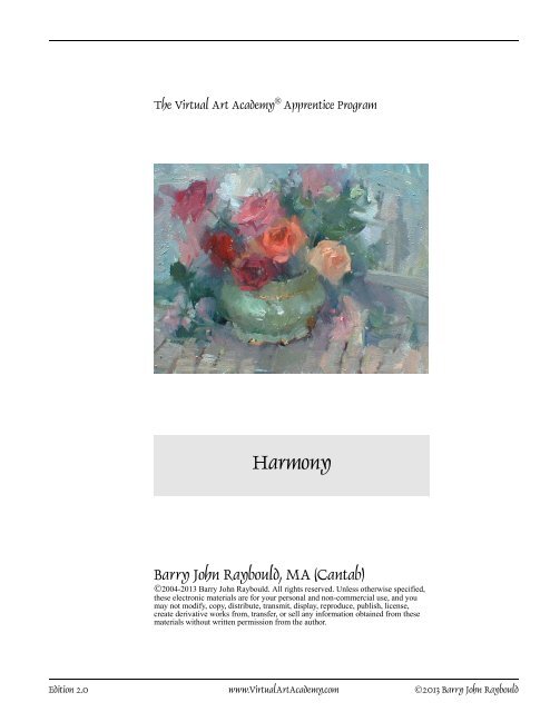
The Virtual Art Academy ® Apprentice Program<br />
Harmony<br />
Barry John Raybould, MA (Cantab)<br />
©2004-2013 Barry John Raybould. All rights reserved. Unless otherwise specified,<br />
these electronic materials are for your personal and non-commercial use, and you<br />
may not modify, copy, distribute, transmit, display, reproduce, publish, license,<br />
create derivative works from, transfer, or sell any information obtained from these<br />
materials without written permission from the author.<br />
Edition 2.0 www.VirtualArtAcademy.com ©2013 Barry John Raybould
Composition Unit Eight 8<br />
PRINCIPLE:<br />
HARMONY<br />
The overall principle of composition is<br />
unity and variety. One way of giving a<br />
painting unity is to create <strong>harmony</strong><br />
within the painting. You create <strong>harmony</strong><br />
in a painting by using various elements<br />
or components in your painting that are<br />
similar in one or more respects, even<br />
though they may differ in another<br />
respect. The opposite of <strong>harmony</strong> is<br />
discord.<br />
Repetition, <strong>harmony</strong> and discord<br />
Attributes<br />
in common<br />
Example<br />
COMPLETE REPETITION<br />
Do this: <strong>harmony</strong><br />
In this example there is a <strong>harmony</strong><br />
in:<br />
♦ shape<br />
♦ size<br />
♦ hue (both hues are next to<br />
each other on the color<br />
wheel), and<br />
♦ saturation<br />
Avoid this: discord<br />
In the above example, there is<br />
a discord created by the great<br />
differences between the two<br />
shapes in:<br />
♦ shape (curved versus<br />
angular)<br />
♦ size (large versus small)<br />
♦ hue (both hues are far<br />
apart on the color wheel)<br />
all<br />
two<br />
one<br />
none<br />
color<br />
size<br />
shape<br />
texture<br />
MORE HARMONY<br />
color<br />
size<br />
size<br />
shape<br />
LESS HARMONY<br />
color<br />
shape<br />
COMPLETE DISCORD<br />
Caution<br />
Harmony on its own is insufficient to make a painting<br />
interesting. If everything were harmonious then the painting<br />
would be boring. You must also have contrast to provide the<br />
variety. The balancing trick is that you have to have enough<br />
<strong>harmony</strong> to balance the contrast. If you don’t have enough<br />
<strong>harmony</strong>, and have too much contrast, then you will lose unity<br />
in the painting. The viewer will feel as if the painting is<br />
confused and that there is nothing holding it together.<br />
Color <strong>harmony</strong><br />
Colors are harmonious when they are next to each other on the<br />
color wheel. Within color harmonies you have three sub-types:<br />
♦ value <strong>harmony</strong><br />
♦ hue <strong>harmony</strong><br />
♦ saturation <strong>harmony</strong><br />
For example, in the following color wheels the colors have<br />
harmonious hues.<br />
Edition 2.0 www.VirtualArtAcademy.com ©2013 Barry John Raybould
Composition Unit Eight 9<br />
PRINCIPLE:<br />
HARMONY (CONTINUED)<br />
Types of <strong>harmony</strong><br />
There are many different ways to create<br />
<strong>harmony</strong> in a painting:<br />
♦ color <strong>harmony</strong><br />
♦ function <strong>harmony</strong><br />
♦ symbolic <strong>harmony</strong><br />
♦ shape <strong>harmony</strong><br />
♦ size <strong>harmony</strong><br />
♦ texture <strong>harmony</strong><br />
Source<br />
The Art of Color and Design, Second<br />
Edition, Maitland Graves, 1951<br />
Example: color <strong>harmony</strong><br />
Here there is a <strong>harmony</strong> in color<br />
between the different sized rose<br />
blossoms. All the colors are in the red<br />
and orange families.<br />
Color <strong>harmony</strong> (continued)<br />
In the painting below by Paul Klee, the round shape A, the two<br />
rectangles B, and the angular shape C, all have very different<br />
shapes (angular versus curved), which tends to make them<br />
discordant. However they all have the same red hue and<br />
approximately the same level of saturation, and so are<br />
harmonized by color. In addition, the woman's head D and the<br />
triangular shapes E on the left of the painting are different in<br />
both size, and shape which tends to make them discordant.<br />
However they are harmonized by being painted the same<br />
yellow color.<br />
E<br />
D<br />
A<br />
B<br />
C<br />
Klee Cat. 9777.<br />
In this painting, the red circle A, triangle B and rectangle C are<br />
all very different in both size and shape, tending to make them<br />
discordant, but they are also harmonized by color (red).<br />
Raybould Cat. 768.<br />
A<br />
Counterpoint<br />
If the concept of your painting is a<br />
message concept or narrative concept<br />
about something that involves discord<br />
such as stress, unease, violence, and so<br />
on, then you might deliberately want to<br />
create discord in the design of your<br />
painting.<br />
B<br />
C<br />
Klee Cat. 9778.<br />
Edition 2.0 www.VirtualArtAcademy.com ©2013 Barry John Raybould
Composition Unit Eight 10<br />
PRINCIPLE:<br />
HARMONY (CONTINUED)<br />
In this painting I harmonized the red<br />
shapes of the buildings, the umbrella<br />
and even the signature by using the<br />
same red hue.<br />
Color <strong>harmony</strong> (continued)<br />
In the following painting by Joan Miró, the red elements are<br />
all very different. They have different shapes, some are<br />
rectangular in shape, such as A and B, and some are circular in<br />
shape, such as C. They also have different sizes: some shapes<br />
are large, such as D, and some shapes are small, such as E.<br />
However Miró has brought all of these elements into <strong>harmony</strong><br />
by painting them with hues that are harmonious (red and red<br />
orange). There are also two shapes that stand out in the<br />
painting: the thin yellow shape F at the bottom and the orange<br />
shape G at the top. These shapes are different in both size and<br />
shape, but are harmonized by color since their hues (yellow,<br />
and yellow orange) are adjacent to each other on the color<br />
wheel.<br />
C<br />
E<br />
D<br />
Raybould Cat. 894.<br />
A<br />
G<br />
In this painting there is a <strong>harmony</strong> of<br />
function in that the objects are all used<br />
for cooking.<br />
B<br />
F<br />
Miró Cat. 9779.<br />
Function <strong>harmony</strong><br />
Stupica Cat. 9514.<br />
There is a <strong>harmony</strong> between different objects that are<br />
commonly associated by their use. For example:<br />
♦ a plate and a knife and fork<br />
♦ a bottle and a cork<br />
♦ an ear of wheat and some fruit<br />
Paintings that contain these objects will have a form of<br />
<strong>harmony</strong>.<br />
Zakharov Cat. 8326.<br />
Edition 2.0 www.VirtualArtAcademy.com ©2013 Barry John Raybould
Composition Unit Eight 11<br />
PRINCIPLE:<br />
HARMONY (CONTINUED)<br />
In this painting I harmonized the rocks<br />
and the trees by using similar vertical<br />
lines in both (the trunks of the trees, and<br />
the cracks in the foreground rocks).<br />
Symbolic <strong>harmony</strong><br />
There is a <strong>harmony</strong> between objects<br />
that are connected through some form<br />
of literary association such as a dove<br />
and an olive branch, both of which are<br />
symbols that represent the literary<br />
concept of peace.<br />
In this religious painting you can see<br />
the lamb and lion at the bottom of the<br />
painting. These are symbolic of Jesus<br />
who first came as the lamb of God and<br />
promises to come again as the Lion of<br />
Judah.<br />
El Greco Cat. 8945.<br />
Line <strong>harmony</strong><br />
Raybould Cat. 796.<br />
In this painting, the three elements A, B and C are very<br />
different in shape. A is oval, B is triangular, and C is<br />
rectangular. However Miró has brought all three elements into<br />
<strong>harmony</strong> by adding a series of curved lines to them. The green<br />
oval shape A has these lines attached all around its<br />
circumference. The green triangular shape B has these curved<br />
lines built into the contour of one of the sides of the triangle.<br />
And the rectangular shape C is divided into strips that consist<br />
of curved wavy lines.<br />
A<br />
A<br />
B<br />
C<br />
Miró Cat. 9780.<br />
Edition 2.0 www.VirtualArtAcademy.com ©2013 Barry John Raybould
Composition Unit Eight 12<br />
PRINCIPLE:<br />
HARMONY (CONTINUED)<br />
I harmonized this painting by repeating<br />
curved shapes in the domes of the<br />
church, and also by repeating dark<br />
rectangular shapes in the silhouettes of<br />
the gondolas. All with a variety of sizes.<br />
Shape <strong>harmony</strong><br />
This graph shows various shapes grouped by similarity.<br />
Adjacent shapes, such as 1 and 2, are similar (harmonious).<br />
Shapes opposite one another, such as 1 and 6, are contrasting<br />
or discordant.<br />
2A<br />
1<br />
2<br />
3A<br />
3<br />
4<br />
4A<br />
5A<br />
5<br />
Raybould Cat. 569.<br />
Example: shape and line <strong>harmony</strong><br />
In Klee's painting, below, the yellow skull shape A is much<br />
larger than the crescent moon shape B and so they have very<br />
different sizes, tending to make them discordant. However<br />
both of these shapes have curved boundaries. The yellow skull<br />
shape A of the woman is made up of two curved lines and the<br />
crescent moon shape B is also made up of two lines. Therefore<br />
these two elements in the painting are harmonized by shape.<br />
6<br />
Here is a fascinating 1000 year old<br />
ceramics design by the indigenous<br />
people of the Nicoya region in Costa<br />
Rica (who said 20th century modern art<br />
was new?). Note the repeated patterns<br />
of dots, circles, segments of straight and<br />
curved lines, and solid shapes. Each<br />
element is repeated, but always with<br />
variety. The artist changed the sizes,<br />
rotations, and quantities of each<br />
element. Also note the big central white<br />
curved shape that snakes from bottom<br />
left to top right. It is dominant in the<br />
design and holds the whole design<br />
together, giving it unity. (It actually<br />
cleverly captures the itness of a jaguar).<br />
Also note the application of the point,<br />
line, mass principle. The design looks<br />
deceptively simple, yet it shows true<br />
mastery of design when studied<br />
carefully and contains a lot of lessons.<br />
Klee Cat. 9777.<br />
A<br />
B<br />
Edition 2.0 www.VirtualArtAcademy.com ©2013 Barry John Raybould
Composition Unit Eight 13<br />
PRINCIPLE:<br />
HARMONY (CONTINUED)<br />
In this painting I harmonized the shapes<br />
of the clothes on the washing line and<br />
the shapes of the wooden fence posts on<br />
the bottom of the painting (I changed<br />
these shapes a little from what they<br />
actually were to help harmonize them).<br />
All these shapes are long rectangles.<br />
The chimney also repeats the long<br />
rectangle shape.<br />
Shape <strong>harmony</strong> (continued)<br />
Here the largest shape (the large circular shape of the head A),<br />
and the smallest shapes (the two small circular eye shapes B &<br />
C) are very different in size and therefore discordant. However<br />
they both have the same shape (a circle) and are therefore<br />
harmonized.<br />
C<br />
A<br />
B<br />
Klee Cat. 9781.<br />
Size <strong>harmony</strong><br />
Raybould Cat. 843<br />
The center of interest in this painting is probably the element A<br />
that consists of a red shape with the embedded purple eye. This<br />
is the center of interest because the eye shape attracts attention<br />
and also because there is an adjacent complementary green<br />
shape next to the red shape. The largest part of this shape is the<br />
red shape. Although this red shape is different in color from all<br />
the other larger shapes in the painting (such as B, C, D and E),<br />
it is brought into <strong>harmony</strong> by being approximately the same<br />
size.<br />
A<br />
C<br />
B<br />
D<br />
E<br />
Miró Cat. 9779.<br />
Edition 2.0 www.VirtualArtAcademy.com ©2013 Barry John Raybould
Composition Unit Eight 14<br />
PRINCIPLE:<br />
HARMONY (CONTINUED)<br />
In this painting the smooth textures of<br />
the dress, the blanket, and the water all<br />
harmonize to give a very serene<br />
atmosphere.<br />
Texture <strong>harmony</strong><br />
In this painting, the rough texture of the crusty bread<br />
harmonizes with the rough texture of the basket. The shiny<br />
green texture of the green objects on the plate harmonize with<br />
the shiny brass texture of the object in the basket.<br />
Waterhouse Cat. 9668.<br />
Melendez Cat. 8072.<br />
In Vermeer’s painting below the yellow shapes all have the<br />
same silky texture and therefore harmonize, and the white<br />
shapes with spots on them all have the same soft fur texture<br />
and so also harmonize.<br />
Vermeer Cat. 8119.<br />
Edition 2.0 www.VirtualArtAcademy.com ©2013 Barry John Raybould
Composition Unit Eight 15<br />
GALLERY: HARMONY<br />
A<br />
D<br />
G<br />
B<br />
F<br />
C<br />
E<br />
Miro Cat. 9780.<br />
Miró harmonizes several elements of the painting (A, B, and C) by line (all have<br />
curved wavy lines built into them). Miró also harmonizes the many very different<br />
elements in this painting by using color. He only uses three groups of colors. The<br />
majority of the painting uses two colors that are adjacent to each other on the color<br />
wheel, yellow and orange. The orange in this painting is generally a low saturation<br />
orange, or brown. The remaining elements in the painting are either green or gray. The<br />
elements D, E, F, and G again are completely different shapes, but Miró harmonizes<br />
them by painting them in the same gray color.<br />
Edition 2.0 www.VirtualArtAcademy.com ©2013 Barry John Raybould