Deidre Schuetz Collect and Analyze Newsprint and Magazine Ads ...
Deidre Schuetz Collect and Analyze Newsprint and Magazine Ads ...
Deidre Schuetz Collect and Analyze Newsprint and Magazine Ads ...

Create successful ePaper yourself
Turn your PDF publications into a flip-book with our unique Google optimized e-Paper software.
<strong>Deidre</strong> <strong>Schuetz</strong><br />
<strong>Collect</strong> <strong>and</strong> <strong>Analyze</strong><br />
<strong>Newsprint</strong> <strong>and</strong> <strong>Magazine</strong> <strong>Ads</strong><br />
Submitted to: Kau<br />
February 4, 2010<br />
(March 11, 2010 submission attached below)<br />
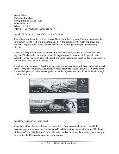
Sample #1: Aboriginal People’s Television Network<br />
I like this newsprint ad for various reasons. The mellow, but partitioned background makes the<br />
information easy to read, while maintaining a flow <strong>and</strong> consistency between one image <strong>and</strong><br />
another. The great use of black <strong>and</strong> white contrast of the images <strong>and</strong> layout are extremely<br />
effective<br />
The logo is very effective, because is st<strong>and</strong>s out from the page, even in black <strong>and</strong> white. The<br />
logo itself is also makes me curious about the organization. It looks hopeful, dynamic, <strong>and</strong><br />
symbolic. When marketers use symbolism I find myself getting curious about the organization in<br />
general: their goals, mission, projects, etc.<br />
The photos <strong>and</strong> the words reflect the serious tone of what is an issue with deep, emotional impact<br />
in the Aboriginal community. I do not know much about this organization, but if I were to come<br />
across this logo on an informational packet about the organization, I would likely thumb through<br />
it to find out more.<br />
Sample#2: Muslim Girl (front page)<br />
I like the contrast of color in this cover page: silver, black, green, <strong>and</strong> purple. I thought the<br />
headline content was surprising “Aikido Angel” <strong>and</strong> the contrast between the words “The Spirit<br />
of Ramadan” <strong>and</strong> “Fall Fashion”—since Ramadan tends to traditionally be an internal, cleansing<br />
time, while “Fall Fashion is more externally motivated.<br />
p. 1 – <strong>Collect</strong>ed Materials, <strong>Deidre</strong> <strong>Schuetz</strong>
The picture on the front is far from provocative to me, although inviting. While in a traditional<br />
Muslim society, this could be very provocative. seems the designer was aiming to attract both<br />
traditional <strong>and</strong> modern, young adult women to read this magazine.<br />
I like good logos, however I don’t see one. This is a disadvantage in br<strong>and</strong>ing this organization.<br />
Granted, the font of the headings <strong>and</strong> subheadings <strong>and</strong> the layout could also help with br<strong>and</strong>ing,<br />
in general, I think they are missing an even more extensive audience without a logo.<br />
This is a magazine cover, not particularly a formal advertisement, but I would argue that the<br />
front page of any print media is important advertising—which is the main reason why I picked<br />
this one to analyze. Overall, this magazine has an amateur feeling to it. For me, it is because of<br />
the rectangular green boxes around the title “Muslim Girl” <strong>and</strong> subheading “Resolutions,<br />
Recipes, Relationships & More.”<br />
<strong>Collect</strong> <strong>and</strong> <strong>Analyze</strong><br />
Mailers <strong>and</strong> H<strong>and</strong>bills<br />
Sample #1: Comcast<br />
Comcast’s mailers are some of the cheesiest I’ve seen. In this particular mailer, on the positive side, the<br />
return address is easy to find, the logo is apparent, there is prepaid postage as well. Key colors (red <strong>and</strong><br />
black) are professional-looking. I also underst<strong>and</strong> that they are trying to grab customer attention by<br />
choosing both an athletic <strong>and</strong> intellectual on the front. However, neither figure encourages me to read<br />
more. I think it would be more effective to state more clearly: what the product they are selling.<br />
p. 2 – <strong>Collect</strong>ed Materials, <strong>Deidre</strong> <strong>Schuetz</strong>
On the backside of the mailer (the image of both O’Neal <strong>and</strong> Stein) hanging out on the couch, it seems<br />
like a complete waste of space. Unless the audience liked one of these celebrities, (I do not, <strong>and</strong> they<br />
mailed it to me) this piece will not likely be looked at beyond the front <strong>and</strong> the back in the folded<br />
position.<br />
The one-fold design is good, but again, I am not enticed to open it up. I would already be in the recycling<br />
bin. However, this aside, the inside is clean <strong>and</strong> crisp with a mirror image reflecting at the bottom of each<br />
red box. I like the layout, information is easy to find in palatable chunks. I do not like small print.<br />
However, if small print is necessary, I liked where the designer put it: at the bottom.<br />
(Front) (Inside) (Back)<br />
Sample #2: Dominos Pizza<br />
This mailer for me is more effective. I know what they are selling from the very beginning because there<br />
is a big picture of a pepperoni <strong>and</strong> mushroom pizza on the front. It also makes me hungry for pizza<br />
looking at the picture. The great price in the upper right-h<strong>and</strong> corner, especially as a student, is enticing.<br />
The logo is in clear view in the middle upper part of this mailer.<br />
On the backside of this mailer, again there is picture (although smaller) of pepperoni pizza with plenty of<br />
cheese. There are clearly coupon deals with a rounded-edge, boxy border. Again the prices are effective. I<br />
also appreciate that their contact information is easily readable in the bottom left-h<strong>and</strong> box<br />
Artistically, I am not impressed with this advertisement. Although there are some professional-looking<br />
gradients <strong>and</strong> I like the unique size of this mailer, the design is, by no means, stunning or impressive; it is<br />
practical <strong>and</strong> clear.<br />
p. 3 – <strong>Collect</strong>ed Materials, <strong>Deidre</strong> <strong>Schuetz</strong>
(Front) (Back)<br />
p. 4 – <strong>Collect</strong>ed Materials, <strong>Deidre</strong> <strong>Schuetz</strong>
<strong>Collect</strong> <strong>and</strong> <strong>Analyze</strong><br />
Brochures <strong>and</strong> Newsletters<br />
Brochure #1: UO Historic Preservation (AAA)<br />
It seems that this brochure is to attract more women into this UO program. The front of the<br />
brochure does a great job of capturing an antique-like appearance (especially how it is framed),<br />
but in the modern world (since the woman hammering is wearing a sweat shirt, with a modern<br />
watch <strong>and</strong> earrings. It is clearly a professional photograph—with crisp contrasts.<br />
After opening the front cover, a beautiful blue back drop of color shines through amazing<br />
architectural artistry, but gets cut off—which draws me to open the final flap. However, first<br />
leads me to a blurb about the current practical projects that students undertake in the program.<br />
The final layout (after opening the last flap) combines colors that I never would, but they<br />
somehow work to again, capture a historic, yet modern vibe. I like the layout with the middle<br />
picture overlapping the clearly defined two halves of the inner spread.<br />
Overall finding contact information is easy. I found it on the back page <strong>and</strong> at the end of the<br />
inner spread. Overall the font is easy to read <strong>and</strong> the presentation of the material is easy to<br />
underst<strong>and</strong>.<br />
(Front) (First unfold)<br />
p. 5 – <strong>Collect</strong>ed Materials, <strong>Deidre</strong> <strong>Schuetz</strong>
(Most of the inside) (Back)<br />
Brochure #2: UO John Yeon Center for Architectural Studies (AAA)<br />
I like this four panel brochure even more than the first one. I love the greens of Oregon as well<br />
illustrated in the picture on the front cover. I would imagine this would be attractive to the<br />
majority of the people who look at this advertising. The logo pops out clearly against the dark<br />
green grass. The font on the front is pretty conservative. I probably would have taken a risk with<br />
something a little more wild—but perhaps this is UO’s way of not looking too liberal?<br />
The brochure opens (still folded at in the middle). The pictures just get better: rich, natural tones<br />
that contrast leaves <strong>and</strong> modern industrial design. I like the white font with the leaves in the<br />
background more than the front pages font options. There is also a small window to the past on<br />
the panel with the leaves. It seems r<strong>and</strong>om—I thought that the text would clarify it, but in<br />
actuality, not very clearly.<br />
The innermost spread is a classic. Each of the four text-filled panels I would never read<br />
completely. However my eyes grab more beautify pictures across the top with similarly natural,<br />
rich tones—like the other spreads. I like the font for the text, but not the font for the headings—it<br />
feels too ridged.<br />
p. 6 – <strong>Collect</strong>ed Materials, <strong>Deidre</strong> <strong>Schuetz</strong>
Logically, <strong>and</strong> neutrally contact information is on the backside panel in simple, nice font. This<br />
information is easily found. I like the overall natural theme interwoven throughout this brochure<br />
by professional, rich photos.<br />
(Front) (First unfold) (Back)<br />
p. 7 – <strong>Collect</strong>ed Materials, <strong>Deidre</strong> <strong>Schuetz</strong>
(Most of the inside)<br />
<strong>Collect</strong> <strong>and</strong> <strong>Analyze</strong><br />
Radio Commercial <strong>and</strong> Public Service Announcements<br />
Sample #1: Burger King<br />
Burger King advertised a $1 burger that outweighed the competition; in this case, Wendy’s<br />
double cheese burger. I don’t like this type of negative advertising. However I can see how it is<br />
tempting.<br />
The overall tone of the advertisement was tied to a wrestling theme probably aimed at young<br />
men. There were a lot of testosterone-type noises in the back ground: grunting <strong>and</strong> start bell as if<br />
there was a wrestling match going on in the background. This was not an appealing<br />
advertisement for me, but I could see how it would be for the right population. They are probably<br />
targeting the right crowd, since just Burger King’s name is enough for me to not want to eat<br />
there.<br />
Overall I thought it was smart to advertise cheap food in our current recession climate.<br />
Sample #2: Kia, Eugene<br />
p. 8 – <strong>Collect</strong>ed Materials, <strong>Deidre</strong> <strong>Schuetz</strong>
Kia in Eugene advertised their “Rio” for $8,999 (approximately) for “this weekend only.” They<br />
were also advertising it with a 10 year (or 100,000 mile) warranty. They also offered to assist<br />
people with bad credit be able to afford one. This great deal is effective anytime, but again,<br />
during the current recession even more so.<br />
Their technique was particularly because of the excited tone in the advertiser’s voice<br />
accompanied by similarly exciting music like you would hear during the climax of an action<br />
film. The initial key was to catch my attention, <strong>and</strong> it definitely did. In fact, it startled me. The<br />
announcer also repeated over <strong>and</strong> over again the location, br<strong>and</strong>, model, <strong>and</strong> price of this great<br />
price. It was very effective in getting the message across.<br />
p. 9 – <strong>Collect</strong>ed Materials, <strong>Deidre</strong> <strong>Schuetz</strong>
<strong>Deidre</strong> <strong>Schuetz</strong><br />
<strong>Collect</strong> <strong>and</strong> <strong>Analyze</strong><br />
<strong>Newsprint</strong> <strong>and</strong> <strong>Magazine</strong> <strong>Ads</strong><br />
Submitted to: Kau<br />
March 11, 2010<br />
<strong>Collect</strong> <strong>and</strong> <strong>Analyze</strong><br />
TV Commercials<br />
Sample #1: Pepsi<br />
link: http://www.youtube.com/watch?v=40DykbPa4Lc<br />
This commercial by Pepsi is effective because it not only promotes Pepsi’s logo, but also is<br />
concise, exciting, <strong>and</strong> humorous. This commercial is one minute long. Imagery with the<br />
exception of only a couple, are two seconds or less. This helps to entice <strong>and</strong> maintain the<br />
attention <strong>and</strong> of the viewer. It is exciting because there are some hot martial arts clips: acrobatics,<br />
punching <strong>and</strong> kicking through difficult-to-break blocks.<br />
It is humorous as well. A couple of different points stood out: 1) initially, when the young boy<br />
was trying to break through a block, he tried punching through it, but instead since he had not yet<br />
received proper training, after making contact with the block he pulled his fist back in pain. 2) At<br />
the end, the same young boy has grown up <strong>and</strong> now proved his block-breaking skills <strong>and</strong> is at<br />
ceremony honoring his accomplishment <strong>and</strong> the closing ritual to the ceremony, he bashes his<br />
head on the top of a Pepsi can imprinting the same symbol that the other individuals who had<br />
mastered these skill had imprinted on their forehead: the outline of top of a opened Pepsi can.<br />
This commercial also attracts attention because the opening scene features beautiful scenery with<br />
a little U.S.-American-looking boy knocking on a large, mysterious, exotic gate. As the viewer it<br />
intrigued me to wonder <strong>and</strong> stay tuned to find out what was behind the big door.<br />
It is aimed at an athletic, internationally minded audience.<br />
Sample #2: Zazoo: One for Two (condom commercial)<br />
Link: http://www.youtube.com/watch?v=PDnUmE3oucg&NR=1<br />
This hilarious condom commercial pulls in the audience from the very beginning. The initial<br />
scene is of a child trying to include “sweeties,” a favorite grocery item into his father’s grocery<br />
cart. His dad removes the sweeties <strong>and</strong> puts them back on the shelf. The child tries to put it in the<br />
cart again, this time folding his arms in front of him with contempt. The father puts them back<br />
again <strong>and</strong> the child throws an uncontrollable fit: shaking the cart, throwing sale items to the<br />
ground, kicking <strong>and</strong> screaming on the floor, etc.<br />
This is funny to me because whether or not a person has kids, they can probably remember<br />
having a tantrum as a youngster. They are completely irrational <strong>and</strong> socially inappropriate <strong>and</strong><br />
embarrassing for everyone involved, but most anyone can relate. Parents, teens, <strong>and</strong> other<br />
grownups can also relate after having witnessed them tantrums that tantrums are frustrating <strong>and</strong><br />
crazy to witness. Most people would agree that tantrums are the downside of having children.<br />
p. 10 – <strong>Collect</strong>ed Materials, <strong>Deidre</strong> <strong>Schuetz</strong>
The tantrum grows in intensity. Towards the end the father with a helpless, uncomfortable look<br />
on his face <strong>and</strong> a large subtitle reads is superimposed: “use condoms.” Then the<br />
organization/company’s name <strong>and</strong> promotion is flashed at the end: “Zazoo: One for Two.”<br />
p. 11 – <strong>Collect</strong>ed Materials, <strong>Deidre</strong> <strong>Schuetz</strong>
<strong>Collect</strong> <strong>and</strong> <strong>Analyze</strong><br />
Posters<br />
Sample #1: Take the Stairs (motivational)<br />
Link: http://www.phac-aspc.gc.ca/sth-evs/images_e/posters/poster_3_big.gif<br />
I shrunk this poster down to better fit on the page. I was first drawn to the poster below because<br />
of the simple design <strong>and</strong> the font. It is simple as if a child had sketched it on a st<strong>and</strong>ard 8.5-in. x<br />
11-in. piece of paper. The white background <strong>and</strong> black writing is effective contrast. On the other<br />
h<strong>and</strong>, I do not like the ending contrast: white letters on light turquoise stairs. I had to look closely<br />
be able to read this part.<br />
The childlike font is cute. It makes me want to read the simple, inspirational quote. The quote<br />
can relate to more than what the poster is promoting (talking the stairs instead of the elevator). It<br />
also applies to other life situations. It is effective to have profound wisdom demonstrated by a<br />
child…similar to this instance.<br />
The weakness of this poster is that it is not clear who sponsoring the message. It is a healthy<br />
message, but may be more successful if, for example the American Heart Association had<br />
sponsored <strong>and</strong> signed it.<br />
Sample #2: Golden Globe Awards<br />
Link: http://blogs.suntimes.com/awards/US-GOLDEN%20GLOBES-POSTER.jpg<br />
This poster is catchy because of its warm, dramatic colors. The globe its pedestal are glowing<br />
with elegance. In the background the rich red <strong>and</strong> orange sky with palm trees bordering the sides<br />
are passionate. The gold writing explaining subject (the Golden Globe Awards, 2009) pops out<br />
well from the design.<br />
The vertical <strong>and</strong> diagonal repetitive lines draw my eye toward the center of the poster 2/3 of the<br />
way down. The poster could almost be split in upper <strong>and</strong> lower segments with the globe being<br />
the focal point for the upper <strong>and</strong> the text for the bottom. However the thin, barely noticeable<br />
border brings it all together.<br />
p. 12 – <strong>Collect</strong>ed Materials, <strong>Deidre</strong> <strong>Schuetz</strong>
The text is easy to read (especially if I had not shrunk it down). However I do not like the<br />
“Golden Globe Awards” font. It looks familiar as if they have been using it for years, but it has<br />
no personality. Since this is a major arts association, (the Hollywood Foreign Press Association)<br />
I would think they could come up with something more remarkable.<br />
p. 13 – <strong>Collect</strong>ed Materials, <strong>Deidre</strong> <strong>Schuetz</strong>
<strong>Collect</strong> <strong>and</strong> <strong>Analyze</strong><br />
Web <strong>and</strong> Electronic Mediums<br />
Sample #1: WordPress<br />
WordPress is a content management blogging system <strong>and</strong> is currently the most popular. From<br />
my experience with it, the content can be organized as a blog or like a mini website. It is easy to<br />
navigate, create an identity, <strong>and</strong> if not, there is 24/7 support to help.<br />
I like that there are 75 free different blog styles to choose from. This allows the account owner to<br />
customize <strong>and</strong> add their personality to the site. The basic amount of storage space is also free.<br />
However, unless the content was heavy with videos <strong>and</strong> pictures, the space would not likely fill<br />
up fast.<br />
Without having used WordPress much myself, it seems that simple designs are possible, but<br />
adding effects <strong>and</strong> sites with many widgets are not possible with the basic, free WordPress<br />
version. However, an additional, free online presence for an organization or individual is an<br />
excellent way to refer more people to one’s more complex website for more information,<br />
donations, etc.<br />
Sample #2: Diigo<br />
Another free content management system is Diigo. After using it in a couple of classes, I notice<br />
it is good for bookmarking information <strong>and</strong> collaborating on written compositions.<br />
There is also a place to blog. However unlike WordPress I was not able to customize my page. It<br />
does not mean that there is not a way to do this, rather if I am able to, it is harder to figure out<br />
how.<br />
Diigo seems to function similar to FaceBook in that I can set up a personal profile <strong>and</strong> network<br />
with friends. I like the reader-friendly layout—it is much better than PBworks. However, this<br />
system is not as popular as FaceBook so it is difficult to know if the time invested is worth it. As<br />
long as there is the time <strong>and</strong> personnel to manage the content <strong>and</strong> responses generated by the site,<br />
more free online presence is favorable. However for people with limited human resources, it<br />
would be better to aim for the free, more popular options like FaceBook <strong>and</strong> WordPress.<br />
p. 14 – <strong>Collect</strong>ed Materials, <strong>Deidre</strong> <strong>Schuetz</strong>
<strong>Collect</strong> <strong>and</strong> <strong>Analyze</strong><br />
Signs, Billboards, <strong>and</strong> Banners<br />
Overall I noticed that the bigger the banner, the more simple messages seem to be most effective.<br />
Smaller banners tend to be better if the marketer wants to provide more in-depth information<br />
about the product/organization, for example if the goal is to promote a more complex mission.<br />
Samples #1: unknown<br />
Link: http://www.integratesolu.com/images/image_graphics1.gif<br />
This banner caught my attention because of the dramatic image. This face with some computerlike<br />
markings around the eye, nose <strong>and</strong> cheek makes me associate it with cutting edge<br />
technology. The face is also attractive <strong>and</strong> mysterious. The glowing green eye stares right at me.<br />
It is intriguing <strong>and</strong> frightening. It is hard to tell if the face is human or alien especially including<br />
the ear profile.<br />
The colors do not contrast on this banner, but light-dark contrast is excellent. For example the<br />
glowing eye with the shadowed eye socket <strong>and</strong> ear.<br />
The main element lacking is a simple message <strong>and</strong> logo. More than that, it would overcrowd <strong>and</strong><br />
take away from the great graphic. A message may not be necessary if it were simply advertising<br />
an organization/business. A logo or a simple message would be effectual if inserted in the space<br />
in the lower, right-h<strong>and</strong> quadrant of this image.<br />
Sample #2: Sea Grant<br />
Link: http://www.seagrant.noaa.gov/other/images/final_pdf_banners.png<br />
p. 15 – <strong>Collect</strong>ed Materials, <strong>Deidre</strong> <strong>Schuetz</strong>
These banners are particularly powerful as a group. Each one would be successful individually,<br />
but they look very professional together. This is a good example of smaller banners portraying a<br />
more complex message.<br />
Repetition consistently pulls together all banners are beautifully distinguished by color, picture,<br />
<strong>and</strong> text content differences. However it is clear that they come from the same organization (for<br />
example, the squiggly line running horizontally across all banners 1/3 of the way from the top).<br />
This same squiggly line <strong>and</strong> the photos indicate that the organization works with water. The logo<br />
with the name of the organization next assures the water theme to be specifically with the sea.<br />
There is also a less-obvious watermark approximately 2/3 down from the top of each banner that<br />
also creates a water-related imagery (turtle, water currents).<br />
On each banner the quotes are uplifting <strong>and</strong> optimistic which makes me feel like this is a<br />
motivated, organization that wants to great positive change in the world. The banners together<br />
the quotes from the banners reinforce Sea Grant’s drive <strong>and</strong> inspiration.<br />
p. 16 – <strong>Collect</strong>ed Materials, <strong>Deidre</strong> <strong>Schuetz</strong>