

Download/view brochure - Monotype Imaging
Download/view brochure - Monotype Imaging
Download/view brochure - Monotype Imaging

You also want an ePaper? Increase the reach of your titles
YUMPU automatically turns print PDFs into web optimized ePapers that Google loves.
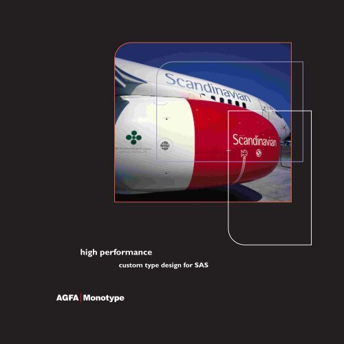
high performance<br />
custom type design for SAS
ead more about us at www.agfamonotype.co.uk
[ a productive<br />
partnership<br />
We were delighted when SAS approached us to discuss their typography<br />
requirements during their corporate identity redesign. And our initial discussions<br />
signalled the start of a very productive and enjoyable working relationship.<br />
SAS told us they needed a new sans serif corporate typeface, with a distinctive<br />
character to complement the simplicity and elegance of the new identity. The<br />
typeface was to be user-friendly, its long-term use was to be ensured, and it<br />
was to be adjusted for the Scandinavian languages.<br />
The eventual outcome of our partnership with SAS was a custom designed<br />
typeface, SAS Scandinavian, at the heart of a very successful typographic strategy.<br />
Who better to tell the story than Linda Fredheim-Björk, Director of Branding &<br />
Marketing Communication for Scandinavian Airlines?<br />
[<br />
The typeface lived up to the hopes<br />
we had for it, without sacrificing our<br />
high ambitions. <strong>Monotype</strong> showed<br />
a keen insight and understanding of<br />
our requirements, as set out in the<br />
brief, and we achieved a successful<br />
result without having to compromise.<br />
Björn Kusoffsky, Creative Director,<br />
Stockholm Design Lab<br />
a productive partnership
The SAS masterbrand consists of the SAS logo<br />
and the wordmark ‘Scandinavian Airlines’ in Rotis.<br />
Sub-brands and business areas are distinguished<br />
through various combinations of the SAS logo and<br />
the Scandinavian typeface or Rotis.
[ by<br />
conception<br />
of a typeface<br />
When SAS carried out a major overhaul of its corporate identity, typography was<br />
seen to be an important strategic element in the new design.<br />
Diefenbach Elkins Davis Baron of London had created the foundation for the<br />
design. Stockholm Design Lab went on to develop the design further, and apply a<br />
Scandinavian touch. <strong>Monotype</strong> was then selected to provide the necessary<br />
typographic expertise.<br />
<strong>Monotype</strong> helped us identify four alternatives for typography. Three of these<br />
started with a selected standard typeface, and involved different licensing options.<br />
The fourth alternative, designing a completely new typeface exclusive to SAS, soon<br />
emerged as the most advantageous.<br />
Since the typeface would be exclusive to SAS, we would own it outright. There<br />
would be no need for licence discussions when distributing information on<br />
CD-Rom, Internet or intranet. We could also add the prefix SAS to the typeface<br />
name, removing any doubt as to which typeface should be used internally and<br />
by suppliers around the world.<br />
Linda Fredheim-Björk, Director of Branding &<br />
Marketing Communication, Scandinavian Airlines<br />
The decision to design our own typeface was presented to the Board and approved.<br />
[<br />
The challenge was to design a<br />
typeface that embodies classical<br />
sans serif characteristics but has<br />
its own unique personality. The<br />
design process was made easier and<br />
more enjoyable by working with<br />
people who had such a clear vision<br />
of the objectives, a keen eye and<br />
appreciation of good type.<br />
Robin Nicholas,<br />
<strong>Monotype</strong>’s Head of Typography<br />
conception of a typeface
Clarity, legibility and functionality.<br />
The simplicity and open nature of<br />
the Scandinavian letterforms ensure<br />
elegance and excellent readability.
A modernised logo, colours, pictures, poems and<br />
the newly designed typography. These elements were<br />
to convey the basics of Scandinavian design: simplicity,<br />
functionality, informal elegance and a respect for<br />
materials and resources.
[<br />
[ birth<br />
of SAS Scandinavian<br />
We gave <strong>Monotype</strong> the go-ahead to design a new typeface called Scandinavian, a<br />
classic sans serif face embodying a high level of typographic quality.<br />
Two secondary typefaces were selected. Rotis, for selective application in poems,<br />
inflight products and wordmarks. And a modified version of Sabon, to use when<br />
very high readability was required.<br />
<strong>Monotype</strong> produced the Scandinavian and Sabon SAS typefaces in versions for Mac<br />
(Postscript) and PC (TrueType). Enhanced Screen Quality (ESQ) versions of the<br />
TrueType fonts were also made, for better clarity and legibility on a display screen.<br />
Latin, Central European and Cyrillic (Russian) character sets for the Scandinavian<br />
typeface were created in various weights.<br />
When we introduced the new SAS typefaces, we also implemented a new standard<br />
platform for all our PCs. This contained a tool enabling the typefaces to be installed<br />
on all computers throughout the SAS Group.<br />
Our new typeface has been in use now for over two years and we are more than<br />
satisfied with the results it has achieved for our brand. We are indebted to<br />
<strong>Monotype</strong> for the very professional job they have done.<br />
Linda Fredheim-Björk continues:<br />
[ The SAS corporate design has won<br />
the following awards:<br />
~ 1998 D&AD Award,<br />
Typography Category<br />
~ 1999 Swedish Design Council,<br />
Special Design Prize<br />
~ 2001 Swedish Advertising<br />
Association Golden Egg Plaque.<br />
birth of SAS Scandinavian
[<br />
maturity<br />
A custom designed font brings many advantages. It communicates subtle messages<br />
about the brand and unifies corporate communications. It simplifies the process of<br />
distributing corporate fonts within and outside the company. Last but not least, it<br />
can prove highly cost-effective.<br />
The SAS experience illustrates all these benefits, and a very important factor<br />
besides: the value of partnership.<br />
All the parties involved in the project maintained exceptional levels of commitment,<br />
input and interest. SAS had the vision, and the self-knowledge that enabled us to<br />
design to their precise needs. Stockholm Lab provided design direction throughout.<br />
While we contributed the full weight of our typographic experience and expertise.<br />
With a partnership like this, perhaps the sky was indeed the limit!<br />
‘<strong>Monotype</strong>’ is a trademark of Agfa <strong>Monotype</strong> Ltd, registered in the UK and the US Patent and Trademark Office and<br />
elsewhere. Agfa is a trademark of Agfa Corporation. All other trademarks are the property of their respective<br />
owners.<br />
of experience<br />
[<br />
When we approached <strong>Monotype</strong> for<br />
assistance with our new typeface,<br />
they responded promptly and a team<br />
of advisers visited us in Stockholm<br />
within days. They maintained this<br />
keen and professional approach<br />
throughout the project. The SAS<br />
Scandinavian typeface has been an<br />
effective element in our corporate<br />
identity. It has served us well and we<br />
are very proud of it.<br />
Linda Fredhem-Björk,<br />
Director Branding & Marketing<br />
Communication,<br />
Scandinavian Airlines
email us at enquire.europe@agfamonotype.com
In the UK, call us free on:<br />
T: 0800 371 242<br />
F: 0800 220 692<br />
From other countries, call us on:<br />
T: +44 (0) 1737 765 959<br />
F: +44 (0) 1737 769 243<br />
Or email us at:<br />
enquire.europe@agfamonotype.com<br />
Find our website at:<br />
www.agfamonotype.co.uk<br />
Our postal address is:<br />
Agfa <strong>Monotype</strong> Ltd<br />
Unit 2, Perrywood Business Park<br />
Salfords, Redhill, Surrey<br />
RH1 5DZ<br />
stay in touch!<br />
g