morfologÃa-estructura de la letra - designblog
morfologÃa-estructura de la letra - designblog
morfologÃa-estructura de la letra - designblog

You also want an ePaper? Increase the reach of your titles
YUMPU automatically turns print PDFs into web optimized ePapers that Google loves.
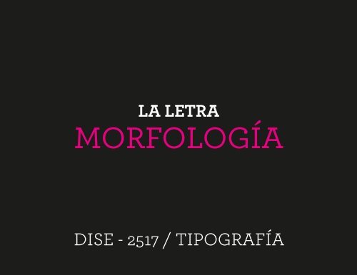
LA LETRA<br />
MORFOLOGÍA<br />
DISE - 2517 / TIPOGRAFÍA
1. Rasgos<br />
2. Terminaciones<br />
3. Superficies fundamentales<br />
4. Líneas fundamentales<br />
5. Partes <strong>de</strong> <strong>la</strong> <strong>letra</strong><br />
6. Correcciones ópticas<br />
7. Renglón gráfico<br />
8. Familias y fuentes tipográficas
1. Rasgos<br />
B<br />
Uniformes<br />
Fuente: Didot<br />
BModu<strong>la</strong>dos<br />
Fuente: Agenda
2. Terminaciones<br />
a a<br />
a a<br />
a a<br />
a a<br />
Gota y gancho<br />
Fuentes: Times New Roman,<br />
Garamond<br />
Botón y gancho<br />
Fuentes: Bodoni, Filosofía<br />
Ban<strong>de</strong>ra<br />
Fuentes: Archer, Glypha b<strong>la</strong>ck<br />
---<br />
Fuentes: Zurich Lt Bt, Futura
3. Superficies fundamentales<br />
O<br />
B<br />
A
3. Superficies fundamentales<br />
CGOQS<br />
BDEFHIJKLMN<br />
PRTUWXYZ<br />
AV
4. Líneas fundamentales<br />
Rectas Fragmentadas Curvas Mixtas<br />
T<br />
N<br />
C D
4. Líneas fundamentales<br />
HLEFT<br />
AVWMXYN<br />
OQC<br />
GUJPRBD<br />
Rectas<br />
Fragmentadas<br />
Curvas<br />
Mixtas
5. Partes <strong>de</strong> <strong>la</strong> <strong>letra</strong>
6. Correcciones ópticas<br />
1. Las <strong>letra</strong>s inscritas en circulos y triangulos se perciben<br />
más pequeñas que <strong>la</strong>s inscritas en cuadrados.<br />
>> los ángulos más cerrados <strong>de</strong>ben sobrepasar<br />
ligeramente el renglón gráfico.<br />
2. Los trazos horizontales se perciben más gruesos que<br />
los verticales.<br />
>> a<strong>de</strong>lgazar ligeramente los trazos horizontales.<br />
3. La mitad superior <strong>de</strong> <strong>la</strong> <strong>letra</strong> se percibe más pesada.<br />
>> el punto medio <strong>de</strong> <strong>la</strong> <strong>letra</strong> <strong>de</strong>be alinearse con el<br />
centro óptico (A,B,E,F,H,K,P,R,S,X,Y).<br />
4. La mitad superior <strong>de</strong> <strong>la</strong> <strong>letra</strong> se percibe más pesada.<br />
>> a<strong>la</strong>rgar/ampliar los trazos <strong>de</strong> <strong>la</strong> mitad inferior para<br />
que sobresalgan ligeramente con respecto al área <strong>de</strong> <strong>la</strong><br />
mitad superior.
6. Correcciones ópticas
6. Correcciones ópticas
6. Correcciones ópticas
6. Correcciones ópticas
6. Correcciones ópticas<br />
Primera versión<br />
sin correcciones<br />
Versión final<br />
con correcciones
7. Renglón gráfico<br />
Apuntes <strong>de</strong>
8. Familias y fuentes tipográficas<br />
Romana Antigua<br />
Romana Antigua<br />
Romana Mo<strong>de</strong>rna<br />
Romana Mo<strong>de</strong>rna<br />
Egipcia<br />
Egipcia<br />
Palo seco<br />
Palo seco<br />
Times New Roman<br />
Garamond<br />
Bodoni<br />
Filosofía<br />
Archer<br />
Glypha<br />
Zurich<br />
Futura
8. Familias y fuentes tipográficas<br />
fuerza<br />
fuerza<br />
fuerza<br />
fuerza