

Church of the City review Transcript
CHURCH OF THE CITY Hi everybody, Tyler Rominger here from Ministry Designs. I’m here to do another church website review. Today we're going to be talking about Church of the City. Church of the City is a church in Nashville. It's a relatively new church. They're doing some phenomenal things down there. Darren Whitehead was a pastor on staff at Willow Creek Church in Chicagoland area and a couple of years ago he went down and planted in Nashville and they've seen some explosive growth over the course of the last couple of years. And so, because of the things that they're doing, I wanted to take a look at their website and see how they are communicating that. So we'll go ahead and jump right in. You can see on their home page, it's actually pretty simple. This is literally the only thing that their homepage consists of. I like the background image, but there's not a lot of information there. So from a personal standpoint, because the majority of people are looking at websites on their mobile device now, I like to see a little bit more information on the homepage. That doesn't mean that this is bad or wrong it's just a personal preference. The data would suggest that when you have less information on your homepage, obviously you're forcing people to click more, which means people are less likely to stay on your website. And so if you have more information on your homepage it gives them that ability to scroll that we've all become so accustomed to. I hope this review was beneficial to you. Again, my name is Tyler Rominger. I'm from Ministry Designs. We'd love the opportunity to take a look at your church website and do a review. Thank you, I hope you’re having a great day, and we'll look forward to seeing you at the next video. Make sure that you subscribe in the link below. Links: YouTube: https://www.youtube.com/watch?v=g1OwBHEXa0I Ministry Designs Website: https://ministrywebsitedesigns.com/church-of-the-city/
CHURCH OF THE CITY
Hi everybody, Tyler Rominger here from Ministry Designs. I’m here to do another church website review.
Today we're going to be talking about Church of the City. Church of the City is a church in Nashville. It's a relatively new church. They're doing some phenomenal things down there. Darren Whitehead was a pastor on staff at Willow Creek Church in Chicagoland area and a couple of years ago he went down and planted in Nashville and they've seen some explosive growth over the course of the last couple of years. And so, because of the things that they're doing, I wanted to take a look at their website and see how they are communicating that. So we'll go ahead and jump right in.
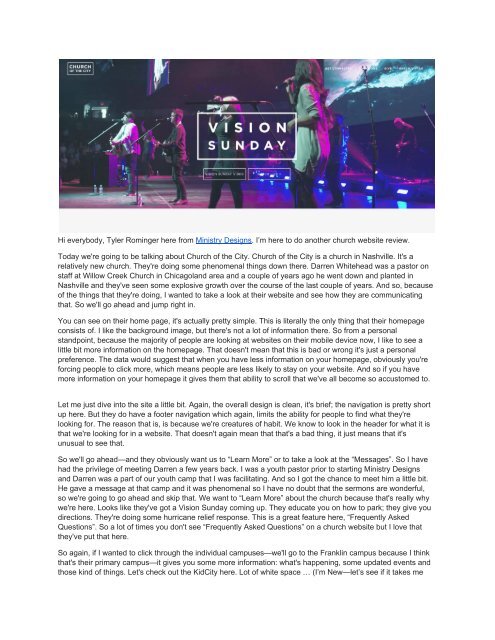
You can see on their home page, it's actually pretty simple. This is literally the only thing that their homepage consists of. I like the background image, but there's not a lot of information there. So from a personal standpoint, because the majority of people are looking at websites on their mobile device now, I like to see a little bit more information on the homepage. That doesn't mean that this is bad or wrong it's just a personal preference. The data would suggest that when you have less information on your homepage, obviously you're forcing people to click more, which means people are less likely to stay on your website. And so if you have more information on your homepage it gives them that ability to scroll that we've all become so accustomed to.
I hope this review was beneficial to you. Again, my name is Tyler Rominger. I'm from Ministry Designs. We'd love the opportunity to take a look at your church website and do a review. Thank you, I hope you’re having a great day, and we'll look forward to seeing you at the next video. Make sure that you subscribe in the link below.
Links:
YouTube: https://www.youtube.com/watch?v=g1OwBHEXa0I
Ministry Designs Website: https://ministrywebsitedesigns.com/church-of-the-city/

Create successful ePaper yourself
Turn your PDF publications into a flip-book with our unique Google optimized e-Paper software.
Hi everybody, Tyler Rominger here from Ministry Designs. I’m here to do ano<strong>the</strong>r church website <strong>review</strong>.<br />
Today we're going to be talking about <strong>Church</strong> <strong>of</strong> <strong>the</strong> <strong>City</strong>. <strong>Church</strong> <strong>of</strong> <strong>the</strong> <strong>City</strong> is a church in Nashville. It's a<br />
relatively new church. They're doing some phenomenal things down <strong>the</strong>re. Darren Whitehead was a pastor on<br />
staff at Willow Creek <strong>Church</strong> in Chicagoland area and a couple <strong>of</strong> years ago he went down and planted in<br />
Nashville and <strong>the</strong>y've seen some explosive growth over <strong>the</strong> course <strong>of</strong> <strong>the</strong> last couple <strong>of</strong> years. And so, because<br />
<strong>of</strong> <strong>the</strong> things that <strong>the</strong>y're doing, I wanted to take a look at <strong>the</strong>ir website and see how <strong>the</strong>y are communicating<br />
that. So we'll go ahead and jump right in.<br />
You can see on <strong>the</strong>ir home page, it's actually pretty simple. This is literally <strong>the</strong> only thing that <strong>the</strong>ir homepage<br />
consists <strong>of</strong>. I like <strong>the</strong> background image, but <strong>the</strong>re's not a lot <strong>of</strong> information <strong>the</strong>re. So from a personal<br />
standpoint, because <strong>the</strong> majority <strong>of</strong> people are looking at websites on <strong>the</strong>ir mobile device now, I like to see a<br />
little bit more information on <strong>the</strong> homepage. That doesn't mean that this is bad or wrong it's just a personal<br />
preference. The data would suggest that when you have less information on your homepage, obviously you're<br />
forcing people to click more, which means people are less likely to stay on your website. And so if you have<br />
more information on your homepage it gives <strong>the</strong>m that ability to scroll that we've all become so accustomed to.<br />
Let me just dive into <strong>the</strong> site a little bit. Again, <strong>the</strong> overall design is clean, it's brief; <strong>the</strong> navigation is pretty short<br />
up here. But <strong>the</strong>y do have a footer navigation which again, limits <strong>the</strong> ability for people to find what <strong>the</strong>y're<br />
looking for. The reason that is, is because we're creatures <strong>of</strong> habit. We know to look in <strong>the</strong> header for what it is<br />
that we're looking for in a website. That doesn't again mean that that's a bad thing, it just means that it's<br />
unusual to see that.<br />
So we'll go ahead—and <strong>the</strong>y obviously want us to “Learn More” or to take a look at <strong>the</strong> “Messages”. So I have<br />
had <strong>the</strong> privilege <strong>of</strong> meeting Darren a few years back. I was a youth pastor prior to starting Ministry Designs<br />
and Darren was a part <strong>of</strong> our youth camp that I was facilitating. And so I got <strong>the</strong> chance to meet him a little bit.<br />
He gave a message at that camp and it was phenomenal so I have no doubt that <strong>the</strong> sermons are wonderful,<br />
so we're going to go ahead and skip that. We want to “Learn More” about <strong>the</strong> church because that's really why<br />
we're here. Looks like <strong>the</strong>y've got a Vision Sunday coming up. They educate you on how to park; <strong>the</strong>y give you<br />
directions. They're doing some hurricane relief response. This is a great feature here, “Frequently Asked<br />
Questions”. So a lot <strong>of</strong> times you don't see “Frequently Asked Questions” on a church website but I love that<br />
<strong>the</strong>y've put that here.<br />
So again, if I wanted to click through <strong>the</strong> individual campuses—we'll go to <strong>the</strong> Franklin campus because I think<br />
that's <strong>the</strong>ir primary campus—it gives you some more information: what's happening, some updated events and<br />
those kind <strong>of</strong> things. Let's check out <strong>the</strong> Kid<strong>City</strong> here. Lot <strong>of</strong> white space … (I’m New—let’s see if it takes me
ack—oh it takes me back to a different page) … so I'm clicking through this website in real time with you, and<br />
just my initial knee-jerk response to this, is honestly it's a little bit confusing to navigate as I'm clicking through<br />
<strong>the</strong> website and kind <strong>of</strong> analyzing it for <strong>the</strong> first time. If I'm a parent with children, or if I'm maybe a first-time<br />
visitor to <strong>the</strong> church, I'm not going to know exactly what to look for, or where to look for it, and so I may<br />
abandon this website, just because <strong>of</strong> <strong>the</strong> difficulty to navigate.<br />
I love that <strong>the</strong>y have <strong>the</strong> Vision Sunday video right here—that's also helpful. They tell us what to expect in <strong>the</strong><br />
“I'm New” section … “Who We Are”. We've got some good information here—<strong>the</strong> “Vision and Values”—people<br />
actually do look at that information, so it's good to have.<br />
With that said, I want to go ahead and jump over into some <strong>of</strong> <strong>the</strong> technical aspects. So if we look at <strong>the</strong> site<br />
speed from Google—<strong>the</strong> mobile site speed—it looks like it needs a little bit <strong>of</strong> work. 72 is by far not <strong>the</strong> worst<br />
I've seen; it's also not <strong>the</strong> best that I've seen. Their desktop however, it's pretty good. And I think that that's<br />
because <strong>of</strong> <strong>the</strong> limited amount <strong>of</strong> content on <strong>the</strong> home page so <strong>the</strong>re's not really a lot to optimize <strong>the</strong>re.<br />
So this is a tool that was produced by HubSpot, and basically what it is, is it's an overall website grader. And it<br />
kind <strong>of</strong> audits things like performance, mobile responsiveness, <strong>the</strong> SEO <strong>of</strong> <strong>the</strong> site, like <strong>the</strong> on-page<br />
optimization <strong>of</strong> <strong>the</strong> site, and <strong>the</strong> website security. So it says “This site is ok”, which I can understand why, and<br />
we'll jump into a little bit more <strong>of</strong> that when we get down to <strong>the</strong> SEO section. The performance is pretty good,<br />
like we already saw thanks to Google. A couple <strong>of</strong> things that <strong>the</strong>y could increase <strong>the</strong>re. Notice that <strong>the</strong> page<br />
speed is really good. We don't ever want to see that load speed higher than about four seconds. If <strong>the</strong>y can get<br />
that down between two and three seconds <strong>the</strong>y'd be in a better spot. Mobile-friendly: <strong>the</strong>y get a 30 out <strong>of</strong> 30 so<br />
that's phenomenal.<br />
So <strong>the</strong>ir SEO grade is a little bit lacking. I've actually noticed that with a lot <strong>of</strong> churches that I <strong>review</strong> <strong>the</strong>ir<br />
website on, that I think <strong>the</strong>re's just a general lack <strong>of</strong> search engine optimization, and people don't necessarily<br />
understand <strong>the</strong> value <strong>of</strong> having your website rank higher in <strong>the</strong> search engines. So a real simple thing that <strong>the</strong>y<br />
could do is just add a sitemap. You know, <strong>the</strong>re are free sitemap generators that <strong>the</strong>y can generate <strong>the</strong> sitemap<br />
and <strong>the</strong>n submit that to <strong>the</strong>ir google webmaster tools. And what it does, is it gives Google a more clear picture<br />
<strong>of</strong> <strong>the</strong> layout <strong>of</strong> <strong>the</strong>ir website and helps Google <strong>the</strong>n index <strong>the</strong> pages more effectively, <strong>the</strong>refore <strong>the</strong>n ranking<br />
<strong>the</strong> site a little bit higher.<br />
They have no headers on <strong>the</strong>ir website so <strong>the</strong>y need H1 tags/H2 tags. An H1 tag would be <strong>the</strong> primary goal <strong>of</strong><br />
<strong>the</strong> site. You could have a couple <strong>of</strong> H2 tags which would maybe … So an example <strong>of</strong> an H1 tag would be:<br />
“<strong>City</strong> <strong>Church</strong>—Nashville” and <strong>the</strong>n an H2 tag could be some subcategories inside <strong>of</strong> that website. They have no<br />
header tags in that home page so it's hurting <strong>the</strong>ir SEO grade. The security is a big thing, again, <strong>the</strong>re's no SSL<br />
certificate on this site, just like Scottsdale Bible. They for some reason have not added an SSL certificate, but<br />
this will also help <strong>the</strong>ir overall SEO grade. Because Google has now publicly come out and said that if a site<br />
has an SSL certificate it's going to be viewed more securely in <strong>the</strong> search engines, <strong>the</strong>refore ranking higher.<br />
Because Google wants to produce <strong>the</strong> most quality and secure results possible. So if I had to make a<br />
recommendation I would say, “Add some header tags and add an SSL certificate.”<br />
So to that point, <strong>the</strong>re are some things that <strong>the</strong>y could do again a little bit better in <strong>the</strong>ir SEO. You can tell that<br />
<strong>the</strong>y've probably recently given it some attention because <strong>the</strong>ir site traffic has just jumped astronomically in <strong>the</strong><br />
last year. But <strong>the</strong>re are some things that <strong>the</strong>y're missing, right?<br />
So if I did a search for churches in Nashville and I view <strong>the</strong> results on that, <strong>the</strong>y're not even on <strong>the</strong> first page.<br />
So I'm all <strong>the</strong> way down here to result number 14, which would be <strong>the</strong> fourth result on <strong>the</strong> second page. And<br />
this has a pretty high search volume. So it looks like <strong>the</strong> search volume for this particular term is 720 organic<br />
searches a month in Google. And so, I think that if <strong>the</strong>y added an SSL certificate and <strong>the</strong>y put some header<br />
tags, were strategic about <strong>the</strong>ir page linking, created some Nashville-specific content and added it to <strong>the</strong>ir<br />
website, <strong>the</strong>ir SEO ranking would increase pretty dramatically, which would <strong>the</strong>n ultimately help <strong>the</strong>m leverage<br />
<strong>the</strong> search volume that's happening in <strong>the</strong>ir specific city on any given month.<br />
So just a quick recap: we'll go back to <strong>the</strong> home page <strong>of</strong> <strong>Church</strong> <strong>of</strong> <strong>the</strong> <strong>City</strong>. I love <strong>the</strong> initial presentation—it's<br />
clean, it's concise, it's modern—but once I dive into <strong>the</strong> navigation, I struggle a little bit to follow <strong>the</strong> path <strong>of</strong> <strong>the</strong>
site. It's not very logically organized. I know that churches—larger churches—struggle with this but <strong>the</strong>re are<br />
more effective ways to lay out your site. So if I could make a recommendation it would be to add <strong>the</strong> SSL and<br />
maybe clarify some <strong>of</strong> <strong>the</strong> navigation.<br />
I hope this <strong>review</strong> was beneficial to you. Again, my name is Tyler Rominger. I'm from Ministry Designs. We'd<br />
love <strong>the</strong> opportunity to take a look at your church website and do a <strong>review</strong>. Thank you, I hope you’re having a<br />
great day, and we'll look forward to seeing you at <strong>the</strong> next video. Make sure that you subscribe in <strong>the</strong> link<br />
below.<br />
Links:<br />
YouTube: https://www.youtube.com/watch?v=g1OwBHEXa0I<br />
Ministry Designs Website: https://ministrywebsitedesigns.com/church-<strong>of</strong>-<strong>the</strong>-city/