

MDA_Danish_Architecture

Create successful ePaper yourself
Turn your PDF publications into a flip-book with our unique Google optimized e-Paper software.
:<br />
r<br />
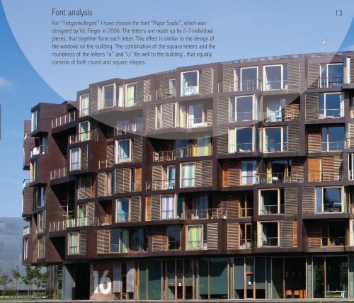
Font analysis<br />
For “Tietgenkollegiet” I have chosen the font “Major Snafu”, which was<br />
designed by Vic Fieger in 2006. The letters are made up by 2-3 individual<br />
pieces, that together form each letter. This effect is similar to the design of<br />
the windows on the building. The combination of the square letters and the<br />
roundness of the letters “o” and “u” fits well to the building’, that equally<br />
consists of both round and square shapes.<br />
13