Effetti e correzioni ottiche nel disegno dei caratteri tipografici - BeeP
Effetti e correzioni ottiche nel disegno dei caratteri tipografici - BeeP
Effetti e correzioni ottiche nel disegno dei caratteri tipografici - BeeP

Create successful ePaper yourself
Turn your PDF publications into a flip-book with our unique Google optimized e-Paper software.
<strong>Effetti</strong> e <strong>correzioni</strong> <strong>ottiche</strong> <strong>nel</strong> <strong>disegno</strong> <strong>dei</strong> <strong>caratteri</strong> <strong>tipografici</strong><br />
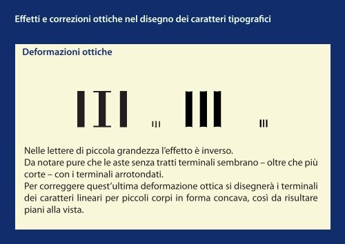
Deformazioni <strong>ottiche</strong><br />
Nelle lettere di piccola grandezza l’effetto è inverso.<br />
Da notare pure che le aste senza tratti terminali sembrano – oltre che più<br />
corte – con i terminali arrotondati.<br />
Per correggere quest’ultima deformazione ottica si disegnerà i terminali<br />
<strong>dei</strong> <strong>caratteri</strong> lineari per piccoli corpi in forma concava, così da risultare<br />
piani alla vista.