Dürer's Fraktur. Opentype font by Paulo Heitlinger - Tipografia
Dürer's Fraktur. Opentype font by Paulo Heitlinger - Tipografia
Dürer's Fraktur. Opentype font by Paulo Heitlinger - Tipografia

You also want an ePaper? Increase the reach of your titles
YUMPU automatically turns print PDFs into web optimized ePapers that Google loves.
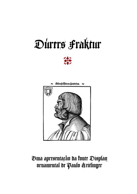
Dürers <strong>Fraktur</strong><br />
#<br />
Uma apresentação da <strong>font</strong>e Display<br />
ornamental de <strong>Paulo</strong> <strong>Heitlinger</strong>
Summary<br />
Best known of the books on the geometry of letterforms<br />
is Dürer’s Underweysung der Messung (A<br />
Course on the Art of Measurement). The text is<br />
printed in <strong>Fraktur</strong>. The book presents the principles<br />
of perspective developed in Renaissance Italy,<br />
applying them to architecture, painting, and lettering.<br />
Dürer’s designs of roman capital letters<br />
demonstrate how they can be created using a<br />
compass and straightedge.<br />
Albrecht Dürer, German painter, engraver, and<br />
draftsman, was the most celebrated artist of the<br />
Northern Renaissance. Dürer’s reputation spread<br />
throughout Europe during his lifetime, beyond<br />
his native city of Nuremberg, a thriving center of<br />
trade and culture. Like Leonardo da Vinci, Dürer<br />
became deeply involved in scientific and mathematical<br />
studies; his application of scientific principles<br />
to the creation of art marks the beginning<br />
of art theory in Northern Europe and of scientific<br />
writing in Germany.<br />
Dürer’s De Symmetria Partium in Rectis Formis Humanorum<br />
Corporum (Books on the normal proportions<br />
of the parts of the human form) and Underweysung<br />
der Messung (Instruction in measurement) are<br />
his most relevant Treaties. De Symmetria is Dürer’s<br />
beautifully illustrated study of the measurements<br />
and proportions of the human form.<br />
Underweysung der Messung is a pioneering work in<br />
scientific illustration; it contains over 150 woodcuts,<br />
including outstanding examples of orthographic<br />
projection and several of Dürer’s most<br />
intriguing designs. It presents a wide range of<br />
geometric subjects, with the basics of linear,<br />
plane, and solid geometry laying a foundation<br />
for practical applications for architecture and<br />
art, including the construction of columns and<br />
the rendering of Roman and <strong>Fraktur</strong> letterforms.<br />
The Underweysung der Messung ends with the artist’s<br />
famous analysis of lettering, one of the earliest<br />
attempts to rationalize principles of typographic<br />
design with precise measurements.<br />
Though Dürer concentrates on the anlaysis of<br />
the Roman capital letters, he does devote a few<br />
pages to the rendering and the analysis of <strong>Fraktur</strong><br />
letterforms. Based on those pages, I digitalised<br />
the <strong>font</strong> presented here.<br />
Algarve, January 2009<br />
<strong>Paulo</strong> <strong>Heitlinger</strong><br />
Dürer’s <strong>Fraktur</strong>. <strong>Opentype</strong> <strong>font</strong> <strong>by</strong> <strong>Paulo</strong> <strong>Heitlinger</strong>. P. 2
Albrecht Dürer<br />
(*1471, Nürnberg; † 1528)<br />
Alberto Durero foi um génio da Renascença<br />
alemã. Multifacetado artista e humanista<br />
alemão, ocupou-se de vários modos com<br />
a <strong>Tipografia</strong> da época. Fez uma análise geométrica<br />
das versais romanas e foi co-autor<br />
da <strong>Fraktur</strong>. Na sua célebre obra Underweysung<br />
der Messung mit Zirkel und Richtscheyd (Instrucção<br />
para medir com régua e compasso), obra<br />
publicada em 1525, estudou intensivamente<br />
as letras versais romanas favorecidas pelos<br />
mestres calígrafos italianos. Entre todas as<br />
tentativas de descrever os caractéres romanos<br />
com métodos de geometria descritiva, a<br />
obra de Dürer é a mais precisa e clara.<br />
A Underweysung der messung mit dem zirckel un<br />
richtscheyt in Linien, ebenen und gantzen corporen,<br />
durch Albrecht Dürer zusammen getzogen und<br />
zu nutz allen kunstliebhabenden mit zugehörigen<br />
figuren in truck gebracht im jar MDXXV é uma<br />
obra que transcende o próprio génio racional da<br />
Renascença.<br />
Albrecht Dürer devotou a terceira parte da sua<br />
Summa geométrica à construção das minúsculas<br />
da <strong>Fraktur</strong> desenvolvida em 1517. Como formas<br />
de referência geométrica, Dürer utilizou pequenos<br />
quadrados e círculos, mas de uma maneira<br />
consideravelmente mais tosca do que nas análises<br />
que devotou às versais romanas.<br />
Dürer descreveu a forma das letras góticas, e<br />
embora o tenha feito de modo muito mais superficial<br />
que o fez com as Romanas, as suas considerações<br />
chamaram-me a atenção, já que vem completadas<br />
com um magnífico alfabeto decorativo.<br />
Este alfabeto está na origem da <strong>font</strong>e digital aqui<br />
apresentada.<br />
Curiosamente, até à data, nenhum typeface<br />
designer pôs no mercado tipográfico uma digitalização<br />
deste estudo de Dürer sobre as formas da<br />
<strong>Fraktur</strong>. O problema não pode ser a dificuldade<br />
de obter um scan e proceder à sua digitalização,<br />
Página da Underweysung der Messung.<br />
já que existem vários fac-símiles que reproduzem<br />
razoavelmente bem a obra de Dürer.<br />
As dificuldades surgem quando nos apercebemos<br />
que as dimensões das minúsculas não estão<br />
convenientemente ajustadas às formas das maiúsculas,<br />
e as grossuras das hastes divergem. Os<br />
desenhos de Dürer são um estudo de formas de<br />
letras, não são uma solução tipográfica.<br />
Houve então que fazer uma cuidadosa afinação<br />
tipográfica a estas letras, alterando-as com<br />
todo o cuidado para obter um set harmonioso de<br />
versais e minúsculas, sem alterar a estética proposta<br />
por Dürer.<br />
Este <strong>font</strong>e Display vem completada com todos<br />
os diacríticos necessários para compor textos em<br />
idiomas europeus, assim como algumas ligaduras<br />
comuns neste contexto tipográfico: fi, fl, st,<br />
ch, ck.<br />
Dürer’s <strong>Fraktur</strong>. <strong>Opentype</strong> <strong>font</strong> <strong>by</strong> <strong>Paulo</strong> <strong>Heitlinger</strong>. P. 3
<strong>Fraktur</strong>: a letra tipográfica<br />
Como tipo móvel de chumbo, a <strong>Fraktur</strong> apareceu<br />
pela primeira vez no Livro de Orações (Gebetbuch)<br />
composto em 1513 para o imperador Maximiliano<br />
I — um dos mais luxuosos e onerosos livros de<br />
todos os tempos. Na elaboração desta versão tipográfica<br />
da <strong>Fraktur</strong> participou toda uma equipa<br />
de designers topo de gama da época: o chanceler<br />
imperial Vincenz Rockner, o mestre-escritor<br />
(Schreibmeister) Johann Neudörffer o Velho, o<br />
mestre-calígrafo Leonhard Wagner, o gravador de<br />
punções Hyeronimus Andreä, o impressor imperial<br />
Hans Schönsperger e Albrecht Dürer.<br />
Na ilustração deste Livro de Orações participou<br />
a fina-flor dos artistas da época: os desenhos nas<br />
margens foram executados por Albrecht Dürer,<br />
Lucas Cranach, Hans Baldung Grien, Hans Buckmayer<br />
e Jörg Breu. O resultado: o Livro de Orações é<br />
um pináculo da arte do livro alemão.<br />
Durante a execução deste livro, Johann Neudörffer<br />
colaborou com Dürer no Portal de Honra de<br />
Maximiliano (Ehrenpforte, peça gráfica de grande<br />
formato, impressa no prelo), escrevendo textos<br />
em <strong>Fraktur</strong>, que foram passados a tipos móveis de<br />
madeira pelo gravador de punções Hyeronimus<br />
Andreä.<br />
A análise das formas das letras<br />
Célebre mestre pintor e gravador, mas também<br />
exímio tipógrafo, Dürer conhecia os estudos dos<br />
italianos da Moile e Luca Pacioli sobre a análise<br />
geométrica das letras, pois tinha visto os desenhos<br />
destes durante a sua segunda viagem à Itália,<br />
que o levara até Veneza, grande empório e centro<br />
tipográfico da época.<br />
Dürer, que tinha começado por fazer uma<br />
aprendizagem de ourives e de pintor em Augsburgo,<br />
fez duas viagens pela Itália – uma prática<br />
comum para artistas e intelectuais alemães, que<br />
perdurou até hoje.<br />
Como formas de referência geométrica, Dürer<br />
utilizou pequenos quadrados e círculos, mas de<br />
uma maneira consideravelmente mais tosca do<br />
que nas análises que devotou às versais romanas.<br />
Embora esta proposta ignore algo de essencial<br />
– a origem caligráfica de todas as letras góticas<br />
– estes desenhos ilustram uma característica<br />
comum a muitas Góticas usadas na Europa<br />
Central: as suas hastes quebradas (fracturadas).<br />
O interesse que Albrecht Dürer desenvolveu<br />
pela <strong>Tipografia</strong> não foi um capricho pessoal; muitos<br />
outros artistas – pintores, gravadores e escultores<br />
– ocuparam-se dos belos caractéres do alfabeto<br />
romano. As suas supostas «proporções ideais»<br />
foram sujeitas a análises sistemáticas e descritas<br />
em relações numéricas. Assim apareceram as<br />
grelhas geométricas nas quais Leonardo da Vinci<br />
colocou a sua versão da forma ideal da anatomia<br />
humana. Dürer executou semelhantes análises,<br />
passando os seus resultados às imagens elucidativas<br />
do seu tratado Underweysung der Messung.<br />
Na secção dedicada à Geometria das letras,<br />
Durero discute em pormenor as formas das<br />
Romanas; o espaço dedicado à letra <strong>Fraktur</strong> é<br />
muito mais curto.<br />
Além de ser um belíssimo livro, este famoso<br />
tratado é uma obra pioneira na ilustração exacta,<br />
no que hoje chamamos «desenho técnico»; contém<br />
mais de 150 gravuras, incluindo projecções<br />
ortográficas.<br />
Dürer’s <strong>Fraktur</strong>. <strong>Opentype</strong> <strong>font</strong> <strong>by</strong> <strong>Paulo</strong> <strong>Heitlinger</strong>. P. 4
Dürer apresentou este livro composto na letra<br />
<strong>Fraktur</strong>, que tinha sido recentemente desenhada<br />
– o que parece uma contradição, mas não é; tratava-se<br />
de apresentar um assunto «moderno» (italiano,<br />
humanista) a um público de cultura alemã,<br />
habituado à letra gótica.<br />
Dürer desenvolve temas geométricos e sua aplicação<br />
prática na arquitectura e na arte – incluindo<br />
a construção de colunas – e a construção de letras.<br />
Na «análise anatómica», Dürer dissecou as letras<br />
do alfabeto versal romano. Letra a letra, analisou<br />
as formas da Capitalis, obtendo as componentes<br />
geométricas elementares, mostrando as medidas<br />
e as proporções das linhas rectas e curvas que<br />
definem as linhas de contorno e mostrando os<br />
pontos de intersecção. Como nos tratados italianos,<br />
o quadrado continuou a ser a grelha de referência<br />
para as construções; contudo, Dürer omitiu<br />
o círculo inscrito, que reconheceu ser inútil.<br />
Esta análise geométrica de Dürer terá, cerca de<br />
450 anos mais tarde, importantes consequências<br />
e resultados práticos; são a base da representação<br />
numérica das <strong>font</strong>es digitais para uso em computadores.<br />
Hoje, a definição da forma dos caractéres de<br />
uma <strong>font</strong>e é feita com curvas (de tipo Bézier,<br />
por exemplo); estas representações são derivados<br />
directos do trabalho analítico dos humanis-<br />
http://digital.slub-dresden.de/ppn27778509X/141<br />
tas renascentistas. A representação renascentista<br />
era análoga e tinha como suporte o papel;<br />
a contemporânea é digital e tratada no computador.<br />
Se Albrecht Dürer e os seus colegas<br />
já tivessem um PC, poderiam ter facilmente<br />
definido <strong>font</strong>es digitais, pois já dispunham de<br />
todo o know-how para isso necessário. A base<br />
essencial da vectorização das formas de letras<br />
foi por eles descoberta – há mais de 400 anos...<br />
Theuerdank, 1517. Um documento padrão ma evolução da letra <strong>Fraktur</strong>.<br />
Dürer’s <strong>Fraktur</strong>. <strong>Opentype</strong> <strong>font</strong> <strong>by</strong> <strong>Paulo</strong> <strong>Heitlinger</strong>. P. 5
abcdefgh<br />
iklmnop<br />
qrjstuv<br />
wxyz<br />
As minúsculas da <strong>Fraktur</strong>, na sua forma mais<br />
simplificada, sem ornamentos, salientado as formas<br />
geométricas. Em cima: o original de Durero.<br />
Em baixo: uma vectorização das mesmas letras.<br />
Dürer’s <strong>Fraktur</strong>. <strong>Opentype</strong> <strong>font</strong> <strong>by</strong> <strong>Paulo</strong> <strong>Heitlinger</strong>. P. 6
abcdefghijklmnop<br />
qrstuvwxyz<br />
ABCDEFGHI<br />
JKLMNOP<br />
QRSTUV<br />
XYZ.<br />
1234567890 !<br />
#<br />
áàâãäå.éèêë.íìîï.óòôõö<br />
úùûü.ýÿ.çÇñÑ<br />
ÁÀÂÃÄÅÉÈÊÍÌÎÏ<br />
ÓÒÔÕÖÜÚÙÛÝ<br />
fiflst����ſ��:.<br />
Set de glifos da <strong>font</strong>e OpenType Dürer’s <strong>Fraktur</strong><br />
Dürer’s <strong>Fraktur</strong>. <strong>Opentype</strong> <strong>font</strong> <strong>by</strong> <strong>Paulo</strong> <strong>Heitlinger</strong>. P. 7
Amadeu Bento Celéria<br />
Domingos Eliús Fradex<br />
Guimarães Hector<br />
Inumeno Jamiruz<br />
Kaspar Laxativof<br />
Maximiano<br />
Nóronha Ottmar Pedro<br />
Quasimodo Rafaely<br />
Stanislao Tadeuz<br />
Uliua Valerius<br />
Wagner Xenofantes<br />
Ypsylon Zéfiro<br />
Dürer’s <strong>Fraktur</strong>. <strong>Opentype</strong> <strong>font</strong> <strong>by</strong> <strong>Paulo</strong> <strong>Heitlinger</strong>. P. 8
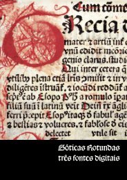
Fontes Góticas: comparação das maiúsculas<br />
A B C D E F G H I J K L M<br />
A B C D E F G H I J K L M<br />
A B C D E F G H I J K L M<br />
A B C D E F G H I J K L M<br />
N O P Q R S T U V W X Y Z<br />
N O P Q R S T U V W X Y Z<br />
N O P Q R S T U V W X Y Z<br />
N O P Q R S T U V W X Y Z<br />
B42<br />
Valentim<br />
Ratdoldt<br />
Duerer <strong>Fraktur</strong><br />
B42<br />
Valentim<br />
Ratdoldt<br />
Duerer <strong>Fraktur</strong><br />
Dürer’s <strong>Fraktur</strong>. <strong>Opentype</strong> <strong>font</strong> <strong>by</strong> <strong>Paulo</strong> <strong>Heitlinger</strong>. P. 9
Publicações<br />
Panofsky, Erwin. Vida y Arte de Alberto Durero. Madrid: Alianza, 1995.<br />
Panofsky, Erwin. Das Leben und die Kunst Albrecht Dürers, ins Deutsche übersetzt von Lise Lotte<br />
Möller, München 1977.<br />
Giorgio Zampa; Angela Ottino Della Chiesa. L’opera Completa di Dürer. Rizzoli Editore, Milano,<br />
1968.<br />
Albrecht Dürer. 1471/1971. Ausstellungskatalog des German. Nationalmuseums, Nürnberg. Prestel,<br />
München, 1971.<br />
Matthias Mende (Hrsg.) Albrecht Dürer - ein Künstler in seiner Stadt. Tümmels, Nürnberg, 2000.<br />
Mark Lehmstedt (Hrsg.): Albrecht Dürer: Das Gesamtwerk. CD-ROM, Digitale Bibliothek, Nr. 28.<br />
Directmedia Publishing, Berlin 2004. Enthält auch: o Fedja Anzelewsky, Albrecht Dürer: Werk und<br />
Wirkung, Stuttgart 1980 (elektron. Ausg. 1999);<br />
Albrecht Dürer: Schriften und Briefe, herausgegeben von Ernst Ullmann und Textbearbeitung<br />
von Elvira Pradel. Reclam Verlag, Leipzig, 1993.<br />
Christian Schoen, Albrecht Dürer: Adam und Eva, Reimer Verlag, Berlin 2001.<br />
Schauerte, Thomas. Die Ehrenpforte für Kaiser Maximilian I. Dürer und Altdorfer im Dienst des<br />
Herrschers, Deutscher Kunstverlag, Berlin, München, 2001.<br />
Johann Konrad Eberlein. Albrecht Dürer. Rowohlt Taschenbuch Verlag, Reinbek, 2003.<br />
Christoph J. Scriba u. Peter Schreiber. 5000 Jahre Geometrie. 2. Auflage. Springer-Verlag, Berlin/<br />
Heidelberg, 2005.<br />
Wolfgang Schmid: Dürer als Unternehmer. Kunst, Humanismus und Ökonomie in Nürnberg<br />
um 1500. (Beiträge zur Landes- und Kulturgeschichte 1). Porta-Alba-Verlag, Trier 2003.<br />
Norbert Wolf: Albrecht Dürer 1471-1528. Das Genie der deutschen Renaissance. Taschen Verlag,<br />
Köln, 2006.<br />
Albrecht Dürer, Hrsg. Klaus Albrecht Schröder und Maria Luise Sternath, Hatje Cantz Verlag,<br />
Ostfildern, 2003.<br />
Olga Kotková (Ed.): Albrecht Dürer. The Feast of the Rose Garlands. Exh. Cat. National Gallery Prague.<br />
Praga, 2006.<br />
Friedrich Piel: Albrecht Dürer. Aquarelle und Zeichnungen. Dumont, Köln, 1983.<br />
Institutiones Geometricae] or (Underweysung der Messung) Christian Wechel, Paris: 1532. Folio.<br />
[viii], 185, [3] pp. Title with Wechel’s tree device. With 9 full-page and 3 half-page woodcuts, 175 text<br />
drawings of geometrical diagrams, architectural figures, and letter designs. First Latin edition of<br />
Dürer’s Unterweisung der Messung (Nuremberg, 1525), his masterpiece of perspective and art theory.<br />
With this translation <strong>by</strong> his good friend Camerarius, Dürer introduces to the rest of Europe the<br />
Renaissance approaches to design and artistic creation. He treats construction of plane curves and<br />
helices <strong>by</strong> means of Euclidian geometry; construction of polygons and their uses in architectural<br />
ornamentation, parquet floors, and finally polyhedra, stereometry and perspective. The woodcuts<br />
and diagrams are executed with great precision; they include the famous illustrations of the two<br />
figures demonstrating a drawing instrument, signed with Dürer’s monogram (dated 1530 for this<br />
edition) as well as one of an artist drawing a seated man with the aid of Dürer’s machine. The text of<br />
Book Three contains his famous original treatise on the shaping of Roman capital and Gothic letters<br />
and Gothic letters built up <strong>by</strong> means of small geometrical forms.<br />
Dürer’s <strong>Fraktur</strong>. <strong>Opentype</strong> <strong>font</strong> <strong>by</strong> <strong>Paulo</strong> <strong>Heitlinger</strong>. P. 10
As <strong>font</strong>es digitais «Valentim», «Ratdoldt»,<br />
«Incunabulo», «B42», «Gótica Rotunda» e «Duerers<br />
<strong>Fraktur</strong>» são da autoria de <strong>Paulo</strong> <strong>Heitlinger</strong>,<br />
comercializadas exclusivamente por tipografos.net<br />
Copyright 2007-8. Todos os direitos reservados.<br />
The digital typefaces «Valentim», «Ratdoldt»,<br />
«Incunabulo», «B42», «Gótica Rotunda» and «Duerers<br />
<strong>Fraktur</strong>» are<br />
copyrighted <strong>by</strong> <strong>Paulo</strong> <strong>Heitlinger</strong>,<br />
Fand being sold at tipografos.net<br />
Copyright 2007-8. All rights reserved.<br />
Dürer’s <strong>Fraktur</strong>. <strong>Opentype</strong> <strong>font</strong> <strong>by</strong> <strong>Paulo</strong> <strong>Heitlinger</strong>. P. 11