

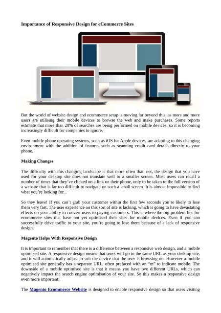
Importance of Responsive Design for eCommerce Sites
But the world of website design and ecommerce setup is moving far beyond this, as more and more users are utilising their mobile devices to browse the web and make purchases. Some reports estimate that more than 20% of searches are being performed on mobile devices, so it is becoming increasingly difficult for companies to ignore.
But the world of website design and ecommerce setup is moving far beyond this, as more and more users are utilising their mobile devices to browse the web and make purchases. Some reports estimate that more than 20% of searches are being performed on mobile devices, so it is becoming increasingly difficult for companies to ignore.

You also want an ePaper? Increase the reach of your titles
YUMPU automatically turns print PDFs into web optimized ePapers that Google loves.
<strong>Importance</strong> <strong>of</strong> <strong>Responsive</strong> <strong>Design</strong> <strong>for</strong> <strong>eCommerce</strong> <strong>Sites</strong><br />
But the world <strong>of</strong> website design and ecommerce setup is moving far beyond this, as more and more<br />
users are utilising their mobile devices to browse the web and make purchases. Some reports<br />
estimate that more than 20% <strong>of</strong> searches are being per<strong>for</strong>med on mobile devices, so it is becoming<br />
increasingly difficult <strong>for</strong> companies to ignore.<br />
Even mobile phone operating systems, such as iOS <strong>for</strong> Apple devices, are adapting to this changing<br />
environment with the addition <strong>of</strong> features such as scanning credit card details directly to your<br />
phone.<br />
Making Changes<br />
The difficulty with this changing landscape is that more <strong>of</strong>ten than not, the design that you have<br />
used <strong>for</strong> your desktop site does not translate well to a smaller screen. Most users can recall a<br />
number <strong>of</strong> times that they’ve clicked on a link on their phone, only to be taken to the full version <strong>of</strong><br />
a website that is far too difficult to navigate on such a small screen. It is almost impossible to find<br />
what you’re looking <strong>for</strong>...<br />
So they leave! If you can’t grab your customer within the first few seconds you’re likely to lose<br />
them very fast. The user experience on this sort <strong>of</strong> site is lacking, which is going to have devastating<br />
effects on your ability to convert users to paying customers. This is where the big problem lies <strong>for</strong><br />
ecommerce sites that have not yet optimised their sites <strong>for</strong> mobile devices. Even if you can<br />
successfully drive traffic to your site, you’re going to lose them because <strong>of</strong> a lack <strong>of</strong> responsive<br />
design.<br />
Magento Helps With <strong>Responsive</strong> <strong>Design</strong><br />
It is important to remember that there is a difference between a responsive web design, and a mobile<br />
optimised site. A responsive design means that users will go to the same URL as your desktop site,<br />
and it will automatically adjust to suit the device that the user is browsing on. However a mobile<br />
optimised site generally has a separate URL, <strong>of</strong>ten prefaced with an “m” to indicate mobile. The<br />
downside <strong>of</strong> a mobile optimised site is that it means you have two different URLs, which can<br />
negatively impact the search engine optimisation <strong>of</strong> your site. So this makes a responsive design<br />
even more important!<br />
The Magento Ecommerce Website is designed to enable responsive design so that users visiting
your site will have a seamless experience, no matter what device they're on.<br />
The usage rate <strong>of</strong> mobile devices <strong>for</strong> searching and online purchases has skyrocketed over the last<br />
couple <strong>of</strong> years, and the trend doesn’t seem to be changing. It seems likely that in the near future<br />
mobile devices and desktops will be on par <strong>for</strong> usage, so it is even more important <strong>for</strong> website<br />
owners to take action now and ensure that they have a responsive design implemented on their site.<br />
For the best in web design solutions, visit Alinga Magento <strong>eCommerce</strong> and see what we have to<br />
<strong>of</strong>fer. If you have any questions or would like to talk about your next project, please get in contact<br />
with us and we will be more than happy to help.<br />
Contact Details :=<br />
Company Name : Magento Web design<br />
Address<br />
: 1 Como Crescent, Gold Coast QLD 4215, Australia Gold Coast QLD<br />
Contact Num : +61 418 693 764<br />
Website<br />
Email ID<br />
: http://www.magentowebdesign.net.au<br />
: alingawebdesign@gmail.com

 Change language