
Create successful ePaper yourself
Turn your PDF publications into a flip-book with our unique Google optimized e-Paper software.
oth part of the Head Office site, bore the<br />
signs of the Three Crowns and the Three<br />
Kings), and the Grant of Arms was<br />
accordingly made in 1937. <strong>The</strong><br />
College of Arms having said that they<br />
had no objection, a Board Resolution<br />
in 1947 authorised the closely<br />
associated Barclays Bank (Dominion,<br />
Colonial and Overseas) to use the arms,<br />
with the addition of “D.C.O.” In practice,<br />
this addition was usually placed on a scroll<br />
beneath the shield, as if it were a motto.<br />
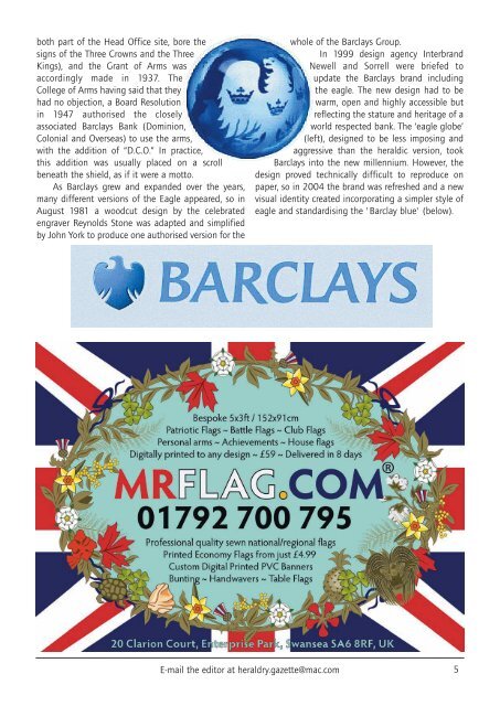
As Barclays grew and expanded over the years,<br />
many different versions of the Eagle appeared, so in<br />
August 1981 a woodcut design by the celebrated<br />
engraver Reynolds Stone was adapted and simplified<br />
by John York to produce one authorised version for the<br />
whole of the Barclays Group.<br />
In 1999 design agency Interbrand<br />
Newell and Sorrell were briefed to<br />
update the Barclays brand including<br />
the eagle. <strong>The</strong> new design had to be<br />
warm, open and highly accessible but<br />
reflecting the stature and heritage of a<br />
world respected bank. <strong>The</strong> ‘eagle globe’<br />
(left), designed to be less imposing and<br />
aggressive than the heraldic version, took<br />
Barclays into the new millennium. However, the<br />
design proved technically difficult to r<strong>ep</strong>roduce on<br />
paper, so in 2004 the brand was refreshed and a new<br />
visual identity created incorporating a simpler style of<br />
eagle and standardising the 'Barclay blue' (below).<br />
E-mail the editor at heraldry.gazette@mac.com 5