Guidelines for usage of FETAC logo
Guidelines for usage of FETAC logo
Guidelines for usage of FETAC logo
Create successful ePaper yourself
Turn your PDF publications into a flip-book with our unique Google optimized e-Paper software.
<strong>Guidelines</strong> <strong>for</strong> <strong>usage</strong> <strong>of</strong> <strong>FETAC</strong> <strong>logo</strong><br />
NOTE: The <strong>FETAC</strong> <strong>logo</strong> has been updated to meet the requirements <strong>of</strong> The Official Languages Act 2003<br />
Background to the Logo<br />
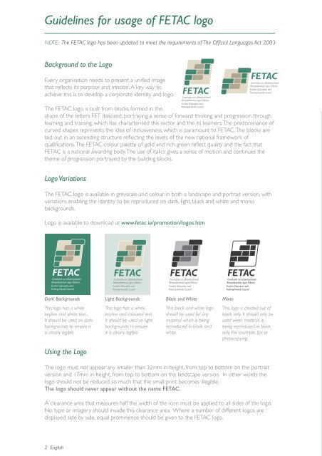
Every organisation needs to present a unified image<br />
that reflects its purpose and mission. A key way to<br />
achieve this is to develop a corporate identity and <strong>logo</strong>.<br />
The <strong>FETAC</strong> <strong>logo</strong> is built from blocks <strong>for</strong>med in the<br />
shape <strong>of</strong> the letters FET italicised, portraying a sense <strong>of</strong> <strong>for</strong>ward thinking and progression through<br />
learning and training, which has characterised this sector and the its learners. The predominance <strong>of</strong><br />
curved shapes represents the idea <strong>of</strong> inclusiveness, which is paramount to <strong>FETAC</strong>. The blocks are<br />
laid out in an ascending structure reflecting the levels <strong>of</strong> the new national framework <strong>of</strong><br />
qualifications. The <strong>FETAC</strong> colour palette <strong>of</strong> gold and rich green reflect quality and the fact that<br />
<strong>FETAC</strong> is a national awarding body. The use <strong>of</strong> italics gives a sense <strong>of</strong> motion and continues the<br />
theme <strong>of</strong> progression portrayed by the building blocks.<br />
Logo Variations<br />
The <strong>FETAC</strong> <strong>logo</strong> is available in greyscale and colour in both a landscape and portrait version, with<br />
variations enabling the identity to be reproduced on dark, light, black and white and mono<br />
backgrounds.<br />
Logo is available to download at www.fetac.ie/promotion/<strong>logo</strong>s.htm<br />
Comhairle na nDámhachtainí<br />
Breisoideachais agus Oiliúna<br />
Further Education and<br />
Training Awards Council<br />
Dark Backgrounds<br />
This <strong>logo</strong> has a white<br />
keyline and white text.<br />
It should be used on dark<br />
backgrounds to ensure it<br />
is clearly legible.<br />
Using the Logo<br />
2 English<br />
Comhairle na nDámhachtainí<br />
Breisoideachais agus Oiliúna<br />
Further Education and<br />
Training Awards Council<br />
Light Backgrounds<br />
This <strong>logo</strong> has a white<br />
keyline and coloured text.<br />
It should be used on light<br />
backgrounds to ensure<br />
it is clearly legible.<br />
Comhairle na nDámhachtainí<br />
Breisoideachais agus Oiliúna<br />
Further Education and<br />
Training Awards Council<br />
Comhairle na nDámhachtainí<br />
Breisoideachais agus Oiliúna<br />
Further Education and<br />
Training Awards Council<br />
Black and White<br />
This black and white <strong>logo</strong><br />
should be used <strong>for</strong> any<br />
material which is being<br />
reproduced in black and<br />
white.<br />
Comhairle na nDámhachtainí<br />
Breisoideachais agus Oiliúna<br />
Further Education and<br />
Training Awards Council<br />
Comhairle na nDámhachtainí<br />
Breisoideachais agus Oiliúna<br />
Further Education and<br />
Training Awards Council<br />
Mono<br />
This <strong>logo</strong> is created out <strong>of</strong><br />
black only. It should only be<br />
used when material is<br />
being reproduced in black<br />
only. For example, fax or<br />
photocopying.<br />
The <strong>logo</strong> must not appear any smaller than 32mm in height, from top to bottom on the portrait<br />
version and 17mm in height, from top to bottom on the landscape version. In other words the<br />
<strong>logo</strong> should not be reduced so much that the small print becomes illegible.<br />
The <strong>logo</strong> should never appear without the name <strong>FETAC</strong>.<br />
A clearance area that measures half the width <strong>of</strong> the icon must be applied to all sides <strong>of</strong> the <strong>logo</strong>.<br />
No type or imagery should invade this clearance area. Where a number <strong>of</strong> different <strong>logo</strong>s are<br />
displayed side by side, equal prominence should be given to the <strong>FETAC</strong> <strong>logo</strong>.


