Representing Georgian Court University
Representing Georgian Court University
Representing Georgian Court University

Create successful ePaper yourself
Turn your PDF publications into a flip-book with our unique Google optimized e-Paper software.
When design or budget limits color use, the following<br />
alternate color treatments for the logo are available:<br />
• All Black: Uses black ink only and is appropriate<br />
for use on white or light-colored backgrounds<br />
such as fax coversheets, memos, forms, and<br />
items to be photocopied.<br />
• All PMS2738 (blue): Uses PMS2738 ink only and<br />
is appropriate for one- or two-color pieces that<br />
use only our primary PMS colors.<br />
• All White: Appropriate for use on black or darkcolored<br />
backgrounds<br />
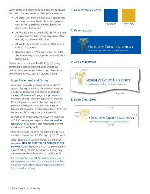
• Reverse (Figure C): When printing in full color<br />
the Reverse Logo is appropriate on a solid, dark<br />
background.<br />
Other colors, including all PMS1245 (gold) or any<br />
combination of blue and gold other than those<br />
outlined here, are not permitted. Logo files may be<br />
downloaded at www.georgian.edu/marketing.<br />
Logo Placement and Sizing<br />
To support an easily recognizable visual identity<br />
system, the logo should be placed consistently on<br />
a page. Generally, the logo should be placed in<br />
the top left corner of a page or top center, a<br />
minimum of 0.25” from the top and left margins.<br />
Depending on your needs, the logo may also be<br />
placed at the bottom right, bottom center, or<br />
bottom left of a page, a minimum of 0.25” from the<br />
bottom and left or right margins (Figure D).<br />
In addition to ensuring that the logo is a minimum<br />
of 0.25” from page margins, a clear zone of at<br />
least 0.25” on all sides is also required to prevent<br />
visual confusion (Figure E).<br />
To further ensure legibility, the standard logo has a<br />
minimum display size of 0.75” high by 3.125” wide.<br />
When placing and sizing the logo, it is extremely<br />
important NOT TO STRETCH OR COMPRESS THE<br />
PROPORTIONS. Typically, this can be prevented by<br />
simply holding the shift key down and using only<br />
the corner handles (diagonally) to size (Figure F).<br />
Do not copy the logo off the Web site for use on a<br />
printed piece; both the color and resolution will be<br />
off as the standards for screen display are different<br />
from those for printing.<br />
B. GCU Primary Colors<br />
PMS2738 PMS1245<br />
C. Reverse Logo<br />
D. Logo Placement<br />
0.25”<br />
0.25”<br />
Top left<br />
E. Logo Clear Zone<br />
0.25”<br />
0.25” 0.25”<br />
0.25”<br />
1:2 | Branding & Visual Identity