Guidelines for Table of Contents/Abstract Graphics
Guidelines for Table of Contents/Abstract Graphics
Guidelines for Table of Contents/Abstract Graphics

Create successful ePaper yourself
Turn your PDF publications into a flip-book with our unique Google optimized e-Paper software.
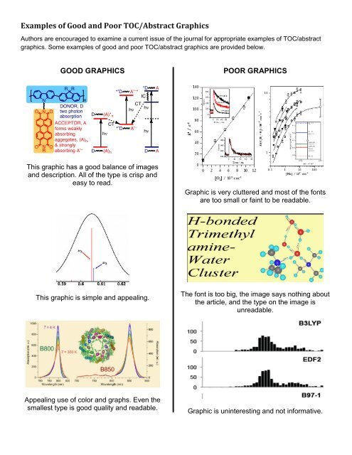
Examples <strong>of</strong> Good and Poor TOC/<strong>Abstract</strong> <strong>Graphics</strong><br />
Authors are encouraged to examine a current issue <strong>of</strong> the journal <strong>for</strong> appropriate examples <strong>of</strong> TOC/abstract<br />
graphics. Some examples <strong>of</strong> good and poor TOC/abstract graphics are provided below.<br />
GOOD GRAPHICS<br />
POOR GRAPHICS<br />
This graphic has a good balance <strong>of</strong> images<br />
and description. All <strong>of</strong> the type is crisp and<br />
easy to read.<br />
Graphic is very cluttered and most <strong>of</strong> the fonts<br />
are too small or faint to be readable.<br />
This graphic is simple and appealing.<br />
The font is too big, the image says nothing about<br />
the article, and the type on the image is<br />
unreadable.<br />
Appealing use <strong>of</strong> color and graphs. Even the<br />
smallest type is good quality and readable.<br />
Graphic is uninteresting and not in<strong>for</strong>mative.