

Vertex Framework Vertex Framework Guide
Vertex Framework Vertex Framework Guide
Vertex Framework Vertex Framework Guide

You also want an ePaper? Increase the reach of your titles
YUMPU automatically turns print PDFs into web optimized ePapers that Google loves.
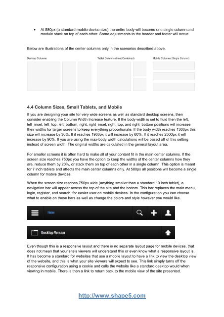
At 580px (a standard mobile device size) the entire body will become one single column and<br />
module stack on top of each other. Some adjustments to the header and footer will occur.<br />
Below are illustrations of the center columns only in the scenarios described above.<br />
4.4 Column Sizes, Small Tablets, and Mobile<br />
If you are designing your site for very wide screens as well as standard desktop screens, then<br />
consider enabling the Column Width Increase feature. If the body width is set to fluid then the left,<br />
left_inset, left_top, left_bottom, right, right_inset, right_top, and right_bottom positions will increase<br />
their widths for larger screens to keep everything proportionate. If the body width reaches 1300px this<br />
size will increase by 30%. If it reaches 1900px it will increase by 60%. If it reaches 2500px it will<br />
increase by 90%. If you are using the max-body width calculations will be based off of this setting<br />
instead of screen width. The original widths are calculated in the general layout area.<br />
For smaller screens it is often hard to make all of your content fit in the main center columns. If the<br />
screen size reaches 750px you have the option to keep the widths of the center columns how they<br />
are, reduce them by 20%, or stack them on top of each other in a single column. This option is meant<br />
for 7 inch tablets and affects the main center columns only. At 580px all positions will become a single<br />
column for mobile devices.<br />
When the screen size reaches 750px wide (anything smaller than a standard 10 inch tablet), a<br />
navigation bar will appear across the top of the site and the bottom. This bar replaces the main menu,<br />
login, register, and search, for easier user on mobile devices. In the configuration you can choose<br />
what to enable on these bars as well as change the colors and style however you would like.<br />
Even though this is a responsive layout and there is no separate layout page for mobile devices, that<br />
does not mean that your site's viewers will understand this or even know what a responsive layout is.<br />
It has become a standard for websites that use a mobile layout to have a link to view the desktop view<br />
of the website, and this is what your site viewers will expect to see. This link simply turns off the<br />
responsive configuration using a cookie and calls the website like a standard desktop would when<br />
viewing in mobile. There is then a link to return back to the mobile view of the site presented.<br />
http://www.shape5.com


 Change language