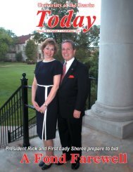
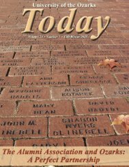
“This partnership is a key reason why <strong>Ozarks</strong>has experienced such tremendous progress,and <strong>the</strong> Alumni Association has my deepestthanks for <strong>the</strong>ir support.”Dr. Rick Niece, PresidentThe <strong>University</strong> arches turn 35 in 2007. The sleek, simpletriple-arch design was first used by <strong>the</strong> <strong>University</strong> in 1972.Over <strong>the</strong> past 35 years, <strong>the</strong> arches logo has become <strong>the</strong><strong>of</strong>ficial symbol <strong>of</strong> <strong>the</strong> <strong>University</strong> and has been displayed oneverything from recruiting brochures, to letterhead, to athleticuniforms, to campus memorabilia. The logo is even trademarkedby <strong>the</strong> United States Patent and Trademark Office.The three-arch logo, which was inspired by <strong>the</strong> Gothic archdesign <strong>of</strong> <strong>the</strong> doors and windows <strong>of</strong> <strong>the</strong> <strong>University</strong>’s historicRaymond Munger Memorial Chapel, has a significant, two-foldsymbolic meaning. First, taking into account <strong>the</strong> <strong>University</strong>’slong relationship with <strong>the</strong> Presbyterian Church, <strong>the</strong> logorepresents <strong>the</strong> Trinity: <strong>the</strong> Fa<strong>the</strong>r, <strong>the</strong> Son and <strong>the</strong> Holy Ghost.Secondly, <strong>the</strong> three arches <strong>of</strong> <strong>the</strong> logo represent a chapel window,within <strong>the</strong> chapel, within <strong>the</strong> Ozark Mountains.“I have been associated with a number <strong>of</strong> campuses duringmy degree-seeking life and pr<strong>of</strong>essional career, and I have neverseen a more dynamic, distinctive and functional logo than ours,”4 <strong>Today</strong>, <strong>FALL</strong>/<strong>WINTER</strong> <strong>2006</strong>The tri-level spray <strong>of</strong> <strong>the</strong> fountain that stands in front <strong>of</strong> MungerChapel was designed with <strong>the</strong> <strong>University</strong>’s arches logo in mind.The logo was inspired by <strong>the</strong> Gothic windows and doors <strong>of</strong>Munger Chapel.
said <strong>Ozarks</strong> President Dr. Rick Niece. “The <strong>Ozarks</strong>’ logo istruly ubiquitous and represents <strong>the</strong> celebrated symbols <strong>of</strong> ourcampus.”The arches logo was designed in <strong>the</strong> late 1960s and early1970s by Art Pr<strong>of</strong>essor Lyle Ward, who taught at <strong>Ozarks</strong> from1956 to 1987, and <strong>the</strong>n-Vice President for Development FredLindall. During <strong>the</strong> 1950s and 1960s, <strong>the</strong> <strong>University</strong> was using<strong>the</strong> <strong>of</strong>ficial seal on most <strong>of</strong> its brochures and documents. When<strong>the</strong> <strong>University</strong> underwent major changes in its academicprograms and curriculum in <strong>the</strong> late 1960s, Lindall wanted tointroduce a new logo that would symbolize a new era for <strong>the</strong><strong>University</strong>.“The administration had decided to get away from using<strong>the</strong> seal because it had too much detail, and we wantedsomething cleaner and more distinguishable,” said Dr. FritzEhren, who was dean <strong>of</strong> academic affairs at <strong>the</strong> time and wholater became president <strong>of</strong> <strong>Ozarks</strong>. “Fred Lindall wanted a logothat was more contemporary, and he had <strong>the</strong> idea <strong>of</strong> using archesfrom <strong>the</strong> Chapel. He worked with Lyle on designing it.”Blaine Caldwell, who has taught art at <strong>Ozarks</strong> since 1982,was a student in <strong>the</strong> art department during <strong>the</strong> design <strong>of</strong> <strong>the</strong>new logo. The <strong>University</strong> had sparingly used a similar logoWard had designed in <strong>the</strong> late 1960s that featured three separatearches, taken from <strong>the</strong> Munger Chapel windows. Ward modified<strong>the</strong> early design by connecting <strong>the</strong> arches, giving it a sleekerappearance.As a student worker, Caldwell worked with Ward on <strong>the</strong>design.“I was Lyle’s flunky,” Caldwell said. “I remember drawingout <strong>the</strong> designs and trying out a lot <strong>of</strong> different ideas. One thingI knew we were trying to do was to emphasize <strong>the</strong> Trinity. The<strong>University</strong> and <strong>the</strong> Presbyterian Church were closely connected,so (<strong>the</strong> administration) wanted to emphasize that connection in<strong>the</strong> new logo.”Caldwell remembers <strong>the</strong> administration, including PresidentDon Davis, liking <strong>the</strong> new design.“They seemed very pleased with how it turned out, and Iremember one <strong>of</strong> <strong>the</strong> first places <strong>the</strong>y used it was on a largeThe <strong>University</strong> logo evolved from three seperate window arches,as shown on <strong>the</strong> cover <strong>of</strong> <strong>the</strong> 1969 Commencement program (leftphoto), to <strong>the</strong> modern, connected arches, as shown on <strong>the</strong> cover<strong>of</strong> <strong>the</strong> 1972-73 <strong>University</strong> catalog.Ward inspired many studentsFormer Art Pr<strong>of</strong>essor LyleWard may be remembered as <strong>the</strong>artist who designed <strong>the</strong><strong>University</strong>’s triple-arch logo, but hewas much more than that.Ward, who died in 1996, taughtin <strong>the</strong> art department at <strong>Ozarks</strong>from 1956 until his retirement in1987. He was an accomplishedartist whose work was showcasedthroughout <strong>the</strong> Midwest and South.He also taught, mentored andinspired hundreds <strong>of</strong> art students in his 31 years at <strong>Ozarks</strong>.“Lyle was a very hands-on pr<strong>of</strong>essor who took a keeninterest in helping students become better artists,” said<strong>Ozarks</strong>’ Pr<strong>of</strong>essor <strong>of</strong> Art Blaine Caldwell, who studiedunder Ward in <strong>the</strong> late 1960s. “He was a very prolific artistwho was quite well known for his paintings.”Ward once said <strong>of</strong> his works, “Painting is a means <strong>of</strong>expressing an inward desire to understand oneself and tocommunicate that understanding to o<strong>the</strong>rs. I present mypainting as a mirror to those who would use it as asounding board for <strong>the</strong>ir own imagery. It is for this that Ihave directed <strong>the</strong> play with <strong>the</strong> hope that its performancewill leave a rich and pleasant afterthought.”display for recruiting,” Caldwell said. “I think it conveyed <strong>the</strong>symbols <strong>the</strong>y were looking for with <strong>the</strong> sleek, clean and moderndesign <strong>the</strong>y wanted.”The logo began to be used more widespread and appearedon <strong>the</strong> cover <strong>of</strong> <strong>the</strong> 1972 course catalog. It also began to appearon all <strong>University</strong> letterhead.“It was a pretty big deal when we started getting <strong>the</strong>letterhead with <strong>the</strong> new logo on it,” said Jo Ward, former wife<strong>of</strong> Lyle Ward who worked in <strong>the</strong> Registrar’s Office at <strong>Ozarks</strong>.“Before that we were using letterhead with just <strong>the</strong> <strong>University</strong>name, so <strong>the</strong> logo really added a nice visual touch.”Throughout <strong>the</strong> years, <strong>the</strong> influence <strong>of</strong> <strong>the</strong> arches can beseen throughout <strong>the</strong> campus, and not just on signs, brochuresand clothing. The Walton Fine Arts Center, which was built in<strong>the</strong> late 1980s, has elements <strong>of</strong> <strong>the</strong> arches in <strong>the</strong> design <strong>of</strong> itscovered entrances. The fountain, which sits prominently in <strong>the</strong>center <strong>of</strong> campus, has a tri-level spray to reflect <strong>the</strong> three archesin <strong>the</strong> logo. And <strong>the</strong>re is a large representation <strong>of</strong> <strong>the</strong> logo etchedinto <strong>the</strong> walkway near <strong>the</strong> east entrance <strong>of</strong> <strong>the</strong> campus.The logo has also become a source <strong>of</strong> pride for thoseconnected with <strong>the</strong> <strong>University</strong>.“We designed a lapel pin with <strong>the</strong> logo, and I always enjoyremoving mine from my suit jacket and pinning it on a specialfriend <strong>of</strong> <strong>the</strong> <strong>University</strong>,” Niece said. “That simple gesture,accompanied with a brief verbal explanation <strong>of</strong> <strong>the</strong> logo’s dualmeaning, allows o<strong>the</strong>rs to share our history and to display ourpride.”<strong>Today</strong>, <strong>FALL</strong>/<strong>WINTER</strong> <strong>2006</strong> 5