
You also want an ePaper? Increase the reach of your titles
YUMPU automatically turns print PDFs into web optimized ePapers that Google loves.
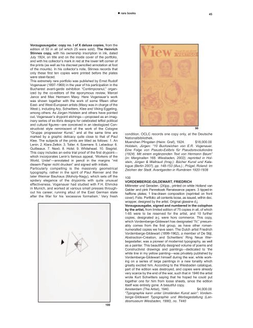
Vorzugsausgabe: copy no. I of X deluxe copies, from the<br />
edition of 50 in all (of which 25 were sold). The Heinrich<br />
Stinnes copy, with his ownership inscription in ink, dated<br />
July 1924, on title and on the inside cover of the portfolio,<br />
and with his collector’s mark in red at the lower left corner of<br />
the prints (as well as his discreet pencilled annotation at foot<br />
of the mounts). In his collector’s note, Stinnes records that<br />
only these first ten copies were printed before the plates<br />
were steel-faced.<br />
This extremely rare portfolio was published by Ernst Rudolf<br />
Vogenauer (1897-1969) in the year of his participation in the<br />
Bucharest avant-garde exhibition “Contimporanul,” organized<br />
by the co-editors of the eponymous review, Marcel<br />
Janco and Max Hermann Maxy. Here Vogenauer’s work<br />
was shown together with the work of some fifteen other<br />
East- and West-European artists (Maxy was in charge of the<br />
West-), including Arp, Schwitters, Klee and Viking Eggeling,<br />
among others. As Jürgen Holstein and others have pointed<br />
out, Vogenauer’s drypoint etchings—-proposed as an imaginary<br />
series of ex-libris designs for celebrated leftist political<br />
and cultural figures—are conceived in an ideologized Constructivist<br />
style reminiscent of the work of the Cologne<br />
“Gruppe progressiver Kunst,” and at the same time are<br />
marked by a graphic delicacy quite close to that of Paul<br />
Klee. The subjects of the prints are titled as follows: 1. An<br />
Lenin. 2. Klara Zetkin. 3. Toller. 4. Szemere. 5. Lebedour. 6.<br />
Guilbeaux. 7. Nexö. 8. Holst. 9. Whitehead. 10. Siegrist.<br />
This copy includes an extra trial proof of the first drypoint—<br />
which incorporates Lenin’s famous appeal, ‘Workers of the<br />
World, Unite!’—annotated in pencil in the margins “mit<br />
diesem Papier nicht drucken” and signed with initials.<br />
Particularly compelling is the massively geometrical<br />
typography, rather in the spirit of Paul Renner and the<br />
later Weimar Bauhaus (Moholy-Nagy), which sets off the<br />
spidery elegance of the drypoints with quite unusual<br />
effectiveness. Vogenauer had studied with F.H. Ehmcke<br />
in Munich, and worked at various small presses throughout<br />
his career, running afoul of the East German state<br />
after the War for his ‘excessive formalism.’ Very fresh<br />
100<br />
� rare books 45<br />
98<br />
condition. OCLC records one copy only, at the Deutsche<br />
Nationalbibliothek.<br />
Muenchen Pfingsten (Heinr. Graf), 1924. $18,000.00<br />
Holstein, Jürgen: “10 Buchzeichen von E.R. Vogenauer.<br />
Eine Folge von Pseudo-Exlibris für Pseudorevolutionäre<br />
(1924). Mit einem ergänzenden Text von Hermann Baum”<br />
(in: Marginalien 168. Wiesbaden, 2002); reprinted in Holstein,<br />
Jürgen & Waltraud (hrsg.): Bücher Kunst und Katalogue<br />
(Berlin 2007), pp. 148-153 (illus.).; Prügel, Roland: Im<br />
Zeichen der Stadt. Avantgarden in Rumänien 1920-1938<br />
100<br />
VORDEMBERGE-GILDEW<strong>ART</strong>, FRIEDRICH<br />
Millimeter und Geraden. (24)pp., printed on white Holland van<br />
Gelder and pink Pannekoek Renaissance papers. 3 tipped-in<br />
halftone plates; 1 line-drawn composition (reprinted on front<br />
cover). Folio. Portfolio: all contents loose, as issued, within dec.<br />
wrapper, designed by the artist. Original glassine d.j.<br />
Vorzugsausgabe, signed and numbered in the colophon<br />
by the artist, from limited edition of 75 copies in all, of which<br />
1-65 were to be reserved for the artist, and 10 further<br />
copies, designated a-j, were hors commerce. This copy,<br />
which Vordemberge-Gildewart has designated “IV,” presumably<br />
comes from the first group, as have other romannumeralled<br />
copies we have seen. The Dutch artist Friedrich<br />
Vordemberge-Gildewart (1899-1962), a member of De Stijl,<br />
Abstraction-Création, and Schwitters’ Ring Neue Werbegestalter,<br />
was a pioneer of modernist typography, as well<br />
as a painter. This beautifully designed volume of poems and<br />
Constructivist drawings and paintings—dedicated to ‘the<br />
white line in my yellow painting—was privately published by<br />
Vordemberge-Gildewart himself during the war, while working<br />
on a series of large paintings in a new tonality which<br />
greatly excited him. According to the Wiesbaden catalogue,<br />
part of the edition was destroyed, and copies were already<br />
very scarce by the end of the war, such that in 1946 the artist<br />
wrote Kurt Schwitters saying that he hoped he could put<br />
together one for him from loose sheets, since the edition<br />
itself was entirely gone. A beautiful copy.<br />
Amsterdam (The Artist), 1940. $4,000.00<br />
“Typographie kann unter Umständen Kunst sein”: Vordemberge-Gildewart<br />
Typographie und Werbegestaltung (Landesmuseum<br />
Wiesbaden, 1990), no. T440