ournal - Society of Environmental Journalists
ournal - Society of Environmental Journalists
ournal - Society of Environmental Journalists
- No tags were found...

You also want an ePaper? Increase the reach of your titles
YUMPU automatically turns print PDFs into web optimized ePapers that Google loves.
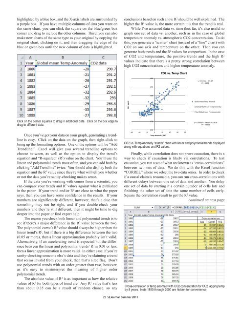
highlighted by a blue box, and the X-axis labels are surrounded bya purple box. If you have multiple columns <strong>of</strong> data you want onthe same chart, you can click the square on the blue/green boxcorner and drag to include the other columns. Third, you can alsomake new charts <strong>of</strong> the same type as your original by copying theoriginal chart, clicking on it, and then dragging the edge <strong>of</strong> theblue or green box until the new column <strong>of</strong> data is highlighted.conclusions based on such a low R 2 should be well explained. Thehigher the R 2 value is, the more certain it is that the trend is real.While I’ve assumed data vs. time thus far, it’s also useful tograph one set <strong>of</strong> data vs. another, such as in the case <strong>of</strong> globaltemperature anomaly vs. atmospheric CO2 concentration. To dothis, you generate a “scatter” chart (instead <strong>of</strong> a “line” chart) withCO2 on one axis and temperature on the other. Then you cangenerate both trends and the R 2 values for comparison. In the case<strong>of</strong> CO2 and temperature, the positive trends and the high R 2values indicate that there’s a pretty strong correlation betweenhigh CO2 concentrations and higher temperature anomaly.Click on the corner squares to drag in additional data. Click on the box edge todrag to different data. Once you’ve got your data on your graph, generating a trendlineis easy. Click on the data on the graph, then right-click tobring up the formatting options. One <strong>of</strong> the options will be “AddTrendline.” Excel will give you several trendline options tochoose between, as well as the option to display the trend’sequation and “R-squared” (R 2 ) value on the chart. You’ll use thelinear and polynomial trends most <strong>of</strong>ten, and you can add both byclicking “Add Trendline” twice. You should also display both theequation and the R 2 value since they're what will tell you whetheror not the data you’re sanity-checking makes sense.If the data you’re working with comes from a scientist, youcan compare your trends and R 2 values against what is publishedin the paper. If your trend and/or R 2 are close to what the papersays, then you can have some confidence in the results. If yournumbers are significantly different, however, that’s a clue thatsomething may not be right, and if you double-check yournumbers and they’re still different, then it might be time to digdeeper into the paper or find expert help.The reason you check both linear and polynomial trends is tosee if there's a major difference in the R 2 value between the two.The polynomial curve’s R 2 value should always be higher than thelinear trend’s R 2 , but if there is a big difference between the two(0.05 or more), then a linear approximation probably isn’t valid.Alternatively, if an accelerating trend is expected but the differencebetween the linear and polynomial trends’ R 2 is 0.01 or less,then a linear approximation is more valid. In either case, if you’resanity-checking someone else’s data and they’re claiming a trendthat seems invalid from your check, then that’s a red flag. Don’tuse polynomial trends with an order greater than two, however,as it’s easy to misinterpret the meaning <strong>of</strong> higher orderpolynomial trends.The absolute value <strong>of</strong> R 2 is as important as how the relativevalues <strong>of</strong> R 2 for both types <strong>of</strong> trend are. Any R 2 value that’s lessthan about 0.35 can be a result <strong>of</strong> random chance, so any CO2 vs. Temp Anomaly “scatter” chart with linear and polynomial trends displayedalong with equations and R2 values.Finally, while correlation does not prove causation, there is away to check if causation is likely via correlations. To testcausation, you run a set <strong>of</strong> what are known as “cross-correlations”between two sets <strong>of</strong> data. We do this with the Excel function“CORREL” where we select the two data series. In order to checkif a causal claim is reasonable, you can run cross-correlations withdifferent delays between one set <strong>of</strong> data and another. You delayone set <strong>of</strong> data by starting it a certain number <strong>of</strong> cells late andfinishing the other set <strong>of</strong> data the same number <strong>of</strong> cells early.Square the correlation result to get the R 2 value.continued on next pageCross-correlation <strong>of</strong> temp anomaly with CO2 concentration for CO2 lagging tempby 8 years. Note:1890 through 2000 are hidden for convenience.23 SEJ<strong>ournal</strong> Summer 2011