David on Typography 1 - HCI
David on Typography 1 - HCI
David on Typography 1 - HCI

Create successful ePaper yourself
Turn your PDF publications into a flip-book with our unique Google optimized e-Paper software.
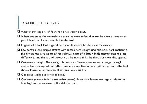
WHAT ABOUT THE FONT ITSELF? What useful aspects of f<strong>on</strong>t should we worry about. When designing for the mobile device we want a f<strong>on</strong>t that can be seen as clearly aspossible at small sizes, <strong>on</strong>e that scales well. In general a f<strong>on</strong>t that is good <strong>on</strong> a mobile device has four characteristics. Low c<strong>on</strong>trast and simple strokes with a c<strong>on</strong>sistent weight and thickness. F<strong>on</strong>t c<strong>on</strong>trast isthe difference in thickness of the relative parts of a letter. High c<strong>on</strong>trast means a bigdifference, and this is bad because as the text shrinks the think parts can disappear. Generous x-height. The x-height is the size of lower case letters. A large x-heightmeans the n<strong>on</strong>-capitalized letters are large relative to the capitals, and so as the textshrinks theses letter maintain their form and visibility. Generous width and letter spacing. Generous punch width (space within letters). These two factors are again related tohow legible f<strong>on</strong>t remains as it shrinks in size.