Mama – Production Notes - I Watch Mike
Mama – Production Notes - I Watch Mike
Mama – Production Notes - I Watch Mike
- No tags were found...

You also want an ePaper? Increase the reach of your titles
YUMPU automatically turns print PDFs into web optimized ePapers that Google loves.
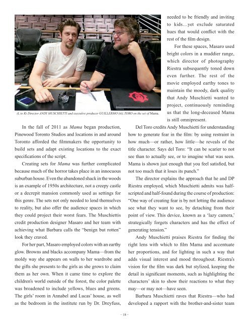
(L to R) Director ANDY MUSCHIETTI and executive producer GUILLERMO del TORO on the set of <strong>Mama</strong>.needed to be friendly and invitingto kids…yet exclude saturatedhues that would conflict with therest of the film design.For these spaces, Masaro usedbright colors in a muddier range,which director of photographyRiestra subsequently toned downeven further. The rest of themovie employed earthy tones tomaintain the moody, dark qualitythat Andy Muschietti wanted toproject, continuously remindingus that the long-deceased <strong>Mama</strong>is still omnipresent.In the fall of 2011 as <strong>Mama</strong> began production, Del Toro credits Andy Muschietti for understandingPinewood Toronto Studios and locations in and around how to generate fear in the film: by using restraint inToronto afforded the filmmakers the opportunity to how much—or rather, how little—he reveals of thebuild sets and adapt existing locations to the exact title character. Says del Toro: “It can be scarier to notspecifications of the script.see than to actually see, or to imagine what was seen.Creating sets for <strong>Mama</strong> was further complicated <strong>Mama</strong> is shown just enough that you feel satisfied, butbecause much of the horror takes place in an innocuous not too much that it loses its punch.”suburban house. Even the abandoned shack in the woods The director explains the approach that he and DPis an example of 1950s architecture, not a creepy castle Riestra employed, which Muschietti admits was halfscriptedand half-found during the course of production:or a decrepit mansion commonly used as settings forthis genre. The sets not only needed to lend themselves “One way of creating fear is by not letting the audienceto reality, but also offer the audience spaces in which see what they want to see, by detaching from theirthey could project their worst fears. The Muschiettis point of view. This device, known as a ‘lazy camera,’credit production designer Masaro and her team with strategically forgets characters and has the effect ofachieving what Barbara calls the “benign but rotten” generating tension.”look they craved.Andy Muschietti praises Riestra for finding theFor her part, Masaro employed colors with an earthy right lens with which to film <strong>Mama</strong> and accentuateglow. Browns and blacks accompany <strong>Mama</strong>—from the her proportions, and for lighting in such a way thatmoldy way she appears on walls to her wardrobe and adds visual interest and mood throughout. Riestra’sthe gifts she presents to the girls as she grows to claim vision for the film was dark but stylized, keeping thethem as her own. When it came time to explore the detail in significant moments, such as highlighting thechildren’s world outside of the forest, the color palette characters’ skin to show their reactions to what theywas broadened to include yellows, blues and greens. may—or may not—have seen.The girls’ room in Annabel and Lucas’ house, as well Barbara Muschietti raves that Riestra—who hadas the bedroom in the institute run by Dr. Dreyfuss, developed a rapport with the brother-and-sister team<strong>–</strong> 18 <strong>–</strong>