- Page 2:
Data MiningPractical Machine Learni
- Page 5 and 6:
Publisher:Publishing Services Manag
- Page 7 and 8:
viFOREWORDThis book presents this n
- Page 10 and 11:
CONTENTSix4 Algorithms: The basic m
- Page 12 and 13:
CONTENTSxiGenerating good rules 202
- Page 14 and 15:
CONTENTSxiii8 Moving on: Extensions
- Page 16:
CONTENTSxv13 The command-line inter
- Page 19 and 20:
xviiiLIST OF FIGURESFigure 4.10 The
- Page 21 and 22:
xxLIST OF FIGURESFigure 10.13 Worki
- Page 23 and 24:
xxiiLIST OF TABLESTable 5.2 Confide
- Page 25 and 26:
xxivPREFACEalchemy. Instead, there
- Page 27 and 28:
xxviPREFACEwho interprets them, and
- Page 29 and 30:
xxviiiPREFACEin Section 6.3. We hav
- Page 31 and 32:
xxxPREFACEration. All who have work
- Page 34:
partIMachine Learning Toolsand Tech
- Page 37 and 38:
4 CHAPTER 1 | WHAT’S IT ALL ABOUT
- Page 39 and 40:
6 CHAPTER 1 | WHAT’S IT ALL ABOUT
- Page 41 and 42:
8 CHAPTER 1 | WHAT’S IT ALL ABOUT
- Page 43 and 44:
10 CHAPTER 1 | WHAT’S IT ALL ABOU
- Page 45 and 46:
12 CHAPTER 1 | WHAT’S IT ALL ABOU
- Page 47 and 48:
14 CHAPTER 1 | WHAT’S IT ALL ABOU
- Page 49 and 50:
16 CHAPTER 1 | WHAT’S IT ALL ABOU
- Page 51 and 52:
18 CHAPTER 1 | WHAT’S IT ALL ABOU
- Page 53 and 54:
20 CHAPTER 1 | WHAT’S IT ALL ABOU
- Page 55 and 56:
22 CHAPTER 1 | WHAT’S IT ALL ABOU
- Page 57 and 58:
24 CHAPTER 1 | WHAT’S IT ALL ABOU
- Page 59 and 60:
26 CHAPTER 1 | WHAT’S IT ALL ABOU
- Page 61 and 62:
28 CHAPTER 1 | WHAT’S IT ALL ABOU
- Page 63 and 64:
30 CHAPTER 1 | WHAT’S IT ALL ABOU
- Page 65 and 66:
32 CHAPTER 1 | WHAT’S IT ALL ABOU
- Page 67 and 68:
34 CHAPTER 1 | WHAT’S IT ALL ABOU
- Page 69 and 70:
36 CHAPTER 1 | WHAT’S IT ALL ABOU
- Page 71 and 72:
38 CHAPTER 1 | WHAT’S IT ALL ABOU
- Page 74 and 75:
chapter 2Input:Concepts, Instances,
- Page 76 and 77:
2.1 WHAT’S A CONCEPT? 43increase
- Page 78 and 79:
2.2 WHAT’S IN AN EXAMPLE? 45data
- Page 80 and 81:
2.2 WHAT’S IN AN EXAMPLE? 47Table
- Page 82 and 83:
2.3 WHAT’S IN AN ATTRIBUTE? 49Tab
- Page 84 and 85:
2.3 WHAT’S IN AN ATTRIBUTE? 51Not
- Page 86 and 87:
2.4 PREPARING THE INPUT 53cleaned u
- Page 88 and 89:
missing values in this dataset). Th
- Page 90 and 91:
dividing by the range between the m
- Page 92 and 93:
2.4 PREPARING THE INPUT 59a record
- Page 94 and 95:
chapter 3Output:Knowledge Represent
- Page 96 and 97:
3.2 DECISION TREES 63Alternatively,
- Page 98 and 99:
3.3 CLASSIFICATION RULES 65nated by
- Page 100 and 101:
3.3 CLASSIFICATION RULES 671abx = 1
- Page 102 and 103:
3.4 ASSOCIATION RULES 69yes, then i
- Page 104 and 105:
3.5 RULES WITH EXCEPTIONS 71If peta
- Page 106 and 107:
3.6 RULES INVOLVING RELATIONS 73ica
- Page 108 and 109:
Standard relations include equality
- Page 110 and 111:
PRP =-56.1+0.049 MYCT+0.015 MMIN+0.
- Page 112 and 113:
3.8 INSTANCE-BASED REPRESENTATION 7
- Page 114 and 115:
3.9 Clusters3.9 CLUSTERS 81When clu
- Page 116 and 117:
chapter 4Algorithms:The Basic Metho
- Page 118 and 119:
4.1 INFERRING RUDIMENTARY RULES 85F
- Page 120 and 121:
described overfitting-avoidance bia
- Page 122 and 123:
4.2 STATISTICAL MODELING 89Table 4.
- Page 124 and 125:
just as we calculated previously. A
- Page 126 and 127:
4.2 STATISTICAL MODELING 93Table 4.
- Page 128 and 129:
of a document. Instead, a document
- Page 130 and 131:
4.3 DIVIDE-AND-CONQUER: CONSTRUCTIN
- Page 132 and 133:
4.3 DIVIDE-AND-CONQUER: CONSTRUCTIN
- Page 134 and 135:
4.3 DIVIDE-AND-CONQUER: CONSTRUCTIN
- Page 136 and 137:
4.3 DIVIDE-AND-CONQUER: CONSTRUCTIN
- Page 138 and 139:
4.4 COVERING ALGORITHMS: CONSTRUCTI
- Page 140 and 141:
4.4 COVERING ALGORITHMS: CONSTRUCTI
- Page 142 and 143:
4.4 COVERING ALGORITHMS: CONSTRUCTI
- Page 144 and 145:
4.4 COVERING ALGORITHMS: CONSTRUCTI
- Page 146 and 147:
4.5 MINING ASSOCIATION RULES 113acc
- Page 148 and 149:
4.5 MINING ASSOCIATION RULES 115Tab
- Page 150 and 151: 4.5 MINING ASSOCIATION RULES 117whi
- Page 152 and 153: 4.6 LINEAR MODELS 119through the da
- Page 154 and 155: 4.6 LINEAR MODELS 121However, linea
- Page 156 and 157: 4.6 LINEAR MODELS 123n( i)i i 1-x
- Page 158 and 159: 4.6 LINEAR MODELS 125Set all weight
- Page 160 and 161: 4.6 LINEAR MODELS 127While some ins
- Page 162 and 163: 4.7 INSTANCE-BASED LEARNING 129When
- Page 164 and 165: 4.7 INSTANCE-BASED LEARNING 131Figu
- Page 166 and 167: 4.7 INSTANCE-BASED LEARNING 133Figu
- Page 168 and 169: 4.7 INSTANCE-BASED LEARNING 135Figu
- Page 170 and 171: 4.8 CLUSTERING 137As we saw in Sect
- Page 172 and 173: 4.9 FURTHER READING 139can be updat
- Page 174 and 175: 4.9 FURTHER READING 141Bayes was an
- Page 176 and 177: chapter 5Credibility:Evaluating Wha
- Page 178 and 179: 5.1 TRAINING AND TESTING 145of each
- Page 180 and 181: ather than error rate, so this corr
- Page 182 and 183: 5.3 CROSS-VALIDATION 149mediate con
- Page 184 and 185: 5.4 OTHER ESTIMATES 151A single 10-
- Page 186 and 187: 90% used in 10-fold cross-validatio
- Page 188 and 189: 5.5 COMPARING DATA MINING METHODS 1
- Page 190 and 191: 5.6 PREDICTING PROBABILITIES 157In
- Page 192 and 193: 5.6 PREDICTING PROBABILITIES 159whe
- Page 194 and 195: mental job expected of a loss funct
- Page 196 and 197: y the total number of positives, wh
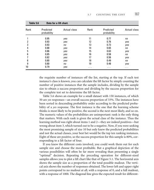
- Page 198 and 199: 5.7 COUNTING THE COST 165different
- Page 202 and 203: 5.7 COUNTING THE COST 169100%80%tru
- Page 204 and 205: 5.7 COUNTING THE COST 171should cho
- Page 206 and 207: Different terms are used in differe
- Page 208 and 209: 5.7 COUNTING THE COST 1750.5Anormal
- Page 210 and 211: 5.8 EVALUATING NUMERIC PREDICTION 1
- Page 212 and 213: 5.9 THE MINIMUM DESCRIPTION LENGTH
- Page 214 and 215: 5.9 THE MINIMUM DESCRIPTION LENGTH
- Page 216 and 217: 5.10 APPLYING THE MDL PRINCIPLE TO
- Page 218: 5.11 FURTHER READING 185tion theory
- Page 221 and 222: 188 CHAPTER 6 | IMPLEMENTATIONS: RE
- Page 223 and 224: 190 CHAPTER 6 | IMPLEMENTATIONS: RE
- Page 225 and 226: 192 CHAPTER 6 | IMPLEMENTATIONS: RE
- Page 227 and 228: 194 CHAPTER 6 | IMPLEMENTATIONS: RE
- Page 229 and 230: 196 CHAPTER 6 | IMPLEMENTATIONS: RE
- Page 231 and 232: 198 CHAPTER 6 | IMPLEMENTATIONS: RE
- Page 233 and 234: 200 CHAPTER 6 | IMPLEMENTATIONS: RE
- Page 235 and 236: 202 CHAPTER 6 | IMPLEMENTATIONS: RE
- Page 237 and 238: 204 CHAPTER 6 | IMPLEMENTATIONS: RE
- Page 239: 206 CHAPTER 6 | IMPLEMENTATIONS: RE
- Page 243 and 244: 210 CHAPTER 6 | IMPLEMENTATIONS: RE
- Page 245 and 246: 212 CHAPTER 6 | IMPLEMENTATIONS: RE
- Page 247 and 248: 214 CHAPTER 6 | IMPLEMENTATIONS: RE
- Page 249 and 250: 216 CHAPTER 6 | IMPLEMENTATIONS: RE
- Page 251 and 252:
218 CHAPTER 6 | IMPLEMENTATIONS: RE
- Page 253 and 254:
220 CHAPTER 6 | IMPLEMENTATIONS: RE
- Page 255 and 256:
222 CHAPTER 6 | IMPLEMENTATIONS: RE
- Page 257 and 258:
224 CHAPTER 6 | IMPLEMENTATIONS: RE
- Page 259 and 260:
226 CHAPTER 6 | IMPLEMENTATIONS: RE
- Page 261 and 262:
228 CHAPTER 6 | IMPLEMENTATIONS: RE
- Page 263 and 264:
230 CHAPTER 6 | IMPLEMENTATIONS: RE
- Page 265 and 266:
232 CHAPTER 6 | IMPLEMENTATIONS: RE
- Page 267 and 268:
234 CHAPTER 6 | IMPLEMENTATIONS: RE
- Page 269 and 270:
236 CHAPTER 6 | IMPLEMENTATIONS: RE
- Page 271 and 272:
238 CHAPTER 6 | IMPLEMENTATIONS: RE
- Page 273 and 274:
240 CHAPTER 6 | IMPLEMENTATIONS: RE
- Page 275 and 276:
242 CHAPTER 6 | IMPLEMENTATIONS: RE
- Page 277 and 278:
244 CHAPTER 6 | IMPLEMENTATIONS: RE
- Page 279 and 280:
246 CHAPTER 6 | IMPLEMENTATIONS: RE
- Page 281 and 282:
248 CHAPTER 6 | IMPLEMENTATIONS: RE
- Page 283 and 284:
250 CHAPTER 6 | IMPLEMENTATIONS: RE
- Page 285 and 286:
252 CHAPTER 6 | IMPLEMENTATIONS: RE
- Page 287 and 288:
254 CHAPTER 6 | IMPLEMENTATIONS: RE
- Page 289 and 290:
256 CHAPTER 6 | IMPLEMENTATIONS: RE
- Page 291 and 292:
258 CHAPTER 6 | IMPLEMENTATIONS: RE
- Page 293 and 294:
260 CHAPTER 6 | IMPLEMENTATIONS: RE
- Page 295 and 296:
262 CHAPTER 6 | IMPLEMENTATIONS: RE
- Page 297 and 298:
264 CHAPTER 6 | IMPLEMENTATIONS: RE
- Page 299 and 300:
266 CHAPTER 6 | IMPLEMENTATIONS: RE
- Page 301 and 302:
268 CHAPTER 6 | IMPLEMENTATIONS: RE
- Page 303 and 304:
270 CHAPTER 6 | IMPLEMENTATIONS: RE
- Page 305 and 306:
272 CHAPTER 6 | IMPLEMENTATIONS: RE
- Page 307 and 308:
274 CHAPTER 6 | IMPLEMENTATIONS: RE
- Page 309 and 310:
276 CHAPTER 6 | IMPLEMENTATIONS: RE
- Page 311 and 312:
278 CHAPTER 6 | IMPLEMENTATIONS: RE
- Page 313 and 314:
280 CHAPTER 6 | IMPLEMENTATIONS: RE
- Page 315 and 316:
282 CHAPTER 6 | IMPLEMENTATIONS: RE
- Page 318 and 319:
chapter 7Transformations:Engineerin
- Page 320 and 321:
7.1 ATTRIBUTE SELECTION 287attribut
- Page 322 and 323:
7.1 ATTRIBUTE SELECTION 289and less
- Page 324 and 325:
tion—and it is much easier to und
- Page 326 and 327:
7.1 ATTRIBUTE SELECTION 293outlook
- Page 328 and 329:
7.1 ATTRIBUTE SELECTION 295the t-te
- Page 330 and 331:
7.2 DISCRETIZING NUMERIC ATTRIBUTES
- Page 332 and 333:
7.2 DISCRETIZING NUMERIC ATTRIBUTES
- Page 334 and 335:
7.2 DISCRETIZING NUMERIC ATTRIBUTES
- Page 336 and 337:
7.2 DISCRETIZING NUMERIC ATTRIBUTES
- Page 338 and 339:
7.3 SOME USEFUL TRANSFORMATIONS 305
- Page 340 and 341:
7.3 SOME USEFUL TRANSFORMATIONS 307
- Page 342 and 343:
7.3 SOME USEFUL TRANSFORMATIONS 309
- Page 344 and 345:
7.3 SOME USEFUL TRANSFORMATIONS 311
- Page 346 and 347:
7.4 AUTOMATIC DATA CLEANSING 313Int
- Page 348 and 349:
7.5 COMBINING MULTIPLE MODELS 315da
- Page 350 and 351:
7.5 COMBINING MULTIPLE MODELS 317pa
- Page 352 and 353:
7.5 COMBINING MULTIPLE MODELS 319mo
- Page 354 and 355:
7.5 COMBINING MULTIPLE MODELS 321Ra
- Page 356 and 357:
7.5 COMBINING MULTIPLE MODELS 323Ho
- Page 358 and 359:
7.5 COMBINING MULTIPLE MODELS 325Th
- Page 360 and 361:
7.5 COMBINING MULTIPLE MODELS 327of
- Page 362 and 363:
7.5 COMBINING MULTIPLE MODELS 329ou
- Page 364 and 365:
7.5 COMBINING MULTIPLE MODELS 331ev
- Page 366 and 367:
7.5 COMBINING MULTIPLE MODELS 333be
- Page 368 and 369:
7.5 COMBINING MULTIPLE MODELS 335Ta
- Page 370 and 371:
7.6 Using unlabeled data7.6 USING U
- Page 372 and 373:
7.6 USING UNLABELED DATA 339automat
- Page 374 and 375:
7.7 FURTHER READING 341deal with we
- Page 376:
7.7 FURTHER READING 343Domingos (19
- Page 379 and 380:
346 CHAPTER 8 | MOVING ON: EXTENSIO
- Page 381 and 382:
348 CHAPTER 8 | MOVING ON: EXTENSIO
- Page 383 and 384:
350 CHAPTER 8 | MOVING ON: EXTENSIO
- Page 385 and 386:
352 CHAPTER 8 | MOVING ON: EXTENSIO
- Page 387 and 388:
354 CHAPTER 8 | MOVING ON: EXTENSIO
- Page 389 and 390:
356 CHAPTER 8 | MOVING ON: EXTENSIO
- Page 391 and 392:
358 CHAPTER 8 | MOVING ON: EXTENSIO
- Page 393 and 394:
360 CHAPTER 8 | MOVING ON: EXTENSIO
- Page 395 and 396:
362 CHAPTER 8 | MOVING ON: EXTENSIO
- Page 398 and 399:
chapter 9Introduction to WekaExperi
- Page 400 and 401:
9.2 How do you use it?9.2 HOW DO YO
- Page 402 and 403:
chapter 10The ExplorerWeka’s main
- Page 404 and 405:
10.1 GETTING STARTED 371(a)(b)(c)Fi
- Page 406 and 407:
10.1 GETTING STARTED 373deviation.
- Page 408 and 409:
10.1 GETTING STARTED 375=== Run inf
- Page 410 and 411:
10.1 GETTING STARTED 377Doing it ag
- Page 412 and 413:
10.1 GETTING STARTED 379(a)(b)Figur
- Page 414 and 415:
10.2 EXPLORING THE EXPLORER 381(a)(
- Page 416 and 417:
10.2 EXPLORING THE EXPLORER 383(b)(
- Page 418 and 419:
10.2 EXPLORING THE EXPLORER 385(a)(
- Page 420 and 421:
10.2 EXPLORING THE EXPLORER 387+ 0.
- Page 422 and 423:
10.2 EXPLORING THE EXPLORER 389posi
- Page 424 and 425:
10.2 EXPLORING THE EXPLORER 391Figu
- Page 426 and 427:
10.3 FILTERING ALGORITHMS 393method
- Page 428 and 429:
10.3 FILTERING ALGORITHMS 395(b)Fig
- Page 430 and 431:
10.3 FILTERING ALGORITHMS 397or fir
- Page 432 and 433:
10.3 FILTERING ALGORITHMS 399attrib
- Page 434 and 435:
10.3 FILTERING ALGORITHMS 401it int
- Page 436 and 437:
10.4 LEARNING ALGORITHMS 403There i
- Page 438 and 439:
10.4 LEARNING ALGORITHMS 405Table 1
- Page 440 and 441:
10.4 LEARNING ALGORITHMS 407Figure
- Page 442 and 443:
10.4 LEARNING ALGORITHMS 409value (
- Page 444 and 445:
10.4 LEARNING ALGORITHMS 411Neural
- Page 446 and 447:
10.4 LEARNING ALGORITHMS 413there a
- Page 448 and 449:
10.5 METALEARNING ALGORITHMS 415Tab
- Page 450 and 451:
10.5 METALEARNING ALGORITHMS 417Com
- Page 452 and 453:
10.7 ASSOCIATION-RULE LEARNERS 419N
- Page 454 and 455:
10.8 ATTRIBUTE SELECTION 421Table 1
- Page 456 and 457:
10.8 ATTRIBUTE SELECTION 423tribute
- Page 458:
10.8 ATTRIBUTE SELECTION 425with on
- Page 461 and 462:
428 CHAPTER 11 | THE KNOWLEDGE FLOW
- Page 463 and 464:
430 CHAPTER 11 | THE KNOWLEDGE FLOW
- Page 465 and 466:
432 CHAPTER 11 | THE KNOWLEDGE FLOW
- Page 467 and 468:
434 CHAPTER 11 | THE KNOWLEDGE FLOW
- Page 470 and 471:
chapter 12The ExperimenterThe Explo
- Page 472 and 473:
12.1 GETTING STARTED 439Dataset,Run
- Page 474 and 475:
12.2 SIMPLE SETUP 441cance test of
- Page 476 and 477:
12.4 THE ANALYZE PANEL 443advanced
- Page 478 and 479:
12.5 DISTRIBUTING PROCESSING OVER S
- Page 480:
12.5 DISTRIBUTING PROCESSING OVER S
- Page 483 and 484:
450 CHAPTER 13 | THE COMMAND-LINE I
- Page 485 and 486:
452 CHAPTER 13 | THE COMMAND-LINE I
- Page 487 and 488:
454 CHAPTER 13 | THE COMMAND-LINE I
- Page 489 and 490:
456 CHAPTER 13 | THE COMMAND-LINE I
- Page 491 and 492:
458 CHAPTER 13 | THE COMMAND-LINE I
- Page 494 and 495:
chapter 14Embedded Machine Learning
- Page 496 and 497:
14.2 GOING THROUGH THE CODE 463/***
- Page 498 and 499:
14.2 GOING THROUGH THE CODE 465// I
- Page 500 and 501:
14.2 GOING THROUGH THE CODE 467}//
- Page 502:
14.2 GOING THROUGH THE CODE 469filt
- Page 505 and 506:
472 CHAPTER 15 | WRITING NEW LEARNI
- Page 507 and 508:
474 CHAPTER 15 | WRITING NEW LEARNI
- Page 509 and 510:
476 CHAPTER 15 | WRITING NEW LEARNI
- Page 511 and 512:
478 CHAPTER 15 | WRITING NEW LEARNI
- Page 513 and 514:
480 CHAPTER 15 | WRITING NEW LEARNI
- Page 515 and 516:
482 CHAPTER 15 | WRITING NEW LEARNI
- Page 518 and 519:
ReferencesAdriaans, P., and D. Zant
- Page 520 and 521:
Bouckaert, R. R. 2004. Bayesian net
- Page 522 and 523:
REFERENCES 489Cypher, A., editor. 1
- Page 524 and 525:
REFERENCES 491Fix, E., and J. L. Ho
- Page 526 and 527:
REFERENCES 493Gennari, J. H., P. La
- Page 528 and 529:
Conference on Knowledge Discovery a
- Page 530 and 531:
REFERENCES 497Kushmerick, N., D. S.
- Page 532 and 533:
Moore, A. W., and M. S. Lee. 1994.
- Page 534 and 535:
REFERENCES 501editor, Proceedings o
- Page 536:
REFERENCES 503Webb, G. I., J. Bough
- Page 539 and 540:
506 INDEXanomaly detection systems,
- Page 541 and 542:
508 INDEXcausal relations, 350CfsSu
- Page 543 and 544:
510 INDEXCSVLoader, 381cumulative m
- Page 545 and 546:
512 INDEXExperimenter, 437-447advan
- Page 547 and 548:
514 INDEXimplementation—real-worl
- Page 549 and 550:
516 INDEXlistOptions(), 482literary
- Page 551 and 552:
518 INDEXnumeric prediction (contin
- Page 553 and 554:
520 INDEXrelational data, 49relatio
- Page 555 and 556:
522 INDEXsupport vector, 216support
- Page 557 and 558:
524 INDEXWinnow, 410Winnow algorith