

A Brush With Art.pdf

Create successful ePaper yourself
Turn your PDF publications into a flip-book with our unique Google optimized e-Paper software.
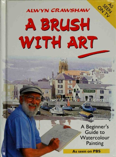
ALWVN CRAW:5HAWwiniAft?-r—=i-^as»i-.,;fc*r«A Beginner'sGuide toWatercolourPaintingAs seen on PBS
A BRUSHWITH ART
jit%'^^^m
A S^USWWIT« ARTALWYN CRAWSHAWi)>j% '• 'h-,^t?-'-Tf"-''T>7:;^^?Ka^^"n:^I NORTHLIGHT[BOOKSNorth Light BooksCincinnati, Ohio
First published in U.S.A. in 1993 byNorth Light Books, an imprint ofFiSiW PubHcations, 1507 Dana Avenue,Cincinnati, OH 45207 (1-800-289-0963)First published in the UK in 1991 byHarperCollins PublishersLondon© Alwyn Crawshaw, 1991Consultant Editor: Flicka ListerDesigned and typeset byBrown Packaging Ltd255-257 Liverpool RoadLondon Nl ILXACKNOWLEDGEMENTSIwould like to record my grateful thanks to all theteam who worked on the TV series - in particularDavid John Hare, the producer, and Ingrid Duffell,the director, and, of course, TSW for theirtremendous support.Iwould also like to express my sincere thanks toCathy Gosling from HarperCollins, and to FlickaLister for the editing of this book. Finally, to June,my wife, for all the help she has unselfishly givento both the book and the filming of the TV series.Photography: Nigel Cheffers-HeardLocation photographs: David John Hare andJune CrawshawAll rights reserved. No part of this publicationmay be reproduced, stored in a retrieval system,or transmitted, in any form or by any means,electronic, mechanical, photocopying, recordingor otherwise, without the prior written permissionof the publishers.A catalogue record for this book is availablefrom the British Library.Jacket illustrations: BrLxham Harbour (front); DawlishWarren Beach and Hay Tor (back); photograph of theauthor by Nigel Cheffers-HeardTitle page: Dawlish Warren Beach (actual size 21 x 29cm/S'Ax 11 1/2 in)ISBN 0-89134-536-1Printed and bound in the UK..,-^Al~A
ContentsForeword by David John Hare, Producer 6Portrait of the <strong>Art</strong>ist 8Introduction 9Materials 10PROGRAMME 1:Observation 16PROGRAMME 2:Mixing colours 20Painting a wash 22PROGRAMME 3:PROGRAMME 4:<strong>Brush</strong> strokes 26TOPSHAMHAY TORHOUND TORDAWLISH WARREN BEACHComparing paper 32Sketching people 36PROGRAMME 5:HARPFORDChoosing a location 38Selecting a view 38Drawing with a pencil 40Design and composition 42Measuring 43PROGRAMME 6:PROGRAMME 7:SHALDON BEACHTonal values 46Drawing boats 48POLPERRO HARBOURPen and wash 50PROGRAMME 8:STUDIOPainting from photographs 56Still life 57PROGRAMME 9:Painting trees 62Painting water 63EXETER QUAYPROGRAMME 10: PAIGNTON ZOOPainting people 66Drawing animals 68PROGRAMME 11: COTTAGES, IDEPainting windows 72Painting skies 72PROGRAMME 12: BRIXHAM HARBOURPainting a complex scene 76Making the series 80Gallery 86
When somebody told me that there were sevenmilhon leisure painters in the UK, it seemed oddto me that there had been no recent televisionprogrammes about painting. After all, there areendless programmes about other hobbies, such ascookery, gardening and fishing. I soon discoveredthe reason - the broadcasters 1 contacted simplydidn t believe that an audience existed.Determined to prove them wrong, I decided toproduce a series for leisure painters myself andstarted to look for an artist with the rightpersonality to present a television programme.Then I met Alwyn Crawshaw, and knew I neededto look no further. An excellent communicator,and experienced at teaching amateur painters,Alwyn would also appeal to people who mightnever pick up a paintbrush but who would stillthoroughly enjoy watching over an artist'sshoulder while he worked.In addition to making the series appeal to thewidest possible audience, I wanted to shoot theprogramme entirely on location. Up until now,with rare exceptions, learn-to-paint programmeshave been confined to television studios, where thelight is always constant, it never rains, and wherepassers-by don't walk in front of the camera! But,as most leisure painters paint outside, we decidedthat this series should also be filmed outside sothat, if rain or something else ruined our plans,I then wrote to Television South West, the ITVcompany serving the region in which Alwyn lives.Our luck was in. They responded immediatelyand decisively, saying that they wanted 12programmes - a large number considering that 1hadn't worked for them previously and that Alwynhadn't presented a T'V programme before.It was both refreshing and nerve-wracking tobe working for a broadcaster prepared to put suchfaith in the unknown, and I would like to thankPaul Stewart Laing, Director of Programmes atTSW, and Thomas Goodison, CommissioningEditor for Education, for having that faith. 1 wouldalso like to thank Ingrid Duffell, the director. BobEdwards, the cameraman, Graham Pearson, thesound recordist, and Dave Elliott, the editor, formaking the series such a success.Originally intended to be a local series forregional television, A <strong>Brush</strong> with. <strong>Art</strong> is now onnational television, released on video and isaccompanied by this book. Two further televisionseries with Alwyn have been made and, to date,A <strong>Brush</strong> with <strong>Art</strong> has also been shown in Ireland,Turkey, Italy and Singapore.I hope that the television series and this bookwill bring Alwyn Crawshaw to an even wideraudience, and perhaps inspire even more people totake up painting in waiercolour.it was all part of the painting experience. After all,it would be hard to believe Alwyn when he says,"Have a go, it's easier than you think", if hewas perched on a comfortable chair in an airconditionedstudio!David John HareProducer, A <strong>Brush</strong> with <strong>Art</strong>London, July 1991
Portrait of the <strong>Art</strong>istSuccessful painter, author and teacher AlwynCrawshaw was born at Mirfield, Yorkshire, andstudied at Hastings School of <strong>Art</strong>. He now lives inDawlish, Devon, with his wife June, where theyhave opened their own gallery. As well as paintingin watercolour, Alwyn also works in oils, acrylicsand pastels. He is a Fellow of the Royal Society of<strong>Art</strong>s and a member of the society of Equestrian<strong>Art</strong>ists and the British Watercolour Society.Alwyn's previous books for HarperCollinsinclude eight in their Learn to Paint series. The<strong>Art</strong>ist at Work (an autobiography of his paintingcareer), Sketching with Alwyn Crawshaw, The Half-Hour Painter and Alwyn Crawshaw's WatercolourPainting Course.In addition to this 12-part Channel 4 televisionseries, A <strong>Brush</strong> with <strong>Art</strong>, Alwyn has made twofurther television series - one on working withoils and another entitled Crawshaw Paints onHoliday - all commissioned by TSW - TelevisionSouth West.Alwyn has been a guest on local and nationalradio programmes, including The Gay Byrne RadioShow in Eire, and has appeared on varioustelevision programmes, including BBC Television'sPebble Mill at One, Daytime Live and SpotlightSouth West. Alwyn has made several successfulvideos on painting and is a regular contributor toLeisure Painter magazine. Alwyn organises his ownpainting courses and holidays as well as givingdemonstrations and lectures to art groups andsocieties throughout Britain.Fine art prints of Alwyn's well-knownpaintings are in demand worldwide. His paintingsare sold in British and overseas galleries and canbe found in private collections throughout theworld. Alwyn has exhibited at the Royal Society ofBritish <strong>Art</strong>ists in London, and he won the prize forthe best watercolour on show at the Society ofEquestrian <strong>Art</strong>ists' 1986 Annual Exhibition.Heavy working horses and elm trees arefrequently featured in Alwyn's paintings and maybe considered the artist's trademark. Paintedmainly from nature and still life, Alwyn's work hasbeen favourably reviewed by critics. The TelegraphWeekend Magazine reported him to be 'a landscapepainter of considerable expertise' and The <strong>Art</strong>ist'sand Illustrator's Magazine described him as'outspoken about the importance of maintainingtraditional values in the teaching of art'.8
IntroductionThere are many people who would like to paintbut don't know how or where to start. Both withthis book and with the television series A <strong>Brush</strong>with <strong>Art</strong>, I have set out to remove some of themystique that surrounds watercolour painting,and to give you the inspiration to simply getstarted and have a go. You may be another JohnConstable but, until you try, you'll never know!If you are a beginner, remember that becominga proficient artist doesn't happen overnight.However, with practice, it can happen far morequickly than you think. You will find that, as youprogress, your own individual painting style willstart to emerge. Everyone is different and no oneartist's work is the same as another's. One subjectcould be painted by 20 different artists at the sametime and all the resulting paintings would lookquite different. That is one of the things thatmakes painting so interesting.Whatever you do, relax and enjoy yourpainting. Start by coming with me to some of myfavourite places in this book - look over myshoulder and share my thoughts as I paint. I'mgoing to show you how to paint water, skies,boats, all sorts of things - and it's not as difficultas you think!
Materialswhole pan half panAll artists have their favourite colours, brushesand other materials. There is plenty of choice and,as you gain experience, you will enjoy going on tomake your own decisions about which ones touse, and discovering for yourself what suits yourstyle of painting best. But to start with - while youare learning - make your keyword simplicity. Bystarting simply, you will not only make thingsmuch easier for yourself, you'll also find you getthe best results.When following the television series andworking through this book, I suggest you use thematerials I use. And do remember, in order to getthe best results from your painting, you shoulduse the best quality materials you can afford.ColoursThere are two types of watercolour paint and theydiffer in both quality and cost. The best quality arecalled <strong>Art</strong>ists' quality Watercolours, and those agrade lower are called students' watercolours,some of which are manufactured under brandnames such as Daler-Rowney's GeorgianWatercolours. I always use <strong>Art</strong>ists' quality - theyreally do make all the difference because you getstronger colours and they are much easier to mixthan students' watercolours.Watercolour paints can be bought in a readyfittedbox, or you can buy a box separately and fillit wdth the colours of your choice. Thewatercolour pans which hold the paint come intwo sizes: a whole pan and a half pan. Throughoutthis series, you'll see I've kept to a paintboxcontaining just six half pans of colour, except forthe studio painting on pages 58-59 and BrixhamHarbour on pages 78-79.Watercolour paints can also be bought intubes; you squeeze the paint on to yourwatercolour palette or the open lid of yourpaintbox and then use it in the same way as pans.However, 1 don't advise beginners to use tubes -in fact, I rarely use them myself. It's far easier tocontrol the amount of paint on your brush whenyou are using pans.My large paintbox (which I use for studio workand large paintings outside) holds 12 whole pansbut I normally only use six colours. I use this sizebox because of the large mixing areasBasic kitApart from your paintbox, what other materials doyou need before you can start watercolourpainting? If you go into any art shop, you'll seethat the list of tools you could acquire is almostendless! Don't worry - it's easy to cut through theconfusion and get down to basics. Please note,though, that by 'basics' I'm referring to theminimum quantity of materials you need to getyou started - and never to the quality of the onesthat you should choose.<strong>Brush</strong>es are very important but you don't needmany. Just three will be quite sufficient: a No. 10and a No. 6 round sable, and a Dalon Rigger SeriesD.99 No. 2 (a very thin one). These are all I'veused in the series.You will also need an HB pencil and a 2Bpencil for sketching, a putty eraser, a watercarrier,and something to hold your water in whilepainting. Last but not least, you'll need paper on adrawing board or pad. Depending on your sketchpad size, you might be able to put the whole lot inyour pocket or handbag, particularly if you take10
my advice and keep your materials simple to beginwith. I don't use an easel, as it is usually easy towork with the board, or pad, on my knees.The top picture shows me in my paintingwaistcoat, which I often wear for outside work.This is shower-proof and has pockets largeenough to carry all the materials I need as aprofessional, plus extras like a knife forsharpening pencils, a small sponge, blotting paper,spare rubber bands to hold the sketchbook pagesdown, a box of sticking plasters and aspirin -when out painting I always carry these things,just in case!For most of my small outdoor work, up to 28 x41 cm (11 X 16 in), I use the Travelling Studio,which 1designed myself and which is now on themarket. 1 use this in nearly all the programmes.This solves the age-old problems of findingsomewhere to put my water jar and keeping all myequipment neatly at hand. The shoulder strap canalso be worn round my neck to support the kit,the water cup is held firmly on the tray, next tothe paintbox, and my left hand supports the pad.You can even stand up and paint with this kit - 1never go anywhere without it.The contents of the Travelling Studio are: sixDaler-Rowney <strong>Art</strong>ists' quality Watercolours (mycolours) in a removable aluminium paintbox, asable brush, a spiral-bound BockingfordWatercolour Paper pad, 13 x 18 cm (5x7 in), anda pencil. It also contains a rustproof water bottleand water-cup holder. All this is neatly heldtogether in a tough PVC waterproof case withcarrying strap and weighs only about 500 g (1 lb).This, with a few additions, could be your basic kit.Incidentally, a folding stool - if you can manage it- is useful, too, and ensures that you always havesomething comfortable and dry to sit on.Top: The large pockets of my painting waistcoathold everything I need for painting outdoors,except large paperCentre: The Travelling Studio is indispensable foroutdoor work - you can even use it standing upBottom: When it's not in use, everything packsneatly away11
<strong>Brush</strong>esPaperIt isn't easy to separate colours, brushes and paperinto order of importance, but I feel that the brushjust must come out at the top of the list. Thebrush makes the marks and these build up tocreate a painting, so what t)'pe of brush you useand how you apply the paint with it willdetermine your individual painting styk. After all,in painting it is with the brush that you reallyexpress yourself on paper, and never more so thanin watercolour. A single brush stroke can create afield, a lake, the side of a boat - all kinds of things.Therefore, it is important to know your brushesand what to expect from them.For watercolour painting, I feel there is onlyone general purpose brush that a traditionalistwould use. It is the best quality - a round sable.This is the most expensive brush on the marketbut it gives you perfect control over your brushstrokes and, if properly cared for, will last a verylong time.Man-made fibres (nylon) are now widely usedto replace the sable hairs in artists' brushes andthese brushes are much less expensive. Many aresold under brand names, such as the Daler-Rowney Dalon series. If your pocket wont stretchto sable brushes, don't worry. I know professionalartists who use nylon brushes for all theirwatercolour painting and they are happy.To me, the most important difference betweennylon and sable brushes is their water-holdingability. A nylon brush only holds two-thirds of theamount of water held by a sable and, as you readon, you'll find I like to paint using bags of water!However, the smaller sizes of nylon brushes areexcellent for detail work, and I always include anylon (Dalon) rigger brush in my kit. In fact, thethree brushes show^n here are the only brushes Iuse for all the watercolour paintings I did for thistelevision series.Deciding which type of paper to use can be ratherconfusing at first, since there are so many tochoose from. A basic point to remember is that ifpaper is too absorbent it will soak up paint likeblotting paper, and if it's non-absorbent, paint willsimply run off! It's best, therefore, to always usepaper specially made for the watercolour artist.Paper is graded according to the texture of itsworking surface and traditional watercolour papercomes in three distinct surface varieties: HotPressed, Rough and Not. Hot Pressed (HP) meansthe surface is very smooth; Rough is the opposite,giving your painting a textured look; and Not(sometimes called Cold Pressed or CP) is betweenrough and smooth and by far the most commonlyused. The weight or thickness of paper isdetermined either by grams weight per squaremetre (gsm) or by calculating how much a ream ofpaper (500 sheets) weighs. So, if a ream weighs200 lb (about the heaviest you can use), the paperis so called (with its manufacturer's name andsurface type), for example, Whatman 200 lb Not.A good weight of paper is 140 lb (285-300 gsm).On the opposite page, I give examples of thedifferent papers I have used in the series, withtheir names, grades and weights. I have alsoshown what effects a pencil and a brush stroke ofcolour can give you on each type of paper,reproduced actual size. Apart from the traditionalwatercolour papers, I've included Bockingfordwatercolour paper which only comes in onesurface but has different weights and is anexcellent, inexpensive watercolour paper.Cartridge paper, also shown, is quite a bitcheaper, too. It has a very smooth surface and islovely for painting small sizes, say up to 28 x 41cm (11 X 16 in). It's really worth getting a sketchpad of this because it's the paper most commonlyused for drawing, too.t UKtfii* -tt-w—tudwriHOWNtraSEZImm^-^From the top: nylon (Dalon) rigger; No. 6 round sable; No. 10 round sable12
Whatman 200 lb Not (2B pencil)«.^^-wiWhatman 200 lb Rough (2B pencil)7//// ^^%..Bockingford 200 lb (2B pencil)cartridge drawing paper 70 lb (2B pencil)
,/,./*.X\; -.,»yg-Cartridge drawing paper(actual size 21 x 29 cm/S^'a x 1 1 V2in)
The 12 ProgrammesA course of easy-to-follow watercolour painting lessonsto accompany the television series%-,^
TOPSHAMObservationIn the programmes that follow, Iwill go into detailabout drawing, colour mixing, choosing alocation, composition, tonal values, and the manyother aspects of watercolour painting. But first Fmgoing to talk about observation.To paint well, you need to look at and seethings very carefully. It's one thing to stand on apavement and casually notice someone go into agreengrocer s shop. But if you had obser-ved thatsame scene in the same time-span, you might haveseen a much more accurate picture - that it was ayoung lady, that she was wearing a yellow dressand that the shop had a dark green painted doorand window frames and a bright yellow 'SpecialToday' sign in the window. You would also haveobserved that small white van parked at the side ofthe shop, and the telegraph pole in front with achild's bicycle leaning against it. And when theyoung lady came out of the shop, you would evenhave seen the large cabbage sticking out of hershopping bag!This is how you should look at a scene, evenbefore you start to paint it, although naturally youwill continue to observe it carefully while you arepainting it. If you can train yourself to see likethis, drawing or painting your scene will becomemuch easier. In fact, soon you won't have to thinkabout observing because, as an artist, it willbecome second nature to you!16
T—//Bockingford 200 lb, 21 x 29 cm (8V4 x 1 1 V2 m)In the picture above of Topsham, there wasn't ayoung lady in a yellow dress coming out of thegreengrocer's shop, of course! But there wereplenty of things that I had to observe to be able todraw and paint it, as I will show you overleaf17
Observing TopshamTopsham, in South Devon, is one of my favouriteplaces to paint. 1 always love painting boats andwater, and this was a gorgeous scene.The first thing you should do when you find ascene is exactly what I did. Sit down, relax andreally observe it. This will make you familiar withthe scene and what you are about to draw.Remember that boats move with the wind andtide, so always decide what position you want aboat in before you draw it. At a casual glance,boats don't seem to move, but when you ohseryethem, they can move from a three-quarter view toa broadside view, and one boat can move enoughto cover up a neighbouring boat. Usually theymove back to the original position again and so, ifyou are patient, you will see your boat in yourdrawing position at different times during yourdrawing and painting.You will see opposite some of the otherelements that I had to look at very carefully beforeand while 1 was drawing and painting Topsham.For beginners and students, the mostfrightening part of any painting is the blank whitepiece of paper in front of you before you start yourwork. Even professionals can hesitate at thispoint! The only way to get over it is to start, nomatter how hesitant you may be. Don't worry -once you have some lines drawn on the paper, youwill start to relax and feel more comfortable withyour work./ made a point of observing how tiighthe tall mast went above the top of thecottage roof- compare it to the mastof the smaller boatNotice the definite shape of the rudder18
Always observe reflections. Study themcarefully and then simplify them as Idid hereI needed to see which direction the sunwas coming from. This shows theshadow side of objects - look at theshadow on the chimney stackM/^r^/ '^sis^ v%yAIobserved the height and width of the seawalls, and also the sunlit side and theshadow side of it19
tiJ i^fa)'H^v^HH^AI^^HTw^b--^4 H^^w^S.('^I^^^^HHay TorMixing c oloursIwent to Hay Tor on Dartmoor because it's anideal place to show you one of the basictechniques of watercolour - painting a wash. Butfirst it's important to learn about mixing colours.There are literally hundreds of colours in alandscape, but don't let that worry you. You canget almost any colour you need from just the threeprimar}' colours: red, yellow and blue. You can, ofcourse, buy ready-mixed shades of green, orange,purple, brown and so on, but forget these and startwith the three primaries.The colours 1 use for the series are shown onthis page. The primaries I use are CrimsonAlizarin, Cadmium Yellow Pale and FrenchUltramarine. I also use two other primaries. YellowOchre and Cadmium Red, and one ready-mixedcolour, Hooker's Green No. 1. Just six colours, butthese can provide all the tones and colours youneed for watercolour painting.An important rule for mixing colours is to putthe predominant colour that you are trying tocreate into your palette first. For a yellowishorange,start by putting yellow into your palette,then add a little red. If you reverse the process,you'll find that the red overpowers the yellow, andthe result is a reddish-orange instead. By followingthis simple rule from the start, you'll avoid a lot ofextra mixing, ruined paintings and frustration!Since watercolour paint is transparent, the onlyway to make a colour lighter or paler is to dilutethe pigment by adding water. To make a colourdarker, you simply do the opposite and add moreCrimson Alizarin Cadmium Yellow Pale French Ultramarine1p^Hooker's Green No. 1 Yellow Ochre Cadmium Redpaint. In the colour chart opposite, I have startedwith my three primary colours, added water tothem to make them paler, and then mixed them toshow you some of the basic colours thai can beobtained by mixing just two or three primarycolours. Then I have added Hooker's Green No. 1,and I've also shown you how to mix a 'black' byusing the three primaries together. In this case, thefirst colour must be blue, since it's the darkest,then add red and then add yellow. To make it grey,add more water. I don't use ready-mixed Black andwould recommend you avoid it, too, especially atthe beginning. It can become a short cut todarkening colours but will only make them 'dirty'.You'll get far better results if you find out whatyour primaries can do for you.Some people are born colour mixers, whileothers find it a little difficult at first. But, withpractice, it's something we can all do. So, have a go- sit down with your paintbox, brush and a cleansheet of cartridge paper. Tr\' mixing the colour ofthe wallpaper, the cushion - anything you can see!20
Three PrimariesSome colours that can be mixed usingTWO and three primary coloursCadmium Yellow Pale French Ultramarine Crimson Alizarinadd more wateradd more wateradd more wateradd more wateradd more wateradd more water add more water add moreCrimson Alizarinadd more waterCadmium Yellow Pale French Ultramarine Crimson Alizarin addadd French Ultramarine add Crimson Alizarin Cadmium Yellow Paleadd moreFrench Ultramarineadd moreCrimson Alizarinadd moreCadmium Yellow Paleadd more blueadd more blueadd rtibreCadmium Yellow Pale•*add more wateradd more wateradd moreFrench Ultramarineadd moreCrimson Alizarinadd moreCadmium Yellow Paleadd more wateradd more water21
Painting awashLearning how to paint a wash is one of the mostimportant and fundamental lessons in watercolourpainting. Basically, it is the ability to apply painton to the paper, and you can use this technique tocover the whole of your paper or just a tiny area.The first and most vital thing is to have yourboard in the right position, with a nice lean to it. Ifyou try to work with your paper flat on yourknees, paint will 'blob" and it won't run down. Andyou do want it to run down a little - this is theway a wash is created.Some artists use an easel and have the paperperfectly upright but when its in this position youhave to accept that you have vevy little control -it's a ver)^ free way of painting. To tr}'thesewashes, and keep things in control, use theorthodox method and have your board at a slightangle, about midway.Apart from having your board at an angle, thesecret of applying a wash is to use a lot of water. Ifyou don't, you will find it impossible to put on awash. Start by mixing plenty of watery paint inyour palette and load your largest brush with it.Always start at the top left-hand side of thepaper, if you are right-handed, taking the brushalong in a wide, even stroke. You'll notice areser\'oir of paint is left underneath but don'tpanic or rush. If your paint runs down the paper'out of control', your board is at too steep an angle.When you reach the end of the stroke, simply liftyour brush off the paper, bring it back to thebeginning, and start another stroke, running alongthe bottom of the first wet stroke. Continue downthe paper in this way, adding plenty of paint toyour brush as you need it; don't let it get dr)^When you mix the paint first and don't add morewater or paint to the mix, the colour densityremains the same throughout the wash. This iscalled a flat wash.Now try a graded wash. <strong>With</strong> this, you start inexactly the same way as you do for a flat wash but,as you paint downwards, you add more cleanwater to your paint in the palette before eachbrush stroke. Since this makes the colour weaker,your wash will gradually grow lighter in colour. Infact, if you keep adding water and your paper islong enough, the wash will finally begin todisappear at the bottom.Another thing that you can do with a wash isto change the colour of it as you work down. Inthe last example opposite, I've started off in blueand then, between strokes, added red to mypalette. You'll see that, as the new colour is added,the wash gradually changes colour, too. Then I'vegone redder still, all the time adding bags of waterto keep the wash running down the page nicely.Lastly, I've added yellow, changing the colour allthe time between brush strokes, but always doingit evenly. This t\^e of wash is particularly effectivewhen painting cloudless skies and sunsets,something I love to do.iPainting Tips• Always use plenty of water• Start at the left and finish the brushstroke on the right of the paper• Always have your board tipped at anangle• Have your board at a steeper angle if youwant the colour to mix more quickly• Where you don't need a perfectly flatwash (the sky with clouds, for instance),1 work your brush in all directions - this isquite correctOpposite: Examples of washes - a flat wash (top); agraded wash (centre); and changing colour in awash (bottom)1I22
Painting Hay TorIdrew in Hay Tor with my 2B pencil on Whatman200 lb Not surface paper. Before I started to paint,1 had to decide whether to paint the rocks darkeror lighter than the sky. Rocks~ become lighterwhen lit by the sun but, when the sun goes in,they look darker than the sky. That day wasovercast, so the decision was made for me - topaint the rocks dark!A subject like Hay Tor is very good forpractising washes, as you have to paint yourwashes to definite shapes. I started by painting awash for the sky, mixing French Ultramarine,Crimson Alizarin and a little Yellow Ochre. Ipainted up to the rocks and ground at the top ofthe hill. Then I mixed a wash of Yellow Ochre andCrimson Alizarin and painted over the hill andfootpaths. Remember, when you mix a wash, tomake sure you mix enough to cover the area youwish to paint.Next 1painted in the rocks, leaving little bits ofwhite paper showing through for the light areas ofthe rocks and using a mix of French Ultramarine,Crimson Alizarin and Yellow Ochre. I didn t worryif my paint ran into the wet paint of the ground -in fact, this can help a painting. But be careful notto let it run into the sky if that is still wet.1 then mixed a stronger wash of 'ground'colour and painted over the hill again, makingsure that my first wash was dry. I painted from theIJ^1top downwards, adding green to my wash as Iworked down the paper. I didn't paint the paths,except for the second from the left. When therocks were dry, I painted over them with a darkerwash, leaving some areas unpainted to representcracks and crevices. Then, when this was dry, Ipainted in the dark areas on the rocks with myNo. 6 brush to give them more form anddimension. Finally, I painted a wash of strongercolour over the hill (not over the paths) andpainted in the figures.Painting TipAlways have your colours in the sameposition in your box and keep your box inthe same position when you work. There'senough to concentrate on without worryingabout where you last left the Yellow Ochre!Right: Dark areas ofthe rock formationwere painted in with aNo. 6 brush (brushstroke K, page 29)24
.a^'
useHound Tor<strong>Brush</strong> strokesFor this programme, I visited Dartmoor again.Hound Tor is an inspiring location and perfect fordemonstrating to you what the brush can do.Akhough it is possible to make hundreds ofvariations on different brush strokes, I have shownyou just 12 on the following pages, first using myNo. 10 brush and then my No. 6 brush. (If you'vealready read the Materials section, you'll knowthai, apart from my nylon rigger, these are theonly two brushes 1 use!)If you master these basic brush strokes, youwill have as much brush control as you need, andwill then be able to use your own ideas to varythem. And remember, each mark can be createddifferently by adding more water to your brush,and you can use any size brush for any brushstroke.Don't worry if you find some of these brushstrokes a little difficult at first. If you practisethem, they will soon develop. Start with any brushand any paper - and experiment to find out all thewonderful things your brush can do!Painting TipWhen painting, use your little finger or theside of your hand to support your brushhand by resting it against the paper. This wilallow you to control the pressure of yourbrush on the paper^Using a No. 10 sable brushA This is the natural line your brush will make whenyou paint horizontally using medium pressureB The brush is held differently here, more like a pen. Iuse this stroke when Iline. The underside is unevenwant to keep a definite topC This is the dry brush technique. Load your brushwith just a little paint (dry it out a bit on the side ofyour palette), so that it will start to run out duhng thebrush stroke to create a 'hit-and-miss' effect. You willneed a lot of practice before you are able to judgehow much paint to use, so do keep at it!D A good brush can cope with this sort of roughtreatment, which gives a spiky grass effect, withoutany problem. Push the brush hard on your paper andthen push it upwards and downwards, letting thebrush hairs splay out in all directions. You willautomatically get dry brush effects when doing thisand Ithis technique a lot in landscape painting, forforeground grass and hedges, etc.EUse this stroke for filling in a small area whenthree sides are to be kept within a given shape, i.e.chimney stacks26
\27
useUsing a No. 6 sable brushF This is the same brush stroke as A, except that it ispainted with a No. 6 brush. It is a general purposebrush stroke and therefore both versions are veryimportant. (Use your No. 6 brush to practise brushstroke B as well.) It is also important to learn how toI This random dry brush effect is similar to brushstroke D, except that the brush is moved from right toleft and left to right.Push down the ferrule end of thehairs and let them splay out as you move your brushbackwards and forwardsvary the pressure of your brush as it is moving acrossthe paper. Try this stroke again, but this time startJUse this stroke for filling in larger areas. First paintwith more pressure and, as the stroke progresses,gradually lift the brush off the paperfour distinctly separate strokes to give you a rectangle.Then fill in the area quickly with paint. And remember,your first brush strokes must remain wet while you'reG This takes stroke F a step further. Load the brushand paint a continuous line, while at the same timevarying the pressure of the brush. Remember to havedoing it, or you will end up with a darker line aroundthe edge of the rectangle where your first brushstrokes have dried outenough paint on your brush to take you through thewhole stroke!H These thick and thin vertical strokes will helpyou use your brush effectively for small work. Followthe arrows and when you have done this exercise(moving only your fingers), repeat all the strokes butmake them longer (this time moving your arm)K This last stroke is really an extension of brush strokeJ. It may look like a doodle, but it's one of the mostimportant strokes of all. Iit for filling in irregularareas and moving on to other areas, filling them all inwith colour. When you have mastered this technique,you will feel very much more at home with your brush.Mix plenty of paint first - the secret is to keep it watery!28
Hliftpresspress111 1 111 Mlliilliiipress ^^\press 1iftliftIffllllll29
Painting Hound TorThe most important decision I made before Istarted this painting was to leave the side of thefirst cottage as unpainted white paper. This helpedto give the illusion of sunlight in the painting. Italso made the cottages look three-dimensional,but I'll tell you more about that in Programme 6.Iwas actually quite surprised how green thispainting turned out, but then it was a very greensubject with nearly all land and only a small areaof sky. When I painted the background hills downtowards the cottages, I made the colour greener topaint down behind the trees. This was really asimple wash that changed colour. It was a warmday and the paint was drying quickly so, naturally,I had to use bags of water!I worked the trees very simply, without muchdetail or fiddling, but Idid add some trunks andbranches with my No. 6 and rigger brushes.Notice how the trunks help with the form of thetrees on the right of the cottages.I worked the foreground very simply, lettingmy dry brush strokes give the impression of roughgrass and rocks. When this was dry, Ishadow on the areas Ipainted ahad left white for the rocks.Right: The distanthedge was painted inwith my No. 6 brush,The large trees were painted with brush stroke I;their trunks with brush stroke K. I painted up tothe bottom edge of the signpost using my No. 6brush and brush stroke Busing brush stroke F.then let the brush 'hitand-miss'as I paintedin the hedgeI30
Bockingford 200 lb, 21 x 29 cm (S'M x 1 1 "2in)Right: <strong>Brush</strong>stroke K wasused for thehedgerows31
'^m DaWLISHWarrenBeachComparing paperIn the Materials section of this book, I'veexplained about the different grades of paper. Ifyou are a beginner with watercolour, it's a goodidea to get used to two or three different types,learning how each one reacts to paint and exactlywhat you can and can't do.The beach at Dawlish Warren provided mewith an ideal spot to demonstrate what happenswhen you paint the same scene in watercolour ontwo entirely different surfaces of paper. My firstpainting (shown on this page) was done oncartridge drawing paper, which has a very smoothsurface texture. Compare this with my secondpainting (shown overleaO, which was done on atraditional Rough watercolour paper, and you'lli^d'r'.j>.?.. i'^i^>
m%m^ t t f • » ^-I .
Second Painting: on Rough PaperWhen painting on Rough paper, the two mainthings you notice are that the paint doesn't runand the brush doesn't move as easily as it does ona smoother surface. This paper really is rough andyour brush will tend to have a hit-and-miss effect',as some of the paper receives paint and somedoesn't. The result is that you get some nice whiteareas left behind - this is marvellous for giving theillusion of ripples on water, for example.In fact, nothing appears smooth about thispaper, so don't aim for neat, clean lines. It's best tolet the brush dance around and make thingshappen as you go along - you'll notice that thepainting I've done has an almost dotted effect.Another plus with this paper is that you canwork over existing paint to add darker tones, orlift colour off by working a brush (no paint, wateronly) into painted areas. I did this with some ofthe trees. This is something you can't do oncartridge paper, where it would make the paintlook murky or dirty. However, on Rough paper itlooks good and can help to mould the picturetogether.Now that you've seen what working on twodifferent papers can do, it's your turn toexperiment! Once you've tried a paper and gotused to it, you'll be amazed at the confidence itwill give you. Remember that only by practisingand getting to know your materials really well willyou be able to discover which one - in whichsituation - works best for you. Once you have,you will be well on the way to masteringwatercolour painting.Go on, have fun - you can do it!^3«e;ii^%^'>^.^,Painting TipWhenever possible, start painting from theleft-hand side of your paper, so that you'vegot a dry area on which to rest your hand.Otherwise you might get into troublebecause you'll be trying to work over wetpaint. (Of course, if you're left-handed, you'need to do the opposite!)Fig. 1 : Thedry brush technique came into its ownhere on the sea. The Rough paper allowed areasof paper to remain unpainted, helping to give alook of sparkling sunlight on waterFig. 2: On cartridge paper, you can't get the sameeffect. The sea had a wash painted over it, butthe paint covered all the paper, leaving nounpainted paper to represent sunlit water34
i;R>-%,5f>a--.Whatman 200 lb Rough, 21 x 29 cm (S'M x 11 '/2in)Fig. 1: Fig. 2:35
.-^X-^i1AQuick sketchesThe beach is an excellent place for observing anddrawing people. In between painting at DawlishWarren, I decided this was the perfect opportunityto practise some figurework - and out came mycartridge paper again!The biggest problem with both animals andchildren is that they tend to move around rather alot. Of course, with repetitive tasks like buildingsandcastles, there's a good chance they may comeback into the same position again, but don't counton it! The main trick is simply to keep going,endeavouring to keep in your mind's eye whatyou've just seen seconds before. If you can'tmanage it, don't worry about abandoning onesketch and starting a new one - you'll see I'vedone this myself in a few places. Try to drawsimply and, as your confidence grows, you can putmore modelling into your figures.I finished by working over the sketches I washappy with, using simple washes. On cartridgepaper, the paint will run - but it doesn't matter.The appeal of adding colour to this particularpaper is the spontaneous, free watercolour effectyou get.N
'A P^' \{•ai^/\ :^^--The top pencil sketches are Incomplete becausethe figures moved away before my brain andpencil had co-ordinated to work fast enough.After 5-10 minutes of sketching, I usually find Ican cope quite well - but not always!37
HiHarpfordChoosing alocationHarpford, in Devon's Otter Valley, is anothergorgeous spot - in fact, 1was almost spoilt forchoice when I went looking for a location!Finding a painting spot can be one of the mostfrustrating parts of working outdoors - and thatgoes for professional artists as well as beginners.This is one time when you need plenty of selfdiscipline,so here's a good tip. When you are inthe area you want to paint and you start to searchfor a suitable spot, always choose the first scenethat inspires you - that's the one to start painting.If you don't choose that one, you could very easilyfall into what I call the 'round-the-next-cornertrap'. This really is a recipe for disaster because, allthe time you're searching for something better,you will become more and more indecisive - andalso your painting time will be running out. So tryto find a place that gives you inspiration, makeyour decision and stick to it. Forget what may beround the corner - leave that discovery foranother day!Selecting aviewEven when you've found your perfect location,you will have one more decision to make beforeyou put pencil or brush to paper. Exactly whatpart of the scene before you are you going topaint? Particularly if you're looking at a fairlycomplicated scene, such as a village square, or alarge one, such as a landscape, it can be yetyou're being presented with a whole panorama!One clever way to help you stop worrying is asimple device called a picture finder, and 1 wouldsuggest you always carry one with you in your kit.You can make one quite easily by cutting a maskout of thin card with an opening of about 6.5 x4.5 cm (2'A X I'A in).Hold the picture finder in front of you at arm'slength, close one eye and look through thewindow. You will see that the picture finder hasgiven you a definite area from whatever is in frontof you, in the form of a framed picture. If youmove the picture finder slowly up and down andnearer to you, you will see many differentcompositions of the same scene through thewindow. Simply move it around until you find thecomposition that really inspires you. Then makemental notes of where your arm is and where thekey points of the scene hit the inside edge of themask, and mark these on your sketch pad to giveyou guidance.My picture finder, which is now on the market,has four lines printed on the transparent window.These divide the picture up into thirds, bothvertically and horizontally. These lines will helpyou further with positioning objects from the realscene accurately on your paper.another thing to be indecisive about - after all,38
_^^g^^^^H^^K^^I^^^HiT7i/s lA'as a nice scene but lacked enoughinterest for a pencil sketch. What reallyBHBhll-'^'-^ •-«'•Bmg^iinspired me was the view above, as seenthrough my picture finder, and that's what Iquickly decided to do. You can see my finishedpencil drawing on page 44Now that you know how to choose your locationand select a perfect view, it's time to take a closerlook at the drawing side of painting!To be able to draw well is a boon for any artistand improving your technique will add a lot toyour painting ability, enabling you to tackle muchmore complicated subjects. As with all things, youneed to get bags of practice. But that's fine, becauseone of the best things about drawing is that youcan pick up a pencil and draw something almostany time, any place and any^where! There's no needfor a lot of expense, either - for a basic sketchingkit, all you need is a 2B pencil, a sketch pad and aputty eraser, and you're well on your way.39
Drawing with pencilYour pencil is, of course, your most importantpiece of equipment for drawing and, like brushesand colours, you'll find plenty of different ones tochoose from. Don't be confused, though - forgeneral sketching purposes you only need two.A good artist's drawing pencil comes in 13degrees of lead. HB, one of the two pencils I use, isright in the middle of the scale. On the H side, theleads become harder and lighter as they reach thetop of the scale, i.e. H, 2H, 3H, 4H, 5H and 6H(the hardest); and on the B side the leads becomesofter and darker, i.e. B, 2B, 3B, 4B, 5B and 6B (thesoftest). For my second pencil, Ifind 2B is ideal.Start with an HB pencil and a 2B pencil - they areall you need for successful drawing. But if youwant to experiment with other grades of pencillater, that's fine too.The next golden rule for drawing is always tohave your pencils sharpened correctly. Let's getstraight to the point - they should never look likethe first pencil in the picture below. You won't feelany artistic flair if you use a pencil like that! Makesure your pencil always has a long, tapering pointlike the pencil in the centre of the picture. Thismeans that you can use either the point or the sideof the lead for shading. When you sharpen yourpencil, use a sharp knife to cut off controlled andpositive slices, giving a long taper to the lead.On the opposite page I have shown you thethree most important ways of holding your pencilfor drawing. The top picture shows what Icall theshort drawing position. This gives you maximumcontrol over your drawing and you hold yourpencil in exactly the same way as you would a penfor writing. For this, as with painting vertical orhorizontal lines with your brush, move onlyyour fingers for short lines, your whole arm forlong lines.The long drawing position shown in the middlepicture allows a freer and more flowing movementand the versatility you need to work over largeareas. For this you must hold the pencil at least5 cm (2 in) from the point.The bottom picture shows the flat drawingposition. This is a totally different way of holdingyour pencil, which is almost flat on the paper,held off by your thumb and finger. Use thismethod to work fast, free, broad strokes, using thelong edge of the lead to give large shaded areas.There are, of course, infinite versions of thehave shown you. Usethree different positions Ithem as a base, learning how to draw with yourpencil and make it work for you. Practisewhenever you can. Doodle - do anything! Don'tworry about drawing, just get used to the penciland what you can make it create on paper.Left: The wrong and right waysto sharpen your pencilRight: Holding your pencil. Theshort drawing position gives youmost control (top); the longdrawing position gives freedomto your strokes (centre); theflat drawing position allowsmaximum freedom ofmovement (bottom)40
short drawing positiolHB pencily/long drawing positionHB pencil/A\-.4rflatdrawing position2B pencil41
Design and CompositionIhave called this section Design and Compositionbecause to me, in painting, they mean exactly thesame thing. This is to say, the positioning ofobjects on paper in a 'happy' way that enables youto tell a story visually to the onlooker.Let us start with a very old system I was taughtat art school, which is now second nature to me.Use it as a good rule of thumb, but remember thatoccasional unexpected deviations can also makeinteresting and original pictures. In Fig. 1, 1 havedivided the paper into thirds, vertically andhorizontally, in the same way as lines have beenprinted on my picture finder on page 39. The fourpoints at which these lines cross (shown as A, B,C and D) are accepted as the four places on apainting where the focal point is best positioned.Therefore, if your centre of interest is positionedon or around a focal point, you should have agood design. Figs. 2 to 5 show how I used thechurch steeple at Harpford to design differentpictures using different focal points.Another basic design, where the centre ofinterest is positioned in the top part of a pyramid.Fig. 1is shown in Fig. 6. I based Brixham Harbour, onpages 78-79, on this design.When you are sketching, start by putting inyour centre of interest at your chosen focal point,then work away from it. You will find that nature'slines (hedgerows, rivers, roads and so on), ifobserved carefully, will help bring the picturetogether and form a natural design. To start with,put in everything you see. Later, experience willtell you what, if anything, to leave out. And don'tbe tempted to distort a view to get more on toyour sketchbook. If you do, the design and theobjects in relation to each other will look wrong.Fig. 2 focal point B Fig. 3 focal point CFig. 4 focal point A Fig. 5 focal point D Fig. 6 pyramidArl
MeasuringAt this point you may know what you want todraw, but how do you work out the relative sizesand positions of objects in your scene, andtranspose them accurately on to your paper? If youlearn how to 'measure' now, drawing will soonbecome a pleasure. It is a very important skill toacquire. Although to start with you may findmeasuring tedious, or even feel it is a little toomechanical, you must persevere. It will becomesecond nature and is as much a part of drawingand sketching as putting pencil to paper.The principle is simple. Hold your pencil atarm's length, vertically for vertical measuring andhorizontally for horizontal measuring, with yourthumb along the near edge as your 'measuring'marker. Unless you keep your arm at the samedistance from your eye while measuring objects inthe same composition, the comparativemeasurements will not be in proportion, so holdyour arm straight - it is then easy to find the sameposition each time.When measuring, you simply need to establishthe correct proportions of the objects; so let metake you through an example. Let us assume thatthe sketch below is a row of real houses all thesame size, and you only want to draw the third,fourth and fifth houses on your sketch pad. Thefirst thing you must do is decide on a key measure.This is any line between two points in a real lifescene. In this exercise, I have taken the width ofone house. If I apply this measure (which I got bymeasuring with my pencil, using my thumb as amarker, at the real house) to any part of the reallife scene, then 1will know how long, tall or smallan object is in relation to the width of the house(the key measure).Because you only want three houses in thepicture, draw the first house where you think itmight go. Then draw two more the same width,one on either side. If they are too small or toolarge for the paper size, rub them out and startagain. The first lines on your paper when you areworking out sizes are not always going to becorrect - this happens even with the professionals- so adjust the size of your first house until theother two fit your paper. When you aremeasuring, don't be too rigid. If an area of yoursubject measures a key measure and a bit, thendraw it on your sketch the size of a keymeasurement and a bit.This all sounds very simple and the principleis, but naturally the more complicated the subject,the more you have to work at measuring. Forinstance, on a town scene you may find you wanttwo or three key measures to help with all thedifferent sizes of buildings you have to cope with.You may decide to use the size of a window aswell as the width of a house for a second keymeasure, and so on. This allows you to measuresmaller objects more easily.Please read this section thoroughly until youunderstand the method. Try it when you aresitting at home; you will soon get used to it.Frequent practice will train your eye to see thesize of objects in relation to each other, and enableyou to place them on your sketch pad accurately.It will soon become second nature!1^Fig. 7 'Real life' scene Fig. 8 Sketch pad43
Drawing Harpford<strong>With</strong> a reasonably complicated scene likeHarpford, the first thing I try to do is to sit andrelax and observe the scene to make myselffamiliar with it. This is very important - even if atelevision crew is waiting for you!1 started the drawing with the church tower, asthis was the most prominent object in the scene.Then I positioned the other main elements. At thisstage, you can find yourself starting to fiddle a bitand putting in detail. Avoid this. There is no pointin drawing a church tower in brilliant detail andthen finding you have drawn it too big or toosmall when you come to draw the rest of thepicture! Always draw the whole of the scene inbefore thinking of putting in any detail. Justdraw it in outline without putting any shading inat this stage.When I had done this, 1 took a short break.Then I looked at the drawing and the scene againwith a fresh eye. This is important because it iseasier to see areas that aren't quite right and youcan correct them before you start to shade in thedrawing. Like all drawings, I had a few worrieswhile I was doing it, but when I had finished, Iwas happy with it.Finally, I began shading, starting from the topof the drawing. Where possible, always work fromthe top to the bottom of a sketch. This enables youto rest your hand on the paper without smudgingyour drawing.-..Xjk-.-^-r
K:i^,-^i(B*5i%**t-..s^^kkJl-52#»«ae»:-*i2B Pencil, Cartridge 70 lb, 21 x 29 cm (8'M x 1 1 'oin)45
Shaldon BeachTonal valuesIf viewers thought I was squinting at ShaldonBeach, it wasn't because I needed to change myglasses - I was simply screwing up my eyes toassess the tonal values! This is the best way to seethe real darks and lights that will help you showshape and form in a painting.When I was a small boy at school, one of ourjokes was to show a blank piece of paper tosomeone and ask them what it was. The answerwas 'A white cat in a snowstorm'. Now, if youpainted a white box on a white piece of paper,exactly the same would apply - it would beinvisible. If you outlined it in pencil, it would havesome shape but it still wouldn't look realistic. Forthat, it would need tone.Up until now, I've only shown you washesrepresenting flat areas of colour. But if you lookaround you, you will quickly see that ever)' objectis three-dimensional. To represent nature, it'simportant that you understand how to paintobjects in this way. And, really, there is nomystery'! It is simply by observing the light andshade - the tonal values - that you will be able togive form to whatever you paint.In the figures opposite, I have painted the firstbox (Fig. A) all over with a wash of Hooker'sGreen No. 1. It has no form and it looks flat andunrealistic. In Fig. B, I have taken things a stepfurther. 'When the first wash has dried, I'vepainted it with a second wash over two sides. Inthis way, I've 'turned the light on' and the box hasstarted to take shape. In Fig. C, I've painted anadditional wash on the darkest side and now, asyou can see, the box appears solid.Objects can be seen because light falls on partsof them, forming shadows on other parts. Lightagainst dark - dark against light. You can tryexperimenting with a table or desk lamp. Move itaround to discover for yourself how some objectscan be seen more easily when you change theposition of the light source.There is another way of bringing form andshape into your painting. This is by putting toneand shading with pencil into your drawing first,then painting a simple wash over the top. In Fig.D, I've done just that and you can see the colourI've used underneath the box. The paint on thebox is just the same but it's gone over the tonesthat were already there and this makes the boxlook three-dimensional in colour. This method isuseful if you don't want to mix a lot ofcomplicated washes and it is called pencil andwash. I've used pencil and wash with the bluetube, too. There's no need to add any extra paintbecause the pencil shading is giving the tube formand shape, making it look three-dimensional.Now it's your turn. Find some objects and lookat them carefully for light and shade. Screw upyour eyes and analyse their dark and light areas.Then practise painting them. I hope you will findthis as exciting as 1 do - it's a wonderful feeling,creating the illusion of a three-dimensional objecton a flat piece of paper! And remember, the firstthing to do when you look at a subject is to screwup your eyes to see form and shape - that's darkagainst light and light against dark!46
Fig. a One wash ofHooker's Green No. 1Fig.B a second wash over twosides 'turns on the light'Fig. C An additional wasli onthe darkest side makes the boxappear solidFig.D Pencil and wash47
Drawing BoatsStudents who don't like painting boats are usuallypeople who can't draw them either! This makessense because, if you aren't confident aboutdrawing them on your paper, how can youpossibly start to paint them accurately?The answer is to get out and about with yoursketch pad and have a go! It is only by practisingthat you will get over this barrier and really startto enjoy painting river and harbour scenes. Tostart with, only pick out one or two boats to drawat a time. Treat each boat as just another subject.Measure it to get the proportions right as yousketch it (see Programme 5) and don't forget tolook at it with your eyes screwed up to see all thetonal values: light against dark, dark against light.If you simphfy boats in this way as you look atthem (see my examples on these two pages), youwill soon start to gain confidence. But it's no goodtrying it just once or twice - you must practiseand practise! Then, once you are confident aboutdrawing boats, you can start painting them in verysimple washes.V —
cpolperroHarbourPen and washYou can never really rely on the British weather -it was such a wet and windy day at PolperroHarbour that I had to paint from the shelter of afisherman's hut! But it's still one of my favouriteprogrammes in the series.Pen and wash is a very popular technique, sodo have a go at it - drawing over the top of yourpainting with a pen can give a lovely sparkle toyour work. You will need a 'dip-in-ink' pen with adrawing nib. Experiment with different nibs anddon't be afraid of them; they are more flexible andstronger than you think. Just don't press too hardon upstrokes, which can damage the nib.You will also need Indian waterproof ink. It isessential that your ink is waterproof or, when youpaint over it, the ink will run and spoil yourpainting.Finally, your paper. This should be harder andsmoother than your normal watercolour paper, sothat the pen will glide over the paper surfacebetter. I've used Daler-Rowney Ivorex board,which is perfect for pen and wash.Now to start practising! Hold your pen in anormal writing position and try some doodles toget used to it. You will find that if you pressharder or work the pen sideways, you will getstronger, thicker strokes. Take the pressure off onupstrokes, or ink will splatter.Pen and wash can be done in two differentways. You can draw your picture using waterproofink, and then lay on washes over your pen work;or you can draw in pencil and paint your picturefirst, let itdry, then draw over the colours withyour pen to give final definition and character.When you use the pen and ink first, as Idone with the red boat opposite, you are morehaverestricted - it's almost a case of colouring in yourpainting. I prefer the second method, which I usedfor my main painting of Polperro Harbouroverleaf. When you apply the paint first, in thisway, you can work wet-on-wet, using plenty ofwatery paint, which gives you much morefreedom. You can let your colours run together asmuch as you like, because you will be drawingover the top of them with your pen, and this willhold the painting together. You will find examplesof how I did this on pages 54 and 55.50
Doodle to get used to the penUse very watery paint and letyour colours run together.Always allow paint time todry before working over itwith a penYou can draw in pen first if youlike, then put colour over yourpen drawingf 51
„£B2i3^'Ivorex board, 28 x 38 cm (1 1 x 1 5 in)^,2»*-"
Details from the painting/ didn't draw in ink over tliis area and thisl
made sure I includedthe people holdingumbrellas to show theatmosphere when Ipainted the picture -wet and windy!I-j^> )£>j»The windows couldn't havebeen painted more simply. Iused only a little pen workso they didn't become tooimportant in the wholepictureThere is very littledetail worked eitherby paint or pen onthe boats; I justpicked out importantshapes. But alwaysremember - lightagainst dark!55
3 StudioPainting from photographsAfter being rained on in Polperro, I decided that -for this programme - I would take the easy wayreal feel of things. There are details you cannotobserve from just a photograph, although they canbe a great source of inspiration for rainy days!out and stay in my studio!Of course, one of the biggest problems aboutworking indoors is what do you paint? One wayto get over this is to paint a picture from aphotograph. You can see opposite how Ifor my book The Half-Hour Painter, using adid thisphotograph I had taken of the Eiffel Tower inParis. The holiday photograph that I used wasquite dark and without much detail, and so 1 usedit only as a guide. A photograph should never besomething to 'copy' from, or a short cut tolearning to draw. You should always bring yourown character into your painting - thephotograph simply gives you somewhere to startyour painting from.However, painting from photographs is a goodexercise because it will help to teach you the shapeof things. A photograph of a tree, for instance, willshow you how the branches grow outwards fromits trunk, and how they get smaller all the way tothe top. It can help with people and animals, too -on a photograph, they will stay still!But, of course, you must also sketch and paintfrom life whenever possible, so that you get theThe sky was done very freely to give movement.Notice that the Eiffel Tower was not workedin detailI gave much more light to the distant buildings -this helped create distance. The figures were keptsimple, but I did paint in their reflections
Still lifeStill life is something that is traditionally doneindoors, and it is one of the best ways to learn topaint because you can control both the subjectand your working conditions. Still life means thatthe object or objects to be painted are inanimateand therefore do not move. It's worth bearing inmind, though, that flowers and fruit can change inappearance, depending on how long it takes youto finish your painting!Before you start, here are some importantpoints. Don't be too ambitious to start with. Setup just a few objects that have simple shapes andcolours, and then put them on a contrastingbackground. Choose where you set up carefully.You'll run into trouble if someone wants to use thetable and you have to move your still life beforeyou've finished your painting. (Also make surethat none of the objects you're using will beneeded by someone else in the near future!)One of the most important things about stilllife is your light source. The best light source is anadjustable desk lamp which can be directed on toyour subject to give maximum light and shadow -dark against light. For the still life painting on thenext pages, I adjusted my light source to cast aninterestingly tall, dark shadow behind the teapot.Setting up a still life can be very absorbing, asyou are using your creative skills. But don't forgetthe object of the exercise - and spend so longcreating the scene that there's no time left to paintit! You will find some examples of how I paintedmy Still Life with Teapot overleaf.57
4t«w
Whatman 200 lb Not, 30x43 cm (12 x 17 in)
Details from the paintingThe blue colour from the grapes ran into the yellowpaint of the banana while it was still wet. This hasn'tspoilt the painting. On the contrary, it has helped thebanana and given it a reflected colour from itssurroundings. Notice how I haven't overworked thebrown spots or marks on the bananaIleft the white paper unpainted for thehighlights on the grapes - these should followthe natural curve of the fruitThe pattern of the teapot was kept simple. Iused brush stroke K (page 28) and my No. 6brush to keep the pattern flowing60
Shadow must bepainted in onecontinuous wash -don't be temptedto fiddle! Noticehow free mine is,especially the edgesThe apples andplums werepainted in verysimple washes,again leavingwhite paperunpainted forstronghighlights
Exeter QuayPainting treesExeter Quay presented me with an excellentopportunity to paint two of my favouritewatercolour subjects: trees and water. 1 lovepainting trees but I know they worry a lot ofpeople, so let's have a look at how to paint themsimply. I've shown you how to paint them in themiddle distance, not close up. Like all subjects,you must observe them carefully in order to drawand simplify them.One golden rule to follow when you aredrawing or painting trees without leaves (seeFig. A) is to always work from the bottom of thetree upwards and outwards in the naturaldirection that the branches grow. Branches getthinner as they reach the top, so never start at thetop of a branch and work downwards. A naturalbrush stroke starts thick (because a full brush putsmost paint on to the paper and you use mostpressure when you first apply the brush). As youfinish the stroke, it gets thinner, particularly asyou start to relax pressure just before you lift thebrush off the paper.When you are painting trees in leaf (see Fig.B), let your brush strokes follow the fall of theleaves. Don't try to copy every branch or leaf - it'simpossible - aim for a feeling of character andshape. It's the overall impression of the tree thatyou are trying to achieve.62
Painting waterAlthough it may seem a bit daunting at first, theillusion of water can be created quite simply inwatercolour painting. It's really not so much a caseof what you put in, as what you leave out! Keepthings simple, otherwise water can look unnatural.In Fig. C, an illusion of water has been createdby leaving the paper white. The secret ingredientis the use of reflections. If a painting has areflection in the water, it will give the impressionof water. Look at the first post in the picture. Thereflection is a copy of it and this is the simplestway to show still water. But if you look at thesecond post, the reflection shows movement,because I've broken the vertical reflection to createthe effect of light and movement of the water. Thetwo posts on the right are both at an angle,and their reflections are painted at theopposite angle to each post, a rulewhich applies to all reflections.Of course, if water is painted blue, itlooks even more realistic. The yacht(Fig. D) is simply a white silhouette ona blue background with a whitereflection, but immediately the reflectiontells us the blue is water.When painting water, use a very weton-wettechnique and hags of water. This i;something worth practising yourwashes for! And don't forget your drybrush technique, either. It will allowareas of paper to be left unpainted,giving a look of sparkling sunlighton the water.Fig.C63
Painting Exeter QuayWhen Ifirst saw this scene with the tall poplartree, the house at its side and the gorgeousreflection made by the tree in the water, 1wait to start painting! Sadly, when I revisitedExeter Quay recently, the white building wascouldn'tbeing renovated and it is now all red brick! So, ifyou see something you like, do paint it as soon asyou can.But let's get back to my painting. 1 put the skyin first as usual and, when it was dry, 1painted inthe main group of trees. Notice how the poplartree is the darkest 'dark' on the painting and itnext to the lightest 'light' - the white house. Thismakes a very powerful focal point.When I came to paint the reflections in thewater, they no longer showed. Reflections arefunny things and seem to defy all logic. Sometimesthey're there in all their glory, other times thereisn't a reflection to be seen. And sometimes theyeven seem too long or too short for the object theyare reflecting! The simple answer to reflections isto spend time observing them. You will graduallyget a feel for the way they reflect in water. Then, ifyou have a 'poor' reflection in your scene whenyou are out painting, you will have the experienceto alter it, to help your picture.Notice how simply I painted the reflections inthis scene. When the first wash on the water wasdry, I painted in the reflections over the top. You'llsee that I left the house reflection unpainted,except for the two windows. You need confidenceto do something like this, so keep practising thosereflections.isPainting Tips• If water is moving, don't let your eyesfollow the movement, keep looking atone spot to pick out the reflected shapes• Half close your eyes to help you see thepatterns formed in the water byreflections of the surroundings• When painting water, strokes must belevel, otherwise water will be runningdownhill64
Whatman 200 lb Not, 28 x 33 cm (1 1 x 1 3 in)65
Paignton Zoowhat better place than the zoo to draw and paintanimals? It can make a perfect day out if theweather is good - and for another reason, too.Since there's usually a crowd, it's also a usefulplace to practise painting people. So, before weturn to animals, I'm going to teach you a littlemore on this subject.Painting peopleOn the opposite page, I've shown you some veryeasy ways to paint figures, which can be used inany simply worked watercolour painting.Remember, the further away people appear in apainting, the less detailed the figures should be.My examples are really just impressions of peoplein the middle distance, worked with just a fewsimple brush strokes, but these can be veryeffective even as the centre of interest in a paintingor as part of the scene.Start by mixing a flesh colour with your paint(Cadmium Red and a touch of Cadmium YellowPale) and paint a head. This is basically one brushstroke and, when painting people's heads, theyshould be oval, not round. Hair is another simplebrush stroke but this should be carefully appliedbecause it will indicate which way the head ispointing. <strong>With</strong> the three heads I've painted, thefirst is facing us, the second has its back to us andthe third is looking to its right. Straightawaysimple 'blobs' have become more lifelike.When painting figures, use your flesh-colouredpaint again. First paint the head, then the body,arms and legs. This should be done in onemovement in a few seconds, so don't be temptedto fiddle. It sounds fairly easy and it is, but youwill need lots of practice. When the paint is dry,you can add clothes, but remember to keep thingssimple at first. As your confidence grows you willbe able to put more modelling into your figures.This type of figure painting is great fun and withpractice you will find that, with simple brushstrokes, you can portray very convincingmovement and character.Next, I've used the same principle to paintfigures in silhouette, dark against light. But don'tmake the mistake of adding feet! I've shown youin my last silhouette the unnatural 'CharlieChaplin' effect you can get if you do this.You can also work the opposite to thesilhouette effect, using light against dark - see myexample of a crowd scene which is painted againsta dark background. Paint the background first,leaving shapes of figures unpainted. When thebackground is dry, add colour to the figures,leaving some unpainted white paper.a^'I
Drawing animalsWhen learning to paint people, you do have adistinct advantage - you can sometimes ask themto stand still and ipose for you! That isn't the casewith animals and this is one of the real problemswhen drawing or painting them. But do try todraw and paint animals from life wheneverpossible because you won't get a real feel for thefur, colour or the way they move from just lookingat photographs.Start by going out with your cartridge paperand a 2B pencil to sketch, observe and learn.Always be patient with yourself. It can take 15-20minutes to get your brain and pencil workingtogether to achieve any good drawings andbecome accustomed to the speed at which youhave to work. Of course, it is disappointing to gethalfway through a good sketch when the animaldecides to move off, but inevitably this v^iWhappen! Just let it be your cue to start anothersketch. Remember that the object is to learn, notto produce a single, perfect drawing. Animals canbe fascinating subjects and, once you feelconfident about drawing them, it will give you theconfidence to start painting them, too.^,^''«?iC«:-sc*'''*"*^''^"A/ found the bisonstrange to draw - theyjust seem a shapelessmass of shading. Butthat's what they lool
SS^-'^^^^r^^c'*»i4rh/s particular rhino proved to be the hardest ofall the animals to sketch and wouldn't keep stillfor more than 5 seconds. He moved and turned,went away and came back, but still I persevered.However, I feel the hind quarters need a littlemore attention! The top rhino was a far betterartist's model and kept reasonably still - as muchas you can expect an animal to!69
•*^When these birds are on themove, you have to work veryquickly. If I only got halfwaythrough a drawing, I waiteduntil the ostrich moved backinto the same position again- they usually do! And, while^*I was waiting, I startedanother sketchi'i#^^^'^ 'iX'*/^"*-»^i^J?*I70
was only concerned aboutthe head and trunk, not the¥'»^X.whole body here, and I justmanaged to sketch these inbefore the elephant moved.I could have done withv^.*i-vmore time, though!iiiZi•^. ,'''If'%f/.^\I?"'* SiIwas very lucky herebecause the elephantstayed in this positionfor quite a fewminutes. Notice howfree the pencil linesare. They're thick, too -this helps to give aheavy, wrinkled look tothe elephant's skiniP5f71
Cottages, IdeThese Devon cottages are gorgeous, and they'veeven got a river running down the side! It's alovely scene but when you paint this type ofpicture, it's important to be careful not to go overthe top. If you put too much detail into yourpainting, your finished work will look contrivedand, if anything, too pretty and like an illustrationfor a chocolate box. You can see my painting ofthese cottages overleaf, but first I'm going to talkabout two things that can worry beginners towatercolour painting - windows and skies.Painting windowsOn the opposite page, I've painted some examplesof windows. You'll see I've kept things very simple- these are windows that are viewed from adistance, not close up. The first (top left) has twowindows, one with a window frame and onewithout.The example below this is an easy way ofpainting windows on the side of the building,using simple brush strokes to fill in the shape ofthe window panes.The bottom window and the large one (farright) have more character and modelling becauseI've painted reflections in the glass and put morePainting skiesIf you work too dry, you will have problemspainting skies. The people who are 'naturals' atpainting skies are the ones who are not worriedabout mixing paint with plenty of water! Theyslop it on (but in a controlled way) and thecolours mould beautifully into sky and clouds.When you work the colour in, don't paint in anydetail but aim for an overall effect of the sky. Youwill be working fast and colours will run into eachother, but this is what you want. The more youpractise, the more you will be able to control theway the colours mix on your paper.In the example at the bottom of the oppositepage, the sky was created by applying only twowashes of colour. Start with skies which can bepainted very simply - you can progress and addmore detail and character as you gain experience.detail into the window frames. But still, you'll see,I've kept things simple - and this is what youshould do. When you are painting a building, lookat the windows and screw up your eyes to showyou the shapes and forms. Then paint in theshapes that you see but, remember, alwayssimplify them!72
' -.i_ ,S*' t.itf^l^lltnr^^^Use simple brushstrokes for eachwindow (brushstrol
Don't try to paint individual flowers - give theimpression of flowers by letting your No. 6 brush'blob' the colour on. Shadows play a veryimportant part here, helping the baskets appearthree-dimensionalWhatman 200 lb Not, 21 x 29 cm ( S'M x1 1 "2 in)All the windows are done in a very simplewash (see previous page) and yet they lookcorrect in the painting as a whole74
1*:-¥, A dry brushtechnique (seepage 26) was usedhere - notice howit gives the illusionof ripples on thewater
Brixham HarbourPainting acomplex sceneBrixham is a lovely, busy harbour - there is alwaysa wonderful array of subjects to choose from inthis sort of location. It was a complicated sceneand this gave me a perfect opportunity todemonstrate what can happen when all thedifferent techniques that we've dealt with in theprevious 1 1 programmes are brought together inone painting.I hope that I have removed some of themystery from watercolour painting and given youenough information to encourage and inspire youto have a go for yourself. Practise and it will giveyou confidence - the more confident you are, thebetter your watercolour painting will become, andthe more you will enjoy it. You now know aboutmaterials, choosing a view, measuring, brushstrokes and painting washes. You know how tolook for tonal value, to screw up your eyes to seedark against light and light against dark. You alsoknow how to paint people, windows, skies and soon - but, most importantly, how to simplify whatyou're seeing. I've shown you my way of working,but do tr)' to let your own style develop. In time,your way of working will be different to mine, andthat's fine.Now's your chance to put all these skills intopractice. Always remember the golden rule ofwatercolour painting - hags ojwaterl Do have a go- watercolour painting is tremendous fun, andeasier than you think!The people have been done with simple brushstrokes (see Programme 10)\ ..^Tonal values give form and shape to objects, aswith these windows and the statue - dark againstlight and light against dark (see Programme 6)76
This area was builtup using simplewashes (seeProgramme 2)«>.'>iw.^-*M-SifliWl^^Si:*ImJLThese windows have beensimplified so they don't'jump out' of the painting(see Programme 7 1)You can see the importance of tonal values withboats but it is also important to get theirSimple reflections are very effective(see Programme 9)proportions right by measuring (see Programme 5)77
mmi
.i>i\ I# w^"t^/ai.-j49»S^ 4I40>^IP?'.-^9^
A <strong>Brush</strong> with FilmingBehind the scenes on location with A <strong>Brush</strong> with <strong>Art</strong>Eyes in my toes would be an asset! Hound TorSome of you will be familiar with the term'outtakes - it describes all the shots in a film thatare not used, or are edited out of the final version.There are many reasons for outtakes to happen -it could be that someone forgot their lines, anunwitting member of the public crossed in front ofthe camera, or a jet plane flew overhead.Sometimes the same scene has to be shot time andtime again.This was the first time I'd had my owntelevision series, and making 12 programmes onlocation is really going in at the deep end!Although rd appeared on television before, I soonfound that there were two major problems I had toovercome. The first was to be able to walk oncamera to a designated spot where a marker hadbeen placed on the ground, and then turn tocamera and deliver my words, right on cue.Believe me, this isn't an easy thing to do whenyou're supposed to be lookingaround you at the view in orderto pick a suitable spot forpainting, and therefore you can'tlook at the ground - let aloneyour marker!My first experience of havingto do this was in Programme 3when we filmed at Hound Toron Dartmoor. I had been givenmy route and we did the firsttake, but I was too far awayfrom the camera when I stoppedand turned around - so, sorryAlwyn, take 2! On the nexttake, more by luck thanjudgement, I found the correctspot and started to deliver mylines, only to be upstaged by alow-flying helicopter. For take3, the crew let me into a 'trade80
secret'. If I counted my steps first, then all 1 had todo when being filmed was to count them againand I would be in thecorrect spot. Itsounded easy, andtake 3 commenced. Istarted to count, got to12, turned to thecamera and - heypresto - there I was, inthe right place. But atthis point, Ingrid, ourdirector, called"Perfect, Alwyn - butplease don't count thesteps under your breath,because we can hearthem on the recording!"Well, luckily, take 4 wasfine - and about time!After all, now I had somepainting to do.The second problem,More thinking time.Hound TorBefore the crowds set in. Dawlish Warren Beachof course, was the actual painting. If you have everused watercolour, you will know that it is amedium that can have a will of its own. To paintsuccessfully in watercolour, the artist needs tohave as much control over the medium aspossible. That's fine under normal paintingcircumstances but, with all the inevitablestoppages during filming and the somewhat erraticbehaviour of watercolour, I'm both surprised anddelighted that we all managed to make the serieswork so well.I must confess that I did start to feel a Uttleharassed on Dawlish Warren Beach (Programme4). It's one thing painting watercolour, it's quiteanother trying to concentrate while you're beingfilmed painting it,and so much else is going on!That day, there were hordes of people on the sunsoakedbeach and there were children andteenagers enjoying themselves within easy reachof our microphones. That is fine for atmosphericbackground sound but, of course, I had to beheard above everything else. Graham, our soundengineer, did a great job to overcome all this, butthere were quite a few occasions when I had to81
Can I sit down now? Harpfordstop painting because people were enjoyingthemselves a little too close to our camp! It wasalso fairly difficult to concentrate on what I wassaying to the camera at times - especially whentwo boisterous teenagers sent sand flying all overmy paintbox.During the making of the series, my wife Junewas the only other artist in the group and, asalways, her help was invaluable. Because of all theother things my brain had to cope with whilefilming, June watched me as I painted and, atbreak times, we would have a discussion abouthow the particular painting was progressing. Junewas always able to offer constructive advice andremind me of various points I hadn't made which,as another artist, were obvious to her.Be fair,Harpfordthat was a bit of a tongue-twister!82
Even in summer, the weather in Britainis a gamble. When we filmed in Polperrofor Programme 7, the weather was terrible.Rain was coming down so hard, it wasbouncing three or four inches off the roadoutside our hotel, and the clouds were solow, they were practically bouncing off theroad as well! Since this programme wasspecifically designed to demonstratepainting sunlight and shadows, theShelter from the storm. Polperrosituation called for some quick rethinking!Eventually, a solution was found - we were to usea fisherman's hut that the harbour master wouldmake available to us. The programme was quicklyrewritten in the hut, while drying clothes, settingup cameras and microphones, etc., and theprogramme was opened by me stating the facts,plainly and with nothing acted - that Fd expectedthe sun in Polperro, but just look at the rain!Needless to say, we got through it all and finishedthe programme. Everyone worked very hard andgot very wet, but this particular programme isnow one of my firm favourites!The previous programme, which was shot atShaldon Beach, had its moments, too. We weregoing to film on the beach and I was to paint aview at the end of the town with the houses alongthe river estuary. This programme was to be aboutlight and shade and it was a glorious summermorning when we arrived and made our camp onthe lovely soft sand. I got myself positioned for thepainting and waited for the crew to get theirequipment set up. Fifteen minutes later, a groupof holidaymakers sat down on the beach near us83
and erected a large windbreak - although therewasn't a breath of wind! From where Iwas sitting,the windbreak cut out my view completely. David,the producer, was about to go and ask them if theywould move it, when the windbreak - and theThe first hint of the mist. Shaldon Beachview - almost disappeared. It was sea mist and itlooked if it was there for the duration, so back tothe drawing board! I decided to make theprogramme about working dark against light andlight against dark, one of the most importantlessons for painting and drawing. Luckily, I foundsome interesting boats to paint, which weremoored nearby in case the mist got any thicker.So, all the equipment was moved to anotherpart of the beach and, with yet another late start,this programme was made. You certainly have tobe adaptable when out filming - or painting - inthe British climate!Because we were filming in the West Country,Ingrid and David had their hearts set on onepainting showing some tv^jical Devon cottages. Iwas rather against this idea because, in a painting,such cottages can look a bit too pretty, and it's notthe sort of painting I would usually do. However, Isoon realised that I was fighting a losing battle andso, on a bright, sunny but cold day, I startedProgramme 11 in a little village called Ide, near84
Exeter. I must admit that I wasn't feelingvery inspired that morning, but Idecided to stop thinking negatively,called on all my professional experienceand started with a blank piece of paperwith the cameras turning. To start withI found drawing under camera a littlenerve-wracking, as there is not muchlicence for an incorrect line with thistype of subject. If you are drawingtrees, for instance, and you draw abranch too high or too low, it stilllooks like a tree, but you can'treposition a doorway or windowwithout it being noticed! However,after a while I became really absorbedin the work and when I had finishedthe drawing I was very pleased withit. In fact, in the end, I was pleasedwith the painting, too. I enjoyeddoing it, especially the sequence inthe film where I am painting thebaskets of flowers on the cottagewalls. So I'm actually glad I lost thatThe start of a long day - and a feeling of beingwanted. Brixbam Harbour...nearly finished! Brixbam Harbourbattle over the Devon cottages, because thisturned out to be one of my favourite programmesin the series, too!When I did the big painting of BrixhamHarbour for Programme 12, I think thecameramen deserved a medal. It was acomplicated painting and it took four hours tofilm altogether. This naturally included breaks forpaint to dry, camera batteries to be changed, andso on. When doing such long filming, nerves canget frayed and tempers can run high, but it's ateam effort and everyone gives that little bit extra.And, of course, we did have a terrific team! So, aswith the rest of the series, at the end of the day(outtakes excluded!) Brixham Harbour was 'allright on the night' and I was very happy with it.Ihope this insight into making the televisionseries will entertain you when you are looking ator working from this book. I hope too that it willinspire you to go out and find some interestinglocations to paint yourself. Of course, if it helpsyou to learn, you can copy any of the paintings inthis book, but don't try to copy them too exactly,or you will find that your paintings will look tightand unspontaneous. If the colours aren't quite thesame, or the composition varies a little - so muchthe better. Even I would have a job to exactly copymy own work!85
Scottish Loch.Whatman 2001b Not, 38 x 51 cm (15 x 20 in)
Gallery•"SP'sSC^*.M^^^!^:...
1JL.^^^^^-^^'>3i^^'Ww^:.-/m^ Mimt; ,^Above: /shall be glad when we move to Somerset!Whatman 2001b Not, 38 x 51 cm (15 x 20 in)Below: Autumn, Harpford.Whatman 200 lb Rough, 38 x 51 cm (1 5 x 20 in)88
Above: East Dart River, Devon.Cartridge paper, 20 x 28 cm (8 x 1 1 in)Below: Polperro Harbour, Cornwall.Wliatman 200 lb Rougli, 38 x 51 cm (15 x 20 in)89
-•m
1Red Sails,Sidmouth.Whatman 200 lb Not, 38 x 51 cm (15 x 20 in)
March Sunshine.Whatman 200 lb Rough, 51 x 38 cm (20 x 15 in)92
HdHAutumn Sunshine.Whatman 200 lb Rough, 51 x 38 cm (20 x 1 5 in)93
'.^^%''^^^m^.The Footbridge.Waterford 200 lb Rough, 38 x 51 cm (1 5 x 20 in)
-XTi- %On the Beach.Bockingford 200 lb, 38 x 28 cm (1 5 x 1 1 in) ;--'
<strong>With</strong> this easy-to-follow guide based on hissuccessful TV series, well-known painter AlwynCrawshaw removes the mystery from watercolourpainting and encourages you to have a go.yJl ~^Jf^"^ 'ISBND-a'=^l3^-s3b-l9000013aSM79 780891"345367'