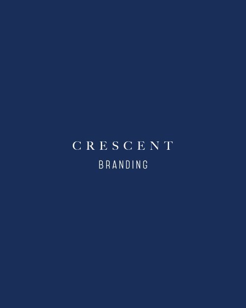
crescent brand copy-2

You also want an ePaper? Increase the reach of your titles
YUMPU automatically turns print PDFs into web optimized ePapers that Google loves.
C R E S C E N T
KEY IDENTITY<br />
introduction<br />
CRESCENT IS A PAKISTANI CLOTHING BRAND. THE BRAND HAVE A<br />
VERY URBANIC STYLE. FOCUS ON CASUAL, & SEMI formal pret<br />
wear.<br />
<strong>crescent</strong> woman<br />
trendy, modern,<br />
she wants to look good,<br />
& live young
logo<br />
CRESCENT logo is in blue & WHITe.<br />
The font used for the logo is modern and elegant which<br />
reflects the <strong>brand</strong> personality.<br />
C R E S C E N T<br />
TAGLINE<br />
FABRIC & PRET IS THE TAGLINE.<br />
it’s very direct and clear as to what we have to offer<br />
C R E S C E N T<br />
FABRIC & PRET
packaging<br />
different ideas for packaging.<br />
we can go really simple with a nice textured bag, or use<br />
some pattern
tags<br />
tags could have little story about the collection<br />
or the <strong>brand</strong> philosophy.
store look & feel<br />
use of pattern could become part of the<br />
<strong>brand</strong>. as per the previous reference in<br />
the packaging slide we could use it on the<br />
floors or make it part of the interior.<br />
signage to be back lit (philipp plein ref)
photograhy<br />
photoshoots can be on location and<br />
in studio.<br />
<strong>crescent</strong> could use 2 models for<br />
every shoot
THANK YOU