


You also want an ePaper? Increase the reach of your titles
YUMPU automatically turns print PDFs into web optimized ePapers that Google loves.
MHt<br />
E<br />
lR L<br />
qb<br />
c<br />
z<br />
y I<br />
OT<br />
N<br />
Q<br />
r<br />
x w<br />
J<br />
10<br />
1<br />
1<br />
< > , . / {<br />
G<br />
11<br />
4<br />
7<br />
1<br />
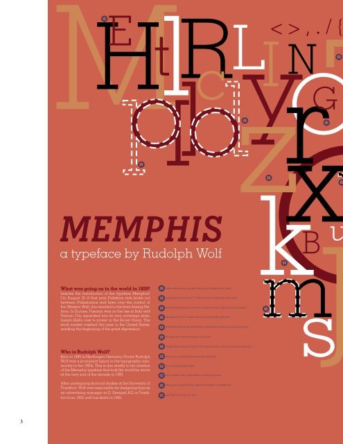
MEMPHIS<br />
a typeface by Rudolph Wolf<br />
k ms<br />
B<br />
9<br />
u<br />
What was going on in the world in 1929?<br />
besides the introduction of the typeface Memphis?<br />
On August 16 of that year Palestine riots broke out<br />
between Palestinians and Jews over the control of<br />
the Western Wall, this resulted in the Jews fleeing Hebron.<br />
In Europe, Fascism was on the rise in Italy and<br />
Vatican City separated into its own sovereign state.<br />
Joseph Stalin rose to power in the Soviet Union. The<br />
stock market crashed this year in the United States,<br />
marking the beginning of the great depression.<br />
1<br />
2<br />
3<br />
4<br />
5<br />
6<br />
letters are simular enough that many fit within each other<br />
memphis is iconic for its “[“ like structure created via slab serifs<br />
slab serif typefaces do not have a bracket that creates a sharp transition<br />
the uppercase T is unique due to its square-like terminal<br />
unlike the other sharp letterforms, some letters transition in a smooth curve<br />
the apeture of the lowercase e is ver low<br />
1<br />
Who is Rudolph Wolf?<br />
Born in 1895 in Hechingen Germany, Doctor Rudolph<br />
Wolf was a prominent figure in the typography community<br />
in the 1920s. This is due mostly to his creation<br />
of the Memphis typeface that took the world by storm<br />
at the very end of the decade in 1929.<br />
After undergoing doctoral studies at the University of<br />
Frankfurt, Wolf was responsible for designing type as<br />
an advertising manager at D. Stempel AG in Frankfurt<br />
from 1922 until his death in 1942.<br />
7<br />
8<br />
9<br />
10<br />
11<br />
12<br />
weight shown here is light but the typeface also comes in medium and bold<br />
there is no contrast between stroke thickness<br />
arm and leg angles differ<br />
short central arm, unbracketed, and low contrast<br />
there are no significantly defined terminals on letterforms<br />
serif like crossbars on i and j<br />
3