Viva Lewes Issue #120 September 2016

You also want an ePaper? Increase the reach of your titles
YUMPU automatically turns print PDFs into web optimized ePapers that Google loves.
ART<br />
Grant Dejonge<br />
'Explosions of light'<br />
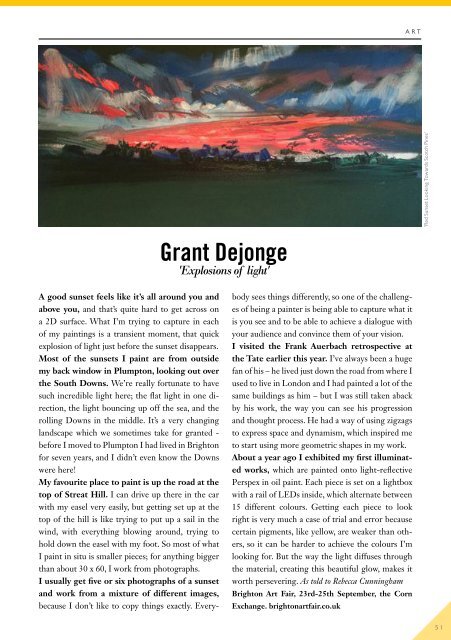
'Red Sunset Looking Towards Scotch Pines'<br />
A good sunset feels like it’s all around you and<br />
above you, and that’s quite hard to get across on<br />
a 2D surface. What I’m trying to capture in each<br />
of my paintings is a transient moment, that quick<br />
explosion of light just before the sunset disappears.<br />
Most of the sunsets I paint are from outside<br />
my back window in Plumpton, looking out over<br />
the South Downs. We’re really fortunate to have<br />
such incredible light here; the flat light in one direction,<br />
the light bouncing up off the sea, and the<br />
rolling Downs in the middle. It’s a very changing<br />
landscape which we sometimes take for granted -<br />
before I moved to Plumpton I had lived in Brighton<br />
for seven years, and I didn’t even know the Downs<br />
were here!<br />
My favourite place to paint is up the road at the<br />
top of Streat Hill. I can drive up there in the car<br />
with my easel very easily, but getting set up at the<br />
top of the hill is like trying to put up a sail in the<br />
wind, with everything blowing around, trying to<br />
hold down the easel with my foot. So most of what<br />
I paint in situ is smaller pieces; for anything bigger<br />
than about 30 x 60, I work from photographs.<br />
I usually get five or six photographs of a sunset<br />
and work from a mixture of different images,<br />
because I don’t like to copy things exactly. Everybody<br />
sees things differently, so one of the challenges<br />
of being a painter is being able to capture what it<br />
is you see and to be able to achieve a dialogue with<br />
your audience and convince them of your vision.<br />
I visited the Frank Auerbach retrospective at<br />
the Tate earlier this year. I’ve always been a huge<br />
fan of his – he lived just down the road from where I<br />
used to live in London and I had painted a lot of the<br />
same buildings as him – but I was still taken aback<br />
by his work, the way you can see his progression<br />
and thought process. He had a way of using zigzags<br />
to express space and dynamism, which inspired me<br />
to start using more geometric shapes in my work.<br />
About a year ago I exhibited my first illuminated<br />
works, which are painted onto light-reflective<br />
Perspex in oil paint. Each piece is set on a lightbox<br />
with a rail of LEDs inside, which alternate between<br />
15 different colours. Getting each piece to look<br />
right is very much a case of trial and error because<br />
certain pigments, like yellow, are weaker than others,<br />
so it can be harder to achieve the colours I’m<br />
looking for. But the way the light diffuses through<br />
the material, creating this beautiful glow, makes it<br />
worth persevering. As told to Rebecca Cunningham<br />
Brighton Art Fair, 23rd-25th <strong>September</strong>, the Corn<br />
Exchange. brightonartfair.co.uk<br />
51