Logo Design Book 2018
Create successful ePaper yourself
Turn your PDF publications into a flip-book with our unique Google optimized e-Paper software.
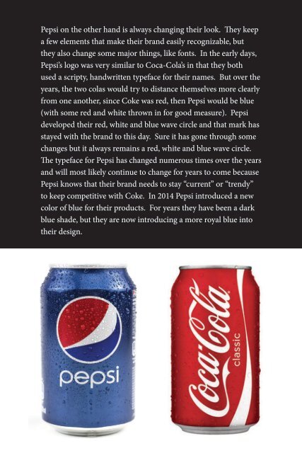
Pepsi on the other hand is always changing their look. They keep<br />
a few elements that make their brand easily recognizable, but<br />
they also change some major things, like fonts. In the early days,<br />
Pepsi’s logo was very similar to Coca-Cola’s in that they both<br />
used a scripty, handwritten typeface for their names. But over the<br />
years, the two colas would try to distance themselves more clearly<br />
from one another, since Coke was red, then Pepsi would be blue<br />
(with some red and white thrown in for good measure). Pepsi<br />
developed their red, white and blue wave circle and that mark has<br />
stayed with the brand to this day. Sure it has gone through some<br />
changes but it always remains a red, white and blue wave circle.<br />
The typeface for Pepsi has changed numerous times over the years<br />
and will most likely continue to change for years to come because<br />
Pepsi knows that their brand needs to stay “current” or “trendy”<br />
to keep competitive with Coke. In 2014 Pepsi introduced a new<br />
color of blue for their products. For years they have been a dark<br />
blue shade, but they are now introducing a more royal blue into<br />
their design.


