

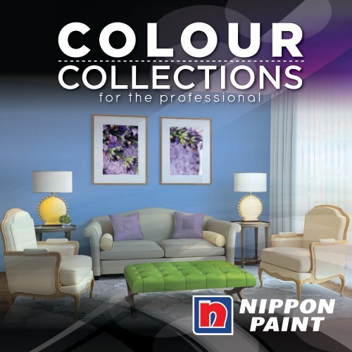
COLOUR COLLECTIONS - Nippon Paint Singapore
COLOUR COLLECTIONS - Nippon Paint Singapore
COLOUR COLLECTIONS - Nippon Paint Singapore

You also want an ePaper? Increase the reach of your titles
YUMPU automatically turns print PDFs into web optimized ePapers that Google loves.
<strong>COLOUR</strong><br />
<strong>COLLECTIONS</strong><br />
for the professional
Power of<br />
Colours
Purple?<br />
Blue?<br />
Index<br />
Explore the p03<br />
Colour Wheel<br />
Colour Families<br />
Pristine Whites p05<br />
Rustic Neutrals p09<br />
Sunny Yellows p13<br />
Sexy Reds p17<br />
Lush Greens p21<br />
Dewy Blues p25<br />
Creative Purples p29<br />
Colour Creations p33<br />
Product List p35<br />
Designers of Choice p37<br />
Just luv this!<br />
Yellow?<br />
Colour have their own personalities. They evoke our feelings and can reflect qualities we process or value.<br />
Look more closely at the hues you’re drawn to - they might just offer some interesting insights!
Explorethe Colour Wheel<br />
Colours bring about happiness, nostalgia, and memories of past and present. Warm colours invigorate and enamate a joyous sense of warmth<br />
while cool colours calm and transcend into harmony and relaxation. Crisp whites and neutrals embalm you in a haven of sanctuary while deep<br />
rich colours call out for attention and novelty.<br />
Colour Decor Schemes<br />
There are no strict rules on what colour should be for which spaces in your homes. However, there is a rule of thumb that you can follow to create a<br />
harmonious and beautiful balance in your home decor. By using the colour wheel, you can understand which colours work best together. The decor<br />
scheme tips will help you decide how best you can incorporate your favourite colour or theme, to create a scheme that can work best for you!<br />
03
Choosing the right colour schemes<br />
The Colour Wheel helps you understand how colours relate to each other and guides you towards selecting your colour schemes by using the<br />
Colour Harmony principles below. With the guidance of combinations of warm or cool colours, you will be able to set the mood for your space,<br />
and more importantly, achieve the level of comfort you would want to feel in your home.<br />
Step 1: Choose a scheme<br />
Monochromatic<br />
One colour won<br />
your heart? It’s<br />
not just white that takes well to a single<br />
colour scheme. Any hue works when<br />
varied through tints, tones and shades.<br />
Adjacent/Analogous Basically<br />
it involves<br />
using adjacent colours - usually 3 to 5 on<br />
the wheel. It works particularly well when<br />
using patterns, focusing on one dominant<br />
colour and serveral accents.<br />
Complementary Choose the main<br />
colour you like,<br />
then match it with the accent colours that<br />
sits on either side of its exact opposite<br />
(complementary colours) on the colour<br />
wheel.<br />
Triadic Find perfect harmony with<br />
three colours that forms a<br />
triangle - all equal distances apart on<br />
the colour wheel. The secret to a triadic<br />
scheme is to vary the intensity of each<br />
colour or you may be overwhelmed.<br />
Step 2: Understand the colour families<br />
P<br />
T<br />
hue<br />
= colour<br />
PRIMARY<br />
red, blue, yellow<br />
S<br />
INTENSITY<br />
SECONDARY<br />
violet, green, orange<br />
TERTIARY<br />
blue-green, blue-violet, red-violet, red-orange, yelloworange,<br />
yellow-green<br />
Step 3: Mix & match<br />
Step 4:<br />
shade tone tint<br />
= colour<br />
+ black<br />
Adjust the intensity<br />
= colour<br />
+ grey<br />
dullness brightness<br />
= colour<br />
+ white
Pristine WhitesColour<br />
05<br />
Triadic<br />
Divinity 3109<br />
Chalk 8160 Dreamland 1149 Barley White 1141<br />
Orchid White 1139 Apple White 1140 Bluebell White 8159<br />
Family<br />
Chalk 8160<br />
Lush 1120<br />
Purity,<br />
Cleanliness<br />
& Innocence<br />
White is featured in most decorating<br />
schemes. The practical and organised<br />
lean towards cool-based whites like Apple<br />
White, while those seeking balance and<br />
security seek out warmer whites like Chalk.<br />
Romantics look towards pearl or champagne<br />
based whites, which suggest a hint of glamour,<br />
exudes a sense of calmness and harmony.<br />
All colours shown in photograph may vary from paint colours due to lighting. All colours shown are as close to the actual <strong>Nippon</strong><br />
<strong>Paint</strong> colours as modern printing techniques permit. Please refer to <strong>Nippon</strong> <strong>Paint</strong> Colour My World for more accurate colours.<br />
Easy Wash<br />
Chalk 8160<br />
3-in-1 Medifresh<br />
Divinity 3109<br />
Odour-less<br />
Lush 1120<br />
Decorating with whites on the<br />
walls, ceilings and even with<br />
furniture brightens a room,<br />
creates the illusion of a larger<br />
space. Use warm whites like<br />
Chalk, which soften areas and<br />
add a sense of comfort in a<br />
contemporary setting.
Apple white 1140<br />
Off whites in dinings<br />
and kitchens are never<br />
a bad idea. Choosing<br />
a colour like Dreamland<br />
which is not stark but<br />
creamy, and pairing with<br />
a soft lavender lends a<br />
comforting touch to its<br />
Complementary<br />
Revitalize 8121 Odour-less<br />
Apple White 1140<br />
Odour-less<br />
Dreamland 1149<br />
Easy Wash<br />
Tender 8149<br />
Glory 3166<br />
Tender 8149<br />
Easy Wash<br />
Revitalize 8121<br />
3-in-1 Medifresh<br />
Glory 3166<br />
Cool whites can suit any style, and especially<br />
so for a modern, urban look. Apple White<br />
in an urban setting gives modern, minimalist<br />
spaces that extra-sharp zing, and highlights<br />
everything around it.<br />
Dreamland 1149<br />
Vinilex<br />
contemporary flair. Purple Angel 5045<br />
Complementary Purple Angel 5045
Off White 5039<br />
Complementary<br />
Conjure a gallery-like open<br />
living areas by having<br />
whimsical whites with a soft<br />
tinge of plum like Indigo Mist.<br />
Complement with a deeper<br />
similar shades in the sofa and<br />
rugs to add a balance note<br />
to the harmony.<br />
Lime Tint 5077<br />
Odour-less<br />
Orchid White 1139<br />
Odour-less<br />
Indigo Mist 1129<br />
Odour-less<br />
Lilac White 1138<br />
Tangerine 3141<br />
Lilac White 1138<br />
Adjacent/Analogous<br />
Vinilex<br />
Off White 5039<br />
Vinilex<br />
Lime Tint 5077<br />
3-in-1 Medifresh<br />
Tangerine 3141<br />
For those who love<br />
the feel of pristine<br />
and lightness, off<br />
white shades work<br />
best for you. Off<br />
White and Lime Tint<br />
provide the right<br />
visual temperature<br />
for a living room and<br />
create a sense of<br />
spaciousness and<br />
lightness.<br />
Orchid White 1139<br />
“<br />
Indigo Mist 1129<br />
The current<br />
trend is offwhites<br />
with<br />
underlying hints<br />
of colours for<br />
the open plan<br />
living style in<br />
contemporary<br />
homes. ”
Monochromatic<br />
Bluebell White 8159<br />
Urban Grey 1113<br />
The magic of White...<br />
What’s so special about white? It reflects about 80% of the light it receives,<br />
making it a potent decorating tool. White and equally pale tones like cream, will<br />
maximise the available light, making them the ideal choice for sun-starved rooms.<br />
White also recedes (seems further away), so it makes smaller rooms look larger.<br />
All colours shown in photograph may vary from paint colours due to lighting. All colours shown are as close to the actual <strong>Nippon</strong><br />
<strong>Paint</strong> colours as modern printing techniques permit. Please refer to <strong>Nippon</strong> <strong>Paint</strong> Colour My World for more accurate colours.<br />
Smoke Pearl 5087<br />
Easy Wash<br />
Bluebell White 8159<br />
Odour-less<br />
Urban Grey 1113<br />
Vinilex<br />
Smoke Pearl 5087<br />
White walls with<br />
strong silhouettes<br />
and neutral palettes<br />
an unusual chic living<br />
area. Minimalist linencovered<br />
white sofas<br />
add to the pure and<br />
crisp impact that<br />
brings a punch to the<br />
overall design.<br />
08
Rustic NeutralsColour Family<br />
09<br />
Triadic<br />
New Blue 3148<br />
Red Earth 3168<br />
Latte 1114 Rustic Brown 1117 Maldives Sand 1116<br />
Light Cocoa 5056 Khaki 1192 Ranch Mink 1171<br />
Light Cocoa 5056<br />
Organic,<br />
Sophisticated<br />
& Relaxed<br />
The need to create warmth and security in a<br />
home is as strong as ever. Natural shades of clay<br />
and tans like Latte and Rustic Brown continue<br />
to play a vital role, sparking off a relaxed yet<br />
sophisticated feel.<br />
Stronger naturals like Treasure Chest and<br />
Ranch Mink create a strong earthy element,<br />
inviting a sense of rich and deep sensuality.<br />
Notwithstanding the spaces where they are<br />
applied, neutrals are the new colour of glamour.<br />
All colours shown in photograph may vary from paint colours due to lighting. All colours shown are as close to the actual <strong>Nippon</strong><br />
<strong>Paint</strong> colours as modern printing techniques permit. Please refer to <strong>Nippon</strong> <strong>Paint</strong> Colour My World for more accurate colours.<br />
Vinilex<br />
Light Cocoa 5056<br />
3-in-1 Medifresh<br />
Red Earth 3168<br />
3-in-1 Medifresh<br />
New Blue 3148<br />
Contrasting textures, fabrics and<br />
colours are key to decorating<br />
with neutrals. A pop of colour<br />
like New Blue in dining accessories<br />
complement the neutral wall, while<br />
earth coloured chairs work well<br />
in completing the look without<br />
feeling sterile.
Maldives Sand 1116<br />
Keep a complementary<br />
scheme interesting by<br />
varying the textures and<br />
mixing prints and solids.<br />
Latte is a versatile colour<br />
that will coordinate well<br />
with paler hues of Moon<br />
and Lavender Charm.<br />
Monochromatic<br />
Odour-less<br />
Latte 1114<br />
Odour-less<br />
Moon 1106<br />
Odour-less<br />
Lavender Charm 1131<br />
Putty 1189<br />
Treasure Chest 1180<br />
Latte 1114<br />
Complementary<br />
Odour-less<br />
Maldives Sand 1116<br />
Odour-less<br />
Putty 1189<br />
Odour-less<br />
Treasure Chest 1180<br />
Do use green-based natural colours as a neutral!<br />
Varying different shades of neutrals is a great<br />
way to make a room feel cohesive. Decorating<br />
with other natural materials like timber furniture<br />
adds to the elegance of the room.<br />
Lavender Charm 1131<br />
Moon 1106
Monochromatic<br />
Give a kick to neutrals by using<br />
colours or curved furniture to<br />
stimulate visual interest. Bright<br />
coloured cabinets kick up a<br />
notch with the Khaki and Putty<br />
walls, adding a punch to the<br />
neutral palette.<br />
Rustic Brown 1117<br />
Cocoa Bar 1179<br />
Odour-less<br />
Khaki 1192<br />
Odour-less<br />
Putty 1189<br />
Odour-less<br />
Fire Engine Red 1168<br />
Cornfield 5085<br />
Putty 1189<br />
Complementary<br />
Odour-less<br />
Rustic Brown 1117<br />
Vinilex<br />
Cornfield 5085<br />
Odour-less<br />
Cocoa Bar 1179<br />
To keep a monochromatic<br />
scheme from getting<br />
boring, use a different<br />
wood tones in furniture to<br />
pair with the wall colour.<br />
Deep oak wood works<br />
wonders with wall colour<br />
Rustic Brown. Coordinate<br />
with lighter tone of<br />
lampshades to harmonise<br />
the neutral palette.<br />
Fire Engine Red 1168<br />
“<br />
Beige when<br />
teamed with<br />
brown, is the<br />
best neutral<br />
combination,<br />
bringing<br />
warmth to a<br />
room. ”<br />
Khaki 1192
Adjacent/Analogous<br />
Mauve Pink 1182<br />
Ranch Mink 1171<br />
Dusk 1130<br />
Urban Living...<br />
Greys and browns are the new power player in modern interiors. Cool and warm-based<br />
neutral colours have a serene feel, and are ideal in areas where socialising frequently<br />
occurs. Most importantly, it can accomodate most other hues including bright tones<br />
and soft pastels.<br />
All colours shown in photograph may vary from paint colours due to lighting. All colours shown are as close to the actual <strong>Nippon</strong><br />
<strong>Paint</strong> colours as modern printing techniques permit. Please refer to <strong>Nippon</strong> <strong>Paint</strong> Colour My World for more accurate colours.<br />
Odour-less<br />
Ranch Mink 1171<br />
Odour-less<br />
Mauve Pink 1182<br />
Odour-less<br />
Dusk 1130<br />
Imbue your bedroom<br />
with a deep rich<br />
neutral like Ranch Mink,<br />
and it harnonises with<br />
the beige cabinet<br />
and pillows. A dapple<br />
of muted Mauve Pink<br />
and lavender in basic<br />
accessories add to<br />
the romantic notion.<br />
12
Sunny YellowsColour Family<br />
13<br />
Peaceful 3138<br />
Triadic<br />
Peaceful 3138 Vanilla Crème 1150 Sunlight 1190<br />
Sunglow 1108 Earth Yellow 3142 Golden Buff 5063<br />
New Blue 3148<br />
Fantasy Orange 8169<br />
Effervescent,<br />
Vivacious &<br />
Optimistic<br />
Warm yellows are happy, positive and a<br />
burst of exuberant energy. Warm yellows<br />
like golden honeys and apricot yellows<br />
paint an uplifting mood. Cool Yellows<br />
like soft citrus and lemon yellows are<br />
classic, a touch of understated luxe and<br />
elegance. Bright lime yellows or tart lemons<br />
create an unexpected splash of colours, infusing the<br />
space with optimism and energy.<br />
All colours shown in photograph may vary from paint colours due to lighting. All colours shown are as close to the actual <strong>Nippon</strong><br />
<strong>Paint</strong> colours as modern printing techniques permit. Please refer to <strong>Nippon</strong> <strong>Paint</strong> Colour My World for more accurate colours.<br />
3-in-1 Medifresh<br />
Peaceful 3138<br />
3-in-1 Medifresh<br />
New Blue 3148<br />
Easy Wash<br />
Fantasy Orange 8169<br />
A glint of yellow in living room<br />
delights. Here, a melting yellow<br />
Peaceful, works together with crisp<br />
white furnishings and warmed<br />
by circular orange lamps. It is<br />
contrasted beautifully, and chilled<br />
by the paled blue wall.
Light coloured bedrooms<br />
in various shades of<br />
yellow create a sense of<br />
calm and serenity. White<br />
linen sheets, with sheer<br />
white curtains complete<br />
the look of this pale<br />
palette.<br />
Mandarin Glow 1111<br />
Sunglow 1108<br />
Adjacent/Analogous<br />
Vinilex<br />
Lime Tint 5077<br />
Odour-less<br />
Moon 1106<br />
Easy Wash<br />
Sunshine 8133<br />
Glory 3166<br />
Monochromatic<br />
Moon 1106<br />
Odour-less<br />
Sun Glow 1108<br />
Easy Wash<br />
Mandarin Glow 1111<br />
3-in-1 Medifresh<br />
Glory 3166<br />
Warm Yellow and rust orange are ideal colours<br />
to add a friendly warmth to the kitchen.<br />
They are the natural choices for the kitchen<br />
because its golden and buttery tones suggest<br />
sumptousness. Avoid overly saturated shades<br />
as it corresponds the perception of heat.<br />
Lime Tint 5077<br />
Sunshine 8133
Deep Violet 1134<br />
Complementary<br />
Yellow and tangerine walls and<br />
white woodwork, along with<br />
snaps of scarlet red pull this<br />
room’s architechture together.<br />
Sometimes simple accessories<br />
in snaps of analogous colours<br />
are all it takes to enliven the<br />
room, creating an analogous<br />
harmony.<br />
Vanilla Crème 1150<br />
Vinilex<br />
Golden Buff 5063<br />
Vinilex<br />
Tangerine 5050<br />
Odour-less<br />
Deep Scarlet 1184<br />
Earth Yellow 3142<br />
Tangerine 5050<br />
Adjacent/Analogous<br />
Odour-less<br />
Vanilla Crème 1150<br />
Odour-less<br />
Deep Violet 1134<br />
3-in-1 Medifresh<br />
Earth Yellow 3142<br />
Because yellow is<br />
associated with<br />
cheerfulness and<br />
optimism, it makes a<br />
perfect decorating<br />
choice for a dining<br />
space where<br />
gatherings and<br />
interaction takes place.<br />
Puncture the butterand-cream<br />
yellow with<br />
a contrasting purple<br />
timepiece to create a<br />
focal point of interest.<br />
Deep Scarlet 1184<br />
“<br />
Yellow’s bright<br />
hue and high<br />
reflective<br />
value makes it<br />
good choice<br />
for rooms that<br />
need some<br />
brightening<br />
up. ”<br />
Golden Buff 5063
Monochromatic<br />
Earth Yellow 3142<br />
Urban Grey 1113<br />
Where to use Yellow?<br />
The beauty of yellows is that it works almost in all spaces. Warm yellows with browns<br />
and creams relay a country touch and are great for dinings or kitchens, while softer<br />
cream yellows are contemporary and clean, great for family rooms. Avoid overly bright<br />
yellows in children’s bedroom, go for a milder shade of yellow instead, as excessive<br />
exposure to it may cause fatigue.<br />
Don’t forget...<br />
Colours of your home accessories can complement your wall colours! Go for an small<br />
touches of accents for a refreshing splash of colour!<br />
All colours shown in photograph may vary from paint colours due to lighting. All colours shown are as close to the actual <strong>Nippon</strong><br />
<strong>Paint</strong> colours as modern printing techniques permit. Please refer to <strong>Nippon</strong> <strong>Paint</strong> Colour My World for more accurate colours.<br />
Sunlight 1190<br />
3-in-1 Medifresh<br />
Earth Yellow 3142<br />
Odour-less<br />
Sunlight 1190<br />
Odour-less<br />
Urban Grey 1113<br />
Using a single<br />
colour scheme can<br />
be tricky. To avoid<br />
overpowering the<br />
bedroom seek out a<br />
colour that is lively<br />
but not too bold,<br />
like Earth Yellow<br />
and apply on one<br />
feature wall.<br />
16
Sexy RedsColour<br />
Name 0000<br />
17<br />
Triadic<br />
Name 0000<br />
Family<br />
Name 0000<br />
Spellbound 8116 Glory 3166 Sassy 1105<br />
Scarlet 3165 Spectrum Red 5046 Glamorous 8172<br />
Strength,<br />
Passion &<br />
Romance<br />
Reds are colours that will outlast any season.<br />
Graduating from soft pinks to deeper tones<br />
smouldering berries and coppers, red’s volatile<br />
nature makes it a versatile and resourceful<br />
shade.<br />
Add earthy undertones to red and transform it<br />
into vibrant rich nuances of wine and red oak.<br />
All colours shown in photograph may vary from paint colours due to lighting. All colours shown are as close to the actual <strong>Nippon</strong><br />
<strong>Paint</strong> colours as modern printing techniques permit. Please refer to <strong>Nippon</strong> <strong>Paint</strong> Colour My World for more accurate colours.<br />
Odour-less<br />
Mandarin Glow 1111<br />
Odour-less<br />
Ballerina 1181<br />
3-in-1 Medifresh<br />
Glory 3166<br />
Red is a versatile colour. Endearing<br />
when paired with off whites and<br />
shades of pink, classic when paired<br />
with neutrals or greys, and urban<br />
when used with brilliant whites.
Red is a daring choice,<br />
with a high impact<br />
design statement that<br />
is unapologetically,<br />
enticing. Red walls bring<br />
a flair to an elegant<br />
living area, with gentle<br />
blue sofa to complement.<br />
Adjacent/Analogous<br />
Easy Wash<br />
Spellbound 8116<br />
3-in-1 Medifresh<br />
Spring Yellow 3179<br />
Easy Wash<br />
Stream 8137<br />
Glory 3166<br />
Tangerine 5050<br />
Vanilla 3111<br />
Triadic<br />
3-in-1 Medifresh<br />
Glory 3166<br />
Vinilex<br />
Tangerine 5050<br />
3-in-1 Medifresh<br />
Vanilla 3111<br />
Small spaces are perfect for experimenting<br />
with vivid colours. Here, two bright colours<br />
unify to create a varied look. Glory combined<br />
with Tangerine, complete with dark wood<br />
injects instant drama to the dining space,<br />
adding to the vivid modernism.<br />
Spellbound 8116 Spring Yellow 3179<br />
Stream 8137
Rose White 8156<br />
Scarlet 3165<br />
Monochromatic<br />
A full strength red like Spectrum<br />
Red and muted green neutrals<br />
are the perfect match for an<br />
urban yet sophisticated look.<br />
An elaborated chandelier of<br />
crystals adds a sparkle to the<br />
colours and design, giving it<br />
a classic yet stylish twist.<br />
Vinilex<br />
Spectrum Red 5046<br />
Vinilex<br />
Kiwippi 5071<br />
Vinilex<br />
Ash Grey 5037<br />
Raspberry Sorbet 3167<br />
Spectrum Red 5046<br />
If you can’t commit<br />
to a completely red<br />
room, try having only<br />
one wall in red. Hang<br />
fabrics or artwork in<br />
varying shades of<br />
the colour as a stylish<br />
alternative to tone<br />
down the shade.<br />
Choose mid tones in<br />
smaller doses such as<br />
in pillows or a quilt is<br />
equally warming.<br />
Kiwippi 5071<br />
Complementary<br />
3-in-1 Medifresh<br />
Scarlet 3165<br />
3-in-1 Medifresh<br />
Raspberry Sorbet 3167<br />
Easy Wash<br />
Rose White 8156<br />
Ash Grey 5037<br />
“<br />
A blast<br />
of red will<br />
work in most<br />
modern<br />
interiors,<br />
making it a<br />
focal point<br />
and adding<br />
life to the<br />
spaces. ”
Monochromatic<br />
Ballerina 1181<br />
Heat Raiser...<br />
Red is a powerful colour. Studies show that exposure to it can raise<br />
your blood pressure, stimulate your heart and blood circulation,<br />
and help build up red blood cells. Red affects your emotions too. It<br />
brings heat, intensity and passion, and revs up all your colour senses,<br />
including your appetite. These properties can work in your favour if<br />
you use red wisely in your home. Go for splashes of scarlet and ruby in<br />
areas where you want excitement and activity - playrooms, hall way<br />
and entrance area.<br />
Sassy 1105<br />
Swansdown 5075<br />
All colours shown in photograph may vary from paint colours due to lighting. All colours shown are as close to the actual <strong>Nippon</strong><br />
<strong>Paint</strong> colours as modern printing techniques permit. Please refer to <strong>Nippon</strong> <strong>Paint</strong> Colour My World for more accurate colours.<br />
Odour-less<br />
Sassy 1105<br />
Odour-less<br />
Ballerina 1181<br />
Vinilex<br />
Swansdown 5075<br />
Red in living rooms<br />
invites and entices –<br />
extending a welcoming<br />
warmth feel. To avoid<br />
overpowering of red,<br />
use it on one wall and<br />
your energy level raises<br />
each time you look at it.<br />
Throw in a rug and pair<br />
it with the palest tinge<br />
on the walls to create<br />
a stylist urban twist.<br />
20
Lush GreensColour<br />
Raindrop 1160<br />
21<br />
Triadic<br />
Family<br />
Tart Twist 8163<br />
Vivid Orange 1170<br />
Tart Twist 8163 Green Tea 3154 Willow Green 5028<br />
Sprout 1122 Citrus 1157 Lettuce 3149<br />
Excitement 8152<br />
Natural,<br />
Calm<br />
& Balanced<br />
Think green! Inspired by eco-living trends,<br />
tranquil palettes of Citrus, Sprout and<br />
Peppermint are perfect for a nurturing and<br />
relaxing escapade. Deep olives like Kiwippi and<br />
forest greens pay homage to mother nature’s palette,<br />
while bright limes are all but the continuing urban<br />
favorites, injecting energy and positivity into every<br />
room.<br />
Don’t forget cool shades of jade and teals that evoke a<br />
sense of rejuvenation to contemporary interiors, bringing<br />
balance and harmony.<br />
All colours shown in photograph may vary from paint colours due to lighting. All colours shown are as close to the actual <strong>Nippon</strong><br />
<strong>Paint</strong> colours as modern printing techniques permit. Please refer to <strong>Nippon</strong> <strong>Paint</strong> Colour My World for more accurate colours.<br />
Easy Wash<br />
Tart Twist 8163<br />
Easy Wash<br />
Excitement 8152<br />
Odour-less<br />
Vivid Orange 1170<br />
Spruce up a room by giving it<br />
a shot of fresh natural colour.<br />
Coordinate with a soft lavender<br />
pleated curtain with shots of Vivid<br />
Orange accessory pieces, and<br />
you’ll end up with a refreshing<br />
statement in your study room.
Kiwippi 5071<br />
The right colours can<br />
stimulate and relax<br />
your senses and create<br />
happy memories. Green<br />
is an organic colour<br />
of nature and is used<br />
here in varying tones to<br />
their advantage, with a<br />
tranquil effect. Pairing<br />
with cream finishes react<br />
well with the green<br />
background, proving to<br />
be soothing and easy to<br />
live with.<br />
Monochromatic<br />
Green Tea 3154<br />
Vinilex<br />
Willow Green 5028<br />
Easy Wash<br />
Pistachio 8164<br />
Vinilex<br />
Sherbet 5066<br />
Pistachio 8164<br />
Turf Green 5033<br />
Willow Green 5028<br />
Monochromatic<br />
3-in-1 Medifresh<br />
Green Tea 3154<br />
Vinilex<br />
Kiwippi 5071<br />
Vinilex<br />
Turf Green 5033<br />
Finished in a soft sheen of Green Tea, it gives<br />
a subtle reminder of nature - healthy, fresh,<br />
and alive. Coupled with a regal muted rug<br />
and unusual brown console, it provides a<br />
sophisticated backdrop for art pieces.<br />
Sherbet 5066
White Ice 5073<br />
Complementary<br />
If you choose to have a big<br />
burst of green, apply it on<br />
the wall. Create patterns or<br />
stripes with varying shades<br />
for visual stimulation. A well<br />
chosen piece of furniture<br />
in a contrasting red brings<br />
attention to the space,<br />
while greenery in the form<br />
of maidenhair ferns help<br />
cool and ground it in its<br />
environment.<br />
Odour-less<br />
Citrus 1157<br />
Odour-less<br />
Fire Engine Red 1168<br />
Odour-less<br />
Fresh Celery 1123<br />
Pink Pop 8173<br />
Sprout 1122<br />
Complementary<br />
Odour-less<br />
Sprout 1122<br />
Vinilex<br />
White Ice 5073<br />
Easy Wash<br />
Pink Pop 8173<br />
Like the first sprouts<br />
of grass, the colour<br />
Sprout in a bedroom<br />
adds a rejuvenating<br />
note to the resting<br />
area. Go for bright<br />
corals or tomato<br />
oranges in rugs or<br />
couch to shake things<br />
up. To add variety,<br />
try multiple shades of<br />
green so it will better<br />
coordinate with the<br />
rest of the decor.<br />
Citrus 1157<br />
“<br />
Fresh Celery 1123<br />
Muted or pale<br />
shades of green<br />
are particularly<br />
soothing, making<br />
it perfect<br />
shades for<br />
areas suitable<br />
for sleeping or<br />
relaxation ”<br />
Fire Engine Red 1168
Lettuce 3149<br />
Adjacent/Analogous<br />
New Blue 3148<br />
Hollyhock 3174<br />
Natural Wonder...<br />
Green is a colour we instinctively seek out when we’re feeling stressed or<br />
overwhelmed. Studies show that exposure to green will result in deep, slow<br />
breathing. This calming effect is the reason people sit in the “green room”<br />
before appearing on television programs, and it’s why many hospital use green, to<br />
help in calming and healing. Its vibrancy and links to nature are what makes green<br />
such a positive colour to live with.<br />
All colours shown in photograph may vary from paint colours due to lighting. All colours shown are as close to the actual <strong>Nippon</strong><br />
<strong>Paint</strong> colours as modern printing techniques permit. Please refer to <strong>Nippon</strong> <strong>Paint</strong> Colour My World for more accurate colours.<br />
3-in-1 Medifresh<br />
Lettuce 3149<br />
3-in-1 Medifresh<br />
New Blue 3148<br />
3-in-1 Medifresh<br />
Hollyhock 3174<br />
Dining spaces are<br />
where you commune<br />
with your family and<br />
friends. Because of<br />
its ability to blend<br />
with its adjacent<br />
colours of blues, the<br />
combination of blues<br />
and greens are<br />
always a favourite<br />
pair for a attractive<br />
and refreshing, yet<br />
surprisingly neutral.<br />
24
Dewy BluesColour<br />
25<br />
Lightest Lavender 8180<br />
Triadic<br />
Family<br />
Sandcastle 1107<br />
Stream 8137<br />
Stream 8137 Cosmic Navy 3133 Harmony 8112<br />
Jewel Blue 1197 Pansy Blue 8182 Continental BLue 5051<br />
Cool, Clear<br />
& Confident<br />
Bring forth memories of Mediterranean seas and<br />
ocean waves, with Stream and Jewel Blue.<br />
Heritage blues like Cosmic Navy reflect a<br />
timeless quality, and when paired with lighter<br />
icy blues, open up a vast expanse of<br />
space and light in the living interior.<br />
Inspired by idyllic getaways where blue<br />
horizons linger, blues are the everlasting<br />
favourites of most people and a positive<br />
uplift in one’s journey through life.<br />
All colours shown in photograph may vary from paint colours due to lighting. All colours shown are as close to the actual <strong>Nippon</strong><br />
<strong>Paint</strong> colours as modern printing techniques permit. Please refer to <strong>Nippon</strong> <strong>Paint</strong> Colour My World for more accurate colours.<br />
Easy Wash<br />
Stream 8137<br />
Odour-less<br />
Sandcastle 1107<br />
Easy Wash<br />
Lightest Lavender 8180<br />
What colour could be more suited<br />
than the happy combination<br />
of blue, yellow and pink? The<br />
Stream colour as a backdrop<br />
for the powdery blue chair works<br />
wonders with white shutters,<br />
providing a clean and fresh vibe.
Continental Blue 5051<br />
A bold shade of sky-blue<br />
invigorates the bedroom<br />
of a young child. Different<br />
shades of blue serve as<br />
the backdrop for fun prints<br />
and accessories. An all<br />
white wicker bed adds to<br />
the casual and carefree<br />
hideout for the kid.<br />
Complementary<br />
3-in-1 Medifresh<br />
Blue Harmony 3132<br />
Odour-less<br />
Ocean Sky 1159<br />
Easy Wash<br />
Yellow Rose 8174<br />
Peaceful 3138<br />
Cosmic Navy 3133<br />
Yellow Rose 8174<br />
Blue Harmony 3132<br />
Ocean Sky 1159<br />
Monochromatic<br />
3-in-1 Medifresh<br />
Cosmic Navy 3133<br />
Vinilex<br />
Continental Blue 5051<br />
3-in-1 Medifresh<br />
Peaceful 3138<br />
Blue is a perennial favourite in decorating<br />
no matter what shade it comes in. Especially<br />
so when used in varying tones - it provides<br />
a glimpse of nobility and clarity. Blues are<br />
fantastic against silver, and so it is outstanding<br />
when used in kitchen with plenty of silverware.
Jewel Blue 1197<br />
Adjacent/Analogous<br />
Pale powdery blue is a<br />
favourite focal colour in the<br />
hot summer weather. Throw<br />
in deeper tones to complete<br />
the monochromatic harmony<br />
and be all ready to kick back<br />
and relax in the comfort of a<br />
blue room.<br />
Allure 8154<br />
3-in-1 Medifresh<br />
Blue Chiffon 3131<br />
Easy Wash<br />
Harmony 8112<br />
Easy Wash<br />
Pansy Blue 8182<br />
Sprout 1122<br />
Monochromatic<br />
Odour-less<br />
Jewel Blue 1197<br />
Odour-less<br />
Sprout 1122<br />
Easy Wash<br />
Allure 8154<br />
Adjacent colour-mix<br />
of blues and greens<br />
will never go wrong.<br />
Give the living<br />
area a relaxed but<br />
coordinated feel by<br />
mixing and matching<br />
fabrics, pictures and<br />
furnishings in related<br />
colours.<br />
Blue Chiffon 3131<br />
Harmony 8112<br />
Pansy Blue 8182<br />
“<br />
Go for the<br />
simplicity of<br />
blue and<br />
white – you<br />
can never<br />
go wrong<br />
with it.<br />
”
Seabreeze 1126<br />
Monochromatic<br />
Peace 8109<br />
Clear Water 1124<br />
It’s a breeze...<br />
Blue is a cool colour with low reflective value, so it diffuses and softens light, making<br />
the room feels cool and comfortable. Particularly effective is pale blue, which is striking<br />
and soothing at the same time. It can be used both as a wall colour or introduced into<br />
a colour scheme as an accent.<br />
All colours shown in photograph may vary from paint colours due to lighting. All colours shown are as close to the actual <strong>Nippon</strong><br />
<strong>Paint</strong> colours as modern printing techniques permit. Please refer to <strong>Nippon</strong> <strong>Paint</strong> Colour My World for more accurate colours.<br />
Odour-less<br />
Seabreeze 1126<br />
Odour-less<br />
Clear Water 1124<br />
Easy Wash<br />
Peace 8109<br />
Blues can be smart<br />
and sophisticated<br />
in any room design.<br />
Envelope your study in<br />
an ocean wave colour<br />
like Seabreeze, and it<br />
adds a sense of calm<br />
like no other. Create<br />
interest with varying<br />
degrees of blue and<br />
include a touch of<br />
seagrass green with<br />
potted plants.<br />
28
Creative PurplesColour Family<br />
29<br />
Purple Romance 1174<br />
Adjacent/Analogous<br />
Lavender Charm 1131<br />
Meadow Sweet 3127 Orchid Purple 1193 Grape 8185<br />
Harmonious Purple 8170 Persian Silk 8187 Purple Romance 1174<br />
Sassy 1105<br />
Bold, Noble &<br />
Enlightened<br />
Deep purple shades strike a chord with the romantics,<br />
striking up images of rich budoirs and jeweled<br />
treasures. Create new daring designs with plums and<br />
make a statement with it.<br />
Softer hues like lavenders and lilacs add<br />
a lighter touch to the palette for the<br />
contemporary space. Violets give a depth<br />
that add a touch of understated class and<br />
elegance to the complexity of the space.<br />
All colours shown in photograph may vary from paint colours due to lighting. All colours shown are as close to the actual <strong>Nippon</strong><br />
<strong>Paint</strong> colours as modern printing techniques permit. Please refer to <strong>Nippon</strong> <strong>Paint</strong> Colour My World for more accurate colours.<br />
Odour-less<br />
Lavender Charm 1131<br />
Odour-less<br />
Purple Romance 1174<br />
Odour-less<br />
Sassy 1105<br />
Moody aubergine walls may<br />
seem a surprising choice for a<br />
living area, but pair with a soft<br />
violet wall, white upholstery and<br />
soft throw cushion, and the room<br />
is transformed into an elegant<br />
yet comfortable lounging space.
Thistle 5090<br />
Candle Light 5084<br />
Purple wears many<br />
hats. In a deep hue<br />
like Harmonious Purple,<br />
it adds drama to an<br />
ordinary design. Yet you<br />
can soothe the space<br />
with a softer shade of<br />
violet on the side wall<br />
and carpet.<br />
Complementary<br />
Easy Wash<br />
Harmonious Purple 8170<br />
Easy Wash<br />
Allure 8154<br />
Easy Wash<br />
Excitement 8152<br />
Orchid Purple 1193<br />
Harmonious Purple 8170<br />
Monochromatic<br />
Odour-less<br />
Orchid Purple 1193<br />
Vinilex<br />
Thistle 5090<br />
Vinilex<br />
Candle Light 5084<br />
When paired with dark wood furnishing,<br />
the lavender colour takes centrestage in<br />
this simple yet comfortable living room. The<br />
amethyst walls serve as an elegant backdrop<br />
for the yellow shades and cushions, rounding<br />
out a well-curated mix.<br />
Excitement 8152<br />
Allure 8154
Grape 8185<br />
Complementary<br />
Purple is not for everyone, but<br />
when used, its varied shades<br />
can be calming in a bedroom.<br />
A musky shade of Persian Silk<br />
with its quieter shades of<br />
Violet Shadow emphasizes<br />
serenity in the bedroom,<br />
soothes the senses and spirit.<br />
Easy Wash<br />
Persian Silk 8187<br />
Easy Wash<br />
Violet Shadow 8186<br />
Odour-less<br />
Pink Frost 1194<br />
Tender 8149<br />
Yellow Rose 8174<br />
Monochromatic<br />
Easy Wash<br />
Tender 8149<br />
Easy Wash<br />
Grape 8185<br />
Easy Wash<br />
Yellow Rose 8174<br />
Taking advantage<br />
of the room’s natural<br />
light, a lightly<br />
coloured purple<br />
tinge creates a<br />
brightly lit dining<br />
area. Punctuate<br />
the simplicity by a<br />
deeper shade of<br />
purple tabletop and<br />
add sparkle with<br />
bright avant-garde<br />
bar chairs and<br />
accessories.<br />
Violet Shadow 8186<br />
“<br />
Purple<br />
always steals<br />
the show.<br />
Passionate<br />
and dreamy,<br />
it makes a<br />
statement<br />
with its deep<br />
luscious<br />
tones.<br />
”<br />
Persian Silk 8187<br />
Pink Frost 1194
Tangerine 5050<br />
Triadic<br />
Lush 1120<br />
Meadow Sweet 3127<br />
Simple luxury...<br />
Deep purple shades can seem overpowering, but knock back with white, their mood becomes<br />
refreshing and serene. A combination of various purple tones creates the perfect ambiance for<br />
family areas or bedrooms.<br />
All colours shown in photograph may vary from paint colours due to lighting. All colours shown are as close to the actual <strong>Nippon</strong><br />
<strong>Paint</strong> colours as modern printing techniques permit. Please refer to <strong>Nippon</strong> <strong>Paint</strong> Colour My World for more accurate colours.<br />
3-in-1 Medifresh<br />
Meadow Sweet 3127<br />
Odour-less<br />
Lush 1120<br />
Vinilex<br />
Tangerine 5050<br />
Transform your child’s<br />
room into a playful<br />
retreat with hues of<br />
periwinkle and lilacs<br />
on the walls. Add a<br />
punch of coral to the<br />
mix in her personal<br />
wardrobe and toys,<br />
keeping things fun<br />
and bright.<br />
32
Colour Creations Creating your own colours<br />
with <strong>Nippon</strong> <strong>Paint</strong><br />
Depending on your needs, your creation is available in any one<br />
of <strong>Nippon</strong> <strong>Paint</strong>’s premium paint finishes.<br />
33<br />
• Odour-less EasyWash<br />
• Odour-less All-in-1<br />
• Easy Wash with Teflon<br />
• 3-in-1 Medifresh<br />
• Vinilex 5000 Low Odour<br />
• Bodelac 9000<br />
• Aqua Bodelac<br />
• Weatherbond<br />
• Weatherbond AlgaeGuard<br />
• SolaReflect<br />
With <strong>Nippon</strong> <strong>Paint</strong>’s <strong>COLOUR</strong><br />
CREATIONS, there is no limit to your<br />
imagination! Our state-of-the-art<br />
system scans practically any material<br />
- a photograph, fabric or even a paper<br />
sample, to any colour that you desire.<br />
Get your inspiration from the wide array<br />
of colours from our <strong>Nippon</strong> <strong>Paint</strong> Colour<br />
Creations fandeck. You can now choose<br />
any colour from our full range of <strong>Nippon</strong><br />
<strong>Paint</strong> products!<br />
For more information on the locations of <strong>Nippon</strong> <strong>Paint</strong> Colour Creations system,<br />
please call the Customer Service Hotline at 6265 5355.
Step 1:<br />
Peppermint NIPPON PAINT<br />
Visit our <strong>Nippon</strong> <strong>Paint</strong> stores and be enticed<br />
by the wide range of new and exciting colours<br />
from our Colour Selector chips. Each colour<br />
chip allows you to view and co-ordinate<br />
colours easily and beautifully.<br />
Step 2:<br />
Step 3:<br />
<strong>Nippon</strong> <strong>Paint</strong> Colour Selectors<br />
Mixing and Matching<br />
Arrange colours to your desired effect. Use<br />
a light, medium and dark shade of the same<br />
family colour for a monochromatic scheme.<br />
You may even bring the colour chips home to<br />
discuss with your family and interior designer.<br />
Getting Your Colour<br />
Once you’ve selected your preferred colours,<br />
simply bring the colour chips to any <strong>Nippon</strong><br />
<strong>Paint</strong> store, and our friendly personnel will<br />
accurately dispense the right shade, hue, tint<br />
and accent paint colours using <strong>Nippon</strong> <strong>Paint</strong><br />
Colour Creations Machine – an innovative,<br />
computerised paint system.<br />
Green Sprout NIPPON PAINT<br />
1121<br />
1122<br />
Turf Green NIPPON PAINT<br />
5033
Product for every<br />
ListSolutions<br />
part of your home<br />
INTERIOR Exterior<br />
35<br />
<strong>Nippon</strong> Odour~less All-in-1<br />
Almost no paint odour during and after painting<br />
• Almost no paint odour<br />
• Near zero VOC<br />
• Covers hairline cracks<br />
<strong>Nippon</strong> Easy Wash with Teflon<br />
Premium washable paint cleans off stains easily<br />
• Teflon technology<br />
• Outstanding washability<br />
• Long lasting colours<br />
• Covers hairline cracks<br />
• Alkali resistant<br />
• Anti-fungus/mould<br />
<strong>Nippon</strong> 3-in-1 Medifresh<br />
Anti-bacterial protection for your loved ones<br />
• Anti-bacterial formula up to<br />
5 years - useful for inhibition<br />
of asthma, flu & diarrhoea<br />
• Outstanding washability<br />
• Long lasting colours<br />
• Anti-fungus/mould/algae<br />
<strong>Nippon</strong> Vinyl Silk<br />
Elegant silky shades for a sense of passion<br />
• Luxurious silky sheen finish<br />
• Long lasting colurs<br />
• Good hiding power<br />
• Durable<br />
• Fast drying<br />
• Anti-fungus<br />
<strong>Nippon</strong> Vinilex 5000 Low Odour<br />
Smooth matt finish<br />
• Low Odour<br />
• Smooth matt finish<br />
• Long lasting colours<br />
• Resistance to fungus<br />
• Anti-bacterial<br />
• Washable<br />
<strong>Nippon</strong> Odour~less EasyWash<br />
All the benefits of Odour-less All-in-1 with added Superior<br />
Washability<br />
• Almost no paint odour<br />
• Teflon surface protector<br />
• Superior washability<br />
• Anti-stain formula<br />
= 2x easier to clean<br />
• Near zero VOC<br />
• Good coverage<br />
• Durable<br />
• Anti-Fungus<br />
1<br />
1<br />
1<br />
1<br />
1<br />
1<br />
<strong>Nippon</strong> SolaReflect<br />
High performance heat reduction<br />
• Surface temperture up to<br />
5ºC cooler<br />
• Heat reduction effect-energy<br />
saving<br />
Wood & Metal <strong>Paint</strong><br />
Roof <strong>Paint</strong><br />
• Excellent weather resistance<br />
• Anti fungus/algae<br />
• Long lasting colours<br />
<strong>Nippon</strong> Weatherbond<br />
High performance exterior paint to protect your house<br />
• High performance paint for<br />
exterior walls<br />
• Anti-carbonation formula<br />
<strong>Nippon</strong> Aqua Bodelac<br />
Water-based modified acrylic gloss enamel paint with low VOC<br />
• High gloss finishes for wood &<br />
metal surfaces<br />
• Protects against corrosion<br />
<strong>Nippon</strong> Bodelac 9000<br />
High gloss paint for excellent finishing<br />
• Super gloss and matt finishes for<br />
wood & Metal sufaces<br />
• Anti-fungus<br />
<strong>Nippon</strong> Roofguard<br />
UV resistance, protects against sun and rain<br />
• Excellent light-fast alkali resistant<br />
pigments<br />
• Effective mould control additive<br />
• Excellent resistance to dirt, water,<br />
alkali, chemicals & peeling<br />
• Excellent adhesion to wall<br />
surface<br />
<strong>Nippon</strong> Weatherbond AlgaeGuard<br />
High performance exterior paint with enhanced anti-algae<br />
and anti-streak marks performance<br />
• Excellent resistance to<br />
algae/fungi<br />
• Resistant to dirty<br />
streak marks<br />
• Weather resistant and<br />
durable<br />
• Low VOC<br />
• Excellent adhesion to wood &<br />
metal surfaces<br />
• Long lasting colours<br />
• Protects againt corrosion<br />
• Long lasting colours<br />
2<br />
2<br />
2<br />
3<br />
3<br />
4
Interior Wood Varnish<br />
Wood <strong>Paint</strong><br />
6<br />
<strong>Nippon</strong> <strong>Paint</strong> Timberlac<br />
Clear & tinted wood varnish to enhance<br />
natural wood surfaces<br />
• Available in various tints in high • Anti-fungus<br />
glass finishes<br />
• Excellent flow & Leveling for a<br />
smoother finish<br />
<strong>Nippon</strong> Timbercoat<br />
Maintain colour consistency, ideal for fences,<br />
balconies and wooden wall<br />
• Excellent durability<br />
• Excellent adhesion<br />
5<br />
7<br />
• Contains light-fast pigments<br />
• Effective mould control addictive<br />
5<br />
6<br />
1<br />
2<br />
3<br />
Exterior Wood Varnish<br />
Spray <strong>Paint</strong><br />
8<br />
<strong>Nippon</strong> Solarshield<br />
Excellent shades with UV filters, protect wooden surfaces<br />
• Water resistant<br />
• Filers out UV rays<br />
<strong>Nippon</strong> Pylox Spray <strong>Paint</strong><br />
Convenient spray can packaging for decorative<br />
and protective purposes<br />
• Super gloss and matt finishes for<br />
wood & Metal sufaces<br />
• Anti-fungus<br />
4<br />
• Excellent abrasion resistance<br />
• Long lasting protection<br />
• Protects againt corrosion<br />
• Long lasting colours<br />
36<br />
7<br />
8
Recognizing the best<br />
in the interior field<br />
Ardously screened and handpicked from the very best in the interior design industry, <strong>Nippon</strong><br />
Pant Designers of Choice is an exclusive selection of creative visionaries with the demonstrated<br />
capacity to be at the forefront of cutting-edge design and colour trends.<br />
<strong>Nippon</strong> <strong>Paint</strong> is proud to endorse these trend-setting space planner under Designers of Choice<br />
after strict assessments of their impeccable track record, delightful workmanship, innovative<br />
designs and their persistence in using only high quality products in their work.<br />
Specially trained in <strong>Nippon</strong> <strong>Paint</strong> colours and products, <strong>Nippon</strong> <strong>Paint</strong><br />
Designers of Choice are well-equipped with all the right tools to<br />
cater to your needs and liking.<br />
37<br />
Make them your Designer of Choice.<br />
Your dream home deserves only the best.<br />
Find out more @<br />
http://www.nipponpaint.com.sg/services/designers-ofchoice/overview/
NIPPON PAINT (SINGAPORE) CO PTE LTD<br />
1 First Lok Yang Road, Jurong, <strong>Singapore</strong> 629728 Tel: (65) 62655 355, Fax: (65) 62641 603<br />
www.nipponpaint.com.sg<br />
A member of the NIPSEA GROUP<br />
01/2012