- Page 1 and 2: Table of Contents Introduction Part
- Page 3 and 4: Part 1: TornadoFX Fundamentals Part
- Page 5 and 6: 1. Why TornadoFX? how Kotlin can si
- Page 7 and 8: 1. Why TornadoFX? tableview { items
- Page 9 and 10: 2. Setting Up 1.8 Then this goes
- Page 11 and 12: 3. Components However, we might wan
- Page 13 and 14: 3. Components Specify the name of y
- Page 15 and 16: 3. Components class MyApp: App(MyVi
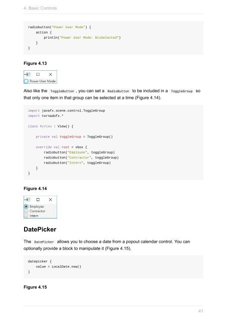
- Page 17 and 18: 3. Components import javafx.scene.c
- Page 19 and 20: 3. Components Here is a simple exam
- Page 21 and 22: 3. Components The VBox contains a L
- Page 23 and 24: 3. Components Argument Type Descrip
- Page 25 and 26: 3. Components Argument Type Descrip
- Page 27 and 28: 3. Components import tornadofx.* cl
- Page 29 and 30: 3. Components Sometimes it is neces
- Page 31 and 32: 4. Basic Controls Basic Controls On
- Page 33 and 34: 4. Basic Controls 3. The Button is
- Page 35 and 36: 4. Basic Controls If you need to sa
- Page 37 and 38: 4. Basic Controls Figure 4.4 You ca
- Page 39: 4. Basic Controls You do not need t
- Page 43 and 44: 4. Basic Controls ProgressBar A Pro
- Page 45 and 46: 4. Basic Controls Like most other c
- Page 47 and 48: 4. Basic Controls Keep in mind that
- Page 49 and 50: 4. Basic Controls button("Commit")
- Page 51 and 52: 4. Basic Controls 51
- Page 53 and 54: 5. Data Controls val greekLetters =
- Page 55 and 56: 5. Data Controls class Person(id: I
- Page 57 and 58: 5. Data Controls tableview(persons)
- Page 59 and 60: 5. Data Controls This more closely
- Page 61 and 62: 5. Data Controls The rowExpander()
- Page 63 and 64: 5. Data Controls Let's break this d
- Page 65 and 66: 5. Data Controls data class Departm
- Page 67 and 68: 5. Data Controls val tableData = ma
- Page 69 and 70: 5. Data Controls val numbers = (1..
- Page 71 and 72: 6. Type Safe CSS Type-Safe CSS Whil
- Page 73 and 74: 6. Type Safe CSS import javafx.scen
- Page 75 and 76: 6. Type Safe CSS You can apply styl
- Page 77 and 78: 6. Type Safe CSS Figure 6.3 Note al
- Page 79 and 80: 6. Type Safe CSS label("Lore Ipsum"
- Page 81 and 82: 6. Type Safe CSS If you want the bu
- Page 83 and 84: 6. Type Safe CSS import javafx.scen
- Page 85 and 86: 6. Type Safe CSS Modifier Selection
- Page 87 and 88: 6. Type Safe CSS The DangerButtonSt
- Page 89 and 90: 7. Layouts and Menus vbox { button(
- Page 91 and 92:
7. Layouts and Menus Notice also wh
- Page 93 and 94:
7. Layouts and Menus borderpane { l
- Page 95 and 96:
7. Layouts and Menus 95
- Page 97 and 98:
7. Layouts and Menus The example ab
- Page 99 and 100:
7. Layouts and Menus One way to use
- Page 101 and 102:
7. Layouts and Menus columnIndex: I
- Page 103 and 104:
7. Layouts and Menus TabPane A TabP
- Page 105 and 106:
7. Layouts and Menus Like many buil
- Page 107 and 108:
7. Layouts and Menus Separators You
- Page 109 and 110:
7. Layouts and Menus Note there are
- Page 111 and 112:
7. Layouts and Menus Attribute Buil
- Page 113 and 114:
7. Layouts and Menus item("SomeText
- Page 115 and 116:
7. Layouts and Menus squeezebox { f
- Page 117 and 118:
7. Layouts and Menus class DrawerVi
- Page 119 and 120:
7. Layouts and Menus drawer(side =
- Page 121 and 122:
8. Charts Charts JavaFX comes with
- Page 123 and 124:
8. Charts val items = listOf( PieCh
- Page 125 and 126:
8. Charts In the series() and data(
- Page 127 and 128:
8. Charts Multiseries You can strea
- Page 129 and 130:
8. Charts BubbleChart BubbleChart i
- Page 131 and 132:
8. Charts Summary Charts are a an e
- Page 133 and 134:
9. Shapes and Animation class MyVie
- Page 135 and 136:
9. Shapes and Animation CubicCurve
- Page 137 and 138:
9. Shapes and Animation Polyline A
- Page 139 and 140:
9. Shapes and Animation Path Path r
- Page 141 and 142:
9. Shapes and Animation A KeyValue
- Page 143 and 144:
9. Shapes and Animation If you want
- Page 145 and 146:
10. FXML If you are converting an e
- Page 147 and 148:
10. FXML We have created an FXML fi
- Page 149 and 150:
10. FXML class CounterView : View()
- Page 151 and 152:
10. FXML FXML is helpful to know as
- Page 153 and 154:
11. Editing Models and Validation F
- Page 155 and 156:
11. Editing Models and Validation }
- Page 157 and 158:
11. Editing Models and Validation p
- Page 159 and 160:
11. Editing Models and Validation T
- Page 161 and 162:
11. Editing Models and Validation /
- Page 163 and 164:
11. Editing Models and Validation m
- Page 165 and 166:
11. Editing Models and Validation L
- Page 167 and 168:
11. Editing Models and Validation -
- Page 169 and 170:
11. Editing Models and Validation F
- Page 171 and 172:
11. Editing Models and Validation E
- Page 173 and 174:
11. Editing Models and Validation d
- Page 175 and 176:
11. Editing Models and Validation i
- Page 177 and 178:
12. TornadoFX IDEA Plugin 13. Torna
- Page 179 and 180:
12. TornadoFX IDEA Plugin You will
- Page 181 and 182:
12. TornadoFX IDEA Plugin A generat
- Page 183 and 184:
12. TornadoFX IDEA Plugin Injecting
- Page 185 and 186:
12. TornadoFX IDEA Plugin Generatin
- Page 187 and 188:
12. TornadoFX IDEA Plugin You will
- Page 189 and 190:
Part 2: TornadoFX Advanced Features
- Page 191 and 192:
Property Delegates class MyView: Vi
- Page 193 and 194:
Property Delegates class Bar { var
- Page 195 and 196:
Advanced Data Controls Advanced Dat
- Page 197 and 198:
Advanced Data Controls This fine-tu
- Page 199 and 200:
Advanced Data Controls This setting
- Page 201 and 202:
Advanced Data Controls class MyView
- Page 203 and 204:
Advanced Data Controls Assign If Nu
- Page 205 and 206:
Advanced Data Controls 205
- Page 207 and 208:
OSGi The dynamic nature of OSGi len
- Page 209 and 210:
OSGi class Dashboard : View() { ove
- Page 211 and 212:
OSGi Requirements To run TornadoFX
- Page 213 and 214:
Scopes Scopes Scope is a simple con
- Page 215 and 216:
Scopes Now whenever you access the
- Page 217 and 218:
Scopes Testing with Scopes Since Sc
- Page 219 and 220:
EventBus A button in the UI can fir
- Page 221 and 222:
EventBus When you create a subclass
- Page 223 and 224:
EventBus Many feel that events migh
- Page 225 and 226:
Workspaces Workspaces Java Business
- Page 227 and 228:
Workspaces To keep things focused,
- Page 229 and 230:
Workspaces fun TabPane.connectWorks
- Page 231 and 232:
Workspaces Modifying the default wo
- Page 233 and 234:
Workspaces Title and heading When a
- Page 235 and 236:
Workspaces Navigating between docke
- Page 237 and 238:
Workspaces We can see that the titl
- Page 239 and 240:
Workspaces workspace.dockInNewScope
- Page 241 and 242:
Workspaces A Workspace in Tabs mode
- Page 243 and 244:
Workspaces // A Form based View we
- Page 245 and 246:
Workspaces This could be a good ide
- Page 247 and 248:
Layout Debugger Layout Debugger Whe
- Page 249 and 250:
Layout Debugger yet, submit a pull
- Page 251 and 252:
Internationalization You can add a
- Page 253 and 254:
Config Settings and State Config se
- Page 255 and 256:
Config Settings and State If the re
- Page 257 and 258:
Config Settings and State var bool:
- Page 259 and 260:
JSON and REST } } with(json) { add(
- Page 261 and 262:
JSON and REST Basic operations Ther
- Page 263 and 264:
JSON and REST To configure authenti
- Page 265 and 266:
Dependency Injection Dependency Inj
- Page 267 and 268:
Dependency Injection This initializ
- Page 269 and 270:
Wizard class BasicData : View("Basi
- Page 271 and 272:
Wizard When the Next or Finish butt
- Page 273 and 274:
Wizard val wizard = find() wizard.s
- Page 275 and 276:
Wizard class CustomerWizard : Wizar
- Page 277:
Wizard Structural modifications The


 Change language