

A Human Cartographic Approach to Mapping the Quality of Nationality Index

Create successful ePaper yourself
Turn your PDF publications into a flip-book with our unique Google optimized e-Paper software.
<strong>Quality</strong> <strong>of</strong> <strong>Nationality</strong> <strong>Index</strong> – 3 rd Edition 2018<br />
Expert Commentary<br />
A <strong>Human</strong> <strong>Car<strong>to</strong>graphic</strong> <strong>Approach</strong> <strong>to</strong><br />
<strong>Mapping</strong> <strong>the</strong> <strong>Quality</strong> <strong>of</strong> <strong>Nationality</strong> <strong>Index</strong><br />
By Benjamin Hennig<br />
University <strong>of</strong> Iceland and<br />
University <strong>of</strong> Oxford<br />
and Dimitris Ballas<br />
University <strong>of</strong> Groningen<br />
The map <strong>of</strong> <strong>the</strong> QNI presented on pages 16–17 is based on a conventional approach <strong>to</strong> visualizing<br />
data about countries. Although most people are used <strong>to</strong> such conventional maps <strong>of</strong> <strong>the</strong>ir<br />
countries, which approximate countries’ size and shape <strong>to</strong> how <strong>the</strong>y appear from space or in <strong>the</strong><br />
most popular map projections <strong>to</strong> which we have become accus<strong>to</strong>med, we would strongly argue<br />
that this is not always <strong>the</strong> best way <strong>to</strong> visualize human geographical data such as <strong>the</strong> QNI and<br />
its underlying domains. The conventional maps <strong>of</strong> <strong>the</strong> QNI show how much land is associated<br />
with states that have different qualities <strong>of</strong> nationality in <strong>the</strong>ir terri<strong>to</strong>ries, but <strong>the</strong>y fail <strong>to</strong> highlight<br />
how many people live in <strong>the</strong>se countries and <strong>the</strong>refore give a misleading representation <strong>of</strong> <strong>the</strong><br />
respective phenomenon and its spatial distribution across humanity. In addition, within countries<br />
<strong>the</strong>re is a visual bias in favor <strong>of</strong> sparsely populated areas: urban areas with large populations<br />
but a small area are virtually invisible <strong>to</strong> <strong>the</strong> map reader.<br />
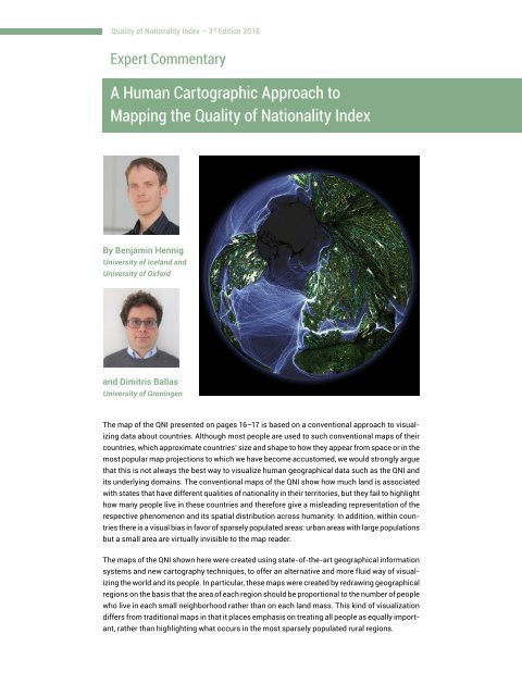
The maps <strong>of</strong> <strong>the</strong> QNI shown here were created using state-<strong>of</strong>-<strong>the</strong>-art geographical information<br />
systems and new car<strong>to</strong>graphy techniques, <strong>to</strong> <strong>of</strong>fer an alternative and more fluid way <strong>of</strong> visualizing<br />
<strong>the</strong> world and its people. In particular, <strong>the</strong>se maps were created by redrawing geographical<br />
regions on <strong>the</strong> basis that <strong>the</strong> area <strong>of</strong> each region should be proportional <strong>to</strong> <strong>the</strong> number <strong>of</strong> people<br />
who live in each small neighborhood ra<strong>the</strong>r than on each land mass. This kind <strong>of</strong> visualization<br />
differs from traditional maps in that it places emphasis on treating all people as equally important,<br />
ra<strong>the</strong>r than highlighting what occurs in <strong>the</strong> most sparsely populated rural regions.