
You also want an ePaper? Increase the reach of your titles
YUMPU automatically turns print PDFs into web optimized ePapers that Google loves.
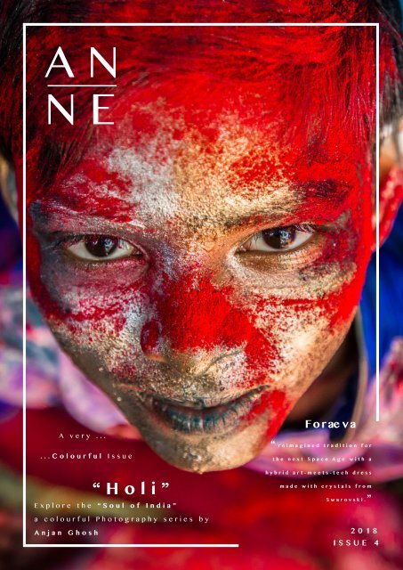
AN<br />
NE<br />
A very ...<br />
...Colourful <strong>Issue</strong><br />
“Holi”<br />
Explore the “Soul of India”<br />
a colourful Photography series by<br />
Anjan Ghosh<br />
Forae va<br />
“ reimagined tradition for<br />
the next Space Age with a<br />
hybrid art-meets-tech dress<br />
made with crystals from<br />
Swarovski.”<br />
2018<br />
ISSUE 4
AN<br />
NE<br />
“ The whole world, as we experience it visually, comes to us through<br />
the mystic realm of colour”.<br />
- Hans Hofmann<br />
ANNE’S MAGAZINE
Image courtesy of Nastia Ibragimova<br />
A N N E<br />
It all started with Isaac Newton’s discovery of light and colour with his<br />
endless experiments. Through that, we all know that with, what seems just<br />
a white ray of light transformed into a beautiful spectrum of a rainbow.<br />
Personally, I’m a minimalist. I’m more 50 shades of greys, whites and<br />
blacks kind of person. However, with those, I always loved to add a splash<br />
of colour, crimson red, mustard yellow or a pop of royal blue to create<br />
this strong contrast of wow factor, well, depends on my mood and how I<br />
want my viewers to feel. Colour opened a door to endless possibilities<br />
in the design world. Through art especially It is a perfect way to express<br />
one’s emotions. The famous Vincent Van Gogh who’s not only known for<br />
his expressive strokes and chopping off his ear, but he also used colour<br />
as a way of expressing. Van Gogh created a painting “Sunflowers”, where<br />
he uses warm yellows to create an energetic image that radiates feelings<br />
of hope and joy. Colour psychologically affects us whether or not we’re<br />
aware. For instance, in many hospitals you may notice blue tones are<br />
commonly used, reflecting calmness and therefore keeps patients calm,<br />
while in restaurants reds, evokes our taste buds, stimulates our appetites<br />
and sometimes sets a romantic mood.<br />
I decided to explore colour in a more personal and deeper level, see<br />
how artists, designers and photographers have captured colour and how<br />
it deeply impacted their work, as well as their main source of inspiration.<br />
This may be a little black book, however, this issue is going colourful!<br />
D esign . ..<br />
C reate . ..<br />
I nspire<br />
Anneelmeri
2018 ISSUE 4 ANNE’S MAGAZINE<br />
SNEAK<br />
PEEK<br />
W hat Inspires you?<br />
Foraeva<br />
Lana Dumitru & Vlad Tenu<br />
Founder and Editor in Chief<br />
Anne EL Meri<br />
AN<br />
NE<br />
For advertisement or any<br />
Inquiries<br />
Style<br />
Sporty Spanta - Lana Dumitru for Moja<br />
Happy Nation - Lana Dumitru<br />
Design Transformation<br />
Liz West<br />
Colour Transfer - Our Colour Reflection - Sevenfold<br />
1000 Colours Recipe - Emmanuelle Moureaux<br />
Janet Echelman<br />
Front Cover<br />
Photographer Anjan Ghosh<br />
Back Cover art<br />
Foraeva by Lana dumitru & Vlad Tenu<br />
Photo credits : Christian Tudose<br />
Contact:<br />
anne@annesmagazine.com<br />
Instagram:<br />
annesmagazine<br />
Design Trend<br />
Capturing Colour<br />
Salt Series - Tom Hegen<br />
Soul of India - Anjan Ghosh<br />
Copyright©ANNE’s Magazine All rights reserved<br />
Website :<br />
Annesmagazine.com<br />
Magazines available as well on<br />
Appstore “Anne’s Magazine”<br />
Design Inspiration<br />
Colour in Design - Nastia Ibragimova<br />
Design Inspight<br />
Jamie Hayon<br />
6 7
2018 ISSUE 4 ANNE’S MAGAZINE<br />
Liz West<br />
Artist<br />
UK<br />
Anjan Ghosh<br />
Photographer<br />
Kolkata, India<br />
What Inspires You?<br />
I walk around with open eyes and the internet<br />
is a great source of inspiration. I look at all the<br />
architecture, design, and art around me and the<br />
amazing photography blogs – which endlessly<br />
frustrate me because I am impressed with what<br />
I see. The work of artists who use the mediums<br />
of colour and light in combination have<br />
interested, resonated and in uenced me the<br />
most. These works have had a direct effect on<br />
the scale, ambition and form of my work. Robert<br />
Irwin, Dan Flavin, James Turrell, Carlos<br />
Cruz-Diez, David Batchelor, Ann Veronica<br />
Janssens, Anthony McCall, and Olafur Eliasson;<br />
these are just a few of the artists who<br />
particularly inspire me. Of all the artists, for<br />
me, J. M. W. Turner remains the father of light<br />
art.<br />
Nastia Ibragimova<br />
Interior Designer<br />
Pskov, Russia<br />
I think that good design works in complex,<br />
not only colour matters but textures as well (in<br />
interior design for example), but the meaning<br />
of colour is crucial. I really like to experiment<br />
with colours and light, even though I’m working<br />
only with few colour pallets I’m trying to<br />
develop.<br />
I am passionate about photography,<br />
especially in rural and semi-urban life. India is<br />
a country where the main essence comes out<br />
from the rural areas that makes it unique among<br />
other countries. My intention is to search this<br />
uniqueness and produce them on the global<br />
platform.<br />
Urbanisation is swallowing down our daily life<br />
style in a rapid pace. Yet, the Indian villages<br />
are competing with this urbanisation in a<br />
positive way for a long time.<br />
Tom Hegen<br />
Photographer and Designer<br />
Munich, Germany<br />
I photograph landscapes, that have been<br />
heavily transformed by human intervention and<br />
show places, where nature is channeled,<br />
regulated and controlled. From a distance –<br />
from the top – the often irreversible trace that<br />
we have left on our planet is even more evident.<br />
I am looking for projects that communicate a<br />
certain message in a convincing way. Not just<br />
in the design sector but also arts, documentary<br />
films, and exhibitions.<br />
I would like to inspire people to look closer<br />
at the impact we have on our environment and<br />
ask if and how we could assume responsibility.<br />
8 9
2018 ISSUE 4 ANNE’S MAGAZINE<br />
design<br />
. ..<br />
Photo credits : Christian Tudose<br />
Calligraphy art by Nakajima Hiroyuki<br />
10 11
2018 ISSUE 4 ANNE’S MAGAZINE<br />
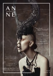
Foraeva<br />
by Lana Dumitru & Vlad Tenu Made with crystals from Swarovski<br />
About<br />
Foraeva is about two designers putting the past into the future in the shape<br />
of a crystal dress.<br />
Approached by Swarovski, fashion designer Lana Dumitru and architect Vlad<br />
Tenu have teamed up and reimagined tradition for the next Space Age. In a<br />
mission to redefine digital craft, they took the folk pattern from a<br />
traditional Romanian rug and digitally reconstructed it from over 25.000<br />
Swarovski crystals into a new kind of artefact. The sheer complexity of this<br />
dress has reached an engineering level, only possible through computer 3D<br />
simulations, algorithmic design methods and digital prototyping. Where no<br />
other human artefact has gone before.<br />
Visionary design duo Lana Dumitru and Vlad Tenu have reinterpreted<br />
tradition for the next Space Age with a hybrid art-meets-tech dress made with<br />
crystals from Swarovski. The future is crystal clear!<br />
“ We’ve seen the future - it’s the Foraeva dress”<br />
Imagine an outfit that looks like space age haute couture, created using the<br />
most sophisticated computer technology imaginable, yet with a nostalgic nod<br />
to the old artisanal crafts of a previous century. This is Foraeva, the perfect<br />
dress for a red carpet event on Mars. We’re talking out-of-this-world,<br />
high-tech couture, digitally constructed for an impossibly glamorous<br />
intergalactic happening somewhere far, far, away. Fearless high fashion for<br />
the brave and the bold.”<br />
Photo credits : Christian Tudose<br />
12 13
2018 ISSUE 4 ANNE’S MAGAZINE<br />
“Foraeva is the dress carrying a positive and colourful message sent to us<br />
from the next century: identity and tradition will not be lost on the path of<br />
inter-globalisation, they will evolve in unexpected ways, shaped by<br />
technology and emotions. You might think of it as the dress that Grandma<br />
Earth will give to us as a goodbye gift before we leave her for other<br />
planets; or a red carpet outfit on Mars.”<br />
Photo credits : Christian Tudose<br />
14 15
2018 ISSUE 4 ANNE’S MAGAZINE<br />
The Process<br />
Based on a multi-disciplinary approach, the sculptural design is achieved<br />
through completely new ways of using Swarovski elements. Informed by<br />
complex algorithms, the crystals act as structural elements,<br />
interconnected to form the fluid geometry and continuous surfaces or the<br />
dress. Simultaneously, they also behave like coloured 3D pixels,<br />
illustrating three-dimensional discrete patterns and organic reliefs. These<br />
are controlled by a bespoke algorithm designed to interpret traditional<br />
patterns and re-create them from Swarovski crystals, in a similar way the<br />
traditional sewn motifs were coded and transmitted through generations.<br />
It is a process based design, creating not just one model but a family of<br />
them, fully simulated in 3D for a productive dialogue with manufacturing<br />
robots rather than the human hand. No wonder that it took a team of 15<br />
people almost six months to assemble the dress.<br />
Photo credits : Christian Tudose<br />
16 17
2018 ISSUE 4 ANNE’S MAGAZINE<br />
Photo credits : Christian Tudose<br />
18 19
2018 ISSUE 4 ANNE’S MAGAZINE<br />
Photo credits : Christian Tudose<br />
20 21
2018 ISSUE 4 ANNE’S MAGAZINE<br />
Photo credits : Christian Tudose<br />
22 23
2018 ISSUE 4 ANNE’S MAGAZINE<br />
Photograph Tasya Kudryk<br />
S tyle<br />
Sporty Săpanța<br />
Lana for Moja<br />
Lana Dumitru’s collection, Sporty Sapanta, comes with statement<br />
items along with a streetwear approach of the Maramures beauty<br />
(the traditional part of Romania where the Merry Cemetery can<br />
be found), which was adapted for the highly active women. The<br />
Sports Couture collection contains shorts, dresses, long jackets<br />
and backpacks, all of them coming in different colours and<br />
patterns. In addition to this, their distinctive elements are<br />
represented by colourful bands and elastics that are specific to<br />
the 90s.<br />
Sports Couture means to hurry with style wherever your job,<br />
love or your lust for fun takes you. Sporty Sapanta is not sportswear,<br />
but clothing items for those who appreciate the “rush chic”<br />
style of the greatest cities. The patterns have been inspired by<br />
the paintings of the Merry Cemetery, Sapanta. It is worthy to<br />
mention that the patterns were not copied, but recreated after a<br />
long research and print development.<br />
Photo credits : Vlad Andrei<br />
24 25
2018 ISSUE 4 ANNE’S MAGAZINE<br />
Photo credits : Vlad Andrei<br />
26 27
2018 ISSUE 4 ANNE’S MAGAZINE<br />
Photo credits : Vlad Andrei<br />
28 29
2018 ISSUE 4 ANNE’S MAGAZINE<br />
H appy N ation<br />
by Lana Dumitru<br />
- “in a love-hate relationship with my memories” -<br />
Happy Nation, the new collection of Romanian artist and fashion<br />
designer Lana Dumitru, deals with the national past and her<br />
early memories using nostalgia and humour: from the iconic coat<br />
of arms of dictator Ceauș escu’s Romanian Socialist Republic mixed<br />
with the laughing with tears emoji, treating that political period<br />
as the absurd joke that was, to the domestic kitsch of the 80s<br />
flats in which the old TV sets were placed over a macramé, to the<br />
ironic glamorization of the school uniforms worn during the era.<br />
She turns the oldest art forms of expressing - the primal emotions<br />
(the ritualistic masks from the pre-Romanian traditions) into the<br />
contemporary digital masks- emojis.<br />
Also, the traditional carpet from a Romanian peasant’s house<br />
becomes the comfy climax of a chic overall. Or the dresses that<br />
express rural good fortune and prosperity using the image of a<br />
turkey, made by using the laser-cut.<br />
Happy Nation is a sports couture collection, made in part using<br />
innovative technologies (digital printing and laser-cut print) mixed<br />
with hand-made techniques (remixed Romanian traditional masks)<br />
and haute couture items.<br />
Like any Lana Dumitru collection, Happy Nation is not made<br />
especially for a peculiar season, it’s not a must-have for the<br />
summer of 2016, it’s just as timeless as the memories that<br />
inspired it.<br />
Photo credits : Adi Bulboacă<br />
30 31
2018 ISSUE 4 ANNE’S MAGAZINE<br />
Photo credits : Adi Bulboacă<br />
32 33
2018 ISSUE 4 ANNE’S MAGAZINE<br />
Photo credits : Adi Bulboacă<br />
34 35
2018 ISSUE 4 ANNE’S MAGAZINE<br />
Photo credits : Adi Bulboacă<br />
36 37
2018 ISSUE 4 ANNE’S MAGAZINE<br />
create<br />
. ..<br />
38 39
2018 ISSUE 4 ANNE’S MAGAZINE<br />
From what once creates the music transformed to the sound of music.<br />
Last <strong>Issue</strong>’s ANNE Magazine have transformed us with recycling<br />
aircrafts to furniture. Taken an iconic object from the past – the 12” vinyl<br />
LP – and recycles it to enhance the very latest audio digital technology.<br />
This have been achieved by Paul Cocksedge, made by heated and molding<br />
the plastic disks into a funnel shape. Known as Change the record,<br />
The loudspeaker created for smart-phones, Because of it’s form, it requires<br />
no wires or connection, just as we get a cup or place a smart phone<br />
between our curved hands, the sound is amplified as it does like electronic<br />
sound-system.<br />
Change the Record<br />
40 41
2018 ISSUE 4 ANNE’S MAGAZINE<br />
DESIGN T RANSFORMATION<br />
R evival<br />
Liz W est<br />
What inspires you in the design world?<br />
I walk around with open eyes and the internet is a great source of<br />
inspiration. I look at all the architecture, design, and art around me<br />
and the amazing photography blogs – which endlessly frustrate me<br />
because I am impressed with what I see. The work of artists who use<br />
the mediums of colour and light in combination have interested,<br />
resonated and influenced me the most. These works have had a direct<br />
effect on the scale, ambition and form of my work. Robert Irwin, Dan<br />
Flavin, James Turrell, Carlos Cruz-Diez, David Batchelor, Ann Veronica<br />
Janssens, Anthony McCall, and Olafur Eliasson; these are just a few<br />
of the artists who particularly inspire me. Of all the artists, for me,<br />
J. M. W. Turner remains the father of light art.<br />
Colour Transfer<br />
Colour Transfer is a new permanent commission spanning the<br />
underside of Paddington Central’s Westway Bridge.<br />
The artwork comprises multiple angled coloured mirrors, vertically<br />
spanning the height of the brickwork to create an optically vibrant<br />
and kaleidoscopic installation. The prismatic shapes mirror the<br />
tunnel’s architecture. The colours appear in the work change<br />
depending on where you are within the tunnel. The work appears<br />
different from one direction to the other. The coloured mirrors are<br />
positioned in a spectral arrangement running from dark red to pale<br />
pink when entering the underpass from the left and the opposite when<br />
entering from the right. As visitors move, they will encounter the<br />
fluctuating effect of light and reflections created by the coloured<br />
mirrors.<br />
Colour Transfer was commissioned by British Land.<br />
Steel, Aluminium and PVC<br />
1780cm (L) 230cm x (H) x 51cm (W)<br />
2018 Photographs © Jason Bailey<br />
Images and Photographs courtesy of Masaomi Fujita<br />
42 43
2018 ISSUE 4 ANNE’S MAGAZINE<br />
I grew up in a family with both parents working as artists, so it was<br />
inevitable that I would end up doing either the opposite of that or<br />
something very similar to that. I was constantly being nurtured with<br />
an artist’s mentality, which was very important for me growing up. All<br />
the aesthetic and conceptual decisions were made with curators and<br />
artists around me, and I pursued what I felt I was good at, what I was<br />
most interested in and most excited by. When I was a tiny little girl,<br />
my mum would sit me at a little table in her studio and I would play<br />
with quite odd materials, not paint as such, but ready-made things.<br />
And if I was bored with that, I would go down to the garden where<br />
my dad’s studio and workshop was; he would give me a lump of clay,<br />
and just say: “try making something with that.” So in fact, every form<br />
of playing in my life was art making. And unlike many other artists I<br />
know, I never felt pressure from my parents to a “proper job” – they<br />
would rather encourage me to make art. I went to what I thought was<br />
the best art school in the world, the Glasgow School of Art, and I<br />
studied sculpture and environmental art, which for me seemed like a<br />
perfect course – it made me think of making site-specific works<br />
instead of paintings or photographs. I think that’s probably a good<br />
indication of why I make site-responsive, immersive installations.<br />
Photoraph courtesy of Liz West<br />
44 45
2018 ISSUE 4 ANNE’S MAGAZINE<br />
Why did you choose to focus on “Colour”?<br />
You cannot see colour without light. The two mediums are intrinsically<br />
connected which is really important for me. I don’t just make work with<br />
artificial light, I also think about natural light as it is as equally<br />
important to us as we go about our day to day lives. One thing I am<br />
really interested in exploring is how we see and I think we are all guilty<br />
of going about our daily lives looking at screens. We live in this digital<br />
age, we have access to information and knowledge instantly and so much<br />
of the time no one actually stops to look around and appreciate what’s<br />
around them.<br />
I want to highlight natural phenomena such as light and colour through<br />
my work so people become more aware. The irony, of course, is that<br />
images of my work then travel around the digital ether. I guess that’s<br />
got a nice symmetry to it!<br />
Photographs © Jason Bailey<br />
46 47
2018 ISSUE 4 ANNE’S MAGAZINE<br />
Photographs © Jason Bailey<br />
48 49
2018 ISSUE 4 ANNE’S MAGAZINE<br />
Sevenfold<br />
When The Met opened its doors in December 2016, following<br />
a £ 4.6 million refurbishment, at the centre of the historical<br />
building is a newly commissioned installation by Liz West.<br />
The site-responsive piece entitled Sevenfold plays with the<br />
natural light of the space and injects vibrant colours and a<br />
sense of illusion into the magnificent entrance and staircase of<br />
the Victorian neo-classical building. Sevenfold takes its<br />
reference from Newton’s rainbow sequence of red, orange,<br />
yellow, green, blue, indigo and violet found when shining pure<br />
white light through a glass prism. Seven individual and vast<br />
prisms (six coloured prisms in the main installation plus one<br />
white prism above the reception desk) have been created that<br />
use mirrors to further radiate colour and reflect elements of<br />
the beautifully restored architecture.<br />
What advice would you like to give about colour?<br />
I always trust my instincts when it comes to the use of colour.<br />
Colour is a very personal thing and therefore people must choose<br />
what is right for them within their own spaces and lives.<br />
Our personal perception of colour reflects our experiences and<br />
backgrounds. I refer to Josef Albers a lot when I think about colour<br />
and would urge others to do so. He famously said, “If one says ‘red’<br />
- the name of colour - and there are fifty people listening, it can<br />
be expected that there will be fifty reds in their minds. And one can<br />
be sure that all these reds will be very different.<br />
Site-specific Installation (acrylic, steel, plywood, polyester film)<br />
970cm (L) 2400cm x (H) x 970cm (W)<br />
2016<br />
Photographs © Jim Stephenson<br />
50 51
2018 ISSUE 4 ANNE’S MAGAZINE<br />
What Challenges do you face when creating your installations?<br />
Often the challenge for me is thinking of the right work for the<br />
space I am offered, particularly if the work is intended to be site<br />
specific. I have made none site-specific work like “Our Spectral<br />
Vision” at the Natural History Museum, this work has toured around<br />
the country and it could go in any space and is much easier to locate<br />
and find sites for. The site-specific, site responsive & site<br />
conditional work side of my practice is more of a challenge, I can<br />
often spend months or even years getting the idea right. This is a<br />
lengthy process; however, sometimes the idea can come instantly<br />
and I think “that space needs this” or sometimes I have to really take<br />
time with it.<br />
Images and Photographs courtesy of Masaomi Fujita<br />
Photographs © Jim Stephenson<br />
52 53
2018 ISSUE 4 ANNE’S MAGAZINE<br />
Photographs © Jim Stephenson<br />
54 55
2018 ISSUE 4 ANNE’S MAGAZINE<br />
Our Colour Reflection<br />
Our Colour Reflection was presented at 20-21 Visual Arts<br />
Centre in Scunthorpe from 14 May until 25 June and St. Mark’s<br />
Mayfair from 4 - 15 July 2016.<br />
Our Colour Reflection creates a conversation between the<br />
viewer and the setting using more than 765 mirrors made of<br />
coloured acrylic. There are 15 colours in all and the mirrors with<br />
diameters of 30, 40, 50 and 60cm are set at different heights so<br />
that they both reflect the roof space of the old nave, revealing<br />
parts of the architecture that would otherwise be invisible, and<br />
project colour up into the historic interior. It is playful,<br />
elegant and engaging but also thoughtful.<br />
Taking time to research and consider the history of the<br />
building and the weight of connotations it holds as a former<br />
place of worship, West studied the stained glass and<br />
considered the importance of light within the space. ‘This has<br />
allowed me to make sure the work is grounded within its site<br />
but also holds its own voice within the grandeur and information<br />
that the space brings to the conversation,’ she says.<br />
There is an element of performance to this work; it puts the<br />
audience to the fore, demanding a response, in West’s words<br />
‘physically, emotionally, psychologically or even spiritually.’<br />
Viewers will each have their own perspectives and their own<br />
experiences tempered by movement through the space and<br />
through time. By going unplugged here, West emphasises that<br />
while artificial light can be manipulated it can only, at best,<br />
replicate the dynamism, shifting mood and changes in quality<br />
embodied in natural light” - Francis Pearce<br />
Installation (mirror, acrylic tubing)<br />
1100cm (L) 20cm x (H) x 1100cm (W)<br />
2016<br />
Photographs © Hannah Devereux<br />
56 57
2018 ISSUE 4 ANNE’S MAGAZINE<br />
What do you hope to achieve between the viewers (or audience)<br />
interacting with your installations?<br />
Upon entering an exhibition of my work and being immediately<br />
surrounded by intense light, I expect the viewers would feel an<br />
overwhelming sense of delight and longing to explore the spaces I<br />
create. I hope the visual sensation of space and light together is<br />
communicated to my audience, I would like them to experience a<br />
playful, magical and transformative environment. The strength of<br />
light created by chemical colour has an effect on me and others,<br />
which can be physical, emotional and psychological (and for some –<br />
spiritual). The effect is known to increase personal well-being and<br />
serotonin levels – often associated with exposure to sunlight.<br />
Although often overwhelming in its saturation, my work allows me<br />
to tap into my own relationship to light and sensory reactions. Each<br />
person visiting my installations will bring with them their own<br />
associations and responses and take away a heightened sense of<br />
feeling, whatever that may be. I think it will be rare for most<br />
people to have been completely immersed and saturated in light and<br />
will find it an extraordinary experiential encounter.<br />
Photographs © Hannah Devereux<br />
58 59
2018 ISSUE 4 ANNE’S MAGAZINE<br />
Photographs © Hannah Devereux<br />
60 61
2018 ISSUE 4 ANNE’S MAGAZINE<br />
Photograph : Daisuke Shima<br />
© Tony Menias<br />
62 63
2018 ISSUE 4 ANNE’S MAGAZINE<br />
1000 COLOURS RECIPE<br />
Emmanuelle Moureaux<br />
Imabari City in Ehime Prefecture is famous for its highquality<br />
towel production. The land is blessed with good<br />
quality water, which has lead to an accumulation of excellent<br />
dyeing techniques. For the “IMABARI Color Show” introducing<br />
the dyeing technology in Imabari City, Emmanuelle revealed an<br />
installation “1000 COLORS RECIPE”, using her own 1000 (one<br />
thousand) colours palette specially created for this installation,<br />
the most number of colours she has ever used in her works.<br />
The installation visually conveys Imabari’s dyeing technology<br />
and a new world of colours that no one has ever seen.<br />
Emmanuelle Moureaux<br />
Born in 1971, France. Emmanuelle Moureaux is a French architect<br />
living in Tokyo since 1996, where she established “Emmanuelle<br />
Moureaux architecture + design” in 2003. Inspired by the layers<br />
and colours of Tokyo that built a complex depth and density on<br />
the street, and the Japanese traditional spatial elements like<br />
sliding screens, she has created the concept of shikiri, which<br />
literally means “dividing (creating) space with colours”. She uses<br />
colours as three-dimensional elements, like layers, in order to<br />
create spaces, not as a finishing touch applied on surfaces.<br />
Handling colours as a medium to compose space, her wish is to<br />
give emotion through colours with her creations, which range<br />
from art, design to architecture.<br />
Credits<br />
Design : emmanuelle moureaux<br />
Photograph : Daisuke Shima<br />
The concept of this installation is “1000 COLORS RECIPE”. It is<br />
a visualization of the delicate and accurate “recipes” required<br />
for dyeing. The elements that make up the recipe are the<br />
percentage of three principles of colour “C (blue) / M (red) / Y<br />
(yellow)”,<br />
temperature “° C”, time “ minute/second”, and values composed<br />
of numerical figures “0” to “9”. By precisely managing all of<br />
these elements, colours delicately different to each other are<br />
created. These 17 types of symbols that make up the recipe<br />
were dyed in 1000 different colours, and they were cut out in<br />
the shape of<br />
symbols, connected with thread, and then suspended at the<br />
centre of the atrium of the Spiral Garden (SPIRAL, Tokyo). 1000<br />
colours are condensed to form a circle at the centre, one colour<br />
for one thread, and the un-dyed white symbols wrap the outer<br />
circumference emphasize the existence of 1000 colours. The total<br />
number of symbols used is about 17000. Symbols are<br />
arranged in three-dimensional grid, while they may be seen<br />
floating aligned or chaotic depending on the viewing position.<br />
When sitting under the symbol, you will see various recipes as<br />
you drown in colours.<br />
64 65
2018 ISSUE 4 ANNE’S MAGAZINE<br />
“1000 COLORS RECIPE” was created by the fusion of Emmanuelle’s<br />
colours with high-quality skills of Imabari’s dyeing technicians. The<br />
technique<br />
“Here I was<br />
of “dyeing”<br />
given the<br />
and<br />
privilege<br />
the creation<br />
and pleasure<br />
of “1000<br />
of<br />
colours”,<br />
running<br />
multiplied<br />
into these<br />
two geishas at my Ryokan in Kyoto. Their history is so intriguing and<br />
by the delicacy of both have become a grand installation.<br />
full of mystery, give it a google, you wont be disappointed.”<br />
© Tony Menias<br />
“One of the many things Japan is famous for is its sushi and fresh<br />
fish. Here, and Itamae (sushi chef) smiles as his sushi goes around him<br />
on a conveyer belt for his customers’ choosing.”<br />
© Tony Menias<br />
Photograph : Daisuke Shima<br />
66 67
2018 ISSUE 4 ANNE’S MAGAZINE<br />
Photograph : Daisuke Shima<br />
68 69
2018 ISSUE 4 ANNE’S MAGAZINE<br />
Photograph : Daisuke Shima<br />
70 71
2018 ISSUE 4 ANNE’S MAGAZINE<br />
Photograph : Daisuke Shima<br />
72 73
2018 ISSUE 4 ANNE’S MAGAZINE<br />
JANET<br />
ECHELMAN<br />
Janet Echelman is an artist who defies categorization. She creates<br />
experiential sculpture at the scale of buildings that transform with wind and<br />
light. The art shifts from being an object you look at, to a living<br />
environment you can get lost in. Using unlikely materials from fishnet to<br />
atomized water particles, Echelman combines ancient craft with cutting-edge<br />
technology to create artworks that have become focal points for urban life<br />
on five continents.<br />
Recipient of the Guggenheim Fellowship, the Harvard University Loeb<br />
Fellowship, a Fulbright Lectureship, and the Aspen Institute Crown<br />
Fellowship, her TED talk “Taking Imagination Seriously” has been<br />
translated into 35 languages with more than one million views. Ranked<br />
number one on Oprah Magazine’s “List of 50 Things that Make You Say<br />
Wow!,” she was named an Architectural Digest Innovator for “changing the<br />
very essence of urban spaces.” She recently received the Smithsonian<br />
American Ingenuity Award in Visual Arts, honouring “the greatest innovators<br />
in America today.”<br />
American artist Janet Echelman reshapes urban airspace with<br />
monumental, fluidly moving sculpture that responds to environmental<br />
forces including wind, water, and sunlight.<br />
Photographs courtesy of Studio Echelman<br />
74 75
2018 ISSUE 4 ANNE’S MAGAZINE<br />
Echelman’s soft, voluminous net sculpture surged 180 feet through the<br />
air between buildings above Oxford Circus, the busiest pedestrian area in<br />
all of London.<br />
The monumental floating form is composed of layers of fibre, braided and<br />
knotted together in vibrant hues that pulse with changing wind and<br />
weather to create a choreography of undulating colour. At night, the<br />
sculpture comes to life with projected coloured light. The precise colours<br />
and patterns are created interactively with members of the public, who are<br />
invited to use their smartphones to select colours and tap out patterns with<br />
the touch of a finger. These patterns are projected onto the monumental<br />
surface of the sculpture, and proceed to interact with one another, creating<br />
ripple effects for all to see.<br />
The work’s title is 1.8, referring to the length of time in microseconds<br />
that the earth’s day was shortened as a result of a single physical event,<br />
the 2011 earthquake and tsunami that emanated from Japan.The sculpture’s<br />
form was inspired by data sets of the tsunami’s wave heights rippling across<br />
the entire Pacific Ocean. The artwork delves into content related to our<br />
complex interdependencies with larger cycles of time and our physical<br />
world. The sculpture’s net structure is a physical manifestation of<br />
interconnectedness - when any one element moves, every other element is<br />
affected.<br />
Lightweight and flexible, the sculpture is travelling to other cites around<br />
the world after its premiere at Lumiere London 2016, a light festival<br />
produced by Artichoke. It is constructed from technical fibres that are 15<br />
times stronger than steel by weight, and custom colour blends that<br />
Echelman combines with programmed coloured light to create the final artwork.<br />
LONDON<br />
OXFORD CIRCUS<br />
Photographs courtesy of Studio Echelman<br />
The artwork invites you to pause amid the bustle and commotion, offering<br />
a chance to gaze skyward and contemplate a physical manifestation of the<br />
interconnectedness surrounding us.<br />
76 77
2018 ISSUE 4 ANNE’S MAGAZINE<br />
Photographs courtesy of Studio Echelman<br />
78 79
2018 ISSUE 4 ANNE’S MAGAZINE<br />
RENWICK<br />
The permanent and temporary projects draw inspiration from ancient craft and<br />
modern technology. Using materials from woven fibre to atomized mist, the studio<br />
creates a living, breathing pieces that respond to the forces of nature — wind,<br />
water and light.<br />
Studio Echelman explores the cutting edge of sculpture,<br />
public art, and urban transformation. Assembled and led by<br />
internationally recognized sculptor Janet Echelman, the design<br />
team focuses on the development and creation of large-scale<br />
artworks.<br />
By combining meaning with physical form, it strives to create a visceral<br />
experience in diverse city environments, accessible to all. These sculpture<br />
environments embody local identity and invite residents to form a personal and<br />
dynamic relationship with the art and place. Each project becomes intimately tied<br />
to its environment through the use of local materials and working methods, thus<br />
strengthening neighbourhood connections and promoting a distinctive civic<br />
character.<br />
The design team spans the globe. Studio Echelman is privileged to collaborate<br />
with brilliant aeronautical and mechanical engineers, architects, lighting<br />
designers, landscape architects, and fabricators.<br />
Photographs courtesy of Studio Echelman<br />
80 81
2018 ISSUE 4 ANNE’S MAGAZINE<br />
A 4,000 square-foot textile floor echoes the organic<br />
topography of the aerial form in monochromatic hues, providing a<br />
playful contrast to the vibrant hues of the sculpture’s 51 miles of<br />
twine above. The flooring is composed of regenerated nylon fibres<br />
repurposed from discarded fishing nets.<br />
The Smithsonian American Art Museum commissioned Janet<br />
Echelman to create an artwork to transform the Renwick Gallery’s<br />
iconic Grand Salon. The WONDER Exhibition, the Renwick Gallery’s<br />
What first after is the an inspiration intensive 2-year behind renovation, your project “transforms “Moon” the entire<br />
museum into an immersive artwork.” Echelman’s sculpture has since<br />
been acquired by the museum for their permanent collection and<br />
remains The moon on display. suggests a lot to me. It waxes and wanes periodically and<br />
looks like that light and shadow are attacking each other on the Moon<br />
every Echelman night. The created relationship a soft, between voluminous light net and sculpture shadow seems that to surges<br />
represent through the “dynamism air of the and hundred-foot Stasis,” “ positive length Grand negative,” Salon, intersecting<br />
“ substance<br />
and with vanity,” its historic that also cove reminds ceiling. me The of “ complex life and form death.” is All composed physical of many<br />
objects layers of in the twines, world knotted are changing together continuously, vibrant in hues the correlation that interplay between with<br />
two coloured contrary light poles. and ““shadow Shogyo – drawings” Mujo “ is one the of the walls. teachings A carefully of Buddha.<br />
It choreographed means nothing lighting can remain program the same. subtly Everything changes on the earth experience changes from of<br />
moment sculpture to with moment. every All perspective. things are in Visitors flux through find themselves<br />
endless circle of<br />
birth, transported death, and into rebirth. a dreamlike It seems state, to me gazing the character skyward “ at moon. an ethereal “<br />
symbolizes choreography this of teaching. undulating colour.<br />
The work’s title is 1.8 Renwick, which refers to the length of<br />
time measured in microseconds that the earth’s day was shortened<br />
as a result of a physical event, the 2011 Tohoku earthquake and<br />
tsunami which hit Japan with devastating effects. The forms in the<br />
sculpture and carpet were inspired by data sets of the Tsunami<br />
wave heights across the Pacific Ocean. The artwork reminds us of<br />
our complex interdependencies with larger cycles of time and<br />
matter. Its physical presence is a manifestation of<br />
interconnectedness - when any one element in the sculpture moves,<br />
every other element is affected. “As individuals we may feel<br />
“ A new moon, a crescent moon, a half moon, a full moon...<br />
fragile, like a length of thread,” said Echelman, “but when knotted<br />
then a new moon.The moon waxes and wanes periodically.<br />
together we have the capacity for incredible strength and<br />
It symbolizes the idea of metempsychosis.Everything on earth<br />
resiliency.”<br />
changes from moment to moment.<br />
All things are in flux through the endless circle of birth,<br />
death and rebirth.<br />
”<br />
Photographs courtesy of Studio Echelman<br />
Images courtesy of Nakajima Hiroyuki<br />
82 83
2018 ISSUE 4 ANNE’S MAGAZINE<br />
1.78 Dubai is the newest work in Janet Echelman’s Earth Time Series,<br />
which her team has been working on the for the last eight years. It is<br />
the most recent addition to Art Emaar’s new public art initiative and<br />
will be on exhibition through late July 2018. That artwork makes its<br />
U.A.E. debut against the iconic backdrop of the Burj Khalifa and Dubai<br />
Fountain.<br />
The number “1.78” within the title refers to the number of<br />
microseconds that the day was shortened when a single earthquake<br />
shifted the planet’s mass, thus speeding up the earth’s rotation of one<br />
day. This work examines the complex interaction of the many systems<br />
of our physical world with one another.<br />
Echelman’s goal as an artist with this work is to remind us of the<br />
many cycles of time at various scales, ranging from a single day to<br />
centuries. It reminds us of our complex interconnectedness with larger<br />
cycles of time and the systems of our physical world. The sculpture’s<br />
materials embody this. When any one element in the sculpture’s<br />
network moves, every other element is affected.<br />
“1.78”<br />
DUBAI<br />
Photographs courtesy of Studio Echelman<br />
84 85
2018 ISSUE 4 ANNE’S MAGAZINE<br />
Our surroundings affect how we feel and how we experience our lives<br />
- we are responsible for the way our cities look and function. These<br />
netted works work brings softness to the scale of the city. They are<br />
soft counterpoints to the hard edges of buildings, offering proof that<br />
we can interrogate the status quo - that the assumption that cities must<br />
be formed from hard materials and straight edges can be changed.<br />
“I feel a need to find moments of contemplation in the midst of daily<br />
city life,” Echelman said. “If my art can create an opportunity to<br />
contemplate the larger cycles of time and remind us to listen to our<br />
inner selves, I believe this could be transformative.”<br />
The monumental floating form of 1.78 is composed of layers of fibre,<br />
braided and knotted together in vibrant hues that pulse with<br />
changing wind and weather to create a choreography of undulating<br />
color. At night, the sculpture comes to life with projected coloured<br />
light. Lightweight and flexible, the sculpture is designed to travel to<br />
cities around the world as a physical manifestation of the<br />
interconnectedness.<br />
Photographs courtesy of Studio Echelman<br />
86 87
2018 ISSUE 4 ANNE’S MAGAZINE<br />
inspire<br />
. ..<br />
Photograph Tom Hegen<br />
88 89
2018 ISSUE 4 ANNE’S MAGAZINE<br />
Design Trend<br />
Capturing Colour<br />
Salt Series<br />
Tom Hegen<br />
My Name is Tom Hegen, I am a Photographer and Graphic<br />
Designer from Munich, Germany. I focus on aerial photography<br />
and projects that show the impact of human presence on earth.<br />
As a photographer, I am interested in the relationship between<br />
man and nature. I first came into contact with photography when<br />
I spent a year in New Zealand, doing a community service.<br />
I studied Communication Design in Germany and the United<br />
Kingdom and have a masters degree in arts.<br />
You mentioned being a photojournalist. Tell us more about<br />
that journey on what kind of things you like to focus on?<br />
I photograph landscapes, that have been heavily transformed<br />
by human intervention and show places, where nature is<br />
channelled, regulated and controlled. From a distance – from the<br />
top – the often irreversible trace that we have left on our planet<br />
is even more evident.<br />
I would like to inspire people to look closer at the impact we<br />
have on our environment and ask if and how we could assume<br />
responsibility. I studied visual communication in Germany and<br />
the United Kingdom and have a masters degree in communication<br />
design. My aerial photos have a very graphic touch and you can<br />
probably see my graphic design background. I live in south<br />
Germany, really close to the European Alps. That fact probably<br />
also sensitized me to focus on nature-themed subjects.<br />
Photograph Tom Hegen<br />
90 91
2018 ISSUE 4 ANNE’S MAGAZINE<br />
I am interested in the idea of the “Anthropocene”. It is a term<br />
used by scientists summarizing that in recent centuries humans have<br />
become one of the most important factors influencing the<br />
biological, geological and atmospheric processes on Earth. Some<br />
scientists propose that we no longer living in the present era called<br />
the “Holocene” as we are on the edge to a new geological epoch, the<br />
“Anthropocene”. The most important changes in the Anthropocene<br />
include climate change, the Antarctic ozone hole, the use of 50<br />
per cent of the earth’s global surface by man, the rapid rise in sea<br />
levels, and landscape changes caused by river shifts or the<br />
degradation of raw materials. In my photography, I explore the<br />
origin and scale of that Idea to understand the dimensions of man’s<br />
intervention in natural spaces and to bring attention to how we can<br />
take responsibility for that.<br />
The extraction of sea salt is one of the oldest forms of<br />
human landscaping and it is the oldest method of salt production. In<br />
Europe, it dates back to the Antiquity some 6000 years ago.<br />
Nowadays salt is one of those raw materials, which we have<br />
incorporated extensively into our everyday lives and rarely ask<br />
where it actually comes from and how it’s being produced. In “The<br />
Salt Series” I explore artificial landscapes where nature is<br />
channelled, regulated and controlled. I like the fact of looking<br />
behind the scenes.<br />
Photograph Tom Hegen<br />
92 93
2018 ISSUE 4 ANNE’S MAGAZINE<br />
To get my photos, I use different methods and techniques like<br />
hot air balloons, helicopters, planes or multicopters. For me it’s<br />
not about the tool I’m using, it’s mainly the story and concept<br />
behind the photos. I spend more time doing research than<br />
getting the photos or the technique.<br />
Photograph Tom Hegen<br />
94 95
2018 ISSUE 4 ANNE’S MAGAZINE<br />
Photograph Tom Hegen<br />
96 97
2018 ISSUE 4 ANNE’S MAGAZINE<br />
Photographs: Yoshihiro Asada<br />
The internal space on the second floor that has secured a<br />
maximum height following the roof shape produced by the light<br />
coming in from a top light and space continuity, which results<br />
from eye-conscious design.<br />
The distinctive large window facing the park is composed of<br />
a high window that introduces enough natural light, and an<br />
opening that takes in gentle sun and breeze while blocking<br />
views from outside. The house fixture designed to be<br />
incorporated in the window frame which connects the spaces,<br />
and fills the room with dignity.<br />
Who is your role model?<br />
There are a lot of great people that achieved some extraordinary body<br />
of work in the past. I really appreciate looking at work from Georg Gerster<br />
and Yann-Arthus Bertrand.<br />
What inspires you in the design world?<br />
I am looking for projects that communicate a certain message in a<br />
convincing way. Not just in the design sector but also arts, documentary<br />
films, and exhibitions.<br />
S CAPE<br />
Photograph Tom Hegen<br />
98 99
2018 ISSUE 4 ANNE’S MAGAZINE<br />
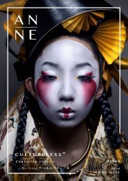
SOUL OF<br />
INDIA<br />
photography by Anjan Ghosh<br />
100 101
2018 ISSUE 4 ANNE’S MAGAZINE<br />
I am passionate about photography, especially in rural and<br />
semi-urban life. India is a country where the main essence comes out<br />
from the rural areas that make it unique among other countries. My<br />
intention is to search this uniqueness and produce them on the<br />
global platform. Urbanisation is swallowing down our daily lifestyle<br />
at a rapid pace. Yet, the Indian villages are competing with this<br />
urbanisation in a positive way for a long time. I do go to the<br />
interiors of my state [West Bengal] and literally ‘research’ the<br />
village lifestyle. And then, if needed take a few snaps.<br />
Photographs: Yoshihiro Asada<br />
The windows as framings produce comfortable spaces where<br />
you can enjoy light and scenery with privacy.<br />
A table, bench, bookshelf, niche, and other furniture items are<br />
incorporated in spaces for you to view outside while reading<br />
books, eat meals, etc., which brings out characteristics of each<br />
area and provides its versatility.<br />
102 103
2018 ISSUE 4 ANNE’S MAGAZINE<br />
The area is composed of mortar with a feel of<br />
texture, highlighting its presence. At the same time,<br />
it provides openness created by the clear and<br />
continuous sightline.<br />
Photographs: Yoshihiro Asada<br />
Holi also was known as the “festival of colours”, is a spring festival<br />
celebrated all across the Indian subcontinent as well as in countries<br />
with large Indian subcontinent diaspora populations such as<br />
Jamaica, Suriname, Guyana, Trinidad and Tobago, South Africa,<br />
Malaysia, the United Kingdom, the United States, Canada,<br />
Mauritius, and Fiji. It signifies the victory of good over evil, the<br />
arrival of spring, end of winter, and for many a festive day to meet<br />
others, play and laugh, forget and forgive, and repair broken<br />
relationships.It is also celebrated as a thanksgiving for a good<br />
harvest. It lasts for a night and a day, starting on the evening of the<br />
Purnima (Full Moon day) falling in the Vikram Samvat Hindu<br />
Calendar Also, the month space of Phalguna, also serves which as falls an somewhere between the end<br />
indispensable of February and element the middle that of March reflects in the visual Gregorian calendar. The<br />
changes first evening of light is known and scenery as Holika developed Dahan or Chhoti while Holi and the<br />
moving following around day as the Holi, room. Rangwali Holi, Dhuleti, Dhulandi, or Phagwah.<br />
104 105
2018 ISSUE 4 ANNE’S MAGAZINE<br />
Photographs: Yoshihiro Asada<br />
The dynamic configuration involving the box-shape volume<br />
with a rhythmical layout of the windows produces beautiful<br />
life scenes where light and scenery are taken in while the eyes<br />
of the neighborhood are blocked.<br />
An annual Bengali festival, Vasanta Utsav heralds the coming of the<br />
spring season and is an integral part of the Bengali culture. It was<br />
the great Nobel- laureate Rabindranath Tagore who, under the<br />
overwhelming influence of the colourful Holi festival and the<br />
beautiful spring season on his poetic mind, introduced this<br />
lovely occasion as an annual event in his Bishwabharati University in<br />
Shantiniketan (West Bengal, India). Every year, the students and the<br />
youths of the institution, attired in colourful dresses like<br />
yellow, celebrate Holi in a very special way. A number of cultural<br />
programs, including group choreography, songs and dance<br />
performances, is staged. The programs are followed by frolic, as all<br />
the members of the university smear each other with coloured<br />
powders and express festive wishes. Since its inception, Vasanta<br />
Utsav has become a milestone of Bengali history and has also captured<br />
international interest that is proved by the presence of numerous<br />
foreign tourists during its celebration.<br />
The Holiday Spot has caught some glimpses of this warm, friendly,<br />
and rich with culture festival for you.<br />
106 107
2018 ISSUE 4 ANNE’S MAGAZINE<br />
Photographs: Yoshihiro Asada<br />
108 109
2018 ISSUE 4 ANNE’S MAGAZINE<br />
110 111
2018 ISSUE 4 ANNE’S MAGAZINE<br />
1F Museum Exterior<br />
WIREFLOW<br />
©YAYOI KUSAMA<br />
Light through Transparency<br />
“Love Forever” is a series of 50 silkscreens transformed from a marker pen<br />
drawing series Kusama drew on F100 canvases (162x130.3cm/130.3x162cm)<br />
between 2004-2007. 27 works will be filling up the walls of the 2nd-floor<br />
gallery.<br />
Using black marker pen without hesitation, Kusama creates repetition<br />
and accumulation of abstract shapes such as lines and polka dots which<br />
are representative elements of Kusama’s art; and mysterious yet<br />
humorous forms like aliens that remarkably appear after this series<br />
brilliantly integrates on a monochrome canvas.<br />
The title “Love Forever” is a title she has used for her works many<br />
times, a strong message of the life praise. Please discover the artist’s<br />
love for the world spreading through the works.<br />
“Love Forever” series filling the gallery walls<br />
The museum has dedicated the work of one of the world’s most<br />
important and influential contemporary artists, Yayoi Kusama, opened<br />
in October 2017. Yayoi Kusama establishes the Yayoi Kusama Museum<br />
and managed by the general incorporated association, Yayoi Kusama<br />
Foundation with the purpose of presenting, promoting while preserving<br />
Kusama’s art through the exhibition of her artworks and related<br />
material.<br />
A principal aim of the museum is to be a welcoming, educational and<br />
Arik inspiring Levy space for broad and diverse audiences; it will transmit the<br />
WireFlow message of world peace and human love, which Kusama has embodied<br />
through her work and singular vision during her esteemed career. A<br />
Photograph courtesy of Alexandra<br />
series of biannual exhibitions of Kusama’s art will be held, as well as<br />
Public Relations ©ArikLEVY<br />
associated lectures.<br />
2F Gallery Installation View<br />
©YAYOI KUSAMA<br />
112 113
DESIGN<br />
INSPIRATION<br />
Images courtesy of Hayon Studio
2018 ISSUE 4 ANNE’S MAGAZINE<br />
Colour in Design<br />
Nastia Ibragimova<br />
Nastia Ibragimova is an aspiring designer from a small city called<br />
Pskov, Russia. “I was really bad at school, so at grade 9 I decided<br />
to transfer to a college where I pursued architecture. I loved it but<br />
there are so many restrictions and regulations where the possibility<br />
that your building to be executed were so low, so I decided to switch<br />
to Interior Design because to me it seemed more fun. After studying<br />
and graduating from the Bachelors in design, Nastia then moved to<br />
Saint- Petersburg, being closer to art movement she continued<br />
studying Masters.<br />
What inspired you to take your path in the design world?<br />
Sometime between my commercial projects, I like to create<br />
different interior settings, to practice as a set stylist. You may<br />
notice in a few images I experimented with arches, and I liked how<br />
surreal it looked, so I decided to create a similar space, but playing<br />
with different styles and colours. A couple of my designs were<br />
inspired by works of artists like Chirico, Magritte and Malevich.<br />
I think that good design works in complex, not only colour matters<br />
but textures as well (in interior design for example), but the<br />
meaning of colour is crucial. I really like to experiment with colours<br />
and light, even though I’m working only with few colour pallets I’m<br />
trying to develop. For example, green to me is a hard colour to work<br />
with which is why I rarely use it, but I am working on improving this<br />
use.<br />
This project to me was “just for fun”, so I did not have any<br />
limitation. I was just doing what my intuition told me to do. A day<br />
before I started a new scene, thinking that I would like to try to make<br />
it more of a violet in bold “Memphis” style, or something<br />
“suprematic” as a Russian avant-garde painting. By this creating the<br />
mood of my set (nothing logical).<br />
I created these scenic designs because I wanted to get creative,<br />
creating something juicy and colourful to brighten up the dull<br />
autumn mood.<br />
Images created by Nastia Ibragimova<br />
116 117
2018 ISSUE 4 ANNE’S MAGAZINE<br />
Images created by Nastia Ibragimova<br />
118 119
2018 ISSUE 4 ANNE’S MAGAZINE<br />
DESIGN<br />
INSIGHT<br />
Image courtesy of Lee Ching Tat<br />
120 121
2018 ISSUE 4 ANNE’S MAGAZINE<br />
D ESIGN INSIGHT<br />
T aste of J apan<br />
JAIME HAYONImages<br />
courtesy of Hayon Studio<br />
Artist-designer Jaime Hayon was born in Madrid in 1974. His artistic<br />
vision was first fully exposed in the “Mediterranean Digital Baroque”<br />
(London, 2003) and “Mon Cirque” (2006) installations. Those exhibitions put<br />
Hayon at the forefront of a new wave that blurred the lines between art,<br />
decoration and design and a renaissance in finely crafted, intricate objects<br />
within the context of contemporary design culture. Hayon further defined<br />
his vision in subsequent solo exhibitions and shows at major galleries and<br />
art fairs around the globe. Previous projects include the large, functional<br />
“Tournament” chessboard installed during London’s Design Week 2009<br />
(Trafalgar Square) and the “Funtastico” solo exhibition at the Groninger<br />
Museum (the Netherlands, 2013). In 2015, the High acquired Hayon’s “Green<br />
Chicken” rocking chair (2008) for its decorative arts and design collection.<br />
122 123
2018 ISSUE 4 ANNE’S MAGAZINE<br />
Hayon currently resides in Valencia, Spain, with offices in<br />
Barcelona and Treviso, Italy. His work has appeared in the most<br />
prestigious art and design publications worldwide, and he has won<br />
numerous awards, including multiple Elle Deco International Design<br />
awards. Wallpaper Magazine included Hayon in its “Design’s Top 100<br />
Power List” and recognized him as one of the most influential<br />
creators of the last decade. TIME magazine also lauded him as a<br />
“visionary” and one of the “most creative icons.”<br />
beautiful stand by Wittmann at Salone del Mobile Milano 2017<br />
Images courtesy of Hayon Studio<br />
124 125
2018 ISSUE 4 ANNE’S MAGAZINE<br />
Images courtesy of Hayon Studio<br />
126 127
2018 ISSUE 4 ANNE’S MAGAZINE<br />
La Terraza del<br />
Casino<br />
10 years after designing ’La Terraza del Casino,’<br />
Jaime Hayon updates the space with a bold new<br />
perspective. The restaurant’s organic elements draw from<br />
Hayon’s artistic touch, surprising diners at different turns.<br />
Dressed for the occasion with deep blues and soft greens,<br />
and punctuated by elegant golden accessories, La Terraza del<br />
Casino simply shines with a new spirit.<br />
Images courtesy of Hayon Studio<br />
128 129
2018 ISSUE 4 ANNE’S MAGAZINE<br />
Images courtesy of Hayon Studio<br />
130 131
2018 ISSUE 4 ANNE’S MAGAZINE<br />
Images Image courtesy courtesy of Hayon of Lee Ching StudioTat<br />
132 133
2018 ISSUE 4 ANNE’S MAGAZINE<br />
What Inspires you ?<br />
134 135
2018 ISSUE 4<br />
D esign . ..<br />
C reate . ..<br />
I nspire<br />
136