

The Art of Package Design
There is more to designing a successful package than just making it noticeable. This book explores how to get the most out of the design process and the regulations and legalities required in packaging. It also explores the pitfalls people fall into when trying to create packaging in multi-languages for sale in other markets and cultures. Written by Mark Lehberg, a 30+ year creative professional, this book offers creative insights and tips to create that perfect package.
There is more to designing a successful package than just making it noticeable. This book explores how to get the most out of the design process and the regulations and legalities required in packaging. It also explores the pitfalls people fall into when trying to create packaging in multi-languages for sale in other markets and cultures. Written by Mark Lehberg, a 30+ year creative professional, this book offers creative insights and tips to create that perfect package.

Create successful ePaper yourself
Turn your PDF publications into a flip-book with our unique Google optimized e-Paper software.
<strong>The</strong> <strong>Art</strong> <strong>of</strong><br />
<strong>Package</strong> <strong>Design</strong><br />
by Mark Lehberg<br />
© 2019 Mark Lehberg
“Packaging can be theater,<br />
it can create a story.”<br />
- STEVE JOBS
For Mary, my muse.
About the Author<br />
You may not know Mark<br />
Lehberg, but if you’ve ever<br />
shopped for toys or food you<br />
may have seen some <strong>of</strong> his<br />
packaging work. He is the<br />
creative and entrepreneurial<br />
force behind the promotional,<br />
marketing and packaging<br />
materials <strong>of</strong> clients across North<br />
America, China, Hong Kong,<br />
Europe and India. From U.S.<br />
multinationals (such as Hasbro and Crayola) to small local firms,<br />
he has, along with his wife Mary, founded Latitudes Marketing By<br />
<strong>Design</strong> in Montreal, Canada. <strong>The</strong>y <strong>of</strong>fer their clientele a one-stop<br />
shop that caters to all <strong>of</strong> their creative needs. He has taken his<br />
30 years <strong>of</strong> passion for packaging and put it into this brief guide,<br />
“<strong>The</strong> <strong>Art</strong> <strong>of</strong> <strong>Package</strong> <strong>Design</strong>”.<br />
Keith O’Donnell,<br />
Animator, Illustrator and Computer Graphics instructor.<br />
Montreal, Quebec<br />
May 2019<br />
Email: mark@lehberg.ca<br />
www.latitudes-marketing.com
Content<br />
Introduction............................................................................... 1<br />
CHAPTER ONE<br />
Packaging: Yesterday and today......................................... 5<br />
CHAPTER TWO<br />
Branding & Product Loyalty................................................11<br />
CHAPTER THREE<br />
Setting out the design objectives....................................23<br />
CHAPTER FOUR<br />
Color, Imagery and Typography........................................31<br />
CHAPTER FIVE<br />
Structure and sustainability...............................................49<br />
CHAPTER SIX<br />
<strong>The</strong> design process................................................................61<br />
CHAPTER SEVEN<br />
Multi-language packaging.................................................85<br />
CHAPTER EIGHT<br />
Inside a toy package..............................................................91<br />
CHAPTER NINE<br />
Regulations and legalities...................................................97<br />
CHAPTER TEN<br />
Conclusion............................................................................. 109
Introduction<br />
In the field <strong>of</strong> design, packaging is a unique challenge. Most<br />
designers will create websites, brochures, catalogs, posters and<br />
other forms <strong>of</strong> visual communications. While we may sit with<br />
our cup <strong>of</strong> c<strong>of</strong>fee and look through a website or read a brochure<br />
or catalog, research has shown that the average consumer,<br />
when walking down a store aisle, will give a package about 1<br />
to 1½ seconds <strong>of</strong> their attention. Almost 70% <strong>of</strong> all purchase<br />
decisions are made at the point <strong>of</strong> purchase. 1 That doesn’t mean<br />
that packaging has to be “loud” but it does have to be straight<br />
forward and clear as to what is inside and what the key selling<br />
points are. That’s the challenge that a specialized packaging designer<br />
needs to face.<br />
As one <strong>of</strong> the most widely used forms <strong>of</strong> three dimensional<br />
applications <strong>of</strong> graphic design, packaging serves as one <strong>of</strong> the<br />
1. <strong>The</strong> Economic Times, December 2008<br />
1
INTRODUCTION<br />
most influential forms <strong>of</strong> communication with consumers since<br />
it provides a first hand experience for individuals. Because <strong>of</strong><br />
the numerous and varied quantities <strong>of</strong> consumer based products<br />
that are produced in modern society it has one <strong>of</strong> the widest<br />
range <strong>of</strong> applications <strong>of</strong> all the forms <strong>of</strong> graphic design. Millions<br />
<strong>of</strong> products require unique and individual packaging to set<br />
themselves apart from the competition when they reach their<br />
retail destinations.<br />
2<br />
We can break packaging design into 4 categories:<br />
1. a container to protect the product inside<br />
2. part <strong>of</strong> the cost <strong>of</strong> the product<br />
3. a marketing tool to promote the product<br />
4. part <strong>of</strong> the actual product such as an after-purchase container<br />
or an element <strong>of</strong> the product or toy.<br />
Of all <strong>of</strong> these, #3, the marketing tool, will be the main focus<br />
<strong>of</strong> this book. Many products in the same category, such as shampoo,<br />
will be in similar shaped bottles. What differentiates these<br />
products is the message and imagery on the package, in essence,<br />
the package design.<br />
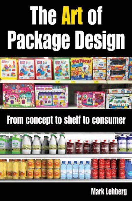
<strong>The</strong>re are many ways to engage the consumer and draw them<br />
to a product. One is to create a range <strong>of</strong> products in the same<br />
brand such as a line <strong>of</strong> potato chips, crayons or markers. This<br />
creates a shelf <strong>of</strong> multiple products so that the consumer’s eyes<br />
are drawn to the brand first and then to the product. In this way<br />
we are creating a larger retail footprint than just a single prod-
INTRODUCTION<br />
uct. We can also create different facings <strong>of</strong> a single product in<br />
varying colors so we create a patchwork <strong>of</strong> colors on the shelf.<br />
This also increases the product footprint. This is known as block<br />
merchandising or billboarding.<br />
Another way to attract shelf attention is with recognizable<br />
icons or visuals. For instance, the unique shape <strong>of</strong> a Coke bottle<br />
or a Perrier bottle, the distinctive Crayola yellow or the black<br />
and cream <strong>of</strong> a Guinness bottle. I’ll explain this in more detail in<br />
the chapter “Branding and Product Loyalty”.<br />
You can also attract shoppers with text or call-outs <strong>of</strong> key<br />
features or benefits such as price, function, size, taste, etc. But<br />
another element <strong>of</strong> the package is to appeal to the emotions. We<br />
do this with colors and imagery evoking a “want” for the product.<br />
Food packaging does this with high-quality images <strong>of</strong> the<br />
prepared foods done in a commercial photo studio with a chef/<br />
stylist to make the image on the package as delicious as it is in<br />
the kitchen.<br />
<strong>The</strong> packaging becomes the real value over and above the<br />
product. For example, two competing brands <strong>of</strong> arts and crafts<br />
markers and crayons, one from a major manufacturer and the<br />
other made in China. If we opened the boxes, the products are<br />
virtually the same. But the package with the “wow” design, is the<br />
one that will sell more. <strong>The</strong> package makes all the difference.<br />
We live in a consumer world <strong>of</strong> almost infinite packaging<br />
choices. A well thought out brand that reflects a quality product<br />
will beat out the competition almost every time.<br />
But there are dangers to be aware <strong>of</strong> in package design, such<br />
3
INTRODUCTION<br />
as the tendency to over-design and over-state benefits <strong>of</strong> a product.<br />
Don’t use a beautiful package to hide a mediocre product.<br />
Consumers may be fooled once but the goal should be for repeat<br />
sales. Make sure that the product is worthy <strong>of</strong> the design and<br />
vice versa.<br />
Packaging design will have an effect on pr<strong>of</strong>it and loss. If you<br />
treat it as just a cosmetic feature or just a secondary marketing<br />
tool you won’t have the desired result. But if design is looked at<br />
as an investment, used as a primary marketing effort and designed<br />
by a pr<strong>of</strong>essional then the results can be very pr<strong>of</strong>itable.<br />
4
CHAPTER 1<br />
Packaging -<br />
yesterday and today<br />
What is packaging? Packaging protects the product from<br />
physical impacts such as hitting, wetting, and bruising.<br />
Packaging allows for the product to reach the consumer in the<br />
most economic way possible and creates ease <strong>of</strong> storage. Another<br />
important role <strong>of</strong> packaging is to provide the consumer with information<br />
about the product, its benefits and the key marketing<br />
message. This differentiates the product from the competition<br />
and allows the consumer to make a choice. <strong>The</strong> weight, price,<br />
production date, use by date, ingredients or contents, name <strong>of</strong><br />
the manufacturer and usage details written on the packaging<br />
provides major convenience to the seller and the consumer.<br />
Packaging should inform the consumer <strong>of</strong> all the properties<br />
<strong>of</strong> the product. It speaks for the product. In regards to food<br />
packaging, with the development <strong>of</strong> the modern age, decreasing<br />
family size and increase in the number <strong>of</strong> single households,<br />
5
PACKAGING - YESTERDAY AND TODAY<br />
the production <strong>of</strong> specially portioned packaging has increased.<br />
<strong>Package</strong>d goods are preferred because people have limited time<br />
to eat, drink and shop in the fast tempo <strong>of</strong> today.<br />
Looking at the history <strong>of</strong> packaging we could go all the<br />
way back to ancient China and the development <strong>of</strong> cardboard.<br />
When containers were needed nature provided gourds, shells,<br />
and leaves. Later, containers were fashioned from natural materials<br />
such as hollowed logs, woven grasses and animal organs.<br />
<strong>The</strong> earliest form <strong>of</strong> flexible packaging can be traced back to<br />
the Chinese in the Second century BC, when they used sheets<br />
<strong>of</strong> treated bark to wrap goods. 1 Over the next millennium paper-making<br />
techniques were developed in the Middle East and<br />
Europe and finally in England. 2 This technique came to America<br />
in the late 1600s.<br />
But this was not paper from wood pulp as we know it today.<br />
This was a product made from flax and other sources. Paper<br />
from wood pulp was developed in the middle <strong>of</strong> the 19th century.<br />
3 Why is this important in the development <strong>of</strong> packaging?<br />
Commercial packaging needs to hold a variety <strong>of</strong> goods. It has<br />
to be <strong>of</strong> a material that can be printed on and it has to be flexible<br />
and durable. In other words, paper or cardboard. <strong>The</strong> first durable<br />
paper that most would claim as the grandfather <strong>of</strong> modern<br />
cardboard was invented in China in the fifteenth century. 4<br />
1. Ohioline. Ohio State University Extension. A History <strong>of</strong> Packaging.<br />
2. Papermaking, its introduction and manufacture in the Medieval Middle East: An Overview, by<br />
Jessica Lafrance<br />
3. Alkaline Paper Advocate. Volume 10, Number 2. October 1997.<br />
4. Packsize.com. How was cardboard invented?<br />
6
PACKAGING - YESTERDAY AND TODAY<br />
Paper bags were developed in England around 1840 and<br />
bag-making machines around 1850. 5 It wasn’t until the turn <strong>of</strong><br />
the century that automatically produced and printed bags came<br />
onto the market.<br />
<strong>The</strong> first commercial cardboard box was produced in England<br />
in the early 1800s, about two hundred years after the Chinese<br />
invented cardboard. 6 Corrugated paper and shipping cartons<br />
(replacing wood) appeared over the next 50 to 75 years. 7<br />
<strong>The</strong> Kellogg brothers developed the use <strong>of</strong> cardboard to<br />
make their cereal cartons and when marketing to the masses, introduced<br />
a heat sealed wax paper liner to protect the food from<br />
the carton. 8<br />
5, 6, 7. Ohioline. Ohio State University Extension. A History <strong>of</strong> Packaging.<br />
8. supplychain247.com: History <strong>of</strong> Cardboard Boxes<br />
7
PACKAGING - YESTERDAY AND TODAY<br />
Paper and paperboard packaging increased in popularity well<br />
into the 20th century. <strong>The</strong>n with the advent <strong>of</strong> plastics as a significant<br />
player in packaging (late 1970s and early 1980s), paper<br />
and its related products tended to fade in use. Lately that trend<br />
has halted as designers try to respond to environmental concerns<br />
<strong>of</strong> using plastics.<br />
A discussion <strong>of</strong> the history <strong>of</strong> packaging goes beyond just<br />
the materials. Packaging has changed over the centuries to meet<br />
consumer demands. <strong>The</strong> purpose <strong>of</strong> packaging is to transport<br />
a product and to display it to the consumer while telling them<br />
what’s inside. In the nineteenth and early twentieth century<br />
packaging told a story <strong>of</strong> the product, what was inside, its benefits,<br />
the history <strong>of</strong> the company, etc.<br />
Packaging today has changed dramatically. Consumers lead<br />
a busy and sometimes frantic lifestyle. Shopping is not a leisure<br />
activity but a necessary daily function. So when shopping for an<br />
item in a grocery store, toy store, electronics store, etc, consumers<br />
will glance at a package for about a second to a second and a<br />
half. Not a lot <strong>of</strong> time to tell a story.<br />
So today’s packaging must attract the eye and appeal to the<br />
senses in an instant. We do that with the use <strong>of</strong> colors, graphics,<br />
images and wording. A far cry from the crowded story-telling<br />
boxes <strong>of</strong> a century ago.<br />
<strong>The</strong> rise <strong>of</strong> the digital world in the late 20th century has permitted<br />
companies to grow rapidly and globally. Increased competition<br />
required advances in packaging design to distinguish<br />
products from competitors. But as packaging needs increased,<br />
8
PACKAGING - YESTERDAY AND TODAY<br />
along with the search for new and innovative materials, the environment<br />
was the loser. So today’s packaging, in addition to<br />
holding and transporting a product, appealing to the consumer,<br />
and being cost-effective, has to be environmentally friendly and<br />
sustainable.<br />
And consumer behavior has changed. In today’s digital world<br />
information is everywhere. It is rare for a consumer to make a<br />
major purchase without searching on-line for options. So unsubstantiated<br />
claims or misleading statements on packaging are<br />
9
PACKAGING - YESTERDAY AND TODAY<br />
easily uncovered.<br />
<strong>The</strong> history <strong>of</strong> packaging is not just a history <strong>of</strong> the development<br />
<strong>of</strong> paper-making, plastics and other materials, but it is a<br />
history <strong>of</strong> societal development and consumer habits.<br />
How will packaging be shaped by future changes? Many<br />
events will effect this such as the changing needs <strong>of</strong> society,<br />
competition, changing lifestyles, the development <strong>of</strong> sustainable<br />
resources, and the discovery <strong>of</strong> new processes. Looking at the<br />
past we see that no single event shaped the packaging <strong>of</strong> today<br />
and the same will be true in the future. A variety <strong>of</strong> events will<br />
converge to create tomorrow’s packaging.<br />
10
CHAPTER 2<br />
Branding and product<br />
loyalty<br />
Before we talk about branding we need to be clear on what is a<br />
brand. Don’t confuse a brand with a logo. A logo is not your<br />
brand and it is not your identity. A logo identifies a company<br />
with the use <strong>of</strong> an icon or other graphic elements. An identity<br />
is all <strong>of</strong> the creative aspects that form the overall brand such as<br />
colors, package layout, and other elements. So a brand is a collection<br />
<strong>of</strong> the logo and the identity creating an emotional image<br />
<strong>of</strong> the company.<br />
Where did branding come from and why? <strong>The</strong> name evolved<br />
from the use <strong>of</strong> a “brand” burned into the hide <strong>of</strong> cattle to identify<br />
their owner. At the dawn <strong>of</strong> commerce people shopped for<br />
goods in a market selecting the best fruit, produce, meat and<br />
household items. All <strong>of</strong> the products were similar but some<br />
stood out above the rest. So the seller started to identify them<br />
with their own mark or insignia to separate or differentiate them<br />
11
BRANDING & PRODUCT LOYALTY<br />
from their competitors. And as word spread <strong>of</strong> their superior<br />
quality consumers sought them out. <strong>The</strong> “brand” had arrived.<br />
In the 1660s, imports into England <strong>of</strong>ten cheated the public<br />
and the phrase “let the buyer beware” became popular. Inferior<br />
quality and impure products were disguised and sold to uninformed<br />
customers. Honest merchants, unhappy with this deception,<br />
began to mark their wares with their identification to alert<br />
potential buyers. In the 1860’s cough drops were sold in glass<br />
jars on store counter tops. To prevent generic versions <strong>of</strong> their<br />
products being sold, the Smith Brothers, in 1872, started packaging<br />
their drops in boxes branded with their name and images<br />
<strong>of</strong> the two brothers. <strong>The</strong>y had created a logo and the beginning<br />
<strong>of</strong> a brand. 1<br />
12<br />
1. Time Magazine, September 24, 1934
BRANDING & PRODUCT LOYALTY<br />
TRADEMARKS<br />
In 1842, the state <strong>of</strong> Michigan required that logs have a special<br />
mark and be registered in the county where the logs were<br />
manufactured and cut into lumber. 2<br />
<strong>The</strong> first trademark laws came into effect in 1857 in France<br />
and in 1862 in the United Kingdom. And in 1870 the first registered<br />
U.S. trademark was awarded to the Eagle-Arwill Chemical<br />
Paint Company. 3 Today there are nearly three-quarters <strong>of</strong><br />
2. Government <strong>of</strong> Michigan, michigan.gov. Michigan Log Marks<br />
3. Ohioline. Ohio State University Extension. A History <strong>of</strong> Packaging.<br />
13
BRANDING & PRODUCT LOYALTY<br />
a million (750,000) registered trademarks in the United States<br />
alone.<br />
We may not always be aware <strong>of</strong> it but trademarks are everywhere.<br />
A trademark is another way <strong>of</strong> distinguishing brands.<br />
Purchasing decisions are influenced by branding and also by<br />
trademarks. We realize the importance <strong>of</strong> branding to enhance<br />
product recognition and instill consumer loyalty. A trademark is<br />
a legal tool to protect that brand. It is also an important part <strong>of</strong><br />
your entire communication strategy.<br />
When we think <strong>of</strong> a trademark we usually think <strong>of</strong> a logo<br />
but it can be much more than that. A package design or layout<br />
can also be a trademark. For example a package design that uses<br />
certain colors in a prescribed shape or form can be trademarked.<br />
It can be any recognizable and unique element in a package design.<br />
And a design trademark does not have to rely on language<br />
or alphabet.<br />
A branded or trademarked design is a valuable asset. It leads<br />
to easy recognitions not just on the shelf, but on websites and<br />
social media platforms. A brand is so much more than a logo.<br />
It extends to corporate brochures, web site, company vehicles,<br />
business stationery, signage, employee uniforms, product displays,<br />
catalogs and product packaging. Quick brand recognition<br />
enhances your overall marketing efforts.<br />
<strong>The</strong> old saying “don’t judge a book by its cover” doesn’t always<br />
apply. Certainly not when it comes to packaging. Branding<br />
is an effective tool to help distinguish your products from com-<br />
3. Ohioline. Ohio State University Extension. A History <strong>of</strong> Packaging.<br />
15
BRANDING & PRODUCT LOYALTY<br />
petitors on the shelf, on line and in Social Media. It’s the first<br />
thing the consumer sees and is a huge part <strong>of</strong> the purchasing<br />
decision.<br />
Branding is a way for companies to stand out from their competition<br />
and be instantly recognizable in the clutter <strong>of</strong> products<br />
on a store shelf. Who hasn’t walked down the aisle <strong>of</strong> a store and<br />
spotted the Crayola products even before we were close enough<br />
to read the name? <strong>The</strong> distinctive yellow package with the green<br />
chevrons is part <strong>of</strong> Crayola’s brand and part <strong>of</strong> our subconscious.<br />
And we all notice the brown delivery trucks <strong>of</strong> UPS without<br />
having to see their logo.<br />
When creating packaging for a brand we need to have a<br />
wider view. As we design we have to ask ourselves how will we<br />
create multiple products using this layout? Which elements will<br />
encompass the brand and which elements will identify specific<br />
products. We can use elements such as a specific font for the title<br />
or header, as well as a section <strong>of</strong> the layout, such as a color bar, to<br />
identify the product within the brand.<br />
So we do not design a package and then say , “OK, let’s use<br />
this for the brand or line.” We have to start that process before<br />
we design and keep the brand prominent and recognizable and<br />
identify those specific product elements as we design. When<br />
we think <strong>of</strong> branding we automatically recall companies such<br />
as LEGO, or Kellogg’s. But a brand doesn’t have to be a billion<br />
dollar company or sold across the globe. A brand can be a series<br />
<strong>of</strong> products or just one. A brand is a trade name for a specific<br />
product, its identity and overall design. It identifies the seller<br />
16
BRANDING & PRODUCT LOYALTY<br />
and differentiates it from its competition. A brand has come<br />
to mean more than just the product. It can be used to define a<br />
range <strong>of</strong> services or even a corporate philosophy. And it can get<br />
confusing with over use.<br />
On the subject <strong>of</strong> package design, a brand is more than a<br />
name. It is also the style <strong>of</strong> design <strong>of</strong> the package and how it is<br />
presented. A brand is meant not just to differentiate you from<br />
your competition but also to have instant recognition for the<br />
consumer. This will help you market a line <strong>of</strong> products based on<br />
the success <strong>of</strong> a single item. People will associate your brand with<br />
the quality <strong>of</strong> a previous purchase. Other elements that tie into<br />
your brand after the package will be signage, advertising, store<br />
displays, stationery, vehicles, employee uniforms, etc.<br />
<strong>The</strong>re are many terms associated with branding. Let’s explore<br />
a few <strong>of</strong> these.<br />
BRAND NAMING<br />
Naming your brand or product is the first step in the branding<br />
process. It is a very involved process balancing objectivity<br />
and emotion. First we need to identify the purpose and mission<br />
<strong>of</strong> the product, the target audience, and then generate a list <strong>of</strong><br />
words that identify with the product, its category and its key<br />
features. Brainstorm this process and discard nothing. Every<br />
word or thought uttered should be written down. Now look at<br />
your words and see if anything jumps out at you. Try combinations<br />
<strong>of</strong> words, rhymes, alliterations. You may look at a word in a<br />
17
BRANDING & PRODUCT LOYALTY<br />
different language, words that conjure up emotions or feeling, or<br />
new words that you create. If you are selling in foreign markets<br />
ensure that you are not using a word that sends a negative or<br />
<strong>of</strong>fensive message. <strong>The</strong> name you select should elicit a positive<br />
image and a positive response from the consumer. Words that<br />
appeal to the senses will work well in the food and beverage<br />
industry and words suggesting fun, play or family will work in<br />
the toy industry. Once you’ve found the three or four top choices<br />
do a quick Google search to see if anyone is using it. If there is<br />
no confusion, a word used in one industry can still be used in<br />
another industry. But once you have your selection it’s time to<br />
talk to a trademark attorney who will do a more exhaustive legal<br />
search to see if the name can be used and protected.<br />
BRAND IDENTITY<br />
Your brand identity are the elements <strong>of</strong> the brand such as a<br />
registered or trademarked name, the colors used, the symbols or<br />
graphics that make up the logo and other elements <strong>of</strong> the design<br />
<strong>of</strong> the packaging, signage, etc.<br />
<strong>The</strong> elements or “identity” separate the brand from other<br />
companies in the marketplace. It also evokes an emotional response<br />
in the consumer. We associate the brand with product<br />
quality or specific ideas and feeling about a product. Consumers<br />
will recall elements <strong>of</strong> the brand and recognize them on various<br />
media (packaging, web site, etc).<br />
18
BRANDING & PRODUCT LOYALTY<br />
BRAND PROMISE<br />
Creating a brand and using that over a range <strong>of</strong> packaging<br />
does not guarantee success. <strong>The</strong> products delivered under your<br />
brand have to stand up to consumer expectations and deliver on<br />
the “promise” <strong>of</strong> a trustworthy, reliable and quality product. If a<br />
branded product delivers what it promises to the consumer, then<br />
other products under that brand will benefit from the promise<br />
associated with the brand.<br />
But like any other promise, a brand promise can be broken.<br />
And when this happens the reputation <strong>of</strong> the company and its<br />
products are affected and consumers will choose a competitor.<br />
19
BRANDING & PRODUCT LOYALTY<br />
20<br />
In packaging, a brand promise can be broken by design<br />
flaws such as:<br />
1. Promising a product that is superior to a competitor but it<br />
is not.<br />
2. Copying <strong>of</strong> a competitor’s design to confuse the consumer<br />
3. Packaging structure that is difficult to open or use<br />
4. Type that is hard to read or poorly written<br />
5. Images on the package that do not resemble the contents.<br />
BRAND EQUITY<br />
As you develop and deliver branded packaging people will<br />
begin to recognize the different elements <strong>of</strong> your design and if<br />
successful, will identify it with quality and value. This is a measure<br />
<strong>of</strong> your legitimacy and reliability. <strong>The</strong> visual elements <strong>of</strong><br />
your brand have become tangible assets and become your Brand<br />
Equity.<br />
In order to create Brand Equity you need to deliver on the<br />
promises you make. This said, Brand Equity is not developed<br />
overnight. You need to consistently deliver or exceed expectations<br />
and never lose sight <strong>of</strong> the value <strong>of</strong> Brand Equity or how<br />
easily you can lose it by not fulfilling expectations.<br />
BRAND LOYALTY<br />
Brand Loyalty could also be translated as “Trust”. As you deliver<br />
quality products that stand up to your marketing hype, con-
BRANDING & PRODUCT LOYALTY<br />
sumers will become loyal to your brand. <strong>The</strong>y will have expected<br />
and received quality products at a price that they feel is justified.<br />
<strong>The</strong> shopping experience, the product quality and product support<br />
met their expectations. <strong>The</strong>y will talk to friends and family<br />
in positive terms about your products and when shopping will<br />
be drawn to your products again and again because <strong>of</strong> the satisfying<br />
experience.<br />
This preference for your products over your competitors,<br />
even if more expensive, is your Brand Loyalty. You will be seen<br />
as delivering a consistent product that meets or exceeds expectations.<br />
BRAND POSITIONING / REPOSITIONING<br />
Brand Positioning is when you identify specific characteristics<br />
<strong>of</strong> your product that help it to stand out from your competitors.<br />
Packaging design will call out different elements that are<br />
superior or unique.<br />
Brand Repositioning is part <strong>of</strong> the evolution <strong>of</strong> your brand.<br />
After a period <strong>of</strong> time you will want to look at your brand identity<br />
and update as your products change. One way to show consumers<br />
that your products have improved is to redesign your<br />
brand identity. That is a tricky process. You do not want to lose<br />
the elements <strong>of</strong> your design that have become identifiable with<br />
your product success but you want to show a growth in your<br />
brand. This is a process that needs to call out new design elements<br />
but keep the look and feel <strong>of</strong> your existing brand. <strong>The</strong>se<br />
21
BRANDING & PRODUCT LOYALTY<br />
changes can be small and subtle or more wide ranging. But never<br />
lose sight <strong>of</strong> what you have built and do not lose your Brand<br />
Equity.<br />
22
CHAPTER 3<br />
Setting out<br />
design objectives<br />
Before we start designing our package we need to define what<br />
it is we want to accomplish. Is this a new product and do we<br />
have to educate the consumer on what it is? Are we creating a<br />
want or a need for an impulse buy or is this a branded product<br />
that ties into an existing line. We need to define all <strong>of</strong> this so<br />
that we can deliver the correct message in a graphic format that<br />
communicates without crowding the package.<br />
Another issue to consider is the size <strong>of</strong> the package. When<br />
determining this many people consider how the contents will<br />
fit but there are other issues that also impact this decision. One<br />
is the retail price <strong>of</strong> the product. For example, a $20 item must<br />
have the look, feel and value associated with its cost. Consumers<br />
have a negative image <strong>of</strong> a small item at a high price. <strong>The</strong>re are<br />
exceptions. A product that is heavily advertised, has a strong<br />
marketing campaign behind it, or is a licensed product does not<br />
23
SETTING OUT DESIGN OBJECTIVES<br />
need to follow this rule. But an item found in mass-market, that<br />
is either an impulse buy or a random purchase must have a perceived<br />
value. Look at competitive products in your category and<br />
judge what is on the shelf. Look at package size if you need<br />
to get an idea <strong>of</strong> the perceived value. A $20 item should have<br />
a certain size and feel. A minimalist approach to packaging is<br />
becoming more popular but packaging your product in a larger<br />
box has a psychological impact on a consumer’s buying decision.<br />
A product in a large box has a perceived greater value than a<br />
product in a small bag. <strong>The</strong>se are two competing ideologies <strong>of</strong><br />
package size and you need to make that decision before you set<br />
our your design objectives. European markets will reject unnecessarily<br />
large packaging.<br />
Regulations <strong>of</strong> the U.S. Product Safety Commission<br />
(USPSC) affecting toy packaging require various warnings on<br />
the front panel (the principal display panel or PDP). <strong>The</strong> size <strong>of</strong><br />
these warnings are regulated by the size <strong>of</strong> the PDP. <strong>The</strong> next<br />
image shows the size <strong>of</strong> the Choking Hazard found on toys. As<br />
you can see, as the PDP size increases, so does the warning size.<br />
So when you are considering package size look at the size <strong>of</strong> the<br />
warning box you need to use. For example, a box that measures<br />
10” x 10” begins a new size category. If the item is slightly smaller<br />
then the warning box is considerably reduced. <strong>The</strong> next size<br />
category goes up to 400 square inches and that size warning on<br />
a 100 square inch box takes up too much space. So in this case,<br />
we would try to keep the box size down to 9-7/8” x 9-7/8”. That<br />
missing 1/8 inch won’t affect the overall design but will give you<br />
24
5 – 9 SQUARE INCHES; PRINCIPAL DISPLAY PANEL<br />
>10 – 14 SQUARE INCHES; PRINCIPAL DISPLAY PANEL<br />
>15 – 29 SQUARE INCHES; PRINCIPAL DISPLAY PANEL<br />
>30 – 99 SQUARE INCHES; PRINCIPAL DISPLAY PANEL<br />
>100 – 399 SQUARE INCHES; PRINCIPAL DISPLAY PANEL<br />
>400 SQUARE INCHES; PRINCIPAL DISPLAY PANEL
SETTING OUT DESIGN OBJECTIVES<br />
a less crowded box. So if you are making a board game for example<br />
and deciding on the components such as the board, consider<br />
the appropriate box size you are aiming for. In this case, the box<br />
design starts with the design <strong>of</strong> the components.<br />
Now that we have determined the optimal package size we<br />
need to make the package stand out on the shelf and deliver a<br />
clear message. We don’t want to crowd it with too many elements<br />
or a confusing and distracting array <strong>of</strong> colors. So the challenge<br />
is to grab the attention long enough to get the consumer<br />
to stop and notice our message. If your design or messaging can<br />
get shoppers to touch or pick up the product then you are closer<br />
to making a sale. So with this in mind, we need to convey our<br />
message on the package in a clear and concise manner.<br />
Keep the message short and simple. You don’t need all <strong>of</strong><br />
your key selling features on the main panel. We need to say just<br />
enough to get the consumer to stop and notice the package. All<br />
additional information can still be used but on the back or side<br />
panels. Once the consumer stops and picks up the package, if<br />
interested, they will turn the box over and see your additional<br />
selling points. By then, we are almost at the check-out counter.<br />
Next we have to consider the message on the package. Break<br />
down all <strong>of</strong> your key selling features and pick the two most important.<br />
Pick the best features and make those strong and visible.<br />
Make sure that the contents are clearly listed and displayed<br />
on the bottom third <strong>of</strong> the package. Colors and imagery play<br />
into the overall appeal and we will discuss that in a later chapter.<br />
Now we have to consider structure and security. This is dif-<br />
26
SETTING OUT DESIGN OBJECTIVES<br />
ferent from package size. What is the most durable structure for<br />
this product? Most consumer products will travel great distances<br />
before they are purchased and taken home. So the package material<br />
must be able to secure the product and prevent damage. It<br />
also needs to avoid wear so it appears new and fresh on the shelf.<br />
This can be done with inserts to hold products securely. Also<br />
the weight <strong>of</strong> the components must be taken into consideration.<br />
Heavy items need a package structure that will not break when<br />
moved around. Many packages will use a 24pt board, printed,<br />
folded and glued. But heavier products may require more solid<br />
structure such as corrugated or other materials. If you are displaying<br />
products in a window make sure they are secure so they<br />
do not move in shipment.<br />
<strong>The</strong> question <strong>of</strong> security must be addressed. You do not want<br />
the package easily opened in the store so that items can be removed.<br />
But balance that with trying to avoid consumer frustration<br />
with overly packaged goods that are difficult to open once<br />
you take them home. You can use security tabs to close flaps or a<br />
complete shrink wrap to enclose the entire box. Always consider<br />
security when designing a package but don’t make opening the<br />
package a frustrating experience for the consumer.<br />
As you can see there are many things to consider before we<br />
even start to design our package.<br />
28
SETTING OUT DESIGN OBJECTIVES<br />
Work with a checklist so that you cover all <strong>of</strong> the points<br />
as you begin your design.<br />
1. Who are you selling to?<br />
2. Who is your competition?<br />
3. What are your products’ strengths?<br />
4. What are its weaknesses?<br />
5. Does the package have any use after purchase, for storage<br />
or display?<br />
6. How is the product used? Is it poured, squeezed, dispensed<br />
in any way?<br />
7. What is the retail price and is the package size<br />
appropriate?<br />
8. Have you taken full advantage <strong>of</strong> the principal display<br />
panel?<br />
9. Is the package structure appropriate for the product?<br />
10. Have you defined your key selling features?<br />
Now we can move on to considering the design elements and<br />
starting the design process.<br />
29
30
CHAPTER 4<br />
Color, imagery and<br />
typography<br />
<strong>The</strong>re are three basic elements that form the core <strong>of</strong> your design.<br />
As the title <strong>of</strong> this chapter suggests they are color, imagery<br />
(photos, illustrations) and typography (the style <strong>of</strong> fonts<br />
used) and we will look at all three <strong>of</strong> them.<br />
COLOR<br />
In discussing colors you’ll come across all sorts <strong>of</strong> terminology<br />
such as hues (variety <strong>of</strong> a color), spectrums (similar to or a<br />
combination <strong>of</strong> hues), tints (mixing a color with white to create<br />
a s<strong>of</strong>ter color), saturation (intensity or strength <strong>of</strong> a color), etc.<br />
We could probably write another book just on the subject <strong>of</strong><br />
color. But we need to simplify the design process and we can<br />
define colors for your package without taking a course on color<br />
terminology.<br />
31
COLOR, IMAGERY AND TYPOGRAPHY<br />
When designing packaging we need to get the message<br />
across (type) and show what the product is (imagery). But if we<br />
had to pick one element that is the most important, it is color.<br />
It is the first thing that draws the consumer to a product on<br />
the shelf. To understand the importance <strong>of</strong> color, stand on the<br />
sidewalk <strong>of</strong> a busy commercial street. You’ll see a lot <strong>of</strong> grays and<br />
browns <strong>of</strong> the various buildings. You’ll see the different tones <strong>of</strong><br />
people’s clothing. But as you look down the street a large red<br />
sign or a bright yellow light will stand out from the clutter. And<br />
it’s the same on a crowded store shelf. So as we design our packaging<br />
we need to decide on a color pallet. That means you are<br />
not using a rainbow <strong>of</strong> colors which can be distracting. Select a<br />
main color and then a range <strong>of</strong> complimentary colors. And how<br />
do we do that?<br />
Look at colors in your brand. You don’t need to repeat the<br />
colors but you don’t want the main package color to fight with<br />
the logo for attention. And look at the color <strong>of</strong> the product. So<br />
pick a color that compliments these. You also need to consider<br />
your competition. We don’t always know what will be on the<br />
shelf beside your product but you do know who the key players<br />
are. For example, if you have an arts and crafts product you know<br />
that Crayola will be in proximity to your package. So you want<br />
to avoid that golden Crayola yellow. Find a color and design that<br />
will distinguish you from your competition.<br />
You can research colors until you are more confused than<br />
when you started. Studies will identify red and orange with<br />
32
COLOR, IMAGERY AND TYPOGRAPHY<br />
warmth, energy and enthusiasm; yellow with creativity, hope<br />
and life; green with environmentally friendly; brown with a natural<br />
product; and blue with dignity and loyalty. 1 In some industries<br />
such as food packaging, we need to consider this. But not<br />
COLOR WHEEL<br />
A traditional color wheel shows three primary colors (yellow, red, blue)<br />
and three secondary colors (green, orange, violet). Complimentary colors to<br />
each are opposite on the wheel.<br />
1. color-wheel-pro.com. Color Meaning<br />
33
COLOR, IMAGERY AND TYPOGRAPHY<br />
as a hard and fast rule. If we did then a natural food store would<br />
have shelves full <strong>of</strong> just brown packaging. Don’t get stuck on<br />
these narrow color definitions. Maybe green or yellow or red will<br />
work with your product. But look at your competition, look at<br />
the store shelf you hope to be on and consider your product and<br />
your message.<br />
Explore a few different color pallets with your logo and<br />
product image. Print them out and stick them all up on a wall.<br />
Stand back, walk away from it, come back and look at them and<br />
consider what works best. <strong>The</strong>re is no formula for this. It is a<br />
feeling you will get.<br />
So as we select colors for our package remember that this is<br />
the most influential and distinguishing feature. It will define the<br />
emotion and feelings associated with your product. It will stand<br />
out from the clutter on the shelf and it will compliment the<br />
product.<br />
<strong>The</strong> package color can be part <strong>of</strong> your brand (such as Crayola<br />
yellow). You can use it within a brand to distinguish flavors or<br />
fragrances <strong>of</strong> a line <strong>of</strong> products (such as in food or cosmetics).<br />
For example, the overall color <strong>of</strong> a line <strong>of</strong> packaging could be<br />
orange. <strong>The</strong> brand might contain a line <strong>of</strong> products in different<br />
flavors. So aside from the overall brand color (orange) each flavor<br />
would have an identifying element in a specific color such as<br />
blue for a blueberry flavor, red for a cherry flavor, etc.<br />
Although we would like to avoid standard color definitions<br />
(such as red for energy, as described previously) we cannot avoid<br />
the fact that certain ranges <strong>of</strong> colors will define certain catego-<br />
34
COLOR, IMAGERY AND TYPOGRAPHY<br />
ries. Walk down the cosmetic aisle <strong>of</strong> a drug store and you will<br />
see a pallet <strong>of</strong> s<strong>of</strong>t colors, pinks, s<strong>of</strong>t blues, etc. In the supermarket<br />
the cereal aisle will have strong bold colors to appeal<br />
to young children. This same color pallet can be found in the<br />
pre-school aisle <strong>of</strong> a toy store. So you can design your product to<br />
be part <strong>of</strong> this aisle or think outside the box for colors that will<br />
stand out against what can become a monotony <strong>of</strong> similarity. A<br />
good designer can give you options to stand out from the pack.<br />
<strong>The</strong>re are no easy solutions or a successful formula for selecting<br />
colors that work. Red is defined as a strong color but if your<br />
product is positioned next to another red package or an orange<br />
box, then the effectiveness is lost. So what is the answer? You<br />
need to look for a color that compliments your product. <strong>The</strong><br />
perfect color may vary from shelf to shelf. So look at your major<br />
competition and focus on differentiating your product from<br />
them.<br />
Don’t get stuck on trends. If the “hot” color one year is purple,<br />
what happens to your product as trends change the next<br />
year? Trend strategy is a recipe for failure. A successful color<br />
strategy for your product will create a personality <strong>of</strong> your brand.<br />
Consumers will start to associate your color with your product<br />
and draw repeat sales through easy recognition. <strong>The</strong> color design<br />
<strong>of</strong> your packaging along with your logo or brand is your<br />
“trade dress”. Trade dress is the overall look and feel <strong>of</strong> a product<br />
or service, which indicates or identifies the source <strong>of</strong> the product<br />
or service and distinguishes it from those <strong>of</strong> others. It may<br />
include the design or configuration <strong>of</strong> a product; the packaging<br />
35
COLOR, IMAGERY AND TYPOGRAPHY<br />
<strong>of</strong> goods; and/or the décor or environment in which services<br />
are provided. 2 And this combination, in addition to packaging<br />
will be used on catalogs, product sheets, web site, etc. So when<br />
selecting color, it’s more than just the color on the shelf.<br />
Key points when selecting color:<br />
1. Select a color that compliments your product and brand.<br />
2. If you are designing a line <strong>of</strong> products, select a coordinated<br />
range <strong>of</strong> colors.<br />
3. Make sure that your computer monitor is calibrated so<br />
that the colors on the screen are reproduced on the printed<br />
package.<br />
4. Use Pantone colors for brand colors. <strong>The</strong>se are industry<br />
specific colors, that are specially formulated to print exactly<br />
the same in tone and hue, every time. 3<br />
IMAGERY<br />
As discussed in the last section, we use color to draw attention<br />
to our package and enhance our brand identity. Imagery<br />
(photography, illustrations, characters, icons, etc) is used to provide<br />
visual stimulation.<br />
We use imagery in different ways on different parts <strong>of</strong> the<br />
packaging. <strong>The</strong> main panel (PDP) will have the main image,<br />
what we call the “hero shot”. This is the image that best rep-<br />
2. International Trademark Association (INTA): Trade Dress<br />
3. intouch-quality.com. What are Pantone colors?<br />
36
COLOR, IMAGERY AND TYPOGRAPHY<br />
resents the product and is the most enticing. On a food package<br />
it says “delicious or healthy”, on a toy package it says “fun” and<br />
on a consumer electronics package it says “You want me”. It’s the<br />
element that makes you reach for the box. We will discuss how<br />
best to use that image but first let’s talk about how to create it.<br />
On a food package the image has to be mouth watering<br />
delicious. You can use an illustration created and rendered to<br />
provide an enticing image. But most food packaging requires a<br />
more realistic visual that the consumer can almost taste as they<br />
look at your package. <strong>The</strong> best image is a photograph. This is<br />
not an area where you want to be budget conscious. Use a pr<strong>of</strong>essional<br />
photographer in a studio and a chef/stylist to create the<br />
incredible mouth-watering image. It’s not just the product you<br />
wan, it is also how the chef will garnish the plate. You want the<br />
consumer to reach for the box and imagine how delicious it will<br />
be. A stylist can create that image for you.<br />
On a toy package you want a detailed image <strong>of</strong> the toy maybe<br />
calling out key features. <strong>The</strong> main image should show the toy in<br />
play. For example an arts and crafts, cosmetic or fashion product<br />
would have an image <strong>of</strong> a child using or wearing the final craft.<br />
On the back <strong>of</strong> the box you may show children interacting with<br />
it. But the setting has to be fun. Be sure not to show a messy<br />
scene that parents will think will need monitoring or a lot <strong>of</strong><br />
clean-up.<br />
<strong>The</strong> final photograph should not be what you use on the<br />
package. A good designer will use extensive PhotoShop skills to<br />
enhance the image, adding highlights, shadows, touch-ups and<br />
38
COLOR, IMAGERY AND TYPOGRAPHY<br />
color correction.<br />
A food image should target the senses such as scent, taste,<br />
flavor, etc. <strong>The</strong> hierarchy <strong>of</strong> the package (after the color) starts<br />
with the hero shot. If you are doing a series <strong>of</strong> products, food,<br />
toys, electronics, be sure to use the same styling in your images.<br />
This is also part <strong>of</strong> your branding and is as important as color.<br />
<strong>The</strong>re are hundreds <strong>of</strong> different photographic styles (such as<br />
lighting, angles, styling, perspective, color or black and white,<br />
duo tones, etc). Selecting a style is as important as selecting a<br />
color. It is part <strong>of</strong> your “trade dress”.<br />
Once you have your main image, consider how it is placed<br />
on the box. You need to leave room for the type and messaging.<br />
Remember this is your main element so it needs to have<br />
prominence and needs to “leap <strong>of</strong>f the box”. You can use extreme<br />
cropping to give the image size. You don’t always need to show<br />
the whole item but can use a part <strong>of</strong> it suggesting what is not<br />
shown.<br />
<strong>The</strong> image should not be created to fit into the layout. <strong>The</strong><br />
layout or design <strong>of</strong> the package should fit the image. Prior to<br />
photography or illustration, you should already have a layout <strong>of</strong><br />
the box with the image placed and styled in the best possible<br />
manner. <strong>The</strong>n the image is created according to your design.<br />
<strong>The</strong> image is not an afterthought. It is the main element <strong>of</strong> the<br />
design. Crop and scale the image for the best effect.<br />
Certain products will benefit from an illustration rather than<br />
a photograph. It’s not a question <strong>of</strong> which category <strong>of</strong> product,<br />
but rather what form <strong>of</strong> imagery best shows <strong>of</strong>f the product.<br />
40
COLOR, IMAGERY AND TYPOGRAPHY<br />
Many illustrations can be photo realistic and give the product a<br />
richer look. You can also use a photograph with heavy retouching.<br />
It all comes down to what makes the product look the best.<br />
Symbols or icons can be used to call out special features.<br />
<strong>The</strong>re are many stock images available that are easily recognized<br />
by the consumer and are effective in identifying special features.<br />
<strong>The</strong>se are icons such as social media, recycling, ages, family fun,<br />
etc. You can also create custom icons for additional features.<br />
Some products will benefit from a character or mascot image.<br />
<strong>The</strong>se are particularly useful if you are creating a line <strong>of</strong><br />
similar products. A character can create a certain style and help<br />
target a particular audience.<br />
In addition to imagery, we also need to consider other graphic<br />
elements; circles, squares and triangles (violators) to hold special<br />
marketing information that needs to stand out. You can also<br />
use color bars to hold special text, or to call out different flavors<br />
or fragrances.<br />
When considering imagery, remember these points:<br />
1. Photographs and illustrations can be used in various styles.<br />
Use the one that best compliments your product and brand.<br />
2. Images should be clear and direct and never confusing to<br />
the consumer.<br />
3. Be sure to look at the entire design <strong>of</strong> the package and<br />
make the image the main element.<br />
4. <strong>The</strong> image should be the main point that the consumer<br />
identifies with.<br />
41
COLOR, IMAGERY AND TYPOGRAPHY<br />
TYPOGRAPHY<br />
<strong>The</strong>re are many rules in type design such as the use <strong>of</strong> capital<br />
letters, alignment, line and word spacing. And these same<br />
rules are relevant in package design. But there are also certain<br />
factors that are unique to packaging. We are not using type on a<br />
brochure or business card. <strong>The</strong> text we create is usually read at a<br />
distance as the consumer walks through a store. And as we described<br />
previously, it is only glanced at. So important text needs<br />
to be short, concise and legible at a distance. <strong>The</strong> family <strong>of</strong> fonts<br />
that we use has to be easy to read. Type also has to convey what<br />
the product is and what the key features are.<br />
When selecting a font (and there are literally thousands to<br />
choose from) we need to take a couple <strong>of</strong> things into consideration.<br />
What is the type <strong>of</strong> product and who is the audience? <strong>The</strong><br />
fonts used must have the same feel as the product, they must<br />
compliment it. A serious electronic product for a pr<strong>of</strong>essional<br />
buyer would not have a fun, cartoon font that you might find on<br />
a cereal box.<br />
So what are we using the fonts for? We are using them for the<br />
product name, a short descriptor, a list <strong>of</strong> contents, some marketing<br />
call-outs and maybe a quantity or piece count. Limit the<br />
typefaces that are used. Try to keep it to 3 different fonts. Usually<br />
you’ll want to stay in the same family and vary the weight<br />
<strong>of</strong> the fonts, bold, medium, condensed, etc. Too many different<br />
fonts is very confusing and distracting to the consumer.<br />
42
COLOR, IMAGERY AND TYPOGRAPHY<br />
When we are designing a package, we start with the principal<br />
display panel (PDP). We need to decide what we want the<br />
reader to see first, second, third, etc. We do that by assigning different<br />
weights and colors to the type so that the most important<br />
text is read first and we guide the reader through the package<br />
in the order we want. How we place type, how we weigh it and<br />
how we align and color it are all tools we use to set up a type<br />
hierarchy.<br />
We group items together that we want read together and<br />
space out other items that we want to separate.<br />
Alignment <strong>of</strong> type can be handled in different ways.<br />
Centered type is positioned with each line having the same<br />
space at the left and right margins so that each line is centered<br />
on the line above and below.<br />
Left aligned or Flush Left: Each line or word is aligned on the<br />
left margin.<br />
Right aligned or Flush Right: Each line or word is aligned on<br />
the right margin.<br />
Most type will be placed left aligned as we read from left<br />
to right. But depending on your box layout and placement <strong>of</strong><br />
elements, sometimes right aligned may work better with your<br />
design.<br />
Justified: This stretches each line evenly to the left and right<br />
so that both <strong>of</strong> the edges are aligned. But this can create other<br />
problems and create inconsistencies in spacing. All word processing<br />
programs create justified space using algorithms. On<br />
any given justified line, the s<strong>of</strong>tware calculates the width <strong>of</strong> each<br />
44
COLOR, IMAGERY AND TYPOGRAPHY<br />
word (combining the width <strong>of</strong> the characters in the word) and<br />
then calculates how many words will fit on each line. It then<br />
takes the remaining space on the line and spaces out the words<br />
evenly to fill each line. So the space between the words will not<br />
be consistent on each line. <strong>The</strong> s<strong>of</strong>tware compensates for this by<br />
hyphenating words to create an average look for each line. You<br />
can see this difference if you turn <strong>of</strong>f hyphenation. <strong>The</strong>n the<br />
spacing will look a bit <strong>of</strong>f. Type that is Flush Left or Flush Right<br />
has the same space between words.<br />
Most design s<strong>of</strong>tware lets you select the language <strong>of</strong> the type<br />
you are using. Hyphenation is different in each language. So if<br />
you are using text in Spanish and the type is specified as English<br />
your hyphenation will be wrong.<br />
Another term you will come across is “kerning”. This is the<br />
adjustment <strong>of</strong> white space between letters. In regular text (such<br />
as in this book) slight irregularities in spacing between letters is<br />
not evident because <strong>of</strong> the smaller size <strong>of</strong> the font. But in packaging<br />
when we use large type sizes you may want to adjust some<br />
letter spacing. Look at the right edge <strong>of</strong> a letter and compare the<br />
space to the left edge <strong>of</strong> the next letter. <strong>The</strong>n look at the whole<br />
word and see if this spacing is consistent. In larger sizes, it may<br />
not be and this is where you adjust the kerning.<br />
Leading is another term. And this is the space between lines.<br />
<strong>Design</strong> s<strong>of</strong>tware will use a value <strong>of</strong> leading in proportion to the<br />
type size <strong>of</strong> the font. But sometimes you may want to increase<br />
or decrease this amount slightly depending on your design and<br />
placement <strong>of</strong> the text. Print out your box layout and place it on<br />
45
COLOR, IMAGERY AND TYPOGRAPHY<br />
a wall to see how it looks. <strong>The</strong>n adjust your spacing (kerning,<br />
leading, size, etc) until it has the effect you want.<br />
Positioning <strong>of</strong> type also sets up a hierarchy. In Western societies<br />
we read from left to right. So type elements on the left<br />
will usually be read before something on the right. And type at<br />
the top <strong>of</strong> the PDP will be read before type on the bottom. That<br />
combined with type sizes and type weights help us prioritize<br />
elements.<br />
We do not design the entire package in the same way. Type<br />
on the front (the PDP) is different that the other panels. Type<br />
on the front needs to be seen at a distance. So we will use larger<br />
fonts maybe heavier weights than we will on the back panel.<br />
On the back, we can use smaller sizes. By the time that panel is<br />
looked at the consumer had picked it up and turned it over.<br />
One important rule to remember in typography is to always<br />
be consistent. Once you have selected the fonts you want to use,<br />
stick with them. Don’t suddenly throw in another font. You can<br />
find enough variety with your font choices using color, weight<br />
and size. Otherwise we are just confusing the reader.<br />
When selecting the font for the item name (or header) remember<br />
your brand identity and select fonts that work with and<br />
compliment the brand.<br />
After this we need to consider the descriptor which is a sub<br />
head to the product name. So that font needs to be in the same<br />
family <strong>of</strong> the product name in a lower hierarchy. This descriptor<br />
is very important. It tells the consumer just what this product is<br />
and what makes it stand out as different from the competition.<br />
46
COLOR, IMAGERY AND TYPOGRAPHY<br />
<strong>The</strong>n we need to place the marketing copy that calls out special<br />
features or contents that give the product value. This type is<br />
important and is usually read before the box is picked up. So we<br />
make it stand out with use <strong>of</strong> color, weights and may place it in<br />
a element such as a burst or bubble.<br />
Lower on the scale <strong>of</strong> importance will be the list <strong>of</strong> contents,<br />
legal and mandatory type. In many industries, such as food, toys<br />
or electronics there are specific government regulations regarding<br />
size and placement. We will cover that in the chapter on<br />
“Regulations and Legalities”<br />
As you can see there is a lot to consider when placing type on<br />
a package. You can easily get lost in a maze <strong>of</strong> fonts as you try to<br />
select which type to use. Don’t waste too much time. <strong>The</strong>re are<br />
thousands <strong>of</strong> fonts but only a few basic groups, serif, sans serif,<br />
cursive, handwriting, etc. Decide which style suits your package<br />
and concentrate on those fonts for your selection. You can customize<br />
type with kerning and line spacing.<br />
And most important, spelling and grammar. When you look<br />
at a package with bad grammar or a spelling mistake, what is<br />
your feeling about that product? We immediately devalue the<br />
product based on our reaction to the packaging. So always check<br />
spelling and use proper grammar. Read the text out loud and<br />
check very carefully for any errors.<br />
Let’s summarize some key points when selecting and designing<br />
the typography for your package.<br />
1. It must be legible from a distance (for the front <strong>of</strong> the<br />
package).<br />
47
COLOR, IMAGERY AND TYPOGRAPHY<br />
2. You must describe clearly what this product is.<br />
3. Key selling points must stand out.<br />
4. Select the fonts you want to use. Don’t spend a disproportionate<br />
amount <strong>of</strong> time on this. Select a family <strong>of</strong> type<br />
with a variety <strong>of</strong> weights.<br />
5. Use the type carefully, paying attention to alignment and<br />
how that relates to the other elements on the package.<br />
6. Pay particular attention to kerning, leading and type sizes.<br />
7. Look at blocks <strong>of</strong> justified type and see if the spacing between<br />
words is consistent.<br />
48
CHAPTER 5<br />
Structure and<br />
Sustainability<br />
Consumers look at packaging today with an eye on the environment.<br />
Is it over-packaged? Does it use recyclable materials?<br />
Is it “green”.<br />
STRUCTURE<br />
We have to weigh these concerns with some very real considerations.<br />
Products are not manufactured in the back room <strong>of</strong><br />
a store and then sold at the front counter. Products must travel<br />
great distances to reach their point-<strong>of</strong>-sale. So a package holds<br />
many different functions. It has to hold the product and protect<br />
it over long distances and through a great deal <strong>of</strong> handling. It<br />
has to be as small as possible to fit the product to minimize<br />
shipping costs. It has to be packaged, as much as possible, in<br />
environmentally friendly materials and it has to allow enough<br />
49
STRUCTURE AND SUSTAINABILITY<br />
surface area to display the graphics and marketing statements.<br />
With some products, the product itself is the package. You’ll<br />
see this with health and beauty items and cosmetics, such as a<br />
bottle <strong>of</strong> shampoo or a jar <strong>of</strong> face cream. For these products,<br />
manufacturers try to use recyclable plastics and other materials.<br />
A product can also be part <strong>of</strong> the brand identity. Think <strong>of</strong> the<br />
shape <strong>of</strong> a Head & Shoulders shampoo bottle. That distinctive<br />
shape is part <strong>of</strong> their brand. <strong>The</strong> same is true <strong>of</strong> the “peanut”<br />
shape <strong>of</strong> the Coca-Cola bottle.<br />
But in most cases, when we talk about sustainable packaging,<br />
we are talking about the cardboard box or plastic pouch that the<br />
product is sold in.<br />
From the consumer’s stand point, the package should have a<br />
function aside from just holding the product. In many cases it<br />
has to open and close to dispense the product as well as storing<br />
it.<br />
When we decide on a package structure and materials we<br />
need to answer some questions:<br />
1. What kind <strong>of</strong> product is this? ... toy, food, consumer electronics,<br />
housewares, etc.<br />
2. How do we need to protect it? What kind <strong>of</strong> packing are<br />
we using to secure the product inside the package? How<br />
will this packing affect the overall size <strong>of</strong> the final package?<br />
3. What type <strong>of</strong> structure do we need? Is it a window box<br />
to display what is inside? Will it hang on a hook or be<br />
displayed on a counter top? Or will it be part <strong>of</strong> a display?<br />
50
STRUCTURE AND SUSTAINABILITY<br />
4. How will the product be shipped? Will it need to fit into<br />
a master carton? Does the final package size need to adapt<br />
to the master carton size?<br />
5. Does the product have a shelf life (such as in food or cosmetic<br />
items)?<br />
6. Does the package have to be leak-pro<strong>of</strong>? (in the case <strong>of</strong><br />
liquids.)<br />
7. Will the package be used to dispense the product?<br />
8. Will the package be used to store the product after its<br />
initial use?<br />
9. How does your competition package their products?<br />
10. Do you have an existing die line or do we have to re-engineer<br />
existing structures?<br />
So how do we decide on the structure <strong>of</strong> a package? In many<br />
cases there are two packages, the outer shell and the inner construction<br />
that holds the product in place and protects it. For<br />
example, the outer shell contains the graphics and marketing<br />
material and the inner structure holds the components and pieces<br />
in place so they do not break in shipment. A product should<br />
be able to survive a drop test. In a drop test, the final packaged<br />
product is dropped from a 30 inch height (basically table height)<br />
onto a concrete floor. <strong>The</strong>n the package is opened and the product<br />
is examined for breakage or any damage. At this point, inserts<br />
and packing will be added, the package size adjusted and<br />
the test repeated until there is no damage. <strong>The</strong>n we can finalize<br />
the inside structure.<br />
52
STRUCTURE AND SUSTAINABILITY<br />
SUSTAINABILITY<br />
What does it mean for a package to be sustainable? This refers<br />
to its environmental impact. A product must meet the needs<br />
<strong>of</strong> the present generation without affecting the ability <strong>of</strong> future<br />
generations to meet their needs. That means not just using paperboard<br />
that can be recycled but using paper from trees that<br />
are from a managed forest that controls harvesting <strong>of</strong> trees and<br />
manages regeneration <strong>of</strong> the forest, in other words “sustainable”.<br />
Not all products are packaged from these sources. It may be a<br />
matter <strong>of</strong> cost or just education <strong>of</strong> the benefits. Most packages<br />
using paperboard from managed forests will carry a designation<br />
identifying this to the consumer. You can see some <strong>of</strong> these logos<br />
and information on certification at http://www.fsc.org.<br />
<strong>The</strong>re are different products we can use aside from standard<br />
paperboard. We can use recycled paper, wood pulp made from<br />
sugarcane, hemp and palm. And when it comes to plastics, they<br />
must be recyclable. We should avoid petroleum based plastics<br />
as much as possible. Research is ongoing in this field and there<br />
are bioplastics made from corn, soy, potato and other renewable<br />
resources. 1<br />
Unfortunately it is a question <strong>of</strong> costs, and none <strong>of</strong> these are<br />
cheaper that the current materials. If you have a completely sustainable<br />
package it will be more expensive. But this is a value to<br />
many consumers and it should become a marketing call-out on<br />
your packaging.<br />
1. Smithsonian.com. Corn Plastics to the Rescue.<br />
53
STRUCTURE AND SUSTAINABILITY<br />
54<br />
PAPER STRIPS FOR RECYCLING<br />
<strong>The</strong> Sustainable Packaging Coalition (SPC) has created<br />
guidelines as to what is and is not a sustainable package.<br />
1. Is it beneficial, safe, and healthy for individuals and communities<br />
throughout its life cycle?<br />
2. Does it meet market criteria for both performance and<br />
cost?<br />
3. Is it sourced, manufactured, transported, and recycled using<br />
renewable energy?<br />
4. Does it optimizes the use <strong>of</strong> renewable or recycled source<br />
materials?<br />
5. Is it manufactured using clean production technologies<br />
and best practices?
STRUCTURE AND SUSTAINABILITY<br />
RECYCLED PAPER IN ROLLS READY FOR PRINTING<br />
6. Is it made from materials that are healthy throughout the<br />
life cycle?<br />
7. Is it physically designed to optimize materials and energy?<br />
8. Is it effectively recovered and utilized in biological and/or<br />
industrial closed loop cycles? 2<br />
You can find more information about sustainable packaging<br />
at https://sustainablepackaging.org<br />
In any discussion <strong>of</strong> sustainable packaging, it will ultimately<br />
come down to choice <strong>of</strong> materials. And we need to understand<br />
their differences and uses. Which materials are compatible and<br />
which are sustainable? We can divide most materials into a few<br />
categories: paper (or cardboard referred to as paperboard), glass,<br />
2. SustainablePackaging.org<br />
55
STRUCTURE AND SUSTAINABILITY<br />
metal and plastics. <strong>The</strong>re are new materials being made from<br />
plant-based products and from recycled materials but for this<br />
topic we will stick to paper, glass, metal and plastic.<br />
PAPER AND PAPERBOARD<br />
This material is made from wood pulp or recycled paper<br />
products. It is classified by its thickness which is measured in<br />
thousands-<strong>of</strong>-an-inch. Material less than 0.010 inches thick is<br />
paper. Anything else is paperboard. Sometimes we hear <strong>of</strong> paperboard<br />
referred to as a point size, such as 24pt board. This is<br />
0.024 inches thick.<br />
Paperboard is inexpensive and recyclable. It is also easily<br />
formed and folded into almost any shape making it an ideal<br />
product for most packaging. It comes in a variety <strong>of</strong> thicknesses<br />
and finishes.<br />
Walmart is the largest retailer in the world and they have<br />
set targets for packaging referred to as the Walmart Scorecard. 3<br />
This scorecard requires manufacturers to improve packaging<br />
and conserve resources, such as greenhouse gas emissions, raw<br />
material use, minimum packaging size, percentage <strong>of</strong> recycled<br />
material, value <strong>of</strong> recovered material, renewable energy used in<br />
manufacture <strong>of</strong> packaging and shipping <strong>of</strong> products (transportation<br />
impact) and innovation.<br />
56<br />
3. corporate.walmart.com. Wal-Mart Scorecard.
STRUCTURE AND SUSTAINABILITY<br />
This has created the “Seven R’s <strong>of</strong> Packaging”;<br />
1. Remove - remove excessive over-packaging.<br />
2. Reduce - maximum protection with minimal packaging,<br />
for example, the use <strong>of</strong> corner boards will reduce the<br />
thickness <strong>of</strong> corrugated packaging resulting in fewer materials<br />
used.<br />
3. Reuse - products can be returned and reused in closedloop<br />
systems to maximize multiple loads over time.<br />
4. Renew - renewable resources such as water used in the<br />
printing process is captured and reused. No heat is used<br />
in the some processes reducing energy consumption.<br />
5. Recyclable - packaging is created using recycled fiber <strong>of</strong><br />
which 80% is post-consumer waste.<br />
6. Revenue - minimal packaging allows more products to<br />
be shipped in a container. Strategically located plants<br />
save on transportation costs.<br />
7. Read - education about the best-practices in sustainable<br />
products increases their use. 4<br />
Walmart, with its commanding position in the retail market<br />
is able to push the industry towards a cleaner environment.<br />
PLASTICS, METALS AND GLASS<br />
Plastic used in packaging can be clear or opaque, white or<br />
colored. It can be heated and shaped (therm<strong>of</strong>ormed) making it<br />
ideal for creating innovative shapes <strong>of</strong> packaging. Distinctively<br />
4. Sustainable Packaging Industry: <strong>The</strong> 7 R’s.<br />
57
STRUCTURE AND SUSTAINABILITY<br />
shaped plastic packaging is part <strong>of</strong> a brand strategy and increases<br />
brand awareness on the shelf. Plastic packaging can be screen<br />
printed directly on the plastic or have a label applied.<br />
Different resins are used in the manufacture <strong>of</strong> plastics and<br />
these are represented by a number on the package. This number<br />
is surrounded by the continuous arrow (recycling) and it does<br />
not indicate the number <strong>of</strong> times it can be recycled. It is simply<br />
to identify the resin to enable easier sorting when processing<br />
recycled plastics.<br />
Bioplastics are made from renewable plant resources such as<br />
corn, potato, soy, etc. <strong>The</strong>y are easily renewable because they are<br />
not petroleum-based.<br />
Glass is a material that is widely used in packaging. Similar<br />
to plastics, it can be shaped and formed into distinctive shapes.<br />
Its advantage over plastic is that it will not interact with the<br />
products it contains. <strong>The</strong> downside is that it is more fragile in<br />
shipping and requires extra protection and packing. It also costs<br />
more to manufacture than plastic and because it is heavier, adds<br />
to shipping costs. But the perception is that products look, smell<br />
and taste better in glass packages.<br />
Metal packaging is made <strong>of</strong> tin, aluminum or steel. It is inexpensive<br />
to produce and is used for beverages, aerosols, paints,<br />
health and beauty items, and food packaging (aluminum foil<br />
containers).<br />
Consumer awareness is building on the use <strong>of</strong> sustainable<br />
materials in packaging. Some manufacturers are making dubious<br />
claims about sustainability on their packages (referred to as<br />
58
STRUCTURE AND SUSTAINABILITY<br />
“greenwashing”) and this can lead to consumer distrust. Also<br />
the use <strong>of</strong> uncertified logos suggesting environmentally friendly<br />
products or resources devalues genuine efforts at sustainability.<br />
If you are committed to sustainable packaging, consider<br />
these points:<br />
1. Look at the entire cycle <strong>of</strong> the products you use and<br />
their closed-loop life cycle.<br />
2. Use recyclable or renewable materials<br />
3. Promote proper disposal and give consumers instructions<br />
on how to dispose <strong>of</strong> properly.<br />
4. Avoid over packing and the over-use <strong>of</strong> inserts.<br />
5. Look at the overall size <strong>of</strong> your package and use materials<br />
to reduce that, such as corner board to reduce overall<br />
corrugated size.<br />
6. Explore which are the best materials for the product<br />
considering the content and shelf life.<br />
7. Look at the overall manufacturing process and its environmental<br />
impact.<br />
59
60
CHAPTER 6<br />
<strong>The</strong> design process<br />
<strong>The</strong>re are different ways to approach package design. You can<br />
simply start with a blank piece <strong>of</strong> paper (or an empty computer<br />
screen) and start placing elements. But that will lead to<br />
innumerable starts and stops in the design process. You need<br />
to approach package design with a clear idea <strong>of</strong> where you are<br />
going.<br />
Before you start designing, you need to ask yourself a few<br />
questions.<br />
1. What is the product?<br />
2. Who is buying this product?<br />
3. Where are they buying it?<br />
4. What is the suggested retail price? This is important because<br />
<strong>of</strong> “perceived value” which we will discuss later.<br />
61
THE DESIGN PROCESS<br />
WHAT IS THE PRODUCT?<br />
This is the phase where we look at the product and decide<br />
on the structure <strong>of</strong> the packaging. Is this a breakable product?<br />
Does it need sturdy packaging or inserts to protect it during<br />
transport? Is it a unique product that might benefit with a window<br />
box or open box to touch and feel the product? If it is a food<br />
product, then what shape are we looking at? What do competitors<br />
do and how will our shape stand out on the shelf.? When<br />
looking at certain shapes, such as tubes or other circular formats,<br />
62
THE DESIGN PROCESS<br />
be aware that they reduce the front panel and limits the area for<br />
your message. If this is a large product then we may look at odd<br />
shaped dimensions. <strong>The</strong>re are a lot <strong>of</strong> options to consider and at<br />
this stage you might want to mock-up some different options.<br />
WHO IS BUYING THE PRODUCT?<br />
What demographic is buying this product... men, women,<br />
adults, children, seniors, etc? What is the market? Is this marketed<br />
to environmentally aware people, then we need to con-<br />
63
sider materials and graphics that appeal to that audience. If an<br />
item is targeted at seniors, we might consider larger type or even<br />
less type. If it is an upscale item then we will want to consider<br />
certain packaging materials that suggest quality. If this product<br />
is being sold in North America, we look at a more colorful design.<br />
If this is for the European market, the design will have a<br />
cleaner more minimalist approach. It is not always possible to<br />
have one design that appeals to a wide range <strong>of</strong> consumers in<br />
many different geographical locations. So if you are only doing<br />
64
THE DESIGN PROCESS<br />
one package for a wide market, then pick a design style that is as<br />
wide ranging as possible but with elements that appeal to your<br />
largest demographic.<br />
WHERE ARE THEY BUYING IT?<br />
Are people buying this on-line, in a supermarket, a big-box<br />
store or a small mom and pop boutique? Each outlet requires<br />
different solutions. Can you afford multiple packages? If not,<br />
consider all <strong>of</strong> the variables and design a package that meets<br />
those needs. If this is sold on-line, then we need to consider<br />
the smallest package possible to minimize shipping costs. But<br />
not too small as we need to add internal elements to hold objects<br />
securely to prevent breakage. If this is sold in a big-box<br />
store as opposed to a smaller boutique, then we need elements<br />
and graphics that can grab the consumer’s attention in a busy,<br />
competitive environment. If sold in smaller mom and pop stores<br />
then we need to capture the buyer with a cleaner, more minimalist<br />
approach.<br />
THE RETAIL PRICE AND PERCEIVED VALUE<br />
Some products, toys in particular, require packaging that conforms<br />
to a consumer’s perceived value. What does that mean? If<br />
a product has a retail price <strong>of</strong> $20, then shoppers will expect a<br />
box <strong>of</strong> a certain size. A $20 item should not be in a small box<br />
where products might usually sell for five dollars. Sometimes we<br />
65
THE DESIGN PROCESS<br />
are selling “air’, placing products in packaging that may be bigger<br />
than needed to meet that concept <strong>of</strong> perceived value and have<br />
more shelf presence. This does not apply to high-end products<br />
such as consumer electronic where the box size has no relation<br />
to price. It depends on your market. This concept <strong>of</strong> “perceived<br />
value” is unique to North America and would not be acceptable<br />
in Europe where wasteful packaging is frowned upon.<br />
Food items are another case. A trend in food packaging has<br />
been to reduce quantities while maintaining price... sort <strong>of</strong> a<br />
hidden price increase. Two example, ice cream used to be sold in<br />
a 2 liter container. Now the same item is 1.45 liters. Pasta used<br />
to sell in 500g packages, now is packaged in 450g or 454g boxes.<br />
But the size <strong>of</strong> the packages in these instances stays the same.<br />
<strong>The</strong>y are selling air. We don’t support this concept <strong>of</strong> “selling<br />
air” but in certain industries it has become a trend. You have to<br />
decide how you want to compete in this market, or abandon this<br />
approach for environmental concerns.<br />
PHASES OF DESIGN<br />
<strong>The</strong>re are specific phases in the process that we need to identify<br />
and elaborate on. <strong>The</strong>y are:<br />
• Research and analysis <strong>of</strong> current market and competitor’s<br />
packaging<br />
• Creation <strong>of</strong> a design brief outlining strategy<br />
• Preliminary design or concepts<br />
• Creative development <strong>of</strong> the package design<br />
66
THE DESIGN PROCESS<br />
• Adjustments and revisions <strong>of</strong> design to meet all goals <strong>of</strong> the<br />
design brief<br />
• Finalization <strong>of</strong> the design and pre-production checklist<br />
• Submission <strong>of</strong> all files to the pre-press provider.<br />
So let’s discuss each step in this process.<br />
RESEARCH AND ANALYSIS<br />
In this phase we need to define what is currently in the market,<br />
where we want to position this product and how will we<br />
stand out from the crowd. First we need to define what category<br />
this product will fit into. If it’s a food item, what aisle will it<br />
be in. If it’s a toy, what is the age-range. Is it a craft toy, is it<br />
electronic, etc. <strong>The</strong>n we look at the competition. How do we<br />
compare in price and package size? Is there a dominant color in<br />
this category and do we want to mimic that or stand out from<br />
it? We will visit retail outlets and see what is <strong>of</strong>fered on-line.<br />
Identify your primary competitor and list their main product<br />
advantages. List your products key features as points to call out<br />
on the packaging either matching the competitor or surpassing.<br />
Maybe your product is similar to the competition but <strong>of</strong>fered at<br />
a lower cost. This would be a key feature.<br />
THE DESIGN BRIEF<br />
This is where we define the brands marketing strategy. <strong>The</strong><br />
design brief defines the product and the key features. It lists all<br />
67
THE DESIGN PROCESS<br />
<strong>of</strong> the main marketing text you want to emphasize on the packaging.<br />
It also defines the final package size and where you’d like<br />
to position the product (in what specific category). If it’s a toy,<br />
then we identify the age range. If it’s a food item, then we list<br />
the nutritional features such as gluten-free, lactose-free, vegan,<br />
etc. What are the elements that need to be on the front panel?<br />
What is the main image? What is the single most important<br />
statement that you want to make? What is on the secondary<br />
panel (the back)? <strong>The</strong> back panel can highlight more marketing<br />
text or a more detailed explanation <strong>of</strong> the product and its uses.<br />
Some packages use the back panel to present a range <strong>of</strong> complimentary<br />
products within the brand. This is a “cross-sell”.<br />
We need to answer a few more questions. Is this a one-<strong>of</strong>f,<br />
or stand-alone product or is it part <strong>of</strong> a brand. That is a line <strong>of</strong><br />
products sharing certain similarities so the consumer develops<br />
a loyalty and recognition for these products. As we discussed in<br />
the chapter on Brands, we have certain elements <strong>of</strong> commonality<br />
in the packaging that ties them all together.<br />
One <strong>of</strong> the main elements <strong>of</strong> this, aside from the logo, is the<br />
colors we choose. Most colors printed on a commercial printing<br />
press are created from the 4 basic colors, cyan, magenta, yellow<br />
and black referred to as CMYK. That sounds simple enough<br />
but sometimes can cause problems when you want one color to<br />
identify your products. Printing presses are constantly adjusted<br />
during the length <strong>of</strong> the print run. <strong>The</strong> pressman checks the<br />
pages as they come <strong>of</strong>f the press and tweaks the press adjusting<br />
the ink flow. So if your main color for example is red, then it is<br />
68
THE DESIGN PROCESS<br />
created with a mixture <strong>of</strong> magenta and yellow. A line <strong>of</strong> products<br />
on the shelf all using that color may have slight variations in the<br />
tone or density.<br />
How do we overcome that? When using a specific color<br />
for your brand, we move away from standard 4 color printing<br />
(CMYK) and go to 5 colors. So that’s CMYK and a special ink<br />
for the red so it is constant. This is called a SPOT color and we<br />
use what are called Pantone colors to identify the specific ink. So<br />
the press will be set up with 4 colors (CMYK) plus one spot color,<br />
such as Pantone Red #185. This ink is mixed before printing<br />
according to a specific formula and will be constant throughout<br />
the press run. Pantone has hundreds <strong>of</strong> colors and we can pick<br />
whatever color matches your brand. And then we will have consistency<br />
<strong>of</strong> the shelf. This is for packaging printed on a commercial<br />
press. If you are printing on a digital press the technology is<br />
different and you should get consistent colors printed CMYK.<br />
But digital presses are not cost effective for large print runs.<br />
Whether you are creating this work yourself, in-house, or<br />
using an outside agency, the <strong>Design</strong> Brief ensures that the direction<br />
that you’ve outlined is followed no matter who works on<br />
your packaging. So you want to make sure you cover all <strong>of</strong> the<br />
points.<br />
Here’s a list <strong>of</strong> what should be in the brief. Add to it as<br />
you customize and create your own brief. But start with<br />
these points:<br />
1. Project overview<br />
69
THE DESIGN PROCESS<br />
70<br />
2. Marketing strategy<br />
3. <strong>Design</strong> goals<br />
4. Brand strategy (if applicable)<br />
5. Product USPs (unique selling points)<br />
6. Target audience (age range if a toy)<br />
7. Product category<br />
8. Identify key competitor and their product USPs<br />
9. Key marketing copy for package<br />
10. Legal and mandatory information that needs to be on<br />
the package (see the chapter on Regulations and Legalities)<br />
11. Printing option, CMYK or additional SPOT colors<br />
12. Packaging structure (die line) and preferred materials<br />
13. Timeline and scheduling<br />
14. Budget<br />
PRELIMINARY DESIGN OR CONCEPTS<br />
<strong>The</strong> next step is to start the actual design. But first we need<br />
to know if this is a new stand-alone product? And if it is, does it<br />
need to relate to the existing brand? Is the package part <strong>of</strong> a line<br />
<strong>of</strong> products and does it need elements that have a commonality<br />
with other products in the line? Or is it a new line or an extension<br />
<strong>of</strong> an existing line? If this is a new stand-alone product,<br />
we should take into account the possibility that other products<br />
may be added to create a line <strong>of</strong> products at a future date. So<br />
in the initial concept we should create elements that could be
THE DESIGN PROCESS<br />
part <strong>of</strong> a line. One <strong>of</strong> the items on our checklist concerns legal<br />
requirements which we will discuss in another chapter. But specifically<br />
with toys, there is a consideration that needs to be addressed<br />
before we start. We always look for the optimal box size<br />
for maximum shelf appeal and for minimal shipping costs. But<br />
we can make small adjustments to this size that will not affect<br />
the product. For toys, there are requirements for the Small Parts<br />
Warning. <strong>The</strong> size <strong>of</strong> this warning is based on the size <strong>of</strong> the<br />
PDP (principal display panel or front <strong>of</strong> package). <strong>The</strong>re is one<br />
size for boxes <strong>of</strong> 30 to 99 square inches, then the size changes<br />
for 100 to 400 square inches, etc. And the warning box is significantly<br />
larger. So if your box is 10” x 10”, you need to use the<br />
larger size warning box. If the components inside will permit,<br />
consider changing the size to 9.875” x 9.875”. This allows you<br />
to use the smaller warning and give you more space for graphics,<br />
images, text, etc.<br />
BRAINSTORMING THE CONCEPTS<br />
To develop different design possibilities we always suggest<br />
brainstorming, conceptualizing and experimenting. This can<br />
inspire new concepts and approaches. Similar to how we brainstormed<br />
brand names, no ideas are discarded, and everything is<br />
considered. After a while a concept will begin to emerge. Keep<br />
notes, start a journal or do all <strong>of</strong> your conceptualizing digitally<br />
.... whatever works best for you and your team.<br />
Concept and strategy rely on each other. <strong>The</strong> specific design<br />
71
THE DESIGN PROCESS<br />
or main idea is the CONCEPT and it should communicate a<br />
design STRATEGY. Different design concepts can result from<br />
your brainstorming sessions. Several design concepts can develop<br />
from a single design strategy. Each design concept should<br />
be creative, innovative and ultimately get the consumer’s attention.<br />
And where you place the primary message is paramount. It<br />
should be in the top 1/3 <strong>of</strong> the front panel. When consumers are<br />
shopping, aside from a brief glance they will give your design, if<br />
they only look at one element, it will be the primary message. So<br />
it should be well thought-out. Consumers will look at this and<br />
maybe up to 4 elements before either picking up the product or<br />
moving down the aisle. So never clutter the design. Use the 3<br />
C’s. Be clean, clear and concise.<br />
If this is part <strong>of</strong> a line keep to your brand design then identify<br />
elements that you can use to call out different products. It<br />
could be something as simple as a color bar, or a different image.<br />
Consider different elements in your design. Is there a repeating<br />
pattern as part <strong>of</strong> the brand identity? Can you use this pattern<br />
with color changes to differentiate products in the same line?<br />
Can you layer different elements to create depth? A problem<br />
with shelf placement, is many packages do not pay enough attention<br />
to the side panels. Very <strong>of</strong>ten products are placed on the<br />
shelf lying down and this is the only panel that is visible to the<br />
consumer. So pay attention to the sides!<br />
72
THE DESIGN PROCESS<br />
VISUAL ORDER OR HIERARCHY<br />
As you begin to design the package pay close attention to<br />
the hierarchy <strong>of</strong> the design and design the elements as they are<br />
meant to be read. Maybe you want to start with the brand name<br />
then the product name or category, the key selling feature and<br />
the imagery. <strong>The</strong> size, color and positioning <strong>of</strong> each element<br />
determines how the consumer’s eyes move through your design.<br />
Important information must be easy to distinguish. In the case<br />
<strong>of</strong> a food item the flavor, variety, ingredients etc. must be easy<br />
to see. So for hierarchy, the eye will move through the product<br />
logically.<br />
Large images will be seen before the text. <strong>The</strong> key elements<br />
on the PDP should be:<br />
1. <strong>The</strong> brand name or sub-brand<br />
2. <strong>The</strong> product name or descriptor<br />
3. <strong>The</strong> product type (flavor, variety or fragrance for a food<br />
item)<br />
4. <strong>Package</strong> size, product count (or net wt. for food or beverage)<br />
5. Marketing text or main benefits<br />
6. Imagery<br />
This is in no particular order. It is up to you to decide on the<br />
hierarchy and design accordingly. If this is a line <strong>of</strong> products,<br />
the difference must be evident without losing the brand look.<br />
Otherwise the consumer will not realize that these are different<br />
73
THE DESIGN PROCESS<br />
products. For a beverage item, if a consumer likes a particular<br />
brand <strong>of</strong> juice, then other flavors in the line must be different<br />
enough to call out the other but still adhere to the brand so that<br />
brand loyalty is not lost.<br />
BILLBOARDING<br />
We need to consider the retail environment for the final<br />
package. Products are rarely placed by themselves and will be<br />
displayed in groups. Do you have an end cap or a 4-foot section?<br />
Don’t get stuck designing with blinders. This is not a single<br />
package front but will be a package <strong>of</strong> multiples. Do design<br />
with repetition in mind. This is billboarding and you should<br />
design the single package with this in mind. How will the elements<br />
work together? Can images run together? An image on<br />
the front panel can be split and repeated so that when the packages<br />
are placed together on the shelf the images come together<br />
to complete the design or pattern. A banner can extend across<br />
the whole shelf? Will products be jammed together next to their<br />
competitor? Use the multiples <strong>of</strong> packages as a design element.<br />
Once all <strong>of</strong> the products are placed together they can have an<br />
overall creative impact.<br />
IMAGES<br />
We discussed imagery in the chapter, “Color, imagery and<br />
typography” but we need to revisit them in relation to the de-<br />
74
THE DESIGN PROCESS<br />
sign process.<br />
Always be aware <strong>of</strong> copyright and infringement. If you are<br />
using stock images read the terms and conditions and ensure<br />
that you can use the images for the purposes you want. You may<br />
need to buy additional rights depending on what you are using.<br />
<strong>The</strong> danger <strong>of</strong> using royalty-free stock images is that the fantastic<br />
image you found for your package, that you based your whole<br />
design around, could turn up on another product on the shelf,<br />
pop up on a billboard or in a magazine layout. It is royalty-free<br />
therefore you have no exclusive rights. But if you really love that<br />
image and want it exclusively then you may be able to negotiate<br />
an exclusive use price. So depending on your budget you can buy<br />
an exclusive image, create your own photography or artwork or<br />
develop your own imagery.<br />
DESIGN REVIEW<br />
Once you have completed the concept phase it is time to<br />
present it for review. <strong>The</strong>se designs need to be examined to ensure<br />
that the brand strategy has been followed and that it meets<br />
the marketing objectives. During this process the design is<br />
tweaked and adjusted, elements are added or discarded, and the<br />
most successful designs can move to the next phase. We usually<br />
start with 3 approved concepts. <strong>The</strong>n we tape then to the wall<br />
and compare the elements. Which message stands out, which<br />
colors pop? Which design immediately attracts the eye? Look at<br />
elements and see if the size relationship gives you the hierarchy<br />
75
THE DESIGN PROCESS<br />
you intended. Look at type styles, colors, images and graphic<br />
elements. Do they all work together to create the message and<br />
direction in the original <strong>Design</strong> Brief?<br />
<strong>The</strong>se presentations should invite an open dialogue about<br />
concepts and direction. What can be modified in order to increase<br />
impact? What is weak on the package and not working?<br />
Is the design what you are looking for but maybe a color needs<br />
to be changed? Try different tweaks <strong>of</strong> the same design until you<br />
see what you are looking for.<br />
Once the preferred concept is agreed on, we can move to the<br />
next phase. We can refine the font selection, the font sizes. Maybe<br />
we will tweak or replace the main image. We will change or<br />
finalize the colors. Decisions are made regarding studio photography<br />
or original artwork. How are we relating all <strong>of</strong> the items<br />
across the line to this new design?<br />
We need to consider the final color pallet and ensure that<br />
we are communicating the product message. How do our colors<br />
relate to the competition. Does the color identify the products<br />
across the line? But this process is a double-edged sword. Sometimes,<br />
too many cooks can spoil the soup. All ideas need to be<br />
considered but as in any creative project there comes a point<br />
when you need to make a decision. Perfectionism is a character<br />
trait <strong>of</strong> a good designer but it can be difficult to decide when a<br />
design is complete. It takes experience and a feeling in your gut<br />
to know when you have taken the design as far a you can. And<br />
always keep the agreed timeline in sight!<br />
We worked with Hasbro Games and they had a great strat-<br />
76
THE DESIGN PROCESS<br />
egy. With a large design team and a lot <strong>of</strong> people involved in a<br />
project, there were many comments and revisions. But once we<br />
had revised and changed and tweaked a design and everyone<br />
had their say, we sometimes found that we were going in circles.<br />
So they had an expression, “OK everyone, pencils down!”<br />
<strong>The</strong> process needs to have a conclusion and we need to pick the<br />
design that works best and move forward. Some designers and<br />
clients can get stuck in the review process with no end in sight.<br />
So at some point, “Pencils down!”<br />
FINAL DESIGN DEVELOPMENT<br />
At this point we need to finalize the messaging and design<br />
and tie in the side panels with the design <strong>of</strong> the PDP. What<br />
about the legal considerations, warnings, ingredients (food),<br />
product count, nutrition (food), etc?<br />
<strong>The</strong> final design elements are refined, such as the shapes <strong>of</strong><br />
letter forms, banners and call-outs. We look at fonts for tracking,<br />
kerning and leading. We look at final placement <strong>of</strong> elements.<br />
We look at the die line and make sure that all elements<br />
are within the die and do not overlap a crease. We can be a bit<br />
anal at this point and have been known to zoom in at 1000% to<br />
line up elements. A little bit crazy, but a good designer should be<br />
a perfectionist.<br />
It is very important, to pro<strong>of</strong>read, pro<strong>of</strong>read and pro<strong>of</strong>read.<br />
At this point you have been looking at the text for a while and<br />
you begin to read what you think is there and may miss what is<br />
77
THE DESIGN PROCESS<br />
actually written. We were at the New York Toy Fair in February<br />
2019 and saw a poster outside a booth <strong>of</strong> a major toy manufacturer<br />
with a glaring typo. Preparing for a trade show can be a real<br />
78
THE DESIGN PROCESS<br />
pressure cooker but the end result was an embarrassing error. So<br />
have someone who has not worked on the project pro<strong>of</strong>read all<br />
<strong>of</strong> the text. <strong>The</strong>n do it again.<br />
AND YOU’RE DONE! OR ARE YOU? ...<br />
<strong>The</strong> design is complete. <strong>The</strong> layout is approved. You’ve<br />
checked all <strong>of</strong> your images and fonts. You’ve looked at your spacing<br />
and hierarchy. It all looks OK. But there is another partner in<br />
the process that needs to be considered .. and that is the printer<br />
or box manufacturer. <strong>The</strong>y will be taking your files, and setting<br />
them up on the press for mass printing. Speak to any printer and<br />
they will tell you horror stories <strong>of</strong> problems they have seen with<br />
a designer’s files not prepared properly. It’s one thing to create<br />
a great-looking design file, it’s another to create one that prints<br />
without problems.<br />
Are we using a SPOT color to identify the brand or the<br />
product in the line? Is this a 4-color print process or using 5 or<br />
6 colors? Will we use a gloss or mat varnish? Will we use a spot<br />
UV to call out a main element? We need to pre-flight our files<br />
so that it moves through the pre-press stage without problems.<br />
This is where you check your files ensuring that you have addressed<br />
all possible printing issues. <strong>The</strong>re is s<strong>of</strong>tware that can do<br />
that or your printer can provide a checklist <strong>of</strong> what to look for.<br />
<strong>The</strong>re is nothing worse than creating a design that has problems<br />
on the press. Go through a checklist to make sure you have covered<br />
all printing questions. Do this and the printer will become<br />
79
THE DESIGN PROCESS<br />
your best friend.<br />
Have you set up the file using layers? All design programs<br />
allow you to “layer” the elements to easily identify and click on<br />
an element. Never create a file in one large and crowded layer.<br />
And very important, label your layers. No one can figure out<br />
how to navigate through a file with a layer pallet labeled, “Layer<br />
1, Layer 2”, etc.<br />
<strong>The</strong>re is s<strong>of</strong>tware out there that will check your files for you<br />
(pre-flight s<strong>of</strong>tware), but you can do this yourself. So after all <strong>of</strong><br />
the design and revisions, what sort <strong>of</strong> things are you looking for?<br />
In any s<strong>of</strong>tware that you are using for design; Adobe Illustrator,<br />
Adobe In<strong>Design</strong>, Corel Draw, etc. there are multiple versions<br />
and upgrades. You may be using the latest version but is<br />
the printer using the same version? You can ask the printer or<br />
you can supply multiple versions. Adobe Illustrator uses Creative<br />
Cloud (CC) as their current version but many companies<br />
did not switch over from Creative Suite 6 (CS6) due to the<br />
change in price structure. In CS6 you could buy the s<strong>of</strong>tware. In<br />
CC versions, you need to have a monthly subscription. So you<br />
can simply supply a file saved in two different versions, and tag<br />
them “CC or CS6”.<br />
If you are using Adobe In<strong>Design</strong> when you use the “package”<br />
feature (which collects all <strong>of</strong> your images and fonts into a<br />
single folder), it also creates an IDML file (In<strong>Design</strong> Markup<br />
Language) which allows users to open the file in older versions.<br />
Be sure to include the IDML file when uploading to the printer.<br />
Similarly Corel Draw has multiple versions so check with the<br />
80
THE DESIGN PROCESS<br />
printer because not everyone uses or can open Corel Draw.<br />
You can also create a high resolution PDF file. Hi-res is 300<br />
dpi or higher. Any printer can open and print a PDF file. <strong>The</strong><br />
only drawback is that it cannot be edited or manipulated easily.<br />
Include lower resolution PDFs as pro<strong>of</strong>s for the printer. Create<br />
the PDF and open it checking to make sure that the file<br />
looks exactly as you want it to look and that nothing has shifted.<br />
Make sure to include all <strong>of</strong> the fonts you have used. For example<br />
if you used the Helvetica family, everyone has that. But<br />
there are different versions <strong>of</strong> Helvetica and if the printer does<br />
not use your version then spacing and line breaks may change.<br />
So include the fonts you used.<br />
Make sure that all <strong>of</strong> the images you are using are imported<br />
into the file. Sometimes they can be on your computer and the<br />
file will open properly but if the images are not uploaded with<br />
the final files then it will not open with the images when the<br />
printer accesses it. So check your image folder.<br />
<strong>The</strong>re are alternatives. You can turn all type into outlines so<br />
the text becomes a graphic element. <strong>The</strong>n there is no need to<br />
load fonts but the file cannot be edited. You can also embed all<br />
images in the file so individual image file are not needed but the<br />
design file will be very large. So we always suggest sending fonts<br />
and images with the files.<br />
Large images can make a file slow to open and print. Sometime<br />
we have a very large image that we reduce a great deal to<br />
fit into our layout. Some <strong>of</strong> our clients have requested that the<br />
image be sized outside <strong>of</strong> the design file (in PhotoShop) so that<br />
81
THE DESIGN PROCESS<br />
it is imported at 100%. <strong>The</strong> problem with this is that if you want<br />
to enlarge the image you have to go back to the original larger<br />
image. If you want to use this method, it is done at the final<br />
stage after all corrections have been made.<br />
Check that the file is in 4-color process (CMYK) and not<br />
RGB (Red Green Blue). RGB is used for digital work, websites,<br />
etc. CMYK is used for commercial printing, and some colors<br />
will have slightly different hues. So always work in CMYK and<br />
make sure the final file is CMYK. Check your color pallet and<br />
make sure that all colors and images are converted to CMYK<br />
and not Spot colors. Only use Spot colors when you are requesting<br />
special inks. If you created your file using Pantone colors but<br />
are not printing them as Spot, then convert them to CMYK.<br />
You can also look at your Swatches pallet and delete all unused<br />
colors. This makes the pallet less crowded and confusing.<br />
Check your die line and make sure that everything fits within<br />
the die. Always leave a bit <strong>of</strong> a margin. All printers will have<br />
preferences on how close to the edge they like to print. Check<br />
with the printer or leave at least an 1/8 to 1/4 inch (3-6 mm)<br />
margin. Indicate how the box folds - which is the front panel,<br />
back, etc. Is there a window on the box? Make sure that it is indicated<br />
on the die line layer and include dimensions on the box<br />
in a non-printing layer.<br />
Are you using a special varnish or coating? If so, indicate that<br />
in a note to the printer. And if you are using a Spot UV (ultra<br />
violet coating) or varnish, put that on a separate layer. A Spot<br />
UV, is a section <strong>of</strong> the layout that will have a shinier finish so<br />
82
THE DESIGN PROCESS<br />
that it can stand out. This is treated as a separate color when set<br />
up on the press so you need to check with the printer if they can<br />
do this or need to do a special, more expensive printing.<br />
A quick re-cap<br />
1. S<strong>of</strong>tware version<br />
2. Hi-res PDF for printing<br />
3. Lo-res PDF for pro<strong>of</strong>ing<br />
4. All fonts included, or convert to outline<br />
5. All images included or embed images in file<br />
6. Check all colors for 4-color printing (CMYK)<br />
7. Check for Spot colors<br />
8. Check all die lines, windows and margins<br />
9. Identify box architecture (front, back, etc)<br />
10. Include a note to the printer with dimensions and special<br />
printing such as coating or varnish.<br />
83
84
CHAPTER 7<br />
Multi-language<br />
packaging<br />
As companies look to expand they look to other markets. But<br />
how will your brand be marketed in different regions and<br />
in different cultures? Will you create uni-lingual packaging in<br />
the language <strong>of</strong> the region or will you retain English and add<br />
additional languages?<br />
Cost is a major factor. How much inventory do you want to<br />
keep in multiple languages? Do you want one global package<br />
that can be sold in any region? That would be ideal, but difficult<br />
to do and not practical. Consumers in the United States<br />
prefer one-language, English packaging. Some companies will<br />
add Spanish and French to create a North American version but<br />
in the U.S., English only packaging is preferred. Canada uses<br />
bilingual packaging in English and French. In the U.S. English<br />
may be a preference, but in Canada, two languages is a legal<br />
requirement (see the chapter on Regulations and Legalities).<br />
85
MULTI-LANGUAGE PACKAGING<br />
In the European Union it is common to have packaging using<br />
4, 5, 6 or even 7 languages. But the key to multi-language<br />
packaging and the one word we need to remember is “simplicity.”<br />
In the past products distributed around the world would<br />
be in one or two languages changing SKUs depending on the<br />
region. Today with multi-regional distribution and the need to<br />
keep margins tight, manufacturers are reducing SKUs and inventory<br />
to cut costs. Packaging that contains three or more languages<br />
is an efficient way to reach a broader audience.<br />
So how do we create a multi-language packaging strategy<br />
that is cost-effective? Check out the competition in each region.<br />
How are they identifying their brand? How will you stand out<br />
against their design? Do you want to use your current brand or<br />
will you need to adapt it to the new market? Are you are going<br />
to be printing new packaging? Is this a good time to re-evaluate<br />
your brand based on the new market and the competition or<br />
do you want to continue with your current branding? Are you<br />
looking to create a global brand or keep it regional? Look at the<br />
competition. Is their branding straightforward, addressing the<br />
local audience in a way that meets their needs and understanding?<br />
Identify ways that you can differentiate your brand to stand<br />
apart.<br />
Are you expanding your current product line to a new market<br />
or is this a new global product launch? How familiar will this<br />
new market be with your product and its benefits? What key<br />
features need to stand out? Look at your brand name and ensure<br />
that when it is pronounced in another language, it does not have<br />
86
MULTI-LANGUAGE PACKAGING<br />
a negative meaning. Parker Pen intended to use the slogan “it<br />
won’t stain your pocket and embarrass you,” to emphasize how<br />
its pens wouldn’t leak, translating it into Spanish as “no manchará<br />
tu bolsillo, ni te embarazará.”<br />
But embarazar means “to be pregnant” rather than “to embarrass.”<br />
So the slogan was understood as “it won’t stain your<br />
pocket and get you pregnant 1 .”<br />
So how many languages should you use on a package? <strong>The</strong>re<br />
1. ThoughtCo.com. <strong>The</strong> Tale <strong>of</strong> the Vulgar Pen<br />
87
MULTI-LANGUAGE PACKAGING<br />
are many factors to consider such as distribution, inventory,<br />
manufacturing costs and market preference. And keep in mind<br />
that languages change by region. French is different in France<br />
and Canada. Brazil and Portugal use different terminology in<br />
Portuguese. Some regions in the South Pacific will accept U.S.<br />
packaging in just English. So study the regions, check the competition,<br />
and determine what you need to do.<br />
Don’t forget the “simplicity” rule. <strong>The</strong> more languages we<br />
use the less we can say on a package. So decide what the main<br />
message needs to be. <strong>The</strong>re is limited room on the PDP. So if<br />
you could only say one or two things about this product what<br />
would it be? Decide on the hierarchy <strong>of</strong> your messaging and<br />
layout the package so it reads properly in each language. You<br />
cannot say everything on the front <strong>of</strong> the package. You can put<br />
additional information on the back but keep the front as simple<br />
and uncluttered as possible with a strong message to entice the<br />
consumer to pick up the package. Once in their hands, they will<br />
turn it over and look at the back. But you need to encourage<br />
them to pick it up in the first place. A crowded, cluttered front<br />
panel will not do that. <strong>The</strong>re are legal requirements in each region<br />
<strong>of</strong> what needs to be on the front. Check out the next chapter<br />
on “Regulations and Legalities”. If the product has complex<br />
information or a fold out panel with a great deal <strong>of</strong> text then<br />
consider a QR code that will take the consumer to a web page or<br />
include an insert inside the package.<br />
<strong>The</strong> simple rule is that you may not be able to say everything<br />
on a multi-language package that you would on the single lan-<br />
88
MULTI-LANGUAGE PACKAGING<br />
guage design.<br />
You can use your design to support a multi-language message.<br />
Different colors or tones can be used to identify languages.<br />
Certain features can be called out with icons instead <strong>of</strong> text.<br />
Another reason to keep your messaging simple is the length<br />
<strong>of</strong> translated text. Most languages use 25% to 30% more space<br />
than English. Korean and Japanese will use less.<br />
If your package contains more than one language then you<br />
will need translation. Use a company with pr<strong>of</strong>essional translation<br />
services. <strong>The</strong>y should have translators that are native to each<br />
language and preferably live in those regions. As we mentioned,<br />
the same language can be different in different regions, such as<br />
Spanish in Europe vs. Latin America, Portuguese in Portugal<br />
vs. Brazil, French in France vs. Canada. Expressions and words<br />
can be different. For example, when translating “markers” into<br />
Spanish, some regions will use “marcador” and some will use<br />
“rotulador”. So use a translator that is a native speaker in the<br />
language and region you are targeting. Ideally a translator creating<br />
French text for Quebec will live in the region, and not, for<br />
example, in Kansas!<br />
Don’t simply give the translator a Micros<strong>of</strong>t Word document<br />
to translate. Let them see the final English box in its entirety<br />
so they can understand the context and meaning <strong>of</strong> what they<br />
are translating. Sometimes, when we receive a translation we<br />
may have trouble fitting it into the space needed. A short English<br />
phrase may become a long multi-word sentence in another<br />
language. So we send it back to the translator showing where<br />
89
MULTI-LANGUAGE PACKAGING<br />
this is going and ask for different text that fits the design more<br />
efficiently. In any language in any translation there are different<br />
ways to convey the same message. So work with your translator<br />
to have the clearest terminology for your design.<br />
<strong>The</strong> use <strong>of</strong> color is different in many cultures. 2 For example,<br />
in western culture we use red and green to express negative and<br />
positive elements, such as in icons, safety issues, charts and diagrams.<br />
In China, when showing a pr<strong>of</strong>it and loss chart, red is a<br />
positive color and green is the opposite. In a business environment<br />
in the U.S. we would use green (the color <strong>of</strong> money) but in<br />
South Africa, we would use blue. <strong>The</strong>re are many more example<br />
<strong>of</strong> color and culture. Do your research to avoid being “color<br />
blind”. We need to be sensitive to different cultures. No one<br />
wants to be the next “Parker Pen”. Do your research. Use native<br />
language speakers to translate and pro<strong>of</strong>-read text. Know what<br />
colors are best for each region and stay away from those with<br />
negative connotations. A native speaking translator will advise<br />
you on idiomatic expressions, slang and pop culture. Some images<br />
or visuals may have negative cultural misunderstanding.<br />
<strong>The</strong>re is no set formula for multi-language packaging. But<br />
remember your goal. You want to communicate with another<br />
market or culture and have them interested and excited about<br />
your product. Remember the “simplicity” rule and be creative in<br />
how you present your message but don’t clutter the package. Use<br />
a pr<strong>of</strong>essional, regional translator and be culturally astute at all<br />
times.<br />
90<br />
2. news.nationalgeographic.com. Even Graphics Can Speak With a Foreign Accent
CHAPTER 8<br />
Inside a toy<br />
package<br />
So once you purchase a product, specifically a toy product,<br />
what is the experience when you open the box? This book<br />
has been all about the outside experience, how we design a package<br />
and make it attractive to the consumer so that they purchase<br />
your item<br />
But we should not just be looking to sell one item. We want<br />
to create a positive customer experience, grow our brand, and<br />
have repeat business. So we need 100% satisfaction when the<br />
box is opened.<br />
Most important deliver what you promise. If you make a<br />
marketing claim on the package make sure this is exactly what<br />
the consumer gets. Don’t over-promise and under-deliver. For<br />
example, don’t promise “bright vibrant color markers”and then<br />
include low quality products that don’t perform well.<br />
Pay attention to how the product presents itself when the<br />
91
INSIDE A TOY PACKAGE<br />
box is opened. Is it just a jumble <strong>of</strong> products in a plastic bag or is<br />
there a printed insert with the components laid out? Obviously<br />
there is a cost for the insert but what is the best result? Do you<br />
want this to be a box that is reused with storage for the components<br />
or is it a throw-away box? Even so it needs to be attractive<br />
and a simple printed insert with dividers for components in different<br />
resealable bags would have be more engaging experience<br />
92
for the consumer. Look at the cost <strong>of</strong> an insert and depending<br />
on quantities you may only be talking about extra pennies per<br />
product.<br />
One <strong>of</strong> the most negative experience a consumer can have<br />
with a product after purchase is the product instructions. Many<br />
companies focus all <strong>of</strong> their attention on the outside <strong>of</strong> the box<br />
and ignore the customer experience with the product. How<br />
many times have we opened a toy package or consumer electronics<br />
product and struggled to understand what to do next.<br />
<strong>The</strong> ideal toy is one that a child can open with instructions targeted<br />
at their age group and level <strong>of</strong> comprehension. Instructions<br />
with long drawn out sections <strong>of</strong> text, poorly written from<br />
another language is not fun for anyone. We’ve always believed<br />
that people prefer to look more and read less. So instructions<br />
that are heavily illustrated with step by step images and limited<br />
text are preferable to a long page <strong>of</strong> words with few illustrations.<br />
93
INSIDE A TOY PACKAGE<br />
But as with everything else there is a cost factor. Illustrations,<br />
especially original line art will add to your costs. But if you take<br />
the larger view <strong>of</strong> enhancing the experience and simplifying the<br />
process you will be one step closer to a repeat purchase.<br />
Let’s look at a case study. We had a client who was selling<br />
drones. That’s a popular toy and a great present under the tree at<br />
Christmas. So when a child tears <strong>of</strong>f the wrapping on Christmas<br />
morning and finds an exciting drone, what do they want to do?<br />
<strong>The</strong>y want to fly it right away. So they open the box and are<br />
94
INSIDE A TOY PACKAGE<br />
usually confronted with a thick booklet with pages and pages <strong>of</strong><br />
instructions on set-up, flight instructions, battery information,<br />
charging, etc. It can be a very discouraging experience. So we<br />
developed a simple, single page Quick Start Guide, with the<br />
very basic directions <strong>of</strong> how to turn it on, fly, hover and land.<br />
That’s all that the child usually wants in the first experience.<br />
<strong>The</strong>n there is a booklet with more detailed and heavily illustrated<br />
step-by-step instructions for more complex features.<br />
For <strong>Art</strong>s and Craft items with a multitude <strong>of</strong> components<br />
it is important to clearly show what is supposed to be in the<br />
box. We want the consumer to be clear on what is included and<br />
what may need to be added from household items such as scissors,<br />
tape, etc. And be sure to show what is the final goal to be<br />
achieved. Is there a single result such as in Origami or making<br />
a bracelet? Are there different options or just a suggestion <strong>of</strong> a<br />
creative direction?<br />
We are all consumers. Put yourself in the position <strong>of</strong> a parent<br />
or child. What would you want to see and experience when you<br />
open your product? Make the experience enjoyable, clear and<br />
fun.<br />
95
96
CHAPTER 9<br />
Regulations<br />
and legalities<br />
So you’ve created a great product and designed crowd-stopping<br />
packaging. You’ve presented it to a major retailer and<br />
they are as excited about it as you are. <strong>The</strong>y place a large order<br />
and you go into production. You’re a great success! But wait!<br />
You ship to the major chain and about a month later you get<br />
a call from the buyer, the same one who was so excited about<br />
your product. And he’s yelling at you over the phone. <strong>The</strong> product<br />
had to be pulled from the shelf because the packaging is<br />
non-compliant. He’s in trouble with his boss and he’s really angry<br />
with you. Your product is returned to you and you will never<br />
get back on that shelf again. So what happened?<br />
<strong>The</strong>re are a myriad <strong>of</strong> regulations specifying what needs to<br />
be on a package, what cannot be on a package, where it must be<br />
placed, and what size it has to be. <strong>The</strong>re are regulations in every<br />
industry regarding packaging but in this book we will concen-<br />
97
trate on two major sectors, the toy industry and the food and<br />
beverage industry. <strong>The</strong>se regulations vary in the United States,<br />
Canada, the E.U., and in every region around the globe. An<br />
attractive, creative package is only one part <strong>of</strong> the process. So if<br />
you want to avoid that screaming buyer then pay close attention<br />
to regulations and legalities regarding packaging.<br />
PACKAGING IN CANADA<br />
Regulations in Canada require that all packaging, either food or<br />
toys,be bilingual (in English and French). And requirements are<br />
different depending on where the product is sold. Regulations<br />
in the Province <strong>of</strong> Quebec require that all text on the package<br />
be in both languages and be <strong>of</strong> equal size and prominence. Regulations<br />
in the rest <strong>of</strong> Canada are more lax and state that you<br />
bilingualize only the product name or descriptor, the list <strong>of</strong> con-<br />
98
REGULATIONS AND LEGALITIES<br />
tents (or ingredients), the country <strong>of</strong> origin, and in the case <strong>of</strong> a<br />
food item, the net weight statement and the nutritional panel.<br />
All marketing text can be in English only. This is OK if you are<br />
selling across the country but not in Quebec. But what happens<br />
if a buyer from Quebec or a national chain becomes interested?<br />
<strong>The</strong>n you will have to revise your packaging. So we always<br />
suggest that all packaging for Canada follow the more stringent<br />
Quebec requirements.<br />
anel<br />
l<br />
WARNING:<br />
CHOKING HAZARD - Small parts.<br />
Not for children under 3 years.<br />
AVERTISSEMENT :<br />
RISQUE DE SUFFOCATION - Petites pièces.<br />
Ne convient pas aux enfants de moins de 3 ans.<br />
ADVERTENCIA:<br />
PELIGRO DE SOFOCACION - El juego contiene partes<br />
pequenas. No es recomendable para ninos menores de 3 anos.<br />
THE TOY INDUSTRY<br />
Back in Chapter 3 we talked about the size <strong>of</strong> the package<br />
and how it affected the Small Parts Warning (the choking hazard).<br />
Regulations in United States and Canada require a boxed<br />
warning on the front <strong>of</strong> the package calling out certain hazards<br />
such as small parts choking, small balls or marbles, latex balloons,<br />
magnets, etc. This warning box must be a certain size in relation<br />
to the proportion <strong>of</strong> the PDP. Basically the larger the box the<br />
99
REGULATIONS AND LEGALITIES<br />
larger the warning. In Canada you are also required to duplicate<br />
the warning in French. In the United States, Spanish is sometimes<br />
used although it is not a legal requirement but more <strong>of</strong> a<br />
marketing decision companies make depending on the market<br />
they are serving. <strong>The</strong>re are specific requirements for the size <strong>of</strong><br />
the “Warning” text and the size <strong>of</strong> the caution triangle, also the<br />
space between the triangle and the first word is regulated. <strong>The</strong>re<br />
are specific sizes for the hazard statement (“Choking Hazard”)<br />
and another size for the remaining text. And all <strong>of</strong> this varies<br />
according to the size <strong>of</strong> the box.<br />
Other regulations stipulate that it must be placed on the bottom<br />
<strong>of</strong> the front panel and that the color <strong>of</strong> the warning box<br />
must be in contrast to the background that it is placed on. For<br />
example, if the background <strong>of</strong> the front panel is a gray tone then<br />
the warning box must be in sharp contrast so it would be white<br />
or another contrasting color to gray. It cannot blend in with the<br />
background and be another gray tone. Depending on the color<br />
you choose you may have to add an outline stroke to the box.<br />
<strong>The</strong> intent <strong>of</strong> the regulation is that it must stand out and be<br />
visible to the consumer. You cannot hide it in the clutter <strong>of</strong> your<br />
design.<br />
What exactly is a small part? It is an item that can become<br />
lodged in the throat <strong>of</strong> a small child under 3 years <strong>of</strong> age. <strong>The</strong><br />
illustration here is <strong>of</strong> a Small Parts Tube. It represents the throat<br />
<strong>of</strong> a young child. This is used by the toy industry to determine<br />
what is a small part or can become a small part. If an object fits<br />
entirely inside this tube and does not stick up past the rim, then<br />
100
REGULATIONS AND LEGALITIES<br />
it is deemed to be a small part. If<br />
the items extends above the rim,<br />
then it is assumed that the small<br />
part, if lodged in a child’s throat,<br />
can be grasped and removed.<br />
Some parts may not fit in<br />
the Small Parts Tube but can<br />
still be classified as such. For<br />
example, a felt marker about 5<br />
inches long obviously will not<br />
fit in this tube, but take <strong>of</strong>f the<br />
cap and see if that fits. If it does,<br />
then you have a small part. Also,<br />
if an item can become dislodged<br />
or broken <strong>of</strong>f, it may become a<br />
small part. Testing labs will do a<br />
1.00 in<br />
25.40 mm<br />
1.25 in<br />
31.70 mm<br />
SMALL PARTS TUBE<br />
2.25 in<br />
57.10 mm<br />
drop test to determine if packaging protects a toy. This same test<br />
will also determine if an item can be broken or come apart and<br />
be classified as a small part.<br />
Companies will sometimes classify a toy as “6 years and up”.<br />
This is done if the toy is legitimately meant for older children,<br />
but sometimes it is done to avoid having to use the small parts<br />
warning. But as a manufacturer, ask yourself if you can guarantee<br />
that your product will not come in contact with a younger child<br />
in the home. A toy marketed to older children may appear to<br />
avoid these regulations but we live in a very litigious society and<br />
you can avoid these issues by labeling all toys with Small Parts<br />
101
REGULATIONS AND LEGALITIES<br />
Warnings if such parts exist in the toy.<br />
Regulations in Europe and Asia are different regarding<br />
Small Parts. We still determine what is a small<br />
part in the same manner but the packaging requirements<br />
are not as stringent. In the E.U. it<br />
is not required to have a large warning on the<br />
front <strong>of</strong> the package. <strong>The</strong> Choking Hazard<br />
warning, shown here, is placed on the back <strong>of</strong><br />
the package with the text “Warning: Choking Hazard, Small<br />
Parts”. <strong>The</strong> size must be legible and does not have to be as large<br />
as in the U.S. <strong>The</strong> size <strong>of</strong> this symbol is regulated to be no smaller<br />
than 10 mm. You will see this on the back <strong>of</strong> European packaging<br />
with the text in multiple languages depending on where it<br />
is sold.<br />
Many retailers will insist on seeing certification that your toy<br />
has passed safety testing. This relates to its chemical composition,<br />
contents, etc. ASTM International formerly known as<br />
American Society for Testing and Materials, is an international<br />
standards organization that develops and publishes voluntary<br />
consensus technical standards for a wide range <strong>of</strong> materials,<br />
products, systems, and services.<br />
<strong>The</strong>re are various ASTM standards relating to toys, such as<br />
ASTM D-4236, relating to art materials and crafts, and ASTM<br />
F-963 which is a mandatory overall safety standard for toys. Retailers<br />
will ask to see this certification before placing an order. As<br />
toys pass through a testing lab for certification the lab may also<br />
evaluate the packaging to confirm that it meets regulations. But<br />
102
REGULATIONS AND LEGALITIES<br />
they may not verify everything on the package and the ultimate<br />
responsibility is still yours.<br />
THE FOOD AND BEVERAGE INDUSTRY<br />
This industry is much more regulated than the toy industry<br />
and requires more mandatory information on the packaging.<br />
<strong>The</strong>se regulations are enforced by the Food and Drug Administration<br />
(FDA) in the United States, the Canada Food Inspection<br />
Agency (CFIA) in Canada, and the European Commission<br />
(EC) in the European Union. All <strong>of</strong> these regions have similarities<br />
but enough differences to preclude using the same label-<br />
103
REGULATIONS AND LEGALITIES<br />
ing in multiple markets. Unfortunately, this means that you will<br />
need to create different packaging and labeling for each market.<br />
So do the FDA, CFIA and EC test all products for compliance<br />
before they hit the shelf? <strong>The</strong>y will do random, spot testing<br />
but the vast majority <strong>of</strong> food products will make it to your table<br />
without any testing. That sounds like a wide open market but<br />
it is actually much tighter than that. <strong>The</strong> people who will take<br />
your product in hand and verify if it complies are much more<br />
stringent observers. <strong>The</strong>y are your competitors who will look<br />
at your product and report it to the appropriate agency if they<br />
suspect you are out <strong>of</strong> compliance. It doesn’t get any tighter than<br />
that!<br />
So what do you need to look for? To start with there are regulations<br />
regarding the Net Weight statement on the front panel.<br />
It must be in the bottom third <strong>of</strong> the package and the height <strong>of</strong><br />
the numerals is regulated in proportion to the area <strong>of</strong> the front<br />
panel. <strong>The</strong> calculation to determine this size is different in the<br />
United States and Canada and on certain package sizes the U.S.<br />
type size will be too small for Canada.<br />
Ensure that your net weight statement is accurate. <strong>The</strong> Bureau<br />
<strong>of</strong> Weights and Measures has been known to do spot tests<br />
in stores and found that a large number <strong>of</strong> products are delivering<br />
less weight than specified on the package. Those products<br />
were removed from the shelf and trashed. It is your responsibility<br />
to ensure that the package reflects an accurate weight.<br />
Beware <strong>of</strong> using words like Organic or Healthy on your<br />
product. To qualify as healthy you must meet certain standards<br />
104
REGULATIONS AND LEGALITIES<br />
and certain nutrition requirements. <strong>The</strong>re are benchmarks that<br />
you have to meet to make certain health claims on a food package.<br />
For example, in the U.S. if you want to say “Sugar Free”<br />
there must be less than a half a gram <strong>of</strong> sugar per serving. 1 Different<br />
standards exist for claims such as “Sodium Free” or “Good<br />
Source <strong>of</strong> Fiber”. Some <strong>of</strong> these benchmarks are the same in<br />
various markets, and some require you to reach a different level.<br />
Basically you can not make a health claim without adhering to<br />
the specific regulation.<br />
To label your product as Organic you must be certified as<br />
organic and meet specific requirements. If not you can still list<br />
specific ingredients as organic ingredients but not the entire<br />
product. <strong>The</strong> USDA specifies that your logo or brand name cannot<br />
contain the word “organic” if you are not certified but the<br />
company name can say “organic” in the information panel just<br />
not in the logo or brand. 2<br />
<strong>The</strong> largest changes that have been made to food packaging is<br />
the Nutrition Labeling. This is the box on the side or back <strong>of</strong> the<br />
package that lists all <strong>of</strong> the nutrition facts per a specified serving.<br />
In the United States, about 20 years ago, the FDA changed the<br />
nutrition labeling to significantly call out the amount <strong>of</strong> fat in<br />
foods. As a result, manufacturers not wanting to be identified as<br />
producers <strong>of</strong> unhealthy foods, started changing the formulation<br />
<strong>of</strong> their products to reduce fat. So the regulation to identify fatty<br />
foods lead to healthier choices on the shelf. Now the FDA wants<br />
to target foods with increasing levels <strong>of</strong> natural and artificial<br />
1. Watson, Inc. Nutrient Claims<br />
2. www.thepacker.com. USDA clarifies the use <strong>of</strong> “organic” in brand, company names.<br />
105
REGULATIONS AND LEGALITIES<br />
sugars in an effort to encourage producers to lower this ingredient.<br />
New FDA regulations require the addition <strong>of</strong> a new line <strong>of</strong><br />
the Nutrition Label identifying “Added Sugars”. <strong>The</strong> new label<br />
also requires that the calorie count be much larger and bolder.<br />
Some manufacturers will look at major brands <strong>of</strong> similar<br />
products and copy what they are doing on their packaging assuming<br />
that if the big guy is doing it then it must be OK. Two<br />
problems with this is you do not know the exact formulation<br />
<strong>of</strong> the food you are copying so your claims may not match and<br />
more importantly, do not assume that the other package is complaint.<br />
You may be copying a package that does not meet standards.<br />
Do your own due diligence and verify that the claims<br />
you are making, the nutrition panel and ingredient list meet all<br />
regulations.<br />
But the major change on packaging is in the serving sizes.<br />
This used to be a “recommended” serving size, what the industry<br />
suggested you eat in one sitting. <strong>The</strong> FDA has now regulated<br />
that it must be a realistic amount. For example, in the past, if you<br />
were consuming a 12 ounce bottle <strong>of</strong> soda or a 20 ounce soda,<br />
the servings were different. <strong>The</strong> smaller bottle was one serving<br />
and the larger bottle was two or more servings. Now the FDA<br />
says that regardless <strong>of</strong> which bottle you buy, realistically you will<br />
consume the entire bottle in one sitting. <strong>The</strong>y are both deemed<br />
to be one serving. So even though the ingredients are the same<br />
the larger bottle has considerably more calories, sugar, fat, etc.<br />
106
REGULATIONS AND LEGALITIES<br />
Serving size changes: What’s considered a single serving has<br />
changed in the decades since the original nutrition label was created.<br />
So now serving sizes will be more realistic to reflect how much<br />
people typically eat at one time.<br />
OLD SERVING SIZE<br />
NEW SERVING SIZE<br />
4<br />
SERVINGS<br />
200<br />
Calories<br />
2<br />
SERVINGS<br />
400<br />
Calories<br />
1 PINT<br />
1 PINT<br />
Packaging affects servings:<br />
<strong>Package</strong> size affects how much people eat and drink. So now,<br />
for example, both 12 and 20 ounce bottles will equal one<br />
serving, since people typically drink both sizes in one sitting.<br />
12<br />
OUNCES<br />
120<br />
Calories<br />
20<br />
OUNCES<br />
200<br />
Calories<br />
ONE SERVING PER BOTTLE<br />
FOR EITHER BOTTLE SIZE<br />
107
108
CHAPTER 10<br />
Conclusion<br />
Packaging is part <strong>of</strong> our everyday lives from the time we wake<br />
up and use personal hygiene products until we open that late<br />
night snack at bedtime.<br />
<strong>The</strong> average consumer has little if any awareness <strong>of</strong> the<br />
lengthy, costly and involved creative process to develop product<br />
packaging. Many people are involved in bringing your product<br />
from conception, to manufacturing to the store and ultimately<br />
into the home. But consumers do recognize brands and specific<br />
products that they have had a positive experience with. Whether<br />
people realize it or not packaging does affect their purchasing<br />
decisions. <strong>The</strong> retail marketing environment is crowded and<br />
competitive and the only way you can succeed is with effective<br />
packaging. Many great products are lost in the clutter with mediocre<br />
packaging.<br />
<strong>The</strong> consumer product industry is one <strong>of</strong> the largest sectors<br />
109
CONCLUSION<br />
<strong>of</strong> the global economy with about $2 trillion <strong>of</strong> sales annually 1 .<br />
<strong>Package</strong> design and other marketing efforts are key to having<br />
your product stand out in a very busy aisle.<br />
For a product package to be successful it must meet consumer’s<br />
needs on a multitude <strong>of</strong> levels. Don’t wait until your product<br />
is ready to launch to start package development. Integrate the<br />
creative development into the product development cycle. Start<br />
looking at packaging size and packaging structures as you develop<br />
the product. One benefit we pointed out in an earlier chapter,<br />
for toy packaging, was that if you can determine or adjust the<br />
size <strong>of</strong> the product before the manufacturing or mold stage you<br />
110<br />
1. Investopedia.com. Consumer <strong>Package</strong>d Good (CPG)
CONCLUSION<br />
can use a smaller box size to lower shipping costs and allow you<br />
to use a smaller warning label.<br />
A consumer products company may have a single individual<br />
or an entire design team responsible for packaging design. Or<br />
it may outsource all design work. Many large companies have<br />
in-house design teams comprised <strong>of</strong> several packaging designers<br />
yet outsource certain design services. It’s hard to have top creative<br />
people in every aspect <strong>of</strong> design. A specialized packaging<br />
design studio will have all <strong>of</strong> those resources at hand because<br />
this is what they do every day.<br />
As you develop your packaging and find your spot on the<br />
store shelf keep in mind that package design can be a very fluid<br />
experience. You don’t want to be constantly re-designing but you<br />
need to be current on market trends, keep an eye on your competition<br />
and look at a package refresh every 5 years. A refresh is<br />
not a re-design but rather an opportunity to tweak your packaging<br />
and stay current.<br />
111
<strong>The</strong> <strong>Art</strong> <strong>of</strong> <strong>Package</strong> <strong>Design</strong><br />
by Mark Lehberg<br />
©2019<br />
Email: mark@lehberg.ca<br />
www.latitudes-marketing.com<br />
112